Inflation/Deflation

Highlights US Treasuries: The uptrend in US Treasury yields has more room to run. However, the primary driver is starting to shift from increased inflation expectations to higher real yields amid greater confidence on the cyclical US economic outlook. Fed Outlook: It is still too soon to expect the Fed to begin signaling a move to turn less accommodative. However, rising realized US inflation amid dwindling spare economic capacity will make the Fed more nervous about its ultra-dovish policy stance in the second half of 2021. This will trigger a repricing of the future path of US interest rates embedded in the Treasury curve, but a Taper Tantrum repeat will be avoided. US Duration: Maintain below-benchmark US duration exposure, with the 10-year Treasury yield likely to soon test the 1.5% level. Feature Chart 1A Cyclical Rise In Global Bond Yields
A Cyclical Rise In Global Bond Yields
A Cyclical Rise In Global Bond Yields
The selloff in global government bond markets that began in the final few months of 2020 has gained momentum over the past few weeks. The benchmark 10-year US Treasury yield now sits at 1.37%, up 45bps so far in 2021, while the 30-year Treasury yield is at a six-year high of 2.22%. Yields are on the move in other countries, as well, with longer-maturity yields moving higher in the UK, Canada, Australia, New Zealand – even Germany, where the 30yr is now back in positive yield territory at 0.20%, a 34bp increase over the past month alone. The main reason for this move higher in yields can be summed up in one word: “optimism”. Economic growth expectations are improving according to investor surveys like the global ZEW, which is a reliable leading indicator of global bond yields (Chart 1). Falling global COVID-19 case numbers with rising vaccination rates, combined with very large US fiscal stimulus measures proposed by the Biden administration, have given investors hope that a return to some form of pre-pandemic economic normalcy can be achieved later this year. That means faster global growth and a risk of higher inflation, both of which must be reflected in higher bond yields. With the 10-year US Treasury yield now already in the middle of our 2021 year-end target range of 1.25-1.5%, and the macro backdrop remaining bond-bearish, we think it is timely to discuss the possibility that our yield target is too conservative Good Cyclical News Is Bad News For Treasuries The more recent move higher in US Treasury yields is notable because it has not been all about higher inflation breakevens, as has been the case since yields bottomed in mid-2020; real yields are finally starting to inch higher. The 30-year TIPS yield now sits in positive territory at +0.09%, ending a period of negative real yields dating back to the pandemic-induced market shock of last spring (Chart 2). Real yields across the rest of the TIPS curve are also starting to stir, even at the 2-year point, yet remain negative. Thus, the price action has supported one of US Bond Strategy’s Key Views for 2021 that the real yield curve will steepen.1 This uptick in US real yields has occurred alongside a string of positive developments on the US economy, suggesting that improved growth prospects – and what that means for future US inflation and Fed policy - are the key driver. Improving US domestic demand US economic data is not only showing resilience but gaining positive momentum. The preliminary US Markit composite PMI (combining both manufacturing and services industries) for February rose to the highest level in six years (Chart 3). Retail sales in January rose by an eye-popping 5.3% versus the month prior, due in no small part to the impact of government stimulus checks issued in the December pandemic relief package. The Conference Board measure of consumer confidence also picked up in January. The improving trend in US data so far in 2021 is pointing to some potentially big GDP numbers – the New York Fed’s “Nowcast” is calling for Q1 real GDP growth of 8.3%. Chart 2US Real Yields Starting Are Stirring
US Real Yields Starting Are Stirring
US Real Yields Starting Are Stirring
Chart 3US Growing Faster Than Lockdown-Stricken Europe
US Growing Faster Than Lockdown-Stricken Europe
US Growing Faster Than Lockdown-Stricken Europe
Vaccine rollout success After a sloppy start to the COVID-19 vaccination program in the US, the numbers are starting to improve with 19% of the US population having received at least one dose (Chart 4). Numbers of new cases and hospitalizations due to the virus have been collapsing as well, a sign that new lockdowns can be avoided, particularly in the larger US coastal cities. The vaccination numbers are even higher in the UK, where Prime Minister Boris Johnson this week revealed an ambitious plan to fully reopen the UK economy by June. While the pace of inoculation has been far slower within the euro area and other developed countries like Canada, developments in the US and UK are a hopeful sign that the vaccines can help free the world economy from the shackles of COVID-19. Chart 4The US & UK Leading The Way On The Vaccine Rollout
Optimism Reigns Supreme
Optimism Reigns Supreme
Even more fiscal stimulus Our US political strategists expect the Biden Administration’s $1.9 trillion pandemic relief package (the “American Rescue Plan”) to be passed by the US Senate in mid-March via a simple majority through a reconciliation bill.2 A second bill is likely to be passed this autumn or next spring with a much larger number, potentially up to $8 trillion worth of spending on infrastructure, health care, child care and green projects over the next ten years (Chart 5). These are big numbers for a $21 trillion US economy that will increasingly need less stimulus as lockdowns ease. Chart 5Biden’s Agenda AFTER The American Rescue Plan
Optimism Reigns Supreme
Optimism Reigns Supreme
Chart 6Welcome Back, Inflation?
Welcome Back, Inflation?
Welcome Back, Inflation?
Chart 7Price Pressures From US Manufacturing Bottlenecks
Price Pressures From US Manufacturing Bottlenecks
Price Pressures From US Manufacturing Bottlenecks
The combined impact of fiscal stimulus, accommodative monetary policy, easy financial conditions and fewer pandemic related economic restrictions has the potential to boost US economic growth quite sharply this year. If US GDP growth follows the Bloomberg consensus forecasts, the US output gap will be fully closed by Q1/2022 (Chart 6).That would be a much faster elimination of the spare capacity created by the 2020 recession compared to the post-2009 experience, raising the risk of upside inflation surprises later this year and in 2022. Signs of growing inflation pressures will make many FOMC members increasingly uncomfortable, even under the Fed’s new Average Inflation Targeting strategy where inflation overshoots will be more tolerated. Already, there are signs of sharply increased price pressures in the US economy stemming from factory bottlenecks (Chart 7). US manufacturers have had to deal with pandemic-induced disruptions to supply chains, in addition to the unexpectedly fast recovery of US consumer demand from last year’s recession that left companies short of inventory.3 The ISM Manufacturing Prices Paid index hit a 10-year high in January, fueled by surging commodity prices, which is already showing up in some inflation data. The US Producer Price Index for finished goods jumped 1.3% in January – the largest monthly surge since 2009 – boosting the annual inflation rate to 1.7% from 0.8% the prior month. Chart 8A Boost To US Inflation Coming Soon From Base Effects
A Boost To US Inflation Coming Soon From Base Effects
A Boost To US Inflation Coming Soon From Base Effects
Chart 9Additional Upside US Inflation Risks
Additional Upside US Inflation Risks
Additional Upside US Inflation Risks
Chart 10US Shelter Inflation Set To Bottom Out
US Shelter Inflation Set To Bottom Out
US Shelter Inflation Set To Bottom Out
A pickup in US annual inflation rates over the next few months was already essentially a done deal because of base effect comparisons versus the collapse in inflation during the 2020 COVID-19 recession (Chart 8). Additional inflation pressures stemming from factory bottlenecks could provide an additional lift to realized inflation rates. When looking at the main components of the US inflation data, there is scope for a broad-based pickup that goes beyond simple base effect moves. Core Goods CPI inflation is now rising at a 1.7% year-over-year rate, the highest since 2012, with more to come based on the acceleration of growth in US non-oil import prices (Chart 9). Core Services CPI inflation has plunged during the pandemic and is now growing at a 0.5% annual rate. As the US economy reopens from pandemic restrictions, services inflation should begin to recover and add to the rising trend of goods inflation. This will especially be true if the Shelter component of US inflation also begins to recover in response to a tightening demand/supply balance for US housing (Chart 10). Bottom Line: US Treasury yields are rising in response to positive upward momentum in US economic growth, the likelihood of some pickup in inflation over the next 6-12 months and, most importantly, shifting expectations that the Fed will turn less dovish later this year. Evaluating The Fed’s Next Moves Fed officials have continued to signal that they are not yet ready to consider any change to monetary policy settings or forward guidance on future rate moves. In his semi-annual testimony before US Congress this week, Fed Chair Jerome Powell reiterated that the pace of the Fed’s asset purchases would only begin to slow once “substantial progress” has been made towards the Fed’s inflation and unemployment objectives. Powell also stuck to his previous messaging that the Fed would “continue to clearly communicate our assessment of progress toward our goals well in advance of any change in the pace of purchases”.4 According to the New York Fed’s Primary Dealer and Market Participant surveys for January, however, the Fed is not expected to stay silent on the topic of tapering for much longer. According to the surveys, the Fed is expected to begin tapering its purchases of Treasuries and Agency MBS in the first quarter of 2022 (Chart 11). A full tapering to zero (net of rollovers of maturing debt) is expected by the first quarter of 2023. Clearly, bond traders and asset managers believe that US growth and inflation dynamics will both improve over the course of this year such that the Fed will have little choice but to begin the signaling of tapering sometime before the end of 2021. Chart 11Fed Surveys Expect A Full QE Tapering In 2022
Optimism Reigns Supreme
Optimism Reigns Supreme
The Fed has been a bit more transparent on the conditions that must be in place before rate hikes would begin. Labor market conditions must be consistent with full employment, while headline PCE inflation must reach at least 2% and be “on track” to moderately exceed that target for some time. On that front, markets believe these conditions will all be met by early 2023, based on pricing in the US overnight index swap (OIS) curve. The first 25bp rate hike is now priced to occur in February 2023 (Chart 12). This is a big shift from the start of the year, when Fed “liftoff” was expected to occur in October 2023. Thus, in a span of just six weeks, interest rate markets have pulled forward the timing of the first Fed rate hike by eight months. Liftoff would occur almost immediately after the Fed was done fully tapering asset purchases, based on the timetable laid out in the New York Fed surveys, although Fed officials have noted that rate hikes could begin before tapering is complete. Chart 12Pulling Forward The Timing Of Future Fed Rate Hikes
Pulling Forward The Timing Of Future Fed Rate Hikes
Pulling Forward The Timing Of Future Fed Rate Hikes
In our view, the timetable laid out in the New York Fed surveys and in the US OIS curve is not only plausible but probable. If the US economy does indeed print the 4-5% real GDP consensus growth forecasts during the second half of this year, with realized inflation approaching 2% as outlined above, then it will be very difficult for the Fed to justify the need to maintain the current pace of asset purchases. The Fed will want to avoid another 2013 Taper Tantrum by signaling less QE well in advance, to avoid triggering a spike in Treasury yields that could upset equity and credit markets or cause an unwelcome appreciation of the US dollar. However, the New York Fed surveys indicate that the bond market is well prepared for a 2022 taper, so the Fed only has to meet those expectations to prevent an unruly move in the Treasury market. That means the Fed will likely signal tapering toward the end of this year. Chart 13Markets Expect A Negative Real Fed Funds Rate
Optimism Reigns Supreme
Optimism Reigns Supreme
The Fed can maintain caution on signaling the timing of the first rate hike once tapering begins, based on how rapidly the US unemployment rate falls towards the Fed’s estimate of full employment. The median projection from the FOMC’s latest Summary of Economic Projections is for the US unemployment rate to fall to 4.2% in 2022 and 3.7% in 2023, compared to the median longer-run estimate of 4.1%. Thus, if the Fed sticks to current guidance on the employment conditions that must be in place before rate hikes can begin, then liftoff would occur sometime in late 2022 or early 2023 – not far off current market pricing – as long as US inflation is at or above the Fed’s 2% target at the same time. Once the Fed begins rate hikes, the pace of the hikes relative to inflation will determine how high real bond yields can rise. The 10-year TIPS yield has become highly correlated over the past few years to the level of the real fed funds rate (Chart 13). The current forward pricing in US OIS and CPI swap curves indicates that the markets are priced for a negative real fed funds rate until at least 2030. That is highly dovish pricing that will be revised higher once the Fed begins tapering and the market begins to debate the timing and pace of the Fed’s next rate hike cycle. Thus, it is highly unlikely that real Treasury yields will stay as low as implied by the forward curves over the next few years. Bottom Line: It is still too soon to expect the Fed to begin signaling a move to turn less accommodative. However, rising realized US inflation amid dwindling spare economic capacity will make the Fed more nervous about its ultra-dovish policy stance in the second half of 2021. This will trigger a repricing of the future path of US interest rates embedded in the Treasury curve, but a Taper Tantrum repeat will be avoided. How High Can Treasury Yields Go In The Current Move? Our preferred financial market-based cyclical bond indicators are still trending in a direction pointing to higher Treasury yields (Chart 14). The ratio of the industrial commodity prices (copper, most notably) to the price of gold, the relative equity market performance of US cyclicals (excluding technology) to defensives, and the total return of a basket of emerging market currencies are all consistent with a 10-year US Treasury yield above 1.5%. With regards to other valuation measures, the 5-year/5-year Treasury forward rate is already at or close to the top of the range of the longer-run fed funds rate projection from the New York Fed surveys (Chart 15). We have used that range to provide guidance as to how high Treasury yields can go during the current bond bear market. On this basis, longer maturity yields do not have much more upside unless survey respondents start to revise up their fed fund rate expectations, something that could easily happen if inflation surprises to the upside in the back-half of the year. Chart 14Cyclical Indicators Support Rising UST Yields
Cyclical Indicators Support Rising UST Yields
Cyclical Indicators Support Rising UST Yields
Chart 15A Rapid Move Higher In UST Forward Rates
A Rapid Move Higher In UST Forward Rates
A Rapid Move Higher In UST Forward Rates
Chart 16This UST Selloff Not Yet Stretched
This UST Selloff Not Yet Stretched
This UST Selloff Not Yet Stretched
Finally, the rising uptrend in longer-maturity Treasury yields is not overly stretched from a technical perspective (Chart 16). The 10-year yield is currently 55bps above its 200-day moving average, but yields got as high as 80-90bps above the moving average during the previous cyclical troughs in 2013 and 2016. The survey of fixed income client duration positioning from JP Morgan shows that bond investors are running duration exposure below benchmarks, but not yet at the bearish extremes seen in 2011, 2014 and 2017. A similar message can be seen in the Market Vane Treasury Sentiment indicator, which has been falling but remains well above recent cyclical lows. Summing it all up, it appears that the 1.5% ceiling of our 2021 10-year Treasury yield target range may prove to be too low. A move 20-30bps above that is quite possible, although those levels would only be sustainable if the Fed alters the forward guidance to pull forward the timing of rate hikes. We view that as a risk for 2022, not 2021. Bottom Line: Maintain below-benchmark US duration exposure, with the 10-year Treasury yield likely to soon test the 1.5% level. Robert Robis, CFA Chief Fixed Income Strategist rrobis@bcaresearch.com Footnotes 1 Please see BCA Research US Bond Strategy Special Report, "2011 Key Views: US Fixed Income", dated December 15, 2020, available at usbs.bcaresearch.com. 2 Please see BCA Research US Political Strategy Weekly Report, "Don’t Forget Biden’s Health Care Policy", dated February 17, 2021, available at usps.bcaresearch.com. 3https://www.wsj.com/articles/consumer-demand-snaps-back-factories-cant-keep-up-11614019305?page=1 4https://www.federalreserve.gov/newsevents/testimony/powell20210223a.htm Recommendations The GFIS Recommended Portfolio Vs. The Custom Benchmark Index
Optimism Reigns Supreme
Optimism Reigns Supreme
Duration Regional Allocation Spread Product Tactical Trades Yields & Returns Global Bond Yields Historical Returns
Highlights US inflation is set to increase sharply over the coming months as base effects kick in. Higher fuel prices, fiscal stimulus, and the partial relaxation of lockdown measures should also boost inflation. The Fed is unlikely to react hawkishly to higher inflation, arguing that it is largely transitory in nature. While the Fed’s relaxed attitude towards inflation risks may be justified in the near term, there is a high probability that inflation will get out of hand later this decade. Contrary to conventional wisdom, many of the factors that led to high inflation in the 1970s could reassert themselves. Investors should overweight stocks for now, but be prepared to reduce equity exposure in about two years. US Inflation Has Bottomed US inflation surprised on the downside in January. The core CPI was flat on the month, compared with the consensus estimate for an increase of 0.2%. We expect US inflation to move higher over the coming months. The weakness in January’s inflation print was concentrated in sectors of the economy that have been hard hit by the pandemic. Airline fares dropped 3.2%, hotel rates fell 1.9%, and entertainment admission prices declined 5.5%. Prices in these sectors should rise on a year-over-year basis as base effects kick in (Chart 1). The relaxation of lockdown measures should also help to partially restore demand in these areas. WTI crude prices have risen 70% since the end of October. Rising energy prices should push up headline inflation, with some bleed-through to core prices. Chart 2 shows that there is a strong correlation between gasoline prices and headline inflation. If gasoline prices evolve in line with what is predicted by the futures market, headline inflation could temporarily rise to 4% this spring. Chart 1Base Effects Will Push Inflation Higher
1970s-Style Inflation: Yes, It Could Happen Again
1970s-Style Inflation: Yes, It Could Happen Again
Chart 2Strong Link Between Gasoline Prices And Headline Inflation
Strong Link Between Gasoline Prices And Headline Inflation
Strong Link Between Gasoline Prices And Headline Inflation
In addition, the lagged effects from a weaker dollar should translate into higher goods prices in the US (Chart 3). A stronger labor market and a slower pace of rent forgiveness should also boost housing inflation (Chart 4). Chart 3A Weaker Dollar Will Be A Tailwind For Inflation
A Weaker Dollar Will Be A Tailwind For Inflation
A Weaker Dollar Will Be A Tailwind For Inflation
Chart 4Stronger Labor Market Will Boost Housing Inflation
Stronger Labor Market Will Boost Housing Inflation
Stronger Labor Market Will Boost Housing Inflation
Fiscal stimulus should further supercharge demand, adding to inflationary pressures. Ironically, Republican unwillingness to offer modest, politically palatable cuts to President Biden’s proposed aid bill has opened the door to the Democrats ramming through the entire $1.9 trillion package via the reconciliation process. As we discussed last week, the amount of stimulus in the pipeline easily dwarfs the size of the output gap. From Reflation To Inflation? Deflation is bad for stocks, just as is high and accelerating inflation. Somewhere between deflation and inflation, however, lies reflation. Reflation is good for stocks. Chart 5Inflation Expectations Have Recovered But Are Still Below Levels That Would Cause Concern For The Fed
Inflation Expectations Have Recovered But Are Still Below Levels That Would Cause Concern For The Fed
Inflation Expectations Have Recovered But Are Still Below Levels That Would Cause Concern For The Fed
We are currently in a reflationary Goldilocks zone, where inflation expectations have risen but not by enough to force the Fed’s hand. There is a high probability we will stay in this Goldilocks zone for the remainder of the year. The 5-year/5-year forward TIPS breakeven rate is still below the level that the Fed regards as consistent with its long-term inflation objective, and even farther below the level that would cause the Fed to panic (Chart 5). Jay Powell told The Economic Club of New York last week that the Fed is unlikely to “even think about withdrawing policy support” anytime soon. The Fed minutes released on Wednesday echoed this view. That ‘70s Show? The path to higher interest rates is lined with lower interest rates. A period of ultra-easy monetary policy can sow the seeds for economic overheating, rising inflation, and ultimately, much higher interest rates. Since this is precisely what happened during the 1970s, it is prudent to ask whether something like that could happen again. Investors certainly do not believe a replay of the 70s is in the cards, at least if long-term CPI swaps are any guide (Chart 6). Yet, we think that a 1970s-style inflationary episode is a greater risk than most investors realize. As we discuss below, much of what investors believe about how inflation emerged during that period is either based on myths, or at best, half-truths. Let’s examine each of these misconceptions in turn. Myth #1: High inflation in the 1970s was primarily driven by supply disruptions, with oil shocks being the most prominent. Fact: Oil shocks exacerbated the inflation problem in the 1970s, but it was an overheated economy that permitted inflation to rise in the first place. Inflation took off in 1966, seven years before the first oil shock. By 1969, core CPI inflation was running at close to 6% (Chart 7). Chart 6Investors Do Not Expect Inflation To Vault Higher
1970s-Style Inflation: Yes, It Could Happen Again
1970s-Style Inflation: Yes, It Could Happen Again
Chart 7Inflation Started Accelerating Quickly Only When Unemployment Reached Very Low Levels In The 1960s
1970s-Style Inflation: Yes, It Could Happen Again
1970s-Style Inflation: Yes, It Could Happen Again
Similar to today, fiscal policy was exceptionally accommodative in the mid-1960s. The escalation of the Vietnam War produced a surge in military expenditures. Social spending rose dramatically with the introduction of Lyndon Johnson’s “Great Society” programs. Medicare and Medicaid took effect in July 1966. Amy Finkelstein has estimated that Medicare, the larger of the two health care programs, led to a 37% increase in real hospital expenditures between 1965 and 1970. Johnson’s “guns and butter” policies caused government spending to surge in the second half of the decade. The budget deficit, which was broadly balanced during the first half of the 60s, swelled to 4% of GDP (Chart 8). As fiscal policy was loosened, the economy began to overheat. The unemployment rate fell to 3.8% in 1966, two percentage points below what economists later concluded had been its full-employment level. Chart 8US "Guns And Butter" Policies In The 1960s Caused Government Spending To Swell
US "Guns And Butter" Policies In The 1960s Caused Government Spending To Swell
US "Guns And Butter" Policies In The 1960s Caused Government Spending To Swell
Myth #2: The Phillips curve is much flatter today. Chart 9The Increase In Inflation In 1966 Was Broad-Based
The Increase In Inflation In 1966 Was Broad-Based
The Increase In Inflation In 1966 Was Broad-Based
Fact: The Phillips curve was also flat during the 1960s. Core inflation was remarkably stable during the first half of the 60s, averaging about 1.5%, even as the unemployment rate steadily declined. Then, starting in 1966, core inflation more than doubled within the span of ten months. As Chart 9 illustrates, the sudden spike in inflation in 1966 was fairly broad-based. A “kink” in the Phillips curve had been reached. That the relationship between inflation and unemployment turned out to be non-linear is not surprising. As long as there is some slack in the labor market, employers are likely to resist raising wages. Thus, a decline in unemployment from a high level to a merely moderate level is unlikely to lead to meaningful wage inflation. It takes a truly overheated labor market – one that forces firms to engage in a tit-for-tat battle to entice workers – for the relationship between unemployment and inflation to reassert itself. In the near term, there is little risk that the US economy will reach a kink in the Phillips curve. Jason Furman estimates that the unemployment rate stood at 8.3% in January if one adjusts for the drop in labor force participation and methodological problems with how the BLS defines temporarily furloughed workers. This is well above the level that could trigger a price-wage spiral. Chart 10Is The Phillips Curve Really Dead?
Is The Phillips Curve Really Dead?
Is The Phillips Curve Really Dead?
Yet, it would be naïve to think that such a spiral could not materialize in a few years. As Chart 10 shows, over the past 40 years, every time the US labor market was on the cusp of overheating, something would invariably come along to push up unemployment. Last year, it was the pandemic. In 2008, it was the Global Financial Crisis. In 2000, it was the dotcom bust. In the early 1990s, it was the collapse in commercial real estate prices following the Savings and Loan Crisis. Admittedly, only the pandemic qualifies as a truly exogenous shock. The preceding three recessions were fomented by growing economic imbalances, which were ultimately laid bare by a Fed hiking cycle. One can debate the degree to which the US economy is suffering from non-pandemic related imbalances today, but one thing is certain: The Fed is not keen on raising rates anytime soon. Thus, whatever imbalances exist today may not be exposed before the economy has had the chance to overheat. Myth #3: Inflation expectations are better anchored these days. Chart 11Long-Term Bond Yields Lagged Inflation During The 1960s
Long-Term Bond Yields Lagged Inflation During The 1960s
Long-Term Bond Yields Lagged Inflation During The 1960s
Fact: Inflation expectations certainly became unmoored in the 1970s. However, there is not much evidence that expectations were adrift prior to the sudden increase in inflation in 1966. At the time, the US had not experienced a major episode of inflation since the Civil War. While long-term bond yields did rise in the second half of the 60s, they generally lagged inflation, suggesting that investors were caught off-guard (Chart 11). It should also be noted that the US and other major economies operated under the Bretton Woods system of fixed exchange rates during the 1960s. Each US dollar was convertible into gold at the official rate of $35 per ounce. The existence of this quasi-gold standard helped anchor inflation expectations. The system began to fall apart in the late 1960s as inflation rose. When President Nixon suspended the dollar’s convertibility into gold in August 1971, the US CPI had already increased by nearly 30% from its 1965 level. While the collapse of the Bretton Woods system in the early 1970s undoubtedly caused inflation expectations to become further unhinged, the breakdown of the system would not have occurred if inflation had not risen in the first place. Myth #4: Widespread wage indexation and powerful trade unions fueled an acceleration in the 1960s. Fact: Just as was the case with the unmooring of inflation expectations, wage indexation was more a response to rising inflation than a cause of it. Chart 12 shows that the share of workers covered by cost of living adjustments only jumped after inflation had accelerated. Chart 12Higher Inflation Led To More Inflation-Indexed Wage Contracts, Not The Other Way Around
Higher Inflation Led To More Inflation-Indexed Wage Contracts, Not The Other Way Around
Higher Inflation Led To More Inflation-Indexed Wage Contracts, Not The Other Way Around
As far as unions are concerned, the US unionization rate peaked by the end of the 1950s and was already on a downward path when inflation began to rise. Revealingly, Canada experienced a similar decline in inflation as the US in the early 1980s even though unionization rates remained elevated (Chart 13). This suggests that union power was not a dominant driver of inflation. Chart 13Inflation Fell In Canada, Despite A High Unionization Rate
Inflation Fell In Canada, Despite A High Unionization Rate
Inflation Fell In Canada, Despite A High Unionization Rate
Myth #5: Today’s globalized economy will limit inflationary pressures. Fact: The empirical evidence generally suggests that the impact of globalization on US inflation has been smaller than widely supposed.1 This is not surprising. The US is a fairly closed economy. Imports account for only 15% of GDP. As a result, a fairly large change in relative prices is necessary to prompt Americans to shift a meaningful fraction of their expenditures towards foreign-made goods. Such a shift in spending would require a real appreciation of the US dollar. A real appreciation could occur either if US inflation exceeds inflation abroad or if the nominal value of the dollar strengthens against other currencies. (Admittedly, the standard terminology can be a bit confusing; just think of a real US dollar appreciation as anything that makes the US economy less competitive). Here’s the thing though: The US dollar is unlikely to strengthen unless the Federal Reserve starts to sound more hawkish. If the Fed remains in the dovish camp, real rates could fall as inflation edges higher. This will put downward pressure on the dollar, leading to a smaller trade deficit and even more aggregate demand. Myth #6: Demographics are much more deflationary now than they were in the past. Fact: Demographic trends arguably did help push down inflation over the past few decades. However, population aging is likely to boost inflation going forward. Chart 14 shows that the ratio of workers-to-consumers in the US and around the world – the so-called “support ratio” – rose steadily in the 1980s, 1990s, and 2000s as more women entered the labor force and the number of dependent children per household declined. An increase in the ratio of workers-to-consumers is equivalent to an increase in the ratio of production-to-consumption. A rising support ratio is thus deflationary. More recently, however, the support ratio has begun to decline as baby boomers retire but continue to spend. Consumption actually increases in old age once health care spending is included in the tally (Chart 15). As production falls in relation to consumption, inflation could rise. Chart 14Support Ratios Are Declining Globally After Rising Steadily For Three Decades
Support Ratios Are Declining Globally After Rising Steadily For Three Decades
Support Ratios Are Declining Globally After Rising Steadily For Three Decades
Chart 15Consumption Increases In Old Age Once Health Care Spending Is Factored In
1970s-Style Inflation: Yes, It Could Happen Again
1970s-Style Inflation: Yes, It Could Happen Again
Myth #7: Today’s fast pace of technological innovation will keep inflation down. Chart 16Total Factor Productivity Growth Is Lower Than It Was During The Great Inflation
Total Factor Productivity Growth Is Lower Than It Was During The Great Inflation
Total Factor Productivity Growth Is Lower Than It Was During The Great Inflation
Fact: Total factor productivity growth – a broad measure of innovation – is not just low by historic standards today; it is lower than during the period of the Great Inflation spanning from 1966 to 1982 (Chart 16). Some have argued that productivity growth is mismeasured. We have examined this argument in the past and found it wanting. In any case, economic theory does not necessarily say that technological innovation should be deflationary. Economic theory states that faster innovation should lead to higher real incomes. It does not say whether the increase in real income should come via rising nominal income or falling inflation. Indeed, to the extent that faster innovation leads to higher potential GDP growth, it could fuel inflation. This is because stronger trend growth will tend to raise the neutral rate of interest, implying that monetary policy will become more stimulative for any given policy rate. Myth #8: Policymakers have learned from their mistakes. It is easy to dismiss this claim, but it is worth considering it seriously. Some of the mistakes that policymakers made during the 60s and 70s were far from obvious at the time. Athanasios Orphanides, who formerly served as a member of the ECB’s Governing Council, has documented that central banks in the US and other major economies systematically overestimated the amount of slack in their economies (Chart 17). They also overestimated trend growth, with the result that they came to see the combination of sluggish growth and seemingly high unemployment as evidence of inadequate demand. Chart 17Central Banks Overestimated The Degree Of Slack In Their Economies During The Great Inflation
1970s-Style Inflation: Yes, It Could Happen Again
1970s-Style Inflation: Yes, It Could Happen Again
Is it possible that economic analysis has improved so much over the past 40 years that such mistakes would not be repeated today? Perhaps, but it is worth noting that not only did most economists fail to predict the productivity boom in the late 1990s, most were not even aware that it had happened until after it had ended. Knowing what is happening to the economy in real time is hard enough. Predicting what will happen to such things as trend growth and the natural rate of unemployment is even more difficult. Myth #9: The Fed is a lot more independent now. Fact: We will only know for sure when this independence is tested. History clearly shows that inflation tends to be higher in countries which lack independent central banks (Chart 18). The Fed’s independence was compromised in the 1970s. In his exhaustive study of the Nixon tapes, Burton Abrams documented how Richard Nixon sought, and Fed Chairman Arthur Burns obligingly delivered, an expansionary monetary policy in the lead-up to the 1972 election. Chart 18Inflation Is Higher In Countries Lacking Independent Central Banks
1970s-Style Inflation: Yes, It Could Happen Again
1970s-Style Inflation: Yes, It Could Happen Again
Starting with the appointment of Paul Volcker, the Fed sought to regain its independence. Most recently, Jay Powell publicly resisted Donald Trump’s efforts to prod the Fed to ease monetary policy. Yet, the Fed’s independence may turn out to be illusory. The Fed wasted little time in slashing rates and relaunching its QE program once the pandemic began. But will it be as quick to tighten monetary policy if inflation starts getting out of hand? Jay Powell’s four-year term as chair runs through February 2022. He will need to stay in Joe Biden’s good graces if he hopes to be reappointed to a second term. The fact that government debt levels are so high further complicates matters. Higher interest rates would force the government to shift funds from social programs towards bond holders. Will the Fed raise rates even if it faces strong political opposition? Time will tell. Investment Conclusions Chart 19Social Unrest Can Fuel Inflation
1970s-Style Inflation: Yes, It Could Happen Again
1970s-Style Inflation: Yes, It Could Happen Again
While no two periods are exactly the same, there are a number of striking similarities between the late 1960s and the present day. As is the case today, fiscal policy was highly expansionary back then. The same goes for monetary policy: Just like today, the Fed kept interest rates well below the growth rate of the economy. In the 1960s, the Federal Reserve was still focused on avoiding a repeat of the Great Depression and the deflationary wave that accompanied it. Today, the Fed is equally focused on reflating the economy. The 1960s was a decade of rising political and social unrest. Crime rates went through the roof, a trend that was eerily matched by rising inflation rates (Chart 19). Early estimates suggest that the US homicide rate jumped by 37% in 2020 – easily the largest one-year increase on record. As was the case in the 1960s, most of the news media has ignored this disturbing development. What should investors do? Our tactical MacroQuant model is flagging some near-term risks for stocks. Nevertheless, as long as the economy is growing solidly and the Fed remains on the sidelines, it is too early for investors with a 12-month horizon to bail on equities. Instead, equity investors should favor sectors that could benefit from higher inflation. Commodity producers are a natural choice. Banks could also gain from an uptick in inflation. Chart 20 shows the remarkably strong correlation between the performance of US banks relative to the S&P 500 and the 10-year Treasury yield. Higher bond yields would boost bank net interest margins, leading to higher profits. Banks are also very cheap and have started to see their earnings estimates rise faster not only relative to the broader market but even relative to tech stocks (Chart 21). Chart 20Bank Shares Are A Buy (I)
Bank Shares Are A Buy (I)
Bank Shares Are A Buy (I)
Fixed-income investors should keep duration risk low. They should also favor inflation-protected securities over nominal bonds. Chart 21Bank Shares Are A Buy (II)
1970s-Style Inflation: Yes, It Could Happen Again
1970s-Style Inflation: Yes, It Could Happen Again
Looking further out, the secular bull market in stocks will end when inflation rises to a high enough level that even the Fed cannot ignore. That day will arrive, but probably not for another two years. Peter Berezin Chief Global Strategist pberezin@bcaresearch.com Footnotes 1 Globalization is often cited as a potential reason behind low inflation in advanced economies, including the US. However, a number of empirical studies have found that globalization did not play a major role. In general, domestic economic conditions are seen as the main factor in the inflation process. Please see Jane Ihrig, Steven B. Kamin, Deborah Lindner, and Jaime Marquez, “Some Simple Tests of the Globalization and Inflation Hypothesis,” Board of Governors of the Federal Reserve System (International Finance Discussion Papers No. 891) (April 2007); Laurence M. Ball, “Has Globalization Changed Inflation?” National Bureau of Economic Research Working Paper Series 12687 (November 2006), and associated blog post “Has Globalization Changed Inflation?” National Bureau of Economic Research, (June 2007); Janet. L. Yellen, 'Panel discussion of William R. White “Globalisation and the Determinants of Domestic Inflation”,' Presentation to the Banque de France International Symposium on Globalisation, Inflation and Monetary Policy (March 2008); Fabio Milani, “Global Slack And Domestic Inflation Rates: A Structural Investigation For G-7 Countries,” Journal of Macroeconomics, (32:4) (2010); and and Lei Lv, Zhixin Liu, and Yingying Xu, “Technological progress, globalization and low-inflation: Evidence from the United States,” PLoS ONE, (14:4), (April 2019). Global Investment Strategy View Matrix
1970s-Style Inflation: Yes, It Could Happen Again
1970s-Style Inflation: Yes, It Could Happen Again
Special Trade Recommendations
1970s-Style Inflation: Yes, It Could Happen Again
1970s-Style Inflation: Yes, It Could Happen Again
Current MacroQuant Model Scores
1970s-Style Inflation: Yes, It Could Happen Again
1970s-Style Inflation: Yes, It Could Happen Again
Dear Client, This week, the US Bond Strategy service is hosting its Quarterly Webcast (today at 10:00 AM EST, 3:00 PM GMT, 4:00 PM CET, 11:00 PM HKT). In addition, we are sending this Quarterly Chartpack that provides a recap of our key recommendations and some charts related to those recommendations and other areas of interest for US bond investors. Please tune in to the Webcast and browse the Chartpack at your leisure, and do let us know if you have any questions or other feedback. To view the Quarterly Chartpack PDF please click here. Best regards, Ryan Swift, US Bond Strategist
Highlights The amount of fiscal stimulus in the pipeline is more than enough to close the US output gap. Inflation is likely to surprise on the upside this year. The Fed will brush off any evidence of economic overheating during the coming months, stressing the “transitory” nature of the problem. Still, long-term bond yields, over which the Fed has less control, will rise. As long as bond yields move higher in conjunction with improving growth expectations, stocks will remain in an uptrend. The bull market in equities will only end when the Fed starts to sound more hawkish. That is not in the cards for the next 12 months at least. Stimulus Smackdown During the past month, a debate has erupted over how much additional fiscal stimulus the US economy needs. The side arguing that the sea of red ink has gotten too deep includes an unlikely cast of characters like Larry Summers, who has famously contended that sustained large budget deficits are necessary to stave off secular stagnation. It also includes Olivier Blanchard, who previously served as the IMF’s chief economist and pushed the multilateral lender to abandon its historic adherence to fiscal austerity. Chart 1Generous Government Transfers Boosted Household Savings
Generous Government Transfers Boosted Household Savings
Generous Government Transfers Boosted Household Savings
Rather than citing debt sustainability concerns, these newfound stimulus skeptics worry that large-scale fiscal easing at the present juncture risks overheating the economy. They point out that President Biden’s proposed $1.9 trillion package, coming on the heels of the $900 billion stimulus bill Congress passed in late December, would inject another 13% of GDP into the economy, on the back of the lagged boost from the first stimulus package. We estimate that US households had accumulated $1.5 trillion in excess savings (7% of GDP) as of the end of 2020, thanks to the fiscal transfers they received under the CARES Act (Chart 1). US real GDP in the fourth quarter of 2020 was 2.5% below its level in the fourth quarter of 2019. Assuming trend growth of 2%, this implies that the output gap – the difference between what the economy is capable of producing and what it actually is producing – has widened by about 4.5% of GDP since the onset of the pandemic. The Congressional Budget Office (CBO) believes the US economy was operating 1% above potential in Q4 of 2019, suggesting that the output gap is around 3.5% of GDP. As it has in the past, the CBO is probably understating the amount of slack in the economy. Our guess is that the US was close to full employment in the months leading up to the pandemic, which implies that the output gap is currently somewhere between 4% and 5% of GDP. While fairly large in absolute terms, it is still smaller than the amount of stimulus currently in the pipeline. Gentle Jay Not So Worried About Overheating Stimulus advocates argue that households will continue to use stimulus checks to fortify their balance sheets, rather than rush out to spend the windfall. They also note that unemployment payments will come down if the labor market recovers more quickly than projected. And even if the economy does temporarily overheat, “so what” they say. The Fed has been trying to engineer an inflation overshoot for years. Now is its chance. Jay Powell seems to sympathize with this thesis. Speaking at a virtual conference organized by The Economic Club of New York this week, Powell repeated his call for fiscal easing and told attendees that the Fed is unlikely to “even think about withdrawing policy support” anytime soon. His words echo remarks made at the press conference following January’s FOMC meeting, where he said “I’m much more worried about falling short of a complete recovery and losing people’s careers,” before adding: “Frankly, we welcome slightly higher inflation.” Most other FOMC members have struck a similar tone. Earlier this year, Fed Governor Lael Brainard noted that “The damage from COVID-19 is concentrated among already challenged groups. Federal Reserve staff analysis indicates that unemployment is likely above 20 percent for workers in the bottom wage quartile, while it has fallen below 5 percent for the top wage quartile.” How Big Is The Fiscal Multiplier From Stimulus Checks? Chart 2Service Inflation Fell During The Pandemic, While Goods Inflation Rose
Service Inflation Fell During The Pandemic, While Goods Inflation Rose
Service Inflation Fell During The Pandemic, While Goods Inflation Rose
One of the reasons that households saved much of last year’s stimulus checks was because there was not much to spend them on. Officially measured service inflation was well contained last year, but many services were simply not available for purchase. In contrast, goods prices, which usually fall over time, rose (Chart 2). As the economy opens up, total spending will recover. Rising household spending will have a multiplier effect. The simplest version of the Keynesian multiplier for fiscal transfer payments is equal to MPC/(1-MPC), where MPC is the marginal propensity to consume. Assuming that households initially spend 50 cents of every dollar they receive, the multiplier would be 0.5/(1-0.5)=1. In other words, every dollar of direct stimulus payments will eventually generate one additional dollar of aggregate demand. One could argue that this multiplier estimate overstates the impact on demand because it ignores the fact that households will regard stimulus checks as one-time payments rather than a continuous flow of income. One could also point out that taxes and imports will cut into the multiplier effect on domestic spending. There is truth to all these arguments, but they are not as compelling as they seem. According to a recent US Census study, only 37% of Americans reported no difficulty in paying for usual household expenses during the pandemic. A mere 16% of workers with incomes below $35,000 reported no difficulty, compared with more than two-thirds of workers with incomes above $100,000 (Chart 3). In the euphemistic parlance of economics, most US households are “liquidity constrained,” meaning that they are likely to spend a large chunk of any income they receive, even if it is a one-off grant.1 Chart 3The Pandemic Has Put A Spotlight On The Liquidity Constraints Of US Households
Higher Bond Yields: Where Is The Breaking Point?
Higher Bond Yields: Where Is The Breaking Point?
As for taxes, while the income from subsequent spending will be taxed, the stimulus checks that households receive will remain untaxed. Granted, some of the demand generated by stimulus checks will leak abroad in the form of higher imports. However, keep in mind that the US is a fairly closed economy – imports account for only 15% of GDP. Moreover, the full impact on imports depends on what happens to the value of the dollar. If the Fed keeps rates unchanged but inflation rises, the accompanying decline in short-term real rates could weaken the dollar, curbing imports and boosting exports in the process. This could lead to a higher multiplier rather than a lower one. Lastly, higher consumption is likely to boost corporate capex, as companies scramble to raise capacity in anticipation of strong demand (Chart 4). Economists call this the “accelerator effect.” Investment spending is 2.5-times as volatile as consumption. Hence, even modest increases in consumption can trigger large increases in investment. Chart 4Stronger Consumption Tends To Boost Capex
Stronger Consumption Tends To Boost Capex
Stronger Consumption Tends To Boost Capex
Unemployment Benefits: Adding To Aggregate Demand But Subtracting From Supply? As Chart 5 shows, stimulus payments to households account for 17% of the December stimulus bill and 26% of Biden’s proposed package for a combined total of around $650 billion (3% of GDP, or around two-thirds of the current output gap). The balance consists of expanded unemployment benefits, health and education funding, support for small businesses, and aid to state and local governments. Chart 5Stimulus Package Breakdowns
Higher Bond Yields: Where Is The Breaking Point?
Higher Bond Yields: Where Is The Breaking Point?
Unemployment benefits are likely to be spent fairly quickly since, in most cases, they replace lost income that had previously been used to finance consumption. More generous unemployment benefits could temporarily reduce aggregate supply. Higher federal unemployment benefits would more than offset the lost income of close to half of jobless workers, potentially creating a disincentive to seek employment. Inflation Expectations Will Continue To Rise Aggregate demand is likely to outstrip the economy’s supply-side potential over the coming months. Hence, inflation will probably surprise on the upside this year, although not by enough to force the Fed to abandon its easy money stance. Inflation expectations have recovered since the depths of the pandemic. However, the 5-year/5-year forward TIPS breakeven rate is still below the level that BCA’s bond strategists believe the Fed regards as consistent with its long-term inflation objective, and even farther below the level that would cause the Fed to panic (Chart 6). This suggests that the Fed will brush off any evidence of overheating during the coming months, stressing the “transitory” nature of the problem. Still, rising inflation expectations will push up long-dated bond yields. At present, the 5-year/5-year forward Treasury yield stands at 1.89%. This is below the median estimate of the long-run equilibrium fed funds rate from the New York Fed’s Survey of Primary Dealers (Chart 7). With policy rates on hold, higher long-term bond yields will translate into steeper yield curves. We expect the 10-year Treasury yield to rise to 1.5% by the end of the year from the current level of 1.16%, with risks to yields tilted to the upside. Chart 6Inflation Expectations Have Recovered But Are Still Below Levels That Would Cause Concern For The Fed
Inflation Expectations Have Recovered But Are Still Below Levels That Would Cause Concern For The Fed
Inflation Expectations Have Recovered But Are Still Below Levels That Would Cause Concern For The Fed
Chart 7Forward Treasury Yields Are Below Primary Dealers' Projections
Forward Treasury Yields Are Below Primary Dealers' Projections
Forward Treasury Yields Are Below Primary Dealers' Projections
Can Stocks Stand The Heat? To what extent will higher bond yields hurt stocks? To get a sense of the answer, it is useful to consider a dividend discount model. The simplest model, the Gordon Growth Model, says that the price of a stock, P, should equal the dividend that it pays, D, divided by the difference between the long-term discount rate, r, and the expected dividend growth rate, g:
Higher Bond Yields: Where Is The Breaking Point?
Higher Bond Yields: Where Is The Breaking Point?
We can write the discount rate as the combination of the long-term risk-free rate and the equity risk premium such that r = rf + ERP and then solve for the dividend yield:
Higher Bond Yields: Where Is The Breaking Point?
Higher Bond Yields: Where Is The Breaking Point?
Note that the value of the stock market becomes increasingly sensitive to changes in the risk-free rate when the dividend yield is low to begin with. For example, if the dividend yield is 2%, a 10-basis-point rise in the long-term risk-free rate will push down stock prices by 5%. In contrast, if the dividend yield is 1%, a 10-basis-point rise in the long-term risk-free rate will push down stock prices by 10%. Today, dividend and earnings yields for most global equity sectors are quite low, although not as low as they were in 2000 (Chart 8). Watch The Correlation Between r And g The fact that dividend and earnings yields are below their long-term average does make stocks vulnerable to a rise in bond yields. This is especially the case for relatively expensive equity sectors such as tech and consumer discretionary. Nevertheless, there is an important mitigating factor at work: Increases in the risk-free rate have generally been accompanied by stronger growth expectations. Chart 9 shows that S&P 500 forward earnings estimates have moved in lockstep with the 10-year Treasury yield, a proxy for the long-term risk-free rate. Chart 8Global Dividend And Earnings Yields Are Quite Low, Although Not As Low As In 2000
Global Dividend And Earnings Yields Are Quite Low, Although Not As Low As In 2000
Global Dividend And Earnings Yields Are Quite Low, Although Not As Low As In 2000
Chart 9Earnings Estimates Move In Lockstep With Bond Yields
Earnings Estimates Move In Lockstep With Bond Yields
Earnings Estimates Move In Lockstep With Bond Yields
This suggests that the main danger to equity investors is not higher bond yields per se, but a rise in bond yields in excess of upward revisions to growth expectations, or worse, against a backdrop of faltering growth. Such a predicament could eventually manifest itself. However, it is only likely to happen when the Fed turns hawkish. This is not in the cards for the next 12 months at least. Peter Berezin Chief Global Strategist pberezin@bcaresearch.com Footnotes 1 The difficulty that many households have had in making ends meet predates the pandemic. For example, in May 2019, the Consumer Finance Protection Bureau found that about 40% of US consumers claimed that they had difficulty paying bills and expenses. Among those with annual household incomes of $20,000 or less, difficulties were experienced by 6 out of 10 people. Moreover, about half of consumers reported that they would be able to cover expenses for no more than two months if they lost their main source of income by relying on all available sources of funds, including borrowing, savings, selling assets, or even seeking help from family and friends. Global Investment Strategy View Matrix
Higher Bond Yields: Where Is The Breaking Point?
Higher Bond Yields: Where Is The Breaking Point?
Special Trade Recommendations
Higher Bond Yields: Where Is The Breaking Point?
Higher Bond Yields: Where Is The Breaking Point?
Current MacroQuant Model Scores
Higher Bond Yields: Where Is The Breaking Point?
Higher Bond Yields: Where Is The Breaking Point?
Dear client, On behalf of the China Investment Strategy team, I would like to wish you a very happy, healthy, and prosperous Chinese New Year of the Ox (Bull)! Gong Xi Fa Chai, Jing Sima, China Strategist Highlights A projected 8% increase in China’s real GDP for 2021 will not be an acceleration from the V-shaped economic recovery from the second half of last year. Excluding an exceptionally strong year-over-year economic expansion in Q1, the average growth in the rest of this year will be slower than in 2H20, which implies China’s economic growth momentum has already passed its peak. On a quarter-over-quarter basis, an expected 18% annual growth in Q1 would mean that China’s economic growth momentum has moderated from Q4 last year. Chinese policymakers are not in a hurry to press the stimulus accelerator again, with good reason. Commodity and risk-asset prices will be the most vulnerable to a weakened demand growth. Feature China’s real GDP is expected to grow by more than 8% this year, which would be a significant improvement over last year’s 2.3%.1 However, it is misleading to compare this year’s growth with that of 2020 as a whole. The first three months of this year will undergo an exceptionally high year-on-year growth (YoY) rate due to the deep contraction experienced in Q1 last year. An 8% annual growth for 2021 would imply that the rate of economic expansion in the rest of this year will be slower than the sharp recovery in 2H20. From a policy perspective, an 8% real GDP growth in 2021 implies an average rate of 5% over the 2020-2021 period, within the long-term growth range targeted in China’s 14th Five-Year Plan - this removes policymakers’ incentives to further stimulate the economy. The annual National People's Congress (NPC) in early March should provide clues about the government's growth priorities and policy directions. If policymakers set 2021’s real GDP growth target at around 8%, our interpretation is that Chinese leaders are not looking to accelerate growth beyond where it ended in 2020. Major equity indexes are already richly valued. A moderating growth momentum from China will weigh on commodity and risk asset prices, both in China and globally. We reiterate our view that downside risks are high in the near term; the market could take the easing demand growth from China as a reason for a long overdue correction. A Perspective On Growth In 2021 Investors should put this year’s GDP growth projections into perspective given last year’s distortions in China’s economic conditions and data. On a YoY basis, data in the first quarter this year will be artificially boosted due to the deep contraction in Q1 last year. The market consensus is that Q1 2021 will register an 18% YoY rate of real GDP expansion. If we assume the economy can expand by 8% this year over 2020, then the YoY GDP growth rates in the rest of this year will average less than 6%. This would be below the 6.5% YoY rate in the fourth quarter of 2020 – meaning that on a YoY basis, China’s growth momentum has peaked (Chart 1). Importantly, sequential growth, such as month-over-month (MoM) and quarter-over-quarter (QoQ), drives the financial markets. On a QoQ basis, Q1 business activities are typically weaker due to the Chinese New Year. However, when we compare the rate of QoQ slowdown in Q1 this year with previous years, an 18% YoY increase would mean China’s output in the first three months of 2021 would be one of the worst in the past 20 years (Chart 2). Chart 1Q1 GDP Growth Will Be Artificially Boosted, On A YoY Basis
Q1 GDP Growth Will Be Artificially Boosted, On A YoY Basis
Q1 GDP Growth Will Be Artificially Boosted, On A YoY Basis
Chart 2…But Will Be On The Weaker Side, On A QoQ Basis
Understanding China’s Growth Arithmetic For 2021
Understanding China’s Growth Arithmetic For 2021
The moderating growth momentum in Q1 this year was already reflected in high-frequency data in January. Most major components in last week’s PMI surveys in both the manufacturing and service sectors had larger setbacks than in January of previous years. Prices in major commodities as well as the Baltic Dry Index softened (Chart 3). Cyclical sector stocks in China’s onshore market, which is highly sensitive to domestic economic policies, have halted their outperformance relative to defensive stocks (Chart 4). Chart 3Chinese Economic Growth May Be Showing Signs Of Moderation
Chinese Economic Growth May Be Showing Signs Of Moderation
Chinese Economic Growth May Be Showing Signs Of Moderation
Chart 4Outperformance In Onshore Cyclical Stocks Is Rolling Over
Outperformance In Onshore Cyclical Stocks Is Rolling Over
Outperformance In Onshore Cyclical Stocks Is Rolling Over
Furthermore, it is useful to look past the growth outliers in the previous four quarters to gain insight into the status of China’s business cycle. On a two-year smoothed term, an 8% annual output growth in 2021 would represent a continuation of China’s downward economic growth trend (Chart 5). Chart 5This Years Rebound In Headline GDP Growth Does Not Alter Chinas Structural Downtrend
This Years Rebound In Headline GDP Growth Does Not Alter Chinas Structural Downtrend
This Years Rebound In Headline GDP Growth Does Not Alter Chinas Structural Downtrend
Bottom Line: It is misleading to consider an 8% YoY real GDP growth rate in 2021 as an acceleration in China’s economic recovery. On a quarterly basis, Q1 will undergo a moderation in growth momentum. The economy in the rest of the year will remain on a downward growth trend. No Rush To Stimulate Anew If Q1 growth turns out to be weaker than the market anticipates, then will Beijing continue to dial back stimulus? Or, will it become concerned about the underlying fragility in the economy and provide more support? So far, all signs point to a continuation of a stimulus pullback. Chart 6Tighter Monetary Conditions are Starting To Bite the Economy
Tighter Monetary Conditions are Starting To Bite the Economy
Tighter Monetary Conditions are Starting To Bite the Economy
The resurgence of domestic COVID-19 cases contributed significantly to January’s shaky demand. However, tighter monetary conditions in 2H20 are likely another reason for the growth moderation (Chart 6). Here are some factors that may have prompted Chinese authorities to stay on track to scale back stimulus: Policymakers appear to consider the massive fiscal stimulus last year overdone. In contrast with the previous two years, local governments are not issuing special-purpose bonds (SPBs) before the NPC sets its quota in early March. China’s broader fiscal budgetary deficit widened to 11% of GDP in 2020 from 6% in 2019. Local governments issued nearly 70% more SPBs in 2020 than in the previous year (Chart 7). SPBs are mostly used for investing in infrastructure projects and last year’s fiscal support along with substantial credit expansion helped to speed up infrastructure investment. However, towards the end of last year local governments reportedly experienced a shortage in profitable investment projects and thus, parked more than 400 billion yuan of proceeds from last year’s SPB issuance at the central bank (Chart 8). This will likely convince the central government to reduce the SPB quota by a large margin this year. Chart 7Fiscal Stimulus Last Year May Be Overdone
Fiscal Stimulus Last Year May Be Overdone
Fiscal Stimulus Last Year May Be Overdone
Chart 8Local Governments Reportedly Ran Out Of Profitable Infrastructure Projects To Invest Last Year
Local Governments Reportedly Ran Out Of Profitable Infrastructure Projects To Invest Last Year
Local Governments Reportedly Ran Out Of Profitable Infrastructure Projects To Invest Last Year
In addition, government revenues in 2020 were surprisingly strong and spending was well below budgeted annual expenditures, resulting in 2.5 trillion yuan in idle funds (Chart 9). Based on China’s fiscal budget laws, any unspent funds from the previous year will be carried over to the next year. In other words, the 2.5 trillion yuan will contribute to fiscal deficit reduction this year and are not extra savings that can be distributed. In addition, asset price bubbles are a perennial concern. Land sales and housing demand for top-tier cities roared back last year due to cheap loans and a relaxed policy environment (Chart 10). In our opinion, Chinese leaders allowed the real estate market to temporarily heat up last year to avoid a deep economic recession. As the economy recovered to its pre-pandemic level by late 2020, policymakers have sharply reduced their tolerance for the booming housing market and substantially tightened restrictions in the real estate sector. Chart 9Unspent Fiscal Stimulus Checks Do Not Lead To Higher Government Spending Next Year
Unspent Fiscal Stimulus Checks Do Not Lead To Higher Government Spending Next Year
Unspent Fiscal Stimulus Checks Do Not Lead To Higher Government Spending Next Year
Chart 10Housing Market Heats Up Again
Housing Market Heats Up Again
Housing Market Heats Up Again
The domestic labor market has been surprisingly resilient, removing the leadership’s political constraints and incentives to further stimulate the economy. Labor market conditions and household income are improving. The gap between household disposable income and spending growth has narrowed, the unemployment rate is back to its pre-pandemic level and consumer confidence has rebounded (Chart 11). More importantly, China’s labor market in urban areas is tightening again, with migrant workers receiving higher pay than prior to the pandemic (Chart 12). Chart 11Labor Market Is On The Mend
Labor Market Is On The Mend
Labor Market Is On The Mend
Chart 12China’s Urban Labor Market Is Tightening Again
Understanding China’s Growth Arithmetic For 2021
Understanding China’s Growth Arithmetic For 2021
Bottom Line: Growth rates will moderate, but policymakers will wait for more evidence of a pronounced slowdown in economic conditions before they ease policies. Concerns about financial risks and excesses in the property market entail authorities to allow stimulus of 2020 to relapse. It will take a much deeper slowdown in the business cycle before easing is re-introduced. Investment Implications Our baseline view indicates that credit growth will decelerate by two to three percentage points in 2021 from 2020, and the local government SPB quota will drop by 10%. The projected pullbacks on stimulus are small and more measured than the last policy tightening cycle in 2017/18. Nevertheless, a smaller stimulus and tighter policy environment will consequently lead to moderating growth momentum in China’s domestic economy and demand, particularly in the second half of this year. Chart 13How Far Can Chinas Inventory Restocking Cycle Go Without More Policy Tailwinds
How Far Can Chinas Inventory Restocking Cycle Go Without More Policy Tailwinds
How Far Can Chinas Inventory Restocking Cycle Go Without More Policy Tailwinds
Commodity prices may be at high risk of easing demand. The strong rebound in China’s commodity imports in 2H20 was not only due to a recovery in domestic consumption, but also inventory restocking from an extremely low level. Chart 13 shows that the change in China’s industrial inventories relative to exports has risen substantially from a two-year contraction. Going forward, the pace of inventory accumulation will slow following a weaker policy tailwind and growth momentum, which will weigh on the demand for and prices of key industrial raw materials. Corporate profits should continue to recover, albeit at a slower rate than in 2H20. At the same time, risks are tilted to the downside, and policy initiatives should be closely monitored going forward. As such, we maintain a cautious view on Chinese stocks. Jing Sima China Strategist jings@bcaresearch.com Footnote: 1 IMF World Economic Outlook and World Bank Global Outlook, January 2021 Footnotes Cyclical Investment Stance Equity Sector Recommendations
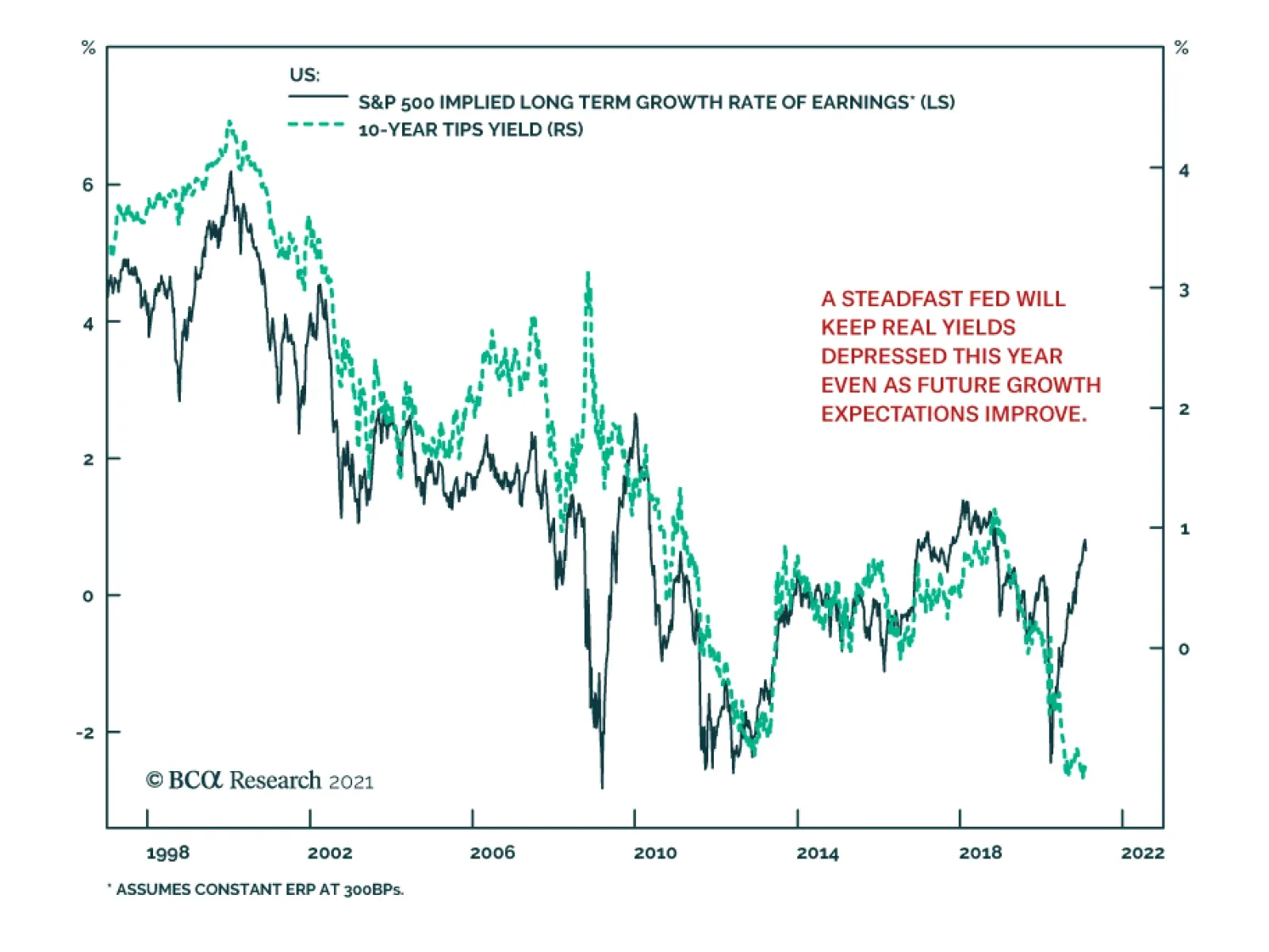
The long-term outlook for earnings growth and the 10-year TIPS yield typically move in tandem because they are both driven by expectations of future growth. However, this long-standing relationship has recently broken down. The 10-year TIPS yield has remained…
Highlights US inflation expectations will continue to grind higher as commodity markets tighten, and financial markets price to an ultra-accommodative Fed over the next 2-3 years. The US stock-market rally is reducing equity yields and squeezing equity risk premiums, which acts as a drag on gold prices. Higher earnings, lower stock prices or both are needed to reduce this effect. Pandemic uncertainty continues to fuel safe-haven demand for the USD, which remains a headwind for gold and silver. Vaccination availability needs to reach a level that convinces markets global contagion risk has been minimized. Until then, this remains the dominant downside risk to gold and commodities. The balance of risks continues to favor gold: US real rates will remain weak as the Fed remains behind the inflation-vs-rates curve, and the USD will be pushed lower (Chart of the Week). We continue to expect gold prices to push to $2,000/oz. We remain bullish silver, and view the recent retail-spec price blip as transitory. Fundamentally, silver supply growth is weakening, and demand is strengthening as the renewable-energy buildout accelerates and consumer spending revives. We expect silver's price to trade back to $30/oz. Feature US inflation expectations will continue to grind higher, as tightening markets for industrial commodities push oil and base metals prices higher (Chart 2).1 As is apparent in Chart 2, these real-economy factors feed directly into five-year inflation expectations, which are important to policy makers and portfolio managers managing risk in trading markets.2 Continued Fed accommodation of massively expansive US fiscal policy also will stoke inflation expectations, and keep real rates negative or weak at low positive levels as realized inflation and inflation expectations increase. These real and financial effects will be positive for gold prices, as the Chart of the Week illustrates. Chart of the WeekRising Inflation Expectations vs. Falling Risk Premiums Restrain Gold
Rising Inflation Expectations vs. Falling Risk Premiums Restrain Gold
Rising Inflation Expectations vs. Falling Risk Premiums Restrain Gold
Chart 2Tightening Commodity Markets Push Inflation Expectations Higher
Tightening Commodity Markets Push Inflation Expectations Higher
Tightening Commodity Markets Push Inflation Expectations Higher
Battling against this tailwind is the historic US equity rally, which has crushed stock yields and the equity risk premium vs bond yields.3 Gold prices are positively correlated with equity risk premiums – the positive economic forces that push dividend yields higher also tend to push gold and commodity prices higher – which means the falling risk premiums are acting as a headwind to gold prices (Chart 3).4 If, as the global economy recovers, the rate of growth in earnings is greater than that of equity prices, stock yields will expand, which will be supportive of gold prices. That said, we do not expect the contraction of the equity risk premium to dominate the evolution of gold prices. Tightening fundamentals in the real economy and continued monetary accommodation at the Fed will dominate gold- and silver-pricing dynamics. Chart 3Falling Stock Yields Pressure Equity Risk Premiums
Falling Stock Yields Pressure Equity Risk Premiums
Falling Stock Yields Pressure Equity Risk Premiums
Balance of Risks Favors Gold Fed policy pronouncements point to continued accommodation of massive fiscal stimulus in the US, with the central bank strongly indicating it will, as a matter of policy, remain behind the inflation-vs-rate-hikes curve for at least another 2-3 years. Taking the Fed at its word, this means US real rates will remain weak, and the USD will be pushed lower as the central bank continues to accommodate higher US budget deficits at the federal level. However, as we have repeatedly noted, the broad trade-weighted USD has found strong support at current levels following a precipitous fall from its COVID-19-induced highs in 1Q20: As pandemic uncertainty feeds into global policy uncertainty, USD safe-haven demand remains elevated (Chart 4).5 While we concentrate on five-year inflation expectations in our modeling, indications of price pressures are showing up in the manufacturing sector in the US (Chart 5), as our colleagues in BCA Research’s US Bond Strategy note in their report this week.6 This confirms that the price strength seen in commodity markets for raw materials used in manufacturing are showing up in the economy as a whole. Chart 4Lower USD, Stronger GDP Bullish For Copper Prices
Lower USD, Stronger GDP Bullish For Copper Prices
Lower USD, Stronger GDP Bullish For Copper Prices
Chart 5Inflation Indicators Hook Up
Inflation Indicators Hook Up
Inflation Indicators Hook Up
Our price target for gold remains $2,000/oz. The sooner vaccines are deployed globally – so that markets can reasonably assign lower odds to a resurgence of COVID-19 and its more insidious variants forcing new lockdowns – the sooner the pandemic uncertainty keeping the USD well bid will dissipate as a fundamental factor restraining a continuation of gold’s rally. Silver Is Not GameStop The Reddit-powered surge in retail silver trading this past week, which lifted silver prices some ~ 11% on Monday to $30/oz, is all but a memory now that the white metal is again pricing in line with fundamentals. We turned bullish silver in July of last year, arguing fundamentals suggested silver could outperform gold in 2H20, which it did.7 Supportive fundamentals remain in place, with total supply (mine output and recycling) falling, demand rising and balances tightening (Chart 6). We expect the supply side of the market to remain under pressure this year and the next, given the physical deficits we are forecasting for the copper market over the next two year: The supply side of silver is a function of copper, zinc and lead mine output (i.e., silver largely is a byproduct). On the demand side, continued recovery of consumer spending and the decade-long buildout of renewable-energy generation – which is heavily reliant on copper and silver to a lesser degree – will force prices higher. We remain bullish silver. However, given our expectation its price will trade again to $30/oz, we do not expect any dramatic tightening of the gold/silver ratio this year (Chart 7). Chart 6Silver Market Tightens, Along With Other Commodities
Higher Inflation Expectations Battle Lower Risk Premia In Gold Markets
Higher Inflation Expectations Battle Lower Risk Premia In Gold Markets
Chart 7Expect Gold/Silver Ratio To Continue To Narrow
Expect Gold/Silver Ratio To Continue To Narrow
Expect Gold/Silver Ratio To Continue To Narrow
Bottom Line: Tightening commodity fundamentals and continued monetary accommodation at the Fed will dominate gold- and silver-pricing dynamics this year and the next. The contraction of the equity risk premium will not dominate the evolution of gold prices. At the margin, if earnings growth exceeds equity-price increases, equity yields will expand, which will support gold prices. We expect gold and silver to trade to $2,000/oz and $30/oz this year – i.e., close to ~ 10% gains for both. Therefore, we do not expect much movement in the gold/silver ratio this year Robert P. Ryan Chief Commodity & Energy Strategist rryan@bcaresearch.com Commodities Round-Up Energy: Bullish OPEC 2.0’s Joint Technical Committee (JTC) lowered its estimated demand growth for 2021 to 5.6mm b/d from its 5.9mm b/d estimate last month, at its Tuesday meeting. The JTC also is expecting the oil market to be in a deficit this year, which will, by the Committee’s estimate, peak at 2mm b/d in May 2021, according to reuters.com. This is in line with our maintained hypothesis that the producer coalition led by Saudi Arabia and Russia will continue to calibrate production in line with demand to keep global storage levels drawing. The JTC was not expected to recommend any change in production policy to oil ministers on Wednesday when they met. We expect OECD oil inventories to hit their rolling five-year average in 1H21, largely because of OPEC 2.0’s production discipline and production losses outside the coalition (Chart 8). Base Metals: Bullish Battery-grade lithium carbonate soared 40% y/y in January in China to $9,450/MT, according to mining.com. The reporting service noted strong demand for lithium iron phosphate (LFP) batteries used to power subsidized short-range autos, public transport infrastructure electrification, and power generation. Precious Metals: Bullish COVID-19-induced demand destruction pushed gold demand down 14% y/y in 2020, to just under 3,760 tons, according to the World Gold Council’s 2020 supply-demand tallies. At 4,633 tons, gold supply lost 4% y/y, the most since 2013, according to the WGC. Supplies were disrupted by COVID-19 as well. (Chart 9). Ags/Softs: Neutral Despite poor weather conditions in South America, US farmers are beginning to worry about record or near-record crops in the current growing season, according to farmprogress.com. grains are trading lower following recent rallies on concerns the upcoming harvest could be better than expected. Tomorrow’s USDA WASDE report will be eagerly awaited for the Department’s latest assessments. Chart 8OPEC 2.0 Keeps Supply Growth Below Demand Growth
OPEC 2.0 Keeps Supply Growth Below Demand Growth
OPEC 2.0 Keeps Supply Growth Below Demand Growth
Chart 9Gold Below 200 Day Moving Average
Gold Below 200 Day Moving Average
Gold Below 200 Day Moving Average
Footnotes 1 Our most recent reports on copper and oil prices – Copper's Supply Challenges and Brent Forecast: $63 This Year, $71 Next Year published 10 December 2020 and 21 January 2021 – highlight the tightening of industrial-commodity markets globally. 2 While we do find strong relationships between gold prices and 5- and 10-year US real rates, we do not find any relationship with the slope of the US rates forward curve. 3 For a discussion of equity risk premiums, please see Asness, Clifford S. (2000) “Stocks versus Bonds: Explaining the Equity Risk Premium.” Financial Analysts Journal. March/April 2000: pp. 96-113. 4 In the post-GFC period 2010-2020, the S&P 500 equity risk premium is borderline insignificant in a cointegrating regression that includes other real and financial variables (i.e., copper prices, US Fed Funds, and global economic policy uncertainty). We therefore to not treat it as determinant to the evolution of gold prices in the same way as the real and financial variables we use as regressors. 5 We expect this pandemic uncertainty to break, but not until markets are convinced sufficient supplies of vaccines will be available globally to control COVID-19 infections, hospitalizations and deaths. Please see Pandemic Uncertainty Will Fall, Weakening USD, Boosting Metals, which we published last week, for further discussion. It is available at ces.bcaresearch.com. 6 For the first time 2011, the Prices Paid component in last month’s ISM Manufacturing PMI came in above 80, signaling for the first time since 2011. Please see No Tightening In 2021, published by BCA’s US Bond Strategy 2 February 2021. It is available at usbs.bcaresearch.com. 7 Please see Silver Likely Outperforms Gold In 2H20, which we published 2 July 2020. It is available at ces.bcaresearch.com. We recommended a long silver position then at $18.51/oz and closed it 23 September 2020 at $26/oz. Investment Views and Themes Recommendations Strategic Recommendations Commodity Prices and Plays Reference Table Summary of Closed Trades
Higher Inflation On The Way
Higher Inflation On The Way
In lieu of the next strategy report, I will be presenting the quarterly webcast titled ‘Five Contrarian Predictions For 2021-22’ on Thursday February 11 at 10.00AM EST (3.00PM GMT, 4.00PM CET, 11.00PM HKT). I hope you can join. Highlights Many of the ‘short squeezed’ investments that day traders have bid up are at, or approaching, collapsed short-term fractal structures. As such, patient long-term investors should take the other side. The biggest risk to the stock market remains the vulnerability of valuations to even a modest rise in bond yields. The happy corollary is that the structural bull market in equities will only end when the 10-year T-bond yield reaches zero. Until then, stay structurally overweight equities. Structurally overweight value-heavy European equities versus value-heavy emerging markets (EM) equities. Do not structurally overweight value-heavy European equities versus growth-heavy US equities. This is a ‘widow maker’ trade. Fractal trade: short AUD/JPY. Feature Chart of the WeekShort-Squeezed Investments Now Have Collapsed Fractal Structures (Gamestop)
Short-Squeezed Investments Now Have Collapsed Fractal Structures (Gamestop)
Short-Squeezed Investments Now Have Collapsed Fractal Structures (Gamestop)
There is no divine law that decrees the ‘correct’ time-horizon for any investment. Depending on your objectives and skills, a correct investment horizon could be anything spanning a few milliseconds to a hundred years. Once you absorb this fundamental point, it leads to a profound conclusion: The ‘correct’ price for any investment depends on your investment horizon. The Most Important Investment Question Is, Who Is Setting The Price? A long-term investor and a day trader will go through completely different thought processes to determine a stock’s ‘correct’ price. The long-term investor, intending to buy and hold the stock for ten years, will receive 40 quarterly dividend payments plus the stock price as it stands in 2031. Hence, the correct price is the discounted value of those expected cashflows. But for the day trader, intending to buy today to sell tomorrow, only one cashflow matters – tomorrow’s price. Hence, the correct price is simply the expected price at which he can sell tomorrow. The longer-term cashflows are irrelevant, unless they set the selling price tomorrow. Yet this is unlikely, because as Benjamin Graham put it: In the long run the market is a weighing machine, but in the short run it is a voting machine. Therefore, a long-term investor and a day trader are completely different animals, whose price-setting behaviour must be seen through different lenses. This matters because the price is always set by the last marginal transaction. The important question then is, who is setting the price? All of which brings us to the battle raging between a cabal of day traders and a group of hedge funds. The day trader is buying today because he expects that the hedge fund, desperate to cover its short positions, must buy at an even higher price tomorrow. The day trader’s behaviour is rational, so long as it is within the law, and so long as the hedge fund short-covering is the marginal price taker. Eventually though, the desperate hedge fund will not take the price, because there are no more short positions left to cover. At this point, if the day trader wants to exit his position, the marginal buyer will be a longer-term investor who will only buy at a much lower fundamentally-determined price. The day trader will have won the battle, but lost the war. The crucial takeaway is that we should always monitor which time-horizon of investors is setting the marginal price of an investment. We can do this by continually measuring the fractal structure of the investment’s price. We should always monitor which time-horizon of investors is setting the marginal price of an investment. When the fractal structure of an investment has collapsed, it means that the time-horizon of investors setting the price has compressed to a near-term limit. Thereby it signals that the price-setting baton will return to long-term investors who will reset the price to valuation anchors, such as discounted long-term cashflows. The implication is that the preceding trend, fuelled by short-term price setters, is likely to reverse. Today, we observe that many of the investments that day traders have recently bid up are at, or approaching, collapsed short-term fractal structures. As such, patient long-term investors should take the other side (Chart of the Week, Chart I-2 and Chart I-3). Chart I-2Short-Squeezed Investments Now Have Collapsed Fractal Structures (AMC Entertainment)
Short-Squeezed Investments Now Have Collapsed Fractal Structures (AMC Entertainment)
Short-Squeezed Investments Now Have Collapsed Fractal Structures (AMC Entertainment)
Chart I-3Short-Squeezed Investments Now Have Collapsed Fractal Structures (Blackberry)
Short-Squeezed Investments Now Have Collapsed Fractal Structures (Blackberry)
Short-Squeezed Investments Now Have Collapsed Fractal Structures (Blackberry)
The Major Misunderstanding About Real Bond Yields A common question we get is, should we compare the prospective returns on equities and bonds in nominal terms or in real terms? In an apples-for-apples comparison it shouldn’t really matter. The problem is that while we know the prospective nominal return from bonds (it is just the bond yield), it is extremely difficult to know the prospective real return from bonds. As the markets are lousy at predicting inflation, the ex-ante real bond yield is a lousy predictor of the ex-post real bond yield. A trustworthy ex-ante real bond yield requires a trustworthy prediction of inflation. But both the inflation forwards market and the breakeven inflation rate implied in inflation protected bonds are lousy at predicting inflation.1 As the markets are lousy at predicting inflation, the ex-ante real bond yield is a lousy predictor of the ex-post real bond yield (Chart I-4 and Chart I-5). Chart I-4The Markets Are Lousy At Predicting Inflation In Europe...
The Markets Are Lousy At Predicting Inflation In Europe...
The Markets Are Lousy At Predicting Inflation In Europe...
Chart I-5...And In The ##br##US
...And In The US
...And In The US
A second point is that the required excess return on equities versus bonds is a nominal concept. This is because the bond yield’s lower limit is set in nominal terms, at say -1 percent. Proximity to this nominal yield limit makes bonds very risky because there is no longer any upside to price, only downside. As the riskiness of equities and bonds converges, the required nominal return on equities collapses towards the ultra-low nominal bond yield. There are two important takeaways. First, we should always compare the valuation of equities and their prospective nominal return with the nominal bond yield. Second, the valuation of equities is exponentially sensitive to an ultra-low nominal bond yield (Chart I-6). Chart I-6The Relationship Between The Bond Yield And Stock Market Valuation Is Exponential
The Relationship Between The Bond Yield And Stock Market Valuation Is Exponential
The Relationship Between The Bond Yield And Stock Market Valuation Is Exponential
We conclude that the biggest risk to the stock market remains the vulnerability of valuations to even a modest rise in bond yields. Yet the happy corollary is that the structural bull market in equities will only end when bond yields can go no lower. In practice, this means when the 10-year T-bond yield reaches zero. Until then, long-term investors should stay in the stock market. The Major Misunderstanding About Valuation Another common question we get is, is it always meaningful to compare an investment’s valuation versus its own history? The answer is no. The comparison with a historical average is meaningful only if the valuation is mathematically stationary, which is to say it has not undergone a ‘phase-shift’. If the valuation has undergone a phase-shift, then the comparison with its own history is meaningless. As an analogy, nobody would compare their bodyweight with its lifetime average, because we understand that our bodyweight undergoes a phase-shift from childhood to adulthood. If we did compare our bodyweight with its lifetime average, it would give the false signal that we were permanently overweight! Likewise, to avoid getting a false signal from a valuation, we should always ask, has it undergone a phase-shift? If a valuation has undergone a phase-shift, then a comparison with its own history is meaningless. Unfortunately, the structural prospects for financials, oil and gas, and basic resources – sectors that dominate ‘value’ indexes and stock markets – did suffer a major downward phase-shift at the start of the 2000s (Chart I-7). It follows that we cannot compare the valuations of ‘value heavy’ indexes with their long-term history, and draw any meaningful conclusions. Chart I-7Value' Sector Profits Are In A Major Structural Downturn
Value' Sector Profits Are In A Major Structural Downturn
Value' Sector Profits Are In A Major Structural Downturn
Proving this point, the relationship between value-heavy European valuations and subsequent 10-year return is much worse for periods ending after the global financial crisis compared with periods ending before it. Whereas the relationship between growth-heavy US valuations and subsequent return has barely changed, because the structural prospects for growth sectors have not suffered downward phase-shifts (Chart I-8 and Chart I-9). Chart I-8The Relationship Between Valuation And Future Return Has Changed In Europe...
The Relationship Between Valuation And Future Return Has Changed In Europe...
The Relationship Between Valuation And Future Return Has Changed In Europe...
Chart I-9...But Not So Much ##br##In The US
...But Not So Much In The US
...But Not So Much In The US
Given the ongoing trends in value versus growth profits, it is much safer to overweight value-heavy European equities versus value-heavy emerging markets (EM) equities. Do not structurally overweight value-heavy European equities versus growth-heavy US equities. This is a ‘widow maker’ trade. Fractal Trading System* The rally in AUD/JPY is at a potential a near-term top based on its collapsed 65-day fractal structure. Accordingly, this week’s recommended trade is short AUD/JPY, setting the profit target and symmetrical stop-loss at 2.8 percent. Chart I-10AUD/JPY
AUD/JPY
AUD/JPY
In other trades, short European basic resources versus the market achieved its 4 percent profit target and is now closed. The rolling 12-month win ratio now stands at 57 percent. When the fractal dimension approaches the lower limit after an investment has been in an established trend it is a potential trigger for a liquidity-triggered trend reversal. Therefore, open a countertrend position. The profit target is a one-third reversal of the preceding 13-week move. Apply a symmetrical stop-loss. Close the position at the profit target or stop-loss. Otherwise close the position after 13 weeks. * For more details please see the European Investment Strategy Special Report “Fractals, Liquidity & A Trading Model,” dated December 11, 2014, available at eis.bcaresearch.com. Dhaval Joshi Chief European Investment Strategist dhaval@bcaresearch.com Footnotes 1 Europe and the US have deep and liquid markets in 5-year 5-year inflation swaps (or forwards), which price the expected 5-year inflation rate 5 years ahead. The current swap measures the annual inflation rate expected through 2026-31. The UK and the US also have deep and liquid markets in inflation-protected government bonds: UK index-linked gilts, and US Treasury Inflation Protected Securities (TIPS). The yield offered on such a security is real, which means in excess of inflation. The yield offered on a similar-maturity conventional bond is nominal. This means that the difference between the two yields equates to the market’s expectation for inflation over the maturity, known as the ‘breakeven inflation rate.’ Fractal Trading System Cyclical Recommendations Structural Recommendations Closed Fractal Trades Trades Closed Trades Asset Performance Currency & Bond Equity Sector Country Equity Indicators Bond Yields Chart II-1Indicators To Watch - Bond Yields
Indicators To Watch - Bond Yields
Indicators To Watch - Bond Yields
Chart II-2Indicators To Watch - Bond Yields
Indicators To Watch - Bond Yields
Indicators To Watch - Bond Yields
Chart II-3Indicators To Watch - Bond Yields
Indicators To Watch - Bond Yields
Indicators To Watch - Bond Yields
Chart II-4Indicators To Watch - Bond Yields
Indicators To Watch - Bond Yields
Indicators To Watch - Bond Yields
Interest Rate Chart II-5Indicators To Watch - Interest Rate Expectations
Indicators To Watch - Interest Rate Expectations
Indicators To Watch - Interest Rate Expectations
Chart II-6Indicators To Watch - Interest Rate Expectations
Indicators To Watch - Interest Rate Expectations
Indicators To Watch - Interest Rate Expectations
Chart II-7Indicators To Watch - Interest Rate Expectations
Indicators To Watch - Interest Rate Expectations
Indicators To Watch - Interest Rate Expectations
Chart II-8Indicators To Watch - Interest Rate Expectations
Indicators To Watch - Interest Rate Expectations
Indicators To Watch - Interest Rate Expectations
Highlights Chart 1Inflation Indicators Hook Up
Inflation Indicators Hook Up
Inflation Indicators Hook Up
There’s no doubt that inflationary pressures are building in the US economy. The latest piece of evidence is January’s ISM Manufacturing PMI which saw the Prices Paid component jump above 80 for the first time since 2011 (Chart 1). Large fiscal stimulus is clearly leading to bottlenecks in certain industries that were not negatively impacted by the pandemic, and this could cause consumer price inflation to rise during the next few months. However, the Fed will not view a spike in inflation as sustainable unless it is accompanied by a labor market that is close to maximum employment. The Fed estimates that “maximum employment” corresponds to an unemployment rate of 3.5% to 4.5%, and we calculate that average monthly payroll growth of about +500k is required to reach that target by the end of the year. The bottom line is that rising inflation will not lead to Fed tightening this year. We continue to expect liftoff in late-2022 or the first half of 2023. Feature Investment Grade: Neutral Chart 2Investment Grade Market Overview
Investment Grade Market Overview
Investment Grade Market Overview
Investment grade corporate bonds outperformed the duration-equivalent Treasury index by 3 basis points in January. The index option-adjusted spread widened 1 bp on the month, leaving it 4 bps above its pre-COVID low. As discussed in last week’s report, the combination of above-trend economic growth and accommodative monetary policy means that the runway for spread product outperformance remains long.1 However, given that investment grade corporate bond spreads are extremely tight, investors should look to other spread products when possible. One valuation measure, the investment grade corporate index’s 12-month breakeven spread – with the index re-weighted to maintain a constant credit rating distribution over time – is down to its 4th percentile (Chart 2). This means that the breakeven spread has only been tighter 4% of the time since 1995. The same measure shows that Baa-rated bonds have also only been more expensive 4% of the time (panel 3). While we don’t anticipate material underperformance versus Treasuries, we see better value outside of the investment grade corporate space. Specifically, we advise investors to favor tax-exempt municipal bonds over investment grade corporates with the same credit rating and duration (see page 9). We also prefer USD-denominated Emerging Market Sovereign bonds over investment grade corporates with the same credit rating and duration (see page 8). Finally, the supportive macro environment means that we are comfortable adding credit risk to a portfolio. With that in mind, we encourage investors pick up the additional spread offered by high-yield corporates, particularly the Ba credit tier where spreads remain wide compared to average historical levels (see page 6). Table 3ACorporate Sector Relative Valuation And Recommended Allocation*
No Tightening In 2021
No Tightening In 2021
Table 3BCorporate Sector Risk Vs. Reward*
No Tightening In 2021
No Tightening In 2021
High-Yield: Overweight Chart 3High-Yield Market Overview
High-Yield Market Overview
High-Yield Market Overview
High-Yield outperformed the duration-equivalent Treasury index by 62 basis points in January. The average index option-adjusted spread widened 2 bps on the month, leaving it 47 bps above its pre-COVID low. Ba-rated credits outperformed duration-matched Treasuries by 50 bps on the month, besting B-rated bonds which outperformed by only 33 bps. The Caa-rated credit tier delivered 157 bps of outperformance versus duration-matched Treasuries. We view Ba-rated junk bonds as the sweet spot within the corporate credit space. The sector is relatively insulated from default risk and yet still offers a sizeable spread pick-up over investment grade corporates (Chart 3). We noted in our 2021 Key Views Special Report that the additional spread earned from moving down in quality below Ba is merely in line with historical averages.2 Assuming a 25% recovery rate on defaulted debt and a minimum required risk premium of 150 bps, we calculate that the junk index is priced for a default rate of 2.8% for the next 12 months (panel 3). This represents a steep drop from the 8.4% default rate observed during the most recent 12-month period. However, only six defaults occurred in December, down from a peak of 22 in July. Job cut announcements, an excellent indicator of the default rate, have also fallen dramatically (bottom panel). Overall, we see room for spread compression across all junk credit tiers in 2021 but believe that Ba-rated bonds offer the best opportunity in risk-adjusted terms. MBS: Underweight Chart 4MBS Market Overview
MBS Market Overview
MBS Market Overview
Mortgage-Backed Securities outperformed the duration-equivalent Treasury index by 24 basis points in January. The nominal spread between conventional 30-year MBS and equivalent-duration Treasuries tightened sharply in January, despite a continued rapid pace of refinancing activity (Chart 4). The option-adjusted spread adjusted downward in January and it now sits at 25 bps (panel 3). This is considerably below the 61 bps offered by Aa-rated corporate bonds and the 45 bps offered by Agency CMBS. It is only slightly above the 20 bps offered by Aaa-rated consumer ABS. The primary mortgage spread has tightened dramatically during the past few months (bottom panel), a key reason why refinancing activity has been so strong despite the back-up in Treasury yields. With the mortgage spread now closer to typical levels, it stands to reason that further increases in Treasury yields will be matched by higher mortgage rates. As such, mortgage refinancing activity could be close to its peak. While a drop in refinancing activity would be a reason to get more bullish on MBS, we aren’t yet ready to pull that trigger. The gap between the nominal MBS spread and the MBA Refinance Index remains wide (panel 2), and we could still see spreads adjust higher. Last year’s spike in the mortgage delinquency rate is alarming (panel 4), but it will have little impact on MBS returns. The increase was driven by household take-up of forbearance granted by the federal government. Our US Investment Strategy service recently showed that a considerable majority of households will remain current on their loans once the forbearance period expires, causing the delinquency rate to fall back down.3 Government-Related: Neutral Chart 5Government-Related Market Overview
Government-Related Market Overview
Government-Related Market Overview
The Government-Related index outperformed the duration-equivalent Treasury index by 24 basis points in January (Chart 5). Sovereign debt and Foreign Agencies underperformed duration-equivalent Treasuries by 21 bps and 7 bps, respectively, in January. Local Authority bonds outperformed the Treasury benchmark by 140 bps while Domestic Agency bonds and Supranationals outperformed by 15 bps and 7 bps, respectively. Last week’s report contains a detailed look at valuation for USD-denominated EM Sovereigns.4 We found that, on an equivalent-duration basis, EM Sovereigns offer a spread advantage versus US corporates for all credit tiers except Ba. We recommend that investors take advantage of this spread pick-up by favoring investment grade EM Sovereigns over investment grade US corporates. Attractive countries include: Qatar, UAE, Saudi Arabia, Mexico, Russia and Colombia. We prefer US corporates over EM Sovereigns in the high-yield space. Ba-rated high-yield US corporates offer a spread advantage over EM Sovereigns and the extra spread available in B-rated and lower EMs comes from distressed credits in Turkey and Argentina. Municipal Bonds: Overweight Chart 6Municipal Market Overview
Municipal Market Overview
Municipal Market Overview
Municipal bonds outperformed the duration-equivalent Treasury index by 108 basis points in January (before adjusting for the tax advantage). Municipal bond spreads have tightened dramatically during the past couple of months and Aaa-rated Munis no longer look cheap compared to Treasuries (Chart 6). That said, if we match the duration and credit rating between the Bloomberg Barclays Municipal bond indexes and the US Credit index, we find that both General Obligation (GO) and Revenue Munis appear attractive compared to US investment grade Credit. Both GO and Revenue Munis offer a before-tax spread pick-up relative to US Credit for maturities above 12 years (bottom panel). Revenue bonds in the 8-12 year and 6-8 year maturity buckets offer an after-tax yield pick-up versus Credit for investors with effective tax rates above 3% and 16%, respectively. GO bonds in the 8-12 year and 6-8 year maturity buckets offer breakeven effective tax rates of 21% and 33%, respectively. All in all, municipal bond value has deteriorated markedly in recent months and we downgraded our recommended allocation from “maximum overweight” to “overweight” in last week’s report. However, investors should still prefer municipal bonds over investment grade corporate bonds with the same credit rating and duration. Treasury Curve: Buy 5-Year Bullet Versus 2/10 Barbell Chart 7Treasury Yield Curve Overview
Treasury Yield Curve Overview
Treasury Yield Curve Overview
The Treasury curve bear-steepened in January. The 2/10 Treasury slope steepened 20 bps to 100 bps. The 5/30 Treasury slope steepened 13 bps to 142 bps. Our expectation is that continued economic recovery will cause investors to price-in eventual monetary tightening at the long-end of the Treasury curve. With the Fed maintaining a firm grip on the front end, this will lead to Treasury curve bear steepening. A timely vaccine roll-out and stimulative fiscal policy will serve to speed this process along. We recommend positioning for a steeper curve by owning the 5-year Treasury note and shorting a duration-matched barbell consisting of the 2-year and 10-year notes. This position is designed to profit from 2/10 curve steepening. Valuation is a concern with our recommended steepener, as the 5-year yield is below the yield on a duration-matched 2/10 barbell (Chart 7). However, the 5-year looked much more expensive during the last zero-lower-bound period between 2010 and 2013 (bottom 2 panels). We anticipate a return to similar valuation levels. TIPS: Overweight Chart 8TIPS Market Overview
TIPS Market Overview
TIPS Market Overview
TIPS outperformed the duration-equivalent nominal Treasury index by 143 basis points in January. The 10-year and 5-year/5-year forward TIPS breakeven inflation rates rose 14 bps and 1 bp on the month. They currently sit at 2.15% and 2.06%, respectively. Core CPI rose 0.09% in December, causing the year-over-year rate to dip from 1.65% to 1.61%. Meanwhile, 12-month trimmed mean CPI ticked up from 2.09% to 2.10%, widening the gap between trimmed mean and core (Chart 8). We expect 12-month core inflation to jump during the next few months, narrowing the gap between core and trimmed mean. As such, we remain overweight TIPS versus nominal Treasuries, even though the 10-year TIPS breakeven inflation rate looks expensive on our Adaptive Expectations Model (panel 2).5 We also recommend holding real yield curve steepeners and inflation curve flatteners. With the Fed now officially targeting an overshoot of its 2% inflation goal, we expect the cost of 2-year inflation protection to rise above the cost of 10-year inflation protection (panel 4). With the Fed also exerting more control over short-dated nominal yields than over long-term ones, we expect short-maturity real yields to come under downward pressure relative to the long end (bottom panel). ABS: Overweight Chart 9ABS Market Overview
ABS Market Overview
ABS Market Overview
Asset-Backed Securities outperformed the duration-equivalent Treasury index by 17 basis points in January. Aaa-rated ABS outperformed the Treasury benchmark by 11 bps in January, while non-Aaa issues outperformed by 48 bps (Chart 9). The stimulus from the CARES act led to a significant increase in household income when individual checks were mailed out last April. Since then, households have used this stimulus to build up a considerable buffer of excess savings (panel 4). The large stock of household savings means that the collateral quality of consumer ABS is very high, and this situation won’t change any time soon with even more fiscal stimulus on the way. Investors should remain overweight consumer ABS and take advantage of strong collateral performance by moving down in credit quality. The Treasury department’s decision to let the Term Asset-Backed Loan Facility (TALF) expire at the end of 2020 does not alter our recommendation. Spreads are already well below the borrowing cost that was offered by TALF, and these tight spread levels are justified by strong household balance sheets. Non-Agency CMBS: Neutral Chart 10CMBS Market Overview
CMBS Market Overview
CMBS Market Overview
Non-Agency Commercial Mortgage-Backed Securities outperformed the duration-equivalent Treasury index by 75 basis points in January. Aaa Non-Agency CMBS outperformed Treasuries by 42 bps in January, while non-Aaa issues outperformed by 185 bps (Chart 10). We continue to recommend an overweight allocation to Aaa-rated Non-Agency CMBS and an underweight allocation to non-Aaa CMBS. Even with the expiry of TALF, Aaa CMBS spreads are already well below the cost of borrowing through TALF and thus will not be negatively impacted. Meanwhile, the structurally challenging environment for commercial real estate could lead to problems for lower-rated CMBS (panels 3 & 4). Agency CMBS: Overweight Agency CMBS outperformed the duration-equivalent Treasury index by 28 basis points in January. The average index spread tightened 4 bps on the month to reach 45 bps (bottom panel). Though Agency CMBS spreads have completely recovered back to their pre-COVID lows, they still look attractive compared to other similarly risky spread products. This is especially true when you consider the Fed’s continued pledge to purchase as much Agency CMBS as “needed to sustain smooth market functioning”. Appendix A: Butterfly Strategy Valuations The following tables present the current read-outs from our butterfly spread models. We use these models to identify opportunities to take duration-neutral positions across the Treasury curve. The following two Special Reports explain the models in more detail: US Bond Strategy Special Report, “Bullets, Barbells And Butterflies”, dated July 25, 2017, available at usbs.bcaresearch.com US Bond Strategy Special Report, “More Bullets, Barbells And Butterflies”, dated May 15, 2018, available at usbs.bcaresearch.com Table 4 shows the raw residuals from each model. A positive value indicates that the bullet is cheap relative to the duration-matched barbell. A negative value indicates that the barbell is cheap relative to the bullet. Table 4Butterfly Strategy Valuation: Raw Residuals In Basis Points (As Of January 29TH, 2021)
No Tightening In 2021
No Tightening In 2021
Table 5 scales the raw residuals in Table 4 by their historical means and standard deviations. This facilitates comparison between the different butterfly spreads. Table 5Butterfly Strategy Valuation: Standardized Residuals (As Of January 29TH, 2021)
No Tightening In 2021
No Tightening In 2021
Table 6 flips the models on their heads. It shows the change in the slope between the two barbell maturities that must be realized during the next six months to make returns between the bullet and barbell equal. For example, a reading of 86 bps in the 5 over 2/10 cell means that we would only expect the 5-year to outperform the 2/10 if the 2/10 slope steepens by more than 86 bps during the next six months. Otherwise, we would expect the 2/10 barbell to outperform the 5-year bullet. Table 6Discounted Slope Change During Next 6 Months (BPs)
No Tightening In 2021
No Tightening In 2021
Appendix B: Excess Return Bond Map The Excess Return Bond Map is used to assess the relative risk/reward trade-off between different sectors of the US bond market. It is a purely computational exercise and does not impose any macroeconomic view. The Map’s vertical axis shows 12-month expected excess returns. These are proxied by each sector’s option-adjusted spread. Sectors plotting further toward the top of the Map have higher expected returns and vice-versa. Our novel risk measure called the “Risk Of Losing 100 bps” is shown on the Map’s horizontal axis. To calculate it, we first compute the spread widening required on a 12-month horizon for each sector to lose 100 bps or more relative to a duration-matched position in Treasury securities. Then, we divide that amount of spread widening by each sector’s historical spread volatility. The end result is the number of standard deviations of 12-month spread widening required for each sector to lose 100 bps or more versus a position in Treasuries. Lower risk sectors plot further to the right of the Map, and higher risk sectors plot further to the left. Chart 11Excess Return Bond Map (As Of January 29th, 2021)
No Tightening In 2021
No Tightening In 2021
Ryan Swift US Bond Strategist rswift@bcaresearch.com Footnotes 1 Please see US Bond Strategy Weekly Report, “Searching For Value In Spread Product”, dated January 26, 2021, available at usbs.bcaresearch.com 2 Please see US Bond Strategy Special Report, “2021 Key Views: US Fixed Income”, dated December 15, 2020, available at usbs.bcaresearch.com 3 Please see US Investment Strategy Weekly Report, “The Big Bank Beige Book, January 2021”, dated January 25, 2021, available at usis.bcaresearch.com 4 Please see US Bond Strategy Weekly Report, “Searching For Value In Spread Product”, dated January 26, 2021, available at usbs.bcaresearch.com 5 For more details on our model please see US Bond Strategy Weekly Report, “How Are Inflation Expectations Adapting?”, dated February 11, 2020, available at usbs.bcaresearch.com Fixed Income Sector Performance Recommended Portfolio Specification Corporate Sector Relative Valuation And Recommended Allocation
Highlights The dollar bounce has further to run. The DXY index could touch 94 before working off oversold conditions. In this environment, yen long positions also provide an attractive hedge. Meanwhile, Japan has stepped back into deflation, with the resurgence in Covid-19 cases constraining activity and consumption spending. A modest rise in real rates will lead to a self-reinforcing upward spiral for the yen. Remain strategically short USD/JPY. Tactical investors can also short EUR/JPY as a trade. Eventually, when global growth picks up, the yen will weaken at the crosses. However, this is less likely in an environment where global yields remain anchored at low levels. We were stopped out of our long silver/short gold position last week. Reinstate. Feature The powerful bounce in global markets from the March lows is morphing into a speculative frenzy. The highlight this week centered on a few stocks, such as GameStop, Blackberry, and AMC Entertainment holdings, that have entered a manic phase. While liquidity conditions remain extremely favorable for risk assets, only a small shift in market sentiment may be required to trigger a reversal. The big risk from a technical perspective is that this reversal might be deeper and longer than most expect, given extremely overbought conditions. The dollar has tended to strengthen as market volatility rises. 2020 saw the rapid accumulation of dollar shorts, as low interest rates squeezed investors into more speculative assets, such as cryptocurrencies (Chart I-1). With these assets now having jumped high into the stratosphere, and dollar-short positioning at a bearish nadir, the nascent bounce in the USD could morph into something bigger. In our report a fortnight ago,1 we argued for a 2%-4% rise, putting 94 on the DXY index within striking distance. Chart I-1Some Signs Of Speculative Froth
Some Signs Of Speculative Froth
Some Signs Of Speculative Froth
Chart I-2The Yen Benefits From A Rise In Volatility
The Yen Benefits From A Rise In Volatility
The Yen Benefits From A Rise In Volatility
The yen also generally benefits from rising volatility (Chart I-2). Should a market correction develop, it will provide the necessary catalyst for established long yen positions. Meanwhile, as we argue below, the backdrop in Japan is becoming more deflationary, which is also yen bullish. We are already short USD/JPY in our portfolio and recommend going short EUR/JPY for a trade. The Yen And Global Markets The AUD/JPY rate is extremely sensitive to equity market conditions (Chart I-3). Therefore, one of the ways to play a potential reversal in equity markets and a rise in volatility is to short the AUD/JPY cross. While we certainly recommend this trade tactically, we prefer to express this view via a short EUR/JPY position. There are three main reasons for this. First, despite a significant rally in AUD/JPY, speculators are still very short the cross, as we showed two weeks ago. This is because short USD positions have been expressed in a concentrated number of currencies, including the euro. In a nutshell, speculators are very long EUR/USD and just neutral EUR/JPY (Chart I-4). This favors EUR short positions from a contrarian perspective, compared to AUD. Chart I-3The Yen And Equity Markets
The Yen And Equity Markets
The Yen And Equity Markets
Chart I-4Go Short EUR/JPY For A Trade
Go Short EUR/JPY For A Trade
Go Short EUR/JPY For A Trade
Second, Australia is doing much better in terms of containing the spread of Covid-19, compared to Europe as we argued last week.2 Australian export volumes and prices continue to recover smartly, and the basic balance remains in a healthy surplus. Meanwhile, there is a rising risk that the Covid-19 crisis will hit Europe particularly hard in Q1 this year. Interest rate markets are already beginning to discount this view. Real interest rates in the euro area are collapsing relative to Japan (Chart I-5). This will limit any fixed-income flows into the euro area from Japanese investors. At the margin, this is negative EUR/JPY. Third, given the most recent stimulus out of Europe, the European Central Bank’s (ECB) balance sheet is expanding faster than that of the Bank of Japan (BoJ). This has historically been negative for the EUR/JPY (Chart I-6). Chart I-5EUR/JPY And Real Interest Rates
EUR/JPY And Real Interest Rates
EUR/JPY And Real Interest Rates
Chart I-6EUR/JPY And Relative Balance Sheets
EUR/JPY And Relative Balance Sheets
EUR/JPY And Relative Balance Sheets
In a nutshell, equity markets are due for a healthy reset. In a similar fashion, a washing out of stale euro long positions will ensure the bull market for 2021 unfolds with higher conviction. Tactical investors can also short EUR/JPY as a trade. Outright short EUR/USD positions also make sense in the near term. The Yen And Japanese Growth Japan has re-entered a debt-deflation spiral, and it is unclear how it will exit this predicament, other than via a rebound in external demand. While it remains our base case that external demand will recover, the yen will be held hostage in the interim to short-term safe-haven inflows, as real rates remain well bid. Like most other economies, Japan is seeing the worst private-sector contraction in decades. For an economy that has held interest rates near zero since the better part of the 90s, this is not good news. Whenever the structural growth rate of the Japanese economy has fallen below interest rates, the trade-weighted yen has staged a powerful rally (Chart I-7). A strong yen, on the back of deficient domestic demand, then leads to a self-fulfilling deflationary spiral. Chart I-7The Story Of Japan In One Chart
The Story Of Japan In One Chart
The Story Of Japan In One Chart
The latest Bank of Japan (BoJ) meeting was a clear indication that the central bank was out of policy bullets (the central bank left policy largely unchanged). The BoJ began to acknowledge this problem with the end of the Heisei era3 two years ago. A policy review is due in March of this year, but with aggressive stimulus in place since governor Haruhiko Kuroda took helm almost a decade ago, it is difficult to see how any changes could steer Japan out of deflation and towards a 2% inflation target anytime soon. For example, with the BoJ owning 47% of outstanding JGBs, about 80% of ETFs and almost 5% of JREITs, the supply side puts a serious limitation on how much more stimulus the BoJ can provide. As a result, the impulse of the BoJ’s balance sheet could soon begin to fade, especially relative to that of other central banks (Chart I-8). Chart I-8The BoJ's Balance Sheet Could Peak Soon
The BoJ's Balance Sheet Could Peak Soon
The BoJ's Balance Sheet Could Peak Soon
2% Inflation = Mission Impossible? Most developed economies have not been able to meet their inflation targets over the last decade. While this might change going forward with unprecedented monetary and fiscal stimulus, it will not happen anytime soon. For example, the US is a much more closed economy than Japan and has not been able to maintain a 2% inflation rate since the Global Financial Crisis. This makes the BoJ’s target of 2% a pipe dream in the near future. Strictly looking at the data, the situation is even worse, with Japan having categorically stepped back into deflation (Chart I-9). The three key variables the authorities pay attention to for inflation – Core CPI, the GDP deflator, and the output gap – are all negative or rolling over. In fact, since the financial crisis, prices in Japan have only been able to really rise after a tax hike. Always forgotten is that the overarching theme for prices in Japan is a rapidly falling (and aging) population, leading to deficient demand (Chart I-10). Chart I-9Japan Is Back In Deflation
Japan Is Back In Deflation
Japan Is Back In Deflation
Chart I-10Japan Prices And Demographics
Japan Prices And Demographics
Japan Prices And Demographics
This view is corroborated in the inflation swap market. 5, 10, and 20-year inflation swaps in Japan are all depressed (Chart I-11). More importantly, with almost 50% of the Japanese consumption basket in tradeable goods, domestic inflation is as much driven by the influence of the BoJ or demographics, as it is by globalization. Chart I-11Is 2 Percent Inflation Mission Impossible?
Is 2% Inflation Mission Impossible?
Is 2% Inflation Mission Impossible?
Fiscal Policy To The Rescue? Chart I-12Falling Consumer Confidence In Japan
Falling Consumer Confidence In Japan
Falling Consumer Confidence In Japan
Most governments have carte blanche on fiscal stimulus. While it is certainly the case that the Japanese government could boost spending via transfer payments, much of this income is more likely to be saved than spent by the private sector. In other words, the savings ratio for workers continues to surge. If consumers were not willing to spend prior to COVID-19,4 they are unlikely to do so under much more uncertain future conditions (Chart I-12). Some of the government’s outlays will certainly go a long way to boosting aggregate demand, since the fiscal multiplier tends to be much larger in a liquidity trap. This will especially be the case for increased social security spending such as child education, construction activity, or the move towards promoting cashless transactions (with a tax rebate). However, there are important near-term offsets. The first is a potential postponement of the Olympics once again for 2021. This will continue to be a drag on Japanese construction activity. Second, the Covid-19 pandemic has severely curtailed tourism in Japan, especially as Niseko and Hakuba, important ski destinations for foreigners, lose inbound momentum. Tourism makes up a non-negligible component of Japanese income. Finally, the labor (and income) dividend from immigration has practically vanished. The Yen Beyond The Near Term Eventually, when global growth picks up, the yen will weaken at the crosses. However, this is less likely in an environment where global yields remain anchored at low levels. Real interest rates are already higher in Japan, and the above factors could meaningfully generate a deflationary impulse. As such, the starting point for yen long positions is already favorable (Chart I-13). Chart I-13The Yen And Relative Interest Rates
The Yen And Relative Interest Rates
The Yen And Relative Interest Rates
Chart I-14DXY And USD/JPY Usually Move Together
DXY And USD/JPY Usually Move Together
DXY And USD/JPY Usually Move Together
A continued rise in global equity markets is a key risk to our scenario. This will especially favor short dollar positions. However, as a low-beta currency, our contention is that the yen will surely weaken at its crosses, but could strengthen versus the dollar. The yen rises versus the dollar not only during recessions, but during most episodes of broad dollar weakness (Chart I-14). While short EUR/JPY positions will suffer, short USD/JPY bets should still fare well. As such, we remain strategically short USD/JPY. It is rare to find such a “heads I win, tails I do not lose too much” proposition. Housekeeping We were stopped out of our long silver/short gold position for a modest profit of 6%. We have profitably traded silver for almost two years now, and could see a speculative breakout in the metal over the next few months. We recommend reinstating this trade today with the ratio at 71, while maintaining our target at 65 and setting the stop loss at 72.5. We were also stopped out of our long petrocurrency basket versus the euro. With heightened volatility in oil prices, we will be looking to re-establish this trade from lower levels. Chester Ntonifor Foreign Exchange Strategist chestern@bcaresearch.com Footnotes 1 Please see our Foreign Exchange Strategy report, "Sizing A Potential Dollar Bounce," dated January 15, 2021. 2 Please see our Foreign Exchange and Global Fixed Income Strategy report, "Australia: Regime Change For Bond Yields And Currency," dated January 20, 2021. 3 The Heisei era refers to the period of Japanese history corresponding to the reign of Emperor Akihito, from January 8, 1989 until his abdication on April 30, 2019. 4 Ricardian equivalence suggests in simple terms that public-sector dissaving will encourage private-sector savings. Currencies U.S. Dollar Chart II-1USD Technicals 1
USD Technicals 1
USD Technicals 1
Chart I-2USD Technicals 2
USD Technicals 2
USD Technicals 2
Recent data in the US have been resilient: US manufacturing activity continues to outperform its peers, with a solid 59.1 print on the Markit PMI for January. The S&P CoreLogic house price index grew by 9.5% year-on-year in November. Consumer confidence remains resilient, with the expectations component surging for the month of January. 4Q GDP came in at an annualized 4% quarter-on-quarter, in line with expectations. The DXY index was flat this week. The latest FOMC meeting reinforced the view that there will be no rush to tighten US monetary policy. Two preconditions for tightening is inflation well above 2% and tight labor market conditions. This suggests the path for least resistance for the US dollar is down, albeit with some near-term consolidation. Report Links: The Dollar In A Blue Wave - January 8, 2021 The Dollar Conundrum And Protection - November 6, 2020 The Dollar In A Market Reset - October 30, 2020 The Euro Chart I-3EUR Technicals 1
EUR Technicals 1
EUR Technicals 1
Chart I-4EUR Technicals 2
EUR Technicals 2
EUR Technicals 2
Recent data from the euro area are softening: Manufacturing PMIs are rolling over, with the aggregate index down to 54.7 in January from 55.2. The German IFO Business climate index also softened from 92.1 to 90.1 in January. GfK consumer confidence slipped from -7.3 to -15.6 in February. The euro fell by 0.3% against the US dollar this week. As the broad dollar continues to work off oversold conditions, the euro remains a potent valve to allow for this reset. We are shorting EUR/JPY this week to profit from any setback in risk assets. Report Links: The Dollar Conundrum And Protection - November 6, 2020 Addressing Client Questions - September 4, 2020 On The DXY Breakout, Euro, And Swiss Franc - February 21, 2020 The Japanese Yen Chart I-5JPY Technicals 1
JPY Technicals 1
JPY Technicals 1
Chart I-6JPY Technicals 2
JPY Technicals 2
JPY Technicals 2
Recent data from Japan has been disappointing: Departmental store sales fell by 13.7% year-on-year in December. Retail sales are softening overall in Japan. Tokyo CPI will be released overnight and is expected to stay weak. The Japanese yen fell by 0.7% against the US dollar this week. Our highest conviction call over the next one to three months is to be long the yen both versus the dollar and versus the euro. As we discuss in the front section of this report, short USD/JPY is an attractive “heads I win, tails I do not lose too much” bet. Report Links: The Dollar Conundrum And Protection - November 6, 2020 The Near-Term Bull Case For The Dollar - February 28, 2020 Building A Protector Currency Portfolio - February 7, 2020 British Pound Chart I-7GBP Technicals 1
GBP Technicals 1
GBP Technicals 1
Chart I-8GBP Technicals 2
GBP Technicals 2
GBP Technicals 2
Recent data out of the UK have been softening: The Markit manufacturing PMI fell from 57.5 to 52.9 in January. 88K jobs were lost in the three months ending November. This pushed up the ILO unemployment rate to 5%. Average weekly earnings rose by 3.6% year-on-year in November. The British pound was flat against the US dollar this week. Post-Brexit relations and Covid-19 vaccinations continue to dominate the news flow in Britain. The latter is progressing, but a difficult adjustment remains for Britain’s exporters. This will add volatility to the pound. We remain short EUR/GBP on valuation grounds. Report Links: The Dollar Conundrum And Protection - November 6, 2020 Revisiting Our High-Conviction Trades - September 11, 2020 Updating Our Balance Of Payments Monitor - November 29, 2019 Australian Dollar Chart I-9AUD Technicals 1
AUD Technicals 1
AUD Technicals 1
Chart I-10AUD Technicals 2
AUD Technicals 2
AUD Technicals 2
Recent data from Australia have been improving: CPI went up a notch in the fourth quarter, to 0.9% from 0.7%. The weighted median number was more encouraging at 1.4% NAB Business conditions improved from 9 to 14 in December. However, the expectations component deteriorated from 12 to 4. 4Q export prices rose by 5.5% quarter-on-quarter. The Australian dollar fell by 0.9% against the US dollar this week. The Aussie has been consolidating gains for most of January. The dominant feature driving the Aussie in the near term will continue to be terms of trade. We expect the AUD to resume its uptrend after a brief consolidation phase. We shied from implementing a short AUD/JPY trade today, preferring to express this view via short EUR/JPY. Report Links: An Update On The Australian Dollar - September 18, 2020 On AUD And CNY - January 17, 2020 Updating Our Balance Of Payments Monitor - November 29, 2019 New Zealand Dollar Chart I-11NZD Technicals 1
NZD Technicals 1
NZD Technicals 1
Chart I-12NZD Technicals 2
NZD Technicals 2
NZD Technicals 2
There was scant data out of New Zealand this week: The trade surplus in 2020 was NZ$2.9bn, compared to a deficit of NZ$4.5bn in 2019. The New Zealand dollar fell by 0.4% against the US dollar this week. Agricultural prices are consolidating after a rebounding from the lows of last year. Poor weather continues to be a worry on the supply side, but this is already reflected in very long Ag positioning. More should continue to deflate air off the high-flying kiwi. Report Links: Currencies And The Value-Versus-Growth Debate - July 10, 2020 Updating Our Balance Of Payments Monitor - November 29, 2019 Place A Limit Sell On DXY At 100 - November 15, 2019 Canadian Dollar Chart I-13CAD Technicals 1
CAD Technicals 1
CAD Technicals 1
Chart I-14CAD Technicals 2
CAD Technicals 2
CAD Technicals 2
Recent data from Canada continues to disappoint: Building permits fell by 4.1% month-on-month in December. The Canadian dollar plunged by 1.3% against the US dollar this week. Oil prices are consolidating this year’s gains, which has weighed on the loonie. There is also the issue of the cancelled keystone XL pipeline, which is adding a risk premium for Canadian crude. We are short CAD/NOK as a trade, to capitalize on the latter headwind. Report Links: Currencies And The Value-Versus-Growth Debate - July 10, 2020 More On Competitive Devaluations, The CAD And The SEK - May 1, 2020 A New Paradigm For Petrocurrencies - April 10, 2020 Swiss Franc Chart I-15CHF Technicals 1
CHF Technicals 1
CHF Technicals 1
Chart I-16CHF Technicals 2
CHF Technicals 2
CHF Technicals 2
There was scant data out of Switzerland this week: The Swiss franc fell by 0.3% against the US dollar this week. The Swiss national bank (SNB) has two headaches to contend with in the coming weeks: a potential correction in the euro, which encourages safe-haven flows into the franc, and the lagged effects on a strong currency on domestic prices. This will force the hand of the SNB to continue being foreign exchange reserves at an aggressive pace. Report Links: The Dollar Conundrum And Protection - November 6, 2020 On The DXY Breakout, Euro, And Swiss Franc - February 21, 2020 Currency Market Signals From Gold, Equities And Flows - January 31, 2020 Norwegian Krone Chart I-17NOK Technicals 1
NOK Technicals 1
NOK Technicals 1
Chart I-18NOK Technicals 2
NOK Technicals 2
NOK Technicals 2
The data out of Norway has been robust: The unemployment rate came down in November to 5% from 5.2%. The Norwegian krone fell by 2% this week on oil-related losses. Despite this, good management of the COVID-19 situation remains a positive catalyst relative to US or European peers. We expect the krone to keep outperforming for the rest of the year. Report Links: Revisiting Our High-Conviction Trades - September 11, 2020 A New Paradigm For Petrocurrencies - April 10, 2020 Building A Protector Currency Portfolio - February 7, 2020 Swedish Krona Chart I-19SEK Technicals 1
SEK Technicals 1
SEK Technicals 1
Chart I-20SEK Technicals 2
SEK Technicals 2
SEK Technicals 2
Recent data from Sweden has been mixed: The unemployment rate ticked up in December from 8.3% to 8.7%. Retail sales fell by 0.6% year-on-year in December, after rising by 5.7% the previous month. The trade balance improved from SEK1.4bn to SEK2.7bn in December. The Swedish krona fell by 0.8% against the US dollar this week. As a high beta currency, the Swedish krona typically bears the brunt of a US dollar rally. However, this time around, valuations provide a sufficient margin of safety for investors that are long. Report Links: Revisiting Our High-Conviction Trades - September 11, 2020 Updating Our Balance Of Payments Monitor - November 29, 2019 Where To Next For The US Dollar? - June 7, 2019 Trades & Forecasts Forecast Summary Core Portfolio Tactical Trades Limit Orders Closed Trades