Inflation/Deflation
BCA Research’s Global Investment Strategy service predicts inflation will rise when unemployment rates return to their pre-pandemic level in three or four years. National savings can shrink either because the private sector is spending more or earning less.…

Highlights Achieving 2 percent inflation, whether as a point-target or as an average over time, will continue to be a mission impossible. As central banks continue to push the monetary policy pedal to the metal, it will underpin the valuation of equities and other risk-assets. So long as bond yields do not spike, stock market sell offs will be short-lived rather than an outright bear market. Within bonds, steer towards those where the monetary policy toolbox is not fully depleted, namely US T-bonds. Within currencies, steer towards those where the monetary policy toolbox is already depleted, namely the Swiss franc and the yen. Inflationary fiscal policy, by spiking bond yields, risks collapsing the valuation underpinning of $450 trillion of global risk-assets and catalysing a deflationary bear market. Fractal trade: Euro strength is vulnerable. Feature Chart of the WeekUltra-Low Bond Yields Do Not Create Consumer Price Inflation, They Create Asset Price Inflation
Ultra-Low Bond Yields Do Not Create Consumer Price Inflation, They Create Asset Price Inflation
Ultra-Low Bond Yields Do Not Create Consumer Price Inflation, They Create Asset Price Inflation
Five years ago, we published a Special Report, Mission Impossible: 2% Inflation. We predicted that 2 percent inflation would remain elusive. Or that in the rare economies that it did appear, it would be runaway, rather than a sedate 2 percent. Either way, the 2 percent inflation point-target that had become a quasi-religious commandment for the world’s central banks would be a ‘mission impossible’.1 Our August 2015 report was heterodox and provocative. Some people pushed back, arguing that the all-powerful central banks could pick and hit whatever inflation target they desired. Yet five years on, we have been vindicated. Last week, the Federal Reserve finally threw in the towel on the 2 percent inflation point-target (Chart I-2). Chart I-2"Forecasts For 2 Percent Inflation Were Never Realised On A Sustained Basis"
"Forecasts For 2 Percent Inflation Were Never Realised On A Sustained Basis"
"Forecasts For 2 Percent Inflation Were Never Realised On A Sustained Basis"
“Over the years, forecasts from FOMC participants and private-sector analysts routinely showed a return to 2 percent inflation, but these forecasts were never realised on a sustained basis… (hence) our new statement indicates that we will seek to achieve inflation that averages 2 percent over time…”2 We suspect that, just like the Fed, European central banks will soon move their goal posts. Nevertheless, today we are doubling down on our August 2015 prediction. Achieving 2 percent inflation, whether as a point-target or as an average over time, will continue to be a mission impossible (Chart I-3). Chart I-3Mission Impossible: 2 Percent Inflation
Mission Impossible: 2 Percent Inflation
Mission Impossible: 2 Percent Inflation
Price Stability Is A State, Not A Number The current school of central bankers have misunderstood price stability. They have defined it as an over-precise inflation rate: two point zero. Yet most people feel price stability imprecisely and intuitively. A recent IFO paper points out that households’ inflation perceptions are “more in line with the imperfect information view prevailing in social psychology than with the rational actor view assumed in mainstream economics.”3 The human brain cannot distinguish between very low rates of inflation or deflation, a range we just perceive as ‘price stability’. In Real-Feel Inflation: Quantitative Estimation of Inflation Perceptions, Michael Ashton confirms that “it would be challenging for a consumer to distinguish 1 percent inflation from 2 percent inflation – that fine of a gradation in perception would be extremely unusual to find.”4 The human brain cannot distinguish between very low rates of inflation or deflation. As the entire range of ultra-low inflation just feels like one state of price stability, it is impossible for central banks to fine-tune our inflation expectations within that range. Therefore, our behaviour in terms of wage demands and willingness to borrow also stays unchanged. And if our behaviour is unchanged, what is the transmission mechanism to 2 percent inflation – or for that matter, any arbitrarily chosen inflation rate? Hence, inflation targeting can ‘phase-shift’ an economy between the states of price instability and price stability. Most notably, its inception in the 1990s ultimately phase-shifted many advanced economies into the state of price stability (Chart I-4). But once in either state, inflation targeting cannot fine-tune inflation to a desired number such as 2 percent, 4 percent, or 10 percent. Chart I-4Inflation Targeting Phase-Shifted Advanced Economies Into Price Stability
Inflation Targeting Phase-Shifted Advanced Economies Into Price Stability
Inflation Targeting Phase-Shifted Advanced Economies Into Price Stability
A recent NBER paper Inflation Expectations As A Policy Tool? points out that in advanced economies, “the inattention of households and firms to inflation is likely a reflection of policy-makers’ success in stabilizing inflation around a low level for decades. This price stability has reduced the benefit to being informed about aggregate inflation, leading many to rely on readily available price signals.”5 The ultimate proof is that even market-based inflation expectations just track realised inflation. Central Banks Have Gone Backwards In his must-read What’s Wrong With The 2 Percent Inflation Target, the late and great Paul Volcker argued that price stability is “that state in which expected changes in the general price level do not effectively alter business or household decisions. It is ill-advised to define that state with a point target, such as 2 percent, as false precision can lead to dangerous policies.”6 The irony, and tragedy, is that both the Fed and the ECB have gone backwards. Their original definitions of price stability were more correct than their more recent iterations. False precision can lead to dangerous policies. At the Federal Reserve’s July 1996 policy meeting, Chairman Alan Greenspan argued that if the aim of inflation targeting was a truly stable price level, it entailed an inflation target of 0-1 percent. But one of the persons present was not so sure. The dissenter was a Fed governor called Janet L. Yellen. She countered that if inflation ended up at 0-1 percent, the zero-bound of interest rates would prevent “real interest rates becoming negative on the rare occasions when required to counter a recession”, an argument that Jay Powell repeated last week. “Expected inflation feeds directly into the general level of interest rates… so if inflation expectations fall below our 2 percent objective, interest rates would decline in tandem. In turn, we would have less scope to cut interest rates to boost employment during an economic downturn.” Meanwhile in Europe, the ECB’s original inflation target of below 2 percent was close to Greenspan’s proposal of 0-1 percent. But in 2003 the ECB changed its inflation target to its current “below but close to 2 percent.” The reason, according to Mario Draghi: “The founding fathers of the ECB thought about the rebalancing of the different members. To rebalance these disequilibria, since the countries do not have the exchange rate, they must readjust their prices. This readjustment is much harder if you have zero inflation than if you have 2 percent.” Hence, the Fed, ECB and other central banks are targeting inflation at an arbitrary 2 percent to always allow some leeway for negative real rates. The central bank argument can be summarised as: we desperately need you to expect 2 percent inflation. Because otherwise, we won’t be able to help you by cutting real interest rates in a downturn. Yet this argument is facile, as it takes no account of the true science of inflation expectation formation (Chart I-5 and Chart I-6). And it is dangerous, as it takes no account of the financial and economic risks of pushing the monetary policy pedal to the metal. Chart I-5Inflation Expectations Just Track Realised Inflation
Inflation Expectations Just Track Realised Inflation
Inflation Expectations Just Track Realised Inflation
Chart I-6Inflation Expectations Just Track Realised Inflation
Inflation Expectations Just Track Realised Inflation
Inflation Expectations Just Track Realised Inflation
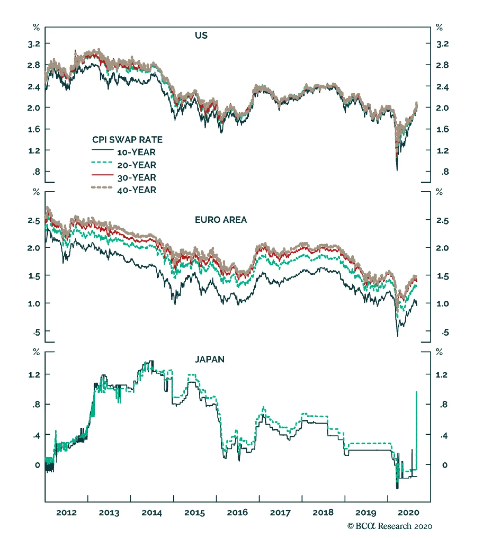
Beware The Twists In The Inflation Story Now we come to a couple of twists in the story. When bond yields become ultra-low, their impact on consumer price inflation breaks down – because the economy is already in the state of price stability – but the impact on stock market inflation increases exponentially (Chart of the Week). We refer readers to previous reports in which we have detailed this dynamic.7 The good twist is that as central banks continue to push the monetary policy pedal to the metal, it will underpin the valuation of equities and other risk-assets. So long as bond yields do not spike, stock market sell offs will be short-lived rather than an outright bear market. Remarkably, this has held true even this year in the worst economic downturn since the Depression. The current school of central bankers have misunderstood price stability. Within bonds, steer towards those where the monetary policy toolbox is not fully depleted, namely US T-bonds (Chart I-7 and Chart I-8). Conversely, within currencies, steer towards those where the monetary policy toolbox is already depleted, namely the Swiss franc and the yen. Chart I-7Steer Towards Bonds Where Monetary Policy Is Not Fully Depleted...
Steer Towards Bonds Where Monetary Policy Is Not Fully Depleted...
Steer Towards Bonds Where Monetary Policy Is Not Fully Depleted...
Chart I-8...Namely US ##br##T-Bonds
...Namely US T-Bonds
...Namely US T-Bonds
Finally, given that any economy can ultimately phase-shift to price instability, when should we worry about inflation in advanced economies? Not yet. To expand the broad money supply, somebody must borrow and spend money. If policymakers really want to create rampant inflation, that somebody is the government. It must borrow and spend money at will, with the central bank creating the money. In other words, the central bank loses its independence and government spending goes vertical. So far, we are not remotely close to this situation because government spending has barely replaced the lost incomes and livelihoods of the pandemic. Indeed, things could get worse once the current income replacement schemes end. Yet, in theory at least, government spending could ultimately go vertical. This would lead to the final bad twist. As bond yields spiked in response, the entire valuation support of global risk-assets would collapse, catalysing a devastating bear market. Given that the $450 trillion worth of global risk-assets (including real estate) is five times the size of the $90 trillion global economy, we reach an important conclusion. The road to inflation, if ever taken, goes via deflation. Fractal Trading System* This week we note that the recent strength in EUR/USD is vulnerable to a countertrend pullback. However, as we are already exposed to this via the correlated position in long USD/PLN, there is no new trade. The rolling 1-year win ratio now stands at 59 percent. Chart I-9EUR/USD
EUR/USD
EUR/USD
When the fractal dimension approaches the lower limit after an investment has been in an established trend it is a potential trigger for a liquidity-triggered trend reversal. Therefore, open a countertrend position. The profit target is a one-third reversal of the preceding 13-week move. Apply a symmetrical stop-loss. Close the position at the profit target or stop-loss. Otherwise close the position after 13 weeks. * For more details please see the European Investment Strategy Special Report “Fractals, Liquidity & A Trading Model,” dated December 11, 2014, available at eis.bcaresearch.com. Dhaval Joshi Chief European Investment Strategist dhaval@bcaresearch.com Footnotes 1 Please see the European Investment Strategy Special Report ‘Mission Impossible: 2% Inflation’, dated August 20, 2015, available at eis.bcaresearch.com. 2 Please see New Economic Challenges and the Fed's Monetary Policy Review, August 27, 2020 available at https://www.federalreserve.gov/newsevents/speech/powell20200827a.htm 3 Please see Households’ Inflation Perceptions and Expectations: Survey Evidence from New Zealand, IFO Working Paper, February 2018 available at https://www.ifo.de/DocDL/wp-2018-255-hayo-neumeier-inflation-perceptions-expectations.pdf 4 Please see Real-Feel Inflation: Quantitative Estimation of Inflation Perceptions by Michael Ashton, National Association for Business Economics available at https://link.springer.com/content/pdf/10.1057/be.2011.35.pdf 5 Please see Inflation Expectations As A Policy Tool? NBER, May 28th, 2018 available at http://conference.nber.org/conf_papers/f117592.pdf 6 Please see https://www.bloomberg.com/opinion/articles/2018-10-24/what-s-wrong-with-the-2-percent-inflation-target 7 Please see the European Investment Strategy Weekly Report ‘Risk: The Great Misunderstanding Of Finance’, dated October 25, 2018, available at eis.bcaresearch.com. Fractal Trading System Cyclical Recommendations Structural Recommendations Closed Fractal Trades Trades Closed Trades Asset Performance Currency & Bond Equity Sector Country Equity Indicators Bond Yields Chart II-1Indicators To Watch - Bond Yields
Indicators To Watch - Bond Yields
Indicators To Watch - Bond Yields
Chart II-2Indicators To Watch - Bond Yields
Indicators To Watch - Bond Yields
Indicators To Watch - Bond Yields
Chart II-3Indicators To Watch - Bond Yields
Indicators To Watch - Bond Yields
Indicators To Watch - Bond Yields
Chart II-4Indicators To Watch - Bond Yields
Indicators To Watch - Bond Yields
Indicators To Watch - Bond Yields
Interest Rate Chart II-5Indicators To Watch - Interest Rate Expectations
Indicators To Watch - Interest Rate Expectations
Indicators To Watch - Interest Rate Expectations
Chart II-6Indicators To Watch - Interest Rate Expectations
Indicators To Watch - Interest Rate Expectations
Indicators To Watch - Interest Rate Expectations
Chart II-7Indicators To Watch - Interest Rate Expectations
Indicators To Watch - Interest Rate Expectations
Indicators To Watch - Interest Rate Expectations
Chart II-8Indicators To Watch - Interest Rate Expectations
Indicators To Watch - Interest Rate Expectations
Indicators To Watch - Interest Rate Expectations
BCA Research’s Global Fixed Income Strategy & US Bond Strategy service highlights that the official shift to an average inflation targeting regime represents a massive structural break relative to how the Fed conducted monetary policy in the past. The…
Highlights Fed Policy Changes: The official shift to an average inflation targeting regime represents a massive structural break relative to how the Fed conducted monetary policy in the past. The main takeaway for investors should be that inflation expectations will carry more weight than ever in the Fed’s thinking, with far less emphasis on estimated measures like the output gap. Investment Implications: The Fed’s new policy framework supports our current US fixed income recommendations: a neutral duration stance; overweighting TIPS versus nominal US Treasuries; positioning for real yield curve steepeners; and overweighting US spread product most directly supported by the Fed’s balance sheet (i.e. investment grade corporates and Ba-rated high-yield). Feature The pandemic forced the Federal Reserve to move its annual Jackson Hole Economic Policy Symposium online this year. That change deprived policymakers of a late-August vacation in the mountains of Wyoming, but offered the public a rare glimpse at the full proceedings live on YouTube.1 Federal Reserve Chairman Jerome Powell took advantage of that larger audience to announce significant changes to the Fed’s Statement on Longer-Run Goals and Monetary Policy Strategy. Though many of the basic elements of the new strategy were well telegraphed in advance, the adjustments are hugely significant and will shape the conduct of US – and, potentially, global - monetary policy for years to come. This Special Report presents the most important takeaways – and fixed income investment implications - from the Fed’s new approach to setting monetary policy. Say Hello To Average Inflation Targeting The most significant change has to do with how the Fed defines its price stability mandate. In its old Statement, the Fed defined its 2% inflation target as “symmetrical”, meaning that the Fed would be equally concerned if inflation were running persistently above or below the target. In the Fed’s words, communicating this symmetry was enough to “keep longer-term inflation expectations firmly anchored.” The Fed now believes that a more aggressive approach is required to keep inflation expectations anchored. The new Statement reads: In order to anchor longer-term inflation expectations at [2 percent], the Committee seeks to achieve inflation that averages 2 percent over time, and therefore judges that, following periods when inflation has been running persistently below 2 percent, appropriate monetary policy will likely aim to achieve inflation moderately above 2 percent for some time.2 In other words, the Fed’s 2% inflation target is no longer purely forward-looking. It is now dependent on the history of realized US inflation, and thus is now much more like a price level target than an inflation target. We will know that the Fed has seen enough inflation overshooting when long-term expectations are anchored at levels consistent with its 2% inflation target. For example, Chart 1 shows how the headline PCE price index would have evolved since the end of 2007 had it averaged 2% growth per year, exactly equal to the Fed’s target. Starting from today, PCE inflation would need to average 3% for the next seven years, or 2.5% for the next fourteen years, for the index to converge with this target. In other words, if the Fed seeks to achieve average 2% inflation since 2007, we are in for a prolonged period of overshooting the old 2% target. Chart 1An Illustration Of Average Inflation Targeting
An Illustration Of Average Inflation Targeting
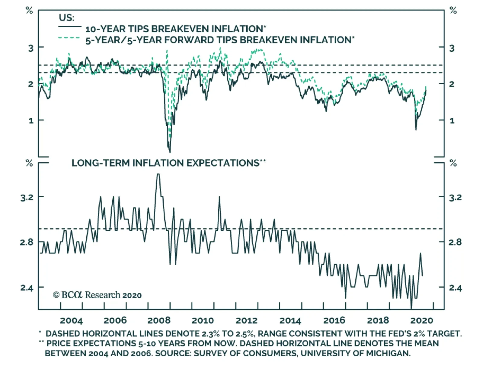
An Illustration Of Average Inflation Targeting
Notice that we had to make several assumptions in our above example. First, we had to assume that the Fed will seek to achieve average 2% inflation since the end of 2007. The Fed could just as easily choose a different start date for calculating the 2% average. We also assumed that the year-over-year PCE inflation rate never breaks above 3% during the overshooting phase. As of now, we have no sense of whether the Fed would act to make sure that inflation only overshoots 2% by a small amount (say, between 0.5 and 1 percentage point) or whether it would tolerate a larger overshoot. A larger overshoot would potentially be more de-stabilizing, but it would allow the Fed to catch up to its price level target more quickly. We will probably get some more information about these missing details when the Fed translates its new framework into more explicit forward rate guidance (see section titled "Are There Any Additional Changes Coming?" below), but the Fed will still want to retain some flexibility. That is, we shouldn’t expect the Fed to tie its hands with a strict policy rule. This means that the question of how much inflation would prompt any future Fed tightening could linger for some time. Faced with this ambiguity, investors are advised to focus more keenly than ever on inflation expectations (Chart 2). Note that in the above excerpt from the revised Statement on Longer-Run Goals and Monetary Policy Strategy, the explicit goal of average inflation targeting is to “anchor long-term inflation expectations at [2 percent]”. This means that we will know that the Fed has seen enough inflation overshooting when long-term expectations are anchored at levels consistent with its 2% inflation target. We view this “well anchored” level as a range between 2.3% and 2.5% for long-dated TIPS breakeven inflation rates (top two panels). When TIPS breakevens reach those levels, we should expect the Fed to shift toward a more restrictive policy stance. Chart 2The Fed Wants Higher Inflation Expectations
The Fed Wants Higher Inflation Expectations
The Fed Wants Higher Inflation Expectations
How long will it take for TIPS breakevens to reach our target range? We expect it will take quite some time because Fed communications alone cannot drive long-term TIPS breakevens back to target. Rather, inflation expectations tend to follow trends in the actual inflation data, so expectations will only return to well-anchored levels once inflation has risen significantly. Further, long-dated inflation expectations tend to adapt slowly to changes in the actual inflation data. Notice in Chart 3 that the 5-year/5-year forward CPI swap rate correlates much more strongly with the 8-year rate of change in CPI inflation than it does with the 1-year rate of change. This suggests that, most likely, 12-month inflation will have to run above 2% for some time before long-term TIPS breakevens sustainably return to our target range. One way to understand the link between actual inflation and inflation expectations is to look at the distribution of individual inflation forecasts. Chart 4 shows the distribution of 10-year headline CPI inflation forecasts from the Survey of Professional Forecasters from 2004 – a year when inflation expectations were well anchored around 2% – and from August 2020. Notice that a similar proportion of respondents at both points in time expect inflation to be near the Fed’s target, in a range of 2% to 2.5%. The difference is that, in 2004, a large minority of respondents anticipated a significant overshoot of the inflation target. Today, hardly anyone anticipates a significant overshoot, and many expect a significant undershoot. Chart 3Inflation Expectations Adapt Slowly To The Actual Data
Inflation Expectations Adapt Slowly To The Actual Data
Inflation Expectations Adapt Slowly To The Actual Data
Chart 4Distribution Of Inflation Forecasts ##br##(2004 & Today)
A New Dawn For US Monetary Policy
A New Dawn For US Monetary Policy
Since market prices can be thought of as a weighted average of the entire distribution of inflation forecasts, it follows that to drive TIPS breakevens higher we need to see investors shift their forecasts from the left tail of the distribution to the right tail. This will only happen if actual inflation rises, and probably only if it stays durably above 2% for a prolonged period. Chart 5shows that the percentage of respondents that expect inflation to average above 3% for the next ten years tends to follow both the long-run inflation rate and the median inflation forecast. Chart 5Few Expect Inflation To Be Above 3%
Few Expect Inflation To Be Above 3%
Few Expect Inflation To Be Above 3%
Bottom Line: The official shift to an average inflation targeting regime represents a massive structural break relative to how the Fed conducted monetary policy in the past. The main takeaway for investors should be that inflation expectations carry more weight than ever in the Fed’s thinking. In particular, we should expect the Fed to move to a more restrictive policy stance only when long-maturity TIPS breakeven inflation rates return to a well-anchored range of 2.3% to 2.5%. Some Key Questions Following The Fed’s Big Shift Does The Phillips Curve Still Matter? The second big change that the Fed made to its official Statement on Longer-Run Goals and Monetary Policy Strategy is in how it views the unemployment rate relative to its “natural” level. Specifically, the change has to do with making estimates of the natural rate of unemployment (NAIRU) less important in the Fed’s reaction function. In its old Statement, the Fed talked about minimizing “deviations of employment from the Committee’s assessments of its maximum level”. The revised Statement talks about mitigating “shortfalls of employment from the Committee’s assessment of its maximum level.” This one word change says a lot about the Fed’s faith in the Phillips curve. In the past, the Fed viewed an unemployment rate below its estimate of NAIRU as a signal that inflation was poised to accelerate. This often led to premature tightening, and over time, a pattern of missing the inflation target to the downside. Now, the Fed is explicitly saying that it only cares about shortfalls of employment from its estimated maximum level. If the labor market appears overheated, the Fed will not take this as a sign that inflation is about to accelerate. Rather, it will wait for the evidence to show up in the actual inflation data. The percentage of respondents that expect inflation to average above 3% for the next ten years tends to follow both the long run inflation rate and the median inflation forecast. This change sends a very clear signal that the Fed will put much less emphasis on expected “Phillips curve effects” in the future than it has in the past. In addition to long-term implications, this change will likely also impact the type of forward rate guidance the Fed provides this year. What’s Missing? It is also interesting to touch on the things that Powell did not mention in his Jackson Hole speech. First, as noted above, Powell provided few details on the length of time over which the Fed will seek to hit average 2% inflation and did not specify any upper limit to the amount of inflation the Fed would tolerate during the overshooting phase. Perhaps more importantly, Powell also did not say much about how the Fed will seek to drive inflation higher, and whether there are additional tools at his disposal that have not yet been rolled out. We think there is good reason for this. In effect, we think the Fed is more or less tapped out in terms of the amount of additional monetary easing it can provide. Negative interest rates have already been ruled out. A Yield Curve Control policy of capping intermediate-maturity bond yields has been discussed, but this policy doesn’t accomplish much beyond what the Fed is already doing with its forward rate guidance. For example, a policy of capping the 2-year Treasury yield at the current level of 0.13% has essentially the same impact on bond prices as convincing the market that the fed funds rate will stay in a range between 0% and 0.25% for the next two years or more. The notion that the Fed is “out of bullets” was hammered home during the final Jackson Hole panel on Friday. The speakers for the panel titled “Post-Pandemic Monetary Policy and the Effective Lower Bound” shifted much of the onus for boosting growth, with policy interest rates at the effective lower bound, toward fiscal policymakers. Given the limitations on the amount of additional easing that the Fed can deliver, the potent impact of the changes announced last week will not really be felt until the economic recovery is further underway. Only once inflation starts to rise will we get a test of the Fed’s resolve to stay on the sidelines. Now that the changes have been enshrined in an official Fed document, we have no doubt that they will follow through. What About The Role Of QE? Chart 6The Future Of QE: Go Big & Go Fast
The Future Of QE: Go Big & Go Fast
The Future Of QE: Go Big & Go Fast
Not every speaker at Jackson Hole, however, felt that central banks had run out of policy options. Bank of England (BoE) Governor Andrew Bailey gave a speech on Day Two of the conference that focused on the use of central bank balance sheets as a more regular part of policymakers’ toolkits over the next decade with policy rates at the effective lower bound. Bailey noted that the use of quantitative easing (QE) in the future would be less about signaling future central bank intentions on interest rates, or forcing changes to the composition of assets held by the private sector, and would be more about “going big and going fast” to calm financial markets during periods of instability.3 Some past examples of such use of QE include the 2008 Global Financial Crisis, the 2011/12 European Debt Crisis and the 2016 UK Brexit shock (Chart 6). In Bailey’s view, QE will now have to be “state contingent”, based on the nature of the financial market shock and where liquidity (cash) needs are greatest at that time. In 2008, it was the banking system that needed liquidity, so central banks expanded their balance sheets in ways that got cash directly to the banks – like repos and government bond purchases. In 2020, the demand for liquidity from the COVID-19 shock came more from non-bank entities, like investment funds or the corporate sector itself. Therefore, central bank balance sheets had to be used to support loans to the private sector or even buying private assets like corporate debt, on top of the usual QE buying of sovereign debt to help drive down risk-free bond yields. What does that mean for the new policy regime of the Fed? It means that the type of market intervention we saw earlier this year – with the Fed announcing a variety of measures to support liquidity like corporate bond purchases when markets were not functioning – will become more commonplace during periods of severe market stress. This is because there cannot be any “emergency” Fed rate cuts to calm markets if the Fed is keeping rates at very low levels to try and make up for past undershoots of its inflation target. Chart 7The Fed Has Room To Do More QE In The Future
The Fed Has Room To Do More QE In The Future
The Fed Has Room To Do More QE In The Future
This also means that the balance sheets of the Fed, and other major global central banks, will likely continue to get larger over time. Tapering of balance sheets, as the Fed engineered during 2014-19, will become very rare events before inflation expectations are stabilized at policymaker targets. That does raise issues of capacity constraints for QE programs, as Bailey mentioned in his speech, where the central bank footprint in financial markets becomes so large as to impair market functionality. That is the case today where the Bank of Japan now owns nearly 50% of all outstanding Japanese government bonds (JGB) and the day-to-day liquidity in the JGB market is extremely challenging for market participants that need to buy and trade JGBs, like Japanese banks and investment funds. Bailey noted that there was still ample capacity for the BoE to ramp up its buying of UK Gilts (and even UK corporate debt) before the sheer size of its presence became a BoJ-like problem for the UK bond market (Chart 7). The same can be argued in the US, where the Fed only owns a little over 20% of outstanding US Treasuries – the supply of which is growing rapidly thanks to large US budget deficits. Are There Any Additional Changes Coming? As we outlined in a recent US Bond Strategy Webcast, after revising the Statement on Longer-Run Goals and Monetary Policy Strategy, the Fed’s next step will be to provide more explicit guidance about the economic conditions that will have to be in place before it considers lifting the fed funds rate.4 We speculate that this next announcement will occur before the end of the year, possibly at this month’s FOMC meeting, and that the guidance will be similar to the Evans Rule employed in 2012. The Evans Rule was a promise that the Fed would not lift rates at least until the unemployment rate was below 6.5% or inflation was above 2.5%. For the 2020 version of the Evans Rule, policymakers had been debating whether to specify both an unemployment target and an inflation target, as was done in 2012, or whether to specify only an inflation target. With the Fed’s new Statement putting much less emphasis on Phillips curve effects and estimates of NAIRU, it now appears much more likely that the 2020 version of the Evans Rule will have only an inflation trigger, or perhaps an inflation trigger and an inflation expectations trigger. Bottom Line: There are still many lingering unanswered questions about the new Fed strategy, but what we do know is that the Fed will focus more on inflation, rather than forecasts of inflation, when making future interest rate decisions. The Fed will also likely use its balance sheet more as a market stability tool during times of crisis. Investment Implications Chart 8Financial Conditions
Financial Conditions
Financial Conditions
The first implication of the Fed’s big shift has to do with the long-run outlook for risk asset prices (corporate bonds, equities and other fixed income spread product). With the Fed committing to give the economic recovery more runway before choking it off, risk asset valuations have been provided with a massive tailwind. In fact, the longer it takes for inflation to move up, the longer the Fed will stay on hold and the more expensive risk asset valuations will become. It is even possible that, if inflation remains subdued for a few more years, risk asset valuations will become so stretched that the Fed might have to exercise its financial stability “out clause”. That is, if the Fed viewed a growing asset bubble as a threat to the economic recovery and/or financial system, it could abandon its inflation target and lift interest rates to deflate that bubble. This out clause is specifically enshrined in the Fed’s Statement on Longer-Run Goals and Monetary Policy Strategy: Moreover, sustainably achieving maximum employment and price stability depends on a stable financial system. Therefore, the Committee’s policy decisions reflect its longer-run goals, its medium-term outlook, and its assessments of the balance of risks, including risks to the financial system that could impede the attainment of the Committee’s goals. We should stress that US financial asset valuations are currently nowhere near expensive enough to prompt this sort of move (Chart 8). However, that picture could change after a few more years of low inflation and zero interest rates. We have been saying since March 2019 that the two most important indicators to watch for gauging the eventual pace of Fed tightening are inflation expectations and financial conditions.5 Last week’s announcement serves to reinforce that view. The Fed could abandon its inflation target and lift interest rates to combat a growing asset bubble. A second investment implication of the Fed’s announcement is that TIPS will continue to outperform nominal US Treasuries until there is an eventual re-anchoring of long-run TIPS breakeven inflation rates in a range between 2.3% and 2.5%. As noted above, this structural investment position could take some time to pan out, and we may even get an opportunity to tactically position for periods of TIPS underperformance if breakevens start to look too high compared to the actual inflation data.6 For now, our models suggest that TIPS breakevens are fairly valued relative to the actual inflation data, and we recommend staying overweight TIPS versus nominal Treasuries as a core allocation in fixed income portfolios. We would also advise investors to enter flatteners along the inflation protection curve (TIPS breakevens or CPI swaps). This recommendation flows directly from the Fed’s announcement. If the Fed is eventually successful at achieving a temporary overshoot of its 2% inflation target, then the cost of short-maturity inflation protection should rise above the cost of long-maturity inflation protection. That is, the inflation protection curve should invert (Chart 9). This would be a stark dislocation compared to the past, but it is a logical one if the Fed is to be attacking its inflation target from above instead of from below. As for nominal Treasury yields, our baseline view is that yields will be flat-to-higher over the next 12 months, with the amount of upside dictated by the pace of economic recovery. The Fed’s extraordinarily dovish monetary policy will keep some downward pressure on nominal yields, but expectations of Fed tightening will eventually infiltrate the long end of the curve. Given that the Fed’s grip is much firmer at the short end of the curve than at the long end, we prefer to play the nominal Treasury curve through yield curve steepeners rather than through outright duration bets (Chart 10). Chart 9Position For Inflation Curve Inversion
Position For Inflation Curve Inversion
Position For Inflation Curve Inversion
Chart 10Enter Nominal Curve Steepeners
Enter Nominal Curve Steepeners
Enter Nominal Curve Steepeners
Finally, the level of real yields is perhaps the trickiest to get right in the current environment. The Fed’s dovish policies are clearly meant to push real yields down, but now that those policies have been announced, it may signal that we are near the trough. In fact, real yields actually rose somewhat on Thursday after the Fed’s announcement. As with nominal yields, we prefer to play the real Treasury (TIPS) curve via steepeners (Chart 11). Whether or not the Fed is able to apply further downward pressure on real yields, as long as its policies are viewed as reflationary and the economic recovery is maintained, then the real yield curve has ample room to steepen. Chart 11Enter Real Curve Steepeners
Enter Real Curve Steepeners
Enter Real Curve Steepeners
Bottom Line: The Fed’s new policy framework supports our current US fixed income recommendations: a neutral duration stance; overweighting TIPS versus nominal US Treasuries; positioning for real yield curve (TIPS) steepeners; and overweighting US spread product most directly supported by the Fed’s balance sheet (i.e. investment grade corporates and Ba-rated high-yield). Ryan Swift US Bond Strategist rswift@bcaresearch.com Robert Robis, CFA Chief Fixed Income Strategist rrobis@bcaresearch.com Footnotes 1 https://www.youtube.com/user/KansasCityFed 2 https://www.federalreserve.gov/monetarypolicy/guide-to-changes-in-statement-on-longer-run-goals-monetary-policy-strategy.htm 3 The full text of BoE Governor Bailey’s speech can be found here: https://www.bankofengland.co.uk/speech/2020/andrew-bailey-federal-reserve-bank-of-kansas-citys-economic-policy-symposium-2020 4 https://www.bcaresearch.com/webcasts/detail/338 5 Please see US Bond Strategy Weekly Report, “The New Battleground For Monetary Policy”, dated March 26, 2019, available at usbs.bcaresearch.com 6 This possibility is discussed in US Bond Strategy Weekly Report, “Positioning For Reflation And Avoiding Deflation”, dated August 11, 2020, available at usbs.bcaresearch.com
Highlights Historically, soft-budget constraints have typically been followed by periods of poor equity market performance. Soft-budget constraints could produce two distinct economic scenarios: malinvestment or inflation. Both are negative for equity investors. Odds are that the US will continue to pursue easy money policies, sowing the seeds of US equity underperformance in the years ahead. In contrast to the US, EM (ex-China, Korea and Taiwan) are presently facing hard-budget constraints, which will weigh on their growth in the near term. However, forced restructuring could boost efficiency and productivity leading to their equity and currency outperformance in the coming years. Unlike other developing economies, China is not currently facing hard-budget constraints. However, the structural overhang from the past 10 years of soft-budget constraints is lingering on and in some cases is increasing. The Thesis The consensus in the investment industry is that cheap money and ample stimulus are good for share prices. We do not disagree with this thesis when it is applied to the near and medium-term equity strategy. However, excessive stimulus and easy money policies — we refer to these as soft-budget constraints — bode ill for share prices in the long run. The investment relevance of this thesis is as follows. Since March, the US has implemented the largest fiscal and central bank stimulus in the world and will likely continue doing so in the coming years (Chart I-1). Such soft-budget constraints will likely support the US economy for now. Nevertheless, they will also sow seeds of future US equity underperformance and currency depreciation. Conversely, many emerging economies (excluding China) have failed to provide sufficient fiscal and credit support to their economies (Chart I-2). The resulting hard-budget constraints will foreshadow their economic underperformance vis-à-vis the US in the coming months. Chart I-1Soft-Budget Policies Will Likely Become Structural In The US
Soft-Budget Policies Will Likely Become Structural In The US
Soft-Budget Policies Will Likely Become Structural In The US
Chart I-2EM Ex-China, Korea And Taiwan Are Facing Hard-Budget Constraints
EM Ex-China, Korea And Taiwan Are Facing Hard-Budget Constraints
EM Ex-China, Korea And Taiwan Are Facing Hard-Budget Constraints
That said, hard-budget constraints will force companies in these EM economies into deleveraging, restructuring and improving efficiency. Ultimately, such hard-budget constraints will benefit EM shareholders in the long run. This thesis has been a key rationale behind our decision to close the short EM / long S&P 500 strategy on July 30, and to turn negative on the US dollar on July 9. In the months ahead, we will be looking for an opportunity to upgrade EM equities to overweight versus the S&P500. BOX 1 Gauging Budget Constraints In our opinion, the best way to gauge budget constraints for the real economy is by monitoring changes in the money supply. This is due to the following reasons: First, net changes in the money supply account for all net loan origination. Second, the money supply also reflects the monetization of public and private debt by the central bank and commercial banks. When a central bank and commercial banks acquire a security from or lend to a non-bank entity, they create new money “out of thin air”. No one needs to save for the central bank and commercial banks to lend to or purchase a security from a non-bank. In short, savings versus spending decisions by economic agents (non-banks) do not change the stock of money supply. We have deliberated on these topics at length in past reports. Securities transactions among non-banks do not create new or destroy existing deposits, i.e., they have no impact on the money supply. Rather, these constitute an exchange of securities and existing deposits between sellers and buyers. Provided these types of transactions do not expand the money supply, they do not, according to our framework, alter budget constraints. Finally, the broad money supply, not central bank assets, is the ultimate liquidity available to economic agents to purchase goods and services as well as invest in both real and financial assets. Commercial banks’ excess reserves at the central bank – a large item on the central bank balance sheet - do not constitute a part of the broad money supply. Empirical Evidence The following are examples of soft-budget constraints that were followed by periods of weakening productivity growth, diminishing return on capital and poor equity market performance: 1. China’s soft budget constraints in 2009-10 Due to the post-Lehman crisis stimulus, the change in broad money exploded above 40% of GDP (Chart I-3, top panel). The economy boomed from early 2009 until early 2011 as cheap and abundant money super-charged investment and consumption. Chart I-3China: Easy Money Presaged Falling Return On Assets And Equity Underperformance
China: Easy Money Presaged Falling Return On Assets And Equity Underperformance
China: Easy Money Presaged Falling Return On Assets And Equity Underperformance
However, Chinese share prices — the MSCI China Investable equity index excluding technology, media and telecom (TMT) — peaked in H1 2011 in absolute terms (Chart I-3, second panel). Relative to the global equity index excluding TMT, the Chinese investable stocks index began underperforming in late 2010 (Chart I-3, third panel). The basis for this equity underperformance was falling return on assets for non-financial companies due to capital misallocation, breeding inefficiencies and diminishing productivity gains (Chart I-3, bottom two panels). In China, the excessive stimulus of 2009 and 2010 and ensuing recurring rounds of soft-budget constraints put a floor under the economy but have destroyed shareholder value. 2. Money overflow in EM ex-China in 2009-10. China’s boom in 2009-10 produced a bonanza for other emerging economies. Not only Chinese imports from developing economies boosted the latter’s balance of payments and income but also international investors rushed into EM equity and fixed income. EM companies and banks took advantage of easy financing and their international borrowing skyrocketed. Finally, EM policy makers stimulated and domestic bank credit boomed. This period of soft-budget constraints led to complacency, lower productivity, falling return on capital and/or inflation in the following years (Chart I-4). Their financial markets performance in the 10 years that followed the soft-budget constraints in 2009-10 has been dismal. The share price index of EM ex-China, Korea and Taiwan as well as the total return on their currencies (including the carry) versus the US dollar have been in a bear market (Chart I-4, bottom two panels). 3. The credit and equity bubbles in Japan, Korea and Taiwan of the late 1980s Money and credit bubbles proliferated in Japan, Korea and Taiwan in the late 1980s (Chart I-5, Chart I-6 and Chart I-7). Chart I-4EM Ex-China, Korea And Taiwan: Easy Money In 2009-10 Sowed Seeds Of Bear Market
EM Ex-China, Korea And Taiwan: Easy Money In 2009-10 Sowed Seeds Of Bear Market
EM Ex-China, Korea And Taiwan: Easy Money In 2009-10 Sowed Seeds Of Bear Market
Chart I-5Japan: Easy Money Produced Equity Bubble And Lower Productivity Growth
Japan: Easy Money Produced Equity Bubble And Lower Productivity Growth
Japan: Easy Money Produced Equity Bubble And Lower Productivity Growth
Chart I-6Korea: Easy Money Produced Equity Bubble And Lower Productivity Growth
Korea: Easy Money Produced Equity Bubble And Lower Productivity Growth
Korea: Easy Money Produced Equity Bubble And Lower Productivity Growth
Chart I-7Taiwan: Easy Money Produced Equity Bubble And Lower Productivity Growth
Taiwan: Easy Money Produced Equity Bubble And Lower Productivity Growth
Taiwan: Easy Money Produced Equity Bubble And Lower Productivity Growth
Their productivity growth rolled over in the late 1980s amid easy money policies. Share prices deflated in Japan, Korea and Taiwan in the 1990s (please refer to the middle and bottom panels of Charts I-5, I-6 and I-7). Chart I-8ASEAN In 1990s: Soft-Budget Constraints Heralded Productivity Demise
ASEAN In 1990s: Soft-Budget Constraints Heralded Productivity Demise
ASEAN In 1990s: Soft-Budget Constraints Heralded Productivity Demise
4. The boom-bust cycle in emerging Asia ex-China in the 1990s Soft-budget constraints prevailed in many emerging Asian economies in the first half of the 1990s. Foreign money inflows and domestic bank credit produced an economic boom. The consequences of such soft-budget constraints were debt-financed malinvestment, falling return on assets and massive current account deficits (Chart I-8). All of these culminated in epic currency and banking crises. 5. The credit bubbles in the US and Europe leading to the 2008 crash Lax credit standards propelled credit and property booms in the US and Southern Europe in the period of 2002-2007. Broad money ballooned in the euro area and swelled in the US (please refer to Chart I-1 on page 2). These property bubbles unraveled in 2007-08. These are well known, and we will not delve into the details. Soft-Budget Constraints Lead To Malinvestment Or Inflation Soft-budget constraints could produce two distinctive economic scenarios – malinvestment or inflation. Both are negative for equity investors. The malinvestment scenario occurs when easy money propels undisciplined capital spending. Easy and abundant money boosts medium-term growth and, thereby, creates the illusion of an economic miracle. The latter renders companies, creditors, investors and government officials complacent. Creditors lend a lot and do so based on optimistic assumptions while companies expand hastily and invest carelessly. The result is capital misallocation, i.e., companies pour money into projects that do not ultimately produce sufficient cash flow. Equity investors project high growth expectations into the future and bid up share prices. Government officials preside over an unsustainable growth trajectory overlooking lurking systemic risks and deteriorating economic fundamentals. Easy money and unlimited financing typically bode ill for efficiency and productivity— this is simply due to human nature. Companies neglect efficiency considerations and, as a result, productivity stagnates. Consequently, cost overruns and unprofitable investments suffocate corporate profits. Declining corporate earnings at a time of expanded capital base culminate in a collapse of return on capital. This is the crucial reason why share prices drop. As profits and return on capital decline, companies retrench by cutting costs and halting investment spending. Defaults mushroom, leading creditors to cut new financing. The inflation scenario transpires when easy money boosts consumption more than investment. Easy money and unlimited financing lift household income and consumption. This can arise from a large fiscal stimulus or private sector's borrowing and spending. On the one hand, robust household income growth inevitably leads to higher wage growth expectations. On the other hand, limited investment brings about productivity stagnation. Mounting wages and languishing productivity growth lead to rising unit labor costs and, ultimately, result in a corporate profit margin squeeze. Faced with corporate profit margin shrinkage, companies either raise prices, i.e., pass through higher costs, or retrench by shedding labor and shrinking capital spending even further. The latter produces a widespread economic downturn, and stifles business profits and share prices. A symptom of higher inflation is a wider current account deficit. With an economy’s productive capacity lagging behind demand, the gap between the two can be filled in by imports. In addition, escalating domestic costs make a country less competitive, which inhibits exports and bloats imports. When a central bank is unwilling to tighten monetary policy meaningfully amid high and rising inflation and/or a widening current account deficit, it falls behind the inflation curve. This constitutes a very bearish backdrop for the exchange rate. Currency depreciation erodes the country’s equity returns in common currency terms versus other bourses. Can an economy with soft-budget constraints, i.e., booming money growth, avoid both malinvestment and inflation? Yes, it can if it is able to boost productivity growth so that it avoids systemic capital misallocation (i.e., investments produce reasonable returns to pay off to creditors and shareholders) and escapes higher inflation by expanding output faster to meet growing demand. However, achieving higher productivity growth amid soft-budget constraints is easier said than done. Bottom Line: The scenario of malinvestment has been playing out in China since 2009. Capital misallocation also occurred in the US and parts of Europe during the 2002-2007 credit boom, and took place in Japan, Korea and Taiwan in the late 1980s. Malinvestment, with some elements of inflation, occurred in emerging Asian countries prior the 1997-98 crises as well as in many EM economies like India, Indonesia and Brazil in 2009-2012. Investment Implications It is fair to say that the unprecedented economic downturn in the US warranted an exceptionally large stimulus. The question for the next several months and years is whether US authorities will: overstay easy policies and make soft-budget constraints a permanent feature of the US economy, or tighten policy earlier than warranted, or navigate policy perfectly so that the economy is neither too hot nor too cold. Our sense is that US authorities will overstay their easy money policies. If the US continues to pursue macro policies in the form of soft-budget constraints, will the nation experience malinvestment or inflation? Our sense is that the US will likely experience asset bubbles and inflation. As the Federal Reserve stays behind the inflation curve in the coming years, the US dollar will be in a multi-year downtrend. Hence, the strategy should be selling the greenback into rebounds. We switched our short positions in select EM currencies— such as BRL, CLP, ZAR, TRY, KRW, IDR and PHP —away from the US dollar to an equal-weighted basket of the euro, CHF and JPY on July 9. For now, EM currencies will lag DM currencies. US equity outperformance versus the rest of the world is in the late innings (Chart I-9). The pillars of US equity underperformance in common currency terms will be excessive US equity valuations, a potential new era of US return on capital underperforming the rest of the world and greenback depreciation. Chart I-9US Equity Outperformance Is In Very Late Stages
US Equity Outperformance Is In Very Late Stages
US Equity Outperformance Is In Very Late Stages
The top panel of Chart I-10 illustrates that the difference between US investors owning international stocks and non-US investors holdings of US equities is at a record low. This reveals that both US and foreign investors currently "over-own" US stocks versus non-US equities. Perfect timing of a structural trend reversal is impossible, but we believe US equity outperformance will discontinue before year-end. That was the rationale behind terminating our short EM / long S&P 500 strategy and upgrading EM equity allocation from underweight to neutral. In contrast to the US, EM (ex-China, Korea and Taiwan) are presently facing hard-budget constraints which will weigh on their economic performance in the near term. This is why we are not rushing to upgrade EM stocks and currencies to overweight. However, the lack of cheap money will force these EM countries and their companies to do the right things: deleverage households and companies, clean up and recapitalize their banking systems and undertake corporate restructuring. Ultimately, hard-budget constraints will likely sow the seeds of high productivity and, with it, equity and currency outperformance in the years to come. China is a tricky case. On a positive note, it has not stimulated as much during the pandemic as it did in 2009. Besides, policymakers are now aware of the ills that come with soft-budget constraints and have been working hard to address these. Critically, the Chinese population, businesses and the authorities are all united in the nation’s confrontation with the US. Complacency in this context is not a major risk and the focus on efficiency and productivity will be razor sharp. On the negative side, the credit, money and property bubbles that had not been dealt with before the pandemic are now increasing with the stimulus. Continued malinvestment and falling return on capital in China’s old economy sectors is signified by the very poor performance of China’s cyclical “old economy” stocks (Chart I-11, top panel). In turn, bank share prices are making new cyclical lows underscoring their worsening structural outlook (Chart I-11, bottom panel). Chart I-10Global Equity Investors Over-Own US Stocks Versus International Ones
Global Equity Investors Over-Own US Stocks Versus International Ones
Global Equity Investors Over-Own US Stocks Versus International Ones
Chart I-11Chinese Equities: "Old Economy" Cyclicals And Banks Are Dismayed By Structural Malaises
Chinese Equities: "Old Economy" Cyclicals And Banks Are Dismayed By Structural Malaises
Chinese Equities: "Old Economy" Cyclicals And Banks Are Dismayed By Structural Malaises
Weighing the pros and cons, we infer that the cyclical recovery in China has further to run. This will support China’s growth and equity outperformance for now. That is why we continue to recommend overweighting China within an EM equity portfolio. However, as the credit and fiscal impulses fade starting in H1 next year, structural malaises will resurface posing risks to China’s equity outperformance. Arthur Budaghyan Chief Emerging Markets Strategist arthurb@bcaresearch.com Footnotes Equities Recommendations Currencies, Credit And Fixed-Income Recommendations
Highlights Portfolio Strategy Softening operating metrics, the falling US dollar, the reopening of the economy, all suggest that investors should avoid hypermarket stocks. A firming macro backdrop, the USD’s recent drop, along with the bearish signals from financial variables, all concur that investors should start a program of modestly shedding consumer staples exposure. Recent Changes Downgrade the S&P hypermarkets index to underweight, today. This move also pushes our S&P consumer staples sector to a modest below benchmark allocation. Table 1
Lessons From The 1940s
Lessons From The 1940s
Feature In our March 23 Weekly Report, when we identified 20 reasons to start buying equities, we published a cycle-on-cycle profile (Chart 1, top panel) of how the SPX performs following a greater than 20% drawdown. History suggested that, on average, new all-time highs would emerge sometime in early 2022! Unfortunately, this assessment proved offside as the S&P 500 made fresh all-time closing highs last week, less than five months from the March 23 trough. Chart 1Overstretched
Overstretched
Overstretched
Nevertheless, comparing the current unprecedented SPX rebound with the historical recessionary profile remains instructive as it highlights how excessively stretched equities currently appear. The bottom panel of Chart 1 warns that the SPX is vulnerable to a snapback, were the SPX to return to the historical mean or median recovery profile. Likely rising (geo)political risks could serve as a near-term catalyst for a healthy pullback. Importantly, all of the SPX’s return since the March lows is due to the multiple expansion and then some, as forward EPS have taken a beating (not shown). Equities are long duration assets and given the drubbing in the discount rate, the forward P/E multiple has done all the heavy lifting. Chart 2 puts some historical context to the S&P 500 forward P/E going back to 1979 using I/B/E/S data. Empirical data supports finance theory and shows that the 40-year bull market in bond prices has caused a structural upshift to the SPX forward P/E. Chart 2Moving In Opposite Directions
Moving In Opposite Directions
Moving In Opposite Directions
While low rates explain the near all-time highs in the SPX forward P/E, looking ahead we doubt that the SPX multiple can expand much further if we assume that the easy assist from ZIRP is behind us and will not repeat; i.e. the Fed will refrain from wrecking the US banking system by exploring NIRP. In contrast, our analysis suggests that a selloff in the bond market is the missing ingredient that will ignite a massive rotation out of growth stocks and into value and propel deep cyclicals versus defensives to uncharted territory. More specifically, the rallies in copper prices, crude oil and the CRB Raw Industrials index need confirmation from the bond market that they are demand, rather than supply driven. This backdrop will also shift equity returns within deep cyclicals away from a handful of tech stocks and toward other beaten down high operating leverage sectors (i.e. energy, industrials and materials) as we posited in our recent August 3 Special Report “Top 10 Reasons To Start Nibbling On Cyclicals At The Expense Of Defensives”. Zooming out and observing how investors have moved capital from one asset class to the next in the aftermath of QE5 is in order (Chart 3). First, the SPX enjoyed a V-shaped recovery from the March 23 lows. Then in early-May, as we first posited in our May 11 Weekly Report, the big EURUSD up-move was set in motion and investors started piling into short USD positions taking cue from the Fed’s QE5 that was directly targeting the US dollar with liquidity swaps. The debasing of the dollar served as a global reflator. Now the final piece of the QE5 puzzle is the bond market. Chart 3 highlights that in order for QE to work, counterintuitively a selloff in the bond market would confirm that the economy is healing and is ready to start standing on its own two feet. The jury is still out. With regard to the Fed’s remaining bullets, yield curve control (YCC) is one unorthodox tool that the FOMC could choose to deploy in the coming years. On that front, turning back in time and drawing parallels with the 1940s is instructive. In 1942 the Fed, at the behest of the Treasury, pegged long-term interest rates at 2.5% and ballooned its balance sheet in order to finance the government’s expenditures during WWII. The Fed surrendered its independence, and this YCC unwarrantedly stayed in place until 1951 when in the midst of the Korean War, the Treasury-Federal Reserve Accord finally ended the peg of government long-dated bond interest rates.1 Chart 3Bonds Yields Are Left To Rally
Bonds Yields Are Left To Rally
Bonds Yields Are Left To Rally
Chart 4WWII-Like Starting Point
WWII-Like Starting Point
WWII-Like Starting Point
Chart 4 shows the ebbs and flows of the US government’s total debt-to-GDP ratio and fiscal deficit as a percentage of output since 1940. While the debt-to-GDP profile fell from 1945 onward owing partially to a tight fiscal ship that the US subsequently ran, it troughed when the US floated the greenback. Since then, the US has been fiscally irresponsible running large budget deficits and the debt-to-GDP ratio has never looked back and very recently went parabolic (top panel, Chart 4). Charts 5 & 6 take a closer look at some macro variables in the 1940s and Charts 7 & 8 compare them to today. Chart 5The…
The…
The…
Chart 6…1940s…
…1940s…
…1940s…
First, YCC did not prevent the late-1948 recession (Chart 5, shaded areas). Crudely put, monetary stimulus is not a panacea for boom/bust cycles. Second, M2 growth was climbing at a 30%/annum rate, the money multiplier was on a secular advance and money velocity was surging especially in the first half of the 1940s (Chart 6). As a result and as expected, YCC caused three significant inflationary jumps (bottom panel, Chart 6) that aided the US government in bringing down the massive debt-to-GDP ratio (i.e. inflating its way out of a debt trap) that it had accumulated via large deficits in the front half of the 1940s (top panel, Chart 5). Third, interest rates were a coiled spring and once the Treasury-Fed Accord was signed, they exploded higher (fourth panel, Chart 5). Finally, equities fared well during the first three years of YCC until the end of WWII, but then suffered an outsized setback until mid-1949, before recovering and taking out the 1945 highs in 1951 (bottom panel, Chart 5). Chart 7...Compared With…
...Compared With…
...Compared With…
Chart 8…Today
…Today
…Today
Were the Fed to embark on YCC in the near-future in order to monetize the US government’s deficits, there are a few parallels to draw with the 1940s especially given that the starting point of debt-to-GDP is similar to the WWII figure (top panel, Chart 4). The Fed would likely lose its independence. This would be a paradigm shift. The Fed would crowd out fixed income investors, and flood the market with US dollars. M2 money stock would continue to surge. Few investors will be chasing US dollar assets including equities. The path of least resistance would be significantly lower for the US dollar as foreign investors would flee. This debt monetization along with a depreciating currency and swelling money supply would result in inflation rearing its ugly head, especially given that import prices would soar. What is difficult to envision is how the economy would perform during an inflationary impulse. Our sense is that the risk of stagflation would rise significantly, especially given the current inverse correlation between M2 growth and the velocity of money.2 In the stagflationary 1970s, any liquidity injections via higher M2 growth failed to translate into rising money velocity. Importantly, the “Nixon shock” effectively ended the Bretton Woods system and floated the US dollar causing a 40% devaluation from peak-to-trough (Chart 9). Tack on the oil related supply shock and stagflation reigned supreme in the 1970s, owing to cost-push inflation. Chart 9Dollar The Reflator
Dollar The Reflator
Dollar The Reflator
In contrast during the 1940s, demand-pull inflation hit the economy rather hard, as the US was retooling its industrial base to win WWII alongside its allies. Also the US dollar was linked to gold since the Gold Reserve Act of 1934 and ten years later the Bretton Woods international monetary agreement ushered in the era of fixed exchange rates, which is a big difference from the 1970s.3 As a reminder, from a political perspective venturing down the inflation avenue is the least painful way of dealing with a debt burden, rather than pursuing tight fiscal policy which is synonymous with political suicide. From an equity perspective, owning commodity-levered sectors and other hard asset-linked equities including REITs would make sense as we highlighted in our recent inflation Special Report. Health care stocks would also shine in case of an inflationary spurt according to empirical evidence that we highlighted in the same Special Report. On the flip side, our inflation Special Report also revealed that shedding telecom services and utilities would be wise and most importantly avoiding technology stocks. Tech stocks are disinflationary beneficiaries as they are mired in constant deflation and have built business models not only to withstand, but also to thrive in deflation. Inflation is a tech killer as these growth stocks suffer when the discount rate spikes and causes valuations to move from a premium to a discount. Nevertheless, deflation/disinflation is more likely in the coming 12-to-18 months, whereas inflation is at least two-to-three years away as we mentioned in our recent inflation Special Report. This week we continue to augment our cyclicals versus defensives portfolio bent and take our defensive exposure down a notch by downgrading consumer staples to a modest below benchmark allocation via a downgrade in the S&P hypermarkets index. Downgrade Hypermarkets To Underweight… Last summer we upgraded the S&P hypermarkets index to overweight as we were preparing the portfolio to withstand a recessionary shock given that the yield curve had inverted. Fast forward to the March carnage in the equity markets and this defensive move served our portfolio well. However, we did not want to overstay our welcome and set a stop in order to exit this position that was triggered in late-March netting our portfolio 26% in relative gains. More recently, we have been adding cyclical exposure to the portfolio and lightening up on defensives and as a continuation of this shift we are now compelled to downgrade the S&P hypermarkets to underweight. The economy is reopening and thus it no longer pays to seek refuge in safe haven hypermarket equities. In fact most of the macro indicators we track suggest the recession is over that will sustain severe downward pressure on relative share prices. Chart 10 shows that the ISM manufacturing new orders subcomponent has slingshot from below 30 to north of 60, junk spreads are probing all-time lows, consumer confidence has troughed and small and medium enterprises hiring intentions are on the mend. Moreover, the extraordinary fiscal expansion has brought spending forward and PCE is all but certain to skyrocket when the Q3 GDP figures get released in late-October, signaling that the easy money has been made in Big Box retailers (top panel, Chart 11). Similarly, discretionary spending should pick up the slack from staple-related purchases, further dampening the need to own hypermarket shares (middle & bottom panels, Chart 11). Chart 10Rebounding Macro
Rebounding Macro
Rebounding Macro
Chart 11Returning to Normality
Returning to Normality
Returning to Normality
On the operating front, while WMT is making strides in its online presence and offering mix, non-store retail sales are on a tear dominated by King AMZN (as a reminder we are overweight the S&P internet retail index). This is a secular trend and should continue unabated and in a relative sense continue to weigh on hypermarket profitability (bottom panel, Chart 12). Finally, a significant tailwind is turning into a severe headwind for this industry: import price inflation. The US dollar has reversed course and it is in a freefall. Historically, the greenback has been an excellent leading indicator of import price inflation and the current message is grim for hypermarket razor thin profit margins (import prices shown inverted, Chart 13). Chart 12Amazonification Is On Track
Amazonification Is On Track
Amazonification Is On Track
Chart 13Currency Headwinds
Currency Headwinds
Currency Headwinds
Adding it all up, softening operating metrics, the falling US dollar, the reopening of the economy, all suggest that investors should avoid hypermarket stocks. Bottom Line: Trim the S&P hypermarkets index to underweight. The ticker symbols for the stocks in this index are: BLBG S5HYPC – WMT, COST. …Which Pushes Consumer Staples To A Below Benchmark Allocation The downgrade in the S&P hypermarkets index tilts our S&P consumer staples sector to a modest below benchmark allocation. Countercyclical consumer staples stocks served their purpose and provided the support to our portfolio in the front half of the year when we needed them most. Now that the economic reopening is gaining steam and the government, the health care system and society are all ready to effectively deal with a flare up in the pandemic, the allure of defensive positioning has diminished. In other words, COVID-19 is currently a known known risk versus an unknown unknown risk early in the year, and defending against it now is more successful. Moreover, according to our mid-April research on what sectors investors should avoid during recessionary recoveries, consumer staples stocks trail the SPX on average by 660bps one year following the SPX trough. The current macro backdrop corroborates this analysis and underscores that the path of least resistance is lower for relative share prices. Not only is the ISM manufacturing survey on fire, but also consumer confidence is making an effort to trough (ISM manufacturing and consumer confidence shown inverted, Chart 14). Meanwhile, financial market variables emit a similarly bearish signal for safe haven staples stocks. Following a brief spike in the bond-to-stock ratio (BSR), the BSR has recently resumed its downdraft (top panel, Chart 15). Volatility has all but collapsed since soaring to over 80 in March, as the Fed has orchestrated a quashing of all asset class volatilities (middle panel, Chart 15). Lastly, the pairwise correlation between stocks in the S&P 500 has also nosedived bringing some semblance of normality back into equity markets (bottom panel, Chart 15). All three of these financial market variables will continue to exert downward pressure on relative share prices. Chart 14V-shaped Recovery…
V-shaped Recovery…
V-shaped Recovery…
Chart 15...Across The Board
...Across The Board
...Across The Board
On the US dollar front, while consumer goods manufacturers get a P&L translation gain from a depreciating currency, their export exposure is on par with the SPX and does not provide a relative advantage. In marked contrast, empirical evidence shows that relative profitability moves in tandem with the greenback and the USD recent weakness will undercut consumer staples profitability (bottom panel, Chart 16), especially via climbing input cost inflation. In sum, a firming macro backdrop, the US dollar’s recent drop, along with the bearish signals from financial variables, all concur that investors should start a program of modestly shedding consumer staples exposure. Bottom Line: Downgrade the S&P consumer staples index to underweight. Chart 16Mind the Gap
Mind the Gap
Mind the Gap
Anastasios Avgeriou US Equity Strategist anastasios@bcaresearch.com Footnotes 1 https://www.richmondfed.org/publications/research/special_reports/treasury_fed_accord/background 2 The velocity of money “is the number of times one dollar is spent to buy goods and services per unit of time. If the velocity of money is increasing, then more transactions are occurring between individuals in an economy.” Source: Federal Reserve Bank of St. Louis. 3 Our colleagues from The Bank Credit Analyst recently illustrated how a strong dollar is good for the US economy on a medium term basis. Current Recommendations Current Trades Strategic (10-Year) Trade Recommendations
Drilling Deeper Into Earnings
Drilling Deeper Into Earnings
Size And Style Views July 27, 2020 Overweight cyclicals over defensives April 28, 2020 Stay neutral large over small caps June 11, 2018 Long the BCA Millennial basket The ticker symbols are: (AAPL, AMZN, UBER, HD, LEN, MSFT, NFLX, SPOT, TSLA, V). January 22, 2018 Favor value over growth
Highlights Nominal Yields: Nominal Treasury yields will move modestly higher during the next 6-12 months with the increase concentrated at the long-end of the curve. Investors should keep portfolio duration close to benchmark and enter duration-neutral yield curve steepeners. Inflation Compensation: Remain overweight TIPS versus nominal Treasuries for now, but we anticipate getting an opportunity to tactically reverse this position near the end of the year. Investors should also position in flatteners across the inflation compensation curve, as both a near-term and long-term trade. Real Yields: The outlook for the level of real yields is highly uncertain, particularly at the long-end of the curve. However, as long as the reflation trade continues, real yield curve steepeners should perform well whether real yields are rising or falling. US Economy: Another stimulus bill is required in order to extend the economic recovery and prolong the reflation trade in financial markets. The President’s executive orders are not sufficient. The pressure on Congress to reach a compromise deal is high, and we expect one to be announced in the coming days. Feature Chart 1Reflation Pushes Real Yields Lower
Reflation Pushes Real Yields Lower
Reflation Pushes Real Yields Lower
Market movements during the past couple of months are consistent with an environment of economic reflation. Equities and commodity prices are up, the US dollar is down, spread product has outperformed Treasuries and TIPS breakeven inflation rates have widened. This “reflation trade” is the result of global economic recovery and highly accommodative Fed policy, the latter being particularly important. In fact, Fed policy has been so accommodative that bonds are the one asset class that has so far bucked the broader reflationary trend. Nominal Treasury yields dipped during the past few weeks, as rising inflation expectations were more than offset by plunging real yields (Chart 1). Our base case expectation is that, broadly speaking, the reflation trade will continue. Global economic growth will improve during the next 6-12 months and Fed policy will remain highly accommodative. In this week’s report we consider how to position for that outcome in US rates markets. In the process, we provide trade recommendations for the nominal, real and inflation compensation curves. We also consider the main risk to our reflationary view: The possibility that further US fiscal stimulus is too little or arrives too late. Positioning For Reflation Chart 2More Downside In Short-Maturity Real Yields
More Downside In Short-Maturity Real Yields
More Downside In Short-Maturity Real Yields
Back in April, we explained how the Fed’s zero-lower-bound interest rate policy can lead to unusual movements in bond markets, particularly in how real bond yields respond to broader market trends.1 The importance of the zero lower bound is easily seen through the lens of the Fisher Equation – the equation that connects nominal yields, real yields and inflation expectations. Real Yield = Nominal Yield – Inflation Expectations If the Fed is expected to hold the nominal short rate steady for a long period of time, then nominal bond yields won’t move around very much in response to the economy. Necessarily, this means that increases in inflation expectations must be matched by falling real yields. Chart 1 shows how this has played out for 10-year yields, but the dynamic is even more pronounced at the short-end of the curve where the Fed has greater control over nominal rate expectations (Chart 2). With these relationships in mind, we consider the outlooks for the nominal, inflation compensation and real yield curves. Nominal Treasury Curve Chart 3Fed Guidance Has Crushed Nominal Rate Vol
Fed Guidance Has Crushed Nominal Rate Vol
Fed Guidance Has Crushed Nominal Rate Vol
As is alluded to above, fed funds rate expectations drive nominal Treasury yields. Treasury yields rise when the market revises its rate expectations up and fall when the market revises its expectations down. But what happens when the Fed signals that the funds rate will stay pinned at its current level, even as inflationary pressures mount? What happens is that nominal bond yields become increasingly insensitive to fluctuations in economic data and rate volatility plunges (Chart 3). Not surprisingly, this decline in rate volatility has been more pronounced at the front-end of the curve than at the long-end (Chart 3, bottom panel). This is because the Fed’s rate guidance exerts more influence over short maturities. The market might be very confident that the fed funds rate will stay at its current level for the next year or two, but it will be less confident about rate expectations five or ten years down the road. The conclusion we draw is that the Fed’s dovish rate guidance will prevent a large increase in nominal bond yields, even as the reflation trade rolls on. But at some point, rising inflation expectations will cause the market to price-in policy firming at the long-end of the curve and long-maturity nominal Treasury yields will move somewhat higher. Historically, nominal bond yields usually move in the same direction as TIPS breakeven inflation rates (Chart 4). Chart 4Nominal Yields And Inflation Expectations Are Positively Correlated
Positioning For Reflation And Avoiding Deflation
Positioning For Reflation And Avoiding Deflation
While this base case outlook calls for flat-to-slightly higher Treasury yields, we recommend keeping portfolio duration close to benchmark on a 6-12 month investment horizon. The reason for this caution is that significant downside risks to our base case economic scenario remain (see section “Avoiding Deflation” below). Chart 5Bullets Trade Expensive When Rates Are Pinned At Zero
Bullets Trade Expensive When Rates Are Pinned At Zero
Bullets Trade Expensive When Rates Are Pinned At Zero
Instead, we recommend positioning for the continuation of the reflation trade via duration-neutral yield curve steepeners. The nominal yield curve will respond to global economic recovery by steepening because the market will price-in eventual policy tightening at the long-end of the curve before it prices-in near-term policy tightening at the front-end of the curve. Specifically, we suggest buying the 5-year bullet and shorting a duration-neutral barbell consisting of the 2-year and 10-year notes. This trade is designed to profit from steepening of the 2/10 yield curve.2 The one problem with our proposed trade is that it is not cheap. The 5-year bullet yield is below the 2/10 barbell yield and the 5-year bullet trades as expensive on our yield curve model (Chart 5). However, we note that the 5-year looked much more expensive at the height of the last zero-lower-bound episode in 2012. In today’s similar environment, we anticipate a return to similar valuation levels. Bottom Line: Nominal Treasury yields will move modestly higher during the next 6-12 months with the increase concentrated at the long-end of the curve. Investors should keep portfolio duration close to benchmark and enter duration-neutral yield curve steepeners. Inflation Compensation Curve Chart 6Adaptive Expectations Model
Adaptive Expectations Model
Adaptive Expectations Model
Almost by definition, the continuation of the reflation trade means that the cost of inflation compensation will rise (i.e. TIPS breakeven inflation rates will move higher), and we remain positioned for that outcome. However, at least according to our Adaptive Expectations Model, the inflation component of bond yields could have a more difficult time rising going forward. Our model, which is based on several different measures of realized inflation, shows that the 10-year TIPS breakeven inflation rate is more or less at its fair value (Chart 6). In other words, further upside from here is contingent upon rising inflation. Fortunately, rising inflation seems likely during the next few months. Month-over-month headline CPI bottomed in April (Chart 7), the oil price is trending up (Chart 7, panel 2) and core inflation has undershot relative to the trimmed mean (Chart 7, panel 3). All of this suggests that our model’s fair value will move higher during the next few months. Chart 7Inflation Has Bottomed
Inflation Has Bottomed
Inflation Has Bottomed
But beyond the near-term snapback that we anticipate, a wide output gap in the United States will prevent inflation from entering a sustainable uptrend as we head into 2021. After all, our Pipeline Inflation Indicator remains deep in deflationary territory (Chart 7, bottom panel). At some point near the end of this year, we anticipate getting an opportunity to move tactically underweight TIPS versus nominal Treasuries, once breakevens start to look expensive on our model. Our Adaptive Expectations Model shows that the 10-year TIPS breakeven inflation rate is more or less at its fair value. A higher conviction long-run trade relates to the slope of the inflation curve. At present, the 10-year CPI swap rate remains somewhat above the 2-year rate, but we eventually expect this slope to invert (Chart 8). With the Fed explicitly targeting a temporary overshoot of its 2% inflation target, it would make sense for the cost of short-maturity inflation protection to trade above the cost of long-maturity inflation protection. This would mark a significant break from historical trends, but this is also true of the Fed’s new policy approach. Chart 8Inflation Curve Will Invert
Inflation Curve Will Invert
Inflation Curve Will Invert
Bottom Line: Remain overweight TIPS versus nominal Treasuries for now, but we anticipate getting an opportunity to tactically reverse this position near the end of the year. Investors should also position in flatteners across the inflation compensation curve, as both a near-term and long-term trade. Real Yield Curve Chart 9Buy Real Yield Curve Steepeners
Buy Real Yield Curve Steepeners
Buy Real Yield Curve Steepeners
At the beginning of this report we noted that the combination of stable nominal rate expectations and rising inflation expectations has led to a steep decline in real Treasury yields. This decline has been more severe at the short-end of the curve, which has resulted in real yield curve steepening (Chart 9). At the long-end of the curve, the outlook for the level of real yields is highly uncertain, even under the assumption that the reflation trade continues. If 10-year nominal rate expectations hold steady, then continued reflation will lead to a further decline in the 10-year real yield. However, as discussed above, long-dated nominal rate expectations will eventually follow inflation expectations higher. If that adjustment to long-dated rate expectations outpaces the increase in expected inflation compensation, then the 10-year real yield will move up as well. The outlook for the short-end of the curve is more certain. Two-year nominal rate expectations are unlikely to budge anytime soon. This means that the continuation of the reflation trade will send the cost of 2-year inflation protection higher and the 2-year real yield lower. For this reason, we would rather take a position in real yield curve steepeners than an outright position on the level of real yields. In fact, as long as the reflation trade continues, the real yield curve should steepen whether the absolute level of real yields is rising or falling. It is only in a renewed deflation scare where we would expect the real yield curve to flatten, as occurred back in March. As long as the reflation trade continues, real yield curve steepeners should perform well whether real yields are rising or falling. Bottom Line: The outlook for the level of real yields is highly uncertain, particularly at the long-end of the curve. However, as long as the reflation trade continues, real yield curve steepeners should perform well whether real yields are rising or falling. Avoiding Deflation The first part of this report talked about how to position in rates markets assuming that the global economic recovery remains on track and that the so-called reflation trade continues. While this is our base case scenario, it is by no means a certainty. In fact, this view is contingent upon continued US fiscal stimulus that is sufficient to sustain household income and prevent a snowballing of foreclosures and bankruptcies. March’s CARES act did a more-than-admirable job supporting household income. In fact, disposable household income rose 7.2% in the four month period between March and June compared to the four months that preceded the COVID recession (Chart 10). This is a far greater increase than what was seen in the first four months of the 2008 recession (dashed line in Chart 10, panel 2), despite the fact that the hit to wage compensation has been worse (dashed line in Chart 10, bottom panel). Chart 11A confirms that, without the CARES act, the hit to disposable income would have been substantial. Chart 10Income Well Supported... So Far
Income Well Supported... So Far
Income Well Supported... So Far
Chart 11ADisposable Personal Income Growth And Its Drivers I
Positioning For Reflation And Avoiding Deflation
Positioning For Reflation And Avoiding Deflation
The problem is that the main income supporting provisions of the CARES act have either been paid out or have expired. Chart 11B shows the impact on disposable income of the CARES act’s different provisions. The two most important were: The Economic Impact Payments: The one-time $1200 stimulus checks. The Pandemic Unemployment Compensation Payments: The extra $600 per week that was added to unemployment benefits. Chart 11BDisposable Personal Income Growth And Its Drivers II
Positioning For Reflation And Avoiding Deflation
Positioning For Reflation And Avoiding Deflation
The Economic Impact Payments have all been delivered, and the Pandemic Unemployment Compensation Payments expired at the end of July. Based on the information that has been released about the ongoing negotiations over a follow-up stimulus bill, we expect that a compromise deal will be large enough to keep disposable income at or above pre-recession levels.3 However, a compromise is proving difficult. Congress’ foot dragging prompted President Trump to announce several executive orders of questionable legality in an attempt to deliver some stimulus. However, even if the executive orders are followed, the boost to household income will be meager without another bill. The President’s executive order to extend the extra unemployment benefits appropriates only $44 billion from the Disaster Relief Fund and asks states to contribute the rest. Many states will be unable to contribute anything, and an extra $44 billion amounts to only 8% of the income support provided by the CARES act. State & local government aid must be addressed in the new stimulus bill. The other urgent area that must be addressed in a follow-up stimulus bill is aid for state & local governments. State & local government spending fell 5.6% (annualized) in the second quarter, as governments have been forced to impose harsh austerity in the face of collapsing tax revenues (Chart 12). This is one area where the Democrats and Republicans are still far apart. The Center on Budget and Policy Priorities estimates that states need $555 billion to close COVID-related budget shortfalls.4 The Democrats’ initial proposal contained $1.13 trillion for states, the Republicans’ initial offer left out state & local government aid altogether. Chart 12State & Local Governments Need A Bailout
State & Local Governments Need A Bailout
State & Local Governments Need A Bailout
Bottom Line: Another stimulus bill is required in order to extend the economic recovery and prolong the reflation trade in financial markets. The President’s executive orders are not sufficient. The pressure on Congress to reach a compromise deal is high, and we expect one to be announced in the coming days. Based on the numbers that have been floated, that deal will contain sufficient income support to keep households afloat and the recovery on track. Appendix A: Buy What The Fed Is Buying The Fed rolled out a number of aggressive lending facilities on March 23. These facilities focused on different specific sectors of the US bond market. The fact that the Fed has decided to support some parts of the market and not others has caused some traditional bond market correlations to break down. It has also led us to adopt of a strategy of “Buy What The Fed Is Buying”. That is, we favor those sectors that offer attractive spreads and that benefit from Fed support. The below Table tracks the performance of different bond sectors since the March 23 announcement. We will use this to monitor bond market correlations and evaluate our strategy’s success. Table 1Performance Since March 23 Announcement Of Emergency Fed Facilities
Positioning For Reflation And Avoiding Deflation
Positioning For Reflation And Avoiding Deflation
Footnotes 1 Please see US Bond Strategy Weekly Report, “Negative Oil, The Zero Lower Bound And The Fisher Equation”, dated April 28, 2020, available at usbs.bcaresearch.com 2 To understand why this trade profits in an environment of yield curve steepening please see US Bond Strategy Special Report, “Bullets, Barbells And Butterflies”, dated July 25, 2017, available at usbs.bcaresearch.com 3 In their initial proposals, House Democrats offered $435 billion in Economic Impact Payments and $437 billion for expanded unemployment benefits. The Senate Republicans offered $300 billion for Economic Impact Payments and $110 billion for expanded unemployment benefits. For context, the CARES act authorized $293 billion for Economic Impact Payments and $268 billion for expanded unemployment benefits. For more details on the ongoing budget negotiations please see Geopolitical Strategy Weekly Report, “A Tech Bubble Amid A Tech War”, dated July 31, 2020, available at gps.bcaresearch.com 4 https://www.cbpp.org/research/state-budget-and-tax/states-continue-to-face-large-shortfalls-due-to-covid-19-effects Ryan Swift US Bond Strategist rswift@bcaresearch.com Fixed Income Sector Performance Recommended Portfolio Specification
Highlights Global Bond Yields: The growing divide between falling negative real bond yields and rising inflation expectations in the US and other major developed economies may be a sign of investors pricing in slower long-run potential economic growth in the aftermath of the COVID-19 recession – and, thus, lower equilibrium real interest rates. Stay overweight inflation-linked bonds versus nominal equivalents. Currency-hedged spread product: A broad ranking of currency-hedged global spread product yields, adjusted for volatility and credit quality, shows that the most attractive yields (hedged into USD, EUR, GBP and JPY) are on offer in emerging market USD-denominated investment grade corporates and high-yield company debt in the US and UK. Feature Global bond yields are testing the downside of the narrow trading ranges that have persisted since May. As of last Friday, the yield on the Bloomberg Barclays Global Treasury index was at 0.41%, only 3 basis points (bps) above the 2020 low seen back in March. The 10-year US Treasury yield closed yesterday at 0.56%, only 6bps above the year-to-date low. Chart of the Week
A Massive Shock To Growth ... And Interest Rates
A Massive Shock To Growth ... And Interest Rates
Concerns about global growth, with the number of new COVID-19 cases still surging in the US and new breakouts occurring in countries like Spain and Australia, would seem to be the logical culprit for the decline in yields. The first reads on global GDP data for the 2nd quarter released last week were historically miserable, with declines of -33% (annualized) in the US and -10% in the euro area (non-annualized). That represents a very deep hole of lost output, literally wiping out several years of growth. Even with the sharp improvements seen recently in cyclical indicators like global manufacturing PMIs, especially in China and Europe, a return to pre-pandemic levels of global economic output is many years away. Central banks will have no choice but to keep policy rates near 0% for at last the next couple of years, as is the current forward guidance provided by the Fed, ECB and others. Lower global bond yields may simply be reflecting the reality that it will take a long time to heal the economic wounds from the pandemic. However, there may be a more insidious reason why bond yields are falling. Investors may be permanently marking down their expectations for long-term potential economic growth, and equilibrium interest rates, in response to the devastation caused by the COVID-19 recession. Last week, Fitch Ratings lowered its estimates for long-term potential GDP growth, used to determine sovereign credit ratings, by 0.5 percentage points for the US (now 1.4%), 0.5 percentage points for the euro area (now 0.7%) and 0.7 percentage points in the UK (now 0.7%).1 These are declines similar in magnitude to the plunge in the OECD’s potential growth rate estimates seen after the 2009 Great Recession (Chart of the Week). Bond yields in the US and Europe witnessed a fundamental repricing in response, with nominal 5-year yields, 5-years forward breaking 200bps below the 4-6% range that prevailed in the US and Europe during the decade prior to the Great Recession. A similar re-rating of global bond yields to structurally lower levels may now be happening, with investors now believing that central banks will have difficulty raising rates much (if at all) in the future - even after the pandemic has ended. The Message From Declining Negative Real Bond Yields Chart 2The Real Rate/Breakevens Divergence Continues
The Real Rate/Breakevens Divergence Continues
The Real Rate/Breakevens Divergence Continues
The typical signals about economic growth from government bond yields are now less clear because of the aggressive policy responses to the COVID-19 crisis. 0% policy rates, dovish forward guidance on the timing of any future rate increases, large scale asset purchases (QE), and more extreme measures like yield curve control to peg bond yields, have all acted to suppress the level and volatility of nominal global bond yields. Within those calm nominal yields, however, the dynamic that has been in place since May - rising inflation breakevens and falling real bond yields – is growing in intensity. The 10-year US TIPS real yield is now at a new all-time low of -1.02%, while the 10-year TIPS breakeven is now up to 1.58%, the highest since February before the pandemic began to roil financial markets (Chart 2). Similar trends are evident in most other major developed economy bond markets, with the gap between falling real yields and widening breakevens growing at a notably faster pace in Canada and Australia. More often than not, longer-term real yields tend to move in the same direction as inflation expectations when economic growth is improving. The former responds to faster economic activity, often with an associated pick up in private sector credit demand. At the same time, rising inflation expectations discount higher economic resource utilization (i.e. lower unemployment) and confidence that inflation will start to pick up. A deeply negative correlation between longer-term real yields and inflation expectations is unusual, but not unprecedented. A deeply negative correlation between longer-term real yields and inflation expectations is unusual, but not unprecedented. In Chart 3, we show the range of rolling three-year correlations between 10-year inflation-linked (real) government bond yields and 10-year inflation breakevens in the US, Germany, France, Italy, the UK, Japan, Canada and Australia for the post-crisis period. The triangles in the chart are the latest three-year correlation, while the diamonds are a more recent measure showing the 13-week correlation. There are a few key takeaways from this chart: Chart 3Negative Real Yield/Breakevens Correlations Are Not Unprecedented
Are Bond Markets Throwing In The Towel On Long-Term Growth?
Are Bond Markets Throwing In The Towel On Long-Term Growth?
All countries shown have experienced a sustained period of negative correlation between real yields and inflation breakevens; The correlation has mostly been positive in Australia and has always been negative in Japan; Most importantly, the deeply negative correlations seen over the past three months – with rising breakevens all but fully offsetting falling real yields – are at or below the range of historical experience for all countries shown. Chart 4TIPS Yields May Stay Negative For Some Time
TIPS Yields May Stay Negative For Some Time
TIPS Yields May Stay Negative For Some Time
In the current virus-stricken world, where many businesses that have closed during the pandemic may never reopen, there will be abundant spare global economic capacity for several years. In the US, measures of spare capacity like the unemployment gap (the unemployment rate minus the full-employment NAIRU rate) have been a reliable leading directional indicator of the long-run correlation between real TIPS yields and TIPS breakevens over the past decade (Chart 4). The surge in US unemployment seen since the spring, which has pushed the jobless rate into double-digit territory, suggests that the current deeply negative correlation between US real yields and inflation breakevens can persist over the next 6-12 months. Given the large increases in unemployment seen in other countries, the negative correlations between real yields and inflation breakevens should also continue outside the US. As for inflation expectations, those remain correlated in the short-run to changes in oil prices and exchange rates in all countries. On that front, there is still some room for breakevens to widen to reach the fair value levels implied by our models.2 A good conceptual way to think about inflation breakevens on a more fundamental level, however, is as a “vote of confidence” in a central bank’s monetary policy stance. If investors perceive policy settings to be too tight, markets will price in slower growth and lower inflation expectations, and vice versa. Every developed market central bank is now setting policy rates near or below 0% - and promising to keep them there until at least the end of 2022. Thus, the trend of rising global inflation breakevens can continue as a reflection of very dovish central banks that will be more tolerant of increases in inflation and not tighten policy pre-emptively. Currently, real 10-year inflation-linked bond yields are below the New York Fed’s estimates of the neutral real short-term rate, or “r-star”, in the US and the UK (Chart 5), as well as in the euro area and Canada (Chart 6).3 In the US and euro area, real yields have followed the broad trend of r-star, but the gap between the two is relatively moderate with r-star estimated to be only 0.5% in the US and 0.2% in the euro zone (where the ECB is setting a negative nominal interest rate on European bank deposits at the central bank – a policy choice that the Fed has been very reluctant to consider). Chart 5Negative Real Bond Yields Are Below R* In The US & UK ...
Negative Real Bond Yields Are Below R* In The US & UK ...
Negative Real Bond Yields Are Below R* In The US & UK ...
Chart 6... As Well As In The Euro Area & Canada
... As Well As In The Euro Area & Canada
... As Well As In The Euro Area & Canada
A more interesting study is in the UK where 10yr inflation-linked Gilt yields have fallen below -2.5%, but without the Bank of England implementing any negative nominal policy rates. In the UK, inflation expectations have been relatively high – running in the 2.5-3% range prior to the COVID-19 recession – as the Bank of England has consistently kept overnight interest rates below actual CPI inflation since the 2008 financial crisis. Thus, nominal Gilt yields have stayed relatively low for longer, as real yields and inflation expectations have remained negatively correlated for a long period with the Bank of England maintaining a consistently negative real policy rate. Chart 7Spillovers From Negative TIPS Yields Into Other Assets
Spillovers From Negative TIPS Yields Into Other Assets
Spillovers From Negative TIPS Yields Into Other Assets
If the Fed were to do the same in the US, keeping the funds rate very low even as inflation rises, then a similar dynamic could take place where real TIPS yields continue to fall and TIPS breakevens continue to rise as the market prices in a sustained negative real fed funds rate. That may already be happening, with Fed Chair Jerome Powell hinting last week that the Fed is in the process of completing its inflation strategy review – with a shift towards rate hikes occurring only after realized inflation has sustainably increased to the Fed’s 2% target. A forecast of inflation heading to 2% because of falling unemployment will no longer be enough.4 Other factors may be at work depressing real bond yields while boosting inflation expectations, such as the massive QE bond buying programs of the Fed, ECB and other central banks. Yet even QE programs are essentially an aggressive form of forward guidance designed to drive down longer-term bond yields by lowering expectations of future interest rates. In sum, it is increasingly likely that the current phase of negative global real bond yields may become longer lasting if markets believe that equilibrium real policy rates are now negative. Bond investors will expect central banks to sit on their hands and do nothing in that environment, even if inflation starts to increase. This not only has implications for bond markets, but other asset classes as well based on what is happening in the US. The steady decline in the in the 10-year US TIPS yield has boosted the valuation of assets that typically have been considered inflation hedges, like equities and gold (Chart 7). The fall in TIPS yields also suggests that more weakness in the US dollar is likely to come over the next 6-12 months – another reflationary factor that should help lift global inflation expectations and boost the attractiveness of inflation-linked bonds. The current phase of negative global real bond yields may become longer lasting if markets believe that equilibrium real policy rates are now negative. Bottom Line: The growing divide between falling negative real bond yields and rising inflation expectations in the US and other major developed economies may be a sign of investors pricing in slower long-run potential economic growth in the aftermath of the COVID-19 recession – and, thus, lower equilibrium real interest rates. Stay overweight inflation-linked bonds versus nominal equivalents. Searching For Value In Global Spread Product Last week, we looked at the impact of currency hedging on the attractiveness of government bond yields across the developed markets.5 We concluded that US Treasuries still offered superior yields to most other countries’ sovereign bonds, even with the US dollar in a weakening trend and after hedging out currency risk. We also presented a cursory look at the relative attractiveness of the major global spread product categories in that report, but without factoring in any considerations on the relative credit quality or volatility between sectors. This week, we will look at the relative value of global spread products hedged into USD, GBP, EUR and JPY, but after controlling for those credit and volatility risks. We conducted a similar analysis in early 2018,6 ranking the currency-hedged yields for a wide variety of global spread products by the ratio of yields to trailing volatility. This time, instead of looking at the just that simple valuation metric, we use regression models to make a judgment on how under- or over-valued spread products are relative to their “fair value”. To recap the methodology of this analysis, we take the Bloomberg Barclays index yield-to-maturity (YTM) for each spread product category, hedged into the four currencies used in this analysis, and divide it by the annualized trailing volatility of those yields over both short-term (1-year) and long-term (3-year) windows. In order to hedge the yields into each currency, we used the annualized differentials between spot and 3-month forward exchange rates, which is the all-in cost of hedging. We then compare those currency-hedged, volatility-adjusted yields to two measures of risk: the index credit rating and duration times spread (DTS) for each spread product. Table 1 summarizes the attractiveness of each product when hedged into different currencies. The rank is based on the average of four different valuation measures.7 The higher the rank, the more attractive the sector is in terms of yield relative to risk measures such as both short-term and long-term volatilities, credit ratings, and DTS. Table 1Ranking Currency-Hedged, Risk-Adjusted Global Spread Product Yields
Are Bond Markets Throwing In The Towel On Long-Term Growth?
Are Bond Markets Throwing In The Towel On Long-Term Growth?
A few interesting points come from the table: Emerging market (EM) USD-denominated investment grade (IG) corporate debt ranks at or near the top of the rankings, for all currencies; the opposite holds true for EM USD-denominated sovereign bonds Almost all European spread products rank poorly for non-euro denominated investors US & UK high-yield (HY) rank highly for all currencies US real estate related assets (MBS and CMBS) also rank well for all investor groups In general, US products are more attractive than European credit sectors. This is mainly because US spread products offer higher yields than European ones even after accounting for volatility and the weakening US dollar. Almost all European spread products rank poorly for non-euro denominated investors. Chart 8 shows the unhedged YTM on the x-axis and the option-adjusted spread (OAS) on the y-axis (Table 2 contains the abbreviations used in this chart and all remaining charts in this report). Unsurprisingly, the YTM and OAS follow a very tight linear relationship. However, when yields are hedged into different currencies and risk measures are factored in, the result changes. Chart 8Global Spread Product Yields & Spreads
Are Bond Markets Throwing In The Towel On Long-Term Growth?
Are Bond Markets Throwing In The Towel On Long-Term Growth?
Charts 9A to 12B show the details of spread product analysis with different currency hedges and risk factors. To limit the number of charts shown, we show only currency-hedged yields adjusted by long-term trailing volatility (the rankings do not change significantly when using a shorter-term volatility measure). The y-axis in all charts shows the volatility-adjusted yields, while the x-axis shows credit ratings and DTS. Sectors that are close to upper-right in each chart are more attractive (undervalued), while spread products that are close to bottom-left are less attractive (overvalued). Chart 9AGlobal Spread Product Yields, Hedged Into USD, Adjusted For Credit Quality
Are Bond Markets Throwing In The Towel On Long-Term Growth?
Are Bond Markets Throwing In The Towel On Long-Term Growth?
Chart 9BGlobal Spread Product Yields, Hedged Into USD, Adjusted For Duration-Times-Spread
Are Bond Markets Throwing In The Towel On Long-Term Growth?
Are Bond Markets Throwing In The Towel On Long-Term Growth?
Chart 10AGlobal Spread Product Yields, Hedged Into EUR, Adjusted For Credit Quality
Are Bond Markets Throwing In The Towel On Long-Term Growth?
Are Bond Markets Throwing In The Towel On Long-Term Growth?
Chart 10BGlobal Spread Product Yields, Hedged Into EUR, Adjusted For Duration-Times-Spread
Are Bond Markets Throwing In The Towel On Long-Term Growth?
Are Bond Markets Throwing In The Towel On Long-Term Growth?
Chart 11AGlobal Spread Product Yields, Hedged Into GBP, Adjusted For Credit Quality
Are Bond Markets Throwing In The Towel On Long-Term Growth?
Are Bond Markets Throwing In The Towel On Long-Term Growth?
Chart 11BGlobal Spread Product Yields, Hedged Into GBP, Adjusted For Duration-Times-Spread
Are Bond Markets Throwing In The Towel On Long-Term Growth?
Are Bond Markets Throwing In The Towel On Long-Term Growth?
Chart 12AGlobal Spread Product Yields, Hedged Into JPY, Adjusted For Credit Quality
Are Bond Markets Throwing In The Towel On Long-Term Growth?
Are Bond Markets Throwing In The Towel On Long-Term Growth?
Chart 12BGlobal Spread Product Yields, Hedged Into JPY, Adjusted For Duration-Times-Spread
Are Bond Markets Throwing In The Towel On Long-Term Growth?
Are Bond Markets Throwing In The Towel On Long-Term Growth?
Table 2Global Spread Products In Our Analysis
Are Bond Markets Throwing In The Towel On Long-Term Growth?
Are Bond Markets Throwing In The Towel On Long-Term Growth?
An interesting result is that when comparing the three major high-yield products (US-HY, EMU-HY and UK-HY), US-HY is the most attractive in USD terms, but UK-HY is more attractive when hedged into GBP, EUR, and JPY. Another observation is that higher quality bonds such as government-related and agency debt in the US and euro area are overvalued and less attractive given how low their yields are, regardless of their low volatility. The results from this analysis may differ from our current recommendations. For example, we currently only have a neutral recommendation on EM corporates, but based on this analysis, EM corporates offer the most attractive return in USD terms. This analysis is purely based on YTM and traditional risk factors without considering other concerns that could make EM assets riskier such as the spread of COVID-19 in major EM countries. However, these rankings do line up with our major spread product call of overweighting US IG and HY corporate debt versus euro area equivalents. Based on this analysis, EM corporates offer the most attractive return in USD terms. Bottom Line: A broad ranking of currency-hedged global spread product yields, adjusted for volatility and credit quality, shows that the most attractive yields (hedged into USD, EUR, GBP and JPY) are on offer in emerging market USD-denominated investment grade corporates and high-yield company debt in the US and UK. Robert Robis, CFA Chief Fixed Income Strategist rrobis@bcaresearch.com Ray Park, CFA Research Analyst ray@bcaresearch.com Footnotes 1https://www.fitchratings.com/research/sovereigns/coronavirus-impact-on-gdp-will-be-felt-for-years-to-come-27-07-2020 2 Please see BCA Global Fixed Income Strategy Weekly Report, "How To Play The Revival Of Global Inflation Expectations", dated June 23, 2020, available at gfis.bcaresarch.com. 3 We use the French 10-year inflation-linked bond as the proxy for the entire euro area, as this is the oldest inflation-linked bond market in the region and thus has the most data history. 4https://www.wsj.com/articles/fed-weighs-abandoning-pre-emptive-rate-moves-to-curb-inflation-11596360600?mod=hp_lead_pos6 5 Please see BCA Research Weekly Report, “What A Weaker US Dollar Means For Global Bond Investors”, dated July 28, 2020, available at gfis.bcaresarch.com. 6 Please see BCA Global Fixed Income Strategy Weekly Report, "Policymakers Are Now Selling Put Options On Volatility, Not Asset Prices", dated March 6, 2018, available at gfis.bcareseach.com. 7 Hedged YTM/Short-term trailing volatility vs. Credit Rating; Hedged YTM/Long-term trailing volatility vs. Credit Rating; Hedged YTM/Long-term trailing volatility vs. Duration; Hedged YTM/Long-term trailing volatility vs. Duration. Recommendations The GFIS Recommended Portfolio Vs. The Custom Benchmark Index
Are Bond Markets Throwing In The Towel On Long-Term Growth?
Are Bond Markets Throwing In The Towel On Long-Term Growth?
Duration Regional Allocation Spread Product Tactical Trades Yields & Returns Global Bond Yields Historical Returns
Dear Client, There will be no Weekly Report on August 10, as the US Equity Strategy team will be on vacation for the week. Our regular publication schedule will resume on Monday August 17, 2020 with a Special Report by my colleague Chester Ntonifor, BCA’s Chief FX Strategist on the interplay of the style bias and the US Dollar. We trust that you will find this Report both informative and insightful. Kind Regards, Anastasios Feature Before getting to our analysis on why cyclicals will best defensives, we want to address our definition of cyclicals and defensives, where we think tech stands and why, discuss what our current positioning is and what time horizon we are targeting for this portfolio bent. Cyclicals And Defensives Definition Table 1 is a stripped down version of our current recommendations table and shows that our cyclicals definition is one of deep cyclicals including industrials, materials, energy and the information technology sector. Utilities, consumer staples, health care and telecom services (which is currently categorized as a GICS2) comprise our defensives universe. Table 1US Equity Strategy's Cyclicals Vs. Defensives Current Recommendations
Top 10 Reasons To Start Nibbling On Cyclicals At The Expense Of Defensives
Top 10 Reasons To Start Nibbling On Cyclicals At The Expense Of Defensives
Tech Is Still Cyclical Importantly, we still consider the tech sector a deep cyclical and not a safe haven sector. While the COVID-19 fallout has acted as an accelerant especially to a faster absorption of goods and services of the tech titans, that is not a de facto change in the behavior of these still cyclical stocks. As a reminder tech stocks have 60% export exposure or 20 percentage points higher than the broad market. The implication is that US tech trends should follow the ebbs and flows of the global economy. Contrary to popular belief that technology equities behaved defensively recently, empirical evidence gives credence to our hypothesis that technology stocks remain cyclical: from the Feb 19 SPX peak until the March trough the IT sector underperformed all four defensive sectors (Chart of the Week). In marked contrast, tech has left in the dust defensive sectors since the March bottom, cementing its cyclical status. Chart of the WeekTech Remains A Cyclical Sector
Tech Remains A Cyclical Sector
Tech Remains A Cyclical Sector
Current Positioning With regard to our broader technology positioning, we are currently neutral the S&P tech sector, overweight the S&P internet retail index (which Amazon dominates) that sits under the S&P consumer discretionary sector and underweight the S&P interactive media & services index (which includes Alphabet and Facebook) that falls under the newly formed S&P communications services sector. Thus, our broadly defined tech sector exposure remains neutral. Meanwhile, last week we boosted the S&P materials sector to overweight and that move pushed our cyclicals/defensives bent marginally to preferring deep cyclicals to defensives (please see market cap weights in Table 1). Timing Is Key This portfolio bent may run into some near-term trouble as we expect a flare up of (geo)political risks (please see here and here), but once the election uncertainty lifts, hopefully in late-November/early-December, from that point onward and on a 9-12 month time horizon cyclicals should really start to flex their muscles versus defensives. The purpose of this Special Report is to identify the top ten drivers of the looming cyclicals versus defensives outperformance phase on a cyclical time horizon. What follows is one page one chart per key reason, in no particular order of importance. 1.) Dollar The Reflator Time and again we have highlighted the boost that internationally exposed sectors get from a weakening greenback. Cyclicals are the primary beneficiaries of such a backdrop as a lot of these deep cyclical companies garner over 50% of their sales from abroad. We recently updated in a Special Report the breakdown of GICS1 sectors’ foreign sourced revenues and more importantly their performance during US dollar bear markets. Cyclicals clearly have the upper hand. Chart 1 shows this tight inverse correlation, irrespective of what USD index we use. Finally, looking ahead a falling greenback will act as a relative profit reflator (US dollar shown inverted, bottom panel, Chart 1), especially given that most of the defensive sectors are landlocked in the US and do not get a P&L fillip from positive translation gains. Chart 1CHART 1
CHART 1
CHART 1
2.) Global Growth Recovery Not only does the debasing of the US dollar bode well for Income Statement (I/S) relative translation gains, but also serves as a tonic to global growth. In other words, a final demand recovery is in the works on the back of a pending virtuous cycle: a depreciating dollar lifts global growth, and an increase in trade brings more US dollars in circulation further weakening the greenback (top panel, Chart 2). Our Global Trade Activity Indicator also corroborates the USD message and underscores a global growth recovery into 2021 (second panel, Chart 2). Tack on the meteoric rise in the G10 economic surprise index (third panel, Chart 2) and factors are falling into place for a synchronized global economic recovery including a V-shaped US rebound from the depths of the recession in Q2 (ISM manufacturing survey shown advanced, bottom panel, Chart 2). Chart 2CHART 2
CHART 2
CHART 2
3.) US Capex To The Rescue The latest GDP report made for grim reading. US capex collapsed 27% last quarter in line with the fall it suffered in Q1/2009. Not even bulletproof software investment escaped unscathed and contracted for the first time in seven years, albeit modestly. However, if the looming recovery resembles the GFC episode when real non-residential investment soared 40 percentage points from that nadir in the subsequent five quarters, then a slingshot rebound will ensue by the end of 2021. Importantly, our US capex indicator has an excellent track record in leading the relative share price ratio and confirms that a capex trough is already in store, tracing out the bottom hit during the Great Recession (top panel, Chart 3). Regional Fed surveys also signal that a capex boom looms in the coming quarters (middle panel, Chart 3). And, so do cheery CEOs that expect a sizable investment recovery in the next six months, according to the Conference Board survey (bottom panel, Chart 3). All of this is a harbinger of a cyclicals outperformance phase at the expense of defensives. Chart 3CHART 3
CHART 3
CHART 3
4.) Chinese Capex On The Upswing (Fiscal Easing) Across the pacific, Chinese excavator sales have gone vertical. While we take Chinese data with a grain of salt, Komatsu hydraulic excavator demand growth in China has averaged 45% on a year-over-year basis in the quarter ending in June. This Japanese company’s data, which has been unaffected by the US/Sino trade war, corroborates the Chinese official statistics (top panel, Chart 4). Infrastructure spending is also on the rise in China following an abrupt halt in projects started early in 2020. This revving of the investment spending engine is bullish for the broad commodity complex including US cyclicals (bottom panel, Chart 4). Chart 4CHART 4
CHART 4
CHART 4
5.) Chinese Monetary Easing None of the above investment recovery would have been possible had the Chinese authorities not opened up the liquidity spigots. Monetary easing via the sinking reserve-requirement-ratio (RRR) has been instrumental in engineering an economic rebound (RRR shown inverted, third panel, Chart 5). The credit-easing channel has been also important in funneling cash toward investment, and the climbing Li Keqiang index is evidence that sloshing liquidity is being put to good use (bottom & second panels, Chart 5). Finally, Chinese loan demand data also confirms that an economic recovery is in the offing and heralds a US cyclicals versus defensives portfolio tilt (top panel, Chart 5). Chart 5CHART 5
CHART 5
CHART 5
6.) Firming Financial Market Data (Chinese And EM Equity Market Outperformance) Typically, financial market data are early in sniffing out a turn in economic data. This anticipatory nature of financial markets is currently signaling that EM in general and Chinese economic growth in particular will make a significant comeback in the coming quarters. Importantly, Chinese bourses and the MSCI EM equity index (in USD) have recently started to outperform the ACWI and the SPX (Chart 6). Both of these equity markets are more cyclically exposed than the defensive US and global indexes because of the respective sector composition and have paved the way for a sustainable rise in the US cyclicals/defensives share price ratio (Chart 6). Chart 6CHART 6
CHART 6
CHART 6
7.) Transition From Deflation To Inflation Similarly to the EM and Chinese equity market outperformance of their DM peers, commodity prices are putting in a bottom and forecasting a brighter global trade backdrop for the rest of the year (top panel, Chart 7). The depreciating US dollar is also underpinning the commodity complex and this should serve as a catalyst for an exit from the recent global disinflationary backdrop, especially corporate wholesale price deflation. Domestically, the prices paid subcomponent of the ISM manufacturing survey is firming and projecting that relative pricing power will favor cyclicals versus defensives (bottom panel, Chart 7). Chart 7CHART 7
CHART 7
CHART 7
8.) Profit Expectations Have Turned The Corner Sell-side extreme pessimism has given way to mild optimism as depicted by the now positive relative Net Earnings Revisions (NER) ratio (third panel, Chart 8). Importantly, despite the spike in the relative NER ratio, the bar has not risen enough both on a relative profit growth and revenue growth basis in order to short circuit the recovery in the relative share price ratio (second & bottom panels, Chart 8). Chart 8CHART 8
CHART 8
CHART 8
9.) Alluring Valuations The relative Valuation Indicator remains below the neutral zone offering a cushion to investors that are contending to execute a cyclicals versus defensives portfolio bent (Chart 9). Chart 9CHART 9
CHART 9
CHART 9
10.) Enticing Technicals Lastly, cyclicals are still unloved compared with defensives as our relative Technical Indicator (TI) highlights in Chart 10. In fact, our relative TI also hovers below the neutral zone, near a level that has marked previous playable recovery rallies (bottom panel, Chart 10). Chart 10CHART 10
CHART 10
CHART 10
But Monitor Three Key Risks Over the coming 12 to 18 months, investors should prepare their portfolios for an outperformance phase of cyclical sectors relative to defensives. Nonetheless, we are closely monitoring a number of key risks that can put our view offside. First, the relentless rise of ex-Vice President Biden in the polls on PREDICTIT, the rapidly increasing probability of a “Blue Sweep” in the upcoming elections, and the non-negligible risk of a contested election (as discussed in a joined Special Report with our sister Geopolitical Strategy service last week), all pose a short-term threat to the benign election backdrop priced into stocks. Were a risk-off phase to materialize in the next three months, as we expect, then cyclicals would take the back seat versus defensives, at least temporarily (bottom panel, Chart 11). Second, what worries us most is that Dr. Copper and crude oil (another global growth barometer), especially compared with gold, have yet to confirm the global growth recovery. In other words, the fleeting oil-to-gold and copper-to-gold ratios underscore that the liquidity-to-growth handoff has gone on hiatus. While we are not ready to throw in the towel yet, these relative commodity signals are disconcerting, and were they to deteriorate further, they would definitely undermine our optimistic view on global growth (top and second panels, Chart 11). Finally, it is disquieting that our relative profit growth models have no pulse. They represent a significant risk to the relative earnings-led rebound which the rest of the indicators we track are anticipating (third panel, Chart 11). Chart 11Three Key Risks We Are Monitoring
Three Key Risks We Are Monitoring
Three Key Risks We Are Monitoring
Bottom Line: On balance, a looming global growth recovery and pending global capex upcycle, a softening US dollar, commodity price inflation and Chinese monetary easing will more than offset the trifecta of rising election-related risks, the current unresponsiveness of our relative profit growth models and the lack of confirmation of a liquidity-to-growth transition. This will pave the way for a cyclicals outperformance phase at the expense of defensives. Anastasios Avgeriou US Equity Strategist anastasios@bcaresearch.com
Highlights The decade-long US equity market outperformance versus the rest of the world could be nearing its end. We are upgrading EM stocks from underweight to neutral within a global equity portfolio. We reiterate the change in our US dollar outlook from bullish to bearish. The concentration risk in EM (specifically in North Asia) mega-cap stocks, poor fundamentals in EM outside North Asia, and a potential flare-up in US-China tensions are the reasons why we are reluctant to be overweight EM stocks. Feature We recommended the short EM equities / long S&P 500 position in late 2010,1 and have reiterated this strategy consistently over the past decade. Since its inception, this trade has produced a 193% gain with extremely low volatility (Chart 1). We recommend taking profits on this position for the reasons elaborated in this report. Chart 1Book Profits On Our Short EM Stocks / Long S&P 500 Strategy
Book Profits On Our Short EM Stocks / Long S&P 500 Strategy
Book Profits On Our Short EM Stocks / Long S&P 500 Strategy
Chart 2Equity Strategy Of the Decade: The Risk-Reward Is No Longer Attractive
Equity Strategy Of the Decade: The Risk-Reward Is No Longer Attractive
Equity Strategy Of the Decade: The Risk-Reward Is No Longer Attractive
Consistently, we are upgrading EM stocks from underweight to neutral within a global equity portfolio. Our decade-long equity sector theme – introduced in our June 8, 2010 report2 – has been to underweight resources and overweight technology and healthcare (Chart 2). This sector strategy has been one of the reasons for underweighting EM and favoring the US market in a global equity portfolio over the past decade. Going forward, the risk-reward of this sector strategy is no longer attractive. Regarding EM absolute performance, we recommend that absolute-return investors remain on standby for a correction before going long the EM equity benchmark. The End Of US Equity Outperformance The decade-long US equity market outperformance versus the rest of the world could be nearing its end.It is widely known that this decade’s US equity outperformance was largely due to FAANGM stocks (Facebook, Amazon, Apple, Netflix, Google and Microsoft). The FAANGM rally meets many of the criteria for a bubble, as we elaborated in our July 16 report. Our FAANGM equity index – an equal-weighted average of the six stocks – has increased almost 20-fold in real (inflation-adjusted) terms since January 2010 (Chart 3). Chart 3Each Decade = One Mania
Take Profits On The Short EM / Long S&P 500 Position
Take Profits On The Short EM / Long S&P 500 Position
Its rise is on par with the magnitude of the bull market in the Nasdaq 100 index through the 1990s, or of Walt Disney. through the 1960s, and it well exceeds other bubbles, as illustrated on Chart 3. All price indexes are shown in real (inflation-adjusted) terms. FAANGM stocks have greatly benefited from the recent “work from home” and other societal shifts and have been outperforming through the March financial carnage. It has made them unassailable in the eyes of investors. Yet, even great companies have a fair price, and considerable price overshoots will not be sustainable in the long term. We sense that a growing number of investors deem the US FAANGM and EM mega-cap stocks to be invincible. When some stocks are regarded as unbeatable, their top is not far. Therefore, it is highly unlikely that the FAANGM will outperform in the next selloff. Rather, the odds are that they will underperform because these stocks are extremely expensive, overbought, over-hyped and over-owned. The decade-long US equity market outperformance versus the rest of the world could be nearing its end. Apart from technology and FAANGM, US equities are facing a mediocre profit outlook. As long as the pandemic is not contained, America’s consumer and business confidence will remain lackluster, and, as a result, a recovery in their spending will be subdued. Chart 4US Stocks Are Not Cheap After Removing Market-Cap Bias
US Stocks Are Not Cheap After Removing Market-Cap Bias
US Stocks Are Not Cheap After Removing Market-Cap Bias
Notably, the broad US equity market is also expensive. The equal-weighted US equity index is trading at a 12-month forward P/E ratio of 21 (Chart 4, top panel). The risks associated with domestic politics are rising in the US. Social, political and economic divisions have been magnified by both the pandemic and the economic downtrend. Social and political tensions will likely flare up around the November elections. Our colleagues from the Geopolitical team argue that a contested election is possible and could lead to a crisis of presidential legitimacy in the US. Finally, the US equity market cap has reached 58% of the global market cap, the highest on record. Gravity forces are likely to kick in sooner than later, capping US equity outperformance. Bottom Line: The tailwinds supporting the US equity outperformance are fading. We are booking gains on the short EM stocks / long S&P 500 strategy. Consistently, we are also closing the short EM banks / long US banks and short Chinese banks / long US banks positions. They have produced a 75% gain and an 11% loss, respectively. Downgrading The US Dollar Outlook = Upgrading The EM View We had been bullish on the US dollar and bearish on EM currencies since early 2011 (Chart 5, top panel), but on July 9 made a major change in our currency strategy: we switched our shorts in EM currencies away from the US dollar to against an equal-weighted basket of the euro, Swiss franc and the yen. Since then, the EM ex-China equal-weighted currency index has rebounded versus the US dollar, but has depreciated against the basket of the euro, CHF and JPY (Chart 5, bottom panel). Chart 5EM Currencies Have Bottomed Versus The US Dollar But Not Against Other Safe-Heavens
EM Currencies Have Bottomed Versus The US Dollar But Not Against Other Safe-Heavens
EM Currencies Have Bottomed Versus The US Dollar But Not Against Other Safe-Heavens
While the US dollar could rebound in the short term, especially versus EM currencies, any rebound will likely prove to be short-lived. From now on, the strategy for the greenback should be selling into strength. Here is why: As US inflation rises in the coming years and the Fed refuses to raise interest rates, US real rates will drop further and, as a result, the US dollar will depreciate. A central bank that is behind the inflation curve is bearish for a nation’s currency. The main reason for turning negative on the US dollar structurally is the rising determination by the Federal Reserve to stay behind the inflation curve in the years to come. This strategy will instigate an inflation outbreak. Falling real interest rates have caused a plunge in the US dollar, as well as a surge in precious metal prices, in recent weeks. In fact, risk-on currencies have lately underperformed safe-haven currencies, such as the CHF and JPY (Chart 6). This market move confirms that the dollar’s recent plunge is due to fears of its debasement, not to robust growth in the world economy and in EM/China. As US inflation rises in the coming years and the Fed refuses to raise interest rates, US real rates will drop further and, as a result, the US dollar will depreciate. Colossal debt monetization. The Fed is undertaking an immense monetization of public and private debt. The current situation, involving the Fed’s purchases of securities, is different from the one following the Lehman crisis. Back in 2008-2014, the Fed’s QE program did not produce an exponential rise in money supply. The US broad money supply (M2) was rising at a single-digit rate between 2009 and 2014 (Chart 7). Presently, US M2 growth has exploded to 24% from a year ago. Chart 6Risk-On Currencies Are Underperforming Safe-Heaven Ones
Risk-On Currencies Are Underperforming Safe-Heaven Ones
Risk-On Currencies Are Underperforming Safe-Heaven Ones
Chart 7Helicopter' Money in the US
Helicopter' Money in the US
Helicopter' Money in the US
The pace of US broad money growth is much higher than that of many advanced and developing economies. Chart 8 shows new money creation as a share of GDP across various economies. It demonstrates that Japan and the US are now experiencing the quickest rate of new money creation in the world. In short, even though debt monetization is occurring in many advanced and EM economies, the US is doing it on an unprecedented scale. Chart 8Money Creation As % Of GDP In 2Q2020
Take Profits On The Short EM / Long S&P 500 Position
Take Profits On The Short EM / Long S&P 500 Position
“Helicopter” money will eventually lift inflation. The latest surge in the US money supply has only partially offset the collapse in its velocity. Consequently, America’s nominal GDP has plunged. This stems from the following identity: Nominal GDP = Price Level x Output Volume = Velocity of Money x Money Supply Solving the above equation for inflation, we get: Price Level = (Velocity of Money x Money Supply) / (Output Volume) Going forward, the velocity of US money will likely recover, for it is closely associated with consumers’ and businesses’ willingness to spend. At that point, rising velocity of money and greater money supply will work together to exert upward pressure on nominal GDP. Meantime, the pandemic will probably reduce potential output. The outcome of higher nominal spending and reduced potential productive capacity will be higher inflation. In sum, US inflation will rise well above 2% in the coming years. Yet, the Fed will stay put amid rising inflation. The upshot will be a structural downtrend in the US dollar. Whilst there are many arguments against rising inflation, we are leaning toward the view that US inflation will begin rising as of next year. We will elaborate on this inflation outlook in our future reports. Rising political and social uncertainty in the US will weigh on the greenback. The failure by the US authorities to contain the spread of the pandemic will continue fueling political and social upheavals. This could culminate in a harshly contested presidential election and a reduction in the US dollar’s allure for foreign investors. Portfolio inflows into the US will turn into outflows. The stellar performance of US equities attracted portfolio inflows into the US over the last 10 years. These capital inflows, in turn, boosted the greenback. But these dynamics are about to be reversed. Chart 9The US's Net International Investment Position Is At A Record Low
The US's Net International Investment Position Is At A Record Low
The US's Net International Investment Position Is At A Record Low
The top panel of Chart 9 shows that the US’s net international investment position in equities is at its lowest point since 1986. This means that foreign ownership of US stocks exceeds US resident ownership of foreign equities by a record amount. This reflects the fact that investors have by a large margin favored the US versus other bourses. As American share prices outperformed their international peers, both domestic and foreign investors have poured more capital into US equities. As the US relative equity performance reverses, equity capital will flow out of the US, thus dragging down the US dollar. Chart 10 shows that the trade-weighted dollar tracks the relative performance of the S&P500 versus the global equity benchmark in local currency terms. Regarding debt securities, the US’s net international investment position has widened to - US$8.5 trillion (Chart 9, bottom panel). Not all fixed-income investors hedge currency risk. As the dollar slides, there will be growing pressure on foreign fixed-income investors to hedge their dollar exposure or sell US and buy non-US debt securities. Chart 10A Top In The US$ = The End Of The US Equity Outperformance?
A Top In The US$ = The End Of The US Equity Outperformance?
A Top In The US$ = The End Of The US Equity Outperformance?
Bottom Line: Immense public debt monetization leading to higher inflation down the road and the Fed falling behind the curve, will produce a lasting and considerable downtrend in the US dollar in the coming years. Why Not Overweight EM Stocks? There are a number of reasons why – for now – we are only upgrading EM equities to neutral, rather than to overweight within a global equity portfolio, and why we are still reluctant to recommend buying EM stocks for absolute-return investors: Concentration risk in EM mega-cap stocks. As US FAANGM share prices come under selling pressure, contagion will spill over to EM mega-cap stocks. The latter have been responsible for a large share of gains in the EM equity index and, conversely, their pullback will considerably impact the EM benchmark’s performance. The top six companies combined account for about 24% of the MSCI EM equity market cap. To compare, US FAANGM (Facebook, Apple, Amazon, Netflix, Google and Microsoft) also account for 24% of the S&P 500 market cap. Hence, the concentration risk in EM equity space is as high as in the US. Geopolitical risk. A potential flare up in in geopolitical tensions will weigh on Chinese, South Korean and Taiwanese stocks. Given that they make up about 65% of the MSCI EM index equity market cap, the EM benchmark will suffer in absolute terms and be unlikely to outperform the global equity index. Faced with decreased approval in regard to his handling of the pandemic, and to a lesser extent, the economy and other social issues, President Trump could well resort to geopolitics to “rally Americans behind the flag.” He may, for example, ramp up tensions with China in an attempt to make geopolitics and China the focal points of the forthcoming presidential election. China will certainly retaliate. The South China Sea, Taiwan, technology transfers, treatment of multinational companies in both China and the US, as well as North Korea, could be focal points of a confrontation. This will weigh on business confidence in Asia and on capital spending. In our opinion, markets are vulnerable to such geopolitical risks. Poor domestic fundamentals in EM outside China, Korea and Taiwan. Fundamental backdrops remain inferior in many EM economies outside the North Asian ones. The number of new infections continues to rise in India, Indonesia, The Philippines, Brazil, Mexico, Colombia and Peru. Many EM economies will only slowly return to normalcy. In certain countries, banking systems were already in poor health, and things have gotten much worse after the crash in economic activity. As to the positives for EM, they are as follows: Rising Chinese demand will boost EM exports to China and help revive their growth. EM equity valuations are very appealing versus the S&P 500 (Chart 11). The bottom panel of Chart 11 shows that EM’s cyclically-adjusted P/E ratio relative to that in the US is over one standard deviation below its mean. Based on the 12-month forward P/E ratio for an equal-weighted index, EM stocks are cheaper than US ones (please refer to Chart 4 on page 4). EM currencies are also cheap (Chart 12). While they might experience a short-term setback, as a global risk-off phase takes place, EM exchange rates have probably seen their lows versus the US dollar. Chart 11EM Stocks Offer Value Versus The S&P 500
EM Stocks Offer Value Versus The S&P 500
EM Stocks Offer Value Versus The S&P 500
Chart 12EM Currencies Are Cheap
EM Currencies Are Cheap
EM Currencies Are Cheap
The US dollar’s weakness will mitigate risks for EM issuers of US dollar bonds and, thereby, induce more flows into EM sovereign and corporate credit markets. In short, EM local currency bonds will assuredly benefit from the US dollar’s slide. We have been neutral on both EM local currency bonds and EM sovereign and corporate credit, and are waiting for a correction before upgrading to overweight. In nutshell, little or no stress in EM fixed-income markets bodes well for EM share prices. Bottom Line: Risks to EM equity relative performance are presently balanced. A neutral allocation is warranted for now. EM relative equity performance versus DM is only slightly above its recent low (Chart 13, top panel). It is, therefore, a good juncture to move the EM equity allocation from underweight to neutral. In addition, both the EM equal-weighted and small-cap equity indexes are not yet signaling a broad-based and sustainable outperformance (Chart 13, middle and bottom panels). Chart 13EM Relative Equity Performance Is In A Bottom-Out Phase
EM Relative Equity Performance Is In A Bottom-Out Phase
EM Relative Equity Performance Is In A Bottom-Out Phase
Some FAQs Question: Wouldn’t the US dollar rally if global stocks sell off? The greenback will likely attempt to rebound from current oversold levels when and as a global risk-off phase sets in. EM high-beta currencies could experience a non-trivial setback but will remain above their March lows. Yet, any rebound in the US dollar versus European currencies and the Japanese yen will be fleeting and moderate. On July 9, in anticipation of US dollar weakness, we booked profits on the short EM currencies/long US dollar strategy and recommended shorting several EM currencies versus an equal-weighted basket of the euro, CHF and JPY. This strategy remains intact for now. Our short list of EM currencies includes: BRL, CLP, ZAR, TRY, IDR, PHP and KRW. Odds are that EM stocks will likely be broadly flattish relative to those in DM amid the next sell off. Chart 14EM Stocks Have Been Low Beta
EM Stocks Have Been Low Beta
EM Stocks Have Been Low Beta
Question: Aren’t EM stocks high-beta and won’t they underperform if, and as, global stocks sell off? The EM equity index has had a beta lower than one since 2013 (Chart 14). Odds are that EM stocks will likely be broadly flattish relative to those in DM amid the next sell off. Within the DM equity space, the US will likely underperform both Europe and Japan in common currency terms. Question: Which equity markets do you favor within the EM space? Our current overweights are China, Thailand, Russia, Peru, Pakistan and Mexico. Our underweights are Indonesia, India, Hong Kong, the Philippines, Turkey, South Africa, Chile and Brazil. Question: Which currencies and local currency bond markets do you recommend overweighting for dedicated EM managers? We recommended going long the Czech koruna versus the US dollar last week. Other currencies that we favor within the EM space are SGD, TWD, THB, MXN and RUB. As for local currency bonds or swap rates, our top picks are Mexico, Russia, Korea, India, China, Malaysia, Thailand, Peru, Ukraine and Pakistan. As always, the list of country recommendations for equities, fixed-income and currencies is available at the end of our reports (please refer to pages 14-15) or on the website. Arthur Budaghyan Chief Emerging Markets Strategist arthurb@bcaresearch.com Footnotes 1Please see Emerging Markets Strategy Weekly Reports "Inflation, Overheating And The Stampede Into Bonds," dated November 30, 2010, and "Emerging Markets In 2011: Not The Best Play In Town," dated December 14, 2010. 2Please see Emerging Markets Strategy Special Report "How To Play Emerging Market Growth In The Coming Decade," dated June 8, 2010 Equities Recommendations Currencies, Credit And Fixed-Income Recommendations