Inflation

The end of China’s exponential credit growth will impede structural rallies in Chinese stocks and commodities, but US superstar stocks’ bubble-like valuations will impede them too. Leaving European stocks as the likely structural outperformer. Plus: copper is correcting, NVDA is consolidating.

US assets and the US dollar should remain resilient relative to global peers over the next 12 months as policy uncertainty, election risk, and geopolitical risk reach a climax. After that, investors should reassess their regional allocation.
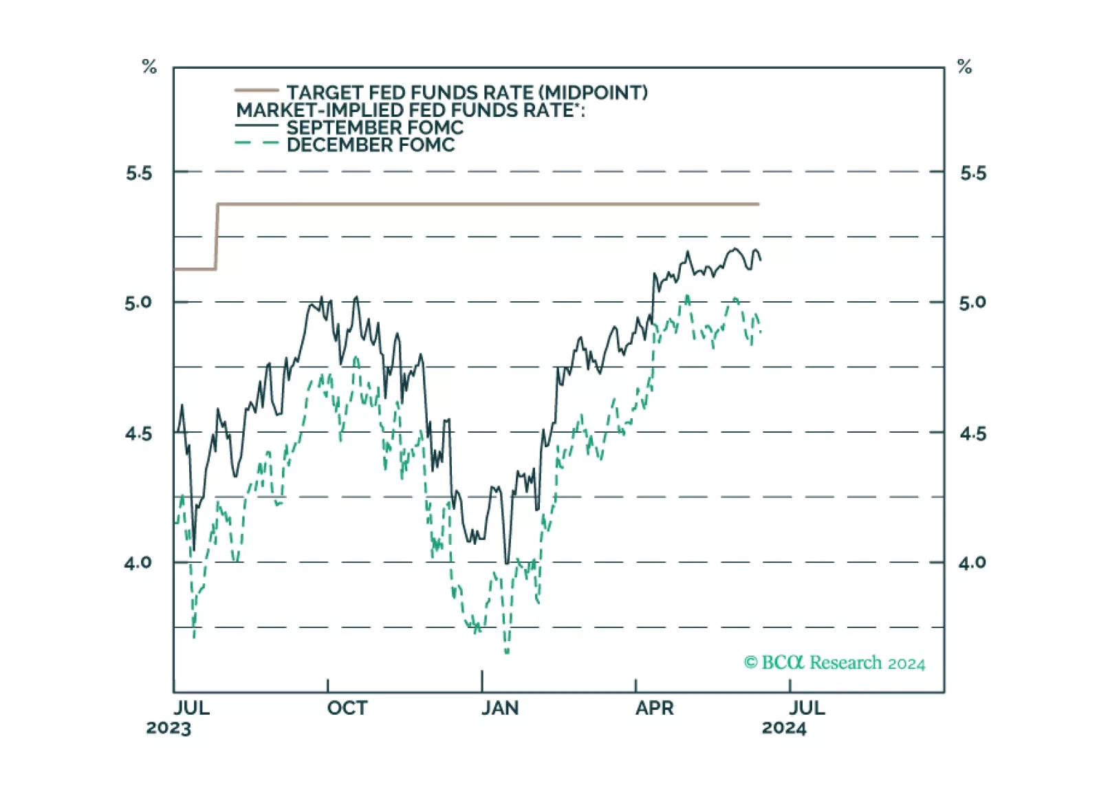
Our reaction to this morning’s CPI report and this afternoon’s FOMC meeting.

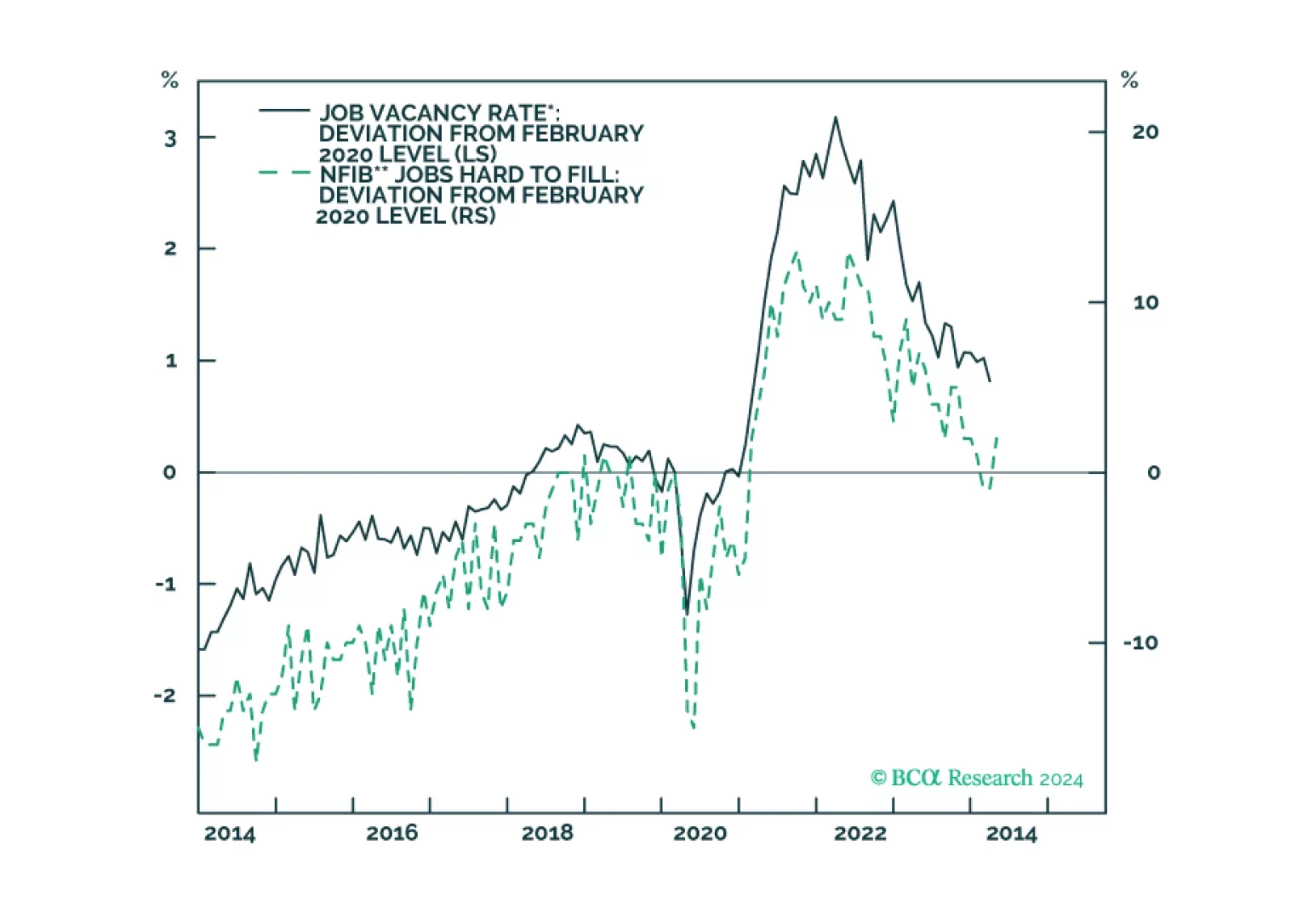
1 in 17 older Americans workers have gone missing either through ‘excess retirements’ or ‘excess mortality’. The consequent dislocation of the labour market means that the Fed’s work is not yet done. We go through some investment implications. Plus: the China and Japan rallies are exhausted.
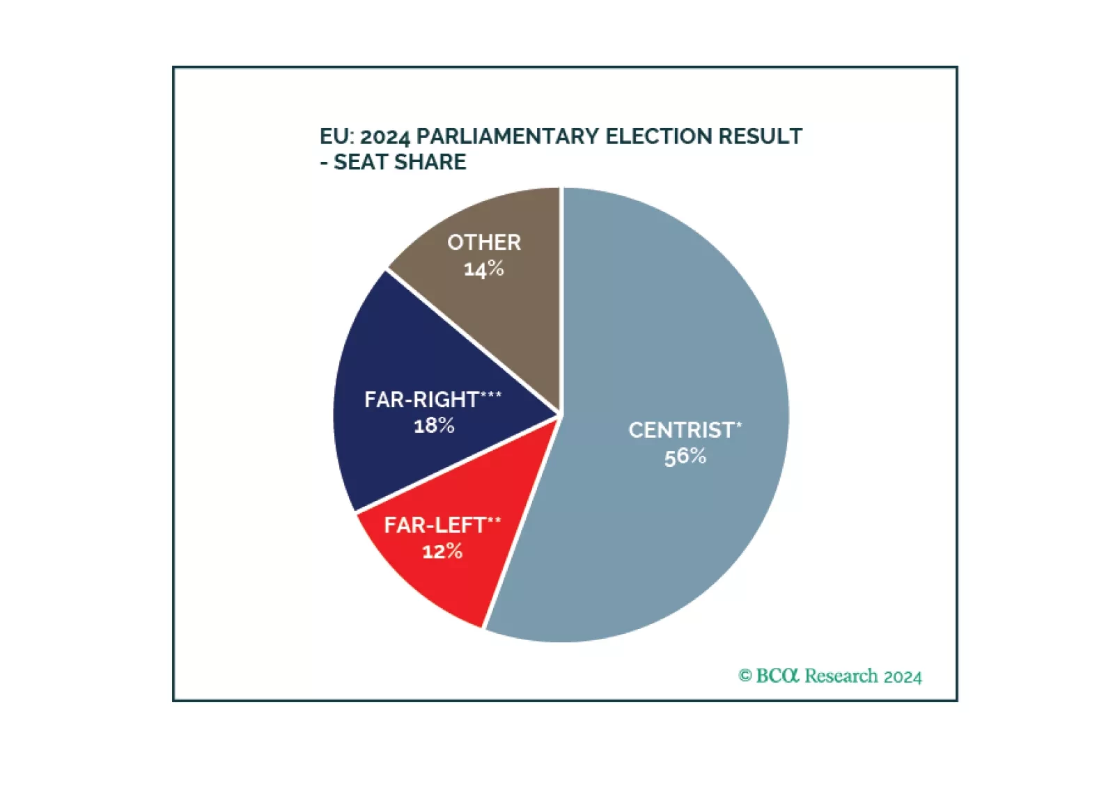
Europe did not witness a major policy reversal. Inflationary pressures are coming down, enabling the ECB to cut rates and European states to maintain soft budgets. Geopolitical challenges ensure that European parties continue to cooperate on national defense, economic security, and energy security.
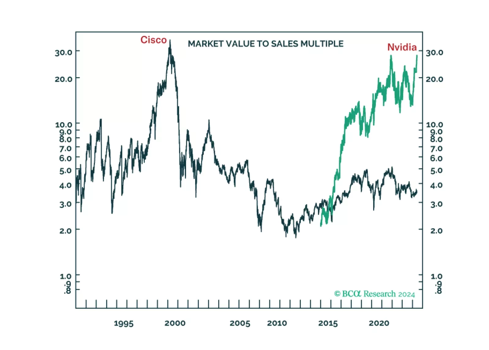
The long-term winners from the generative-AI gold rush are unlikely to be the ‘picks and shovels’ stock Nvidia or the overvalued US superstars of Web 2.0. We discuss the structural investment implications. Plus: time to go tactically overweight global consumer discretionary (RXI).
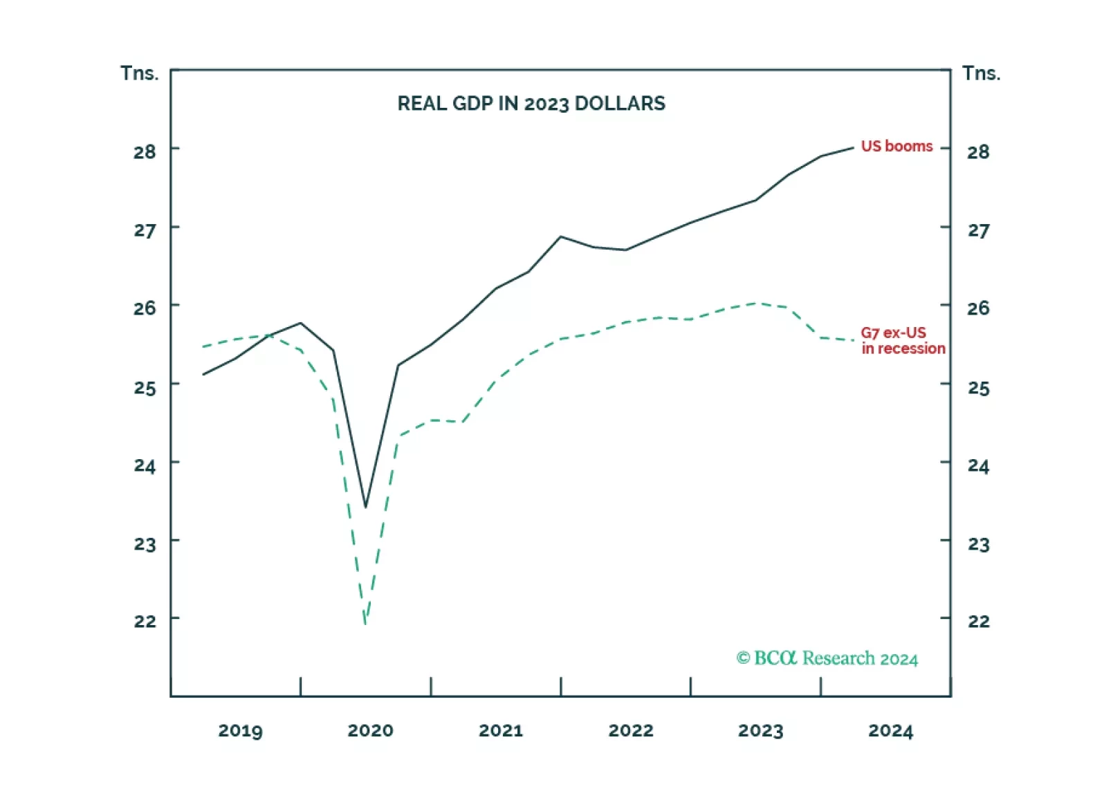
The economic schism in the world economy, between the non-US developed economy in recession and the US in strong growth, is unprecedented during our lifetimes. Now the schism will continue in reverse, as the non-US developed economy rebounds while the US fades. There are important implications for rates, the dollar, and sector and regional equity allocation which we discuss. Plus: base metals are a tactical short.
Our updated views on Treasury yields and Fed policy following this morning’s CPI report.
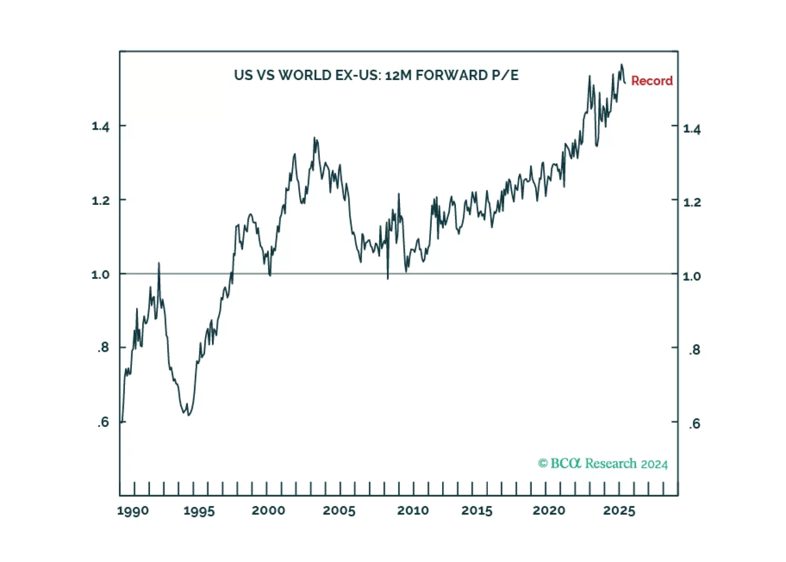
The US stock market’s record 50 percent valuation premium versus the non-US stock market is pricing generative AI to do through the next decade what the Web 2.0 network effect did through the last decade. But this is a huge ask, as it will be very difficult for the Web 2.0 superstar companies to become generative AI superstar companies, assuming there are indeed any lasting generative AI superstar companies. We go through the main long-term investment implications.
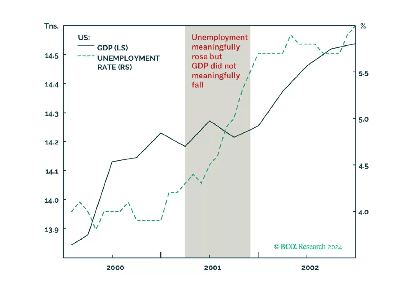
Why the US could get a jobs recession without a GDP recession, as happened in 2001, and what it means for stocks and bonds. Plus, an update on the Joshi rule.