Ireland
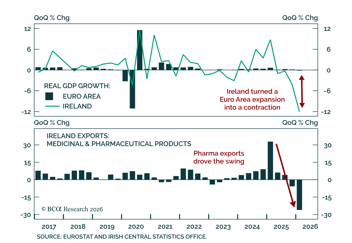
Ireland is making the Euro Area look weaker than it is. The bloc reportedly contracted 0.2% in Q1 2026, but stripping out Ireland would have shown a 0.3% expansion. That reversal can be traced back to a dramatic downward revision in Irish GDP, from -2% to…

Germany’s economy has lagged that of the rest of Europe for nearly 10 years. So have German stocks. Investors are extrapolating these trends to bet on the country’s deindustrialization. Could Germany manage to beat dismal expectations?

BCA Research is proud to announce a new feature to help clients get the most out of our research: an Executive Summary cover page on each of the BCA Research Reports. We created these summaries to help you quickly capture the main points of each report through an at-a-glance read of key insights, chart of the day, investment recommendations and a bottom line. For a deeper analysis, you may refer to the full BCA Research Report. Executive Summary The golden rule for investing in the stock market simply states: “Stay bullish on stocks unless you have good reason to think that a recession is imminent.” The catch, of course, is that it is difficult to know whether a recession is lurking around the corner. Still, we can learn a lot from past recessions. As we document in this week’s report, every major downturn was caused by the buildup of imbalances within the economy, which were then laid bare by some sort of catalyst, usually monetary tightening. Today, the US is neither suffering from an overhang of capital spending, as it did in the lead-up to the 2001 recession, nor an overhang of housing, as it did in the lead-up to the Great Recession. US inflation has risen, but unlike in the early 1980s, long-term inflation expectations remain well anchored. This gives the Fed scope to tighten monetary policy in a gradual manner. Outside the US, vulnerabilities are more pronounced, especially in China where the property market is weakening, and debt levels stand at exceptionally high levels. Fortunately, the Chinese government has enough tools to keep the economy afloat, at least for the time being. Equity Bear Markets And Recessions Go Hand In Hand Bottom Line: Equity bear markets rarely occur outside of recessions. With global growth set to remain above trend at least for the next 12 months, investors should continue to overweight equities. However, they should underweight the tech sector since tech stocks remain disproportionately vulnerable to rising rates, increased regulation, and a retrenchment in pandemic-induced spending on electronics and online services. Macro Matters Investors tend to underestimate the importance of macroeconomics for stock market outcomes. That is a pity. Charts 1, 2, and 3 show that the business cycle drives the evolution of corporate earnings; corporate earnings, in turn, drive the stock market; and as a result, the business cycle determines the path for stock prices. Chart 1The Business Cycle Drives Earnings… Chart 2…Earnings In Turn Drive Stock Prices… An appreciation of macro forces leads to our golden rule for investing in the stock market. It simply states: Stay bullish on stocks unless you have good reason to think that a recession is imminent. Chart 3…Hence, The Business Cycle Is The Main Driver Of Equity Returns Historically, stocks have peaked about six months before the onset of a recession. Thus, it usually does not pay to turn bearish on stocks if you expect the economy to grow for at least another 12 months. In fact, aside from the brief but violent 1987 stock market crash, during the past 50 years, the S&P 500 has never fallen by more than 20% outside of a recessionary environment (Chart 4). Peering Around The Corner The catch, of course, is that it is difficult to know whether a recession is lurking around the corner. Leo Tolstoy began his novel Anna Karenina with the words “Happy families are all alike; every unhappy family is unhappy in its own way.” By the same token, every economic boom seems the same, whereas every recession has its own unique features. This makes forecasting recessions difficult. Difficult, but not impossible. Even though recessions differ substantially in their magnitude and causes, they all share the following three characteristics: 1) The buildup of imbalances that make the economy vulnerable to a downturn; 2) A catalyst that exposes these imbalances; and 3) Amplifiers or dampeners that either exacerbate or mitigate the slump. Let us review six past recessions to better understand what these three characteristics reveal about the current state of the global economy. Chart 4Equity Bear Markets And Recessions Go Hand In Hand The 1980 And 1982 Recessions The double-dip recessions of 1980 and 1982 were the last in which inflation played a starring role. Throughout the 1970s, the Fed consistently overstated the degree of slack in the economy (Chart 5). This led to a prolonged period in which interest rates stayed below their equilibrium level. The resulting upward pressure on inflation from an overheated economy was compounded by a series of oil shocks, the last of which occurred in 1979 following the Iranian revolution. Chart 6The Volcker Era: It Took Massive Monetary Tightening To Bring Down Inflation Chart 5The Fed Continuously Overstated The Magnitude Of Economic Slack In The 1970s In an effort to break the back of inflation, newly appointed Fed chair Paul Volcker raised rates, first to 17% in April 1980, and then following a brief interlude in which the effective fed funds rate dropped back to 9%, to a peak of 19% in July 1981 (Chart 6). The 1990-91 Recession Overheating also contributed to the early 1990s recession. After reaching a high of 10.8% in 1982, the unemployment rate fell to 5% in 1989, about one percentage point below its equilibrium level at that time. Core inflation began to accelerate, reaching 5.5% by August 1990. The Fed initially responded to the overheating economy by hiking interest rates. The fed funds rate rose from 6.6% in March 1988 to a high of 9.8% by May 1989. By the summer of 1990, the economy had already slowed significantly. Commercial real estate, still reeling from the effects of the Savings and Loan crisis, weakened sharply. Defense outlays continued to contract following the collapse of the Soviet Union. The final straw was Saddam Hussein’s invasion of Kuwait, which caused oil prices to surge and consumer confidence to plunge (Chart 7). The 2001 Recession An overhang of IT equipment sowed the seeds of the 2001 recession. Spending on telecommunications equipment rose almost three-fold over the course of the 1990s, which helped lift overall nonresidential capital spending from 11.2% of GDP in 1992 to 14.7% in 2000 (Chart 8). Chart 7Overheating In The Leadup To The 1990-91 Recession The recession itself was fairly mild. After subsequent revisions to the data, growth turned negative for just one quarter, in Q3 of 2001. However, due to the lopsided influence of the tech sector in aggregate profits – and even more so, in market capitalization – the dotcom bust had a major impact on equity prices (Chart 9). Chart 9The Dotcom Bust Dragged Down Tech Earnings Chart 8A Glut Of I.T. Equipment Sowed The Seeds Of The 2001 Recession Having raised rates to 6.5% in May 2000, the Fed responded to the downturn by easing monetary policy. Falling rates were effective in reviving the economy – indeed, perhaps too effective. The resulting housing boom paved the way for the Great Recession. The Great Recession (2007-2009) The housing sector was the source of imbalances in the lead-up to the Great Recession. In the US, and in other countries such as Spain and Ireland, house prices soared as lenders doled out credit on increasingly lenient terms. Chart 10A Long House Party Rising house prices stoked a consumption boom and incentivized developers to build more homes. In the US, the personal savings rate fell to historic lows. Residential investment reached a high of 6.7% of GDP, up from an average of 4.3% of GDP in the 1990s (Chart 10). While the housing bubble would have burst at some point anyway, tighter monetary policy helped expedite the downturn. Starting in June 2004, the Fed raised rates 17 times, pushing the fed funds rate to 5.25% by June 2006. The ECB also hiked rates; it raised the refi rate from 2% in December 2005 to 4.25% in July 2008, continuing to tighten policy even after the Fed had begun to cut rates. Once global growth started to weaken, a number of accelerants kicked in. As is the case in every recession, rising unemployment led to less spending, which in turn led to even higher unemployment. To make matters worse, a vicious circle engulfed the housing market. Falling home prices eroded the collateral underlying mortgage loans, producing more defaults, tighter lending standards, and even lower home prices. The Fed responded to the crisis by cutting rates and introducing an alphabet soup of programs to support the financial system. However, the zero lower-bound constraint limited the degree to which the Fed could cut rates, forcing it to resort to unorthodox measures such as quantitative easing. While these measures arguably helped, they fell short of what was needed to resuscitate the economy. Fiscal policy could have picked up the slack, but political considerations limited the scale and scope of the 2009 Recovery Act. The result was a needlessly long and drawn-out recovery. The Euro Crisis (2012) Chart 11The State Is Here To Mop Up The Mess A reoccurring theme in economic history is that financial crises often force governments to assume private-sector liabilities in order to avoid a full-scale economic collapse. Unlike Greece, where government debt stood at very high levels even before the GFC, debt levels in Spain and Ireland were quite modest before the crisis. However, all that changed when Spain and Ireland were forced to bail out their banks (Chart 11). Unlike the US, UK, and Japan, euro area member governments did not have access to central banks that could serve as buyers of last resort for their debts. This limitation created a feedback loop where rising bond yields made it more onerous for governments to service their debts, which led to a higher perceived likelihood of default and even higher yields (Chart 12). Chart 12Multiple Equilibria In The Debt Market Are Possible Without A Lender Of Last Resort The ECB could have short-circuited this vicious cycle. Unfortunately, under the hapless leadership of Jean-Claude Trichet, instead of providing assistance, the central bank raised rates twice in 2011. This helped spread the crisis to Italy and other parts of core Europe. It ultimately took Mario Draghi’s “whatever it takes pledge” to restore some semblance of normality to European sovereign debt markets. Lessons For Today The current environment bears some resemblance to the one preceding the recessions of the early 1980s. As was the case back then, inflation today has surged well above the Federal Reserve’s target, forcing the Fed to turn more hawkish. Oil prices have also risen, despite slowing global growth. Even Russia has returned to its status as the world’s leading geopolitical boogeyman. Yet, digging below the surface, there is a big difference between today and the early ‘80s. For one thing, long-term inflation expectations remain well anchored. While expected inflation 5-to-10 years out has risen to 3.1% in the latest University of Michigan survey, this just takes the reading back to where it was not long after the Great Recession. It is still nowhere near the double-digit levels reached in the early ‘80s (Chart 13). Market-based inflation expectations are even more subdued. In fact, the widely watched 5-year/5-year forward TIPS breakeven inflation rate is currently well below the Fed’s comfort zone (Chart 14). Chart 13Long-Term Inflation Expectations Are Inching Up But Are Still Low Chart 14Market-Based Long-Term Inflation Expectations Are Below The Fed's Comfort Zone Higher oil prices are unlikely to have the sting that they once did. The energy intensity of the global economy has fallen steadily over time, especially in advanced economies (Chart 15). Today, the US generates three-times as much output for every joule of energy consumed than it did in 1970. Household spending on energy has declined from a peak of 8.3% of disposable income in 1980 to 3.8% in December 2021. The US also produces over 11 million barrels of oil per day, more than Saudi Arabia (Chart 16). Chart 15The Global Economy Has Become Less Energy Intensive Over Time Chart 16When It Comes To Energy Production, The USA Is Now #1 Unlike in the late 1990s, advanced economies do not face a significant capex overhang. Quite the contrary. Capital spending has been fairly weak across much of the OECD. In the US, the average age of the nonresidential capital stock has risen to the highest level since the 1960s (Chart 17). Looking out, far from cratering, capital spending is set to rise, as foreshadowed by the jump in core capital goods orders (Chart 18). Chart 17The Aging Capital Stock Chart 18The Outlook For US Capex Is Bright Chart 19Need More Houses In contrast to the glut of housing that helped precipitate the Global Financial Crisis, housing remains in short supply in many developed economies. In the US, the homeowner vacancy rate has fallen to a record low. There are currently half as many new homes available for sale as there were in early 2020 (Chart 19). Even in Canada, where homebuilding has held up well, government officials have been hitting the panic button over a brewing home shortage. The Biggest Risk Is Debt The biggest macroeconomic risk the global economy faces stems from high debt levels. While household debt has fallen by 20% of GDP in the US, it has risen in a number of other economies. Corporate debt has generally increased everywhere, in many cases to finance share buybacks and M&A activity (Chart 20). Public debt has also soared to the highest levels since during World War II. Chart 20Mo' Debt Among emerging markets, China’s debt burden is especially pronounced. Total private and public debt reached 285% of GDP in 2021, nearly double what it was in early 2008. The property market is also slowing, which will weigh on growth. Like many countries, China finds itself in a paradoxical situation: Any effort to pare back debt is likely to crush nominal GDP by so much that the debt-to-GDP ratio rises rather than falls. Ironically, the only solution is to adopt reflationary policies that allow the economy to run hot. In the near term, this could prove to be a favorable outcome for investors since it will mean that monetary policy stays highly accommodative. Over the long haul, however, it may lead to a stagflationary environment, which would be detrimental to equities and other risk assets. In summary, investors should remain overweight stocks for now. However, they should underweight the tech sector since tech stocks remain disproportionately vulnerable to rising rates, increased regulation, and a retrenchment in pandemic-induced spending on electronics and online services. Peter Berezin Chief Global Strategist peterb@bcaresearch.com Global Investment Strategy View Matrix Special Trade Recommendations Current MacroQuant Model Scores
In lieu of the next weekly report I will be presenting the quarterly webcast ‘The Japanification Of Europe: Should We Fear It, Or Celebrate It?’ on Monday 4 November at 10.00AM EST, 3.00PM GMT, 4.00PM CET, 11.00PM HKT. As usual, the webcast will take a TED talk format lasting 18 minutes, after which I will take live questions. Be sure to tune in. Regards, Dhaval Joshi Highlights Global and European growth is experiencing a welcome rebound. Favour a cyclical investment stance, albeit tactical – as there is no visibility in the growth rebound beyond early 2020. Close the overweight to healthcare versus industrials at a small profit. Upgrade Sweden and Spain to overweight, and Norway to neutral. Downgrade Denmark to underweight, and Ireland to neutral. Expect heightened volatility in sterling in the build up to a highly ‘non-linear’ UK election. Fractal trades: 1. long oil and gas versus telecom; 2. long tin. Feature Global and European growth is experiencing a welcome rebound. This we can see from the best real-time indicators of activity, such as the ZEW sentiment, IFO expectations and of course the equity and bond markets (Chart of the Week). Nevertheless, investors make three very common mistakes in interpreting, predicting, and implementing such rebounds. This week’s report describes these three mistakes and the underlying realities. Chart of the WeekGrowth Is Experiencing A Welcome Rebound Mistake #1: Real-Time Indicators Do Not Lead The Market Reality #1: In the short term, markets move in lockstep with indicators such as the ZEW sentiment, IFO expectations, and PMIs (Chart I-2). Chart I-2Economic Indicators Do Not Lead The Markets... Having said that, the evolution of economic indicators can still provide a useful long-term investment signal. If an indicator – like IFO expectations – tends to revert to its mean, and is now near its historical lower bound, the scope for an eventual move up is greater than the scope for a further move down.1 Based on such a reversion to the mean, we are maintaining a structural overweight to the DAX versus the German long bund (Chart I-3). Chart I-3...But Depressed Performances Have Scope For Long-Term Upside But to reiterate, in the short term, the market moves in lockstep with the real-time economic indicators. Hence, to get a useful short-term investment signal, we need to predict where these indicators will be in the coming months – in other words, to predict whether growth will continue to accelerate. In the short term, the market moves in lockstep with real-time economic indicators. Which brings us neatly to the second mistake. Mistake #2: When Financial Conditions Ease, Growth Does Not Necessarily Accelerate Reality #2: It is not the change of financial conditions but rather its impulse – the change of the change – that causes growth to accelerate or decelerate. For example, a 0.5 percent decline in the bond yield decline will trigger new borrowing through, inter alia, an increase in the number of mortgage applications. The new borrowing will add to demand, meaning it will generate growth. But in the following period, a further 0.5 percent decline in the bond yield will generate the same additional new borrowing and thereby the same growth rate. The crucial point being that if the decline in the bond yield is the same in the two periods, growth will not accelerate. Growth will accelerate only if the first 0.5 percent bond yield decline is followed by a bigger, say 0.6 percent, decline – meaning a tailwind impulse. But growth will decelerate if the first 0.5 percent decline is followed by a smaller, say 0.4 percent, decline – meaning a headwind impulse. To repeat, the counterintuitive thing is that for a growth acceleration it is not the change in the bond yield that is important but rather its impulse. There are four impulses that matter for short-term growth: The bond yield 6-month impulse. The credit 6-month impulse. The oil price 6-month impulse (for oil importing economies like Germany). The geopolitical risk impulse. To be clear the geopolitical risk impulse is not an impulse in the technical sense, but it is a similar concept: is the number of potential geopolitical tail-events going up or down? In the fourth quarter, our subjective answer is down. The Brexit deadline has been pushed back to January 31 2020; the new coalition government in Italy has removed Italian politics as an imminent tail-event; and the US/China trade war and Middle East tensions are most likely to be in stasis. Turning to the other impulses, the credit 6-month impulse should briefly rebound in the fourth quarter following the rebound in the global bond yield 6-month impulse (Chart I-4). All of this favours a cyclical investment stance – albeit tactical, because there is no visibility in this growth rebound beyond early 2020. Chart I-4The Credit 6-Month Impulse Should Briefly Rebound Meanwhile, the recent evolution of the oil price 6-month impulse should provide an additional short-term tailwind for oil importing economies (Chart I-5). Justifying a near-term overweight stance to the cyclical heavy German stock market within a European or global equity portfolio. Chart I-5The Oil Price 6-Month Impulse Should Help Oil Importing Economies Which brings us to the third mistake. Mistake #3: Major Stock Markets Are Not Plays On Their Economies Of Domicile Reality #3: Major stock markets are dominated by multinational corporations, and such companies are plays on their global sectors, rather than the country in which they have a stock market listing. Hence, a stock market’s relative performance is predominantly a play on its distinguishing overweight and underweight ‘sector fingerprint’. What confuses matters is that sometimes the sector fingerprint happens to align with the tilt of the domicile economy. Germany has an exporter heavy stock market and an exporter heavy economy while Norway has an oil heavy stock market and an oil heavy economy, so in these cases there is a connection between the stock market and the economy. But in most instances, there is no alignment: the connection between the UK stock market and the UK economy is minimal, and the same is true in Spain, Denmark, Ireland, and most other countries. When bond yields were declining most sharply, and growth was decelerating, it weighed on cyclical sectors such as industrials and banks versus the more defensive sectors such as healthcare. Banks suffered doubly because the flattening (or inverting) yield curve also ate into their margins. But if the sharpest decline in bond yields has already happened, it suggests that cyclicals could experience a burst of outperformance, at least for a few months (Chart I-6). Hence, today we are closing our four month overweight to healthcare versus industrials at a small profit. Chart I-6If The Sharpest Decline In Bond Yields Is Over, Cyclicals Could Outperform Based on sector fingerprints, this also necessitates the following changes to our country allocation: Overweight banks versus healthcare means overweight Sweden versus Denmark (Chart I-7). Chart I-7Long Sweden Versus Denmark = Long Financials And Industrials Versus Biotech Overweight banks means overweight Spain (Chart I-8). Chart I-8Long Spain = Long Banks Meanwhile, removing our underweight to the cyclical oil sector means removing the successful underweight to Norway (Chart I-9). And indirectly, it means removing the equally successful overweight to Ireland, given its high weighting to Airlines (Chart I-10). Chart I-9Long Norway = Long Oil And Gas Chart I-10Long Ireland = Long Airlines Bonus Mistake: You Can Not Hit A Point Target In A Non-Linear System Boris Johnson said that he “would rather be dead in a ditch” than miss the October 31 deadline for delivering Brexit. Well Johnson had to ditch his ditch. Why? Because the UK’s parliamentary arithmetic has made Brexit an inherently non-linear system, and you cannot hit a point target in a non-linear system. Boris Johnson had to ditch his ditch. In a non-linear system a tiny change in an input might have no impact on the output, or it might have a huge impact on the output. The Brexit process is inherently non-linear because a tiny shift in parliamentary votes one way or another, or a tiny shift in the tabled amendments to laws one way or another has had a huge impact on the outcome. That’s why it proved impossible for Johnson to hit his point target of delivering Brexit by October 31. Attention now shifts to another non-linear system – the upcoming UK general election. The UK’s first past the post electoral system is designed for a head-to-head between two dominant parties. But right now, there are five parties in play – Labour, Liberal Democrat, Conservative, Brexit, plus the SNP in Scotland. Mathematically, this creates the possibility of ten types of swings, compared with the usual single swing between Labour and Conservative. Making the outcome of the election highly sensitive to a tiny shift in votes either way in ten different directions. The UK general election is a non-linear system. In The Pound Is A Long Term Buy (And So Are Homebuilders) we initiated a structural long position in the undervalued pound.2 Given that our overweight to the international focused FTSE100 versus the domestic focussed FTSE250 is effectively an inverse play on the pound, it is inconsistent with our long-term view on the currency (Chart I-11). Nevertheless, over the course of the election campaign we expect heightened volatility in sterling as the non-linearity of the election outcome becomes clear. Hence, we await an upcoming better opportunity to remove our overweight FTSE100 versus FTSE250 position. Chart I-11Long FTSE250 Versus FTSE100 = Long Pound Fractal Trading System* There are two recommended trades this week. The underperformance of US oil and gas versus telecom is ripe for a technical rebound based on its broken 130-day fractal structure. Go long US oil and gas versus telecom, setting a profit target and symmetrical stop-loss at 8 percent. The recent sell-off in tin is undergoing a similar technical bottoming process. Go long tin, setting a profit target and symmetrical stop-loss at 5 percent. For any investment, excessive trend following and groupthink can reach a natural point of instability, at which point the established trend is highly likely to break down with or without an external catalyst. An early warning sign is the investment’s fractal dimension approaching its natural lower bound. Encouragingly, this trigger has consistently identified countertrend moves of various magnitudes across all asset classes. Chart I-12US: Oil & Gas Vs. Telecom Chart I-13Tin The post-June 9, 2016 fractal trading model rules are: When the fractal dimension approaches the lower limit after an investment has been in an established trend it is a potential trigger for a liquidity-triggered trend reversal. Therefore, open a countertrend position. The profit target is a one-third reversal of the preceding 13-week move. Apply a symmetrical stop-loss. Close the position at the profit target or stop-loss. Otherwise close the position after 13 weeks. Use the position size multiple to control risk. The position size will be smaller for more risky positions. * For more details please see the European Investment Strategy Special Report “Fractals, Liquidity & A Trading Model,” dated December 11, 2014, available at eis.bcaresearch.com. Dhaval Joshi Chief European Investment Strategist dhaval@bcaresearch.com Footnotes 1 In technical terms, if the time-series is ‘stationary’, it must eventually rebound from its lower bound. 2 Please see the European Investment Strategy Weekly Report, "The Pound Is A Long-Term Buy (And So Are Homebuilders)," dated October 17, 2019 available at eis.bcaresearch.com Fractal Trading System Cyclical Recommendations Structural Recommendations Fractal Trades Trades Closed Trades Asset Performance Currency & Bond Equity Sector Country Equity Indicators Bond Yields Chart II-1Indicators To Watch - Bond Yields Chart II-2Indicators To Watch - Bond Yields Chart II-3Indicators To Watch - Bond Yields Chart II-4Indicators To Watch - Bond Yields Interest Rate Chart II-5Indicators To Watch - Interest Rate Expectations Chart II-6Indicators To Watch - Interest Rate Expectations Chart II-7Indicators To Watch - Interest Rate Expectations Chart II_8Indicators To Watch - Interest Rate Expectations
Highlights The global economic mini-cycle is set to weaken while the euro is set to grind higher. Upgrade Telecoms to overweight. Also overweight Healthcare and Airlines. Underweight Banks, Basic Materials and Energy. Overweight France, Ireland, U.K., Switzerland and Denmark. Underweight Italy, Spain, Sweden and Norway. The Eurostoxx50 will struggle to outperform the S&P500. Feature We are strong believers in Investment Reductionism, a philosophy synthesized from the Pareto Principle and Occam's Razor.1 Investment reductionism offers a liberating thesis - the incessant barrage of investment research, newsfeeds and ten thousand word commentaries is largely superfluous to the investment process. What seems like a complexity of investment choice usually reduces to getting a few over-arching decisions right. Chart of the WeekIn Quadrant 4, Overweight Domestic Defensives And Underweight International Cyclicals For equity sector and country allocation, two over-arching decisions dominate: Whether the global economic mini-cycle is set to strengthen or weaken (Chart I-2). Whether the domestic currency is set to strengthen or weaken. Chart I-2The Empirical Evidence For Credit And Economic Mini-Cycles Is Irrefutable The four permutations of these two decisions create the four quadrants of cyclical investing (Chart of the Week). Right now, European investors find themselves in quadrant four: the global economic mini-cycle is set to weaken while the euro is set to grind higher. This favours an overweight stance to defensives, especially domestic-focused defensives. Therefore today, we are upgrading Telecoms to overweight. We also recommend an underweight stance to the most cyclical sectors, especially international-focused cyclicals such as Basic Materials and Energy. Country allocation then just drops out of this sector allocation. The Global Economic Mini-Cycle Is Set To Weaken We can predict the changes of the seasons and the tides of the sea with utmost precision. How? Not because we have an ingenious leading indicator for the seasons and tides, but because we recognise that these phenomena follow perfectly regular cycles. Regular cycles create predictability. Significantly, global bank credit flows also exhibit remarkably regular cycles with half-cycle lengths averaging around eight months. Recognizing these mini-cycles is immensely powerful because, just as for the seasons and the tides, it creates predictability. Furthermore, if most investors are unaware of these cycles, the next turn will not be discounted in today's price - providing a compelling investment opportunity for those who do recognise the predictability. The empirical evidence for credit mini-cycles is irrefutable. The theoretical foundation is also rock solid, based on an economic model called the Cobweb Theory.2 This states that in any market where supply lags demand, both the quantity supplied and the price must oscillate. Given that credit supply clearly lags credit demand, the quantity of credit supplied and its price (the bond yield) must experience mini-cycles (Chart I-3). And as the quantity of credit supplied is a marginal driver of economic activity, economic activity will also experience the same regular oscillations. Today, the global 6-month credit impulse is turning from mini-upswing to mini-downswing, with all three subcomponents - the euro area, the U.S. and China - now in decline (Chart I-4). This is exactly in line with prediction. Mini half-cycles average eight months, and the latest mini-upswing started eight months ago. Chart I-3The Global Economic Mini-Cycle##br## Is Set To Weaken Chart I-4All Three Subcomponents Of The Global 6-Month ##br##Credit Impulse Are Now Declining More importantly, as we enter a mini-downswing, we can also predict that global growth is likely to experience at least a modest deceleration through the coming two to three quarters. The Euro Is Set To Grind Higher, Except Versus The Yen Chart I-5Lost In Translation Nowadays, mainstream stock markets tend to be eclectic collections of multinational companies which happen to be quoted on bourses in Frankfurt, Paris, New York, and so on. For example, BASF is not really a German chemical company, it is a global chemical company headquartered in Germany. For operational hedging, multinational companies like BASF will intentionally diversify their sales and profits across multiple major currencies, say euros and dollars. But of course, the primary stock market quotation will be in the currency of its home bourse, euros. Therefore, when the euro strengthens, the company's multi-currency profits, translated back into a stronger euro, will necessarily weaken (Chart I-5). Clearly, more domestic-focused companies like telecoms will not experience such a strong currency-translation headwind. We expect the main euro crosses to continue strengthening over the next 8 months, with the exception being the cross versus the Japanese yen. Our central thesis is that the payoff profile for a foreign exchange rate just tracks the bond yield spread. This means that when a central bank has already taken bond yields close to their lower bound, its currency possesses a highly attractive asymmetry called positive skew. In essence, as the ECB is at the realistic limit of ultra-loose policy, long-term expectations for the ECB policy rate possess an asymmetry: they cannot go significantly lower, but they could go significantly higher. Exactly the same applies to long-term expectations for the BoJ policy rate. In contrast, long-term expectations for the Fed policy rate possess full symmetry: they could go either way, lower or higher. This stark asymmetry of central bank 'degrees of freedom' favours the euro and the yen over the dollar. Which Sectors And Countries To Own And Which To Avoid? Pulling together the preceding two sections, the global economic mini-cycle is set to weaken while the euro is set to grind higher. This puts Europe in quadrant four of our four quadrant framework for cyclical investing. Unsurprisingly, the relative performance of the most cyclical sectors - Banks, Basic Materials and Energy - very closely tracks the regular mini-cycles in the global 6-month credit impulse. In a mini-downswing these cyclical sectors always underperform (Chart I-6, Chart I-7 and Chart I-8). Accordingly, underweight these three sectors on a two to three quarter horizon. Chart I-6In A Mini-Downswing, ##br##Banks Always Underperform Chart I-7In A Mini-Downswing,##br## Basic Materials Always Underperform Chart I-8In A Mini-Downswing,##br## Energy Always Underperforms Conversely, overweight the relatively defensive Healthcare sector. Also overweight the Airlines sector. Airlines' performance is a mirror-image of the oil price cycle, given that aviation fuel comprises the sector's main variable cost. Furthermore, as aviation fuel is priced in dollars, it also insulates European Airlines against a strengthening euro. Today, we are also upgrading the Telecoms sector to overweight given its relative non-cyclicality (Chart I-9), its domestic-focus, and the excessively negative groupthink towards it (Chart I-10). Chart I-9In A Mini-Downswing, ##br##Telecoms Always Outperform Chart I-10Telecoms Are Due ##br##A Trend Reversal In summary: Overweight: Healthcare, Telecoms, and Airlines Underweight: Banks, Basic Materials and Energy Then to arrive at a country allocation, just combine the cyclical view on the major sectors with the country sector skews in Box 1. The result is the following unchanged European equity market allocation. Overweight: France, Ireland, U.K., Switzerland and Denmark Neutral: Germany and Netherlands Underweight: Italy, Spain, Sweden and Norway Lastly, what is the prognosis for the Eurostoxx50 relative to the S&P500? Essentially, this reduces to a battle between the multinational cyclicals - especially banks - that dominate euro area bourses and the multinational technology giants that dominate the U.S. stock market. With the global economic mini-cycle set to weaken and the euro set to grind higher, the Eurostoxx50 will struggle to outperform the S&P500. Box 1: The Vital Few Sector Skews That Drive Country Relative Performance For major equity indexes in the euro area, the dominant sector skews that drive relative performance are as follows: Germany (DAX) is overweight Chemicals, underweight Banks. France (CAC) is underweight Banks and Basic Materials. Italy (MIB) is overweight Banks. Spain (IBEX) is overweight Banks. Netherlands (AEX) is overweight Technology, underweight Banks. Ireland (ISEQ) is overweight Airlines (Ryanair) which is, in effect, underweight Energy. And for major equity indexes outside the euro area: The U.K. (FTSE100) is effectively underweight the pound. Switzerland (SMI) is overweight Healthcare, underweight Energy. Sweden (OMX) is overweight Industrials. Denmark (OMX20) is overweight Healthcare and Industrials. Norway (OBX) is overweight Energy. The U.S. (S&P500) is overweight Technology, underweight Banks. Dhaval Joshi, Senior Vice President Chief European Investment Strategist dhaval@bcaresearch.com 1 The Pareto Principle, often known as the 80-20 rule, says that 80% of effects come from just 20% of causes. Occam's Razor says that when there are many competing explanations for the same effect, the simplest explanation is usually the best. 2 Please see the European Investment Strategy Special Report 'The Cobweb Theory And Market Cycles' published on January 11, 2018 and available at eis.bcaresearch.com. Fractal Trading Model* This week's recommended trade is to short the Helsinki OMX versus the Eurostoxx600. Apply a profit target of 3% with a symmetrical stop-loss. In other trades, we are pleased to report that short Japanese Energy versus the market achieved its 8% profit target at which it was closed. This leaves four open positions. For any investment, excessive trend following and groupthink can reach a natural point of instability, at which point the established trend is highly likely to break down with or without an external catalyst. An early warning sign is the investment's fractal dimension approaching its natural lower bound. Encouragingly, this trigger has consistently identified countertrend moves of various magnitudes across all asset classes. Chart 11 The post-June 9, 2016 fractal trading model rules are: When the fractal dimension approaches the lower limit after an investment has been in an established trend it is a potential trigger for a liquidity-triggered trend reversal. Therefore, open a countertrend position. The profit target is a one-third reversal of the preceding 13-week move. Apply a symmetrical stop-loss. Close the position at the profit target or stop-loss. Otherwise close the position after 13 weeks. Use the position size multiple to control risk. The position size will be smaller for more risky positions. * For more details please see the European Investment Strategy Special Report "Fractals, Liquidity & A Trading Model," dated December 11, 2014, available at eis.bcaresearch.com Fractal Trading Model Recommendations Equities Bond & Interest Rates Currency & Other Positions Closed Fractal Trades Trades Closed Trades Asset Performance Currency & Bond Equity Sector Country Equity Indicators Bond Yields Chart II-1Indicators To Watch - Bond Yields Chart II-2Indicators To Watch - Bond Yields Chart II-3Indicators To Watch - Bond Yields Chart II-4Indicators To Watch - Bond Yields Interest Rate Chart II-5Indicators To Watch##br## - Interest Rate Expectations Chart II-6Indicators To Watch##br## - Interest Rate Expectations Chart II-7Indicators To Watch##br## - Interest Rate Expectations Chart II-8Indicators To Watch##br## - Interest Rate Expectations
Highlights The euro is cheap. To cease being cheap, EUR/USD needs to approach 1.35. Euro area bonds are expensive. To cease being expensive, the yield spread between the euro area and U.S. long bond needs to compress from -135 bps to -40 bps. Never pick mainstream stock markets on the basis of seeming cheapness. Sector effects, step changes in sector valuations and currency effects make relative valuations very difficult to interpret. Always pick mainstream stock markets on the basis of the sector and currency biases you wish to express. Overweight Denmark's OMX and Ireland's ISEQ on a 6-9 month horizon. Feature A very common question we get asked is: are European investments attractively priced compared to those elsewhere in the world? To which the current answers are: yes for the euro currency; no for euro area government bonds; and highly unlikely for the aggregate European stock market. That said, we can still identify individual European stock markets that are well placed to outperform major equity indexes, including the S&P500, over the coming 6-9 months. Chart of the WeekWhen Healthcare Outperforms, Denmark's OMX Outperforms The S&P 500 The Euro Is Cheap... Says The ECB We can confidently claim that the euro is cheap because the ECB's own indicators say so.1 According to the ECB, the euro needs to appreciate at least 7% to cancel the euro area's over-competitiveness versus its top 19 trading partners. In terms of EUR/USD this translates to 1.32. Admittedly, 1.32 encapsulates a spectrum of fair values for the individual euro area economies: 1.45 for Germany; around 1.30 for France, Spain and Netherlands; and around 1.20 for Italy (Chart I-2). Chart I-2The Euro Needs To Appreciate 7% To Cancel The Euro Area's Over-Competitiveness The ECB indicators also assume that the euro began its life close to fair value. This seems plausible. Twenty years ago, the euro area's constituent economies were broadly in internal balance and had a lot in common. Remarkably, Germany and Italy scored identically on total debt as a share of GDP as well as on exports as a share of GDP. Furthermore, euro area trade was in external balance, and the bloc's real competitiveness versus its major trading partners was exactly in line with its long-term average. After its birth, the euro first became extremely undervalued in the dot com bubble, then extremely overvalued in the global credit boom, and most recently, extremely undervalued again. Seen in this bigger picture, the euro's current ascent is just a recovery from an extreme undervaluation, an argument that even Mario Draghi made at the last ECB press conference: "Movements in the exchange rate, to the extent that it is justified by the strengthening of the economy, is part of nature." At what level would EUR/USD cease to be cheap? Based on the average of the ECB's three competitiveness indicators, EUR/USD needs to approach 1.35. Euro Area Bonds Are Expensive The yield spread between the euro area and U.S. long bond stands at an extreme -135 bps.2 This compares with an average -40 bps through the twenty year life of the euro - indicating that euro area government bonds are very expensive relative to U.S. T-bonds. Over the completion of this cycle, this yield spread is highly likely to compress to its long-term average of -40 bps, given that the yield spread just tracks relative real GDP per head - which is itself mean-reverting (Chart I-3). Interestingly, the euro area versus U.S. annual inflation differential has also averaged -40 bps (Chart I-4), so the real interest rate differential has averaged zero. This means that the so-called 'neutral' (or mid-cycle) real interest rates in the euro area and the U.S. have been identical through the past twenty years. Growth in real GDP per head has also been identical (Chart I-5). Chart I-3Euro Area-U.S.: Average Interest ##br##Rate Differential = -40bps Chart I-4Euro Area-U.S.: Average Inflation ##br##Differential = -40bps Chart I-5The Euro Area And U.S. Have Generated##br## Identical Growth Per Head The past twenty years provide a good template for what the future holds, at least in relative terms if not in absolute terms. This is because 1999-2018 captures multiple manias and crises, some centred in Europe, some in the U.S. With no difference in neutral real rates over the past two decades, is there any reason to expect the future neutral rate to be meaningfully lower in the euro area compared to the U.S.? Our starting assumption has to be no. This assumption would be at risk if the existential threat to the euro resurfaced. Looking at the political calendar, the immediate concern might be the Italian election on March 4. Specifically, the anti-establishment Five Star Movement and Northern League could poll well enough to hold some sway in the next government and ruffle the markets. However, while both the Five Star Movement and Northern League have agendas that are unashamedly disruptive, anti-establishment and anti-austerity, neither party is standing on an anti-euro platform. Unless there is a major change in emphasis, the Italian election should not pose an existential threat to the euro. Our central expectation is that the euro area versus U.S. yield spread has the scope to compress substantially from its current -135 bps. In other words, euro area government bonds are very expensive relative to U.S. T-bonds. Never Pick Stock Markets On The Basis Of Seeming Cheapness Compared with currencies and bonds, stock markets are much less connected with their domestic economies. Mainstream stock markets are eclectic collections of multinational companies, with each stock market possessing its own unique fingerprint of sector and industry skews. Therefore, a head-to-head comparison of European stock market valuations either with each other or with non-European stock markets is a meaningless and potentially dangerous exercise. Two sectors with vastly different structural growth prospects - say, Financials and Personal Products (Chart I-6) - must necessarily trade on vastly different valuations. So the sector with the lower valuation is not necessarily the cheaper sector. By extension, a stock market with a lower valuation because of its sector fingerprint is not necessarily a cheaper stock market. Chart I-6Two Sectors With Vastly Different Growth Prospects Will Trade On Vastly Different Valuations Some people suggest comparing a valuation with its own history, and assessing how many 'standard deviations' it is above or below its norm. The problem with this standard deviation approach is that it assumes 'stationarity' - meaning, no step changes in a sector's valuation through time. Unfortunately, sector valuations can and do undergo major step changes when they enter a vastly different economic climate. For example, the structural outlook for bank profits undergoes a step change when a debt super-cycle ends. Therefore, comparing a bank valuation after a debt super-cycle with the valuation during a debt super-cycle is like comparing an apple with an orange. Another issue for stock markets that contain multinational companies is the so-called 'currency translation effect'. A multinational company will intentionally diversify its sales and profits across multiple major currencies - say, euros, dollars and yen - but of course its primary stock market listing will be in just one currency - say, euros. So when the other currencies weaken versus the euro, the company's profit growth (quoted in its home currency of euros) will necessarily weaken too. If investors anticipate this effect - because they see that the euro is structurally cheap today - they might downgrade the stock market's profit growth expectations. Thereby, they will also downgrade the stock market's valuation. Pulling together these complexities of sector effects, step changes in sector valuations and currency effects, we offer some very strong advice: picking stock markets on the basis of relative valuation is a wrong and very dangerous way to invest. The correct and safe way to invest is to pick stock markets on the basis of the sector and currency biases you wish to express (Chart I-7). This brings us to one of the major advantages of investing in Europe. The plethora of stock markets - each with their own unique fingerprint of sector and industry skews - means that there are always European bourses worth overweighting, whatever your economic outlook. Right now, two of our sector recommendations are to overweight Healthcare and to underweight Energy. Please review our report Beware The Great Moderation 2.0 for the underlying thesis, which we will not repeat here.3 If these sector recommendations pan out as we expect, Denmark's OMX is highly likely to outperform the S&P500 given the OMX's substantial overweighting to Healthcare (Chart of the Week). Likewise, Ireland's ISEQ is highly likely to outperform the S&P500 given the ISEQ's substantial underweighting to Energy via its large exposure to budget airline Ryanair (Chart I-8). Chart I-7Eurostoxx50 Vs. S&P500 Is Just 3 Banks Vs.##br## 3 Tech Stocks! Chart I-8When Energy Underperforms, Ireland's ##br##ISEQ Outperforms The S&P 500 Overweight Denmark's OMX And Ireland's ISEQ. A final salutary observation illustrates the importance of the sector approach to picking stock markets. As a result of favourable sector biases - overweight Healthcare, underweight Energy - a 50:50 combination of Denmark and Ireland has kept pace with the S&P500 over the past 20 years, while the Eurostoxx50 has been left a very long way behind (Chart I-9). Chart I-9Sector Biases Helped Denmark's OMX And Ireland's ISEQ, But Hindered The Eurostoxx 50 Dhaval Joshi, Senior Vice President Chief European Investment Strategist dhaval@bcaresearch.com 1 Available at https://www.ecb.europa.eu/stats. The ECB calculates three Harmonised Competitiveness Indicators for the euro area versus its top 19 trading partners based on unit labour costs (ULCs), GDP deflators, and consumer price indices (CPIs), with the latest readings referring to Q3 2017 for ULCs and GDP deflators and January 2018 for CPIs. Updating these for the euro's move to February 20 2018, the three indicators suggest that the trade-weighted euro is still undervalued by 7%, 12% and 7% respectively. 2 Calculated from the over 10-year government bond yield: euro area average, weighted by sovereign issue size, less U.S. 3 Please see the European Investment Strategy Weekly Report 'Beware The Great Moderation 2.0' published on February 1, 2018 and available at eis.bcaresearch.com. Fractal Trading Model* This week our fractal model has produced a very interesting finding. The 130-day fractal dimension for the U.S. 10-year T-bond is approaching a level which has consistently signalled a technical inflection point. This suggests that the recent sell-off in bonds might be close to running its course. We are not putting on a countertrend position yet, but expect to do so within the next few weeks. For any investment, excessive trend following and groupthink can reach a natural point of instability, at which point the established trend is highly likely to break down with or without an external catalyst. An early warning sign is the investment's fractal dimension approaching its natural lower bound. Encouragingly, this trigger has consistently identified countertrend moves of various magnitudes across all asset classes. Chart I-10 The post-June 9, 2016 fractal trading model rules are: When the fractal dimension approaches the lower limit after an investment has been in an established trend it is a potential trigger for a liquidity-triggered trend reversal. Therefore, open a countertrend position. The profit target is a one-third reversal of the preceding 13-week move. Apply a symmetrical stop-loss. Close the position at the profit target or stop-loss. Otherwise close the position after 13 weeks. Use the position size multiple to control risk. The position size will be smaller for more risky positions. * For more details please see the European Investment Strategy Special Report "Fractals, Liquidity & A Trading Model," dated December 11, 2014, available at eis.bcaresearch.com Fractal Trading Model Recommendations Equities Bond & Interest Rates Currency & Other Positions Closed Fractal Trades Trades Closed Trades Asset Performance Currency & Bond Equity Sector Country Equity Indicators Bond Yields Chart II-1Indicators To Watch - Bond Yields Chart II-2Indicators To Watch - Bond Yields Chart II-3Indicators To Watch - Bond Yields Chart II-4Indicators To Watch - Bond Yields Interest Rate Chart II-5Indicators To Watch##br## - Interest Rate Expectations Chart II-6Indicators To Watch ##br##- Interest Rate Expectations Chart II-7Indicators To Watch##br## - Interest Rate Expectations Chart II-8Indicators To Watch##br## - Interest Rate Expectations
Highlights Idea 1: Long Eurodollar, short Euribor - December 2022 interest rate futures contracts. Alternatively just go outright long the Eurodollar contract. Idea 2: Long EUR/USD Idea 3: Underweight Basic Materials equities versus market. Alternative expressions are to go short the LMEX index, or underweight Norway (OMX) versus Ireland (ISE). Idea 4: Long Norwegian 10-year bonds, short German 10-year bunds. Idea 5: Long U.K. 10-year gilts, short Irish 10-year bonds. Feature Question 1: Where Is The Worrying Imbalance? Last week, in the Quantum Theory Of Finance,1 we pointed out that when bond yields reach ultra-low levels, the payoff profile from bonds becomes highly asymmetric. When yields approach a lower bound, they cannot fall much further but they can rise a lot. Meaning that bond prices have very limited potential for gains, but have great potential for sudden and deep losses. Chart of the WeekThe Norway Versus Euro Area Bond Yield Spread Is Too Wide The unattractive asymmetric payoff profile - known as negative skew - applies to both nominal and real returns. This is because negative skew is concerned about deep nominal losses over a relatively short period. In which case, a deep nominal loss will be a deep real loss too.2 As equity returns always possess negative skew we can say that at ultra-low bond yields, bond risk becomes equity-like. Given this risk equalization, equities no longer justify a risk premium over bonds. And the lower prospective return required from equities means that today's equity valuations and prices become a lot richer. But the new delicate balance of valuations is conditional on bond yields remaining ultra-low. This is because the unattractive negative skew on a 10-year bond's returns disappears when its yield moves up into the 'high 2s' (Chart I-2). At this point, risk is no longer equalized and the equity risk premium must fully re-emerge - requiring today's equity market valuation and price to drop, perhaps substantially. However, the ensuing fight to havens would then once again pull bond yields back down from the 'high 2s'. It follows that the rise in expected interest rates is self-limiting. Any policy interest rate expectation already in the 'high 2s' - such as the Eurodollar December 2022 contract - cannot sustainably rise much further, whereas those that are still some way below - such as the Euribor December 2022 contract - can (Chart I-3). Which leads to our first investment idea. Chart I-2Bonds Become Much More ##br##Risky At Ultra-Low Yields Chart I-3The Euro Area/U.S. Interest Rate Expectation ##br##Spread Is Too Wide Investment idea 1: Long Eurodollar, short Euribor - December 2022 interest rate futures contracts. Alternatively just go outright long the Eurodollar contract. Question 2: Which Is The Safest Currency To Hold? Chart I-4Euro/Dollar Just Tracks ##br##The Bond Yield Spread To reiterate, at ultra-low bond yields, bond returns offer a highly unattractive payoff profile. Put simply, you can quickly lose a lot more money - in both nominal and real terms - than you can make! Now observe that the payoff profile for a foreign exchange rate just tracks the bond yield spread (Chart I-4). This means that when a central bank has already taken bond yields close to their lower bound, its currency possesses a highly attractive payoff profile called positive skew. In essence, as the ECB is at the realistic limit of ultra-loose policy, the direction of policy rate expectations cannot go significantly lower. Conversely, policy rate expectations for the Federal Reserve (for 2022) are not far from our upper bound of the 'high 2s'. So these expectations cannot go significantly higher without threatening a risk-asset selloff. On this basis, EUR/USD has more scope to gap up than to gap down. Investment idea 2: Long EUR/USD But be aware that investment ideas 1 and 2 are highly correlated with each other! Question 3: Where Are We In The Global Growth Mini-Cycle? Global growth experiences remarkably consistent - and therefore predictable - 'mini-cycles', with half-cycle lengths averaging 8 months. As the current mini-upswing started in May we can infer that it is likely to end in early 2018. So one surprise in 2018 could be that global growth slows in the first half rather than in the second half - contrary to what the consensus is expecting. That said, half-cycle lengths do have some degree of variation: the current upswing might be a few months longer or shorter than the average. So how can we avoid positioning too early or too late for the next turn? The answer is to focus on investments that have already fully priced the current upswing, so that timing becomes less of an issue. On this basis, we propose that the rally in industrial metals and Basic Materials equities is already extended. Our technical indicator which captures herding and groupthink correctly identified the trough at the end of 2015, the mini-peak at the end of 2016, and is now signalling that the latest rally is likely to fade (Chart I-5 and Chart I-6). Chart I-5Metals Have Fully Priced ##br##The Mini-Upswing... Chart I-6...And The Metal Rally Is Reaching##br## Its Technical Limit Investment idea 3: Underweight Basic Materials equities versus market. Alternative expressions are to go short the LMEX index, or underweight Norway (OMX) versus Ireland (ISE). Question 4: Will Inflation Lift Off? The ECB's continued indulgence with ultra-loose monetary policy would make you think that the euro area is on the edge of a deflationary abyss. In fact, inflation has been running comfortably within a 0-2% band for almost two years. Will inflation edge closer to the ECB's 2% point target? Given our view on the growth mini-cycle, not immediately. In the first half of 2018, inflation may even edge lower within the 0-2% band, but this global dynamic will affect inflation in all jurisdictions, not just in the euro area. There is nothing wrong with inflation running comfortably within a 0-2% band. Now that we know that nominal interest rates can go slightly negative, a 0-2% inflation band even permits negative real interest rates. The big mistake is to aim for an arbitrary point target, like 2%. This is because inflation is a non-linear phenomenon, and a defining characteristic of a non-linear phenomenon is that it cannot hit an arbitrary point target.3 It is our high conviction expectation that the major central banks will eventually change their point targets for inflation into target bands such as 0-2% or 1-3%. But afraid to lose credibility, they will not change tack abruptly. In the meantime, we notice that the Norges Bank is undershooting its 2.5% inflation target by considerably more than the ECB is undershooting its 2% target (Chart I-7). Yet the yield spread between Norwegian and euro area bonds has not caught up with this reality (Chart of the Week). Chart I-7The Norges Bank Is Undershooting Its Inflation Target By More Than The ECB Investment idea 4: Long Norwegian 10-year bonds, short German 10-year bunds. Question 5: Will Political Risk Re-emerge? Political events have had a hand in three of the sharpest recent moves in financial markets. The vote for Brexit catalysed a 15% decline in the pound; the vote for Trump triggered an 80 bps spike in the 10-year T-bond yield, and the vote for Macron unleashed a 10% rally in the euro. Political change disrupts markets if it dislocates the long-term expectations embedded in economic agents and financial prices. The vote for Brexit changed expectations about the U.K.'s long-term trading relationships; the election of Trump changed expectations about fiscal stimulus, the tax structure, and protectionism (perhaps unrealistically); and the election of Macron exorcised the potential chaos of a Le Pen presidency. Chart I-8The U.K. Versus Ireland Bond ##br##Yield Spread Is Too Wide In contrast, the recent (disputed) vote for independence in Catalonia, and the breakdown of coalition discussions in Germany barely moved the markets - because neither event changed expectations of long-term economic outcomes. As investors, this is the test we should apply to all political events. In 2018, the evolution of Brexit has the potential to move markets. This is because hard Brexiters and the EU27 are on a collision course. Specifically, the issue of the Irish border is insoluble. It is Brexit's Gordian knot. Theresa May has promised the hard Brexiters that the U.K. will leave the EU customs union and single market. She has also promised the Northern Ireland Unionists - who are propping up May's minority government - that there will be no hard border between Northern Ireland and the Republic of Ireland or the rest of the U.K. But these promises are irreconcilable. The Republic of Ireland will veto a border that threatens the Good Friday peace agreement; the Northern Ireland Unionists will not tolerate the border moving to the Irish Sea, which would effectively take Northern Ireland into the EU customs union and single market; and the EU27 will block a Hong Kong type 'free port' status for Northern Ireland - as this would remove the integrity of harmonized standards across the EU. Eventually, the impenetrable Irish border problem is likely to be the roadblock to a hard Brexit. But first there needs to be a collision. And the collision could move markets. With the yield spread between U.K. 10-year gilts and Irish 10-year bonds near a 2-year wide (Chart I-8), this leads us to our fifth investment idea. Investment idea 5: Long U.K. 10-year gilts, short Irish 10-year bonds. Dhaval Joshi, Senior Vice President Chief European Investment Strategist dhaval@bcaresearch.com 1 Please see the European Investment Strategy Special Report 'The Quantum Theory Of Finance' November 23 2017 available at eis.bcaresearch.com. 2 For example if the nominal return over 3 months was a very painful -10%, and inflation was running at -10% per annum, the real return over 3 months would be a still very painful -7.5%. 3 Please see the European Investment Strategy Weekly Report 'Three Mantras For Investors' August 17 2017 available at eis.bcaresearch.com. Fractal Trading Model* Ahead of the OPEC meeting on November 30, the WTI crude oil price is vulnerable to any disappointment - because its rally is technically very extended. This week's trade recommendation is to expect a retracement of 7.5% with a symmetrical stop-loss. For any investment, excessive trend following and groupthink can reach a natural point of instability, at which point the established trend is highly likely to break down with or without an external catalyst. An early warning sign is the investment's fractal dimension approaching its natural lower bound. Chart I-9 The post-June 9, 2016 fractal trading model rules are: When the fractal dimension approaches the lower limit after an investment has been in an established trend it is a potential trigger for a liquidity-triggered trend reversal. Therefore, open a countertrend position. The profit target is a one-third reversal of the preceding 13-week move. Apply a symmetrical stop-loss. Close the position at the profit target or stop-loss. Otherwise close the position after 13 weeks. Use the position size multiple to control risk. The position size will be smaller for more risky positions.Encouragingly, this trigger has consistently identified countertrend moves of various magnitudes across all asset classes. * For more details please see the European Investment Strategy Special Report "Fractals, Liquidity & A Trading Model," dated December 11, 2014, available at eis.bcaresearch.com Fractal Trading Model Recommendations Equities Bond & Interest Rates Currency & Other Positions Closed Fractal Trades Trades Closed Trades Asset Performance Currency & Bond Equity Sector Country Equity Indicators Bond Yields Chart II-1Indicators To Watch - Bond Yields Chart II-2Indicators To Watch - Bond Yields Chart II-3Indicators To Watch - Bond Yields Chart II-4Indicators To Watch - Bond Yields Interest Rate Chart II-5Indicators To Watch##br## - Interest Rate Expectations Chart II-6Indicators To Watch##br## - Interest Rate Expectations Chart II-7Indicators To Watch##br## - Interest Rate Expectations Chart II-8Indicators To Watch##br## - Interest Rate Expectations
Highlights For the time being, our cyclical stance is to underweight the globally-sensitive Energy, Materials and Banks sectors versus Healthcare - in both the equity and credit asset-class. Combined with our expectation of a weakening pound/euro, this necessarily means the following European equity market allocation: Overweight: France, Ireland, U.K., Switzerland and Denmark. Neutral: Germany, Netherlands and Sweden. Underweight: Italy, Spain, and Norway. We anticipate shifting to a more cyclical sector (and country) allocation by the late summer, especially on dips. Feature It is worth reminding readers that picking mainstream equity markets1 is overwhelmingly about the industry sectors and dominant stocks that you are buying, wittingly or unwittingly. Picking equity markets is seldom about the prospects of the underlying domestic economies or head-to-head valuations.2 Chart of the WeekGlobal Energy Has Just Tracked The Global 6-Month Credit Impulse (Down) The usual top-down approach to picking stock markets ignores two dominant features of these markets. First, they have huge variations in their sector exposures. Second, large industry sector groups like Energy, Banks, Healthcare and Technology tend to move en masse under the influence of global or regional rather than domestic drivers. The combination of these two features means that for most stock markets, the sector (and dominant company) impact swamps the effect that comes from the domestic economy. Right now, by far the most important consideration for country pickers is the relative outlook for the globally-sensitive Energy and Banks sectors versus the more defensive Healthcare. As an example, consider the choice between Spain and Switzerland. Spain's IBEX is at the mercy of its huge weighting to Banks, dominated by Santander and BBVA; while Switzerland's SMI is at the mercy of its similarly dominant weighting in the Healthcare sector, via Novartis and Roche. Box I-1 - Sector Skews That Drive Country Relative Performance For major equity indexes in the euro area, the dominant sector skews that drive relative performance are as follows: Germany (DAX) is overweight Chemicals, underweight Banks (Chart 2). France (CAC) is underweight Banks and Basic Materials (Chart 3). Italy (MIB) is overweight Banks (Chart 4). Spain (IBEX) is overweight Banks (Chart 5). Netherlands (AEX) is overweight Technology, underweight Banks (Chart 6). Ireland (ISEQ) is overweight Airlines (Ryanair) which is, in effect, underweight Energy (Chart 7). And for major equity indexes outside the euro area: The U.K. (FTSE100) is effectively underweight the pound (Chart 8). Switzerland (SMI) is overweight Healthcare, underweight Energy (Chart 9). Sweden (OMX) is overweight Industrials (Chart 10). Denmark (OMX20) is overweight Healthcare and Industrials (Chart 11). Norway (OBX) is overweight Energy (Chart 12). The U.S. (S&P500) is overweight Technology, underweight Banks (Chart 13). It follows that if Banks underperform Healthcare, it is highly likely that Spain's IBEX will underperform Switzerland's SMI, irrespective of the performances of the Spanish and Swiss domestic economies. For long-term investors, the large skews in sector exposure also mean that a head-to-head comparison of country valuations can be very misleading. At first glance, Spain, trading on a forward price to earnings (PE) multiple of 15.5, appears 15% cheaper than Switzerland, trading on a multiple of over 18. But this head-to-head difference just reflects the impact of forward PEs of Banks at 11 and Healthcare at 18. The Bank sector's lower multiple does not necessarily make it better value than Healthcare. Unlike two developed economies - whose long-term growth prospects tend to be broadly similar - two industry sectors could end up experiencing very different structural growth outcomes. Which would justify very different multiples. Despite its low multiple, a structural underweight to Banks might nonetheless be a good strategy if the sector's structural growth outlook is poor. In such a case, the low multiple is potentially a value trap. Picking Stock Markets The Right Way To reiterate, the decision to overweight or underweight a mainstream equity index should not be based on your view of the country's underlying economy - unless, of course, the country is the potential source of a major tail-risk event. Instead, the decision should be based on your over-arching sector view, combined with the country's skews to specific dominant stocks and sectors (Box I-1). Chart I-2, Chart I-3, Chart I-4, Chart I-5, Chart I-6, Chart I-7, Chart I-8, Chart I-9, Chart I-10, Chart I-11, Chart I-12 and Chart I-13 should leave readers in absolutely no doubt. A market's dominant sector skew is by far the most important determinant of its relative performance. Chart I-2Germany (DAX) Is Overweight Chemicals,##br## Underweight Banks Chart I-3France (CAC) Is Underweight Banks##br## And Basic Materials Chart I-4Italy (MIB) Is Overweight Banks Chart I-5Spain (IBEX) Is Overweight Banks Chart I-6Netherlands (AEX) Is Overweight Technology,##br## Underweight Banks Chart I-7Ireland (ISEQ) Is Overweight Airlines (Ryanair) ##br##Which Is, In Effect, Underweight Energy Chart I-8The U.K. (FTSE100) Is Effectively ##br##Underweight The Pound Chart I-9Switzerland (SMI) Is Overweight Healthcare, ##br##Underweight Energy Chart I-10Sweden (OMX) Is ##br##Overweight Industrials Chart I-11Denmark (OMX20) Is Overweight ##br##Healthcare And Industrials Chart I-12Norway (OBX) Is ##br##Overweight Energy Chart I-13The U.S. (S&P500) Is Overweight Technology, ##br##Underweight Banks Which brings us to the key consideration for country allocation right now: how to allocate to the sectors that feature most often in the skews: Energy and Banks versus Healthcare. For Energy relative performance, note the very strong recent connection with the global 6-month credit impulse. The downswing in the impulse - heralding a very clear growth pause - lines up with the setback in energy and resource prices and the underperformance of these globally-sensitive equity sectors (Chart of the Week and Chart I-14). Meanwhile, in the most recent mini-cycle, Banks' relative performance is tracking the bond yield almost tick for tick (Chart I-15). There are two reasons. For banks, lower bond yields presage both slimmer net interest margins and weaker economic growth. Chart I-14Commodity Price Inflation Is Just Tracking ##br##The Global 6-Month Credit Impulse Chart I-15Financials Are Just Tracking ##br##The Bond Yield So for both Energy and Banks relative performance the overriding question is: when will this mini-downswing end? To answer this question, we note that we are 4-5 months into the global mini-downswing, whose average duration tends to be around 8-9 months. On this basis, now is a little too early to switch to an aggressively pro-cyclical sector allocation. But we would look for potential opportunities by the late summer, especially on sharp dips. Hence, for the time being our cyclical stance is to underweight the globally-sensitive Energy (and Materials) and Banks versus Healthcare. Combined with our expectation of a weakening pound/euro, this necessarily means the following European country allocation: Overweight: France,3 Ireland, U.K., Switzerland and Denmark. Neutral: Germany, Netherlands, and Sweden. Underweight: Italy, Spain, Netherlands and Norway. Clearly, if you have a different cyclical and over-arching sector view, you will arrive at a different country allocation. That's fine. The important point is that the stock and sector skew approach is the right way to pick between mainstream equity indexes. Financials Drive The European Credit Market Finally, an over-arching sector view is also highly relevant for the European corporate credit market. In the euro area, the credit market is heavily skewed towards bank and other financial sector bonds, which account for almost half of euro area corporate bonds by value. By comparison, the U.S. credit market is not so skewed to one dominant sector. Hence, the outlook for the European credit asset-class hinges on the prospects for one sector: Financials (Chart 16). With the European high yield credit spread already close to a 20-year low, we would again wait for a better opportunity before adding aggressively to the European credit asset-class. Chart I-16Mirror Image: European High Yield Credit Spread And Bank Equity Prices Dhaval Joshi, Senior Vice President European Investment Strategy dhaval@bcaresearch.com 1 In the developed world. 2 Please also see the three European Investment Strategy Special Reports 'Picking 5 European Countries The Right Way' November 13, 2014, 'Picking Countries The Right Way: Part 2' March 26, 2015 and 'Picking Countries The Right Way: Part 3' November 12, 2015. 3 But expect a small near-term countertrend underperformance in the CAC40. See page 11. Fractal Trading Model* There are no new trades this week. Last week's trade, long nickel / short palladium has made an encouraging countertrend move at the classic limit of a trend. For any investment, excessive trend following and groupthink can reach a natural point of instability, at which point the established trend is highly likely to break down with or without an external catalyst. An early warning sign is the investment's fractal dimension approaching its natural lower bound. Encouragingly, this trigger has consistently identified countertrend moves of various magnitudes across all asset classes. Chart I-17 The post-June 9, 2016 fractal trading model rules are: When the fractal dimension approaches the lower limit after an investment has been in an established trend it is a potential trigger for a liquidity-triggered trend reversal. Therefore, open a countertrend position. The profit target is a one-third reversal of the preceding 13-week move. Apply a symmetrical stop-loss. Close the position at the profit target or stop-loss. Otherwise close the position after 13 weeks. Use the position size multiple to control risk. The position size will be smaller for more risky positions. * For more details please see the European Investment Strategy Special Report "Fractals, Liquidity & A Trading Model," dated December 11, 2014, available at eis.bcaresearch.com Fractal Trading Model Recommendations Equities Bond & Interest Rates Currency & Other Positions Closed Fractal Trades Trades Closed Trades Asset Performance Currency & Bond Equity Sector Country Equity Indicators Bond Yields Chart II-1Indicators To Watch - Bond Yields Chart II-2Indicators To Watch - Bond Yields Chart II-3Indicators To Watch - Bond Yields Chart II-4Indicators To Watch - Bond Yields Interest Rate Chart II-5Indicators To Watch##br## - Interest Rate Expectations Chart II-6Indicators To Watch##br## - Interest Rate Expectations Chart II-7Indicators To Watch##br## - Interest Rate Expectations Chart II-8Indicators To Watch##br## - Interest Rate Expectations
We test three channels of contagion from the Brexit shock: political, banking system, and economic.
The latest conclusions from the sector-based (right) way to pick stock markets. Plus some important conclusions for credit markets.