Monetary

Highlights Duration: We recommend that investors run below-benchmark portfolio duration in US bond portfolios on the expectation that the Treasury curve will bear-flatten between now and Fed liftoff in December 2022. Nominal Treasury Curve: We recommend positioning for curve flattening by going short the 5-year Treasury note versus a duration-matched barbell consisting of the 2-year and 10-year notes. TIPS: Investors should position for higher short-maturity real yields. This can be done through an outright short position in 2-year TIPS, an inflation curve steepener or a real yield curve flattener. The Long And Short Of It Chart 1Short-End Joins The Selloff
Short-End Joins The Selloff
Short-End Joins The Selloff
It’s still a bit early for a 2021 retrospective, but unless something dramatic happens during the next 2 ½ months it’s likely that the year will go into the books as a bad one for US bonds. Looking back, we can identify three phases of bond market performance in 2021. First, a selloff in long-dated bonds early in the year driven by economic re-opening and fiscal stimulus. Second, a partial reversal of this long-end selloff that lasted through the spring and early summer. Finally, a renewed selloff involving both the long and short ends of the yield curve (Chart 1). The Long End Looking first at the long end of the curve, we don’t see any immediate signs that yields have risen too far. Estimates of the 10-year term premium created by taking the difference between the spot 10-year Treasury yield and survey estimates of the future 10-year average fed funds rate show that the term premium is not as elevated as it was when yields peaked last March or when they peaked in 2018 (Chart 2). The 25-delta risk reversal on 30-year Treasury futures – a technical indicator with a strong track record of calling turning points in the 30-year yield – also remains below the 1.5 level that has historically signaled a peak in the 30-year yield (Chart 3). Table 1 shows that while it is rare for the risk reversal to rise above 1.5, such a move usually indicates that yields have risen too far, too fast Chart 210-Year Term Premium Still Low
10-Year Term Premium Still Low
10-Year Term Premium Still Low
Chart 3Technicals Not Stretched
Technicals Not Stretched
Technicals Not Stretched
Table 1Track Record Of Risk Reversal Indicator
Right Price, Wrong Reason
Right Price, Wrong Reason
Finally, we look at the 5-year/5-year forward Treasury yield relative to a range of survey estimates of the long-run neutral fed funds rate (Chart 4). At 2.09%, the 5-year/5-year yield is close to median survey estimates of the long-run neutral fed funds rate.1 We take this to mean that the 5y5y yield has limited upside. Further increases in yields will take the form of the rest of the curve catching up to the 5y5y. Put differently, further increases in yields are more likely to coincide with curve flattening, not steepening.2 Chart 45y5y Is At Its Fair Value
5y5y Is At Its Fair Value
5y5y Is At Its Fair Value
The Short End While long-maturity bond yields have moved up during the past few months, it is the breakout in short-maturity Treasury yields that has been the most notable feature of the recent bond selloff (Chart 1, bottom panel). In particular, near-term interest rate expectations have adjusted sharply higher since the September FOMC meeting (Chart 5). Prior to the September FOMC meeting, the overnight index swap (OIS) market was priced for Fed liftoff in February 2023 and for a total of 80 bps of rate hikes by the end of 2023. Now, the OIS curve is priced for Fed liftoff in September 2022 and for a total of 113 bps of rate hikes by the end of 2023. Chart 5Fed Funds Rate Expectations
Fed Funds Rate Expectations
Fed Funds Rate Expectations
We continue to view the December 2022 FOMC meeting as the most likely date for the first rate hike. We also think it’s reasonable to expect the Fed to lift rates at a pace of 75-100 bps per year once tightening begins. In other words, we view fair pricing at the front-end of the curve as consistent with liftoff in December 2022 and a total of 100-125 bps of rate hikes by the end of 2023. The recent selloff has made front-end pricing more consistent with our assessment of fair value. Therefore, we don’t see any huge opportunities for directional bets on short-dated nominal yields. That said, we also contend that the bond market has arrived at the correct conclusion about the near-term pace of Fed tightening, but for the wrong reason. As is discussed in the next section of this report (see section titled “Massive Upside In Short-Maturity Real Yields”), this presents some attractive opportunities to trade short-maturity real yields and short-maturity inflation breakevens. One other observation from Chart 5 is that the market’s expected pace of Fed tightening flattens off considerably in 2024 and beyond. The market is priced for a mere 34 bps of tightening in 2024 and 2025 and the fed funds rate is still expected to be below 1.6% by the end of 2025. This highlights that, while pricing at the front-end of the yield curve looks reasonable, yields with slightly longer maturities remain too low. Bottom Line: We recommend that investors run below-benchmark portfolio duration in US bond portfolios on the expectation that the Treasury curve will bear-flatten between now and Fed liftoff in December 2022. We recommend positioning for curve flattening by going short the 5-year Treasury note versus a duration-matched barbell consisting of the 2-year and 10-year notes. Massive Upside In Short-Maturity Real Yields Table 2Yield Changes Since September FOMC (BPs)
Right Price, Wrong Reason
Right Price, Wrong Reason
The prior section noted that the market’s near-term rate expectations have risen considerably during the past few weeks. While we think that pricing looks reasonable compared to our own monetary policy expectations, we alluded to the idea that the market has brought forward its rate hike expectations for the wrong reason. Table 2 illustrates what we mean. Practically all the increase in nominal Treasury yields since the September FOMC meeting has been driven by a rising cost of inflation compensation. Real yields, on the other hand, have either been relatively stable (for long maturities) or have fallen massively (at the short-end of the curve). In fact, the 2-year real yield has declined 34 bps since the September FOMC meeting even as the 2-year nominal yield has increased by 16 bps. What the stark divergence between real yields and the cost of inflation compensation tells us is that the market is concerned that inflation may not fall as much as was previously assumed and the Fed may be forced to tighten more quickly in response. First off, we think concerns about persistently high inflation are a tad overblown. It’s certainly true that 12-month headline and core CPI inflation remain extremely high, at 5.4% and 4.0% respectively, but 3-month rates of change have moderated during the past few months and the 12-month figures will soon follow suit (Chart 6). Second, even if inflation is slow to moderate, the composition of what is driving that high inflation has implications for how the Fed will respond. Specifically, if elevated inflation continues to be driven by extreme readings from a few sectors that have been inordinately impacted by the pandemic, the Fed will be inclined to write-off that inflation as “transitory” while it awaits more broad-based inflationary pressures driven by tight labor markets and accelerating wages. It continues to be worth noting that after stripping out COVID-impacted services and cars, core inflation remains well contained near levels consistent with the Fed’s target (Chart 7). Chart 6Inflation Is Falling
Inflation Is Falling
Inflation Is Falling
Chart 7Inflation Pressures Are Narrow
Inflation Pressures Are Narrow
Inflation Pressures Are Narrow
In a speech last week, Atlanta Fed President Raphael Bostic said that the Fed should use the word “episodic” instead of “transitory” to describe the nature of the current inflationary shock.3 The problem with the word “transitory” is that it is linked to a notion of time. It implies that inflation pressures are expected to fade quickly, but this is not the message that the Fed meant to convey with that word. Rather, in Bostic’s words, the Fed meant to convey that “these price changes are tied specifically to the presence of the pandemic and, once the pandemic is behind us, will eventually unwind, by themselves, without necessarily threatening longer-run price stability.” In other words, the Fed will not tighten policy to lean against narrow inflationary pressures driven by a few sectors that can easily be traced back to the pandemic. Rather, the Fed will only respond if inflationary pressures are sufficiently broad and/or if long-run inflation expectations become un-anchored to the upside. On the first point, there is some evidence that inflation pressures are broadening. As of September, 49% of the CPI index was growing at a 12-month rate above 3%, up from a 2021 low of 22% (Chart 8). However, long-run inflation expectations remain well-anchored near the Fed’s target levels (Chart 9). Chart 8CPI Breadth Indicator
CPI Breadth Indicator
CPI Breadth Indicator
Chart 9Long-Term Inflation Expectations
Long-Term Inflation Expectations
Long-Term Inflation Expectations
Our sense is that inflationary pressures will fade during the next 12 months as pandemic fears abate. Long-dated inflation expectations will remain close to current levels, but short-dated inflation expectations will fall. The Fed will start to lift rates in December 2022 as broad-based inflationary pressures emerge, but inflation will be only slightly above the Fed’s target by then. The best way to position for this outcome is to go short 2-year TIPS. The cost of 2-year inflation compensation will fall as inflation moderates during the next 12 months, but the nominal 2-year yield will rise modestly as we advance toward a Fed tightening cycle. These two factors will combine to drive the 2-year real yield sharply higher (Chart 10). If you prefer not to put on an outright short 2-year TIPS position, there are a few other ways to position for the same trend. First, investors could position for a steeper inflation curve. Chart 11 shows that the cost of short-maturity inflation compensation is much further above the Fed’s target level than the cost of long-maturity inflation compensation. Further, Table 3 shows that monthly changes in the cost of short-maturity inflation compensation are more sensitive to CPI than are changes in the long-maturity cost of inflation compensation. This means that the inflation curve will steepen during the next 12 months as inflation moderates and the short-term cost of inflation compensation falls. Chart 10Short 2-Year TIPS
Short 2-Year TIPS
Short 2-Year TIPS
Chart 11Position For Inflation Curve Steepening...
Position For Inflation Curve Steepening...
Position For Inflation Curve Steepening...
Table 3Regression of Monthly Changes In CPI Swap Rate Versus Monthly Changes In 12-Month Headline CPI Inflation (2010 - Present)
Right Price, Wrong Reason
Right Price, Wrong Reason
Second, you could also position for a flatter TIPS yield curve (Chart 12). The combination of inflation curve steepening and nominal curve flattening will lead to a supercharged flattening of the real yield curve during the next 12 months. Chart 12... And Real Yield Curve Flattening
... And Real Yield Curve Flattening
... And Real Yield Curve Flattening
Bottom Line: Investors should position for higher short-maturity real yields. This can be done through an outright short position in 2-year TIPS, an inflation curve steepener or a real yield curve flattener. Ryan Swift US Bond Strategist rswift@bcaresearch.com Footnotes 1 The median response from the New York Fed’s Survey of Market Participants pegs the long-run neutral fed funds rate at 2.0%. The same measure from the Survey of Primary Dealers sits at 2.25%. 2 For more details on the relationship between the proximity of the 5-year/5-year yield to its fair value range and the slope of the yield curve please see US Bond Strategy Weekly Report, “A Bump On The Road To Recovery”, dated July 27, 2021. 3 https://www.atlantafed.org/news/speeches/2021/10/12/bostic-the-current-inflation-episode.aspx Recommended Portfolio Specification Other Recommendations Treasury Index Returns Spread Product Returns
Dear Client, There will be no weekly report next week. Instead, we will host our quarterly webcast on Tuesday, October 26 for the US and EMEA regions and Wednesday, October 27 for the Asia Pacific region. We will resume our regular publishing schedule on Monday, November 1. In the meantime, we look forward to seeing many of you at our BCA Research Investment Conference this week. Best regards, Mathieu Savary Highlights This year’s decline in EUR/USD has rendered this pair sufficiently inexpensive and oversold to account for the near-term risks we highlighted in March. Nonetheless, some risks remain—among them, the continued credit slowdown in China, diverging monetary policy trends, and the energy crisis hurting Europe. However, long-term fundamentals continue to support the euro’s 12- to 18-month outlook. Moreover, Chinese credit growth may soon stabilize and markets already largely factor in the policy divergence between the Fed and the ECB. As a result, we buy the euro today with a preliminary target at 1.25 and a stop loss at 1.1175. The Bank of England will lift rates this December, but the market already prices in a hawkish BoE. GBP/USD has upside, even if the euro should outpace the pound in the coming months. Look to upgrade UK small-cap stocks. Italian equities do not appear particularly appealing on a cyclical horizon, neither in absolute nor relative terms. Investors should favor Spanish stocks over Italian ones for the next 12-to-18 months. Feature EUR/USD recently flirted with 1.15. Did this move create a buying opportunity? Last March, we warned that the euro would correct to the 1.12 to 1.15 zone because short-term models flagged it as expensive, speculators carried a substantial net-long exposure, and Chinese credit growth was set to slow meaningfully. These forces have now mostly played out; thus, the euro’s near-term outlook is becoming more positive. Despite this more constructive view, EUR/USD still carries ample downside risks, especially if Chinese authorities remain reluctant to reflate their economy. Moreover, the energy crisis facing Europe clouds the euro. We are nonetheless buyers of EUR/USD, with a target at 1.25. Investors should set a wide stop in at 1.1175. Cheap And Oversold The internal dynamics of the euro indicate that the bulk of the sell-off is behind us. First, the euro is now cheap on a tactical basis. Back in March, our short-term fair value model for EUR/USD flagged at 7% overvaluation based on real rate differentials, on the slope of the German yield curve relative to that of the US, and on the copper-to-lumber prices ratio. Today, this same measure shows a 5% undervaluation. BCA’s Foreign Exchange Strategy Intermediate Term Timing Model (ITTM) flags an even clearer buy signal. The ITTM framework combines interest rate parity models, with risk aversion and considerations for the currency’s trend. Currently, this model is at -8% or nearly minus one standard error. Historically, such a depressed reading points to generous returns in the subsequent 12 months (Chart 1). Second, the euro is oversold. BCA’s Intermediate Term Technical Indicator has hit 7, which is consistent with past rebounds in EUR/USD (Chart 2). While some of these rallies have been extremely short-lived, the technical indicator’s message is stronger when it is matched by a buy signal from the ITTM. Chart 1Strong Buy Signal From Short-Term Valuations
Strong Buy Signal From Short-Term Valuations
Strong Buy Signal From Short-Term Valuations
Chart 2EUR/USD is Oversold
EUR/USD is Oversold
EUR/USD is Oversold
Chart 3Stale Euro Longs Have Been Purged
Stale Euro Longs Have Been Purged
Stale Euro Longs Have Been Purged
Third, speculators do not carry a large net long position in the euro anymore. This variable suggests that the worst of the selling pressure is behind us, but it has yet to send a strong buy signal on its own (Chart 3). Bottom Line: The euro is sufficiently inexpensive that our Intermediate-term timing model flags a strong buy signal. Moreover, our technical indicators paint an oversold picture consistent with a reversal. Nonetheless, speculators may not be long EUR/USD anymore, but they are not aggressively selling it either. Thus, macro dynamics remain important to the future trend of this currency. Macro Fog Remains The macro environment is not yet conducive to a euro rally, especially when Chinese credit growth remains weak. However, considering the euro’s valuation and technical picture, small changes in the macro environment could be enough to catalyze a jump in EUR/USD. A key problem for the euro is that the dollar remains well bid. The yen and the dollar are the two momentum currencies within the G-10 (Chart 4). This property of the dollar is a large handicap for the euro, because it remains the most liquid vehicle to bet on the USD. Thus, as long as the dollar’s momentum is strong, the euro will find it difficult to rally. Relative economic growth is another headwind for EUR/USD. European activity is weakening versus that of the US. Since 2019, the relative manufacturing PMIs between the Euro Area and the US track EUR/USD, and they currently confirm the euro’s weakness (Chart 5). Moreover, European economic surprises are significantly weaker than US ones, which adds to the euro’s malaise (Chart 5, bottom panel). Chart 4The Dollar Is A Momentum Currency
Time For The Euro To Shine?
Time For The Euro To Shine?
Chart 5Deteriorating European Growth Hurts EUR/USD
Deteriorating European Growth Hurts EUR/USD
Deteriorating European Growth Hurts EUR/USD
The near-term outlook does not signal a resolution of this issue until the first half of 2022. The declines in the expectation and current situation components of both the ZEW and Sentix surveys herald an additional deceleration in manufacturing activity (Chart 6). The Eurozone’s growth problems reflect China’s slowing credit flows. Europe economic activity is still extremely sensitive to the evolution of the global industrial cycle (Chart 7, top panel), much more so than the US GDP is. China’s business cycle is an essential determinant of the robustness of the global manufacturing sector. Consequently, when measures of China’s marginal propensity to consume decelerate, such as the gap between M1 and M2 growth, European PMIs and industrial production underperform those of the US (Chart 7, second and bottom panels). Chart 6A Bit More Time Before Europe's Slowdown Ends
A Bit More Time Before Europe's Slowdown Ends
A Bit More Time Before Europe's Slowdown Ends
Chart 7China's Travails Hurt Europe
China's Travails Hurt Europe
China's Travails Hurt Europe
The fourth quarter of 2021 is likely to represent the tail end of the Chinese headwind on EUR/USD. The Chinese credit impulse remains weak, but signs of a floor are beginning to appear. For example, the decline in Chinese commercial banks excess reserve growth warned us of the coming decline in the credit impulse. Today, excess reserves have begun to stabilize, which points to an upcoming imporvement in credit flows (Chart 8). Additionally, the Evergrande problems continue to weigh on Europe in the near-term because of the deceleration in Chinese construction activity; however, the crisis will also intensify the pressure on Beijing to revive credit growth in order to avoid a systemic collapse. Chart 8Will China's Credit Impulse Bottom Soon?
Will China's Credit Impulse Bottom Soon?
Will China's Credit Impulse Bottom Soon?
Monetary policy differentials also remain euro bearish. The US Federal Reserve will announce the start of its tapering program on November 3. The FOMC is set to hike rates by the end of 2022. Meanwhile, the ECB is unphased by the increase in European inflation, which remains mostly a reflection of energy prices and base effects. Thus, Europe will lag behind the US when it comes to monetary policy tightening. Nonetheless, investors already understand this dichotomy very well. The US OIS curve anticipates four hikes in 2023. Meanwhile, the EONIA curve shows a first 25-bps hike only by September 2023. Thus, the euro will suffer more from policy differentials if the Fed generates hawkish surprises relative to this pricing. The energy crisis shaking Europe is the last major headwind currently affecting the euro. Historically, EUR/USD and the ratio of European to US natural gas prices track each other (Chart 9). This relationship reflects relative growth dynamics. A stronger Eurozone economy relative to the US pushes up the value of the euro and European natural gas, which is a commodity with heavy industrial usage. However, since this summer, the spike in European natural gas prices has coincided with a decline in the euro. This divergence highlights the negative effect on European activity of the current energy shock, which raises fears of stagflation. The cross-Atlantic bond market dynamics confirm the notion that the energy shock increases the perceived stagflation risk in the Eurozone. German yields have risen relative to US ones because of a pick-up in inflation expectations, not real rates (Chart 10). The lack of traction for relative real rates is appropriate because market participants believe that the ECB wants to ignore the spike in energy prices. An environment of rising relative inflation expectations but stable relative real rates is very negative for any currency, including the euro. However, European inflation expectations should decrease relative to those of the US once European natural gas prices normalize, which we expect to take place in the coming months (Chart 10, bottom panel). This process will be very positive for the euro. Chart 9The European Energy Crisis Harms The Euro
The European Energy Crisis Harms The Euro
The European Energy Crisis Harms The Euro
Chart 10Pricing In European Stagflation?
Pricing In European Stagflation?
Pricing In European Stagflation?
Bottom Line: While euro pricing and technicals suggest EUR/USD will bottom soon, the economic environment is murkier. The dollar is a momentum currency, and its current strength feeds the euro’s weakness. China’s credit flows continue to decelerate, which hurts the euro; however, credit flows may stabilize in early 2022. The Fed is a tailwind for the dollar, but markets already price in this reality. Finally, the energy crisis hurts European growth and thus EUR/USD; nonetheless, the spike in natural gas prices will soon give way to a period of decline, which will lessen the pain for the euro. What To Do? When we balance the positives and negative for the euro, we are becoming more comfortable with buying EUR/USD outright, even if it is still a risky bet. To begin with, the big fundamental forces point to a firmer euro on an 18- to 24-month basis: BCA’s Foreign Exchange strategists see greater cyclical downside for the USD and believe the current rebound is a pronounced countertrend move within a multi-year dollar bear market. The euro will naturally benefit over the coming years from a weak greenback. EUR/USD is still inexpensive on long-term valuation metrics. Based on BCA’s purchasing power parity model, this pair trades 17% below its fair value. Moreover, the PPP estimate keeps rising in favor of the euro, a result of the Eurozone’s lower inflation compared to the US (Chart 11). The relative balance of payments favors the euro. The European economy generates a current account surplus of 3% of GDP compared to a current account deficit of 3.1% for the US. The US current account deficit is unlikely to narrow, even if the federal government’s budget hole declines because the private sector’s savings rate is falling even faster. Moreover, US real two-year rates remain well below those of its trading partners. Investors underweight Eurozone assets aggressively. For the past ten years, capital has consistently flowed out of the Euro Area relative to the US (Chart 12). European growth should converge toward the US next year, especially if Chinese credit activity stabilizes. Therefore, 2022 should witness a period of inflows into the Eurozone. Chart 11EUR/USD Significant Long-Term Discount
EUR/USD Significant Long-Term Discount
EUR/USD Significant Long-Term Discount
Chart 12Investors Underweight Eurozone Assets
Investors Underweight Eurozone Assets
Investors Underweight Eurozone Assets
We argued that the valuation and technical backdrop shows the Euro is becoming increasingly supportive and our timing model is clearly arguing against selling EUR/USD. However, the biggest technical risk is the momentum sensitivity of the dollar, which means that the euro’s weakness could last somewhat longer. Nevertheless, BCA’s Dollar Capitulation Index now warns of a pullback in the USD, especially as speculators are very long DXY futures (Chart 13). The biggest downside risk remains China’s credit trend. If it takes more time than we anticipate for Beijing to put an end to the credit impulse slowdown, the euro will experience greater downside pressure. Moreover, the longer it takes Beijing to reflate, the greater the chance of an uncontrolled selloff in the CNY, which would drag down the euro (Chart 14). Chart 13Is The Dollar Technically Vulnerable?
Is The Dollar Technically Vulnerable?
Is The Dollar Technically Vulnerable?
Chart 14China Remains The Euro's Main Risk
China Remains The Euro's Main Risk
China Remains The Euro's Main Risk
Despite this level of near-term uncertainty, we recommend investors buy the euro, with a target at 1.25, and a stop loss at 1.1175. Bottom Line: Conditions are falling in place for the countertrend decline in the euro to end soon. As a result, the euro should converge back toward the upward path driven by fundamentals. The greatest near-term risk remains the path of Chinese credit trends. We recommend investors buy the euro with a preliminary target at EUR1.25 and a stop loss at 1.1175. Country Focus: A Well Discounted BoE Hike The Bank of England will begin to increase interest rates at its December meeting. The BoE’s communication has been clear that it does not see a need to wait between the end of its tapering program in December and the beginning of its hiking campaign. Recent comments by senior MPC members, including new Chief Economist Huw Pill, also suggest a rate hike is looming. Chart 15The BoE's Inflation Problem
The BoE's Inflation Problem
The BoE's Inflation Problem
We see little reason to doubt the willingness of the MPC to start lifting the Bank Rate. UK Core CPI stands at 3.1% or 110 basis points above the BoE’s inflation target. Moreover, both market-based and survey-based long-term inflation expectations are well above 3.5%, which increases the risk of a dangerous dis-anchoring of UK inflation (Chart 15). UK economic activity remains inflationary. Wages are strong, climbing 7.2% in August. This number probably exaggerates the underlying wage growth due to compositional effects, but job creation remains robust and the unemployment rate fell to 5.2%. The BoE was concerned that the end of the furlough scheme last month would cause a jump in unemployment, but their fears have dwindled, because job vacancies stand at a record high and capex intentions are solid (Chart 16). The housing market continues to be a tailwind to growth. House prices are up 10% annually, which lifts household net worth considerably (Chart 17). The pace of transactions in the real estate market will slow this spring because the stamp duty holiday will end; however, low mortgage rates and expectations of further housing gains may fuel greater appreciation. This creates long-term financial stability risks for the UK because household leverage will rise. This worries the BoE. Chart 16The UK's Labor Market Strength Will Continue
The UK's Labor Market Strength Will Continue
The UK's Labor Market Strength Will Continue
Chart 17Rising Household Net Worth
Rising Household Net Worth
Rising Household Net Worth
Market participants already expect a hawkish BoE. A rate hike is priced in for December and the SONIA curve embeds almost two more increases in 2022. The 4.3% underperformance of the UK government bond index over the global benchmark in seven weeks also underscores the rapid adjustment in investors’ perceptions of the UK policy path. BCA’s Global Fixed-Income strategists have underweighted UK government bonds for two months, and they maintain a negative view over the coming quarters. Nonetheless, the risk of a short-lived countertrend rebound in UK bonds’ relative performance is significant. However, it would be a temporary position squaring, while hedge funds and CTAs take profits. BCA’s Foreign Exchange strategists expect GBP/USD to rebound. Cable is oversold and trades at a 12% discount to BCA’s PPP fair-value estimate. GBP/USD is also hurt by fears that the BoE hikes will damage the UK economy. From a contrarian perspective, this creates a positive entry point to buy cable, especially because the pound should benefit from the anticipated dollar weakness and the euro’s upcoming rally. However, BCA’s FX strategists also foresee some decline in the pound versus the euro, because GBP is a low beta play on EUR/USD. Hence, the trade-weighted pound could remain flat to slightly down in the coming months. We stay neutral on UK small-cap stocks relative to large-cap equities, but we are putting them on an upgrade alert. Small-cap stocks benefit from the strength in the domestic economy; however, they are also extremely expensive compared to large-cap ones (Chart 18). The arbiter of performance will be profits. The forward EPS of small-caps have lagged behind those of large-caps by 9% since the COVID recession, after underperforming since 2016 (Chart 19). Small-caps’ relative profits are currently trying to stabilize, but the durability of this trend will be tested if the trade-weighted pound remains flat in the coming months. Thus, the EPS of small-cap shares must regain more ground before moving more aggressively in this market. Chart 18UK Small Cap Are Pricey
UK Small Cap Are Pricey
UK Small Cap Are Pricey
Chart 19Follow The Profits
Follow The Profits
Follow The Profits
Bottom Line: On the back of a strong UK economy and significant inflationary forces, the BoE will start elevating interest rates this December. The market already prices in this outcome. Nonetheless, UK bonds should continue to underperform the global benchmark, and cable has upside, even if the near-term outlook favors the EUR over the GBP. We are putting UK small-cap stocks on a buy alert. They are expensive, but a turnaround in profits would solve this problem. Market Focus: A Quick Take On Italian Equities The Italian equity market remains Europe’s problem child. The Italian MSCI index has underperformed the rest of the Euro Area by 40% since 2010. This underperformance holds even after adjusting for sectoral differences, although it becomes less dramatic (Chart 20, top panel). Despite this underperformance, Italian equities have managed to outperform their Spanish counterparts by 27% since 2010, but this outperformance dissipates once sectoral difference are accounted for (Chart 20, bottom panel). The RoE of Italian non-financial listed equities is equivalent to the rest of the Eurozone, but it only reflects elevated financial leverage, as is the case in Spain (Chart 21). Italy’s RoA is poor, because Italy’s excess capital stocks hurts its return on capital. As a result, Italian equities continue to face a structural handicap. Chart 20A Problem Child
A Problem Child
A Problem Child
Chart 21Italy's Return On Asset Is Poor
Italy's Return On Asset Is Poor
Italy's Return On Asset Is Poor
The good run in Italian equities in absolute terms faces headwinds. Italian stocks are very sensitive to the global business cycle; however, they often respond with a delay and in an exaggerated fashion to decelerations in the global PMI (Chart 22, top panel). Moreover, since 2010, widening European high-yield corporate bond spreads have preceded falling Italian stock prices. Thus, the recent slide in the global PMI and the widening in European high-yield OAS create a period of vulnerability for Italian equities. Finally, Italian share prices have overshot the path implied by US yields (Chart 22, bottom panel). Nonetheless, Italian stocks may be sniffing out further increases in global yields. The cleanest way to play these vulnerabilities in the Italian is via a short bet against Spain. A steeper global yield curve will help both markets due to their heavy exposure to financials. However, we still favor Spanish financials, which benefit from higher RoEs than their Italian counterparts (Chart 23) and lower NPLs. As a result, the forward EPS of Spanish financials should begin to outperform those of Italian financials. Chart 22Some Risks To Italian Stocks
Some Risks To Italian Stocks
Some Risks To Italian Stocks
Chart 23Spanish Banks Are Better Placed To Benefit From Rising Global Yields
Spanish Banks Are Better Placed To Benefit From Rising Global Yields
Spanish Banks Are Better Placed To Benefit From Rising Global Yields
Mathieu Savary, Chief European Strategist Mathieu@bcaresearch.com Jeremie Peloso, Associate Editor JeremieP@bcaresearch.com Tactical Recommendations
Time For The Euro To Shine?
Time For The Euro To Shine?
Cyclical Recommendations
Time For The Euro To Shine?
Time For The Euro To Shine?
Structural Recommendations
Time For The Euro To Shine?
Time For The Euro To Shine?
Closed Trades
Time For The Euro To Shine?
Time For The Euro To Shine?
Currency Performance Fixed Income Performance Equity Performance
Highlights UK GDP is on track to overtake pre-pandemic levels. This will strengthen the case for the BoE to tighten monetary policy. That said, markets are aggressively pricing in a hawkish BoE. This creates room for near-term disappointment. The post-Brexit environment still remains volatile, especially vis-à-vis Northern Ireland. This opens a window to tactically go long EUR/GBP. Ultimately, the pound is undervalued on a longer-term basis. GBP/USD should touch 1.45 over the next 12 months. Feature Chart I-1A Robust Recovery In UK Growth
An Update On Sterling
An Update On Sterling
The UK recovery has been progressing smartly (Chart I-1). GDP growth is on track to increase by 7.25% this year, and 6% next year, according to the Bank of England (BoE). This is well above potential, and will eclipse growth in other developed economies. Markets have reacted accordingly. The pound is marginally higher versus the dollar this year, despite broad-based USD strength. Gilt yields have risen versus most developed market long rates. The OIS curve is already discounting at least 3 rate hikes by the BoE next year, much higher than most other developed market central banks (Chart I-2). The risk is that it creates downside risks for sterling in the near-term, even if the longer-term outlook remains bullish. Chart I-2A Violent Repricing In Interest Rate Expectations
A Violent Repricing In Interest Rate Expectations
A Violent Repricing In Interest Rate Expectations
Robust Domestic Conditions Most measures of domestic demand in the UK remain robust. The employment rate is higher than in the US, with unemployment fast approaching NAIRU (Chart I-3). Projections from the BoE no longer forecast an acute impact from the expiration of the furlough scheme. Unemployment should hit 4.25% in 2022, pinning it close to the lows of the last several decades. Chart I-3The UK Versus US Jobs Recovery An Employment Boom
The UK Versus US Jobs Recovery An Employment Boom
The UK Versus US Jobs Recovery An Employment Boom
Robust labor market conditions are beginning to shift bargaining power to workers. Vacancy rates are closing in on fresh highs relative to unemployed workers and wages have inflected noticeably higher (Chart I-4). The BoE has noted that compositional effects could have exarcerbated the pace of wage increases, with most job losses aggregated in sectors with lower pay. As the economy progresses towards full employment, wage growth will moderate from current levels, but will still be very robust by historical standards. Inflation has been the wild card in the UK. The headline inflation print is currently 3.2%, while core CPI sits at 3.1%, well above the MPC’s 2% target. Meanwhile, the 10-year CPI swap rate has shot up to 4.2%, brewing expectations that higher inflation could become entrenched (Chart I-5). This has pushed up bets that the central bank could turn even more hawkish. Chart I-4Employees Are Gaining Bargaining Power
Employees Are Gaining Bargaining Power
Employees Are Gaining Bargaining Power
Chart I-5Will UK Inflation Be Transitory?
Will UK Inflation Be Transitory?
Will UK Inflation Be Transitory?
From a big picture perspective, the acute increase in money supply growth stemming from aggressive easing by the BoE has stimulated economic activity. As such, the velocity of money is rising sharply in the UK (Chart I-6). To prevent a potential overheating of the economy, the BoE will need to raise rates. This is bullish for cable. Finally, house price inflation in the UK remains robust. While this has been a global phenomenon, surveys suggest that the pace of house price increases will accelerate in the coming months (Chart I-7). With the most negative interest rates in the G10, this will be cause for concern for the BoE Chart I-6Money Velocity In The UK
Money Velocity In The UK
Money Velocity In The UK
Chart I-7Will The Housing Boom Be Sustained?
Will The Housing Boom Be Sustained?
Will The Housing Boom Be Sustained?
The Policy Response Chart I-8The BoE Will Withdraw Emergency Monetary Settings
The BoE Will Withdraw Emergency Monetary Settings
The BoE Will Withdraw Emergency Monetary Settings
On the monetary policy front, the BoE is acting accordingly. Asset purchases are slated to end soon, with the central bank having bought £869bn of its £895bn target (Chart I-8). In fact, two members of the MPC voted at the last policy meeting to reduce this target by £35bn, which would have effectively ended QE. Meanwhile, markets are priced for at least three interest rate hikes over the next 12 months. We agree that tighter monetary policy is warranted over the longer term. However, our bias is that market expectations for interest rate increases may have overshot, a potential setup for disappointment in the very near term. Offsetting Factors Inflation in the UK could prove transitory, and fall much faster than the market expects. According to BoE forecasts, inflation should settle closer to 2% by the end of next year. Yet the market is still pricing in very sticky inflation in the UK. The 5-year inflation swap currently sits at 4.4%, while the 10-year sits at 4.2%. These are very high numbers which are susceptible to downside surprises in the coming months. A firm trade-weighted pound will be the first catalyst for lower inflation. Historically, a strong GBP has dampened inflationary pressures through lower input costs (Chart I-9). It is remarkable that there has been a strong divergence between the currency and inflation expectations in the current regime. This can be partly attributed to a pandemic-related surge in restaurant and hotel costs, high transportation costs, and a surge in housing utilities, all amidst an electricity shortage (Chart I-10). Global supply chains are also under siege. Chart I-9The Inflation Overshoot Will Not Persist
The Inflation Overshoot Will Not Persist
The Inflation Overshoot Will Not Persist
Chart I-10Transport And Utility Inflation Could Prove Transitory
An Update On Sterling
An Update On Sterling
However, energy costs in Europe could modestly subside in the coming months. The opening of the Nord Stream 2 pipeline, connecting Russia with Europe, will help alleviate the euro zone energy crisis. For the UK in particular, the opening of the 1,400 MW undersea cable with Norway this month should assuage the electricity shortage. The pace of house price appreciation may also temper going forward. The UK holiday stamp duty, introduced in July 2020, expired last month. Under the scheme, taxes paid on property purchases were exempt to a ceiling of initially £500,000 until March 2021, and eventually £250,000. Housing in the UK has been supported by low interest rates and higher savings, factors pushing up global real estate demand, but the pickup in housing transactions ahead of the expiry of the rebate should ebb. The post-Brexit environment also remains volatile, especially vis-à-vis Northern Ireland. Significant checks exists on goods from the UK to Northern Ireland, even if they are slated for final consumption. This is leading to delays, and hampering UK businesses. The UK has been pushing back strongly against this, asking for an adjustment to the Brexit agreement. So far, the UK trade balance with the EU has been recovering, but overall, balance of payments dynamics remain a negative (Chart I-11). As we go to press, Europe’s Brexit negotiator, Maros Sefcovic, is being pressed by member states to draw up retaliatory measures, should the UK default on its agreement. Chart I-11The UK Trade Balance With The EU Is At Risk
An Update On Sterling
An Update On Sterling
Finally, the pound is also being held hostage to global macro dynamics. The UK runs a basic balance deficit. This means portfolio inflows, both in equities and bonds are needed to finance the trade deficit. These portfolio flows accelerated this year, but are now relapsing (Chart I-12). The risk is that a correction in global equity markets could exarcebate this trend (Chart I-13). Chart I-12Portfolio Flows Into The UK Have ##br##Slowed
Portfolio Flows Into The UK Have Slowed
Portfolio Flows Into The UK Have Slowed
Chart I-13The Pound Is Susceptible To A Market Correction
The Pound Is Susceptible To A Market Correction
The Pound Is Susceptible To A Market Correction
Trading Opportunities The pound is likely to fare well over a cyclical horizon. Our 12-month target is 1.45 with a best-case scenario above 1.50. This target is based on mean reversion towards fair value. On a real effective exchange rate basis, the pound is about 15% below the mean. This is lower than where it was after the UK exited the Exchange Rate Mechanism in 1992 (Chart I-14). Over time, the pound will converge towards the mid-point of this historical range, pushing it near 1.50. Our in-house PPP models suggest the pound is undervalued by 12%. Our models on average revert to the mean over three years, suggesting the pound could revert to fair value in the next 12-to-18 months (Chart I-15).1 Our intermediate-term timing model suggests the pound is 0.5 standard deviations below fair value, and will also gravitate towards 1.50 over the next year or two. This model incorporates risk variables such as corporate spreads and commodity prices that drive fluctuations in the pound (Chart I-16). Chart I-14The Trade-Weighted Pound Is Cheap
The Trade-Weighted Pound Is Cheap
The Trade-Weighted Pound Is Cheap
Chart I-15GBP/USD Is Cheap On A PPP Basis
GBP/USD Is Cheap On A PPP Basis
GBP/USD Is Cheap On A PPP Basis
Chart I-16GBP/USD Is Cheap On A Competitive Basis
GBP/USD Is Cheap On A Competitive Basis
GBP/USD Is Cheap On A Competitive Basis
However, in the near term, the pound could relapse versus other G10 currencies. EUR/GBP: Interest rate expectations are bombed out in the euro area, relative to the UK. This is occurring at a time when PMI data remain relatively upbeat in the eurozone (though rolling over, Chart I-17). A modest reset in relative rate expectations could ignite EUR/GBP. We are initiating a long position at 0.846, with a stop loss at 0.835. GBP/JPY: The pound has rallied hard against the yen this year. Yet, real interest rates in the UK have cratered relative to Japan, as inflation has overshot in the former. The trade balance with Japan is also deteriorating, one year after a free-trade agreement was signed (Chart I-18). This divergence cannot last as relative trade surpluses/deficits have driven the exchange rate over the last three decades. We expect the yen to modestly outperform the pound in the next 3-to-6 months. AUD/GBP: The Aussie should outperform the pound. First, the cross has tremendously lagged levels implied by relative terms of trade. Even if commodity prices relapse, the margin of safety will remain very wide. Second, investors are massively short the Aussie relative to cable. From a contrarian perspective, this will pull AUD/GBP higher (Chart I-19). Chart I-17Buy EUR/GBP For A Trade
Buy EUR/GBP For A Trade
Buy EUR/GBP For A Trade
Chart I-18GBP/JPY Is Vulnerable In The Short Term
GBP/JPY Is Vulnerable In The Short Term
GBP/JPY Is Vulnerable In The Short Term
Chart I-19AUD/GBP Still Has Upside
AUD/GBP Still Has Upside
AUD/GBP Still Has Upside
Overall, sentiment on the pound remains ebullient, and our intermediate-term technical indicator has yet to hit capitulation lows (Chart I-20). This is modestly negative in the short term. That said, should the dollar experience broad-based weakness, as we expect, the pound might underperform the crosses, but will fare well against the dollar. Chart I-20Cable Will Hit Capitulation Lows Soon
Cable Will Hit Capitulation Lows Soon
Cable Will Hit Capitulation Lows Soon
Chester Ntonifor Foreign Exchange Strategist chestern@bcaresearch.com Footnotes 1 Please see Foreign Exchange Strategy Strategy Report, "Updating Our PPP Models," dated November 13, 2020. Trades & Forecasts Strategic View Cyclical Holdings (6-18 months) Tactical Holdings (0-6 months) Limit Orders Forecast Summary
Highlights Cross-Atlantic Policy Divergence: A steadily tightening US labor market means that the Fed remains on track to formally announce tapering next month. Meanwhile, the ECB is signaling that they are in no hurry to do the same given scant evidence that surging energy prices are seeping into broader European inflation. This leads us to make the following changes to our tactical trade portfolio – taking profits on the 10-year French inflation breakeven spread widener; while switching out of the long December 2023 Euribor futures trade into a 10-year US Treasury-German Bund spread widening trade. Surging Antipodean Inflation: Australia and New Zealand are both seeing higher realized inflation, but market-based inflation expectations are falling in the former and rising in the latter. This leads us to make the following changes to our tactical trades: taking profits on the Australia-US 10-year spread widener; entering a new 10-year Australia inflation breakeven spread widener; and closing the underwater 2-year/5-year New Zealand curve flattening trade. Feature This week, we present a review of the shorter-term recommendations currently in our list of Tactical Overlay trades. These are positions that are intended to complement our strategic Model Bond Portfolio, with shorter holding periods – our goal is no longer than six months - and sometimes in smaller markets that are outside our usual core bond market coverage. As can be seen in the table on page 17, we typically organize these ideas by the type of trade (i.e. yield curve flatteners or cross-country spread wideners). Yet for the purposes of this review, we see two interesting themes that better organize the current trades and help guide our decision to keep them or enter new ones. Playing A Hawkish Fed Versus A Dovish ECB Federal Reserve officials have spent the past few months signaling that a tapering of bond purchases was increasingly likely to begin before year-end given the steadily improving US labor market. The September payrolls report released last Friday, even with the headline employment growth number below expectations for the second consecutive month, does not change that trajectory. Chart of the WeekCyclical UST Curve Flattening Pressures
Cyclical UST Curve Flattening Pressures
Cyclical UST Curve Flattening Pressures
The US unemployment rate fell to 4.8% in September, continuing the uninterrupted decline from the April 2020 peak of 14.8% (Chart of the Week). The pace of that decline has accelerated in recent months, although the Delta variant surge in the US has created distortions in both the numerator and denominator of the unemployment rate. Now that the US Delta wave has crested and case numbers are falling, growth in both employment and the labor force should start to accelerate in the next few payrolls reports. This will result in a faster pace of US job growth, albeit with a slower decline in the unemployment rate, likely starting as soon as the October jobs report. The US Treasury curve has already been reshaping in preparation for a less accommodative Fed, with flattening seen beyond the 5-year point (middle panel). We have positioned for a more hawkish Fed, and a flatter Treasury curve, in our Tactical Overlay via a butterfly trade. Specifically, we are short a 5-year Treasury bullet versus a long position in a 2-year/10-year barbell, all using on-the-run cash Treasuries. That trade was initiated on June 22, 2021 and has so far generated a small profit of +0.27%. Our butterfly spread valuation model for that 2/5/10 Treasury butterfly shows that the 5-year bullet has not yet reached an undervalued extreme versus the 2/10 barbell (Chart 2). We are keeping this trade in our Tactical Overlay, as the current 2/5/10 butterfly spread of 23bps is still 6bps below the +1 standard deviation level implied by our model. Chart 2Stay In Our 2/5/10 UST Butterfly Trade
Stay In Our 2/5/10 UST Butterfly Trade
Stay In Our 2/5/10 UST Butterfly Trade
Moving across the Atlantic, our trades have been the mirror image of our Fed recommendations, positioning for a continued dovish, reflationary ECB policy bias. We have expressed that via two trades: long 10-year French inflation breakevens and long December 2021 Euribor futures. We continue to see no reason for the ECB to follow the Fed’s path towards imminent tapering and signaling future rate hikes. Growth momentum has cooled in the euro area, with both the Markit composite PMI and the ZEW growth expectations index having peaked in June (Chart 3). At the same time, inflation expectations have picked up. The 5-year/5-year forward CPI swap rate has risen to 1.8%, still below the ECB’s 2% inflation target but well above the 2020 low of 0.7% (middle panel). Markets are focusing on the higher inflation and not the slowing growth, with the EUR overnight index swap (OIS) curve now pricing in 12bps of rate hikes in 2022 (bottom panel). We see that as a highly improbable outcome. There is little evidence that the latest pickup in euro area realized inflation is broadening out beyond surging energy price inflation and supply-constrained goods inflation (Chart 4). Euro area headline CPI inflation hit a 13-year high of 3.0% in August, with the “flash” estimate for September showing a further acceleration to 3.4%. Yet core inflation only reached 1.6% in August - a month when the trimmed mean euro area CPI inflation rate calculated by our colleagues at BCA Research European Investment Strategy was a scant 0.2%. Chart 3ECB Will Not React To This Cyclical Bout Of Inflation
ECB Will Not React To This Cyclical Bout Of Inflation
ECB Will Not React To This Cyclical Bout Of Inflation
Chart 4Euro Area Inflation Upturn Is Not Broad-Based
Euro Area Inflation Upturn Is Not Broad-Based
Euro Area Inflation Upturn Is Not Broad-Based
While the September flash estimate of core inflation did perk up to 1.9%, the trimmed mean measure shows that the rise in euro area inflation to date has not been broad based. Like the Fed, ECB officials have indicated that they view this pick-up in inflation as “transitory”, fueled by soaring energy costs and base effect comparisons to low inflation in 2020. Signs that higher inflation was feeding into “second round” effects like rising wage growth might change the ECB’s thinking. From that perspective, the recent increase in labor strike activity in Germany is a potentially worrisome sign, but the starting point is one of low wage growth – the latest available data on euro area wage costs showed a -0.1% decline during Q2/2021. Chart 5Close Our Long Dec/23 Euribor Futures Trade
Close Our Long Dec/23 Euribor Futures Trade
Close Our Long Dec/23 Euribor Futures Trade
We have been trying to fade ECB rate hike expectations via our long December 2023 Euribor futures trade. That position, initiated on May 18, 2021 has generated a small loss of -0.11% (Chart 5). We still expect the ECB to keep rates on hold in 2022, and most likely 2023, so there is the potential for that trade to recover that underperformance. However, that position has now reached the six-month holding period “re-evaluation” limit that we have imposed on our Tactical Overlay trades. Thus, we are closing that trade this week. In its place, we are initiating a new tactical trade to position for not only persistent ECB dovishness but a more hawkish Fed – a US Treasury-German Bund spread widening trade using 10-year bond futures. The specific details of the trade (futures contracts, duration-neutral weightings on each leg of the trade) can be found in the table on page 17. This new UST-Bund trade is attractive for three reasons: Our valuation model for the Treasury-Bund spread - which uses relative policy interest rates, relative unemployment, relative inflation and the relative size of the Fed and ECB balance sheets as inputs – shows that the spread is currently undervalued by more than one full standard deviation, and fair value is rising (Chart 6). The technical backdrop for the Treasury-Bund spread has turned more favorable for wideners, with the spread having fallen back to its 200-day moving average and the 26-week change in the spread now down to levels that preceded past turning points in the spread (Chart 7). Chart 6Enter A New 10yr UST-Bund Spread Widening Trade
Enter A New 10yr UST-Bund Spread Widening Trade
Enter A New 10yr UST-Bund Spread Widening Trade
Relative data surprises are pointing to relatively higher US yields and a wider Treasury-Bund spread, with the Citigroup Data Surprise Index for the US now rising and the euro area equivalent measure falling (Chart 8). Chart 7UST-Bund Technical Backdrop Positioned For Widening
UST-Bund Technical Backdrop Positioned For Widening
UST-Bund Technical Backdrop Positioned For Widening
Chart 8Relative Data Surprises Favor Wider UST-Bund Spread
Relative Data Surprises Favor Wider UST-Bund Spread
Relative Data Surprises Favor Wider UST-Bund Spread
While we are entering a new trade to play for a relatively dovish ECB, we are also choosing to take the substantial profit in our tactical trade in French inflation breakevens. Specifically, we are closing our 10-year French inflation breakeven spread widening position – long a 10-year cash OATi bond, short 10-year French bond futures – with a solid gain of +6.3%. Chart 9Take Profits On Our Long 10yr French Breakevens Trade
Take Profits On Our Long 10yr French Breakevens Trade
Take Profits On Our Long 10yr French Breakevens Trade
We have held this trade for nine months, a bit longer than our typical tactical trade holding period. We did so because French 10-year breakevens continued to look cheap on our valuation model. Now, the breakeven spread has risen to fair value (Chart 9), prompting us to take our gains and move on. Diverging Inflation Expectations In Australia & New Zealand Playing Fed/ECB policy divergence was the first main theme of this Tactical Overlay trade review. The second broad theme is also a divergence, between inflation expectations in New Zealand (which are rising) and Australia (which are falling). This trend leads us to close two existing trades and enter a new position. Chart 10An Inflation-Induced Bear Steepening Of Yield Curves
An Inflation-Induced Bear Steepening Of Yield Curves
An Inflation-Induced Bear Steepening Of Yield Curves
In New Zealand, we are closing out our 2-year/5-year government bond yield curve flattener trade, initiated on July 21, for a loss of -0.32%. While we were correct in our expectation of ramped-up hawkishness from the Reserve Bank of New Zealand (RBNZ), we were caught offside by persistently sticky inflation which has become a headache for global central bankers. With supply squeezes and high commodity prices not going away anytime soon, sovereign curves have bear-steepened across developed markets, driven by rising long-dated inflation expectations (Chart 10). This global steepening pressure also hit the New Zealand curve, to the detriment of our domestic RBNZ-focused flattener trade. There was also a technical component to the steepening in the New Zealand 2-year/5-year curve (Chart 11). With the 2-year/5-year curve having dipped far below its 200-day moving average and the 26-week rate of change at stretched levels, the flattener was already “overbought” when we entered the trade. Despite a steady stream of hawkish messaging from the RBNZ, leading to an actual rate hike last week, technicals did win out in the short term as the 2-year/5-year spread steepened back up towards the 200-day moving average. Chart 11The NZ 2s/5s Curve Has Also Steepened Due To Technical Factors
The NZ 2s/5s Curve Has Also Steepened Due To Technical Factors
The NZ 2s/5s Curve Has Also Steepened Due To Technical Factors
On the positive side, our decision to implement this trade as a duration-neutral “butterfly”, selling a 2-year bond, and using the proceeds to buy a weighted combination of a 5-year bond and a 3-month treasury bill with an equivalent duration to the 2-year bond, worked as intended with the butterfly underperforming as the underlying 2-year/5-year curve steepened. Looking forward, technicals are still some distance from turning favorable and will remain a headwind for the flattener trade. Implied forward rates are also not in our favor, with markets already pricing in some flattening, making this a negative carry trade. Over a cyclical horizon – i.e. beyond our normal six-month holding period for tactical trades - we still expect the shorter-end of the New Zealand to flatten. The experience of past hiking cycles shows that the 2-year/5-year curve tends to continue flattening during policy tightening, usually leveling out at 0bps before re-steepening (Chart 12). Considering that we have already been in this trade for three months, however, we do not believe our initial curve flattening bias will play out successfully over the remainder of our six-month tactical horizon. While we are closing out our flattener trade, we will investigate ways to better express our bearish cyclical view on New Zealand sovereign debt in a future report. Turning to Australia, we are closing out our long Australia/short US spread trade, implemented using 10-year bond futures, taking a healthy profit of +2.1%. We have held this trade for longer than our typical six-month holding period (the trade was initiated on January 26, 2021) because our Australia-US 10-year spread valuation model has continued to flash that the spread was too wide to its fair value (Chart 13). The model has been signaling that the spread should be negative, yet Australian yields have been unable to trade below US yields for any sustained length of time in 2021. Furthermore, the model-implied fair value is now starting to bottom out, suggesting a diminishing tailwind from the relative fundamental drivers of the spread embedded in our model. Chart 12The NZ 2s/5s Curve Will Flatten Over A Cyclical Horizon
The NZ 2s/5s Curve Will Flatten Over A Cyclical Horizon
The NZ 2s/5s Curve Will Flatten Over A Cyclical Horizon
Chart 13Take Profits On Our 10-Yr Australia-US Spread Narrowing Trade
Take Profits On Our 10-Yr Australia-US Spread Narrowing Trade
Take Profits On Our 10-Yr Australia-US Spread Narrowing Trade
Chart 14Inputs Into Our Australia-US Spread Model
Inputs Into Our Australia-US Spread Model
Inputs Into Our Australia-US Spread Model
The inputs into our 10-year spread model are relative policy interest rates, core inflation, unemployment and the size of central bank balance sheets (to incorporate QE effects) for Australia and the US. Of these variables, the biggest drivers of the decline in the fair value since the start of the COVID pandemic in 2020 have been relative inflation and the relative size of the Fed and Reserve Bank of Australia (RBA) balance sheets as a percentage of GDP (Chart 14). Both of those trends are related. Persistently underwhelming Australian inflation – despite accelerating inflation in the US and other developed economies over the past year – has forced the RBA into a pace of asset purchases relative to GDP that exceeded even what the Fed has done since the pandemic started (bottom panel). However, Australian inflation finally began catching up to the rising trends seen elsewhere in the spring of this year, with headline CPI inflation jumping from 1.1% to 3.8% on a year-over-year basis during Q2. Australian bond yields have traded more in line with US yields since that mid-year pop in inflation, preventing the Australia-US spread from narrowing below zero and converging to our model-implied fair value. This is despite a severe COVID wave that forced much of Australia into the kind of severe lockdowns that the nation avoided during the worst of the global pandemic in 2020. With Australian inflation now moving higher and converging towards US levels, economic restrictions starting to be lifted thanks to a rapid vaccination campaign, and the RBA having already done some tapering of its asset purchases before the Fed, the fundamental rationale for holding our Australia-US trade is no longer valid, leading us to take profits. The convergence to fair value in our spread model is now more likely to come from fair value rising rather than the actual spread falling. The pickup in Australian inflation also leads us to enter a new trade Down Under. This week, we are initiating a new trade, going long 10-year Australia inflation breakevens, implemented by going long a 10-year cash inflation-linked bond and selling 10-year bond futures. The details of the new trade are shown in the table on page 17. Despite the uptick in realized Australian inflation, breakevens have actually been declining over the past several months, falling from a peak of 247bps on May 13 to the current 208bps. That move has accelerated more recently due to a rise in Australian real yields that has coincided with markets pricing in more future RBA rate hikes. Our 24-month Australia discounter, which measures the total amount of tightening over the next two years discounted in the AUD OIS curve, now shows that 104bps of rate hikes are expected by the fourth quarter of 2023 (Chart 15, bottom panel). This has occurred despite Australian wage growth remaining well below the 3-4% range that the RBA believes is consistent with underlying Australian inflation returning sustainably to the RBA’s 2-3% target band (top two panels). Chart 15Market Expectations For The RBA Are Too Hawkish
Market Expectations For The RBA Are Too Hawkish
Market Expectations For The RBA Are Too Hawkish
Chart 16Go Long 10-Yr Australian Inflation Breakevens
Go Long 10-Yr Australian Inflation Breakevens
Go Long 10-Yr Australian Inflation Breakevens
Australian real bond yields have begun to move higher in response to this more hawkish market policy expectation that seems overdone, helping push breakeven inflation even lower more recently. This has helped unwind some of the overvaluation of 10-year inflation breakevens from earlier in 2021. Our fundamental model for the 10-year Australian breakeven showed that the spread was over two standard deviations above fair value to start 2020 (Chart 16). The decline in the spread since that has largely eliminated that overvaluation, providing a better entry point for a new breakeven spread widening trade. With survey-based measures of inflation expectations rising even as breakevens fall back to fair value (bottom panel), we see a strong case for adding a new Australian inflation trade to our Tactical Overlay. Robert Robis, CFA Chief Fixed Income Strategist rrobis@bcaresearch.com Shakti Sharma Senior Analyst ShaktiS@bcaresearch.com Recommendations The GFIS Recommended Portfolio Vs. The Custom Benchmark Index
A Thematic Update Of Our Tactical Trades
A Thematic Update Of Our Tactical Trades
Duration Regional Allocation Spread Product Tactical Trades Yields & Returns Global Bond Yields Historical Returns
Highlights Spread Product: Investors should stay overweight spread product versus Treasuries for now (with a preference for high-yield corporates over investment grade). But recent shifts in the yield/spread correlation suggest that the credit cycle is getting a bit long in the tooth. We will be quick to recommend a reduction in spread product exposure once the monetary tightening cycle is more advanced and the 3-year/10-year Treasury slope flattens to below 50 bps. We expect this could occur in the first half of 2022. Labor Market & Fed: September’s employment report likely doesn’t alter the Fed’s timeline. The Fed is still on track to announce a tapering of its asset purchases next month and we expect employment growth will be sufficiently strong for the Fed to start hiking rates in December 2022. The Treasury curve will bear-flatten as that outcome is priced in. Duration: Investors should maintain below-benchmark portfolio duration with an expectation that the 10-year Treasury yield will reach a range of 2%-2.25% by the time of Fed liftoff in December 2022. Feature Chart 1A December Debt Ceiling Debate
A December Debt Ceiling Debate
A December Debt Ceiling Debate
The creditors of the United States government can breathe a little easier, at least for a couple of months, as Congress reached an agreement last week to punt debt ceiling negotiations until December. T-bills maturing this month reacted sharply to price-out the risk of technical default, though December bill yields have already started to push higher in anticipation of more turmoil (Chart 1). Of course, the political incentives to lift the debt ceiling will be the same in December as they are today, and Congress will ultimately act to avert economic disaster.1 Financial markets seem to realize this, and Treasury note and bond yields have been unphased by the drama. Instead, Treasury yields have moved higher in recent weeks alongside other indicators of optimism surrounding economic reflation and re-opening (Chart 2). However, there is one troubling signal from financial markets that warrants further investigation. Corporate bonds (both investment grade and high-yield) have underperformed duration-matched Treasuries so far in October, even as Treasury yields have moved higher (Chart 3). Typically, Treasury yields and corporate bond spreads are negatively correlated – spreads tighten as Treasury yields rise, and vice-versa – so it is notable when the correlation flips. Chart 2The Reflation Trade Is Back
The Reflation Trade Is Back
The Reflation Trade Is Back
Chart 3Bad Times For Bonds
Bad Times For Bonds
Bad Times For Bonds
The next section of this report explores the economic drivers of the yield/spread correlation and considers whether the flip to a positive yield/spread correlation signals anything about future corporate bond performance. An Examination Of The Yield/Spread Correlation The simple economic explanation for the negative yield/spread correlation is that an improved economic outlook leads to both a better environment for credit risk (i.e. tighter corporate bond spreads) and the expectation that higher interest rates will be needed to cool the economy in the future (i.e. higher Treasury yields). With that in mind, when spreads and yields both rise at the same time it usually means that the Fed is “over-tightening”. That is, tightening monetary policy so much that the near-term credit environment is deteriorating. This could be because the Fed is making a policy mistake – tightening into an economic slowdown – or because inflation is high enough that the Fed is deliberately slowing growth in an effort to bring down prices. A Technical Examination Looking at the history of monthly changes in Treasury index yields and High-Yield index spreads since 1994, we see that it is quite unusual for yields and spreads to both rise in the same month (Chart 4). In fact, monthly yield and spread changes are negatively correlated 65% of the time and have only risen together in 15% of the months since 1994. Chart 4Monthly Junk Spread Changes Versus Monthly Treasury Yield Changes Since 1994
An Early Warning Sign For Spreads
An Early Warning Sign For Spreads
Second, we observe in Chart 4 that almost all months of large spread widening or tightening occur against the back-drop of a negative yield/spread correlation. This shouldn’t be too surprising. The worst months for corporate bond performance occur during economic recessions when the Fed is cutting interest rates. Conversely, the best months for corporate bond performance occur just after the recession-peak in spreads when the Fed has finished cutting rates and the economic recovery is starting up. Tables 1A and 1B delve deeper into the return numbers. Table 1A shows average High-Yield excess returns over different investment horizons following a signal from the yield/spread correlation. For example, the second row shows that after a month when both Treasury yields and junk spreads rise, high-yield bonds deliver average excess returns of 24 bps during the following 3 months, 116 bps during the following 6 months and 75 bps during the following 12 months. Table 1B provides even more detail by showing 90% confidence intervals for each number. Table 1AAverage High-Yield Excess Returns After A Signal From Yield/Spread Correlation
An Early Warning Sign For Spreads
An Early Warning Sign For Spreads
Table 1BHigh-Yield Excess Returns After A Signal From Yield/Spread Correlation: 90% Confidence Intervals
An Early Warning Sign For Spreads
An Early Warning Sign For Spreads
We draw two conclusions from this analysis. First, a month when spreads widen and yields fall sends the worst signal for near-term (3-month) corporate bond performance, though a month where both yields and spreads rise is a close second. Second, and most relevant for the current market, a month when yields and spreads rise together sends the worst signal for junk bond performance over the following 12 months. In fact, it is the only signal where the 90% confidence interval shows the chance of negative excess returns during the following 12 months. This second conclusion aligns with our intuition. A period of both rising Treasury yields and junk spreads likely signals that the market is pricing-in some move toward a tighter monetary policy stance, though not a severe enough move to send long-maturity Treasury yields down. This is most likely to occur in the very early stages of a monetary tightening cycle, when monetary conditions are still accommodative but recent shifts in Fed policy suggest that they will become more restrictive down the road. A Historical Examination A look back through history confirms our analysis of when yields and spreads tend to rise concurrently. The solid line in the third panel of Chart 5 shows the number of months when both junk spreads and Treasury yields rose out of the most recent trailing 12-month period. The dashed line shows the same measure over the trailing 3-month period, multiplied by 4 to put it on the same scale as the solid line. A spike in these lines indicates that Treasury yields and junk spreads were rising at the same time. Chart 5Rising Yields And Spreads Is A Warning Signal For Monetary Tightening
Rising Yields And Spreads Is A Warning Signal For Monetary Tightening
Rising Yields And Spreads Is A Warning Signal For Monetary Tightening
We identify four relevant historical periods. First, yields and spreads rose concurrently during the 1999/2000 Fed tightening cycle. Specifically, yields and spreads rose together in the early stages of the tightening cycle, then spreads continued to widen as yields fell during the 2001 recession. Second, our indicator showed a couple blips higher during the 2004/06 tightening cycle, though corporate bond returns were solid during this period, at least until after the tightening cycle ended and the recession began. Third, the 2013 taper tantrum coincided with a temporary increase in both yields and spreads as investors worried that the Fed was moving too quickly toward rate hikes. Fourth, yields and spreads both moved higher in 2015 as the Fed was heading toward a December 2015 rate hike against a back-drop of slowing economic growth. Turning to today, we view the recent jump in our indicator as similar to the jump seen during the 2013 taper tantrum. Not only is the Fed once again about to taper asset purchases, but the tapering of asset purchases suggests that the Fed’s next move will be a rate hike at some point down the road. We view this as an early warning sign for corporate bond spreads. While the monetary environment remains supportive for positive corporate bond returns for now, this may not be true by this time next year when the Fed is that much closer to liftoff. Bottom Line: Investors should stay overweight spread product versus Treasuries for now (with a preference for high-yield corporates over investment grade). But recent shifts in the yield/spread correlation suggest that the credit cycle is getting a bit long in the tooth. We will be quick to recommend a reduction in spread product exposure once the monetary tightening cycle is more advanced and the 3-year/10-year Treasury slope flattens to below 50 bps. We expect this could occur in the first half of 2022. Labor Market Update: Still On Track For November Taper And December 2022 Liftoff Chart 6Employment Growth Slowed in September
Employment Growth Slowed in September
Employment Growth Slowed in September
September’s employment report delivered a disappointing headline number, with nonfarm payrolls growing only 194 thousand on the month compared to a consensus estimate of 500k (Chart 6). The details of the report were slightly better: August’s nonfarm payroll growth number was revised higher, our measure of the unemployment rate adjusted for distortions in the number of people employed but absent from work fell from 5.5% to 4.9% (Chart A1) and average hourly earnings rose at an annualized monthly rate of 7.7% (Chart 6, bottom panel). Expect A November Taper For bond investors, the most pressing question is whether the report is bad enough to delay the Fed’s tapering announcement past November. We doubt it. The Fed’s test for when to taper asset purchases, that it gave itself last December, is “substantial further progress” back to pre-COVID levels of employment. Since December 2020, total nonfarm payroll employment is 50% of the way back to its February 2020 level (Chart 7) and there are several good reasons to believe that employment growth will be much stronger in October and November. First, the delta wave of COVID cases clearly weighed on employment growth in September, much like it did in August. The Leisure & Hospitality sector only added 74 thousand jobs in September, compared to an average monthly pace of 349 thousand jobs between February and July of this year before the delta wave struck. With a shortfall of almost 1.6 million Leisure & Hospitality jobs compared to pre-COVID levels (Table 2), job growth in this sector will bounce back sharply during the next few months now that new COVID cases are receding (Chart 8). Chart 7"Substantial Further Progress" Has Been Made
"Substantial Further Progress" Has Been Made
"Substantial Further Progress" Has Been Made
Chart 8Delta Wave Has Crested
Delta Wave Has Crested
Delta Wave Has Crested
Second, the last column of Table 2 shows that the government sector accounted for net job loss of 123 thousand in September. This negative number was driven by state & local government education jobs and is almost certainly a statistical artifact. According to the Bureau of Labor Statistics’ release notes: Recent employment changes [in state & local government education] are challenging to interpret, as pandemic-related staffing fluctuations in public and private education have distorted the normal seasonal hiring and layoff patterns. Table 2Employment By Industry
An Early Warning Sign For Spreads
An Early Warning Sign For Spreads
Expect December 2022 Liftoff As for what this labor market report means for when the Fed will start lifting rates, we believe that we are still on track for liftoff in December 2022. The Appendix to this report updates our scenarios that show the average monthly nonfarm payroll growth that is required to reach different combinations of the unemployment and labor force participation rates by specific future dates. If we use the median assumption from the New York Fed’s Survey of Market Participants that the Fed will lift rates when the unemployment rate is 3.5% and the participation rate is 63%, we calculate that average monthly nonfarm payroll growth of +453k is required to reach those targets by the end of 2022. We see that threshold as eminently achievable.2 Bottom Line: September’s employment report likely doesn’t alter the Fed’s timeline. The Fed is still on track to announce a tapering of its asset purchases next month and we expect employment growth will be sufficiently strong for the Fed to start hiking rates in December 2022. Investors should maintain below-benchmark portfolio duration and hold Treasury curve flatteners in anticipation of that outcome. Ryan Swift US Bond Strategist rswift@bcaresearch.com Appendix: How Far From “Maximum Employment” And Fed Liftoff? Chart A1Defining “Maximum Employment”
Defining "Maximum Employment"
Defining "Maximum Employment"
The Federal Reserve has promised that the funds rate will stay pinned at zero until the labor market returns to “maximum employment”. The Fed has not provided explicit guidance on the definition of “maximum employment”, but we deduce that “maximum employment” means that the Fed wants to see the U3 unemployment rate within a range consistent with its estimates of the natural rate of unemployment, currently 3.5% to 4.5%, and that it wants to see a significant increase in the labor force participation rate (Chart A1). Alternatively, we can infer definitions of “maximum employment” from the New York Fed’s Surveys of Primary Dealers and Market Participants. These surveys ask respondents what they think the unemployment and labor force participation rates will be at the time of Fed liftoff. Currently, the median respondent from the Survey of Market Participants expects an unemployment rate of 3.5% and a participation rate of 63%. The median respondent from the Survey of Primary Dealers expects an unemployment rate of 3.8% and a participation rate of 62.8%. Tables A1-A4 present the average monthly nonfarm payroll growth required to reach different combinations of unemployment rate and participation rate by specific future dates. For example, if we use the definition of “maximum employment” from the Survey of Market Participants, then we need to see average monthly nonfarm payroll growth of +453k in order to hit “maximum employment” by the end of 2022. Table A1Average Monthly Nonfarm Payroll Growth Required For The Unemployment Rate To Reach 4.5% By The Given Date
An Early Warning Sign For Spreads
An Early Warning Sign For Spreads
Table A2Average Monthly Nonfarm Payroll Growth Required For The Unemployment Rate To Reach 4% By The Given Date
An Early Warning Sign For Spreads
An Early Warning Sign For Spreads
Table A3Average Monthly Nonfarm Payroll Growth Required For The Unemployment Rate To Reach 3.5% By The Given Date
An Early Warning Sign For Spreads
An Early Warning Sign For Spreads
Table A4Average Monthly Nonfarm Payroll Growth Required To Reach “Maximum Employment” As Defined By Survey Respondents
An Early Warning Sign For Spreads
An Early Warning Sign For Spreads
Chart A2 presents recent monthly nonfarm payroll growth along with target levels based on the Survey of Market Participants’ definition of “maximum employment”. This chart is to help us track progress toward specific liftoff dates. For example, if monthly nonfarm payroll growth prints +400k per month going forward, we would expect Fed liftoff between December 2022 and June 2023. We will continue to track these charts and tables in the coming months, and will publish updates after the release of each monthly employment report. Chart A2Tracking Toward Fed Liftoff
Tracking Toward Fed Liftoff
Tracking Toward Fed Liftoff
Footnotes 1 For more details on the politics of the debt ceiling please see US Political Strategy Weekly Report, “The House Ways And Means Tax Plan”, dated September 15, 2021. 2 For a discussion about what unemployment and participation rate targets to use in this analysis please see US Bond Strategy Weekly Report, “2022 Will Be All About Inflation”, dated September 14, 2021. Recommended Portfolio Specification Other Recommendations Treasury Index Returns Spread Product Returns
Highlights Gold prices will continue to be challenged by conflicting information flows regarding US monetary policy; higher inflationary impulses from commodity prices and supply-chain bottlenecks; global economic policy uncertainty, and risks to EM economic growth (Chart of the Week). Concern over the likely tapering of the Fed's asset-purchase program this year, rate hikes next year and fiscal-policy uncertainty will support rising interest-rate risk premia and a stronger USD. These will remain headwinds for gold. Going into the Northern Hemisphere's winter, risk premia in fossil-fuel prices are at or close to their zeniths, as is the Bloomberg commodity index. This will keep short-term inflation elevated. Heightened geopolitical tensions – particularly between Western democracies and China – will keep the USD well bid by risk-averse investors. The commodity-induced element of PCEPI inflation will be transitory. Uncertainty over US monetary policy and rising geopolitical tensions, however, will remain part and parcel of gold fundamentals indefinitely. The trailing stop on our long 1Q22 natural gas call spread – long $5.00/MMBtu call vs. short $5.50/MMBtu call – was elected, leaving us with a 20% gain. We will not be re-setting the spread at tonight's close, due to the difficulty in taking a price view in markets with extremely high weather-related uncertainty. Feature The quality of information informing the analysis of gold markets is highly uncertain at present. US monetary policy uncertainty and the future of Fed chairman Jerome Powell keep expectations twitchy when it comes issues like the tapering of the Fed's asset-purchase program. Our colleagues at BCA's US Bond Strategy expect the Fed will announce a taper in asset purchases by November 2021 which will end in June 2022.1 But the tapering really is not, in our estimation, as big a deal as inflation and inflation expectations, which will drive the Fed's rate-hiking timetable. Chart of the WeekUncertainty Weighs On Gold
Uncertainty Weighs On Gold
Uncertainty Weighs On Gold
The first Fed rate hike expected by our bond desk likely will come at the end of next year. Our colleagues expect the Fed will want to check off three criteria before increasing interest rates (Table 1). The inflation targets – actual and expected – already have been checked off, leaving the labor market's recovery as the only outstanding issue on our internal checklist. By December 2022, once the maximum employment criterion has been met, the Fed will commence with rate hike.2 Subsequent rate hikes will depend on inflation expectations. Table 1A Checklist For Liftoff
Conflicting Signals Challenge Gold
Conflicting Signals Challenge Gold
Uncertain Inflation Expectations The higher inflation that checks off our bond desk's list resulted from COVID-19-impacted services and tight auto markets (Chart 2). We also find evidence commodities feed into inflation expectations and realized inflation, both of which are key variables for the Fed (Chart 3). Transitory effects – chiefly supply-chain bottlenecks and a global scramble for coal, gas and oil – have lifted realized inflation in 2H21, and have taken the Bloomberg commodity index to record levels (Chart 4). Nonetheless, given the fundamental backdrop for the key industrial commodities – chiefly oil, gas, coal and base metals – the inflationary impulse from commodity markets could persist indefinitely into the future, in our estimation. In order to incentivize the investment in base metals needed to literally build out the renewable energy infrastructure, the grids that support it and the electric vehicles that will supplant internal-combustion-engine technology, higher energy and metals prices will be required for years.3 This will be occurring as the production of traditional energy sources – i.e., fossil fuels – winds down due to lower investment over the next 10-20 years. This also will result in higher and more volatile oil and gas prices. Chart 2Inflation Meets Fed Targets
Inflation Meets Fed Targets
Inflation Meets Fed Targets
Chart 3Commodities Feed Into Inflation Expectations
Commodities Feed Into Inflation Expectations
Commodities Feed Into Inflation Expectations
All of these real-economy factors will feed into higher inflation over time, which will present the Fed with difficult choices regarding monetary policy and interest rates. Chart 4Record Commodity Index Levels
Record Commodity Index Levels
Record Commodity Index Levels
USD Strength Suppresses Inflation And Gold Prices It is worthwhile noting the current USD strength is suppressing inflation. However, it is not suppressing commodity prices entirely, as Chart 4 shows. The transitory weather-related price increases in energy commodities will pass, either when winter ends or if a less severe winter hits the Northern Hemisphere. We continue to expect a lower dollar, as the Fed's accommodative monetary policy remains in place. Even after the Fed tapers its asset-purchase program, policy will remain loose. The large fiscal packages that most likely will be approved by the US Congress will swell the US debt and budget deficits, which likely will weaken the USD over time. On a purchasing-power-parity basis (PPP) we also expect a weaker dollar (Chart 5). We also are expecting the availability of more efficacious vaccines in EM economies to boost economic activity, which will strengthen incomes and local currencies vis-à-vis the USD. Chart 5Weaker USD Expected On A PPP Basis
Conflicting Signals Challenge Gold
Conflicting Signals Challenge Gold
The risk to this USD view – which would support gold prices – remains the heightened geopolitical tensions between Western democracies and China, which will keep political uncertainty elevated and will keep the USD well bid by risk-averse investors. Persistent USD strength would restrain inflation, and weaken the case for owning gold. Investment Implications We remain bullish gold over the medium- and long-term, expecting higher inflation and inflation expectations to lift demand for this safe haven. However, persistent commodity-induced inflation could force the Fed to tighten monetary policy more than is currently expected to get out ahead of higher inflation and inflation expectations. This could lead to stagflation, wherein inflation runs high but growth stalls as interest rates move higher. Persistent geopolitical risk also will keep risk-averse investors well bid for the USD. Commodities Round-Up Energy: Bullish First-line US natural gas prices were down ~ 9% as we went to press, following reports Russia would make more gas available to European buyers. This report apparently was later contradicted by a Gazprom official, who said Russian inventories still were being filled ahead of winter.4 WTI crude oil prices came close to hitting a seven-year high early in the trading day Wednesday, then promptly retreated (Chart 6). The news flow is indicative of the extreme sensitivity of gas and oil buyers going into the coming winter. Base Metals: Bullish Earlier this week, the Peruvian government struck an deal with MMG Ltd, owner of the Las Bambas mine, and the local community around the site, which reportedly will involve hiring local residents to provide services to the mine, including helping transport minerals and maintaining key transit roads. The community had been protesting to seek more of the income from the mine, and created blockades en route to the site, which threatened ~ 2% of global copper supply. Peru's newly elected president, TK Castillo, rose to power on the promise to redistribute mining wealth to Peruvian citizens. This was his first negotiation with a mining company since his election in July. MMG’s major shareholder is China Minmetals Corp. The Leftist president will need to balance the interests of local stakeholders on the one hand, while ensuring the world’s second largest copper producing nation is still attractive to international miners. Precious Metals: Bullish In 2021, the World Platinum Investment Council expects the platinum to swing to a physical surplus of 190k oz, which reverses an earlier forecast for a deficit made in the Council's 1Q21 report (Chart 7). Demand is forecast to increase year-over-year, spurred by increases in automotive, industrial and jewelry demand. On the supply side, growth in South Africa's mined output growth will keep markets in a surplus for 2021. According to SFA Oxford, gross palladium demand and refined supply for 2021 are expected to be at 10.03mm oz, and 6.77mm, respectively. Palladium balances (ex-ETFs) are projected to remain in a physical deficit of 495k ounces for 2021. Chart 6
WTI LEVEL GOING UP
WTI LEVEL GOING UP
Chart 7
Conflicting Signals Challenge Gold
Conflicting Signals Challenge Gold
Robert P. Ryan Chief Commodity & Energy Strategist rryan@bcaresearch.com Ashwin Shyam Research Associate Commodity & Energy Strategy ashwin.shyam@bcaresearch.com Footnotes 1 Please see Damage Assessment, published by BCA Research's US Bond Strategy on September 28, 2021. 2 Please see 2022 Will Be All About Inflation, published by BCA Research's US Bond Strategy on September 14, 2021, which notes the concept of maximum employment is not a well-defined term. 3 Please see La Niña And The Energy Transition, which we published last week. 4 Please see Energy price surge sends shivers through markets as Europe looks to Russia published by reuters.com on September 6, 2021. Investment Views and Themes Recommendations Strategic Recommendations
Highlights Equity valuations are extremely stretched versus bonds, so there is little wiggle room for bonds to sell off before pulling down large tracts of the stock market. We estimate that bond yields can rise by no more than 30 bps, before the Fed is forced to talk them back down again. Starting from an earnings yield that is extreme versus its history, we should prudently assume that the prospective long-term real return from equities will be far below the current earnings yield of 4.6 percent, and closer to zero, even if not actually negative. In capitalist economies, gluts may or may not lead to shortages; but shortages always lead to gluts. In other words, the current inflation is sowing the seeds of its own destruction. Hence, we reiterate our structural recommendation to overweight US T-bonds versus US TIPS. Fractal analysis: Cotton, and Polish equities. Feature Chart of the WeekTech Stocks Have Been Tracking The 30-Year T-Bond Price One-For-One
Tech Stocks Have Been Tracking The 30-Year T-Bond Price One-For-One
Tech Stocks Have Been Tracking The 30-Year T-Bond Price One-For-One
Equity valuations are extremely stretched versus bonds. The upshot is that there is little wiggle room for bonds to sell off before pulling down large tracts of the stock market. This is not just an abstract hypothesis – it is an empirical fact, as recent market action is making painfully clear. Since February, the global tech sector has tracked the 30-year T-bond price almost one-for-one. The near perfect fit proves that the tech (and broader growth stock) rally has been entirely premised on the bond market rally. Hence, on the three occasions that bonds have sold off sharply – including in the last couple of weeks – tech stocks have sold off sharply too (Chart of the Week). Put simply, the performance of the tech sector is being driven by the change in its valuation, and the change in its valuation is being driven by the change in the bond yield (Chart I-2). Chart I-2Tech Stock Valuations Are Being Driven By The Bond Yield
Tech Stock Valuations Are Being Driven By The Bond Yield
Tech Stock Valuations Are Being Driven By The Bond Yield
Of course, stock prices are also premised on earnings. So, given enough time, rising earnings can make valuations less stretched, adding more wiggle room for bonds to sell off. The trouble is that a change in earnings happens much more gradually than can a change in valuation – a 10 percent rise in earnings can take a year, whereas a 10 percent fall in valuation can happen in a week. Bond Yields Remain The Dominant Driver Of The Stock Market For the next few months at least, the movement in bond yields will remain the dominant driver of the most stretched parts of the stock market and, by extension, the overall market itself. This is especially true for the growth-heavy S&P 500 which, since March, has been tracking the 30-year T-bond price one-for-one (Chart I-3). Chart I-3The S&P 500 Has Also Been Tracking The 30-Year T-Bond Price One-For-One
The S&P 500 Has Also Been Tracking The 30-Year T-Bond Price One-For-One
The S&P 500 Has Also Been Tracking The 30-Year T-Bond Price One-For-One
The key question for investors is, what is the upper limit to bond yields before stock market damage causes the Federal Reserve to talk them down again? To answer this question, our working assumption is that a 15 percent drawdown in growth stocks would damage the growth-heavy S&P 500 enough – and thereby worsen ‘financial conditions’ enough – for the Fed to change its tone. Based on this year’s very tight relationship between tech stocks and the 30-year T-bond yield, a 15 percent drawdown would occur if the 30-year T-bond yield increased to 2.4 percent from 2.1 percent today (Chart I-4). Chart I-4The Fed's 'Pain Point' Is Only 30 Basis Points Away
The Fed's 'Pain Point' Is Only 30 Basis Points Away
The Fed's 'Pain Point' Is Only 30 Basis Points Away
This confirms our view that the resistance level to long-duration bond yields is around 30 bps above current levels, equivalent to around 1.8 percent on the 10-year T-bond yield. More About The ‘Negative Equity Risk Premium’ Our recent report The Equity Risk Premium Turns Negative For The First Time Since 2002 caused quite a stir. So, let’s elaborate and clarify the arguments we made about the equity risk premium (ERP) – the estimated excess return that stocks will deliver over bonds over a long investment horizon, such as 10 years. Many investors estimate the ERP by taking the stock market’s earnings yield – currently 4.6 percent in the US1 – and subtracting the real 10-year bond yield – currently -0.9 percent on US Treasury Inflation Protected Securities (TIPS). At first glance, this presents a very generous ERP of 5.5 percent. So, equities are attractively valued versus bonds, right? Wrong. The glaring error is that the earnings yield estimates the stock market’s prospective return only if the earnings yield starts and ends at the same level. If it does not, then the prospective return could be very different to the earnings yield. For example, imagine that the stock market was trading at a bubble price-to-earnings multiple of 100, meaning an earnings yield of 1 percent. Clearly, from such a bubble valuation, nobody would expect the market to return 1 percent. Instead, as the bubble burst, and valuations normalised, the prospective return would be deeply negative. It follows that when, as now, the earnings yield is extreme versus its history, we must build in some prudent normalisation to estimate the prospective return. The question is, how? One approach is to use history to inform us of the likely normalisation. Chart I-5 does this using the ‘best-fit’ relationship between the earnings yield at each point through 1990-2011 and subsequent 10-year real return from each starting point. Using the best-fit for this specific episode, the current earnings yield of 4.6 percent implies a prospective 10-year real return not of 4.6 percent, but of -1.1 percent. Chart I-5Based On History, The Current Earnings Yield Implies A Prospective 10-Year Real Return Much Less Than 4.6 Percent
Based On History, The Current Earnings Yield Implies A Prospective 10-year Real Return Much Less Than 4.6 Percent
Based On History, The Current Earnings Yield Implies A Prospective 10-year Real Return Much Less Than 4.6 Percent
Yet this best-fit approach meets a common reproach – that the best-fit for this specific episode is massively distorted by the dot com bubble peak and the global financial crisis (GFC) trough occurring (by coincidence) almost 10 years apart. We can counter this reproach in two ways. First, the best-fit relationship is much better than the raw earnings yield even for undistorted 10-year periods such as 1995-2005 or 2011-2021. Better still, we can change the prospective return from 10 years to 7 years and thereby remove the dot com bubble peak to GFC trough distortion. Chart I-6 shows that this 7-year best-fit relationship also works much better than the raw earnings yield. Chart I-6Based On History, The Current Earnings Yield Implies A Prospective 7-Year Real Return Much Less Than 4.6 Percent
Based On History, The Current Earnings Yield Implies A Prospective 7-year Real Return Much Less Than 4.6 Percent
Based On History, The Current Earnings Yield Implies A Prospective 7-year Real Return Much Less Than 4.6 Percent
Admittedly, the best-fit comes from just one episode in history, and there is no certainty that the 10-year and 7-year relationships that applied during that one episode should apply through 2021-31 and 2021-28 respectively. Nevertheless, starting from an earnings yield that is extreme versus its history, as is the case now, we should prudently assume that the prospective long-term real return from equities will be far below 4.6 percent, and closer to zero, even if not actually negative. Will The ‘Real’ Real Yield Please Stand Up Measuring the ERP also requires an estimate of the prospective real return on bonds. This part should be easy because the yield on the US 10-year TIPS – currently -0.9 percent – is the guaranteed 10-year real return of buying and holding that investment. It is derived by taking the yield on the 10-year T-bond – currently 1.5 percent – and subtracting the market’s expected rate of inflation over the next 10 years – currently 2.4 percent. But the equivalent real return on the much larger conventional bond market could be quite different. In this case, it will be the 10-year T-bond yield minus the actual rate of inflation over the next 10 years. To the extent that the actual rate of inflation turns out less than the expected rate of 2.4 percent, the real return on the T-bond will turn out higher than that on the TIPS. In fact, this has consistently turned out to be the case. The market has consistently overestimated the inflation rate over the subsequent 10 years, meaning that the real return on T-bonds has been around 1 percent higher than that on TIPS (Chart I-7). Chart I-7Will The 'Real' Real Yield Please Stand Up
Will The 'Real' Real Yield Please Stand Up
Will The 'Real' Real Yield Please Stand Up
Yet given the current surge in inflation, and no end in sight for supply chain disruptions and bottlenecks, is it plausible that the next ten years’ rate of inflation will be lower than 2.4 percent? The answer is yes. Because, as my colleague Peter Berezin points out: in capitalist economies, gluts may or may not lead to shortages; but shortages always lead to gluts. And gluts always cause prices to collapse. In other words, the current inflation is sowing the seeds of its own destruction. Hence, we reiterate our structural recommendation to overweight US T-bonds versus US TIPS. The Cotton Is Stretched, And So Are Polish Equities Talking of shortages, cotton now adds to the list of commodities in which supply bottlenecks have raised prices to extremes. Cotton prices have reached a 10-year high due to weather conditions in the US (the world’s biggest cotton producer) combined with shipping disruptions. However, with cotton now exhibiting extreme fragility on its combined 130/260-day fractal structure, there is a high likelihood of a price reversal in the coming months when the shortage turns into a glut (Chart I-8). Chart I-8The Cotton Is Stretched
The Cotton Is Stretched
The Cotton Is Stretched
Meanwhile, the bank-heavy Polish equity market has surged on the back of the spectacular outperformance of its banks sector. This strong uptrend has now reached the point of fragility on its 130-day fractal structure that has indicated several previous reversals (Chart I-9). Chart I-9Poland's Outperformance Is Stretched
Poland's Outperformance Is Stretched
Poland's Outperformance Is Stretched
Accordingly, this week’s recommended trade is to underweight the Warsaw General Index versus the Eurostoxx 600, setting a profit target and symmetrical stop-loss at 6 percent. Dhaval Joshi Chief Strategist dhaval@bcaresearch.com Footnotes 1 Based on the 12-month forward earnings yield. Fractal Trading System Fractal Trades 6-Month Recommendations Structural And Thematic Recommendations Closed Fractal Trades Indicators To Watch - Bond Yields Chart II-1Indicators To Watch - Bond Yields ##br##- Euro Area
Indicators To Watch - Bond Yields - Euro Area
Indicators To Watch - Bond Yields - Euro Area
Chart II-2Indicators To Watch - Bond Yields ##br##- Europe Ex Euro Area
Indicators To Watch - Bond Yields - Europe Ex Euro Area
Indicators To Watch - Bond Yields - Europe Ex Euro Area
Chart II-3Indicators To Watch - Bond Yields ##br##- Asia
Indicators To Watch - Bond Yields - Asia
Indicators To Watch - Bond Yields - Asia
Chart II-4Indicators To Watch - Bond Yields ##br##- Other Developed
Indicators To Watch - Bond Yields - Other Developed
Indicators To Watch - Bond Yields - Other Developed
Indicators To Watch - Interest Rate Expectations Chart II-5Indicators To Watch ##br##- Interest Rate Expectations
Indicators To Watch - Interest Rate Expectations
Indicators To Watch - Interest Rate Expectations
Chart II-7Indicators To Watch ##br##- Interest Rate Expectations
Indicators To Watch - Interest Rate Expectations
Indicators To Watch - Interest Rate Expectations
Chart II-6Indicators To Watch ##br##- Interest Rate Expectations
Indicators To Watch - Interest Rate Expectations
Indicators To Watch - Interest Rate Expectations
Chart II-8Indicators To Watch ##br##- Interest Rate Expectations
Indicators To Watch - Interest Rate Expectations
Indicators To Watch - Interest Rate Expectations
Highlights Q3/2021 Performance Breakdown: Our recommended model bond portfolio outperformed the custom benchmark index by +8bps during the third quarter of the year. Winners & Losers: The government bond side of the portfolio outperformed by +4bps, led by the timely downgrade of UK Gilts to underweight in early August. Spread product allocations outperformed by +4bps, coming entirely from the overweights to high-yield in the US and Europe. Portfolio Positioning For The Next Six Months: We are maintaining an overall below-benchmark portfolio duration exposure, concentrated in the US and UK. We expect global growth will rebound from the Delta variant and supply chain disruptions will keep inflation elevated for longer, both of which will push global bond yields higher as central banks – led by Fed – turn less dovish. We are maintaining a moderate overweight to global spread product versus government debt, concentrated on an overweight to US high-yield where valuations still look the least stretched compared to corporate debt in other countries. Feature Global bond markets have had a lot of sources of uncertainty to digest over the past few months. Renewed COVID fears due to the spread of the Delta variant, slowing global growth momentum, supply chain disruptions leading to surging realized inflation, the ongoing US fiscal policy debate in D.C., concerns over Chinese corporate debt and the increasingly hawkish monetary policy signals sent by global central banks, most notably the Fed. The net result of these narratives has been some major swings in government bond market performance during the third quarter of 2021. The benchmark 10-year government bond yield in the US started the quarter at 1.48%, fell to an intraday low of 1.12% on August 4, then soared higher to end the quarter back at 1.50%. Even bigger moves were seen in other countries, with the 10-year UK Gilt yield doubling from its Q3 low of 0.48% on August 4 while the 10-year German bund yield is now 30bps above its low for the quarter. Despite this yield volatility, however, spreads for riskier credit market assets like US high-yield have remained generally well behaved. With that in mind, we present our quarterly review of the BCA Research Global Fixed Income Strategy (GFIS) model bond portfolio during Q3/2021. We also present our recommended positioning for the portfolio for the next six months (Table 1), as well as portfolio return expectations for our base case and alternative investment scenarios. We anticipate that bond investor uncertainty will switch from concerns about global growth to worries that stubbornly elevated inflation will elicit bond-bearish monetary policy responses from central banks. Table 1GFIS Model Bond Portfolio Recommended Positioning For The Next Six Months
GFIS Model Bond Portfolio Q3/2021 Performance Review & Current Allocations: Fading A Growth Scare
GFIS Model Bond Portfolio Q3/2021 Performance Review & Current Allocations: Fading A Growth Scare
As a reminder to existing readers (and to new clients), the model portfolio is a part of our service that complements the usual macro analysis of global fixed income markets. The portfolio is how we communicate our opinion on the relative attractiveness between government bond and spread product sectors. We do this by applying actual percentage weightings to each of our recommendations within a fully invested hypothetical bond portfolio. Q3/2021 Model Bond Portfolio Performance: Positive Returns In An Uncertain Environment Chart 1Q3/2021 Performance: Riding The Duration Roller Coaster
Q3/2021 Performance: Riding The Duration Roller Coaster
Q3/2021 Performance: Riding The Duration Roller Coaster
The total return for the GFIS model portfolio (hedged into US dollars) in the third quarter was +0.21%, slightly outperforming the custom benchmark index by +8bps (Chart 1).1 In terms of the specific breakdown between the government bond and spread product allocations in our model portfolio, the former generated +4bps of outperformance versus our custom benchmark index while the latter also outperformed by +4bps. Those small positive excess returns should be considered a victory, given the huge yield swings within the quarter, particularly for government bonds. We maintained a significant underweight position to US Treasuries in the portfolio during Q3, given our view that markets were underestimating the risks that the US economy would weather the summer Delta storm. As Treasury yields declined steadily during July and August, so did the relative performance of our model bond portfolio. The government bond portion of the portfolio was underperforming the benchmark by as much as -30bps before global bond yields bottomed out in early August. In the end, there was only a slight underperformance (-2bps) from the US Treasury portion of the portfolio during the quarter (Table 2). Table 2GFIS Model Bond Portfolio Q3/2021 Overall Return Attribution
GFIS Model Bond Portfolio Q3/2021 Performance Review & Current Allocations: Fading A Growth Scare
GFIS Model Bond Portfolio Q3/2021 Performance Review & Current Allocations: Fading A Growth Scare
Our biggest government bond overweights have been concentrated in the euro area. There, the sum of active returns during Q3 from our government bond allocations was +3bps, although that came entirely from above-benchmark allocations to inflation-linked bonds in Germany, France and Italy. We did make one major shift in our government bond allocations during the quarter, and it was both timely and successful. We downgraded our recommended UK Gilt exposure to underweight on August 11.2 We observed that the Bank of England (BoE) was starting to prepare the markets for less accommodative monetary policy, with the UK economy holding up well as its Delta variant surge was losing momentum. The BoE rhetoric has proven to be even more hawkish than we anticipated, hinting at a possible rate hike before the end of 2021, leading Gilts to be the worst performing government bond market in our model portfolio universe during the quarter. The result: our UK underweight contributed +4bps to the portfolio performance during the quarter. Turning to the credit side of the portfolio, the most successful positions were our overweight tilts on high-yield in the US (+3bps) and euro area (+1bps). All other exposures contributed little to returns, an unsurprising development given our neutral allocations to investment grade corporates in the US, UK and euro area, as well as for USD-denominated EM corporates. The bar charts showing the total and relative returns for each individual government bond market and spread product sector are presented in Charts 2 & 3. Chart 2GFIS Model Bond Portfolio Q3/2021 Government Bond Performance Attribution
GFIS Model Bond Portfolio Q3/2021 Performance Review & Current Allocations: Fading A Growth Scare
GFIS Model Bond Portfolio Q3/2021 Performance Review & Current Allocations: Fading A Growth Scare
Chart 3GFIS Model Bond Portfolio Q3/2021 Spread Product Performance Attribution By Sector
GFIS Model Bond Portfolio Q3/2021 Performance Review & Current Allocations: Fading A Growth Scare
GFIS Model Bond Portfolio Q3/2021 Performance Review & Current Allocations: Fading A Growth Scare
Biggest Outperformers: Overweight UK Gilts with a maturity greater than 10-years (+4bps) Overweight Italian inflation-linked bonds (+2bps) Overweight US high-yield: Ba-rated (+2bps) and B-rated (+1bps) Biggest Underperformers: Underweight US Treasuries with a maturity greater than 10-years (-2bps) Overweight Japanese Government Bonds in longer maturity buckets: 7-10 years (-1bps) and greater than 10-years (-1bps) Overweight UK inflation-linked bonds (-1bps) Chart 4 presents the ranked benchmark index returns of the individual countries and spread product sectors in the GFIS model bond portfolio for Q3/2021. Returns are hedged into US dollars (we do not take active currency risk in this portfolio) and adjusted to reflect duration differences between each country/sector and the overall custom benchmark index for the model portfolio. We have also color coded the bars in each chart to reflect our recommended investment stance for each market during Q3 (red for underweight, dark green for overweight, gray for neutral). Chart 4Ranking The Winners & Losers From The GFIS Model Bond Portfolio Universe In Q3/2021
GFIS Model Bond Portfolio Q3/2021 Performance Review & Current Allocations: Fading A Growth Scare
GFIS Model Bond Portfolio Q3/2021 Performance Review & Current Allocations: Fading A Growth Scare
Ideally, we would look to see more green bars on the left side of the chart where market returns are highest, and more red bars on the right side of the chart were returns are lowest. As can be seen in the chart, the bars look very close to that ideal for Q3/2021. Among the markets that represent our overweights, the most notably positive returns came from all euro area government bonds (a combined +136bps) and euro area corporates (a combined +20bps from investment grade and high-yield). Returns within our recommended underweight positions were even more notable: UK Gilts (-302bps), New Zealand government bonds (-103bps), EM USD-denominated sovereigns (-85bps), and Canadian government bonds (-45bps). Bottom Line: Our model bond portfolio slightly outperformed its benchmark index in the third quarter of the year by +8bps – a moderately positive result coming equally from underweight positions in government bonds and overweight allocations to spread product. Future Drivers Of Portfolio Returns Chart 5Negative Real Yields: The Biggest Mispricing In Global Bond Markets
Negative Real Yields: The Biggest Mispricing In Global Bond Markets
Negative Real Yields: The Biggest Mispricing In Global Bond Markets
Looking ahead, the performance of the model bond portfolio will continue to be driven primarily by our below-benchmark overall duration tilt – focused on our underweight stance on US Treasuries – and our overweight stance on high-yield corporates. Our most favored cyclical indicators for global bond yields are still, in aggregate, signaling more upside potential over at least the next six months, although the nature of the signal is changing (Chart 5). While our Global Duration Indicator, comprised of leading economic indicators and measures of future economic sentiment, has peaked, the overall level of 10-year bond yields within the major developed markets remains well below levels implied by the Indicator (top panel). That is most clearly evident when looking at the large gap between deeply negative real bond yields and the still-elevated level of the global manufacturing PMI, which typically leads real yields by around six months (second panel). We continue to view this gap between real yields and growth as the biggest mispricing in global bond markets – one that will eventually be rectified by the incremental reduction in monetary accommodation that is signaled by our Global Central Bank Monitor (bottom panel). The combined message from our Central Bank Monitor, Duration Indicator and the manufacturing PMI is that global bond yields are still too low, suggesting a below-benchmark overall portfolio duration stance remains appropriate. With regards to country allocation within the government bond side of our model portfolio, we continue to overweight countries where central banks are less likely to begin normalizing pandemic-era monetary policy quickly (Germany, France, Italy, Spain, Japan, Australia), while underweighting countries where normalization is expected to begin within the next 6-12 months (the US, UK and Canada). We have the highest conviction on the US and UK underweights, with a curve-flattening bias for both markets relative to the rest of the major developed markets (Chart 6). The bond-friendly (and risk asset-friendly) impact of global quantitative easing programs is fading, on the margin, with the annual growth rate of central bank balance sheets having already slowed sharply (Chart 7). The pace of tapering, and any subsequent rate hikes, will differ by country and support our government bond country allocations in the model portfolio. Chart 6Expect More Relative Curve Flattening In The US & UK
Expect More Relative Curve Flattening In The US & UK
Expect More Relative Curve Flattening In The US & UK
Chart 7The 'Great Global Taper' Has Begun
The 'Great Global Taper' Has Begun
The 'Great Global Taper' Has Begun
Chart 8Less Scope For Wider Global Inflation Breakevens
Less Scope For Wider Global Inflation Breakevens
Less Scope For Wider Global Inflation Breakevens
We expect the Fed to taper its pace of bond purchases over the first half of 2022, setting up a first Fed rate hike late next year. The Bank of Canada and the BoE will be the other developed market central banks that will both end QE and lift rates before the Fed does the same. On the other hand, the ECB, Bank of Japan and the Reserve Bank of Australia will maintain a more relatively dovish stance in 2022, with very modest tapering (at worst) and no rate hikes. Turning to inflation-linked bonds, we are maintaining an overall neutral allocation given the competing forces of rising global inflation and rich valuations. Our Comprehensive Breakeven Indicators combine three measures to determine the upside potential for 10-year inflation breakevens: the distance from fair value based on our models, the spread between headline inflation and central bank target inflation, and the gap between market-based and survey-based measures of inflation expectations. Those indicators suggest that the most attractive markets to position for further upside potential for breakevens are Italy, France, Canada and Japan (Chart 8). On the back of this, we are maintaining our overweight allocations to inflation-linked bonds in the euro area and Japan in our model portfolio, while staying neutral on US TIPS. Chart 9Fading Support For Credit Markets From Global QE In 2022
Fading Support For Credit Markets From Global QE In 2022
Fading Support For Credit Markets From Global QE In 2022
Moving our attention to the credit side of our model portfolio, a moderate overweight stance on overall global corporates (focused on high-yield) versus governments remains appropriate. However, the slowing trend in developed market central bank balance sheets is flashing a warning sign for the future performance of global spread product. The annual growth rate of the combined balance sheets of the Fed, ECB, Bank of Japan and Bank of England has been an excellent leading indicator (by about twelve months) of the annual excess returns of both global investment grade and high-yield corporates during the “QE Era” since the 2008 financial crisis (Chart 9). That growth rate peaked back in February of this year, suggesting a peak of global corporate bond outperformance around February 2022, particularly for high-yield versus government bonds and investment grade (top two panels). At the same time, our preferred measure of the attractiveness of credit spreads - the historical percentile ranking of 12-month breakeven spreads – shows that lower-rated high-yield credit tiers in the US and euro area offer spreads that are relatively high versus their own history compared to other credit sectors in our model bond portfolio universe (Chart 10). Using this metric, investment grade corporate spreads look much more fully valued, particularly in the US. Chart 10Lower-Rated High-Yield & EM Sovereigns Offer Relatively Attractive Spreads
GFIS Model Bond Portfolio Q3/2021 Performance Review & Current Allocations: Fading A Growth Scare
GFIS Model Bond Portfolio Q3/2021 Performance Review & Current Allocations: Fading A Growth Scare
Given sharply reduced default risks in the US and Europe, with strong nominal growth supporting corporate revenues alongside low borrowing rates, the fundamental backdrop for riskier high-yield corporates is still positive. Thus, we are maintaining our overweights to high-yield bonds in both the US and euro area, while sticking with only a neutral stance on investment grade corporates in the US, euro area and the UK. We do anticipate starting to reduce that exposure in the model portfolio sometime in early months of 2022, however, based on the ominous leading signal from the growth of central bank balance sheets – and what that means about the future path for global monetary policy and risk asset performance. Within the euro area, we are maintaining overweights to Italian and Spanish government bonds given the likelihood that the monetary policy backdrop will remain supportive (Chart 11). We expect the ECB to be one of the most accommodative central banks within our model portfolio universe in 2022. At worst, the ECB could deliver a modest reduction of total asset purchases, but with no rate hikes. Chart 11A Relatively Dovish ECB Will Be Positive For European Credit
A Relatively Dovish ECB Will Be Positive For European Credit
A Relatively Dovish ECB Will Be Positive For European Credit
Chart 12EM Headwinds: A Firmer USD, China Tightening & Global QE Tapering
EM Headwinds: A Firmer USD, China Tightening & Global QE Tapering
EM Headwinds: A Firmer USD, China Tightening & Global QE Tapering
Finally, we are sticking with a cautious stance on emerging market (EM) spread product in our model bond portfolio. Slowing Chinese economic growth, a firming US dollar, rate hikes across EM in response to high inflation, and the coming turn in the Fed policy cycle are all headwinds to the relative performance of EM USD-denominated corporates and sovereigns (Chart 12). We are sticking with our overall modestly underweight stance on EM USD-denominated credit. However, rebounding global growth and some potential policy stimulus in China could prompt us to consider an upgrade in the coming months. Summing it all up, our overall allocations and risks in our model portfolio leading into Q4/2021 look like this: An overall below-benchmark stance on global duration, equal to -0.75 years versus the custom index (Chart 13). A moderate overweight stance on global spread product versus government debt, equal to five percentage points of the portfolio (Chart 14). This overweight comes almost entirely from allocations to US and euro area high-yield corporates. The tracking error of the portfolio, or its expected volatility versus that of the benchmark index, is relatively low at 55bps (Chart 15). This fits with our desire to maintain only a moderate level of absolute portfolio risk, while focusing exposures more on relative tilts between countries and credit sectors. Chart 13Overall Portfolio Duration: Stay Below Benchmark
GFIS Model Bond Portfolio Q3/2021 Performance Review & Current Allocations: Fading A Growth Scare
GFIS Model Bond Portfolio Q3/2021 Performance Review & Current Allocations: Fading A Growth Scare
Chart 14Overall Portfolio Allocation: Small Spread Product Overweight
GFIS Model Bond Portfolio Q3/2021 Performance Review & Current Allocations: Fading A Growth Scare
GFIS Model Bond Portfolio Q3/2021 Performance Review & Current Allocations: Fading A Growth Scare
The yield of the portfolio is now slightly higher than that of the benchmark, with a small “positive carry” of 16bps (Chart 16). Chart 15Overall Portfolio Risk: Moderate
Overall Portfolio Risk: Moderate
Overall Portfolio Risk: Moderate
Chart 16Overall Portfolio Yield: Small Positive Carry Vs. Benchmark
Overall Portfolio Yield: Small Positive Carry Vs. Benchmark
Overall Portfolio Yield: Small Positive Carry Vs. Benchmark
Scenario Analysis & Return Forecasts We now turn to scenario analysis to determine the return expectations for the portfolio for the next six months. On the credit side of the portfolio, we use risk-factor-based regression models to forecast future yield changes for global spread product sectors as a function of four major factors - the VIX, oil prices, the US dollar and the fed funds rate (Table 2A). For the government bond side of the portfolio, we avoid using regression models and instead use a yield-beta driven framework, taking forecasts for changes in US Treasury yields and translating those in changes in non-US bond yields by applying a historical yield beta (Table 2B). For our scenario analysis over the next six months, we use a base case scenario plus two alternate “tail risk” scenarios. Table 2AFactor Regressions Used To Estimate Spread Product Yield Changes
GFIS Model Bond Portfolio Q3/2021 Performance Review & Current Allocations: Fading A Growth Scare
GFIS Model Bond Portfolio Q3/2021 Performance Review & Current Allocations: Fading A Growth Scare
Table 2BEstimated Government Bond Yield Betas To US Treasuries
GFIS Model Bond Portfolio Q3/2021 Performance Review & Current Allocations: Fading A Growth Scare
GFIS Model Bond Portfolio Q3/2021 Performance Review & Current Allocations: Fading A Growth Scare
We see global growth momentum, the stickiness of supply-driven inflation pressures and the Fed monetary policy outlook as the three most important factors for fixed income markets over the next six months, thus our scenarios are defined along those lines. Base case Global growth rebounds from the dip seen during July and August as fears over the spread of the Delta variant subside. Unemployment rates across the developed economies continue to decline on the back of ongoing demand/supply imbalances in labor markets. China is a relative growth laggard, but this will trigger fresh macro stimulus measures (credit, monetary, perhaps fiscal) from policymakers concerned about missing growth targets. Global supply chain disruptions will remain stubbornly persistent, keeping upward pressure on realized inflation rates in most countries even as commodity price momentum cools a bit on a rate of change basis. Most developed market central banks will move to dial back pandemic monetary policy stimulus to varying degrees, most notably the Fed and the Bank of England. The Fed will begin tapering its asset purchases around the turn of the year, to be completed during Q4/2021 thus setting the stage for a Fed rate hike in December. In this scenario, we expect the US Treasury curve to see some initial mild bear-steepening alongside moderately wider longer-term TIPS breakevens, before entering a more typical cyclical bear-flattening as the Fed begins tapering and rate hike expectations get pulled forward. The net result over the next six months: the entire US Treasury curve shifts higher in roughly parallel fashion, with the 10-year reaching 1.70% by next March. The VIX drifts a bit lower from the current 21 to 18, the US dollar is flattish (faster global growth offsets more USD-favorable real yield differentials versus other developed markets), the Brent oil price goes up +5% on the back of stronger global demand, and the fed funds target rate is unchanged at 0-0.25%. Upside growth & inflation surprise Global growth accelerates amid sharply diminished COVID risks and rallying stock and credit markets that loosen financial conditions. Consumer & business confidence recover smartly, as do hiring and capex. Global inflation rates accelerate from current elevated levels, but less from supply squeezes and more from fundamental pressures and faster wage growth. China loosens macro policies, but developed market central banks shift in an even more hawkish direction. The Fed signals a rapid 2022 taper and a funds rate liftoff well before year-end. In this scenario, real bond yields drift higher globally, but inflation breakevens stay elevated with the earlier surge in realized inflation proving not to be “transitory”. The US Treasury curve shifts much higher than in our base case, led by the 5-year maturity with bear-flattening beyond that point. The 10-year US Treasury yield climbs to 1.90% by the end of Q1/2022. The VIX moves higher to 25, the US dollar falls -3% (faster global growth offsetting a relatively modest increase in US/non-US real yield differentials), the Brent oil price goes up +10% and the fed funds target range is unchanged at 0-0.25%. Downside growth & inflation surprise Global growth loses additional momentum as consumer and business confidence stay muted. Supply/demand mismatches in labor markets remain unresolved, leading to a slower pace of employment growth. China does not signal adequate stimulus to offset its slowdown, while a weakened Biden administration implements a much smaller-than-expected US fiscal stimulus. Supply chain disruptions persist, keeping inflation elevated even as growth slows (stagflation). Developed market central banks, stuck between slowing growth and elevated inflation, are unable to ease in response to slower growth. The Fed chooses a slower drawn-out taper with liftoff delayed to 2023. Diminished economic optimism leads to a pullback in global equity values, lower government bond yields and wider global credit spreads. The US Treasury curve bull flattens as longer-maturity yields fall, with the 10-year yield moving back down to 1.25% alongside lower inflation breakevens. The VIX rises to 30, the safe-haven US dollar rises +5%, the Brent oil price falls -10% and the fed funds target range stays at 0-0.25%. The inputs into the scenario analysis are shown in Chart 17 (for the USD, VIX, oil and the fed funds rate), while the US Treasury yield scenarios are in Chart 18. The excess return scenarios for the model bond portfolio, using the above inputs in our simple quantitative return forecast framework, are shown in Table 3A (the scenarios for the changes in US Treasury yields are shown in Table 3B). Chart 17Risk Factor Assumptions For The Scenario Analysis
Risk Factor Assumptions For The Scenario Analysis
Risk Factor Assumptions For The Scenario Analysis
Chart 18US Treasury Yield Assumptions For The Scenario Analysis
US Treasury Yield Assumptions For The Scenario Analysis
US Treasury Yield Assumptions For The Scenario Analysis
Table 3AGFIS Model Bond Portfolio Scenario Analysis For The Next Six Months
GFIS Model Bond Portfolio Q3/2021 Performance Review & Current Allocations: Fading A Growth Scare
GFIS Model Bond Portfolio Q3/2021 Performance Review & Current Allocations: Fading A Growth Scare
Table 3BUS Treasury Yield Assumptions For The 6-Month Forward Scenario Analysis
GFIS Model Bond Portfolio Q3/2021 Performance Review & Current Allocations: Fading A Growth Scare
GFIS Model Bond Portfolio Q3/2021 Performance Review & Current Allocations: Fading A Growth Scare
The model bond portfolio is expected to deliver a positive excess return over the next six months of +60bps in the base case scenario and +57bps in the optimistic growth scenario, but is projected to underperform by -26bps in the pessimistic growth scenario. Bottom Line: We are maintaining an overall below-benchmark portfolio duration exposure, concentrated in the US and UK. We expect global growth will rebound from the Delta variant and supply chain disruptions will keep inflation elevated for longer, both of which will push global bond yields higher as central banks – led by Fed – turn less dovish. We are maintaining a moderate overweight to global spread product versus government debt, concentrated on an overweight to US high-yield where valuations still look the least stretched compared to corporate debt in other countries. Robert Robis, CFA Chief Fixed Income Strategist rrobis@bcaresearch.com Ray Park, CFA Research Analyst ray@bcaresearch.com Footnotes 1 The GFIS model bond portfolio custom benchmark index is the Bloomberg Barclays Global Aggregate Index, but with allocations to global high-yield corporate debt replacing very high-quality spread product (i.e. AA-rated). We believe this to be more indicative of the typical internal benchmark used by global multi-sector fixed income managers. 2 Please see BCA Research Global Fixed Income Strategy/ European Investment Strategy Weekly Report, "The UK Leads The Way", dated August 11, 2021, available at gfis.bcaresearch.com. The GFIS Recommended Portfolio Vs. The Custom Benchmark Index
GFIS Model Bond Portfolio Q3/2021 Performance Review & Current Allocations: Fading A Growth Scare
GFIS Model Bond Portfolio Q3/2021 Performance Review & Current Allocations: Fading A Growth Scare
Global Fixed Income - Strategic Recommendations* Duration Regional Allocation Spread Product Tactical Trades Yields & Returns Global Bond Yields Historical Returns
Highlights Chart 1Bond Yields Still Track The "Re-Opening" Trade
Bond Yields Still Track The "Re-Opening" Trade
Bond Yields Still Track The "Re-Opening" Trade
Bond yields rose notably in September, with the bulk of the move coming in the days after the Fed teased an upcoming tapering of its asset purchases and revealed slightly hawkish revisions to its interest rate projections. Interestingly, some of the details of the bond market move don’t mesh nicely with the mildly hawkish policy surprise that the Fed delivered. For example, the Treasury curve steepened on the month and long-maturity TIPS breakeven inflation rates rose. Our sense is that September’s market moves were less driven by the Fed and more by a revival of the reflation (or re-opening) trade from earlier this year. The daily new US COVID case count ticked down and, while overall S&P 500 returns were negative on the month, a basket of equities designed to profit from the end of the pandemic soundly beat a basket of “COVID winners” (Chart 1). With the delta COVID wave receding, we remain confident that economic growth will be sufficiently strong for the Fed to launch a new rate hike cycle in December 2022. The Treasury curve will bear-flatten as that outcome gets priced in. Feature Table 1Recommended Portfolio Specification
A Bout Of Reflation
A Bout Of Reflation
Table 2Fixed Income Sector Performance
A Bout Of Reflation
A Bout Of Reflation
Investment Grade: Neutral Chart 2Investment Grade Market Overview
Investment Grade Market Overview
Investment Grade Market Overview
Investment grade corporate bonds outperformed the duration-equivalent Treasury index by 26 basis points in September, bringing year-to-date excess returns up to +193 bps. The combination of above-trend economic growth and accommodative monetary policy supports continued positive excess returns for spread product versus Treasuries. At 99 bps, the 3-year/10-year Treasury slope remains steep. This is a strong signal that monetary conditions are accommodative. But despite the positive macro back-drop, investment grade valuations are extremely tight (Chart 2). A recent report presented the results of a scenario analysis for investment grade corporate bond returns during the next 12 months.1 We concluded that investment grade corporate bond total returns will be close to zero or negative during the next 12 months and that excess returns versus duration-matched Treasuries are capped at 85 bps. With that in mind, we advise investors to seek out higher returns in junk bonds, municipal bonds and USD-denominated Emerging Market sovereign and corporate bonds. We also recommend favoring long-maturity corporate bonds and those corporate sectors with elevated Duration-Times-Spread.2 Table 3ACorporate Sector Relative Valuation And Recommended Allocation*
A Bout Of Reflation
A Bout Of Reflation
Table 3BCorporate Sector Risk Vs. Reward*
A Bout Of Reflation
A Bout Of Reflation
High-Yield: Overweight Chart 3High-Yield Market Overview
High-Yield Market Overview
High-Yield Market Overview
High-Yield outperformed the duration-equivalent Treasury index by 53 basis points in September, bringing year-to-date excess returns up to 558 bps. A recent report looked at the default expectations that are currently priced into the junk index and considered whether they are likely to be met.3 If we demand an excess spread of 100 bps and assume a 40% recovery rate on defaulted debt, then the High-Yield index embeds an expected default rate of 3.2% (Chart 3). Using a model of the 12-month trailing speculative grade default rate that is based on gross corporate leverage (pre-tax profits over total debt) and C&I lending standards, we estimate that the 12-month default rate will fall to between 2.3% and 2.8%, below what the market currently discounts. Notably, the corporate default rate is tracking at an annualized rate of roughly 1.7% through the first eight months of the year, well below the estimate generated by our macro model. Another recent report considered different plausible scenarios for junk bond returns during the next 12 months.4 We concluded that junk bond total returns will fall into a range of -0.29% to +1.80% during the next 12 months and that excess returns versus duration-matched Treasuries will be between +0.94% and +1.84%. MBS: Underweight Chart 4MBS Market Overview
MBS Market Overview
MBS Market Overview
Mortgage-Backed Securities outperformed the duration-equivalent Treasury index by 24 basis points in September, bringing year-to-date excess returns up to -43 bps. The nominal spread between conventional 30-year MBS and equivalent-duration Treasuries tightened 19 bps in September. The spread is wide compared to recent history, but it remains tight compared to the recent pace of mortgage refinancings (Chart 4). The conventional 30-year MBS option-adjusted spread (OAS) tightened 6 bps in September to reach 31 bps (panel 3). This is above the 22 bps offered by Aaa-rated consumer ABS but below the 52 bps offered by Aa-rated corporate bonds and the 33 bps offered by Agency CMBS. In a recent report we looked at MBS performance and valuation across the coupon stack.5 We noted that the higher convexity of high-coupon MBS makes them likely to outperform lower-coupon MBS in a rising yield environment. Higher coupon MBS also have greater OAS than lower coupons. This makes the high-coupon MBS more likely to outperform in a flat bond yield environment as well. Given our view that bond yields will be higher in 6-12 months, we recommend favoring high coupons (4%, 4.5%) over low coupons (2%, 2.5%, 3%) within an overall underweight allocation to Agency MBS. Government-Related: Neutral Chart 5Government-Related Market Overview
Government-Related Market Overview
Government-Related Market Overview
The Government-Related index underperformed the duration-equivalent Treasury index by 15 basis points in September, dragging year-to-date excess returns down to +69 bps (Chart 5). Sovereign debt underperformed duration-equivalent Treasuries by 95 bps in September, dragging year-to-date excess returns down to -87 bps. Foreign Agencies outperformed the Treasury benchmark by 5 bps on the month, bringing year-to-date excess returns up to +49 bps. Local Authority bonds outperformed by 24 bps in September, bringing year-to-date excess returns up to +406 bps. Domestic Agency bonds underperformed by 7 bps, dragging year-to-date excess returns down to +24 bps. Supranationals underperformed by 4 bps, dragging year-to-date excess returns down to +27 bps. Last week’s report looked at performance and valuation trends for Emerging Market sovereign and corporate bonds relative to US corporates.6 The recent underperformance of EM bonds versus US corporates has led to attractive relative valuations in the sector. We see investment grade EM sovereign and corporate bonds both outperforming investment grade US corporates during the next 12 months. The outperformance will be the result of better starting valuations and an acceleration of EM growth in 2022. The bonds of Colombia, Russia, Mexico, Indonesia, Saudi Arabia, UAE and Qatar look particularly attractive within the USD-denominated EM sovereign space. Municipal Bonds: Overweight Chart 6Municipal Market Overview
Municipal Market Overview
Municipal Market Overview
Municipal bonds outperformed the duration-equivalent Treasury index by 29 basis points in September, bringing year-to-date excess returns up to +292 bps (before adjusting for the tax advantage). The economic and policy back-drop remains favorable for municipal bond performance. Trailing 4-quarter net state & local government savings were already positive through the end of Q1 2021 and they received another significant boost in Q2 as funds from the American Rescue Plan were doled out (Chart 6). With state & local government balance sheets in such good shape, we are comfortable moving down in quality within municipal bonds. A move down in quality is especially compelling because of tight Aaa muni valuations relative to Treasuries (top panel). Valuation is more compelling in the lower investment grade credit tiers, especially at the long-end of the curve.7 Both General Obligation (GO) and Revenue munis in the 12-17 year maturity bucket offer a before-tax yield pick-up versus corporate bonds with the same credit rating and duration (panel 2). Finally, high-yield muni spreads are reasonably attractive relative to high-yield corporates, offering a breakeven tax rate of 25% (panel 4). But despite the attractive spread, we recommend only a neutral allocation to high-yield munis versus high-yield corporates as the deep negative convexity of high-yield munis makes them susceptible to extension risk if bond yields rise. Treasury Curve: Buy 2/10 Barbell Versus 5-Year Bullet Chart 7Treasury Yield Curve Overview
Treasury Yield Curve Overview
Treasury Yield Curve Overview
The Treasury curve bear-steepened in September, with yields moving sharply higher – especially in the 5-10 year maturity space. The 2-year/10-year Treasury slope steepened 14 bps to end the month at 124 bps. The 5-year/30-year slope flattened 5 bps to end the month at 110 bps. We expect bond yields to be higher in 6-12 months, but we also anticipate that the next significant move higher in bond yields will coincide with curve flattening, not steepening. At 2.08%, the 5-year/5-year forward Treasury yield is already within our target fair value range of 2% - 2.25%. In a recent report, we demonstrated that yield curve steepening only occurs when either the Fed is cutting rates or the 5-year/5-year forward yield rises.8 This means that the 2/10 Treasury curve is more likely to flatten than steepen during the next 6-12 months, even as bond yields move higher. Similarly, we observe that the overnight index swap (OIS) curve is priced for the fed funds rate to be 0.30% in one year’s time and 1.62% in five years (Chart 7). The latter rate has 131 bps of upside if it converges all the way back to its 2018 high, but this pales in comparison to the 256 bps of upside in the 12-month forward rate. The yield curve will flatten as the 12-month forward OIS rate converges with the 5-year forward rate (panel 3). Investors should position in yield curve flatteners on a 6-12 month horizon. Specifically, we recommend shorting the 5-year bullet versus a duration-matched 2/10 barbell. TIPS: Neutral Chart 8TIPS Market Overview
TIPS Market Overview
TIPS Market Overview
TIPS outperformed the duration-equivalent nominal Treasury index by 47 basis points in September, bringing year-to-date excess returns up to +627 bps. The 10-year TIPS breakeven inflation rate rose 3 bps on the month, while the 5-year/5-year forward TIPS breakeven inflation rate rose 5 bps. At 2.41%, the 10-year TIPS breakeven inflation rate is near the middle of the 2.3% to 2.5% range that is consistent with inflation expectations being well anchored around the Fed’s target (Chart 8). Meanwhile, at 2.26%, the 5-year/5-year forward TIPS breakeven inflation rate is only just below target (panel 3). With long-dated inflation expectations close to the Fed’s target levels, we see limited upside on a 6-12 month horizon. We also see the cost of short-maturity inflation protection falling during the next few months as realized inflation moderates from its extremely high level. This will lead to a steepening of the inflation curve (bottom panel). We recommend that investors position for a steeper 2/10 inflation curve, or alternatively for a flatter 2/10 real Treasury curve. We noted in last week’s report that the combination of nominal curve flattening and inflation curve steepening will lead to a large flattening of the 2/10 real curve during the next 6-12 months.9The 2-year TIPS yield, in particular, has a lot of upside. ABS: Overweight Chart 9ABS Market Overview
ABS Market Overview
ABS Market Overview
Asset-Backed Securities outperformed the duration-equivalent nominal Treasury index by 3 basis points in September, bringing year-to-date excess returns up to +43 bps. Aaa-rated ABS outperformed by 2 bps on the month, bringing year-to-date excess returns up to +32 bps. Non-Aaa ABS outperformed by 7 bps, bringing year-to-date excess returns up to +99 bps. The stimulus from last year’s CARES Act led to a significant increase in household savings when individual checks were mailed in April 2020. That excess savings has still not been spent and the most recent round of stimulus checks has only added to the stockpile (Chart 9). The extraordinarily large stock of household savings means that the collateral quality of consumer ABS is also extraordinarily high. Indeed, many households have been using their windfalls to pay down consumer debt (bottom panel). Investors should remain overweight consumer ABS and should also take advantage of the high quality of household balance sheets by moving down the quality spectrum. Non-Agency CMBS: Neutral Chart 10CMBS Market Overview
CMBS Market Overview
CMBS Market Overview
Non-Agency Commercial Mortgage-Backed Securities outperformed the duration-equivalent Treasury index by 2 basis points in September, bringing year-to-date excess returns up to +195 bps. Aaa Non-Agency CMBS outperformed Treasuries by 4 bps in September, bringing year-to-date excess returns up to +96 bps. Non-Aaa Non-Agency CMBS underperformed Treasuries by 4 bps on the month, dragging year-to-date excess returns down to +525 bps (Chart 10). Though returns have been strong and spreads remain attractive, particularly for lower-rated CMBS, we continue to recommend only a neutral allocation to the sector because of the structurally challenging environment for commercial real estate. Agency CMBS: Overweight Agency CMBS outperformed the duration-equivalent Treasury index by 3 basis points in September, bringing year-to-date excess returns up to +94 bps. The average index option-adjusted spread tightened 1 bp on the month. It currently sits at 33 bps (bottom panel). Though Agency CMBS spreads have recovered to well below pre-COVID levels, they still look attractive compared to other similarly risky spread products. Stay overweight. Ryan Swift US Bond Strategist rswift@bcaresearch.com Appendix A: Butterfly Strategy Valuations The following tables present the current read-outs from our butterfly spread models. We use these models to identify opportunities to take duration-neutral positions across the Treasury curve. The following two Special Reports explain the models in more detail: US Bond Strategy Special Report, “Bullets, Barbells And Butterflies”, dated July 25, 2017, available at usbs.bcaresearch.com US Bond Strategy Special Report, “More Bullets, Barbells And Butterflies”, dated May 15, 2018, available at usbs.bcaresearch.com Table 4 shows the raw residuals from each model. A positive value indicates that the bullet is cheap relative to the duration-matched barbell. A negative value indicates that the barbell is cheap relative to the bullet. Table 4Butterfly Strategy Valuation: Raw Residuals In Basis Points (As Of September 30th, 2021)
A Bout Of Reflation
A Bout Of Reflation
Table 5 scales the raw residuals in Table 4 by their historical means and standard deviations. This facilitates comparison between the different butterfly spreads. Table 5Butterfly Strategy Valuation: Standardized Residuals (As Of September 30th, 2021)
A Bout Of Reflation
A Bout Of Reflation
Table 6 flips the models on their heads. It shows the change in the slope between the two barbell maturities that must be realized during the next six months to make returns between the bullet and barbell equal. For example, a reading of -17 bps in the 5 over 2/10 cell means that we would expect the 5-year to outperform the 2/10 if the 2/10 flattens by less than 17 bps during the next six months. Otherwise, we would expect the 2/10 barbell to outperform the 5-year bullet. Table 6Discounted Slope Change During Next 6 Months (BPs)
A Bout Of Reflation
A Bout Of Reflation
Appendix B: Excess Return Bond Map The Excess Return Bond Map is used to assess the relative risk/reward trade-off between different sectors of the US bond market. It is a purely computational exercise and does not impose any macroeconomic view. The Map’s vertical axis shows 12-month expected excess returns. These are proxied by each sector’s option-adjusted spread. Sectors plotting further toward the top of the Map have higher expected returns and vice-versa. Our novel risk measure called the “Risk Of Losing 100 bps” is shown on the Map’s horizontal axis. To calculate it, we first compute the spread widening required on a 12-month horizon for each sector to lose 100 bps or more relative to a duration-matched position in Treasury securities. Then, we divide that amount of spread widening by each sector’s historical spread volatility. The end result is the number of standard deviations of 12-month spread widening required for each sector to lose 100 bps or more versus a position in Treasuries. Lower risk sectors plot further to the right of the Map, and higher risk sectors plot further to the left. Chart 11Excess Return Bond Map (As Of September 30th, 2021)
A Bout Of Reflation
A Bout Of Reflation
Footnotes 1 Please see US Bond Strategy Weekly Report, “Expected Returns In Corporate Bonds”, dated September 21, 2021. 2 Please see US Bond Strategy Weekly Report, “The Collapsing Credit Risk Premium”, dated July 20, 2021. 3 Please see US Bond Strategy Weekly Report, “The Post-FOMC Credit Environment”, dated June 29, 2021. 4 Please see US Bond Strategy Weekly Report, “Expected Returns In Corporate Bonds”, dated September 21, 2021. 5 Please see US Bond Strategy Weekly Report, “A New Conundrum”, dated April 20, 2021. 6 Please see US Bond Strategy Weekly Report, “Damage Assessment”, dated September 28, 2021. 7 Please see US Bond Strategy Weekly Report, “The Collapsing Credit Risk Premium”, dated July 20, 2021. 8 Please see US Bond Strategy / Global Fixed Income Strategy Weekly Report, “A Bump On The Road To Recovery”, dated July 27, 2021. 9 Please see US Bond Strategy Weekly Report, “Damage Assessment”, dated September 28, 2021.
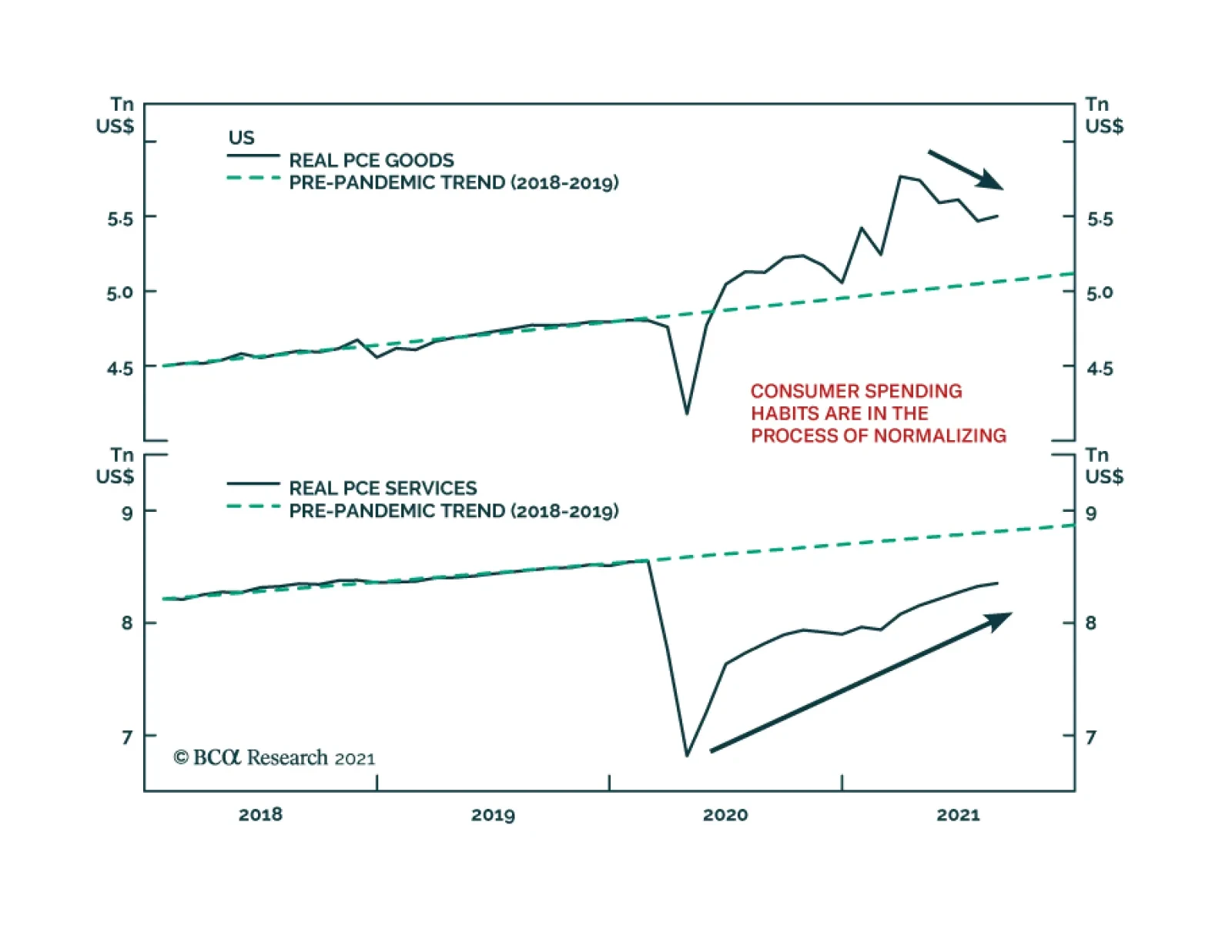
The August US Personal Income and Outlays report was broadly in line with expectations. Personal income rose 0.2% m/m following the prior month’s 1.1% m/m increase. Meanwhile, real personal spending grew 0.4% m/m after a downwardly revised percentage decline…