Monetary

Highlights The Federal Reserve’s temporary FIMA repo facility will go a long way in helping ease dollar-funding stress outside the US. However, with the duration of the lockdown highly uncertain, a liquidity crisis could rapidly evolve into a solvency one. If the containment measures prove successful by summer, then the global economy will be awash with much stimulus, which will be fertile ground for pro-cyclical currencies. However, in the event that we receive indications of a more malignant outcome, we could retest and break above the recent highs in the DXY. We assign a one-third probability to this outcome. For now, a barbell strategy is warranted. Hold a basket of the cheapest currencies, along with some safe-havens. Crude oil has approached capitulation lows, but conditions are not yet in place for a durable bottom. Stand aside on petrocurrencies for now. Feature Chart I-1The Fed's Liquidity Injections Are Working
The Fed's Liquidity Injections Are Working
The Fed's Liquidity Injections Are Working
The DXY index has once again broken above the psychological 100 level. This has occurred alongside the backdrop of very generous swap lines offered by the Federal Reserve to foreign central banks, as well as a temporary repo facility for foreign and international monetary authorities (FIMA). In fact, the euro-dollar cross-currency basis swap is now in positive territory, suggesting that a key funnel for offshore dollar liquidity has now significantly widened (Chart I-1). Why then has the dollar continued to strengthen, despite a concerted effort by the Fed to flood the global system with dollars? We offer and explore three reasons: The Fed’s actions are still insufficient. The dollar crisis is evolving from a liquidity one to a solvency one. The liquidity-to-growth transmission mechanism needs time. The Fed’s Actions Are Still Insufficient The Fed’s actions so far to ease the offshore dollar funding stress have been to: Offer unlimited funding through swap lines to five major central banks at the overnight index swap + 25 basis points.1 This was effective the week of March 16. Extend the swap lines to nine more central banks, with a cap of US$60 billion and a maturity of 84 days.2 This was announced March 19. Allow FIMA account holders to temporarily exchange their Treasury securities held with the Fed for US dollars. This was announced on Tuesday. Have these actions been sufficient? For most developed market currencies, yes. Chart I-2 shows that the currencies that have been most hit in the first quarter were of the countries initially excluded from the swap agreement such as Australia, Norway and New Zealand. Since the March 19 agreement, these currencies have staged significant rallies. Chart I-2Very Few Winners In Q1
Capitulation?
Capitulation?
However, there are three reasons why the Fed’s actions are still insufficient. First, they are limited to only 14 central banks, and need to be expanded further. While currencies such as the Brazilian real and Mexican peso have stabilized, others like the Turkish lira or South African rand continue their freefall. In short, many emerging market central banks do not have swap agreements with the US. These are countries with huge dollar liabilities that could continue to see their currencies fall, pushing up the aggregate dollar index. Developed market commodity currencies tend to be highly correlated to emerging market currencies (Chart I-3). There is a huge pool within the financial architecture unable to access funding through central bank swap lines. The second reason is that the pool of Treasury securities available to swap for US dollars has shrunk significantly. This has been on the back of slowing global trade, which sapped the current account surpluses of many countries, dampening their foreign exchange reserves. Thus, while the Fed’s latest actions may prevent an international dumping of US Treasurys, it may be insufficient to completely assuage funding stresses (Chart I-4). Chart I-3Commodity Currencies Still At Risk
Commodity Currencies Still At Risk
Commodity Currencies Still At Risk
Chart I-4A Smaller Pool Of Treasurys To Sell
A Smaller Pool Of Treasurys To Sell
A Smaller Pool Of Treasurys To Sell
Finally, a recent report by the Bank of International Settlements3 showed that of the US$86 trillion in outstanding foreign exchange swaps/forwards, about 60% is among non-bank financial and other institutions. This suggests there is a huge pool within the financial architecture unable to access funding through central bank swap lines. Given that hedge funds are included in this group, this category entails a lot more credit risk than any central bank will be willing to bear (Chart I-5). Chart I-5Can The Fed Bail Out Non-Banks?
Capitulation?
Capitulation?
Bottom Line: While the Fed’s injection of dollar liquidity has been massive and significant, access to these funds may be limited to entities that have significant credit risk. There is not much the Fed can do about this. But at the same time, it also suggests the Fed’s actions have been insufficient to quench the global thirst for dollar liquidity. From A Liquidity To A Solvency Crisis If the containment measures prove successful by summer, then the global economy will be awash with much stimulus, which will be fertile ground for pro-cyclical currencies. As a counter-cyclical currency, the dollar will buckle, lighting a fire under our favorites such as the Norwegian krone and the Swedish krona. The euro will be the most liquid beneficiary of this move. However, the DXY index has effortlessly broken above the psychological 100 level, suggesting we could catapult to new highs. When massive amounts of stimulus are injected into markets but prices keep falling (and the dollar keeps rallying), this portends a liquidity crisis morphing into a solvency one. What ensues is a liquidation phase where the only guiding signposts are technical indicators and valuation extremes. There are a few indications we could be stepping into this phase: During recessions, the dollar rally has tended to occur in two phases. The first phase prompts the US authorities to act, usually by dropping interest rates, which dampens the rally. The next phase epitomizes indiscriminate liquidation by financial markets (Chart I-6). Enter 2008. The US first introduced swap lines with a few central banks in December 2007. But from March to October 2008, the dollar soared by about 25%. This prompted the Fed to expand its swap lines to include even some emerging markets. Despite the knee-jerk fall in the dollar of 11%, we eventually made new highs by rallying 15%. While the Fed’s injection of dollar liquidity has been massive and significant, access to these funds may be limited. As the dollar rises, it takes time for economies to implode due to strong monetary and fiscal frameworks. The implosion of the euro area economy only surfaced well after the 2008 crisis. Specifically, there has been an epic rise in global nonfinancial corporate debt. As a result, credit default swaps across many countries are surging (Chart I-7). High-yield spreads are blowing out. Our bond strategists believe that even though there is value in investment-grade debt, high-yield paper remains at risk.4 Historically, whenever the default rate has breached 4% (as is the case now), a self-reinforcing feedback loop of higher refinancing rates and defaults ensues (Chart I-8). With a recovery rate that is going to be much lower than historical standards due to bloated balance sheets, this is worrisome. Chart I-6The Dollar Rally Occurs In Two Phases
The Dollar Rally Occurs In Two Phases
The Dollar Rally Occurs In Two Phases
Chart I-7CDS Spreads Are Widening Significantly
CDS Spreads Are Widening Significantly
CDS Spreads Are Widening Significantly
Chart I-8Large Defaults Are Ahead
Large Defaults Are Ahead
Large Defaults Are Ahead
It is difficult to pinpoint where the epicenter of the potential default wave will be. The energy sector looks like a prime candidate, putting many commodity currencies at risk. Bottom Line: There is a non-negligible risk that the liquidity crisis evolves into a solvency one. Though this is not our base case, we assign a one-third probability to this outcome. Liquidity To Growth Transmission Channel Monetary stimulus only affects the economy with a lag, and fiscal stimulus is so far unlikely to completely plug the hole from economic disruption. This leaves currency technicals and valuation as among the only few guiding signposts towards a peak in the DXY. There is usually a significant lag between easing in offshore dollar funding costs and a respective bottom in the domestic currency (Chart I-1). The AUD/JPY cross has broken below the key support zone of 70-72. This defensive line held notably during the European debt crisis, China’s industrial recession and, more recently, the global trade war. This pins the next level of support in the 55-57 zone, on par with the recessions of 2001 and 2008. The USD/JPY is weakening again and will likely hit 100. A rising yen is usually accompanied by a dollar rally against other procyclical currencies. Outside of the Fukushima crisis, this has been a key indicator that the investment environment is becoming precarious (Chart I-9). Chart I-9The Yen Could Touch 100
The Yen Could Touch 100
The Yen Could Touch 100
Some high-beta currencies such as the USD/TRY, USD/ZAR, and USD/IDR are still in freefall. These currencies are usually good at sniffing out a change in the investment landscape, specifically one becoming perilous for carry trades. Similarly, the USD/CNY has tested and has failed to break above 7.12. This will be a key level to watch since a break above will send Asian currencies into the abyss. “Doctor” copper has failed to stage a meaningful rebound. In fact, the copper-to-gold and oil-to-gold ratios continue to head lower from oversold levels. Whenever cyclical sectors are underperforming defensives at the same time as non-US markets underperforming US ones, this has signaled that the marginal dollar is rotating towards the US. This is usually dollar bullish (Chart I-10A and Chart I-10B). “Doctor” copper has failed to stage a meaningful rebound. In fact, the copper-to-gold and oil-to-gold ratios continue to head lower from oversold levels. This signifies impairment in the liquidity-to-growth transmission mechanism (Chart I-11). Earnings revisions continue to head lower across all markets. Chart I-10ACyclical Markets Are Not Confirming A Dollar Top
Cyclical Markets Are Not Confirming A Dollar Top
Cyclical Markets Are Not Confirming A Dollar Top
Chart I-10BCyclical Markets Are Not Confirming A Dollar Top
Cyclical Markets Are Not Confirming A Dollar Top
Cyclical Markets Are Not Confirming A Dollar Top
Chart I-11Dr Copper Is Sick
Dr Copper Is Sick
Dr Copper Is Sick
Bottom Line: Historically, signs of capitulation can usually be observed by paying close attention to market internals and currency technicals. While we have had some marginal improvement, we are not out of the woods yet. Portfolio Strategy Chart I-12Go Short CAD/NOK
Go Short CAD/NOK
Go Short CAD/NOK
We recommend maintaining a barbell strategy – a basket of the cheapest currencies, along with some safe-havens such as the yen and Swiss franc. Overall, investors should maintain a small upward bias in the dollar in the near term. Meanwhile, short USD/JPY positions make sense. Oil plays are becoming attractive, but conditions for a durable bottom are not yet in place. The strong rebound in the NOK/SEK cross is just an unwinding of the flash crash. If the dollar and oil have been at the epicenter of these moves, then the cross is still at risk of relapsing in the near term. We were stopped out of a long position in this cross, and will discuss oil and petrocurrencies next week. That said, a short CAD/NOK position is a much safer way to express a longer-term bearish view on the dollar (Chart I-12). We are going short this cross today with a stop-loss at 7.5. Finally, the pound remains extremely cheap versus the dollar, but the rally in recent days has eroded the potential for tactical upside. We will await better opportunities to own sterling. Chester Ntonifor Foreign Exchange Strategist chestern@bcaresearch.com Footnotes 1 These include the Bank Of Canada, Bank Of Japan, Bank Of England, European Central Bank, and the Swiss National Bank. 2 These include the Reserve Bank of Australia, the Banco Central do Brasil, the Danmarks Nationalbank (Denmark), the Bank of Korea, the Banco de Mexico, the Norges Bank, the Reserve Bank of New Zealand, the Monetary Authority of Singapore, and the Sveriges Riksbank. 3 Stefan Avdjiev, Egemen Eren and Patrick McGuire, “Dollar Funding Costs during the Covid-19 Crisis through the Lens of the FX Swap Market,” BIS Bulletin, dated April 1, 2020. 4 Please see US Bond Strategy and Global Fixed Income Strategy Joint Special Report, “Trading The US Corporate Bond Market In A Time Of Crisis,” dated March 31, 2020, available at usbs.bcaresearch.com Currencies U.S. Dollar Chart II-1USD Technicals 1
USD Technicals 1
USD Technicals 1
Chart II-2USD Technicals 2
USD Technicals 2
USD Technicals 2
Recent data in the US have been negative: The University of Michigan's consumer sentiment index plunged to 89.1 in March from 101 the previous month, the fourth largest monthly decline over the past half a century. ADP employment recorded a loss of 27K jobs in total nonfarm private sector, including a 90K decrease in small businesses payroll which was offset by the 48K increase in healthcare. Initial jobless claims surged to 6.6 million for the week ended March 27. The ISM manufacturing index came in at a relatively benign 49.1, but this was boosted by supplier deliveries. The DXY index appreciated by 1.1% this week amid growing concerns over COVID-19 and disappointing data releases. Shortly after the $2 trillion coronavirus rescue package last week, President Trump is now calling for another "very big and bold" $2 trillion "Phase 4" package on infrastructure spending. Report Links: The Dollar Funding Crisis - March 19, 2020 Are Competitive Devaluations Next? - March 6, 2020 The Near-Term Bull Case For The Dollar - February 28, 2020 The Euro Chart II-3EUR Technicals 1
EUR Technicals 1
EUR Technicals 1
Chart II-4EUR Technicals 2
EUR Technicals 2
EUR Technicals 2
Recent data in the euro area have been negative: The business climate indicator dropped to -0.28 from -0.06 in March, as the COVID-19 crisis deepens. The March consumer price inflation fell across the euro area: headline inflation fell from 1.2% to 0.7% year-on-year and core inflation decreased from 1.2% to 1%. EUR/USD depreciated by 1.1% this week. Euro zone countries have until April 9 to design another stimulus package to support the economy which might consist of financial loans and a short-term work scheme. The biggest challenge being faced is that while some member countries (including France, Italy and Spain) are calling for joint debt issuance, others (including Germany and Austria) are fiercely against it. Report Links: On The DXY Breakout, Euro, And Swiss Franc - February 21, 2020 Updating Our Balance Of Payments Monitor - November 29, 2019 On Money Velocity, EUR/USD And Silver - October 11, 2019 Japanese Yen Chart II-5JPY Technicals 1
JPY Technicals 1
JPY Technicals 1
Chart II-6JPY Technicals 2
JPY Technicals 2
JPY Technicals 2
Recent data in Japan have been negative: The jobs-to-applicants ratio dropped from 1.49 to 1.45 in February. Industrial production contracted by 4.7% year-on-year in February, down from -2.3% the previous month. Housing starts fell by 12.3% year-on-year in February. The Japanese yen appreciated by 1.6% against the US dollar this week, supported by growing concerns over COVID-19 and a global recession. The quarterly Tankan Survey shows that the sentiment index fell to a 7-year low of -8 in Q1 among large manufacturers, and dived to 8 from 20 among non-manufacturers. Besides, the survey points to a further deterioration of confidence over the next three months. Report Links: The Near-Term Bull Case For The Dollar - February 28, 2020 Building A Protector Currency Portfolio - February 7, 2020 Currency Market Signals From Gold, Equities And Flows - January 31, 2020 British Pound Chart II-7GBP Technicals 1
GBP Technicals 1
GBP Technicals 1
Chart II-8GBP Technicals 2
GBP Technicals 2
GBP Technicals 2
Recent data in the UK have been negative, despite some positive releases for Q4: Consumer confidence dropped from -7 to -9 in March. Markit manufacturing PMI slipped from 48 to 47.8 in March. The current account deficit narrowed from £15.9 billion to £5.6 billion in Q4. Annualized GDP growth was unchanged at 1.1% year-on-year in Q4. The British pound soared by 2% against the US dollar this week. To preserve cash during the pandemic, the BoE's Prudential Regulation Authority (PRA) suggested commercial banks to suspend dividends and buybacks until the end of this year in addition to cancelling outstanding 2019 dividends. Moreover, the PRA also expects banks not to pay any cash bonuses to senior staff. Report Links: Updating Our Balance Of Payments Monitor - November 29, 2019 A Few Trade Ideas - Sept. 27, 2019 United Kingdom: Cyclical Slowdown Or Structural Malaise? - Sept. 20, 2019 Australian Dollar Chart II-9AUD Technicals 1
AUD Technicals 1
AUD Technicals 1
Chart II-10AUD Technicals 2
AUD Technicals 2
AUD Technicals 2
Recent data in Australia have been mixed: Consumer confidence dropped from 72.2 to 65.3 in March. Manufacturing PMI slipped from 50.1 to 49.7 in March. New home sales increased by 6.2% month-on-month in February, up from 5.7% the previous month. Building permits grew by 20% month-on-month in February. However, we expect housing activities to slow down in March. The Australian dollar fell further by 0.4% against the US dollar this week. In the minutes released this Wednesday, the RBA warned that a "very material contraction" in economic activity was ahead. While the RBA said it was not possible to provide an update of the macro forecast given the "fluidity of the situation", it also expressed concerns that the contraction might linger beyond the June quarter. Report Links: On AUD And CNY - January 17, 2020 Updating Our Balance Of Payments Monitor - November 29, 2019 A Contrarian View On The Australian Dollar - May 24, 2019 New Zealand Dollar Chart II-11NZD Technicals 1
NZD Technicals 1
NZD Technicals 1
Chart II-12NZD Technicals 2
NZD Technicals 2
NZD Technicals 2
Recent data in New Zealand have been negative: Building permits grew by 4.7% month-on-month in February. However, business confidence plunged from -19.4 to -63.5 in March. The activity outlook index also dived from 12 to -26.7 in March. The New Zealand dollar fell by 0.8% against the US dollar this week. Similar to the BoE, the RBNZ is now restricting all locally-incorporated banks from paying dividends on ordinary shares until the economy has sufficiently recovered in order to preserve cash and support the stability of the financial system. The RBNZ is also taking measures to help support banks to lend to businesses. Report Links: Updating Our Balance Of Payments Monitor - November 29, 2019 Place A Limit Sell On DXY At 100 - November 15, 2019 USD/CNY And Market Turbulence - August 9, 2019 Canadian Dollar Chart II-13CAD Technicals 1
CAD Technicals 1
CAD Technicals 1
Chart II-14CAD Technicals 2
CAD Technicals 2
CAD Technicals 2
Recent data in Canada have been negative: Bloomberg Nanos confidence dropped from 51.3 to 46.9 for the week ended March 27. Markit manufacturing PMI fell below 50 for the first time since last September to 46.1 in March. The Canadian dollar fell by 1.2% against the US dollar this week, weighed down by the sharp decline in oil prices. The BoC lowered the overnight target rate by another 50 bps in an emergency meeting last Friday. It also joined the QE club by launching the Commercial Paper Purchase Program (CPPP) which aims to ease short-term funding stress. Report Links: The Loonie: Upside Versus The Dollar, But Downside At The Crosses Updating Our Balance Of Payments Monitor - November 29, 2019 Making Money With Petrocurrencies - November 8, 2019 Swiss Franc Chart II-15CHF Technicals 1
CHF Technicals 1
CHF Technicals 1
Chart II-16CHF Technicals 2
CHF Technicals 2
CHF Technicals 2
Recent data in Switzerland have been negative: KOF leading indicator dropped from 100.9 to 92.9 in March. Total sight deposits increased from CHF 609 billion to CHF 621 billion for the week ended March 27. The manufacturing PMI plunged from 49.5 to 43.7 in March. Headline consumer prices fell by 0.5% year-on-year in March, further down from the 0.1% decline in February. The Swiss franc fell by 1.5% against the US dollar this week. The SNB is not only battling a weaker economic backdrop, but also strong demand for safe-haven currencies. While the SNB has less room to further lower interest rates, it is taking part in easing funding stress from the pandemic. Report Links: On The DXY Breakout, Euro, And Swiss Franc - February 21, 2020 Currency Market Signals From Gold, Equities And Flows - January 31, 2020 Portfolio Tweaks Before The Chinese New Year - January 24, 2020 Norwegian Krone Chart II-17NOK Technicals 1
NOK Technicals 1
NOK Technicals 1
Chart II-18NOK Technicals 2
NOK Technicals 2
NOK Technicals 2
Recent data in Norway have been negative: Retail sales increased by 2% month-on-month in February, up from 0.5% the previous month. Manufacturing PMI fell to 41.9 from 51.6 in March, the lowest since the Great Financial Crisis. The new orders, production and employment components all plunged below 40, while suppliers' delivery index soared to 74. The Norwegian krone rebounded by 2% against the US dollar this week, following the brutal selloff in recent weeks weighed by the sharp decline in oil prices. The Norges Bank is stepping up in currency intervention to reduce volatility including buying the krone in exchange for the US dollar. We believe there is now tremendous value in the krone once oil prices stabilize. Report Links: Building A Protector Currency Portfolio - February 7, 2020 On Oil, Growth And The Dollar - January 10, 2020 Updating Our Balance Of Payments Monitor - November 29, 2019 Swedish Krona Chart II-19SEK Technicals 1
SEK Technicals 1
SEK Technicals 1
Chart II-20SEK Technicals 2
SEK Technicals 2
SEK Technicals 2
Recent data in Sweden have been negative: Retail sales grew by 2.8% year-on-year in February. Manufacturing PMI crashed to 43.2 in March from 52.7. The Swedish krona fell by 0.5% against the US dollar this week. In the Swedish Economy Report released on Wednesday, the NIER (Swedish National Institute of Economic Research) estimates that Sweden's GDP will fall by just over 6% in the second quarter. While the NIER believes that the current central bank measures are appropriate in supporting the economy in a wave of bankruptcies and mass unemployment, Sweden has more room to act with relatively lower government debt to its advantage. Report Links: Updating Our Balance Of Payments Monitor - November 29, 2019 Where To Next For The US Dollar? - June 7, 2019 Balance Of Payments Across The G10 - February 15, 2019 Trades & Forecasts Forecast Summary Core Portfolio Tactical Trades Limit Orders Closed Trades
Making predictions about the economic and market outlook seems a futile exercise in the midst of such massive uncertainty. The deluge of articles about COVID-19 merely serves to highlight that nobody really knows how things will play out in the year ahead. Much depends on whether an effective vaccine or treatment becomes available within a reasonable timescale and that remains an open question. Social and economic disruption will continue to intensify until the spread of the virus starts to abate. One thing is certain. Economic activity around the world faces its biggest contraction in modern times. Declines in second quarter GDP will be mind-numbingly bad in a wide range of countries, especially those that have instituted lockdowns and the closure of non-essential businesses. According to the OECD, the median economy faces an initial output decline of around 25% as a result of shutdowns and restrictions.1 Chart 1A Meltdown In Economic Activity
A Meltdown In Economic Activity
A Meltdown In Economic Activity
Estimates for the drop in US real GDP in the second quarter range as high as 50% at an annual rate. To put this into perspective, the peak-to-trough decline in US real GDP in the 2007-09 recession was a mere 4% over six quarters, and that felt catastrophic at the time. The New York Fed’s weekly economic index2 has already fallen to the lows of 2008 and worse is still to come (Chart 1). Could things be as bad as the 1930s Great Depression when US real GDP contracted by 25% over a three-year period? That would require an extreme apocalyptic view about the progression of the virus and does not bear thinking about. I am not that gloomy. Policymakers are acting aggressively to limit the economic damage. Central banks are flooding the system with liquidity and the cost of money is negligible. Meanwhile, fiscal caution has been thrown to the wind with massive government stimulus in many countries. While this will not prevent a deep recession, it will minimize the downside risks and support the eventual rebound. Markets are understandably in a deep funk because it is hard to price unknown risks. If this is no more than a two-quarter economic downturn followed by a sharp recovery, then a good buying opportunity in risk assets is in place given that monetary policy will stay hyper accommodative for a considerable time. If the downturn lingers much longer than that, then equities remain at risk. While loath to make a prediction, I am uncharacteristically tending to the more optimistic side. Let’s make the heroic assumption that we are not in an end of days scenario and that this crisis will pass at some point in the next year- hopefully sooner than later. What are some of the longer-run implications? A few come to mind. The backlash against globalization will gather impetus. Public sector debt will rise to unimaginable peacetime levels. Meanwhile, the crisis puts the final nail in the coffin of the private sector Debt Supercycle. Monetary policy will err on the side of ease for a very long time. The way that companies and other institutions have been forced to adapt to the crisis could trigger lasting changes in how they operate. Globalization In Full Retreat Chart 2A Retreat From Globalization
A Retreat From Globalization
A Retreat From Globalization
The peak of globalization has been a central part of the BCA view for several years.3 Long before the current crisis, it was clear that anti-globalization forces were gathering strength, illustrated by increased trade barriers, a backlash against inward migration in many countries, and reduced flows of foreign direct investment (Chart 2). The Trump Administration’s imposition of tariffs and the Brexit vote were two of the more obvious examples of the change in attitudes. The supply-chain interruptions caused by factory shutdowns in China will reinforce the view that shifting production to cheaper-cost countries overseas went too far. At a minimum, it seems inevitable that many companies will seek to reduce their reliance on a single producer for critical components. On the medical front, one striking fact to emerge was that China supplies around 80% of US antibiotics. There will be massive pressure to develop greater homegrown supplies of medical supplies and other products deemed critical for economic and national security. The crisis also has led to a breakdown of the Schengen Area of open borders within the European Union (EU). Many member countries have reinstituted border controls and it is unclear when these might be removed. The free movement of people is a core principle of the EU. Meanwhile, the Maastricht Treaty rules on fiscal discipline, a key element of economic union, have been thrown out of the window. Even Germany has bowed to the pressure of relaxing fiscal constraints. Finally, a worsening situation for the already troubled Italian banking system will threaten EU financial stability. Overall, the crisis will leave a huge question mark over the long-term viability of the EU. Globalization was a major force behind disinflation as production shifted to low-cost producers. A reversal of this trend will thus be inflationary, at the margin. For many, this will be a price worth paying if it means increased job security and reduced vulnerability of supply chains. But the shift away from globalization will not be the only trend that threatens an eventual resurgence of inflation. The Explosion In Government Debt: Last Gasp Of The Debt Supercycle BCA introduced the concept of the Debt Supercycle more than 40 years ago to describe the actions of policymakers to pump up demand rather than allow financial imbalances to be fully unwound during economic downturns. This inevitably meant that each new cycle began with a higher level of financial imbalances. As indebtedness rose, the economic costs of a financial cleansing increased, requiring ever-more desperate policy measures to shore things up. Unfortunately, such actions merely created the conditions for greater excesses and imbalances down the road. For example, the Federal Reserve’s aggressive response to the bursting of the tech bubble in 2000 helped set the scene for the even bigger housing bubble later in the decade. In that sense, the Debt Supercycle was a self-reinforcing trap that was bound to end badly, and that occurred in 2007. Chart 3The US Household Love Affair With Debt Died A Decade Ago
The US Household Love Affair With Debt Died A Decade Ago
The US Household Love Affair With Debt Died A Decade Ago
Our discussion of the US Debt Supercycle was focused largely on the private sector because that is where rising imbalances posed the greatest threat to economic and financial stability. Rising public sector imbalances were less of a concern because governments do not finance themselves through the banking sector. Moreover, unlike the private sector, taxes can always be raised to boost revenues or, in extremis, the authorities can resort to the printing press. At the end of 2014, we wrote that the Debt Supercycle was dead. By that, we meant that easing policy would no longer be able to encourage a new cycle of leverage-financed private-sector spending. The downturn of 2007-09 was a turning point in attitudes toward debt, much in the way that those who lived through the Great Depression were financially conservative for the rest of their lives. Our view has been vindicated by the fact the ratio of household debt to income has decisively broken its pre-housing bubble uptrend and has failed to revive in the face of record-low interest rates (Chart 3). Corporate borrowing has been strong, but largely to finance stock buybacks and M&A activity. Capital spending has been disappointing this cycle, despite strong profits and margins. The current deep downturn will add a further nail in the coffin of the private sector Debt Supercycle. The shock of the recession and destruction of wealth will leave a legacy of increased financial caution with households wanting to build precautionary savings and companies striving to repair damaged balance sheets. It would not be a surprise to see the US personal saving rate head back to the double-digit levels of the early 1980s. While the private sector embraces greater financial conservatism, we are witnessing the start of an extraordinary surge in public sector deficits and debt from already high levels. Chart 4A Bad Starting Point For A Surge In The Federal Deficit
A Bad Starting Point For A Surge In The Federal Deficit
A Bad Starting Point For A Surge In The Federal Deficit
Budget deficits automatically rise during recessions because tax receipts drop and spending on unemployment and welfare programs goes up (Chart 4). In the past, the starting point for deficits generally was low before a recession took hold. This time, the federal deficit has breached 5% of GDP when the economy was doing fine. With the current recession set to be deeper than in 2007-09 and fiscal stimulus likely to end up much more than the initial $2 trillion package, the deficit will far exceed the previous post-WWII peak of almost 10% of GDP, reached in fiscal 2009. The ratio of federal debt to GDP will soar past 100% within the next few years, exceeding the peak reached in WWII. A speedy decline in WWII debt burdens was helped by a sharp rebound in economic activity, supported by a powerful combination of demographics (the post-WWII baby boom) and pent-up demand. Real GDP grew at an average annualized pace of 4.3% in both the 1950s and 1960s. Unfortunately, slower population growth means that growth in the next one and two decades will be less than half that pace. At the same time, the federal deficit will be under upward pressure because of the impact of an aging population on healthcare and social security. In other words, restoring order to fiscal finances through normal measures (growth and/or austerity) will be an impossible task. High levels of government debt are perfectly manageable when private sector savings are plentiful, interest rates are negligible, and investors seek the safety of low-risk bonds. Thus, $1 trillion US federal deficits have not prevented Treasury yields from falling to all-time lows. However, such conditions will not last indefinitely. The timing of when bloated budget deficits start to impact markets and thus the economy will partly depend on the actions of the Fed. Monetary Policy: Is There A Limit To What It Can Do? Gone are the days when monetary policy was a rather technical exercise: tweaking the level of interest rates to ensure that money and credit trends delivered the economic growth consistent with low and stable inflation. In the past decade, the old rule book has been discarded with policymakers forced to take ever-more extreme measures to prevent total collapse of the economic and financial system. The 2007-9 downturn was easier to deal with than the current crisis. The primary problem a decade ago was a financial rather than economic seizure. While policymakers had to be creative, the main task was to shore up systemically important financial institutions and inject enough liquidity into the system to restore normal market functioning. And it worked. This time, the issue is an economic not financial seizure and associated liquidity strains are a symptom, not the primary problem. The immediate role of central banks is again to ensure that the financial system continues to function by injecting whatever amounts of liquidity are necessary. But monetary policy cannot directly bail out all the businesses that face bankruptcy or help those that have lost their jobs. That is the role of fiscal policy. What central banks can do is print money to finance the rise in budget deficits. During WWII, the Fed had an agreement with the Treasury Department to peg the level of long-term yields below 2.5% and this arrangement persisted until 1951, long after the war ended. This ensured that a post-war rebound in private credit demand would not cause a spike in interest rates that might short-circuit the recovery. We could well see a similar arrangement in the coming years, though it might be an informal rather than publicized agreement. The key point is that the Fed will be massively biased toward easy policy for many years. The current generation of central bankers have experienced periodic threats of deflation rather than inflation during the past 20 years and that will shape how they perceive the balance of risks going forward. After the Great Depression of the 1930s, fears of deflation lingered well into the 1950s and policymakers’ resulting complacency toward inflation led to the inflation spike of the 1970s. We are at a similar point again. The Fed will remain a massive buyer of Treasury bonds, even as the economy recovers because it will not want to risk higher yields undermining growth. Even if inflation starts to rise, the Fed will justify a continued easy stance on the grounds that inflation has fallen far short of its 2% target for many years. Given the combination of a global blowout in central bank balance sheets and the retreat from globalization, the scene will be set for inflation to surprise on the upside. But this may not occur for several years because the recession will create a lot of spare capacity and deflation is a greater near-term threat than inflation. We have long argued that a sustained upturn in inflation would be preceded by a final bout of deflation. The revival of inflation may be gradual but its insidious nature ultimately will make it more dangerous. It seems inevitable that there will have to be monetization of public sector debt, not only in the US but in other major economies. Once investor confidence returns, the demand for government bonds will recede and yields will be under upward pressure. Financial repression may help contain the rise, but that cannot be a long-term solution. In the end, central banks will be the bond buyers of last resort and ultimately it will have to be written off via making the debt effectively non-maturing. If the economic picture continues to deteriorate could central banks use quantitative easing to start buying assets such as equities and real estate? Current legislation prevents such purchases in the case of the Fed and European Central Bank. Of course, legislation can always be changed but the Fed would be reluctant for Congress to change the Federal Reserve Act. That could open a can of worms including amendments such as requiring regular audits of policy decisions and altering how regional presidents are chosen. But it will not be the Fed’s decision and if things get bad enough then nothing should be ruled out. An Accelerated Move To Virtual Activity? The restrictions on travel and public meetings and the closure of many businesses have forced companies to embrace online ways of conducting operations. And the same applies to schools and universities. In many cases, companies may find that virtual meetings between far-flung offices work rather well. This could cause a major rethink about future spending on business travel. Replacing travel with virtual meetings not only saves on airfares but also frees up employee time and reduces stress. And the improvements in communication technology make virtual meetings almost as good as the real thing. Of course, this is not a great story for airlines. The same arguments can be made for education but are slightly less compelling because of the social dimension. Mixing with friends and peers is one of the big attractions for students and most would be loath to give this up. And for working parents, it is not feasible to have children stuck at home. Nonetheless, at the post-secondary level, there could be a move to more online teaching. Another consequence of the current crisis has been a forced shift to more online shopping. This trend was already well established but is now likely to accelerate. Those retailers who fail to adapt will fall by the wayside. Market Implications As noted at the outset, it is hard to make predictions without knowing how the virus will progress. But we know a few things. First, there is not much scope for bond yields to fall from current levels. Second, equity valuations have improved as a result of the collapse in prices. Third, monetary policy will remain supportive of markets for a long time. On this basis, it is easy to conclude that stocks should beat bonds handsomely over the medium and long term. The short-term picture is cloudier. If the recession is short-lived and economic activity rebounds strongly, then we currently have a good buying opportunity for stocks. But there is no way to make a prediction about this with any conviction. The case for a strong recovery is that policy is massively stimulative and there will be a lot of pent-up demand. The case for a slow and drawn-out recovery is that consumers and businesses will be left with greatly weakened balance sheets and the loss of small businesses and associated jobs could be a lasting problem. A final issue is that fears of another virus wave could weigh on consumer and business confidence. Initially, there will be some extremely strong quarters of growth but beyond that, the odds favor a drawn-out recovery rather than a vigorous one. Faced with such uncertainty, one strategy is to rely on technical indicators rather than economic forecasts as a judge of whether it is safe to rebuild positions in risk assets. This gives some reason for encouragement as measures of sentiment are at depressed extremes, typically seen only at major bottoms. And this is supported by momentum indicators at oversold extremes. However, a word of caution: these indicators make the case for a near-term bounce but say nothing about the durability of any rally. For some time, non-US markets have looked more appealing than Wall Street from a valuation perspective. That remains the case, but there is an important caveat. Thus far, the virus has been more of a problem for the developed countries than emerging ones (China and Iran excepted). It remains to be seen whether Africa, and Latin America and other countries in Asia and the Middle East can avoid a catastrophic spread of the virus. It could potentially be disastrous given the poor infrastructure and lack of government resources in those regions. Moreover, a shift away from globalization is not bullish for the emerging world. Some positions in gold are a good hedge given current uncertainties and the fact that inflation fears will rise long before actual inflation picks up. In normal circumstances, the extraordinary rise in the US budget deficit would be bearish for the US dollar. But other countries are following the same path so in relative terms, the US is no worse off. And there is still no serious competition to the dollar as the global reserve currency. Thus, while the dollar might weaken somewhat, it should not be a major source of risk to US assets. In closing, it is impossible to provide the certainty and high-conviction predictions that investors crave. That makes it rash to make aggressive bets on how things will play out in the economy and markets. At BCA, we favor equities over bonds but advise continued near-term caution. The bottoming process in equities could be volatile and drawn-out. Building positions gradually seems the most sensible strategy. Martin H. Barnes, Senior Vice President Chief Economist mbarnes@bcaresearch.com Footnotes 1 For an estimate of the virus impact on a range of economies, please see the recent OECD report “Evaluating the initial impact of COVID-19 containment measures on economic activity”. Available at: www.oecd.org 2 The report and underlying data are available at www.newyorkfed.org. 3 For example, the retreat from globalization was discussed in our 2015 Outlook report published at the end of 2014.
Dear Client, This week’s report is written by BCA’s chief economist, Martin Barnes. Martin explores the myriad ways the pandemic could influence long-term economic and financial trends. I trust you will find his report very insightful. Best regards, Peter Berezin, Chief Global Strategist Making predictions about the economic and market outlook seems a futile exercise in the midst of such massive uncertainty. The deluge of articles about COVID-19 merely serves to highlight that nobody really knows how things will play out in the year ahead. Much depends on whether an effective vaccine or treatment becomes available within a reasonable timescale and that remains an open question. Social and economic disruption will continue to intensify until the spread of the virus starts to abate. One thing is certain. Economic activity around the world faces its biggest contraction in modern times. Declines in second quarter GDP will be mind-numbingly bad in a wide range of countries, especially those that have instituted lockdowns and the closure of non-essential businesses. According to the OECD, the median economy faces an initial output decline of around 25% as a result of shutdowns and restrictions.1 Chart 1A Meltdown In Economic Activity
A Meltdown In Economic Activity
A Meltdown In Economic Activity
Estimates for the drop in US real GDP in the second quarter range as high as 50% at an annual rate. To put this into perspective, the peak-to-trough decline in US real GDP in the 2007-09 recession was a mere 4% over six quarters, and that felt catastrophic at the time. The New York Fed’s weekly economic index2 has already fallen to the lows of 2008 and worse is still to come (Chart 1). Could things be as bad as the 1930s Great Depression when US real GDP contracted by 25% over a three-year period? That would require an extreme apocalyptic view about the progression of the virus and does not bear thinking about. I am not that gloomy. Policymakers are acting aggressively to limit the economic damage. Central banks are flooding the system with liquidity and the cost of money is negligible. Meanwhile, fiscal caution has been thrown to the wind with massive government stimulus in many countries. While this will not prevent a deep recession, it will minimize the downside risks and support the eventual rebound. Markets are understandably in a deep funk because it is hard to price unknown risks. If this is no more than a two-quarter economic downturn followed by a sharp recovery, then a good buying opportunity in risk assets is in place given that monetary policy will stay hyper accommodative for a considerable time. If the downturn lingers much longer than that, then equities remain at risk. While loath to make a prediction, I am uncharacteristically tending to the more optimistic side. Let’s make the heroic assumption that we are not in an end of days scenario and that this crisis will pass at some point in the next year- hopefully sooner than later. What are some of the longer-run implications? A few come to mind. The backlash against globalization will gather impetus. Public sector debt will rise to unimaginable peacetime levels. Meanwhile, the crisis puts the final nail in the coffin of the private sector Debt Supercycle. Monetary policy will err on the side of ease for a very long time. The way that companies and other institutions have been forced to adapt to the crisis could trigger lasting changes in how they operate. Globalization In Full Retreat Chart 2A Retreat From Globalization
A Retreat From Globalization
A Retreat From Globalization
The peak of globalization has been a central part of the BCA view for several years.3 Long before the current crisis, it was clear that anti-globalization forces were gathering strength, illustrated by increased trade barriers, a backlash against inward migration in many countries, and reduced flows of foreign direct investment (Chart 2). The Trump Administration’s imposition of tariffs and the Brexit vote were two of the more obvious examples of the change in attitudes. The supply-chain interruptions caused by factory shutdowns in China will reinforce the view that shifting production to cheaper-cost countries overseas went too far. At a minimum, it seems inevitable that many companies will seek to reduce their reliance on a single producer for critical components. On the medical front, one striking fact to emerge was that China supplies around 80% of US antibiotics. There will be massive pressure to develop greater homegrown supplies of medical supplies and other products deemed critical for economic and national security. The crisis also has led to a breakdown of the Schengen Area of open borders within the European Union (EU). Many member countries have reinstituted border controls and it is unclear when these might be removed. The free movement of people is a core principle of the EU. Meanwhile, the Maastricht Treaty rules on fiscal discipline, a key element of economic union, have been thrown out of the window. Even Germany has bowed to the pressure of relaxing fiscal constraints. Finally, a worsening situation for the already troubled Italian banking system will threaten EU financial stability. Overall, the crisis will leave a huge question mark over the long-term viability of the EU. Globalization was a major force behind disinflation as production shifted to low-cost producers. A reversal of this trend will thus be inflationary, at the margin. For many, this will be a price worth paying if it means increased job security and reduced vulnerability of supply chains. But the shift away from globalization will not be the only trend that threatens an eventual resurgence of inflation. The Explosion In Government Debt: Last Gasp Of The Debt Supercycle BCA introduced the concept of the Debt Supercycle more than 40 years ago to describe the actions of policymakers to pump up demand rather than allow financial imbalances to be fully unwound during economic downturns. This inevitably meant that each new cycle began with a higher level of financial imbalances. As indebtedness rose, the economic costs of a financial cleansing increased, requiring ever-more desperate policy measures to shore things up. Unfortunately, such actions merely created the conditions for greater excesses and imbalances down the road. For example, the Federal Reserve’s aggressive response to the bursting of the tech bubble in 2000 helped set the scene for the even bigger housing bubble later in the decade. In that sense, the Debt Supercycle was a self-reinforcing trap that was bound to end badly, and that occurred in 2007. Chart 3The US Household Love Affair With Debt Died A Decade Ago
The US Household Love Affair With Debt Died A Decade Ago
The US Household Love Affair With Debt Died A Decade Ago
Our discussion of the US Debt Supercycle was focused largely on the private sector because that is where rising imbalances posed the greatest threat to economic and financial stability. Rising public sector imbalances were less of a concern because governments do not finance themselves through the banking sector. Moreover, unlike the private sector, taxes can always be raised to boost revenues or, in extremis, the authorities can resort to the printing press. At the end of 2014, we wrote that the Debt Supercycle was dead. By that, we meant that easing policy would no longer be able to encourage a new cycle of leverage-financed private-sector spending. The downturn of 2007-09 was a turning point in attitudes toward debt, much in the way that those who lived through the Great Depression were financially conservative for the rest of their lives. Our view has been vindicated by the fact the ratio of household debt to income has decisively broken its pre-housing bubble uptrend and has failed to revive in the face of record-low interest rates (Chart 3). Corporate borrowing has been strong, but largely to finance stock buybacks and M&A activity. Capital spending has been disappointing this cycle, despite strong profits and margins. The current deep downturn will add a further nail in the coffin of the private sector Debt Supercycle. The shock of the recession and destruction of wealth will leave a legacy of increased financial caution with households wanting to build precautionary savings and companies striving to repair damaged balance sheets. It would not be a surprise to see the US personal saving rate head back to the double-digit levels of the early 1980s. While the private sector embraces greater financial conservatism, we are witnessing the start of an extraordinary surge in public sector deficits and debt from already high levels. Chart 4A Bad Starting Point For A Surge In The Federal Deficit
A Bad Starting Point For A Surge In The Federal Deficit
A Bad Starting Point For A Surge In The Federal Deficit
Budget deficits automatically rise during recessions because tax receipts drop and spending on unemployment and welfare programs goes up (Chart 4). In the past, the starting point for deficits generally was low before a recession took hold. This time, the federal deficit has breached 5% of GDP when the economy was doing fine. With the current recession set to be deeper than in 2007-09 and fiscal stimulus likely to end up much more than the initial $2 trillion package, the deficit will far exceed the previous post-WWII peak of almost 10% of GDP, reached in fiscal 2009. The ratio of federal debt to GDP will soar past 100% within the next few years, exceeding the peak reached in WWII. A speedy decline in WWII debt burdens was helped by a sharp rebound in economic activity, supported by a powerful combination of demographics (the post-WWII baby boom) and pent-up demand. Real GDP grew at an average annualized pace of 4.3% in both the 1950s and 1960s. Unfortunately, slower population growth means that growth in the next one and two decades will be less than half that pace. At the same time, the federal deficit will be under upward pressure because of the impact of an aging population on healthcare and social security. In other words, restoring order to fiscal finances through normal measures (growth and/or austerity) will be an impossible task. High levels of government debt are perfectly manageable when private sector savings are plentiful, interest rates are negligible, and investors seek the safety of low-risk bonds. Thus, $1 trillion US federal deficits have not prevented Treasury yields from falling to all-time lows. However, such conditions will not last indefinitely. The timing of when bloated budget deficits start to impact markets and thus the economy will partly depend on the actions of the Fed. Monetary Policy: Is There A Limit To What It Can Do? Gone are the days when monetary policy was a rather technical exercise: tweaking the level of interest rates to ensure that money and credit trends delivered the economic growth consistent with low and stable inflation. In the past decade, the old rule book has been discarded with policymakers forced to take ever-more extreme measures to prevent total collapse of the economic and financial system. The 2007-9 downturn was easier to deal with than the current crisis. The primary problem a decade ago was a financial rather than economic seizure. While policymakers had to be creative, the main task was to shore up systemically important financial institutions and inject enough liquidity into the system to restore normal market functioning. And it worked. This time, the issue is an economic not financial seizure and associated liquidity strains are a symptom, not the primary problem. The immediate role of central banks is again to ensure that the financial system continues to function by injecting whatever amounts of liquidity are necessary. But monetary policy cannot directly bail out all the businesses that face bankruptcy or help those that have lost their jobs. That is the role of fiscal policy. What central banks can do is print money to finance the rise in budget deficits. During WWII, the Fed had an agreement with the Treasury Department to peg the level of long-term yields below 2.5% and this arrangement persisted until 1951, long after the war ended. This ensured that a post-war rebound in private credit demand would not cause a spike in interest rates that might short-circuit the recovery. We could well see a similar arrangement in the coming years, though it might be an informal rather than publicized agreement. The key point is that the Fed will be massively biased toward easy policy for many years. The current generation of central bankers have experienced periodic threats of deflation rather than inflation during the past 20 years and that will shape how they perceive the balance of risks going forward. After the Great Depression of the 1930s, fears of deflation lingered well into the 1950s and policymakers’ resulting complacency toward inflation led to the inflation spike of the 1970s. We are at a similar point again. The Fed will remain a massive buyer of Treasury bonds, even as the economy recovers because it will not want to risk higher yields undermining growth. Even if inflation starts to rise, the Fed will justify a continued easy stance on the grounds that inflation has fallen far short of its 2% target for many years. Given the combination of a global blowout in central bank balance sheets and the retreat from globalization, the scene will be set for inflation to surprise on the upside. But this may not occur for several years because the recession will create a lot of spare capacity and deflation is a greater near-term threat than inflation. We have long argued that a sustained upturn in inflation would be preceded by a final bout of deflation. The revival of inflation may be gradual but its insidious nature ultimately will make it more dangerous. It seems inevitable that there will have to be monetization of public sector debt, not only in the US but in other major economies. Once investor confidence returns, the demand for government bonds will recede and yields will be under upward pressure. Financial repression may help contain the rise, but that cannot be a long-term solution. In the end, central banks will be the bond buyers of last resort and ultimately it will have to be written off via making the debt effectively non-maturing. If the economic picture continues to deteriorate could central banks use quantitative easing to start buying assets such as equities and real estate? Current legislation prevents such purchases in the case of the Fed and European Central Bank. Of course, legislation can always be changed but the Fed would be reluctant for Congress to change the Federal Reserve Act. That could open a can of worms including amendments such as requiring regular audits of policy decisions and altering how regional presidents are chosen. But it will not be the Fed’s decision and if things get bad enough then nothing should be ruled out. An Accelerated Move To Virtual Activity? The restrictions on travel and public meetings and the closure of many businesses have forced companies to embrace online ways of conducting operations. And the same applies to schools and universities. In many cases, companies may find that virtual meetings between far-flung offices work rather well. This could cause a major rethink about future spending on business travel. Replacing travel with virtual meetings not only saves on airfares but also frees up employee time and reduces stress. And the improvements in communication technology make virtual meetings almost as good as the real thing. Of course, this is not a great story for airlines. The same arguments can be made for education but are slightly less compelling because of the social dimension. Mixing with friends and peers is one of the big attractions for students and most would be loath to give this up. And for working parents, it is not feasible to have children stuck at home. Nonetheless, at the post-secondary level, there could be a move to more online teaching. Another consequence of the current crisis has been a forced shift to more online shopping. This trend was already well established but is now likely to accelerate. Those retailers who fail to adapt will fall by the wayside. Market Implications As noted at the outset, it is hard to make predictions without knowing how the virus will progress. But we know a few things. First, there is not much scope for bond yields to fall from current levels. Second, equity valuations have improved as a result of the collapse in prices. Third, monetary policy will remain supportive of markets for a long time. On this basis, it is easy to conclude that stocks should beat bonds handsomely over the medium and long term. The short-term picture is cloudier. If the recession is short-lived and economic activity rebounds strongly, then we currently have a good buying opportunity for stocks. But there is no way to make a prediction about this with any conviction. The case for a strong recovery is that policy is massively stimulative and there will be a lot of pent-up demand. The case for a slow and drawn-out recovery is that consumers and businesses will be left with greatly weakened balance sheets and the loss of small businesses and associated jobs could be a lasting problem. A final issue is that fears of another virus wave could weigh on consumer and business confidence. Initially, there will be some extremely strong quarters of growth but beyond that, the odds favor a drawn-out recovery rather than a vigorous one. Faced with such uncertainty, one strategy is to rely on technical indicators rather than economic forecasts as a judge of whether it is safe to rebuild positions in risk assets. This gives some reason for encouragement as measures of sentiment are at depressed extremes, typically seen only at major bottoms. And this is supported by momentum indicators at oversold extremes. However, a word of caution: these indicators make the case for a near-term bounce but say nothing about the durability of any rally. For some time, non-US markets have looked more appealing than Wall Street from a valuation perspective. That remains the case, but there is an important caveat. Thus far, the virus has been more of a problem for the developed countries than emerging ones (China and Iran excepted). It remains to be seen whether Africa, and Latin America and other countries in Asia and the Middle East can avoid a catastrophic spread of the virus. It could potentially be disastrous given the poor infrastructure and lack of government resources in those regions. Moreover, a shift away from globalization is not bullish for the emerging world. Some positions in gold are a good hedge given current uncertainties and the fact that inflation fears will rise long before actual inflation picks up. In normal circumstances, the extraordinary rise in the US budget deficit would be bearish for the US dollar. But other countries are following the same path so in relative terms, the US is no worse off. And there is still no serious competition to the dollar as the global reserve currency. Thus, while the dollar might weaken somewhat, it should not be a major source of risk to US assets. In closing, it is impossible to provide the certainty and high-conviction predictions that investors crave. That makes it rash to make aggressive bets on how things will play out in the economy and markets. At BCA, we favor equities over bonds but advise continued near-term caution. The bottoming process in equities could be volatile and drawn-out. Building positions gradually seems the most sensible strategy. Martin H. Barnes, Senior Vice President Chief Economist mbarnes@bcaresearch.com Footnotes 1 For an estimate of the virus impact on a range of economies, please see the recent OECD report “Evaluating the initial impact of COVID-19 containment measures on economic activity”. Available at: www.oecd.org 2 The report and underlying data are available at www.newyorkfed.org. 3 For example, the retreat from globalization was discussed in our 2015 Outlook report published at the end of 2014.
Highlights Investment Grade: Investors should overweight investment grade corporate bonds relative to a duration-matched position in Treasury securities, with a particular focus on bonds that are eligible for the Fed’s purchase programs. High-Yield: Caution is still warranted in the high-yield market. At current levels, spreads do not adequately compensate investors for the coming default cycle. We would recommend buying high-yield if the average index spread rises to a range of 1075 bps – 1290 bps. Fed Purchases: Fed corporate bond purchases will cause investment grade spreads to tighten, particularly out to the 5-year maturity point. However, the program won’t stop the coming onslaught of ratings downgrades. High-Yield Sectors: The Energy, Transportation, Capital Goods, Consumer Cyclical and Consumer Noncyclical sectors are all highly exposed to the looming default cycle. Financials and Utilities look like the best places to hide out. Feature Chart 1Will The Fed's Corporate QE Mark The Top In Spreads?
Will The Fed's Corporate QE Mark The Top In Spreads?
Will The Fed's Corporate QE Mark The Top In Spreads?
The COVID pandemic and associated recession have already caused turmoil in financial markets and prompted a policy response from the Federal Reserve that is unprecedented in its aggressiveness. US investment grade and high-yield corporate spreads widened 280 bps and 764 bps, respectively, to start the year. Then, they tightened by 78 bps and 179 bps, respectively, after the Fed announced it is stepping into the corporate bond market for the first time (Chart 1). Clearly, this is a challenging time for corporate bond investors. But sifting through all the noise, we think there are three key questions to stay focused on: How will the Federal Reserve’s support for the corporate bond market impact spreads? At what level do spreads fully discount the looming default cycle? What sectors within the corporate bond market are most/least at risk of experiencing large-scale defaults? What Can The Fed Hope To Accomplish By Buying Corporate Debt? As part of its package of monetary policy stimulus measures to combat the US COVID-19 recession, the Fed has undertaken a dramatic new step to try and lower borrowing costs for US businesses – the outright buying of US investment grade corporate bonds. The main details of these new programs are as follows: The Fed will purchase investment grade corporate bonds, loans and related exchange-traded funds (ETFs) as part of these programs. Bonds can be purchased in the primary (newly-issued) and secondary markets. The purchases will not be held on the Fed’s balance sheet. Instead, two off-balance sheet Special Purpose Vehicles (SPVs), one for primary market purchases and one for secondary market purchases, will buy the bonds. Both SPVs are initially funded by the US Treasury and will be levered up via loans from the Fed. The primary market SPV will buy newly-issued bonds with credit ratings as low as BBB- and maturities of four years or less. Eligible issuers are US businesses with material operations in the United States; that list of companies may be expanded in the future. Eligible issuers do not include companies that are expected to receive direct financial assistance from the US government (i.e. no buying of bonds from companies getting bailout funds). The secondary market SPV will buy bonds with maturities of up to five years and credit ratings as low as BBB-, with a buying limit of 10% of the entire stock of eligible debt of any single company. This secondary market SPV will also buy investment grade bond ETFs, up to 20% of the outstanding shares of any single ETF. Through the primary market facility, any eligible company can “borrow” from the Fed, through bond purchases or direct loans, an amount greater than its maximum outstanding debt (bonds plus loans) on any day over the past twelve months. Specifically: 140% of all debt for AAA-rated issuers, 130% for AA-rated issuers, 120% for A-rated issuers and 110% for BBB-rated issuers. Since those percentages are all greater than 100, this effectively means that the Fed will allow eligible companies to potentially roll over their entire stocks of debt through this program, plus some net new borrowing. With the primary market facility, issuers can even defer interest payments on the funds borrowed from the Fed for up to six months, with the interest payments added to the final repayment amount (any company choosing this option cannot do share buybacks or make dividend payments). These programs are set to run until September 30 of this year, with an option to extend as needed. The Fed’s new initiatives represent a new step for the central bank, providing direct lending to any company that needs it. The Fed had to do this through off-balance-sheet SPVs, since direct buying of corporates is not permitted under the Federal Reserve Act. With this structure, it is technically the US Treasury department that bears the initial credit risk through its seed funding of each SPV. The BoJ was the first of the major central banks to start buying corporate bonds. This structure is different than the recent corporate bond QE programs of the European Central Bank (ECB), Bank of England (BoE) and Bank of Japan (BoJ), where the credit risk was directly taken onto the central bank balance sheets. But from an investment perspective, the difference in structure between the Fed’s corporate bond buying program and that of other central banks is nothing more than a technicality. It is still worthwhile to see if any lessons can be learned from these other countries. The Corporate Bond Buying Experience Of Other Central Banks The BoJ was the first of the major central banks to start buying corporate bonds, in a program that began in February 2009 and continued until October 2012. The program initially involved only the purchase of very high-quality corporate debt (rated A or higher) and only for maturities up to one year. The pool of eligible bonds was later increased to allow for lower credit quality (rated BBB or higher) and longer maturities (up to three years). The BoJ ended up buying a total of 3.2 trillion yen (US$30 billion) of bonds during that program, representing nearly 50% of total Japanese investment grade nonfinancial debt (Chart 2). Credit spreads tightened modestly over the life of the program, particularly for the shorter maturity debt that the BoJ was directly buying.1 Research from the BoJ concluded that the corporate bond buying did improve liquidity for the bonds that were eligible for the program, although there was no discernable pickup in overall Japanese corporate bond issuance.2 The BoE started its Corporate Bond Purchase Scheme (CBPS) in August 2016, as part of a package of stimulus measures to cushion the economic blow from the UK’s stunning vote to leave the European Union. The CBPS bought £10bn of UK nonfinancial investment grade corporate bonds over a period of 18 months, with ratings as low as BBB-. This was a relatively modest share of all eligible nonfinancial bonds (4.7%), but UK credit spreads did tighten over the life of the program (Chart 3). The BoE’s own research has determined that the spread tightening was due to lower downgrade/default risk premiums, and that the program triggered a surge in investment grade issuance in the weeks and months following its launch.3 Chart 2The BoJ's Corporate Bond Buying Experience
The BoJ's Corporate Bond Buying Experience
The BoJ's Corporate Bond Buying Experience
Chart 3The BoE's Corporate Bond Buying Experience
The BoE's Corporate Bond Buying Experience
The BoE's Corporate Bond Buying Experience
The ECB announced its Corporate Sector Purchase Program (CSPP) in March 2016, with the actual bond purchases beginning three months later. This was an expansion of the ECB’s overall Asset Purchase Program that had previously been focused on government debt. Like the BoJ and BoE programs, only nonfinancial debt of domestic euro area companies rated BBB- or higher was eligible. The ECB did buy bonds across a wide maturity spectrum of 1-30 years. The ECB’s purchases in the first 18 months of the CSPP were sizeable, between €60-80bn per month, reaching a cumulative total of nearly 20% of the stock of eligible bonds (Chart 4). This not only drove credit spreads tighter for bonds in the CSPP, but also pushed spreads lower for bonds that were not directly purchased by the ECB, like bank debt. The ECB described this as evidence of a strong “portfolio balance effect”, where investors who sold their bonds to the central bank ended up redeploying the proceeds into other parts of the euro area corporate bond market.4 One major difference between the ECB CSPP and the BoJ and BoE programs was that the ECB could conduct the necessary purchases in the primary market, if necessary. This represented a major new source of funding for smaller euro area companies that did not previously issue corporate bonds, preferring to get most of their debt financing through bank loans. As evidence of this, the year-over-year growth rate of euro area corporate bond issuance soared from 2.5% to 10% in the first year of the CSPP (Chart 5). Chart 4The ECB's Corporate Bond ##br##Buying Experience
The ECB's Corporate Bond Buying Experience
The ECB's Corporate Bond Buying Experience
Chart 5ECB Primary Market Buying Spurred A Boom In Issuance
ECB Primary Market Buying Spurred A Boom In Issuance
ECB Primary Market Buying Spurred A Boom In Issuance
Investment Conclusions Applying these lessons to the US, the first conclusion we reach is that Fed corporate bond purchases will tighten spreads for eligible securities. In this case, eligible securities include all investment grade rated US corporate bonds with maturities less than five years. In effect, the Fed’s primary market facility could be thought of as adding an agency backing to these eligible bonds since the Fed has effectively guaranteed that this debt can be rolled over and that bond investors will be made whole. It’s noteworthy that last week saw a record amount of new investment grade corporate bond issuance as firms rushed to take advantage of the program. Second, we should see some positive knock-on effects on spreads of ineligible investment grade securities, i.e. investment grade corporate bonds with maturities greater than five years. The impact will not be as large as for eligible securities, but since many of the same issuers operate at both ends of the curve, long-maturity spreads will benefit at the margin from any reduction in interest expense for the issuer. Third, any trickle-down effects to high-yield spreads will be much smaller. No high-yield issuers can benefit from the program, and while the Fed could eventually open up its facilities to include high-yield debt, we wouldn’t count on it. We suspect the moral hazard of “bailing out the junk bond market” would simply be a step too far for the Federal Reserve. We should see some positive knock-on effects on spreads of ineligible securities. In sum, we would advocate an overweight allocation to US investment grade corporate bonds today – especially on securities eligible for the Fed’s programs. We do not recommend a similar overweight stance on US high-yield, where spreads will continue to fluctuate based on the fundamental default outlook (see section titled “Assessing The Value In High-Yield” below). Can The Fed Re-Steepen US Credit Spread Curves And Prevent Ratings Downgrades? Prior to the Fed’s announcement of the new programs, the US investment grade corporate spread curve had become inverted, with shorter maturity spreads exceeding longer maturity ones. This has historically been a harbinger of increased investment grade downgrades and high-yield defaults (Chart 6). With the Fed’s new programs focusing on bonds with maturities of up to five years, the Fed’s buying can potentially lead to a re-steepening of the investment grade spread curve by driving down shorter maturity spreads. Chart 6Inverted US Credit Spread Curves Are Flashing An Ominous Message
Inverted US Credit Spread Curves Are Flashing An Ominous Message
Inverted US Credit Spread Curves Are Flashing An Ominous Message
Already, the investment grade spread curve has begun to disinvert in the first week of the Fed’s programs (Chart 7). At the same time, the bond rating agencies are moving aggressively to adjust credit opinions in light of the US recession. Already, downgrades from Moody’s and S&P are outpacing upgrades by a 3-1 ratio year-to-date – a pace not seen since the depths of the financial crisis, according to Bloomberg.5 Chart 7The Fed's New Programs Are Already Helping Disinvert Investment Grade Spread Curves
The Fed's New Programs Are Already Helping Disinvert Investment Grade Spread Curves
The Fed's New Programs Are Already Helping Disinvert Investment Grade Spread Curves
The Fed’s actions should be successful at re-steepening the investment grade credit curve. However, we doubt that they will have much impact on ratings decisions. While the Fed can reduce borrowing costs and prevent default by rolling over maturing debt for investment grade issuers, this has a relatively minor impact on corporate balance sheet health. In fact, the Fed's programs will only improve balance sheet health for firms that just roll over existing debt loads and don’t take on any new debt. Any firm that takes on new debt during this period will come out of the crisis with more leverage than when it entered. All else equal, that should warrant a downgrade. Bottom Line: Fed corporate bond purchases will cause investment grade spreads to tighten, particularly out to the 5-year maturity point. However, the program won’t stop the coming onslaught of ratings downgrades. Assessing The Value In High-Yield What Kind Of Default Cycle Is Already “In The Price”? High-yield debt may not benefit from the Fed’s corporate bond-buying programs. But, as in every other cycle, there will come a time when spreads discount the full extent of future default losses. At that point it will be appropriate to increase allocations to the sector. Our Default-Adjusted Spread will guide us as we make that determination. Our Default-Adjusted Spread is the excess spread available in the Bloomberg Barclays High-Yield index after subtracting realized default losses. Specifically, we calculate the Default-Adjusted Spread as: Index OAS – [Default Rate x (1 – Recovery Rate)] The default and recovery rates apply to the 12-month period that follows the index spread reading. For example, the Default-Adjusted Spread for January 2019 uses the index OAS from January 2019 and default losses incurred between February 2019 and January 2020. Table 1 shows that there is a strong link between the Default-Adjusted Spread and excess High-Yield returns relative to duration-matched Treasuries. Specifically, we see that losses are a near certainty if the Default-Adjusted Spread is negative and that return prospects are poor for spreads below 150 bps. A Default-Adjusted Spread above its historical average of 250 bps is an obvious buying opportunity, while a spread above 400 bps virtually guarantees strong returns. Table 1The Default-Adjusted Spread & High-Yield Excess Returns
Trading The US Corporate Bond Market In A Time Of Crisis
Trading The US Corporate Bond Market In A Time Of Crisis
This helps clarify the task at hand. We must make an assumption about what the default and recovery rates will be for the next 12 months, then apply those assumptions to the current index spread. The resulting Default-Adjusted Spread will tell us if High-Yield bonds are worth a look. Table 2 shows the Default-Adjusted Spread that results from different combinations of default and recovery rates.6 For example, a 10% default rate and 35% recovery rate together imply a Default-Adjusted Spread of 271 bps, suggesting an attractive buying opportunity. Table 2Default-Adjusted Spread (BPs) Given Different Assumptions For Default And Recovery Rates
Trading The US Corporate Bond Market In A Time Of Crisis
Trading The US Corporate Bond Market In A Time Of Crisis
What Sort Of Default Cycle Should We Expect? To answer this question we turn to Table 3. Table 3 lists periods since the mid-1980s when the default rate rose above 4%, along with several factors that influence the level of default losses: The magnitude of the economic downturn, proxied by the worst year-over-year real GDP growth reading recorded during that timeframe. The duration of the economic downturn, measured as the number of quarters from the peak to trough in real GDP. Nonfinancial corporate leverage – measured as total debt divided by book value of equity – at the cycle peak. Table 3A Brief History Of Default Cycles
Trading The US Corporate Bond Market In A Time Of Crisis
Trading The US Corporate Bond Market In A Time Of Crisis
Alongside these determining factors, the table also shows the peak 12-month default rate seen during the cycle and the recovery rate that occurred alongside it. First, we notice a strong relationship between the magnitude of the economic shock and the peak default rate. Meanwhile, corporate leverage does a better job explaining the recovery rate. Notice that recoveries were greater in 2008 than in 2001, despite 2008’s larger economic shock. Turning to the current situation, our base case assumption is that we will see severe economic contraction in Q1 and Q2 of this year followed by some recovery in the third and fourth quarters. All told, 2020 annual GDP growth could be close to the -3.9% seen in 2008, though the duration of the peak-to-trough economic shock will be only two quarters instead of six.7 Based on the historical comparables listed in Table 3, this sort of economic shock could generate a peak default rate somewhere between 11% and 13%. As for recoveries, nonfinancial corporate leverage is currently higher than during any of the prior episodes in our study. It follows that the recovery rate will be very low, perhaps on the order of 20%-25%. Turning back to Table 2, we see that our default and recovery rate assumptions imply a Default-Adjusted Spread somewhere between -119 bps and +96 bps. This is too low to be considered a buying opportunity. A Default-Adjusted Spread above its historical average of 250 bps is an obvious buying opportunity, while a spread above 400 bps virtually guarantees strong returns. Table 4 flips this analysis around and shows the option-adjusted-spread on the Bloomberg Barclays High-Yield index that would generate a Default-Adjusted Spread of 250 bps based on different assumptions for the default and recovery rates. Recall that we consider a Default-Adjusted Spread of 250 bps or above as a buying opportunity. Using the aforementioned default and recovery rate assumptions, we would see a buying opportunity in high-yield if the average index spread rose to a range of 1075 bps – 1290 bps, or above. As of Friday’s close, the index option-adjusted spread was 921 bps. Table 4High-Yield Index Spread (BPs) That Would Imply A Buying Opportunity* In Different Default Loss Scenarios
Trading The US Corporate Bond Market In A Time Of Crisis
Trading The US Corporate Bond Market In A Time Of Crisis
Bottom Line: High-yield spreads do not discount the full extent of the looming default cycle and will not benefit from the Fed’s asset purchase programs. Investors should stay cautious on high-yield for now and look to increase allocations when the average index spread moves into a range of 1075 bps to 1290 bps. Which High-Yield Sectors Are Most Exposed? Even during a period of large-scale defaults, sector and firm selection are vital in the high-yield bond market. In fact, you could argue that sector selection becomes even more important during a default cycle, as some sectors bear the brunt of default losses while others skate through relatively unscathed. To wit, Chart 8plots the 12-month trailing speculative grade default rate alongside a diffusion index that shows the percentage of 30 high-yield industry groups – as defined by Moody’s Investors Service – that have a trailing 12-month default rate above 4%. Even at the peaks of the default cycles during the last two recessions, only 47% and 63% of industry groups experienced significant default waves. Chart 8Sector Selection Is Vital In A Default Cycle
Sector Selection Is Vital In A Default Cycle
Sector Selection Is Vital In A Default Cycle
To help identify which sectors are most at risk during the current default cycle, we consider how the 10 main high-yield industry groups, as defined by Bloomberg Barclays, stack up on three crucial credit metrics: The share of firms rated Caa Growth in par value of debt outstanding since the last recession Change in the median firm’s net debt-to-EBITDA ratio since the last recession8 Charts A1-A10 in the Appendix show how the three credit metrics for each industry group have evolved over time. In the remainder of this report we compare the sectors against each other across each of the above three dimensions. Note that Box 1 provides a legend for the sector name abbreviations used in Charts 9, 10 and 11. Box 1Sector Abbreviations
Trading The US Corporate Bond Market In A Time Of Crisis
Trading The US Corporate Bond Market In A Time Of Crisis
Chart 9OAS Versus Share Of Caa-Rated Debt
Trading The US Corporate Bond Market In A Time Of Crisis
Trading The US Corporate Bond Market In A Time Of Crisis
Chart 10OAS Versus Debt Growth
Trading The US Corporate Bond Market In A Time Of Crisis
Trading The US Corporate Bond Market In A Time Of Crisis
Chart 11OAS Versus Net Debt-To-EBITDA
Trading The US Corporate Bond Market In A Time Of Crisis
Trading The US Corporate Bond Market In A Time Of Crisis
Share Of Caa-Rated Debt Even during a large default cycle the bulk of default losses will be borne by firms rated Caa and below. In Chart 9, we see that if we ignore the outlying Technology, Transportation and Energy sectors, there is a fairly linear relationship between credit spreads and the share of firms rated Caa in each sector. Transportation and Energy currently trade at very wide spreads because those sectors’ revenues are heavily impacted by the current crisis. Technology spreads remain low because, despite the high percentage of Caa-rated debt, the sector has one of the lower net debt-to-EBITDA ratios (see Chart A6). All in all, Chart 9 suggests that Capital Goods, Communications, Consumer Cyclicals and Consumer Noncyclicals all carry a large proportion of low-rated debt. In contrast, Financials and Utilities appear much safer. Debt Growth Another good way to assess which sectors are most likely to experience defaults is to look at which sectors added the most debt during the economic recovery (Chart 10). On that note, the rapid levering-up of the Energy sector clearly sticks out. Beyond that, Capital Goods, Consumer Noncyclicals and Technology also added significant amounts of debt during the recovery. In contrast, the Utilities sector actually reduced its debt load. Change In Net Debt-to-EBITDA Finally, it’s important to note that simply adding debt does not necessarily put a sector at greater risk of default if earnings are rising even more quickly. For this reason we also look at recent trends in net debt-to-EBITDA (Chart 11). Here, we see that wide spreads in Energy and Transportation are justified by large increases in net debt-to-EBITDA. Conversely, Financials and Communications have seen improvement. Bottom Line: Based on a survey of three important credit metrics: The Energy, Transportation, Capital Goods, Consumer Cyclical and Consumer Noncyclical sectors are all highly exposed to the looming default cycle. In contrast, Financials and Utilities look like the best places to hide out. Appendix Chart A1Basic Industry Credit Metrics
Basic Industry Credit Metrics
Basic Industry Credit Metrics
Chart A2Capital Goods Credit Metrics
Capital Goods Credit Metrics
Capital Goods Credit Metrics
Chart A3Consumer Cyclical Credit Metrics
Consumer Cyclical Credit Metrics
Consumer Cyclical Credit Metrics
Chart A4Consumer Non-Cyclical Credit Metrics
Consumer Non-Cyclical Credit Metrics
Consumer Non-Cyclical Credit Metrics
Chart A5Energy Credit Metrics
Energy Credit Metrics
Energy Credit Metrics
Chart A6Technology Credit Metrics
Technology Credit Metrics
Technology Credit Metrics
Chart A7Transportation Credit Metrics
Transportation Credit Metrics
Transportation Credit Metrics
Chart A8Communications Credit Metrics
Communications Credit Metrics
Communications Credit Metrics
Chart A9Utilities Credit Metrics
Utilities Credit Metrics
Utilities Credit Metrics
Chart A10Financial Institutions Credit Metrics
Financial Institutions Credit Metrics
Financial Institutions Credit Metrics
Ryan Swift US Bond Strategist rswift@bcaresearch.com Robert Robis, CFA Chief Fixed Income Strategist rrobis@bcaresearch.com Jeremie Peloso Senior Analyst jeremiep@bcaresearch.com Footnotes 1 The March 2011 earthquake and tsunami in Japan created a lot of short-term credit spread volatility, but even then, shorter-maturity bonds saw less spread widening than the overall index. 2 https://www.imes.boj.or.jp/research/papers/english/18-E-04.pdf 3 https://www.bankofengland.co.uk/quarterly-bulletin/2017/q3/corporate-bond-purchase-scheme-design-operation-and-impact 4 The ECB described this effect in a 2018 report that can be accessed here: https://www.ecb.europa.eu/pub/pdf/other/ecb/ebart201803_02.en.pdf 5 https://www.bloomberg.com/news/articles/2020-03-26/s-p-moody-s-cut-credit-grades-at-fastest-pace-since-2008-crisis 6 Calculations are based on the index spread as of market close on Friday March 27. 7 For more details on BCA’s assessment of the economic outlook please see Global Investment Strategy Second Quarter 2020 Strategy Outlook, “World War V”, dated March 27, 2020, available at gis.bcaresearch.com 8 Median net debt-to-EBITDA is calculated from our bottom-up sample of high-yield firms that consists of all the firms in the Bloomberg Barclays High-Yield index for which data are available. Data are retrieved on a quarterly basis and the sample is adjusted once per year based on changes in the composition of the Barclays indexes. As of Q2 2019, this sample includes 354 companies.
Dear Client, I will be discussing the economic and financial implications of the pandemic with my colleague Caroline Miller this Friday, March 27 at 8:00 AM EDT (12:00 PM GMT, 1:00 PM CET, 8:00 PM HKT). I hope you will be able to join us for this webcast. Next week, we will send you a special report prepared by BCA’s Chief Economist Martin Barnes. Martin will provide his perspective on the current crisis, focusing on some of the longer-run implications. Best regards, Peter Berezin, Chief Global Strategist Highlights The world is in the midst of a deep recession. Growth should recover in the third quarter as the measures taken to compensate for the initial slow response to the crisis are relaxed and existing measures are better calibrated to reduce economic distress. Continued monetary support and unprecedented fiscal stimulus should help drive the recovery once businesses reopen and workers return to their jobs. Investors should maintain a modest overweight to global equities. US stocks will lag their foreign peers over the next 12 months. The US dollar has peaked. A weaker dollar should help lift commodity prices and the more cyclical sectors of the stock market. High-yield credit spreads will narrow over the next 12 months, but we prefer investment-grade credit on a risk-reward basis. Investors are understating the potential long-term inflationary consequences of all the stimulus that has been unleashed on the global economy. Buy TIPS and gold. I. Macroeconomic Outlook The global economy is now in recession. The recession has occurred because policymakers saw it as the lesser of two evils. They judged, with good reason, that a temporary shutdown of most non-essential economic activities was a price worth paying to contain the virus. Outside of China, the level of real GDP is likely to be down 1%-to-3% in Q1 of 2020 relative to Q4 of 2019, and down another 5%-to-10% in Q2 relative to Q1. On a sequential annualized basis, this implies that GDP growth could register a negative print of 40% in some countries in the second quarter, a stunning number that has few parallels in history. Growth in China should stage a modest rebound in the second quarter, reflecting the success the country has had in containing the virus. Nevertheless, the level of Chinese economic activity will remain well below its pre-crisis trend, with exports increasingly weighed down by the collapse in overseas spending. A One-Two Punch The “sudden stop” nature of the downturn stems from the fact that the global economy was simultaneously hit by both a massive demand and supply shock. When households are confined to their homes, they cannot spend as much as they normally would. This is particularly the case in an environment of heightened risk aversion, which usually leads to increased precautionary savings. At times like these, businesses also slash spending in a desperate effort to preserve cash. All this reduces aggregate demand. On the supply side, production has been impaired because of workers’ inability to get to their jobs. According to the Bureau of Labor Statistics, less than 30% of US employees can work from home (Chart 1). Since modern economies rely on an intricate division of labor, disturbances in one part of the economy quickly ripple through to other parts. The global supply chain ceases to function normally. Chart 1US: Who Can Work From Home And Who Cannot?
Second Quarter 2020 Strategy Outlook: World War V
Second Quarter 2020 Strategy Outlook: World War V
Think of this as a Great Depression-style demand shock combined with a category five hurricane supply shock. The fact that both of these shocks have been concentrated in the service sector, which represents at least two-thirds of GDP in most economies, has made the situation even worse (Chart 2). During most recessions, the service sector is the ballast that helps stabilize the economy in the face of sharp declines in the more cyclical sectors such as manufacturing and housing. This time is different. Chart 2The Service Sector Accounts For A Big Chunk Of GDP And Has Been Very Hard Hit
Second Quarter 2020 Strategy Outlook: World War V
Second Quarter 2020 Strategy Outlook: World War V
The Shape Of The Recovery: L, U, or V? Provided that the number of new infections around the world stabilizes during the next two months, growth should begin to recover in the third quarter. What will the recovery look like? From the perspective of sequential quarterly growth rates, a V-shaped recovery is inevitable simply because a string of quarters of negative 20%-to-40% growth would quickly leave the world with no GDP at all. However, thinking in terms of growth rates is not the best approach. It is better to think of the level of real GDP. Chart 3 shows three scenarios: 1) An L-shaped profile for real GDP where the level of output falls and then remains permanently depressed relative to its long-term trend; 2) A sluggish U-shaped recovery where output slowly rebounds starting in the second half of the year; and 3) A rapid V-shaped recovery where output quickly moves back to its pre-crisis trend. Chart 3Profile Of The Recovery: L, U, or V?
Second Quarter 2020 Strategy Outlook: World War V
Second Quarter 2020 Strategy Outlook: World War V
We had previously thought that the recovery from the pandemic would be V-shaped. Compared to the sluggish recovery following the Great Recession, that is likely still true. However, at this point, we would prefer to characterize the probable recovery as being more U-shaped in nature. This is mainly because the measures necessary to contain the virus may end up having to remain in place, in one form or another, for the next few years. Why Not L? Given the likelihood that containment measures will continue to weigh on economic activity, how can an L-shaped “recovery” be avoided? While such a dire outcome cannot be ruled out, there are three reasons to think “U” is more likely than “L”. Reason #1: We Will Learn From Experience It is almost certain that we will figure out how to fine-tune containment measures to reduce the economic burden without increasing the number of lives lost. There are still many questions that remain unanswered. For example: Are restaurants where family members sit together really more dangerous than bars or conferences where strangers are milling about talking to one another? How dangerous is air travel? Modern airplanes have hospital-grade filtration systems that recirculate all the air in the cabin every three minutes. Might this explain why there has only been a handful of flight attendants that have tested positive for the virus? How contagious are children, who often may not present any symptoms at all? Which drugs might slow the spread of the disease or perhaps even cure it? To what extent would widespread mask-wearing help? Yes, a mask may not prevent you from catching the virus, but if there is major social stigma associated with being unmasked in public, then people who have the virus and may not know it will be less of a threat to others. One study estimates that the virus could be completely eradicated if 80% of people always wore masks.1 With time, we will learn the answers to these questions. We will also be able to stockpile masks, ventilators, respirators, and test kits – all of which are currently in short supply – to better combat the virus. Reason #2: We Are NowOvercompensating For Lost Time Second, most countries are currently at the stage where they are trying not just to bring down the basic reproduction number for the virus to 1, but to drive it down to well below 1. There is merit in doing so. If you can reduce the reproduction number to say, 0.5, meaning that 100 people with the virus will pass it on to only 50 other people, then the number of new infections will fall rapidly over time. This is what China was finally able to achieve. A recent study documented that China succeeded in bringing down the reproduction number in Wuhan from 3.86 to 0.32 once all the containment measures had been implemented (Chart 4).2 Chart 4Severe Containment Measures Have Changed The Course Of The Wuhan Outbreak
Second Quarter 2020 Strategy Outlook: World War V
Second Quarter 2020 Strategy Outlook: World War V
The critical point is that once you reduce the number of new infections to a sufficiently low level, you can then relax the containment measures by just enough so that the reproduction number rises back to 1. At that point, the number of new infections at any given point in time will be constant. One can see this point by imagining a bicycle coasting down a mountain road. Ideally, the rider should apply uniform pressure on the brakes at the outset of the descent to prevent the bicycle from accelerating too quickly. However, if the rider is too slow to apply the brakes and ends up going too fast, he or she will then need to overcompensate by pressing hard on the brakes to slow the bike down before easing off the brakes a bit. Most of the world is currently in the same predicament as the cyclist who failed to squeeze the brakes early on. We are overcompensating to get the infection rate down. However, once the infection rate has fallen by enough, we can ease off the most economically onerous measures, allowing GDP to slowly recover. Reason #3: Containment Measure Will Be Eased As More People Acquire Immunity Much of the popular discussion of the epidemiology of COVID-19 has failed to distinguish between the basic reproduction number, R0, and the effective reproduction number, Re. The former measures the average number of people a carrier of the virus will infect in an entirely susceptible population, whereas the latter measures the average number of people who will be infected after some fraction of the population acquires immunity either by surviving the disease or getting vaccinated. Mathematically, Re = R0*(1-P), where P is the proportion of the population which has acquired immunity. For example, suppose P=0.5, meaning that half the population has acquired immunity. In this case, the average number of people a carrier will infect will be only half as high as when no one has immunity. As we discuss below, there is considerable uncertainty about how fast P will increase over time, including whether it could spike upwards if a vaccine becomes widely available. Still, any increase in P will make it more difficult for the virus to propagate. Over time, this will permit policymakers to raise R0 at an accelerating rate towards the level it would naturally be in the absence of any containment measures (Chart 5). Such a strategy would allow economic activity to increase without raising Re; that is to say, without triggering an explosion in the number of new cases. Chart 5Populations Acquiring Immunity Is Key
Second Quarter 2020 Strategy Outlook: World War V
Second Quarter 2020 Strategy Outlook: World War V
The Virus Endgame How long will it take to dismantle all the containment measures completely? This partly depends on what medical breakthroughs occur and what measures are needed to “flatten the curve” of new infections (Chart 6). Right now, most countries are trying to drive down the number of new infections to very low levels in the hopes that either a vaccine will be invented or new treatment options will become available. Chart 6Flattening The Curve
Second Quarter 2020 Strategy Outlook: World War V
Second Quarter 2020 Strategy Outlook: World War V
We are not medical experts and will not offer an opinion on how likely a breakthrough may be. What we would say is that combating the virus has become a modern-day Manhattan project. If the project succeeds, a V-shaped recovery could still ensue. What if the virus evades the best efforts of scientists to eradicate it? In that case, the only way for life to return to some semblance of normalcy is for the population to acquire herd immunity. How many people would need to be infected? In the context of the foregoing discussion, this is equivalent to asking how high P needs to rise for Re to fall below 1. The equation above tells us this must correspond to the value of P for which R0 (1-P) <1. Solving for P yields P > 1-1/R0. In the absence of social distancing and other containment measures, most estimates of R0 for COVID-19 place it between 1.5 and 4. This implies that between one-third (1-1/1.5) to three-quarters (1-1/4) of the population would need to be infected for herd immunity to set in. Even if one allows for the likelihood that significantly more resources will be marshalled to allow hospitals to service a greater number of patients, we estimate that it would take 2-to-3 years to reach that point.3 To be clear, the virus’ ability to spread will decline even before herd immunity is achieved. An increase in the share of the population who survived and became naturally inoculated against the virus would allow policymakers to relax containment measures, perhaps to such an extent that eventually only the simplest of actions such as increased hand-washing and widespread mask-wearing would be enough to prevent hospitals from being overwhelmed. This underscores our baseline expectation of a U-shaped economic recovery. Second-Round Effects Suppose the global economy starts to recover in the third quarter of this year as the measures taken to compensate for the initial slow response to the crisis are relaxed, existing measures are better calibrated to reduce economic distress, and more younger and healthier people acquire natural immunity to the virus, thus reducing the vulnerability of the old and frail. Does that mean we are out of the woods? Not necessarily! We still have to worry about the second-round economic effects. Even if the virus is contained, there is a risk that the economy will be so scarred by the initial drop in output that it will fail to recover. A vicious circle could emerge where falling spending leads to higher unemployment, leading to even less spending. In the current environment, the tendency for unemployment to rise may be initially mitigated by the decision of a few large companies with ample financial resources to pay their workers even if they are confined to their homes. This would result in a decline in labor productivity rather than higher unemployment. That said, given the severity of the shock and the fact that many of the hardest-hit firms are in the labor-intensive service sector, a sharp rise in joblessness is still inevitable, particularly in countries with flexible labor markets such as the US. Chart 7Worries Over Job Security Abound
Worries Over Job Security Abound
Worries Over Job Security Abound
Today’s spike in US initial unemployment claims is testament to that point (Chart 7). In fact, the true increase in the unemployment rate will probably be greater than what is implied by the claims data because many state websites did not have the bandwidth to handle the slew of applications. In addition, under existing rules, the self-employed and those working in the “gig economy” do not qualify for unemployment benefits (this has been rectified in the bill now making its way to the White House). The Role Of Policy Could we really end up in a world where the virus is contained, and people are ready and able to work, only to find that there are no jobs available? While such a sorry outcome cannot be dismissed, we would bet against it. This outcome would only arise if there is insufficient demand throughout the economy when it reopens. Unlike in 2008/09 when there was a lot of moralizing about how this or that group deserved to be punished for their reckless behavior, no one in their right mind today would argue that the workers losing their jobs and the companies facing bankruptcy somehow had it coming. What can policymakers realistically do? On the monetary side, policy rates are already close to zero in most developed economies. A number of emerging markets still have scope to cut rates, but even there, many find themselves not far from the zero bound (Chart 8). Chart 8DM Rates At The Zero Bound, With EM Rates Approaching
DM Rates At The Zero Bound, With EM Approaching
DM Rates At The Zero Bound, With EM Approaching
Chart 9A Mad Scramble For Cash
A Mad Scramble For Cash
A Mad Scramble For Cash
That said, cutting interest rates right now is not the only, and probably not the most important, way for central banks to stimulate their economies. The global economy is facing a cash shortage. Companies are tapping credit lines at a time when banks would normally be looking to increase their own cash reserves. The mad scramble for cash has caused libor, repo, and commercial paper spreads to surge (Chart 9). And not just any cash. As the world’s reserve currency, the dollar is increasingly in short supply (Chart 10). This explains why cross-currency basis spreads have soared and why the DXY index has jumped to the highest level in 17 years. Chart 10Dollars Are In Short Supply
Dollars Are In Short Supply
Dollars Are In Short Supply
Flood The Zone Chart 11US Mortgage Spreads Have Spiked
US Mortgage Spreads Have Spiked
US Mortgage Spreads Have Spiked
The good news is that there is no limit to how many dollars the Federal Reserve can create. The Fed has already expanded the supply of bank reserves by initiating the purchase of $500 billion in treasuries and another $200 billion in agency mortgage-backed securities (MBS) since relaunching its QE program on March 15th. Further MBS purchases will be especially useful given that mortgage rates have not come down as quickly as Treasury yields (Chart 11). The Fed has also dusted off the alphabet soup of programs created during the financial crisis to improve proper market functioning, and has even added a few more to the list, including a program to support investment-grade corporate bonds and another to support small businesses. In order to ease overseas funding pressures, the Fed has opened up swap lines with a number of central banks. We expect these lines to be expanded to more countries if the situation necessitates it. The Coming Mar-A-Lago Accord? We also think that there is at least a 50-50 chance that we could see coordinated currency interventions designed to drive down the value of the US dollar. Federal Reserve, Treasury, and IMF guidelines all permit currency intervention to counter “disorderly market conditions.” While a weaker dollar would erode the export competitiveness of some countries, this would be more than offset by the palliative effects of additional dollar liquidity stemming from US purchases of foreign securities, as well as the relief that overseas dollar borrowers would receive from dollar depreciation. Thus, on balance, a weaker dollar would result in an easing of global financial conditions. Liquidity Versus Solvency Risk Some might complain that the actions of the Fed and other central banks go well beyond their mandates. They might argue that it is one thing to provide liquidity to the financial system; it is quite another to socialize credit risk. We think these arguments are largely red herrings. For one thing, concern about credit risk can be addressed by having governments backstop central banks for any losses they incur. Moreover, there is no clear distinction between liquidity and solvency risk during a financial crisis. The former can very easily morph into the latter. For example, consider the case of Italy. Would you buy more Italian bonds if the yield rises? That depends on two competing considerations. On the one hand, a higher yield makes the bond cheaper. On the other hand, a higher yield may make it more difficult for the government to service its debt obligations, which raises the risk of default. If the second consideration outweighs the first, your inclination may be to sell the bond. To the extent that your selling causes yields to rise further, that could lead to another wave of selling. As Chart 12 illustrates, this means that there may be multiple equilibria in fixed-income markets. It is absolutely the job of central banks to try to steer the economy towards the good ”low yield” equilibrium rather than the bad “default” equilibrium. Chart 12Multiple Equilibria In Debt Markets Are Possible Without A Lender Of Last Resort
Second Quarter 2020 Strategy Outlook: World War V
Second Quarter 2020 Strategy Outlook: World War V
In this light, ECB president Christine Lagarde’s statement on March 12th that “we are not here to close spreads” – coming on the heels of a spike in Italian bond yields and a 13% drop in euro area stocks the prior day – was one of the most negligent things a central banker has ever said. To her credit, she has since walked back her comments. The ECB has also launched the Pandemic Emergency Purchase Programme (PEPP), a EUR 750bn asset-purchase program, which gives the central bank considerable flexibility over the timing, composition, and geographic makeup of purchases. Further actions, including upsizing the PEPP, creating a “conditionality-lite” version of the ESM program, and perhaps even issuing Eurobonds, are possible. All this should help Italy. Accordingly, BCA’s global fixed-income team upgraded Italian government bonds to overweight this week. Using Fiscal Policy To Align Financial Time With Economic Time While central banks will play an important role in mitigating the crisis, most of the economic burden will fall on fiscal policy. How much fiscal support is necessary and what should it consist of? To get a sense of what is optimal, it is useful to distinguish between the concept of financial time and economic time. Financial time and economic time usually beat at the same pace. Most of the time, people have financial obligations – rent, mortgage payments, spending on necessities – that they match with the income earned from work. Likewise, companies have expenses that they match with the revenue that they derive from various economic activities. No one worries when economic time and financial time deviate in predictable ways. For example, GDP collapses around 5pm on Monday only to recover at 9am on Tuesday. The fact that many western Europeans take most of August off for vacation is also not a problem, since everyone expects this. The problem occurs when economic time and financial time deviate in unpredictable ways. That is the case at present. Today, economic time has ground to a halt as businesses shutter their doors and workers confine themselves to their homes. Yet, financial time continues to march on. This implies that in the near term, the correct course of action is for governments to transfer money to households and firms to allow them to service their financial obligations. One simple way of achieving this is through wage subsidies, where the government pays companies most of the wage bill of their employees who, through no fault of their own, are unable to work. Note that this strategy does not boost GDP. By definition, an idle worker is one who does not contribute to economic output. What this strategy does do is alleviate needless hardship, while creating pent-up demand for when businesses start to open their doors again. Once the virus is contained, traditional fiscal stimulus that boosts aggregate demand will be appropriate. How much money are we talking about? In the case of the US, suppose that annualized growth is -5% in Q1, -25% in Q2, and +10% in Q3 and Q4, respectively. That would leave the level of real GDP down 4% on the year compared to 2019. Assuming trend GDP growth of 2%, that implies an annual shortfall of income (consisting of wages and lost profits) that the government would have to cover amounting to 6% of GDP. The $2 trillion stimulus bill amounts to 10% of GDP, although not all of that will be spent during the next 12 months and about a quarter of the amount is in the form of loans and loan guarantees. Still, on size, we would give it an “A”. On composition, we would give it a “B”, as it lacks sufficient funding for state and local governments to cover the likely decline in the tax revenues that they will experience. This could result in layoffs of first responders, teachers, etc. Given that the US was running a fiscal deficit going into the crisis, all this additional stimulus could easily push the budget deficit to over 15% of GDP. While this is a huge number, keep in mind that in a world where interest rates are below the trend growth rate of the economy, a government can permanently increase its budget deficit by any amount it wants while still achieving a stable debt-to-GDP ratio over the long haul.4 Today, we are not even talking about a permanent increase in the deficit, but a temporary increase that could last a few years at most. If we end up in a depression, don’t blame the virus; blame politicians. Fortunately, given that the political incentives are aligned towards fiscal easing rather than austerity, our guess is that a depression will be averted. Appendix A summarizes the monetary and fiscal measures that have already been taken in the major economies. II. Investment Strategy As anyone who has ever watched a horror movie knows, the scariest part of the film is the one before the monster is revealed to the audience. No matter how good the makeup or set design, our imaginations can always conjure up something much more frightening than Hollywood can invent. Right now, we are fighting an invisible enemy that is ravaging the world. Victory is in sight. The number of new infections has peaked in China and South Korea. I mentioned during last week’s webcast that we should watch Italy very carefully. If the number of new infections peaks there, that would send an encouraging signal to financial markets that other western democracies will be able to get the virus under control. While it is too early to be certain, this may be happening: Both the number of new cases and deaths in Italy have stabilized over the past five days (Chart 13). Chart 13A Peak In The Number Of New COVID-19 Cases In Italy Would Send An Encouraging Signal
Second Quarter 2020 Strategy Outlook: World War V
Second Quarter 2020 Strategy Outlook: World War V
Of course, there is still the risk that the number of new infections will rise again if containment measures are relaxed prematurely. However, as we spelled out in this report, there are good reasons to think that these measures will not need to be as severe as the ones currently in place. As such, it is likely that global growth will begin to rebound in the third quarter of this year. Equities: A Modest Overweight Is Warranted We turned more cautious on the near-term outlook for global equities earlier this year, but upgraded our recommendation on the morning of February 28th after the MSCI All-Country World Index fell by 12% over the prior week. While stocks did rally by 7% during the following three trading days, they subsequently plunged to multi-year lows. In retrospect, we should have paid more attention to our own warnings in our earlier report titled “Markets Too Complacent About The Coronavirus.” 5 For now, we would recommend a modest overweight to stocks on both a 3-month and 12-month horizon. Monetary and fiscal easing and the prospect of a peak in the number of new cases in Italy could continue to support stocks in the near term, while a rebound in growth starting this summer should pave the way for a recovery in corporate earnings over a 12-month horizon. Chart 14US Equity Valuations Are Not Yet At Bombed-Out Levels
US Equity Valuations Are Not Yet At Bombed-Out Levels
US Equity Valuations Are Not Yet At Bombed-Out Levels
Of course, when it comes to financial markets, one should always be prepared to adjust one’s conviction level if prices either rise or fall significantly. We mentioned two weeks ago that we would move to a high-conviction overweight if the S&P 500 fell below 2250. While the index did briefly fall below this level, it has since bounced back to about 2630. At its current level, the S&P 500 is trading at 15.3-times forward earnings (Chart 14). While this is not particularly expensive, it is still well above the trough of 10.5-times forward earnings reached in 2011 during the height of the euro crisis. And keep in mind that current earnings estimates are based on the stale assumption that S&P 500 companies will earn $172 over the next four quarters, down only 3% from the peak earnings estimate of $177 reached in February. With this in mind, we are introducing a lower and upper bound for global equity prices at which we will adjust our view. To keep things simple, we will focus on the S&P 500, which accounts for over half of global stock market capitalization. If the S&P 500 falls below (and stays below) 2250, we would recommend a high-conviction overweight to global stocks. If the index rises above 2750, we would recommend a neutral equity allocation. Anything between 2250 and 2750 would justify the current stance of modest overweight. Going forward, we will adjust this range as events warrant it. Our full slate of views can be found in the table at the end of this report. Sector And Regional Equity Allocation: Favor Cyclicals and Non-US Over A 12-Month Horizon Not surprisingly, defensive equity sectors outperformed cyclicals both in the US and abroad during this month’s selloff. Financials also underperformed on heightened worries about rising defaults and the adverse effect on net interest margins from flatter yield curves (Chart 15). Chart 15Cyclicals And Financials Underperformed On The Way Down
Cyclicals And Financials Underperformed On The Way Down
Cyclicals And Financials Underperformed On The Way Down
Chart 16Non-US Stocks Are Cheaper Even After Adjusting For Differences In Sector Weights
Second Quarter 2020 Strategy Outlook: World War V
Second Quarter 2020 Strategy Outlook: World War V
Cyclicals and financials have outperformed the broader market over the past few days as risk sentiment has improved. They are likely to continue outperforming over a 12-month horizon as global growth eventually recovers and yield curves steepen modestly. To the extent that cyclicals and financials are overrepresented in stock market indices outside the US, this will give non-US equities the edge. Stocks outside the US also benefit from more favorable valuations. Even after adjusting for differences in sector weights, non-US stocks are quite a bit cheaper than their US peers as judged by price-to-earnings, price-to-book, and other valuation measures (Chart 16). The US Dollar Has Probably Peaked Another factor that should help cyclical stocks later this year is the direction of the US dollar. The greenback has been buffeted by two major forces this year (Chart 17). Chart 17The Dollar Has Been Facing Crosscurrents
The Dollar Has Been Facing Crosscurrents
The Dollar Has Been Facing Crosscurrents
Chart 18USD Is A Countercyclical Currency
USD Is A Countercyclical Currency
USD Is A Countercyclical Currency
Between February 19 and March 9, the dollar weakened as US bond yields fell more than yields abroad. This eliminated some of the yield advantage that had been supporting the dollar last year. Starting around the second week of March, however, global financial stresses escalated. Money began to flow into the safe-haven Treasury market. Global growth prospects also deteriorated sharply. As a countercyclical currency, this helped the dollar (Chart 18). Looking out, interest rate differentials are unlikely to return anywhere close to where they were at the start of this year, given that the Fed will probably keep rates near zero at least until the middle of 2021. Meanwhile, aggressive central bank liquidity injections should reduce financial stress, while a rebound in global growth will allow capital to start flowing back towards riskier foreign markets. This should result in a weaker dollar. Once Growth Bottoms, So Will Commodities Chart 19Low Prices Force US Shale Cutbacks
Second Quarter 2020 Strategy Outlook: World War V
Second Quarter 2020 Strategy Outlook: World War V
The combination of a weaker dollar, a rebound in global growth starting this summer, and increased infrastructure stimulus spending in China should help lift resource prices. This will also buoy currencies such as the AUD, CAD, and NOK in the developed market space, and RUB, CLP, ZAR, and IDR, in the EM space. Oil prices have tumbled on the back of the sudden stop in global economic activity and the breakdown of the agreement between OPEC and Russia to restrain crude production. BCA’s commodity strategists expect the Saudis and Russians to come to an agreement to reduce output, as neither side has an incentive to pursue a prolonged price war. They see Brent prices averaging $36/barrel in 2020 and $55/barrel in 2021. However, prices are not likely to go much higher than $60/barrel because that would take them well above the current breakeven cost for shale producers, eliciting a strong supply response (Chart 19). Spread Product: Favor IG Over HY A rebound in oil prices from today’s ultra-depressed levels should help the bonds of energy companies, which are overrepresented in high-yield indices. This, together with stronger global growth and improving risk sentiment, should allow HY spreads to narrow over a 12-month horizon. Chart 20High-Yield Credit Is Pricing In Only A Moderate Recession
High-Yield Credit Is Pricing In Only A Moderate Recession
High-Yield Credit Is Pricing In Only A Moderate Recession
Nevertheless, we think investment grade currently offers a better risk-reward profile. While HY spreads have jumped to more than 1000 basis points in the US, they are still nowhere close to 2008 peak levels of almost 2000 basis points. Like the equity market, high-yield credit is pricing in only a modest recession, with a default rate on par with the 2001 downturn (Chart 20). Moreover, central banks around the world are racing to protect high-quality borrowers from default. The Fed’s announcement that it will effectively backstop the investment-grade corporate bond market could be a game changer in this regard. Unfortunately for HY credit, the moral hazard consequences of bailing out companies that investors knew were risky when they first bought the bonds are too great for policymakers to bear. Government Bonds: Deflation Today, Inflation Tomorrow? As noted at the outset of this report, the current economic downturn involves both an adverse supply and demand shock. Outside of a few categories of consumer staples and medical products, we expect demand to fall more than supply, resulting in downward pressure on prices. This deflationary impulse will be exacerbated by rising unemployment. Looking beyond the next 12-to-18 months, the outlook for inflation is less clear. On the one hand, it is possible that the psychological trauma from the pandemic will produce a permanent, or at least semi-permanent, increase in precautionary savings. If budget deficits are reined in too quickly, many countries could find themselves facing a shortage of aggregate demand. This would be deflationary. On the other hand, one can easily envision a scenario where monetary policy remains highly accommodative and many of the fiscal measures put in place to support households are maintained long after the virus is eradicated. This could be particularly true in the US, where our geopolitical team now expects Joe Biden to win the presidential election. In such an environment, unemployment could fall back to its lows, eventually leading to an overheated economy. Our hunch is that the more inflationary scenario will unfold over the next 2-to-3 years. Interestingly, that is not the market’s opinion. For example, the 5-year US TIPS breakeven inflation rate is currently only 0.69% and the 10-year rate is 1.07%. This means that a buy-and-hold investor will make money owning TIPS versus nominals if inflation averages more than 0.69% per year for the next five years, or 1.07% per year for the next decade. That is a bet we would be willing to take. Finally, a word on gold. Just as during the Global Financial Crisis, gold failed to be an attractive hedge against financial risk during the recent stock market selloff – bullion dropped by 15% from $1704/oz to $1451/oz, before rebounding back to $1640/oz over the past few days as risk sentiment improved. Nevertheless, gold remains a good hedge against long-term inflation risk. And with the US dollar likely to weaken over the next 12 months, gold prices should move up even if near-term inflationary pressures remain contained. As such, we are upgrading our outlook on the yellow metal. Peter Berezin Chief Global Strategist peterb@bcaresearch.com Appendix A Appendix A Table 1Central Banks Still Had Some Options When Crisis Hit
Second Quarter 2020 Strategy Outlook: World War V
Second Quarter 2020 Strategy Outlook: World War V
Appendix A Table 2Massive Stimulus In Response To Pandemic
Second Quarter 2020 Strategy Outlook: World War V
Second Quarter 2020 Strategy Outlook: World War V
Footnotes 1 Jing Yan, Suvajyoti Guha, Prasanna Hariharan, and Matthew Myers, “Modeling the Effectiveness of Respiratory Protective Devices in Reducing Influenza Outbreak,” U.S. National Library of Medicine, (39:3), March 2019. 2 Chaolong Wang, Li Liu, Xingjie Hao, Huan Guo, Qi Wang, Jiao Huang, Na He, Hongjie Yu, Xihong Lin, Sheng Wei, and Tangchun Wu, “Evolving Epidemiology and Impact of Non-pharmaceutical Interventions on the Outbreak of Coronavirus Disease 2019 in Wuhan, China,”medrxiv.org, March 6, 2020. 3 This calculation assumes that 5% of infected people need ICU care and each spends an average of 2 weeks in the ICU. It also assumes that hospitals are able to expand their capacity by 30 additional ICU beds per 100,000 people per year to treat COVID-19. 4 Please see Global Investment Strategy Weekly Report, “Is There Really Too Much Government Debt In The World?” dated February 22, 2019, available at gis.bcarearch.com. 5 Please see Global Investment Strategy Weekly Report, “Markets Too Complacent About The Coronavirus,” dated February 21, 2020, available at gis.bcaresearch.com. Global Investment Strategy View Matrix
Second Quarter 2020 Strategy Outlook: World War V
Second Quarter 2020 Strategy Outlook: World War V
MacroQuant Model And Current Subjective Scores
Second Quarter 2020 Strategy Outlook: World War V
Second Quarter 2020 Strategy Outlook: World War V
Strategic Recommendations Closed Trades
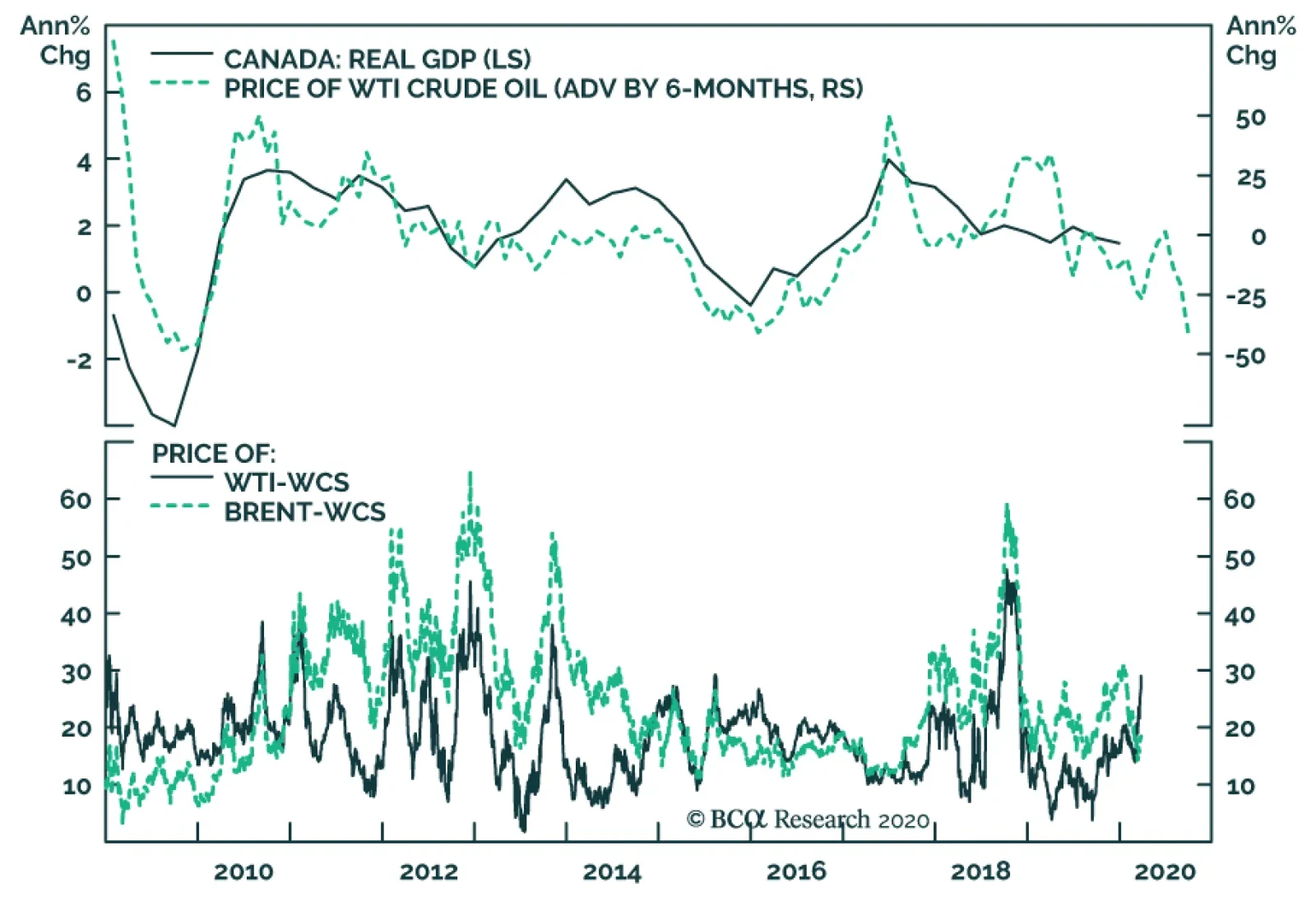
In an emergency meeting last Friday, the Bank of Canada lowered the overnight target rate by 50 basis points rate to 0.25%. Meanwhile, it also launched two new programs to restore liquidity to financial markets. The Commercial Paper Purchase Program…
Highlights Global investors have come to accept the secular stagnation narrative as described by Larry Summers in November 2013, and have gravitated to the only available real time estimate of the real neutral rate of interest: the Laubach & Williams (“LW”) “R-star” estimate. With this apparent visualization of secular stagnation as a guide, many investors have concluded that monetary policy ceased to be stimulative last year and that recent Fed rate cuts will be of limited benefit to economic activity even once economic recovery takes hold unless inflation meaningfully accelerates (thus pushing real rates lower for any given nominal Fed funds rate). This report revisits the “LW” R-star estimate in detail, and demonstrates why the estimation is almost certainly wrong, at least over the past two decades. We also outline an inferential approach that investors can use to monitor where the neutral rate is in real time and whether it is rising or falling. The core conclusion for investors is that US Treasury yields reflect a “low rates forever” view with much higher certainty than is analytically warranted and thus appear to be anchored by a false narrative. While bond yields may not rise significantly in the near-term, investors should avoid dogmatic medium-to-longer term views about yields as they may rise meaningfully over a cyclical and secular horizon once a post-COVID-19 expansion takes hold. Feature Over the past several weeks financial markets have moved rapidly to price in a global recession stemming from the COVID-19 outbreak. As financial market participants began to turn to policy makers for support, eyes focused first on the Federal Reserve, and then fiscal authorities. Earlier this week, the ECB joined the party and announced aggressive further measures of its own. When responding to the Fed’s return to the lower bound and its other recent monetary policy decisions, many market participants have expressed the view that the Fed is largely impotent to deal with a global pandemic. There are three elements to this view. The first is that interest rate cuts are ill equipped to stimulate domestic demand if quarantine measures or other forms of “social distancing” are in effect. The second element is that the Fed has only been capable of delivering a fraction of the reduction in interest rates compared to what has occurred in response to previous contractions. The third aspect of this view is that because the neutral rate of interest is so much lower now than it was in the past, Fed rate cuts will not be as stimulative as they were before. Chart II-1Monetary Policy Ceased To Be Stimulative Last Year, According To The LW R-star Estimate
Monetary Policy Ceased To Be Stimulative Last Year, According To The LW R-star Estimate
Monetary Policy Ceased To Be Stimulative Last Year, According To The LW R-star Estimate
While we at least partly agree with the first and second elements of this view, we feel strongly that the third is flawed. Global investors have come to accept the secular stagnation narrative as described by Larry Summers in November 2013,1 and have gravitated to the only available real time estimate of the neutral rate of interest: the Laubach & Williams (“LW”) “R-star” estimate. This time series, which is regularly updated by the New York Fed,2 suggests that the real fed funds rate reached neutral territory in the first quarter of 2019 (Chart II-1). With this apparent visualization of secular stagnation as a guide, many investors have concluded that monetary policy ceased to be stimulative last year and that recent Fed rate cuts will be of limited benefit to economic activity even beyond the near term unless inflation meaningfully accelerates (thus pushing real rates lower for any given nominal Fed funds rate). In this Special Report we revisit the “LW” R-star estimate in detail, and demonstrate why the estimation is almost certainly wrong, at least over the past two decades. Our analysis does not reveal a precise alternative estimate of the neutral rate, although we do provide some inferential perspective on how investors may be able to monitor where the neutral rate is in real time and whether it is rising or falling. However, the core insight emanating from our report, particularly for US fixed income investors, is that US Treasury yields reflect a “low rates forever” view with much higher certainty than is analytically warranted and thus appear to be anchored by a false narrative. While bond yields may not rise significantly in the near-term, this underscores that they have the potential to rise meaningfully over a cyclical and secular horizon once economic activity recovers. As such, we caution fixed-income investors against dogmatic medium-to-longer term views about bond yields, as their potential to rise may be larger than many investors currently expect. Demystifying The LW R-star Estimate The LW estimate of the neutral rate of interest has gained credibility for three reasons. First, as noted above, the evolution of the series fits with the secular stagnation narrative re-popularized by Larry Summers. Second, the series is essentially sponsored by the Federal Reserve even if it is not officially part of the Fed’s forecasting framework, as its two creators are long-time Fed employees (Thomas Laubach is a director of the Fed’s Board of Governors, and John Williams is the current President of the New York Fed). But, in our view, there is a third important reason that global investors have accepted the LW R-star estimate of the neutral rate of interest: the methodology used to generate the estimate is extremely technically complex, and thus is difficult for most investors to penetrate. Much of the technical complexity of the LW estimate is centered around the use of a statistical procedure called a Kalman filter (“KF”). Simply described, the KF is an algorithm that tries to estimate an unobservable variable based on 1) an idea of how the unobservable variable might relate to an observable variable (the “measurement equation”), and 2) an idea of how the unobservable variable might change through time (the “transition equation”). Through a repeated process of simulating the unobserved variable based on a set of assumptions, the KF is able to compare predicted results to actual results on an observation-by-observation basis, and use that information to generate ever more reliable future estimates of the unobserved variable (Chart II-2). Chart II-2A Very Simplified Overview Of The Kalman Filter Algorithm
April 2020
April 2020
We acknowledge that a full technical treatment of the Kalman Filter as it relates to the LW estimate of the neutral rate of interest is beyond the scope of this report, and we provide a more technical overview in Box II-1. But what emerges from a detailed analysis of the model is that the Kalman Filter jointly estimates R-star, potential GDP growth, potential GDP, and the variable “z”, the determinants of R-star that are not explained by potential GDP growth. As we will highlight in the next section, this joint estimation of these four variables is a crucial aspect of the model, because a valid estimate of R-star necessitates a valid estimate of the remaining variables. BOX II-1 A Technical Overview Of The Laubach & Williams R-star Model Chart Box II-1 shows that there are three sets of formulas involved in the LW estimation: the “law of motion” for the neutral rate of interest, two measurement equations, and three transition equations. The law of motion for the neutral rate is fairly simple: R-star is a function of trend real GDP growth, as well as “other factors” represented by the variable “z”. Laubach & Williams note that z “captures factors such as households’ rate of time preference”. The measurement equations are also fairly straightforward. First, the (unobservable) output gap is a function of lagged values of itself as well as the lagged real Fed funds rate gap (relative to the unobservable neutral rate). Second, inflation is a function of lagged values of itself, past values of the output gap, relative core import prices, and lagged relative imported oil prices (the latter two variables are included to capture potential supply shocks to inflation). Note that this second measurement equation is required for the model to work, as it relates the unobservable output gap to observable inflation. As presented in Chart II-2, the three transition equations are present to simulate how the unobservable variables might move through time. Potential growth and potential output are a random walk, and “z” from the law of motion follows either a random walk or an autoregressive process. Chart Box II-1The Laubach & Williams R-star Model
April 2020
April 2020
Debunking The LW R-star Estimate Before criticizing the LW estimate of the neutral rate of interest, it is important for us to note that we have the utmost respect for the Federal Reserve and its research methods. We fully acknowledge that the LW R-star estimation is rooted in solid economic theory, and we have identified no technical errors in the setup of the LW model. Nevertheless, valid analytical efforts sometimes lead to problematic real-world results, and there are two key reasons to believe that the Kalman filter in the LW model is almost certainly misspecifying R-star, at least in terms of its estimate over the past two decades. The first reason relates to the sensitivity of the model to the interval of estimation (the period over which R-star is estimated). Chart II-3 presents the range of quarterly estimates of R-star since 2005, along with the difference between the high and low end of the range in the second panel. The chart shows that while previous estimates of R-star have generally been stable for values ranging between the early-1980s and 2006/2007, pre-1980 estimates have varied quite substantially and we have seen material revisions to the estimates over the past decade. Q1 2018 serves as an excellent example: in that quarter R-star was estimated to be 0.14%; today, the Q1 2018 R-star estimate sits at 0.92%. Chart II-3Since 2005, There Has Been Some Instability In The LW R-star Estimates
Since 2005, There Has Been Some Instability In The LW R-star Estimates
Since 2005, There Has Been Some Instability In The LW R-star Estimates
However, Table II-1 and Chart II-4 highlight the real instability of the Kalman filter estimation by demonstrating the effect of varying the starting point of the model (please see Box II-2 for a brief description of how our estimation of R-star using the LW approach differs slightly from the original procedure). Laubach & Williams originally estimated R-star beginning in Q1 1961; Table II-1 shows what happens to today’s estimate of R-star simply by incrementally varying the starting point of the model from Q1 1958 to Q4 1979. Table II-1Alternative Current LW Estimates Of R-star By Model Starting Point
April 2020
April 2020
Chart II-4Alternative Starting Points Produce Wildly Different Estimates Of R-star Today
April 2020
April 2020
BOX II-2 The Laubach & Williams R-star Model With Simplified Inflation Expectations To proxy inflation expectations in their model, Laubach & Williams use a “forecast of the four-quarter-ahead percentage change in the price index for personal consumption expenditures excluding food and energy (“core PCE prices”) generated from a univariate AR(3) of inflation estimated over the prior 40 quarters”. The authors note that a simplified measure of expectations, a 4-quarter moving average of quarterly annualized core inflation, does not materially alter their results. For the sake of parsimony we use this simplified measure in our analysis. We find that the effect shifts the current estimate of R-star only slightly (+10 basis points), and that the historical differences between our version of the 1961 estimation and the official series are indeed minor. The table highlights that the model fails to even generate a result in a majority of the cases (only 39 out of 88 of the model runs were error-free). In addition, Chart II-4 shows that of the successful estimates of R-star using the LW procedure and alternate starting dates of the model, the estimate of R-star today varies from -2% (in one case) to +2%. Excluding the one extremely negative outlier results in an effective estimate range of 0% to 2%, but the key point for investors is that this range is massive and underscores that the original model’s estimate of R-star today is heavily and unduly influenced by the interval of estimation. Investors should also note that of all of the alternative estimates of R-star today shown in Chart II-4, the estimate using the original interval is very much on the low end of the distribution. The second (and most important) reason to believe that the LW estimate is misspecifying R-star is that the output gap estimate generated by the model is almost certainly invalid, at least over the past two decades. Chart II-5presents the LW output gap estimate alongside an average of the CBO, OECD, and IMF estimates of the gap; panel 1 shows the official current LW output gap estimate, whereas panel 2 shows the range of output gap estimates that are generated using the different estimation intervals highlighted in Table II-1 and Chart II-4. Chart II-5The LW Output Gap Estimates, Upon Which R-star Depends, Have Been Wrong For Two Decades
The LW Output Gap Estimates, Upon Which R-star Depends, Have Been Wrong For Two Decades
The LW Output Gap Estimates, Upon Which R-star Depends, Have Been Wrong For Two Decades
Given that the Kalman filter in the LW model jointly determines R-star and the output gap (by way of estimating potential output via estimating potential GDP growth) and that these estimates are dependent on each other, Chart II-5 highlights that in order to believe the LW R-star estimate investors must believe three things: That the US economy was chronically below potential in the late-1990s when the unemployment rate was below 5%, real GDP growth averaged nearly 5%, and the equity market was booming, That output exceeded potential in 2004/2005 by a magnitude not seen since the late-1970s / early-1980s despite an average unemployment rate, That the 2008/2009 US recession was not particularly noteworthy in terms of its deviation from potential output, and that the economy had returned to potential output by 2010/2011 when the unemployment rate was in the range of 8-9%. Chart II-6The US Economy Was Definitely Not At Full Employment In 2010
The US Economy Was Definitely Not At Full Employment In 2010
The US Economy Was Definitely Not At Full Employment In 2010
While we do not believe any of these three statements, the third is especially unlikely. Chart II-6 highlights that the economic expansion from 2009 – 2020 was the weakest on record in the post-war era in terms of average annual real per capita GDP growth. To us, this is a clear symptom of a chronic deficiency in aggregate demand, and that it is essentially unreasonable to argue that the economy was operating at full employment prior to 2014/2015. This means that the Kalman filter is generating incorrect and unreliable estimates of the output gap, which means in turn that the filter’s estimation of R-star is almost assuredly wrong. How Can Investors Tell What The Neutral Rate Is? An Inferential Approach Table II-2 presents the sensitivity of the original Q1 1961 LW estimate of R-star to a series of counterfactual scenarios for inflation, real GDP growth, nominal interest rates, and import and oil prices since mid-2009. While these scenarios do not in any way improve the validity of the LW R-star estimate, they do help clarify the theoretical basis of the model and they help reveal how investors may infer whether the neutral rate of interest is higher or lower than prevailing market rates, and whether it is rising or falling. Table II-2Sensitivity Of Current LW R-star Estimate To Counterfactual Scenarios (2009 - Present)
April 2020
April 2020
Chart II-7Core Import Price Growth Has Been Weak On Average During This Expansion
Core Import Price Growth Has Been Weak On Average During This Expansion
Core Import Price Growth Has Been Weak On Average During This Expansion
Table II-2 highlights that today’s estimate of R-star using the original LW approach is mostly sensitive to our counterfactual scenarios for growth and interest rates, but not inflation or oil prices. Shifting down import price growth also has a meaningful effect on R-star, but since core import price growth has been particularly weak over the past several years (Chart II-7), it seems unreasonable to suggest that they have been abnormally high and thus “explain” a low R-star estimate today. Table II-2 essentially highlights that the entire question of the neutral rate of interest over the past decade, and the core contradiction that led to the re-emergence of the secular stagnation thesis, can effectively be boiled down to the following simple question: “Why hasn’t US economic growth been stronger this cycle, given that interest rates have been so low?” Based on the (hopefully uncontroversial) view that interest rates influence economic activity and that economic activity influences inflation, we propose the following checklist for investors to ask themselves in order to not only determine the answer to this important question, but to help identify whether R-star in any given country is likely higher or lower than existing policy rates at any given point in time. Are interest rates above or below the prevailing level of economic growth? Are interest rates rising or falling, and how intensely? Are there identifiable non-monetary shocks (positive or negative) that appear to be influencing economic activity? Is private sector credit growth keeping pace with economic growth? Are debt service burdens in the economy high or low? The first question reflects the most basic view of R-star, which is that the real neutral rate of interest should be equal to, or at least closely related to, the potential growth rate of the economy, ceteris paribus. Questions 2 through 5 attempt to determine whether ceteris paribus holds. In terms of how the answers to these questions relate to identifying the neutral rate, consider two economies, “Economy A” and “Economy B” (Chart II-8). Economy A has broadly stable or slightly rising interest rates that are well below prevailing rates of economic growth (questions 1 & 2), no obvious beneficial shocks to domestic demand from fiscal policy or other factors (question 3), and strong private sector credit growth that is perhaps above or strongly above the current pace of GDP growth (question 4). Chart II-8'Economy A', Versus 'Economy B'
April 2020
April 2020
Inferentially, it would seem that interest rates in this hypothetical economy are below R-star today. Question 5 is in our list because the more that active private sector leveraging occurs (thus pushing up debt burdens), the more that we would expect R-star in the future to fall. This is because debt payments as a share of income cannot rise forever, and we would expect that the capacity of economy A’s central bank to raise interest rates in the future are negatively related to economy A’s private sector debt service burden today. Now, imagine another economy (“Economy B”) with interest rates well below average rates of economic growth, an interest rate trend that is flat-to-down, no identifiable non-monetary policy shocks that are restricting aggregate demand, persistently sluggish credit growth, and high private sector debt service burdens in the past. If economy B is growing (even sluggishly) and not in the middle of a recession, it would seem that prevailing interest rates are below R-star, but not significantly so. In this scenario it would seem reasonable to conclude that R-star in economy B has fallen non-trivially below its potential growth rate, and that interest rate increases are likely to move monetary policy into restrictive territory earlier than otherwise would be the case. Is The United States “Economy B”? From the perspective of some investors, our description of economy B above perfectly captures the experience of the US over the past decade: an extremely low Fed funds rate, sluggish to weak growth and inflation, all the result of a huge build-up in leverage and debt service burdens during the last economic cycle. We do not doubt that R-star fell in the US for some period of time during the global financial crisis and in the early phase of the economic recovery. But we doubt that it is as low today as the secular stagnation narrative would imply, in large part because it ignores several important aspects concerning questions 2 through 5 noted above. Chart II-9Fiscal Austerity Has Been A Serious Non-Monetary Shock To Aggregate Demand
Fiscal Austerity Has Been A Serious Non-Monetary Shock To Aggregate Demand
Fiscal Austerity Has Been A Serious Non-Monetary Shock To Aggregate Demand
Non-monetary shocks to the US and global economies: Over the past 12 years, there have been at least five deeply impactful non-monetary shocks to both the US and global economies that have contributed to the disconnect between growth and interest rates: 1) a prolonged period of US household deleveraging from 2008-2014, 2) the euro area sovereign debt crisis, 3) fiscal austerity in the US, UK, and euro area from 2010 – 2012/2014 (Chart II-9), 4) the US dollar / oil price shock of 2014, and 5) the recent trade war between the US and China. Several of these shocks have been policy-driven, and in the case of austerity the negative consequences of that policy has led to a lasting change in thinking among fiscal authorities (outside of Japan) that is unlikely to reverse in the near-future. Chart II-10Recent Trends In US Private Sector Leverage Do Not Suggest R-star Is Very Low
Recent Trends In US Private Sector Leverage Do Not Suggest R-star Is Very Low
Recent Trends In US Private Sector Leverage Do Not Suggest R-star Is Very Low
Private sector credit growth: Chart II-10 highlights the extent of household deleveraging noted above by showing the growth in total household liabilities over the past decade alongside income growth. Panel 2 shows the leveraging trend of firms, as represented by the nonfinancial corporate sector debt-to-GDP ratio. Chart II-10 underscores two points: the first is that while US household sector credit contracted for several years following the global financial crisis, it is now growing again and has largely closed the gap with income growth. The second point is that the nonfinancial corporate sector has clearly leveraged itself over the course of the expansion, arguing that interest rates have not in any way been restrictive for businesses. While it is true that firms have largely leveraged themselves to buy back stock instead of significantly increasing capital expenditures, in our view this reflects the fact that US consumer demand was impaired for several years due to deleveraging. We doubt that firms would have altered their capital structures to this degree if they did not view interest rates as extremely low. Debt service burdens: Chart II-11 highlights that US household debt service burdens were at very elevated levels prior to the financial crisis, suggesting that the neutral rate did fall for some time following the recession. But today, the debt burden facing households is the lowest it has been in the past 40 years due to both rate reductions and deleveraging, arguing against the view that household debt levels will structurally weigh on interest rates in the years to come. Chart II-12 shows that the picture is different for nonfinancial corporations, as the substantial leveraging noted above has indeed raised debt service burdens for firms. However, the nonfinancial corporate sector debt service ratio remains 400 basis points below early-2000 levels when excess corporate sector liabilities had a clear impact on the economy, suggesting that the Fed’s capacity to raise interest rates still exists following the onset of economic recovery if corporate sector credit growth does not rise sharply relative to GDP over the coming 6-12 months. Chart II-11The Debt Burden Facing US Households Is At A Record Low
The Debt Burden Facing US Households Is At A Record Low
The Debt Burden Facing US Households Is At A Record Low
Chart II-12Businesses Have Levered Up Their Balance Sheets, But There Is Still Room For Rates To Rise
Businesses Have Levered Up Their Balance Sheets, But There Is Still Room For Rates To Rise
Businesses Have Levered Up Their Balance Sheets, But There Is Still Room For Rates To Rise
The intensity of recent interest rate changes: Finally, many investors have pointed to sluggish housing activity over the past three years as evidence of a low neutral rate. However, Chart II-13 highlights that the rise in the 30-year US mortgage rate from late-2016 to late-2018 was one of the largest two-year changes in US history, and Chart II-14 shows that the growth in household mortgage credit did not fall below its trend during this period until Q4 2018, when the US stock market fell 20% from its high in response to the economic consequences of the US/China trade war. Chart II-14 also shows that mortgage credit growth responded sharply to a recent reduction in interest rates. All in all, Charts II-13 & II-14 cast doubt on the notion that the level of mortgage rates over the past three years reached restrictive territory. Chart II-13Mortgage Rates Rose Very Significantly From Late-2016 To Late-2018
Mortgage Rates Rose Very Significantly From Late-2016 To Late-2018
Mortgage Rates Rose Very Significantly From Late-2016 To Late-2018
Chart II-14A Record Rise In Mortgage Rates Did Not Crack The Housing Market
A Record Rise In Mortgage Rates Did Not Crack The Housing Market
A Record Rise In Mortgage Rates Did Not Crack The Housing Market
Investment Conclusions In the face of a global pandemic and an attendant global recession this year, the idea of eventual Fed rate hikes and the notion that the US economy will be able to tolerate them likely seems preposterous to many investors. We agree that over the coming 6-12 months US Treasury yields are unlikely to rise; even at current levels of the 10-year Treasury yield, we are reluctant to call a trough. Chart II-15US 10-Year Treasurys Are Mostly Priced For A Repeat Of The Past Decade
US 10-Year Treasurys Are Mostly Priced For A Repeat Of The Past Decade
US 10-Year Treasurys Are Mostly Priced For A Repeat Of The Past Decade
However, Chart II-15highlights that over a long-term time horizon, the bond market is now essentially priced for a repeat of the ten-year path of the Fed funds rate following the global financial crisis. While some investors will view this as a reasonable expectation in the face of what they see as a persistent and unexplainable gap between growth and interest rates over the past decade, we think this gap is explainable and we highly doubt that a pandemic with minimal mortality risk to the working age population and the young will cause the US economy to be afflicted with active consumer deleveraging lasting 4 to 6-years, substantial and wide-ranging fiscal austerity, persistently rising trade tariffs, and sharply lower oil prices. So while we agree that the US economy will be substantially cyclically affected by COVID-19, US Treasury yields reflect a “low rates forever” view with much higher certainty than is analytically warranted and thus appear to be anchored by a false narrative. As such, we caution fixed-income investors against dogmatic medium-to-longer term views about bond yields, as their potential to rise following the upcoming recession may be larger than many investors currently believe. Jonathan LaBerge, CFA, Vice President Special Reports jonathanl@bcaresearch.com Footnotes 1 "IMF Fourteenth Annual Research Conference in Honor of Stanley Fischer," Washington DC, November 8, 2013. 2 "Measuring the Natural Rate of Interest," Federal Reserve Bank of New York.
Highlights The global economy is in the midst of a painful recession. Monetary and fiscal authorities are responding forcefully to the crisis, but the lengths of the lockouts and quarantines remain a major source of downside risk to the economy. Investors should favor stocks over bonds during the next year. The short-term outlook remains fraught with danger, so avoid aggressive bets. Central banks can tackle the global liquidity crunch, thus spreads will narrow and the dollar will weaken. The long-term impact of COVID-19 will be inflationary. Feature “The only thing we have to fear is fear itself.” Franklin Delano Roosevelt 1932 A violent global recession is underway. Last month, we wrote that a deep economic slump would be unavoidable if COVID-19 cases could not be controlled within two to three weeks.1 Since then, the number of new, recorded COVID-19 cases has mounted every day and fear prevails. Consumers are not spending; firms will face a cash crunch and/or bankruptcy, and employment will be slashed. The next few quarters could result in some of the worst GDP prints since the Great Depression. Risk assets have moved to discount this dire scenario. The global stock-to-bond ratio has collapsed by 47% since its peak on January 17th and stands at the 1st decile of it post-1980 distribution. 10-year US bond yields temporarily fell below 0.4%. The dollar has rallied against every currency and even gold traded below $1500 an ounce. Brent crude trades below $30/bbl. In this context, investors must assess if risk asset prices have declined enough to compensate for the economic hazards created by the COVID-19 pandemic. If the massive amount of monetary and fiscal stimulus announced can turn around the economy in the second half of the year, then stocks and risk assets are attractive. Otherwise, they are still not cheap enough and cash remains king. We think it is a good time to begin to parsimoniously deploy capital into risk assets. A Global Recession And An Extraordinary Response The global economy has suffered its worst shock since the Great Financial Crisis (GFC), but policymakers are deploying every tool available. In our base case, GDP will contract more quickly for two quarters than it did during the GFC, and then will recover smartly. It is hard to pinpoint exactly how quickly global GDP will contract in the next six months, but key indicators point to a grim outcome. Chart I-1Global Growth Is Plunging
Global Growth Is Plunging
Global Growth Is Plunging
China’s economy was at the forefront of the COVID-19 pandemic and its trajectory provides a glimpse into what the rest of the world should anticipate. In February, Chinese retail sales contracted by 20.5% annually and industrial production plunged by 13.5%. The German ZEW survey for March paints an equally bleak picture. The growth expectations component for the Eurozone and Germany fell to its lowest level since the GFC. The same indicator, but computed as an average of US, European and Asian subcomponents is also collapsing at an alarming pace (Chart I-1). The European flash PMI for March also points to a deep slowdown, with the services PMI plunging to 28.4, an all-time low. The performance of EM carry trades flashes a somber warning for our Global Industrial Production Nowcast (Chart I-2). Carry trade returns are imploding because global liquidity is incapable of meeting the demand for precautionary money by economic agents. This lack of liquidity is inflicting enormous damage on worldwide growth. Live trackers for US and global economic activity are also melting down. Traffic in some of the US’s largest cities is a fraction of last year's (Chart I-3). Globally, restaurant bookings have dried up and fewer airlines are flying compared to 2008. Initial jobless claims in the US have surged to 3.28 million, rapidly and decisively overtaking the weaknesses seen during the GFC. Chart I-2The Liquidation Of Carry Trade Is A Bad Omen
The Liquidation Of Carry Trade Is A Bad Omen
The Liquidation Of Carry Trade Is A Bad Omen
Chart I-3Live Trackers Are In Free Fall
April 2020
April 2020
Despite the dismal situation, some positive developments are emerging. It has been demonstrated that quarantines contain the spread of the virus. On March 18th, Wuhan recorded no new COVID-19 cases. Moreover, 10 days after its January 24th quarantine began, new cases started to fall off quickly (Chart I-4) in the city. If the recent softening in new cases in Italy’s Lombardy region continues, it will illustrate that democratic regimes can also reduce the pace of infection. Chart I-4Quarantines Do Work
April 2020
April 2020
Most importantly, policymakers around the world have shown their willingness to do “whatever it takes.” Governments are easing fiscal policy with abandon. Germany’s state bank KfW is setting aside EUR550 billion to support the economy. France will spend EUR45 billion and has earmarked EUR300 billion in small business loan guarantees. Spain announced EUR200 billion to protect domestic activity. The White House just passed a stimulus package of $2 trillion, and Canada follows suit with a CAD82 billion relief bill. (Table I-1). As A. Walter and J. Chwieroth showed, the growing financial wealth of the middle class is forcing governments to always provide large bailouts after financial crises and recessions. Otherwise, their political parties suffer extreme repudiation from power.2 Table I-1Massive Stimulus In Response To Pandemic
April 2020
April 2020
Central bankers have also become extreme reflators. Nearly every central bank in advanced economies has cut interest rates to zero or into negative territory. Most importantly, central banks have become lenders of last resort. The US Federal Reserve has announced it will engage in unlimited asset purchases; it has reopened various facilities to provide liquidity to the market and is using the US Department of the Treasury to lend directly to the private sector. Among its many measures, the European Central Bank is scrapping artificial limits on its bond purchases that were its capital keys and has offered a EUR750 billion bond purchase program. The ECB is also looking to open its OMT program. Other central banks are injecting cash directly into their domestic markets (Table I-2). The list and size of actions will expand until the markets are satiated with enough liquidity. Table I-2The Central Banks Still Had Some Options When Crisis Hit
April 2020
April 2020
The impact of these policy measures is threefold. First, the actions are designed to alleviate the global economy’s cash crunch. Secondly, they aim to support growth directly. The private sector needs direct backing to survive the lack of cash inflows that will develop in the coming weeks. If fiscal and monetary authorities can plug that hole, then spending will not have to collapse as deeply nor for as long as would otherwise be the case. Finally, it is imperative that policymakers boost confidence and ease financial conditions to allow “animal spirits” to stabilize. If risk-taking continues to tailspin, then spending will never recover and the demand for cash will only grow, creating the worst liquidity trap since the Great Depression. Policymakers around the world have shown their willingness to do “whatever it takes.” The economy will continue to weaken in the second half of 2020 if quarantines remain in place beyond the summer. Not being epidemiologists, we are not equipped to make this call with any degree of certainty. Much depends on the evolution of the disease and the political decisions taken. We do not yet know if the population will be willing to endure the economic pain of a depression, or if political pressures will rise to force isolation on those over age 60 and those suffering dangerous comorbidities who are at higher risk, and allow everyone else to return to work and school.3 Investment Implications Part 1: Bonds and Stocks Chart I-5The Stock-To-Bond Ratio Has Capitulated
The Stock-To-Bond Ratio Has Capitulated
The Stock-To-Bond Ratio Has Capitulated
While the short-term outlook remains murky for asset markets, investors with a 12-month or longer investment horizon should begin to move capital into equities at the expense of bonds. Beyond the relative technical and valuation backdrops (Chart I-5), the outlook for fiscal and monetary policy favors this allocation decision. US Treasury yields have dropped from 1.9% at the turn of the year to as low as 0.31% on March 9th. According to the bond market, inflation will average less than 1% during the coming 10 years. The OIS curve is pricing in a fed funds rate of only 68 basis points in five years. In response to this extreme pricing, Treasury bonds are exceptionally expensive (Chart I-6). Moreover, using BCA Research’s Golden Rule of Treasury Investing, there is little scope for yields to fall any lower. The Golden Rule states that the return of Treasury bonds is directly linked to the Fed's rate surprises. If over the next year the Fed cuts interest rates more than is currently priced into the OIS curve, then bond yields will fall in the next 12 months (Chart I-7). Given that the fed funds rate is already at its lower limit, the Fed will not be able to deliver such a dovish surprise and yields will have limited downside. Chart I-6Bonds Are Furiously Expensive
Bonds Are Furiously Expensive
Bonds Are Furiously Expensive
Chart I-7The Fed Cannot Pull Another Dovish Surprise Out Of Its Hat
The Fed Cannot Pull Another Dovish Surprise Out Of Its Hat
The Fed Cannot Pull Another Dovish Surprise Out Of Its Hat
The bond market is also vulnerable from a technical perspective. Our Composite Technical Indicator is as overbought today as it was in December 2008 (Chart I-8). Thus, bond prices are vulnerable to good news. Economic activity will be weak for many months, but the recent policy announcements will boost global fiscal deficits by more than $3 trillion in the next 12 to 18 months. Such a large supply of paper is bearish for bonds, especially when they are very expensive. Moreover, global central banks are engaging in large-scale quantitative easing (QE). Globally, monetary authorities have already announced the equivalent of at least $1.9 trillion in asset purchases. The GFC experience showed that QE programs put upward pressure on Treasury yields (Chart I-9). This time will not be different given the combination of QE, supply disruptions caused by quarantines and large fiscal stimulus. Chart I-8A Dire Combination For Bonds
A Dire Combination For Bonds
A Dire Combination For Bonds
Chart I-9QE Pushes Yields Up
QE Pushes Yields Up
QE Pushes Yields Up
Equities offer the opposite risk/reward ratio to bonds. Technical indicators are consistent with maximum pessimism toward equities and imply that most of the selloff is behind us, at least for the time being. The Complacency-Anxiety Indicator developed by BCA Research’s US Equity Strategy service points to widespread pessimism among investors,4 an intuition confirmed by our Sentiment indicator (Chart I-10). Moreover, our Equity Capitulation Index is as depressed as in March 2009. Investors with a 12-month or longer investment horizon should begin to move capital into equities at the expense of bonds. Despite the magnitude of the shock hitting the global economy, equities will rally if they become cheap enough and monetary conditions are accommodative enough. The BCA Valuation indicator has collapsed to “undervalued” territory and our Monetary Indicator has never been more supportive of equities (both variables are shown on page 2 of Section III). The gap between these two indicators is at its lowest level since Q1 2009 or 1982, two points that marked the end of bear markets (Chart I-11). Chart I-10Equities Have Capitulated
Equities Have Capitulated
Equities Have Capitulated
Chart I-11Supportive Combined Valuation And Monetary Backdrop For Equities
Supportive Combined Valuation And Monetary Backdrop For Equities
Supportive Combined Valuation And Monetary Backdrop For Equities
Equity multiples also offer some insight into the risk/reward ratio for stocks. The S&P 500 has collapsed by 34% since its February 19th peak and trades at 13 times forward earnings. True, analysts will revise their forecasts, but the market also only trades at 14 times trailing earnings, which cannot be downgraded. Most importantly, investors are extremely gloomy about expected growth when multiples and risk-free rates are so subdued. Risk assets cannot stabilize durably as long as the demand for dollar liquidity is not satiated. Table I-3Evaluating Where The Floor Lies
April 2020
April 2020
We can use a simple discounted cash flow model to extract the expected growth rate of long-term earnings embedded in the S&P 500. To do so, we assume that the ERP is 300 basis points, close to the long-term outperformance of stocks versus bonds. At current multiples and 10-year yields, investors are pricing in a long-term growth rate of -2% annually for earnings (Table I-3). In comparison, investors were more pessimistic in 1974, 2008 and 2011 when they anticipated long-term earnings contractions of -2.5% annually. If we assume that the long-term growth of expected earnings will fall to that depth, then we can estimate trailing P/E multiples will be under different risk-free rates. If yields fall to zero, then the P/E would be 17.7 or a price level of 2,692; however, if they rise to 1.5%, then the P/E would decline to 13.9 or a price level of 2,115 (Table I-3). Chart I-12Expected Earnings Growth And Interest Rates Are Co-Integrated
Expected Earnings Growth And Interest Rates Are Co-Integrated
Expected Earnings Growth And Interest Rates Are Co-Integrated
This method suggests that 2200 is the S&P 500’s likely floor. Risk-free rates and the expected growth rate of long-term earnings are correlated series because the anticipated evolution of economic activity drives both real interest rates and earnings (Chart I-12). Thus, it is unlikely that yields will climb if expected earnings growth falls. Instead, if the expected growth rate of long-term earnings drops to -2.5%, then yields should stand between 1% and 0.5%, implying equilibrium trailing P/Es of 15 to 16.3 times, or prices levels of 2,278 to 2,468. P/E will only fall much further if the dollar scramble lasts longer. As investors seek cash and liquidate all assets, the process can push anticipated growth rates lower while pulling bond yields higher (see next section). Investment Implications Part 2: The Uncontrolled Liquidity Crunch Is Still An Immediate Risk Risk assets cannot stabilize durably as long as the demand for dollar liquidity is not satiated. The large programs announced around the world seem to be calming this liquidity crunch. However, the situation is fluid and the crunch can come back at a moment's notice. Despite the magnitude of the shock hitting the global economy, equities will rally if they become cheap enough and monetary conditions are accommodative enough. Credit spreads blew up as investors priced in the inevitable increase in defaults that accompanies recessions (Chart I-13). Junk spreads moved to as high as 1100 basis points, their highest level since 2009. If we assume that next year, US EBITDA contracts by its average post-war magnitude (a timid assumption), then the interest coverage ratio will deteriorate to readings not seen since the S&L crisis, which will force default rates higher (Chart I-14). Chart I-13Defaults Will Rise
Defaults Will Rise
Defaults Will Rise
Chart I-14Corporate Fundamentals Will Deteriorate
Corporate Fundamentals Will Deteriorate
Corporate Fundamentals Will Deteriorate
The anticipated contraction in cash flows creates another more pernicious and dangerous consequence: an insatiable demand for dollar liquidity by the private sector. Companies are worried they may not generate the necessary cash flows to service their debt. This is especially worrisome for foreign borrowers who have loans in US dollars. The BIS estimates that foreign currency debt denominated in USDs stands at $12 trillion. Meanwhile, these foreign borrowers are hoarding dollars. The risk aversion of US-based companies is accentuating the dollar crunch. US companies have pulled on their credit lines en masse. US commercial banks must provide this cash to their clients. However, US banks must still meet liquidity requirements imposed by the Basel III rules. As a result, the banks are also hoarding as much cash as possible in the form of excess reserves and curtailed their capital market lending, especially in the repo market. Repos are the lifeblood of capital markets and without repos, market liquidity (the ability to sell and buy securities) quickly deteriorates. This chain of events has caused a sharp widening in Treasury bid-ask spreads, LIBOR-OIS spreads and commercial paper-T-Bill spreads, and has fueled weaknesses in mortgage and municipal bond markets (Chart I-15). The evaporation of the repo market accentuates the foreign liquidity crunch. Without functioning repo markets, dollar funding in offshore markets becomes more onerous, as highlighted by the widening in global cross-currency basis swap spreads (Chart I-16). Borrowers are buying dollars at any cost. This has led to the surge in the dollar from March 9th, which forced the collapse of risky currencies such as the NOK, the BRL or the MXN, but also of safe-haven currencies such as the JPY and the CHF. Chart I-15Symptoms Of A Liquidity Crunch
Symptoms Of A Liquidity Crunch
Symptoms Of A Liquidity Crunch
Chart I-16Offshore Funding Pressures Point To A Dollar Shortage
Offshore Funding Pressures Point To A Dollar Shortage
Offshore Funding Pressures Point To A Dollar Shortage
The strength in the dollar is problematic. As a symptom of the liquidity crunch, it accompanies forced selling of assets by investors seeking to acquire cash. Moreover, the USD is a funding currency, hence a strong dollar also tightens the global cost of capital for all foreign borrowers who have tapped into US capital markets. For US firms, it also accentuates deflationary pressures and the resulting lower price of goods sold increases the risk of bankruptcies. Thus, a strong dollar would feed the weakness in asset prices and further widen credit spreads. Moreover, because the liquidity crunch hurts growth and can concurrently push yields higher, it could pull P/Es below 15 and drive equity prices far below our 2,200 floor. On the positive side, central banks worldwide are keenly aware of the danger created by the liquidity crunch. The Fed has started and restarted a long list of liquidity facilities (Table I-2). Its unlimited QE program also addresses the dollar shortage directly by expanding the supply of money. Crucially, the Fed has re-opened dollar swap lines with other central banks, including emerging markets such as Korea, Singapore, Mexico and Brazil. Even the ECB and the Bank of England are relaxing liquidity ratios for their banks, which at the margin will alleviate the supply of liquidity in their domestic economies. The Fed will likely follow its European counterparts, which could play a large role in alleviating the global dollar shortage. Investors seeking to assess if the supply of liquidity is large enough should pay close attention to gold prices. The global, large-scale fiscal stimulus programs will also address the dollar liquidity crisis. When investors judge there is sufficient fiscal stimulus to put a floor under global economic activity, the markets will take a more sanguine view of the risk of default. If large enough, government spending will support corporate cash flows and, therefore, limit corporate bankruptcies. Consequently, demand for liquidity will also decline and mass asset liquidations will ebb. Chart I-17Gold Is The Ultimate Liquidity Gauge
Gold Is The Ultimate Liquidity Gauge
Gold Is The Ultimate Liquidity Gauge
Investors seeking to assess if the supply of liquidity is large enough should look for some key market signals. We pay close attention to gold prices; after March 9th they fell despite the global spike in risk aversion due to gold's extreme sensitivity to global liquidity conditions. Both today and in the fall of 2008, gold prices fell when illiquidity grew. Our gold fair-value model shows that the precious metal is extremely sensitive to inflation expectations and real bond yields (Chart I-17). As illiquidity grows and the dollar appreciates, inflation breakevens collapse and real yields spike. Thus, the recent gold rebound suggests that the Fed and other major central banks have expanded the supply of liquidity sufficiently to meet demand, the price of money will fall (real interest rates) and inflation expectations will rebound. Monitor whether gold can remain well bid. Investment Implications Part 3: FX And Commodity Markets Chart I-18China's Stimulus Will Once Again Be Paramount
China's Stimulus Will Once Again Be Paramount
China's Stimulus Will Once Again Be Paramount
China’s stimulus will be a key driver of the FX market in the post-liquidity-crunch world. Historically, because Chinese reflation has lifted the global manufacturing cycle, it possesses a large influence on the dollar’s trend (Chart I-18). We believe that China’s stimulus will be comparable to the one implemented in 2008 and will boost global growth. Moreover, the interest rate advantage of the US has declined and global macro volatility will not remain at current extremes for an extended time. These three factors (Chinese stimulus, lower interest rate differentials and declining volatility) will weigh on the USD in the coming 18 months (Chart I-18, bottom panel). EM currencies and the AUD will benefit most from the dollar depreciation later this year. In the short term, these currencies remain exposed to any flare up in the liquidity crunch and can cheapen further. But, as Chart I-19 highlights, investing in those currencies will likely generate long-term excess returns because they have cheapened significantly. Commodities, too, are becoming attractive at current valuations. Industrial metals such as copper will benefit greatly from China’s stimulus. A rising Chinese credit and fiscal impulse lifts the price of base metals because it pushes up Chinese infrastructure spending as well as residential and capex investment (Chart I-20). Moreover, a lower dollar and accommodative global monetary policy will further boost the appeal of industrial metals. Chart I-19EM FX Is Cheap
EM FX Is Cheap
EM FX Is Cheap
Chart I-20China Will Drive Metal Prices Higher
China Will Drive Metal Prices Higher
China Will Drive Metal Prices Higher
China’s stimulus will be a key driver of the FX market in the post-liquidity-crunch world. The oil outlook is particularly unclear as both demand and supply factors are in flux. At $27/bbl, Brent is cheap enough to compensate investors for the decline in demand that will emerge between now and the end of the second quarter. However, the market-share war between Saudi Arabia and Russia layers on the problem of supply risk. Saudi Aramco is set to increase production to 12.3 million barrels by April and Saudi’s GCC allies have announced they are increasing output as well. According to BCA Research’s Commodity and Energy Strategy service, the oil market is already oversupplied by 1.6 million barrels per day, a number that will expand if the KSA and its allies fulfill their production pledges. If this situation persists, oil will lag behind industrial metals when global risk aversion recedes. Nonetheless, our commodity strategists believe that the collapse in oil prices is more painful for Russia than for KSA. We believe there will be a compromise between OPEC and Russia in the coming weeks that will push supply lower.5 Additionally, the Texas Railroad Commission is preparing to impose limitations on Texas oil production, which has not been done since the 1970s. Such a decision would magnify any rebound in oil prices. Thinking Long-Term: The Return Of Stagflation? The COVID-19 outbreak will likely be viewed as an epoch-defining moment. The policy response to the outbreak will be far reaching and the disease will change the way firms manage supply chains for decades to come. There will be a substantial pullback in globalization. COVID-19 has generated an inflationary shock in the medium term. Chart I-21War Spending Is Always Inflationary
War Spending Is Always Inflationary
War Spending Is Always Inflationary
COVID-19 has generated an inflationary shock in the medium term. Governments have suddenly abandoned their preferences for fiscal rectitude. The US deficit will reach a peacetime record of 15% of GDP. These are war-like spending measures. In history, gold standard or not, wars were the main reason for inflationary outbreaks as they involved massive budgetary expansions (Chart I-21). The large monetary easing accompanying the current fiscal expansion will only add to this inflationary impulse. Many of the proposals discussed by governments involve funneling cash directly to households, while central banks buy bonds issued by the same government. This is very close to helicopter money. These policies will increase the velocity of money, which is structurally inflationary (Chart I-22). Naysayers may point to the lack of inflation created by QE programs in the direct aftermath of the GFC. However, at that time, households and commercial banks were much sicker. Today, capital ratios in the US and the Eurozone are 60% and 33% higher than in 2007, respectively (Chart I-23). Thus, banks are much more likely to add to money creation instead of retracting from it as they did in the last cycle. Chart I-22If Velocity Rises, So Will Inflation
If Velocity Rises, So Will Inflation
If Velocity Rises, So Will Inflation
Chart I-23Banks Are Much Healthier Than In 2008
April 2020
April 2020
Chart I-24Financial Assets Have No Inflation Cushion
Financial Assets Have No Inflation Cushion
Financial Assets Have No Inflation Cushion
Markets are not ready for higher inflation. The 5-year/5-year forward CPI swaps in the US and the euro area stand at only 1.6% and 0.7%, respectively. Household long-term inflation expectations are also at all-time lows (Chart I-24). Therefore, an increase in inflation will have a deep impact on asset prices. The first implication is that gold prices have probably begun a new structural bull market. Inflation will surprise on the upside and keep real interest rates lower. Both these factors are highly bullish for the yellow metal. Additionally, easy fiscal policy and money printing will devalue currencies versus hard assets, which will benefit all precious metals, including gold. EM central banks have recently been diversifying aggressively in gold, which will add another impetuous to its rally. The second implication is that the stock-to-bond ratio has structural upside. Equities are not a perfect inflation hedge, but their profits can rise when selling prices accelerate. However, bonds display rock bottom real yields, inflation protection and term premia. Moreover, their low-running yields are below the dividend yields of equities, which has also boosted bond duration to record levels. Therefore, bonds offer even less protection against higher inflation. Hence, the stock-to-bond ratio will probably follow the historical experience of the 20th century structural bull market and inflect higher (Chart I-25). However, this outperformance will not stem from the superior performance of stocks in real terms; rather, it will emerge from a very poor performance by bonds. Chart I-25The Stock-To-Bond Ratio Will Follow The 20th Century Road Map
The Stock-To-Bond Ratio Will Follow The 20th Century Road Map
The Stock-To-Bond Ratio Will Follow The 20th Century Road Map
Thirdly, the structural relative bear market in EM equities will likely end soon. EM equities will enjoy strong real asset prices and EM assets have much more appealing valuations than DM stocks. This is an imbedded inflation protection. The world is witnessing a fiscal and monetary push that will result in lower productivity growth and profit margins, along with feared inflation. The next decade could increasingly look like the stagflationary 1970s. Mathieu Savary Vice President The Bank Credit Analyst March 26, 2020 Next Report: April 30, 2020 II. Revisiting The Neutral Rate Of Interest: A Contrarian View In A Time Of Crisis Global investors have come to accept the secular stagnation narrative as described by Larry Summers in November 2013, and have gravitated to the only available real time estimate of the real neutral rate of interest: the Laubach & Williams (“LW”) “R-star” estimate. With this apparent visualization of secular stagnation as a guide, many investors have concluded that monetary policy ceased to be stimulative last year and that recent Fed rate cuts will be of limited benefit to economic activity even once economic recovery takes hold unless inflation meaningfully accelerates (thus pushing real rates lower for any given nominal Fed funds rate). This report revisits the “LW” R-star estimate in detail, and demonstrates why the estimation is almost certainly wrong, at least over the past two decades. We also outline an inferential approach that investors can use to monitor where the neutral rate is in real time and whether it is rising or falling. The core conclusion for investors is that US Treasury yields reflect a “low rates forever” view with much higher certainty than is analytically warranted and thus appear to be anchored by a false narrative. While bond yields may not rise significantly in the near-term, investors should avoid dogmatic medium-to-longer term views about yields as they may rise meaningfully over a cyclical and secular horizon once a post-COVID-19 expansion takes hold. Over the past several weeks financial markets have moved rapidly to price in a global recession stemming from the COVID-19 outbreak. As financial market participants began to turn to policy makers for support, eyes focused first on the Federal Reserve, and then fiscal authorities. Earlier this week, the ECB joined the party and announced aggressive further measures of its own. When responding to the Fed’s return to the lower bound and its other recent monetary policy decisions, many market participants have expressed the view that the Fed is largely impotent to deal with a global pandemic. There are three elements to this view. The first is that interest rate cuts are ill equipped to stimulate domestic demand if quarantine measures or other forms of “social distancing” are in effect. The second element is that the Fed has only been capable of delivering a fraction of the reduction in interest rates compared to what has occurred in response to previous contractions. The third aspect of this view is that because the neutral rate of interest is so much lower now than it was in the past, Fed rate cuts will not be as stimulative as they were before. Chart II-1Monetary Policy Ceased To Be Stimulative Last Year, According To The LW R-star Estimate
Monetary Policy Ceased To Be Stimulative Last Year, According To The LW R-star Estimate
Monetary Policy Ceased To Be Stimulative Last Year, According To The LW R-star Estimate
While we at least partly agree with the first and second elements of this view, we feel strongly that the third is flawed. Global investors have come to accept the secular stagnation narrative as described by Larry Summers in November 2013,6 and have gravitated to the only available real time estimate of the neutral rate of interest: the Laubach & Williams (“LW”) “R-star” estimate. This time series, which is regularly updated by the New York Fed,7 suggests that the real fed funds rate reached neutral territory in the first quarter of 2019 (Chart II-1). With this apparent visualization of secular stagnation as a guide, many investors have concluded that monetary policy ceased to be stimulative last year and that recent Fed rate cuts will be of limited benefit to economic activity even beyond the near term unless inflation meaningfully accelerates (thus pushing real rates lower for any given nominal Fed funds rate). In this Special Report we revisit the “LW” R-star estimate in detail, and demonstrate why the estimation is almost certainly wrong, at least over the past two decades. Our analysis does not reveal a precise alternative estimate of the neutral rate, although we do provide some inferential perspective on how investors may be able to monitor where the neutral rate is in real time and whether it is rising or falling. However, the core insight emanating from our report, particularly for US fixed income investors, is that US Treasury yields reflect a “low rates forever” view with much higher certainty than is analytically warranted and thus appear to be anchored by a false narrative. While bond yields may not rise significantly in the near-term, this underscores that they have the potential to rise meaningfully over a cyclical and secular horizon once economic activity recovers. As such, we caution fixed-income investors against dogmatic medium-to-longer term views about bond yields, as their potential to rise may be larger than many investors currently expect. Demystifying The LW R-star Estimate The LW estimate of the neutral rate of interest has gained credibility for three reasons. First, as noted above, the evolution of the series fits with the secular stagnation narrative re-popularized by Larry Summers. Second, the series is essentially sponsored by the Federal Reserve even if it is not officially part of the Fed’s forecasting framework, as its two creators are long-time Fed employees (Thomas Laubach is a director of the Fed’s Board of Governors, and John Williams is the current President of the New York Fed). But, in our view, there is a third important reason that global investors have accepted the LW R-star estimate of the neutral rate of interest: the methodology used to generate the estimate is extremely technically complex, and thus is difficult for most investors to penetrate. Much of the technical complexity of the LW estimate is centered around the use of a statistical procedure called a Kalman filter (“KF”). Simply described, the KF is an algorithm that tries to estimate an unobservable variable based on 1) an idea of how the unobservable variable might relate to an observable variable (the “measurement equation”), and 2) an idea of how the unobservable variable might change through time (the “transition equation”). Through a repeated process of simulating the unobserved variable based on a set of assumptions, the KF is able to compare predicted results to actual results on an observation-by-observation basis, and use that information to generate ever more reliable future estimates of the unobserved variable (Chart II-2). Chart II-2A Very Simplified Overview Of The Kalman Filter Algorithm
April 2020
April 2020
We acknowledge that a full technical treatment of the Kalman Filter as it relates to the LW estimate of the neutral rate of interest is beyond the scope of this report, and we provide a more technical overview in Box II-1. But what emerges from a detailed analysis of the model is that the Kalman Filter jointly estimates R-star, potential GDP growth, potential GDP, and the variable “z”, the determinants of R-star that are not explained by potential GDP growth. As we will highlight in the next section, this joint estimation of these four variables is a crucial aspect of the model, because a valid estimate of R-star necessitates a valid estimate of the remaining variables. BOX II-1 A Technical Overview Of The Laubach & Williams R-star Model Chart Box II-1 shows that there are three sets of formulas involved in the LW estimation: the “law of motion” for the neutral rate of interest, two measurement equations, and three transition equations. The law of motion for the neutral rate is fairly simple: R-star is a function of trend real GDP growth, as well as “other factors” represented by the variable “z”. Laubach & Williams note that z “captures factors such as households’ rate of time preference”. The measurement equations are also fairly straightforward. First, the (unobservable) output gap is a function of lagged values of itself as well as the lagged real Fed funds rate gap (relative to the unobservable neutral rate). Second, inflation is a function of lagged values of itself, past values of the output gap, relative core import prices, and lagged relative imported oil prices (the latter two variables are included to capture potential supply shocks to inflation). Note that this second measurement equation is required for the model to work, as it relates the unobservable output gap to observable inflation. As presented in Chart II-2, the three transition equations are present to simulate how the unobservable variables might move through time. Potential growth and potential output are a random walk, and “z” from the law of motion follows either a random walk or an autoregressive process. Chart Box II-1The Laubach & Williams R-star Model
April 2020
April 2020
Debunking The LW R-star Estimate Before criticizing the LW estimate of the neutral rate of interest, it is important for us to note that we have the utmost respect for the Federal Reserve and its research methods. We fully acknowledge that the LW R-star estimation is rooted in solid economic theory, and we have identified no technical errors in the setup of the LW model. Nevertheless, valid analytical efforts sometimes lead to problematic real-world results, and there are two key reasons to believe that the Kalman filter in the LW model is almost certainly misspecifying R-star, at least in terms of its estimate over the past two decades. The first reason relates to the sensitivity of the model to the interval of estimation (the period over which R-star is estimated). Chart II-3 presents the range of quarterly estimates of R-star since 2005, along with the difference between the high and low end of the range in the second panel. The chart shows that while previous estimates of R-star have generally been stable for values ranging between the early-1980s and 2006/2007, pre-1980 estimates have varied quite substantially and we have seen material revisions to the estimates over the past decade. Q1 2018 serves as an excellent example: in that quarter R-star was estimated to be 0.14%; today, the Q1 2018 R-star estimate sits at 0.92%. Chart II-3Since 2005, There Has Been Some Instability In The LW R-star Estimates
Since 2005, There Has Been Some Instability In The LW R-star Estimates
Since 2005, There Has Been Some Instability In The LW R-star Estimates
However, Table II-1 and Chart II-4 highlight the real instability of the Kalman filter estimation by demonstrating the effect of varying the starting point of the model (please see Box II-2 for a brief description of how our estimation of R-star using the LW approach differs slightly from the original procedure). Laubach & Williams originally estimated R-star beginning in Q1 1961; Table II-1 shows what happens to today’s estimate of R-star simply by incrementally varying the starting point of the model from Q1 1958 to Q4 1979. Table II-1Alternative Current LW Estimates Of R-star By Model Starting Point
April 2020
April 2020
Chart II-4Alternative Starting Points Produce Wildly Different Estimates Of R-star Today
April 2020
April 2020
BOX II-2 The Laubach & Williams R-star Model With Simplified Inflation Expectations To proxy inflation expectations in their model, Laubach & Williams use a “forecast of the four-quarter-ahead percentage change in the price index for personal consumption expenditures excluding food and energy (“core PCE prices”) generated from a univariate AR(3) of inflation estimated over the prior 40 quarters”. The authors note that a simplified measure of expectations, a 4-quarter moving average of quarterly annualized core inflation, does not materially alter their results. For the sake of parsimony we use this simplified measure in our analysis. We find that the effect shifts the current estimate of R-star only slightly (+10 basis points), and that the historical differences between our version of the 1961 estimation and the official series are indeed minor. The table highlights that the model fails to even generate a result in a majority of the cases (only 39 out of 88 of the model runs were error-free). In addition, Chart II-4 shows that of the successful estimates of R-star using the LW procedure and alternate starting dates of the model, the estimate of R-star today varies from -2% (in one case) to +2%. Excluding the one extremely negative outlier results in an effective estimate range of 0% to 2%, but the key point for investors is that this range is massive and underscores that the original model’s estimate of R-star today is heavily and unduly influenced by the interval of estimation. Investors should also note that of all of the alternative estimates of R-star today shown in Chart II-4, the estimate using the original interval is very much on the low end of the distribution. The second (and most important) reason to believe that the LW estimate is misspecifying R-star is that the output gap estimate generated by the model is almost certainly invalid, at least over the past two decades. Chart II-5presents the LW output gap estimate alongside an average of the CBO, OECD, and IMF estimates of the gap; panel 1 shows the official current LW output gap estimate, whereas panel 2 shows the range of output gap estimates that are generated using the different estimation intervals highlighted in Table II-1 and Chart II-4. Chart II-5The LW Output Gap Estimates, Upon Which R-star Depends, Have Been Wrong For Two Decades
The LW Output Gap Estimates, Upon Which R-star Depends, Have Been Wrong For Two Decades
The LW Output Gap Estimates, Upon Which R-star Depends, Have Been Wrong For Two Decades
Given that the Kalman filter in the LW model jointly determines R-star and the output gap (by way of estimating potential output via estimating potential GDP growth) and that these estimates are dependent on each other, Chart II-5 highlights that in order to believe the LW R-star estimate investors must believe three things: That the US economy was chronically below potential in the late-1990s when the unemployment rate was below 5%, real GDP growth averaged nearly 5%, and the equity market was booming, That output exceeded potential in 2004/2005 by a magnitude not seen since the late-1970s / early-1980s despite an average unemployment rate, That the 2008/2009 US recession was not particularly noteworthy in terms of its deviation from potential output, and that the economy had returned to potential output by 2010/2011 when the unemployment rate was in the range of 8-9%. Chart II-6The US Economy Was Definitely Not At Full Employment In 2010
The US Economy Was Definitely Not At Full Employment In 2010
The US Economy Was Definitely Not At Full Employment In 2010
While we do not believe any of these three statements, the third is especially unlikely. Chart II-6 highlights that the economic expansion from 2009 – 2020 was the weakest on record in the post-war era in terms of average annual real per capita GDP growth. To us, this is a clear symptom of a chronic deficiency in aggregate demand, and that it is essentially unreasonable to argue that the economy was operating at full employment prior to 2014/2015. This means that the Kalman filter is generating incorrect and unreliable estimates of the output gap, which means in turn that the filter’s estimation of R-star is almost assuredly wrong. How Can Investors Tell What The Neutral Rate Is? An Inferential Approach Table II-2 presents the sensitivity of the original Q1 1961 LW estimate of R-star to a series of counterfactual scenarios for inflation, real GDP growth, nominal interest rates, and import and oil prices since mid-2009. While these scenarios do not in any way improve the validity of the LW R-star estimate, they do help clarify the theoretical basis of the model and they help reveal how investors may infer whether the neutral rate of interest is higher or lower than prevailing market rates, and whether it is rising or falling. Table II-2Sensitivity Of Current LW R-star Estimate To Counterfactual Scenarios (2009 - Present)
April 2020
April 2020
Chart II-7Core Import Price Growth Has Been Weak On Average During This Expansion
Core Import Price Growth Has Been Weak On Average During This Expansion
Core Import Price Growth Has Been Weak On Average During This Expansion
Table II-2 highlights that today’s estimate of R-star using the original LW approach is mostly sensitive to our counterfactual scenarios for growth and interest rates, but not inflation or oil prices. Shifting down import price growth also has a meaningful effect on R-star, but since core import price growth has been particularly weak over the past several years (Chart II-7), it seems unreasonable to suggest that they have been abnormally high and thus “explain” a low R-star estimate today. Table II-2 essentially highlights that the entire question of the neutral rate of interest over the past decade, and the core contradiction that led to the re-emergence of the secular stagnation thesis, can effectively be boiled down to the following simple question: “Why hasn’t US economic growth been stronger this cycle, given that interest rates have been so low?” Based on the (hopefully uncontroversial) view that interest rates influence economic activity and that economic activity influences inflation, we propose the following checklist for investors to ask themselves in order to not only determine the answer to this important question, but to help identify whether R-star in any given country is likely higher or lower than existing policy rates at any given point in time. Are interest rates above or below the prevailing level of economic growth? Are interest rates rising or falling, and how intensely? Are there identifiable non-monetary shocks (positive or negative) that appear to be influencing economic activity? Is private sector credit growth keeping pace with economic growth? Are debt service burdens in the economy high or low? The first question reflects the most basic view of R-star, which is that the real neutral rate of interest should be equal to, or at least closely related to, the potential growth rate of the economy, ceteris paribus. Questions 2 through 5 attempt to determine whether ceteris paribus holds. In terms of how the answers to these questions relate to identifying the neutral rate, consider two economies, “Economy A” and “Economy B” (Chart II-8). Economy A has broadly stable or slightly rising interest rates that are well below prevailing rates of economic growth (questions 1 & 2), no obvious beneficial shocks to domestic demand from fiscal policy or other factors (question 3), and strong private sector credit growth that is perhaps above or strongly above the current pace of GDP growth (question 4). Chart II-8'Economy A', Versus 'Economy B'
April 2020
April 2020
Inferentially, it would seem that interest rates in this hypothetical economy are below R-star today. Question 5 is in our list because the more that active private sector leveraging occurs (thus pushing up debt burdens), the more that we would expect R-star in the future to fall. This is because debt payments as a share of income cannot rise forever, and we would expect that the capacity of economy A’s central bank to raise interest rates in the future are negatively related to economy A’s private sector debt service burden today. Now, imagine another economy (“Economy B”) with interest rates well below average rates of economic growth, an interest rate trend that is flat-to-down, no identifiable non-monetary policy shocks that are restricting aggregate demand, persistently sluggish credit growth, and high private sector debt service burdens in the past. If economy B is growing (even sluggishly) and not in the middle of a recession, it would seem that prevailing interest rates are below R-star, but not significantly so. In this scenario it would seem reasonable to conclude that R-star in economy B has fallen non-trivially below its potential growth rate, and that interest rate increases are likely to move monetary policy into restrictive territory earlier than otherwise would be the case. Is The United States “Economy B”? From the perspective of some investors, our description of economy B above perfectly captures the experience of the US over the past decade: an extremely low Fed funds rate, sluggish to weak growth and inflation, all the result of a huge build-up in leverage and debt service burdens during the last economic cycle. We do not doubt that R-star fell in the US for some period of time during the global financial crisis and in the early phase of the economic recovery. But we doubt that it is as low today as the secular stagnation narrative would imply, in large part because it ignores several important aspects concerning questions 2 through 5 noted above. Chart II-9Fiscal Austerity Has Been A Serious Non-Monetary Shock To Aggregate Demand
Fiscal Austerity Has Been A Serious Non-Monetary Shock To Aggregate Demand
Fiscal Austerity Has Been A Serious Non-Monetary Shock To Aggregate Demand
Non-monetary shocks to the US and global economies: Over the past 12 years, there have been at least five deeply impactful non-monetary shocks to both the US and global economies that have contributed to the disconnect between growth and interest rates: 1) a prolonged period of US household deleveraging from 2008-2014, 2) the euro area sovereign debt crisis, 3) fiscal austerity in the US, UK, and euro area from 2010 – 2012/2014 (Chart II-9), 4) the US dollar / oil price shock of 2014, and 5) the recent trade war between the US and China. Several of these shocks have been policy-driven, and in the case of austerity the negative consequences of that policy has led to a lasting change in thinking among fiscal authorities (outside of Japan) that is unlikely to reverse in the near-future. Chart II-10Recent Trends In US Private Sector Leverage Do Not Suggest R-star Is Very Low
Recent Trends In US Private Sector Leverage Do Not Suggest R-star Is Very Low
Recent Trends In US Private Sector Leverage Do Not Suggest R-star Is Very Low
Private sector credit growth: Chart II-10 highlights the extent of household deleveraging noted above by showing the growth in total household liabilities over the past decade alongside income growth. Panel 2 shows the leveraging trend of firms, as represented by the nonfinancial corporate sector debt-to-GDP ratio. Chart II-10 underscores two points: the first is that while US household sector credit contracted for several years following the global financial crisis, it is now growing again and has largely closed the gap with income growth. The second point is that the nonfinancial corporate sector has clearly leveraged itself over the course of the expansion, arguing that interest rates have not in any way been restrictive for businesses. While it is true that firms have largely leveraged themselves to buy back stock instead of significantly increasing capital expenditures, in our view this reflects the fact that US consumer demand was impaired for several years due to deleveraging. We doubt that firms would have altered their capital structures to this degree if they did not view interest rates as extremely low. Debt service burdens: Chart II-11 highlights that US household debt service burdens were at very elevated levels prior to the financial crisis, suggesting that the neutral rate did fall for some time following the recession. But today, the debt burden facing households is the lowest it has been in the past 40 years due to both rate reductions and deleveraging, arguing against the view that household debt levels will structurally weigh on interest rates in the years to come. Chart II-12 shows that the picture is different for nonfinancial corporations, as the substantial leveraging noted above has indeed raised debt service burdens for firms. However, the nonfinancial corporate sector debt service ratio remains 400 basis points below early-2000 levels when excess corporate sector liabilities had a clear impact on the economy, suggesting that the Fed’s capacity to raise interest rates still exists following the onset of economic recovery if corporate sector credit growth does not rise sharply relative to GDP over the coming 6-12 months. Chart II-11The Debt Burden Facing US Households Is At A Record Low
The Debt Burden Facing US Households Is At A Record Low
The Debt Burden Facing US Households Is At A Record Low
Chart II-12Businesses Have Levered Up Their Balance Sheets, But There Is Still Room For Rates To Rise
Businesses Have Levered Up Their Balance Sheets, But There Is Still Room For Rates To Rise
Businesses Have Levered Up Their Balance Sheets, But There Is Still Room For Rates To Rise
The intensity of recent interest rate changes: Finally, many investors have pointed to sluggish housing activity over the past three years as evidence of a low neutral rate. However, Chart II-13 highlights that the rise in the 30-year US mortgage rate from late-2016 to late-2018 was one of the largest two-year changes in US history, and Chart II-14 shows that the growth in household mortgage credit did not fall below its trend during this period until Q4 2018, when the US stock market fell 20% from its high in response to the economic consequences of the US/China trade war. Chart II-14 also shows that mortgage credit growth responded sharply to a recent reduction in interest rates. All in all, Charts II-13 & II-14 cast doubt on the notion that the level of mortgage rates over the past three years reached restrictive territory. Chart II-13Mortgage Rates Rose Very Significantly From Late-2016 To Late-2018
Mortgage Rates Rose Very Significantly From Late-2016 To Late-2018
Mortgage Rates Rose Very Significantly From Late-2016 To Late-2018
Chart II-14A Record Rise In Mortgage Rates Did Not Crack The Housing Market
A Record Rise In Mortgage Rates Did Not Crack The Housing Market
A Record Rise In Mortgage Rates Did Not Crack The Housing Market
Investment Conclusions In the face of a global pandemic and an attendant global recession this year, the idea of eventual Fed rate hikes and the notion that the US economy will be able to tolerate them likely seems preposterous to many investors. We agree that over the coming 6-12 months US Treasury yields are unlikely to rise; even at current levels of the 10-year Treasury yield, we are reluctant to call a trough. Chart II-15US 10-Year Treasurys Are Mostly Priced For A Repeat Of The Past Decade
US 10-Year Treasurys Are Mostly Priced For A Repeat Of The Past Decade
US 10-Year Treasurys Are Mostly Priced For A Repeat Of The Past Decade
However, Chart II-15highlights that over a long-term time horizon, the bond market is now essentially priced for a repeat of the ten-year path of the Fed funds rate following the global financial crisis. While some investors will view this as a reasonable expectation in the face of what they see as a persistent and unexplainable gap between growth and interest rates over the past decade, we think this gap is explainable and we highly doubt that a pandemic with minimal mortality risk to the working age population and the young will cause the US economy to be afflicted with active consumer deleveraging lasting 4 to 6-years, substantial and wide-ranging fiscal austerity, persistently rising trade tariffs, and sharply lower oil prices. So while we agree that the US economy will be substantially cyclically affected by COVID-19, US Treasury yields reflect a “low rates forever” view with much higher certainty than is analytically warranted and thus appear to be anchored by a false narrative. As such, we caution fixed-income investors against dogmatic medium-to-longer term views about bond yields, as their potential to rise following the upcoming recession may be larger than many investors currently believe. Jonathan LaBerge, CFA, Vice President Special Reports jonathanl@bcaresearch.com III. Indicators And Reference Charts Last month, we continued to strike a cautious tactical tone. Valuations were not depressed enough to compensate investors for the lack of clarity around the path of COVID-19. In other words, there was not enough of a risk premium imbedded in asset prices if COVID-19 cases were to spread around the world. Now that COVID-19 has spread around the planet, asset valuations have adjusted massively. The BCA Valuation Indicator for the S&P 500 is now in undervalued territory, thanks to both lower prices and interest rates. Meanwhile, the BCA Monetary Indicator has never been more accommodative than it is today. Together, these two indicators suggest that twelve months from now, equities will stand at higher levels than they do today. Tactically, equities have most probably found their floor. Both our Composite Sentiment Indicator and the VIX are consistent with a capitulation. Anecdotal evidences also point to a capitulation by retail investors. Additionally, Our RPI indicator is finally starting to try to turn up. Nonetheless, equities will likely re-test their Monday March 23rd floor as the length of US and global quarantines that are so damaging to growth (but for now, necessary) remain uncertain. The cleanest way to express a positive 12-month outlook on equities is to bet on a rise in the stock-to-bond ratio. 10-year Treasurys are as expensive as they were in late 2008 and early 1986, two periods followed by rapid rises in yields. Moreover, our Composite Technical Indicators is 2.5 sigma overbought. The yield curve is steepening anew, which confirms the intuition that yields will experience significant upside over the coming 12 months. On a longer-term basis, inflation expectations are too low to compensate investors for the inflation risk created by a larger monetary and fiscal expansion than the one witnessed in 2008. That being said, EM sovereigns are getting attractive for long-term investors. Following the surge in the dollar that accompanied the liquidity crunch that surrounded the COVID-19 panic, the dollar is now trading at its most expensive level since 1985. The large liquidity injections by the Fed should cap the dollar for now, but the greenback will need more clarity on the end of global quarantines before it can fall decisively. Nonetheless, it will depreciate significantly once the global economy rebounds due to the powerful reflationary impulse building up around the world. Finally, commodity prices are retesting their 2008 lows. They are not as oversold as they were then, but this is good sign as the advance/decline line of our Continuous Commodity Index continues to trend higher. Thus, if as we expect, the dollar’s surge is ending, commodities are likely to be in the process of finding a floor right now. Once investors become more optimistic about the outlook for global growth, commodities will likely rebound sharply, maybe even more so than stocks. Therefore, it is a good time to begin accumulating metals, energy and equities as well as FX linked to natural resources prices. EQUITIES: Chart III-1US Equity Indicators
US Equity Indicators
US Equity Indicators
Chart III-2Willingness To Pay For Risk
Willingness To Pay For Risk
Willingness To Pay For Risk
Chart III-3US Equity Sentiment Indicators
US Equity Sentiment Indicators
US Equity Sentiment Indicators
Chart III-4Revealed Preference Indicator
Revealed Preference Indicator
Revealed Preference Indicator
Chart III-5US Stock Market Valuation
US Stock Market Valuation
US Stock Market Valuation
Chart III-6US Earnings
US Earnings
US Earnings
Chart III-7Global Stock Market And Earnings: Relative Performance
Global Stock Market And Earnings: Relative Performance
Global Stock Market And Earnings: Relative Performance
Chart III-8Global Stock Market And Earnings: Relative Performance
Global Stock Market And Earnings: Relative Performance
Global Stock Market And Earnings: Relative Performance
FIXED INCOME: Chart III-9US Treasurys And Valuations
US Treasurys And Valuations
US Treasurys And Valuations
Chart III-10Yield Curve Slopes
Yield Curve Slopes
Yield Curve Slopes
Chart III-11Selected US Bond Yields
Selected US Bond Yields
Selected US Bond Yields
Chart III-1210-Year Treasury Yield Components
10-Year Treasury Yield Components
10-Year Treasury Yield Components
Chart III-13US Corporate Bonds And Health Monitor
US Corporate Bonds And Health Monitor
US Corporate Bonds And Health Monitor
Chart III-14Global Bonds: Developed Markets
Global Bonds: Developed Markets
Global Bonds: Developed Markets
Chart III-15Global Bonds: Emerging Markets
Global Bonds: Emerging Markets
Global Bonds: Emerging Markets
CURRENCIES: Chart III-16US Dollar And PPP
US Dollar And PPP
US Dollar And PPP
Chart III-17US Dollar And Indicator
US Dollar And Indicator
US Dollar And Indicator
Chart III-18US Dollar Fundamentals
US Dollar Fundamentals
US Dollar Fundamentals
Chart III-19Japanese Yen Technicals
Japanese Yen Technicals
Japanese Yen Technicals
Chart III-20Euro Technicals
Euro Technicals
Euro Technicals
Chart III-21Euro/Yen Technicals
Euro/Yen Technicals
Euro/Yen Technicals
Chart III-22Euro/Pound Technicals
Euro/Pound Technicals
Euro/Pound Technicals
COMMODITIES: Chart III-23Broad Commodity Indicators
Broad Commodity Indicators
Broad Commodity Indicators
Chart III-24Commodity Prices
Commodity Prices
Commodity Prices
Chart III-25Commodity Prices
Commodity Prices
Commodity Prices
Chart III-26Commodity Sentiment
Commodity Sentiment
Commodity Sentiment
Chart III-27Speculative Positioning
Speculative Positioning
Speculative Positioning
ECONOMY: Chart III-28US And Global Macro Backdrop
US And Global Macro Backdrop
US And Global Macro Backdrop
Chart III-29US Macro Snapshot
US Macro Snapshot
US Macro Snapshot
Chart III-30US Growth Outlook
US Growth Outlook
US Growth Outlook
Chart III-31US Cyclical Spending
US Cyclical Spending
US Cyclical Spending
Chart III-32US Labor Market
US Labor Market
US Labor Market
Chart III-33US Consumption
US Consumption
US Consumption
Chart III-34US Housing
US Housing
US Housing
Chart III-35US Debt And Deleveraging
US Debt And Deleveraging
US Debt And Deleveraging
Chart III-36US Financial Conditions
US Financial Conditions
US Financial Conditions
Chart III-37Global Economic Snapshot: Europe
Global Economic Snapshot: Europe
Global Economic Snapshot: Europe
Chart III-38Global Economic Snapshot: China
Global Economic Snapshot: China
Global Economic Snapshot: China
Mathieu Savary Vice President The Bank Credit Analyst Footnotes 1 Please see The Bank Credit Analyst "March 2020," dated February 27, 2020, available at bca.bcaresearch.com 2 Chwieroth, Jeffrey M., Walter, Andrew, The Wealth Effect: How the Great Expectations of the Middle Class Have Changed the Politics of Banking Crises, 2019. 3 A relaxation of social-distancing measures would likely mean that large-scale gatherings are still prohibited, and life would not return to normal for a long time. 4 Please see US Equity Strategy "The Darkest Hour Is Just Before The Dawn," dated March 23, 2020, available at uses.bcaresearch.com 5 Please see Commodity & Energy Strategy "KSA, Russia Will Be Forced To Quit Market-Share War," dated March 19, 2020, available at ces.bcaresearch.com 6 "IMF Fourteenth Annual Research Conference in Honor of Stanley Fischer," Washington DC, November 8, 2013. 7 "Measuring the Natural Rate of Interest," Federal Reserve Bank of New York.
Highlights Duration: Last week’s bond market sell-off was a headfake and does not portend a sustained move higher in Treasury yields. We will need to see a stabilization in confirmed COVID-19 cases and signs of improving global growth before calling the bottom in yields. Keep portfolio duration close to benchmark. Yield Curve: A fed funds rate pinned at zero means that the yield curve will trade directionally with yields for the foreseeable future. The yield curve’s recent re-shaping also means that a barbelled Treasury portfolio now only offers a small yield advantage. We recommend shifting out of a barbell and into a position long the 5-year bullet and short a duration-matched 2/10 barbell. Corporate Spreads: High-yield spreads are now fairly priced for a default cycle of similar magnitude to the 2001/02 recession, and the Fed’s entrance into the corporate bond market is a potential game changer for investment grade spreads. Investors should increase exposure to investment grade corporates from neutral to overweight. High-yield investors with horizons of 12 months or more should also start adding exposure. Fed Policy: The Fed is frantically trying to mitigate the impact of three different (though related) shocks: An economic shock, a liquidity shock and a credit shock. We assess its progress to date and discuss what could be done next. Feature Headfake Chart 1Not A Reflationary Environment
Not A Reflationary Environment
Not A Reflationary Environment
Bond yields jumped early last week, shortly after the Fed cut rates back to the zero bound. At one point the 10-year Treasury yield reached as high as 1.18%. But make no mistake, this was not the start of a protracted bond sell off. By Monday morning, the 10-year was back down to 0.75%. Evidently, the conditions for a sustained move higher in Treasury yields are not yet in place. To see why this is so, we need to look a little bit beyond the headline grabbing change in nominal yields and notice that, even when the nominal 10-year yield moved up early last week, the 10-year real yield increased much more quickly, causing the implied cost of inflation protection to fall (Chart 1). This is unusual behavior. Typically, real yields, nominal yields and breakeven inflation rates are all positively correlated. This is because an improving economic outlook usually leads investors to expect both higher inflation and a higher fed funds rate in the future, and vice-versa. When the correlation breaks down it is usually related to some policy action or constraint. For example, investors could come to believe that the Fed will keep interest rates too low for far too long, causing real yields to fall even as inflation expectations jump. Or, as is the case right now, the market could recognize the zero-lower-bound constraint on Fed policy and start to price-in a scenario where the Fed can’t cut rates far enough to jumpstart economic growth. Real yields move higher in this scenario, but inflation expectations crash. We are seeing the same dynamic of rising real yields and falling inflation expectations that was witnessed in 2008. This same dynamic of rising real yields and falling inflation expectations was witnessed in 2008, when the Fed was rapidly cutting rates but investors did not view that action as sufficient (Chart 2). Falling equity prices and a rising dollar further underscored that the environment was becoming more deflationary, not reflationary. A sustained rise in bond yields can only be caused by a reflationary environment. Chart 2Shades Of 2008
Shades Of 2008
Shades Of 2008
How Close To The Bottom? The relevant question then becomes: How close are we to returning to a reflationary environment? To answer this question we will rely on the checklist to call the bottom in bond yields that we unveiled two weeks ago.1 That checklist contains four factors: A stabilization in confirmed COVID-19 cases Improving global economic growth (particularly in China) Weaker US economic data A trigger from one or more technical trading rules Last week we started to see the first signs of weaker US economic data. Initial jobless claims spiked to 281k and both the New York and Philadelphia Fed regional manufacturing surveys plunged (Chart 3). We expect the bottom in bond yields will occur when the US economic data are very weak and when economies that experienced the outbreak earlier – such as China – are showing signs of rebounding. Investors will superimpose the Chinese experience onto the US. But it is still too early for that. Global growth bellwethers such as the CRB Raw Industrials commodity price index remain in freefall (Chart 3, bottom panel). We also noted that we want to see stabilization in the global number of confirmed COVID-19 cases. Essentially, this would mean the number of daily new cases falling close to zero. We are far from that point, as the daily number of new cases continues to rise exponentially (Chart 4). Chart 3Weaker US Data, But No Global Recovery
Weaker US Data, But No Global Recovery
Weaker US Data, But No Global Recovery
Chart 4New Cases Still Rising
New Cases Still Rising
New Cases Still Rising
We should also mention that we expect risk assets – equities and corporate credit – to bottom before Treasury yields, as the Fed will take care not to signal a premature removal of crisis stimulus measures. Finally, two weeks ago we described several technical trading rules that have demonstrated some success at calling troughs in Treasury yields in the past. Since last week, one of our three proposed trading rules was briefly triggered, but that signal was quickly reversed. Bottom Line: Last week’s bond market sell-off was a headfake and does not portend a sustained move higher in Treasury yields. We will need to see a stabilization in confirmed COVID-19 cases and signs of improving global growth before calling the bottom in yields. Keep portfolio duration close to benchmark. A Quick Note On TIPS In last week’s report we made the case for long-term investors to buy TIPS relative to equivalent-maturity nominal Treasuries.2 The reasoning is that TIPS breakeven inflation rates offer exceptional value relative to likely future inflation outcomes. For example, the 5-year TIPS breakeven inflation rate is currently 0.31% and the 10-year rate is 0.75%. This means that a buy-and-hold investor will make money owning TIPS versus nominals if inflation averages more than 0.31% per year for the next five years, or 0.75% per year for the next decade. Chart 51-Year TIPS Return Scenarios
Life At The Zero Bound
Life At The Zero Bound
We also observed last week that TIPS breakeven inflation rates have turned negative at the front-end of the curve. We described this pricing as irrational because of the embedded deflation floors in TIPS. This was incorrect. While TIPS will always pay at least par at maturity, seasoned TIPS with only a year or two left to maturity already have inflation-adjusted principal values that are well above par. In other words, there is room for deflation to influence the returns from these securities before any floor is triggered. Specifically, we can take a look at the TIPS maturing in just over one year, on April 15 2021 (Chart 5). This note has an accumulated principal of just under $109 and is currently trading at an ask price of $97.63.3 According to our calculations, this security will earn 2.55% if headline CPI inflation is 0% over the next 12 months. It will only lose money if headline CPI inflation comes in at -2.49% or below. What’s more, it will return more than a 12-month nominal T-bill as long as inflation is above -2.4%. Note that the lowest year-over-year headline CPI inflation print during the Great Financial Crisis was -2.1%. TIPS offer exceptional value relative to nominal Treasuries for investors who are able to hold the trade for at least one year. Bottom Line: TIPS offer exceptional value relative to nominal Treasuries for investors who are able to hold the trade for at least one year. Treasury Curve: Re-Visiting The Zero-Lower-Bound Playbook Chart 6Curve Will Trade Directionally With Yields
Curve Will Trade Directionally With Yields
Curve Will Trade Directionally With Yields
The Fed’s aggressive policy easing has caused the yield curve to re-shape dramatically during the past few weeks. The 2/10 Treasury slope is up to 55 bps from a 2019 low of -4 bps. The 2/30 Treasury slope is up to 118 bps from a 2019 low of 42 bps, and the 2/5 Treasury slope is up to 15 bps from a 2019 low of -13 bps. Looking through the recent volatility, the fact that the fed funds rate is back to a range between 0% and 0.25% means that we can dust off our yield curve playbook from the last zero-lower-bound period. Fortunately, that playbook is quite straightforward. With the front-end of the curve pinned near zero, the slope of the yield curve will essentially trade directionally with the level of Treasury yields for the foreseeable future. Chart 6 shows that during the last zero-lower-bound period, the 2/30, 2/10 and 2/5 slopes were all positively correlated with the 5-year Treasury yield. This correlation suggests one obvious strategy. If you think yields will rise, put on steepeners. If you think they will fall, put on flatteners. Or if, like us, you suspect that bond yields will be higher in 12 months but are not quite ready to call the bottom, you could hedge benchmark or above-benchmark portfolio duration by entering a duration-neutral steepener. What About Value Across The Curve? Chart 7Bullets Looking Less Expensive
Bullets Looking Less Expensive
Bullets Looking Less Expensive
Until recently, investors could earn large positive carry by owning a barbell consisting of the long and short ends of the Treasury curve (e.g. 2/30) and shorting the belly (e.g. 5yr), in duration-matched terms. But this has changed. The 2/10 barbell now only offers 6 bps of positive carry versus the 5-year bullet, while the 2/30 barbell and 5-year bullet offer approximately the same yield. Both the 2/5/10 and 2/5/30 butterfly spreads are also much closer to the fair values suggested by our models (Chart 7).4 Though we are not ready to call the bottom in Treasury yields, we think the 5-year yield is sufficiently attractive to initiate a duration-neutral curve steepener trade: go long the 5-year bullet and short a duration-matched 2/10 barbell. This trade should perform well if the 2/10 slope steepens going forward. Since a steeper curve is now positively correlated with the level of yields, this trade will profit if yields move higher. Viewed this way, the trade acts as a hedge when implemented alongside our conservative ‘At Benchmark’ portfolio duration recommendation. Bottom Line: A fed funds rate pinned at zero means that the yield curve will trade directionally with yields for the foreseeable future. The yield curve’s recent re-shaping also means that a barbelled Treasury portfolio now only offers a small yield advantage. We recommend shifting out of a barbell and into a position long the 5-year bullet and short a duration-matched 2/10 barbell. Corporate Spread Update Corporate spreads continue to widen very quickly. As such, our conclusions from last week about the amount of value in corporate bonds are already out of date. Our value assessment is based on our High-Yield Default-Adjusted Spread, which is the excess spread left over in the high-yield index after removing actual 12-month default losses. Table 1 shows how often the Default-Adjusted Spread has been in different 50 basis point intervals, and what sort of 12-month junk excess returns occurred during those periods. One conclusion from the table: To be confident that high-yield will outperform duration-matched Treasuries on a 12-month horizon, we would need to expect a Default-Adjusted Spread of at least 150 bps. Preferably, the spread would be greater than or equal to 250 bps, the historical average. The red numbers down the right-hand side of Table 1 indicate what the Default-Adjusted Spread will be for the next 12 months if the speculative grade default rate hits a specific value. For example, a default rate of 6%, which would correspond to a default cycle of a similar magnitude as 2015/16, implies a very attractive Default-Adjusted Spread of +633 bps. In contrast, a default rate of 14% or greater would lead to a negative Default-Adjusted Spread. For context, the default rate peaked at 15% and 11% in the 2008 and 2001/2 recessions, respectively. Table 1What's Priced In Credit Spreads?
Life At The Zero Bound
Life At The Zero Bound
As of now, our base case scenario is that the current default cycle will be more severe than the 2015/16 episode but probably not as bad as the 2008 financial crisis. Something on the order of 9% - 11% seems plausible. If that’s the case, then the Default-Adjusted Spread will be somewhere between 216 bps and 394 bps. This looks quite attractive. Additionally, yesterday’s announcement that the Fed will effectively be entering the investment grade corporate bond market could be a game changer. As a result, we recommend increasing exposure to investment grade corporate bonds from neutral to overweight. For high-yield, it is possible that spreads will widen more in the near-term, but value is now sufficiently attractive for investors with investment horizons of 12 months or more to start adding exposure. We retain our neutral 6-12 month recommended allocation for now, but will re-visit the question in more detail in next week’s report. To be confident that high-yield will outperform duration-matched Treasuries on a 12-month horizon, we would need to expect a Default-Adjusted Spread of at least 150 bps. Bottom Line: High-yield spreads are now fairly priced for a default cycle of similar magnitude to the 2001/02 recession, and the Fed’s entrance into the corporate bond market is a potential game changer for investment grade spreads. Investors should increase exposure to investment grade corporates from neutral to overweight. High-yield investors with horizons of 12 months or more should also start adding exposure. The Fed’s War On Three Fronts Events continue to unfold rapidly in financial markets and in terms of the Fed’s response to the market turmoil. We conclude this week’s report with a brief discussion of the three main shocks that the Fed is frantically trying to contain. We also assess how successful the Fed’s responses might be. #1: The Economic Shock The first shock that the Fed is trying to contain is the pure shock to aggregate demand that is occurring as a result of widespread quarantine measures. In cutting rates to zero and signaling that rates will not rise any time soon, the Fed has effectively done all it can to help fight the economic shock. It should help a little. Lower interest rates will ease the debt burden of homeowners who can refinance their mortgages. They may also lower costs for firms that are able to issue debt to weather the current storm. But these effects are minor compared to the fiscal measures currently making their way through Congress.5 Next steps for the Fed: None. The Fed is effectively out of bullets to contain the economic shock. It’s all about fiscal policy now. #2: Market Liquidity Shock Chart 8Bond Market Liquidity Shock
Bond Market Liquidity Shock
Bond Market Liquidity Shock
In addition to the economic shock, the Fed is also responding to a severe market liquidity shock. What we mean by a “market liquidity shock” is that investors are finding it more expensive (or difficult) to transact in certain markets because of the scarce amount of capital being deployed to those areas. This is different than credit risk (see Shock #3). We are not talking about investors having trouble transacting because there are few willing buyers of credit risk. We are talking about high transaction costs in otherwise risk-free parts of the bond market. The issue is critical because these risk-free parts of the bond market (overnight repo, for example) are often used to fund riskier investments. Disruption in funding markets can have ripple-on effects into other, less opaque, areas. We currently see several examples of disruptions to bond market liquidity (Chart 8): Repo rates have spiked relative to the overnight index swap curve (Chart 8, top panel). The iShares 20+ year Treasury Bond ETF (TLT) is suddenly trading at a huge discount to its net asset value (Chart 8, panel 2). Cross-currency basis swap spreads have turned deeply negative, meaning that it is more expensive for non-US actors to obtain US dollar funding (Chart 8, bottom panel). Wider-than-normal bid/ask spreads are being reported in the Treasury market (not shown). These disruptions are occurring because the financial system is not deploying enough capital to market-making activities in these areas. Essentially, nonfinancial firms have drawn on their revolving credit lines during the past few weeks and this has left the financial system short of cash to deploy toward market-making activities. To fix the problem, the Fed has started to transact directly (in large amounts) in both the repo and Treasury markets. This essentially replaces the function that banks were performing until a few weeks ago. But perhaps more importantly, the Fed is also encouraging banks to deploy the capital that already sits on their balance sheets. Unlike during the 2008 financial crisis, banks now carry a lot of capital – the result of Dodd-Frank and Basel III regulations. What the banks need now is tacit permission from regulators to deploy that capital into financial markets, without concern that they will face consequences during a future stress test. Table 2Banks Have Excess Capital
Life At The Zero Bound
Life At The Zero Bound
Even without any specific changes to regulation, Table 2 shows that the big 5 US financial institutions all carry significant buffers above the regulatory minimum 100% Liquidity Coverage Ratio and 6% Supplementary Leverage Ratio. At a minimum, these excess buffers must be deployed to aid market liquidity. Next steps: The Fed is already transacting directly in both the repo and Treasury markets, and behind closed doors it is most certainly encouraging banks to deploy more capital toward market-making activities. If these actions prove insufficient, the next step would be for the Fed – along with other regulators and possibly Congress – to offer temporary regulatory relief for banks, lowering the required Liquidity Coverage and Supplementary Leverage ratios. We view this market liquidity problem as one that regulators will be able to solve. And given the Fed’s aggressive policy response to date, we expect that regulators will get a handle on the issue and restore bond market liquidity fairly soon. #3 Credit Shock Chart 9Can The Credit Shock Be Contained?
Can The Credit Shock Be Contained?
Can The Credit Shock Be Contained?
We draw a distinction between spreads widening because of a lack of market liquidity and spreads widening because investors are unwilling to take credit risk. Though admittedly, it is not always easy to distinguish between these two factors in real time. But there is no doubt that the economy is also grappling with a credit shock, in addition to the economic and liquidity shocks we already mentioned. Some evidence that market players are less willing to take credit risk (Chart 9): The average option-adjusted spread on the Bloomberg Barclays Investment Grade Corporate Bond index has spiked (Chart 9, top panel). The spread between the 3-month commercial paper rate and the overnight index swap rate has surged (Chart 9, panel 2). The Municipal / Treasury yield ratio is higher than it was during the financial crisis (Chart 9, panel 3). The 30-year mortgage rate has so far not followed Treasury yields lower (Chart 9, bottom panel). The Fed can take some measures to mitigate the negative impacts of a credit shock, and it has already taken quite a few. The Fed has set up facilities to back-stop commercial paper and short-maturity municipal debt. It also announced yesterday morning that it will, in conjunction with the Treasury department, enter the investment grade corporate bond market out to the 5-year maturity point, effectively back-stopping a large portion of corporate issuance. The Fed has not yet set up a facility to purchase longer-maturity municipal bonds, but this could be forthcoming. The Fed is also directly purchasing large amounts of Agency MBS in an effort to tighten the spread between the mortgage rate and Treasury yields. The Fed’s measures to guarantee some risky debt can help solve some problems related to a credit shock. For example, if Fed purchases increase asset values for corporate and municipal bonds, then it lessens the risk of bankruptcy both for the issuing firms and for any systemically-important investment fund that may be levered to those markets. However, Fed purchases do not guarantee that stressed firms will be able to take out new debt, nor do they prevent firms from cutting payrolls in the face of lower demand. Only direct cash bailouts from the government can fix those problems. Next steps: The Fed could add another facility to purchase long-maturity municipal bonds. It could also implement a “funding for lending” scheme similar to what the Bank of England has done. These measures, along with what has already been announced, will help ease the credit shock at the margin. But ultimately, cash bailouts from Congress to firms and state & local governments will be required. Ryan Swift US Bond Strategist rswift@bcaresearch.com Footnotes 1 Please see US Bond Strategy Weekly Report, “When And Where Will Bond Yields Trough?”, dated March 10, 2020, available at usbs.bcaresearch.com 2 Please see US Bond Strategy Weekly Report, “Buying Opportunities & Worst-Case Scenarios”, dated March 17, 2020, available at usbs.bcaresearch.com 3 Numbers quoted assuming a par value of $100. 4 For details on our yield curve models please see US Bond Strategy Special Report, “Bullets, Barbells And Butterflies”, dated July 25, 2017, available at usbs.bcaresearch.com 5 The global fiscal response to the COVID crisis is discussed in more detail in Geopolitical Strategy Weekly Report, “De-Globalization Confirmed”, dated March 20, 2020, available at gps.bcaresearch.com Fixed Income Sector Performance Recommended Portfolio Specification
Highlights Market Turmoil: The combination of accelerating global cases of COVID-19, a surging US dollar and elevated market volatility has wreaked havoc on financial markets. A sustainable bottom in global risk assets (and, potentially, bond yields) requires a reversal of all three of those trends. Fed & ECB: Central bankers on both sides of the Atlantic are now committing to provide liquidity backstops for both government bonds and corporate debt by promising “unlimited” purchases. This effectively removes the left tail of the return distribution on debt of more questionable quality that has seen significant spread widening, like US BBB-rated corporates and Peripheral European sovereign debt. Fixed Income Strategy: Upgrade US investment grade corporates to overweight from neutral, and upgrade Italian government bonds to overweight from underweight, on both a tactical (0-6 months) and strategic (6-12 months) basis. Buy What The Central Banks Are Buying Chart of the WeekAre These Market Stress Points Turning?
Are These Market Stress Points Turning?
Are These Market Stress Points Turning?
The COVID-19 outbreak has become a full-blown global health crisis, with country after country imposing lockdowns on their populations to control the spread of the disease. The economic ramifications are now obvious: a certain deep global recession, but one of indeterminate length. The investment implications are also now clear: bear markets in global equities, credit and growth-sensitive currencies and commodities. There is a new bull market, however, in pessimism. Economic forecasters are tripping over themselves to offer up the most shocking estimate of the severity of the downturn. The IMF is now expecting a recession in 2020 “at least as bad” as during the global financial crisis. Wall Street investment banks are forecasting double-digit declines in US GDP growth during the second quarter. St. Louis Fed President Fed James Bullard wins the prize for the most gloomy prediction, suggesting that we could see a 30% US unemployment rate and a -50% (!) decline in US GDP growth in Q2. Investors have seen few positive headlines on the spread of the virus, resulting in a de-risking “dash for cash” that has impeded liquidity across equity, fixed income and currency markets. Global policymakers have responded with trillions of dollars of monetary and fiscal policy announcements designed to calm nervous markets while ensuring liquidity provision for temporarily shuttered businesses, of all sizes, facing painful layoff announcements. Chart 2Get Ready For Shockingly Weak Global Economic Data
Get Ready For Shockingly Weak Global Economic Data
Get Ready For Shockingly Weak Global Economic Data
Have we seen enough stimulus to stop the market turmoil? In our view, three things must all occur for a sustainable bottom in global risk assets, and potentially bond yields, to unfold (Chart of the Week): Slowing growth in new COVID-19 infections outside China. As long as the global spread of the virus shows no signs of slowing down, it will be impossible for markets to ascertain the full hit to global growth from the outbreak. A cooling off of the surging US dollar. The greenback has soared 8% since March 9, and is wreaking havoc on global borrowers who have significant USD-denominated liabilities. Global financial market volatility must peak. Volatility spikes across all major asset classes have forced investors to de-risk portfolios; lower volatility will have the opposite effect. Of late, the news on all three fronts is tentatively more positive. The US DXY dollar index is off from the peak, the VIX index of US equity volatility is off the extreme highs and the number of new cases of COVID-19 in virus-ravaged Italy has declined for the past two days. While it is still early to call a lasting peak in these measures, it is potentially a sign of optimism coming at a time when economic confidence measures like the ZEW surveys are back to 2008 levels and a China-like collapse in activity is now expected in the US (Chart 2). We now think it is time to pick through the ashes of the global market rout and begin to add back some risk in global bond portfolios. We now think it is time to pick through the ashes of the global market rout and begin to add back some risk in global bond portfolios. After seeing the policy announcements of the past week, however, we are choosing to dip our toes back into the water in assets that now have direct central bank liquidity backstops – namely US investment grade corporates and Italian sovereign debt. The Fed Is Now Truly The Lender Of Last Resort … To Corporates The Fed unloaded their biggest of bazookas yesterday, expanding existing stimulus programs while introducing new initiatives that reach into parts of the US economy and financial markets previously untouched by the central bank. Specifically, the Fed did the following: Announcing unlimited quantitative easing (QE) for US Treasuries and agency mortgage-backed securities (MBS) Increasing the size of money market and commercial paper liquidity programs announced last week, and expanding the range of eligible assets Adding commercial MBS (CMBS) to asset purchases, which was never done even in 2008 Reviving the 2008 crisis-era Term Asset-Backed Loan Facility (TALF) to make loans directly to companies, while introducing a new “Main Street Business Lending Program” that will fund small businesses directly (details are yet to be determined) Most significantly for bond investors, the Fed will begin buying corporate bonds, in both primary and secondary markets, while also providing direct lending to eligible companies through loans. This will be done through off-balance sheet Special Purpose Vehicles (SPV), initially funded with $10 billion from the US Treasury and levered up by the Fed to whatever amount is necessary The Fed primary market SPV will buy newly-issued bonds with credit ratings as low as BBB- and maturities of four years or less. Eligible issuers are US businesses with material operations in the United States, although the Fed noted that the list of companies in the program may be expanded in the future. Eligible issuers do not include companies that are expected to receive direct financial assistance from the US government (i.e. no buying of bonds from companies getting bailout funds). The most significant details of the Fed’s new primary market corporate bond buying program are the numerical limits of what can be purchased. Any eligible company can “borrow” from the Fed, though bond purchases or direct loans, an amount greater than the maximum outstanding debt (bonds plus loans) on any day over the past twelve months. Those percentages are determined by credit quality: 140% of all debt for AAA-rated issuers, 130% for AA-rated issuers, 120% for A-rated issuers and 110% for BBB-rated issuers. Since those percentages are all greater than 100, this effectively means that the Fed will allow eligible companies to roll over their entire stock of debt through this program, plus some net new borrowing. The Fed is even calling this “bridge financing for up to four years” in their official term sheets for the new program.1 Issuers can even defer interest payments on the funds borrowed from the Fed for up to six months, with the interest payments added to the final repayment amount (again, any company choosing this option can do no share buybacks or dividend payments). In addition to this direct lending to investment grade rated issuers, the Fed is introducing another SPV that will buy corporate bonds of eligible investment grade issuers in the secondary market. This will be for bonds with maturity of up to five years and credit ratings as low as BBB-, with a buying limit of 10% of the entire stock of eligible debt of any single company. This secondary market SPV will also buy investment grade bond ETFs, up to 20% the outstanding shares of any single ETF. All of these programs are set to run to September 30 of this year, with an option to extend as needed. The Fed’s new initiatives represent a new step for the central bank, providing direct lending to any company that needs it. The Fed had to do this through off-balance-sheet SPVs, since direct buying of corporates is not permitted under the Federal Reserve Act. Thus, it is not like the Fed’s QE programs that used to buy Treasuries and MBS – in fact, it is the US Treasury that is taking on the initial credit risk through its $10 billion funding of each SPV. In this sense, the Fed's new program is also different than the corporate bond QE programs of the ECB, Bank of England and Bank of Japan, where the credit risk is directly taken onto the central bank balance sheet. The purpose of these new corporate bond programs is two-fold: 1. To ensure that companies do not suffer a credit crunch, either by being unable to roll over maturing corporate debt in primary markets or by only doing so at prohibitively high yields and spreads 2. To ensure the proper functioning of US corporate bond markets, by providing liquidity to both cash bonds and related ETFs. By doing this, the Fed can help mitigate the severe tightening of financial conditions that has already occurred because of the credit selloff in recent weeks. Also, by helping to reduce the extreme price/spread volatility in higher-quality credit, the Fed may be hoping this can spill over into lower volatility of other asset classes which are at the historical extremes of the past quarter century (Chart 3). Both can help mitigate the second round effects of the virtual shutdown of the US economy that has taken place to contain the spread of COVID-19. Chart 3Few Places To Hide From Historically High Volatility
Central Banks To Markets: Redefining "Whatever It Takes"
Central Banks To Markets: Redefining "Whatever It Takes"
The Fed’s unprecedented intervention in the US corporate bond market is a positive step that has improved the risk/reward profile for US investment grade credit, coming after a period of significant spread widening that has restored some value to the asset class. We will further discuss the implications of the Fed’s actions in a corporate bond Special Report that we will publish jointly next week with our colleagues at BCA US Bond Strategy. For now, however, the Fed’s unprecedented intervention in the US corporate bond market is a positive step that has improved the risk/reward profile for US investment grade credit, coming after a period of significant spread widening that has restored some value to the asset class (Chart 4). Chart 4A New Huge IG Liquidity Backstop From The Fed
A New Huge IG Liquidity Backstop From The Fed
A New Huge IG Liquidity Backstop From The Fed
Could the Fed’s actions spill over into non-US credit, as well? Chart 5This Is A Global Widening Of Credit Spreads
This Is A Global Widening Of Credit Spreads
This Is A Global Widening Of Credit Spreads
Chart 6Signs Of USD Funding Stress, But Nothing Like 2008
Signs Of USD Funding Stress, But Nothing Like 2008
Signs Of USD Funding Stress, But Nothing Like 2008
The COVID-19 crisis has resulted in credit spread widening across the world, especially so for the big borrowers of USD-denominated debt in the emerging markets and US shale oil industry (Chart 5). For those issuers, a weaker USD would be more positive development, as would higher oil prices. The Fed’s other monetary policy actions – cutting the funds rate to 0%, moving to unlimited QE for Treasuries and MBS, should be helping to weaken the US dollar. The problem, however, is that all other major central banks are now doing similar policy easings as well, with even the likes of the Reserve Bank of Australia and Reserve Bank of New Zealand now starting bond-buying QE programs. This exacerbates the strong USD problem, seen in the stresses in USD funding markets (Chart 6). Simply put, the Fed cannot generate easier financial conditions, both in the US and elsewhere, through a weaker USD. Thus, the Fed has to seek other ways to ease US financial conditions – like helping cap borrowing costs for investment grade US borrowers by direct intervention in those markets. Bottom Line: The Fed’s move into buying investment grade corporate debt, and providing term lending to corporates more broadly, has effectively eliminated the left tail of the return distribution for investment grade US credit. The ECB Is Moving Towards Being The Lender Of Last Resort – For Euro Area Sovereigns The Fed is not the only central bank that ramped up its asset purchases. The ECB also increased its existing Asset Purchase Program by a massive €750bn last week, across both sovereign and corporate debt. This new program was dubbed the “Pandemic Emergency Purchase Program” (PEPP) and is to take place over the rest of 2020 in order to help fight the negative impacts on the European economy and financial markets from the COVID-19 outbreak. The most important part of the announcement of the PEPP, however, was in the loosening of previous restrictions of the ECB’s €2.6 trillion Asset Purchase Program (APP). Greek bonds were included in the PEPP by allowing a waiver to the rules of the APP that forbid the inclusion of Greece in the funding program. Also, the ECB hinted in its statement announcing the new program that the self-imposed limits on the APP could be revised, if necessary, for the more “temporary” PEPP to help fight the COVID-19 crisis. That was a clear signal to the markets that the ECB could deviate from the “capital key” country weightings, and the 33% single sovereign issuer limit, that have governed the APP. This is very positive news for Italy, where COVID-19 has been particularly devastating and deadly, causing the entire country to be locked down to control its spread. The ECB could deviate from the “capital key” country weightings, and the 33% single sovereign issuer limit, that have governed the APP. This is very positive news for Italy, where COVID-19 has been particularly devastating and deadly, causing the entire country to be locked down to control its spread. Already, Italy and the rest of the EU have been given a temporary waiver of the EU’s fiscal policy targets (government deficit no larger than 3% of GDP, government debt no larger than 60% of GDP). Now that the ECB is also willing to consider suspending its own limits on asset purchases, Italy has been given the “space” to run larger deficits without the market punishment of higher bond yields – especially with the ECB only owning around 20% of the stock of Italian government debt, well below the 33% single country APP limit (Chart 7). Chart 7The ECB Can Buy More Italian Debt, If Necessary
Central Banks To Markets: Redefining "Whatever It Takes"
Central Banks To Markets: Redefining "Whatever It Takes"
Already, the ECB announcement triggered a sharp decline in Italian bond yields (and Greek yields, for that matter) and tightening of the spread between Italian and German bond yields. So far, the threat of the ECB buying more Italy has been enough to get private investors to buy more Italian bonds, similar to Mario Draghi’s “whatever it takes” promise back in 2012. Draghi never had to buy a single bond to get the market to move in his favor then. In 2020, given the collapse in European growth seen so far in response to COVID-19 lockdowns, and the acute hit to the Italian economy from the virus, we suspect that Christine Lagarde will be far likely to actually buy more Italian debt – especially with even the hard-money Germans now engaged in deficit spending to stimulate the virus-stricken German economy. We interpret all this similarly to our read of the Fed’s buying of corporate debt – the ECB has changed the risk/reward profile of Italian government bonds by not only introducing the PEPP, but having it operated under different rules than the APP. Bottom Line: The ECB’s new bond buying program has significantly reduced the downside risk of Italian government debt over the next 6-12 months. Fixed Income Strategy Implications The Fed’s dramatic move into direct funding of US companies is a game changer for the US corporate bond market. By providing a full liquidity backstop to all companies, the Fed is ensuring that no US investment grade issuer will have to worry about rolling over their maturing debt in an illiquid and nervous corporate bond market. Simply put, the Fed has cut out the left side of the distribution of corporate bond returns for the foreseeable future. The same argument goes for the ECB’s increased purchases of government bonds, with promises to buy more Italian debt, if necessary. For these reasons, we are upgrading our recommended stance on US investment grade corporate debt, and Italian sovereign debt to overweight - both on a tactical (0-6 months) basis in our model bond portfolio and on a strategic (6-12 months) basis. Chart 8Upgrade US IG Corporates And Italian Sovereign Debt On CB Buying
Upgrade US IG Corporates And Italian Sovereign Debt On CB Buying
Upgrade US IG Corporates And Italian Sovereign Debt On CB Buying
For these reasons, we are upgrading our recommended stance on US investment grade corporate debt, and Italian sovereign debt to overweight - both on a tactical (0-6 months) basis in our model bond portfolio and on a strategic (6-12 months) basis (Chart 8). We are focusing only on these two markets for now, as an initial step to increase our recommended exposure to fixed income risk assets. There may be a spillover into other credit markets and sovereign debt, like European investment grade and Spanish government bonds. For now, however, we are focusing on US investment grade and Italy, while keeping underweights in other credit markets as a hedge against a renewed flare-up of COVID-19 related market risk. Bottom Line: Upgrade US investment grade corporates to overweight from neutral, and upgrade Italian government bonds to overweight from underweight, on both a tactical (0-6 months) and strategic (6-12 months) basis. Robert Robis, CFA Chief Fixed Income Strategist rrobis@bcaresearch.com Footnotes 1 The details of the Fed’s new corporate bond buying programs can be found here: https://www.federalreserve.gov/newsevents/pressreleases/files/monetary20200323b1.pdf https://www.federalreserve.gov/newsevents/pressreleases/files/monetary20200323b2.pdf Recommendations The GFIS Recommended Portfolio Vs. The Custom Benchmark Index
Central Banks To Markets: Redefining "Whatever It Takes"
Central Banks To Markets: Redefining "Whatever It Takes"
Duration Regional Allocation Spread Product Tactical Trades Yields & Returns Global Bond Yields Historical Returns