Monetary
Incredibly, the tone shifted again in February, when Premier Li Keqiang and the PBoC publicly disputed whether the January credit spike represented “flood irrigation-style” stimulus, something Premier Li made clear was to be avoided. These shifts impacted…
The events of the past year have also demonstrated that the effectiveness of Chinese monetary policy has declined relative to past economic cycles. This, in conjunction with the reluctant/reactive nature of the monetary authorities, has clear implications for…

NOTE: There will be no report on Wednesday, July 17 due to our regular summer break. Highlights Chinese policymakers as well as the People’s Bank of China (PBoC) have historically been reactive, meaning they have typically waited for economic pain to become entrenched before accelerating reflationary measures. The agreement reached at the June G20 Summit to renew trade negotiations with the U.S., while temporary, takes the pressure off the immediate need to further stimulate the economy. While China has the ability to juice the economy, the pain threshold has been raised higher during this cycle, and the country’s leadership has been reluctant to let go of its financial deleveraging campaign. This approach has resulted in a “half measure” stimulus over the past 12 months. The outlook for Chinese stocks is negative over the next three months, as a flip-flop policy approach will increase market volatility. However, over a cyclical (i.e. six- to 12-month) time horizon, we are maintaining a bullish stance toward Chinese stocks in hedged currency terms. Feature Last week marked the first anniversary of the imposition of tariffs on imports from China by the U.S. – an event that has clearly had a lasting and meaningful impact on global economic activity. Last week was also the first anniversary of a significant monetary easing measure: China’s 3-month interbank repo rate fell 90 basis points on July 3, 2018, 3 days before the first tranche of import tariffs took effect. This decline was just under half of what would ultimately occur (the 3-month repo rate fell from 4.5% in early July to 2.4% in early August), and was taken as a sign by many investors that the PBoC had shifted to a maximum reflationary stance (Chart 1). Chart 1Indecisively Falling Interbank Rate
Indecisively Falling Interbank Rate
Indecisively Falling Interbank Rate
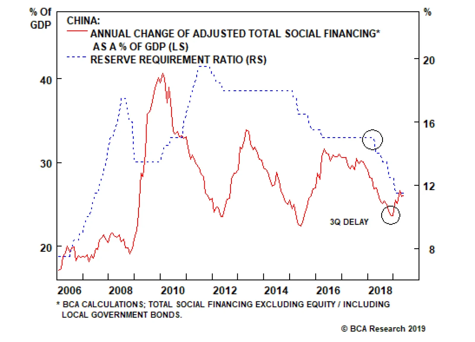
However, several facts underscore that either the PBoC did not, in retrospect, move completely toward a pro-growth stance, or that China’s monetary transmission mechanism is seriously impaired. In our view, it is a combination of both: Despite evidence suggesting it should, the PBoC did not cut its benchmark lending rate. The repo rate declined in the third quarter last year on the back of increased liquidity supply in the interbank market. The weighted average lending rate also fell, but not massively, and not by as much as our model had predicted (Chart 2). A pickup in credit expansion has significantly lagged easing. Excluding local government bonds, the general pickup in credit has been modest. Based on this measure of Total Social Financing, new credit to GDP still remains lower today than at any point during the 2015-2016 downturn (Chart 3). Chart 2Lending Rate: Not Much Easing
Lending Rate: Not Much Easing
Lending Rate: Not Much Easing
Chart 3No Strong Re-Leveraging
No Strong Re-leveraging
No Strong Re-leveraging
With the conclusion of the G20 Summit temporarily halting the trade war escalation and implementation of additional tariffs, these observations raise important questions: Will the PBoC be proactive in easing policy? What does this mean for investors over the coming year? The PBoC Will Be Reactive Rather Than Proactive Chart 4Shadow-Banking Crackdown Continues
Shadow-Banking Crackdown Continues
Shadow-Banking Crackdown Continues
In our view, the PBoC’s policy actions last year can at best be described as half-measures, despite the fact that the central bank was quick to reduce interbank interest rates in last July by cutting the reserve requirement ratio (RRR). The reason is that the PBoC clearly maintained macro-prudential/administrative restrictions on shadow banking activity, despite significantly easing liquidity in the interbank market. Chart 4 shows that shadow-banking credit as a share of total adjusted social financing continued to decelerate rapidly throughout 2018. It now accounts for a mere 12% of the stock of total adjusted social financing, by far the lowest point since 2009. This underscores that the PBoC and policymakers more generally have a deep-seated desire to avoid (further) inflating China’s substantial money and credit excesses – a dynamic that we have discussed in previous reports.1 Looking forward, there are three reasons why the PBoC’s reactive nature is unlikely to change in the near term, in addition to policymakers’ concerns about financial system’s excesses. First, the PBoC has historically been a reactive central bank, in a way that goes beyond the now-typical “data dependent” approach of its developed-market peers. Chart 5 provides a close look at China’s previous economic growth cycles and their corresponding credit expansions. The chart highlights that Chinese policymakers tend to stay behind the curve when it comes to monetary easing: In the previous three growth cycles, the first sign of monetary easing (defined as an RRR and/or benchmark lending rate cut) lagged the peak of nominal GDP growth by an average of four quarters. Rate cuts took place not when economic growth peaked, but once economic activity had already weakened considerably (Chart 6). Chart 5Chinese Policymakers Tend To Stay 'Behind The Curve'
Chinese Policymakers Tend To Stay 'Behind The Curve'
Chinese Policymakers Tend To Stay 'Behind The Curve'
Chart 6More 'Pain' Needed For Massive Easing
More 'Pain' Needed for Massive Easing
More 'Pain' Needed for Massive Easing
The same pattern has applied to other monetary easing tools that the PBoC has deployed in the past, including the Medium Lending Facility (MLF), the Targeted Medium-term Lending Facility (TMLF), the standing Lending Facility (SLF), and the Pledged Supplementary Lending program (PSL) – all of which only took shape after the economy had already shown across-the-board weakness. It will take more widespread and entrenched economic weakness for the PBoC to meaningfully ease further. The local government debt-to-bond swap program was also launched well into the 2015 growth downturn. When widespread and sustained weakness in activity emerged, Chinese policymakers responded by “throwing the kitchen sink” at the economy – by moving forward with multiple rate cuts and often creating new forms of easing in an attempt to catalyze a quick rebound. Since the PBoC has already implemented a series of easing measures, we believe it will take more widespread and entrenched weakness in the real economy for the PBoC to meaningfully ease further. Chart 7Chinese Currency Is Under Pressure
Chinese Currency Is Under Pressure
Chinese Currency Is Under Pressure
Second, the PBoC is likely to be reactive because of the potentially negative effects that proactive rate cuts could cause on sentiment towards the RMB. Chart 7 highlights the close historical correlation between the RRR, interest rate differentials and the USD/CNY. USD/CNY was trading at 7.8 the last time the weighted average RRR was at 11%, which was back in 2007. At the current juncture, interest rate differentials already point to a weaker currency. The PBoC has signaled that USD/CNY at 7 is no longer a line in the sand that must be defended, meaning this level is not a hard constraint that would prevent the central bank from cutting either the RRR or the benchmark lending rates if warranted. In fact, a measured depreciation in the RMB would help mitigate some of the blow from increased tariffs. Nevertheless, in an environment where the currency has already weakened significantly, cutting the RRR or the benchmark lending rates quickly or by a large amount could create self-reinforcing expectations of further depreciation. China has implemented a better counter-cyclical mechanism to defend the RMB than it had in 2015-‘16,2 but the potential for capital outflows remains a serious concern.3 Third, the Trump-Xi meeting at the June G20 Summit in Osaka temporarily averted a further escalation of the trade war and additional tariffs. The agreement to continue trade negotiations lacks tangible progress from either side, and thus the “truce” is likely to be short-lived. Chart 8Markets So Far Unimpressed By Stimulus
Markets So Far Unimpressed By Stimulus
Markets So Far Unimpressed By Stimulus
However, as we pointed out in last week’s report,4 the existence of talks is likely to take some pressure off Chinese policymakers’ immediate need to floor the reflation accelerator. Readouts from recent PBoC leadership meetings indicate that speculative excesses in the financial system remain a top concern for Chinese policymakers. China’s onshore market, after rallying by 2% following the good news from the G20 meeting, has given back all its gain (Chart 8). Given that the onshore equity market is extremely sensitive to China’s credit growth, the short-lived rally since the G20 meeting suggests markets have been unimpressed by the authorities’ reflationary efforts so far. Bottom Line: Chinese policymakers have not fully abandoned their financial deleveraging campaign, which President Xi Jinping initiated two years ago. This implies China’s central bank is likely to maintain its reactive approach in further easing monetary policy, and will likely try to avoid going “all-in” on stimulus for as long as possible. The Reduced Effectiveness Of Monetary Policy The events of the past year have also demonstrated that the effectiveness of Chinese monetary policy has declined relative to past economic cycles. This, in conjunction with the reluctant/reactive nature of the monetary authorities, has clear implications for investors over the coming year. When there is lack of clarity in policy interpretation, Chinese banks tend to stay on the sidelines. Chart 9A Long Delayed Credit Response To Monetary Easing
A Long Delayed Credit Response To Monetary Easing
A Long Delayed Credit Response To Monetary Easing
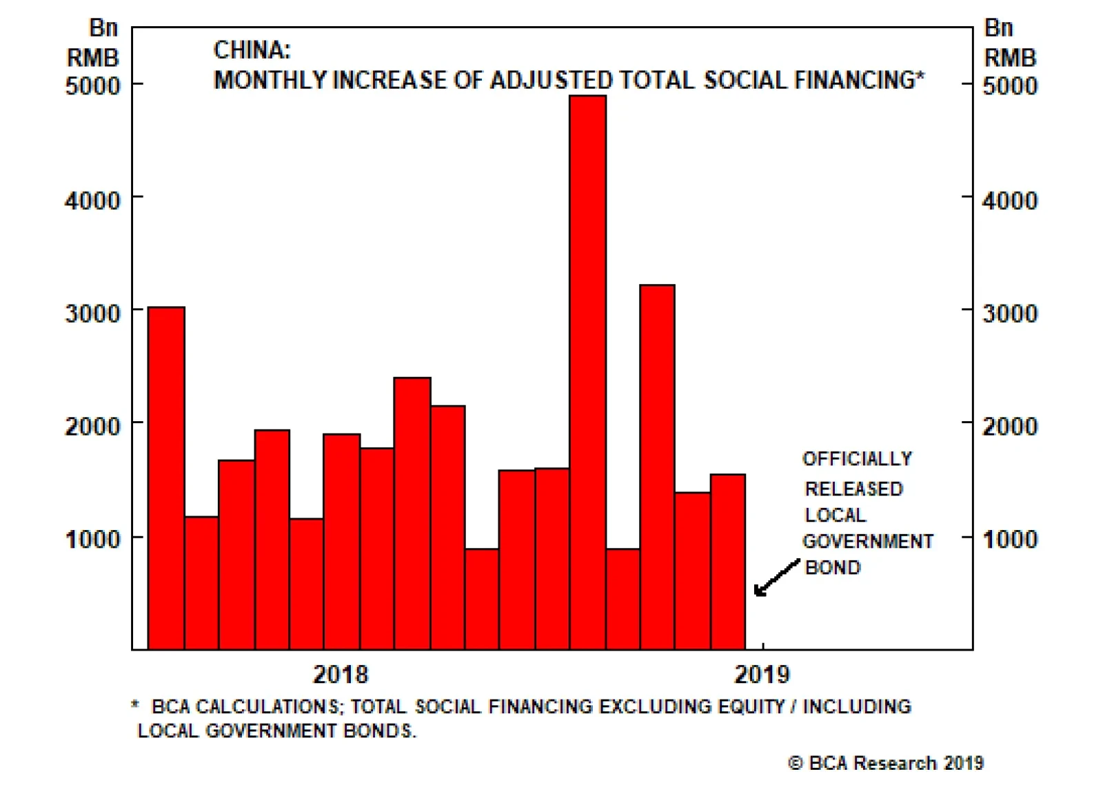
The PBoC has cut the RRR five times since the second quarter of last year, which has freed up a total of 3.35 trillion yuan of liquidity for the banking system5 and has helped spur significant easing in overall monetary conditions. Yet, as we noted earlier, overall credit growth did not pick up until January of this year, lagging the first rate cut by three quarters (Chart 9). Prior to the economic slowdown in 2015-2016, credit growth used to respond to cuts in the RRR almost immediately. In other words, when banking system liquidity was ample, banks historically lent without hesitation. Post-2015, however, this relationship has changed. The PBoC has increasingly been having trouble channeling new liquidity into actual financing for the real economy. A sharp deterioration in reported bank asset quality that began in 2014 is likely part of the explanation,6 but we suspect that more recent extreme policy contradiction – in particular, repeated flip-flopping among authorities between their desire to support growth and their focus on financial stability – has caused economic agents to wait on the sidelines. While monetary conditions eased and the government urged banks to lend (particularly to the private sector) in the second half of 2018, the “prudent” stance coming from Chinese top leaders was little changed, and tight regulations on financial institutions remained in place. This combination did not give banks the confidence to lend. This changed in the first quarter of this year, when new credit creation-to-GDP surged from 23.6% to 25.6%. The surge occurred shortly after the late-December Central Economic Work Conference (CEWC), which sent a clear message that the central government’s policy focus had shifted to “stabilizing aggregate demand.” Incredibly, the tone shifted again in February, when Premier Li Keqiang and the PBoC publicly disputed whether the January credit spike represented “flood irrigation-style” stimulus, something Premier Li made clear was to be avoided.7 Charts 10 and 11 highlight how these shifts impacted credit growth: The first quarter was clearly on track for a 2015-2016-magnitude outcome, whereas April and May saw the path of credit growth return back to a moderate re-leveraging scenario.
Chart 10
Chart 11
To get back on track for a 2015-2016 magnitude reflation, we will need to see June’s credit creation at or above 5 trillion yuan – equivalent to January’s credit numbers (Chart 12). Chart 12'Credit Binge' In June Unlikely
Credit Binge' in June Unlikely
Credit Binge' in June Unlikely
As we go to press, the number for June’s total social financing has not been officially released yet. But the official reading from the total local government bond issuance in June (including both general bond and special-purpose bond issuance), a key component of our adjusted total social financing series, came in at 900 billion yuan. This is three times more than local government bonds issued in May and twice the size of January’s. Nevertheless, January’s bank lending, particularly short-term lending, was unusually large; an episode highly criticized by Chinese leadership as we mentioned above. As PBoC stated in its defense to this criticism, January is “traditionally the biggest month of the year for bank loans due to seasonal factors”. Therefore, without a clear shift in policy signal from China’s top leadership, we do not expect June’s bank lending number to be a repeat of January’s. Instead, June’s total credit impulse will likely put the cumulative progress in credit growth closer to our 27% of nominal GDP assumption (assuming an 8% nominal GDP growth for the remainder of 2019). This would fall into our “half-strength” credit cycle scenario relative to past reflationary episodes. Bottom Line: Ultimately, we do not doubt that Chinese policymakers will be able to engineer a significant re-acceleration in economic activity should they choose to do so. But in order for policymakers to achieve this goal, policy ambiguity and inconsistency will have to be meaningfully reduced. Investment Implications Over a cyclical time horizon, we recommend staying long/overweight Chinese stocks in hedged currency terms. From our perspective, neither policymakers’ bias towards reluctance nor the reduced effectiveness of monetary policy convincingly argue against our bullish stance towards Chinese stocks over a cyclical (i.e. six- to twelve-month) time horizon, but the tactical implications are clearly negative. Over a cyclical horizon, one of two scenarios is likely to unfold: Either downside risk brought on by current tariffs and weakness in domestic demand is contained enough such that Chinese economic activity does not materially decelerate, or the trade dispute escalates into a full-tariff scenario of 25% on all U.S. imports from China that dramatically impacts Chinese growth. In the first scenario, policymakers will likely to continue providing half-measured responses, and unconstrained “across-the-board” easing will not occur. But Chart 13 highlights that Chinese stocks, particularly the investable market, are priced for a much worse economic outcome, suggesting Chinese relative equity performance would trend higher in these circumstances. Chart 13Chinese Stocks Priced In For A Worse Economic Outlook
Chinese Stocks Priced In For A Worse Economic Outlook
Chinese Stocks Priced In For A Worse Economic Outlook
Chart 14Bullish On A Cyclical Horizon, Bearish In The Near Term
Bullish On A Cyclical Horizon, Bearish In The Near Term
Bullish On A Cyclical Horizon, Bearish In The Near Term
In the second scenario, Chinese business and consumer sentiment is likely to collapse and policymakers will be facing high odds of a substantial slowdown in economic activity. This will create the political will necessary for unconstrained “across-the-board” easing, similar to what occurred in 2015-2016. The sharp re-acceleration in economic activity that would result from broad-based stimulus would clearly be positive for listed Chinese earnings per share (Chart 14), meaning the cyclical outlook for Chinese stocks would likely be even more positive than in the first scenario. However, the near-term equity market outlook of the second scenario would be extremely negative, as a financial market meltdown in of itself would likely be required to build the political will necessary to ultimately ease. Bottom Line: For investors with a time horizon of less than three months, we would not recommend a long position in Chinese stocks, neither in absolute terms nor relative to the global benchmark. However, over a strictly cyclical (i.e. six- to 12-month) time horizon, we recommend staying long/overweight Chinese stocks in hedged currency terms. Jing Sima China Strategist JingS@bcaresearch.com Footnotes 1 Please see Geopolitical Strategy Special Report, “China: How Stimulating is The Stimulus?”, dated August 8, 2018, available at cis.bcaresearch.com 2 A series of countercyclical measures China implemented in 2016-2017 includes: tightening controls on capital outflows, reducing offshore RMB liquidity supply, raising offshore RMB borrowing costs, and setting a firmer daily reference point for the RMB’s trading band. 3 Please see China Investment Strategy Special Report, “Monitoring Chinese Capital Outflows”, dated March 20, 2019, available at cis.bcaresearch.com 4 Please see China Investment Strategy Weekly Report, “China Macro and Market Review”, dated July 4, 2019, available at cis.bcaresearch.com 5 According to PBoC announcements. 6 Please see China Investment Strategy Weekly Report, “Trade Is Not China’s Only Problem”, dated November 21, 2018, available at cis.bcaresearch.com 7 Please see “Chinese Premier In Rare Spat With Central Bank”, Financial Times. Cyclical Investment Stance Equity Sector Recommendations
Oil prices will remain volatile as markets work through the lingering effects of tighter financial conditions prevailing last year, which, along with extended angst over Sino-U.S. trade tensions, slowed commodity demand growth (Chart of the Week). In 2H19, globally accommodative monetary policy and fiscal stimulus will revive demand for industrial commodities, particularly in EM economies. This will be most apparent in oil markets, where we continue to expect demand growth to strengthen going into 2020, aided in part by a weaker USD. On the supply side, this week’s extension of OPEC 2.0’s production cuts into 1Q20 means growth will remain constrained. Prices will rise, and forward curves, particularly for Brent, will steepen as refiners are forced to draw inventories to meet product demand.1 We continue to expect Brent to average $73/bbl this year and $75/bbl next, respectively. We expect WTI to trade $7/bbl and $5/bbl below that this year and next. Chart of the WeekEasing Financial Conditions Will Spur Oil Demand
Easing Financial Conditions Will Spur Oil Demand
Easing Financial Conditions Will Spur Oil Demand
Highlights Energy: Overweight. Venezuela’s oil production reportedly recovered to 1.1mm b/d in June. Most of the increased production found its way to China, which accounted for just under 60% of crude and product exports.2 Given its modus operandi, we believe OPEC 2.0 likely will accommodate higher production in Venezuela by reducing production in other member states, keeping overall output relatively constant. Base Metals: Neutral. Copper treatment and refining charges fell to new lows at the end of last week, with Fastmarkets MB’s Asia – Pacific TC/RC index recording its lowest level on record at $52.40/MT ($0.0524/lb).3 TC/RC levels fall when supplies are low, as refiners have to discount their services to attract concentrate supplies. Elsewhere, workers at Codelco’s Chuquicamata copper mine agreed to a new contract last week, ending a brief strike. Precious Metals: Neutral. Gold’s rally resumed this week, reflecting investors’ expectations for expanded central-bank accommodation globally, which, all else equal, will keep interest rates lower for longer. The Fed's dovish turn, in particular, will weaken the USD later this year, which will be positive for EM commodity demand, the engine for commodity demand growth globally. Ags/Softs: Underweight. The USDA reported 56% of corn in the ground was in good to excellent condition last week, vs. 76% of the crop last year. For soybeans, 54% of the U.S. crop was in good or excellent condition, vs. 71% last year. The USDA’s Crop Progress reports cover 92% and 95% of total acreage planted in the U.S., respectively. Feature Oil prices will remain volatile over the short term, as markets transition from tighter monetary conditions to a more accommodative global backdrop (Chart 2). Based on our research into the drivers of oil-price volatility, this should translate into a less stressful pricing environment for industrial commodities generally, base metals and oil in particular (Chart 3).4 Chart 2Volatility Indicators Are Moderating
Volatility Indicators Are Moderating
Volatility Indicators Are Moderating
Chart 3Signaling Oil Price Volatility Will Fall
Signaling Oil Price Volatility Will Fall
Signaling Oil Price Volatility Will Fall
Much of the current oil-price volatility is being driven by worries over damage to aggregate global demand and growth expectations in the wake of the Sino-U.S. trade war, and by what now appears to be a too-aggressive posture by central banks implementing rates-normalization policies last year. Both of these can affect consumption and investment locally and globally.5 Fear That Real Demand Will Weaken At present, any indication real demand is faltering – e.g., weaker manufacturing PMIs – gives industrial commodities an excuse to sell off (Chart 4). In the case of the Sino-U.S. trade war, presidents Xi and Trump appear to have agreed to re-start trade negotiations. Markets are not going to be terribly concerned with the specifics of a trade deal between the U.S. and China, but it does appear some rollback in U.S. tariffs will be necessary for a trade deal – perhaps in exchange for greater access to Chinese markets. However, our geopolitical strategists make the odds of a trade deal by the time U.S. elections roll around 1:3. Our colleagues in BCA Research’s Global Investment Strategy note, “The specifics of the deal are less important than there being a deal – any deal – that avoids a major escalation. Ultimately, the distinction between a ‘small’ trade war and a ‘moderate’ trade war is a function of how high tariffs end up being. Tariffs are taxes, and while no one likes to pay taxes, they are a familiar part of the global capitalist system.”6 As for monetary policy, major central banks are embarked on a coordinated effort to reverse falling inflation expectations, and will be vigorously stimulating their money supply and credit growth over the balance of the year. In addition, fiscal stimulus globally – in the U.S. and China most prominently – will boost real demand for industrial commodities, particularly oil and base metals.7 Monetary and fiscal stimulus operates with a lag, which is why we continue to expect its more visible for commodity demand to become apparent in commodity prices later in 2H19 and next year. This lagged effect can be seen in our expectation for the evolution of EM import volumes to year end, which we estimate using data compiled the CPB World Trade Monitor (Chart 5). EM import volumes are closely tied to the evolution of EM income, which drives global commodity demand.8 Chart 4Globally, The Real Economy Has Slowed
Globally, The Real Economy Has Slowed
Globally, The Real Economy Has Slowed
Chart 5EM Imports and Income Will Rebound
EM Imports and Income Will Rebound
EM Imports and Income Will Rebound
In our modeling of supply-demand balances and prices, we accounted for the reduced EM GDP growth brought about by more restrictive monetary policy last year and the slowdown in global trade in our most recent forecast. In our base case, we took our expected global oil-demand growth this year down to 1.35mm b/d from 1.5mm b/d earlier, and to 1.55mm b/d next year from 1.6mm b/d previously. These adjustments reduced our price expectation for Brent crude oil slightly to $73/bbl this year and $75/bbl next year, with WTI trading $7/bbl and $5/bbl below those respective levels (Chart 6). Chart 6Our Forecasts Reflect Lower Demand, Tighter Supply
Our Forecasts Reflect Lower Demand, Tighter Supply
Our Forecasts Reflect Lower Demand, Tighter Supply
Oil Markets Will Get Tighter For all of the concern over real demand, prompt demand remains stout relative to available supply, as can be seen in the backwardations for global benchmark crude oil prices (Chart 7). This week’s extension of OPEC 2.0’s production cuts into 1Q20 means supply growth will remain constrained, which, given our demand expectation, will tighten balances globally (Chart 8).9 Chart 7Global Oil Benchmarks Remain Backwardated
Global Oil Benchmarks Remain Backwardated
Global Oil Benchmarks Remain Backwardated
Chart 8Oil Supply Demand Balances Will Tighten
Oil Supply Demand Balances Will Tighten
Oil Supply Demand Balances Will Tighten
Chart 9Oil Inventories Will Fall, As Supply Is Constrained
Oil Inventories Will Fall, As Supply Is Constrained
Oil Inventories Will Fall, As Supply Is Constrained
As balances tighten in the wake of global fiscal and monetary stimulus, oil prices will rise, and forward curves, particularly for Brent, will steepen as refiners are forced to draw inventories to meet product demand (Chart 9). For this reason we remain long September – December 2019 Brent vs. short September – December 2020 Brent, expecting backwardation to increase.10 Bottom Line: We remain constructive toward oil markets, as they transition to a more accommodative monetary backdrop globally. Combined with fiscal stimulus in the U.S. and China in particular, demand will remain supported in 2H19 and 2020. The extension of OPEC 2.0’s production-cutting deal will tighten markets, forcing refiners to draw down inventories. Robert P. Ryan, Chief Commodity & Energy Strategist rryan@bcaresearch.com Footnotes 1 OPEC 2.0 is a name we coined for the OPEC/non-OPEC oil-producing coalition led by the Kingdom of Saudi Arabia (KSA) and Russia. Their agreement to extend production cuts of 1.2mm b/d into 1Q19 was announced this week in Vienna. Please see OPEC/non-OPEC rolls over oil output cuts for 9 months published by S&P Global Platts on July 2, 2019. Compliance with these cuts has been higher by ~ 400k b/d in 1H19 by our reckoning. 2 Please see Venezuela's June oil exports recover to over 1 million bpd: data published July 2, 2019, by reuters.com. 3 Please see Copper concs TCs drop marginally on traders purchase; Cobre Panama’s fresh supply hits market published by Fastmarkets MB June 28, 2019. 4 We are using “volatility” in the technical sense here – i.e., the standard deviation of per-annum returns. We have shown this can be explained by different variables, including EM volatility; U.S. financial conditions – as seen in the St. Louis Fed’s financial-stress index; and by speculative positioning, which tends to follow the evolution of prices as news flows change. For discussions of our volatility modeling, including the construction of Working’s T index, please see Specs Back Up The Truck For Oil, published April 26, 2018, and Feedback Loop: Spec Positioning & Oil Price Volatility, published May 10, 2018, by BCA Research’s Commodity & Energy Strategy. Both are available at ces.bcaresearch.com. 5 Please see The economic implications of rising protectionism: a euro area and global perspective published by European Central Bank April 24, 2019. 6 Please see Third Quarter 2019 Strategy Outlook: The Long Hurrah, BCA Research’s global macro outlook for 3Q19, published June 28, 2019, by our Global Investment Strategy. It is available at gis.bcaresearch.com. The larger issues that will have to be addressed at some point in the future are non-tariff barriers to trade, exemplified by Huawei’s exclusion from access to U.S. technology on national security grounds. An expansion of such non-tariff barriers would strand huge amounts of capital globally, which likely would lead to a global recession. 7 Our chief global strategist, Peter Berezin, notes in the above-cited BCA Research third-quarter outlook that Fed policy is expected to remain ultra-accommodative into late 2021, which will push the USD lower later this year, and will support commodity demand generally. 8 We use an FX-based model to estimate EM import volumes to year end off the CPB data. 9 We will be updating our Venezuela and OPEC 2.0 production estimates to reflect this development in our July global oil market balance publication later this month. 10 We have been long 2H19 Brent vs. short 2H20 Brent since February 28, 2019. The July and August pieces of this position returned 222.7% and 273% since inception. We remain long the September – December exposure. Investment Views and Themes Recommendations Strategic Recommendations TRADE RECOMMENDATION PERFORMANCE IN 2019 Q2
Image
Commodity Prices and Plays Reference Table Trades Closed in 2019 Summary of Closed Trades
Image
Highlights The EM equity and currency rebounds should be faded. When corporate profits are contracting, lower interest rates typically do not preclude equity prices from dropping. This is the case in EM and China. Our leading indicators for the Chinese business cycle continue to point to intensifying profit contraction in both China and EM. The ratio of global broad money supply to the current value of securities worldwide is at an all-time low. This casts doubt on the “too much money chasing too few assets” hypothesis. Feature Chart I-1EM Share Prices: Decision Time
EM Share Prices: Decision Time
EM Share Prices: Decision Time
EM share prices are at a critical juncture (Chart I-1). Their ability to hold their recent lows and break above their April highs will signify that a sustainable cyclical rally is in the making. Failure to punch through April’s highs will pose a major breakdown risk. In brief, EM is facing a make-it-or-break-it moment. Fundamentally, the outlook for EM risk assets and currencies largely hinges on economic growth in general and corporate profits in particular. In our June 20 report, we illustrated that the primary drivers of EM risk assets and currencies have historically been their business cycles and profit growth – not U.S. interest rates. Falling interest rates are positive for share prices when profits are expanding, even if at a slower rate. However, when corporate profits are contracting, lower interest rates typically do not preclude equity prices from dropping. Hence, lower global interest rates in of themselves are not a sufficient condition to foster a sustainable cyclical EM rally. As to EM corporate profits, the rate of their contraction will continue deepening. Since early this year, we have been arguing that expectations of recovery in the Chinese economy and global trade are unwarranted. That is why BCA’s Emerging Markets Strategy team contends that EM risk assets and currencies, as well as China-plays, face the risk of a breakdown. This differs from BCA’s house view, which is positive on global risk assets in general. Global And Chinese Business Cycles: No Recovery So Far Chart I-2Chinese A-Share EPS Is Heading Into Contraction
Chinese A-Share EPS Is Heading Into Contraction
Chinese A-Share EPS Is Heading Into Contraction
The rebound in EM risk assets and currencies since last December has occurred despite no improvement in both China’s business cycle and global trade, and despite the deepening contraction in EM corporate profits. Since early this year, we have been arguing that expectations of recovery in the Chinese economy and global trade are unwarranted. So far, our baseline economic view has played out – mainland growth has been rather weak, and global trade has contracted. Yet EM financial markets have done better than we had anticipated. China’s domestic industrial new orders lead Chinese A-share earnings per share growth rate by about nine months and point to intensifying profit slump into early 2020 (Chart I-2). Furthermore, China’s adjusted narrow money(M1+)1 growth leads Chinese investable stocks earnings per share (EPS) by about nine months, and is also pointing to further compression (Chart I-3). Finally, Korea’s exports are shrinking, as are EM EPS (Chart I-4, top panel). Chart I-3Chinese Investable Companies' EPS Is Already Shrinking
Chinese Investable Companies' EPS Is Already Shrinking
Chinese Investable Companies' EPS Is Already Shrinking
Chart I-4Korean Exports And EM EPS
Korean Exports And EM EPS
Korean Exports And EM EPS
Notably, both Korean exports values and EM EPS in U.S. dollars terms are on par with their early 2011 levels (Chart I-4, bottom panel). This indicates that neither Korean exports nor EM EPS have expanded sustainably over the past eight years. Chart I-5Global Stocks Did Not Lead Global PMI Historically
Global Stocks Did Not Lead Global Manufacturing PMI Historically
Global Stocks Did Not Lead Global Manufacturing PMI Historically
Is it possible that the current gap between global share prices and global manufacturing is due to the fact that financial markets are forward-looking and lead business cycles? Historical evidence suggests that global share prices have not led the global manufacturing PMI, as exhibited in Chart I-5. In fact, global share prices have actually been coincident with the global manufacturing PMI not only throughout this decade but before that as well. The de-coupling between share prices and the manufacturing PMI is currently also present in EM, albeit in a less-striking form. Chart I-6 illustrates that the EM manufacturing PMI has slipped below 50 line, yet share prices have recently rebounded and sovereign spreads have tightened. In a nutshell, the divergence between global share prices and the global manufacturing PMI is unprecedented. This cannot be explained by falling global bond yields either. The latter were falling in the previous business cycle downtrends (2011-12 and 2015), yet share prices did not deviate from the global manufacturing PMI during those episodes (Chart I-5). Chart I-6EM PMI And EM Risk Assets
EM PMI And EM Risk Assets
EM PMI And EM Risk Assets
Chart I-7The Rest Of World's Exports To China Will Continue Shrinking
The Rest Of Worlds' Exports To China Will Continue Shrinking
The Rest Of Worlds' Exports To China Will Continue Shrinking
It seems that the global equity and credit markets expect an imminent recovery in the global business cycle in general and in China in particular. As we elaborated in the previous reports, the current global manufacturing recession stems primarily from China. Our leading indicators of the mainland business cycle suggest that more growth disappointments are likely before China’s growth and other economies’ shipments to the mainland hits a bottom (Chart I-7). For example, Korea’s exports to China in June were still dropping by 24% from a year ago. The primary reason for the lack of revival in growth is that China’s stimulus efforts have so far not been large enough, and the marginal propensity to spend among households and companies is diminishing, offsetting the positive effect of the stimulus, as we have discussed in previous reports. Will the recent G20 trade truce between the U.S. and China boost business confidence worldwide and in China? In our view, it is unlikely to produce a quick and meaningful recovery in business confidence among multinational companies and Chinese businesses. Corporate managers have probably come to realize that the U.S.-China row is not about import tariffs but rather geopolitical confrontation between the existing hegemon and a rising superpower. Hence, there is no easy solution that will satisfy both parties. An acceptable resolution for China will be unacceptable for the U.S., and vice versa. Hence, it will be hard to find a formula that gratifies both sides politically and economically. Overall, we reckon there are low odds in the next six months of an agreement between the U.S. and China that removes tariffs, addresses structural issues and satiates both nations. Korea’s exports are shrinking, as are EM EPS. Finally, even though the S&P 500 is hovering around its previous highs, under-the-surface dynamics have been less upbeat. Specifically, the equal-weighted share price index of U.S. high-beta stocks in cyclical sectors such as industrials, technology and consumer discretionary versus the S&P 500 has been tame and has not yet broken above its 200-day moving average (Chart I-8, top panel). The same holds true for the relative performance of an equal-weighted stock index of global cyclical sectors such as industrials, materials and semiconductors against the overall global equity benchmark (Chart I-8, bottom panel). Conversely, despite its recent setback, the U.S. dollar has technically not yet broken down (Chart I-9, top panel). In fact, our composite momentum indicator for the broad trade-weighted dollar has troughed at zero – a sign that downside is limited and another up-leg will likely emerge soon (Chart I-9, bottom panel). Chart I-8Cyclical Stocks Have Been Underperforming
bca.ems_wr_2019_07_04_s1_c8
bca.ems_wr_2019_07_04_s1_c8
Chart I-9The U.S. Dollar Has Technically Not Broken Down
The U.S. Dollar Has Technically Not Broken Down
The U.S. Dollar Has Technically Not Broken Down
Bottom Line: The EM equity and currency rebounds should be faded. As EM currencies depreciate, sovereign and corporate credit spreads will likely widen. Asset allocators should continue underweighting EM equities and credit markets relative to their DM peers. Too Much Money Chasing Too Few Assets? Many investors identify “liquidity” as the main reason why global equity and credit markets have done so well this year, despite the relapsing global business cycle. Yet there are as many definitions of “liquidity” as there are investors. Many commentators use the term “liquidity” to denote balance sheet expansion by global central banks. As part of their quantitative easing programs, central banks in the U.S., U.K., Japan, the euro area, Switzerland and Sweden have expanded their balance sheets enormously. In line with their asset expansion, their liabilities – the monetary base, consisting primarily of commercial banks’ excess reserves – have also mushroomed. Nevertheless, broad money supply has grown only modestly in these economies.2 The principal reason behind this phenomenon has been a collapse in the money multiplier due to both banks’ unwillingness to boost lending proportionally to their swelling excess reserves, and a persistent lack of demand for credit among households and businesses. This computation casts doubt on the “too much money chasing too few assets” hypothesis. Broad money supply includes all types of deposits at commercial banks and cash in circulation. Crucially, it does not include commercial banks’ excess reserves at central banks. This differentiation between broad money and excess reserves at central banks is vital because excess reserves are not used to purchase goods, services or assets/securities. Hence, a true measure of purchasing power for assets, goods and services is broad money supply. Consistently, the pertinent liquidity ratio for financial markets can be computed by dividing global broad money supply by the value of all securities outstanding excluding those owned by central banks. The top panel of Chart I-10 depicts the ratio of the sum of broad money supply in 12 economies3 - excluding China - to the market value of investable global equities and bonds. The latter is calculated as the market cap of the Datastream World Equity Index plus the market value of the Barclays Aggregate Bond Index, excluding securities owned by central banks (Chart I-11). Bonds include both government and corporate issues. Chart I-10Comparing Global Broad Money And Market Value Of Outstanding Securities
Comparing Global Broad Money And Market Value Of Outstanding Securities
Comparing Global Broad Money And Market Value Of Outstanding Securities
Chart I-11Broad Money, Securities Absorbed By QEs And Value Of Outstanding Securities
Broad Money, Securities Absorbed By QE And Value Of Outstanding Securities
Broad Money, Securities Absorbed By QE And Value Of Outstanding Securities
We exclude China from this calculation because its money supply (deposits) is not internationally “mobile” – i.e., due to capital controls, Chinese residents cannot convert their renminbi deposits to other currencies, or use them to purchase international securities. Likewise, we exclude Chinese on-shore equity and bond markets from the calculation because they are not easily accessible to all foreign investors. This broad money supply-to-asset values ratio can be regarded as a rough proxy for available liquidity for financial markets.4 Our interpretation is that a lower ratio means investors have lower cash balances relative to the value of financial assets they hold, and vice versa. Interestingly, the ratio of global broad money to the current value of securities worldwide is at an all-time low (Chart I-10, top panel). Hence, this computation casts doubt on the “too much money chasing too few assets” hypothesis. By flipping this ratio, we compute the ratio of market value of all investable securities (excluding the ones owned by central banks) to broad money supply (Chart I-10, bottom panel). It is at all-time high entailing that the market value of globally investable publically-traded securities has expanded much more than global broad money supply/deposits. Bottom Line: We recognize that this is a simplistic macro exercise, and a more comprehensive methodology is required to compute global cash balances that are available to purchase securities worldwide. However, at minimum the above casts doubt on the hypothesis that “too much money is chasing too few assets”. Arthur Budaghyan Chief Emerging Markets Strategist arthurb@bcaresearch.com Footnotes 1 M1+ is calculated as M1 plus household demand deposits and deposits at third-party payment platforms. 2 Note that when a central bank purchases securities from commercial banks, this operation originates excess reserves, but not a new deposit at commercial banks. However, when a central bank acquires securities from a non-bank entity, such as a pension fund or an insurance company, this transaction creates both excess reserves and a bank deposit that did not exist before. Hence, QE programs have created some deposits but less so than excess reserves. 3 Economies included into this aggregate are the U.S., the euro area, the UK, Japan, Canada, Australia, Switzerland, Sweden, Korea, Taiwan, Hong Kong and Singapore. 4 This calculation does not strip out transactional demand for money, i.e., how much money is required to finance regular economic activity. Given transactional demand for money is not stable, it is hard to estimate and adjust for it. Equity Recommendations Fixed-Income, Credit And Currency Recommendations
Chart I-
Highlights Corporate Spreads: The Fed’s dovish pivot prolongs the period of time before the yield curve inverts, thus extending the window for corporate bond outperformance. Investors should remain overweight corporate bonds, with a preference for securities rated Baa and below, where spreads remain wide relative to our fair value estimates. Yield Curve: Investors should barbell their U.S. bond portfolios, favoring long-maturity (> 10 years) and short-maturity (< 2 years) securities while avoiding the 5-year and 7-year notes. This positioning will boost average portfolio yield and will benefit from any future hawkish re-assessment of Fed policy. MBS: Lower mortgage rates have led to a jump in mortgage refinancings and wider MBS spreads. However, MBS spreads remain quite low compared to history. Maintain a neutral allocation to MBS in U.S. bond portfolios. Feature Last December, we laid out our key fixed income themes for 2019 in a Special Report.1 In that report we also introduced a framework for splitting the economic cycle into three phases based on the slope of the yield curve. Specifically, we use the 3-year/10-year Treasury slope to divide each cycle into the following three phases:2 Phase 1 runs from the end of the last recession until the 3/10 slope flattens to below 50 bps. Phase 2 encompasses the period when the 3/10 slope is between 0 bps and 50 bps. Phase 3 begins after the 3/10 slope inverts and ends at the start of the next recession. Clearly, as is illustrated in Chart 1, we are smack dab in the middle of a Phase 2 environment. This has implications for how we should think about positioning a U.S. bond portfolio. Chart 1Firmly In Phase 2
Firmly In Phase 2
Firmly In Phase 2
What Makes The Middle Phase Awkward? Table 1 shows annualized excess returns for Treasuries and corporate bonds (both investment grade and high-yield) in each phase of every cycle stretching back to the mid-1970s. Treasury excess returns are calculated relative to cash, as a proxy for the returns from taking duration risk. Corporate excess returns are relative to a duration-matched position in Treasury securities. Table 1Bond Performance In Different Yield Curve Regimes
The Long Awkward Middle Phase
The Long Awkward Middle Phase
A look at Table 1 reveals why we call Phase 2 the “awkward” middle phase of the cycle. The excess returns earned from taking both duration and corporate spread risk tend to be underwhelming. On duration, we observe that in three of the four complete cycles in our sample, Treasury excess returns are lowest in Phase 2. This lines up well with intuition. The flatter yield curve means that Treasuries offer a lower term premium in Phase 2 than in Phase 1. Meanwhile, Phase 3 periods tend to coincide with rapid Fed rate cuts, and thus large capital gains. Phase 2 periods, in contrast, often contain Fed tightening cycles. On corporate credit, we observe that excess returns tend to be lower in Phase 2 than in Phase 1, but are usually still positive. Returns tend not to turn consistently negative until after the 3/10 slope inverts and we enter Phase 3. Overall, if we know nothing other than that we are in Phase 2 of the cycle, our results suggest that we should take less duration risk in our portfolio than in Phases 1 or 3. Overall, if we know nothing other than that we are in Phase 2 of the cycle, our results suggest that we should take less duration risk in our portfolio than in Phases 1 or 3. The results also suggest that we should prefer corporate credit over Treasuries, though to a lesser extent than in Phase 1. What Makes The Middle Phase Long? In last December’s Special Report, we argued that the U.S. economy would remain in a Phase 2 environment for a long time, at least until late 2019. Our reasoning was that, in the absence of inflationary pressures, the Fed would be reluctant to tighten policy enough to invert the 3/10 curve. The Fed’s recent dovish pivot, and the resultant steepening of the curve (see Chart 1), only prolongs the current Phase 2 environment. We now think it will be well into 2020, and possibly later, before the 3/10 slope inverts and the economy enters Phase 3. One obvious investment implication of an extended Phase 2 environment is that we should remain overweight corporate bonds relative to duration-matched Treasuries. However, we also need to consider valuation before drawing too firm of a conclusion. Charts 2A and 2B show spreads for each corporate credit tier, encompassing both investment grade and high-yield, along with our spread targets. The spread targets are the median levels observed in prior Phase 2 environments, adjusted for changes in the average duration of the bond indexes over time.3 The charts reveal that Aaa-rated bonds already look expensive, while Aa and A-rated bonds are close to fairly valued. Baa-rated bonds are 13 bps cheap relative to our target, while the high-yield credit tiers offer significantly more value. Chart 2AInvestment Grade Spread Targets
Investment Grade Spread Targets
Investment Grade Spread Targets
Chart 2BHigh-Yield Spread Targets
High-Yield Spread Targets
High-Yield Spread Targets
As discussed in last week’s report, the Fed’s dovish pivot will cause corporate spreads to tighten in the near-term, but it will take longer before Treasury yields respond by moving higher.4 For Treasury yields to move higher, investors must first become convinced that the Fed’s reflationary efforts are translating into stronger global economic growth. Ultimately, we expect this will occur in the second half of this year and Treasury yields will be higher 12 months from now, as the Fed will fail to deliver the 92 bps of rate cuts that are currently priced. The flat yield curve means that the yield give-up is small, and we expect global growth to improve in the second half of the year. Bottom Line: The Fed’s dovish pivot prolongs the period of time before the yield curve inverts, thus extending the window for corporate bond outperformance. Investors should remain overweight corporate bonds, with a preference for securities rated Baa and below, where spreads remain wide relative to our fair value estimates. Investors should also keep portfolio duration low. The flat yield curve means that the yield give-up is small, and we expect global growth to improve in the second half of the year. Barbell Your Portfolio Chart 3Barbell Your Portfolio
Barbell Your Portfolio
Barbell Your Portfolio
For those unwilling or unable to deviate portfolio duration significantly from benchmark, there is another way to bet on the Fed delivering fewer cuts than are currently priced into the market. Investors can run a barbelled portfolio, favoring short-maturity (< 2 years) and long-maturity (> 10 years) securities, while avoiding the belly (5-year/7-year) of the curve. This sort of positioning has a few advantages. First, since the financial crisis, the yield curve has tended to steepen out to the 5-year/7-year point and flatten beyond that point whenever our 12-month Fed Funds Discounter rises (Chart 3). Conversely, whenever the market prices in more cuts/fewer hikes and our discounter falls, the yield curve has flattened out to the 5-year/7-year maturity point and steepened beyond that point. This correlation has been very consistent during the past few years, and continued to hold during the most recent decline in rate expectations. Notice that the 5-year yield has fallen by more than either the 2-year or 10-year yields since our Discounter's early-November peak (Table 2). Table 2The Belly Of The Curve Is Most Sensitive To Rate Expectations
The Long Awkward Middle Phase
The Long Awkward Middle Phase
The upshot is that, if rate expectations rise during the next 12 months, as we expect, the 5-year and 7-year notes will endure the most damage. The second reason why a barbelled portfolio makes sense is that valuation is very attractive. Chart 4 shows that the 5-year yield is below the yield on a duration-matched 2/10 barbell. It also shows that this 2/5/10 butterfly spread is very low relative to our model’s fair value.5 Chart 42/10 Barbell Is Attractive Versus 5-Year Bullet
2/10 Barbell Is Attractive Versus 5-Year Bullet
2/10 Barbell Is Attractive Versus 5-Year Bullet
We run similar fair value models for every possible bullet/barbell combination along the yield curve, and barbells appear universally cheap (see Appendix). Bottom Line: Investors should barbell their U.S. bond portfolios, favoring long-maturity (> 10 years) and short-maturity (< 2 years) securities while avoiding the 5-year and 7-year notes. This positioning will boost average portfolio yield and will benefit from any future hawkish re-assessment of Fed policy. MBS & Housing: The Implications Of Lower Mortgage Rates Alongside bond yields, mortgage rates have fallen sharply during the past few months, a trend that has important implications for both MBS spreads and future housing data. We consider the outlook for both. MBS Spreads Lower mortgage rates encourage homeowners to refinance their loans, and any increase in refinancing activity puts upward pressure on MBS spreads. Not surprisingly, as mortgage rates have declined we have seen a jump in the MBA Refinance Index and a widening of nominal MBS spreads (Chart 5). Chart 5MBS Spreads Still Historically Tight
MBS Spreads Still Historically Tight
MBS Spreads Still Historically Tight
While spreads have widened somewhat, they remain low compared to history (Chart 5, top panel). As such, we do not see a compelling buying opportunity in MBS. This is especially true relative to corporate credit where spreads are more attractive. Chart 6Limited Upside For Refis
Limited Upside For Refis
Limited Upside For Refis
With the mortgage rate now below 4%, our rough calculation suggests that approximately 44% of the Bloomberg Barclays Conventional 30-year MBS index is refinanceable. A regression of the MBA Refi Index versus the refinanceable share suggests a fair value of 2014 for the Refi Index, slightly above its actual level of 1950 (Chart 6). We also calculate that a further drop in the mortgage rate to below 3.5%, where it troughed in mid-2016, would increase the refinanceable share to 77%. Our regression translates this 77% share to a level of 3309 on the Refi Index. It should be noted that when the refinanceable share rose to 77% in 2016, the MBA Refi Index peaked at 2870. This means that our simple regression analysis probably overstates the surge in refis that would occur if mortgage rates fell another 50 bps. In addition, we think it’s unlikely that mortgage rates will actually fall back to 3.5%, as they did in 2016, and as such, we are hesitant to position for further MBS spread widening. The improvement in housing actitivty is not uniform across all indicators. We recommend maintaining a neutral allocation to MBS for now. If mortgage rates drop and spreads widen further in the near-term, then a buying opportunity may present itself. Housing Activity Chart 7Housing Activity: A Mixed Picture
Housing Activity: A Mixed Picture
Housing Activity: A Mixed Picture
The drop in mortgage rates will also have a significant impact on housing activity data. This is important because, as we have demonstrated in prior reports, housing activity data – particularly single-family housing starts and new homes sales – are reliable indicators of U.S. recessions and interest rates.6 By all measures, housing activity weakened significantly as mortgage rates surged in 2018. But it has improved somewhat now that mortgage rates have declined. However, the improvement is not uniform across all indicators (Chart 7): New home sales jumped sharply early this year, then fell back more recently. The current trend is neutral, with the latest monthly print very close to the 12-month moving average (Chart 7, top panel). Housing starts and permits are both trending below their respective 12-month moving averages, though by less than in 2018 (Chart 7, panel 2 & 3). Existing home sales have popped, and are now exerting upward pressure on the 12-month average (Chart 7, panel 4). Likewise for mortgage purchase applications (Chart 7, panel 5). Homebuilders also report that lower mortgage rates have led to a jump in sales activity (Chart 7, bottom panel). With mortgage rates still low, the tentative rebound in housing activity data should continue in the coming months. Looking further out, we see significantly more upside in single-family housing starts and new home sales as builders shift construction toward lower-priced properties. The Bifurcated Housing Market Beyond the large swings in mortgage rates, another trend has significantly influenced housing activity in recent years. For the past few years, homebuilders have focused their attention on higher priced homes, and that segment of the market now looks oversupplied. Data from the American Enterprise Institute Housing Center show that the recent deceleration in home prices has been driven by falling prices for the most expensive homes. Homes in the lowest price tier have seen prices accelerate (Chart 8).7 The divergence is also evident in the supply data. New home inventories are roughly consistent with average historical levels, while existing home inventories are incredibly low (Chart 9). In fact, new home inventories now represent 6.4 months of demand while existing home inventories represent 4.3 months of demand (Chart 9, panel 3). Such a wide divergence is historically rare. Chart 8An Oversupply Of High ##br##Priced Homes...
An Oversupply Of High Priced Homes...
An Oversupply Of High Priced Homes...
Chart 9...And An Undersupply Of Low Priced Homes
...And An Undersupply Of Low Priced Homes
...And An Undersupply Of Low Priced Homes
The divergence between an oversupply of new homes and an undersupply of existing homes is a result of new construction having focused on higher priced homes in recent years. The median price for a new home used to be only slightly above the median price for an existing home, but the difference shot up to above 75k during the past few years (Chart 9, bottom panel). More recently, the price differential between new and existing homes has started to fall, as builders are starting to recognize that the greater growth opportunity lies at the low-end of the market where demand is strong relative to supply. As this supply-side adjustment plays out, it will provide an additional boost to new homes sales and housing starts going forward. Appendix The following tables present the current read-outs from our butterfly spread models. We use these models to identify opportunities to take duration-neutral positions across the Treasury curve. The following two Special Reports explain the models in more detail: U.S. Bond Strategy Special Report, “Bullets, Barbells And Butterflies”, dated July 25, 2017, available at usbs.bcaresearch.com U.S. Bond Strategy Special Report, “More Bullets, Barbells And Butterflies”, dated May 15, 2018, available at usbs.bcaresearch.com Table 3 shows the raw residuals from each model. A positive value indicates that the bullet is cheap relative to the duration-matched barbell. A negative value indicates that the barbell is cheap relative to the bullet. Table 3Butterfly Strategy Valuation: Raw Residuals In Basis Points (As of June 27, 2019)
The Long Awkward Middle Phase
The Long Awkward Middle Phase
Table 4 scales the raw residuals in Table 3 by their historical means and standard deviations. This facilitates comparison between the different butterfly spreads. Table 4Butterfly Strategy Valuation: Standardized Residuals (As of June 27 2019)
The Long Awkward Middle Phase
The Long Awkward Middle Phase
Ryan Swift, U.S. Bond Strategist rswift@bcaresearch.com Footnotes 1 Please see U.S. Bond Strategy Special Report, “2019 Key Views: Implications For U.S. Fixed Income”, dated December 11, 2018, available at usbs.bcaresearch.com 2 We use the 3/10 Treasury slope in place of the more commonly referenced 2/10 slope because it is a close proxy that provides an additional 14 years of historical data. 3 For more details on how we arrive at our spread targets please see U.S. Bond Strategy Weekly Report, “The Value In Corporate Bonds”, dated February 19, 2019, available at usbs.bcaresearch.com 4 Please see U.S. Bond Strategy / Global Fixed Income Strategy Weekly Report, “The Fed’s Got Your Back”, dated June 25, 2019, available at usbs.bcaresearch.com 5 For more details on our yield curve models please see U.S. Bond Strategy Special Report, “Bullets, Barbells And Butterflies”, dated July 25, 2017, available at usbs.bcaresearch.com 6 Please see U.S. Bond Strategy Weekly Report, “More Than One Reason To Own Steepeners”, dated September 25, 2018, available at usbs.bcaresearch.com 7 Low-tier homes are those in the bottom 40% of the price distribution in each metro area. High-tier homes are those that are both in the top 20% of the price distribution and exceed the GSE loan limit by more than 25%. For further details: http://www.aei.org/wp-content/uploads/2019/06/HPA_market_conditions_report_June_2019.pdf Fixed Income Sector Performance Recommended Portfolio Specification
Highlights Central banks globally have turned dovish, with the Fed virtually promising to cut rates in July. But this will be an “insurance” cut, like 1995 and 1998, not the beginning of a pre-recessionary easing cycle. The global expansion remains intact, with the fundamental drivers of U.S. consumption robust and China likely to ramp up its credit stimulus over the coming months. The Fed will cut once or twice, but not four times over the next 10 months as the futures markets imply. Underlying U.S. inflation – properly measured – is trending higher to above 2%. U.S. GDP growth this year will be around 2.5%. Inflation expectations will move higher as the crude oil price rises. Unemployment is at a 50-year low and the U.S. stock market at an historical peak. These factors suggest bond yields are more likely to rise than fall from current levels. The upside for U.S. equities is limited, but earnings growth should be better than the 3% the bottom-up consensus expects. The key for allocation will be when to shift in the second half into higher-beta China-related plays, such as Europe and Emerging Markets. For now, we remain overweight the lower-beta U.S. equity market, neutral on credit, and underweight government bonds. To hedge against the positive impact of China stimulus, we raise Australia to neutral, and re-emphasize our overweights on the Industrials and Energy sectors. Feature Overview Precautionary Dovishness – Or Looming Recession? Recommendations
Quarterly Portfolio Outlook: Precautionary Dovishness – Or Looming Recession?
Quarterly Portfolio Outlook: Precautionary Dovishness – Or Looming Recession?
Central banks everywhere have taken a decidedly dovish turn in recent weeks. June’s FOMC statement confirmed that “uncertainties about the outlook have increased….[We] will act as appropriate to sustain the expansion,” hinting broadly at a rate cut in July. The Bank of Japan’s Kuroda said he would “take additional easing action without hesitation,” and hinted at a Modern Monetary Theory-style combination of fiscal and monetary policy. European Central Bank President Draghi mentioned the possibility of restarting asset purchases. There are two possible explanations. Either the global economy is heading into recession, and central banks are preparing for a full-blown easing cycle. Or these are “insurance” cuts aimed at prolonging the expansion, as happened in 1995 and 1998, or similar to when the Fed went on hold for 12 months in 2016 (Chart 1). Our view is that it is most likely the latter. The reason for this is that the main drivers of the global economy, U.S. consumption ($14 trillion) and the Chinese economy ($13 trillion) are likely to be strong over the next 12 months. U.S. wage growth continues to accelerate, consumer sentiment is close to a 50-year high, and the savings rate is elevated (Chart 2); as a result core U.S. retail sales have begun to pick up momentum in recent months (Chart 3). Unless something exogenous severely damages consumer optimism, it is hard to see how the U.S. can go into recession in the near future, considering that consumption is 70% of GDP. Moreover, despite weaknesses in the manufacturing sector – infected by the China-led slowdown in the rest of the world – U.S. service sector growth and the labor market remain solid. This resembles 1998 and 2016, but is different from the pre-recessionary environments of 2000 and 2007 (Chart 4). There is also no sign on the horizon of the two factors that have historically triggered recessions: a sharp rise in private-sector debt, or accelerating inflation (Chart 5). Chart 1Insurance Cuts, Or Full Easing Cycle?
Insurance Cuts, Or Full Easing Cycle?
Insurance Cuts, Or Full Easing Cycle?
Chart 2Consumption Fundamentals Are Strong...
Consumption Fundamentals Are Strong...
Consumption Fundamentals Are Strong...
Chart 3...Leading To Rebound In Retail Sales
...Leading To Rebound In Retail Sales
...Leading To Rebound In Retail Sales
Chart 4Manufacturing Weak, But Services Holding Up
Manufacturing Weak, But Services Holding Up
Manufacturing Weak, But Services Holding Up
Chart 5No Signs Of Usual Recession Triggers
No Signs Of Usual Recession Triggers
No Signs Of Usual Recession Triggers
China’s efforts to reflate via credit creation have been somewhat half-hearted since the start of the year. Investment by state-owned companies has picked up, but the private sector has been spooked by the risk of a trade war and has slowed capex (Chart 6). China may have hesitated from full-blown stimulus because the authorities in April were confident of a successful outcome to trade talks with the U.S., and a bit concerned that the liquidity was going into speculation rather than the real economy. But we see little reason why they will not open the taps fully if growth remains sluggish and trade tensions heighten.1 Chinese credit creation clearly has a major impact on many components of global growth – in particular European exports, Emerging Markets earnings, and commodity prices – but the impact often takes 6-12 months to come through (Chart 7). A key question is when investors should position for this to happen. We think this decision is a little premature now, but will be a key call for the second half of the year. Chart 6China's Half-Hearted Reflation
China's Half-Hearted Reflation
China's Half-Hearted Reflation
Chart 7China Credit Growth Affects The World
China Credit Growth Affects The World
China Credit Growth Affects The World
Chart 8Fed Won't Cut As Much As Market Wants...
Fed Won't Cut As Much As Market Wants...
Fed Won't Cut As Much As Market Wants...
The Fed has so clearly signaled rate cuts that we see it cutting by perhaps 50 basis points over the next few months (maybe all in one go in July if it wants to “shock and awe” the market). But the futures market is pricing in four 25 bps cuts by April next year. With GDP growth likely to be around 2.5% this year, unemployment at a 50-year low, trend inflation above 2%,2 and the stock market at an historical high, we find this improbable. Two cuts would be similar to what happened in 1995, 1998 and (to a degree) 2016 (Chart 8). In this environment, we think it likely that equities will outperform bonds over the next 12 months. When the Fed cuts by less than the market is expecting, long-term rates tend to rise (Chart 9). BCA’s U.S. bond strategists have shown that after mid-cycle rate cuts, yields typically rise: by 59 bps in 1995-6, 58 bps in 1998, and 19 bps in 2002.3 A combination of rising inflation, stronger growth ex-U.S., a less dovish Fed that the market expects, and a rising oil price (which will push up inflation expectations) makes it unlikely – absent an outright recession – that global risk-free yields will fall much below current levels. Moreover, June’s BOA Merrill Lynch survey cited long government bonds as the most crowded trade at the moment, and surveys of investor positioning suggest duration among active investors is as long as at any time since the Global Financial Crisis (Chart 10). Chart 9...So Bond Yields Are Likely To Rise
...So Bond Yields Are Likely To Rise
...So Bond Yields Are Likely To Rise
Chart 10Investors Betting On Further Rate Decline
Investors Betting On Further Rate Decline
Investors Betting On Further Rate Decline
The outlook for U.S. equities is not that exciting. Valuations are not cheap (with forward PE of 16.5x), but earnings should be revised up from the currently very cautious level: the bottom-up consensus forecasts S&P 500 EPS growth at only 3% in 2019 (and -3% YoY in Q2). We have sympathy for the view that there are three put options that will prop up stock prices in the event of external shocks: the Fed put, the Xi put, and the Trump put. Relating to the last of these, it is notable that President Trump tends to turn more aggressive in trade talks with China whenever the U.S. stock market is strong, but more conciliatory when it falls (Chart 11). For now, therefore, we remain overweight U.S. equities, as a lower beta way to play an environment that continues to be positive – but uncertain – for stocks. But we continue to watch for the timing to move into higher-beta China-related markets as the effects of China’s stimulus start to come through. Chart 11Trump Turns Softer When Market Falls
Trump Turns Softer When Market Falls
Trump Turns Softer When Market Falls
Garry Evans Chief Global Asset Allocation Strategist garry@bcaresearch.com What Our Clients Are Asking Chart 12Temporary Forces Drove Inflation Downturn
Temporary Forces Drove Inflation Downturn
Temporary Forces Drove Inflation Downturn
Why Is Inflation So Low? After reaching 2% in July 2018, U.S. core PCE currently stands at 1.6%, close to 18 month lows. This plunge in inflation, along with increased worries about the trade war and continued economic weakness, has led the market to believe that the Fed Funds Rate is currently above the neutral rate, and that several rate cuts are warranted in order to move policy away from restrictive territory. We believe that the recent bout of low inflation is temporary. The main contributor to the fall in core PCE has been financial services prices, which shaved off up to 40 basis points from core PCE (Chart 12, panel 1). However, assets under management are a big determinant of financial services prices, making this measure very sensitive to the stock market (panel 2). Therefore, we expect this component of core PCE to stabilize as equity prices continue to rise. The effect of higher equity prices, and the stabilization of other goods that were affected by the slowdown of global growth in late 2018 and early 2019, may already have started to push inflation higher. Month-on-month core PCE grew at an annualized rate of 3% in April, the highest pace since the end of 2017. Meanwhile, trimmed mean PCE, a measure that has historically been a more stable and reliable gauge of inflationary pressures, is at a near seven-year high (panel 3). The above implies that the market might be overestimating how much the Fed is going to ease. We believe that the Fed will likely cut once this year to soothe the pain caused by the trade war on financial markets. However, with unemployment at 50-year lows, and inflation set to rise again, the Fed is unlikely to deliver the 92 basis points of cuts currently priced by the OIS curve for the next 12 months. This implies that investors should continue to underweight bonds. Chart 13Turning On The Taps
Turning On The Taps
Turning On The Taps
Will China Really Ramp Up Its Stimulus? The direction of markets over the next 12 months (a bottoming of euro area and Emerging Markets growth, commodity prices, the direction of the USD) are highly dependent on whether China further increases monetary stimulus in the event of a breakdown in trade negotiations with the U.S. But we hear much skepticism from clients: aren’t the Chinese authorities, rather, focused on reducing debt and clamping down on shadow banking? Aren’t they worried that liquidity will simply flow into speculation and have little impact on the real economy? Now the government has someone to blame for a slowdown (President Trump), won’t they use that as an excuse – and, to that end, are preparing the population for a period of pain by quoting as analogies the Long March in the 1930s and the Korea War (when China ground down U.S. willingness to prolong the conflict)? We think it unlikely that the Chinese government would be prepared to allow growth to slump. Every time in the past 10 years that growth has slowed (with, for example, the manufacturing PMI falling significantly below 50) they have always accelerated credit growth – on the basis of the worst-case scenario (Chart 13, panel 1). Why would they react differently this time, particularly since 2019 is a politically sensitive year, with the 70th anniversary of the founding of the People’s Republic in October and several other important anniversaries? Moreover, the government is slipping behind in its target to double per capita income in the 10 years to end-2020 (panel 2). GDP growth needs to be 6.5-7% over the next 18 months to achieve the target. The government’s biggest worry is employment, where prospects are slipping rapidly (panel 3). This also makes it difficult for the authorities to retaliate against U.S. companies that have large operations, such as Apple or General Motors, since such measures would hurt their Chinese employees. Besides a significant revaluation of the RMB (which we think likely), China has few cards to play in the event of a full-blown trade war other than fully turning on the liquidity tap again.
Chart 14
Aren’t There Signs Of Bubbliness In Equity Markets? Clients have asked whether the current market environment has been showing any classic signs of euphoria. These usually appear with lots of initial public offerings (IPO), irrational M&A activity, and excess investor optimism. The IPO market has some similarities to the years leading up to the dot-com bubble, but it is important to look below the surface. The percentage of IPOs with negative earnings in 2018 was similar to the previous peak in 1999. However, the average first-day return of IPOs in 2019, while still above the historical average, has been much lower than that during the dot-com bubble period (Chart 14, panel 1). There is also a difference in the composition of firms going public. There are now many IPOs for biotech firms that have heavily invested in R&D, and so have relatively low sales currently but await a breakthrough in their products; by their nature, these are loss-making (panel 2). Cross-sector, unrelated M&A activity has also often been a sign of bubble peaks. It is a consequence of firms stretching to find inorganic growth late in the cycle. Such deals are characterized by high deal premiums, and are usually conducted through stock purchases rather than in cash. The current average deal premium is below its historical average (panel 3). Additionally, 2018 and 2019-to-date M&A deals conducted using cash represented 60% and 90% of the total respectively, compared to only 17% between 1996 and 2000. Investor sentiment is also moderately pessimistic despite the rally in the S&P 500 since the beginning of the year (panel 4). This caution suggests that investors are fearful of the risk of recession rather than overly positive about market prospects, despite the U.S. market being at an historical high. Given the above, we do not see any signals of the sort of euphoria and bubbliness that typically accompanies stock market tops. Will Japan Benefit From Chinese Reflation? Japan has been one of the worst-performing developed equity markets since March 2009, when global equities hit their post-crisis bottom in both USD (Chart 15) and local currency terms. Now with increasing market confidence in China’s reflationary policies, clients are asking if Japan is a good China play given its close ties with the Chinese economy. Our answer is No.
Chart 15
Chart 16Downgrade Japan To Underweight
Downgrade Japan To Underweight
Downgrade Japan To Underweight
It’s true that Japanese equities did respond to past Chinese reflationary efforts, but the outperformances were muted and short-lived (Chart 16, panel 1). Even though Japanese exports to China will benefit from Chinese reflationary policy (panel 5), MSCI Japan index earnings growth does not have strong correlation with Japanese exports to China, as shown in panel 4. This is not surprising given that exports to China account for only about 3% of nominal GDP in Japan (compared to almost 6% for Australia, for example). The MSCI Japan index is dominated by Industrials (21%) and Consumer Discretionary (18%). Financials, Info Tech, Communication Services and Healthcare each accounts for about 8-10%. Other than the Communication Services sector, all other major sectors in Japan have underperformed their global peers since the Global Financial Crisis (panels 2 and 3). The key culprit for such poor performance is Japan’s structural deflationary environment. Wage growth has been poor despite a tight labor market. This October’s consumption tax increase will put further downward pressure on domestic consumers. There is no sign of the two factors that have historically triggered recessions: a sharp rise in private-sector debt, or accelerating inflation. As such, we are downgrading Japan to a slight underweight in order to close our underweight in Australia (see page 16). This also aligns our recommendation with the output from our DM Country Allocation Quant Model, which has structurally underweighted Japan since its inception in January 2016. Global Economy Chart 17Is Consumption Enough To Prop Up U.S. Growth?
Is Consumption Enough To Prop Up U.S. Growth?
Is Consumption Enough To Prop Up U.S. Growth?
Overview: The tight monetary policy of last year (with the Fed raising rates and China slowing credit growth) has caused a slowdown in the global manufacturing sector, which is now threatening to damage worldwide consumption and the relatively closed U.S. economy too. The key to a rebound will be whether China ramps up the monetary stimulus it began in January but which has so far been rather half-hearted. Meanwhile, central banks everywhere are moving to cut rates as an “insurance” against further slowdown. U.S.: Growth data has been mixed in recent months. The manufacturing sector has been affected by the slowdown in EM and Europe, with the manufacturing ISM falling to 52.1 in May and threatening to dip below 50 (Chart 17, panel 2). However, consumption remains resilient, with no signs of stress in the labor market, average hourly earnings growing at 3.1% year-on-year, and consumer confidence at a high level. As a result, retail sales surprised to the upside in May, growing 3.2% YoY. The trade war may be having some negative impact on business sentiment, however, with capex intentions and durable goods orders weakening in recent months. Euro Area: Current conditions in manufacturing continue to look dire. The manufacturing PMI is below 50 and continues to decline (Chart 18, panel 1). In export-focused markets like Germany, the situation looks even worse: Germany’s manufacturing PMI is at 45.4, and expectations as measured by the ZEW survey have deteriorated again recently. Solid wage growth and some positive fiscal thrust (in Italy, France, and even Germany) have kept consumption stable, but the recent tick-up in German unemployment raises the question of how sustainable this is. Recovery will be dependent on Chinese stimulus triggering a rebound in global trade. Chart 18Few Signs Of Recovery In Global Ex-U.S. Growth
Few Signs Of Recovery In Global Ex-U.S. Growth
Few Signs Of Recovery In Global Ex-U.S. Growth
Japan: The slowdown in China continues to depress industrial production and leading indicators (panel 2). But maybe the first “green shoots” are appearing thanks to China’s stimulus: in April, manufacturing orders rose by 16.3% month-on-month, compared to -11.4% in March. Nonetheless, consumption looks vulnerable, with wage growth negative YoY each month so far this year, and the consumption tax rise in October likely to hit consumption further. The Bank of Japan’s six-year campaign of maximum monetary easing is having little effect, with core core inflation stuck at 0.5% YoY, despite a small pickup in recent months – no doubt because the easy monetary policy has been offset by a steady tightening of fiscal policy. Emerging Markets: China’s growth has slipped since the pickup in February and March caused by a sharp increase in credit creation. Seemingly, the authorities became more confident about a trade agreement with the U.S., and worried about how much of the extra credit was going into speculation, rather than the real economy. The manufacturing PMI, having jumped to almost 51 in March, has slipped back to 50.2. A breakdown of trade talks would undoubtedly force the government to inject more liquidity. Elsewhere in EM, growth has generally been weak, because of the softness in Chinese demand. In Q1, GDP growth was -3.2% QoQ annualized in South Africa, -1.7% in Korea, and -0.8% in both Brazil and Mexico. Only less China-sensitive markets such as Russia (3.3%) and India (6.5%) held up. Interest rates: U.S. inflation has softened on the surface, with the core PCE measure slipping to 1.6% in April. However, some of the softness was driven by transitory factors, notably the decline in financial advisor fees (which tend to move in line with the stock market) which deducted 0.5 points from core PCE inflation. A less volatile measure, the trimmed mean PCE deflator, however, continues to trend up and is above the Fed’s 2% target. Partly because of the weaker historical inflation data, inflation expectations have also fallen (panel 4). As a result, central banks everywhere have become more dovish, with the Australian and New Zealand reserve banks cutting rates and the Fed and ECB raising the possibility they may ease too. The consequence has been a big fall in 10-year government bonds yields: in the U.S. to only 2% from 3.1% as recently as last September. Global Equities Chart 19Worrisome Earnings Prospects
Worrisome Earnings Prospects
Worrisome Earnings Prospects
Remain Cautiously Optimistic, Adding Another China Hedge: Global equities managed to eke out a small gain of 3.3% in Q2 despite a sharp loss of 5.9% in May. Within equities, our defensive country allocation worked well as DM equities outperformed EM by 2.9% in Q2. Our cyclical tilt in global sector positioning, however, did not pan out, largely due to the 2% underperformance in global Energy as the oil price dropped by 2% in Q2. Going forward, BCA’s House View remains that global economic growth will pick up sometime in the second half thanks to accommodative monetary policies globally and the increasing likelihood of a large stimulus from China to counter the negative effect from trade tensions. This implies that equities are likely to rally again after a period of congestion within a trading range, supporting a cautiously optimistic portfolio allocation for the next 9-12 months. The “optimistic” side of our allocation is reflected in two aspects: 1) overweight equities vs. bonds at the asset class level; and 2) overweight cyclicals vs. defensives at the global sector level. However, corporate profit margins are rolling over and earnings growth revisions have been negative (Chart 19). Therefore, the “cautious” side of our allocation remains a defensive country allocation, reflected by overweighting DM vs. EM. Our macro view hinges largely on what happens to China. There is an increasing likelihood that China may be on a reflationary path to stimulate economic growth. We upgraded global Industrials in March to hedge against China’s re-acceleration. Now we upgrade Australia to neutral from a long-term underweight, by downgrading Japan to a slight underweight from neutral, because Australia will benefit more from China’s reflationary policies (see next page). Chart 20Australian Equities: Close The Underweight
Australian Equities: Close The Underweight
Australian Equities: Close The Underweight
Upgrade Australian Equities To Neutral The relative performance of MSCI Australian equities to global equities has been closely correlated with the CRB metal price most of the time. Since the end of 2015, however, the CRB metals index has increased by more than 40%, yet Australian equities did not outperform (Chart 20, panel 1). Why? The MSCI Australian index is concentrated in Financials (mostly banks) and Materials (mostly mining), as shown in panel 2. Aussie Materials have outperformed their global peers, but the banks have not (panel 3). The banks are a major source of financing for the mining companies (hence the positive correlation with metal prices). They are also the source of financing for the Aussie housing markets, which have weighed down on the banks’ performance over the past few years due to concerns about stretched valuations. We have been structurally underweight Australian equities because of our unfavorable view on industrial commodities, and also our concerns on the Australian housing market and the problems of the banks. This has served us well, as Australian equities have done poorly relative to the global aggregate since late 2012. Now interest rates in Australia have come down significantly. Lower mortgage rates should help stabilize house prices, which suffered in Q1 their worst year-on-year decline, 7.7%, in over three decades. Australian equity earnings growth is still slowing relative to the global earnings, but the speed of slowing down has decreased significantly. With 6% of GDP coming from exports to China, Aussie profit growth should benefit from reflationary policies from China (panel 4). Relative valuation, however, is not cheap (panel 5). All considered, we are closing our underweight in Australian equities as another hedge against a Chinese-led re-acceleration in economic growth. This is financed by downgrading Japan to a slight underweight (for more on Japan, see What Our Clients Are Asking, on page 11). Government Bonds Chart 21Limited Downside In Yields
Limited Downside In Yields
Limited Downside In Yields
Maintain Slight Underweight On Duration: After the Fed signaled at its June meeting that rates cuts were likely on the way, the U.S. 10-year Treasury yield dropped to 1.97% overnight on June 20, the lowest since November 2016. Overall, the 10-year yield dropped by 40 bps in Q2 to end the quarter at 2%. BCA’s Fed Monitor is now indicating that easier monetary policy is required. But that is already more than discounted in the 92 bps of rate cuts over the next 12 months priced in at the front end of the yield curve, and by the current low level of Treasury yields. (Chart 21). We see the likelihood of one or two “insurance” cuts by the Fed, but the current environment (with a record-high stock market, tight corporate spreads, 50-year low unemployment rate, and 2019 GDP on track to reach 2.5%) is not compatible with a full-out cutting campaign. In addition, the latest Merrill Lynch survey indicated that long duration is the most crowded global trade. Given BCA’s House View that the U.S. economy is not heading into a recession but rather experiencing a manufacturing slowdown mainly due to external shocks, the path of least resistance for Treasury yields is higher rather than lower. Investors should maintain a slight underweight on duration over the next 9-12 months. Chart 22Favor Linkers Over Nominal Bonds
Favor Linkers Over Nominal Bonds
Favor Linkers Over Nominal Bonds
Favor Linkers Vs. Nominal Bonds: Global inflation expectations have dropped anew in the second quarter, with the 10-year CPI swap rate now sitting at 1.55%, 41 bps lower than its 2018 high of 1.96%. However, historically, the change in the crude oil price tends to have a good correlation with inflation expectations. BCA’s Commodity & Energy Strategy service revised down its 2019 Brent crude forecast to an average of US$73 per barrel from US$75, but this implies an average of US$79 in H2. (Chart 22). This would cause a significant rise in inflation expectations in the second half, supporting our preference for inflation-linked over nominal bonds. We also favor linkers in Japan and Australia over their respective nominal bonds. Corporate Bonds Chart 23Profit Growth Should Still Outpace Debt Growth
Profit Growth Should Still Outpace Debt Growth
Profit Growth Should Still Outpace Debt Growth
We turned cyclically overweight on credit within a fixed-income portfolio in February. Since then, corporate bonds have produced 120 basis points of excess return over duration-matched Treasuries. We believe this bullish stance on credit will continue to pay dividends. The global leading economic indicators have started to stabilize while multiple credit impulses have started to perk up all over the world. Historically, improving global growth has been positive for corporate bonds (Chart 23, panel 1). A valid concern is the deceleration in profit growth in the U.S., as the yearly growth of pre-tax profits has fallen from 15% in 2018 Q4 to 7% in the first quarter of this year. In general, corporate bonds suffer when profit growth lags debt growth, as defaults tends to rise in this environment. Is this scenario likely over the coming year? We do not believe so. While weak global growth at the end of 2018 and beginning of 2019 is likely to weigh on revenues, the current contraction in unit labor costs should bolster profit margins and keep profit growth robust (panel 2). Additionally, the Fed’s Senior Loan Officer Survey shows that C&I loan demand has decreased significantly this year, suggesting that the pace of U.S. corporate debt growth is set to slow (panel 3). How long will we remain overweight? We expect that the Federal Reserve will do little to no tightening over the next 12 months. This will open a window for credit to outperform Treasuries in a fixed-income portfolio. We have also reduced our double underweight in EM debt, since an acceleration of Chinese monetary stimulus would be positive for this asset class. Commodities Chart 24Watch Oil And Be Wary Of Gold
Watch Oil And Be Wary Of Gold
Watch Oil And Be Wary Of Gold
Energy (Overweight): Supply/demand fundamentals continue to be the main driver of crude oil prices. However, it seems as though the market is discounting something else. President Trump’s tweets, OPEC+ coalition statements, and concerns about future demand growth are contributing to price swings (Chart 24, panel 1). According to the Oxford Institute for Energy Studies, weak demand has reduced oil prices by $2/barrel this year. That should be offset, however, by a much larger contribution from supply cuts, speculative demand, and a deteriorating geopolitical environment. We see crude prices tilted to the upside, as OPEC’s ability to offset any supply disruptions (besides Iran and Venezuela) is limited (panel 2). We expect Brent to average $73 in 2019 and $75 in 2020. Industrial Metals (Neutral): A stronger USD accompanied by weakening global growth since 2018 has put downward pressure on industrial metal prices, which are down about 20% since January 2018. However, we now have renewed belief that the Chinese authorities will counter with a reflationary response though credit and fiscal stimulus. That should push industrial metal prices higher over the coming 12 months (panel 3). Precious Metals (Neutral): Allocators to gold are benefiting from the current environment of rising geopolitical risk, dovish central banks, a weaker USD, and the market’s flight to safety. Escalated trade tensions, falling global yields, and lower growth prospects are some of the factors that have supported the bullion’s 18% return since its September 2018 low. Until evidence of a bottom in global growth emerges, we expect the copper-to-gold ratio – another barometer for global growth – to continue falling (panel 4). The months ahead could see a correction, as investors take profits with gold in overbought territory. Nevertheless, we continue to recommend gold as both an inflation hedge as well as against any uncertain escalated political tensions. Currencies Chart 25Stronger Global Growth Will Weigh On The Dollar
Stronger Global Growth Will Weigh On The Dollar
Stronger Global Growth Will Weigh On The Dollar
U.S. dollar: The trade-weighted dollar has been flat since we lowered our recommendation from positive to neutral in April. We expect that the Fed will cut rates at least once this year, easing financial conditions, and boosting economic activity. This will eventually prove negative for the dollar. However as long as the global economy is weak the greenback should hold up. Stay neutral for now. Euro: Since we turned bullish on the euro in April, EUR/USD has appreciated by 1.5%. Overall, we continue to be bullish on EUR/USD on a cyclical timeframe. Forward rate expectations continue to be near 2014 lows, suggesting that there is little room for U.S. monetary policy to tighten further vis-à-vis euro area monetary policy, creating a floor under the euro (Chart 25, panel 1). EM Currencies: We continue to be negative on emerging market currencies. However, some indicators suggest that Chinese weakness, the main engine behind the EM currency bear market might be reaching its end. Chinese marginal propensity to spend (proxied by M1 growth relative to M2 growth), has bottomed and seems to have stabilized (panel 2). The bond market has taken note of this development, as Chinese yields are now rising relative to U.S. ones (panel 3). Historically, both of these developments have resulted in a rally for emerging market currencies. Thus, while we expect the bear market to continue for the time being, the pace of decline is likely to ease, making EM currencies an attractive buy by the end of the year. Accordingly, we are reducing our underweight in EM currencies from double underweight to a smaller underweight position. Alternatives
Chart 26
Return Enhancers: Hedge funds historically display a negative correlation with global growth momentum. Despite growth slowing over the past year, hedge funds underperformed the overall GAA Alternatives Index as well as private equity. Hedge funds usually outperform other risky alternatives during recessions or periods of high credit market stress. Credit spreads have been slow to rise in response to the slowing economy and worsening political environment. A pickup in spreads should support hedge fund outperformance (Chart 26, panel 2). Inflation Hedges: As we approach the end of the cycle, we continue to recommend investors reduce their real estate exposure and increase allocations towards commodity futures. Our May 2019 Special Report4 analyzed how different asset classes perform in periods of rising inflation. Our expectation is that inflation will pick up by the end of the year. An allocation to commodity futures, particularly energy, historically achieved excess returns of nearly 40% during periods of mild inflation (panel 3). Volatility Dampeners: Realized volatility in the catastrophe bond market is generally low. In fact, absent any catastrophe losses, catastrophe bonds provide stable returns, with volatility that is comparable to global bonds (panel 4). In a December 2017 Special Report,5 we tested for how the inclusion of catastrophe bonds in a traditional 60/40 equity-bond portfolio would have impacted portfolio risk-return characteristics. Replacing global equities with catastrophe bonds reduced annualized volatility by more than 1.5%. Risks To Our View Chart 27What Risk Of Recession?
What Risk Of Recession?
What Risk Of Recession?
Our main scenario is sanguine on global growth, which means we argue that bond yields will not fall much below current levels. The risks to this view are mostly to the downside. There could be a full-blown recession. Most likely this would be caused either by China failing to do stimulus, or by U.S. rates being more restrictive than the Fed believes. Both of these explanations seem implausible. As we argue elsewhere, we think it unlikely that China would simply allow growth to slow without reacting with monetary and fiscal stimulus. If current Fed policy is too tight for the economy to withstand, it would imply that the neutral rate of interest is zero or below, something that seems improbable given how strong U.S. growth has been despite rising rates. Formal models of recession do not indicate an elevated risk currently (Chart 27). We continue to watch for the timing to move into higher-beta China-related markets as the effects of China’s stimulus start to come through. Even if growth is as strong as we forecast, is there a possibility that bond yields fall further. This could come about – for a while, at least – if the Fed is aggressively dovish, oil prices fall (perhaps because of a positive supply shock), inflation softens further, and global growth remains sluggish. Absent a recession, we find those outcomes unlikely. The copper-to-gold ratio has been a good indicator of U.S. bond yields (Chart 28). It suggests that, at 2%, the 10-year Treasury yield has slightly overshot. In fact, in June copper prices started to rebound, as the market began to price in growing Chinese demand. Chart 28Can Bond Yields Fall Any Further?
Can Bond Yields Fall Any Further?
Can Bond Yields Fall Any Further?
Chart 29Are Analysts Right To Be So Gloomy?
Are Analysts Right To Be So Gloomy?
Are Analysts Right To Be So Gloomy?
For U.S. equities to rise much further, multiple expansion will not be enough; the earnings outlook needs to improve. Analysts are still cautious with their bottom-up forecasts, expecting only 3% EPS growth for the S&P500 this year (Chart 29). This seems easy to beat. But a combination of further dollar strength, worsening trade war, further slowdown in Europe and Emerging Markets, and higher U.S. wages would put it at risk. Footnotes 1 Please see What Our Clients Are Asking on page 9 of this Quarterly for further discussion on why we are confident China will ramp up stimulus if necessary. 2 Trimmed Mean PCE inflation, a better indicator of underlying inflation than the Core PCE deflator, is above 2%. Please see What Our Clients Are Asking on page 8 of this Quarterly for details. 3 Please see U.S. Bond Strategy Weekly Report, “Track Records,” dated June 18, available at usb.bcaresearch.com. 4 Please see Global Asset Allocation Special Report “Investors’ Guide To Inflation Hedging: How To Invest When Inflation Rises,” dated May 22, 2019 available at gaa.bcaresearch.com 5 Please see Global Asset Allocation Special Report “A Primer On Catastrophe Bonds,” dated December 12, 2017 available at gaa.bcaresearch.com GAA Asset Allocation
Highlights What did the Fed just do?: It cemented the tonal about-face it began signaling in March, pushing the start date of the next recession further out into the future. Why has the Fed pivoted so sharply?: It appears that the Fed has simply shifted its priorities, and decided that a little overheating is a small price to pay to stave off a potentially more troubling deflationary scenario. What does it mean for markets and the real economy?: Additional accommodation means that the expansion will last longer than it otherwise would have, and that the growth outlook will likely improve once rate cuts begin to make themselves felt. The former will extend the bull markets in risk assets, and the latter may well make prices climb at a faster pace. Dear Client, There will be no U.S. Investment Strategy next week as we take the first of two summer breaks. U.S. Investment Strategy will return on Monday, July 15th. We wish all of our northern hemisphere clients a happy start to the summer. Best regards, Doug Peta Feature We wrapped up the third of three weeks of travel to meet face to face with clients last week. The Fed was a constant topic of conversation across all three weeks, but there was a palpable mood shift in last week’s meetings. Investors appeared to be more at ease, partially because the uncertainty ahead of the FOMC meeting had been removed, but more so from the sense, as our U.S. Bond Strategy colleagues put it, that the Fed really does have their back. Trade tensions still loom as an unknown with potentially far-reaching consequences, but risk capital now has something to lean on as it navigates tricky geopolitical currents. That is not to say that the suspicion and distrust that has shadowed this expansion and bull market for ten years has entirely disappeared. There was plenty of discomfort in the unspoken what-does-the-Fed-know-that-we-don’t sense that underlay the why-has-the-Fed-turned-so-dovish question that we were asked in nearly every meeting. As long as that nervousness remains, the bull markets will still have a wall of worry to climb, and we won’t yet have transitioned to the final euphoric phase of the advance. We continue to recommend that multi-asset investors and managers of balanced portfolios remain at least equal weight equities and spread product. What Did The Fed Just Do?
Chart 1
The Fed just signaled that it has fully transitioned from the tightening bias it had at the end of last year to an easing bias that may last to the end of this one. The dot plots of FOMC participants’ fed funds rate expectations demonstrate how the transition has unfolded over the last six months. At the December meeting, 15 of 17 participants expected rate hikes in 2019, and the median voter was calling for two hikes (Chart 1, top panel). By March, the median dot was down to zero hikes, as a net nine votes migrated from two and three hikes to zero (Chart 1, middle panel). The median dot narrowly remained at zero at the June meeting, but eight voters now see the Fed cutting rates this year versus a solitary holdout expecting a lone hike (Chart 1, bottom panel). As our Global Investment Strategy colleague Peter Berezin puts it, Recessions = (Imbalances + Rate Hikes). Unsustainable imbalances are the weak link in the economic chain and as such make an economy vulnerable. They can persist for longer than an observer diligently tracking them might expect (Dornbusch), but if they really can’t go on, they won’t (Stein). A restrictive monetary policy backdrop, typically set in place via a concerted rate-hike effort, is the stress that causes the weak link to snap, triggering the recession. We do not yet see any U.S. imbalances worthy of note in either the real economy or financial markets, and the Fed has signaled that it will most likely cut the fed funds rate in July. There is no such thing as a free lunch (Friedman), though, and the dovish shift boils down to a temporal trade-off in which future growth is pulled forward to the present. Unneeded monetary stimulus carries the seeds of its own demise via the promotion of inflation pressures and the animal spirits that are the mother’s milk of imbalances. Easier policy now will ultimately lead to a higher terminal fed funds rate later, but that higher peak is likely not even a story for next year, to judge by the 2020 dots. There will be a bill for unneeded stimulus down the road, but it shouldn’t color asset-allocation decisions now. Bottom Line: The Fed’s dovish pivot, sealed in last month’s FOMC meeting, will sustain the expansion for longer than we and most macro observers expected. The market status quo will likely hold for another couple years. Why Is The Fed Pursuing Easier Policy? We see three primary reasons for the Fed’s dovish turn: countering the domestic threat posed by a potential worsening of trade tensions, making conventional recession-fighting measures more robust, and insulating the expansion from market wiggles and popular concerns that could imperil it when amplified in social echo chambers. Global trade is a solid proxy for global growth. There is a longer lag before the comparatively closed U.S. economy is affected by global conditions than its major-economy peers, but there is no such thing as decoupling and global waves eventually wash up on its shores. Higher trade barriers would raise costs across the economy as outsourcing obstacles sent corporate wage bills shooting higher, tariff costs mainly fell on end-consumer households, and the disinflationary breeze that has drifted across the developed world since global sourcing became the rule was partially blocked (Chart 2). Higher trade barriers would also reduce corporate and household incomes as export opportunities were directly limited by tariffs and quotas, and indirectly limited by reduced foreign growth. Chart 2Globalization Has Been A Disinflationary Force
Globalization Has Been A Disinflationary Force
Globalization Has Been A Disinflationary Force
The Fed first publicly turned in a dovish direction at the beginning of January in response to the material tightening in financial conditions imposed by the fourth quarter’s market selloffs. Although equities had retraced a good bit of their losses, and corporate bonds a good bit of their spread widening, by the end of the first quarter, the Fed became incrementally more dovish at the March FOMC meeting. At the time, Fed officials repeatedly cited the perils of inflation expectations becoming unanchored on the downside. Comparatively low inflation expectations mute the potency of conventional policy measures by making the zero lower bound on interest rates a more binding constraint. We took the Fed’s focus to mean that it was wary of entering the next recession with one arm tied behind its back (Chart 3), given our personal view that it is reluctant to embark on subsequent rounds of quantitative easing when markets have been so ticklish about its efforts to unwind a tiny portion of the initial ones. Chart 3ZIRP's Power Is Directly Related To Inflation
ZIRP's Power Is Directly Related To Inflation
ZIRP's Power Is Directly Related To Inflation
We do not believe that the Fed has caved in to market expectations, as many commentators have argued. The Fed is indifferent to market gains and losses in themselves; it cares only about how those gains and losses impact the real economy via their influence over the aggregate economic state of mind. Rampant concerns about an inverted yield curve that led to a stock selloff and a significant bout of spread widening could have the effect of denting confidence among corporate management teams and households. If they circled the wagons, squeezing hiring, capital expenditures, and consumption, a decline in confidence could become a self-fulfilling prophecy, tipping the economy into a recession that would not have otherwise occurred. We do not believe that the Fed’s turn represents a capitulation to political pressures, either. There is a natural structural tension between elected officials facing recurring election cycles that are shorter than the business cycle from which central banks take their cue. The Johnson, Nixon, Reagan and Bush I administrations all leaned on the Fed, but only the Nixon administration succeeded in altering its behavior. In our view, the Fed’s independence remains intact. Bottom Line: Incremental monetary accommodation may not be necessary, strictly speaking, but the Fed has a sound basis for providing it, and investors should not worry that the Fed’s dovish turn is a sign that it knows about problems they don’t. What Does It Mean For Investors?
Chart 4
From the perspective of the simple Berezin recession equation, the Fed has pushed the beginning date of the next recession further out into the future. One or two rate cuts will delay its progress toward lifting rates to a level that restricts economic activity. The imbalances that may currently be lurking in markets and the economy are modest enough that they can easily be sustained while monetary policy settings remain accommodative. Chart 5Yields May Be About To Turn
Yields May Be About To Turn
Yields May Be About To Turn
We expect that incremental accommodation will eventually promote overheating, and the imbalances that accompany it, but that day is presumably a couple years and a sizable equity advance away, given how bull markets tend to sprint to the finish line (Chart 4). The 10-year Treasury yield tends to move with the global manufacturing PMI, and the series that lead it have turned sharply higher. We acknowledge that we have been on the wrong side of the duration divide, but the prospects for economic weakness that would push Treasury yields even lower are slim. As our U.S. Bond Strategy colleagues wrote last week, current data suggest that the U.S. is more likely to have been experiencing a mid-cycle slowdown than the initial stages of a recession.1 They have found that Treasury yields tend to move with the aggregate global manufacturing PMI, which remains quite weak. Gold prices and highly cyclical currencies’ performance versus the yen have a good record of leading the global PMI, however, and they have turned up, suggesting that economic pressure on yields will soon ease (Chart 5). A new round of rate cuts may be just what stocks need to end the bull market in their typical style. Recessions and bear markets tend to coincide, so pushing out the date when policy turns restrictive will have the effect of extending the equity bull market. The underlying rationale is fundamental – earnings almost always grow when the economy expands, supporting higher equity prices at equivalent multiples, and making sound borrowers even better credits – and argues for the continuation of the bull market in both equities and spread product. It may also have the animal-spirits impact of encouraging higher equity multiples and tighter credit spreads as the growth outlook improves, allowing the rate of the bull market’s advance to inflect higher. The earnings/multiple interaction may help explain bull markets’ tendency to stampede to the finish, and this one may not end until the climate turns euphoric. Stick around; the party doesn’t usually get going for a while yet. Doug Peta, CFA Chief U.S. Investment Strategist dougp@bcaresearch.com Footnotes 1 Please see U.S. Bond Strategy Weekly Report, “The Fed’s Got Your Back ”, dated June 25, 2019, available at usbs.bcaresearch.com.
Image
Highlights Fed policy is likely to proceed in two stages: An initial stage characterized by a highly accommodative monetary policy, followed by a second stage where the Fed is raising rates aggressively in response to galloping inflation. The first stage, which will end in late 2021, will be heaven for risk assets. The subsequent stage, which will feature a global recession, will be hell. In the end, we expect the fed funds rate to reach 4.75%, representing thirteen more 25-basis point hikes than implied by current market pricing. For the time being, investors should maintain a pro-risk stance: Overweight global equities and high-yield credit relative to government bonds and cash. Regardless of what happens to the trade negotiations, China is stimulating its economy, which will benefit global growth. As a countercyclical currency, the dollar will weaken over the next 12 months. Cyclical stocks will outperform defensives. We expect to upgrade European and EM stocks this summer. Feature Dear Client, In lieu of next week’s report, I will be hosting a webcast on Wednesday, July 3rd at 10:00 AM EDT, where I will be discussing the major investment themes and views I see playing out for the rest of the year and beyond. Best regards, Peter Berezin, Chief Global Strategist Macro Outlook Right On Stocks, Wrong On Bonds We turned structurally bullish on global equities following December’s sell-off, having temporarily moved to the sidelines last June. This view has generally played out well. In contrast, our view that bond yields would rise this year as stocks recovered has been one gigantic flop. What went wrong with the bond view? The answer is that central banks are reacting to incoming news and data differently than in the past. As we discuss below, this has monumental implications for investment strategy. A Not So Recessionary Environment If one had been told at the start of the year that investors would be expecting the fed funds rate to fall to 1.5% by mid-2020 – with a 93% chance that the Fed would cut rates at least twice and a 62% chance it will cut rates three times in 2019 – one would probably have assumed that the U.S. had teetered into recession and that the stock market would be down on the year (Chart 1).
Chart 1
Instead, the S&P 500 is near an all-time high, while credit spreads have narrowed by 145 bps since the start of the year. Outside the manufacturing sector, the economy continues to grow at an above-trend pace and the unemployment rate is below most estimates of full employment. According to the Atlanta Fed, real final domestic demand is set to increase by 2.8% in Q2, up from 1.6% in Q1. Real personal consumption expenditures are tracking to rise at a 3.7% annualized pace (Chart 2).
Chart 2
So why is the Fed telegraphing rate cuts when real interest rates are barely above zero? A few reasons stand out: Global growth has slowed (Chart 3). The trade war has heated up again following President Trump’s decision to further increase tariffs on Chinese goods. Inflation expectations have fallen in the U.S. as well as around the world (Chart 4). Chart 3Global Growth Has Slowed
Global Growth Has Slowed
Global Growth Has Slowed
Chart 4Inflation Expectations Have Fallen Around The World
Inflation Expectations Have Fallen Around The World
Inflation Expectations Have Fallen Around The World
There’s More To The Story As important as they are, these three factors, even taken together, would not be enough to justify rate cuts were it not for an additional consideration: The Fed, like most other major central banks, has become increasingly worried that the neutral rate of interest – the rate consistent with full employment and stable inflation – is extremely low. This has resulted in a major shift in its reaction function. Nobody really knows exactly where the neutral rate is. According to the widely-cited Laubach Williams (L-W) model, the nominal neutral rate stands at 2.2% in the United States. This is close to current policy rates (Chart 5). The range for the longer-term interest rate dot in the Summary of Economic Projections is between 2.4% and 3.3%, which is higher than the L-W estimate. However, the range has trended lower since it was introduced in 2014 (Chart 6). Chart 5The Fed Thinks Rates Are Close To Neutral
The Fed Thinks Rates Are Close To Neutral
The Fed Thinks Rates Are Close To Neutral
Chart 6
A Fundamental Asymmetry Given that inflation expectations are quite low and there is considerable uncertainty over the level of the neutral rate, it does make some sense for policymakers to err on the side of being too dovish rather than too hawkish. This is because there is an asymmetry in monetary policy in the current environment. If the neutral rate turns out to be higher than expected and inflation starts to accelerate, central banks can always raise rates. In contrast, if the neutral rate turns out to be very low, the decision to hike rates could plunge the economy into a downward spiral. Historically, the Fed has cut rates by over five percentage points during recessions (Chart 7). At the present rate of inflation, the zero-lower bound on interest rates would be quickly reached, at which point monetary policy would become largely impotent. Chart 7The Fed Is Worried About The Zero Bound
The Fed Is Worried About The Zero Bound
The Fed Is Worried About The Zero Bound
The asymmetry described above argues in favor of letting the economy run hot in order to allow inflation to rise. A higher inflation rate going into a recession would let a central bank push real rates deeper into negative territory before the zero bound is reached. In addition, a higher inflation rate would facilitate wage adjustments in response to economic shocks. Firms typically try to reduce costs when demand for their products and services declines, but employers are often wary of cutting nominal wages. Even though it is not fully rational, workers get more upset when they are told that their wages will fall by 2% when inflation is 1% than when they are told their wages will rise by 1% when inflation is 3%. More controversially, a modestly higher inflation rate could improve financial stability. In a low-inflation, low-nominal-rate environment, risky borrowers are likely to be able to roll over loans for an extended period of time. This could lead to the proliferation of bad debt. Chart 8Higher Underlying Inflation Can Cushion Nominal Asset Price Declines
Higher Underlying Inflation Can Cushion Nominal Asset Price Declines
Higher Underlying Inflation Can Cushion Nominal Asset Price Declines
Higher inflation can also cushion the blow from a burst asset bubble. For example, the Case-Shiller 20-City Composite Index fell by 34% between 2006 and 2012, or 41% in real terms. If inflation had averaged 4% over this period and real home prices had fallen by the same amount, nominal home prices would have declined by only 26%, resulting in fewer underwater mortgages (Chart 8). A New Reaction Function It is usually a mistake to base market views on an opinion about what policymakers should do rather than what they will do. On rare occasions, however, the opposite is true. And, where our Fed call is concerned, this seems to be the case. Where we fumbled earlier this year was in assuming the Fed would follow a more traditional, Taylor Rule-based monetary framework, which calls for raising rates as the output gap shrinks. Instead, the Fed has adopted a risk-based approach of the sort described above, reminiscent in many ways of the optimal control framework that Janet Yellen set out in 2012. The New Normal Becomes The New Consensus
Chart 9
If one is going to conduct monetary policy in a way that errs on the side of letting the economy overheat, one should not be too surprised if the economy does overheat. Yet, the implied rate path from the futures curve suggests that investors are not taking this risk seriously. Chart 9 shows that investors are assigning a mere 5% chance that U.S. short-term rates will be above 3.5% in mid-2022. Why isn’t the market assigning more of a risk to an inflation overshoot? We suspect that most investors have bought into the consensus view that the real neutral rate is zero. According to this view, U.S. monetary policy had already turned restrictive last year when the 10-year Treasury yield climbed above 3%. If this view is correct, the recent decline in yields may stave off a recession, but it will not be enough to cause the economy to overheat. Many of the same investors also believe that deep-seated structural forces ranging from globalization, automation, demographics, to the waning power of trade unions, will all prevent inflation from rising much over the coming years even if the unemployment rate continues to fall. In other words, the Phillips curve is broken and destined to stay that way. But are these views correct? We think not. Where Is Neutral? There is a big difference between arguing that the neutral rate may be low – and taking preemptive steps to remedy it – and arguing that it definitely is low. We subscribe to the former view, but not the latter. Our guess is that in the end, we will discover that the neutral rate is lower than in the past, but not nearly as low as investors currently think. Probably closer to 1.5% in real terms than 0%. As we discussed in detail two weeks ago, while a deceleration in trend growth has pushed down the neutral rate, other forces have pushed it up.1 These include looser fiscal policy (especially in the U.S.), a modest revival in private-sector credit demand, and dwindling labor market slack. Since the neutral rate cannot be observed directly, the best we can do is monitor the more interest rate-sensitive sectors of the economy to see if they are cooling in a way that would be expected if monetary policy had become restrictive. For example, housing is a long-lived asset that is usually financed through debt. Hence, it is highly sensitive to changes in mortgage rates. History suggests that the recent decline in mortgage rates will spur a rebound in home sales and construction later this year (Chart 10). The fact that homebuilder confidence has bounced back this year and purchase mortgage applications have reached a cycle high is encouraging in that regard. The same goes for the fact that the vacancy rate is near an all-time low, housing starts have been running well below the rate of household formation, and the quality of mortgage lending has been quite strong (Chart 11). Chart 10Declining Yields Bode Well For Housing
Declining Yields Bode Well For Housing
Declining Yields Bode Well For Housing
Chart 11U.S. Housing: No Oversupply Problem, While Demand Is Firm
U.S. Housing: No Oversupply Problem, While Demand Is Firm
U.S. Housing: No Oversupply Problem, While Demand Is Firm
Nevertheless, if the rebound in housing activity fails to materialize, it would provide evidence that other factors, such as job security concerns among potential homebuyers, are overwhelming the palliative effects of lower mortgage rates. Have Financial Markets “Trapped” Central Banks? An often-heard argument is that central banks can ill-afford to raise rates for fear of unsettling financial markets. Proponents of this argument often mention that the value of all equities, corporate bonds, real estate and other risk assets around the world exceeds $400 trillion, five times greater than global GDP. There are at least two things wrong with this argument. First, an increase in financial wealth should translate into more spending, and hence a higher neutral rate of interest. Second, as we discussed earlier this year, the feedback loop between asset prices and economic activity tends to kick in only when monetary policy has already become restrictive.2 When policy rates are close to or above neutral, further rate hikes threaten to push the economy into recession. Corporate profits inevitably contract during recessions, which hurts risk asset prices. A vicious spiral can develop where falling asset prices lead to less spending throughout the economy, leading to lower profits and even weaker asset prices. In contrast, when interest rates are below their neutral level, as we believe is the case today in the major economies, an increase in policy rates will simply reduce the odds that the economy will overheat, which is ultimately a desirable outcome. U.S. Imbalances Are Modest Chart 12U.S. Corporate Debt (I): No Cause For Alarm
U.S. Corporate Debt (I): No Cause For Alarm
U.S. Corporate Debt (I): No Cause For Alarm
Recessions usually occur when rising rates expose some serious imbalances in the economy. In the U.S. at least, the imbalances are fairly modest. As noted above, housing is on solid ground, which means that mortgage rates would need to rise substantially before the sector crumbles. Equities are pricey, but far from bubble territory. Moreover, unlike in the late 1990s, the run-up in stock prices over the past five years has not led to a massive capex overhang. Corporate debt is the weakest link in the financial system, but we should keep things in perspective. Even after the recent run-up, net corporate debt is only modestly higher than it was in the late 1980s, a period where the fed funds rate averaged nearly 10% (Chart 12). Thanks to low interest rates and rapid asset accumulation, the economy-wide interest coverage ratio is above its long-term average, while the ratio of debt-to-assets is below its long-term average (Chart 13). The corporate sector financial balance – the difference between what businesses earn and spend – is still in surplus. Every recession during the past 50 years has begun when the corporate sector financial balance was in deficit (Chart 14). Chart 13U.S. Corporate Debt (II): No Cause For Alarm
U.S. Corporate Debt (II): No Cause For Alarm
U.S. Corporate Debt (II): No Cause For Alarm
Chart 14U.S. Corporate Debt (III): No Cause For Alarm
U.S. Corporate Debt (III): No Cause For Alarm
U.S. Corporate Debt (III): No Cause For Alarm
The Dollar, The Neutral Rate, and Global Growth In a globalized economy, capital flows can equalize, at least partially, neutral rates across countries. If any one central bank tries to raise rates – while others are standing pat or even cutting rates – the currency of the economy where rates are rising will shoot up, causing net exports to shrink and growth to slow. In the case of the U.S. dollar, there is an additional issue to worry about, which is that there is about $12 trillion in overseas dollar-denominated debt. A stronger greenback would make it difficult for external borrowers to service their debts, leading to increased bankruptcies and defaults. Since financial and economic imbalances are arguably larger outside the U.S., a rising dollar would probably pose more of a problem for the rest of the world than for the United States. Although this is a serious risk, it is unlikely to materialize over the next 12-to-18 months, given our assumption that the dollar will weaken over this period. The U.S. dollar trades as a countercyclical currency, which is another way of saying that it tends to weaken whenever global growth strengthens (Chart 15). While the U.S. benefits from faster global growth, the rest of the world benefits even more. This stems from the fact that the U.S. has a smaller manufacturing base and a larger service sector than most other economies, which makes the U.S. a “low beta” economy. Hence, stronger global growth tends to cause capital to flow from the U.S. to the rest of the world, putting downward pressure on the greenback. Right now, China is stimulating its economy. The stimulus is a reaction to both slowing domestic growth, as well as worries about the potential repercussions of a trade war. It also reflects the fact that Chinese credit growth had sunk to a level only modestly above nominal GDP growth late last year. With the ratio of credit-to-GDP no longer rising quickly, the authorities had the luxury of suspending the deleveraging campaign (Chart 16). Chart 15The Dollar Is A Countercyclical Currency
The Dollar Is A Countercyclical Currency
The Dollar Is A Countercyclical Currency
Chart 16Chinese Deleveraging Campaign Has Now Been Put On The Backburner
Chinese Deleveraging Campaign Has Now Been Put On The Backburner
Chinese Deleveraging Campaign Has Now Been Put On The Backburner
The combination of Chinese stimulus, the lagged effects from lower bond yields, and a turn in the global manufacturing cycle should all lift global growth in the back half of this year. This should cause the dollar to weaken. Trade War Worries Needless to say, this rosy outlook is predicated on the assumption that the trade war does not get out of hand. Our baseline envisions a “muddle through” scenario, where some sort of deal is hatched that allows the U.S. to bring down existing tariffs over time in exchange for a binding agreement by the Chinese to improve market access for U.S. companies and better secure intellectual property rights. The specifics of the deal are less important than there being a deal – any deal – that avoids a major escalation. Ultimately, the distinction between a “small” trade war and a “moderate” trade war is a function of how high tariffs end up being. Tariffs are taxes, and while no one likes to pay taxes, they are a familiar part of the global capitalist system.
Chart 17
What is less familiar, and much more dangerous to global finance, are nontariff barriers that effectively bar countries from accessing critical inputs and technologies. Most global trade is in the form of intermediate goods (Chart 17). If a company cannot access the global supply chain, there is a good chance it may not be able to function at all. The current travails of Huawei is a perfect example of this. A full-blown trade war would create a lot of stranded capital. The stock market represents a claim on the existing capital stock, not the capital stock that would emerge after a trade war has been fought. Stocks would plunge in this scenario, with the U.S. and most other economies succumbing to a recession. Enough voters would blame Donald Trump that he would lose the election. While such an outcome cannot be entirely dismissed, it is precisely its severity that makes it highly unlikely. Inflation: Waiting For Godot? Global monetary policy is highly accommodative at present, and will only become more so if the Fed and some other central banks cut rates. Provided that the trade war does not boil over, global growth should accelerate, putting downward pressure on the U.S. dollar. A weaker dollar will further ease global financial conditions. In such a setting, global growth is likely to remain above trend, leading to a further erosion of labor market slack. Among the major economies, the U.S. is the closest to exhausting all remaining spare capacity (Chart 18). The unemployment rate has fallen to 3.6%, the lowest level since 1969. The number of people outside the labor force who want a job as a share of the working-age population is below the level last seen in 2000. The quits and job opening rates remain near record highs. Given the erosion in slack, why has inflation not taken off? To some extent, the answer is that the Phillips curve is “kinked.” A decline in the unemployment rate from say, 8% to 5%, does little to boost inflation because even at 5%, there are enough jobless workers keen to accept what employment offers they get. It is only once the unemployment rate falls well below NAIRU that inflation starts to kick in. In the 1960s, it was not before the unemployment rate fell two percentage points below NAIRU that inflation broke out (Chart 19). Chart 18U.S. Is Back To Full Employment
U.S. Is Back To Full Employment
U.S. Is Back To Full Employment
Chart 19Inflation Took Off In The 1960s Amid An Overheated Economy
Inflation Took Off In The 1960s Amid An Overheated Economy
Inflation Took Off In The 1960s Amid An Overheated Economy
Wage growth has picked up. However, productivity growth has risen as well. As a result, unit labor costs – the ratio of wages-to-productivity – have actually decelerated over the past 18 months. Unit labor cost inflation tends to lead core inflation by up to one year (Chart 20). Chart 20No Imminent Threat Of A Wage-Price Inflationary Spiral
No Imminent Threat Of A Wage-Price Inflationary Spiral
No Imminent Threat Of A Wage-Price Inflationary Spiral
As the unemployment rate continues to drop, wage growth is likely to begin outstripping productivity gains. A wage-price spiral could develop. This is not a major risk for the next 12 months, but could become an issue thereafter. Could structural forces related to globalization, automation, demographics, and waning union power prevent inflation from rising even if labor markets tighten significantly further? We think that is unlikely. Globalization Regardless of what happens to the trade war, the period of hyperglobalization, ushered in by the fall of the Berlin Wall and China’s entry into the WTO, is over. As a share of global GDP, trade has been flat for more than ten years (Chart 21). Chart 21Globalization Has Peaked
Globalization Has Peaked
Globalization Has Peaked
Granted, it is not just the change in globalization that matters for inflation. The level matters too. In a highly globalized world, excess demand in one economy can be satiated with increased imports from another economy. However, this is only true if other economies have enough spare capacity. Even outside the United States, the unemployment rate in the G7 economies is approaching a record low (Chart 22). Chart 22The Unemployment Rate In The U.S. And Elsewhere Is Near Record Lows
The Unemployment Rate In The U.S. And Elsewhere Is Near Record Lows
The Unemployment Rate In The U.S. And Elsewhere Is Near Record Lows
In any case, for a fairly closed economy such as the U.S., where imports account for only 15% of GDP, relative prices would need to shift a lot in order to incentivize households and firms to purchase substantially more goods from abroad. In the absence of dollar appreciation, this would require that the prices of U.S. goods increase in relation to the prices of foreign goods. In other words, U.S. inflation would still have to rise above that of the rest of the world. Automation Everyone likes to think that they are living in a special age of technological innovation. Yet, according to the productivity statistics, U.S. productivity has grown at a slower pace over the last decade than during the 1970s (Chart 23). As we argued in a past report, this is unlikely to be the result of measurement error.3 Perhaps the recent pickup in productivity growth will mark the start of a new structural trend. Maybe, but it could also just reflect a temporary cyclical revival. As labor has become less plentiful, companies have started to invest in more capital. Chart 24 shows that productivity growth and capital spending are highly correlated over the business cycle.
Chart 23
Chart 24U.S. Productivity Growth And Capex Move In Lock-Step
U.S. Productivity Growth And Capex Move In Lock-Step
U.S. Productivity Growth And Capex Move In Lock-Step
It is less clear whether total factor productivity (TFP) growth — which reflects such things as technological know-how and business practices – has turned the corner. Over the past two centuries, TFP growth has accounted for over two-thirds of overall productivity growth. Recent data suggests TFP growth in the U.S. and around the world has remained sluggish (Chart 25). Chart 25ATotal Factor Productivity Remains Muted Across Developed Markets
Total Factor Productivity Remains Muted Across Developed Markets
Total Factor Productivity Remains Muted Across Developed Markets
Chart 25BTotal Factor Productivity Remains Muted Across Developed Markets
Total Factor Productivity Remains Muted Across Developed Markets
Total Factor Productivity Remains Muted Across Developed Markets
Even if TFP growth does accelerate, it is not obvious that this will end up being deflationary. Increased productivity means more income, but more income means more potential spending. To the extent that stronger productivity growth expands aggregate supply, it also has the potential to raise aggregate demand. Thus, while faster productivity growth in one sector will cause relative prices in that sector to fall, this will not necessarily reduce the overall price level. Chart 26Rising Labor Share Of Income Occurring Alongside Labor Market Tightening
Rising Labor Share Of Income Occurring Alongside Labor Market Tightening
Rising Labor Share Of Income Occurring Alongside Labor Market Tightening
Chart 27
True, faster productivity growth has the ability to shift income from poor workers to rich capitalists. Since the former spend more of their income than the latter, this could slow aggregate demand growth. However, the recent trend has been in the other direction, as a tighter labor market has pushed up labor’s share of income (Chart 26). Among workers, wage growth is now higher at the bottom end of the income distribution than at the top (Chart 27). Demographics For several decades, slower population growth has reduced the incentive for firms to expand capacity. Population aging has also shifted more people into their prime saving years. The combination of lower investment demand and higher desired savings pushed down the neutral rate on interest. Chart 28The Worker-To-Consumer Ratio Has Peaked Globally
The Worker-To-Consumer Ratio Has Peaked Globally
The Worker-To-Consumer Ratio Has Peaked Globally
Now that baby boomers are starting to retire, they are moving from being savers to dissavers. Chart 28 shows that ratio of workers-to-consumers globally has begun to decline as the post-war generation leaves the labor force. As more people stop working, aggregate savings will fall. The shortage of savings will put upward pressure on the neutral rate. If central banks drag their feet in raising policy rates in response to an increase in the neutral rate, monetary policy will end up being too stimulative. As economies overheat, inflation will pick up. The Waning Power Of Unions The declining influence of trade unions is often cited as a reason for why inflation will remain subdued. There are a number of problems with this argument. First, unionization rates in the U.S. peaked in the mid-1950s, more than a decade before inflation began to accelerate. Second, while the unionization rate continued to decline in the U.S. during the 1980s and 1990s, it remained elevated in Canada. Yet, this did not prevent Canadian inflation from falling as rapidly as it did in the United States (Chart 29). The widespread use of inflation-linked wage contracts in the 1970s appears mainly to have been a consequence of rising inflation rather than the cause of it (Chart 30). Chart 29Inflation Fell In Canada, Despite A High Unionization Rate
Inflation Fell In Canada, Despite A High Unionization Rate
Inflation Fell In Canada, Despite A High Unionization Rate
Chart 30Higher Inflation Led To More Inflation-Indexed Wage Contracts, Not The Other Way Around
Higher Inflation Led To More Inflation-Indexed Wage Contracts, Not The Other Way Around
Higher Inflation Led To More Inflation-Indexed Wage Contracts, Not The Other Way Around
Ultimately, the price level cannot increase on a sustained basis independent of other things such as the level of the money supply. Unions have influence over wages, but in the long run, central banks play the decisive role. Alt-Right Or Ctrl-Left, The Result Is Usually Inflation In a speech to the Council on Foreign Relations this week, Jay Powell noted that “The Fed is insulated from short-term political pressures – what is often referred to as our ‘independence’.”4 The operative words in his remarks were “short-term”. Powell knows full well that the Fed’s independence is not cast in stone. Even if Trump cannot legally fire or demote him, the President can choose who to nominate to the Fed’s Board of Governors. Early on in his tenure, Trump showed little interest in the workings of the Federal Reserve. He even went so far as to nominate Marvin Goodfriend – definitely no good friend of easy money – to the Fed board. Trump’s last two candidates, Stephen Moore and Herman Cain, were both political flunkies, happy to ditch their previous commitments to hard money in favor of Trump’s desire to see lower interest rates. Neither made it as far as the Senate confirmation process. Recent media reports have suggested that Trump will nominate Judy Shelton, a previously unknown economist whose main claim to fame is the promulgation of a bizarre theory about why the Fed should not pay interest on excess reserves (which, conveniently, would imply that overnight rates would need to fall to zero immediately).5 It is not clear whether Trump’s attempt to stack the Fed with lackeys will succeed. But one thing is clear: Countries with independent central banks tend to end up with lower inflation rates than countries where central banks are not independent (Chart 31).
Chart 31
Whether it be Trump-style right-wing populism or left-wing populism (don’t forget, MMT is a product of the left, not the right), the result is usually the same: higher inflation. Investment Recommendations Overall Strategy The discussion above suggests the Fed will proceed along a two-stage path: An initial stage characterized by a highly accommodative monetary policy, followed by a second stage where the Fed is raising rates aggressively in response to galloping inflation. The first stage will be heaven for risk assets. The subsequent stage will be hell. The big question is when the transition from stage one to stage two will occur. Inflation is a highly lagging indicator. It usually does not peak until a recession has begun and does not bottom until a recovery is well under way (Chart 32).
Chart 32
While some measures of U.S. core inflation such as the Dallas Fed’s “trimmed mean” have moved back up to 2%, this follows a prolonged period of sub-target inflation. For now, the Fed wants both actual inflation and inflation expectations to increase. Thus, we doubt that inflation will move above the Fed’s comfort zone before 2021, and it will probably not be until 2022 that monetary policy turns contractionary. It will take even longer for inflation to rise meaningfully in the euro area and Japan. Recessions rarely happen if monetary policy is expansionary. Sustained equity bear markets in stocks, in turn, almost never happen outside of recessionary periods (Chart 33). As such, a pro-risk asset allocation, favoring global equities and high-yield credit over safe government bonds and cash, is warranted at least for the next 12 months. Chart 33Recessions And Equity Bear Markets Usually Overlap
Recessions And Equity Bear Markets Usually Overlap
Recessions And Equity Bear Markets Usually Overlap
The key market forecast charts on the first page of this report graphically lay out our baseline forecasts for equities, bonds, currencies, and commodities. Broadly speaking, we expect a risk-on environment to prevail until the end of 2021, followed by a major sell-off in equities and credit. Equities Stocks tend to peak about six months before the onset of a recession. In the 13-to-24 month period prior to the recession, returns tend to be substantially higher than during the rest of the expansion (Table 1). We are approaching that party phase. Table 1Too Soon To Get Out
Third Quarter 2019 Strategy Outlook: The Long Hurrah
Third Quarter 2019 Strategy Outlook: The Long Hurrah
Global equities currently trade at 15-times forward earnings. Unlike last year, earning growth estimates are reasonably conservative (Chart 34). Chart 34Global Stocks Are Not That Expensive
Global Stocks Are Not That Expensive
Global Stocks Are Not That Expensive
Outside the U.S., stocks trade at a respectable 13-times forward earnings. Considering that bond yields are negative in real terms in most economies – and negative in nominal terms in Japan and many parts of Europe – this implies a sizable equity risk premium. We have yet to upgrade EM and European stocks to overweight, but expect to do so some time this summer, once we see some evidence that global growth is accelerating. International stocks should do especially well in common-currency terms over the next 12 months, if the dollar continues to trend lower, as we expect will be the case. We are less enthusiastic about Japanese equities. First, there is still the risk that the Japanese government will needlessly raise the consumption tax in October. Second, as a risk-off currency, the yen is likely to struggle in an environment of strengthening global growth. Investors looking for exposure to Japanese stocks should favor the larger multinational exporters. At the global sector level, cyclicals should outperform defensives in an environment of stronger global growth, a weaker dollar, and ongoing Chinese stimulus. We particularly like industrials and energy. Financials should catch a bid in the second half of this year. According to the forwards, the U.S. yield curve will steepen by 38 bps over the next six months (Chart 35). Worries about an inverted yield curve will taper off. Curves will also likely steepen outside the U.S. as growth prospects improve. A steeper yield curve is manna from heaven for banks. Euro area banks trade at an average dividend yield of 6.4% (Chart 36). We are buying them as part of a tactical trade recommendation.
Chart 35
Chart 36Euro Area Banks Are A Buy
Euro Area Banks Are A Buy
Euro Area Banks Are A Buy
Fixed Income The path to higher rates is lined with lower rates. The longer a central bank keeps rates below their neutral level, the more economies will overheat, and the larger the eventual inflation overshoot will be. The Fed’s dovish turn means that rates will stay lower for longer, but will ultimately go higher than we had originally envisioned. As a result, we are increasing our estimate of the terminal fed funds rate for this cycle by 50 bps to 4.75% and initiating a new trade going short the March 2022 Eurodollar futures contract. Our terminal fed funds rate projection assumes a neutral real rate of 1.5% and a peak inflation rate of 2.75%. Rates will rise roughly 50 basis points above neutral in the first half of 2022, enough to generate a recession later that year. The 10-year Treasury yield will peak at 4% this cycle. While the bulk of the increase will happen in 2021/22, yields will still rise over the next 12 months, as U.S. growth surprises on the upside. Thus, a short duration stance is warranted even in the near-to-medium term. The German 10-year yield will peak at 1.5% in 2022. We expect the U.S.-German spread to narrow modestly through to end-2021 and then widen somewhat as U.S. inflation accelerates relative to German inflation. The spread between Italian and German yields will decline in the lead-up to the global recession in 2022 and widen thereafter. U.K. gilt yields are likely to track global bond yields, although Brexit remains a source of downside risk for yields. Our base case is either no Brexit or a very soft Brexit, given that popular opinion has turned away from leaving the EU (Chart 37). Chart 37U.K.: In The Case Of A Do-Over, The Remain Side Would Likely Win
U.K.: In The Case Of A Do-Over, The Remain Side Would Likely Win
U.K.: In The Case Of A Do-Over, The Remain Side Would Likely Win
Chart 38U.S. Default Losses Will Remain In Check
U.S. Default Losses Will Remain In Check
U.S. Default Losses Will Remain In Check
We expect only a very modest increase in Japanese yields over the next five years. Japanese long-term inflation expectations are much lower than in the other major economies, which will require an extended period of near-zero rates to rectify. We expect corporate credit to outperform government bonds over the next 12 months. While spreads are not likely to narrow much from present levels, the current yield pickup is high enough to compensate for expected bankruptcy risk. Our U.S. fixed-income strategists expect default losses on the Bloomberg Barclays High-Yield index on the order of 1.25%-1.5% over the next 12 months (Chart 38). In that scenario, the junk index offers 224 bps – 249 bps of excess spread, a solid positive return that is only slightly below the historical average of 250 bps. Currencies And Commodities The two-stage Fed cycle described above will govern the trajectory of the dollar over the next few years. In the initial stage, where global growth is accelerating and the Fed is falling ever further behind the curve in normalizing monetary policy, the dollar will depreciate. Dollar weakness will be especially pronounced against the euro and EM currencies. Commodities and commodity currencies will see solid gains. Our commodity strategists are particularly bullish on oil, as they expect crude prices to benefit from both stronger global demand and increasingly tight supply conditions. The Chinese yuan will start strengthening again if a detente is reached in the trade talks. Even if a truce fails to materialize, the Chinese authorities will likely step up the pace of credit stimulus, rather than trying to engineer a significant, and possibly disorderly, devaluation. In the second stage, where the Fed is desperately hiking rates to prevent inflation expectations from becoming unmoored, the dollar will soar. The combination of higher U.S. rates and a stronger dollar will cause global equities to crash and credit spreads to widen. The resulting tightening in financial conditions will lead to slower global growth, which will further turbocharge the dollar. Only once the Fed starts cutting rates again in late 2022 will the dollar weaken anew. Gold should do well in the first stage of the Fed cycle and at least part of the second stage. In the first stage, gold will benefit from a weaker dollar. In the initial part of the second stage, gold prices will continue to rise as inflation fears escalate. Gold will probably weaken temporarily once real interest rates reach restrictive territory and a recession becomes all but inevitable. We recommended buying gold on April 17, 2019. The trade is up 10.8% since then. Stick with it. Peter Berezin, Chief Global Strategist Global Investment Strategy peterb@bcaresearch.com Footnotes 1 Please see Global Investment Strategy Weekly Report, “A Two-Stage Fed Cycle,” dated June 14, 2019. 2 Please see Global Investment Strategy Weekly Report, “Low Odds Of An FCI Doom Loop,” dated January 4, 2019. 3 Please see Global Investment Strategy Special Report, "Weak Productivity Growth: Don't Blame The Statisticians," dated March 26, 2016. 4 Please see “Powell Emphasizes Fed’s Independence,” The New York Times, June 25, 2019. 5 Heather Long, “Trump’s potential Fed pick Judy Shelton wants to see ‘lower rates as fast as possible’,” The Washington Post, June 19, 2019. Strategy & Market Trends MacroQuant Model And Current Subjective Scores
Chart 39
Tactical Trades Strategic Recommendations Closed Trades
Highlights The sharp fall in the bond-to-gold ratio is an important signal to pay heed to. It might suggest that confidence in the U.S. dollar is finally waning. If correct, the sharp rally in crypto currencies over the past few months warrants monitoring. We are maintaining a pro-cyclical currency stance, while cognizant of the fact that many growth barometers remain in freefall. Oil and petrocurrencies are being supported by geopolitical risk, but a rebound in underlying demand could supercharge the uptrend. We are looking to buy a speculative basket of the Russian ruble and Colombian peso versus the U.S. dollar or Japanese yen. The Norges Bank remains the most hawkish G10 central bank. Hold long NOK/SEK positions. Meanwhile, North Sea crude should continue trading at a premium to WTI, while Norway should also outperform Canada domestically. Remain short CAD/NOK at current levels. Feature Chart I-1Major Peak In The Bond-To-Gold Ratio
Major Peak In The Bond-To-Gold Ratio
Major Peak In The Bond-To-Gold Ratio
Gold continues to outperform Treasurys, which has historically been an ominous sign for the U.S. dollar. Ever since the end of the Bretton Woods agreement broke the gold/dollar link in the early ‘70s, bullion has stood as a viable threat to dollar liabilities, capturing the ebbs and flows of investor confidence in the greenback tick for tick. With the Federal Reserve’s dovish shift, we may just have triggered one of the necessary catalysts for a selloff in the U.S. dollar (Chart I-1). The implications for currency strategy could be far and wide, especially vis-à-vis our procyclical stance. For example, one of the crosses we are watching fervently is the AUD/JPY exchange rate, since the Aussie tends to be a high-beta currency among G10 FX traders, while the yen tends to be the lowest. More importantly, the AUD/JPY cross is bouncing off an important technical level, having failed to punch below the critical 72-74 zone. In our eyes, the recent bounce could be the prologue to a reflationary rally. On Gold One beneficiary from a lower U.S. dollar is gold. Gold may be breaking out to multi-year highs, but the important takeaway for macro traders is that we may be entering a seismic shift in the investment landscape. Almost every major economy now has or is inching towards negative real interest rates. So, investors who are worried about the U.S. twin deficits and the crowded trade of being long Treasurys will shift into gold, given other major bond markets are getting perilously expensive. Gold has a long-standing relationship with negative interest rates, though the correlation has shifted over time (Chart I-2). The intuition behind falling real rates and rising gold prices is that low rates reduce the opportunity cost of holding non-income generating assets such as gold. And while odds are that yields may creep higher from current low levels, this will still be bullish for gold, if driven by rising inflation expectations. Gold tends to be a “Giffen good” meaning physical demand tends to increase as prices rise. Support for the dollar is fraying at the edges, judging from relative interest rate differentials, international flows and balance-of-payment dynamics. Data from the International Monetary Fund (IMF) shows that the global allocation of foreign exchange reserves towards the U.S. dollar peaked at about 72% in the early 2000s and has been in a downtrend since. At the same time, foreign central banks have been amassing tremendous gold reserves, notably Russia and China, almost to the tune of the total annual output of the yellow metal (Chart I-3). The U.S. dollar remains the reserve currency of the world today, but that exorbitant privilege is clearly fading. Chart I-2Gold And Real ##br##Yields
Gold And Real Yields
Gold And Real Yields
Chart I-3Central Banks Are Absorbing Most Gold Production
Central Banks Are Absorbing Most Gold Production
Central Banks Are Absorbing Most Gold Production
Gold tends to be a “Giffen good” meaning physical demand tends to increase as prices rise. Ever since the gold bubble burst in 2011, both financial and jewelry demand has evaporated. The reality is that both China and India went on a buying binge of coins and jewelry during gold’s last bull market, and there is no reason to expect this time to be different (Chart I-4). For all the talk about flexible exchange rate regimes, it seems as if the world’s major central banks have been fixing their exchange rates to the gold price (Chart I-5). This suggests that gold price risks could be asymmetric to the upside, at least for now. A fall in prices encourages accumulation by EM central banks as a way to diversify out of their dollar reserves, while a rise in prices encourages financial demand and jewelry consumption. Chart I-4Gold Is A Giffen Good
Gold Is A Giffen Good
Gold Is A Giffen Good
Chart I-5Fixed Exchange Rates Versus Gold?
Fixed Exchange Rates Versus Gold?
Fixed Exchange Rates Versus Gold?
The explosive rise in cryptocurrency prices highlights that the world is becoming flush again with liquidity, but also signals trepidation against global monetary policy settings (Chart I-6). In its basic function, money should be a store of value, a unit of account and a medium of exchange. Bitcoin’s high price volatility violates its function as a unit of account, but so do other currencies such as the Venezuelan peso or the Turkish Lira. In all, this boosts the demand for alternative assets, including gold. Bottom Line: Interest rate differentials are moving against the dollar, but our important takeaway – that gold continues to outperform Treasurys – is an ominous sign. This is bullish for pro-cyclical currency trades and gold. Chart I-6Confidence In The Dollar Is Waning
Confidence In The Dollar Is Waning
Confidence In The Dollar Is Waning
On Oil Oil prices have been supported by rising geopolitical tensions between the U.S. and Iran, but will be supercharged if demand bottoms later this year. The view of our Geopolitical strategists is that the risk of escalation between the two factions is high, given Iran has been pinned into a corner with falling oil exports.1 Together with a falling U.S. dollar, this will be categorically bullish for petrocurrencies. In the cases of Canada and Norway, petroleum represents around 20% and 60% of total exports, so it is easy to see why a big fluctuation in the price of oil can have deep repercussions for their external balances. Our baseline still calls for Brent prices to touch $75/bbl by year-end. Oil demand tends to follow the ebbs and flows of the business cycle, and demand is contracting along with the slowdown in global trade (Chart I-7). But there is rising evidence of more and more activity along sea routes, judging from the Baltic Dry and Harpex shipping indexes. With over 60% of global petroleum consumed fueling the transportation sector, this is positive. This obviously hinges critically on a resolution to the trade war between the U.S. and China. However, with Chinese and Indian oil imports still growing healthily, this should also put a floor under global demand growth (Chart I-8). Chart I-7Global Oil Demand Has Been Weak
Global Oil Demand Has Been Weak
Global Oil Demand Has Been Weak
Chart I-8Oil Demand Green Shoots
Oil Demand Green Shoots
Oil Demand Green Shoots
Any increase in oil demand will materialize at a time when OPEC spare capacity is low. Global spare capacity cannot handle the loss of both Venezuelan and Iranian exports. Unplanned outages wiped off about 1.5% of supply in 2018, and lost output from both countries is nudging the oil market dangerously close to a negative supply shock (Chart I-9). The explosive rise in cryptocurrency prices signals trepidation against global monetary policy settings. In terms of petrocurrencies, there remains a gaping wedge that has opened vis-à-vis the price of oil (Chart I-10). While it is true that the landscape for oil production is rapidly shifting with the U.S. shale revolution grabbing market share from both OPEC and non-OPEC members, terms of trade still matter for petrocurrencies. Chart I-9A New Oil Baron
A New Oil Baron
A New Oil Baron
Chart I-10Opportunity Or Regime Shift?
Opportunity Or Regime Shift?
Opportunity Or Regime Shift?
The positive correlation between petrocurrencies and oil has been gradually eroded as the U.S. economy has become less and less of an oil importer. Meanwhile, Norwegian production has been falling for a few years. In statistical terms, petrocurrencies had a near-perfect positive correlation with oil around the time U.S. production was about to take off (Chart I-11). Since then, that correlation has fallen from around 0.8 to roughly 0.3. This is why it may be increasingly more profitable to be long petrocurrencies versus a basket of oil-consuming nations, rather than the U.S. Chart I-11Shifting Landscape For Petrocurrencies
Shifting Landscape For Petrocurrencies
Shifting Landscape For Petrocurrencies
Bottom Line: Both the CAD and NOK remain positively correlated with oil. So do the Russian ruble and the Colombian and Mexican pesos. That said, a loss of global market share has hurt the oil sensitivity of many petrocurrencies. Transportation bottlenecks for Canadian crude and falling production in Norway are also added negatives. Remain Long NOK/SEK And Short CAD/NOK The Norges Bank remains the most hawkish G10 central bank, having hiked interest rates to 1.25% at last week’s meeting. Governor Øystein Olsen signaled further rate increases later this year – at a time when global central banks are turning dovish. This will continue to put upward pressure under the Norwegian krone. Our recommendation is to stay long NOK/SEK and short CAD/NOK. Both the CAD and NOK remain positively correlated with oil. So do the Russian ruble and the Colombian and Mexican pesos. The Norwegian economy remains closely tied to oil, with the bottom in oil prices in 2016 having jumpstarted employment growth, business confidence and wage growth. With inflation near the central bank’s target and our expectation for oil prices to grind higher, we agree with the central bank’s assessment that the future path of interest rates is likely higher (Chart I-12). Short CAD/NOK positions are an excellent way to play U.S. dollar downside (Chart I-13). The 6.50-6.60 level for the CAD/NOK has proven to be a formidable resistance since 2015. Chart I-12The Norwegian Economy Will Rebound
The Norwegian Economy Will Rebound
The Norwegian Economy Will Rebound
Chart I-13Sell USD Via CAD/NOK
Sell USD Via CAD/NOK
Sell USD Via CAD/NOK
At $20/bbl, the discount between Western Canadian Select crude oil and Brent has narrowed, but remains wide. This has usually pinned CAD/NOK around the 6.30 level (Chart I-14). The NOK tends to outperform the SEK when oil prices are rising. This trade also benefits from a positive carry. Both the Canadian and Norwegian housing markets continue to be frothy, but in the latter it has been concentrated in Oslo, with Bergen and Trondheim having had more muted increases. In Canada, the rise in house prices could rotate to smaller cities, as macro-prudential measures implemented in Toronto and Vancouver nudge investors away from those markets. The Canadian government has decided to provide residents with a potential line of credit in exchange for equity stakes of up to 10% in residential homes. While this does little to improve the affordability of houses in expensive cities, it almost guarantees that those in competitive markets will be bid up. This will encourage a continued buildup of household leverage, which is a long-term negative for the Canadian dollar (Chart I-15). Chart I-14Oil Differentials Will Weigh On CAD/NOK
Oil Differentials Will Weigh On CAD/NOK
Oil Differentials Will Weigh On CAD/NOK
Chart I-15The CAD Looks Vulnerable Longer-Term
The CAD Looks Vulnerable Longer-Term
The CAD Looks Vulnerable Longer-Term
Bottom Line: Remain short CAD/NOK and long NOK/SEK for a trade. Chester Ntonifor, Foreign Exchange Strategist chestern@bcaresearch.com Footnotes 1 Please see Geopolitical Strategy Weekly Report, titled “Escalation … Everywhere,” dated June 21, 2019, available at gps.bcaresearch.com Currencies U.S. Dollar Chart II-1USD Technicals 1
USD Technicals 1
USD Technicals 1
Chart II-2USD Technicals 2
USD Technicals 2
USD Technicals 2
Recent data in the U.S. have been mostly negative: The Markit composite PMI fell to 50.6 in June. Both manufacturing and services fell to 50.1 and 50.7 respectively. On the housing market front, existing home sales increased by 2.5% month-on-month in May. However, new home sales contracted by 7.8% month-on-month. The house price index increased by 0.4% month-on-month in April. Both Dallas and Richmond Fed Manufacturing indices fell to -12.1 and 3 in June. Advanced goods trade balance fell to $74.55 billion in May. Final annualized Q1 GDP was unchanged at 3.1% quarter-on-quarter, and core PCE increased by 1.2% quarter-on-quarter in Q1. DXY index has been flat this week. As we mentioned in last week’s report, we are closely monitoring the bond-to-gold ratio to gauge the direction of the U.S. dollar. Gold prices continue to soar this week by 5% due to safe-haven buying, the Fed’s dovish pivot, and rising inflation expectations. Our bias is that the balance of forces are moving away from the U.S. dollar. Report Links: Battle Of The Central Banks - June 21, 2019 EUR/USD And The Neutral Rate Of Interest - June 14, 2019 Where To Next For The U.S. Dollar? - June 7, 2019 The Euro Chart II-3EUR Technicals 1
EUR Technicals 1
EUR Technicals 1
Chart II-4EUR Technicals 2
EUR Technicals 2
EUR Technicals 2
Recent data in the euro area remain negative: The Markit composite PMI increased to 52.1 in June. The manufacturing PMI increased slightly to 47.8, and services PMI increased to 53.4. Sentiment remains depressed in June: Business climate fell to 0.17; Industrial confidence decreased to -5.6; Economic sentiment dropped to 103.3; Services sentiment came in at 11; Consumer confidence declined to -7.2. EUR/USD has been flat this week. The dovish message by Mario Draghi last week has limited the upside for the euro recently. However, in the long term, the dovish contest by global central banks will support a global economic recovery. That said, the trade war remains one of the biggest downside risks to our baseline scenario. Any deal or no-deal coming out of the G20 summit will likely re-shape expectations for the global economy and the euro. Report Links: Battle Of The Central Banks - June 21, 2019 EUR/USD And The Neutral Rate Of Interest - June 14, 2019 Take Out Some Insurance - May 3, 2019 Japanese Yen Chart II-5JPY Technicals 1
JPY Technicals 1
JPY Technicals 1
Chart II-6JPY Technicals 2
JPY Technicals 2
JPY Technicals 2
Recent data in Japan have been mixed: Headline and core CPI fell to 0.7% and 0.5% year-on-year respectively in May. The Nikkei manufacturing PMI declined to 49.5 in June. The leading economic index increased to 95.9 in April. The coincident index rose to 102.1 in April. Retail sales grew by 1.2% year-on-year in May. USD/JPY rose by 0.2% this week. The BoJ published the monetary policy meetings minutes this week, highlighting the upside and downside risk factors to their forecast. Close attention is being paid to outside economic developments and the scheduled consumption tax hike for the fiscal year 2019, and peaking-out of Olympic games-related demand and IT sector developments for the fiscal year 2020. Besides that, the BoJ members agree that the accommodative monetary policy should be sustained for an extended period. Report Links: Battle Of The Central Banks - June 21, 2019 Short USD/JPY: Heads I Win, Tails I Don’t Lose Too Much - May 31, 2019 Beware Of Diminishing Marginal Returns - April 19, 2019 British Pound Chart II-7GBP Technicals 1
GBP Technicals 1
GBP Technicals 1
Chart II-8GBP Technicals 2
GBP Technicals 2
GBP Technicals 2
Recent data in the U.K. have been negative: Public sector net borrowing fell to £4.5 billion in May. CBI retailing survey fell to -42 in June, from a previous reading of -27. GBP/USD fell by 0.4% this week. The probability of a “no-deal” Brexit has increased as a result of the new leadership contest. However, during the inflation report hearings this week, BoE Governor Carney highlighted that unless the next PM makes a “no-deal” Brexit their preferred policy, additional dovishness might not be warranted. We continue to favor the pound but will respect the stop loss at 1.25 if triggered. Report Links: Battle Of The Central Banks - June 21, 2019 A Contrarian View On The Australian Dollar - May 24, 2019 Take Out Some Insurance - May 3, 2019 Australian Dollar Chart II-9AUD Technicals 1
AUD Technicals 1
AUD Technicals 1
Chart II-10AUD Technicals 2
AUD Technicals 2
AUD Technicals 2
Recent data in Australia have been positive: CBA composite PMI increased to 53.1 in June. Manufacturing and services PMI increased to 51.7 and 53.3 respectively. ANZ Roy Morgan weekly consumer confidence increased slightly from 114.2 to 114.3. AUD/USD increased by 1% this week, now trading around 0.6996. Any good news coming out of the trade deal during the G20 summit could support the Aussie dollar and put a floor under this cross. Report Links: A Contrarian View On The Australian Dollar - May 24, 2019 Beware Of Diminishing Marginal Returns- April 19, 2019 Not Out Of The Woods Yet - April 5, 2019 New Zealand Dollar Chart II-11NZD Technicals 1
NZD Technicals 1
NZD Technicals 1
Chart II-12NZD Technicals 2
NZD Technicals 2
NZD Technicals 2
Recent data in New Zealand have been negative: Exports and imports both increased to NZ$5.81 billion and NZ$5.54 billion in May. The total trade balance fell to NZ$264 million in May. ANZ activity outlook fell to 8 in June, and business confidence fell to -38.1. NZD/USD increased by 1.7% this week. On Wednesday, the RBNZ kept interest rates unchanged at 1.5% and the market is currently pricing a 71.6% probability of rate cuts for the next policy meeting in August. Our bias remains that while the kiwi will benefit from broad dollar weakness, it will underperform its antipodean counterpart. We remain long AUD/NZD and SEK/NZD. Report Links: Where To Next For The U.S. Dollar? - June 7, 2019 Not Out Of The Woods Yet - April 5, 2019 Balance Of Payments Across The G10 - February 15, 2019 Canadian Dollar Chart II-13CAD Technicals 1
CAD Technicals 1
CAD Technicals 1
Chart II-14CAD Technicals 2
CAD Technicals 2
CAD Technicals 2
Recent data in Canada have been mostly positive: Retail sales growth slowed down to 0.1% month-on-month in April. Wholesale trade sales soared by 1.7% month-on-month in April. Bloomberg Nanos weekly confidence index rose to 57.8. CFIB business barometer increased to 61.5 in June. USD/CAD fell by 0.8% this week. The Canadian dollar continues to strengthen on the back of positive data surprises and recovering oil prices. U.S. EIA reported falling commercial crude oil inventories for last week. The tension continues between the U.S. and Iran. Moreover, OPEC is likely to cut their oil supply during the next meeting beginning in July. All these factors point to higher oil prices and will likely lift the loonie. Report Links: Currency Complacency Amid A Global Dovish Shift - April 26, 2019 A Shifting Landscape For Petrocurrencies - March 22, 2019 Into A Transition Phase - March 8, 2019 Swiss Franc Chart II-15CHF Technicals 1
CHF Technicals 1
CHF Technicals 1
Chart II-16CHF Technicals 2
CHF Technicals 2
CHF Technicals 2
There is little data from Switzerland this week: ZEW expectations index fell to -30 in June. USD/CHF has been flat this week. We remain overweight the franc in the long run due to solid Swiss economic fundamentals, including a high savings rate, rising productivity, and current account surplus. It also serves as a perfect hedge to any downside risks, both economic and geopolitical. The long CHF/NZD recommendation in our April 26 weekly report remains valid, though we do not have this trade on. Report Links: What To Do About The Swiss Franc? - May 17, 2019 Beware Of Diminishing Marginal Returns - April 19, 2019 Balance Of Payments Across The G10 - February 15, 2019 Norwegian Krone Chart II-17NOK Technicals 1
NOK Technicals 1
NOK Technicals 1
Chart II-18NOK Technicals 2
NOK Technicals 2
NOK Technicals 2
There is little data from Norway this week: Retail sales contracted by 1.3% in May. USD/NOK has been flat this week. The Norwegian krone remains one of our favorite currencies due to the rising oil prices and widening interest rate differentials. The front section of this bulletin reinforces our bullish petrocurrency view. Report Links: Currency Complacency Amid A Global Dovish Shift - April 26, 2019 A Shifting Landscape For Petrocurrencies - March 22, 2019 Balance Of Payments Across The G10 - February 15, 2019 Swedish Krona Chart II-19SEK Technicals 1
SEK Technicals 1
SEK Technicals 1
Chart II-20SEK Technicals 2
SEK Technicals 2
SEK Technicals 2
Recent data in Sweden have been mostly positive: Producer price inflation fell to 3.5% year-on-year in May. Trade balance increased to 8.3 billion SEK in May. USD/SEK fell by 0.8% this week. As we mentioned before, the Swedish exports could be a very powerful leading indicator of the global economy. In May, the Swedish exports increased to 137 billion SEK from 129 billion SEK in April. Hold on to our long SEK/NZD position. Report Links: Where To Next For The U.S. Dollar? - June 7, 2019 Balance Of Payments Across The G10 - February 15, 2019 A Simple Attractiveness Ranking For Currencies - February 8, 2019 Trades & Forecasts Forecast Summary Core Portfolio Tactical Trades Closed Trades