Monetary

Dear Client, Tomorrow we will publish a debate piece on China shedding more light on the ongoing discussions at BCA on this topic. This report will articulate the conceptual and analytical differences between my colleague, Peter Berezin, and I relating to our respective outlooks on China’s credit cycle. Peter believes that the credit boom in China is a natural outcome of a high household “savings” rate. I maintain that household “savings” have no bearing on credit growth, debt or bank deposit levels. Rather, China’s credit and money excesses are pernicious and will precipitate negative macro outcomes. I hope you will find this report valuable and interesting. Today we are publishing analysis and market strategy updates on Russia and Chile. Best regards, Arthur Budaghyan Chief Emerging Markets Strategist Russia: A Fiscal And Monetary Fortress Underpins A Low-Beta Status Russian financial markets and the ruble have entered a low-beta paradigm. A combination of ultra-conservative fiscal and monetary policies over the past four years will help Russian equities, local bonds as well as sovereign and corporate credit to continue outperforming their respective EM benchmarks. First, both the overall and primary fiscal surpluses now stand at over 3% of GDP (Chart I-1). The authorities have sufficient fiscal leeway to undertake substantial fiscal easing. They have announced a major fiscal spending program, which is planned to be in the order of $390 billion or 25% of GDP, over the next six years. Chart I-1Fiscal Balance Is In Large Surplus
Fiscal Balance Is In Large Surplus
Fiscal Balance Is In Large Surplus
Importantly, government non-interest expenditures have dropped to 15.5% of GDP from 18% in 2016. Therefore, it makes perfect sense to ease fiscal policy materially to counteract the impact of lower commodities prices on the economy. What’s more, gross public debt is at 13% of GDP – out of which the foreign component is only 4% of GDP – and remains the lowest in the EM space. A fiscal fortress, as well as the potential for significant fiscal stimulus amid the current EM selloff, will help the Russian currency, local bonds and sovereign and corporate credit markets behave as a lower beta play within the EM universe. Second, there is scope for the Central Bank of Russia (CBR) to cut interest rates. Both nominal and real interest rates have remained high, particularly lending rates (Chart I-2). Furthermore, growth has been mediocre and inflation is likely to fall again (Chart I-3). Chart I-2Russian Real Interest Rates Are High
Russian Real Interest Rates Are High
Russian Real Interest Rates Are High
Chart I-3Russia: Growth Has Been Weakening Prior To Oil Price Decline
Russia: Growth Has Been Weakening Prior To Oil Price Decline
Russia: Growth Has Been Weakening Prior To Oil Price Decline
Although overwhelming evidence warrants lower interest rates in Russia, it is not clear if the ultra-conservative Central Bank Governor Elvira Nabiullina will resort to rate reductions as oil prices and EM assets continue selling off – as we expect. Even if Governor Elvira Nabiullina delivers rate cuts, they will be delayed and small. Hence, real rates will remain high, helping the ruble outperform other EM currencies. Provided the central bank remains behind the curve, odds are that the yield curve will probably invert as long-term bond yields drop below the policy rate (Chart I-4). In short, a conservative central bank will provide a friendly environment for fixed-income and currency investors. Third, the Russian ruble will depreciate only modestly despite the ongoing carnage in oil prices due to high foreign exchange reserves and a positive balance of payments. The current account surplus stands at 7.5% of GDP, or $115 billion. Both the central bank and the Ministry of Finance (MoF) have been buying foreign currency. In particular, based on the fiscal rule, the MoF buys U.S. dollars when oil prices are above $40/barrel and sells U.S. dollars when the oil price is below that level. As such, policymakers have created a counter-cyclical ballast to counteract any negative shocks. A fiscal fortress, as well as the potential for significant fiscal stimulus amid the current EM selloff, will help the Russian currency, local bonds and sovereign and corporate credit markets behave as a lower beta play within the EM universe. Remarkably, the monetary authorities have siphoned out the additional liquidity that has been injected as part of their foreign currency purchases. In fact, the CRB’s net liquidity injections have been negative. This is in contrast to what has been happening in many other EMs. These prudent macro policies will limit the downside in the ruble versus the dollar and the euro. Chart I-4Russia: Yield Curve Will Probably Invert
Russia: Yield Curve Will probably Invert
Russia: Yield Curve Will probably Invert
Chart I-5Cash Flow From Operations: Russia Versus EM
Cash Flow From Operations: Russia Versus EM
Cash Flow From Operations: Russia Versus EM
Finally, rising profits in the non-financial corporate sector and balance sheet improvements justify Russian equity outperformance relative to EM. Specifically, Russian firms’ cash flows from operation have been diverging from EM, suggesting the former is in better financial health than its EM counterparts (Chart I-5). Bottom Line: Even though we expect oil prices to drop further,1 investors should continue to overweight Russian equities, sovereign and corporate credit and local currency bonds relative to their respective EM benchmarks (Chart I-6). Chart I-6Continue Overweighting Russian Stocks And Bonds
Continue Overweighting Russian Stocks And Bonds
Continue Overweighting Russian Stocks And Bonds
To express our positive view on the ruble, we have been recommending a long RUB / short COP trade since May 31, 2018. This position has generated a 10.8% gain, and remains intact. Andrija Vesic, Research Analyst andrijav@bcaresearch.com Chile: Heading Into A Recession? Our recommended strategy2 for Chile has been to (1) receive three-year swap rates, (2) favor local bonds versus stocks for domestic investors, (3) short the peso versus the U.S. dollar, and (4) overweight Chilean equities within an EM equity portfolio. Chart II-1Chile's Central Bank Is Behind The Curve
Chile's Central Bank Is Behind The Curve
Chile's Central Bank Is Behind The Curve
The first three strategies have played out nicely as the economy has slowed, rate expectations have dropped and the peso has plunged (Chart II-1). Yet the Chilean bourse has recently substantially underperformed the EM benchmark, challenging our overweight equity stance. At the moment, we recommend staying with these recommendations, as the growth slowdown in Chile has much further to run and the central bank will cut rates substantially: Our proxy for marginal propensity to spend among both households and companies – which leads the business cycle by six months – has been falling (Chart II-2). The outcome is that growth conditions will worsen, and a recession is probable. There are already segments of the economy – retail sales volumes, car sales, non-mining exports and mining output, to name a few – that are contracting (Chart II-3). Chart II-2More Growth Retrenchment In The Next 6 Months
More Growth Retrenchment In The Next 6 Months
More Growth Retrenchment In The Next 6 Months
Chart II-3Chilean Economy: Certain Segments Are Contracting
Chilean Economy: Certain Segments Are Contracting
Chilean Economy: Certain Segments Are Contracting
Shockwaves from the global slump in general and China’s slowdown in particular are taking a toll on this open economy. Copper prices are breaking down, and Chile’s industrial pulp and paper prices are falling in dollar terms (Chart II-4). Bank loan growth as well as employment growth have not yet decelerated. The latter are typically lagging indicators in Chile. Therefore, as weakening growth erodes business and consumer confidence, credit growth as well as hiring and wages will retrench. Finally, both core consumer prices and service inflation rates are at the lower end of the central bank’s inflation target band. It is a matter of time before the growth deterioration leads to even lower inflation. We argued in our last analysis on Chile3 that large net immigration has boosted labor supply and is hence disinflationary. This, along with forthcoming hiring cutbacks, will depress wages and lead to lower inflation. Overall, Chile’s central bank is well behind the curve. A major rate reduction cycle is in the cards, as both growth and inflation will undershoot the Chilean central bank’s targets. Chart II-4Chile: Industrial Paper And Pulp Prices Are Deflating
Chile: Industrial Paper And Pulp Prices Are Deflating
Chile: Industrial Paper And Pulp Prices Are Deflating
Chart II-5The Chilean Peso Is Not Cheap
The Chilean Peso Is Not Cheap
The Chilean Peso Is Not Cheap
Lower interest rates, shrinking exports and a large current account deficit will weigh on the exchange rate. In addition, Chilean companies have large amounts of foreign currency debt ($75 billion or 26% of GDP), and peso depreciation is forcing them to hedge their foreign currency liabilities. This will heighten selling pressure on the peso. Notably, the currency is not yet cheap and bear markets usually do not end until valuations become cheap (Chart II-5). That said, the main reasons to continue overweighting Chilean equities within an EM universe are potential monetary and fiscal easing in Chile that many other EM are not in a position to do amid their own ongoing currency depreciation. Besides, this bourse’s relative equity performance versus the EM benchmark is already very oversold and is likely to rebound as the EM stock index drops more than Chilean share prices. The main reasons to continue overweighting Chilean equities within an EM universe are potential monetary and fiscal easing in Chile that many other EM are not in a position to do. Our recommended strategy remains intact: Fixed-income investors should continue receiving three-year swap rates; Local investors should overweight domestic bonds versus stocks; Currency traders should maintain the short CLP / long U.S. dollar trade; Dedicated EM equity portfolio managers should maintain an overweight in this bourse versus the EM benchmark. One trade we are closing is our short copper / long CLP, which has returned a 1.6% gain since its initiation on September 6, 2017. The original motive for this trade was to express our negative view on copper. While we believe copper prices have more downside, the peso could undershoot, which tips the balances in favor of closing this trade. Arthur Budaghyan Chief Emerging Markets Strategist arthurb@bcaresearch.com Juan Egaña, Research Associate juane@bcaresearch.com Footnotes 1 The Emerging Markets Strategy team’s negative view on oil prices is different from the BCA house view which is bullish on oil. 2 Please see "Chile: Stay Overweight Equities, Receive Rates," dated May 31, 2018 and "Chile: Favor Bonds Over Stocks," dated February 7, 2019. 3 Please see "Chile: Favor Bonds Over Stocks," dated February 7, 2019. Equity Recommendations Fixed-Income, Credit And Currency Recommendations
Feature Through the past five years, the global long bond yield has tried to surpass 2.5 percent on three occasions – once in 2015, twice in 2018. But it has failed (Feature Chart). The global long bond yield’s five-year struggle to break through 2.5 percent convinces us that the so-called ‘neutral’ rate of interest is now extremely low, indeed zero in real terms. This is a very high conviction view though, to be clear, not every BCA strategist may necessarily concur. Feature ChartSince 2015, The Global Long Bond Yield Has Struggled To Surpass 2.5 Percent
Since 2015, The Global Long Bond Yield Has Struggled To Surpass 2.5 Percent
Since 2015, The Global Long Bond Yield Has Struggled To Surpass 2.5 Percent
The neutral rate of interest is the interest rate at which monetary policy is neither accommodative nor restrictive, the interest rate consistent with the economy maintaining full employment while keeping inflation constant. That much is generally accepted. Here’s where we differ from the conventional thinking: what is setting the neutral rate now is not the economy’s direct sensitivity to the interest rate via rate sensitive sectors such as mortgage lending or home construction: rather, it is the economy’s indirect sensitivity to the interest rate via its impact on equities and other so-called ‘risky’ assets. This Special Report challenges the conventional wisdom on the neutral rate on three specific points: The neutral rate is based on the bond yield, not on the policy interest rate. The neutral rate is global, not European or region specific. The neutral rate is nominal, not real. The Neutral Rate Is Based On The Bond Yield, Not On The Policy Interest Rate
Chart I-2
The $400 trillion combined value of equities, corporate bonds, real estate and other risky assets dwarfs the $80 trillion global economy by five to one. These risky assets are long-duration assets, because their cash flows extend into the distant future. Hence, the market calibrates the expected return available on these risky assets from the supposedly less risky return available from long-duration bonds – the bond yield – plus a ‘risk premium’. Now comes the part of the story that is not well understood, even by central bankers, because it derives from recent advances outside their field of expertise. Years of research in behavioural finance conclude that the measure that best encapsulates our perception of an investment’s risk is not its volatility but its negative asymmetry: the potential largest loss as a multiple of the potential largest gain (Chart I-2). The $400 trillion combined value of equities, corporate bonds, real estate and other risky assets dwarfs the $80 trillion global economy by five to one. Crucially, when the bond yield gets low, the proximity of its lower bound dramatically reduces the potential for price gains while leaving open the potential for large losses. This sudden onset of negative asymmetry means that bonds are no longer less risky than equities or other risky assets (Chart I-3). So risky assets no longer need to deliver a higher expected return than bonds (Chart I-4).
Chart I-3
Chart I-4
Chart I-5Equities Offer Diversification Benefits Too!
Equities Offer Diversification Benefits Too!
Equities Offer Diversification Benefits Too!
Some people counter that bonds offer investors a diversification benefit and, because of this, investors still need a higher return from equities. This argument is wrong. Just as bonds can protect equity investors, equities can protect bond investors during vicious sell-offs in the bond market – such as after Trump’s shock victory in 2016 (Chart I-5). So we could equally argue that equities require the lower return. In fact, at a low bond yield, with the same negative asymmetry and diversification properties, both equities and bonds must offer the same prospective return. The upshot is that once the bond yield gets low and stays low, equity (and other risky asset) returns collapse to the feeble return offered by bonds with no additional ‘risk premium’ giving the valuation of $400 trillion of assets an exponential uplift (Chart I-6). The unfortunate corollary is that if the bond yield was no longer low, the valuation of $400 trillion of assets would suffer an exponential decline. And the consequent deterioration in financial conditions would send a chill wind through the global economy. Theoretically and empirically, the hyper-sensitivity of equity valuations to bond yields is greatest when the 10-year bond yield is in the 2-3 percent range. But which 10-year bond yield?1 Chart I-6Equities Are Now Priced To Generate A Feeble Long-Term Return
Equities Are Now Priced To Generate A Feeble Long-Term Return
Equities Are Now Priced To Generate A Feeble Long-Term Return
The Neutral Rate Is Global, Not European Or Region Specific The question: ‘will European equities go up or down?’ is essentially the same as ‘will U.S. equities go up or down?’ or ‘will Chinese equities go up or down?’ albeit the size of the moves can be quite different. The same applies to mainstream bond markets; in directional terms, bonds move together. Chart I-7The Global 10-Year Yield Is The Average Of The Euro Area, U.S., And China
The Global 10-Year Yield Is The Average Of The Euro Area, U.S., And China
The Global 10-Year Yield Is The Average Of The Euro Area, U.S., And China
Given this tight directional integration of global capital markets – and to some extent economies too – asset allocators make the asset class choice between equities and bonds their primary decision, and the regional allocation the subsidiary decision. It follows that the point of hyper-sensitivity of equity valuations, be it in Europe or any other region, is when the global 10-year bond yield is in the 2-3 percent range. What is the global 10-year bond yield? Previously, we defined it in terms of the German bund, U.S. T-bond, and JGB. But we now have an even better definition: it is the simple average of the 10-year yields in the world’s three major economies; the euro area, U.S., and China (Chart I-7).2 Given this yield’s five year struggle to surpass 2.5 percent, we can say that the ‘neutral’ rate, at which tighter financial conditions do not threaten any major economy, might be somewhere below this recent empirical limit, at around 2 percent. The Neutral Rate Is Nominal, Not Real
Chart I-8
Investors always think about the negative asymmetry of returns in nominal terms. This is because the losses they fear tend to be too short and too sharp for the real return to be meaningfully different from the nominal return.3 It follows that the aforementioned hyper-sensitivity of equity valuations is when the nominal bond yield is in the 2-3 percent range, resulting in a neutral nominal rate which might be 2 percent (Chart I-8). But if inflation is also running fairly close to 2 percent, as it is in the major economies, the upshot is that the neutral real rate of interest is zero. What Does All Of This Mean? To sum up, a decade of ultra-loose monetary policy has fostered an addiction to – or at least a dependency on – low bond yields (Chart I-9). But the dependency is not of the rate sensitive sectors in the economy per se, rather it is of the rich valuation of risky assets whose worth dwarfs the global economy by five to one (Chart I-10). Gradually, this dependency should diminish as economic and profit growth improves valuations, but this will take time. Chart I-9A Decade Of Ultra-Loose Monetary Policy...
A Decade Of Ultra-Loose Monetary Policy...
A Decade Of Ultra-Loose Monetary Policy...
Chart I-10...Has Made The Rich Valuation Of Risky Assets Dependent On Low Bond Yields
...Has Made The Rich Valuation Of Risky Assets Dependent On Low Bond Yields
...Has Made The Rich Valuation Of Risky Assets Dependent On Low Bond Yields
In the meantime, the integration of global capital markets means that the valuation cue for European – and all regional – stock markets now comes from the global 10-year bond yield. Given its recent decline to slightly below neutral, stock markets are unlikely to free fall. A decade of ultra-loose monetary policy has fostered an addiction to – or at least a dependency on – low bond yields. That said, the aggregate market is likely to be in a sideways structural pattern, as it has been for the past eighteen months, and the big opportunities will continue to come from sector rotation: in the second half of the year switch out of economically sensitives such as industrials, and into defensives such as healthcare. A final point is that any decline in the global bond yield to below neutral will come disproportionately from higher yielding bond markets. This will underpin the lower yielding major currencies such as the euro. But our first choice for the second half of the year remains the Japanese yen. Fractal Trading System* This week, we see an excellent opportunity to short Russia’s recent strong outperformance versus Japan. The recommended trade is short MOEX versus Nikkei225 with a profit target of 5 percent and symmetrical stop-loss. In other trades, short WTI crude versus LMEX achieved its profit target. Against this, short the French OAT reached its stop-loss. This leaves three open positions. For any investment, excessive trend following and groupthink can reach a natural point of instability, at which point the established trend is highly likely to break down with or without an external catalyst. An early warning sign is the investment’s fractal dimension approaching its natural lower bound. Encouragingly, this trigger has consistently identified countertrend moves of various magnitudes across all asset classes. Chart I-11
Russia (MOEX) VS. Japan (NIKKEI225)
Russia (MOEX) VS. Japan (NIKKEI225)
The post-June 9, 2016 fractal trading model rules are: When the fractal dimension approaches the lower limit after an investment has been in an established trend it is a potential trigger for a liquidity-triggered trend reversal. Therefore, open a countertrend position. The profit target is a one-third reversal of the preceding 13-week move. Apply a symmetrical stop-loss. Close the position at the profit target or stop-loss. Otherwise close the position after 13 weeks. Use the position size multiple to control risk. The position size will be smaller for more risky positions. * For more details please see the European Investment Strategy Special Report “Fractals, Liquidity & A Trading Model,” dated December 11, 2014, available at eis.bcaresearch.com. Dhaval Joshi, Chief European Investment Strategist dhaval@bcaresearch.com Footnotes 1 Consider what happens to valuations when bond yields decline from 4% to 2%. At a 4% bond yield, equities possess significantly more negative asymmetry than 10-year bonds. So investors will demand a comparatively higher return from equities, let’s say 8% a year. Whereas, at a 2% bond yield, equities and 10-year bonds possess the same negative asymmetry. So investors will demand the same return from equities as they can get from bonds, 2% a year. At the lower bond yield, the bond must deliver 2% a year less for ten years compared to previously, meaning its price must rise by 22%. But equities must deliver 6% a year less for ten years, so the equity market must surge by 80%. 2 We define the global 10-year bond yield as the simple average of the three 10-year bond yields in the euro area, U.S., and China, where the 10-year bond yield in the euro area is the issue-weighted average of the euro area’s individual 10-year bond yields. 3 For example, if bonds had a countertrend correction of 10% in a month when the economy was suffering severe deflation of 10% (per annum), it would still equate to a 9% loss in real terms! Fractal Trading System Recommendations Asset Allocation Equity Regional and Country Allocation Equity Sector Allocation Bond and Interest Rate Allocation Currency and Other Allocation Closed Fractal Trades Trades Closed Trades Asset Performance Currency & Bond Equity Sector Country Equity Indicators Bond Yields Chart II-1Indicators To Watch - Bond Yields
Indicators To Watch - Bond Yields
Indicators To Watch - Bond Yields
Chart II-2Indicators To Watch - Bond Yields
Indicators To Watch - Bond Yields
Indicators To Watch - Bond Yields
Chart II-3Indicators To Watch - Bond Yields
Indicators To Watch - Bond Yields
Indicators To Watch - Bond Yields
Chart II-4Indicators To Watch - Bond Yields
Indicators To Watch - Bond Yields
Indicators To Watch - Bond Yields
Interest Rate Chart II-5Indicators To Watch - ##br##Interest Rate Expectations
Indicators To Watch - Interest Rate Expectations
Indicators To Watch - Interest Rate Expectations
Chart II-6Indicators To Watch -##br## Interest Rate Expectations
Indicators To Watch - Interest Rate Expectations
Indicators To Watch - Interest Rate Expectations
Chart II-7Indicators To Watch -##br## Interest Rate Expectations
Indicators To Watch - Interest Rate Expectations
Indicators To Watch - Interest Rate Expectations
Chart II-8Indicators To Watch - ##br##Interest Rate Expectations
Indicators To Watch - Interest Rate Expectations
Indicators To Watch - Interest Rate Expectations
Feature Markets have turned jittery in the past month. Global growth data have deteriorated further (Chart 1), with Korean exports, the German manufacturing PMI, and even U.S. industrial production weak. Moreover, trade negotiations between the U.S. and China appear to have broken down, with China threatening to retaliate against U.S. sanctions on Huawei by blocking sales of rare earths, and refusing to negotiate further unless the U.S. eases tariffs. BCA’s Geopolitical Strategists now give only a 40% probability of a trade deal by the time of the G20 summit at the end of June (Table 1). As a result, BCA alerted clients on 10 May to the risk of a further short-term 5% correction in global equities.1 Recommended Allocation
Monthly Portfolio Update: China To The Rescue?
Monthly Portfolio Update: China To The Rescue?
Chart 1Worrying Signs?
Worrying Signs?
Worrying Signs?
Table 1Chances Of A Trade Deal Fading Fast
Monthly Portfolio Update: China To The Rescue?
Monthly Portfolio Update: China To The Rescue?
What is essentially behind the global slowdown, especially outside the U.S., is that both China and the U.S. last year were tightening monetary policy – China by slowing credit growth, the U.S. via Fed hikes. The U.S. economy was robust enough to withstand this, but economies in Europe, Asia, and Emerging Markets were not (Chart 2). The question now is whether the Chinese authorities and the Fed will come to the rescue and add stimulus that will cause a recovery in global growth. China has already triggered a rebound in credit growth since January (Chart 3). Chart 2U.S. Holding Up Better Than Elsewhere
U.S. Holding Up Better Than Elsewhere
U.S. Holding Up Better Than Elsewhere
Chart 3China Stimulus Has Only Just Begun
China Stimulus Has Only Just Begun
China Stimulus Has Only Just Begun
This has not come through clearly in Chinese – and other countries’ – activity data yet, partly because there is usually a lag of 3-12 months before this happens, and partly because Chinese authorities seemingly eased back somewhat on the gas pedal in April given rising expectations of a trade deal. But, judging by previous episodes such as 2009 and 2016, the Chinese will stimulate now based on the worst-case scenario. The risk is more that they overdo the stimulus than that they fail to do enough. Yes, China is worried about its excess debt situation. But this year they will prioritize growth – not least because of some sensitive anniversaries in the months ahead (for example, the 70th anniversary of the People’s Republic on October 1), and because the government is falling behind on its promise to double per capita real income between 2010 and 2020 (Chart 4). Chart 4Chinese Communist Party Needs To Prioritize Growth
Chinese Communist Party Needs To Prioritize Growth
Chinese Communist Party Needs To Prioritize Growth
Chart 5U.S. Consumers Look In Fine State
U.S. Consumers Look In Fine State
U.S. Consumers Look In Fine State
In the U.S., consumption is likely to continue to buoy the economy. Wages are growing 3.2% a year and set to accelerate further, and consumer confidence is close to a 50-year high (Chart 5). It is easy to exaggerate the impact of even an all-out trade war. For China, exports to the U.S. are only 3.4% of GDP. A hit to this could easily be offset by stimulus leading to greater capital expenditure. For the U.S, most academic studies show that the impact of tariffs will largely be passed on to the consumer via higher prices.2 But even if the U.S. imposes 25% tariffs on all Chinese exports and all is passed on to the consumer with no substitutions for goods from other countries the impact, about $130 billion, would represent only 1% of total U.S. consumption. The question now is whether the Chinese authorities and the Fed will come to the rescue and add stimulus that will cause a recovery in global growth. But if China will bail out the global economy, we are not so convinced that the Fed will cut rates any time soon. The market has priced in two Fed rate cuts over the next 12 months (Chart 6). But we agree with comments from Fed officials that recent softness in inflation is transitory. For example, financial services inflation (mostly comprising financial advisor fees, linked to assets under management, and therefore very sensitive to the stock market) alone has deducted 0.4 percentage points from core PCE inflation over the past six months (Chart 7). The trimmed mean PCE (which cuts out other volatile items besides energy and food, which are excluded from the commonly used core PCE measure) is close to 2% and continues to drift up. Chart 6Will The Fed Really Cut Twice In 12 Months?
Will The Fed Really Cut Twice In 12 Months?
Will The Fed Really Cut Twice In 12 Months?
Chart 7Soft Inflation Probably Is Transitory
Soft Inflation Probably Is Transitory
Soft Inflation Probably Is Transitory
Fed policy remains mildly accommodative: the current Fed Funds Rate is still two hikes below the neutral rate, as defined by the median terminal-rate dot in the FOMC’s Summary of Economic Projections (Chart 8). The market may be trying to push the Fed into cutting rates and could be disappointed if it does not. For now, we tend to agree with the Fed’s view that policy is about correct (Chart 9) but, if global growth does recover before the end of the year, one hike would be justified in early 2020 – before the upcoming Presidential election in November 2020 makes it less comfortable for the Fed to move. Chart 8Fed Policy Is Still Accommodative
Fed Policy Is Still Accommodative
Fed Policy Is Still Accommodative
Chart 9Fed Doesn't Need To Move For Now
Fed Doesn't Need To Move For Now
Fed Doesn't Need To Move For Now
In this macro environment, we see global bond yields bottoming not far below their current (very depressed) levels, and equities eking out reasonable gains over the next 12 months. The risk of a global recession over the next year or so is not high, in our opinion. We, therefore, continue to recommend an overweight on global equities and underweight on bonds over the cyclical horizon. We see global bond yields bottoming not far below their current (very depressed) levels, and equities eking out reasonable gains over the next 12 months. Fixed Income: Government bond yields have fallen sharply over the past eight months (by 110 basis points for the U.S. 10-year, for example) because of 1) falling inflation expectations, caused mostly by a weak oil price, 2) expectations of Fed rate cuts, 3) especially weak growth in Europe, which pulled German yields down to -20 basis points in May, and 4) global risk aversion which pushed asset allocators into government bonds, and lowered the term premium to near record low levels (Chart 10). If Brent crude rises to $80 a barrel this year as we forecast, the Fed does not cut rates, and European growth rebounds because of Chinese stimulus, we find it highly improbable that yields will fall much further. Ultimately, the global risk-free rate is driven by global growth (Chart 11). Investors are already positioned very aggressively for a further fall in yields (Chart 12). We would expect the U.S. 10-year yield to move back towards 3% over the next 12 months. We remain moderately positive on credit, which should also benefit from a growth rebound: U.S. high-yield spreads are still around 70 basis points for Ba-rated bonds, and 110 basis points for B-rated ones, above the levels at which they typically bottom in expansions; investment-grade bonds, though, have less room for spread contraction (Chart 13). Chart 10Term Premium Near Record Low
Term Premium Near Record Low
Term Premium Near Record Low
Chart 11Global Rebound Would Push Up Yields
Global Rebound Would Push Up Yields
Global Rebound Would Push Up Yields
Chart 12Investors Very Long Duration
Investors Very Long Duration
Investors Very Long Duration
Chart 13Credit Spreads Can Tighten Further
Credit Spreads Can Tighten Further
Credit Spreads Can Tighten Further
Equities: We remain overweight U.S. equities, partly as a hedge against our overweight on the equity asset class, since the U.S. remains a relatively low beta market. Our call for the second half will be 1) when will Chinese stimulus start to boost growth disproportionately for commodity and capital-goods exporters, and 2) does that justify a shift out of the U.S. (which may be somewhat hurt short term by the Trade War) and into euro zone and Emerging Markets equities. Given the structural headwinds in both (the chronically weak banking system and political issues in Europe; high debt and lack of structural reforms in EM), we want clear evidence that the Chinese stimulus is working before making this call. We are likely to remain more cautious on Japan, even though it is a clear beneficiary of Chinese growth, because of the risk presented by the rise in the consumption tax in October: after previous such hikes, consumption not only slumped immediately afterwards but remained depressed (Chart 14). Chart 14Japan's Sales Tax Hike Is A Worry
Japan's Sales Tax Hike Is A Worry
Japan's Sales Tax Hike Is A Worry
Chart 15Dollar Is A Counter-Cyclical Currency
Dollar Is A Counter-Cyclical Currency
Dollar Is A Counter-Cyclical Currency
Currencies: Again, China is the key. The dollar is a counter-cyclical currency, and a pickup in global growth would weaken it (Chart 15). Any further easing by the ECB – for example, significantly easier terms on the next Targeted Longer-Term Refinancing Operations (TLTRO) – might actually be positive for the euro since it would augur stronger growth in the euro area. Moreover, long dollar is a clear consensus view, with very skewed market positioning (Chart 16). Also, on a fundamental basis, compared to Purchasing Power Parity, the dollar is around 15% overvalued versus the euro and 11% versus the yen.
Chart 16
Chart 17Industrial Metals Driven By China Too
Industrial Metals Driven By China Too
Industrial Metals Driven By China Too
Commodities: Industrial metals prices have generally been weak in recent months with copper, for example, falling by 10% since mid-April. It will require a sustained rebound in Chinese infrastructure spending to push prices back up (Chart 17). Oil continues to be driven by supply-side factors, not demand. With OPEC discipline holding, Iran sanctions about to be reimposed, political turmoil in Libya and Venezuela, BCA’s energy strategists continue to see inventories drawing down this year, and therefore forecast Brent crude to reach $80 during 2019 (Chart 18). Chart 18Oil Supply Remains Tight
Oil Supply Remains Tight
Oil Supply Remains Tight
Garry Evans Chief Global Asset Allocation Strategist garry@bcaresearch.com Footnotes 1 Please see Global Investment Strategy, Special Report, “Stay Cyclically Overweight Global Equities, But Hedge Near-Term Downside Risks From An Escalation Of A Trade War,” dated May 10, 2019, available at gis.bcaresearch.com 2 Please see, for example, Mary Amiti, Sebastian Heise, and Noah Kwicklis, “The Impact of Import Tariffs on U.S. Domestic Prices,” Federal Reserve Bank of New York Liberty Street Economics, dated 4 January 2019. Recommended Asset Allocation
Highlights Monetary policy remains accommodative in Japan, but will tighten on a relative basis if the Bank Of Japan (BoJ) stands pat. The BoJ’s margin of error is non-trivial, since a small external shock could well tip the economy back into deflation. Historically, the BoJ has needed an external shock to act, suggesting the path towards additional stimulus could be lined with a stronger yen. Our bias is that USD/JPY could weaken to 104 in the next three to six months, especially if market volatility spikes further. We are carefully monitoring any shift in the yen’s behavior, in particular its role as a counter-cyclical currency. If global growth eventually picks up, the yen will surely weaken on its crosses, but could still strengthen versus the dollar. Feature The powerful bounce in global markets since the December lows is sitting at a critical juncture. With the S&P 500 at its 200-day moving average, crude oil and Treasury yields plunging and the dollar taking a bid, it may only require a small shift in market prices to change sentiment sharply. The yen has strengthened in sympathy with these moves, but the balance of evidence suggests the possibility of a much bigger adjustment. Should the selloff in global risk assets persist, the yen will strengthen further. On the other hand, if global growth does eventually pick up, the yen could weaken on its crosses but strengthen vis-à-vis the dollar. This places short USD/JPY bets in an enviable “heads I win, tails I do not lose too much” position. BoJ: Out Of Policy Bullets For most of the 1990s, Japan was in a deflationary bust. In hindsight, the reason was simple: The structural growth rate of the economy was well below interest rates, which meant paying down debt was preferable to investing. Tight money also led to a structurally strong currency, reinforcing the negative feedback loop (Chart I-1). Chart I-1The Story Of Japan In One Chart
The Story Of Japan In One Chart
The Story Of Japan In One Chart
Much farther down the road, the three arrows of ‘Abenomics’ arrived, ushering in a paradigm shift. Since 2012, Japan has enjoyed one of its longest economic expansions in recent history, having fine-tuned monetary policy each time private sector GDP growth has fallen close to interest rates. The result has been remarkable. The unemployment rate is close to a 26-year low, and the Nikkei index has tripled. But if the economy once again flirts with deflation, additional monetary policy options may be hard to come by, since there have been diminishing economic returns to additional stimulus. Chart I-2Stealth Tapering By ##br##The BoJ
Stealth Tapering By The BoJ
Stealth Tapering By The BoJ
Chart I-32 Percent Inflation Equal Mission Impossible?
2% Inflation = Mission Impossible?
2% Inflation = Mission Impossible?
The end of the Heisei era1 has brought forward the urgency of the above quandary. At its latest monetary policy meeting, the BoJ strengthened forward guidance, expanded collateral requirements for the provision of credit, and stated that it will continue to “conduct purchases of JGBs in a flexible manner so that their amount outstanding will increase at an annual pace of about 80 trillion yen.”2 But with the BoJ owning 46% of outstanding JGBs, about 75% of ETFs, and almost 5% of JREITs, this will be a tall order. The supply side obviously puts a serious limitation on how much more stimulus the central bank can provide. In recent years, the yen has become extremely sensitive to shifts in the relative balance sheets of the Federal Reserve and the BoJ. Total annual asset purchases by the BoJ are currently running at about ¥27 trillion, while JGBs purchases are running at ¥20 trillion. This is a far cry from the central bank’s soft target of ¥80 trillion, and is unlikely to change anytime soon. In recent years, the yen has become extremely sensitive to shifts in the relative balance sheets of the Federal Reserve and the BoJ. If the BoJ continues to purchase securities at its current pace, then the rate of expansion in its balance sheet will severely slow, and could trigger a knee-jerk rally in the yen (Chart I-2). The BoJ targets an inflation rate of 2%, but it is an open question as to whether it can actually achieve this. It pays attention to three main variables when looking at inflation: Core CPI, the GDP deflator, and the output gap. All indicators are pointing in the right direction, but the recent slowdown in the global economy could reverse this trend. It is always important to remember that the overarching theme for prices in Japan is a falling (and aging) population leading to deficient demand (Chart I-3). More importantly, almost 40% of the Japanese consumption basket is in tradeable goods, meaning domestic inflation is as much driven by the influence of the BoJ as it is by globalization. Even for prices within the BoJ’s control, an aging demographic that has a strong preference for falling prices is a powerful conflicting force. For example, over the years the government has been a thorn in the side of telecom companies, pushing them to keep cutting prices, given domestic pressures from its voting base. Transportation and telecommunications make up 17% of the core consumption basket in Japan, a non-negligible weight. This is and will remain a powerful drag on CPI (Chart I-4), making it difficult for the BoJ to re-anchor inflation expectations upward. On the other side of the coin, the importance of financial stability to the credit intermediation process has been a recurring theme among Japanese policymakers, with the health of the banking sector an important pillar. YCC and negative interest rates have been anathemas for Japanese net interest margins and share prices (Chart I-5). This, together with QE, has pushed banks to search for yield down the credit spectrum. Any policy shift that is increasingly negative for banks could easily tip them over. Chart I-4The Japanese Prefer Falling Prices
The Japanese Prefer Falling Prices
The Japanese Prefer Falling Prices
Chart I-5Negative Rates Are Anathema To Banks
Negative Rates Are Anathema To Banks
Negative Rates Are Anathema To Banks
Bottom Line: Inflation expectations are falling to rock-bottom levels in Japan, at a time when the BoJ may be running out of policy bullets. Meanwhile, the margin of error for the BoJ is non-trivial, since a small external shock could tip the economy back into deflation. The BoJ will eventually act, but it might first require a riot point. Go short USD/JPY. High Hurdle For Delaying Consumption Tax Since the late 1990s, every time Japan’s consumption tax has been hiked, the economy has slumped by an average of over 1.3% in subsequent quarters. For an economy with a potential growth rate of just 0.5-1%, this is a disastrous outcome. More importantly, similar to past episodes, the consumption tax is being hiked at a time when the economy is at the precipice of a major slowdown. Foreign and domestic machinery orders are slowing, employment growth has halved from 2% to 1%, and wages are inflecting lower (Chart I-6). This is especially worrisome since the labor market has been the poster child of the Japanese recovery.3 The consumption tax is being hiked at a time when the economy is at the precipice of a major slowdown. Why go ahead with the consumption tax then? The answer lies in the concept of Ricardian equivalence.4 Despite relatively robust economic conditions since the Fukushima disaster, Japanese consumption has remained tepid. By the same token, the savings ratio for workers has surged (Chart I-7). If consumers are caught in a Ricardian equivalence negative feedback loop, exiting deflation becomes a pipe dream. Chart I-6A Bad Omen
A Bad Omen
A Bad Omen
Increased social security spending: This will be particularly geared towards child education. For example, preschool and tertiary education will be made free of charge. Promoting cashless transactions: Transactions made via cashless payments (for example, via mobile pay) will not be subject to the 2% tax increase for nine months. Cashless payments in Japan account for less than 25% of overall transactions – among the lowest of developed economies. This incentive should help lift the velocity of money. Chart I-7Strong Labor Market, Weak Consumption
Strong Labor Market, Weak Consumption
Strong Labor Market, Weak Consumption
Construction spending: This will offset the natural disasters that afflicted Japan last year. Construction orders in Japan accelerated at a 66% pace in March. The Abe government’s strategy has so far been to offset the consumption tax hike with increased domestic spending. The thinking is that once in a liquidity trap, the fiscal multiplier tends to be much larger. Some of these outlays include: Chart I-8Japan Needs More Fiscal Stimulus
Japan Needs More Fiscal Stimulus
Japan Needs More Fiscal Stimulus
The new immigration law will also help. Foreign workers were responsible for 30% of all new jobs filled in Japan in 2017. Assuming public aversion towards immigration remains benign, as is the case now (these are mostly lower-paying jobs in sectors with severe labor shortages), the government’s target to attract 350,000+ new workers by 2025 will be beneficial for consumption. To be sure, this may not be enough. The IMF still projects the fiscal drag in Japan to be 0.1% of GDP in 2019 and 0.6% in 2020 (Chart I-8). This puts the onus back on the BoJ to ease financial conditions. A combination of easier fiscal and monetary policy will be a headwind for the yen. This could happen if the U.S./China trade war escalates, and twists the arm of the finance ministry. But the hurdle is high for the government to roll back the consumption tax, given significant spending offsets. The Yen As A Safe Haven Correlations do shift from time to time, but one longstanding rule of thumb still holds for yen investors: Buy the currency on any market turbulence (Chart I-9). This is because with a net international investment position of almost 60% of GDP and net income receipts of almost 4% of GDP, volatility in markets tend to lead to powerful repatriation flows back to Japan. Real interest rates also tend to be higher in Japan in recessions as already-low inflation expectations fall further. Correlations do shift from time to time, but one longstanding rule of thumb still holds for yen investors: Buy the currency on any market turbulence. Some have suggested that the BoJ’s asset purchases are pushing investors out of Japan and weakening the safe-haven status of the yen. While plausible, our view is that other factors have been at play. First, tax changes led to repatriation of capital back to the U.S. in 2018. This unduly pressured foreign direct investment in Japan as well as other safe-haven countries like Switzerland. Second, Japan, by virtue of its current account surplus, runs a capital account deficit. This means that portfolio outflows are the norm. This is how it has managed to build the biggest net international investment position in the world. Only in times of severe flight to safety are those investments liquidated and brought home. More importantly, the time may now be very ripe for yen long positions, given rising suspicion towards the currency as a haven. To see why, one only has to return to late 2016. Back then, global growth was soft, the yen was very cheap and everyone was short the currency on the back of a dovish shift by the BoJ. Despite that backdrop, the yen strengthened by almost 10% from December 2016 to mid-2017, even as equity markets remained resilient. When the equity market drawdown finally arrived in early 2018, it carried the final legs of the yen rally. With U.S. interest rates having risen significantly versus almost all G10 countries in recent years, including Japan’s, the dollar has become a carry currency. It will be difficult for the dollar to act as both a safe-haven and carry currency, because the forces that drive both move in opposite directions. As markets become volatile and these trades get unwound, this will be a powerful undercurrent for the yen (Chart I-10). Chart I-9The Yen Remains A Safe Haven
The Yen Remains A Safe Haven
The Yen Remains A Safe Haven
Chart I-10The Yen Has Financed Carry Trades
The Yen Has Financed Carry Trades
The Yen Has Financed Carry Trades
Bottom Line: Every diversified currency portfolio should hold the yen as insurance against rising market volatility. What If Global Growth Picks Up? The eventual bottom in global growth is a key risk to our scenario. However, inflows into Japan could accelerate, given cheap equity valuations and improved corporate governance that has been raising the relative return on capital (Chart I-11). The propensity of investors to hedge these purchases will dictate the yen’s path. The traditional negative relationship between the yen and the Nikkei still holds, but it will be important to monitor if this correlation shifts during the next equity market rally. Over the past few years, an offshoring of industrial production has been marginally eroding the benefit of a weak yen/strong Nikkei. If a company’s labor costs are no longer incurred in yen, then the translation effect for profits is reduced on currency weakness. USD/JPY and the DXY tend to have a positive correlation because the dollar drives the yen most of the time. Our contention is that the yen will surely weaken at the crosses, but could strengthen versus the dollar. USD/JPY and the DXY tend to have a positive correlation because the dollar drives the yen most of the time. Meanwhile, large net short positioning in the yen versus the dollar makes it attractive from a contrarian standpoint (Chart I-12). Chart I-11Japan: Better Governance, Higher ROIC
Japan: Better Governance, Higher ROIC
Japan: Better Governance, Higher ROIC
Chart I-12Short USD/JPY: A Contrarian Bet
Short USD/JPY: A Contrarian Bet
Short USD/JPY: A Contrarian Bet
Bottom Line: Short USD/JPY trades have entered into an envious “heads I win, tails I do not lose too much” position. Should the selloff in global risk assets persist, the yen will strengthen further. On the other hand, if global growth does eventually pick up later this year, the yen could weaken on its crosses but may actually strengthen versus the dollar. Housekeeping We are closing our short EUR/CZK position with a 4.7% profit. Interest rate differentials between the Czech Republic and the euro area have widened significantly, at a time when growth and labor market tightness could be fraying at the edges. Meanwhile, possible weakness in the dollar will be a risk to this position. Chester Ntonifor, Foreign Exchange Strategist chestern@bcaresearch.com Footnotes 1 The Heisei era refers to the period corresponding to the reign of Japanese Emperor Akihito from 1989 until 2019. 2 Please see “Minutes of the Monetary Policy Meeting,” Bank of Japan, dated May 8, 2019, p.27. 3 Sample changes last year make it more difficult to have an apples-to-apples comparison for wages. 4 Ricardian equivalence suggests in simple terms that public sector dissaving will encourage private sector savings. Currencies U.S. Dollar USD Technicals 1
USD Technicals 1
USD Technicals 1
USD Technicals 2
USD Technicals 2
USD Technicals 2
Recent data in the U.S. have been negative: Total durable goods orders decreased by 2.1% in April. On the housing front, FHFA house price growth fell to 0.1% month-on-month in March. MBA Mortgage applications fell by 3.3% in May. Conference Board consumer confidence index improved to 134.1 in May. Dallas Fed Manufacturing activity index fell to -5.3 in May. Annualized GDP came in at 3.1% quarter-on-quarter in Q1, revised from the previous 3.2% but higher than the consensus of 3%. Q1 headline and core PCE both fell to 0.4% and 1% quarter-on-quarter respectively. DXY index increased by 0.6% this week. In the long-term, we maintain a pro-cyclical stance, and continue to believe that the path of least resistance for the dollar in down. In the short-term however, there is more room for the trade-weighted dollar to rise before eventually reversing, amid global data weakness and political uncertainties. Report Links: President Trump And The Dollar - May 9, 2019 Take Out Some Insurance - May 3, 2019 Currency Complacency Amid A Global Dovish Shift - April 26, 2019 The Euro EUR Technicals 1
EUR Technicals 1
EUR Technicals 1
EUR Technicals 2
EUR Technicals 2
EUR Technicals 2
Recent data in the euro area have shown improvement: Private loans increased by 3.4% year-on-year in April. Money supply (M3) increased by 4.7% year-on-year in April. Business climate indicator fell to 0.3 in May. Despite the weak business climate indicator, soft data in the euro area have generally improved in May: economic confidence rose to 104; industrial confidence increased to -2.9; services confidence climbed to 12.2. Lastly, the consumer confidence increased to -6.5. EUR/USD fell by 0.7% this week. During this weekend’s European Parliament election, the European People’s Party (EPP) won with 24% of the seats. However, 43 seats were lost compared with their last election result. The S&D party also lost 34 seats, together ending the 40-year majority of the center-right and center-left coalitions. Report Links: Take Out Some Insurance - May 3, 2019 Reading The Tea Leaves From China - April 12, 2019 Into A Transition Phase - March 8, 2019 The Yen JPY Technicals 1
JPY Technicals 1
JPY Technicals 1
JPY Technicals 2
JPY Technicals 2
JPY Technicals 2
Recent data in Japan have been negative: All industry activity index fell by 0.4% month-on-month in March. The leading index and coincident index both fell to 95.9 and 99.4 respectively in March. PPI services fell to 0.9% year-on-year in April, below the expected 1.1%. Labor market and CPI data will be released after we go to press today. USD/JPY rose by 0.3% this week. BoJ Governor Haruhiko Kuroda has given two speeches this week, warning about the high degree of uncertainty, and potential downside risks worldwide. On the positive side, Kuroda thinks that EM capital outflows are less at risk than during recent financial crises, given a better framework for risk management. In the meantime, uncertainties remain regarding the U.S.-Japan trade disputes, especially vis-à-vis Japanese auto exports. Report Links: Beware Of Diminishing Marginal Returns - April 19, 2019 Tug OF War, With Gold As Umpire - March 29, 2019 A Trader’s Guide To The Yen - March 15, 2019 British Pound GBP Technicals 1
GBP Technicals 1
GBP Technicals 1
GBP Technicals 2
GBP Technicals 2
GBP Technicals 2
Recent data in the U.K. continue to outperform: Total retail sales increased by 5.2% year-on-year in April, surprising to the upside. BBA mortgage a pprovals increased to 43 thousand in April. GBP/USD fell by 0.8% this week. The uncertainties of Brexit increased with the resignation of Prime Minister Theresa May last Friday. With a Brexit decision not due until October 31, 2019, the U.K. has participated in the recent EU election. The newly formed Brexit Party led by Nigel Farage, won with more than 31% of the votes. This reflects a growing dissatisfaction with traditional parties within U.K. Report Links: A Contrarian View On The Australian Dollar - May 24, 2019 Take Out Some Insurance - May 3, 2019 Not Out Of The Woods Yet - April 5, 2019 Australian Dollar AUD Technicals 1
AUD Technicals 1
AUD Technicals 1
AUD Technicals 2
AUD Technicals 2
AUD Technicals 2
Recent data in Australia have been mostly negative: ANZ Roy Morgan weekly consumer confidence index increased to 118.6 this week. HIA new home sales fell by 11.8% month-on-month in April. Moreover, building permits decreased by 24.2% year-on-year. Private capital expenditure in Q1 fell by 1.7% quarter-on-quarter. Building approvals fell by 4.7% month-on-month in April. AUD/USD fell by 0.2% this week. As we argued in last week’s report, we favor the Aussie dollar from a contrarian point of view. Despite the negative data points on the surface, the recent election result and dovish shift by RBA all support the Australian economy in the long-term. Moreover, the robust job market, rising terms of trade, and Chinese stimulus will likely put a floor under AUD/USD. Report Links: A Contrarian View On The Australian Dollar - May 24, 2019 Beware Of Diminishing Marginal Returns- April 19, 2019 Not Out Of The Woods Yet - April 5, 2019 New Zealand Dollar NZD Technicals 1
NZD Technicals 1
NZD Technicals 1
NZD Technicals 2
NZD Technicals 2
NZD Technicals 2
Recent data in New Zealand have been mixed: ANZ activity outlook increased by 8.5% in May, well above consensus. Building permits fell by 7.9% month-on-month in April. ANZ business confidence remained low at -32 in May. NZD/USD fell by 0.6% this week. The Financial Stability Report, released by RBNZ this week, highlighted the worrisome debt levels, particularly in the household and dairy sectors. Ongoing efforts are necessary to bolster system soundness and efficiency, according to RBNZ governor Adrian Orr. Report Links: Not Out Of The Woods Yet - April 5, 2019 Balance Of Payments Across The G10 - February 15, 2019 A Simple Attractiveness Ranking For Currencies - February 8, 2019 Canadian Dollar CAD Technicals 1
CAD Technicals 1
CAD Technicals 1
CAD Technicals 2
CAD Technicals 2
CAD Technicals 2
Recent data in Canada have been positive: Bloomberg Nanos confidence index improved to 55.7, from the previous 55.1. Current account deficit increased to C$17.35 billion from C$16.62 billion, but it is lower than the expected C$ 18 billion. USD/CAD increased by 0.4% this week. On Wednesday, the Bank of Canada (BoC) held interest rates steady at 1.75%, as widely expected. Despite the recent trade uncertainties, the BoC views the slowdown in late 2018 and early 2019 as temporary, and expects growth to pick up again in the second quarter this year, supported by recovering oil prices, stabilizing housing sector, robust job market and easy financial conditions. Report Links: Currency Complacency Amid A Global Dovish Shift - April 26, 2019 A Shifting Landscape For Petrocurrencies - March 22, 2019 Into A Transition Phase - March 8, 2019 Swiss Franc CHF Technicals 1
CHF Technicals 1
CHF Technicals 1
CHF Technicals 2
CHF Technicals 2
CHF Technicals 2
Recent data in Switzerland have been mixed: Q1 GDP came in higher-than-expected at 1.7% year-on-year, from the previous reading of 1.5%. Trade surplus reduced to 2.3 million CHF in April, mostly due to the decrease in exports. KOF leading indicator fell to 94.4 in May. ZEW expectations fell in May to -14.3. USD/CHF appreciated by 0.7% this week. We favor the Swiss franc as a safe haven when market volatility rises. In the longer term, the high domestic savings rate, rising productivity, and current account surplus should all underpin the franc. Report Links: What To Do About The Swiss Franc? - May 17, 2019 Beware Of Diminishing Marginal Returns - April 19, 2019 Balance Of Payments Across The G10 - February 15, 2019 Norwegian Krone NOK Technicals 1
NOK Technicals 1
NOK Technicals 1
NOK Technicals 2
NOK Technicals 2
NOK Technicals 2
There is little data from Norway this week: Retail sales increased by 1.6% year-on-year in April. Credit expanded by 5.7% year-on-year in April USD/NOK increased by 0.9% this week. Our Commodity & Energy Strategy team believe that the energy market is underpricing the U.S. - Iran war risk, and overestimating the short-term effects of the trade war. In the long run, the Chinese stimulus, dollar weakness, and supply uncertainties should lift oil prices, which will support the Norwegian krone. Report Links: Currency Complacency Amid A Global Dovish Shift - April 26, 2019 A Shifting Landscape For Petrocurrencies - March 22, 2019 Balance Of Payments Across The G10 - February 15, 2019 Swedish Krona SEK Technicals 1
SEK Technicals 1
SEK Technicals 1
SEK Technicals 2
SEK Technicals 2
SEK Technicals 2
Recent data in Sweden have been mostly negative: Producer price inflation fell to 4.9% year-on-year in April from 6.3% in March. Consumer confidence fell to 91 in May. Moreover, manufacturing confidence fell to 103.7 in May. Trade surplus fell from 6.4 billion to 1.4 billion SEK in April. Q1 GDP came in at 2.1% year-on-year, outperforming expectations but lower than the previous 2.4%. USD/SEK has been flat this week. Swedish exports, a reliable barometer for global business confidence, fell from 133.4 billion SEK to 128 billion SEK in April, which is a total decrease of 5.4 billion SEK in exports, implying that the global growth remains in a volatile bottoming process. Report Links: Balance Of Payments Across The G10 - February 15, 2019 A Simple Attractiveness Ranking For Currencies - February 8, 2019 Global Liquidity Trends Support The Dollar, But... - January 25, 2019 Trades & Forecasts Forecast Summary Core Portfolio Tactical Trades Closed Trades
Highlights Global equities face near-term downside risks from the trade war, but should be higher in 12 months’ time. Its claims to novelty notwithstanding, Modern Monetary Theory is basically indistinguishable from standard Keynesian economics except that MMT assumes that changes in interest rates have no discernible effect on aggregate demand. This straightforward but unrealistic assumption allows MMT’s proponents to argue that the neutral rate of interest does not exist, that crowding out is impossible, and that while fiscal deficits do matter (because too much government spending can stoke inflation), debt levels do not. Despite its many shortcomings, MMT’s focus on financial balances and the role of sovereign-issued money is laudable. A better understanding of these concepts would have made investors a lot of money during the past decade. Today, most economies are still running large private-sector financial surpluses. This surplus of desired savings relative to investment has kept interest rates low, which have allowed governments to finance their budgets at favorable terms. As these surpluses decline, inflation will rise. Feature Greetings From Down Under I have been meeting clients in Australia and New Zealand this week. The mood has been generally negative on the outlook for both the domestic and global economies. As one might imagine, the brewing China-U.S. trade war has been a hot topic of discussion. We went tactically short the S&P 500 on May 10th, a move that for the time being effectively neutralizes our structurally overweight stance on global equities. As we indicated when we initiated the hedge, we will take profits on the position if the S&P 500 drops below 2711. Despite the darkening clouds hanging over the trade war, we still expect a detente to be reached that prevents a further escalation of the conflict. Both sides would suffer from an extended trade war. For China, it is no longer just about losing access to the vast U.S. market. It is also about losing access to vital technology. The blacklisting of Huawei deprives China of critical components needed to realize its dream of becoming a world leader in AI and robotics. The trade war will not harm the U.S. as much as it will China, but it has still raised prices for American consumers, while lowering the prices of key agricultural exports such as soybeans. It has also hurt the stock market, which Trump seems to view as a barometer for his own success as president. If a trade detente is eventually reached, market attention will shift back to the outlook for global growth. We expect the combination of aggressive Chinese fiscal/credit stimulus and the palliative effects of falling global bond yields over the past seven months to lift growth in the back half of the year. As a countercyclical currency, the U.S. dollar is likely to weaken when global growth starts to strengthen. This will provide an opportune time to go overweight EM and European equities as well as the more cyclical sectors of the stock market. Are You Now Or Have You Ever Been A Member Of The MMT Movement? Last week’s report1 argued that a global deflationary ice age is unlikely to transpire because politicians will pursue large-scale fiscal stimulus to preclude this outcome. We noted that many countries are easing fiscal policy at the margin, partly in response to populist pressures. Even in Japan, the likelihood that the government will raise the sales tax this year has diminished, while structural forces will continue to drain savings for years to come. This will set the stage for higher inflation in Japan, something the market is not at all anticipating. Somewhat controversially, we contended that larger budget deficits are unlikely to imperil debt sustainability, at least for countries that are able to issue debt in their own currencies. This implies that any government with its own printing press should simply ease fiscal policy until long-term inflation expectations reach their target level. MMT can best be thought of as a special case of Keynesian economic theory where monetary policy is not just relegated to the back burner, but banished from the kitchen altogether. A number of readers pointed out that our analysis sounded suspiciously supportive of Modern Monetary Theory (MMT). Are we really closet MMT devotees? No, we are not. Our approach shares some commonalities with MMT (so if you want to call me a “MMT sympathizer,” go ahead). However, it also differs from MMT in a number of important respects. As we discuss below, these differences have significant implications for market outcomes, particularly one’s views about the long-term direction of government bond yields. MMT: A “Special Case” Of Keynesian Economics
Chart 1
Modern Monetary Theory is not nearly as novel as its backers claim. In fact, MMT can best be thought of as a special case of Keynesian economic theory where monetary policy is not just relegated to the back burner, but banished from the kitchen altogether. Outside of liquidity trap conditions, most economists believe that monetary policy is an effective aggregate demand management tool. MMT’s supporters reject this. In their view, changes in interest rates have no impact on spending. In the technical parlance of economics, MMT is basically the Hicksian IS/LM model but with a vertical IS curve and an LM curve that intersects the IS curve at an interest rate of zero (Chart 1). This seemingly small variation on the traditional Keynesian framework has far-reaching consequences. For one thing, it renders meaningless the entire concept of the neutral rate of interest. If changes in interest rates have no effect on aggregate demand, then one cannot identify an equilibrium level of interest rates that is consistent with full employment and stable inflation. Given their leftist roots, it is not surprising that most MMTers favor keeping rates low, preferably near zero. Higher rates shift income from borrowers to lenders. The latter tend to be richer than the former. Why reward fat cats when you don’t have to? Low rates also allow the government to spend more without putting the debt-to-GDP ratio on an unsustainable trajectory. If the interest rate at which the government borrows stays below the growth rate of the economy, the government can run a stable Ponzi scheme, perpetually issuing new debt to pay the interest on existing debt (Chart 2). In such a world, budget deficits only matter to the extent that too much fiscal stimulus can stoke inflation. The level of debt, in contrast, never matters.
Chart 2
Interest Rates Do Affect Aggregate Demand Chart 3Mortgage Rate Swings Matter For The Housing Market
Mortgage Rate Swings Matter For The Housing Market
Mortgage Rate Swings Matter For The Housing Market
Despite MMT’s efforts to deny any role for monetary policy in stabilizing the economy, the empirical evidence clearly shows that changes in interest rates do affect consumption and investment decisions. Housing activity, in particular, is very sensitive to movements in mortgage rates. The recent drop in mortgage rates bodes well for U.S. housing activity during the remainder of the year (Chart 3). The dollar, like most currencies, is also influenced by shifts in interest rate differentials (Chart 4). Changes in the dollar affect net exports, and hence overall employment. Once we acknowledge that interest rates affect aggregate demand, we are back in a world of trade-offs between monetary and fiscal policy. One can have easy monetary policy and tight fiscal policy, or tight monetary policy and easy fiscal policy. But outside of liquidity trap conditions, one cannot have both easy monetary and fiscal policies for a prolonged period of time without tolerating higher and rising inflation. Chart 4Historically, The Dollar Has Moved In Line With Interest Rate Differentials
Historically, The Dollar Has Moved In Line With Interest Rate Differentials
Historically, The Dollar Has Moved In Line With Interest Rate Differentials
The Perils Of Accounting Identities MMT proponents love accounting identities. They are particularly fond of saying that government deficits endow the private sector with additional wealth in the form of government bonds or cash. Unfortunately, the penchant to “argue by accounting identity” is almost always a recipe for disaster since such arguments usually fail to identify the causal forces by which one thing affects the other. For example, no competent economist would deny that an increase in the fiscal deficit must tautologically imply an increase in the private sector’s financial balance (the difference between the private sector’s income and spending). What MMT adherents fail to appreciate is that private-sector savings can increase either if incomes rise or spending falls. Ironically, what often gets overlooked is that the predictions made by standard Keynesian economic theory over the past decade have proven to be broadly accurate. When an economy is depressed, fiscal stimulus is likely to increase employment. In such a setting, rising payrolls will boost incomes, leading to a larger private-sector surplus. In contrast, when the economy is operating at full employment, any increase in the private-sector surplus must come about through a decline in private-sector spending. That is to say, if the government consumes more of the economy’s output, the private sector has to consume less. There is a huge difference between the two cases. MMTers tend to gloss over this distinction because they do not really have a theory for why the private-sector financial balance moves around in the first place. To them, private-sector spending is completely exogenous. It is determined by such things as animal spirits that the government has no control over. The government’s only job is to adjust the fiscal balance to ensure that it is the mirror image of the private-sector’s balance. Budget deficits cannot crowd out private-sector spending in this context because the government plays no role in determining how much the private sector wishes to spend. Investment Conclusions Economics gets a bad rap these days. Although most people would not go as far as Nassim Taleb who once mused about running over economists in his Lexus, it is fair to say that there is a lot of disillusionment towards the economics profession. Ostensibly heterodox theories like MMT help fill an intellectual void for those hoping to rewrite the economics textbooks for the 21st century. Ironically, what often gets overlooked is that the predictions made by standard Keynesian economic theory over the past decade have proven to be broadly accurate. Shortly after the financial crisis, when the world was still mired in a deep slump, Keynesian economics predicted that large budget deficits would not push up interest rates and that QE would not lead to runaway inflation. In contrast, Taleb said in early February 2010, when the 10-year Treasury yield was trading at around 3.6%, that Ben Bernanke was “immoral” and that “Every single human being should short Treasury bonds. It’s a no-brainer.” The study of financial balances is not unique to MMT, nor is MMT’s approach to thinking about financial balances the best one. Even so, a basic understanding of the concept would have prevented Taleb and countless others from making the mistakes they did. The fact that MMT has brought the discussion of financial balances, along with related concepts such as the role of sovereign-issued money in an economy, back into the spotlight is its greatest virtue. Today, most economies are still running large private-sector financial surpluses (Chart 5). Given that interest rates are so low, it is difficult to argue that budget deficits are crowding out private spending. This may change over time, however. Falling unemployment is boosting consumer confidence, which will bolster spending. U.S. wage growth has already accelerated sharply among workers at the bottom end of the income distribution (Chart 6). These are the workers with the highest marginal propensity to consume. Chart 5AMost Major Countries Run Private-Sector Surpluses (I)
Most Major Countries Run Private-Sector Surpluses (I)
Most Major Countries Run Private-Sector Surpluses (I)
Chart 5BMost Major Countries Run Private-Sector Surpluses (II)
Most Major Countries Run Private-Sector Surpluses (II)
Most Major Countries Run Private-Sector Surpluses (II)
Meanwhile, baby boomers are leaving the labor force. More retirees means less production, but not necessarily less consumption. Once health care spending is added to the tally, consumption actually increases in old age (Chart 7). If production falls in relation to consumption, excess savings will decline and the neutral rate of interest will rise.
Chart 6
Chart 7Savings Over The Life Cycle
Savings Over The Life Cycle
Savings Over The Life Cycle
When this happens, will governments tighten fiscal policy, as the MMT prescription requires? In a world where entitlement programs are politically sacrosanct, that seems unlikely. The end result is that economies will overheat and inflation will rise. Will central banks tighten monetary policy in response to higher inflation? That depends on what one means by tighten. Central banks will undoubtedly raise rates, but in a world of high debt levels, they will be loath to push interest rates above the growth rate of the economy. Interest rates will rise in nominal terms, but probably very little or not at all in real terms. In such an environment, investors should maintain below-benchmark duration exposure in their fixed-income portfolios, while favouring inflation-linked bonds over nominal bonds. Owning traditional inflation hedges such as gold would also make sense. Peter Berezin, Chief Global Strategist Global Investment Strategy peterb@bcaresearch.com Footnotes 1 Please see Global Investment Strategy Weekly Report, “Ice Age Cometh?” dated May 24, 2019. Strategy & Market Trends MacroQuant Model And Current Subjective Scores
Chart 8
Tactical Trades Strategic Recommendations Closed Trades
Highlights The Federal Reserve’s monetary policy stance is slightly accommodative for the U.S., but it is too tight for the rest of the world. Inflation is likely to slow further before making a durable bottom toward year-end. The Fed will remain on an extended pause, maybe all the way through to December 2020. The trade war is not going away, and investors should not be complacent. However, it also guarantees that Chinese policymakers will redouble on their reflationary efforts. As a result, global growth is still set to improve in the second half of 2019. The dollar rally is in its last innings; the greenback will depreciate in the second half of this year. Treasury yields have limited downside and their recent breakdown is likely to be a fake-out. Use any strength in bond prices to further curtail portfolio duration. The correction in stocks is not over. However, the cycle’s highs still lie ahead. Feature Ongoing Sino-U.S. tensions and weakness in global growth are taking their toll. The S&P 500 has broken below its crucial 2,800 level, EM equities are quickly approaching their fourth-quarter 2018 lows, U.S. bond yields have fallen to their lowest readings since 2017, copper has erased all of its 2019 gains and the dollar is attempting to break out. In response, futures markets are now pricing in interest rate cuts by the Fed of 54 bps and 64 bps, over the next 12 and 24 months, respectively. Will the Fed ratify these expectations? Last week’s release of the most recent Fed’s Federal Open Market Committee meeting minutes, as well as comments from FOMC members ranging from Jerome Powell to Richard Clarida, are all adamantly clear: U.S. monetary policy is appropriate, and a rate cut is not on the table for now. However, the avowed data-dependency of the Fed implies that if economic conditions warrant, the FOMC will capitulate and cut rates. Even as U.S. inflation slows, a recession is unlikely. Moreover, the Sino-U.S. trade war will catalyze additional reflationary policy from China, putting a floor under global growth. In this context, the Fed is likely to stay put for an extended period, but will not cut rates. While the S&P 500 is likely to fall toward 2,600, the high for the cycle is still ahead. We therefore maintain our positive cyclical equity view, especially relative to government bonds, but we are hedging tactical risk. Fed Policy Is Neutral For The U.S…. If the fed funds rate was above the neutral rate – the so-called R-star – we would be more inclined to agree with interest rate markets and bet on a lower fed funds rate this year. However, it is not clear that this is the case. Chart I-1Mixed Message From The R-Star Indicator
Mixed Message From The R-Star Indicator
Mixed Message From The R-Star Indicator
Admittedly, the inversion of the 10-year/3-month yield curve is worrisome, but other key variables are not validating this message. Currently, our R-star indicator, based on M1, bank liquidity, consumer credit, and the BCA Fed monitor, is only in neutral territory (Chart I-1). Moreover, we built a model based on the behavior of the dollar, yield curve, S&P homebuilding relative to the broad market and initial UI claims that gauges the probability that the fed funds rate is above R-star. Currently, the model gives a roughly 40% chance that U.S. monetary policy is tight (Chart I-2). Historically, such a reading was consistent with a neutral policy stance. Chart I-2Today, Fed Policy Is At Neutral
Today, Fed Policy Is At Neutral
Today, Fed Policy Is At Neutral
Models can be deceiving, so it is important to ensure that facts on the ground match their insights. Historically, housing is the sector most sensitive to monetary policy.1 Key forward-looking activity measures are not showing signs of stress: mortgage applications for purchases have jumped to new cyclical highs, and the NAHB homebuilders confidence index has smartly rebounded after weakening last year (Chart I-3). Also, homebuilder stocks have been in a steady uptrend relative to the S&P 500 since last October (Chart I-3, bottom panel). These three developments are not consistent with tight monetary policy. Chart I-3This Would Not Happen If Policy Were Tight
This Would Not Happen If Policy Were Tight
This Would Not Happen If Policy Were Tight
The corporate sector confirms the message from the housing sector. While capex intentions have weakened, they remain at elevated levels, despite slowing profit growth and elevated global uncertainty. Moreover, the latest Fed Senior Loan Officer Survey shows that banks have again eased credit standards for commercial and industrial loans. Netting out all these factors, we are inclined to agree with the Fed that monetary policy in the U.S. is broadly neutral. If anything, the rebound in leading indicators of residential activity would argue that policy is even slightly accommodative. … But Not For The Rest Of The World Congress gave the Fed a U.S.-only mandate, but the U.S. dollar is the global reserve currency. Because the dollar is the keystone of the global financial architecture, between US$12 trillion and US$14 trillion of foreign-currency debt is issued in USDs, and the greenback is used as a medium of exchange in roughly US$800 trillion worth of transaction per year.2 Therefore, the Fed may target U.S. monetary conditions, but it sets the cost of money for the entire world. While U.S. monetary conditions may be appropriate for the U.S., they are not entirely appropriate for the world as a whole. Indeed, the green shoots of growth we highlighted two months ago are rapidly turning brown: Korean and Taiwanese exports, which are highly sensitive to the global and Asian business cycles, are still contracting at a brisk pace (Chart I-4, top panel). Japan, an economy whose variance in GDP mostly reflects global gyrations, is weakening. Exports are contracting at a 4.3% yearly pace, machine tool orders are plunging at a 33% annual rate and the coincident indicator is below 100 – a sign of shrinking activity. The semiconductor space is plunging (Chart I-4, second panel). Our EM Asia diffusion index, which tallies 23 variables, is near record lows (Chart I-4, third panel). Europe too is feeling the pain, led by Germany, another economy deeply dependent on global activity. The flash estimate for the euro area manufacturing PMI fell to 47.7 and plunged to 44.3 in Germany, its lowest level since July 2012 (Chart I-4, bottom panel). These developments show that the world economy remains weak, in part because the Chinese economy has yet to meaningfully regain any traction. The rebound in Chinese PMI in March proved short lived; in April, both the NBS and Caixin measures fell back to near the 50 boom/bust line. Since inflation lags real activity and global growth has yet to bottom, it could take some time before inflation finds a floor. A strong dollar is a natural consequence of an outperforming U.S. economy, especially when global growth weakens. Thus, the rally in the Fed’s nominal trade-weighted dollar to its highest level since March 2002 is unsurprising (Chart I-5). A strong Greenback will have implications for inflation, and thus the Fed. Chart I-4Global Growth: No Green Shoots Here
Global Growth: No Green Shoots Here
Global Growth: No Green Shoots Here
Chart I-5A Strong Dollar Is A Natural Consequence Of Weak Growth
A Strong Dollar Is A Natural Consequence Of Weak Growth
A Strong Dollar Is A Natural Consequence Of Weak Growth
Transitory Inflation Weakness Is Not Over The Fed believes the current inflation slowdown is transitory. We agree. With a tight labor market and rising wages, the question is not if inflation will rise, but when. In the current context, it could take some time. As Chart I-6 shows, inflation has been stable for more than 20 years. From 1996 to today, core PCE has oscillated between 0.9% and 2.6%, while core CPI has hovered between 0.6% and 2.9%, with the peaks and troughs determined by the ebbs and flows of global growth. Since inflation lags real activity and global growth has yet to bottom, it could take some time before inflation finds a floor, likely around 1.3% and 1.5% for core PCE and core CPI, respectively. Chart I-6Stable U.S. Inflation Since 1996
Stable U.S. Inflation Since 1996
Stable U.S. Inflation Since 1996
A few dynamics strengthen this judgment: The strength in the dollar is deflationary (Chart I-7, top panel). Not only does an appreciating greenback depress import prices, it tightens U.S. and global financial conditions. It also undermines dollar-based liquidity, especially if EM central banks try to fight weakness in their own currencies. All these forces harm growth, commodity prices and ultimately, inflation. Chart I-7More Downside Ahead In Inflation For Now
More Downside Ahead In Inflation For Now
More Downside Ahead In Inflation For Now
After adjusting for their disparate variance, the performance of EM stocks relative to EM bonds is an excellent leading indicator of global core inflation (Chart I-7, second panel). This ratio is impacted by EM financial conditions, explaining its forecasting power for prices. Since goods inflation – which disproportionally contributes to overall variations in core CPI – is globally determined, U.S. inflation will suffer as well. U.S. capacity utilization is declining (Chart I-7, third panel). The U.S. just underwent a mini inventory cycle. The 12-month moving averages of the Philadelphia Fed and Empire State surveys’ inventory indexes still stand above their long-term averages. U.S. firms will likely use discounts to entice customers, especially as a strong dollar and weak global growth point to limited foreign outlets for this excess capacity. Finally, the growth in U.S. unit labor costs is slowing sharply, which normally leads inflation lower (Chart I-7, bottom panel). Average hourly earnings may now be growing at a 3.2% annual pace, but productivity rebounded to a 2.4% year-on-year rate in the first quarter, damping the impact of higher salaries on costs. If global growth is weak and U.S. inflation decelerates further, the Fed is unlikely to raise interest rates anytime soon. As the Fed policy remains modestly accommodative and the labor market is at full employment, the balance of probability favors an extended pause over a cut. But keep in mind, next year’s elections may mean this pause could last all the way to December 2020. How Does The Trade War Fit In? An additional irritant has been added to the mix: the growing trade tensions between the U.S. and China. The trade war has resurrected fears of a repeat of the 1930 Smoot-Hawley tariffs, which prompted a wave of retaliatory actions, worsening the massive economic contraction of the Great Depression. There is indeed plenty to worry about. Today, global trade represents 25% of global GDP, compared to 12% in the late 1920s. Global growth would be highly vulnerable to a freeze in world trade. Besides, global supply chains are extremely integrated, with intra-company exports having grown from 7% of global GDP to 16% between 1993 and 2013. If a full-blown trade war were to flare up, much of the capital invested abroad by large multinationals might become uneconomic. As markets price in this probability, stock prices would be dragged down. Chart I-8Trade Uncertainty Alone Will Delay The Recovery
Trade Uncertainty Alone Will Delay The Recovery
Trade Uncertainty Alone Will Delay The Recovery
The fear of a full-fledged trade war is already affecting the global economy. The fall in asset prices to reflect the risk of stranded capital is tightening financial conditions and hurting growth. Moreover, the rise in U.S. and global economic uncertainty is depressing capex intentions (Chart I-8). Since capex intentions are a leading variable for actual capex, global exports and manufacturing activity, the trade war is deepening and lengthening the current soft patch. Markets need to be wary of pricing in a quick end to the Sino-U.S. trade conflict. Table I-1 presents BCA’s Geopolitical Strategist Matt Gertken’s odds of various outcomes to the trade negotiations and their implications for stocks. Matt assigns only a 5% probability to a grand compromise between the U.S. and China on trade and tech. He also foresees a 35% chance that a deal on trade excluding an agreement on tech will be reached this year. This leaves 10% odds that the two sides agree to extend the negotiation deadline beyond June, 20% odds of no deal at all and a minor escalation, and 30% odds of a major escalation. In other words, BCA is currently assigning 60% odds of a market-unfriendly outcome, and only a 40% chance of a genuinely market-friendly one.3
Chart I-
Chart I-9
Why the gloom? The U.S. and China are geopolitical rivals in a deadlock. Moreover, both parties are feeling increasingly emboldened to play hardball. On the U.S. side, President Donald Trump has threatened to expand his tariffs to all of China’s exports to the U.S., which would represent a major escalation in both the conflict and its cost (Chart I-9). However, despite the scale of the threat, even if it were fully borne by U.S. households, its impact should be kept in perspective. Imports of consumer goods from China only represent 2% of total household spending (Chart I-10, top panel). Moreover, households are not currently overly concerned with inflation, as goods prices are already muted (Chart I-10, middle panel) and family income is still growing (Chart I-10, bottom panel). Finally, a weak deal could easily be decried as a failure in the 2020 election. On the Chinese side, the 9.5% fall in the yuan is already absorbing some of the costs of the tariffs, and the RMB will depreciate further if the trade war escalates. Additionally, Chinese exports to the U.S. represent 3.4% of GDP, while household and capital spending equals 81% of output. China can support its domestic economy via fiscal and credit policy, greatly mitigating the blow from the trade war. The outlook for Chinese reflationary efforts is therefore paramount. In sharp contrast to its limited upside, the dollar’s downside will be much more significant once global growth improves. Not only do Chinese policymakers have the room to stimulate, they also have the will. In the first four months of 2019, Chinese total social financing flows have amounted to CNY 9.6 trillion, which compares favorably to the same period during the 2016 reflation campaign. Yet, the economy has not fully responded to the injection of credit and previously implemented tax cuts amounting to CNY 1.3 trillion or 1.4% of GDP. Consequently, GDP per capita is now lagging well behind the required path to hit the government’s 2020 development targets (Chart I-11). Moreover, Chinese policymakers’ recent comments have increasingly emphasized protecting employment. This combination raises the likelihood of additional stimulus in the months ahead. Chart I-10...But Do Not Overstate Trump's Constraints
...But Do Not Overstate Trump's Constraints
...But Do Not Overstate Trump's Constraints
Chart I-11Chinese Stimulus: Scope And Willingness
Chinese Stimulus: Scope And Willingness
Chinese Stimulus: Scope And Willingness
Therein lies the paradox of the trade war. While its immediate effect on world growth is negative, it also increases the chance that Chinese authorities pull all the levers to support domestic growth. A greater reflationary push would thus address the strongest headwind shaking the global economy. It could take two to six more months before the Chinese economy fully responds and lifts global growth. Ultimately, it will. Hence, even as the trade war continues, we remain skeptical that the Fed will cut interest rates as the market is discounting. We are therefore sticking to our call that the Fed will not cut rates over the next 12 months and will instead stay on an extended pause. Investment Conclusions The Dollar So long as global growth remains soft, the dollar is likely to rally further. That being said, the pace of the decline in global growth is decelerating. As a corollary, the fastest pace of appreciation for the greenback is behind us (see Chart I-5 on page 6). The risk to this view is that the previous strength in the dollar has already unleashed a vicious cycle whereby global financial conditions have tightened enough to cause another precipitous fall in world growth. The dollar’s strong sensitivity to momentum would then kick in, fomenting additional dollar strength in response to the greater growth slowdown. In this environment, the Fed would have no choice but to cut interest rates. However, growing reflationary efforts around the world currently confine this scenario to being a risk, not a central case. Additional factors also limit how far the dollar can rally. Speculators have already aggressively bought the greenback (Chart I-12). The implication is that buyers have moved in to take advantage of the dollar-friendly fundamentals. When looking at the euro, which can be thought of as the anti-dollar, investors are imputing a large discount in euro area stocks relative to U.S. ones, pointing to elevated pessimism on non-U.S. growth (Chart I-13). It would therefore require a much graver outcome in global growth to cause investors to further downgrade the outlook for the rest of the world relative to the U.S. and bring in new buyers of greenbacks. Chart I-12USD: Supportive Fundamentals Are Already Reflected
USD: Supportive Fundamentals Are Already Reflected
USD: Supportive Fundamentals Are Already Reflected
Chart I-13Plenty Of Pessimism In European Assets...
Plenty Of Pessimism In European Assets...
Plenty Of Pessimism In European Assets...
In sharp contrast to its limited upside, the dollar’s downside will be much more significant once global growth improves. The same factors that are currently putting the brakes on the dollar’s rise will fuel its eventual downturn. As global growth bounces, a liquidation of stale long-dollar bets will ensue. European growth will also rebound (Chart I-14), and euro pessimism will turn into positive surprises. European assets will be bought, and the euro will rise, deepening the dollar’s demise. We are closely following the Chinese and global manufacturing PMIs to gauge when global growth exits its funk. At this point, it will be time to sell the USD. Government Bonds Bonds are caught between strong crosscurrents. On the one hand, rising economic uncertainty caused by the trade war, slowing global economic activity and decelerating inflation are all bond-bullish. On the other hand, bond prices already reflect these tailwinds. The OIS curve is baking in 54 basis points of Fed cuts over the next 12 months, as well as a further 10 basis points over the following 12 months (Chart I-15, top panel). Meanwhile, term premia across many major bond markets are very negative (Chart I-15, middle panel). Finally, fixed-income investors have pushed their portfolio duration to extremely high levels relative to their benchmark (Chart I-15, bottom panel). Chart I-14...Creates Scope For Positive Surprises
...Creates Scope For Positive Surprises
...Creates Scope For Positive Surprises
Chart I-15Fade The Treasury Rally
Fade The Treasury Rally
Fade The Treasury Rally
Last week, Treasury yields broke down below 2.34%. For this technical break to trigger a new down-leg in yields, investors must curtail their already-depressed expectations of the fed funds rate in 12-months’ time. However, the fed funds rate is not yet restrictive, and global growth should soon find a floor in response to expanding Chinese stimulus. Under these circumstances, the Fed is unlikely to cut rates, and will continue to telegraph its intentions not to do so. Hence, unless the S&P 500 or the ISM manufacturing fall below 2,500 and 50, respectively, any move lower in yields is likely to be transitory and shallow. Cyclically, yields should instead move higher. Our Global Fixed Income Strategy service’s duration indicator has already turned the corner (Chart I-16). Moreover, in the post-war period, Treasury yields have, on average, bottomed a year before inflation. Expecting an inflation trough in late 2019 or even early 2020 is therefore consistent with higher yields by year-end. Finally, when the Fed does not cut interest rates as much as the markets had been anticipating 12-months’ prior, Treasurys underperform cash. This is exactly BCA’s current Fed forecast. Chart I-16Global Yields Now Have More Upside Than Downside
Global Yields Now Have More Upside Than Downside
Global Yields Now Have More Upside Than Downside
While we expect the bond-bearish forces to emerge victorious, yields may only rise slowly. The list of aforementioned supports for Treasury prices is long, the equity market will remain volatile and has yet to trough, and the trade war is likely to linger. We continue to closely monitor the AUD, the SEK versus the EUR, and copper to gauge if our view is wrong. These three markets are tightly linked to Chinese growth. If China’s stimulus is working, these three variables will rebound, and our bond view will be validated. If these three variables fall much further, U.S. yields could experience significantly more downside. Equities Equities are at a difficult juncture. The trade war is a bigger problem for Wall Street than for Main Street, as 43.6% sales of the S&P 500’s are sourced abroad. Moreover, the main mechanism through which trade tensions impact the stock market is through the threat that capital will be stranded – and thus worthless. This is a direct hit to the S&P 500, especially as global growth has yet to clearly stabilize and the Chinese are only beginning to make clearer retaliatory threats. Oil could also hurt stocks. Energy prices have proven resilient, despite weaker global economic activity. OPEC and Russia have been laser-focused on curtailing global crude inventories; even after the U.S. declined to extend waivers on Iranian exports, the swing oil producers have not meaningfully increased supply. Problems in Venezuela, Libya, and potential Iranian adventurism in Iraq could easily send oil prices sharply higher, especially as the U.S. does not have the export capacity to fulfill foreign demand. Thus, the oil market could suddenly tighten and create a large drag on global growth. This backdrop also warrants remaining overweight the energy sector. Stocks remain technically vulnerable. Global and U.S. stock market breadth has deteriorated significantly, as shown by the number of countries and stocks above their 200-day moving averages (Chart I-17). Moreover, since March, the strength in the S&P 500 has been very narrow, as shown by the very poor performance of the Value Line Geometric Average Index (Chart I-18). Meanwhile, the poor relative performance of small-cap stocks in an environment where the dollar is strong, where U.S. growth is holding steady compared to the rest of the world and where multinationals have the most to lose from a trade war, is perplexing. Chart I-17Stocks Remain Technically Fragile
Stocks Remain Technically Fragile
Stocks Remain Technically Fragile
Chart I-18Dangerous Internal Dynamics
Dangerous Internal Dynamics
Dangerous Internal Dynamics
The U.S. stock market has the most downside potential in the weeks ahead. Like last summer, U.S. equity prices remain near record highs while EM and European stocks, many commodities and bond yields have been very weak. Moreover, the broad tech sector, the U.S.’s largest overweight, has defied gravity, despite weakness in the semiconductor sector, the entire industry’s large exposure to foreign markets, and the consequential slowdown in our U.S. Equity Strategy service's EPS model (Chart I-19).4 Thus, any bad news on the trade front or any additional strength in the dollar could prove especially painful for tech. This would handicap U.S. equities more than their already beaten-up foreign counterparts. Chart I-19The Tech Sector Profit Outlook Remains Poor
The Tech Sector Profit Outlook Remains Poor
The Tech Sector Profit Outlook Remains Poor
These forces mean that the global equity correction will last longer, and that U.S. equities could suffer more than other DM markets. However, we do not see the S&P falling much beyond the 2,700 to 2,600 zone. Again, the fed funds rate is slightly accommodative and a U.S. recession – a prerequisite for a bear market (Chart I-20) – is unlikely over the coming 12 months. Moreover, global growth should soon recover, especially if China’s reflationary push gathers force. Additionally, an end to the dollar’s rally would create another welcomed relief valve for stocks. Chart I-20The Absence Of A Recession Means This Is A Correction, Not A Bear Market
The Absence Of A Recession Means This Is A Correction, Not A Bear Market
The Absence Of A Recession Means This Is A Correction, Not A Bear Market
In this context, we recommend investors keep a cyclical overweight stance on stocks. Balanced portfolios should also overweight stocks relative to government bonds. However, the near-term risks highlighted above remain significant. Consequently, we also recommend investors hedge tactical equity risks, a position implemented by BCA’s Global Investment Strategy service three weeks ago.5 As a corollary, if stocks correct sharply, the associated rise in implied volatility will also cause a violent but short-lived pick up in credit spreads. In Section II, we look beyond the short-term gyrations. One of BCA’s long-term views is that inflation is slowly embarking on a structural uptrend. An environment of rising long-term inflation is unfamiliar to the vast majority of investors. In this piece, Juan-Manuel Correa, of our Global Asset Allocation team, shows which assets offer the best inflation protection under various states of rising consumer and producer prices. Mathieu Savary Vice President The Bank Credit Analyst May 30, 2019 Next Report: June 27, 2019 II. Investors’ Guide To Inflation Hedging: How To Invest When Inflation Rises U.S. inflation is on a structural uptrend. Monetary and fiscal policy, populism, and demographics will tend to push inflation higher over the coming decade. How can investors protect portfolios against inflation risk? We look at periods of rising inflation to determine which assets were the best inflation hedge. We find that the level of inflation is very important in determining which assets work best. When inflation is rising and high, or very high, the best inflation hedges at the asset class level are commodities and U.S. TIPS. When inflation is very high, gold is the best commodity to hold and defensive sectors will minimize losses in an equity portfolio. However, hedges have a cost. Allocating a large percentage of a portfolio to inflation hedges will be a drag on returns. Investors should opt for a low allocation to hedges now, and increase to a medium level when inflation rises further. Some 38 years have passed since the last time the U.S. suffered from double-digit inflation. The Federal Reserve reform of 1979, championed by Paul Volcker, changed the way the Fed approached monetary policy by putting a focus on controlling money growth.1 The reform gave way to almost four decades of relatively controlled inflation, which persists today. But times are changing. While most of today’s investors have never experienced anything other than periods of tame inflation, BCA expects that rising inflation will be a major driving force of asset returns over the coming decade.2 The main reasons behind this view are the following: 1. A rethink in the monetary policy framework: At its most recent meeting, the FOMC openly discussed the idea of a price-level target, implying that it would be open to the economy running hot to compensate for the past 10 years of below-target inflation (Chart II-1.1A, top panel). Chart II-1.1AStructural Forces Point To Higher Inflation In The Coming Decade (I)
Structural Forces Point To Higher Inflation In The Coming Decade (I)
Structural Forces Point To Higher Inflation In The Coming Decade (I)
Chart II-1.1BStructural Forces Point To Higher Inflation In The Coming Decade (I)
Structural Forces Point To Higher Inflation In The Coming Decade (I)
Structural Forces Point To Higher Inflation In The Coming Decade (I)
2. Procyclical fiscal policy: The U.S. is conducting expansionary fiscal policy while the economy is at near-full employment (Chart II-1.1A, middle panel). The last time this happened in the U.S., during the 1960s, high inflation followed, as the fiscal boost made the economy run substantially above capacity. 3. Waning Fed independence: President Trump has openly questioned the hiking campaign undertaken by the Fed. Moreover, he has tried to nominate Fed governors with dovish tendencies. Historically around the world, a lack of central bank independence has often led to higher inflation rates (Chart II-1.1A, bottom panel). 4. Peak in globalization: Globalization accelerated significantly in the 1990s and 2000s, flooding the global economy with cheap labor (Chart II-1.1B, top panel). However, we believe that globalization has peaked. Instead, populism and protectionism will be the dominant paradigms for years to come, reducing the cheap pool of workers and goods previously available. 5. Demographics: The population in the U.S. is set to age in coming years (Chart II-1.1B, middle panel). As the percentage of U.S. retirees increases, the number of spenders relative to savers will begin to rise (Chart II-1.1B, bottom panel). Higher spending and lower savings in the economy should create upward pressure on inflation. If our view is correct, how should investors allocate their money? We attempt to answer this question by evaluating the performance of five major asset classes during periods when inflation was rising. Furthermore, we look into sub-asset class performance to determine how investors should position themselves within each asset class to take advantage of an inflationary environment. In our asset-class analysis, we use a data sample starting in 1973 and we limit ourselves to five publicly traded assets that have adequate history: global equities, U.S. Treasuries, U.S. real estate (REITs), U.S. inflation-linked bonds,3 and commodities. We compare asset classes according to their Sharpe ratios: average annualized excess returns divided by annualized volatilities.4 BCA expects that rising inflation will be a major driving force of asset returns over the coming decade. In our sub-asset class analysis, we analyze global equity sectors, international vs U.S. equities, and individual commodities. In some of the sections in our sub-asset class analysis, our sample is slightly reduced due to lack of historical data. Moreover, since in some instances all sectors have negative returns, we compare sub-asset classes according to their excess returns only. We base our analysis on the U.S. Consumer Price Index, given that most of the assets in our sample are U.S. based. We opt for this measure because it tends to track the living expenses for most U.S. citizens and it is the preferred measure to index defined-benefit payments. Finally, we decompose the periods of rising inflation into four quartiles in order to examine whether the level of inflation has any impact on the performance of each asset. Chart II-1.2 and Table II-1.1 show the different ranges we use for our analysis as well as a description of the typical economic and monetary policy environments in each of them.
Chart II-1
Chart II-
Summary Of Results Table II-1.2 shows the summary of our results. For a detailed explanation on how each asset class and sub-asset class behaves as inflation rises, please see the Asset Class section and the Sub-Asset Class section below.
Chart II-
Which assets perform best when inflation is rising? Rising inflation affects assets very differently, and is especially dependent on how high inflation is. Global equities performed positively when inflation was rising and low or mild, but they were one of the worst-performing assets when inflation was rising and high or very high. Importantly, equities underperformed U.S. Treasuries in periods of both high and very high inflation. Commodities and U.S. TIPS were the best performers when inflation was high or very high. U.S. REITs were not a good inflation hedge. Which global equity sectors perform best when inflation is rising? Energy and materials outperformed when inflation was high. Every single sector had negative excess returns when inflation was very high, but defensive sectors such as utilities, healthcare, and telecommunications5 minimized losses. Which commodities perform best when inflation is rising? With the exception of energy, most commodities had subpar excess returns when inflation was in the first two quartiles. Industrial metals outperformed when inflation was high. Gold and silver outperformed when inflation was very high. Additionally, gold had consistent returns and low volatility.
Chart II-1
What is the cost of inflation hedging? To answer this question, we construct four portfolios with different levels of inflation hedging: 1. Benchmark (no inflation hedging): 60% equities/40% bonds. 2. Low Inflation Hedging: 50% equities/40% bonds/5% TIPS/5% commodities 3. Medium Inflation Hedging: 40% equities/30% bonds/15% TIPS/15 % commodities 4. Pure Inflation Hedging: 50% TIPS/50% commodities. While increased inflation hedging provides better performance when inflation is high and rising, these hedges are costly to hold when inflation is at lower ranges or when it is falling (Chart II-1.3, panels 1 & 2). However, adding moderate inflation hedging (low or medium) to a portfolio achieved the right balance between cost and protection, and ultimately improved risk-adjusted returns over the whole sample (Chart II-1.3, panel 3). What about absolute returns? The benchmark outperformed over the whole sample. However, the low and medium inflation hedging did not lag far behind, while avoiding the big drawdowns of high inflation periods (Chart II-1.3, panel 4). Investment Implications High inflation may return to the U.S. over the next decade. Therefore, inflation hedging should be a key consideration when constructing a portfolio. Based on our results, our recommendations are the following: 1. At the asset-class level, investors should allocate to commodities and U.S. TIPS to hedge inflation. 2. However, these hedges are costly to hold as they will create a drag on returns in periods when inflation is not high or very high. Therefore, a low allocation to inflation hedges is warranted now. 3. Inflation will probably start to pick up in the 2020s. A medium allocation to inflation hedges will then be appropriate. 4. When inflation is high (3.3%-4.9%), investors should overweight energy and materials in their equity portfolios. Likewise, they should overweight industrial metals and energy within a commodity portfolio. 5. When inflation is very high (4.9% or more), investors should overweight defensive sectors in their equity portfolio to minimize losses. Moreover, investors should overweight gold within a commodity portfolio. At the asset-class level, investors should allocate to commodities and U.S. TIPS to hedge inflation. Asset Classes Global Equities
Chart II-2
The relationship between equity returns and rising inflation depends on how high inflation is, with outstanding performance when inflation is rising but low or mild, and poor performance as it gets higher (Chart II-2.1, top panel). This relationship can be explained by the interaction between interest rates, inflation, earnings, and valuations: Earnings growth was usually slightly negative when inflation was recovering from low levels. However, given that interest rates were very low in this environment and growth expectations were high, multiple expansion boosted equity returns (Chart II-2.1, bottom panel). When inflation was mild, the Fed typically started to raise rates, resulting in a declining multiple. However, equities had the best performance in this range thanks to very high earnings growth – a result of the economy growing strongly due to a healthy level of inflation. When inflation climbed into the high or very high range, earnings growth was usually positive but beginning to slow, as high inflation weighed on growth. Meanwhile the multiple started to decline rapidly due to rising interest rates and declining growth expectations. With the exception of the mild inflation range, the return profile of equities during inflationary periods was similar to its normal profile: negative skew and excess kurtosis (Table II-2.1). However, the consistency of returns decreased at higher levels of inflation, with only 45% of months with positive returns when inflation was rising and in its highest quartile.
Chart II-
U.S. Treasuries
Chart II-2
U.S. Treasuries reacted in a similar fashion to equities when inflation was rising (Chart II-2.2). However, while Treasuries underperformed equities when inflation was low or mild, they actually outperformed equities when inflation was high or very high. This was in part due to the fact that at higher inflation ranges, U.S. Treasuries offer a higher coupon return when rates are high, at least partially counteracting losses from falling prices. The steady stream of cash flows from the coupons helped Treasuries achieve positive returns roughly two-thirds of the time at the highest levels of inflation (Table II-2.2). However, this consistency in returns came at a cost: very high inflation resulted in negative skew and high excess kurtosis. Therefore, while Treasuries provided frequent positive returns when inflation was very high, they were prone to violent selloffs.
Chart II-
U.S. REITs
Chart II-2
While REITs had high risk-adjusted returns when inflation was rising but mild, much like equities they had subpar performance in every other quartile and particularly poor performance when inflation was high or very high (Chart II-2.3). These results confirm our previous research showing that REITs performance is very similar to that of equities.6 The return consistency for REITs was generally poor in inflationary periods, with the second-lowest percentage of positive return of any asset class (Table II-2.3). Moreover, REIT returns had excess kurtosis and negative skew throughout all inflation quartiles.
Chart II-
Commodity Futures
Chart II-2
Commodities performed positively in every quartile, and did particularly well when inflation was mild (Chart II-2.4, top panel). However, total return and price return were very different due to the behavior of the roll and collateral return: Total risk-adjusted returns were lower than spot risk-adjusted returns when inflation was low and rising. This happened because during these periods, commodity supply was high relative to demand, as the economy was recovering from a deflationary shock. Thus, there was an incentive for producers to conserve inventories, making the futures curve upward-sloping (contango). Thus, roll return was negative (Chart II-2.4, bottom panel). When inflation was in the upper two quartiles, total risk-adjusted returns were much higher than risk-adjusted spot returns. This was because high inflation was the product of supply shocks. These supply shocks resulted in a downward-sloping futures curve (backwardation), which, in turn, resulted in a positive roll return. Additionally, high rates during these regimes contributed to a high collateral return. Commodities provided good return consistency during inflationary periods, with roughly 60% of positive return months in the upper two inflation quartiles (Table II-2.4). The skew of returns was neutral or positive in the top two quartiles. This means that although volatility was high for commodities, extreme return movements were normally positive.
Chart II-
U.S. Inflation-Protected Bonds
Chart II-2
While inflation-protected bonds provided meager returns when inflation was rising but in the mild range, they provided excellent performance at the highest levels of inflation (Chart II-2.5). Moreover, this high Sharpe ratio was not just simply the result of low volatility, since U.S. TIPS had excess returns of 4.6% when inflation was high and 5.7% when inflation was very high.7 The return profile of inflation-protected bonds during inflationary periods was also attractive in our testing period. Average skew was positive, while kurtosis was relatively low (Table II-2.5). The percentage of positive months across all quartiles was also the highest of all asset classes, with a particularly high share of positive returns in the periods of highest inflation.
Chart II-
Sub-Asset Classes Global Equity Sectors
Chart II-3
For the sector analysis, we looked at information technology, financials, energy, materials, utilities, healthcare, and telecommunications. We excluded industrials, consumer discretionary, and consumer staples given that they do not have adequate back data. Once again, we separate rising inflation periods into four quartiles, arriving at the following results: When inflation was low, information technology had the best excess returns while utilities had the worst (Chart II-3.1, panel 1). This matches our observations at the asset class level, as IT is highly responsive to changes in the valuation multiple. When inflation was mild, energy had the best performance, followed by information technology (Chart II-3.1, panel 2). Meanwhile, financials had the worst performance, as rates were normally rising in these periods. When inflation was high, sectors highly correlated with commodity prices such as energy and materials outperformed. Meanwhile, IT was the worst performer (Chart II-3.1, panel 3). When inflation was very high, every sector had negative excess returns. Overall, investing in energy minimized losses (Chart II-3.1, panel 4). However, this performance was in part attributable to the oil spikes of the 1970s. Alternatively, defensive sectors such as utilities, telecommunications, and healthcare also minimized losses. International vs U.S. Equities
Chart II-3
How do equities outside of the U.S. behave when inflation is rising? While the high share of U.S. equities in the global index causes U.S. equities to be the main driver of global stock prices, is it possible to improve returns in inflationary environments by overweighting international equities? The answer once again depends on the level of inflation. When inflation was rising but low, U.S. stocks outperformed global ex-U.S. equities in both common currency and local currency terms (Chart II-3.2, panel 1). This was in part due to the inherent tech bias in U.S. stocks. Additionally, the low level of inflation was often accompanied by slowing global growth in our sample, helping the U.S. dollar. When inflation was mild, U.S. stocks once again outperformed international stocks in both local and common currency terms, though to a lesser degree (Chart II-3.2, panel 2). The dollar was roughly flat in this environment. U.S. stocks started to have negative excess returns when inflation was high (Chart II-3.2, panel 3). On the other hand international equities had positive excess returns in dollar terms, partly because of their energy and material bias and partly because the dollar was generally weak in this period. U.S. equities outperformed global ex-U.S. equities by a small margin when inflation was very high, given that defensive sectors such as telecommunication were over-represented in the U.S. index (Chart II-3.2, panel 4). The dollar was roughly flat in this period. Individual Commodities
Chart II-3
Our analysis above confirmed that commodities were one of the best assets to hold when inflation was rising. However, which commodity performed best?8 Total return for every commodity was lower than spot return when inflation was low (Chart II-3.3, panel 1). This was due to the upward-sloping term structure of the futures curve (contango), resulting in a negative roll yield. In this range, energy had the best performance, followed by industrial metals. Precious metals had negative excess returns. When inflation was mild, energy had the best performance of any commodity by far (Chart II-3.3, panel 2). Precious and industrial metals had low but positive excess returns in this period. When inflation was high, industrial metals had the highest excess returns, followed by energy (Chart II-3.3, panel 3). We omit energy for the last quartile since there is not enough data available. Overall, when inflation was very high, both gold and silver had the highest excess returns (Chart II-3.3, panel 4). However, gold’s return volatility was much lower, while it also had positive returns 64% of the time compared to 52% for silver. Other Assets U.S. Direct Real Estate Our asset-class analysis confirmed that public real estate (REITs) as an asset class offered poor risk-adjusted returns during inflationary periods. But how did direct real estate perform? We analyzed direct real estate separately from all other assets because of a couple of issues: Our return dataset is available only on a quarterly basis, versus a monthly basis for the rest of the assets in our sample. Even when annualized, volatility is not directly comparable when using data with different frequencies. The NCREIF Real Estate Index that we used is a broad aggregate, which is not investable. Individual property prices might differ from this aggregate. Finally, real estate returns are measured on an appraisal basis. Appraisal-based indices are not reflective of real transactions. Moreover, prices tend to be sticky. To attenuate this issue we unsmoothed the capital returns by removing return autocorrelation. Overall, the Sharpe ratio of direct real estate was solid throughout the first three quartiles of rising inflation (Chart II-4.1, top panel). There is not enough data available for the fourth quartile. However, judging by the performance of U.S. housing in the 1970s from OECD, risk-adjusted returns when inflation was very high was likely positive (Chart II-4.1, bottom panel).
Chart II-4
Chart II-4
Cash Cash (investing in a 3-month U.S. Treasury bill) outperformed inflation over our sample (Chart II-4.2, top panel). Moreover, cash provided positive real returns when inflation was mild, or high, or when it was decreasing (Chart II-4.2, bottom panel). However, cash was not a good inflation hedge at the highest inflation quartile, with an average annualized real loss of almost 2%. Juan Manuel Correa Ossa Senior Analyst Global Asset Allocation III. Indicators And Reference Charts Last month, we argued that the S&P 500 would most likely enter a period of digestion after its furious gains from December to April. This corrective episode is now upon us as the S&P 500 is breaking below the crucial 2,800 level. Moreover, our short-term technical indicators are deteriorating, as the number of stocks above their 30-week and 10-week moving averages have rolled over after hitting elevated levels, but have yet to hit levels consistent with a durable trough. This vulnerability is especially worrisome in a context where pressure will continue to build, as Beijing is only beginning to retaliate to the U.S.’s trade belligerence. Our Revealed Preference Indicator (RPI) is not flashing a buy signal either. The RPI combines the idea of market momentum with valuation and policy measures. It provides a powerful bullish signal if positive market momentum lines up with constructive signals from the policy and valuation measures. Conversely, if constructive market momentum is not supported by valuation and policy, investors should lean against the market trend. It will require either cheaper valuations, a pick-up in global growth or further policy easing before stocks can resume their ascent. On the plus side, our Willingness-to-Pay (WTP) indicator for the U.S. and Japan continues to improve. However, it remains flat in Europe. The WTP indicator tracks flows, and thus provides information on what investors are actually doing, as opposed to sentiment indexes that track how investors are feeling. The current readings in major advanced economies thus suggest that investors are still inclined to add to their stock holdings. Hence, stock weaknesses are likely to prompt buy-the-dip behaviors by investors. Therefore, the expected downdraft will remain a correction and stocks have more cyclical upside. Our Monetary Indicator remains in stimulative territory, supporting our cyclical constructive equity view. The Fed is firmly on hold and global central banks have been opening the monetary spigots, thus monetary conditions should stay supportive. The BCA Composite Valuation Indicator, an amalgamation of 11 measures, is in overvalued territory, but it is not high enough to negate the positive message of our Monetary Indicator, especially as our Composite Technical Indicator has moved back above its 9-month moving average. These dynamics confirm that despite the near-term downside, equities have more cyclical upside. According to our model, 10-year Treasurys are slightly expensive. Moreover, our technical indicator flags a similar picture. However, duration surveys show that investors have very elevated portfolio duration, and both the term premium and Fed expectations are very depressed. Taking this positioning into account, BCA’s economic view is consistent with limited yield downside in the short-run, and higher yields on a 6 to 12 month basis. On a PPP basis, the U.S. dollar is only getting ever more expensive. Additionally, our Composite Technical Indicator is not only in overbought territory, it is also starting to diverge from prices. Normally, this technical action points to a possible trend reversal, especially when valuations are so demanding. However, this downside will only materialize once global growth shows greater signs of strength. EQUITIES: Chart III-1U.S. Equity Indicators
U.S. Equity Indicators
U.S. Equity Indicators
Chart III-2Willingness To Pay For Risk
Willingness To Pay For Risk
Willingness To Pay For Risk
Chart III-3U.S. Equity Sentiment Indicators
U.S. Equity Sentiment Indicators
U.S. Equity Sentiment Indicators
Chart III-4Revealed Preference Indicator
Revealed Preference Indicator
Revealed Preference Indicator
Chart III-5U.S. Stock Market Valuation
U.S. Stock Market Valuation
U.S. Stock Market Valuation
Chart III-6U.S. Earnings
U.S. Earnings
U.S. Earnings
Chart III-7Global Stock Market And Earnings: Relative Performance
Global Stock Market And Earnings: Relative Performance
Global Stock Market And Earnings: Relative Performance
Chart III-8Global Stock Market And Earnings: Relative Performance
Global Stock Market And Earnings: Relative Performance
Global Stock Market And Earnings: Relative Performance
FIXED INCOME: Chart III-9U.S. Treasurys And Valuations
U.S. Treasurys And Valuations
U.S. Treasurys And Valuations
Chart III-10Yield Curve Slopes
Yield Curve Slopes
Yield Curve Slopes
Chart III-11Selected U.S. Bond Yields
Selected U.S. Bond Yields
Selected U.S. Bond Yields
Chart III-1210-Year Treasury Yield Components
10-Year Treasury Yield Components
10-Year Treasury Yield Components
Chart III-13U.S. Corporate Bonds And Health Monitor
U.S. Corporate Bonds And Health Monitor
U.S. Corporate Bonds And Health Monitor
Chart III-14Global Bonds: Developed Markets
Global Bonds: Developed Markets
Global Bonds: Developed Markets
Chart III-15Global Bonds: Emerging Markets
Global Bonds: Emerging Markets
Global Bonds: Emerging Markets
CURRENCIES: Chart III-16U.S. Dollar And PPP
U.S. Dollar And PPP
U.S. Dollar And PPP
Chart III-17U.S. Dollar And Indicator
U.S. Dollar And Indicator
U.S. Dollar And Indicator
Chart III-18U.S. Dollar Fundamentals
U.S. Dollar Fundamentals
U.S. Dollar Fundamentals
Chart III-19Japanese Yen Technicals
Japanese Yen Technicals
Japanese Yen Technicals
Chart III-20Euro Technicals
Euro Technicals
Euro Technicals
Chart III-21Euro/Yen Technicals
Euro/Yen Technicals
Euro/Yen Technicals
Chart III-22Euro/Pound Technicals
Euro/Pound Technicals
Euro/Pound Technicals
COMMODITIES: Chart III-23Broad Commodity Indicators
Broad Commodity Indicators
Broad Commodity Indicators
Chart III-24Commodity Prices
Commodity Prices
Commodity Prices
Chart III-25Commodity Prices
Commodity Prices
Commodity Prices
Chart III-26Commodity Sentiment
Commodity Sentiment
Commodity Sentiment
Chart III-27Speculative Positioning
Speculative Positioning
Speculative Positioning
ECONOMY: Chart III-28U.S. And Global Macro Backdrop
U.S. And Global Macro Backdrop
U.S. And Global Macro Backdrop
Chart III-29U.S. Macro Snapshot
U.S. Macro Snapshot
U.S. Macro Snapshot
Chart III-30U.S. Growth Outlook
U.S. Growth Outlook
U.S. Growth Outlook
Chart III-31U.S. Cyclical Spending
U.S. Cyclical Spending
U.S. Cyclical Spending
Chart III-32U.S. Labor Market
U.S. Labor Market
U.S. Labor Market
Chart III-33U.S. Consumption
U.S. Consumption
U.S. Consumption
Chart III-34U.S. Housing
U.S. Housing
U.S. Housing
Chart III-35U.S. Debt And Deleveraging
U.S. Debt And Deleveraging
U.S. Debt And Deleveraging
Chart III-36U.S. Financial Conditions
U.S. Financial Conditions
U.S. Financial Conditions
Chart III-37Global Economic Snapshot: Europe
Global Economic Snapshot: Europe
Global Economic Snapshot: Europe
Chart III-38Global Economic Snapshot: China
Global Economic Snapshot: China
Global Economic Snapshot: China
Mathieu Savary Vice President The Bank Credit Analyst Footnotes 1 Edward E. Leamer, "Housing is the business cycle," Proceedings - Economic Policy Symposium - Jackson Hole, Federal Reserve Bank of Kansas City, pages 149-233, 2007. 2 This includes both real and financial transactions. 3 Please see Geopolitical Strategy Weekly Report, “How Trump Became A War President,” dated May 17, 2019, available at gps.bcaresearch.com 4 Please see Global Investment Strategy Special Report, “Stay Cyclically Overweight Global Equities, But Hedge Near-Term Downside Risks From An Escalation Of A Trade War,” dated May 10, 2019, available at gis.bcaresearch.com 5 Please see U.S. Equity Strategy Weekly Report, “Trader's Paradise,” dated January 28, 2019, available at uses.bcaresearch.com 6 Please see Carl E. Walsh, “October 6, 1979,” FRSBF Economic Letter, 2004:35, (December 3, 2004). 7 Please see Global Investment Strategy Special Report, “1970s-Style Inflation: Could it Happen Again? (Part 1), ” dated August 10, 2018, and “1970s-Style Inflation: Could it Happen Again? (Part 2),” dated August 24, 2018, available at gis.bcaresearch.com. 8 We use a synthetic TIPS series for data prior to 1997. For details on the methodology, please see: Kothari, S.P. and Shanken, Jay A., “Asset Allocation with Inflation-Protected Bonds,” Financial Analysts Journal, Vol. 60, No. 1, pp. 54-70, January/February 2004. 9 Excess returns are defined as asset return relative to a 3-month Treasury bill. 10 Sector classification does not take into account GICS changes prior to December 2018. 11 Please see Global Asset Allocation Strategy Special Report "REITS Vs Direct: How To Get Exposure To Real Estate," dated September 15, 2016, available at gaa.bcaresearch.com. 12 It is important to note that the synthetic TIPS series does not completely match actual TIPS series for the periods where they overlap. Specifically, volatility is significantly higher in the synthetic series. Thus, results should be taken as approximations. 13 We decompose the returns into the same 4 quartiles to answer this question. However, due to lower data availability, we start our sample in 1978 instead of 1973. Moreover, our sample for energy is smaller beginning in 1983. This mainly reduces the amount of data available at the upper quartile. EQUITIES:FIXED INCOME:CURRENCIES:COMMODITIES:ECONOMY:
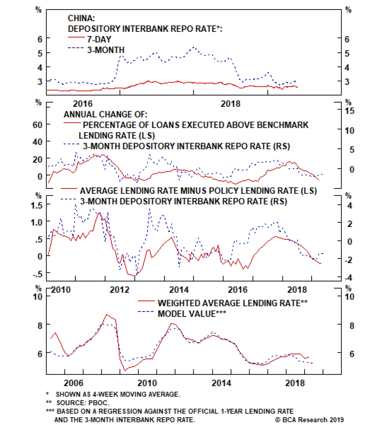
The top panel shows that while the 7-day repo rate rose in late-2016 and 2017, the rise was fairly small (on the order of 60 basis points). By contrast, the 3-month repo rate surged, which appears to have been caused by macro-prudential policy changes aimed…
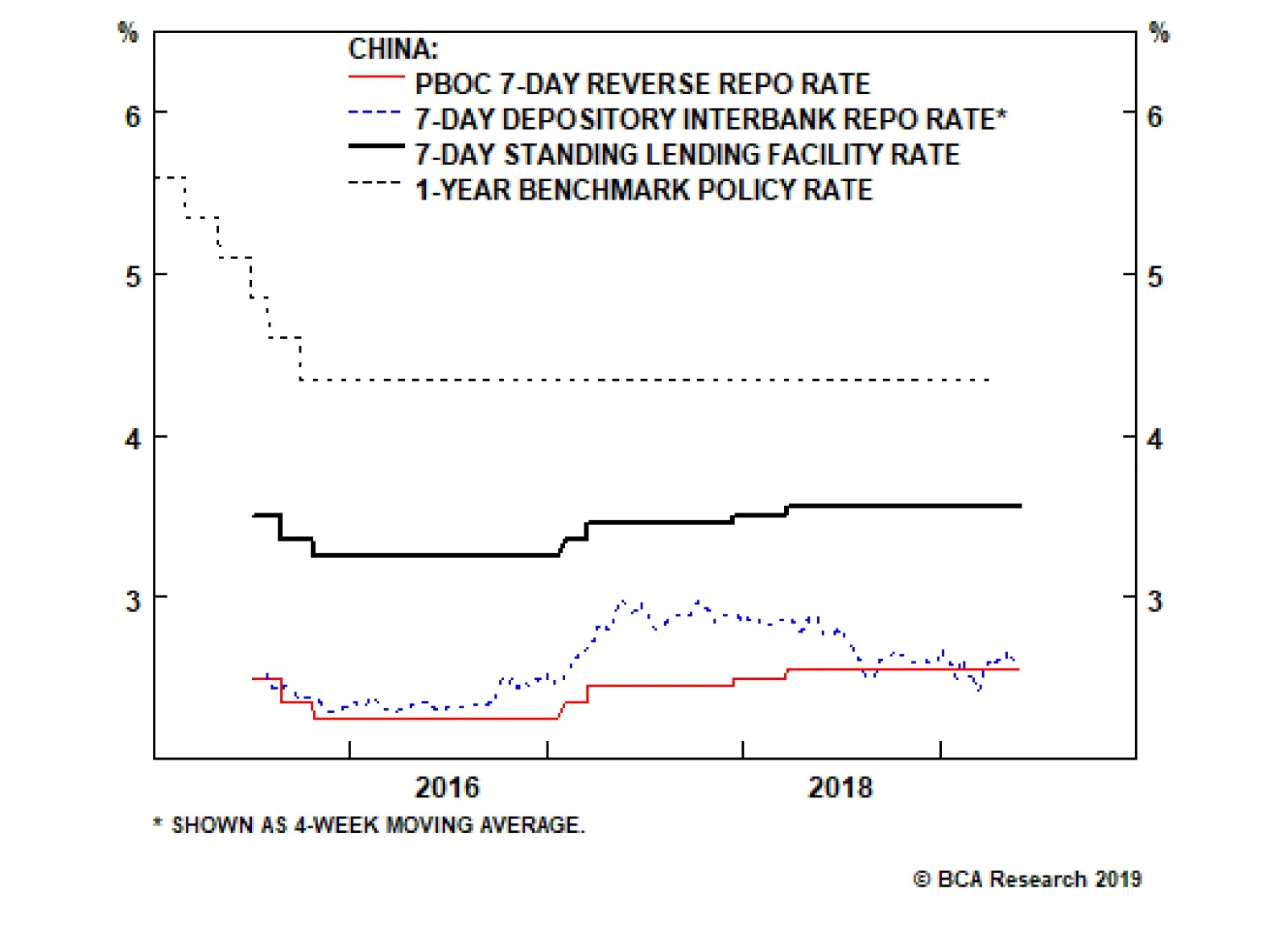
Instead of aggressive and broad-based bank lending, this policy push will likely have to come in the form of quasi-fiscal spending, e.g. a significant increase in infrastructure-oriented local government bond issuance (which we include as “credit” in our…
Highlights Huge imbalance #1 is the euro area’s $150 billion trade surplus with the United States. Huge imbalance #1 has resulted from the ECB holding interest rates at the lower bound while the Fed tightened policy. The upshot is that the Fed now has the scope to cut rates while the ECB does not. Huge imbalance #2 is the euro area’s €1.5 trillion TARGET2 banking imbalance. Huge imbalance #2 means that Germany effectively has hundreds of billions of ‘Italian’ euro assets, making a euro break-up unthinkable for the euro area’s dominant economy. New structural recommendation for bond investors: overweight a 50:50 portfolio of U.S. T-bonds and Italian BTPs versus a 50:50 portfolio of German bunds and Spanish Bonos. Feature Huge Imbalance #1: The Euro Area’s $150 Billion Trade Surplus With The United States While the recent focus has been on the brewing trade war between the United States and China, trade tensions between the U.S. and Europe have also been escalating. The euro area trade surplus with the U.S. – standing near an all-time high of $150 billion – is extreme; and it is extreme because the undervaluation of the euro has made the euro area grossly over-competitive vis-à-vis the U.S., as claimed by the ECB’s own analysis (Chart I-2 and Chart I-3)! Chart of the WeekThe U.S./Euro Area Trade Imbalance Is A Near-Perfect Function Of Relative Monetary Policy
The U.S./Euro Area Trade Imbalance Is A Near-Perfect Function Of Relative Monetary Policy
The U.S./Euro Area Trade Imbalance Is A Near-Perfect Function Of Relative Monetary Policy
Chart I-2Relative Monetary Policy Has Driven The Euro's Undervaluation...
Relative Monetary Policy Has Driven The Euro's Undervaluation...
Relative Monetary Policy Has Driven The Euro's Undervaluation...
Chart I-3...And The Euro's Undervaluation Has Driven The U.S./Euro Area Trade Imbalance
...And The Euro's Undervaluation Has Driven The U.S./Euro Area Trade Imbalance
...And The Euro's Undervaluation Has Driven The U.S./Euro Area Trade Imbalance
A common counterargument is that the euro area trade surplus is simply a structural issue. If a country, such as Germany, consistently consumes less than it produces, it must show up as a structural surplus. This argument is flawed. At least half of the surplus, including for Germany, has appeared since 2014, meaning it cannot be a structural issue (Chart I-4). In any case, if an economy consumes less than it produces, a higher exchange rate should help to facilitate the adjustment, encouraging under-consuming households to buy more imports, and discouraging over-producing firms from selling into foreign markets. Chart I-4Half Of Germany's Export Surplus Appeared After 2014
Half Of Germany's Export Surplus Appeared After 2014
Half Of Germany's Export Surplus Appeared After 2014
The Chart of the Week shows the true and damning reason for the trade imbalance. The euro area’s surplus with the U.S. is a near-perfect function of relative monetary policy. To be clear, the ECB is not explicitly depressing the exchange rate to make the euro area over-competitive, the ECB is just targeting its definition of price stability. However, the ECB’s definition of price stability omits owner-occupied housing (OOH) costs, and thereby understates true euro area inflation by 0.5 percent. To the extent that the ECB thinks in terms of real interest rates based on seemingly low (excluding OOH) inflation, this means that the ECB is setting real interest rates that are far too low for the euro area economy including OOH. This has resulted in the grossly over-competitive euro and the associated $150 billion surplus with the United States. The euro area trade surplus with the U.S. is a near-perfect function of relative monetary policy. Still, for 85 percent of the euro area, even inflation excluding OOH is reliably running within a 1.5-2 percent range, very close to the ECB’s definition of price stability. And bank lending is growing at a very healthy clip. For this vast majority of the bloc, the ECB’s zero and negative interest rate policy is wholly inappropriate. However, for the 15 percent of the euro area that is called Italy, ultra-loose monetary policy does seem more appropriate. Inflation is struggling to stay above 1 percent, and bank lending is still failing to gain traction (Chart I-5 and Chart I-6). Chart I-5Italian Inflation Is Struggling To Stay Above 1 Percent
Italian Inflation Is Struggling To Stay Above 1 Percent
Italian Inflation Is Struggling To Stay Above 1 Percent
Chart I-6Italian Banks Have Not ##br##Been Lending
Italian Banks Have Not Been Lending
Italian Banks Have Not Been Lending
Therefore, an important way of thinking of the ECB’s stance is one of self-preservation – protecting the euro area’s obvious source of fissure. Effectively, the ECB is setting policy for the weakest link in the euro area, even if that policy means exacerbating strains outside the euro area – specifically, by generating a huge trade surplus with the United States. But in the interests of self-preservation, the external strain is a price worth paying. This leads us to believe that the inevitable convergence of euro area and U.S. monetary policies is now much more likely to happen via the Federal Reserve ultimately cutting rates, than by the ECB raising rates. Huge Imbalance #2: The Euro Area’s €1.5 Trillion TARGET2 Imbalance The euro area Target2 banking imbalance now stands close to €1.5 trillion (Chart I-7). What is this huge imbalance (Box 1), and why does it matter?
Chart I-7
Box 1: What Is Target2? Target2 stands for Trans-European Automated Real-time Gross settlement Express Transfer system. It is the settlement system for euro payment flows between banks in the euro area. These payment flows result from trade or financial transactions such as deposit transfers, sales of financial assets or debt repayments. If the banking system in one member country has more payment inflows than outflows, its national central bank (NCB) accrues a Target2 asset vis-à-vis the ECB. Conversely, if the banking system has more outflows than inflows, the respective NCB accrues a Target2 liability vis-à-vis the ECB. Target2 balances therefore show the cumulative net payment flows within the euro area. The ECB delegated its QE sovereign bond purchases to the respective national central banks. In the case of Italian BTPs, Italian investors sold their bonds to the Bank of Italy and deposited the cash in banks healthier than those in Italy – for example, in Germany. Strictly speaking, this outflow of Italian cash to German banks is not the same as the deposit flight during the depths of the euro debt crisis in 2012. Rather, we might call it precautionary cash management. Nevertheless, in Eurosystem accounting terms it still means that the Bank of Italy has a new asset – the BTP – denominated in ‘Italian’ euros, while the Bundesbank has a new liability to German banks denominated in ‘German’ euros. The Target2 imbalance is the aggregate of such mismatches between Eurosystem assets denominated in ‘Italian and other periphery’ euros and liabilities denominated in ‘German and other core’ euros. If Italy owes Germany half a trillion euros then it is Germany that has the problem. Does the €1.5 trillion imbalance really matter? No, as long as an ‘Italian’ euro equals a ‘German’ euro, the imbalance is just an accounting identity within the Eurosystem. But if Italy and Germany started using different currencies, then suddenly it would matter with a vengeance. The Bank of Italy asset would be redenominated into lira, while the Bundesbank liability to German banks would be redenominated into deutschemarks. Thereby the ECB would end up with fewer assets than liabilities, and a solvency shortfall potentially equivalent to hundreds of billions of euros would end up on the shoulders of the ECB’s shareholders – largely, German taxpayers. To paraphrase John Maynard Keynes, if Italy owes Germany half a billion euros, then Italy has a problem; but if Italy owes Germany half a trillion euros, then it is Germany that has the problem (Chart I-8 and Chart I-9). In effect, the Target2 huge imbalance is a huge force for euro area self-preservation – because break-up means mutually assured destruction. Chart I-8The Target2 Imbalance Reflects The Cross-Border Flow Of Italian Investor Cash...
The Target2 Imbalance Reflects The Cross-Border Flow Of Italian Investor Cash...
The Target2 Imbalance Reflects The Cross-Border Flow Of Italian Investor Cash...
Chart I-9...To German##br## Banks
...To German Banks
...To German Banks
A New Structural Recommendation For Bond Investors To sum up, the euro area has two huge imbalances: one external, the other internal. The external imbalance is the $150 billion trade surplus with the United States. This huge imbalance has resulted from the ECB holding interest rates at the lower bound while the Fed tightened policy. The upshot is that the Fed now has the scope to cut rates while the ECB does not. And this makes the U.S. T-bond a much better haven asset than the German bund. The Target2 imbalance is a huge force for euro area self-preservation. The internal imbalance is the €1.5 trillion euro area Target2 imbalance. This huge imbalance means that Germany effectively has hundreds of billions of Italian ‘euro’ assets, making a euro break-up unthinkable for the euro area’s dominant economy. On this premise, the Italian BTP – which is offering a generous yield premium for such a break-up risk – is a good structural investment. Therefore, our new structural recommendation for bond investors is to overweight: A 50:50 portfolio of U.S. T-bonds and Italian BTPs Versus A 50:50 portfolio of German bunds and Spanish Bonos. Since 2018, the T-bond/BTP combination has underperformed by 20 percent and has considerable scope for ultimate catch-up one way or another (Chart I-10). Chart I-10A U.S. T-Bond/Italian BTP Combo Can Catch Up With A German Bund/Spanish Bono Combo
A U.S. T-Bond/Italian BTP Combo Can Catch Up With A German Bund/Spanish Bono Combo
A U.S. T-Bond/Italian BTP Combo Can Catch Up With A German Bund/Spanish Bono Combo
Fractal Trading System * There are no new trades this week. For any investment, excessive trend following and groupthink can reach a natural point of instability, at which point the established trend is highly likely to break down with or without an external catalyst. An early warning sign is the investment’s fractal dimension approaching its natural lower bound. Encouragingly, this trigger has consistently identified countertrend moves of various magnitudes across all asset classes. Chart I-11
Bitcoin
Bitcoin
The post-June 9, 2016 fractal trading model rules are: When the fractal dimension approaches the lower limit after an investment has been in an established trend it is a potential trigger for a liquidity-triggered trend reversal. Therefore, open a countertrend position. The profit target is a one-third reversal of the preceding 13-week move. Apply a symmetrical stop-loss. Close the position at the profit target or stop-loss. Otherwise close the position after 13 weeks. Use the position size multiple to control risk. The position size will be smaller for more risky positions. * For more details please see the European Investment Strategy Special Report “Fractals, Liquidity & A Trading Model,” dated December 11, 2014, available at eis.bcaresearch.com. Dhaval Joshi, Chief European Investment Strategist dhaval@bcaresearch.com Fractal Trading System Recommendations Asset Allocation Equity Regional and Country Allocation Equity Sector Allocation Bond and Interest Rate Allocation Currency and Other Allocation Closed Fractal Trades Trades Closed Trades Asset Performance Currency & Bond Equity Sector Country Equity Indicators Bond Yields Chart II-1Indicators To Watch - Bond Yields
Indicators To Watch - Bond Yields
Indicators To Watch - Bond Yields
Chart II-2Indicators To Watch - Bond Yields
Indicators To Watch - Bond Yields
Indicators To Watch - Bond Yields
Chart II-3Indicators To Watch - Bond Yields
Indicators To Watch - Bond Yields
Indicators To Watch - Bond Yields
Chart II-4Indicators To Watch - Bond Yields
Indicators To Watch - Bond Yields
Indicators To Watch - Bond Yields
Interest Rate Chart II-5Indicators To Watch - Interest Rate Expectations
Indicators To Watch - Interest Rate Expectations
Indicators To Watch - Interest Rate Expectations
Chart II-6Indicators To Watch - Interest Rate Expectations
Indicators To Watch - Interest Rate Expectations
Indicators To Watch - Interest Rate Expectations
Chart II-7Indicators To Watch - Interest Rate Expectations
Indicators To Watch - Interest Rate Expectations
Indicators To Watch - Interest Rate Expectations
Chart II-8Indicators To Watch - Interest Rate Expectations
Indicators To Watch - Interest Rate Expectations
Indicators To Watch - Interest Rate Expectations
Highlights A financial market riot point remains likely over the coming few months to force policymakers, including those in China, to address the economic weakness that a full-tariff scenario will entail. The near-term outlook is bearish for China-related assets, but investors should stay cyclically bullish in anticipation of a strong reflationary response. It is not clear whether further monetary easing will occur over the coming year, given that monetary conditions have already eased substantially. But an RRR cut coupled with a benchmark lending rate cut is now a real possibility, and would signal that the monetary policy dial has been turned to “maximum stimulus”. Monthly credit growth needs to be approximately 2.8-3 trillion RMB per month in May and June in order to be consistent with a 2015/2016-magnitude policy response. May’s number may fall short of this, but that would set up June as a make-it or break-it month for credit creation. Chinese credit growth surged in 2012, but economic activity did not significantly accelerate. A repeat of this scenario is a risk to our cyclically bullish stance, but three reasons suggest it is not likely to occur. Investors should stay long USD-CNH over the cyclical horizon despite warnings from Chinese policymakers not to short the RMB. Feature Tensions between China and the U.S. have worsened materially over the past two weeks, in line with our view that an actual trade agreement this year (not just continued negotiations) is much less likely. The Huawei blacklist, stalled negotiations, a sharp escalation in preparatory nationalist rhetoric in China, and President Xi Jinping’s declaration in a Jiangxi province speech that the country is embarking on a new “Long March”1 significantly diminishes the possibility of a deal that addresses the U.S.’ structural concerns. Chart 1A Market Riot Point Is Coming
A Market Riot Point Is Coming
A Market Riot Point Is Coming
This implies that any agreement would require President Trump to capitulate and accept a temporary deal relating simply to the balance of trade between the two countries. It is possible that this occurs over the coming 6-12 months (in time for Trump to attempt a declaration of victory before the 2020 election), but it is not likely to occur before real economic (and thus financial market) pain arrives. This supports our view that a major financial market riot point is likely over the coming few months to force policymakers, including those in China, to address the economic weakness that a full-tariff scenario will entail (Chart 1). Given this, we would not recommend a long position in Chinese stocks, either in absolute terms or relative to the global benchmark, for investors with a time horizon of less than 3 months. However, over a strictly cyclical (i.e. 6-12 month) time horizon, we would recommend staying long/overweight Chinese stocks (in hedged currency terms) on the basis that policymakers will ultimately respond as needed, lest they face an unstable deceleration in economic activity that may become difficult to stop. In this week’s report we address the following three questions facing China-exposed investors over the coming year, before concluding with a brief note about the RMB: Can the PBOC provide more of a reflationary impulse if needed, and if so, how? How can investors tell whether policymakers are stimulating as required from the monthly credit data? What are the odds that China will stimulate aggressively and the economy does not meaningfully reaccelerate? How Can The PBOC Ease Further? We argued in our May 15 Weekly Report that a 2015/2016-magnitude policy response will again be required in order for policymakers to be confident that the upcoming trade shock will be overcome.2 In our view, this response, instead of aggressive and broad-based bank lending, will likely have to come in the form of quasi-fiscal spending, e.g. a significant increase in infrastructure-oriented local government bond issuance (which we include as “credit” in our adjusted total social financing calculation). However, we have received several questions from clients asking about the outlook for monetary policy in a full-tariff scenario, particularly the question of what the PBOC can do to provide even more of a reflationary response. Most investors would simply assume that the PBOC would cut interest rates even further, and this is certainly a possible outcome over the coming year. But even if the PBOC were to cut interest rates, it is not always clear to investors what rate should or will be cut. Confusion surrounding China’s monetary policy landscape has been high ever since the PBOC established an interest rate corridor system in 2015, and a review of what has occurred over the past 2½ years is warranted in order to better understand the implications of future policy decisions. A 2015/2016-magnitude policy response will again be required in order for policymakers to be confident that the upcoming trade shock will be overcome. Chart 2The Simple (But Incomplete) View Of China's New Monetary Regime
The Simple (But Incomplete) View Of China's New Monetary Regime
The Simple (But Incomplete) View Of China's New Monetary Regime
Chart 2 outlines how China’s new monetary regime is officially described by the PBOC. The benchmark lending rate, China’s “old” policy rate that established a base regulated rate for banks to price their loans, was replaced in 2015 with a corridor system. The target rate in this system is the 7-day interbank repo rate, which can be seen in Chart 2 is often at the low end of the corridor. However, we explained in a February 2018 Special Report why Chart 2 is only half of the story.3Charts 3 - 5 show the other half: Chart 3 shows that while the 7-day repo rate rose in late-2016 and 2017, the rise was fairly small (on the order of 60 basis points). By contrast, the 3-month repo rate surged, which appears to have been caused by macro-prudential policy changes aimed at severely curtailing the issuance of wealth management products by non-depository financial institutions. Chart 4 highlights that there is a strong (and leading) relationship between changes in China’s 3-month interbank repo rate and 1) changes in the percentage of loans issued above the benchmark rate and 2) changes in the gap between the weighted-average interest rate and the benchmark rate. Chart 5 shows that China’s weighted average interest rate can be successfully modelled by a regression on the benchmark lending rate and the 3-month interbank repo rate. Chart 3The 3-Month Repo Rate Has Been More Important Than The 7-Day
The 3-Month Repo Rate Has Been More Important Than The 7-Day
The 3-Month Repo Rate Has Been More Important Than The 7-Day
Chart 4A Strong Link Between 3-Month Repo Rates And Economy-Wide Rates
A Strong Link Between 3-Month Repo Rates And Economy-Wide Rates
A Strong Link Between 3-Month Repo Rates And Economy-Wide Rates
The relationships shown in Charts 3 - 5 are weaker if the 3-month repo rate is replaced with the 7-day rate, highlighting that while the latter is the new de jure policy rate in China, the former has been the de facto policy and market-driven lending rate among banks and non-financial institutions over the past 2½ years. Chart 5The Benchmark Lending And 3-Month Repo Rates Explain Effective Lending Rates
The Benchmark Lending And 3-Month Repo Rates Explain Effective Lending Rates
The Benchmark Lending And 3-Month Repo Rates Explain Effective Lending Rates
Our framework for examining China’s monetary policy environment leads us to conclude that there are three things the PBOC can do to meaningfully ease further, were they to decide to do so: The most impactful action that the PBOC could take is to cut the benchmark lending rate. While banks in China are no longer required to price loans in reference to the benchmark rate, in practice many still do. Roughly 2/3rds of loans in China have been priced at an interest rate above the benchmark over the past year, and Chart 5 noted that the weighted average interest rate is a direct function of the benchmark rate. As such, a cut to the benchmark rate is likely to feed directly into lower lending rates. Chart 3 showed that the substantial spread between the 3-month and 7-day repo rates that prevailed from late-2016 to mid-2018 has all but disappeared, implying that the PBOC cannot lower interest rates much further by dialing back on macro-prudential regulation. Instead, if it wants interbank rates to fall meaningfully, lowering the corridor around the 7-day rate by cutting the floor (the PBOC’s 7-day reverse repo rate) will likely be required. This would be carried out with further reductions to the reserve requirement ratio (RRR). Third, while Chart 5 showed that our model for the weighted average lending rate has done a very good job over the past few years, it is clear that a gap has opened up between the actual rate and that predicted by the model. The most likely explanation of this gap is that it is due to a risk premium applied by banks, possibly in response to the re-orientation of riskier funding demands that had previously been fulfilled by the shadow banking sector to on-balance sheet loans from depository institutions. It is not clear what policy tools are at the PBOC’s disposable to reduce the gap, but doing so has the potential to lower average interest rates by a non-trivial amount. The relative easiness of monetary conditions is the key difference between today and 2012. It is not clear yet which option the PBOC will pursue over the coming year or whether further monetary easing will occur, but an RRR cut coupled with a benchmark lending rate cut is now a real possibility. If it happens, it would be a clear signal for investors that the monetary policy dial has been turned to “maximum stimulus”. Inferring Reluctance Or Capitulation From Monthly Credit Growth The second issue that investors will be wrestling with over the coming few months relates to the question of whether the month-to-month pace of credit growth is consistent with the magnitude of the reflationary response that we believe will be required. To the extent that significantly more monetary easing occurs over the coming year, it is likely to have happened because policymakers were overly reluctant to green-light a renewed and substantial re-acceleration in credit growth and were then forced to fight a destabilizing slowdown in the economy. Chart 6A Strong Credit Response Will Be Required In Response To A Full Tariff Scenario
A Strong Credit Response Will Be Required In Response To A Full Tariff Scenario
A Strong Credit Response Will Be Required In Response To A Full Tariff Scenario
We have used the metric of new credit to GDP as the primary method to judge the relative size of previous credit booms, and have argued that a return to 30% on this measure will likely be required in response to a full 25% tariff scenario (Chart 6). Unfortunately, China’s unique seasonality patterns and the lack of official seasonally adjusted data make it difficult for investors to judge whether incoming credit data is consistent with the required policy response. Previously, we have shown seasonally adjusted measures of credit using a simple application of X12 ARIMA, the statistical seasonal adjustment program used by the U.S. Census Bureau. But Charts 7 and 8 present a different approach. The charts show the average cumulative amount of adjusted total social financing as the calendar year progresses, along with a ±0.5 standard deviation band, based on the 2010 to 2018 period. The thick black line in both charts shows the progress in new credit creation this year, assuming an 8% annual nominal GDP growth rate for the remainder of the year. Chart 7 shows the cumulative progress in credit assuming a 27% new credit to GDP ratio for the year (corresponding to a half-strength credit cycle relative to past episodes), whereas Chart 8 assumes 30%.
Chart 7
Chart 8
In our view, these charts are revelatory. First, Chart 7 provides evidence that policymakers have been reluctant to allow credit growth to surge. The chart shows that credit growth ran well above a half-strength credit cycle pace in the first quarter of the year; following this, through either administrative controls or jawboning, policymakers lowered the pace of credit growth in April such that it moved back within the range. By contrast, Chart 8 highlights that the pace of Q1 credit growth was exactly right in a 30% new credit to GDP scenario, and that April fell short. In order to be back within the range by June, Chart 8 suggests that monthly credit growth needs to be on the order of 2.8-3 trillion RMB per month in May and June, just a slightly slower pace than what investors observed in March. It is quite possible that May’s credit number will fall short of 2.8-3 trillion RMB, given that the increase in the second round tariffs only occurred on May 10 and that Chinese policymakers have so far seemed reluctant to pull the trigger. But this also heightens the risk of a serious near-term selloff in the domestic equity market, and would set up June as a make-it or break-it month for credit creation. Stimulus Without A Recovery? Revisiting The 2012 Scenario Chart 9The 2012 Scenario: Strong Credit, But A Modest Improvement In Activity
The 2012 Scenario: Strong Credit, But A Modest Improvement In Activity
The 2012 Scenario: Strong Credit, But A Modest Improvement In Activity
A final question facing investors this year is whether it is possible that the Chinese economy fails to respond to strong efforts by policymakers to stimulate the economy. Chart 9 shows that a similar situation occurred in 2012; while the surge in new credit to GDP did stabilize economic activity and caused a modest uptrend, the economic improvement was much smaller than what the relationship shown in the chart would imply. In our view, there are three reasons to believe that a 2012 scenario will not repeat itself: First, Chart 10 shows that the Q1 rebound in new credit to GDP appears to have halted the decline in investment-relevant Chinese economic activity. There is no basis to suggest that an uptrend in activity has begun, but the fact that the economy has even started to respond to the pickup in credit growth is a positive sign. Second, Chart 11 highlights one important difference between 2012 and today. The chart shows that our leading indicator for China’s economy did not rise as much as new credit to GDP, and that this occurred because monetary conditions remained relatively tight from the beginning of 2012 all the way through to early-2015. This relative tightness in monetary conditions occurred because of fairly elevated interest rates, and due to a persistent rise in the real effective exchange rate. However, the collapse in the weighted average lending rate following the 2015/2016 economic slowdown has eased monetary conditions in a lasting way, suggesting that a similar rise in new credit to GDP should have a strongly positive effect on Chinese economic growth. This also underscores our earlier point: monetary policy has already largely returned to 2015/2016 levels, meaning that it is fiscal/administrative action to boost credit growth that is missing. Third, Chart 12 highlights that the pace of inventory accumulation represents another key difference between the current economic environment and that of 2012. The chart shows that the change in China’s level of industrial inventories relative to exports (both measured in value terms) rose sharply in 2011 and 1H 2012, only to slow significantly over the following year (which may have weighed on the rebound in activity in 2012 and 2013). In contrast, the chart shows that inventories have recently been contracting at their fastest pace relative to exports since 2011, implying that the drag on production from potential destocking may be minimal. Chart 10A (Very) Tentative Sign Of Stabilization
A (Very) Tentative Sign Of Stabilization
A (Very) Tentative Sign Of Stabilization
Chart 11Monetary Conditions Are Considerably Easier Today
Monetary Conditions Are Considerably Easier Today
Monetary Conditions Are Considerably Easier Today
There are, however, two caveats to the above analysis. First, on the inventory front, Chart 12 shows that the level of industrial inventories to exports is fractionally higher than it was in 2012, even though it has declined significantly from its 2017 high. The level of inventories has been rising relative to exports for some time, and thus the “equilibrium” level is not clear. But to the extent that a prolonged trade war with the U.S. requires meaningfully lower inventory levels in China, then destocking may become more of a drag than we expect. Second, Chart 11 shows that while monetary conditions are much easier today than they were in 2012, money growth is much weaker. A weaker-than-expected recovery in Chinese economic activity is much more likely if money growth remains weak, although we cannot reasonably envision an outcome where credit growth surges and growth in the money supply does not. A Brief Note On The RMB We noted in our May 15 Weekly Report4 that a significant rise in new credit to GDP and a meaningful decline in the currency would be required to stabilize China’s economy if the U.S. proceeds with 25% tariffs on all imports from China. Consequently, we recommended that investors hedge the inherent RMB exposure from a long US$ cyclical position in Chinese stocks by opening a long USD-CNH trade, with the expectation that a break above 7 in the coming weeks was likely (Chart 13). Chart 12Inventories Have Been Meaningfully Reduced
Inventories Have Been Meaningfully Reduced
Inventories Have Been Meaningfully Reduced
Chart 13In A Full Tariff Scenario, A Defense Of 7 Is Only A Near-Term Event
In A Full Tariff Scenario, A Defense Of 7 Is Only A Near-Term Event
In A Full Tariff Scenario, A Defense Of 7 Is Only A Near-Term Event
Recently, Xiao Yuanqi, the spokesman for the China Banking and Insurance Regulatory Commission, was quoted as saying that “those who speculate and short the yuan will [surely] suffer heavy loss[es]”,5 which many investors took to mean that China will defend USD-CNY = 7 at all costs. In our view this may be true in the short-term, but is unlikely to occur over a 6-12 month time horizon in a full 25% tariff scenario. Policymakers have become much more attuned to sharp declines in the currency after the major episode of capital flight that occurred in 2015 and 2016, and are keen to ensure that any movements in the exchange rate are orderly. However, complete currency stability in the face of a major shock to the export sector means that the required rise in the “macro leverage ratio” to stabilize the economy will be even higher, highlighting that an orderly depreciation in the currency is the lesser of two evils. As such, we interpret these recent comments from policymakers as an attempt to prevent a breach in USD-CNY = 7 over the short-term, and an attempt to control the pace of decline over the longer term in a full-tariff scenario. The conclusion for investment strategy is that China-exposed investors should stay long USD-CNH over the cyclical horizon, but should limit the leverage of the position and should expect frequent short-term reversals. Jonathan LaBerge, CFA, Vice President Special Reports jonathanl@bcaresearch.com Footnotes 1 Please see Geopolitical Strategy Weekly Report, “Is Trump Ready For The New Long March?” dated May 24, 2019, available at gps.bcaresearch.com. 2 Please see China Investment Strategy Weekly Report, “Simple Arithmetic,” dated May 15, 2019, available at cis.bcaresearch.com. 3 Please see China Investment Strategy Special Report, “Seven Questions About Chinese Monetary Policy,” dated February 22, 2018, available at cis.bcaresearch.com. 4 Please see China Investment Strategy Weekly Report, “Simple Arithmetic,” dated May 15, 2019, available at cis.bcaresearch.com. 5 Reuters News, “China’s top banking regulator says yuan bears will suffer ‘heavy losses’,” dated May 25, 2019. Cyclical Investment Stance Equity Sector Recommendations