Policy

Dear Client, We will be presenting our quarterly webcast next week, and, as a result, will not be publishing on 29 July 2021. We will cover our major calls for the quarter and provide a look-ahead. I look forward to the Q+A, and am hopeful you will tune in. Bob Ryan Chief Commodity & Energy Strategist Highlights Chart Of The WeekOPEC 2.0's Hand Strengthened By Production Agreement
OPEC 2.0s Hand Strengthened By Production Agreement
OPEC 2.0s Hand Strengthened By Production Agreement
The deal crafted by OPEC 2.0 over the weekend to add 400k b/d of oil every month from August preserves the coalition, and sends a credible signal of its ability to raise output after its 5.8mm b/d of spare capacity is returned to market next year.1 KSA and Russia will remain primi inter pares, but the position of OPEC 2.0's core producers – not just the UAE, which negotiated an immediate baseline increase – was enhanced for future negotiations. This deal explicitly recognizes they are the only ones capable of increasing output over an extended period. We assume the revised production baselines for core OPEC 2.0 effective May 2022 reflect the coalition's demand expectations from 2H22 onward. Our modeling indicates core OPEC 2.0's output will almost converge on the revised baseline production of 34.3mm b/d by 2H23, when we expect these producers to be at ~ 33.4mm b/d. Holding our demand estimates constant from last week, our revised supply expectations prompt us to move our forecast closer to our June forecast. We expect Brent to average $70/bbl in 2H21, with 2022 and 2023 averaging $74 and $80/bbl (Chart of the Week). Feature The deal concluded by OPEC 2.0 over the weekend will do more than add 400k b/d of spare capacity to the market every month beginning next month. It also does more than preserve the producer coalition's successful production-management strategy. The big take-away from the deal is the clear message being sent by the coalition's core members – KSA, Russia, Iraq, UAE and Kuwait – that they are able to significantly increase output after their 5.8mm b/d of spare capacity has been returned to the market over the next year or so. It does so by raising the baselines of the core producers starting in May 2022, clearly indicating the capacity and willingness to raise output and keep it there (Table 1). Table 1Baseline Increases For Core OPEC 2.0
OPEC 2.0's Forward Guidance In New Baselines
OPEC 2.0's Forward Guidance In New Baselines
What OPEC 2.0's Deal Signals Internally, the deal is meant to recognize the investment made by the UAE in particular, which was not being accounted for in its current baseline. Externally – i.e., to competitors outside the coalition – the deal signals OPEC 2.0's successful production management strategy will continue, by raising the likelihood the coalition will remain intact. This has kept the level of supply below demand over the course of the COVID-19 pandemic (Chart 2), and is responsible for the global decline in inventories (Chart 3). Chart 2OPEC 2.0 Durability Increases
OPEC 2.0 Durability Increases
OPEC 2.0 Durability Increases
Chart 3Inventories Will Remain Under Control
Inventories Will Remain Under Control
Inventories Will Remain Under Control
Specifically, the massive spare capacity still to be returned to the market between now and 2H22 can be accomplished with minimal risk of a market-share war breaking out among the core OPEC 2.0 members seeking to monetize their off-the-market production before the other members of the coalition. Most importantly, the revised benchmark production levels that becomes effective May 2022 signal the coalition members with the capacity to increase production can do so. Longer-Term Forward Guidance We assume the revised production baselines for core OPEC 2.0 effective May 2022 reflect the coalition's demand expectations from 2H22 onward. Our modeling indicates core OPEC 2.0's output will approach the revised baseline reference levels of 34.3mm b/d, hitting 33.4mm b/d for crude and liquids output by 2H23 (Table 2). Table 2BCA Global Oil Supply - Demand Balances (MMb/d, Base Case Balances) To Dec23
OPEC 2.0's Forward Guidance In New Baselines
OPEC 2.0's Forward Guidance In New Baselines
This implies the core group expects to be able to cover production declines within the coalition and to meet demand increases going forward. The estimates are far enough into the future to prepare ahead of time to increase production. Our estimates for core OPEC 2.0 production reflects our assumption the revised baseline levels do reflect demand expectations of the coalition. In estimating the coalition's production, we rely on historical data from the US EIA, which allows us to estimate future production using regressors we consider reliable (e.g., GDP estimates from the IMF and World Bank). Non-OPEC 2.0 Production We use EIA historical data for non-OPEC 2.0 production as well. In last week’s balances, we substituted the EIA's estimates for non-OPEC 2.0 producers ex-US for our estimates, which resulted in lower supply numbers throughout our forecast sample. This threw off our balances estimates in particular, as we did not balance the decrease in supply from this group using the new data set with an increase from another group. We corrected this oversight this week: We will continue to use EIA estimates for non-OPEC 2.0 ex-US countries, but will balance the decrease in oil production from this cohort with increased supply from other countries. Chart 4US Shales Are The Marginal Barrel
US Shales Are The Marginal Barrel
US Shales Are The Marginal Barrel
For US oil production, we will continue to estimate it as a function of WTI price levels, the forward curve and financial variables – chiefly high-yield rates, which serve as a good proxy for borrowing costs for the marginal US shale producer, which we view as the quintessential marginal producer in the global price-taking cohort (Chart 4). Our research indicates US shale producers – like all producers, for that matter – are prioritizing shareholder interests first and foremost. This means they will focus on profitability and margins. While we have observed this tendency for some time, it appears it is gaining speed, as oil and gas producers are now considering whether they want to retain their existing exposure to their hydrocarbon assets.2 There appears to be a reluctance among resource producers generally – this is true in copper, as we have noted – to substantially increase capex. This could be the result of covid uncertainty, demand uncertainty, monetary-policy uncertainty or a real attempt to provide competitive returns. We think it is a combination of all of these, but the picture is clouded by the difficulty in separating all of these uncertainties. Income Drives Oil Demand Chart 5Income Drives Oil Demand
Income Drives Oil Demand
Income Drives Oil Demand
Our demand estimates will continue to be driven by estimates of GDP from the IMF and the World Bank. We have found the level of oil consumption is highly correlated with GDP, particularly for EM states (Chart 5). Holding our demand estimates constant from last week, our revised supply expectations prompt us to move our forecast closer to our June forecast. This week, we also will adjust our inventory calculations, which will rely less on EIA estimates of OECD stocks. In the recent past, these estimates played a sizeable role in our forecasts. From this month on, they will play a smaller part. This is why, even though our supply estimates have risen from last week, there is not a significant change to our inventory levels. Investment Implications Holding our demand estimates constant from last week, our revised supply expectations prompt us to move our forecast closer to our June forecast. We expect Brent to average $70/bbl in 2H21, with 2022 and 2023 averaging $74 and $80/bbl. We remain bullish commodities in general, given the continued tightness in these markets. We expect this to persist, as capex remains elusive in oil, gas and metals markets. This underpins our long S&P GSCI and COMT ETF commodity recommendations, and our long MSCI Global Metals & Mining Producers ETF (PICK) recommendation. Robert P. Ryan Chief Commodity & Energy Strategist rryan@bcaresearch.com Ashwin Shyam Research Associate Commodity & Energy Strategy ashwin.shyam@bcaresearch.com Commodities Round-Up Energy: Bullish US natural gas exports via pipeline to Mexico averaged just under 7 bcf/d in June, according to the EIA. Exports hit a record high of 7.4 bcf/d on 24 June 2021. The record high for the month was 7.4 Bcf/d on June 24. The EIA attributes the higher exports to increases in industrial and power demand, and high temperatures, which are driving air-conditioning demand south of the US border. Close to 5 bcf/d of the imported gas is used to generate power, according to the EIA. This was up close to 20% y/y. Increases in gas-pipeline infrastructure are allowing more gas to flow to Mexico from the US. Base Metals: Bullish China reportedly will be selling additional copper from its strategic stockpiles later this month, in an effort to cool the market. According to reuters.com, market participants expect China to auction 20k MT of Copper on 29 July 2021. This will bring total sales via auction to 50k MT, as the government earlier this month sold 30k MT at $10,500/MT (~ $4.76/lb). Prior to and since that first auction, copper has been trading on either side of $4.30/lb (Chart 6). Market participants expected a higher volume than the numbers being discussed as we went to press. In addition to auctioning copper, the government reportedly will auction other base metals. Precious Metals: Bullish Interest rates on 10-year inflation-linked bonds remain below -1%, as U.S. CPI inflation rises. US 10-year treasury yields have rebounded since sinking to a five-month low at the beginning of this week. The positive effect of negative real interest rates on gold is being balanced by a rising USD (Chart 7). Safe-haven demand for the greenback is being supported by uncertainty caused by COVID-19’s Delta variant. Gold prices are still volatile after the Fed’s ‘dot shock’ in mid-June.3 This volatility is reducing safe-haven demand for the yellow metal despite rising economic and policy uncertainty. Ags/Softs: Neutral Hot, dry weather is expected over most of the grain-growing regions of the US for the balance of July, which will continue to support prices, according to Farm Futures. Chart 6Copper Prices Going Down
Copper Prices Going Down
Copper Prices Going Down
Chart 7Weaker USD Supports Gold
Weaker USD Supports Gold
Weaker USD Supports Gold
Footnotes 1Please see 19th "OPEC and non-OPEC Ministerial Meeting concludes" published by OPEC 18 July 2021. 2Please see "BHP said to seek an exit from its petroleum business" published by worldoil.com July 20, 2021. 3Please refer to ‘“Dot Shock” Continues To Roil Gold; Oil…Not So Much’, which we published on July 1, 2021 for additional discussion. It is available at ces.bcaresearch.com. Investment Views and Themes Strategic Recommendations Tactical Trades Commodity Prices and Plays Reference Table Trades Closed In 2021 Summary of Trades Closed
OPEC 2.0's Forward Guidance In New Baselines
OPEC 2.0's Forward Guidance In New Baselines
Feature June’s economic data and second-quarter GDP indicate that China’s economic recovery may have peaked. Slight improvements in some sectors, including manufacturing investment, exports and consumption, were offset by slowing in China’s old economy, such as infrastructure and real estate. A softening economy will weigh on Chinese corporate profits in 2H21. Inflation in Producer Price Index (PPI) has likely peaked, but it remains far above its historic average. Downstream industries may benefit from low interest rates and slightly less inflationary pressures on input prices, however, their profit growth has rolled over given weakening domestic demand and base effect. Industrial profits will shift downward in 2H21, meanwhile China’s macro policy will probably disappoint investors. Last week’s GDP’s numbers show that small-to-medium enterprises (SMEs) and private-sector businesses bore the brunt of rising global commodity prices and a slow recovery in domestic household consumption and services. The data, coupled with recent policy moves, support our view that China’s leadership is focused on helping vulnerable segments of the economy rather than boosting domestic demand by broadly easing policies (Chart 1). Nonetheless, the authorities may resort to easing policy later in 2021 if export growth weakens significantly in the second half of the year. A series of Reserve Requirement Ratio (RRR) and/or interest rate cuts, increased infrastructure project approvals, and/or looser real estate regulations, will signal that China’s ongoing policy tightening cycle has ended. In recent weeks both Chinese onshore and offshore stocks slipped further in absolute terms and relative to global benchmarks (Chart 2). We continue to recommend that investors remain cautious on Chinese stocks, at least through Q3. Chart 1No Broad Easing Yet
No Broad Easing Yet
No Broad Easing Yet
Chart 2Investors Still Cautious On China's Economy And Policy
Investors Still Cautious On China's Economy And Policy
Investors Still Cautious On China's Economy And Policy
Qingyun Xu, CFA Associate Editor qingyunx@bcaresearch.com Jing Sima China Strategist jings@bcaresearch.com Q2 GDP: Recovering At A Slower Pace China’s official GDP growth, on a year-over-year basis, slowed to 7.9% in Q2 from 18.3% in Q1 (Chart 3, top panel). While Q2’s weaker reading reflects the base effect in the data, it was slightly below the market’s expectation of 8.0-8.5%. Moreover, on a sequential basis (quarter-over-quarter), Q2’s seasonally adjusted GDP growth was one of the slowest in the past decade (Chart 3, bottom panel). These figures and the underlying data highlight that China’s economic growth momentum, which historically lags the credit impulse by six to nine months, has peaked (Chart 4). However, in 1H21, China aggregate output still grew by a 5.5% average annual rate during the same period over the past two years, well within Chinese policymakers’ target of above 5% growth needed to maintain a stable economy. Meanwhile, the bifurcation in China’s economic recovery continues. While robust external demand for Chinese goods helped to underpin manufacturing output, the sector’s profit growth has lagged upstream industries. Moreover, state-owned enterprises (SOEs) are experiencing soaring profit growth whereas SMEs have struggled with rising global commodity prices and sluggish domestic consumption as discussed below. We expect that the pace in credit growth deceleration will moderate in 2H21 and interest rates will stay at historically low levels. However, the authorities are unlikely to loosen macro policies until more signs of economic weaknesses emerge. Chart 3Q2 GDP: Slowing From An Elevated Level
Q2 GDP: Slowing From An Elevated Level
Q2 GDP: Slowing From An Elevated Level
Chart 4Chinese Economic Growth Should Soften Further In 2H21
Chinese Economic Growth Should Soften Further In 2H21
Chinese Economic Growth Should Soften Further In 2H21
Robust Exports, Sluggish Manufacturing Investment Chart 5Subdued Manufacturing Investment Recovery Despite Robust Exports
Subdued Manufacturing Investment Recovery Despite Robust Exports
Subdued Manufacturing Investment Recovery Despite Robust Exports
China’s export growth in June beat market expectations, despite shipping disruptions at major ports in Guangdong province due to a resurgence in COVID-19 cases. However, the recovery in manufacturing investment was muted through most of 1H21 even though export growth was resilient (Chart 5). There are several reasons for the sluggish recovery: the RMB’s rapid appreciation in the first five months of 2021, rising inflation and the limited pricing power that Chinese exporters gained in the first half of the year likely impeded their profits and curbed their propensity to invest (Chart 6). Total export values in USD significantly outpaced those in RMB terms, suggesting that the profit gains by Chinese exporters were offset by the strengthening local currency (Chart 7). Chart 6Rapid RMB Appreciation Will Weigh On Industrial Profits
Rapid RMB Appreciation Will Weigh On Industrial Profits
Rapid RMB Appreciation Will Weigh On Industrial Profits
Chart 7Divergence Between Exports In USD versus RMB
Divergence Between Exports In USD versus RMB
Divergence Between Exports In USD versus RMB
Furthermore, manufacturers in mid-to-downstream industries have been unable to fully pass on rising input costs to domestic consumers, which is evidenced in the faster growth of manufacturing output volume compared with price increases. It contrasts with the previous inflationary cycles, where surging prices for manufactured goods surpassed output volume (Chart 8A & 8B). Chart 8AChina's Manufacturing Recovery: Stronger Volume Than Prices
China's Manufacturing Recovery: Stronger Volume Than Prices
China's Manufacturing Recovery: Stronger Volume Than Prices
Chart 8BMuted Profit Margin Recovery In Manufacturing Compared With Mining
Muted Profit Margin Recovery In Manufacturing Compared With Mining
Muted Profit Margin Recovery In Manufacturing Compared With Mining
June’s improvement in manufacturing investment may not advance into 2H21 without added policy support. The nearly 2% depreciation in the RMB against the dollar in recent weeks will alleviate some pressure on exporters’ profit margins. However, export prices in USD also started to weaken (Chart 9). In addition, June’s manufacturing PMI and a Chinese business school survey,1 reported a deterioration in business conditions among smaller businesses. The weaker sentiment will depress manufacturing investments since China’s manufacturing sector is dominated by private and smaller businesses (Chart 10). Chart 9Chinese Export Prices In USD Are Rolling Over
Chinese Export Prices In USD Are Rolling Over
Chinese Export Prices In USD Are Rolling Over
Chart 10Deteriorating Business Sentiment Will Depress Manufacturing Investments
Deteriorating Business Sentiment Will Depress Manufacturing Investments
Deteriorating Business Sentiment Will Depress Manufacturing Investments
Recent policy measures to keep a low interest-rate environment will help the export and manufacturing sectors by reducing operating costs. The measures are also in keeping with China’s shift from boosting its service sector to maintaining a steady share of manufacturing output in its domestic economy (Chart 11). Chart 11Maintaining A Steady Share Of Manufacturing Output In China's Economy
Maintaining A Steady Share Of Manufacturing Output In China's Economy
Maintaining A Steady Share Of Manufacturing Output In China's Economy
Policy Tightening In The Old Economy Continues Chart 12Investments In Real Estate Have Lost Steam
Investments In Real Estate Have Lost Steam
Investments In Real Estate Have Lost Steam
Infrastructure investment growth slowed further in June. Investments in real estate, which drove China’s economic recovery in the second half of 2020, are also losing momentum (Chart 12). The slowdown, engineered by policymakers, will likely endure for the rest of the year. Bank loans to real estate developers tumbled to a cyclical low (Chart 13). In addition, deposit and advance payments, the main source of funds for real estate projects, nose-dived along with home sales (Chart 14). Chart 13No Signs Of Looser Financing Regulations In Property Sector
No Signs Of Looser Financing Regulations In Property Sector
No Signs Of Looser Financing Regulations In Property Sector
Chart 14Falling Home Sales Will Further Depress Real Estate Investments
Falling Home Sales Will Further Depress Real Estate Investments
Falling Home Sales Will Further Depress Real Estate Investments
Chart 15Sharp Pullback In New Infrastructure Project Approvals This Year
Sharp Pullback In New Infrastructure Project Approvals This Year
Sharp Pullback In New Infrastructure Project Approvals This Year
Infrastructure project approvals by the Ministry of Finance remain on a downward trend (Chart 15). Last week, China’s Banking and Insurance Regulatory Commission (CBIRC) announced a new rule to stop financial institutions from lending to local government financing vehicles (LGFV) that hold off-balance sheet government debt. LGFVs are largely used by provincial governments to borrow from banks to help fund infrastructure projects. Regulations targeting the real estate sector will further dampen real estate investments in the second half of this year. Land purchases and housing starts, both leading indicators for real estate investment, have declined since February. Excavator sales and investment in construction equipment also deteriorated sharply (Chart 16). Given that housing prices remain elevated, we do not expect real estate regulations to shift to an easier tone. The deceleration in China’s old economy is reflected in imports. While the value of imports remains strong, the volume has slowed, which suggests that the surge was due to soaring commodity prices (Chart 17, top panel). In particular, the growth in China’s imports of copper and steel, on a year-over-year basis and in volume terms, contracted in June (Chart 17, bottom panel). Chart 16Construction Activities Set To Slow Further
Construction Activities Set To Slow Further
Construction Activities Set To Slow Further
Chart 17Falling Import Volume
Falling Import Volume
Falling Import Volume
The Key To A Consumption Recovery Retail sales picked up slightly in June following two consecutive months of decline. However, retail sales remain below their pre-pandemic level (Chart 18). Labor market dynamics and household income growth, which stayed sluggish through 1H21, hold the key to the speed and magnitude of a recovery in consumption this year (Chart 19). Chart 18Sluggish Recovery In Household Consumption
Sluggish Recovery In Household Consumption
Sluggish Recovery In Household Consumption
Chart 19A Lackluster Consumption Recovery Due To Slow Recovery in Household Income
A Lackluster Consumption Recovery Due To Slow Recovery in Household Income
A Lackluster Consumption Recovery Due To Slow Recovery in Household Income
Household precautionary savings, which remain elevated compared with their historical norms, have depressed the propensity to spend (Chart 20). While the overall unemployment rate in China’s urban centers has steadily declined this year, the rate of jobless young graduates (ages 16-24) picked up and is nearly three percentage points higher than its historical mean (Chart 21). However, the high unemployment among graduates will not encourage policymakers to stimulate the economy. The number of new graduates in both 2020 and 2021 is larger than the historical average, while the growth in new job creation has nearly recovered to that of the pre-pandemic years (Chart 22). Chart 20Households' Propensity For Precautionary Savings Remains Elevated
Households' Propensity For Precautionary Savings Remains Elevated
Households' Propensity For Precautionary Savings Remains Elevated
Chart 21Rising Unemployment Rate Among Younger Workers
Rising Unemployment Rate Among Younger Workers
Rising Unemployment Rate Among Younger Workers
Moreover, labor market slack among young graduates seems to be concentrated in the services sector, and this sector’s improvement is dependent on China’s domestic pandemic situation and inoculation rates rather than on stimulus (Chart 23). Chart 22Urban Job Creation Growth Still On The Mend
Urban Job Creation Growth Still On The Mend
Urban Job Creation Growth Still On The Mend
Chart 23Interruptions In Service Sector Recovery Due To Lingering COVID Cases
Interruptions In Service Sector Recovery Due To Lingering COVID Cases
Interruptions In Service Sector Recovery Due To Lingering COVID Cases
Elevated Inflation, Downshifting Industrial Profits Chart 24China's PPI May Have Reached A Cyclical Peak...
China's PPI May Have Reached A Cyclical Peak...
China's PPI May Have Reached A Cyclical Peak...
China’s domestic inflationary pressures eased slightly in June with a small decline in both consumer and producer prices. The input price component of the manufacturing PMI, which normally leads the PPI by about three months, dropped sharply last month, which indicates that the PPI may have reached its cyclical peak (Chart 24). However, producer price inflation will likely remain elevated in the second half of the year. Although global industrial metal prices have rolled over since May, they remain at their highest level since 2011 (Chart 25). A rapid deceleration in Chinese credit growth and weakening demand in 2H21 will remove some pressure in the sizzling hot commodity market, but global supply-side constraints will limit the downside in raw material prices, at least through the next six months. Therefore, diminishing inflationary pressures on the PPI will only slightly reduce input costs for China’s mid-to- downstream manufacturers, which have been unable to pass on rising commodity prices to domestic consumers (Chart 26). As discussed earlier, Chinese export prices in both USD and RMB terms have also rolled over. Chart 25...But Global Commodity Prices Are Still Elevated
...But Global Commodity Prices Are Still Elevated
...But Global Commodity Prices Are Still Elevated
Chart 26Absence Of Inflation Pass-Through
Absence Of Inflation Pass-Through
Absence Of Inflation Pass-Through
Given that price changes are more important to corporate profits than volume changes, Chinese mid-to-downstream industries will continue to face downward pressure on their profit margins. Profit growth in mid-to-downstream industries consistently lagged their upstream counterparts in the past 12 months (Chart 27). Moreover, state-holding enterprises, which dominate upstream industries, have seen a 150% jump in profit growth from a year ago, while the rate of profit gains among privately owned industrial companies tumbled this year (Chart 28). Chart 27A Faster Mean Reversal In Profit Growth Among Private Companies
Taking The Pulse Of China’s Slowing Economy
Taking The Pulse Of China’s Slowing Economy
Chart 28A Faster Mean Reversal In Profit Growth Among Private Companies
A Faster Mean Reversal In Profit Growth Among Private Companies
A Faster Mean Reversal In Profit Growth Among Private Companies
Chinese policymakers will probably focus on addressing imbalances in China’s industrial sector and economy by supporting SMEs and the private sector. Meanwhile, industrial profit growth will decline in 2H21 from its V-shaped recovery last year, given weakening domestic demand and the waning base effect. Table 1China Macro Data Summary
Taking The Pulse Of China’s Slowing Economy
Taking The Pulse Of China’s Slowing Economy
Table 2China Financial Market Performance Summary
Taking The Pulse Of China’s Slowing Economy
Taking The Pulse Of China’s Slowing Economy
Footnotes 1The CKGSB (Cheung Kong Graduate School Of Business) Business Conditions Index (BCI) comprises four sub-indices: corporate sales, corporate profits, corporate financing environment and inventory levels. Equity Sector Recommendations Cyclical Investment Stance
Highlights Metals prices are likely to suffer in the short term on the back of weakening Chinese demand and fading inflationary pressures. Accordingly, in our most recent Global Asset Allocation (GAA) Quarterly Outlook, we downgraded the AUD to underweight against the greenback. Bond yields, globally, are bound to rise moderately over the course of the coming 12 months. Australian yields, however, are likely to rise slower than those in the US. The RBA has been explicit in communicating what it would take to adjust its policy stance and is likely to lag behind other central banks in DM. We therefore recommend investors favor Australian government bonds in a global bond portfolio. Australian equities, now dominated by Financials rather than the Materials sector, would benefit from a rise in bond yields. However, a weaker AUD and declining metal prices warrant no more than a benchmark exposure to Australian equities within a global equity portfolio. Introduction Recently, clients have often been asking about Australia. The reasons seem clear. With a potential commodities “super-cycle” driven by a shift to renewable energy and electric vehicles (EVs), both the Australian economy and equities should be in a position to benefit. The reality, however, has been much less positive. Particularly the divergence between the core driver of the Australian market, industrial metals, and the performance of both equities and the currency over the past few years has been a concern (Chart 1). Over the past year and a half, Australian equities have underperformed the MSCI ACWI by 12.4% (Chart 2, panel 1). This underperformance was mainly due to the outperformance of the US. However, even against global markets excluding the US, Australian equities did not match the rise in commodity prices – particularly industrial metals (Chart 2, panel 2). Chart 1Despite The Rise In Metals Prices...
Despite The Rise In Metals Prices...
Despite The Rise In Metals Prices...
Chart 2...Australian Equities Have Not Outperformed
...Australian Equities Have Not Outperformed
...Australian Equities Have Not Outperformed
Chart 3Financials Dominate Australian Equities
Financials Dominate Australian Equities
Financials Dominate Australian Equities
The structure of the Australian market has changed over the past few years. The commodities boom and subsequent global liquidity boom over the past two decades have fueled a housing bubble in Australia and an unsustainable rise in household debt. As a result, Australian equities are no longer dominated by metals and mining stocks, but rather by banks (Chart 3). We structured this Special Report in a Q&A format, answering questions we think are most relevant for investors to assess both the short- and long-term outlook for Australia. We aim to provide an overview of the economy and draw some conclusions on how investors should be positioned. Our conclusions are as follows: Over the past year and a half, the Australian economy has shown how complementary actions between fiscal and monetary policy, as well as social restriction measures, can mitigate both economic and human damage. The Reserve Bank of Australia (RBA) will be in no rush to adjust its policy stance until wage growth is back to its 3% target. However, RBA officials risk running the economy hot in the meantime given that measures of employment are back to their pre-pandemic levels. The RBA is not likely to change its policy stance before reaching its wage growth and inflation targets and will probably lag behind other global central banks in tightening. In that case, investors should favor Australian government bonds in a global bond portfolio. Australian banks remain well-funded and in good health. But their excessive exposure to the housing sector puts them at grave risk if home prices collapse. Despite this, there seems to be a feedback loop where a decline in mortgage rates fuels further demand for loans, pushing up home prices. A slowdown in Chinese credit growth and economic activity will hamper commodity demand, weighing down on Australian equities. The longer-term outlook remains compelling for Australian equities and metals as we enter into a new commodities “supercycle” fueled by a transition to renewable and alternative energy. The Australian economy stands to benefit given that the country has high levels of both production and reserves of the minerals needed for this transition. Q: How Does The Economy Look In The Short-Term? A: Australia can be regarded as one of the few countries that successfully navigated the pandemic with a minimal amount of damage, both to its population and economy. With swift measures to limit travel and implement social restrictions, the spread of the outbreak was curtailed to slightly over 30,000 total cases, representing only 0.12% of its population (Chart 4). On the other hand, its vaccination campaign has been much slower (at 38 doses administered per 100 people) than in other DM economies such as the US, UK, France, or Germany with 100, 120, 90, and 102 doses per 100 people, respectively. In the short term, this might not seem particularly damaging to the economy. However, if vaccination rates do not pick up rapidly, Australia’s international travel restrictions (which cannot sustainably be kept in place) will hamper economic growth and become a major drag on the tourism and education sectors (Chart 5, panels 1 & 2). Chart 4Government Policies Contained The Pandemic Outbreak...
Government Policies Contained The Pandemic Outbreak...
Government Policies Contained The Pandemic Outbreak...
Chart 5...At The Expense Of Tourism
...At The Expense Of Tourism
...At The Expense Of Tourism
Ample fiscal support – in the form of wage subsidies and business support through the JobKeeper program – mitigated the shortfall in household incomes (Chart 6). This provided a boost to both consumers and businesses with Q1 GDP growth coming in at 1.8% quarter-on-quarter (7.4% annualized). GDP expectations for the remainder of this year and next show a resilient strong momentum for Australian growth and domestic demand (Chart 7). Chart 6Fiscal Stimulus Supported Employment...
A Deeper Dive Into The Land Down Under
A Deeper Dive Into The Land Down Under
Chart 7...And Overall Growth
...And Overall Growth
...And Overall Growth
Chart 8Labor Market Back To Pre-Pandemic Levels...
Labor Market Back To Pre-Pandemic Levels...
Labor Market Back To Pre-Pandemic Levels...
The labor market recovery has been an excellent example of how fiscal support and lockdown measures complement each other. Most employment indicators have almost recovered or surpassed their pre-pandemic levels: The unemployment rate stands at 4.90%, compared to 5.13%, the underemployment rate is at 7.44%, compared to 8.60%. The total number of those employed is now above its pre-pandemic level, albeit still below the 2018-2019 growth trend (Chart 8). Q: When Will The RBA Shift Its Policy Stance? A: The RBA has been explicit in communicating that changes in its policy stance hinge on Australian wage growth rising sustainably towards 3% – a level last reached in Q1 2013. Even with economic activity mostly restored, wage growth remains low at 1.49% (Chart 9). Our belief is that until that occurs, the RBA will probably maintain its accommodative stance. Our global fixed-income strategists, in a recent report, highlighted their belief that the RBA is likely to be less hawkish than markets currently expect – on both tapering and hiking rates. We agree with that assessment. Comments by RBA Governor Lowe earlier last month back our dovish belief: He stated that “The Board is committed to maintaining highly supportive monetary conditions to support a return to full employment in Australia and inflation consistent with the target…This is unlikely to be until 2024 at the earliest”. Market expectations nevertheless remain much more hawkish – pointing to a first rate hike by mid 2022 and almost 70 basis points of hikes by 2024 (Chart 10). Chart 9...However Wage Growth Remains Muted
...However Wage Growth Remains Muted
...However Wage Growth Remains Muted
Chart 10Market Expects A Hawkish RBA...
Market Expects A Hawkish RBA
Market Expects A Hawkish RBA
Chart 11...And Is Already Pricing That Down The Curve
...And Is Already Pricing That Down The Curve
...And Is Already Pricing That Down The Curve
Chart 12Inflation Remains Well-Below The RBA's Target
Inflation Remains Well-Below The RBA's Target
Inflation Remains Well-Below The RBA's Target
This means that the RBA will probably risk running the economy hot for a while. With total employment back to its pre-pandemic level and other employment indicators closely behind, inflationary pressures, sooner or later, will begin to mount. Higher growth prospects and inflation risks are being discounted further down the curve (Chart 11). The June CPI print is likely to reflect a transitory short-term base effect and the RBA is mostly going to see through that. In the meantime, we would watch other broad inflation indicators to gauge for price pressures. Broader measures such as the trimmed-mean inflation index or median inflation remain subdued at 1.1% and 1.3%, respectively. The 10-year breakeven rate currently stands at 2.1%, within the RBA’s range of 2%-3%, highlighting the market’s belief that long-term inflation remains well under control (Chart 12). Bottom Line: The RBA is likely to maintain its dovish stance for longer than the market expects. A return to sustainable levels of wage growth and inflation will remain the top objectives and it is unlikely that policy will be reversed before they are achieved. Our global fixed-income strategists laid out a checklist of what would make the RBA turn less dovish. So far, only 1 out of 5 items on their list (the recovery in private-sector demand) signals the need for a more hawkish stance. The remaining items signal no imminent pressure on the RBA to adjust policy (Table 1). The RBA is also wary of the currency appreciating if it took a more hawkish stance ahead of other central banks (e.g., the Fed) and is therefore likely to switch policy only after other central banks do so (Chart 13). Accordingly, investors should favor Australian government bonds within a global bond portfolio. Table 1RBA Checklist
A Deeper Dive Into The Land Down Under
A Deeper Dive Into The Land Down Under
Chart 13The RBA Will Be Wary Of A Rising AUD
The RBA Will Be Wary Of A Rising AUD
The RBA Will Be Wary Of A Rising AUD
Q: Are There Signs Of Improvement In The Banking Sector? A: Headline indicators of the health of the Australian banking sector paint a picture of a well-capitalized, highly funded, and profitable industry. Return on equity (ROE) has averaged 12.1% over the past decade. Capital adequacy and Tier 1 capital ratios stand at 14.5% and 18.2%, respectively – much higher than at the start of the Global Financial Crisis (GFC). The ratio of non-performing loans remains low and Australian banks’ reliance on leverage has also decreased (Chart 14). Chart 14Banks Look Healthy...
Banks Look Healthy...
Banks Look Healthy...
Chart 15...But Remain Exposed To The Housing Sector...
...But Remain Exposed To The Housing Sector
...But Remain Exposed To The Housing Sector
However, these indicators mask a major underlying risk. Banks remain heavily exposed to the housing market, with housing loans as high as 62% of banks’ gross outstanding loans and 40% of total assets (Chart 15, panel 1). Over the past decade and a half, banks have lent an average of A$56 of housing-related loans for every A$100 in total loans (Chart 15, panel 2). Chart 16...Which Is Showing No Signs Of Slowing Down
...Which Is Showing No Signs Of Slowing Down
...Which Is Showing No Signs Of Slowing Down
Chart 17Households Remain Heavily Indebted
Households Remain Heavily Indebted
Households Remain Heavily Indebted
With interest rates falling over the past few decades, construction activity has boomed. Consequently, the demand for loans for new homes has been rising, leading home prices higher (Chart 16). This also meant that household debt levels have climbed and currently standing at a staggering 130% of GDP and 180% of disposable income (Chart 17). So what does this mean for banks’ stock prices? The short answer is that absent a bursting of the bubble in house prices, banks should continue to fare well. Interestingly, the long-standing relationship between bond yields and banks’ relative stock price returns – one that works in other financial-heavy markets such as the euro area – did not hold in Australia, at least until recently. In fact, we find that, historically, Australian banks outperformed the broad market when bond yields were falling. This relationship changed post-GFC, most likely when inflation expectations became unanchored and trended lower – reflecting lower commodity prices (Chart 18). Bottom Line: Rising rates, reflecting better growth prospects and higher long-term inflation, should be a tailwind for bank stocks in the short term. Accommodative monetary policy will spur activity in the property market, propping up bank profits. This, however, puts banks at even greater risk when profitability starts to decline, NPLs rise and regulations tighten further. The latter risk is one we would highlight following RBA deputy governor Guy Debelle’s statement that monetary policy will not be used as a tool to curtail housing prices and that there are other tools to address that issue. Chart 18Rising Yields Will Be A Tailwind For Australian Equities
Rising Yields Will Be A Tailwind For Australian Equities
Rising Yields Will Be A Tailwind For Australian Equities
Q: How Does Chinese Policy Impact Australian Growth? A: China's role in global supply chains, as both a producer and consumer, has increased dramatically since the early 2000s. China’s demand for commodities generally and industrial metals in particular has grown over the past two decades from an average of 10% of total global demand to 50% for most metals (Chart 19). Australia stood to benefit, redirecting more and more of its metals’ production away from the rest of the world and towards China. For example, during the same period, the share of Australian iron ore exports to China increased fourfold (Chart 20). Chart 19China Is A Major Consumer Of Metals...
China Is A Major Consumer Of Metals...
China Is A Major Consumer Of Metals...
Chart 20...And This Has Benefited Australia Over The Past Two Decades
...And This Has Benefited Australia Over The Past Two Decades
...And This Has Benefited Australia Over The Past Two Decades
However, this dynamic leaves the Australian economy very exposed to the Chinese business cycle – one that is heavily reliant on policymakers’ decisions on how much liquidity to inject into the economy. After strong credit and fiscal support throughout 2020, the Chinese authorities – wary of excessive leverage in the economy – have begun paring back stimulus which is likely to lead to weaker growth in the second half of the year and put downward pressure on metal demand (Chart 21). Chart 21Weakening Chinese Demand Will Hurt Metals In The Short-Term
Weakening Chinese Demand Will Hurt Metals In The Short-Term
Weakening Chinese Demand Will Hurt Metals In The Short-Term
Heightened political tensions between Australia and China have also played a role. China recently imposed restrictions, including additional tariffs and bans, on Australian imports such as beef, wine, coal, and other goods. Consequently, Australian exports to China slowed. However, the goods not imported by China were absorbed by other economies – Australian export growth did not fall that much. It is unlikely that a new commodity-heavy marginal buyer will emerge in the short-term to replace Chinese demand. The recent rise in commodity prices reflected a return to economic activity, as well as inflationary fears, and supply, shipping, and logistical backlogs. These will ease in the short term, weighing on both the AUD and Australian equities. Q: Can The Shift To Renewable Energy Spur Future Australian Growth? A: The shift to renewable energy and electrification – particularly in the transport sector – will occur sooner rather than later. Some commodity-exporting countries stand to benefit, and Australia is likely to be one. We previously highlighted that modeling longer-term demand is tricky since it relies on assumptions for the emergence of new technologies, metals’ efficiency and recycling rates, and the rate of conversion to renewables. Chart 22The Shift To Renewables Will Require More Resources...
A Deeper Dive Into The Land Down Under
A Deeper Dive Into The Land Down Under
The mechanics of the future demand/supply relationship hinge on the following: Demand will rise during this energy transition period – simply due to the fact that the new clean energy systems require more minerals (such as copper and zinc) than the current traditional hydrocarbon-fueled energy system (Chart 22, panel 1). Electric vehicles (EVs) require about four and a half times more of certain commodities – particularly copper, nickel, and graphite – than conventional vehicles do (Chart 22, panel 2). Supply limitations, on the other hand, are what might propel metal prices even higher and lead the world economy into a new commodities “supercycle”. A study by the Institute for Sustainable Futures has shown that, in the most positive energy transition scenarios, demand for some metals will exceed supply, in terms of both available resources and reserves (Table 2). Table 2...Which Are Likely To Be In Short Supply
A Deeper Dive Into The Land Down Under
A Deeper Dive Into The Land Down Under
For some of those metals, Australia is either among the top producers, or has the largest reserves. For example, Australia produces almost 45% and 12% of the world’s lithium and zinc, and has 22% and 27% of the world’s reserves. Looking at other metals, supply disruptions – particularly in economies where political, social, and environmental influences are an issue – might be the driver of further price rises. For example, Chile has the largest shares of global lithium reserves (~44%), and copper reserves (~23%), while South Africa has the largest share of global manganese reserves (~40%). Bottom Line: The transition to renewable energy is already underway and is likely to intensify. Forecast demand should outstrip supply and Australia stands to benefit given its large share of current production and/or reserves. How much will depend on the pace of renewable energy integration but miners are likely to be long-term winners. Q: What Is The Outlook For The AUD? A: The Global Asset Allocation (GAA) service, in its latest Quarterly Outlook, turned negative on the AUD. The currency has historically had a high positive correlation with commodity prices and industrial metals prices, which in turn are very sensitive to Chinese demand (Chart 23). Given our outlook for metals in the short term (falling demand driven by slowing Chinese activity), we expect some weakening in the AUD over the coming 9-to-12 months (Chart 24). Chart 23The AUD Is Highly Correlated To Metal Prices...
The AUD Is Highly Correlated To Metal Prices...
The AUD Is Highly Correlated To Metal Prices...
Chart 24...Which In Turn Are Highly Correlated To Chinese Activity
...Which In Turn Are Highly Correlated To Chinese Activity
...Which In Turn Are Highly Correlated To Chinese Activity
Additionally, short-term weakness in the economy, caused by further lockdowns as Delta-variant COVID cases rise, is a risk since it might reduce domestic demand. From a valuation perspective, the AUD is slightly below its fair value (Chart 25). However, this on its own does not compel us to remain positive on the currency. We also consider other indicators such as investor positioning – which has reached a decade high, according to Citibank’s FX Positioning Alert Indicator (PAIN) (Chart 26). This indicator suggests that active FX traders hold substantial long positions in the AUD against the USD. Historically, this indicator has provided contrarian signals, with extreme optimism (pessimism) providing useful short (long) signals. Chart 25The AUD Is Close To Fair Value
The AUD Is Close To Fair Value
The AUD Is Close To Fair Value
Chart 26Investors Are Long The AUD
Investors Are Long The AUD
Investors Are Long The AUD
Bottom Line: Short-term weakness in the economy and a reversal in metal prices warrant caution on the currency. While valuations do not signal overbought conditions, investor positioning (a contrarian indicator) does. Q: How Should Equity Investors Be Positioned? A: Our recent Special Report on whether country or sector effects drive equity performance showed that sector composition was relatively important in Australia, given the large difference in sector weightings relative to the global benchmark. Our analysis showed that cumulative Australian sector performance over the past two decades detracted from overall returns (Chart 27). Given that framework, and the relationship between the Australian economy and industrial metals, we find that Australian equity performance relative to the US mirrors the performance of global metal and mining relative to global tech stocks (Chart 28). This underperformance makes sense: Commodity prices have been in a structural downtrend throughout the past decade. Chart 27Country Vs Sector Effect
Country Vs Sector Effect
Country Vs Sector Effect
Chart 28Australia / US = Metals / Tech
Australia / US = Metals / Tech
Australia / US = Metals / Tech
Therefore, given our view of the outlook for metals, we would not want to shun Australian equities. The Global Asset Allocation (GAA) service is currently neutral the Australian market within a global equity portfolio, and underweight the Materials sector over the next 12 months. We believe this positioning makes sense given the slowdown in the Chinese economy and the improbability that another country will emerge as the alternative marginal buyer of commodities. The longer-term outlook is more compelling however, as the shift to decarbonization, renewables, and alternative energy gets underway. Conclusions In the short term metals prices are likely to suffer on the back of weakening Chinese demand (with no immediate substitute as a marginal buyer) as well as fading inflationary fears and an easing of supply/logistical issues. Our analysis shows that sector composition is a larger driver of Australian equity relative performance than country composition. While Australian equities – dominated by Financials – would benefit from a moderate rise in global bond yields, yields will rise more slowly in Australia than in the US and the AUD is likely to weaken. Over the next 12 months, investors should remain neutral on Australian equities within a global equity portfolio. The RBA is likely to lag other central banks in tightening policy. Investors should therefore favor Australian government bonds over other developed economies such as the US and Canada. Amr Hanafy, Senior Analyst Global Asset Allocation amrh@bcaresearch.com
Highlights The ECB has changed its inflation target, but its credibility remains weak. Inflation will not allow the ECB to tighten policy anytime soon. Instead, the ECB will have to add to its asset purchase program next year and may even consider dual interest rates. EUR/USD should continue to appreciate because of the weakness in the USD, but EUR/GBP, EUR/NOK, and EUR/SEK will soften. The SNB will follow the ECB; buy Swiss stocks / sell Eurozone defensives as an uncorrelated trade. China matters more than COVID-19 for the cyclical/defensive ratio. Despite our pro-cyclical medium- to long-term portfolio bias, the reflation trade is pausing. Remain tactically long telecom / short consumer discretionary as a hedge. European momentum stocks are near critical levels relative to growth equities. Feature The European Central Bank has found a new way to shed its Bundesbank heritage further and to justify the continuation of its QE program well after other central banks around the world will have ended their asset purchases. The early results of the Strategy Review and the subsequent comments by President Christine Lagarde will make it near impossible for the ECB to taper its asset purchases anytime soon. Practically, this means that the European yield curve will steepen relative to that of the US. Additionally, this policy should not hurt EUR/USD, but it will hurt EUR/GBP, EUR/NOK, and EUR/SEK. In the equity space, Swiss stocks will outperform European defensive equities, creating an opportunity for an uncorrelated trade. A New Tougher Target The ECB has abandoned its long-standing target of “close but below” 2% inflation. Even more importantly, the ECB followed the Bank of Japan and the Fed in adopting an approach whereby both downside and upside deviations from the 2% inflation target are to be fought. The ECB’s credibility was already hurt by its inability to achieve its more modest previous inflation target. Since 2009, the Euro Area HICP only averaged 1.2% (Chart 1). To prevent losing further credibility under its new mandate, the ECB will have to increase its stockpile of assets. Moreover, the ECB is far from achieving its new mandate, which will add to the ECB’s need to expand stimulus to the system even once the impact of owner-equivalent rent is included in CPI. Chart 1Mission Impossible
Mission Impossible
Mission Impossible
Chart 2Narrow Inflationary Pressures
Narrow Inflationary Pressures
Narrow Inflationary Pressures
Today, the ECB’s measure of core inflation stands at 1%, while headline inflation is 1.9%. As the economy re-opens, a surge in inflation is likely, but this spike will be transitory, even more so than in the US. As we recently showed, our estimate of the Eurozone trimmed-mean CPI has plunged close to 0%, which highlights that inflation pressures remain narrow (Chart 2). The labor market is another hurdle that will prevent Eurozone inflation from durably reaching 2% anytime soon. Currently, the total hours worked in the Euro Area remains well below the equilibrium level implied by the working-age population (Chart 3), which historically constrains wages. Moreover, it generally takes many quarters after labor shortages become prevalent before inflation begins to inch higher (Chart 4). Chart 3No Wage Pressure Yet
No Wage Pressure Yet
No Wage Pressure Yet
Chart 4No Inflation Labor Shortages For A While
No Inflation Labor Shortages For A While
No Inflation Labor Shortages For A While
The euro is the last force that caps European inflation. Despite the recent depreciation in EUR/USD, the trade-weighted euro remains near all-time highs, which historically imparts strong deflationary pressures to the economy (Chart 5). Beyond the time it will take for realized inflation to reach the ECB’s new target, inflation expectations are still inconsistent with 2% inflation. As the top panel of Chart 6illustrates, market-based inflation expectations in the Eurozone remain well below both 2% and the levels that prevailed before the Great Financial Crisis, even though rising commodity prices are lifting global inflation expectations. Market participants are not alone in doubting the ECB; professional forecasters do not see inflation at 2% in the near-term or the long-term (Chart 6, bottom panel). Chart 5The Euro Is Deflationary
The Euro Is Deflationary
The Euro Is Deflationary
Chart 6The ECB Lacks Credibility
The ECB Lacks Credibility
The ECB Lacks Credibility
In addition to the continued inability of the ECB to achieve its previous inflation target, let alone its present one, sovereign risk still hamstrings the central bank. The Italian economy remains fragile, because little structural reform has taken place. The Spanish economy cannot stand on its own two feet while the tourism industry continues to suffer due to COVID-19 related fears. And the exploding debt load of the French economy as well as its structural current account deficit raise the possibility that OATs will become unmoored. The ECB will ensure that spreads in those nations do not widen, or Eurozone inflation will never reach the new 2% target. Bottom Line: When it was time to achieve near—but below—2% inflation, the credibility of the ECB was already limited. The new target will be even harder to reach, but the symmetry around it gives the ECB more leeway to provide additional support to the Eurozone economy. Market Implications The ECB is now bound to maintain policy accommodation beyond the scheduled end of the PEPP program in March 2022, or the new policy target will be even less credible than the previous one. BCA Global Fixed Income Strategy team expects the ECB to maintain its asset purchase program beyond the stated end of the PEPP. Practically, this means that the ECB will fold the program into the pre-pandemic APP. The ECB cannot tighten policy while it remains so far from its target, especially now that missing the goalpost to the downside is as problematic as missing it to the upside. We expect the ECB to hint at this on Thursday. Chart 7The EONIA Curve Anticipated The Strategy Review
The EONIA Curve Anticipated The Strategy Review
The EONIA Curve Anticipated The Strategy Review
The ECB will also not increase interest rates for the foreseeable future, which the EONIA curve already anticipates (Chart 7). Money markets only expect a first hike in late 2024, which is appropriate. Compared to a month ago, overnight rates 10-year forward fell by more than 10bps, from 0.75% to 0.61%. We are inclined to fade this move. More stimulus raises the outlook for long-term policy rates. Amid the correction in global bond yields, betting against the decline in the long-term EONIA rate is akin to catching a falling knife; however, because the ECB is easing relative to the Fed, a box trade of buying European steepeners at the same time as US flatteners remains appropriate. The ECB could also lower the rate on TLTRO operations, resulting in a dual interest rate regime in the Eurozone. As Megan Greene and Eric Lonergan have argued, this policy would provide a further lift to the Euro Area economy by boosting the attractiveness of borrowing; at the same time, it would limit the deleterious impact of ever-more negative deposit rates on the profitability of the banking sector, because banks would borrow at extremely negative rates to finance lending activities. Chart 8JPY And YCC
JPY And YCC
JPY And YCC
The effect of the policy on the euro is more complex. When Japan announced its Yield Curve Control strategy in September 2016, it defined price stability as achieving a 2% inflation rate over the span of the business cycle. In other words, the BoJ implemented a backdoor average inflation mandate. Following this announcement, USD/JPY strengthened (Chart 8), but this move reflected the dollar rally and the global bond selloff around the US election, not yen-specific factors. This suggests that the euro will continue to track the USD inversely. BCA’s FX Strategy team remains bearish on the greenback, as a result of the growing US current account deficit and the fact that the Fed continues to target an overshoot in inflation, which suggests that, even if US nominal interest rates rise, real rates will lag behind. The EUR is nonetheless set to underperform compared to other European currencies. In the UK, house price gains are accelerating, the jobless count is declining rapidly as the economy re-opens, and the cheapness of the pound is accentuating positive inflation surprises. This combination suggests that the BoE is likely to follow the path of the Bank of Canada or the Reserve Bank of New Zealand, by beginning to tighten policy by early next year. Norway also faces a similar set of circumstances and has already announced it will lift interest rates this year. As we argued two months ago, the Riksbank is likely to follow its western neighbor, because the Swedish housing market is roaring, and the economy will remain well supported by the upcoming global capex boom. Hence, EUR/GBP, EUR/NOK, and EUR/SEK will depreciate. The Swiss National Bank should be the outlier that will follow the ECB. Swiss headline and core inflation linger at 0.6% and 0.4%, respectively. Wage growth is a meager 0.5%, because the Swiss output gap remains a massive 5.5% of GDP (Chart 9, top panel). Meanwhile, consumer confidence and retail sales are much weaker than those of Sweden, Norway, or the UK. Finally, Swiss private debt stands at 270% of GDP, which means that this economy still risks falling into a Fisherian debt-deflation trap. As a result, the SNB will continue to try to cap the upside in the CHF vis-à-vis the EUR, because the currency remains the main determinant of Swiss monetary conditions. Moreover, according to the central bank, the Swiss franc is still 10% overvalued relative to the euro, which is weighing on the country’s competitiveness (Chart 9, bottom panel). To fight the recent depreciation of EUR/CHF, the SNB will not raise rates for a long time and will intervene further in the FX market. The liquidity injections should prompt additional increases in the SNB’s domestic sight deposits, which since 2015 have resulted in a rise of Swiss bond yields relative to those of Germany (Chart 10). While counterintuitive, this relationship reflects the reflationary impact of the SNB’s asset purchases. It also means that the Swiss real estate market is set to become ever bubblier. Chart 9The SNB Will Follow The ECB
The SNB Will Follow The ECB
The SNB Will Follow The ECB
Chart 10Swiss/German Spreads To Widen
Swiss/German Spreads To Widen
Swiss/German Spreads To Widen
For Swiss shares, the picture is more complex. Swiss equities are extremely defensive, but, while they underperform Euro Area stocks when global yields rise, widening Swiss / German spreads often provide a lift to the SMI. A simple model, assuming US 10-year Treasury yields rise to 2.25% by the end of 2022 (BCA’s US Bond Strategy forecast) and that Swiss/German spreads widen to 20bps as the SNB domestic sight deposits swell, suggests that Swiss stocks will underperform that of the Euro Area over the coming 18 months (Chart 11). However, if we compare Swiss equities to European defensive sectors, then the widening in Swiss/German spreads should prompt an outperformance of Swiss equities, because their multiples benefit from ample liquidity conditions in Switzerland (Chart 12). Chart 11Swiss Stocks Are Too Defensive To Outperform Durably...
Swiss Stocks Are Too Defensive To Outperform Durably...
Swiss Stocks Are Too Defensive To Outperform Durably...
Chart 12...But They Will Beat Euro Area Defensives
...But They Will Beat Euro Area Defensives
...But They Will Beat Euro Area Defensives
Bottom Line: The results of the ECB Strategy Review will force this central bank to remain a laggard and continue to expand its balance sheet well after the expected end of the PEPP program. Eurozone interest rates will also fall behind that of other major economies. The ECB may even consider cutting the interest rate on TLTROs to boost lending. These policies will have a minimal impact on EUR/USD, which will continue to be dominated by the dollar’s fluctuations. However, EUR/GBP, EUR/SEK, and EUR/NOK will suffer. Finally, the SNB will follow the ECB and expand its balance sheet further, which will paradoxically lift Swiss/German spreads. As a result of their defensive nature, Swiss stocks will underperform Euro Area ones over the next 18 months, but they will outperform European defensive equities. Go long Swiss equities relative to European defensives, as a trade uncorrelated to the broad market. Follow China, Not Delta Chart 13
The ECB’s New Groove
The ECB’s New Groove
In recent days, doubts have grown about the European re-opening trade because of the resurgence of COVID-19 cases. The Delta variant (or any subsequent mutation for that matter) will cause hiccups along the way, but, ultimately, the re-opening will continue to proceed. As a result of the growing rate of vaccination, hospitalizations and deaths remain stable even if new cases are climbing rapidly in many countries (Chart 13). As long as the burden on the healthcare system remains limited, governments will find it difficult to justify further large-scale lockdowns. Instead, measures such as Macron’s Pass Sanitaire will provide increasing, widespread incentives for greater vaccination. Despite this sanguine take on the Delta variant, we remain concerned for the near-term outlook for cyclical equities because of the Chinese economy, even after the recent 50bps cut in the Reserve Requirement Ratio. BCA’s China Investment Strategy service believes that the RRR cut does not signal the beginning of a policy easing cycle. More evidence would be needed, such as additional RRR cuts, rising excess reserves, or supportive policies for the infrastructure and real estate sectors. For now, we heed the message from PBoC official Sun Guofeng that “the RRR cut is a standard liquidity operation.” Chart 14Fade The RRR Cut
Fade The RRR Cut
Fade The RRR Cut
The dominant force for the Chinese economy remains the previous deterioration in the credit impulse, which suggests that Q3 and Q4 growth will decelerate materially (Chart 14, top panel). Moreover, the softening impulse is consistent with weaker global economic activity, as approximated by our Global Nowcast (Chart 14, middle panel), especially since the lingering effect of the past RRR increases is still consistent with a global deceleration (Chart 14, bottom panel). In this context, we continue to hedge our long-term preference for cyclical stocks because of the near-term risks created by China and the excessively rapid move in the cyclical-to-defensives ratio (Chart 15). In response to this pause in the reflation trade, we continue to favor a long telecom/short consumer discretionary tactical position, which is supported by valuations and RoE differentials, as well as the still extended relative momentum (Chart 16). The period of risk to the global reflation trade should also allow the dollar to remain firm in the near-term, which means that for the coming months, the euro will not go beyond its trading range in place since the beginning of the year. Chart 15Cyclicals Remain Tactically Vulnerable
Cyclicals Remain Tactically Vulnerable
Cyclicals Remain Tactically Vulnerable
Chart 16Stay Long Telecom / Short Consumer Discretionary
Stay Long Telecom / Short Consumer Discretionary
Stay Long Telecom / Short Consumer Discretionary
Bottom Line: China’s RRR cut is not yet enough to bet against the temporary pause in the global reflation trade. Thus, investors should continue to hedge pro-cyclical long-term bets in their portfolios via a long telecom / short consumer discretionary position. An Exciting Chart A chart caught our eye this week: The underperformance of Eurozone momentum stocks relative to growth stocks is massively overdone (Chart 17). For now, we only want to highlight the phenomenon, but, in the coming weeks, we will delve deeper into the topic to gauge if these oversold conditions constitute an attractive opportunity. Chart 17Washed Out Moment
Washed Out Moment
Washed Out Moment
Mathieu Savary, Chief European Investment Strategist Mathieu@bcaresearch.com Currency Performance
The ECB’s New Groove
The ECB’s New Groove
Fixed Income Performance Government Bonds
The ECB’s New Groove
The ECB’s New Groove
Corporate Bonds
The ECB’s New Groove
The ECB’s New Groove
Equity Performance Major Stock Indices
The ECB’s New Groove
The ECB’s New Groove
Geographic Performance
The ECB’s New Groove
The ECB’s New Groove
Sector Performance
The ECB’s New Groove
The ECB’s New Groove
Highlights With geopolitical risks increasing around China, India is attracting greater attention from global investors. India’s youthful demographics also mark a stark contrast with China. While this demographic dividend is real, its benefits should not be overstated. India is young but socially complex, which will create unique social conflicts and policy risks. In particular, the country faces structurally large budget deficits. Regional political differences could slow down reforms. Lastly, competition with China will increase India’s own geopolitical risks. Macroeconomic and (geo)political factors, not youth alone, will determine India’s equity market returns. The bullish long-term view faces near-term challenges. Feature Map 1 PreviewIndia’s Demographic Dividend Can Be Overstated
India’s Demographics: The Devil Is In The Details
India’s Demographics: The Devil Is In The Details
“Independence had come to India like a kind of revolution; now there were many revolutions within that revolution … All over India scores of particularities that had been frozen by foreign rule, or by poverty or lack of opportunity or abjectness, had begun to flow again.” – Sir VS Naipaul, India: A Million Mutinies Now (Vintage, 1990) What is well known is that India is populous, young, and boasts a high GDP growth rate. India is also largely free of internal conflicts. Its democratic framework is seen as a pressure valve that can release social tensions. India’s hefty 58% cross-cycle premium to Emerging Markets (EM) is often attributed to the fact that India is younger than its peers, especially China. In this report we highlight that India’s demographic advantage is real but should not be overstated. For instance, India’s northern region can be likened to a demographic tinderbox. It accounts for about 45% of India’s population and is also younger than the national average. However, per capita incomes in this region are lower than the national average and to complicate matters, this region is crisscrossed by several social fault lines. This heterogeneity and economic backwardness in India’s population is the reason why the trend-line of India’s demographic dividend will not be linear. Its diverse population’s attempt to break out of its poverty will spawn unique policy risks. The North Is A Demographic Tinderbox, The South Is Prosperous But Ageing India will soon be the most populous country in the world (Chart 1). India’s median age is a decade lower than that of China to boot (Chart 2). Some emerging market investors fret about India’s low per capita income but India holds the promise of lifting individual incomes over time. This is because its GDP growth rate has been higher than that of its peers (Chart 3). Chart 1India Will Soon Be The Most Populous Country
India’s Demographics: The Devil Is In The Details
India’s Demographics: The Devil Is In The Details
Chart 2India Is A Decade Younger Than China
India’s Demographics: The Devil Is In The Details
India’s Demographics: The Devil Is In The Details
Chart 3India’s Per Capita Income Is Low, But GDP Growth Rate Is High
India’s Demographics: The Devil Is In The Details
India’s Demographics: The Devil Is In The Details
However, the “demographic dividend” narrative oversimplifies India’s investment case. India is young but also socially heterogenous and its median voter is poor. This complicates India’s development process and makes its demographic dividend trend-line non-linear. India’s social complexity is best understood if India is characterized as an amalgamation of three major regions: the North, the South (which we define to include the western region), and the East. Each of these parts are unique and have distinctive socio-demographic identities. India hence is more comparable to a continent like Europe than a country like the US. Like the European Union, India is a union of multiple social, religious, and ethnic groups. It straddles a vast geography and represents a very wide spectrum of interests. India’s South is more like a middle-income Asian country such as Sri Lanka or Vietnam whilst India’s East is more like a poor Latin American economy with latent social unrest. Understanding the heterogeneity of India’s vast populace is key to get a better sense of why an investment strategy for India must be nuanced and tactical in its approach, even if the overarching strategic view is constructive. The key features of each of these three regions can be summarized as follows: Region #1: The North This region comprises the triangular area between Jammu & Kashmir, Rajasthan and Jharkhand. This is the largest landmass in India stretching from the Himalayas to the fertile Gangetic plains of central India. Ethnically most of the population here is of Indo-Aryan descent. A lion’s share of this region’s population remains engaged in agriculture and allied activities. The North accounts for about 45% of the nation’s total population and is a demographic tinderbox. Per capita incomes are low and one in five persons falls in the age group of 15-24 years. To complicate matters, wage inflation in the farm sector, which employs a large majority of the populace in this region, has been slowing. If job creation in the non-farm sector stays insufficient then it will fan fires of social instability. The North includes states like Uttar Pradesh and Punjab which have seen a steady increase in small but notable socio-political conflicts in the recent past. Issues that triggered social conflict ranged from inter-religious marriages to resistance to amending farmer-friendly laws. Region #2: The South India’s South constitutes the large inverted-triangular region on the map and spans the area between Gujarat, Kerala, and West Bengal. We include India’s western region in this category because of its socio-economic similarities with the southern peninsula. Together the South and West account for the entirety of India’s peninsular coastline and for about 40% of total population. Historically, the South has seen far fewer external invasions and its social fabric is more homogenous than that of the North. This region is characterized by high per capita incomes, balanced gender ratios (Chart 4), and higher literacy ratios (Chart 5). Socio-political conflicts in this region are less common as compared to the North. Chart 4India’s South Has Healthy Gender Ratios Compared To North
India’s Demographics: The Devil Is In The Details
India’s Demographics: The Devil Is In The Details
Chart 5India’s South Is More Educated Than The Rest Of India
India’s Demographics: The Devil Is In The Details
India’s Demographics: The Devil Is In The Details
The state of Kerala is an exception in this region. The social fabric in this state is unusual, with Hindus accounting for only 55% of its population (versus the national average of 80%). The high degree of religious heterogeneity in this southern Indian state could perhaps be the reason why the state has lately seen a rise of small but significant incidences of social conflict. Unlike India’s young North, the median age of the population in India’s South is likely to be higher than the national average. Whilst India’s South is clearly young by global standards, this region will have to deal with problems of an ageing population before India’s North or East. The Southern region in India even today relies on migrant workers from India’s North. Region #3: The East This region is the youngest and the smallest of the three, as it accounts for the remaining 15% of India’s population. The region is young but must contend with low per capita incomes and very high degrees of religious diversity. Muslims, Christians, and other religions account for 20% of India’s population nationally but +50% of the population in India’s East. By virtue of sharing borders with countries like Bangladesh, Nepal, and Myanmar, this region is often the entry point for migration into India. It is historically the least stable of the three regions owing to its heterogeneity and the steady influx of migrants. To conclude, India is young but is also socially complex. Whilst a youthful population yields economic advantages, if this young population lacks economic opportunity then social dissatisfaction and associated risks can be a problem. Furthermore, history suggests that if a region’s populace is young but poor and diverse, then it often spawns the rise of identity politics, which takes policymakers’ attention away from matters of economic development. Social Complexity Index To better represent India’s demographic granularities, we created a Social Complexity Index (SCI), as shown in Map 1. Map 1India’s North Is A Demographic Tinderbox; South Is Prosperous But Ageing
India’s Demographics: The Devil Is In The Details
India’s Demographics: The Devil Is In The Details
The SCI for Indian states is created by adding a layer of socio-economic data over the demographic data. It uses three sets of variables: Economic well-being of a state as proxied by state-level per capita incomes. The lower the incomes, the greater the risk of social instability. This is because India’s per capita income is low to start with and if pockets have incomes that are substantially lower than the national average then the associated economic duress can be significant. Religious diversity in a state as measured by creating a Herfindahl-Hirschman Index of religious diversity in the state. The greater the religious diversity the greater the social complexity is expected to be. Youthfulness of a state as measured by population in the age group of 15-24 years relative to the total population. The greater the youth population ratio, the more complex are the social realities likely to be. If a state is exposed unfavorably to all three of the above stated parameters then such a state is deemed to have a high degree of social complexity and hence could be exposed to a higher risk of social conflicts and/or policy risks. Our Social Complexity Index (SCI) (Map 1) shows how parts of India are young but also socially complex. Why does this matter? This matters because a diverse, young and vast population’s attempt to develop will create policy risks. Policy Impact: Left-Leaning Economics, Right-Leaning Politics To be sure, governments in India will stay focused on creating large-scale jobs, a big concern for India’s median voter (Chart 6). However, given the time involved in building consensus for any major reform, progress on economic reforms (and hence job creation) will remain slow. India’s large population and democratic framework render the reform process more acceptable, but also less nimble. This contrasts with the speed of reforms executed by East Asian countries in the 1970s-90s, which turned them into export powerhouses. Two recent examples illustrate the problem of slow reform in India: Implementation of GST: Goods and services tax (GST) was a major reform that India embraced in 2017. However, the creation of a nation-wide GST was first mooted in 2000 and it took seventeen years for this reform to pass into law. Even in its current form India’s GST does not cover all products. It excludes large categories like petroleum products and electricity owing to resistance from state governments. Industrial sector growth: Despite India’s consistent efforts to grow its industrial sector as a source of large-scale, low-skill jobs, the share of this sector in India’s GDP has remained static for three decades (Chart 7). The services sector has grown rapidly in India over this period but its ability to absorb low-skill workers on a large scale is fundamentally restricted since (1) the sector needs mid-to-high skill workers and (2) the sector generates fewer jobs per unit of GDP owing to high degrees of productivity in the sector. Chart 6India’s Median Voter Worries Greatly About Job Creation
India’s Demographics: The Devil Is In The Details
India’s Demographics: The Devil Is In The Details
Chart 7India’s Industrial Sector Stuck In A Rut, India’s Workforce Is Connected And Aware
India’s Demographics: The Devil Is In The Details
India’s Demographics: The Devil Is In The Details
India’s inability to reform rapidly and create jobs on a large-scale will trigger policy risks. This factor is more relevant now than ever. In the 1990s, India was a small, closed economy that was just opening up. Hence slow reforms were acceptable as they yielded high growth off a low base. By contrast India’s masses today are at the forefront of connectivity (Chart 7). Slow job growth in a young country with high degrees of connectivity will have to be managed in the short term by responding to other needs of India’s median voter. This process might delay painful structural reforms necessary to improve productivity and hence create policy risks in the interim. What policy-risks is India exposed to? We highlight three policy risks that investors must brace for: Policy Risk #1: Structurally Large Budget Deficits Despite being young, India’s fiscal deficit has been large and as such comparable to that of countries that have an older demographic profile (Chart 8). Chart 8Despite India’s Youth, Its Fiscal Deficit Has Been Comparable To That Of Older Countries
India’s Demographics: The Devil Is In The Details
India’s Demographics: The Devil Is In The Details
Chart 9Unlike China, The Majority Of India’s Citizenry Lives On Less Than US$10 A Day
India’s Demographics: The Devil Is In The Details
India’s Demographics: The Devil Is In The Details
Whilst India’s fiscal deficit will rise and fall cyclically, it will remain elevated on a structural basis as India’s median voter is young but poor (Chart 9). This median voter will keep needing government support to tide over her economic duress. These fiscal transfers are likely to assume the form of transfer payments, food subsidies and a large interest burden on the exchequer who will need to borrow funds in the absence of adequate tax revenue growth. Two manifestations of this fiscal quagmire that India must contend with include: Revenue expenditure for India’s central government accounts for 85% of its total expenditure, with only 15% being set aside for more productive capital expenditure. Within central government revenue expenditure, 40% is foreclosed by food-subsidies, transfer payments, and interest payments. Can India’s fiscal deficit be expected to structurally trend lower? Only if India embraces big-ticket tax reforms. This appears unlikely given that India’s central tax revenue to GDP ratio has remained static at 10% of GDP for two decades owing to its inability to widen its tax base. Policy Risk #2: Foreign Policy Will Turn Rightwards India’s northern states are known to harbor unfavorable views of Pakistan. These are more unfavorable than the rest of India (Map 2). Geopolitical tension will persist due to a confluence of factors. Map 2Northern India Views Pakistan Even More Unfavorably Than Rest Of India
India’s Demographics: The Devil Is In The Details
India’s Demographics: The Devil Is In The Details
India may be forced to adopt a far more aggressive foreign policy response and shed its historical stance of neutrality. This will be done to respond to tectonic shifts in geopolitics as well as the preferences of India’s north that accounts for about 45% of India’s population. China’s active involvement in South Asia will accentuate this phenomenon whereby India tilts towards abandoning its historical foreign policy stance of non-alignment. An aggressive foreign policy stance will engender fiscal costs as well as diverting attention away from internal reform. The adoption of a more aggressive foreign policy stance will necessitate the maintenance of high defense spending when these scarce resources could be used for boosting productivity through spends on soft as well as hard infrastructure. Despite having low per capita incomes, India already is the third largest military spender globally. In 2022, India’s central government plans to allocate ~15% of its budget for defense, which is the same allocation that productivity-enhancing capital expenditure as a whole will attract. Since it will be politically untenable to cut social spending, defense spending will simply add to the budget deficit. Policy Risk #3: Regional Differences Could Get Amplified Over Time India’s northern states typically lag on human development indicators (Charts 4 and 5). Owing to their large population, these states have also lagged smaller states in the east more recently on vaccination rates, which could be a symptom of deeper problems of managing public services in highly populous states (Chart 10). Chart 10India’s Northern States Lagging On Vaccinations, Smaller Eastern States Are Leading
India’s Demographics: The Devil Is In The Details
India’s Demographics: The Devil Is In The Details
Whilst such differences between India’s more populous and less populous states are commonplace, these tensions could grow over the next few years. In specific, it is worth noting that a delimitation exercise in India is due in 2026. Delimitation refers to the process of redrawing boundaries for Lok Sabha seats to reflect changes in population. India’s Northern states are likely to receive an increased allocation of seats in India’s lower house (i.e. the Lok Sabha) beginning in 2026, despite poor performance on human development indicators. This is because India’s North accounted for 40% of seats in India’s lower house and accounted for 41% of its population in 1991. Owing rapid population growth, this region’s population share rose to 44% by 2011 and the ratio could rise further. Given that a review of the allocation of Lok Sabha seats is due in 2026, it is highly likely that India’s northern states get allocated more seats at this review. A change in political influence of different regions will have two sets of implications. Firstly, reforms that require a buy-in from all Indian states (such as GST implementation in 2017) could become trickier to implement if states that have delivered improvements in human development have to contend with a decline in political influence. Secondly, the rising political influence of India’s more populous states in the North could reinforce the trend of a less neutral and more aggressive foreign policy stance that we expect India to assume. Investment Conclusions Indian equity markets have historically traded at a hefty premium to Emerging Markets (EMs). This premium is often attributed to India’s youthful demographic structure. However academic literature has shown that realizing benefits associated with a youthful demographic structure is dependent on a country’s institutions and requires the productive employment of potential workers. It has also been shown, both theoretically and empirically, that there is nothing automatic about the link from demographic change to economic growth.1 Country-specific studies have also shown that it is difficult to find a robust relationship between asset returns on stocks, bonds, or bills, and a country’s age structure.2 An analysis of equity market returns generated by young EMs confirms that a youthful demographic structure can aid high equity returns but the geopolitical setting and macroeconomic factors matter too. Moreover, history confirms that each young country spawns a new generation of winners and losers. Fixed patterns in terms of top performing or worst performing sectors are not seen across young and populous EMs. The rest of this section highlights details pertaining to these two findings. Investment Implication#1: Youth Does Not Assure High Equity Market Returns China in the nineties, Indonesia & Brazil in the early noughties and India over the last decade had similar demographic features (see Row 1, 2 and 3 in Table 1). Table 1Leader And Laggard Sectors Can Vary Across Young, Populous Countries
India’s Demographics: The Devil Is In The Details
India’s Demographics: The Devil Is In The Details
However, it is worth noting that these four EMs delivered widely varying returns even when their demographic features were similar (see Row 5, 6 and 7 in Table 1). In real dollarized terms equity returns ranged from a CAGR of -22% to 8% for these four countries. The variation in returns can be attributed to differences in macroeconomic and geopolitical factors. Brazil’s period of political stability in the early 2000s along with its relatively high per capita incomes were potentially responsible for Brazil’s youthful demography translating into high equity market returns. At the other end of the spectrum, equity returns in China were the lowest despite a young demography owing to low per capita incomes and economic restructuring prevalent in the nineties. Investment Implication#2: Each Young Country Spawns A New Generation Of Winners And Losers Given that a young populace is expected to display a higher propensity to consume, sectors like consumer staples, consumer discretionary, and financials are expected to outperform in young countries. However, a cross-country analysis suggests that a young country does not necessarily throw up any consistent patterns of sector performance. Sectoral performance patterns too appear to be affected by demographics along with macroeconomic and geopolitical factors. Similarities in the profile of top performing sectors in India, China, Brazil and Indonesia when these countries were young are few and far between (see Row 9, 10 and 11 in Table 1). No patterns or similarities are evident even in the profile of worst performing sectors in India, China, Brazil and Indonesia when they had similar demographic features (see Row 12, 13 and 14 in Table 1). Even India’s own experience confirms that: There exists no correlation between India’s equity market returns and its demographic structure. India was at its youngest in the nineties and yet its peak equity market returns were achieved in the subsequent decade (see Row 4, 5 & 6 in Table 2). High domestic growth combined with the emergence of political stability potentially allowed India’s youth to translate into high equity market returns over 2000-2010. Table 2Youth Is Not A Sufficient Condition For A Market To Deliver High Returns
India’s Demographics: The Devil Is In The Details
India’s Demographics: The Devil Is In The Details
There exists no pattern in terms of top or worst performing sectors in India as it has aged over the last three decades (see Row 8 to 13 in Table 2). Healthcare for instance was the top performing sector in India in the 1990s when India’s median age was only 21 years. Industrials as a sector have featured as one of the worst performing sectors in India in the 1990s as well as the late noughties despite India’s youthful age structure. This could be attributed to the fact that India’s growth model pivoted off service sector growth while industrial sector development has lagged. Bottom Line: History suggests that a youthful demographic structure is a necessary but not a sufficient condition for an emerging market like India to deliver high equity market returns. Besides demographics, domestic macroeconomic and regional geopolitical factors create a deep imprint on equity returns’ patterns too. India faces a geopolitical tailwind as its economy develops and China’s risks increase. Nevertheless, owing to India’s heterogeneity and poverty, its road to realizing its demographic dividend will be paved with policy risks. Even as India’s lead on the demographic front is expected to continue, tactical underweights on this EM too are warranted from time to time. Ritika Mankar, CFA Editor/Strategist ritika.mankar@bcaresearch.com Footnotes 1 David Bloom et al, "Global demographic change: dimensions and economic significance", NBER Working Paper No. 10817, September 2004, nber.org. 2 James M Poterba, "Demographic Structure and Asset Returns" The Review of Economics and Statistics, Vol. 83, No. 4, November 2001, The MIT Press.
In lieu of next week’s report, I will be presenting the quarterly Counterpoint webcast titled ‘Where Is The Groupthink Wrong? And How To Profit From It.’ I do hope you can join. We will then take a summer break, so our next report will come out on August 5. Highlights The quantum theory of finance describes the strange quantum effects of ultra-low inflation, of ultra-low interest rates, and of ultra-low probabilities. The key finding of the quantum theory of finance is that when inflation and interest rates get ultra-low, inflation becomes completely insensitive to monetary policy, while risk-asset valuations become hyper-sensitive to monetary policy. The hyper-sensitivity of $500 trillion of global risk-assets to bond yields means that the ultimate low in the US T-bond yield is still to come. Given the hyper-sensitivity of equity valuations to bond yields and the demand for US assets during bond market rallies, it also means that the structural bull market in equities and the structural bull market in the US dollar are both still intact. Feature Feature ChartNear The Lower Bound In Bond Yields, Potential Losses Are Greater Than Potential Gains
Near The Lower Bound In Bond Yields, Potential Losses Are Greater Than Potential Gains
Near The Lower Bound In Bond Yields, Potential Losses Are Greater Than Potential Gains
When things get ultra-small, the laws of physics undergo a radical shift. Classical physics breaks down, and we must to turn to an alternative theory to explain and predict the physical world. That theory is the quantum theory of physics. In this updated Special Report we propose that, just as there is the quantum theory of physics, there is The Quantum Theory Of Finance. When inflation and interest rates get ultra-low, the laws of economics and finance undergo a radical shift. And we must turn to the alternative theory to explain and predict the economic and financial world. In the physical world, the allowable values of a physical system appear to be continuous, with all values permitted. In fact, the permitted values occur in discrete ‘quanta’. At ultra-small scales, these quantum effects become the dominant driver of physical systems and form the foundation of the quantum theory of physics. Likewise, in the economic and financial world of ultra-low inflation and interest rates, quantum effects become the dominant drivers of the system. These quantum effects take three forms: The quantum effects of ultra-low inflation. The quantum effects of ultra-low interest rates. The quantum effects of ultra-low probabilities. The Quantum Effects Of Ultra-Low Inflation Even though inflation is continuous mathematically, we do not perceive it as such psychologically. Instead we perceive inflation as ‘quantum states’ of either price stability or price instability. A recent IFO paper points out that households’ inflation perceptions are “more in line with the imperfect information view prevailing in social psychology than with the rational actor view assumed in mainstream economics.”1 And in Real-Feel Inflation: Quantitative Estimation of Inflation Perceptions, Michael Ashton confirms that “it would be challenging for a consumer to distinguish 1 percent inflation from 2 percent inflation – that fine of a gradation in perception would be extremely unusual to find.”2 There are several reasons why we perceive inflation imprecisely: We do not recognise quality change and substitution adjustments. We tend to feel inflation asymmetrically, noticing goods whose prices are rising, but noticing less goods whose prices are falling. This is the classic attribution bias: higher prices are inflation, lower prices are “good shopping.” Items whose prices are volatile tend to draw more attention, and give more opportunities for these asymmetries to compound. We notice the price changes of small, frequently purchased items more than the price changes of large infrequently purchased items. We perceive the cost of homeownership as the monthly mortgage payment, and not the imputed cost of owners’ equivalent rent (OER). Yet OER is the largest single item in the US core CPI basket, weighted at 30 percent. The result of these biases is that we perceive inflation intuitively, as a quantum state rather than as a precise number within a continuum. The quantum effects of ultra-low inflation mean that policymakers can take an economy from the state of price instability to the state of price stability, and vice-versa, but they cannot sustainably hit an arbitrary inflation target within the quantum state, such as 2 percent (Chart I-2). Chart I-2Mission Impossible: 2 Percent Inflation
Mission Impossible: 2 Percent Inflation
Mission Impossible: 2 Percent Inflation
The Quantum Effects Of Ultra-Low Interest Rates Policymakers accept that there exists an interest rate, at around -1 percent, below which there would be an exodus of bank deposits. Hence, this marks the lower bound of policy interest rates. When policy interest rates are at, or near, this lower bound, central banks can turn to a second strategy: they can promise to keep the policy rate ultra-low for an extended period. Thereby they can pull down the long bond yield towards the lower bound too. To do this, they must convince the market that their promise is genuine. Enter quantitative easing (QE) which, in the words of the ECB’s former Chief Economist Peter Praet, is nothing more than “a signalling channel which reinforces the credibility of forward guidance on (ultra-low) policy rates.” Once forward guidance plus QE has taken bond yields close to their lower bound, we start to see the quantum effects of ultra-low interest rates. Specifically, the bond investor is left with a highly asymmetric payoff – the bond price can fall much more than it can rise. Witness the performance of Swiss bonds through the past three years. The worst drawdowns have far exceeded the best gains (Feature Chart, Chart I-3 and Chart I-4). Chart I-3Swiss Bonds Offer Small Potential Gains...
Swiss Bonds Offer Small Potential Gains...
Swiss Bonds Offer Small Potential Gains...
Chart I-4...But Big Potential Losses
...But Big Potential Losses
...But Big Potential Losses
This asymmetric payoff is technically known as negative skew and it starts to take effect when bond yields decline to around 2 percent above their lower bound. So, if the lower bound for the 10-year T-bond yield is -0.5 percent, the negative skew in its payoffs would start to take effect at around 1.5 percent. One important implication of the quantum effect of ultra-low interest rates is that the asymmetry of bond payoffs becomes very similar to the asymmetry of equity and other risk-asset payoffs (Chart I-5). This is important because, as we describe in the next section, it is the skew of an asset’s payoff that establishes its absolute and relative riskiness. Chart I-5Equities Can Suffer Bigger Short-Term Losses Than Short-Term Gains (Negative Skew)
Equities Can Suffer Bigger Short-Term Losses Than Short-Term Gains (Negative Skew)
Equities Can Suffer Bigger Short-Term Losses Than Short-Term Gains (Negative Skew)
The Quantum Effects Of Ultra-Low Probabilities We are very bad at comprehending low probabilities. For example, we cannot distinguish a 1 in a 1000 risk from a 1 in a 100 risk, even though the second risk is ten times greater than the first. This is what Daniel Kahneman’s and Amos Tversky’s Nobel prize winning Prospect Theory called the ‘quantal effect’ of ultra-low probabilities. Kahneman and Tversky discovered that our fears and hopes come in quanta rather than in a continuum, with the result that we overweight the tail-events in a payoff distribution. “Because people are limited in their ability to comprehend and evaluate extreme probabilities, highly unlikely events are either ignored or over-weighted.” If the payoff distribution is symmetric, then our overweighting of the positive and negative tails cancels out, meaning there is no impact on the value of the payoff (Figure I-1). However, if the payoff distribution is skewed, then the longer tail dominates our perceived value of the payoff. Figure I-1In A Symmetric Payoff, We Overestimate The Big Gain And the Big Loss Equally, So It Cancels Out
The Quantum Theory Of Finance (Part 2)
The Quantum Theory Of Finance (Part 2)
A lottery payoff has an extreme positive skew. There exists a miniscule chance of winning a fortune. As we overweight this highly unlikely event, we overvalue the lottery ticket relative to its expected payoff (Figure I-2). And this explains the existence of the multi-billion dollar lottery industry. Figure I-2In A Positively-Skewed Payoff (Lottery), We Overestimate The Big Gain, So We Overpay
The Quantum Theory Of Finance (Part 2)
The Quantum Theory Of Finance (Part 2)
Conversely, the payoff from equities has a negative skew. As we overweight the tail-event of losing a lot of money, we undervalue this negatively skewed payoff (Figure I-3). In other words, we demand a higher return from a negatively skewed payoff relative to a symmetrical payoff, such as the payoff from bonds when yields are not ultra-low. And this explains the existence of the so-called ‘equity risk premium.’ Figure I-3In A Negatively-Skewed Payoff (Risk-Assets), We Overestimate The Big Loss, So We Demand A ‘Risk Premium’
The Quantum Theory Of Finance (Part 2)
The Quantum Theory Of Finance (Part 2)
Crucially though, at ultra-low bond yields – when both equity and bond payoffs carry the same negative skew – we no longer demand a higher return from equities versus bonds. As the equity risk premium compresses, the return demanded from equities and other risk-assets collapses to the ultra-low bond yield. Put another way, the valuation of risk-assets soars. The Quantum Theory Of Finance, The Past And The Future The key finding of the quantum theory of finance is this. When inflation and interest rates get ultra-low, inflation becomes completely insensitive to monetary policy, while risk-asset valuations become hyper-sensitive to monetary policy. This is the story of the past decade, and most likely the story of the coming years. For over a decade now, central banks have fixated on hitting their 2 percent inflation targets when the quantum effects of ultra-low inflation make such a target unachievable. In their misguided fixation, the unleashing of trillions of dollars of QE has taken bond yields to unprecedented lows which has driven risk-asset valuations to unprecedented highs, and made them hyper-sensitive to the slightest move in bond yields (Chart I-6 and Chart I-7). Chart I-6Real Estate Prices Have Massively Outperformed Rents
Real Estate Prices Have Massively Outperformed Rents
Real Estate Prices Have Massively Outperformed Rents
Chart I-7Equity Prices Have Massively Outperformed Profits
Equity Prices Have Massively Outperformed Profits
Equity Prices Have Massively Outperformed Profits
Yet to be clear, though policymakers cannot consistently hit the 2 percent inflation target, they could certainly take the economy back to price instability – if they pursued ultra-loose monetary policy combined with ultra-loose fiscal policy aggressively enough for long enough. But if a major economy were to take this road – intentionally or accidentally – the $500 trillion valuation of global risk-assets that is premised on ultra-low inflation and ultra-low interest rates would collapse. As we have previously written, this means that The Road To Inflation Ends At Deflation and the ultimate low in the T-bond yield is still to come. Alternatively, another deflationary shock could take us to this ultimate low in the T-bond yield more directly. Given the hyper-sensitivity of equity valuations to bond yields and the massive portfolio inflows into US assets during shocks, this also means that the structural bull markets in equities and the structural bull market in the US dollar are both still intact. Dhaval Joshi Chief Strategist dhaval@bcaresearch.com Footnotes 1 Please see Households’ Inflation Perceptions and Expectations: Survey Evidence from New Zealand, IFO Working Paper, February 2018 available at https://www.ifo.de/DocDL/wp-2018-255-hayo-neumeier-inflation-perceptions-expectations.pdf 2 Please see Real-Feel Inflation: Quantitative Estimation of Inflation Perceptions by Michael Ashton, National Association for Business Economics available at https://link.springer.com/content/pdf/10.1057/be.2011.35.pdf Fractal Trade Update We are pleased to report that long USD/CAD achieved its 3.7 percent profit target, and short building materials (PKB) versus healthcare (XLV) achieved its 15 percent profit target. Combined with other successes, this lifts the 6-month win ratio to an all-time high of 76 percent, comprising 12.3 winners versus just 3.9 losers. This week, we present two new candidates for countertrend reversal. First, the strong recent rally in Australian 30-year bonds has reached fragility on its 65-day fractal structure. The recommended trade is to short Australian versus Canadian 30-year bonds, setting the profit-target and symmetrical stop-loss at 3.9 percent. Second, the strong recent rally in lead versus platinum has also reached fragility on its 65-day fractal structure. The recommended trade is to short lead versus platinum, setting the profit-target and symmetrical stop-loss at 6.4 percent. Chart I-8Short Australian Vs, Canadian 30-Year Bonds
Short Australian Vs, Canadian 30-Year Bonds
Short Australian Vs, Canadian 30-Year Bonds
Chart I-9Short Lead Vs. Platinum
Short Lead Vs. Platinum
Short Lead Vs. Platinum
Fractal Trading System Fractal Trades 6-Month Recommendations Structural Recommendations Closed Fractal Trades Closed Trades Asset Performance Equity Market Performance Indicators To Watch - Bond Yields Chart II-1Indicators To Watch - Bond Yields - Euro Area
Indicators To Watch - Bond Yields - Euro Area
Indicators To Watch - Bond Yields - Euro Area
Chart II-2Indicators To Watch - Bond Yields - Europe Ex Euro Area
Indicators To Watch - Bond Yields - Europe Ex Euro Area
Indicators To Watch - Bond Yields - Europe Ex Euro Area
Chart II-3Indicators To Watch - Bond Yields - Asia
Indicators To Watch - Bond Yields - Asia
Indicators To Watch - Bond Yields - Asia
Chart II-4Indicators To Watch - Bond Yields - Other Developed
Indicators To Watch - Bond Yields - Other Developed
Indicators To Watch - Bond Yields - Other Developed
Indicators To Watch - Interest Rate Expectations Chart II-5Indicators To Watch - Interest Rate Expectations
Indicators To Watch - Interest Rate Expectations
Indicators To Watch - Interest Rate Expectations
Chart II-6Indicators To Watch - Interest Rate Expectations
Indicators To Watch - Interest Rate Expectations
Indicators To Watch - Interest Rate Expectations
Chart II-7Indicators To Watch - Interest Rate Expectations
Indicators To Watch - Interest Rate Expectations
Indicators To Watch - Interest Rate Expectations
Chart II-8Indicators To Watch - Interest Rate Expectations
Indicators To Watch - Interest Rate Expectations
Indicators To Watch - Interest Rate Expectations
Highlights The August 1 deadline for Congress to raise the debt ceiling will come and go but the looming debt showdown will not replay the 2011-13 crisis. It is not a major risk to the bull market. The Biden administration still has the political capital to pass a signature piece of legislation via budget reconciliation by end of year. The tax component of the plan may bring a negative surprise but the market is likely to be more concerned over inflation expectations, eventual Fed rate hikes, and the 2022 fiscal cliff. The Delta variant of COVID-19 is spreading rapidly in Republican-leaning states but the existence of effective vaccines presents an immediate solution. Any substantial new jitters over the pandemic will increase monetary and fiscal stimulus. Stay long value over growth stocks despite near term risks and setbacks. Reassess if technical support is broken. Feature The Democratic Party is attempting to achieve two major things before Congress goes on recess in early August. The first is a $1.2 trillion bipartisan infrastructure package – which will take longer than that and may never pass. The second is a $2-$6 trillion budget resolution that will contain reconciliation instructions to enable the Senate to pass President Joe Biden’s proposed $2.5-$4.1 trillion American Jobs and Families Plan with 51 votes. Democrats may very well achieve this resolution before going on recess but that is the very problem when it comes to negotiations with Republicans. Even though divisions within Republican ranks make bipartisanship more likely to succeed than usual, investors should not bet on it. A partisan reconciliation process virtually guarantees both that Democrats pass their next spending bill without major disappointments for the market and that the debt ceiling is not a substantial risk to the bull market. The real risk for investors is that the markets have mostly priced the Democrats’ stimulus spending and will increasingly turn to tax hikes and especially Fed rate hikes. While we expect dovish surprises from the Fed, the strong 4.5% year-on-year growth in core consumer prices, in the context of booming consumer sentiment (Chart 1), suggests the opposite. Chart 1Consumer Confidence Still Rebounding
Consumer Confidence Still Rebounding
Consumer Confidence Still Rebounding
The Debt Ceiling Is Not A Significant Risk To The Bull Market Investors are increasingly concerned about the US debt ceiling, or statutory limit on the national debt, which comes due on August 1. But the debt ceiling does not pose a significant risk to the bull market this time around. The US is not in the same political context as it was in 2011-13 when debt showdowns roiled markets. Investors’ concerns are understandable, of course. In the wake of the Great Recession, congressional Democrats and Republicans quarreled over the debt ceiling, resulting in notable disinflationary episodes in which stocks fell while Treasuries and the dollar rallied (Chart 2). A close look at the debt showdowns of summer 2011 and winter 2012-13 reveals that the “risk off” phase occurred immediately in the first case and over the succeeding month in the second case (Chart 3). The implication is that the whole period from September to December of 2021 could be at risk from any new debt showdown. To understand why risk is not substantial this year one needs to understand what the debt ceiling is. Chart 2ABiden Will Fare Better Than Obama On Debt Ceiling
Biden Will Fare Better Than Obama On Debt Ceiling
Biden Will Fare Better Than Obama On Debt Ceiling
Chart 2BBiden Will Fare Better Than Obama On Debt Ceiling
Biden Will Fare Better Than Obama On Debt Ceiling
Biden Will Fare Better Than Obama On Debt Ceiling
Chart 3A Close Look At Debt Ceiling Showdowns, 2011-13
A Close Look At Debt Ceiling Showdowns, 2011-13
A Close Look At Debt Ceiling Showdowns, 2011-13
The debt ceiling is a legislative instrument intended to constrain the US’s public debt. Congress must authorize a higher debt limit to enable the Treasury Department to make debt payments. Legislating a higher debt ceiling is not the same as legislating government spending. Congress spends money through the annual appropriations process. Government spending amidst recurring budget deficits requires new debt issuance to provide the funds to be spent. But debt in excess of the statutory limit must be authorized by raising the limit. The last time Congress expanded the debt ceiling was in August 2019, leaving August 1, 2021 as the next deadline. Theoretically it is unpopular for congressmen to increase the allowance for their own profligate policies and as such the debt ceiling acts a curb on deficits and debt. In reality the two political parties usually pull together the 60 votes needed in the Senate to raise or suspend the limit and prevent the federal government from defaulting on debt payments that come due. The reason is that, if the debt limit were not raised, the government would default on debt payments and be forced to halt social security payments, civil servant wages, and other essential payments. A failure to write checks to seniors and military veterans would be extremely unpopular and both the president’s party and the opposition party would suffer for it (Chart 4). Chart 4ABoth President And Congress To Suffer From Any Debt Showdown
The Debt Ceiling Is The Least Of Your Worries
The Debt Ceiling Is The Least Of Your Worries
Chart 4BBoth President And Congress To Suffer From Any Debt Showdown
The Debt Ceiling Is The Least Of Your Worries
The Debt Ceiling Is The Least Of Your Worries
This does not mean that 10 Senate Republicans can easily be found to join 50 Democrats, thus reaching 60 votes in the Senate to raise the debt limit. The battle is likely to extend well into the fall, pushing up against Treasury Secretary Janet Yellen’s warning that the Treasury could run out of funds before Congress returns in mid-September. The battle will likely extend into October and create fears of a default. Getting 10 Republicans is difficult. It will not occur as part of a compromise infrastructure package, even though this package already has 11 Republicans supporting it. First, the bipartisan infrastructure deal may fail anyway because Republicans know that Democratic leadership, whether they admit it or not, will tie the deal to the passage of their larger budget reconciliation bill later this fall. Since Republicans oppose the reconciliation bill they may not be able to save face if they vote for an infrastructure deal that enables it. And Democrats do not have any reason to compromise on a bipartisan deal if they think it will destroy their larger reconciliation ambitions. Second, if a bipartisan infrastructure deal comes together, Republicans will insist that the debt ceiling is kept separate. They will not want to link themselves and their infrastructure spending with the bulging national debt. Rather they will want to force the Democrats to link their massive social spending with the national debt. Democrats may accept this trade off since the Biden administration wants a bipartisan deal – as long as they are given guarantees from moderate Senate Democrats that the latter will support the reconciliation bill. Public opinion is not generally distressed when it comes to federal budget deficits and the national debt. Only 3% of Americans cite these as the most important problem facing the country today – obviously people are more concerned with the general economic recovery and unemployment (Chart 5). However, voters clearly believe debt is one of the country’s problems, with 43% saying they are “very concerned” about debt growth, including 45% of independents. Republicans are under significant pressure on these issues, which is why only moderates would conceivably vote to raise the debt limit and even then would only raise it if forced to choose between doing so and triggering a national default (Chart 6). Brinkmanship is to be expected. Chart 5Voters Say Recovery More Important Than Debt
The Debt Ceiling Is The Least Of Your Worries
The Debt Ceiling Is The Least Of Your Worries
Chart 6Yet Concern About Debt Is Not Negligible
The Debt Ceiling Is The Least Of Your Worries
The Debt Ceiling Is The Least Of Your Worries
While public opinion generally favors infrastructure spending, support for infrastructure falls when it is explicitly linked to increases in national debt. Only 39% of voters, and 30% of independents, think it is acceptable to increase the debt to pay for infrastructure, according to a recent Ipsos/Reuters poll (Chart 7). About 60% of Democrats agree with this statement and 22% of Republicans. The implication – as we have long argued – is that investors should not bet on a bipartisan deal. They should bet on the partisan reconciliation process. Chart 7Democrats Support More Debt For Infrastructure … Others Do Not
The Debt Ceiling Is The Least Of Your Worries
The Debt Ceiling Is The Least Of Your Worries
Support for extreme deficit spending is likely to wane as the economy recovers and the sense of crisis abates. Support for emergency COVID-19 fiscal relief was very high early this year (Chart 8). Yet even at the height of the lockdowns there was a non-negligible group of voters who claimed to care about deficits (Chart 9). Fortunately for the Biden administration, the window of opportunity has not yet closed. The rise in the Delta variant of COVID-19 is generating higher hospitalization rates and renewed concerns about the pandemic, which will help support additional stimulus measures (Table 1). There is still time to pass a major spending bill on infrastructure and/or social welfare before the end of the year. Chart 8Support For COVID Relief Was Very High
The Debt Ceiling Is The Least Of Your Worries
The Debt Ceiling Is The Least Of Your Worries
Chart 9Yet Voters Showed Some Concern About Deficits Even At Height Of Crisis
The Debt Ceiling Is The Least Of Your Worries
The Debt Ceiling Is The Least Of Your Worries
Table 12022 Swing States Struggling With COVID-19
The Debt Ceiling Is The Least Of Your Worries
The Debt Ceiling Is The Least Of Your Worries
Ultimately Democrats control both chambers of Congress and will be able to vote with party discipline on raising the debt ceiling. They can raise the debt ceiling with a simple majority vote if they include it in their upcoming budget reconciliation bill. This is the main reason why investors should look through any financial market jitters: there is a clear escape hatch if Republicans obstruct. The only reason we do not exclude the possibility of Republican cooperation entirely is that Republicans are in such desperate need of a lifeline following President Trump’s defeat and the post-election riot on Capitol Hill. Indeed, the last time Republicans saw anywhere near such low levels of partisan identification was in 2013, after House Republicans brought the US to the brink of defaulting on its debt (Chart 10). The Senate Republicans are divided, not unified in willingness to trigger a default, and we can count at least 10 Senate Republicans who will capitulate if necessary to prevent a default. Chart 10Republicans Need A Lifeline … Infrastructure May Be It
The Debt Ceiling Is The Least Of Your Worries
The Debt Ceiling Is The Least Of Your Worries
Of course, Senate Republicans could refuse to raise the debt ceiling anyway. But the crucial difference is that Congress is not gridlocked. Democrats, as the ruling party, would suffer in the event of a default and they have the reconciliation process to prevent that from happening. (We have also maintained that they will eventually water down or abolish the Senate filibuster, which would open another way to lift the debt ceiling, although so far they have not succeeded in doing so.) Bottom Line: There are reasons for investors to be increasingly risk averse – tax hikes, eventual Fed rate hikes, the 2022 fiscal cliff, global growth sputters – but the debt ceiling is not one of them. Any major stock market jitters that emerge because of the debt ceiling should be ignored if they are not attended by more significant risks. Biden’s Political Capital Still Sufficient For One More Big Bill All year we have maintained that President Biden will get at least one signature bill passed in addition to the huge COVID-19 relief bill, the American Rescue Plan, passed at the beginning of the year. This view is based in our reading of his political support and capability, as evinced in our Political Capital Index, which we update weekly in the Appendix. This view is on track and we maintain high conviction. Nevertheless readers should be aware that Biden’s support will wobble over the coming months and US economic policy uncertainty will rebound from post-pandemic lows. This week’s update of the Political Capital Index shows some chinks in Biden’s armor that will likely get wider over the coming months, though we do not expect them to prevent the bill from passing. First, while political polarization has subsided from recent peaks in 2020, our polarization indicators are starting to rebound from post-election lows. Our polarization proxy (the gap in partisan approval of the president) will eventually find a floor considering the historically high structural polarization in the country. Meanwhile economic sentiment polarization and the Philly Fed Partisan Conflict Index climbed from their respective lows in the first half of the year, as Congress bickered over Biden’s next reconciliation bill (Chart 11). The upcoming partisan battles over infrastructure, the debt ceiling, budget appropriations, voting rights, guns, the Hyde amendment (abortion), a possible government shutdown, and the midterm elections will revive polarization even if it does not surpass 2020 peaks. Partisanship will ensure the passage of a reconciliation bill but then it will reduce Biden’s ability to pass legislation afterwards. Chart 11Polarization Still Historically Elevated
Polarization Still Historically Elevated
Polarization Still Historically Elevated
Second, Biden’s approval rating is rebounding a bit in July from its low point in June but the legislative process – as well as looming foreign policy challenges and other negative surprises – will weigh on his approval, at least until his infrastructure bill passes (Chart 12). Over the medium term, strong consumer sentiment and a recovering economy will prevent Biden’s approval rating from falling to President Trump’s levels, at least until a major mistake or negative shock occurs. Nevertheless presidents tend to have low approval ratings in the modern era due to partisanship and so far Biden is no exception. Chart 12ABiden Approval Will Suffer Till Infrastructure Passes
The Debt Ceiling Is The Least Of Your Worries
The Debt Ceiling Is The Least Of Your Worries
Chart 12BBiden Approval Will Suffer Till Infrastructure Passes
The Debt Ceiling Is The Least Of Your Worries
The Debt Ceiling Is The Least Of Your Worries
Third, while small business continues to be more concerned with wages and inflation than with Biden’s legislative agenda, concerns about higher taxes are gradually emerging. The business community may finally be internalizing Biden’s American Jobs Plan, which will include a corporate tax hike and possibly also individual tax hikes (Chart 13). The stock market is unlikely to ignore Biden’s corporate tax hikes forever, even if they only cause a one-off hit to earnings of 8%-10%. We expect negative tax surprises from the reconciliation process. The small business community’s opposition to Biden’s agenda is well known, and limited in impact, but it will increasingly detract from his political capital on the margin. Fourth, the economy is beginning to decelerate albeit from a very high rate of growth. The manufacturing PMI and its employment component have fallen from their highs in the first half of the year while the ratio of new orders to inventories was flat in June. The non-manufacturing sector showed the same trend with non-manufacturing business activity and new orders-to-inventories coming down from earlier heights. Non-manufacturing employment ticked down though it will likely rebound soon as enhanced federal unemployment benefits expire (Chart 14). Capex intentions softened a bit. Chart 13Small Biz Wakes Up To Inflation, Tax Hikes
Small Biz Wakes Up To Inflation, Tax Hikes
Small Biz Wakes Up To Inflation, Tax Hikes
Chart 14Economy To Decelerate From Highs
Economy To Decelerate From Highs
Economy To Decelerate From Highs
Still, the unemployment rate continued its decline in June and household and business balance sheets are strong as the economic recovery continues. Biden’s ability to pass his spending plans will ensure that the government contribution to growth remains robust in the coming years, after a soft patch in 2022 as the infrastructure plan is gradually rolled out. Most of these indicators show improvement relative to November, which gives Biden a store of political capital. Bottom Line: Polarization and policy uncertainty are likely to rebound as the economy decelerates, albeit from rapid growth. Ultimately Biden is likely to pass a signature government spending plan by the end of the year, which will give his approval rating a boost. But given thin margins in Congress, and the looming 2022 midterm elections, Biden’s political capital will largely be exhausted after the second half of this year. Fiscal policy will likely be frozen in place for several years after that. Investment Takeaways The debt ceiling is not a major risk to the bull market, though congressional brinkmanship is inevitable. We are prepared for more volatility and near-term equity setbacks but jitters arising solely from the debt ceiling should be looked through.. Investors should stay focused on the high likelihood that Biden and the Democrats will pass a reconciliation bill that will add about $1.3-$2.5 trillion to the budget deficit over eight years. Disappointments in the bill (higher taxes, lower spending) pose a greater risk to the stock market than the debt ceiling. This bill will solidify the economic recovery but also exact a one-off toll on corporate earnings and hasten concerns over rising inflation expectations and Fed rate hikes. Furthermore a fiscal cliff looms in 2022 as budget deficits normalize from extreme levels. Until new stimulus is secured, this fiscal cliff poses a much greater risk than debt ceilings or a possible government shutdown. The Delta variant of the COVID-19 virus is threatening to clog hospitals and thus poses a risk of forcing authorities to tighten social restrictions, especially in Republican-leaning states where vaccination rates are lower (Chart 15). However, we expect vaccinations to rise – and meanwhile highly vaccinated areas will remain free to conduct business. As long as vaccines remain effective, any scare over variants of the virus will be limited. A selloff is possible but would trigger new bouts of monetary and fiscal stimulus. Chart 15Red States Will Have To Increase Vaccination
The Debt Ceiling Is The Least Of Your Worries
The Debt Ceiling Is The Least Of Your Worries
We will maintain our cyclical orientation of favoring value stocks over growth stocks, although this trade faces an immediate and critical test that could trigger a revaluation (Chart 16). Tactically it should be clear from this report that rising policy uncertainty and other near-term risks are abounding. Chart 16A Test For Value Versus Growth
A Test For Value Versus Growth
A Test For Value Versus Growth
Matt Gertken Vice President Geopolitical Strategy mattg@bcaresearch.com Jesse Anak Kuri Associate Editor jesse.Kuri@bcaresearch.com Appendix Table A1USPS Trade Table
The Debt Ceiling Is The Least Of Your Worries
The Debt Ceiling Is The Least Of Your Worries
Table A2Political Risk Matrix
The Debt Ceiling Is The Least Of Your Worries
The Debt Ceiling Is The Least Of Your Worries
Chart A1Presidential Election Model
The Debt Ceiling Is The Least Of Your Worries
The Debt Ceiling Is The Least Of Your Worries
Chart A2Senate Election Model
The Debt Ceiling Is The Least Of Your Worries
The Debt Ceiling Is The Least Of Your Worries
Table A3Political Capital Index
The Debt Ceiling Is The Least Of Your Worries
The Debt Ceiling Is The Least Of Your Worries
Table A4APolitical Capital: White House And Congress
The Debt Ceiling Is The Least Of Your Worries
The Debt Ceiling Is The Least Of Your Worries
Table A4BPolitical Capital: Household And Business Sentiment
The Debt Ceiling Is The Least Of Your Worries
The Debt Ceiling Is The Least Of Your Worries
Table A4CPolitical Capital: The Economy And Markets
The Debt Ceiling Is The Least Of Your Worries
The Debt Ceiling Is The Least Of Your Worries
Footnotes
Highlights Global Yields: Falling global bond yields, led by US Treasuries, are an oversized response to some modest cooling of growth momentum. Global growth will remain above-trend over the next year, which will keep global inflation rates elevated and maintain pressure on central banks (outside of Europe and Japan) to withdraw monetary accommodation. Stay below-benchmark on duration exposure, and underweight US Treasuries, in global bond portfolios. ECB Strategy Review: The ECB’s new monetary policy framework is a dovish move, as it gives the central bank the leeway to maintain accommodative policy settings even if euro area inflation temporarily rises above 2%. Maintain overweights to European government bonds, both in the core and the Periphery. Model Portfolio Benchmark: We are formally including inflation-linked bonds (ILBs) in our model bond portfolio custom performance benchmark index. Stay neutral ILBs in the US, overweight ILBs in Europe and Japan, and underweight ILBs in the UK, Canada, and Australia. Letting Some Air Out Of Reflation Trades Chart of the WeekA Bear-Market Correction For Bond Yields
A Bear-Market Correction For Bond Yields
A Bear-Market Correction For Bond Yields
The growth acceleration narrative that drove much of the performance of global financial markets in 2021 has frayed a bit, led by US bond yields. The 10-year US Treasury yield declined to an intraday low of 1.25% last week, but has since recovered to 1.36%. That is well off the 2021 intraday high of 1.78% seen in late March. The yield decline has been concentrated in longer-maturity bonds, resulting in a bullish flattening of the US Treasury yield curve. While the inflation expectations component of yields has drifted lower, the big surprise move has been a fall in US real yields, with the benchmark 10-year TIPS yield falling back to -1% (Chart of the Week). This positive price action in bonds has led to investors questioning their faith in the so-called US Reflation Trade. US small-cap stocks – a proxy for the companies that would benefit as the US economy recovers from the pandemic - have been underperforming large-caps since March. Economically-sensitive commodity prices have lost much of the sharp upward momentum seen earlier this year, with the price of copper peaking in May and lumber futures prices down more than 40% over the past month. Technology-laden growth stocks have been outperforming value stocks since May, as investors have sought the reliable earnings of the US tech giants. Markets are likely getting a bit more jittery about the near-term growth outlook given the global spread of the Delta COVID-19 variant, which raises the risk of a reversal of “reopening momentum”. Yet nominal economic growth in the major developed economies is still projected to be above the pace seen during the pre-pandemic years - when global bond yields were much higher than current levels - until at least the end of 2022, according to Bloomberg consensus forecasts of real GDP growth and headline inflation (Chart 2). This suggests that global bond yields will begin climbing again, led by the US, as persistent above-trend growth limits how much US realized inflation cools after the Q2 spike, which would go a long way towards reestablishing the bond-bearish reflation narrative. Some pullback in US reflation trades was inevitable, given crowded positioning and a growing number of US data releases disappointing versus highly elevated expectations (Chart 3). Yet forward-looking US indicators like the Conference Board leading economic indicator and the Goldman Sachs financial conditions index are still pointing to strong US growth in the second half of 2021. Chart 2Nominal Growth Expected To Remain Above Pre-COVID Pace
Nominal Growth Expected To Remain Above Pre-COVID Pace
Nominal Growth Expected To Remain Above Pre-COVID Pace
Chart 3No Reason To Be Pessimistic On US Growth
No Reason To Be Pessimistic On US Growth
No Reason To Be Pessimistic On US Growth
The reflation narrative has also been challenged by policy tightening in China. Last week, the reserve requirement ratio (RRR) for Chinese banks was cut by 50bps, while the credit data for June showed a stabilization of the credit impulse that has been declining since October (Chart 4). Our China strategists are not convinced that the RRR cut was the start of a full-blown easing cycle, but any additional positive policy surprises from China would help boost global growth expectations and breathe new life into the reflation narrative. For global bond markets, however, the Fed’s next moves remain critical. The FOMC minutes released last week reinforced the message from the June policy meeting, that the Fed has moved incrementally towards starting the process of monetary policy normalization. Lower real US real bond yields are the part of the reflation trade unwind that is most inconsistent with a Fed inching towards QE tapering in 2022 as the US labor market continues to tighten. The fall in US Treasury yields now looks overdone, with the 5-year/5-year forward Treasury yield now below the range of median longer-term fed funds rate forecasts from the New York Fed’s Primary Dealer Survey (Chart 5). Once the overhang of short positioning in the Treasury market is fully worked off, likely in the next month or two, Treasury yields will begin to rise again driven by steady US growth and Fed tightening expectations. Chart 4Is China Moving Towards Fresh Stimulus?
Is China Moving Towards Fresh Stimulus?
Is China Moving Towards Fresh Stimulus?
Chart 5UST Yields Have Fallen Too Far
UST Yields Have Fallen Too Far
UST Yields Have Fallen Too Far
Bottom Line: Falling global bond yields, led by US Treasuries, are an oversized response to some modest cooling of growth momentum. Global growth will remain above-trend over the next year, which will keep global inflation rates elevated and maintain pressure on central banks (outside of Europe and Japan) to withdraw monetary accommodation. Stay below-benchmark on duration exposure, and underweight US Treasuries, in global bond portfolios. The ECB Finds A New Way To Stay Dovish The ECB unveiled the results of its strategic review last week, with some noteworthy tweaks to the policy framework. The central bank shifted to a symmetric inflation target of 2%, a change from the prior goal of aiming for inflation “just below” 2%. While that may seem like a small distinction, it does the give the ECB some leeway in tolerating temporary bouts of inflation above the 2% target. This removes one of the rigidities of the prior framework, where the 2% level was considered to be a ceiling, a breach of which would force the ECB to tighten policy. Of course, the ECB has not had to deal with a +2% inflation rate for some time (Chart 6). The last time euro area headline inflation, core inflation and inflation expectations (using 5-year/5-year forward euro CPI swaps) were all at or above 2% was back in 2012. Today, headline inflation is at 1.9%, while core inflation is a mere 0.9% and inflation expectations are at 1.6%. ECB President Christine Lagarde noted in the press conference announcing the strategy change that policymakers wanted to break out of the current situation where a too-rigid interpretation of the inflation target could result in sustained low longer-run inflation expectations when actual inflation was persistently low. Lagarde noted that the ECB needed room to “act forcefully” if needed when inflation expectations were too low, especially give the constraint of the lower bound on policy rates. Yet with nominal policy rates already in negative territory and the ECB balance sheet now nearly €8 trillion, there is limited scope for any new policy that could be considered sufficiently “forceful”. Our measure of the market-implied path of the real ECB policy rate, derived from the forward rates from overnight index swaps and CPI swaps, shows that the market already expects negative real rates to persist in the euro area well into the next decade (Chart 7). The ECB has had to resort to cutting nominal rates below 0%, as well as embarking on massive bond buying programs and cheap bank funding programs (TLTROs), in order to appear accommodative enough to try, unsuccessfully, to raise inflation expectations back to the 2% target. Chart 6The ECB's Old 'Just Below 2%' Inflation Target Was Not Credible
The ECB's Old 'Just Below 2%' Inflation Target Was Not Credible
The ECB's Old 'Just Below 2%' Inflation Target Was Not Credible
Chart 7Negative ECB Rates Were A Product Of Persistent Sub-2% Inflation
Negative ECB Rates Were A Product Of Persistent Sub-2% Inflation
Negative ECB Rates Were A Product Of Persistent Sub-2% Inflation
The ECB Governing Council realized that it had a credibility problem with its prior one-sided approach to the 2% inflation target, given the persistent undershooting of that level. By moving to allow a tolerance for inflation above 2%, policymakers hope to be perceived as being more flexible – and, thus, more dovish - as even inflation above 2% would not require immediate monetary tightening.This is especially important as the neutral real interest rate (or “r-star”) has likely stopped falling with potential growth in the euro area drifting higher over the past few years, according to the OECD (Chart 8). Euro area r-star should continue to drift higher in the next few years, especially given the potential for faster productivity growth on the back of Next Generation European Union (NGEU) government investments (Chart 9). This opens a window for the ECB to implement an even more accommodative monetary stance without doing anything, by leaving policy rates untouched while the equilibrium interest rate increases. To the extent that inflation also goes up at the same time, that will further depress real interest rates and widen the gap of real rates to r-star. This will help lift euro area inflation expectations closer to the 2% target over time. Chart 8Equilibrium Interest Rates In Europe Have Stopped Falling
Equilibrium Interest Rates In Europe Have Stopped Falling
Equilibrium Interest Rates In Europe Have Stopped Falling
Chart 9NGEU Investments Could Help Boost Potential Growth In Europe
NGEU Investments Could Help Boost Potential Growth In Europe
NGEU Investments Could Help Boost Potential Growth In Europe
In the end, the new ECB framework was a likely compromise between the various Governing Council members, who do not share the same degree of tolerance of higher inflation. For example, it is hard to imagine the Bundesbank being a willing participant to any monetary policy that permits above-target inflation, especially in a year when the German central bank is forecasting domestic inflation to hit a 14-year high of 2.6%. This poses a future communication problem for the ECB, as no guidance was provided about how much of an inflation overshoot above 2% would be tolerated, and for how long. That is likely because there was no agreement yet within the ECB Governing Council on those parameters. The current underlying inflation dynamics in the euro area are still weak, with ample spare capacity in labor markets still dampening wage pressures. Previous episodes of euro area headline inflation climbing above 2% occurred alongside euro area wage growth of at least 3% (Chart 10). With wage growth now slowing to 2.1% after the brief pandemic-fueled spike to 5% in 2020, the euro area needs a sustained period of above-trend growth to absorb spare economic capacity and push up weak domestically-driven inflation. The ECB has given themselves the opening to stay dovish with their new policy framework. Even a forecast of inflation moving above 2% will not necessarily suggest that policy should be tightened in any way, including tapering asset purchases. Our view remains that the Pandemic Emergency Purchase Program (PEPP) will not be allowed to expire without some form of replacement program.1 The ECB simply cannot allow markets to tighten financial conditions through higher bond yields on Italian government bonds or euro area corporate debt, or through a stronger euro – all outcomes that would be likely to unfold if the ECB announced that it was letting the PEPP roll off - with inflation expectations still too low (Chart 11). Chart 10ECB Hawks Do Not Have To Fear An Inflation Overshoot
ECB Hawks Do Not Have To Fear An Inflation Overshoot
ECB Hawks Do Not Have To Fear An Inflation Overshoot
Chart 11The ECB Will Fold The PEPP Into The APP
The ECB Will Fold The PEPP Into The APP
The ECB Will Fold The PEPP Into The APP
We expect the ECB to make an announcement about the future of the PEPP – including the upsizing of the existing Asset Purchase Program (APP) and, potentially, the introduction of more flexibility of the rules governing the APP – at the next ECB meeting on July 22. Some changes to the ECB’s forward guidance, on both rates and future TLTROs, will likely also be unveiled in response to the new policy framework. In the end, the new strategy only confirms what most investors already know – the ECB is going to stay with a highly accommodative monetary policy for a very long time, keeping European interest rates among the lowest in the world for the next several years. Bottom Line: The ECB’s new monetary policy framework is a dovish move, as it gives the central bank the leeway to maintain accommodative policy settings even if euro area inflation temporarily rises above 2%. Maintain overweights to European government bonds, both in the core and the Periphery. Benchmarking Our Inflation-Linked Bond Allocations A little over a year ago, we added inflation-linked bonds (ILBs) to our model bond portfolio.2 At the time, our rationale was that inflation breakevens seemed extraordinarily depressed, far more than was justified by fundamentals, across developed markets. So, to gain exposure to the inevitable rebound in inflation expectations, we made an “opportunistic” addition of ILBs to the portfolio while giving them zero weighting in our model bond portfolio custom performance benchmark. Chart 12Global Inflation Breakevens Have Recovered From The Pandemic Shock
Global Inflation Breakevens Have Recovered From The Pandemic Shock
Global Inflation Breakevens Have Recovered From The Pandemic Shock
Effectively, this constrained us to either a zero or a long-only allocation to ILBs in the portfolio. At the time, such an approach was effective with ILBs extraordinarily cheap in all developed markets. However, with inflation expectations having rebounded and now above pre-pandemic levels across the developed markets, there are grounds for a more nuanced approach (Chart 12). Today, we are formally making inflation-linked bonds part of our custom performance benchmark. With this addition, we can now take positions relative to benchmark, as we do for all other categories included in our portfolio, rather than being restricted to absolute allocations to ILBs. Not only does this approach allow us to take proper short and neutral positions on ILBs, it is also more in line with the practices followed by global fixed income portfolio managers and many of our clients, who maintain a position in ILBs at all times and include them in their own benchmarks when measuring performance. As we have for all the other categories in our Model Bond Portfolio, we are basing the relative size of our allocations off the Bloomberg Barclays Indices. We will now include in our benchmark all the major ILB markets in developed economies – the US, UK, France, Italy, Japan, Germany, Spain, Canada, and Australia (Chart 13). Together, these amount to 98.7% of the $3.8 trillion Bloomberg Barclays World Government Inflation-Linked Index.3 Chart 13World Government Inflation-Linked Bond Index: Market Shares By Country
The Reflationary Backdrop Is Still In Place
The Reflationary Backdrop Is Still In Place
To help inform our ILB allocations, we turn to our Comprehensive Breakeven Indicators (CBIs), which combine three measures to determine the upside potential for 10-year inflation breakevens: the distance from fair value based on our models, the spread between headline inflation and central bank target inflation, and the gap between market-based and survey-based measures of inflation expectations. (Chart 14). These indicators suggest that ILBs are still attractive in Europe and Japan while valuations look stretched in the other developed markets – Australia, US, Canada, and the UK. Globally, we think it is too early to position for falling breakevens even though real yields will play an increasingly important part in the continuing cyclical rise in bond yields. With a neutral global allocation to ILBs in mind, we are adding a neutral US TIPS allocation to our model portfolio, while adding a new small overweight to Japanese ILBs. We are introducing a below-benchmark allocation to the large UK ILB market, while staying completely out of smaller and less liquid Australian and Canadian ILBs. We are maintaining our existing European ILB overweights in Germany, France and Italy where our CBIs show that breakevens have the most upside potential. Even though US breakevens do look stretched on our CBIs, it is impossible, given the sheer size of the US and UK ILB markets, to go underweight on both while maintaining an overall neutral allocation globally. We are more willing to be ILB-bearish in the UK, as we currently have the UK on “downgrade watch” given our view that the Bank of England will withdraw monetary accommodation faster than the markets expect over the next couple of years – an outcome that will likely push up real yields and lower UK breakeven inflation rates. As part of this exercise, we are also rebalancing the market weights and updating durations for the existing categories in our benchmark. After this rebalancing, government bonds in total make up 59% of the benchmark, with ILBs making up 11% of that allocation. The rest goes to spread product, which now makes up 41% of the benchmark, falling a single percentage point from before the rebalancing (Chart 15). Our rebalanced benchmark and allocations can be found on pages 14-15. Chart 14Stay Overweight Euro Area Inflation-Linked Bonds
The Reflationary Backdrop Is Still In Place
The Reflationary Backdrop Is Still In Place
Bottom Line: We are formally including inflation-linked bonds in our GFIS Custom Performance Benchmark. Stay neutral ILBs in the US, overweight ILBs in Europe and Japan, and underweight ILBs in the UK, Canada, and Australia. Chart 15GFIS Custom Performance Benchmark: Rebalanced Allocations
The Reflationary Backdrop Is Still In Place
The Reflationary Backdrop Is Still In Place
Robert Robis, CFA Chief Fixed Income Strategist rrobis@bcaresearch.com Shakti Sharma Senior Analyst ShaktiS@bcaresearch.com Footnotes 1 Please see BCA Research Global Fixed Income Strategy/US Bond Strategy Special Report, "A Central Bank Timeline For The Next Two Years", dated June 1, 2021, available at gfis.bcaresearch.com. 2 Please see BCA Research Global Fixed Income Strategy Weekly Report, "How To Play The Revival Of Global Inflation Expectations", dated June 23, 2020, available at gfis.bcaresearch.com. 3 Bloomberg Ticker: BCIW1A Index. Recommendations The GFIS Recommended Portfolio Vs. The Custom Benchmark Index
The Reflationary Backdrop Is Still In Place
The Reflationary Backdrop Is Still In Place
Duration Regional Allocation Spread Product Tactical Trades Yields & Returns Global Bond Yields Historical Returns
Highlights It is too early to conclude that the PBoC’s surprise rate cut last Friday to its reserve requirement ratio (RRR) marks the beginning of another policy easing cycle. Historically it took more than a single RRR reduction to lower interest rates and to boost credit growth. Overall economic conditions do not yet suggest that Chinese policymakers will initiate a broad-based policy easing to spur demand. The end-of-July Politburo meeting will shed more light on whether there is a decisive turn in China’s overall policy stance. In previous cycles, consecutive RRR cuts led to bond market rallies, but were not good leading indicators for equities, which have been more closely correlated with cyclical swings in credit and business cycle. We recommend patience. Chinese onshore stocks are richly valued and their prices can still correct in Q3 when corporate profits and economic growth slow further. Feature The speed and magnitude of the PBoC’s 50-basis point trim in its RRR rate last week exceeded market expectations. The RRR rate drop, combined with June’s better-than-expected credit data, sparked speculation that China’s macroeconomic policy had shifted to an easier mode. A single RRR cut does not indicate that another policy easing cycle is underway. Rather, the PBoC’s intention is to prevent rising demand for liquidity in 2H21 from significantly pushing up interest rates. In addition, we do not expect that the credit impulse will decisively turn around until later this year. We will remain alert to any signs of additional policy easing, particularly because policymakers will face more pressure to maintain trend growth next year. The July Politburo meeting may provide more information on the direction of Chinese macro policy going forward. Meanwhile, investors should stay the course. In previous cycles there were long lags between the first RRR cut and sustained rallies in China’s onshore stock markets. We will continue to maintain an underweight stance towards Chinese stocks through the next three months, given that economic data and corporate profits will likely weaken further in Q3. Surprise, Surprise! The PBoC lowered the RRR rate only two days after the State Council mentioned the possibility, which exceeded the consensus. Historically, the PBoC has always made more than one RRR reduction during easing cycles, separated by about three months. Are more RRR cuts pending and does the initial decrease mark the beginning of another policy easing cycle? It is too early to conclude that a broad-based easing cycle has started, for the following reasons: First, economic fundamentals do not suggest an urgent need for policy easing. The economy is softening, but it is softening from a very elevated level (Chart 1). Importantly, production is weakening at a faster pace than demand and partially due to COVID-related idiosyncrasies. This supply-side issue cannot be solved by monetary easing. For example, the production subcomponent of the manufacturing PMI fell in June while new orders increased (Chart 2). Since its trough in April last year, the gap between new orders and production has consistently narrowed for 11 of the past 15 months, highlighting that the demand-side recovery has been outpacing the supply-side. The recent resurgence in COVID-19 cases and local lockdowns in Guangdong province, which is China’s manufacturing and export powerhouse, may have curbed June’s manufacturing production and new export orders. Global supply shortages in raw materials and chips also add to the sluggishness in manufacturing production. Chart 1Chinese Economy Is Slowing, But Not Too Slow
Chinese Economy Is Slowing, But Not Too Slow
Chinese Economy Is Slowing, But Not Too Slow
Chart 2Demand Not As Soft Compared With Production
Demand Not As Soft Compared With Production
Demand Not As Soft Compared With Production
Similarly, China’s service PMI slipped notably in June and has closely tracked the country’s domestic COVID-19 situation. The decline is an issue that policy easing and boosting demand will not solve (Chart 3). Secondly, global supply chains are still impaired and commodity prices remain elevated. Even though China’s PPI on a year-over-year basis rolled over in June, it is at its highest level since 2008 (Chart 4). As such, spurring demand through monetary easing would only exacerbate inflationary pressures among producers. Chart 3Slow Recovery In Services Largely Due To Lingering COVID Effects
Slow Recovery In Services Largely Due To Lingering COVID Effects
Slow Recovery In Services Largely Due To Lingering COVID Effects
Chart 4Producer Prices Remain Elevated
Producer Prices Remain Elevated
Producer Prices Remain Elevated
Apart from COVID-related disruptions, the weakness in China’s economy this year has been driven by slower growth in infrastructure and real estate investment due to tightened regulatory oversights that were put in place late last year (Chart 5). Construction PMI declined sharply from its peak in March and both excavator sales and loader sales have plummeted since Q1 this year (Chart 5, bottom panel). However, regulatory tightening towards the housing market and infrastructure projects remain firmly in place, suggesting that policymakers are not looking to stimulate the old economy sectors to support growth. Lastly, despite weaker home sales, housing prices in tier-one cities continue to escalate (Chart 6). The rising prices will keep authorities vigilant about excessive liquidity in the market. Chart 5It Has Been Chinese Policymakers' Intention To Slow The 'Old Economy' Sectors
It Has Been Chinese Policymakers' Intention To Slow The 'Old Economy' Sectors
It Has Been Chinese Policymakers' Intention To Slow The 'Old Economy' Sectors
Chart 6Housing Market Mania Remains Authorities' Pressure Point
Housing Market Mania Remains Authorities' Pressure Point
Housing Market Mania Remains Authorities' Pressure Point
Bottom Line: Supply-demand dynamics in the global economy and China’s domestic inflationary pressures suggest that it is premature to assume that the RRR cut marks the beginning of another policy easing cycle. Why Now? Chart 7More 'Pain' Needed For Broad Easing
More 'Pain' Needed For Broad Easing
More 'Pain' Needed For Broad Easing
The drop in the RRR highlights the PBoC’s determination to maintain a low interest-rate environment without any further easing, and does not indicate that the central bank has shifted its current policy setting framework. The PBoC has been reactive rather than proactive in the past as it typically waits for severe signs of economic weakness before broadly relaxing its policy (Chart 7). The PBoC cited two main reasons for the RRR cut. One is to ease liquidity pressures of small to medium enterprises (SMEs), which have been struggling with rising input prices and subdued output prices (Chart 8). This motive is consistent with the PBoC’s monetary position so far this year –the central bank has kept rates at historical low levels while scaling back credit creation (Chart 9). Chart 8SMEs Under Elevated Pricing Stress
SMEs Under Elevated Pricing Stress
SMEs Under Elevated Pricing Stress
Chart 9The PBoC Has Kept Rates At Historic Low Levels
The PBoC Has Kept Rates At Historic Low Levels
The PBoC Has Kept Rates At Historic Low Levels
Demand for liquidity will rise meaningfully in the second half of the year due to an acceleration in local government bond issuance and the large number of expiring medium-term lending facility (MLF) loans and bonds. The liquidity gap could significantly push up interbank and market-based interest rates without the central bank’s intervention. The amount of maturing MLF and government bonds could be more than RMB1 trillion in July. Thus, the 50bp RRR cut, which the PBoC indicates will free up about RMB1 trillion of liquidity to the banking system, will ensure that interest rates remain stable. Chart 10Bank Lending Rates Have Not Declined With Policy Rates
Bank Lending Rates Have Not Declined With Policy Rates
Bank Lending Rates Have Not Declined With Policy Rates
The PBoC also stated that it intends to keep down financing costs for both banks and SMEs. The statement is vague, but the PBoC may mean it plans to guide bank lending rates lower for SMEs and, at the same time, provide banks (particularly smaller banks) with enough liquidity to encourage lending to those enterprises. To achieve this goal, a broad-based RRR cut would be more effective than other monetary policy tools, such as open-market operations or MLF injections, which normally benefit large commercial banks more than their smaller counterparts. While interbank rates have been sliding since Q4 last year, the weighted average lending rates moved sideways and even ticked up slightly this year (Chart 10). As of Q1 2021, more than half of bank loans charged higher interest rates than the loan prime rate (LPR), highlighting a distribution matrix unfavorable to SMEs (Chart 11). Loan demand from SMEs, as shown in the PBoC survey, peaked much earlier and tumbled more rapidly than their large peers (Chart 12). Chart 11SMEs Face Rising Input And Funding Costs
China’s Monetary Policy: Easy, But Not Easing
China’s Monetary Policy: Easy, But Not Easing
Chart 12Waning SMEs' Demand For Bank Credit
Waning SMEs' Demand For Bank Credit
Waning SMEs' Demand For Bank Credit
Lowering lending rates for SMEs is usually at the cost of the banks by bearing higher default risks and lower profits. A RRR reduction, coupled with recent changes in banks’ deposit rate pricing mechanisms,1 are measures that can potentially reduce the banks’ liability costs. Bottom Line: The PBoC is using a RRR cut to avoid a sudden jump in interest rates from their low levels in 1H21, and to reduce funding costs for the SMEs and banks. What About Credit Growth? Chart 13Credit Numbers In June Beat Market Expectations
Credit Numbers In June Beat Market Expectations
Credit Numbers In June Beat Market Expectations
Credit numbers beat the market’s expectations in June. Both credit growth and impulse rose slightly after a fast deceleration in much of 1H21 (Chart 13). We continue to expect the credit impulse to hover at a low level throughout Q3. Local government bond issuance will pick up in 2H21, but the acceleration will not necessarily lead to a reversal in credit growth (Chart 14). On a year-over-year basis, high base during Q3 last year will depress credit growth and impulse in the next three months. Moreover, in the past couple years, on average local government bonds account for only about 18% of annual total social financing. As such, the pace of bank loan expansion would need to substantially accelerate to reverse the slowdown in credit growth in the next three months. In previous cycles, on average it took more than one RRR cut and about two quarters for credit growth to turn around (Chart 15). Therefore, even if monetary policy is on an easing path, we expect credit growth to pick up in Q4 at the earliest. Chart 14LG Bonds Only A Small Part Of Total Credit Creation
China’s Monetary Policy: Easy, But Not Easing
China’s Monetary Policy: Easy, But Not Easing
Chart 15Credit Growth Lags RRR Cuts By About Two Quarters
Credit Growth Lags RRR Cuts By About Two Quarters
Credit Growth Lags RRR Cuts By About Two Quarters
Furthermore, policymakers are unlikely to deviate from targeting credit growth in line with nominal GDP this year. Based on our estimate, the target suggests that the overall credit impulse relative to 2020 will be negative this year (Chart 16). Chart 16Negative Credit Impulse In 2021 Relative To 2020
Negative Credit Impulse In 2021 Relative To 2020
Negative Credit Impulse In 2021 Relative To 2020
Chart 17The Credit Structure, Rather Than Volume, Will Improve In 2H21
The Credit Structure, Rather Than Volume, Will Improve In 2H21
The Credit Structure, Rather Than Volume, Will Improve In 2H21
Meanwhile, we think that the PBoC will focus on improving the structure of credit creation by continuing to encourage medium- to long-term lending, while scaling back shadow banking and short-term loans (Chart 17). Corporate bond financing improved slightly in June. However, room for further improvement in corporate bond issuance is small this year, given tightened financing reglations on local government financing vehicles. Downside potential for corporate bond yields is also limited in 2H21, when the economy slows and corporate bond default risks are rising (Chart 18). Given elevated housing prices and tightened regulations to contain the property sector’s leverage, bank lending to real estate developers and mortgages will continue to trend down in the foreseeable future, regardless the direction of interest rates (Chart 19). Chart 18Limited Upsides For Corporate Bond Issuance In 2H21
Limited Upsides For Corporate Bond Issuance In 2H21
Limited Upsides For Corporate Bond Issuance In 2H21
Chart 19Bank Loans To Property Market Unlikely To Pick Up In 2H21
Bank Loans To Property Market Unlikely To Pick Up In 2H21
Bank Loans To Property Market Unlikely To Pick Up In 2H21
Bottom Line: Regardless changes in monetary policy, credit growth will not decisively bottom until later this year. Investment Implications Chart 20Chinese Stock Prices Failed To Break Out
Chinese Stock Prices Failed To Break Out
Chinese Stock Prices Failed To Break Out
Chinese stocks in both onshore and offshore equity markets failed to reverse their trend of underperformance relative to global stocks (Chart 20). Investors should be patient in upgrading their allocation to Chinese stocks from underweight to overweight, in both absolute terms and within a global equity portfolio. Historically, there has been a long lag between an initial RRR trim and a trough in Chinese onshore stock prices (Chart 21). Although prices moved up along with RRR cut announcements in the past, the price upticks were short lived. Stock prices in previous cycles troughed when the credit impulse and/or the economy bottomed. Given our view that a single RRR decrease does not indicate a broad-based policy easing and the credit impulse is unlikely to pick up until later this year, investors should wait for more price setbacks in Q3 before favoring Chinese stocks again. Chart 21Long Lags Between First RRR Cut And Stock Market Troughs
Long Lags Between First RRR Cut And Stock Market Troughs
Long Lags Between First RRR Cut And Stock Market Troughs
We are slightly more optimistic than last month about Chinese bonds because the RRR cut has reduced the possibility for any substantial rise in interest rates in 2H21. However, we maintain a cautious view on Chinese government and corporate bonds in Q3. In previous cycles, onshore bond yields often fluctuated sideways or even climbed a bit following the first RRR reduction. It often took several RRR drops, more policy easing signals and sure signs of economic weakening for the bond market to enter a tradable bull run (Chart 22). Therefore, we recommend investors stay on the sidelines for a better entry price point. Chart 22It Takes More Than One RRR Cut To Start A Bond Market Bull Run
It Takes More Than One RRR Cut To Start A Bond Market Bull Run
It Takes More Than One RRR Cut To Start A Bond Market Bull Run
It is also unrealistic to expect the RRR cut will lead to significant and sustained devaluation in the RMB relative to the US dollar. We expect the dollar index to rebound somewhat in Q3 on the back of positive US employment data surprises which will push US bond yields higher. However, following previous RRR cuts, the RMB had sizeable depreciations only when geopolitical events (the US-China trade war in 2018/19) or drastic central bank intervention (the August 2015 de-pegging from the USD) coincided with the RRR cuts. These scenarios are not likely to play out in the next six months (Chart 23). As such, we maintain our view that the CNY will slightly weaken against the USD in Q3 but will end the year at around 6.4. Chart 23Expect Muted And Short-Lived Movements In The USDCNY From A Single RRR Cut
Expect Muted And Short-Lived Movements In The USDCNY From A Single RRR Cut
Expect Muted And Short-Lived Movements In The USDCNY From A Single RRR Cut
Jing Sima China Strategist jings@bcaresearch.com Qingyun Xu, CFA Associate Editor qingyunx@bcaresearch.com Footnotes 1The reform changes the way banks calculate and offer deposit rates. The upper limit is set on their deposit interest rates by adding basis points to the central bank’s benchmark deposit rates, rather than multiplying the benchmark rates by a specific number. Exclusive: Banks Prepare to Lower Deposit Rates as Rate Cap Reform Takes Effect (caixinglobal.com) Cyclical Investment Stance Equity Sector Recommendations
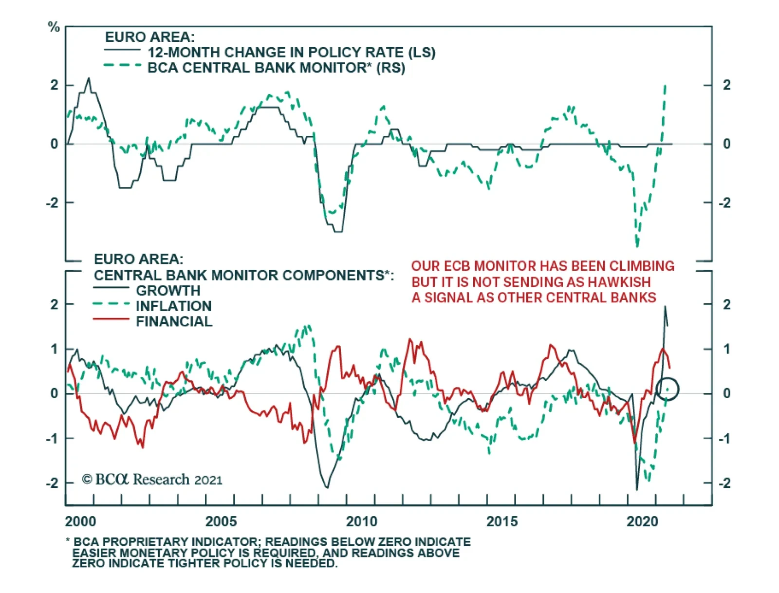
ECB messaging indicates that the central bank is in no rush to tighten policy. ECB President Christine Lagarde highlighted in a Bloomberg Television interview over the weekend that the pandemic remains a threat and that the central bank will continue to…