Policy

Feature Since the end of the first quarter, the decline in Treasury yields has been the most important trend in global financial markets. It has contributed to the return of the outperformance of growth stocks relative to value stocks, the underperformance of Eurozone equities relative to the S&P 500, and the tepid results of cyclicals relative to defensive equities. This decline in yields is a temporary phenomenon, because the global economy continues to re-open and inventory levels remain so low that further restocking is in the cards. The cyclical picture is not without blemish; COVID-19 variants remain a concern. However, if these risks were to materialize into another delayed re-opening, then further reflationary efforts by both monetary and fiscal authorities would buoy financial markets. The greatest near-term worry for the global economy and markets comes from China. The Chinese credit impulse is slowing markedly and fiscal support has yet to come to the rescue. This phenomenon is the main reason why this publication maintains a cautious tactical stance on Eurozone cyclical stocks, even if we believe these sectors have ample scope to outperform over the remainder of the business cycle. As a corollary, we believe that yields will likely remain within range this summer and Eurozone benchmarks will lag behind the US. This week, we review key charts, organized by theme, highlighting some of these key concepts. As an aside, none covers inflation. Even if the balance of evidence suggests that any sharp increase in Eurozone inflation will be temporary, the proof will only become more visible by early 2022. The Opening Is On Track… The pace of vaccination across the major Eurozone economies has picked up meaningfully since the spring. Consequently, the number of doses distributed per capita is rapidly approaching that of the US, even as it still lags behind that of the UK (Chart 1). As a result of this improvement, the stringency of lockdown measures is declining, which is allowing European mobility to recover (Chart 2). While this phenomenon is evident around the world, EM still lag in terms of vaccination rates. However, the Global Health Innovation Center at Duke University expects 10 billion vaccine doses to be produced by the year’s end, which will be enough to inoculate most (if not all) the vulnerable people in the world by early 2022. Consequently, the re-opening of the economy will remain a potent tailwind behind global growth for three or four more quarters. Chart 1Vaccination Progress...
Vaccination Progress...
Vaccination Progress...
Chart 2...Leads To Greater Activity
...Leads To Greater Activity
...Leads To Greater Activity
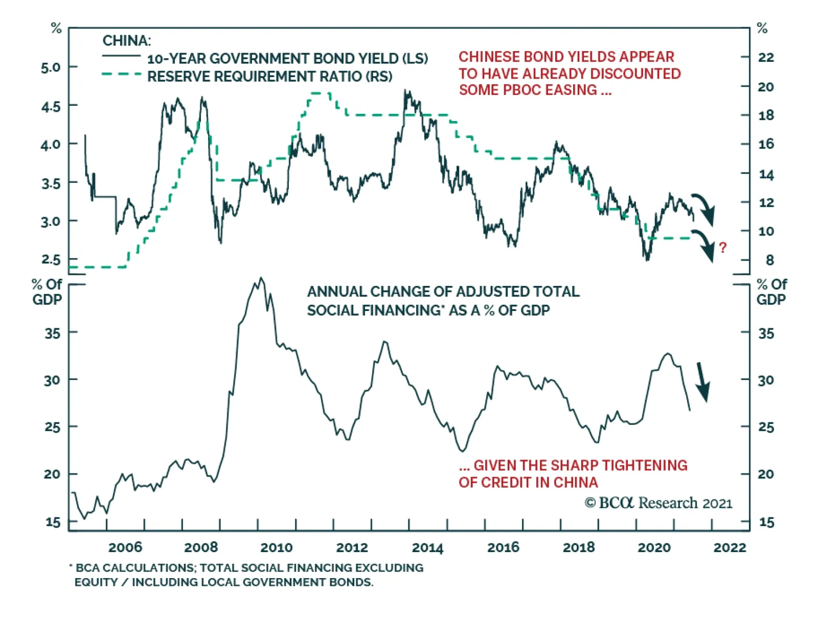
… But Near-Term Headwinds Remain The re-opening of the global economy will allow growth to stay well above trend for the upcoming 12 months, at least. Global industrial activity could nonetheless decelerate this summer. Input costs have risen. The two most important ones, oil and interest rates, are already consistent with a peak in the US ISM manufacturing and the global PMI (Chart 3). In this context, the decelerating Chinese credit impulse is concerning (Chart 4) because it portends a hit to global trade and industrial activity. The effect of this slowdown should be most evident in the third and fourth quarters of 2021. However, it will be temporary because Beijing only wants credit to grow in line with GDP, rather than an outright deleveraging. Thus, the credit impulse will stabilize before the year’s end, which will allow the positive effect of the global re-opening to be fully experienced once again. Chart 3Rising Input Costs...
Rising Input Costs...
Rising Input Costs...
Chart 4...And China's Credit Slowdown Matter
...And China's Credit Slowdown Matter
...And China's Credit Slowdown Matter
Domestic Tailwind In Europe Despite the extreme sensitivity of the European economy to the global business cycle, Europe should continue to produce positive surprises. The supports to the domestic economy are strong. The NGEU funds means that Europe will suffer one of the smallest fiscal drag among G-10 nations next year. Moreover, the re-opening will support household income and allow the positive effect of the increase in the money supply to buoy consumption (Chart 5). Finally, rising consumer confidence, and the ebbing propensity to save will reinforce the tailwinds behind consumption (Chart 6). Chart 5Europe's Domestic Activity
Europe's Domestic Activity
Europe's Domestic Activity
Chart 6...Will Improve Further
...Will Improve Further
...Will Improve Further
Higher Bond Yields Are Coming… The environment continues to support higher yields. Our BCA Pipeline Inflation Indicator is surging, which historically translates into higher global borrowing costs (Chart 7). Most importantly, our Nominal Cyclical Spending Proxy remains very robust, which normally leads to rising yields (Chart 8). While US inflation expectations at the short end of the curve already fully reflect current inflationary pressures, the 5-year/5-year forward inflation breakeven rates will have additional upside. Moreover, the term premium and real rates remain depressed, and policy normalization will cause these variables to climb higher over time. Chart 7Higher Yields Will Come...
Higher Yields Will Come...
Higher Yields Will Come...
Chart 8...Later This Year
...Later This Year
...Later This Year
… But Not This Summer It could take some time before the bearish backdrop for bonds results in higher bond yields. First, bonds have yet to purge fully their oversold status created by the 125 basis-point surge that took place between August 2020 and March 2021 (Chart 9). This vulnerability is even more salient in an environment in which the Chinese credit impulse is decelerating. As Chart 10 illustrates, a slowing total social financing number reliably leads to bond rallies. While the chart looks dire for bond bears, it must be placed in context, in which global fiscal policy remains accommodative considering the decline in the private sector savings rate and in which Advanced Economies’ capex will stay strong. Thus, instead of betting on a large swoon in yields in the coming quarters, we expect US yields to remain stuck between 1.20% and 1.70% for a few more months before they resume their upward path once the Chinese economy stabilizes. Chart 9But Bonds Are Still Oversold...
But Bonds Are Still Oversold...
But Bonds Are Still Oversold...
Chart 10...And Fundamentals Cap Yields For Now
...And Fundamentals Cap Yields For Now
...And Fundamentals Cap Yields For Now
A Positive Cyclical Backdrop For The Euro The near-term forces suggest that the euro will remain range bound over the summer, between 1.16 and 1.23. EUR/USD is a pro-cyclical pair, and so the near-term lack of upside to global growth will act as a temporary ceiling on this currency. Nonetheless, the 18-month outlook continues to favor the common currency. Investors have shed Eurozone exposure for more than 10 years and are structurally underweight this region (Chart 11). Hence, EUR/USD should benefit from any positive reassessment of the growth path in the Euro Area compared to that of the US. Additionally, the euro benefits from a structural current account surplus compared to the USD, which translates into a positive basic balance of payments (Chart 12). In an environment in which US real interest rates are low in relation to foreign ones and in which the Fed wants to maintain accommodative monetary conditions to achieve maximum employment, the capital account balance is unlikely to come to the rescue of the dollar. In this context, EUR/USD still possesses significant cyclical upside and is likely to move back above 1.30 by the year’s end of 2022. Chart 11Investors Underweight Eurozone Assets...
Investors Underweight Eurozone Assets...
Investors Underweight Eurozone Assets...
Chart 12...And The BoP Favors The Euro
...And The BoP Favors The Euro
...And The BoP Favors The Euro
The Bull Market In Global Stocks Is Not Over The cyclical outlook for equities remains supportive. To begin with, in most years, equities eke out positive returns, as long as a recession is not around the corner; we do not expect a recession anytime soon. Moreover, while the balance of valuation risk and monetary accommodation is not as supportive of stocks as it was last year, it is not pointing to an imminent deep pullback either (Chart 13). The equity risk premium echoes this message. Our ERP measure adjusts for the expected growth rate of earnings as well as the lack of stationarity of the ERP. According to this indicator, equities are not an urgent buy, but they are not at risk of a bear market either (Chart 14). This combination does not prevent corrections, but it suggests that pullbacks of 10% are to be bought. Chart 13Equities Are Not A Screaming Buy...
Equities Are Not A Screaming Buy...
Equities Are Not A Screaming Buy...
Chart 14...Nor A Screaming Sell
...Nor A Screaming Sell
...Nor A Screaming Sell
Europe’s Structural Underperformance Is Intact… Eurozone stocks have been underperforming their US counterparts since the GFC. As Chart 15 highlights, this subpar performance reflects the decline in European EPS relative to US ones. There is very little case to be made for this underperformance to end on a structural basis. Europe remains saddled with an excessive capital stock and ageing assets. This combination is weighing on European profit margins and RoE (Chart 16). To put an end to this structural underperformance, either European firms will have to consolidate within each industry (allowing cuts to the excess capital stock, to increase concentration, and to boost profit margins) or the regulatory burden must rise in the US to curtail rates of returns in relation to European levels. Chart 15Europe's Underperformance...
Europe's Underperformance...
Europe's Underperformance...
Chart 16...Reflects Profitability Problems
...Reflects Profitability Problems
...Reflects Profitability Problems
…But The Window For A Cyclical Outperformance Remains Open Despite a challenging structural backdrop, European equities have a window to outperform US stocks, similar to the outperformance of Japan from 1999 to 2006, which only marked a pause within a prolonged relative bear market. European stocks beat their US counterparts when global yields rise (Chart 17). This is because European benchmarks underweight growth stocks relative to US markets. The effect of higher yields on the relative performance of the Euro Area is not limited to the impact of higher discount rates. Yields rise when global economic activity is above trend. As Chart 18 highlights, robust readings of our Global Growth Indicator correlate with an outperformance of the EPS of value stocks compared to growth equities. Thus, when rates rise, Europe should enjoy both a period of re-rating relative to the US and stronger profits. Chart 17Yields Drive European Stocks...
Yields Drive European Stocks...
Yields Drive European Stocks...
Chart 18...And So Does Global Growth
...And So Does Global Growth
...And So Does Global Growth
Positives For Euro Area Financials Like the broad European market, the financials’ fluctuations are linked to interest rates. Moreover, Euro Area banks also move in line with EUR/USD (Chart 19). As a result, our positive view on both yields and the euro for the next 18 months or so should translate into an outperformance of financials in Europe. Additionally, European banks are inexpensive, embedding not just depressed long-term growth expectations, but also a wide risk premium. Europe’s structural problems mean that investors are correct to expect poor earnings growth from the region’s banks. However, the risk premium is overdone. Eurozone banks are much safer than they were 10 years ago. Banks now sport significantly higher Tier 1 capital adequacy ratios and NPLs have shrunk considerably (Chart 20). Moreover, governmental supports and credit guarantees implemented during the pandemic should limit the upside to NPL in the coming quarters. Finally, the so-called doom-loop that used to bind government and bank solvency together is not as problematic as it once was, because the ECB is a willing buyer of government paper and the NGEU programs create the embryo of fiscal risk sharing that limit these dynamics. As a result, investors should overweight this sector for the next 18 months. Chart 19Financials Have A Window To Shine...
Financials Have A Window To Shine...
Financials Have A Window To Shine...
Chart 20...And Are Less Risky
...And Are Less Risky
...And Are Less Risky
A Tactical Hedge Our worries about the impact on the global economy of the Chinese credit slowdown are likely to prompt some downside in European cyclical equities relative to defensive ones. Moreover, cyclicals are still significantly overbought relative to defensives, while our relative Combined Mechanical Valuation Indicator confirms the near-term threat (Chart 21). A high-octane vehicle to play this tactical underperformance of cyclicals relative to defensives is to buy Euro Area telecom stocks relative to consumer discretionary equities. Not only are the discretionary stocks massively overbought and expensive relative to telecoms (Chart 22), they also offer a lower RoE. This backdrop makes the short discretionary / long telecoms bet a great hedge for portfolios with a pro-cyclical bias over one- to two-year horizons. Chart 21Cyclicals Are Tactically Vulnerable...
Cyclicals Are Tactically Vulnerable...
Cyclicals Are Tactically Vulnerable...
Chart 22...But This Risk Can Be Hedged Away
...But This Risk Can Be Hedged Away
...But This Risk Can Be Hedged Away
Currency Performance Currency Performance
Summer Charts
Summer Charts
Fixed Income Performance Government Bonds
Summer Charts
Summer Charts
Corporate Bonds
Summer Charts
Summer Charts
Equity Performance Major Stock Indices
Summer Charts
Summer Charts
Geographic Performance
Summer Charts
Summer Charts
Sector Performance
Summer Charts
Summer Charts
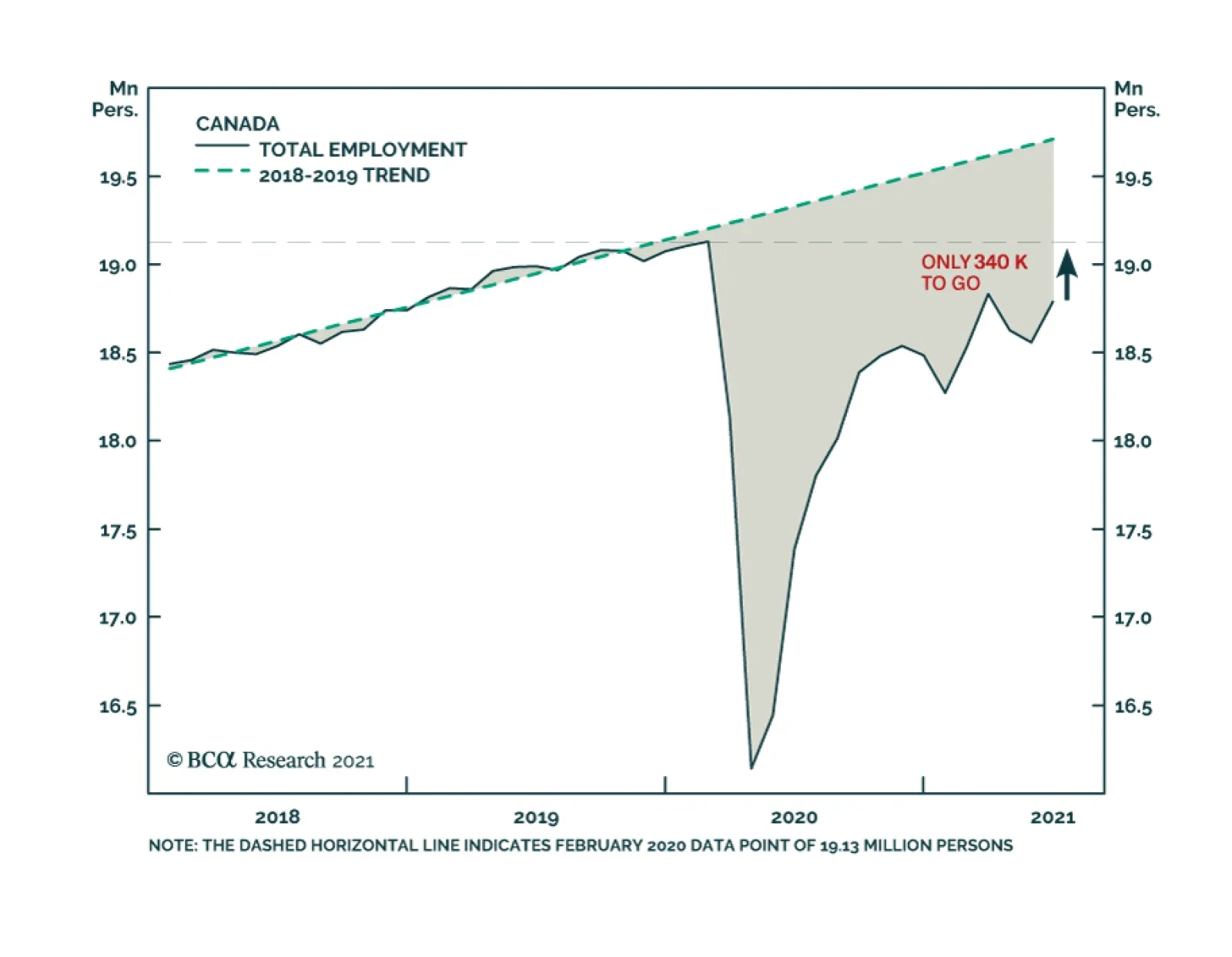
Canadian employment growth in June was robust at 231,000, a big improvement over the losses incurred over the prior two months. The latest month’s growth was driven mainly by a 264,000 increase in part-time jobs: full-time workers fell by 33,000. The recovery…
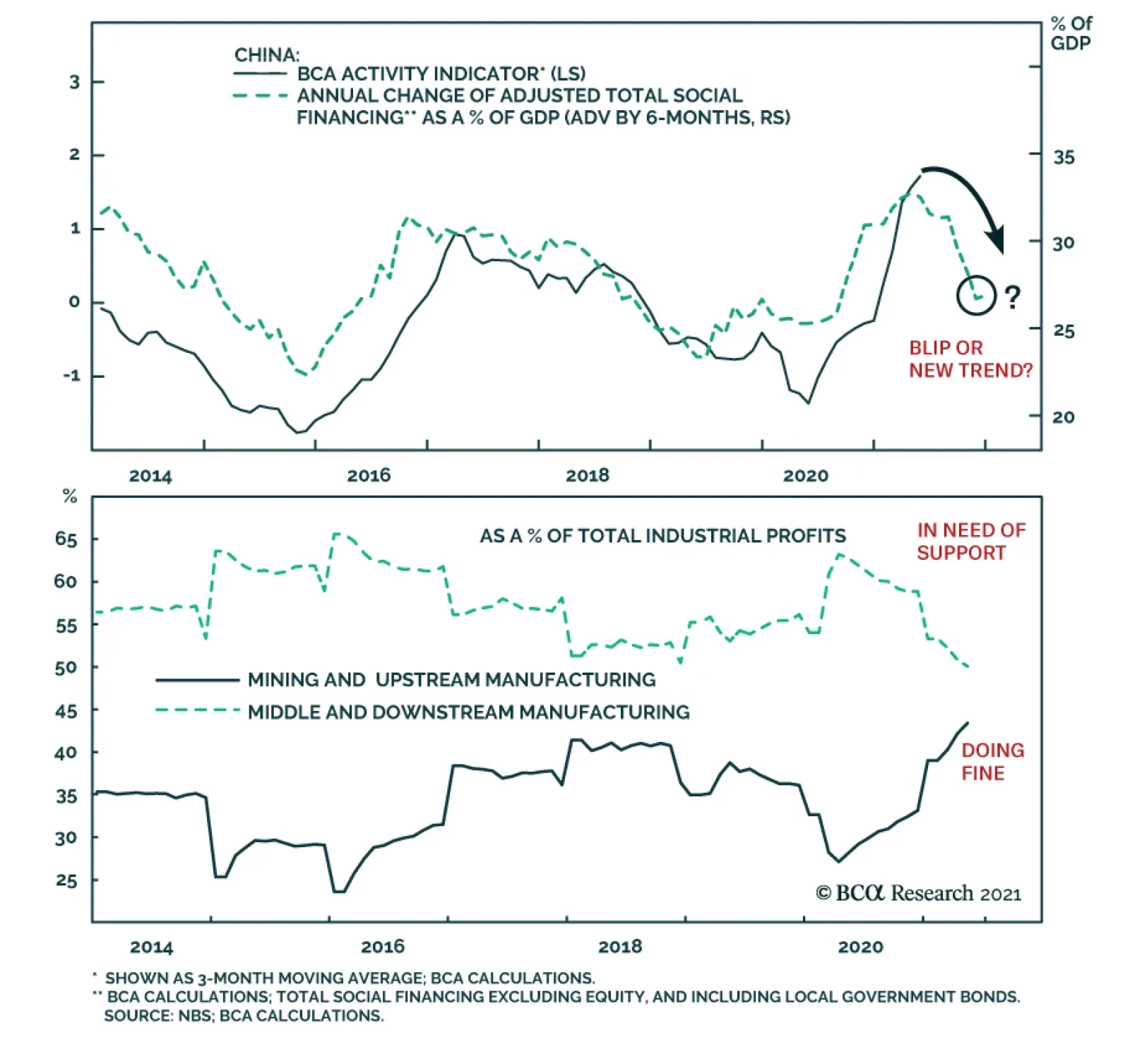
Chinese credit numbers came in rather higher than expected. Total Social Finance (TSF) grew by RMB3.7 trillion in June, compared to RMB1.9 trillion in May and expectations of RMB2.9 trillion. At the same time, outstanding loan growth accelerated to 12.3%…
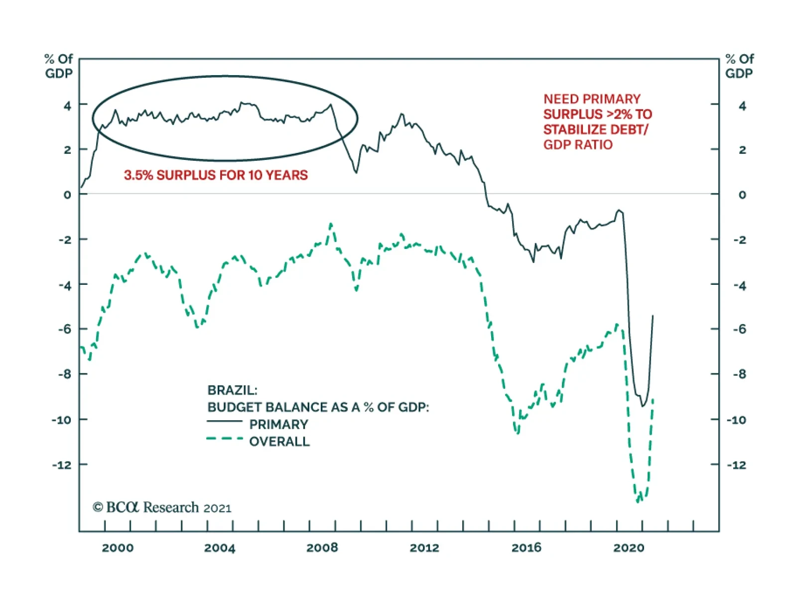
One of the structural challenges Brazil faces is its public debt overhang. The authorities have responded by periodically embarking on fiscal and monetary austerity. Yet, such austerity depresses nominal growth and has in fact worsened public debt dynamics. …
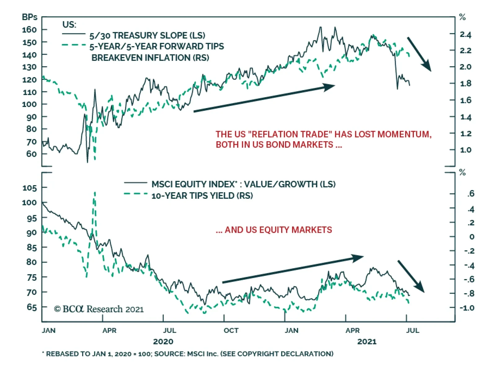
The growth acceleration narrative that drove much of the performance of global financial markets in 2021 is showing signs of fraying, led by US bond yields. The 10-year US Treasury yield continues to drift lower, hitting an intraday low of 1.25% yesterday.…
The China State Council meeting on July 7, chaired by Premier Li Keqiang, sent a somewhat ambiguous message on the direction of China’s monetary policy. The press release from the meeting stated that the country will “use monetary policy tools in a timely…
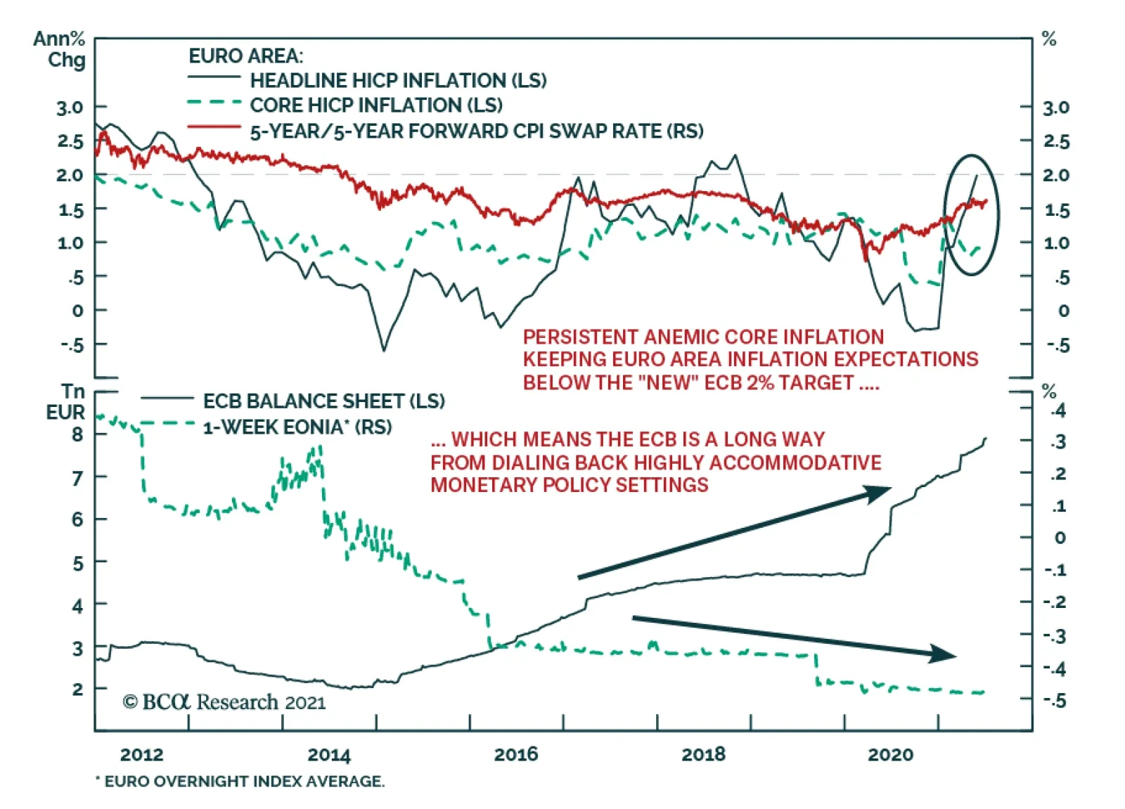
The ECB unveiled the results of its strategic review yesterday, with some noteworthy tweaks to the policy framework. The central bank shifted to a symmetric inflation target of 2%, a change from the prior goal of aiming for inflation “just below” 2%.…

In their Q2/2021 model bond portfolio performance review, BCA Research’s Global Fixed Income Strategy team updated their recommended positioning for the next six months. Firstly, the team changed its US Treasury curve exposure to have more of a flattening…
Highlights Inflation is set to decelerate, job creation has a speed limit, and super-spreaders of new-variant Covid-19 infections will create speed bumps in the economy. This means that in the second half of the year: Bonds will rally. The US dollar will rally. Growth stocks will outperform value stocks. US stocks will outperform non-US stocks. Fractal trade shortlist: Brazilian real, Saudi Tadawul All Share, and Marine Transportation. Feature Chart of the WeekThe 60 Percent Correction In Lumber Shows What Happens When Supply Bottlenecks Ease. Are Used Cars Next?
The 60 Percent Correction In Lumber Shows What Happens When Supply Bottlenecks Ease. Are Used Cars Next?
The 60 Percent Correction In Lumber Shows What Happens When Supply Bottlenecks Ease. Are Used Cars Next?
As Supply Bottlenecks Ease, Inflation Will Cool Since mid-March, US inflation has surged to 5 percent. Yet bond yields have drifted lower, by almost 50 bps in the case of the 30-year T-bond yield, equating to a handsome return of 12 percent. The seeming contradiction between rising inflation and declining bond yields has puzzled some people, but it shouldn’t. In 2009, the same pattern occurred in reverse. Inflation collapsed, culminating in a modern era low of -2 percent in July 2009. Yet while inflation was collapsing, bond yields rose sharply (Chart I-2 and Chart I-3). Chart I-2In 2009, Bond Yields Rose When Year-On-Year Inflation Fell
In 2009, Bond Yields Rose When Year-On-Year Inflation Fell
In 2009, Bond Yields Rose When Year-On-Year Inflation Fell
Chart I-3In 2021, Bond Yields Fell When Year-On-Year Inflation Rose
In 2021, Bond Yields Fell When Year-On-Year Inflation Rose
In 2021, Bond Yields Fell When Year-On-Year Inflation Rose
We can explain this seeming contradiction with an analogy from driving. The inflation rate is like your average speed over the past mile. But the bond market cares much more about your average speed over the next mile, or even over the next 5-10 miles. If you are driving at a constant speed, then your speed over the past mile is a good guide to your future speed. But if you have been driving unusually fast or unusually slowly, there is a more important predictor of your future speed. That important predictor is your acceleration – meaning, what is happening to your speed over successive hundred yards stretches. In the same way, during episodes of unusually low or unusually high inflation, the bond market focusses on the monthly rate of inflation, and specifically the moment that it stops decreasing, as in early-2009, or stops increasing, as in mid-2021. In 2008, after a long sequence of declining monthly rates of inflation that went deep into negative territory, the December 2008 print marked the first substantial increase. Hence, the bond yield also bottomed in December 2008 (Chart I-4), even though annual inflation did not bottom until July 2009. Chart I-4In 2009, Bond Yields Bottomed When Month-On-Month Inflation Bottomed
In 2009, Bond Yields Bottomed When Month-On-Month Inflation Bottomed
In 2009, Bond Yields Bottomed When Month-On-Month Inflation Bottomed
Similarly, in 2020-21, after a six month sequence of increasing monthly rates of inflation, the May 2021 print marked the end of the rising trend. To the extent that this was anticipated, most of the decline in the bond yield has happened since mid-May (Chart I-5). Chart I-5In 2021, Bond Yields Topped When Month-On-Month Inflation Topped
In 2021, Bond Yields Topped When Month-On-Month Inflation Topped
In 2021, Bond Yields Topped When Month-On-Month Inflation Topped
Since mid-May, the 60 percent crash in the lumber price shows what happens when supply bottlenecks ease. Other prices that are being supported by temporary supply constraints – such as used car prices – are likely to suffer the same fate (Chart of the Week). Hence, so long as the coming monthly prints confirm an ongoing deceleration in inflation, the current rally in bonds will stay intact. Jobs: The Hard Work Starts Now Staying on the theme of speed, there is a well-defined speed limit to every post-recession jobs recovery. In A Fed Rate Hike By Early 2023 Is Pie In the Sky, we pointed out the remarkable consistency in the pace of post-recession US jobs recoveries. The last five recessions had different causes, severities, durations and peak unemployment rates. Yet in the recoveries that followed each recession, the unemployment rate declined at a remarkably consistent pace of 0.4-0.5 percent per year (Table I-1). Table I-1After Every Recession, The Pace Of Recovery In The Jobs Market Is Near-Identical
H2 2021: Speed Limits, Speed Bumps, And Super-Spreaders
H2 2021: Speed Limits, Speed Bumps, And Super-Spreaders
Reassuringly at the last FOMC press conference, Jay Powell supported this thesis: Most of the act of sort of going back to one's old job – that's kind of already happened. So, this is a question of people finding a new job. And that's just a process that takes longer. There may be something of a speed limit on it. You've got to find a job where your skills match, you know, what the employer wants. It's got to be in the right area. There's just a lot that goes into the function of finding a job. Powell’s comments lead to two further points: The act of going back to one’s old job for those on ‘temporary layoff’ is relatively straightforward. For job creation, this is the low hanging fruit, most of which has already been picked. Now comes the much harder part – finding jobs for those ‘not on temporary layoff’ whose numbers have barely declined from the peak (Chart I-6). Chart I-6For Job Creation, The Low Hanging Fruit Has Already Been Picked
For Job Creation, The Low Hanging Fruit Has Already Been Picked
For Job Creation, The Low Hanging Fruit Has Already Been Picked
One way of encapsulating this is to observe that the unemployment rate – including those on temporary layoff – has already made 80 percent of the journey from its recession peak to the February 2020 trough, which makes it seem that the jobs recovery is largely done. However, the unemployment rate for those not on temporary layoff has made only 25 percent of the journey (Chart I-7). Moreover, this process is not a straight line, it is a curve. The first quarter of the journey is the easiest, then it gets harder. Chart I-7The Hard Part Is Finding Jobs For Those Unemployed 'Not On Temporary Layoff'
The Hard Part Is Finding Jobs For Those Unemployed 'Not On Temporary Layoff'
The Hard Part Is Finding Jobs For Those Unemployed 'Not On Temporary Layoff'
As we, and Jay Powell, have pointed out, the process to reduce this unemployment rate has a remarkably consistent speed limit of 0.4-0.5 percent per year. Starting at the current rate of 2.5 percent and a target of 1.5 percent, this means full employment will not be reached before the second half of 2023. And even this assumes clear blue skies for the world economy through the next two years, which is a tall order. We conclude that the market pricing of a Fed funds rate lift-off in December 2022 is much too optimistic, making the December 2022 Eurodollar contract a good buy. The End Of Pandemic Restrictions Will Unleash Super-Spreaders On July 19, the UK will remove all its domestic pandemic restrictions – meaning no more facemasks, social distancing, and limits on the size of gatherings. This doesn’t mean that the pandemic is over in the UK. Far from it. The delta variant of the virus is rampant. Rather, with a large portion of the population vaccinated, the government is replacing state-imposed laws and regulations with a libertarian onus on personal responsibility. Given that Covid-19 is not going away, the UK strategy raises a fundamental question. Other than implementing a vaccination program, what role should a government take in containing the virus? In Who’s Right On The Pandemic – Sweden Or Denmark? we revealed two important findings: First, it is a misunderstanding that state-imposed restrictions cause the collapse in social consumption. This is a classic confusion between correlation and causation. The true cause of the recession is that a virulent disease focuses millions of people on self-preservation, shunning crowds and public places. But to the extent that the pandemic also leads to state-imposed restrictions, many people blame the slowdown on these correlated restrictions rather than on the underlying cause – the voluntary change in behaviour. Second, without state-imposed restrictions, the majority will voluntarily change their behaviour to avoid catching and spreading the virus, but a minority will not. When a virus is spreading, this is critical because a tiny minority of so-called ‘super-spreaders’ is responsible for most infections. Put simply, economic growth depends on the behaviour of the majority and in a pandemic the majority will voluntarily reduce their social consumption. This explains why libertarian Sweden and lockdown Denmark suffered similar contractions in their economies (Chart I-8). Chart I-8Libertarian Sweden Has Not Significantly Outperformed Lockdown Denmark...
Libertarian Sweden Has Not Significantly Outperformed Lockdown Denmark...
Libertarian Sweden Has Not Significantly Outperformed Lockdown Denmark...
In contrast, containing the virus depends on restricting the minority of super-spreaders. Which explains why libertarian Sweden suffered a much worse outbreak of the disease than lockdown Denmark (Chart I-9). Chart I-9...But Libertarian Sweden Has Suffered Many More Covid-19 Casualties
...But Libertarian Sweden Has Suffered Many More Covid-19 Casualties
...But Libertarian Sweden Has Suffered Many More Covid-19 Casualties
The worry now is that the end of state-imposed restrictions will unleash super-spreaders and super-spreading events. This will allow the virus to replicate, mutate, and create new variants which are potentially more transmissible and resistant to existing vaccines. Pulling together our three themes for the second half of the year, inflation is set to decelerate, job creation has a natural speed-limit, and super-spreaders of new-variant Covid-19 infections will create speed bumps in the economy. This means that: Bonds will rally. The US dollar will rally. Growth stocks will outperform value stocks. US stocks will outperform non-US stocks Candidates For Countertrend Reversal This week, we present three candidates for countertrend reversal. First, the Brazilian real’s recent surge has hit expected resistance at 65-day fractal fragility. A good way to play a continued reversal is to short BRL/COP (Chart I-10). Chart I-10The Brazilian Real Is Correcting
The Brazilian Real Is Correcting
The Brazilian Real Is Correcting
Second, within emerging markets, the strong rally in the Saudi equity market is vulnerable to a setback, especially versus other markets. A good way to play this is to short the Saudi Tadawul All Share index versus the FTSE Bursa Malaysia KLCI, given that the 260-day fractal structure is at the point of fragility that marked the major top in 2014 (Chart I-11). Chart I-11The Saudi Stock Market Is Vulnerable To A Setback
The Saudi Stock Market Is Vulnerable To A Setback
The Saudi Stock Market Is Vulnerable To A Setback
Finally, coming full circle to short-term supply bottlenecks, one major beneficiary has been the Marine Transportation sector which, since February, has outperformed the world market by 70 percent. As the supply bottlenecks ease, this is vulnerable to correction, especially as the 260-day fractal structure is at the point of fragility that marked the major top in 2007 (Chart I-12). Chart I-12Underweight Marine Transportation
Underweight Marine Transportation
Underweight Marine Transportation
Hence, this week’s recommended trade is to underweight Marine Transportation versus the market, setting the profit target and symmetrical stop-loss at 16.5 percent. Dhaval Joshi Chief Strategist dhaval@bcaresearch.com Fractal Trading System Fractal Trades 6-Month Recommendations Structural Recommendations Closed Fractal Trades Closed Trades Asset Performance Equity Market Performance Indicators To Watch - Bond Yields Chart II-1Indicators To Watch - Bond Yields - Euro Area
Indicators To Watch - Bond Yields - Euro Area
Indicators To Watch - Bond Yields - Euro Area
Chart II-2Indicators To Watch - Bond Yields - Europe Ex Euro Area
Indicators To Watch - Bond Yields - Europe Ex Euro Area
Indicators To Watch - Bond Yields - Europe Ex Euro Area
Chart II-3Indicators To Watch - Bond Yields - Asia
Indicators To Watch - Bond Yields - Asia
Indicators To Watch - Bond Yields - Asia
Chart II-4Indicators To Watch - Bond Yields - Other Developed
Indicators To Watch - Bond Yields - Other Developed
Indicators To Watch - Bond Yields - Other Developed
Indicators To Watch - Interest Rate Expectations Chart II-5Indicators To Watch - Interest Rate Expectations
Indicators To Watch - Interest Rate Expectations
Indicators To Watch - Interest Rate Expectations
Chart II-6Indicators To Watch - Interest Rate Expectations
Indicators To Watch - Interest Rate Expectations
Indicators To Watch - Interest Rate Expectations
Chart II-7Indicators To Watch - Interest Rate Expectations
Indicators To Watch - Interest Rate Expectations
Indicators To Watch - Interest Rate Expectations
Chart II-8Indicators To Watch - Interest Rate Expectations
Indicators To Watch - Interest Rate Expectations
Indicators To Watch - Interest Rate Expectations
Highlights Complementing the US Political Strategy Quantitative Presidential Election Model, we introduce our revised Quantitative Senate Election Model. Our senate election model measures the probability of the incumbent party (Democratic Party) to retain the Senate in the 2022 midterm election. The model predicts that Democrats are slightly favored to retain control of the Senate, though it is too early to call, which in combination with the high likelihood that the GOP will retake the House, points to a US political gridlock from 2023 to 2025. The “Blue Sweep” policy setting will end as early as the end of the year as Democrats pass Biden’s signature legislation. Post-midterm gridlock implies that taxes unlikely to rise further from 2023 while spending will not be subjected to cuts. While markets will not be alarmed if growth keeps up, near term surprises from potential tax hikes, rate hikes, and China’s slowdown warrants a more defensive positioning. Feature 2020 was not only the year of a highly contested US Presidential election, but also a close-knit battle for control of the US Senate, which had 351 seats up for reelection. The Republican party initially retained control of the Senate at the start of 2021 and the 117th congress, but this was short-lived. The Democrats secured victories in both run-off triggered Senate races in the state of Georgia, putting them at an even 50-50 hold with Republicans in the Senate. The inauguration of Vice President Kamala Harris who too became the Senate President, was the tie breaker the Democrats needed to take control of the Senate, and ultimately secure a “blue sweep” of holding the House of Representatives, the Senate and the White House. We recently introduced BCA US Political Strategy readers to our quantitative presidential election model. If you have not yet read it, you can access it here. In this week’s report we introduce our US Political Strategy Senate election model. We acknowledged that it was still early days in the presidential election cycle when we published our presidential election model but there were however some interesting takeaways from an early model forecast. For control of the Senate, however, the cycle is much shorter, with voting of one third of the Senate taking place every two years. The mid-term elections of 2022 are not that far-out, and with 34 seats up for reelection, we believe that introducing our readers to our Senate election model now will start to provide valuable insight going forward. Like our presidential election model, our Senate election model is a state-by-state model that uses both economic and political variables to predict the number of seats the incumbent party will win in the 2022 Senate election. Our Senate model covers a large sample size, consisting of 19 Senate elections (1984 to 2020), across 50 states, amounting to 950 observations. The Six Variables Our Senate model is based off a Probit regression that produces a probability that each state will remain under the control of the incumbent party. The dependent variable (classified as “elected”) is stated as follows: 1 = Incumbent party wins the Senate election in each state; or 0 = Incumbent party did not win the Senate election in each state. This method allows us to measure the probability that a state with certain characteristics will fall into one of two categories above. We can then predict the probability of the incumbent party winning all the Senate seat/s in each of the 50 states (although this is only relevant to one-third of the states that have a Senate seat up for election in 2022). State economic health. Specifically, we use the Federal Reserve Bank of Philadelphia State Coincident Index for each of the 50 states. The coincident index combines four of a given state’s economic indicators to summarize current economic conditions in a single statistic. The four indicators are nonfarm payroll employment; average hours worked in manufacturing by production workers; the unemployment rate; and wage and salary disbursements plus proprietors' income deflated by the consumer price index (US city average). In other words, it captures job growth, manufacturing wages, joblessness, and real household income. The incumbent party’s margin of victory in previous Senate elections in each state Senate race. This is measured as the incumbent party’s share of the popular vote minus the non-incumbent party’s share. If the incumbent party failed to secure a solid win in each state in the previous Senate election, the probability of securing a solid win in the current election becomes smaller. Moreover, the larger the margin of victory in a previous Senate election race, the more likely that incumbent party will win re-election in said state. Net average approval level of the incumbent president in a Senate election year. This is the difference between the incumbent president’s approval and disapproval level in a Senate election year, from the start of the year up until the end of October of that year – taken as an average. Generic congressional ballot (net support rate). The generic congressional ballot asks people which party they are likely to vote for in Congress. We take the average net support rate in a Senate election year (that being whichever party leads the other in congressional ballot polling). Democrats are usually favored in congressional generic ballot voting, so the net rate is more predictive than the gross rate Dummy variable for congressional ballot. A dummy variable is assigned to variable number four. For example, dummy takes the value of 1 when Democrats have a positive net support rate in generic congressional ballot voting, and 0 when Republicans have a net positive support rate. We assign only one dummy variable to avoid a dummy variable trap.2 A “time for change” variable, a categorical variable indicating whether the incumbent party has controlled the Senate for three or more terms (six or more years). If the Senate has been controlled for three or more terms, the model will “punish” the incumbent party, as we would expect to see a change in control of the Senate the longer one incumbent party controls it. Democrats Retain Control Of The Senate As it stands, our election model predicts that Democrats will retain control of the Senate in 2022 (Chart 1). The Democrats are predicted to win 49 seats, a gain of one seat over the 2020 Senate election outcome,3 and when coupled with the two seats of Independent Senators, give them a majority of 51 seats. Chart 1Quant Model Gives Democrats 54% Chance Of Retaining The Senate
Introducing The US Political Strategy Quantitative Senate Election Model
Introducing The US Political Strategy Quantitative Senate Election Model
The additional seat for Democrats stems from our model allocating both North Carolina and Pennsylvania (which are currently occupied by Republicans) to the Democrats (+ two seats) and allocating one of Georgia’s seats occupied by Raphael Warnock4 back to Republican control. The Democrats overall probability of retaining control of the Senate is 54%, three percentage points higher than early market predictions (Chart 2). The market implied odds highlight another close battle between Democrats and Republicans to control the Senate in 2022. Chart 2Market Narrowly In Favor Of Democratic Senate Control
Introducing The US Political Strategy Quantitative Senate Election Model
Introducing The US Political Strategy Quantitative Senate Election Model
North Carolina is the only toss-up state,5 with a 51% chance of a Democratic victory. Pennsylvania will switch to Democrats and Georgia to Republicans. Note that North Carolina and Pennsylvania are both currently under Republican control. Both incumbents have decided not to run again. While both Georgia Senate run-off races were won by Democrats earlier this year, the sum of first-round voting in November 2020 was higher for Republican candidates than for Democrats. There was also extra-ordinary voter turnout in favor of Democrats for both run-offs, which ultimately played a big role in Democrats securing victory. Voter turnout was largely spurred on by voting against Republicans, and ultimately Donald Trump. This may not be the case come 2022, if turnout for Democrats is unmatched to 2020/2021. Our model’s prediction will evolve over time as new data become available, which could produce more toss-up states, or swing the prediction in favor of the opposing party. For now, the model provides us with a preliminary prediction as we draw nearer to the 2022 midterm elections. Senate Races Of Interest Comparing our model’s prediction to online betting markets, we group nine races into a category of “interest”. All nine races have varying degrees of probability for a Democratic win, ranging from approximately 30% to 60%. Five races are overestimated, and four races are underestimated by consensus (Chart 3). The remaining 25 races are decidedly in favor of either Democrat or Republican control, according to our model, so are therefore excluded from this analysis. Betting markets are overestimating Nevada, Arizona, Pennsylvania, Georgia, and Wisconsin, while underestimating New Hampshire, North Carolina, Florida and Ohio. Chart 3Senate Odds Compared With The Bookies
Introducing The US Political Strategy Quantitative Senate Election Model
Introducing The US Political Strategy Quantitative Senate Election Model
All nine of these races are precariously balanced, even at this stage of the mid-term election cycle. Small or local factors could ultimately decide the outcome. This is an important limitation on our macro model, highlighting our ultimate emphasis on qualitative analysis. For example, it is not at all clear that Democrats will win Georgia. Our model gives Democrats a 43% chance of victory. Betting markets are a lot more optimistic, penning a 55% chance of a Democratic win. But even by our model’s standard, Georgia remains a toss-up. Georgia may not be as close of a race as it was in 2020/2021, if voters are not as motivated as they were to vote Democrat. Will turnout be as large in 2022? That remains to be seen. One or two races with unique makeup can contribute to maintaining or shifting the balance of power in the Senate come 2022. Back Testing Our Model Our Senate model performs at an acceptable level during in-sample and out-sample back testing. For in-sample testing, we test our model over our entire sample period (1984 – 2020) and find that 74% of Senate elections (control of the Senate) are correctly predicted, with the model predicting the outcome of the last five Senate elections correctly (Chart 4). Chart 4In-Sample Back Testing Results
Introducing The US Political Strategy Quantitative Senate Election Model
Introducing The US Political Strategy Quantitative Senate Election Model
During out-sample back testing, we look at a sample period of 2000 – 2020, comprising of 11 Senate elections, where our model correctly predicts 73% of actual outcomes. The previous five Senate elections are predicted correctly too (Chart 5). Chart 5Out-Sample Back Testing Results
Introducing The US Political Strategy Quantitative Senate Election Model
Introducing The US Political Strategy Quantitative Senate Election Model
In comparison to our presidential election model, prediction accuracy of our Senate model is lower across its sample period. Predicting control of the Senate can sometimes be more uncertain than that of the White House. Both statistical and event based (Senate elections) reasons give way to a lower accuracy rate in this case. For example, there could be several idiosyncratic state-level variables not captured by our model, which could have played a leading role in determining any one state’s Senate election outcome over our sample period, and ultimately, control of the Senate. Where To From Here? In comparison to the presidential election cycle, we are a lot closer to election day. That means that Senate races will begin to heat up as we move closer toward November 8, 2022 – the date of the midterm elections. For now, our model ratifies the current control of the Senate, that is, Democratic. Our Model also suggests that come 2022, the Democrats will retain control of the Senate. But this is all but an early forecast. If any long-standing conclusion can be drawn right now, it is that the battle for control of the Senate in 2022 will be highly contested. From a qualitative point of view, our model may be overestimating the Democrats’ odds in 2022 as things stand today. Midterm elections have historically seen the sitting president’s party lose seats in the Senate and House of Representatives. We already expect Republicans to retake the House after a poor showing by Democrats in 2020. This narrative may play into the Republicans taking the Senate too – and is plausible given how closely the battle for the Senate is wound. But congressional approval has ticked higher lately under a Democratic run congress (Chart 6). Most likely, the American public have largely approved of COVID-19 government relief, and the Democrats will pass at least one more major piece of legislation covering infrastructure. Republicans are deeply divided, so there is some chance that they underperform in 2022. Nevertheless, the historical pattern clearly favors the opposition. The takeaway is to expect the GOP to retake the house but to monitor the Senate closely with both quantitative and qualitative tools. Chart 6US Public Approving Of Congress ?!?
Introducing The US Political Strategy Quantitative Senate Election Model
Introducing The US Political Strategy Quantitative Senate Election Model
Lastly, and importantly, we should note that in both the case of the presidential and Senate models, a probability between 50% and 55% for the incumbent party retaining control of the White House or Senate is indicative of an outcome “too close to call.” Both models are touting Democratic wins, but high conviction views about either the 2024 presidential election or 2022 Senate election are not warranted at this time. Investment Takeaway Unless 2022 is one of the rare cases of an incumbent party legislative victory after a national shock, like 1934 and 2002, Republicans will take the House at least. This is likely notwithstanding our model’s slight tilt in favor of Democrats in the Senate. This means that the “Blue Sweep” policy setting will cease as early as 2023, but de facto it would cease as early as the end of this year when Biden’s signature legislation is passed, since Congress will get little done in 2022. Our model suggests Republicans are slightly disfavored in the Senate. The truth is that as long as they gain one chamber of the legislature then US fiscal stimulus will virtually freeze. Taxes will no longer be able to rise from 2023 but spending will not be subject to cuts. Gridlock is reinforced by our presidential quant election model’s slightly higher odds of Democrats retaining the White House, which we think is underestimated at present. Hence Biden will retain veto power even if Democrats squander the Senate and House in 2022. Gridlock is thus looming from 2023 until at least 2025. The financial markets will not be alarmed by this forecast as long as growth keeps up. In the very near term, however, the clouds on the horizon of tax hikes, Fed rate hikes, and China’s tight-fisted economic policy pose rising headwinds to US equities in 2022 — and hence markets should respond negatively sooner than later. We are tactically growing more defensive. Guy Russell Research Analyst GuyR@bcaresearch.com Statistical Appendix Some clients may be curious as to how our US Political Strategy Senate election model differs from our Geopolitical Strategy model used in the 2020 elections, and where it has made improvements in its predictive accuracy. We discuss these improvements herein. Changes To The Geopolitical Strategy Senate Election Model A notable property in our dependent variable data requires a brief discussion. Our dependent variable classified as “elected” takes the form of a binary outcome. This data, however, is what’s called “unbalanced,” since incumbent Senators are re-elected approximately 80% of the time. This means that most outcomes in our dependent variable are coded as “1,” with fewer “0’s” because of the strong incumbency effect in Senate races. There are many data sets that exhibit this type of property, such as events like wars, vetoes, cases of political activism, or epidemiological infections, where non-events occur rarely. To alleviate this statistical property in the data, we estimate our model using a weighted maximum likelihood estimate as opposed to the ordinary maximum likelihood estimate usually used in a Probit regression.6 This method assigns more weighting to the unbalanced data, or what is known theoretically as “rare event” data, to aid the Probit regression in assigning higher probabilities to “0” outcomes. Through this process, we effectively deal with our unbalanced dependent variable data. The last update to the BCA Geopolitical Strategy Senate election model was published on January 6, 2021. Our model suggested that Republican’s would retain control of the Senate. Our model was limited in dealing with a unique twin Georgia run-off race that ultimately swung Senate control into the hands of the Democrats. The Geopolitical Strategy, which we will refer to as the 2020 model, only missed the Republican victory in Maine, but correctly predicted losses in Arizona and Colorado. The model missed both Georgia races, signaling they would remain red states – this was proven otherwise. Also, our model has become a better predictor in terms of in and out-sample forecasting (compared to our 2020 model). The 2022 version correctly predicts 74% (vs 72%) of in-sample and 73% (vs 70%) of out-sample outcomes. Methodology And Variables Our Senate model retains the methodology and suite of economic and political variables used in the model we first introduced in 2020. For long-time clients and those who are new to the US Political Strategy and Geopolitical Strategy service, the first version of our model can be found here. The one and only economic variable is now transformed by a six-month change to each state’s coincident index, capturing the improvement or deterioration of the state’s economy. The six-month change results in the best statistical fit for the overall model this time round. In the 2020 model, we transformed the variable by a three-month change. A fast-changing economic environment coupled with a then-higher statistical impact in our model led us to this decision. We still weight the transformation of our economic variable in the same manner as we did in last year’s updated model. We take a weighted average of the six-month change of all the monthly state coincident indices in the term preceding a Senate election. Later months are weighted heavier than earlier months as the most recent context will have a greater impact on voter opinion in the election. In terms of our political variables, they all remain the same as the 2020 model. Model Performance Classification The 2022 model correctly classifies predicted outcomes at a rate of exactly 81%. That is, when the model makes a prediction of a certain state’s Senate election outcome from 1984-2020, it is correct 81% of the time. This level of classification is higher than our 2020 model, which classified outcomes at a rate of 79% (Table 1). Table 1New Model Classifies Outcomes At A Higher Rate …
Introducing The US Political Strategy Quantitative Senate Election Model
Introducing The US Political Strategy Quantitative Senate Election Model
Sensitivity And Specificity – Receiver Operating Characteristic Curve A Receiver Operating Characteristic (ROC) curve is a performance measurement for classification problems of binary modelled outcomes, among others. An ROC curve tells us how much the model is capable of distinguishing between classes. In our case, we have two classes: the dependent variable (classified as “elected”) is stated as 1 = Incumbent party wins the Senate election in each state; or 0 = Incumbent party did not win the Senate election in each state. The higher the area under the curve (AUC), the better our model is at predicting 0 classes as 0 and 1 classes as 1. A robust model has an AUC near to one. A poor model has an AUC near to zero, which means it has the worst measure of classifying classes correctly, labelling zeros as ones and vice versa. In fact, at a level of zero AUC, the model is reciprocating incorrect classes by predicting zeros as ones and ones as zeros. Statistically, more AUC means that the model is identifying more true positives while minimizing the number/percent of false positives. Chart 7Receiver Operating Characteristic Curve Of 2022 Model
Introducing The US Political Strategy Quantitative Senate Election Model
Introducing The US Political Strategy Quantitative Senate Election Model
Table 2… Is A Better Fit …
Introducing The US Political Strategy Quantitative Senate Election Model
Introducing The US Political Strategy Quantitative Senate Election Model
The ROC curve for our 2022 model has an AUC of 0.9609 (Chart 7), a higher AUC than our 2020 model (Table 2). This means that the true positive rate for classifying outcomes is high and the false positive rate is low, improving on our model’s robustness. F1 Scores A final grading of the 2022 model is by means of the F1 score. The F1 score is a measurement that considers both precision (specificity in the above ROC curve) and recall (sensitivity in the above ROC curve) to compute the score. The F1 score can be interpreted as a weighted average of the precision and recall values, where an F1 score reaches its best value at 1 and worst value at 0. The 2022 model produces a higher F1 score compared to our 2020 model (Table 3). Table 3… And Is More Accurate Than The 2020 Model
Introducing The US Political Strategy Quantitative Senate Election Model
Introducing The US Political Strategy Quantitative Senate Election Model
Considering the improvement in forecast accuracy and overall better model specification over our 2020 model, we accept our 2022 model as our new base case Senate election model, premised on its improvement in accuracy at predicting election outcomes in the past, as well as its ability to correctly classify outcomes as they were realized. Appendix Tables Table A1USPS Trade Table
Introducing The US Political Strategy Quantitative Senate Election Model
Introducing The US Political Strategy Quantitative Senate Election Model
Table A2Political Risk Matrix
Introducing The US Political Strategy Quantitative Senate Election Model
Introducing The US Political Strategy Quantitative Senate Election Model
Chart A1Presidential Election Model
Introducing The US Political Strategy Quantitative Senate Election Model
Introducing The US Political Strategy Quantitative Senate Election Model
Table A3APolitical Capital: White House And Congress
Introducing The US Political Strategy Quantitative Senate Election Model
Introducing The US Political Strategy Quantitative Senate Election Model
Table A3BPolitical Capital: Household And Business Sentiment
Introducing The US Political Strategy Quantitative Senate Election Model
Introducing The US Political Strategy Quantitative Senate Election Model
Table A3CPolitical Capital: The Economy And Markets
Introducing The US Political Strategy Quantitative Senate Election Model
Introducing The US Political Strategy Quantitative Senate Election Model
Table A4Political Capital Index
Introducing The US Political Strategy Quantitative Senate Election Model
Introducing The US Political Strategy Quantitative Senate Election Model
Footnotes 1 Two of which were open Senate seats for the state of Georgia. 2 A dummy variable trap is a scenario in which the independent variables are multicollinear — a scenario in which two or more variables are highly correlated; or, in simple terms, in which one variable can be predicted from the others. To avoid such a trap, we must exclude one of the categorical variables. Since there are two categorical variables that can be represented here (Republican or Democrat), we use k-1 (where k = the number of categorical variables). 3 In reference to the Senate election outcome after the Georgia run-off races which concluded in early January 2021. 4 This seat formed part of the 2020 special Senate election race which was decided by a run-off election between Raphael Warnock and Kelly Loeffler. The seat was always up for reelection in 2022 no matter which party won it in the 2020 special election. 5 Toss-ups are defined as having a probability between 45% and 55% according to our model. 6 Weighted maximum likelihood estimation is a reasonable approach in dealing with dependent variables that show significant imbalance in their data set. See: King, G. and Zeng, L., 2001. Logistic regression in rare events data. Political analysis, 9(2), pp.137-163.