Policy

Highlights Geopolitical risk is trickling back into financial markets. China’s fiscal-and-credit impulse collapsed again. The Global Economic Policy Uncertainty Index is ticking back up after the sharp drop from 2020. All of our proprietary GeoRisk Indicators are elevated or rising. Geopolitical risk often rises during bull markets – the Geopolitical Risk Index can even spike without triggering a bear market or recession. Nevertheless a rise in geopolitical risk is positive for the US dollar, which happens to stand at a critical technical point. The macroeconomic backdrop for the dollar is becoming less bearish given China’s impending slowdown. President Biden’s trip to Europe and summit with Russian President Vladimir Putin will underscore a foreign policy of forming a democratic alliance to confront Russia and China, confirming the secular trend of rising geopolitical risk. Shift to a defensive tactical position. Feature Back in March 2017 we wrote a report, “Donald Trump Is Who We Thought He Was,” in which we reaffirmed our 2016 view that President Trump would succeed in steering the US in the direction of fiscal largesse and trade protectionism. Now it is time for us to do the same with President Biden. Our forecast for Biden rested on the same points: the US would pursue fiscal profligacy and mercantilist trade policy. The recognition of a consistent national policy despite extreme partisan divisions is a testament to the usefulness of macro analysis and the geopolitical method. Trump stole the Democrats’ thunder with his anti-austerity and anti-free trade message. Biden stole it back. It was the median voter in the Rust Belt who was calling the shots all along (after all, Biden would still have won the election without Arizona and Georgia). We did make some qualifications, of course. Biden would maintain a hawkish line on China and Russia but he would reject Trump’s aggressive foreign and trade policy when it came to US allies.1 Biden would restore President Obama’s policy on Iran and immigration but not Russia, where there would be no “diplomatic reset.” And Biden’s fiscal profligacy, unlike Trump’s, would come with tax hikes on corporations and the wealthy … even though they would fall far short of offsetting the new spending. This is what brings us to this week’s report: New developments are confirming this view of the Biden administration. Geopolitical Risk And Bull Markets Chart 1Global Geopolitical Risk And The Dollar
Global Geopolitical Risk And The Dollar
Global Geopolitical Risk And The Dollar
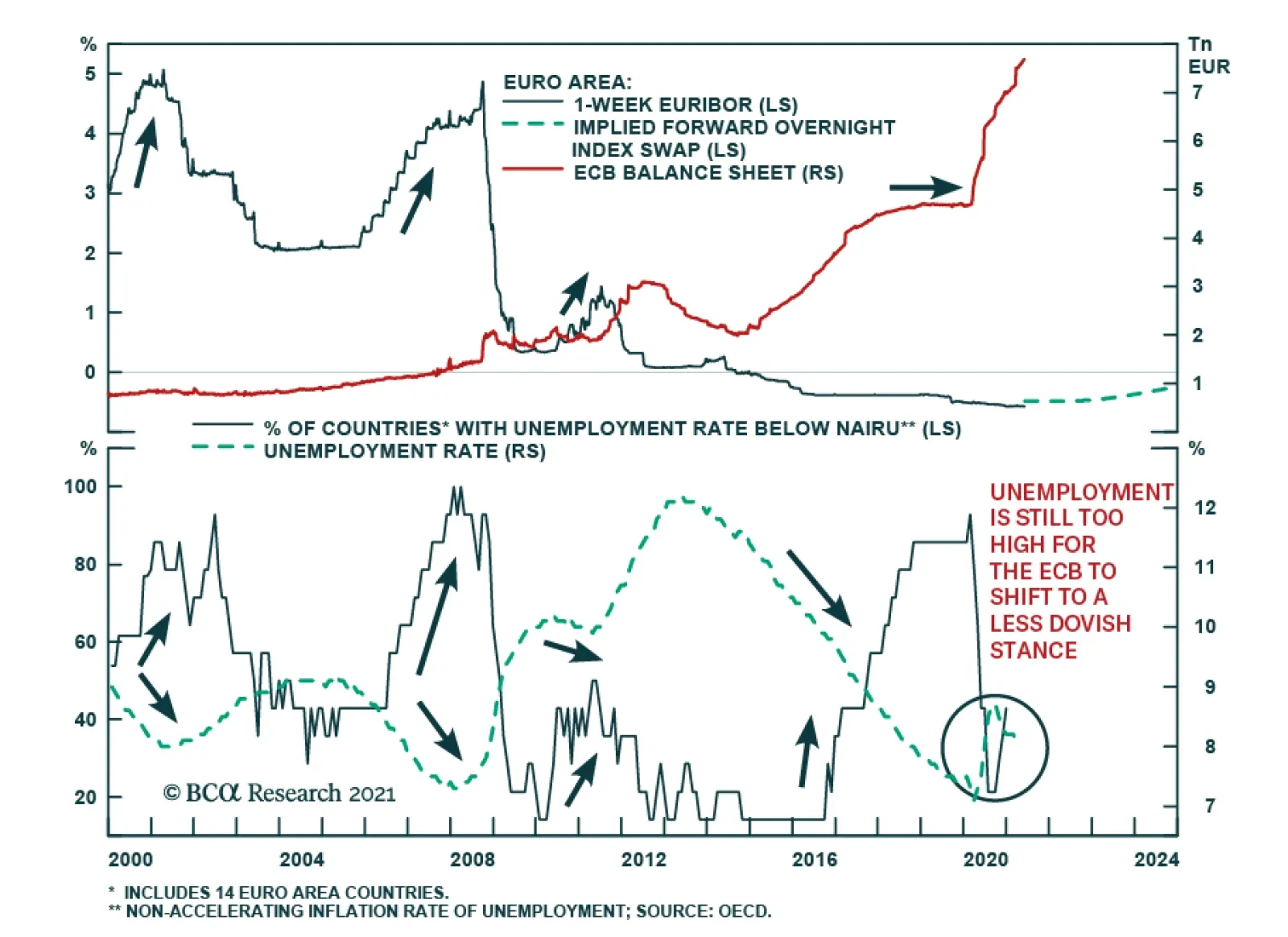
In recent weeks Biden has adopted a hawkish policy on China, lowered tensions with Europe, and sought to restore President Obama’s policy of détente with Iran. The jury is still out on relations with Russia – Biden will meet with Putin on June 16 – but we do not expect a 2009-style “reset” that increases engagement. Still, it is too soon to declare a “Biden doctrine” of foreign policy because Biden has not yet faced a major foreign crisis. A major test is coming soon. Biden’s decision to double down on hawkish policy toward China will bring ramifications. His possible deal with Iran faces a range of enemies, including within Iran. His reduction in tensions with Russia is not settled yet. While the specific source and timing of his first major foreign policy crisis is impossible predict, structural tensions are rebuilding. An aggregate of our 13 market-based GeoRisk indicators suggests that global political risk is skyrocketing once again. A sharp spike in the indicator, which is happening now, usually correlates with a dollar rally (Chart 1). This indicator is mean-reverting since it measures the deviation of emerging market currencies, or developed market equity markets, from underlying macroeconomic fundamentals. The implication is positive for the dollar, although the correlation is not always positive. Looking at both the DXY’s level and its rate of change shows periods when the global risk indicator fell yet the dollar stayed strong – and vice versa. The big increase in the indicator over the past week stems mostly from Germany, South Korea, Brazil, and Australia, though all 13 of the indicators are now either elevated or rising, including the China/Taiwan indicators. Some of the increase is due to base effects. As global exports recover, currencies and equities that we monitor are staying weaker than one would expect. This causes the relevant BCA GeoRisk indicator to rise. Base effects from the weak economy in June 2020 will fall out in coming weeks. But the aggregate shows that all of the indicators are either high or rising and, on a country by country level, they are now in established uptrends even aside from base effects. Chart 2Global Policy Uncertainty Revives
Global Policy Uncertainty Revives
Global Policy Uncertainty Revives
Meanwhile the global Economic Policy Uncertainty Index is recovering across the world after the drop in uncertainty following the COVID-19 crisis (Chart 2). Policy uncertainty is also linked to the dollar and this indicator shows that it is rising on a secular basis. The Geopolitical Risk Index, maintained by Matteo Iacoviello and a group of academics affiliated with the Policy Uncertainty Index, is also in a secular uptrend, although cyclically it has not recovered from the post-COVID drop-off. It is sensitive to traditional, war-linked geopolitical risk as reported in newspapers. By contrast our proprietary indicators are sensitive to market perceptions of any kind of risk, not just political, both domestic and international. A comparison of the Geopolitical Risk Index with the S&P 500 over the past century shows that a geopolitical crisis may occur at the beginning of a business cycle but it may not be linked with a recession or bear market. Risk can rise, even extravagantly, during economic expansions without causing major pullbacks. But a crisis event certainly can trigger a recession or bear market, particularly if it is tied to the global oil supply, as in the early 1970s, 1980s, and 1990s (Chart 3). Chart 3Secular Rise In Geopolitical Risk Soon To Reassert Itself
Secular Rise In Geopolitical Risk Soon To Reassert Itself
Secular Rise In Geopolitical Risk Soon To Reassert Itself
While geopolitical risk is normally positive for the dollar, the macroeconomic backdrop is negative. The dollar’s attempt to recover earlier this year faltered. This underlying cyclical bearish dollar trend is due to global economic recovery – which will continue – and extravagant American monetary expansion and budget deficits. This is why we have preferred gold – it is a hedge against both geopolitical risk and inflation expectations. Tactically this year we have refrained from betting against the dollar except when building up some safe-haven positions like Japanese yen. Over the medium and long term we expect geopolitical risk to put a floor under the greenback. The bottom line is that the US dollar is at a critical technical crossroads where it could break out or break down. Macro factors suggest a breakdown but the recovery of global policy uncertainty and geopolitical risk suggests the opposite. We remain neutral. A final quantitative indicator of the recovery of geopolitical risk is the performance of global aerospace and defense stocks (Chart 4). Defense shares are rising in absolute and relative terms. Chart 4Another Sign Of Geopolitical Risk: Defense Stocks Outperform As Virus Ebbs And Military Spending Surges
Another Sign Of Geopolitical Risk: Defense Stocks Outperform As Virus Ebbs And Military Spending Surges
Another Sign Of Geopolitical Risk: Defense Stocks Outperform As Virus Ebbs And Military Spending Surges
Can The WWII Peace Be Prolonged? Qualitative assessments of geopolitical risk are necessary to explain why risk is on a secular upswing – why drops in the quantitative indicators are temporary and the troughs keep getting higher. Great nations are returning to aggressive competition after a period of relative peace and prosperity. Over the past two decades Russia and China took advantage of America’s preoccupations with the Middle East, the financial crisis, and domestic partisanship in order to build up their global influence. The result is a world in which authority is contested. The current crisis is not merely about the end of the post-Cold War international order. It is much scarier than that. It is about the decay of the post-WWII international order and the return of the centuries-long struggle for global supremacy among Great Powers. The US and European political establishments fear the collapse of the WWII settlement in the face of eroding legitimacy at home and rising challenges from abroad. The 1945 peace settlement gave rise to both a Cold War and a diplomatic system, including the United Nations Security Council, for resolving differences among the great powers. It also gave rise to European integration and various institutions of American “liberal hegemony.” It is this system of managing great power struggle, and not the post-Cold War system of American domination, that lies in danger of unraveling. This is evident from the following points: American preeminence only lasted fifteen years, or at best until the 2008 Georgia war and global financial crisis. The US has been an incoherent wild card for at least 13 years now, almost as long as it was said to be the global empire. Russian antagonism with the West never really ended. In retrospect the 1990s were a hiatus rather than a conclusion of this conflict. China’s geopolitical rise has thawed the frozen conflicts in Asia from the 1940s-50s – i.e. the Chinese civil war, the Hong Kong and Taiwan Strait predicaments, the Korean conflict, Japanese pacifism, and regional battles for political influence and territory. Europe’s inward focus and difficulty projecting power have been a constant, as has its tendency to act as a constraint on America. Only now is Europe getting closer to full independence (which helped trigger Brexit). Geopolitical pressures will remain historically elevated for the foreseeable future because the underlying problem is whether great power struggle can be contained and major wars can be prevented. Specifically the question is whether the US can accommodate China’s rise – and whether China can continue to channel its domestic ambitions into productive uses (i.e. not attempts to create a Greater Chinese and then East Asian empire). The Great Recession killed off the “East Asia miracle” phase of China’s growth. Potential GDP is declining, which undermines social stability and threatens the Communist Party’s legitimacy. The renminbi is on a downtrend that began with the Xi Jinping era. The sharp rally during the COVID crisis is over, as both domestic and international pressures are rising again (Chart 5). Chart 5Biden Administration Review Of China Policy: More China Bashing
Biden Administration Review Of China Policy: More China Bashing
Biden Administration Review Of China Policy: More China Bashing
While the data for China’s domestic labor protests is limited in extent, we can use it as a proxy for domestic instability in lieu of official statistics that were tellingly discontinued back in 2005. The slowdown in credit growth and the cyclical sectors of the economy suggest that domestic political risk is underrated in the lead up to the 2022 leadership rotation (Chart 6). Chart 6China's Domestic Political Risk Will Rise
China's Domestic Political Risk Will Rise
China's Domestic Political Risk Will Rise
Chart 7Steer Clear Of Taiwan Strait
Steer Clear Of Taiwan Strait
Steer Clear Of Taiwan Strait
The increasing focus on China’s access to key industrial and technological inputs, the tensions over the Taiwan Strait, and the formation of a Russo-Chinese bloc that is excluded from the West all suggest that the risk to global stability is grave and historic. It is reminiscent of the global power struggles of the seventeenth through early twentieth centuries. The outperformance of Taiwanese equities from 2019-20 reflects strong global demand for advanced semiconductors but the global response to this geopolitical bottleneck is to boost production at home and replace Taiwan. Therefore Taiwan’s comparative advantage will erode even as geopolitical risk rises (Chart 7). The drop in geopolitical tensions during COVID-19 is over, as highlighted above. With the US, EU, and other countries launching probes into whether the virus emerged from a laboratory leak in China – contrary to what their publics were told last year – it is likely that a period of national recriminations has begun. There is a substantial risk of nationalism, xenophobia, and jingoism emerging along with new sources of instability. An Alliance Of Democracies The Biden administration’s attempt to restore liberal hegemony across the world requires a period of alliance refurbishment with the Europeans. That is the purpose of his current trip to the UK, Belgium, and Switzerland. But diplomacy only goes so far. The structural factor that has changed is the willingness of the West to utilize government in the economic sphere, i.e. fiscal proactivity. Infrastructure spending and industrial policy, at the service of national security as well as demand-side stimulus, are the order of the day. This revolution in economic policy – a return to Big Government in the West – poses a threat to the authoritarian powers, which have benefited in recent decades by using central strategic planning to take advantage of the West’s democratic and laissez-faire governance. If the West restores a degree of central government – and central coordination via NATO and other institutions – then Beijing and Moscow will face greater pressure on their economies and fewer strategic options. About 16 American allies fall short of the 2% of GDP target for annual defense spending – ranging from Italy to Canada to Germany to Japan. However, recent trends show that defense spending did indeed increase during the Trump administration (Chart 8). Chart 8NATO Boosts Defense Spending
Joe Biden Is Who We Thought He Was
Joe Biden Is Who We Thought He Was
The European Union as a whole has added $50 billion to the annual total over the past five years. A discernible rise in defense spending is taking place even in Germany (Chart 9). The same point could be made for Japan, which is significantly boosting defense spending (as a share of output) after decades of saying it would do so without following through. A major reason for the American political establishment’s rejection of President Trump was the risk he posed to the trans-Atlantic alliance. A decline in NATO and US-EU ties would dramatically undermine European security and ultimately American security. Hence Biden is adopting the Trump administration’s hawkish approach to trade with China but winding down the trade war with Europe (Chart 10). Chart 9Europe Spending More On Guns
Joe Biden Is Who We Thought He Was
Joe Biden Is Who We Thought He Was
Chart 10US Ends Trade War With Europe?
Joe Biden Is Who We Thought He Was
Joe Biden Is Who We Thought He Was
A multilateral deal aimed at setting a floor in global corporate taxes rates is intended to prevent the US and Europe from undercutting each other – and to ensure governments have sufficient funding to maintain social spending and reduce income inequality (Chart 11). Inequality is seen as having vitiated sociopolitical stability and trust in government in the democracies. Chart 11‘Global’ Corporate Tax Deal Shows Return Of Big Government, Attempt To Reduce Inequality In The West
Joe Biden Is Who We Thought He Was
Joe Biden Is Who We Thought He Was
Risks To Biden’s Diplomacy It is possible that Biden’s attempt to restore US alliances will go nowhere over the course of his four-year term in office. The Europeans may well remain risk averse despite their initial signals of willingness to work with Biden to tackle China’s and Russia’s challenges to the western system. The Germans flatly rejected both Biden and Trump on the Nord Stream II natural gas pipeline linkage with Russia, which is virtually complete and which strengthens the foundation of Russo-German engagement (more on this below). The US’s lack of international reliability – given the potential of another partisan reversal in four years – makes it very hard for countries to make any sacrifices on behalf of US initiatives. The US’s profound domestic divisions have only slightly abated since the crises of 2020 and could easily flare up again. A major outbreak of domestic instability could distract Biden from the foreign policy game.2 However, American incapacity is a risk, not our base case, over the coming years. We expect the US economic stimulus to stabilize the country enough that the internal political crisis will be contained and the US will continue to play a global role. The “Civil War Lite” has mostly concluded, excepting one or two aftershocks, and the US is entering into a “Reconstruction Lite” era. The implication is negative for China and Russia, as they will now have to confront an America that, if not wholly unified, is at least recovering. Congress’s impending passage of the Innovation and Competition Act – notably through regular legislative order and bipartisan compromise – is case in point. The Senate has already passed this approximately $250 billion smorgasbord of industrial policy, supply chain resilience, and alliance refurbishment. It will allot around $50 billion to the domestic semiconductor industry almost immediately as well as $17 billion to DARPA, $81 billion for federal research and development through the National Science Foundation, which includes $29 billion for education in science, technology, engineering, and mathematics, and other initiatives (Table 1). Table 1Peak Polarization: US Congress Passes Bipartisan ‘Innovation And Competition Act’ To Counter China
Joe Biden Is Who We Thought He Was
Joe Biden Is Who We Thought He Was
With the combination of foreign competition, the political establishment’s need to distract from domestic divisions, and the benefit of debt monetization courtesy of the Federal Reserve, the US is likely to achieve some notable successes in pushing back against China and Russia. On the diplomatic front, the US will meet with some success because the European and Asian allies do not wish to see the US embrace nationalism and isolationism. They have their own interests in deterring Russia and China. Lack Of Engagement With Russia Russian leadership has dealt with the country’s structural weaknesses by adopting aggressive foreign policy. At some point either the weaknesses or the foreign policy will create a crisis that will undermine the current regime – after all, Russia has greatly lagged the West in economic development and quality of life (Chart 12). But President Putin has been successful at improving the country’s wealth and status from its miserably low base in the 1990s and this has preserved sociopolitical stability so far. Chart 12Russia's Domestic Political Risk
Russia's Domestic Political Risk
Russia's Domestic Political Risk
It is debatable whether US policy toward Russia ever really changed under President Trump, but there has certainly not been a change in strategy from Russia. Thus investors should expect US-Russia antagonism to continue after Biden’s summit with Putin even if there is an ostensible improvement. The fundamental purpose of Putin’s strategy has been to salvage the Russian empire after the Soviet collapse, ensure that all world powers recognize Russia’s veto power over major global policies and initiatives, and establish a strong strategic position for the coming decades as Russia’s demographic decline takes its toll. A key component of the strategy has been to increase economic self-sufficiency and reduce exposure to US sanctions. Since the invasion of Ukraine in 2014, Putin has rapidly increased Russia’s foreign exchange reserves so as to buffer against shocks (Chart 13). Chart 13Russia Fortified Against US Sanctions
Russia Fortified Against US Sanctions
Russia Fortified Against US Sanctions
Putin has also reduced Russia’s reliance on the US dollar to about 22% (Chart 14), primarily by substituting the euro and gold. Russia will not be willing or able to purge US dollars from its system entirely but it has been able to limit America’s ability to hurt Russia by constricting access to dollars and the dollar-based global financial architecture. Russian Finance Minister Anton Siluanov highlighted this process ahead of the Biden-Putin summit by declaring that the National Wealth Fund will divest of its remaining $40 billion of its US dollar holdings. Chart 14Russia Diversifies From USD
Joe Biden Is Who We Thought He Was
Joe Biden Is Who We Thought He Was
In general this year, Russia is highlighting its various advantages: its resilience against US sanctions, its ability to re-invade Ukraine, its ability to escalate its military presence in Belarus and the Black Sea, and its ability to conduct or condone cyberattacks on vital American food and fuel supplies (Chart 15). Meanwhile the US is suffering from deep political divisions at home and strategic incoherence abroad and these are only starting to be mended by domestic economic stimulus and alliance refurbishment. Chart 15Cyber Security Stocks Recover
Cyber Security Stocks Recover
Cyber Security Stocks Recover
Europe’s risk-aversion when it comes to strategic confrontation with Russia, and the lack of stability in US-Russia relations, means that investors should not chase Russian currency or financial assets amid the cyclical commodity rally. Investors should also expect risk premiums to remain high in developing European economies relative to their developed counterparts. This is true despite the fact that developed market Europe’s outperformance relative to emerging Europe recently peaked and rolled over. From a technical perspective this outperformance looks to subside but geopolitical tensions can easily escalate in the near term, particularly in advance of the Russian and German elections in September (Chart 16). Chart 16Developed Markets In Europe Will Outperform Emerging Europe Unless Russian Geopolitical Risk Abates
Developed Markets In Europe Will Outperform Emerging Europe Unless Russian Geopolitical Risk Abates
Developed Markets In Europe Will Outperform Emerging Europe Unless Russian Geopolitical Risk Abates
Developed Europe trades in line with EUR-RUB and these pair trades all correspond closely to geopolitical tensions with Russia (Chart 17). A notable exception is the UK, whose stock market looks attractive relative to eastern Europe and is much more secure from any geopolitical crisis in this region (Chart 17, bottom panel). The pound is particularly attractive against the Czech koruna, as Russo-Czech tensions have heated up in advance of October’s legislative election there (Chart 18). Chart 17Long UK Versus Eastern Europe
Long UK Versus Eastern Europe
Long UK Versus Eastern Europe
Chart 18Long GBP Versus CZK
Long GBP Versus CZK
Long GBP Versus CZK
Meanwhile Russia and China have grown closer together out of strategic necessity. Germany’s Election And Stance Toward Russia Germany’s position on Russia is now critical. The decision to complete the Nord Stream II pipeline against American wishes either means that the Biden administration can be safely ignored – since it prizes multilateralism and alliances above all things and is therefore toothless when opposed – or it means that German will aim to compensate the Americans in some other area of strategic concern. Washington is clearly attempting to rally the Germans to its side with regard to putting pressure on China over its trade practices and human rights. This could be the avenue for the US and Germany to tighten their bond despite the new milestone in German-Russia relations. The US may call on Germany to stand up for eastern Europe against Russian aggression but on that front Berlin will continue to disappoint. It has no desire to be drawn into a new Cold War given that the last one resulted in the partition of Germany. The implication is negative for China on one hand and eastern Europe on the other. Germany’s federal election on September 26 will be important because it will determine who will succeed Chancellor Angela Merkel, both in Germany and on the European and global stage. The ruling Christian Democratic Union (CDU) is hoping to ride Merkel’s coattails to another term in charge of the government. But they are likely to rule alongside the Greens, who have surged in opinion polls in recent years. The state election in Saxony-Anhalt over the weekend saw the CDU win 37% of the popular vote, better than any recent result, while Germany’s second major party, the Social Democrats, continued their decline (Table 2). The far-right Alternative for Germany won 21% of the vote, a downshift from 2016, while the Greens won 6% of the vote, a slight improvement from 2016. All parties underperformed opinion polling except the CDU (Chart 19). Table 2Saxony-Anhalt Election Results
Joe Biden Is Who We Thought He Was
Joe Biden Is Who We Thought He Was
Chart 19Germany: Conservatives Outperform In Final State Election Before Federal Vote, But Face Challenges
Joe Biden Is Who We Thought He Was
Joe Biden Is Who We Thought He Was
Chart 20Germany: Greens Will Outperform in 2021 Vote
Germany: Greens Will Outperform in 2021 Vote
Germany: Greens Will Outperform in 2021 Vote
The implication is still not excellent for the CDU. Saxony-Anhalt is a middling German state, a CDU stronghold, and a state with a popular CDU leader. So it is not representative of the national campaign ahead of September. The latest nationwide opinion polling puts the CDU at around 25% support. They are neck-and-neck with the Greens. The country’s left- and right-leaning ideological blocs are also evenly balanced in opinion polls (Chart 20). A potential concern for the CDU is that the Free Democratic Party is ticking up in national polls, which gives them the potential to steal conservative votes. Betting markets are manifestly underrating the chance that Annalena Baerbock and the Greens take over the chancellorship (Charts 21A and 21B). We still give a subjective 35% chance that the Greens will lead the next German government without the CDU, a 30% that the Greens will lead with the CDU, and a 25% chance that the CDU retains power but forms a coalition with the Greens. A coalition government would moderate the Greens’ ambitious agenda of raising taxes on carbon emissions, wealth, the financial sector, and Big Tech. The CDU has already shifted in a pro-environmental, fiscally proactive direction. Chart 21AGerman Greens Will Recover
Joe Biden Is Who We Thought He Was
Joe Biden Is Who We Thought He Was
Chart 21BGerman Greens Still Underrated
Joe Biden Is Who We Thought He Was
Joe Biden Is Who We Thought He Was
No matter what the German election will support fiscal spending and European solidarity, which is positive for the euro and regional equities over the next 12 to 24 months. However, the Greens would pursue a more confrontational stance toward Russia, a petro-state whose special relations with the German establishment have impeded the transition to carbon neutrality. Latin America’s Troubles A final aspect of Biden’s agenda deserves some attention: immigration and the Mexican border. Obviously this one of the areas where Biden starkly differs from Trump, unlike on Europe and China, as mentioned above. Vice President Kamala Harris recently came back from a trip to Guatemala and Mexico that received negative media attention. Harris has been put in charge of managing the border crisis, the surge in immigrant arrivals over 2020-21, both to give her some foreign policy experience and to manage the public outcry. Despite telling immigrants explicitly “Do not come,” Harris has no power to deter the influx at a time when the US economy is fired up on historic economic stimulus and the Democratic Party has cut back on all manner of border and immigration enforcement. From a macro perspective the real story is the collapse of political and geopolitical risk in Mexico. From 2016-20 Mexico faced a protectionist onslaught from the Trump administration and then a left-wing supermajority in Congress. But these structural risks have dissipated with the USMCA trade deal and the inability of President Andrés Manuel López Obrador to follow through with anti-market reforms, as we highlighted in reports in October and April. The midterm election deprived the ruling MORENA party of its single-party majority in the Chamber of Deputies, the lower house of the legislature (Chart 22). AMLO is now politically constrained – he will not be able to revive state control over the energy and power sectors. Chart 22Mexican Midterm Election Constrained Left-Wing Populism, Political Risk
Joe Biden Is Who We Thought He Was
Joe Biden Is Who We Thought He Was
Chart 23Buy Mexico (And Canada) On US Stimulus
Buy Mexico (And Canada) On US Stimulus
Buy Mexico (And Canada) On US Stimulus
American monetary and fiscal stimulus, and the supply-chain shift away from China, also provide tailwinds for Mexico. In short, the Mexican election adds the final piece to one of our key themes stemming from the Biden administration, US populism, and US-China tensions: favor Mexico and Canada (Chart 23). A further implication is that Mexico should outperform Brazil in the equity space. Brazil is closely linked to China’s credit cycle and metals prices, which are slated to turn down as a result of Chinese policy tightening. Mexico is linked to the US economy and oil prices (Chart 24). While our trade stopped out at -5% last week we still favor the underlying view. Brazilian political risk and unsustainable debt dynamics will continue to weigh on the currency and equities until political change is cemented in the 2022 election and the new government is then forced by financial market riots into undertaking structural reforms. Chart 24Brazil's Troubles Not Truly Over - Mexico Will Outperform
Brazil's Troubles Not Truly Over - Mexico Will Outperform
Brazil's Troubles Not Truly Over - Mexico Will Outperform
Elsewhere in Latin America, the rise of a militant left-wing populist to the presidency in a contested election in Peru, and the ongoing social unrest in Colombia and Chile, are less significant than the abrupt slowdown in China’s credit growth (Charts 25A and 25B). According to our COVID-19 Social Stability Index, investors should favor Mexico. Turkey, the Philippines, South Africa, Colombia, and Brazil are the most likely to see substantial social instability according to this ranking system (Table 3). Chart 25AMexico To Outperform Latin America
Mexico To Outperform Latin America
Mexico To Outperform Latin America
Chart 25BChina’s Slowdown Will Hit South America
China's Slowdown Will Hit South America
China's Slowdown Will Hit South America
Table 3Post-COVID Emerging Market Social Unrest Only Just Beginning
Joe Biden Is Who We Thought He Was
Joe Biden Is Who We Thought He Was
Investment Takeaways Close long emerging markets relative to developed markets for a loss of 6.8% – this is a strategic trade that we will revisit but it faces challenges in the near term due to China’s slowdown (Chart 26). Go long Mexican equities relative to emerging markets on a strategic time frame. Our long Mexico / short Brazil trade hit the stop loss at 5% but the technical profile and investment thesis are still sound over the short and medium term. Chart 26China Slowdown, Geopolitical Risk Will Weigh On Emerging Markets
China Slowdown, Geopolitical Risk Will Weigh On Emerging Markets
China Slowdown, Geopolitical Risk Will Weigh On Emerging Markets
Chart 27Relative Uncertainty And Safe Havens
Relative Uncertainty And Safe Havens
Relative Uncertainty And Safe Havens
China’s sharp fiscal-and-credit slowdown suggests that investors should reduce risk exposure, take a defensive tactical positioning, and wait for China’s policy tightening to be priced before buying risky assets. Our geopolitical method suggests the dollar will rise, while macro fundamentals are becoming less dollar-bearish due to China. We are neutral for now and will reassess for our third quarter forecast later this month. If US policy uncertainty falls relative to global uncertainty then the EUR-USD will also fall and safe-haven assets like Swiss bonds will gain a bid (Chart 27). Gold is an excellent haven amid medium-term geopolitical and inflation risks but we recommend closing our long silver trade for a gain of 4.5%. Disfavor emerging Europe relative to developed Europe, where heavy discounts can persist due to geopolitical risk premiums. We will reassess after the Russian Duma election in September. Go long GBP-CZK. Close the Euro “laggards” trade. Go long an equal-weighted basket of euros and US dollars relative to the Chinese renminbi. Short the TWD-USD on a strategic basis. Prefer South Korea to Taiwan – while the semiconductor splurge favors Taiwan, investors should diversify away from the island that lies at the epicenter of global geopolitical risk. Close long defense relative to cyber stocks for a gain of 9.8%. This was a geopolitical “back to work” trade but the cyber rebound is now significant enough to warrant closing this trade. Matt Gertken Vice President Geopolitical Strategy mattg@bcaresearch.com Footnotes 1 Trump’s policy toward Russia is an excellent example of geopolitical constraints. Despite any personal preferences in favor of closer ties with Russia, Trump and his administration ultimately reaffirmed Article 5 of NATO, authorized the sale of lethal weapons to Ukraine, and deployed US troops to Poland and the Czech Republic. 2 As just one example, given the controversial and contested US election of 2020, it is possible that a major terrorist attack could occur. Neither wing of America’s ideological fringes has a monopoly on fanaticism and violence. Meanwhile foreign powers stand to benefit from US civil strife. A truly disruptive sequence of events in the US in the coming years could lead to greater political instability in the US and a period in which global powers would be able to do what they want without having to deal with Biden’s attempt to regroup with Europe and restore some semblance of a global police force. The US would fall behind in foreign affairs, leaving power vacuums in various regions that would see new sources of political and geopolitical risk crop up. Then the US would struggle to catch up, with another set of destabilizing consequences.
Even though the ECB revised up its GDP growth and inflation forecasts for 2021 and 2022 at its latest meeting on Thursday, it kept policy unchanged and did not signal a plan to taper purchases. Instead, the press statement reiterated the intention to continue…
Highlights US labor-market disappointments notwithstanding, the global recovery being propelled by real GDP growth in the world's major economies is on track to be the strongest in 80 years. This growth will fuel commodity demand, which increasingly confronts tighter supply. Higher commodity prices will ensue, and feed through to realized and expected inflation. Manufacturers will continue to see higher input and output prices. Our modeling suggests the USD will weaken to end-2023; however, most of the move already has occurred. Real US rates will remain subdued, as the Fed looks through PCE inflation rates above its 2% target and continues to focus on its full-employment mandate (Chart of the Week). Given these supportive inflation fundamentals, we remain long gold with a price target of $2,000/oz for this year. We are upgrading silver to a strategic position, expecting a $30/oz price by year-end. We remain long the S&P GSCI Dynamic Roll Index ETF (COMT) and the S&P GSCI, expecting tight supply-demand balances to steepen backwardations in forward curves, and long the Global Metals & Mining Producers ETF (PICK). Global economic policy uncertainty will remain elevated until broader vaccine distributions reduce lockdown risks. Feature The recovery of the global economy catalyzed by massive monetary accommodation and fiscal stimulus is on track to be the strongest in the past 80 years, according to the World Bank.1 The Bank revised its growth expectation for real GDP this year sharply higher – to 5.6% from its January estimate of 4.1%. For 2022, the rate of global real GDP growth is expected to slow to 4.3%, which is still significantly higher than the average 3% growth of 2018-19. DM economies are expected to grow at a 4% rate this year – double the average 2018-19 rate – while EM growth is expected to come in at 6% this year vs a 4.2% average for 2018-19. The big drivers of growth this year will be China, where the Bank expects an unleashing of pent-up demand to push real GDP up by 8.5%, and the US, where massive fiscal and monetary support will lift real GDP 6.8%. The Bank expects other DM economies will contribute to this growth, as well. Growth in EM economies will be supported by stronger demand and higher commodity prices, in the Bank's forecast. Commodity demand is recovering faster than commodity supply in the wake of this big-economy GDP recovery. As a result, manufacturers globally are seeing significant increases in input and output prices (Chart 2). Chart of the WeekUS Real Rates Continue To Languish
Gold, Silver, Indexes Favored As Inflation Looms
Gold, Silver, Indexes Favored As Inflation Looms
Chart 2Global Manufacturers' Prices Moving Higher
Gold, Silver, Indexes Favored As Inflation Looms
Gold, Silver, Indexes Favored As Inflation Looms
These price increases at the manufacturing level reflect the higher-price environment in global commodity markets, particularly in industrial commodities – i.e., bulks like iron ore and steel; base metals like copper and aluminum; and oil prices, which touch most processes involved in getting materials out of the ground and into factories before they make their way to consumers, who then drive to stores to pick up goods or have them delivered. Chart 3Commodity Price Increases Reflected in CPI Inflation Expectations
Commodity Price Increases Reflected in CPI Inflation Expectations
Commodity Price Increases Reflected in CPI Inflation Expectations
These price pressures are being picked up in 5y5y CPI swaps markets, which are cointegrated with commodity prices (Chart 3). This also is showing up in shorter-tenor inflation gauges – monthly CPI and 2y CPI swaps. Oil prices, in particular, will be critical to the evolution of 5-year/5-year (5y5y) CPI swap rates, which are closely followed by fixed-income markets (Chart 4). Chart 4Oil Prices Are Key To 5Y5Y CPI Swap Rates
Oil Prices Are Key To 5Y5Y CPI Swap Rates
Oil Prices Are Key To 5Y5Y CPI Swap Rates
Higher Gold Prices Expected CPI inflation expectations drive 5-year and 10-year real rates, which are important explanatory variables for gold prices (Chart 5).2 In addition, the massive monetary and fiscal policy out of the US also is driving expectations for a lower USD: Currency debasement fears are higher than they otherwise would be, given all the liquidity and stimulus sloshing around global markets, which also is bullish for gold (Chart 6). Chart 5Weaker Real Rates Bullish For Gold
Weaker Real Rates Bullish For Gold
Weaker Real Rates Bullish For Gold
Chart 6Weaker USD Supports Gold
Weaker USD Supports Gold
Weaker USD Supports Gold
All of these effects, particularly the inflationary impacts, are summarized in our fair-value gold model (Chart 7). At the beginning of 2021, our fair-value gold model indicated price would be closer to $2,005/oz, which was well above the actual gold price in January. Gold prices have remained below the fair value model since the beginning of 2021. The model explains gold prices using real rates, TWIB, US CPI and global economic policy uncertainty. Based on our modeling, we expect these variables to continue to be supportive of gold, bolstering our view the yellow metal will reach $2000/ oz this year. Unlike industrial commodities, gold prices are sensitive to speculative positioning and technical indicators. Our gold composite indicator shows that gold prices may be reflecting bullish sentiment. This sentiment likely reflects increasing inflation expectations, which we use as an explanatory variable for gold prices. The fact that gold is moving higher on sentiment is corroborated by the latest data point from Marketvane’s gold bullish consensus, which reported 72% of the traders expect prices to rise further (Chart 8). Chart 7BCAs Gold Fair-Value Model Supports 00/oz View
BCAs Gold Fair-Value Model Supports $2000/oz View
BCAs Gold Fair-Value Model Supports $2000/oz View
Chart 8Sentiment Supports Oil Prices
Sentiment Supports Oil Prices
Sentiment Supports Oil Prices
Investment Implications The massive monetary and fiscal stimulus that saw the global economy through the worst of the economic devastation of the COVID-19 pandemic is now bubbling through the real economy, and will, if the World Bank's assessment proves out, result in the strongest real GDP growth in 80 years. Liquidity remains abundant and interest rates – real and nominal – remain low. In its latest Global Economic Prospects, the Bank notes, " The literature generally suggests that monetary easing, both conventional and unconventional, typically boosts aggregate demand and inflation with a lag of 1-3 years …" The evidence for this is stronger for DM economies than EM; however, as the experience in China shows, scale matters. If the Bank's assessment is correct, the inflationary impulse from this stimulus should be apparent now – and it is – and will endure for another year or two. This stimulus has catalyzed organic growth and will continue to do so for years, particularly in economies pouring massive resources into renewable-energy generation and the infrastructure required to support it, a topic we have been writing about for some time.3 We remain long gold with a price target of $2,000/oz for this year. We are long silver on a tactical basis, but given our growth expectations, are upgrading this to a strategic position, expecting a $30/oz price by year-end. As we have noted in the past, silver is sensitive to all of the financial factors we consider when assessing gold markets, and it has a strong industrial component that accounts for more than half of its demand.4 Supportive fundamentals remain in place, with total supply (mine output and recycling) falling, demand rising and balances tightening (Chart 9). Worth noting is silver's supply is constrained because of underinvestment in copper production at the mine level, where silver is a by-product. On the demand side, continued recovery of industrial and consumer demand will keep silver prices well supported. In terms of broad commodity exposure, we remain long the S&P GSCI Dynamic Roll Index ETF (COMT) and the S&P GSCI, expecting tight supply-demand balances to continue to draw down inventories – particularly in energy and metals markets – which will lead to steeper backwardations in forward curves. Backwardation is the source of roll-yields for long commodity index investments. Investors initially have a long exposure in deferred commodity futures contracts, which are then liquidated and re-established when these contracts become more prompt (i.e., closer to delivery). If the futures' forward curves are backwardated, investors essentially are buying the deferred contracts at a lower price than the price at which the position likely is liquidated. We also remain long the Global Metals & Mining Producers ETF (PICK), an equity vehicle that spans miners and traders; the longer discounting horizon of equity markets suits our view on metals. Chart 9Upgrading Silver To Strategic Position
Gold, Silver, Indexes Favored As Inflation Looms
Gold, Silver, Indexes Favored As Inflation Looms
Chart 10Wider Vaccine Distribution Will Support Gold Demand
Gold, Silver, Indexes Favored As Inflation Looms
Gold, Silver, Indexes Favored As Inflation Looms
Global economic policy uncertainty will remain elevated until broader vaccine distributions reduce lockdown risks. We expect the wider distribution of vaccines will become increasingly apparent during 2H21 and in 2022. This will be bullish for physical gold demand – particularly in China and India – which will add support for our gold position (Chart 10). Robert P. Ryan Chief Commodity & Energy Strategist rryan@bcaresearch.com Ashwin Shyam Research Associate Commodity & Energy Strategy ashwin.shyam@bcaresearch.com Commodities Round-Up Energy: Bullish The US EIA expects Brent crude oil prices to fall to $60/bbl next year, given its call higher production from OPEC 2.0 and the US shales will outpace demand growth. The EIA expects global oil demand will average just under 98mm this year, or 5.4mm b/d above 2020 levels. For next year, the EIA is forecasting demand will grow 3.6mm b/d, averaging 101.3mm b/d. This is slightly less than the demand growth we expect next year – 101.65mm b/d. We are expecting 2022 Brent prices to average $73/bbl, and $78/bbl in 2023. We will be updating our oil balances and price forecasts in next week's publication. Base Metals: Bullish Pedro Castillo, the socialist candidate in Peru's presidential election, held on to a razor-thin lead in balloting as we went to press. Markets have been focused on the outcome of this election, as Castillo has campaigned on increasing taxes and royalties for mining companies operating in Peru, which accounts for ~10% of global copper production. The election results are likely to be contested by opposition candidate rival Keiko Fujimori, who has made unsubstantiated claims of fraud, according to reuters.com. Copper prices traded on either side of $4.50/lb on the CME/COMEX market as the election drama was unfolding (Chart 11). Precious Metals: Bullish As economies around the world reopen and growth rebounds, car manufacturing will revive. Stricter emissions regulations mean the demand for autocatalysts – hence platinum and palladium – will rise with the recovery in automobile production. Platinum is also used in the production of green hydrogen, making it an important metal for the shift to renewable energy. On the supply side, most platinum shafts in South Africa are back to pre-COVID-19 levels, according to Johnson Matthey, the metals refiner. As a result, supply from the world’s largest platinum producer will rebound by 40%, resulting in a surplus. South Africa accounts for ~ 70% of global platinum supply. The fact that an overwhelming majority of platinum comes from a nation which has had periodic electricity outages – the most recent one occurring a little more than a week ago – could pose a supply-side risk to this metal. This could introduce upside volatility to prices (Chart 12). Ags/Softs: Neutral As of 6 June, 90% of the US corn crop had emerged vs a five-year average of 82%; 72% of the crop was reported to be in good to excellent condition vs 75% at this time last year. Chart 11
Political Risk in Chile and Peru Could Bolster Copper Prices
Political Risk in Chile and Peru Could Bolster Copper Prices
Chart 12
Platinum Prices Going Up
Platinum Prices Going Up
Footnotes 1 Please see World Bank's Global Economic Prospects update, published June 8, 2021. 2 In fact, US Treasury Inflation-Indexed securities include the CPI-U as a factor in yield determination. 3 For our latest installment of this epic evolution, please see A Perfect Energy Storm On The Way, which we published last week. It is available at ces.bcareserch.com. 4 Please see Higher Inflation Expectations Battle Lower Risk Premia In Gold Markets, which we published February 4, 2021. It is available at ces.bcareserch.com. Investment Views and Themes Strategic Recommendations Tactical Trades Commodity Prices and Plays Reference Table Trades Closed in 2021 Summary of Closed Trades
Higher Inflation On The Way
Higher Inflation On The Way
Highlights The Fed’s independence from politics is illusory. President Biden has the potential to reshape the Fed’s Board of Governors through three personnel picks, two of which are due by January 2022. While monetary policy could only get marginally more dovish, the Democratic Party’s goals would be furthered by new appointments. If Biden retains Powell then he is convinced that Powell is fully committed to today’s ultra-dovish monetary policy strategy. If he does not, then the new Fed chair will be still more dovish. Nevertheless the excessive expansion of the US money supply is reminiscent of the Arthur Burns era and suggests that any Fed chair faces a sea of troubles from 2022-26. For now stay long TIPS, infrastructure plays, cyclicals, and value stocks. Feature I do not recall a single instance where somebody in the political realm said, “We need to raise rates, they’re too low.” -Alan Greenspan, CNBC, October 18, 2018 Just before the 2020 election I held a call with a client in New York and the question arose of whether the expected winner, then candidate Joe Biden, would reappoint Federal Reserve Chairman Jerome Powell when his term expired on January 31, 2022. I argued that the odds of Biden keeping Powell in place were higher than one might think. After all, Powell reversed his stance on rate hikes in the winter of 2018-19 and then oversaw the Fed’s adoption of a new monetary policy strategy that deliberately targets an inflation overshoot. Powell would be a reliable dove for a president who would seek economic recovery above all things. The client drily responded, “There is no way that is going to happen.” We still do not know what President Biden will decide with seven months before the decision is due. Personnel appointments are a matter of information and intelligence, not political or macroeconomic analysis. From a macro point of view all that can be said is that Biden does not face the situation President Trump faced: Biden has entered early in the business cycle, under a new, ultra-easy average inflation targeting regime at the Fed. Trump entered in the middle of a business cycle, while the Fed was hiking rates (Chart 1). Chart 1Biden's and Powell's Context
Biden's and Powell's Context
Biden's and Powell's Context
Almost any new Fed chair will be largely constrained by the policy consensus on the Federal Open Market Committee (FOMC). Biden is an establishment player whose appointments so far suggest that he is unlikely to nominate a maverick capable of bucking the entire FOMC. But personalities can still make a difference at critical junctures. Nobody should be surprised if Biden opts to replace Powell with a candidate who is marginally more committed to keeping rates lower for longer. Investors should bet on dovish surprises for three reasons. First, the Fed as an institution has reached a consensus on its current policy framework, which is geared toward an inflation overshoot. Second, Powell may wish to retain his job. Third, the aforementioned client could be right and Biden may replace Powell with a more fervent proponent of ultra-easy policy. The takeaway is bullish for the time being. The Dependency Of Central Banks Central banks are part of the political bureaucracy of the nation state. Insofar as they achieve policy autonomy, or independence, it is at the forbearance of the executive or legislative branch. The ability to contain personal influences shows institutional maturity but institutions can never be fully independent. Fiscal policy is controlled by the ruling party, which will legislate in its interest. The “political business cycle” is an empirical phenomenon in which policymakers attempt to manipulate fiscal policy ahead of elections either to help or hurt the incumbent. A “political monetary cycle” also exists but its prevalence is debatable. It is more widely observed in developing countries.1 Politics in the developed world are more democratic and institutionalized so central banks have achieved considerable autonomy. In many cases their independence is enshrined in law, although the legal basis is often questionable and exaggerated.2 Not only are there checks and balances but they are reinforced by asynchronous cycles between the institutions. Term limits constrict politicians as much as or more so than monetary policymakers. Federal Reserve chairmen William McChesney Martin, Arthur F. Burns, and Jerome H. Powell were not immune to political influence but were able in their own ways to “wait out” the tenure of manipulative presidents Lyndon B. Johnson, Richard M. Nixon, and Donald J. Trump. Still, the latter examples highlight that developed markets cannot claim to be purely rationalist in their conduct of monetary policy. President Trump publicly asked, “Who is our bigger enemy, Jay Powell or Chairman Xi?” Yet this was mild compared to the treatment that Nixon gave Burns and especially that Johnson gave Martin. Johnson physically shoved Martin around a private room demanding policy easing and accused him of not caring about the lives of young American soldiers dying in Vietnam. Martin held his ground and hiked rates in 1966 despite the war.3 Arthur Burns was subjected to a relentless campaign of public and private verbal abuse by Nixon and his staffers. Nixon was convinced that he lost the 1960 election because of overly tight Fed policies and was determined not to let it happen again in 1972. Greenspan kept rates low during the Iraq war and inflated the housing bubble. Plenty of unsavory examples of political influence and interference can be drawn from other developed markets.4 All governments and monetary systems are built and run by humans and therefore fallible. Even aside from individuals and anecdotes, structural forms of central bank manipulation within the developed world include: (1) Debt accommodation: Central banks face an inexorable pressure to provide liquidity to governments running irresponsible fiscal deficits. The consequences if they refused could be devastating (Chart 2). Chart 2The Fed's Biggest Political Constraint: Debt
The Fed's Biggest Political Constraint: Debt
The Fed's Biggest Political Constraint: Debt
(2) Appointments: Presidents and executives appoint and remove leaders. In the US, the tendency for members of the Board of Governors to resign often gives the president substantial influence even aside from picking the Fed chairman, who can indeed be removed at will.5 (3) Bureaucracy: Administrative structures exert a powerful influence over the personnel, policy frameworks, and behavior of central bank leadership and staff. The candidates for top positions are heavily filtered – and once they achieve high office, their options are constrained.6 Today’s Federal Reserve supports these three points: it is highly accommodative toward the US’s soaring federal debt and its leadership consists of a tight coterie of experts and academics who share a robust consensus regarding the appropriate theory and practice of monetary policy. The outstanding question stems from item number two, appointments, where President Biden has the opportunity to influence the Fed’s board. But the third point mostly controls the available personnel. Still, the choice of the Fed chair could prove decisive under unforeseen circumstances. Historical accounts of the Fed show that the chairman exerts substantial influence over monetary policy decisions.7 Most investors know from experience that individuals and leaders can still exert an outsized influence at critical junctures. For example, premature monetary tightening occurred with negative consequences in the US in 1937, Japan in 2000, and Europe in 2011. Investors are safest to bet on institutions rather than individuals. But the choice of the Fed chair can hardly be ignored. The current context features an extraordinary expansion of the money supply, and “excess money supply,” comparable only to the inflationary 1970s (Chart 3). The Fed chair in the coming years faces an unstable and difficult sea of troubles to navigate. Chart 3Excess Money Supply Unseen In Modern Memory
Excess Money Supply Unseen In Modern Memory
Excess Money Supply Unseen In Modern Memory
Fed Chairs Care About Their Careers But Not Midterm Elections Political influence over monetary policy is measurable. A substantial body of academic literature reveals not only the above structural political factors but also that ideological affiliation – i.e. the political party whose president appointed the Fed chair – influences interest rates. So do elections and the career interests of Fed chairmen. Consider the following findings: Abrams and Iossifov show evidence of abnormally expansionary monetary policy if the president and the chair are affiliated with the same political party.8 Gamber and Hakes show evidence of a lowered federal funds rate if the Fed chair stands for reappointment in the two years following a national election – i.e. Fed chairmen accommodate political pressures in the latter part of term to increase odds of reappointment.9 Dentler shows that while the Fed funds rate does not fall in advance of elections to help presidents in general, it is found to fall when the Fed chair and president have the same partisan affiliation, especially when the Fed chair’s reappointment is looming. Also the Fed funds rate is abnormally high before elections if the Fed chair hails from the opposite party of the incumbent president.10 Dentler shows specifically that Fed chair career motivations matter. If you omit career considerations, then it is not so much partisan affiliation as partisan opposition that can influence monetary policy. In effect, there is a potential increase in policy rate before elections. Dentler calls this a “reverse political monetary policy cycle.”11 In essence, a Fed chair is more likely to lean into his partisan affiliation as an incumbent president seeks reelection. It is hard to prove this behavior is partisan because it conforms with the idea of a staunchly independent central bank. Now let us look at the data first hand. In the following analysis we focus on the nominal Fed funds rate alongside (1) the headline consumer price index and (2) an implied policy rate following a simple Taylor Rule using potential GDP, the core PCE deflator, and the unemployment rate.12 We chose the nominal Fed funds rate and headline consumer price index because they should provide an indication of how the US president and public perceived interest rates and inflation. These factors are critical for the president’s decisions as to whether to reappoint or replace sitting Fed chairmen. However, we also use the Taylor Rule as a proxy for the correct or appropriate policy rate at the time, recognizing that headline CPI is insufficient. We observe the following: Burns worked closely with President Nixon and his tenure has always been controversial. The simple evidence shown here suggests that he accommodated Nixon in 1972 but did not accommodate President Ford’s bid for the presidency in 1976. He might have stayed easy a bit longer than necessary in 1977 ahead of President Carter’s decision on whether to reappoint him (Chart 4). Chart 4AArthur Burns As Fed Chair
Arthur Burns As Fed Chair
Arthur Burns As Fed Chair
Chart 4BArthur Burns As Fed Chair
Arthur Burns As Fed Chair
Arthur Burns As Fed Chair
Miller’s tenure was marred by stagflation. He did not accommodate the Democrats during the 1978 midterm election and probably could not have done so. Carter promoted him to Treasury Secretary as a way of removing him from the Fed chair. The episode is a reminder that the president can remove the Fed chair – as the best constitutional studies show – but he may need to get creative about how to do it to avoid a political storm (Chart 5). Volcker may have accommodated Carter somewhat but not entirely in 1980. His actions are debatable around Reagan’s election in 1984. But Volcker laid inflation low and his reappointment by Reagan in 1983 makes sense in the context of that triumph (Chart 6). Chart 5William Miller As Fed Chair
William Miller As Fed Chair
William Miller As Fed Chair
Chart 6Paul Volcker As Fed Chair
Paul Volcker As Fed Chair
Paul Volcker As Fed Chair
Greenspan cannot really be said to have accommodated Bush in 1992 though rates fell. He cracked down on inflation regardless of the 1994 midterm election, which turned out badly for President Clinton and the Democrats. But Clinton did not hold it against him – inflation had been brought down without a recession. Greenspan was tame during Clinton’s reelection bid in 1996 despite rising inflation – he hiked rates immediately thereafter. Clinton reappointed him in the midst of a rate-hike cycle justified by rising inflation, regardless of any risk to the Democratic bid in the 2000 election (Chart 7). Chart 7AAlan Greenspan As Fed Chair
Alan Greenspan As Fed Chair
Alan Greenspan As Fed Chair
Chart 7BAlan Greenspan As Fed Chair
Alan Greenspan As Fed Chair
Alan Greenspan As Fed Chair
Bernanke’s tenure was dominated by the subprime mortgage crisis and Great Recession. He cannot be said to have accommodated the Republicans in 2008, though they were doomed anyway. President Obama’s decision to reappoint him in 2009 was a clear example of an urgent need to maintain policy continuity. Obama announced his replacement in 2013, after the crisis had passed (Chart 8). Chart 8ABen Bernanke As Fed Chair
Ben Bernanke As Fed Chair
Ben Bernanke As Fed Chair
Chart 8BBen Bernanke As Fed Chair
Ben Bernanke As Fed Chair
Ben Bernanke As Fed Chair
Yellen’s decision to pause hiking interest rates in 2016 is debatable and can be said to have accommodated the Democratic Party that year. She was replaced by President Trump in the midst of a rate-hike cycle justified by conditions (Chart 9). Powell hiked rates four times in 2018 despite the onset of a trade war with China. Powell cannot be said to have accommodated the Republicans in the 2018 midterm election. His behavior in 2020 was dominated by the COVID-19 crisis (Chart 10). Chart 9Janet Yellen As Fed Chair
Janet Yellen As Fed Chair
Janet Yellen As Fed Chair
Chart 10Jerome Powell As Fed Chair
Jerome Powell As Fed Chair
Jerome Powell As Fed Chair
The point is not to claim that politics is the driving factor behind monetary policy but rather to observe the cruxes in which personal and political motivations are at least mixed with technocratic and institutional decisions. Incidentally our observations largely corroborate the relevant academic literature. If there is one solid rule that emerges from this analysis, it is that Fed chairmen and chairwomen do not accommodate midterm elections. There are no exceptions in the data shown here. If anything they are more hawkish. At the same time, it is true (though sometimes exaggerated) that rate hikes tend to be put on pause during presidential election years. And this tendency is observable not only during times in which a crisis makes rate hikes impossible. Furthermore a close examination of these charts supports the contention that Fed chairs tend to avoid or delay rate hikes prior to the president’s decision whether to reappoint them. There are exceptions but the charts do not disconfirm the hypothesis, which is intuitive because it fits with the central banker’s self-interest. Biden Faces Zero Risk From A New Chair Or Some Risk From Powell A flat application of the rules of thumb in the previous section would suggest that Powell will push for easier policy than necessary ahead of Biden’s decision whether to reappoint him. It would also suggest that, if reappointed, Powell will not make any special accommodation for the Democrats in the critical 2022 midterms or in 2023. Obviously the reality might work out differently this time. But it is legitimate to suggest that retaining Powell poses a risk to the Democrats’ control of the economy ahead of the 2024 elections, even though we know we will get hate mail for saying it. Investors should not assume that there is a powerful norm in favor of the president’s retaining the sitting Fed chair in the name of continuity and “doing no harm.” The modern period of the Federal Reserve begins with the Fed-Treasury Accord in 1951. There have been seven changes of the Fed chair since that time and three of them occurred because of a change of political party in the White House (Martin to Burns, Burns to Miller/Volcker, and Yellen to Powell). While President Obama retained Bernanke, the reappointment came in early 2009, in the midst of a historic crisis. Biden has much greater flexibility than that today. And while Clinton retained Greenspan, the above analysis suggests that Democrats may warn Biden against doing the same. Most importantly Biden is president at a period of peak polarization in the US, when most of his Democratic Party and the US political establishment believe that democracy itself is at risk of dying at the hands of the Trumpist populism that is overtaking the Republican Party. If this is the view then even marginal risks to Democratic election prospects over the next four years should not be willingly taken. Biden’s dilemma can be illustrated easily by game theory. If he retains Powell he runs some risk of a hawkish surprise, however small, whereas if he replaces Powell he can avoid that risk. Powell regains some individual discretion if he is reappointed and therefore a hawkish surprise cannot be ruled out. The game theory implies that Biden will opt to remove Powell, but obviously that is up to Biden. Note that there is no stable equilibrium as Powell’s decision is shown as data-dependent and indifferent to the outcome (which may not truly be the case) (Diagram 1). Diagram 1Game Theory: Will The President Reappoint The Fed Chair?
Will Biden Re-Appoint Powell? Does It Matter?
Will Biden Re-Appoint Powell? Does It Matter?
Biden must also choose a replacement for Vice Chair Richard Clarida, whose term expires in January 2022. Later, in June 2023, John Williams’s tenure on the board will expire (Diagram 2). With three new appointments Biden would be able to remake the board both slightly more dovish and considerably more diverse. Diversity and inclusiveness in top government positions are key aspects of Biden’s and the Democrats’ overall agenda. Diagram 2Biden Could Replace At Least Three Fed Governors
Will Biden Re-Appoint Powell? Does It Matter?
Will Biden Re-Appoint Powell? Does It Matter?
The history of the Fed shows that leaders tend to be captured by the institution. Powell is fully absorbed into the new Fed consensus and his personal legacy depends on executing the new ultra-dovish monetary policy strategy that he himself ushered into being. While Modern Monetary Theory (MMT) has made great strides, it is not easy for Biden to get a true believer confirmed in the Senate. In this sense, it does not matter whether Biden replaces Powell – the result will be largely the same and in line with the Fed’s current policy framework. We have a lot of sympathy with this argument. It emphasizes the checks and balances on the individual policymaker, which is the method we use to analyze US politics. The Fed has given very explicit criteria for lifting rates off the zero lower bound that are tied to specific economic outcomes. They have removed a lot of the discretion from that decision. Anyone qualified to take up the Fed chair would understand that it would be very risky to deviate from that specific guidance: the Fed would lose a lot of credibility. It would have to be a very non-mainstream pick to do that. That is not likely to happen. But again – personalities can matter at inflection points. Some would argue that Biden will not be able to find any credible candidates who can pass Senate confirmation and still be significantly more dovish than Powell (the Senate being divided equally between the two parties). However, Lael Brainard, Raphael Bostic, and Neel Kashkari are all Fed insiders who would be likely to pass the Senate and marginally more dovish than Powell, albeit supporters of the current policy framework. They would also advance the diversity agenda in different ways. They are more likely nominees than other potential candidates (Table 1). Table 1Potential Successors To Powell As Fed Chair
Will Biden Re-Appoint Powell? Does It Matter?
Will Biden Re-Appoint Powell? Does It Matter?
Note that the focus on inclusiveness is not only about personnel but also about the inclusiveness of the economy and hence it could affect monetary policy decisions. Inclusiveness as well as climate change and inequality are concerns outside of the Fed’s official mandate, where monetary policy will have a limited effect, but any influence of these issues whatsoever would point to dovish surprises. Biden can advance this agenda without legislative change through appointments. Investment Takeaways The Fed chair appointment is a misleading win-win situation for markets. If Biden retains Powell, it is because Powell has proved thoroughly committed to the Fed’s new ultra-dovish monetary policy strategy, whereas if Biden replaces him, the replacement will be ultra-dovish. However, this win-win is misleading because beyond the near term the Fed will have to normalize policy. The Fed will ultimately remain data-dependent and the rapid closing of the output gap combined with a historic increase in excess money supply will push up inflation and require Fed responses regardless of the future chairman or chairwoman (Chart 11). Our US Bond Strategist Ryan Swift emphasizes that the Fed’s policy framework is very explicit. In order to normalize policy it needs to see inflation above the 2% target, the economy at maximum employment, and a convincing inflation overshoot (Table 2). The first goal is already met, with 12-month PCE inflation above target. An inflation overshoot will necessarily follow from the first goal combined with the second goal. Therefore the focal point for investors should be the second goal, “maximum employment,” i.e. the unemployment rate and labor participation rate (Chart 12). Positive data surprises on the employment front will accelerate the time frame. Chart 11Output Gap To Close Rapidly
Output Gap To Close Rapidly
Output Gap To Close Rapidly
Table 2Checklist For Fed Liftoff
Will Biden Re-Appoint Powell? Does It Matter?
Will Biden Re-Appoint Powell? Does It Matter?
Chart 12Charting The Checklist For Fed Liftoff
Charting The Checklist For Fed Liftoff
Charting The Checklist For Fed Liftoff
For now we remain long TIPS relative to duration-matched nominal Treasuries in expectation of dovish policy surprises. We may modify this trade in the near future. The upside is limited now that ten-year breakevens and five-year/five-year forward breakevens have reached the point where they are consistent with the Fed’s goal of well-anchored inflation expectations. But the above analysis supports this trade. Of course, the Fed’s actions should be taken into context with fiscal policy as well as external events and the US dollar. In the near term we continue to advise a cautious approach given that the US dollar is resting at a critical juncture, around 90 on the DXY. If the dollar breaks down beneath this level then it could fall substantially further. From a macro perspective this is what we would expect given the standing of budget deficit and real interest rates. Today’s historic combination of loose fiscal, loose monetary policy is dollar-bearish (Chart 13). The implication is positive for equities, especially cyclical and value sectors, so we maintain our current positioning. Chart 13Loose Monetary, Loose Fiscal Policy Threaten The Dollar
Loose Monetary, Loose Fiscal Policy Threaten The Dollar
Loose Monetary, Loose Fiscal Policy Threaten The Dollar
Our sister Geopolitical Strategy highlights China among other foreign policy challenges to the bearish dollar view and global risk appetite. This summer should provide some clarity on whether global policy uncertainty will rise and reinforce the dollar’s floor (Chart 14). Chart 14Geopolitical Risk And Policy Uncertainty Put Floor Under Dollar?
Geopolitical Risk And Policy Uncertainty Put Floor Under Dollar?
Geopolitical Risk And Policy Uncertainty Put Floor Under Dollar?
Biden is still highly likely to pass an infrastructure bill this year (80% subjective odds). Any failure of bipartisan talks with Republicans will simply result in an all-Democratic bill via budget reconciliation. West Virginia Senator Joe Manchin will not prevent the passage of a bipartisan infrastructure bill and/or Biden’s next reconciliation bill (the American Jobs Plan). Manchin’s current tensions with the Democratic caucus center on the so-called “For The People” voting rights bill and the Senate filibuster, not the question of infrastructure and corporate tax hikes. Indeed Manchin may be forced to accept a higher corporate tax rate than his preferred 25% if he wants to make peace with his party. It is not inconceivable that he could defect from his party – the Republicans lost a 50-seat majority in the Senate this way as recently as 2001. But we have long argued that Manchin will support Biden’s signature legislative achievement. The market may be temporarily disappointed by stimulus hiccups but we view the infrastructure bill as a “buy the rumor, sell the news” dynamic for US cyclicals. While a fiscal policy weak spot will develop late in 2021 and early 2022, after the American Rescue Plan Act’s provisions expire but before new funds arrive from the American Jobs Plan, nevertheless the recovery of the private economy both at home and abroad should provide a bridge. The implication of the above analysis is to stay invested in the stock market and maintain a constructive outlook over the cyclical (12-month) time horizon while exercising near-term caution due to the dollar and geopolitical risk. Matt Gertken Vice President Geopolitical Strategy mattg@bcaresearch.com Appendix Table A1USPS Trade Table
Will Biden Re-Appoint Powell? Does It Matter?
Will Biden Re-Appoint Powell? Does It Matter?
Table A2Political Risk Matrix
Will Biden Re-Appoint Powell? Does It Matter?
Will Biden Re-Appoint Powell? Does It Matter?
Table A3Political Capital Index
Will Biden Re-Appoint Powell? Does It Matter?
Will Biden Re-Appoint Powell? Does It Matter?
Table A4APolitical Capital: White House And Congress
Will Biden Re-Appoint Powell? Does It Matter?
Will Biden Re-Appoint Powell? Does It Matter?
Table A4BPolitical Capital: Household And Business Sentiment
Will Biden Re-Appoint Powell? Does It Matter?
Will Biden Re-Appoint Powell? Does It Matter?
Table A4CPolitical Capital: The Economy And Markets
Will Biden Re-Appoint Powell? Does It Matter?
Will Biden Re-Appoint Powell? Does It Matter?
Footnotes 1 For political monetary cycles see Edward N. Gamber and David R. Hakes, “The Federal Reserve’s response to aggregate demand and aggregate supply shocks: Evidence of a partisan political cycle,” Southern Economic Journal 63:3 (1997), 680-91. For developed versus developing market political monetary cycles, see S. Alpanda and A. Honig, “The impact of central bank independence on political monetary cycles in advanced and developing nations,” Journal of Money, Credit and Banking 41:7 (2009), 1365-1389. 2 In the US, the Fed’s independence rests on dubious constitutional and legal supports but is nevertheless well-established in legal and political practice. See Peter Conti-Brown, “The Institutions of Federal Reserve Independence,” Yale Journal on Regulation 32 (2015), 257-310. 3 Lawrence Bauer and Alex Faseruk, “Understanding Political Pressures, Monetary Policy, and the Independence of the Federal Reserve in the United States from 1960-2019,” Journal of Management Policy and Practice 21:3 (2020), 41-63. 4 Kuttner and Posen (2007) demonstrate that financial markets respond to newsworthy developments with central bankers across the developed world. See footnote 7 below. 5 See Conti-Brown, footnote 2 above. See also Kelly H. Chang, Appointing Central Bankers: The Politics of Monetary Policy in the United States and European Union (Cambridge: CUP, 2003). 6 See Alexander W. Salter and Daniel J. Smith, “Political economists or political economists? The role of political environments in the formation of Fed policy under Burns, Greenspan, and Bernanke,” The Quarterly Review of Economics and Finance 71 (2019), 1-13. 7 See Dentler, 241. See also Ellen E. Mead, “The FOMC: Preferences, Voting, and Consensus,” Federal Reserve Bank of St. Louis Reivew 87:2 (2005), 93-101; Kenneth N. Kuttner and Adam S. Posen, “Do Markets Care Who Chairs the Central Bank?” National Bureau of Economic Research, Working Paper 13101 (May 2007), nber.org. 8 B. A. Abrams and P. Iossifov, “Does the Fed contribute to a political business cycle?” Public Choice 129 (2006), 249-62. 9 Gamber and Hakes, “The Taylor rule and the appointment cycle of the chairperson of the Federal Reserve,” Journal of Economics and Business 58 (2006), 55-66. 10 Alexander Dentler, “Did the Fed raise interest rates before elections?” Public Choice 181 (2019), 239-73. 11 Dentler, 259, characterizes the Fed chairs as follows: “We believe that Martin was more susceptible to political infuences than his colleagues, but he never worked in opposition to a president in our sample period. Neither did Arthur Burns; however, we find him to be a moderating force with respect to ideological biases, though he appears to have been vulnerable to threats regarding his career. We find Volcker to respond more strongly than most other chairs to ideological motives and career incentives. Greenspan, on the other hand, did not fall prey to biased behavior that characterizes the other chairs. Bernanke’s tenure is probably the most difficult to interpret.” 12 Real Potential GDP Growth + Core PCE Deflator + 0.5 * (Core PCE Deflator – 2% Target) - 0.5 * (Unemployment Rate – NAIRU). We prefer real potential GDP to estimates of the real neutral rate because it is simpler and more transparent.
Highlights Bond Market Performance: Government bonds in the developed economies are currently trapped in ranges, consolidating the sharp upward moves seen in the first quarter of 2021. This is only a pause in the broader cyclical uptrend, however, with central banks under increasing pressure to turn less dovish amid surging inflation and tightening labor markets. Oversold USTs: Technical indicators of yield/price momentum and investor sentiment/positioning suggest that US Treasuries are oversold. Working off this condition can take another 2-3 months, based on an analysis of past oversold episodes. Beyond that, higher yields loom with the Fed starting to prepare the markets for a taper in 2022. Stay underweight Treasuries in global bond portfolios on a cyclical basis. RBA Checklist: Only one of the five components of our “RBA Checklist” – designed to measure the pressures that would force the Reserve Bank of Australia to turn less dovish – is flashing such a signal. We are upgrading our recommended allocation for Australian government bonds to overweight on a tactical (0-6 months) investment horizon. Feature Dear Client, Next week, in lieu of our regularly weekly report, I will be hosting a webcast on Tuesday, June 15 where I will discuss the outlook for global fixed income markets in the second half of 2021. Following that, we will be jointly publishing our bi-annual Global Central Bank Monitor Chartbook with our colleagues at BCA Research Foreign Exchange Strategy on Friday, June 18th. We will return to our regular publishing schedule on Tuesday, June 29th. Best Regards, Rob Robis Chart of the WeekA Tale Of Two Quarters
A Summer Nap For Global Bond Yields
A Summer Nap For Global Bond Yields
The performance of government bond markets in the developed world so far in 2021 has been a tale of two quarters. In Q1, yields were rising steadily on the back of upside surprises in global growth and emerging signs of the biggest inflation upturn seen in nearly a generation. The Bloomberg Barclays Global Treasury index delivered a total return of -2.7% (hedged into US dollars) during the quarter, with no country escaping losses (Chart of the Week). The biggest declines were seen in the UK (-7.5%) the US (-4.3%), with the smallest losses occurring in Japan (-0.3%) and Italy (-0.7%). Chart 2Lower Vol Means High Yielders Outperform Low Yielders
Lower Vol Means High Yielders Outperform Low Yielders
Lower Vol Means High Yielders Outperform Low Yielders
Q2 has been a different story, however. Yields have retreated somewhat from the year-to-date peaks seen at the end of Q1, leading to positive returns so far in Q2 in the UK (+0.8), the US (+1.2%) and Australia (+1.1%). The laggards are the low yielding euro area markets, most notably Italy (-0.7%) and France (-0.9%), that have seen yields move higher on the back of accelerating European growth. The Q2 returns look very much like a carry-driven market, with higher-yielding markets outperforming lower-yielding ones. That trend can persist if the current backdrop of low market volatility persists (Chart 2), although this calm will eventually be broken by a shift towards less dovish monetary policies. Some countries will make that shift at a faster pace than others, leading to relative value opportunities for bond investors in the latter half of 2021. This week, we discuss one such opportunity – Australia versus the US. US Treasuries: Oversold & Trendless – For Now After reaching a 2021 intraday high of 1.77% back on March 30, the benchmark 10-year US Treasury yield has traded in a narrow 15bp range between 1.55% and 1.70%. From a fundamental perspective, US yields are lacking direction because inflation expectations have already made a major upward adjustment to the more inflationary backdrop, but real yields have remained depressed by the continued dovish messaging from the Fed – for now - with regards to the timing of tapering or future rate hikes. From a technical perspective, however, the sideways pattern for US Treasury yields is also consistent for a market that trying to work off an oversold condition. Most of the technical indicators for the US Treasury market that we monitor regularly were at or close to the most bearish/oversold extremes seen since 2000 (Chart 3): Chart 3US Treasuries Are Working Off An Oversold Condition
US Treasuries Are Working Off An Oversold Condition
US Treasuries Are Working Off An Oversold Condition
The 10-year Treasury yield is 39bps above its 200-day moving average, but that gap was as high as 84bps on March 19; The 26-week total return of the 10-year Treasury is -4.7%, after reaching a low of -8.8% on March 19; The JP Morgan client survey of bond managers and traders shows some of the largest underweight duration positioning in the 19-year history of the series; The Market Vane index of sentiment for Treasuries is in the bottom half of the range that has prevailed since 2000; The CFTC data on positioning in 10-year Treasury futures is the only one of our indicators that is not signaling an oversold market, with a small net long position of +3% (scaled by open interest). The overall message of these indicators suggests that price momentum and positioning reached such a bearish extreme by mid-March that some pullback in Treasury yields was inevitable. However, a look back at past periods when Treasuries became heavily oversold since the turn of the century shows that the duration and magnitude of such a pullback is highly variable – anywhere from two months to ten months. The main determining factors are the trends in economic growth and inflation in the US, and the Fed’s expected policy response to both. To show this, we conducted a simple study, updating work we first presented in a 2018 report.1 We looked at “oversold episodes” since 2000, which began when the 10-year Treasury yield was trading at least 50bps above its 200-day moving average. We then defined the end of the oversold episode as simply the point when the 10-year Treasury yield subsequently converged back to its 200-day moving average. We then looked at the length of the episode (in days), and the change in bond yields, for each oversold episode. There were nine such episodes since the year 2000, not counting the current one which has not yet ended. In Table 1, we rank the episodes by the number of days it took to complete each one, based on our simple moving average rule. We also show the change in both the 10-year Treasury yield and its 200-day moving average during each episode, to show how the convergence between the two unfolds. Table 1A Look At Prior Episodes Of An Oversold Treasury Market
A Summer Nap For Global Bond Yields
A Summer Nap For Global Bond Yields
To describe the US economic backdrop during each episode, we looked at the change in the ISM manufacturing index and core PCE inflation during those oversold periods. We also show changes in two important determinants of the level of Treasury yields: inflation expectations using 10-year TIPS breakeven rates, and Fed rate hike expectations using our 12-month Fed discounter which measures the expected change in interest rates - one year ahead - priced into the US overnight index swap (OIS) curve. At the bottom of the table, we show the average for all nine oversold episodes, as well as the averages for the episodes were the ISM was rising and where core PCE inflation was rising. Chart 4US Treasury Market Oversold Episodes: 2003-2007
US Treasury Market Oversold Episodes: 2003-2007
US Treasury Market Oversold Episodes: 2003-2007
There are a few messages gleaned from the results in Table 1: The longest correction of an oversold Treasury market since 2000 took place between February 2018 and December 2018, when 305 days passed before the 10-year yield fell back to its 200-day moving average; The shortest correction was between June 2007 and August 2007, where only 52 days elapsed; Treasury yields typically decline during oversold periods, with two notable exceptions: 2018 and 2013/14, which were also the two longest episodes; During all of the oversold periods, markets reduced the amount of expected Fed tightening by an average of 26bps. However, that was entirely concentrated in four of the nine episodes - including three of the four shortest episodes – and is typically associated with a decline in inflation expectations. Growth momentum appears to be a bigger factor than inflation momentum in determining the length of an oversold episode, with longer episodes typically occurring alongside a rising ISM index, and vice versa. The notable exception was the longest episode in 2018, where the ISM declined by six points, although the bulk of that decline occurred in a single month at the end of the period (November 2018). For the more visually oriented, we present the time series for all the data in Table 1, shaded for the oversold periods, in Chart 4 (for the 2003-2007 period), Chart 5 (2008-2012), Chart 6 (2013-2017) and Chart 7 (2018 to today). We’ve added one additional variable – our Fed Monitor, designed to signal the need for tighter or looser US monetary policy – in the bottom panel of each of those charts. Chart 5US Treasury Market Oversold Episodes: 2008-2012
US Treasury Market Oversold Episodes: 2008-2012
US Treasury Market Oversold Episodes: 2008-2012
Chart 6US Treasury Market Oversold Episodes: 2013-2017
US Treasury Market Oversold Episodes: 2013-2017
US Treasury Market Oversold Episodes: 2013-2017
Chart 7US Treasury Market Oversold Episodes: 2018 To Today
US Treasury Market Oversold Episodes: 2018 To Today
US Treasury Market Oversold Episodes: 2018 To Today
What does this look back tell us about looking ahead? The current episode, at only 105 days old, is still 62 days “younger” than the average oversold period, and 76 days “younger” than the average period where core inflation was rising. This would put the end of the current episode sometime in August. The ISM is essentially unchanged over the current episode so far, making it difficult to draw conclusions based on growth momentum – although the longest episode in 2018 shows that yields can trade sideways for a long time, even in the absence of a big slowing of growth, if the Fed is in a rate hiking cycle. However, the current episode differs dramatically from others in this analysis on two critical fronts. Core inflation has surged 1.6 percentage points since the oversold period began in February, far more than any other episode, while the gap between a rapidly increasing Fed Monitor and a flat 12-month Fed Discounter is also unique among post-2000 oversold periods. In other words, the Treasury market is still vulnerable to a repricing of Fed tightening expectations, especially with positioning and sentiment measures like the Market Vane survey and net futures positioning not yet at fully bearish extremes. Bottom Line: The current oversold condition in the US Treasury market can take another 2-3 months to unwind, based on an analysis of past oversold episodes. Beyond that, higher yields loom with the Fed starting to prepare the markets for a taper in 2022. Stay underweight Treasuries in global bond portfolios on a cyclical basis. RBA Checklist Update: No Case For A Hawkish Turn Yet Australia has been one of the top performing government bond markets within the developed economies, as discussed earlier. This performance has occurred even with strong acceleration of both Australian economic momentum and market-based inflation expectations (Chart 8). Despite our RBA Monitor flashing pressure on the RBA to tighten, and the Australian OIS curve already discounting 48bps of rate hikes over the next two years, Australian bond yields have remained very well behaved during the “calm” second quarter for global fixed income. Chart 8RBA Policies Limiting Rise In Bond Yields
RBA Policies Limiting Rise In Bond Yields
RBA Policies Limiting Rise In Bond Yields
Chart 9RBA Stimulus Takes Many Forms
RBA Stimulus Takes Many Forms
RBA Stimulus Takes Many Forms
The continued dovish messaging from the Reserve Bank of Australia (RBA) is the main reason for the solid Australia bond performance. The central bank is signaling no imminent shift in its combination of 0.1% nominal policy rates, deeply negative real rates, yield curve control on 3-year bonds and quantitative easing on longer-maturity bonds (Chart 9). Other central banks are starting to inch towards reining in the massive monetary accommodation of the past year. Could the RBA be next? In a Special Report published back in January of this year, we outlined a list of variables to watch to determine when the Reserve Bank of Australia (RBA) could be expected to turn less dovish.2 This checklist would also inform our country allocation view on Australian government bonds, which has remained neutral. A quick update on the latest readings from the RBA Checklist shows little pressure on the RBA to begin preparing markets for tighter monetary policy. 1. The vaccination process goes quickly and smoothly We are NOT placing a checkmark next to this part of our RBA Checklist. Australia has weathered COVID-19 far better than most other Western countries in terms of actual cases and deaths, but the vaccine rollout Down Under has been underwhelming. Only 16% of the population has received at least one vaccine jab, while a mere 2% is fully vaccinated. These are numbers that are more comparable to pandemic-ravaged emerging market countries like India and Brazil where access to vaccines is an issue (Chart 10). Chart 10A Slow Vaccine Rollout Down Under
A Summer Nap For Global Bond Yields
A Summer Nap For Global Bond Yields
The slow vaccine rollout is less worrisome in light of the Australian government having secured enough vaccine doses to inoculate the entire population, and with the domestic economy facing limited remaining COVID-19 restrictions. The issue has been distribution and that is now occurring at a quickening pace. Until a much greater share of the population is vaccinated, however, Australia will continue to maintain aggressive COVID-related international travel restrictions – the government just announced that borders will remain shut until mid-2022 - that will be a major drag on the economically-important tourism sector. 2. Private sector demand accelerates alongside fiscal stimulus (✔) We ARE placing a checkmark next to this part of our RBA Checklist. Australia’s fiscal stimulus in response to the pandemic was one of the largest in the developed world. The stimulus was heavily focused on wage subsidies and income support measures like the JobSeeker program, which expired back in March. As the expensive stimulus programs are unwound, it is critical that the domestic economy can stand on its own without support. On that front, the news is good. Australia’s economy grew by 1.8% during Q1/2021, lifting the level of real GDP above the pre-pandemic peak (Chart 11). Both consumer spending and business investment posted solid growth during the quarter, fueled by surging confidence with the NAB business outlook measure hitting a record high in May (bottom panel). As a sign that the domestic economy is benefitting from a return to pre-pandemic habits, Q1 saw a 15% increase in spending in hotels, cafes and restaurants. That strength looked to extend into the Q2, with retail sales rising 1.1% in April, suggesting that Australian domestic demand is enjoying strong upward momentum. Chart 11A Confidence-Led Recovery In Domestic Demand
A Confidence-Led Recovery In Domestic Demand
A Confidence-Led Recovery In Domestic Demand
Chart 12China Is A Drag On Australian Exports
China Is A Drag On Australian Exports
China Is A Drag On Australian Exports
3. China reins in policy stimulus by less than expected We are NOT placing a checkmark next to this part of our RBA Checklist. China is by far Australia’s largest trading partner, so Chinese demand is always an important contributor to Australian economic growth. This is why we included a China element in our RBA Checklist. Specifically, we deemed the outcome that would potentially turn the RBA more hawkish would be Chinese policymakers pulling back monetary and fiscal stimulus by less than expected in 2021 after the big policy support in 2020. The combined fiscal and credit impulse for China has already slowed by 9% of GDP since December 2020, signaling a meaningful cooling of Chinese growth in the latter half of 2021 that should weigh on demand for imports from Australia (Chart 12). However, Chinese import demand has already been severely impacted because of worsening China-Australia political tensions, which has led Beijing to impose restrictions on Australian imports for a variety of products, include coal, wine, beef, barley and cotton. The result is that there has been no growth in Australian total exports to China over the past year – an outcome that was flattered by the surge in iron ore prices - which has weighed on overall Australian export growth. Given this weak starting point for Chinese demand for Australian goods, the sharp reduction in the China stimulus is, on the margin, a factor that will not force the RBA to turn less dovish sooner than expected. 4. Inflation, both realized and expected, returns to the RBA’s 2-3% target We are NOT placing a checkmark next to this part of our RBA Checklist. Australian inflation remains well below the RBA’s 2-3% target range, with the headline CPI and the less volatile trimmed mean CPI both expanding at only a 1.1% annual rate in Q1/2021 (Chart 13). The RBA is forecasting a brief boost to both measures in Q2, before settling back below 2% to the end of 2022. Chart 13No Bond-Bearish RBA Policy Shift Without More Inflation
No Bond-Bearish RBA Policy Shift Without More Inflation
No Bond-Bearish RBA Policy Shift Without More Inflation
Chart 14Diminishing Financial Stability Risks From Housing
Diminishing Financial Stability Risks From Housing
Diminishing Financial Stability Risks From Housing
The RBA’s message on the inflation outlook has been very consistent. A sustainable move of realized inflation back to the 2-3% target range – that would prompt a normalization of monetary policy – cannot occur without a significant tightening of labor markets that drives wage growth back to 3% from the Q1/2021 reading of 1.5%. The RBA currently does not expect that outcome to occur before 2024. The RBA believes that the full employment NAIRU is between 4-4.5%, well below the OECD’s latest estimate of 5.4%. Given the sharp drop in Australian unemployment already seen over the past few quarters, there is the potential for an upside surprise in the wage data that could lead the RBA to change its policy bias. The central bank would need to see a few quarters of such wage surprises, however, before altering its forward guidance on the timing of future rate hikes. 5. House price inflation begins to accelerate We are NOT placing a checkmark next to this part of our RBA Checklist. Given Australia’s past history with periods of surging home values, signs that housing markets were overheating could prompt the RBA to consider tighten monetary policy. The annual growth of median house prices has dipped from +8% in Q1 2020 to +4% in Q4 2020, despite robust housing demand as evidenced by the 40% growth in building approvals. At the same time, housing valuations have become less stretched with the ratio of median home prices to median household incomes falling -9% from the 2017 peak according to data from the OECD (Chart 14). The RBA remains sensitive to the potential financial stability risks from overvalued housing. The latest trends in the house price data, however, suggest that the central bank does not yet to have the use the blunt tool of tighter monetary policy to cool off an overheated housing market. Chart 15Upgrade Australia To Overweight (Vs. USTs)
Upgrade Australia To Overweight (Vs. USTs)
Upgrade Australia To Overweight (Vs. USTs)
In sum, the majority of items in our RBA Checklist are signaling no immediate pressure on the central bank to tighten policy. The first 25bp rate hike is not discounted in the Australian OIS curve until April 2023, a little ahead of RBA guidance but still consistent with a very dovish policy bias. The inflation data, in our view, will be the critical factor that could prompt the markets to pull forward expected monetary tightening, leading to a surge in Australian bond yields. With the RBA already expecting a surge in inflation in the Q2/2020 data, the central bank would likely want to see at least a couple of more quarterly inflation prints – both for the CPI and wage price index - before signaling a more hawkish policy shift. Thus, the RBA will likely stay dovish over the latter half of 2021 Therefore, we are moving to an overweight recommended stance on Australian government bonds on a tactical (0-6 months) basis. In our model bond portfolio on pages 16-17, we are “funding” that shift to an above-benchmark weighting in Australia out of US Treasury exposure. Given our view that the Fed will soon begin to signal a 2022 taper of its asset purchases, relative policy dovishness should lead Australian government bonds to outperform US Treasuries in the latter half of this year. In addition, Australian bonds have a lower yield beta to changes in US Treasury yields, relative to the high beta to changes in non-US developed market yields (Chart 15), making allocations out of the US into Australia attractive from a risk management perspective in a global bond portfolio. Bottom Line: Only one of the five components of our “RBA Checklist” – designed to measure the pressures that would force the Reserve Bank of Australia to turn less dovish – is flashing such a signal. We are upgrading our recommended allocation to Australian government bonds to overweight on a tactical investment horizon. Robert Robis, CFA Chief Fixed Income Strategist rrobis@bcaresearch.com Footnotes 1 See BCA Research Global Fixed Income Strategy Report, "Bond Markets Are Suffering Withdrawal Symptoms", dated March 20, 2018. 2 See BCA Research Global Fixed Income Strategy/Foreign Exchange Strategy Special Report, "Australia: Regime Change For Bond Yields & The Currency?", dated January 20, 2021. Recommendations The GFIS Recommended Portfolio Vs. The Custom Benchmark Index
A Summer Nap For Global Bond Yields
A Summer Nap For Global Bond Yields
Duration Regional Allocation Spread Product Tactical Trades Yields & Returns Global Bond Yields Historical Returns
Highlights Chart 1Tracking Nonfarm Payrolls
Tracking Nonfarm Payrolls
Tracking Nonfarm Payrolls
With 12-month PCE inflation already above the Fed’s 2% target, it is progress toward the Fed’s “maximum employment” goal that will determine both the timing of Fed liftoff and whether bond yields rise or fall. On that note, the bond market is currently priced for Fed liftoff in early 2023. We also calculate that average monthly nonfarm payroll growth of between 378k and 462k is required to meet the Fed’s “maximum employment” goal by the end of 2022, in time for an early-2023 rate hike. It follows from this analysis that any monthly employment print above +462k should be considered bond-bearish and any print below +378k should be considered bond-bullish (Chart 1). In that light, May’s +559k print is bond-bearish, and we anticipate further bond-bearish employment reports in the coming months as COVID fears fade and people return to a labor market that is already awash with demand. Investors should maintain below-benchmark portfolio duration in US bond portfolios and also continue to favor spread product over duration-matched Treasuries. Feature Table 1Recommended Portfolio Specification
It’s All About Employment
It’s All About Employment
Table 2Fixed Income Sector Performance
It’s All About Employment
It’s All About Employment
Investment Grade: Neutral Chart 2Investment Grade Market Overview
Investment Grade Market Overview
Investment Grade Market Overview
Investment grade corporate bonds outperformed the duration-equivalent Treasury index by 47 basis points in May, bringing year-to-date excess returns up to +159 bps. The combination of above-trend economic growth and accommodative monetary policy supports positive excess returns for spread product versus Treasuries. At 142 bps, the 2/10 Treasury slope is very steep and the 5-year/5-year forward TIPS breakeven inflation rate sits at 2.27% - almost, but not quite, within the 2.3% to 2.5% range that the Fed considers “well anchored”.1 The message from these two indicators is that the Fed is not yet ready for monetary conditions to turn restrictive. Despite the positive macro back-drop, investment grade corporate valuations are extremely tight. The investment grade corporate index’s 12-month breakeven spread is almost at its lowest since 1995 (Chart 2). Though we retain a positive view of spread product as a whole, tight valuations cause us to recommend only a neutral allocation to investment grade corporates. We prefer high-yield corporates, municipal bonds and USD-denominated Emerging Market Sovereigns. Last week, the Fed announced that it will wind down its corporate bond portfolio over the coming months. The corporate bond purchase facility has not been operational since December 2020, meaning that the corporate bond market has been functioning without an explicit Fed back-stop for all of 2021. The portfolio itself is also quite small compared to the size of the corporate bond market. As a result, we anticipate no material impact on spreads. Table 3ACorporate Sector Relative Valuation And Recommended Allocation*
It’s All About Employment
It’s All About Employment
Table 3BCorporate Sector Risk Vs. Reward*
It’s All About Employment
It’s All About Employment
High-Yield: Overweight Chart 3High-Yield Market Overview
High-Yield Market Overview
High-Yield Market Overview
High-Yield outperformed the duration-equivalent Treasury index by 8 basis points in May, bringing year-to-date excess returns up to +343 bps. In a recent report, we looked at the default expectations that are currently priced into the junk index and considered whether they are likely to be met.2 If we demand an excess spread of 100 bps and assume a 40% recovery rate on defaulted debt, then the High-Yield index embeds an expected default rate of 3.3% (Chart 3). Using a model of the speculative grade default rate that is based on gross corporate leverage (pre-tax profits over total debt) and C&I lending standards, we can estimate a likely default rate for the next 12 months using assumptions for profit and debt growth. The median FOMC forecast of 6.5% real GDP growth in 2021 is consistent with 31% corporate profit growth. We also assume that last year’s corporate debt binge will moderate in 2021. According to our model, 30% profit growth and 2% debt growth is consistent with a default rate of 3.4%, very close to what is priced into junk spreads. Given that the large amount of fiscal stimulus coming down the pike makes the Fed’s 6.5% real GDP growth forecast look conservative, and the fact that the combination of strong economic growth and accommodative monetary policy could easily cause valuations to overshoot in the near-term, we are inclined to maintain an overweight allocation to High-Yield bonds. MBS: Underweight Chart 4MBS Market Overview
MBS Market Overview
MBS Market Overview
Mortgage-Backed Securities underperformed the duration-equivalent Treasury index by 36 basis points in May, dragging year-to-date excess returns down to -9 bps. The nominal spread between conventional 30-year MBS and equivalent-duration Treasuries widened 7 bps in May. The spread remains wide compared to recent history, but it is still tight compared to the pace of mortgage refinancings (Chart 4). The conventional 30-year MBS option-adjusted spread (OAS) currently sits at 24 bps. This is considerably below the 51 bps offered by Aa-rated corporate bonds and the 27 bps offered by Agency CMBS. It is only slightly more than the 18 bps offered by Aaa-rated consumer ABS. All in all, value in MBS is not appealing compared to other similarly risky sectors. In a recent report, we looked at MBS performance and valuation across the coupon stack.3 We noted that the higher convexity of high-coupon MBS makes them likely to outperform lower-coupon MBS in a rising yield environment. Higher coupon MBS also have greater OAS than lower coupons. This makes the high-coupon MBS more likely to outperform in a flat bond yield environment as well. Given our view that bond yields will be flat-to-higher during the next 6-12 months, we recommend favoring high coupons over low coupons within an overall underweight allocation to Agency MBS. Government-Related: Neutral Chart 5Government-Related Market Overview
Government-Related Market Overview
Government-Related Market Overview
The Government-Related index outperformed the duration-equivalent Treasury index by 15 basis points in May, bringing year-to-date excess returns up to +87 bps (Chart 5). Sovereign debt outperformed duration-equivalent Treasuries by 32 bps in May, bringing year-to-date excess returns up to +53 bps. Foreign Agencies outperformed the Treasury benchmark by 2 bps on the month, bringing year-to-date excess returns up to +37 bps. Local Authority bonds outperformed by 30 bps in May, bringing year-to-date excess returns up to +360 bps. Domestic Agency bonds and Supranationals both outperformed by 8 bps, bringing year-to-date excess returns up to +27 bps and +24 bps, respectively. We recently took a detailed look at USD-denominated Emerging Market (EM) Sovereign valuation.4 We found that, on an equivalent-duration basis, EM Sovereigns offer a spread advantage over investment grade US corporates. Attractive countries include: Qatar, UAE, Saudi Arabia, Indonesia, Mexico, Russia and Colombia. We prefer US corporates over EM Sovereigns in the high-yield space where there is still some value left in US corporate spreads and where the EM space is dominated by distressed credits like Turkey and Argentina. Municipal Bonds: Overweight Chart 6Municipal Market Overview
Municipal Market Overview
Municipal Market Overview
Municipal bonds underperformed the duration-equivalent Treasury index by 21 basis points in May, dragging year-to-date excess returns down to +286 bps (before adjusting for the tax advantage). We took a detailed look at municipal bond performance and valuation in a recent report and came to the following conclusions.5 First, the economic and policy back-drop is favorable for municipal bond performance. The recently enacted American Rescue Plan includes $350 billion of funding for state & local governments, a bailout that comes after state & local government revenues already exceeded expenditures in 2020 (Chart 6). President Biden has also proposed increasing income tax rates. However, there may not be time to pass these tax hikes before the 2022 midterm elections. Second, Aaa-rated municipal bonds look expensive relative to Treasuries (top panel). Muni investors should move down in quality to pick up additional yield. Third, General Obligation (GO) and Revenue munis offer better value than investment grade corporates with the same credit rating and duration, particularly at the long-end of the curve. Revenue munis in the 12-17 year maturity bucket offer a before-tax yield pick-up versus corporates. GO munis offer a breakeven tax rate of just 7% (panel 2). Fourth, taxable munis offer a yield advantage over investment grade corporates that investors should take advantage of (panel 3). Finally, high-yield muni spreads are reasonably attractive relative to high-yield corporates, offering a breakeven tax rate of 22% (panel 4). But despite the attractive spread, we recommend only a neutral allocation to high-yield munis versus high-yield corporates as the deep negative convexity of high-yield munis makes them prone to extension risk if bond yields gap higher. Treasury Curve: Buy 5-Year Bullet Versus 2/30 Barbell Chart 7Treasury Yield Curve Overview
Treasury Yield Curve Overview
Treasury Yield Curve Overview
Treasury yields fell in May, with the 5-10 year part of the curve benefiting the most. The 7-year yield fell 8 bps in May while the 5-year and 10-year yields both fell 7 bps. Yield declines were smaller for shorter (< 5-year) and longer (> 10-year) maturities. The 2/10 Treasury slope flattened 5 bps to end the month at 144 bps. The 5/30 Treasury slope steepened 3 bps to end the month at 147 bps (Chart 7). We recently changed our recommended yield curve position from a 5 over 2/10 butterfly to a 5 over 2/30 butterfly.6 In making the switch we noted that the slope of the Treasury curve has behaved differently since bond yields peaked in early April. Prior to April, the rise in bond yields was concentrated at the very long-end (10-year +) of the curve. During the past two months, the belly of the curve (5-7 years) has seen more volatility. We conclude that we are now close enough to an expected Fed liftoff date that further significant increases in yields will be met with a flatter curve beyond the 5-year maturity point and that the 5-year and 7-year notes are likely to benefit the most if bond yields dip. We also observe an exceptional yield pick-up of +33 bps in the 5-year bullet over a duration-matched 2/30 barbell. Given our view that bond yields will be flat-to-higher during the next 6-12 months, we recommend buying the 5-year bullet over a duration-matched 2/30 barbell to take advantage of the strong positive carry in a flat yield environment, and as a hedge against our below-benchmark portfolio duration stance. TIPS: Neutral Chart 8TIPS Market Overview
TIPS Market Overview
TIPS Market Overview
TIPS outperformed the duration-equivalent nominal Treasury index by 86 basis points in May, bringing year-to-date excess returns up to +484 bps. The 10-year and 5-year/5-year forward TIPS breakeven inflation rates rose 1 bp and 2 bps on the month, respectively. At 2.42%, the 10-year TIPS breakeven inflation rate is near the top-end of the 2.3% to 2.5% range that is consistent with inflation expectations being well anchored around the Fed’s target (Chart 8). Meanwhile, at 2.27%, the 5-year/5-year forward TIPS breakeven inflation rate is just below the target band (panel 3). With long-maturity breakevens already consistent (or close to consistent) with the Fed’s target, they have limited upside going forward. The Fed has so far welcomed rising TIPS breakeven inflation rates, but it will have an increasing incentive to lean against them if they continue to move up. We also think that the market has priced-in an overly aggressive inflation outlook at the front-end of the curve. The 1-year and 2-year CPI swap rates stand at 3.76% and 3.12%, respectively. There is a good chance that these lofty inflation expectations will not be confirmed by the actual data. With all that in mind, investors should maintain a neutral allocation to TIPS versus nominal Treasuries and also a neutral posture towards the inflation curve (panel 4). The inflation curve could steepen somewhat in the near-term if short-maturity inflation expectations moderate, but we expect the curve to remain inverted for a long time yet. An inverted inflation curve is more consistent with the Fed’s Average Inflation Target than a positively sloped one, and it should be considered the natural state of affairs moving forward. ABS: Overweight Chart 9ABS Market Overview
ABS Market Overview
ABS Market Overview
Asset-Backed Securities outperformed the duration-equivalent Treasury index by 13 basis points in May, bringing year-to-date excess returns up to +33 bps. Aaa-rated ABS outperformed by 13 bps on the month, bringing year-to-date excess returns up to +26 bps. Non-Aaa ABS outperformed by 12 bps on the month, bringing year-to-date excess returns up to +70 bps. The stimulus from last year’s CARES act led to a significant increase in household savings when individual checks were mailed in April 2020. This excess savings has still not been spent and, already, the most recent round of stimulus checks is pushing the savings rate higher again (Chart 9). The extraordinarily large stock of household savings means that the collateral quality of consumer ABS is also extraordinarily high. Indeed, many households have been using their windfalls to pay down consumer debt (bottom panel). Investors should remain overweight consumer ABS and should also take advantage of the high quality of household balance sheets by moving down the quality spectrum. Non-Agency CMBS: Neutral Chart 10CMBS Market Overview
CMBS Market Overview
CMBS Market Overview
Non-Agency Commercial Mortgage-Backed Securities outperformed the duration-equivalent Treasury index by 41 basis points in May, bringing year-to-date excess returns up to +163 bps. Aaa Non-Agency CMBS outperformed Treasuries by 27 bps in May, bringing year-to-date excess returns up to +78 bps. Non-Aaa Non-Agency CMBS outperformed by 84 bps, bringing year-to-date excess returns up to +453 bps (Chart 10). Though returns have been strong and spreads remain attractive, particularly for lower-rated CMBS, we continue to recommend only a neutral allocation to the sector because of the structurally challenging environment for commercial real estate. Even with the economic recovery well underway, commercial real estate loan demand continues to weaken and banks are not making lending standards more accommodative (panels 3 & 4). Agency CMBS: Overweight Agency CMBS outperformed the duration-equivalent Treasury index by 37 basis points in May, bringing year-to-date excess returns up to +125 bps. The average index option-adjusted spread tightened 7 bps on the month and it currently sits at 27 bps (bottom panel). Though Agency CMBS spreads have completely recovered their pre-COVID levels, they still look attractive compared to other similarly risky spread products. Stay overweight. Appendix A: Butterfly Strategy Valuations The following tables present the current read-outs from our butterfly spread models. We use these models to identify opportunities to take duration-neutral positions across the Treasury curve. The following two Special Reports explain the models in more detail: US Bond Strategy Special Report, “Bullets, Barbells And Butterflies”, dated July 25, 2017, available at usbs.bcaresearch.com US Bond Strategy Special Report, “More Bullets, Barbells And Butterflies”, dated May 15, 2018, available at usbs.bcaresearch.com Table 4 shows the raw residuals from each model. A positive value indicates that the bullet is cheap relative to the duration-matched barbell. A negative value indicates that the barbell is cheap relative to the bullet. Table 4Butterfly Strategy Valuation: Raw Residuals In Basis Points (As Of May 28TH, 2021)
It’s All About Employment
It’s All About Employment
Table 5 scales the raw residuals in Table 4 by their historical means and standard deviations. This facilitates comparison between the different butterfly spreads. Table 5Butterfly Strategy Valuation: Standardized Residuals (As Of May 28TH, 2021)
It’s All About Employment
It’s All About Employment
Table 6 flips the models on their heads. It shows the change in the slope between the two barbell maturities that must be realized during the next six months to make returns between the bullet and barbell equal. For example, a reading of 57 bps in the 5 over 2/10 cell means that we would only expect the 5-year to outperform the 2/10 if the 2/10 slope steepens by more than 57 bps during the next six months. Otherwise, we would expect the 2/10 barbell to outperform the 5-year bullet. Table 6Discounted Slope Change During Next 6 Months (BPs)
It’s All About Employment
It’s All About Employment
Appendix B: Excess Return Bond Map The Excess Return Bond Map is used to assess the relative risk/reward trade-off between different sectors of the US bond market. It is a purely computational exercise and does not impose any macroeconomic view. The Map’s vertical axis shows 12-month expected excess returns. These are proxied by each sector’s option-adjusted spread. Sectors plotting further toward the top of the Map have higher expected returns and vice-versa. Our novel risk measure called the “Risk Of Losing 100 bps” is shown on the Map’s horizontal axis. To calculate it, we first compute the spread widening required on a 12-month horizon for each sector to lose 100 bps or more relative to a duration-matched position in Treasury securities. Then, we divide that amount of spread widening by each sector’s historical spread volatility. The end result is the number of standard deviations of 12-month spread widening required for each sector to lose 100 bps or more versus a position in Treasuries. Lower risk sectors plot further to the right of the Map, and higher risk sectors plot further to the left. Chart 11Excess Return Bond Map (As Of May 28TH, 2021)
It’s All About Employment
It’s All About Employment
Ryan Swift US Bond Strategist rswift@bcaresearch.com Footnotes 1 For further discussion of how we assess the state of monetary policy vis-à-vis spread product please see US Bond Strategy Weekly Report, “Lower For Longer, Then Faster Than You Think”, dated May 25, 2021. 2 Please see US Bond Strategy Weekly Report, “That Uneasy Feeling”, dated March 30, 2021. 3 Please see US Bond Strategy Weekly Report, “A New Conundrum”, dated April 20, 2021. 4 Please see US Bond Strategy Weekly Report, “Searching For Value In Spread Product”, dated January 26, 2021. 5 Please see US Bond Strategy Weekly Report, “Making Money In Municipal Bonds”, dated April 27, 2021. 6 Please see US Bond Strategy Weekly Report, “Entering A New Yield Curve Regime”, dated May 11, 2021.
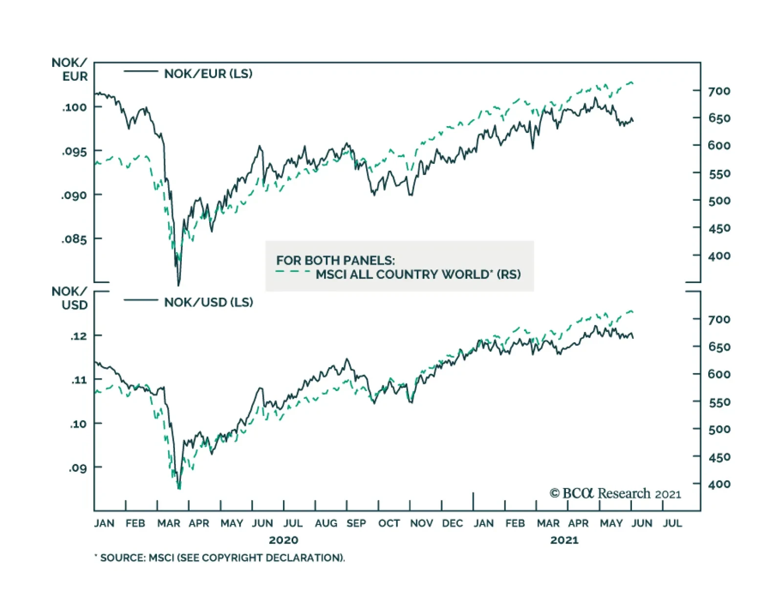
BCA Research’s Foreign Exchange Strategy and European Investment Strategy services conclude that the global environment and Norway’s continued economic strength will create potent tailwind for the Norwegian krone over a cyclical investment horizon. The…
Highlights The Norwegian economy will continue to grow above trend for the next two years or so. Norwegian inflation will firm up. Among Advanced Economies, the Norges Bank will lead the way in terms of policy tightening; however, money markets already embed this view. Nonetheless, the Norwegian krone remains an appealing value play, a result of its pronounced pro-cyclicality. USD/NOK and EUR/NOK will depreciate over the next 24 months. Norwegian equities face structural headwinds, but they should outperform their US and Euro Area counterparts. However, Norwegian stocks will lag behind Swedish equities. Buy Norwegian stocks / sell Dutch ones. Feature Norway remains an example of how to handle the pandemic successfully. Since the onset of the COVID-19 crisis, Norway has registered the lowest rate of infections per capita, in part aided by its early decision to close its borders. Fiscal stimulus was prompt and finely tailored to the sectors most in need of emergency funds. Moreover, the Norges Bank cut interest rates to zero for the first time since its founding in 1816. As nations across the world coordinated monetary and fiscal accommodation during the pandemic, Nordic economies had already mastered this paradigm. Thus, counter-cyclical buffers worked like a charm in Norway. For example, the contraction in Norwegian GDP was the most subdued within the G10, and the recovery is also impressive. Today, Norwegian GDP is 2% above pre-pandemic levels, inflation is near the target rate of 2%, and the central bank will be among the first to lift interest rates. In this Special Report, we explore whether or not conditions remain ripe for strong performances by both Norwegian equities and the NOK. In our view, the global environment and the continued economic strength of Norway will create potent tailwind for Norwegian assets over the coming two years or so. A Robust Economic Outlook The Norwegian economy is set to continue growing at a robust above-trend pace and inflation will remain above the Norges Bank’s target. The Pandemic Norway has moved largely beyond the COVID-19 pandemic. The number of cases per 100 is a mere 2, which compares favorably to the US at 10, Germany at 4, France at 8, or its neighbor Sweden at 10. Norway closed its borders on March 12, 2020, to limit the entry of the virus on its territory, as health authorities opted for rapid containment measures. As a direct result of these policies, Norwegian consumers and workers gained greater peace of mind in their day-to-day dealings, and economic activity recovered rapidly. This process led to Norway’s GDP contracting by only 4.6% in Q2 2020, which compares favorably to contractions of 19.5% in the UK, 9.7% in Germany and 7.8% in Sweden. Norway’s vaccination campaign is also gaining momentum. At first, the country’s inoculation performance lagged. However, Norwegian procurement of vaccines has improved, and the pace of inoculation is accelerating (Chart 1, top panel). The result is that the share of the population that is fully vaccinated is inching toward 20% and accelerating. Authorities expect greater relaxation of containment measures this summer, which will allow mobility to improve (Chart 2). The local service sector will therefore receive a welcome fillip. Chart 1Norway's Vaccination Progress
Norway's Vaccination Progress
Norway's Vaccination Progress
Chart 2Mobility Will Pick Up
Mobility Will Pick Up
Mobility Will Pick Up
Fiscal Policy Fiscal policy remains an important complement to national health directives. During the crisis, the fiscal deficit reached 3.4% of GDP, which generated a fiscal thrust of 6% of GDP. Moreover, the drawdown from the Norwegian Oil Fund amounted to 12.5% of GDP. These provided targeted supports to industries, such as tourism and transport, while a furlough scheme protected household income. Thus, these programs effectively alleviated the pain on the sectors of the economy most affected by the pandemic. Going forward, Norway will also suffer from one of the smallest fiscal drag in the G10 for the remainder of 2021 and 2022 (Chart 3). Chart 3Norway's Advantageous Fiscal Backdrop
Norway's Advantageous Fiscal Backdrop
Norway's Advantageous Fiscal Backdrop
The Banking System The credit channel in Norway remains open and fluid, as a resilient banking system withstood the economic fallout from the pandemic. According to the Norges Bank, credit losses have been limited; they peaked at 1% of lending and are already declining. Additionally, banks have restricted exposure to the sectors hardest hit by the pandemic, such as travel and tourism, personal services, and transport (Chart 4). Moreover, the profitability of the banking system decreased, as global yields fell last year, but RoE remains around 10% and net interest margins hover near 2.5% and 1.5% for non-financial corporate loans and households lending, respectively. Crucially, the Norwegian banking system sports a regulatory Tier-1 capital-to-risk weighted-assets ratio of 20%, well above Basel III criteria or that of the Eurozone banks (Chart 4, bottom panel). Chart 4Norwegian Banks Are Faring Well
The Norwegian Method
The Norwegian Method
Household Consumption Household consumption will remain a source of strength over the coming quarters. Household net worth is growing robustly as a result of the rapid appreciation of house prices across the country (Chart 5, top panel). Moreover, the share of debt held by households with a high debt-to-income ratio or a low debt-servicing capacity remains low, which suggests household balance sheets are firming (Chart 5, middle panel). Employment is also recovering well. After peaking at 9.5% in March 2020, the headline unemployment rate fell to 3.3% last month (Chart 5, bottom panel). Meanwhile, the number of employed workers bottomed in July 2020 and has been steadily recovering ever since. The only blemish is that, as of Q4 2020, the rate of underemployment among the prime-age population remains at 3.5%, which is somewhat elevated by national standards. This balance sheet and employment backdrop confirms the Norges Bank’s projection: the household savings rate will decline significantly over the coming two years (Chart 6, top panel). Hence, the marked pick-up in consumer confidence should translate into a major recovery in real consumption growth (Chart 6, bottom panel). Nonetheless, the service sector will likely be the main beneficiary of this improvement, as real retail sales are already well above their historical trend Chart 5Positive Household Fundamentals
Positive Household Fundamentals
Positive Household Fundamentals
Chart 6Consumption Will Improve Further
Consumption Will Improve Further
Consumption Will Improve Further
Net Exports Chart 7Years Of Underinvestment In Oil & Gas
The Norwegian Method
The Norwegian Method
The external sector will create another tailwind for the Norwegian economy. Prior to the pandemic, 71% of Norway’s exports flowed to Europe. Moreover, oil and gas represented 53% of shipments, and cyclically sensitive exports amounted to 74% of total or 24% of GDP. Thus, even if China’s economy slows, Europe’s economic re-opening will raise the Norwegian trade balance, which sits near a multi-decade low.1 Moreover, greater mobility in Europe and around the world will elevate demand for petroleum. In light of the tepid pace of investment in global oil and gas extraction over the past five years, our commodity strategists forecast further oil and gas price appreciation2 (Chart 7), which will boost Norway’s terms of trade. The national income will therefore expand smartly, especially because oil and gas shipments will increase thanks to growing production from the new Johan Sverdrup field. Capital Spending This context suggests that capital spending, which accounts for 26% of Norway’s output (Chart 8), will constitute an important tailwind to domestic activity. Capex is even more important to the Norwegian economy than it is for other Nordic economies or even Germany (Chart 9). Chart 8Capital Spending Is Important For Norway
Capital Spending Is Important For Norway
Capital Spending Is Important For Norway
Chart 9The Capex Share Of GDP Is Higher In Norway
The Capex Share Of GDP Is Higher In Norway
The Capex Share Of GDP Is Higher In Norway
Norwegian capex is highly cyclical. Capital formation tracks our BCA Global Nowcast indicator (a combination of high-frequency economic and financial variables that proxy the global industrial cycle), as well as the domestic manufacturing PMI. These indicators suggest that capex should increase by 10-15% in the coming quarters (Chart 10). A Norges Bank survey of capex intentions, which are firming, corroborates this view. Chart 10Capex Will Recover Strongly Capex Will Recover
Capex Will Recover Strongly Capex Will Recover
Capex Will Recover Strongly Capex Will Recover
On the energy front, the new Johan Sverdrup oil and gas discovery marks a major turnaround in capital spending for Norway. According to the Norges Bank, real petroleum investment will increase from approximately NOK 175bn in 2021 to NOK 198bn by 2024 (Chart 11). Moreover, years of global underinvestment in oil extraction suggests Norway will gain market share in exports as production accelerates. Total petroleum production is slated to increase by 10% over the next 4 years. More importantly, by 2025, over 50% of production from Norwegian oil fields will be natural gas and associated liquids (Chart 12). Demand for natural gas and NGLs will be more inelastic than demand for crude because the latter is threatened by the rising electrification of vehicles, while the former faces more sustainable demand as China, among others, moves to replace its coal polluting plants with cleaner alternatives. Chart 11Real Petroleum Investment Will Increase By 13% In 2024
The Norwegian Method
The Norwegian Method
Chart 12Gas Production Is Rising In Importance
The Norwegian Method
The Norwegian Method
Inflation This positive economic outlook suggests that Norwegian inflation will remain above the central bank’s target of 2%. Already, headline CPI stands at 3%. Meanwhile, core inflation is at 2%, but it is decelerating. However, this slowdown should be temporary. According to a Norges Bank survey, both long-term and near-term inflation expectations among economists, business leaders, and households are rising, which indicates that a deflationary mentality has not taken root in Norway. Moreover, wage expectations have quickly normalized following the trauma of 2020 (Chart 13). Capacity constraints further reinforce the notion that inflation has upside. The Norges Bank Regional Network survey shows that capacity and labor supply constraints are tighter than they were in the 2014 to 2017 period, when inflation averaged 2.3% and the policy rate fell to 0.5% (Chart 14). Moreover, according to the same survey, selling prices are also stronger than they were during the 2016 oil collapse (Chart 14, bottom panel) Chart 13No Signs Of A Deflation Mentality
No Signs Of A Deflation Mentality
No Signs Of A Deflation Mentality
Chart 14Capacity Doesn’t Point To Falling Inflation
The Norwegian Method
The Norwegian Method
Bottom Line: The Norwegian economy will continue to grow above its trend rate of 1.5%, at least through to 2022. The acceleration in vaccination numbers will allow a reopening of the economy, while the fiscal drag will be limited and the banking system remains resilient. The outlook for households remains positive and employment is firming, which will lead to stronger consumption. Meanwhile, exports and capex have significant upside ahead. As a result, we anticipate Norwegian inflation will remain above target for the foreseeable future. The Norges Bank Will Lead The Pack The Norges Bank’s response to the pandemic was swift and all encompassing: It cut interest rates in the spring of 2020 from 1.5% to zero, the lowest level since the formation of the bank in 1816. It set up extraordinary F-loans at very generous interest rates, to provide ample liquidity to commercial banks. The longest maturity loan of 12 months had a prevailing interest rate of just 30 basis points. It also relaxed collateral requirements for these loans. It introduced swap lines with the Federal Reserve to provide US dollar funding to Norwegian firms. Since then, our Norges Bank monitor has rebounded powerfully from very depressed levels, which suggests that emergency policy settings have become unnecessary. Moreover, the Norwegian Central Bank Monitor towers above that of other G10 countries, which indicates that the Norges Bank should lead the pack in normalizing policy rates (Chart 15). Chart 15The Norges Bank Should Lead The Tightening Cycle
The Norges Bank Should Lead The Tightening Cycle
The Norges Bank Should Lead The Tightening Cycle
Chart 16The Growth Component Of Our Monitor Has Exploded Higher
The Growth Component Of Our Monitor Has Exploded Higher The Growth Component Of Our Monitor Has Exploded Higher
The Growth Component Of Our Monitor Has Exploded Higher The Growth Component Of Our Monitor Has Exploded Higher
The biggest improvement in our Norges Bank Monitor comes from its growth component, which has surged to its highest levels in over two decades. This improvement surpasses those that followed the global financial crisis and the burst of the dot-com bubble (Chart 16). In essence, the growth component of the Monitor signals that the Norwegian economy has achieved escape velocity. Norway’s robust economic turnover is increasing the velocity of money, which points to the need for higher interest rates. Money velocity can be regarded as the equilibrating mechanism between money supply and nominal output, from the classical Fisher equation MV=PQ (where M is the money supply, P is prices, Q is real output, and V is money velocity). Thus, rising money velocity (when PQ expands faster than M) signifies that the economy needs higher interest rates to encourage savings. In Norway’s case, the velocity of money is surging through 2021, which confirms that the Norges Bank may depart from its current emergency policy setting (Chart 17). Chart 17Money Velocity Is Rising In Norway
Money Velocity Is Rising In Norway
Money Velocity Is Rising In Norway
The OIS curve already reflects this reality. At the last central bank meeting in March, Governor Øystein Olsen stated that interest rates would increase in the second half of this year. Already, the central bank’s balance sheet has been expanding more slowly than that of its peers (Chart 18). In response to this messaging, investors now expect the Norges Bank to lead the Fed, ECB, Riksbank, and BoE in lifting interest rates (Chart 19). Chart 18The Norges Bank's Balance Sheet Impulse Has Rolled Over
The Norges Bank's Balance Sheet Impulse Has Rolled Over
The Norges Bank's Balance Sheet Impulse Has Rolled Over
Chart 19Money Markets Already Expect The Norges Bank To Tighten First
Money Markets Already Expect The Norges Bank To Tighten First
Money Markets Already Expect The Norges Bank To Tighten First
The Norges Bank must nonetheless manage a tough balancing act. Lifting rates too soon or too fast could torpedo the recovery, if the currency and bond yields increase too rapidly and tighten financial conditions in a disruptive fashion. However, not removing accommodation fast enough could lead to economic overheating. Bottom Line: The Norges Bank will be the first DM central bank to increase interest rates, most likely as soon as this September. The OIS curve already reflects this outlook; it prices in over 6 hikes by the end of 2023, more than any other DM money market curve. This pricing seems appropriate; thus, Norwegian money markets offer no compelling investment opportunity. Norway’s Problem: Sagging Productivity Both the OECD and the IMF view weak productivity growth as Norway’s biggest long-term hurdle. Despite the bright economic outlook for the next two years or so, we agree. Since 2004-2005, Norwegian productivity has sharply decelerated. At the turn of the millennium, the Norwegian’s mainland labor productivity was growing at 2.5%, or a percentage point above the average of the OECD. Today, labor productivity growth is a paltry 0.5%, placing Norway last among Nordic economies (Chart 20, left panel). Total factor productivity tells a similar story. After recording the fastest productivity expansion among G10 nation from 1990 to 2005, Norway’s TFP declined 11% and is now situated at the same level as it was in 1995. This deterioration is comparable to Italy’s TFP (Chart 20, left panel). Chart 20From Best To Last
The Norwegian Method
The Norwegian Method
According to the most recent OECD country report, one of the roots of Norway’s productivity problem is an absence of low-hanging fruit. Norway sports one of the highest GDP per hours worked in the world. This nation essentially sits near the global productivity frontier. Its product market regulations are generally not onerous (Chart 21, top panel). Likewise, more than 60% of both the service sector and the manufacturing sector’s workforce use ICT tools, which is at the highest level among OECD countries. Additionally, the jobs at risk of a negative impact from automation or technological changes represent a significantly smaller share of total employment than in most OECD nations (Chart 21, bottom panel). Chart 21Doing Things Right
The Norwegian Method
The Norwegian Method
The Dutch Disease, the hollowing out of the manufacturing sector due to a capital hungry resource sector, is the second root of Norway’s productivity problem. Historically and across countries, manufacturing is the sector that records the greatest productivity gains. However, since 1979, the oil and gas and the housing sectors have experienced the largest capital investments expansion in Norway. Meanwhile, the share of capex generated by the manufacturing sector has declined to a paltry 5% (Chart 22). Moreover, oil and gas represents a larger share of capex than the contribution of its gross value added to GDP. The same holds true for housing, whose share of capex doubled over the past 27 years. Meanwhile, manufacturing’s share of capex has consistently lagged its representation in GDP, which has steadily declined (Chart 23). These are the typical symptoms of the Dutch Disease; as long as oil prices remain in a secular decline, any cyclical improvement in productivity will prove to be transitory. Chart 22The Dutch Disease, Part I
The Dutch Disease, Part I
The Dutch Disease, Part I
Chart 23The Dutch Disease, Part II
The Dutch Disease, Part II
The Dutch Disease, Part II
Bottom Line: Despite an upbeat cyclical outlook, Norway’s deteriorating productivity trend constitutes a formidable structural headwind. There are no easy solutions, because Norway already sits near the global productivity frontier. Moreover, Norway suffers from a pronounced case of the Dutch Disease. For decades, the oil and gas sector has absorbed a share of capital that is greater than its role in the economy, starving the productivity-generating manufacturing sector from investments. With the oil sector entering a structural decline due to ESG concerns, this trend will not change without a significant change in the allocation of the Norwegian capital stock. Investment Implications The cyclical outlook (12 to 24 months) for the Norwegian currency and stock market remains appealing. The NOK’s Outlook Chart 24The Krone Is Undervalued On A PPP Basis
The Krone Is Undervalued On A PPP Basis
The Krone Is Undervalued On A PPP Basis
While money markets do not offer any compelling opportunities to play the Norges Bank’s hiking cycle, the krone remains attractive from a cyclical perspective. Over the next 12-18 months, the NOK should appreciate compared to both the US dollar and the euro on the back of four key pillars. On a purchasing power parity basis, the Norwegian krone is undervalued by 14%. This compares favorably with both the euro, which is undervalued by 12%, and the US dollar, which is overvalued by 12% (Chart 24). More importantly, our PPP model adjusts the consumption basket across countries, allowing for a more apples-to-apples comparison. The Norwegian krone is highly procyclical and will benefit from any improvement in the global backdrop. The performance of NOK/USD, NOK/EUR, and NOK/JPY moves in lockstep with global equities (Chart 25). Norwegian equities have greatly underperformed global bourses over the last decade, but, as we argue below, there is some room for mean reversion. Inflows into the Norwegian equity market should benefit the krone (Chart 26). Chart 25NOK Is A Procyclical ##br##Currency
NOK Is A Procyclical Currency
NOK Is A Procyclical Currency
Chart 26NOK Moves With A Rerating In Norwegian Shares
NOK Moves With A Rerating In Norwegian Shares
NOK Moves With A Rerating In Norwegian Shares
From a more fundamental perspective, the krone will benefit from positive income flows, given Norway’s large net international investment position (NIIP). In fact, ever since the first Norwegian oil fields began producing light sweet crude in the North Sea in the 1970s, Norway has maintained a structural trade surplus with most of its trading partners. This has allowed the country to build one of the biggest NIIP in the world (Chart 27), trailing only behind Hong Kong and Singapore. This large NIIP generates large income receipts that skew heavily toward equity dividends. This characteristic of the Norwegian balance of payment strengthens the bond between the NOK and global equities. Over the next few years, Norway’s trade balance should also get a boost, not only from rising oil and gas production, but also from an improvement in terms of trade, as we argued above. The trade balance has historically been the biggest driver of cross-border inflows into Norway, and that should remain positive for the basic balance and the NOK (Chart 28) Chart 28Norway's Basic Balance Should Improve Norway Balance Of Payments
Norway's Basic Balance Should Improve Norway Balance Of Payments
Norway's Basic Balance Should Improve Norway Balance Of Payments
Chart 27Norway Has A Large Net International Investment Position
Norway Has A Large Net International Investment Position
Norway Has A Large Net International Investment Position
On a structural basis, however, the Norwegian krone faces challenges. Declining productivity suggests that economic growth in Norway will be more inflationary. This will lower the fair value of the real exchange rate. Therefore, while we are positive on the NOK over the next 18 to 24 months, we will be cognizant not to overstay our welcome. Finally, as for NOK/SEK, the pair should rise as both oil and gas prices remain firm in the near term, but any structural challenges to both oil and/or Norwegian productivity will favor the SEK over the longer term (Chart 29). Chart 29NOK/SEK Will Track Crude Prices
NOK/SEK Will Track Crude Prices
NOK/SEK Will Track Crude Prices
The Equity Market Outlook Norwegian equities remain challenged as long-term holdings, but they are attractive on a cyclical basis. The poor profitability of Norwegian equities is their main long-term problem. Unlike Swedish stocks, Norwegian shares sport a return on equity in line with that of the Eurozone, not that of the US. Norway’s profit margins are weak and its asset turnover rivals that of the Euro Area (Chart 30). Additionally, the country’s poor productivity performance argues against a sudden reversal in RoEs. Chart 30Norway Is More Like The Eurozone Than Swden
Norway Is More Like The Eurozone Than Swden
Norway Is More Like The Eurozone Than Swden
Sectoral composition creates another structural handicap for the Norwegian market. Oslo overweighs Energy and Financials (Table 1). Energy stocks can experience periodic rallies, but their long-term outlook is bleak in a world moving away from carbon-based power. Meanwhile, financials are also likely to remain structural laggards. The regulatory legacy of the Great Financial Crisis has curtailed leverage, which is depressing the RoE of the banking sector. Greater competition and the emergence of the fintech industry are further undermining fee income. None of these factors will change anytime soon. Table 1Sectoral Breakdown
The Norwegian Method
The Norwegian Method
That being said, Norwegian equities remain a compelling opportunity for the next two years or so, despite their long-term problems. Norwegian stocks have an extremely negative beta to the US dollar. The historical sensitivity of the NOK to the USD in part explains this attribute, the other part being their elevated cyclicality. The dollar is one of the most counter-cyclical currencies in the world; thus, its weakness correlates with strong Norwegian forward earnings, which are heavily influenced by commodity prices and the global industrial cycle. This process also lifts Norwegian stock prices (Chart 31). Hence, BCA’s positive outlook on the global business cycle, as well as our negative stance on the dollar, points to significantly stronger Norwegian share prices.3 The slowdown in China’s economy is one risk that could cause some near-term tremors in Norwegian assets, which investors should use to build positions. In response to Beijing’s efforts to limit systemic risk, the Chinese credit impulse has slowed from 1.1% of GDP to 0.3%, and could flirt with the zero line. The ensuing investment slowdown will weigh on the global industrial sector and cause a temporary pullback in commodity prices. As Chart 32 illustrates, this will be negative for Norwegian equities; historically, following declines in Chinese yields, Norwegian forward earnings and stock prices weaken. However, global energy demand will remain robust even as China slows; therefore, correcting Norwegian equities create a buying opportunity. Chart 31Norwegian Stocks Are A Dollar-Bearish Bet
Norwegian Stocks Are A Dollar-Bearish Bet
Norwegian Stocks Are A Dollar-Bearish Bet
Chart 32A Chinese Slowdown Is A Risk
A Chinese Slowdown Is A Risk
A Chinese Slowdown Is A Risk
Norwegian stocks should also outperform US and Eurozone equities. Nonetheless, Norwegian equities enjoy their greatest appeal against the US benchmark. Norwegian stocks trade at valuation discounts ranging from 38% to 54% compared to their US counterparts. Meanwhile, Norway’s net earnings revisions remain depressed compared to the US. Most importantly, Norwegian stocks are more pro-cyclical and sensitive to EM and global financial conditions than US shares are. Consequently, Oslo outperforms New York when the broad trade-weighted dollar depreciates, EM currencies appreciate, and the global yield curve slope steepens (Chart 33). We expect these trends to intensify over the remainder of the business cycle. Chart 33Oslo Beats New York
Oslo Beats New York
Oslo Beats New York
Norwegian equities are also more responsive than Eurozone equities to global business-cycle oscillations. Norwegian equities outperform those of the Eurozone when the dollar depreciates (Chart 34). Additionally, a simple modelling exercise reveals that rising oil prices and global yields result in higher relative share prices in favor of Norway (Chart 35). Chart 34Norway Outperforms The Eurozone When The Dollar Weakens
Norway Outperforms The Eurozone When The Dollar Weakens
Norway Outperforms The Eurozone When The Dollar Weakens
Chart 35Favor Norway Over ##br##The Euro Area
Favor Norway Over The Euro Area
Favor Norway Over The Euro Area
Sweden is the one market that maintains a hedge over Norway.4 Swedish stocks not only sport a RoE nine percentage point above that of Norway, they are also sensitive to the global business cycle. However, the main advantage of Swedish equities is their sectoral breakdown. Sweden has an enormous overweight in industrials (38% of the benchmark), while Norway greatly overweighs materials. In an environment in which China is likely to decelerate, but global capex and infrastructure spending will remain firm, Sweden’s industrials’ weighting gives it a powerful advantage over its neighbor’s stock market. Finally, we recommend the following high-octane trade: Long Norwegian / short Dutch stocks. The Amsterdam bourse has a 47% allocation to tech stocks and a greater “growth” bias than the S&P 500. This means that the relative performance of Norwegian stocks compared to Dutch equities is even more sensitive to the global business cycle, oil prices, and bond yields. As a result, our simple model incorporating both Brent prices and yields currently sends a strong buy signal in favor of Norway (Chart 36). Chart 36Time To Buy Norway And Sell The Netherlands
Time To Buy Norway And Sell The Netherlands
Time To Buy Norway And Sell The Netherlands
Bottom Line: The NOK will perform strongly against both the USD and the EUR over the coming 18 to 24 months. Norwegian equities are not an appealing long-term bet; however, they will experience significant upside over the coming two years, both in absolute terms and relative to the US and Euro Area stocks. While Oslo is unlikely to outperform Stockholm over this period, we recommend buying Norwegian stocks and selling the Dutch index. Mathieu Savary Chief European Investment Strategist Mathieu@bcaresearch.com Chester Ntonifor Foreign Exchange Strategist chestern@bcaresearch.com Footnotes 1 Please see European Investment Strategy Report, "A Surprising Dance," dated May 10, 2021. 2 Please see Commodity & Energy Strategy Report, "OPEC’s 2.0 Production Strategy In Focus," dated May 20, 2021. 3 Please see Foreign Exchange Strategy Report, "Explaining Recent Weakness In The US Dollar," dated May 14, 2021. 4 Please see European Investment Strategy Report, "Take A Chance On Sweden," dated May 03, 2021.
Highlights The Norwegian economy will continue to grow above trend for the next two years or so. Norwegian inflation will firm up. Among Advanced Economies, the Norges Bank will lead the way in terms of policy tightening; however, money markets already embed this view. Nonetheless, the Norwegian krone remains an appealing value play, a result of its pronounced pro-cyclicality. USD/NOK and EUR/NOK will depreciate over the next 24 months. Norwegian equities face structural headwinds, but they should outperform their US and Euro Area counterparts. However, Norwegian stocks will lag behind Swedish equities. Buy Norwegian stocks / sell Dutch ones. Feature Norway remains an example of how to handle the pandemic successfully. Since the onset of the COVID-19 crisis, Norway has registered the lowest rate of infections per capita, in part aided by its early decision to close its borders. Fiscal stimulus was prompt and finely tailored to the sectors most in need of emergency funds. Moreover, the Norges Bank cut interest rates to zero for the first time since its founding in 1816. As nations across the world coordinated monetary and fiscal accommodation during the pandemic, Nordic economies had already mastered this paradigm. Thus, counter-cyclical buffers worked like a charm in Norway. For example, the contraction in Norwegian GDP was the most subdued within the G10, and the recovery is also impressive. Today, Norwegian GDP is 2% above pre-pandemic levels, inflation is near the target rate of 2%, and the central bank will be among the first to lift interest rates. In this Special Report, we explore whether or not conditions remain ripe for strong performances by both Norwegian equities and the NOK. In our view, the global environment and the continued economic strength of Norway will create potent tailwind for Norwegian assets over the coming two years or so. A Robust Economic Outlook The Norwegian economy is set to continue growing at a robust above-trend pace and inflation will remain above the Norges Bank’s target. The Pandemic Norway has moved largely beyond the COVID-19 pandemic. The number of cases per 100 is a mere 2, which compares favorably to the US at 10, Germany at 4, France at 8, or its neighbor Sweden at 10. Norway closed its borders on March 12, 2020, to limit the entry of the virus on its territory, as health authorities opted for rapid containment measures. As a direct result of these policies, Norwegian consumers and workers gained greater peace of mind in their day-to-day dealings, and economic activity recovered rapidly. This process led to Norway’s GDP contracting by only 4.6% in Q2 2020, which compares favorably to contractions of 19.5% in the UK, 9.7% in Germany and 7.8% in Sweden. Norway’s vaccination campaign is also gaining momentum. At first, the country’s inoculation performance lagged. However, Norwegian procurement of vaccines has improved, and the pace of inoculation is accelerating (Chart 1, top panel). The result is that the share of the population that is fully vaccinated is inching toward 20% and accelerating. Authorities expect greater relaxation of containment measures this summer, which will allow mobility to improve (Chart 2). The local service sector will therefore receive a welcome fillip. Chart 1Norway's Vaccination Progress
Norway's Vaccination Progress
Norway's Vaccination Progress
Chart 2Mobility Will Pick Up
Mobility Will Pick Up
Mobility Will Pick Up
Fiscal Policy Fiscal policy remains an important complement to national health directives. During the crisis, the fiscal deficit reached 3.4% of GDP, which generated a fiscal thrust of 6% of GDP. Moreover, the drawdown from the Norwegian Oil Fund amounted to 12.5% of GDP. These provided targeted supports to industries, such as tourism and transport, while a furlough scheme protected household income. Thus, these programs effectively alleviated the pain on the sectors of the economy most affected by the pandemic. Going forward, Norway will also suffer from one of the smallest fiscal drag in the G10 for the remainder of 2021 and 2022 (Chart 3). Chart 3Norway's Advantageous Fiscal Backdrop
Norway's Advantageous Fiscal Backdrop
Norway's Advantageous Fiscal Backdrop
The Banking System The credit channel in Norway remains open and fluid, as a resilient banking system withstood the economic fallout from the pandemic. According to the Norges Bank, credit losses have been limited; they peaked at 1% of lending and are already declining. Additionally, banks have restricted exposure to the sectors hardest hit by the pandemic, such as travel and tourism, personal services, and transport (Chart 4). Moreover, the profitability of the banking system decreased, as global yields fell last year, but RoE remains around 10% and net interest margins hover near 2.5% and 1.5% for non-financial corporate loans and households lending, respectively. Crucially, the Norwegian banking system sports a regulatory Tier-1 capital-to-risk weighted-assets ratio of 20%, well above Basel III criteria or that of the Eurozone banks (Chart 4, bottom panel). Chart 4Norwegian Banks Are Faring Well
The Norwegian Method
The Norwegian Method
Household Consumption Household consumption will remain a source of strength over the coming quarters. Household net worth is growing robustly as a result of the rapid appreciation of house prices across the country (Chart 5, top panel). Moreover, the share of debt held by households with a high debt-to-income ratio or a low debt-servicing capacity remains low, which suggests household balance sheets are firming (Chart 5, middle panel). Employment is also recovering well. After peaking at 9.5% in March 2020, the headline unemployment rate fell to 3.3% last month (Chart 5, bottom panel). Meanwhile, the number of employed workers bottomed in July 2020 and has been steadily recovering ever since. The only blemish is that, as of Q4 2020, the rate of underemployment among the prime-age population remains at 3.5%, which is somewhat elevated by national standards. This balance sheet and employment backdrop confirms the Norges Bank’s projection: the household savings rate will decline significantly over the coming two years (Chart 6, top panel). Hence, the marked pick-up in consumer confidence should translate into a major recovery in real consumption growth (Chart 6, bottom panel). Nonetheless, the service sector will likely be the main beneficiary of this improvement, as real retail sales are already well above their historical trend Chart 5Positive Household Fundamentals
Positive Household Fundamentals
Positive Household Fundamentals
Chart 6Consumption Will Improve Further
Consumption Will Improve Further
Consumption Will Improve Further
Net Exports Chart 7Years Of Underinvestment In Oil & Gas
The Norwegian Method
The Norwegian Method
The external sector will create another tailwind for the Norwegian economy. Prior to the pandemic, 71% of Norway’s exports flowed to Europe. Moreover, oil and gas represented 53% of shipments, and cyclically sensitive exports amounted to 74% of total or 24% of GDP. Thus, even if China’s economy slows, Europe’s economic re-opening will raise the Norwegian trade balance, which sits near a multi-decade low.1 Moreover, greater mobility in Europe and around the world will elevate demand for petroleum. In light of the tepid pace of investment in global oil and gas extraction over the past five years, our commodity strategists forecast further oil and gas price appreciation2 (Chart 7), which will boost Norway’s terms of trade. The national income will therefore expand smartly, especially because oil and gas shipments will increase thanks to growing production from the new Johan Sverdrup field. Capital Spending This context suggests that capital spending, which accounts for 26% of Norway’s output (Chart 8), will constitute an important tailwind to domestic activity. Capex is even more important to the Norwegian economy than it is for other Nordic economies or even Germany (Chart 9). Chart 8Capital Spending Is Important For Norway
Capital Spending Is Important For Norway
Capital Spending Is Important For Norway
Chart 9The Capex Share Of GDP Is Higher In Norway
The Capex Share Of GDP Is Higher In Norway
The Capex Share Of GDP Is Higher In Norway
Norwegian capex is highly cyclical. Capital formation tracks our BCA Global Nowcast indicator (a combination of high-frequency economic and financial variables that proxy the global industrial cycle), as well as the domestic manufacturing PMI. These indicators suggest that capex should increase by 10-15% in the coming quarters (Chart 10). A Norges Bank survey of capex intentions, which are firming, corroborates this view. Chart 10Capex Will Recover Strongly Capex Will Recover
Capex Will Recover Strongly Capex Will Recover
Capex Will Recover Strongly Capex Will Recover
On the energy front, the new Johan Sverdrup oil and gas discovery marks a major turnaround in capital spending for Norway. According to the Norges Bank, real petroleum investment will increase from approximately NOK 175bn in 2021 to NOK 198bn by 2024 (Chart 11). Moreover, years of global underinvestment in oil extraction suggests Norway will gain market share in exports as production accelerates. Total petroleum production is slated to increase by 10% over the next 4 years. More importantly, by 2025, over 50% of production from Norwegian oil fields will be natural gas and associated liquids (Chart 12). Demand for natural gas and NGLs will be more inelastic than demand for crude because the latter is threatened by the rising electrification of vehicles, while the former faces more sustainable demand as China, among others, moves to replace its coal polluting plants with cleaner alternatives. Chart 11Real Petroleum Investment Will Increase By 13% In 2024
The Norwegian Method
The Norwegian Method
Chart 12Gas Production Is Rising In Importance
The Norwegian Method
The Norwegian Method
Inflation This positive economic outlook suggests that Norwegian inflation will remain above the central bank’s target of 2%. Already, headline CPI stands at 3%. Meanwhile, core inflation is at 2%, but it is decelerating. However, this slowdown should be temporary. According to a Norges Bank survey, both long-term and near-term inflation expectations among economists, business leaders, and households are rising, which indicates that a deflationary mentality has not taken root in Norway. Moreover, wage expectations have quickly normalized following the trauma of 2020 (Chart 13). Capacity constraints further reinforce the notion that inflation has upside. The Norges Bank Regional Network survey shows that capacity and labor supply constraints are tighter than they were in the 2014 to 2017 period, when inflation averaged 2.3% and the policy rate fell to 0.5% (Chart 14). Moreover, according to the same survey, selling prices are also stronger than they were during the 2016 oil collapse (Chart 14, bottom panel) Chart 13No Signs Of A Deflation Mentality
No Signs Of A Deflation Mentality
No Signs Of A Deflation Mentality
Chart 14Capacity Doesn’t Point To Falling Inflation
The Norwegian Method
The Norwegian Method
Bottom Line: The Norwegian economy will continue to grow above its trend rate of 1.5%, at least through to 2022. The acceleration in vaccination numbers will allow a reopening of the economy, while the fiscal drag will be limited and the banking system remains resilient. The outlook for households remains positive and employment is firming, which will lead to stronger consumption. Meanwhile, exports and capex have significant upside ahead. As a result, we anticipate Norwegian inflation will remain above target for the foreseeable future. The Norges Bank Will Lead The Pack The Norges Bank’s response to the pandemic was swift and all encompassing: It cut interest rates in the spring of 2020 from 1.5% to zero, the lowest level since the formation of the bank in 1816. It set up extraordinary F-loans at very generous interest rates, to provide ample liquidity to commercial banks. The longest maturity loan of 12 months had a prevailing interest rate of just 30 basis points. It also relaxed collateral requirements for these loans. It introduced swap lines with the Federal Reserve to provide US dollar funding to Norwegian firms. Since then, our Norges Bank monitor has rebounded powerfully from very depressed levels, which suggests that emergency policy settings have become unnecessary. Moreover, the Norwegian Central Bank Monitor towers above that of other G10 countries, which indicates that the Norges Bank should lead the pack in normalizing policy rates (Chart 15). Chart 15The Norges Bank Should Lead The Tightening Cycle
The Norges Bank Should Lead The Tightening Cycle
The Norges Bank Should Lead The Tightening Cycle
Chart 16The Growth Component Of Our Monitor Has Exploded Higher
The Growth Component Of Our Monitor Has Exploded Higher The Growth Component Of Our Monitor Has Exploded Higher
The Growth Component Of Our Monitor Has Exploded Higher The Growth Component Of Our Monitor Has Exploded Higher
The biggest improvement in our Norges Bank Monitor comes from its growth component, which has surged to its highest levels in over two decades. This improvement surpasses those that followed the global financial crisis and the burst of the dot-com bubble (Chart 16). In essence, the growth component of the Monitor signals that the Norwegian economy has achieved escape velocity. Norway’s robust economic turnover is increasing the velocity of money, which points to the need for higher interest rates. Money velocity can be regarded as the equilibrating mechanism between money supply and nominal output, from the classical Fisher equation MV=PQ (where M is the money supply, P is prices, Q is real output, and V is money velocity). Thus, rising money velocity (when PQ expands faster than M) signifies that the economy needs higher interest rates to encourage savings. In Norway’s case, the velocity of money is surging through 2021, which confirms that the Norges Bank may depart from its current emergency policy setting (Chart 17). Chart 17Money Velocity Is Rising In Norway
Money Velocity Is Rising In Norway
Money Velocity Is Rising In Norway
The OIS curve already reflects this reality. At the last central bank meeting in March, Governor Øystein Olsen stated that interest rates would increase in the second half of this year. Already, the central bank’s balance sheet has been expanding more slowly than that of its peers (Chart 18). In response to this messaging, investors now expect the Norges Bank to lead the Fed, ECB, Riksbank, and BoE in lifting interest rates (Chart 19). Chart 18The Norges Bank's Balance Sheet Impulse Has Rolled Over
The Norges Bank's Balance Sheet Impulse Has Rolled Over
The Norges Bank's Balance Sheet Impulse Has Rolled Over
Chart 19Money Markets Already Expect The Norges Bank To Tighten First
Money Markets Already Expect The Norges Bank To Tighten First
Money Markets Already Expect The Norges Bank To Tighten First
The Norges Bank must nonetheless manage a tough balancing act. Lifting rates too soon or too fast could torpedo the recovery, if the currency and bond yields increase too rapidly and tighten financial conditions in a disruptive fashion. However, not removing accommodation fast enough could lead to economic overheating. Bottom Line: The Norges Bank will be the first DM central bank to increase interest rates, most likely as soon as this September. The OIS curve already reflects this outlook; it prices in over 6 hikes by the end of 2023, more than any other DM money market curve. This pricing seems appropriate; thus, Norwegian money markets offer no compelling investment opportunity. Norway’s Problem: Sagging Productivity Both the OECD and the IMF view weak productivity growth as Norway’s biggest long-term hurdle. Despite the bright economic outlook for the next two years or so, we agree. Since 2004-2005, Norwegian productivity has sharply decelerated. At the turn of the millennium, the Norwegian’s mainland labor productivity was growing at 2.5%, or a percentage point above the average of the OECD. Today, labor productivity growth is a paltry 0.5%, placing Norway last among Nordic economies (Chart 20, left panel). Total factor productivity tells a similar story. After recording the fastest productivity expansion among G10 nation from 1990 to 2005, Norway’s TFP declined 11% and is now situated at the same level as it was in 1995. This deterioration is comparable to Italy’s TFP (Chart 20, left panel). Chart 20From Best To Last
The Norwegian Method
The Norwegian Method
According to the most recent OECD country report, one of the roots of Norway’s productivity problem is an absence of low-hanging fruit. Norway sports one of the highest GDP per hours worked in the world. This nation essentially sits near the global productivity frontier. Its product market regulations are generally not onerous (Chart 21, top panel). Likewise, more than 60% of both the service sector and the manufacturing sector’s workforce use ICT tools, which is at the highest level among OECD countries. Additionally, the jobs at risk of a negative impact from automation or technological changes represent a significantly smaller share of total employment than in most OECD nations (Chart 21, bottom panel). Chart 21Doing Things Right
The Norwegian Method
The Norwegian Method
The Dutch Disease, the hollowing out of the manufacturing sector due to a capital hungry resource sector, is the second root of Norway’s productivity problem. Historically and across countries, manufacturing is the sector that records the greatest productivity gains. However, since 1979, the oil and gas and the housing sectors have experienced the largest capital investments expansion in Norway. Meanwhile, the share of capex generated by the manufacturing sector has declined to a paltry 5% (Chart 22). Moreover, oil and gas represents a larger share of capex than the contribution of its gross value added to GDP. The same holds true for housing, whose share of capex doubled over the past 27 years. Meanwhile, manufacturing’s share of capex has consistently lagged its representation in GDP, which has steadily declined (Chart 23). These are the typical symptoms of the Dutch Disease; as long as oil prices remain in a secular decline, any cyclical improvement in productivity will prove to be transitory. Chart 22The Dutch Disease, Part I
The Dutch Disease, Part I
The Dutch Disease, Part I
Chart 23The Dutch Disease, Part II
The Dutch Disease, Part II
The Dutch Disease, Part II
Bottom Line: Despite an upbeat cyclical outlook, Norway’s deteriorating productivity trend constitutes a formidable structural headwind. There are no easy solutions, because Norway already sits near the global productivity frontier. Moreover, Norway suffers from a pronounced case of the Dutch Disease. For decades, the oil and gas sector has absorbed a share of capital that is greater than its role in the economy, starving the productivity-generating manufacturing sector from investments. With the oil sector entering a structural decline due to ESG concerns, this trend will not change without a significant change in the allocation of the Norwegian capital stock. Investment Implications The cyclical outlook (12 to 24 months) for the Norwegian currency and stock market remains appealing. The NOK’s Outlook Chart 24The Krone Is Undervalued On A PPP Basis
The Krone Is Undervalued On A PPP Basis
The Krone Is Undervalued On A PPP Basis
While money markets do not offer any compelling opportunities to play the Norges Bank’s hiking cycle, the krone remains attractive from a cyclical perspective. Over the next 12-18 months, the NOK should appreciate compared to both the US dollar and the euro on the back of four key pillars. On a purchasing power parity basis, the Norwegian krone is undervalued by 14%. This compares favorably with both the euro, which is undervalued by 12%, and the US dollar, which is overvalued by 12% (Chart 24). More importantly, our PPP model adjusts the consumption basket across countries, allowing for a more apples-to-apples comparison. The Norwegian krone is highly procyclical and will benefit from any improvement in the global backdrop. The performance of NOK/USD, NOK/EUR, and NOK/JPY moves in lockstep with global equities (Chart 25). Norwegian equities have greatly underperformed global bourses over the last decade, but, as we argue below, there is some room for mean reversion. Inflows into the Norwegian equity market should benefit the krone (Chart 26). Chart 25NOK Is A Procyclical ##br##Currency
NOK Is A Procyclical Currency
NOK Is A Procyclical Currency
Chart 26NOK Moves With A Rerating In Norwegian Shares
NOK Moves With A Rerating In Norwegian Shares
NOK Moves With A Rerating In Norwegian Shares
From a more fundamental perspective, the krone will benefit from positive income flows, given Norway’s large net international investment position (NIIP). In fact, ever since the first Norwegian oil fields began producing light sweet crude in the North Sea in the 1970s, Norway has maintained a structural trade surplus with most of its trading partners. This has allowed the country to build one of the biggest NIIP in the world (Chart 27), trailing only behind Hong Kong and Singapore. This large NIIP generates large income receipts that skew heavily toward equity dividends. This characteristic of the Norwegian balance of payment strengthens the bond between the NOK and global equities. Over the next few years, Norway’s trade balance should also get a boost, not only from rising oil and gas production, but also from an improvement in terms of trade, as we argued above. The trade balance has historically been the biggest driver of cross-border inflows into Norway, and that should remain positive for the basic balance and the NOK (Chart 28) Chart 28Norway's Basic Balance Should Improve Norway Balance Of Payments
Norway's Basic Balance Should Improve Norway Balance Of Payments
Norway's Basic Balance Should Improve Norway Balance Of Payments
Chart 27Norway Has A Large Net International Investment Position
Norway Has A Large Net International Investment Position
Norway Has A Large Net International Investment Position
On a structural basis, however, the Norwegian krone faces challenges. Declining productivity suggests that economic growth in Norway will be more inflationary. This will lower the fair value of the real exchange rate. Therefore, while we are positive on the NOK over the next 18 to 24 months, we will be cognizant not to overstay our welcome. Finally, as for NOK/SEK, the pair should rise as both oil and gas prices remain firm in the near term, but any structural challenges to both oil and/or Norwegian productivity will favor the SEK over the longer term (Chart 29). Chart 29NOK/SEK Will Track Crude Prices
NOK/SEK Will Track Crude Prices
NOK/SEK Will Track Crude Prices
The Equity Market Outlook Norwegian equities remain challenged as long-term holdings, but they are attractive on a cyclical basis. The poor profitability of Norwegian equities is their main long-term problem. Unlike Swedish stocks, Norwegian shares sport a return on equity in line with that of the Eurozone, not that of the US. Norway’s profit margins are weak and its asset turnover rivals that of the Euro Area (Chart 30). Additionally, the country’s poor productivity performance argues against a sudden reversal in RoEs. Chart 30Norway Is More Like The Eurozone Than Swden
Norway Is More Like The Eurozone Than Swden
Norway Is More Like The Eurozone Than Swden
Sectoral composition creates another structural handicap for the Norwegian market. Oslo overweighs Energy and Financials (Table 1). Energy stocks can experience periodic rallies, but their long-term outlook is bleak in a world moving away from carbon-based power. Meanwhile, financials are also likely to remain structural laggards. The regulatory legacy of the Great Financial Crisis has curtailed leverage, which is depressing the RoE of the banking sector. Greater competition and the emergence of the fintech industry are further undermining fee income. None of these factors will change anytime soon. Table 1Sectoral Breakdown
The Norwegian Method
The Norwegian Method
That being said, Norwegian equities remain a compelling opportunity for the next two years or so, despite their long-term problems. Norwegian stocks have an extremely negative beta to the US dollar. The historical sensitivity of the NOK to the USD in part explains this attribute, the other part being their elevated cyclicality. The dollar is one of the most counter-cyclical currencies in the world; thus, its weakness correlates with strong Norwegian forward earnings, which are heavily influenced by commodity prices and the global industrial cycle. This process also lifts Norwegian stock prices (Chart 31). Hence, BCA’s positive outlook on the global business cycle, as well as our negative stance on the dollar, points to significantly stronger Norwegian share prices.3 The slowdown in China’s economy is one risk that could cause some near-term tremors in Norwegian assets, which investors should use to build positions. In response to Beijing’s efforts to limit systemic risk, the Chinese credit impulse has slowed from 1.1% of GDP to 0.3%, and could flirt with the zero line. The ensuing investment slowdown will weigh on the global industrial sector and cause a temporary pullback in commodity prices. As Chart 32 illustrates, this will be negative for Norwegian equities; historically, following declines in Chinese yields, Norwegian forward earnings and stock prices weaken. However, global energy demand will remain robust even as China slows; therefore, correcting Norwegian equities create a buying opportunity. Chart 31Norwegian Stocks Are A Dollar-Bearish Bet
Norwegian Stocks Are A Dollar-Bearish Bet
Norwegian Stocks Are A Dollar-Bearish Bet
Chart 32A Chinese Slowdown Is A Risk
A Chinese Slowdown Is A Risk
A Chinese Slowdown Is A Risk
Norwegian stocks should also outperform US and Eurozone equities. Nonetheless, Norwegian equities enjoy their greatest appeal against the US benchmark. Norwegian stocks trade at valuation discounts ranging from 38% to 54% compared to their US counterparts. Meanwhile, Norway’s net earnings revisions remain depressed compared to the US. Most importantly, Norwegian stocks are more pro-cyclical and sensitive to EM and global financial conditions than US shares are. Consequently, Oslo outperforms New York when the broad trade-weighted dollar depreciates, EM currencies appreciate, and the global yield curve slope steepens (Chart 33). We expect these trends to intensify over the remainder of the business cycle. Chart 33Oslo Beats New York
Oslo Beats New York
Oslo Beats New York
Norwegian equities are also more responsive than Eurozone equities to global business-cycle oscillations. Norwegian equities outperform those of the Eurozone when the dollar depreciates (Chart 34). Additionally, a simple modelling exercise reveals that rising oil prices and global yields result in higher relative share prices in favor of Norway (Chart 35). Chart 34Norway Outperforms The Eurozone When The Dollar Weakens
Norway Outperforms The Eurozone When The Dollar Weakens
Norway Outperforms The Eurozone When The Dollar Weakens
Chart 35Favor Norway Over ##br##The Euro Area
Favor Norway Over The Euro Area
Favor Norway Over The Euro Area
Sweden is the one market that maintains a hedge over Norway.4 Swedish stocks not only sport a RoE nine percentage point above that of Norway, they are also sensitive to the global business cycle. However, the main advantage of Swedish equities is their sectoral breakdown. Sweden has an enormous overweight in industrials (38% of the benchmark), while Norway greatly overweighs materials. In an environment in which China is likely to decelerate, but global capex and infrastructure spending will remain firm, Sweden’s industrials’ weighting gives it a powerful advantage over its neighbor’s stock market. Finally, we recommend the following high-octane trade: Long Norwegian / short Dutch stocks. The Amsterdam bourse has a 47% allocation to tech stocks and a greater “growth” bias than the S&P 500. This means that the relative performance of Norwegian stocks compared to Dutch equities is even more sensitive to the global business cycle, oil prices, and bond yields. As a result, our simple model incorporating both Brent prices and yields currently sends a strong buy signal in favor of Norway (Chart 36). Chart 36Time To Buy Norway And Sell The Netherlands
Time To Buy Norway And Sell The Netherlands
Time To Buy Norway And Sell The Netherlands
Bottom Line: The NOK will perform strongly against both the USD and the EUR over the coming 18 to 24 months. Norwegian equities are not an appealing long-term bet; however, they will experience significant upside over the coming two years, both in absolute terms and relative to the US and Euro Area stocks. While Oslo is unlikely to outperform Stockholm over this period, we recommend buying Norwegian stocks and selling the Dutch index. Mathieu Savary Chief European Investment Strategist Mathieu@bcaresearch.com Chester Ntonifor Foreign Exchange Strategist chestern@bcaresearch.com Footnotes 1 Please see European Investment Strategy Report, "A Surprising Dance," dated May 10, 2021. 2 Please see Commodity & Energy Strategy Report, "OPEC’s 2.0 Production Strategy In Focus," dated May 20, 2021. 3 Please see Foreign Exchange Strategy Report, "Explaining Recent Weakness In The US Dollar," dated May 14, 2021. 4 Please see European Investment Strategy Report, "Take A Chance On Sweden," dated May 03, 2021. Trades & Forecasts Forecast Summary Core Portfolio Tactical Trades Limit Orders Closed Trades
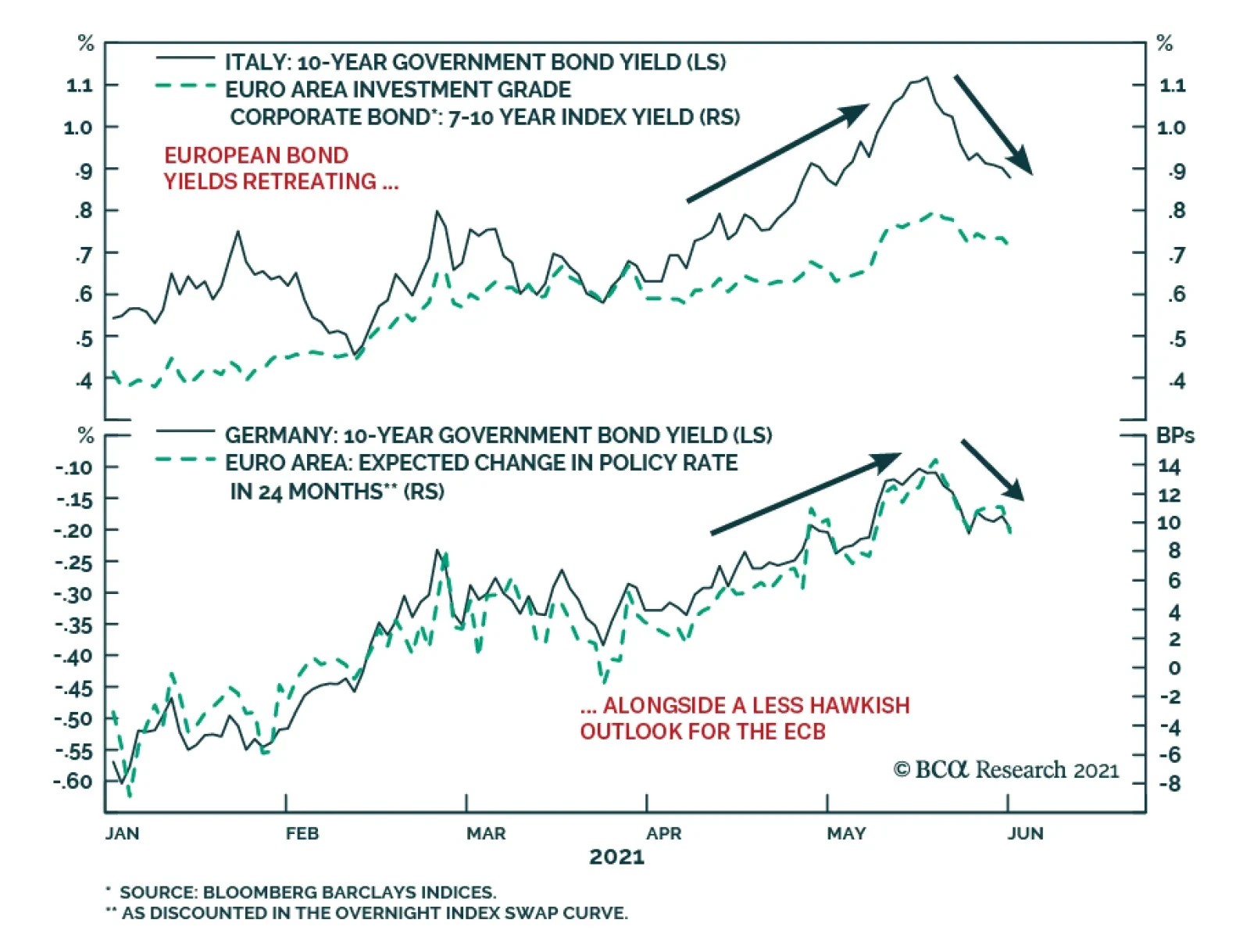
European bond markets have calmed down after a rough couple of months that saw the benchmark 10-year German bund yield rise from a low of -0.39% on March 25 to a high of -0.11% on May 19. Yields on riskier European debt saw even bigger increases over that…