Policy

Highlights The amount of fiscal stimulus in the pipeline is more than enough to close the US output gap. Inflation is likely to surprise on the upside this year. The Fed will brush off any evidence of economic overheating during the coming months, stressing the “transitory” nature of the problem. Still, long-term bond yields, over which the Fed has less control, will rise. As long as bond yields move higher in conjunction with improving growth expectations, stocks will remain in an uptrend. The bull market in equities will only end when the Fed starts to sound more hawkish. That is not in the cards for the next 12 months at least. Stimulus Smackdown During the past month, a debate has erupted over how much additional fiscal stimulus the US economy needs. The side arguing that the sea of red ink has gotten too deep includes an unlikely cast of characters like Larry Summers, who has famously contended that sustained large budget deficits are necessary to stave off secular stagnation. It also includes Olivier Blanchard, who previously served as the IMF’s chief economist and pushed the multilateral lender to abandon its historic adherence to fiscal austerity. Chart 1Generous Government Transfers Boosted Household Savings
Generous Government Transfers Boosted Household Savings
Generous Government Transfers Boosted Household Savings
Rather than citing debt sustainability concerns, these newfound stimulus skeptics worry that large-scale fiscal easing at the present juncture risks overheating the economy. They point out that President Biden’s proposed $1.9 trillion package, coming on the heels of the $900 billion stimulus bill Congress passed in late December, would inject another 13% of GDP into the economy, on the back of the lagged boost from the first stimulus package. We estimate that US households had accumulated $1.5 trillion in excess savings (7% of GDP) as of the end of 2020, thanks to the fiscal transfers they received under the CARES Act (Chart 1). US real GDP in the fourth quarter of 2020 was 2.5% below its level in the fourth quarter of 2019. Assuming trend growth of 2%, this implies that the output gap – the difference between what the economy is capable of producing and what it actually is producing – has widened by about 4.5% of GDP since the onset of the pandemic. The Congressional Budget Office (CBO) believes the US economy was operating 1% above potential in Q4 of 2019, suggesting that the output gap is around 3.5% of GDP. As it has in the past, the CBO is probably understating the amount of slack in the economy. Our guess is that the US was close to full employment in the months leading up to the pandemic, which implies that the output gap is currently somewhere between 4% and 5% of GDP. While fairly large in absolute terms, it is still smaller than the amount of stimulus currently in the pipeline. Gentle Jay Not So Worried About Overheating Stimulus advocates argue that households will continue to use stimulus checks to fortify their balance sheets, rather than rush out to spend the windfall. They also note that unemployment payments will come down if the labor market recovers more quickly than projected. And even if the economy does temporarily overheat, “so what” they say. The Fed has been trying to engineer an inflation overshoot for years. Now is its chance. Jay Powell seems to sympathize with this thesis. Speaking at a virtual conference organized by The Economic Club of New York this week, Powell repeated his call for fiscal easing and told attendees that the Fed is unlikely to “even think about withdrawing policy support” anytime soon. His words echo remarks made at the press conference following January’s FOMC meeting, where he said “I’m much more worried about falling short of a complete recovery and losing people’s careers,” before adding: “Frankly, we welcome slightly higher inflation.” Most other FOMC members have struck a similar tone. Earlier this year, Fed Governor Lael Brainard noted that “The damage from COVID-19 is concentrated among already challenged groups. Federal Reserve staff analysis indicates that unemployment is likely above 20 percent for workers in the bottom wage quartile, while it has fallen below 5 percent for the top wage quartile.” How Big Is The Fiscal Multiplier From Stimulus Checks? Chart 2Service Inflation Fell During The Pandemic, While Goods Inflation Rose
Service Inflation Fell During The Pandemic, While Goods Inflation Rose
Service Inflation Fell During The Pandemic, While Goods Inflation Rose
One of the reasons that households saved much of last year’s stimulus checks was because there was not much to spend them on. Officially measured service inflation was well contained last year, but many services were simply not available for purchase. In contrast, goods prices, which usually fall over time, rose (Chart 2). As the economy opens up, total spending will recover. Rising household spending will have a multiplier effect. The simplest version of the Keynesian multiplier for fiscal transfer payments is equal to MPC/(1-MPC), where MPC is the marginal propensity to consume. Assuming that households initially spend 50 cents of every dollar they receive, the multiplier would be 0.5/(1-0.5)=1. In other words, every dollar of direct stimulus payments will eventually generate one additional dollar of aggregate demand. One could argue that this multiplier estimate overstates the impact on demand because it ignores the fact that households will regard stimulus checks as one-time payments rather than a continuous flow of income. One could also point out that taxes and imports will cut into the multiplier effect on domestic spending. There is truth to all these arguments, but they are not as compelling as they seem. According to a recent US Census study, only 37% of Americans reported no difficulty in paying for usual household expenses during the pandemic. A mere 16% of workers with incomes below $35,000 reported no difficulty, compared with more than two-thirds of workers with incomes above $100,000 (Chart 3). In the euphemistic parlance of economics, most US households are “liquidity constrained,” meaning that they are likely to spend a large chunk of any income they receive, even if it is a one-off grant.1 Chart 3The Pandemic Has Put A Spotlight On The Liquidity Constraints Of US Households
Higher Bond Yields: Where Is The Breaking Point?
Higher Bond Yields: Where Is The Breaking Point?
As for taxes, while the income from subsequent spending will be taxed, the stimulus checks that households receive will remain untaxed. Granted, some of the demand generated by stimulus checks will leak abroad in the form of higher imports. However, keep in mind that the US is a fairly closed economy – imports account for only 15% of GDP. Moreover, the full impact on imports depends on what happens to the value of the dollar. If the Fed keeps rates unchanged but inflation rises, the accompanying decline in short-term real rates could weaken the dollar, curbing imports and boosting exports in the process. This could lead to a higher multiplier rather than a lower one. Lastly, higher consumption is likely to boost corporate capex, as companies scramble to raise capacity in anticipation of strong demand (Chart 4). Economists call this the “accelerator effect.” Investment spending is 2.5-times as volatile as consumption. Hence, even modest increases in consumption can trigger large increases in investment. Chart 4Stronger Consumption Tends To Boost Capex
Stronger Consumption Tends To Boost Capex
Stronger Consumption Tends To Boost Capex
Unemployment Benefits: Adding To Aggregate Demand But Subtracting From Supply? As Chart 5 shows, stimulus payments to households account for 17% of the December stimulus bill and 26% of Biden’s proposed package for a combined total of around $650 billion (3% of GDP, or around two-thirds of the current output gap). The balance consists of expanded unemployment benefits, health and education funding, support for small businesses, and aid to state and local governments. Chart 5Stimulus Package Breakdowns
Higher Bond Yields: Where Is The Breaking Point?
Higher Bond Yields: Where Is The Breaking Point?
Unemployment benefits are likely to be spent fairly quickly since, in most cases, they replace lost income that had previously been used to finance consumption. More generous unemployment benefits could temporarily reduce aggregate supply. Higher federal unemployment benefits would more than offset the lost income of close to half of jobless workers, potentially creating a disincentive to seek employment. Inflation Expectations Will Continue To Rise Aggregate demand is likely to outstrip the economy’s supply-side potential over the coming months. Hence, inflation will probably surprise on the upside this year, although not by enough to force the Fed to abandon its easy money stance. Inflation expectations have recovered since the depths of the pandemic. However, the 5-year/5-year forward TIPS breakeven rate is still below the level that BCA’s bond strategists believe the Fed regards as consistent with its long-term inflation objective, and even farther below the level that would cause the Fed to panic (Chart 6). This suggests that the Fed will brush off any evidence of overheating during the coming months, stressing the “transitory” nature of the problem. Still, rising inflation expectations will push up long-dated bond yields. At present, the 5-year/5-year forward Treasury yield stands at 1.89%. This is below the median estimate of the long-run equilibrium fed funds rate from the New York Fed’s Survey of Primary Dealers (Chart 7). With policy rates on hold, higher long-term bond yields will translate into steeper yield curves. We expect the 10-year Treasury yield to rise to 1.5% by the end of the year from the current level of 1.16%, with risks to yields tilted to the upside. Chart 6Inflation Expectations Have Recovered But Are Still Below Levels That Would Cause Concern For The Fed
Inflation Expectations Have Recovered But Are Still Below Levels That Would Cause Concern For The Fed
Inflation Expectations Have Recovered But Are Still Below Levels That Would Cause Concern For The Fed
Chart 7Forward Treasury Yields Are Below Primary Dealers' Projections
Forward Treasury Yields Are Below Primary Dealers' Projections
Forward Treasury Yields Are Below Primary Dealers' Projections
Can Stocks Stand The Heat? To what extent will higher bond yields hurt stocks? To get a sense of the answer, it is useful to consider a dividend discount model. The simplest model, the Gordon Growth Model, says that the price of a stock, P, should equal the dividend that it pays, D, divided by the difference between the long-term discount rate, r, and the expected dividend growth rate, g:
Higher Bond Yields: Where Is The Breaking Point?
Higher Bond Yields: Where Is The Breaking Point?
We can write the discount rate as the combination of the long-term risk-free rate and the equity risk premium such that r = rf + ERP and then solve for the dividend yield:
Higher Bond Yields: Where Is The Breaking Point?
Higher Bond Yields: Where Is The Breaking Point?
Note that the value of the stock market becomes increasingly sensitive to changes in the risk-free rate when the dividend yield is low to begin with. For example, if the dividend yield is 2%, a 10-basis-point rise in the long-term risk-free rate will push down stock prices by 5%. In contrast, if the dividend yield is 1%, a 10-basis-point rise in the long-term risk-free rate will push down stock prices by 10%. Today, dividend and earnings yields for most global equity sectors are quite low, although not as low as they were in 2000 (Chart 8). Watch The Correlation Between r And g The fact that dividend and earnings yields are below their long-term average does make stocks vulnerable to a rise in bond yields. This is especially the case for relatively expensive equity sectors such as tech and consumer discretionary. Nevertheless, there is an important mitigating factor at work: Increases in the risk-free rate have generally been accompanied by stronger growth expectations. Chart 9 shows that S&P 500 forward earnings estimates have moved in lockstep with the 10-year Treasury yield, a proxy for the long-term risk-free rate. Chart 8Global Dividend And Earnings Yields Are Quite Low, Although Not As Low As In 2000
Global Dividend And Earnings Yields Are Quite Low, Although Not As Low As In 2000
Global Dividend And Earnings Yields Are Quite Low, Although Not As Low As In 2000
Chart 9Earnings Estimates Move In Lockstep With Bond Yields
Earnings Estimates Move In Lockstep With Bond Yields
Earnings Estimates Move In Lockstep With Bond Yields
This suggests that the main danger to equity investors is not higher bond yields per se, but a rise in bond yields in excess of upward revisions to growth expectations, or worse, against a backdrop of faltering growth. Such a predicament could eventually manifest itself. However, it is only likely to happen when the Fed turns hawkish. This is not in the cards for the next 12 months at least. Peter Berezin Chief Global Strategist pberezin@bcaresearch.com Footnotes 1 The difficulty that many households have had in making ends meet predates the pandemic. For example, in May 2019, the Consumer Finance Protection Bureau found that about 40% of US consumers claimed that they had difficulty paying bills and expenses. Among those with annual household incomes of $20,000 or less, difficulties were experienced by 6 out of 10 people. Moreover, about half of consumers reported that they would be able to cover expenses for no more than two months if they lost their main source of income by relying on all available sources of funds, including borrowing, savings, selling assets, or even seeking help from family and friends. Global Investment Strategy View Matrix
Higher Bond Yields: Where Is The Breaking Point?
Higher Bond Yields: Where Is The Breaking Point?
Special Trade Recommendations
Higher Bond Yields: Where Is The Breaking Point?
Higher Bond Yields: Where Is The Breaking Point?
Current MacroQuant Model Scores
Higher Bond Yields: Where Is The Breaking Point?
Higher Bond Yields: Where Is The Breaking Point?
Highlights The Biden administration’s budget reconciliation bill will close the output gap, so markets will have to start thinking about upcoming tax hikes, rising wages, and eventual Fed interest rate hikes. Biden’s lax immigration policies will not have a major negative impact on wage growth. A doubling of the minimum wage, which could still make it into one of two budget reconciliation bills, would include a measure to index the post-2026 minimum wage to the average rate of wage rises. Biden’s industrial policy and support of labor unions would also increase wages. Stay long Treasury inflation-protected securities versus duration-matched Treasuries and long value stocks over growth stocks. Feature The Senate and House of Representatives passed a concurrent resolution on the budget for FY2021, the first step in the budget reconciliation process that will enable Democratic leadership to pass President Joe Biden’s $1.9 trillion American Rescue Plan with only a simple majority in the Senate. The budget resolution is a fantasy that the ruling party uses to bypass the Senate filibuster, as was the case under George W. Bush, Barack Obama, and Donald Trump. The latest such resolution claims that the budget deficit will be smaller, not larger, after the Biden rescue plan than what is currently projected by the Congressional Budget Office (Chart 1). It envisions the entire $1.9 trillion being spent in 2021 and then a huge drop in expenditures in 2022. A fiscal cliff ahead of the 2022 midterm election will not occur. Instead the second budget reconciliation maneuver, for FY2022, will increase spending levels once again with infrastructure and green projects, as per Biden’s campaign platform. Chart 1Democrats Pass Budget Resolution
Biden Opens The Border
Biden Opens The Border
The FY2021 budget resolution does not contain any tax increases, “revenue offsets,” to keep the budget in line because the COVID relief is emergency spending that is one-off, not recurring. The FY2022, however, will aim partially to repeal President Trump’s tax cuts. As such financial markets will continue to “buy the rumor” of additional fiscal spending for now but they will also sell the news given that the next reconciliation bill will push up inflation expectations even further, hasten the Federal Reserve’s policy normalization, and include tax hikes. And the current buy-the-rumor phase could be interrupted anyway by Biden’s immediate foreign policy challenges. Larry Summers And The Output Gap Democrats will err on the larger side of the $1.9 trillion stimulus because they regret erring on the smaller side back in 2009. But it is still possible for the price tag to be knocked down to around $1.5 trillion given that the economy is recovering and several moderate Democrats will balk at the enormous size. After all, $900 billion passed at the end of the year is not yet spent. Biden has already compromised by raising the eligibility requirements for households to receive $1,400 stimulus checks. Larry Summers, a frequent guest at the annual BCA conference and a veteran of the Clinton and Obama White Houses, has stirred up a firestorm over the past month by warning that too much federal money spent on short-term cash handouts today would crowd out the administration’s political capital and the amount of deficit spending that is available for long-term, productivity-enhancing investments. Summers warned that the current proposed stimulus is three times larger than required to fill the output gap. Chart 2 shows the output gap from 2009-12 and projected from 2021-24 alongside the size of the relevant stimulus packages to illustrate his point. Treasury Secretary Janet Yellen defended the $1.9 trillion price tag – like Summers, she is not normally one to worry about overheating the economy, but unlike Summers, she is now an administration official. She predicted that this size of package would bring the economy back to full employment by next year. The Congressional Budget Office, based on earlier congressional actions, had predicted employment would not return to its pre-COVID level until around 2024. The administration will look to Yellen now and in future to make the call on when enough stimulus is enough. With inflation expectations recovering rapidly, the Fed could be forced to hike rates as early as late 2022, though we think 2023 is more likely given our methodological bias as political analysts. This means the scope for overheating is quite large – a point reinforced by the comparison with the economic recovery back in 2009 (Chart 3). Summers’s criticism is not remiss and could come back to haunt the administration.1 When inflation picks up, the Fed will have to allow an overshoot according to its new policy of targeting average inflation. But once it is assured, it will have to start hiking rates. And once it starts hiking rates it could trigger a recession. Plus, even if we set recession risks aside, Summers’s critical point is that too much stimulus today will reduce the political and budgetary scope for Biden’s long-term agenda, which includes what will likely be his second major bill focused on infrastructure and renewables. The reconciliation process makes it highly likely that Democrats will drive through this initiative through the Senate but not if moderate Senate Democrats balk in the face of rising budget deficits and inflation. Chart 2How Much Is Too Much Stimulus?
Biden Opens The Border
Biden Opens The Border
Our base case still holds that Democrats will pass both reconciliation bills over the next roughly 12 months but investors should keep Summers’s warning in mind. Chart 3Recovery Is Ahead Of The Previous Cycle
Recovery Is Ahead Of The Previous Cycle
Recovery Is Ahead Of The Previous Cycle
There are tailwinds for Biden’s agenda. First, his political capital is moderate-to-strong and likely to strengthen over the coming year. It will get bumped up by improving economic conditions, including most recently a marked decline in bankruptcy filings from Q3 to Q4. Our updated Political Capital Index is shown in the Appendix. Second, concern about budget deficits has eroded, as Republican fiscal largesse showed under Trump – the pandemic and atmosphere of crisis greatly reinforce this point. Third, divisions in the Republican Party have produced as many as five moderates who could assist Biden in winning close legislative votes – even beyond the relatively easy passage of the American Rescue Plan in his honeymoon period. This Republican Party split is the only significance of President Trump’s second impeachment. Trump’s legal woes will continue after he is acquitted in the Senate. The deeper Republicans are divided over Trump’s legacy the harder time they will have recovering in the 2022 midterms, where opposition parties are normally favored. But the Biden administration’s leftward agenda will bring Republicans together, especially once the country moves out of the crisis. One of the biggest battles looms over the southern border. Bottom Line: The $1.9 trillion American Rescue Plan will more than close the output gap and yet it is only one of two budget reconciliation bills that the Biden administration will seek to pass over the next 12 months. There are still domestic and international factors that could impede the recovery, not least China’s policy tightening, but the risk of excessively short-term stimulus at the expense of long-term public investment is clear. Republicans Will Regroup Over Immigration To Summers’s warning about Biden’s legislative window of opportunity, recall that President Trump never achieved his signature 2016 policy promise – to build a wall on the border with Mexico – because congressional Republicans led him to prioritize repealing and replacing the Affordable Care Act (which failed) and passing the Tax Cut and Jobs Act (which succeeded). There was no political capital left for a major legislative push on the border and immigration. Immigration is one of the areas where Biden has a major incentive to push his policies aggressively. Immigrants tend to skew Democratic in their party affiliations. Americans increasingly believe immigration should be increased, a trend that accelerated after Trump’s election on an avowedly anti-immigration platform (Chart 4, top panel). Today 34% believe it should be increased in addition to 36% who are comfortable with the current level. Meanwhile the number who believe it should be decreased has fallen to 28%, down from 34%-38% around the time of Trump’s election. An anti-immigration candidate may be able to win within the Republican Party (especially under the specific circumstances of 2015-16) but he or she will have trouble winning general elections. Trump himself discarded the topic in the 2020 race. For Democrats, immigration is also probably the single most effective way to drive a wedge between the populist and establishment factions of the Republican Party. For example, establishment Republican presidents oversaw huge infusions of foreigners into US society, the 1986 Immigration and Reform Control Act, which granted amnesty to three million illegal immigrants, and the 1990 Immigration Act, which increased the quota of legal immigrants. By contrast Trump rose to power by attacking the bipartisan consensus on “open borders.” As long as a substantial cohort of Republicans defends immigration on free market principles, and upholds the corporate interest in having plentiful availability of lower wage seasonal and specialized workers, the party will be divided. The above points explain why the Biden administration will pursue immigration reform more intently than public opinion would leave one to believe. Polls show that voters want to focus on the economic recovery, the pandemic response, and social and civil rights policies more than immigration. There is no question that Biden is prioritizing the pandemic, the economy, and health care (Chart 4, bottom panel). But the Democratic Party has a strategic interest in expanding immigration so Biden will continue to plow forward with executive orders and comprehensive immigration reform in Congress. The US does need immigration reform – to ensure the flow is orderly. President Trump’s “wall” proposal did not come out of nowhere. Like the “Know Nothing Party” that emerged in the 1840s and rose to prominence in the 1850s, the Trump movement arose amid a historic increase in the foreign-born share of the population (Chart 5). But Trump’s policies hardly made a dent in the flow of legal immigrants into the US. Now Biden will reverse them and encourage more incomers. Therefore immigration will persist as a bone of contention in the 2020s. Granted, immigration has amply attested positive effects on the economy – including most clearly by lifting the US’s fertility rate so that it does not suffer from as rapid of an aging process as other developed countries. Indeed, voters are primarily concerned about illegal, not legal, immigration. Still, Republicans will struggle to walk the line between tighter immigration policies and appealing to an audience beyond “old white folks.” This suggests the Biden administration has room to run. Chart 4Public Not Too Concerned About Immigration
Public Not Too Concerned About Immigration
Public Not Too Concerned About Immigration
Chart 5Historically Large Foreign-Born Population
Biden Opens The Border
Biden Opens The Border
It helps Biden that the post-World War II and post-Cold War booms in legal immigration are relatively measured when compared to the overall population. The inflow of migrants was around 0.3% in 2019, very far from its post-war peak of 0.7% per year (Chart 6). Thus the Biden administration will not be overly concerned about being too progressive on this issue. Chart 6Boom In Legal Immigration Less Impressive Relative To Population
Biden Opens The Border
Biden Opens The Border
Chart 7Detainees On The Mexican Border
Biden Opens The Border
Biden Opens The Border
Illegal immigration is the biggest factor motivating periodic public backlashes such as in 2016. Southwestern border apprehensions – the only credible way to measure the unauthorized flow of people over the Mexican border – spiked under President Obama as well as President Trump, though US agents detained nowhere near the numbers witnessed in the 1980s and 1990s (Chart 7). The stock of illegal immigrants in the US ranges from 10-11 million and has remained flat, or fallen slightly, since the financial crisis of 2008. The weakening of the US economy, in the context of tighter border security, reduced incentives to make the difficult journey (Chart 8). The fact that President Obama and Trump increased detentions suggests that the demand to get into the country recovered over the course of the last business cycle. Based on President Biden’s voting record in the Senate and statements during the 2020 campaign, he is not an ultra-dove on the border – but his party has moved to the left on the issue. This is clear from his rivals’ positions in the Democratic primary election. Even his Vice President Kamala Harris, who was not the most radical on stage, supported decriminalizing illegal border crossings and downgrading Immigration and Customs Enforcement. Still, until Democrats repeal the filibuster in the Senate, they will not have a chance of passing comprehensive immigration reform with Republicans unless they accept stronger enforcement provisions. Biden voted for the 2006 Secure Fence Act but more recently has emphasized high-tech upgrades to better monitor crossovers. Harris also accepted high-tech security funding that did not involve building a wall. Even with these compromises, it will still be a stretch to find 10 Republicans willing to cross the aisle on this issue while Trump and his faction remain active to punish them in primary elections. Chart 8Estimate Of Total Illegal Immigrants
Biden Opens The Border
Biden Opens The Border
The demand to enter the US will revive once the pandemic is over. The big surge in illegal border crossings in the 1980s-90s coincided with a period in which US economic growth and wellbeing far outpaced that of Mexico and Central America (Chart 9). The gap in GDP per capita is the crudest possible measure and does not reflect the dramatic differences in quality of life that drive people to relocate. Nevertheless, the gap remains drastic, especially with Mexico. Chart 9The Grass Is Greener On The Other Side
Biden Opens The Border
Biden Opens The Border
The gap in current economic activity, such as manufacturing PMIs, between the US and Mexico is as wide as ever. Even as manufacturing contracts in Mexico, the demand for workers in US service industries is soaring (Chart 10). Moreover the US economic revival will be super-charged by the gargantuan fiscal stimulus of 2020-21 whereas Mexican government support for the economy is comparatively austere (Chart 11) Chart 10Super-Charged US Recovery Opens Big Gap With Mexico
Super-Charged US Recovery Opens Big Gap With Mexico
Super-Charged US Recovery Opens Big Gap With Mexico
Chart 11Less Government Support In Mexico Than US
Less Government Support In Mexico Than US
Less Government Support In Mexico Than US
Bottom Line: Biden is opening up the borders at a time of economic disparity between the US and Latin America that will lead to an influx of immigration. This is positive for US labor force growth and productivity but it will be hard to pass a long-term solution through Congress. The Republican Party is deeply divided on the issue today but it is likely to become a rallying cry as numbers of newcomers increase and as Trump-style populism remains an active force within the party. Immigration, Wages, And The Minimum Wage The macroeconomic and market impact of easier border and immigration controls boils down to the impact on wages. There is a vast literature on this subject and we will not pretend to be comprehensive. We will merely make a few observations. The foreign-to-native-born wage differential has narrowed substantially over the past twenty years. The discount to hire immigrants has shrunk from 24% to 15% (Chart 12). This is a reflection of the high demand for immigrant labor and especially the increase in high-skilled workers alongside the booming tech, legal, financial, personal care, and health care industries in the United States – the fastest growing sectors for foreign-born workers since 2003. Earnings growth for foreign workers is more cyclical than for native workers and has been rising faster in recent decades (Chart 13). Chart 12Immigrants Command A Higher Price Than They Used To
Biden Opens The Border
Biden Opens The Border
Chart 13Immigrant Wages Grow In Boom Times
Biden Opens The Border
Biden Opens The Border
Immigrants work the lowest-wage jobs and hence there is some correlation between the share of foreign-born workers in any given industry and the hourly wage, just as there was at the turn of the century (Chart 14). But it does not follow that an increase in immigration suppresses wages as a whole. Chart 15 shows that, over the last business cycle at least, a change in the foreign worker share of a given industry does not correlate with a change in wage growth. Of course, it stands to reason that increasing the supply of labor decreases the price. But not if demand is growing sufficiently to raise the price for all workers. As we have seen, since migrants are willing to undertake long and dangerous journeys for work, they are likely to go where the demand is strong and the price is right – and the flow drops when the jobs dry up. Chart 14Immigrants Work The Lowest Wage Jobs
Biden Opens The Border
Biden Opens The Border
Chart 15More Immigration Not Necessarily A Pay Cut
Biden Opens The Border
Biden Opens The Border
Academics debate the impact on wages. There could be a negative impact, especially for low-skilled native workers, but the aggregate effect is small. One study showed that wages for native workers fell by three percent cumulatively over the 20-year period from 1980-2000 due to immigration.2 This is not dramatic. We can test the connection between immigration and wage growth informally by plotting the growth of southwest border detentions and legal permanent residence admissions alongside that of real wages. There is no clear relationship either way (Chart 16). The same is true if we test it with real median wages – the surge in border apprehensions under President Trump coincided with a boom in wages across the spectrum. Chart 16Border Influx Does Not Suppress Wages
Border Influx Does Not Suppress Wages
Border Influx Does Not Suppress Wages
Thus we cannot rule out the possibility that the Biden administration’s relaxation of border controls will have a dampening effect on wages over the long run but we cannot endorse it either. Chances are that the rollout of COVID-19 vaccines and government spending will continue to power a recovery that tightens the labor market and lifts wages for most workers. What about the administration’s simultaneous policy of doubling the federal minimum wage to $15 per hour by the year 2026 – and indexing wage growth after that date to the median hourly wage? The minimum wage hike might yet make it into the budget reconciliation bill under negotiation – but Biden has already signaled it can be delayed. There is a growing fear about the negative impact on small businesses struggling during the pandemic. The Congressional Budget Office estimates that anywhere from 1 million to 2.7 million jobs could be lost in 2025 if the wage hike were implemented now and businesses would pay $333 billion.3 But the proposal will return when the second budget reconciliation bill is up for consideration unless the Senate parliamentarian rules it out, in which case its passage becomes much less likely. Only about 2% of workers are paid at or below the current minimum wage of $7.25 per hour so a minimum wage hike but the CBO estimates that 10 percent of workers would be below the proposed wage level by 2025 (Chart 17). The states with higher proportions of minimum wage workers will be the ones most affected and are mostly in the south, including South Carolina, Mississippi, Kentucky, and Texas, though there are a few in the north such as New Hampshire and Pennsylvania (Chart 18). Chart 17Most Workers Earn More Than Minimum Wage
Biden Opens The Border
Biden Opens The Border
Chart 18Minimum Wage Workers By State
Biden Opens The Border
Biden Opens The Border
Previous minimum wage hikes did not prevent the economy from reaching full employment – nor did they lead to a lasting pickup in overall wage growth. But indexation to overall wage growth would mark a big change in favor of an eventual wage-price spiral. It cannot be ruled out given that the reconciliation option might be available to Democrats, though it would not take effect till 2026. Bottom Line: There is no firm link between immigration growth and wage growth. Increased immigration flows often coincide with higher incomes and wages as growth and productivity improve. Meanwhile a change in the minimum wage will have a limited impact from a macro point of view alone but a bigger impact if it is indexed to wage growth after 2026, which is possible. In the coming years the much greater impact of Biden’s policies will stem from the massive infusion of fiscal spending he is likely to pass through Congress, which will close the output gap quickly and put upward pressure on wages. Investment Takeaways Easier immigration and a higher minimum wage are not the only Biden policies that will affect wages. One of the biggest developments since Biden took office is his confirmation that he will maintain a tougher trade policy than his predecessors, excluding Trump. Biden won the election among Midwestern blue collar voters at least partly by stealing Trump’s thunder on trade and globalization. Since taking office he has issued a “Buy American” executive order and declared that he will maintain “extreme” competition with China. His cabinet appointees – notably Antony Blinken at the State Department and Janet Yellen at the Treasury – have given words of warning to China over trade as well. Geopolitical risk is one reason we are cutting back on our participation in the market’s exuberance at the moment, given that critical foreign policy stances are likely to be tested early in Biden’s term. But there is also a long-term implication of the Democrats’ marginal increase in protectionism. It was the overall policy context of hyper-globalization that led to sluggish wage growth in the United States over the previous forty years. A major factor was the decline of manufacturing and unionization as a result of a lack of competitiveness in the US as global production came online. The erosion in manufacturing jobs only stopped in recent years (Chart 19). Popular support for unions has risen to levels last seen in the late 1970s and 1990s since the Great Recession – under Trump even Republicans talked up unions. Chart 19Blame Fall In Manufacturing, Not Foreign Workers, For Flat Wages
Blame Fall In Manufacturing, Not Foreign Workers, For Flat Wages
Blame Fall In Manufacturing, Not Foreign Workers, For Flat Wages
Biden’s policies outlined above are reminiscent of the “third way” Democrats in the 1990s – particularly Bill Clinton, who oversaw an increase in the minimum wage and a surge in both legal and illegal immigration. But on trade Biden is shaping up to be more like Trump than Clinton, albeit directing his protectionism more at China than other trade partners. His spending bills will also use fiscal spending to promote industrial policy. Meanwhile labor protections will go up and unionization will at least stem its multi-decade decline. For the stock market the risk of higher wages looms mostly due to the super-charging of the economy with stimulus. But shoring up domestic manufacturing, unions, labor perks and protections, and possibly indexing the minimum wage will contribute to faster wage growth and – to corporations – higher employment costs (Chart 20). This is a headwind to the corporate earnings outlook. But like the Biden administration’s tax hikes it is not yet affecting the market’s overall bullishness – and may not until the first reconciliation bill passes and the narrative shifts from stimulus to structural reform. Investors may soon find out that they will be dealing with higher wages, higher taxes, higher inflation, and a higher cost of capital. Chart 20Higher Wages, Lower Corporate Profits
Higher Wages, Lower Corporate Profits
Higher Wages, Lower Corporate Profits
Matt Gertken Vice President Geopolitical Strategy mattg@bcaresearch.com Jesse Anak Kuri Associate Editor jesse.Kuri@bcaresearch.com Appendix Table A1APolitical Capital: White House And Congress
Biden Opens The Border
Biden Opens The Border
Table A1BPolitical Capital: Household And Business Sentiment
Biden Opens The Border
Biden Opens The Border
Table A1CPolitical Capital: The Economy And Markets
Biden Opens The Border
Biden Opens The Border
Table A2Political Risk Matrix
Biden Opens The Border
Biden Opens The Border
Table A3Biden’s Cabinet Position Appointments
Biden Opens The Border
Biden Opens The Border
Footnotes 1 See BCA Global Investment Strategy, “Fiscal Stimulus: How Much Is Too Much?” January 8, 2021, bcaresearch.com. 2 George J. Borjas and Stephen J. Trejo, “The Evolution of the Mexican-Born Workforce in the United States,” in Borjas, ed, Mexican Immigration to the United States (Chicago: Chicago University Press, 2005), pp.13-55. 3 See “The Budgetary Effects of the Raise the Wage Act of 2021,” Congressional Budget Office, February 2021, cbo.gov.
Highlights Duration: Long-maturity Treasury yields are closing in on our intermediate-term targets. On balance, cyclical and valuation indicators continue to support an outlook for higher yields, but a few are sending warning signs that the bearish bond move is due for a correction. We maintain our recommended below-benchmark 6-12 month duration stance for now, but are keeping a close eye on the indicators shown in this report. Ba Versus Baa Corporates: From a risk-adjusted perspective, the Ba credit tier still looks like the sweet spot for positioning within corporate bonds. Fallen Angels have performed exceptionally, but no longer look cheap compared to the Baa and Ba corporate indexes. Labor Market: If the current pace of monthly employment growth is maintained, it will be a very long time before the economy reaches full employment. Vaccine effectiveness and distribution rate are the two most important factors that will determine employment growth going forward. We are optimistic that we will see a 4.5% unemployment rate sometime in 2022. Feature Chart 1Uptrend Intact
Uptrend Intact
Uptrend Intact
Bond yields moved higher last week, maintaining their post-August uptrend despite a brief lull in the second half of January (Chart 1). The 30-year yield even touched 1.97%, its highest level since last February. Given the sharp up-move, the first section of this week’s report considers whether bond yields look stretched. More broadly, we discuss several factors that will help us decide when to increase portfolio duration. How Much Higher Can Yields Rise? We have maintained a recommended below-benchmark duration stance since October and have been targeting a range of 2% to 2.25% for the 5-year/5-year forward Treasury yield.1 That target range is based on median estimates of the long-run equilibrium fed funds rate from the New York Fed’s surveys of market participants and primary dealers (Chart 2). The rationale is that in an environment of global economic recovery where the Fed is expected to eventually lift the funds rate back to equilibrium, long-dated forward yields should reflect expectations of that long-run equilibrium. At present, the 5-year/5-year forward Treasury yield is 1.97% meaning that there is between 3 bps and 28 bps of upside before our target is met. Chart 2Almost At Target
Almost At Target
Almost At Target
A 5-year/5-year forward Treasury yield between 2% and 2.25% would not automatically trigger an increase in our recommended portfolio duration, but it would mean that further increases in yields would need to be justified by upward revisions to survey estimates of the long-run equilibrium fed funds rate. In a similar vein, the 5-year/5-year forward TIPS breakeven inflation rate has risen considerably in recent months, but at 2.15%, it remains below the 2.3% to 2.5% range that the Fed would consider “well anchored” (Chart 2, bottom panel). In other words, there is still some running room for reflationary economic outcomes to be priced into bond yields. Cyclical Growth Indicators Treasury yields may be encroaching on the lower bounds of our target ranges, but cyclical economic indicators suggest further increases ahead. The CRB Raw Industrials / Gold ratio remains in a solid uptrend, and encouragingly, it is being driven by a surging CRB index and not just a falling gold price (Chart 3). Separately, the outperformance of cyclical equity sectors over defensives has moderated in recent weeks, but not yet by enough to warrant reversing our duration call (Chart 3, bottom panel). Chart 3Cyclical Bond Indicators
Cyclical Bond Indicators
Cyclical Bond Indicators
Value Indicators Chart 4Bond Valuation Indicators
Bond Valuation Indicators
Bond Valuation Indicators
While cyclical indicators point to further bond weakness ahead, a couple valuation measures show yields starting to look stretched. Two survey-derived estimates of the 10-year zero-coupon term premium have moved up sharply. The estimate derived from the New York Fed’s Survey of Market Participants has jumped into positive territory and the estimate derived from the Survey of Primary Dealers is close behind (Chart 4). These surveys ask respondents to estimate what they think the fed funds rate will average over the next ten years. By comparing the median survey response to the current spot 10-year Treasury yield we get a measure of how much term premium the median investor expects to earn. These term premium estimates have typically been negative during the past few years, though they did rise to about +50 bps before Treasury yields peaked in 2018. In other words, a positive term premium estimate, on its own, is no reason to extend duration. All it tells us is that if the median investor is correct about the future path of the fed funds rate, then there is more money to be made at the long-end of the curve than in cash. This doesn’t rule out investors revising their funds rate expectations higher, or the term premium becoming even more stretched. Another related bond valuation indicator is the difference between the market’s expected path for the fed funds rate and the path projected by the FOMC (Chart 4, bottom panel). Here we see that, for the first time since 2014, the market is priced for a faster pace of tightening over the next two years than the median FOMC participant anticipates. Again, this is not a decisive signal to buy bonds. The FOMC could revise its funds rate projections higher when it meets next month. However, the longer that market pricing remains more hawkish than the Fed, the stronger the case to increase duration becomes. The Dollar Chart 5Dollar Still Supports Higher Yields
Dollar Still Supports Higher Yields
Dollar Still Supports Higher Yields
Finally, we should note that the trade-weighted dollar appreciated last week as bond yields rose (Chart 5). A stronger dollar certainly supports the case for extending duration, the only question is whether the dollar has strengthened enough to dent US economic growth and pull US yields back down. Our sense is that we haven’t reached that breaking point yet, but we could if US real yields continue to rise relative to real yields in the rest of the world (Chart 5, panels 2 & 3). We think of the relationship between US bond yields and the dollar as a feedback loop. A weaker dollar supports economic reflation, which eventually sends yields higher. However, once higher US yields de-couple too far from yields in the rest of the world, the dollar appreciates. A stronger dollar impairs the economic outlook and sends US yields back down, the dollar then depreciates and the cycle repeats. At present, we appear to be in the stage of the feedback loop where US yields are rising relative to the rest of the world, putting upward pressure on the dollar. However, we don’t think the dollar is yet strong enough to prevent US yields from climbing. Dollar bullish sentiment, for example, remains below 50% suggesting that most investors remain dollar bears. A sub-50 reading on this index also tends to coincide with rising US Treasury yields (Chart 5, bottom panel). A move above 50 in the dollar sentiment index would be another signal that the bond bear market is becoming stretched. Bottom Line: Long-maturity Treasury yields are closing-in on our intermediate-term targets. On balance, cyclical and valuation indicators continue to support an outlook for higher yields, but a few are sending warning signs that the bearish bond move is due for a correction. We maintain our recommended below-benchmark 6-12 month duration stance for now, but are keeping a close eye on the indicators shown in this report. Comparing Baa- And Ba-Rated Corporate Bonds Chart 6The Ba Index OAS Is Unusually High
The Ba Index OAS Is Unusually High
The Ba Index OAS Is Unusually High
We have previously written that the macro environment is extremely positive for credit risk and we recommend moving down in quality within corporate bonds. We have also pointed out that the incremental spread pick-up earned from moving out of Baa-rated bonds and into Ba-rated bonds is elevated compared to typical historical levels. As such, the Ba-rated credit tier looks like the sweet spot for corporate bond allocation from a risk/reward perspective.2 In this week’s report we delve a little deeper into the relative valuation between Baa- and Ba-rated bonds. First, we note the difference between the average option-adjusted spread (OAS) of the Ba index and the average OAS of the Baa index. The Ba index OAS is 126 bps above the Baa index OAS, a level that looks high compared to recent years (Chart 6). One problem with this simple comparison of index OAS is that the average duration of the Ba index is much lower than the average duration of the Baa index (Chart 6, bottom panel). However, after doing our best to match the duration between the two indexes, we still find that Ba offers an attractive yield advantage, particularly compared to levels seen in 2017 and 2018 (Chart 6, panel 2). Going back to our simple OAS differential, we conducted a small study looking at calendar year excess returns between 1989 and 2020. Our results show that the differential between the Default-Adjusted Ba OAS and the Baa OAS does a good job predicting relative excess returns between the two sectors (Table 1).3 The Default-Adjusted Ba OAS is the Ba index OAS at the beginning of the calendar year minus realized Ba default losses that occurred during the year in question. We also use the Baa index OAS from the beginning of the year, but don’t make any adjustments for Baa default losses. Table 1Annual Excess Return Differential & Relative Spreads: Ba Corporates Over Baa Corporates
Ba-Rated Bonds Look Best
Ba-Rated Bonds Look Best
Our results show that Ba excess returns outpaced Baa excess returns in every calendar year for which the Adjusted Ba/Baa OAS differential exceeds 100 bps. The raw Ba/Baa OAS differential is currently 126 bps. This means that we should be very confident that Ba-rated bonds will outperform Baa-rated bonds in 2021, as long as Ba default losses come in below 0.26%. This seems likely. For context, Ba default losses came in at 0.09% in 2020, despite the 12-month default rate spiking to almost 9%. Fallen Angels Another interesting issue to consider when looking at the intersection between the Baa and Ba credit tiers is the presence of fallen angels – bonds that were initially rated investment grade but have been downgraded to junk. The 2020 default cycle coincided with a huge spike in ratings downgrades and the number of outstanding fallen angels jumped dramatically (Chart 7). Not only that, but fallen angels also performed exceptionally well in 2020. Fallen angels outperformed duration-matched Treasuries by 800 bps in 2020 compared to 431 bps for the Ba-rated index, -10 bps for the Baa-rated index and -13 bps for the B-rated index (Chart 7, bottom panel). All that outperformance has compressed fallen angel valuations a lot. The incremental spread pick-up in fallen angels over duration-matched Baa-rated bonds is 201 bps, about one standard deviation below its post-2010 average (Chart 8). Fallen angels look even worse compared to the Ba index, offering only a 30 bps spread advantage (Chart 8, panel 2). Chart 7Fallen Angels Dominated In 2020
Fallen Angels Dominated In 2020
Fallen Angels Dominated In 2020
Chart 8Fallen Angels No Longer Look Cheap
Fallen Angels No Longer Look Cheap
Fallen Angels No Longer Look Cheap
Bottom Line: From a risk-adjusted perspective, the Ba credit tier still looks like the sweet spot for positioning within corporate bonds. Fallen Angels have performed exceptionally, but no longer look cheap compared to the Baa and Ba corporate indexes. Labor Market Update Chart 9Employment Growth Has Slowed
Employment Growth Has Slowed
Employment Growth Has Slowed
Last week’s January employment report was a disappointment with nonfarm payrolls growing only 49k after having contracted by 227k in December (Chart 9). Two weeks ago, we calculated the average monthly nonfarm payroll growth that will be required for the unemployment rate to reach 4.5% by certain future dates.4 In our view, an unemployment rate of 4.5% would meet the Fed’s definition of maximum employment, making it an important pre-condition for monetary tightening. Revising our calculations to incorporate January’s report, a 4.5% unemployment rate by the end of 2021 still looks like a long shot. Nonfarm payroll growth would have to average between +328k and +705k per month to meet that target, depending on the path of the participation rate (Table 2). That said, we still view a 4.5% unemployment rate by the end of 2022 as achievable. Table 2Average Monthly Nonfarm Payroll Growth Required For The Unemployment Rate To Reach 4.5% ##br##By The Given Date
Ba-Rated Bonds Look Best
Ba-Rated Bonds Look Best
Yes, even that will require average monthly payroll growth of between +210k and +411k, but we are likely to see a re-opening of certain shuttered sectors – Leisure & Hospitality, for example – during that timeframe. When it occurs, this re-opening will lead to a surge in employment growth that will push average monthly payroll growth dramatically higher. Notice that almost 40% of the 9.9 million drop in overall employment since February 2020 has come from the Leisure & Hospitality sector (Chart 10). Chart 10Waiting For The Post-COVID Snapback
Waiting For The Post-COVID Snapback
Waiting For The Post-COVID Snapback
Bottom Line: If the current pace of monthly employment growth is maintained, it will be a very long time before the economy reaches full employment. Vaccine effectiveness and distribution rate are the two most important factors that will determine employment growth going forward. We are optimistic that we will see a 4.5% unemployment rate sometime in 2022. Ryan Swift US Bond Strategist rswift@bcaresearch.com Footnotes 1 Please see US Bond Strategy / Global Fixed Income Strategy Special Report, “Beware The Bond-Bearish Blue Sweep”, dated October 20, 2020, available at usbs.bcaresearch.com 2 Please see US Bond Strategy Special Report, “2021 Key Views: US Fixed Income”, dated December 15, 2020, available at usbs.bcaresearch.com 3 Excess returns are calculated relative to duration-matched Treasury securities in all cases. 4 Please see US Bond Strategy Weekly Report, “Searching For Value In Spread Product”, dated January 26, 2021, available at usbs.bcaresearch.com Fixed Income Sector Performance Recommended Portfolio Specification
Highlights For the month of February, our trading model recommends shorting the US dollar versus the euro and Swiss franc. While we agree a barbell strategy makes sense, we would rather hold the yen and the Scandinavian currencies. In the near term, we recommend trades at the crosses, given the potential for the dollar rally to run further. An opportunity has opened up to short the AUD/MXN cross. We are tightening the stop on our short EUR/GBP position to protect profits. We believe EUR/CHF still has upside. While the US has been labelling Switzerland a currency manipulator, the real culprit is Europe. Precious metals remain a buy. We are placing a limit sell on the gold/silver ratio at 70, after our initial target of 65 was touched. Platinum should also outperform in 2021. Remain long AUD/NZD, as the key drivers (relative terms of trade and cheap valuation) remain intact. Feature Currency markets are at a crossroads. On the one hand, news on the vaccine front continues to progress, raising the specter that we might return to normalcy sometime in the second half of this year. On the other hand, the current lockdowns are slowing down economic activity across the developed world, which is bullish for the dollar. With the DXY index up 1.4% this year, it appears near-term economic weakness is dominating the currency market narrative. Our long-term trade basket is centered on a dollar-bearish theme, but we have been shifting much focus in the near term to non-US dollar opportunities. Central to this has been our conviction that the dollar is due for a countertrend bounce, in an order of magnitude of 2%-4%.1 It appears we are already halfway there (Chart I-1). For the month of January, our trade recommendations outperformed the model allocation. Notable trades were being short gold versus silver and being short EUR/GBP. Silver in particular was a big winner in January (Chart I-2). Most emerging market currencies saw weakness, especially the Korean won, Russian ruble, and Brazilian real Chart I-1The Dollar Has Been Strong In 2021
Portfolio And Model Review
Portfolio And Model Review
Chart I-2Our FX Portfolio Did Well In January
Portfolio And Model Review
Portfolio And Model Review
For the month of February, our trading model recommends shorting the US dollar, mostly versus the euro and Swiss franc (Chart I-3 and Chart I-4). The model gets its signal from three variables: Relative interest rates (both levels and rates of change), valuation, and sentiment.2 While some of these variables have moved in favor the dollar, the magnitude of these moves has not been sufficient to trigger a model shift. We agree a barbell strategy makes sense. That said, we would rather hold the yen (as the safe haven, compared to the CHF) and the Scandinavian currencies (compared to the EUR). These are our two strategic positions, and we made the case for yen long positions last week. Chart I-3Our FX Model Remains ##br##Short USD...
Our FX Model Remains Short USD...
Our FX Model Remains Short USD...
Chart I-4...Especially Versus The Euro And Swiss Franc
...Especially Versus The Euro And Swiss Franc
...Especially Versus The Euro And Swiss Franc
Circling back to our trades at the crosses, we maintain that they should continue to perform well in February and beyond. We revisit the rationale behind these trades, as well as introduce a new idea: Short the AUD/MXN cross. Go Short AUD/MXN A tactical opportunity has opened up to go short the AUD/MXN cross. Central to this thesis are three catalysts: relative economic activity, valuation, and sentiment. The Australian PMI has rebounded quite strongly relative to that in Mexico, driven by the performance of the Chinese economy, versus that of the US economy. Australia exports mostly to China, while Mexico is heavily tied to the US economy. With the Chinese credit impulse rolling over, the US economy has been outperforming of late. If past is prologue, this will herald a lower AUD/MXN exchange rate (Chart I-5). Correspondingly, oil prices are outperforming metals prices. China is the biggest consumer of metals, while the US is the biggest consumer of oil. A higher oil-to-metal ratio is negative for AUD/MXN. Terms of trade between Australia and Mexico have been an important driver of the exchange rate (Chart I-5). China had a massive restocking of metals last year, much more than oil and natural gas. This implies that the destocking phase (should it occur) will be most acute among metal inventories (Chart I-6), suggesting oil imports into China could fare better than metals. On a real effective exchange rate basis, the Aussie is expensive relative to the Mexican peso. Historically, this has heralded a lower exchange rate (Chart I-7). Chart I-5AUD/MXN And Terms Of Trade
Portfolio And Model Review
Portfolio And Model Review
Chart I-6Chinese Destocking: From Crude Oil To Metals?
Chinese Destocking: From Crude Oil To Metals?
Chinese Destocking: From Crude Oil To Metals?
Chart I-7AUD/MXN Is ##br##Expensive
AUD/MXN Is Expensive
AUD/MXN Is Expensive
Back in 2020, when everyone was short the Aussie and long the MXN, being a contrarian paid off handsomely. Now, speculators are roughly neutral both crosses. Should the trends we are highlighting carry on into the next few months, this will be a powerful catalyst for speculators to jump on the bandwagon. We recommend opening a short AUD/MXN trade today, with a stop loss at 16.50 and an initial target of 13. Stay Short EUR/GBP Chart I-8An Asymmetry In Pricing
An Asymmetry In Pricing
An Asymmetry In Pricing
Our short EUR/GBP position is performing well, amidst a more hawkish Bank of England this week. Technically, there remains room for much downside on the cross. Real interest rates in the UK are rising relative to those in the euro area. The Brexit discount has not been fully priced out of the EUR/GBP cross, whereas broad US dollar weakness has eroded the discount in cable (Chart I-8). From a technical perspective, speculators are still very long the EUR/GBP, even though our intermediate-term indicator is nearing bombed-out levels (Chart I-9). Chart I-9EUR/GBP Still Has Downside
EUR/GBP Still Has Downside
EUR/GBP Still Has Downside
Finally, short EUR/GBP tends to benefit from an outperformance of oil prices. We will be revisiting the fair value of the pound in upcoming reports given the fundamental shifts that are happening in the post-EU relationship. For now, we are tightening stops on our short EUR/GBP position to 0.89, in order to protect profits. Remain Long NOK And SEK Chart I-10NOK Follows Oil Prices
NOK Follows Oil Prices
NOK Follows Oil Prices
The Scandinavian currencies are extremely cheap and an attractive bet for 2021. As such, we believe the recent relapse in their performance provides an opportunity for fresh long positions. For the NOK, a rising oil price is bullish, both against the EUR and USD (Chart I-10). Meanwhile, superior handling of the pandemic has buoyed domestic economic data in Norway. Both retail sales and domestic inflation have been perking up, pushing the Norges Bank to dial forward expectations of a rate lift-off. Sweden is also holding up relatively well this year. Part of the reason for this is that over the years, the drop in the Swedish krona, both against the US dollar and euro, has made Sweden very competitive. With our models showing the Swedish krona as undervalued by 13% versus the USD, there is much room for currency appreciation before financial conditions tighten significantly. The bottom line is that both Norway and Sweden are well positioned to benefit from a global economic recovery, with much undervalued currencies that will bolster their basic balances. We expect both the SEK and NOK to remain the best performers versus the USD in the coming year. Stay Long EUR/CHF While the US has been labelling Switzerland a currency manipulator, the real culprit is the euro area. To be clear, the SNB has been actively intervening in the currency markets. However, when one looks at relative monetary policy, the expansion in the ECB’s balance sheet far outpaces that of the SNB (Chart I-11). With the correlation between balance sheet policy and the exchange rate shifting, it may embolden Switzerland to intervene even more strongly in currency markets. Historically, the Swiss franc was buffeted by the global environment (improving global trade) and rising productivity in Switzerland. As a result, the SNB had no alternative but to try to recycle those excess savings abroad by lifting its FX reserves, or see even stronger appreciation of its currency. With global trade much more muted, intervention in the FX market could be a more potent headwind for the franc. Chart I-11The SNB Is More Hawkish Than The ECB
The SNB Is More Hawkish Than The ECB
The SNB Is More Hawkish Than The ECB
Chart I-12EUR/CHF And The Global Cycle
EUR/CHF And The Global Cycle
EUR/CHF And The Global Cycle
In the near-term, the risk to this trade is that safe-haven flows reaccelerate, as investors re-price risk. However, this will be a short-term hiccup. EUR/CHF is a procyclical cross and will benefit from improvement in the Eurozone economy relative to the rest of the world (Chart I-12). Meanwhile, by many measures, the Swiss franc remains expensive versus the euro. Stay Long AUD/NZD Chart I-13RBA QE Will Hurt AUD/NZD
RBA QE Will Hurt AUD/NZD
RBA QE Will Hurt AUD/NZD
The rally in the kiwi has provided an exploitable opportunity to lean against it. We remain long the AUD/NZD cross, despite the RBA stepping up the pace of QE at its latest meeting. The rationale is as follows: The balance sheet of the RBA was already lagging that of the RBNZ, so the latest move is simply catch up (Chart I-13). It has no doubt been negative for the cross, as Australia-New Zealand rates have compressed. However, when the program expires, the AUD will be subject to external forces once again. The Australian bourse is heavy in cyclical stocks, notably banks and commodity plays, while the New Zealand stock market is the most defensive in the G10. Should value outperform growth, this will favor the AUD/NZD cross. The kiwi has benefited from rising terms of trade, as agricultural prices have catapulted higher. Should a correction ensue, as we expect, this will favor NZD short positions. Our conviction on long AUD/NZD has clearly been hit with the RBA’s latest move. As such, we are tightening stops to 1.05 for risk management purposes. Stay Long Precious Metals, Especially Silver And Platinum We are placing a limit sell on the gold/silver ratio at 70, after our initial 65 target was hit. The rationale for the trade remains intact: In a world of ample liquidity and a falling US dollar, gold and precious metals are bound to benefit. However, silver has underperformed the rise in gold. The long-term mean for the gold/silver ratio is 50, providing ample alpha for this trade (Chart I-14). Chart I-14The Case For Short Gold Versus Silver
The Case For Short Gold Versus Silver
The Case For Short Gold Versus Silver
Silver is heavily used in the electronics and renewable energy industries, which are capturing the new manufacturing landscape. Silver faced resistance near $30/oz. However, this will be a temporary hiccup. The next important level for silver will be the 2012 highs near $35/oz. After this, silver could take out its 2011 highs that were close to $50/oz, just as gold did. Chester Ntonifor Foreign Exchange Strategist chestern@bcaresearch.com Footnotes 1 Please see our Foreign Exchange Strategy report, "Sizing A Potential Dollar Bounce," dated January 15, 2021. 2 Please see our Foreign Exchange Strategy report, "Introducing An FX Trading Model," dated April 24, 2020. Trades & Forecasts Forecast Summary Core Portfolio Tactical Trades Limit Orders Closed Trades
Highlights Chart 1China's PMIs Dropped In January
China Macro And Market Review
China Macro And Market Review
January’s official PMI suggests that China’s economic recovery started the year on a weaker note. While both manufacturing and non-manufacturing PMIs remain in expansionary territory, the moderation was larger than in previous Januarys, which implies that more than seasonal factors were at play (Chart 1). The lockdowns in January due to a resurgence of COVID-19 cases in China are distorting business activities. Moreover, travel restrictions imposed for the upcoming Lunar New Year (LNY) will profoundly affect household consumption and the service sector in February and perhaps into March. Chinese stock prices, on the other hand, registered gains in January in both onshore and offshore markets. As noted in last week’s report, Chinese stocks face downside risks in the near term and we recommend that investors turn cautious. Economic and profit growth may disappoint in the first quarter, against a tightening policy backdrop. Feature Monetary Policy Normalization Remains On Track In the past three weeks, the PBoC drained short-term liquidity on a net basis from the interbank system. This action reversed market expectations in earlier January that the central bank would start to loosen monetary stance. Chart 2Chinas Monetary Policy Unlikely To Change Course When The Economy Strengthens
Chinas Monetary Policy Unlikely To Change Course When The Economy Strengthens
Chinas Monetary Policy Unlikely To Change Course When The Economy Strengthens
The soft patch in China’s first-quarter economic recovery may prompt the PBoC to temporarily slow the pace of interest rate tightening, but it is unlikely that policymakers will reverse their policy normalization over the next 6 to 12 months (Chart 2). The authorities have been increasingly concerned about asset price inflation. In our view, near-term policy shifts will be tied to asset prices rather than consumer prices. The PBoC stated that its policymaking will be data dependent, but it may not succumb to a marginally slower recovery, particularly if the weakness proves to be transitory. Moreover, the unprecedented growth contraction from Q1 last year will boost economic data in the first three months of this year due to a low base effect. This year’s monetary policy could be reminiscent of 2019 when the PBoC frequently adjusted the short-term interbank rate (i.e. 1- to 7-days) while keeping the longer rate (3-month repo rate) mostly trendless throughout the year (Chart 3). In this scenario, China's 10-year government bond yield will not rise by as much as in 2017-2018 (Chart 4). Without a substantial improvement in profit growth, however, a slower rise in bond yields will be only marginally positive for Chinese stocks (Chart 4, bottom panel). Chart 3Policy Normalization Remains On Track
Policy Normalization Remains On Track
Policy Normalization Remains On Track
Chart 4Smaller Bond Yield Hikes Are Marginally Positive For Chinese Stocks
Smaller Bond Yield Hikes Are Marginally Positive For Chinese Stocks
Smaller Bond Yield Hikes Are Marginally Positive For Chinese Stocks
Corporations May Not Deliver Strong Profit Growth In 2021 Chart 5An Impressive Profit Recovery Supported The Stock Rally In 2H20
An Impressive Profit Recovery Supported The Stock Rally In 2H20
An Impressive Profit Recovery Supported The Stock Rally In 2H20
The newly released industrial profits data showed a sharp rebound in growth this past December, with the annual profit up by 4.1% over 2019. An impressive recovery in profit growth in the second half of last year helped to drive up Chinese stock prices (Chart 5). However, the magnitude of the rally in stock prices has been much more substantial than implied by the underlying profit growth. Industrial profits have barely recovered to their 2018 levels, while A shares have jumped by 40% in the past two years (Chart 5, bottom panel). Moreover, the strong recovery in profit growth may not be sustainable in 2021. While sales revenues may pick up even more this year, operating costs will likely increase, which would compress corporate profit margins (Chart 6). Lower operating costs from last year’s cheaper financing and growth-support policies, such as tax cuts and loan payment deferrals, helped to widen corporate profit margins. China’s social security contribution exemption and reduction policy reduced the cost burden of enterprises by 1.5 trillion yuan in 2020. Moreover, cheaper global commodity and oil prices in earlier 2020 also lowered China’s industrial input prices (Chart 7). Chart 6Increasing Operation Costs May Weigh On Industrial Profit Margins
Increasing Operation Costs May Weigh On Industrial Profit Margins
Increasing Operation Costs May Weigh On Industrial Profit Margins
Chart 7Input Prices Have Risen Faster Than Output Prices
Input Prices Have Risen Faster Than Output Prices
Input Prices Have Risen Faster Than Output Prices
Chart 8Product Inventories And Account Receivables Have Not Fully Recovered
Product Inventories And Account Receivables Have Not Fully Recovered
Product Inventories And Account Receivables Have Not Fully Recovered
The normalization of policy rates and bond yields along with the rebound in commodity prices will weigh on industrial profit margins and profit growth this year. Furthermore, some cost-reduction benefits will be rolled back: policymakers have announced an end to the social security contribution waiver for corporations in 2021. However, they will extend the reduction of unemployment insurance from the end of April 2021 to April 2022. It is still unclear whether China will grant the same scale of corporate tax relief this year as it did in 2020. We note that industrial inventory turnover has not recovered to its pre-pandemic level, finished product inventories remain high, and accounts receivable payments are taking longer to reach businesses compared with 2019. All these factors highlight a lack of vigor in the industrial sector’s recovery (Chart 8). Travel Restrictions Will Dampen Q1 Economic Growth Chart 9A New Wave Of COVID-19 Cases In China
A New Wave Of COVID-19 Cases In China
A New Wave Of COVID-19 Cases In China
New travel restrictions may cause some short-term distortion in China’s aggregate economy in the first quarter. China announced inter-provincial travel constraints for the LNY, effective between January 28 and March 8, due to a resurgence of COVID-19 cases in Beijing and the northern provinces (Chart 9). Local authorities urged migrant workers to stay in their work places and not return to their hometowns. According to the Ministry of Transport, it is estimated that around 50% of migrant workers will remain in place during the LNY. Manufacturing production (secondary industry) may increase slightly because workers will take fewer vacation days during the LNY. Nevertheless, the positive effect will be more than offset by large losses from consumption and tourism (tertiary industry). Reduced consumption from holiday travel, restaurant dining, offline shopping and services will overwhelm online retail sales of goods and services. All these factors will negatively impact Q1 GDP because tertiary industry accounts for around 55% of China’s GDP, a much larger slice than secondary industry1 (Chart 10). January’s PMI shows that after narrowing in the past six months, the gap between production (supply) and new orders (demand) sub-indexes widened again in January (Chart 11). We expect the travel restrictions to exacerbate the goods oversupply in February and perhaps even into March. Chart 10New Travel Restrictions Will Have A Negative Impact On Q1 GDP
New Travel Restrictions Will Have A Negative Impact On Q1 GDP
New Travel Restrictions Will Have A Negative Impact On Q1 GDP
Chart 11Goods Oversupply May Last Through Q1
Goods Oversupply May Last Through Q1
Goods Oversupply May Last Through Q1
Lingering Deflationary Pressures While headline CPI moved back into inflationary territory in December, mainly driven by food price increases, core CPI has fallen to its lowest level since late 2010 (Chart 12). Prices for some key consumer goods and services remain firmly in deflation and they may deteriorate further in Q1 due to a high price base during last year’s LNY. Chart 12Lingering Deflationary Pressures On Consumer Prices
Lingering Deflationary Pressures On Consumer Prices
Lingering Deflationary Pressures On Consumer Prices
Chart 13PPI Will Likely Turn Positive In Q1 Due To Low Base Effect
PPI Will Likely Turn Positive In Q1 Due To Low Base Effect
PPI Will Likely Turn Positive In Q1 Due To Low Base Effect
Chart 14A Stronger RMB Will Exacerbate Deflationary Pressures
A Stronger RMB Will Exacerbate Deflationary Pressures
A Stronger RMB Will Exacerbate Deflationary Pressures
PPI deflation has eased and will probably turn positive in Q1 this year, supported by an expansionary business cycle and a low base (Chart 13). However, the risk of deflation may resurface in the second half of the year as stimulus effects subside. As such, China’s corporate profit growth will again face downward pressure, which would be exacerbated by a stronger RMB and rising real interest rate (Chart 14). Shipping Disruptions Should Be Transitory China’s export sector remains strong, benefiting from improving global demand and strength in China’s manufacturing supply chains. The drop in January’s PMI export new orders sub-index was mainly seasonal and could be due to the recent pandemic-related logistical disruptions and bottlenecks at ports (Chart 15). The recent massive jump in freight costs reflects these one-off factors and bouts of inflation this year due to disruptions in logistics, which will likely prove to be transitory (Chart 16). Chart 15Exports Should Remain Robust Through 1H21
Exports Should Remain Robust Through 1H21
Exports Should Remain Robust Through 1H21
Chart 16A Jump In Freight Costs is Probably Transitory
A Jump In Freight Costs is Probably Transitory
A Jump In Freight Costs is Probably Transitory
Real Estate Sector Under Stricter Scrutiny Housing demand and prices in top-tier cities picked up again in December despite rising mortgage rates and more restrictive bank lending to the real estate sector (Chart 17). In our view, the rebound in floor space started will be short-lived, and the gap between floor space started and completed will continue to converge (Chart 18). Real estate developers face stricter borrowing regulations and the rate of expansion of new projects will slow this year due to shrinking land transfers in 2020. Still, real estate developers will continue to finish their existing projects and promote new home sales. Therefore, on a net basis, we expect real estate investment and construction activities to remain stable in the first half of 2021. Chart 17Housing Demand In First Tier Cities Climbed Again In December
Housing Demand In First Tier Cities Climbed Again In December
Housing Demand In First Tier Cities Climbed Again In December
Chart 18A Rebound In Floor Space Started May Be Short lived
A Rebound In Floor Space Started May Be Short lived
A Rebound In Floor Space Started May Be Short lived
Table 1China Macro Data Summary
China Macro And Market Review
China Macro And Market Review
Table 2China Financial Market Performance Summary
China Macro And Market Review
China Macro And Market Review
Qingyun Xu, CFA Senior Analyst qingyunx@bcaresearch.com Jing Sima China Strategist jings@bcaresearch.com Footnotes 1China’s secondary industry is mainly comprised of mining, manufacturing, the production and supply of electricity, gas and water, and construction. The tertiary industry refers to traffic, storage and mail businesses, information transfer, computer services and software, wholesale and retail trade, accommodation and food, finance, and other services. Cyclical Investment Stance Equity Sector Recommendations
Highlights Chart 1Inflation Indicators Hook Up
Inflation Indicators Hook Up
Inflation Indicators Hook Up
There’s no doubt that inflationary pressures are building in the US economy. The latest piece of evidence is January’s ISM Manufacturing PMI which saw the Prices Paid component jump above 80 for the first time since 2011 (Chart 1). Large fiscal stimulus is clearly leading to bottlenecks in certain industries that were not negatively impacted by the pandemic, and this could cause consumer price inflation to rise during the next few months. However, the Fed will not view a spike in inflation as sustainable unless it is accompanied by a labor market that is close to maximum employment. The Fed estimates that “maximum employment” corresponds to an unemployment rate of 3.5% to 4.5%, and we calculate that average monthly payroll growth of about +500k is required to reach that target by the end of the year. The bottom line is that rising inflation will not lead to Fed tightening this year. We continue to expect liftoff in late-2022 or the first half of 2023. Feature Investment Grade: Neutral Chart 2Investment Grade Market Overview
Investment Grade Market Overview
Investment Grade Market Overview
Investment grade corporate bonds outperformed the duration-equivalent Treasury index by 3 basis points in January. The index option-adjusted spread widened 1 bp on the month, leaving it 4 bps above its pre-COVID low. As discussed in last week’s report, the combination of above-trend economic growth and accommodative monetary policy means that the runway for spread product outperformance remains long.1 However, given that investment grade corporate bond spreads are extremely tight, investors should look to other spread products when possible. One valuation measure, the investment grade corporate index’s 12-month breakeven spread – with the index re-weighted to maintain a constant credit rating distribution over time – is down to its 4th percentile (Chart 2). This means that the breakeven spread has only been tighter 4% of the time since 1995. The same measure shows that Baa-rated bonds have also only been more expensive 4% of the time (panel 3). While we don’t anticipate material underperformance versus Treasuries, we see better value outside of the investment grade corporate space. Specifically, we advise investors to favor tax-exempt municipal bonds over investment grade corporates with the same credit rating and duration (see page 9). We also prefer USD-denominated Emerging Market Sovereign bonds over investment grade corporates with the same credit rating and duration (see page 8). Finally, the supportive macro environment means that we are comfortable adding credit risk to a portfolio. With that in mind, we encourage investors pick up the additional spread offered by high-yield corporates, particularly the Ba credit tier where spreads remain wide compared to average historical levels (see page 6). Table 3ACorporate Sector Relative Valuation And Recommended Allocation*
No Tightening In 2021
No Tightening In 2021
Table 3BCorporate Sector Risk Vs. Reward*
No Tightening In 2021
No Tightening In 2021
High-Yield: Overweight Chart 3High-Yield Market Overview
High-Yield Market Overview
High-Yield Market Overview
High-Yield outperformed the duration-equivalent Treasury index by 62 basis points in January. The average index option-adjusted spread widened 2 bps on the month, leaving it 47 bps above its pre-COVID low. Ba-rated credits outperformed duration-matched Treasuries by 50 bps on the month, besting B-rated bonds which outperformed by only 33 bps. The Caa-rated credit tier delivered 157 bps of outperformance versus duration-matched Treasuries. We view Ba-rated junk bonds as the sweet spot within the corporate credit space. The sector is relatively insulated from default risk and yet still offers a sizeable spread pick-up over investment grade corporates (Chart 3). We noted in our 2021 Key Views Special Report that the additional spread earned from moving down in quality below Ba is merely in line with historical averages.2 Assuming a 25% recovery rate on defaulted debt and a minimum required risk premium of 150 bps, we calculate that the junk index is priced for a default rate of 2.8% for the next 12 months (panel 3). This represents a steep drop from the 8.4% default rate observed during the most recent 12-month period. However, only six defaults occurred in December, down from a peak of 22 in July. Job cut announcements, an excellent indicator of the default rate, have also fallen dramatically (bottom panel). Overall, we see room for spread compression across all junk credit tiers in 2021 but believe that Ba-rated bonds offer the best opportunity in risk-adjusted terms. MBS: Underweight Chart 4MBS Market Overview
MBS Market Overview
MBS Market Overview
Mortgage-Backed Securities outperformed the duration-equivalent Treasury index by 24 basis points in January. The nominal spread between conventional 30-year MBS and equivalent-duration Treasuries tightened sharply in January, despite a continued rapid pace of refinancing activity (Chart 4). The option-adjusted spread adjusted downward in January and it now sits at 25 bps (panel 3). This is considerably below the 61 bps offered by Aa-rated corporate bonds and the 45 bps offered by Agency CMBS. It is only slightly above the 20 bps offered by Aaa-rated consumer ABS. The primary mortgage spread has tightened dramatically during the past few months (bottom panel), a key reason why refinancing activity has been so strong despite the back-up in Treasury yields. With the mortgage spread now closer to typical levels, it stands to reason that further increases in Treasury yields will be matched by higher mortgage rates. As such, mortgage refinancing activity could be close to its peak. While a drop in refinancing activity would be a reason to get more bullish on MBS, we aren’t yet ready to pull that trigger. The gap between the nominal MBS spread and the MBA Refinance Index remains wide (panel 2), and we could still see spreads adjust higher. Last year’s spike in the mortgage delinquency rate is alarming (panel 4), but it will have little impact on MBS returns. The increase was driven by household take-up of forbearance granted by the federal government. Our US Investment Strategy service recently showed that a considerable majority of households will remain current on their loans once the forbearance period expires, causing the delinquency rate to fall back down.3 Government-Related: Neutral Chart 5Government-Related Market Overview
Government-Related Market Overview
Government-Related Market Overview
The Government-Related index outperformed the duration-equivalent Treasury index by 24 basis points in January (Chart 5). Sovereign debt and Foreign Agencies underperformed duration-equivalent Treasuries by 21 bps and 7 bps, respectively, in January. Local Authority bonds outperformed the Treasury benchmark by 140 bps while Domestic Agency bonds and Supranationals outperformed by 15 bps and 7 bps, respectively. Last week’s report contains a detailed look at valuation for USD-denominated EM Sovereigns.4 We found that, on an equivalent-duration basis, EM Sovereigns offer a spread advantage versus US corporates for all credit tiers except Ba. We recommend that investors take advantage of this spread pick-up by favoring investment grade EM Sovereigns over investment grade US corporates. Attractive countries include: Qatar, UAE, Saudi Arabia, Mexico, Russia and Colombia. We prefer US corporates over EM Sovereigns in the high-yield space. Ba-rated high-yield US corporates offer a spread advantage over EM Sovereigns and the extra spread available in B-rated and lower EMs comes from distressed credits in Turkey and Argentina. Municipal Bonds: Overweight Chart 6Municipal Market Overview
Municipal Market Overview
Municipal Market Overview
Municipal bonds outperformed the duration-equivalent Treasury index by 108 basis points in January (before adjusting for the tax advantage). Municipal bond spreads have tightened dramatically during the past couple of months and Aaa-rated Munis no longer look cheap compared to Treasuries (Chart 6). That said, if we match the duration and credit rating between the Bloomberg Barclays Municipal bond indexes and the US Credit index, we find that both General Obligation (GO) and Revenue Munis appear attractive compared to US investment grade Credit. Both GO and Revenue Munis offer a before-tax spread pick-up relative to US Credit for maturities above 12 years (bottom panel). Revenue bonds in the 8-12 year and 6-8 year maturity buckets offer an after-tax yield pick-up versus Credit for investors with effective tax rates above 3% and 16%, respectively. GO bonds in the 8-12 year and 6-8 year maturity buckets offer breakeven effective tax rates of 21% and 33%, respectively. All in all, municipal bond value has deteriorated markedly in recent months and we downgraded our recommended allocation from “maximum overweight” to “overweight” in last week’s report. However, investors should still prefer municipal bonds over investment grade corporate bonds with the same credit rating and duration. Treasury Curve: Buy 5-Year Bullet Versus 2/10 Barbell Chart 7Treasury Yield Curve Overview
Treasury Yield Curve Overview
Treasury Yield Curve Overview
The Treasury curve bear-steepened in January. The 2/10 Treasury slope steepened 20 bps to 100 bps. The 5/30 Treasury slope steepened 13 bps to 142 bps. Our expectation is that continued economic recovery will cause investors to price-in eventual monetary tightening at the long-end of the Treasury curve. With the Fed maintaining a firm grip on the front end, this will lead to Treasury curve bear steepening. A timely vaccine roll-out and stimulative fiscal policy will serve to speed this process along. We recommend positioning for a steeper curve by owning the 5-year Treasury note and shorting a duration-matched barbell consisting of the 2-year and 10-year notes. This position is designed to profit from 2/10 curve steepening. Valuation is a concern with our recommended steepener, as the 5-year yield is below the yield on a duration-matched 2/10 barbell (Chart 7). However, the 5-year looked much more expensive during the last zero-lower-bound period between 2010 and 2013 (bottom 2 panels). We anticipate a return to similar valuation levels. TIPS: Overweight Chart 8TIPS Market Overview
TIPS Market Overview
TIPS Market Overview
TIPS outperformed the duration-equivalent nominal Treasury index by 143 basis points in January. The 10-year and 5-year/5-year forward TIPS breakeven inflation rates rose 14 bps and 1 bp on the month. They currently sit at 2.15% and 2.06%, respectively. Core CPI rose 0.09% in December, causing the year-over-year rate to dip from 1.65% to 1.61%. Meanwhile, 12-month trimmed mean CPI ticked up from 2.09% to 2.10%, widening the gap between trimmed mean and core (Chart 8). We expect 12-month core inflation to jump during the next few months, narrowing the gap between core and trimmed mean. As such, we remain overweight TIPS versus nominal Treasuries, even though the 10-year TIPS breakeven inflation rate looks expensive on our Adaptive Expectations Model (panel 2).5 We also recommend holding real yield curve steepeners and inflation curve flatteners. With the Fed now officially targeting an overshoot of its 2% inflation goal, we expect the cost of 2-year inflation protection to rise above the cost of 10-year inflation protection (panel 4). With the Fed also exerting more control over short-dated nominal yields than over long-term ones, we expect short-maturity real yields to come under downward pressure relative to the long end (bottom panel). ABS: Overweight Chart 9ABS Market Overview
ABS Market Overview
ABS Market Overview
Asset-Backed Securities outperformed the duration-equivalent Treasury index by 17 basis points in January. Aaa-rated ABS outperformed the Treasury benchmark by 11 bps in January, while non-Aaa issues outperformed by 48 bps (Chart 9). The stimulus from the CARES act led to a significant increase in household income when individual checks were mailed out last April. Since then, households have used this stimulus to build up a considerable buffer of excess savings (panel 4). The large stock of household savings means that the collateral quality of consumer ABS is very high, and this situation won’t change any time soon with even more fiscal stimulus on the way. Investors should remain overweight consumer ABS and take advantage of strong collateral performance by moving down in credit quality. The Treasury department’s decision to let the Term Asset-Backed Loan Facility (TALF) expire at the end of 2020 does not alter our recommendation. Spreads are already well below the borrowing cost that was offered by TALF, and these tight spread levels are justified by strong household balance sheets. Non-Agency CMBS: Neutral Chart 10CMBS Market Overview
CMBS Market Overview
CMBS Market Overview
Non-Agency Commercial Mortgage-Backed Securities outperformed the duration-equivalent Treasury index by 75 basis points in January. Aaa Non-Agency CMBS outperformed Treasuries by 42 bps in January, while non-Aaa issues outperformed by 185 bps (Chart 10). We continue to recommend an overweight allocation to Aaa-rated Non-Agency CMBS and an underweight allocation to non-Aaa CMBS. Even with the expiry of TALF, Aaa CMBS spreads are already well below the cost of borrowing through TALF and thus will not be negatively impacted. Meanwhile, the structurally challenging environment for commercial real estate could lead to problems for lower-rated CMBS (panels 3 & 4). Agency CMBS: Overweight Agency CMBS outperformed the duration-equivalent Treasury index by 28 basis points in January. The average index spread tightened 4 bps on the month to reach 45 bps (bottom panel). Though Agency CMBS spreads have completely recovered back to their pre-COVID lows, they still look attractive compared to other similarly risky spread products. This is especially true when you consider the Fed’s continued pledge to purchase as much Agency CMBS as “needed to sustain smooth market functioning”. Appendix A: Butterfly Strategy Valuations The following tables present the current read-outs from our butterfly spread models. We use these models to identify opportunities to take duration-neutral positions across the Treasury curve. The following two Special Reports explain the models in more detail: US Bond Strategy Special Report, “Bullets, Barbells And Butterflies”, dated July 25, 2017, available at usbs.bcaresearch.com US Bond Strategy Special Report, “More Bullets, Barbells And Butterflies”, dated May 15, 2018, available at usbs.bcaresearch.com Table 4 shows the raw residuals from each model. A positive value indicates that the bullet is cheap relative to the duration-matched barbell. A negative value indicates that the barbell is cheap relative to the bullet. Table 4Butterfly Strategy Valuation: Raw Residuals In Basis Points (As Of January 29TH, 2021)
No Tightening In 2021
No Tightening In 2021
Table 5 scales the raw residuals in Table 4 by their historical means and standard deviations. This facilitates comparison between the different butterfly spreads. Table 5Butterfly Strategy Valuation: Standardized Residuals (As Of January 29TH, 2021)
No Tightening In 2021
No Tightening In 2021
Table 6 flips the models on their heads. It shows the change in the slope between the two barbell maturities that must be realized during the next six months to make returns between the bullet and barbell equal. For example, a reading of 86 bps in the 5 over 2/10 cell means that we would only expect the 5-year to outperform the 2/10 if the 2/10 slope steepens by more than 86 bps during the next six months. Otherwise, we would expect the 2/10 barbell to outperform the 5-year bullet. Table 6Discounted Slope Change During Next 6 Months (BPs)
No Tightening In 2021
No Tightening In 2021
Appendix B: Excess Return Bond Map The Excess Return Bond Map is used to assess the relative risk/reward trade-off between different sectors of the US bond market. It is a purely computational exercise and does not impose any macroeconomic view. The Map’s vertical axis shows 12-month expected excess returns. These are proxied by each sector’s option-adjusted spread. Sectors plotting further toward the top of the Map have higher expected returns and vice-versa. Our novel risk measure called the “Risk Of Losing 100 bps” is shown on the Map’s horizontal axis. To calculate it, we first compute the spread widening required on a 12-month horizon for each sector to lose 100 bps or more relative to a duration-matched position in Treasury securities. Then, we divide that amount of spread widening by each sector’s historical spread volatility. The end result is the number of standard deviations of 12-month spread widening required for each sector to lose 100 bps or more versus a position in Treasuries. Lower risk sectors plot further to the right of the Map, and higher risk sectors plot further to the left. Chart 11Excess Return Bond Map (As Of January 29th, 2021)
No Tightening In 2021
No Tightening In 2021
Ryan Swift US Bond Strategist rswift@bcaresearch.com Footnotes 1 Please see US Bond Strategy Weekly Report, “Searching For Value In Spread Product”, dated January 26, 2021, available at usbs.bcaresearch.com 2 Please see US Bond Strategy Special Report, “2021 Key Views: US Fixed Income”, dated December 15, 2020, available at usbs.bcaresearch.com 3 Please see US Investment Strategy Weekly Report, “The Big Bank Beige Book, January 2021”, dated January 25, 2021, available at usis.bcaresearch.com 4 Please see US Bond Strategy Weekly Report, “Searching For Value In Spread Product”, dated January 26, 2021, available at usbs.bcaresearch.com 5 For more details on our model please see US Bond Strategy Weekly Report, “How Are Inflation Expectations Adapting?”, dated February 11, 2020, available at usbs.bcaresearch.com Fixed Income Sector Performance Recommended Portfolio Specification Corporate Sector Relative Valuation And Recommended Allocation
Highlights GameStop & Bond Yields: The reflationary conditions that helped create a backdrop highly conducive to the wild stock market speculation on display last week – namely, aggressive monetary and fiscal policy stimulus to fight the pandemic – remain bearish for global government bonds and bullish for risk assets like global corporate credit. Remain overweight the latter versus the former. Italy: The latest bout of political uncertainty in Italy has only paused the medium-term spread compression story for BTPs versus core European government bonds, for two reasons: a) this political battle has, to date, had far less of the fiscal populism and anti-Europe flavor of past conflicts; and b) the ECB has shown that it will aggressively use its balance sheet to prevent a spike in Italian bond yields. Maintain an overweight stance on Italy in global bond portfolios, even with early elections likely later this year. Feature Dear Client, The next Global Fixed Income Strategy publication will be a Special Report on Canada, jointly published with our colleagues at Foreign Exchange Strategy on Friday, February 12. We will return to our regular publishing schedule on Tuesday, February 16. Rob Robis, Chief Global Fixed Income Strategist Chart of the WeekExpect More Bubbles & GameStop-Like Silliness
Expect More Bubbles & GameStop-Like Silliness
Expect More Bubbles & GameStop-Like Silliness
The “Reddit Retail Revolution” has exposed the dangers of staying too long in crowded short positions for equities like GameStop, but bond markets were unfazed by the wild moves in stocks last week. US Treasury yields actually crept upwards as the mother of all short squeezes became the top news story in America. Corporate credit spreads worldwide were essentially unchanged, despite the pickup in US equity volatility measures like the VIX. Bond investors recognize that, while the sideshow of rebel traders taking on mighty hedge funds makes for great theater, the underlying reflationary global policy backdrop remains the main driver of global bond yields and credit risk premia (Chart of the Week). Global fiscal policy risks are increasingly tilted towards more stimulus than currently projected, even as the pace of new COVID-19 cases is starting to slow in the US and much of Europe. Vaccine rollouts in many countries are going far slower than expected, which has forced global central banks to commit to maintaining highly accommodative policies - zero interest rates, quantitative easing (QE) and cheap bank funding – for longer. As Fed Chair Jerome Powell noted in his press conference following last week’s FOMC meeting, “There’s nothing more important to the economy now than people getting vaccinated.” Chart 2Vaccine Rollout Critical For Fed/ECB/BoE Policy
The Revolution Will Be Monetized
The Revolution Will Be Monetized
On that front, the largest economies on both sides of the Atlantic continue to perform poorly. According to data from the Duke Global Health Innovation Center, vaccination coverage (defined as actual vaccination doses acquired on a per person basis) in the US, UK and European Union remains low relative to the intensity of COVID-19 cases within the population (Chart 2) – especially compared to the experience of other major Western countries.1 As we discussed in last week’s report, it is far too soon for investors to fear a hawkish move by global central banks towards tapering asset purchases and signaling future interest rate hikes.2 The GameStop episode may cause some policymakers to worry about the financial stability risks resulting from cheap money policies, but not before the greater risks to global growth from the COVID-19 pandemic are contained. Until vaccination rates rise to levels where there is the potential for herd immunity to be reached, central banks will have little choice by to maintain 0% (or lower) policy rates for longer with continued expansion of their balance sheets (Chart 3). Policy makers will even likely respond with more QE in the event of broad financial market turmoil occurring before inflation expectations return to central bank targets (Chart 4). Chart 3Expect More Global QE ...
The Revolution Will Be Monetized
The Revolution Will Be Monetized
Chart 4...To Moderate Reflationary Pressure On Bond Yields
...To Moderate Reflationary Pressure On Bond Yields
...To Moderate Reflationary Pressure On Bond Yields
We continue to recommend the following medium-term positioning for reflation-based themes in global fixed income markets: below-benchmark overall duration exposure, favoring lower-quality corporate bonds versus government debt, and underweighting US Treasuries within global government bond portfolios. Bottom Line: The reflationary conditions that have helped create a backdrop highly conducive to the wild stock market speculation on display last week – namely, aggressive monetary and fiscal policy stimulus to fight the pandemic – remain bearish for global government bonds and bullish for risk assets like global corporate credit. Italy: ECB Policy Trumps Political Uncertainty One of our highest conviction fixed income investment recommendations over the past year has been to overweight Italian government bonds (BTPs). We have maintained that bullish stance with an expectation that Italian bond yields (and spreads over German debt) would converge to the levels of Spain, restoring a relationship last seen sustainably in 2016 (Chart 5). Chart 5A Small Response To Italian Political Uncertainty
A Small Response To Italian Political Uncertainty
A Small Response To Italian Political Uncertainty
The recent collapse of the coalition government of Prime Minister Giuseppe Conte would, in a more “normal” time, represent a serious threat to the stability of the Italian bond market and our bullish view. Yet the response so far has been muted, with the spread between 10-year BTPs and German Bunds up only 11bps from the mid-January lows. The current political drama stemmed from a disagreement within the ruling coalition over how the government was planning to use Italy’s share of the €750bn EU Recovery Fund. As we go to press, the survival of the current government hangs in the balance, with President Sergio Mattarella testing whether the political parties can form a government with a majority. The initial announcement of that Recovery Fund was considered to be a major reason for a reduced risk premium on Italian government bonds, as it represented a potential step towards greater fiscal integration within Europe. Unfortunately, it took the COVID-19 crisis to get the rest of Europe to offer help to the more economically fragile countries like Italy. The country suffered one of the world’s worst initial waves of the virus and the late-2020 surge has also hit hard – although, more recently, Italy has fared far better than Southern European neighbors Spain and Portugal with a slower pace of new cases and hospitalizations (Chart 6). Italy’s economy has struggled under the weight of some of the most stringent restrictions on activity within Europe to stop the spread of the virus, according to the Oxford COVID-19 database (Chart 7). Domestic spending on retail and recreation activities is estimated to be down nearly 50% from the start of the pandemic, a hit to the economy made worse by the collapse of tourism revenue that will take years to fully recover. In other words, Italy desperately needs the money from the EU Recovery Fund. Chart 6Italy's COVID-19 Situation Is Slowly Improving
Italy's COVID-19 Situation Is Slowly Improving
Italy's COVID-19 Situation Is Slowly Improving
Chart 7A Big Economic Hit To Italy From COVID-19
A Big Economic Hit To Italy From COVID-19
A Big Economic Hit To Italy From COVID-19
Former Prime Minister Matteo Renzi and his Italia Viva party precipitated the crisis by withdrawing their support from Conte’s coalition, but are in a weak position electorally. They claim that the funds should be handled by parliament, rather than a technocratic council overseen by Conte, and devoted to long-term structural reform rather than short-term fixes. Renzi’s withdrawal from the ruling coalition, however, is not grounded in substantial disagreements over fiscal spending: First, the EU recovery fund requires all member states to use 30% of the funds on climate change initiatives and 25% on digitizing the economy, and none of the major parties oppose this use of the €209 billion coming their way. Second, Prime Minister Conte adjusted his spending plans, nearly doubling the allocations for health, education, and culture, in response to Renzi’s criticisms that not enough spending focused on structural needs. Third, Renzi wants to tap €36 billion from the European Stability Mechanism in addition to taking recovery funds, but this would come with austerity measures attached (which is self-defeating) and would be opposed by the left-wing populist Five Star Movement, a linchpin in the ruling coalition. Even if the immediate political turmoil passes, there will still be an elevated risk of an early election as the various parties jockey for power in the wake of the cataclysmic pandemic, and as they eye control of the presidency, which is up for grabs in 2022. The only real change on the fiscal front would come if the populist League and Brothers of Italy ended up winning a majority and control of government in the eventual elections, as they favor much greater fiscal largesse. It is possible that Conte will survive as his personal support has increased throughout the crisis. Otherwise, former ECB President Mario Draghi could replace him, although he is now less popular than Conte. President Mattarella is not eager to dissolve parliament given that the combined strength of right-wing anti-establishment parties is greater than that of the centrist and left-wing parties in the ruling coalition judging by public opinion polls (Chart 8). Yet sooner rather than later, a new election looms. The country already completed an electoral reform via a referendum in September 2020 that cleared the way for a new election to be held. Chart 8Unstable Coalition Wants To Delay Election As Populist Right Slightly Ahead
Unstable Coalition Wants To Delay Election As Populist Right Slightly Ahead
Unstable Coalition Wants To Delay Election As Populist Right Slightly Ahead
Chart 9Waning Immigration Undercuts Italian Populists (For Now)
The Revolution Will Be Monetized
The Revolution Will Be Monetized
The current crisis is different than past bouts of Italian political uncertainty as there is less of a question over Italy’s commitment to the euro - which in the past has resulted in higher Italian bond yields and wider BTP-Bund spreads as markets had to price in euro breakup risk. The current coalition, and any new coalition cobbled out of the current morass to prevent a snap election, are united in their opposition to the populist League and the Brothers of Italy. They will strive to remain in power to distribute the EU recovery funds and secure the Italian presidency for an establishment political elite – one, like Mattarella, who will act as a check on the power of any future populist government and its cabinet choices, just as Mattarella himself hobbled the League’s most radical proposals from 2018-19. Chart 10Italian Support For EU & The Euro Sufficient But Not Ironclad
The Revolution Will Be Monetized
The Revolution Will Be Monetized
While the right-wing “sovereigntist” parties lead in the opinion polls, the League has lost support since its leader Matteo Salvini’s failed bid to trigger an election in August 2019 and especially since the COVID-19 outbreak has boosted the establishment parties and coalition members. Anti-immigration sentiment, a key support of this faction, has subsided as the EU has cut down the influx of immigrants (Chart 9). Salvini and his supporters have also compromised their euroskepticism to appeal to a broader audience as 60% of the populace still approves of the euro – although this support is falling again and bears monitoring (Chart 10). Another economic shock or a new wave of immigration could put the right-wing populists into power. Moreover, an unstable ruling coalition will lose support over time in what will be a difficult post-pandemic environment. Thus, the risk of euroskepticism and fiscal populism will persist over the coming two years, even though they are most likely contained at the moment. Has The ECB Removed The Tail Risk Of BTPs? The ECB has shown they are willing to use their balance sheet via QE and cheap bank funding tools like TLTROs to support the euro area’s weakest link – Italy. Thus, any upward pressure on Italian bond yields/spreads from the current political fracas will almost certainly be met by a more aggressive ECB response (more QE for longer, new TLTROs), limiting the damage to the Italian bond market. Chart 11What Would Italian Loan Growth Be WITHOUT ECB Support?
What Would Italian Loan Growth Be WITHOUT ECB Support?
What Would Italian Loan Growth Be WITHOUT ECB Support?
The ECB’s TLTROs appear to have been helpful for Italy, whose LTRO allotments represent 14.7% of total bank lending (Chart 11). Yet Spanish banks have relied on cheap ECB funding to a similar degree, while the growth of bank lending in Italy has substantially lagged that of Spain since the start of the pandemic in 2020 – even with Italy having less restrictive lending standards according to the ECB’s Bank Lending Survey. The ECB has also helped Italy by being more flexible with its purchases of Italian government bonds within both the Public Sector Purchase Program (PSPP) and the Pandemic Emergency Purchase Program (PEPP) that began in response to COVID-19. ECB data show that, after the worst days of the COVID-19 market rout last spring when the 10-year Italian bond yield soared from 1% to 2.4% over just three weeks, the ECB increased the Italy share of its bond buying to levels well above the Capital Key weighting scheme that “officially” governs the bond purchases. This was true within both the PSPP (Chart 12) and the PSPP (Chart 13). Chart 12ECB Paying Less Attention To The Capital Key In The PSPP ...
The Revolution Will Be Monetized
The Revolution Will Be Monetized
Chart 13… And The PEPP
The Revolution Will Be Monetized
The Revolution Will Be Monetized
Chart 14Stay Overweight Italian Government Bonds
Stay Overweight Italian Government Bonds
Stay Overweight Italian Government Bonds
The ECB’s actions helped stabilize Italian bond yields, sowing the seeds of the major decline in yields that took place between April and September. Once Italian bond yields fell back to pre-pandemic levels, the ECB slowed the pace of its purchases of Italian bonds to levels at or below the Capital Key weights. Thus, the ECB was willing to deviate from its own self-imposed rules for its bond purchase schemes in order to ease financial conditions in Italy during a pandemic. There is no reason to believe that would not occur again if yields rise because of a growing political risk premium while the pandemic was still raging. A prolonged period of political uncertainty in Italy, especially one that ends with fresh elections, could even force the ECB to maintain or extend its full current mix of policies and not just QE. For example, a new TLTRO could be initiated later this year, or the subsidized cost of banks borrowing from existing TLTROs could be reduced further, all in an effort to help boost Italian lending activity. More likely, the PEPP could be expanded in size or extended beyond the current March 2022 expiration, or the PSPP could be upsized to allow for more purchases of Italian debt (Chart 14). From an investment strategy perspective, there is still a strong case for overweighting Italian government bonds in global fixed income portfolios, even with the current political uncertainty. The weight of ECB policy actions removes much of the usual upside risk to BTP yields. However, investors will likely be more reluctant to drive Italian yields (and spreads versus Germany) to fresh lows if there is a risk of early elections, as we expect. Italian bonds are now more of a pure carry with yields trapped between politics and QE, but that still justifies an overweight stance - especially given the puny levels of alternative sovereign bond yields available elsewhere in the euro area. Bottom Line: The latest bout of political uncertainty in Italy has only paused the medium-term spread compression story for BTPs versus core European government bonds, for two reasons: a) this political battle has, to date, had far less of the fiscal populism and anti-Europe flavor of past conflicts; and b) the ECB has shown that it will aggressively use its balance sheet to prevent a spike in Italian bond yields. Maintain an overweight stance on Italy in global bond portfolios, even with early elections likely later this year. Robert Robis, CFA Chief Fixed Income Strategist rrobis@bcaresearch.com Matt Gertken Vice President Geopolitical Strategy mattg@bcaresearch.com Footnotes 1 The Duke Global Health Innovation Center data on COVID-19 can be found here: https://launchandscalefaster.org/COVID-19. 2 Please see BCA Research Global Fixed Income Strategy Report, "A Pause, Not A Peak, In Global Bond Yields", dated January 26, 2021, available at gfis.bcaresearch.com. Recommendations The GFIS Recommended Portfolio Vs. The Custom Benchmark Index
The Revolution Will Be Monetized
The Revolution Will Be Monetized
Duration Regional Allocation Spread Product Tactical Trades Yields & Returns Global Bond Yields Historical Returns
Highlights The dollar bounce has further to run. The DXY index could touch 94 before working off oversold conditions. In this environment, yen long positions also provide an attractive hedge. Meanwhile, Japan has stepped back into deflation, with the resurgence in Covid-19 cases constraining activity and consumption spending. A modest rise in real rates will lead to a self-reinforcing upward spiral for the yen. Remain strategically short USD/JPY. Tactical investors can also short EUR/JPY as a trade. Eventually, when global growth picks up, the yen will weaken at the crosses. However, this is less likely in an environment where global yields remain anchored at low levels. We were stopped out of our long silver/short gold position last week. Reinstate. Feature The powerful bounce in global markets from the March lows is morphing into a speculative frenzy. The highlight this week centered on a few stocks, such as GameStop, Blackberry, and AMC Entertainment holdings, that have entered a manic phase. While liquidity conditions remain extremely favorable for risk assets, only a small shift in market sentiment may be required to trigger a reversal. The big risk from a technical perspective is that this reversal might be deeper and longer than most expect, given extremely overbought conditions. The dollar has tended to strengthen as market volatility rises. 2020 saw the rapid accumulation of dollar shorts, as low interest rates squeezed investors into more speculative assets, such as cryptocurrencies (Chart I-1). With these assets now having jumped high into the stratosphere, and dollar-short positioning at a bearish nadir, the nascent bounce in the USD could morph into something bigger. In our report a fortnight ago,1 we argued for a 2%-4% rise, putting 94 on the DXY index within striking distance. Chart I-1Some Signs Of Speculative Froth
Some Signs Of Speculative Froth
Some Signs Of Speculative Froth
Chart I-2The Yen Benefits From A Rise In Volatility
The Yen Benefits From A Rise In Volatility
The Yen Benefits From A Rise In Volatility
The yen also generally benefits from rising volatility (Chart I-2). Should a market correction develop, it will provide the necessary catalyst for established long yen positions. Meanwhile, as we argue below, the backdrop in Japan is becoming more deflationary, which is also yen bullish. We are already short USD/JPY in our portfolio and recommend going short EUR/JPY for a trade. The Yen And Global Markets The AUD/JPY rate is extremely sensitive to equity market conditions (Chart I-3). Therefore, one of the ways to play a potential reversal in equity markets and a rise in volatility is to short the AUD/JPY cross. While we certainly recommend this trade tactically, we prefer to express this view via a short EUR/JPY position. There are three main reasons for this. First, despite a significant rally in AUD/JPY, speculators are still very short the cross, as we showed two weeks ago. This is because short USD positions have been expressed in a concentrated number of currencies, including the euro. In a nutshell, speculators are very long EUR/USD and just neutral EUR/JPY (Chart I-4). This favors EUR short positions from a contrarian perspective, compared to AUD. Chart I-3The Yen And Equity Markets
The Yen And Equity Markets
The Yen And Equity Markets
Chart I-4Go Short EUR/JPY For A Trade
Go Short EUR/JPY For A Trade
Go Short EUR/JPY For A Trade
Second, Australia is doing much better in terms of containing the spread of Covid-19, compared to Europe as we argued last week.2 Australian export volumes and prices continue to recover smartly, and the basic balance remains in a healthy surplus. Meanwhile, there is a rising risk that the Covid-19 crisis will hit Europe particularly hard in Q1 this year. Interest rate markets are already beginning to discount this view. Real interest rates in the euro area are collapsing relative to Japan (Chart I-5). This will limit any fixed-income flows into the euro area from Japanese investors. At the margin, this is negative EUR/JPY. Third, given the most recent stimulus out of Europe, the European Central Bank’s (ECB) balance sheet is expanding faster than that of the Bank of Japan (BoJ). This has historically been negative for the EUR/JPY (Chart I-6). Chart I-5EUR/JPY And Real Interest Rates
EUR/JPY And Real Interest Rates
EUR/JPY And Real Interest Rates
Chart I-6EUR/JPY And Relative Balance Sheets
EUR/JPY And Relative Balance Sheets
EUR/JPY And Relative Balance Sheets
In a nutshell, equity markets are due for a healthy reset. In a similar fashion, a washing out of stale euro long positions will ensure the bull market for 2021 unfolds with higher conviction. Tactical investors can also short EUR/JPY as a trade. Outright short EUR/USD positions also make sense in the near term. The Yen And Japanese Growth Japan has re-entered a debt-deflation spiral, and it is unclear how it will exit this predicament, other than via a rebound in external demand. While it remains our base case that external demand will recover, the yen will be held hostage in the interim to short-term safe-haven inflows, as real rates remain well bid. Like most other economies, Japan is seeing the worst private-sector contraction in decades. For an economy that has held interest rates near zero since the better part of the 90s, this is not good news. Whenever the structural growth rate of the Japanese economy has fallen below interest rates, the trade-weighted yen has staged a powerful rally (Chart I-7). A strong yen, on the back of deficient domestic demand, then leads to a self-fulfilling deflationary spiral. Chart I-7The Story Of Japan In One Chart
The Story Of Japan In One Chart
The Story Of Japan In One Chart
The latest Bank of Japan (BoJ) meeting was a clear indication that the central bank was out of policy bullets (the central bank left policy largely unchanged). The BoJ began to acknowledge this problem with the end of the Heisei era3 two years ago. A policy review is due in March of this year, but with aggressive stimulus in place since governor Haruhiko Kuroda took helm almost a decade ago, it is difficult to see how any changes could steer Japan out of deflation and towards a 2% inflation target anytime soon. For example, with the BoJ owning 47% of outstanding JGBs, about 80% of ETFs and almost 5% of JREITs, the supply side puts a serious limitation on how much more stimulus the BoJ can provide. As a result, the impulse of the BoJ’s balance sheet could soon begin to fade, especially relative to that of other central banks (Chart I-8). Chart I-8The BoJ's Balance Sheet Could Peak Soon
The BoJ's Balance Sheet Could Peak Soon
The BoJ's Balance Sheet Could Peak Soon
2% Inflation = Mission Impossible? Most developed economies have not been able to meet their inflation targets over the last decade. While this might change going forward with unprecedented monetary and fiscal stimulus, it will not happen anytime soon. For example, the US is a much more closed economy than Japan and has not been able to maintain a 2% inflation rate since the Global Financial Crisis. This makes the BoJ’s target of 2% a pipe dream in the near future. Strictly looking at the data, the situation is even worse, with Japan having categorically stepped back into deflation (Chart I-9). The three key variables the authorities pay attention to for inflation – Core CPI, the GDP deflator, and the output gap – are all negative or rolling over. In fact, since the financial crisis, prices in Japan have only been able to really rise after a tax hike. Always forgotten is that the overarching theme for prices in Japan is a rapidly falling (and aging) population, leading to deficient demand (Chart I-10). Chart I-9Japan Is Back In Deflation
Japan Is Back In Deflation
Japan Is Back In Deflation
Chart I-10Japan Prices And Demographics
Japan Prices And Demographics
Japan Prices And Demographics
This view is corroborated in the inflation swap market. 5, 10, and 20-year inflation swaps in Japan are all depressed (Chart I-11). More importantly, with almost 50% of the Japanese consumption basket in tradeable goods, domestic inflation is as much driven by the influence of the BoJ or demographics, as it is by globalization. Chart I-11Is 2 Percent Inflation Mission Impossible?
Is 2% Inflation Mission Impossible?
Is 2% Inflation Mission Impossible?
Fiscal Policy To The Rescue? Chart I-12Falling Consumer Confidence In Japan
Falling Consumer Confidence In Japan
Falling Consumer Confidence In Japan
Most governments have carte blanche on fiscal stimulus. While it is certainly the case that the Japanese government could boost spending via transfer payments, much of this income is more likely to be saved than spent by the private sector. In other words, the savings ratio for workers continues to surge. If consumers were not willing to spend prior to COVID-19,4 they are unlikely to do so under much more uncertain future conditions (Chart I-12). Some of the government’s outlays will certainly go a long way to boosting aggregate demand, since the fiscal multiplier tends to be much larger in a liquidity trap. This will especially be the case for increased social security spending such as child education, construction activity, or the move towards promoting cashless transactions (with a tax rebate). However, there are important near-term offsets. The first is a potential postponement of the Olympics once again for 2021. This will continue to be a drag on Japanese construction activity. Second, the Covid-19 pandemic has severely curtailed tourism in Japan, especially as Niseko and Hakuba, important ski destinations for foreigners, lose inbound momentum. Tourism makes up a non-negligible component of Japanese income. Finally, the labor (and income) dividend from immigration has practically vanished. The Yen Beyond The Near Term Eventually, when global growth picks up, the yen will weaken at the crosses. However, this is less likely in an environment where global yields remain anchored at low levels. Real interest rates are already higher in Japan, and the above factors could meaningfully generate a deflationary impulse. As such, the starting point for yen long positions is already favorable (Chart I-13). Chart I-13The Yen And Relative Interest Rates
The Yen And Relative Interest Rates
The Yen And Relative Interest Rates
Chart I-14DXY And USD/JPY Usually Move Together
DXY And USD/JPY Usually Move Together
DXY And USD/JPY Usually Move Together
A continued rise in global equity markets is a key risk to our scenario. This will especially favor short dollar positions. However, as a low-beta currency, our contention is that the yen will surely weaken at its crosses, but could strengthen versus the dollar. The yen rises versus the dollar not only during recessions, but during most episodes of broad dollar weakness (Chart I-14). While short EUR/JPY positions will suffer, short USD/JPY bets should still fare well. As such, we remain strategically short USD/JPY. It is rare to find such a “heads I win, tails I do not lose too much” proposition. Housekeeping We were stopped out of our long silver/short gold position for a modest profit of 6%. We have profitably traded silver for almost two years now, and could see a speculative breakout in the metal over the next few months. We recommend reinstating this trade today with the ratio at 71, while maintaining our target at 65 and setting the stop loss at 72.5. We were also stopped out of our long petrocurrency basket versus the euro. With heightened volatility in oil prices, we will be looking to re-establish this trade from lower levels. Chester Ntonifor Foreign Exchange Strategist chestern@bcaresearch.com Footnotes 1 Please see our Foreign Exchange Strategy report, "Sizing A Potential Dollar Bounce," dated January 15, 2021. 2 Please see our Foreign Exchange and Global Fixed Income Strategy report, "Australia: Regime Change For Bond Yields And Currency," dated January 20, 2021. 3 The Heisei era refers to the period of Japanese history corresponding to the reign of Emperor Akihito, from January 8, 1989 until his abdication on April 30, 2019. 4 Ricardian equivalence suggests in simple terms that public-sector dissaving will encourage private-sector savings. Currencies U.S. Dollar Chart II-1USD Technicals 1
USD Technicals 1
USD Technicals 1
Chart I-2USD Technicals 2
USD Technicals 2
USD Technicals 2
Recent data in the US have been resilient: US manufacturing activity continues to outperform its peers, with a solid 59.1 print on the Markit PMI for January. The S&P CoreLogic house price index grew by 9.5% year-on-year in November. Consumer confidence remains resilient, with the expectations component surging for the month of January. 4Q GDP came in at an annualized 4% quarter-on-quarter, in line with expectations. The DXY index was flat this week. The latest FOMC meeting reinforced the view that there will be no rush to tighten US monetary policy. Two preconditions for tightening is inflation well above 2% and tight labor market conditions. This suggests the path for least resistance for the US dollar is down, albeit with some near-term consolidation. Report Links: The Dollar In A Blue Wave - January 8, 2021 The Dollar Conundrum And Protection - November 6, 2020 The Dollar In A Market Reset - October 30, 2020 The Euro Chart I-3EUR Technicals 1
EUR Technicals 1
EUR Technicals 1
Chart I-4EUR Technicals 2
EUR Technicals 2
EUR Technicals 2
Recent data from the euro area are softening: Manufacturing PMIs are rolling over, with the aggregate index down to 54.7 in January from 55.2. The German IFO Business climate index also softened from 92.1 to 90.1 in January. GfK consumer confidence slipped from -7.3 to -15.6 in February. The euro fell by 0.3% against the US dollar this week. As the broad dollar continues to work off oversold conditions, the euro remains a potent valve to allow for this reset. We are shorting EUR/JPY this week to profit from any setback in risk assets. Report Links: The Dollar Conundrum And Protection - November 6, 2020 Addressing Client Questions - September 4, 2020 On The DXY Breakout, Euro, And Swiss Franc - February 21, 2020 The Japanese Yen Chart I-5JPY Technicals 1
JPY Technicals 1
JPY Technicals 1
Chart I-6JPY Technicals 2
JPY Technicals 2
JPY Technicals 2
Recent data from Japan has been disappointing: Departmental store sales fell by 13.7% year-on-year in December. Retail sales are softening overall in Japan. Tokyo CPI will be released overnight and is expected to stay weak. The Japanese yen fell by 0.7% against the US dollar this week. Our highest conviction call over the next one to three months is to be long the yen both versus the dollar and versus the euro. As we discuss in the front section of this report, short USD/JPY is an attractive “heads I win, tails I do not lose too much” bet. Report Links: The Dollar Conundrum And Protection - November 6, 2020 The Near-Term Bull Case For The Dollar - February 28, 2020 Building A Protector Currency Portfolio - February 7, 2020 British Pound Chart I-7GBP Technicals 1
GBP Technicals 1
GBP Technicals 1
Chart I-8GBP Technicals 2
GBP Technicals 2
GBP Technicals 2
Recent data out of the UK have been softening: The Markit manufacturing PMI fell from 57.5 to 52.9 in January. 88K jobs were lost in the three months ending November. This pushed up the ILO unemployment rate to 5%. Average weekly earnings rose by 3.6% year-on-year in November. The British pound was flat against the US dollar this week. Post-Brexit relations and Covid-19 vaccinations continue to dominate the news flow in Britain. The latter is progressing, but a difficult adjustment remains for Britain’s exporters. This will add volatility to the pound. We remain short EUR/GBP on valuation grounds. Report Links: The Dollar Conundrum And Protection - November 6, 2020 Revisiting Our High-Conviction Trades - September 11, 2020 Updating Our Balance Of Payments Monitor - November 29, 2019 Australian Dollar Chart I-9AUD Technicals 1
AUD Technicals 1
AUD Technicals 1
Chart I-10AUD Technicals 2
AUD Technicals 2
AUD Technicals 2
Recent data from Australia have been improving: CPI went up a notch in the fourth quarter, to 0.9% from 0.7%. The weighted median number was more encouraging at 1.4% NAB Business conditions improved from 9 to 14 in December. However, the expectations component deteriorated from 12 to 4. 4Q export prices rose by 5.5% quarter-on-quarter. The Australian dollar fell by 0.9% against the US dollar this week. The Aussie has been consolidating gains for most of January. The dominant feature driving the Aussie in the near term will continue to be terms of trade. We expect the AUD to resume its uptrend after a brief consolidation phase. We shied from implementing a short AUD/JPY trade today, preferring to express this view via short EUR/JPY. Report Links: An Update On The Australian Dollar - September 18, 2020 On AUD And CNY - January 17, 2020 Updating Our Balance Of Payments Monitor - November 29, 2019 New Zealand Dollar Chart I-11NZD Technicals 1
NZD Technicals 1
NZD Technicals 1
Chart I-12NZD Technicals 2
NZD Technicals 2
NZD Technicals 2
There was scant data out of New Zealand this week: The trade surplus in 2020 was NZ$2.9bn, compared to a deficit of NZ$4.5bn in 2019. The New Zealand dollar fell by 0.4% against the US dollar this week. Agricultural prices are consolidating after a rebounding from the lows of last year. Poor weather continues to be a worry on the supply side, but this is already reflected in very long Ag positioning. More should continue to deflate air off the high-flying kiwi. Report Links: Currencies And The Value-Versus-Growth Debate - July 10, 2020 Updating Our Balance Of Payments Monitor - November 29, 2019 Place A Limit Sell On DXY At 100 - November 15, 2019 Canadian Dollar Chart I-13CAD Technicals 1
CAD Technicals 1
CAD Technicals 1
Chart I-14CAD Technicals 2
CAD Technicals 2
CAD Technicals 2
Recent data from Canada continues to disappoint: Building permits fell by 4.1% month-on-month in December. The Canadian dollar plunged by 1.3% against the US dollar this week. Oil prices are consolidating this year’s gains, which has weighed on the loonie. There is also the issue of the cancelled keystone XL pipeline, which is adding a risk premium for Canadian crude. We are short CAD/NOK as a trade, to capitalize on the latter headwind. Report Links: Currencies And The Value-Versus-Growth Debate - July 10, 2020 More On Competitive Devaluations, The CAD And The SEK - May 1, 2020 A New Paradigm For Petrocurrencies - April 10, 2020 Swiss Franc Chart I-15CHF Technicals 1
CHF Technicals 1
CHF Technicals 1
Chart I-16CHF Technicals 2
CHF Technicals 2
CHF Technicals 2
There was scant data out of Switzerland this week: The Swiss franc fell by 0.3% against the US dollar this week. The Swiss national bank (SNB) has two headaches to contend with in the coming weeks: a potential correction in the euro, which encourages safe-haven flows into the franc, and the lagged effects on a strong currency on domestic prices. This will force the hand of the SNB to continue being foreign exchange reserves at an aggressive pace. Report Links: The Dollar Conundrum And Protection - November 6, 2020 On The DXY Breakout, Euro, And Swiss Franc - February 21, 2020 Currency Market Signals From Gold, Equities And Flows - January 31, 2020 Norwegian Krone Chart I-17NOK Technicals 1
NOK Technicals 1
NOK Technicals 1
Chart I-18NOK Technicals 2
NOK Technicals 2
NOK Technicals 2
The data out of Norway has been robust: The unemployment rate came down in November to 5% from 5.2%. The Norwegian krone fell by 2% this week on oil-related losses. Despite this, good management of the COVID-19 situation remains a positive catalyst relative to US or European peers. We expect the krone to keep outperforming for the rest of the year. Report Links: Revisiting Our High-Conviction Trades - September 11, 2020 A New Paradigm For Petrocurrencies - April 10, 2020 Building A Protector Currency Portfolio - February 7, 2020 Swedish Krona Chart I-19SEK Technicals 1
SEK Technicals 1
SEK Technicals 1
Chart I-20SEK Technicals 2
SEK Technicals 2
SEK Technicals 2
Recent data from Sweden has been mixed: The unemployment rate ticked up in December from 8.3% to 8.7%. Retail sales fell by 0.6% year-on-year in December, after rising by 5.7% the previous month. The trade balance improved from SEK1.4bn to SEK2.7bn in December. The Swedish krona fell by 0.8% against the US dollar this week. As a high beta currency, the Swedish krona typically bears the brunt of a US dollar rally. However, this time around, valuations provide a sufficient margin of safety for investors that are long. Report Links: Revisiting Our High-Conviction Trades - September 11, 2020 Updating Our Balance Of Payments Monitor - November 29, 2019 Where To Next For The US Dollar? - June 7, 2019 Trades & Forecasts Forecast Summary Core Portfolio Tactical Trades Limit Orders Closed Trades
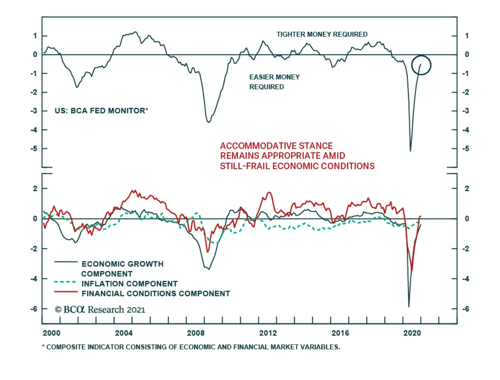
Chairman Jerome Powell maintained the dovish message at the FOMC’s first meeting of the year, emphasizing the dominant need to continue resuscitating the still-frail economy, even in the face of risks from inflationary spikes and financial market instability.…
Highlights The enormous size of US stimulus and overflow of liquidity is creating a thrill akin to riding a tiger. Remarkably, this kind of jubilation is very similar to what EM experienced in 2009-10. That was followed by a lost decade for EM. The US equity and bond markets as well as the economy have grown accustomed to constant stimulus – an addiction that will be very hard to wean off. Due to recurring stimulus, the US will experience asset bubbles and inflation in the real economy. The Fed will fall behind the inflation curve. The resulting downward pressure on the US dollar in the coming years favors EM stocks and fixed-income markets over their US counterparts. Feature Policymakers worldwide and in the US in particular “are riding a tiger”. Congress is authorizing unlimited spending and the government is on a borrowing and spending spree. So far there are no constraints on the ballooning budget deficit. Government bond yields are well behaved. In turn, the Fed is printing limitless money to finance the Treasury and there have been no market or economic constrictions. Share prices are at a record high and credit spreads are very tight. The US dollar is depreciating but it is a benign adjustment for the US because the greenback had been too strong for too long. Chart 1EM's Soft-Budget Constraints In 2009-10 Were Followed By A Decade-Long Hangover
EM's Soft-Budget Constraints In 2009-10 Were Followed By A Decade-Long Hangover
EM's Soft-Budget Constraints In 2009-10 Were Followed By A Decade-Long Hangover
In brief, the enormous size of US stimulus and overflow of liquidity is creating a thrill akin to riding a tiger. Remarkably, this kind of jubilation is very similar to what EM experienced in 2009-10. At the BCA annual conference in New York in 2016, one of the invited speakers – a hedge fund manager – recounted that in 2010, in a private conversation with an investor, Brazilian President Lula da Silva likened ruling Brazil to driving a sports car at high speed in the city with no police around. These were prescient words to describe the situation in Brazil’s economy and financial markets in 2009-10. In 2009-10, Brazil – like many other developing countries – benefited from both the impact of China’s enormous stimulus on commodities prices as well as from foreign capital inflows in part triggered by the Fed’s QE program. In addition, its own government provided sizeable monetary and fiscal stimulus. This stimulus trifecta – emanating from China, the US and local authorities – produced a one-off economic boom and a cyclical bull market in Brazil and other EM countries. Yet, the exuberance was followed by a stagflationary period in Brazil, and later a depression and associated rolling bear markets. Brazil was a poster child for that EM era. The experience of other EM economies was similar and the performance of their financial markets was equally underwhelming. These economies, their leaders, and financial markets wholly enjoyed the stimulus of that period. What followed, however, was a drawn-out hangover that lasted many years: EM ex-China, Korea and Taiwan share prices have been flat for the past 10 years and their currencies were depreciating till last spring (Chart 1). China, the epicenter of epic stimulus in 2009-10, had a similar experience. Its investable ex-TMT stocks, i.e., excluding Alibaba, Tencent and Meituan, are presently at the same level as they were in 2010 (Chart 2). The underlying cause has been a collapse in listed companies’ return on assets (Chart 2, bottom panel). It is essential to emphasize that such poor Chinese equity market performance occurred despite recurring fiscal and credit stimulus from Chinese authorities since 2009 (Chart 2, top panel). As we discussed in detail in a previous report, soft-budget constraints – unlimited stimulus and liquidity overflow – led to complacency, inefficiencies and falling return on capital in EM/China. Chart 3 demonstrates that EM EPS (including China, Korea and Taiwan and their TMT companies) has been flat for 10 years and non-financial companies’ return on assets plunged during the past decade. Chart 2China: "Free Money" Undermined Corporate Efficiency And Profitability
China: "Free Money" Undermined Corporate Efficiency And Profitability
China: "Free Money" Undermined Corporate Efficiency And Profitability
Chart 3EM EPS And Return On Assets: The Lost Decade
EM EPS And Return On Assets: The Lost Decade
EM EPS And Return On Assets: The Lost Decade
Can The US Dismount The Tiger? The US is currently experiencing no budget constraints. US broad money (M2) growth is at a record high both in nominal and real terms (Chart 4). In turn, the fiscal thrust was 11.4% of GDP last year and will remain substantial this year as most of Biden’s stimulus plan is likely to gain approval from Congress. Chart 4Helicopter Money In The US
Helicopter Money In The US
Helicopter Money In The US
Chart 5China Has Not Been Able To Wean Off Stimulus
China Has Not Been Able To Wean Off Stimulus
China Has Not Been Able To Wean Off Stimulus
Such an explosive boom in US money supply and fiscal largess will continue. Even after the pandemic is under control, it will be hard for policymakers to withdraw stimulus. China is a case in point. In the past 10 years, any time Beijing attempted to reduce the stimulus, China’s economic growth downshifted considerably and financial markets sold off (Chart 5, top panel). This forced Chinese policymakers to continuously enact new rounds of stimulus measures. As a result, they have not been able to achieve their goal of stabilizing the credit-to-GDP ratio (Chart 5, bottom panel). Similar dynamics will likely transpire in the US. Having been inflated enormously, US equity and corporate credit markets will be exceptionally sensitive to any policy shifts. US financial markets will riot at any attempt to withdraw monetary or fiscal stimulus. Given how sensitive US policymakers are to selloffs in financial markets, authorities will be extremely reluctant to exit these stimulative policies. Overall, the US equity and bond markets as well as the economy have grown accustomed to constant stimulus – an addiction that will be very hard to wean off. Bottom Line: Riding a tiger is fun. The hitch is that no one can safely get off a tiger. Similarly, US authorities are currently enjoying the exuberance from stimulus, but they will not be able to safely and smoothly dismount. Inflation, Asset Bubbles Or Capital Misallocation? In any system where an explosive money/credit boom persists, the outcome will be one or a combination of the following: inflation, asset bubbles or capital misallocation. Charts 6 and 7 illustrate that rampant money/credit growth in Japan and Korea in the second half of the 1980s produced property and equity market bubbles. Chart 6Japan: Money And Asset Prices
Japan: Money And Asset Prices
Japan: Money And Asset Prices
Chart 7Korea: Money And Asset Prices
Korea: Money And Asset Prices
Korea: Money And Asset Prices
Chart 8Deploying Credit To Capital Spending Could Lead To Deflation
Deploying Credit To Capital Spending Could Lead To Deflation
Deploying Credit To Capital Spending Could Lead To Deflation
In China’s case, the 2009-10 stimulus resulted in a property bubble as well as capital misallocation. Over the years, we have discussed these outcomes in China in detail and will not elaborate on them in this report. The pertinent question is why inflation has remained depressed in China. In fact, bouts of deflation occurred in various industries in China in the past 10 years. One usually associates a money/credit boom with demand exceeding supply resulting in higher inflation. That is correct if money/credit origination finances consumption with little capital expenditures taking place. However, the credit outburst in China enabled a capital spending boom. This led to a greater supply of goods and services, which in many cases exceeded underlying demand. The upshot has been deflation in various goods prices (Chart 8). History does not repeat but it rhymes. Open-ended stimulus in the US will eventually lead to years of economic and financial malaise. The nature of the challenges that the US will face matters not only to US financial markets but also to EM. Odds are that the US will experience asset bubbles and inflation in the real economy. We will not debate whether the US equity market is already in a bubble or not. Suffice it to say that in our opinion, parts of the market are already in a bubble. The main observation we will make in that regard is as follows: the sole way to justify the current broad US equity valuations is to assume that US Treasurys yields will not rise from the current levels. If US bond yields do not rise much, equity prices could hover at a high altitude. However, any mean reversion in US bond yields will deflate American share prices considerably. In turn, the outlook for US bond yields is contingent on the Fed’s willingness to continue with QE. We do not doubt the Fed will continue buying government securities until it faces a significant inflationary threat. Hence, the primary threat to US and global equity prices is inflation. Fertile Grounds For Inflation In The US Odds of inflation rising meaningfully above 2% in the US economy in the next 12-24 months have increased substantially:1 1. A combination of surging money supply and a potential revival in the velocity of money herald higher nominal GDP growth and inflation. It is critical to realize that in contrast to the last decade when the Fed was also undertaking QE programs, US money supply is now skyrocketing, as shown in Chart 4. In the Special Report from October 22 we discussed in depth why US money growth is currently substantially stronger than the post-GFC period. With household income and deposits (money supply) booming due to fiscal transfers funded by the Fed, the only missing ingredient for inflation to transpire is a pickup in the velocity of money. Lets’ recall: Nominal GDP = Price Level x Output Volume = Velocity of Money x Money Supply Solving the above equation for inflation, we get: Price Level = (Velocity of Money x Money Supply) / (Output Volume) Going forward, the velocity of US money will likely recover, for it is closely associated with consumer and businesses’ willingness to spend. At that point, a rising velocity of money and greater money supply will work together to exert upward pressure on nominal GDP and inflation (Chart 9). Chart 9The US: The Velocity Of Money Correlates With Inflation Momentum
The US: The Velocity Of Money Correlates With Inflation Momentum
The US: The Velocity Of Money Correlates With Inflation Momentum
2. Government policies targeting faster growth in employee compensation are conducive to higher inflation. One of the Biden administration’s key priorities is to boost wages and reduce income inequality. Unless productivity growth accelerates considerably in the coming years, odds are that labor’s share in national income will rise and companies’ profit margins will shrink (Chart 10). Businesses will attempt to raise prices to restore their profit margins. Provided income and spending will be strong, companies could succeed in raising their prices. In the US, a modest wage-inflation spiral is probable in the coming years. Chart 10The US: Faster Wage Growth Will Likely Undermine Corporate Profit Margins
The US: Faster Wage Growth Will Likely Undermine Corporate Profit Margins
The US: Faster Wage Growth Will Likely Undermine Corporate Profit Margins
Chart 11US Core Goods Price Inflation Is Accelerating
US Core Goods Price Inflation Is Accelerating
US Core Goods Price Inflation Is Accelerating
3. Demand-supply distortions and shortages will lead to higher prices. The pandemic has distorted supply chains while the overwhelming demand for manufacturing goods has produced shortages of manufacturing goods. US household spending on goods is booming and US core goods prices as well as import prices from emerging Asia and China are rising (Chart 11). In the service sector, lockdowns will permanently curtail capacity in some sectors. Meanwhile, the reopening of the economy will likely release pent-up demand for services, leading to shortages in certain segments. 4. De-globalization – the ongoing shift away from the lowest price producer – entails higher costs of production and, ultimately, higher prices. 5. Higher industry concentration and less competition create fertile grounds for inflation. Over the past two decades, the competitive structure of many US industries has changed – it has become oligopolistic. Due to cheap financing and weak enforcement of anti-trust regulation, large companies have acquired smaller competitors. In many industries, several dominant players now have a substantial market share. Such a high concentration across many industries raises odds of collusion and price increases when the macro backdrop permits. In sum, US inflation will rise well above 2% in the coming years. Inflationary pressures will become evident later this year when the economy opens up. The main and overarching risk to this view is that technology and automation will boost productivity and allow companies to cut or maintain prices despite cost pressures. Conclusions And Investment Strategy As America’s economy normalizes in the second half of this year, US inflationary pressures will begin rising. However, the Fed will fall behind the inflation curve – it will be late to acknowledge the potency of the inflationary pressures and act on it. It is typical for policymakers to downplay a budding new economic or financial tendency when they have long been pre-occupied with the opposite. Policymakers often fight past wars and are slow to calibrate their policy when the setting changes. The Fed falling behind the inflation curve is bearish for the US dollar in the medium and long-term. Share prices will be caught between rising inflationary pressures and the Fed’s continuous dovishness. This could create large swings in share prices: the market will sell off in response to evidence of rising inflation but will rebound after being calmed by the Fed. Eventually, fundamentals will prevail and the next US equity bear market will be due to higher inflation and rising bond yields. Over the coming several years, US share prices and bond yields will be negatively correlated as they were in the second half of the 1960s (Chart 12). Chart 12The 1960-70s: US Treasury Yields And The S&P 500 Were Negatively Correlated
The 1960-70s: US Treasury Yields And The S&P 500 Were Negatively Correlated
The 1960-70s: US Treasury Yields And The S&P 500 Were Negatively Correlated
Chart 13Will Gold Outperform Global Equities?
Will Gold Outperform Global Equities?
Will Gold Outperform Global Equities?
This is not imminent, but it is not several years away either. Inflation could become the market’s focus later this year. Such a backdrop of heightening inflation risks and the Fed falling behind the curve will favor gold over equities – this ratio might be making a major bottom (Chart 13). In this context, we reiterate our trade of being long gold/short EM stocks. For now, global risk assets are extremely overbought and many of them are expensive. In short, they are overdue for a correction. During this setback, EM equities and credit markets will suffer and in the near term could even underperform their respective global benchmarks. In anticipation of such a setback, we have not upgraded EM to overweight. We continue to recommend maintaining a neutral allocation to EM in global equity and credit portfolios. Consistently, the US dollar will rebound because it is very oversold. We continue shorting a basket of EM currencies versus the euro, CHF and JPY. High-risk currencies will underperform low-beta currencies. The EM/China backdrop remains disinflationary. Therefore, fixed-income investors should continue receiving 10-year swap rates in the following EM countries: Mexico, Colombia, Russia, China, Korea, India, and Malaysia. Arthur Budaghyan Chief Emerging Markets Strategist arthurb@bcaresearch.com Footnotes 1 This is the view of BCA’s Emerging Markets team and is different from BCA’s house view. The latter is more benign on the US inflation outlook in the coming years. Equities Recommendations Currencies, Credit And Fixed-Income Recommendations