Policy

Highlights 2021 Model Bond Portfolio Broad Allocations: Translating our 2021 global fixed income Key Views into recommended positioning within our model bond portfolio results in the following conclusions: target a relatively aggressive level of overall portfolio risk, while maintaining a moderately below-benchmark duration exposure alongside overweight allocations to lower-quality global corporate credit, and inflation-linked debt, versus nominal government bonds. Specific Allocation Changes: We are increasing credit spread risk in the US by upgrading our recommended overall US high-yield allocation to overweight, focused on B- and Caa-rated credit tiers, while downgrading US investment grade corporates to neutral. We are also reducing the size of our underweights in euro area corporates and shifting the overall allocation to emerging market USD-denominated credit to overweight. Feature Happy New Year! Just before our holiday break last month, we published our 2021 “Key Views” report, outlining the thematic implications of the BCA 2021 Outlook for global bond markets.1 In this follow-up report, we translate those themes into specific investment recommendations and changes to the allocations in the Global Fixed Income Strategy (GFIS) model bond portfolio. The main takeaways are that the expected global backdrop of improving economic growth momentum, a reduction in coronavirus uncertainty as vaccines are distributed, highly accommodative monetary policy and a weakening US dollar will all provide an additional reflationary lift to global financial markets after a strong H2/2020. That means moderately higher global government bond yields (led by US Treasuries) along with outperformance of growth-related spread product like corporate bonds – specifically in the riskier credit segments like US high-yield and emerging markets (Table 1). Table 1GFIS Model Bond Portfolio Recommended Positioning For The Next Six Months
Our Model Bond Portfolio Strategy For 2021: Leaning Into Reflation
Our Model Bond Portfolio Strategy For 2021: Leaning Into Reflation
A Review Of The 2020 Model Bond Portfolio Performance Before we look ahead to discuss the details of the changes to our model bond portfolio for 2021, we need to take a final look back at the performance of the portfolio in 2020. Chart 12020 Performance: A Positive Year After A Volatile Start
2020 Performance: A Positive Year After A Volatile Start
2020 Performance: A Positive Year After A Volatile Start
Last year, the model bond portfolio delivered a total return (hedged into US dollars) of 5.9%, which outperformed its custom benchmark index by +20bps (Chart 1).2 That moderately solid return was not delivered without some volatility over the course of the year, particularly during the global market tumult last February and March. Over the full year, the government bond portion of the portfolio underperformed the custom benchmark index by -70bps while the spread product segment outperformed by +90bps. The government bond underperformance occurred entirely in the first quarter of the year, as we began 2020 with a recommended below-benchmark global duration stance and an underweight overall allocation to government bonds versus spread product. For a portfolio that is intended to reflect our strategic investment recommendations, the COVID-19 market volatility in Q1/2020 forced us to change our allocations more frequently and aggressively than usual. In early March, we moved to an overweight recommendation on government bonds and underweight on spread product (particular corporate debt) while also shifting the portfolio duration to above-benchmark. That was a large flip from a pro-risk portfolio construction to a defensive one, but which helped claw back some of the severe underperformance in the month of February as government bonds yields plunged and corporate credit spreads surged higher. After the dramatic easing of monetary policy by the major global central banks in March, most notably the US Federal Reserve’s decision to begin buying corporate bonds, we reverted back to a pro-risk stance by upgrading US investment grade credit and Ba-rated high-yield to overweight – positions that were maintained for the rest of 2021. Those US corporate bond exposures alone accounted for essentially all of the spread product outperformance of our model bond portfolio in 2020 (Table 2). Table 2GFIS Model Bond Portfolio Full Year 2020 Overall Return Attribution
Our Model Bond Portfolio Strategy For 2021: Leaning Into Reflation
Our Model Bond Portfolio Strategy For 2021: Leaning Into Reflation
In terms of specific country exposures (Chart 2), our underweight stance on US Treasuries (both in allocation and duration exposure) early in 2020 severely hurt the government bond portion of the portfolio (-76bps of underperformance versus the benchmark). This dwarfed the 2020 outperformance from other countries like Italy (+11bps), Japan (+17bps), and the UK (+5bps). Importantly, our move to allocate out of nominal government bonds to inflation-linked debt in the US, Italy and Canada back in June was a positive contributor on the year, boosting the overall portfolio outperformance by a combined +25bps. Chart 2GFIS Model Bond Portfolio Full Year 2020 Government Bond Performance Attribution
Our Model Bond Portfolio Strategy For 2021: Leaning Into Reflation
Our Model Bond Portfolio Strategy For 2021: Leaning Into Reflation
Within spread product (Chart 3), the biggest gains outside of US investment grade came from UK investment grade (+18bps), euro area investment grade (+12bps) and US CMBS (+11bps). The biggest drags on performance came from underweights in euro area high-yield (-23bps) and US B-rated high-yield (-17bps), as we maintained a relatively cautious stance on those sectors even during the sharp rally in the latter half of 2020 given the lingering risks from COVID-19 and US election year uncertainty. In the end, 2020 proved to be an outstanding year for taking any kind of credit risk, as the majority of spread product sectors in our model bond portfolio universe strongly outperformed government debt. Chart 3GFIS Model Bond Portfolio Full Year 2020 Spread Product Performance Attribution By Sector
Our Model Bond Portfolio Strategy For 2021: Leaning Into Reflation
Our Model Bond Portfolio Strategy For 2021: Leaning Into Reflation
In the end, 2020 proved to be an outstanding year for taking any kind of credit risk, as the majority of spread product sectors in our model bond portfolio universe strongly outperformed government debt (Chart 4). Given our overweight stance toward credit, the year ended on a strong note, with the portfolio delivering +16bps of outperformance in Q4/2020 – the details of which can be found in the Appendix on pages 19-23. Chart 4Ranking The Winners & Losers From The GFIS Model Bond Portfolio Universe In 2020
Our Model Bond Portfolio Strategy For 2021: Leaning Into Reflation
Our Model Bond Portfolio Strategy For 2021: Leaning Into Reflation
Top-Down Bond Market Implications Of Our Key Views As a reminder, the main fixed income investment themes from our 2021 Key Views report were the following: Global growth will accelerate over the course of 2021 as COVID-19 vaccines are distributed and economic confidence improves in response. Longer-term global nominal bond yields should see some upward pressure as growth picks up, with US Treasury yields rising the most. Global real bond yields will stay deeply negative with on-hold central banks actively seeking an inflation overshoot. The US dollar will remain soft in 2021, providing an additional reflationary impulse to the global economy. Lower-quality global credit should outperform against a backdrop that will prove positive for risk assets: easy money policies, improving growth momentum and a reduction in virus-related uncertainty. We now present the specific fixed income investment recommendations that derive from those themes, described along the following lines: overall portfolio risk, overall duration exposure, country allocations within government bonds, yield curve allocations within countries, and corporate credit allocations by country and credit rating. Overall Portfolio Duration Exposure: MODERATELY BELOW BENCHMARK Our Global Duration Indicator, comprised of leading economic growth variables, is already signaling that the direction of global bond yields will be higher in 2021 (Chart 5). Successful distribution of COVID-19 vaccines should eventually add additional upward momentum to global growth as confidence improves later in the year. Even if the vaccine rollout does not go as smoothly as expected, that would put pressure for fiscal stimulus policy responses – especially in the US - that can help sustain economic recoveries. Chart 5Global Bond Yields Will Drift Higher In 2021
Global Bond Yields Will Drift Higher In 2021
Global Bond Yields Will Drift Higher In 2021
Chart 6Stay Below-Benchmark On Overall Duration Exposure
Stay Below-Benchmark On Overall Duration Exposure
Stay Below-Benchmark On Overall Duration Exposure
However, with major central banks like the Fed and ECB likely to keep policy rates unchanged in 2021, so as not to impede a recovery in inflation, any upward lift to bond yields will be moderate and driven overwhelmingly by rising longer-term inflation expectations and not a repricing of future monetary policy tightening. That means developed market yield curves should bearishly steepen, in general, as front-end yields remain anchored. We shifted to a below-benchmark overall portfolio duration stance back at the end of last October, equal to just over 0.5 years of duration versus the custom benchmark index (Chart 6). We are comfortable maintaining that position, in that size, while maintaining a bearish steepening bias to yield curve exposure across all countries in the model portfolio. Government Bond Country Allocation: OVERWEIGHT LOW YIELD BETA MARKETS, OVERWEIGHT PERIPHERAL EUROPE, UNDERWEIGHT THE US In more normal times, we would let our expectations of monetary policy changes guide our recommended government bond country allocations. Yet in 2021, we see almost no chance for any meaningful change in the monetary policy bias of any developed market central bank. Thus, we continue to rely on a “yield beta” framework for making fixed income country allocation decisions in our model bond portfolio. In 2021, we see almost no chance for any meaningful change in the monetary policy bias of any developed market central bank. We expect the largest increase in developed market bond yields in 2021 to occur in the US, thus we recommend favoring countries that have a lower sensitivity to changes in US Treasury yields (i.e. the “yield beta”). The obvious candidates are government bonds in Japan and core Europe, where inflation expectations are likely to see less upward pressure than in the US – especially if the US dollar weakens further (Chart 7). Thus, we begin 2021 by maintaining our existing overweight positions in Germany and France. Chart 7Favor Government Bond Markets Less Correlated To UST Yields In 2021
Favor Government Bond Markets Less Correlated To UST Yields In 2021
Favor Government Bond Markets Less Correlated To UST Yields In 2021
The UK has been transitioning from a high-beta to low-beta bond market in recent years and we do not see that trend turning in 2021. The Bank of England (BoE) will maintain a dovish policy bias this year as the UK economy begins adjusting to the post-Brexit world and a stronger pound will dampen inflation pressures. We also begin 2021 by staying overweight UK gilts in our model portfolio. We anticipate that the Italy-Germany government bond spread will converge to the lower Spain-Germany spread in 2021. Chart 8Stay Overweight Italian Government Bonds
Stay Overweight Italian Government Bonds
Stay Overweight Italian Government Bonds
Australia and Canada are two countries where a high yield beta to US Treasuries would make them ideal underweight candidates in a global bond portfolio this year. However, the Reserve Bank of Australia (RBA) and Bank of Canada (BoC) have instituted aggressive quantitative easing (QE) programs that are designed to dampen increases in government bond yields. As a result of these opposing forces on Australian and Canadian bond yields, we begin 2021 with a neutral allocation to both countries. However, we may shift either or both to an underweight stance if we sense any wavering of the commitment of the RBA or BoC to their QE programs amid improving economic growth. We also expect further declines in the risk premia for Italian government bond yields in 2021. The combination of aggressive ECB government bond purchases, which includes greater buying of BTPs than in years past, and signs of a somewhat more supportive backdrop of fiscal unity within the European Union (the €750bn Recovery Fund) reduce both the sovereign credit risk and “redenomination risk” of a potential euro breakup. We anticipate that the Italy-Germany government bond spread will converge to the lower Spain-Germany spread in 2021 – an outcome that last occurred in 2016 (Chart 8). We are not only maintaining our long-held overweight stance on Italy in our model portfolio, we are increasing the size of the allocation to begin 2021. Inflation-Linked Bond Allocations: MAINTAIN EXPOSURE IN THE US, ITALY AND CANADA; ADD A NEW ALLOCATION TO FRANCE Chart 9Stay Overweight Global Inflation-Linked Bonds
Stay Overweight Global Inflation-Linked Bonds
Stay Overweight Global Inflation-Linked Bonds
Inflation-linked bonds had a strong relative performance versus nominal government debt across the developed markets during the second half of 2020, with breakevens widening even in countries with low realized inflation like France and Australia. Dovish central banks, the reflationary impacts of rising commodity prices (also fueled by US dollar weakness), and the V-shaped recovery in global economic growth from the 2020 COVID-19 recession have all played a role in helping lift breakevens from the depressed levels seen last spring. None of those factors is expected to change during at least the first half of 2021, thus allocations to inflation-linked bonds are still justified in several countries. We are adding a new position in French inflation-linked bonds versus nominal French bonds with breakevens below our model-implied fair value. Our fair value models for 10-year inflation breakevens show that valuations are no longer unequivocally cheap in most countries, but only in Australia do breakevens look much too high relative to underlying fundamental drivers (Chart 9). US TIPS breakevens are approaching levels that would appear “expensive”, defined as at least one standard deviation above fair value, but we still see additional upside as the model implied fair value is also rising. We currently have recommended allocations to inflation-linked bonds in the US, Italy and Canada in our model portfolio, and we are maintaining those positions as we begin 2021. We are adding a new position in French inflation-linked bonds versus nominal French bonds with breakevens below our model-implied fair value. Spread Product Allocation: OVERWEIGHT GLOBAL CORPORATES VERSUS GOVERNMENT BONDS, FOCUSED ON US HIGH-YIELD AND EM Our expectation of a combination of improving global economic growth and persistent reflationary monetary policies is a very positive backdrop for global spread product, most notably corporate bonds. However, valuations across the global corporate debt spectrum are not universally cheap after the strong H2/2020 performance. Thus, we are maintaining only a moderate overall overweight stance on spread product versus government bonds in our model bond portfolio, equal to 5% of the portfolio (Chart 10). At the same time, we recommend taking more relative spread risk within that moderate overweight allocation. This is the way we are balancing the competing forces of a pro-risk backdrop and increasingly stretched valuations in many sectors. The biggest change we are making to the credit side of our model bond portfolio is downgrading US investment grade corporate exposure to neutral while upgrading US high-yield to overweight. As we discussed in our 2021 Key Views report, spread valuation measures are more stretched for higher-rated US investment grade corporate debt compared to junk bonds. Chart 10A Moderate Recommended Overweight To Global Spread Product In 2021
Our Model Bond Portfolio Strategy For 2021: Leaning Into Reflation
Our Model Bond Portfolio Strategy For 2021: Leaning Into Reflation
Combined with a monetary liquidity backdrop that supports the performance of riskier assets like high-yield (Chart 11), we anticipate that US high-yield will be a relatively strong performer within the US credit markets in 2021. Chart 11Upgrade Lower Rated US High-Yield To Overweight
Upgrade Lower Rated US High-Yield To Overweight
Upgrade Lower Rated US High-Yield To Overweight
When looking at the relationship between spread valuation (using our preferred metric of 12-month breakeven spreads) and risk (using a standard measure like duration-times-spread), the lower rated credit tiers of US high-yield stand out as having the most attractive risk/valuation tradeoff (Chart 12). Thus, we are focusing our shift to an overweight stance on US high-yield in our model bond portfolio by increasing the allocations to the B-rated and Caa-rated tiers. Chart 12Comparing Value (Breakeven Spreads) With Risk (Duration Times Spread)
Our Model Bond Portfolio Strategy For 2021: Leaning Into Reflation
Our Model Bond Portfolio Strategy For 2021: Leaning Into Reflation
Outside the US, we are also adding additional spread product exposure by increasing the weightings to euro area high-yield and emerging market USD-denominated sovereign debt. However, we are still maintaining a relatively higher allocation to US high-yield over euro area equivalents, and emerging market USD-denominated corporate debt over sovereigns. The biggest change we are making to the credit side of our model bond portfolio is downgrading US investment grade corporate exposure to neutral while upgrading US high-yield to overweight. Finally, we are entering 2021 with the same relative tilt within US mortgage-backed securities (MBS) we maintained during the latter half of 2020, with an overweight stance on agency commercial MBS and an underweight on agency residential MBS. Overall Portfolio Risk: AGGRESSIVE The net impact of all the changes made to our portfolio allocations is to boost the estimated tracking error – the relative portfolio volatility versus that of the benchmark – from 31bps to 73bps (Chart 13). This is a significant increase in the usage of our portfolio “risk budget”, but the tracking error is still below our self-imposed limit of 100bps. Chart 13Taking A More Aggressive Posture On Overall Portfolio Risk
Taking A More Aggressive Posture On Overall Portfolio Risk
Taking A More Aggressive Posture On Overall Portfolio Risk
Chart 14Boosting Portfolio Yield Through Selective Overweights
Boosting Portfolio Yield Through Selective Overweights
Boosting Portfolio Yield Through Selective Overweights
After maintaining a cautious stance on overall portfolio risk levels in the latter half of 2020, given the persistent uncertainties over the spread of COVID-19 and the US presidential election, we now deem it appropriate to be more aggressive within our model bond portfolio allocations. The pro-risk positioning changes will also boost the overall yield of the model bond portfolio. The greater allocations to riskier spread product sectors leave the portfolio with a yield that begins 2021 modestly higher than that of the benchmark index (Chart 14). Portfolio Scenario Analysis For The Next Six Months After making the shifts to our model bond portfolio allocations, which can all be seen in the tables on pages 24-25, we now turn to scenario analysis to determine the return expectations for the portfolio for the first half of 2021. Table 2AFactor Regressions Used To Estimate Spread Product Yield Changes
Our Model Bond Portfolio Strategy For 2021: Leaning Into Reflation
Our Model Bond Portfolio Strategy For 2021: Leaning Into Reflation
Table 2BEstimated Government Bond Yield Betas To US Treasuries
Our Model Bond Portfolio Strategy For 2021: Leaning Into Reflation
Our Model Bond Portfolio Strategy For 2021: Leaning Into Reflation
On the credit side of the portfolio, we use risk-factor-based regression models to forecast future yield changes for global spread product sectors as a function of four major factors - the VIX, oil prices, the US dollar and the fed funds rate (Table 2A). For the government bond side of the portfolio, we avoid using regression models and instead use a yield-beta driven framework, taking forecasts for changes in US Treasury yields and translating those in changes in non-US bond yields by applying a historical yield beta (Table 2B). For our scenario analysis over the next six months, we use a base case scenario plus two alternate “tail risk” scenarios, based on the following descriptions and inputs: Base Case The current surge of global COVID-19 cases gives way to increased distribution of vaccines. The result is a steady improvement in global growth. Some additional fiscal stimulus is delivered in the US and the larger countries of Europe. Central banks keep their foot on the monetary accelerator with realized inflation moving only modestly higher. The US Treasury curve bear steepens as US inflation expectations continue drifting higher. The VIX index reaches 23, the US dollar depreciates by -5%, oil prices climb +10% and the fed funds rate remains at 0%. Optimistic Scenario The global distribution of COVID-19 vaccines goes smoothly and rapidly, while the current surge in COVID-19 cases fades in the early weeks of 2021. Global growth quickly accelerates on the back of soaring consumer & business confidence. Global fiscal stimulus surprises to upside, while central banks remain super-dovish even as inflation perks up. The US Treasury curve bear-steepens substantially as US inflation expectations steadily increase. The VIX index falls to 18, the US dollar depreciates by -10% in a pro-risk/pro-growth move, oil prices climb +20% and the fed funds rate remains at 0%. Pessimistic Scenario The vaccine rollout is slower than expected, with COVID-19 restrictions remaining in place for longer. Policymakers deliver inadequate new fiscal and monetary stimulus measures to support underwhelming growth. The US Treasury curve bull-flattens as US inflation breakevens plunge. The VIX index soars to 35, the US dollar appreciates by +5%, oil prices plunge -20% and the fed funds rate remains at 0%. The excess return scenarios for the model bond portfolio, using the above inputs in our simple quantitative return forecast framework, are shown in Table 3A. The US Treasury yield assumptions are shown in Table 3B. For the more visually inclined, we present charts showing the model inputs and Treasury yield projections in Chart 15 and Chart 16, respectively. Table 3AGFIS Model Bond Portfolio Scenario Analysis For The Next Six Months
Our Model Bond Portfolio Strategy For 2021: Leaning Into Reflation
Our Model Bond Portfolio Strategy For 2021: Leaning Into Reflation
Table 3BUS Treasury Yield Assumptions For The 6-Month Forward Scenario Analysis
Our Model Bond Portfolio Strategy For 2021: Leaning Into Reflation
Our Model Bond Portfolio Strategy For 2021: Leaning Into Reflation
Chart 15Risk Factor Assumptions For The Scenario Analysis
Risk Factor Assumptions For The Scenario Analysis
Risk Factor Assumptions For The Scenario Analysis
Chart 16US Treasury Yield Assumptions For The Scenario Analysis
US Treasury Yield Assumptions For The Scenario Analysis
US Treasury Yield Assumptions For The Scenario Analysis
The model bond portfolio is expected to deliver an excess return over its performance benchmark during the next six months of +50bps in the base case and +78bps in the optimistic scenario, but is projected to underperform by -37bps in the pessimistic scenario. These are larger expected relative returns than witnessed during the latter half of 2020, consistent with the larger tracking error we are taking entering 2021. Robert Robis, CFA Chief Fixed Income Strategist rrobis@bcaresearch.com Footnotes 1 Please see BCA Global Fixed Income Strategy Weekly Report, "2021 Key Views: Vaccination, Reflation, Rotation," dated December 17, 2020, available at gfis.bcarsearch.com. 2 Our model bond portfolio custom benchmark index is the Bloomberg Barclays Global Aggregate Index, but with allocations to global high-yield corporate debt and USD-denominated emerging market debt replacing very high quality spread product (i.e. AA-rated). We believe this to be more indicative of the typical internal benchmark used by global multi-sector fixed income managers. Appendix Appendix Chart 1Q4/2020 GFIS Model Bond Portfolio Performance
Our Model Bond Portfolio Strategy For 2021: Leaning Into Reflation
Our Model Bond Portfolio Strategy For 2021: Leaning Into Reflation
Appendix Table 1GFIS Model Bond Portfolio Q4/2020 Overall Return Attribution
Our Model Bond Portfolio Strategy For 2021: Leaning Into Reflation
Our Model Bond Portfolio Strategy For 2021: Leaning Into Reflation
Appendix Chart 2GFIS Model Bond Portfolio Q4/2020 Government Bond Performance Attribution
Our Model Bond Portfolio Strategy For 2021: Leaning Into Reflation
Our Model Bond Portfolio Strategy For 2021: Leaning Into Reflation
Appendix Chart 3GFIS Model Bond Portfolio Q4/2020 Spread Product Performance Attribution By Sector
Our Model Bond Portfolio Strategy For 2021: Leaning Into Reflation
Our Model Bond Portfolio Strategy For 2021: Leaning Into Reflation
Appendix Chart 4Ranking The Winners & Losers From The GFIS Model Bond Portfolio In Q4/2020
Our Model Bond Portfolio Strategy For 2021: Leaning Into Reflation
Our Model Bond Portfolio Strategy For 2021: Leaning Into Reflation
Recommendations The GFIS Recommended Portfolio Vs. The Custom Benchmark Index
Our Model Bond Portfolio Strategy For 2021: Leaning Into Reflation
Our Model Bond Portfolio Strategy For 2021: Leaning Into Reflation
Duration Regional Allocation Spread Product Tactical Trades Yields & Returns Global Bond Yields Historical Returns
According to BCA Research’s Global Asset Allocation Strategy service, a rapid rollout of vaccines means that the economy should be on track to return to near-normality by the second half of 2021. Therefore, the key thing for investors to think about is what…
This is US Bond Strategy’s final report of the year. Our regular publication schedule will resume on January 5th with our Portfolio Allocation Summary for January 2021. We wish you a happy, healthy and prosperous new year. Highlights Interest Rate Policy: The Fed has given us a checklist of three criteria that must be met before it will lift rates off the zero bound. After those criteria are met, the pace of the eventual rate hike cycle will be determined by how quickly inflation expectations move back to “well-anchored” levels. We don’t expect Fed liftoff in 2021. Balance Sheet Policy: The Fed will only increase the pace or lengthen the maturity of its asset purchases if the economy or risk assets undergo a significant negative shock in 2021. Absent that, Fed communications in late-2021 will increasingly focus on the eventual tapering of asset purchases. Given the current vague guidance about when tapering will start, a scaled-down repeat of the 2013 Taper Tantrum is possible in late-2021 or 2022. Emergency Lending Facilities: The Fed will not undertake efforts to subvert Congress and re-establish its emergency lending facilities in 2021. However, the absence of the facilities will not have a negative impact on financial markets. Fiscal/Monetary Coordination: Looking beyond 2021, we see the lines between fiscal and monetary policy continuing to blur. The Fed will be increasingly incentivized to dip its toes into the fiscal arena and fiscal policymakers will let it. Feature Chart 1An Eventful Year
An Eventful Year
An Eventful Year
It would be an understatement to say that 2020 was a busy year for the Federal Reserve. The Fed cut rates to the zero bound when the recession struck in March. It also exploded its balance sheet to fresh all-time highs and rolled out brand-new emergency lending facilities to support flagging credit markets (Chart 1). Then, to top it all off, the Fed concluded a Strategic Review of its monetary policy strategy in August and officially adopted an Average Inflation Target. This report touches on the market implications of 2020’s big Fed moves, but its focus is on what the Fed is likely to do in 2021. The first three sections discuss how we see the Fed’s interest rate policy, balance sheet policy and emergency lending facilities evolving next year. The final section considers a longer time horizon as it discusses what might be the next frontier for monetary policy: increased cooperation between monetary and fiscal authorities. Interest Rate Policy With the fed funds rate at its effective lower bound, bond investors will spend 2021 trying to determine the eventual start date and magnitude of the next tightening cycle. This will be especially complicated because the Fed’s adoption of an Average Inflation Target means that old models of its reaction function must be discarded. We discussed the implications of the move toward Average Inflation Targeting in a September Special Report.1 To quickly recap, the Fed made three main changes that will influence our outlook for interest rate policy in 2021. First, the Fed edited its Statement on Longer-Run Goals and Monetary Policy Strategy to include a new interpretation of its price stability mandate. The new Statement reads: In order to anchor longer-term inflation expectations at [2 percent], the Committee seeks to achieve inflation that averages 2 percent over time, and therefore judges that, following periods when inflation has been running persistently below 2 percent, appropriate monetary policy will likely aim to achieve inflation moderately above 2 percent for some time.2 Second, the Fed modified its Statement on Longer-Run Goals and Monetary Policy Strategy to signal that it will rely less on labor market indicators to forecast future inflation. In its old Statement, the Fed talked about minimizing “deviations of employment from the Committee’s assessments of its maximum level.” The revised Statement talks about mitigating “shortfalls of employment from the Committee’s assessment of its maximum level.” In other words, the Fed is saying that it will be less inclined to view an unemployment rate below its estimated natural level (NAIRU) as a signal that inflation is about to accelerate. The Fed’s adoption of an Average Inflation Target means that old models of its reaction function must be discarded. Finally, at the September FOMC meeting, the Fed translated the changes it made to its Statement on Longer-Run Goals and Monetary Policy Strategy into more explicit guidance about when it will consider lifting rates off the zero bound. That guidance is as follows: … it will be appropriate to maintain this target range until labor market conditions have reached levels consistent with the Committee’s assessments of maximum employment and inflation has risen to 2 percent and is on track to moderately exceed 2 percent for some time.3 The Timing Of Liftoff Table 1A Checklist For Liftoff
The Fed In 2021
The Fed In 2021
Digging into the new guidance, we identify three criteria for lifting rates off the zero bound (Table 1). First, the unemployment rate must reach levels consistent with the Committee’s assessments of NAIRU. Currently, those estimates range from 3.5% to 4.5% (Chart 2). Practically, we view this as the least important of the three criteria. NAIRU estimates are revised based on what happens with inflation, and the Fed has already acknowledged that it is now less inclined to view a sub-NAIRU unemployment rate as an inflationary signal. In short, if inflation were to rise sustainably above 2% with the unemployment rate still at 5%, the Fed would simply revise up its NAIRU estimates and begin the rate hike cycle. Chart 2Criteria For Lifting Rates
Criteria For Lifting Rates
Criteria For Lifting Rates
The Fed’s second criterion for lifting rates is also the most specific. Inflation must rise to 2 percent before the Fed will consider hiking rates. In a recent speech, Fed Vice-Chair Richard Clarida said he interprets this to mean that 12-month PCE inflation must be at least 2% before the Fed will consider hiking (Chart 2, bottom panel).4 This is helpful for bond investors. We can be certain that no rate hikes will occur at least until 12-month PCE inflation reaches 2%. Finally, the Fed also wants to be certain that inflation is “on track to moderately exceed 2 percent for some time.” This means that the event of 12-month PCE reaching 2% won’t automatically lead to a rate increase. The Fed must also view inflation gains as sustainable. This will likely become an issue in the first half of 2021 when we know that base effects will push 12-month PCE sharply higher, possibly even above 2%. However, we also know that those gains will be short lived.5 Of course, the Fed also knows about the impact of base effects and it will look past any temporary jump in inflation in H1 2021. More generally, while we advise investors to not pay much attention to the Fed’s NAIRU estimates, the unemployment rate will play a role in the Fed’s determination of whether above-2% inflation is sustainable. That is, the Fed is more likely to view above-2% inflation as sustainable if the unemployment rate is 4% than it is if the unemployment rate is 6%. What Does The Market Think? The bond market has been quick to price-in the big shift in the Fed’s interest rate guidance. At present, the overnight index swap curve is priced for a single 25 basis point rate hike in mid-2023 and only one more by mid-2024 (Chart 3). We see a good chance that the Fed’s three liftoff criteria are met before then, a view that forms the basis of our below-benchmark portfolio duration recommendation for 2021.6 In addition, the New York Fed’s Survey of Market Participants shows that only 43% of respondents expect liftoff before the end of 2023 and only 31% before the end of 2022 (Table 2A). This is further evidence that bond yields have room to rise if it looks like the Fed’s three liftoff criteria will be met in 2022 or the first half of 2023. Finally, the New York Fed’s survey shows that market participants understand the Fed’s three liftoff criteria and that differences in opinion about the timing of liftoff reflect differences in views about the economic outlook, not differences in understanding the Fed’s reaction function. The bulk of survey respondents think that the unemployment rate will be between 3.5% and 4.2% (consistent with the Fed’s NAIRU estimates) and that 12-month PCE inflation will be between 2.2% and 2.5% at the time of liftoff (Table 2B). Chart 3The Fed May Lift Rates Sooner Than Markets Expect
The Fed May Lift Rates Sooner Than Markets Expect
The Fed May Lift Rates Sooner Than Markets Expect
Table 2ALiftoff Expectations
The Fed In 2021
The Fed In 2021
Table 2BMarkets Understand The Fed’s Guidance
The Fed In 2021
The Fed In 2021
The Pace Of Tightening And Why We’re Watching Inflation Expectations We’ve seen the three criteria upon which the Fed will condition its decision to hike rates off the zero bound. But the timing of liftoff is not the only thing that bond investors need to consider. We also need to get a sense of how quickly rate hikes will proceed once the next tightening cycle begins. According to the Fed’s interest rate guidance, even after liftoff the Fed will seek to maintain accommodative monetary conditions until it has achieved its price stability goal under its new Average Inflation Target. Recall that this goal is defined as achieving “inflation that averages 2 percent over time”. This is somewhat vaguer than the Fed’s liftoff guidance. Over what time period should we seek to hit average 2% inflation? One option is to start calculating the average when the new regime was adopted in August. In that case, average PCE inflation is running at 0.96%, well below 2%. Alternatively, we could calculate average inflation since the Fed last cut rates to zero in March 2020 (1.50%) or average inflation since the Fed cut rates to zero in December 2008 (1.43%). The point is that the Fed has not given us a clearly defined target. Differences in opinion about the timing of liftoff reflect differences in views about the economic outlook. For this reason, it’s important for bond investors to understand why the Fed has shifted to an Average Inflation Target. The reason has to do with trying to re-anchor inflation expectations. Box 1 shows an example of an Expectations-Augmented Phillips Curve, the Fed’s go-to framework for thinking about inflation. As the accompanying quote from Janet Yellen explains, the Fed thinks about inflation’s long-run trend as being driven by expectations. Shocks to economic slack and import prices can cause inflation to deviate from its long-run trend, but expectations drive the trend itself. This makes it critical for a central bank to keep expectations well anchored near its inflation target. Box 1The Expectations-Augmented Phillips Curve (aka The Fed’s Inflation Model)
The Fed In 2021
The Fed In 2021
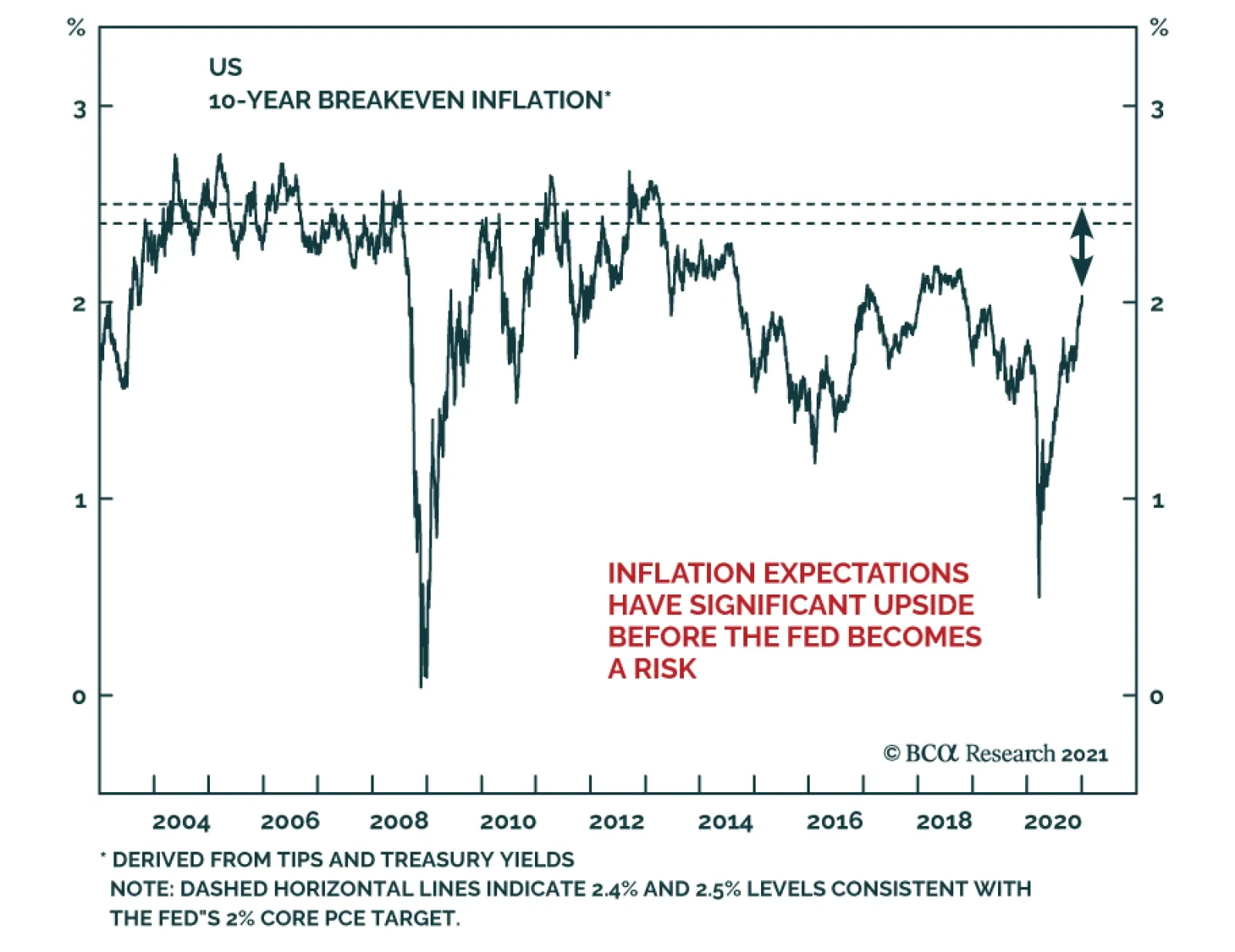
This is the underlying rationale for the Fed’s Average Inflation Target. The Fed has observed that inflation expectations have been too low in recent years. In the Fed’s model, this signals that inflation’s long-run trend has shifted down. In order to get expectations back up to target, the Fed understands that it will probably need to accept a period of above-target inflation. Since economic agents have just experienced a long period of sub-2% inflation, it will probably require a significant period of above-2% inflation before their expectations sustainably shift higher.7 To sum it all up, the Fed will seek to keep monetary conditions accommodative, and thus supportive for risk assets, until inflation expectations are deemed to be re-anchored. At that point, monetary policy will shift to a neutral or restrictive stance and risk asset performance will be challenged. But don’t just take our word for it. Here is what Vice-Chair Clarida said in a recent speech (referenced above): It is important to note, however, that the goal of the new framework is to keep inflation expectations well anchored at 2 percent, and, for this reason, I myself plan to focus more on indicators of inflation expectations themselves – especially survey-based measures – than I will on the calculation of an average rate of inflation over any particular window of time. It is clear that inflation expectations will dictate the eventual pace of Fed tightening. But the question of what measure of inflation expectations to track remains unresolved. Measures of inflation expectations fall into three main categories: Market-based measures Survey measures Trend measures Market-based measures are derived from inflation-linked bonds. Specifically, we derive TIPS breakeven inflation rates for different time horizons by taking the difference between a nominal yield and TIPS yield of the same maturity. In this publication, we often refer to the 10-year and 5-year/5-year forward TIPS breakeven inflation rates and have found that a range of 2.3% to 2.5% has historically been consistent with periods when inflation expectations were deemed “well anchored” (Chart 4A). One potential issue with using market-based measures of inflation expectations is that TIPS prices can sometimes move around for reasons unrelated to changing inflation expectations. That is, regulations or broader portfolio diversification concerns could change the risk premium an investor is willing to accept from TIPS, even if that investor’s underlying inflation view is unchanged. Academics have made attempts to solve this problem by using affine term structure models to decompose yields into various components. Chart 4B presents one such model from D’Amico, Kim and Wei (DKW).8 The DKW model splits the TIPS breakeven inflation rate (or inflation compensation) into an inflation expectation, a liquidity premium that compensates investors for the lower liquidity in TIPS compared to nominal Treasuries and an inflation risk premium that represents the extra compensation investors require to take inflation risk. We are skeptical of the usefulness of affine term structure models. In general, these models have too few inputs to reliably generate the components they purport to measure. However, the Fed clearly pays some attention to the DKW decomposition. If a future increase in TIPS breakeven inflation rates is driven entirely by movement in the liquidity or inflation risk premium components, it would be reasonable to question whether the Fed will react. Chart 4AInflation Expectations: Market-Based Measures
The Fed In 2021
The Fed In 2021
Chart 4BA Decomposition Of TIPS##br## Breakevens
The Fed In 2021
The Fed In 2021
Survey measures of inflation expectations are exactly that: Responses from surveys, usually of professional forecasters or households (Chart 4C). One drawback of survey measures compared to market-based measures is that they are updated less frequently. Another is that survey respondents, particularly households, may only be able to distinguish very large swings in prices. That said, the Fed tracks a wide range of survey measures and they were even singled out by Vice-Chair Clarida as being particularly important in the above quote. Trend inflation measures are statistical measures of the trend in the actual PCE or CPI inflation data. Chart 4D shows both a very simple trend measure, the 10-year annualized rate of change, and a slightly more complex trend measure based on an exponential smoothing rule. Academics have developed even more complex trend inflation measures.9 The logic behind these measures is that expectations tend to adapt only slowly to changes in the actual inflation data. Chart 4CInflation Expectations: Survey Measures
The Fed In 2021
The Fed In 2021
Chart 4DInflation Expectations: Trend Measures
The Fed In 2021
The Fed In 2021
Finally, we should point out a relatively new measure that the Fed will be using to track inflation expectations going forward. It is called the Common Inflation Expectations Index and it is a composite of 21 different survey and market-based inflation measures (Chart 4E), no trend inflation measures are included.10 Chart 4EIntroducing The Common Inflation Expectations Index
The Fed In 2021
The Fed In 2021
To summarize, the Fed has given us a checklist of three criteria that must be met before it will lift rates off the zero bound. After those criteria are met, the pace of the eventual rate hike cycle will be determined by how quickly inflation expectations move back to levels that are considered “well anchored”. Once that happens, the Fed will no longer have an incentive to keep monetary conditions accommodative and risk asset performance will be challenged. Charts 4A-4E in this report provide a wide array of different measures of inflation expectations to monitor. We will keep an eye on all of them, but in particular, we will track the Common Inflation Expectations Index’s progress back to 2.1% and the 5-year/5-year forward TIPS breakeven inflation rate’s progress back to a range of 2.3%-2.5%. While we don’t expect the Fed’s rate hike criteria to be met in 2021, a 2022 liftoff is possible if the COVID vaccine spurs a rapid economic recovery. However, we do expect that, in 2021, the market will start to price-in an earlier liftoff date and quicker pace of tightening than is currently discounted, thus pushing bond yields higher. The Financial Conditions Wildcard Chart 5Financial Conditions
Financial Conditions
Financial Conditions
Our base case view is that the eventual pace of Fed tightening will be determined by inflation expectations. However, there is one wildcard that could cause the Fed to abandon its inflation expectations goal and tighten policy earlier. That wildcard is financial conditions. Presently, financial asset valuations are a mixed bag (Chart 5). Corporate bond spreads are tight, but not at all-time expensive levels. Equity P/E ratios are very elevated, but equities don’t look expensive compared to bonds. If these valuations stay relatively stable, the Fed will continue to rely on inflation expectations to guide the pace of tightening. However, if inflation expectations take a long time to rise, it is conceivable that such a long period of low interest rates could lead to historically stretched financial asset valuations. In short, if inflation doesn’t return within the next couple of years, the Fed may have to tighten policy to take the wind out of an asset bubble that might otherwise burst and lead to an economic recession. We stress that we are not yet close to this point and that the bar for the Fed to abandon its inflation goal will be very high, but we would place financial conditions alongside inflation expectations as the two most important variables to monitor to assess the eventual pace of Fed tightening. Balance Sheet Policy With the funds rate pinned at zero and the Fed’s interest rate guidance essentially set in stone, changes to the pace and composition of asset purchases are the principal tool that the Fed will use to provide more or less immediate monetary accommodation in 2021. The Fed is currently purchasing $80 billion of Treasuries and $40 billion of Agency MBS each month, with Treasury purchases spread out across the yield curve. If this pace and distribution of Treasury purchases is maintained in 2021, the Fed will end up purchasing less and less of the Treasury flow. The Treasury Department has a stated policy goal of increasing the average maturity of the outstanding debt and it has been pursuing that goal by raising the amount of coupon issuance at the expense of bills. The Treasury has already given us its planned coupon issuance schedule for Q4 2020 and Q1 2021. Chart 6 shows that net Fed coupon purchases will gradually decline as a percentage of gross issuance, assuming the Treasury follows through with its plan and the Fed’s balance sheet policy is unchanged. Chart 6The Path For Treasury Supply And Fed Demand
The Fed In 2021
The Fed In 2021
Can The Fed Do More? … Will The Fed Do More? It is possible that the Fed will use its balance sheet to provide more monetary easing in 2021. There are two ways it could do this. First, it could simply increase the monthly pace of asset purchases. Alternatively, it could keep the same pace of purchases but shift Treasury buying toward the long-end of the curve. The idea here would be to prevent long-dated yields from rising too quickly. One or both of these changes could happen in 2021, but only if the economy experiences a negative growth shock or risk asset prices (equities and corporate credit) fall significantly. In that case, the Fed will want to be seen as responding to a negative shock, but absent that, the Committee seems comfortable with its current balance sheet strategy. Chart 7Rate-Sensitive Sectors Have Recovered
Rate-Sensitive Sectors Have Recovered
Rate-Sensitive Sectors Have Recovered
Some have suggested that, even if the economic recovery stays on track, the Fed will try to use its balance sheet to lean against rising long-maturity bond yields. We doubt this. First, it is not obvious that the Fed would be able to stop the 10-year Treasury yield from rising to a range of, say, 1.25% to 1.5% by increasing bond purchases in that maturity range by a few billion dollars. As long as the Fed’s interest rate guidance is unchanged, the market’s interest rate expectations will continue to exert a powerful influence on bond yields across the entire curve. Unless the Fed announces a cap on long-dated bond yields, and pledges to buy enough securities to enforce that cap, we are skeptical about the effectiveness of just changing the quantity of asset purchases. Second, it is also not clear that a 10-year Treasury yield between 1.25% and 1.5%, in the context of a steepening yield curve and improving economic growth, would be a problem for either the economy or risk assets. In fact, these sorts of environments tend to be very positive for risk asset performance.11 It is only when the Fed is shifting to a more restrictive monetary policy stance and the yield curve is flattening that bond yields start to exert a negative influence on the economy and risk assets. Even if the Fed is not worried about a moderate bear-steepening of the Treasury curve, a case could be made for providing more easing right now in order to spur a quicker recovery. This question was posed to Chair Powell several times at the last FOMC press conference. In response, Powell noted that the sectors of the economy that are most sensitive to interest rates – residential investment and consumer spending on durable goods – have already recovered (Chart 7). The lagging sectors of the economy – particularly consumer spending on services – cannot recover until the COVID vaccine is widely distributed, irrespective of the level of interest rates. In our view, this is an acknowledgement that the Fed does not see much value in trying to provide further accommodation through the balance sheet channel. All in all, our base case scenario is that the Fed will maintain its current pace and maturity distribution of asset purchases throughout 2021. However, it will increase the pace and/or lengthen the maturity if there is a significant shock to the economy and/or financial markets. Later in 2021, if the recovery stays on track, Fed communications will increasingly take up the issue of when it will be appropriate to taper its pace of asset purchases. The Exit From Asset Purchases And The Possibility Of A Taper Tantrum Chart 8Remember The Taper Tantrum
Remember The Taper Tantrum
Remember The Taper Tantrum
The Fed has already given us a timeline for how it will wind down its asset purchases. According to the minutes from the November FOMC meeting, most participants support a timeline where the Fed will start tapering its pace of asset purchases sometime before the first rate hike. It will then begin lifting interest rates and will stop purchases altogether sometime after that. At the December FOMC meeting, the Fed gave us additional guidance on when it will start the tapering process. Unfortunately, this guidance is quite vague and only confirms the fact that tapering will start before the liftoff date. Specifically, the Fed said that tapering will begin when “substantial further progress has been made toward the Committee’s maximum employment and price stability goals.” Because the guidance around the timing of the tapering process is quite vague, we think it’s possible that it could sneak up on investors and lead to a sharp upward re-adjustment in rate hike expectations, and thus a bond sell-off. In essence, a tamer version of the 2013 Taper Tantrum is possible in late-2021 or 2022. On May 22, 2013, Fed Chair Ben Bernanke explained the Fed’s plan to eventually start tapering its asset purchases. Because investors took this to mean that the rate hike cycle would start much sooner than anticipated, the bond market underwent a sharp re-adjustment. The market quickly went from pricing-in only 35 bps of rate hikes over the next 24 months to 116 bps, and Treasury returns fell precipitously as a result (Chart 8). The Fed has learned a few lessons about communications since then, and it will do its best to keep market expectations aligned with its own strategy. However, unless firmer guidance is provided about when tapering will begin, the risk of a hawkish surprise around the tapering announcement remains. Bottom Line: The Fed will only increase the pace or lengthen the maturity of its asset purchases if the economy or risk assets undergo a significant negative shock in 2021. Absent that, Fed communications in late-2021 will increasingly focus on the eventual tapering of asset purchases. Given the current vague guidance about when tapering will start, a scaled-down repeat of the 2013 Taper Tantrum is possible in late-2021 or 2022. Emergency Lending Facilities In addition to cutting rates to zero and massively scaling up the size of its balance sheet, the Fed also responded to the COVID recession by launching a slew of emergency lending facilities, some re-treads from the financial crisis and some brand new. Facilities to support the corporate bond market (The Primary and Secondary Market Corporate Credit Facilities) and the Municipal Liquidity Facility were particularly successful at capping bond spreads versus Treasuries, even if their actual usage was quite low. In fact, corporate bond spreads peaked on the very day that the Fed announced its corporate credit facilities in March (Chart 1). More recently, however, Treasury Secretary Steve Mnuchin refused to authorize the continuation of most of the Fed’s emergency lending facilities beyond the end of the year. We wrote in November that, even with the Treasury taking back the funds used to set up the facilities, the Fed could re-launch them in 2021 if incoming Treasury Secretary Janet Yellen provides her approval.12 However, a late addition to the recently passed fiscal stimulus package appears to prohibit the re-authorization of the facilities without Congressional approval. At the time of publishing, we have not been able to see the details of the new provision, so there remains some uncertainty about what the Fed can and cannot do in this regard. Credit spreads are no longer trading at distressed levels, primary issuance markets are functioning properly, and the Fed’s facilities have hardly been used at all. Nonetheless, while the new bill raises interesting questions about Fed independence in the long-run, we doubt that markets will respond negatively to the absence of the Fed’s emergency facilities in 2021. Credit spreads are no longer trading at distressed levels, primary issuance markets are functioning properly, and the Fed’s facilities have hardly been used at all (Table 3). Table 3Usage Of The 2020 Federal Reserve Emergency Lending Facilities
The Fed In 2021
The Fed In 2021
In short, we don’t see the Fed going out of its way to re-establish the facilities in 2021 because it will become clear that they are no longer needed. The Next Regime Shift In Fed Policy: Fiscal/Monetary Coordination The adoption of an Average Inflation Target represents a major regime shift in Federal Reserve policy. In the final section of this report, we expand our horizon beyond 2021 and speculate about what the next major regime shift for the Fed might be. The 2020 recession made two things crystal clear. First, traditional fiscal policy becomes essentially impotent once interest have been reduced to the zero-lower-bound. Once there, Fed policy is most impactful when it focuses on lending to the private sector. Lending to the private sector through an emergency lending facility is an act that blurs the distinction between monetary and fiscal policy. This was made abundantly clear by Congress’ recent push to legislate the Fed’s activities in this arena. Second, it is difficult for fiscal policy to act quickly enough during an economic downturn. While the CARES act was delivered in a timely manner, it has taken many months to pass a follow-up bill. The Fed’s independence allows it to act immediately when it is economically necessary, while Congress’ increasing polarization makes swift action a challenge. If we take these two observations to their logical conclusion, and throw in the strong chance that the traditional channels of monetary policy will be increasingly blocked in the future as rates bump up against zero, it seems to us that the strict separation of responsibilities between fiscal and monetary policymakers will fade over time. More specifically, greater time spent at the zero-lower-bound will incentivize the Fed to get more and more creative with its quasi-fiscal private lending facilities. Further, Congress will be more than happy to allow this encroachment as it finds itself unable to respond effectively in times of crisis. Of course, this will also lead to periodic push-back as some members of Congress fret about the Fed’s over-reach, but we expect this push-back will be the exception rather than the rule. Greater time spent at the zero-lower-bound will incentivize the Fed to get more and more creative with its quasi-fiscal private lending facilities. In fact, the best idea might be for fiscal and monetary policymakers to join together proactively to craft programs that can be deployed during the next recession. One example of such an idea was recently presented by Julia Coronado and Simon Potter.13 Coronado and Potter’s idea relies on the use of instant payment processing technology (which the Fed is already working on) to create digital accounts at the Federal Reserve for every household. Once those accounts are in place, the federal government could issue Recession Insurance Bonds, zero coupon bonds with some pre-determined face value, and grant one bond to every household in the country. Then, during the next economic downturn, the Fed could decide to do a “people’s QE” where it buys all the Recession Insurance Bonds leaving every household with a direct cash payment equal to the face value of the bond. This scheme directly addresses the two main problems we named earlier. It is fiscal policy, not monetary policy, so it can still be effective at the zero-lower-bound. Also, Congress can take its time to deliberate on the bill that authorizes the creation of the Recession Insurance Bonds, as this can be done proactively during a period of economic recovery. Then, the Fed can use its ability to move quickly during the next downturn to “activate” the bonds and deliver the fiscal stimulus that Congress actually passed years earlier. While likely not a story for 2021, we see increased cooperation between monetary and fiscal policymakers as the next big regime shift for the Fed. Ryan Swift US Bond Strategist rswift@bcaresearch.com Footnotes 1 Please see US Bond Strategy / Global Fixed Income Strategy Special Report, “A New Dawn For US Monetary Policy”, dated September 1, 2020, available at usbs.bcaresearch.com 2 https://www.federalreserve.gov/monetarypolicy/guide-to-changes-in-statement-on-longer-run-goals-monetary-policy-strategy.htm 3 https://www.federalreserve.gov/monetarypolicy/files/monetary20200916a1.pdf 4 https://www.federalreserve.gov/newsevents/speech/clarida20201116a.htm 5 For a more complete discussion of our 2021 inflation outlook please see “BCA Outlook 2021: A Brave New World”, dated November 30, 2020, available at bca.bcaresearch.com 6 Please see US Bond Strategy Special Report, “2021 Key Views: US Fixed Income”, dated December 15, 2020, available at usbs.bcaresearch.com 7 This is the theory of adaptive expectations and we use it to model changes in the 10-year TIPS breakeven inflation rate. For further details please see US Bond Strategy Weekly Report, “How Are Inflation Expectations Adapting?”, dated February 11, 2020, available at usbs.bcaresearch.com 8 https://www.federalreserve.gov/econres/notes/feds-notes/tips-from-tips-update-and-discussions-20190521.htm 9 Fed Governor Lael Brainard references several of these trend measures in this recent speech: https://www.federalreserve.gov/newsevents/speech/brainard20201021a.htm&…; 10 More details on how this aggregate measure is constructed can be found here: https://www.federalreserve.gov/econres/notes/feds-notes/index-of-common-inflation-expectations-20200902.htm 11 For more details on how corporate credit performs during different yield curve environments please see US Bond Strategy Special Report, “2021 Key Views: US Fixed Income”, dated December 15, 2020, available at usbs.bcaresearch.com 12 Please see US Bond Strategy Weekly Report, “Preparing For A Dark Winter … But Do Markets Care?”, dated November 24, 2020, available at usbs.bcaresearch.com 13 https://www.piie.com/publications/policy-briefs/reviving-potency-monetary-policy-recession-insurance-bonds
Highlights The ongoing pandemic underscores the need for fiscal and monetary policymakers to continue to provide a reflationary “bridge” until vaccination ends the threat to the health care system. The pending deal being discussed between US congressional negotiators is not perfect, but it is likely to be a credible extension of the US fiscal bridge and it clarifies the path from the near-term growth outlook (which is negative), to the cyclical outlook (which is positive). The surprisingly strong euro area flash services PMI in December likely reflects the quick removal of restrictions that may soon need to be reimposed. European leaders will either need to provide additional fiscal support to their economies if the strain on the health care system does not soon relent, or economic activity will have to become increasingly dependent on external demand. China’s credit impulse has likely peaked, but economic activity will continue to accelerate in the first half of 2021 and will positively contribute to global growth. Our baseline view is that credit tightening in China will not lead to a meaningful drag on global growth in the second half of next year, but the history of policy “oversteering” in China means that the risks of a policy overkill cannot be ruled out. A likely extension of the reflationary bridge in the US coupled with strengthening Chinese demand has meaningfully reduced the odds of a deflationary outcome over the next year. Extreme technical conditions suggest that a moderate correction in stocks is possible in the first quarter, but the next significant episode of risk-off sentiment should be bought rather than sold. Investors should position in favor of risky assets over a 6-12 month horizon. Feature Our recently published 2021 Outlook report laid out the main macroeconomic themes that we see driving markets next year, as well as our cyclical investment recommendations. In this month’s report we briefly discuss the nearer-term outlook for growth through the lens of fiscal policy. Still Some Way To Go Chart I-1Slowing Economic Activity In Developed Economies
Slowing Economic Activity In Developed Economies
Slowing Economic Activity In Developed Economies
Over the very near term, growth will remain unavoidably linked to the dynamics of the COVID-19 pandemic. The second/third wave of infections that began in September has forced the re-imposition of restrictions in most European countries, as well as in some US states. High-frequency economic indicators clearly show that the European economy contracted in Q4 (Chart I-1), whereas in the US the slowdown has so far been less pronounced. The US economy continued to expand in the fourth quarter with the Atlanta Fed GDPNow model projecting 11% annualized growth, driven heavily by a sizeable change in private inventories (Chart I-2). Chart I-2US Q4 Growth Is Set To Be Large, But Driven Mostly By Inventories
January 2021
January 2021
The relationship between the pandemic and the economy has shifted since the spring. Back then, the rapid spread of the disease and the mostly unknown nature of the virus triggered a forceful response from policymakers. Widespread restrictions on movement and economic activity were imposed to stem the spread. However, those measures came at a high economic and social cost. With economic activity still running far below pre-pandemic levels and an increasingly weary and resistant public, policymakers have become highly reluctant to re-impose aggressive measures. As a driver of policy, the key consideration is the extent of pressure on medical systems. Chart I-3 highlights the situation in Europe. Daily ICU occupancy exploded in several European countries in October, which led to the new restrictions at the end of that month. In the US, COVID-19 hospitalizations are now nearly twice as high as they were in April and July, and for now many new state-level restrictions are not mandatory. But New York City’s mayor noted earlier this week that a “full shutdown” was likely following Christmas, highlighting that many parts of the US may be facing meaningfully tighter restrictions in the weeks ahead if the pace of new infections does not level off. Chart I-4 presents an estimate of the COVID-19 reproduction value (“R-naught”) in the US and in advanced economies outside the US, which highlights that it is too soon to confidently project a peak. Even outside the US, where restrictions have recently been tighter and progress has been made at reducing the number of intensive care patients, the reproduction number has crept back above one after some restrictions were loosened. Chart I-3Europe Reintroduced Lockdowns Because Of Pressure On The Medical System
Europe Reintroduced Lockdowns Because Of Pressure On The Medical System
Europe Reintroduced Lockdowns Because Of Pressure On The Medical System
Chart I-4Too Soon To Project A Peak In Cases
Too Soon To Project A Peak In Cases
Too Soon To Project A Peak In Cases
A Credible Extension Of The US Reflationary Bridge The ongoing pandemic underscores the need for fiscal and monetary policymakers to continue to provide a reflationary “bridge” until vaccination ends the threat to the health care system. Currently, health experts project that this is unlikely to occur before late spring or mid-year. Earlier this year, fiscal authorities around the world built a massive reflationary bridge to support household income while stay-at-home orders were in place. However, the effect of that stimulus has waned – at least for some income groups. In the US, Chart I-5 highlights that unemployment insurance payments have fallen by more than suggested by the decline in continuing jobless claims. Post-election surveys have suggested that a vast majority of Americans felt another economic assistance package was needed, with most reporting that it should occur before inauguration.1 Overall income remains higher than its pre-pandemic baseline (Chart I-6), but aggregate figures mask white collar/blue collar divergences. Many white-collar employees saw a substantial increase in their savings this year as their spending declined and income held up (due to their ability to work from home), whereas blue-collar and low-wage service workers found themselves dependent on government assistance. While the deployment of white-collar savings is likely to eventually support blue-collar and low-wage worker income, it is unlikely that this will occur while significant pandemic restrictions remain in place. Chart I-5The Stimulative Effect Of The CARES Act Has Waned
The Stimulative Effect Of The CARES Act Has Waned
The Stimulative Effect Of The CARES Act Has Waned
Chart I-6Overall Income Is ''Normal'', But This Masks Large Differences Across The Income Spectrum
Overall Income Is ''Normal'', But This Masks Large Differences Across The Income Spectrum
Overall Income Is ''Normal'', But This Masks Large Differences Across The Income Spectrum
That reality motivated the COVID relief deal that is reportedly under discussion between US congressional negotiators. The deal – as described in the financial media as we go to press – likely excludes state & local support, but it also likely includes a new round of stimulus checks, some funding for unemployment insurance recipients, and cash for small businesses, health-care providers, and schools. The deal, which we expect to be passed over the course of the next week, is not perfect but it is a credible extension of the US fiscal bridge and it clarifies the path from the near-term growth outlook (which is negative), to the cyclical outlook (which is positive). Chart I-7State & Local Government Support Is Needed In The New Year
State & Local Government Support Is Needed In The New Year
State & Local Government Support Is Needed In The New Year
The issue of state & local funding will be important to return to in the new year following Joe Biden’s inauguration. Persistent state & local government austerity following the global financial crisis acted as a significant drag on US economic growth (Chart I-7). Nonetheless, one-month delay to state & local government fiscal assistance is less problematic than a delay in extending unemployment insurance payments, given the pending expiry of the remaining CARES act unemployment programs on Dec. 26. Europe’s Bridge Is Shakier In Europe, the need for additional fiscal support is higher than in the US, given that activity contracted this quarter. While the December flash euro area services PMI showed surprising strength, this likely reflects the quick removal of restrictions that we noted may soon need to be reimposed. European economies responded very forcefully this year to the pandemic when all response measures are considered, but less so in many important economies when focusing only above-the-line measures – i.e., new spending and foregone government revenue – to the exclusion of equity injections, loans, and guarantees. Based on this metric, Chart I-8 shows that the UK and Germany have provided a response that is in line with the advanced economy average, whereas most other European countries have lagged. Chart I-9 highlights that this year’s economic rebound in Spain and Italy has been aided by Germany’s stronger fiscal response, as evidenced by intra-euro area trade balances. Chart I-8The Fiscal Response Of Many European Countries Has Lagged
January 2021
January 2021
Chart I-9Germany's Fiscal Stimulus Supported The Euro Area's Recovery
Germany's Fiscal Stimulus Supported The Euro Area's Recovery
Germany's Fiscal Stimulus Supported The Euro Area's Recovery
Funds from the European Recovery and Resilience Facility (“RRF”) have yet to be deployed and they will eventually act to support euro area economic activity. However, outlays from the fund next year are expected to be small. Given that this month’s ECB actions were aimed at simply maintaining easy financial conditions,2 European leaders will either need to provide additional fiscal support to their economies if the strain on the health care system does not soon relent, or economic activity will have to become increasingly dependent on external demand. China: Adding To Global Growth, For Now Chart I-10China Will Boost Euro Area Economic Activity Next Year
China Will Boost Euro Area Economic Activity Next Year
China Will Boost Euro Area Economic Activity Next Year
Fortunately for Europe (and advanced economies more generally), the external demand outlook is bright – for now. Euro area exports to China are strongly predicted by China’s credit impulse lagged by 9 months, and are set to rise materially (Chart I-10). China’s aggressive – and comparatively early – response to the pandemic will thus contribute meaningfully to global growth in the first half of 2021, and could obviate the need for further European fiscal stimulus if restrictions there are not reinstituted. China is likely to provide a significantly smaller boost to global growth in the second half of next year, as policymakers have already begun to mop up excess liquidity. Chart I-11 highlights that China’s credit impulse has consistently followed a 3½-year cycle since 2010, and this year has been no different. This cycle is not exogenous or mystical; it has been caused by the repeated “oversteering” of activity by Chinese policymakers who frequently oscillate between the need to fight deflation and the strong desire to curb additional private-sector leveraging. The chart suggests that an inflection point in this cycle’s upswing has been reached, which is consistent with the view of BCA’s China strategists that the credit cycle has peaked. A peak in China’s credit impulse does not mean that China’s contribution to global growth is about to slow. Global industrial production continued to accelerate following a peak in China’s credit impulse for at least six months in the lead-up to the last two global economic slowdowns (Chart I-12). But the chart also shows that a slowdown in global activity did occur following China’s impulse peak in both cases, especially when the impulse fell below its average of 28½% of GDP. Chart I-11China's Credit Cycle Has Peaked, Right On Schedule
China's Credit Cycle Has Peaked, Right On Schedule
China's Credit Cycle Has Peaked, Right On Schedule
Chart I-12DM Economies Continue To Grow Following A Peak In China's Credit Cycle
DM Economies Continue To Grow Following A Peak In China's Credit Cycle
DM Economies Continue To Grow Following A Peak In China's Credit Cycle
Our baseline view is that credit tightening in China will bring the impulse down to approximately 30% of GDP in 2021, which is still above its average of the past decade. This suggests that China will not contribute as much to global demand in the second half of the year, but will not be an actual drag. Still, the history of policy “oversteering” in China means that the risk of a policy overkill cannot be ruled out. Investors should closely watch for signs of increased hawkishness emanating from China’s National People’s Congress in March. Conclusions And Portfolio Recommendations Cyclically, as we highlighted in our 2021 Outlook, developed market (DM) economies are likely to experience above-trend growth, low inflation, and accommodative monetary policy next year. China’s economic cycle is running ahead of the DM world and Chinese growth will eventually moderate, but is still set to accelerate in the first half of the year. A likely extension of the reflationary bridge in the US coupled with strengthening Chinese demand meaningfully reduces the odds of a deflationary outcome over the next year, in the sense that consumers, businesses, and investors are much more likely to view any near-term lockdown-driven impacts on growth as necessarily temporary. This de-risks the path to a post-pandemic economy and increases our conviction in a cyclically-bullish stance towards risk assets. We continue to recommend that in 2021 global investors should: Favor stocks versus bonds; Maintain below-benchmark portfolio duration; Position for corporate bond spread tightening; Favor commodities; and Expect a continued decline in the US dollar. Chart I-13US Equities Are Vulnerable To A Moderate Correction
US Equities Are Vulnerable To A Moderate Correction
US Equities Are Vulnerable To A Moderate Correction
Over the very near-term, Chart I-13 shows that US equities are potentially vulnerable to a moderate tactical correction. US stocks are very richly valued, and investors may use signs of modest delays in the immunization campaign, a failure of the US Congress to provide support for state & local governments, or inadequate fiscal support in Europe as an excuse to sell. A moderate correction, on the order of 5-7%, is possible in the first quarter. The question for investors is whether the next significant episode of risk-off sentiment should be bought or sold. Given the ongoing impact of very easy monetary policy on equity multiples and the high likelihood of a significant earnings recovery, we are strongly inclined towards the former, barring any substantial shift in the timeline to mass vaccination. Equity returns will be lower in 2021 than in 2020, but are very likely to be positive and beat those offered by government securities. Jonathan LaBerge, CFA Vice President The Bank Credit Analyst December 18, 2020 Next Report: January 28, 2021 II. The Modern-Day Phillips Curve, Future Inflation, And What To Do About It Many investors feel that the Phillips Curve has failed to predict weak inflation over the past decade. But this perception is due to a singular focus on the economic slack component of the modern-day version of the curve to the exclusion of inflation expectations, and a failure to fully consider the lasting impact of sustained periods of a negative output gap on those expectations. In addition, many investors tend to downplay the long-term balance sheet impact of two episodes of excesses and savings/capital misallocations on the relationship between the stance of monetary policy and the output gap, via a persistently negative shock to aggregate demand and a reduced sensitivity of economic activity to interest rates. The COVID-19 pandemic was certainly a major economic shock. But for now, it seems like this was a sharp income statement recession, not a balance-sheet recession. This fact, along with lower odds of negative supply-side shocks and several structural factors, suggest that inflation will be higher over the next ten years than it has over the past decade. Investors looking to protect against potentially higher inflation should look primarily to commodities, cyclical stocks, and US farmland. Gold is likely to remain well supported over the coming few years, but rich valuation suggests the long-term outlook for the yellow metal is poor. A hybrid TIPS/currency portfolio has historically been strongly correlated with the price of gold, and may provide investors with long-term protection against inflation – at a better price. Introduction Chart II-1A Surge In Long-Dated Inflation Expectations
A Surge In Long-Dated Inflation Expectations
A Surge In Long-Dated Inflation Expectations
The pandemic, and the corresponding fiscal and monetary response is challenging the low-inflation outlook of many market participants. Chart II-1 highlights that long-dated market-based inflation expectations have surged past their pre-COVID levels after collapsing to the lowest-ever level in March. The shift in thinking about inflation has partly been a response to an extraordinary rise in government spending in many countries. But Chart II-1 shows that long-dated expectations in the US were mostly trendless from April to June as Federal support was distributed, and instead rose sharply in July and August in the lead-up to the Fed’s official shift to an average inflation targeting regime. This new dawn for US monetary policy has been prompted not just by the pandemic, but also by the extended period of below-target inflation over the past decade. In this report, we review how the past ten-year episode of low inflation can be successfully explained through the lens of the expectations-augmented (i.e. “modern-day”) Phillips Curve. Many investors fail to fully appreciate the impact that inflation expectations have on driving actual inflation, as well as the cumulative impact of two major capital and savings misallocations over the past 25 years on the responsiveness of demand to interest rates and on the level of inflation expectations. Using the modern-day Phillips Curve as a guide, we present several reasons in favor of the view that inflation will be higher over the next decade than over the past ten years. Finally, we conclude with an assessment of several ways for investors to protect their portfolios from rising inflation. Revisiting The “Modern-Day” Phillips Curve The original Phillips Curve, as formulated by New Zealand economist William Phillips in the late 1950s, described a negative relationship between the unemployment rate and the pace of wage growth. Given the close correlation between wage and overall price growth at the time, the Phillips Curve was soon extended and generalized to describe an inverse relationship between labor market slack and overall price inflation. Chart II-2Rising Unemployment And Inflation Challenged The Original Phillips Curve
Rising Unemployment And Inflation Challenged The Original Phillips Curve
Rising Unemployment And Inflation Challenged The Original Phillips Curve
However, the experience of rising inflation alongside high unemployment from the late 1960s to the late 1970s underscored that prices are also importantly determined by inflation expectations and shocks to the supply-side of the economy (Chart II-2). In the 1980s and 1990s, the Federal Reserve’s success at reigning in inflation was achieved not only by raising interest rates to punishingly high levels, but also by sharply altering consumer, business, and investor expectations about future prices. The experience of the late 1960s and 1970s led to a revised form of the Phillips Curve, dubbed the “expectations-augmented” or “modern” version. As an equation, the modern Phillips Curve is described today by Fed officials, in terms of core inflation, as follows: πct = β1πet + β2πct-1 + β3πct-2 - β4SLACKt + β5IMPt + εt where: πct = Core inflation today πet = Expectations of inflation πct-n = Lagged core inflation SLACKt = Slack in the economy IMPt = Imported goods prices εt = Other shocks to prices Described verbally, this framework suggests that “economic slack, changes in imported goods prices, and idiosyncratic shocks all cause core inflation to deviate from its longer-term trend that is ultimately determined by long-run inflation expectations.3” This framework can easily be extended to headline inflation by adding changes in food and energy prices. In most formal models of the economy in use today, the modern Phillips Curve is combined with the New Keynesian demand function to describe business cycles: Yt = Y*t – β(r-r*) + εt where: Yt = Real GDP Y*t = Real potential GDP r = The real interest rate r* = The neutral rate of interest εt = Other shocks to output This equation posits that differences in the real interest rate from its neutral level, along with idiosyncratic shocks to demand, cause real GDP to deviate from potential output. Abstracting from import prices and idiosyncratic shocks, these two equations tell a simple and intuitive story of how the economy generally works: The stance of monetary policy determines the output gap and, The output gap, along with inflation expectations, determine inflation. The Modern-Day Phillips Curve: The Pre-2000 Experience This above view of inflation and demand was strongly accepted by investors before the 2008 global financial crisis, but the decade-long period of generally below-target inflation has caused a crisis of faith in the idea of the Phillips Curve. Charts II-3 and II-4 show the historical record of the New Keynesian demand function and the modern-day Phillips Curve, using five-year averages of the data in question to smooth out the impact of short-term and idiosyncratic effects. We use nominal GDP growth as our long-run proxy for the neutral rate of interest,4 the US Congressional Budget Office’s (CBO) estimate of potential GDP to determine the output gap, and a proprietary measure of inflation expectations based on an adaptive expectations framework5 (Chart II-5). Chart II-3With Just Two Exceptions, Monetary Policy Strongly Explained Demand Before 2000
With Just Two Exceptions, Monetary Policy Strongly Explained Demand Before 2000
With Just Two Exceptions, Monetary Policy Strongly Explained Demand Before 2000
Chart II-4Similarly, Pre-2000 The Output Gap Generally Explained Unexpected Inflation
Similarly, Pre-2000 The Output Gap Generally Explained Unexpected Inflation
Similarly, Pre-2000 The Output Gap Generally Explained Unexpected Inflation
Chart II-3 shows that until 1999, the stance of monetary policy was highly predictive of the output gap over a five-year period, with just two exceptions where major structural forces were at play: the late 1970s, and the second half of the 1990s. In the case of the former, the disruptive effect of persistently high inflation negatively impacted output growth despite easy monetary policy, and in the latter case, economic activity was modestly stronger than what interest rates would have implied due to the beneficial impact of the technologically-driven productivity boom of that decade. Similarly, Chart II-4 shows that until 1999 there was a good relationship between the output gap and the deviation in inflation from expectations, again with the late 1970s and late 1990s as exceptions. Along with the beneficial supply-side effects of the disinflationary tech boom, persistent import price weakness (via dollar strength) seems to have also played a role in suppressing inflation in the late 1990s (Chart II-6). Chart II-5The Expectations Component Of The Modern Phillips Curve, Visualized
The Expectations Component Of The Modern Phillips Curve, Visualized
The Expectations Component Of The Modern Phillips Curve, Visualized
Chart II-6A Strong Dollar Also Played A Role In Suppressing Inflation During The 1990s
A Strong Dollar Also Played A Role In Suppressing Inflation During The 1990s
A Strong Dollar Also Played A Role In Suppressing Inflation During The 1990s
The Modern-Day Phillips Curve Post-2000 Following 2000, deviations between the monetary policy stance, the output gap, and inflation become more prominent, particularly after 2008. As we will illustrate below, these deviations are more apparent on the demand side. In the case of inflation, the question should be why inflation was not even lower in the years immediately following the global financial crisis. On both the demand and inflation side, these deviations are explainable, and in a way that helps us determine future inflation. Charts II-7 and II-8 show the same series as in Charts II-3 and II-4, but focused on the post-2000 period. From 2000-2007, Chart II-8 shows that the relationship between the output gap and the deviation in inflation from expectations was not particularly anomalous. The output gap was negative from the end of the 2001 recession until the beginning of 2006, and inflation was correspondingly below expectations on average for the cycle. Chart II-7Post-2000, The Output Gap Decoupled From The Monetary Policy Stance
Post-2000, The Output Gap Decoupled From The Monetary Policy Stance
Post-2000, The Output Gap Decoupled From The Monetary Policy Stance
Chart II-8Since The GFC, The Real Mystery Is Why Inflation Has Been So Strong
Since The GFC, The Real Mystery Is Why Inflation Has Been So Strong
Since The GFC, The Real Mystery Is Why Inflation Has Been So Strong
Chart II-7 shows that the anomaly during that cycle was in the relationship between the output gap and the stance of monetary policy. Monetary policy was the easiest it had been in two decades, yet the output gap was negative for several years following the recession. Larry Summers pointedly cited this divergence in his revival of the secular stagnation theory in November 2013, arguing that it was strong evidence that excess savings were depressing aggregate demand via a lower neutral rate of interest and that this effect pre-dated the financial crisis. Why was demand so weak during that period? Chart II-9 compares the annualized per capita growth in the expenditure components of GDP during the 2001-2007 expansion to the 1991-2001 period. The chart shows that all components of GDP were lower than during the 1991-2001 period, with investment – the most interest rate sensitive component of GDP – showing up as particularly weak. On the surface, this supports the idea of structural factors weighing heavily on the neutral rate, rendering monetary policy less easy than investors would otherwise expect. But Chart II-9 treats the 2001-2007 years as one period, ignoring what happened over the course of the expansion. Chart II-10 repeats the exercise shown in Chart II-9 from Q1 2001 to Q3 2005, and highlights that the annualized growth in per capita residential investment was much stronger than it was during the 1991-2001 period – and nonresidential fixed investment was much weaker. Spending on goods was roughly the same, which is impressive considering that the late 1990s experienced a productivity boom and robust wage growth. All the negative contribution to growth from residential investment during the 2001-2007 expansion came after Q3 2005, as the housing market bubble burst in response to rising interest rates. In short, Chart II-10 highlights that there was a strong relationship between easy monetary policy and the demand for housing, but that this was not true for the corporate sector. Chart II-9Looking At The Whole 2001-2007 Period, Investment Was Extremely Weak
January 2021
January 2021
Chart II-10Housing Absolutely Responded To Easy Monetary Policy
January 2021
January 2021
Explaining Weak CAPEX Growth In The Early 2000s This leads us to ask why CAPEX was so weak during the 2001-2007 period. In addition to changes in interest rates, business investment is strongly influenced by expectations of consumer demand and corporate profitability. Chart II-11 shows that real nonresidential fixed investment and as-reported earnings moved in lockstep during the period, and that this delayed corporate-sector recovery also impacted the pace of hiring. Weak expectations for consumer spending do not appear to be the culprit. Chart II-12 highlights that while real personal consumption expenditure growth fell during the recession, spending did not contract (as it had done during the previous recession) and capital expenditures fell much more than what real PCE would have implied. Chart II-11Post-2001, Persistently Weak Profits Led To Weak Investment And Jobs Growth
Post-2001, Persistently Weak Profits Led To Weak Investment And Jobs Growth
Post-2001, Persistently Weak Profits Led To Weak Investment And Jobs Growth
Chart II-12CAPEX Was Much Weaker In 2002 Than Justified By Consumer Spending
CAPEX Was Much Weaker In 2002 Than Justified By Consumer Spending
CAPEX Was Much Weaker In 2002 Than Justified By Consumer Spending
Instead, persistently weak CAPEX in the early 2000s appears to be best explained by the damaging impact of corporate excesses that built up during the dot-com bubble. The Sarbanes-Oxley Act of 2002 was passed in response to a series of corporate accounting frauds that came to light in the wake of the bubble, but in many cases had been occurring for several years. Chart II-13 highlights that widespread write-offs badly impacted earnings quality and the growth in the asset value of equipment and intellectual property products (IPP), both of which only began to improve again in early 2003. This occurred alongside an outright contraction in real investment in IPP as investors lost faith in company financial statements and heavily scrutinized corporate spending. Chart II-14highlights that a contraction in IP spending was a huge change from the double-digit pace of growth that occurred in the late 1990s. Chart II-13The Damaging Impact Of Corporate Excesses
The Damaging Impact Of Corporate Excesses
The Damaging Impact Of Corporate Excesses
Chart II-14A Near-Unprecedented Collapse In IPP Investment Followed The Tech Bubble
A Near-Unprecedented Collapse In IPP Investment Followed The Tech Bubble
A Near-Unprecedented Collapse In IPP Investment Followed The Tech Bubble
In addition, corporate sector indebtedness also appears to have played a role in driving weak investment in the early 2000s. While the interest burden of nonfinancial corporate debt was not as high in 2000 as it was in the early 1990s, Chart II-15 highlights that debt to operating income surged in the late 1990s – which likely caused investors already skeptical about company financial statements to impose a period of elevated capital discipline on corporate managers following the recession. Chart II-16 shows that while the peak in the 12-month trailing corporate bond default rate in January 2002 was similar to that of the early 90s, it was meaningfully higher on average in the lead-up to and following the recession. Chart II-15The Late-1990s Saw A Major Increase In Corporate Debt
The Late-1990s Saw A Major Increase In Corporate Debt
The Late-1990s Saw A Major Increase In Corporate Debt
Chart II-16Above-Average Corporate Defaults Before And After The 2001 Recession
Above-Average Corporate Defaults Before And After The 2001 Recession
Above-Average Corporate Defaults Before And After The 2001 Recession
To summarize, Charts II-10-16 underscore that management excesses, governance failures, and elevated debt in the corporate sector in the 1990s were the root cause of the seeming divergence between monetary policy and the output gap from 2001 to 2007. This was, unfortunately, the first of two major savings/capital misallocations that have occurred in the US over the past 25 years. Explaining The Post-GFC Experience In the early 2000s, the Federal Reserve was faced with a decision between two monetary policy paths: one that was appropriate for the corporate sector, and one that was appropriate for the household sector. The Fed chose the former, and it inadvertently contributed to the second major savings/capital misallocation to occur over the past 25 years: the enormous debt-driven bubble in US housing that culminated into the global financial crisis (GFC) of 2007-2009. Chart II-17It Is No Mystery Why Demand And Inflation Were Weak Last Cycle
It Is No Mystery Why Demand And Inflation Were Weak Last Cycle
It Is No Mystery Why Demand And Inflation Were Weak Last Cycle
As a result, 2007 to 2013/2014 was a mirror image of the early 2000s. Unlike previous post-war downturns, the GFC precipitated a balance-sheet recession that deeply affected homeowners and the financial system. This lasting damage led to a multi-year household deleveraging process, which substantially lowered the responsiveness of the economy to stimulative monetary policy. On a year-over-year basis, Chart II-17 shows that total nominal household mortgage credit growth was continuously negative for six and a half years, from Q4 2008 until Q2 2015, underscoring that the large divergence during this period between the stance of monetary policy and the output gap should not, in any way, be surprising to investors. And this is even before accounting for the negative impact of the euro area sovereign debt crisis and double-dip recession, or the persistent fiscal drag in nearly every advanced economy last cycle. What is surprising about the post-GFC experience is that inflation was not substantially weaker than it was, which is ironic considering that the secular stagnation narrative was revived to help explain below-target inflation. Chart II-8 showed that actual inflation steadily improved versus expected inflation alongside the closing of the output gap and the decline in the unemployment rate, but that it was much stronger than the output gap would have implied – particularly during the early phase of the economic recovery. It is still an open question as to why this occurred. A weak dollar and a strong recovery in oil prices likely helped support consumer prices, but we doubt that these two factors alone explain the discrepancy. A more credible answer is that expectations stayed very well anchored due to the Fed’s strong record of maintaining low and stable inflation (thus preventing a disinflationary spiral). In addition, the fact that the Fed actively communicated to the public during the early recovery years that a large part of its objective was to prevent deflation may have helped support prices. For example, in a CBS interview following the Fed’s November 2010 decision to engage in a second round of quantitative easing (“QE2”), then-Chair Bernanke prominently tied the decision to the fact that “inflation is very, very low.” When asked whether additional rounds of easing might be required, Bernanke responded that it was “certainly possible” and again cited inflation as a core consideration. Chart II-18Rising US Oil Production Caused The Massive 2014 Oil Price Shock
Rising US Oil Production Caused The Massive 2014 Oil Price Shock
Rising US Oil Production Caused The Massive 2014 Oil Price Shock
While inflation did not ultimately fall relative to expectations post-GFC as much as the output gap would have implied, the long-lasting weakness in demand left expectations vulnerable to exogenous shocks. In 2014, such a shock occurred: oil prices collapsed almost exactly at the point that US tight oil production crossed the four-million-barrels-per-day mark (Chart II-18), a level of output that many experts had previously believed would not be attainable (or would roughly mark the peak in production). We view this event as a truly exogenous shock to prices, given that research & development of shale technology had been ongoing since the late 1970s and only happened to finally gain traction around 2010. Chart II-19 shows that the 2014 oil price collapse caused a clear break lower in our measure of inflation expectations, to the lowest value recorded since the 1940s. This break also occurred in market-based expectations of inflation, such as long-dated CPI swap rates and TIPS breakeven inflation rates, and surveys of consumer inflation expectations (Chart II-20). This decline in inflation expectations meant that the output gap needed to be above zero in order for the Fed to hit its 2% target (absent any upwards shock to prices), and that the meaningful acceleration of inflation from 2016 to 2018 should actually be viewed as inflation “outperformance” because its long-term trend had been lowered by the earlier downward shift in expectations. Chart II-19The 2014 Oil Price Shock Collapsed Inflation Expectations...
The 2014 Oil Price Shock Collapsed Inflation Expectations...
The 2014 Oil Price Shock Collapsed Inflation Expectations...
Chart II-20...No Matter What Inflation Expectations Measure Is Used
...No Matter What Inflation Expectations Measure Is Used
...No Matter What Inflation Expectations Measure Is Used
The Modern-Day Phillips Curve: Key Takeaways Based on the evidence presented above, we see the perceived “failure” of the Phillips Curve to predict weak inflation over the past decade as being due to: A singular focus on the output gap/slack component of the modern Phillips Curve, to the exclusion of expectations A failure to fully consider the lasting impact of sustained periods of a negative output gap on expectations Downplaying the long-term balance-sheet impact of two episodes of excesses and savings/capital misallocations on the relationship between the stance of monetary policy and the output gap, via a persistently negative shock to aggregate demand and a reduced sensitivity of economic activity to interest rates. One crucial takeaway from the modern-day Phillips Curve equation presented above is that if inflation expectations are largely formed based on the experience of past inflation, then inflation is ultimately determined by three dimensions of the output gap: whether it is rising or falling, whether it is above or below zero, and how long it has been above or below zero. The extended period of below-potential output over the past two decades, accelerated recently by a major negative shock to energy prices, has now lowered inflation expectations to a point that merely reaching the Fed’s target constitutes inflation “outperformance.” This realization, made even more urgent by the COVID-19 pandemic, has strongly motivated the Fed’s official shift to an average inflation targeting regime. That shift does not suggest that the Fed is moving away from the modern-day Phillips Curve framework; rather, the Fed’s new policy is aimed at closing the output gap as quickly as possible in order to prevent a renewed decline in inflation expectations (and thus inflation itself) from another long period of activity running below its potential. The Outlook For Inflation While the Fed has shifted its policy to prefer higher inflation, that does not necessarily mean it will get it. Why is it likely to happen this time, if the last economic cycle featured such a large divergence between monetary policy and the output gap? Chart II-21Above-Target Inflation Is Not Imminent
Above-Target Inflation Is Not Imminent
Above-Target Inflation Is Not Imminent
First, to clarify, we do not believe that above-target inflation is imminent. The COVID-19 pandemic was an extreme event, and even given the very substantial recovery in the labor market, the unemployment rate remains almost 2½ percentage points above the Congressional Budget long-run estimate of NAIRU (Chart II-21). But based on our analysis of the modern-day Phillips Curve presented above, there are at least four main reasons to expect that inflation may be higher on average over the next ten years than over the past decade. Reason #1: This Appears To Be A Sharp Income Statement Recession, Not A Balance-Sheet Recession We highlighted above the importance of savings/capital misallocations in driving a gap between monetary policy and the output gap over the past two decades, but this recession was obviously not sparked by such an event. The onset of the pandemic came following a long period of US household sector deleveraging which, while painful, helped restore consumer balance sheets. Chart II-22 highlights that household debt to disposable income had fallen back to 2001 levels at the onset of the pandemic, and the interest burden of debt servicing had fallen to a 40-year low. From a wealth perspective, Chart II-23 highlights that total household liabilities to net worth have fallen below where they were at the peak of the housing market boom in 2005 for almost all income groups, and that a decline in leverage has been particularly noteworthy for the lowest income group since mid-2016. Chart II-22Households Have Repaired Their Balance Sheets...
Households Have Repaired Their Balance Sheets...
Households Have Repaired Their Balance Sheets...
Chart II-23...Across Almost All Income Brackets
...Across Almost All Income Brackets
...Across Almost All Income Brackets
Total credit to the nonfinancial corporate sector rose significantly relative to GDP over the course of the last cycle, but subpar growth in real nonresidential fixed investment and a rise in share buybacks highlight that this debt went largely to fund changes in capital structure rather than increased productive capacity. Chart II-24 highlights that corporate sector interest payments as a percentage of operating income are low relative to history, and they do not seem to be necessarily dependent on extremely low government bond yields.6 Finally, the corporate bond default rate may have already peaked (Chart II-25) and the percentage of jobs permanently lost looks more like 2001 than 2007 (Chart II-26), signaling that a prolonged balance-sheet recession is unlikely. Chart II-24Corporate Sector Debt Is Currently High, But Affordable
Corporate Sector Debt Is Currently High, But Affordable
Corporate Sector Debt Is Currently High, But Affordable
Chart II-25Corporate Defaults Have Already Peaked
Corporate Defaults Have Already Peaked
Corporate Defaults Have Already Peaked
Chart II-26So Far, Permanent Job Losses Look Like The 2001 Recession, Not 2007/2008
So Far, Permanent Job Losses Look Like The 2001 Recession, Not 2007/2008
So Far, Permanent Job Losses Look Like The 2001 Recession, Not 2007/2008
The bottom line is that while the pandemic has not yet been resolved and that major and permanent economic damage cannot be ruled out, the absence of “balance-sheet dynamics” is likely to eventually lead to a stronger responsiveness of demand for goods and services to what is set to be an extraordinarily easy monetary policy stance for at least another two years. Reason #2: The Fed May Be Able To Jawbone Inflation Higher The Fed’s public commitment to set interest rates in a way that will generate moderately above-target inflation is highly reminiscent of its defense of quantitative easing in the early phase of the last economic expansion, and (in the opposite fashion) of Paul Volker’s campaign in the 1980s against the “self-fulfilling prophecy” of inflation. From 2008-2014, the Fed explicitly linked the odds of future bond buying to the pace of actual inflation in its public statements. On its own, this was not enough to cause inflation to rise, but we highlighted above that it may have contributed to the fact that inflation expectations did not collapse. Chart II-1 on page 12 showed that long-dated market-based expectations for inflation have already been impacted by the Fed’s regime shift, suggesting decent odds that Fed policy will contribute to self-fulfilling price increases if the US economy does indeed avoid “balance-sheet dynamics” as a result of the pandemic. Reason #3: The Odds Of Negative Supply Shocks Are Lower Than In The Past We noted above the impact that energy price shocks and large typically exchange-rate driven changes in import prices can have on inflation, with the 2014 oil price collapse serving as the most vivid recent example. On both fronts, a value perspective suggests that the odds of negative shocks to inflation over the coming few years from oil and the dollar are lower than they have been in the past. Chart II-27 shows that the cost of global energy consumption as a share of GDP has fallen below its median since 1970, and Chart II-28 highlights that the US dollar is comparatively expensive relative to other currencies – which raises the bar for further gains. Stable-to-higher oil prices alongside a flat-to-weak dollar implies reflationary rather than disinflationary pressure. Chart II-27Massive, Downward Shocks To Oil Prices Are Now Less Likely
Massive, Downward Shocks To Oil Prices Are Now Less Likely
Massive, Downward Shocks To Oil Prices Are Now Less Likely
Chart II-28Valuation Favors A Declining Dollar, Which Is Inflationary
January 2021
January 2021
Reason #4: Structural Factors In addition to the cyclical arguments noted above, my colleague Peter Berezin, BCA’s Chief Global Strategist, has also highlighted several structural arguments in favor of higher inflation. Chart II-29 highlights that the world support ratio, calculated as the number of workers relative to the number of consumers, peaked early last decade after rising for nearly 40 years. This suggests that output will fall relative to spending the coming several years, which should have the effect of boosting prices. Chart II-30 also highlights that globalization is on the back foot, with the ratio of trade-to-output having moved sideways for more than a decade. Since the early 1990s, rising global trade intensity has corresponded with very low goods prices in many countries, and the end of this trend reduces the impact of a factor that has been weighing on consumer prices globally over the past two decades. Chart II-29Less Production Relative To Consumption Is Inflationary
Less Production Relative To Consumption Is Inflationary
Less Production Relative To Consumption Is Inflationary
Chart II-30Trade Is Not Suppressing Prices As Much As It Used To
Trade Is Not Suppressing Prices As Much As It Used To
Trade Is Not Suppressing Prices As Much As It Used To
Positioning For Eventually Higher Inflation Below we present an assessment of several potential candidates across the major asset classes that investors can use to protect their portfolios from rising inflation once it emerges. We conclude with a new trade idea that may provide investors with inflation protection at a better valuation profile than more traditional inflation hedges. Fixed-Income Within fixed-income, inflation-linked bonds and derivatives (such as CPI swaps) are the obvious choice for investors seeking inflation protection. Inflation-linked bonds are much better played relative to nominal equivalents, as inflation expectations make up the difference between nominal and inflation-linked yields. But Table II-1 shows that 5-10 year TIPS are also likely to provide positive absolute returns over the coming year even in a scenario where 10-year Treasury yields are rising, so long as real yields do not account for the vast majority of the increase. Barring a major and positive change in the long-term economic outlook over the coming year, our sense is that the Fed would act to cap any outsized increase in real yields and that TIPS remain an attractive long-only option until the Fed becomes sufficiently comfortable with the inflation outlook. Table II-1TIPS Will Earn Positive Absolute Returns Next Year Barring A Surge In Real Yields
January 2021
January 2021
Commodities Commodities are arguably the most traditional inflation hedge, and are likely to provide investors with superior risk-adjusted returns in an environment where inflation expectations are rising. Our Commodity & Energy Strategy service is positive on gold, and recently argued that Brent crude prices are likely to average between $65-$70/barrel between 2021-2025.7 Chart II-31Gold Is Expensive And Long-Term Returns May Be Poor
Gold Is Expensive And Long-Term Returns May Be Poor
Gold Is Expensive And Long-Term Returns May Be Poor
One caveat about gold is that, unlike oil prices, it appears to be quite expensive relative to its history. Since gold does not provide investors with a cash flow, over time real (or inflation-adjusted) prices should ultimately be mean-reverting unless real production costs steadily trend higher. Chart II-31 highlights that the real price of gold is already sky-high and well above its historical average. Over a ten-year time horizon, gold prices fell meaningfully following the last two occasions where real gold prices reached current levels, suggesting that the long-term outlook for gold returns is poor. However, over the coming few years, gold prices are likely to remain well supported given our economic outlook, the Fed’s new monetary policy regime, and the consistently negative correlation between real yields and the US dollar and gold prices. As such, we would recommend gold as a hedge against the fear of inflation, which is likely to increase over the cyclical horizon. Equities We provide two perspectives on how equity investors may be able to protect themselves against rising inflation. The first is simply to favor cyclical versus defensive sectors. The former is likely to continue to benefit next year in response to a strengthening economy as COVID-19 vaccines are progressively distributed, and historically cyclical sectors have tended to outperform during periods of rising inflation. In addition, my colleague Anastasios Avgeriou, BCA’s Equity Strategist, presented Table II-2 in a June Special Report,8 and it highlights that cyclical sectors (plus health care) have enjoyed positive relative returns on average during periods of rising inflation. Table II-2S&P 500 Sector Performance During Inflationary Periods
January 2021
January 2021
The second strategy is to favor companies that are more likely to successfully pass on increasing prices to their customers (i.e., firms with “pricing power”). Pricing power is a difficult attribute to identify, but one possible approach is to select industries that have experienced above-average sales per share growth over the past decade. While it is true that the past ten years have seen low rather than high inflation, it has also seen firms in general struggle to achieve robust top-line growth. Industries that have succeeded in this environment may thus be able to pass on higher costs to their customers without disproportionately suffering from lower sales. Chart II-32Last Decade's Revenue Winners: Potential Pricing Power Candidates
Last Decade's Revenue Winners: Potential Pricing Power Candidates
Last Decade's Revenue Winners: Potential Pricing Power Candidates
Chart II-32 presents the historical relative performance of these industries in the US plus the materials and energy sector, equally-weighted and compared to an equally-weighted industry group portfolio (level 2 GICS). The chart shows that the portfolio has outperformed steadily over the past decade, although admittedly at a slower pace since 2018. An interesting feature of this approach is that, in addition to including industries within the industrials, consumer discretionary, and health care sectors (along with the food & staples retailing component of the consumer staples sector), tech stocks show up prominently due to their outstanding revenue performance over the past decade. Table II-2 above highlighted that tech stocks have historically performed poorly during periods of rising inflation, although it is unclear whether this is due to increasing prices or expectations of rising interest rates. Tech stocks are typically long-duration assets, meaning that they are very sensitive to the discount rate, but the Fed’s new monetary policy regime all but guarantees that investors will see a gap between inflation and rates for a time. It is thus an open question how tech stocks would perform in the future in response to rising inflation, and we plan to revisit this topic in a future report. Chart II-33Owners Of Existing Infrastructure Assets Are Primarily Utilities And Telecom Companies
Owners Of Existing Infrastructure Assets Are Primarily Utilities And Telecom Companies
Owners Of Existing Infrastructure Assets Are Primarily Utilities And Telecom Companies
As a final point within the stock market, we would caution against equity portfolios favoring companies that are owners or operators of infrastructure assets. While increased infrastructure spending may indeed occur in the US over the coming several years, indexes focused on companies with sizeable existing infrastructure assets tend to be highly concentrated in the utilities and telecommunications sectors. Chart II-33 shows that the relative performance of the MSCI ACWI Infrastructure Index is nearly identical to that of a 50/50 utilities/telecom services portfolio, two sectors that are defensive rather than pro-cyclical and that have historically performed poorly during periods of rising inflation. Direct Real Estate Alongside commodities, direct real estate investment is also typically viewed as a traditional inflation hedge. For now, however, the outlook for important segments of the commercial real estate market is sufficiently cloudy that it is difficult to form a high conviction view in favor of the asset class. CMBS delinquency rates on office properties have remained low during the pandemic, but those of retail and accommodation have soared and the long-term outlook for all three may have permanently shifted due to the impact of the pandemic. By contrast, industrial and medical properties are likely to do well, with the former likely to be increasingly negatively correlated with the performance of retail properties in the coming few years (i.e., “warehouses versus malls”). I noted my colleague Peter Berezin’s structural arguments for inflation above, and Peter has also highlighted farmland as a real asset that is likely to do well in an environment of rising inflation.9 Chart II-34 further supports the argument: the chart shows that despite a significant increase in real farm real estate values over the past 20 years, returns to operators as a % of farmland values are not unattractive. In addition, USDA forecasts for 2020 suggest that operator returns will be the highest in a decade relative to current 10-year Treasury yields, underscoring both the capital appreciation and relative yield potential of US farmland. A Hybrid TIPS/Currency Inflation-Hedged Portfolio Finally, as we highlighted in Section 1, in a world of extremely low government bond yields, global ex-US investors have the advantage of being able to hedge against deflationary risks in a long-only portfolio by employing the US dollar as a diversifying asset. The dollar is consistently negatively correlated with global stock prices, and this relationship tends to strengthen during crisis periods. The flip side is that US-based investors have the advantage of being able to hedge against inflationary risks in a long-only portfolio by buying global currencies. Chart II-35 presents a 50/50 portfolio of US TIPS and an equally-weighted basket of six major DM currencies against the US dollar. The chart highlights that the portfolio is strongly positively correlated with gold prices, but with a better valuation profile. We already showed in Chart II-28 on page 28 that global currencies are undervalued versus the US dollar. TIPS valuation is not as attractive given that real yields are at record low levels, but the 10-year TIPS breakeven inflation rate currently sits at its 40th percentile historically (and thus has room to move higher). Chart II-34Farmland: Protection Again Inflation, At A Decent Yield
Farmland: Protection Again Inflation, At A Decent Yield
Farmland: Protection Again Inflation, At A Decent Yield
Chart II-35A Hybrid TIPS/Currency Portfolio: Liquid, And Cheaper Than Gold
A Hybrid TIPS/Currency Portfolio: Liquid, And Cheaper Than Gold
A Hybrid TIPS/Currency Portfolio: Liquid, And Cheaper Than Gold
As such, while gold prices are likely to remain supported over the cyclical horizon, a hybrid TIPS/currency portfolio may also provide investors with long-term protection against inflation – at a better price. Jonathan LaBerge, CFA Vice President The Bank Credit Analyst III. Indicators And Reference Charts Among BCA’s equity indicators, the monetary indicator continues to fall but it remains very elevated relative to its history. This underscores that monetary policy remains extremely accommodative and will continue to support stock prices. By contrast, our technical, valuation, and speculative indicators have become quite elevated. This would normally be a very concerning profile, but an improvement in sentiment is warranted in response to the positive vaccine news over the past month. Valuation remains a source of concern, but value is not an effective market timing tool. Extended valuation ratios point more to low average returns over a multi-year time horizon than a major equity market selloff next year. Equity earnings are likely to improve meaningfully in 2021, but much of this improvement is already priced in. Over the coming 12 months, bottom-up analysts expect S&P 500 EPS to grow 20% to a point that modestly surpasses their pre-pandemic peak. Earnings growth that is merely in line with these expectations is likely to produce mid-single digit returns from stocks. Globally, the most significant regional equity trend is that the US is beginning to underperform the rest of the world. The relative performance of US versus global stocks has broken below its 200-day moving average, and sector weights suggest that euro area stocks are likely to be the biggest beneficiary within global ex-US if the trend in growth versus value follows that of the US versus global. Within the currency space, the US dollar remains quite oversold. But USD is a reliably counter-cyclical currency, and it has only modestly undershot what would be implied by the rally in global stock prices this year. The euro and commodity currencies have been especially strong versus the dollar over the past month, and may be due for a consolidation. Our composite technical indicator for commodities is the most overbought that it has been since 2011. Industrial metals and lumber appear to be at the greatest risk of a technical selloff, as gold’s correction may have already run its course. US and global LEIs remain in a solid uptrend. A peak in our global LEI (GLEI) diffusion index suggests that the pace of advance in the GLEI will moderate, but the diffusion index has not yet fallen to a level that would herald a meaningful decline in the LEI. US labor market momentum is waning, although payroll growth remained positive in November. A massive rise in the savings rate means that savings will eventually support spending, but this is unlikely to significantly occur while pandemic restrictions remain in place. Given this, fiscal and monetary policymakers need to continue to provide a reflationary “bridge” until vaccination ends the threat to the health care system and allows a return to more normal economic conditions. EQUITIES: Chart III-1US Equity Indicators
US Equity Indicators
US Equity Indicators
Chart III-2Willingness To Pay For Risk
Willingness To Pay For Risk
Willingness To Pay For Risk
Chart III-3US Equity Sentiment Indicators
US Equity Sentiment Indicators
US Equity Sentiment Indicators
Chart III-4Revealed Preference Indicator
Revealed Preference Indicator
Revealed Preference Indicator
Chart III-5US Stock Market Valuation
US Stock Market Valuation
US Stock Market Valuation
Chart III-6US Earnings
US Earnings
US Earnings
Chart III-7Global Stock Market And Earnings: Relative Performance
Global Stock Market And Earnings: Relative Performance
Global Stock Market And Earnings: Relative Performance
Chart III-8Global Stock Market And Earnings: Relative Performance
Global Stock Market And Earnings: Relative Performance
Global Stock Market And Earnings: Relative Performance
FIXED INCOME: Chart III-9US Treasurys And Valuations
US Treasurys And Valuations
US Treasurys And Valuations
Chart III-10Yield Curve Slopes
Yield Curve Slopes
Yield Curve Slopes
Chart III-11Selected US Bond Yields
Selected US Bond Yields
Selected US Bond Yields
Chart III-1210-Year Treasury Yield Components
10-Year Treasury Yield Components
10-Year Treasury Yield Components
Chart III-13US Corporate Bonds And Health Monitor
US Corporate Bonds And Health Monitor
US Corporate Bonds And Health Monitor
Chart III-14Global Bonds: Developed Markets
Global Bonds: Developed Markets
Global Bonds: Developed Markets
Chart III-15Global Bonds: Emerging Markets
Global Bonds: Emerging Markets
Global Bonds: Emerging Markets
CURRENCIES: Chart III-16US Dollar And PPP
US Dollar And PPP
US Dollar And PPP
Chart III-17US Dollar And Indicator
US Dollar And Indicator
US Dollar And Indicator
Chart III-18US Dollar Fundamentals
US Dollar Fundamentals
US Dollar Fundamentals
Chart III-19Japanese Yen Technicals
Japanese Yen Technicals
Japanese Yen Technicals
Chart III-20Euro Technicals
Euro Technicals
Euro Technicals
Chart III-21Euro/Yen Technicals
Euro/Yen Technicals
Euro/Yen Technicals
Chart III-22Euro/Pound Technicals
Euro/Pound Technicals
Euro/Pound Technicals
COMMODITIES: Chart III-23Broad Commodity Indicators
Broad Commodity Indicators
Broad Commodity Indicators
Chart III-24Commodity Prices
Commodity Prices
Commodity Prices
Chart III-25Commodity Prices
Commodity Prices
Commodity Prices
Chart III-26Commodity Sentiment
Commodity Sentiment
Commodity Sentiment
Chart III-27Speculative Positioning
Speculative Positioning
Speculative Positioning
ECONOMY: Chart III-28US And Global Macro Backdrop
US And Global Macro Backdrop
US And Global Macro Backdrop
Chart III-29US Macro Snapshot
US Macro Snapshot
US Macro Snapshot
Chart III-30US Growth Outlook
US Growth Outlook
US Growth Outlook
Chart III-31US Cyclical Spending
US Cyclical Spending
US Cyclical Spending
Chart III-32US Labor Market
US Labor Market
US Labor Market
Chart III-33US Consumption
US Consumption
US Consumption
Chart III-34US Housing
US Housing
US Housing
Chart III-35US Debt And Deleveraging
US Debt And Deleveraging
US Debt And Deleveraging
Chart III-36US Financial Conditions
US Financial Conditions
US Financial Conditions
Chart III-37Global Economic Snapshot: Europe
Global Economic Snapshot: Europe
Global Economic Snapshot: Europe
Chart III-38Global Economic Snapshot: China
Global Economic Snapshot: China
Global Economic Snapshot: China
Jonathan LaBerge, CFA Vice President The Bank Credit Analyst Footnotes 1 Please see Daily Insights "Americans Want Another Deal, Pronto!" dated November 30, 2020, available at di.bcaresearch.com. 2 Please see Daily Insights "The ECB: Looser For Longer," dated December 10, 2020, available at di.bcaresearch.com. 3 “Inflation Dynamics and Monetary Policy,” Janet Yellen, Speech at the Philip Gamble Memorial Lecture, University of Massachusetts - Amherst, Amherst, Massachusetts, September 24, 2015. 4 The use of nominal GDP growth as our proxy for the neutral rate of interest is based on the idea that borrowing costs are stimulative if they are below that of income growth. 5 An adaptive expectations framework suggests that expectations for future inflation are largely determined by what has occurred in the past. Our proxy for inflation expectations is thus calculated using simple exponential smoothing of the actual PCE deflator, which provides us with a long and consistent time series for expectations. 6 The second debt service ratio shown in Chart II-24 would only rise to its 68th historical percentile if the 10-year Treasury yield were to rise to 3%, or the 75th with a 10-year yield at 4%. This would be elevated relative to history, but not extreme. 7 Please see Commodity & Energy Strategy Report “BCA’s 2021-25 Brent Forecast: $65-$70/bbl,” dated November 12, 2020, available at ces.bcaresearch.com 8 Please see US Equity Strategy Special Report “Revisiting Equity Sector Winners And Losers When Inflation Climbs,” dated June 1, 2020, available at uses.bcaresearch.com 9 Please see Global Investment Strategy Weekly Report “Will There Be A Fiscal Hangover?” dated May 29, 2020, available at gis.bcaresearch.com
This is our last report of this year. We will resume publications in January. The EM strategy team wishes you a happy holiday season and a prosperous new year. Chart Of The weekFiscal Thrust Is A Major Negative In 2021
Charts That Matter: Crosscurrents
Charts That Matter: Crosscurrents
Emerging market equities, currencies and credit markets are facing crosscurrents. On the positive side, their business cycle will continue to improve, albeit from very low levels, and there is too much money chasing fewer securities globally. On the other hand, several factors argue for a shakeout in EM financial markets: (1) peak investor sentiment and positioning, (2) peak stimulus and continued regulatory tightening in China and (3) the negative fiscal thrust in the US as well as in EM ex-China, Korea and Taiwan. Our Chart of the Week illustrates that the aggregate fiscal thrust in EM ex-China, Korea and Taiwan will be -2.7% of GDP in 2021. The charts on the following pages illustrate these positives and negatives. With such factors in mind, EM risk assets should price in those negatives and work out excesses before resuming their uptrend. Hence, our best hunch is that a potential shakeout is likely to occur before a breakout. Arthur Budaghyan Chief Emerging Markets Strategist arthurb@bcaresearch.com EM ex-China: Fiscal Thrust And New Covid Cases In many emerging economies, the good news about the vaccines could be offset by a negative fiscal thrust in 2021. Brazil, Peru, Poland and Hungary stand out as those economies facing the most negative fiscal thrust in 2021. Brazil is in an especially precarious position and is facing a dilemma: financial markets might sell off in the wake of fiscal stimulus or the economy will relapse again if fiscal policy is not eased substantially. Chart 1
Charts That Matter: Crosscurrents
Charts That Matter: Crosscurrents
Chart 2EM ex-China: Fiscal Thrust And New Covid Cases
Charts That Matter: Crosscurrents
Charts That Matter: Crosscurrents
Chart 3EM ex-China: Fiscal Thrust And New Covid Cases
Charts That Matter: Crosscurrents
Charts That Matter: Crosscurrents
Will EM Share Prices Break Out? EM equity prices have risen back to their highs of the last decade. Will they break out and enter a secular bull market? In our outlook report for 2021, for the first time in the past 10 years we suggested that odds of a breakout next year are more than 50%. Nevertheless, it could be preceded by a shakeout. The following pages contain many indicators and charts that highlight both upside and downside risks. Watching emerging Asian credit markets is essential: if the excess return on high-yield corporate bonds breaks out above investment grade bonds, odds of a breakout will rise. Chart 4Will EM Share Prices Break Out?
Charts That Matter: Crosscurrents
Charts That Matter: Crosscurrents
Chart 5Will EM Share Prices Break Out?
Charts That Matter: Crosscurrents
Charts That Matter: Crosscurrents
Chart 6Will EM Share Prices Break Out?
Charts That Matter: Crosscurrents
Charts That Matter: Crosscurrents
Outside The US, Global Equities Have Not Broken Out Yet Only US stocks have had a broad-based breakout – both large and small caps as well as the equal-weighted index. Global ex-US equity indexes have not yet broken out above their previous highs. Chart 7Outside The US, Global Equities Have Not Broken Out Yet
Charts That Matter: Crosscurrents
Charts That Matter: Crosscurrents
Chart 8Outside The US, Global Equities Have Not Broken Out Yet
Charts That Matter: Crosscurrents
Charts That Matter: Crosscurrents
Chart 9Outside The US, Global Equities Have Not Broken Out Yet
Charts That Matter: Crosscurrents
Charts That Matter: Crosscurrents
Chart 10Outside The US, Global Equities Have Not Broken Out Yet
Charts That Matter: Crosscurrents
Charts That Matter: Crosscurrents
Too Much Money Chasing Fewer Securities One major reason to expect breakouts in global ex-US share prices is too much money chasing fewer securities. The current round of QEs is producing ballooning broad money supply worldwide. Such a powerful boost to broad money supply is a major departure for QE programs from those of the last decade. We discussed those differences in the following special report: Dissecting The Impact Of QE Programs On Asset Prices And Inflation. Chart 11Too Much Money Chasing Fewer Securities
Charts That Matter: Crosscurrents
Charts That Matter: Crosscurrents
Chart 12Too Much Money Chasing Fewer Securities
Charts That Matter: Crosscurrents
Charts That Matter: Crosscurrents
Chart 13Too Much Money Chasing Fewer Securities
Charts That Matter: Crosscurrents
Charts That Matter: Crosscurrents
Chart 14Too Much Money Chasing Fewer Securities
Charts That Matter: Crosscurrents
Charts That Matter: Crosscurrents
EM/China EPS Recovery To Continue In H1 2021 As previous stimulus packages continue to work their way through the Chinese economy, its business cycle will remain robust in H1 2021. Reviving business and consumer confidence will reinforce it. EM corporate profits will continue recovering in H1 2021. Chart 15EM/China EPS Recovery To Continue In H1 2021
Charts That Matter: Crosscurrents
Charts That Matter: Crosscurrents
Chart 16EM/China EPS Recovery To Continue In H1 2021
Charts That Matter: Crosscurrents
Charts That Matter: Crosscurrents
Chart 17EM/China EPS Recovery To Continue In H1 2021
Charts That Matter: Crosscurrents
Charts That Matter: Crosscurrents
Chart 18EM/China EPS Recovery To Continue In H1 2021
Charts That Matter: Crosscurrents
Charts That Matter: Crosscurrents
Global Business Cycle And Investor Expectations Global trade and manufacturing have staged a strong comeback but investor/analyst expectations are already very elevated. Chart 19Global Business Cycle And Investor Expectations
Charts That Matter: Crosscurrents
Charts That Matter: Crosscurrents
Chart 20Global Business Cycle And Investor Expectations
Charts That Matter: Crosscurrents
Charts That Matter: Crosscurrents
Chart 21Global Business Cycle And Investor Expectations
Charts That Matter: Crosscurrents
Charts That Matter: Crosscurrents
Chart 22Global Business Cycle And Investor Expectations
Charts That Matter: Crosscurrents
Charts That Matter: Crosscurrents
Growth In EM ex-China, Korea And Taiwan In EM ex-China, Korea and Taiwan, the economic activity will continue to improve, albeit from very low levels. Chart 23Growth In EM ex-China, Korea And Taiwan
Charts That Matter: Crosscurrents
Charts That Matter: Crosscurrents
Chart 24Growth In EM ex-China, Korea And Taiwan
Charts That Matter: Crosscurrents
Charts That Matter: Crosscurrents
Chart 25Growth In EM ex-China, Korea And Taiwan
Charts That Matter: Crosscurrents
Charts That Matter: Crosscurrents
Chart 26Growth In EM ex-China, Korea And Taiwan
Charts That Matter: Crosscurrents
Charts That Matter: Crosscurrents
Investor Sentiment On Stocks The latest Bank of America Merrill Lynch survey noted that investor overweights in EM stocks and commodities are the highest since November 2010 and February 2011, respectively. Overall investor "risk on" optimism is the highest since early 2011. Our charts corroborate extremely bullish investor sentiment. Chart 27Investor Sentiment on Stocks
Charts That Matter: Crosscurrents
Charts That Matter: Crosscurrents
Chart 28Investor Sentiment on Stocks
Charts That Matter: Crosscurrents
Charts That Matter: Crosscurrents
Chart 29Investor Sentiment on Stocks
Charts That Matter: Crosscurrents
Charts That Matter: Crosscurrents
Red Flag For Chinese Equities Rising corporate bond yields in China’s onshore bond market are not an impediment to rising Chinese share prices as long as forward EPS net revisions are also rising. Recently, not only have onshore corporate bond yields risen but also forward EPS net revisions have rolled over. Such a combination does not bode well for Chinese equities. Chart 30Red Flag For Chinese Equities
Charts That Matter: Crosscurrents
Charts That Matter: Crosscurrents
China’s Monetary Conditions Have Tightened In China, monetary conditions have tightened as real (inflation-adjusted) interest rates have risen considerably and the RMB has appreciated. Such tightening has historically heralded a shakeout in the domestic A-share market and industrial metals prices. Chart 31China's Monetary Conditions Have Tightened
Charts That Matter: Crosscurrents
Charts That Matter: Crosscurrents
Chart 32China's Monetary Conditions Have Tightened
Charts That Matter: Crosscurrents
Charts That Matter: Crosscurrents
Message From Chinese Equities Chinese cyclical equity sectors and small cap stocks have paused or have had a small setback despite strong economic numbers. This could be a roadmap for DM and EM share prices in the coming months. Chart 33Message From Chinese Equities
Charts That Matter: Crosscurrents
Charts That Matter: Crosscurrents
Chart 34Message From Chinese Equities
Charts That Matter: Crosscurrents
Charts That Matter: Crosscurrents
Message From Chinese Equities China’s A-share index and relative performance of Chinese cyclical stocks versus defensive ones point to a halt in the EM and commodities rallies. Chart 35Message From Chinese Equities
Charts That Matter: Crosscurrents
Charts That Matter: Crosscurrents
Chart 36Message From Chinese Equities
Charts That Matter: Crosscurrents
Charts That Matter: Crosscurrents
China: Peak Stimulus The PBoC has been withdrawing liquidity from the banking system — the seasonally-adjusted excess reserves ratio has been trending lower. This points to a peak in the credit impulse. Reduced central and local government bonds issuance entails a crest in the fiscal stimulus. Chart 37China: Peak Stimulus
Charts That Matter: Crosscurrents
Charts That Matter: Crosscurrents
Chart 38China: Peak Stimulus
Charts That Matter: Crosscurrents
Charts That Matter: Crosscurrents
Chart 39China: Peak Stimulus
Charts That Matter: Crosscurrents
Charts That Matter: Crosscurrents
Chart 40China: Peak Stimulus
Charts That Matter: Crosscurrents
Charts That Matter: Crosscurrents
China Stimulus And EM Stocks And Commodities Cycles in the adjusted Total Social Financing (TSF) lead fluctuations in EM equity and industrial metals prices. Can EM and commodities break out despite the peak stimulus in China? They have not been able to do so in the past 10 years. Stay tuned. Chart 41China Stimulus and EM Stocks And Commodities
Charts That Matter: Crosscurrents
Charts That Matter: Crosscurrents
Chart 42China Stimulus and EM Stocks And Commodities
Charts That Matter: Crosscurrents
Charts That Matter: Crosscurrents
The US Dollar Is Very Oversold And Is Due For A Rebound Following the 2016 US elections, the US dollar rallied strongly for several weeks before selling off violently. It seems that the broad trade-weighted dollar is now following a reverse pattern. The US dollar in 2016 is shown inverted in this chart. The greenback was selling off before the 2020 US elections and has since continued to weaken. If this reverse pattern is to play out, the US dollar will near its bottom soon and then stage a playable rebound. Chart 43The US Dollar Is Very Oversold and Is Due For A Rebound
Charts That Matter: Crosscurrents
Charts That Matter: Crosscurrents
Chart 44The US Dollar Is Very Oversold and Is Due For A Rebound
Charts That Matter: Crosscurrents
Charts That Matter: Crosscurrents
Several Indicators Herald A US Dollar Rebound The relative outperformance of the US equal-weighted equity index against its global peers and the recent relapse in a cyclical European currency (the Swedish krona) versus a defensive currency (the Swiss franc) point to a potential rebound in the US dollar. Chart 45Several Indicators Herald A US Dollar Rebound
Charts That Matter: Crosscurrents
Charts That Matter: Crosscurrents
Chart 46Several Indicators Herald A US Dollar Rebound
Charts That Matter: Crosscurrents
Charts That Matter: Crosscurrents
Chart 47Several Indicators Herald A US Dollar Rebound
Charts That Matter: Crosscurrents
Charts That Matter: Crosscurrents
Commodities Prices Have Surged Recently Many commodities prices have recently spiked after the notable rally from their March/April lows. Is the latest spike the final climax phase of the cyclical rally? If yes, China-related plays might have approached a major peak. Chart 48Commodities Prices Have Surged Recently
Charts That Matter: Crosscurrents
Charts That Matter: Crosscurrents
Chart 49Commodities Prices Have Surged Recently
Charts That Matter: Crosscurrents
Charts That Matter: Crosscurrents
The Latest Rebound In Oil Prices Is Unsustainable The US and European mobility index points to lower gasoline consumption. Critically, the rise in US oil inventories (shown inverted) points to a drop in crude prices. Chart 50The Latest Rebound In Oil Prices Is Unsustainable
Charts That Matter: Crosscurrents
Charts That Matter: Crosscurrents
Chart 51The Latest Rebound In Oil Prices Is Unsustainable
Charts That Matter: Crosscurrents
Charts That Matter: Crosscurrents
Chart 52The Latest Rebound In Oil Prices Is Unsustainable
Charts That Matter: Crosscurrents
Charts That Matter: Crosscurrents
The Long-Term Oil Outlook Global oil demand will rise next year, as the deployment of the coronavirus vaccines revives mobility and travel. However, greater demand will be offset by higher crude production in 2021. The long-term oil outlook is dismal as the OPEC+ arrangement of suppressing crude output will likely prove unsustainable. In turn, oil consumption will be suppressed by green policies. Notably, long-term (three- and five-year) oil price forwards have failed to advance. Chart 53The Long-Term Oil Outlook Chinese Oil Imports Have Slowed
Charts That Matter: Crosscurrents
Charts That Matter: Crosscurrents
Chart 54The Long-Term Oil Outlook Oil Production Will Rise For Major Producers
Charts That Matter: Crosscurrents
Charts That Matter: Crosscurrents
Chart 55The Long-Term Oil Outlook Long-Term Oil Prices Remain Depressed
Charts That Matter: Crosscurrents
Charts That Matter: Crosscurrents
Chart 56The Long-Term Oil Outlook
Charts That Matter: Crosscurrents
Charts That Matter: Crosscurrents
EM Fixed-Income Markets EM sovereign and corporate credit spreads (shown inverted on the chart) move in tandem with commodities prices and EM exchange rates. We continue to recommend receiving 10-year swap rates in Mexico, Colombia, Russia, Malaysia, India and China. In the long run, EM currencies are attractive versus the US dollar. Investors should consider buying cash bonds on potential EM currency weakness. Chart 57EM Fixed-Income Markets
Charts That Matter: Crosscurrents
Charts That Matter: Crosscurrents
Chart 58EM Fixed-Income Markets
Charts That Matter: Crosscurrents
Charts That Matter: Crosscurrents
Chart 59EM Fixed-Income Markets
Charts That Matter: Crosscurrents
Charts That Matter: Crosscurrents
Chart 60EM Fixed-Income Markets EM Currencies Are Cheap
Charts That Matter: Crosscurrents
Charts That Matter: Crosscurrents
A Peak In Copper And Iron Ore Prices Copper and iron ore prices are vulnerable going into 2021 due to various factors elaborated in our two recent in-depth special reports. Chart 61A Peak In Copper And Iron Ore Prices
Charts That Matter: Crosscurrents
Charts That Matter: Crosscurrents
Chart 62A Peak In Copper And Iron Ore Prices
Charts That Matter: Crosscurrents
Charts That Matter: Crosscurrents
Chart 63A Peak In Copper And Iron Ore Prices
Charts That Matter: Crosscurrents
Charts That Matter: Crosscurrents
Five High-Conviction Strategies / Trades Long global value / short Chinese value stocks; Stay neutral on EM versus DM equities; Continue receiving select EM 10-year swap rates (please refer page 21); Stay short a basket of high-beta EM currencies versus an equal-weighted basket of the euro, CHF and JPY; Stay long EM consumer staples / short EM bank stocks. Chart 64Five High-Conviction Strategies/Trades
Charts That Matter: Crosscurrents
Charts That Matter: Crosscurrents
Chart 65Five High-Conviction Strategies/Trades
Charts That Matter: Crosscurrents
Charts That Matter: Crosscurrents
Chart 66Five High-Conviction Strategies/Trades
Charts That Matter: Crosscurrents
Charts That Matter: Crosscurrents
Chart 67Five High-Conviction Strategies/Trades
Charts That Matter: Crosscurrents
Charts That Matter: Crosscurrents
Footnotes Equities Recommendations Currencies, Credit And Fixed-Income Recommendations
Highlights Global growth will accelerate over the course of 2021 as COVID-19 vaccines are distributed and economic confidence improves in response. Longer-term global bond yields see some upward pressure as growth picks up, but global real yields will stay negative with on-hold central banks actively seeking an inflation overshoot. Maintain below-benchmark overall global duration exposure, and position for steeper government bond yield curves and wider inflation breakevens. The rise in global bond yields we anticipate will be relatively moderate, with US Treasury yields rising the most. Underweight the US in global bond portfolios, and favor countries where yields have a lower sensitivity to rising US yields (core Europe, Japan, UK). Also overweight Peripheral European debt given supportive monetary and fiscal policies that are helping to reduce credit risk (Italy, Spain, Portugal). The US dollar will remain soft in 2021, providing an additional reflationary impulse to the global economy. Overweight global inflation-linked bonds versus nominal government debt. Lower-quality global credit should outperform against a backdrop that will prove positive for risk assets: easy money policies, improving growth momentum and a reduction in virus-related uncertainty. Upgrade US high-yield to overweight through higher allocations to lower rated credit tiers, while downgrading US investment grade, where valuations are far less compelling, to neutral. Favor US corporates versus euro area equivalents, of all credit quality, based off less attractive euro area spread valuations. Within US$-denominated emerging market debt, favor corporates over sovereigns. Feature Dear Client, This report, detailing our global fixed income investment outlook for next year, will be our last for 2020. Please join me for a webcast this coming Friday, December 18 at 10:00 AM EST (3:00 PM GMT, 4:00 PM CET, 11:00 PM HKT) where I will discuss the outlook followed by a Q&A session. Best wishes for a very safe, healthy and prosperous 2021. We’ve all earned that after a difficult 2020 that none of us will soon forget. Rob Robis, Chief Global Fixed Income Strategist BCA Research’s Outlook 2021 report, “A Brave New World”, outlining the main investment themes for next year based on the collective wisdom of our strategists, was sent to all clients in late November.1 In this report, we discuss the broad implications of those themes for the direction of global fixed income markets in 2021. In a follow-up report to be published in the first week of the New Year, we will translate those themes into specific recommended allocations and weightings within our model bond portfolio framework. A Summary Of The 2021 BCA Outlook The tone of the BCA 2021 Outlook was generally positive, with conclusions that are supportive for the outperformance of risk assets relative to safe havens like government bonds (Chart 1). Chart 1How To Play Recovery & Reflation In 2021
2021 Key Views: Vaccination, Reflation, Rotation
2021 Key Views: Vaccination, Reflation, Rotation
Global growth will strengthen over the course of next year, after an initial soft patch related to the late-2020 COVID-19 economic restrictions in Europe and the US. Economic confidence will improve as the COVID-19 vaccines become more widely distributed, at a time of ongoing substantial monetary and fiscal stimulus in most important countries. A major release of pent-up demand is likely, fueled by the surge in private sector savings in the US and Europe after households and businesses cut back on spending because of the pandemic. The lingering impact of China’s substantial fiscal and credit stimulus in 2020 will still be felt throughout the world for most of 2021, even with Chinese authorities likely to begin curtailing the expansion of credit around mid-year. The tremendous amount of global spare capacity created by the virus and associated economic restrictions will keep inflation subdued in most countries. Thus, both monetary and fiscal policymakers will be under no pressure to pre-emptively tighten policy. The pace of monetary/fiscal stimulus will inevitably slow on a rate-of-change basis after the massive ramp up of government spending, income support, loan guarantees and central bank asset purchases. However, policymakers are expected to pull any and all of those levers once again in the event of a severe pullback in economic growth or a major bout of financial market turbulence. After a wild 2020 in a US election year, geopolitical uncertainty is expected to recede a bit next year. Although US-China tensions will remain elevated even under the incoming Biden administration, European politics are expected to be a tailwind for financial markets. A UK-EU Brexit deal is expected to be reached given economic realities, increased fiscal cooperation within the EU will support fiscally weaker countries like Italy, and the threat of the US imposing tariffs on Europe will disappear after Donald Trump leaves office. Our Four Main Key Views For Global Fixed Income Markets In 2021 The following are the main implications for global fixed income investment strategy based off the conclusions from the 2020 BCA Outlook: Key View #1: Maintain below-benchmark overall global duration exposure, and position for steeper government bond yield curves and wider inflation breakevens. Chart 2COVID-19 Lockdowns Will Not Last Forever
COVID-19 Lockdowns Will Not Last Forever
COVID-19 Lockdowns Will Not Last Forever
COVID-19 was the elephant in the room for financial markets in 2020, influencing sentiment whenever cases flared up or subsided. Yet the impact diminished steadily since the first wave of the virus stretched beyond China in the spring. The broad span of global risk assets – equities, corporate credit, industrial commodities – has performed very well during the current, and much larger, surge in cases occurring in the US and Europe. One big reason for this is that investors now understand that lockdowns, and the associated drag on economic growth, do not last forever. In addition, investors know that policymakers in most countries will react to any sharp downturn in economic confidence with more fiscal and monetary stimulus to help offset the negative growth impact of the lockdowns. In Europe, many European governments enacted harsh national lockdowns in a bid to “flatten the curve” during the latest surge. This has helped successfully reduce the growth rate of new cases and hospitalizations (Chart 2). This will eventually lead to an easing of restrictions, and a recovery in economic activity, in early 2021. While US case numbers are also surging, the response by governments has been much less widespread, and severe, compared to Europe. There is little political appetite (even with a new president) for another wave of harsh restrictions along the lines of what took place last spring. Some slowing of economic activity is inevitable because of increased regional restrictions in large states like California and New York, as is already evident in some late-2020 data. However, any downturn should not be expected to last long with the growth rate of US COVID-19 hospitalizations having already peaked. The big game-changer, of course, is the introduction of COVID-19 vaccines which have already begun to be distributed in the UK and US. While there are uncertainties related to the operational logistics of a worldwide vaccine rollout, including whether enough people will voluntarily choose to be vaccinated to achieve herd immunity on a global scale, the very high announced efficacy levels of the various vaccines mean that an end of the pandemic is now achievable. Investors should see through the current surge in COVID-19 cases, and any short-term hiccup in economic growth, and focus on the bigger picture of the introduction of the vaccine and the positive implications for global economic confidence in 2021. Growth has already been holding up well in the US and China in the final months of 2020, with both manufacturing and services PMIs remaining solidly above the 50 line indicating expanding activity. As the euro area lockdowns begun to ease up, growth there will catch up, which already appears to be underway with the sharp uptick in the December PMI data (Chart 3). Those three regions account for one-half of worldwide GDP, so that is already a solid footing for global growth entering 2021. A sustained improvement in the pace of global economic activity is important, as it is becoming increasingly harder for governments to sustain the extreme levels of policy stimulus delivered in 2020. In China, policymakers are starting to rotate their focus away from aggressive stimulus and fighting deflation back to the cautious risk management approach to credit expansion that was in place prior to COVID-19. BCA Research’s China strategists expect the latest Chinese credit cycle to peak by mid-2021, with the credit impulse set to decline in the second half of the year (Chart 4). Combined with the tightening of monetary conditions through a strengthening yuan and higher local interest rates, some slowing of Chinese growth is inevitable. Although given the lags between stimulus and growth, the impact is more likely to be felt toward year-end and into 2022 – good news for much of the global economy that still relies heavily on exporting to China as an engine of growth. Chart 3A Growth Recovery Without Inflation
A Growth Recovery Without Inflation
A Growth Recovery Without Inflation
Chart 4China Stimulus Will Peak Out By Mid-2021
China Stimulus Will Peak Out By Mid-2021
China Stimulus Will Peak Out By Mid-2021
Overall global fiscal policy is on track to be less supportive in 2021. The latest estimates from the IMF show that the “fiscal thrust”, or the change in the cyclically-adjusted primary budget balance relative to potential GDP, in most developed economies will turn negative next year (Charts 5A and 5B). Such a swing is inevitable given the sheer magnitudes of the fiscal stimulus measures first introduced to combat the economic damage from COVID-19 that will not be repeated in 2021. By the same token, less fiscal stimulus will be necessary if overall global growth improves, especially if vaccines can be successfully distributed to much of the world. Chart 5ANegative Fiscal Thrust In 2021 …
Negative Fiscal Thrust In 2021 ...
Negative Fiscal Thrust In 2021 ...
Chart 5B… But Governments Will Spend More If Needed
... But Governments Will Spend More If Needed
... But Governments Will Spend More If Needed
What does all this mean for global government bond yields? We believe that it signals a continuation of the trends seen towards the end of 2020 – a slow grind higher in longer-term yields, led by better growth and rising inflation expectations, but without any need to discount a move to tighter monetary policy because of a sustained overshoot of realized inflation. The current economic projections of the Fed, ECB, Bank of England (BoE), Bank of Canada (BoC) and Reserve Bank of Australia (RBA) all show that policymakers there expect unemployment rates to remain above pre-pandemic levels to at least 2023 (Chart 6). At the same time, central banks are also projecting inflation to be below their target levels/ranges over that same period. In response, the forward guidance from these central banks has been very dovish, with policy interest rates expected to remain at current levels at or near 0% for at least the next two to three years. Interest rate markets have taken the hint, with a very low expected path for rates over the next few years discounted in overnight index swap curves. Chart 6Central Banks Projecting A Slow Return To Full Employment
2021 Key Views: Vaccination, Reflation, Rotation
2021 Key Views: Vaccination, Reflation, Rotation
Chart 7Markets Expect Years Of Negative Real Policy Rates
Markets Expect Years Of Negative Real Policy Rates
Markets Expect Years Of Negative Real Policy Rates
The implication of this is that central banks are projecting a sustained, multi-year period where policy rates will remain below forecasted inflation (Chart 7). Or put more simply, central banks are consistently signaling that negative real interest rates will persist for a long time. This means that one of the most oft-discussed “oddities” of global bond markets in 2020 - the persistence of negative real long term bond yields in most major economies, most notably in the US Treasury market, even as inflation expectations increase – is unlikely to disappear in 2021. Those negative real yields reflect, to a large part, the expectation that real global policy rates will stay persistently negative (Chart 8). At some point in 2021, markets could challenge this dovish guidance from central banks that could temporarily push up both future interest rate expectations and longer-term real yields, especially in the US. However, it is more likely that central banks will not validate that move higher in yields for fears of pre-emptively short-circuiting an economic recovery. Such a hawkish shift could be more plausibly delivered in 2022 at the earliest, with the Fed the most likely candidate to change its guidance. Summing up all of the above points with regards to our recommendations on overall management of government bond portfolios, we arrive at the following conclusions (Chart 9): Chart 8Rising Inflation Breakevens With Stable Negative Real Yields
Rising Inflation Breakevens With Stable Negative Real Yields
Rising Inflation Breakevens With Stable Negative Real Yields
Chart 9Moderately Higher Global Bond Yields In 2021
Moderately Higher Global Bond Yields In 2021
Moderately Higher Global Bond Yields In 2021
Duration exposure should be set below-benchmark. Our forward-looking Duration Indicator, comprised of leading economic indicators and economic expectations data, is strongly signaling that global yields should head higher in 2021. Position for a bearish steepening of yield curves. This will be driven more by rising longer-term inflation expectations, as the short-ends of yield curves will remain anchored by dovish on-hold central banks. Key View #2: Underweight the US in global bond portfolios, and favor countries where yields have a lower sensitivity to rising US yields Moving beyond the overall global duration view, there are significant country allocation decisions that derive from our outlook for 2021. First and foremost, we recommend underweighting US Treasuries in global bond portfolios, as we anticipate the biggest increase in developed market bond yields next year to occur in the US. We expect the benchmark 10-year Treasury yield to rise to the 1.25% to 1.5% range sometime in 2021. This move will come mostly through higher inflation expectations. The 10-year TIPS breakeven inflation rate is expected to reach the 2.3-2.5% range that we have long considered to be consistent with the market pricing in the Fed sustainably achieving its 2% inflation goal. Any additional Treasury yield increases beyond our 2021 forecast range would require the Fed to shift to a more hawkish stance signaling future rate hikes. With the Fed now operating with an Average Inflation Target framework, allowing for temporary overshoots of inflation after periods when inflation was below the Fed’s 2% target, the hurdle for such a shift in Fed guidance is much higher than in previous years. The Fed has also changed the nature of its forward guidance compared to years past, signaling that any future monetary tightening will only occur once actual inflation has sustainably returned to the 2% target. That means that the Fed will no longer pre-emptively choose to hike rates on merely a forecast of higher inflation – it will first need to see a sustained period of higher inflation materialize before considering any tightening. Thus, any move beyond our expected 1.25% to 1.5% range on US Treasuries would require a hawkish signal by the Fed that it intends to begin removing monetary accommodation through rate hikes. Under the Average Inflation Target framework, that will not happen in 2021 but could happen the following year if inflation stays at or above 2% over the course of next year. Turning to other countries, we recommend favoring bond markets with a lower historical “yield beta” to US Treasuries. In other words, we prefer overweighting counties where government bond yields are typically less correlated to changes in Treasury yields. We show those historical yield betas, using 10-year yields, in Chart 10. Importantly, the betas are calculated only for periods when Treasury yields are moving higher. We call this “upside beta”, which is a useful tool to identify which bond markets are more sensitive to selloffs in the US Treasury market. Chart 10Favor Lower Beta Government Bond Markets In 2021
Favor Lower Beta Government Bond Markets In 2021
Favor Lower Beta Government Bond Markets In 2021
The highest “upside beta” countries among the major developed markets are Australia, Canada and New Zealand, while the lowest “upside beta” countries are Germany, France and Japan. The UK is in the middle of those two groupings, although the trend over the past few years suggests that it is transitioning from a high-beta to low-beta country. Note that for all countries shown, the upside yield betas are below one, indicating that no market should be expected to see a bigger rise in yields than the US. Strictly based on our forecast of higher Treasury yields and calculated yield betas, we would recommend more overweight allocations to markets in the lower-beta group and more underweight allocations to the higher-beta group. We are comfortable recommending overweights to the lower-beta group of Germany, France, Japan and the UK. Although among the higher-beta group, we are reluctant to recommend underweighting all three countries because of the policy choices of their central banks. The RBA, BoC and Reserve Bank of New Zealand (RBNZ) have all enacted aggressively large quantitative easing (QE) programs in 2020 as a way to provide additional monetary stimulus after cutting policy rates to near-0%. The BoC stands out as being extremely aggressive on QE with its balance sheet expanding more than three-fold on a year-over-year basis (Chart 11). Chart 11More Divergence In The Pace Of Global QE
More Divergence In The Pace Of Global QE
More Divergence In The Pace Of Global QE
None of these three central banks has discussed slowing the pace of purchases anytime soon. In the case of the RBA and RBNZ, they have gone as far as signaling the role of QE in dampening their bond yields to help stem the appreciation of their currencies. They may have limited success in driving down yields further, however. Measures of bond valuation like the term premium, which typically move lower when QE accelerates, have bottomed out across the developed markets even as central banks have absorbed a greater share of the stock of government debt in 2020 (Chart 12). Yet even if QE can no longer drive yields lower, it can limit how much yields can increase when under cyclical upward pressure. For this reason, we do not expect government bond yields in Australia, Canada or New Zealand to behave in line their historical higher yield beta that would make them clear underweight candidates in a period of rising US Treasury yields, as we expect. Net-net, we recommend that investors focus underweights solely on US Treasuries within global government bond portfolios. This suggests that yield spreads between Treasuries and other bond markets should continue to widen, as has been the case over the final few months of 2020 (Chart 13). We recommend neutral allocations to Australia, Canada and New Zealand, while overweighting core Europe, Japan and the UK. Chart 12More QE Is Less Impactful In Pushing Down Bond Yields
More QE Is Less Impactful In Pushing Down Bond Yields
More QE Is Less Impactful In Pushing Down Bond Yields
Chart 13US Treasuries Will Continue To Underperform In 2021
US Treasuries Will Continue To Underperform In 2021
US Treasuries Will Continue To Underperform In 2021
We also are maintaining our overweight recommendation on Italian and Spanish government debt, which was one of our most successful calls of 2020. We view those markets more as a credit spread story versus core Europe, rather than a directional yield instrument like US Treasuries or German Bunds. On that basis, the spread of Italian and Spanish yields versus German yields has room to compress even further, as both are strongly supported by ECB bond purchases. Also, the introduction of the European Union’s €750bn Recovery Fund is a strong signal of greater fiscal co-operation within Europe – another important factor that has helped reduce the risk premium (credit spread) on Italy and Spain. When looking at the yields currently on offer in the developed world, Italy and Spain offer very attractive yields in a global low-yield environment (Table 1). Stay overweight. Table 1Developed Market Bond Yields, Both Unhedged & Hedged Into USD
2021 Key Views: Vaccination, Reflation, Rotation
2021 Key Views: Vaccination, Reflation, Rotation
Key View #3: Overweight global inflation-linked bonds versus nominal government debt We have discussed the importance of rising inflation expectations as a core driver of the rise in global bond yields that we expect in 2021. This has been in the context of improving global growth, reduced spare economic capacity and central banks staying very dovish, all of which are necessary ingredients to boost depressed inflation expectations. A weaker US dollar will also play a significant role in that boost to inflation expectations and bond yields that we expect next year. The decline in the greenback seen in the latter half of 2020 has been driven by the typical factors (Chart 14): Chart 14More Negatives Than Positives For The USD
More Negatives Than Positives For The USD
More Negatives Than Positives For The USD
The Fed’s aggressive rate cuts, dating back to 2019, have reduced much of the relative interest rate attractiveness of the US dollar Accelerating global growth after the sharp worldwide plunge in growth in Q2/2020 benefitted non-US economies more, eliciting a standard decline in the “anti-growth” US dollar Uncertainty and risk aversion declined after the initial COVID-19 shock at the start of 2020, easing the safe haven demand for dollars. Looking ahead, rate differentials continue to point to additional downward pressure on the US dollar, even with the moderate rise in longer-term US Treasury yields that we expect next year. Risk aversion and uncertainty should also decline in a dollar-bearish fashion with the US presidential election behind us and the COVID-19 vaccine ahead of us. Improving global growth should also be supportive of more dollar weakness, especially as Europe recovers from the current lockdown-driven slowdown. A weaker US dollar is a key variable to trigger faster global inflation through the link between the currency and global traded goods prices. On a rate-of-change basis, a weakening US dollar has a strong negative correlation to the growth rate of world export prices and commodity prices (Chart 15). Thus, more USD weakness in 2021 will lift realized global inflation through commodities and traded goods prices, especially against a backdrop of faster global growth. Chart 15Global Reflation Through A Weaker USD
Global Reflation Through A Weaker USD
Global Reflation Through A Weaker USD
Chart 16Stay Overweight Global Inflation-Linked Bonds In 2021
Stay Overweight Global Inflation-Linked Bonds In 2021
Stay Overweight Global Inflation-Linked Bonds In 2021
BCA Research’s commodity strategists expect oil prices to move higher next year on the back of an improving demand/supply balance, with the benchmark Brent price of oil averaging $63/bbl over the course of 2021. A weaker USD could provide additional upside to that forecast, giving a further lift to realized inflation rates around the world. To position for this boost to inflation via a weaker dollar and rising commodity prices, we recommend that fixed-income investors continue holding a core allocation to inflation-linked bonds versus nominal government debt. We have maintained that recommendation since last spring after the collapse of global breakeven inflation rates that left breakevens very undervalued according to our fair value models (Chart 16).2 The valuation case is far less compelling now after the steady climb in breakevens over the latter half of 2020, with only French and Japan breakevens below fair value. However, given our expected backdrop of improving global growth and highly accommodative global monetary policy, breakevens are likely to continue to climb to more expensive levels. Our preferred allocations are to US and French inflation-linked bonds, while we would be cautious on Australian inflation-linked bonds which appear extremely overvalued on our models. Key View #4: Within an overweight allocation to global corporate debt, overweight US high-yield versus US investment grade and favor all US corporates versus euro area equivalents. Global corporate bond markets have enjoyed a spectacular rally over the final three quarters of 2020 after the huge pandemic related selloff of last February and March. The benchmark index yields for investment grade corporates in the US, euro area and UK have all fallen back below pre-COVID levels, while index yields for high-yield in the same three regions are back at the pre-COVID lows (Chart 17). The story is similar on a credit spread basis. The benchmark index option-adjusted spread (OAS) for investment grade corporates is only 11bps away from the pre-COVID low in the US and 4bps from the pre-COVID low in the euro area, with the UK spread now slightly below the pre-pandemic low (Chart 18). High-yield spreads still have some more room to compress with US, euro area and UK junk index spreads 67bps, 68bps and 110bps above the pre-pandemic low, respectively. Chart 17Corporate Bond Yields Falling To New Lows
Corporate Bond Yields Falling To New Lows
Corporate Bond Yields Falling To New Lows
Chart 18Corporate Bond Spreads Approaching Pre-COVID Lows
Corporate Bond Spreads Approaching Pre-COVID Lows
Corporate Bond Spreads Approaching Pre-COVID Lows
Supportive monetary policy has played a huge role in the global credit rally. Central banks have used their balance sheets aggressively to help ease financial conditions, including the direct buying of corporate bonds by the Fed, ECB and BoE. Looking ahead to 2021, it is clear that credit markets are still benefitting from loose monetary policy while also enjoying a tailwind from better global growth. The global high-yield default rate is rolling over and the US default rate has clearly peaked (Chart 19). There is now less of a need for direct buying of corporates by central banks with credit markets seeing major investor inflows with a robust pace of corporate bond issuance. Corporate bond markets can now walk on their own with the support of central bank crutches. This means that investors should pivot away from the more cautious “buy what the central banks are buying” approach that we had advocated for much of 2020 and be more selectively aggressive. First and foremost, that means increasing allocations to US high-yield corporate debt, both out of US investment grade and euro area corporates. Default-adjusted spreads in the US, which measure the high-yield index OAS net of realized default losses, will look far more attractive as the US default rate peaks (Chart 20). If the US default rate moves back below 5% over the next year from the current 8% rate, the US default-adjusted spread will climb back into positive territory. This will compare more favorably to the default-adjusted spread for euro area high-yield, which has been higher because the euro area default rate did not suffer a major spike this year despite the sharp downturn in euro area growth back in the spring. Chart 19Easy Money Policies Supporting Global Credit
Easy Money Policies Supporting Global Credit
Easy Money Policies Supporting Global Credit
Chart 20High-Yield Looks More Attractive With Fewer Defaults In 2021
High-Yield Looks More Attractive With Fewer Defaults In 2021
High-Yield Looks More Attractive With Fewer Defaults In 2021
US high-yield also looks most attractive using our preferred metric of pure spread valuation, the 12-month breakeven spread. This measures the amount of spread widening that must occur over a one year period for corporate debt to have the same return as a duration-matched position in government bonds. We compare this “spread cushion” to its own history in a percentile ranking to determine if spreads look relatively attractive. Within US corporate debt, the 12-month breakeven spread for investment grade credit is down to the 5th percentile, suggesting virtually no room for additional spread tightening (Chart 21). For US high-yield credit, the 12-month breakeven spread is still relatively elevated at the 60th percentile level, suggesting more room for spread compression. Within euro area corporates, the 12-month breakeven percentile rankings for investment grade and high-yield are at the 27th and 28th percentile, respectively, suggesting a more limited scope for spread compression compared to US high-yield (Chart 22). Chart 21Move Down In Quality Within US Corporates
Move Down In Quality Within US Corporates
Move Down In Quality Within US Corporates
Chart 22No Compelling Value In Euro Area Corporates
No Compelling Value In Euro Area Corporates
No Compelling Value In Euro Area Corporates
When comparing the 12-month breakeven spreads of all corporate debt in the US, euro area and UK, broken down by credit tier, to a more pure measure of spread risk - duration times spread – the attractiveness of lower-rated US junk bonds is most compelling (Chart 23). In particular, US B-rated and Caa-rated junk spreads offer very high 12-month breakeven spreads relative to spread risk. Chart 23Comparing Value (Breakeven Spreads) With Risk (Duration Times Spread)
2021 Key Views: Vaccination, Reflation, Rotation
2021 Key Views: Vaccination, Reflation, Rotation
Adding it all up, it is clear that lower-rated US high-yield debt offers an attractive value proposition for 2021. This is especially true given the positive global growth and monetary policy backdrop. The annual growth rate of the combined balance sheets of the Fed, ECB, BoE and Bank of Japan has been an excellent leading indicator of the excess return of US high-yield US Treasuries (Chart 24). The surge in balance sheet growth of 2020 is pointing to strong US high-yield bond performance versus Treasuries, and an outperformance of lower-rated US high-yield, in 2021. Chart 24Upgrade US High-Yield To Overweight
Upgrade US High-Yield To Overweight
Upgrade US High-Yield To Overweight
Chart 25Within EM USD Credit, Favor Corporates Over Sovereigns
Within EM USD Credit, Favor Corporates Over Sovereigns
Within EM USD Credit, Favor Corporates Over Sovereigns
This leads us to shift to an overweight stance on US high-yield, while downgrading US investment grade to neutral, as our key global spread product recommendation for 2020. Within other corporate credit markets, we recommend only a neutral allocation to euro area corporate credit, given the relatively less attractive valuations. Finally, within the emerging market US dollar denominated universe, we continue to recommend an overweight stance on corporates versus sovereigns, as the former will benefit more in 2021 from the lagged effect of Chinese credit stimulus and central bank balance sheet expansion in 2020 (Chart 25). Robert Robis, CFA Chief Fixed Income Strategist rrobis@bcaresearch.com Footnotes 1 Please see BCA Research The Bank Credit Analyst, "Outlook 2021: A Brave New World", dated November 30, 2020, available at bca.bcaresearch.com. 2 Our breakeven inflation models use the growth rate of oil prices in local currency terms and a long-term moving average of realized inflation as the inputs. Recommendations Spread Product Tactical Trades Yields & Returns Global Bond Yields Historical Returns
Highlights Below-Benchmark Portfolio Duration: The economic recovery will continue (and even accelerate) in 2021. Meanwhile, the Fed’s forward interest rate guidance is already as dovish as it will get. Keep portfolio duration below-benchmark in 2021, targeting a level of 1.25% to 1.5% for the 10-year Treasury yield. Overweight TIPS Versus Nominal Treasuries: We remain overweight TIPS versus nominal Treasuries for the time being but are actively looking for an opportunity to get tactically underweight. This opportunity could emerge in the first half of 2021 when core and trimmed mean inflation re-converge and when the 10-year TIPS breakeven inflation rate looks expensive on our model. Own Nominal Yield Curve Steepeners, Real Yield Curve Steepeners And Inflation Curve Flatteners: The nominal yield curve will continue to trade directionally with yields. Therefore, higher yields will coincide with a steeper nominal curve in 2021. Rising inflation and the Fed’s new Average Inflation Target both argue for a flatter inflation curve in 2021. We also recommend a real yield curve steepener as a high octane play on both a steeper nominal curve and flatter inflation curve. Overweight Spread Product Versus Treasuries: We see the economy as entering what we call “Phase 1” of the economic cycle in 2021, an environment of above-trend growth, low inflation and accommodative monetary policy. This is an environment where spread product typically performs very well relative to Treasuries. Move Down In Quality Within Corporates: Investment grade corporates will outperform Treasuries in 2021, but the potential for further spread compression is limited. Junk spreads have more room to tighten, and the Ba credit tier looks particularly attractive from a risk/reward perspective A Maximum Overweight Allocation To Municipal Bonds: Tax-exempt municipal bonds offer the best opportunity in the US fixed income space. Investors should adopt a maximum overweight allocation, and in particular, they should shift some allocation out of investment grade corporates and into Munis with the same credit rating and duration, but with a greater after-tax yield. Feature BCA published its 2021 Outlook on November 30. That report lays out the main macroeconomic themes that our strategists see driving markets next year. This Special Report explains how investors can profit from those themes in US fixed income markets. Specifically, we offer six key US fixed income views for 2021. This report is limited to the six key investment views listed on page 1, and only discusses Fed policy in the context of how it influences those views. Next week we will publish a more comprehensive “Fed In 2021” report that will delve into our outlook for the Fed next year. Outlook Summary First, a brief summary of the main economic views presented in BCA’s 2021 Outlook:1 The third wave of COVID infections will be a drag on economic activity in 2020 Q4 and 2021 Q1, but inventory re-stocking and the large build-up of household savings will prevent the US economy from falling into a double-dip recession. Ultimately, the vaccine roll-out will cause US GDP to grow well above trend in 2021. Inflation is likely to spike in the first half of 2021 due to base effects and the re-opening of some service sectors that were shuttered during the pandemic. But this initial surge will dissipate in the second half of the year. The wide output gap that opened in 2020 will persist in 2021 and will prevent a broad-based acceleration in consumer prices. The Fed’s forward interest rate guidance is as dovish as it will get. A large portion of the Outlook is devoted to considering longer-run economic and political trends that were accelerated by the global policy response to COVID-19. Specifically, rising populism, heavier corporate regulation and a greater appetite for MMT-like taxing and spending policies. The ultimate outcome of these trends will be significantly higher inflation, on the order of 3% to 5%, in the second half of the decade. Key View #1: Below-Benchmark Portfolio Duration Chart 1Treasury Yields In 2020
2021 Key Views: US Fixed Income
2021 Key Views: US Fixed Income
The economic recovery will continue (and even accelerate) in 2021. Meanwhile, the Fed’s forward interest rate guidance is already as dovish as it will get. Keep portfolio duration below-benchmark in 2021, targeting a level of 1.25% to 1.5% for the 10-year Treasury yield. Our recommendation to maintain below-benchmark portfolio duration rests on two key pillars. The first is BCA’s view that the economic recovery will continue in 2021 and will even accelerate once enough of the population has received the COVID vaccine. The second pillar is our view that the Federal Reserve’s reaction function is as dovish as it will get. In other words, having already laid out the conditions that must be in place for it to begin the next rate hike cycle, the Fed will not undertake further efforts to guide interest rates lower in the face of economic recovery. Chart 1 provides a bit more context for our assessment of Fed policy. This year, economic growth and inflation expectations troughed in March and moved rapidly higher throughout the summer. Bond yields, however, stayed relatively flat between March and August. The reason is that, even as the economic outlook improved, the Fed was steadily guiding markets towards a dramatic shift in its forward interest rate guidance. Specifically, the adoption of an Average Inflation Target – a pledge to allow a moderate overshoot of the 2% inflation target to make up for past downside misses. The result of the Fed’s dovish shift is that the increase in inflation expectations between March and August was entirely offset by falling real yields (Chart 1, panel 3), leaving nominal yields close to unchanged. However, the Fed made its Average Inflation Target official at the Jackson Hole Symposium in August. Then, in September, it formalized its forward rate guidance by promising not to lift rates off the zero bound until inflation reaches 2% and is expected to moderately overshoot for a while. These events changed the dynamic in the bond market. The Fed is no longer trying to guide markets towards a more dovish reaction function. That reaction function is now officially in place, and presumably in the market price. Indeed, nominal bond yields have risen in concert with improving economic conditions since August, and we expect that trend to continue in 2021. Our Golden Rule of Bond Investing states that we should set portfolio duration by considering our own expectations for future changes in the fed funds rate relative to what is already priced in the yield curve. Appendix A at the end of this report shows that the Golden Rule once again performed well in 2020. Looking ahead, the market is currently pricing-in one full 25 basis point rate hike by mid-2023 and then only one more by mid-2024 (Chart 2). We see high odds that inflation could sustainably reach 2% – the Fed’s stated criteria for lifting off the zero bound – before that, necessitating some Fed tightening in 2022. Chart 2Market Priced For Liftoff In 2023
2021 Key Views: US Fixed Income
2021 Key Views: US Fixed Income
How High Could Yields Go In 2021? To answer this question, we first look at the 5-year/5-year forward Treasury yield relative to survey estimates of the longer-run equilibrium fed funds rate. In theory, long-dated forward yields should be relatively insulated from near-term shifts in the policy rate and should settle near levels consistent with estimates of the equilibrium fed funds rate. In practice, we find that the 5-year/5-year forward Treasury yield does settle near these levels, but only during periods of global economic recovery when investors are presumably more inclined to envision the closing of the output gap and an eventual neutralizing of monetary policy. Notice that during the past two global growth upturns, 2013/14 and 2017/18, the 5-year/5-year forward Treasury yield peaked close to survey estimates of the long-run equilibrium fed funds rate from the New York Fed’s Survey of Market Participants and the Survey of Primary Dealers (Chart 3A). If the same thing happens next year, the 5-year/5-year forward Treasury yield will rise to a range of roughly 2% to 2.25%, 54 bps to 79 bps above current levels. Chart 3AHow High Can Yields Rise?
2021 Key Views: US Fixed Income
2021 Key Views: US Fixed Income
Chart 3BLess Upside In 10y Than In 5y5y
2021 Key Views: US Fixed Income
2021 Key Views: US Fixed Income
We see less upside next year for the benchmark 10-year yield than for the 5-year/5-year forward. Long-dated forward rates are not mathematically influenced by the near-term outlook for the policy rate, but the yield on the 10-year Treasury note embeds those expectations. Since it is unlikely that inflation will be strong enough to prompt a Fed rate hike in 2021, the yield curve will steepen as the economic outlook improves and the 10-year yield will rise by less than the 5-year/5-year forward. Looking at Chart 3B, next year’s bond market moves will look a lot more like 2013/14 than like 2017/18. The Fed kept rates at zero in 2013/14. This led to yield curve steepening and caused the 10-year Treasury yield to peak at a level well below survey estimates of the long-run equilibrium fed funds rate. In contrast, the Fed was hiking rates in 2017/18. This led to a flatter yield curve and caused the 10-year yield to peak at around the same level as the 5-year/5-year forward. All in all, while we could see the 5-year/5-year forward Treasury yield reach a range of 2% to 2.25% next year, we expect the 10-year Treasury yield to reach a range of 1.25% to 1.5%. Will The Fed Use Its Balance Sheet To Stop Treasury Yields From Rising? By far, the most common disagreement we’ve received from clients on our call for higher bond yields is that the Fed will simply use its balance sheet to prevent any increase in long-maturity yields. We don’t see this as having a meaningful impact. For one, the Fed will only take significant steps to ease monetary policy if it looks like the economic recovery is under threat. This would require a large tightening of financial conditions, meaning significantly lower stock prices and wider corporate bond spreads. We don’t see a 1.25% to 1.5% 10-year Treasury yield in the context of a steepening yield curve, low inflation and improving economic growth as likely to cause such an event. Granted, the Fed could take more minor actions, like keeping the same pace of purchases but shifting them further out the curve, but a significant tightening of financial conditions is likely required for them to increase the monthly pace of bond buying. Second, even if the Fed does decide to ramp up the pace of bond buying (either overall or only at the long-end of the curve), if it keeps the same forward interest rate guidance, then bond yields will be driven by the market’s perceived progress toward the conditions that would prompt the start of the next tightening cycle. It won’t matter how many bonds the Fed buys in the meantime. Our Golden Rule of Bond Investing has a strong track record that it achieves by focusing only on changes in the fed funds rate relative to expectations. It does not consider asset purchases at all, and we are also inclined to view them more as a distraction. Key View #2: Overweight TIPS Versus Nominal Treasuries Chart 4Adaptive Expectations Model
2021 Key Views: US Fixed Income
2021 Key Views: US Fixed Income
We remain overweight TIPS versus nominal Treasuries for the time being but are actively looking for an opportunity to get tactically underweight. This opportunity could emerge in the first half of 2021 when core and trimmed mean inflation re-converge and when the 10-year TIPS breakeven inflation rate looks expensive on our model. TIPS breakeven inflation rates fell dramatically when the COVID crisis struck in March, but they then rebounded just as quickly and are now near fair value according to our Adaptive Expectations Model (Chart 4). Our model forecasts the future 12-month change in the 10-year TIPS breakeven inflation rate based on where the rate currently sits relative to several different measures of actual CPI inflation. Right now, our model is looking for a 12 basis point decline in the 10-year breakeven rate during the next year, but this forecast will rise if CPI prints strongly in the coming months, which is exactly what we expect. Chart 5Expect Higher Inflation In H1 2021
2021 Key Views: US Fixed Income
2021 Key Views: US Fixed Income
As noted in the above Outlook Summary, base effects and the re-opening of some service sectors will cause inflation to jump in the first half of 2021. A good way to see this is to look at the gap between 12-month core and trimmed mean CPI (Chart 5). Core inflation fell dramatically in March and April and is now in the process of bouncing back. Meanwhile, trimmed mean inflation measures were much more stable in the spring because they filtered out those sectors that experienced huge negative inflation prints during quarantine. We think the gap between core and trimmed mean CPI is a good guidepost for our TIPS strategy. As long as the gap remains wide, we see upside risks to inflation. However, once the gap closes, that will signal that the “snapback phase” from re-opening the economy is over and that inflation pressures will moderate in line with the wide output gap. Shelter inflation is one of the components of inflation that is most sensitive to the output gap, and it has already been rolling over in line with the rising unemployment rate (Chart 5, bottom panel). Overall, our TIPS strategy in 2021 is to remain overweight TIPS versus nominal Treasuries for the time being. However, we are actively looking for an opportunity to get tactically short TIPS versus nominals. This could occur sometime in the first half of 2021 when core and trimmed mean inflation have re-converged and when (hopefully) the 10-year TIPS breakeven inflation rate looks more expensive on our model. Key View #3: Own Nominal Yield Curve Steepeners, Real Yield Curve Steepeners and Inflation Curve Flatteners Chart 62/5/10 Butterfly Spread Valuation
2021 Key Views: US Fixed Income
2021 Key Views: US Fixed Income
The nominal yield curve will continue to trade directionally with yields. Therefore, higher yields will coincide with a steeper nominal curve in 2021. Rising inflation and the Fed’s new Average Inflation Target both argue for a flatter inflation curve in 2021. We also recommend a real yield curve steepener as a high octane play on both a steeper nominal curve and flatter inflation curve. Nominal Yield Curve With the funds rate pinned at zero and the Fed unlikely to actually lift it until 2022 (at the earliest), it is quite clear that the slope of the nominal yield curve will continue to trade directionally with yields as we head into 2021. That is, with volatility at the front-end of the curve completely suppressed, the yield curve will steepen when yields rise and flatten when they fall. In that context, we recommend complementing our below-benchmark portfolio duration view with nominal yield curve steepeners. Our preferred way to implement a nominal yield curve steepener is to buy the 5-year Treasury note and short a barbell consisting of the 2-year note and 10-year note. Allocations to the 2-year and 10-year should be weighted so that the duration of the 2/10 barbell matches that of the 5-year note. As we have explained in prior research, this sort of position is designed to profit from 2/10 yield curve steepening and it has worked well during the past few months (Chart 6).2 The one problem with this 5 over 2/10 trade is that it is not cheap. The 5-year yield is below the yield on the 2/10 barbell (Chart 6, panel 3) and the 5-year bullet looks expensive on our fair value model (Chart 6, bottom panel). However, we should also note that the 5-year looked much expensive during the last period of zero-bound rates in 2012. Given today’s very similar policy environment, we could see the 5-year yield getting even more expensive in 2021. Inflation Curve Chart 7Favor Inflation Curve Flatteners...
2021 Key Views: US Fixed Income
2021 Key Views: US Fixed Income
Our second recommended yield curve position relates to the inflation curve, either the TIPS breakeven inflation curve or the CPI swap curve. Here, we recommend owning inflation curve flatteners for two reasons. First, short-maturity inflation expectations are more sensitive to the actual inflation data than long-maturity expectations. We saw a prime example of this relationship in 2020. The 2-year CPI swap rate plunged into negative territory when inflation fell in March while the 10-year CPI swap rate held relatively stable in comparison (Chart 7). Subsequently, the 2-year CPI swap rate rose much more quickly than the 10-year rate this summer as inflation rebounded. Looking ahead, with inflation biased higher in the first half of 2021, we should see greater upside in short-maturity inflation expectations than in long-maturity ones. The Fed’s adoption of an Average Inflation Target is the second reason to favor inflation curve flatteners. If the Fed is ultimately successful at achieving an overshoot of its 2% inflation target, it will mean that the Fed will be attacking its inflation target from above rather than from below for the first time since the 1980s. Logically, the inflation curve should be inverted in this sort of environment. This means that the inflation curve still has a lot of room to flatten from current levels (Chart 7, bottom panel). Real Yield Curve Chart 8...And Real Yield Curve Steepeners
2021 Key Views: US Fixed Income
2021 Key Views: US Fixed Income
The Fisher Equation tells us that real yields are simply the difference between nominal yields and inflation expectations. Viewed that way, it is easy to see that – all else equal – a steeper nominal curve will lead to a steeper real yield curve. Meanwhile, a flatter inflation curve will also lead to a steeper real yield curve. In that sense, a real yield curve steepener is just a combination of the nominal curve steepener and inflation curve flattener that we already mentioned (Chart 8). As inflation rises, it will pressure short-dated inflation expectations higher relative to long-dated ones. This will exert bull-steepening pressure on the real yield curve. Meanwhile, investors starting to price-in eventual rate hikes will lead to nominal yield curve steepening. This will exert bear-steepening pressure on the real yield curve. With that in mind, a real yield curve steepener is a high conviction position for us in 2021. We have less conviction on the outright direction for real yields, though we suspect that long-maturity real yields have already troughed for the cycle. Key View #4: Overweight Spread Product Versus Treasuries We see the economy as entering what we call “Phase 1” of the economic cycle in 2021, an environment of above-trend growth, low inflation and accommodative monetary policy. This is an environment where spread product typically performs very well relative to Treasuries. Most spread sectors will likely end the year having underperformed duration-equivalent Treasuries in 2020. However, this simple fact obscures the actual pattern of spread movements that was witnessed during the year. Spreads widened sharply when COVID struck but they peaked on March 23, the same day that the Federal Reserve announced its slew of emergency lending facilities.3 Spread product has been outperforming Treasuries since then (see Appendix B), a trend we expect will continue in 2021. The phase of the economic cycle when the economy is just emerging from a recession is typically one where risk assets perform well. The principal reason to expect spread product outperformance to continue is that the phase of the economic cycle when the economy is just emerging from a recession is typically one where risk assets perform well. It tends to be an environment where economic activity is growing at an above-trend pace, but inflation is still low and monetary conditions are accommodative. This is the perfect environment for credit spreads to tighten. The slope of the yield curve is a useful variable for summarizing the above macro conditions and we often use it to define three phases of the economic cycle (Chart 9): Chart 9The Three Phases Of The Cycle
2021 Key Views: US Fixed Income
2021 Key Views: US Fixed Income
Phase 1 is defined as the time between the end of the last recession and when the 3-year/10-year Treasury slope flattens to below 50 bps. Phase 2 is defined as when the 3-year/10-year Treasury slope is between 0 bps and 50 bps. Phase 3 is defined as the time between when the 3-year/10-year Treasury slope turns negative and the start of the next recession. As we are just now emerging from recession and the 3-year/10-year slope is above 50 bps and steepening, we see the economy as being firmly in Phase 1 of the cycle. Historically, this phase has been the best one for spread product returns relative to duration-matched Treasuries (Table 1). Table 1Corporate Bond Performance In Different Phases Of The Cycle
2021 Key Views: US Fixed Income
2021 Key Views: US Fixed Income
The main risk to this view of spread product is that we are not yet emerging from the recession and the corporate default rate may have another leg higher. Our sense, however, is that the default rate has already peaked. Gross leverage (the ratio between total corporate debt and pre-tax corporate profits) and job cut announcements are two variables that correlate very tightly with the default rate (Chart 10). Starting with leverage, net earnings revisions – a leader profit indicator – have already troughed and the corporate financing gap has turned negative (Chart 11). A negative financing gap means that the corporate sector has sufficient retained earnings to cover its capital expenditures. In other words, most firms are flush with cash and they won’t need to issue more debt in the coming quarters. Further, job cut announcements have come down sharply during the past few months (Chart 11, bottom panel). Chart 10The Default Rate Correlates With Gross Leverage And Job Cuts
2021 Key Views: US Fixed Income
2021 Key Views: US Fixed Income
Chart 11Firms Have Enough Cash
2021 Key Views: US Fixed Income
2021 Key Views: US Fixed Income
The above trends in corporate profits, corporate debt and job cut announcements are consistent with what we’re already seeing on the default front. The US corporate sector was experiencing upwards of 20 default events per month back in May, June and July. But only seven defaults occurred in November, following five in October and six in September (Chart 12). Chart 12The Default Rate Has Peaked
2021 Key Views: US Fixed Income
2021 Key Views: US Fixed Income
The bottom line is that the macro environment of above-trend growth, low inflation and accommodative monetary policy is one where we should expect spread product to outperform Treasuries. Relative valuation dictates which spread sectors we prefer over other ones, and the next two Key Views address this issue. Key View #5: Move Down In Quality Within Corporates Investment grade corporates will outperform Treasuries in 2021, but the potential for further spread compression is limited. Junk spreads have more room to tighten, and the Ba credit tier looks particularly attractive from a risk/reward perspective. As noted in the previous section, the macroeconomic environment is one where spread product should flourish. However, valuation in certain sectors could limit how much further spread tightening is possible. In particular, valuation looks to be a constraint for investment grade corporates. In absolute terms, investment grade corporate spreads look like they still have some room to compress (Chart 13). The overall index spread is 12 bps above its pre-COVID level. The Aa, A and Baa-rated spreads are 16 bps, 11 bps and 13 bps above, respectively. Only seven defaults occurred in November, following five in October and six in September. However, valuation looks much worse in risk-adjusted terms. Chart 14 shows the 12-month breakeven spread, i.e. the spread widening required for the sector to underperform Treasuries on a 12-month investment horizon. In addition, we re-weight the overall corporate index to ensure that it maintains a constant credit rating distribution over time, and we show all breakeven spreads as percentile ranks relative to their own histories. For example, a reading of 8% for the Baa credit tier means that the 12-month breakeven spread for the Baa credit tier has only been lower than it is today 8% of the time since our data begin in 1995. Chart 13IG Spreads Still Above ##br##Pre-COVID levels
2021 Key Views: US Fixed Income
2021 Key Views: US Fixed Income
Chart 14IG Looks More Expensive In Risk-Adjusted Terms
2021 Key Views: US Fixed Income
2021 Key Views: US Fixed Income
Adding it all up, we think there is scope for investment grade corporates to modestly outperform Treasuries in 2021, but there are also more attractively priced sectors that investors may want to consider. Municipal bonds are one particularly attractive alternative to investment grade corporates (we discuss our view on municipal bonds in the next section), but investors are also advised to pick-up additional spread by moving down in quality within the corporate credit space. High-Yield corporate bonds have significantly more scope for tightening than their investment grade counterparts, with the overall junk index spread still 69 bps above its pre-COVID level (Chart 15). Within junk, the Ba credit tier looks like the best place to camp out from a risk/reward perspective. The incremental spread offered by Ba-rated junk bonds compared to Baa-rated corporates is elevated compared to history, 111 bps above its 2019 low (Chart 15, panel 2). In contrast, the additional spread pick-up you get from moving into the lower junk tiers (B & Caa) is more in line with typical historical levels (Chart 15, bottom 2 panels). Chart 15Ba-Rated Bonds Look Best
2021 Key Views: US Fixed Income
2021 Key Views: US Fixed Income
Another reason to be cautious about chasing the extra spread in the B-rated and below credit tiers is that the High-Yield index is pricing-in a fairly rapid decline in the default rate for the next 12 months (Chart 16). If we assume a 25% recovery rate and target an excess spread of 150 bps above default losses,4 then we calculate a spread-implied default rate of 3.1%. That is, we should only expect junk bonds to outperform duration-matched Treasuries if the default rate comes in below 3.1% during the next 12 months. This would represent a steep decline of 5.3% from the 8.4% default rate we just witnessed during the past 12 months, but this sort of big drop in the default rate would not be out of line with what typically happens when the economy emerges from recession. For example, in the last recession, the 12-month default rate peaked at 14.6% in November 2009 and then fell to 3.6% by November 2010, a decline of 11%! Chart 16Spread-Implied Default Rate
2021 Key Views: US Fixed Income
2021 Key Views: US Fixed Income
All in all, we view the Ba-rated credit tier as the sweet spot within corporate credit in terms of offering the best combination of risk and reward. We also expect the default rate to fall quickly enough that the lower-rated junk credit tiers will outperform Treasuries, but the risk here is greater and the potential additional compensation is not historically elevated. Investment grade corporate spreads will remain tight, but have limited room to compress further. Investors are advised to look at Ba-rated corporates and municipal bonds instead. Key View #6: A Maximum Overweight Allocation To Municipal Bonds Tax-exempt municipal bonds offer the best opportunity in the US fixed income space. Investors should adopt a maximum overweight allocation, and in particular, they should shift some allocation out of investment grade corporates and into Munis with the same credit rating and duration, but with a greater after-tax yield. At present, we think that tax-exempt municipal bonds represent the best opportunity in US fixed income. Muni spreads have certainly tightened since March, but valuation remains attractive relative to both Treasuries and investment grade corporates. First, let’s consider value relative to Treasuries (Chart 17). Spreads between Aaa-rated municipal bonds and maturity-matched Treasuries are elevated compared to history across the entire yield curve. 2-year Munis even offer a 3 bps yield pick-up over 2-year Treasuries before adjusting for the tax advantage. Further out the curve, value is worst at the 5-year part of the curve where the breakeven effective tax rate between Munis and Treasuries is 42%, slightly above the top marginal tax rate of 37%. But value improves again for longer maturities. The breakeven effective tax rate between 10-year Munis and Treasuries is 24% and it is a mere 10% for 30-year bonds.5 Next, we can look at relative value between Munis and credit. This is where the attractiveness of munis really stands out (Chart 18). After controlling for credit rating and duration, municipal revenue bonds offer a yield advantage over the Bloomberg Barclays Credit Index across the entire yield curve, before any adjustment is made for the municipal tax exemption. General Obligation (GO) Munis only offer a before-tax yield advantage over credit beyond the 12-year maturity point, but the GO Muni/credit spread is nonetheless historically elevated for all maturity buckets. Chart 17Muni/Treasury Yield Spreads
2021 Key Views: US Fixed Income
2021 Key Views: US Fixed Income
Chart 18Munis Versus Credit
2021 Key Views: US Fixed Income
2021 Key Views: US Fixed Income
This is all well and good, but it could easily be countered that municipal bonds only offer such attractive valuations because the COVID recession has been an historically challenging period for state & local government balance sheets. If this period leads to a spate of downgrades and defaults, then municipal bonds no longer look cheap. All this is true, but we think investors’ worst fears in this regard will not be realized. For one thing, state & local governments have been very quick to clamp down on spending and cut employment (Chart 19). Coming out of the last recession, Muni/Treasury yield spreads had almost fully recovered by the time that state & local government austerity began. Also, state budgets were in pretty good shape heading into the COVID downturn, with all-time high Rainy Day Fund balances (Chart 19, bottom panel). Chart 19State & Local Austerity Has Begun
2021 Key Views: US Fixed Income
2021 Key Views: US Fixed Income
We recommend that investors take advantage of historically attractive municipal bond spreads by adopting a maximum overweight allocation. In particular, investors should shift allocation out of investment grade rated corporate bonds, where valuations are stretched, and into municipal bonds that offer the same credit rating and duration with a greater yield pick-up. Finally, Chart 20 shows the spread between different municipal bond sectors and the Bloomberg Barclays US Credit Index. We match the credit rating and duration in each case, but we make no adjustments for the municipal tax exemption. The message from Chart 20 is that the yield advantage in investment grade Munis is broad based, with the exception of the Electric sector. We also see that attractive valuations do not extend to high-yield Munis, which appear expensive relative to High-Yield Credit. Chart 20Municipal Bond Sector Valuation
2021 Key Views: US Fixed Income
2021 Key Views: US Fixed Income
Appendix A: The Golden Rule Of Bond Investing Our Golden Rule of Bond Investing says that we should determine what change in the fed funds rate is priced into the overnight index swap curve for the next 12 months, and then decide whether the Fed will deliver a hawkish or dovish surprise relative to that expectation. We contend that if the Fed delivers a hawkish surprise, then a below-benchmark portfolio duration positioning will pay off. Conversely, if the Fed delivers a dovish surprise, then an above-benchmark portfolio duration positioning will profit. Chart A1 shows how the Golden Rule has performed in every calendar year going back to 1990. We include year-to-date performance for 2020. In 31 years of historical data, our Golden Rule performed well in 23. It provided the wrong recommendation in 8 years, though 3 of those years were during the zero-lower-bound period between 2009 and 2015 when 12-month rate expectations were essentially pinned at zero.6 Chart A1The Golden Rule's Track Record
2021 Key Views: US Fixed Income
2021 Key Views: US Fixed Income
At the beginning of this year, the market was priced for 13 bps of rate cuts in 2020. The funds rate actually fell by 146 bps, leading to a dovish surprise of 133 bps. Based on a historical regression, we would expect a dovish surprise of 133 bps to coincide with a Treasury index yield that falls by 81 bps. In actuality, the index yield fell by 122 bps, more than our Golden Rule predicted. Chart A2 shows how close changes in the Treasury index yield have been to our Golden Rule’s prediction in each of the past 31 years. This regression between the change in Treasury index yield and the monetary policy surprise is the main source of error in our Treasury return forecasts. Chart A2Treasury Index Yield Changes Versus Fed Funds Surprises
2021 Key Views: US Fixed Income
2021 Key Views: US Fixed Income
Based on our expected -81 bps index yield change, we would have expected the Treasury index to deliver 6.5% of total return in 2020 and to outperform cash by 5.5%. In actuality, the index earned 7.9% of total return and outperformed cash by 7%. Charts A3 and A4 show how index total and excess returns have performed relative to our Golden Rule’s expectations in each of the past 31 years. Chart A3Treasury Index Total Returns Versus The Golden Rule’s Predictions
2021 Key Views: US Fixed Income
2021 Key Views: US Fixed Income
Chart A4Treasury Index Excess Returns Versus The Golden Rule’s Predictions
2021 Key Views: US Fixed Income
2021 Key Views: US Fixed Income
Appendix B: Spread Product Performance In 2020 Table B1Spread Product Year-To-Date Performance
2021 Key Views: US Fixed Income
2021 Key Views: US Fixed Income
Table B2Performance Since March 23 Announcement Of Emergency Fed Facilities
2021 Key Views: US Fixed Income
2021 Key Views: US Fixed Income
Ryan Swift US Bond Strategist rswift@bcaresearch.com Footnotes 1 Please see The Bank Credit Analyst, “Outlook 2021: A Brave New World”, dated November 30, 2020, available at bca.bcaresearch.com 2 Please see US Bond Strategy Special Report, “Bullets, Barbells And Butterflies”, dated July 25, 2017, available at usbs.bcaresearch.com 3 We discussed these facilities in detail in two Special Reports published jointly this year with our US Investment Strategy team. US Investment Strategy / US Bond Strategy Special Report, “Alphabet Soup: A Summary Of The Fed’s Anti-Virus Measures”, dated April 14, 2020 and US Investment Strategy / US Bond Strategy Special Report, “Alphabet Soup Part 2: Shocked And Awed”, dated July 28, 2020. Both reports available at usbs.bcaresearch.com 4 Our research has shown that this is the minimum excess spread investors should require to be confident that junk bonds will outperform duration-matched Treasuries. For more details please see US Bond Strategy Weekly Report, “No Holding Back”, dated June 16, 2020, available at usbs.bcaresearch.com 5 The breakeven effective tax rate is the effective tax rate that makes the after-tax muni yield the same as the Treasury yield. If the investor’s personal tax rate is above the breakeven effective tax rate, they will get an after-tax yield pick-up from owning the municipal bond over the Treasury. 6 We say the Golden Rule “worked” if a dovish surprise coincided with positive Treasury index excess returns versus cash, or if a hawkish surprise coincided with negative Treasury excess returns versus cash. Recommended Portfolio Specification
Highlights With a vaccine already rolling out in the UK and soon in the US, investors have reason to be optimistic about next year. Government bond yields are rising, cyclical equities are outperforming defensives, international stocks hinting at outperforming American, and value stocks are starting to beat growth stocks (Chart 1). Feature President Trump’s defeat in the US election also reduces the risk of a global trade war, or a real war with Iran. European, Chinese, and Emirati stocks have rallied since the election, at least partly due to the reduction in these risks (Chart 2). However, geopolitical risk and global policy uncertainty have been rising on a secular, not just cyclical, basis (Chart 3). Geopolitical tensions have escalated with each crisis since the financial meltdown of 2008. Chart 1A New Global Business Cycle
A New Global Business Cycle
A New Global Business Cycle
Chart 2Biden: No Trade War Or War With Iran?
Biden: No Trade War Or War With Iran?
Biden: No Trade War Or War With Iran?
Chart 3Geopolitical Risk And Global Policy Uncertainty
Geopolitical Risk And Global Policy Uncertainty
Geopolitical Risk And Global Policy Uncertainty
Chart 4The Decline Of The Liberal Democracies?
The Decline Of The Liberal Democracies?
The Decline Of The Liberal Democracies?
Trump was a symptom, not a cause, of what ails the world. The cause is the relative decline of the liberal democracies in political, economic, and military strength relative to that of other global players (Chart 4). This relative decline has emboldened Chinese and Russian challenges to the US-led global order, as well as aggressive and unpredictable moves by middle and small powers. Moreover the aftershocks of the pandemic and recession will create social and political instability in various parts of the world, particularly emerging markets (Chart 5). Chart 5EM Troubles Await
EM Troubles Await
EM Troubles Await
Chart 6Global Arms Build-Up Continues
Global Arms Build-Up Continues
Global Arms Build-Up Continues
We are bullish on risk assets next year, but our view is driven largely from the birth of a new economic cycle, not from geopolitics. Geopolitical risk is rapidly becoming underrated, judging by the steep drop-off in measured risk. There is no going back to a pre-Trump, pre-Xi Jinping, pre-2008, pre-Putin, pre-9/11, pre-historical golden age in which nations were enlightened, benign, and focused exclusively on peace and prosperity. Hard data, such as military spending, show the world moving in the opposite direction (Chart 6). So while stock markets will grind higher next year, investors should not expect that Biden and the vaccine truly portend a “return to normalcy.” Key View #1: China’s Communist Party Turns 100, With Rising Headwinds Investors should ignore the hype about the Chinese Communist Party’s one hundredth birthday in 2021. Since 1997, the Chinese leadership has laid great emphasis on this “first centenary” as an occasion by which China should become a moderately prosperous society. This has been achieved. China is deep into a structural economic transition that holds out a much more difficult economic, social, and political future. Chart 7China: Less Money, More Problems
China: Less Money, More Problems
China: Less Money, More Problems
The big day, July 1, will be celebrated with a speech by General Secretary Xi Jinping in which he reiterates the development goals of the five-year plan. This plan – which doubles down on import substitution and the aggressive tech acquisition campaign – will be finalized in March, along with Xi’s yet-to-be released vision for 2035, which marks the halfway point to the “second centenary,” 2049, the hundredth birthday of the regime. Xi’s 2035 goals may contain some surprises but the Communist Party’s policy frameworks should be seen as “best laid plans” that are likely to be overturned by economic and geopolitical realities. It was easier for the country to meet its political development targets during the period of rapid industrialization from 1979-2008. Now China is deep into a structural economic transition that holds out a much more difficult economic, social, and political future. Potential growth is slowing with the graying of society and the country is making a frantic dash, primarily through technology acquisition, to boost productivity and keep from falling into the “middle income trap” (Chart 7). Total debt levels have surged as Beijing attempts to make this transition smoothly, without upsetting social stability. Households and the government are taking on a greater debt load to maintain aggregate demand while the government tries to force the corporate sector to deleverage in fits and starts (Chart 8). The deleveraging process is painful and coincides with a structural transition away from export-led manufacturing. Beijing likely believes it has already led de-industrialization proceed too quickly, given the huge long-term political risks of this process, as witnessed in the US and UK. The fourteenth five-year plan hints that the authorities will give manufacturing a reprieve from structural reform efforts (Chart 9). Chart 8China Struggles To Dismount Debt Bubble
China Struggles To Dismount Debt Bubble
China Struggles To Dismount Debt Bubble
Chart 9China Will Slow De-Industrialization, Stoking Protectionism
China Will Slow De-Industrialization, Stoking Protectionism
China Will Slow De-Industrialization, Stoking Protectionism
Chart 10China Already Reining In Stimulus
China Already Reining In Stimulus
China Already Reining In Stimulus
A premature resumption of deleveraging heightens domestic economic risks. The trade war and then the pandemic forced the Xi administration to abandon its structural reform plans temporarily and drastically ease monetary, fiscal, and credit policy to prevent a recession. Almost immediately the danger of asset bubbles reared its head again. Because the regime is focused on containing systemic financial risk, it has already begun tightening monetary policy as the nation heads into 2021 – even though the rest of the world has not fully recovered from the pandemic (Chart 10). The risk of over-tightening is likely to be contained, since Beijing has no interest in undermining its own recovery. But the risk is understated in financial markets at the moment and, combined with American fiscal risks due to gridlock, this familiar Chinese policy tug-of-war poses a clear risk to the global recovery and emerging market assets next year. Far more important than the first centenary, or even General Secretary Xi’s 2035 vision, is the impending leadership rotation in 2022. Xi was originally supposed to step down at this time – instead he is likely to take on the title of party chairman, like Mao, and aims to stay in power till 2035 or thereabouts. He will consolidate power once again through a range of crackdowns – on political rivals and corruption, on high-flying tech and financial companies, on outdated high-polluting industries, and on ideological dissenters. Beijing must have a stable economy going into its five-year national party congresses, and 2022 is no different. But that goal has largely been achieved through this year’s massive stimulus and the discovery of a global vaccine. In a risk-on environment, the need for economic stability poses a downside risk for financial assets since it implies macro-prudential actions to curb bubbles. The 2017 party congress revealed that Xi sees policy tightening as a key part of his policy agenda and power consolidation. In short, the critical twentieth congress in 2022 offers no promise of plentiful monetary and credit stimulus (Chart 11). All investors can count on is the minimum required for stability. This is positive for emerging markets at the moment, but less so as the lagged effects of this year’s stimulus dissipate. Chart 11No Promise Of Major New Stimulus For Party Congress 2022
No Promise Of Major New Stimulus For Party Congress 2022
No Promise Of Major New Stimulus For Party Congress 2022
Not only will Chinese domestic policy uncertainty remain underestimated, but geopolitical risk will also do so. Superficially, Beijing had a banner year in 2020. It handled the coronavirus better than other countries, especially the US, thus advertising Xi Jinping’s centralized and statist governance model. President Trump lost the election. Regardless of why Trump lost, his trade war precipitated a manufacturing slowdown that hit the Rust Belt in 2019, before the virus, and his loss will warn future presidents against assaulting China’s economy head-on, at least in their first term. All of this is worth gold in Chinese domestic politics. Chart 12China’s Image Suffered In Spite Of Trump
2021 Key Views: No Return To Normalcy
2021 Key Views: No Return To Normalcy
Internationally, however, China’s image has collapsed – and this is in spite of Trump’s erratic and belligerent behavior, which alienated most of the world and the US’s allies (Chart 12). Moreover, despite being the origin of COVID-19, China’s is one of the few economies that thrived this year. Its global manufacturing share rose. While delaying and denying transparency regarding the virus, China accused other countries of originating the virus, and unleashed a virulent “wolf warrior” diplomacy, a military standoff with India, and a trade war with Australia. The rest of Asia will be increasingly willing to take calculated risks to counterbalance China’s growing regional clout, and international protectionist headwinds will persist. The United States will play a leading part in this process. Sino-American strategic tensions have grown relentlessly for more than a decade, especially since Xi Jinping rose to power, as is evident from Chinese treasury holdings (Chart 13). The Biden administration will naturally seek a diplomatic “reset” and a new strategic and economic dialogue with China. But Biden has already indicated that he intends to insist on China’s commitments under Trump’s “phase one” trade deal. He says he will keep Trump’s sweeping Section 301 tariffs in place, presumably until China demonstrates improvement on the intellectual property and tech transfer practices that provided the rationale for the tariffs. Biden’s victory in the Rust Belt ensures that he cannot revert to the pre-Trump status quo. Indeed Biden amplifies the US strategic challenge to China’s rise because he is much more likely to assemble a “grand alliance” or “coalition of the willing” focused on constraining China’s illiberal and mercantilist policies. Even the combined economic might of a western coalition is not enough to force China to abandon its statist development model, but it would make negotiations more likely to be successful on the West’s more limited and transactional demands (Chart 14). Chart 13The US-China Divorce Pre-Dates And Post-Dates Trump
The US-China Divorce Pre-Dates And Post-Dates Trump
The US-China Divorce Pre-Dates And Post-Dates Trump
Chart 14Biden's Grand Alliance A Danger To China
Biden's Grand Alliance A Danger To China
Biden's Grand Alliance A Danger To China
The Taiwan Strait is ground zero for US-China geopolitical tensions. The US is reviving its right to arm Taiwan for the sake of its self-defense, but the US commitment is questionable at best – and it is this very uncertainty that makes a miscalculation more likely and hence conflict a major tail risk (Chart 15). True, Beijing has enormous economic leverage over Taiwan, and it is fresh off a triumph of imposing its will over Hong Kong, which vindicates playing the long game rather than taking any preemptive military actions that could prove disastrous. Nevertheless, Xi Jinping’s reassertion of Beijing and communism is driving Taiwanese popular opinion away from the mainland, resulting in a polarizing dynamic that will be extremely difficult to bridge (Chart 16). If China comes to believe that the Biden administration is pursuing a technological blockade just as rapidly and resolutely as the Trump administration, then it could conclude that Taiwan should be brought to heel sooner rather than later. Chart 15US Boosts Arms Sales To Taiwan
2021 Key Views: No Return To Normalcy
2021 Key Views: No Return To Normalcy
Chart 16Taiwan Strait Risk Will Explode If Biden Seeks Tech Blockade
2021 Key Views: No Return To Normalcy
2021 Key Views: No Return To Normalcy
Bottom Line: On a secular basis, China faces rising domestic economic risks and rising geopolitical risk. Given the rally in Chinese currency and equities in 2021, the downside risk is greater than the upside risk of any fleeting “diplomatic reset” with the United States. Emerging markets will benefit from China’s stimulus this year but will suffer from its policy tightening over time. Key View #2: The US “Pivot To Asia” Is Back On … And Runs Through Iran Most likely President-elect Biden will face gridlock at home. His domestic agenda largely frustrated, he will focus on foreign policy. Given his old age, he may also be a one-term president, which reinforces the need to focus on the achievable. He will aim to restore the Obama administration’s foreign policy, the chief features of which were the 2015 nuclear deal with Iran and the “Pivot to Asia.” The US is limited by the need to pivot to Asia, while Iran is limited by the risk of regime failure. A deal should be agreed. The purpose of the Iranian deal was to limit Iran’s nuclear and regional ambitions, stabilize Iraq, create a semblance of regional balance, and thus enable American military withdrawal. The US could have simply abandoned the region, but Iran’s ensuing supremacy would have destabilized the region and quickly sucked the US back in. The newly energy independent US needed a durable deal. Then it could turn its attention to Asia Pacific, where it needed to rebuild its strategic influence in the face of a challenger that made Iran look like a joke (Chart 17). Chart 17The "Pivot To Asia" In A Nutshell
The "Pivot To Asia" In A Nutshell
The "Pivot To Asia" In A Nutshell
It is possible for Biden to revive the Iranian deal, given that the other five members of the agreement have kept it afloat during the Trump years. Moreover, since it was always an executive deal that lacked Senate approval, Biden can rejoin unilaterally. However, the deal largely expires in 2025 – and the Trump administration accurately criticized the deal’s failure to contain Iran’s missile development and regional ambitions. Therefore Biden is proposing a renegotiation. This could lead to an even greater US-Iran engagement, but it is not clear that a robust new deal is feasible. Iran can also recommit to the old deal, having taken only incremental steps to violate the deal after the US’s departure – manifestly as leverage for future negotiations. Of course, the Iranians are not likely to give up their nuclear program in the long run, as nuclear weapons are the golden ticket to regime survival. Libya gave up its nuclear program and was toppled by NATO; North Korea developed its program into deliverable nuclear weapons and saw an increase in stature. Iran will continue to maintain a nuclear program that someday could be weaponized. Nevertheless, Tehran will be inclined to deal with Biden. President Hassan Rouhani is a lame duck, his legacy in tatters due to Trump, but his final act in office could be to salvage his legacy (and his faction’s hopes) by overseeing a return to the agreement prior to Iran’s presidential election in June. From Supreme Leader Ali Khamenei’s point of view, this would be beneficial. He also needs to secure his legacy, but as he tries to lay the groundwork for his power succession, Iran faces economic collapse, widespread social unrest, and a potentially explosive division between the Iranian Revolutionary Guard Corps and the more pragmatic political faction hoping for economic opening and reform. Iran needs a reprieve from US maximum pressure, so Khamenei will ultimately rejoin a limited nuclear agreement if it enables the regime to live to fight another day. In short, the US is limited by the need to pivot to Asia, while Iran is limited by the risk of regime failure. A deal should be agreed. But this is precisely why conflict could erupt in 2021. First, either in Trump’s final days in office or in the early days of the Biden administration, Israel could take military action – as it has likely done several times this year already – to set back the Iranian nuclear program and try to reinforce its own long-term security. Second, the Biden administration could decide to utilize the immense leverage that President Trump has bequeathed, resulting in a surprisingly confrontational stance that would push Iran to the brink. This is unlikely but it may be necessary due to the following point. Third, China and Russia could refuse to cooperate with the US, eliminating the prospect of a robust renegotiation of the deal, and forcing Biden to choose between accepting the shabby old deal or adopting something similar to Trump’s maximum pressure. China will probably cooperate; Russia is far less certain. Beijing knows that the US intention in Iran is to free up strategic resources to revive the US position in Asia, but it has offered limited cooperation on Iran and North Korea because it does not have an interest in their acquiring nuclear weapons and it needs to mitigate US hostility. Biden has a much stronger political mandate to confront China than he does to confront Iran. Assuming that the Israelis and Saudis can no more prevent Biden’s détente with Iran than they could Obama’s, the next question will be whether Biden effectively shifts from a restored Iranian deal to shoring up these allies and partners. He can possibly build on the Abraham Accords negotiated by the Trump administration smooth Israeli ties with the Arab world. The Middle East could conceivably see a semblance of balance. But not in 2021. The coming year will be the rocky transition phase in which the US-Iran détente succeeds or fails. Chart 18Oil Market Share War Preceded The Last US-Iran Deal
Oil Market Share War Preceded The Last US-Iran Deal
Oil Market Share War Preceded The Last US-Iran Deal
Chart 19Still, Base Case Is For Rising Oil Prices
Still, Base Case Is For Rising Oil Prices
Still, Base Case Is For Rising Oil Prices
Chart 20Biden Needs A Credible Threat
Biden Needs A Credible Threat
Biden Needs A Credible Threat
The lead-up to the 2015 Iranian deal saw a huge collapse in global oil prices due to a market share war with Saudi Arabia, Russia, and the US triggered by US shale production and Iranian sanctions relief (Chart 18). This was despite rising global demand and the emergence of the Islamic State in Iraq. In 2021, global demand will also be reviving and Iraq, though not in the midst of full-scale war, is still unstable. OPEC 2.0 could buckle once again, though Moscow and Riyadh already confirmed this year that they understand the devastating consequences of not cooperating on production discipline. Our Commodity and Energy Strategy projects that the cartel will continue to operate, thus drawing down inventories (Chart 19). The US and/or Israel will have to establish a credible military threat to ensure that Iran is in check, and that will create fireworks and geopolitical risks first before it produces any Middle Eastern balance (Chart 20). Bottom Line: The US and Iran are both driven to revive the 2015 nuclear deal by strategic needs. Whether a better deal can be negotiated is less likely. The return to US-Iran détente is a source of geopolitical risk in 2021 though it should ultimately succeed. The lower risk of full-scale war is negative for global oil prices but OPEC 2.0 cartel behavior will be the key determiner. The cartel flirted with disaster in 2020 and will most likely hang together in 2021 for the sake of its members’ domestic stability. Key View #3: Europe Wins The US Election Chart 21Europe Won The US Election
Europe Won The US Election
Europe Won The US Election
The European Union has not seen as monumental of a challenge from anti-establishment politicians over the past decade as have Britain and America. The establishment has doubled down on integration and solidarity. Now Europe is the big winner of the US election. Brussels and Berlin no longer face a tariff onslaught from Trump, a US-instigated global trade war, or as high of a risk of a major war in the Middle East. Biden’s first order of business will be reviving the trans-Atlantic alliance. Financial markets recognize that Europe is the winner and the euro has finally taken off against the dollar over the past year. European industrials and small caps outperformed during the trade war as well as COVID-19, a bullish signal (Chart 21). Reinforcing this trend is the fact that China is looking to court Europe and reduce momentum for an anti-China coalition. The center of gravity in Europe is Germany and 2021 faces a major transition in German politics. Chancellor Angela Merkel will step down at long last. Her Christian Democratic Union is favored to retain power after receiving a much-needed boost for its handling of this year’s crisis (Chart 22), although the risk of an upset and change of ruling party is much greater than consensus holds. Chart 22German Election Poses Political Risk, Not Investment Risk
German Election Poses Political Risk, Not Investment Risk
German Election Poses Political Risk, Not Investment Risk
However, from an investment point of view, an upset in the German election is not very concerning. A left-wing coalition would take power that would merely reinforce the shift toward more dovish fiscal policy and European solidarity. Either way Germany will affirm what France affirmed in 2017, and what France is on track to reaffirm in 2022: that the European project is intact, despite Brexit, and evolving to address various challenges. The European project is intact, despite Brexit, and evolving to address various challenges. This is not to say that European elections pose no risk. In fact, there will be upsets as a result of this year’s crisis and the troubled aftermath. The countries with upcoming elections – or likely snap elections in the not-too-distant future, like Spain and Italy – show various levels of vulnerability to opposition parties (Chart 23). Chart 23Post-COVID EU Elections Will Not Be A Cakewalk
Post-COVID EU Elections Will Not Be A Cakewalk
Post-COVID EU Elections Will Not Be A Cakewalk
Chart 24Immigration Tailwind For Populism Subsided
Immigration Tailwind For Populism Subsided
Immigration Tailwind For Populism Subsided
The chief risks to Europe stem from fiscal normalization and instability abroad. Regime failures in the Middle East and Africa could send new waves of immigration, and high levels of immigration have fueled anti-establishment politics over the past decade. Yet this is not a problem at the moment (Chart 24). And even more so than the US, the EU has tightened border enforcement and control over immigration (Chart 25). This has enabled the political establishment to save itself from populist discontent. The other danger for Europe is posed by Russian instability. In general, Moscow is focusing on maintaining domestic stability amid the pandemic and ongoing economic austerity, as well as eventual succession concerns. However, Vladimir Putin’s low approval rating has often served as a warning that Russia might take an external action to achieve some limited national objective and instigate opposition from the West, which increases government support at home (Chart 26). Chart 25Europe Tough On Immigration Like US
Europe Tough On Immigration Like US
Europe Tough On Immigration Like US
Chart 26Warning Sign That Russia May Lash Out
Warning Sign That Russia May Lash Out
Warning Sign That Russia May Lash Out
Chart 27Russian Geopolitical Risk Premium Rising
Russian Geopolitical Risk Premium Rising
Russian Geopolitical Risk Premium Rising
The US Democratic Party is also losing faith in engagement with Russia, so while it will need to negotiate on Iran and arms reduction, it will also seek to use sanctions and democracy promotion to undermine Putin’s regime and his leverage over Europe. The Russian geopolitical risk premium will rise, upsetting an otherwise fairly attractive opportunity relative to other emerging markets (Chart 27). Bottom Line: The European democracies have passed a major “stress test” over the past decade. The dollar will fall relative to the euro, in keeping with macro fundamentals, though it will not be supplanted as the leading reserve currency. Europe and the euro will benefit from the change of power in Washington, and a rise in European political risks will still be minor from a global point of view. Russia and the ruble will suffer from a persistent risk premium. Investment Takeaways As the “Year of the Rat” draws to a close, geopolitical risk and global policy uncertainty have come off the boil and safe haven assets have sold off. Yet geopolitical risk will remain elevated in 2021. The secular drivers of the dramatic rise in this risk since 2008 have not been resolved. To play the above themes and views, we are initiating the following strategic investment recommendations: Long developed market equities ex-US – US outperformance over DM has reached extreme levels and the global economic cycle and post-pandemic revival will favor DM-ex-US. Long emerging market equities ex-China – Emerging markets will benefit from a falling dollar and commodity recovery. China has seen the good news but now faces the headwinds outlined above. Long European industrials relative to global – European equities stand to benefit from the change of power in Washington, US-China decoupling, and the global recovery. Long Mexican industrials versus emerging markets – Mexico witnessed the rise of an American protectionist and a landslide election in favor of a populist left-winger. Now it has a new trade deal with the US and the US is diversifying from China, while its ruling party faces a check on its power via midterm elections, and, regardless, has maintained orthodox economic policy. Long Indian equities versus Chinese – Prime Minister Narendra Modi has a single party majority, four years on his political clock, and has recommitted to pro-productivity structural reforms. The nation is taking more concerted action in pursuit of economic development since strategic objectives in South Asia cannot be met without greater dynamism. The US, Japan, Australia, and other countries are looking to develop relations as they diversify from China. Matt Gertken Vice President Geopolitical Strategy mattg@bcaresearch.com
This week, we present the BCA Central Bank Monitors Chartbook, detailing our set of proprietary indicators measuring the cyclical forces influencing future monetary policy decisions. The Chartbook has previously been published by BCA Research Global Fixed Income Strategy but, starting today, will be jointly published with BCA Research Foreign Exchange Strategy twice per year. Given how expectations of monetary policy changes influence both bond yields and currencies, we see the Chartbook as a useful forum for cross-market analysis of fixed income and foreign exchange. We have Monitors for ten major developed market economies and, currently, all are below the zero line, indicating the need for continued easy global monetary policy (Charts 1A & 1B). The Monitors are all trending higher, however, as global growth and financial markets have steadily recovered from the brutal collapse spurred by the first wave of COVID-19 earlier this year. The recovery in the Monitors is consistent with two of BCA’s highest conviction views for 2021 – rising global bond yields, led by the US, but with additional weakness in the counter-cyclical US dollar. The compression in the US interest rate advantage this year is sufficient to allow for some upside, without derailing the dollar bear market. Chart 1ALess Easy Money Required...
Less Easy Money Required...
Less Easy Money Required...
Chart 1B...Given The Rebound From Depressed Levels
...Given The Rebound From Depressed Levels
...Given The Rebound From Depressed Levels
An Overview Of The BCA Research Central Bank Monitors The BCA Research Central Bank Monitors are composite indicators that include data that have historically been correlated to changes in interest rates. The economic data series used to construct the Monitors are not the same for every country, but the list of indicators generally measure the same things (i.e. manufacturing cycles, domestic demand strength, commodity prices, labor market conditions, financial conditions). The data series are standardized and combined to form the Monitors. Readings above the zero line for each Monitor indicate pressures for central banks to raise interest rates, and vice versa. Through the nexus between growth, inflation, and market expectations of future interest rate changes, the Monitors do exhibit broad correlations to government bond yields in the major developed markets (Charts 2A & 2B). Chart 2AA Rebound In Our CB Monitors...
A Rebound In From Our CB Monitors...
A Rebound In From Our CB Monitors...
Chart 2B...Suggesting Bond Yields Should Creep Higher
...Suggesting Bond Yields Should Creep Higher
...Suggesting Bond Yields Should Creep Higher
The Monitors do also exhibit steady correlations to currencies, although not in the same consistent fashion as with bond yields. For example, the Fed Monitor is typically negatively correlated to the US dollar, while the Reserve Bank of Australia (RBA) Monitor is positively correlated to the Australian dollar. We present charts showing the links between the Monitors and bond yields (and foreign exchange rates) in the individual country sections of this Chartbook. Previously, the country coverage for the Monitors has included the US, euro area, UK, Japan, Canada, Australia, New Zealand and Sweden. In this report, we introduce new Monitors for Norway and Switzerland – countries with relatively small government bond markets but with actively traded currencies. We have also revamped the individual component lists of the existing Monitors to include a broader range of economic and inflation data, as well as adding more measures of financial conditions like equity prices or corporate credit spreads. The latter is critical as policymakers have increasingly realized the importance of financial conditions as a key transmission mechanism of monetary policy to the real economy. Within each country, we have aggregated the various data series within the Monitors into sub-groupings covering economic, inflation and financial conditions indicators. The weightings of each bucket vary by country, based on the strength of historical correlations of the Monitors to actual changes in policy interest rates. Disaggregating the Monitors this way offers an additional layer of analysis by helping describe central bank reaction functions (i.e. some central banks respond more strongly to economic growth, others to inflation or financial conditions). None of the Monitors is indicating a need for policymakers to turn more hawkish. At the moment, the common signal from the Monitors is that there is diminished pressure to ease global monetary policies compared to mid-2020. At the same time, none of the Monitors is indicating a need for policymakers to turn more hawkish. There are growing divergences between the individual Monitors, though, which are creating more interesting opportunities for relative bond and currency trades and portfolio allocations – as we discuss throughout the pages of this Chartbook. Fed Monitor: Less Pressure For More Easing Our Fed Monitor has rebounded sharply during the latter half of 2020 on the back of improving US economic growth momentum and booming financial markets. However, it is not yet signaling a need for the Fed to begin moving to a less accommodative policy stance (Chart 3A). The US economy has recovered impressively from the COVID-19 recession, with real GDP expanding at an annualized 33% pace in Q3 and the ISM Manufacturing index reaching a two-year high in October. Rapid growth also fueled a recovery in the labor market, with the US unemployment rate falling from a peak of 14.7% in April to 6.7% in November. It will take a few years for the US economy to return to full employment, given the severity of this year’s recession. The IMF estimates that the US output gap will not be effectively closed until 2023, thus a sustained return of US inflation to the Fed’s 2% target will take time to develop (Chart 3B). Chart 3AUS: Fed Monitor
US: Fed Monitor
US: Fed Monitor
Chart 3BAn Improving US Economic Backdrop
BCA Central Bank Monitor Chartbook: Recovery & Reflation
BCA Central Bank Monitor Chartbook: Recovery & Reflation
Chart 3CThe US Dollar Is Countercyclical
The US Dollar Is Countercyclical
The US Dollar Is Countercyclical
The recovery in the Fed Monitor has been led primarily by the financial and growth components (Chart 3C). The inflation components will be more relevant to time the start of the Fed’s next rate hiking cycle. The Fed’s recent shift to an Average Inflation Targeting framework means that US monetary policy will not be tightened based on a forecast of higher inflation, as the Fed has done in past cycles. This means that both US growth and inflation will be allowed to accelerate in 2021 without a pre-emptive hawkish response from the Fed. The result: additional downward pressure on the counter-cyclical US dollar, which tends to weaken when the Fed Monitor is rising (bottom panel). The current surge in US COVID-19 cases represents a near-term downside risk to US growth momentum, as evidenced by a string of softer data prints in November. Another round of fiscal stimulus and, more importantly, the start of the vaccine distribution process will give a bigger lift to economic confidence and growth – and US bond yields - in the first half of 2021. We recommend an underweight strategic allocation to US Treasuries within global government bond portfolios (Chart 3D). Chart 3DUpside For Treasury Yields
Upside For Treasury Yields
Upside For Treasury Yields
BoE Monitor: Subdued Inflation Requires A Dovish Stance Our Bank of England (BoE) Monitor has rebounded sharply from the Q2 collapse, but remains well below zero indicating the ongoing need for easy UK monetary policy (Chart 4A). To that end, the BoE increased the size of its Gilt quantitative easing (QE) program by £150bn last month. However, the central bank chose to not cut the Bank Rate from 0.1% into negative territory, despite many public flirtations with such a move by BoE officials in recent months. Both the output gap and unemployment gap show high levels of excess capacity in the UK economy that are projected to take years to unwind according to the IMF and OECD (Chart 4B). UK real GDP grew by 15.5% on a quarter-on-quarter basis in Q3, a big reversal from the -19.8% plunge in Q2, but more recent domestic data has softened with the UK under national lockdowns to fight a surge in COVID-19 cases. UK headline CPI inflation is threatening to dip into deflation, even with a soft pound. Chart 4AUK: BoE Monitor
UK: BoE Monitor
UK: BoE Monitor
Chart 4BUK Excess Capacity Will Take Years To Unwind
BCA Central Bank Monitor Chartbook: Recovery & Reflation
BCA Central Bank Monitor Chartbook: Recovery & Reflation
Chart 4CLingering Weakness In UK Inflation Components
Lingering Weakness In UK Inflation Components
Lingering Weakness In UK Inflation Components
Looking at the details of our BoE Monitor, all three main sub-components remain below the zero line, but with some diverging trends (Chart 4C). The inflation components remain very weak, but the growth components have almost rebounded back to the pre-pandemic level. The financial components have also recovered sharply thanks in no small part to the BoE’s highly accommodative monetary policy. The BoE Monitor has historically been positively correlated to the momentum of the UK currency, and the trade-weighted pound appears to have outperformed the weakness in the Monitor (bottom panel). The near term direction of the pound, however, is completely linked to the final stage of the UK-EU Brexit negotiations. A no-deal Brexit would likely see the gap between the momentum of the pound and our BoE Monitor close via a sharp fall in the currency. If a trade agreement is reached, however, we would expect the convergence to happen via a rising Monitor catching up to a firming currency, driven by a likely improvement in portfolio inflows. With COVID-19 vaccines already starting to be administered in the UK, a “peaceful” resolution to the Brexit saga could give the UK economy a solid lift in 2021 – especially with the UK government preparing a big fiscal impulse. Our BoE Monitor currently indicates little upward pressure on 10-year Gilt yields. Our BoE Monitor currently indicates little upward pressure on 10-year Gilt yields (Chart 4D). Given the lack of UK inflation, and with the BoE taking down a large share of new Gilt issuance via QE, UK bond yields will lag the rise in global bond yields that we expect in the first half of 2021, even if there is good news on Brexit. We continue to recommend an overweight stance on UK Gilts. Chart 4DExpect UK Gilts To Lag Behind As Global Bond Yields Rise
Expect UK Gilts To Lag Behind As Global Bond Yields Rise
Expect UK Gilts To Lag Behind As Global Bond Yields Rise
ECB Monitor: Price Deflation Leads To Asset Reflation Our European Central Bank (ECB) Monitor is in “easy money required” territory, but has rebounded significantly from the lows seen earlier in 2020 (Chart 5A). The ECB delivered on that easing message at the December policy meeting, increasing the size of its Pandemic Emergency Purchase Program by €500bn to €1.85tn and extending the end-date of the program from June 2021 to March 2022. The central bank also extended the maturity date for its offer of heavily discounted funding (at rates as low as -1%) for bank lending to June 2022. The ECB needed to deliver another round of easing because the euro area has fallen back into deflation. Year-over-year headline CPI inflation reached -0.3% in November, while core inflation was not much further behind at +0.2% (Chart 5B). With much of Europe now under increased economic restrictions due to the latest surge in COVID-19 cases, the near-term downside risks to euro area growth could push inflation even deeper into negative territory in the coming months. Chart 5AEuro Area: ECB Monitor
Euro Area: ECB Monitor
Euro Area: ECB Monitor
Chart 5BLots Of Slack In The Eurozone
BCA Central Bank Monitor Chartbook: Recovery & Reflation
BCA Central Bank Monitor Chartbook: Recovery & Reflation
Chart 5CThe Euro Is Too Strong For The Economy
The Euro Is Too Strong For The Economy
The Euro Is Too Strong For The Economy
Looking at the breakdown of our ECB Monitor, there is a very large divergence between the components. The inflation components are at the most depressed levels since the turn of the century, while the growth components have rebounded sharply (Chart 5C). The financial conditions components have now surged above the zero line, suggesting pressure on the ECB to tighten policy from robust European financial markets. Of course, booming markets are a direct result of the ECB’s dovish monetary stance, which includes the rapid expansion of its balance sheet and significant purchases of riskier sovereign bonds in Italy, Spain and even Greece. The ECB realizes that it cannot cut policy interest rates any further into negative territory without harming the ability of the fragile European banking system to earn profits. This effective floor on nominal policy rates, combined with deepening price deflation, has boosted real European interest rates. The result is a steadily climbing euro, even as the ECB has continued to signal a continued dovish policy bias and an aggressive expansion of its balance sheet. The weakening trend for the US dollar that we expect in 2021 will leave the ECB little choice but to continue doing what it has been doing – more asset purchases, more cheap funding for bank lending and extending the time duration of all its easing programs in an effort to keep European financial markets aloft while also limiting the damage from an appreciating euro. The introduction of a COVID-19 vaccine should provide a lift to growth, but inflation is likely to remain very subdued without a weaker euro. Inflation is likely to remain very subdued without a weaker euro. The depressed level of the ECB Monitor suggests that there is additional scope for lower euro area bond yields (Chart 5D), although the impact will not be the same for all countries in the region. Deeply negative German and French bond yields will likely not decline much in 2021, although they will not rise much either even as US Treasury yields move higher, making them good defensive overweights in a global bond portfolio. At the same time, Italian and Spanish bond yields will continue to grind lower as ECB buying and more European fiscal co-operation help further reduce the risk premium on Peripheral Europeans - stay overweight. Chart 5DEuropean Yields Should Lag The US
European Yields Should Lag The US
European Yields Should Lag The US
BoJ Monitor: Fighting Deflation, Once Again Our Bank of Japan (BoJ) Monitor has rebounded from the recent low but is still well below zero, indicating that easier monetary policy is required (Chart 6A). That will be hard for the BoJ to deliver, however - policy rates are already negative, the BoJ’s balance sheet has blown up to 128% of GDP, and a more dovish forward guidance is impossible as most market participants already believe the BoJ will keep rates untouched for years. Japan’s economic recovery is currently at near-term risk from a particularly sharp increase in COVID-19 cases, although Japan’s labor market did not suffer much from the pandemic-induced plunge in growth earlier this year (Chart 6B). Nonetheless, while the unemployment rate remains below the OECD’s estimate of full employment (4.1%), there remains significant excess capacity in Japan according the IMF output gap estimates, with headline CPI inflation now in mild deflation. Chart 6AJapan: BoJ Monitor
Japan: BoJ Monitor
Japan: BoJ Monitor
Chart 6BSignificant Excess Capacity In Japan
BCA Central Bank Monitor Chartbook: Recovery & Reflation
BCA Central Bank Monitor Chartbook: Recovery & Reflation
Chart 6CJapanese Equities Have Bolstered Financial Conditions
Japanese Equities Have Bolstered Financial Conditions
Japanese Equities Have Bolstered Financial Conditions
The individual elements of the BoJ Monitor show a large divergence between the growth and inflation components, which are very depressed, and the more stable financial component (Chart 6C). The latter reflects the outstanding performance of Japanese equities in recent months, with some benchmark indices reaching levels last seen in the mid-1990s. The continued steady expansion of the BoJ’s balance sheet is clearly helping to underwrite easy financial conditions in Japan. While the BoJ is reaching some operational constraints with its asset purchases, owning nearly one-half of all JGBs and three-quarters of all Japanese equity ETF’s, the central bank has no choice but to continue buying assets to support financial conditions. Cutting policy interest rates deeper into negative territory is a non-starter given the negative impact sub-0% rates have had on the profitability of Japanese banks. The inability of the BoJ to further ease Japanese monetary policy is boosting real rates and supporting the yen. The historical correlation between the BoJ Monitor and the yen has not been as consistent as that seen in other countries, but since the 2008 financial crisis a deteriorating BoJ Monitor has tended to coincide with a rising yen – given the lower bound of policy rates. The inability of the BoJ to further ease Japa-nese monetary policy is boosting real rates and supporting the yen. The weakness of our BoJ Monitor indicates that Japanese Government Bond (JGB) yields should fall significantly (Chart 6D). However, the BoJ’s Yield Curve Control policy, with the central bank buying enough bonds to keep the 10yr JGB yield around 0%, is preventing JGB yields from plunging to the deeply negative yield levels seen in core Europe. This policy-induced stability of Japanese yields actually makes JGBs a defensive bond market when US Treasury yields are rising. Thus, we recommend an overweight stance on JGBs given our view that US bond yields have more upside. Chart 6DPolicy Will Keep JGB Yields Stable
Policy Will Keep JGB Yields Stable
Policy Will Keep JGB Yields Stable
BoC Monitor: No Choice But To Stay Ultra-Dovish Our Bank of Canada (BoC) Monitor has seen a much weaker rebound off the lows than some of our other Central Bank Monitors, indicating that the BoC cannot lay off the monetary gas pedal (Chart 7A). The BoC has already been aggressive in easing policy earlier this year, cutting the Bank Rate to 0.25%, initiating several liquidity facilities and quickly ramping up bond purchases. The central banks now owns around 40% of all Government of Canada bonds outstanding, from a starting point of essentially 0% before the pandemic, and has started to shift its purchases to longer maturity bonds in order to suppress risk-free yields and lower borrowing costs for households and business. While Canada did see a sharp recovery in GDP growth in Q3 – rising 8.9% on a non-annualized, quarter-on-quarter basis following the -11.3% drop in Q2 – the level of real GDP is still -5.2% lower than Q3 2019 levels. The BoC has already significantly revised down its estimates of potential growth for 2020-22 by nearly one full percentage point due to the various negative shocks including COVID-19. Inflation remains weak because of significant economic slack – the BoC forecasts that CPI inflation will remain below its target until 2022 (Chart 7B). Chart 7ACanada: BoC Monitor
Canada: BoC Monitor
Canada: BoC Monitor
Chart 7BCanada: BoC Monitor
BCA Central Bank Monitor Chartbook: Recovery & Reflation
BCA Central Bank Monitor Chartbook: Recovery & Reflation
Chart 7CWeaker Growth Is Holding Down Our BoC Monitor
Weaker Growth Is Holding Down Our BoC Monitor
Weaker Growth Is Holding Down Our BoC Monitor
Within the details of our BoC Monitor, the weakness in the overall indicator is clearly driven by the depressed level of the growth components (Chart 7C). Heavy containment measures to fight the spread of COVID-19, combined with uneven recoveries in different sectors, have weighed on the Canadian economy. At the same time, the financial conditions components have been relatively stable, even with the rapid expansion of the BoC’s balance sheet. The Canadian dollar has clearly outperformed its typical positive correlation to the BoC Monitor (bottom panel), as the “loonie” has benefitted from rising global commodity prices and the overall depreciation of the US dollar. Both of those trends are likely to remain in place in 2021 as global growth gains upward momentum, which should keep the Canadian dollar well supported – and also force the BoC to stay dovish to prevent an even greater rise in the currency. We currently recommend a neutral stance on Canadian government bonds within global fixed income portfolios. In more normal times, a backdrop of accelerating economic growth and rising commodity prices would typically push Canadian yields higher and justify an underweight stance – particular given the relatively high historical “yield beta” of Canada to changes in US bond yields (Chart 7D). However, with the BoC forced to stay aggressive with its QE program to dampen Canadian yields and suppress the rising Canadian dollar, Canadian government bonds are likely to outperform their normal high-beta status as US Treasury yields continue to drift higher in 2021. Chart 7DAn Aggressive BoC Will Hold Down Canadian Yields
An Aggressive BoC Will Hold Down Canadian Yields
An Aggressive BoC Will Hold Down Canadian Yields
RBA Monitor: Not Out Of The Woods Yet Our Reserve Bank of Australia (RBA) monitor remains in “easier policy required” territory despite a strong rebound after bottoming in April (Chart 8A). Since our last update, the RBA has slashed the official cash rate once more to 0.1%, largely in an effort to contain the surging Australian dollar. The unemployment gap in Australia has staged a tentative recovery but is set to remain elevated and recover only gradually going forward, according to the IMF’s forecast (Chart 8B). The RBA actually sees unemployment ticking up slightly in the near term as the eligibility conditions for the JobSeeker program tighten. Inflation, meanwhile, will have a tough time reaching the target 2-3% band in the absence of wage price pressures. Chart 8AAustralia: RBA Monitor
Australia: RBA Monitor
Australia: RBA Monitor
Chart 8BA Lot Of Slack In The Australian Economy
BCA Central Bank Monitor Chartbook: Recovery & Reflation
BCA Central Bank Monitor Chartbook: Recovery & Reflation
Chart 8CFinancial Conditions In Australia Call For Tightening
Financial Conditions In Australia Call For Tightening
Financial Conditions In Australia Call For Tightening
Breaking down our RBA monitor into its constituent growth, inflation, and financial conditions components, we see a sharp rebound led by financial conditions which, taken in isolation, are calling for tighter monetary policy (Chart 8C). This comes as no surprise with the RBA growing its balance sheet at an unprecedented rate. The growth component, meanwhile, has been driven by rebounding consumer and business sentiment data with Australia benefitting from Chinese reflation. We are also beginning to see a divergence in the historically tight correlation between the RBA monitor and the trade-weighted Australian dollar, as investors pile into the growth-sensitive currency with the Fed reflating the global economy. For its part, the RBA has tried to combat this by reiterating its support for its QE program and leaving the door open to further bond-buying. We can see the RBA’s core problem summarized in Chart 8D. The rise in Australian bond yields has cornered the RBA towards a more dovish tilt. Although RBA Governor Lowe has ruled out negative rates, the RBA has some bullets remaining, including shifting its purchases to the long-end of the curve. With that in mind, we feel confident reiterating our neutral stance on Australian sovereign debt. Chart 8DAustralian Yields Have Outpaced Our RBA Monitor
Australian Yields Have Outpaced Our RBA Monitor
Australian Yields Have Outpaced Our RBA Monitor
RBNZ Monitor: Between A Rock And A Hard Place Our Reserve Bank of New Zealand (RBNZ) monitor has rebounded slightly but is still calling for easing (Chart 9A). While the RBNZ has held its official cash rate steady at 0.25% since our last update, it has expanded its large-scale asset purchase (LSAP) program to a whopping NZD 100bn. Unemployment and output gaps indicate a good deal of slack in the New Zealand economy, with the output gap set to recover slightly faster than the unemployment gap, according to IMF forecasts (Chart 9B). Although inflation momentarily breached the 2% mark, it is expected to remain subdued as spare capacity and low tradables inflation weigh on the overall measure. Chart 9ANew Zealand: RBNZ Monitor
New Zealand: RBNZ Monitor
New Zealand: RBNZ Monitor
Chart 9BNZ Inflation Is Set To Subside
BCA Central Bank Monitor Chartbook: Recovery & Reflation
BCA Central Bank Monitor Chartbook: Recovery & Reflation
Chart 9CThe Appreciating NZD Is A Problem
The Appreciating NZD Is A Problem
The Appreciating NZD Is A Problem
As with neighboring Australia, financial conditions have led the rebound in the RBNZ monitor while the growth component has ticked up slightly and the inflation component remains subdued (Chart 9C). However, one of the variables in our model, house prices, has recently leapt to the forefront of the monetary policy discussion in New Zealand, with the government asking the RBNZ to cool the rapidly heating market. The RBNZ has responded by reinstating loan-to-value ratio restrictions but we cannot expect the bank to turn hawkish anytime soon, given recent appreciation in the New Zealand dollar, which not only hurts export competitiveness but also threatens import price inflation. Going forward, political pressure on the RBNZ will prevent it from taking an overly accommodative stance and has made it unlikely that the bank will go into negative rate territory next year. The momentum in NZ yields has largely kept pace with our RBNZ monitor despite the dramatic spike last month (Chart 9D). The RBNZ will increasingly have to find ways to suppress both bond yields and the New Zealand dollar without stimulating the housing market. Given these opposing forces, yields will likely move sideways, supporting our neutral stance on NZ sovereign debt. Chart 9DYields Have Kept Pace With Our RBNZ Monitor
Yields Have Kept Pace With Our RBNZ Monitor
Yields Have Kept Pace With Our RBNZ Monitor
Riksbank Monitor: Sluggish Recovery Ahead Our Riksbank monitor has rebounded but is still calling for easier policy (Chart 10A). Given the bank’s fraught relationship with negative rates and the associated financial stability concerns, it will likely deliver further stimulus in the form of asset purchases, which it has recently ramped up to SEK 700bn while also promising to step up the pace of purchases in the next quarter. Both output and unemployment gaps indicate slack in the Swedish economy, with OECD and IMF estimates pointing towards a gradual recovery (Chart 10B). While GDP in the third quarter did come out stronger than expected, it was likely just a temporary development. After failing to contain surging infections, the Swedish government has finally decided to impose restrictions, which will limit the recovery until we start to see mass immunization. The Riksbank does not expect inflation to be sustainably close to 2% until 2023. Chart 10ASweden: Riksbank Monitor
Sweden: Riksbank Monitor
Sweden: Riksbank Monitor
Chart 10BSweden Is Set For A Slow Recovery
BCA Central Bank Monitor Chartbook: Recovery & Reflation
BCA Central Bank Monitor Chartbook: Recovery & Reflation
Chart 10CThe Rallying Swedish Krona Is A Concern For The Riksbank
The Rallying Swedish Krona Is A Concern For The Riksbank
The Rallying Swedish Krona Is A Concern For The Riksbank
Looking at the components of the Riksbank monitor, all of them are currently below zero, implying a need for easier policy (Chart 10C). The growth component rebounded strongly on the back of improving exports and sentiment data. On the currency side, we have seen strong appreciation in the trade-weighted Krona this year, far exceeding the levels implied by our Riksbank monitor. This could dampen export growth in the small, open economy, making it a prime concern for policymakers. While the Riksbank monitor fell drastically, Swedish government bond yields remained largely rangebound this year, with the 10-year yield hovering around zero (Chart 10D). The bottom line is that yields for the most part are reflecting expectations of a policy rate stuck at 0%, that the Riksbank is unwilling to cut and cannot afford to hike. Chart 10DSwedish Yields Have Remained Rangebound
Swedish Yields Have Remained Rangebound
Swedish Yields Have Remained Rangebound
Norges Bank Monitor: On A Recovery Path Our Norges Bank Monitor is improving from very depressed levels, but still remains well below the zero line. This is signaling that continued monetary accommodation is still needed, but emergency settings are no longer appropriate (Chart 11A). Consistent with the message from the Monitor, Norges Bank governor Øystein Olsen has pledged to keep interest rates at zero for the next couple of years, before a gradual rise begins. The central bank also continues to extend emergency F-loans to commercial banks at 0%, to encourage much needed lending to Norwegian firms. The rebound in Q3 mainland GDP (which excludes oil & gas production) was the strongest on record. The unemployment rate has also declined from a high of 10.4% to 3.9% for the month of November. That said, there was a small tick up in November, a sign that the second wave of COVID-19 engulfing the euro area is beginning to bite into Norwegian growth. Underlying inflation remains above well above target, while headline inflation is slowly rebounding. But given that the output gap is expected to remain wide into 2021, these trends should flatten, rather than accelerate (Chart 11B). Chart 11ANorway: Norges Bank Monitor
Norway: Norges Bank Monitor
Norway: Norges Bank Monitor
Chart 11BNorwegian Inflation Is At Target
BCA Central Bank Monitor Chartbook: Recovery & Reflation
BCA Central Bank Monitor Chartbook: Recovery & Reflation
Chart 11CThe Norwegian Krone Tracks The Monitor
The Norwegian Krone Tracks The Monitor
The Norwegian Krone Tracks The Monitor
The key improvement in our Norges Bank Monitor has come from the growth component, which is very close to the zero line (Chart 11C). Not surprisingly, the Monitor shows a very tight correlation with the trade-weighted currency, suggesting the latter is an important valve in adjusting monetary conditions. As an oil-producing economy, the drop in the krone cushioned the crash in oil prices. A recovery will benefit the krone. The correlation between the Monitor and Norwegian bond yields has become more robust (Chart 11D). This suggest yields in Norway should participate as global yields modestly grind higher. Within a global bond portfolio, our default stance is neutral, as the market is thinly traded. Chart 11DNorwegian Yields Should Modestly Track Higher
Norwegian Yields Should Modestly Track Higher
Norwegian Yields Should Modestly Track Higher
SNB Monitor: More Currency Weakness Needed Our Swiss National Bank (SNB) Monitor has shown very tepid improvement, as the SNB has maxed out its policy options (Chart 12A). Interest rates have been at -0.75% since 2015, making the currency channel the only valve to ease monetary conditions. To achieve this, the central has been heavily expanding its balance sheet via the accumulation of foreign assets and reserves. Switzerland has seen a less powerful rebound in Q3 GDP at 7.2%, compared to the euro zone where growth stood at 12.5%. Meanwhile, Q4 data is likely to disappoint as Switzerland was hit harder by the second COVID-19 wave. Labor market tightness has eased, with the unemployment rate at a 2020 high of 3.4%. This will continue to suppress inflationary pressures, which are now the weakest since the 2008 Global Financial Crisis (Chart 12B). Chart 12ASwitzerland: SNB Monitor
Switzerland: SNB Monitor
Switzerland: SNB Monitor
Chart 12BThe Swiss Economy Is Deflating
BCA Central Bank Monitor Chartbook: Recovery & Reflation
BCA Central Bank Monitor Chartbook: Recovery & Reflation
Chart 12CThe Swiss Franc Is Too Strong
The Swiss Franc Is Too Strong
The Swiss Franc Is Too Strong
Looking at the components of our SNB Monitor, both growth and inflation are anchoring down the indicator. The message is that Switzerland needs a weaker currency, especially relative to its trading partners (Chart 12C). This concern is repeatedly echoed by SNB governor Thomas Jordan. As such, the Swiss franc should lag other European currencies, including the euro and Swedish krona. The SNB Monitor does a good job at capturing shifts in Swiss bond yields. Constrained by the lower bound, they were not really able to fall when the pandemic was raging in March. By the same token, they should lag any modest increase in global bond yields, as suggested by the Monitor (Chart 12D). Like Norway, our default stance on Swiss bonds is neutral in a global portfolio, given low market liquidity. Chart 12DSwiss Yields Should Lag The Global Upswing
Swiss Yields Should Lag The Global Upswing
Swiss Yields Should Lag The Global Upswing
Robert Robis, CFA Chief Fixed Income Strategist rrobis@bcaresearch.com Ray Park, CFA Research Analyst ray@bcaresearch.com Shakti Sharma Research Associate shaktiS@bcaresearch.com Chester Ntonifor Foreign Exchange Strategist chestern@bcaresearch.com
Dear Client, Next week I will be presenting our 2021 outlook on China at our last webcasts of the year "China 2021 Key Views: Shifting Gears In The New Decade". The webcasts will take place next Wednesday, December 16 at 10:00AM EST (English) and at 9:00 AM Beijing/HK/Taipei time, 12:00 PM Australian Eastern time (Mandarin). In addition, our final weekly publication for 2020 will be on Wednesday, December 16, 2020. Best regards, Jing Sima, China Strategist Highlights Chinese policymakers have shifted their focus from supporting economic growth at all costs to risk management. The trend will likely gather speed in 2021. A deceleration in credit growth next year is almost a certainty. While policymakers will be data dependent and the slowdown will be managed, our baseline scenario suggests a decline of approximately three percentage points in credit impulse in 2021. Chinese stocks could still trend higher in Q1, but prices will falter as the market starts to price in a tighter policy environment and slower profit growth in 2H21. We recommend a tactical neutral stance in both the onshore and offshore markets. We continue to favor Chinese government bonds on a cyclical basis, while gyrations in the onshore corporate bond market will endure for at least the next six months. Feature China’s economic growth momentum has strengthened in recent months, but the nation’s policy stance has also turned more hawkish. As set out in the 14th Five-Year Plan, 2021 will mark the beginning of a new era in which policymakers will switch gears from building a "moderately prosperous society" to becoming a "great modern socialist nation.” The pivot means China’s top officials may tolerate slower economic growth, implement tougher financial and industry regulations, and accelerate structural reforms by allowing more bankruptcies and industry consolidations. As we pointed out in our November 4, 2020 Strategy Report,1 external challenges combined with a stronger domestic leadership will allow China to initiate more meaningful reforms in the next decade than in the past ten years. The reforms will strengthen our structural view on China’s economy and financial assets, but this restructuring will create headwinds for growth in the short to medium term. Therefore, investors should maintain low expectations for Chinese growth and financial asset prices. In 2021, credit growth will decelerate, regulations will be tightened and the “old economy” will moderate in the second half of the year. We will discuss four main themes in our outlook for 2021. Key Theme #1: Macro Policy: Turning More Hawkish Government officials recently stepped up mention of financial risk containment in their public announcements, along with tightened industry regulations. Many market commentators are downplaying the risk of a tighter policy in 2021, citing China’s fragile recovery and a weak global economy. However, the current environment resembles the policy backdrop in late 2016/early 2017 when President Xi Jinping began his financial deleveraging campaign. Our policy framework suggests that China currently faces fewer constraints than in 2016/2017. Thus, the odds are high that the leaders will turn their tough rhetoric into action in the next six to twelve months. Importantly, despite low year-over-year GDP growth, the pace of China’s domestic economic recovery has been faster than in 2016 (Chart 1). The PMIs in both the manufacturing and service sectors have been above the 50 percent boom-bust threshold for nine consecutive months (Chart 2). The laggards in the economy - manufacturing investment and household consumption - have been consistently improving (Chart 3). Bond yields have climbed sharply, but given that corporate bond issuance only accounts for 10% of total social financing, the economic impact from rising corporate bond yields has been more than offset by the large number of government bonds issued (Chart 4). Moreover, the recovery in China’s export sector and current account balance has fared surprisingly well this year, propelled by the global demand for medical supplies and stay-at-home electronic goods (Chart 5). Portfolio inflows also have been strong, fueling a rapid appreciation in the RMB. Chart 1Current Economic Recovery In Better Shape Than In 2016
Current Economic Recovery In Better Shape Than In 2016
Current Economic Recovery In Better Shape Than In 2016
Chart 2PMI Remains Strong
PMI Remains Strong
PMI Remains Strong
Chart 3The Laggards Are Catching Up
The Laggards Are Catching Up
The Laggards Are Catching Up
Chart 4Large Fiscal Stimulus More Than Offset Tighter Monetary Stance
Large Fiscal Stimulus More Than Offset Tighter Monetary Stance
Large Fiscal Stimulus More Than Offset Tighter Monetary Stance
Chart 5Exports Surged
Exports Surged
Exports Surged
Chart 6Chinese Business Cycle Upswing Still Has Steam
Chinese Business Cycle Upswing Still Has Steam
Chinese Business Cycle Upswing Still Has Steam
Looking forward, China’s economic recovery should continue for at least another two quarters due to this year’s credit expansion. Economic activities usually lag the turning points in credit growth by six to nine months (Chart 6). Moreover, headline economic data in 1H21 should be impressive, given the deep slump in domestic output during the same period in 2020. The strengthening economic data will provide China’s leadership with a long-awaited opportunity to focus on risk management. Chart 7A Mild Deflation Will Not Stop Policymakers From Reining In Stimulus
A Mild Deflation Will Not Stop Policymakers From Reining In Stimulus
A Mild Deflation Will Not Stop Policymakers From Reining In Stimulus
Furthermore, the ongoing deflation in the ex-factory prices should not stop the authorities from scaling back policy support. It is worth noting that Xi’s administration doubled down on squeezing shadow banking activity in early 2017 when the CPI was decelerating; the PPI turned positive only due to a low base factor from deep contractions in 2016 (Chart 7). In this vein, as long as the deceleration in both the CPI and PPI does not drastically worsen, we think that policymakers will see less need to reflate the economy. China’s external environment will be less challenging in 2021 than in 2016/2017. Geopolitical tensions are set to ease, at least temporarily, with US President-elect Joe Biden taking office in January. This contrasts with 2016/2017 when President Xi began his financial deleveraging campaign despite increasing strain from then newly-elected President Donald Trump. In hindsight, Xi’s intention may have been to solidify China’s financial sector in preparation for a trade war with the US. The same logic can be applied to our view for next year: Xi will accelerate structure reforms to mitigate risk in the domestic economy before the Biden administration turns its focus to China. We do not think the Communist Party’s 100th anniversary next year will prevent Xi from adopting a hawkish policy bias either. Xi plowed ahead with tightening financial regulations in 2017 even as the ruling Communist Party Committee (CPC) was preparing for a generational leadership reshuffle. In the past two years, the escalation in US-China tensions has strengthened Xi’s power in the CPC and Chinese society. The recent large number of changes in provincial CPC leaders should help Xi to further consolidate his centralized power over local governments. All signs indicate that both the domestic and external landscapes should provide Xi with even more room to undertake reforms in 2021 compared with 2017. Key Theme #2: Stimulus: Deceleration Ahead A deceleration in both credit growth and fiscal support in 2021 is almost a certainty in light of the more hawkish tone by Chinese policymakers. Chart 8 shows that between 2017 and 2019, policymakers came close to stabilizing the macro leverage ratio, but the progress was more than reversed this year due to the pandemic. If policymakers are to allow the increase in the 2021 debt-to-GDP ratio to be within the range of the past four years, then credit may expand at a rate slightly above nominal GDP growth in 2021 (assuming nominal output growth at around 10-11% next year). This scenario, which is our baseline view, is in line with recent statements from the PBoC, which calls for aligning credit growth with nominal GDP in 2021. Our calculation suggests that credit impulse will reach around 29% of next year’s GDP, about 2 to 3 percentage points lower than in 2020 (Chart 9). Chart 8Financial Deleveraging Efforts Erased By COVID-19
Financial Deleveraging Efforts Erased By COVID-19
Financial Deleveraging Efforts Erased By COVID-19
Chart 9Credit Growth Will Decelerate In 2021
Credit Growth Will Decelerate In 2021
Credit Growth Will Decelerate In 2021
Even if the PBoC keeps its official policy rate (i.e. the 7-day interbank repo rate) steady, tightening regulations and repricing credit risk will lead to higher funding costs and a lower appetite for borrowing (Chart 10). Banking regulators have made it clear that some of the one-off easing measures from this year, such as the extension of loan payments (through March 2021) and the delay of macro-prudential assessments (through end-2021), will end next year. Financial institutions will need to slow the pace of their asset balance sheet to comply with these regulations. The regulatory pressures will lead to de facto deleveraging. On the fiscal front, we expect the large budget deficit to remain intact next year. Targeted stimulus through subsidies and tax cuts to support household consumption and small businesses will likely continue. Government spending in the new economy sectors such as semiconductor and tech-related infrastructure will even accelerate. However, the new-economy infrastructure investment is estimated to only account for about 1% of China’s total capital formation, having limited impact on the overall economy.2 Chart 10Higher Funding Costs Will Discourage Corporate Borrowing
Higher Funding Costs Will Discourage Corporate Borrowing
Higher Funding Costs Will Discourage Corporate Borrowing
Chart 11Fiscal Boost For Infrastructure Will Scale Back
2021 Key Views: Shifting Gears In The New Decade
2021 Key Views: Shifting Gears In The New Decade
The proceeds from the large number of the local government special purpose bonds (SPBs) this year will continue to provide tailwinds for infrastructure investment into Q1 2021. However, as the laggards in the economic recovery catch up and government tax revenue improves next year, 2021 quotas for government general and SPBs are likely to be scaled back, reining in expenditure growth in the traditional infrastructure sector (Chart 11). Finally, investors should watch for signs of further hawkishness from China’s leaders at the Central Economic Work Conference this December and the National People’s Congress next March. While we expect policymakers to be data dependent and keep a controlled deceleration in credit and economic growth, risks of a policy overkill cannot be ruled out. A more bearish scenario would be if policymakers decide to fully revert the pace of debt accumulation to the average rate in 2017-2019. In this case, credit impulse in 2021 could fall by more than 5 percentage points compared with 2020 (Scenario 2 in Chart 9 on Page 6). Key Theme #3: Chinese Equities: Position For A Peak In Prices This year’s cyclical (6- to 12 months) call to overweight Chinese stocks within a global portfolio has panned out. In the next 12 months, the risks in Chinese stocks relative to global benchmarks are to the downside; Chinese stocks are vulnerable to setbacks in policy support next year, in both absolute and relative terms. We are closing the following trades: Long MSCI China Index/Short MSCI All Country World Index, for a 1.5% profit; Long MSCI China A Onshore Index/Short MSCI All Country World Index, for a 5.6% profit; Long MSCI China Ex-TMT/Short MSCI Global EX-TMT, for a 0.7% loss; Long Investable Materials/Short broad investable market, for a 5.6% profit; and Long Onshore Materials/Short broad A-Share market, for a 9.3% profit. Chart 12Onshore Equity Market Investors Will Start To Price In Slower Profit Growth In 2H21
Onshore Equity Market Investors Will Start To Price In Slower Profit Growth In 2H21
Onshore Equity Market Investors Will Start To Price In Slower Profit Growth In 2H21
In absolute terms, Chinese onshore stocks on an aggregate level could still inch higher in the next quarter, supported by an improving business and profit cycle (Chart 12). However, in Q2 the market may start to price in slower economic and profit growth in 2H21, erasing the gains from the first quarter. The resilient performance in Chinese stocks against a tightening policy backdrop in 2017 is not likely to repeat itself next year. Current valuations in both China’s onshore and offshore equity markets are higher than at the end of 2016; the price-to-forward earnings ratios in both markets this year have breached the peak levels achieved in 2017 (Chart 13A and 13B). Recovering earnings in the next year will help to digest the currently elevated valuations, i.e. the market has already priced in a substantial post-pandemic profit recovery and investors’ focus will soon switch to a more pessimistic outlook for corporate earnings in 2H21. Chart 13AInvestable Stocks Are More Expensive Now Than Prior To The Last Tightening Cycle
Investable Stocks Are More Expensive Now Than Prior To The Last Tightening Cycle
Investable Stocks Are More Expensive Now Than Prior To The Last Tightening Cycle
Chart 13BA-Shares Are Less Expensive, But Valuations Still Elevated
A-Shares Are Less Expensive, But Valuations Still Elevated
A-Shares Are Less Expensive, But Valuations Still Elevated
Additionally, a property market boom in 2017 boosted the stock performance of real estate developers and related sectors in the supply chain (Chart 14). Policies have already turned much more restrictive in the past month, and deleveraging pressures faced by property developers may weigh on both the sector’s profit growth and stock performance in the next six to twelve months.3 The investable market may not be insulated from tighter domestic policies either. Recent anti-trust regulations in China could create headwinds for mega-cap technology stocks in the near term. Global investors will demand a higher risk premium for China’s tech sector than in the past, as the rich valuations of tech stocks pose more downside risks in a less friendly policy environment (Chart 15). Chart 14Housing Boom In 2017 Also Helped Sustain A Bull Market Back Then
Housing Boom In 2017 Also Helped Sustain A Bull Market Back Then
Housing Boom In 2017 Also Helped Sustain A Bull Market Back Then
Chart 15Valuations In Chinese Tech Stocks Are Elevated
Valuations In Chinese Tech Stocks Are Elevated
Valuations In Chinese Tech Stocks Are Elevated
Chart 16A Policy Overkill Will Significantly Raise Prob Of A Earnings Contraction In 12 Months
A Policy Overkill Will Significantly Raise Prob Of A Earnings Contraction In 12 Months
A Policy Overkill Will Significantly Raise Prob Of A Earnings Contraction In 12 Months
Furthermore, if we presume a policy overkill with more aggressive deleveraging and a further appreciation in the RMB in 2021, our model shows a significant increase in the probability of a profit growth contraction in the next 12 months (Chart 16). In this scenario, selloffs in Chinese stock prices may start in Q1, a risk that cannot be ruled out. In relative terms, Chinese stocks will likely underperform global equities. It is doubtful that the impressive outperformance in Chinese investable stocks throughout 2017 will be repeated in 2021. Chinese equities have benefited from the successful containment of China’s COVID-19 situation in the past year (Chart 17). As breakthroughs in vaccines make the pandemic less threatening to the global economy, Chinese risk assets relative to global ones will become less appealing. Global cyclical stocks, particularly European and Japanese equities, should benefit from improvements in business activities and relatively low valuations (Chart 18). Chart 17Chinese Equities Have Benefited From A Better Control Of COVID-19 This Year...
Chinese Equities Have Benefited From A Better Control Of COVID-19 This Year...
Chinese Equities Have Benefited From A Better Control Of COVID-19 This Year...
Chart 18...But Vaccines Will Give A Boost To Other Markets Next Year
...But Vaccines Will Give A Boost To Other Markets Next Year
...But Vaccines Will Give A Boost To Other Markets Next Year
Importantly, despite strong inflows this year from foreign investors to China’s bond market, foreign portfolio flows into China’s onshore equity market have been less than one-third of that in 2019 (Chart 19). Looking ahead, global investors will be less keen to support Chinese stocks, based on the expectation of tighter onshore liquidity conditions and less buoyant economic growth. Chart 19Foreign Investors Have Not Been So Keen On Chinese Risky Assets This Year
Foreign Investors Have Not Been So Keen On Chinese Risky Assets This Year
Foreign Investors Have Not Been So Keen On Chinese Risky Assets This Year
Everything considered, we anticipate that Chinese A-shares and investable stocks will start descending in Q2 in absolute terms. Their performance relative to global equities will also peak. We recommend a neutral stance on both bourses in the next three months to minimize the downside risks. Key Theme #4: Chinese Bonds: Favor Onshore Government Over Corporate Bonds We continue to recommend a cyclical long position in Chinese government bonds within a global fixed-income portfolio. However, we are closing our long Chinese onshore corporate bond trade for now, for a 17% gain (Chart 20). The large interest rate differential between yields in Chinese bonds versus those in other major developed nations should remain intact into the new year. The yield on the short-duration government notes will continue to trend higher in 1H21, based on the prospect of tighter monetary policy. The yield on long-dated bonds will also escalate as the outlook for the economy continues to improve. We are pricing in a 70BPs increase in the 1-year government bond yield and a 40BPs rise in the yield of the 10-year bond from their current levels (Chart 21). Chart 20Handsome Returns On Chinese Government Bonds
Handsome Returns On Chinese Government Bonds
Handsome Returns On Chinese Government Bonds
Chart 21Our Projections On Government Bond Yield Hikes Next Year
Our Projections On Government Bond Yield Hikes Next Year
Our Projections On Government Bond Yield Hikes Next Year
Chart 22RMB Appreciation Will Continue In 2021, But At A Slower Pace Than This Year
RMB Appreciation Will Continue In 2021, But At A Slower Pace Than This Year
RMB Appreciation Will Continue In 2021, But At A Slower Pace Than This Year
The ongoing appreciation in the RMB will also make Chinese government bonds attractive to global investors. The speed of the gain in the RMB against the US dollar may slow in 2021, but the economic fundamentals do not yet suggest that this trend will reverse. Relative growth and interest rates between China and the US will probably narrow and the geopolitical tailwinds affecting the RMB following the Biden win in the US election will subside in the new year (Chart 22). However, China's strong export sector should still support a record high trade surplus and provide a floor to the Chinese currency against the USD. Chinese onshore corporate bonds have undergone a major shakeout in the domestic corporate bond market in the past month. A slew of state-owned enterprise (SOE) bond defaults has pushed up the yields on the lower-rated corporate bond by nearly 40BPs in one month. In our view, the recent panic selloff in the onshore corporate bond market is overdone and domestic corporate bonds are starting to look attractive on a cyclical basis. Bloomberg data shows that the value of defaulted bonds in the first three quarters of this year is in fact much lower than in the past two years: it dropped to 85Bn RMB from 142Bn RMB defaults in 2019 and the default of 122Bn RMB in 2018. Bondholders have been spooked by the fact that the Chinese local government and top financial regulators allow defaults by state-backed firms. The policy change to shift risk to the markets should result in a continuation of risk-off sentiment among investors, inducing selling pressure in the domestic corporate bond market in the near term. However, on a cyclical basis, such selloffs could present good buying opportunities. While we expect China’s onshore corporate bond defaults to be higher in 2021, the default rate remains below the global average (Chart 23). As we pointed out in our previous report, since 2017 Chinese onshore corporate bonds have been priced with a significantly higher risk premium than their global peers, which in our view is overdone (Chart 24). Chart 23Chinese Corporate Bond Default Rate Lower Than Global Average...
Chinese Corporate Bond Default Rate Lower Than Global Average...
Chinese Corporate Bond Default Rate Lower Than Global Average...
Chart 24...And Much Lower Than Their Risk Premiums Imply
...And Much Lower Than Their Risk Premiums Imply
...And Much Lower Than Their Risk Premiums Imply
Chart 25Chinese Corporate Bonds Can Bring Better Returns Once The Peak Intensity In Policy Tightening Passes
Chinese Corporate Bonds Can Bring Better Returns Once The Peak Intensity In Policy Tightening Passes
Chinese Corporate Bonds Can Bring Better Returns Once The Peak Intensity In Policy Tightening Passes
In addition, Chart 25 shows that the total returns on Chinese onshore corporate bonds briefly declined in 2017 when the government’s financial de-risking efforts intensified. It sequentially rebounded in 2018, suggesting a turnaround in investors’ sentiment after the first cleanup wave in the corporate sector. As such, while we do not favor Chinese onshore corporate bonds in the next six months, on a 12-month horizon, conditions could become more favorable to initiate a long position. Jing Sima China Strategist jings@bcaresearch.com Footnotes 1Please see China Investment Strategy Report "The 14th Five-Year Plan: Meaningful Transformations Ahead," dated November 4, 2020, available at cis.bcaresearch.com 2Please see China Investment Strategy Special Report "Chinese Economic Stimulus: How Much For Infrastructure And The Property Market?" dated March 25, 2020, available at cis.bcaresearch.com 3Please see China Investment Strategy Special Report "China: The Implications Of Deleveraging By Property Developers," dated October 21, 2020, available at cis.bcaresearch.com Cyclical Investment Stance Equity Sector Recommendations