Policy

Highlights If policymakers can neutralize default pressures arising from the lockdowns, the lasting impacts of this recession may not be so bad: As Jay Powell put it on 60 Minutes several weeks ago, policymakers just have to keep people and businesses out of insolvency until health professionals can gain the upper hand over the virus. Fiscal spending caused income and savings to spike, … : Generous transfer payments have left the majority of the unemployed better off than they were when they were working, and April household income and savings soared accordingly. … allowing consumers to meet nearly all of their obligations … : April’s income and savings gains showed up in reduced delinquencies across all categories of consumer loans and in solid April and May rent collections. May’s employment gains suggest that the private sector may not be too far away from taking the baton from Congress: The May employment report blew away expectations and sent risk assets surging, but the positive surprise may derail plans for further fiscal support. Feature Since March, investors have been presented with a simple choice: believe their eyes or believe in the government. They could either focus on horrendous economic data illustrating the crippling effects of widespread lockdowns, or they could trust in policymakers’ ability to shield most citizens and businesses from lasting damage. Our base case has been that policymakers would succeed, for the most part, provided they didn’t have to contend with acute COVID-19 pressures for more than six months. There are as many guesses about the virus’ future path as there are commentators, but it seems reasonably conservative to estimate that the most onerous restrictions will be eased by October. Chart 1DC To The Rescue
D.C. To The Rescue
D.C. To The Rescue
In our view, preventing defaults is the key to mitigating the effects of the virus. If newly vulnerable debtors can be kept from defaulting until the economy can return to something resembling normal, a negatively self-reinforcing dynamic will not take hold, the infection will not spread to the financial system and creditworthy individuals’ and viable businesses’ temporary liquidity issues will not morph into solvency issues. Banking system data to confirm or disprove our thesis will not be available until August, however, as Fed and FDIC data are quarterly, and the shutdowns only began in late March. The unemployment safety net has turned into a trampoline; ... In this report, we have turned to a range of other sources for higher-frequency insights into what is happening in real time. We start with an academic paper showing that most laid-off workers are eligible for benefits comfortably exceeding their previous income, a conclusion reinforced by the April personal income data (Chart 1). We then look at April delinquency data from TransUnion, one of the major credit reporting agencies, and April and May rent-collection data from an apartment trade organization and large-cap publicly traded apartment REITs. We also review the Fed’s Survey of Consumer Finances to get a sense of household indebtedness across the income and wealth spectrums. For now, the data support the conclusion that policymakers have successfully defused credit distress pressures. What Comes In … Unemployment benefits typically fall far short of workers’ regular compensation, averaging about 40% of the median worker’s wage. To cushion the blow of unemployment from COVID-19, the CARES Act included a federal supplement to unemployment benefit payments distributed by the individual states. Added onto the average $400 weekly state benefit, the $600 federal supplement would make the average worker whole (mean earnings are a little less than $1,000 a week). As income inequality has intensified, the compensation distribution for all American workers has come to exhibit a pronounced rightward skew. That skew has pulled mean compensation (the average of all Americans’ earnings) well above median compensation (the earnings of the worker at the exact middle of the earnings distribution).1 By targeting mean compensation, the CARES Act opened the door for a lot of lower-income workers to make more money in unemployment than they did when they were working. According to a recent paper from three Chicago professors, 68% of unemployed workers are eligible to receive benefits that exceed their previous income, while 20% of unemployed workers are eligible for benefits that will at least double it. Overall, they calculate that the median worker is eligible to receive benefits amounting to 134% of his/her previous income.2 ... instead of keeping laid-off employees' incomes from falling below 40 cents on the dollar, it's launched them to $1.30. We offer no judgments about the policy merits of a 134% median replacement rate, but unusually generous benefits should help reduce the drag from unemployment that would otherwise ensue with a 40% replacement rate. Thanks to lower-income households’ higher marginal propensity to consume, consumption should rise at the margin (once activity resumes). Thanks to increased income, lower-income households should be better positioned to meet their financial obligations. We suspect the marginal consumption boost may be hard to see with the naked eye, but auto, credit card and mortgage delinquencies should be appreciably lower than any regression model not adjusted to reflect record replacement rates would predict. … And What Goes Out The Personal Income and Outlays data for April reflected the significant impact on household income of the up-to-$1,200 stimulus checks (economic impact payments) and the supplemental unemployment benefits. Despite an annualized $900 billion decline in employee compensation, personal income rose by nearly $2 trillion in April, thanks to a $3 trillion increase in transfer payments. De-annualizing the components, $250 billion in transfer payments offset a $75 billion decrease in compensation. At about $220 billion, the economic impact payments accounted for the bulk of the transfer payments, and they will fall sharply in May. The IRS did not disclose the amount of economic impact payments it had disbursed by April 30, but it appears that around 80% of the distributions have been made, leaving approximately $55 billion yet to be disbursed. Unemployment insurance receipts will rise in May on an extra week of benefits and an increase in the weekly sums of initial and continuing unemployment claims. We project that employee compensation rose about 3% in May, based on a 2% gain in employment and a 1% increase in average weekly earnings. Aggregating the February-to-May changes, it appears that May personal income ought to exceed February (Table 1). Absent another round of stimulus checks, however, personal income will slide below its pre-shutdown level beginning in June. Table 1May Personal Income Should Exceed Its Pre-Pandemic Level
So Far, So Good (How Markets Learned To Stop Worrying And Love Washington, DC)
So Far, So Good (How Markets Learned To Stop Worrying And Love Washington, DC)
Income is not the sole driver of households’ capacity to service their debt, however. Assets matter, too, and even if the surge in cash flow was a one-off event, it left behind an elevated stock of cash as households slashed consumption in both March and April. Real personal consumption expenditures have fallen 19% from February’s all-time high and are now back to a level they breached in January 2012 (Chart 2). Households saved 33% of their April disposable income, and on a level basis, April savings were up nearly fivefold from their 2019 average. They were a whopping 20 times April interest payments, ex-mortgages (Chart 3). Chart 2Eight Years Of Spending Undone In Two Months
Eight Years Of Spending Undone In Two Months
Eight Years Of Spending Undone In Two Months
Chart 3Consumers' Interest Coverage Ratios Have Soared
Consumers' Interest Coverage Ratios Have Soared
Consumers' Interest Coverage Ratios Have Soared
Household Borrowers Are Staying Current … Table 2Consumer Borrowers Are Hanging In There
So Far, So Good (How Markets Learned To Stop Worrying And Love Washington, DC)
So Far, So Good (How Markets Learned To Stop Worrying And Love Washington, DC)
It is possible to make too much of the April income and outlays data. We had been expecting another round of stimulus checks, but lawmakers’ comments even before the blockbuster employment report suggested one may not be forthcoming. Some of the savings activity was forced on homebound consumers, and some pent-up demand will surely be unleashed as the economy re-opens. Households amassed a mighty savings war chest across March and April, however, and it has left them better-positioned to service their debt obligations going forward. Despite an unemployment rate not seen since FDR, households made their scheduled payments in April. According to TransUnion, delinquency rates fell month-over-month across every major consumer loan category and delinquency rates for mortgages and unsecured personal loans declined on a year-over-year basis (Table 2). The TransUnion data comes from its inaugural Monthly Industry Snapshot, intended to provide a higher-frequency read on headline consumer credit metrics than its typical quarterly releases. In addition to crunching the delinquency numbers, the report noted that forbearance programs have helped ease consumer liquidity pressures, consumers have reduced their outstanding credit card balances and credit scores have slightly improved. None of the factors is decisive on its own, but they contribute to a marginally improved consumer credit outlook. … And Apartment Tenants Are Paying Their Rent It is more common for households in the lower half of the income and net worth distributions to rent their residence than own it. Just one in every five households in the bottom two quintiles of the income distribution (Chart 4, top panel), and one in four in the bottom half of the net worth distribution (Chart 4, bottom panel), have a mortgage. Rent is the single largest recurring expense for these households and the shutdowns made paying it a concern. Several newspaper stories have highlighted the plight of distressed renters while discussing grassroots rent-strike movements, but the National Multifamily Housing Council’s (NMHC) Rent Payment Tracker tells a different story.3 Chart 4Households In The Lower Half Of The Income And Wealth Distributions Rent Their Homes
Households In The Lower Half Of The Income And Wealth Distributions Rent Their Homes
Households In The Lower Half Of The Income And Wealth Distributions Rent Their Homes
The Rent Payment Tracker distills the results of a national survey covering over 11 million professionally managed apartment units. Through May 27th, it reported that 93.3% of renters had made full or partial payments for the month of May. The share of paying tenants was down just 150 basis points year-over-year, and up 160 basis points month-over-month. The six apartment REITs in the S&P 500 reported April and May rent collections that were better than the NMHC data. By the end of May, the REITs had collected 94-99% of the April rent they were due, and 93-96% of their May rents (Table 3). (Equity Residential (EQR) reported its April collections through April 7th and did not provide an end-of-month update; on June 1st, it reported that its May collections through May 7th were in line with April’s.) Essex Property Trust (ESS), which owns a portfolio of apartments in southern California, the Bay Area and greater Seattle, provided a table showing how the economic impact payments and the supplemental unemployment benefit would affect the income of unemployed California and Washington state couples without children. Table 4 expands it to cover four income scenarios, illustrating just how far up the income distribution CARES Act relief stretches. Table 3Residential Tenants Are Paying Their Rent
So Far, So Good (How Markets Learned To Stop Worrying And Love Washington, DC)
So Far, So Good (How Markets Learned To Stop Worrying And Love Washington, DC)
Table 4The CARES Act For Essex Property Trust Renters
So Far, So Good (How Markets Learned To Stop Worrying And Love Washington, DC)
So Far, So Good (How Markets Learned To Stop Worrying And Love Washington, DC)
Who Borrows: Evidence From The Survey Of Consumer Finances Helping the households in the bottom half of the income distribution won’t materially limit credit distress across the economy if those households don’t have access to credit. The latest edition of the Fed’s triennial Survey of Consumer Finances, published in 2017, makes it clear that they do. Those households may be much less likely to carry mortgage debt (Chart 5), but they make up for it by borrowing via other channels. 64% of households in the bottom two quintiles have some debt, and the share grows to 70% when the middle quintile, which qualified for the full $1,200 economic impact payment, is included (Chart 6). Chart 5The Homeownership Income Divide
The Homeownership Income Divide
The Homeownership Income Divide
Chart 6Households In The Lower Two Quintiles Have Debt To Service, Too
Households In The Lower Two Quintiles Have Debt To Service, Too
Households In The Lower Two Quintiles Have Debt To Service, Too
Investment Implications The discussion above focused solely on the consumer, as we discussed the Fed’s efforts to assist lenders and business borrowers in a joint Special Report with our US Bond Strategy colleagues in April.4 Record corporate bond issuance in March and April – before the Fed bought a single corporate bond – testifies to the effectiveness of the Fed’s measures. Its corporate credit facilities bazooka was so large that it was able to soothe the roiled corporate issuance market without firing a single shot. Spreads have narrowed across the spread product spectrum and the primary and secondary markets are once again able to function normally. Too much economic improvement could be self-limiting, and the S&P 500 is trading at an ambitious multiple. We remain equal weight equities over the tactical three-month timeframe. The foregoing review of consumer performance reinforces our view that the SIFI banks should be overweighted relative to the S&P 500. The ongoing data indicate that the SIFI banks will not have to build up their reserves for loan losses as much as investors feared. Our conviction that the SIFI banks are unlikely to face material book value declines has only increased. It has become possible that second- and third-quarter reserve builds may be even less than our optimistic two-times-the-first-quarter view, but the virus will have the final say. The SIFI banks remain our favorite long idea. At the asset allocation level, we remain equal weight equities over the tactical three-month timeframe. We are encouraged by the green shoots visible in the employment report, but stocks are generously valued and the virus outlook is still unclear. The improvement on the ground could prove to be self-limiting if it kills the momentum for further fiscal assistance, or if it encourages officials and individuals to let their guard down regarding the social distancing measures that have been effective in lowering COVID-19 infection rates. Doug Peta, CFA Chief US Investment Strategist dougp@bcaresearch.com Footnotes 1 According to the Census Department’s annual Current Population Survey, mean household income ($90,000) exceeded median household income ($63,000) by 42% in 2018. 2 Ganong, Peter, Noel, Pascal J., Vavra, Joseph S. "US Unemployment Insurance Replacement Rates During the Pandemic," NBER Working Paper No. 27216. 3https://www.nmhc.org/research-insight/nmhc-rent-payment-tracker/ Accessed June 1. 4 Please see the April 14, 2020 US Investment Strategy/US Bond Strategy Special Report, "Alphabet Soup: A Summary Of The Fed’s Anti-Virus Measures," available at usis.bcaresearch.com.
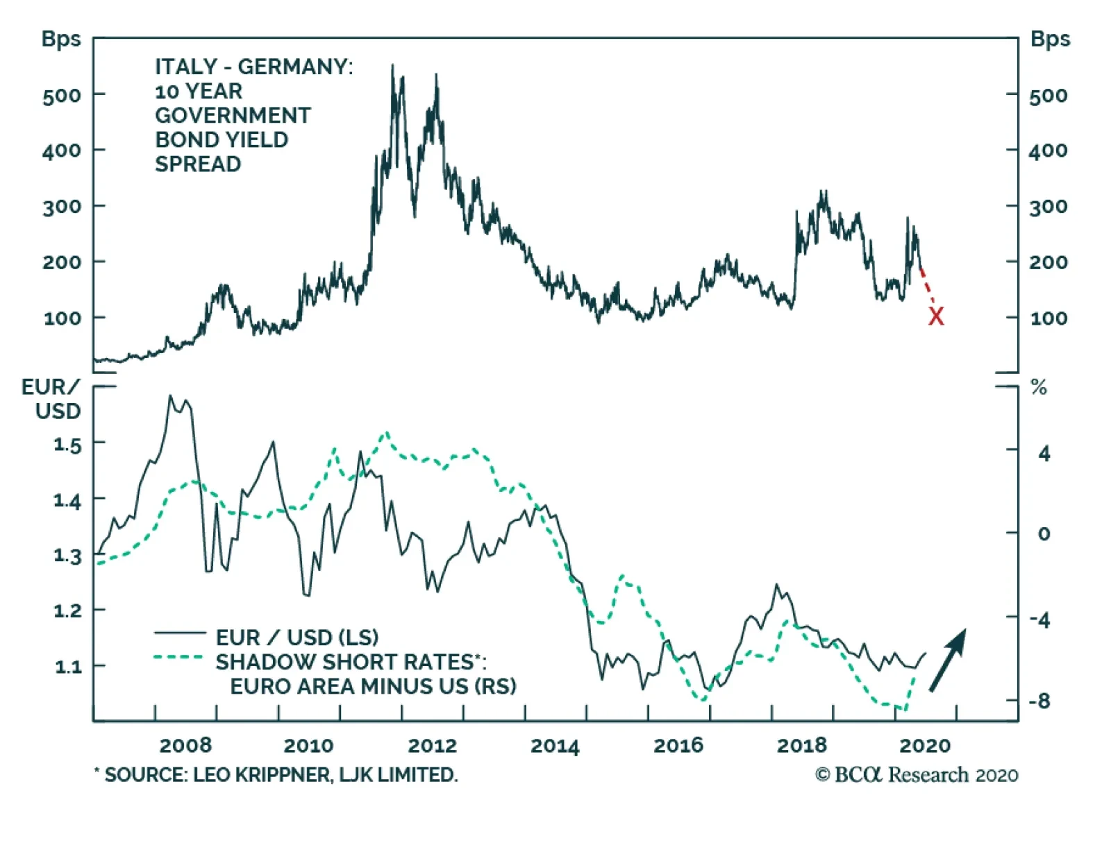
Yesterday, the ECB pleasantly surprised market participants by announcing an additional EUR600 billion of purchases and extending the program to at least June 2021. Investors expected only a further EUR500 billion in buying. The euro strengthened on the…
Highlights Risks assets have entered a FOMO-driven mania phase that could last for a few more weeks. Markets are ignoring the particularities of this recession and are treating the post-lockdown activity snapback as a V-shaped recovery. A weaker than expected global recovery and rising geopolitical tensions between the US and China are the two primary risks that will weigh on EM risk assets after this mania phase runs out of steam. We are upgrading EM sovereign and corporate credit from underweight to neutral within a global credit portfolio. Within EM, local rates will perform well in both risk-on and risk-off phases. Feature The recovery in global risk assets has entered a fear-of-missing-out, or FOMO, mania phase. Like any mania, this one could last longer and go further than any fundamental analysis could presume. Investors who are long or cannot afford to stay on the sidelines should play this rally with tight stop points. Investors with longer time horizon should wait for a pullback in EM equities and currencies to buy. Within EM, local rates offer the best risk-reward profile. A recovery in global trade and mainland industrial sectors is necessary for EM equities and currencies to rally on a sustainable basis. The global equity rally has taken place amid a shrinking forward EPS. The top panel of Chart I-1 demonstrates that even the ever-bullish bottom-up analysts have been cutting their expectations of the level of corporate 12-month forward earnings per-share. As a result, the global forward P/E ratio has spiked to a 18-year high (Chart I-1, bottom panel). Chart I-1An Unprecedented Divergence: Surging Stocks Prices Amid Plunging Forward EPS Levels
An Unprecedented Divergence: Surging Stocks Prices Amid Plunging Forward EPS Levels
An Unprecedented Divergence: Surging Stocks Prices Amid Plunging Forward EPS Levels
Chart I-2EM Forward EPS Level Has Been Falling
EM Forward EPS Level Has Been Falling
EM Forward EPS Level Has Been Falling
Chart I-2 illustrates that the same phenomenon is true for EM equities. Their forward EPS has been contracting and their forward P/E has jumped to a decade high. Any overdrive in asset prices without supporting fundamentals can last for a while but typically ends with a crash. This FOMO-driven mania is unlikely to be any different. It is fair to say that during the March carnage, many investors operated on a “sell now, think later” principle. Since the rally began, they have switched to a “buy now, ask questions later” attitude. As this rally persists, global stocks and credit will become overbought and expensive. At that point, any negative shock could produce a sharp pullback that would likely devolve into another nasty selloff as investors shift back to a “sell now, think later” mentality. The Narratives Driving The Rally The narratives supporting this mania are simple and seem to be both accepted and embraced by a growing number of investors. We agree with some and disagree with others: Economies around the world are opening, which will ensure that an economic recovery will follow. Our interpretation: Surely as confinement policies are eased, activity will improve. However, in our opinion, this should not come as a surprise to investors. This is especially pertinent for the trend-setting US stock market. With US equity valuations not particularly cheap, the market was never pricing in extended lockdowns. Hence, it appears strange to us that markets have so exuberantly cheered the reopening of the economy. Looking forward, the key to the medium-term (six-month) equity outlook is the shape of the recovery following the initial partial normalization. The latter presently looks V-shaped because as stores and businesses reopen economic activity is bound to improve. Yet the odds are that following this initial normalization, the shape of the recovery is most likely to be U-shaped. For what it’s worth, manufacturing PMIs in export-oriented economies like Korea, Japan and Taiwan made new lows in May (Chart I-3). We are not suggesting these indicators will not improve in the months ahead; they surely will. Nevertheless, a marginal rise in diffusion indexes like PMIs from extraordinary depressed levels do not signify a profit recovery. This recession differs from previous ones as the level of business activity has dropped below breakeven points for more businesses than it did in other recessions. When a company operates below its breakeven level, a marginal rise in sales may not be sufficient to improve its debt-servicing capacity, hiring and capital spending intentions. However, it seems markets are ignoring the particularities of this recession and are treating the post-lockdown activity snapback as a V-shaped recovery. This is why we feel risk assets are in a FOMO-driven mania phase, where fundamentals do not matter. Authorities around the world are stimulating, with the US pumping enormous amounts of fiscal and credit stimulus into the economy (Chart I-4, top panel). Chart I-3Asian Manufacturing PMIs Made New Lows In May
Asian Manufacturing PMIs Made New Lows In May
Asian Manufacturing PMIs Made New Lows In May
Chart I-4An Unparalleled Global Money Boom
An Unparalleled Global Money Boom
An Unparalleled Global Money Boom
Chart I-5China Is Ramping Up Stimulus
China Is Ramping Up Stimulus
China Is Ramping Up Stimulus
China has finally embarked on aggressive stimulus. The National People’s Congress has set the monetary policy objective for 2020 as follows: Substantially accelerate the growth of broad money supply and total social financing (Chart I-4, bottom panel). Our interpretation: Indeed, government stimulus worldwide is massive. Yet, it is hard to know if it will be sufficient to produce a V-shaped recovery. The rise in money supply at the moment is being offset by the drop in the velocity of money. As a result, nominal GDP levels are extremely low. That said, last week we upgraded our growth outlook for China because of the above-mentioned aggressive policy stimulus. It is possible that China’s credit and fiscal impulse will reach about 15% of GDP before year-end (Chart I-5). What presently deters us from recommending outright long positions in China-related plays is the escalating US-China confrontation and the risk of a relapse in global stocks. Central banks around the world both in DM and EM are monetizing debt and injecting immense liquidity into the system. Our interpretation: Correct, but equally relevant is investors’ animal spirits. The latter will determine whether and when these liquidity injections leak into risk assets. For now, it seems that once again central banks’ actions have been successful in lifting asset prices, despite poor fundamentals. Equity valuations are cheap, especially outside the US. This is especially true given the low risk-free rate. Our interpretation: We agree that EM equities are cheap, something we have been highlighting since mid-March (Chart I-6). Yet valuations are not a good timing tool, as they can stay depressed so long as profits are not worsening. Meanwhile, US equities are expensive (Chart I-7). Critically, we argued in a recent report that equity multiples depend not only on the risk-free rate but also on the equity risk premium (ERP). Chart I-6EM Equities Are Cheap
EM Equities Are Cheap
EM Equities Are Cheap
Chart I-7US Stocks Are Expensive
US Stocks Are Expensive
US Stocks Are Expensive
Given the immense ambiguities investors are facing with respect to both the business cycle and economic, political and geopolitical trends, the ERP should be at the upper end of its historical range. Hence, the discount factor – the sum of the risk-free rate and the ERP – should be reasonably high. In this context, US equity valuations are rather expensive, despite the very low risk-free rate. In short, the expensive US stock market has until very recently been the locomotive of this rally. If US share prices had not rallied hard in the past two months, EM and other international bourses would not have caught a bid. The Fed’s public debt monetization is a structural, not near-term negative for the greenback. The US dollar is expensive and will depreciate a lot due to unrestrained fiscal and monetary stimulus in the US. Our interpretation: The US dollar is one standard deviation expensive (Chart I-8) and EM currencies have become cheap (Chart I-9). Chart I-8US Dollar Valuations Are Elevated
US Dollar Valuations Are Elevated
US Dollar Valuations Are Elevated
Chart I-9EM Currencies Are Cheap
EM Currencies Are Cheap
EM Currencies Are Cheap
Chart I-10EM Currencies And Stocks Correlate With Industrial Metals
EM Currencies And Stocks Correlate With Industrial Metals
EM Currencies And Stocks Correlate With Industrial Metals
We do not disagree with the view that the US dollar is vulnerable in the long term due to the Federal Reserve’s aggressive debt monetization and that the Fed will eventually fall behind the inflation curve. Yet inflation is not imminent, and the Fed’s public debt monetization is a structural, not near-term negative for the greenback. As such, these potholes for the US dollar may not be pertinent in the next several months. Critically, Chart I-10 illustrates that EM currencies move with industrial metals prices, and EM stocks correlate with global materials stocks. The common driver of all of these markets is global growth in general and China’s industrial sectors in particular. In short, a recovery in global trade and mainland industrial sectors is necessary for EM equities and currencies to rally on a sustainable basis. Investors are underinvested in global equities in general and cyclical plays in particular. Our interpretation: Indeed, we showed last week that institutional equity investors had been skeptical of this rally. What has driven or supercharged this equity rally since late March has been unsophisticated retail investors. They have been opening up broker accounts worldwide and aggressively trading since March lockdowns. We cited a few pieces of anecdotal evidence confirming this phenomenon in last week’s report. However, it seems that institutional investors in recent weeks have capitulated by raising their risk exposure in general and their exposure to cyclical plays in particular. This explains the recent surge in cyclical equities and currencies. Bottom Line: The narratives driving this rally are only partially correct. Markets are ignoring the particularities of this recession and are treating the post-lockdown activity snapback as a V-shaped recovery. A weaker than expected global recovery and rising geopolitical tensions between the US and China are the two primary risks that will weigh on EM risk assets after this FOMO-driven mania phase runs out of steam. Nuances To Beware Of There are several nuances about the market’s internals and characteristics that we would like to draw investors’ attention to: There is mixed evidence as to whether China’s economy in general and its industrial sectors in particular have entered a sustainable recovery. First, examining the Taiwanese manufacturing PMI data could help in assessing the growth outlook for both the mainland economy and for global trade. The basis is that Taiwan has done extremely well by avoiding COVID-19 outbreaks and lockdowns. Therefore, there are no domestic reasons for weak output growth. In addition, its manufacturing sector is very export-oriented, with about 40% of exports destined for mainland China. PMI export orders for Taiwan's aggregate manufacturing and its three key sectors plunged to new lows in May (Chart I-11). This includes both the electronic optical (semiconductor) and basic materials sectors. The latter correlates well with global materials stocks. There has so far not been a bullish signal from this indicator (Chart I-11, second panel). Second, China’s domestic A-share market in general and its cyclical sectors in particular have not yet broken out (Chart I-12). Given China was the first nation to exit from lockdowns, its share prices should be the first to signal a sustainable economic recovery. Yet onshore share prices have been rather subdued. China’s economy will eventually stage a recovery later this year. Our point is that global cyclicals might have run ahead of themselves by pricing in a recovery too early. Chart I-11Taiwanese Manufacturing PMIs In May: New Lows Across All Industries
Taiwanese Manufacturing PMIs In May: New Lows Across All Industries
Taiwanese Manufacturing PMIs In May: New Lows Across All Industries
Chart I-12Chinese Onshore Share Prices Are Not Flagging An Imminent Recovery
Chinese Onshore Share Prices Are Not Flagging An Imminent Recovery
Chinese Onshore Share Prices Are Not Flagging An Imminent Recovery
Equity market and sector leadership changes occur during selloffs or at the inception of rallies. Chart I-13 illustrates EM relative stock prices versus DM along with the global equity index. Over the past 25 years, there have been several major leadership changes between EM and DM. And all of them occurred during selloffs in global share prices. Chart I-13EM Versus DM Equity Leadership Rotations Took Place During Selloffs
EM Versus DM Equity Leadership Rotations Took Place During Selloffs
EM Versus DM Equity Leadership Rotations Took Place During Selloffs
Similarly, the relative performance of global growth versus value stocks experiences trend reversals during global bear markets (Chart I-14). Chart I-14Global Growth Versus Value Leadership Rotations Occurred During Bear Markets
Global Growth Versus Value Leadership Rotations Occurred During Bear Markets
Global Growth Versus Value Leadership Rotations Occurred During Bear Markets
Chart I-15EM Could Outperform DM For A Few Weeks
EM Could Outperform DM For A Few Weeks
EM Could Outperform DM For A Few Weeks
Leadership of US equities and global growth stocks did not change during the March crash nor during the following two-month rally from the bottom. Only in the past week or so have US equities and global growth stocks begun to lag EM bourses and global value, respectively (Chart I-15). In brief, the latest leadership rotation from US to EM did not occur during the selloff or at inception of the rally – i.e., it does not fit the typical profile of sustainable leadership reversal. As such, it may not be enduring. The internals of this rally are consistent with the fact that it might already be at a late stage. During rallies, laggards are the last to catch a bid. Contrarily, during selloffs, outperformers are the last to be liquidated. For example, US growth stocks were the last ones to be liquidated in both the 2015-early-2016 and 2018 selloffs. When the decade-long leaders – US growth stocks – were finally stamped out, it marked the bottom of those selloffs. We are upgrading EM sovereign and corporate credit from underweight to neutral within a global credit portfolio. The Fed’s purchases of US bonds will likely continue pushing investors into EM credit markets. Using an analogous framework for this rally, the latest extraordinary spike in the laggards such as EM, Europe and both value and cyclical stocks could be a sign of bear capitulation, and could signify the final phase of this equity rally. Bottom Line: There are several nuances to the current equity market rally, but investors seem reluctant to consider them amid a FOMO-driven mania. Investment Considerations The FOMO-driven rally could last for several more weeks. Afterwards it will be followed by a major setback. Investors who are long or cannot afford to stay on the sidelines should play this rally with tight stop points. Investors with longer time horizon should wait for a pullback in EM equities and currencies to buy. Chart I-16EM Local Rates Offer Value
EM Local Rates Offer Value
EM Local Rates Offer Value
We are making the following adjustments and changes to our strategy and trade recommendations: In regard to our EM versus DM asset allocation strategy, we are making one change: we are upgrading EM sovereign and corporate credit from underweight to neutral within a global credit portfolio. The Fed’s purchases of US bonds will likely continue pushing investors into EM credit markets. Consistently, we are closing two positions: (1) our short EM corporate and sovereign credit / long US investment-grade corporate bond trade; and (2) our long Asian investment-grade /short high-yield corporate bond trade. Within the EM credit space, we continue to favor sovereigns versus corporates – a strategy recommended on April 23. We are still reluctant to strategically upgrade EM stocks versus DM ones even though odds of EM outperforming DM stocks are high in the coming weeks. In light of the potential FOMO-driven rally, to protect profits we are closing the following two currency positions: Take profits on short BRL/long USD trade. It was initiated on November 29, 2019 and has produced a 19% gain. Book profits on short SGD/long JPY position. This recommendation has generated a 2.3% gain since its initiation on June 8, 2018. We are still maintaining shorts in the following EM currencies: CLP, ZAR, TRY, IDR, PHP and KRW. They could continue rallying in the near term but will relapse afterwards. We are also structurally short low beta currencies: the RMB and the Saudi riyal. Within EM, local rates offer the best risk-reward profile: they will perform well in both risk-on and risk-off phases. Real bond yields remain somewhat elevated in many EMs, as shown in Chart I-16. We continue to receive long-term rates in Mexico, Colombia, Russia, Ukraine, India, Pakistan, Malaysia, China and Korea, as well as 2-year rates in South Africa. Their central banks will reduce policy rates much further. In addition, several of these local bond markets will benefit from ongoing quantitative easing by their central banks. Arthur Budaghyan Chief Emerging Markets Strategist arthurb@bcaresearch.com Equities Recommendations Currencies, Credit And Fixed-Income Recommendations
Highlights The Chinese economy continues to recover, albeit less quickly than the first two months following a re-opening of the economy. The demand side of the Chinese economic recovery in May marginally outpaced the supply side, with a notable improvement concentrated in the construction sector. We are initiating two new trades: long material sector stocks versus the broad indices, in both onshore and offshore equity markets. Feature The recovery in China’s economy and asset prices has entered a “tapering phase”, in which the speed of the recovery is normalizing from a rapid rebound two months after the economy re-opened. The direction of the ultra-accommodative monetary and fiscal stance has not changed, but the aggressiveness in the stimulus impulse is abating as the recovery continues. As we highlighted in last week’s report, the announced stimulus at this year's NPC was less than meets the eye of investors.1 Chart 1A Quick Reversal In The Outperformance Of Chinese Stocks
A Quick Reversal In The Outperformance Of Chinese Stocks
A Quick Reversal In The Outperformance Of Chinese Stocks
Near-term downside risks in Chinese stocks were highlighted by last week’s quick reversal in the outperformance of Chinese equities relative to global benchmarks (Chart 1). As the US and European economies re-open and the stimulus impulse in major developed markets (DMs) is at peak intensity, Chinese stocks will underperform those in DMs, particularly US stocks. The re-escalation in Sino-US tensions will also add to the near-term volatility in Chinese equities. Therefore, we maintain our tactical (0-3 months) neutral view on aggregate Chinese equity indexes, in both domestic and offshore markets. Beyond Q2, however, our baseline view still supports an outperformance in Chinese stocks. The stepped-up stimulus measures since March should start to trickle down into the broader economy. Global business activities and demand will slowly normalize in the summer, helping to revive China’s exports. Moreover, an intensified pressure on employment, indicated in this month’s employment subcomponents in manufacturing and non-manufacturing PMIs, should prompt policymakers to roll out more growth-supporting measures in Q3. Tables 1 and 2 below highlight key developments in China’s economic and financial market performance in the past month. Table 1China Macro Data Summary
China Macro And Market Review
China Macro And Market Review
Table 2China Financial Market Performance Summary
China Macro And Market Review
China Macro And Market Review
Chart 2ASpeed Of Manufacturing Activity Recovery Has Moderated
Speed Of Manufacturing Activity Recovery Has Moderated
Speed Of Manufacturing Activity Recovery Has Moderated
China’s official manufacturing PMI slipped to 50.6 in May from 50.8 a month earlier (Chart 2A). While the reading suggests that manufacturing activities are still in an expansionary mode, the speed of the expansion has moderated compared with April and March. The supply side of manufacturing activities and employment were the biggest drags on May’s official PMI. The production subcomponent in the PMI decelerated whereas new orders increased from April (Chart 2A, bottom panel). The net result is an improved supply-demand balance in the manufacturing sector, however, the improvement is marginal. It also differs from the V-shaped recovery in 2008/09, when both new orders and production subcomponents grew simultaneously (Chart 2B). The demand side of the economy is still concentrated in the policy-driven construction sector. The rebound in construction PMI continues to significantly outpace that in manufacturing and non-manufacturing PMIs (Chart 2C, top panel). The construction employment sub-index ticked up by 1.7 percentage points in May, compared with a slowdown of 0.8 percentage points in manufacturing and 0.1 percentage points in non-manufacturing employment PMIs (Chart 2C, bottom panel). Chart 2BDemand Struggles To Outpace Supply
Demand Struggles To Outpace Supply
Demand Struggles To Outpace Supply
Chart 2CDemand Recovery Is Concentrated In Construction
Demand Recovery Is Concentrated In Construction
Demand Recovery Is Concentrated In Construction
While a buoyant construction sector should provide a strong tailwind to raw material prices and related machinery sales, a laggard recovery from other sectors means the upside potential in aggregate producer prices (PPI) will be limited in the current quarter. In May, there was a rebound in the PMI sub-indices measuring raw material purchase prices and ex-factory prices, which heralds easing in the contraction of PPI in Q2 (Chart 3). However, neither of the PMI price sub-indices has returned to levels reached in January, when PPI growth was last positive. Moreover, weaker readings in the purchases and raw material inventory subcomponents suggest that manufacturers may be reluctant to restock due to sluggish global trade and a lagging rebound in domestic demand (Chart 3, bottom panel). This month’s PMI shows that the employment subcomponents in both the manufacturing and non-manufacturing PMIs are contracting (Chart 4). Because demand for Chinese export goods remains sluggish, we expect unemployment in China’s labor-intensive export manufacturing sector to rise in Q2 and even into Q3. The intensified pressure on employment will likely prompt Chinese policymakers to roll out more demand-supporting measures. Chart 3PPI Contraction Will Ease But Upside Limited In Q2/Q3
PPI Contraction Will Ease But Upside Limited In Q2/Q3
PPI Contraction Will Ease But Upside Limited In Q2/Q3
Chart 4Employment In Trouble, A Catalyst For More Easing
Employment In Trouble, A Catalyst For More Easing
Employment In Trouble, A Catalyst For More Easing
The BCA Li Keqiang Leading Indicator rose moderately in April. A plunge in the Monetary Conditions Index (MCI) limited the magnitude of the indicator's increase, offsetting an uptick in money supply and credit growth (Chart 5). A rapid disinflation in headline consumer prices (CPI) since the beginning of this year has pushed up the real savings deposit rate, which contributed to the MCI’s nose-dive. In our view, the MCI’s sharp drop is idiosyncratic and does not signify a tightening in the PBoC’s monetary stance or overall monetary conditions. Huge fluctuations in food prices have been driving the headline CPI since March 2019, while the core CPI remains stable. While food prices historically have very little correlation with the PBoC's monetary policy actions, a disinflationary environment will provide the central bank more room for easing. Odds are high that the PBoC will cut the savings deposit rate for the first time since 2015. Chart 5Monetary Conditions Are Not As Tight As The Indicator Suggests
Monetary Conditions Are Not As Tight As The Indicator Suggests
Monetary Conditions Are Not As Tight As The Indicator Suggests
The yield curve in Chinese government bonds quickly flattened around the time of the National People’s Congress (NPC), with the short end of the curve rising faster than the long end (Chart 6). This is in keeping with our assessment that while the market is expecting the recovery to continue in China, it is unimpressed with the intensity of upcoming stimulus and monetary easing. Monetary easing seems to be taking a pause, but we do not think this indicates a change in the PBoC’s policy stance (Chart 7). Instead, weak global demand, slow recovery in the domestic economy and intensified pressure on domestic employment, all will incentivize policymakers to up their game by mid-year. As such, we expect the yield curve to steepen again in H2, with the short-end of the curve fluctuating at a low level and the 10-year government bond yield picking up when the economy gains traction. Chart 6The Bond Market May Be Incorrectly Pricing In A Monetary Tightening
The Bond Market May Be Incorrectly Pricing In A Monetary Tightening
The Bond Market May Be Incorrectly Pricing In A Monetary Tightening
Chart 7A Pause Before More Easing In June
A Pause Before More Easing In June
A Pause Before More Easing In June
The spread in Chinese corporate bond yields has dropped by more than 30bps from its peak in April. This is in line with that of major DM countries and a reflection of the easier liquidity conditions globally (Chart 8). We anticipate that the yield spreads in Chinese corporate bonds will continue to normalize. However, a flare in US-China tensions will put upward pressure on the financing costs of lower-rated corporations (Chart 8, bottom panel). The default rate among Chinese corporate bonds is unlikely to rise meaningfully this year, in light of ultra-accommodative monetary conditions and the Chinese government’s bailout programs to backstop corporate defaults. Chinese corporate bond defaults and non-performing loans historically have correlated with periods of financial sector de-leveraging and de-risking, other than during economic downturns. We continue to recommend investors hold China’s corporate bonds in the coming 6-12 months in a USD-CNH hedged term. Chart 8Financing Costs May Rise For Lower-Rated Corporations
Financing Costs May Rise For Lower-Rated Corporations
Financing Costs May Rise For Lower-Rated Corporations
Chart 9Cyclicals Are Struggling To Break Out
Cyclicals Are Struggling To Break Out
Cyclicals Are Struggling To Break Out
Among Chinese equities, cyclical sectors have struggled to outperform defensives in both onshore and offshore markets (Chart 9). This reflects investors’ concerns over the slow recovery in domestic demand and heightened geopolitical risk between the US and China. As such, we continue to favor domestic, demand-driven sectors among the cyclical stocks, such as consumer discretionary and construction-related materials. We upgraded consumer discretionary stocks from neutral to overweight on May 20, and we are now initiating two trades to long material sector stocks versus the broad markets in both the domestic and investable markets. The constituents of both China’s investable and domestic material sectors are highly concentrated in the metal and mining subsectors, which roughly account for half of the material sectors’ weight in the MSCI and MSCI A Onshore Indexes, respectively. Chart 10 highlights that the material sectors’ relative performance is highly correlated with CRB raw materials in both domestic and investable markets. Given that China’s credit cycles historically lead the CRB material index by about six months, China’s massive credit stimulus will boost CRB raw materials by end-Q2 and thus, the outperformance of the material sectors. The RMB has depreciated by almost 3% in the wake of a re-escalation in US-China frictions. The CNY/USD spot rate is approaching its weakest point reached in September 2019 (Chart 11). Furthermore, on May 29, the PBoC set the CNY/USD reference rate at its lowest level since 2008, a move that suggests defending the RMB is no longer in China’s interest. Downward pressure on the RMB will persist in the months leading up to the November US presidential election. The US economy is in a much more fragile state than in 2018/19, which may hinder President Trump’s willingness to resort to tariffs between now and November. However, we cannot completely roll out the probability that Trump will impose further tariffs on Chinese exports, if he is losing the election through weak public support and is removed from his financial and economic constraints. In any case, in the coming months CNY/USD exchange rate will likely continue to decouple from the economic fundamentals such as interest rate differentials (Chart 11, bottom panel). Instead, the exchange rate will be largely driven by market sentiment surrounding the US-China frictions. Volatility in CNY/USD will increase, but the overall trend in the CNY/USD will continue downwards as long as the escalation in US-China tensions persists. On a 6- to 12-month horizon, however, we expect that the depreciation trend in the RMB to moderately reverse as the Chinese economy continues to strengthen. Chart 10Material Sectors Should Benefit From The Stimulus And Construction Boom
Material Sectors Should Benefit From The Stimulus And Construction Boom
Material Sectors Should Benefit From The Stimulus And Construction Boom
Chart 11The CNY/USD Will Continue To Decouple From Interest Rate Differentials
The CNY/USD Will Continue To Decouple From Interest Rate Differentials
The CNY/USD Will Continue To Decouple From Interest Rate Differentials
Qingyun Xu, CFA Senior Analyst qingyunx@bcaresearch.com Jing Sima China Strategist jings@bcaresearch.com Footnotes 1 Please see China Investment Strategy Weekly Report "Taking The Pulse Of The People’s Congress," dated May 28, 2020, available at cis.bcaresearch.com Cyclical Investment Stance Equity Sector Recommendations
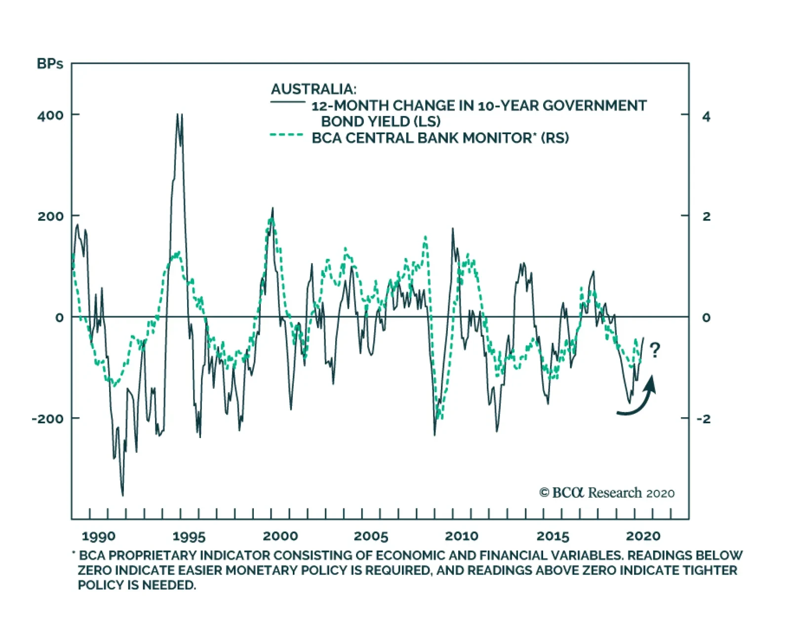
BCA Research's Global Fixed Income Strategy service's Reserve Bank of Australia (RBA) monitor may be turning the corner after Australia delivered 125bps of stimulus since June 2019. The Australian unemployment gap has widened dramatically, owing to job…
Highlights In this Weekly Report, we present our semi-annual chartbook of the BCA Central Bank Monitors. All of the Monitors are now below the zero line, indicating the need for continued easy global monetary policy to help mitigate the COVID-19 recession (Chart of the Week). Central bankers have already responded in an intense and rapid fashion to the crisis, delivering a series of rate cuts, increased asset purchase programs and measures to support bank lending to businesses suffering under quarantines. All of these vehicles have helped trigger a powerful rally in global bond markets that helped revitalize risk assets as well. After the coordinated global easing response of the past few months, the optimal policy choices now differ from country to country. This creates opportunities to benefit from country allocation decisions even in a world of puny government bond yields. The overall signal from our Central Bank Monitors is still bond bullish, however – at least over the next few months until there is evidence of how fast global growth is rebounding from the COVID-19 lockdowns. An Overview Of The BCA Central Bank Monitors Chart of the WeekUltra-Accommodative Monetary Policies Are Still Required
Ultra-Accommodative Monetary Policies Are Still Required
Ultra-Accommodative Monetary Policies Are Still Required
Chart 2A Bond-Bullish Message From Our CB Monitors
A Bond-Bullish Message From Our CB Monitors
A Bond-Bullish Message From Our CB Monitors
The BCA Central Bank Monitors are composite indicators designed to measure the cyclical growth and inflation pressures that can influence future monetary policy decisions. The economic data series used to construct the Monitors are not the same for every country, but the list of indicators generally measure the same things (i.e. manufacturing cycles, domestic demand strength, commodity prices, labor market conditions, exchange rates, etc). The data series are standardized and combined to form the Monitors. Readings above the zero line for each Monitor indicate pressures for central banks to raise interest rates, and vice versa. Through the nexus between growth, inflation, and market expectations of future interest rate changes, the Monitors do exhibit broad correlations to government bond yields in the Developed Markets (Chart 2). All of the Monitors are indicating intense pressure to maintain very easy monetary policies in response to the global COVID-19 recession. While the bad economic and inflation news is largely discounted in the depressed level of bond yields worldwide, there are still opportunities to position country allocations within a government bond portfolio based on the message from our Monitors (overweighting the US, the UK and Canada, underweighting Germany and Japan). All of the Monitors are indicating intense pressure to maintain very easy monetary policies in response to the global COVID-19 recession. In each BCA Central Bank Monitor Chartbook, we include a new chart for each country that we have not shown previously. In this edition, we show the components of the Monitors, grouped into those focusing on economic growth and inflation, plotted alongside our estimate of the appropriate level of central bank policy interest rates derived using a Taylor Rule. Fed Monitor: Policy Must Stay Accommodative Our Fed Monitor has collapsed below the zero line to recessionary levels (Chart 3A) in response to the coronavirus crisis. The Fed has already delivered a series of aggressive policy responses since March to help support an economy ravaged by the virus, including: interest rate cuts; quantitative easing (QE), including buying corporate and municipal debt; and setting up lending schemes for small businesses. The lockdown of almost the entire country has helped “flatten the curve” of the spread of COVID-19, but at a painful economic cost. The unemployment rate rose to 14.7% in April, the highest level since the Great Depression, and is expected to peak at levels above 20%. The result is unsurprising: a massive increase in spare economic capacity with a threat of deflation as headline CPI inflation plummeted to 0.3% in April (Chart 3B). Chart 3AUS: Fed Monitor
US: Fed Monitor
US: Fed Monitor
Chart 3BUS Realized Inflation Flirting With 0%
US Realized Inflation Flirting With 0%
US Realized Inflation Flirting With 0%
Within the components of our Fed Monitor, weakening growth has been the main driver of the decline (Chart 3C). Our Taylor Rule estimate suggests a deeply negative fed funds rate is “appropriate”, although the Fed is likely to pursue other avenues of easing like yield curve control before ever attempting a sub-0% policy rate. Chart 3CNegative Rates Are 'Required' In The US, But The Fed Has Other Options
Negative Rates Are 'Required' In The US, But The Fed Has Other Options
Negative Rates Are 'Required' In The US, But The Fed Has Other Options
The fall in US Treasury yields over the past few months has been in line with the decline in our Fed Monitor (Chart 3D). While the US economy is slowly awakening from lockdowns, consumer and business confidence are likely to remain fragile given the numerous risks from a second wave of COVID-19, worsening US-China relations and, more recently, social unrest. Thus, we continue to recommend an overweight strategic allocation to the US within global government bond portfolios. The fall in US Treasury yields over the past few months has been in line with the decline in our Fed Monitor Chart 3DTreasury Yields Fully Reflect Pressure For More Fed Easing
Treasury Yields Fully Reflect Pressure For More Fed Easing
Treasury Yields Fully Reflect Pressure For More Fed Easing
BoE Monitor: Negative Rates On The Horizon? Our Bank of England (BoE) Monitor has collapsed to the lowest level in its history on the back of the severe COVID-19 recession (Chart 4A). The BoE already cut the Bank Rate to 0.1% in March, ramped up asset purchases, and introduced a Term Funding scheme to support business lending. Any additional easing from here might entail negative policy rates, which markets are already discounting. The UK unemployment rate is expected to peak around 8%, with the BoE projecting the economy to shrink by -14% this year, which would be the worst recession in modern history. Inflation has dropped sharply on the back of the dual collapse of energy prices and economic growth, ending a period of currency-fueled inflation increases (Chart 4B). Chart 4AUK: BoE Monitor
UK: BoE Monitor
UK: BoE Monitor
Chart 4BUK Realized Inflation Is Slowing Rapidly
UK Realized Inflation Is Slowing Rapidly
UK Realized Inflation Is Slowing Rapidly
The components of our BoE Monitor fully reflect the dire economic situation (Chart 4C), with weak growth – led by sharp falls in business confidence – driving the collapse of the Monitor more than falling inflation pressures. Our Taylor Rule estimate of the policy rate is not yet calling for negative rates, but that is because we are using the New York Fed’s estimate of r* as the neutral real rate, which is a relatively high 1.4% (by comparison, r* in the US is estimated to be 0.5%). Chart 4CNegative Rates Are Not Yet Required In The UK
Negative Rates Are Not Yet Required In The UK
Negative Rates Are Not Yet Required In The UK
The sharp fall in the BoE Monitor suggests that Gilt yields will remain under downward pressure in the coming months (Chart 4D). New BoE Governor Andrew Bailey has stated that a move to negative rates is not imminent, but markets will continue to flirt with the notion of sub-0% interest rates until the economy and inflation stabilize. We maintain an overweight stance on UK Gilts. Chart 4DBoE Monitor Suggests Continued Downward Pressure On Gilt Yields
BoE Monitor Suggests Continued Downward Pressure On Gilt Yields
BoE Monitor Suggests Continued Downward Pressure On Gilt Yields
ECB Monitor: Continued Monetary Support Is Needed Our European Central Bank (ECB) Monitor is now well below the zero line, signaling a strong need for easier monetary policy to fight the COVID-19 downturn (Chart 5A). The ECB has delivered multiple measures to ease monetary conditions, including a new €750bn bond-buying vehicle and liquidity operations to help banks maintain lending to European businesses. The recession has hit the region hard, with real GDP declining by -3.8% in Q1, the sharpest fall since records began in 1995. Unemployment rates have climbed higher, although to much lower levels than seen in the US thanks to more generous government labor support programs that have helped to limit layoffs. The sharp downturn has resulted in both a surge in spare economic capacity and plunge in headline inflation to 0.3% in April (Chart 5B). Chart 5AEuro Area: ECB Monitor
Euro Area: ECB Monitor
Euro Area: ECB Monitor
Chart 5BEurope Is On The Edge Of Deflation
Europe Is On The Edge Of Deflation
Europe Is On The Edge Of Deflation
Within the individual components of our ECB Monitor, both weaker growth and near-0% inflation have both contributed to the Monitor’s decline (Chart 5C). Our Taylor Rule measure shows that the ECB’s current stance of having policy rates modestly below 0% is appropriate. Chart 5CThe ECB Needs To Keep Its Foot On The Monetary Accelerator
The ECB Needs To Keep Its Foot On The Monetary Accelerator
The ECB Needs To Keep Its Foot On The Monetary Accelerator
Despite the ECB’s easing measures, and in contrast to the message from our ECB Monitor, the downward momentum in core European bond yields has been fading (Chart 5D). With the ECB reluctant to push policy rates deeper into negative territory, and with reliable cyclical indicators like the German ZEW and IFO surveys showing signs that euro area growth is starting to recover from the lockdowns, the case for even lower core European yields in the coming months is not strong. We maintain our recommended underweight stance on German and French government bonds. We maintain our recommended underweight stance on German and French government bonds. Chart 5DNo Pressure For Higher German Bund Yields
No Pressure For Higher German Bund Yields
No Pressure For Higher German Bund Yields
BoJ Monitor: What More Can Be Done? Our Bank of Japan (BoJ) Monitor has fallen further below zero, indicating easier policy is required (Chart 6A). The BoJ has already introduced additional easing measures in the past couple of months: extending forward guidance (inflation is projected to remain below the BoJ’s 2% target for the next three years), increasing asset purchases and enhancing loan programs to small and medium sized companies. New cases of COVID-19 have slowed sharply in Japan, prompting an end to the national state of emergency last week. Importantly, the virus did not hit Japan's labor market as severely as in other developed countries. The unemployment rate did reach a two-year high in April, but is still only 2.6% (Chart 6B). Fiscal stimulus and measures to protect job losses have played a major role in preventing a bigger spike in joblessness. Even with those measures, growth remains weak and realized inflation is heading back towards deflation. Chart 6AJapan: BoJ Monitor
Japan: BoJ Monitor
Japan: BoJ Monitor
Chart 6BJapan Nearing Deflation Once Again
Japan Nearing Deflation Once Again
Japan Nearing Deflation Once Again
Looking at the components of our BoJ Monitor, contracting growth, more than weakening inflation pressures, is the bigger driver of the fall in the Monitor below zero (Chart 6C). However, our Taylor Rule estimate does not suggest that the current level of the policy rate is out of line. Chart 6CBoJ Needs More Easing (Somehow) Until The Economy Revives
BoJ Needs More Easing (Somehow) Until The Economy Revives
BoJ Needs More Easing (Somehow) Until The Economy Revives
The BoJ’s current combined policies of negative rates, QE and yield curve control are keeping JGB yields at near-0% levels. Those policies are also suppressing yield volatility and preventing an even bigger fall in JGB yields (with larger capital gains) as suggested by our BoJ Monitor (Chart 6D). We continue to recommend a maximum underweight in Japanese government bonds in a yield-starved world. Chart 6DJGB Yields Will Be Anchored For Some Time
JGB Yields Will Be Anchored For Some Time
JGB Yields Will Be Anchored For Some Time
BoC Monitor: Deflationary Pressures Intensifying Our Bank of Canada (BoC) Monitor has collapsed into “easier policy required” territory, reaching levels last seen during the 2009 recession (Chart 7A). The central bank has already introduced several easing measures to help boost the virus-stricken economy, including cutting the Bank Rate to a mere 0.25% and starting a QE program to buy government bonds for the first time ever. Before the COVID-19 outbreak, some softening of the economy was already underway. Now, after the imposition of nationwide lockdowns to limit the spread of the virus, the unemployment rate has spiked to 13% - a level last seen in the early 1980s. The result is a massive deflationary output gap has opened up (Chart 7B), with realized headline CPI inflation printing at -0.2% in April. Chart 7ACanada: BoC Monitor
Canada: BoC Monitor
Canada: BoC Monitor
Chart 7BOutright Headline CPI Deflation In Canada
Outright Headline CPI Deflation In Canada
Outright Headline CPI Deflation In Canada
The fall in our BoC Monitor has been driven by both collapsing economic growth and weakening inflation pressures (Chart 7C). Our Taylor Rule estimate suggests that one of new BoC Governor Tiff Macklem’s first policy decisions may need to be a move to negative interest rates. Macklem and other BoC officials have not played up the possibility of cutting rates below 0%. However, the fact that the BoC provided no economic growth forecasts in the most recent Monetary Policy Report highlights the extreme uncertainties surrounding the economic impact from COVID-19 – even with the Canadian government providing a large fiscal response to the pandemic. Chart 7CBoC Monitor Plunging Due To High Unemployment & Low Inflation
BoC Monitor Plunging Due To High Unemployment & Low Inflation
BoC Monitor Plunging Due To High Unemployment & Low Inflation
We upgraded our recommended stance on Canadian government debt to overweight back in March, and the collapse of the BoC Monitor suggests continued downward pressure on Canadian yields (Chart 7D). Stay overweight. The collapse of the BoC Monitor suggests continued downward pressure on Canadian yields. Chart 7DCanadian Yield Momentum In Line With The BoC Monitor
Canadian Yield Momentum In Line With The BoC Monitor
Canadian Yield Momentum In Line With The BoC Monitor
RBA Monitor: Rate Cutting Cycle Is Done Due to a slump in export demand and a weakening housing market, our Reserve Bank of Australia (RBA) monitor has been consistently calling for rate cuts since April 2018 (Chart 8A). Australia began its easing cycle early, having delivered a total of 125bps of stimulus since June 2019, with the two most recent cuts coming directly in response to the COVID-19 crisis. As in other developed markets, the unemployment gap in Australia has widened dramatically, owing to job losses concentrated in tourism, entertainment, and dining out (Chart 8B). Although inflation briefly breached the low end of the RBA’s 2-3% target band in Q1, this will not be a lasting development. The RBA sees headline CPI deflating by -1% year-on-year in Q2/2020 and, even as far as 2022, only sees it growing at 1.5%. Chart 8AAustralia: RBA Monitor
Australia: RBA Monitor
Australia: RBA Monitor
Chart 8BInflation Will Remain Stuck Below RBA 2-3% Target
Inflation Will Remain Stuck Below RBA 2-3% Target
Inflation Will Remain Stuck Below RBA 2-3% Target
Although both the growth and inflation components of our RBA Monitor are below zero, the former drove the most recent decline (Chart 8C) led by consumer confidence almost touching the 2008 lows. The RBA has already responded by cutting rates to near 0%, well below the Taylor Rule implied estimate, and initiating yield curve control with a cap on 3-year government bond yields at 0.25%. Chart 8CNo Pressure For The RBA To Go To Negative Rates
No Pressure For The RBA To Go To Negative Rates
No Pressure For The RBA To Go To Negative Rates
Overall, Australian bond yields have accurately priced in the dovish signal from our RBA Monitor (Chart 8D). With COVID-19 relatively well contained in Australia, there is less pressure on the RBA to ease further. Governor Lowe has also ruled out negative rates, which will put a floor under yields. Owing to these factors, we confidently reiterate our neutral stance on Australian government debt within global fixed income portfolios. Australian bond yields have accurately priced in the dovish signal from our RBA Monitor. Chart 8DAustralian Bond Yields Are Unlikely To Move Much Lower
Australian Bond Yields Are Unlikely To Move Much Lower
Australian Bond Yields Are Unlikely To Move Much Lower
RBNZ Monitor: Cause For Concern After a resurgence late last year, our Reserve Bank of New Zealand (RBNZ) Monitor has declined to a level slightly below zero (Chart 9A). The RBNZ responded to the pandemic by delivering a massive -75bps cut in March, but has since left the policy rate untouched, preferring to deliver further stimulus by doubling the size of its QE program. Forward guidance is signaling that the policy rate will remain at 0.25% until 2021, but the central bank has not ruled out negative rates in the future. Although the actual unemployment numbers do not yet capture the impact of the pandemic, both consensus and RBNZ forecasts call for a blowout in the unemployment gap (Chart 9B). The RBNZ expects the steady improvement in inflation seen up to Q1/2020 to be wiped out, with headline CPI projected to remain below the 1-3% target range until mid-2022. Chart 9ANew Zealand: RBNZ Monitor
New Zealand: RBNZ Monitor
New Zealand: RBNZ Monitor
Chart 9BRealized NZ Inflation Was Drifting Higher, Pre-Virus
Realized NZ Inflation Was Drifting Higher, Pre-Virus
Realized NZ Inflation Was Drifting Higher, Pre-Virus
Surprisingly, the inflation component of our RBNZ Monitor is actually calling for tighter monetary policy, owing to significant strength in the housing market (Chart 9C). However, this trend is likely to reverse - the RBNZ foresees a -9% decline in house prices over the remainder of 2020. Meanwhile, growth components such as consumer confidence and employment will remain depressed, holding down our RBNZ monitor. Chart 9CGrowth, Now Inflation, Has Driven The RBNZ Monitor Lower
Growth, Now Inflation, Has Driven The RBNZ Monitor Lower
Growth, Now Inflation, Has Driven The RBNZ Monitor Lower
Overall, the momentum in New Zealand bond yields seems to have overshot the message from our RBNZ Monitor (Chart 9D). However, with so much uncertainty about business investment and cash flows from key sectors such as tourism and education, it is too early to bet on an improvement in yields. We therefore maintain a neutral recommendation on NZ sovereign debt. Chart 9DNZ Bond Yields Are Unlikely To Move Lower
NZ Bond Yields Are Unlikely To Move Lower
NZ Bond Yields Are Unlikely To Move Lower
Riksbank Monitor: Worries For The Coronavirus Mavericks Amid the global pandemic, our Riksbank Monitor has collapsed to all-time lows (Chart 10A). In its April monetary policy decision, the Riksbank opted for continued asset purchases and liquidity measures to support bank lending to companies over a move to negative rates. One of the primary concerns for the Riksbank is headline CPI inflation, which fell into mild deflation (-0.4% year-over-year) in April on the back of lower energy prices and weaker domestic demand (Chart 10B). This could spill over into a lasting decline in long-term inflation expectations if the economy does not quickly improve. Chart 10ASweden: Riksbank Monitor
Sweden: Riksbank Monitor
Sweden: Riksbank Monitor
Chart 10BSwedish Realized Inflation Back To 0%
Swedish Realized Inflation Back To 0%
Swedish Realized Inflation Back To 0%
Both the growth and inflation components of our Riksbank Monitor are calling for further easing, with the growth component now at post-crisis lows (Chart 10C). The collapse on the growth side can be attributed to historic falls in retail confidence, the manufacturing PMI and employment while the inflation component remains depressed due to low headline numbers and inflation expectations. Chart 10CThe Riksbank Hates Negative Rates, But Could Still Need Them If The Economy Worsens
The Riksbank Hates Negative Rates, But Could Still Need Them If The Economy Worsens
The Riksbank Hates Negative Rates, But Could Still Need Them If The Economy Worsens
The sharp downward move in our Riksbank Monitor suggests Swedish bond yields should remain under downward pressure in the coming months (Chart 10D). The key factor for yields will be the effect of the relatively lax measures implemented by Sweden to combat the pandemic. Sweden saw positive GDP growth in Q1/2020 due to fewer restrictions on the economy. However, infection and mortality rates are much higher in Sweden than in neighboring countries and, as a result, Denmark and Norway excluded Sweden from their open border agreement. Continued restrictions of the sort are bearish for growth – and bullish for bonds – in this trade-dependent economy. Chart 10DSwedish Bond Yields Will Remain Under Downward Pressure
Swedish Bond Yields Will Remain Under Downward Pressure
Swedish Bond Yields Will Remain Under Downward Pressure
Robert Robis, CFA Chief Fixed Income Strategist rrobis@bcaresearch.com Ray Park, CFA Research Analyst ray@bcaresearch.com Shakti Sharma Research Associate ShaktiS@bcaresearch.com Recommendations The GFIS Recommended Portfolio Vs. The Custom Benchmark Index
BCA Central Bank Monitor Chartbook: Collapse
BCA Central Bank Monitor Chartbook: Collapse
Duration Regional Allocation Spread Product Tactical Trades Yields & Returns Global Bond Yields Historical Returns
The COVID-19 induced recession has accelerated several paradigm shifts that were already afoot. Populism, anti-immigrant sentiment, deglobalization, and fiscal profligacy were replete – particularly in the US – even before the pandemic. For the first time since WWII, the US budget deficit significantly expanded for three years running at a time when the unemployment rate was declining, late in the cycle. We fear that the Washington Consensus – a catchall term for fiscal prudence, laissez-faire economics, free trade, and unfettered capital flows – is being replaced by economic populism, by a Buenos Aires Consensus, as our geopolitical strategists have posited in the past. Buenos Aires Consensus is our catchall term for everything that is opposite of the Washington Consensus: less globalization, fiscal stimulus as far as the eyes can see, erosion of central bank independence, and a dirigiste (as opposed to laissez-faire) approach to economics that seeks to protect “state champions,” stifles innovation, and ultimately curbs productivity growth. The most important long-term consequence of the Buenos Aires Consensus will be higher inflation. And we are not talking just the asset price kind – which investors have enjoyed over the past decade – but of the more traditional flavor: consumer price inflation (Chart 1). Chart 1Inflation Is Coming
Inflation Is Coming
Inflation Is Coming
A profligate US government where $3 trillion + fiscal packages are passed with a strong bipartisan consensus, rising odds of increased defense and infrastructure spending, a renewed focus on protecting America’s industrial champions from competition (foreign or domestic), and a robust protectionist agenda (again, on both sides of the aisle), are all inherently inflationary and negative for bonds, ceteris paribus. A whiff of inflation would be a positive for the broad equity market, further fueling the “risk on”, liquidity-driven, melt-up phase. However, historically when inflation has entered the 3.7%-4% zone in the past, the broad equity market has stumbled (Chart 2). Despite these powerful longer-term inflationary forces, our working assumption is that, in the next 9-12 months, headline CPI inflation will only renormalize, rather than surge, as the coronavirus-induced deficient demand and excess supply dynamic will take time to reach a new equilibrium (Chart 3). Chart 2Only A Whiff Of Inflation Is Good For Stocks
Only A Whiff Of Inflation Is Good For Stocks
Only A Whiff Of Inflation Is Good For Stocks
Importantly, the magnitude of the economic damage, the likelihood that a “second wave” requires renewed lockdowns, and a new steady state of the apparent “square root” type of recovery remain unknown. This means that “deflationistas” may continue to have an upper hand on the “inflationistas”, as witnessed by the subdued inflation expectations (Chart 3). Chart 3In The Near-Term Disinflation Looms
In The Near-Term Disinflation Looms
In The Near-Term Disinflation Looms
The Federal Reserve’s Function As The Lender Of Last Resort What is certain is the Fed’s resolve to keep things gelled together and allow businesses and the economy enough time to heal and overcome the coronavirus shock. Simply put, there are high odds that the Fed will remain accommodative and take inflation risk “sitting down” for quite some time, certainly for the next year, and likely longer (Chart 4). While early on, the Powell-led Fed had been ambivalent, the FOMC’s swift and immense response to the coronavirus calamity with unorthodox monetary policies has been appropriate and unprecedented (Chart 5). Clearly, the sloshing liquidity cannot cure the coronavirus, but providing the credit needed in parts of the financial markets and select business sectors that had completely dried up was the proper policy response. The Fed acted promptly as a lender of last resort. Unlike the difficulty in defeating deflation – look no further than Japan – ending inflation is easy. The great Paul Volcker has taught the Fed and the world how to break the back of inflation. The Fed, therefore, has the credible tools to deal with a possible inflationary impulse. Chart 4Do Not Fight The Mighty Fed
Do Not Fight The Mighty Fed
Do Not Fight The Mighty Fed
Chart 5Joined At The Hip
Joined At The Hip
Joined At The Hip
Until economic growth regains its footing and climbs to its post-GFC steady 2-2.5% real GDP growth profile, the probability is high that the Fed will take some inflation risk (Chart 6). Chart 6The Fed Can Afford To Take Inflation Risk
The Fed Can Afford To Take Inflation Risk
The Fed Can Afford To Take Inflation Risk
This is especially the case given that political risk in the US is tilted to the downside. With income inequality at nose bleeds levels, US policymakers (both fiscal and monetary authorities) will hesitate to act on the inflation mandate with gusto and objectivity (Chart 7). Chart 7The Apex Of Globalization And Income Inequality
The Apex Of Globalization And Income Inequality
The Apex Of Globalization And Income Inequality
The Fed will therefore not rush to abruptly tighten monetary policy, a view confirmed by the bond market: fed funds futures are penciling a negative fed funds rate in mid-2021 and ZIRP as far as the eye can see (Chart 8). A sustainable breakout in bond yields would require inflation (and to a lesser extent real GDP growth) to significantly surprise to the upside, which would compel the Fed to aggressively raise the fed funds rate. But that is not on the immediate horizon especially given the recent coronavirus-related blow to unit labor costs (please see Appendix below). Even if there were an inflationary backup in longer term Treasury yields, yield curve control is a tool the Fed is considering, something it first tried on the Treasury’s orders during and following WWII for a nine year period. Chart 8ZIRP As Far As The Eye Can See
ZIRP As Far As The Eye Can See
ZIRP As Far As The Eye Can See
Dollar And The Inflationary Valve Importantly, the US dollar’s direction will be critical in determining whether any lasting inflation acceleration occurs. The top panel of Chart 9 shows that inflation accelerates during U.S. dollar bear markets. A depreciating greenback greases the wheels of the global financial system and also serves as a global growth locomotive given that trade is largely conducted in US dollars (bottom panel, Chart 9). Thus, the Fed’s recent US dollar swap lines to other Central Banks, along with its FIMA facility, were instrumental in unclogging the global financial system. Sloshing US dollar liquidity restored a semblance of normality to asset prices (Chart 10). Chart 9Inversely Correlated
Inversely Correlated
Inversely Correlated
Chart 10Ample Liquidity To Debase The Greenback
Ample Liquidity To Debase The Greenback
Ample Liquidity To Debase The Greenback
As we highlighted in our December 16 Special Report titled “Top US Sector Investment Ideas For The Next Decade” ,1 there are rising odds that a US dollar bear market takes root this decade. Eventually, the steeper the greenback’s fall, the higher the chance of a longer lasting inflationary spurt as US import price inflation will rear its ugly head (Chart 11). Chart 11US Dollar Bear Markets Are Synonymous With Inflation
US Dollar Bear Markets Are Synonymous With Inflation
US Dollar Bear Markets Are Synonymous With Inflation
So What? While, in the near-term, accelerating inflation is a negligible risk owing to excess economic slack, in the intermediate-term, it is a rising probability outcome. BCA’s long-held de-globalization theme,2 the US/Sino trade war that is here to stay irrespective of the next electoral outcome and excessive US government fiscal largesse will likely, in the next two-to-three years, swing the global deflation/inflation pendulum toward sustained inflation (Chart 12). For investors that are worried about the prospect of higher inflation, the purpose of this Special Report is to serve as an equity sector positioning roadmap, especially if inflationary pressures become more acute sooner than we anticipate. Chart 12Deglobalization Will Result In Inflation
Deglobalization Will Result In Inflation
Deglobalization Will Result In Inflation
Historically, inflation has been synonymous with an aggressive Fed and hard asset outperformance, suggesting that deep cyclical sectors would be the primary beneficiaries. Table 1 shows that over the last six major inflationary cycles, energy, materials, real estate and health care have been consistent outperformers. On the flip side, utilities, tech and telecom have been clear underperformers. The remaining sectors have been a mixed bag. Table 1S&P 500 Sector Performance During Inflationary Periods
Revisiting Equity Sector Winners And Losers When Inflation Climbs
Revisiting Equity Sector Winners And Losers When Inflation Climbs
With the exception of real estate, our portfolio will benefit from an accelerating inflationary backdrop. However, our early- and late-cyclical preference to defensives is a consequence of the current stage of the cycle: when in recession it pays to have a cyclical portfolio bent (please see Charts 6 and 7 from our mid-April Weekly Report).3 Ultimately, we expect relative profit trends to dictate relative performance on a cyclical investment horizon, and are not rushing to further shift our portfolio in order to benefit from accelerating inflation. What follows is a one page per sector analysis of the impact of inflation on pricing power and performance. Sectors are ranked by their average returns (largest to smallest) in the six inflationary cycles we studied as shown on Table 1. Anastasios Avgeriou US Equity Strategist anastasios@bcaresearch.com Health Care Health care stocks have consistently outperformed during the six inflationary periods we examined. Over the long haul, it has paid to overweight this sector given the structural uptrend in relative share prices. Spending on health care services is non-cyclical and demand for such services is on a secular rise around the globe most recently further catalyzed by the COVID-19 pandemic: in the developed markets driven largely by the aging population and in the emerging markets by the accelerating adoption of health care safety nets and higher standards. Chart 13Health Care
Health Care
Health Care
Health care pricing power is expanding at a healthy clip, outshining overall CPI. Importantly, recent geopolitical uncertainty had cast a shadow on the sector’s pricing power prospects that suffered from a constant derating. Now that political uncertainty has lifted as Biden is a more moderate Democratic President candidate than either Sanders or Warren, a rerating looms. Finally, demand for health care goods and services will not only remain robust, but also get a boost from the recent coronavirus pandemic as governments around the globe beef up their health care response systems. Chart 14Health Care
Health Care
Health Care
Energy The energy sector comes out on top of the median relative return results in times of inflation, and second best in average terms (Table 1 above). Oil price surges are typically synonymous with other forms of inflation. During the six inflationary periods we analyzed, all but one period were associated with relative share outperformance. Oil producers in particular benefit from the increase in the underlying commodity almost immediately (assuming little to no hedging), which also serves as an excellent inflation hedge. Chart 15Energy
Energy
Energy
Relative energy pricing power collapsed during the COVID-19 accelerated recession plumbing multi-decade lows. Saudi Arabia’s decision in early-2020 to refrain from balancing the oil market triggered a plunge in WTI crude oil prices to negative $40/bbl. While global demand remains deficient, this breakdown in oil prices has brought some much needed supply discipline in global oil producers including US shale. As the reopening of economies takes hold oil demand will recover and absorb excess oil inventories. While base effects will push crude oil inflation to the stratosphere in Q1/2021, eventually a more balanced global oil market will pave the way to a sustainable rebound in oil prices. Chart 16Energy
Energy
Energy
Real Estate REITs have outperformed the overall market during the five inflationary periods we analyzed, exemplifying their hard asset profile. While the 1976-81 iteration skewed the mean results, REITs still come out with the third best showing among the top eleven sectors even on median return basis (Table 1 above). Real estate prices tend to appreciate when inflation is accelerating, because landlords have consistently raised rents at least on a par with inflation. Chart 17Real Estate
Real Estate
Real Estate
Following the GFC trough, REITs pricing power has outpaced the overall CPI. CRE selling prices had been on a tear since the GFC, but the ongoing recession has short-circuited this hard asset’s near uninterrupted price appreciation; according to Green Street Advisors, average CRE prices contracted by roughly 10% in April. Worrisomely the persistent multi-family construction boom and the “amazonification” of the economy will act as a restraint to the apartment REIT and shopping center REIT segments, respectively. Tack on the longer-term knock-on effects of the work-from-home wave that has staying power and even office REITs may suffer a demand-related deflationary shock. Chart 18Real Estate
Real Estate
Real Estate
Materials Materials equities have a tight positive correlation with accelerating inflation. Resource-related stocks are the closest representation of hard assets, given their ability to store value among the eleven GICS1 sectors. As inflation takes root and commodity prices rise, materials sales and EPS growth get a boost with relative share prices following right behind. Chart 19Materials
Materials
Materials
Our relative materials pricing power gauge is currently contracting, but encouragingly it is showing some signs of stabilization. The drubbing in Chinese GDP in Q1 has dealt a blow to commodities-related demand and thus prices as infrastructure projects ground to a halt. As the Chinese economy has restarted slightly ahead of developed markets a return to normalcy is a high probability outcome in the back half of the year. Keep in mind that the delayed effect of stimulus spending should also hit in Q3 and Q4 likely further tightening commodity markets. Chart 20Materials
Materials
Materials
Consumer Discretionary While the overall trend in consumer discretionary stocks has been higher since the mid-1970s, relative performance mostly declines during inflationary times. Consumer spending takes the backseat as a performance driver when interest rates rise on the back of higher inflation. In addition, previous inflationary periods have also coincided with surging energy prices, representing another source of diminishing consumer discretionary purchasing power. Chart 21Consumer Discretionary
Consumer Discretionary
Consumer Discretionary
Consumer discretionary selling prices are expanding relative to overall wholesale price inflation, and are on a trajectory to hit double digit growth. Deflating energy prices, ultra-loose monetary conditions and the $3tn fiscal stimulus have kept the US consumer afloat. As Washington and the Fed are providing a lifeline to the economy during the recession, the reopening of the economy has the potential to turbo-charge consumer discretionary spending as pent up demand will get unleashed. Chart 22Consumer Discretionary
Consumer Discretionary
Consumer Discretionary
Financials Financials relative returns are neither hot nor cold when inflation rears its ugly head. In fact they sit in the middle of the pack in terms of relative median and mean returns. This lack of consistency reflects different factors that exerted significant influence in some of these inflationary periods. Moreover, Chart 23 shows that relative share prices have been mean reverting since the 1960s, likely blurring the inflation influence. Ultimately, the yield curve, credit growth and credit quality determine the path of least resistance for the relative share price ratio of this early cyclical sector. Chart 23Financials
Financials
Financials
Financials sector pricing power has jumped by about 450bps since the 2019 trough and have exited deflation. Given the recent steepening of the yield curve that is typical at the depths of the recession, the odds are high that sector pricing power will remain firm via rising net interest margins. Any easing in the regulatory backdrop even temporary could also provide a fillip to margins and offset the large precautionary provisioning that banks are taking to combat the looming recession-related losses. Chart 24Financials
Financials
Financials
Industrials The industrials sector tends to outperform during inflationary periods. In fact, relative share prices have risen 50% of the time since the mid-1960s when inflation was accelerating. The two oil shocks in the 1970s raised the profile of all commodity-related sectors as investors were scrambling to find reliable inflation hedges. Chart 25Industrials
Industrials
Industrials
Following a three-year period in the deflation zone, industrials relative pricing power is steadily rising, likely as a consequence of decreasing supplies, CEO discipline and the ongoing US/Sino trade war. The previously expansionary mindset has given way to retrenchment, as the scars from the late-2015/early 2016 manufacturing recession remain fresh. However, infrastructure spending is slated to increase at some point in late-2020 as China revs its economic engine and bolster the demand prospects for this deep cyclical sector. Chart 26Industrials
Industrials
Industrials
Consumer Staples Similar to the health care sector, consumer staples stocks have been stellar outperformers over the past 55 years. The sector’s track record during the six inflationary periods we studied is split down the middle. Most consumer staples companies are global conglomerates and their efforts have been focused on building global consumer brands, allowing them to implement a stickier pricing strategy. As a result, overall inflation/deflation pressures are more benign. Chart 27Consumer Staples
Consumer Staples
Consumer Staples
Relative consumer staples pricing power has slingshot higher and is flirting with the upper bound of the past three decade range near the 10% mark. The current recession has augmented the status of consumer staples. While the lockdowns has dealt a blow to select discretionary purchases, demand for staples has actually increased according to recent retail sales and inflation data releases. Tack on falling commodity input costs and the implication is that consumer staples manufacturers will likely continue to enjoy widening profit margins. Chart 28Consumer Staples
Consumer Staples
Consumer Staples
Tech Technology stocks have underperformed every time inflation has accelerated with two exceptions, in the mid-to-late 1960s and mid-to-late 1970s. Creative destruction forces in the tech industry are inherently deflationary. As a result, tech business models have evolved to thrive during disinflationary periods. Moreover, tech stocks have become more mature than is typically perceived, generating enormous amounts of free cash flow. Cash flow growth is also steadier than in the past and has served as a catalyst to embark on shareholder friendly activities. Chart 29Tech
Tech
Tech
Tech companies are constantly mired in deflation. While relative pricing power has been in an uptrend since 2016, it has recently soared as tech companies preserved their pricing power, but overall wholesale inflation has suffered a sizable setback. Importantly, demand for tech goods and services has remained resilient during the current recession, further adding to the allure of the tech sector. Chart 30Tech
Tech
Tech
Utilities Utilities relative returns during inflationary bouts are the second worst among the top eleven sectors on an average basis and dead last on a median return basis (Table 1 above). In five out of the six inflationary phases we examined, utilities stocks suffered a setback. The industry’s lack of economic leverage and fixed income attributes anchor the relative share price ratio during inflationary times. Chart 31Utilities
Utilities
Utilities
Our utilities sector pricing power proxy has sprung to life recently moderately outpacing overall inflation. Natural gas prices, the industry’s marginal price setter, have risen 18% since the early-April trough, signaling that recent utility pricing power gains have more upside. Nevertheless, as the economy is gradually reopening, soft data will stage a V-shaped recovery bolstering the odds of a selloff in the bond market. Such a backdrop will dampen the demand for high-yielding defensive equities, including pricey utilities. Chart 32Utilities
Utilities
Utilities
Telecom Services Relative telecom services performance and inflation appear broadly inversely correlated since the early 1970s, underperforming 60% of the time when core PCE prices accelerate. Importantly, in two of the periods we studied (during the late-70s and the TMT bubble) the drawdowns were massive, skewing the mean results portrayed in Table 1 above. This fixed income proxy sector tends to suffer in times of inflation as competing assets dilute its yield appeal and vice versa. Chart 33Telecom Services
Telecom Services
Telecom Services
Telecom services pricing power has been on a recovery mode since February 2017 when Verizon surprised investors and embarked on a price war by reinstating its unlimited plans in order to defend its market share. Importantly, earlier in the year telecom carriers relative selling prices exited deflation coinciding with the completion of the T-Mobile/Sprint deal. Intra-industry M&A is over as now only three major wireless providers are left raising the threat of monopolistic power. Nevertheless, the ongoing 5G deployment is of the utmost importance for telecom carriers and a foray further into cable/media/content services is inevitable so that the telecom incumbents move beyond being “dumb pipelines”. Chart 34Telecom Services
Telecom Services
Telecom Services
Appendix Chart A1
CHART A1
CHART A1
Chart A2
CHART A2
CHART A2
Chart A3
CHART A3
CHART A3
Chart A4
CHART A4
CHART A4
Chart A5
CHART A5
CHART A5
Chart A6
CHART A6
CHART A6
Footnotes 1 Please see BCA US Equity Strategy Special Report, “Top US Sector Investment Ideas For The Next Decade” dated December 16, 2019, available at uses.bcaresearch.com 2 Please see BCA Geopolitical Strategy Special Report, “The Apex Of Globalization - All Downhill From Here” dated November 12, 2014, available at gps.bcaresearch.com 3 Please see BCA US Equity Strategy Weekly Report, “Fight Central Banks At Your Own Peril” dated April 14, 2020, available at uses.bcaresearch.com.
Highlights There are no atheists in foxholes, and no Austrians ahead of this election: Republican senators and White House staffers may grumble about giveaways, but they cannot risk being painted as the Grinch who Stole Essential Services in the homestretch of the campaign. A Biden victory will mean a leftward swing: Our geopolitical strategists believe markets are underestimating the extent to which a Biden victory would lead to a less friendly backdrop for investment capital. Tensions with China are likely to escalate: China-bashing is popular with the electorate, and a desperate White House may turn up the heat to recover its standing in the polls. The battle for great-power supremacy remains unresolved. The pandemic is causing the retreat from globalization to accelerate before our eyes: Curtailing offshoring and building new redundancies into supply chains will weigh on corporate profit margins and undermine earnings growth. Feature We had the pleasure of sitting down with Matt Gertken, the leader of BCA’s Geopolitical Strategy service, for a webcast last week. The timing could not have been better, as the pandemic has thrust Washington into the spotlight and the campaign will keep it there until Election Day. This report blends the US Investment Strategy and Geopolitical Strategy teams’ takes on the broad themes we discussed and is a starting point for thinking about the 2020 election and its financial market implications. We will return to the topic throughout the summer and early fall as developments unfold. Republicans in the Senate can talk tough now, but they will have to knuckle under if they want to keep their majority (and the White House). Future Fiscal Largesse Though the scale of the CARES Act was huge, powering the United States to the head of the global class in terms of fiscal stimulus (Chart 1), both parties were discussing the next phase of COVID-19 relief before the ink on the bill was dry. Two months later, that momentum has stalled as Republicans have begun to push back against a fifth wave of spending (the CARES Act was the third). Senator Lindsey Graham (R-SC) has taken direct aim at the $600 weekly federal unemployment benefit supplement, scheduled to expire at the end of July, calling unemployment benefits in excess of pay an “aberration,” and pledging that the program will be extended “over [his] dead body.” Chart 1A Massive Amount Of Fiscal Stimulus
Elections Have Consequences
Elections Have Consequences
That benefit may be generous on a Scandinavian scale,1 but along with the direct $1,200 payments sent to nearly two-thirds of households, it is helping the economy withstand deleterious social distancing measures. Shoring up the finances of vulnerable households will help them stay current on their auto loans and rent or mortgage payments, staving off a wave of repossessions, evictions and foreclosures, and preventing a cascading chain of defaults that would intensify the economic pressure. Table 1The Battleground States Need Help
Elections Have Consequences
Elections Have Consequences
Graham’s rhetorical flourishes aside, Republicans cannot hand the Democrats an opening to cast them as Scrooge when the campaign intensifies in late summer. Trump’s 2016 victory turned on flipping Florida and Rust Belt stalwarts Pennsylvania, Ohio, Michigan and Wisconsin from the Democrats, and all those states are in play again except Ohio (Chart 2). Unemployment is elevated in the battleground Rust Belt states, and we think it must be higher than the official measure in a state as dependent on tourism as Florida (Table 1).2 Channeling the Grinch by taking unemployment benefits and essential workers away from put-upon voters in pivotal states3 is not a winning electoral strategy. Caught between an aid proposal that both Democrats and the White House want, Republican senators will ultimately have to concede. Chart 2The Midwest And Florida Are Crucial
Elections Have Consequences
Elections Have Consequences
Rounding Out The Democratic Ticket Chart 3A New Obama-Biden Ticket?
Elections Have Consequences
Elections Have Consequences
Presumptive Democratic nominee Biden is considering the pool of candidates to fill the number two spot on the ticket. Vice-presidential picks generate a lot of discussion when they’re made, but they typically have little influence on election outcomes. Among this year’s crop of contenders for the presidential nomination, only Senator Amy Klobuchar (D-MN) could fulfill the typical VP function of helping to land a swing state. Klobuchar would likely appeal to soccer moms and suburban independents capable of being swayed back to the Democrats, but her moderate sensibilities wouldn’t expand Biden’s appeal to the party’s progressive wing or inspire younger voters. Senator Elizabeth Warren (D-MA) could help attract progressives and younger voters who see Biden as the status quo, but her antipathy toward big business could turn off swing voters and she would come at the cost of a senate seat.4 Voters have an unfavorable view of Kamala Harris (D-CA) and her contentious exchanges with Biden in the early debates could make for an awkward pairing. Stacey Abrams has recently entered the picture and would be an asset if she were able to increase African-American voter turnout, but she has a thin government resume. Michelle Obama is the only choice who would make a splash and significantly boost Biden’s prospects. She is viewed way more favorably than the rest of the field (Chart 3), would solidify Biden’s connection with Barack Obama, and increase turnout among the progressive, female, and minority voters the ticket needs to tip the scales in its favor. Unfortunately for the Democrats, she has unequivocally indicated that she does not wish to run. Biden has said he’d welcome her onto the ticket in a second, and he will likely put off his choice until efforts to draft her definitively fail. Michelle Obama could shake up the race if the Democrats can convince her to join the ticket. Investors should keep an eye on the Democratic ticket. Joe Biden will turn 78 in November. He will be a one-term president if he wins, and his public appearances suggest that he’s slower on the draw than he used to be. He may rely on his second-in-command much more than the average president and she will immediately become the odds-on favorite for the 2024 nomination. If the Democrats gain control of the Senate alongside a Biden victory, as our Geopolitical Strategy service projects, financial markets may have to begin discounting a future with materially less friendly regulatory and tax policy. China Tensions Will Not Go Away Chart 4The Middle Kingdom Is Out Of Favor
Elections Have Consequences
Elections Have Consequences
Our geopolitical strategists have long flagged US-China tensions as the paramount geopolitical flashpoint. The only standalone nations with superpower potential are engaged in a long-term struggle for hegemony. The trade tensions that waxed and waned across all of 2019 were only one act of a longer-running play. Investors should not have been lulled into thinking the Phase 1 trade agreement would end the friction between the two countries. Politicians can be counted upon to give their constituents what they want, especially during election campaigns. China’s unpopularity with US voters has reached a new high in the wake of the pandemic (Chart 4), and candidates are likely to compete with one another to appear tougher on China. Between now and the election, there is a possibility that tensions could ramp up considerably. If the president finds his re-election prospects suffering from the COVID-19 outbreak and soaring unemployment, he may look to transform himself into a wartime president, boldly asserting American interests globally, and serially baiting an unpopular foe like China. Profit Margin Pressures Are Coming Except when interrupted by recessions, S&P 500 profit margins have climbed steadily higher since the early ‘90s (Chart 5). Several factors contributed to the increase in corporate profitability: the PC revolution, outsourcing, China’s entry into the WTO, the declining power of labor unions and, punctuating the rise in 2018, the 40% cut in the top marginal corporate tax rate (from 35% to 21%). If the Democrats take the White House and the Senate, we expect that corporate tax rates will swiftly rise. The top marginal rate may not go all the way back to 35%, but it has room to rise from its lowest level since before the US entered World War II (Chart 6), and any increase will represent a profit headwind. Re-configuring supply chains will reduce margins. Higher taxes will, too, if Democrats can take the White House and the Senate. Chart 5Corporate Profit Margins Are Vulnerable
Corporate Profit Margins Are Vulnerable
Corporate Profit Margins Are Vulnerable
Chart 6A Democratic Sweep Will Lead To Higher Taxes
A Democratic Sweep Will Lead To Higher Taxes
A Democratic Sweep Will Lead To Higher Taxes
Our Geopolitical Strategy service identified peak globalization as an important theme not long after it began publishing in 2012. The outbreak of the pandemic seems as if it will accelerate the retreat from globalization (Chart 7), and any reduction in outsourcing is likely to weigh on profit margins until automated inputs can supplant more expensive domestic labor. Onshoring is not the only factor likely to increase corporate costs after the pandemic, however. Companies are likely to seek to diversify their supply chains so that they are not so reliant on a single country or supplier. Building up redundancies within supply chains will make those chains more stable, but it will also increase costs. Chart 7The Pandemic Is Accelerating The Trend Away From Globalization
The Pandemic Is Accelerating The Trend Away From Globalization
The Pandemic Is Accelerating The Trend Away From Globalization
A Biden victory is not the only source of election downside. If the president wins re-election, the odds of tariff conflicts with Europe will rise significantly. Unconstrained by having to contest another election, the administration could ratchet up the pressure on Europe, prompting certain retaliation from Brussels. Our strategists see a greater chance for trade peace, ex-China, if Biden captures the White House. Investment Implications The overriding questions on investors’ minds are why the stock market and the economy have parted company so decisively and how long they can continue to diverge. Our explanation turns on policy: the Fed has intervened mightily to hold down Treasury yields and keep financial markets functioning, while Congress has thrown open the federal coffers to keep laid-off workers and suddenly teetering businesses afloat. The social distancing measures imposed to slow the spread of COVID-19 caused economic activity to crater. Monetary and fiscal policy have been deployed to build a bridge over that crater, lest capital, people and businesses disappear into it like the Union troops at Petersburg. Ever since they began to rally in late March, financial markets have focused exclusively on the bridge. The Fed has the capacity and the will to install more monetary planks should the crater prove to be wider than initially estimated. Congress’ commitment is shakier, but the election will compel Republicans to provide more funding should it become necessary to prevent a dire outcome. The virus alone will dictate how long the bridge will have to be in place and investors can only guess at the virus' future course. Given the stock market’s pattern of surging on positive preliminary data for potential treatments or vaccines and barely easing when those data are shown to hold far less promise, it appears that its expectations are skewed to the right-hand side of the distribution. There appears to be considerable room for disappointment on the public health front. The possibility that markets are giving short shrift to a robust second wave of infections, or overestimating the speed with which a vaccine can be developed and distributed, is not a reason to short equities or be underweight them in balanced portfolios, though. The rally has been too strong, and there is a subset of right-tail outcomes that could well come to pass. We continue to expect a correction, and are carrying excess cash to prepare for it, but we are maintaining a neutral tactical outlook in the event of a positive surprise. We are optimistic about equities’ prospects over a twelve-month timeframe. Our rationale is that easy monetary policy and generous fiscal spending will outlive the social distancing measures they were prescribed to treat. Low interest rates, ample liquidity and pumped-up aggregate demand form a highly supportive backdrop for equities and should help them handily outperform bonds. The difference between our outlook and the equity market’s may simply be a matter of timing; the resurgent S&P 500 seems to be skipping ahead to the twelve-month conclusion and looking through the uncertainties that will arise along the way. The bears face daunting odds if Congress approves a meaningful fifth phase of fiscal stimulus: every trillion dollars extends the dark US bar in Chart 1 by another five percentage points. TIPS will eventually be the asset of choice when the debt has to be repaid but, in the meantime, equities have undeniable appeal. Doug Peta, CFA Chief US Investment Strategist dougp@bcaresearch.com Footnotes 1 According to a new working paper, the median unemployed worker is eligible for benefit payments equivalent to 134% of his/her pre-layoff compensation. https://www.nber.org/papers/w27216 Accessed May 26, 2020. 2 Nevada, home to the Magic Kingdom for adults, has the nation’s highest unemployment rate (28.2%). 3 Most state constitutions mandate balanced budgets. In the absence of federal aid, local school, fire, police and public hospital payrolls will have to be pared in response to declining sales and income tax revenues. 4 Massachusetts’ Republican governor would get to appoint her replacement until a special election could be held.
Dear Client, In lieu of our regular report next week, we will be sending you a Special Report from my colleague Jonathan LaBerge. Jonathan will be examining the global effectiveness of recent pandemic containment measures to judge both the odds of a second infection wave and what policy responses are likely to be effective in countering one were it to occur. I hope you find the report insightful. Best regards, Peter Berezin, Chief Global Strategist Highlights Fiscal deficits have soared in the wake of the pandemic, putting government debt-to-GDP ratios on a trajectory to reach post-WWII highs in many countries. Contrary to popular belief, there is little reason to think that fiscal relief will make it more difficult for governments to repay their obligations down the road. Larger budget deficits tend to increase overall national savings when the economy is depressed because private savings rise more than enough to compensate for the decline in government savings. The end result is a higher level of national wealth that governments can tax in the future. That said, there is more than one way to tax national wealth. For political reasons, higher inflation coupled with financial repression may prove to be more feasible than other forms of taxation. While inflation is not an imminent risk, it could become a formidable problem in two-to-three years. Investors should maintain below-benchmark levels of duration in fixed-income portfolios and favor inflation-linked securities over nominal bonds. Gold prices will rise over the long haul. The yellow metal should perform well even in the near term if the dollar weakens during the remainder of this year, as we anticipate. Real estate investors should reallocate capital away from densely populated urban areas towards suburbs and farmland. Stay Cyclically Overweight Equities Global equities continued to climb higher this week, as more countries reopened their economies. As we discussed three weeks ago in our report entitled “Risks To The U,” the main downside risk facing stocks is a second wave of the disease.1 While the number of new COVID-19 cases has declined in many countries, it continues to rise in others. As a result, the global tally of new cases remains broadly flat. The daily number of deaths seems to be trending lower, but that could easily reverse if social distancing measures are abandoned too quickly (Chart 1). Chart 1COVID-19: Global New Cases Remain Broadly Flat, While Deaths Seem To Be Trending Slightly Lower
Will There Be A Fiscal Hangover?
Will There Be A Fiscal Hangover?
Chart 2Joined At The Hip
Joined At The Hip
Joined At The Hip
Given this risk, we do not have a strong near-term (3-month) view on the direction of equities. Google searches for the “coronavirus” have closely correlated with equity prices and credit spreads (Chart 2). If fears of a new outbreak were to escalate, risk assets would suffer. Looking at a cyclical (12-month) horizon, we still recommend a modest overweight to stocks. Even if a vaccine does not become available later this year, increased testing should allow for a more economically palatable approach to containment strategies. Ample fiscal support will also help. As we provocatively asked in a report entitled “Could The Pandemic Lead To Higher Stock Prices?”,2 one can easily imagine a scenario where central banks keep rates near zero for the foreseeable future, while ongoing fiscal stimulus enables the labor market to reach full employment. Such an outcome could allow corporate profits to return to pre-pandemic levels, but leave the discount rate lower than before. The end result would be a higher fair value for the stock market. Although we would not counsel investors to bank on such a fortuitous outcome, the probability of it occurring is reasonably high – probably in the range of 30%-to-40%. This makes us inclined to favor stocks over a cyclical horizon. Will Indebted Governments Spoil The Party? One potential flaw in this bullish thesis is that massive government deficits could push up interest rates, crowding out private-sector investment in the process. As we argue below, such worries are misplaced for now. For the time being, bigger budget deficits will likely lead to an increase in overall savings, thus raising investment relative to what would have happened in the absence of any stimulus. That said, as we conclude towards the end of this report, there will come a time – probably in two-to-three years – when most economies are back to full employment. If budget deficits are still high at that point, inflation and long-term bond yields could end up rising substantially. Keynes To The Rescue The IMF expects budget deficits in advanced economies to exceed 10% of GDP in 2020, significantly higher than during the financial crisis. The sea of red ink is projected to push government debt-to-GDP ratios to fresh highs in many economies (Chart 3). Chart 3AGovernment Debt Levels Have Surged In The Wake Of The Pandemic
Government Debt Levels Have Surged In The Wake Of The Pandemic
Government Debt Levels Have Surged In The Wake Of The Pandemic
Chart 3BGovernment Debt Levels Have Surged In The Wake Of The Pandemic
Government Debt Levels Have Surged In The Wake Of The Pandemic
Government Debt Levels Have Surged In The Wake Of The Pandemic
Chart 4The Paradox Of Thrift: Not Just A Theory
The Paradox Of Thrift: Not Just A Theory
The Paradox Of Thrift: Not Just A Theory
Should bond investors be worried? Not for now. One of John Maynard Keynes’ great insights was that an individual’s attempt to increase savings could lead to a collective decline in savings, a phenomenon he called the paradox of thrift. Keynes argued that if everyone tried to save more, the resulting contraction in spending would cause total employment to fall by so much that overall income would decline by more than spending. As a result, aggregate savings would fall. This is precisely what happened during the Great Depression and in the aftermath of the Global Financial Crisis (Chart 4). The paradox of thrift implies that bigger budget deficits in a depressed economy will lead to an increase in overall savings, as private savings rise more than one dollar for every dollar decline in government savings. S-I=CA One can see this point using the familiar macroeconomic accounting identity which says that the difference between what a country saves and invests should equal its current account balance.3 In the absence of a change in the current account balance, any increase in investment will translate into an increase in savings. If the government stimulates aggregate demand by increasing spending, cutting taxes, or boosting transfer payments, companies are likely to respond by investing more (or at least not cutting capital expenditures as much as they would otherwise). Thus, if fiscal stimulus raises investment, it will also raise aggregate savings. Chart 5Huge Spike In The US Personal Savings Rate
Huge Spike In The US Personal Savings Rate
Huge Spike In The US Personal Savings Rate
This conclusion has important implications for bond yields. If bigger budget deficits lead to an increase in overall savings, there is no reason to expect real bond yields to rise very much, at least in the short term. The failure of bond yields to rise since March, when governments began to trot out one fiscal stimulus package after another, is a testament to this fact. So too is the stimulus-induced surge in the US personal saving rate, which reached a record high of 33% in April (Chart 5). All That Money Printing If bigger government budget deficits are, in some sense, self-financing, why are so many people convinced that the Fed and other central banks are effectively “monetizing” deficits by buying up bonds? Part of the answer has to do with how one defines monetization. Governments create money whenever they purchase goods or services or make transfers to the public by running down their deposits at the central bank. In theory, the public could use that money to buy government bonds, which would allow the government to replenish its account at the central bank. In practice, it is usually a bit more circuitous than that. Chart 6Commercial Banks Deposits, Bank Reserve Held At The Fed, And Fed Holdings Of Treasuries Have All Expanded This Year
Commercial Banks Deposits, Bank Reserve Held At The Fed, And Fed Holdings Of Treasuries Have All Expanded This Year
Commercial Banks Deposits, Bank Reserve Held At The Fed, And Fed Holdings Of Treasuries Have All Expanded This Year
What normally happens is that the public places the money in a commercial bank deposit and the commercial bank then transfers the money to its account at the central bank. Next, the central bank buys the bonds from the government, crediting the government’s deposit account at the central bank in the process. Chart 6 shows that this is precisely what has happened this year: Commercial bank deposits, bank reserves held at the Fed, and the Fed’s holdings of Treasuries have all risen by roughly the same amount. Granted, there is a bit more to the story. If the central bank buys bonds, it will push down bond yields at the margin, allowing the government to finance itself more cheaply than it could otherwise. However, this is a far cry from the sort of “money printing” that many people have in mind. True debt monetization occurs when governments lose all access to outside financing, forcing the central bank to pick up the tab. Such situations invariably involve accelerating inflation and a collapsing currency, which often culminates in hyperinflation. This is clearly not the case today. Back To Full Employment The idea that bigger budget deficits can generate enough private savings to more than fully compensate for any loss in government savings is applicable only for economies with spare capacity. Once the economy reaches full employment, fiscal stimulus will not lead to more income or production since everyone who wants a job already has one. At that point, bigger budget deficits will cause the economy to overheat and inflation to rise, potentially forcing the central bank to raise rates. Higher interest rates will reduce investment. Higher rates will also put upward pressure on the currency, leading to a reduction in net exports and a corresponding deterioration in the current account balance. If investment and the current account balance both decline, then savings, which is just the sum of the two, must also fall. Strategies For Alleviating A Debt Burden Once the free lunch from fiscal stimulus disappears, the question of how to address the government debt accumulated during the downturn becomes paramount. There are four ways to reduce the ratio of government debt-to-GDP: 1) outgrow the debt burden; 2) tighten fiscal policy; 3) default; and 4) inflate away the debt. Outgrowing It At the end of the Second World War, many governments found themselves saddled with high levels of debt. In the US, the government debt-to-GDP ratio stood at 121% in 1945. In the UK, it hit 270%. In Canada, it reached 155%. For the most part, these governments did not repay the debt they incurred during the war. As Chart 7 shows, the nominal value of debt outstanding either rose or remained broadly constant following the war. What happened was that rapid GDP growth led to a shrinkage in debt-to-GDP ratios. Compared with the post-war period, the two drivers of an economy’s growth potential, labor force and productivity growth, are both weaker now. Thus, outgrowing the debt by raising the denominator of the debt-to-GDP ratio will be more difficult than in the past. It’s About g-r That said, the trajectory of the debt-to-GDP ratio does not depend solely on GDP growth; it also depends on the interest rate that the government pays to service its debt. Conceptually, it is the difference between the two that determines whether the level of any given budget deficit is sustainable or not. While trend GDP growth in advanced economies has declined since the 1950s, equilibrium interest rates have also fallen. As a consequence, the spread between growth rates and interest rates is only somewhat smaller in advanced economies today than it was in the 1950s and 60s and notably higher than it was in the 1980s and 90s (Chart 8). Indeed, as Chart 9 shows, g-r has been trending higher for hundreds of years! Chart 7The Case Of Outgrowing The Debt Burden Post-WWII
The Case Of Outgrowing The Debt Burden Post-WWII
The Case Of Outgrowing The Debt Burden Post-WWII
Chart 8The Rate Of Economic Growth Has Been Higher Than Interest Rates
Will There Be A Fiscal Hangover?
Will There Be A Fiscal Hangover?
Chart 9A Multi-Century Trend In The Spread Between Growth And Interest Rates
Will There Be A Fiscal Hangover?
Will There Be A Fiscal Hangover?
Today, government borrowing rates in most economies are well below trend growth rates. No matter the size of the budget deficit, the ratio of debt-to-GDP will converge to a stable level as long as the interest rate the government pays on the debt is below the growth rate of the economy.4 A Gordian Fiscal Knot Of course, there is no guarantee that real rates will remain below the rate of trend growth. As we have discussed before, the exodus of baby boomers from the labor force, a peak in globalization, and rising political populism could all curtail aggregate supply, leading to a depletion of national savings.5 What would happen if governments allowed debt levels to reach very high levels only to find that the neutral rate of interest — the interest rate consistent with full employment and stable inflation — has risen above the growth rate of the economy? Raising the policy rate would be very painful in a high-debt environment because even a small increase in interest rates would lead to a large rise in interest payments. Faced with this reality, some governments might elect to tighten fiscal policy. An increase in taxes or a decline in government spending would not only create some resources to pay back debt, but it would also reduce aggregate demand, pushing down the neutral rate of interest in the process. Don’t Blame The Stimulus Ironically, all the fiscal relief efforts that governments have carried out over the past few months have probably left them better placed to pay back debt than if no stimulus had been undertaken in the first place. Box 1 illustrates this point with a numerical example, but the intuition for this claim can be seen easily enough. As noted earlier, fiscal stimulus in a depressed economy will raise overall savings. This means that after the pandemic is over, governments will have a larger tax base available to them than they would have had in the absence of any stimulus (although, obviously, the tax base would be even larger if the pandemic had never occurred). The Inflation Solution Chart 10Long-Term Inflation Expectations Remain Very Depressed
Long-Term Inflation Expectations Remain Very Depressed
Long-Term Inflation Expectations Remain Very Depressed
Still, any decision to tighten fiscal policy down the road is going to be an inherently political one. What if governments do not have the political will to tighten fiscal policy even if the economy begins to overheat? Defaulting on the debt is always an option in that case, but not one that any sensible government would choose given the devastating impact this would have on the financial system and broader economy. Rather, it is conceivable that governments will lean on central banks to keep rates low and let inflation accelerate. While higher inflation will not boost real GDP, it will raise nominal GDP, allowing the ratio of government debt-to-GDP to decline. Investors currently assign very low odds to such an outcome. Long-term market-based inflation expectations remain very depressed (Chart 10). Yet, we think such an eventuality is more plausible than widely believed. As long as inflation does not spiral out of control, central banks are likely to welcome rising prices. A higher inflation rate would make monetary policy more effective by allowing central banks to bring real rates deeper into negative territory whenever the economy falls into recession. Higher inflation would also result in steeper yield curves, reoxygenating commercial banks’ profitability. Profiting From Higher Inflation The path to higher interest rates is paved with lower rates. In order to generate inflation, central banks will need to keep rates at very low levels even once the economy has returned to full employment. Given that unemployment is quite high today, inflation is not an imminent risk. However, it could become a formidable problem in two-to-three years. Investors should maintain below-benchmark levels of duration in fixed-income portfolios and favor inflation-linked securities over nominal bonds. While gold is no longer super cheap, it remains a good hedge against inflation. The yellow metal should also do well if the dollar weakens during the remainder of this year, as we anticipate. As a countercyclical currency, the dollar tends to fall whenever global growth picks up (Chart 11). Chart 11Gold Will Do Well When The Dollar Weakens As Global Growth Picks Up
Gold Will Do Well When The Dollar Weakens As Global Growth Picks Up
Gold Will Do Well When The Dollar Weakens As Global Growth Picks Up
Chart 12Farmland Would Benefit From High Inflation
Farmland Would Benefit From High Inflation
Farmland Would Benefit From High Inflation
Lastly, land will gain from low interest rates in the near term and higher inflation in the long term. Farmland and suburban land are particularly appealing. The pandemic has made remote working more commonplace. It has also highlighted the potential dangers of living in densely populated cities. Since most suburbs are built on top of land that was previously zoned for agriculture, farmland should benefit from the retreat from urban living, much like it did during the inflationary period of the 1970s (Chart 12). Box 1Saving More By Spending More
Will There Be A Fiscal Hangover?
Will There Be A Fiscal Hangover?
Peter Berezin Chief Global Strategist peterb@bcaresearch.com Footnotes 1 Please see Global Investment Strategy Weekly Report, “Risks To The U,” dated May 7, 2020. 2 Please see Global Investment Strategy Weekly Report, “Could The Pandemic Lead To Higher Stock Prices?” dated April 23, 2020. 3 Gross Domestic Product (GDP) can be computed as the sum of consumption (C), investment (I), government spending (G), and net exports (X-M). Gross National Product (GNP) is equal to GDP except that the former includes net income from abroad (which is included in the current account balance). Thus, GNP=C+I+G+CA, or GNP-C-G=I+CA. Savings (S) is equal to GNP-C-G. Taken together, the two expressions imply S-I=CA, or S=I+CA. 4 Please see Global Investment Strategy Weekly Report, ”Is There Really Too Much Government Debt In The World?” dated February 22, 2019. 5 Please see Global Investment Strategy Weekly Report, “A Structural Bear Market In Bonds,” dated February 16, 2018. Global Investment Strategy View Matrix
Will There Be A Fiscal Hangover?
Will There Be A Fiscal Hangover?
Current MacroQuant Model Scores
Will There Be A Fiscal Hangover?
Will There Be A Fiscal Hangover?
Highlights This year’s NPC refrained from announcing a numeric economic growth target. However, the targeted employment growth will be a reliable indicator of the government’s pain threshold. The announced stimulus package did not exceed market expectations. At the same time, the government is keeping the liquidity tap open and the fiscal budget flexible. We expect the government to utilize both policy tools before July. The stimulus focuses on supporting infrastructure investment and consumption, with marginal loosening of property market restrictions. While we maintain a positive view on Chinese equities in the next 6 to 12 months, we favor large cap stocks in domestic demand-driven sectors, to hedge rising geopolitical risks. We also recommend investors to hedge their RMB exposure in Chinese stocks by opening a long USD-CNH trade, with the expectation that further weakness in the RMB is likely in Q2. Feature This year’s National People’s Congress (NPC) delivered two surprises on opening day: a new national security bill on Hong Kong SAR, which will be voted on at the May 28th plenary session;1 and a lack of an annual economic growth target in the Government Work Report (GWR), for the first time since the early 1990s. Chinese stock prices in both the onshore and offshore markets plunged following Friday’s NPC session (Chart 1). Chart 1Messages From This Year's NPC Did Not Bode Well For Market Sentiment
Messages From This Year's NPC Did Not Bode Well For Market Sentiment
Messages From This Year's NPC Did Not Bode Well For Market Sentiment
Numeric targets in the stimulus package announced at the NPC did not exceed the consensus. However, citing global geopolitical and economic uncertainties, Chinese policymakers have kept the liquidity tap open and the fiscal budget flexible. This means that policymakers can add to the existing stimulus without the approval of the NPC at the Politburo’s mid-year review in July. Investors will likely turn their focus back to economic fundamentals in the coming months. In Q2, the market will trade on the back of disappointing corporate earnings and news from the geopolitical front. In H2, however, a confluence of further domestic policy easing and a global economic recovery should lift Chinese corporate earnings. As such, our cyclical (6-12 months) outlook on both China’s economic recovery and equity performance remains upbeat. The Economy: No Growth Target ≠ No Growth The GWR set targets for this year’s urban job creation and unemployment rate, even though it refrained from setting an explicit objective for economic growth in 2020 (Table 1). A numeric target on job growth implicitly provides a floor to the economy, i.e., stimulus will have to step up if the economy does not provide adequate jobs to meet the employment target. Table 1No Growth Target, But Big Spending
Taking The Pulse Of The People’s Congress
Taking The Pulse Of The People’s Congress
Anecdotes indicate that, to keep the unemployment rate in abeyance, the government has mandated corporations to retain their employees on payrolls even if there is no pay. This may help to explain the meager 6.0% unemployment rate in China compared with a near 20% rate in the US. It is undoubtedly much harder to create new jobs than to maintain a stable unemployment rate. Economic and demand growth is still the foundation for job growth, and administrative measures can only go so far in creating new jobs, particularly in the private sector. The government pledges to create 9 million new jobs in 2020, about 20% lower than the target of 11 million new jobs set for last year. In 2019, 13.52 million urban jobs were created and the nominal GDP expanded at 7.8%. A back-of-the-envelope calculation suggests that China economy needs to grow by 4-5% from 2019 (in nominal terms) to achieve the employment target for this year. Given that Q1 registered a 5.3% contraction, China’s economy must expand by at least 8% (year on year) in H2 (Chart 2). Chart 2Employment Growth Will Be This Year's Government Policy Anchor
Employment Growth Will Be This Year's Government Policy Anchor
Employment Growth Will Be This Year's Government Policy Anchor
Stimulus: Keeping Options Open “We will use a variety of tools such as required reserve ratio reductions, interest rate cuts, and re-lending to enable M2 money supply and aggregate financing to grow at notably higher rates than last year.” – Li Keqiang at the NPC, May 22, 2020. Chart 3Further Monetary Easing Likely In June
Further Monetary Easing Likely In June
Further Monetary Easing Likely In June
This statement makes it clear that policymakers intend to keep the liquidity tap running. The easing of local government financing vehicle (LGFV) borrowing and shadow banking regulations also indicates that Chinese policymakers have given an all-clear signal to accelerate money and credit growth. We expect another round of cuts in interest rates and required reserve rates ahead of the July Politburo meeting. The credit impulse should reach around 35% of China's GDP this year, well above the 25% in 2019 (Chart 3). A notable exception in this year’s GWR is that it did not put a lid on the size of fiscal stimulus. The fiscal deficit for 2020 is set at an ambiguous “above 3.6% of GDP”. Furthermore, the GWR states that the current policies “can be improved according to changes in the economic situation,” which will allow for greater leeway in easing. We believe that while the government pledges to maintain a measured stimulus, more easing actions are inevitable. China’s post-pandemic economic recovery is on track and not yet close to the policymakers’ pain threshold. However, the global economy faces tremendous uncertainties. The pandemic is not yet controlled worldwide and the US-China rivalry is expected to grow more acrimonious in the months to come. A temporary setback in China’s economic recovery and financial market in Q2 is a strong possibility. Employment is also set to come under more pressure in Q2 when an estimate of 8.7 million new college graduates enter the job market. As mentioned in our previous report, China’s job losses so far are concentrated in lower-skilled, lower-income manufacturing and service sectors.2 However, the new graduates will seek middle-income, white-collar jobs, which can only be provided by real demand in the economy. Young middle-class professionals in China are not only a major source of consumption growth, but also are a source of domestic instability if they are discontent – a political risk we do not think the Chinese leadership is willing to take. Fiscal Stimulus: Largest On Record Raw material prices have closely tracked Chinese credit cycles since the Global Financial Crisis (GFC). China’s fiscal impulse and government-led investment have helped to speed up commodity price recoveries and bridged the gap between economic slowdowns and a rebound in the private sector (Chart 4). Fiscal deficit will likely be enlarged by more than 3% of GDP in 2020 from last year's near 5% of GDP, and will be the largest annual deficit increase on record. The announced budgetary fiscal deficit in 2020 is set at above 3.6% of GDP, but the broad-measure fiscal deficit will most likely reach to more than 8% of GDP this year when taking into account both government budgetary and fund expenditures (Chart 5). Chart 4Commodity Prices Will Get A Lift From Fiscal Stimulus
Commodity Prices Will Get A Lift From Fiscal Stimulus
Commodity Prices Will Get A Lift From Fiscal Stimulus
Chart 5Fiscal Deficit Largest In Decades
Fiscal Deficit Largest In Decades
Fiscal Deficit Largest In Decades
Chart 6"New Infrastructure" Investment Moved Into The Fast Lane
"New Infrastructure" Investment Moved Into The Fast Lane
"New Infrastructure" Investment Moved Into The Fast Lane
The local government special purpose bond (SPB) budget is set at 3.75 trillion, 1.6 trillion above last year. We expect 80% of the 2020 SPB to be invested in infrastructure projects. With the additional 700 billion yuan of central government budgetary investment fund, infrastructure investment will be increased by 2.5 trillion compared with 2019, a 10% growth (Chart 6). A reason why the market reacted negatively to the announced stimulus is that the headline figure for central government special treasury bonds (STB) is below market expectations. However, STBs are special transfers from the central government to localities to replenish fiscal reserve funds, which have little stimulative impact on business activity. The fact that the figure is below market expectations does not have the same kind of market relevance as government expenditure or local government SPB. Real Estate: More Dovish Chinese policymakers have always maintained an enigmatic attitude towards the housing sector. Although no housing stimulus was announced this year, the tone on keeping housing demand in check has softened. Phrases have been added to this year’s GWR, allowing provincial and city officials to adjust their housing policies. Housing policy has become progressively less restrictive since mid-2019 and we anticipate some modest property stimulus going forward. Chart 7Construction Set To Pick Up
Construction Set To Pick Up
Construction Set To Pick Up
As mentioned in our previous reports, the massive contraction in fiscal revenue growth this year will inevitably push up land auctions and housing construction activity (Chart 7). We continue to expect a strong recovery in housing demand, particularly in China’s top-tier cities. Lower mortgage rates, easier access to bank loans and the preference to hold hard assets to hedge inflation, all will drive up housing demand among higher-income Chinese households. High-frequency data show that since the beginning of May, the contraction in property sales in tier-1 and tier-2 cities have narrowed by 17 percentage points from April. Investment Conclusions The NPC delivered a stimulus package that did not exceed market expectations, which means that investors will be re-focusing on China’s economic fundamentals in the near term. We think that geopolitical tensions and weak corporate earnings will dominate the performance of equities in Q2. On the geopolitical front, Beijing’s move to pass a new national security law on Hong Kong will likely be met with retaliatory actions from the US, adding fuel to the US-China tensions. The near-term response in the equity market will be negative if President Trump follows through with his retaliatory threats. Consequently, we recommend investors to hedge their RMB exposure in Chinese stocks by opening a long USD-CNH trade, with the expectation that further weakness in the RMB is likely in Q2. On China’s domestic economy, industrial profit growth will likely remain in contraction during most of Q2, before returning to modest positive growth in H2. As such, near-term investors’ risk appetite will experience periods of setbacks, and there will be better price entry points to go long on Chinese stocks in both relative and absolute terms. We remain positive on Chinese equities in the next 6 to 12 months. The speed of the economic recovery will likely accelerate in H2, and there is a distinct possibility that the stimulus will step up following a lackluster economic recovery in Q2. Some cyclical industries will significantly benefit from the ongoing stimulus and recover ahead of the broad market. We favor consumer discretionary stocks in both onshore and offshore equity markets.3 We also recommend that investors focus on large cap firms that draw their revenues from domestic demand-oriented industries. This will help to hedge volatilities created from escalating US-China trade frictions. Jing Sima China Strategist jings@bcaresearch.com Footnotes 1 We will discuss the implications from the Hong Kong national security bill proposal in future research. 2 Please see China Investment Strategy, "A Consumption Recovery On Two Tracks," dated May 20 2020, available at cis.bcaresearch.com 3 Please see China Investment Strategy, "A Consumption Recovery On Two Tracks," dated May 20 2020, available at cis.bcaresearch.com Cyclical Investment Stance Equity Sector Recommendations