Policy

Highlights The six-month increase in European bank credit flows amounts to an underwhelming $70 billion, compared to a record high $660 billion in the US and $550 billion in China. Underweight European domestic cyclicals versus their peers in the US and China. Specifically, underweight euro area banks versus US banks. Overweight equities on a long-term (2 years plus) horizon. The mid-single digit return that equities are offering makes them attractive versus ultra-low yielding bonds. But remain neutral equities on a 1-year horizon, until it becomes clear that we can prevent a second wave of the pandemic. Fractal trade: long bitcoin cash, short ethereum. Feature Chart I-1Bank Credit 6-Month Flow Up $70 Bn ##br##In The Euro Area…
Bank Credit 6-Month Flow Up $70 Bn In The Euro Area...
Bank Credit 6-Month Flow Up $70 Bn In The Euro Area...
Chart I-2…But Up $700 Bn ##br##In The US
...But Up $700 Bn In The US
...But Up $700 Bn In The US
Governments and central banks are dishing out an alphabet soup of stimulus. The question is: how much is reaching those that need it? Our preferred approach to assessing monetary stimulus is to focus on the evolution of bank credit flows and bond yields over a six-month period. Bank Credit Flows Have Surged In The US And China, Not In Europe On our preferred assessment, Europe’s monetary stimulus is underwhelming compared with that in the US and China. The six-month increase in US bank credit flows, at $660 billion, is the highest in a decade and not far from the highest ever. In China, the equivalent six-month increase is $550 billion. But in the euro area, the six-month increase in bank credit flows amounts to an underwhelming $70 billion (Charts I-1 - Chart I-4). Chart I-3Bank Credit 6-Month Flow Up $550 Bn In China…
Bank Credit 6-Month Flow Up $550 Bn In China...
Bank Credit 6-Month Flow Up $550 Bn In China...
Chart I-4...And Up ##br##Globally
...And Up Globally
...And Up Globally
Admittedly, US firms are drawing on pre-arranged bank credit lines rather than taking out new loans. Furthermore, the link between bank credit flows and final demand might be compromised during the current economic shutdown. For example, if firms are borrowing to pay workers who are not producing any output, then the transmission of a credit flow acceleration to a GDP acceleration would be weakened. Europe’s monetary stimulus is underwhelming compared with that in the US and China. Nevertheless, some bank credit flows will still reach the real economy. And the US and China are creating more bank credit flows than Europe. Focus On The Deceleration Of The Bond Yield Turning to the bond yield, it is important to focus not on its level, and not on its decline. Instead, it is important to focus on its deceleration. The focus on the deceleration of the bond yield sounds counterintuitive, but it results from a fundamental accounting identity. The next two paragraphs may seem somewhat technical but read them carefully, as they are important for understanding the transmission of stimulus. GDP is a flow. It measures the flow of goods and services produced in a quarter. Hence, GDP receives a contribution from the flow of credit. The flow of credit, in turn, is established by the level of bond yields. When we talk about stimulating the economy, we mean boosting the GDP growth rate from, say, -1 percent to +1 percent, which is an acceleration of GDP. This acceleration in the GDP flow must come from an acceleration in the flow of credit. This acceleration in the flow of credit, in turn, must come from a deceleration of bond yields. In other words, the bond yield decline in the most recent period must be greater than the decline in the previous period. Banks tend to perform better after bond yields have decelerated. The good news is that in the US and China, bond yields have decelerated; the bad news is that in Europe, they have not. Over the past six months, the 10-year bond yield has decelerated by 40 bps in the US and by 65 bps in China. Yet in France, despite the coronavirus crisis, the 10-year bond yield has accelerated by 60 bps (Charts I-5 - Chart I-8).1 Chart I-5The Bond Yield Has Accelerated ##br##In The Euro Area...
The Bond Yield Has Accelerated In The Euro Area... CHART B
The Bond Yield Has Accelerated In The Euro Area... CHART B
Chart I-6...Decelerated ##br##In The US...
...Decelerated In The US...
...Decelerated In The US...
Chart I-7...Decelerated In China...
...Decelerated In China...
...Decelerated In China...
Chart I-8...And Decelerated Globally
...And Decelerated Globally
...And Decelerated Globally
European bond yields are struggling to decelerate because of their proximity to the lower bound to bond yields, at around -1 percent. The inability to decelerate the bond yield constrains the monetary stimulus that Europe can apply compared to the US and China, whose bond yields are much further from the lower bound constraint. Compared to Europe, the US and China have much stronger decelerations in their bond yields and much stronger accelerations in their bank credit flows. This suggests underweighting European domestic cyclicals versus their peers in the US and China. Specifically, banks tend to perform better after bond yields have decelerated; and they tend to perform worse after bond yields have accelerated. On this basis, underweight euro area banks versus US banks (Chart I-9). Chart I-9Banks Perform Better After Bond Yields Have Decelerated, Worse After Bond Yields Have Accelerated
Banks Perform Better After Bond Yields Have Decelerated, Worse After Bond Yields Have Accelerated
Banks Perform Better After Bond Yields Have Decelerated, Worse After Bond Yields Have Accelerated
Long-Term Asset Allocation Is Straightforward, Shorter-Term Is Not The level of the bond yield, or of so-called ‘financial conditions’, does not drive the short-term oscillations in credit flows. To repeat, it is the acceleration and deceleration of the bond yield that matters. Yet when it comes to the long-term valuation of assets, the level of the bond yield does matter, and when the bond yield is ultra-low it matters enormously. An ultra-low bond yield justifies a much lower prospective return on competing long-duration assets, like equities. The reason is that when bond yields approach their lower bound, bond prices can no longer rise, they can only fall. This higher riskiness of bonds justifies an abnormally low (or zero) ‘risk premium’ on equities. In this world of ultra-low numbers – for both bond yields and equity risk premiums – the low to mid-single digit long-term return that equities are offering makes them attractive versus bonds (Chart I-10). Chart I-10Equities Are Offering Mid-Single Digit Long-Term Returns
Equities Are Offering Mid-Single Digit Long-Term Returns
Equities Are Offering Mid-Single Digit Long-Term Returns
But this long-term valuation argument only works for those with long-term investment horizons. What does long-term mean? There is no clear dividing line, but we would define long-term as two years at the very minimum. For a one-year investment horizon, the much more important question is: what will happen to 12-month forward earnings (profits)? In the stock market recessions of 2008-09 and 2015-16, the stock market reached its low just before forward earnings reached their low. Assuming the same holds true in 2020-21, we must establish whether forward earnings are close to their low or not. In 2008-09, world forward earnings collapsed by 45 percent. In the current recession, which is putatively worse, world forward earnings are down by less than 20 percent to date. To have already reached the cycle low in forward earnings with only half the decline of 2008, the current recession needs to be much shorter than the 2008-09 episode (Chart I-11 and Chart I-12). Chart I-11In The Global Financial Crisis, Forward Earnings Collapsed By 45 Percent
In The Global Financial Crisis, Forward Earnings Collapsed By 45 Percent
In The Global Financial Crisis, Forward Earnings Collapsed By 45 Percent
Chart I-12In The Current Crisis, Forward Earnings Are Down 20 Percent. Is That Enough?
In The Current Crisis, Forward Earnings Are Down 20 Percent. Is That Enough?
In The Current Crisis, Forward Earnings Are Down 20 Percent. Is That Enough?
Whether this turns out to be the case or not hinges on the pandemic and our response to it. A controlled easing of lockdowns will boost growth as more of the economy comes back to life. But too rapid an easing of lockdowns will unleash a second wave of the pandemic, requiring a second wave of economic shutdowns, a double dip recession and a new low in the stock market. Hence, if you have a long-term (2-year plus) investment horizon, the choice between equities and bonds is very straightforward: overweight equities. On this long-term horizon, German and Swedish equities are especially attractive versus negative-yielding bonds. On a 1-year investment horizon, the key question is: can we avoid a second wave of the pandemic? But if you have a 1-year investment horizon, the choice is less straightforward, because it hinges on whether we can avoid a second wave of the pandemic or not. Until it becomes clear that governments will not reopen economies too quickly, remain neutral equities on the 1-year horizon. Fractal Trading System* This week’s recommended trade is a pair-trade within the cryptocurrency asset-class. Long bitcoin cash / short ethereum. Set the profit target at 21 percent with a symmetrical stop-loss. The 12-month rolling win ratio now stands at 61 percent. Chart I-13Bitcoin Cash Vs. Ethereum
Bitcoin Cash Vs. Ethereum
Bitcoin Cash Vs. Ethereum
When the fractal dimension approaches the lower limit after an investment has been in an established trend it is a potential trigger for a liquidity-triggered trend reversal. Therefore, open a countertrend position. The profit target is a one-third reversal of the preceding 13-week move. Apply a symmetrical stop-loss. Close the position at the profit target or stop-loss. Otherwise close the position after 13 weeks. * For more details please see the European Investment Strategy Special Report “Fractals, Liquidity & A Trading Model,” dated December 11, 2014, available at eis.bcaresearch.com. Dhaval Joshi Chief European Investment Strategist dhaval@bcaresearch.com Footnotes 1 In the US, the 10-year bond yield has declined by 120 bps in the past six months compared with 80 bps in the preceding six months, which equals a deceleration of 40 bps; in China, the 10-year bond yield has declined by 73 bps in the past six months compared with 18 bps in the preceding six months, which equals a deceleration of 65 bps; but in France, the 10-year bond yield has increased by 12 bps in the past six months compared with a 48 bps decline in the preceding six months, which equals an acceleration of 60 bps. Fractal Trading System Cyclical Recommendations Structural Recommendations Closed Fractal Trades Trades Closed Trades Asset Performance Currency & Bond Equity Sector Country Equity Indicators Bond Yields Chart II-1Indicators To Watch - Bond Yields
Indicators To Watch - Bond Yields
Indicators To Watch - Bond Yields
Chart II-2Indicators To Watch - Bond Yields
Indicators To Watch - Bond Yields
Indicators To Watch - Bond Yields
Chart II-3Indicators To Watch - Bond Yields
Indicators To Watch - Bond Yields
Indicators To Watch - Bond Yields
Chart II-4Indicators To Watch - Bond Yields
Indicators To Watch - Bond Yields
Indicators To Watch - Bond Yields
Interest Rate Chart II-5Indicators To Watch - Interest Rate Expectations
Indicators To Watch - Interest Rate Expectations
Indicators To Watch - Interest Rate Expectations
Chart II-6Indicators To Watch - Interest Rate Expectations
Indicators To Watch - Interest Rate Expectations
Indicators To Watch - Interest Rate Expectations
Chart II-7Indicators To Watch - Interest Rate Expectations
Indicators To Watch - Interest Rate Expectations
Indicators To Watch - Interest Rate Expectations
Chart II-8Indicators To Watch - Interest Rate Expectations
Indicators To Watch - Interest Rate Expectations
Indicators To Watch - Interest Rate Expectations
Dear Client, This week, in lieu of our regular report, we are sending you a Special Report from my colleague Jonathan LaBerge. Jonathan discusses the global fiscal response to the COVID-19 pandemic, and provides some perspective on whether the response will be enough to prevent an "L-shaped" economic outcome. I hope you find the report insightful. Last Friday, I participated in a webcast with my fellow BCA Strategists Caroline Miller and Arthur Budaghyan where we discussed the outlook for developed and emerging market equities over the immediate (0-3 month) and cyclical (12 month) horizon. You can access a replay of the webcast here. Please note we will be sending out our regular weekly report next week. Best regards, Peter Berezin, Chief Global Strategist Highlights In this Special Report we explore in detail the fiscal response amongst advanced economies, with the goal of judging whether the response is large enough to prevent an “L-shaped” recession. The crisis remains in its early days and new information about the size and character of the response, as well as the magnitude of the economic shock, continues to emerge on a near-daily basis. As such, our conclusions may change over the coming weeks in line with incoming data. Even when narrowly-defined, the announced (or likely) fiscal response of the US, China, and Germany is quite large and appears to be adequate to prevent the direct and indirect effects of the lockdowns from causing an “L-shaped” event. This is not the case, however, in other euro area economies (France, Italy, and Spain), or in emerging markets. Our analysis also suggests that the global fiscal response will need to increase if the global economy faces a W-shaped shock caused by another round of aggressive containment measures later this year. This underscores the importance of ensuring that the “Great Lockdown” succeeds at reducing the spread of the disease to a point that does not necessitate widespread renewed restrictions on economic activity. Feature The global economic expansion that began in 2009 has come to an abrupt end due to the COVID-19 pandemic. Aggressive containment measures necessary to control the spread of the disease and prevent the collapse in health care systems around the world have caused a large and sudden stop in global economic activity, which has prompted unprecedented responses from governments around the world. In this Special Report we explore in detail the fiscal response amongst advanced economies, with the goal of judging whether the response is large enough to prevent an “L-shaped” recession (characterized by a very prolonged return to trend growth). The crisis remains in its early days and new information about the size and character of the response, as well as the magnitude of the economic shock, continues to emerge on a near-daily basis. As such, our conclusions may change over the coming weeks in line with incoming data. But for now, we (tentatively) conclude that the fiscal response appears to be adequate to prevent the direct and indirect effects of the lockdowns from causing an “L-shaped” event. However, there are two important caveats. First, while Germany has provided among the strongest fiscal responses globally, measures in France, Italy, and Spain are still lacking and must be stepped up. Second, the announced fiscal measures will not be sufficient if the global economy faces a W-shaped shock caused by another round of aggressive containment measures later this year – more will have to be done. For policymakers, this underscores the importance of ensuring that the “Great Lockdown” succeeds at reducing the spread of the disease to a point that does not necessitate widespread renewed restrictions on economic activity. In this regard, the gradual re-opening of several US states by early-May, while positive for economic activity in the short-run, is a non-trivial risk to the US and global economic outlooks over the coming 6-12 months. This risk must be closely watched by investors. The Global Fiscal Response: Comparing Across Countries And Across Measures The flurry of policy announcements from national governments over the past six weeks has led to a great degree of confusion about the size and disposition of the global COVID-19 fiscal response. Our analysis is based heavily on the IMF’s tracking of these measures, albeit with a few adjustments. We also rely on analysis from Bruegel, a prominent European macroeconomic think-tank, as well as our own Geopolitical Strategy team and a variety of news reports. Chart 1 presents the IMF’s estimate of the total fiscal response to the crisis across major countries, as of April 23, broken down into “above-the-line” and “below-the-line” measures. Above-the-line measures are those that directly impact government budget balances (direct fiscal spending and revenue measures, usually tax deferrals), whereas below-the-line measures typically involve balance sheet measures to backstop businesses through capital injections and loan guarantees. Chart 1 makes it clear that the fiscal response of advanced economies is enormous when including both above- and below-the-line measures. By this metric, the response of most developed economies is on the order of 10% of GDP, and well above 30% in the case of Italy and Germany. However, using the sum of above- and below-the-line measures to gauge the fiscal response of any country may not be the ideal approach, given that below-the-line measures are contingent either on the triggering of certain conditions or on the provision of credit to households and firms from the financial system. Below-the-line measures also likely increase the liability position of the private sector, thus raising the odds of negative second-round effects. Chart 1The Global Fiscal Response Is Huge When Including All Measures
The Global COVID-19 Fiscal Response: Is It Enough?
The Global COVID-19 Fiscal Response: Is It Enough?
Instead, Chart 2 compares the countries shown in Chart 1 based only on the IMF’s estimate of above-the-line measures, and with a 4% downward adjustment to Japan’s reported spending to account for previously announced measures.1 The chart shows that countries fall into roughly three categories in terms of the magnitude of their above-the-line response: in excess of 4% of GDP (Australia, the US, Japan, Canada, and Germany), 2-3% (the UK, Brazil, and China), and sub-2% (all other countries shown in the chart, including Spain, Italy, and France). Chart 2The Picture Changes When Excluding Below-The-Line Measures
The Global COVID-19 Fiscal Response: Is It Enough?
The Global COVID-19 Fiscal Response: Is It Enough?
Analysis by Bruegel, provides somewhat different estimates of the global COVID-19 fiscal response for select European countries as well as the US (Table 1). Bruegel breaks down discretionary fiscal measures that have been announced into three categories: those involving an immediate fiscal impulse (new spending and foregone revenues), those related to deferred payments, and other liquidity provisions and guarantees. Bruegel distinguishes between the first and second categories because of their differing impact on government budget balances. Deferrals improve the liquidity positions of individuals and companies but do not cancel their obligations, meaning that they result only in a temporary deterioration in budget balances. Table 1 highlights that Bruegel’s estimates of the sum of above- and below-the-line measures are similar to the IMF’s estimates for the US, the UK, and Spain, but are smaller for Italy and larger for France and Germany (particularly the latter). These differences underscore the extreme uncertainty facing investors, who have to contend not only with varying estimates of the magnitude of government policies but also a torrent of news concerning the evolution of the pandemic itself. Table 1The Type Of Fiscal Response Varies Significantly Across Countries
The Global COVID-19 Fiscal Response: Is It Enough?
The Global COVID-19 Fiscal Response: Is It Enough?
Chart 3 presents our best current estimate of the above-the-line fiscal response of several countries (the measure we deem to be most likely to result in an immediate fiscal impulse), by excluding loans, guarantees, and non-specified revenue deferrals to the best of our ability.2Chart 3 is based on a combination of data from the IMF, Bruegel analysis, and BCA estimates and news analysis. Chart 3When Narrowly Defined, Several Countries Are Responding Forcefully, But Many Countries Are Not
The Global COVID-19 Fiscal Response: Is It Enough?
The Global COVID-19 Fiscal Response: Is It Enough?
Overall, investors can draw the following conclusions from Charts 1 – 3 and Table 1: When measured as the total of above- and below-the-line measures, nearly all large developed market countries have responded with sizeable measures. Emerging market economies are the clear laggards. Excluding below-the-line measures and using our approach, Australia, the US, China, Germany, Japan, and Canada appear to be spending the most relative to the size of their economies. While Japan’s “headline” fiscal number was inflated by including previously-announced spending, it is still decently-sized after adjustment. Outside of Germany, the rest of Europe appears to be providing a middling or poor above-the-line fiscal response. The UK appears to be providing between 4-5% of GDP as a fiscal impulse, whereas the fiscal response in Italy, Spain, and France looks more like that of emerging markets than of advanced economies. Measuring The Stimulus Against The Shock Despite the substantial amount of new information over the past six weeks concerning the evolution of the pandemic and the attendant policy response, it remains extremely difficult to judge what the balance between shock and stimulus will be and what that means for the profile of growth. Nonetheless, below we present a framework that investors can use to approach the question, and that can be updated as new information emerges concerning the impact of the shutdowns and the extent of the response. Our approach involves analyzing four specific questions: What is the size of the initial shock? What are the likely second-round effects on growth? What is the likely multiplier on fiscal spending? Will the composition of fiscal spending alter its effectiveness? The Size Of The Initial Shock Chart 4 presents the OECD’s estimates of the initial impact of partial or complete shutdowns on economic activity in several countries. The OECD first used a sectoral approach to estimating the impact on activity while lockdowns are in effect, assuming a 100% shutdown for manufacturing of transportation equipment and other personal services, a 50% decline in activity for construction and professional services, and a 75% decline for retail trade, wholesale trade, hotels, restaurants, and air travel. Chart 4 illustrates the total impact of this approach for key developed and emerging economies. Chart 4Annual GDP Will Be 1.5%-2.5% Lower For Each Month Lockdowns Are In Effect
The Global COVID-19 Fiscal Response: Is It Enough?
The Global COVID-19 Fiscal Response: Is It Enough?
The OECD’s approach provides a credible estimate of the impact of aggressive containment policies, and implies that annual real GDP is likely to be 1.5-2.5% lower for major countries for each month that lockdown policies are in effect. This implies that output in major economies is likely to fall 3.5% - 6% for the year from the initial shock alone, assuming an aggressive 10-week lockdown followed by a complete return to normal. Estimating Potential Second Round Effects Chart 5 presents projections from the Bank for International Settlements on the spillover and spillback potential of a 5% initial shock to the level of global GDP from the COVID-19 pandemic (equivalent to a 20% impact on an annualized basis). The chart shows that the cumulative impact of the initial shock rises to 7-8% by the end of this year for the US, euro area, and emerging markets, and 6% for other advanced economies. These estimates account for both domestic second round effects of the initial shock, as well as the reverberating impact of the shock on global trade. Chart 5 also shows the devastating effect that a second wave of COVID-19 emerging in the second half of the year would have after including spillover and spillback effects, assuming that only partial lockdowns would be required. In this scenario, the level of GDP would be 10-12% lower at the end of the year depending on the region, suggesting that investors should be more concerned about the possibility of additional lockdown events than they should be about the after-effects of the first wave of infections (more on this below). Chart 5Additional Lockdown Events Are A Greater Risk Than First Wave After-Effects
The Global COVID-19 Fiscal Response: Is It Enough?
The Global COVID-19 Fiscal Response: Is It Enough?
Will Fiscal Multipliers Be High Or Low? When examining the academic literature on fiscal multipliers, the first impression is that multipliers are likely to be extremely large in the current environment. Tables 2 and 3 present a range of academic multiplier estimates aggregated by the IMF, categorized by the stage of the business cycle and whether the zero lower bound is in effect. The tables tell a clear story: multipliers are typically meaningfully larger during recessions than during expansions, and extremely large when the zero lower bound (ZLB) is in effect. However, there are at least two reasons to expect that the fiscal multiplier during this crisis will not be as large as Tables 2 and 3 suggest. First, it is obviously the case that the multiplier will be low while full or even partial lockdowns are in effect, as consumers will not have the ability to fully act in response to stimulative measures. This will be partially offset by a burst of spending once lockdowns are removed, but the empirical multiplier estimates during recessions shown in Table 2 have not been measured during a period when constraints to spending have been in effect, and we suspect that this will have at least somewhat of a dampening effect on the efficacy of fiscal spending relative to previous recessions (even once regulations concerning store closures are removed). Table 2Fiscal Multipliers Are Much Larger During Recessions Than Expansions
The Global COVID-19 Fiscal Response: Is It Enough?
The Global COVID-19 Fiscal Response: Is It Enough?
Table 3Models Suggest The Multiplier Is Quite High At The Zero Lower Bound
The Global COVID-19 Fiscal Response: Is It Enough?
The Global COVID-19 Fiscal Response: Is It Enough?
Second, Table 3 likely overestimates the multiplier at the ZLB. These estimates have been based on models rather than empirical analysis, and appear to be in reference to the prevention of large subsequent declines in output following an initial shock. The modeled finding of a large multiplier at the ZLB occurs because increased deficit spending will not lead to higher policy rates in a scenario where the neutral rate has fallen below zero. But it seems difficult to believe that the fiscal multiplier during ZLB episodes, defined as the impact of fiscal spending on the path of output relative to the initial shock (not relative to a counterfactual additional shock), is larger than the highest empirical estimates of the multiplier during recessions. The only circumstance in which we can envision this being the case is an environment where long-term bond yields are capped and remain at zero, alongside short-term interest rates, as the economy improves. The IMF has provided a simple rule of thumb approach to estimating the fiscal multiplier for a given country. The IMF’s approach involves first estimating the multiplier under normal circumstances based on a series of key structural characteristics that have been shown to influence the economy’s response to fiscal shocks. Then, the “normal” multiplier is adjusted higher or lower depending on the stage of the business cycle, and whether monetary policy is constrained by the ZLB. For the US, the IMF’s approach suggests that a multiplier range of 1.1 – 1.6 is reasonable, assuming the highest cyclical adjustment but no ZLB adjustment (see Box 1 for a description of the calculation). Given the unprecedented nature of this crisis, we are inclined to use the low end of this range (1.1) as a conservative assumption when judging whether fiscal responses to the crisis are sufficient. For investors, this means that governments should be aiming, at a minimum, for fiscal packages that are roughly 90% of the size of the expected shock of their economies, using our US fiscal multiplier assumption as a guide. Box 1The 'Bucket' Approach To Estimating Fiscal Multipliers
The Global COVID-19 Fiscal Response: Is It Enough?
The Global COVID-19 Fiscal Response: Is It Enough?
The Composition Of The Response: Helping Or Hurting? The last of our four questions deals with the issue of composition and whether the form of a country’s fiscal response is likely to alter its effectiveness. We implicitly addressed the first element of composition, whether measures are above-the-line or below-the-line, by comparing Charts 1 - 3 on pages 3-5. Our view is that above-the-line measures are far more important than below-the-line measures, as the former provides direct income and liquidity support. Below-the-line measures are also important, as they are likely to help reduce business failure and household bankruptcies. The fiscal multiplier on these measures has to be above zero, but it is likely to be much lower than that of an above-the-line response. Chart 6Much Of The US Fiscal Response Is Going To Households And Small Businesses
The Global COVID-19 Fiscal Response: Is It Enough?
The Global COVID-19 Fiscal Response: Is It Enough?
The second element of composition concerns the appropriate distribution of aid among households, businesses, and local governments. On this particular question, it remains extremely challenging to analyze the issue on a global basis, owing to a frequent lack of an explicit breakdown of fiscal measures by recipient. For now, we limit our distributional analysis to the US, and hope to expand our approach to other countries in future research. Chart 6 presents a breakdown of the US fiscal response by recipient, which informs the following observations. Households: Chart 6 highlights that US households will receive approximately $600 billion as part of the CARES Act, roughly half of which will occur through direct payments (i.e. “stimulus checks”) and another 40% from expanded unemployment benefits. In cases where the federal household response has been criticized by members of the public as inadequate, it has often been compared to income support programs of other countries. The Canada Emergency Response Benefit (“CERB”) is a good example of a program that seems, at first blush, to be superior: it provides $2,000 CAD in direct payments to individuals for a 4 week period, for up to 16 weeks (i.e. a maximum of $8,000 CAD), which seems better than a $1,200 USD stimulus check. However, Table 4 highlights that this comparison is mostly spurious. First, the CERB is not universal, in that it is only available to those who have stopped or will stop working due to COVID-19. At a projected cost of $35 billion CAD, the CERB program represents 1.5% of Canadian GDP. By comparison, $600 billion USD in overall household support represents 2.75% of US GDP; this number drops to 1.75% when only considering support to those who have lost their jobs, but this is still higher as a share of the economy than in Canada. Moreover, there is little question that Congress is prepared to pass more stimulus for additional weeks of required assistance. Table 4US Household Relief Is Just As Generous As Seemingly Better Programs
The Global COVID-19 Fiscal Response: Is It Enough?
The Global COVID-19 Fiscal Response: Is It Enough?
The discrepancy between the perception and reality of US household sector support appears to be rooted in the speed of payments. Speed is the one area where Canada’s household sector response appears to have legitimately outperformed the US; CERB payments are received by applicants within three business days for those registered for electronic payment, and in some cases they are received the following day. By contrast, it has taken some time for US States to start paying out the additional $600 USD per week in expanded unemployment benefits, but as of the middle of last week nearly all states had started making these payments. Firms: On April 16 the Small Business Administration announced that the Paycheck Protection Program (“PPP”) had expended its initial budget of $350 billion. While additional funds of $320 billion have subsequently been approved (plus $60 billion in small business emergency loans and grants), the run on PPP funds was, to some investors, an implicit sign that the CARES Act was inadequately structured. Table 5Help For Small Businesses Will Replace A Significant Amount Of Lost Income
The Global COVID-19 Fiscal Response: Is It Enough?
The Global COVID-19 Fiscal Response: Is It Enough?
However, the fact that the initial funds ran out in mid-April simply reflects the reality that social distancing measures had been in place for 3-4 weeks by the time that the program began taking applications. Table 5 highlights that $350 billion was large enough to replace nearly 90% of lost small business income for one month, assuming that overall small business revenue has fallen by 50% and that small businesses account for 44% of total GDP. The table also shows that a combined total of $730 billion is enough to replace almost 80% of lost small business income for 10 weeks, given these assumptions. With loan forgiveness at least partially tied to small businesses retaining employees on payroll for an 8-week period, the PPP is also essentially an indirect form of household income support. State & Local Governments: The magnitude of support for state & local (S&L) governments appears to be the least-well designed element of the US fiscal response. The CARES Act provides for $170 billion in support to S&L, which at first blush seems large as it is approximately 25% of S&L current receipts in Q4 2019 (i.e. it stands to cover a 25% loss in revenue for one quarter). However, this does not account for the significant reported increase in S&L costs to combat the pandemic, nor does it provide S&L governments with any revenue certainty beyond June 30 when most of the assistance from CARES must be spent. Chart 7Persistent State & Local Austerity Must Be Avoided This Time
Persistent State & Local Austerity Must Be Avoided This Time
Persistent State & Local Austerity Must Be Avoided This Time
Unlike households or firms, who also face significant uncertainty, nearly all US states are subject to balanced budget requirements, which prevent them from spending more than they collect in revenue. When faced even with projected revenue losses in the second half of this year and into 2021, states are likely to aggressively and immediately cut costs in order to avoid budgetary shortfalls. Chart 7 highlights that S&L austerity was a significant element of the persistent drag on real GDP growth from overall government expenditure and investment in the first 3-4 years of the post-GFC economic expansion. A repeat of this episode would significantly raise the odds of an “L-type” recession (and thus should certainly be avoided). This is why Congress is moving to pass larger state and local aid. Our Geopolitical Strategy team argues that neither President Trump nor Senate Majority Leader Mitch McConnell will prevent the additional financial assistance that US states will require, despite their rhetoric about states going bankrupt.3 A near-term, temporary standoff may occur, but Washington will almost certainly act to provide at least additional short-term funding if state employment starts to fall due to budget pressure. So while we recognize that the state & local component of the US fiscal response is currently lacking, it does not seem likely to represent a serious threat to an eventual economic recovery in the US. Putting It All Together: Will It Be Enough? Chart 8 reproduces Chart 3 with an assumed fiscal multiplier of 1.1, and with shaded regions denoting the likely initial and total impact on GDP from aggressive containment measures (based on the OECD and BIS’ estimates). Based on our analysis of the US fiscal response, we make no adjustments for the composition of the measures beyond defining the fiscal response on a narrow basis (i.e. excluding loans, guarantees, and non-specified revenue deferrals). The chart highlights that the narrowly-defined fiscal response of three key economies driving global demand, the US, China, and Germany, is either at the upper end or above the total impact range. Thus, for now, we tentatively conclude that the fiscal response that has or will happen appears to be adequate to prevent the direct and indirect effects of the lockdowns from causing an “L-shaped” event, especially since Chart 8 explicitly excludes below-the-line measures. Chart 8Several Important Countries Seem To Be Doing Enough, But More Is Needed In Europe Ex-Germany
The Global COVID-19 Fiscal Response: Is It Enough?
The Global COVID-19 Fiscal Response: Is It Enough?
However, there are two important caveats to this conclusion. First, Chart 8 makes it clear that measures in France, Italy, and Spain are still lacking and must be stepped up. Italy and France have provided a substantial below-the-line response, but it is far from clear that a debt-based response or one that only temporarily improves access to cash for households and businesses will be enough to prevent a prolonged fallout from the sudden stop in economic activity and income. Second, our analysis suggests that the announced fiscal measures will not be sufficient if the global economy faces a W-shaped shock caused by another round of aggressive containment measures later this year or if these measures remain in place at half-strength for many months. This underscores how sensitive the adequacy of announced fiscal measures are to the amount of time economies remain under full or partial lockdown. As such, it is crucial for investors to have some sense of when advanced economies may be able to sustainably end aggressive containment measures. When Can The Lockdowns Sustainably End? Several countries and US states have already announced some reductions in their restrictions, but the question of how comprehensive these measures can be without risking a second period of prolonged stay-at-home orders looms large. Table 6 presents two different methods of estimating sustainable lockdown end dates for several advanced economies. First, we use the “70-day rule” that appears to have succeeded in ending the outbreak in Wuhan, calculated from the first day that either school or work closures took effect in each country.4 Second, using a linear trend from the peak 5-day moving average of confirmed cases and fatalities, we calculate when confirmed cases and fatalities may reach zero. Table 6By Re-Opening Soon, The US May Be Risking A Damaging Second Wave
The Global COVID-19 Fiscal Response: Is It Enough?
The Global COVID-19 Fiscal Response: Is It Enough?
The table highlights that these methods generally prescribe a reopening date of May 31 or earlier, with a few exceptions. The UK’s confirmed case count and fatality trends are still too shallow to suggest an end of May re-opening, as is the case in Canada. In the case of Sweden, no projections can truly be made based on the 70-day rule because closures never formally occurred. But the most problematic point highlighted in Table 6 is that US newly confirmed cases are only currently projected to fall to zero as of February 2021. Chart 9 highlights that while new cases per capita in New York state are much higher than in the rest of the country, they are declining whereas they have yet to clearly peak elsewhere. Cross-country case comparisons can be problematic due to differences in testing, but with several US states having already begun the gradual re-opening process, this underscores that US policymakers may be allowing a dangerous rise in the odds of a secondary infection wave. Chart 9No Clear Downtrend Yet Outside Of New York State
The Global COVID-19 Fiscal Response: Is It Enough?
The Global COVID-19 Fiscal Response: Is It Enough?
Investment Conclusions Our core conclusion that an “L-shaped” global recession is likely to be avoided is generally bullish for equities on a 12-month horizon. However, uncertainty remains extremely elevated, and the recent rise in stock prices in the US (and globally) has been at least partially based on the expectation that lockdowns will sustainably end soon, which at least in the case of the US appears to be a premature conclusion given the current lack of large-scale virus testing capacity. As such, we are less optimistic towards risky assets tactically, and would recommend a neutral stance over a 0-3 month horizon. As noted above, our cross-country comparison of narrowly-defined fiscal measures suggested that euro area countries (excluding Germany) will likely have to do more in order to prevent a long period of below-trend growth. In the case of highly-indebted countries like Italy, this raises the additional question of whether a significantly increased debt-to-GDP ratio stemming from an aggressive fiscal impulse will cause another euro area sovereign debt crisis similar to what occurred from 2010-2014. Chart 10Italy's Debt Sustainability Hurdle Is Lower Than It Used To Be
Italy's Debt Sustainability Hurdle Is Lower Than It Used To Be
Italy's Debt Sustainability Hurdle Is Lower Than It Used To Be
Government debts are sustainable as long as interest rates remain below economic growth, and from this vantage point Italy should spend as much as needed in order to ensure that nominal growth remains above current long-term government bond yields. Chart 10 highlights that, despite a widening spread versus German bunds, Italian 10-year yields are much lower today than they were during the worst of the euro area crisis, meaning that the debt sustainability hurdle is technically lower. However, we have also noted in previous reports that high-debt countries often face multiple government debt equilibria; if global investors become fearful that that high-debt countries may not be able to repay their obligations without defaulting or devaluing, then a self-fulfilling prophecy will occur via sharply higher interest rates (Chart 11). Chart 11Multiple Equilibria In Debt Markets Are Possible Without A Lender Of Last Resort
The Global COVID-19 Fiscal Response: Is It Enough?
The Global COVID-19 Fiscal Response: Is It Enough?
For now, we view the risk of a renewed Italian debt crisis from significantly increased spending related to COVID-19 as minimal, and it is certainly lower than the status quo as the latter risks causing a sharp gap between nominal growth and bond yields like what occurred from 2010 – 2014. First, Chart 12 highlights that Italy has succeeded in somewhat reducing its structural balance, which averaged -4% for many years prior to the euro area crisis. Assuming an adequate global response to the crisis and that economic recovery ensues, it is not clear why global bond investors would be concerned that Italian structural deficits would persistently widen. Second, the ECB is purchasing Italian government bonds as part of its new Pandemic Emergency Purchase Program, which will help cap the level of Italian yields. Third, Chart 13 shows what will occur to Italy’s government debt service ratio (general government net interest payments as a percent of GDP) in a scenario where Italy’s gross debt to GDP rises a full 20 percentage points and the ratio of net interest payments to debt remains unchanged. The chart shows that while debt service will rise, it will still be lower than at any point prior to 2015. Chart 12Italy's Structural Budget Balance Has Improved
Italy's Structural Budget Balance Has Improved
Italy's Structural Budget Balance Has Improved
Chart 13Italy's Debt Service Ratio Won't Go Up Much, If Yields Are Unchanged
Italy's Debt Service Ratio Won't Go Up Much, If Yields Are Unchanged
Italy's Debt Service Ratio Won't Go Up Much, If Yields Are Unchanged
So not only should Italy spend significantly more to combat the severely damaging nature of the pandemic, we would expect that Italian spreads would fall, not rise, in such an outcome. Jonathan LaBerge, CFA, Vice President Special Reports jonathanl@bcaresearch.com Footnotes 1 “Skeptical economists call Japan’s largest-ever stimulus package ‘puffed-up’, Keita Nakamura, The Japan Times, April 8, 2020. 2 Please note that Chart 3 differs somewhat from a chart that has been frequently shown by our Geopolitical Strategy service. Both charts are accurate; they simply employ different definitions of the fiscal response to the pandemic. 3 Indeed, McConnell has already walked back his comments that states should consider bankruptcy. President Trump is constrained by the election, as are Senate Republicans, and the House Democrats control the purse strings. Hence more state and local funding is forthcoming. At best for the Republicans, there may be provisions to ensure it goes to the COVID-19 crisis rather than states’ unfunded pension obligations. See Geopolitical Strategy, “Drowning In Oil (GeoRisk Update),” April 24, 2020, available at gps.bcaresearch.com. 4 School and work closure dates have been sources from the Oxford COVID-19 Government Response Tracker. Global Investment Strategy View Matrix
The Global COVID-19 Fiscal Response: Is It Enough?
The Global COVID-19 Fiscal Response: Is It Enough?
Current MacroQuant Model Scores
The Global COVID-19 Fiscal Response: Is It Enough?
The Global COVID-19 Fiscal Response: Is It Enough?
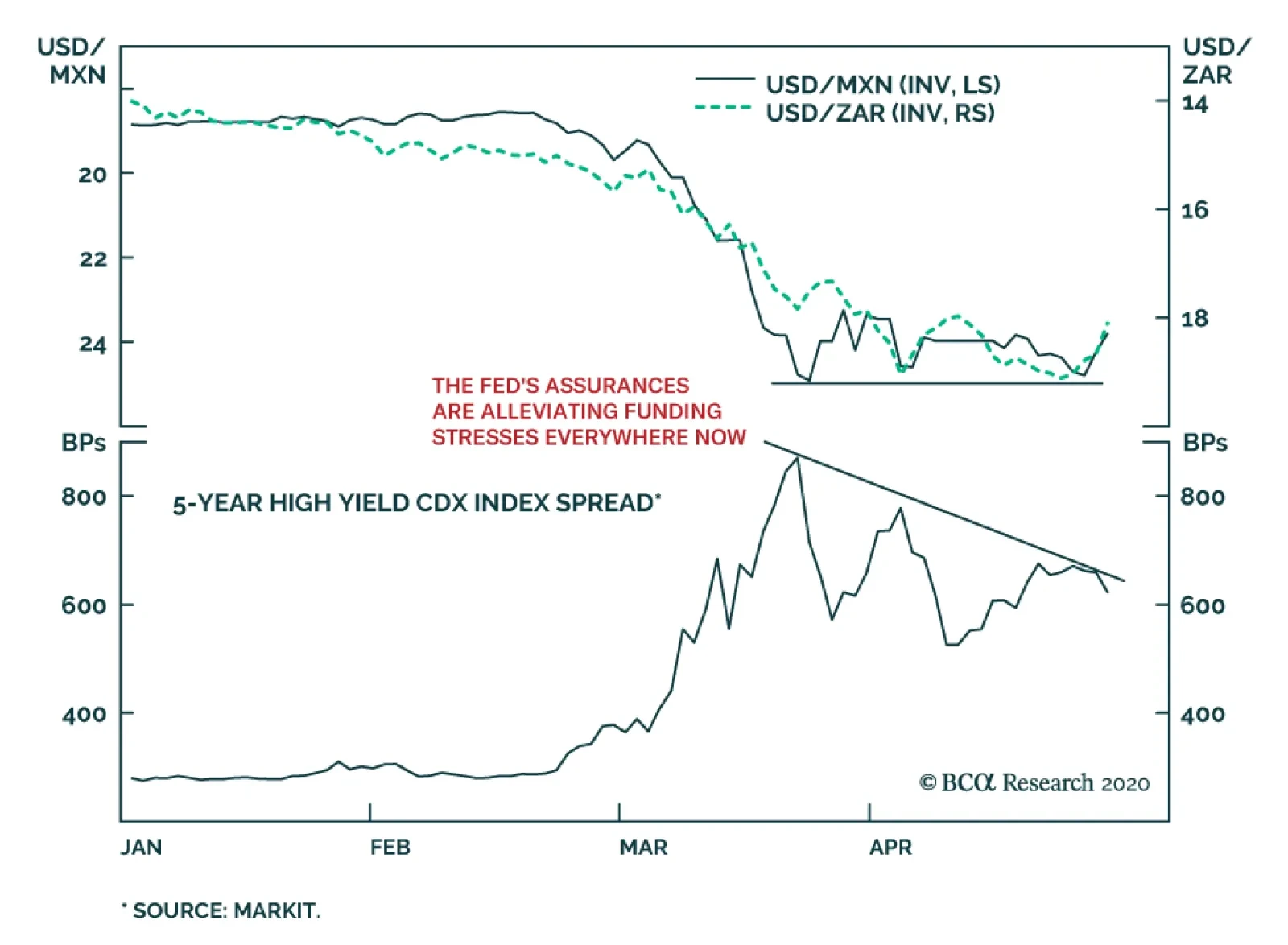
The Fed did not adjust policy yesterday. This is not much of a surprise, the FOMC announced a flurry of programs since March 15th which have allowed funding stress to fall, risk assets to stabilize, and stocks to rally sharply. Nonetheless, Chairman…
Highlights The collapse in oil prices supercharges the geopolitical risks stemming from the global pandemic and recession. Low oil prices should discourage petro-states from waging war, but Iran may be an important exception. Russian instability is one of the most important secular geopolitical consequences of this year’s crisis. President Trump’s precarious status this election year raises the possibility of provocations or reactions on his part. Europe faces instability on its eastern and southern borders in coming years, but integration rather than breakup is the response. Over a strategic time frame, go long AAA-rated municipal bonds, cyber security stocks, infrastructure stocks, and China reflation plays. Feature Chart 1Someone Took Physical Delivery!
Someone Took Physical Delivery!
Someone Took Physical Delivery!
Oil markets melted this week. Oil volatility measured by the Crude Oil ETF Volatility Index surpassed 300% as WTI futures for May 2020 delivery fell into a black hole, bottoming at -$40.40 per barrel (Chart 1). Our own long Brent trade, initiated on 27 March 2020 at $24.92 per barrel, is down 17.9% as we go to press. Strategically we are putting cash to work acquiring risk assets and we remain long Brent. The forward curve implies that prices will rise to $35 and $31 per barrel for Brent and WTI by April 2021. We initiated this trade because we assessed that: The US and EU would gradually reopen their economies (they are doing so). Oil production would be destroyed (more on this below). Russia and Saudi Arabia would agree to production cuts (they did). Monetary and fiscal stimulus would take effect (the tsunami of stimulus is still growing). Global demand would start the long process of recovery (no turn yet, unknown timing). On a shorter time horizon, we are defensively positioned but things are starting to look up on COVID-19 – New York Governor Andrew Cuomo has released results of a study showing that 15% of New Yorkers have antibodies, implying a death rate of only 0.5%. The US dollar and global policy uncertainty may be peaking as we go to press (Chart 2). However, second-order effects still pose risks that keep us wary. Chart 2Dollar And Policy Uncertainty Roaring
Dollar And Policy Uncertainty Roaring
Dollar And Policy Uncertainty Roaring
Geopolitics is the “next shoe to drop” – and it is already dropping. A host of risks are flying under the radar as the world focuses on the virus. Taken alone, not every risk warrants a risk-off positioning. But combined, these risks reveal extreme global uncertainty which does warrant a risk-off position in the near term. This week’s threats between the US and Iran, in particular, show that the political and geopolitical fallout from COVID-19 begins now, it will not “wait” until the pandemic crisis subsides. In this report we focus on the risks from oil-producing economies, but we first we update our fiscal stimulus tally. Stimulus Tsunami Chart 3Stimulus Tsunami Still Building
Drowning In Oil (GeoRisk Update)
Drowning In Oil (GeoRisk Update)
Policymakers responded to COVID-19 by doing “whatever it takes” to prop up demand (Chart 3). Please see the Appendix for our latest update of our global fiscal stimulus table. The latest fiscal and monetary measures show that countries are still adding stimulus – i.e. there is not yet a substantial shift away from providing stimulus: China has increased its measures to a total of 10% of GDP for the year so far, according to BCA Research China Investment Strategy. This includes a general increase in credit growth, a big increase in government spending (2% of GDP), a bank re-lending scheme (1.5% of GDP), an increase in general purpose local government bonds (2% of GDP), plus special purpose bonds (4% of GDP) and other measures. On the political front, the government has rolled out a new slogan, “the Six Stabilities and the Six Guarantees,” and President Xi Jinping said on an inspection tour to Shaanxi that the state will increase investments to ensure that employment is stabilized. This is the maximum reflationary signal from China that we have long expected. The US agreed to a $484 billion “fourth phase” stimulus package, bringing its total to 13% of GDP. President Trump is already pushing for a fifth phase involving bailouts of state and local governments and infrastructure, which we fully expect to take place even if it takes a bit longer than packages that have been passed so far this year. German Chancellor Angela Merkel has opened the way for the EU to issue Eurobonds, in keeping with our expectations. Germany is spending 12% of GDP in total – which can go much higher depending on how many corporate loans are tapped – while Italy is increasing its stimulus to 3% of GDP. As deficits rise to astronomical sums, and economies gradually reopen, will legislatures balk at passing new stimulus? Yes, eventually. Financial markets will have to put more pressure on policymakers to get them to pass more stimulus. This can lead to volatility. In the US the pandemic is coinciding with “peak polarization” over the 2020 election. Lack of coordination between federal and state governments is increasing uncertainty. Currently disputes center on the timing of economic reopening and the provisioning bailout funds for state and local governments. Senate Majority Leader Mitch McConnell is threatening to deny bailouts for American states with large, unfunded public pension benefits (Chart 4A). He is insisting that the Senate “push the pause button” on coronavirus relief measures; specifically that nothing new be passed until the Senate convenes in Washington on May 4. He may then lead a charge in the Republican Senate to try to require structural reforms from states in exchange for bailouts. Estimates of the total state budget shortfall due to the crisis stand at $500 billion over the next three years, which is almost certainly an understatement (Chart 4B). Chart 4AUS States Have Unfunded Liabilities
Drowning In Oil (GeoRisk Update)
Drowning In Oil (GeoRisk Update)
Chart 4BUS States Face Funding Shortfalls
Drowning In Oil (GeoRisk Update)
Drowning In Oil (GeoRisk Update)
Could a local government or state declare bankruptcy? Not anytime soon. Technically there is no provision for states to declare bankruptcy. A constitutional challenge to such a declaration would go to the Supreme Court. One commonly cited precedent, Arkansas in 1933, ended up with a federal bailout.1 A unilateral declaration could conceivably become a kind of “Lehman moment” in the public sector, but state governors will ask their legislatures to provide more fiscal flexibility and will seek bailouts from the federal government first. The Federal Reserve is already committed to buying state and local bonds and can expand these purchases to keep interest rates low. Washington would be forced to provide at least short-term funding if state workers started getting fired in the midst of the crisis because of straightened state finances – another $500 billion for the states is entirely feasible in today’s climate. Constraints will prevail on the GOP Senate to provide state bailout funds. This conflict over state finances could have a negative impact on US equities in the near term, but it is largely a bluff – McConnell will lose this battle. The fundamental dynamic in Washington is that of populism combined with a pandemic that neutralizes arguments about moral hazard. Big-spending Democrats in the House of Representatives control the purse strings while big-spending President Trump faces an election. Senate Republicans are cornered on all sides – and their fate is tied to the President’s – so they will eventually capitulate. Bottom Line: The global fiscal and monetary policy tsunami is still building. But there are plenty of chances for near-term debacles. Over the long run the gargantuan stimulus is the signal while the rest is noise. Over the long run we expect the reflationary efforts to prevail and therefore we are long Treasury inflation-protected securities and US investment grade corporate bonds. We recommend going strategically long AAA-rated US municipal bonds relative to 10-year Treasuries. Petro-State Meltdown Since March we have highlighted that the collapse in oil prices will destabilize oil producers above and beyond the pandemic and recession. This leaves Iran in danger, but even threatens the stability of great powers like Russia. Normally there is something of a correlation between the global oil price and the willingness of petro-states to engage in war (Chart 5). Chart 5Petro-States Cease Fire When Oil Drops
Drowning In Oil (GeoRisk Update)
Drowning In Oil (GeoRisk Update)
When prices fall, revenues dry up and governments have to prioritize domestic stability. This tends to defer inter-state conflict. We can loosely corroborate this evidence by showing that global defense stocks tend to be correlated with oil prices (Chart 6). Global growth is the obvious driver of both of these indicators. But states whose budgets are closely tied to the commodity cycle are the most likely to cut defense spending. Chart 6Global Growth Drives Oil And Guns
Global Growth Drives Oil And Guns
Global Growth Drives Oil And Guns
Russia is case in point. Revenues from Rostec, one of Russia’s largest arms firms, rise and fall with the Urals crude oil price (Chart 7). The Russians launch into foreign adventures during oil bull markets, when state coffers are flush with cash. They have an uncanny way of calling the top of the cycle by invading countries (Chart 8). Chart 7Oil Correlates With Russian Arms Sales
Drowning In Oil (GeoRisk Update)
Drowning In Oil (GeoRisk Update)
Chart 8Russian Invasions Call Peak In Oil Bull Markets
Russian Invasions Call Peak In Oil Bull Markets
Russian Invasions Call Peak In Oil Bull Markets
Chart 9Turkish Political Risk On The Rise
Turkish Political Risk On The Rise
Turkish Political Risk On The Rise
In the current oil rout, there is already some evidence of hostilities dying down in this way. For instance, after years of dogged fighting in Yemen, Saudi Arabia is finally declaring a ceasefire there. Turkey, which benefits from low oil prices, has temporarily gotten the upper hand in Libya vis-à-vis Khalifa Haftar and the Libyan National Army, which depends on oil revenues and backing from petro-states like Russia and the GCC. Of course, Turkey’s deepening involvement in foreign conflicts is evidence of populism at home so it does not bode well for the lira or Turkish assets (Chart 9). But it does highlight the impact of weak oil on petro-players such as Haftar. However, the tendency of petro-states to cease fire amid low prices is merely a rule of thumb, not a law of physics. Past performance is no guarantee of future results. Already we are seeing that Iran is defying this dynamic by engaging in provocative saber-rattling with the United States. Iran And Iraq The US and Iran are rattling sabers again. One would think that Iran, deep in the throes of recession and COVID-19, would eschew a conflict with the US at a time when a vulnerable and anti-Iranian US president is only seven months away from an election. Chart 10US Maximum Pressure On Iran
US Maximum Pressure On Iran
US Maximum Pressure On Iran
Iran has survived nearly two years of “maximum pressure” from President Trump (Chart 10), and previous US sanction regimes, and has a fair chance of seeing the Democrats retake Washington. The Democrats would restart negotiations to restore the 2015 nuclear deal, which was favorable to Iran. Therefore risking air strikes from President Trump is counterproductive and potentially disastrous. Yet this logic only holds if the Iranian regime is capable of sustaining the pain of a pandemic and global recession on top of its already collapsing economy. Iran’s ability to circumvent sanctions to acquire funds depended on the economy outside of Iran doing fine. Now Iran’s illicit funds are drying up. This could lead to a pullback in funding for militant proxies across the region as Iran cuts costs. But it also removes the constraint on Iran taking bolder actions. If the economy is collapsing anyway then Iran can take bigger risks. Furthermore if Iran is teetering, there may be an incentive to initiate foreign conflicts to refocus domestic angst. This could be done without crossing Trump’s red lines by attacking Iraq or Saudi Arabia. With weak oil demand, Iran’s leverage declines. But a major attack would reduce oil production and accelerate the global supply-demand rebalance. Iran’s attack on the Saudi Abqaiq refinery last September took six million barrels per day offline briefly, but it was clearly not intended to shut down that production permanently. Threats against shipping in the Persian Gulf bring about 14 million barrels per day into jeopardy (Chart 11). Chart 11Closing Hormuz Would Be The Biggest Oil Shock Ever
Drowning In Oil (GeoRisk Update)
Drowning In Oil (GeoRisk Update)
Iran-backed militias in Iraq have continued to attack American assets and have provoked American air strikes over the past month, despite the near-war scenario that erupted just before COVID. Iranian ships have harassed US naval ships in recent days. President Trump has ordered the navy to destroy ships that threaten it; Iranian commander has warned that Iran will sink US warships that threaten its ships in the Gulf. There is a 20% chance of armed hostilities between the US and Iran. Why would Iran be willing to confront the United States? First, Iran rightly believes that the US is war-weary and that Trump is committed to withdrawing from the Middle East. But this could prompt a fateful mistake. The equation changes if the US public is incensed and Trump’s election campaign could benefit from conflict. Chart 12Youth Pose Stability Risk To Iran
Youth Pose Stability Risk To Iran
Youth Pose Stability Risk To Iran
Second, the US is never going to engage in a ground invasion of Iran. Airstrikes would not easily dislodge the regime. They could have the opposite effect and convert an entire generation of young, modernizing Iranians into battle-hardened supporters of the Islamic revolution (Chart 12). This is a dire calculation that the Iranian leaders would only make if they believed their regime was about to collapse. But they are quite possibly the closest to collapse that they have been since the 1980s and nobody knows where their pain threshold lies. They are especially vulnerable as the regime approaches the uncharted succession of Supreme Leader Ali Khamanei. Since early 2018 we have argued that there is a 20% chance of armed hostilities between the US and Iran. We upgraded this to 40% in June 2019 and downgraded it back to 20% after the Iranians shied from direct conflict this January. Our position remains the same 20%. This is still a major understated risk at a time when the global focus is entirely elsewhere. It will persist into 2021 if Trump is reelected. If the Democrats win the US election, this war risk will abate. The Iranians will play hard to get but they are politically prohibited from pursuing confrontation with the US when a 2015-type deal is available. This would open up the possibility for greater oil supply to be unlocked in the future, but sanctions are not likely to be lifted till 2022 at earliest. Russia Russia may not be on the verge of invading anyone, but it is internally vulnerable and fully capable of striking out against foreign opponents. Cyberattacks, election interference, or disinformation campaigns would sow confusion or heighten tensions among the great powers. The Russian state is suffering a triple whammy of pandemic, recession, and oil collapse. President Vladimir Putin’s approval rating has fallen this year so far, whereas other leaders in the western world have all seen polling bounces (even President Trump, slightly) (Chart 13). Putin postponed a referendum designed to keep him in office through 2036 due to the COVID crisis. In other words, the pandemic has already disrupted his carefully laid succession plans. While Putin can bypass a referendum, he would have been better off in the long run with the public mandate. Generally it is Putin’s administration, not his personal popularity, that is at risk, but the looming impact on Russian health and livelihoods puts both in jeopardy (Chart 14) and requires larger fiscal outlays to try to stabilize approval (Chart 15). Chart 13Putin Saw No COVID Popularity Bump
Drowning In Oil (GeoRisk Update)
Drowning In Oil (GeoRisk Update)
Chart 14Russian Regime Faces Political Discontent
Russian Regime Faces Political Discontent
Russian Regime Faces Political Discontent
Moreover, regardless of popular opinion, Putin is likely to settle scores with the oligarchs. The fateful decision to clash with the Saudis in March, which led to the oil collapse, will fall on Igor Sechin, Chief Executive of Rosneft, and his faction. An extensive political purge may well ensue that would jeopardize domestic stability (Chart 16). Chart 15Russia To Focus On Domestic Stability
Russia To Focus On Domestic Stability
Russia To Focus On Domestic Stability
Chart 16Russian Political Risk Will Rise
Russian Political Risk Will Rise
Russian Political Risk Will Rise
Russian tensions with the US will rise over the US election in November. The Democrats would seek to make Russia pay for interfering in US politics to help President Trump win in 2016. But even President Trump may no longer be a reliable “ally” of Putin given that Putin’s oil tactics have bankrupted the US shale industry during Trump’s reelection campaign. The American and Russian air forces are currently sparring in the air space over Syria and the Mediterranean. The US has also warned against a malign actor threatening to hack the health care system of the Czech Republic, which could be Russia or another actor like North Korea or Iran. These issues have taken place off the radar due to the coronavirus but they are no less real for that. Venezuela We have predicted Venezuela’s regime change for several years but the oil meltdown, pandemic, and insufficient Russian and Chinese support should put the final nail in the regime’s coffin. Hugo Chavez’s rise to power, the last “regime change,” occurred as oil prices bottomed in 1998. Historically the Venezuelan armed forces have frequently overthrown civilian authorities, but in several cases not until oil prices recovered (Chart 17). Chart 17Venezuelan Coups Follow Oil Rebounds
Venezuelan Coups Follow Oil Rebounds
Venezuelan Coups Follow Oil Rebounds
The US decision to designate Nicolas Maduro as a “narco-terrorist,” to deploy greater naval and coast guard assets around Venezuela, to reassert the Monroe Doctrine and Roosevelt Corollary, and to pull Chevron from the country all suggest that Washington is preparing for regime change. Such a change may or may not involve any American orchestration. Venezuela is an easy punching-bag for President Trump if he seeks to “wag the dog” ahead of the election. Venezuela would be a strategic prize and yet it cannot hurt the US economy or financial markets substantially, giving limited downside to President Trump if he pursues such a strategy. Obviously any conflict with Venezuela this year is far less relevant to global investors than one with Iran, North Korea, China, or Russia. Regime change would be positive for oil supply and negative for prices over the long run. But that is a story for the next cycle of energy development, as it would take years for government and oil industry change in Venezuela to increase production. The US election cycle is a critical aggravating factor for all of these petro-state risks. Shale producers are going bankrupt, putting pressure on the economy and some swing states. The risk of a conflict arises not only from Trump playing “wag the dog” after the crisis abates, but also from other states provoking the president, causing him to react or overreact. The “Other Guys” Oil producers outside the US, Canada, gulf OPEC, and Russia – the “other guys” – are extremely vulnerable to this year’s global crisis and price collapse. Comprising half of global production, they were already seeing production declines and a falling global market share over the past decade when they should have benefited from a global economic expansion. They never recovered from the 2014-15 oil plunge and market share war (Chart 18). Angola (1.4 million barrels per day), Algeria (one million barrels per day), and Nigeria (1.8 million barrels per day) are relatively sizable producers whose domestic stability is in question in the coming years as they cut budgets and deplete limited forex reserves to adjust to the lower oil price. This means fewer fiscal resources to keep political and regional factions cooperating and provide basic services. Algeria is particularly vulnerable. President Abdelaziz Bouteflika, who ruled as a strongman from 1999, was forced out last year, leaving a power vacuum that persists under Prime Minister Abdelaziz Djerad, in the wake of the low-participation elections in December. An active popular protest movement, Hirak, already exists and is under police suppression. Unemployment is high, especially among the youth. Neighboring Libya is in the midst of a war and extremist militants within Libya and North Africa would like to expand their range of operations in a destabilized Algeria. Instability would send immigrants north to Europe. Oil production will be reduced involuntarily as well as voluntarily this year due to regime failures. Brazil is not facing the risk of state failure like Algeria, but it is facing a deteriorating domestic political outlook (Chart 19). President Jair Bolsonaro’s popularity was already low relative to most previous presidents before COVID. His narrow base in the Chamber of Deputies got narrower when he abandoned his political party. He has defied the pandemic, refused to endorse social distancing or lockdown orders by local governments, and fired his Health Minister Luiz Henrique Mandetta. Chart 18Petro-States: 'Other Guys' Face Instability
Petro-States: 'Other Guys' Face Instability
Petro-States: 'Other Guys' Face Instability
Chart 19Brazilian Political Risk Rising Again
Brazilian Political Risk Rising Again
Brazilian Political Risk Rising Again
Brazil has a high number of coronavirus deaths per million people relative to other emerging markets with similar health capacity and susceptibility to the disease. This, combined with sharply rising unemployment, could prove toxic for Bolsonaro, who has not received a bounce in popular opinion from the crisis like most other world leaders. Thus on balance we expect the October local elections to mark a comeback for the Worker’s Party. The limited fiscal gains of Bolsonaro’s pension reform are already wiped out by the global recession, which will set back the country’s frail recovery from its biggest recession in a century. The country is still on an unsustainable fiscal path. Bolsonaro does not have a strong personal commitment to neoliberal structural reform, which has been put aside anyway due to the need for government fiscal spending amid the crisis. Unless Bolsonaro’s popularity increases in the wake of the crisis – due to backlash against the state-level lockdowns – the economic shock is negative for Brazil’s political stability and economic policy orthodoxy. Bottom Line: Our rule of thumb about petro-states suggests that they will generally act less aggressive amid a historic oil price collapse, but Iran may prove a critical exception. Investors should not underestimate the risk of a US-Iran conflict this year. Beyond that, the US election will have a decisive impact as the Democrats will seek to resume the Iranian nuclear deal and Iran would eventually play ball. Venezuela is less globally relevant this year – although a “wag the dog” scenario is a distinct possibility – but it may well be a major oil supply surprise in the 2020s. More broadly the takeaway is that oil production will be reduced involuntarily as well as voluntarily this year due to regime failures. Investment Takeaways Obviously any conflict with Iran could affect the range of Middle Eastern OPEC supply, not just the portion already shuttered due to sanctions on Iran itself. Any Iran war risk is entirely separate from the risk of supply destruction from more routine state failures in Africa. These shortages have been far less consequential lately and have plenty of room to grow in significance (Chart 20). The extreme lows in oil prices today will create the conditions for higher oil prices later when demand recovers, via supply destruction. Chart 20More Unplanned Outages To Come
Drowning In Oil (GeoRisk Update)
Drowning In Oil (GeoRisk Update)
Chart 21European Political Risk No Longer Underrated
European Political Risk No Longer Underrated
European Political Risk No Longer Underrated
An important implication – to be explored in future reports – is that Europe’s neighborhood is about to get a lot more dangerous in the coming years, as the Middle East and Russia will become less stable. Middle East instability will result in new waves of immigration and terrorism after a lull since 2015-16. These waves would fuel right-wing political sentiment in parts of Europe that are the most vulnerable in today’ crisis: Italy, Spain, and France (Chart 21). This should not be equated with the EU breaking apart, however, as the populist parties in these countries are pursuing soft rather than hard Euroskepticism. Unless that changes the risk is to the Euro Area’s policy coherence rather than its existence. Finally Russian domestic instability is one of the major secular consequences of the pandemic and recession and its consequences could be far-reaching, particularly in its great power struggle with the United States. We are reinitiating a strategic long in cyber security stocks, the ISE Cyber Security Index, relative to the S&P500 Info Tech sector. Cyberattacks are a form of asymmetrical warfare that we expect to ramp up with the general increase in global geopolitical tensions. The US’s recent official warning against an unknown actor that apparently intended to attack the health system of the Czech Republic highlights the way in which malign actors could attempt to capitalize on the chaos of the pandemic. We also recommend strategic investors reinitiate our “China Play Index” – commodities and equities sensitive to China’s reflation – and our BCA Infrastructure Basket, which will benefit from Chinese reflation as well as US deficit spending. China’s reflation will help industrial metals more so than oil, but it is positive for the latter as well. Matt Gertken Vice President Geopolitical Strategist mattg@bcaresearch.com Footnotes 1 John Mauldin, "Don't Be So Sure That States Can't Go Bankrupt," Forbes, July 28, 2016, forbes.com. Section II: Appendix : GeoRisk Indicator China
China: GeoRisk Indicator
China: GeoRisk Indicator
Russia
Russia: GeoRisk Indicator
Russia: GeoRisk Indicator
UK
UK: GeoRisk Indicator
UK: GeoRisk Indicator
Germany
Germany: GeoRisk Indicator
Germany: GeoRisk Indicator
France
France: GeoRisk Indicator
France: GeoRisk Indicator
Italy
Italy: GeoRisk Indicator
Italy: GeoRisk Indicator
Canada
Canada: GeoRisk Indicator
Canada: GeoRisk Indicator
Spain
Spain: GeoRisk Indicator
Spain: GeoRisk Indicator
Taiwan
Taiwan: GeoRisk Indicator
Taiwan: GeoRisk Indicator
Korea
Korea: GeoRisk Indicator
Korea: GeoRisk Indicator
Turkey
Turkey: GeoRisk Indicator
Turkey: GeoRisk Indicator
Brazil
Brazil: GeoRisk Indicator
Brazil: GeoRisk Indicator
Appendix Table 1 The Global Fiscal Stimulus Response To COVID-19
Drowning In Oil (GeoRisk Update)
Drowning In Oil (GeoRisk Update)
Section III: Geopolitical Calendar
Highlights Yesterday we published a Special Report titled EM: Foreign Currency Debt Strains. We are upgrading our stance on EM local currency bonds from negative to neutral. Before upgrading to a bullish stance, we would first need to upgrade our stance on EM currencies. We recommend receiving long-term swap rates in Russia, Mexico, Colombia, China and India. EM central banks’ swap lines with the Fed could be used to fend off short-term speculative attacks on EM currencies. Nevertheless, they cannot prevent EM exchange rates from depreciation when fundamental pressures warrant weaker EM currencies. For the rampant expansion of US money supply to produce a lasting greenback depreciation, US dollars should be recycled abroad. This is not yet occurring. Domestic Bonds: A New Normal Chart I-1Performance Of EM Domestic Bonds In The Last Decade
Performance Of EM Domestic Bonds In The Last Decade
Performance Of EM Domestic Bonds In The Last Decade
In recent years, our strategy has favored the US dollar and, by extension, US Treasurys over EM domestic bonds. Chart I-1 demonstrates that the EM GBI local currency bond total return index in US dollar terms is at the same level as it was in 2011, and has massively underperformed 5-year US Treasurys. We are now upgrading our stance on EM local currency bonds from negative to neutral. Consistently, we recommend investors seek longer duration in EM domestic bonds while remaining cautious on the majority of EM currencies. Before upgrading to a bullish stance on EM local bonds, we would first need to upgrade our stance on EM currencies. Still, long-term investors who can tolerate volatility should begin accumulating EM local bonds on any further currency weakness. Our upgrade is based on the following reasons: First, there has been a fundamental shift in EM central banks’ policies. In past global downturns, many EM central banks hiked interest rates to defend their currencies. Presently, they are cutting rates aggressively despite large currency depreciation. This is the right policy action to fight the epic deflationary shock that EM economies are presently facing. There has been a fundamental shift in EM central banks’ policies. They are cutting rates aggressively despite large currency depreciation. Historically, EM local bond yields were often negatively correlated with exchange rates (Chart I-2, top panel). Similarly, when EM currencies began plunging two months ago, EM local bond yields initially spiked. However, following the brief spike, bond yields have begun dropping, even though EM currencies have not rallied (Chart I-2, bottom panel). This represents a new normal, which we discussed in detail in our October 24 report. Overall, even if EM currencies continue to depreciate, EM domestic bond yields will drop as they price in lower EM policy rates. Second, the monetary policy transmission mechanism in many EMs was broken before the COVID-19 outbreak. Even though central banks in many developing countries were reducing their policy rates before the pandemic, commercial banks’ corresponding lending rates were not dropping much (Chart I-3, top panel). Chart II-2EM Local Bond Yields And EM Currencies
EM Local Bond Yields And EM Currencies
EM Local Bond Yields And EM Currencies
Chart I-3EM ex-China: Monetary Transmission Has Been Impaired
EM ex-China: Monetary Transmission Has Been Impaired
EM ex-China: Monetary Transmission Has Been Impaired
Further, core inflation rates were at all time lows and prime lending rates in real terms were extremely high (Chart I-3, middle panels). Consequently, bank loan growth was slowing preceding the pandemic (Chart I-3, bottom panel). The reason was banks’ poor financial health. Saddled with a lot of NPLs, banks had been seeking wide interest rate margins to generate profit and recapitalize themselves. With the outburst of the pandemic and the sudden stop in domestic and global economic activity, EM banks’ willingness to lend has all but evaporated. Chart I-4 reveals EM ex-China bank stocks have plunged, despite considerable monetary policy easing in EM, which historically was bullish for bank share prices. This upholds the fact that the monetary policy transmission mechanism in EM is broken. Mounting bad loans due to the pandemic will only reinforce these dynamics. Swap lines with the Fed cannot prevent EM exchange rates from depreciation when fundamental pressures – global and domestic recessions – warrant weaker EM currencies. In brief, EM lower policy rates will not be transmitted to lower borrowing costs for companies and households anytime soon. Loan growth and domestic demand will remain in an air pocket for some time. Consequently, EM policy rates will have to drop much lower to have a meaningful impact on growth. Third, there is value in EM local yields. The yield differential between EM GBI local currency bonds and 5-year US Treasurys shot up back to 500 basis points, the upper end of its historical range (Chart I-5). Chart I-4EM ex-China: Bank Stocks Plunged Despite Rate Cuts
EM ex-China: Bank Stocks Plunged Despite Rate Cuts
EM ex-China: Bank Stocks Plunged Despite Rate Cuts
Chart I-5The EM Vs. US Yield Differential Is Attractive
The EM Vs. US Yield Differential Is Attractive
The EM Vs. US Yield Differential Is Attractive
Bottom Line: Odds favor further declines in EM local currency bond yields. Fixed-income investors should augment their duration exposure. We express this view by recommending receiving swap rates in the following markets: Russia, Mexico, Colombia, India and China. This is in addition to our existing receiver positions in Korean and Malaysian swap rates. For more detail, please refer to the Investment Recommendations section on page 8. Nevertheless, absolute-return investors should be cognizant of further EM currency depreciation. EM Currencies: At Mercy Of Global Growth Chart I-6EM Currencies Correlate With Commodities Prices
EM Currencies Correlate With Commodities Prices
EM Currencies Correlate With Commodities Prices
The key driver of EM currencies has been and remains global growth. The latter will remain very depressed for some time, warranting patience before turning bullish on EM exchange rates. We have long argued that EM exchange rates are driven not by US interest rates but by global growth. Industrial metals prices offer a reasonable pulse on global growth. Chart I-6 illustrates their tight correlation with EM currencies. Even though the S&P 500 has rebounded sharply in recent weeks, there are no signs of a meaningful improvement in industrial metals prices. Various raw materials prices in China are also sliding (Chart I-7). In a separate section below we lay out the case as to why there is more downside in iron ore and steel as well as coal prices in China. Finally, the ADXY – the emerging Asia currency index against the US dollar – has broken down below its 2008, 2016 and 2018-19 lows (Chart I-8). This is a very bearish technical profile, suggesting more downside ahead. This fits with our fundamental assessment that a recovery in global economic activity is not yet imminent. Chart I-7China: Commodities Prices Are Sliding
China: Commodities Prices Are Sliding
China: Commodities Prices Are Sliding
Chart I-8A Breakdown In Emerging Asian Currencies
A Breakdown In Emerging Asian Currencies
A Breakdown In Emerging Asian Currencies
What About The Fed’s Swap Lines? A pertinent question is whether EM central banks’ foreign currency reserves and the Federal Reserve’s swap lines with several of its EM counterparts are sufficient to prop up EM currencies prior to a pickup in global growth. The short answer is as follows: These swap lines will likely limit the downside but cannot preclude further depreciation. With the exception of Turkey and South Africa, virtually all mainstream EM banks have large foreign currency reserves. On top of this, several of them – Brazil, Mexico, South Korea and Singapore– have recently obtained access to Fed swap lines. Their own foreign exchange reserves and the swap lines with the Fed give them an option to defend their currencies from depreciation if they choose to do so. However, selling US dollars by EM central banks is not without cost. When central banks sell their FX reserves or dollars obtained from the Fed via swap lines, they withdraw local currency liquidity from the system. As a result, banking system liquidity shrinks, pushing up interbank rates. This is equivalent to hiking interest rates. The Fed’s outright money printing is the sole reason to buy EM risk assets and currencies at the moment. Yet, EM fundamentals – namely, its growth outlook – remain downbeat. Hence, the cost of defending the exchange rate by using FX reserves is both liquidity and credit tightening. In such a case, the currency could stabilize but the economy will take a beating. Since the currency depreciation was itself due to economic weakness, such a policy will in and of itself be self-defeating. The basis is that escalating domestic economic weakness will re-assert its dampening effect on the currency. Of course, EM central banks can offset such tightening by injecting new liquidity. However, this could also backfire and lead to renewed currency depreciation. Bottom Line: EM central banks’ swap lines with the Fed are primarily intended to instill confidence among investors in financial markets. They could be used to fend off short-term speculative attacks on EM currencies. Nevertheless, they cannot prevent EM exchange rates from depreciation when fundamental pressures – global and domestic recessions – warrant weaker EM currencies. What About The Fed’s Money Printing? Chart I-9The Fed Is Aggressively Printing Money
The Fed Is Aggressively Printing Money
The Fed Is Aggressively Printing Money
The Fed is printing money and monetising not only public debt but also substantial amounts of private debt. This will ultimately be very bearish for the US dollar. Chart I-9 illustrates that the Fed is printing money much more aggressively than during its quantitative easing (QE) policies post 2008. The key difference between the Fed’s liquidity provisions now and during its previous QEs is as follows: When the Fed purchases securities from or lends to commercial banks, it creates new reserves (banking system liquidity) but it does not create money supply. Banks’ reserves at the Fed are not a part of broad money supply. This was generally the case during previous QEs when the Fed was buying bonds mostly – but not exclusively – from banks, therefore increasing reserves without raising money supply by much. When the Fed lends to or purchases securities from non-banks, it creates both excess reserves for the banking system and money supply (deposits at banks) out of thin air. The fact that US money supply (M2) growth is now much stronger than during the 2010s QEs suggests the recent surge in US money supply is due to the Fed’s asset purchases from and lending to non-banks, which creates money/deposits outright. The rampant expansion of US money supply will eventually lead to the greenback’s depreciation. However, for the US dollar to depreciate against EM currencies, the following two conditions should be satisfied: 1. US imports should expand, reviving global growth, i.e., the US should send dollars to the rest of the world by buying goods and services. This is not yet happening as domestic demand in America has plunged and any demand recovery in the next three to six months will be tame and muted. 2. US investors should channel US dollars to EM to purchase EM financial assets. In recent weeks, foreign flows have been returning to EM due to the considerable improvement in EM asset valuations. However, the sustainability of these capital flows into EM remains questionable. The main reasons are two-fold: (A) there is huge uncertainty on how efficiently EM countries will be able handle the economic and health repercussions of the pandemic; and (B) global growth remains weak and, as we discussed above, it has historically been the main driver of EM risk assets and currencies. Bottom Line: The Fed’s outright money printing is the sole reason to buy EM risk assets and currencies at the moment. Yet, EM fundamentals – namely, its growth outlook – remain downbeat. Overall, we recommend investors to stay put on EM risk assets and currencies in the near-term. Investment Recommendations Chart I-10China: Bet On Lower Long-Term Yields
China: Bet On Lower Long-Term Yields
China: Bet On Lower Long-Term Yields
We have been recommending receiving rates in a few markets such as Korea and Malaysia. Now, we are widening this universe to include Russia, Mexico, Colombia, China, and India. In China, the long end of the yield curve offers value (Chart I-10, top panel). The People’s Bank of China has brought down short rates dramatically but the long end has so far lagged (Chart I-10, bottom panel). We recommend investors receive 10-year swap rates. Fixed-income investors could also bet on yield curve flattening. The recovery in China will be tame and the PBoC will keep interest rates lower for longer. Consequently, long-dated swap rates will gravitate toward short rates. We are closing three fixed-income trades: In Mexico, we are booking profits on our trade of receiving 2-year / paying 10-year swap rates – a bet on a steeper yield curve. This position has generated a 152 basis-point gain since its initiation on April 12, 2018. In Colombia, our bet on yield curve flattening has produced a loss of 28 basis points since January 17, 2019. We are closing it. In Chile, we are closing our long 3-year bonds / short 3-year inflation-linked bonds position. This trade has returned 2.0% since we recommended it on October 3, 2019. For dedicated EM domestic bond portfolios, our overweights are Russia, Mexico, Peru, Colombia, Korea, Malaysia, Thailand, India, China, Pakistan and Ukraine. Our underweights are South Africa, Turkey, Brazil, Indonesia and the Philippines. The remaining markets warrant a neutral allocation. Regarding EM currencies, we continue to recommend shorting a basket of the following currencies versus the US dollar: BRL, CLP, ZAR, IDR, PHP and KRW. Arthur Budaghyan Chief Emerging Markets Strategist arthurb@bcaresearch.com Chinese Steel, Iron Ore And Coal Markets: Heading South Chart II-1Steel, Iron Ore And Coal Prices: More Downside Ahead?
Steel, Iron Ore And Coal Prices: More Downside Ahead?
Steel, Iron Ore And Coal Prices: More Downside Ahead?
Odds are that iron ore, steel and coal prices will all continue heading south (Chart II-1). Lower prices will harm both Chinese and global producers of these commodities. Steel And Iron Ore The oversupplied conditions in the Chinese steel market will become even more aggravated over the next three to six months. First, Chinese output of steel products has not contracted even though demand plunged in the first three months of the year, creating oversupply. Despite falling steel prices and the demand breakdown resulting from the COVID-19 outbreak, Chinese crude steel output still grew at 1.5% and its steel products output only declined 0.6% between January and March from a year ago (Chart II-2). Chart II-2Steel Products Output In China: Still No Contraction
Steel Products Output In China: Still No Contraction
Steel Products Output In China: Still No Contraction
The profit margin of Chinese steel producers has compressed but not enough to herald a sizable cut in mainland steel production. Despite oversupply, Chinese steel producers are reluctant to curtail output to prevent layoffs. This year, there will be 62 million tons of new steel production capacity while 82 million tons of obsolete capacity will be shut down. As the capacity-utilization rate (CUR) of the new advanced production capacity will be much higher than the CUR on those soon-to-be-removed capacities in previous years, this will help lift steel output. Second, Chinese steel demand has plummeted, and any revival will be mild and gradual over the next three to six months. Construction accounts for about 55% of Chinese steel demand, with about 35% coming from the property market and 20% from infrastructure. Additionally, the automobile industry contributes about 10% of demand. All three sectors are currently in deep contraction (Chart II-3). Looking ahead, we expect that the demand for steel from property construction and automobile production will revive only gradually. Overall, it will continue contracting on a year-on-year basis, albeit at a diminishing rate than now. While we projected a 6-8% rise in Chinese infrastructure investment for this year, most of that will be back-loaded to the second half of the year. In addition, modest and gradual steel demand increases from this source will not be able to offset the loss of demand from the property and automobile sectors. The oversupplied conditions in the Chinese steel market will become even more aggravated over the next three to six months. Reflecting the disparity between weak demand and resilient supply, steel inventories in the hands of producers and traders are surging, which also warrants much lower prices (Chart II-4). Chart II-3Deep Contraction In Steel Demand From Major Users
Deep Contraction In Steel Demand From Major Users
Deep Contraction In Steel Demand From Major Users
Chart II-4Significant Build-Up In Steel Inventories
Significant Build-Up In Steel Inventories
Significant Build-Up In Steel Inventories
Chart II-5Chinese Iron Ore Imports Will Likely Decline In 2020
Chinese Iron Ore Imports Will Likely Decline In 2020
Chinese Iron Ore Imports Will Likely Decline In 2020
Regarding iron ore, mushrooming steel inventories in China and lower steel prices will eventually lead to steel output cutbacks in the country. This will be compounded by shrinking steel production outside of China, dampening global demand for iron ore. Besides, in China, scrap steel prices have fallen more sharply than iron ore prices have. This makes the use of scrap steel more appealing than iron ore in steel production. Chinese iron ore imports will likely drop this year (Chart II-5). Finally, the global output of iron ore is likely to increase in 2020. The top three producers (Vale, Rio Tinto and BHP) have all set their 2020 guidelines above their 2019 production levels. This will further weigh on iron ore prices. Coal Although Chinese coal prices will also face downward pressure, we believe that the downside will be much less than that for steel and iron ore prices. Coal prices have already declined nearly 27% from their 2019 peak. They recently declined below 500 RMB per ton – the lower end of a range that the government generally tries to maintain. Prices had not dropped below this level since September 2016. In the near term, prices could go down by another 5-10%, given that record-high domestic coal production and imports have overwhelmed the market (Chart II-6). Coal prices have already declined nearly 27% from their 2019 peak. They recently declined below 500 RMB per ton – the lower end of a range that the government generally tries to maintain. However, there are emerging supportive forces. China Coal Transport & Distribution Association (CCTD), the nation’s leading industry group, on April 18, called on the industry to slash production (of both thermal and coking coal) in May by 10%. It also proposed that the government should restrict imports. The CCTD stated that about 42% of the producers are losing money at current coal prices. The government had demanded producers make similar cuts for a much longer time duration in 2016, which pushed coal to sky-high prices. The outlook for a revival in the consumption of electricity and, thereby, in the demand for coal is more certain than it is for steel and iron ore. About 60% of Chinese coal is used to generate thermal power. Finally, odds are rising that the government will temporarily impose restrictions on coal imports as it did last December – when coal imports to China fell by 70% as a result. Investment Implications Companies and countries producing these commodities will be hurt by the reduction of Chinese purchases. These include, but are not limited to, producers in Indonesia, Australia, Brazil and South Africa. Iron ore and coal make up 10% of total exports in Brazil, 6% in South Africa, 18% in Indonesia and 32% in Australia. Investors should avoid global steel and mining stocks (Chart II-7). Chart II-6Chinese Coal Output And Imports Are At Record Highs
Chinese Coal Output And Imports Are At Record Highs
Chinese Coal Output And Imports Are At Record Highs
Chart II-7Avoid Global Steel And Mining Stocks For Now
Avoid Global Steel And Mining Stocks For Now
Avoid Global Steel And Mining Stocks For Now
We continue to recommend shorting BRL, ZAR and IDR versus the US dollar. Ellen JingYuan He Associate Vice President ellenj@bcaresearch.com Footnotes Equities Recommendations Currencies, Credit And Fixed-Income Recommendations
Dear Client, Please join me and my fellow BCA Strategists Caroline Miller and Arthur Budaghyan for a live webcast tomorrow, Friday, April 24 at 8:00 AM EDT (1:00 PM BST, 2:00 PM CEST, 8:00 PM HKT) where we will discuss the outlook for developed and emerging market equities over the immediate (0-3 month) and cyclical (12 month) horizon. In lieu of our regular report next week, we will be sending you a Special Report from my colleague Jonathan LaBerge. Jonathan will discuss the global fiscal response to the COVID-19 pandemic, and will provide some perspective on whether the response will be enough to prevent an "L-shaped" economic outcome. I hope you find the report insightful. Best regards, Peter Berezin, Chief Global Strategist Highlights Theoretically, the pandemic could raise the long-term fair value of equities – as proxied by the present value of future cash flows – if it causes the discount rate to fall by more than enough to offset the decline in corporate earnings. While such a seemingly bizarre outcome is not our base case, it cannot be easily dismissed, especially since the evidence suggests that real long-term interest rates have fallen a lot more since the start of the pandemic than have earnings estimates. We consider a number of challenges to this claim, including: current earnings estimates are too optimistic; long-term interest rates are being distorted by QE and other factors; and the equity risk premium will be higher in a post-pandemic world. While all these counterarguments have merit, none of them are airtight. Even if the pandemic ultimately boosts stock prices, the path to new highs will be a bumpy one. In the near term, a slew of bad economic data could cause another bout of market turbulence. Nevertheless, over a 12-month horizon, investors should continue to overweight equities relative to cash and bonds. The plunge in front-end oil futures this week was a timely reminder of the extent to which the pandemic has suppressed crude demand. Oil prices should bounce back later this year as global growth recovers, the dollar weakens, and more oil supply is taken offline. A Counterintuitive Scenario Chart 1EPS Growth Scenarios
Could The Pandemic Lead To Higher Stock Prices?
Could The Pandemic Lead To Higher Stock Prices?
Could the pandemic end up raising the long-term fair value of equities – as proxied by the present value of future cash flows – compared with a scenario in which the virus never emerged? Such an outcome sounds far-fetched but could occur if the pandemic causes the discount rate to fall by more than enough to offset the decline in corporate earnings. How likely is such an outcome? To get a sense of the answer, let us consider a simple example where, prior to the pandemic, cash flows to shareholders were expected to grow by 2% per annum, the risk-free interest rate was 2%, and the equity risk premium was 5% (implying a discount rate of 7%). Let us suppose that the pandemic temporarily reduces corporate profits by 60% in 2020, 40% in 2021, and 20% in 2022 relative to the aforementioned baseline, with earnings returning to trend beyond then (Chart 1, Scenario 1). All things equal, an earnings shock of this magnitude would reduce the present value of corporate profits by 5.4%. For the present value to return to its original level, the discount rate would have to fall by 27 bps. How does this example square with reality? While it is impossible to know what would have happened in the absence of the pandemic, we can observe that S&P 500 EPS estimates have so far fallen by 22% for 2020 and 11% for both 2021 and 2022 since the start of the year. Meanwhile, the 30-year TIPS yield – a proxy for long-term real interest rates – has fallen by 75 bps, and is down 138 bps since the beginning of 2019. Based on this comparison, one can conclude that the decline in rate expectations has been large enough to offset the drop in projected earnings. Four Counterarguments The discussion above makes a number of assumptions that could easily be challenged. Let us consider four counterarguments to the claim that the pandemic has increased the long-term fair value of equities. As we shall see, while all four counterarguments are valid, none of them are bulletproof. Bottom-up earnings estimates are too optimistic. As estimates come down, so will stock prices. Calculations of long-term risk-free rates are being distorted by QE and other factors. If a more cautious mindset results in a lower risk-free rate, it should also result in a higher equity risk premium (ERP). A higher ERP would push up the discount rate, reducing the fair value of the stock market. The pandemic could lead to a variety of investor-negative outcomes, including further deglobalization, higher corporate taxes, and the loss of policy maneuverability during the next downturn. Let us examine all four of these counterarguments in turn. 1. Are Earnings Estimates Too Optimistic? BCA’s US equity strategists expect S&P 500 companies to generate $104 in EPS this year and $162 in 2021. A simple weighted-average of these estimates implies a forward 12-month EPS of $123, compared with the current consensus of $140. Could the pandemic end up raising the long-term fair value of equities? Granted, consensus estimates for any given calendar year usually start high and drift lower over time, reflecting the overoptimistic bias of bottom-up analysts (Chart 2). Nevertheless, the gap between where consensus is today and where we think it will end up is large enough that further negative revisions could still weigh on stocks. As evidence, note that stock prices tend to move in the same direction as earnings revisions and 12-month ahead earnings estimates (Chart 3). Chart 2Are Earnings Estimates Too Optimistic?
Could The Pandemic Lead To Higher Stock Prices?
Could The Pandemic Lead To Higher Stock Prices?
Chart 3Negative Earnings Revisions Will Weigh On Stocks In The Near Term
Negative Earnings Revisions Will Weigh On Stocks In The Near Term
Negative Earnings Revisions Will Weigh On Stocks In The Near Term
The discussion above suggests that stocks could face some downward pressure in the near term, reflecting the tendency for investors to myopically focus on earnings over the next 12 months. This does not, however, negate the possibility that the pandemic could raise the long-term present value of future cash flows. After all, even the earnings projections from our equity strategists are much more benign than those in the stylized example of a 60%, 40%, and 20% decline in EPS for the next three years. In fact, to get something that fully offsets the decline in real yields since the start of the year requires a scenario that not only assumes a 60%, 40%, and 20% drop in earnings, but also assumes that profits remain 10% lower forever relative to the baseline (Chart 1, Scenario 2). 2. Are Estimates Of Long-Term Risk-Free Rates Distorted To The Downside? Chart 4Rate Expectations Have Come Down
Rate Expectations Have Come Down
Rate Expectations Have Come Down
So far, we have argued that earnings are unlikely to fall by enough over the next few years to counteract the steep drop in long-term interest rates. But, perhaps the problem is not with the earnings projections? Perhaps the problem is with the estimates of the long-term risk-free rate? Conceptually, long-term government bond yields should incorporate the market’s expectation of how short-term interest rates will evolve over the life of the bond plus a “term premium.” The inelegantly named term premium is a catch-all, unobservable variable that captures everything that affects bond yields other than changes in rate expectations. Term premia have fallen in global bond markets since the start of the year, partly because central banks have ramped up bond buying programs with the express intent of pushing down long-term yields. Nevertheless, rate expectations have also come down, as can be gleaned from forward contracts linked to expected overnight rates (Chart 4). This suggests that expectations of lower rates have played an important role in explaining the decline in bond yields. In any case, it is not clear why one should control for the term premium in calculating discount rates. If the idea is to compare bonds with stocks, then one should look at bond yields directly, rather than trying to ascertain what yields would hypothetically be in the absence of various distortions – especially if these distortions are unlikely to go away anytime soon. You can’t eat hypothetical profits. 3. Projecting The Equity Risk Premium If overly optimistic earnings estimates and a distorted risk-free rate cannot fully counteract the claim that the pandemic has raised the long-term fair value of equities, what about the third driver of present value calculations: the equity risk premium (ERP)? While the ERP cannot be observed directly, it is possible to infer it by looking at the difference between the long-term earnings yield and the real bond yield. Under some simplifying assumptions, the earnings yield provides a good estimate of the long-term real total return to holding stocks.1 To the extent that the earnings yield has risen this year, while the risk-free rate has fallen, one can infer that the equity risk premium has gone up. However, there is no money in observing today’s equity risk premium; the money is in projecting it. The equity risk premium can shift a lot over the course of the business cycle. This is why the stock-to-bond ratio moves so closely with, say, the ISM manufacturing index (Chart 5). Chart 5Stock-To-Bond Ratio And Economic Growth Go Hand-In-Hand
Stock-To-Bond Ratio And Economic Growth Go Hand-In-Hand
Stock-To-Bond Ratio And Economic Growth Go Hand-In-Hand
Like many financial market variables, the ERP has tended to be mean reverting. Today, the ERP is above its long-term average both in the US and the rest of the world, which suggests that it may decline over time (Chart 6). If that were to happen, stocks would almost certainly outperform bonds. Chart 6Favor Equities Over Bonds Over A 12-Month Horizon
Favor Equities Over Bonds Over A 12-Month Horizon
Favor Equities Over Bonds Over A 12-Month Horizon
Yet, in an environment where caution reigns supreme, might the ERP stay elevated? After all, if risk-free bond yields remain low because people are more reluctant to spend, wouldn’t that mean that investors will continue to demand an additional premium to holding stocks? Perhaps, but this assumes that bonds will retain their safe-haven characteristics. There are two reasons to think that these characteristics may fray in a post-pandemic world. First, with policy rates now close to zero in most markets, there is a limit to how much further bond yields can decline. This means that bond prices will not rise much even if the recession lasts much longer than expected (Table 1). Table 1Bonds Won't Provide Much Of A Hedge Even In A Severe Recession Scenario
Could The Pandemic Lead To Higher Stock Prices?
Could The Pandemic Lead To Higher Stock Prices?
Second, looking further out, highly indebted governments may try to dissuade central banks from raising rates even once unemployment has fallen back to normal levels. This could lead to higher inflation, imperiling bond investors. While such an outcome would not necessarily be good for stocks, equities will be more insulated than bonds because nominal profits tend to rise more quickly in an environment of higher inflation. As such, one could plausibly argue that the equity risk premium should not be any higher, and conceivably should be lower, in a post-pandemic world. 4. Unintended Consequences Chart 7Global Trade Was Already Stalling
Global Trade Was Already Stalling
Global Trade Was Already Stalling
While it is too early to say with any confidence what the long-term effects of the pandemic will be, it is certainly possible that they will be momentous. Globalization had already stalled before the eruption of the Sino-US trade war (Chart 7). It could go into reverse if trade tensions remain elevated and countries increasingly focus on ensuring that they have enough domestic capacity to produce various essential goods. Support for pro-business, laissez-faire policies could also wane further. Prior to the pandemic, BCA’s geopolitical team gave President Trump a 55% chance of being re-elected. Now, with the economy in shambles, they only give him a 35% chance. If the Democrats take control of the White House and both Houses of Congress, Trump’s corporate tax cuts are sure to be watered down if not fully reversed. The pandemic could also limit the ability of policymakers to respond to the next downturn. Interest rates cannot be cut further and high debt levels may limit fiscal maneuverability, especially for countries that do not have access to their own printing press. To be sure, there could be some silver linings. Many lessons have been learned over the past few months. If another pandemic were to occur, we will be better prepared. Meanwhile, gratuitous business travel will be curtailed now that people have grown more comfortable with videoconferencing. And just like the space race inspired a generation of scientists and engineers, the pandemic could motivate more young people to pursue a career in medical research. Investment Conclusions While not our base case, we would subjectively assign a 25% probability to an outcome where the pandemic ends up raising the long-term present value of corporate cash flows by pushing down the discount rate by more than enough to offset the near-term drop in profits. Chart 8Don't Rush Into Growth Stocks Just Yet, As Value Stocks Are Still Cheap
Don't Rush Into Growth Stocks Just Yet, As Value Stocks Are Still Cheap
Don't Rush Into Growth Stocks Just Yet, As Value Stocks Are Still Cheap
Even if the pandemic leaves stocks lower than they otherwise would have been, the current equity risk premium is high enough to warrant overweighting global equities over bonds on a 12-month horizon. Of course, stocks are unlikely to sail smoothly to new highs on the back of lower interest rates alone. As we discussed last week in a reported entitled “Still Stuck in The Tree,” it will be difficult to dismantle ongoing lockdown measures until a mass-testing regime is put in place, something that is still at least a few months away at best.2 With the data on the economy and corporate earnings set to disappoint in the near term, stocks could give up some of their recent gains. Thus, while we are still bullish on equities on a long-term horizon, we are more cautious on a short-term, 3-month horizon. Drilling further down, the decline in long-term rates this year is likely to create winners and losers across all asset classes. Some of the winners and losers are fairly straightforward to identify. For instance, growth stocks, whose market value hinges on anticipated cash flows that may not be realized until far into the future, gain relatively more from lower rates than value stocks. Banks, which are overrepresented in value indices, have suffered from the flattening of yield curves and lower rates in general. That said, given that value stocks currently trade at a multi-decade discount to growth stocks, we would not recommend that clients chase growth stocks at this juncture (Chart 8). Other winners and losers from lower rates may be less readily discernible. For example, consider the US dollar. The greenback benefited over the past few years from the fact that US rates were higher than those abroad. That rate differential has narrowed significantly recently as the Fed brought interest rates down to zero (Chart 9). Yet, the dollar has managed to remain well bid thanks to safe-haven flows into the Treasury market. Looking out, if the Fed succeeds in easing dollar funding pressures, as we expect will be the case, the dollar will weaken. Chart 9Rate Differentials Are No Longer A Tailwind For The US Dollar
Rate Differentials Are No Longer A Tailwind For The US Dollar
Rate Differentials Are No Longer A Tailwind For The US Dollar
The plunge in near-term oil futures this week was a reminder of the extent to which the pandemic has suppressed crude demand. Transportation accounts for over half of global oil usage. Going forward, the combination of a weaker dollar, increased supply discipline, and a rebound in global growth in the second half of this year will help lift oil prices (Chart 10). Our energy analysts see WTI and Brent returning to $38/bbl and $42/bbl, respectively, by the end of the year following the drumming they received this week (Chart 11).3 Chart 10Commodity Prices Usually Rise When The Dollar Weakens
Commodity Prices Usually Rise When The Dollar Weakens
Commodity Prices Usually Rise When The Dollar Weakens
Chart 11Oil Prices Expected To Recover
Oil Prices Expected To Recover
Oil Prices Expected To Recover
Oil prices tend to be strongly correlated with inflation expectations (Chart 12). As inflation expectations rise, real rates could fall further, giving an additional boost to equity valuations. Chart 12Inflation Expectations And Oil Prices Tend To Move Closely Together
Inflation Expectations And Oil Prices Tend To Move Closely Together
Inflation Expectations And Oil Prices Tend To Move Closely Together
Peter Berezin Chief Global Strategist peterb@bcaresearch.com Footnotes 1 For a more in-depth discussion on this, please see Global Investment Strategy Special Report, “TINA To The Rescue,” dated August 23, 2019. 2 Please see Global Investment Strategy Weekly Report, “Still Stuck In The Tree,” dated April 16, 2020. 3 Please see Commodity & Energy Strategy Weekly Report, “USD Strength Restrains Commodity Recovery,” dated April 23, 2020; Special Alert, “WTI In Free Fall,” dated April 20, 2020; and Weekly Report, “US Storage Tightens, Pushing WTI Lower,” dated April 16, 2020. Global Investment Strategy View Matrix
Could The Pandemic Lead To Higher Stock Prices?
Could The Pandemic Lead To Higher Stock Prices?
Current MacroQuant Model Scores
Could The Pandemic Lead To Higher Stock Prices?
Could The Pandemic Lead To Higher Stock Prices?
Highlights The Chinese economy is recovering at a slower rate than the equity market has priced in. There is a high likelihood of negative revisions to Q2 EPS estimates and an elevated risk of a near-term price correction in Chinese stocks. We expect a meaningful pickup in credit growth in H1 to improve domestic demand gain tractions in H2. This supports our overweight stance on Chinese stocks in the next 6-12 months, in both absolute and relative terms. There is still a strong probability that the yield curve will flatten, and the 10-year government bond yield may even dip below 2% in the wake of disappointing economic data in Q2. But our baseline scenario suggests the 10-year government bond yield should bottom no later than Q3 of this year. Feature This week’s report addresses pressing concerns from clients in China’s post-Covid-19 environment. China’s economy contracted by 6.8% in Q1, the largest GDP growth slump since 1976. Furthermore, the IMF’s baseline scenario projects a 3% contraction in global economic growth in 2020, with the Chinese economy growing at a mere 1.2%.1 This dim annual growth outlook means that the contraction in China’s economy will likely extend to Q2, dragging down corporate profit growth. In our April 1st report2 we recommended that investors maintain a neutral stance on Chinese stocks in the next three months due to uncertainties surrounding the pandemic, the oversized passive outperformance in Chinese stocks, and heightened risks for further risk-asset selloffs. On a 6- to 12-month horizon, however, we have a higher conviction that Chinese stocks will outperform global benchmarks. Our view is based on a decisive shift by policymakers to a “whatever it takes” approach to boost the economy. We believe that the speed of China’s economic recovery in the second half of 2020 will outpace other major economies. Q: China’s economy is recovering ahead of other major economies. Why did you recently downgrade your tactical call on Chinese equities from overweight to neutral relative to global stocks? A: China’s economy is recovering, but it is recovering at a slower rate than the equity market has fully priced in (Chart 1A and 1B). We believe the likelihood of negative revisions to Q2 EPS estimates is high, and the risk of a near-term price correction in Chinese stocks remains elevated. Chart 1AElevated Chinese Equity Outperformance Relative To Global Stocks
Elevated Chinese Equity Outperformance Relative To Global Stocks
Elevated Chinese Equity Outperformance Relative To Global Stocks
Chart 1BChinese Stocks Largely Ignored Weakness In Domestic Economy
Chinese Stocks Largely Ignored Weakness In Domestic Economy
Chinese Stocks Largely Ignored Weakness In Domestic Economy
The lackluster March data suggests that the pace of China’s economic recovery in April and even May will likely disappoint, weighing on the growth prospects for Q2’s corporate earnings (Chart 2). Chart 2EPS Growth Estimates Likely To Capitulate In Q2
EPS Growth Estimates Likely To Capitulate In Q2
EPS Growth Estimates Likely To Capitulate In Q2
The work resumption rate in China’s 36 provinces jumped sharply between mid-February and mid-March. However, since that time, the resumption rate among large enterprises has hovered around 80% of normal capacity (Chart 3). Chart 3Work Resumption Hardly Improved Since Mid-March
Three Questions Following The Coronacrisis
Three Questions Following The Coronacrisis
The flattening of the work resumption rate curve is due to a lack of strong recovery in demand. Chart 4So Far No Strong Recovery In Domestic Demand
So Far No Strong Recovery In Domestic Demand
So Far No Strong Recovery In Domestic Demand
The flattening of the resumption rate curve is due to a lack of strong recovery in demand. Although there was a surge in Chinese imports in crude oil and raw materials, the increase was the result of China taking advantage of low commodity prices. This surge cannot be sustained without a pickup in domestic demand. The March bounce back in domestic demand from the manufacturing, construction, and household sectors has all been lackluster (Chart 4). External demand, which growth remained in contraction through March, will likely worsen in Q2 (Chart 5). Exports shrunk by 6.6% in March, up from a deep contraction of 17.2% in January-February. Export orders can take more than a month to be processed, therefore, March’s data reflects pent-up orders from the first two months of the year. The US and European economies started their lockdowns in March, so Chinese exports will only feel the full impact of the collapse in demand from its trading partners in April and May. The work resumption rate will advance only if the momentum in domestic demand recovery increases to fully offset the collapse in external demand. The current 83% rate of work resumption implies that industrial output growth in April will remain in contraction on a year-over-year basis (Chart 6). Chart 5External Demand Will Worsen In Q2
External Demand Will Worsen In Q2
External Demand Will Worsen In Q2
Chart 6Will Q2 Industrial Output Growth Remain In Contraction?
Will Q2 Industrial Output Growth Remain In Contraction?
Will Q2 Industrial Output Growth Remain In Contraction?
Although we maintain a constructive outlook on Chinese risk assets in the next 6 to 12 months, the short-term picture remains volatile in view of the emerging economic data. As such, we recommend investors to maintain short-term hedges for risk asset positions. Q: China’s policy response to mitigate the economic blow from COVID-19 has been noticeably smaller than programs rolled out in key developed economies, especially the US. Why do you think such measured stimulus from China warrants an overweight stance on Chinese stocks in the next 6-12 months relative to global benchmarks? A: It is true that the size of existing Chinese stimulus, as a percentage of the Chinese economy, is smaller than that has been announced in the US. But this is due to a different approach China is taking in stimulating its economy. In addition, both the recent policy rhetoric and PBoC actions suggest a large credit expansion is in the works. This will likely overcompensate the damage on China’s aggregate economy, and generate an outperformance in both Chinese economic growth and returns on Chinese risk assets in the next 6 to 12 months. China’s policy responses have an overarching focus on stimulating new demand and investment, which is a different approach from the programs offered by its Western counterparts. In the US, the combination of fiscal and monetary stimulus amounts to 11% of GDP as of April 16, with almost all policy support targeted at keeping companies and individuals afloat. In comparison, China’s policy response accounts for a mere 1.2% of its GDP.3 However, this direct comparison understates the enormous firepower in the Chinese stimulus toolkit, specifically a credit boom. As noted in our February 26 report,4 China has largely resorted to its “old economic playbook” by generating a huge credit wave to ride out the economic turmoil. Our prediction of the policy shift towards a significant escalation in stimulus was confirmed at the March 27 Politburo meeting. Moreover, the April 17 Politburo meeting reinforced a “whatever it takes” policy shift with direct calls on more forceful central bank policy actions, a first since the global financial crisis in 2008.5 Since 2008, the overnight repo rate’s breaking into the IORR-IOER corridor has been a reliable indicator leading to impressive credit upcycles. The PBoC’s recent aggressive easing measures have pushed down the interbank repo rate below the central bank’s interest rate on required reserves (IORR). The price for interbank borrowing is now near the lower range of the rate corridor, between the IORR and the interest rate on excess reserves (IOER). Since 2008, the overnight repo rate’s breaking into the IORR-IOER corridor has been a reliable indicator leading to impressive credit upcycles (Chart 7). Such credit super cycles, in turn, have led to both economic booms and an outperformance in Chinese stocks. Chart 7Another Credit Super Cycle Is In The Works
Another Credit Super Cycle Is In The Works
Another Credit Super Cycle Is In The Works
Chart 8Financial Conditions Were Extremely Tight In 2011-2014
Financial Conditions Were Extremely Tight In 2011-2014
Financial Conditions Were Extremely Tight In 2011-2014
The 2012-2015 cycle was an exception to the relationship between the overnight interbank repo rate, credit growth and Chinese stock performance. A steep pickup in credit growth in 2012 coincided with a leap in the overnight interbank repo rate, and the credit boom did not help boost demand in the real economy or improve Chinese stock performance. This is because corporate borrowing was severely curtailed by high lending rates during a four-year monetary tightening cycle from 2011 to 2014 (Chart 8). The credit boom during that cycle was largely driven by explosive growth in short-term shadow-bank lending and wealth management products (WMP), and did not channel into the real economy.6 We do not think such an extreme phenomena will replay under the current circumstances. Monetary stance will likely remain tremendously accommodative through the end of the year to facilitate a continuous rollout of medium- to long-term bank loans and local government bonds. Chinese financial institutions’ “animal spirits” may have been unleashed. But under the scrutiny of the Macro-Prudential Assessment Framework and the New Asset Management Rules,7 the "animal spirits" are unlikely to run up enough risks to prompt the PBoC to prematurely tighten liquidity conditions in the interbank market. Marginal propensity in China is pro-cyclical, which tends to lag credit cycles by 6 months. Chart 9Marginal Propensity In China Is Pro-Cyclical
Marginal Propensity In China Is Pro-Cyclical
Marginal Propensity In China Is Pro-Cyclical
Both corporate and household marginal propensity, a measure of the willingness to spend, will pick up as well. Marginal propensity is pro-cyclical, which tends to lag credit cycles by 6 months (Chart 9). In other words, when interest rates are low and credit growth improves, corporates and households tend to spend more. The meaningful expansion in credit growth, which started in Q1 and will sustain in the coming two to three quarters, will help corporate and household spending gain tractions in H2. This constructive view on Chinese stimulus and economic recovery supports our overweight stance on Chinese stocks in the next 6-12 months, in both absolute and relative terms. Q: The yield curve in Chinese government bonds has steepened following PBoC’s aggressive monetary easing announcements. Has the Chinese 10-year bond yield bottomed? A: No, we do not think the 10-year bond yield has bottomed. There is probability the 10-year government bond yield may briefly dip below 2% in Q2. However, barring a multi-year global economic recession, we think the 10-year government bond yield will bottom no later than Q3 this year. Chart 10A Wide Gap Between The Long and Short
A Wide Gap Between The Long and Short
A Wide Gap Between The Long and Short
The short end of the yield curve dropped disproportionally compared with the long end, following the PBoC’s announcement to place its first IOER cut since 2008 (Chart 10). This led to a rapid steepening in the yield curve. While our view supports a flattening of the yield curve in Q2 and even a 50bps drop in the 10-year government bond yield, we think that the capitulation will be brief. In order for the 10-year government bond yield to remain below 2% for an extended period of time, the market needs to believe one or more of the following will happen: The pandemic will cause a multi-year global economic recession, preventing the PBoC from normalizing its policy stance in the foreseeable future. The duration and depth of the economic impact from the pandemic are still moving targets. Our baseline scenario suggests that the Chinese economic recovery will pick up momentum in H2 this year. The PBoC will not normalize its policy stance even when the economy has stabilized. The PBoC has a track record as a reactive central bank rather than a proactive one. Still, during each of the past three economic and credit cycles, the PBoC has started to normalize its interest rate on average nine months following a bottom in the business cycle (Chart 11). The tightening of interest rate even applied to the prolonged economic downturn and deep deflationary cycle in 2015/16 (Chart 12). Chart 11The 'Old Faithful' PBoC Policy Normalization Pattern
The 'Old Faithful' PBoC Policy Normalization Pattern
The 'Old Faithful' PBoC Policy Normalization Pattern
Chart 12Policy Normalized Even After A Long Economic Downturn
Policy Normalized Even After A Long Economic Downturn
Policy Normalized Even After A Long Economic Downturn
Chart 132008 Or 2015?
2008 Or 2015?
2008 Or 2015?
How the yield curve has historically behaved also depended on the market’s expectations on the speed of the economic recovery, and the timing of the subsequent monetary policy normalization. The yield curved spiked in the wake of substantial monetary easing and pickup in credit growth, in both 2008 and 2015 (Chart 13). While in 2008 the yield curve moved in lockstep with the 3-month SHIBOR with a perfect reverse correlation, in the 2015/16 cycle the yield curve spiked initially but quickly flattened. The long end of the yield curve capitulated as soon as the market realized the economic slowdown was a prolonged one. The 10-year government bond yield, after trending sideways in early 2016, only truly bottomed after the nominal output growth troughed in Q1 2016 (Chart 13, bottom panel). Will the yield curve behave like in 2008, or more like in 2015 in this cycle? We think it will be somewhere in between. The current economic cycle bottomed in Q1, but the economy is only recovering slowly and we expect a U-shaped economic recovery rather than a 2008-style V-shaped one. At the same time, our baseline scenario does not suggest the current environment will evolve into a 4-year deflationary cycle as in the 2012-2016 period. Therefore, we expect the low interest rate environment to endure for another two to three quarters before the PBoC starts to reverse its policy stance back to the pre-COVID-19 range. As such, the yield on 10-year government bonds will fall, possibly by as much as 50bps, when the economic data disappoint in Q2 and more rate cuts are forthcoming. But it will bottom when the economic recovery starts to gain traction in H22020 and the market starts to price in a subsequent monetary policy normalization. When growth slows and debt rises sharply, the PBoC will need to join its western counterparts to permanently maintain an ultra-low interest rate policy to accommodate its high debt level. We acknowledge the fact that China’s potential output growth is trending down (Chart 14). But it has been trending downwards since 2011. A structurally slowing rate of economic growth has not prevented the PBoC from cyclically raising its policy rate. Hence, unless we see evidence that the pandemic is meaningfully lowering China’s potential growth on par with growth rates in the DMs, our baseline scenario does not support a structural ultra-low interest rate environment in China. China’s debt-to-GDP ratio will most likely rise substantially this year, given that the credit impulse will gain momentum and GDP will grow very modestly. However, this rapid rise in the debt-to-GDP ratio will most likely not be sustained beyond this year. Even if we assume that credit impulse will account for 40% of GDP in 2020 (the same magnitude as in 2008/09), a sharp reversal in the output gap in 2021, as predicted by IMF,8 will flatten the debt-to-GDP ratio curve (Chart 15). Moreover, following every credit super cycle in the past, Chinese authorities have put a brake on the debt-to-GDP ratio. Chart 14China's Potential Growth Is Likely To Trend Lower...
China's Potential Growth Is Likely To Trend Lower...
China's Potential Growth Is Likely To Trend Lower...
Chart 15...But Has Not Stopped PBoC From Flattening The Debt Curve
...But Has Not Stopped PBoC From Flattening The Debt Curve
...But Has Not Stopped PBoC From Flattening The Debt Curve
All in all, while we see a high possibility for the 10-year government bond yield to fall in Q2, the decline will be limited in terms of duration. Jing Sima China Strategist jings@bcaresearch.com Footnotes 1IMF World Economic Outlook, April 2020 2Please see China Investment Strategy Weekly Report "Investing During A Global Pandemic," dated April 1, 2020, available at cis.bcaresearch.com 3IMF, Policy Responses To COVID-19 https://www.imf.org/en/Topics/imf-and-covid19/Policy-Responses-to-COVID-19#U 4Please see China Investment Strategy Weekly Report "China: Back To Its Old Economic Playbook?" dated February 26, 2020, available at cis.bcaresearch.com 5“Stable monetary policy must become more flexible” and “use RRR reductions, lower interest rates, re-lending and other measures to preserve adequate liquidity and guide the loan prime rate downwards.” Statements from Xi Jinping, April 17, 2020 Politburo Meeting. http://www.gov.cn/xinwen/2020-04/17/content_5503621.htm 6 Bankers’ acceptances - short-term debt instruments guaranteed by commercial banks - swelled by 887% between end-2008 and 2012. The outstanding amount of WMPs jumped from 1.7 trillion RMB in 2009 to more than 9 trillion RMB by H12013. In contrast, the amount of RMB-denominated bank loans increased by only 67% during the same period. 7The Macro-Prudential Assessment Framework and the New Asset Management Rules were implemented in 2016 and 2018, respectively. They are designed to create additional restrictions to curb shadow-bank lending and broaden the PBoC’s oversight on banks’ WMP holdings. 8The April IMF World Economic Outlook predicts a 1.2% Chinese GDP growth in 2020 and a 9.2% GDP growth in 2021. Cyclical Investment Stance Equity Sector Recommendations
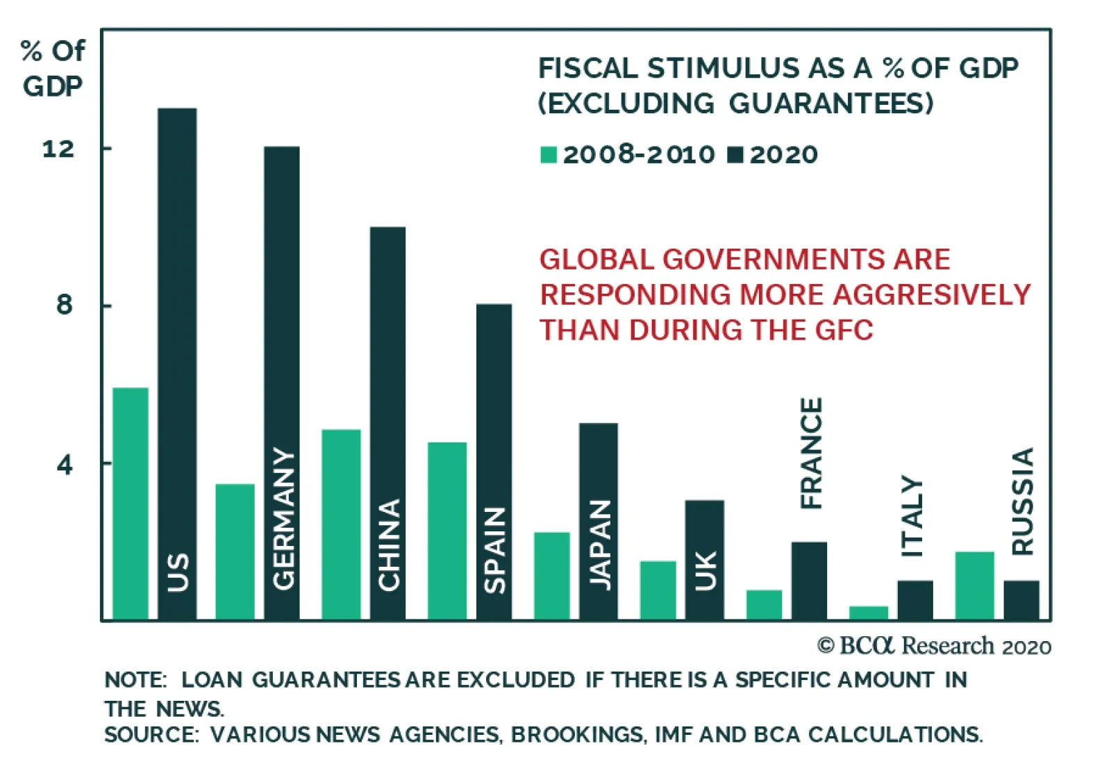
The global economy is furiously weak, but politicians around the world are not seating idly by. The flood of stimulus unleashed over the course of the past two months dwarves the fiscal easing that followed the GFC. European governments are much more…
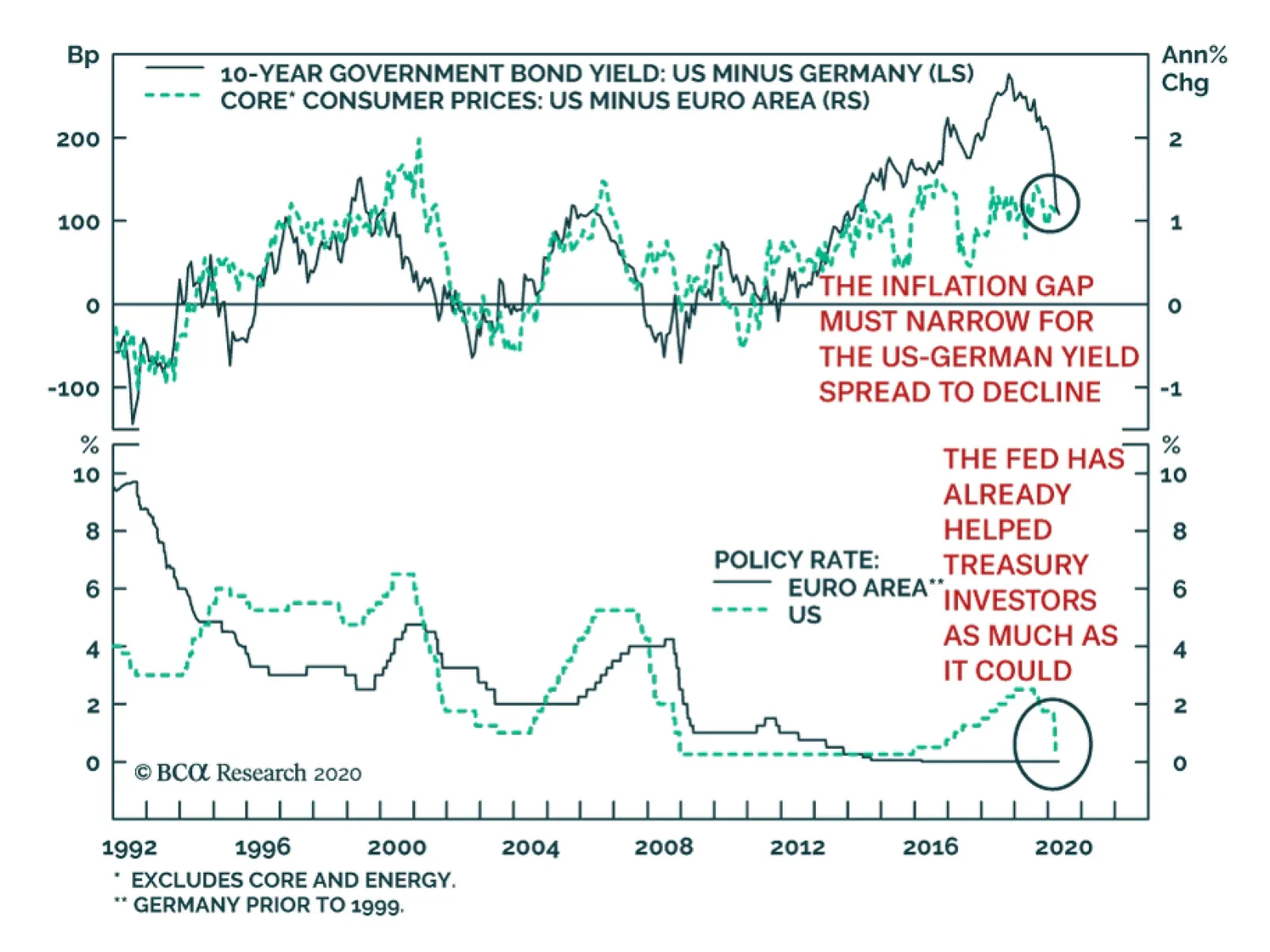
The 10-year yield spread between US Treasurys and German Bunds has quickly narrowed, falling by 170bps from a higher of 279bps in November 2018. Despite this sharp narrowing, the spread remains elevated by historical standards, which begs the question of…
Highlights With interest rates near zero around the world, balance sheet policy will become an important driver for currencies. Should the global economy need another dose of monetary stimulus, yield curve control (YCC) and direct financing of governments will increasingly be the policy tool of choice. This will lead to more bloated central bank balance sheets. The dollar will initially rally, as it did in 2008, since the conditions needed for even more central bank stimulus is a deeper than perceived contraction in global growth. Once the dust settles, the global economy will be awash with liquidity, which will light a fire under procyclical currencies, akin to 2009. An important barometer will be the velocity of money. We continue to recommend a barbell strategy for now – a basket of the cheapest currencies together with some save havens. Shorting EUR/JPY is a good insurance policy. Feature Quantitative easing affects the economy and currency markets through three major channels: By lowering interbank spreads and boosting commercial bank excess reserves, the credit channel is widened. Purchases of securities along the yield curve also lowers long-term borrowing costs for economic agents. Central bank purchases of government securities crowds out private concerns. As these funds are redirected out the risk curve, this loosens financial conditions. This is the portfolio balance effect. Part of the flows from portfolio rebalancing leave the country, especially if interest rates are too low for bond investors. This lowers the exchange rate, boosting imported inflation, which further lowers domestic real rates. During isolated crises, the QE exchange rate channel works like a charm. Chart I-1 shows that for most of the post-2008 period when the euro area was engulfed in a crisis, the EUR/USD exchange rate oscillated with the relative balance sheet impulse1 between the Federal Reserve and the European Central Bank. The story in Japan was similar after the Fukushima crisis in 2011 and the subsequent adoption of Abenomics. In short, the more aggressive a central bank is with quantitative easing, the bigger the impact on currency markets. Chart I-1QE And EUR/USD
QE And EUR/USD
QE And EUR/USD
The dollar seems to be following this narrative. Ever since hitting a March 19 high near 103, the DXY index has been in a broad-based consolidation phase, currently trading around 100. Swap lines are running full throttle as foreign central banks have tapped into the Fed’s liquidity provisions (Chart I-2). Despite this, our contention is that the dollar could still retest its recent highs before ultimately cresting. Chart I-2Improving Liquidity
Improving Liquidity
Improving Liquidity
When V Is Collapsing Everywhere Currencies move on relative fundamentals. So, if one country is in a crisis and precipitously drops interest rates, then its currency should collapse relative to its trading partners. However, when interest rates are collectively plummeting around the world, they lose their relative anchor for currencies. In such times, correlations shift to 1, volatility spikes and valuations are thrown out the window (Chart I-3). As a reserve currency, the dollar benefits. When interest rates are collectively plummeting around the world, they lose their relative anchor for currencies. Many countries have announced QE in one form or another, and their balance sheets are set to explode higher, led by the Fed (Chart I-4). But akin to 2008, the dollar can still tick higher as markets remain in the belly of a liquidity trap. In these situations, technical indicators can help. But more often than not, it is usually instructive to sit back and gauge the signal from the velocity of money (or V), especially after interest rates have collapsed to zero. Chart I-3Life At Zero
Life At Zero
Life At Zero
Chart I-4The QE Club
The QE Club
The QE Club
V can be summarized by Irving Fisher’s classical equation MV=PQ, where P is the price level in the economy, Q is output, and M is the money supply. In other words, V=PQ/M. A few observations are clear from the equation: If output or PQ is collapsing, then the only way the authorities can stabilize demand is by driving up the money supply. It is an open debate as to whether V is stable or not. Over the last decade or so, V has been collapsing (Chart I-5). Meanwhile, the fact there has been no correlation between prices and money supply suggests that V may have a life of its own. Finally, as the collapse in V accelerates, there is a window in which policymakers can be behind the curve. In this window, zero rates and QE could still be insufficient to stem the decline in output. Chart I-5A Collapse Of V Everywhere
A Collapse Of V Everywhere
A Collapse Of V Everywhere
It becomes clear that observing V can provide valuable information for the economy and currency markets. A rising V means that central bank liquidity injections are being turned over into real economic activity, either through rising prices, output or a combination of the two. In a sense, a turnaround in V is a signal that the precautionary demand for money is falling. This is usually synonymous with higher interest rates. Chart I-6Watch The Yield Curve
Watch The Yield Curve
Watch The Yield Curve
In a general sense, V can be viewed as the interest rate required by the underlying economy (the neutral rate), since it is measured using economic variables. Once economic agents start to increase the turnover of money in the system as activity improves, it is an endogenous sign that the economy has escaped a liquidity trap and can handle higher rates. Over the longer term, exchange rates should fluctuate along with the ebb and flow of V, or the relative neutral rate of interest between two countries. Herein lies the problem. The velocity of money is observed ex-post, meaning it is not very useful as a forecasting tool. We already know from the drop in interest rates that the velocity of money is collapsing everywhere. Therefore, how can one gauge for tentative signs of a reversal? One method is to look at financial variables. The yield curve is one example. Whenever the fed funds target rate falls below the neutral rate of interest in the US, the yield curve usually steepens (Chart I-6). A steepening yield curve usually signifies borrowing costs are well below the structural growth rate of the economy. As such, banks do well in this environment. Another barometer, and our favorite, is the ratio of industrial commodities to financial ones, or more precisely, the gold-to-silver ratio. A steepening yield curve usually signifies borrowing costs are well below the structural growth rate of the economy. Bottom Line: With interest rates near zero in the developed world, proxies for the velocity of money become important in gauging when we exit the belly of the liquidity trap. Gold Versus Silver Chart I-7Watch The Gold/Silver Ratio
Watch The Gold/Silver Ratio
Watch The Gold/Silver Ratio
The gold/silver ratio (GSR) provides important information on the battleground between easing financial conditions and a pick-up in economic (or manufacturing) activity. The GSR tends to rally ahead of an economic slowdown, but then peaks when growth is still weak but financial conditions are easy enough to lift the economy out of a liquidity trap. Of course, a key assumption is that the global economy fends off a deeper recession, which would otherwise sustain a high and rising GSR. Just like gold, silver benefits from low interest rates, plentiful liquidity, and the incentive for fiat money debasement. However, today, silver has much more industrial uses than gold, allowing it to sniff out any shift in the economic landscape. Silver fabrication demand benefits from new industries such as solar and a flourishing “cloud” orbit that are capturing the new manufacturing landscape. As a result, the dollar tends to be positively correlated with the gold/silver ratio (Chart I-7). The gold/silver ratio has been a good confirming indicator on when to rebuy procyclical currencies. The gold/silver ratio (GSR) broke above major overhead resistance at 100 just as the dollar liquidity crunch was intensifying and is now showing tentative signs of a reversal. The history of these reversals is that they tend to be powerful but extremely volatile. More importantly, the ratio has been a good confirming indicator on when to rebuy procyclical currencies (Chart I-8). Given that the ratio is close to its highest level in 120 years, the odds are that the forces of mean reversion will continue to push it lower. A break in the ratio below 100 will be a positive development (Chart I-9). Chart I-8Tentative Signs Of Improvement
Tentative Signs Of Improvement
Tentative Signs Of Improvement
Chart I-9Watch The 100 Level
Watch The 100 Level
Watch The 100 Level
The ratio of the velocity of money between the US and China has tended to track both the gold/silver ratio and the dollar closely. Given the epicenter of the crisis was China, a falling GSR will also signify Beijing has been successful in rekindling animal spirits, as the economy reopens for business. Bottom Line: A falling GSR will be consistent with a peak in the dollar and upside for pro-cyclical currencies. Housekeeping We continue to recommend a barbell strategy for now – a basket of the cheapest currencies together with some save havens. Investors can seek such protection by selling EUR/JPY. EUR/JPY should continue to sell off in the short term. First, the yen tends to do well when volatility is high, as is the case now. Second, given that Japan is closer to the Asean economies who were first hit with Covid-19, it will probably see activity recover a little faster relative to the West. In addition, real rates are higher in Japan relative to Europe. Lastly, consistent with our thesis above, place a sell-stop on GSR at 100. Chester Ntonifor Foreign Exchange Strategist chestern@bcaresearch.com Footnotes 1 Given that GDP is a flow concept, and central bank balance sheets are a stock concept, the impulse is calculated as follows: 1) Take the 12-month change in the balance sheet, to convert it to a flow. 2) Show the 12-month change of this flow as a % of GDP to gauge the impulse of stimulus. Currencies U.S. Dollar Chart II-1USD Technicals 1
USD Technicals 1
USD Technicals 1
Chart II-2USD Technicals 2
USD Technicals 2
USD Technicals 2
Recent data in the US have been negative: Headline inflation fell sharply from 2.3% to 1.5% year-on-year in March. Core inflation dropped by 0.3% to 2.1%. Export and import prices both contracted by 3.6% and 4.1% year-on-year, respectively in March. NY Empire State manufacturing index plunged from -21.5 to -78.2 in April. Retail sales slumped by 8.7% month-on-month in March, down from -0.4% the previous month. Initial jobless claims increased by 5,245K last week, above the expectations of 5,105K. The DXY index increased by 0.3% this week on the back of safe-haven demand. The break above the psychological overhead resistance at 100 means we can begin to see a flurry of buy orders, as traders move to hedge positions. The Fed’s Beige Book reported sharp contraction in Q1, which should carry on into Q2. Leisure, hospitality and retail were the hardest-hit industries. Report Links: Capitulation? - April 3, 2020 The Dollar Funding Crisis - March 19, 2020 Are Competitive Devaluations Next? - March 6, 2020 The Euro Chart II-3EUR Technicals 1
EUR Technicals 1
EUR Technicals 1
Chart II-4EUR Technicals 2
EUR Technicals 2
EUR Technicals 2
Recent data in the euro area have been negative: March consumer prices were released across the euro area: the headline inflation rate was stable at 1.3% year-on-year in Germany and 0.1% in Italy. It increased from 0.7% to 0.8% in France while falling from 0.1% to 0 in Spain. Industrial production contracted by 1.9% year-on-year in February. The euro fell by 0.5% against the US dollar this week. As the anti-dollar and a global growth barometer, trends in the euro will primarily be dictated by what happens to the greenback. The IMF April 2020 World Economic Outlook forecasted global output to contract by 3% in 2020. Moreover, it predicted the Euro area to be hit the hardest, with output shrinking by 7.5% this year, in comparison to 5.9% in the US, 6.5% in the UK, and 5.2% in Japan. Report Links: On The DXY Breakout, Euro, And Swiss Franc - February 21, 2020 Updating Our Balance Of Payments Monitor - November 29, 2019 On Money Velocity, EUR/USD And Silver - October 11, 2019 Japanese Yen Chart II-5JPY Technicals 1
JPY Technicals 1
JPY Technicals 1
Chart II-6JPY Technicals 2
JPY Technicals 2
JPY Technicals 2
Recent data in Japan have been negative: Machine tool orders kept contracting by 41% year-on-year in March, worse than the 30% decline in February. Money supply (M2) increased by 3.3% year-on-year in March, up from 3% the previous month. The Japanese yen rose by 1% against the US dollar this week. The BoJ Governor Haruhiko Kuroda said that the central bank will not hesitate to further ease monetary policy depending on COVID-19 developments. Possible solutions to support corporate funding include more purchases of corporate bonds and commercial paper, as well as easing collateral standards. More importantly, the government unveiled a 108 trillion yen fiscal package, amounting to 20% of GDP. Report Links: The Near-Term Bull Case For The Dollar - February 28, 2020 Building A Protector Currency Portfolio - February 7, 2020 Currency Market Signals From Gold, Equities And Flows - January 31, 2020 British Pound Chart II-7GBP Technicals 1
GBP Technicals 1
GBP Technicals 1
Chart II-8GBP Technicals 2
GBP Technicals 2
GBP Technicals 2
Recent data in the UK have been negative: Retail sales contracted by 3.5% year-on-year in March. The British pound has been flat against the US dollar this week. The BoE’s Credit Conditions Survey showed growing concerns from banks about the outlook during the COVID-19 health crisis. The BoE said that “Overall availability of credit to the corporate sector was unchanged for all business sizes in Q1, but was expected to increase for all business sizes in Q2.” British banks now expect to lend more to businesses in the next three months, more so than to the household sector. Report Links: Updating Our Balance Of Payments Monitor - November 29, 2019 A Few Trade Ideas - Sept. 27, 2019 United Kingdom: Cyclical Slowdown Or Structural Malaise? - Sept. 20, 2019 Australian Dollar Chart II-9AUD Technicals 1
AUD Technicals 1
AUD Technicals 1
Chart II-10AUD Technicals 2
AUD Technicals 2
AUD Technicals 2
Recent data in Australia have been negative: NAB business confidence crashed from -2 to -66 in March. Business conditions also dropped from 2 to -21. Westpac consumer confidence plunged from -3.8 to -17.7 in April. The unemployment rate inched up from 5.1% to 5.2% in March, lower than the expected 5.5%. 6K jobs were created in March, down from 26K the previous month, while well above the consensus of 40K job loss. However, the Australian Bureau of Statistics pointed out that the monthly data mostly only covers the first two weeks of March. AUD/USD fell by 0.6% this week. With Australian GDP now forecasted to shrink by 7% in Q2, and another 1% in Q3, the Australian economy is destined for its first recession in three decades. Prime Minister Scott Morrison has pledged A$130 billion subsidy for employers to prevent further layoffs. Report Links: On AUD And CNY - January 17, 2020 Updating Our Balance Of Payments Monitor - November 29, 2019 A Contrarian View On The Australian Dollar - May 24, 2019 New Zealand Dollar Chart II-11NZD Technicals 1
NZD Technicals 1
NZD Technicals 1
Chart II-12NZD Technicals 2
NZD Technicals 2
NZD Technicals 2
Recent data in New Zealand have been negative: Visitor arrivals declined by 11% year-on-year in February, down from an increase of 3% the previous month. This trend will likely worsen in March. House prices increased by 0.7% month-on-month in March, down from the last reading of 3.1%. The New Zealand dollar fell by 2% against the US dollar this week. On Thursday, the RBNZ Governor Adrian Orr said that the New Zealand financial institutions were strong and in a position to be part of the solution, while acknowledging that the soaring unemployment and high mortgage debts could pose a big challenge to the economy. Moreover, he said that the current central bank interventions to mitigate COVID-19 damage are just the beginning, and that negative interest rates are not off-the-table. Report Links: Updating Our Balance Of Payments Monitor - November 29, 2019 Place A Limit Sell On DXY At 100 - November 15, 2019 USD/CNY And Market Turbulence - August 9, 2019 Canadian Dollar Chart II-13CAD Technicals 1
CAD Technicals 1
CAD Technicals 1
Chart II-14CAD Technicals 2
CAD Technicals 2
CAD Technicals 2
Recent data in Canada have been negative: Existing home sales slumped 14.3% month-on-month in March, down from 5.9% the prior month. Bloomberg Nanos confidence kept falling to 38.7 from 42.7 for the week ended April 10. The Canadian dollar kept falling by 1.2% against the US dollar this week. On Wednesday, the BoC kept interest rates steady at 0.25%, after having lowered it by 150 bps over the past three weeks. Moreover, the BoC has announced additional measures to weather the crisis, including new purchases of provincial bonds by up to C$50 billion and corporate bonds by up to C$10 billion. The Bank has also enhanced its term repo facility to permit funding for up to 24 months. Report Links: A New Paradigm For Petrocurrencies - April 10, 2020 The Loonie: Upside Versus The Dollar, But Downside At The Crosses Updating Our Balance Of Payments Monitor - November 29, 2019 Swiss Franc Chart II-15CHF Technicals 1
CHF Technicals 1
CHF Technicals 1
Chart II-16CHF Technicals 2
CHF Technicals 2
CHF Technicals 2
Recent data in Switzerland have been mixed: Total sight deposits increased to CHF 634 billion for the week ended April 10, up from the previous reading of CHF 627 billion. Producer prices fell by 2.7% year-on-year in March, lower than the expected -2.5%. The Swiss franc fell by 0.3% against the US dollar this week, amid broad US dollar strength. While USD/CHF remains under parity, investors seeking cover from US dollar strength did not find shelter in the franc. Switzerland’s Federal Council has offered emergency loans to almost 80,000 small businesses, far more than other European countries. The most recent IMF World Economic Outlook is now forecasting the Swiss GDP to slump 6% in 2020, followed by a rebound of 3.8% next year. This compares favorably with the slated euro area contraction of 7.5% this year. Report Links: On The DXY Breakout, Euro, And Swiss Franc - February 21, 2020 Currency Market Signals From Gold, Equities And Flows - January 31, 2020 Portfolio Tweaks Before The Chinese New Year - January 24, 2020 Norwegian Krone Chart II-17NOK Technicals 1
NOK Technicals 1
NOK Technicals 1
Chart II-18NOK Technicals 2
NOK Technicals 2
NOK Technicals 2
Recent data in Norway have been negative: The trade surplus tumbled to NOK 2.5 billion in March from NOK 18.5 billion the same month last year. After having rebounded by 15% from its March lows, the Norwegian krone fell again by 3% against the US dollar this week, making it the worst-performing G10 currency. The trading pattern of the Norwegian krone in recent weeks has mirrored that of emerging market currencies, warranting intervention by the central bank. OPEC has agreed over the weekend to cut production by 9.7 million barrels per day in May and June, which represents approximately 10% of global supply. Despite the production cut, oil prices slipped this week over growing COVID-19 demand fears and supply concerns. Report Links: A New Paradigm For Petrocurrencies - April 10, 2020 Building A Protector Currency Portfolio - February 7, 2020 On Oil, Growth And The Dollar - January 10, 2020 Swedish Krona Chart II-19SEK Technicals 1
SEK Technicals 1
SEK Technicals 1
Chart II-20SEK Technicals 2
SEK Technicals 2
SEK Technicals 2
Recent data in Sweden have been negative: Headline inflation declined from 1% to 0.6% year-on-year in March, while in line with expectations, this is the lowest inflation rate since May 2016. The Swedish krona fell by 0.8% against the US dollar this week. Sweden’s COVID-19 death toll just passed 1000 this week. While its fatality rate is still well below that in Italy and the UK, it’s much higher than its Scandinavian neighbors, which adds more criticism surrounding Sweden’s decision to ignore the lockdown measures imposed elsewhere. Prime Minister Stefan Lofven has said that stricter measures may be needed going forward, which will pose more threat to the economy. Report Links: Updating Our Balance Of Payments Monitor - November 29, 2019 Where To Next For The US Dollar? - June 7, 2019 Balance Of Payments Across The G10 - February 15, 2019 Trades & Forecasts Forecast Summary Core Portfolio Tactical Trades Limit Orders Closed Trades