Policy

Feature In this report, we determine which South and Southeast Asian countries are better equipped to endure the COVID-19 pandemic. Answers to this question combined with our macro fundamental analysis lead us to recommend which countries to favor or avoid. We assess several factors in regard to the COVID-19 shock: (1) the healthcare capacity in each country, (2) the COVID-19 containment measures that have been implemented, and (3) the magnitude of fiscal and monetary stimulus packages that have been announced. We conclude that EM equity investors should keep an overweight position in Thai equities and a neutral one in the Malaysian stock market. Indian, Indonesian and Philippine stock markets, on the other hand, warrant an underweight stance. Healthcare System Capacity The COVID-19 virus can cause individuals with underlying medical conditions and already in poor health, as well as those above a certain age, to become seriously ill when infected. These patients will require the kind of special medical attention – such as ventilation – that is only provided in a hospital’s intensive care unit (ICU). A country that currently lacks sufficient ICU capacity relative to the number of patients requiring it, risks overburdening the health care system. This would be a social catastrophe. A country that currently lacks sufficient ICU capacity relative to the number of patients requiring it, risks over¬burdening the health care system. Therefore, a key measure of the current coronavirus crisis is the relation between a population’s risk of developing critical illness from COVID-19 infections and a country’s intensive care unit (ICU) availability. We assess the risk of COVID-19 infections developing into critical illnesses in ASEAN countries and in India by gauging (1) the prevalence of diabetes in the population and (2) the share in population of people above the age of 60. Chart I-1 and Chart I-2 illustrate these factors separately. Chart I-1ASEAN & India: Population With Diabetes
COVID-19 Battle: Assessing ASEAN And Indian Capabilities
COVID-19 Battle: Assessing ASEAN And Indian Capabilities
Chart I-2Population Above 60 Years Old
COVID-19 Battle: Assessing ASEAN And Indian Capabilities
COVID-19 Battle: Assessing ASEAN And Indian Capabilities
In addition, we combine these two risk variables to calculate the risk of critical illness. This measure is shown in Chart I-3. The measure shows that the population of both Malaysia and Thailand carry the highest risk of developing critical illnesses from COVID-19, owing to Malaysia’s high prevalence of diabetes and to Thailand’s rapidly aging population. Meanwhile, that risk is somewhat lower in India and dramatically lower in both the Philippines and Indonesia. The next thing to look at is each country’s ICU capacity. Chart I-4 shows the number of ICU beds available per 100,000 people. Thailand has the highest number and Malaysia the second highest. On the other hand, India, Indonesia and the Philippines all have lower rates of ICU capacity. Chart i-3The Risk Of Critical Illness From COVID-19
COVID-19 Battle: Assessing ASEAN And Indian Capabilities
COVID-19 Battle: Assessing ASEAN And Indian Capabilities
Chart I-4Intensive Care Unit (ICU) Capacity
COVID-19 Battle: Assessing ASEAN And Indian Capabilities
COVID-19 Battle: Assessing ASEAN And Indian Capabilities
Finally, we compare the risk of critical illness in each country to its available ICU capacity. Chart I-5 shows a scatter plot between these two variables. The risk of critical illness is shown on the Y-axis and the availability of ICU beds per 100,000 people is plotted on the X-axis. Thailand and Malaysia both have the highest risk of critical illness but also a large number of available ICU beds. India, Indonesia and the Philippines have lower average risk of critical illness but also far fewer ICU bed availabilities. Chart I-5The Risk Of Critical Illness Versus ICU Capacity
COVID-19 Battle: Assessing ASEAN And Indian Capabilities
COVID-19 Battle: Assessing ASEAN And Indian Capabilities
It is also important to note that Malaysia has the highest relative number of medical doctors per 10,000 people in the region (15 versus an average of 8). Furthermore, both Malaysia and Thailand appear to be performing many more COVID-19 tests. That in turn should help slow the spread of the virus and avoid overwhelming health care systems of Malaysia and Thailand. Bottom Line: Thailand and Malaysia have decent healthcare care capabilities relative to the threat of critical illness among their populations. India, Indonesia and the Philippines, on the other hand, seem relatively unprepared to weather this outbreak. Containment Response The magnitude and effectiveness of social distancing measures implemented is a critical means of protecting a country’s health care system. Indeed, the sooner such measures are put into place, the earlier the threat of the pandemic is likely to subside. This will then allow a country to normalize its economic activities sooner. It appears that the Philippines and India have enacted the most stringent social distancing measures. Both announced complete lockdowns and called in their respective national armies to intervene. Malaysia has also announced extremely inhibitive measures and their enforcement has been quite successful. In Thailand, while the authorities have not imposed a complete lockdown, they have placed curfews and checkpoints that are subject to extension. Thai authorities have also warned that more restrictive measures could be imposed if residents do not comply. Indonesia, on the other hand, has been much softer on enforcement and is reluctant to introduce additional measures due to its economic concerns. Malaysia and Thailand emerge as the most likely to win the battle against COVID-19 in the region. Remarkably, the effectiveness of the measures can be quantitatively assessed via Google’s COVID-19 mobility tool and TomTom’s traffic congestion data. The average of all Google’s mobility variables, as of April 5, has declined most significantly in the Philippines, Malaysia, and India, relative to baseline values (Chart I-6).1 Likewise, TomTom’s traffic congestion data for the major cities in these same countries’ shows a similar decline during average peak hours over the first two weeks of April 2020, relative to the same period in 2019 (Chart I-7). Chart I-6How Effective Are Social Distancing Measures?
COVID-19 Battle: Assessing ASEAN And Indian Capabilities
COVID-19 Battle: Assessing ASEAN And Indian Capabilities
Chart I-7Decline In Traffic From ##br##A Year Ago
COVID-19 Battle: Assessing ASEAN And Indian Capabilities
COVID-19 Battle: Assessing ASEAN And Indian Capabilities
Bottom Line: The Philippines, India, and Malaysia have imposed the most effective and successful social distancing measures. This is then followed by Thailand. Indonesia on the other hand has not been as effective in this aspect. Fiscal And Monetary Stimulus Table I-1Stimulus Packages So Far Announced
COVID-19 Battle: Assessing ASEAN And Indian Capabilities
COVID-19 Battle: Assessing ASEAN And Indian Capabilities
The magnitude of the stimulus plans announced by each country is also important. Once the pandemic subsides and social distancing measures are relaxed, countries with a larger stimulus package in place should experience a faster economic recovery. Table I-1 shows the size of the overall stimulus packages announced so far. Malaysia and Thailand have the largest overall stimulus packages to the tune of 16% and 14% of GDP, respectively. India, Indonesia and the Philippines fall well short of these levels. Regarding monetary policy, central banks in all these countries have been cutting policy rates and injecting local currency liquidity. However, some of the programs announced by some of the central banks stand out: The Bank Of Thailand will inject 400 billion baht ($13 billion or 2% of GDP) into the corporate bond market. The central bank is also allocating 500 billion baht ($15 billion or 3% of GDP) of soft loans to small-and mid-sized companies.2 The central bank of the Philippines will be purchasing 300 billion pesos worth of government bonds ($6 billion or 1.6% of GDP) under a 3- to 6-month repurchase agreement to aid government efforts in countering the pandemic. Bank Indonesia may also begin buying government bonds (recovery/pandemic bonds) directly from the primary market. Details are not yet clear but the Indonesian government plans to issue $27 billion worth of these bonds and the central bank might emerge as the largest buyer. Similarly, the Reserve Bank of India has been injecting liquidity and purchasing government bonds for some time now. For instance, it announced a 1 trillion rupees injection in February – or $13 billion – via the long-term repo operation channel. It is now infusing an additional 1 trillion rupees through the same channel. It will also continue purchasing government bonds and securities to keep liquidity aflush and suppress market interest rates. Crucially, Governor Shaktikanta Das indicated that the RBI might even be forced to purchase government bonds directly from the primary market and that all options – including non-conventional ones – are on the table. Bottom Line: Both Thailand and Malaysia have so far announced larger overall stimulus packages than Indonesia, the Philippines and India have. This combined with their better health care capacities, suggests that the Thai and Malaysian economies will recover more quickly than they will in India, Indonesia and the Philippines. Conclusions Having considered risk of critical illness, the ICU availability and general medical capacities, the effectiveness of social distancing measures, and the stimulus packages each country has announced, Malaysia and Thailand emerge as the most likely to win the battle against COVID-19 in the region. Despite their elevated risk of critical illness, both countries have decent healthcare system capacities. Additionally, Malaysia has put in place very effective social distancing measures. Meanwhile, Thailand is placing curfews and monitoring developments very closely. Finally, both countries have enacted massive stimulus packages that will aid in the recovery of their economies later this year. Notably, Thailand and Malaysia have been running current account surpluses for a long period of time whereas India, Indonesia and the Philippines generally run current account deficits. This, in turn, will allow the former to implement much larger overall stimulus packages than the latter, without risking major currency depreciation. Despite strong and successful social distancing efforts, India and the Philippines are hampered by a weakness in their health care infrastructures. They also are unlikely to be able to provide a large enough stimulus without subjecting themselves to significant currency depreciation. Additionally, India also has an elevated critical illness risk. Finally, Indonesia is likely to emerge from the crisis in the weakest position. Its healthcare system capacity is weak, the social distancing measures it implemented are insufficient and its enforcement has been lax. Indonesia is likely to emerge from the crisis in the weakest position. The government has also been timid about enacting significant stimulus given that it runs a large current account deficit. Moreover, it is unwilling to tolerate any further large currency depreciation due to the elevated foreign currency debt that Indonesian companies and banks carry. The latter stands at $124 billion in the form of both bonds and loans. Investment Strategy Chart I-8Thai Stock Prices Vs. Emerging Markets
Thai Stock Prices Vs. Emerging Markets
Thai Stock Prices Vs. Emerging Markets
The following is our strategy recommendations for each country: Thailand: Our equity overweight stance on this bourse has been significantly challenged since early this year (Chart I-8). However, Thai stocks seem to be holding up at an important technical support level in relative terms. Furthermore, as of December 2019, the ownership of the country’s local currency bonds was low at 17% (i.e. even before the global sell-off commenced). Further selling by foreigners should therefore be limited, which should reduce renewed depreciation pressures on the Thai currency. We recommend that respective EM portfolios keep an overweight position on Thai equities, sovereign US dollar and local currency bonds. Malaysia: On the one hand, Malaysian stocks have been underperforming EM benchmarks since 2014. Also, foreign ownership of Malaysian local currency bonds has declined from 34% in 2016 to 25% as of December 2019. This limits the possibility of future foreign selling. On the other hand, the economy was facing severe deflationary pressures even before the COVID-19 shock occurred. The latter will only reinforce these deflationary dynamics. Considering the positives and the negatives together, we recommend a neutral allocation to Malaysia within an EM equity portfolio. The Philippines: Philippine stock prices relative to EM seem to have broken below a critical support level that will now act as resistance (Chart I-9). Moreover, local currency government bond yields have risen sharply (Chart I-10 and Chart I-11). This does not bode well for real estate and bank stocks that account for a very large market-cap chunk of the Philippine MSCI Index (46%). Critically, government expenditures were strong even before the COVID-19 pandemic occurred and it was only a matter of time before that contributed to higher imports. Now that exports are crashing - due to collapsing global demand - and imports are likely to remain high because of even higher government spending/fiscal stimulus, the current account deficit will widen substantially. This will cause the peso – which has been holding up so far – to depreciate significantly. Stay underweight on this bourse and local currency government bonds relative to their respective EM benchmarks. We also recommend keeping a short position on the Philippine peso versus the US dollar. Chart I-9Philippine Stock Prices Vs. Emerging Markets
Philippine Stock Prices Vs. Emerging Markets
Philippine Stock Prices Vs. Emerging Markets
Chart I-10Philippine Yields In Absolute Terms...
Philippine Yields In Absolute Terms...
Philippine Yields In Absolute Terms...
Chart I-11...And Relative To Their EM Peers
...And Relative To Their EM Peers
...And Relative To Their EM Peers
India: We discussed India in detail in a recent report. We recommend an underweight position amid the pandemic. In previous years, private banks lent enormous amounts to consumers via mortgages and consumer loans/credit cards. Therefore, the performance of both sectors has been contingent on the health of the Indian consumer sector. However, the outlook for the Indian consumer has worsened dramatically because of the unprecedented income hit households will suffer from the lockdown. Moreover, social safety nets and health care capacities (as mentioned above) are very weak in India. Indonesia: We also discussed Indonesia in detail in a report published on April 2. In recent years, the Indonesian bourse benefited from lower US interest rates and ignored deteriorating domestic fundamentals and lower commodities prices. Global investors’ increased sensitivity to individual EM fundamentals amid this pandemic will only make Indonesia’s weakest spots – like its exposure to commodities and its anemic domestic demand – more apparent. With global growth being very weak, commodities prices will remain low – reinforcing currency depreciation and pushing corporate bond yields higher. Combined with relapsing domestic growth, the Indonesian bourse will likely continue underperforming. Bottom Line: Within an EM equity portfolio, we are keeping an overweight position on the Thai stock market. We also recommend keeping Malaysian equities on neutral. Our equity underweights are India, Indonesia, and the Philippines. In terms of fixed income markets, we recommend overweighting Thai, Malaysian and Indian local currency bonds and US dollar sovereign bonds. We recommend underweighting Indonesian and Philippine local and US dollar sovereign bonds. Ayman Kawtharani Editor/Strategist ayman@bcaresearch.com Footnotes 1 The baseline is the median value between January 3 and February 6. Our average calculation includes retail & recreation, grocery & pharmacy, parks, transit stations, and workplaces. It excludes the residential variable. 2 Note that this is part of the stimulus shown in Table 1.
Highlights Portfolio Strategy The Fed’s QE and ZIRP, the collapse in gasoline prices and extremely depressed breadth readings that are contrarily positive, all signal that it no longer pays to be bearish consumer discretionary stocks. A boost in demand for e-commerce, the high-growth profile of internet retailers along with neutral valuations and technicals, all compel us to trigger our upgrade alert and lift the S&P internet retail index to overweight. The rising gap between house price inflation and mortgage rates, the looming increase in residential investment’s contribution to GDP growth and firming industry operating metrics, all argue for an above benchmark allocation in the S&P home improvement retail index. Recent Changes Boost the S&P consumer discretionary sector to overweight today. Execute the upgrade alert and lift the S&P internet retail index to overweight today. Augment exposure to the S&P home improvement retail index to above benchmark today. Table 1
Fight Central Banks At Your Own Peril
Fight Central Banks At Your Own Peril
Feature The SPX oscillated violently last week, and a glimmer of good news on the coronavirus fight front, the Fed’s newly announced bazooka and a tick down in unemployment insurance claims all signaled that the bulls have the upper hand. We first showed the Google Trends’ worldwide searches for “coronavirus” series in our early-March Weekly Report,1 when stocks were unhinged and we were still bearish. Now, the most recent update of this indicator suggests that the recessionary lows are likely in for the SPX – this search term peaked a week prior to the overall stock market’s bottom (Google Trends shown inverted, Chart 1) – and we therefore reiterate our cyclically sanguine equity market view.2 Moreover, two weeks ago we highlighted that market internals were confirming the SPX recessionary lows.3 Not only did the SOX versus NDX and small caps versus large caps bottom in advance of the S&P 500, but also transports along with the Value Line Geometric and Arithmetic Indexes relative ratios all led the broad market’s trough.4 Chart 1Joined At The Hip
Joined At The Hip
Joined At The Hip
Chart 2Dr. Copper...
Fight Central Banks At Your Own Peril
Fight Central Banks At Your Own Peril
Importantly, Dr. Copper is also sending a bullish signal for the broad equity market. Economically sensitive copper tends to trough prior to the SPX especially in recessions. Copper collapsed below $2/lb recently leading the SPX by a few days (Chart 2). Similarly, in the recent late-2015/early-2016 manufacturing recession, the 2007/09 and 2001 recessions, copper sniffed out the bottom before the overall equity market troughed (Chart 3). Turning over to the macro backdrop, keep in mind that the Fed first cut rates this year on March 3, 2020, a mere nine trading days following the SPX peak when it fell just below the 10% correction mark. Then, on Sunday March 15, 2020 the Fed cut rates to zero, as the SPX had fallen another 10% into a bear market. Chart 3...Tends To Lead
...Tends To Lead
...Tends To Lead
Just to put these moves into perspective, the last time the SPX fell roughly 20% from its peak was on Christmas Eve 2018, and it took the Fed seven months to cut interest rates. While a retest of the 2174 ES futures lows is possible, we would rather not fight the Fed. Instead, we continue to recommend investors deploy cyclically oriented capital in the broad equity market with a 9-12 month time horizon. Chart 4 shows that the Fed is on track to balloon its balance sheet over $11tn in the coming year, i.e. almost trebling it, and soaring to over 50% of GDP. Chart 4Follow The…
Follow The…
Follow The…
Beyond the Fed’s QE5 liquidity injection and skyrocketing bank credit, in response to firms tapping existing credit lines, money seems to be growing on trees. M2 money supply growth spiked to 14.8% of late, the highest rate since WWII! This breakneck pace of M2 growth translates into $2tn created versus last year. In the past two weeks alone, M2 grew by $805bn. Deposits and money market funds’ assets are surging, driving the money supply to unprecedented levels. While we have sympathy to some investors’ view that very little of this money and credit will flow to the real economy, such flush liquidity is likely to spillover from the banking system. Asset prices will be the primary beneficiaries of that flood, albeit with a slight lag (Chart 5). Chart 5…Money Trail
…Money Trail
…Money Trail
Meanwhile, we have heeded our research of how to prepare a portfolio from the SPX peak to the recessionary trough highlighted in the Special Report penned in May 2018, and we have been overweight health care and consumer staples (please refer to Table 5 in that Special Report).5 We are now building on the research from that report. Table 2 shows the (unweighted) average relative sector performance six, twelve and eighteen months out from the SPX recessionary troughs, using market cycles since the 1960s. Table 2Sector Winners From Recessionary Recoveries
Fight Central Banks At Your Own Peril
Fight Central Banks At Your Own Peril
Early cyclicals financials and consumer discretionary along with tech are clear winners in all three periods we analyzed. This empirical evidence confirms the theoretical backdrop that early cyclicals are the first to sniff out a recovery during a recession. At the opposite end of the spectrum, defensive utilities, consumer staples and telecom services fare poorly in the three time frames we examined. Impressively, health care (we are overweight), which is the defensive sector with the largest market cap weight, manages to eke out modest relative gains. Charts 6 & 7 depict these time series profiles for the ten GICS1 sectors (we use telecom services instead of communication services due to lack of historical data). Chart 6Early Cyclicals Rise To The Occasion...
Early Cyclicals Rise To The Occasion...
Early Cyclicals Rise To The Occasion...
Chart 7...But Defensives Lag
...But Defensives Lag
...But Defensives Lag
We are already overweight financials, hence, this week we heed this empirical evidence and are upgrading the S&P consumer discretionary sector to overweight via executing the upgrade alert on the S&P internet retail index and also via augmenting the S&P home improvement retail (HIR) index to an above benchmark allocation. Boost Consumer Discretionary To Overweight… While we may be a bit early, we recommend investors augment exposure to the S&P consumer discretionary index to overweight, today. The Fed really cares about household net worth (HNW). It is a key pillar of consumer spending, which powers over 70% of the US economy. Greenspan in the late 1990s eloquently described this relationship between HNW and the economy. In Q1/2020 HNW will take a beating, but the Fed is making sure it recovers in Q2, and is doing everything in its power to keep the stock and residential real estate markets afloat (roughly 50% of HNW). Granted employment and income are also currently of paramount importance, and the Main Street Fed programs along with the massive fiscal easing package should partially cushion the blow from the looming surge in the unemployment rate. We are therefore comfortable with lifting consumer discretionary to an above benchmark allocation. Chart 8 highlights the inverse correlation between consumer discretionary relative performance and the fed funds rate dating back to the 1980s. Now that the Fed has returned to ZIRP and is on track to expand its balance sheet to over $11tn, the risk/reward tradeoff favors consumer discretionary stocks. Keep in mind household balance sheets have been repaired since the Great Recession with both debt/income and debt/GDP ratios plumbing multi-year lows as the GFC hit the consumer (and financial sector) hardest (bottom panel, Chart 8). Chart 8Buy Consumer Discretionary Stocks
Buy Consumer Discretionary Stocks
Buy Consumer Discretionary Stocks
Our consumer drag indicator comprising interest rates and oil prices also signals that the path of least resistance for this early cyclical sector is higher (Chart 9). Not only will consumers eventually take advantage of ultra-low interest rates to buy big ticket items on credit, but also a wave of mortgage refinancing at lower rates translates into more cash in consumers’ wallets. Keep in mind that $20/bbl oil also saves US consumers money as retail gas at the pump has now plunged to $1.8/gallon from a recent high of $2.8/gallon. If we are correct and the US economy avoids a Great Depression/Recession, then the swift economic collapse will likely prove transitory as the authorities will have to slowly reopen the economy in early May, and the US consumer will come roaring back in the back half of the year. Finally, sentiment is bombed out toward consumer discretionary equities. Earnings breadth is as bad as it gets, technicals are washed out and a lot of damage has already been done to these interest rate-hypersensitive stocks (Chart 10). True, valuations are a bit extended, but were our thesis to pan out, these early cyclical stocks will grow into their expensive valuations. Chart 9Tailwinds
Tailwinds
Tailwinds
Netting it all out, the Fed’s QE and ZIRP, the collapse in gasoline prices and extremely depressed breadth readings that are contrarily positive, all signal that it no longer pays to be bearish consumer discretionary stocks. Chart 10As Bad As It Gets
As Bad As It Gets
As Bad As It Gets
Bottom Line: Boost the S&P consumer discretionary sector to overweight today from previously underweight, for a modest loss of 1.4% since inception. …Via Executing The Upgrade Alert On Internet Retail To Overweight… E-commerce has been garnering a rising market share of total retail sales uninterruptedly for over two decades. In fact, this juggernaut accelerates during recessions not only because overall retail sales level off, but also internet sales prove resilient during downturns. We are thus compelled to boost the bellwether S&P internet retail index to overweight by executing our upgrade alert to take advantage of the ongoing explosion of internet sales in the face of the coronavirus pandemic (Chart 11). AMZN dominates the internet retail space and by extension the broad consumer discretionary index, especially ever since the media complex migrated to the newly formed S&P communications services index in October 2018. Therefore, as AMZN goes so goes the rest of the consumer discretionary sector. Chart 11Market Share Gains As Far As The Eye Can See
Market Share Gains As Far As The Eye Can See
Market Share Gains As Far As The Eye Can See
AMZN is a retail category killer and the “amazonification” of the economy is not something new as evidenced by the shopping mall evisceration and the dampening of retail sales price inflation. Nearly every segment AMZN has entered it has dominated. The Whole Foods acquisition has also positioned this internet retail behemoth to benefit from an online push for groceries. All of these forces were ongoing prior to the current recession. Now we deem they will accelerate and disproportionately benefit internet retailers at the expense of bricks and mortar retailers: the howling out of the latter is best evidenced by the recent double demotion of Macy’s from the big leagues to the S&P 600 small cap index. Related to the inevitable rise in demand for e-commerce owing to social distancing, growth is a highly sought after attribute that this index enjoys. Time and again we have stressed that when growth is scarce investors flock to industries that exemplify growth (Chart 12). AMZN’s cloud business, AWS, represents another aspect of significant growth, that will remain on an exponential trajectory as more and more businesses move to the SaaS model catalyzed by the current recession. While at first sight this index appears expensive, versus its own history it has worked off previously extreme valuation readings. In more detail, our relative Valuation Indicator has fallen from three standard deviations above the mean back to the historical average. Similarly, despite the recent run-up in prices, relative technicals are only back up to the neutral zone (Chart 13). Chart 12Seek Out Growth…
Seek Out Growth…
Seek Out Growth…
Chart 13...At A Reasonable Price
...At A Reasonable Price
...At A Reasonable Price
Adding it all up, a boost in demand for e-commerce, the high-growth profile of internet retailers along with neutral valuations and technicals, all compel us to trigger our upgrade alert and lift the S&P internet retail index to overweight. Bottom Line: Execute the upgrade alert and boost the S&P internet retail index to overweight, today. The ticker symbols for the stocks in this index are: BLBG: S5INRE - AMZN, BKNG, EBAY, EXPE. …And Upgrading Home Improvement Retailers To Overweight Home improvement retailers (HIR) were the first consumer discretionary stocks to sniff out the end of the Great Recession, troughing even prior to the China-sensitive materials and industrials equities (Chart 14). As such we believe these economically hyper-sensitive stocks will once again showcase their early cyclical status, and we recommend augmenting exposure to above benchmark. ZIRP along with the rising gap between house price inflation and mortgage refinancing rates are a tonic for home improvement retailers (fed funds rate shown inverted, Chart 14). While the residential real estate market will remain in the doldrums for a few months (we recently monetized impressive gains in our underweight stance in the S&P homebuilding index and lifted to neutral), mortgage holders that retain their jobs will be quick to benefit from lower refinancing rates, and boost their savings. Some of these savings will likely flow into home improvement activities courtesy of the recent quarantine rules. One big assumption is that these retailers remain open during the coronavirus induced lockdown. Chart 14Overweight Home Improvement Retailers…
Overweight Home Improvement Retailers…
Overweight Home Improvement Retailers…
If our thesis pans out, then given the looming drubbing in Q2 GDP, residential investment/GDP should jump and provide a relative boost to the S&P HIR index (second panel, Chart 15). None of this positive news is priced in relative forward sales or profits that are flirting with the zero line (third panel, Chart 15). Importantly, relative valuations have dropped below par and are 30% below the historical mean, offering a compelling entry point for fresh capital with a 12-18 month time horizon (bottom panel, Chart 15). Turning over to industry operating metrics, there is a budding recovery in a number of the indicators we track. Chart 15...As A Play On A Relative Rise In Fixed Residential Investment
...As A Play On A Relative Rise In Fixed Residential Investment
...As A Play On A Relative Rise In Fixed Residential Investment
Chart 16Firming Operating Metrics
Firming Operating Metrics
Firming Operating Metrics
While it is not very visible in Chart 16, lumber prices have bounced from $275/tbf to over $338/tbf of late, signaling gains for industry relative profits. As a reminder, HIR make a set margin on lumber sales, thus earnings tend to move with the ebb and flow of lumber prices. Moreover, the Fed is resolute to keep the residential real estate market afloat, as we aforementioned, owing to the HNW effect and all these new and old Fed QE policies should underpin the US residential market and by extension lumber prices (Chart 16). Meanwhile, the HIR price deflator has made an effort to exit deflation recently and should also contribute to the sector’s profitability in the coming quarters (Chart 16). Tack on the V-shaped recovery in the HIR sales-to-inventories ratio, albeit from depressed levels, and factors are falling into place for an earnings-led rebound in relative share prices (Chart 16). In sum, the Fed’s ZIRP and QE5, the rising gap between house price inflation and mortgage rates, the looming increase in residential investment’s contribution to GDP growth and firming industry operating metrics, all argue for an above benchmark allocation in the S&P home improvement retail index. Bottom Line: Lift the S&P HIR index to overweight, today. The ticker symbols for the stocks in this index are: BLBG: S5HOMI – HD, LOW. Anastasios Avgeriou US Equity Strategist anastasios@bcaresearch.com Footnotes 1 Please see BCA US Equity Strategy Weekly Report, “From "Stairway To Heaven" To "Highway To Hell"?” dated March 2, 2020, available at uses.bcaresearch.com. 2 Please see BCA US Equity Strategy Weekly Report, ““The Darkest Hour Is Just Before The Dawn”” dated March 23, 2020, available at uses.bcaresearch.com. 3 Please see BCA US Equity Strategy Weekly Report, “What Is Priced In?” dated March 30, 2020, available at uses.bcaresearch.com. 4 Please see BCA US Equity Strategy Daily Report, “Watch The Value Line Geometric Index” dated April 1, 2020, available at uses.bcaresearch.com. 5 Please see BCA US Equity Strategy Special Report, “Portfolio Positioning For A Late Cycle Surge” dated May 22, 2018, available at uses.bcaresearch.com. Current Recommendations Current Trades Strategic (10-Year) Trade Recommendations
Fight Central Banks At Your Own Peril
Fight Central Banks At Your Own Peril
Size And Style Views June 3, 2019 Stay neutral cyclicals over defensives (downgrade alert) January 22, 2018 Favor value over growth May 10, 2018 Favor large over small caps (Stop 10%) June 11, 2018 Long the BCA Millennial basket The ticker symbols are: (AAPL, AMZN, UBER, HD, LEN, MSFT, NFLX, SPOT, TSLA, V).
Highlights The Fed has been awfully busy since the middle of March, … : Over the last 30 days, the Fed has unleashed a barrage of measures to support market liquidity and alleviate economic hardship. … unveiling a package of facilities to keep credit flowing to consumers, businesses and municipalities, … : The Fed is building a sizable firewall against market seizure, touching on commercial paper, money market funds, asset-backed securities, small business loans, municipal notes, investment-grade corporate bonds and ETFs and high-yield corporate ETFs. … and loosening regulatory strictures to encourage banks to put their capital buffers to work: The Fed and other major bank regulators have eased some of the post-2008 rules to encourage banks to ramp up market-making activity and increase lending to cushion the shock to the economy. Investors should buy what the Fed is buying: Fixed income investors should look to capture excess spreads in markets that have not yet priced in the full effect of the Fed’s indemnity. Banks and agency mortgage REITs offer a way to implement this theme in equities. Feature What A Difference A Pandemic Makes “Whatever it takes” is clearly the order of the day for Jay Powell and company, as well as Congress and the White House, to mitigate the potentially pernicious second-round economic damage from COVID-19. In this Special Report, we detail the Fed’s key initiatives. Central banks are neither omniscient nor omnipotent, and they cannot stave off all of the pressure from mass quarantines, but we do expect the Fed’s measures will cushion the economic blow, and reflate prices in targeted asset markets. The Fed began pulling out all the stops to fight the virus on Sunday, March 15th with what have now become stock emergency responses: zero rates and purchases of Treasuries and agency mortgage-backed securities (MBS). Although the MBS purchases began the week of March 23rd, and have continued at a steady clip despite appearing to have swiftly surpassed their $200 billion target, they have not yet achieved much traction in the mortgage market. The spread between the current coupon agency MBS and the 10-year Treasury yield has come down a bit, but the average 30-year fixed-rate home mortgage rate does not reflect the 150 basis points ("bps") of rate cuts since the beginning of March (Chart 1). The Fed’s measures are intended to help direct the flow of credit to adversely affected constituencies with a pressing need for it. Other measures to relieve liquidity pressures, like the Fed’s ongoing overnight repo operations, have achieved their aim. The signal indicator of liquidity strains, the effective fed funds rate, was bumping up against the top of the Fed’s target range for several days after the return to zero interest rate policy. Over the last week, however, it has settled around 5 bps, near the bottom of its range (Chart 2), suggesting that the formerly tight overnight funding market is now amply supplied. Chart 1MBS Purchases Haven't Helped Main Street Yet
MBS Purchases Haven't Helped Main Street Yet
MBS Purchases Haven't Helped Main Street Yet
Chart 2Overnight Funding Stresses ##br##Have Eased
Overnight Funding Stresses Have Eased
Overnight Funding Stresses Have Eased
The rest of the Fed’s measures (Table 1) have been more finely targeted, intended to help direct the flow of credit to adversely affected constituencies with a pressing need for it. We focus on the most important measures in the following section and summarize their common elements in Table 2. The following discussions of the individual programs highlight their intent, their chances of success, and yardsticks for tracking their progress. We conclude with the fixed income and equity niches that are most likely to benefit from the Fed’s efforts. Table 1A Frenzied Month Of Activity
Alphabet Soup: A Summary Of The Fed's Anti-Virus Measures
Alphabet Soup: A Summary Of The Fed's Anti-Virus Measures
Table 2The 2020 Federal Reserve Emergency Programs
Alphabet Soup: A Summary Of The Fed's Anti-Virus Measures
Alphabet Soup: A Summary Of The Fed's Anti-Virus Measures
A Field Guide To The Acronym Jungle Money Market Mutual Fund Liquidity Facility (MMLF) Under the MMLF, which started on March 23rd, US banks can borrow from the Fed to purchase eligible assets mainly from prime money market funds. These assets are in turn pledged to the Fed as collateral, effectively allowing the Fed to lend to prime money market funds via banks. Assets eligible for purchase from these funds include: US Treasuries & fully guaranteed agencies Securities issued by US GSEs Asset-backed commercial paper (ABCP) rated A1 or its equivalent, issued by a US issuer US municipal short-term debt (excluding variable rate demand notes) Backed by $10 billion of credit protection from the Treasury, the Fed will lend at the primary credit rate (the discount rate, currently 0.25%) for pledged asset purchases of US Treasuries, fully guaranteed agencies or securities issued by US GSEs. For any other assets pledged, the Fed will charge an additional 100 bps – with the exception of US municipal short-term debt to which the Fed only applies a 25-bps surcharge. Chart 3The MMLF Already Providing Some Relief
The MMLF Already Providing Some Relief
The MMLF Already Providing Some Relief
Loans made under the MMLF are fully non-recourse (the Fed can recover nothing more from the borrower than the pledged collateral). Banks borrowing from the Fed under the MMLF bear no credit risk and have therefore been exempted from risk-based capital and leverage requirements for any asset pledged to the MMLF, an important element that should promote MMLF participation. This facility is a direct descendant of the Asset-Backed Commercial Paper Money Market Mutual Fund Liquidity Facility (AMLF), which operated from September 2008 to February 2010 to prevent a run on prime money market funds after a prominent fund “broke the buck.” Its objective is to help prime money market funds meet redemption requests from investors and increase liquidity in the markets for the assets held by these funds – most notably commercial paper where prime money market funds represent 21% of the market. Those funds have experienced large outflows in the midst of the coronavirus pandemic and building economic crisis – erasing $140 billion, or 18%, of the fund segment’s total net assets in a matter of days (Chart 3, top panel). Since it started, the MMLF has extended $53 billion of credit to prime money funds, about a third of AMLF’s output in its first 10 days of operation. The financial sector is suffering a big shock, but it is not the source of the problem like it was in 2008, so the situation is not as dire as it was in late 2008, and we are already seeing a tentative stabilization of asset outflows from money market funds. Commercial paper spreads have also narrowed, implying that the combination of the MMLF and the CPFF (see below) is having the intended effect (Chart 3, bottom panel). Commercial Paper Funding Facility (CPFF) Starting today, April 14th, the Fed will revive 2008’s Commercial Paper Funding Facility (CPFF) with the aim of restoring liquidity to a market where investment grade corporate borrowers raise cash to finance payroll, inventories, accounts payable and other short-term liabilities. The 2020 iteration applies to municipalities as well, extending its reach across the real economy. Via a Special Purpose Vehicle (SPV) (see Box) funded with a $10 billion equity investment from the Treasury Department, the CPFF will purchase US dollar-denominated investment-grade (A1/P1/F1) three-month asset-backed, corporate and municipal commercial paper priced at the overnight index swap rate (OIS) plus 110 bps. Lower-rated issuers are not eligible, but investment-grade borrowers who were downgraded to A2/P2/F2 after March 17th, 2020 can be grandfathered into the program at a higher spread of OIS+200 bps. The pricing is tighter than it was in 2008, when unsecured investment grade and asset-backed issues were priced at OIS+100 bps and OIS+300 bps, respectively, and the Fed did not have the loss protection provided by an equity investment in the SPV. Box 1 - SPV Mechanics The Fed has set up Special Purpose Vehicles (SPV) in connection with most of the facilities we examine here. Each SPV has been seeded by the Treasury department to carry out the facility’s work. The Fed lends several multiples of the Treasury’s initial equity investment to each SPV to provide it with a total capacity of anywhere from eight to fourteen times its equity capital, based on the riskiness of the assets the SPV is purchasing or lending against. The result is that most of the cash used to operate the facilities will come from the Fed in the form of loans with full recourse to the SPVs’ assets, but the Treasury department will own the equity tranche. The Treasury therefore bears the first credit losses, should any occur. Issuers are only eligible if they have issued three-month commercial paper in the twelve months preceding the March 17th announcement of the program. The Federal Reserve did not set an explicit limit on the size of the program, but funding for any single issuer is limited to the amount of outstanding commercial paper it had during that twelve-month period. The 2020 CPFF could therefore max out above $750 billion, the peak size of the domestic commercial paper market over the past year (Chart 4). If the first CPFF’s experience is any guide, however, it’s unlikely that its full capacity will be needed. Its assets peaked at $350 billion in January 2009, around a quarter of 2008’s $1.5 trillion average outstanding balance. A similar proportion today would cap the fund at $175-200 billion. As in 2008 (Chart 5, bottom panel), the mere announcement of the program has driven commercial paper spreads significantly below their previously stressed levels (Chart 5, top panel). Chart 4Pressure On The Domestic Commercial Paper Market...
Pressure On The Domestic Commercial Paper Market...
Pressure On The Domestic Commercial Paper Market...
Chart 5...Is Being Relieved Ahead Of The CPFF Implementation
...Is Being Relieved Ahead Of The CPFF Implementation
...Is Being Relieved Ahead Of The CPFF Implementation
Term Asset-Backed Securities Loan Facility (TALF) The asset-backed securities (ABS) market funds a significant share of the credit extended to consumers and small businesses. The Fed’s TALF program that started on March 23rd aims to provide US companies holding AAA collateral with funding of up to $100 billion, in the form of 3-year non-recourse loans secured by AAA-rated ABS. It will be conducted via an SPV backed by a $10 billion equity investment from the US Treasury Department. Chart 6Narrower Spreads Promote Easier Financial Conditions At The Margin
Narrower Spreads Promote Easier Financial Conditions At The Margin
Narrower Spreads Promote Easier Financial Conditions At The Margin
Eligible collateral includes ABS with exposure to auto loans, student loans, credit card receivables, equipment loans, floorplan loans, insurance premium finance loans, SBA-guaranteed loans and leveraged loans issued after March 23rd, 2020. Last week, the Fed added agency CMBS issued before March 23rd, 2020 and left the door open to further expansion of the pool of eligible securities. The rate charged on the loans is based on the type of collateral and its weighted average life. Depending on the ABS, the spreads will range from 75 bps to 150 bps over one of four different benchmarks (LIBOR, SOFR, OIS or the upper 25-bps bound of the target fed funds range). The spreads are reasonable, and will not keep ABS holders away from the facility, but they’re not meant to be giveaways. The 2009 TALF program originally had a $200 billion capacity, which was later expanded to $1 trillion. Those numbers make the current iteration’s $100 billion limit look awfully modest, but only $71 billion worth of loans were eventually granted the first time around. ABS spreads have already narrowed significantly (Chart 6), suggesting the program is already making a difference. Although an incremental $100 billion of loans is not likely to move the needle much for the US economy, narrower spreads will promote easier financial conditions at the margin. Secondary Market Corporate Credit Facility (SMCCF) Though no firm start date has been given, the Fed will soon enter the secondary market and start purchasing corporate bonds. As with all of the other facilities discussed in this section except the MMLF, the SMCCF is set up as an SPV. It will have up to $250 billion of buying power, anchored by $25 billion of equity funding from the Treasury department. Once it’s up and running, the SMCCF will buy non-bank corporate bonds in the secondary market that meet the following criteria: Issuer rated at least BBB-/Baa3 (the lowest investment grade tier) as of March 22nd, 2020 A remaining maturity of 5 years or less Issuer is a US business with material operations, and a majority of its employees, in the US Issuer is not expected to receive direct financial assistance from the federal government The SMCCF can own a maximum of 10% of any single firm’s outstanding debt, and it may dip into the BB-rated market for securities that were downgraded from BBB after March 22nd. In addition to cash bonds, the SMCCF will also buy ETFs that track the broad corporate bond market. The Fed says that the “preponderance” of SMCCF ETF purchases will be of ETFs tracking investment grade corporate bond benchmarks (like LQD), but it will also buy some high-yield ETFs (like HYG). We expect that the SMCCF will be able to achieve its direct goal of driving down borrowing costs for otherwise healthy firms that may struggle to access credit markets in the current environment. One way to track the program’s success is to monitor investment grade corporate credit spreads (Chart 7). Spreads have been tightening aggressively since the Fed announced the program on March 23rd but are still elevated compared to average historical levels. The slope of the line of investment grade corporate bond spreads plotted by maturity will be another important metric (Chart 8). An inverted spread slope tends to coincide with a sharply rising default rate, since it signals that investors are worried about near-term default risk. By purchasing investment grade bonds with maturities of 5 years or less, the Fed hopes to maintain a positively sloped spread curve. Chart 7SMCCF Announcement Marked The Peak In Spreads
SMCCF Announcement Marked The Peak In Spreads
SMCCF Announcement Marked The Peak In Spreads
Chart 8Fed Wants A Positive ##br##Spread Slope
Fed Wants A Positive Spread Slope
Fed Wants A Positive Spread Slope
Primary Market Corporate Credit Facility (PMCCF) The PMCCF employs the same structure as the SMCCF, but it is twice as large. The Treasury’s initial equity investment will be $50 billion and Fed loans will scale its capacity up to $500 billion. As a complement to the SMCCF, the PMCCF will purchase newly issued non-bank corporate bonds. The eligibility criteria are the same as the SMCCF’s, but the PMCCF will only buy bonds with a maturity of 4 years or less. The new issuance purchased by the PMCCF can be new debt or it can be used to refinance existing debt. The only caveat is that the maximum amount of borrowing from the facility cannot exceed 130% of the issuer’s maximum debt outstanding on any day between March 22nd, 2019 and March 22nd, 2020. Essentially, eligible firms can use the facility to refinance their entire stock of debt and then top it up by another 30% if they so choose. The goals of the PMCCF are to keep the primary issuance markets open and to prevent bankruptcy for firms that were rated investment grade before the virus outbreak. Investment grade corporate bond issuance shut down completely for a stretch in early March, but then surged once the Fed announced the PMCCF and SMCCF on March 23rd. The PMCCF will have achieved lasting traction if gross corporate bond issuance holds up in the coming months (Chart 9). It should also meet its bankruptcy-prevention goal, since firms will be able to refinance their maturing obligations and tack on some new debt to get through the next few months. Given the large amount of outstanding BBB-rated debt, a lot of fallen angel supply is poised to hit the high-yield bond market. While we expect the PMCCF will succeed in achieving its primary aims, it is unlikely to prevent a large number of ratings downgrades. If a given firm only makes use of the facility to refinance its existing debt at a lower rate, then its ability to service its debt will improve at the margin and its rating should be safe. However, any firm that increases its debt load via this facility will end up with a riskier balance sheet. Ratings agencies will not look through an increased debt burden, and we expect a significant number of ratings downgrades in the coming months (Chart 10, top panel). Chart 9Primary Markets Have Re-Opened
Primary Markets Have Re-Opened
Primary Markets Have Re-Opened
Chart 10Fed Actions Won't Prevent Downgrades
Fed Actions Won't Prevent Downgrades
Fed Actions Won't Prevent Downgrades
Given the large amount of outstanding BBB-rated debt, a lot of fallen angel supply is poised to hit the high-yield bond market (Chart 10, middle and bottom panels). The Fed will try to contain the surge by allowing the SMCCF to purchase fallen angel debt, and by providing some support to the upper tiers of high-yield credits through its Main Street Lending Programs. Main Street New Loan Facility (MSNLF) and Main Street Expanded Loan Facility (MSELF) The goal of the MSNLF and MSELF is to provide relief to large firms that are not investment grade credits. Both facilities will draw from the same SPV, which will be funded by a $75 billion equity stake from the Treasury and will then be levered up to a total size of “up to $600 billion” by the Fed. The Main Street facilities are structured differently than the PMCCF and SMCCF in that the Fed will not transact directly with nonfinancial corporate issuers. Rather, the Fed will purchase 95% of the par value of eligible loans from banks (which will retain 5% of the credit risk of each loan), hoping to free up enough extra room on bank balance sheets to promote more lending. To be eligible for purchase by the Main Street New Loan Facility, loans must be issued after April 8th, 2020 and meet the following criteria: Borrowers have less than 10,000 employees or $2.5 billion of 2019 revenue Borrowers are US firms with significant operations, and a majority of employees, in the US Loans are unsecured and have a maturity of 4 years Loans are made at an adjustable rate of SOFR + 250-400 bps Principal and interest payments are deferred for one year Loan size of $1 million to the lesser of $25 million or the amount that keeps the borrower’s Debt-to-EBITDA ratio below 4.01 Loan proceeds cannot be used to refinance existing debt Borrowers must commit to “make reasonable efforts to maintain payroll and retain employees during the term of the loan” The Main Street Expanded Loan Facility applies similar criteria to existing loans that banks will upsize before transferring 95% of the incremental risk to the Fed. The MSELF allows for loans up to the lesser of $150 million, 30% of the borrower’s existing debt (including undrawn commitments) or the amount keeps the borrower’s Debt-to-EBITDA ratio below 6.0. Borrowers can participate in only one of the MSNLF, MSELF and PMCCF, though they can tap the PPP alongside one of the Main Street lending facilities. Chart 11Main Street Programs Will Spur Bank Lending
Main Street Programs Will Spur Bank Lending
Main Street Programs Will Spur Bank Lending
The Main Street facilities endeavor to have banks adopt an “originate to distribute” model. With the Fed assuming 95% of each loan’s credit risk, banks will have nearly unlimited balance sheet capacity to continue originating these sorts of loans. Retaining 5% of each loan ensures that the banks will have enough skin in the game to perform proper due diligence. We expect to see a significant increase in commercial bank C&I loan growth in the coming months once these facilities are up to speed (Chart 11). Crucially for high-yield investors, the debt-to-EBITDA constraints ensure that the Main Street facilities will aid BB- and some B-rated issuers but will not bail out high-default-risk issuers rated CCC and below. BB-rated firms typically have debt-to-EBITDA ratios between 3 and 4, while B-rated issuers typically fall in a range of 4 to 6. For the most part, BB-rated firms will be able to make use of either the MSNLF or MSELF, while B-rated firms will be limited to the MSELF. By leaving out issuers rated CCC & below, the Fed is acquiescing to a significant spike in corporate defaults over the next 12 months. The bulk of corporate defaults come from firms that were rated CCC or below 12 months prior (Chart 12). Chart 12A Significant Increase In Corporate Defaults Is Coming
A Significant Increase In Corporate Defaults Is Coming
A Significant Increase In Corporate Defaults Is Coming
As with the PMCCF, we note that the Main Street facilities offer loans, not grants. While they will address firms’ immediate liquidity issues, they will do so at the cost of more indebted balance sheets. Downgrade risk remains high for BB- and B-rated companies. Paycheck Protection Program Liquidity Facility (PPPLF) The Paycheck Protection Program (PPP) is a component of the CARES Act that was designed to forestall layoffs by small businesses. PPP loans are fully guaranteed by the Small Business Association (SBA), which will forgive them if the borrower maintains its employee headcount for eight weeks. The size of the PPPLF has yet to be announced, along with the details of its funding, but its intent is to get PPP loans off of issuers’ balance sheets so as to free up their capital and allow them to make more loans, expanding the PPP’s reach. The Fed will lend on a non-recourse basis at a rate of 0.35% to any depository institution making PPP loans,2 taking PPP loans as collateral at their full face value. PPP loans placed with the Fed are exempt from both risk-weighted and leverage-based capital adequacy measures (please see “Easing Up On The Regulatory Reins,” below). PPP is meant to be no less than a lifeline for households and small businesses, but the devil is in the details. Banks were reportedly overwhelmed with demand for PPP loans over the first five business days that they were available, suggesting that many small businesses still qualify, despite 17 million initial unemployment claims over the last three weeks. Media reports about the program highlighted that there are quite a few kinks yet to be worked out, and it has arrived too late to stave off the first waves of layoffs. Success may be most easily measured by the size of the PPPLF, which should eventually translate into fewer layoffs and bankruptcies than would otherwise have occurred. Municipal Liquidity Facility (MLF) Chart 13State & Local Governments Need Support
State & Local Governments Need Support
State & Local Governments Need Support
The Municipal Liquidity Facility is similar in structure to the PMCCF, only it is designed to support state and local governments. The MLF SPV will be funded by a $35 billion equity investment from the Treasury, and the Fed will lever it up to a maximum size of $500 billion to purchase newly issued securities directly from state and local governments that meet the following criteria: All states (including D.C.) are eligible, as are cities with populations above 1 million and counties with populations above 2 million. The newly issued notes will have a maximum maturity of 2 years. The MLF can buy new issuance from any one state, city or county up to an amount equal to 20% of that borrower’s fiscal year 2017 general revenue. States can request a higher limit to procure funds for political subdivisions or instrumentalities that aren’t eligible themselves for the MLF. The MLF’s goal is to keep state and local governments liquid as they deal with the COVID-19 pandemic. The large size of the facility – $500 billion is five times 2019’s aggregate muni issuance – should allow it to meet its goal. However, as with the Fed’s other facilities, the support comes in the form of loans, not grants. The lost tax revenue and increased pandemic expenditures cannot be recovered. State and local government balance sheets will emerge from the recession weaker. We can track the program’s success by looking at the spread between municipal bond yields and comparable US Treasury yields. These spreads widened to all-time highs in March, but have since come in significantly, even for longer maturities (Chart 13). If this tightening does not continue, the Fed may eventually enter the secondary market to purchase long-maturity municipal bonds. Supporting such a fragmented market will be tricky, and the Fed may be hoping that more aid will come from Capitol Hill. Central Bank Liquidity Swaps Chart 14US Dollar Debt Is A Global Problem
US Dollar Debt Is A Global Problem
US Dollar Debt Is A Global Problem
The global economy is loaded with USD-denominated debt issued by entities outside of the US. As of 3Q19, there was roughly $12 trillion of outstanding foreign-issued US dollar debt, exceeding the domestic nonfinancial corporate sector’s total issuance (Chart 14). As the sole provider of US dollars, the Fed has a role to play in supporting foreign dollar-debt issuers during this tumultuous period. Currency swap lines linking the Fed with other central banks can help alleviate the pressure on foreign borrowers to access the US dollars they need to service their debt. For example, once the Fed exchanges dollars for euros using its swap line with the European Central Bank (ECB), the ECB can then direct those US dollars toward USD-denominated borrowers within the Euro Area. Widening cross-currency basis swap spreads are a tried-and-true signal that US dollars are becoming too scarce. The Fed responded to widening basis swap spreads by instituting swap lines during the financial crisis and again during the Eurozone debt crisis of 2011. In both instances, the swap lines eventually calmed the market and basis swap spreads moved back toward zero (Chart 15). Chart 15The Cost Of US Dollars
The Cost Of US Dollars
The Cost Of US Dollars
Since 2013, the Fed has maintained unlimited swap lines with the central banks of the Euro Area, Canada, UK, Japan and Switzerland. On March 19th, it extended limited swap lines to the central banks of Australia, Brazil, Denmark, Korea, Mexico, Norway, New Zealand, Singapore and Sweden. These swap lines will help ease stresses for some foreign issuers of US dollar debt, but not all. One potential problem is that the foreign central banks that acquire dollars via the swap lines may be unwilling or unable to direct those dollars to debtors in their countries. Another problem is that several emerging markets (EM) countries do not have access to the Fed’s swap facility. EM issuers account for roughly one-third of foreign-issued dollar debt (Chart 14, bottom panel). For example, the governments of the Philippines, Colombia, Indonesia and Turkey all carry large US dollar debt balances, not to mention US dollar debt issued by the EM corporate sector in non-swap line countries. Currency swap lines linking the Fed with other central banks can help alleviate the pressure on foreign borrowers to access the US dollars they need to service their debt. The swap lines that are already in place have led to basis swap spread tightening in developed markets. If global growth eventually rebounds and the dollar weakens, EM dollar-debt burdens will become easier to service. However, until that happens, a default by some foreign issuer of US dollar debt remains a non-trivial tail risk. The Fed may need to extend swap lines to more countries to mitigate this risk in the months ahead. Easing Up On The Regulatory Reins As we’ve argued in US Investment Strategy Special Reports the last two weeks, the largest US banks are extremely well capitalized.3 The Fed agrees, and over the last 30 days, it has issued six separate statements encouraging the banks to lend or to work with struggling borrowers, all but one of them in concert with its fellow banking regulators. Although the largest banks have amassed sizable capital cushions that would support increased lending, post-GFC regulations often crimp incentives to deploy them. Over the last 30 days, the Fed and the other federal regulators have granted banks relief from the key binding constraints. Those constraints fall into two broad categories: risk-based requirements, which are based on risk weightings assigned to individual assets, and leverage requirements, which are based on total assets or total leverage exposure. All banks are required to maintain minimum ratios of equity capital to risk-weighted assets under the former and to total leverage, which includes some off-balance-sheet exposures, under the latter. The three federal banking regulators have amended rules to exclude MMLF and PPP exposures from the regulatory capital denominator used to calculate risk-weighted and leverage ratios. The Fed also made a similar move by excluding Treasury securities and deposits held at the Fed from the denominator of the supplementary leverage ratio large banks must maintain (3% for banks with greater than $250 billion in assets, 5% for SIFIs). Reducing the denominators increases the banks’ ratios and expands their lending capacity. Community banks’ capital adequacy is determined by their leverage ratio (equity to total assets), and regulators have temporarily cut it to 8% from 9%. We expect that easing capital constraints will spur the banks to lend more in the coming weeks and months, but it’s not a sure thing. A clear lesson from the Bernanke Fed’s three rounds of quantitative easing is that the Fed can lead banks to water, but it can’t make them drink. A considerable amount of the funds the Fed deployed to buy Treasury and agency securities was simply squirreled away by banks, and wound up being neither lent nor spent. Lending is not the Fed’s sole focus, though: it hopes that easing capital regulations will also encourage banks and broker-dealers to ramp up their market-making activity, improving capital market liquidity across a range of instruments. Investment Implications While all of the programs discussed above have expiration dates, they can be extended if necessary. Flexible end dates illustrate the open-ended nature of the Fed’s (and Congress’) support, and help underpin our contention that more aid will be forthcoming at the drop of a hat. Confronting the most severe recession in 90 years and an especially competitive election, policymakers can be counted upon to err to the side of providing too much stimulus. That is not to say, however, that the measures amount to a justification for loading up on all risk assets. Every space will not be helped equally. Spreads for all corporate credit tiers are cheap compared to history, but only BB-rated and higher benefit from the Fed’s programs. Within US fixed income, investors should look for opportunities in sectors that offer attractive spreads and directly benefit from Fed support. In the corporate bond market this means owning securities rated BB or higher and avoiding debt rated B and below. Spreads for all corporate credit tiers are cheap compared to history (Charts 16A & 16B), but only BB-rated and higher benefit from the Fed’s programs. Some B-rated issuers will be able to access the MSELF, but Fed support for the B-rated credit tier is limited. Fed support is non-existent for securities rated CCC or lower. Chart 16AInvestment Grade Valuation
Investment Grade Valuation
Investment Grade Valuation
Chart 16BHigh-Yield Valuation
High-Yield Valuation
High-Yield Valuation
Elsewhere, several traditionally low-risk spread sectors also meet our criteria of offering attractive spreads and benefitting from Fed support. AAA-rated Consumer ABS spreads are wide and will benefit from TALF. Agency CMBS spreads are also attractive and those securities are being directly purchased by the Fed (Chart 17). We also like the opportunity in Agency bonds (the debt of Fannie Mae and Freddie Mac) and Supranationals, where spreads are currently well above historical levels (Chart 17, third panel). Chart 17Opportunities In Low-Risk Spread Product
Opportunities In Low-Risk Spread Product
Opportunities In Low-Risk Spread Product
Chart 18Not Enough Value In Agency MBS
Not Enough Value In Agency MBS
Not Enough Value In Agency MBS
Agency MBS are less appealing. Spreads have already tightened back to pre-COVID levels and while continued Fed buying should keep them low, returns will be much better in the investment grade corporate space (Chart 18). Meanwhile, we would also advocate long positions in municipal bonds. Spreads are wide and the Fed is now providing support out to the 2-year maturity point (see Chart 13). We also see potential for the Fed to start purchasing longer-maturity municipal debt if spreads don’t tighten quickly enough. Chart 19Look For Attractive Spreads In Countries With Swap Lines
Look For Attractive Spreads In Countries With Swap Lines
Look For Attractive Spreads In Countries With Swap Lines
Finally, we would also consider the USD-denominated sovereign debt of countries to which the Fed has extended swap lines, with Mexico offering a prime example. Its USD-denominated debt offers an attractive spread and it has been extended a swap line (Chart 19). In equities, agency mortgage REITs – monoline lenders that manage MBS portfolios 8-10 times the size of their equity capital – are a levered play on buying what the Fed’s buying. They were beaten up quite badly throughout March, and have been de-rated enough to deliver double-digit total returns as long as the repo market doesn’t flare up again, and agency MBS spreads do not widen anew. We see large banks as a direct beneficiary of policymakers’ efforts to limit credit distress and expect that their loan losses could ultimately be less than markets fear. While lenders have an incentive to be the first to push secured borrowers into default in a normal recession to ensure they’re first in line to liquidate collateral, they now have an incentive to keep borrowers from defaulting lest they end up having to carry the millstone of seized collateral on their balance sheets for an indefinite period. Regulatory forbearance may end up being every bit as helpful for bank book values as the ability to move securities into the Fed’s non-recourse facilities. Footnotes 1 This calculation uses 2019 EBITDA and includes undrawn loan commitments in total debt. 2 The Fed plans to expand the program to include non-bank SBA-approved lenders in the near future. 3 Please see the US Investment Strategy Special Reports, “How Vulnerable Are US Banks? Part 1: A 50-Year Bottom-Up Case Study,” and “How Vulnerable Are US Banks? Part 2: It’s Complicated,” published March 30 and April 6, 2020, respectively, available at usis.bcaresearch.com. Doug Peta, CFA Chief US Investment Strategist dougp@bcaresearch.com Ryan Swift US Bond Strategist rswift@bcaresearch.com Jennifer Lacombe Associate Editor jenniferl@bcaresearch.com Jeremie Peloso Senior Analyst jeremiep@bcaresearch.com
Highlights US Corporates: The Fed continues to expand the reach of its extraordinary monetary policies designed to combat the COVID-19 recession, now giving itself the ability to hold BB-rated US high-yield bonds within its corporate bond buying programs. Raise allocations to US BB-rated corporates to overweight, within a neutral overall strategic (6-12 months) allocation to US high-yield. Euro Area Corporates: European investment grade corporate debt has seen significant spread widening over the past month, but spreads have stabilized with the ECB introducing a new asset purchase program with fewer restrictions. Upgrade euro area investment grade corporates to neutral from underweight on both a tactical (0-6 months) and strategic (6-12 months) basis. Favor debt from beaten-up sectors that are already priced for severe economic weakness like Energy, Transportation and non-bank Financials. Central Banks Are A Corporate Bond Investor’s Best Friend Right Now Chart of the WeekThe Fed & ECB Are Supporting Bond Markets
The Fed & ECB Are Supporting Bond Markets
The Fed & ECB Are Supporting Bond Markets
The actions of policymakers worldwide to help mitigate the severe economic shock from the COVID-19 recession have helped boost global risk assets over the past couple of weeks. This is particularly notable in US corporate bond markets, where credit spreads have tightened for both shorter-maturity investment grade bonds and Ba-rated high-yield (Chart of the Week). It is not a coincidence that those are the parts of the US corporate bond market that the Fed is now explicitly backstopping through its off-balance-sheet investment programs. Last week, the Fed unveiled yet another “bazooka” to help ease US financial conditions, broadening the scope of its previously investment grade-only corporate bond purchase programs to include Ba-rated high-yield corporate bonds and high-yield ETFs. In Europe, meanwhile, the European Central Bank (ECB) is also providing additional monetary support through increased asset purchases of both government and corporate debt. Those purchases are focused more on the weakest links in the euro area financial and economic chain like Italian sovereign bonds. This has helped to stabilize credit spreads for both Italian government bonds and euro area investment grade corporate debt. This support from policymakers is critical to prevent a further tightening of financial conditions during a severe global recession (Chart 2). The excess return (over government bonds) for the Bloomberg Barclays global high-yield bond index is now down 15% on a year-over-year basis. High-yield corporate bond spreads are well above the lows seen earlier this year on both sides of the Atlantic, across all credit quality tiers. In the US, spreads between credit quality tiers had widened to levels not seen in several years. Within the US investment grade universe, the gap between Baa-rated and Aa-rated spreads had widened from 20bps to 60bps (Chart 3), a level last seen in September 2011, but now sits at 39bps. Chart 2Junk Bonds Already Discount A Big Recession
Junk Bonds Already Discount A Big Recession
Junk Bonds Already Discount A Big Recession
Chart 3The Fed Wants These Spreads To Tighten
The Fed Wants These Spreads To Tighten
The Fed Wants These Spreads To Tighten
Looking in the other direction of the credit quality spectrum, the spread between Baa-rated and Ba-rated corporates – the line of demarcation between investment grade and high-yield bonds – had blown out from 132bps in February to 556bps, but is now at 360bps. This is the market pricing in the growing risk of fallen angels being downgraded from investment grade to junk. In our view, the Ba-Baa spread is the best indicator to follow to see if the Fed’s extension of its bond purchase program to high-yield is working to reduce borrowing costs for lower-rated US companies. Both in the US and Europe, we continue to recommend a credit investment strategy that favors the parts of the markets that the Fed and ECB are most directly involved in now. That means staying overweight US investment grade corporate bonds with maturities of less than five years (the Fed’s maturity limit for its bond buying program). It also means staying overweight Italian government debt versus core European equivalents. The Fed’s new extension into high-yield corporates within its buying programs means we need to upgrade our recommendation on US BB-rated high-yield to overweight within our recommended neutral strategic (6-12 months) allocation to US junk bonds. We are making that change on a tactical basis in our model bond portfolio, as well, as can be seen on pages 14-15. As the title of this Weekly Report suggests, buy what the central banks are buying. The Fed’s new extension into high-yield corporates within its buying programs means we need to upgrade our recommendation on US BB-rated high-yield to overweight within our recommended neutral strategic (6-12 months) allocation to US junk bonds. In Europe, there is now scope to also raise allocations to euro area corporate bonds, as well, as we discuss over the remainder of this report. Bottom Line: The Fed continues to expand the reach of its extraordinary monetary policies designed to combat the COVID-19 recession, now giving itself the ability to hold BB-rated US high-yield bonds within its corporate bond buying programs. Raise allocations to US BB-rated corporates to overweight within a neutral overall strategic (6-12 months) allocation to US high-yield. Looking For Value In Euro Area Investment Grade Bonds The outlook for euro area spread product does not have as clean-cut a story as is the case for US credit. The ECB is not explicitly supporting European corporate credit markets to the same degree as the Fed is with its open-ended off-balance sheet investment vehicles. While the ECB has introduced a new large €750bn asset purchase program, the Pandemic Emergency Purchase Program (PEPP), to help ease financial conditions in the euro area, no specific details have yet been provided specifying how much of the PEPP will go towards corporate debt versus sovereign bonds. The ECB has already loosened the country and issuer limit restrictions it has imposed on its existing Asset Purchase Program (APP), however, which means that the central bank will be very flexible with the PEPP purchases. That means helping reduce sovereign risk premiums in Peripheral Europe by buying greater amounts of Italian, Spanish and even Greek government debt. That also likely means buying more corporate debt in the most stressed sectors of the euro area economy, as needed. Greater ECB bond purchases would make euro area investment grade credit – which has seen some value restored after the recent bout of spread widening - more attractive over both tactical and strategic investment horizons. This is true even with much of the euro area now in a deep recession because of COVID-19 lockdowns, which has already been discounted in the poor investment performance of euro area corporates. Greater ECB bond purchases would make euro area investment grade credit – which has seen some value restored after the recent bout of spread widening - more attractive over both tactical and strategic investment horizons. Year-to-date, euro area corporate credit markets have been hit hard by the global credit selloff (Table 1). In total return terms denominated in euros, the Bloomberg Barclays euro area investment grade corporate bond index is down -5.0% so far in 2020. The numbers are slightly better relative to duration-matched euro area government bonds (the pure credit component), with the index excess return down -5.5% year-to-date. At the broad sector level, the laggards so far in 2020 have been the sectors most exposed to the sharp downturn in European (and global) economic growth. In excess return terms, the worst performing sectors year-to-date within the eleven major groupings shown in Table 1 have been Consumer Cyclicals (-8.5%), Transportation (-8.1%), Energy (-7.2%). The best performing sectors are those that would be categorized as less cyclical and more “defensive”, like Utilities (-4.3%), Technology (-4.3%) and Financials (-4.7%). In many ways, this is a mirror image of 2019, when Consumer Cyclicals and Transportation were among the top performers while Technology was the worst performer. Table 1Euro Area Investment Grade Corporate Bond Returns
Buy What The Central Banks Are Buying
Buy What The Central Banks Are Buying
Chart 4Euro Area Corporate Spreads Are Relatively Subdued Vs. Past Credit Cycles
Euro Area Corporate Spreads Are Relatively Subdued Vs. Past Credit Cycles
Euro Area Corporate Spreads Are Relatively Subdued Vs. Past Credit Cycles
When looking at the differences in spreads between credit tiers in the euro area, the gaps are not as wide as in the US (Chart 4). The index spread on Baa-rated euro area corporates is only 44bps above that of Aa-rated credit, far below the 100bps gap seen at the peak of the 2001 and 2011 spread widening episodes and well below the 200bps witnessed in 2008. Looking at the difference between Ba-rated and Baa-rated euro area spreads paints a similar picture, with the gap between the highest high-yield credit tier and lowest investment grade credit tier now sitting at 297bps after getting as wide as 431bps in late March – close to the 500bps peak seen in 2011 but far below the 1000bps levels seen in 2001 and 2007 The broad conclusion looking strictly at credit tiers is that euro area corporates have cheapened up a bit during the COVID-19 selloff, but on a more modest scale compared to previous euro area credit cycles. A similar conclusion is reached when looking at industry-level credit spreads. The broad conclusion looking strictly at credit tiers is that euro area corporates have cheapened up a bit during the COVID-19 selloff, but on a more modest scale compared to previous euro area credit cycles. A similar conclusion is reached when looking at industry-level credit spreads. In Charts 5 & 6, we show the history of option-adjusted spreads (OAS) for the major industrial sub-groupings of the Bloomberg Barclays euro area investment grade corporate indices. Unsurprisingly, spreads look relatively wide for the biggest underperforming sectors like Energy, Consumer Cyclicals and Transportation. The spread widening has been more contained in the better performing sectors like Technology. Chart 5A Mixed Performance For Euro Area Investment Grade Spreads By Industry …
A Mixed Performance For Euro Area Investment Grade Spreads By Industry ...
A Mixed Performance For Euro Area Investment Grade Spreads By Industry ...
Chart 6…. With Spreads Well Below 2001 And 2008 Credit Cycle Peaks
... With Spreads Well Below 2001 And 2008 Credit Cycle Peaks
... With Spreads Well Below 2001 And 2008 Credit Cycle Peaks
When looking at the individual country corporate bond indices within the euro area, the current levels of spreads do not look particularly wide in an historical context. In Chart 7, we show a bar chart of the range of index OAS for the six largest euro area countries (Germany, France, Italy, Spain, the Netherlands, Belgium and Austria). The current OAS is shown within that historical range. The chart shows that current spreads are in the middle of that range for most countries, suggesting some better value has been restored by the COVID-19 selloff but with spreads remaining relatively subdued compared to past euro area credit cycles.1 Chart 7Euro Area Investment Grade Corporate Spreads By Country
Buy What The Central Banks Are Buying
Buy What The Central Banks Are Buying
On a relative basis, investment grade spreads are tightest in France (203bps), the Netherlands (202bps) and Belgium (226bps), and widest in Germany (255bps), Italy (255bps), Austria (251bps) and Spain (234bps). With the ECB already promising greater flexibility in the country allocations of its sovereign bond purchases within the PEPP, Italian corporates may offer the best value within the major euro area countries. With the ECB already promising greater flexibility in the country allocations of its sovereign bond purchases within the PEPP, Italian corporates may offer the best value within the major euro area countries. We can get a better sense of relative corporate bond spread valuation at the country level by looking at the 12-month breakeven spread percentile rankings of those spreads. This is one of the tools we use to assess value in global credit spreads, as measured by historical “spread cushions”. Specifically, we calculate how much spread widening is required over a one-year horizon to eliminate the yield advantage of owning corporate bonds versus duration-matched government debt. We then show those breakeven spreads as a percentile ranking versus its own history, to allow comparisons over periods with differing underlying spread volatility. In Charts 8 & 9, we show the 12-month breakeven spread percentile rankings for Germany, France, Italy, Spain, Belgium and Austria. On this basis, the current level of spreads looks most historically attractive in Germany, Italy and France, with the breakeven spread in the upper quartile versus its history dating back to the year 2000. Spreads in Spain, Belgium and Austria also look relatively wide versus their own history, but to a lesser extent than in Germany, France and Italy. Chart 8German, Italian & French Investment Grade Corporates Offer Better Value On A Breakeven Spread Basis ….
German, Italian & French Investment Grade Corporates Offer Better Value On A Breakeven Spread Basis ...
German, Italian & French Investment Grade Corporates Offer Better Value On A Breakeven Spread Basis ...
Chart 9… Than Spanish, Belgian & Austrian Investment Grade Corporates
Buy What The Central Banks Are Buying
Buy What The Central Banks Are Buying
Chart 10Euro Area Investment Grade Corporate Spreads Are Relatively Wide Across All Credit Tiers
Euro Area Investment Grade Corporate Spreads Are Relatively Wide Across All Credit Tiers
Euro Area Investment Grade Corporate Spreads Are Relatively Wide Across All Credit Tiers
So while there are some modest differences in value to exploit within the euro area investment grade corporate bond universe at the country level, there is less to choose from across credit tiers. The 12-month breakeven spreads for Aaa-rated, Aa-rated, A-rated and Baa-rated euro area corporates are all within the upper quartiles of their own history (Chart 10). One other tool we can use to assess value across euro area investment grade corporates is our sector relative value framework. Borrowing from the methodology used by our colleagues at BCA Research US Bond Strategy to assess US investment grade corporates, the sector relative value framework determines “fair value” spreads for each of the major and minor industry level sub-indices of the overall euro area investment grade universe. The methodology takes each sector's individual OAS and regresses it in a cross-sectional regression with all other sectors. The independent variables in the model are each sector's duration, trailing 12-month spread volatility, and credit rating - the primary risk factors for any corporate bond. Using the common coefficients from that regression, a risk-adjusted "fair value" spread is calculated. The difference between the actual OAS and fair value OAS is our valuation metric used to inform our sector allocation ranking. The latest output from the euro area relative value spread model can be found in Table 2. We also show the duration-times-spread (DTS) for each sector in those tables, which we use as the primary way to measure the riskiness (volatility) of each sector. The scatterplot in Chart 11 shows the tradeoff between the valuation residual from our model and each sector's DTS. Table 2Euro Area Investment Grade Corporate Sector Valuation & Recommended Allocation
Buy What The Central Banks Are Buying
Buy What The Central Banks Are Buying
We can then apply individual sector weights based on the model output and our desired level of overall spread risk to come up with a recommended credit portfolio. The weights are determined at our discretion and are not the output from any quantitative portfolio optimization process. The only constraints are that all sector weights must add to 100% (i.e. the portfolio is fully invested with no use of leverage) and the overall level of spread risk (DTS) must equal our desired target. The strongest overweight candidates (a DTS score equal to or greater than that of the overall index with the highest positive valuation residual) are the following euro area investment grade sectors: Packaging, Tobacco, Other Industrials, Media Entertainment, Supermarkets, Integrated Energy, Consumer Cyclical Services and all non-bank Financials (Insurance, REITs, Brokerages and Finance Companies). Against the current backdrop of euro area corporate spreads offering relatively wide spreads on a breakeven spread basis, and with the ECB providing a highly accommodative monetary backdrop that includes more purchases of both government and corporate debt, we think targeting an overall portfolio DTS greater than that of the euro area investment grade corporate bond index is reasonable. On that basis, we are looking to go overweight sectors with relatively higher DTS and positive risk-adjusted spread residuals from our relative value model (and vice versa). Those overweight candidates would ideally be located in the upper right quadrant of Chart 11. Chart 11Euro Area Investment Grade Corporate Sectors: Valuation Versus Risk
Buy What The Central Banks Are Buying
Buy What The Central Banks Are Buying
Based on the latest output from the relative value model, the strongest overweight candidates (a DTS score equal to or greater than that of the overall index with the highest positive valuation residual) are the following euro area investment grade sectors: Packaging, Tobacco, Other Industrials, Media Entertainment, Supermarkets, Integrated Energy, Consumer Cyclical Services and all non-bank Financials (Insurance, REITs, Brokerages and Finance Companies). The least attractive sectors within this framework (negative risk-adjusted valuations) are: Senior Bank Debt, Natural Gas, Other Utilities, Metals and Mining, Chemicals, Construction Machinery, Lodging, Cable and Satellite, Restaurants, Food/Beverage, Health Care, Oil Field Services, Building Materials and Aerospace/Defense. Bottom Line: European investment grade corporate debt has seen significant spread widening over the past month, but spreads should stabilize with the ECB introducing a new asset purchase program with fewer restrictions. Upgrade euro area investment grade corporates to neutral from underweight on both a tactical (0-6 months) and strategic (6-12 months) basis. Favor debt from beaten-up sectors that are already priced for severe economic weakness like Energy, Transportation and non-bank Financials. Robert Robis, CFA Chief Fixed Income Strategist rrobis@bcaresearch.com Footnotes 1 For the Netherlands, there is a much shorter history of corporate bond index data available from Bloomberg Barclays than the other euro area countries shown in Chart 7. The OAS range only encompasses about seven years of data, while the other countries go back as far as the early 2000s. Recommendations The GFIS Recommended Portfolio Vs. The Custom Benchmark Index
Buy What The Central Banks Are Buying
Buy What The Central Banks Are Buying
Duration Regional Allocation Spread Product Tactical Trades Yields & Returns Global Bond Yields Historical Returns
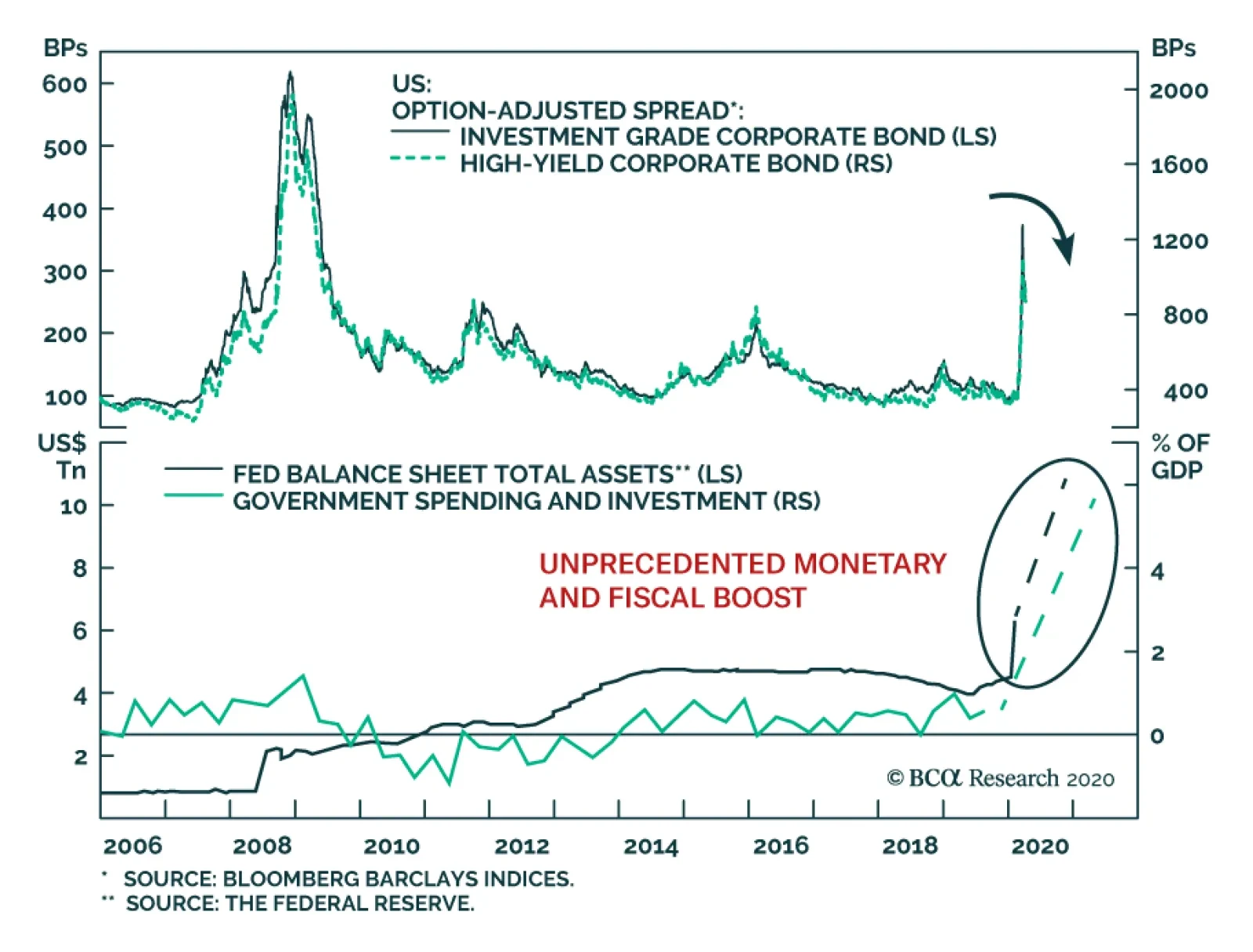
Last week, the Fed announced an additional $2.3trillion dollar of balance sheet expansion, which will bring its total assets to $11trillion a few weeks from now. Last week’s announcement includes $500 billion for municipalities, starting the Paycheck…
Despite the magnitude of the COVID-19 crisis, China’s stimulus has so far been tepid. However, this will soon change. Chinese policymakers are sending two clear signals that they will aggressively reflate their economy. They have pushed down the reserve…
BCA Research's European Investment Strategy service recommends investors overweight Italian BTPs and underweight German bunds on a cyclical (6-12 month) horizon. Europe is dithering on its fiscal response to the pandemic. Specifically, Germany and the…
Highlights A World Organization of the Petroleum Exporting Countries (WOPEC) looks set to emerge after today’s OPEC 2.0 video conference to discuss production cuts in the wake of the COVID-19 pandemic, and the market-share war between the leaders of the coalition led by the Kingdom of Saudi Arabia (KSA) and Russia. WOPEC will not be memorialized by a Declaration of Cooperation as OPEC 2.0 was. Oil exporters globally will cooperate on harmonizing policy to meet demand. In our latest scenario concentrating on likely supply responses, we show cuts of ~ 8mm b/d will be sufficient to clear the storage overhang caused by COVID-19-induced demand destruction of close to 4mm b/d this year. Based on this modeling, we see Brent prices averaging $36/bbl and $64/bbl this year and next, with WTI trading $2-$6/bbl lower, depending on US Gulf storage availability. This is roughly in line with our previous scenario (Chart of the Week).1 Demand destruction over 4mm b/d would require additional production cuts. Feature The 2020 oil price collapse brought on by COVID-19 – and super-charged by the market-share war declared by Russia following the breakdown of OPEC 2.0’s March 6 meeting – has spurred oil-producing states globally to action. Chart of the WeekExpect A Sharp Oil Price Recovery
Expect A Sharp Oil Price Recovery
Expect A Sharp Oil Price Recovery
Chart 2The Oil-Price Collapse Of 2020
The Oil-Price Collapse Of 2020
The Oil-Price Collapse Of 2020
WOPEC is bigger than OPEC 3.0 – an unofficial grouping we hypothesized at the end of March to encompass the expected future cooperation of KSA, Russia and the Texas Railroad Commission (RRC) – our shorthand for US oil-producing interests – succeeding OPEC 2.0. Today’s OPEC 2.0 video conference originally was called by KSA for Monday, but was moved to today – presumably – to give member states time to agree production cuts. The conference most likely was delayed by the acrimonious public exchange between its leaders this past weekend.2 On the heels of the OPEC 2.0 video conference comes a hastily called video conference on Friday of G20 energy ministers to discuss energy security. The G20 is led by KSA this year.3 The 2020 oil price collapse brought on by COVID-19 – and super-charged by the market-share war declared by Russia following the breakdown of OPEC 2.0’s March 6 meeting – has spurred oil-producing states globally to action (Chart 2). KSA, Russia and their respective OPEC 2.0 allies all are fully invested in this meeting, as are producers in the US, Canada, Norway and Brazil.4 Supply Destruction Vs.Production Cuts Oil producers face a stark choice: Either cut production voluntarily to counter the global demand destruction of a pandemic, or have the market do it for them by driving prices through cash costs toward zero (i.e., $0.00/bbl), as global crude oil and product storage fills. Prices in some basins have fallen close to zero after accounting for the basis differentials to benchmark prices and transport costs (e.g., WTI-Midland), which, in the US has begun to force shut-ins (Chart 3).5 Continued weak pricing close to zero risks shutting older, high-cost landlocked production in permanently, and many states simply cannot afford to lose the critical revenue provided by oil exports. Chief among these states are the non-Gulf members of OPEC, excluding Russia, US onshore, and Canada, which we identify as “The Other Guys” (Chart 4).6 Chart 3Some Crude Grades Priced Close To $0.00/bbl
Some Crude Grades Priced Close to $0.00/bbl
Some Crude Grades Priced Close to $0.00/bbl
Chart 4"The Other Guys" Production Declines Would Moderate With OPEC 2.0 Deal
The "Other Guys" Production Declines Would Moderate With OPEC 2.0 Deal
The "Other Guys" Production Declines Would Moderate With OPEC 2.0 Deal
We expect The Other Guys in OPEC 2.0 will lose 700k b/d, with 400k b/d of that realized over the course of 2021. The chief contribution of The Other Guys to the OPEC 2.0 coalition’s production-management scheme is their managed production decline. These states were only starting to recover from the Global Financial Crisis (GFC) beginning in 2010 when the OPEC market-share war of 2014-16 was declared. The COVID-19 price collapse, coupled with the knock-on effects of the 2020 KSA-Russia market-share war likely accelerates the rate of production decline for the Other Guys, as capital continues to avoid developing their resources. We expect The Other Guys in OPEC 2.0 will lose 700k b/d, with 400k b/d of that realized over the course of 2021. Core OPEC and Russia can increase (and decrease) production, and we expect they will deliver the largest part of the OPEC 2.0 production cuts. In this week’s simulation, we project KSA will cut 2mm b/d, from their April level of from 12mm b/d; and Russia will cut 1.1mm b/d, down from 11.6mm b/d. We then project Iraq will cut 460k b/d; Kuwait 280k b/d; and the UAE 315k b/d. Outside OPEC 2.0, a lot of the production we expect will be cut is out of necessity. Canada, for example, will be forced to either shut in high-cost tar-sands production or go back to pro-rating production as it did last year, owing to a lack of storage in Alberta and pipeline takeaway capacity to move their crude south to US refiners. We expect Canada to cut 350k b/d this year, as a result. Brazil’s Petrobras already has shut in 100k b/d, and US producers have begun shutting in shale-oil production.7 US Production Cuts Some of the more efficient producers in The Great State of Texas have been calling for pro-rationing of up to 20%, which would push the cuts in Texas’s Permian and Eagle Ford shale basins alone to 1.23mm b/d. Production cuts most likely will be focused on the US, as this is the most easy-to-adjust output in the world. It also still is higher up the global cost curve, although, as we have noted earlier, this will change in the event bankruptcies pick up.8 In the US, production cuts already have begun. They are and will continue to be focused on the shales. We continue to project cuts in the US shales of ~ 1.5 mm b/d this year. However, this number could be higher: If producers respond to the collapse in prices by not sending any new rigs to the field in the next 12 months, production will fall by 2.9mm b/d from production declines alone. Just to keep production flat, the US shales will need an average of ~ 520 rigs per month (assuming no drilled-uncompleted wells are finished). The risk on our rig-count estimates are straightforward: If rig counts go much lower, we could see a large decline in shale production in the coming months (Chart 5). Chart 5US Shale Output Falls This Year And Next
The Birth Of WOPEC
The Birth Of WOPEC
Some of the more efficient producers in The Great State of Texas have been calling for pro-rationing of up to 20%, which would push the cuts in Texas’s Permian and Eagle Ford shale basins alone to 1.23mm b/d. Including the Anadarko Basin, most of which is in Oklahoma, which also permits pro-rationing, 20% pro-rationing would push TX-OK cuts to ~ 1.33mm b/d. As we have been writing over the past month, we could see a return of pro-rationing in the states of Texas and Oklahoma. In the Great State, producers have filed a petition before the Texas RRC asking the Commission to reprise its 1928-73 production-management role.9 The Texas RRC will hold a video conference Tuesday, April 14, to consider this petition. We’re expecting this petition to be granted, and for pro-rationing to begin in the near future. On the demand side, we are staying with the scenario we presented March 30, with 2Q20 demand falling ~ 12mm b/d (y/y vs. 2Q19). In 2H20, we project demand to grow at a rate of 800k b/d by 4Q20. For all of 2020, we model average demand losses equal to 3.8mm b/d. For 2021, massive fiscal and monetary stimulus globally will lift demand 5.3mm b/d. With the supply cuts projected above and our demand view, we see balances tightening over the course of the year and moving into a physical deficit in 4Q20 (Chart 6). While near-term oversupply will force inventories to grow sharply, we expect them to draw as sharply beginning by September and continuing into next year (Chart 7). Chart 6Supply-Demand Imbalance Will Tighten Into 2021
Supply-Demand Imbalance Will Tighten Into 2021
Supply-Demand Imbalance Will Tighten Into 2021
Chart 7Inventories Will Build Sharply, Then Draw Sharply in 2021
Inventories Will Build Sharply, Then Draw Sharply in 2021
Inventories Will Build Sharply, Then Draw Sharply in 2021
Investment Implications Our projections for supply presented this week and our demand scenario presented at the end of March are evolving into our base case for oil and gas. We still do not know with certainty the OPEC 2.0 coalition will agree to production cuts today, or whether the Texas RRC will return to the business of pro-rationing. If either or both of these outcomes does not materialize, markets will take over and savagely destroy supply. This will be extremely volatile. For our part, we expect OPEC 2.0, the Other Guys outside the coalition, and the US shales to deliver something that looks like voluntary cuts. This will occur via voluntary cuts, “managed” declines, and pro-rationing and shut-ins. Unlike many of our economist colleagues who argue against such jointly coordinated policies – invoking a free-market, pure-competition paradigm that has not existed for any meaningful period in the modern history of the oil market – we believe producers are intelligently pursuing their interests by jointly coordinating the boom-bust mayhem of unfettered oil markets. Similarly, we believe consumers are better served by diversified sources of energy vs. an over-reliance on large concentrated supplies who can use their low-cost endowment to monopolize supply and set up barrier to entry to competition. Given our view, we remain constructive to the oil market, expecting a rally that will look a lot like the Chart of the Week and the balances we show in Chart 7. As a result, we are getting long 2H21 Brent vs. short 2H22 Brent futures. Robert P. Ryan Chief Commodity & Energy Strategist rryan@bcaresearch.com Hugo Bélanger Associate Editor Commodity & Energy Strategy HugoB@bcaresearch.com Fernando Crupi Research Associate Commodity & Energy Strategy FernandoC@bcaresearch.com Commodities Round-Up Energy: Overweight Defying the global rush to cut oil production, Mexico apparently is moving toward increasing production. Petroleos Mexicanos (PEMEX) is looking to drill 423 wells this year, according to Bloomberg. A March 26 Journal of Petroleum Technology survey suggests capex by E&P companies will fall by up to 35% this year. Base Metals: Neutral This week Japan’s Nippon Steel became the latest producer to idle blast furnaces, halting about 15% of the company’s total capacity. More generally an iron ore surplus in other parts of Asia and in Europe is expected as steel mills idle furnaces amidst lower demand for their output. However, diminished activities in mines – severely impacted by lockdowns – will offset some of the demand loss. COVID-19 induced shutdown in South Africa, Iran, India and Canada have curtailed exports from those countries until late April. Additionally, bad weather in Brazil led iron ore exports to fall on a yoy basis for the third month in a row in March. A decline of ~ 2% vs. last year’s already depressed – following the Vale dam incident – levels. China’s anticipated infrastructure stimulus will support iron ore demand, drawing down inventories and pushing up prices, but it, too, will be tempered by the pace of the recovery in its export markets. Precious Metals: Neutral A strong US dollar remains an important risk for precious metals. The dollar rose 1.6% since March 28 despite the Fed’s actions to calm the global dollar liquidity squeeze. This signals the funding crisis has not been thoroughly controlled and that swap lines will have to be extended to additional EM central banks. However, a large share of outstanding foreign exchange swaps/forwards resides in non-bank financial corporations and institutions with limited access to dollar funding via central bank swap lines. Over the short-term, our gold price recommendation remains vulnerable to deterioration, due to uncertain liquidity conditions (Chart 8). Ags/Softs: Underweight This week we begin tracking the lumber market. Lumber consumption fell sharply as the coronavirus spread in the United States, pushing front-month futures down 44% from February highs. With housing starts already weak in February – down 1.5% month on month – and expected to be even weaker in March (Chart 9), continued lumber supply curtailments will stabilize prices in the short term and eventually push prices up once lower interest rates kick in and demand resumes. Chart 8
Global USD Squeeze Could Threaten Gold Again
Global USD Squeeze Could Threaten Gold Again
Chart 9
Lumber Hammered As COVID-19 Pounds Housing Starts
Lumber Hammered As COVID-19 Pounds Housing Starts
1 Please see OPEC 3.0 In the Offing?, published March 30, 2020, which focused on demand destruction. 2 Please see OPEC+ meeting delayed as Saudi Arabia and Russia row over oil price collapse: sources, and G20 energy ministers to hold video conference on Friday: document published by reuters.com April 4 and April 7, 2020. 3 The G20 consists of Argentina, Australia, Brazil, Canada, China, Germany, France, India, Indonesia, Italy, Japan, Mexico, the Russian Federation, Saudi Arabia, South Africa, South Korea, Turkey, the UK, the US and the EU. 4 Please see A look at the major players in this week’s “OPEC++” meeting, a Bloomberg analysis published by worldoil.com April 7, 2020. 5 Please see Can the world agree a deal to boost oil prices? Published by Wood MacKenzie April 3, 2020. 6 The Other Guys is our moniker for all producers excluding core-OPEC, US shale, Russia and Canada. Production from this group of producers has been falling as a share of global production for years, due to a lack of domestic and foreign direct investment in their energy sectors. 7 In its latest Short-Term Energy Forecast, the EIA estimates US crude oil production will fall 500k b/d this year and 700k b/d next year, driven by market forces. 8 For a discussion, please see How Long Will The Oil-Price Rout Last?, a Special Report we published with BCA Research’s Geopolitical Strategy March 9, 2020. It is available at ces.bcaresearch.com. 9 Please see Oil Prorationing in the Spotlight at Texas Railroad Commission, published by Baker Botts, a Texas law firm, on March 30, 2020. Investment Views and Themes Recommendations Strategic Recommendations Tactical Trades Trade Recommendation Performance In 2019 Q4
The Birth Of WOPEC
The Birth Of WOPEC
Commodity Prices and Plays Reference Table Trades Closed in 2020 Summary of Closed Trades
The Birth Of WOPEC
The Birth Of WOPEC
Highlights Europe’s dirty little secret: Euro area debt is already mutualised. Investment implication: Overweight Italian BTPs, underweight German bunds, and overweight the euro on a structural (2-year plus) horizon. ESM plus ECB plus OMT equals a compromise solution to fund stimulus at a mutualised euro area interest rate. Investment implication: Overweight Italian BTPs, underweight German bunds on a cyclical (6-12 month) horizon. Spain’s high early peak in morbidity means that it has taken its pain upfront, at least compared to other countries. Investment implication: upgrade Spain’s IBEX to a tactical overweight – and remove it from the cyclical underweight basket. Feature Chart of the WeekThe Underperformances Of China, Italy And Spain Were A Mirror-Image Of Their Covid-19 Morbidity Curves
The Underperformances Of China, Italy And Spain Were A Mirror-Image Of Their Covid-19 Morbidity Curves
The Underperformances Of China, Italy And Spain Were A Mirror-Image Of Their Covid-19 Morbidity Curves
More About Morbidity Curves Most analyses of the pandemic tend to focus on the grim daily mortality statistics. Yet the key to the pandemic’s evolution is not its mortality rate, but rather its morbidity (severe illness) rate. This is because, without a vaccine, the total area underneath the morbidity curve is fixed. The cumulative number of people who will fall severely ill is pre-determined at the outset (Figures 1-3). Figure I-1The Area Under The Morbidity Curve Is Fixed, A High First Peak Means A Low Second Peak
Will Europe Unite Or Split?
Will Europe Unite Or Split?
Figure I-2A Low First Peak Means An Extended First Peak…
Will Europe Unite Or Split?
Will Europe Unite Or Split?
Figure I-3…Or A High Second Peak
Will Europe Unite Or Split?
Will Europe Unite Or Split?
Very optimistically assuming a Covid-19 morbidity rate of 1 percent, and that 65 percent of the population must get infected to exhaust the pandemic, we know that Covid-19 will ultimately make 0.65 percent of the population severely ill. Absent a vaccine, this number is set in stone. But the number of deaths is not set in stone. It depends on the availability of emergency medical treatment for those that are severely ill. For Covid-19 this means access to ventilation in an intensive care unit (ICU). Yet even the best equipped countries only have ICUs for 0.03 percent of the population. Therefore, the emergency treatment must be rationed either by supply or by demand. Without a Covid-19 vaccine, we cannot change the cumulative number of people who will become severely ill. Rationing by supply means that we must deny emergency treatment to the severely ill – not just Covid-19 patients but victims of, say, heart attacks or car crashes. Accept more deaths. Rationing by demand means that we must flatten the demand (morbidity) curve so that demand is always satisfied by the limited ICU supply. During the pandemics of 1918-19 and 1957, countries could ration emergency medical treatment by supply. Not in 2020. In an era of universal healthcare, everybody is entitled to, and expects to get, emergency medical care. Which means we must ration emergency medical treatment by demand. As such, we must analyse the 2020 response differently to the responses in 1918-19 and 1957. To repeat, without a vaccine, we cannot change the area under the morbidity curve. There is no way of escaping this truth. A low first peak requires a very elongated peak or a high second peak (Chart I-2). Conversely, countries that have suffered a high first peak will need a shorter peak and small (or no) second peak. Chart I-2Japan's Early Stabilisation Was A False Dawn
Japan's Early Stabilisation Was A False Dawn
Japan's Early Stabilisation Was A False Dawn
Turning to an equity market implication, the underperformances of highly cyclical and domestically exposed Spain and Italy have closely tracked their morbidity curves (Chart I-1). Given that both countries have suffered very high first peaks in morbidity, the strong implication is that they have taken their pain upfront – at least compared to other countries. In the case of Spain, the market is also technically oversold (see Fractal Trading System). Investment implication: upgrade Spain’s IBEX to a tactical overweight – and remove it from the cyclical underweight basket. How Europe Could Unite Europe is dithering on its fiscal response to the pandemic. Specifically, Germany and the Netherlands are pushing back against the concept of mutualised euro area debt in the form of ‘corona-bonds’. But a pandemic is an act of nature, an indiscriminate exogenous shock. What is the point of the economic and monetary union if Italy must fund its response to an act of nature at the Italian 10-year yield of 1.5 percent rather than the euro area 10-year yield of 0 percent? (Chart I-3 and Chart I-4) Chart I-3To Fight An Act Of Nature Why Should Italy Borrow At A Higher Rate...
To Fight An Act Of Nature Why Should Italy Borrow At A Higher Rate...
To Fight An Act Of Nature Why Should Italy Borrow At A Higher Rate...
Chart I-4...When It Could Borrow At A Lower Mutualised Rate?
...When It Could Borrow At A Lower Mutualised Rate?
...When It Could Borrow At A Lower Mutualised Rate?
The good news is there is a compromise solution to fund stimulus at a mutualised interest rate. It uses the euro area’s €500 billion bailout fund, the European Stability Mechanism (ESM). But the compromise solution carries two problems which need mitigation. First, ESM credit lines come with conditionality. Italy would rightly balk if it were shackled like Greece, Portugal, and Ireland were after the euro debt crisis. Luckily, the ESM is likely to regard the current ‘act of nature’ crisis very differently to the debt crisis and impose only minimum and appropriate conditionality – for example, that credit lines should be used for healthcare and social welfare spending. Second, ESM credit lines come with a stigma. Taking fright that Italy is tapping the ESM, the bond market might drive up the yields on Italian BTPs. If this pushed up Italy’s overall funding rate, it would defeat the purpose of using the ESM in the first place. ESM plus ECB plus OMT equals a compromise solution to borrow at a mutualised interest rate. The hope is that the bond market, realising that Italy is using the bailout facility to counter an act of nature, would not drive up BTP yields. But if it did, the ECB could counter this by buying BTPs. One option would be to use its Outright Monetary Transactions (OMT) facility. Set up during the euro debt crisis, the OMT’s specific function is to counter bond market attacks when they are not justified by the economic fundamentals. In other words, to prevent a liquidity crisis escalating into a solvency crisis. Thereby, ESM plus ECB plus OMT equals a compromise solution to fund stimulus at a mutualised euro area interest rate. Investment implication: Overweight Italian BTPs, underweight German bunds on a cyclical (6-12 month) horizon. Europe’s Dirty Little Secret Outwardly, Germany and the Netherlands are reluctant to go down the slippery slope to mutualised euro area debt. But here’s the dirty little secret they don’t want you to know. Euro area debt is already mutualised. The stealth mutualisation has happened via the Target2 banking imbalance which now stands at €1.5 trillion. This imbalance is an accounting identity showing that Italy is owed ‘German euros’ via its large quantity of bank deposits in German banks while Germany is symmetrically owed ‘Italian euros’ via its large effective holding of Italian government bonds. The imbalance is irrelevant if a German euro equals an Italian euro. But if Italy defaulted on its bonds – by repaying them in a reinstated and devalued lira – then Target2 means that Germany must pick up the bill (Chart I-5). Chart I-5Target2 Means That If Italy Defaults, Germany Picks Up The Bill
Will Europe Unite Or Split?
Will Europe Unite Or Split?
The Target2 imbalance is the result of the ECB’s QE program, in which the central bank has bought hundreds of billions of Italian bonds. If Italy repaid those bonds in a devalued lira, then the ECB would become insolvent, and the central bank’s remaining shareholders would have to plug the hole. The biggest shareholder would be Germany. Could Germany force Italy to repay its bonds in euros? No. According to a legal principle called ‘lex monetae’ Italy can repay its debt in its sovereign currency, whatever that is. Meanwhile, because of the fragility of the Italian banking system, the Italians who sold the bonds to the ECB deposited the cash in German banks. Legally, these depositors must be paid back in whatever is the German currency. Euro area debt is already mutualised. If euro area debt is already mutualised, why do policymakers continue to pretend that it isn’t? There are three reasons. First no policymaker would want to publicise that Germany is now on the hook if Italy left the euro. Second, no policymaker would want to publicise that the ECB has put Germany in this position (Chart I-6). Chart I-6ECB QE Has Created The Target2 Imbalance
ECB QE Has Created The Target2 Imbalance
ECB QE Has Created The Target2 Imbalance
Third, and most important, policymakers would point out that the mutualisation of debt only happens if the euro breaks up. They would argue that because the euro is irreversible, the debt is not mutualised. In fact, their argument is completely back to front. The truth is: Because euro area debt is now mutualised, the euro has become irreversible. Investment implication: Overweight Italian BTPs, underweight German bunds, and overweight the euro on a structural (2-year plus) horizon. Fractal Trading System* As already discussed, this week’s recommended trade is long Spain’s IBEX 35 versus the Euro Stoxx 600. The profit target is 3 percent with a symmetrical stop-loss. Meanwhile our other trade, long Australia versus New Zealand has moved into a 2 percent profit. The rolling 12-month win ratio now stands at 66 percent. Chart I-7IBEX 35 Vs. EUROSTOXX 600
IBEX 35 Vs. EUROSTOXX 600
IBEX 35 Vs. EUROSTOXX 600
When the fractal dimension approaches the lower limit after an investment has been in an established trend it is a potential trigger for a liquidity-triggered trend reversal. Therefore, open a countertrend position. The profit target is a one-third reversal of the preceding 13-week move. Apply a symmetrical stop-loss. Close the position at the profit target or stop-loss. Otherwise close the position after 13 weeks. * For more details please see the European Investment Strategy Special Report “Fractals, Liquidity & A Trading Model,” dated December 11, 2014, available at eis.bcaresearch.com. Dhaval Joshi Chief European Investment Strategist dhaval@bcaresearch.com Fractal Trading System Cyclical Recommendations Structural Recommendations Closed Fractal Trades Trades Closed Trades Asset Performance Currency & Bond Equity Sector Country Equity Indicators Bond Yields Chart II-1Indicators To Watch - Bond Yields
Indicators To Watch - Bond Yields
Indicators To Watch - Bond Yields
Chart II-2Indicators To Watch - Bond Yields
Indicators To Watch - Bond Yields
Indicators To Watch - Bond Yields
Chart II-3Indicators To Watch - Bond Yields
Indicators To Watch - Bond Yields
Indicators To Watch - Bond Yields
Chart II-4Indicators To Watch - Bond Yields
Indicators To Watch - Bond Yields
Indicators To Watch - Bond Yields
Interest Rate Chart II-5Indicators To Watch - Interest Rate Expectations
Indicators To Watch - Interest Rate Expectations
Indicators To Watch - Interest Rate Expectations
Chart II-6Indicators To Watch - Interest Rate Expectations
Indicators To Watch - Interest Rate Expectations
Indicators To Watch - Interest Rate Expectations
Chart II-7Indicators To Watch - Interest Rate Expectations
Indicators To Watch - Interest Rate Expectations
Indicators To Watch - Interest Rate Expectations
Chart II-8Indicators To Watch - Interest Rate Expectations
Indicators To Watch - Interest Rate Expectations
Indicators To Watch - Interest Rate Expectations
On Tuesday, BCA Research's Global Fixed Income Strategy service concluded that global government bond yields are likely to remain range-bound for at least one to two more months. Market expectations of future policy rates are driving the term structure of…