Policy

Highlights Global investors have come to accept the secular stagnation narrative as described by Larry Summers in November 2013, and have gravitated to the only available real time estimate of the real neutral rate of interest: the Laubach & Williams (“LW”) “R-star” estimate. With this apparent visualization of secular stagnation as a guide, many investors have concluded that monetary policy ceased to be stimulative last year and that recent Fed rate cuts will be of limited benefit to economic activity even once economic recovery takes hold unless inflation meaningfully accelerates (thus pushing real rates lower for any given nominal Fed funds rate). This report revisits the “LW” R-star estimate in detail, and demonstrates why the estimation is almost certainly wrong, at least over the past two decades. We also outline an inferential approach that investors can use to monitor where the neutral rate is in real time and whether it is rising or falling. The core conclusion for investors is that US Treasury yields reflect a “low rates forever” view with much higher certainty than is analytically warranted and thus appear to be anchored by a false narrative. While bond yields may not rise significantly in the near-term, investors should avoid dogmatic medium-to-longer term views about yields as they may rise meaningfully over a cyclical and secular horizon once a post-COVID-19 expansion takes hold. Feature Over the past several weeks financial markets have moved rapidly to price in a global recession stemming from the COVID-19 outbreak. As financial market participants began to turn to policy makers for support, eyes focused first on the Federal Reserve, and then fiscal authorities. Earlier this week, the ECB joined the party and announced aggressive further measures of its own. When responding to the Fed’s return to the lower bound and its other recent monetary policy decisions, many market participants have expressed the view that the Fed is largely impotent to deal with a global pandemic. There are three elements to this view. The first is that interest rate cuts are ill equipped to stimulate domestic demand if quarantine measures or other forms of “social distancing” are in effect. The second element is that the Fed has only been capable of delivering a fraction of the reduction in interest rates compared to what has occurred in response to previous contractions. The third aspect of this view is that because the neutral rate of interest is so much lower now than it was in the past, Fed rate cuts will not be as stimulative as they were before. Chart II-1Monetary Policy Ceased To Be Stimulative Last Year, According To The LW R-star Estimate
Monetary Policy Ceased To Be Stimulative Last Year, According To The LW R-star Estimate
Monetary Policy Ceased To Be Stimulative Last Year, According To The LW R-star Estimate
While we at least partly agree with the first and second elements of this view, we feel strongly that the third is flawed. Global investors have come to accept the secular stagnation narrative as described by Larry Summers in November 2013,1 and have gravitated to the only available real time estimate of the neutral rate of interest: the Laubach & Williams (“LW”) “R-star” estimate. This time series, which is regularly updated by the New York Fed,2 suggests that the real fed funds rate reached neutral territory in the first quarter of 2019 (Chart II-1). With this apparent visualization of secular stagnation as a guide, many investors have concluded that monetary policy ceased to be stimulative last year and that recent Fed rate cuts will be of limited benefit to economic activity even beyond the near term unless inflation meaningfully accelerates (thus pushing real rates lower for any given nominal Fed funds rate). In this Special Report we revisit the “LW” R-star estimate in detail, and demonstrate why the estimation is almost certainly wrong, at least over the past two decades. Our analysis does not reveal a precise alternative estimate of the neutral rate, although we do provide some inferential perspective on how investors may be able to monitor where the neutral rate is in real time and whether it is rising or falling. However, the core insight emanating from our report, particularly for US fixed income investors, is that US Treasury yields reflect a “low rates forever” view with much higher certainty than is analytically warranted and thus appear to be anchored by a false narrative. While bond yields may not rise significantly in the near-term, this underscores that they have the potential to rise meaningfully over a cyclical and secular horizon once economic activity recovers. As such, we caution fixed-income investors against dogmatic medium-to-longer term views about bond yields, as their potential to rise may be larger than many investors currently expect. Demystifying The LW R-star Estimate The LW estimate of the neutral rate of interest has gained credibility for three reasons. First, as noted above, the evolution of the series fits with the secular stagnation narrative re-popularized by Larry Summers. Second, the series is essentially sponsored by the Federal Reserve even if it is not officially part of the Fed’s forecasting framework, as its two creators are long-time Fed employees (Thomas Laubach is a director of the Fed’s Board of Governors, and John Williams is the current President of the New York Fed). But, in our view, there is a third important reason that global investors have accepted the LW R-star estimate of the neutral rate of interest: the methodology used to generate the estimate is extremely technically complex, and thus is difficult for most investors to penetrate. Much of the technical complexity of the LW estimate is centered around the use of a statistical procedure called a Kalman filter (“KF”). Simply described, the KF is an algorithm that tries to estimate an unobservable variable based on 1) an idea of how the unobservable variable might relate to an observable variable (the “measurement equation”), and 2) an idea of how the unobservable variable might change through time (the “transition equation”). Through a repeated process of simulating the unobserved variable based on a set of assumptions, the KF is able to compare predicted results to actual results on an observation-by-observation basis, and use that information to generate ever more reliable future estimates of the unobserved variable (Chart II-2). Chart II-2A Very Simplified Overview Of The Kalman Filter Algorithm
April 2020
April 2020
We acknowledge that a full technical treatment of the Kalman Filter as it relates to the LW estimate of the neutral rate of interest is beyond the scope of this report, and we provide a more technical overview in Box II-1. But what emerges from a detailed analysis of the model is that the Kalman Filter jointly estimates R-star, potential GDP growth, potential GDP, and the variable “z”, the determinants of R-star that are not explained by potential GDP growth. As we will highlight in the next section, this joint estimation of these four variables is a crucial aspect of the model, because a valid estimate of R-star necessitates a valid estimate of the remaining variables. BOX II-1 A Technical Overview Of The Laubach & Williams R-star Model Chart Box II-1 shows that there are three sets of formulas involved in the LW estimation: the “law of motion” for the neutral rate of interest, two measurement equations, and three transition equations. The law of motion for the neutral rate is fairly simple: R-star is a function of trend real GDP growth, as well as “other factors” represented by the variable “z”. Laubach & Williams note that z “captures factors such as households’ rate of time preference”. The measurement equations are also fairly straightforward. First, the (unobservable) output gap is a function of lagged values of itself as well as the lagged real Fed funds rate gap (relative to the unobservable neutral rate). Second, inflation is a function of lagged values of itself, past values of the output gap, relative core import prices, and lagged relative imported oil prices (the latter two variables are included to capture potential supply shocks to inflation). Note that this second measurement equation is required for the model to work, as it relates the unobservable output gap to observable inflation. As presented in Chart II-2, the three transition equations are present to simulate how the unobservable variables might move through time. Potential growth and potential output are a random walk, and “z” from the law of motion follows either a random walk or an autoregressive process. Chart Box II-1The Laubach & Williams R-star Model
April 2020
April 2020
Debunking The LW R-star Estimate Before criticizing the LW estimate of the neutral rate of interest, it is important for us to note that we have the utmost respect for the Federal Reserve and its research methods. We fully acknowledge that the LW R-star estimation is rooted in solid economic theory, and we have identified no technical errors in the setup of the LW model. Nevertheless, valid analytical efforts sometimes lead to problematic real-world results, and there are two key reasons to believe that the Kalman filter in the LW model is almost certainly misspecifying R-star, at least in terms of its estimate over the past two decades. The first reason relates to the sensitivity of the model to the interval of estimation (the period over which R-star is estimated). Chart II-3 presents the range of quarterly estimates of R-star since 2005, along with the difference between the high and low end of the range in the second panel. The chart shows that while previous estimates of R-star have generally been stable for values ranging between the early-1980s and 2006/2007, pre-1980 estimates have varied quite substantially and we have seen material revisions to the estimates over the past decade. Q1 2018 serves as an excellent example: in that quarter R-star was estimated to be 0.14%; today, the Q1 2018 R-star estimate sits at 0.92%. Chart II-3Since 2005, There Has Been Some Instability In The LW R-star Estimates
Since 2005, There Has Been Some Instability In The LW R-star Estimates
Since 2005, There Has Been Some Instability In The LW R-star Estimates
However, Table II-1 and Chart II-4 highlight the real instability of the Kalman filter estimation by demonstrating the effect of varying the starting point of the model (please see Box II-2 for a brief description of how our estimation of R-star using the LW approach differs slightly from the original procedure). Laubach & Williams originally estimated R-star beginning in Q1 1961; Table II-1 shows what happens to today’s estimate of R-star simply by incrementally varying the starting point of the model from Q1 1958 to Q4 1979. Table II-1Alternative Current LW Estimates Of R-star By Model Starting Point
April 2020
April 2020
Chart II-4Alternative Starting Points Produce Wildly Different Estimates Of R-star Today
April 2020
April 2020
BOX II-2 The Laubach & Williams R-star Model With Simplified Inflation Expectations To proxy inflation expectations in their model, Laubach & Williams use a “forecast of the four-quarter-ahead percentage change in the price index for personal consumption expenditures excluding food and energy (“core PCE prices”) generated from a univariate AR(3) of inflation estimated over the prior 40 quarters”. The authors note that a simplified measure of expectations, a 4-quarter moving average of quarterly annualized core inflation, does not materially alter their results. For the sake of parsimony we use this simplified measure in our analysis. We find that the effect shifts the current estimate of R-star only slightly (+10 basis points), and that the historical differences between our version of the 1961 estimation and the official series are indeed minor. The table highlights that the model fails to even generate a result in a majority of the cases (only 39 out of 88 of the model runs were error-free). In addition, Chart II-4 shows that of the successful estimates of R-star using the LW procedure and alternate starting dates of the model, the estimate of R-star today varies from -2% (in one case) to +2%. Excluding the one extremely negative outlier results in an effective estimate range of 0% to 2%, but the key point for investors is that this range is massive and underscores that the original model’s estimate of R-star today is heavily and unduly influenced by the interval of estimation. Investors should also note that of all of the alternative estimates of R-star today shown in Chart II-4, the estimate using the original interval is very much on the low end of the distribution. The second (and most important) reason to believe that the LW estimate is misspecifying R-star is that the output gap estimate generated by the model is almost certainly invalid, at least over the past two decades. Chart II-5presents the LW output gap estimate alongside an average of the CBO, OECD, and IMF estimates of the gap; panel 1 shows the official current LW output gap estimate, whereas panel 2 shows the range of output gap estimates that are generated using the different estimation intervals highlighted in Table II-1 and Chart II-4. Chart II-5The LW Output Gap Estimates, Upon Which R-star Depends, Have Been Wrong For Two Decades
The LW Output Gap Estimates, Upon Which R-star Depends, Have Been Wrong For Two Decades
The LW Output Gap Estimates, Upon Which R-star Depends, Have Been Wrong For Two Decades
Given that the Kalman filter in the LW model jointly determines R-star and the output gap (by way of estimating potential output via estimating potential GDP growth) and that these estimates are dependent on each other, Chart II-5 highlights that in order to believe the LW R-star estimate investors must believe three things: That the US economy was chronically below potential in the late-1990s when the unemployment rate was below 5%, real GDP growth averaged nearly 5%, and the equity market was booming, That output exceeded potential in 2004/2005 by a magnitude not seen since the late-1970s / early-1980s despite an average unemployment rate, That the 2008/2009 US recession was not particularly noteworthy in terms of its deviation from potential output, and that the economy had returned to potential output by 2010/2011 when the unemployment rate was in the range of 8-9%. Chart II-6The US Economy Was Definitely Not At Full Employment In 2010
The US Economy Was Definitely Not At Full Employment In 2010
The US Economy Was Definitely Not At Full Employment In 2010
While we do not believe any of these three statements, the third is especially unlikely. Chart II-6 highlights that the economic expansion from 2009 – 2020 was the weakest on record in the post-war era in terms of average annual real per capita GDP growth. To us, this is a clear symptom of a chronic deficiency in aggregate demand, and that it is essentially unreasonable to argue that the economy was operating at full employment prior to 2014/2015. This means that the Kalman filter is generating incorrect and unreliable estimates of the output gap, which means in turn that the filter’s estimation of R-star is almost assuredly wrong. How Can Investors Tell What The Neutral Rate Is? An Inferential Approach Table II-2 presents the sensitivity of the original Q1 1961 LW estimate of R-star to a series of counterfactual scenarios for inflation, real GDP growth, nominal interest rates, and import and oil prices since mid-2009. While these scenarios do not in any way improve the validity of the LW R-star estimate, they do help clarify the theoretical basis of the model and they help reveal how investors may infer whether the neutral rate of interest is higher or lower than prevailing market rates, and whether it is rising or falling. Table II-2Sensitivity Of Current LW R-star Estimate To Counterfactual Scenarios (2009 - Present)
April 2020
April 2020
Chart II-7Core Import Price Growth Has Been Weak On Average During This Expansion
Core Import Price Growth Has Been Weak On Average During This Expansion
Core Import Price Growth Has Been Weak On Average During This Expansion
Table II-2 highlights that today’s estimate of R-star using the original LW approach is mostly sensitive to our counterfactual scenarios for growth and interest rates, but not inflation or oil prices. Shifting down import price growth also has a meaningful effect on R-star, but since core import price growth has been particularly weak over the past several years (Chart II-7), it seems unreasonable to suggest that they have been abnormally high and thus “explain” a low R-star estimate today. Table II-2 essentially highlights that the entire question of the neutral rate of interest over the past decade, and the core contradiction that led to the re-emergence of the secular stagnation thesis, can effectively be boiled down to the following simple question: “Why hasn’t US economic growth been stronger this cycle, given that interest rates have been so low?” Based on the (hopefully uncontroversial) view that interest rates influence economic activity and that economic activity influences inflation, we propose the following checklist for investors to ask themselves in order to not only determine the answer to this important question, but to help identify whether R-star in any given country is likely higher or lower than existing policy rates at any given point in time. Are interest rates above or below the prevailing level of economic growth? Are interest rates rising or falling, and how intensely? Are there identifiable non-monetary shocks (positive or negative) that appear to be influencing economic activity? Is private sector credit growth keeping pace with economic growth? Are debt service burdens in the economy high or low? The first question reflects the most basic view of R-star, which is that the real neutral rate of interest should be equal to, or at least closely related to, the potential growth rate of the economy, ceteris paribus. Questions 2 through 5 attempt to determine whether ceteris paribus holds. In terms of how the answers to these questions relate to identifying the neutral rate, consider two economies, “Economy A” and “Economy B” (Chart II-8). Economy A has broadly stable or slightly rising interest rates that are well below prevailing rates of economic growth (questions 1 & 2), no obvious beneficial shocks to domestic demand from fiscal policy or other factors (question 3), and strong private sector credit growth that is perhaps above or strongly above the current pace of GDP growth (question 4). Chart II-8'Economy A', Versus 'Economy B'
April 2020
April 2020
Inferentially, it would seem that interest rates in this hypothetical economy are below R-star today. Question 5 is in our list because the more that active private sector leveraging occurs (thus pushing up debt burdens), the more that we would expect R-star in the future to fall. This is because debt payments as a share of income cannot rise forever, and we would expect that the capacity of economy A’s central bank to raise interest rates in the future are negatively related to economy A’s private sector debt service burden today. Now, imagine another economy (“Economy B”) with interest rates well below average rates of economic growth, an interest rate trend that is flat-to-down, no identifiable non-monetary policy shocks that are restricting aggregate demand, persistently sluggish credit growth, and high private sector debt service burdens in the past. If economy B is growing (even sluggishly) and not in the middle of a recession, it would seem that prevailing interest rates are below R-star, but not significantly so. In this scenario it would seem reasonable to conclude that R-star in economy B has fallen non-trivially below its potential growth rate, and that interest rate increases are likely to move monetary policy into restrictive territory earlier than otherwise would be the case. Is The United States “Economy B”? From the perspective of some investors, our description of economy B above perfectly captures the experience of the US over the past decade: an extremely low Fed funds rate, sluggish to weak growth and inflation, all the result of a huge build-up in leverage and debt service burdens during the last economic cycle. We do not doubt that R-star fell in the US for some period of time during the global financial crisis and in the early phase of the economic recovery. But we doubt that it is as low today as the secular stagnation narrative would imply, in large part because it ignores several important aspects concerning questions 2 through 5 noted above. Chart II-9Fiscal Austerity Has Been A Serious Non-Monetary Shock To Aggregate Demand
Fiscal Austerity Has Been A Serious Non-Monetary Shock To Aggregate Demand
Fiscal Austerity Has Been A Serious Non-Monetary Shock To Aggregate Demand
Non-monetary shocks to the US and global economies: Over the past 12 years, there have been at least five deeply impactful non-monetary shocks to both the US and global economies that have contributed to the disconnect between growth and interest rates: 1) a prolonged period of US household deleveraging from 2008-2014, 2) the euro area sovereign debt crisis, 3) fiscal austerity in the US, UK, and euro area from 2010 – 2012/2014 (Chart II-9), 4) the US dollar / oil price shock of 2014, and 5) the recent trade war between the US and China. Several of these shocks have been policy-driven, and in the case of austerity the negative consequences of that policy has led to a lasting change in thinking among fiscal authorities (outside of Japan) that is unlikely to reverse in the near-future. Chart II-10Recent Trends In US Private Sector Leverage Do Not Suggest R-star Is Very Low
Recent Trends In US Private Sector Leverage Do Not Suggest R-star Is Very Low
Recent Trends In US Private Sector Leverage Do Not Suggest R-star Is Very Low
Private sector credit growth: Chart II-10 highlights the extent of household deleveraging noted above by showing the growth in total household liabilities over the past decade alongside income growth. Panel 2 shows the leveraging trend of firms, as represented by the nonfinancial corporate sector debt-to-GDP ratio. Chart II-10 underscores two points: the first is that while US household sector credit contracted for several years following the global financial crisis, it is now growing again and has largely closed the gap with income growth. The second point is that the nonfinancial corporate sector has clearly leveraged itself over the course of the expansion, arguing that interest rates have not in any way been restrictive for businesses. While it is true that firms have largely leveraged themselves to buy back stock instead of significantly increasing capital expenditures, in our view this reflects the fact that US consumer demand was impaired for several years due to deleveraging. We doubt that firms would have altered their capital structures to this degree if they did not view interest rates as extremely low. Debt service burdens: Chart II-11 highlights that US household debt service burdens were at very elevated levels prior to the financial crisis, suggesting that the neutral rate did fall for some time following the recession. But today, the debt burden facing households is the lowest it has been in the past 40 years due to both rate reductions and deleveraging, arguing against the view that household debt levels will structurally weigh on interest rates in the years to come. Chart II-12 shows that the picture is different for nonfinancial corporations, as the substantial leveraging noted above has indeed raised debt service burdens for firms. However, the nonfinancial corporate sector debt service ratio remains 400 basis points below early-2000 levels when excess corporate sector liabilities had a clear impact on the economy, suggesting that the Fed’s capacity to raise interest rates still exists following the onset of economic recovery if corporate sector credit growth does not rise sharply relative to GDP over the coming 6-12 months. Chart II-11The Debt Burden Facing US Households Is At A Record Low
The Debt Burden Facing US Households Is At A Record Low
The Debt Burden Facing US Households Is At A Record Low
Chart II-12Businesses Have Levered Up Their Balance Sheets, But There Is Still Room For Rates To Rise
Businesses Have Levered Up Their Balance Sheets, But There Is Still Room For Rates To Rise
Businesses Have Levered Up Their Balance Sheets, But There Is Still Room For Rates To Rise
The intensity of recent interest rate changes: Finally, many investors have pointed to sluggish housing activity over the past three years as evidence of a low neutral rate. However, Chart II-13 highlights that the rise in the 30-year US mortgage rate from late-2016 to late-2018 was one of the largest two-year changes in US history, and Chart II-14 shows that the growth in household mortgage credit did not fall below its trend during this period until Q4 2018, when the US stock market fell 20% from its high in response to the economic consequences of the US/China trade war. Chart II-14 also shows that mortgage credit growth responded sharply to a recent reduction in interest rates. All in all, Charts II-13 & II-14 cast doubt on the notion that the level of mortgage rates over the past three years reached restrictive territory. Chart II-13Mortgage Rates Rose Very Significantly From Late-2016 To Late-2018
Mortgage Rates Rose Very Significantly From Late-2016 To Late-2018
Mortgage Rates Rose Very Significantly From Late-2016 To Late-2018
Chart II-14A Record Rise In Mortgage Rates Did Not Crack The Housing Market
A Record Rise In Mortgage Rates Did Not Crack The Housing Market
A Record Rise In Mortgage Rates Did Not Crack The Housing Market
Investment Conclusions In the face of a global pandemic and an attendant global recession this year, the idea of eventual Fed rate hikes and the notion that the US economy will be able to tolerate them likely seems preposterous to many investors. We agree that over the coming 6-12 months US Treasury yields are unlikely to rise; even at current levels of the 10-year Treasury yield, we are reluctant to call a trough. Chart II-15US 10-Year Treasurys Are Mostly Priced For A Repeat Of The Past Decade
US 10-Year Treasurys Are Mostly Priced For A Repeat Of The Past Decade
US 10-Year Treasurys Are Mostly Priced For A Repeat Of The Past Decade
However, Chart II-15highlights that over a long-term time horizon, the bond market is now essentially priced for a repeat of the ten-year path of the Fed funds rate following the global financial crisis. While some investors will view this as a reasonable expectation in the face of what they see as a persistent and unexplainable gap between growth and interest rates over the past decade, we think this gap is explainable and we highly doubt that a pandemic with minimal mortality risk to the working age population and the young will cause the US economy to be afflicted with active consumer deleveraging lasting 4 to 6-years, substantial and wide-ranging fiscal austerity, persistently rising trade tariffs, and sharply lower oil prices. So while we agree that the US economy will be substantially cyclically affected by COVID-19, US Treasury yields reflect a “low rates forever” view with much higher certainty than is analytically warranted and thus appear to be anchored by a false narrative. As such, we caution fixed-income investors against dogmatic medium-to-longer term views about bond yields, as their potential to rise following the upcoming recession may be larger than many investors currently believe. Jonathan LaBerge, CFA, Vice President Special Reports jonathanl@bcaresearch.com Footnotes 1 "IMF Fourteenth Annual Research Conference in Honor of Stanley Fischer," Washington DC, November 8, 2013. 2 "Measuring the Natural Rate of Interest," Federal Reserve Bank of New York.
Highlights The global economy is in the midst of a painful recession. Monetary and fiscal authorities are responding forcefully to the crisis, but the lengths of the lockouts and quarantines remain a major source of downside risk to the economy. Investors should favor stocks over bonds during the next year. The short-term outlook remains fraught with danger, so avoid aggressive bets. Central banks can tackle the global liquidity crunch, thus spreads will narrow and the dollar will weaken. The long-term impact of COVID-19 will be inflationary. Feature “The only thing we have to fear is fear itself.” Franklin Delano Roosevelt 1932 A violent global recession is underway. Last month, we wrote that a deep economic slump would be unavoidable if COVID-19 cases could not be controlled within two to three weeks.1 Since then, the number of new, recorded COVID-19 cases has mounted every day and fear prevails. Consumers are not spending; firms will face a cash crunch and/or bankruptcy, and employment will be slashed. The next few quarters could result in some of the worst GDP prints since the Great Depression. Risk assets have moved to discount this dire scenario. The global stock-to-bond ratio has collapsed by 47% since its peak on January 17th and stands at the 1st decile of it post-1980 distribution. 10-year US bond yields temporarily fell below 0.4%. The dollar has rallied against every currency and even gold traded below $1500 an ounce. Brent crude trades below $30/bbl. In this context, investors must assess if risk asset prices have declined enough to compensate for the economic hazards created by the COVID-19 pandemic. If the massive amount of monetary and fiscal stimulus announced can turn around the economy in the second half of the year, then stocks and risk assets are attractive. Otherwise, they are still not cheap enough and cash remains king. We think it is a good time to begin to parsimoniously deploy capital into risk assets. A Global Recession And An Extraordinary Response The global economy has suffered its worst shock since the Great Financial Crisis (GFC), but policymakers are deploying every tool available. In our base case, GDP will contract more quickly for two quarters than it did during the GFC, and then will recover smartly. It is hard to pinpoint exactly how quickly global GDP will contract in the next six months, but key indicators point to a grim outcome. Chart I-1Global Growth Is Plunging
Global Growth Is Plunging
Global Growth Is Plunging
China’s economy was at the forefront of the COVID-19 pandemic and its trajectory provides a glimpse into what the rest of the world should anticipate. In February, Chinese retail sales contracted by 20.5% annually and industrial production plunged by 13.5%. The German ZEW survey for March paints an equally bleak picture. The growth expectations component for the Eurozone and Germany fell to its lowest level since the GFC. The same indicator, but computed as an average of US, European and Asian subcomponents is also collapsing at an alarming pace (Chart I-1). The European flash PMI for March also points to a deep slowdown, with the services PMI plunging to 28.4, an all-time low. The performance of EM carry trades flashes a somber warning for our Global Industrial Production Nowcast (Chart I-2). Carry trade returns are imploding because global liquidity is incapable of meeting the demand for precautionary money by economic agents. This lack of liquidity is inflicting enormous damage on worldwide growth. Live trackers for US and global economic activity are also melting down. Traffic in some of the US’s largest cities is a fraction of last year's (Chart I-3). Globally, restaurant bookings have dried up and fewer airlines are flying compared to 2008. Initial jobless claims in the US have surged to 3.28 million, rapidly and decisively overtaking the weaknesses seen during the GFC. Chart I-2The Liquidation Of Carry Trade Is A Bad Omen
The Liquidation Of Carry Trade Is A Bad Omen
The Liquidation Of Carry Trade Is A Bad Omen
Chart I-3Live Trackers Are In Free Fall
April 2020
April 2020
Despite the dismal situation, some positive developments are emerging. It has been demonstrated that quarantines contain the spread of the virus. On March 18th, Wuhan recorded no new COVID-19 cases. Moreover, 10 days after its January 24th quarantine began, new cases started to fall off quickly (Chart I-4) in the city. If the recent softening in new cases in Italy’s Lombardy region continues, it will illustrate that democratic regimes can also reduce the pace of infection. Chart I-4Quarantines Do Work
April 2020
April 2020
Most importantly, policymakers around the world have shown their willingness to do “whatever it takes.” Governments are easing fiscal policy with abandon. Germany’s state bank KfW is setting aside EUR550 billion to support the economy. France will spend EUR45 billion and has earmarked EUR300 billion in small business loan guarantees. Spain announced EUR200 billion to protect domestic activity. The White House just passed a stimulus package of $2 trillion, and Canada follows suit with a CAD82 billion relief bill. (Table I-1). As A. Walter and J. Chwieroth showed, the growing financial wealth of the middle class is forcing governments to always provide large bailouts after financial crises and recessions. Otherwise, their political parties suffer extreme repudiation from power.2 Table I-1Massive Stimulus In Response To Pandemic
April 2020
April 2020
Central bankers have also become extreme reflators. Nearly every central bank in advanced economies has cut interest rates to zero or into negative territory. Most importantly, central banks have become lenders of last resort. The US Federal Reserve has announced it will engage in unlimited asset purchases; it has reopened various facilities to provide liquidity to the market and is using the US Department of the Treasury to lend directly to the private sector. Among its many measures, the European Central Bank is scrapping artificial limits on its bond purchases that were its capital keys and has offered a EUR750 billion bond purchase program. The ECB is also looking to open its OMT program. Other central banks are injecting cash directly into their domestic markets (Table I-2). The list and size of actions will expand until the markets are satiated with enough liquidity. Table I-2The Central Banks Still Had Some Options When Crisis Hit
April 2020
April 2020
The impact of these policy measures is threefold. First, the actions are designed to alleviate the global economy’s cash crunch. Secondly, they aim to support growth directly. The private sector needs direct backing to survive the lack of cash inflows that will develop in the coming weeks. If fiscal and monetary authorities can plug that hole, then spending will not have to collapse as deeply nor for as long as would otherwise be the case. Finally, it is imperative that policymakers boost confidence and ease financial conditions to allow “animal spirits” to stabilize. If risk-taking continues to tailspin, then spending will never recover and the demand for cash will only grow, creating the worst liquidity trap since the Great Depression. Policymakers around the world have shown their willingness to do “whatever it takes.” The economy will continue to weaken in the second half of 2020 if quarantines remain in place beyond the summer. Not being epidemiologists, we are not equipped to make this call with any degree of certainty. Much depends on the evolution of the disease and the political decisions taken. We do not yet know if the population will be willing to endure the economic pain of a depression, or if political pressures will rise to force isolation on those over age 60 and those suffering dangerous comorbidities who are at higher risk, and allow everyone else to return to work and school.3 Investment Implications Part 1: Bonds and Stocks Chart I-5The Stock-To-Bond Ratio Has Capitulated
The Stock-To-Bond Ratio Has Capitulated
The Stock-To-Bond Ratio Has Capitulated
While the short-term outlook remains murky for asset markets, investors with a 12-month or longer investment horizon should begin to move capital into equities at the expense of bonds. Beyond the relative technical and valuation backdrops (Chart I-5), the outlook for fiscal and monetary policy favors this allocation decision. US Treasury yields have dropped from 1.9% at the turn of the year to as low as 0.31% on March 9th. According to the bond market, inflation will average less than 1% during the coming 10 years. The OIS curve is pricing in a fed funds rate of only 68 basis points in five years. In response to this extreme pricing, Treasury bonds are exceptionally expensive (Chart I-6). Moreover, using BCA Research’s Golden Rule of Treasury Investing, there is little scope for yields to fall any lower. The Golden Rule states that the return of Treasury bonds is directly linked to the Fed's rate surprises. If over the next year the Fed cuts interest rates more than is currently priced into the OIS curve, then bond yields will fall in the next 12 months (Chart I-7). Given that the fed funds rate is already at its lower limit, the Fed will not be able to deliver such a dovish surprise and yields will have limited downside. Chart I-6Bonds Are Furiously Expensive
Bonds Are Furiously Expensive
Bonds Are Furiously Expensive
Chart I-7The Fed Cannot Pull Another Dovish Surprise Out Of Its Hat
The Fed Cannot Pull Another Dovish Surprise Out Of Its Hat
The Fed Cannot Pull Another Dovish Surprise Out Of Its Hat
The bond market is also vulnerable from a technical perspective. Our Composite Technical Indicator is as overbought today as it was in December 2008 (Chart I-8). Thus, bond prices are vulnerable to good news. Economic activity will be weak for many months, but the recent policy announcements will boost global fiscal deficits by more than $3 trillion in the next 12 to 18 months. Such a large supply of paper is bearish for bonds, especially when they are very expensive. Moreover, global central banks are engaging in large-scale quantitative easing (QE). Globally, monetary authorities have already announced the equivalent of at least $1.9 trillion in asset purchases. The GFC experience showed that QE programs put upward pressure on Treasury yields (Chart I-9). This time will not be different given the combination of QE, supply disruptions caused by quarantines and large fiscal stimulus. Chart I-8A Dire Combination For Bonds
A Dire Combination For Bonds
A Dire Combination For Bonds
Chart I-9QE Pushes Yields Up
QE Pushes Yields Up
QE Pushes Yields Up
Equities offer the opposite risk/reward ratio to bonds. Technical indicators are consistent with maximum pessimism toward equities and imply that most of the selloff is behind us, at least for the time being. The Complacency-Anxiety Indicator developed by BCA Research’s US Equity Strategy service points to widespread pessimism among investors,4 an intuition confirmed by our Sentiment indicator (Chart I-10). Moreover, our Equity Capitulation Index is as depressed as in March 2009. Investors with a 12-month or longer investment horizon should begin to move capital into equities at the expense of bonds. Despite the magnitude of the shock hitting the global economy, equities will rally if they become cheap enough and monetary conditions are accommodative enough. The BCA Valuation indicator has collapsed to “undervalued” territory and our Monetary Indicator has never been more supportive of equities (both variables are shown on page 2 of Section III). The gap between these two indicators is at its lowest level since Q1 2009 or 1982, two points that marked the end of bear markets (Chart I-11). Chart I-10Equities Have Capitulated
Equities Have Capitulated
Equities Have Capitulated
Chart I-11Supportive Combined Valuation And Monetary Backdrop For Equities
Supportive Combined Valuation And Monetary Backdrop For Equities
Supportive Combined Valuation And Monetary Backdrop For Equities
Equity multiples also offer some insight into the risk/reward ratio for stocks. The S&P 500 has collapsed by 34% since its February 19th peak and trades at 13 times forward earnings. True, analysts will revise their forecasts, but the market also only trades at 14 times trailing earnings, which cannot be downgraded. Most importantly, investors are extremely gloomy about expected growth when multiples and risk-free rates are so subdued. Risk assets cannot stabilize durably as long as the demand for dollar liquidity is not satiated. Table I-3Evaluating Where The Floor Lies
April 2020
April 2020
We can use a simple discounted cash flow model to extract the expected growth rate of long-term earnings embedded in the S&P 500. To do so, we assume that the ERP is 300 basis points, close to the long-term outperformance of stocks versus bonds. At current multiples and 10-year yields, investors are pricing in a long-term growth rate of -2% annually for earnings (Table I-3). In comparison, investors were more pessimistic in 1974, 2008 and 2011 when they anticipated long-term earnings contractions of -2.5% annually. If we assume that the long-term growth of expected earnings will fall to that depth, then we can estimate trailing P/E multiples will be under different risk-free rates. If yields fall to zero, then the P/E would be 17.7 or a price level of 2,692; however, if they rise to 1.5%, then the P/E would decline to 13.9 or a price level of 2,115 (Table I-3). Chart I-12Expected Earnings Growth And Interest Rates Are Co-Integrated
Expected Earnings Growth And Interest Rates Are Co-Integrated
Expected Earnings Growth And Interest Rates Are Co-Integrated
This method suggests that 2200 is the S&P 500’s likely floor. Risk-free rates and the expected growth rate of long-term earnings are correlated series because the anticipated evolution of economic activity drives both real interest rates and earnings (Chart I-12). Thus, it is unlikely that yields will climb if expected earnings growth falls. Instead, if the expected growth rate of long-term earnings drops to -2.5%, then yields should stand between 1% and 0.5%, implying equilibrium trailing P/Es of 15 to 16.3 times, or prices levels of 2,278 to 2,468. P/E will only fall much further if the dollar scramble lasts longer. As investors seek cash and liquidate all assets, the process can push anticipated growth rates lower while pulling bond yields higher (see next section). Investment Implications Part 2: The Uncontrolled Liquidity Crunch Is Still An Immediate Risk Risk assets cannot stabilize durably as long as the demand for dollar liquidity is not satiated. The large programs announced around the world seem to be calming this liquidity crunch. However, the situation is fluid and the crunch can come back at a moment's notice. Despite the magnitude of the shock hitting the global economy, equities will rally if they become cheap enough and monetary conditions are accommodative enough. Credit spreads blew up as investors priced in the inevitable increase in defaults that accompanies recessions (Chart I-13). Junk spreads moved to as high as 1100 basis points, their highest level since 2009. If we assume that next year, US EBITDA contracts by its average post-war magnitude (a timid assumption), then the interest coverage ratio will deteriorate to readings not seen since the S&L crisis, which will force default rates higher (Chart I-14). Chart I-13Defaults Will Rise
Defaults Will Rise
Defaults Will Rise
Chart I-14Corporate Fundamentals Will Deteriorate
Corporate Fundamentals Will Deteriorate
Corporate Fundamentals Will Deteriorate
The anticipated contraction in cash flows creates another more pernicious and dangerous consequence: an insatiable demand for dollar liquidity by the private sector. Companies are worried they may not generate the necessary cash flows to service their debt. This is especially worrisome for foreign borrowers who have loans in US dollars. The BIS estimates that foreign currency debt denominated in USDs stands at $12 trillion. Meanwhile, these foreign borrowers are hoarding dollars. The risk aversion of US-based companies is accentuating the dollar crunch. US companies have pulled on their credit lines en masse. US commercial banks must provide this cash to their clients. However, US banks must still meet liquidity requirements imposed by the Basel III rules. As a result, the banks are also hoarding as much cash as possible in the form of excess reserves and curtailed their capital market lending, especially in the repo market. Repos are the lifeblood of capital markets and without repos, market liquidity (the ability to sell and buy securities) quickly deteriorates. This chain of events has caused a sharp widening in Treasury bid-ask spreads, LIBOR-OIS spreads and commercial paper-T-Bill spreads, and has fueled weaknesses in mortgage and municipal bond markets (Chart I-15). The evaporation of the repo market accentuates the foreign liquidity crunch. Without functioning repo markets, dollar funding in offshore markets becomes more onerous, as highlighted by the widening in global cross-currency basis swap spreads (Chart I-16). Borrowers are buying dollars at any cost. This has led to the surge in the dollar from March 9th, which forced the collapse of risky currencies such as the NOK, the BRL or the MXN, but also of safe-haven currencies such as the JPY and the CHF. Chart I-15Symptoms Of A Liquidity Crunch
Symptoms Of A Liquidity Crunch
Symptoms Of A Liquidity Crunch
Chart I-16Offshore Funding Pressures Point To A Dollar Shortage
Offshore Funding Pressures Point To A Dollar Shortage
Offshore Funding Pressures Point To A Dollar Shortage
The strength in the dollar is problematic. As a symptom of the liquidity crunch, it accompanies forced selling of assets by investors seeking to acquire cash. Moreover, the USD is a funding currency, hence a strong dollar also tightens the global cost of capital for all foreign borrowers who have tapped into US capital markets. For US firms, it also accentuates deflationary pressures and the resulting lower price of goods sold increases the risk of bankruptcies. Thus, a strong dollar would feed the weakness in asset prices and further widen credit spreads. Moreover, because the liquidity crunch hurts growth and can concurrently push yields higher, it could pull P/Es below 15 and drive equity prices far below our 2,200 floor. On the positive side, central banks worldwide are keenly aware of the danger created by the liquidity crunch. The Fed has started and restarted a long list of liquidity facilities (Table I-2). Its unlimited QE program also addresses the dollar shortage directly by expanding the supply of money. Crucially, the Fed has re-opened dollar swap lines with other central banks, including emerging markets such as Korea, Singapore, Mexico and Brazil. Even the ECB and the Bank of England are relaxing liquidity ratios for their banks, which at the margin will alleviate the supply of liquidity in their domestic economies. The Fed will likely follow its European counterparts, which could play a large role in alleviating the global dollar shortage. Investors seeking to assess if the supply of liquidity is large enough should pay close attention to gold prices. The global, large-scale fiscal stimulus programs will also address the dollar liquidity crisis. When investors judge there is sufficient fiscal stimulus to put a floor under global economic activity, the markets will take a more sanguine view of the risk of default. If large enough, government spending will support corporate cash flows and, therefore, limit corporate bankruptcies. Consequently, demand for liquidity will also decline and mass asset liquidations will ebb. Chart I-17Gold Is The Ultimate Liquidity Gauge
Gold Is The Ultimate Liquidity Gauge
Gold Is The Ultimate Liquidity Gauge
Investors seeking to assess if the supply of liquidity is large enough should look for some key market signals. We pay close attention to gold prices; after March 9th they fell despite the global spike in risk aversion due to gold's extreme sensitivity to global liquidity conditions. Both today and in the fall of 2008, gold prices fell when illiquidity grew. Our gold fair-value model shows that the precious metal is extremely sensitive to inflation expectations and real bond yields (Chart I-17). As illiquidity grows and the dollar appreciates, inflation breakevens collapse and real yields spike. Thus, the recent gold rebound suggests that the Fed and other major central banks have expanded the supply of liquidity sufficiently to meet demand, the price of money will fall (real interest rates) and inflation expectations will rebound. Monitor whether gold can remain well bid. Investment Implications Part 3: FX And Commodity Markets Chart I-18China's Stimulus Will Once Again Be Paramount
China's Stimulus Will Once Again Be Paramount
China's Stimulus Will Once Again Be Paramount
China’s stimulus will be a key driver of the FX market in the post-liquidity-crunch world. Historically, because Chinese reflation has lifted the global manufacturing cycle, it possesses a large influence on the dollar’s trend (Chart I-18). We believe that China’s stimulus will be comparable to the one implemented in 2008 and will boost global growth. Moreover, the interest rate advantage of the US has declined and global macro volatility will not remain at current extremes for an extended time. These three factors (Chinese stimulus, lower interest rate differentials and declining volatility) will weigh on the USD in the coming 18 months (Chart I-18, bottom panel). EM currencies and the AUD will benefit most from the dollar depreciation later this year. In the short term, these currencies remain exposed to any flare up in the liquidity crunch and can cheapen further. But, as Chart I-19 highlights, investing in those currencies will likely generate long-term excess returns because they have cheapened significantly. Commodities, too, are becoming attractive at current valuations. Industrial metals such as copper will benefit greatly from China’s stimulus. A rising Chinese credit and fiscal impulse lifts the price of base metals because it pushes up Chinese infrastructure spending as well as residential and capex investment (Chart I-20). Moreover, a lower dollar and accommodative global monetary policy will further boost the appeal of industrial metals. Chart I-19EM FX Is Cheap
EM FX Is Cheap
EM FX Is Cheap
Chart I-20China Will Drive Metal Prices Higher
China Will Drive Metal Prices Higher
China Will Drive Metal Prices Higher
China’s stimulus will be a key driver of the FX market in the post-liquidity-crunch world. The oil outlook is particularly unclear as both demand and supply factors are in flux. At $27/bbl, Brent is cheap enough to compensate investors for the decline in demand that will emerge between now and the end of the second quarter. However, the market-share war between Saudi Arabia and Russia layers on the problem of supply risk. Saudi Aramco is set to increase production to 12.3 million barrels by April and Saudi’s GCC allies have announced they are increasing output as well. According to BCA Research’s Commodity and Energy Strategy service, the oil market is already oversupplied by 1.6 million barrels per day, a number that will expand if the KSA and its allies fulfill their production pledges. If this situation persists, oil will lag behind industrial metals when global risk aversion recedes. Nonetheless, our commodity strategists believe that the collapse in oil prices is more painful for Russia than for KSA. We believe there will be a compromise between OPEC and Russia in the coming weeks that will push supply lower.5 Additionally, the Texas Railroad Commission is preparing to impose limitations on Texas oil production, which has not been done since the 1970s. Such a decision would magnify any rebound in oil prices. Thinking Long-Term: The Return Of Stagflation? The COVID-19 outbreak will likely be viewed as an epoch-defining moment. The policy response to the outbreak will be far reaching and the disease will change the way firms manage supply chains for decades to come. There will be a substantial pullback in globalization. COVID-19 has generated an inflationary shock in the medium term. Chart I-21War Spending Is Always Inflationary
War Spending Is Always Inflationary
War Spending Is Always Inflationary
COVID-19 has generated an inflationary shock in the medium term. Governments have suddenly abandoned their preferences for fiscal rectitude. The US deficit will reach a peacetime record of 15% of GDP. These are war-like spending measures. In history, gold standard or not, wars were the main reason for inflationary outbreaks as they involved massive budgetary expansions (Chart I-21). The large monetary easing accompanying the current fiscal expansion will only add to this inflationary impulse. Many of the proposals discussed by governments involve funneling cash directly to households, while central banks buy bonds issued by the same government. This is very close to helicopter money. These policies will increase the velocity of money, which is structurally inflationary (Chart I-22). Naysayers may point to the lack of inflation created by QE programs in the direct aftermath of the GFC. However, at that time, households and commercial banks were much sicker. Today, capital ratios in the US and the Eurozone are 60% and 33% higher than in 2007, respectively (Chart I-23). Thus, banks are much more likely to add to money creation instead of retracting from it as they did in the last cycle. Chart I-22If Velocity Rises, So Will Inflation
If Velocity Rises, So Will Inflation
If Velocity Rises, So Will Inflation
Chart I-23Banks Are Much Healthier Than In 2008
April 2020
April 2020
Chart I-24Financial Assets Have No Inflation Cushion
Financial Assets Have No Inflation Cushion
Financial Assets Have No Inflation Cushion
Markets are not ready for higher inflation. The 5-year/5-year forward CPI swaps in the US and the euro area stand at only 1.6% and 0.7%, respectively. Household long-term inflation expectations are also at all-time lows (Chart I-24). Therefore, an increase in inflation will have a deep impact on asset prices. The first implication is that gold prices have probably begun a new structural bull market. Inflation will surprise on the upside and keep real interest rates lower. Both these factors are highly bullish for the yellow metal. Additionally, easy fiscal policy and money printing will devalue currencies versus hard assets, which will benefit all precious metals, including gold. EM central banks have recently been diversifying aggressively in gold, which will add another impetuous to its rally. The second implication is that the stock-to-bond ratio has structural upside. Equities are not a perfect inflation hedge, but their profits can rise when selling prices accelerate. However, bonds display rock bottom real yields, inflation protection and term premia. Moreover, their low-running yields are below the dividend yields of equities, which has also boosted bond duration to record levels. Therefore, bonds offer even less protection against higher inflation. Hence, the stock-to-bond ratio will probably follow the historical experience of the 20th century structural bull market and inflect higher (Chart I-25). However, this outperformance will not stem from the superior performance of stocks in real terms; rather, it will emerge from a very poor performance by bonds. Chart I-25The Stock-To-Bond Ratio Will Follow The 20th Century Road Map
The Stock-To-Bond Ratio Will Follow The 20th Century Road Map
The Stock-To-Bond Ratio Will Follow The 20th Century Road Map
Thirdly, the structural relative bear market in EM equities will likely end soon. EM equities will enjoy strong real asset prices and EM assets have much more appealing valuations than DM stocks. This is an imbedded inflation protection. The world is witnessing a fiscal and monetary push that will result in lower productivity growth and profit margins, along with feared inflation. The next decade could increasingly look like the stagflationary 1970s. Mathieu Savary Vice President The Bank Credit Analyst March 26, 2020 Next Report: April 30, 2020 II. Revisiting The Neutral Rate Of Interest: A Contrarian View In A Time Of Crisis Global investors have come to accept the secular stagnation narrative as described by Larry Summers in November 2013, and have gravitated to the only available real time estimate of the real neutral rate of interest: the Laubach & Williams (“LW”) “R-star” estimate. With this apparent visualization of secular stagnation as a guide, many investors have concluded that monetary policy ceased to be stimulative last year and that recent Fed rate cuts will be of limited benefit to economic activity even once economic recovery takes hold unless inflation meaningfully accelerates (thus pushing real rates lower for any given nominal Fed funds rate). This report revisits the “LW” R-star estimate in detail, and demonstrates why the estimation is almost certainly wrong, at least over the past two decades. We also outline an inferential approach that investors can use to monitor where the neutral rate is in real time and whether it is rising or falling. The core conclusion for investors is that US Treasury yields reflect a “low rates forever” view with much higher certainty than is analytically warranted and thus appear to be anchored by a false narrative. While bond yields may not rise significantly in the near-term, investors should avoid dogmatic medium-to-longer term views about yields as they may rise meaningfully over a cyclical and secular horizon once a post-COVID-19 expansion takes hold. Over the past several weeks financial markets have moved rapidly to price in a global recession stemming from the COVID-19 outbreak. As financial market participants began to turn to policy makers for support, eyes focused first on the Federal Reserve, and then fiscal authorities. Earlier this week, the ECB joined the party and announced aggressive further measures of its own. When responding to the Fed’s return to the lower bound and its other recent monetary policy decisions, many market participants have expressed the view that the Fed is largely impotent to deal with a global pandemic. There are three elements to this view. The first is that interest rate cuts are ill equipped to stimulate domestic demand if quarantine measures or other forms of “social distancing” are in effect. The second element is that the Fed has only been capable of delivering a fraction of the reduction in interest rates compared to what has occurred in response to previous contractions. The third aspect of this view is that because the neutral rate of interest is so much lower now than it was in the past, Fed rate cuts will not be as stimulative as they were before. Chart II-1Monetary Policy Ceased To Be Stimulative Last Year, According To The LW R-star Estimate
Monetary Policy Ceased To Be Stimulative Last Year, According To The LW R-star Estimate
Monetary Policy Ceased To Be Stimulative Last Year, According To The LW R-star Estimate
While we at least partly agree with the first and second elements of this view, we feel strongly that the third is flawed. Global investors have come to accept the secular stagnation narrative as described by Larry Summers in November 2013,6 and have gravitated to the only available real time estimate of the neutral rate of interest: the Laubach & Williams (“LW”) “R-star” estimate. This time series, which is regularly updated by the New York Fed,7 suggests that the real fed funds rate reached neutral territory in the first quarter of 2019 (Chart II-1). With this apparent visualization of secular stagnation as a guide, many investors have concluded that monetary policy ceased to be stimulative last year and that recent Fed rate cuts will be of limited benefit to economic activity even beyond the near term unless inflation meaningfully accelerates (thus pushing real rates lower for any given nominal Fed funds rate). In this Special Report we revisit the “LW” R-star estimate in detail, and demonstrate why the estimation is almost certainly wrong, at least over the past two decades. Our analysis does not reveal a precise alternative estimate of the neutral rate, although we do provide some inferential perspective on how investors may be able to monitor where the neutral rate is in real time and whether it is rising or falling. However, the core insight emanating from our report, particularly for US fixed income investors, is that US Treasury yields reflect a “low rates forever” view with much higher certainty than is analytically warranted and thus appear to be anchored by a false narrative. While bond yields may not rise significantly in the near-term, this underscores that they have the potential to rise meaningfully over a cyclical and secular horizon once economic activity recovers. As such, we caution fixed-income investors against dogmatic medium-to-longer term views about bond yields, as their potential to rise may be larger than many investors currently expect. Demystifying The LW R-star Estimate The LW estimate of the neutral rate of interest has gained credibility for three reasons. First, as noted above, the evolution of the series fits with the secular stagnation narrative re-popularized by Larry Summers. Second, the series is essentially sponsored by the Federal Reserve even if it is not officially part of the Fed’s forecasting framework, as its two creators are long-time Fed employees (Thomas Laubach is a director of the Fed’s Board of Governors, and John Williams is the current President of the New York Fed). But, in our view, there is a third important reason that global investors have accepted the LW R-star estimate of the neutral rate of interest: the methodology used to generate the estimate is extremely technically complex, and thus is difficult for most investors to penetrate. Much of the technical complexity of the LW estimate is centered around the use of a statistical procedure called a Kalman filter (“KF”). Simply described, the KF is an algorithm that tries to estimate an unobservable variable based on 1) an idea of how the unobservable variable might relate to an observable variable (the “measurement equation”), and 2) an idea of how the unobservable variable might change through time (the “transition equation”). Through a repeated process of simulating the unobserved variable based on a set of assumptions, the KF is able to compare predicted results to actual results on an observation-by-observation basis, and use that information to generate ever more reliable future estimates of the unobserved variable (Chart II-2). Chart II-2A Very Simplified Overview Of The Kalman Filter Algorithm
April 2020
April 2020
We acknowledge that a full technical treatment of the Kalman Filter as it relates to the LW estimate of the neutral rate of interest is beyond the scope of this report, and we provide a more technical overview in Box II-1. But what emerges from a detailed analysis of the model is that the Kalman Filter jointly estimates R-star, potential GDP growth, potential GDP, and the variable “z”, the determinants of R-star that are not explained by potential GDP growth. As we will highlight in the next section, this joint estimation of these four variables is a crucial aspect of the model, because a valid estimate of R-star necessitates a valid estimate of the remaining variables. BOX II-1 A Technical Overview Of The Laubach & Williams R-star Model Chart Box II-1 shows that there are three sets of formulas involved in the LW estimation: the “law of motion” for the neutral rate of interest, two measurement equations, and three transition equations. The law of motion for the neutral rate is fairly simple: R-star is a function of trend real GDP growth, as well as “other factors” represented by the variable “z”. Laubach & Williams note that z “captures factors such as households’ rate of time preference”. The measurement equations are also fairly straightforward. First, the (unobservable) output gap is a function of lagged values of itself as well as the lagged real Fed funds rate gap (relative to the unobservable neutral rate). Second, inflation is a function of lagged values of itself, past values of the output gap, relative core import prices, and lagged relative imported oil prices (the latter two variables are included to capture potential supply shocks to inflation). Note that this second measurement equation is required for the model to work, as it relates the unobservable output gap to observable inflation. As presented in Chart II-2, the three transition equations are present to simulate how the unobservable variables might move through time. Potential growth and potential output are a random walk, and “z” from the law of motion follows either a random walk or an autoregressive process. Chart Box II-1The Laubach & Williams R-star Model
April 2020
April 2020
Debunking The LW R-star Estimate Before criticizing the LW estimate of the neutral rate of interest, it is important for us to note that we have the utmost respect for the Federal Reserve and its research methods. We fully acknowledge that the LW R-star estimation is rooted in solid economic theory, and we have identified no technical errors in the setup of the LW model. Nevertheless, valid analytical efforts sometimes lead to problematic real-world results, and there are two key reasons to believe that the Kalman filter in the LW model is almost certainly misspecifying R-star, at least in terms of its estimate over the past two decades. The first reason relates to the sensitivity of the model to the interval of estimation (the period over which R-star is estimated). Chart II-3 presents the range of quarterly estimates of R-star since 2005, along with the difference between the high and low end of the range in the second panel. The chart shows that while previous estimates of R-star have generally been stable for values ranging between the early-1980s and 2006/2007, pre-1980 estimates have varied quite substantially and we have seen material revisions to the estimates over the past decade. Q1 2018 serves as an excellent example: in that quarter R-star was estimated to be 0.14%; today, the Q1 2018 R-star estimate sits at 0.92%. Chart II-3Since 2005, There Has Been Some Instability In The LW R-star Estimates
Since 2005, There Has Been Some Instability In The LW R-star Estimates
Since 2005, There Has Been Some Instability In The LW R-star Estimates
However, Table II-1 and Chart II-4 highlight the real instability of the Kalman filter estimation by demonstrating the effect of varying the starting point of the model (please see Box II-2 for a brief description of how our estimation of R-star using the LW approach differs slightly from the original procedure). Laubach & Williams originally estimated R-star beginning in Q1 1961; Table II-1 shows what happens to today’s estimate of R-star simply by incrementally varying the starting point of the model from Q1 1958 to Q4 1979. Table II-1Alternative Current LW Estimates Of R-star By Model Starting Point
April 2020
April 2020
Chart II-4Alternative Starting Points Produce Wildly Different Estimates Of R-star Today
April 2020
April 2020
BOX II-2 The Laubach & Williams R-star Model With Simplified Inflation Expectations To proxy inflation expectations in their model, Laubach & Williams use a “forecast of the four-quarter-ahead percentage change in the price index for personal consumption expenditures excluding food and energy (“core PCE prices”) generated from a univariate AR(3) of inflation estimated over the prior 40 quarters”. The authors note that a simplified measure of expectations, a 4-quarter moving average of quarterly annualized core inflation, does not materially alter their results. For the sake of parsimony we use this simplified measure in our analysis. We find that the effect shifts the current estimate of R-star only slightly (+10 basis points), and that the historical differences between our version of the 1961 estimation and the official series are indeed minor. The table highlights that the model fails to even generate a result in a majority of the cases (only 39 out of 88 of the model runs were error-free). In addition, Chart II-4 shows that of the successful estimates of R-star using the LW procedure and alternate starting dates of the model, the estimate of R-star today varies from -2% (in one case) to +2%. Excluding the one extremely negative outlier results in an effective estimate range of 0% to 2%, but the key point for investors is that this range is massive and underscores that the original model’s estimate of R-star today is heavily and unduly influenced by the interval of estimation. Investors should also note that of all of the alternative estimates of R-star today shown in Chart II-4, the estimate using the original interval is very much on the low end of the distribution. The second (and most important) reason to believe that the LW estimate is misspecifying R-star is that the output gap estimate generated by the model is almost certainly invalid, at least over the past two decades. Chart II-5presents the LW output gap estimate alongside an average of the CBO, OECD, and IMF estimates of the gap; panel 1 shows the official current LW output gap estimate, whereas panel 2 shows the range of output gap estimates that are generated using the different estimation intervals highlighted in Table II-1 and Chart II-4. Chart II-5The LW Output Gap Estimates, Upon Which R-star Depends, Have Been Wrong For Two Decades
The LW Output Gap Estimates, Upon Which R-star Depends, Have Been Wrong For Two Decades
The LW Output Gap Estimates, Upon Which R-star Depends, Have Been Wrong For Two Decades
Given that the Kalman filter in the LW model jointly determines R-star and the output gap (by way of estimating potential output via estimating potential GDP growth) and that these estimates are dependent on each other, Chart II-5 highlights that in order to believe the LW R-star estimate investors must believe three things: That the US economy was chronically below potential in the late-1990s when the unemployment rate was below 5%, real GDP growth averaged nearly 5%, and the equity market was booming, That output exceeded potential in 2004/2005 by a magnitude not seen since the late-1970s / early-1980s despite an average unemployment rate, That the 2008/2009 US recession was not particularly noteworthy in terms of its deviation from potential output, and that the economy had returned to potential output by 2010/2011 when the unemployment rate was in the range of 8-9%. Chart II-6The US Economy Was Definitely Not At Full Employment In 2010
The US Economy Was Definitely Not At Full Employment In 2010
The US Economy Was Definitely Not At Full Employment In 2010
While we do not believe any of these three statements, the third is especially unlikely. Chart II-6 highlights that the economic expansion from 2009 – 2020 was the weakest on record in the post-war era in terms of average annual real per capita GDP growth. To us, this is a clear symptom of a chronic deficiency in aggregate demand, and that it is essentially unreasonable to argue that the economy was operating at full employment prior to 2014/2015. This means that the Kalman filter is generating incorrect and unreliable estimates of the output gap, which means in turn that the filter’s estimation of R-star is almost assuredly wrong. How Can Investors Tell What The Neutral Rate Is? An Inferential Approach Table II-2 presents the sensitivity of the original Q1 1961 LW estimate of R-star to a series of counterfactual scenarios for inflation, real GDP growth, nominal interest rates, and import and oil prices since mid-2009. While these scenarios do not in any way improve the validity of the LW R-star estimate, they do help clarify the theoretical basis of the model and they help reveal how investors may infer whether the neutral rate of interest is higher or lower than prevailing market rates, and whether it is rising or falling. Table II-2Sensitivity Of Current LW R-star Estimate To Counterfactual Scenarios (2009 - Present)
April 2020
April 2020
Chart II-7Core Import Price Growth Has Been Weak On Average During This Expansion
Core Import Price Growth Has Been Weak On Average During This Expansion
Core Import Price Growth Has Been Weak On Average During This Expansion
Table II-2 highlights that today’s estimate of R-star using the original LW approach is mostly sensitive to our counterfactual scenarios for growth and interest rates, but not inflation or oil prices. Shifting down import price growth also has a meaningful effect on R-star, but since core import price growth has been particularly weak over the past several years (Chart II-7), it seems unreasonable to suggest that they have been abnormally high and thus “explain” a low R-star estimate today. Table II-2 essentially highlights that the entire question of the neutral rate of interest over the past decade, and the core contradiction that led to the re-emergence of the secular stagnation thesis, can effectively be boiled down to the following simple question: “Why hasn’t US economic growth been stronger this cycle, given that interest rates have been so low?” Based on the (hopefully uncontroversial) view that interest rates influence economic activity and that economic activity influences inflation, we propose the following checklist for investors to ask themselves in order to not only determine the answer to this important question, but to help identify whether R-star in any given country is likely higher or lower than existing policy rates at any given point in time. Are interest rates above or below the prevailing level of economic growth? Are interest rates rising or falling, and how intensely? Are there identifiable non-monetary shocks (positive or negative) that appear to be influencing economic activity? Is private sector credit growth keeping pace with economic growth? Are debt service burdens in the economy high or low? The first question reflects the most basic view of R-star, which is that the real neutral rate of interest should be equal to, or at least closely related to, the potential growth rate of the economy, ceteris paribus. Questions 2 through 5 attempt to determine whether ceteris paribus holds. In terms of how the answers to these questions relate to identifying the neutral rate, consider two economies, “Economy A” and “Economy B” (Chart II-8). Economy A has broadly stable or slightly rising interest rates that are well below prevailing rates of economic growth (questions 1 & 2), no obvious beneficial shocks to domestic demand from fiscal policy or other factors (question 3), and strong private sector credit growth that is perhaps above or strongly above the current pace of GDP growth (question 4). Chart II-8'Economy A', Versus 'Economy B'
April 2020
April 2020
Inferentially, it would seem that interest rates in this hypothetical economy are below R-star today. Question 5 is in our list because the more that active private sector leveraging occurs (thus pushing up debt burdens), the more that we would expect R-star in the future to fall. This is because debt payments as a share of income cannot rise forever, and we would expect that the capacity of economy A’s central bank to raise interest rates in the future are negatively related to economy A’s private sector debt service burden today. Now, imagine another economy (“Economy B”) with interest rates well below average rates of economic growth, an interest rate trend that is flat-to-down, no identifiable non-monetary policy shocks that are restricting aggregate demand, persistently sluggish credit growth, and high private sector debt service burdens in the past. If economy B is growing (even sluggishly) and not in the middle of a recession, it would seem that prevailing interest rates are below R-star, but not significantly so. In this scenario it would seem reasonable to conclude that R-star in economy B has fallen non-trivially below its potential growth rate, and that interest rate increases are likely to move monetary policy into restrictive territory earlier than otherwise would be the case. Is The United States “Economy B”? From the perspective of some investors, our description of economy B above perfectly captures the experience of the US over the past decade: an extremely low Fed funds rate, sluggish to weak growth and inflation, all the result of a huge build-up in leverage and debt service burdens during the last economic cycle. We do not doubt that R-star fell in the US for some period of time during the global financial crisis and in the early phase of the economic recovery. But we doubt that it is as low today as the secular stagnation narrative would imply, in large part because it ignores several important aspects concerning questions 2 through 5 noted above. Chart II-9Fiscal Austerity Has Been A Serious Non-Monetary Shock To Aggregate Demand
Fiscal Austerity Has Been A Serious Non-Monetary Shock To Aggregate Demand
Fiscal Austerity Has Been A Serious Non-Monetary Shock To Aggregate Demand
Non-monetary shocks to the US and global economies: Over the past 12 years, there have been at least five deeply impactful non-monetary shocks to both the US and global economies that have contributed to the disconnect between growth and interest rates: 1) a prolonged period of US household deleveraging from 2008-2014, 2) the euro area sovereign debt crisis, 3) fiscal austerity in the US, UK, and euro area from 2010 – 2012/2014 (Chart II-9), 4) the US dollar / oil price shock of 2014, and 5) the recent trade war between the US and China. Several of these shocks have been policy-driven, and in the case of austerity the negative consequences of that policy has led to a lasting change in thinking among fiscal authorities (outside of Japan) that is unlikely to reverse in the near-future. Chart II-10Recent Trends In US Private Sector Leverage Do Not Suggest R-star Is Very Low
Recent Trends In US Private Sector Leverage Do Not Suggest R-star Is Very Low
Recent Trends In US Private Sector Leverage Do Not Suggest R-star Is Very Low
Private sector credit growth: Chart II-10 highlights the extent of household deleveraging noted above by showing the growth in total household liabilities over the past decade alongside income growth. Panel 2 shows the leveraging trend of firms, as represented by the nonfinancial corporate sector debt-to-GDP ratio. Chart II-10 underscores two points: the first is that while US household sector credit contracted for several years following the global financial crisis, it is now growing again and has largely closed the gap with income growth. The second point is that the nonfinancial corporate sector has clearly leveraged itself over the course of the expansion, arguing that interest rates have not in any way been restrictive for businesses. While it is true that firms have largely leveraged themselves to buy back stock instead of significantly increasing capital expenditures, in our view this reflects the fact that US consumer demand was impaired for several years due to deleveraging. We doubt that firms would have altered their capital structures to this degree if they did not view interest rates as extremely low. Debt service burdens: Chart II-11 highlights that US household debt service burdens were at very elevated levels prior to the financial crisis, suggesting that the neutral rate did fall for some time following the recession. But today, the debt burden facing households is the lowest it has been in the past 40 years due to both rate reductions and deleveraging, arguing against the view that household debt levels will structurally weigh on interest rates in the years to come. Chart II-12 shows that the picture is different for nonfinancial corporations, as the substantial leveraging noted above has indeed raised debt service burdens for firms. However, the nonfinancial corporate sector debt service ratio remains 400 basis points below early-2000 levels when excess corporate sector liabilities had a clear impact on the economy, suggesting that the Fed’s capacity to raise interest rates still exists following the onset of economic recovery if corporate sector credit growth does not rise sharply relative to GDP over the coming 6-12 months. Chart II-11The Debt Burden Facing US Households Is At A Record Low
The Debt Burden Facing US Households Is At A Record Low
The Debt Burden Facing US Households Is At A Record Low
Chart II-12Businesses Have Levered Up Their Balance Sheets, But There Is Still Room For Rates To Rise
Businesses Have Levered Up Their Balance Sheets, But There Is Still Room For Rates To Rise
Businesses Have Levered Up Their Balance Sheets, But There Is Still Room For Rates To Rise
The intensity of recent interest rate changes: Finally, many investors have pointed to sluggish housing activity over the past three years as evidence of a low neutral rate. However, Chart II-13 highlights that the rise in the 30-year US mortgage rate from late-2016 to late-2018 was one of the largest two-year changes in US history, and Chart II-14 shows that the growth in household mortgage credit did not fall below its trend during this period until Q4 2018, when the US stock market fell 20% from its high in response to the economic consequences of the US/China trade war. Chart II-14 also shows that mortgage credit growth responded sharply to a recent reduction in interest rates. All in all, Charts II-13 & II-14 cast doubt on the notion that the level of mortgage rates over the past three years reached restrictive territory. Chart II-13Mortgage Rates Rose Very Significantly From Late-2016 To Late-2018
Mortgage Rates Rose Very Significantly From Late-2016 To Late-2018
Mortgage Rates Rose Very Significantly From Late-2016 To Late-2018
Chart II-14A Record Rise In Mortgage Rates Did Not Crack The Housing Market
A Record Rise In Mortgage Rates Did Not Crack The Housing Market
A Record Rise In Mortgage Rates Did Not Crack The Housing Market
Investment Conclusions In the face of a global pandemic and an attendant global recession this year, the idea of eventual Fed rate hikes and the notion that the US economy will be able to tolerate them likely seems preposterous to many investors. We agree that over the coming 6-12 months US Treasury yields are unlikely to rise; even at current levels of the 10-year Treasury yield, we are reluctant to call a trough. Chart II-15US 10-Year Treasurys Are Mostly Priced For A Repeat Of The Past Decade
US 10-Year Treasurys Are Mostly Priced For A Repeat Of The Past Decade
US 10-Year Treasurys Are Mostly Priced For A Repeat Of The Past Decade
However, Chart II-15highlights that over a long-term time horizon, the bond market is now essentially priced for a repeat of the ten-year path of the Fed funds rate following the global financial crisis. While some investors will view this as a reasonable expectation in the face of what they see as a persistent and unexplainable gap between growth and interest rates over the past decade, we think this gap is explainable and we highly doubt that a pandemic with minimal mortality risk to the working age population and the young will cause the US economy to be afflicted with active consumer deleveraging lasting 4 to 6-years, substantial and wide-ranging fiscal austerity, persistently rising trade tariffs, and sharply lower oil prices. So while we agree that the US economy will be substantially cyclically affected by COVID-19, US Treasury yields reflect a “low rates forever” view with much higher certainty than is analytically warranted and thus appear to be anchored by a false narrative. As such, we caution fixed-income investors against dogmatic medium-to-longer term views about bond yields, as their potential to rise following the upcoming recession may be larger than many investors currently believe. Jonathan LaBerge, CFA, Vice President Special Reports jonathanl@bcaresearch.com III. Indicators And Reference Charts Last month, we continued to strike a cautious tactical tone. Valuations were not depressed enough to compensate investors for the lack of clarity around the path of COVID-19. In other words, there was not enough of a risk premium imbedded in asset prices if COVID-19 cases were to spread around the world. Now that COVID-19 has spread around the planet, asset valuations have adjusted massively. The BCA Valuation Indicator for the S&P 500 is now in undervalued territory, thanks to both lower prices and interest rates. Meanwhile, the BCA Monetary Indicator has never been more accommodative than it is today. Together, these two indicators suggest that twelve months from now, equities will stand at higher levels than they do today. Tactically, equities have most probably found their floor. Both our Composite Sentiment Indicator and the VIX are consistent with a capitulation. Anecdotal evidences also point to a capitulation by retail investors. Additionally, Our RPI indicator is finally starting to try to turn up. Nonetheless, equities will likely re-test their Monday March 23rd floor as the length of US and global quarantines that are so damaging to growth (but for now, necessary) remain uncertain. The cleanest way to express a positive 12-month outlook on equities is to bet on a rise in the stock-to-bond ratio. 10-year Treasurys are as expensive as they were in late 2008 and early 1986, two periods followed by rapid rises in yields. Moreover, our Composite Technical Indicators is 2.5 sigma overbought. The yield curve is steepening anew, which confirms the intuition that yields will experience significant upside over the coming 12 months. On a longer-term basis, inflation expectations are too low to compensate investors for the inflation risk created by a larger monetary and fiscal expansion than the one witnessed in 2008. That being said, EM sovereigns are getting attractive for long-term investors. Following the surge in the dollar that accompanied the liquidity crunch that surrounded the COVID-19 panic, the dollar is now trading at its most expensive level since 1985. The large liquidity injections by the Fed should cap the dollar for now, but the greenback will need more clarity on the end of global quarantines before it can fall decisively. Nonetheless, it will depreciate significantly once the global economy rebounds due to the powerful reflationary impulse building up around the world. Finally, commodity prices are retesting their 2008 lows. They are not as oversold as they were then, but this is good sign as the advance/decline line of our Continuous Commodity Index continues to trend higher. Thus, if as we expect, the dollar’s surge is ending, commodities are likely to be in the process of finding a floor right now. Once investors become more optimistic about the outlook for global growth, commodities will likely rebound sharply, maybe even more so than stocks. Therefore, it is a good time to begin accumulating metals, energy and equities as well as FX linked to natural resources prices. EQUITIES: Chart III-1US Equity Indicators
US Equity Indicators
US Equity Indicators
Chart III-2Willingness To Pay For Risk
Willingness To Pay For Risk
Willingness To Pay For Risk
Chart III-3US Equity Sentiment Indicators
US Equity Sentiment Indicators
US Equity Sentiment Indicators
Chart III-4Revealed Preference Indicator
Revealed Preference Indicator
Revealed Preference Indicator
Chart III-5US Stock Market Valuation
US Stock Market Valuation
US Stock Market Valuation
Chart III-6US Earnings
US Earnings
US Earnings
Chart III-7Global Stock Market And Earnings: Relative Performance
Global Stock Market And Earnings: Relative Performance
Global Stock Market And Earnings: Relative Performance
Chart III-8Global Stock Market And Earnings: Relative Performance
Global Stock Market And Earnings: Relative Performance
Global Stock Market And Earnings: Relative Performance
FIXED INCOME: Chart III-9US Treasurys And Valuations
US Treasurys And Valuations
US Treasurys And Valuations
Chart III-10Yield Curve Slopes
Yield Curve Slopes
Yield Curve Slopes
Chart III-11Selected US Bond Yields
Selected US Bond Yields
Selected US Bond Yields
Chart III-1210-Year Treasury Yield Components
10-Year Treasury Yield Components
10-Year Treasury Yield Components
Chart III-13US Corporate Bonds And Health Monitor
US Corporate Bonds And Health Monitor
US Corporate Bonds And Health Monitor
Chart III-14Global Bonds: Developed Markets
Global Bonds: Developed Markets
Global Bonds: Developed Markets
Chart III-15Global Bonds: Emerging Markets
Global Bonds: Emerging Markets
Global Bonds: Emerging Markets
CURRENCIES: Chart III-16US Dollar And PPP
US Dollar And PPP
US Dollar And PPP
Chart III-17US Dollar And Indicator
US Dollar And Indicator
US Dollar And Indicator
Chart III-18US Dollar Fundamentals
US Dollar Fundamentals
US Dollar Fundamentals
Chart III-19Japanese Yen Technicals
Japanese Yen Technicals
Japanese Yen Technicals
Chart III-20Euro Technicals
Euro Technicals
Euro Technicals
Chart III-21Euro/Yen Technicals
Euro/Yen Technicals
Euro/Yen Technicals
Chart III-22Euro/Pound Technicals
Euro/Pound Technicals
Euro/Pound Technicals
COMMODITIES: Chart III-23Broad Commodity Indicators
Broad Commodity Indicators
Broad Commodity Indicators
Chart III-24Commodity Prices
Commodity Prices
Commodity Prices
Chart III-25Commodity Prices
Commodity Prices
Commodity Prices
Chart III-26Commodity Sentiment
Commodity Sentiment
Commodity Sentiment
Chart III-27Speculative Positioning
Speculative Positioning
Speculative Positioning
ECONOMY: Chart III-28US And Global Macro Backdrop
US And Global Macro Backdrop
US And Global Macro Backdrop
Chart III-29US Macro Snapshot
US Macro Snapshot
US Macro Snapshot
Chart III-30US Growth Outlook
US Growth Outlook
US Growth Outlook
Chart III-31US Cyclical Spending
US Cyclical Spending
US Cyclical Spending
Chart III-32US Labor Market
US Labor Market
US Labor Market
Chart III-33US Consumption
US Consumption
US Consumption
Chart III-34US Housing
US Housing
US Housing
Chart III-35US Debt And Deleveraging
US Debt And Deleveraging
US Debt And Deleveraging
Chart III-36US Financial Conditions
US Financial Conditions
US Financial Conditions
Chart III-37Global Economic Snapshot: Europe
Global Economic Snapshot: Europe
Global Economic Snapshot: Europe
Chart III-38Global Economic Snapshot: China
Global Economic Snapshot: China
Global Economic Snapshot: China
Mathieu Savary Vice President The Bank Credit Analyst Footnotes 1 Please see The Bank Credit Analyst "March 2020," dated February 27, 2020, available at bca.bcaresearch.com 2 Chwieroth, Jeffrey M., Walter, Andrew, The Wealth Effect: How the Great Expectations of the Middle Class Have Changed the Politics of Banking Crises, 2019. 3 A relaxation of social-distancing measures would likely mean that large-scale gatherings are still prohibited, and life would not return to normal for a long time. 4 Please see US Equity Strategy "The Darkest Hour Is Just Before The Dawn," dated March 23, 2020, available at uses.bcaresearch.com 5 Please see Commodity & Energy Strategy "KSA, Russia Will Be Forced To Quit Market-Share War," dated March 19, 2020, available at ces.bcaresearch.com 6 "IMF Fourteenth Annual Research Conference in Honor of Stanley Fischer," Washington DC, November 8, 2013. 7 "Measuring the Natural Rate of Interest," Federal Reserve Bank of New York.
Highlights China’s capital spending is likely to gradually recover in the second half of 2020. We project 6-8% growth in Chinese traditional infrastructure investment and a 30-50% increase in tech-related infrastructure investment by the end of 2020. There will not be much stimulus to boost housing demand. Commodities and related global equity sectors as well as global industrial stocks are approaching buy territory in absolute terms. Semiconductor stocks are attractive on a 12-month time horizon but still face near-term risks. Chinese property developer stocks remain at risk. Feature Chart I-1Chinese Growth Is Worse Now Than In 2008
Chinese Growth Is Worse Now Than In 2008
Chinese Growth Is Worse Now Than In 2008
Lockdowns during the Covid-19 outbreak have already caused much larger and more widespread damage to the Chinese economy than what occurred both in 2008 and in 2015 (Chart 1). Even though the spread of Covid-19 looks to be largely under control, China’s domestic economy is only in gradual recovery mode, and Chinese authorities are preparing to inject more stimulus to reinvigorate growth. The important questions are where and how large the stimulus will likely be. Infrastructure development will be the major focus this year, including both traditional and tech-related infrastructure. The former includes three categories: (1) Transport, Storage and Postal Services, (2) Water Conservancy, Environment & Utility Management, and (3) Electricity, Gas and Water Production and Supply. The latter encompasses Information Transmission, Software and Information Technology Services, such as 5G networks, industrial internet, and data centers. The current emphasis of stimulus differs from the 2009 one which was more broad-based and spanned across not only infrastructure but also the property and auto sectors. It also differs from the 2016 stimulus measures, which had a heavy emphasis on the property market. Overall, the scale of combined traditional infrastructure and property market stimulus in 2020 will be smaller than what was put forward in 2009, 2012 and 2015-‘16. We estimate Chinese traditional infrastructure investment will increase by about RMB1 trillion to RMB1.5 trillion (6-8% year-on-year), while tech-related new infrastructure investment will be boosted by RMB 240 billion to RMB400 billion (30-50% year-on-year) (Chart 2). Together, the infrastructure stimulus will be about RMB1.3 trillion to 1.9 trillion, amounting to 3.2-4.5% of nominal gross fixed capital formation (GFCF) and 1.3-1.9% of nominal GDP (Table 1). The Chinese property market is unlikely to receive much stimulus on the demand side this time as, “houses are for living in, not for speculation,” will remain the main policy mantra. That said, there will be some support for developers, helping somewhat ease extremely tight financing conditions. Chart 2Chinese Infrastructure Investment: A Boost Ahead
Chinese Infrastructure Investment: A Boost Ahead
Chinese Infrastructure Investment: A Boost Ahead
Table 1Projections Of Traditional And Tech Infrastructure Investment In 2020
Chinese Economic Stimulus: How Much For Infrastructure And The Property Market?
Chinese Economic Stimulus: How Much For Infrastructure And The Property Market?
Restarting The Infrastructure Engine Tech Infrastructure: The authorities recently repeatedly emphasized the importance of “new infrastructure”1 development. This includes 5G networks, the industrial internet, inter-city transit systems, vehicle charging stations, and data centers. Strategic investment in indigenously produced leading technologies, the ongoing geopolitical confrontation with the US and the need to boost growth are behind the government’s aim for an acceleration in “new infrastructure” investment this year. China will significantly boost the pace of its strategic 5G network deployment as well as other tech-related investment. The growth of total tech infrastructure investment was 30-40% during the 4G-network development ramp-up in 2014. As the 5G network is much more costly to build than 4G, we expect growth within tech infrastructure investment to be 30-50% this year. This translates to an increase of RMB 240 billion to RMB400 billion in tech infrastructure investment in 2020, equaling around 0.2% to 0.4% of the country’s 2019 GDP (Table 1 on page 3). Chart 3Components Of Traditional Infrastructure Investment
Components Of Traditional Infrastructure Investment
Components Of Traditional Infrastructure Investment
Traditional Infrastructure: Growth in traditional infrastructure has been weak at around 3% year-on-year in 2019, in line with our analysis last August. However, we are now expecting growth to accelerate to 6-8% by the end of this year, across all three categories of traditional infrastructure (Chart 3). In the past two months, the central government has clearly sped up the pace in reviewing and approving infrastructure projects related to power generation and distribution, transportation (railways, highways, waterways, airports, subways, etc.), and new energy. As the central government enforces increasingly stringent rules on environmental protection, investment in environmental management is likely to accelerate. Public utility management investment, which accounts for a massive 45% of overall infrastructure investment, includes sewer systems, sewer treatment facilities, waste treatment and disposal, streetlights, city roads construction, parks, bridges and tunnels. As the country’s urbanization process continues and more townships and city suburbs are developed, public utility management investment will register solid growth. The 6-8% year-on-year growth in traditional infrastructure investments by the end of this year equals to an increase of RMB1 trillion to RMB1.5 trillion in 2020. Adding up the increase of RMB 240 billion to RMB400 billion for tech-related infrastructure investment, total infrastructure spending will be RMB1.3 trillion to RMB1.9 trillion, or 1.3-1.9% of GDP (Table 1 on page 3). Bottom Line: We project 6-8% year-on-year growth in Chinese traditional infrastructure investment and a 30-50% year-on-year increase in tech-related infrastructure investment. Sources Of Infrastructure Financing Significant increases in special bond issuance, loosening public-private-partnerships (PPP) restrictions and possible Pledged Supplementary Lending (PSL) injections should enable local governments to provide sufficient funding for planned infrastructure investment projects. Net Special Bond Issuance Local government net special bond issuance, which is mainly used to fund infrastructure projects, has been one main source of financing. Last year, the amount of net special bond issuance was about RMB 2 trillion,2 accounting for about 11% of total infrastructure investment (both tech-related and traditional). This year, the annual quota on local government special bonds is still unknown, as the NPC meeting has been postponed due to the Covid-19 outbreak. Given that last year’s quota was RMB2.15 trillion, RMB 800 billion higher than in the previous year (25% growth over 2018), it is reasonable to expect the quota for 2020 will be set at RMB 3.15-3.65 trillion, a 30-35% increase from 2019. This increase alone will be able to finance 70-80% of the RMB1.3 trillion to RMB1.9 trillion additional funding required for the infrastructure investments planned for this year. Consequently, the share of special bonds in total infrastructure spending in 2020, if these projections materialize, will rise to 15-17% from 11% in 2019. Chart 4Public-Private-Partnerships Financing Will Recover This Year
Public-Private-Partnerships Financing Will Recover This Year
Public-Private-Partnerships Financing Will Recover This Year
Public-Private-Partnerships (PPP) PPPs involve a collaboration between local governments and private companies. The PPP establishment can allow the local governments to reduce local governments’ burden of financing infrastructure. Due to tightened regulations on PPP projects since late 2017, PPP financing plunged 75% from about RMB 5 trillion in 2017 to RMB 1.2 trillion in 2019. Its share of total infrastructure investment had also tumbled from nearly 30% in early 2017 to 6% in 2019 (Chart 4). However, in recent months, the Chinese government has started to loosen up the restrictions on PPP projects, by releasing three announcements within a month (Box 1). We believe recent government actions will lead to a pickup in PPP financing. Box 1 The Authorities: Loosening Up of PPP-Related Policies On February 12, the Finance Ministry released a notice demanding local governments “accelerate and strengthen PPP projects’ reserve management.” On February 28, the Finance Ministry released a contract sample of sewage water and garbage disposal projects, aiming to help local governments to more effectively proceed with such projects. On March 10, the website of the National Development and Reform Commission demanded local governments utilize the national PPP project information management and monitoring platform, actively attracting private capital and starting the projects as soon as possible. In addition, the government will likely make efforts to reduce financial and operating costs of some infrastructure projects in order to increase the risk-to-return attractiveness of such projects for private investors. The authorities may order both policy banks and commercial banks to give preferential loans to certain infrastructure projects (i.e., low-interest and long-term loans from policy banks). Moreover, the government can also provide tax breaks, offer land at a reduced cost, and other supportive policies to certain infrastructure projects. Putting it all together, we expect PPP financing to grow 10-20% and provide additional funding of RMB120 billion to RMB240 billion to China’s infrastructure development in 2020. Pledged Supplementary Lending Chart 5Possible Pledged Supplementary Lending Injections In Infrastructure Projects
Possible Pledged Supplementary Lending Injections In Infrastructure Projects
Possible Pledged Supplementary Lending Injections In Infrastructure Projects
Some Chinese government officials have hinted that policy banks may start using PSL injections to boost domestic infrastructure investment.3 Speculation among China watchers is that the scale of PSL injections will be RMB600 billion this year (Chart 5). In comparison, PSL net lending for the property market ranged from RMB 630 to 980 billion in the years 2015-2018. Bottom Line: Odds are that a significant increase in special bond issuance, loosening PPP restrictions and possible PSL injections will be sufficient to offset the decline in other funding sources. Consequently, a moderate acceleration in traditional infrastructure investment and very strong growth in tech-related infrastructure expenditures is likely. What About Stimulus In The Property Sector? Stimulus for the property sector this time will be less forceful than the ones in both 2009 and 2016. In addition, structural property demand in China has already entered a saturation phase, drastically different from previous episodes when demand still had strong underlying growth. Altogether, the outlook for property sales in China is not promising. “Houses are for living in, not for speculation” will remain the main policy focus in the Chinese property market. That said, authorities will help ease developers’ extremely tight financing conditions. No stimulus on demand: Three cities (Zhumadian, Baoji, Guangzhou) that had released policies to loosen up restrictions on the demand side (e.g., cutting down payment from 30% to 20%, allowing larger amounts of borrowing for homebuyers) were ordered to retract their announcements within a week. There will be very little PSL lending into the property market in 2020, in line with the government’s goal of curbing speculation in the property market. Some supportive polices for developers: Over 60 cities have released policies on the supply side (e.g., delaying developers’ land transaction payments, waiving fines for breaches of start and completion dates, etc.), mainly helping property developers overcome their extreme funding shortages. Given housing unaffordability and lack of demand, we expect floor space sold to contract slightly in 2020 (Chart 6, top panel). In the meantime, we expect a slight pickup in property starts (Chart 6, middle panel). In order to stay afloat, property developers have to maintain rising floor space starts for presales to gain some funding – a fund-raising scheme for Chinese real estate developers that we discussed in detail in prior reports. In addition, we also expect moderate growth in property completions in the commodity buildings market (Chart 6, bottom panel). The pace of property completion has to be accelerated as property developers are currently under increased pressure to deliver units that were pre-sold about two years ago. This will lift construction activity in the commodity buildings market (Chart 7). Chart 6Commodity Buildings: Divergences Among Sales, Starts And Completions
Commodity Buildings: Divergences Among Sales, Starts And Completions
Commodity Buildings: Divergences Among Sales, Starts And Completions
Chart 7Commodity Buildings: Construction Activities
Commodity Buildings: Construction Activities
Commodity Buildings: Construction Activities
Please note that commodity buildings are a small subset of total constructed buildings in China, and as a subset do not provide a full picture of construction activity. The official data show that commodity buildings account for only 24% of total constructed buildings in terms of floor space area completed. In terms of a broader measure of the Chinese property market, we still expect a continuing contraction – albeit less than last year – in “building construction” floor area started and completed (Chart 8). Bottom Line: There will not be much stimulus to boost housing demand. Yet authorities will ease financial constraints on property developers that will allow them to complete housing currently under construction. Chart 8Building Construction Versus Commodity Housing
Building Construction Versus Commodity Housing
Building Construction Versus Commodity Housing
Chart 9Commodities And Related Equity Sectors Are Approaching A Bottom
Commodities And Related Equity Sectors Are Approaching A Bottom
Commodities And Related Equity Sectors Are Approaching A Bottom
Investment Implications Traditional infrastructure spending in China will post a moderate recovery in 2020, with most gains occurring in the second half of the year. Consistently, we believe the segments of Chinese and global markets leveraged to the infrastructure cycle – commodities and related equity sectors as well as industrial stocks – are approaching buying territory in absolute terms. Prices of segments have collapsed, creating a good entry point in the coming weeks (Chart 9, 10 and 11). Chart 10A Buying Time May Be Not Far For Industrial Stocks…
A Buying Time May Be Not Far For Industrial Stocks...
A Buying Time May Be Not Far For Industrial Stocks...
Chart 11…And Machinery Stocks
...And Machinery Stocks
...And Machinery Stocks
China’s spending on itech-related infrastructure will post very strong growth in 2020. Even though global semiconductor stocks have sold off considerably, they have not underperformed the global equity benchmark. In the near term, we believe risks are still to the downside for technology and semi stocks (Chart 12). However, this down-leg will create a good buying opportunity. We are watching for signs of capitulation in this sector to buy. Finally, concerning Chinese property developers, their share prices will likely underperform their respective Chinese equity benchmarks in the next nine months (Chart 13). Meanwhile, the absolute performance of property stocks listed on the domestic A-share market remains at risk (Chart 13, bottom panel). Chart 12Semi Stocks: Final Down-leg Is Possible
Semi Stocks: Final Down-leg Is Possible
Semi Stocks: Final Down-leg Is Possible
Chart 13Chinese Property Developers Are Still At Risk
Chinese Property Developers Are Still At Risk
Chinese Property Developers Are Still At Risk
Ellen JingYuan He Associate Vice President ellenj@bcaresearch.com Footnotes 1 To gauge the scale of the “new infrastructure”, we are using the National Bureau of Statistics data of “investment in information transmission, software and information technology service”. This tech-related infrastructure investment measure includes 5G networks, industrial internet, and data centers, while inter-city transit systems and vehicle charging stations may be included in the transportation investment. 2 Please note that the amount of net special bond issuance was the actual amount of funding used in infrastructure projects. It was smaller than the RMB 2.15 trillion quota because a small proportion of issuance were used to repay some existing special bonds due in the year. 3 http://www.xinhuanet.com/money/2020-02/19/c_1125593807.htm
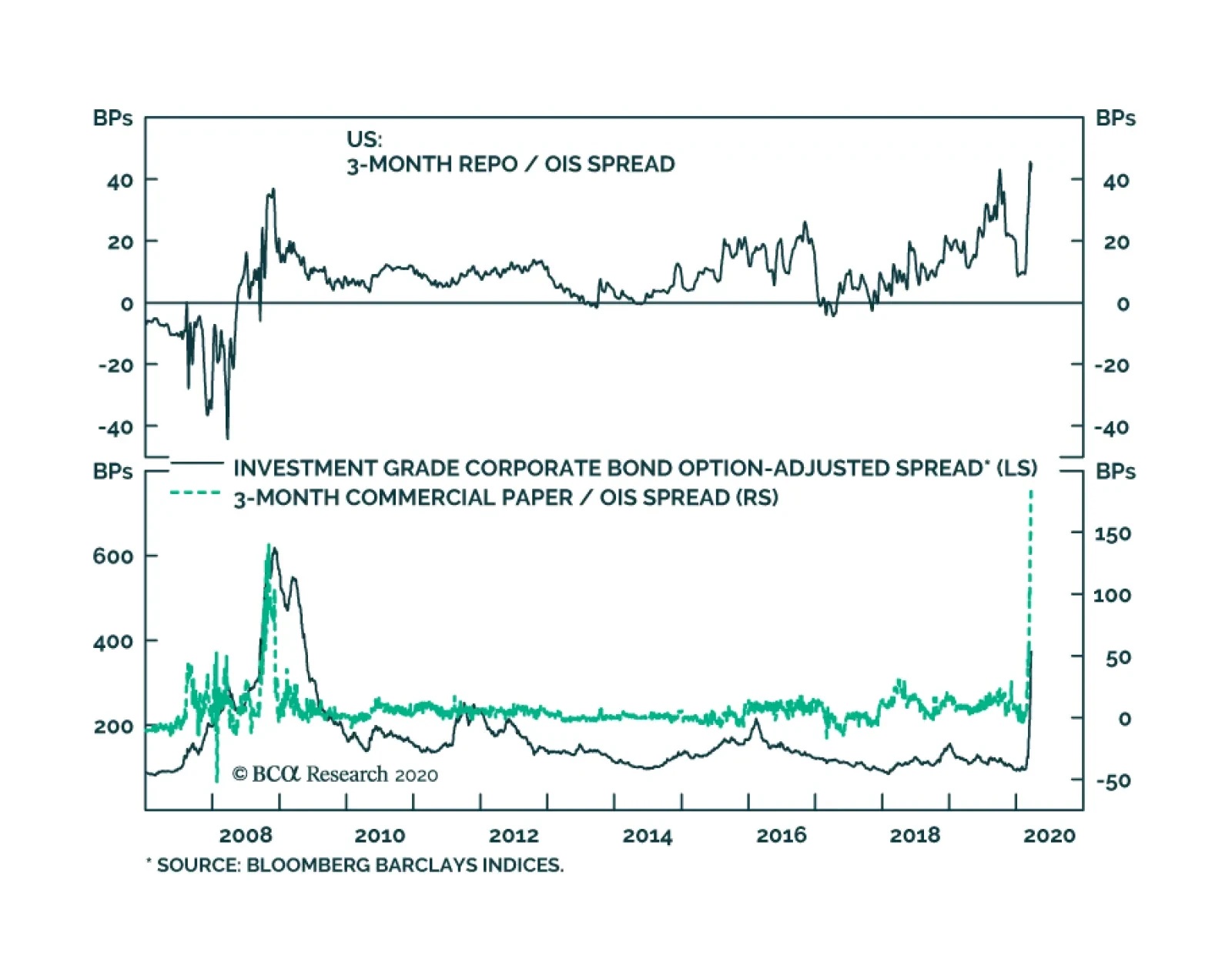
Yesterday, BCA Research's US Bond Strategy service surveyed the Fed's COVID-19 policy response to date and assessed how successful it may be in containing three different (related) shocks: an economic shock, a liquidity shock and a credit shock.
…
Highlights Duration: Last week’s bond market sell-off was a headfake and does not portend a sustained move higher in Treasury yields. We will need to see a stabilization in confirmed COVID-19 cases and signs of improving global growth before calling the bottom in yields. Keep portfolio duration close to benchmark. Yield Curve: A fed funds rate pinned at zero means that the yield curve will trade directionally with yields for the foreseeable future. The yield curve’s recent re-shaping also means that a barbelled Treasury portfolio now only offers a small yield advantage. We recommend shifting out of a barbell and into a position long the 5-year bullet and short a duration-matched 2/10 barbell. Corporate Spreads: High-yield spreads are now fairly priced for a default cycle of similar magnitude to the 2001/02 recession, and the Fed’s entrance into the corporate bond market is a potential game changer for investment grade spreads. Investors should increase exposure to investment grade corporates from neutral to overweight. High-yield investors with horizons of 12 months or more should also start adding exposure. Fed Policy: The Fed is frantically trying to mitigate the impact of three different (though related) shocks: An economic shock, a liquidity shock and a credit shock. We assess its progress to date and discuss what could be done next. Feature Headfake Chart 1Not A Reflationary Environment
Not A Reflationary Environment
Not A Reflationary Environment
Bond yields jumped early last week, shortly after the Fed cut rates back to the zero bound. At one point the 10-year Treasury yield reached as high as 1.18%. But make no mistake, this was not the start of a protracted bond sell off. By Monday morning, the 10-year was back down to 0.75%. Evidently, the conditions for a sustained move higher in Treasury yields are not yet in place. To see why this is so, we need to look a little bit beyond the headline grabbing change in nominal yields and notice that, even when the nominal 10-year yield moved up early last week, the 10-year real yield increased much more quickly, causing the implied cost of inflation protection to fall (Chart 1). This is unusual behavior. Typically, real yields, nominal yields and breakeven inflation rates are all positively correlated. This is because an improving economic outlook usually leads investors to expect both higher inflation and a higher fed funds rate in the future, and vice-versa. When the correlation breaks down it is usually related to some policy action or constraint. For example, investors could come to believe that the Fed will keep interest rates too low for far too long, causing real yields to fall even as inflation expectations jump. Or, as is the case right now, the market could recognize the zero-lower-bound constraint on Fed policy and start to price-in a scenario where the Fed can’t cut rates far enough to jumpstart economic growth. Real yields move higher in this scenario, but inflation expectations crash. We are seeing the same dynamic of rising real yields and falling inflation expectations that was witnessed in 2008. This same dynamic of rising real yields and falling inflation expectations was witnessed in 2008, when the Fed was rapidly cutting rates but investors did not view that action as sufficient (Chart 2). Falling equity prices and a rising dollar further underscored that the environment was becoming more deflationary, not reflationary. A sustained rise in bond yields can only be caused by a reflationary environment. Chart 2Shades Of 2008
Shades Of 2008
Shades Of 2008
How Close To The Bottom? The relevant question then becomes: How close are we to returning to a reflationary environment? To answer this question we will rely on the checklist to call the bottom in bond yields that we unveiled two weeks ago.1 That checklist contains four factors: A stabilization in confirmed COVID-19 cases Improving global economic growth (particularly in China) Weaker US economic data A trigger from one or more technical trading rules Last week we started to see the first signs of weaker US economic data. Initial jobless claims spiked to 281k and both the New York and Philadelphia Fed regional manufacturing surveys plunged (Chart 3). We expect the bottom in bond yields will occur when the US economic data are very weak and when economies that experienced the outbreak earlier – such as China – are showing signs of rebounding. Investors will superimpose the Chinese experience onto the US. But it is still too early for that. Global growth bellwethers such as the CRB Raw Industrials commodity price index remain in freefall (Chart 3, bottom panel). We also noted that we want to see stabilization in the global number of confirmed COVID-19 cases. Essentially, this would mean the number of daily new cases falling close to zero. We are far from that point, as the daily number of new cases continues to rise exponentially (Chart 4). Chart 3Weaker US Data, But No Global Recovery
Weaker US Data, But No Global Recovery
Weaker US Data, But No Global Recovery
Chart 4New Cases Still Rising
New Cases Still Rising
New Cases Still Rising
We should also mention that we expect risk assets – equities and corporate credit – to bottom before Treasury yields, as the Fed will take care not to signal a premature removal of crisis stimulus measures. Finally, two weeks ago we described several technical trading rules that have demonstrated some success at calling troughs in Treasury yields in the past. Since last week, one of our three proposed trading rules was briefly triggered, but that signal was quickly reversed. Bottom Line: Last week’s bond market sell-off was a headfake and does not portend a sustained move higher in Treasury yields. We will need to see a stabilization in confirmed COVID-19 cases and signs of improving global growth before calling the bottom in yields. Keep portfolio duration close to benchmark. A Quick Note On TIPS In last week’s report we made the case for long-term investors to buy TIPS relative to equivalent-maturity nominal Treasuries.2 The reasoning is that TIPS breakeven inflation rates offer exceptional value relative to likely future inflation outcomes. For example, the 5-year TIPS breakeven inflation rate is currently 0.31% and the 10-year rate is 0.75%. This means that a buy-and-hold investor will make money owning TIPS versus nominals if inflation averages more than 0.31% per year for the next five years, or 0.75% per year for the next decade. Chart 51-Year TIPS Return Scenarios
Life At The Zero Bound
Life At The Zero Bound
We also observed last week that TIPS breakeven inflation rates have turned negative at the front-end of the curve. We described this pricing as irrational because of the embedded deflation floors in TIPS. This was incorrect. While TIPS will always pay at least par at maturity, seasoned TIPS with only a year or two left to maturity already have inflation-adjusted principal values that are well above par. In other words, there is room for deflation to influence the returns from these securities before any floor is triggered. Specifically, we can take a look at the TIPS maturing in just over one year, on April 15 2021 (Chart 5). This note has an accumulated principal of just under $109 and is currently trading at an ask price of $97.63.3 According to our calculations, this security will earn 2.55% if headline CPI inflation is 0% over the next 12 months. It will only lose money if headline CPI inflation comes in at -2.49% or below. What’s more, it will return more than a 12-month nominal T-bill as long as inflation is above -2.4%. Note that the lowest year-over-year headline CPI inflation print during the Great Financial Crisis was -2.1%. TIPS offer exceptional value relative to nominal Treasuries for investors who are able to hold the trade for at least one year. Bottom Line: TIPS offer exceptional value relative to nominal Treasuries for investors who are able to hold the trade for at least one year. Treasury Curve: Re-Visiting The Zero-Lower-Bound Playbook Chart 6Curve Will Trade Directionally With Yields
Curve Will Trade Directionally With Yields
Curve Will Trade Directionally With Yields
The Fed’s aggressive policy easing has caused the yield curve to re-shape dramatically during the past few weeks. The 2/10 Treasury slope is up to 55 bps from a 2019 low of -4 bps. The 2/30 Treasury slope is up to 118 bps from a 2019 low of 42 bps, and the 2/5 Treasury slope is up to 15 bps from a 2019 low of -13 bps. Looking through the recent volatility, the fact that the fed funds rate is back to a range between 0% and 0.25% means that we can dust off our yield curve playbook from the last zero-lower-bound period. Fortunately, that playbook is quite straightforward. With the front-end of the curve pinned near zero, the slope of the yield curve will essentially trade directionally with the level of Treasury yields for the foreseeable future. Chart 6 shows that during the last zero-lower-bound period, the 2/30, 2/10 and 2/5 slopes were all positively correlated with the 5-year Treasury yield. This correlation suggests one obvious strategy. If you think yields will rise, put on steepeners. If you think they will fall, put on flatteners. Or if, like us, you suspect that bond yields will be higher in 12 months but are not quite ready to call the bottom, you could hedge benchmark or above-benchmark portfolio duration by entering a duration-neutral steepener. What About Value Across The Curve? Chart 7Bullets Looking Less Expensive
Bullets Looking Less Expensive
Bullets Looking Less Expensive
Until recently, investors could earn large positive carry by owning a barbell consisting of the long and short ends of the Treasury curve (e.g. 2/30) and shorting the belly (e.g. 5yr), in duration-matched terms. But this has changed. The 2/10 barbell now only offers 6 bps of positive carry versus the 5-year bullet, while the 2/30 barbell and 5-year bullet offer approximately the same yield. Both the 2/5/10 and 2/5/30 butterfly spreads are also much closer to the fair values suggested by our models (Chart 7).4 Though we are not ready to call the bottom in Treasury yields, we think the 5-year yield is sufficiently attractive to initiate a duration-neutral curve steepener trade: go long the 5-year bullet and short a duration-matched 2/10 barbell. This trade should perform well if the 2/10 slope steepens going forward. Since a steeper curve is now positively correlated with the level of yields, this trade will profit if yields move higher. Viewed this way, the trade acts as a hedge when implemented alongside our conservative ‘At Benchmark’ portfolio duration recommendation. Bottom Line: A fed funds rate pinned at zero means that the yield curve will trade directionally with yields for the foreseeable future. The yield curve’s recent re-shaping also means that a barbelled Treasury portfolio now only offers a small yield advantage. We recommend shifting out of a barbell and into a position long the 5-year bullet and short a duration-matched 2/10 barbell. Corporate Spread Update Corporate spreads continue to widen very quickly. As such, our conclusions from last week about the amount of value in corporate bonds are already out of date. Our value assessment is based on our High-Yield Default-Adjusted Spread, which is the excess spread left over in the high-yield index after removing actual 12-month default losses. Table 1 shows how often the Default-Adjusted Spread has been in different 50 basis point intervals, and what sort of 12-month junk excess returns occurred during those periods. One conclusion from the table: To be confident that high-yield will outperform duration-matched Treasuries on a 12-month horizon, we would need to expect a Default-Adjusted Spread of at least 150 bps. Preferably, the spread would be greater than or equal to 250 bps, the historical average. The red numbers down the right-hand side of Table 1 indicate what the Default-Adjusted Spread will be for the next 12 months if the speculative grade default rate hits a specific value. For example, a default rate of 6%, which would correspond to a default cycle of a similar magnitude as 2015/16, implies a very attractive Default-Adjusted Spread of +633 bps. In contrast, a default rate of 14% or greater would lead to a negative Default-Adjusted Spread. For context, the default rate peaked at 15% and 11% in the 2008 and 2001/2 recessions, respectively. Table 1What's Priced In Credit Spreads?
Life At The Zero Bound
Life At The Zero Bound
As of now, our base case scenario is that the current default cycle will be more severe than the 2015/16 episode but probably not as bad as the 2008 financial crisis. Something on the order of 9% - 11% seems plausible. If that’s the case, then the Default-Adjusted Spread will be somewhere between 216 bps and 394 bps. This looks quite attractive. Additionally, yesterday’s announcement that the Fed will effectively be entering the investment grade corporate bond market could be a game changer. As a result, we recommend increasing exposure to investment grade corporate bonds from neutral to overweight. For high-yield, it is possible that spreads will widen more in the near-term, but value is now sufficiently attractive for investors with investment horizons of 12 months or more to start adding exposure. We retain our neutral 6-12 month recommended allocation for now, but will re-visit the question in more detail in next week’s report. To be confident that high-yield will outperform duration-matched Treasuries on a 12-month horizon, we would need to expect a Default-Adjusted Spread of at least 150 bps. Bottom Line: High-yield spreads are now fairly priced for a default cycle of similar magnitude to the 2001/02 recession, and the Fed’s entrance into the corporate bond market is a potential game changer for investment grade spreads. Investors should increase exposure to investment grade corporates from neutral to overweight. High-yield investors with horizons of 12 months or more should also start adding exposure. The Fed’s War On Three Fronts Events continue to unfold rapidly in financial markets and in terms of the Fed’s response to the market turmoil. We conclude this week’s report with a brief discussion of the three main shocks that the Fed is frantically trying to contain. We also assess how successful the Fed’s responses might be. #1: The Economic Shock The first shock that the Fed is trying to contain is the pure shock to aggregate demand that is occurring as a result of widespread quarantine measures. In cutting rates to zero and signaling that rates will not rise any time soon, the Fed has effectively done all it can to help fight the economic shock. It should help a little. Lower interest rates will ease the debt burden of homeowners who can refinance their mortgages. They may also lower costs for firms that are able to issue debt to weather the current storm. But these effects are minor compared to the fiscal measures currently making their way through Congress.5 Next steps for the Fed: None. The Fed is effectively out of bullets to contain the economic shock. It’s all about fiscal policy now. #2: Market Liquidity Shock Chart 8Bond Market Liquidity Shock
Bond Market Liquidity Shock
Bond Market Liquidity Shock
In addition to the economic shock, the Fed is also responding to a severe market liquidity shock. What we mean by a “market liquidity shock” is that investors are finding it more expensive (or difficult) to transact in certain markets because of the scarce amount of capital being deployed to those areas. This is different than credit risk (see Shock #3). We are not talking about investors having trouble transacting because there are few willing buyers of credit risk. We are talking about high transaction costs in otherwise risk-free parts of the bond market. The issue is critical because these risk-free parts of the bond market (overnight repo, for example) are often used to fund riskier investments. Disruption in funding markets can have ripple-on effects into other, less opaque, areas. We currently see several examples of disruptions to bond market liquidity (Chart 8): Repo rates have spiked relative to the overnight index swap curve (Chart 8, top panel). The iShares 20+ year Treasury Bond ETF (TLT) is suddenly trading at a huge discount to its net asset value (Chart 8, panel 2). Cross-currency basis swap spreads have turned deeply negative, meaning that it is more expensive for non-US actors to obtain US dollar funding (Chart 8, bottom panel). Wider-than-normal bid/ask spreads are being reported in the Treasury market (not shown). These disruptions are occurring because the financial system is not deploying enough capital to market-making activities in these areas. Essentially, nonfinancial firms have drawn on their revolving credit lines during the past few weeks and this has left the financial system short of cash to deploy toward market-making activities. To fix the problem, the Fed has started to transact directly (in large amounts) in both the repo and Treasury markets. This essentially replaces the function that banks were performing until a few weeks ago. But perhaps more importantly, the Fed is also encouraging banks to deploy the capital that already sits on their balance sheets. Unlike during the 2008 financial crisis, banks now carry a lot of capital – the result of Dodd-Frank and Basel III regulations. What the banks need now is tacit permission from regulators to deploy that capital into financial markets, without concern that they will face consequences during a future stress test. Table 2Banks Have Excess Capital
Life At The Zero Bound
Life At The Zero Bound
Even without any specific changes to regulation, Table 2 shows that the big 5 US financial institutions all carry significant buffers above the regulatory minimum 100% Liquidity Coverage Ratio and 6% Supplementary Leverage Ratio. At a minimum, these excess buffers must be deployed to aid market liquidity. Next steps: The Fed is already transacting directly in both the repo and Treasury markets, and behind closed doors it is most certainly encouraging banks to deploy more capital toward market-making activities. If these actions prove insufficient, the next step would be for the Fed – along with other regulators and possibly Congress – to offer temporary regulatory relief for banks, lowering the required Liquidity Coverage and Supplementary Leverage ratios. We view this market liquidity problem as one that regulators will be able to solve. And given the Fed’s aggressive policy response to date, we expect that regulators will get a handle on the issue and restore bond market liquidity fairly soon. #3 Credit Shock Chart 9Can The Credit Shock Be Contained?
Can The Credit Shock Be Contained?
Can The Credit Shock Be Contained?
We draw a distinction between spreads widening because of a lack of market liquidity and spreads widening because investors are unwilling to take credit risk. Though admittedly, it is not always easy to distinguish between these two factors in real time. But there is no doubt that the economy is also grappling with a credit shock, in addition to the economic and liquidity shocks we already mentioned. Some evidence that market players are less willing to take credit risk (Chart 9): The average option-adjusted spread on the Bloomberg Barclays Investment Grade Corporate Bond index has spiked (Chart 9, top panel). The spread between the 3-month commercial paper rate and the overnight index swap rate has surged (Chart 9, panel 2). The Municipal / Treasury yield ratio is higher than it was during the financial crisis (Chart 9, panel 3). The 30-year mortgage rate has so far not followed Treasury yields lower (Chart 9, bottom panel). The Fed can take some measures to mitigate the negative impacts of a credit shock, and it has already taken quite a few. The Fed has set up facilities to back-stop commercial paper and short-maturity municipal debt. It also announced yesterday morning that it will, in conjunction with the Treasury department, enter the investment grade corporate bond market out to the 5-year maturity point, effectively back-stopping a large portion of corporate issuance. The Fed has not yet set up a facility to purchase longer-maturity municipal bonds, but this could be forthcoming. The Fed is also directly purchasing large amounts of Agency MBS in an effort to tighten the spread between the mortgage rate and Treasury yields. The Fed’s measures to guarantee some risky debt can help solve some problems related to a credit shock. For example, if Fed purchases increase asset values for corporate and municipal bonds, then it lessens the risk of bankruptcy both for the issuing firms and for any systemically-important investment fund that may be levered to those markets. However, Fed purchases do not guarantee that stressed firms will be able to take out new debt, nor do they prevent firms from cutting payrolls in the face of lower demand. Only direct cash bailouts from the government can fix those problems. Next steps: The Fed could add another facility to purchase long-maturity municipal bonds. It could also implement a “funding for lending” scheme similar to what the Bank of England has done. These measures, along with what has already been announced, will help ease the credit shock at the margin. But ultimately, cash bailouts from Congress to firms and state & local governments will be required. Ryan Swift US Bond Strategist rswift@bcaresearch.com Footnotes 1 Please see US Bond Strategy Weekly Report, “When And Where Will Bond Yields Trough?”, dated March 10, 2020, available at usbs.bcaresearch.com 2 Please see US Bond Strategy Weekly Report, “Buying Opportunities & Worst-Case Scenarios”, dated March 17, 2020, available at usbs.bcaresearch.com 3 Numbers quoted assuming a par value of $100. 4 For details on our yield curve models please see US Bond Strategy Special Report, “Bullets, Barbells And Butterflies”, dated July 25, 2017, available at usbs.bcaresearch.com 5 The global fiscal response to the COVID crisis is discussed in more detail in Geopolitical Strategy Weekly Report, “De-Globalization Confirmed”, dated March 20, 2020, available at gps.bcaresearch.com Fixed Income Sector Performance Recommended Portfolio Specification
Highlights Market Turmoil: The combination of accelerating global cases of COVID-19, a surging US dollar and elevated market volatility has wreaked havoc on financial markets. A sustainable bottom in global risk assets (and, potentially, bond yields) requires a reversal of all three of those trends. Fed & ECB: Central bankers on both sides of the Atlantic are now committing to provide liquidity backstops for both government bonds and corporate debt by promising “unlimited” purchases. This effectively removes the left tail of the return distribution on debt of more questionable quality that has seen significant spread widening, like US BBB-rated corporates and Peripheral European sovereign debt. Fixed Income Strategy: Upgrade US investment grade corporates to overweight from neutral, and upgrade Italian government bonds to overweight from underweight, on both a tactical (0-6 months) and strategic (6-12 months) basis. Buy What The Central Banks Are Buying Chart of the WeekAre These Market Stress Points Turning?
Are These Market Stress Points Turning?
Are These Market Stress Points Turning?
The COVID-19 outbreak has become a full-blown global health crisis, with country after country imposing lockdowns on their populations to control the spread of the disease. The economic ramifications are now obvious: a certain deep global recession, but one of indeterminate length. The investment implications are also now clear: bear markets in global equities, credit and growth-sensitive currencies and commodities. There is a new bull market, however, in pessimism. Economic forecasters are tripping over themselves to offer up the most shocking estimate of the severity of the downturn. The IMF is now expecting a recession in 2020 “at least as bad” as during the global financial crisis. Wall Street investment banks are forecasting double-digit declines in US GDP growth during the second quarter. St. Louis Fed President Fed James Bullard wins the prize for the most gloomy prediction, suggesting that we could see a 30% US unemployment rate and a -50% (!) decline in US GDP growth in Q2. Investors have seen few positive headlines on the spread of the virus, resulting in a de-risking “dash for cash” that has impeded liquidity across equity, fixed income and currency markets. Global policymakers have responded with trillions of dollars of monetary and fiscal policy announcements designed to calm nervous markets while ensuring liquidity provision for temporarily shuttered businesses, of all sizes, facing painful layoff announcements. Chart 2Get Ready For Shockingly Weak Global Economic Data
Get Ready For Shockingly Weak Global Economic Data
Get Ready For Shockingly Weak Global Economic Data
Have we seen enough stimulus to stop the market turmoil? In our view, three things must all occur for a sustainable bottom in global risk assets, and potentially bond yields, to unfold (Chart of the Week): Slowing growth in new COVID-19 infections outside China. As long as the global spread of the virus shows no signs of slowing down, it will be impossible for markets to ascertain the full hit to global growth from the outbreak. A cooling off of the surging US dollar. The greenback has soared 8% since March 9, and is wreaking havoc on global borrowers who have significant USD-denominated liabilities. Global financial market volatility must peak. Volatility spikes across all major asset classes have forced investors to de-risk portfolios; lower volatility will have the opposite effect. Of late, the news on all three fronts is tentatively more positive. The US DXY dollar index is off from the peak, the VIX index of US equity volatility is off the extreme highs and the number of new cases of COVID-19 in virus-ravaged Italy has declined for the past two days. While it is still early to call a lasting peak in these measures, it is potentially a sign of optimism coming at a time when economic confidence measures like the ZEW surveys are back to 2008 levels and a China-like collapse in activity is now expected in the US (Chart 2). We now think it is time to pick through the ashes of the global market rout and begin to add back some risk in global bond portfolios. We now think it is time to pick through the ashes of the global market rout and begin to add back some risk in global bond portfolios. After seeing the policy announcements of the past week, however, we are choosing to dip our toes back into the water in assets that now have direct central bank liquidity backstops – namely US investment grade corporates and Italian sovereign debt. The Fed Is Now Truly The Lender Of Last Resort … To Corporates The Fed unloaded their biggest of bazookas yesterday, expanding existing stimulus programs while introducing new initiatives that reach into parts of the US economy and financial markets previously untouched by the central bank. Specifically, the Fed did the following: Announcing unlimited quantitative easing (QE) for US Treasuries and agency mortgage-backed securities (MBS) Increasing the size of money market and commercial paper liquidity programs announced last week, and expanding the range of eligible assets Adding commercial MBS (CMBS) to asset purchases, which was never done even in 2008 Reviving the 2008 crisis-era Term Asset-Backed Loan Facility (TALF) to make loans directly to companies, while introducing a new “Main Street Business Lending Program” that will fund small businesses directly (details are yet to be determined) Most significantly for bond investors, the Fed will begin buying corporate bonds, in both primary and secondary markets, while also providing direct lending to eligible companies through loans. This will be done through off-balance sheet Special Purpose Vehicles (SPV), initially funded with $10 billion from the US Treasury and levered up by the Fed to whatever amount is necessary The Fed primary market SPV will buy newly-issued bonds with credit ratings as low as BBB- and maturities of four years or less. Eligible issuers are US businesses with material operations in the United States, although the Fed noted that the list of companies in the program may be expanded in the future. Eligible issuers do not include companies that are expected to receive direct financial assistance from the US government (i.e. no buying of bonds from companies getting bailout funds). The most significant details of the Fed’s new primary market corporate bond buying program are the numerical limits of what can be purchased. Any eligible company can “borrow” from the Fed, though bond purchases or direct loans, an amount greater than the maximum outstanding debt (bonds plus loans) on any day over the past twelve months. Those percentages are determined by credit quality: 140% of all debt for AAA-rated issuers, 130% for AA-rated issuers, 120% for A-rated issuers and 110% for BBB-rated issuers. Since those percentages are all greater than 100, this effectively means that the Fed will allow eligible companies to roll over their entire stock of debt through this program, plus some net new borrowing. The Fed is even calling this “bridge financing for up to four years” in their official term sheets for the new program.1 Issuers can even defer interest payments on the funds borrowed from the Fed for up to six months, with the interest payments added to the final repayment amount (again, any company choosing this option can do no share buybacks or dividend payments). In addition to this direct lending to investment grade rated issuers, the Fed is introducing another SPV that will buy corporate bonds of eligible investment grade issuers in the secondary market. This will be for bonds with maturity of up to five years and credit ratings as low as BBB-, with a buying limit of 10% of the entire stock of eligible debt of any single company. This secondary market SPV will also buy investment grade bond ETFs, up to 20% the outstanding shares of any single ETF. All of these programs are set to run to September 30 of this year, with an option to extend as needed. The Fed’s new initiatives represent a new step for the central bank, providing direct lending to any company that needs it. The Fed had to do this through off-balance-sheet SPVs, since direct buying of corporates is not permitted under the Federal Reserve Act. Thus, it is not like the Fed’s QE programs that used to buy Treasuries and MBS – in fact, it is the US Treasury that is taking on the initial credit risk through its $10 billion funding of each SPV. In this sense, the Fed's new program is also different than the corporate bond QE programs of the ECB, Bank of England and Bank of Japan, where the credit risk is directly taken onto the central bank balance sheet. The purpose of these new corporate bond programs is two-fold: 1. To ensure that companies do not suffer a credit crunch, either by being unable to roll over maturing corporate debt in primary markets or by only doing so at prohibitively high yields and spreads 2. To ensure the proper functioning of US corporate bond markets, by providing liquidity to both cash bonds and related ETFs. By doing this, the Fed can help mitigate the severe tightening of financial conditions that has already occurred because of the credit selloff in recent weeks. Also, by helping to reduce the extreme price/spread volatility in higher-quality credit, the Fed may be hoping this can spill over into lower volatility of other asset classes which are at the historical extremes of the past quarter century (Chart 3). Both can help mitigate the second round effects of the virtual shutdown of the US economy that has taken place to contain the spread of COVID-19. Chart 3Few Places To Hide From Historically High Volatility
Central Banks To Markets: Redefining "Whatever It Takes"
Central Banks To Markets: Redefining "Whatever It Takes"
The Fed’s unprecedented intervention in the US corporate bond market is a positive step that has improved the risk/reward profile for US investment grade credit, coming after a period of significant spread widening that has restored some value to the asset class. We will further discuss the implications of the Fed’s actions in a corporate bond Special Report that we will publish jointly next week with our colleagues at BCA US Bond Strategy. For now, however, the Fed’s unprecedented intervention in the US corporate bond market is a positive step that has improved the risk/reward profile for US investment grade credit, coming after a period of significant spread widening that has restored some value to the asset class (Chart 4). Chart 4A New Huge IG Liquidity Backstop From The Fed
A New Huge IG Liquidity Backstop From The Fed
A New Huge IG Liquidity Backstop From The Fed
Could the Fed’s actions spill over into non-US credit, as well? Chart 5This Is A Global Widening Of Credit Spreads
This Is A Global Widening Of Credit Spreads
This Is A Global Widening Of Credit Spreads
Chart 6Signs Of USD Funding Stress, But Nothing Like 2008
Signs Of USD Funding Stress, But Nothing Like 2008
Signs Of USD Funding Stress, But Nothing Like 2008
The COVID-19 crisis has resulted in credit spread widening across the world, especially so for the big borrowers of USD-denominated debt in the emerging markets and US shale oil industry (Chart 5). For those issuers, a weaker USD would be more positive development, as would higher oil prices. The Fed’s other monetary policy actions – cutting the funds rate to 0%, moving to unlimited QE for Treasuries and MBS, should be helping to weaken the US dollar. The problem, however, is that all other major central banks are now doing similar policy easings as well, with even the likes of the Reserve Bank of Australia and Reserve Bank of New Zealand now starting bond-buying QE programs. This exacerbates the strong USD problem, seen in the stresses in USD funding markets (Chart 6). Simply put, the Fed cannot generate easier financial conditions, both in the US and elsewhere, through a weaker USD. Thus, the Fed has to seek other ways to ease US financial conditions – like helping cap borrowing costs for investment grade US borrowers by direct intervention in those markets. Bottom Line: The Fed’s move into buying investment grade corporate debt, and providing term lending to corporates more broadly, has effectively eliminated the left tail of the return distribution for investment grade US credit. The ECB Is Moving Towards Being The Lender Of Last Resort – For Euro Area Sovereigns The Fed is not the only central bank that ramped up its asset purchases. The ECB also increased its existing Asset Purchase Program by a massive €750bn last week, across both sovereign and corporate debt. This new program was dubbed the “Pandemic Emergency Purchase Program” (PEPP) and is to take place over the rest of 2020 in order to help fight the negative impacts on the European economy and financial markets from the COVID-19 outbreak. The most important part of the announcement of the PEPP, however, was in the loosening of previous restrictions of the ECB’s €2.6 trillion Asset Purchase Program (APP). Greek bonds were included in the PEPP by allowing a waiver to the rules of the APP that forbid the inclusion of Greece in the funding program. Also, the ECB hinted in its statement announcing the new program that the self-imposed limits on the APP could be revised, if necessary, for the more “temporary” PEPP to help fight the COVID-19 crisis. That was a clear signal to the markets that the ECB could deviate from the “capital key” country weightings, and the 33% single sovereign issuer limit, that have governed the APP. This is very positive news for Italy, where COVID-19 has been particularly devastating and deadly, causing the entire country to be locked down to control its spread. The ECB could deviate from the “capital key” country weightings, and the 33% single sovereign issuer limit, that have governed the APP. This is very positive news for Italy, where COVID-19 has been particularly devastating and deadly, causing the entire country to be locked down to control its spread. Already, Italy and the rest of the EU have been given a temporary waiver of the EU’s fiscal policy targets (government deficit no larger than 3% of GDP, government debt no larger than 60% of GDP). Now that the ECB is also willing to consider suspending its own limits on asset purchases, Italy has been given the “space” to run larger deficits without the market punishment of higher bond yields – especially with the ECB only owning around 20% of the stock of Italian government debt, well below the 33% single country APP limit (Chart 7). Chart 7The ECB Can Buy More Italian Debt, If Necessary
Central Banks To Markets: Redefining "Whatever It Takes"
Central Banks To Markets: Redefining "Whatever It Takes"
Already, the ECB announcement triggered a sharp decline in Italian bond yields (and Greek yields, for that matter) and tightening of the spread between Italian and German bond yields. So far, the threat of the ECB buying more Italy has been enough to get private investors to buy more Italian bonds, similar to Mario Draghi’s “whatever it takes” promise back in 2012. Draghi never had to buy a single bond to get the market to move in his favor then. In 2020, given the collapse in European growth seen so far in response to COVID-19 lockdowns, and the acute hit to the Italian economy from the virus, we suspect that Christine Lagarde will be far likely to actually buy more Italian debt – especially with even the hard-money Germans now engaged in deficit spending to stimulate the virus-stricken German economy. We interpret all this similarly to our read of the Fed’s buying of corporate debt – the ECB has changed the risk/reward profile of Italian government bonds by not only introducing the PEPP, but having it operated under different rules than the APP. Bottom Line: The ECB’s new bond buying program has significantly reduced the downside risk of Italian government debt over the next 6-12 months. Fixed Income Strategy Implications The Fed’s dramatic move into direct funding of US companies is a game changer for the US corporate bond market. By providing a full liquidity backstop to all companies, the Fed is ensuring that no US investment grade issuer will have to worry about rolling over their maturing debt in an illiquid and nervous corporate bond market. Simply put, the Fed has cut out the left side of the distribution of corporate bond returns for the foreseeable future. The same argument goes for the ECB’s increased purchases of government bonds, with promises to buy more Italian debt, if necessary. For these reasons, we are upgrading our recommended stance on US investment grade corporate debt, and Italian sovereign debt to overweight - both on a tactical (0-6 months) basis in our model bond portfolio and on a strategic (6-12 months) basis. Chart 8Upgrade US IG Corporates And Italian Sovereign Debt On CB Buying
Upgrade US IG Corporates And Italian Sovereign Debt On CB Buying
Upgrade US IG Corporates And Italian Sovereign Debt On CB Buying
For these reasons, we are upgrading our recommended stance on US investment grade corporate debt, and Italian sovereign debt to overweight - both on a tactical (0-6 months) basis in our model bond portfolio and on a strategic (6-12 months) basis (Chart 8). We are focusing only on these two markets for now, as an initial step to increase our recommended exposure to fixed income risk assets. There may be a spillover into other credit markets and sovereign debt, like European investment grade and Spanish government bonds. For now, however, we are focusing on US investment grade and Italy, while keeping underweights in other credit markets as a hedge against a renewed flare-up of COVID-19 related market risk. Bottom Line: Upgrade US investment grade corporates to overweight from neutral, and upgrade Italian government bonds to overweight from underweight, on both a tactical (0-6 months) and strategic (6-12 months) basis. Robert Robis, CFA Chief Fixed Income Strategist rrobis@bcaresearch.com Footnotes 1 The details of the Fed’s new corporate bond buying programs can be found here: https://www.federalreserve.gov/newsevents/pressreleases/files/monetary20200323b1.pdf https://www.federalreserve.gov/newsevents/pressreleases/files/monetary20200323b2.pdf Recommendations The GFIS Recommended Portfolio Vs. The Custom Benchmark Index
Central Banks To Markets: Redefining "Whatever It Takes"
Central Banks To Markets: Redefining "Whatever It Takes"
Duration Regional Allocation Spread Product Tactical Trades Yields & Returns Global Bond Yields Historical Returns
Highlights Financial markets are in a state of upheaval, and no one knows where or when they’ll bottom: We reiterate that it’s too early to dive back into equities or spread product. The policy path is not nearly as clear as it was during the last crisis, and central banks and legislatures may be hard-pressed to blunt the effects of a pandemic until it’s contained: Developed-world central banks and legislatures are committed to doing whatever they can to aid their economies, but their measures won’t gain full traction until the coronavirus is bottled up. Uncertainty breeds opportunities, however, … : There’s a good chance that the baby will be thrown out with the bathwater as the selling accentuates and turns indiscriminate. … so we’re seeking out the most attractive risk-reward profiles: Those with cash who keep their head may find multiple opportunities to earn outsized profits. We’re actively trying to insulate ourselves from the current surge of emotion. Feature We don’t know. We don’t know where stocks will bottom, or when. We don’t know how much the economy will contract, or how long second-round effects will extend the recession. We don’t know how many businesses will go bust, or how many people will lose jobs and default on mortgages and other loans. But no one ever does in the midst of crashes, or when a sudden-stop economic tsunami looms, and only the foolish, naïve or arrogant think they do. Investing is never a sure thing, and its difficulty is a feature, not a bug. Alpha is earned by correctly intuiting securities’ future direction from a limited number of data points. We were slow to grasp the global health ramifications of the coronavirus outbreak in Wuhan, and the probability of a 2020 recession turned out to be considerably larger than we judged. We were also off the mark when we said the economy would likely bottom swiftly, roughly tracing the course of a V. We did not foresee the economically crippling strictures that would be imposed to slow COVID-19’s spread. We now recognize that the recession will be quite severe and that the market rout has further to go for as long as the self-reinforcing adverse consequences from quarantine-like conditions continue unabated. We suspect that markets are giving short shrift to the idea that something could short-circuit the vicious circle, however, and on that basis we think the outlook may not be as unrelentingly gloomy as market action is making it out to be. To be clear, we do not think risk assets have bottomed. We do not think investors should be in any rush whatsoever to buy stocks or spread product. Investors with cash should not lose sight of the fact that they are in control right now, and they should strike a hard bargain before parting with it. We still have a constructive 12-month view, however, and we do think investors should be making lists of assets they find attractive and the prices where they’d happily own them. We sketch out the reasons why across the following pages, but the nature of the analysis departs from our typical data-driven process. Market action has left the data far behind as investors have rushed to apply valuation haircuts in advance of economic releases that are sure to be dreadful. We are therefore pulling our focus out to 30,000 feet in this report, and highlighting the mindset we’re trying to bring to the task of navigating markets caught in the throes of peak fear. Crises Happen [W]hen the crisis began, governments around the world were too slow to act. When action came, it was late and inadequate. Policy was always behind the curve, always chasing an escalating crisis. And as the crisis intensified and more dramatic government action was required, the emergency actions meant to provide confidence and reassurance too often added to public anxiety and to investor uncertainty. The force of government support was not comprehensive or quick enough to withstand the deepening pressure brought on by a weakening economy. … We believe that the policy response has to be comprehensive, and forceful. There is more risk and greater cost in gradualism than in aggressive action. We believe that action has to be sustained until recovery is firmly established.1 Monetary and fiscal policy measures can still move markets, but their full effect won't be felt until the coronavirus is contained. Here we go again. Confronted with freefalling markets and the prospect of widespread business failures, Congress is preparing a gigantic fiscal stimulus package aimed at limiting the second-order effects of the crippling measures implemented to stem COVID-19’s spread and the Fed has already raided its 2008-9 playbook (Table 1). Officials could lift much of Treasury Secretary Geithner’s 2009 remarks announcing the stress tests to explain the rationale for the measures they’re proposing now. The difference is that policymakers in 2008 and 2009 could directly wield their monetary and fiscal tools to backstop a wobbling banking system, whereas now, the potent resources they’ve marshaled to spur the economy won’t be able to take full effect until the pandemic recedes. Table 1Borrowing From The 2008-09 Playbook
Data Independent
Data Independent
As much as investors pine for a policy measure that puts a firewall around markets, and the cumulative global monetary and fiscal responses become truly substantial, the selloff may continue to rage until withering deleveraging pressure abates. The pattern may be very similar to 2009, when the S&P 500 didn’t bottom until four weeks after the financial crisis effectively ended upon Secretary Geithner’s pledge that the Treasury would provide sufficient capital to any of the largest 19 banks that failed the stress tests (Chart 1). Chart 1Deleveraging Pressure Might Drag On Stocks Even After Policymakers Fire Their Bazookas
Deleveraging Pressure Might Drag On Stocks Even After Policymakers Fire Their Bazookas
Deleveraging Pressure Might Drag On Stocks Even After Policymakers Fire Their Bazookas
One Damn Thing After Another As we noted at the outset, investors are currently bedeviled by a multitude of significant unknowns about the coronavirus. Even epidemiologists don’t know if social distancing measures will be enough to arrest its spread within the US, how severe the mortality rate will be, or how long it will take to develop more effective treatment protocols. The current plunge was triggered by a pandemic that hadn’t occurred on a similar scale since the 1918-19 Spanish influenza outbreak, but significant unknowns are at the heart of every financial market panic. We were in the audience at the Economic Club of New York in October 2007, during the early stages of the subprime crisis, when Fed Chair Bernanke, asked what market and economic information he would like to have to improve the Fed’s decision-making process, replied, “I’d like to know what those damn things [securitized credit products] are worth.”2 Markets’ Outstanding Characteristic As Benjamin Graham pointed out repeatedly in The Intelligent Investor, markets have a deeply entrenched tendency to overreact. “The market is always making mountains out of molehills and exaggerating ordinary vicissitudes into major setbacks.”3 “[W]hen an individual company … begins to lose ground in the economy, Wall Street is quick to assume that its future is entirely hopeless and it should be avoided at any price.”4 “[T]he outstanding characteristic of the stock market is its tendency to react excessively to favorable and unfavorable influences.”5 In times of severe stress, the market tendency to overreact at the individual-stock level radiates out to the entire market. As the buzzards circle, and the margin calls arrive, investors scramble to sell stocks that have managed to dodge the brunt of the decline, and therefore bring something closer to their perceived fair value than the stocks that have already been savaged. In Dennis Gartman’s memorable phrasing, “when the cops raid the house of ill repute, they take away the good girls and the piano player, too.” The indiscriminate selling that draws better stocks into the vortex creates opportunities, and it seems to us that there must be many sound issues that are being tarred with the same brush as companies in the travel, hospitality, restaurant and brick-and-mortar retail industries, and the oil producers who are caught in the Russia-Saudi Arabia crossfire. Outstanding Investors’ Characteristics About 25 years ago, we read the Market Wizards profiles of elite traders before interviewing for trading positions with broker-dealers. We distilled them into seven characteristics of successful traders that were at the heart of our pitch: Competitiveness, Humility, Ability to Psychologically Handle Losses, Patience, Discipline, Emotional Detachment and Willingness to Be a Contrarian. We haven’t worked on a trading desk in a while, but those qualities would suit all investors, and we think they’re especially apropos at times of peak emotion. No one can manufacture them out of nothing, but by keeping them in mind, and trying to live up to them, we can draw on the reserves we do possess to make better decisions in the midst of the rout (Table 2). Cash is precious right now, and investors should part with it only when they're certain they're getting quite a bit in return. Table 2Honing One's Mental Edge
Data Independent
Data Independent
What Now? We reiterate that it is too early to re-risk portfolios. Markets in the throes of daily convulsions are not healthy markets, and we do not expect that stocks will bottom until there is evidence that the global virus infection curve is flattening. Investors should always prune or exit positions that have become poor fits as the backdrop changes, but we would not dramatically alter asset allocation strategies now. Take a deep breath, and focus on the internal aspects you can control. Cash is precious during major selloffs, because it stabilizes portfolios while the storm rages and provides valuable optionality when it inevitably ends. We would deploy it slowly, via limit orders below the market in selected stocks that have been unfairly lumped in with the most vulnerable issues. We continue to embrace the idea of writing out-of-the-money puts in stocks we would happily own at lower levels. When the VIX spent most of last week in the 70s and 80s (Chart 2), implied volatilities on single-stock options soared into the triple digits. In the four largest banks, it was possible to earn an annualized return exceeding 100% by writing an April put between 12 and 15% below last sale (Box, page 8). Similar opportunities must be available in other besieged industries. Chart 2Implied Volatility On S&P 500 Index Options Made A New All-Time High
Implied Volatility On S&P 500 Index Options Made A New All-Time High
Implied Volatility On S&P 500 Index Options Made A New All-Time High
These are unquestionably trying times for investors of all stripes, but they are especially hard on those with long-only mandates. Professional investors add much of their value by saving their clients from themselves – by keeping them from succumbing to the temptation to go all-in near market tops and run screaming from risk assets near market bottoms. We all need to make a conscious effort to overcome counterproductive emotions and impulses when markets plunge; reminders that the general pattern is similar, even if the specific circumstances change, help us to keep our eye on the ball. Trying to live up to the seven items we memorized 25 years ago when trying to secure a junior seat on a trading desk does, too. Doug Peta, CFA Chief US Investment Strategist dougp@bcaresearch.com Box: Extreme Volatility In SIFI Bank Options There are two possible outcomes for an investor who writes a put option. The option will expire without being exercised, in which case the writer will pocket the premium, or the holder will exercise it, compelling the writer to purchase the stock at the strike price. The writer keeps the premium in that case, too, so that his/her basis in the stock is equivalent to the strike price less the premium. The top panel in Table 3 shows the pricing data for April puts on the four largest banks with strike prices 12 to 15% below Thursday’s closing prices. The bottom panel uses that data to calculate the implied annualized return for each put option in the event that it is not exercised, and the option writer’s basis in the stock as a share of its tangible book value in the event that it is. Table 3Insuring SIFI Equities Is Tremendously Expensive
Data Independent
Data Independent
We understand that banks are on the credit front lines, and that defaults will impair their book value. We further understand that their net interest margins, and therefore their revenues, are pressured by declines in longer-term interest rates, though it is our long-held conviction that markets overestimate the largest banks’ exposure to a flattening yield curve. The decision to own them is hardly a slam dunk, but the cost of insuring against further declines is staggering. We recognize that not every investor has discretion to write puts, and it is not something to be done lightly in any event. Writers of puts on SIFI banks are being paid annualized returns of 100% because equity prices are plunging, and investors are especially worried about banks’ exposure to the spreading pain. The compensation is so high, however, that we think the risk-reward proposition merits careful consideration. It may not be a no-brainer to write puts on the SIFI banks right now, but we certainly wouldn’t buy them at these prices. Footnotes 1 Prepared Remarks by Treasury Secretary Timothy Geithner Introducing the Financial Stability Plan, February 10, 2009. Accessed from https://www.treasury.gov/press-center/press-releases/Pages/tg18.aspx on March 18, 2020. 2https://www.econclubny.org/legacyarchive/-/blogs/2007-ben-bernanke Accessed on March 18, 2020. The referenced Q&A exchange begins at the 51:49 mark. 3 Graham, Benjamin, The Intelligent Investor, HarperCollins: New York, 2005, p. 97. 4Ibid, p. 15 5Ibid, p. 18
Dear Client, This week, I provided an update through a webcast on the economic and financial market outlook in the era of the COVID-19 outbreak. You can access the webcast here. In lieu of our regular report this week, we are sending you a Special Report from my colleague Jonathan LaBerge. Jonathan shows why the most widely cited estimate of the US neutral rate of interest, the Laubach & Williams estimate of “R-star”, is very likely wrong and that the true neutral rate may be higher than many investors believe. While bond yields may not rise significantly in the near-term, this underscores that they have the potential to rise meaningfully over a cyclical and secular horizon once a post-COVID-19 expansion takes hold. I hope you find the report insightful. Please note that next week we will be publishing our quarterly Strategy Outlook. Best regards, Peter Berezin, Chief Global Strategist Highlights Global investors have come to accept the secular stagnation narrative as described by Larry Summers in November 2013, and have gravitated to the only available real time estimate of the real neutral rate of interest: the Laubach & Williams (“LW”) “R-star” estimate. With this apparent visualization of secular stagnation as a guide, many investors have concluded that monetary policy ceased to be stimulative last year and that recent Fed rate cuts will be of limited benefit to economic activity even once economic recovery takes hold unless inflation meaningfully accelerates (thus pushing real rates lower for any given nominal Fed funds rate). This report revisits the “LW” R-star estimate in detail, and demonstrates why the estimation is almost certainly wrong, at least over the past two decades. We also outline an inferential approach that investors can use to monitor where the neutral rate is in real time and whether it is rising or falling. The core conclusion for investors is that US Treasury yields reflect a “low rates forever” view with much higher certainty than is analytically warranted and thus appear to be anchored by a false narrative. While bond yields may not rise significantly in the near-term, investors should avoid dogmatic medium-to-longer term views about yields as they may rise meaningfully over a cyclical and secular horizon once a post-COVID-19 expansion takes hold. Feature Over the past several weeks financial markets have moved rapidly to price in a global recession stemming from the COVID-19 outbreak. As financial market participants began to turn to policy makers for support, eyes focused first on the Federal Reserve, and then fiscal authorities. Earlier this week, the ECB joined the party and announced aggressive further measures of its own. When responding to the Fed’s return to the lower bound and its other recent monetary policy decisions, many market participants have expressed the view that the Fed is largely impotent to deal with a global pandemic. There are three elements to this view. The first is that interest rate cuts are ill equipped to stimulate domestic demand if quarantine measures or other forms of “social distancing” are in effect. The second element is that the Fed has only been capable of delivering a fraction of the reduction in interest rates compared to what has occurred in response to previous contractions. The third aspect of this view is that because the neutral rate of interest is so much lower now than it was in the past, Fed rate cuts will not be as stimulative as they were before. Chart 1Monetary Policy Ceased To Be Stimulative Last Year, According To The LW R-star Estimate
Monetary Policy Ceased To Be Stimulative Last Year, According To The LW R-star Estimate
Monetary Policy Ceased To Be Stimulative Last Year, According To The LW R-star Estimate
While we at least partly agree with the first and second elements of this view, we feel strongly that the third is flawed. Global investors have come to accept the secular stagnation narrative as described by Larry Summers in November 2013,1 and have gravitated to the only available real time estimate of the neutral rate of interest: the Laubach & Williams (“LW”) “R-star” estimate. This time series, which is regularly updated by the New York Fed,2 suggests that the real fed funds rate reached neutral territory in the first quarter of 2019 (Chart 1). With this apparent visualization of secular stagnation as a guide, many investors have concluded that monetary policy ceased to be stimulative last year and that recent Fed rate cuts will be of limited benefit to economic activity even beyond the near term unless inflation meaningfully accelerates (thus pushing real rates lower for any given nominal Fed funds rate). In this Special Report we revisit the “LW” R-star estimate in detail, and demonstrate why the estimation is almost certainly wrong, at least over the past two decades. Our analysis does not reveal a precise alternative estimate of the neutral rate, although we do provide some inferential perspective on how investors may be able to monitor where the neutral rate is in real time and whether it is rising or falling. However, the core insight emanating from our report, particularly for US fixed income investors, is that US Treasury yields reflect a “low rates forever” view with much higher certainty than is analytically warranted and thus appear to be anchored by a false narrative. While bond yields may not rise significantly in the near-term, this underscores that they have the potential to rise meaningfully over a cyclical and secular horizon once economic activity recovers. As such, we caution fixed-income investors against dogmatic medium-to-longer term views about bond yields, as their potential to rise may be larger than many investors currently expect. Demystifying The LW R-star Estimate The LW estimate of the neutral rate of interest has gained credibility for three reasons. First, as noted above, the evolution of the series fits with the secular stagnation narrative re-popularized by Larry Summers. Second, the series is essentially sponsored by the Federal Reserve even if it is not officially part of the Fed’s forecasting framework, as its two creators are long-time Fed employees (Thomas Laubach is a director of the Fed’s Board of Governors, and John Williams is the current President of the New York Fed). But, in our view, there is a third important reason that global investors have accepted the LW R-star estimate of the neutral rate of interest: the methodology used to generate the estimate is extremely technically complex, and thus is difficult for most investors to penetrate. Much of the technical complexity of the LW estimate is centered around the use of a statistical procedure called a Kalman filter (“KF”). Simply described, the KF is an algorithm that tries to estimate an unobservable variable based on 1) an idea of how the unobservable variable might relate to an observable variable (the “measurement equation”), and 2) an idea of how the unobservable variable might change through time (the “transition equation”). Through a repeated process of simulating the unobserved variable based on a set of assumptions, the KF is able to compare predicted results to actual results on an observation-by-observation basis, and use that information to generate ever more reliable future estimates of the unobserved variable (Chart 2). Chart 2A Very Simplified Overview Of The Kalman Filter Algorithm
Revisiting The Neutral Rate Of Interest: A Contrarian View In A Time Of Crisis
Revisiting The Neutral Rate Of Interest: A Contrarian View In A Time Of Crisis
We acknowledge that a full technical treatment of the Kalman Filter as it relates to the LW estimate of the neutral rate of interest is beyond the scope of this report, and we provide a more technical overview in Box 1. But what emerges from a detailed analysis of the model is that the Kalman Filter jointly estimates R-star, potential GDP growth, potential GDP, and the variable “z”, the determinants of R-star that are not explained by potential GDP growth. As we will highlight in the next section, this joint estimation of these four variables is a crucial aspect of the model, because a valid estimate of R-star necessitates a valid estimate of the remaining variables. Box 1 A Technical Overview Of The Laubach & Williams R-star Model
Revisiting The Neutral Rate Of Interest: A Contrarian View In A Time Of Crisis
Revisiting The Neutral Rate Of Interest: A Contrarian View In A Time Of Crisis
Debunking The LW R-star Estimate Before criticizing the LW estimate of the neutral rate of interest, it is important for us to note that we have the utmost respect for the Federal Reserve and its research methods. We fully acknowledge that the LW R-star estimation is rooted in solid economic theory, and we have identified no technical errors in the setup of the LW model. Nevertheless, valid analytical efforts sometimes lead to problematic real-world results, and there are two key reasons to believe that the Kalman filter in the LW model is almost certainly misspecifying R-star, at least in terms of its estimate over the past two decades. The first reason relates to the sensitivity of the model to the interval of estimation (the period over which R-star is estimated). Chart 3 presents the range of quarterly estimates of R-star since 2005, along with the difference between the high and low end of the range in the second panel. The chart shows that while previous estimates of R-star have generally been stable for values ranging between the early-1980s and 2006/2007, pre-1980 estimates have varied quite substantially and we have seen material revisions to the estimates over the past decade. Q1 2018 serves as an excellent example: in that quarter R-star was estimated to be 0.14%; today, the Q1 2018 R-star estimate sits at 0.92%. Chart 3Since 2005, There Has Been Some Instability In The LW R-star Estimates
Since 2005, There Has Been Some Instability In The LW R-star Estimates
Since 2005, There Has Been Some Instability In The LW R-star Estimates
However, Table 1 and Chart 4 highlight the real instability of the Kalman filter estimation by demonstrating the effect of varying the starting point of the model (please see Box 2 for a brief description of how our estimation of R-star using the LW approach differs slightly from the original procedure). Laubach & Williams originally estimated R-star beginning in Q1 1961; Table 1 shows what happens to today’s estimate of R-star simply by incrementally varying the starting point of the model from Q1 1958 to Q4 1979. Table 1Alternative Current LW Estimates Of R-star By Model Starting Point
Revisiting The Neutral Rate Of Interest: A Contrarian View In A Time Of Crisis
Revisiting The Neutral Rate Of Interest: A Contrarian View In A Time Of Crisis
Chart 4Alternative Starting Points Produce Wildly Different Estimates Of R-star Today
Revisiting The Neutral Rate Of Interest: A Contrarian View In A Time Of Crisis
Revisiting The Neutral Rate Of Interest: A Contrarian View In A Time Of Crisis
Box 2 The Laubach & Williams R-star Model With Simplified Inflation Expectations
Revisiting The Neutral Rate Of Interest: A Contrarian View In A Time Of Crisis
Revisiting The Neutral Rate Of Interest: A Contrarian View In A Time Of Crisis
The table highlights that the model fails to even generate a result in a majority of the cases (only 39 out of 88 of the model runs were error-free). In addition, Chart 4 shows that of the successful estimates of R-star using the LW procedure and alternate starting dates of the model, the estimate of R-star today varies from -2% (in one case) to +2%. Excluding the one extremely negative outlier results in an effective estimate range of 0% to 2%, but the key point for investors is that this range is massive and underscores that the original model’s estimate of R-star today is heavily and unduly influenced by the interval of estimation. Investors should also note that of all of the alternative estimates of R-star today shown in Chart 4, the estimate using the original interval is very much on the low end of the distribution. The second (and most important) reason to believe that the LW estimate is misspecifying R-star is that the output gap estimate generated by the model is almost certainly invalid, at least over the past two decades. Chart 5 presents the LW output gap estimate alongside an average of the CBO, OECD, and IMF estimates of the gap; panel 1 shows the official current LW output gap estimate, whereas panel 2 shows the range of output gap estimates that are generated using the different estimation intervals highlighted in Table 1 and Chart 4. Given that the Kalman filter in the LW model jointly determines R-star and the output gap (by way of estimating potential output via estimating potential GDP growth) and that these estimates are dependent on each other, Chart 5 highlights that in order to believe the LW R-star estimate investors must believe three things: That the US economy was chronically below potential in the late-1990s when the unemployment rate was below 5%, real GDP growth averaged nearly 5%, and the equity market was booming, That output exceeded potential in 2004/2005 by a magnitude not seen since the late-1970s / early-1980s despite an average unemployment rate, That the 2008/2009 US recession was not particularly noteworthy in terms of its deviation from potential output, and that the economy had returned to potential output by 2010/2011 when the unemployment rate was in the range of 8-9%. Chart 5The LW Output Gap Estimates, Upon Which R-star Depends, Have Been Wrong For Two Decades
The LW Output Gap Estimates, Upon Which R-star Depends, Have Been Wrong For Two Decades
The LW Output Gap Estimates, Upon Which R-star Depends, Have Been Wrong For Two Decades
While we do not believe any of these three statements, the third is especially unlikely. Chart 6 highlights that the economic expansion from 2009 – 2020 was the weakest on record in the post-war era in terms of average annual real per capita GDP growth. To us, this is a clear symptom of a chronic deficiency in aggregate demand, and that it is essentially unreasonable to argue that the economy was operating at full employment prior to 2014/2015. This means that the Kalman filter is generating incorrect and unreliable estimates of the output gap, which means in turn that the filter’s estimation of R-star is almost assuredly wrong. Chart 6The US Economy Was Definitely Not At Full Employment In 2010
Revisiting The Neutral Rate Of Interest: A Contrarian View In A Time Of Crisis
Revisiting The Neutral Rate Of Interest: A Contrarian View In A Time Of Crisis
How Can Investors Tell What The Neutral Rate Is? An Inferential Approach Table 2 presents the sensitivity of the original Q1 1961 LW estimate of R-star to a series of counterfactual scenarios for inflation, real GDP growth, nominal interest rates, and import and oil prices since mid-2009. While these scenarios do not in any way improve the validity of the LW R-star estimate, they do help clarify the theoretical basis of the model and they help reveal how investors may infer whether the neutral rate of interest is higher or lower than prevailing market rates, and whether it is rising or falling. Table 2 highlights that today’s estimate of R-star using the original LW approach is mostly sensitive to our counterfactual scenarios for growth and interest rates, but not inflation or oil prices. Shifting down import price growth also has a meaningful effect on R-star, but since core import price growth has been particularly weak over the past several years (Chart 7), it seems unreasonable to suggest that they have been abnormally high and thus “explain” a low R-star estimate today. Table 2Sensitivity Of Current LW R-star Estimate To Counterfactual Scenarios (2009 - Present)
Revisiting The Neutral Rate Of Interest: A Contrarian View In A Time Of Crisis
Revisiting The Neutral Rate Of Interest: A Contrarian View In A Time Of Crisis
Chart 7Core Import Price Growth Has Been Weak On Average During This Expansion
Core Import Price Growth Has Been Weak On Average During This Expansion
Core Import Price Growth Has Been Weak On Average During This Expansion
Table 2 essentially highlights that the entire question of the neutral rate of interest over the past decade, and the core contradiction that led to the re-emergence of the secular stagnation thesis, can effectively be boiled down to the following simple question: “Why hasn’t US economic growth been stronger this cycle, given that interest rates have been so low?” Based on the (hopefully uncontroversial) view that interest rates influence economic activity and that economic activity influences inflation, we propose the following checklist for investors to ask themselves in order to not only determine the answer to this important question, but to help identify whether R-star in any given country is likely higher or lower than existing policy rates at any given point in time. Are interest rates above or below the prevailing level of economic growth? Are interest rates rising or falling, and how intensely? Are there identifiable non-monetary shocks (positive or negative) that appear to be influencing economic activity? Is private sector credit growth keeping pace with economic growth? Are debt service burdens in the economy high or low? The first question reflects the most basic view of R-star, which is that the real neutral rate of interest should be equal to, or at least closely related to, the potential growth rate of the economy, ceteris paribus. Questions 2 through 5 attempt to determine whether ceteris paribus holds. In terms of how the answers to these questions relate to identifying the neutral rate, consider two economies, “Economy A” and “Economy B” (Chart 8). Economy A has broadly stable or slightly rising interest rates that are well below prevailing rates of economic growth (questions 1 & 2), no obvious beneficial shocks to domestic demand from fiscal policy or other factors (question 3), and strong private sector credit growth that is perhaps above or strongly above the current pace of GDP growth (question 4). Chart 8''Economy A'', Versus ''Economy B''
Revisiting The Neutral Rate Of Interest: A Contrarian View In A Time Of Crisis
Revisiting The Neutral Rate Of Interest: A Contrarian View In A Time Of Crisis
Inferentially, it would seem that interest rates in this hypothetical economy are below R-star today. Question 5 is in our list because the more that active private sector leveraging occurs (thus pushing up debt burdens), the more that we would expect R-star in the future to fall. This is because debt payments as a share of income cannot rise forever, and we would expect that the capacity of economy A’s central bank to raise interest rates in the future are negatively related to economy A’s private sector debt service burden today. Now, imagine another economy (“Economy B”) with interest rates well below average rates of economic growth, an interest rate trend that is flat-to-down, no identifiable non-monetary policy shocks that are restricting aggregate demand, persistently sluggish credit growth, and high private sector debt service burdens in the past. If economy B is growing (even sluggishly) and not in the middle of a recession, it would seem that prevailing interest rates are below R-star, but not significantly so. In this scenario it would seem reasonable to conclude that R-star in economy B has fallen non-trivially below its potential growth rate, and that interest rate increases are likely to move monetary policy into restrictive territory earlier than otherwise would be the case. Is The United States “Economy B”? From the perspective of some investors, our description of economy B above perfectly captures the experience of the US over the past decade: an extremely low Fed funds rate, sluggish to weak growth and inflation, all the result of a huge build-up in leverage and debt service burdens during the last economic cycle. We do not doubt that R-star fell in the US for some period of time during the global financial crisis and in the early phase of the economic recovery. But we doubt that it is as low today as the secular stagnation narrative would imply, in large part because it ignores several important aspects concerning questions 2 through 5 noted above. Chart 9Fiscal Austerity Has Been A Serious Non- Monetary Shock To Aggregate Demand
Fiscal Austerity Has Been A Serious Non-Monetary Shock To Aggregate Demand
Fiscal Austerity Has Been A Serious Non-Monetary Shock To Aggregate Demand
Non-monetary shocks to the US and global economies: Over the past 12 years, there have been at least five deeply impactful non-monetary shocks to both the US and global economies that have contributed to the disconnect between growth and interest rates: 1) a prolonged period of US household deleveraging from 2008-2014, 2) the euro area sovereign debt crisis, 3) fiscal austerity in the US, UK, and euro area from 2010 – 2012/2014 (Chart 9), 4) the US dollar / oil price shock of 2014, and 5) the recent trade war between the US and China. Several of these shocks have been policy-driven, and in the case of austerity the negative consequences of that policy has led to a lasting change in thinking among fiscal authorities (outside of Japan) that is unlikely to reverse in the near-future. Private sector credit growth: Chart 10 highlights the extent of household deleveraging noted above by showing the growth in total household liabilities over the past decade alongside income growth. Panel 2 shows the leveraging trend of firms, as represented by the nonfinancial corporate sector debt-to-GDP ratio. Chart 10 underscores two points: the first is that while US household sector credit contracted for several years following the global financial crisis, it is now growing again and has largely closed the gap with income growth. The second point is that the nonfinancial corporate sector has clearly leveraged itself over the course of the expansion, arguing that interest rates have not in any way been restrictive for businesses. While it is true that firms have largely leveraged themselves to buy back stock instead of significantly increasing capital expenditures, in our view this reflects the fact that US consumer demand was impaired for several years due to deleveraging. We doubt that firms would have altered their capital structures to this degree if they did not view interest rates as extremely low. Chart 10Recent Trends In US Private Sector Leverage Do Not Suggest R-star Is Very Low
Recent Trends In US Private Sector Leverage Do Not Suggest R-star Is Very Low
Recent Trends In US Private Sector Leverage Do Not Suggest R-star Is Very Low
Debt service burdens: Chart 11 highlights that US household debt service burdens were at very elevated levels prior to the financial crisis, suggesting that the neutral rate did fall for some time following the recession. But today, the debt burden facing households is the lowest it has been in the past 40 years due to both rate reductions and deleveraging, arguing against the view that household debt levels will structurally weigh on interest rates in the years to come. Chart 12 shows that the picture is different for nonfinancial corporations, as the substantial leveraging noted above has indeed raised debt service burdens for firms. However, the nonfinancial corporate sector debt service ratio remains 400 basis points below early-2000 levels when excess corporate sector liabilities had a clear impact on the economy, suggesting that the Fed’s capacity to raise interest rates still exists following the onset of economic recovery if corporate sector credit growth does not rise sharply relative to GDP over the coming 6-12 months. Chart 11The Debt Burden Facing US Households Is At A Record Low
The Debt Burden Facing US Households Is At A Record Low
The Debt Burden Facing US Households Is At A Record Low
Chart 12Businesses Have Levered Up Their Balance Sheets, But There Is Still Room For Rates To Rise
Businesses Have Levered Up Their Balance Sheets, But There Is Still Room For Rates To Rise
Businesses Have Levered Up Their Balance Sheets, But There Is Still Room For Rates To Rise
The intensity of recent interest rate changes: Finally, many investors have pointed to sluggish housing activity over the past three years as evidence of a low neutral rate. However, Chart 13 highlights that the rise in the 30-year US mortgage rate from late-2016 to late-2018 was one of the largest two-year changes in US history, and Chart 14 shows that the growth in household mortgage credit did not fall below its trend during this period until Q4 2018, when the US stock market fell 20% from its high in response to the economic consequences of the US/China trade war. Chart 14 also shows that mortgage credit growth responded sharply to a recent reduction in interest rates. All in all, Charts 13 & 14 cast doubt on the notion that the level of mortgage rates over the past three years reached restrictive territory. Chart 13Mortgage Rates Rose Very Significantly From Late-2016 To Late-2018
Mortgage Rates Rose Very Significantly From Late-2016 To Late-2018
Mortgage Rates Rose Very Significantly From Late-2016 To Late-2018
Chart 14A Record Rise In Mortgage Rates Did Not Crack The Housing Market
A Record Rise In Mortgage Rates Did Not Crack The Housing Market
A Record Rise In Mortgage Rates Did Not Crack The Housing Market
Investment Conclusions In the face of a global pandemic and an attendant global recession this year, the idea of eventual Fed rate hikes and the notion that the US economy will be able to tolerate them likely seems preposterous to many investors. We agree that over the coming 6-12 months US Treasury yields are unlikely to rise; even at current levels of the 10-year Treasury yield, we are reluctant to call a trough. Chart 15US 10-Year Treasurys Are Mostly Priced For A Repeat Of The Past Decade
US 10-Year Treasurys Are Mostly Priced For A Repeat Of The Past Decade
US 10-Year Treasurys Are Mostly Priced For A Repeat Of The Past Decade
However, Chart 15 highlights that over a long-term time horizon, the bond market is now essentially priced for a repeat of the ten-year path of the Fed funds rate following the global financial crisis. While some investors will view this as a reasonable expectation in the face of what they see as a persistent and unexplainable gap between growth and interest rates over the past decade, we think this gap is explainable and we highly doubt that a pandemic with minimal mortality risk to the working age population and the young will cause the US economy to be afflicted with active consumer deleveraging lasting 4 to 6-years, substantial and wide-ranging fiscal austerity, persistently rising trade tariffs, and sharply lower oil prices. So while we agree that the US economy will be substantially cyclically affected by COVID-19, US Treasury yields reflect a “low rates forever” view with much higher certainty than is analytically warranted and thus appear to be anchored by a false narrative. As such, we caution fixed-income investors against dogmatic medium-to-longer term views about bond yields, as their potential to rise following the upcoming recession may be larger than many investors currently believe. Jonathan LaBerge, CFA, Vice President Special Reports jonathanl@bcaresearch.com Footnotes 1 "IMF Fourteenth Annual Research Conference in Honor of Stanley Fischer," Washington DC, November 8, 2013. 2 "Measuring the Natural Rate of Interest," Federal Reserve Bank of New York. Global Investment Strategy View Matrix
Revisiting The Neutral Rate Of Interest: A Contrarian View In A Time Of Crisis
Revisiting The Neutral Rate Of Interest: A Contrarian View In A Time Of Crisis
Highlights The global pandemic is quickening the decline in globalization. Democracies can manage the virus, but it will be painful. European integration just got a major boost from Germany’s fiscal turn. Stay long the German consumer relative to the exporter. The US and UK are shifting to a “big government” approach for the first time in forty years. Go long TIPS versus equivalent-maturity nominal Treasuries. The US-China cold war is back on, after a fleeting hiatus. Stay short CNY-USD. Stay strategically long gold but go tactically long Brent crude oil relative to gold. Feature The global pandemic blindsided us this year, but it is catalyzing the past decade’s worth of Geopolitical Strategy’s themes. This week’s report is dedicated to our founder and consulting editor, Marko Papic, who spearheaded the following themes, which should be considered in light of this month’s extraordinary developments: The Apex Of Globalization: Borders are closing and the US is quarreling with both Europe and China over vulnerabilities in its medical supply chain. European Integration: Germany is embracing expansive fiscal policy and is softening its line on euro bonds. The End of Anglo-Saxon Laissez-Faire: Senate Republicans in the US are considering “helicopter money” – deficit-financed cash handouts to the public. US-China Conflict: Pandemic, recession, and the US election are combining to make a dangerous geopolitical cocktail. In this report we discuss how the coronavirus crisis is supercharging these themes, making them salient for investors in the near term. New themes will also develop from the crucible of this pandemic and global recession. Households Can’t Spend Helicopter Money Under Quarantine The global financial meltdown continues despite massive monetary and fiscal stimulus by governments across the world (Chart 1). The reason is intuitive: putting cash in people’s hands offers little solace if people are in quarantine or self-isolation and can’t spend it. Stimulus is essential and necessary to defray the costs of a collapsing economy, but doesn’t give any certainty regarding the depth and duration of the recession or the outlook for corporate earnings. Government health policy, rather than fiscal or monetary policy, will provide the critical signals in the near term. Once the market is satisfied that the West is capable of managing the pandemic, then the unprecedented stimulus has the potential to supercharge the rebound. The most important measure is still the number of new daily cases of the novel coronavirus across the world (Chart 2). Once this number peaks and descends, investors will believe the global pandemic is getting under control. It will herald a moment when consumers can emerge from their hovels and begin spending again. Chart 1Monetary/Fiscal Stimulus Not Enough To Calm Markets
De-Globalization Confirmed
De-Globalization Confirmed
Chart 2Keep Watching New Daily Cases Of COVID-19
De-Globalization Confirmed
De-Globalization Confirmed
It is critical to see this number fall in Italy, proving that even in cases of government failure, the contagion will eventually calm down (Chart 3). This is essential because it is possible that an Italian-sized crisis could develop in the US or another European country, especially given that unlike Iran, these countries have large elderly populations highly susceptible to the virus. Financial markets are susceptible to more panic until the US and EU show the virus is under control. At the same time the other western democracies still need to prove they are capable of delaying and mitigating the virus now that they are fully mobilized. They should be able to – social distancing works. The province of Lodi, Italy offers an example of successful non-pharmaceutical measures (isolation). It enacted stricter policies earlier than its neighbors and succeeded in turning down the number of daily new cases (Chart 4).1 But it may also be testing less than its wealthier neighbor Bergamo, where the military has recently been deployed to remove corpses. Chart 3Market Needs Italy Contagion To Subside
De-Globalization Confirmed
De-Globalization Confirmed
Chart 4Lodi Suggests Social Distancing Works
De-Globalization Confirmed
De-Globalization Confirmed
More stringent measures, including lockdowns, are necessary in “hot zones” where the outbreak gets out of control. It is typical of democracies to mobilize slowly, in war or other crises. Italy brought the crisis home for the G7 nations, jolting them into unified action under Mario Draghi’s debt-crisis slogan of “whatever it takes.” Borders are now closed, schools and gatherings are canceled, policy and military forces are deploying, and emergency production of supplies is under way. Populations are responding to their leaders. Self-preservation is a powerful motivator once the danger is clearly demonstrated. Still, in the near term, Spain, Germany, France, the UK, and the United States have painful battles to fight to ensure they do not become the next Italy, with an overloaded medical system leading to a vicious spiral of infections and deaths (Chart 5). Chart 5Painful Battles Ahead For US And EU
De-Globalization Confirmed
De-Globalization Confirmed
Until financial markets verify that current measures are working, they are susceptible to panics and selling. In the United States, testing kits were delayed by more than a month because the Center for Disease Control bungled the process and failed to adopt the successful World Health Organization protocol. Some materials for testing kits are still missing. Many states will not begin testing en masse for another two weeks. This means that big spikes in new cases will occur not only now but in subsequent weeks as testing exposes more infections. Over the next month there are numerous such trigger points for markets to panic and give away whatever gains they may have made from previous attempts at a rally. Pure geopolitical risks, outlined below, reinforce this reasoning. Volatility will continue to be the dominant theme. Governments must demonstrate successes in health crisis management before monetary and fiscal measures can have their full effect. There is no amount of stimulus that can compensate for the collapse of consumer spending in advanced consumer societies (Chart 6), so consumers’ health must be put on a better trajectory first. Thus in place of economic and financial data streams, we are watching our Health Policy Checklist (Table 1) to determine if policy measures can provide reassurance to the economy and financial markets. Chart 6No Stimulus Can Offset Collapse Of Consumer
No Stimulus Can Offset Collapse Of Consumer
No Stimulus Can Offset Collapse Of Consumer
Table 1Markets Need To See Health Policy Succeeding
De-Globalization Confirmed
De-Globalization Confirmed
Bottom Line: For financial markets to regain confidence durably, governments must show they can manage the outbreak. This can be done but the worst is yet to come and markets will not be able to recover sustainably over the next month or two during that process. There is more upside for the US dollar and more downside for global equities ahead. The Great Fiscal Blowout Global central banks were not entirely out of options when this crisis hit – the Fed has cut rates to zero, increased asset purchases, and extended US dollar swap lines, while central banks already at the zero bound, like the ECB, have still been able to expand asset purchases radically (Table 2). Table 2Central Banks Still Had Some Options When Crisis Hit
De-Globalization Confirmed
De-Globalization Confirmed
Chart 7ECB Still The Lender Of Last Resort
ECB Still The Lender Of Last Resort
ECB Still The Lender Of Last Resort
The ECB’s new 750 billion euro Pandemic Emergency Purchase Program (PEPP) has led to a marked improvement in peripheral bond spreads which were blowing out, guaranteeing that the lender of last resort function remains in place even in the face of a collapse of the Italian economy that will require a massive fiscal response in the future (Chart 7). Nevertheless with rates so low, and government bond yields and yield curves heavily suppressed, investors do not have faith in monetary policy to make a drastic change to the macro backdrop for developed market economies. Fiscal policy was the missing piece. It has remained restrained due to government concerns about excessive public debt. Now the “fiscal turn” in policy has arrived with the pandemic and massive stimulus responses (Table 3). Table 3Massive Stimulus In Response To Pandemic
De-Globalization Confirmed
De-Globalization Confirmed
The Anglo-Saxon world had already rejected budgetary “austerity” in 2016 with Brexit and Trump. Few Republicans dare oppose spending measures to combat a pandemic and deep recession after having voted to slash corporate taxes at the height of the business cycle in 2017.2 The Trump administration is currently vying with the Democratic leadership to see who can propose a bigger third and fourth phase to the current spending plans – $750 billion versus $1.2 trillion? Both presidential candidates are proposing $1 trillion-plus infrastructure plans that are not yet being put to Congress to consider. The Trump administration agrees with its chief Republican enemy, Mitt Romney, as well as former Obama administration adviser Jason Furman, in proposing direct cash handouts to households (“helicopter money”). The size of the US stimulus is at 7% of GDP and rising, larger than in 2008- 10. In the UK, the Conservative Party has changed fiscal course since the EU referendum. Prime Minister Boris Johnson's government had proposed an “infrastructure revolution” and the most expansive British budget in decades – and that was before the virus outbreak. Robert Chote, the head of the Office for Budget Responsibility, captured the zeitgeist by saying, “Now is not a time to be squeamish about public sector debt. We ran during the Second World War budget deficits in excess of 20% of GDP five years on the trot and that was the right thing to do.”3 Now Germany and the EU are joining the ranks of the fiscally accommodative – and in a way that will have lasting effects beyond the virus crisis. Chart 8Coalition Loosened Belt Amid Succession Crisis
Coalition Loosened Belt Amid Succession Crisis
Coalition Loosened Belt Amid Succession Crisis
On March 13 Germany pulled out a fiscal “bazooka” of government support. Finance Minister Olaf Scholz announced that the state bank, KfW, will be able to lend 550bn euros to any business, great or small, suffering amid the pandemic. KfW’s lending capacity was increased from 12% to 15% of GDP. But Scholz, of the SPD, and Economy Minister Peter Altmaier, of the CDU, both insist that there is “no upward limit.” This shift in German policy was the next logical step in a policy evolution that began with the European sovereign debt crisis and took several strides over the past year. The German public, battered by the Syrian refugee crisis, China’s slowdown, and the trade war, voted against the traditional ruling parties, the Christian Democratic Union (CDU) and the Social Democratic Party (SPD). Smaller parties have been stealing their votes, namely the Greens but also (less so) the right-wing populist Alternative for Germany (Chart 8). This competition has thrown the traditional parties into crisis, as it is entirely unclear how they will fare in the federal election in 2021 when long-ruling Chancellor Angela Merkel passes the baton to her as yet unknown successor. To counteract this trend, the ruling coalition began loosening its belt last year with a small stimulus package. But a true game changer always required a crisis or impetus – and the coronavirus has provided that. Germany’s shift is ultimately rooted in geopolitical constraints: Germany is a net beneficiary of the European single market and stands to suffer both economically and strategically if it breaks apart. Integration requires not only the ECB as lender of last resort but also, ultimately, fiscal transfers to keep weaker, less productive peripheral economies from abandoning the euro and devaluing their national currencies. When Germany loosens its belt, it gives license to the rest of Europe to do the same: The European Commission was obviously going to be extremely permissive toward deficits, but it has now made this explicit. Spain announced a massive 20% of GDP stimulus package, half of which is new spending, and is now rolling back the austere structural reforms of 2012. Italy is devastated by the health crisis and is rolling out new spending measures. The right-wing, big spending populist Matteo Salvini is waiting in the wings, having clashed with Brussels over deficits repeatedly in 2018-19 only to see Brussels now coming around to the need for more fiscal action. In addition to spending more, Germany is also sounding more supportive toward the idea of issuing emergency “pandemic bonds” and “euro bonds,” opening the door for a new source of EMU-wide financing. True, the crisis will bring out the self-interest of the various EU member states. For example, Germany initially imposed a cap on medical exports so that critical items would be reserved for Germans, while Italy would be deprived of badly needed supplies. But European Commission President Ursula von der Leyen promptly put a stop to this, declaring, “We are all Italians now.” Fiscal policy is now a tailwind instead of a headwind. Von der Leyen is representative of the German ruling elite, but her position is in line with the median German voter, who approves of the European project and an ever closer union. Chart 9DM Budget Deficits Set To Widen
DM Budget Deficits Set To Widen
DM Budget Deficits Set To Widen
Separately, it should be pointed that Japan is also going to loosen fiscal policy further. Prime Minister Shinzo Abe was supposed to have already done this according to his reflationary economic policy. His decision to hike the consumer tax in 2014-15 and 2019, despite global manufacturing recessions, ran against the aim of whipping the country’s deflationary mindset. While Abe’s term will end in 2021, Abenomics will continue and evolve by a different name. His successor is much more likely now to follow through with the “second arrow” of Abenomics, government spending. Across the developed markets budget deficits are set to widen and public debt to rise, enabled by low interest rates, surging output gaps, and radical policy shifts that were long in coming (Chart 9). Bottom Line: Ultra-dovish fiscal policy is now complementing ultra-dovish monetary policy throughout the West. This was clear in the US and UK, but now Europe has joined in. Germany’s “bazooka” is the culmination of a policy evolution that began with the European debt crisis. This is an essential step to ensuring that Germany rebalances its economy and that Europe sticks together during and after the pandemic. Europe still faces enormous challenges, but now fiscal policy is a tailwind instead of a headwind. US-China: The Cold War Is Back On US-China tensions are heating back up and could provide the source of another crisis event that exacerbates the “risk off” mode in global financial markets. The underlying strategic conflict never went away – it is rooted in China’s rising geopolitical power relative to the United States. The “phase one” trade deal agreed last fall was a manifestly short-term, superficial deal meant to staunch the bleeding in China’s manufacturing sector and deliver President Trump a victory to take to the 2020 election. Beijing was never going to deliver the exorbitant promises of imports and was not likely to implement the difficult structural provisions until Trump achieved a second electoral mandate. Trump always had the option of accusing China of insufficient compliance, particularly if he won re-election. Now, however, both governments are faced with a global recession and are seeking scapegoats for the COVID-19 crisis. Xi Jinping doesn’t have an electoral constraint but he does have to maintain control of the party and rebuild popular confidence and legitimacy in the wake of the crisis. China’s private sector has suffered a series of blows since Xi took power. China’s trend growth is slowing, it is sitting on an historic debt pile, and it is now facing the deepest recession in modern memory. The protectionist threat from the United States and other nations is likely to intensify amid a global recession. Former Vice President Joe Biden has clinched the Democratic nomination and does not offer a more attractive option for China than President Trump. On the US side, Trump’s economic-electoral constraint is vanishing. Trump’s chances of reelection have been obliterated unless he manages to recreate himself as a successful “crisis president” and convince Americans not to change horses in mid-stream. Primarily this means he will focus on managing the pandemic. Yet it also gives Trump reason to try to change the subject and adopt an aggressive foreign or trade policy, particularly if the virus panic subsides. The economic downside has been removed but there could be political upside to a confrontation with China. The US public increasingly views China unfavorably and is now particularly concerned about medical supply chain vulnerabilities. A diplomatic crisis is already unfolding. China’s propaganda machine has gone into overdrive to distract its populace from the health crisis and recession. The main thrust of this campaign is to praise China’s success in halting the virus’s spread through draconian measures while criticizing the West’s ineffectual response, symbolized by Italy and the United States. This disinformation campaign escalated when Zhao Lijian, spokesman for the Ministry of Foreign Affairs, tweeted that COVID-19 originated in the United States. The conspiracy theory holds that it brought or deployed the coronavirus in China while a military unit visited for a friendly competition in Wuhan in October. A Hong Kong doctor who wrote an editorial exposing this thesis was forced to retract the article. President Trump responded by deliberately referring to COVID-19 as the “Chinese virus.” He defended these comments as a way of emphasizing the origin although China and others have criticized the president for dog-whistle racism. Secretary of State Mike Pompeo and Yang Jiechi, a top Chinese diplomat, met to address the dispute, but relations have only gotten worse. After the meeting China revoked the licenses of several prominent American journalists.4 The fact that conspiracy theories are being spouted by official and semi-official sources in the US and China reflects the dangerous combination of populism, nationalism, and jingoism flaring up in both countries – and the global recession has hardly begun.5 The phase one trade deal may collapse. Investors must now take seriously the possibility that the phase one trade deal will collapse. While China obviously will not meet its promised purchases for the year due to the recession, neither side has abandoned the deal. The CNY-USD exchange rate is still rising (Chart 10). President Trump presumably wants to maintain the deal as a feather in his cap for the election. This means that any failure would come from the China side, as an attack on Trump, or from Trump deciding he is a lame duck and has nothing to lose. These are substantial risks that would blindside the market and trigger more selling. Chart 10US And China Could Abandon Trade Deal
US And China Could Abandon Trade Deal
US And China Could Abandon Trade Deal
Military and strategic tensions could also flare up in the South and East China Seas, the Korean peninsula, or the Taiwan Strait. While we have argued that Korea is an overstated geopolitical risk while Taiwan is understated, at this point both risks are completely off the radar and therefore vastly understated by financial markets. A “fourth Taiwan Strait crisis” could emerge from American deterrence or from Chinese encroachments on Taiwanese security. What is clear is that the US and China are growing more competitive, not more cooperative, as a result of the global pandemic. This is not a “G2” arrangement of global governance but a clash of nationalisms. Another risk is that President Trump would look elsewhere when he looks abroad: conflict with Iran-backed militias in Iraq is ongoing, and both Iran and Venezuela are on the verge of collapse, which could invite American action. A conflict or revolution in Iran would push up the oil price due to regional instability and would have major market-negative implications for Europe. Bottom Line: The US-China trade conflict had only been suspended momentarily. The economic collapse removes the primary constraint on conflict, and the US election is hanging in the balance, so Trump could try to cement his legacy as the president who confronted China. This is a major downside risk for markets even at current crisis lows. Investment Implications What are the market implications of the themes reviewed in this report? First, the virus will precipitate another leg down in globalization, which was already collapsing (Chart 11). Chart 11Globalization Has Peaked
Globalization Has Peaked
Globalization Has Peaked
The US dollar will remain strong in the near term. It is too soon to go long commodities and emerging market currencies and risk assets, though it is notable that our Emerging Markets Strategy has booked profits on its short emerging market equity trade (Chart 12). Chart 12Too Soon To Go Long EM/Commodities
Too Soon To Go Long EM/Commodities
Too Soon To Go Long EM/Commodities
Second, the Anglo-Saxon shift away from laissez faire leads toward dirigisme, an active state role in the economy. US stocks can outperform global stocks amid the global recession, but the rising odds that Trump will lose the election herald a generational anti-corporate turn in US policy. We are strategically long international stocks, which are far more heavily discounted. The combination of de-globalization and dirigisme is ultimately inflationary so we recommend that investors with a long-term horizon go long TIPS versus equivalent-maturity nominal Treasuries, following our US Bond Strategy. Third, Germany, the EU, and the ECB are taking dramatic steps to reinforce our theme of continued European integration. We are strategically long German consumers versus exporters and believe that recommendation should benefit once the virus outbreak is brought under control. There is more downside for EUR-USD in the near term although we remain long on a strategic (one-to-three year) horizon. Fourth, China will not come out the “winner” from the pandemic. It is suffering the first recession in modern memory and is beset by simultaneous internal and external economic challenges. It is also becoming the focus of negative attention globally due to its lack of integration into global standards. Economic decoupling is back on the table as the US may take advantage of the downturn to take protective actions. The US stimulus package in the works should be watched closely for “buy America” provisions and requirements for companies to move onshore. A Biden victory will not remove American “containment policy” directed toward China. Stay strategically long USD-CNY. The chief geopolitical insight from all of the above is that the market turmoil can be prolonged by geopolitical conflict, especially with Trump likely to be a lame duck president. With nations under extreme stress, and every nation fending for itself, the probability of conflicts is rising. We do however see the potential for collapsing oil prices to force Russia and Saudi Arabia back to the negotiating table, so we are initiating a tactical long Brent crude oil / short gold trade. Moreover we remain skeptical toward companies and assets exposed to the US-China relationship, particularly Chinese tech. Matt Gertken Vice President Geopolitical Strategist mattg@bcaresearch.com Footnotes 1 See Margherita Stancati, "Lockdown of Recovering Italian Town Shows Effectiveness of Early Action," Wall Street Journal, March 16, 2020. 2 The conservatives Stephen Moore, Art Laffer, and Steve Forbes are virtually isolated in opposing the emergency fiscal measures – and will live in infamy for this, their “Mellon Doctrine” moment. 3 Costas Pitas and Andy Bruce, “UK unveils $420 billion lifeline for firms hit by coronavirus,” Reuters, March 17, 2020. 4 China retaliated against The Wall Street Journal for calling China “the sick man of Asia.” The United States responded by reducing the number of Chinese journalists licensed in the US. (Washington had earlier designated China state press as foreign government actors, which limited their permissible actions.) Beijing then ordered reporters from The Wall Street Journal, New York Times, and Washington Post whose licenses were set to expire in 2020 not to return. 5 Inflicting an epidemic on one’s own people is a very roundabout way to cause a global pandemic and harm the United States – obviously that is not what happened in China. It is also absurd to think that the US has essentially initiated World War III by committing an act of bioterrorism against China.
The ECB announced that it would implement EUR750 billion of government bonds purchases this year and that the program would remain open beyond December if need be. Moreover, the ECB seems to be ignoring its capital keys as self-imposed limits on its purchases…