Policy
The Chinese economic growth model remains reliant on credit formation and capital investment. Therefore, the sustainability of an economic recovery depends on whether Chinese policymakers are willing to keep the stimulus wheel turning. We expect that some…

Feature We spent the past two weeks visiting and exchanging views with our clients in Asia. We presented our view that the ongoing stimulus measures are beginning to bear fruit in terms of stabilizing China’s economic activity, and that we expect the economic slowdown to bottom early next year. In addition, Chinese policymakers are signaling their willingness to accelerate stimulus on both monetary and fiscal fronts, which should mitigate the downside risks and help the economy regain traction in 2020. Interestingly, our view sparked divergent responses: clients outside of China were more upbeat about the state of the Chinese economy than clients from mainland China. While few investors we spoke to showed concerns over an imminent “hard landing” in China’s economy or systemic risk from China’s financial system, our mainland Chinese clients remain skeptical that the ongoing stimulus will be sufficient to revive the economy. They were also worried that financial regulations may be too restrictive to generate the amount of money growth needed for the economy. Another interesting observation was that while being pessimistic about the economy, our mainland Chinese investors share our assessment that Chinese domestic stocks still have some upside in the coming year. On the other hand, global investors, who are more sanguine about China’s economic recovery, prefer to wait on the sidelines before favoring Chinese investable stocks (Chart 1). Chart 1AA Tale Of Two Markets: Onshore Outperforms Global Markets...
A Tale Of Two Markets: Onshore Outperforms Global Markets
A Tale Of Two Markets: Onshore Outperforms Global Markets
Chart 1B...While Offshore Underperforms
...While Offshore Underperforms
...While Offshore Underperforms
Below we present some of the top questions that were posed by investors during our trip, along with our answers. We recap the conclusions of our view, and draw out the investment implications of the differences between the sentiments towards China’s equity markets, in the last question of the report. Q: Recent economic data suggests a weakening Chinese economy. Why do you think the economy will reach a bottom in 2020? Historically, China’s credit formation has consistently led economic activity by about three quarters (Chart 2). Even though credit growth this year has not been as strong as in previous expansionary cycles, a turning point in the credit impulse occurred at the start of 2019. This suggests that economic activity should turn around within the next two quarters. Chart 2Expecting A Turn In Q1 2020
Expecting A Turn In Q1 2020
Expecting A Turn In Q1 2020
Chart 3Emerging Green Shoots
Emerging Green Shoots
Emerging Green Shoots
Furthermore, despite weakening headline economic data, some underlying components indicate promising improvements (Chart 3): Growth in infrastructure investment has ticked up modestly in the past couple months, and is set to improve further. The State Council mandated local governments to allocate the proceeds from special-purpose bond sales to infrastructure projects by the end of October. This, combined with a frontloading of next year’s local government bonds, should lend support to infrastructure spending in the coming months. After fluctuating in and out of contraction for a year, growth in auto manufacturing production picked up in August and remained positive through October. This improvement is due to less contraction in auto sales and a faster reduction in auto inventories. Moreover, electricity output surged in October, which also indicates that growth may be gaining momentum. Chart 4Trade Should Improve Into 2020
Trade Should Improve Into 2020
Trade Should Improve Into 2020
Lastly, global financial conditions have eased significantly and credit growth has picked up worldwide, which should help support global demand. Even though Sino-US trade negotiations are ongoing, our baseline view is that a “Phase One” trade deal will be inked in the next couple months. Eased trade tensions and even some rollbacks in the existing tariffs on Chinese export goods, coupled with improved global demand, should provide some tailwinds to China’s external sector (Chart 4). Q: What is your outlook on China’s economic policy for 2020? The Chinese economic growth model remains reliant on credit formation and capital investment. Therefore, the sustainability of an economic recovery depends on whether Chinese policymakers are willing to keep the stimulus wheel turning. Chart 5A Sign Of A Policy Shift
A Sign Of A Policy Shift
A Sign Of A Policy Shift
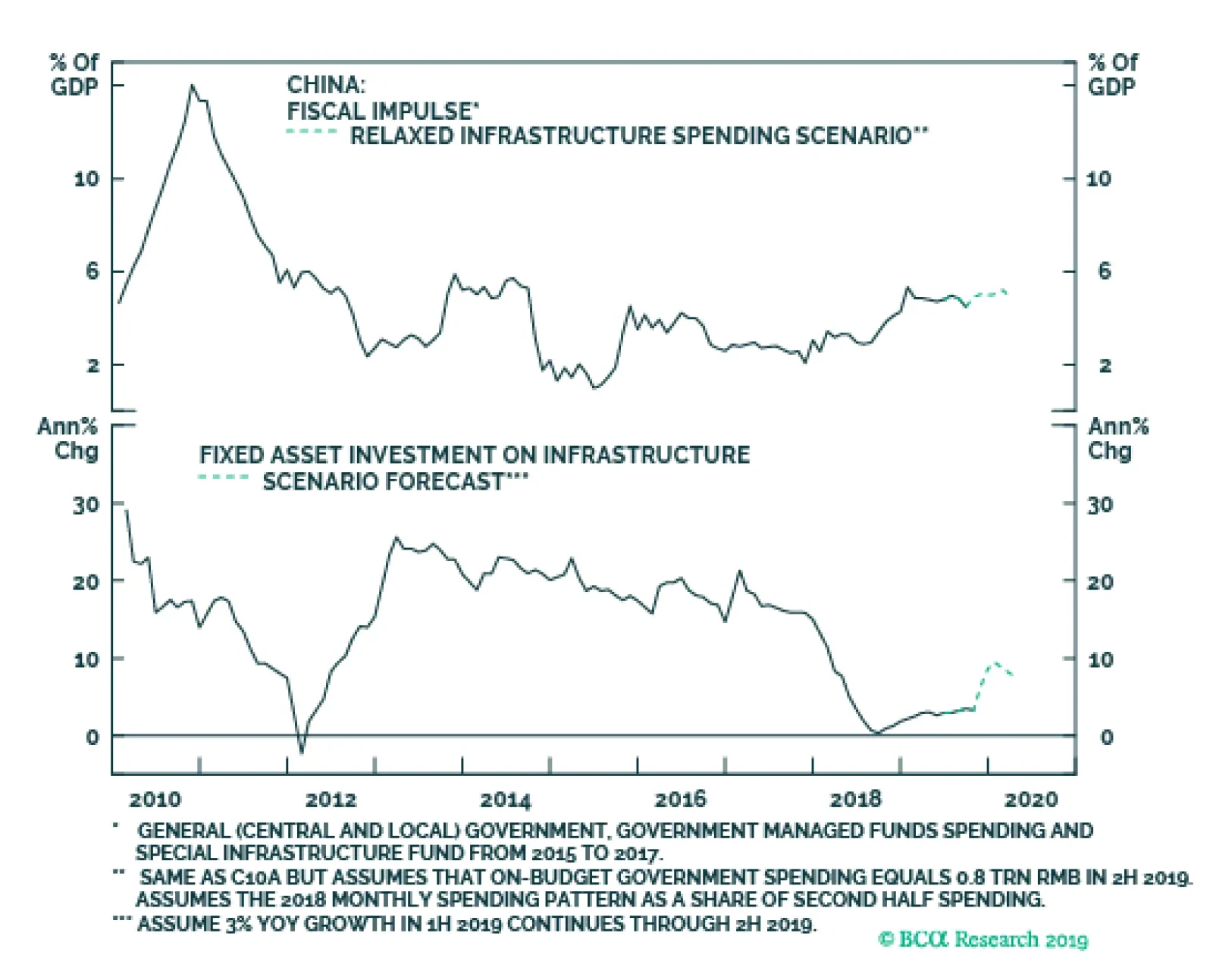
For investors favoring China-related assets, the good news is that there has been an increasing urgency in policymakers’ tone to support economic growth since September. Capex growth from state-owned enterprises (SOEs) has increasingly outpaced the private sector, which is significant: A sustained rotation in the pace of SOE vis-à-vis private sector capex marked a turning point in the 2015-2016 cycle, when Chinese policymakers’ imperative to supporting growth outweighed their desire to continue with structural reforms (Chart 5). We do not expect a 2016-style drastic rise in SOE capex growth next year, because the current economic slowdown is not as severe or prolonged as in 2015. Nonetheless, the rotation in capex growth is an important signal that Chinese policymakers may be more willing to stimulate the economy by again allowing the state sector to upstage the private sector. In the meantime, we expect that some pro-growth “policy adjustments” will be deployed in 2020: Chart 6Infrastructure Investment Likely To Rise
Infrastructure Investment Likely To Rise
Infrastructure Investment Likely To Rise
Monetary policy will incrementally ease, with one to two 10-15bps loan prime rate (LPR) cuts in the next 3-6 months. At the same time, China’s central bank (PBoC) will keep bank liquidity ample and commercial banks’ funding costs relatively low, by continuing frequent liquidity injections to stabilize the interbank rate. A further cut in the reserve requirement ratio (RRR) is also highly likely. Keeping banks well capitalized will partially mitigate the pressure commercial banks face from falling profit margins and rising credit defaults. Accommodative monetary conditions will also support more stimulus on the fiscal front. We expect that the National People’s Congress in March 2020 will approve higher quotas on the issuing of local government bonds. Chinese state-owned commercial banks will continue to be the main buyers for local government bonds. A portion of 2020 local government special-purpose bond issuance will be frontloaded to the remainder of 2019 and into the first months of next year. Relaxed capital requirements will likely boost local governments’ infrastructure project funding and expenditures. Our model suggests infrastructure spending should pick up from the current 3.3% year-on-year, to close to 7.5% in the second and third quarters next year (Chart 6). There are subtle signs that the government is starting to relax restrictions on the real estate sector. Land sales by local governments have increased since mid-2019, and the trend will continue into 2020 (Chart 7). Income from land sales accounts for 70% of local government revenues, thus allowing more land sales should help fund a larger local government spending budget next year. Declining government subsidies to shantytown renovation (namely the Pledged Supplementary Lending, or PSL) have recently abated and will likely continue to improve (Chart 8). Chart 7Some Improvement To Come In The Real Estate Sector
Some Improvement To Come In The Real Estate Sector
Some Improvement To Come In The Real Estate Sector
Chart 8Government Subsidies Will Continue
Government Subsidies Will Continue
Government Subsidies Will Continue
December’s Central Economic Work Conference (CEWC) will set policy priorities for the following year. We think Chinese policymakers will make economic growth a top priority for 2020. Credit growth swelled in the first quarter of 2019 following the December 2018 CEWC, and we expect a surge in early 2020 as well.Due to the unusually high credit growth in January this year and the seasonal factor next year (Chinese New Year will fall in January 2020), the surge in credit growth, on a year-over-year basis, will more likely be muted until towards the end of the first quarter and into the second quarter. Investors should overweight Chinese investable stocks in the next 6-12 months, but need to watch for more positive signs to upgrade tactical stance. Beyond the second quarter, however, the outlook gets cloudier as tension from the US election heats up and President Trump may change his trade negotiation strategies with China.1 This may have implications on China’s domestic policies. But for now, our baseline view is that Chinese policymakers will incrementally accelerate the pace of economic stimulus throughout next year. Q: Monetary policy has been accommodative for more than a year, but capex this year has fallen below market expectations compared with past cycles. How will further stimulus help to revive investment and economic growth next year? In short, our answer is this: interest rate cuts alone will not be enough to boost economic growth in China. Capex, and growth more generally, will only revive through synchronized policy support from the Chinese authorities. In a previous report2 we discussed that the lack of response to monetary easing has been due to a less effective monetary policy transmission mechanism, a reactive and reluctant central bank, and a debt-loaded corporate sector. More importantly, the “half-measured” stimulus has been preferred by Chinese authorities in this cycle, as they prioritized financial de-risking over growth and have significantly tightened financial regulations since 2016. Given the expected policy pivot to a more pro-growth stance in the coming year, the following underlines our conviction that capex should pick up in 2020. Modern Money Theory (MMT), with Chinese characteristics:3 local governments will ramp up debt again, and this quasi-fiscal stimulus will be a key support to the economy in 2020. During the 2015-2016 cycle, aggressive interest cuts did not result in a significant uptick in credit growth. Bank lending was not the core driver for economic recovery in 2016. The economy only bottomed following an unprecedented issuance of local government bonds after mid-2015 (Chart 9). Chinese authorities will keep a “back door” open: even though overall tight financial regulations will remain intact, we expect the PBoC to allow a more moderate contraction in shadow banking (Chart 10). This will provide smaller banks and enterprises access to tap into bank credit. Importantly, this means the government will acquiesce to local governments in providing extra funding through shadow banking. We already see local government financing vehicles (LGFV) making a comeback in recent months. Chart 9A Chinese Version Of MMT
A Chinese Version Of MMT
A Chinese Version Of MMT
Chart 10The "Back Door" May Open Wider
The "Back Door" May Open Wider
The "Back Door" May Open Wider
Small- and medium-sized enterprises (SMEs) will benefit from lowered financing costs through the new LPR system. As we pointed out in our previous report,4 the new LPR regime is not intended as much to expand bank credit as to help struggling SMEs survive economic hardships. This, along with tax cuts, should provide SMEs some relief from capital constraints. Q. CPI has been rising sharply and is above the government’s inflation target of 3%. Will inflation prevent the PBoC from maintaining an easy monetary policy? Chart 11PBoC Likely To Capitulate To Producer Deflation
PBoC Likely To Capitulate To Producer Deflation
PBoC Likely To Capitulate To Producer Deflation
No. We think deflationary pressure in the industrial sector (measured by producer prices) poses a bigger threat to the economy, and that PBoC is more likely to loosen monetary policy than to tighten (Chart 11). Chart 12 shows that the recent surge in headline consumer prices has almost been entirely driven by soaring pork prices. There is compelling evidence from historical data that, unless core consumer price inflation also rises, climbing food prices alone will have a limited impact on PBoC policy (Chart 13). We think this approach is justified, as the necessity of “core feedthrough” is also what most central banks in the developed world look for when confronted with a detrimental supply shock. Chart 12Rising Pork Prices Have Driven Up Headline Inflation...
Rising Pork Prices Have Driven Up Headline Inflation...
Rising Pork Prices Have Driven Up Headline Inflation...
Chart 13...But Won't Be Driving Up Interest Rates
...But Won't Be Driving Up Interest Rates
...But Won't Be Driving Up Interest Rates
Chart 14A Wild Year For The RMB
A Wild Year For The RMB
A Wild Year For The RMB
Core CPI has been trending downwards since February 2018, and there is no evidence to suggest that food prices will drive up core CPI inflation (Chart 13, bottom panel). This, in combination with deflating producer prices, means that the probability of tighter monetary policy over the coming 6-9 months is extremely low. In fact, we expect, with high conviction, that the PBOC will guide the LPR lower in the coming months. Q: What is your view on the RMB for 2020? The RMB depreciated by 5% against the US dollar from its peak in February this year, mostly driven by market expectations of US tariffs imposed on Chinese export goods. Interest rate differentials, short-term capital flows, and economic fundamentals all have played much smaller roles in the RMB’s value changes (Chart 14). The depreciation in the CNY/USD this year has pushed the RMB close to two sigma below its long-term trend (Chart 15). As we expect a “Phase One” trade deal to be signed and trade tensions abating at least in the near term, the RMB will face upward pressure through the first half of 2020. The appreciation will also be supported by, although to a lesser extent, China’s improved domestic economy, rising demand for RMB-denominated assets, and a weakening US dollar (Chart 16). According to our model, the USD/CNY exchange rate can return to a 6.8-7.0 range, if a significant portion of the existing tariffs is rolled back (Chart 17). This range seems to be within the “fair value” of the RMB, justifiable by the current China-US interest rate differential (Chart 14, bottom panel). Chart 15Has The RMB Gone Too Far?
Has The RMB Gone Too Far?
Has The RMB Gone Too Far?
Chart 16Demand For RMB Assets On The Rise, Despite The Trade War
Demand For RMB Assets On The Rise, Despite The Trade War
Demand For RMB Assets On The Rise, Despite The Trade War
However, it would not be in the PBoC’s best interests to let the RMB appreciate too rapidly, because an appreciating Chinese currency would act as a deflationary force on China’s export and manufacturing sectors. The large differential in the China-US interest rates would allow PBoC to cut interest and/or RRR rates, to ease upward pressure on the RMB. Chart 17Tariff Rollbacks Will Push Up RMB
Tariff Rollbacks Will Push Up RMB
Tariff Rollbacks Will Push Up RMB
Q: How should equity investors position themselves towards China over the coming year? We are bullish on Chinese investable stocks in the next 6 to 12 months, based on our view that the Chinese economy will bottom in the first quarter next year, policy will be incrementally more supportive, and a “Phase One” trade deal will be signed soon. In the very near term, however, we think downside risks to Chinese equities are not trivial. We remain a neutral tactical stance, but will continue to watch for the following signs before upgrading our tactical call from neutral to overweight.5 Chart 18A (top panel) shows that cyclical stocks remain very depressed relative to defensives, underscoring investors’ lack of confidence in the Chinese economy and trade negotiations. A breakout in cyclicals versus defensives would signify a major improvement in investor sentiment towards Chinese economic growth. An uptick in the relative performance of industrials and consumer staples (Chart 18A, bottom panel). The negative sensitivity of industrials and positive sensitivity of consumer staples to monetary policy suggests that the relative performance between the two sectors may be a reflationary barometer for China’s economy. The relative performance trend remains off its recent low, which suggests that China’s existing policy stance has not yet turned more reflationary. A technical breakdown in the relative performance of healthcare and utility stocks (Chart 18B) would also be a bullish sign. Investable health care and utilities stocks have historically led China’s economic activity, core inflation and stock prices by 1-3 months. A technical breakdown in the relative performance of these sectors would signify that market participants anticipate a bottom in China’s economy. As we mentioned at the outset, we observed an interesting divergence in sentiment among our domestic versus global investors. This divergence is reflected in both the onshore and offshore stock markets; year to date, onshore A shares have outperformed global benchmarks by 5.6% (Chart 1, on page 1 of the report). Chart 18AWaiting For A Telltale Sign...
Waiting For A Telltale Sign...
Waiting For A Telltale Sign...
Chart 18B...Before A Tactical Upgrade
...Before A Tactical Upgrade
...Before A Tactical Upgrade
However, all of the outperformance in A shares occurred before end April, when the trade talks broke down and domestic credit expansion significantly slowed from the first quarter. Since May, the relative performance of A shares in US dollar terms has been mostly flat, reflecting the fact the markets were not expecting a significant stimulus forthcoming. Chinese investable stocks, on the other hand, have been trading heavily on the day-to-day news surrounding the trade negotiations and have significantly underperformed both domestic A shares and global benchmarks. Therefore, our base case view of a trade truce coupled with an improved Chinese economy and more supportive policy near year, warrant a cyclical overweight stance favoring Chinese investable stocks over their domestic peers. Earnings from both onshore and offshore markets will benefit from a modest improvement in economic activity, but we think the investable market will benefit more from the trade truce and more upside growth potential. Stay tuned. Jing Sima China Strategist jings@bcaresearch.com Footnotes 1Please see Geopolitical Strategy Special Report, "Is China Afraid Of The Big Bad Warren?" dated October 25, 2019, available at gps.bcaresearch.com 2Please see China Investment Strategy Weekly Report, " Threading A Stimulus Needle (Part 1): A Reluctant PBoC," dated July 10 2019, available at cis.bcaresearch.com 3We call it a “MMT” because China’s state-owned commercial banks own approximately 80% of local government bonds. The commercial banks are essentially backed by China’s central bank, which has a fiat currency system and can make independent monetary policy decisions. 4Please see China Investment Strategy Weekly Report, "Mild Deflation Means Timid Easing," dated October 9, 2019, available at cis.bcaresearch.com 5Please see China Investment Strategy Special Report, "A Guide To Chinese Investable Equity Sector Performance," dated October 30, 2019, available at cis.bcaresearch.com Cyclical Investment Stance Equity Sector Recommendations
Highlights There is little risk that inflation will heat up over the next several months, … : Weak growth is more of a threat to the global economy than inflation. … which means the Fed won’t be in any hurry to take away this year’s rate cuts, … : We expect the Fed to leave the target fed funds rate alone for nearly all of 2020. … giving the economy plenty of opportunity to overheat: If trade tensions move to the back burner, and global manufacturing activity revives, the “insurance” rate cuts executed by the Fed and other central banks may turn out to have been unnecessary. The investment punch line is that accommodative monetary policy is likely to push asset prices and Treasury yields higher: Our revised Rates View Checklist supports going back to a below-benchmark duration stance over the tactical timeframe, in line with our cyclical view. Feature BCA researchers’ latest monthly view meeting opened with a discussion of whether inflation or deflation is the bigger risk to financial markets. Should investors be more concerned about signs of overheating or stalling growth? With inflation unable to get traction in any of the major economies, we all agreed that growth is the more critical unknown. An investor who gets the growth call right has the best chance of getting broad asset class positioning right, along with country, sector, duration, credit and currency tilts. While we continue to believe that there are more inflation pressures beneath the surface of the US economy than most investors realize, they are highly unlikely to manifest themselves any time soon. At today’s low-single-digit levels, inflation’s investment import is limited to its impact on monetary policy. Inflation expectations remain far below the levels that are consistent with the Fed’s inflation target (Chart 1), and the Fed is likely to keep policy easy until they adjust higher. Though it is uncertain just what levels of realized inflation, or inflation expectations, would trigger the Fed’s reaction function, we are confident that inflation will not be an issue in the coming year. Chart 1No Pressure To Remove Accommodation
No Pressure To Remove Accommodation
No Pressure To Remove Accommodation
Chart 2Global Revival Ahead?
Global Revival Ahead?
Global Revival Ahead?
We expect that global growth will surprise to the upside, pulling bond yields and risk asset prices higher. BCA’s global LEI bottomed earlier this year, and the diffusion index that leads directional moves in the LEI has turned sharply higher (Chart 2). The improvement is consistent with the easing in global financial conditions and the tentative détente in the trade war. Although we will not count on a completed “Phase I” agreement until it is signed, financial markets’ allergic reaction to trade tensions seems to have encouraged the White House to back off lest it undermine its re-election prospects. Interest Rates – Looking Back Figure 1Rates View Checklist
Refreshing Our Rates View
Refreshing Our Rates View
We rolled out our Rates View Checklist a little over a year ago to systematize our interest rate analysis and to clarify the rationale underpinning our views1 (Figure 1). Detailing the key series we monitor to anticipate the future direction of rates helps clients think along with us while giving them the chance to adapt the framework for their own purposes. As we were starting from a position of recommending below-benchmark duration, the checklist was aimed at identifying and tracking the factors that could encourage us to become more constructive about Treasury bonds. We never did warm to duration on a cyclical basis, though we did turn tactically neutral in mid-August. Part of the reason was that we did not give enough weight to events outside of the US. Highly-rated, developed-market sovereign bonds are substitutes for one another, and there is a limit to how much currency-adjusted yields can deviate across countries. Very low to negative yields in the UK, France, Germany and Switzerland have exerted a magnetic pull on Treasury yields (Chart 3), and the different sovereigns should move in tandem going forward, with currency-hedged yields observing a tight range. Chart 3Birds Of A Feather
Birds Of A Feather
Birds Of A Feather
The short end of the yield curve exerts considerable influence on rates across all maturities. Our US bond strategists’ golden rule of bond investing homes in on the deviation between actual and expected moves in the fed funds rate as the key determinant of duration positioning outcomes. Following their lead, our checklist is oriented around anticipating the Fed’s reaction to important incoming data. It seems to have done its job over the last year, highlighting the factors that drove the Fed to switch from dialing back accommodation to dialing it up. Although we never checked more than four of the eleven boxes in the checklist – Inverted Yield Curve, Sluggish Rise in Realized Inflation, Sluggish Rise in Inflation Breakevens and International Duress – those four boxes were enough to inspire the Fed’s dovish pivot. That pivot has so far encompassed three quarter-point rate cuts, pruning back the funds rate to 1.75% from 2.5%. It turns out that the key items in the checklist were the orientation of the yield curve; sluggish inflation expectations that the Fed worried could become “unanchored on the downside;” and the shadow of trade tensions that seem to have induced a global manufacturing recession, even if they have yet to infect the DM economies’ larger services sector. They tipped the scales for Fed policy and we will be especially alert to them going forward. Interest Rates – Looking Ahead Figure 2Revised Rates View Checklist
Refreshing Our Rates View
Refreshing Our Rates View
While our interpretation of the checklist left something to be desired, we are convinced that the checklist approach is sound. We return to its framework for insight into the current rates outlook, after making a few tweaks to shore it up (Figure 2). Starting with Fed perceptions, there is still some daylight between our fed funds rate expectations and the market’s, as we think the Fed is done cutting, while the money market assigns a high probability to the possibility of one more cut (Chart 4). The combination of rate cuts and the rally in 10-year Treasury yields got the yield curve back to its typical upward-sloping orientation in October (Chart 5), so we can now uncheck the inverted curve box. We see the five-month inversion as a reason to be more vigilant, but given the unusually negative term premium, we are not treating it as a hard-and-fast sign of looming weakness. The money market has priced out all but one more rate cut, and the yield curve is no longer inverted, suggesting that recession fears are abating. Chart 4Looking For One More Cut
Looking For One More Cut
Looking For One More Cut
Chart 5The Curve Is No Longer Inverted
The Curve Is No Longer Inverted
The Curve Is No Longer Inverted
Chart 6Inflation Is Muted, ...
Inflation Is Muted, ...
Inflation Is Muted, ...
We continue to check both of the sluggish inflation boxes. Realized inflation measures, headline and core, have slumped (Chart 6), and below-target inflation expectations remain a hot-button concern, judging by Fed speakers’ repeated references to them. The Fed has strapped itself to the mast with all its talk about inflation expectations, and it will not begin removing accommodation until inflation expectations revive. We cannot directly observe the output gap, but nearly 3% growth in 2018, and a rip-roaring labor market, offer solid evidence that it has closed and we leave its box unchecked. Labor market indicators unanimously point to the conclusion that monetary accommodation is not necessary. The unemployment rate is a full percentage point below the Fed’s and the CBO’s estimates of NAIRU. Ancillary indicators like the broader definition of unemployment including discouraged workers and involuntary part-time workers (Chart 7, top panel), and the openings (Chart 7, middle panel) and quits rates (Chart 7, bottom panel) from the JOLTS survey, testify to an extremely tight labor market. We expect that the pause in wage acceleration will prove temporary (Chart 8). Chart 7... Despite A Red-Hot Labor Market
... Despite A Red-Hot Labor Market
... Despite A Red-Hot Labor Market
Chart 8Wage Gains Will Pick Up Again
Wage Gains Will Pick Up Again
Wage Gains Will Pick Up Again
Chart 9No Overheating In The Real Economy
No Overheating In The Real Economy
No Overheating In The Real Economy
With cyclical spending well short of past business cycle peaks (Chart 9), the real economy isn’t exerting any pressure on the Fed to intervene to choke off the expansion. (Although a modest pace of Fed hikes would support below-benchmark duration positioning, aggressive tightening to cut off overheating leads to recessions, and would favor long-maturity Treasuries.) We have removed the financial sector imbalances box because there has been no apparent follow through from Governor Brainard’s speech last September, which appeared to set the stage for tightening on the basis of frothy credit conditions. We maintain the international duress box, which is meant to alert us to an overseas crisis or near-crisis that could spark a flight to quality that depresses Treasury yields and/or inspires the Fed to pursue easier policy in an attempt to stave off contagion risks. Green shoots in manufact-uring, here and abroad, support the idea that growth outside the U.S. could be poised to accelerate. Chart 10Global Manufacturing Is Coming Back ...
chart 10
Global Manufacturing Is Coming Back ...
Global Manufacturing Is Coming Back ...
Chart 11... And US Manufacturing May Have Bottomed
... And US Manufacturing May Have Bottomed
... And US Manufacturing May Have Bottomed
We add “Flagging Global Growth” to address the global growth blind spot that undermined our call last year. Our US Bond Strategy colleagues find that the Global Manufacturing PMI, the US ISM Manufacturing PMI and the CRB Raw Industrials Index are the global growth measures that exert the strongest influence on Treasury yields. The Global Manufacturing PMI has risen off its lows over the last three months and is within striking distance of getting back above the 50 contraction/expansion line, led by the US2 and China (Chart 10). The outlook for the US ISM Manufacturing PMI looks good on several counts. First, the comparatively modest manufacturing sector tends to move with the much larger services sector, and the sharp bounce in the Services PMI bodes well for the Manufacturing PMI (Chart 11, top panel). Within the manufacturing survey, New Export Orders’ leap back over 50 suggests that the global economy may have already seen the worst of the manufacturing weakness that has swept the rest of the world (Chart 11, bottom panel). The jury is still out on the CRB Raw Industrials-to-gold ratio (Chart 12, top panel), as industrial commodity prices have yet to show any spunk (Chart 12, bottom panel). Chart 12Commodities Have Yet To Turn
Commodities Have Yet To Turn
Commodities Have Yet To Turn
Chart 13A Weaker Dollar Would Support Higher Rates
A Weaker Dollar Would Support Higher Rates
A Weaker Dollar Would Support Higher Rates
With our trio of indicators mixed-to-positive on balance, we leave the global growth box unchecked. We have also added a dollar box to monitor when Treasury yields are drifting out of alignment with other sovereign yields. If the dollar and Treasury yields rise together, we would view the rise in yields as suspect and at risk of being reversed.3 There doesn’t appear to be any decoupling pressure now, as Treasury yields have risen while the dollar has bumped around in a narrow range (Chart 13, top panel), and bullish sentiment toward the dollar has cooled off, pointing the way to a currency-approved path to higher yields (Chart 13, bottom panel). Bottom Line: We check only two of the boxes in our revised rates checklist (Figure 2), supporting a below-benchmark duration stance. Investment Implications Like all investors, we hate to get anything wrong. We were wrong on rates, though, failing to see the potential for the 10-year Treasury yield to fall to 1.5%. The duration miss undermined results within the fixed income sleeve of our recommendations, as we didn’t take it off until the 10-year Treasury yield had fallen to 1.74% .4 We have modified our rates checklist to force ourselves to be more aware of the world beyond the US, but the available data still support below-benchmark duration positioning, and we now recommend going back to it over the tactical (0-3-month) timeframe. The date when monetary policy turns restrictive has been pushed out, and so have the dates when the bull markets in risk assets will end. We note that our overall asset allocation calls have performed well. Since we upgraded equities in our first 2019 report,5 the S&P 500 Total Return Index has gained 24% while our Treasury underweight, as proxied by the Bloomberg Barclays US Treasury Total Return Index, is up 7% (Chart 14, top panel). Since we upgraded spread product in late January,6 the Bloomberg Barclays US Corporate Investment Grade and High Yield Total Return Indexes are up 12% and 8%, respectively, versus the Treasury Index’s 7% (Chart 14, bottom panel). Chart 14Underweighting Treasuries Has Been The Way To Go
Underweighting Treasuries Has Been The Way To Go
Underweighting Treasuries Has Been The Way To Go
The run-up to the Fed’s series of mid-cycle rate cuts doomed our duration call, but it has fortified the case for overweighting equities and spread product. We still expect the expansion, the equity bull market, and spread product’s long period of generating excess returns to die at the hands of the Fed. Now that the date when monetary policy settings become restrictive has been indefinitely delayed, the end-dates of the equity and credit bull markets have as well. We continue to recommend overweighting equities and spread product, and underweighting Treasuries. Doug Peta, CFA Chief US Investment Strategist dougp@bcaresearch.com Footnotes 1 Please see the September 17, 2018 US Investment Strategy Weekly Report, “What Would It Take To Change Our Bearish Rates View?” available at usis.bcaresearch.com. 2 The Global PMI is compiled from Markit’s individual country PMIs, so the chart shows the Markit US PMI instead of the more familiar ISM measure. 3 It the dollar were to rise significantly while Treasury yields rose faster than other DM sovereign yields, currency-adjusted Treasury yields would decouple from peer yields and arbitrage activity would likely bring them back down. 4 Please see the August 12, 2019 US Investment Strategy Weekly Report, “When The Facts Change,” available at usis.bcaresearch.com. 5 Please see the January 7, 2019 US Investment Strategy Weekly Report, “What Now?” available at usis.bcaresearch.com. 6 Please see the January 28, 2019 US Investment Strategy Weekly Report, “Double Breaker,” available at usis.bcaresearch.com.
Highlights Duration: A survey of the five factors that determine the path for Treasury yields suggests that further upside is likely. We see a clear path to 2.5% for long-maturity Treasury yields as recessionary risk moves to the back burner in the coming months. Credit Cycle: C&I lending standards tightened on net in the third quarter of 2019. But other indicators of monetary conditions point to continued accommodation. We expect lending standards will soon move back into “net easing” territory. Remain overweight Spread Product versus Treasuries. IG Valuation: Investment grade corporate bond spreads for all credit tiers are now below our fair value targets. We recommend only a neutral allocation to the sector. Investors should prefer high-yield bonds, where spreads are more attractive, and Agency MBS, which offer competitive expected returns and much less risk. Feature Chart 1Recession Risk Getting Priced Out
Recession Risk Getting Priced Out
Recession Risk Getting Priced Out
The bond sell-off continued last week, driven by positive developments in US/China trade negotiations and tentative signs of stabilization in some global growth indicators. The renewed sense of economic optimism has reduced the recessionary risk priced into bond markets. The 2/10 Treasury slope has steepened 30 bps since it briefly inverted in late August. During that same period, the 2-year Treasury yield is up 15 bps, the 10-year yield is up 45 bps and the Bloomberg Barclays Treasury index has underperformed a position in cash by 2.7% (Chart 1). These recent developments raise two important questions. First, should investors chase or fade the back-up in Treasury yields? And second, if the sell-off does continue, how high can yields go? To answer these questions we turn to the five macro factors that drive trends in US bond yields. These factors were outlined in our “Bond Kitchen” report from last April, and are listed right here:1 Global growth Policy uncertainty The US dollar The output gap Sentiment Back In The Kitchen Global Growth Chart 2CRB Index Needs To Rebound
CRB Index Needs To Rebound
CRB Index Needs To Rebound
Three global growth indicators are particularly relevant for US Treasury yields. They are the Global Manufacturing PMI, the US ISM Manufacturing PMI and the CRB Raw Industrials index. The latter is especially useful because it updates on a daily basis. Considering the CRB index, we notice that, while it is no longer in a steep downtrend, it has also not rebounded alongside the jump in bond yields (Chart 2). This should give us pause. Continued low readings from the CRB index make it more likely that bond yields will fall back in the coming weeks. We should also note that the ratio between the CRB index and Gold is more highly correlated with the 10-year Treasury yield than the CRB index itself.2 This ratio has bounced off its lows (Chart 2, top panel), but only because Gold has come under downward pressure. With the Fed committed to maintaining an accommodative policy stance until inflation expectations are re-anchored, we expect the Gold price to remain well bid. This means that raw industrials prices must rebound to keep the ratio trending higher. The CRB/Gold ratio has bounced off its lows, but only because Gold has come under downward pressure. More encouraging than the CRB index is the Global Manufacturing PMI, which has moved off its lows during the past three months (Chart 3). The increase has been partially driven by stronger US readings (Chart 3, panel 2), but principally by a significant jump in China’s PMI (Chart 3, bottom panel). Chart 3China Pulling The Global Manufacturing PMI Higher
China Pulling The Global Manufacturing PMI Higher
China Pulling The Global Manufacturing PMI Higher
Somewhat stronger China PMI readings should be expected, given the rebound in our China Investment Strategy’s Li Keqiang Leading Indicator – a composite measure of monetary conditions, money and credit growth (Chart 4).3 We should also expect further modest policy stimulus from China, as long as the labor market remains under pressure (Chart 4, bottom panel). Turning to the US, we have seen three very positive developments in the economic data during the past month. First, the ISM Services PMI jumped from 52.6 to 54.7 in October (Chart 5). A drop in this index to 50 or below would be consistent with a US recession, while the combination of a strong service sector and a depressed manufacturing sector is consistent with our baseline 2015/16 roadmap. This roadmap leads to an eventual rebound in the manufacturing index. Second, the ISM Manufacturing PMI rose a tad in October, but the New Export Orders component jumped significantly from 41 to 50.4 (Chart 5, panel 2). Since the global slowdown began as a non-US phenomenon, a rebound in this export component sends a strong signal that we are at an inflection point. Finally, consumer confidence rose in October following a sharp decline in September. A year-over-year decline in the consumer confidence index is a reasonably strong recession signal, but recent data suggest that this signal is fading (Chart 5, bottom panel). Chart 4Modest Stimulus In China
Modest Stimulus In China
Modest Stimulus In China
Chart 5Three Positive Developments
Three Positive Developments
Three Positive Developments
All in all, the global growth data have turned more positive during the past month. US indicators, in particular, are no longer sending strong recessionary signals. A rebound in the CRB Raw Industrials index would give us more confidence in the durability of the recent rise in Treasury yields. Policy Uncertainty Uncertainty about the US/China trade conflict has eased considerably during the past few weeks, as the two sides appear to be working toward a “phase 1” deal that would prevent the imposition of new tariffs and roll back some that are already in place. Heightened uncertainty about the trade war played a large role in dragging bond yields lower in 2019. This becomes apparent when you notice that survey and sentiment (aka “soft”) data about the economic outlook have been significantly worse than the actual “hard” data on US economic activity.4 It is clear that negative sentiment about the trade war has held survey data and bond yields down, even as underlying US economic activity has been solid. Less bullish dollar sentiment supports a continued uptrend in Treasury yields. We see a continued easing of trade tensions as we head into the first half of next year. President Trump has an incentive to support the economy in an election year, given the historical record of incumbent presidents being re-elected when the economy is strong. However, if this strategy doesn’t work and Trump finds himself behind in the polls by the end of next summer, then he could decide that ramping up the trade war again is the best course of action. In other words, another spike in policy uncertainty in the second half of 2020 is possible if President Trump is trailing in the polls. The US Dollar Chart 6Dollar Sentiment Points To Higher Yields
Dollar Sentiment Points To Higher Yields
Dollar Sentiment Points To Higher Yields
The US dollar is important for the path of US Treasury yields because it signals whether US yields are decoupling from yields in the rest of the world. In other words, if the dollar appreciates significantly alongside rising Treasury yields, then we should view those yields as increasingly out of step with the rest of the world, and thus more likely to fall back down. So far, the dollar has been relatively flat as yields have risen and bullish sentiment toward the US dollar has declined significantly (Chart 6). Less bullish dollar sentiment supports a continued uptrend in Treasury yields. But if yields do in fact continue to rise, it will be important to watch the dollar’s reaction. The Output Gap Chart 7Wage Gains Hurting Margins, Not Raising Prices
Wage Gains Hurting Margins, Not Raising Prices
Wage Gains Hurting Margins, Not Raising Prices
Some sense of the output gap is important for forecasting bond yields. This is because the same amount of global growth will lead to more inflationary pressure and higher bond yields when the output gap is small than when it is large. The fact that the output gap is smaller now than it was in 2016 is probably the reason why the 10-year Treasury yield bottomed 10 bps above its 2016 trough this year, and why the average Treasury index yield bottomed 47 bps above its 2016 trough. We have found wage growth to be an excellent indicator of the output gap, and noted in a recent report that wage growth should continue to accelerate.5 In this vein, another crucial variable to monitor is labor compensation as a percent of national income (Chart 7). The rise in this series indicates that wage gains during the past few years have come at the expense of corporate profit margins, and have not been passed through to higher consumer prices. If this series proves to have a lot more cyclical upside, then it could be some time before wage acceleration translates to higher inflation. Sentiment Chart 8Surprise Index Says Sentiment Is Neutral
Surprise Index Says Sentiment Is Neutral
Surprise Index Says Sentiment Is Neutral
The final factor we consider when forecasting US Treasury yields is sentiment. We have found that the Economic Surprise Index is the single best measure of aggregate market sentiment. That is, when the Surprise index reaches a positive or negative extreme, it usually means that sentiment is too positive or too negative, and will mean-revert in the months ahead. Also, we have observed a strong correlation between the Surprise index and changes in Treasury yields (Chart 8). At present, the Surprise index is roughly neutral, and therefore does not send a strong signal about where sentiment might push bond yields during the next few months. Investment Conclusions To summarize, the outlook from our five macro factors suggests that Treasury yields will rise further in the coming months. Global growth indicators are showing tentative signs of bottoming, and should rise to levels more consistent with the “hard” economic data as policy uncertainty continues to wane. The fact that the US economic data look less recessionary than they did one month ago makes us more confident that our global indicators will rebound. Chart 9A Clear Path To 2.5%
A Clear Path To 2.5%
A Clear Path To 2.5%
We would become concerned about a renewed downtick in yields if the CRB Raw Industrials index fails to rebound, or if the dollar strengthens significantly in the coming weeks. At the beginning of this report, we asked how high Treasury yields can go if the global growth rebound proves durable. To answer that question we refer to current estimates of the long-run neutral fed funds rate. The FOMC’s median estimate of the long-run neutral fed funds rate is 2.5% and the median estimate from the New York Fed’s Survey of Market Participants is 2.48%, with an interquartile range of 2.25% - 2.5%. If recessionary fears move to the back burner, it would be logical for long-dated yields to converge toward those levels. That is in fact what happened in recent years, with the 5-year/5-year forward Treasury yield peaking several times at levels close to the Fed’s median neutral rate estimate (Chart 9). With this in mind, we see a clear path to 2.5% on the 5-year/5-year forward Treasury yield, with the 10-year yield reaching similar levels since the 5/10 Treasury slope is likely to remain flat (Chart 9, bottom panel). For yields to eventually move above 2.5%, the market would have to re-consider its outlook for the long-run neutral fed funds rate. We discussed what factors to monitor in this regard in a recent report.6 Bottom Line: Treasury yields have moved significantly higher in recent weeks, but a survey of the five factors that determine the path for Treasury yields suggests that further upside is likely. We see a clear path to 2.5% for long-maturity Treasury yields as recessionary risk moves to the back burner in the coming months. Checking In On The Credit Cycle In previous reports, we mentioned that three factors drive our view of corporate bond spreads and the credit cycle: Balance sheet health Monetary conditions Valuation We last presented a detailed examination of these factors in a report from mid-September, concluding that accommodative monetary conditions will support corporate bond excess returns, despite deteriorating balance sheet health.7 Three factors drive our view of corporate bond spreads and the credit cycle: Balance sheet health, monetary conditions,and valuation. But since then, C&I lending standards – an important indicator of monetary conditions – moved into “net tightening” territory for the third quarter of 2019 (Chart 10). Tightening C&I lending standards, if they persist, would put significant upward pressure on corporate defaults and credit spreads. Chart 10Credit Cycle Checklist: Monetary Conditions
Credit Cycle Checklist: Monetary Conditions
Credit Cycle Checklist: Monetary Conditions
While the recent move in lending standards is concerning, we expect it to reverse in the near future. The yield curve, another indicator of monetary conditions, has steepened in recent months, suggesting that conditions are becoming more accommodative. Also, loan officers reported that the terms on C&I loans continued to ease in Q3, even as overall standards tightened (Chart 10, panel 3). Most importantly, inflation expectations remain extremely low (Chart 10, bottom panel). This gives the Fed every incentive to maintain accommodative monetary conditions. This should give lenders the confidence to ease lending standards, leading to tight credit spreads and a low corporate default rate. Bottom Line: C&I lending standards tightened on net in the third quarter of 2019. But other indicators of monetary conditions point to continued accommodation. We expect lending standards will soon move back into “net easing” territory. Remain overweight Spread Product versus Treasuries. Downgrade Investment Grade Corporates To Neutral Last week, we downgraded our recommended allocation to investment grade corporate bonds from overweight to neutral.8 We maintain a positive view of the credit cycle, and expect that corporate bonds will continue to outperform Treasuries. However, investment grade corporate spreads no longer provide adequate compensation for their level of risk. We maintain an overweight allocation to high-yield corporates, where spreads remain attractive. Chart 11 shows that investment grade corporate spreads have tightened somewhat in recent months, but that they remain well above the tights seen in early 2018. However, the chart also shows that average index duration has increased considerably this year. All else equal, higher index duration justifies a wider spread. In contrast, notice that high-yield index duration fell this year (Chart 11, bottom panel). This is because high-yield bonds usually carry embedded call options, making them negatively convex. All else equal, lower index duration makes the spread offered by the high-yield index more attractive. Because changes in spread and duration are both important, we prefer to use the 12-month breakeven spread as our main valuation tool. This measure is the spread widening required on a 12-month investment horizon to underperform a duration-matched position in Treasuries. It can be approximated by dividing the option-adjusted spread by duration. Chart 12 shows investment grade 12-month breakeven spreads as a percentile rank since 1995. The overall message is that spreads have rarely been lower. Chart 11Higher Durations Makes IG Spreads Look Too Tight
Higher Durations Makes IG Spreads Look Too Tight
Higher Durations Makes IG Spreads Look Too Tight
Chart 12Investment Grade Corporate Spreads Have Rarely Been Lower
Investment Grade Corporate Spreads Have Rarely Been Lower
Investment Grade Corporate Spreads Have Rarely Been Lower
Finally, we can also recognize that spreads tend to be tight in the middle and late stages of the credit cycle. In the current environment, that means we should expect spreads to be near the bottom of their historical ranges. To control for this fact, we re-calculate our breakeven spread percentile ranks using only mid-cycle periods when the slope of the yield curve is between 0 bps and 50 bps. We can then back-out spread targets for each credit tier based on the median 12-month breakeven spreads seen in similar macro environments. Chart 13 shows that spreads for all investment grade credit tiers have moved below our targets. High-yield spreads are not shown, but they remain well above target levels.9 Chart 13Spreads For All IG Credit Tiers Are Below Target
Spreads For All IG Credit Tiers Are Below Target
Spreads For All IG Credit Tiers Are Below Target
In place of investment grade corporates, which have become expensive, we recommend upgrading Agency MBS. MBS now offer expected returns that are comparable with corporate bonds rated A or higher, with considerably less risk.10 Bottom Line: Investment grade corporate bond spreads for all credit tiers are now below our fair value targets. We recommend only a neutral allocation to the sector. Investors should prefer high-yield bonds, where spreads are more attractive, and Agency MBS, which offer competitive expected returns and much less risk. Ryan Swift US Bond Strategist rswift@bcaresearch.com Footnotes 1 Please see US Bond Strategy Weekly Report, “Bond Kitchen”, dated April 9, 2019, available at usbs.bcaresearch.com 2 For details on why the ratio between the CRB Raw Industrials index and Gold tracks the 10-year Treasury yield please see US Bond Strategy Portfolio Allocation Summary, “The Sequence Of Reflation”, dated March 5, 2019, available at usbs.bcaresearch.com 3 Please see China Investment Strategy Special Report, “The Data Lab: Testing The Predictability Of China’s Business Cycle”, dated November 30, 2017, available at cis.bcaresearch.com 4 For more details on the divergence between “soft” and “hard” data please see US Bond Strategy Weekly Report, “Crisis Of Confidence”, dated October 22, 2019, available at usbs.bcaresearch.com 5 Please see US Bond Strategy Weekly Report, “Position For Modest Curve Steepening”, dated October 29, 2019, available at usbs.bcaresearch.com 6 Please see US Bond Strategy Weekly Report, “Position For Modest Curve Steepening”, dated October 29, 2019, available at usbs.bcaresearch.com 7 Please see US Bond Strategy Weekly Report, “Corporate Bond Investors Should Not Fight The Fed”, dated September 17, 2019, available at usbs.bcaresearch.com 8 Please see US Bond Strategy Portfolio Allocation Summary, “The Fed Will Stay Supportive”, dated November 5, 2019, available at usbs.bcaresearch.com 9 For details on how we calculate our spread targets please see US Bond Strategy Weekly Report, “The Value In Corporate Bonds”, dated February 19, 2019, available at usbs.bcaresearch.com 10 For more details on the positive outlook for MBS please see US Bond Strategy Weekly Report, “Two Themes And Two Trades”, dated October 1, 2019, available at usbs.bcaresearch.com Fixed Income Sector Performance Recommended Portfolio Specification
Highlights All the steps in the earnings dance are well known: Company management teams guide Wall Street analysts to lower their expectations in the weeks leading up to the beginning of earnings season, and their companies’ results then comfortably clear the lowered bar. Given the lack of true suspense, the S&P 500 largely ignores quarterly results: In the near term, moves in the S&P 500 have little to no relationship with either earnings growth or the magnitude of earnings beats. Over time, however, index prices and earnings move together: If earnings multiples mean-revert, earnings and prices have to converge over the long run. The equity bull market isn’t finished yet: The monetary policy backdrop will support earnings growth well into 2021, though it will not promote multiple expansion for much more than a year. Feature Chart 1We've Seen This Movie Before
Why Bother With Earnings?
Why Bother With Earnings?
Taking a turn chairing BCA’s daily meeting last week, we duly updated our colleagues on the progress of earnings season. At the time, over 75% of the S&P 500’s constituents had reported, and the index was on its way to surpassing consensus analyst expectations by a few percentage points. We then showed charts tracking the course of expectations across each of this year’s three quarters to show that the “surprise” wasn’t actually very surprising (Chart 1). We included the charts to add a bit of levity, but a fellow strategist asked an incisive question: If earnings season follows the same pattern every quarter, why pay attention to it at all? Earnings season surely has its elements of Kabuki theater, but earnings are the fundamental basis for purchasing an ownership stake in a company. A share of stock is a claim on a company’s aggregate future earnings. To the extent that quarterly earnings reports provide a window into the trajectory of a company’s future earnings path, they contain relevant information about the fair value of its shares. Quarterly earnings offer more insight at the individual stock level than at the index level, as individual stocks are subject to idiosyncratic factors, while index earnings tend to reflect overall economic performance, and we therefore view them as a check on the other real-time indicators we examine to gauge the health of the economy. A review of how S&P 500 prices interact with S&P 500 earnings suggests that earnings have little to no impact on near-term index performance. They do move together in the long term, though, as they must if earnings multiples are a mean-reverting series. In the near term, when multiples are oscillating, anticipating stock market moves is a function of anticipating earnings growth and swings in multiples, which move independently of one another. The fed funds rate cycle has historically provided a good high-level guide to earnings and multiples trends. S&P 500 Performance During Earnings Season To test the S&P 500’s sensitivity to earnings surprises, we dug through weekly earnings updates going back to the beginning of 2012 (4Q11 earnings season) to compare expected index earnings per share (EPS) with reported index EPS.1 I/B/E/S has long been recognized as the earnings-estimates authority, so we use its estimates in conjunction with its compilation of reported earnings to ensure our analysis really is apples-for-apples.2 We track S&P 500 performance in three-month segments, beginning with the Monday following the second Friday of the new quarter, since that is the week that the banks typically get earnings season rolling. Earnings beats are stable and predictable, but the S&P 500's reaction to them is anything but. The empirical record over the last 31 quarters supports our colleague’s intuition. Over the 13 weeks following the major banks’ releases, S&P 500 performance exhibits no consistent link with earnings surprises (Chart 2). The best-fit line through a simple scatterplot shows that the relationship, such as it is, has been inverse and weak (Chart 3). The link with the year-over-year change in S&P 500 earnings is even weaker (Charts 4 and 5). Chart 2Earnings Surprises Don't Move The S&P 500 …
Why Bother With Earnings?
Why Bother With Earnings?
Chart 3… Which Is Slightly Negatively Correlated With Them
Why Bother With Earnings?
Why Bother With Earnings?
Chart 4Earnings Growth Doesn't Move The S&P 500 …
Why Bother With Earnings?
Why Bother With Earnings?
Chart 5… Which Has No Short-Term Relationship With It
Why Bother With Earnings?
Why Bother With Earnings?
Earnings data support our colleague’s contention that earnings season, at least as it relates to expectations, is something of a charade. Companies, which heavily influence analyst estimates with their guidance, have beaten expectations every quarter for at least eight years. As Charts 2 and 3 show, earnings beat expectations by an average of 3.7%, nearly the midpoint of the 1-6% range. The S&P 500 shouldn’t be expected to react to “surprises” that are more or less pre-ordained. Bottom Line: Earnings season has no observable impact on the S&P 500. Earnings attract a lot of attention, but they do not influence index-level performance in the near term. The S&P 500 And Earnings Over Longer Periods Anything can happen over short periods, but stock prices have to track earnings over the long term. If the idea that an ownership share represents a proportional stake in company earnings is too abstract, consider the equity equation. Equity prices, P, can be viewed as the product of earnings, E, and the multiple investors are willing to pay for each dollar of earnings, P/E. P = E * (P/E) The market P/E ratio is subject to mean reversion, making changes in earnings the key long-term driver of S&P 500 performance. Since 1966, the S&P 500 index (Chart 6, top panel) has appreciated at the same rate as its trailing four-quarter operating earnings (Chart 6, middle panel), given that its trailing multiple is not far from where it started (Chart 6, bottom panel). Growth in forward earnings expectations (Chart 7, middle panel) has lagged S&P 500 growth (Chart 7, top panel) since expectations data began to be compiled in 1979 because the forward multiple has more than doubled from late ‘70s trough levels (Chart 7, bottom panel). In any extended period not bookended by an outlier multiple, however, one should expect S&P 500 appreciation to track earnings estimate growth. Chart 6S&P 500 Earnings And Prices Will Converge Over Time ...
S&P 500 Earnings And Prices Will Converge Over Time ...
S&P 500 Earnings And Prices Will Converge Over Time ...
Chart 7... As Long As The Starting Or Ending Multiple Isn't An Outlier
... As Long As The Starting Or Ending Multiple Isn't An Outlier
... As Long As The Starting Or Ending Multiple Isn't An Outlier
Bottom Line: Stock price gains and earnings growth will converge over the long run as long as the earnings multiple mean-reverts. Earnings do matter in the long run. Where Do We Go From Here? There are several earnings growth models within BCA. Like all regression models, they often work well in stretches, but are susceptible to unanticipated inflections and changes in correlations. Since the crisis, the difference between year-over-year growth in industrial production and year-over-year growth in the money supply has aligned closely with earnings growth (Chart 8). If we (and global equity markets) are correct in sniffing out a bottoming in global manufacturing activity, and loan growth is unlikely to accelerate much as banks are pulling in their horns in commercial real estate and selected consumer categories, earnings growth could pull out of its funk. Chart 8Earnings Growth Will Revive Once Global Manufacturing Pressure Abates
Earnings Growth Will Revive Once Global Manufacturing Pressure Abates
Earnings Growth Will Revive Once Global Manufacturing Pressure Abates
We have found that earnings growth and multiple re-rating or de-rating is reliably influenced by the monetary policy backdrop. While the level of the fed funds rate goes a long way to explaining overall index moves, earnings growth and multiple expansion/compression are a function of its direction. Broadly, forward estimates grow at a rapid rate when the Fed is hiking rates (the economy is expanding) and slump when it’s cutting them (the economy needs a hand). Forward multiples are the mirror image of earnings estimates, contracting when the Fed is hiking and expanding at a robust clip when the Fed is cutting. Earnings grow at a rapid clip when the Fed is leaning against a too-strong economy, but they slump when the Fed is trying to nurse it back to health. Viewed through the lens of the fed funds rate cycle (Figure 1), policy had been in Phase I from December 2015, when the Fed began hiking rates, until the end of July, when the Fed began cutting, transitioning into Phase IV. Phase IV has been characterized by solid multiple expansion and, ex-2008-9, decent earnings growth. It will remain in force until the Fed returns to hiking rates, which we do not expect until the second half of 2020 at the earliest. Once the Fed does resume hiking, it will likely take some time for it to raise the fed funds rate above its equilibrium level (Phase II). Figure 1The Fed Funds Rate Cycle
Why Bother With Earnings?
Why Bother With Earnings?
Our base case is that the Fed will not turn restrictive until 2021. Easy monetary policy is a tailwind for earnings growth, which remains strong in Phase II, so we expect that earnings growth will shake loose of 2019’s doldrums across the next two years. Stocks should benefit from re-rating until the Fed resumes hiking rates (Phase I), cutting off multiple expansion. They will de-rate once monetary policy becomes restrictive (Phase II), as it must once the Fed perceives a need to cool the economy. The bottom line is that the monetary policy backdrop should be earnings-friendly well into 2021, even if multiple expansion isn’t likely to persist beyond the next nine to twelve months. Investment Implications Investors should not look to quarterly earnings reports to inform asset allocation decisions. Quarterly releases may be telling for individual companies’ longer-run profit potential, but they do not shed much light on the S&P 500’s future earnings. The long-run index earnings profile is much more likely to be influenced by broad themes than real-time data points. We devote our focus to the cyclical forces affecting asset-class-level returns, and find that the monetary policy cycle offers useful insight into future moves in earnings and multiples. The Fed's dovish pivot will help keep the expansion going, ... That insight is favorable for equities, and for spread product as well. We are in the latter stages of both the business cycle and the credit cycle, but new injections of monetary accommodation and the postponement of the shift to restrictive monetary policy settings will extend the longevity of the expansion and the period over which credit generates positive excess returns. Investors have different objectives and risk tolerances, but we think all of them should remain at least equal weight equities in balanced portfolios, and overweight spread product (and underweight Treasuries) within fixed-income sleeves. It is too soon to de-risk investment portfolios. Doug Peta, CFA Chief U.S. Investment Strategist dougp@bcaresearch.com Footnotes 1 All data cited in this section comes from Refinitiv’s (formerly Thomson Reuters’) This Week in Earnings publication. 2 Earnings estimates compiled by other vendors may differ from I/B/E/S estimates, and other measures of reported earnings, like Standard & Poor’s, regularly diverge from I/B/E/S’.
Highlights Maintaining an adequate level of aggregate demand has proven to be one of the biggest macroeconomic challenges of the modern era. Yet, in principle, it should not be difficult to increase demand. After all, people like to consume. If households are not spending enough, governments can just give them money or increase spending directly on public infrastructure and other worthwhile endeavors. Various explanations have been proposed for why these solutions either won’t work or are bad ideas even if they do work. These include Ricardian Equivalence-type arguments; claims that periods of high unemployment may be necessary to cleanse financial and economic imbalances; and concerns about excessive levels of government debt. None of these explanations are particularly persuasive, which suggests that politics, rather than economics, may be at the heart of the demand-side secular stagnation problem. Bondholders benefit from low inflation, which has often led them to oppose meaningful fiscal stimulus. Looking out, the influence of bondholders is likely to wane as populism proliferates. Investors should favor “real assets” such as equities, real estate, and commodities over “nominal assets” such as bonds and cash. A Rather Peculiar Problem Some problems are hard to solve. Curing cancer is hard. Reconciling quantum mechanics with general relativity is hard. But why should getting people to spend more be so difficult? After all, people like to consume. It is getting them to save that should be challenging. And yet, the most pressing macroeconomic problem in many countries over the past decade (and much longer in Japan) has been generating enough spending to achieve full employment, which is a precondition for allowing central banks to move away from extreme measures such as quantitative easing and negative rates. It would be one thing if secular stagnation were primarily a problem of inadequate supply. Increasing supply is difficult. While some economists such as Robert Gordon have focused on the poor prospects for potential GDP growth in developed economies (sluggish productivity and labor force growth being among the key culprits), the Larry Summers characterization of secular stagnation is first and foremost about inadequate demand. If people are not spending enough, why can’t the government simply increase transfers to households or spend money directly on public infrastructure, scientific exploration, or other worthwhile endeavors? Three arguments have been advanced as to why this strategy either will not work or is a bad idea even if it does work: 1) Ricardian Equivalence-type theories claiming that the private sector will increase savings by enough to counter larger budget deficits, thus leaving overall demand unchanged; 2) claims that periods of high unemployment are both necessary and desirable for shifting resources to more productive uses; and 3) concerns that higher government debt levels stemming from larger budget deficits will impose long-term costs that swamp the short-term growth benefits of fiscal stimulus. As we discuss below, none of these arguments are particularly persuasive. This suggests that politics, rather than economics, explains why there has been so much reluctance towards fiscal easing. Ricardian Equivalence Ricardian Equivalence stipulates that the lifetime present value of after-tax income determines household consumption. This implies that if a government issues each person a check for $1 million, everybody will just save the money in anticipation of higher taxes down the road. If that sounds a tad implausible, this is because the theory assumes, among other things, that everyone is perfectly rational, can borrow as much as they want, and lives forever (or at least values their heirs’ or beneficiaries’ welfare as much as their own). The theory is even less convincing when applied to government spending. Only in the extreme scenario where the government permanently increases spending would rational, infinitely-lived households cut their spending by exactly enough to offset the rise in government expenditures. If the increase in government spending were perceived to be temporary, aggregate demand would still rise, even if everyone is completely rational. To see this, consider a case where the government increases spending by $1 billion per year for three years. The “rational” response would be for households to cut their own expenditures by the annual carrying cost of the additional $3 billion in debt. Assuming an interest rate of 2%, this would amount to a reduction in annual consumption of about $60 million, leaving a net annual fiscal boost of $940 billion. The example above almost certainly overstates the negative impact on consumption in situations where the economy is operating below potential. This is because raising government spending in a depressed economy will boost output, thus increasing the present value of lifetime incomes. The expectation of higher income will lift consumption. The bottom line is that Ricardian Equivalence applies only in a very narrow range of circumstances, none of which are relevant in the real world. Indeed, as Box 1 discusses, the empirical evidence clearly suggests that fiscal multipliers are positive, especially in economies grappling with high unemployment. The Urge To Purge One popular view, often associated with the Austrian School of economics, is that recessions cleanse the economy and the financial system of excesses, paving the way for faster growth. The main problem with this view is that it assumes that resources will only shift to more worthwhile uses if many people are unemployed. In practice, this is not the case. In any given month, about five million US workers will either quit or lose their job, while a slightly higher number will find new work (Chart 1). Chart 1Labor Market Churn Tends To Increase As Unemployment Falls
Labor Market Churn Tends To Increase As Unemployment Falls
Labor Market Churn Tends To Increase As Unemployment Falls
Chart 2Residential Construction Accounted For Only 20% Of The Job Losses During The Great Recession
Secular Stagnation: The Easiest Problem In The World?
Secular Stagnation: The Easiest Problem In The World?
The small difference between gross inflows and outflows is the net change in employment. This is the number investors focus on every month when the payroll report is released; it is usually less than 5% of gross flows. Strikingly, gross separations usually rise when the unemployment rate falls, implying that labor market churn increases when the economy strengthens. This occurs because more people tend to quit their jobs when the labor market is tight and job openings are plentiful. The pro-cyclicality of the quits rate dominates the counter-cyclicality of the discharge rate. The Great Recession demonstrated that most of the job losses during severe downturns are gratuitous in the sense that they impose needless suffering on workers without making the economy more productive. Chart 2 shows that only 20% of US job losses between 2007 and 2009 took place in the residential building sector and related financial activities where excesses were plainly evident. The rest of the losses were in parts of the economy that had little to do with the housing bubble. Too Much Debt? Opponents of loose fiscal policy often point to rising government debt levels as an unwelcome side effect of larger budget deficits. Worries about high debt levels are certainly justified for countries that do not print their own currencies. When a country lacks a buyer of last resort for its debt, a self-fulfilling crisis can develop where rising bond yields make it more difficult for the government to service its obligations, leading to even higher bond yields (Chart 3). Chart 3Multiple Equilibria In Debt Markets Are Possible Without A Lender Of Last Resort
Secular Stagnation: The Easiest Problem In The World?
Secular Stagnation: The Easiest Problem In The World?
In contrast, central banks in countries that are able to issue debt in their own currencies can always purchase their own government’s bonds with newly issued cash. They can also set short-term interest rates at whatever level they want, thus ensuring that the government has a reliable source of financing. The “golden rule” for debt sustainability says that a country’s debt-to-GDP ratio will stabilize as long as the interest rate the government pays on its debt is less than the growth rate of the economy. This is true regardless of how big a primary budget deficit the government runs (Chart 4).1 Chart 4Debt Dynamics When r Is Less Than g
Secular Stagnation: The Easiest Problem In The World?
Secular Stagnation: The Easiest Problem In The World?
In fact, the higher the debt-to-GDP ratio is, the larger the sustainable level of the budget deficit that the government can achieve. For example, if nominal GDP growth is 4% and the target debt-to-GDP ratio is 50%, the government can run a budget deficit of 2% of GDP in perpetuity; in contrast, if the target debt-to-GDP ratio is 250%, the government can run a budget deficit of 10% of GDP. The catch is that this magic only works if the interest rate stays below the growth rate of the economy. When there is a lot of spare capacity, this is not a major issue since interest rates can be kept low without the worry that inflation will accelerate. Things get trickier once the economy reaches full employment. At that point, if the budget deficit remains high, inflation could rise as aggregate demand begins to outstrip the economy’s productive capacity. This may cause the central bank to raise interest rates, which could be a vexing problem for a highly indebted government. One might argue that the government could preempt the central bank from having to raise rates simply by tightening fiscal policy once the economy begins to overheat. In many cases, this would indeed be the correct response. However, there may be some occasions where tightening fiscal policy is politically impossible. In such cases, the preferred political response may be to allow inflation to rise. Higher inflation would push up nominal income, thus putting downward pressure on the debt-to-GDP ratio. Once the real value of the debt has been inflated away, the central bank could raise rates in order to cool the economy. Would such an inflationary strategy be preferable to not running a large budget deficit to begin with? It depends on who you ask! If you ask bondholders, they would certainly say no. If anything, bondholders might prefer a deflationary environment since falling prices would increase the purchasing power of their bonds. In contrast, workers and businesses may prefer more stimulus. For them, higher inflation down the road is a price worth paying if it means continued low unemployment and rising profits. How do these competing interests balance out? In most cases, the economy would be better off following the bigger budget deficit/higher inflation strategy. This is partly because deflation is generally a greater risk to the financial system and the broader economy than inflation. It is also because the capital stock is likely to grow more quickly in an economy that is able to stay close to full employment than one that suffers from deficient demand (firms generally invest more when unemployment is low). Hence, not only can fiscal stimulus provide short-term support to employment and consumption during the period when demand is depressed, it can even generate longer-term gains in the form of higher labor productivity and lower structural unemployment compared to what would have happened in the absence of any fiscal easing. The Political Economy Of Debt And Inflation The discussion above suggests that political forces, rather than economic logic, explain why some countries fail to take the necessary steps to solve what should be an elementary problem: increasing demand. In particular, demand-side secular stagnation is likely to be a bigger threat in countries where the preferences of bondholders and others who benefit from very low inflation hold sway. The appreciation of this fact helps explain some key developments in economic history, while shedding light on what the future may hold. Chart 5Universal Suffrage Made Inflation Politically More Palatable Than Deflation
Universal Suffrage Made Inflation Politically More Palatable Than Deflation
Universal Suffrage Made Inflation Politically More Palatable Than Deflation
The introduction of universal suffrage in the first few decades of the twentieth century made inflation politically more palatable (Chart 5). A poor farmer did not need to worry quite as much about losing his land to the bank, since he could vote for someone who would ensure that crop prices increased rather than decreased. In William Jennings Bryan's colorful words, the rich and powerful would no longer “crucify mankind upon a cross of gold." Today, populism is on the rise again. Whether it is rightwing populism or leftwing populism, the result is usually the same: bigger budget deficits and higher inflation. Retirees may not welcome higher inflation, but given the choice between rising prices and cuts to pensions and health care programs, they are likely to opt for the former. For their part, today’s youth has become increasingly enamored with socialism. According to a recent YouGov poll, 70% of Millennials would be somewhat or extremely likely to vote for a socialist candidate (Chart 6). More than one-third of Millennials view communism favorably, while about 20% think the Communist Manifesto “better guarantees freedom and equality” than the Declaration of Independence. No wonder the Democrats are talking about introducing Universal Basic Income, Medicare For All, and a Green New Deal. Chart 6Woke Millennials Cozying Up To Socialism
Secular Stagnation: The Easiest Problem In The World?
Secular Stagnation: The Easiest Problem In The World?
Contrary to conventional wisdom, an individual’s political attitudes are fairly stable over their lifespan.2 This suggests that the average political orientation of US voters will continue to move leftward as older voters pass away. Meanwhile, globalization – a historically deflationary force – has peaked (Chart 7). And despite all the hype about game-changing technological innovation, productivity growth in advanced economies continues to underwhelm (Chart 8). Chart 7Globalization Has Peaked
Globalization Has Peaked
Globalization Has Peaked
In a world of excess savings, inflation could be held at bay. However, the ratio of workers-to-consumers has now begun to decline as ever more baby boomers leave the labor force (Chart 9). As more people stop working, aggregate savings will fall. The shortage of savings will put upward pressure on the neutral rate. If central banks drag their feet in raising policy rates in response to an increase in the neutral rate, monetary policy will end up being too stimulative. As economies overheat, inflation will pick up. Chart 8Productivity Growth In Advanced Economies Has Decelerated Materially
Productivity Growth In Advanced Economies Has Decelerated Materially
Productivity Growth In Advanced Economies Has Decelerated Materially
Chart 9The Worker-To-Consumer Ratio Has Peaked Globally
The Worker-To-Consumer Ratio Has Peaked Globally
The Worker-To-Consumer Ratio Has Peaked Globally
Investment Conclusions Few people are worried about rising inflation these days, as evidenced by the weakness in long-term market-based inflation expectations (Chart 10). For now, most of our leading inflation indicators remain contained (Chart 11). However, we suspect this will change in the next few years as the unemployment rate – which is already at a generational low in the G7 – continues to fall (Chart 12). Chart 10Long-Term Inflation Expectations Are Muted
Long-Term Inflation Expectations Are Muted
Long-Term Inflation Expectations Are Muted
Chart 11An Inflation Breakout Is Not Imminent
An Inflation Breakout Is Not Imminent
An Inflation Breakout Is Not Imminent
Chart 12Falling Unemployment Rate Across Developed Markets
Falling Unemployment Rate Across Developed Markets
Falling Unemployment Rate Across Developed Markets
Chart 13Prices And Wages In Japan Have Been Rising Since 2014... Albeit At A Sluggish Pace
Prices And Wages In Japan Have Been Rising Since 2014... Albeit At A Sluggish Pace
Prices And Wages In Japan Have Been Rising Since 2014... Albeit At A Sluggish Pace
Chart 14Japan: Labor Market Tightening May Eventually Spur Higher Inflation
Japan: Labor Market Tightening May Eventually Spur Higher Inflation
Japan: Labor Market Tightening May Eventually Spur Higher Inflation
As we discussed two weeks ago in our analysis of whether negative rates will spread out across the world, both the theoretical and empirical evidence suggest that the Phillips curve is kinked.3 This means that a decline in the unemployment rate may not have a significant effect on inflation until unemployment reaches a threshold that is low enough to trigger a price-wage spiral. The US will probably be the first major economy to reach the kink, but others will follow. This includes the mother of all recent deflationary economies: Japan. Chart 13 shows that Japanese prices are rising again, albeit still at a slower pace than the BoJ’s target. Japanese inflation will accelerate if the labor market continues to tighten. Already, the ratio of job openings-to-applicants is near a 45-year high (Chart 14). All this suggests that investors should favor “real assets” such as equities, real estate, and commodities over “nominal assets” such as bonds and cash. To the extent that investors need to maintain exposure to fixed income, we would recommend a short-duration stance and above-benchmark exposure to inflation-linked securities. Box 1 Fiscal Multipliers: How Large?
Secular Stagnation: The Easiest Problem In The World?
Secular Stagnation: The Easiest Problem In The World?
Peter Berezin Chief Global Strategist peterb@bcaresearch.com Footnotes 1Please see Global Investment Strategy Weekly Report, “Is There Really Too Much Government Debt In The World?” dated February 22, 2019, for a fuller discussion of this debt sustainability equation. 2Johnathan Peterson, Kevin Smith, and John Hibbing, “Do People Really Become More Conservative as They Age? ” The Journal of Politics, (2018). 3Please see Global Investment Strategy Special Report, “Is The Entire World Heading For Negative Rates?” dated October 25, 2019. Strategy & Market Trends MacroQuant Model And Current Subjective Scores
Secular Stagnation: The Easiest Problem In The World?
Secular Stagnation: The Easiest Problem In The World?
Strategic Recommendations Closed Trades
Highlights The slowdown in global industrial activity appears to have bottomed. This, along with an apparent shared desire for a ceasefire in the Sino-US trade war, points toward a measured recovery in manufacturing and global trade, which will contribute to higher iron-ore and steel demand beginning in 1H20. A trade-war ceasefire, should it endure, will reduce global economic uncertainty. Along with continued monetary accommodation from systematically important central banks, reduced economic uncertainty will boost global growth and industrial-commodity demand generally by allowing the USD to weaken. We expect Beijing policymakers to remain focused on keeping GDP growth above 6.0% p.a. To that end, we believe a boost in infrastructure spending next year is likely, which also will be bullish for steel demand. Given China’s growing share of global steel production, we expect price differentials for high-grade iron ore – most of which comes from Brazil – to widen as steel demand increases next year. Given this view, we are initiating a strategic iron-ore spread trade at tonight’s close: Getting long December 2020 high-grade (65% Fe) futures traded on the Singapore Exchange vs. short the benchmark-grade (62% Fe) December 2020 futures traded on the CME. We recommend a 20% stop-loss on this recommendation. Feature Iron ore and steel demand will get a lift from the rebound our proprietary Global Industrial Activity (GIA) index has been forecasting for the past few months (Chart of the Week). The GIA index is designed to pick up changes in Chinese industrial activity, given its outsized influence on world industrial output, and also makes use of trade data, FX rates, and global manufacturing data. The rebound we are expecting will get a fillip from an apparent shared desire for a ceasefire in the Sino-US trade war, which, based on media reports, is close to being agreed. Should this ceasefire prove to be durable, it would contribute to a lowering of global economic policy uncertainty (GEPU), which, as we have shown recently, has kept the USD well bid to the detriment of industrial-commodity demand.1 Chart of the WeekBCA GIA Index Pick-Up Points To Higher Global Steel Demand
BCA GIA Index Pick-Up Points To Higher Global Steel Demand
BCA GIA Index Pick-Up Points To Higher Global Steel Demand
While we do expect economic uncertainty to decline next year, it will remain elevated due to continued Sino-US trade tensions – even if a “phase-one” deal is agreed – ongoing hostilities in the Persian Gulf, and popular discontent with the political status quo globally. As global economic uncertainty fades, the USD broad trade-weighted index for goods (TWIBG) will fall, which will bolster EM GDP growth, and a recovery in global trade next year (Chart 2). If, as media reports suggest, this so-called “phase-one” agreement includes a relaxation – or complete removal – of tariffs by the US on Chinese imports, we would expect manufacturing activity to pick up as Chinese manufacturers spin-up capacity to meet demand. A reduction in tariffs also will lessen the deadweight loss they imposed on US households, which will support higher consumption.2 Chart 2Reduced Global Economic Uncertainty Bolsters Global Trade Volumes, EM GDP
Iron Ore, Steel Prices Set To Lift
Iron Ore, Steel Prices Set To Lift
That said, economic uncertainty still remains high. This uncertainty is destructive of demand and will remain a key risk factor in 2020. While we do expect economic uncertainty to decline next year, it will remain elevated due to continued Sino-US trade tensions – even if a “phase-one” deal is agreed – ongoing hostilities in the Persian Gulf, and popular discontent with the political status quo globally. China’s Steel Demand Holds Up In Trade War China accounts for more than half of global steel production and consumption, and the lion’s share of seaborne iron-ore consumption (Chart 3). This makes its steel industry critically important to the global economy, and a key barometer of industrial activity worldwide. With global industrial activity bottoming and moving higher, and the USD expected to weaken, we expect iron ore demand and steel production in China to move higher next year as domestic and global demand for steel rises. China’s apparent steel demand held up fairly well during the slowdown observed in manufacturing and in commodity demand growth globally, averaging 8% y/y growth ytd (Chart of the Week, bottom panel). It now appears to be stalling in the wake of the global manufacturing slowdown. In addition, Chinese credit stimulus remains weak, contrary to expectations. However, with global industrial activity bottoming and moving higher, and the USD expected to weaken, we expect iron ore demand and steel production in China to move higher next year as domestic and global demand for steel rises.3 Chart 3China Dominates Global Steel Production and Consumption
China Dominates Global Steel Production and Consumption
China Dominates Global Steel Production and Consumption
Chart 4Construction, Real Estate Strength Offset Lower Chinese Auto Production
Construction, Real Estate Strength Offset Lower Chinese Auto Production
Construction, Real Estate Strength Offset Lower Chinese Auto Production
Greater demand for steel by the construction and real estate sectors offset lower consumption by the automobile industry in China this year, as manufacturing and trade slowed globally (Chart 4). Overall, apparent demand is still growing (Chart 5), which will continue to support iron ore imports, even though domestic production of low-grade ore picked up as steelmakers’ margins tightened earlier in the year (Chart 6). Chart 5China"s Apparent Steel Demand Growth Holds Up During Industrial Slowdown
China"s Apparent Steel Demand Growth Holds Up During Industrial Slowdown
China"s Apparent Steel Demand Growth Holds Up During Industrial Slowdown
Chart 6China Iron Ore Imports Remain Stout
China Iron Ore Imports Remain Stout
China Iron Ore Imports Remain Stout
Chinese imports from Brazil have rebounded following the Brumadinho tailings dam collapse in January at Vale’s Córrego do Feijão iron ore mine, which killed close to 300 people. The collapse in margins from steel mills combined with outages to Brazil and Australia high-grade ore exports led to a rise in imports and domestic production of low-grade iron ore. High-Grade Iron Ore Favored; Policy Uncertainty Persists Our overall view for industrial commodities – iron ore, steel, base metals and crude oil – is constructive but not wildly bullish going into next year. Our oil view, for example, calls for a rally in the average price of crude oil next year of ~ 10% from current levels for Brent crude oil, the world benchmark. While we expect global monetary stimulus to offset much of the tightening of financial conditions brought on by the Fed’s rate hikes last year, and China’s de-leveraging campaign of 2017-18, elevated economic uncertainty will keep the USD better bid that it otherwise would be absent the Sino-US trade war and global economic policy uncertainty. This translates into weaker commodity demand, generally, as a strong USD raises local-currency costs for consumers and lowers local-currency production costs for producers. At the margin, both push commodity prices lower. On a relative basis, we expect the more efficient, less-polluting technology likely will be called on to meet higher steel demand – in China and globally – next year, which means higher-grade iron ore will be favored by Chinese steel mills as profitability improves. For iron ore and steel in particular, environmental considerations also are important, given the Chinese government's “Blue Skies Policy” aimed at reducing the country’s high levels of air pollution.4 This policy has led to the forced retirement of older, highly polluting steelmaking capacity, which has been replaced with newer, less-polluting technology that favors high-grade iron ore. However, the application of regulations designed to reduce pollution has been uneven, and still relies on local compliance, which has been spotty. We expect demand for high-grade ore will increase as global manufacturing and trade also recovers. On a relative basis, we expect the more efficient, less-polluting technology likely will be called on to meet higher steel demand – in China and globally – next year, which means higher-grade iron ore will be favored by Chinese steel mills as profitability improves. The restoration of high-grade exports from Brazil means this ore will be available. It is worthwhile noting that these steelmakers account for an increasing share of global capacity. For this reason, we expect demand for high-grade ore will increase as global manufacturing and trade also recovers (Chart 7). Given our view, at tonight’s close we will get long December 2020 high-grade iron-ore futures (65% Fe) traded on the Singapore Exchange vs. short benchmark-grade iron-ore futures (62% Fe) traded on the CME. Both are quoted in USD/MT and settle basis Chinese port-delivery (CFR) indexes in cash. Given the uncertain nature of the durability and depth of the ceasefire currently being negotiated by the US and China, we will keep a stop-loss on this position of 20%. Bottom Line: China’s steel demand has held up relatively well despite the global slowdown in manufacturing and trade. Given our expectation for a pick-up in global growth – in response to global monetary and fiscal stimulus and lower economic uncertainty in the wake of a ceasefire in the Sino-US trade war – we expect Chinese steel demand to resume growing. This will support iron ore prices, particularly for high-grade ores. On the back of this expectation, we are recommending an iron-ore spread trade, going long high-grade futures vs. short benchmark-grade iron ore futures. Chart 7High-Grade Iron Ore Should Outperform Strategically
High-Grade Iron Ore Should Outperform Strategically
High-Grade Iron Ore Should Outperform Strategically
Robert P. Ryan Chief Commodity & Energy Strategist rryan@bcaresearch.com Hugo Bélanger Senior Analyst Commodity & Energy Strategy HugoB@bcaresearch.com Market Round-Up Energy: Overweight. Bloomberg reported China is looking to invest between $5-$10 billion in the Saudi Aramco IPO through various vehicles. Such an investment would give China a deeper stake in the Kingdom’s oil industry, and a hedge to price shocks. In addition, it could open the way for deeper investment in the Saudi oil and petchems industries. For KSA, as we have argued in the past, a deepening of China’s investment and involvement in the Kingdom’s economy would diversify the states that have a vested interest in ensuring its safety.5 We will be updating our analysis of China’s pivot to the Middle East, and KSA’s pivot to Asia next week. Separately, we the last of our Brent backwardation trades – i.e., long December 2019 Brent vs. short December 2020 Brent – was closed last week with a gain of 110.8%. Base Metals: Neutral. Copper prices are up 6% vs. last month, supported by supply-side worries in Chile and, more recently, easing trade tensions. Cyclically, we believe copper prices are turning up – spurred by easy monetary conditions and fiscal stimulus directed at infrastructure and construction spending. Most of our key commodity-demand indicators have bottomed and are suggesting EM demand growth will move up. This supports a year-end base metal rally. Precious Metals: Neutral. A risk-on sentiment fueled by expectation the U.S. and China will sign a trade deal weighs on gold’s safe-haven demand. Prices fell 2% since last week. Additionally, U.S. 10-year bond yields shot higher – pushing gold prices lower – on Tuesday following a stronger-than-expect ISM services PMI data release. Gold-backed ETF holdings reached a new record in September at 2,855 MT (up 377 MT ytd), surpassing the December 2012 peak. A reversal in investors’ sentiment towards gold could send prices down. Ags/Softs: Underweight. The USDA reported that 52% of the U.S. corn has been harvested, a 13 percentage point increase relative to last week, yet the figure came shy of analysts’ expectation and far below the 2014-2018 average of 75%. On a weekly basis, corn prices are still down 2% due to drier weather forecast. Soybean harvest did better reaching 75%, and meeting expectations. Soybean price is almost unchanged on a weekly basis, despite having edged higher earlier in the week on the back of rising expectations the US and China will agree on a ceasefire in the ongoing trade war. Footnotes 1 We measure this uncertainty using the Baker-Bloom-Davis Global Economic Policy Uncertainty (GEPU) index. This is a GDP-weighted index of newspaper headlines containing a list of words related economic uncertainty. Newspapers from 20 countries representing almost 80% of global GDP are scoured for reports reflecting economic uncertainty. Please see our October 17 and October 31, 2019, reports Policy Uncertainty Lifts USD, Stifles Global Oil Demand Growth and Global Financial Conditions Support Higher Commodity Demand for the original research on this topic. Both are available at ces.bcaresearch.com. 2 We discuss deadweight losses to US households arising from the tariffs in Waiting To Get Long Copper, In China’s Steel Slipstream, published August 29, 2019. It is available at ces.bcaresearch.com. 3 BCA Research’s China Investment Strategy expects China’s business cycle likely will bottom in 1Q20 of next year, rather than in 4Q19. This aligns with our expectation. Please see China Macro And Market Review, published November 6, 2019. It is available at cis.bcaresearch.com. 4 We examined the implications of China’s “Blue Skies” policy in China's Anti-Pollution Resolve Critical To Iron Ore Markets, published April 4, 2019. It is available at ces.bcaresearch.com. 5 We discuss these issues in our Special Report entitled ضد الواسطة published November 16, 2018. The Arabic title of the report translates as "Against Wasta." Wasta means reciprocity in formal and informal dealings. Investment Views and Themes Recommendations Strategic Recommendations Tactical Trades TRADE RECOMMENDATION PERFORMANCE IN 2019 Q3
Iron Ore, Steel Prices Set To Lift
Iron Ore, Steel Prices Set To Lift
Commodity Prices and Plays Reference Table Trades Closed in 2019 Summary of Closed Trades
Iron Ore, Steel Prices Set To Lift
Iron Ore, Steel Prices Set To Lift
Highlights Chart 1The Fed Must Remain Dovish
The Fed Must Remain Dovish
The Fed Must Remain Dovish
Many were quick to label last week’s FOMC decision a “hawkish cut”. This is somewhat true in the near-term. The Fed lowered rates by 25 basis points while signaling that it doesn’t expect to have to cut more. But this focus on the near-term rate path misses the big picture. In the post-meeting press conference, Chairman Powell mentioned inflation expectations several different times. At one point, he called them “central” to the Fed’s framework and said “we need them to be anchored at a level that’s consistent with our symmetric 2 percent inflation goal.” As of today, the 5-year/5-year forward TIPS breakeven inflation rate is 1.69%, well short of the 2.3%-2.5% range that is consistent with the Fed’s goal (Chart 1). The Fed will take care to maintain an accommodative policy stance until inflation expectations are re-anchored. This will provide strong support for risk assets, and we recommend overweight positions in spread product versus Treasuries. We also expect that global growth will improve enough in the coming months for the Fed to keep its promise to stand pat. With the market still priced for 29 bps of cuts during the next 12 months, investors should keep portfolio duration low. Investment Grade: Neutral Chart 2Investment Grade Market Overview
Investment Grade Market Overview
Investment Grade Market Overview
Investment grade corporate bonds outperformed the duration-equivalent Treasury index by 60 basis points in October, bringing year-to-date excess returns up to +429 bps. We consider three main factors in our credit cycle analysis: (i) corporate balance sheet health, (ii) monetary conditions and (iii) valuation.1 On balance sheets, our top-down measure of gross leverage is elevated and rising (Chart 2). In contrast, interest coverage ratios remain solid, propped up by the Fed’s accommodative stance. With inflation expectations still depressed, the Fed can maintain its “easy money” policy for some time yet. The Fed’s Senior Loan Officer survey shows that C&I lending standards tightened in Q3 (bottom panel). We expect the Fed’s accommodative stance to push standards back into “net easing” territory in Q4. But if standards continue to tighten, it could indicate that monetary conditions are not as accommodative as we think. For now, we see valuation as the main headwind for investment grade credit spreads. Spreads for all credit tiers are now below our targets, with the Baa tier looking less expensive than the others (panels 2 & 3).2 As a result, we advise only a neutral allocation to investment grade corporate bonds, with a preference for the Baa credit tier. We also recommend increasing exposure to Agency MBS in place of corporate bonds rated A or higher. Table 3ACorporate Sector Relative Valuation And Recommended Allocation*
The Fed Will Stay Supportive
The Fed Will Stay Supportive
Table 3BCorporate Sector Risk Vs. Reward*
The Fed Will Stay Supportive
The Fed Will Stay Supportive
High-Yield: Overweight Chart 3High-Yield Market Overview
High-Yield Market Overview
High-Yield Market Overview
High-Yield performed in line with the duration-equivalent Treasury index in October, keeping year-to-date excess returns steady at +621 bps. The junk index’s option-adjusted spread (OAS) has been fairly stable for most of the year, but the sector has become increasingly attractive from a risk/reward perspective.3 This is because the index’s negatively convex nature has caused its average duration to fall alongside declining Treasury yields. Chart 3 shows that while the index OAS has been rangebound, the 12-month breakeven spread has widened considerably.4 In other words, while junk expected returns have been stable, those expected returns now come with considerably less risk. As a result, the junk index OAS looks increasingly attractive relative to our spread target.5 Specifically, we now view the junk index OAS as 141 bps cheap (panel 3). Falling index duration also explains the divergence between quality spreads and the index OAS. Many have observed that the spread differential between Caa and Ba-rated junk bonds has widened in recent months, while the overall index OAS has been stable (panel 4). However, the divergence evaporates when we look at 12-month breakeven spreads instead of OAS (bottom panel). MBS: Overweight Chart 4MBS Market Overview
MBS Market Overview
MBS Market Overview
Mortgage-Backed Securities outperformed the duration-equivalent Treasury index by 9 basis points in October, bringing year-to-date excess returns up to +3 bps. The conventional 30-year zero-volatility spread widened 4 bps on the month, as a 5 bps widening of the option-adjusted spread (OAS) was partially offset by a 1 bp decline in option cost (i.e. the expected losses from prepayments). This week we recommend upgrading Agency MBS from neutral to overweight, and in particular, we recommend favoring Agency MBS over corporate bonds rated A or higher. We have three main reasons for this recommendation.6 First, expected compensation is competitive. The conventional 30-year MBS OAS is now 53 bps. This is above its pre-crisis average (Chart 4), and only 4 bps below the spread offered by a Aa-rated corporate bond. All investment grade corporate bond credit tiers also look expensive relative to our spread targets. Second, risk-adjusted compensation heavily favors MBS. The Excess Return Bond Map in Appendix C shows that Agency MBS plot well to the right of investment grade corporates. This means that the sector is less likely to see losses versus Treasuries on a 12-month horizon. Finally, the macro environment for MBS remains supportive. Mortgage lending standards have barely eased since the financial crisis (bottom panel), and most people have already had at least one opportunity to refinance their mortgages. This burnout will keep refi activity low, and MBS spreads tight (panel 2). Government-Related: Underweight Chart 5Government-Related Market Overview
Government-Related Market Overview
Government-Related Market Overview
The Government-Related index outperformed the duration-equivalent Treasury index by 20 basis points in October, bringing year-to-date excess returns up to +183 bps. Sovereign debt outperformed duration-equivalent Treasuries by 38 bps on the month, bringing year-to-date excess returns up to +475 bps. Local Authorities outperformed the Treasury benchmark by 9 bps, bringing year-to-date excess returns up to +220 bps. Meanwhile, Foreign Agencies outperformed by 63 bps, bringing year-to-date excess returns up to +261 bps. Domestic Agencies underperformed by 2 bps in October, dragging year-to-date excess returns down to +40 bps. Supranationals underperformed by 8 bps on the month, dragging year-to-date excess returns down to +31 bps. We continue to recommend an underweight allocation to USD-denominated sovereign bonds, given that spreads remain expensive compared to U.S. corporate credit (Chart 5). However, we noted in a recent report that Mexican and Saudi Arabian sovereigns look attractive on a risk/reward basis.7 This is also true for Foreign Agencies and Local Authorities, as shown in the Bond Map in Appendix C. Our Emerging Markets Strategy service also thinks that worries about Mexico’s fiscal position are overblown, and that bond yields embed too high of a risk premium (bottom panel).8 Municipal Bonds: Overweight Chart 6Municipal Market Overview
Municipal Market Overview
Municipal Market Overview
Municipal bonds underperformed the duration-equivalent Treasury index by 7 basis points in October, dragging year-to-date excess returns down to -64 bps (before adjusting for the tax advantage). The average Aaa-rated Municipal / Treasury (M/T) yield ratio fell almost 2% in October, and currently sits at 85% (Chart 6). We recently upgraded municipal bonds from neutral to overweight.9 The decision was based on the fact that yield ratios had jumped significantly. Yield ratios continue to look attractive relative to average pre-crisis levels, especially at the long-end of the Aaa curve (panel 2). Specifically, 2-year and 5-year M/T yield ratios are close to average pre-crisis levels at 73% and 77%, respectively. Meanwhile, M/T yield ratios for longer maturities are all above average pre-crisis levels. M/T yield ratios for 10-year, 20-year and 30-year maturities are 86%, 94% and 97%, respectively. Fundamentally, state & local government balance sheets remain solid. Our Municipal Health Monitor remains in “improving health” territory and state & local government interest coverage has improved considerably in recent quarters (bottom panel). Both of these trends are consistent with muni ratings upgrades continuing to outnumber downgrades going forward. Treasury Curve: Maintain A Barbell Curve Positioning Chart 7Treasury Yield Curve Overview
Treasury Yield Curve Overview
Treasury Yield Curve Overview
The Treasury curve steepened considerably in October, as short-dated yields came under downward pressure even as long-maturity yields edged higher. The 2/10 Treasury slope steepened 12 bps on the month, and currently sits at 17 bps. The 5/30 slope steepened 9 bps on the month, and currently sits at 66 bps (Chart 7). Last week’s report discussed the outlook for the 2/10 Treasury slope on a 6-12 month horizon.10 We considered the main macro factors that influence the slope of the yield curve: Fed policy, wage growth, inflation expectations and the neutral fed funds rate. We concluded that the 2/10 slope has room to steepen during the next few months, as the Fed holds down the front-end of the curve in an effort to re-anchor inflation expectations. However, we see the 2/10 slope remaining in a range between 0 bps and 50 bps, owing to strong wage growth and downbeat neutral rate expectations. Despite the outlook for modest curve steepening, we continue to recommend holding a barbelled Treasury portfolio. Specifically, we favor holding a 2/30 barbell versus the 5-year bullet, in duration-matched terms. This position offers strong positive carry (bottom panel), due to the extreme overvaluation of the 5-year note, and looks attractive on our yield curve models (see Appendix B). TIPS: Overweight Chart 8Inflation Compensation
Inflation Compensation
Inflation Compensation
TIPS outperformed the duration-equivalent nominal Treasury index by 27 basis points in October, bringing year-to-date excess returns up to -64 bps. The 10-year TIPS breakeven inflation rate rose 1 bp on the month, and currently sits at 1.60%. The 5-year/5-year forward TIPS breakeven inflation rate fell 8 bps on the month, and currently sits at 1.69%. Both rates remain well below the 2.3%-2.5% range consistent with the Fed’s target. The divergence between the actual inflation data and inflation expectations is becoming increasingly stark. Trimmed mean PCE inflation has been fluctuating around the Fed’s target for most of the year (Chart 8). However, long-maturity TIPS breakeven inflation rates remain stubbornly low. As we have pointed out in prior research, it can take time for expectations to adapt to a changing macro environment.11 That being said, the 10-year TIPS breakeven rate is currently 32 bps too low according to our Adaptive Expectations Model, a model whose primary input is 10-year trailing core inflation (panel 4). It is highly likely that the Fed will have to tolerate some overshoot of its 2% inflation target in order to re-anchor inflation expectations near desired levels. We anticipate that the committee will do so, and maintain our view that long-dated TIPS breakevens will move above 2.3% before the end of the cycle. ABS: Underweight Chart 9ABS Market Overview
ABS Market Overview
ABS Market Overview
Asset-Backed Securities underperformed the duration-equivalent Treasury index by 5 basis points in October, dragging year-to-date excess returns down to +67 bps. The index option-adjusted spread for Aaa-rated ABS widened 5 bps on the month. It currently sits at 39 bps, 5 bps above its minimum pre-crisis level (Chart 9). Our Excess Return Bond Map (see Appendix C) shows that Aaa-rated consumer ABS rank among the most defensive U.S. spread products and also offer more expected return than other low-risk sectors such as Domestic Agency bonds and Supranationals. However, we remain wary of allocating too much to consumer ABS because credit trends continue to shift in the wrong direction. The consumer credit delinquency rate is still low, but has put in a clear bottom. The same is true for the household interest expense ratio (panel 3). Senior loan officers also continue to tighten lending standards for both credit cards and auto loans. Tighter lending standards usually coincide with rising delinquencies (bottom panel). All in all, our favorable outlook for global growth causes us to shy away from defensive spread products, and deteriorating ABS credit metrics are also a cause for concern. Stay underweight. Non-Agency CMBS: Neutral Chart 10CMBS Market Overview
CMBS Market Overview
CMBS Market Overview
Non-Agency Commercial Mortgage-Backed Securities outperformed the duration-equivalent Treasury index by 6 basis points in October, bringing year-to-date excess returns up to +233 bps. The index option-adjusted spread for non-agency Aaa-rated CMBS was flat on the month. It currently sits at 73 bps, below its average pre-crisis level but somewhat above levels seen in 2018 (Chart 10). The macro outlook for commercial real estate (CRE) is somewhat unfavorable, with lenders tightening loan standards (panel 4) in an environment of tepid demand. The Fed’s Senior Loan Officer survey shows that banks saw slightly stronger demand for nonfarm nonresidential CRE loans in Q3, after four consecutive quarters of falling demand (bottom panel). CRE prices have accelerated of late, but are still not keeping pace with CMBS spreads (panel 3). Despite the poor fundamental picture, our Excess Return Bond Map shows that CMBS offer a reasonably attractive risk/reward trade-off compared to other bond sectors (see Appendix C). Agency CMBS: Overweight Agency CMBS outperformed the duration-equivalent Treasury index by 10 basis points in October, bringing year-to-date excess returns up to +100 bps. The index option-adjusted spread was flat on the month, and currently sits at 57 bps. The Excess Return Bond Map in Appendix C shows that Agency CMBS offer a compelling risk/reward trade-off. An overweight allocation to this high-rated sector remains appropriate. Appendix A: The Golden Rule Of Bond Investing We follow a two-step process to formulate recommendations for bond portfolio duration. First, we determine the change in the federal funds rate that is priced into the yield curve for the next 12 months. Second, we decide – based on our assessments of the economy and Fed policy – whether the change in the fed funds rate will exceed or fall short of what is priced into the curve. Most of the time, a correct answer to this question leads to the appropriate duration call. We call this framework the Golden Rule Of Bond Investing, and we demonstrated its effectiveness in the U.S. Bond Strategy Special Report, “The Golden Rule Of Bond Investing”, dated July 24, 2018, available at usbs.bcaresearch.com. Chart 11 illustrates the Golden Rule’s track record by showing that the Bloomberg Barclays Treasury Master Index tends to outperform cash when rate hikes fall short of 12-month expectations, and vice-versa. Chart 11The Golden Rule's Track Record
The Golden Rule's Track Record
The Golden Rule's Track Record
At present, the market is priced for 29 basis points of cuts during the next 12 months. We anticipate a flat fed funds rate over that time horizon, and therefore anticipate that below-benchmark portfolio duration positions will profit. We can also use our Golden Rule framework to make 12-month total return and excess return forecasts for the Bloomberg Barclays Treasury index under different scenarios for the fed funds rate. Excess returns are relative to the Bloomberg Barclays Cash index. To forecast total returns we first calculate the 12-month fed funds rate surprise in each scenario by comparing the assumed change in the fed funds rate to the current value of our 12-month discounter. This rate hike surprise is then mapped to an expected change in the Treasury index yield using a regression based on the historical relationship between those two variables. Finally, we apply the expected change in index yield to the current characteristics (yield, duration and convexity) of the Treasury index to estimate total returns on a 12-month horizon. The below tables present those results, along with 95% confidence intervals. Excess returns are calculated by subtracting assumed cash returns in each scenario from our total return projections.
The Fed Will Stay Supportive
The Fed Will Stay Supportive
The Fed Will Stay Supportive
The Fed Will Stay Supportive
Appendix B: Butterfly Strategy Valuations The following tables present the current read-outs from our butterfly spread models. We use these models to identify opportunities to take duration-neutral positions across the Treasury curve. The following two Special Reports explain the models in more detail: U.S. Bond Strategy Special Report, “Bullets, Barbells And Butterflies”, dated July 25, 2017, available at usbs.bcaresearch.com U.S. Bond Strategy Special Report, “More Bullets, Barbells And Butterflies”, dated May 15, 2018, available at usbs.bcaresearch.com Table 4 shows the raw residuals from each model. A positive value indicates that the bullet is cheap relative to the duration-matched barbell. A negative value indicates that the barbell is cheap relative to the bullet. Table 4Butterfly Strategy Valuations: Raw Residuals In Basis Points (As Of November 1, 2019)
The Fed Will Stay Supportive
The Fed Will Stay Supportive
Table 5 scales the raw residuals in Table 4 by their historical means and standard deviations. This facilitates comparison between the different butterfly spreads. Table 5Butterfly Strategy Valuation: Standardized Residuals (As Of November 1, 2019)
The Fed Will Stay Supportive
The Fed Will Stay Supportive
Table 6 flips the models on their heads. It shows the change in the slope between the two barbell maturities that must be realized during the next six months to make returns between the bullet and barbell equal. For example, a reading of 48 bps in the 5 over 2/10 cell means that we would only expect the 5-year to outperform the 2/10 if the 2/10 slope steepens by more than 48 bps during the next six months. Otherwise, we would expect the 2/10 barbell to outperform the 5-year bullet. Table 6Discounted Slope Change During Next 6 Months (BPs)
The Fed Will Stay Supportive
The Fed Will Stay Supportive
Appendix C: Excess Return Bond Map The Excess Return Bond Map is used to assess the relative risk/reward trade-off between different sectors of the U.S. bond market. It is a purely computational exercise and does not impose any macroeconomic view. The Map’s vertical axis shows 12-month expected excess returns. These are proxied by each sector’s option-adjusted spread. Sectors plotting further toward the top of the Map have higher expected returns and vice-versa. Our novel risk measure called the “Risk Of Losing 100 bps” is shown on the Map’s horizontal axis. To calculate it, we first compute the spread widening required on a 12-month horizon for each sector to lose 100 bps or more relative to a duration-matched position in Treasury securities. Then, we divide that amount of spread widening by each sector’s historical spread volatility. The end result is the number of standard deviations of 12-month spread widening required for each sector to lose 100 bps or more versus a position in Treasuries. Lower risk sectors plot further to the right of the Map, and higher risk sectors plot further to the left. Chart 12Excess Return Bond Map (As Of November 1, 2019)
The Fed Will Stay Supportive
The Fed Will Stay Supportive
Ryan Swift U.S. Bond Strategist rswift@bcaresearch.com Jeremie Peloso Research Analyst jeremiep@bcaresearch.com Footnotes 1 Please see U.S. Bond Strategy Weekly Report, “Corporate Bond Investors Should Not Fight The Fed”, dated September 17, 2019, available at usbs.bcaresearch.com 2 For details on how we arrive at our spread targets please see U.S. Bond Strategy Weekly Report, “The Value In Corporate Bonds”, dated February 19, 2019, available at usbs.bcaresearch.com 3 Please see U.S. Bond Strategy Weekly Report, “Crisis Of Confidence”, dated October 22, 2019, available at usbs.bcaresearch.com 4 The 12-month breakeven spread is the spread widening required to break even with a duration-matched position in Treasuries on a 12-month horizon. It can be approximated by OAS divided by duration. 5 For details on how we arrive at our spread targets please see U.S. Bond Strategy Weekly Report, “The Value In Corporate Bonds”, dated February 19, 2019, available at usbs.bcaresearch.com 6 Please see U.S. Bond Strategy Weekly Report, “Two Themes And Two Trades”, dated October 1, 2019, available at usbs.bcaresearch.com 7 Please see U.S. Bond Strategy Weekly Report, “A Perspective On Risk And Reward”, dated October 15, 2019, available at usbs.bcaresearch.com 8 Please see Emerging Markets Strategy Weekly Report, “Country Insights: Malaysia, Mexico & Central Europe”, dated October 31, 2019, available at ems.bcaresearch.com 9 Please see U.S. Bond Strategy Weekly Report, “Two Themes and Two Trades”, dated October 1, 2019, available at usbs.bcaresearch.com 10 Please see U.S. Bond Strategy Weekly Report, “Position For Modest Curve Steepening”, dated October 29, 2019, available at usbs.bcaresearch.com 11 Please see U.S. Bond Strategy Weekly Report, “Adaptive Expectations In The TIPS Market”, dated November 20, 2018, available at usbs.bcaresearch.com Fixed Income Sector Performance Recommended Portfolio Specification Corporate Sector Relative Valuation And Recommended Allocation
Highlights An expansion in the Federal Reserve’s balance sheet will increase dollar liquidity. This should be negative for the greenback, barring a recession over the next six to 12 months. Interest rate differentials have largely moved against the dollar. The biggest divergences are versus the more export-dependent NOK, SEK and GBP. A weak dollar will supercharge the gold uptrend. Gold will also benefit from abundant liquidity, and persistently low/negative real rates. Remain short USD/JPY. The path to a lower yen is via an overshoot, as the BoJ will need a shock to act more aggressively. The Bank of Canada left rates on hold, but may be hard-pressed to continue meeting its inflation mandate amid a widening output gap. Go long AUD/CAD for a trade. Feature Chart I-1A Well-Defined Channel
Signposts For A Reversal In The Dollar Bull Market
Signposts For A Reversal In The Dollar Bull Market
The DXY index has been trading within a very narrow band this year, defined by the upward-sloped channel drawn from the February lows (Chart I-1). At 97, the DXY index is just a few ticks away from the lower bound of this channel, which could be tested in the coming weeks. A decisive break below will represent an important fundamental shift, since it will declare the winner in the ongoing battle between deteriorating global growth and easing financial conditions. Global Growth And The Dollar One of the defining features of the currency landscape last year was that U.S. interest rates became too tight relative to underlying conditions. This tightened dollar liquidity both domestically and abroad. Chart I-2 plots the neutral rate of interest in the U.S. relative to the fed funds target rate. A widening gap suggests underlying financing conditions are low relative to the potential growth rate of the economy. Not surprisingly, this also tends to track the yield curve pretty closely, assuming long-term rates are a proxy for the economy’s structural growth rate, while short-term rates reflect borrowing costs. For economic agents, a narrowing spread suggests a rising risk of capital misallocation, as the gap between the cost of capital and return on capital closes. This is most evident for banks through their net interest margins. At the epicenter of this shrinking spread are the Fed’s macroeconomic policies. These include raising interest rates (especially in the face of a trade slowdown) and/or shrinking its balance sheet. These are the very policies that also tend to strengthen the greenback. The result is a rise in the velocity of international U.S. dollars, pushing up offshore rates and lifting the cost of capital for borrowing countries. A widening gap between U.S. neutral rate of interest and fed funds target rate suggests underlying financing conditions are low relative to the potential growth rate of the economy. This has been the backdrop for the dollar for much of the past two years. The good news is that more recently, the Fed has been quick to rectify the situation. The funding crisis among U.S. domestic banks will be resolved through repurchase agreements and a resumption of the Fed's bond purchases. Chart I-3 shows that the interest rate the Fed pays on excess reserves may soon exceed the effective fed funds rate, meaning the liquidity crisis among U.S. banks may soon be over. Correspondingly, banks’ excess reserves should start rising anew. The drop in rates and the easing in funding conditions have been partly sniffed out by a steepening yield curve (Chart I-3, bottom panel). This will incentivize banks to lend, which in turn, will boost U.S. money supply. As the economy recovers and demand for imports (machinery, commodities, consumer goods) rises, this will widen the current account deficit and increase the international supply of dollars. This should further calm dollar offshore rates, helping short-circuit any negative feedback loops that might have hampered growth in the past. Chart I-2The Fed Has Pivoted
The Fed Has Pivoted
The Fed Has Pivoted
Chart I-3Easing Liquidity Strains
Easing Liquidity Strains
Easing Liquidity Strains
The message from both global fixed-income markets and international stocks is that we may have reached a tipping point, where easing in financial conditions is sufficient to end the manufacturing recession. This is especially the case given this week’s breakout in the S&P 500, the Swedish OMX, and the Swiss Market Index (Chart I-4) – indices with large international exposure and very much tied to the global cycle. Such market cycles also tend to correspond with a weaker dollar, especially when the return on capital appears marginally higher outside the U.S. (Chart I-5). Chart I-4A Few Equity Breakouts
A Few Equity Breakouts
A Few Equity Breakouts
Chart I-5Europe And EM Leading The Rally
Europe And EM Leading The Rally
Europe And EM Leading The Rally
Chart I-6Less Stress In Offshore USD Funding
Less Stress In Offshore USD Funding
Less Stress In Offshore USD Funding
Bottom Line: Rising dollar liquidity appears to have started greasing the international financial supply chain. One way to track if dollar funding is becoming more abundant is through the convenience yield, or cross-currency basis swap.1 This measures the difference in yield between an actual Treasury bond and a synthetic one trading in the offshore market. On this basis, we are well below the panic levels observed over the past decade (Chart I-6). Interest Rate Differentials And International Flows If the rise in global bond yields reflects a nascent pickup in growth, then the message from interest rate differentials has been clear: This growth pickup will be led by non-U.S. markets, similar to the message from international equities. Should the nascent pickup in global growth morph into a synchronized recovery, this will go a long way in further eroding the U.S.’ yield advantage. More specifically, the currencies that have borne the brunt of the manufacturing slowdown should also experience the quickest reversals. This is already being manifested in a very steep rise in their bond yields vis-à-vis those in the U.S. (Chart I-7A and Chart I-7B). For example, yields in Norway, Sweden, Switzerland and Japan have risen by an average of 75 basis points versus those in the U.S. since the bottom. Should the nascent pickup in global growth morph into a synchronized recovery, this will go a long way in further eroding the U.S.’ yield advantage. Chart I-7AInterest Differentials And Exchange Rates
Interest Differentials And Exchange Rates
Interest Differentials And Exchange Rates
Chart I-7BInterest Differentials And Exchange Rates
Interest Differentials And Exchange Rates
Interest Differentials And Exchange Rates
International investors might still find U.S. bond markets attractive in an absolute sense, but the currency risk is just too big a potential blindside at the current juncture. Markets with the potential for currency appreciation such as Australia, Canada, Norway or even the European periphery within Europe might be better bets. Flow data highlights just how precarious being long U.S. dollars is. As of last August, overall flows into the U.S. Treasury market have been negative, which may have contributed to the bottom in bond yields. Net foreign purchases by private investors are still positive at an annualized US$166 billion, but the momentum of these flows is clearly rolling over. This is more than offset by official net outflows that are running at $314 billion (Chart I-8). As interest rate differentials have started moving against the U.S., so has foreign investor appetite for Treasury bonds. More importantly, private purchases have not been driven on a net basis by foreign entities, but by U.S. domestic concerns repatriating capital on the back of the 2017 Trump tax cuts. On a rolling 12-month basis, the U.S. was repatriating back close to net $US400 billion in assets, or about 2% of GDP. Given that the tax break was a one-off, flows have since started to ease, contributing to the ebb in Treasury purchases (Chart I-9). Chart I-8A Growing Dearth Of Treasury Buyers
A Growing Dearth Of Treasury Buyers
A Growing Dearth Of Treasury Buyers
Chart I-9Repatriation Flows Are Ebbing
Repatriation Flows Are Ebbing
Repatriation Flows Are Ebbing
Meanwhile, while U.S. residents have been repatriating capital domestically, foreign investors have been fleeing U.S. equity markets at among the fastest pace in recent years. On a rolling 12-month total basis, the U.S. saw an exodus of about US$200 billion in equity from foreigners earlier this year, the largest on record. Foreigners are still net buyers of about $265 billion in U.S. securities (mostly agency bonds), but the downtrend in purchases in recent years is evident. Bottom Line: Flows into U.S. assets are rapidly dwindling. This may be partly because as the S&P 500 makes new highs amid lofty valuations, long-term investors are slowly realizing that future expected returns will pale in comparison to history. Given that being long Treasurys and the dollar remains a consensus trade (Chart I-10), international investors run the risk of a potential blindside from a sharp drop in the dollar. Chart I-10Unfavorable Dollar Technicals
Unfavorable Dollar Technicals
Unfavorable Dollar Technicals
Dollar Reserve Status And Gold The decline in the dollar may not mark the ultimate peak in the bull market that began in 2011, but at least it will unveil some of the underlying forces that have been chipping away at the dollar’s reserve status over the past few years. China has risen within the ranks to become the number one contributor to the U.S. trade deficit over the past few years. At the same time, Beijing has been destocking its holding of Treasurys, if only as retaliation against past U.S. policies, or perhaps to make room for the internationalization of the RMB. In a broader sense, there has been an underlying shift in the global economy away from dollars and towards a more diversified basket of currencies. This makes sense, given that a growing proportion of trading – be it in crude, natural gas, bulk commodities or even softs – is being done outside U.S. exchanges. Gold continues to outperform Treasurys, which has historically been an ominous sign for the U.S. dollar. Ever since the end of the gold/dollar link in the early ‘70s, bullion has stood as a viable threat to dollar liabilities. With the Fed about to embark on a renewed expansion of its balance sheet, we may have just triggered one of the necessary catalysts for a selloff in the U.S. dollar. This means that holding gold in dollars may become more profitable compared to other currencies (Chart I-11). Given that being long Treasurys and the dollar remains a consensus trade, international investors run the risk of a potential blindside from a sharp drop in the dollar. The one tectonic shift that has happened over the past decade is that central banks have become net gold buyers, holding 20% of all gold that has ever been mined. If that number were to rise to say 25% or even 30%, it could have the potential to propel the gold price up towards $2800/oz (Chart I-12). If you think such an idea is far-fetched, just ask the Swiss, who a few years ago called a referendum to increase their gold holdings from 7% of total reserves to 20%, or Russia that has seen its gold holdings rise from 2% to over 20% of total reserves. Chart I-11Watch Gold In ##br##USD Terms
Watch Gold In USD Terms
Watch Gold In USD Terms
Chart I-12What If Central Banks Bought Gold More Aggressively?
What If Central Banks Bought Gold More Aggressively?
What If Central Banks Bought Gold More Aggressively?
Bottom Line: Reserve diversification out of U.S. dollars is a trend that has been underway for a while now, and unlikely to change anytime soon. Gold will be a big beneficiary of this tectonic shift. A Few Trade Ideas If the dollar eventually weakens, the more export-dependent economies should benefit the most from a rebound in global growth, and by extension their currencies should be the outperformers. Within the G-10 universe, there would notably be the European currencies led by the Swedish krona, the Norwegian krone and the pound. The countries currently experiencing the steepest rise in interest rate differentials vis-à-vis the U.S. could be a prelude to which currencies will outperform (previously mentioned Chart I-7A). We expect commodity currencies to also hold firm, but this awaits further confirmation of more pronounced Chinese stimulus, which so far has not yet materialized. The Canadian dollar should also be a beneficiary from dollar weakness, with a technical formation that looks categorically bearish USD/CAD (Chart I-13). Should the 1.30 level be breached, the next level of support is around the 2017 lows of 1.20. The BoC left rates unchanged this week, but the dovish tone from Governor Stephen Poloz was a big reminder that no central bank wants to tolerate a more expensive currency for now. Looser fiscal policy and rising oil prices will eventually become growth tailwinds. Chart I-13A USD/CAD Breakout Or Breakdown?
A USD/CAD Breakout Or Breakdown?
A USD/CAD Breakout Or Breakdown?
Chart I-14Canadian House Prices
Canadian House Prices
Canadian House Prices
However, we will favor the Aussie over the loonie since the downturn in the Australian housing market appears much further advanced compared to Canada. And with macro-prudential measures already implemented in Vancouver and Toronto, there is a rising risk that Montreal could follow suit (Chart I-14). Historically, policy divergences between the Reserve Bank of Australia and the BoC have followed the relative growth profiles of their biggest export markets, and the message so far is that the RBA is well ahead of the curve in its dovish bias (Chart I-15). Go long AUD/CAD for a trade. Chart I-15Buy AUD/CAD
Buy AUD/CAD
Buy AUD/CAD
Finally, the Bank Of Japan left interest rates unchanged but signaled it was willing to ease should the path towards their 2% inflation target be in question. As the central bank that has been pursuing the most aggressive monetary stimulus over the last few years, it is fair to say this week’s policy meeting was a non-event. The yen will continue to be buffeted by powerful deflationary tailwinds that are holding the Japanese economy hostage, as well as global economic uncertainty. In the event that global growth picks up, the yen will depreciate at the crosses, but can still rise versus the dollar. This puts long yen bets in a “heads I win, tails I don’t lose much” scenario. Bottom Line: Go long AUD/CAD and stay short USD/JPY. Chester Ntonifor Foreign Exchange Strategist chestern@bcaresearch.com Footnotes 1 Arvind Krishnamurthy and Hanno Lustig, “Mind the Gap in Sovereign Debt Markets: The U.S. Treasury basis and the Dollar Risk Factor,” Stanford University, August 29, 2019. Currencies U.S. Dollar Chart II-1USD Technicals 1
USD Technicals 1
USD Technicals 1
Chart II-2USD Technicals 2
USD Technicals 2
USD Technicals 2
Recent data in the U.S. have been mixed: Preliminary GDP growth slowed to 1.9% quarter-on-quarter from 2% in Q3. PCE slowed to 1.5% quarter-on-quarter in Q3. Core PCE, on the other hand, increased to 2.2%. New home sales contracted by 0.7% month-on-month in September, while pending home sales grew by 1.5% month-on-month. The trade deficit narrowed marginally by $2.7 billion to $70.4 billion in September. Initial jobless claims increased by 5K to 218K for the week ended October 25th. The DXY index fell sharply after the Fed's press conference, ending with a loss of 0.6% this week. On Wednesday, the Fed cut interest rate by 25 bps for the third time this year to 1.75%, as widely expected. The fading interest rate differential will continue to be a headwind for the U.S. dollar. Report Links: On Money Velocity, EUR/USD And Silver - October 11, 2019 Preserving Capital During Riot Points - September 6, 2019 Has The Currency Landscape Shifted? - August 16, 2019 The Euro Chart II-3EUR Technicals 1
EUR Technicals 1
EUR Technicals 1
Chart II-4EUR Technicals 2
EUR Technicals 2
EUR Technicals 2
Recent data in the euro area have been firm: GDP growth in the euro area slowed marginally to 1.1% year-on-year in Q3, down from 1.2% in the previous quarter. On a quarter-on-quarter basis, the growth was unchanged at 0.2%. Headline inflation in the euro area slowed slightly to 0.7% year-on-year in October. Core inflation however, increased to 1.1% year-on-year. Retail sales in Germany grew by 3.4% year-on-year in September, up from 3.1% in the previous month. EUR/USD increased by 0.5% this week amid broad dollar weakness. The current debate among central bankers in the Eurozone is whether ultra accommodative monetary policy is still warranted. This espouses the view that at least, to some members of the ECB, the neutral rate of interest in the Eurozone is higher than perceived. Report Links: On Money Velocity, EUR/USD And Silver - October 11, 2019 A Few Trade Ideas - Sept. 27, 2019 Battle Of The Central Banks - June 21, 2019 Japanese Yen Chart II-6JPY Technicals 1
JPY Technicals 1
JPY Technicals 1
Chart II-6JPY Technicals 2
JPY Technicals 2
JPY Technicals 2
Recent data in Japan have been mostly positive: Headline inflation was unchanged at 0.4% year-on-year in October. Core inflation however, increased marginally to 0.7% year-on-year in October. Retail sales soared by 9.1% year-on-year in September in anticipation of the consumption tax hike. Industrial production grew by 1.1% year-on-year in September, compared to a contraction of 4.7% year-on-year the previous month. Consumer confidence increased marginally to 36.2 from 35.5 in October. The yen appreciated by 0.5% this week against the U.S. dollar. The BoJ left its policy rate unchanged this Thursday, while reassuring markets that more stimulus could be added if needed in the future. Report Links: A Few Trade Ideas - Sept. 27, 2019 Has The Currency Landscape Shifted? - August 16, 2019 Portfolio Tweaks Into Thin Summer Trading - July 5, 2019 British Pound Chart II-7GBP Technicals 1
GBP Technicals 1
GBP Technicals 1
Chart II-8GBP Technicals 2
GBP Technicals 2
GBP Technicals 2
Recent data in the U.K. have been mixed: On the housing front, nationwide house prices increased by 0.4% year-on-year in October. Mortgage approvals increased marginally to 65.9K in September. Money supply (M4) grew by 4% year-on-year in September, up from 3.3% in the previous month. GfK consumer confidence fell further to -14 in October. The pound appreciated by almost 1% against the U.S. dollar this week. The E.U. has agreed on yet another Brexit extension until January 31st. An earlier exit is also possible if the U.K. so chooses. Meanwhile, the U.K. economy is holding up quite well despite the cloud of uncertainty. We remain tactically long GBP/JPY. Report Links: A Few Trade Ideas - Sept. 27, 2019 United Kingdon: Cyclical Slowdown Or Structural Malaise? - Sept. 20, 2019 Battle Of The Central Banks - June 21, 2019 Australian Dollar Chart II-9AUD Technicals 1
AUD Technicals 1
AUD Technicals 1
Chart II-10AUD Technicals 2
AUD Technicals 2
AUD Technicals 2
Recent data in Australia have been mostly positive: Headline inflation increased to 1.7% year-on-year in Q3, up from 1.6% in the previous quarter. HIA new home sales grew by 5.7% month-on-month in September. Building permits contracted by 19% year-on-year in September. However on a monthly basis, it grew by 7.6% in September. AUD/USD surged by 1.2% this week. During a speech this Monday, RBA Governor Philip Lowe ruled out the possibility of negative interest rates in Australia, and urged businesses to start investing given historically low interest rates. Going forward, we expect the Aussie dollar to rebound amid a global growth recovery. New Report Links: A Contrarian View On The Australian Dollar - May 24, 2019 Beware Of Diminishing Marginal Returns - April 19, 2019 Not Out Of The Woods Yet - April 5, 2019 New Zealand Dollar Chart II-11NZD Technicals 1
NZD Technicals 1
NZD Technicals 1
Chart II-12NZD Technicals 2
NZD Technicals 2
NZD Technicals 2
Recent data in New Zealand have been mixed: Building permits increased by 7.2% month-on-month in September. Business confidence came in at -42.4 in October. This was an improvement from -53.5 in the previous month. The activity outlook fell further to -3.5 from -1.8 in October. The New Zealand dollar soared by 0.9% against the USD this week. While we expect the kiwi to outperform the USD amid global growth recovery, it will likely underperform its pro-cyclical peers. Report Links: USD/CNY And Market Turbulence - August 9, 2019 Where To Next For The U.S. Dollar? - June 7, 2019 Not Out Of The Woods Yet - April 5, 2019 Canadian Dollar Chart II-13CAD Technicals 1
CAD Technicals 1
CAD Technicals 1
Chart II-14CAD Technicals 2
CAD Technicals 2
CAD Technicals 2
Recent data in the Canada have been firm: GDP grew by 0.1% month-on-month in August. Bloomberg Nanos confidence index fell marginally to 57.4 for the week ended October 25th. The Canadian dollar has depreciated by 0.7% against the U.S. dollar, making it the worst performing G-10 currency this week. The BoC decided to keep interest rates on hold this Wednesday, with relatively strong domestic growth and inflation on target. While growth in Canada has surprised to the upside, it might not prove sustainable. We are shorting the Canadian dollar this week against the Australian dollar. Report Links: Preserving Capital During Riot Points - September 6, 2019 Portfolio Tweaks Into Thin Summer Trading - July 5, 2019 On Gold, Oil And Cryptocurrencies - June 28, 2019 Swiss Franc Chart II-15HF Technicals 1
CHF Technicals 1
CHF Technicals 1
Chart II-16CHF Technicals 2
CHF Technicals 2
CHF Technicals 2
Recent data in Switzerland have been mixed: KOF leading indicator increased to 94.7 in October, up from 93.9 in the previous month. ZEW expectations fell further to -30.5 in October. The Swiss franc has increased by 0.7% against the U.S. dollar this week. Domestic fundamentals remain strong in Switzerland, but are at risk from the global growth slowdown. As a safe-haven currency, a rising gold-to-oil ratio points to a higher franc. Report Links: Notes On The SNB - October 4, 2019 What To Do About The Swiss Franc? - May 17, 2019 Beware Of Diminishing Marginal Returns - April 19, 2019 Norwegian Krone Chart II-17NOK Technicals 1
NOK Technicals 1
NOK Technicals 1
Chart II-18NOK Technicals 2
NOK Technicals 2
NOK Technicals 2
Recent data in Norway has been positive: Retail sales increased by 0.8% year-on-year in September. USD/NOK is flat this week amid broad dollar weakness. The Norwegian krone has diverged from the ebb and flow of energy prices, and is currently trading around two standard deviations below its fair value. While energy prices have recently been soft, the selloff in the Norwegian krone is exaggerated. We are looking to short CAD/NOK. Report Links: A Few Trade Ideas - Sept. 27, 2019 Portfolio Tweaks Into Thin Summer Trading - July 5, 2019 On Gold, Oil And Cryptocurrencies - June 28, 2019 Swedish Krona Chart II-19SEK Technicals 1
SEK Technicals 1
SEK Technicals 1
Chart II-20SEK Technicals 2
SEK Technicals 2
SEK Technicals 2
Recent data in Sweden have been positive: Consumer confidence rebounded to 92.7 in October. Retail sales increased by 2.6% year-on-year in September. Trade balance of goods shifted back to a surplus of SEK 2 billion in September, following the deficit of SEK 5.5 billion in August. Both imports and exports increased by SEK 6.6 billion and SEK 14.1 billion month-on-month, respectively. USD/SEK fell by 0.6% this week. The Swedish krona is much undervalued. A cheap krona should help to improve the balance of payments dynamics in Sweden. We expect the krona to bounce back sharply once global growth shows more signs of recovery amid a U.S.-China trade war détente. Report Links: Where To Next For The U.S. Dollar? - June 7, 2019 Balance Of Payments Across The G10 - February 15, 2019 A Simple Attractiveness Ranking For Currencies - February 8, 2019 Trades & Forecasts Forecast Summary Core Portfolio Tactical Trades Limit Orders Closed Trades
The key question for asset allocators over coming months will be when (or, perhaps, whether) the global manufacturing cycle will turn up. This would trigger a move into more cyclically sensitive markets, for example euro zone equities and Emerging Market assets. It would push up commodity prices and government bond yields, and lead to a weakening of the U.S. dollar. Recommended Allocation
Monthly Portfolio Update: Looking For The Turning-Point
Monthly Portfolio Update: Looking For The Turning-Point
Chart 1First Inklings Of A Pick-Up?
First Inklings Of A Pick-Up?
First Inklings Of A Pick-Up?
For now, the evidence of this turning-point remains ambiguous, and so we hesitate to pull the trigger. BCA Research's calculation of the global OECD Leading Economic Indicator bottomed earlier this year and should lead to a pick-up in manufacturing activity soon (Chart 1). However, only in EM have the manufacturing PMIs bottomed (Chart 1, panel 2) and this was due mainly to a questionably strong September PMI in China which might be reversed when the latest data-point is published on October 1. In the euro zone, the best that one can say is that the PMIs have stopped falling but they remain at a low level (41.9 in Germany, for instance). Some market-based indicators also signal a pick-up – but not yet convincingly (Chart 2). Defensive currencies such as the U.S. dollar and yen have fallen a little against cyclical currencies like the Korean won and Australian dollar. Euro zone equities have shown some strength, especially in the beaten-down auto sector. The global stock-to-bond ratio looks to be about to break out of its recent range. And copper has bounced off its lows. But these moves could turn out to be just noise rather than the beginning of a trend. Chart 2Are Markets Sniffing Out A Turn?
Are Markets Sniffing Out A Turn?
Are Markets Sniffing Out A Turn?
Easier financial conditions are the most likely cause of a rebound. BCA Research's Financial Liquidity Index tends to lead both manufacturing activity and the relative performance of global stocks by around 12-18 months (Chart 3). With the dovish turn of central banks this year, the decline in long-term interest rates (the 10-year U.S. Treasury yield, even after its recent rebound, is only at 1.7% compared to 3.2% a year ago), the contraction in credit spreads, and a pick-up in money supply growth especially in the U.S. (where M2 is now growing 6.5% year-on-year), it would be surprising if these looser monetary conditions do not feed through into stronger activity over coming quarters. Chart 3Financial Liquidity Propels Growth
Financial Liquidity Propels Growth
Financial Liquidity Propels Growth
Chart 4Could Inflation Now Slow?
Could Inflation Now Slow?
Could Inflation Now Slow?
Indeed, one can easily imagine a scenario next year where growth rebounds but inflation slows (due to the lagged effect of this year’s weaker growth, Chart 4), allowing central banks to remain dovish for some time. This non-inflationary accelerating growth would be highly positive for risk assets and negative for the U.S. dollar. Chart 5 shows how various asset classes behaved in such an environment in the past. Chart 5How Assets Behaved Under Rising Growth/Falling Inflation
Monthly Portfolio Update: Looking For The Turning-Point
Monthly Portfolio Update: Looking For The Turning-Point
Easier financial conditions are the most likely cause of a rebound. There are some risks to this optimistic scenario, however. Chinese growth remains sluggish with, for example, imports – the most important factor as far as the rest of the world is concerned – falling by 8.5% year-on-year in September and showing no signs of recovery (Chart 6). The acceleration of Chinese credit growth in early 2019 has petered out since the summer and points to a much flatter recovery of activity than was the case in 2016 (Chart 7). A politburo meeting in late October could lead to monetary stimulus being ramped up but, for now, investors should not assume a big reflationary impulse from China. In the developed world, the biggest risk is that the slowdown in manufacturing spills over into employment, consumption, and services. There are some signs in the U.S. that companies are delaying hiring decisions: job openings have fallen, and the employment component of both the manufacturing and non-manufacturing ISMs points to a deterioration in the labor market (Chart 8). Growing CEO pessimism, presumably because of anemic earnings and the trade war, points to continuing weakness in capex and a further decline in activity indicators (Chart 9). Chart 6Chinese Growth Still Sluggish...
Chinese Growth Still Sluggish...
Chinese Growth Still Sluggish...
Chart 7...As Credit Growth Peters Out
...As Credit Growth Peters Out
...As Credit Growth Peters Out
Chart 8Are Firms Starting To Delay Hiring?
Are Firms Starting To Delay Hiring?
Are Firms Starting To Delay Hiring?
Chart 9CEOs Are Not Happy
CEOs Are Not Happy
CEOs Are Not Happy
Chart 10Stocks Should Outperform Cyclically
Stocks Should Outperform Cyclically
Stocks Should Outperform Cyclically
On balance, we still expect global growth to accelerate next year, and therefore global equities to outperform bonds over the next 12 months (Chart 10). But we want to have greater conviction for that view before we recommend more aggressive pro-cyclical tilts. We remain overweight equities versus bonds, but hedge the downside risk through an overweight in cash, and through tilts towards U.S. equities, and DM over EM equities. We continue to recommend hedging against the upside risk of greater Chinese stimulus and a strong rally in cyclical assets through an overweight in global Financials, Industrials, and Energy, and also through a neutral stance on Australian equities, which are a clean play on a Chinese rebound. We continue to look for the right timing to turn more positive on pure cyclical assets such as euro zone equities, and Emerging Markets. Fixed Income: A cyclical pick-up would imply that global government bond yields have further to rise (Chart 11). Our global fixed-income strategists have a short-term target for the 10-year U.S. Treasury yield of 2.1% (versus 1.7% now) and -0.2% for Bunds (-0.4% now), which would take yields back to their 200-day moving averages (Chart 12).1 We continue to recommend a moderate underweight on duration, and prefer TIPS to nominal bonds, since inflation breakevens imply that the Fed will miss its inflation target by 80 basis points a year on average over the next 10 years. In an environment of accelerating economic growth, credit (both investment grade and high-yield)should outperform in both the U.S. and Europe. The most attractive points on the credit curve are BBB-rated bonds in IG, and the riskiest bonds in HY. For more risk-averse investors, agency MBS currently offer an attractive yield pickup over quality corporate credits. Chart 11Growth Will Push Up Yields Further...
Growth Will Push Up Yields Further...
Growth Will Push Up Yields Further...
Chart 12...Initially To Their 200-Day Average
...Initially To Their 200-Day Average
...Initially To Their 200-Day Average
Equities: Any upside for U.S. equities must come from improved earnings performance. Throughout 2019, earnings have been beating overly pessimistic analysts’ forecasts and Q3 looks to be no exception, with EPS growth on track to be much stronger than the -5% year-on-year that analysts forecast going into the results season (Chart 13). Next year, nominal GDP growth of 4% and a weaker U.S. dollar should produce 7-8% EPS growth. But, with a forward PE of 17x and the Fed unlikely to boost the multiple by further rate cuts, upside is limited. In the right economic environment (as described above), euro zone and EM stocks should do much better. We are currently neutral on euro zone equities, but the recent stronger performance by European banks gives us more confidence that we may be able to move to overweight soon (Chart 14). Similarly, our EM strategists have instituted a buy stop on the MSCI EM index and say they will go overweight EM equities if the index in USD terms rises 3% from its current level.2 Chart 13Analysts Are Too Pessimistic On Earnings
Monthly Portfolio Update: Looking For The Turning-Point
Monthly Portfolio Update: Looking For The Turning-Point
Currencies: The first inklings of U.S. dollar weakness over the past month suggest that it may, too, be sniffing out the start of a cyclical rebound, since it tends to be a very counter-cyclical currency (Chart 15). Going forward, relative interest rates are also unlikely to be as bullish a force for the U.S. dollar as they have been in the past few years. For now, we are neutral on the U.S. dollar on a trade-weighted basis, but do see it depreciating against the Australian dollar and the euro over the next 12 months. The British pound has already risen to take into account the lesser probability of a no-deal Brexit, and we would not expect it to move much either way until the General Election result is clear. There are some risks to the optimistic scenario: Chinese growth remains sluggish, and there are signs that U.S. companies are delaying hiring decisions. Chart 14First Signs Of Euro Banks Recovering?
First Signs Of Euro Banks Recovering?
First Signs Of Euro Banks Recovering?
Chart 15Recovery Would Be Dollar Bearish
Recovery Would Be Dollar Bearish
Recovery Would Be Dollar Bearish
Commodities: Industrial metals prices have bottomed out in recent months, in line with Chinese leading indicators (Chart 16). But we will need to see greater Chinese stimulus before we become more positive. Crude oil has moved largely in a range for the past six months, with tightness in supply offset by some weakness in demand, especially from developed economies (Chart 17). With demand likely to pick up in line with the global economy, and supply still constrained by the Saudi/Russia production pact and geopolitical disturbances, our energy strategists see Brent crude averaging $66 a barrel in Q4 and $70 in 2020, versus $60 now. Chart 16Not Enough China Stimulus For Metals To Bounce
Not Enough China Stimulus For Metals To Bounce
Not Enough China Stimulus For Metals To Bounce
Chart 17Oil Kept Down By Weak Demand
Oil Kept Down By Weak Demand
Oil Kept Down By Weak Demand
As last year, the Global Asset Allocation service will not publish a Q1 Quarterly in mid-December. Instead, we will send clients on November 22 our annual report of the conversation between Mr and Ms X and BCA Research’s managing editors. This report will detail BCA's house views on the outlook for the macro environment and investment markets in 2020. We will publish GAA Monthly Portfolio Outlooks on the first business days of December and January. Garry Evans Senior Vice President Chief Global Asset Allocation Strategist garry@bcaresearch.com Footnotes 1Please see Global Fixed Income Strategy Weekly Report “Big Mo(mentum) Is Turning Positive,” dated 29 October 2019, available at gfis.bcaresearch.com. 2For an explanation, please see the Emerging Markets Strategy Weekly Report " EM Local Bonds: A New Normal?" dated 24 October 2019, available at ems.bcaresearch.com. Recommended Asset Allocation Model Portfolio (USD Terms)