Policy
The Fed refrained from cutting rates yesterday, but has set a very high bar not to do so in July. Not only was dropping the word “patience” an important signal, but also, the “dot plot” now shows that seven FOMC members are calling for two rate cuts this year…

Analysis on Thailand is available below. Feature Last week we were on the road meeting with some of our U.S. clients. This week’s report presents some of the key topics of our discussions in a Q&A format. Question: You have been downplaying the potentially positive impact of lower bond yields in advanced economies on EM risk assets. Why do you think lower bond yields in developed markets (DM) and potential rate cuts by DM central banks won’t suffice to lift EM markets on a sustainable basis? Answer: Falling interest rates are positive for share prices when profits are growing, even at a slower rate. When corporate profits are contracting, lower interest rates typically do not preclude equity prices from dropping. Presently, EM and Chinese corporate earnings are shrinking rapidly (Chart I-1). This is the primary reason why we believe DM monetary easing will not help EM share prices much. Furthermore, EM exchange rates follow relative EPS cycles in local currency terms (Chart I-2). In short, EM currencies are driven by relative corporate profitability between EM and the U.S. – not by interest rate differentials. Chart I-1EM & China EPS Are Contracting
EM & China EPS Are Contracting
EM & China EPS Are Contracting
Chart I-2Relative EPS And Exchange Rate
Relative EPS And Exchange Rate
Relative EPS And Exchange Rate
The contraction in EM and China EPS has not been caused by higher interest rates and slump in DM domestic demand. Rather, the EM/China profit contraction has been due to China’s economic slowdown spilling over to the rest of EM. Crucially, there is no empirical evidence that interest rate cuts and QEs in DM preclude EM selloffs when EM/Chinese growth is slumping. Specifically: Chart I-3A and I-3B illustrate that neither the level of G4 central banks’ assets nor their annual rate of change correlates with EM share prices or EM local bonds’ total returns in U.S. dollar terms. Hence, QEs have not always guaranteed positive returns for EM financial markets. Chart I-3APace Of QE And EM Performance
Pace Of QE And EM Performance
Pace Of QE And EM Performance
Chart I-3BPace Of QE And EM Performance
Pace Of QE And EM Performance
Pace Of QE And EM Performance
Chart I-4U.S. Treasury Yields And EM Performance
U.S. Treasury Yields And EM Performance
U.S. Treasury Yields And EM Performance
Chart I-4 demonstrates the correlation between U.S. 5-year Treasurys yields on the one hand and EM spot exchange rates, EM sovereign credit spreads and EM share prices on the other. There has been no stable relationship – at times it has been positive, and at other times negative. We are not implying that DM interest rates have no bearing on EM financial markets. Our point is that lower interest rates and QEs in DM do not constitute sufficient conditions for EM financial markets to rally. Even though DM monetary policy has not been the driving force of cyclical fluctuations in EM financial markets, it has had a structural impact. QEs and lower bond yields in DM have prompted an expanded search for yield and have produced substantial compression in risk premia worldwide. For example, Chart I-5 demonstrates that excess returns on EM corporate bonds have historically been correlated with the global manufacturing cycle, but the correlation has diminished in recent years. The widening gap between the two lines is due to investors’ search for yield. Investors have bought and continue to hold securities of “zombie” companies and countries that have low productivity and poor fundamentals. In short, QEs have undermined the efficiency of global capital allocation. This is marginally adverse for productivity in the global economy in the long run. Question: But doesn’t DM monetary policy influence DM demand, which in turn affects EM corporate profits? Answer: DM monetary policy influences DM domestic demand, but there is little correlation between DM domestic demand and EM corporate profits. For example, U.S. import volumes have been growing at a decent pace, yet EM corporate profits have shrunk (Chart I-6). Indeed, robust growth in U.S. imports did not preclude EM EPS contraction in 2012, 2014-‘15 and 2018-‘19, as shown in this chart. Chart I-5Fundamentals Have Become Less Important Due To QE Programs
Fundamentals Have Become Less Important Due To QE Programs
Fundamentals Have Become Less Important Due To QE Programs
Chart I-6EM EPS And U.S. Imports
EM EPS And U.S. Imports
EM EPS And U.S. Imports
Chart I-7 reveals additional evidence of the diminished impact of U.S. growth on Asian exports. Korean, Taiwanese, Japanese and Singaporean exports to the U.S. are growing at 7% rate, while their shipments to China are contracting at an 11% rate from a year ago as of May. As a result, these countries’ overall exports are shrinking because they ship to China considerably more than they do to the U.S. We are not implying that DM interest rates have no bearing on EM financial markets. Our point is that lower interest rates and QEs in DM do not constitute sufficient conditions for EM financial markets to rally. The current global slowdown did not originate in the U.S. or Europe. Rather, it originated in China and has spilt across the world, affecting the economies that sell to China the most. The deceleration in global trade can be tracked to Chinese imports contraction (Chart I-8). Chart I-7Asia's Exports To China And U.S.
Asia's Exports To China And U.S.
Asia's Exports To China And U.S.
Chart I-8Chinese Imports And Global Trade
Chinese Imports And Global Trade
Chinese Imports And Global Trade
U.S. manufacturing is the least exposed to China, which is the main reason why it was the last shoe to drop in the global manufacturing recession. Question: So, what drives EM business cycles if it is not DM growth and DM interest rates? Chart I-9China's Credit & Fiscal Impulse And EM EPS
China's Credit & Fiscal Impulse And EM EPS
China's Credit & Fiscal Impulse And EM EPS
Answer: The key and dominant driver of EM risk assets – stocks, credit markets and currencies – has been the global trade and EM/China growth cycles. There is a much stronger correlation between EM financial markets and the global business cycle in general, and Chinese imports in particular than with DM interest rates. In turn, Chinese imports are driven by its capital spending cycle. 85% of the mainland’s good imports are composed of industrial goods and devices, machinery, chemicals, various commodities and autos. Only 15% are non-auto consumer goods. Meanwhile, the credit/money cycles drive capital spending. That is why China’s credit and fiscal spending impulse leads EM corporate profits (Chart I-9). This is also why we spend a significant amount of time analyzing and discussing China's credit cycle. Question: Why has the policy stimulus in China not revived growth in its economy and its suppliers around the world? Answer: Our aggregate credit and fiscal spending impulse bottomed in January of this year, but its recovery has so far been timid. In the past, this indicator led China’s business cycle and the global manufacturing PMI by an average of about nine months (Chart I-10, top panel) and EM corporate profits by 12 months (Chart I-9). According to this pattern, the bottom in global manufacturing should occur in August of this year. However, global share prices have not led global manufacturing PMI during this decade; they have instead been coincident (Chart I-10, bottom panel). Hence, there was no historical justification for global share prices to rally since early January - well ahead of a potential bottom in the global manufacturing PMI in August. The current global slowdown did not originate in the U.S. or Europe. Rather, it originated in China and has spilt across the world, affecting the economies that sell to China the most. That said, due to the U.S.-China confrontation and other structural reasons currently prevailing in China – including high levels of indebtedness and more regulatory scrutiny over shadow banking as well as local government debt – a recovery in mainland household and corporate spending is likely to be delayed. Crucially, as we have documented in previous reports, the marginal propensity to spend for consumers and companies continues to fall (Chart I-11). This is the opposite of what occurred in early 2016. Chart I-10Chinese Stimulus, Global Manufacturing And Global Stocks
Chinese Stimulus, Global Manufacturing And Global Stocks
Chinese Stimulus, Global Manufacturing And Global Stocks
Chart I-11China: What Is Different From 2016
China: What Is Different From 2016
China: What Is Different From 2016
Overall, a revival in China’s growth will likely take longer to unfold and EM risk assets will likely sell off anew before bottoming. Chart I-12Global Slowdown Is Not Yet Over
Global Slowdown Is Not Yet Over
Global Slowdown Is Not Yet Over
Chart I-13Global Semiconductor Demand Is Shrinking
Global Semiconductor Demand Is Shrinking
Global Semiconductor Demand Is Shrinking
Question: Apart from China’s credit and fiscal spending impulse and marginal propensity to spend among households and companies, what other indicators are you monitoring to gauge a bottom in the global manufacturing cycle? Answer: Among many variables and indicators we continuously monitor, there are a few we have been paying particular attention to: The difference between global narrow (M1) and broad money growth correlates well with global corporate earnings (Chart I-12). The rationale for this indicator is that it is akin to the marginal propensity to spend: When demand deposits (M1) outpace time/savings deposits, it is indicative that households and companies are getting ready to spend on large-ticket items or kick off capital spending, and vice versa. Presently, this narrow-to-broad money growth differential continues to point to lower global growth. Last week we published a report on the global semiconductor industry, arguing that upstream demand for semiconductors is withering as sales of servers, smartphones, PCs and autos are all shrinking globally (Chart I-13). With consumption of these goods contracting, demand for semiconductors remains lackluster, and semiconductor prices are still deflating (Chart I-14). Hence, semiconductor prices can be used as an indicator of final demand dynamics in many important segments of the global economy. China’s Container Freight Index – the price to ship containers – is also currently lackluster, reflecting weak global trade dynamics (Chart I-15, top panel). Chart I-14Semiconductor Prices Are Still Deflating
Semiconductor Prices Are Still Deflating
Semiconductor Prices Are Still Deflating
Chart I-15Global Shipments Are Very Weak
Global Shipments Are Very Weak Global Shipments Are Very Weak
Global Shipments Are Very Weak Global Shipments Are Very Weak
In the U.S., both total intermodal carloads and railroad carloads excluding petroleum and coal are tanking, reflecting subsiding growth (Chart I-15, middle and bottom panel). In turn, Chinese imports continue to contract. This is the primary channel in terms of how the Middle Kingdom affects the rest of the world economy. From the rest of the world’s perspective, China is in recession because their shipments to the mainland are shrinking. In China and Taiwan, the seasonally adjusted manufacturing PMI new orders have rolled over after the temporary pick up early this year (Chart I-16). Finally, we are monitoring our Reflation Indicator and Risk-On/Safe-Haven Currency Ratio (Chart I-17). Both are market-based indicators and are very sensitive to global growth conditions – especially to the dynamics in commodities markets – making them very pertinent to EM investors. Chart I-16Manufacturing PMI: New Orders Seasonally-Adjusted
Manufacturing PMI: New Orders Seasonally-Adjusted
Manufacturing PMI: New Orders Seasonally-Adjusted
Chart I-17Market-Based Indicators
Market-Based Indicators
Market-Based Indicators
As with any marked price-based signals, both are very volatile. Even though both indicators have rebounded in recent days, only a major trend reversal matters for macro investors. Technically speaking, the profile of both indicators is consistent with a breakdown rather than a breakout. Question: You have highlighted that EM corporate EPS is contracting. How widespread is the profit contraction, and how long will it persist? Answer: EM corporate EPS contraction is widespread across almost all sectors. Chart I-18A and I-18B illustrate EPS growth in U.S. dollar terms for all sectors. EPS growth is negative for most sectors, close to zero for three (technology, financials and materials) and still positive for the energy sector. However, technology, materials and energy EPS are heading into contraction, given the drop in semiconductor, industrial metals and oil prices, respectively. Chart I-18ASynchronized EM EPS Contraction
Synchronized EM EPS Contraction
Synchronized EM EPS Contraction
Chart I-18BSynchronized EM EPS Contraction
Synchronized EM EPS Contraction
Synchronized EM EPS Contraction
Consequently, all EM equity sectors will soon be experiencing synchronized profit contraction. EM corporate EPS contraction is widespread across almost all sectors. Our credit and fiscal spending impulse for China leads EM EPS growth by about 12 months, and it currently entails that the profit contraction will continue to deepen all the way through December (Chart I-9 on page 6). It would be surprising if EM share prices stage a major rally amid a hastening decline in corporate EPS (please refer to Chart I-1 on page 1). Arthur Budaghyan Chief Emerging Markets Strategist arthurb@bcaresearch.com Thailand: A Defensive Play Within EM The Thai parliament has elected to keep the ex-military general Prayuth Chan-ocha as the country’s prime minister. This will instill political stability for now, which is positive for investor confidence. In absolute terms, Thai financial markets are leveraged to global trade and will, therefore, sell off if our negative views on the latter and EM risk assets play out. Chart II-1Thailand's Current Account Is In Surplus
Thailand's Current Account Is In Surplus
Thailand's Current Account Is In Surplus
Relative to their EM peers, Thai equities, credit, currency and domestic bonds will continue outperforming: The Thai current account balance remains in large surplus, which provides a large cushion for the Thai baht amid the slowdown in global growth (Chart II-1). Critically, Thailand is less exposed to China and is more leveraged to the U.S. and Europe than its EM peers. Thailand’s shipments to China account for 12% of the former’s total exports, while exports to the U.S. and EU together account for 21%. Both U.S. and European imports are holding up better than those of China. Thailand also has the lowest foreign debt obligations (FDO) among EM countries. FDOs measure the sum of short-term claims, interest payments and amortization over the next 12 months. The country’s current FDOs stand at 8% relative to its exports of goods and services and 12% relative to the central bank’s foreign exchange reserves. The rest of EM countries have much higher ratios. In addition, foreign ownership of local currency bonds is amongst the lowest in the region (18%). As a result, currency depreciation will not trigger major portfolio outflows and a self-reinforcing downtrend in Thai financial markets. Thailand also has the lowest foreign debt obligations (FDO) among EM countries. Chart II-2Thailand: Moderate Growth In Private Consumption
Thailand: Moderate Growth In Consumption
Thailand: Moderate Growth In Consumption
Thailand’s private consumption is growing reasonably well (Chart II-2, top panel). Likewise, passenger and commercial vehicle sales are rising and so is household credit (Chart II-2, bottom two panels). The Thailand MSCI index carries a large weight in domestic and defensive stocks such as transportation, utilities, telecommunication, and consumer staples. These sectors will benefit from moderate consumption growth. In fact, Thai equity outperformance versus EM has been justified by its non-financial companies’ EBITDA outpacing that of EM non-financials (Chart II-3). This trend remains intact. Concerning banks, Thailand’s commercial banks suffer from credit excesses, as do many of their EM peers. However, Thai commercial banks have been responsible in terms of recognizing NPLs and have been properly provisioning for them (Chart II-4). This is contrary to many other EM banks. This means that share prices of Thai commercial banks will outperform their EM counterparts. Finally, although the Thai bourse is more expensive than its EM counterparts, relative equity valuation will likely get even more stretched before a major reversal occurs. Given our cautious view on overall EM, we continue to prefer this richly valued and defensive bourse to the more cyclical, albeit cheaper, but fundamentally vulnerable EM peers. Chart II-3Equity Outperformance Has Been Justified By Earnings
Equity Outperformance Has Been Justified By Earnings
Equity Outperformance Has Been Justified By Earnings
Chart II-4Thai Commercial Banks Are Well Provisioned
Thai Commercial Banks Are Well Provisioned
Thai Commercial Banks Are Well Provisioned
Bottom Line: Investors should keep an overweight position in Thai equities, currency, domestic bonds and credit markets. Ayman Kawtharani, Editor/Strategist ayman@bcaresearch.com Footnotes Equity Recommendations Fixed-Income, Credit And Currency Recommendations
While the Fed might deliver a rate cut at one of the next few meetings, it is unlikely to lower rates by more than the 84 bps that are priced into the yield curve for the next 12 months. Ultimately, we expect Treasury yields to be higher on a 6-12 month…
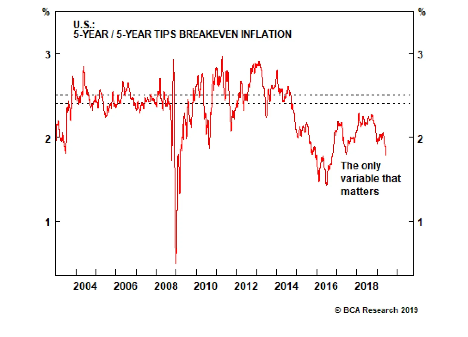
Highlights Fed: Depressed U.S. Treasury yields now discount more rate cuts than the FOMC is likely to deliver, even for “insurance” purposes to offset the negative growth impacts from trade policy uncertainty. Maintain a below-benchmark strategic U.S. duration stance, and stay underweight the U.S. in global hedged government bond portfolios. JGBs: The low yield beta of Japanese government bonds can be a useful diversifier of duration risk in global government bond portfolios. We recommend taking advantage of this by increasing allocations to Japan, out of U.S. Treasuries, on a currency-hedged basis (in USD). Feature June FOMC Preview: Hawks & Doves, Living Together, Mass Hysteria! The next two days will be critical for global bond markets, with the U.S. Federal Reserve set to update its outlook for U.S. monetary policy. The only logical interpretation of current market pricing is that bond investors now expect a major hit to U.S. (and global) business confidence and economic growth from a U.S.-China trade war - without any lasting pickup in U.S. inflation from the tariffs. The Fed is stuck in a difficult position at the moment. Looking purely at the state of the economy, there is no immediate need for rate cuts. The unemployment rate is still low at 3.6%; real GDP growth was a solid 3.1% in Q1 and the Atlanta Fed’s GDPNow model estimates Q2 growth will be a trend-like 2.1%; and consumer confidence remains healthy. Our Global Duration Indicator has hooked up, driven by an improving global leading economic indicator and stabilizing economic sentiment surveys. Yet despite this, U.S. Treasury yields have melted down to levels consistent with much weaker economic growth and inflation, with -83bps of Fed rate cuts now discounted over the next twelve months (Chart of the Week). Chart of the WeekToo Much Economic Pessimism Now Discounted In U.S. Treasury Yields
Too Much Economic Pessimism Now Discounted In U.S. Treasury Yields
Too Much Economic Pessimism Now Discounted In U.S. Treasury Yields
Chart 2U.S. Business Confidence: Fraying On The Edges
U.S. Business Confidence: Fraying On The Edges
U.S. Business Confidence: Fraying On The Edges
The only logical interpretation of current market pricing is that bond investors now expect a major hit to U.S. (and global) business confidence and economic growth from a U.S.-China trade war - without any lasting pickup in U.S. inflation from the tariffs. Reducing interest rates now would be the appropriate pre-emptive policy response, even if the current health of the economy does not justify a need to ease. A look at various U.S. business confidence surveys confirms that interpretation. Both the NFIB Small Business Confidence index and the Duke CFO U.S. Economic Outlook index are still at fairly high levels, but have clearly softened in recent months (Chart 2, top panel). The deterioration in the Duke CFO measure has come from a sharp fall in the percentage of respondents who are more optimistic on the U.S. economic outlook – a move mirrored by the deterioration in the Conference Board’s survey of CEO Confidence (second panel). On the inflation side, the Duke CFO survey shows that companies have dramatically cut back on their planned increases for labor compensation over the next year, from 5.1% in the March survey to 3.8% in the June survey (third panel). Plans for price increases over the next year have also collapsed from 2.7% to 1.4% in the June survey (bottom panel). As the FOMC deliberates, the doves will make the following case for an insurance rate cut now (Chart 3): The U.S. manufacturing sector has caught up with the global downturn. Market-based inflation expectations remain below levels consistent with the Fed’s 2% PCE inflation target (between 2.3% and 2.4% using CPI-based TIPS breakevens). The 10-year/3-month U.S. Treasury yield curve remains inverted, typically a sign that monetary policy has become restrictive. The trade-weighted dollar remains near the post-crisis highs, even as U.S. bond yields have plunged. Global economic policy uncertainty remains elevated. Meanwhile, the hawks on the FOMC will argue that easing would be premature (Chart 4): Chart 3The Case For Fed Rate Cuts
The Case For Fed Rate Cuts
The Case For Fed Rate Cuts
Chart 4The Case Against Fed Rate Cuts
The Case Against Fed Rate Cuts
The Case Against Fed Rate Cuts
U.S. equities are only 2% below the all-time high. High-yield spreads are stable and nowhere close to the peaks seen during previous bouts of market turmoil. A similar argument applies for market volatility, with the VIX index also relatively subdued in the mid-teens. Global leading economic indicators are bottoming out. Underlying realized inflation trends – average hourly earnings growth, trimmed mean inflation measures – are sticky, at cyclical highs. Given the compelling arguments on both sides, the most likely outcome tomorrow will be the Fed holding off on cutting rates, but making a clear case for what it will take to ease at the July 30-31 FOMC meeting. We imagine that checklist to include: a) Failure of U.S.-China trade talks at the G-20 summit later this month to progress toward an agreement. b) The June U.S. Payrolls report, to be released on July 5th, confirming that the soft May reading was not a one-off. c) The June Consumer Price Index report to be released on July 11th, and the May PCE deflator reading out on July 28th, showing no acceleration of some of the “transitory” components that the Fed believes has been dampening U.S. core inflation. d) A major pullback in U.S. equities and/or a widening of U.S. corporate bond spreads, leading to tighter U.S. financial conditions. Chart 5The Market & FOMC Disagree On The Terminal Rate
The Market & FOMC Disagree On The Terminal Rate
The Market & FOMC Disagree On The Terminal Rate
A new set of FOMC economic projections will be unveiled at this meeting, providing the intellectual cover for the Fed to signal that a rate cut is imminent. A new set of interest rate projections will also be provided. While this current edition of the FOMC has been downplaying the importance of the message implied by those interest rate projections, any movement in the “dots” will be noticed by the markets. The dot plot has only existed in a phase of expected Fed tightening. A shift to a projected ease would be momentous. In particular, any shift in the longer run “terminal rate” dot would be critical to ascertaining the Fed’s reaction function (Chart 5). This is especially true given the wide gap between our estimate of the market expectation of the terminal funds rate for this cycle (the 5-year U.S. Overnight Index Swap rate, 5-years forward, which is currently at 2%) and the median FOMC member estimate of the terminal rate from the last set of economic projections in March (2.8%). If the Fed were to make the case for an insurance rate cut tomorrow, while also lowering the terminal rate estimate, this would suggest that the FOMC was growing more concerned over the medium-term economic outlook as fewer future rate hikes would be needed. More dovish guidance on near-term rate moves, but without any change in the terminal rate projection, would imply that the Fed would view any insurance rate cut as a temporary measure that would need to be reversed at a later date if global uncertainty abates, U.S. growth recovers and U.S. inflation rebounds. Whatever the outcome of this week’s FOMC meeting, U.S. Treasury yields now discount a lot of bad news on both growth and inflation. Both the real and inflation expectations component of the benchmark 10-year Treasury yield are at critical support levels (Chart 6), suggesting that yields can only decline further in the face of incrementally more bearish economic data. Given the risk/reward tradeoff of yields at current levels, we do not recommend chasing this Treasury market rally, and prefer to position for an eventual rebound in yields. Chart 6Not Much Downside Left For Treasury Yields
Not Much Downside Left For Treasury Yields
Not Much Downside Left For Treasury Yields
It is possible that the Fed gives a message this week that is more hawkish than the market expects, similar to last December, leading to a sharp selloff in risk assets that temporarily pushes the 10-year Treasury yield to 2%. Such an outcome would eventually force the Fed’s hand to cut rates down the road to offset the tightening of financial conditions and stabilize equity and credit markets. This will eventually trigger a rebound in Treasury yields via rising inflation expectations and investors’ moving out of bonds into risky assets. Given the risk/reward tradeoff of yields at current levels, we do not recommend chasing this Treasury market rally, and prefer to position for an eventual rebound in yields. Bottom Line: Depressed U.S. Treasury yields now discount more rate cuts than the FOMC is likely to deliver, even for “insurance” purposes to offset the negative growth impacts from trade policy uncertainty. Maintain a below-benchmark strategic U.S. duration stance, and stay underweight the U.S. in global hedged government bond portfolios. JGBs As A Duration Management Tool In Global Bond Portfolios It has been quite some time since we have discussed Japanese government bonds (JGBs) in this publication. That is for a good reason – they are an incredibly boring asset. We can think of many more interesting investments than a bond market with no yield, no volatility, no inflation and a central bank with no other viable policy options. Yet low Japanese interest rates make borrowing in yen a good source of funding for carry trades. JGBs also offer the usual safe-haven appeal during periods of risk aversion and recessions. JGBs are a low-beta sovereign bond market, making them a useful way to manage duration risk in a global bond portfolio – especially in environments like today, where JGB yields are higher than U.S. Treasury yields on a currency hedged basis (in U.S. dollars). Chart 7JGBs Are Essentially A 'Global Duration' Bet
JGBs Are Essentially A 'Global Duration' Bet
JGBs Are Essentially A 'Global Duration' Bet
Most relevant for global bond investors - JGBs typically outperform their developed market peers during periods of rising global bond yields, and vice versa. That can be seen in Chart 7, where we show the total return of the Barclays Bloomberg Japan government bond index, hedged into U.S. dollars, on a duration-matched basis to the Global Treasury index. That return is plotted versus the overall Global Treasury index yield-to-maturity. The correlation is clear from the chart: JGBs outperform when the global yield rises, and underperform when the global yield is falling. In other words, JGBs are a low-beta sovereign bond market, making them a useful way to manage duration risk in a global bond portfolio – especially in environments like today, where JGB yields are higher than U.S. Treasury yields on a currency hedged basis (in U.S. dollars). For bond investors with a view that U.S. Treasury yields have fallen too far and are likely to begin rising again, JGBs are a compelling alternative. Selling Treasuries for JGBs, and hedging the currency risk back into U.S. dollars, can be a way to gain a yield pickup while reducing sensitivity to U.S. bond yield changes (i.e. duration) by owning an asset with a low, or even negative, beta to Treasuries. Chart 8BoJ Needs To Ease, But Options Are Limited
BoJ Needs To Ease, But Options Are Limited
BoJ Needs To Ease, But Options Are Limited
Japan’s export-led economy is sputtering on worries over U.S.-China trade tensions which are dampening global growth sentiment more broadly. The Bank of Japan’s (BoJ) widely-watched Tankan survey shows that business confidence has turned more pessimistic; the manufacturing PMI has fallen below 50; and the OECD leading economic indicator for Japan is falling sharply. Even with the unemployment rate at a multi-decade low of 2.4%, wage growth remains muted and consumer confidence is softening. Our own BoJ Monitor is signaling the need for easier monetary policy, and there are now -9bps of rate cuts discounted in the Japanese Overnight Index Swap curve (Chart 8). The BoJ’s policy options, however, are limited. The official policy rate (the discount rate) is already negative, and pushing that lower risks damaging Japanese bank profitability even further. More dovish forward guidance is of limited impact with markets already priced for a prolonged period of low rates. The BoJ cannot pursue more quantitative easing (QE) either, as it already owns nearly 50% of all outstanding JGBs - a massive presence that has, at times, disrupted functionality in the JGB market. There is nothing on the horizon indicating that JGB yields will move much from current levels, allowing JGBs to maintain their defensive status in global bond portfolios. The only real policy tool left is Yield Curve Control (YCC), where the BoJ has been targeting a 10-year JGB yield close to 0% and managing purchases to sustain the yield target. In our view, any upward adjustment of that yield target range (currently 0-0.2% on the 10yr JGB) would require a combination of three factors: The USD/JPY exchange rate must increase back to at least the 115-120 range, to provide a lower starting point for the likely yen appreciation that would occur if the BoJ targeted a higher bond yield. Japanese core CPI inflation and nominal wage growth must both rise and remain above 1.5%, which is close enough to the BoJ’s 2% inflation target to justify an increase in nominal bond yields. The momentum in the yield differential between 10-year Treasuries and JGBs must be overshooting to the upside; the BoJ would not want to keep JGB yields too depressed for too long if the global economy was strong enough to boost non-Japanese yields at a rapid pace. Chart 9BoJ Yield Curve Control Is Here To Stay
BoJ Yield Curve Control Is Here To Stay
BoJ Yield Curve Control Is Here To Stay
Currently, none of those criteria is in place (Chart 9). USD/JPY is down to 108; core CPI inflation is 0.6%; real wage growth is effectively zero; and the 10yr U.S.-Japan bond spread is contracting. There is nothing on the horizon indicating that JGB yields will move much from current levels, allowing JGBs to maintain their defensive status in global bond portfolios. Changes to our model bond portfolio We have been recommending an overweight stance on JGBs in our model portfolio for much of the past two years. This is in line with our long-held view that global bond yields had to rise on the back of improving global growth and the slow normalization of interest rates by the Fed and other central banks not named the Bank of Japan. Events this year have obviously challenged that view and we have reduced the size of our recommended overweight in our model bond portfolio. Given our view that U.S. Treasury yields are likely to grind higher in the next few months, we see a need to turn to Japan as a way to play defense against a rebound in global bond yields. That means increasing the Japan allocation, and decreasing the U.S. allocation, in our model bond portfolio. We can fine-tune that allocation shift based on the empirical yield betas of U.S. Treasuries to JGBs across different maturity buckets. In Chart 10, we show the rolling 52-week yield beta of JGBs to the other major developed bond markets, shown at the four critical yield curve points (2-year, 5-year, 10-year and 30-year). In all cases, the yield beta is low and fairly consistent across all maturities. When looking at those same rolling betas using yields hedged into U.S. dollars, shown in Chart 11, the story changes (note that we are using hedged yield data from Bloomberg Barclays, so the maturity buckets correspond to those used in the benchmark indices). The yield betas between JGBs and other markets are at or below zero in the 3-5 year and 7-10 year maturity buckets, with particularly large negative betas versus U.S. Treasuries. This implies that there is a gain to be made by focusing any Japan-for-U.S. switch in currency-hedged global bond portfolios on bonds with maturities between three and ten years. Chart 10JGBs Are Low-Beta To Global Yields...
JGBs Are Low-Beta To Global Yields...
JGBs Are Low-Beta To Global Yields...
Chart 11...And Even Negative-Beta After Hedging Into USD
...And Even Negative-Beta After Hedging Into USD
...And Even Negative-Beta After Hedging Into USD
Based on this analysis, and our view on U.S. Treasuries laid out earlier in this report, we are making a shift in our model bond portfolio on page 12 – cutting the weight in the maturity buckets in the middle of the Treasury curve and placing the proceeds into similar maturity buckets in Japan. Bottom Line: The low yield beta of Japanese government bonds can be a useful diversifier of duration risk in global government bond portfolios. We recommend taking advantage of this by increasing allocations to Japan, out of U.S. Treasuries, on a currency-hedged basis (into USD). Robert Robis, CFA, Chief Fixed Income Strategist rrobis@bcaresearch.com Ray Park, CFA, Research Analyst ray@bcaresearch.com Recommendations The GFIS Recommended Portfolio Vs. The Custom Benchmark Index
The Case For, And Against, Fed Rate Cuts
The Case For, And Against, Fed Rate Cuts
Duration Regional Allocation Spread Product Tactical Trades Yields & Returns Global Bond Yields Historical Returns
While 2017 was characterized by a synchronized upturn, 2018 was marked by a sharp divergence in growth momentum. The U.S., fueled by fiscal stimulus, powered ahead, but China slowed, hobbled by monetary tightening. We think it is telling that the rest of the…
Fed officials only revealed that they were seriously contemplating rate cuts recently, and it would feel rather sudden if they followed through so soon. Our base case is that changes in the post-meeting statement and the updated dots will point in the…
Right now, the Fed has the luxury of time on its side. Even though some measures of core inflation such as the trimmed mean calculation have reached the Fed’s 2% target, this follows a prolonged period of below-target inflation. A few years of above-trend…
Highlights June FOMC Meeting: To appease markets, the Fed will at least have to signal that it stands ready to cut rates in July. While this is possible, there is a significant risk that the committee fails to deliver. We continue to advocate a cautious approach to corporate credit spreads in the near-term (0-3 months). Rate Cuts: The historical track record suggests that the 10-year Treasury yield can rise or fall in the immediate aftermath of a Fed rate cut. With a U.S. recession still far off, we see a good chance that Treasury yields will rise during the next 6-12 months, even if the Fed lowers rates in June or July. Treasury Yields: Yields have fallen a lot since the beginning of November, but the move isn't terribly anomalous relative to history. We use statistics to place recent price action in its appropriate historical context. Feature The Fed This Week Chart 1Credit Spreads At Risk
Credit Spreads At Risk
Credit Spreads At Risk
Tomorrow’s FOMC meeting is the main event in financial markets this week, with investors of all stripes eager to learn whether the Fed will deliver on the rate cut expectations that have already been priced into bond yields. As we’ve written in prior reports, our immediate concern is that the Fed may not sound dovish enough to appease markets, leading to further near-term widening in corporate bond spreads.1 Corporate bond excess returns have far outpaced commodity prices of late (Chart 1), leaving the sector vulnerable to any hawkish surprise. What’s Priced In, And Can The Fed Deliver? How dovish must the Fed be to prevent a sell-off in corporate credit? A look at current fed funds futures pricing shows that the market is looking for nearly three 25 basis point rate cuts spread over the next six FOMC meetings (Table 1). Roughly, the market expects one rate cut at either the June or July meeting, a second rate cut in either September or October, and a third rate cut in either December or January. To appease markets, the Fed will at least have to revise its 2019 funds rate projections down and signal that it stands ready to cut rates in July (Chart 2). While this is possible, there is a significant risk that the committee fails to deliver. We continue to advocate a cautious approach to corporate credit markets in the near-term (0-3 months). Table 1Fed Funds Futures: What's Priced In?
Track Records
Track Records
Chart 2Watch For Dot Plot Revisions
Watch For Dot Plot Revisions
Watch For Dot Plot Revisions
Fed Rate Cuts: A Track Record While we are cautious on corporate spreads in the near-term, we are also not willing to chase Treasury yields lower from current levels. Our view is that while the Fed might deliver a rate cut at one of the next few meetings, it is unlikely to lower rates by more than the 84 bps that are priced into the yield curve for the next 12 months. Ultimately, we expect Treasury yields to be higher on a 6-12 month horizon, even if the Fed cuts rates during the next few months. In response to this outlook, a few clients have asked whether it is possible for Treasury yields to rise so soon after a Fed rate cut. While we see no theoretical reason why it shouldn't be possible, it is always a good idea to stress test a theory against the historical track record. We therefore compiled a list of every Fed rate cut since 1995, and looked at how the 10-year Treasury yield reacted to each event. The results are displayed in Tables 2A-2D.
Chart
Chart
Chart
Chart
Table 2A shows the rate cuts that the Fed delivered in the mid-1990s, in response to persistently low U.S. inflation and slowing growth in the rest of the world. At the time, overall U.S. economic growth was quite solid and the U.S. economy didn’t fall into recession until 2001. The divergence between relatively strong U.S. economic growth and slower growth in the rest of the world makes the period look very similar to today, and we have long argued that the current cycle should be viewed in the context of the mid-1990s.2 Table 2A reveals that, on average, the 10-year Treasury yield tended to rise in the months following a rate cut, often even in the first 21 days. The historical track record suggests that the 10-year Treasury yield can rise or fall in the immediate aftermath of a Fed rate cut. Table 2C shows the rate cuts that were delivered during the economic recovery of the mid-2000s, and it paints a similar picture as Table 2A. In particular, the 10-year Treasury yield rose dramatically following the 2003 rate cut, and the Fed actually started to hike interest rates almost exactly one year after the 2003 cut. Tables 2B & 2D show the rate cuts that led into the 2001 and 2008 recessions. Not surprisingly, yields were much more likely to fall after the Fed cut rates in those episodes. Bottom Line: The historical track record suggests that the 10-year Treasury yield can rise or fall in the immediate aftermath of a Fed rate cut. The yield is much more likely to fall if the cut occurs in the run-up to a recession. With a U.S. recession still far off, we see a good chance that Treasury yields will rise during the next 6-12 months, even if the Fed lowers rates at one of the next few FOMC meetings. Treasury Yield Moves: A Track Record In recent weeks a BCA client who had been shaking his head at the large drop in Treasury yields reached out to see if we could put the recent moves in historical context. Specifically, he wondered how often such large yield moves have occurred in the past, and whether there is a tendency for moves of this magnitude to mean-revert. Our U.S. Investment Strategy team took a stab at answering these questions. The below analysis first appeared in last week's U.S. Investment Strategy report, but is re-printed here for the interest of U.S. bond clients.3 The ongoing decline in bond yields has felt like a big deal in real time, but it isn’t historically. The sharp decline in the 10-year Treasury yield that began in early November can be viewed as three separate declines (Chart 3). In the first, the 10-year yield fell by 68 basis points (“bps”) over a span of 37 trading days. After retracing a third of the decline over the next 11 sessions, it slid by another 40 bps over 48 days. Following a one-half retracement over the ensuing 13 days, it shed 53 basis points in 32 days, capped off by a 36-bps decline across the final eight sessions (Table 3). Chart 3The Path To 2.07%
The Path To 2.07%
The Path To 2.07%
Table 3A Lower 10-Year Treasury Yield In Three Steps
Track Records
Track Records
Using the daily 10-year Treasury yield series beginning in 1962, we compared the individual yield declines for prior 37-, 48- and 32-day periods, as well as for the aggregate 141-day session spanning the entire stretch from the November 8th peak to the June 3rd trough. We also looked at the May 21st to June 3rd crescendo relative to past eight-day segments. The standardized moves range from three-quarters of a standard deviation below the mean for the 48-day middle leg to 1.5 and 1.8 for the 37- and 8-day moves, respectively (Table 4). All in all, the entire move grades out to 1.3 standard deviations below the mean – a somewhat unusual move, but nothing too special. Table 4Standardized Values Of Nominal 10-Year Treasury Yield Declines
Track Records
Track Records
The current decline’s relative stature is undermined by the wild volatility of the late ‘70s and early ‘80s, when bond yields and annual inflation reached double-digit levels (Chart 4). To try to place the current episode on a more equal framework, we also calculated standardized moves in real (inflation-adjusted) yields. On a real basis, however, the current moves made even less of a splash. The 8-day decline (z-score = -1.2) was the only component that was more than a standard deviation from the mean, and the overall move amounted to just 0.7 standard deviations below the mean (Chart 5). Chart 4No Historical Anomaly In The Current Market
No Historical Anomaly In The Current Market
No Historical Anomaly In The Current Market
Chart 5Little Impact In Terms Of Real Yields
Little Impact In Terms Of Real Yields
Little Impact In Terms Of Real Yields
We are familiar with the electronic financial media’s increasingly popular convention of stating daily yield moves in proportion to the previous day’s closing yield.4 That convention has the advantage of fitting snugly aside stock price quotes on TV and computer screens, but it is ultimately nonsensical. The proportional change in a bond’s yield relative to its starting yield doesn’t come close to approximating the change in the value of that bond. Comparing proportional changes in bond yields across timeframes would be a way of putting today’s yield moves on a more equal footing with yield moves in the high-inflation, high-coupon era of the late seventies and early eighties, but it conveys no practical information. The standardized moves in real yields and Treasury index returns haven’t been a big deal. Our next steps were instead to compare Treasury total returns and the change in the slope of the yield curve to past flattening and steepening episodes. The moves here were also unavailing over both seven- and one-month periods, as the high-coupon ‘70s and ‘80s still dominated (Chart 6). In terms of the change in the 10-year Treasury yield, both nominal and real; Treasury index total returns; and the slope of the yield curve (3-month rate to 10-year yield), both the aggregate move since last October and its three component moves have amounted to one-standard-deviation events. They would only have had about a one-in-six chance of occurring randomly in a normally distributed population, but they do not represent unsustainable moves that cry out to be reversed. Chart 6Little Impact In Terms Of Treasury Total Returns, ...
Little Impact In Terms Of Treasury Total Returns, ...
Little Impact In Terms Of Treasury Total Returns, ...
Digging a little deeper to consider total returns across different regions of the yield curve, we do find one apparent anomaly at the long end of the curve. The long Treasury index has outperformed the intermediate Treasury index by a two-standard-deviation margin over both a seven-month and a one-month timeframe (Chart 7). On a standalone basis, the long Treasury index has beaten the seven-month mean return by one-and-a-half standard deviations, and the one-month mean return by two standard deviations (Chart 8). The two-standard-deviation results would only be expected to occur one out of forty times, and thereby validate our client’s sense that something has been going on. Chart 7... But The Spread Between Long- And Intermediate-Index Returns Is Wide, ...
... But The Spread Between Long- And Intermediate-Index Returns Is Wide, ...
... But The Spread Between Long- And Intermediate-Index Returns Is Wide, ...
Chart 8... And Long-Maturity Returns Have Been Elevated
... And Long-Maturity Returns Have Been Elevated
... And Long-Maturity Returns Have Been Elevated
The margin by which long-maturity Treasuries have outperformed intermediate-maturity Treasuries is unusual, and history suggests it will be partially unwound over the next six to twelve months. Moving on to the second part of his inquiry, we reviewed the standalone performance of the long Treasury index, and the relative long-versus-intermediate performance, over subsequent six- and twelve-month periods. We focused our analysis on instances when historical z-scores were greater than or equal to their current levels to try to determine if we should expect current performance to reverse and, if so, how sharply. On a standalone basis, long Treasury index performance has gently reverted to the mean over the subsequent six and twelve months, posting returns over those periods within +/- 0.2 standard deviations of its long-run average (Table 5). Table 5Standardized Values Of Future Long-Maturity Treasury Index Returns
Track Records
Track Records
Outlying relative long-versus-intermediate performance like we’ve witnessed over the last seven months has reversed more convincingly. The long Treasury index has underperformed its intermediate-maturity counterpart over six and twelve months when its z-scores were greater than or equal to their current levels over a seven- and one-month basis, falling roughly 0.5 standard deviations below the mean (Table 6). The future does not have to resemble the past, especially over small sample sizes, but relative long-end underperformance would accord with our constructive view of the U.S. economy. Table 6Standardized Values Of Future Difference Between Long- And Intermediate-Maturity Treasury Index Returns
Track Records
Track Records
Ryan Swift, U.S. Bond Strategist rswift@bcaresearch.com Doug Peta, CFA Chief U.S. Investment Strategist dougp@bcaresearch.com Footnotes 1 Please see U.S. Bond Strategy Weekly Report, “Hedge Near-Term Credit Exposure”, dated May 28, 2019, available at usbs.bcaresearch.com 2 Please see U.S. Bond Strategy Weekly Report, “Tracking The Mid-1990s”, dated June 11, 2019, available at usbs.bcaresearch.com 3 Please see U.S. Investment Strategy Weekly Report, “Context”, dated June 10, 2019, available at usis.bcaresearch.com 4 If a bond yielding 3% at Friday’s close ends Monday’s session with a yield of 2.94%, 6 bps lower, its yield is shown as having declined 2% on the day (-.0006/.03 = -2%). Fixed Income Sector Performance Recommended Portfolio Specification
Highlights We spent nearly all of last week engaged in dialogue with clients: Over the course of a dozen face-to-face meetings, and multiple follow-up questions, we learned that crowding out is a real phenomenon. The Fed and trade tensions were essentially all that people wanted to discuss. We’re expecting a 25-basis-point rate cut in July, but our investment recommendations have not changed: We remain bullish on risk assets and bearish on Treasuries, and we continue to recommend that investors maintain below-benchmark duration positioning. Feature It turns out that you really can’t fight the Fed. Not when meeting with investors right now, anyway, as its impending moves dominated our discussions with several U.S.-based clients last week. We expect monetary policy will be Topic A on our meetings schedule this week and next, especially if the plot thickens after the FOMC releases its updated Summary of Economic Projections (“the dots”) and markets mull over Wednesday’s post-meeting statement and press conference. This report covers our recent exchanges with investors on the points that came up most often. Chart 1Healing, If Not Yet Fully Healed
Healing, If Not Yet Fully Healed
Healing, If Not Yet Fully Healed
Q: How likely is it that the Fed will cut rates? We think a rate cut at the FOMC meeting beginning tomorrow is unlikely. Fed officials only revealed that they were seriously contemplating the idea recently, and it would feel rather sudden if they followed through so soon, especially when the Mexican tariff cloud has lifted, economic data have been reasonably firm and financial conditions are still easing (Chart 1). We pay particularly close attention when Fed speakers all start singing from the same sheet, though, and the prepared-to-adjust-the-target-range-as-necessary refrain is signaling a rate cut. Our base case is that changes in the post-meeting statement and the updated dots will point in the direction of a cut at the next FOMC conclave at the end of July. Q: Why has the Fed changed its tune so much since mid-December? We view the Fed’s evolution from a tightening bias to an easing bias as having unfolded in three distinct stages. The first stage occurred in early January, following the sharp fourth-quarter selloff in equities and corporate bonds. The decline in stock prices amounted to a meaningful decline in household wealth, the sudden widening in bond spreads heralded higher debt-service costs for corporations and consumers, and the surge in mortgage rates caused several would-be homebuyers to lose their nerve (Chart 2). With the accumulated tightening in financial conditions equating to at least one, if not two, 25-basis-point hikes in the fed funds rate, additional hikes would have amounted to piling on, and the Fed opted to move to the sidelines for perhaps a six-month stay. Financial conditions are still tighter than they were before the fourth-quarter selloff, but they’ve eased quite a bit. Chart 2The Rate Backup Spooked Homebuyers, But They'll Be Back
The Rate Backup Spooked Homebuyers, But They'll Be Back
The Rate Backup Spooked Homebuyers, But They'll Be Back
The Fed signaled an even lengthier pause in March, bemoaning the risk of too-low inflation expectations, at a time when global growth was already slumping (Chart 3). It seemed to us that it began to worry about the prospect of entering the next recession with inflation expectations below 2%, from which it would not be able to lower the real fed funds rate below -2%. Inflation expectations of 2.5%, on the other hand, would support a real fed funds rate of -2.5%, providing the Fed with additional firepower to restart the economy. The post-meeting dots removed two full rate hikes from the median voter’s terminal-rate projection, and appeared to stretch the Fed’s pause from six months to twelve. Chart 3As Global Trade Goes, So Goes Global Growth
As Global Trade Goes, So Goes Global Growth
As Global Trade Goes, So Goes Global Growth
Global trade facilitates global growth. Impediments to trade can cast a long shadow over the global economy, and the escalation of trade tensions provided the catalyst for the Fed’s latest dovish turn. Against a backdrop of uninspiring global growth, taking out some monetary policy insurance to protect against increasing trade frictions may well be a prudent course of action, especially in a low-inflation environment. At the moment, we assign slightly better than a 50% probability that the FOMC will cut the target rate at its July 30-31 meeting, but much could change between now and then. Q: What will happen if the Fed cuts rates? If the Fed cuts the fed funds rate in response to a rapidly weakening economy, risk assets will fare poorly. If the economy’s doing fine, and the rate cut is simply an insurance policy, the additional accommodation would give the economy an incremental boost, extending the longevity of the expansion. A longer runway for the business cycle, in turn, would mean longer (and bigger) bull markets in equities and spread product. In our base-case scenario in which the economy’s doing fine, a rate cut (or cuts) would be tantamount to spiking the punchbowl, and would therefore extend the sell-by date on our overweight equities and spread product recommendations. We don’t think the U.S. economy needs easier monetary policy, but there’s nothing in the current low-inflation environment that would prevent the Fed from cutting the fed funds rate as insurance against a downturn. Q: But what will happen if the Fed falls short of the rate-cut expectations that are already being discounted by the markets? As implied by the overnight index swap (OIS) curves, the money markets are pricing in 75 basis points (“bps”) of rate cuts in 2019, and another 25 in 2020 (Chart 4). Those expectations are awfully aggressive, and they are flatly incompatible with our constructive view. If the economy proves to be more resilient than expected, spread product will outperform Treasuries, especially given how much the latter have surged on the pickup in risk aversion. In line with our U.S. Bond Strategy service’s Golden Rule of Bond Investing,1 we expect that long-maturity Treasuries will underperform the overall Treasury index if actual rate cuts fall short of expected rate cuts over the next twelve months. We expect that the yield curve will first shift higher as the market discounts a better economic future (real rates rise) and then steepen as investors begin to discount the inflation implications of unneeded incremental monetary accommodation. Chart 4The Money Market Seems To Foresee A Recession
The Money Market Seems To Foresee A Recession
The Money Market Seems To Foresee A Recession
Chart 5Stocks Do Better When Real Rates Are Rising
Stocks Do Better When Real Rates Are Rising
Stocks Do Better When Real Rates Are Rising
If the economy surprises to the upside, the resulting boost to earnings should help equity investors overcome any disappointment resulting from a rate-cut shortfall. In terms of equity analysts’ spreadsheets, we expect that the boost to the earnings numerator would be large enough to overcome the drag from a larger interest rate denominator. Empirically, U.S. equities perform better over periods when real rates are rising than they do when real rates are falling (Chart 5). Q: What do you see for the rest of the world? We see improvement for the rest of the world. After 2017’s globally synchronized upturn, the first since the crisis, 2018 was marked by a sharp divergence in momentum. The U.S., fueled by fiscal stimulus, powered ahead, while China slowed, hobbled by monetary tightening. We think it is telling that the rest of the world followed China, the world’s second largest standalone economy, rather than the U.S., the comparatively closed number one (Chart 6). Chart 6Divergent Paths
Divergent Paths
Divergent Paths
Our China Investment Strategy and Geopolitical Strategy teams have repeatedly made the case that investors have underestimated the lagged impact of tight monetary policy and slowing domestic credit growth on the Chinese economy over the past two years. While the existing tariffs on imports to the U.S. are a drag on Chinese growth, policymakers’ efforts to redirect credit creation from the shadow banking system to the regulated banking system has had a larger impact on economic activity. Now that the regulatory impediment has been removed, total social financing growth has picked up, and our China team expects it to rise meaningfully over the coming year in order to overcome the combination of still-muted economic momentum and a larger shock to the export sector (Chart 7). The key takeaway is that ongoing policy efforts will allow Chinese growth to stabilize and there is scope for policy to induce re-acceleration over the coming six to twelve months. The bullish scenario holds that Chinese growth will rebound as policymakers make use of that capacity. Chart 7Add Leverage In Case Of Tariffs
Add Leverage In Case Of Tariffs
Add Leverage In Case Of Tariffs
Chinese imports are the key channel by which China impacts growth in the rest of the world. Increased Chinese aggregate demand will feed increased demand for materials and goods imports. China’s imports are Europe’s, Japan’s, emerging Asia’s, and the resource economies’ exports. If China bottoms and turns higher, we anticipate that its trading partners will as well with a lag of a few months. We side with the bulls and expect that it will, and we expect that the China-driven revival in the global economy, ex-U.S., will help spark a modest self-reinforcing acceleration cycle. As this virtuous circle begins to turn, the growth divergence between the U.S. (where the fiscal thrust from the stimulus package is nearly spent) and the rest of the world will narrow. We expect the dollar will peak once markets catch on to the shift, and that U.S. equities will shift from leader to laggard, in common-currency terms. Narrowing equity outperformance should help push the dollar lower at the margin, which in turn should help blunt Treasuries’ appeal to foreign investors, steering investment capital away from the U.S. Dollar softness, at the margin, should help contribute to S&P 500 earnings gains, reinforcing our bullish equity take in absolute terms. An exogenous shock could trip up the U.S. economy, but it’s hard to find clear-cut signs of internal weakness. Q: What data are you watching to tell you that your view may not come to pass? Much of our sanguine take turns on the idea that monetary policy settings have not yet turned restrictive. We cannot know in real time where the line of demarcation between reflationary and restrictive monetary policy lies, however, so we are on the lookout for data that might disprove our assessment that the fed funds rate is still comfortably in reflationary territory. Housing is the segment of the economy that is most sensitive to interest rates, and we would be concerned if it took a turn for the worse. For now, though, we’re encouraged by the homebuilder sentiment survey, which has retraced nearly all of its fourth-quarter losses (Chart 8), and suggests that the modest recovery in housing starts and new home sales will continue. Chart 8Homebuilders Are Feeling Pretty Chipper
Homebuilders Are Feeling Pretty Chipper
Homebuilders Are Feeling Pretty Chipper
Chart 9What Recession?
What Recession?
What Recession?
The inverted yield curve has gotten everyone’s attention, but one month of inversion is not enough to declare that a recession is on the way. It also appears that the inversion may have been inspired by investor risk aversion more than a sense that recession is nigh. Our Global Fixed Income Strategy service looked at the average position of several key data series at the onset of the last five recessions and found that conditions look a lot better than they did when those recessions were developing (Chart 9).2 The Leading Economic Index’s (LEI) recession forecasting record matches the yield curve’s. When it contracts on a year-over-year basis, recessions have reliably followed (Chart 10). The LEI is still expanding, but it has been steadily decelerating, and we are keeping a close eye on it. If it contracted while the yield curve was inverted, we would probably have to throw in the towel on our view that policy is still easy, and a recession is therefore still a ways off. Chart 10The LEI Is Not Yet Sounding The Recession Alarm
The LEI Is Not Yet Sounding The Recession Alarm
The LEI Is Not Yet Sounding The Recession Alarm
Doug Peta, CFA Chief U.S. Investment Strategist dougp@bcaresearch.com Footnotes 1 Please see the U.S. Bond Strategy Special Report titled, “The Golden Rule Of Bond Investing,” published July 24, 2018, available at usbs.bcaresearch.com. 2 Please see the Global Fixed Income Strategy Weekly Report titled, “The Risk Aversion Curve Inversion,” published June 4, 2019, available at gfis.bcaresearch.com.
Highlights A resurfacing of trade tensions could weigh on risk sentiment in the near term. A somewhat less dovish tone from the FOMC this month could further rattle risk assets. While we would not exclude the possibility of an “insurance cut,” the Fed is probably uncomfortable with the amount of easing that markets now expect. That being said, a trade truce is still more likely than not, and while the Fed will resist cutting rates this year, it will not raise them either. The neutral rate of interest in the U.S. is higher than widely believed, which means that monetary policy will remain accommodative. That’s good news for global equities. Investors should maintain a somewhat cautious stance over the next month or so. However, they should overweight stocks, while underweighting bonds, over a 12-month horizon. The equity bull market will only end when U.S. inflation rises to a level that forces the Fed to pick up the pace of rate hikes. That is unlikely to occur until late-2020 at the earliest. Feature Stocks Bounce Back We turned positive on global equities in late December after a six-month period on the sidelines. While we have remained structurally bullish over the course of this year, we initiated a tactical hedge to short the S&P 500 on May 10th following what we regarded as an overly complacent reaction by investors to President Trump’s decision to increase tariffs on Chinese imports. Our reasoning at the time was that a period of market pressure would likely be necessary to forge an agreement between the two sides. Our thesis was looking prescient for a while. However, the rebound in stocks since last week has brought the S&P 500 close to the level where we initiated the trade. Is it time to drop the hedge? Not yet. First, market internals do not inspire much confidence. Even though the S&P 500 is just below its year-to-date (and all-time) high, the Russell 2000 is 5.1% below its May highs, and 11.8% below where it was last August (Chart 1). The S&P mid cap and small cap indexes are 6.8% and 16.2%, respectively, below their highs reached last August. Such weak breadth is disconcerting. Chart 1U.S. Stocks: Not As Strong As They Appear
U.S. Stocks: Not As Strong As They Appear
U.S. Stocks: Not As Strong As They Appear
Second, President Trump’s decision to suspend raising the tariffs on Mexican imports may have had less to do with his desire to seek a more conciliatory tone, and more to do with pressure from Congressional Republicans. Various news reports suggested that Mitch McConnell and other Republican leaders opposed the action, and threatened to revoke the President’s authority to unilaterally impose tariffs.1 In the end, the deal with Mexico contained many of the same measures that the Mexicans had already agreed to implement months earlier. Our geopolitical team remains skeptical of a grand bargain in trade talks with China.2 In the United States, protectionist sentiment is politically more popular towards China than it is towards other countries (Chart 2). A breakthrough is still probable, but again, it may take a stock market selloff to produce a trade truce.
Chart 2
Chart 2
Third, we have become increasingly concerned that the market has gotten ahead of itself in pricing in Fed easing. While we would not rule out the possibility that the Fed takes out an “insurance cut” to guard against downside risks to the economy, the 80 basis points of easing that the market has priced in over the next 12 months seems excessive to us. Chart 3Financial Conditions Have Not Tightened Much
Financial Conditions Have Not Tightened Much
Financial Conditions Have Not Tightened Much
Unlike late last year, U.S. financial conditions have tightened only modestly over the past nine weeks (Chart 3). The economy is also performing reasonably well. According to the Atlanta Fed GDPNow model, real final sales to domestic purchasers3 are set to grow by 2.5% in the second quarter, up from 1.5% in Q1 (Chart 4). Real personal consumption expenditures are on track to rise by 3.2%. Gasoline futures have tumbled, which will support discretionary spending over the next few quarters (Chart 5).
Chart 4
Chart 5Lower Gasoline Prices Should Bode Well For Discretionary Spending
Lower Gasoline Prices Should Bode Well For Discretionary Spending
Lower Gasoline Prices Should Bode Well For Discretionary Spending
Granted, the labor market has cooled down. Payrolls increased by only 75K in May. However, the Council of Economic Advisers estimated that flooding in the Midwest shaved 40K from payrolls. And even with this adverse impact, the three-month average for payroll growth still stands at 151K, well above the 90K-to-100K or so that is needed to keep up with labor force growth. Meanwhile, initial unemployment claims remain muted and the employment component of the nonmanufacturing ISM hit a seven-month high in May. Chart 6Trimmed Mean PCE Inflation Back To 2%
Trimmed Mean PCE Inflation Back To 2%
Trimmed Mean PCE Inflation Back To 2%
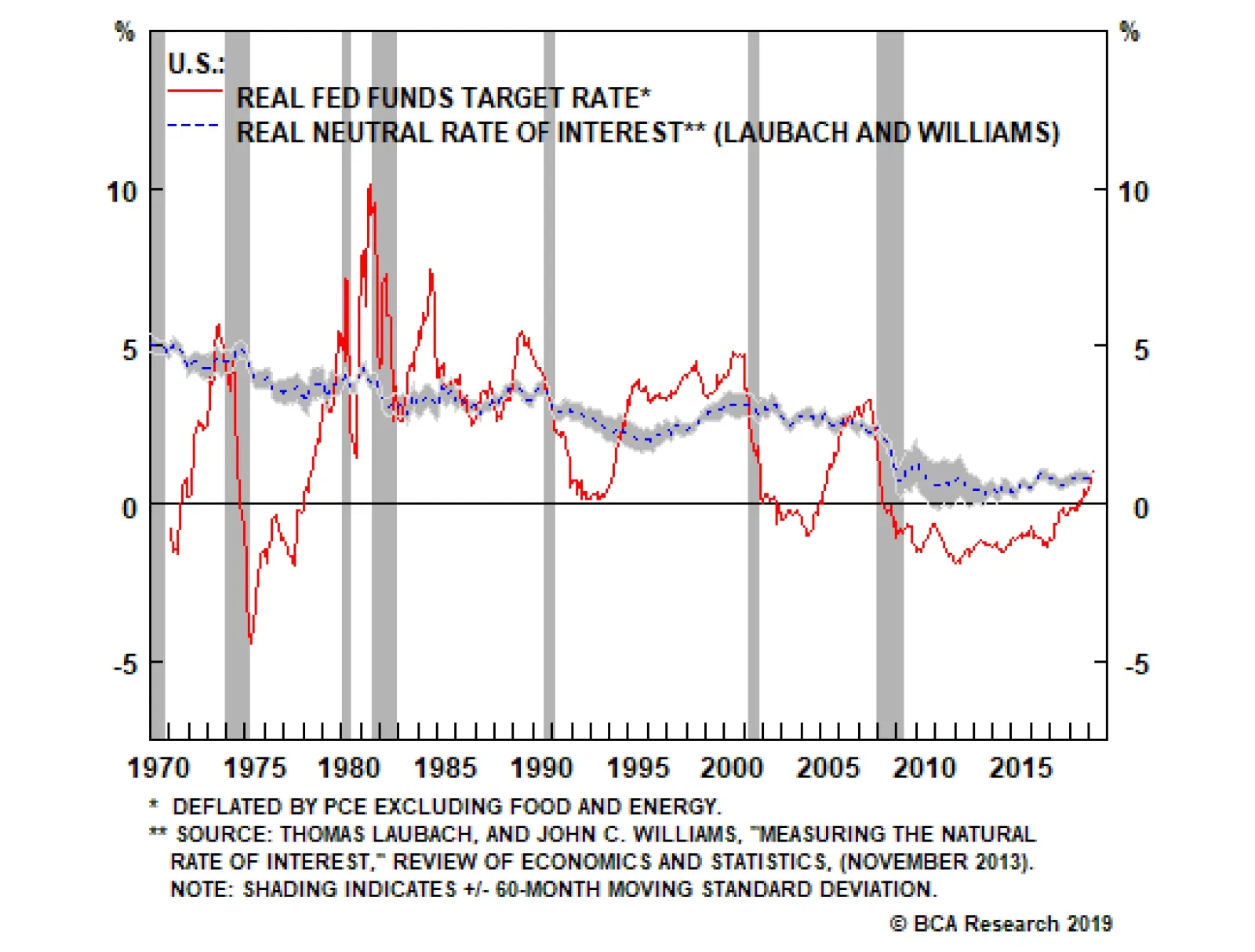
Inflation expectations are on the low side, but actual inflation is proving to be reasonably sturdy. The core PCE index rose by 0.25% month-over-month in April. Trimmed mean PCE inflation increased above 2% on a year-over-year basis for the first time in seven years (Chart 6). According to a recent Fed study, the trimmed mean calculation is superior to the core PCE index as a summary measure of underlying inflationary trends.4 Ultimately, the fact that the U.S. economy is holding up well is a positive sign for equity returns over the next 12 months. In the short term, however, it does create the risk that the Fed will sound less dovish than investors are anticipating, leading to a temporary selloff in stocks. Hence our view: near-term cautious, longer-term bullish. Who Determines Interest Rates? Central banks decide where rates will go in the short run, but it is the economy that determines where interest rates will go in the long run. The neutral rate of interest is the rate that corresponds to full employment and stable inflation. One can also think of it as the rate that aligns the level of aggregate demand with the maximum potential output the economy is capable of achieving without overheating. Both the Fed dots and the widely-used Laubach Williams model suggest that rates are close to neutral. But are they really? If a central bank keeps rates below their neutral level for too long, inflation will eventually break out, forcing the central bank to raise rates. Conversely, if a central bank raises rates above their neutral level, growth will slow, inflation will decline, and the central bank will be forced to cut rates. The problem is that changes in monetary policy typically affect the economy with a lag of 12-to-18 months. Inflation is also a highly lagging indicator. It usually peaks well after a recession has begun and troughs long after the recovery is under way (Chart 7). Thus, central banks have to make an educated guess as to where the neutral rate lies and try to steer the economy towards that rate in a way that achieves a soft landing. Needless to say, this is easier said than done.
Chart 7
Today, both the Fed dots and the widely-used Laubach Williams model suggest that rates are close to neutral (Chart 8). Chart 8The Fed Thinks Rates Are Close To Neutral
The Fed Thinks Rates Are Close To Neutral
The Fed Thinks Rates Are Close To Neutral
But are they really? That’s the million dollar question. Not only will the answer determine the medium-term path of interest rates, it will also determine how long the current U.S. economic expansion will last. Recessions rarely occur when monetary policy is accommodative, and equity bear markets almost never happen outside of recessionary periods (Chart 9). Thus, if rates are currently well below neutral, investors should maintain a bullish equity tilt. Chart 9Recessions And Bear Markets Usually Overlap
Recessions And Bear Markets Usually Overlap
Recessions And Bear Markets Usually Overlap
Chart 10U.S.: Federal Fiscal Policy Has Been Expansionary
U.S.: Federal Fiscal Policy Has Been Expansionary
U.S.: Federal Fiscal Policy Has Been Expansionary
Where Is Neutral? The neutral rate of interest is a function of many variables, most of which are not in the Laubach Williams model. Let us consider a few: Fiscal Policy A larger budget deficit boosts aggregate demand, while higher interest rates lower demand. Thus, once an economy has achieved full employment, an easing of fiscal policy must be counterbalanced by an increase in interest rates, which is another way of saying that looser fiscal policy raises the neutral rate of interest. The U.S. cyclically-adjusted budget deficit has risen by about 3% of GDP since 2015. Both tax cuts and increased federal discretionary spending have contributed to the deterioration in the fiscal balance (Chart 10). Standard “Taylor Rule” equations suggest that a 1% of GDP increase in aggregate demand will raise the appropriate level of the fed funds rate by 0.5-to-1 percentage points.5 This implies that easier fiscal policy has lifted the neutral rate of interest by 1.5-to-3 percentage points over the past five years. Labor Market Developments A tight labor market tends to increase the share of national income accruing to workers (Chart 11). Workers generally spend more of every dollar of income than businesses. Thus, a shift of income from businesses to workers raises the neutral rate of interest. The fact that a tight labor market usually generates the biggest gains for workers at the bottom of the income distribution – who have the highest marginal propensity to spend – further amplifies the positive effect on aggregate spending. Chart 11Workers Garner A Larger Piece Of The Income Pie When The Labor Market Is Tight
Workers Garner A Larger Piece Of The Income Pie When The Labor Market Is Tight
Workers Garner A Larger Piece Of The Income Pie When The Labor Market Is Tight
Chart 12
The labor share of income has rebounded since reaching a record low in 2014. The lowest-paid workers have also seen the largest wage increases during the past 12 months (Chart 12). Neither of these nascent developments have come close to unwinding the beating that labor has suffered in relation to capital over the past four decades, but if the unemployment rate keeps falling, workers are going to start gaining the upper hand. Thus, one would expect the neutral rate of interest to rise further as the labor market continues to tighten. Credit Growth The Great Recession ushered in a painful deleveraging cycle. Household debt fell from 86% of GDP in 2009 to 70% of GDP in 2012. The household debt-to-GDP ratio has edged slightly lower since then due to continued declines in mortgage debt and home equity lines of credit. A return to the rapid pace of credit growth seen before the financial crisis is unlikely. Nevertheless, a modest releveraging of household balance sheets would not be surprising. Some categories such as student and auto loans have seen fairly robust debt growth (Chart 13). Housing-related debt could also stage a modest comeback due to rising home prices and buoyant consumer confidence. Conceptually, the rate of credit growth determines the level of aggregate demand.6 Thus, if household credit growth picks up at the margin, this would push up the neutral rate of interest. Corporate debt levels also have scope to rise further. Net corporate debt is only modestly higher than it was in the late 1980s, a period when the fed funds rate averaged nearly 10% (Chart 14). Chart 13U.S. Housing Deleveraging Has Slowed
U.S. Housing Deleveraging Has Slowed
U.S. Housing Deleveraging Has Slowed
Chart 14U.S. Corporate Debt (I): No Cause For Alarm
U.S. Corporate Debt (I): No Cause For Alarm
U.S. Corporate Debt (I): No Cause For Alarm
Thanks to low interest rates and rapid asset accumulation, the economy-wide interest coverage ratio is above, while the ratio of debt-to-assets is below, their respective long-term averages (Chart 15). The corporate sector financial balance – the difference between what businesses earn and spend – is still in surplus. Almost every recession in the post-war era has begun when the corporate sector financial balance was in deficit (Chart 16). Chart 15U.S. Corporate Debt (II): No Cause For Alarm
U.S. Corporate Debt (II): No Cause For Alarm
U.S. Corporate Debt (II): No Cause For Alarm
Chart 16U.S. Corporate Debt (III): No Cause For Alarm
U.S. Corporate Debt (III): No Cause For Alarm
U.S. Corporate Debt (III): No Cause For Alarm
The Value Of The U.S. Dollar A stronger dollar reduces net exports. This drains demand from the economy, which lowers the neutral rate of interest. The real broad trade-weighted dollar index has risen 10% since 2014. According to the New York Fed’s econometric model, this would be expected to reduce the level of real GDP by 0.5% in the first year and by a further 0.2% in the second year, for a cumulative decline of 0.7%, equivalent to a decrease in the neutral rate of 0.35%-to-0.7%. The New York Fed model assumes an “all things equal” environment. All things have not been quite equal, however. The U.S. has benefited from a modest improvement in its terms of trade7 over the past five years (Chart 17). The shale boom has also significantly cut into oil imports. As a result, the trade deficit has fallen from 5.9% of GDP in 2005 to 2.9% of GDP at present. Chart 17The Dollar Has Appreciated Since 2014
The Dollar Has Appreciated Since 2014
The Dollar Has Appreciated Since 2014
Chart 18The Savings Rate Has (A Lot Of) Room To Drop, Judging From The Historical Relationship With Wealth
The Savings Rate Has (A Lot Of) Room To Drop, Judging From The Historical Relationship With Wealth
The Savings Rate Has (A Lot Of) Room To Drop, Judging From The Historical Relationship With Wealth
Asset Prices An increase in asset values – whether they be equities, bonds, or homes – makes people and businesses feel wealthier, which leads to more consumption and investment spending. As such, higher asset prices raise the neutral rate of interest. Today, U.S. household net worth stands near a record high as a percent of disposable income (Chart 18). The personal savings rate, in contrast, still stands at an elevated 6.4%. If the savings rate falls over the coming months, this would further boost aggregate demand. Demographics Slower labor force growth has led to a decline in trend GDP growth in the U.S. and most other economies. Slower economic growth tends to reduce the neutral rate of interest. The Bureau of Labor Statistics expects labor force growth to be broadly stable over the next 5-to-10 years, with immigration compensating for the withdrawal of baby boomers from employment (Chart 19).
Chart 19
Chart 20Savings Over The Life Cycle
Savings Over The Life Cycle
Savings Over The Life Cycle
In the current political climate, there is quite a bit of uncertainty over how many immigrants will settle in the United States. On the one hand, less immigration would reduce labor force growth, thus lowering the neutral rate. On the other hand, a decline in immigration would lead to an even tighter labor market, thus potentially raising the neutral rate. An additional question is how population aging, which will continue even if immigration remains elevated, will affect the neutral rate. Older people work less, but consume more than younger people, once health care spending is accounted for (Chart 20). If overall national output falls in relation to consumption, national savings will go down. This will raise the neutral rate of interest. The Shift To A Capital-Lite Economy Firms increasingly need less physical capital to carry out their activities. Larry Summers has labeled this the “demassification” of the economy. Lower investment spending would translate into a lower neutral rate. While plausible, it is not clear how important this phenomenon is. Companies may need less physical capital, but they need more human capital. Instead of more lending to businesses to finance purchases of machinery, we get additional lending to students. If our thesis that the neutral rate of interest is higher than widely believed turns out to be correct, this means that the Fed will eventually need to start hiking rates again. The question is when. The share of R&D and other intangibles in business investment has risen from around 14% in the 1960s to 33% today (Chart 21). Importantly, the depreciation rate for intangible investment is much higher than for other forms of capital spending. As intangible investment has increased, the overall depreciation rate for the economy has risen (Chart 22). Conceptually, an increase in the depreciation rate should lead to a higher neutral rate of interest.8 Chart 21A Larger Share Of Business Investment Is Intangible...
A Larger Share Of Business Investment Is Intangible...
A Larger Share Of Business Investment Is Intangible...
Chart 22...And That Puts Upward Pressure On The Depreciation Rate
...And That Puts Upward Pressure On The Depreciation Rate
...And That Puts Upward Pressure On The Depreciation Rate
Watch Housing And Business Capex The discussion above suggests that the neutral rate of interest is probably higher than widely believed. That said, there is significant uncertainty around any estimate of the neutral rate. As such, we recommend that investors track the more interest-rate sensitive sectors of the economy to gauge whether monetary policy is becoming restrictive. Housing, and to a lesser extent, business capital expenditures are the key indicators to watch. As a long-lived asset, housing is very sensitive to mortgage rates. Chart 23 shows that changes in mortgage rates tend to lead residential investment and home sales by about six months. Chart 23Housing Is Interest-Rate Sensitive
Housing Is Interest-Rate Sensitive
Housing Is Interest-Rate Sensitive
If the decline in mortgage rates since last fall fails to spur housing, this would support the claim that monetary policy turned restrictive last year. Fortunately, the jump in homebuilder confidence, the outperformance of homebuilder stocks, and the surge in mortgage applications for purchases all suggest that the housing sector remains on firm ground (Chart 24). Despite the broad-based weakness in the global manufacturing sector, U.S. capex intentions remain reasonably buoyant (Chart 25). This week’s release of the May NFIB small business survey, which showed that the share of firms citing “now is a good time to expand” jumped five points to a seven-month high, provides further evidence in support of this view. Chart 24Some Positives For U.S. Housing
Some Positives For U.S. Housing
Some Positives For U.S. Housing
Chart 25U.S. Capex Intentions Remain Solid
U.S. Capex Intentions Remain Solid
U.S. Capex Intentions Remain Solid
A Two-Stage Fed Cycle Chart 26Inflation Expectations Are Not Where The Fed Wants Them To Be
Inflation Expectations Are Not Where The Fed Wants Them To Be
Inflation Expectations Are Not Where The Fed Wants Them To Be
If our thesis that the neutral rate of interest is higher than widely believed turns out to be correct, this means that the Fed will eventually need to start hiking rates again. The question is when. Right now, the Fed has the luxury of time on its side. Even though some measures of core inflation such as the trimmed mean calculation discussed above have reached the Fed’s 2% target, this follows a prolonged period of below-target inflation. A few years of above-trend inflation would hardly be the worst thing in the world. The Fed’s failure to reach its inflation target has pushed long-term inflation expectations below the central bank’s comfort zone (Chart 26). Given the asymmetric risks created by the zero lower bound on interest rates - if inflation rises too fast, the Fed can always hike rates; but if inflation falls too much, it may be impossible to ease monetary policy by enough to avert a recession - the Fed can afford to remain patient. Thus, while the Fed is unlikely to cut rates as much as investors currently expect, it is also unlikely to raise them this year. Thanks to a cyclical revival in productivity growth, unit labor cost inflation has actually declined over the past 12 months (Chart 27). However, as we get into late next year and 2021, circumstances may change. If an increasingly tight jobs market continues to push up wage growth, unit labor costs will start to reaccelerate. Cost-push inflation will kick in. At that point, the Fed may have no choice but to pick up the pace of monetary tightening. All this suggests that Fed policy will evolve in two stages: an initial stage lasting for the next 12-to-18 months where the Fed is doing little-to-no tightening (and could even cut rates if the trade war heats up), followed by a second stage where the central bank is scrambling to raise rates to cool an overheated economy. U.S. Treasury yields are likely to rise modestly during the first stage in response to stronger-than-expected economic growth. We see the 10-year yield clawing its way back to the high-2% range by early next year. Yields could rise more precipitously, to around 4%, in the second stage once inflation begins to move decisively higher. The dollar is unlikely to strengthen during the first stage. Indeed, our baseline forecast calls for a period of modest dollar weakness stretching into late next year driven by a reacceleration in European and Chinese/EM growth. The sharp rebound in Chinese real estate equipment purchases from -18% on a six-month basis late last year to +30% in April suggests that the government’s stimulus efforts are working (Chart 28). Chart 27No Imminent Threat Of A Wage-Price Inflationary Spiral
No Imminent Threat Of A Wage-Price Inflationary Spiral
No Imminent Threat Of A Wage-Price Inflationary Spiral
Chart 28China: A Sign That Stimulus Is Finding Its Way Into The Economy
China: A Sign That Stimulus Is Finding Its Way Into The Economy
China: A Sign That Stimulus Is Finding Its Way Into The Economy
The greenback will likely appreciate, perhaps significantly so, once the Fed picks up the pace of rate hikes in late 2020. The accompanying tightening in global financial conditions is likely to sow the seeds for a worldwide downturn in 2021. The combination of faster global growth and a weaker dollar will support global equities over the next 12 months. European and EM bourses will benefit the most. Investors should begin derisking in the second half of next year. Peter Berezin, Chief Global Strategist Global Investment Strategy peterb@bcaresearch.com Footnotes 1 Patricia Zengerle, “U.S. Lawmakers Seek To Block Trump On Tariffs,” Reuters, June 5, 2019. 2 Please see Geopolitical Strategy Weekly Report, “Is Trump Ready For The New Long March?” dated May 24, 2019. 3 Final sales to domestic purchasers is equal to gross domestic product (GDP) excluding net exports of goods and services, less the change in private inventories. 4 Jim Dolmas and Evan F. Koenig, “Two Measures Of Core Inflation: A Comparison,” Federal Reserve Bank Of Dallas, Working Paper 1903, February 25, 2019. 5 Depending on which specification of the Taylor Rule one uses, a one percent of GDP increase in aggregate demand will increase the neutral rate of interest by half a point (John Taylor’s original specification) or by a full point (Janet Yellen’s preferred specification). John B. Taylor's 1993 specification is based on the following equation: rt = 2 + pt + 0.5(pt - 2) + 0.5yt. Janet Yellen's preferred specification is based on the following equation: rt = 2 + pt+ 0.5(pt - 2) + 1.0yt. Please note: For both specifications above, rt is the federal funds rate; pt is core PCE expressed as a year-over-year percent change; and yt is the output gap (as approximated using the unemployment gap and Okun's law). For further discussion, please see Janet L. Yellen, "The Economic Outlook And Monetary Policy," April 11, 2012. 6 Recall that GDP is a flow variable (how much production takes place every period), whereas credit is a stock variable (how much debt there is outstanding). By definition, a flow is a change in a stock. Thus, credit growth affects GDP and the change in credit growth affects GDP growth. 7 Ratio (multiplied by 100) of the price index for exports of goods and services to the price index for imports of goods and services. 8 The higher the depreciation rate, the more investment is necessary to maintain the existing capital stock. More investment demand for any given level of savings implies a higher interest rate. One can see this in the Solow growth model, which posits that the neutral rate of interest (r*) should be equal to:
Image
Where a is the output elasticity of capital, s is the savings rate, n is labor force growth, g is the growth in total factor productivity, and d is the depreciation rate. The equation implies that the neutral rate of interest will increase if capital intensity increases, the savings rate declines, the rate of labor force growth picks up, technological progress accelerates, or the depreciation rate increases. Strategy & Market Trends MacroQuant Model And Current Subjective Scores
Chart 29
Tactical Trades Strategic Recommendations Closed Trades