Policy

Highlights Bad news is still looming in the trade war. Public opinion polling in the U.S. gives President Trump more leeway to push the envelope on tariffs and sanctions against China than the consensus recognizes. Trump’s tendency to push the envelope is forcing China into a corner in which structural concessions become too risky. Unrest in Hong Kong reveals the city-state’s political woes as well as the tail-risk of a geopolitical incident in Taiwan. Tariffs on Mexico are still possible. Close long MXN/BRL. Maintain tactical safe-haven plays. Feature Judging by the S&P 500, the Federal Reserve has cut interest rates and the G20 summit between Presidents Donald Trump and Xi Jinping has been a success (Chart 1). Chart 1Trade War? Who Cares!
Trade War? Who Cares!
Trade War? Who Cares!
The problem is that there is not yet a compelling, positive, political catalyst on the trade front. And the Fed has an incentive to wait until after the June 28-29 G20 to make its decision on any cut. At least in the case of the December 1 G20 summit in Buenos Aires there was significant diplomatic preparation ahead of time. That is not yet the case for the summit in Osaka, Japan. And even Buenos Aires ended up being a flop given the subsequent tariff escalation. We are maintaining our tactical safe-haven recommendations – long gold, Swiss bonds, and Japanese yen – until we see a clearer pathway for the risk-on phase to resume amid a summer loaded with fair-probability geopolitical risks: Trump’s aggressive foreign policy, the Democratic primary, China’s domestic policy, the U.S. immigration crisis, and Brexit. Beyond this near-term caution, we agree with BCA’s House View in remaining overweight equities on a cyclical basis (12 months). China’s economic stimulus is likely to pick up further this summer and it still has the capacity to deliver positive surprises. Preparing For The G20 Over the course of this year we have argued for a 50% chance and then 40% chance that the U.S. and China would conclude a trade deal by the G20 summit. However, Commerce Secretary Wilbur Ross and other administration officials, including Chief of Staff Mick Mulvaney, have recently indicated that the best case at the G20 is for the leaders to have dinner and agree to a new timetable that aims to close the negotiations in the coming months. The Trump-Xi summit itself remains unconfirmed as we go to press. This suggests that we were too optimistic about even a barebones trade deal at the G20. We are now extending our time frame to the November 2020 election -- the only deadline that really matters. Diagram 1 presents a cogent and conservative decision tree that results in a 41% chance of a major, Cold War-style escalation in tensions; a 27% chance of a minor escalation that is contained but without a final trade agreement; and a 28% chance of a tenuous or short-term deal. It gives only a 4% chance of a “grand compromise” that initiates a new phase of re-engagement between the two economies. These outcomes clearly represent a large downside risk given where equities are positioned today. Diagram 1Trade War Decision Tree (Updated June 13, 2019)
Another Phony G20? And A Word On Hong Kong
Another Phony G20? And A Word On Hong Kong
Why such gloom when the two sides may be on the brink of a new tariff ceasefire? First, delaying the talks beyond the G20 is disadvantageous for Trump and will make him angry sooner or later. The Trump administration, unlike its predecessors, has made a point of opposing China’s traditional playbook of drawing out negotiations. China benefits in talks over the long run because it gains economic and strategic leverage. This has been the case in every major round of dialogue since the 1980s and it is specifically the case today, as China gradually stimulates its way out of the slowdown that afflicted it at the time of the last G20 (Chart 2). Chart 2China's Bargaining Leverage To Improve On Stimulus
China's Bargaining Leverage To Improve On Stimulus
China's Bargaining Leverage To Improve On Stimulus
Trump would not have called a ceasefire on Dec. 1, 2018 if the stock market had held up amid Fed rate hikes and the Sept. 24 implementation of the 10% tariff on $200 billion. This year the U.S. equity market has bounced back and the Fed has paused, but China’s economy has not yet fully recovered. This gives Trump an advantage that may not last if the talks extend through the rest of the year. And this reasoning explains why Trump raised the tariff rate and blacklisted China’s tech companies in May – to try to clinch a deal by the end of June. He is also threatening to impose tariffs on the remaining $300 billion worth of imports if Xi snubs him in Osaka. If the G20 fails to produce progress, we would bet that Trump will proceed with a sweeping tariff on the remaining $300 billion worth of Chinese imports, whether immediately after the summit or at some later point when he decides that the Chinese are indeed playing for time. How can we be confident of this? After all, Trump’s approval rating has fallen since he escalated the trade war in May and it remains well beneath the average post-World War II presidents at this stage in their first terms, including President Obama’s rating in the summer of 2011 (Chart 3). Recent opinion polls suggest that voters are getting wise to the negative impact of tariffs on their pocketbooks. The financial and political constraints on Trump are not very pressing.
Chart 3
We are confident because the financial and political constraints on Trump are not very pressing, at least not at the moment. First, the stock market has risen despite the tariff hikes, so Trump is likely emboldened. Second, Trump is less constrained in the use of tariffs than in other areas. He is bogged down with a Democratic Congress, investigations, and scandals at home. He cannot pursue policy through legislation – he shifted to the threat of tariffs on Mexico because he could not build his border wall. By turbo-charging his trade policy and foreign policy – against China, Iran, Mexico, Russia, most recently Germany … basically everyone except North Korea – he creates the option of turning 2020 into a “foreign policy election” rather than an election about the economy or social policy. A strong economy has not enabled him to break through his ceiling in public opinion thus far and he will lose a social policy election easily (see health care). The risk of his aggressive foreign policy is that it triggers an international crisis. But that would likely benefit him in the polls, given the natural inclination to defend America against foreign enemies. See George W. Bush, 2004 (Chart 4). Third, popular opposition to Trump’s trade war is not clear-cut – voters are ambivalent. In the past we have shown that President Trump’s 2020 run still depends on his ability to increase voter turnout among whites, specifically white males, low-income whites, and whites without college degrees. Recent polls suggest that voters have turned against tariffs and the trade war – namely the Quinnipiac and Monmouth University polls released in late May after the latest tariff hike. But it is essential to dig beneath the surface. These polls reveal that the key voting groups look more favorably than the rest of the country upon Trump’s policies on both trade and China (Chart 5).
Chart 4
Chart 5
These voters’ assessment of Trump’s performance overall, across a range of policies, is not disapproving, despite all of the unorthodox and disruptive decisions that Trump has made in his presidency thus far (Chart 6).
Chart 6
American voters are neither as enthusiastic about free trade nor as appalled by protectionism as the headline polling suggests. For instance, take the Monmouth University poll, which asked very specific questions about trade, tariffs, and retaliation. If we combine the group of voters who are clearly protectionist with those who are “not sure” or think the answer “depends,” the results do not suggest that Trump is heavily constrained (Table 1). Table 1Americans Are Not As Pro-Free Trade As It Seems
Another Phony G20? And A Word On Hong Kong
Another Phony G20? And A Word On Hong Kong
In swing counties 51% of voters think that free trade is either a bad idea or are undecided. And even 57% percent of voters in counties that voted for Hillary Clinton by more than a 10% margin are in favor of tariffs or unsure. And a majority of voters in the most relevant categories – independents, moderates, non-college graduates, low-income earners – believe that Trump’s tariffs will bring manufacturing back, a highly relevant point for an election that will likely swing on the Rust Belt yet again. This includes Clinton’s most secure districts (Chart 7)!
Chart 7
The point is not that Trump lacks political constraints on the trade war – after all, these voters are on the borderline in many cases and concerned about all-out trade war with China. Rather, his aggressive trade tactics enable him to reconnect with and energize his voter base at a time when his other signature policies are tied down. This is critical because his reelection prospects, which we have pegged at 55%, are in great peril, at least judging by his lag in the head-to-head polling against the top Democrats in swing states. Bottom Line: Going forward, Trump has more room to push the envelope than investors realize. A failed G20 summit poses the risk of another selloff in global equities. We are maintaining our tactical safe-haven trades. What About Xi Jinping’s Constraints? Xi is president for life and must be attentive to long-term ramifications. Chart 8Xi Jinping's Immediate Constraint
Xi Jinping's Immediate Constraint
Xi Jinping's Immediate Constraint
If Trump is tempted to continue pushing the envelope, will President Xi back down? While not constrained by the stock market or elections, he does face the prospect of instability in the manufacturing sector and large-scale unemployment (Chart 8), which Beijing has not had to deal with for 20 years. The point is not to claim that laid-off Chinese workers will turn around and protest against their own country in the face of gunboat diplomacy by capitalist imperialists – on the 70th anniversary of the regime, no less. Rather, Xi is president for life and must be attentive to the long-term ramifications of a disruptive transition in the excessively large manufacturing sector. This would cause economic and, yes, ultimately socio-political problems for him down the road. If Trump continues to move toward his 2016 campaign pledge of a 45% tariff on all Chinese imports, as the 2020 election approaches, China’s leaders have far less incentive to put their careers (and lives) on the line to produce structural concessions. A tariff covering all Chinese goods is an absolutist position that China can only address by doubling down on its demand for full tariff rollback. Yet Trump needs to retain some tariffs to enforce the implementation of any agreement. Thus slapping tariffs on all Chinese imports is almost, but not quite, an irreversible step. This is captured in Diagram 1 via the 29% chance that tensions are contained even if a deal falls through. Tensions are even less likely to be contained if the Trump administration follows through on its threats against China’s tech sector. On August 19, the Commerce Department will decide whether to renew the license for U.S. companies to sell key components to Huawei and other blacklisted companies. If the administration denies the license – and moves further ahead with export controls on emerging and foundational technologies – then Beijing faces an outright technological blockade. It will retaliate against U.S. companies – a process already beginning1 – and will likely act on other threats such as a rare earths embargo. In this case strategic tensions will escalate dramatically, including saber-rattling in the air, in cyberspace, or on the high seas. At the moment political frictions in Hong Kong are exacerbating U.S.-China distrust. Bottom Line: Since President Xi’s constraints are longer-term, he has the ability to deny structural concessions to Trump. But Trump’s ability to push the trade war further and further risks forcing China to a point of no return. There is not a clear basis for the geopolitical risk affecting the global trade and growth outlook to fall. Hong Kong: A New Front In The U.S.-China Struggle The large-scale protests that have erupted in Hong Kong – first on April 28 and most recently on June 9 –are important for several reasons: they highlight the immense geopolitical pressure in East Asia emanating from China’s “New Era” under Xi Jinping; they are rapidly becoming entangled in U.S.-China tensions, particularly over technological acquisition; and they foreshadow the political instability on the horizon in Taiwan. Tensions have been rising between Hong Kong and mainland China since the Great Recession and the shock to capitalist financial centers around the world. The tensions are symptomatic of the dramatic change in China over the past decade; the decline of the post-Cold War status quo; and the broader decline of the western world order (e.g. the British Empire). After all, the West is lacking tools to preserve the rights and privileges that Hong Kong was supposed to be guaranteed when the transfer of sovereignty occurred in 1997. More immediately, the current protests are part of a process going back to 2012 in which the disaffected and marginalized parts of Hong Kong society began speaking up against the political establishment. This emerged because of high income inequality (Chart 9), shortcomings in quality of life, excessive property prices (Chart 10), and the mainland’s reassertion of Communist Party rule and encroachments on Hong Kong’s autonomy.
Chart 9
Chart 10Another Source Of Hong Kong's Unrest
Another Source Of Hong Kong's Unrest
Another Source Of Hong Kong's Unrest
A simple comparison with Singapore, the other major East Asian city-state, shows that Hong Kong has trailed in GDP per capita and wage gains, while property price inflation has soared ahead (Chart 11). These structural economic factors contributed to the emergence of the “Occupy Central” protests in 2014, which were smaller than today’s protests but signaled the abrupt shift in the political sphere toward disenchantment and activism. Chart 11Why Hong Kong Is Not As Quiet As Singapore
Why Hong Kong Is Not As Quiet As Singapore
Why Hong Kong Is Not As Quiet As Singapore
The 2016 elections for the Legislative Council (LegCo) resulted in a fiasco by which a number of pro-democracy activists, known as “localists,” were squeezed out of the legislature through a combination of juvenile mistakes and heavy-handed intervention by Beijing and the pro-mainland Hong Kong authorities (Chart 12 A&B). Beijing exploited the occasion to extend its legal writ over Hong Kong society and curb some of the city’s freedoms.2 The democratic opposition and dissidents have been sidelined or repressed — and now they face the prospect of being extradited, given that the LegCo is highly likely to pass the “Fugitive Offenders and Mutual Legal Assistance in Criminal Matters” bill that sparked the protests this year.
Chart 12
Chart 12
The exclusion of the localists from power runs the risk of radicalizing them and increasing disaffection, making mass protests likely to recur both in the near term and in future. Hong Kongers are losing confidence in the “One Country, Two Systems” arrangement (Chart 13). They are similarly becoming more disillusioned with mainland China, adding fuel to the fire over time (Chart 14). However, in the specific case of the city-state, there is no alternative to Beijing’s ultimate say – and the older generations will continue to support the political establishment.
Chart 13
Chart 14
Nevertheless Hong Kong’s discontents will become entangled in the broader Cold War emerging between the U.S. and China. Beijing is accusing the protesters of being lackeys of foreign powers. The U.S. Congress, on both sides of the aisle, is threatening to declare that Hong Kong is no longer sufficiently autonomous from Beijing and therefore no longer eligible for special privileges. Hong Kong faces rising political dependency on China and the potential for special relations with the United States to decline.
Chart 15
Part of Washington’s concern lies with Beijing’s aggressive technological acquisition program. Hong Kong has been able to import advanced dual-use technology products from the United States without Beijing’s restrictions. This is not apparent from the proportion of exports but it is important on the technological level (Chart 15). It introduces a backdoor for China to acquire these goods and has prompted a rethink in Washington. Hong Kong is also accused of facilitating the circumventing of sanctions on U.S. enemies. It thus faces rising political dependency on China and the potential for special relations with the United States to decline. These pressures also highlight why we view Taiwan as a potential “Black Swan.” Similar political fissures are emerging as Beijing expands its economic and military dominance over Taiwan. Of course, the political backlash against Beijing has recently been receding in Taiwanese opinion, due to the fact that the nominally pro-independence Democratic Progressive Party has lost most of the momentum it gained after the large-scale “Sunflower” student protests of 2014 (Chart 16). But there are still several reasons that the January 2020 election could become a geopolitical flashpoint: namely the developments in Hong Kong, China’s handling of them, Beijing’s tensions with Washington, and the Trump administration’s temptation to achieve some key goals with the Tsai Ing-wen administration before it leaves office (including arms sales). Even if the Taiwanese political winds shift to become less confrontational toward Beijing after January, the time between now and then is ripe for an “incident” of some kind. Beyond that, the pro-independence opposition will begin activating and marching against the next government if it proves obsequious to the mainland. Chart 16Taiwan: Pro-Mainland Forces Revive
Taiwan: Pro-Mainland Forces Revive
Taiwan: Pro-Mainland Forces Revive
Chart 17
Over the long run, Taiwan is far more autonomous than Hong Kong, harder for Beijing to control, and much more attractive for Beijing’s enemies to defend – namely the U.S. and Japan. Moreover, as the tech conflict with Washington heats up, Taiwan becomes vital for China’s technological self-sufficiency, putting it at higher risk (Chart 17). Beijing will also frown upon the role of Taiwanese companies like FoxConn for taking early steps to diversify the supply chain away from China. This regional strategic reality is not conducive to U.S.-China trade negotiations. And even aside from the U.S., Beijing’s growing power generates resistance from its periphery. This is true of Chinese ally North Korea, which is trying to broaden its options, as well as a historic enemy like Vietnam. Other countries at a bit more of a distance are trying to accommodate both Beijing and Washington, but are increasingly seeing their regimes vacillate based on their orientation toward China – this is true of Thailand in 2014, the Philippines in 2015, South Korea in 2017, and Malaysia in 2018. These changes inject economic policy uncertainty on the country level. Over the long run we see Southeast Asia as a beneficiary of the relocation of supply chains out of China. But at the moment, with the trade war escalating and unresolved and with China taking a heavier hand, we are only recommending holding relatively insulated countries like Thailand. Bottom Line: Our theme of U.S.-China conflict is intertwined with our theme of geopolitical risk rotation to East Asia. States that have domestic-oriented economies, limited exposure to China, or greater U.S. support – including Japan, Thailand, South Korea, Indonesia, and Malaysia – face less geopolitical risk than those heavily exposed to China (Taiwan) or that lack U.S. security guarantees (Hong Kong, Vietnam). Investment Recommendations In addition to our safe-haven tactical trades – long spot gold, long Swiss bonds, and long JPY-USD – we are maintaining our long recommendation for a basket of companies in the MVIS global rare earth and strategic metals index. The basket includes companies not based in mainland China that have seen their stock prices appreciate this year yet have a P/E ratio under 35 (Chart 18). Chart 18Go Long Rare Earth Firms Ex-China
Go Long Rare Earth Firms Ex-China
Go Long Rare Earth Firms Ex-China
We remain short the CNY-USD on the expectation that trade tensions will encourage Beijing to use depreciation as a countervailing tool, despite our expectation of increasing fiscal-and-credit stimulus. Over the long run, we would observe that trade escalation between the U.S. and China bodes poorly for China’s long-term productivity and efficiency. The basis for a reduction in trade tensions is a recommitment to the liberal structural reform agenda that Chinese state economists outlined at the beginning of Xi Jinping’s term in 2012-13. The current trajectory of “the New Long March,” in which Beijing pursues personalized power and uses stimulus to improve self-sufficiency and import-substitution, goes the opposite direction. It is not a pathway for innovation, openness, and technological progress. A simple comparison of China’s long-term equity total return highlights the market’s lack of enthusiasm about the current administration’s approach (Chart 19). The contexts were different, but the earlier outperformance grew from painful structural reforms and a grand compromise with the United States in the late 1990s and early 2000s. Chart 19The Market Wants Reforms And Trade Deal
The Market Wants Reforms And Trade Deal
The Market Wants Reforms And Trade Deal
We are closing our long MXN / short BRL trade for a gain of 4.6%. This trade has bounced back from the U.S.-Mexico deal to avert tariffs. The agreement was not entirely hollow compared to earlier agreements: it calls for Mexico to accelerate the deployment of the National Guard to stem the flow of refugees from Guatemala and central America and expand the Migrant Protection Protocols across the southern border. Trump’s reversal – under Senate pressure, entirely unlike the China dynamic – gave the peso a boost, benefiting our trade. However, one of the fundamental reasons for this trade – the improvement in Mexico’s relative current account balance – has now rolled over (Chart 20) and the tariff threat will reemerge if Mexico proves unable or unwilling to stem the inflow of asylum seekers into the United States (Chart 21). Chart 20Peso Has Outperformed The Real
Peso Has Outperformed The Real
Peso Has Outperformed The Real
Chart 21
As we go to press, the attacks on tankers in Oman highlight our view that oil prices will witness policy-induced volatility and a rising geopolitical risk premium as “fire and fury” shifts to the U.S. and Iran in the near-term. Our expectation of increasing Chinese stimulus helps underpin the constructive view on oil and energy-producing emerging markets. Matt Gertken, Vice President Geopolitical Strategist mattg@bcaresearch.com Footnotes 1 The American Chamber of Commerce in China and Shanghai released a survey on May 22, 2019 revealing that while 53% of companies have not yet experienced “non-tariff” retaliation by Chinese authorities, 47% had experienced it: 20.1% through increased inspections; 19.7% through slower customs clearance; 14.2% through slow license approvals; another 14.2% through bureaucratic and regulatory complications; and smaller numbers dealing with problems associated with American employees’ visas, increased difficulty closing investment deals, products rejected by customs, and rejections of licenses and applications. 2 We noted at the time, “Mainland forces will bring down the hammer on the pro-independence movement. The election of a new chief executive will appear to reinforce the status quo but in reality Beijing will tighten its legal, political, and security grip. Large protests are likely; political uncertainty will remain high.” See BCA Geopolitical Strategy, “Strategic Outlook 2017: We Are All Geopolitical Strategists Now,” December 14, 2016, available at www.bcaresearch.com.
Highlights 10-year real Spanish and Portuguese bond yields have already fallen below the neutral rate of interest for the entire euro zone. This suggests monetary conditions could now be favorable for all euro zone countries. Should external demand pick up, this will also help lift the equilibrium rate for the monetary union, which will be a tailwind for the EUR/USD. Falling U.S. rate expectations relative to policy action have historically been bearish for the dollar, with a lag of about six to 12 months. A risk to this view is further deterioration in the U.S.-China trade war, or a rollover in Chinese stimulus. Remain long EUR/CHF, with a tight stop at 1.11. Our bias is that the Swiss National Bank will continue to use the currency as a weapon to defend the economy. Feature The standard dilemma for the euro zone is that interest rates have always been too low for the most productive nation, Germany, but too expensive for others such as Spain and Italy. As such, the euro has typically been caught in a tug-of-war between a rising equilibrium rate of interest for Germany, but a very low neutral rate for the peripheral countries. Over the years, the impasse has been resolved from time to time through a combination of internal devaluation, currency depreciation and a successively accommodative European Central Bank. This has helped prevent a collapse of the monetary union, but in the process generated tremendous volatility in the currency. Since the onset of the Great Recession, the EUR/USD has seen five boom/bust cycles of about 20% to 25%. For both domestic policymakers and global investors alike, this has been an untenable headache. The silver lining is that the ECB may now have finally lowered domestic interest rates and eased policy to the point where they are accommodative for almost all euro zone countries: 10-year government bond yields in France, Spain and even Portugal now sit at 11bps, 54bps and 65bps respectively, much below the neutral rate. This is severely easing financial conditions in the entire euro zone, with huge implications for European assets in general and the euro in particular. In short, the EUR/USD may be very close to a floor (Chart I-1). Chart I-1How Much Lower For Relative R-Star*?
How Much Lower For Relative R-Star*?
How Much Lower For Relative R-Star*?
Structural Reforms Have Progressed The neutral rate of interest is simply the market price at which both the supply of savings and the demand for them clear. In academic parlance, this means the interest rate at which the economy is at full employment, but inflationary pressures are relatively contained. At this critical interest rate level, the economy tends to be in balance. The difficulty arises because most indicators of either full employment or inflation tend to be lagging. As such, steering interest rates toward the neutral level becomes a very difficult task for any one country and/or central bank to achieve in real time. For the euro zone as a whole, where member countries can have vastly diverging economic outcomes at any point in time, the task becomes even more arduous. This is why since the introduction of the euro, most of the economic imbalances from the region have stemmed from the standard contradiction of a common currency regime. For most of the early 2000s, Spanish and Irish long-term rates were too low relative to the potential of their respective economies, and the reverse was true for Germany. As a result, Spanish real estate took off in what culminated to be one of the biggest booms in recent history, while it stagnated in Germany. And after the Great Recession, the reverse was true: rates became too low for the most productive nation, Germany, and too high for Ireland and Spain (Chart I-2). In a normal adjustment process, the exchange rate always tends to play a key role. In a common-currency regime, there is not such a possibility. In a normal adjustment process, the exchange rate always tends to play a key role, since countries with lower productivity growth require a lower neutral rate, and as such see currency depreciation. This tends to ease financial conditions, alleviating the need for an internal adjustment process. However, in a common-currency regime, there is not such a possibility. The result is a painful process of internal devaluation, as was very vivid in the European peripheral countries from 2009-2012 (Chart I-3). Chart I-2The Common-Currency Dilemma
The Common-Currency Dilemma
The Common-Currency Dilemma
Chart I-3Internal Devaluation In The South...
Internal Devaluation In The South...
Internal Devaluation In The South...
The good news is that for the euro zone, it forced businesses to restructure and jumpstarted the process of structural reform. In the early 2000s, the German economy had to restructure in order to improve its competitiveness. As a result, unit labor costs began to lag in 2001. Over the same period, the German government began to reform the labor market. The Hartz IV labor market reforms implemented minimized safety nets for the unemployed, encouraging them to accept market-determined wages. This dramatically increased the flexibility of the labor market. The same script has been replayed over the last decade with the European periphery. Labor market reforms in Mediterranean Europe have seen unit labor costs in Greece, Ireland, Portugal and Spain collectively contract by almost 10%. This has effectively eliminated the competitiveness gap that had accumulated over the past two decades (Chart I-4). Italy remains saddled with a rigid and less productive workforce, but overall adjustments have still come a long way to closing a key fissure plaguing the common currency area. At the same time, other factors also suggest the neutral rate for individual countries should also have converged higher to that of Germany. Peripheral sovereign borrowing costs have plummeted from their prohibitive 2012 levels. As a result, interest payments as a share of GDP have become more manageable. Most southern European countries now run primary surpluses, reducing the need for external funding. Fortunately, the improvement in structural budget balances has diminished the need for any additional austerity measures, meaning government spending should no longer be a net drag on GDP growth. Increased integration continues to sustain a steady stream of cheap migrant workers to Germany. On the labor market front, the unemployment rate in Germany remains well below that in other regions, but increased integration continues to sustain a steady stream of cheap migrant workers to Germany. Over the last decade, there has been a surge of migrant workers into Germany from countries such as Portugal or Spain (Chart I-5). This will help redistribute aggregate demand within the system. Chart I-4...Has Realigned Competitiveness
...Has Realigned Competitiveness
...Has Realigned Competitiveness
Chart I-5The Unemployment Gap Is Closing
The Unemployment Gap Is Closing
The Unemployment Gap Is Closing
The bottom line is that the various forces that may have been keeping the neutral rate of interest artificially low in the euro area are ebbing. The proverbial saying is that a chain is only as strong as its weakest link. This means that if these forces pressuring equilibrium rates in the periphery are slowly dissipating, that should lift the neutral rate of interest in the entire euro zone. Over a cyclical horizon, this should be bullish for the euro (previously referenced Chart I-1). Manufacturing Recession May Soon End With the rising specter of a full-blown trade war and a global manufacturing recession, it is possible that euro zone policy settings have become even more appropriate for Germany than the rest of Europe. For example, the latest PMI releases suggest that Germany is the weakest link in the euro zone on the manufacturing front (Chart I-6). The implication is that if the ECB’s monetary settings are now being calibrated for Germany, they may also now be appropriate for all euro zone countries. For example, since 2015, peripheral country exports have increased to 28% of GDP, from a low of 16%, despite strength in the trade-weighted euro. This contrasts favorably with Germany, where the export share of German GDP has essentially been flat over this period (Chart I-7). In fact, it is entirely possible that the German economy may have already 'maxed out' its export market share gains, given its externally driven growth model over the last decade. If so, further currency weakness can only lead to inflation and wage pressures in Germany, redistributing demand from exports to the domestic sector, while benefitting the periphery. Chart I-6Germany Is Once Again The Sickman
Germany Is Once Again The Sickman
Germany Is Once Again The Sickman
Chart I-7GIPS Are Gaining Export Share
GIPS Are Gaining Export Share
GIPS Are Gaining Export Share
Over the past few years, corporate profits as a share of GDP in both Portugal and Spain have overtaken German levels. And with the output gap is still open in these countries, it will take a while before the unemployment rate moves below NAIRU and begins to generate wage pressures. This will allow companies to continue reaping a labor dividend while gaining export market share. It is not easy to tell if and when the trade war will end sans escalation, but there remain a number of green shoots in the European economy: While the German PMI is currently one of the weakest in the euro zone, forward-looking indicators suggest we are on the cusp of a V-shaped bottom over the next few months or so (Chart I-8). A rising Chinese credit impulse is usually bullish for European exports, and this time should be no different (Chart I-9). This also follows improvement in the European credit impulse. Most European growth indicators relative to the U.S. hit a nadir at the beginning of this year, and have been steadily improving since.1 Chart I-8German Manufacturing Could Soon Bottom
German Manufacturing Could Soon Bottom
German Manufacturing Could Soon Bottom
Chart I-9A Pick Up In Global Demand Will Help
A Pick Up In Global Demand Will Help
A Pick Up In Global Demand Will Help
The bottom line is that investors are currently too pessimistic on Europe’s growth prospects at a time when policy settings have become appropriate for the weakest link. If, in fact, European growth and inflation improve relative to the U.S., this will give investors an opportunity to reassess interest rate expectations for the euro area versus the U.S. Implications For The Euro The euro tends to be largely driven by pro-cyclical flows. Fortunately for investors, European equities, especially those in the periphery, remain unloved, given they are trading at some of the cheapest cyclically adjusted price-to-earnings multiples in the developed world. Analysts began aggressively revising up their earnings estimates for euro zone equities verus the U.S. earlier this year. If they are right, this tends to firmly lead the euro by about nine to 12 months, suggesting we are due for a pop in the coming quarters (Chart I-10). Chart I-10Rising Earnings Revisions Are Bullish For The Euro
Rising Earnings Revisions Are Bullish For The Euro
Rising Earnings Revisions Are Bullish For The Euro
The euro’s bounce after the ECB’s latest meeting suggests its dovish shift is paradoxically bullish for the common currency. If a central bank eases financing conditions at a time when growth is hitting a nadir, it is tough to argue that it is bearish for the currency. This in combination with easier fiscal policy should boost aggregate demand and lift the neutral rate of interest in the euro zone. Dollar weakness could be the catalyst that triggers a EUR/USD rally. Markets are usually wrong about Federal Reserve interest rate expectations, and this time is likely to be no different. However, the current divergence between market expectations and policy action is the widest since the Great Recession. Falling rate expectations relative to policy action have historically been bearish for the dollar with a lag of about nine to 12 months (Chart I-11). The basic balance in the euro area is on the verge of hitting fresh highs. Finally, positioning, valuation and balance-of-payments dynamics remain favorable for the euro (Chart I-12). The basic balance in the euro area is on the verge of hitting fresh highs on the back of improvement in FDI flows. With a large number of short positions on the euro, this could trigger a significant short-covering rally. Chart I-11The Dollar Might ##br##Soon Peak
The Dollar Might Soon Peak
The Dollar Might Soon Peak
Chart I-12A Favorable Balance Of Payments ##br##Backdrop For The Euro
A Favorable Balance Of Payments Backdrop For The Euro
A Favorable Balance Of Payments Backdrop For The Euro
Chester Ntonifor, Foreign Exchange Strategist chestern@bcaresearch.com Footnotes 1 Please see Foreign Exchange Strategy Special Report, titled “A Contrarian Bet On The Euro,” dated March 1, 2019, available at fes.bcaresearch.com. Currencies U.S. Dollar Chart II-1USD Technicals 1
USD Technicals 1
USD Technicals 1
Chart II-2USD Technicals 2
USD Technicals 2
USD Technicals 2
Recent data in the U.S. have been mostly negative, but a few one-time factors were at play: On the labor market front, nonfarm payrolls fell to 75 thousand in May, but this was dragged down by flooding in the Midwest. Average hourly earnings grew by 3.1% year-on-year and the unemployment rate was stable at 3.6%. Headline and core consumer price inflation came in slightly lower at 1.8% and 2% year-on-year, but remain on target. Export prices fell by 0.7% year-on-year in May, and import prices contracted by 1.5% year-on-year, giving the greenback a terms-of-trade boost. On a positive note, the NFIB Small Business Optimism survey rose to a 5-month high of 105 in May. On another positive note, mortgage applications jumped by 26.8% this week. DXY index rose by 0.3% this week. Our bias is that the dollar is in the final innings of its rally, amid narrowing interest rate differentials, portfolio outflows, and easing liquidity strains. Should global growth benefit from the dovish pivot by central banks, this could be the catalyst for dollar downside. Report Links: Where To Next For The U.S. Dollar? - June 7, 2019 President Trump And The Dollar - May 9, 2019 Take Out Some Insurance - May 3, 2019 The Euro Chart II-3EUR Technicals 1
EUR Technicals 1
EUR Technicals 1
Chart II-4EUR Technicals 2
EUR Technicals 2
EUR Technicals 2
There has been tepid data out of the euro zone this week: Sentix investor confidence fell to -3.3 in June. Industrial production contracted by 0.4% year-on-year in April. This is an improvement compared with the last reading of -0.7% and the consensus of -0.5%. EUR/USD fell by 0.3% this week. The front section this week is dedicated to the euro, since it has begun to tick many of the boxes for a counter-trend rally. The euro is trading below its fair value, easy financial conditions within the euro area will help, and Chinese stimulus could boost European exports, lifting the growth potential for the entire union. Report Links: Take Out Some Insurance - May 3, 2019 Reading The Tea Leaves From China - April 12, 2019 Into A Transition Phase - March 8, 2019 The Yen Chart II-5JPY Technicals 1
JPY Technicals 1
JPY Technicals 1
Chart II-6JPY Technicals 2
JPY Technicals 2
JPY Technicals 2
Recent data in Japan have been mixed: The leading economic index fell to 95.5 in April, while the coincident index increased to 101.9. Annualized GDP growth was 2.2% year-on-year in Q1. Quarter-on-quarter growth also improved to 0.6%. The current account balance came in at 1.7 trillion yen in April. This was lower than the previous 2.9 trillion figure, but an improvement over consensus. Machine tool orders contracted by 27.3% year-on-year in May, while machinery orders increased by 2.5% year-on-year in April. It is worth noting that the pace of deceleration in machine tool orders is ebbing. USD/JPY has been flat this week. We continue to recommend the yen as an insurance against market turbulence. Even though the yen might weaken on the crosses in a scenario where global growth picks up later this year, it still has upside potential against the U.S. dollar. Report Links: Short USD/JPY: Heads I Win, Tails I Don’t Lose Too Much - May 31, 2019 Beware Of Diminishing Marginal Returns - April 19, 2019 Tug OF War, With Gold As Umpire - March 29, 2019 British Pound Chart II-7GBP Technicals 1
GBP Technicals 1
GBP Technicals 1
Chart II-8GBP Technicals 2
GBP Technicals 2
GBP Technicals 2
Recent data in the U.K. have been mixed: Halifax house prices increased by 5.2% year-on-year in May. Industrial production contracted by 1% year-on-year in April. Manufacturing production also contracted by 0.8% year-on-year. The trade deficit narrowed to 2.74 billion pounds in April. The ILO unemployment rate was unchanged at 3.8% in April, while average earnings growth keeps holding firm, though it fell slightly to 3.1%. GBP/USD fell by 0.4% this week, now oscillating around 1.268. We will respect the stop loss for our long GBP/USD position if triggered at 1.25. While cheap valuation and favorable fundamentals support the pound on a cyclical basis, the implied volatility remains elevated amidst political uncertainties. The official kickoff for a new Conservative party leader is poised to ratchet up “hard Brexit” rhetoric, which will be negative for the pound. Report Links: A Contrarian View On The Australian Dollar - May 24, 2019 Take Out Some Insurance - May 3, 2019 Not Out Of The Woods Yet - April 5, 2019 Australian Dollar Chart II-9AUD Technicals 1
AUD Technicals 1
AUD Technicals 1
Chart II-10AUD Technicals 2
AUD Technicals 2
AUD Technicals 2
Recent data in Australia have shown a steady labor market: Consumer inflation expectations were unchanged at 3.3% in June. On the labor market front, the participation rate increased to 66% in May; unemployment rate was stable at 5.2%; 42.3 thousand new jobs were created in May but the mix was unfavorable, with a combination of 2.4 thousand full-time jobs and 39.8 thousand part-time jobs. AUD/USD fell by 1.3% this week. Clearly, the Australian jobs report was interpreted negatively by the market, given the boost from temporary election hiring. As such, markets are continually pricing in further rate cuts from the RBA, a negative for interest rate differentials between Australia and the U.S. Over the longer term, easier financial conditions could help to lift the economy, and stabilize the housing sector by reducing the interest payment burdens. Report Links: A Contrarian View On The Australian Dollar - May 24, 2019 Beware Of Diminishing Marginal Returns - April 19, 2019 Not Out Of The Woods Yet - April 5, 2019 New Zealand Dollar Chart II-11NZD Technicals 1
NZD Technicals 1
NZD Technicals 1
Chart II-12NZD Technicals 2
NZD Technicals 2
NZD Technicals 2
There was scant data out of New Zealand this week: Manufacturing sales were unchanged at 2% in Q1. Electronic card retail sales growth grew by 3.2% year-on-year in May, higher than the consensus of 1.6%. Immigration remains a tailwind for domestic demand, but is slowly fading. NZD/USD fell by 1.4% this week. We introduced a long SEK/NZD trade last Friday, which is now 0.3% in the money. We believe that the Swedish krona will benefit more than the New Zealand dollar once global growth picks up. Report Links: Where To Next For The U.S. Dollar? - June 7, 2019 Not Out Of The Woods Yet - April 5, 2019 Balance Of Payments Across The G10 - February 15, 2019 Canadian Dollar Chart II-13CAD Technicals 1
CAD Technicals 1
CAD Technicals 1
Chart II-14CAD Technicals 2
CAD Technicals 2
CAD Technicals 2
Recent data in Canada have been positive: The labor market remains robust with 27.7 thousand new jobs created in May. This pushed the unemployment rate to a low of 5.4%. The participation rate fell slightly to 65.7% but average hourly wages increased by 2.6% year-on-year. The mix was also positive, with all of the jobs generated as full-time employment. Housing starts came in at 202.3 thousand in May, while building permits increased by 14.7% month-on-month in April. USD/CAD initially fell by 1% on the labor market data last Friday, then recovered gradually, returning flat this week. While the labor market remains strong and the housing sector is showing signs of a recovery, the recent weakness in energy prices has been a headwind for the loonie. Moreover, a rate cut by BoC has become increasingly likely following the dovish shift by the Fed. Report Links: Currency Complacency Amid A Global Dovish Shift - April 26, 2019 A Shifting Landscape For Petrocurrencies - March 22, 2019 Into A Transition Phase - March 8, 2019 Swiss Franc Chart II-15CHF Technicals 1
CHF Technicals 1
CHF Technicals 1
Chart II-16CHF Technicals 2
CHF Technicals 2
CHF Technicals 2
There has been little data out of Switzerland this week: The unemployment rate was unchanged at 2.4% in May. Foreign currency reserves fell slightly to 760 billion CHF in May. Producer and import prices contracted by 0.8% year-on-year in May. USD/CHF appreciated by 0.4% this week. The Swiss National Bank maintained interest rates at -0.75% this week. The policy remains expansionary, in order to stabilize price developments and support economic activity. As a technicality, the SNB will also stop targeting Libor rates in favor of SARON (Swiss Average Rate Overnight). More importantly for the franc, the SNB stated that they will “remain active in the foreign exchange market as necessary, while taking the overall currency situation into consideration.” This suggest the SNB will weaponize the franc against deflationary pressures. Remain long EUR/CHF. Report Links: What To Do About The Swiss Franc? - May 17, 2019 Beware Of Diminishing Marginal Returns - April 19, 2019 Balance Of Payments Across The G10 - February 15, 2019 Norwegian Krone Chart II-17NOK Technicals 1
NOK Technicals 1
NOK Technicals 1
Chart II-18NOK Technicals 2
NOK Technicals 2
NOK Technicals 2
Recent data in Norway have softened: Manufacturing output increased by 2.2% month-on-month in April. Headline and core inflation both fell to 2.5% and 2.3% year-on-year in May. This has nudged the core measure below the central bank’s target. Producer price inflation fell to 0.4% year-on-year in May. USD/NOK rose by 0.6% this week. The recent plunge in oil prices caused by the U.S. inventory buildup has been a headwind for the Norwegian krone. However, we expect U.S. shale-oil production to eventually slow as E&P companies exercise greater capital discipline as marginal profit decreases. Moreover, irrespective of the oil price direction, we expect the Norwegian krone to outperform other petro-currencies, such as the Canadian dollar. Report Links: Currency Complacency Amid A Global Dovish Shift - April 26, 2019 A Shifting Landscape For Petrocurrencies - March 22, 2019 Balance Of Payments Across The G10 - February 15, 2019 Swedish Krona Chart II-19SEK Technicals 1
SEK Technicals 1
SEK Technicals 1
Chart II-20SEK Technicals 2
SEK Technicals 2
SEK Technicals 2
Recent data in Sweden have been positive: PES unemployment rate fell further to 3.4% in May. Household consumption increased by 0.2% month-on-month in April, but was unchanged on a year-on-year basis. USD/SEK appreciated by 0.9% this week. We favor the krona due to its cheap valuation, and its higher β to global growth (the potential to benefit more from a global economy recovery). We initiated the long SEK/NZD position last week, based on improving relative fundamentals between Sweden and New Zealand. Report Links: Where To Next For The U.S. Dollar? - June 7, 2019 Balance Of Payments Across The G10 - February 15, 2019 A Simple Attractiveness Ranking For Currencies - February 8, 2019 Trades & Forecasts Forecast Summary Core Portfolio Tactical Trades Closed Trades
Our Fed Monitor is now signaling the need for easier U.S. monetary policy, but that is already discounted in the 75bps of rate cuts (over the next twelve months) priced at the front-end of the yield curve, and reflected by the current low level of Treasury…
The coordinated nature of the global bond rally has left the Fed facing a combination of rapidly falling Treasury yields alongside a strong U.S. dollar. With interest rate differentials continuing to favor the greenback, the currency is exerting downward…
Chinese total social financing numbers for May increased to CNY1400 billion from CNY1360 billion. New loans rose to CNY1180 from CNY 1020 billion. M2 money supply was stable at 8.5% abut M1 increased to 3.4% from 2.9%. While these numbers are inconsistent…
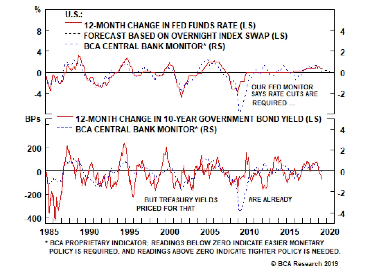
Highlights Fed: A Fed rate cut in June or July is not a done deal, but is looking increasingly likely purely from a risk management perspective, as it would both calm financial markets and potentially boost the inflation expectations component of Treasury yields. ECB: Easier monetary policy is required in Europe, and Mario Draghi hinted that rate cuts or even more QE are viable policy options. Depressed European bond yields (excluding Italy) suggest that this outcome is already fully priced. Maintain only a neutral allocation to core European government bonds. Feature Chart of the WeekA Lot Of "Negativity" In Bond Yields
A Lot Of "Negativity" In Bond Yields
A Lot Of "Negativity" In Bond Yields
The Great Global Bond Rally of 2019 has caught many by surprise – including, we admit with some humility, us. Not only has the pace of the decline in yields been impressive, but the outright yield levels seen in many markets are startlingly low. The 10-year German bund reach an all-time low of -0.25% last week, while sub-1% 10-year bond yields can be seen in “risky Peripherals” like Spain and Portugal. The ferocity of the global bond move has left 54% of all developed market government bonds trading with negative yields; the highest such percentage since July 2016 after the U.K. Brexit vote unnerved investors (Chart of the Week). There are parallels to today purely from a political risk perspective, given the trade tensions between the U.S. and China (and potentially any other country that the Trump Administration has issues with). Another comparison can be made versus three years ago when looking at more fundamental drivers of low global yields that require a response from policymakers – namely, slowing growth and sluggish inflation. Our Central Bank Monitors are now sending a clear message that easier monetary policy is needed in all the major developed economies (Chart 2). Given soft market-based inflation expectations, this suggests that policymakers must not only talk dovish, but act dovish, to defend the lower bound of price stability. Chart 2Pressure To Ease GLOBAL Monetary Policy
Pressure To Ease GLOBAL Monetary Policy
Pressure To Ease GLOBAL Monetary Policy
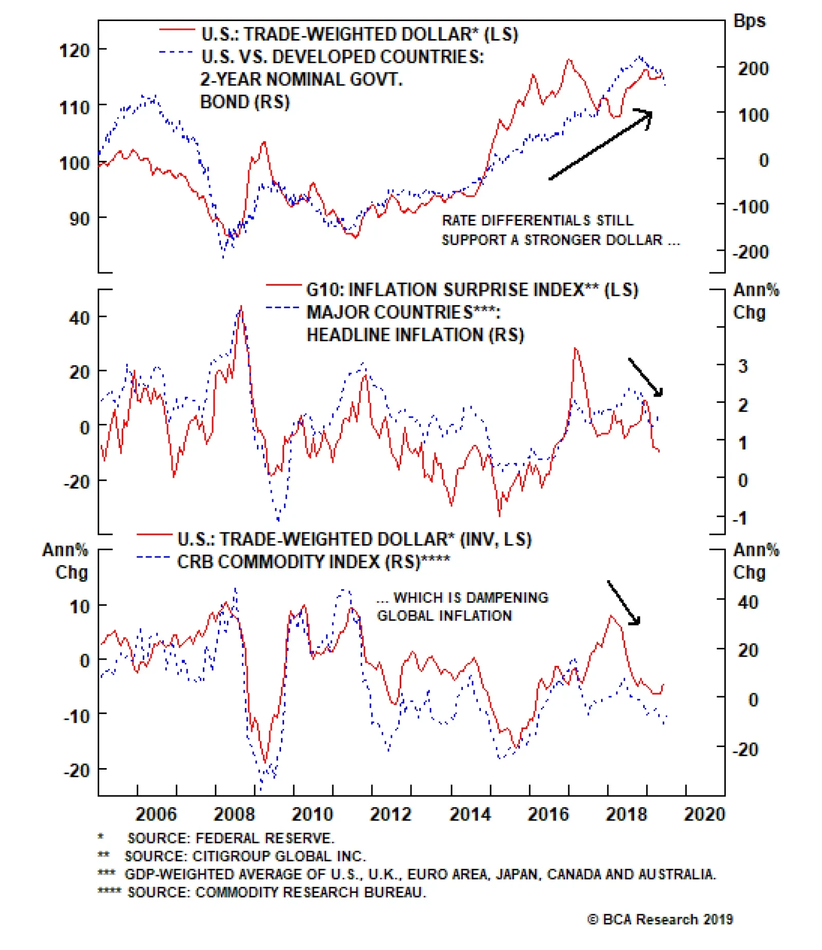
We’re seeing that in places like Australia and New Zealand, where policymakers have already cut rates. We can also see that in the euro area, where the ECB has introduced a new funding program to support bank lending (TLTRO3) and is now even contemplating restarting quantitative easing (QE). The Fed is next in line, with numerous Fed officials hinting that some easing of monetary policy could be on the horizon. Much easier monetary policy is already largely discounted in the current depressed level of global bond yields, though. While there are still risks to the growth outlook from trade uncertainty, we do not foresee a U.S./global recession on the immediate horizon. That means the risk/reward balance now favors some pickup in global bond yields, warranting a below-benchmark medium-term stance on duration exposure. Why “Insurance” Fed Cuts Are Likely Chart 3A Strong Dollar Is Disinflationary
A Strong Dollar Is Disinflationary
A Strong Dollar Is Disinflationary
Last week, the Federal Reserve held a research conference to discuss its monetary policy framework. Among the topics discussed were potential changes to the way the Fed manages its inflation target, including tolerating faster inflation after a period of below-target inflation. The goal of such “make-up” strategies would be to ensure that periods of low inflation do not get embedded into inflation expectations and bond yields. The problem with such strategies, however, is they are less likely to work if low interest rates and low inflation are a global phenomenon. The coordinated nature of the global bond rally has left the Fed facing a combination of rapidly falling Treasury yields alongside a strong U.S. dollar. With interest rate differentials continuing to favor the greenback, the currency is exerting downward pressure on commodity prices and, more generally, global inflation (Chart 3). Of course, the dollar does not only trade off interest rate differentials, but also global growth expectations, so some of the dollar rally seen this year reflects slowing non-U.S. economies and capital outflows from non-U.S. financial markets. What is clear, however, is that a strong dollar, and all it represents in terms of global growth, is disinflationary. Numerous Fed officials, including Fed Chairman Jay Powell, gave hints last week that they were open to considering interest rate cuts in response to signs of weakening U.S. growth and heightened trade uncertainty. With 5-year/5-year forward inflation expectations in the TIPS market now at 1.9% – still well below the 2.3-2.4% levels consistent with the Fed’s 2% target on the PCE deflator – the Fed has the cover to deliver one or two “insurance” rate cuts in the next few FOMC meetings. This would be consistent with their risk management framework. Our Central Bank Monitors are now sending a clear message that easier monetary policy is needed in all the major developed economies. Given soft market-based inflation expectations, this suggests that policymakers must not only talk dovish, but act dovish, to defend the lower bound of price stability. If the Fed fails to ratify markets’ dovish expectations at next week’s policy meeting, risk assets will likely sell off – perhaps violently, as occurred last December. That would deliver the kind of tightening in financial conditions that would force the Fed turn more dovish and eventually cut rates anyway. Alternatively, if the Fed actually cuts rates next week or in July and both the economy and inflation eventually recover, and risk assets surge higher, then the Fed can always take back those cuts with tighter policy later (especially if trade uncertainty diminishes with some sort of U.S.-China trade deal at the G20 meeting later this month). Such a strategy could even help Fed credibility by boosting inflation expectations back to levels more consistent with the Fed’s inflation target, which would also help put upward pressure on Treasury yields. Our Fed Monitor is now signaling the need for easier U.S. monetary policy, but that is already discounted in the 75bps of rate cuts (over the next twelve months) priced at the front-end of the yield curve, and in the current low level of Treasury yields (Chart 4). The Treasury rally also looks overdone when looking at other measures, such as the low level of mean-reverting U.S. data surprises, overbought price momentum and extended long duration positioning (Chart 5). Chart 4Treasuries Fully Priced For Fed Easing
Treasuries Fully Priced For Fed Easing
Treasuries Fully Priced For Fed Easing
Net-net, the medium-term risk/reward balance favors moderate below-benchmark duration positioning for Treasury investors, and underweight tilts for the U.S. in global government bond portfolios. More tactically, the amount of Fed rate cuts now discounted seems excessive with only the U.S. manufacturing sector cooling while the rest of the economy remains on firm footing. For that reason, we are already taking profits on one leg of our fed funds futures calendar spread trade initiated last week. The Treasury rally also looks overdone when looking at other measures, such as the low level of mean-reverting U.S. data surprises, overbought price momentum and extended long duration positioning Chart 5The Treasury Rally Looks Stretched
The Treasury Rally Looks Stretched
The Treasury Rally Looks Stretched
Chart 6Fed Funds Futures Trade: Exit Long Aug 2019, Stay Short Feb 2020
Fed Funds Futures Trade: Exit Long Aug 2019, Stay Short Feb 2020
Fed Funds Futures Trade: Exit Long Aug 2019, Stay Short Feb 2020
We recommended buying the August 2019 fed funds futures contract to hedge the risk that the Fed tries to get ahead of market sentiment by cutting rates in June or July. That contract would have returned a positive return in a scenario where the Fed delivered one 25 basis point rate cut in either June or July, and a negative return in a scenario where rates are unchanged. In only one week, that contract’s risk/reward profile has shifted dramatically. The contract is now priced for a loss in both the “one rate cut” and “no rate cut” scenarios. We therefore exit our long position in the August 2019 fed funds futures contract for a gain of +5bps. The second leg of our proposed trade was to short the February 2020 fed funds futures contract. This remains an excellent bet. As of last Friday, a short position in the February 2020 contract will earn a positive return as long as three or fewer rate cuts occur between now and next February (Chart 6). We are keeping this position on as a pure rates trade to play for the Fed delivering less than the market expects. Bottom Line: A Fed rate cut in June or July is not a done deal, but is looking increasingly likely purely from a risk management perspective, as it would both calm financial markets and potentially boost the inflation expectations component of Treasury yields. Are European Bond Yields Discounting More ECB QE? While we see little absolute value in U.S. Treasuries, there may not be much near-term upside in yields without an improvement in European economic growth. Simply put, Europe remains an anchor weighing on global bond yields. While we see little absolute value in U.S. Treasuries, there may not be much near-term upside in yields without an improvement in European economic growth. Simply put, Europe remains an anchor weighing on global bond yields. Our country diffusion indicators for the euro area – measuring the share of countries within the region that are seeing faster GDP growth, rising leading economic indicators and quickening headline inflation rates – all show that the current downturn is broad-based (Chart 7). Dating back to the introduction of the single currency zone in the late 1990s, there have been three periods where the country diffusion indicators were as weak as they are now. All three times lead to multiple interest rate cuts by the ECB. Chart 7A Broad-Based Slowing Of European Growth & Inflation
A Broad-Based Slowing Of European Growth & Inflation
A Broad-Based Slowing Of European Growth & Inflation
Our ECB Monitor is also calling for easier monetary policy in the euro area (Chart 8), driven by weakness in both the growth and inflation components. Chart 8Our ECB Monitor Says 'Ease', Bund Yields Agree
Our ECB Monitor Says 'Ease', Bund Yields Agree
Our ECB Monitor Says 'Ease', Bund Yields Agree
With the ECB policy rate already negative, however, the central bank is reluctant to push rates even lower and starve euro area banks of badly needed net interest margin. Chart 9TLTRO3 Will Help Italian & Spanish Banks The Most
TLTRO3 Will Help Italian & Spanish Banks The Most
TLTRO3 Will Help Italian & Spanish Banks The Most
At last week’s policy meeting, the ECB Governing Council committed to leaving rates unchanged through the first half of 2020. ECB President Mario Draghi noted in his press conference that forward guidance has “become the major monetary policy tool we have now”, suggesting that actual changes in interest rates will be more difficult to implement. Draghi also noted that the new TLTRO3 program was intended only as a “backstop” to sustain current levels of bank lending as the old TLTRO programs begin to roll off, not as a fresh source of stimulus. This was almost certainly aimed at the banks of Italy and Spain – countries that took up nearly 60% of the last TLTRO program that is now starting to roll off and where credit growth is contracting (Chart 9). The ECB worries that the weaker parts of the European banking system are becoming too reliant on cheap central bank funding, making it more difficult to end the liquidity program in the future without causing a credit crunch. German bunds have already priced in some sort of ECB easing (rate cuts or fresh bond buying). Our estimate of the term premium on the 10-year German bund yield is already deeply negative, which reflects both a risk aversion bid for safety and, potentially, some market expectation of incremental ECB QE. Chart 10Market Discounting Fresh ECB Bond Buying?
Market Discounting Fresh ECB Bond Buying?
Market Discounting Fresh ECB Bond Buying?
So if the ECB is reluctant to cut rates or subsidize more lending, what monetary ammunition is left? Draghi did hint last week that the topic of restarting the Asset Purchase Program (APP) came up in the ECB meeting as an option if the economic and inflation backdrop deteriorated further, or global trade uncertainty intensified. The ECB is facing a situation similar to when the APP was first announced in 2014. Inflation expectations, as measured by the 5-year/5-year forward euro CPI swap rate, are now down to 1.2% (Chart 10). It was a similar plunge in inflation expectations that wore down ECB hawks’ reticence to deploy quantitative easing back in 2014. German bunds have already priced in some sort of ECB easing (rate cuts or fresh bond buying). Our estimate of the term premium on the 10-year German bund yield is already deeply negative, which reflects both a risk aversion bid for safety and, potentially, some market expectation of incremental ECB QE. The latter interpretation would also explain the low level of bond yields seen in Peripheral Europe (excluding Italy, dealing with a deficit battle with the European Commission), as investors stretch for yield in anticipation of supportive future ECB policy. We see little investment value in euro area bonds at such low levels, given how much bad news on growth and inflation, and the potential monetary easing in response, is already discounted. Similar to U.S. Treasuries, the risk/reward balance favors a modest below-benchmark structural duration stance. The upside in European yields is still far more limited than for U.S. Treasury yields, given the much more fragile state of European growth and inflation expectations. Treasuries are thus more overpriced than bunds. Bottom Line: Easier monetary policy is required in Europe, and Mario Draghi hinted that rate cuts or even more QE are viable policy options. Depressed European bond yields (excluding Italy) suggest that this outcome is already fully priced. Maintain only a neutral allocation to core European government bonds. Robert Robis, CFA, Chief Fixed Income Strategist rrobis@bcaresearch.com Recommendations
Making Up Is Hard To Do
Making Up Is Hard To Do
Duration Regional Allocation Spread Product Tactical Trades Yields & Returns Global Bond Yields Historical Returns
Highlights Fed: The large divergence between Treasury yields and risk assets means that the Fed will almost certainly cut rates during the next few months. The only question is whether a large sell-off in risk assets will be required to force the Fed’s capitulation. Maintain a cautious near-term (0-3 month) allocation to corporate credit. Duration: The economic data and shape of the yield curve do not suggest that the economy is heading into recession. Rather, they suggest that the economy is experiencing an external shock – akin to 1998 or 2015/16 – that can be offset by a relatively minor pivot in Fed policy. Investors should keep portfolio duration low. Corporate Balance Sheets: Growth rates for both corporate profits and debt should settle into the mid-single digits during the next few quarters. This will keep gross leverage and the default rate roughly stable. A sustained period of negative profit growth and tighter C&I lending standards would challenge this outlook. Feature Chart 1Markets Taking The Rate Cut For Granted
Markets Taking The Rate Cut For Granted
Markets Taking The Rate Cut For Granted
Markets aren’t begging for a rate cut. Rather, they are behaving as though one has already occurred. This sort of set-up could lead to wider credit spreads and lower equity prices in the near-term. To elaborate, notice that the S&P 500 is only 3% off its late-2018 peak, but is down an alarming 8% relative to the Bloomberg Barclays Treasury Master Index. Meanwhile, the 10-year Treasury yield had fallen all the way to 2.06% as we went to press last Friday (Chart 1, bottom panel). The overall message from financial markets is that investors expect the Fed to cut rates very soon, but also think that a small number of cuts will be enough to forestall recession and keep risk assets supported. As we see it, the divergence between risk assets and Treasuries makes a rate cut during the next few months a near certainty. If the Fed does not appear sufficiently dovish at next week’s FOMC meeting, then risk assets will sell off. The resulting tightening of financial conditions will then force the Fed’s hand, leading to a rate cut in July or September. The alternative is that the Fed tries to get ahead of market sentiment by delivering a rate cut next week, even if such a move is not easily justified by the economic data. A New Trade In last week’s report, we recommended adding a fed funds futures calendar spread trade to take advantage of these near-term policy moves (Chart 2).1 Specifically, we advised investors to go long the August 2019 fed funds futures contract and short the February 2020 contract. Chart 2Exit Long Aug 2019 / Stay Short Feb 2020
Exit Long Aug 2019 / Stay Short Feb 2020
Exit Long Aug 2019 / Stay Short Feb 2020
We recommended buying the August 2019 fed funds futures contract to hedge the risk that the Fed tries to get ahead of market sentiment by cutting rates in June or July. As of last week, this contract would have earned a positive return in a scenario where the Fed delivered one 25 basis point rate cut in either June or July, and a negative return in a scenario where rates are unchanged. But as of last Friday, the contract’s risk/reward profile had shifted dramatically. The contract is now priced for a loss in both the “one rate cut” and “no rate cut” scenarios. We therefore exit our long position in the August 2019 fed funds futures contract for a gain of 8 bps. . The second leg of our proposed trade was to short the February 2020 fed funds futures contract. This remains an excellent bet. As of last Friday, a short position in the February 2020 contract will earn a positive return as long as three or fewer rate cuts occur between now and next February (Chart 2, bottom panel). In last week’s report, we recommended adding a fed funds futures calendar spread trade to take advantage of these near-term policy moves. Table 1 displays the expected returns from our proposed spread trade (long Aug 2019/short Feb 2020) as of last Friday, the most recent pricing available at the time of publication. Because of the rapid gains in the August 2019 contract price, an outright short position in the February 2020 contract now dominates the expected returns from the calendar spread trade in all likely scenarios. We therefore advise investors to exit the long position in the August 2019 contract, but to remain short the February 2020 contract. Table 1Expected Returns From Long Aug 2019 / Short Feb 2020 Fed Funds Futures Calendar Spread Trade
Tracking The Mid-1990s
Tracking The Mid-1990s
Bottom Line: The large divergence between Treasury yields and risk assets means that the Fed will almost certainly cut rates during the next few months. The only question is whether a large sell-off in risk assets will be required to force the Fed’s capitulation. We advise near-term caution on credit spreads. While a near-term rate cut is likely, we also doubt that the Fed will deliver more than the 76 bps of rate cuts priced into the curve for the next 12 months. We therefore recommend that investors keep portfolio duration low and maintain a short position in the February 2020 fed funds futures contract. More 1998 Than 2001 In the last section we reiterated our view that the Fed will deliver fewer than the 76 bps of rate cuts that are priced into the yield curve for the next 12 months. Our main justification is that such a large number of rate cuts will only occur if the economy enters recession. At present, the pre-conditions for an economic recession are simply not in place. Rather, the economy is experiencing an external shock – akin to 2015/16 and 1998 – that will require only a modest shift in Fed policy. In other words, if we use the mid-1990s cycle as a roadmap, today looks much more like 1998 than 2001. The divergence between manufacturing and services PMIs is exactly what occurred in 1998 and 2015/16. In a recent Special Report, we observed that every single post-WWII recession was preceded by either high inflation or rapid private debt growth (Chart 3).2 At present, inflation is muted and private debt growth is low. The economy is unlikely to experience a recession if there hasn’t been a prior build-up of excess demand. Chart 3Private Debt Growth, High Inflation & Recessions
Private Debt Growth, High Inflation & Recessions
Private Debt Growth, High Inflation & Recessions
Second, economic indicators are much more consistent with the 2015/16 and 1998 episodes than with “pre-recession” conditions. The ISM Manufacturing PMI has fallen sharply, though it remains above 50, but the ISM Non-Manufacturing PMI looks much healthier. This divergence between manufacturing and services is exactly what occurred in 1998 and 2015/16 (Chart 4). It is consistent with a shock to global demand and trade that has relatively little impact on the U.S. consumer and the domestic economy’s large service sector. Chart 4Divergence Between Services And Manufacturing
Divergence Between Services And Manufacturing
Divergence Between Services And Manufacturing
Granted, the PMIs compiled by Markit do not mirror the divergence between the ISM Manufacturing and Non-Manufacturing surveys. In fact, the Markit Services PMI has dropped sharply alongside its manufacturing counterpart (Chart 5). However, the Markit surveys also showed no divergence between manufacturing and services in 2015/16 and have no available data for 1998. We are therefore inclined to downplay the weakness in the Markit Services PMI for the time being. Chart 5MARKIT PMIs
MARKIT PMIs
MARKIT PMIs
Third, employment growth usually starts to slow at least one year before the economy heads into recession. But it showed relatively little weakness in 1998 and 2015/16 (Chart 4, bottom panel). If May’s downbeat payrolls number turns out to be the start of a trend, then we will have to reconsider our view. But for now, even after last week’s report, employment growth remains solid. Finally, not only do the economic data suggest an episode similar to 1998 and 2015/16, but the slope of the yield curve does as well. While many have focused on the inversion of the 3-month/10-year Treasury slope, the 2-year/10-year slope remains above zero, and has indeed steepened in recent weeks. A more comprehensive look at the entire yield curve, adjusting for changes in the overall level of yields, shows that it looks very similar to the yield curve seen just ahead of the first 1998 rate cut. In contrast, the yield curve seen just before the first 2001 rate cut was more heavily inverted at the front-end, and long-dated yields priced-in much less of a rebound (Charts 6A & 6B).
Chart 6
Chart 6
Bottom Line: The economic data and shape of the yield curve do not suggest that the economy is heading into recession. Rather, they suggest that the economy is experiencing an external shock – akin to 1998 or 2015/16 – that can be offset by a relatively minor pivot in Fed policy. Investors should keep portfolio duration low on the view that the Fed will cut rates by less than 76 bps during the next 12 months. Corporate Health Update Chart 7Weak Profit Growth In Q1
Weak Profit Growth In Q1
Weak Profit Growth In Q1
The full slate of first quarter corporate balance sheet data have now been released, and as expected, corporate profit growth cooled significantly compared to the rapid gains seen in 2018. As a result, our Corporate Health Monitor – an equal-weighted composite of six important financial ratios – ceased its recent improvement and jumped firmly back into “deteriorating health” territory (Chart 7). Our preferred measure of pre-tax profits contracted at an annualized rate of 17% in Q1, dragging the year-over-year growth rate down to 7%, from 15% in 2018 Q4 (Chart 7, bottom panel). The crucial relationship for corporate bond investors is between pre-tax profit growth and debt growth. If profit growth exceeds debt growth, then gross leverage will decline over time taking the default rate with it. Conversely, defaults tend to rise whenever profit growth fails to keep pace with debt growth.3 Corporate debt has been growing at an annualized pace of about 6-8%. This means that profit growth would have to slow to below those levels for us to become concerned about an increase in defaults. This could occur for the next quarter or two, as the weak global growth environment weighs on revenues (Chart 8). But our Profit Margin Proxy – corporate selling prices less unit labor costs – is in a strong uptrend, suggesting that the weakness may not be that dire. The crucial relationship for corporate bond investors is between pre-tax profit growth and debt growth. There is also some reason to think that corporate debt growth might slow during the next few quarters. According to the Fed’s Senior Loan Officer Survey, C&I loan demand has weakened significantly in recent months, while lending standards remain approximately unchanged. Historically, it is extremely rare for loan demand to weaken without a simultaneous tightening in bank lending standards (Chart 9). However, if the current unusual situation were to persist, it would be quite positive from the perspective of corporate balance sheet health. It would suggest that firms are adding less debt to balance sheets, even though banks continue to make credit readily available. Chart 8Profit Margins Still Strong
Profit Margins Still Strong
Profit Margins Still Strong
Chart 9Is Corporate Sector On A Debt Diet?
Is Corporate Sector On A Debt Diet?
Is Corporate Sector On A Debt Diet?
Bottom Line: Growth rates for both corporate profits and debt should settle into the mid-single digits during the next few quarters. This will keep gross leverage and the default rate roughly stable. A sustained period of negative profit growth and tighter C&I lending standards would challenge this outlook. Ryan Swift, U.S. Bond Strategist rswift@bcaresearch.com Footnotes 1 Please see U.S. Bond Strategy Portfolio Allocation Summary, “When Expectations Are Self-Fulfilling”, dated June 4, 2019, available at usbs.bcaresearch.com 2 Please see U.S. Bond Strategy/Global Fixed Income Strategy Special Report, “The Risk From Corporate Debt: Theory And Evidence”, dated April 23, 2019, available at usbs.bcaresearch.com 3 Please see U.S. Bond Strategy Special Report, “Assessing Corporate Default Risk”, dated March 19, 2019, available at usbs.bcaresearch.com Fixed Income Sector Performance Recommended Portfolio Specification
Highlights Portfolio Strategy The risk/reward tradeoff remains squarely to the downside and we are turning cyclically (3-12 month horizon) cautious on the prospects of the broad equity market. The Presidential cycle, UBER’s IPO, the SPX hitting all-time highs following the initial December 2018 yield curve inversion, and two additional yield curve inversions signal that this time is no different and a recession is likely upon us in the coming 18 months. The re-escalation of the U.S./China trade tussle along with the risk of an antitrust investigation into Apple, waning capital outlays, softening exports and deteriorating operating conditions warn that it does not pay to be overweight the S&P tech hardware storage & peripherals (THS&P) index. Our tech EPS model is flashing red on the back of sinking capex and an appreciating U.S. dollar, deteriorating operating metrics signal that tech margins are under attack and exports are also in a freefall, suggesting that the time is ripe to put the tech sector on downgrade alert. Recent Changes Downgrade the S&P THS&P index to neutral, today. Put the S&P tech sector on downgrade alert. Table 1
A Recession Thought Experiment
A Recession Thought Experiment
Feature The SPX appeared to crack early in the week, but dovish Fed President statements saved the day and stocks recovered smartly to end the week on a high note. Our tactically (0-3 month) cautious equity market stance has served us well and has run its course. We are currently leaning toward a cyclically (3-12 month) cautious stance as a slew of our cyclical indicators have rolled over decisively. At the current juncture the big call to make is on the longevity of the business cycle. Crudely put, can the Fed engineer a soft landing or is the looming easing cycle a precursor of recession (Chart 1)? We side with the latter. Chart 1What’s The Opposite Of Bond Vigilantes?
What’s The Opposite Of Bond Vigilantes?
What’s The Opposite Of Bond Vigilantes?
This is U.S. Equity Strategy service’s view. BCA’s house view remains constructive on a cyclical 3-12 month time horizon. As a reminder, the ongoing expansion is officially the longest on record and BCA’s house view also calls for recession in late-2020/early-2021. Stan Druckenmiller once famously said “…you have to visualize the situation 18 months from now, and whatever that is, that's where the price will be, not where it is today." Thus, if BCA’s recession view is accurate then we need to start preparing the portfolio for a recessionary outcome. This week we conduct a simple thought experiment on where and why the SPX will be headed as the economy flirts with recession. But first, we rely on the message from our indicators to guide us in determining if the cycle is nearing an end. Last December parts of the yield curve slope inverted (Chart 2) and our simple insight was that the market almost always peaks following the yield curve inversion and we remained bullish on the prospects of the broad equity market and called for fresh all-time highs based on the results of our research.1 On May 1, 2019 we got confirmation as the SPX vaulted to new all-time highs, so that box is now checked. Chart 2The Yield Curve...
The Yield Curve...
The Yield Curve...
Beyond the traditional yield curve inversion that forecasts that the Fed’s next move will be a cut and eventually the cycle ends, other yield curve type indicators have inverted and also foreshadow the end of the business cycle. Charts 3A & 3B show that the unemployment gap and another labor market yield curve type indicator have both inverted signaling that the business cycle is long in the tooth. Chart 3A...Is Always Right...
...Is Always Right...
...Is Always Right...
Chart 3B...In Predicting Fed Cuts
...In Predicting Fed Cuts
...In Predicting Fed Cuts
This time is no different and the business cycle will end. Why? Because the Fed has likely raised interest rates (as we first posited on November 19, 2018 and again on December 3, 2018) by enough to trigger a default cycle in the most indebted segment of the U.S. economy where the excesses are most prominent in the current expansion: the non-financial business sector (Chart 4A). Chart 4AMind The Corporate Debt Excesses
Mind The Corporate Debt Excesses
Mind The Corporate Debt Excesses
Chart 4BDefault Cycle Looming
Default Cycle Looming
Default Cycle Looming
Already, junk bond market spreads are widening and the yield curve is predicting that a default cycle is around the corner (yield curve shown on inverted scale, bottom panel, Chart 4B). Another interesting indicator is the Presidential cycle. Chart 5 updates our work from last year showing years 2 & 3 of 17 Presidential cycles dating back to 1950. In the summer of year 3 the SPX typically peaks. Finally, the anecdote of the biggest unicorn, UBER, ipoing on May 10, 2019 also likely marks the ending of the cycle. Therefore if recession looms in the coming 18 months what is the typical magnitude of the SPX EPS drawdown and what multiple do investors pay for trough earnings? Chart 5Presidential Cycle Says Sell
Presidential Cycle Says Sell
Presidential Cycle Says Sell
While the two most recent recessionary earnings contractions have been severe, we are conservative in estimating a garden variety recession causing a 20% EPS fall. S&P 500 2018 EPS ended near $162/share. This year $167/share is likely and we are now revising down our forecast for next year to $175/share from $181/share previously. A conservative 20% drawdown sets us back to $140/share in 2021. Dating back to the late 1970s when our IBES dataset on the forward P/E multiple commences, the trough forward P/E multiple during recessions averages out to 10x (Chart 6). Remaining on a conservative path we will use 13.5x, or the recent December 2018 trough multiple as our worst case multiple and a sideways move to 16.5x as the most optimistic case. This implies an SPX ending value of between 1890 and 2310 will be reached some time in 2020, with the former resetting the equity market back near the 2016 BREXIT lows. Chart 6Trough Recession Multiple Averages 10x
Trough Recession Multiple Averages 10x
Trough Recession Multiple Averages 10x
As a result, we are not willing to play a 100-200 point advance for a potential 1000 point drawdown, the risk/reward tradeoff is to the downside. Can and has the Fed previously engineered soft landings that have caused big relief rallies in the equity market? Six times since the 1960s: once in each of the mid-1960s, early-1970s, mid-1970s, mid-1980s and mid-1990s and once in 1998 (top panel, Chart 7). Chart 7Six Mid-cycle Easing Attempts
Six Mid-cycle Easing Attempts
Six Mid-cycle Easing Attempts
Three easing cycles were not forecast by a yield curve inversion, but the mid-1960s, the mid-1990s and in 1998 the yield curve cautioned investors that an easing cycle was looming (bottom panel, Chart 7). Specifically in 1998 the Fed only acted after the equity market fell by 20%. Another interesting observation is that ex-post five of these six iterations were truly mid cycle, one was very late cycle, but none took place in year 11 of an expansion as is currently the case. We are in uncharted territory. Chart 8 shows the mean profile of the S&P 500 six months prior to and one year post the initial Fed cut. Our assumption is that a cut in July may materialize, thus the vertical line in Chart 8 denotes t=0, which is in sync with the bond market that is pricing a greater than 75% chance of this occurrence. The subsequent market rallies were significant. Our insight from this research is that we already had the explosive rally as Chart 8 depicts, owing to the Fed’s completed pivot, with the stock market rallying from the 2018 Christmas Eve lows to the May 1, 2019 all-time highs by 26%. But, the jury is still out. The biggest risk to our call is indeed a continued rally in the S&P 500 on easy money. A way to mitigate this risk of missing out on a rally is by going long SPX LEAPS Calls once a greater than 10% correction takes root. Chart 8Is The Rally Already Behind Us?
Is The Rally Already Behind Us?
Is The Rally Already Behind Us?
Keep in mind, that for the Fed to act and cut rates, stocks will likely have to breach the 2650 level, a point where a reflexive fall will further shake investor’s confidence in profit growth. In other words, the bond market is screaming that Fed cuts are looming, but it also means that stocks have ample room to fall before the Fed cuts rates, i.e. a riot point will force the Fed’s hand. Another big risk to this call is a swift positive resolution on the U.S./China trade dispute, and/or an unprecedented easing from the Chinese authorities which will put us offside as a euphoric rise will definitely ensue. Again SPX LEAPS Calls are an excellent way to position for such an outcome. Netting it all out, the risk/reward tradeoff remains squarely to the downside and we are turning cyclically (3-12 month horizon) cautious on the prospects of the broad equity market. The Presidential cycle, UBER’s IPO, the SPX hitting all-time highs following the initial December 2018 yield curve inversion, and two additional yield curve inversions signal that this time is no different and a recession is likely upon us in the coming 18 months. Thus, this week we are further de-risking the portfolio by downgrading a tech subindex to neutral, setting a tighter stop on a different long term tech subsector holding that has been the cornerstone of the equity bull market, and putting the overall tech sector on downgrade watch. Downgrade Tech Hardware Storage & Peripherals To Neutral In the context of further de-risking the portfolio we are downgrading the S&P tech hardware storage & peripherals index to a benchmark allocation and booking a small loss of 1.0% in relative terms since inception. Four reasons underpin our downgrade of this index that comprises almost 1/5 of the S&P tech market cap. First, index heavyweight Apple has 20% foreign sales exposure to the Greater China region. While we doubt the Chinese will directly retaliate to the U.S. restriction on Huawei by directly targeting Apple, it is still a risk. Moreover, recent news of the FTC and the DOJ targeting GOOGL and FB pose a risk to Apple, especially given its App Store dominance. Any negative news on either front would take a bite out of the sector’s profits. Second, capex has taken a bit hit. Chart 9 shows industry investment is almost nil and capex intentions from regional Fed surveys and from CEO confidence surveys signal more pain down the line. Third, the S&P THS&P index’s internationally sourced revenues are near the 60% mark, and computer exports are also flirting with the zero line. Worryingly, deflating EM Asian currencies are sapping consumer purchasing power and are weighing on industry exports (third panel, Chart 10). Chart 9Capex Blues
Capex Blues
Capex Blues
Chart 10Exports...
Exports...
Exports...
Similarly, global trade volumes have sunk into contractionary territory and to a level last seen during the Great Recession (not shown). With regard to export expectations the recently updated IFO World Economic Survey still points toward sustained global export ails (second panel, Chart 10). More specifically, tech laden Korean and Taiwanese exports are outright contracting at an accelerating pace and so are Chinese exports. Tack on the negative signal from the respective EM Asian stock market indices and the implication is that more profit pain looms for the S&P THS&P index (Chart 11). Finally, on the domestic front, new orders-to-inventories (NOI) have not only ground to a halt from the overall manufacturing sector, but also computer and electronic product NOI are not contracting on a short-term rate of change basis (bottom panel, Chart 10). Tracking domestic consumer outlays on computer and peripheral equipment reveals that they too have steeply decelerated from the cyclical peak reached in early 2018, painting a softening picture for industry sales growth prospects (Chart 12). Chart 11...Under Pressure
...Under Pressure
...Under Pressure
Chart 12Soft Sales Backdrop
Soft Sales Backdrop
Soft Sales Backdrop
The re-escalation of the U.S./China trade tussle along with the risk of an antitrust investigation into Apple, waning capital outlays, softening exports and deteriorating operating conditions warn that it does not pay to be overweight the S&P THS&P index. Nevertheless, before getting too bearish there is a silver lining. This index has a net debt/EBITDA of 0.5x versus the non-financial broad market of 2x. On the valuation front this tech subindex trades at 28% discount to the non-financial broad market on an EV/EBITDA basis suggesting that most of bad news is already reflected in bombed out valuations (Chart 13). The re-escalation of the U.S./China trade tussle along with the risk of an antitrust investigation into Apple, waning capital outlays, softening exports and deteriorating operating conditions warn that it does not pay to be overweight the S&P THS&P index. Bottom Line: Downgrade the S&P THS&P index to neutral for a modest relative loss of 1.0% since inception. The ticker symbols for the stocks in this index are: BLBG: S5CMPE – AAPL, HPQ, HPE, NTAP, STX, WDC, XRX. Chart 13But B/S Remains Pristine
But B/S Remains Pristine
But B/S Remains Pristine
Put Tech On Downgrade Alert We are compelled to put the S&P tech sector on our downgrade watch list as President Trump’s hawkish trade talk and actions since May 5 warn that tech revenues (60% export exposure) and profits will likely remain under intense downward pressure. The way we will execute this tech sector downgrade to underweight will be via the S&P software index, the sector’s largest market cap weight. A downgrade to neutral in the S&P software index would push our S&P tech sector weight to a below benchmark allocation. Thus, we are initiating a stop near the 10% relative return mark on the S&P software high-conviction overweight call since the December 3, 2018 inception and also lift the stop to 27% from 17% relative return on the cyclical overweight we have on the S&P software index since the November 27, 2017 inception. Any near term stock market pullback will likely trigger these stops and push the tech sector to an underweight position. Stay tuned. With regard to the overall tech sector, our EPS model is on the verge of contraction on the back of sinking capex and a firming U.S. dollar (middle panel, Chart 14). In more detail, tech capex has recaptured market share swinging from below 6% to above 13% in the past decade and now has likely hit a wall similar to the late 1990s peak (second panel, Chart 15). On a rate of change basis tech capital outlays have all peaked and national data corroborate the message from stock market reported data (bottom panel, Chart 15). Chart 14Grim EPS Model Signal
Grim EPS Model Signal
Grim EPS Model Signal
Chart 15Exhausted Capex?
Exhausted Capex?
Exhausted Capex?
The San Francisco Fed’s Tech Pulse Index (comprising coincident indicators of activity in the U.S. information technology sector) is also closing in on the expansion/contraction line warning that tech stocks are in for a rough ride (bottom panel, Chart 14). Delving deeper into operating metrics, we encounter some profit margin trouble for tech stocks. Not only do industry selling prices continue to deflate, but also our tech sector wage bill gauge is picking up steam. Taken together, all-time high profit margins – double the broad market – appear unsustainable and something has to give (Chart 16). On the export relief valve front, the sector faces twin headwinds. First the trade war re-escalation suggests that an interruption/disruption of tech supply chains is a rising risk, and the firming greenback will continue to weigh on P&Ls as negative translation effects will hit Q2, Q3 and likely Q4 profits (Chart 17). Chart 16Margin Trouble
Margin Trouble
Margin Trouble
Chart 17Rising Dollar Will Weigh On Revenues & Profits
Rising Dollar Will Weigh On Revenues & Profits
Rising Dollar Will Weigh On Revenues & Profits
Netting it all out, our tech EPS model is flashing red on the back of sinking capex and an appreciating U.S. dollar, deteriorating operating metrics signal that tech margins are under attack and exports are also in a freefall, suggesting that the time is ripe to put the tech sector on downgrade alert. Nevertheless, there are two sizable offsets contrasting all the grim news. Tech stocks are effectively debt free with the net debt/EBITDA sitting on the zero line and valuations a far cry from the tech bubble era. Finally, the drop in interest rates via the 10-year yield and looming Fed cuts will underpin these growth stocks that thrive in a disinflationary backdrop (Chart 18). Netting it all out, our tech EPS model is flashing red on the back of sinking capex and an appreciating U.S. dollar, deteriorating operating metrics signal that tech margins are under attack and exports are also in a freefall, suggesting that the time is ripe to put the tech sector on downgrade alert. Bottom Line: We are compelled to put the tech sector on our downgrade watch list. We will execute the S&P tech sector downgrade to underweight when the S&P software index’s stops are triggered. This would push the S&P software index to neutral from currently overweight. Stay tuned. Chart 18But There Is An Offset: Melting Yields Help Growth Stocks
But There Is An Offset: Melting Yields Help Growth Stocks
But There Is An Offset: Melting Yields Help Growth Stocks
Anastasios Avgeriou, U.S. Equity Strategist anastasios@bcaresearch.com Footnotes 1 Please see BCA U.S. Equity Strategy Weekly Report, “Signal Vs. Noise” dated December 17, 2018, available at uses.bcaresearch.com. Current Recommendations Current Trades Size And Style Views Favor value over growth Favor large over small caps
Highlights Bond yields have fallen a lot since the beginning of November, … : At the close on November 8th, the 10-year Treasury bond yielded 3.24%. By last Monday, it was yielding just 2.07%. … but the move isn’t terribly anomalous relative to history: In terms of nominal yields, the decline was just over a one-standard-deviation event; per real yields, it amounted to a -0.7 sigma move. The Fed may be preparing for a rate cut, but overweight duration positions will only pay off if several more follow: A one-and-done rate cut would stretch out the expansion and the bull markets in equities and spread product, but Treasuries are priced for an extended rate-cutting cycle. Feature Stocks are said to be the only asset that people want more of when prices rise, and less of when they fall. Lately, bonds have also seemed to have an upward-sloping demand curve, because more and more people have bought them as they’ve gotten more expensive. A BCA client who’s been shaking his head at the action got in touch with us last week to try to make some sense of it all. Experience tells him that big moves like the one that’s been unfolding since last November don’t go on forever. When they stop, mean reversion would suggest that they’re prone to retrace a good bit of territory. He came to us for some historical context to support or contradict his intuition, as summed up in something like the following statement. “Over the past 50 years, the current move equates to an x-standard-deviation event. Following similar instances, rates have risen by x basis points over the next six months, and by y basis points over the next twelve months.” The Empirical Record The sharp decline in the 10-year Treasury yield that began in early November can be viewed as three separate declines (Chart 1). In the first, the 10-year yield fell by 68 basis points (“bps”) over a span of 37 trading days. After retracing a third of the decline over the next 11 sessions, it slid by another 40 bps over 48 days. Following a one-half retracement over the ensuing 13 days, it shed 53 basis points in 32 days, capped off by a 36-bps decline across the final eight sessions (Table 1). Chart 1The Path To 2.07%
The Path To 2.07%
The Path To 2.07%
Table 1A Lower 10-Year Treasury Yield In Three Steps
Context
Context
Using the daily 10-year Treasury yield series beginning in 1962, we compared the individual yield declines for prior 37-, 48- and 32-day periods, as well as for the aggregate 141-day session spanning the entire stretch from the November 8th peak to the June 3rd trough. We also looked at the May 21st to June 3rd crescendo relative to past eight-day segments. The standardized moves range from three-quarters of a standard deviation below the mean for the 48-day middle leg to 1.5 and 1.8 for the 37- and 8-day moves, respectively (Table 2). All in all, the entire move grades out to 1.3 standard deviations below the mean – a somewhat unusual move, but nothing too special. Table 2Standardized Values Of Nominal 10-Year Treasury Yield Declines
Context
Context
The current decline’s relative stature is undermined by the wild volatility of the late ‘70s and early ‘80s, when bond yields and annual inflation reached double-digit levels (Chart 2). To try to place the current episode on a more equal framework, we also calculated standardized moves in real (inflation-adjusted) yields. On a real basis, however, the current moves made even less of a splash. The 8-day decline (z-score = -1.2) was the only component that was more than a standard deviation from the mean, and the overall move amounted to just 0.7 standard deviations below the mean (Chart 3). Chart 2No Historical Anomaly In The Current Market
No Historical Anomaly In The Current Market
No Historical Anomaly In The Current Market
Chart 3Little Impact In Terms Of Real Yields
Little Impact In Terms Of Real Yields
Little Impact In Terms Of Real Yields
We are familiar with the electronic financial media’s increasingly popular convention of stating daily yield moves in proportion to the previous day’s closing yield.1 That convention has the advantage of fitting snugly aside stock price quotes on TV and computer screens, but it is ultimately nonsensical. The proportional change in a bond’s yield relative to its starting yield doesn’t come close to approximating the change in the value of that bond. Comparing proportional changes in bond yields across timeframes would be a way of putting today’s yield moves on a more equal footing with yield moves in the high-inflation, high-coupon era of the late seventies and early eighties, but it conveys no practical information. The margin by which long-maturity Treasuries have outperformed intermediate-maturity Treasuries is unusual, ... Our next steps were instead to compare Treasury total returns and the change in the slope of the yield curve to past flattening and steepening episodes. The moves here were also unavailing over both seven- and one-month periods, as the high-coupon ‘70s and ‘80s still dominated (Chart 4). In terms of the change in the 10-year Treasury yield, both nominal and real; Treasury index total returns; and the slope of the yield curve (3-month rate to 10-year yield), both the aggregate move since last October and its three component moves have amounted to one-standard-deviation events. They would only have had about a one-in-six chance of occurring randomly in a normally distributed population, but they do not represent unsustainable moves that cry out to be reversed. Chart 4Little Impact In Terms Of Treasury Total Returns, ...
Little Impact In Terms Of Treasury Total Returns, ...
Little Impact In Terms Of Treasury Total Returns, ...
Digging a little deeper to consider total returns across different regions of the yield curve, we do find one apparent anomaly at the long end of the curve. The long Treasury index has outperformed the intermediate Treasury index by a two-standard-deviation margin over both a seven-month and a one-month timeframe (Chart 5). On a standalone basis, the long Treasury index has beaten the seven-month mean return by one-and-a-half standard deviations, and the one-month mean return by two standard deviations (Chart 6). The two-standard-deviation results would only be expected to occur one out of forty times, and thereby validate our client’s sense that something has been going on. ... and history suggests they’ll be partially unwound over the next six to twelve months. Chart 5... But The Spread Between Long- And Intermediate-Index Returns Is Wide, ...
... But The Spread Between Long- And Intermediate-Index Returns Is Wide, ...
... But The Spread Between Long- And Intermediate-Index Returns Is Wide, ...
Chart 6... And Long-Maturity Returns Have Been Elevated
... And Long-Maturity Returns Have Been Elevated
... And Long-Maturity Returns Have Been Elevated
Moving on to the second part of his inquiry, we reviewed the standalone performance of the long Treasury index, and the relative long-versus-intermediate performance, over subsequent six- and twelve-month periods. We focused our analysis on instances when historical z-scores were greater than or equal to their current levels to try to determine if we should expect current performance to reverse and, if so, how sharply. On a standalone basis, long Treasury index performance has gently reverted to the mean over the subsequent six and twelve months, posting returns over those periods within +/- 0.2 standard deviations of its long-run average (Table 3). Table 3Standardized Values Of Future Long-Maturity Treasury Index Returns
Context
Context
Outlying relative long-versus-intermediate performance like we’ve witnessed over the last seven months has reversed more convincingly. The long Treasury index has underperformed its intermediate-maturity counterpart over six and twelve months when its z-scores were greater than or equal to their current levels over a seven- and one-month basis, falling roughly 0.5 standard deviations below the mean (Table 4). The future does not have to resemble the past, especially over small sample sizes, but relative long-end underperformance would accord with our constructive view of the U.S. economy. It would also be consistent with our anti-duration and pro-inflation biases. Table 4Standardized Values Of Future Difference Between Long- And Intermediate-Maturity Treasury Index Returns
Context
Context
The Fed, Again The consistency of the comments from Fed officials last week would seem to suggest that they are trying to prepare the ground for a rate cut. A cut at next week’s FOMC meeting might be a little too abrupt, but it seems increasingly possible that the committee could guide markets to a cut at the next scheduled meeting at the end of July. Various officials have made it abundantly clear that they view trade tensions as a threat to the economy, and that the bank is prepared to adjust policy, if need be, to sustain the expansion. Uber-dovish St. Louis President Bullard, who said last Monday that, “a downward policy rate adjustment may be warranted soon,” no longer appears to be such an outlier. We do not think a rate cut is necessary, and we would be content to remain on the sidelines if we were on the committee, but our opinion is irrelevant. We endeavor not to be distracted by what we think should happen, devoting our focus instead to determining what’s most likely to happen. To that end, our estimate of the probability that the Fed’s next move might be a cut is rising by the speech/interview. When incorporating that probability into investment strategy, we have been thinking a lot about a question that keeps being raised within BCA: If the Fed cuts rates next week or next month, how will markets respond? Assuming the economic backdrop doesn’t deteriorate, we expect that a rate cut will keep the equity and credit bull markets going. The answer depends heavily on the context in which the Fed cuts, and we assume that if the Fed cuts after the economy has taken a dramatic turn for the worse, risk assets would decline. In that case, markets would presumably read the Fed’s decision as confirmation that things were even worse than they perceived and that a significant bout of risk aversion was right around the corner. On the other hand, if the cut came against a backdrop of decent, if unexciting, economic data, risk assets would likely rally. For an investor who cannot resist injecting his/her opinion into the mix, the market response would be supportive of risk assets if a rate cut was unnecessary, but negative if the economy couldn’t get along without it. Investment Implications We believe that the U.S. economy is doing just fine, thank you, and do not yet see the signs that the expansion requires more monetary accommodation if it is to continue. Assuming that the cast of the incoming data does not change enough to change our view, we would expect that a rate cut would defer the end of the expansion and thereby defer the end of the bull markets in risk assets. We are therefore content to stick with our recommendation that investors should remain at least equal weight equities and spread product. We are still looking for restrictive monetary policy to be the catalyst that ends the expansion, and anything that pushes restrictiveness further into the future ought to keep the market parties going. Our view has aligned with the house view over the last year, but there is no guarantee that it will continue to do so. A growing minority of managing editors has been repeatedly challenging the internal consensus in our daily meetings, and it will be debated vigorously at our monthly view meeting Monday morning in Montreal. It is possible that the house view, and the U.S. Investment Strategy view, could soon become less constructive, though our level of conviction remains fairly high. Doug Peta, CFA Chief U.S. Investment Strategist dougp@bcaresearch.com Footnotes 1 If a bond yielding 3% at Friday’s close ends Monday’s session with a yield of 2.94%, 6 bps lower, its yield is shown as having declined 2% on the day (-.0006/.03 = -2%).
Highlights It remains too early to put on fresh pro-cyclical trades, but the Federal Reserve’s dovish shift is a positive development at the margin. As the market fights a tug of war between weak fundamentals and easier monetary policy, bigger gains are likely to be made at the crosses rather than versus the dollar. Safe-haven currencies are also winners in the interim. Continue to hold short USD/JPY positions recommended last week. Watch the gold-to-bond ratio for cues on where the balance of forces are shifting, with a rising ratio negative for the dollar. Once investors eventually shift their focus towards the rising U.S. twin deficits, de-dollarization of the global economy and low expected returns for U.S. assets, the dollar will peak. New idea: Buy SEK/NZD for a trade. Feature Global markets have once again decided that the U.S. is due for rate cuts, and the Federal Reserve appears to be heeding their message. Both Fed Governor Lael Brainard and Fed Chair Jerome Powell have suggested that policy should be calibrated to address the downside risks posed by the trade war. The question du jour is the path of the dollar if the Fed eventually does ease monetary policy. A slowing global economy on the back of deteriorating trade is positive for the greenback, since it is a counter-cyclical currency. A Fed rate cut will just be acknowledging the gravity of the slowdown. On the other hand, a dovish Fed knocks down U.S. interest rate expectations relative to the rest of the world. This has historically been bearish for the dollar, and positive for global growth. Our bias remains that the dollar will emerge a loser in this tug of war, especially if Beijing and Washington come to a trade agreement. However, for currency strategy, it is important to revisit our indicators to see where the balance of forces for the dollar lie. We do this via the lens of interest rate differentials, global growth, liquidity trends, and positioning. Expectations Versus Reality Markets are mostly wrong about Fed interest rate expectations, but do get it right from time to time. Since the 1990s, most Fed rate-cutting cycles were initially predicted in advance by the swaps market. Moreover, the current divergence between market expectations and policy action is as wide as before the Great Recession, and among the deepest in over three decades (Chart I-1). The fact that the Fed seldom cuts interest rates only once during a mid-cycle slowdown suggests expectations could diverge even further. Outside of recessions, falling rate expectations relative to policy action have historically been bearish for the dollar, and vice versa. This makes intuitive sense. As a reserve and counter-cyclical currency, the dollar has tended to rise during times of capital flight. However, if we are not on the cusp of a recession, then easier monetary policy by the Fed should improve global liquidity, which is bullish for higher-beta currencies and negative for the dollar. On this front, our discounter suggests rate cuts of about 80 basis points are penciled in by the swaps market over the next 12 months. This will put downward pressure on the dollar. It also helps that sentiment on the greenback remains relatively bullish, and speculators are very long the currency (Chart I-2). Chart I-1Big Divergences Are Rare
Will The Market Be Wrong This Time?
Will The Market Be Wrong This Time?
Chart I-2Lots of Room For The Dollar To Fall
Lots of Room For The Dollar To Fall
Lots of Room For The Dollar To Fall
Chart I-3Relative Rates Moving Against The Dollar
Relative Rates Moving Against The Dollar
Relative Rates Moving Against The Dollar
Relative interest rate differentials between the U.S. and the rest of the world continue to suggest that the greenback should be slightly higher. However, the Treasury market tends to be a global interest rate benchmark rather than specific to the U.S. With global growth in a downtrend and the Fed becoming relatively more dovish, U.S. interest rates are falling much faster than elsewhere and closing the interest-rate gap vis-à-vis the rest of the world. A peak in U.S. interest rates relative to its G10 peers has always been a bad omen for the greenback (Chart I-3). Market action following the Reserve Bank of Australia’s (RBA) interest rate cut this week is a case in point. The initial reaction was a knee-jerk rally in AUD/USD. Australian 10-year government bond yields are already 65 basis points below U.S. levels, the lowest since the 1980s. But the structural growth rate in Australia remains higher than in the U.S., suggesting there is a natural limit as to how low relative interest rates can go. We remain long AUD/USD, but are maintaining a tight stop at 68 cents should rising volatility nudge the market against us.1 Australian 10-year government bond yields are already 65 basis points below U.S. levels, the lowest since the 1980s. Bottom Line: Interest rate expectations between the rest of the world and the U.S. are already at very depressed levels. This suggests that unless the world economy tips into recession, rate differentials are likely to shift against the greenback. A dovish Fed could be the catalyst that triggers this convergence. Portfolio Flows The change in the U.S. tax code to allow for the repatriation of offshore cash helped the dollar in 2018, but not to the extent that might have been expected. On a rolling 12-month basis, the U.S. has repatriated about $400 billion in net assets, or close to 2% of GDP. Historically, this is a very huge sum that would have had the potential to set the greenback on fire – circa 10% higher. The issue today is that the tax break was a one-off, and net flows into the U.S. are now rolling over as the impact fades (Chart I-4). Historically, portfolio flows into the U.S. have been persistent, so it will be important to monitor how fast repatriation flows run off. The Fed’s tapering of asset purchases has been a net drain on dollar liquidity. In the meantime, foreign investors have been fleeing U.S. capital markets at one of the fastest paces in years. On a rolling 12-month total basis, the U.S. is seeing an exodus of about US$200 billion in equity from foreigners, the largest on record (Chart I-5). In aggregate, both foreign official and private long-term portfolio investment into the U.S. has been rolling over, with investor interest limited only to agency and corporate bonds. Foreigners are still net buyers of U.S. securities, but the downtrend in purchases in recent years is evident. Chart I-4Repatriation Flows Have Peaked
Repatriation Flows Have Peaked
Repatriation Flows Have Peaked
Chart I-5Investors Stampeding Out Of U.S. Equities
Investors Stampeding Out Of U.S. Equities
Investors Stampeding Out Of U.S. Equities
The one pillar of support for the dollar is falling liquidity (Chart I-6). Internationally, the Fed’s tapering of asset purchases has been a net drain on dollar liquidity, despite a widening U.S. current account deficit. The Fed’s balance sheet peaked a nudge above US$4.5 trillion in early 2015 and has been falling since. This has triggered a severe contraction in the U.S. monetary base, and has severely curtailed commercial banks’ excess reserves. However, with the Fed turning more dovish and its balance sheet runoff slated to end in September, dollar liquidity will likely improve at the margin. Chart I-6A Dollar Liquidity Squeeze
A Dollar Liquidity Squeeze
A Dollar Liquidity Squeeze
Bottom Line: Currency markets continue to fight a tug of war between deteriorating global growth and easier monetary conditions. Our bias is that the dollar will emerge a loser. Falling interest rate differentials, portfolio outflows, soft relative growth and easing liquidity strains support this thesis. Another Dovish Shift By The ECB The European Central Bank (ECB) kept monetary policy unchanged following this week’s meeting, while highlighting that it will be on hold for longer – at least until mid-2020. The EUR/USD rallied on the news, suggesting the market expected a much more dovish ECB. Our bias is that with European long-term rates already at rock-bottom levels relative to the U.S., the currency market will continue to be disappointed by ECB policy actions for now. Economic surprises are rising in Sweden relative to New Zealand. Terms for the new Targeted Longer-Term Refinancing Operation (TLTRO III – in other words, cheap loans), were announced at 10 basis points above the main refinancing rate. They can fall as low as 10 basis points above the deposit rate if banks meet certain lending standards. There was no mention of a tiered system for its marginal deposit facility, which would have alleviated some cash flow pressures for euro area banks. We remain of the view that TLTROs are a better policy tool than a tiered central bank deposit system. Chart I-7A Tentative Bottom In Euro Area Data
A Tentative Bottom In Euro Area Data
A Tentative Bottom In Euro Area Data
In the case of a TLTRO, the ECB can effortlessly decentralize monetary policy, since liquidity gravitates towards the countries that need it the most. While a tiered system can allow a bank to offer higher rates and attract deposits, there is no guarantee that these deposits will find their way into new loans. It is also likely to benefit countries with the most excess liquidity. The euro’s bounce suggests that the ECB’s dovish shift is paradoxically bullish for the euro. If a central bank eases financing conditions at a time when growth is hitting a nadir, it is tough to argue that it is bearish for the currency. Meanwhile, fiscal policy is also set to be loosened. Swedish new orders-to-inventories lead euro area growth by about five months, and the recent uptick could be a harbinger of positive euro area data surprises ahead (Chart I-7). Bottom Line: European rates are further below equilibrium compared to the U.S., and the ECB’s dovish shift will help lift the euro area’s growth potential. Meanwhile, investors are currently too pessimistic on euro area growth prospects. Our bias is that the euro is close to a floor. Buy SEK/NZD For A Trade A few market indicators suggest there is a trading opportunity for the SEK/NZD cross: Since 2015, the cross has been trading into the apex of a tight wedge formation, defined by higher lows and lower highs. From a technical standpoint, the break above the 50-day moving average is bullish, suggesting the cross could gap higher outside its tight wedge (Chart I-8). Economic surprises are rising in Sweden relative to New Zealand. Going forward, this trend is likely to persist given that investor expectations toward the Swedish economy are very bearish (on the back of depressed sentiment towards the euro area). Relative economic surprises have a good track record of capturing short-term swings in the currency (Chart I-9). Chart I-8A Breakout Seems##br## Imminent
A Breakout Seems Imminent
A Breakout Seems Imminent
Chart I-9Sweden Could Perform Better Than New Zealand
Sweden Could Perform Better Than New Zealand
Sweden Could Perform Better Than New Zealand
Interest rates are moving in favor of the SEK/NZD cross. For almost two decades, relative interest rate differentials between Sweden and New Zealand have been a powerful driver of the exchange rate (Chart I-10). The housing downturn appears well advanced in Sweden relative to New Zealand. Rising relative house prices have historically been supportive of the cross (Chart I-11). The undervaluation of the krona has begun to mitigate the effects of negative interest rates, mainly a buildup of household leverage and an exodus of foreign direct investment. Chart I-10Relative Rates Favor SEK/NZD
Relative Rates Favor SEK/NZD
Relative Rates Favor SEK/NZD
Chart I-11Swedish House Prices Could Stabilize
Swedish House Prices Could Stabilize
Swedish House Prices Could Stabilize
The USD/SEK and NZD/SEK cross tend to be highly correlated, since the SEK has a higher beta to global growth than the kiwi (Sweden exports 45% of its GDP versus 27% in New Zealand). On a relative basis, the Swedish economy appears to have bottomed relative to that of the U.S., making the SEK/NZD an attractive way to play USD downside. Meanwhile, the carry cost of being short NZD is lower compared to being short the U.S. dollar. Housekeeping We recommended a short USD/JPY position last week, which is currently 1.3% in the money. Our conviction remains high that this could be the best performing trade over the next one-to-three months. For one, the cross has “underperformed” its safe-haven status. The AUD/JPY is back to its 2016 lows, suggesting the market is flirting with another riot point, but the USD/JPY is still well above 100. We expect the latter to eventually give way as currency volatility rises (Chart I-12). Chart i-12Hold Short USD/JPY Positions
Hold Short USD/JPY Positions
Hold Short USD/JPY Positions
Chester Ntonifor, Foreign Exchange Strategist chestern@bcaresearch.com Footnotes 1 Please see Foreign Exchange Strategy Weekly Report, titled “A Contrarian View On The Australian Dollar,” dated May 24, 2019, available at fes.bcaresearch.com. Currencies U.S. Dollar Chart II-1USD Technicals 1
USD Technicals 1
USD Technicals 1
Chart II-2USD Technicals 2
USD Technicals 2
USD Technicals 2
Recent data in the U.S. have been negative: Headline and core PCE were both unchanged at 1.5% and 1.6% year-on-year, respectively. Personal income increased by 0.5% month-on-month in April. However, personal spending increased by only 0.3% month-on-month, lower than expected. Michigan consumer sentiment index fell to 100 in May. Markit composite PMI fell to 50.9 in May, with manufacturing and services PMIs both falling to 50.5 and 50.9, respectively. ISM manufacturing PMI fell to 52.1 in May, while non-manufacturing PMI increased to 56.9. MBA mortgage applications increased by 1.5% in May. The trade deficit fell from $51.9 billion to $50.8 billion in April. On the labor market front, initial and continuing jobless claims rose to 218 thousand and 1.682 million, respectively DXY index fell by 0.8% this week. Chairman Powell gave the opening remarks at the FedListens conference organized by the Chicago Fed this Tuesday, during which he stated that the Fed is closely monitoring trade developments, and will act to sustain the expansion. This signals the potential for rate cuts in the coming monetary policy meetings. Report Links: President Trump And The Dollar - May 9, 2019 Take Out Some Insurance - May 3, 2019 Currency Complacency Amid A Global Dovish Shift - April 26, 2019 The Euro Chart II-3EUR Technicals 1
EUR Technicals 1
EUR Technicals 1
Chart II-4EUR Technicals 2
EUR Technicals 2
EUR Technicals 2
Recent data in the euro area have been negative with inflation well below target: Markit manufacturing PMI in the euro area fell to 47.7 in May, as expected. Markit services and composite PMI increased to 52.9 and 51.8 respectively in May. Unemployment rate fell to 7.6% in April. Preliminary headline and core CPI both fell to 1.2% and 0.8% year-on-year respectively in May, dropping to the lowest levels in more than one year. Producer price inflation fell to 2.6% year-on-year in April. Retail sales growth fell to 1.5% year-on-year in April. Employment growth was unchanged at 1.3% year-on-year in Q1. EUR/USD increased by 0.8% this week. On Thursday, the ECB decided to leave interest rates unchanged. The Governing Council also expects the key rates to remain at current levels at least through the first half of 2020. Report Links: Take Out Some Insurance - May 3, 2019 Reading The Tea Leaves From China - April 12, 2019 Into A Transition Phase - March 8, 2019 Japanese Yen Chart II-5JPY Technicals 1
JPY Technicals 1
JPY Technicals 1
Chart II-6JPY Technicals 2
JPY Technicals 2
JPY Technicals 2
Recent data in Japan have been negative: Housing starts fell by 5.7% year-on-year in April. Construction orders fell by 19.9% year-on-year in April. Consumer confidence fell to 39.4 in May. Nikkei manufacturing PMI increased to 49.8 in May, while Markit services PMI fell to 51.7 in May. Capital spending was positive in Q1, rising 6.1% year-on-year versus expectations of 2.6%. USD/JPY fell by 0.6% this week. Our “Heads I Win, Tails I Don’t Lose Too Much” bet on a short USD/JPY position is currently 1.3% in the money since entered last Friday. Report Links: Short USD/JPY: Heads I Win, Tails I Don’t Lose Too Much - May 31, 2019 Beware Of Diminishing Marginal Returns - April 19, 2019 Tug OF War, With Gold As Umpire - March 29, 2019 British Pound Chart II-7GBP Technicals 1
GBP Technicals 1
GBP Technicals 1
Chart II-8GBP Technicals 2
GBP Technicals 2
GBP Technicals 2
Recent data in the U.K. have been mixed: Nationwide house prices grew by only 0.6% year-on-year in April. Mortgage approvals increased to 66.3 thousand in April. Money supply (M4) increased by 3% year-on-year in April. Markit manufacturing PMI fell to 49.4 in May, the lowest since 2016. Construction PMI also fell to 48.6, while services PMI increased to 51. GBP/USD increased by 0.5% this week. During Trump’s visit to U.K. this week, he said that U.S. companies should have market access to every sector of the British economy as part of any deal. The pound is likely to trade higher until political uncertainty is reintroduced in July, ahead of elections for a new Conservative leader. Report Links: A Contrarian View On The Australian Dollar - May 24, 2019 Take Out Some Insurance - May 3, 2019 Not Out Of The Woods Yet - April 5, 2019 Australian Dollar Chart II-9AUD Technicals 1
AUD Technicals 1
AUD Technicals 1
Chart II-10AUD Technicals 2
AUD Technicals 2
AUD Technicals 2
Recent data in Australia have been mixed: Private sector credit increased by 3.7% year-on-year in April, slightly lower than expected. AiG performance of manufacturing index fell to 52.7 in May, while the services index increased to 52.5. The current account deficit narrowed to from A$6.3 billion to A$2.9 billion in Q1. Retail sales contracted by 0.1% month-on-month in April. GDP came in at 1.8% year-on-year in Q1, in line with expectations. Trade surplus fell to A$4.9 million in April. AUD/USD increased by 0.76% this week. The RBA cut interest rates by 25 bps to a record low of 1.25% on Tuesday, the first move since August 2016. Governor Philip Lowe emphasized that this decision is not due to deterioration in the Australian economy. Moreover, he believes that while the cut might reduce interest income for many, the effects will be fully passed to mortgage rates, thus lowering payments and boosting disposable income. Report Links: A Contrarian View On The Australian Dollar - May 24, 2019 Beware Of Diminishing Marginal Returns - April 19, 2019 Not Out Of The Woods Yet - April 5, 2019 New Zealand Dollar Chart II-11NZD Technicals 1
NZD Technicals 1
NZD Technicals 1
Chart II-12NZD Technicals 2
NZD Technicals 2
NZD Technicals 2
Recent data in New Zealand have been mostly negative: Consumer confidence fell to 119.3 in May. Terms of trade increased by 1% in Q1. ANZ commodity price was unchanged in May. NZD/USD increased by 1.4% this week. The New Zealand dollar is benefitting from rising soft commodity prices, on the back of a poor U.S. planting season. However, we believe terms of trade over the longer term will be more favorable for Australia, compared to New Zealand. Hold strategic long AUD/NZD positions. Report Links: Not Out Of The Woods Yet - April 5, 2019 Balance Of Payments Across The G10 - February 15, 2019 A Simple Attractiveness Ranking For Currencies - February 8, 2019 Canadian Dollar Chart II-13CAD Technicals 1
CAD Technicals 1
CAD Technicals 1
Chart II-14CAD Technicals 2
CAD Technicals 2
CAD Technicals 2
Recent data in Canada have been mostly positive: Industrial product prices increased by 0.8% month-on-month in April. GDP growth increased by 1.4% year-on-year in Q1, above expectations. Markit manufacturing PMI fell to 49.1 in May. Labor productivity increased by 0.3% quarter-on-quarter in Q1. The trade deficit narrowed to C$0.97 billion in April. Exports increased to C$50.7 billion, while imports fell to C$51.7 billion. USD/CAD fell by 1% this week. The latest downdraft in oil prices is likely to have a negative impact on the loonie. We remain short CAD/NOK as a play on better pricing for North Sea crude, versus WTI. Norway will also benefit more from a pickup in European growth. Report Links: Currency Complacency Amid A Global Dovish Shift - April 26, 2019 A Shifting Landscape For Petrocurrencies - March 22, 2019 Into A Transition Phase - March 8, 2019 Swiss Franc Chart II-15CHF Technicals 1
CHF Technicals 1
CHF Technicals 1
Chart II-16CHF Technicals 2
CHF Technicals 2
CHF Technicals 2
Recent data in Switzerland have been neutral: Real retail sales fell by 0.7% year-on-year in April, versus the consensus of -0.8%. Headline inflation fell from 0.7% to 0.6% year-on-year in May. Manufacturing PMI increased to 48.6 in May. USD/CHF fell by 1.1% this week. The franc will benefit from rising volatility as penned in our Special Report three weeks ago. Moreover, the franc is still cheap relative to its fair value. Report Links: What To Do About The Swiss Franc? - May 17, 2019 Beware Of Diminishing Marginal Returns - April 19, 2019 Balance Of Payments Across The G10 - February 15, 2019 Norwegian Krone Chart II-17NOK Technicals 1
NOK Technicals 1
NOK Technicals 1
Chart II-18NOK Technicals 2
NOK Technicals 2
NOK Technicals 2
There was little data out of Norway this week: Manufacturing PMI came in at 54.4 in May, from 54 in April. Current account surplus increased from NOK 47.3 billion to NOK 67.8 billion in Q1. USD/NOK fell by 0.6% this week. Our Commodity & Energy team continue to favor oil prices, but have revised down their forecasts from $77/bbl to $73/bbl for Brent this year and next. Despite the recent plunge in crude oil prices, rising inventories in the U.S. allow for OPEC production cuts, which will eventually be bullish. Report Links: Currency Complacency Amid A Global Dovish Shift - April 26, 2019 A Shifting Landscape For Petrocurrencies - March 22, 2019 Balance Of Payments Across The G10 - February 15, 2019 Swedish Krona Chart II-19SEK Technicals 1
SEK Technicals 1
SEK Technicals 1
Chart II-20SEK Technicals 2
SEK Technicals 2
SEK Technicals 2
Recent data in Sweden have been positive: Manufacturing PMI jumped to 53.1 in May, versus 50.9 in the previous month. Retail sales grew by 3.9% year-on-year in April. Industrial production increased by 3.3% year-on-year in April. Manufacturing new orders rose by 0.1% year-on-year in April. Lastly, the current account surplus increased to SEK 63 billion in Q1. USD/SEK fell by 0.6% this week. We like the Swedish krona as a potential reflation play and are going long SEK/NZD this week for a trade. Report Links: Balance Of Payments Across The G10 - February 15, 2019 A Simple Attractiveness Ranking For Currencies - February 8, 2019 Global Liquidity Trends Support The Dollar, But... - January 25, 2019 Trades & Forecasts Forecast Summary Core Portfolio Tactical Trades Closed Trades