Policy
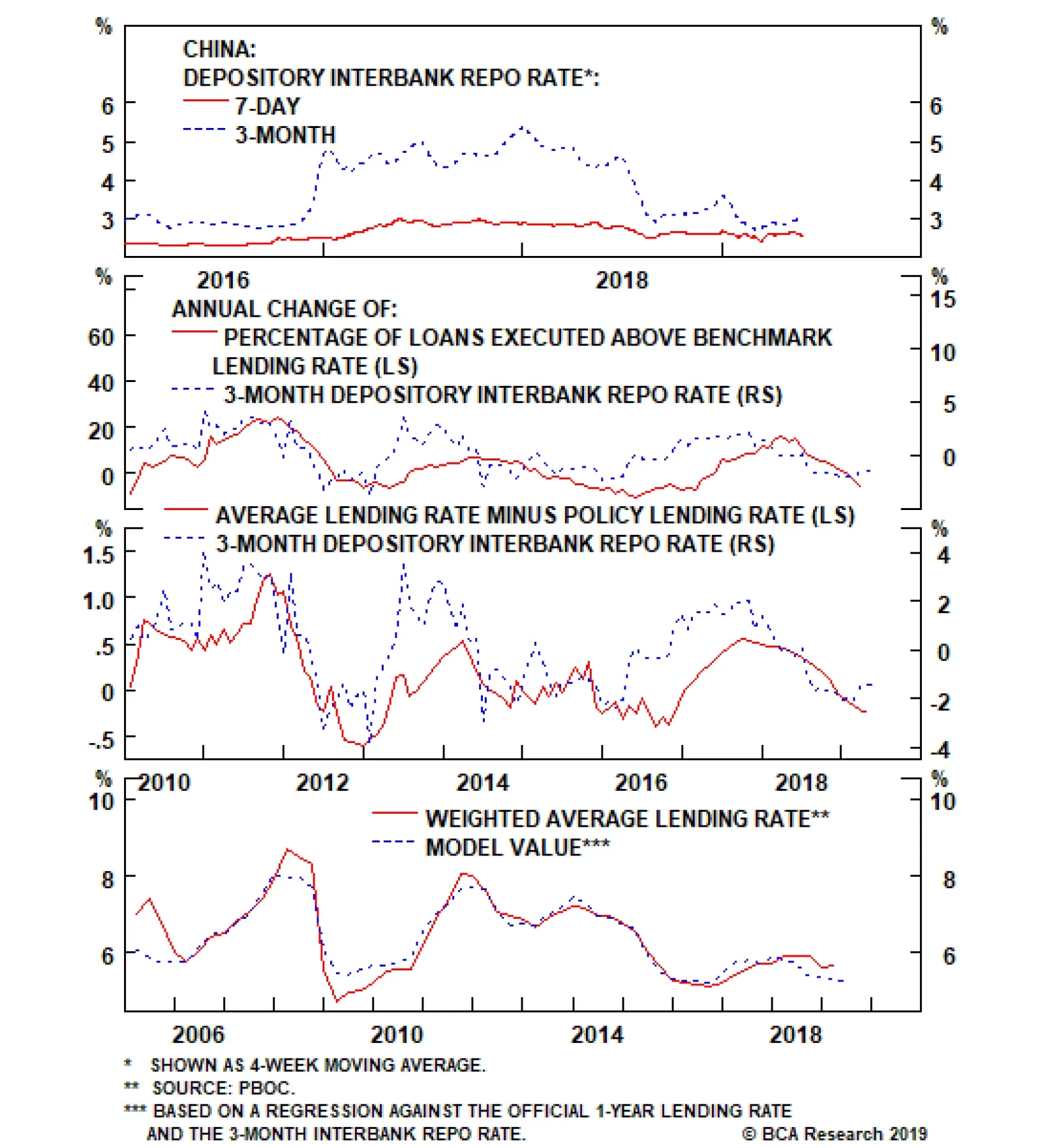
The top panel shows that while the 7-day repo rate rose in late-2016 and 2017, the rise was fairly small (on the order of 60 basis points). By contrast, the 3-month repo rate surged, which appears to have been caused by macro-prudential policy changes aimed…
Instead of aggressive and broad-based bank lending, this policy push will likely have to come in the form of quasi-fiscal spending, e.g. a significant increase in infrastructure-oriented local government bond issuance (which we include as “credit” in our…

Highlights Huge imbalance #1 is the euro area’s $150 billion trade surplus with the United States. Huge imbalance #1 has resulted from the ECB holding interest rates at the lower bound while the Fed tightened policy. The upshot is that the Fed now has the scope to cut rates while the ECB does not. Huge imbalance #2 is the euro area’s €1.5 trillion TARGET2 banking imbalance. Huge imbalance #2 means that Germany effectively has hundreds of billions of ‘Italian’ euro assets, making a euro break-up unthinkable for the euro area’s dominant economy. New structural recommendation for bond investors: overweight a 50:50 portfolio of U.S. T-bonds and Italian BTPs versus a 50:50 portfolio of German bunds and Spanish Bonos. Feature Huge Imbalance #1: The Euro Area’s $150 Billion Trade Surplus With The United States While the recent focus has been on the brewing trade war between the United States and China, trade tensions between the U.S. and Europe have also been escalating. The euro area trade surplus with the U.S. – standing near an all-time high of $150 billion – is extreme; and it is extreme because the undervaluation of the euro has made the euro area grossly over-competitive vis-à-vis the U.S., as claimed by the ECB’s own analysis (Chart I-2 and Chart I-3)! Chart of the WeekThe U.S./Euro Area Trade Imbalance Is A Near-Perfect Function Of Relative Monetary Policy
The U.S./Euro Area Trade Imbalance Is A Near-Perfect Function Of Relative Monetary Policy
The U.S./Euro Area Trade Imbalance Is A Near-Perfect Function Of Relative Monetary Policy
Chart I-2Relative Monetary Policy Has Driven The Euro's Undervaluation...
Relative Monetary Policy Has Driven The Euro's Undervaluation...
Relative Monetary Policy Has Driven The Euro's Undervaluation...
Chart I-3...And The Euro's Undervaluation Has Driven The U.S./Euro Area Trade Imbalance
...And The Euro's Undervaluation Has Driven The U.S./Euro Area Trade Imbalance
...And The Euro's Undervaluation Has Driven The U.S./Euro Area Trade Imbalance
A common counterargument is that the euro area trade surplus is simply a structural issue. If a country, such as Germany, consistently consumes less than it produces, it must show up as a structural surplus. This argument is flawed. At least half of the surplus, including for Germany, has appeared since 2014, meaning it cannot be a structural issue (Chart I-4). In any case, if an economy consumes less than it produces, a higher exchange rate should help to facilitate the adjustment, encouraging under-consuming households to buy more imports, and discouraging over-producing firms from selling into foreign markets. Chart I-4Half Of Germany's Export Surplus Appeared After 2014
Half Of Germany's Export Surplus Appeared After 2014
Half Of Germany's Export Surplus Appeared After 2014
The Chart of the Week shows the true and damning reason for the trade imbalance. The euro area’s surplus with the U.S. is a near-perfect function of relative monetary policy. To be clear, the ECB is not explicitly depressing the exchange rate to make the euro area over-competitive, the ECB is just targeting its definition of price stability. However, the ECB’s definition of price stability omits owner-occupied housing (OOH) costs, and thereby understates true euro area inflation by 0.5 percent. To the extent that the ECB thinks in terms of real interest rates based on seemingly low (excluding OOH) inflation, this means that the ECB is setting real interest rates that are far too low for the euro area economy including OOH. This has resulted in the grossly over-competitive euro and the associated $150 billion surplus with the United States. The euro area trade surplus with the U.S. is a near-perfect function of relative monetary policy. Still, for 85 percent of the euro area, even inflation excluding OOH is reliably running within a 1.5-2 percent range, very close to the ECB’s definition of price stability. And bank lending is growing at a very healthy clip. For this vast majority of the bloc, the ECB’s zero and negative interest rate policy is wholly inappropriate. However, for the 15 percent of the euro area that is called Italy, ultra-loose monetary policy does seem more appropriate. Inflation is struggling to stay above 1 percent, and bank lending is still failing to gain traction (Chart I-5 and Chart I-6). Chart I-5Italian Inflation Is Struggling To Stay Above 1 Percent
Italian Inflation Is Struggling To Stay Above 1 Percent
Italian Inflation Is Struggling To Stay Above 1 Percent
Chart I-6Italian Banks Have Not ##br##Been Lending
Italian Banks Have Not Been Lending
Italian Banks Have Not Been Lending
Therefore, an important way of thinking of the ECB’s stance is one of self-preservation – protecting the euro area’s obvious source of fissure. Effectively, the ECB is setting policy for the weakest link in the euro area, even if that policy means exacerbating strains outside the euro area – specifically, by generating a huge trade surplus with the United States. But in the interests of self-preservation, the external strain is a price worth paying. This leads us to believe that the inevitable convergence of euro area and U.S. monetary policies is now much more likely to happen via the Federal Reserve ultimately cutting rates, than by the ECB raising rates. Huge Imbalance #2: The Euro Area’s €1.5 Trillion TARGET2 Imbalance The euro area Target2 banking imbalance now stands close to €1.5 trillion (Chart I-7). What is this huge imbalance (Box 1), and why does it matter?
Chart I-7
Box 1: What Is Target2? Target2 stands for Trans-European Automated Real-time Gross settlement Express Transfer system. It is the settlement system for euro payment flows between banks in the euro area. These payment flows result from trade or financial transactions such as deposit transfers, sales of financial assets or debt repayments. If the banking system in one member country has more payment inflows than outflows, its national central bank (NCB) accrues a Target2 asset vis-à-vis the ECB. Conversely, if the banking system has more outflows than inflows, the respective NCB accrues a Target2 liability vis-à-vis the ECB. Target2 balances therefore show the cumulative net payment flows within the euro area. The ECB delegated its QE sovereign bond purchases to the respective national central banks. In the case of Italian BTPs, Italian investors sold their bonds to the Bank of Italy and deposited the cash in banks healthier than those in Italy – for example, in Germany. Strictly speaking, this outflow of Italian cash to German banks is not the same as the deposit flight during the depths of the euro debt crisis in 2012. Rather, we might call it precautionary cash management. Nevertheless, in Eurosystem accounting terms it still means that the Bank of Italy has a new asset – the BTP – denominated in ‘Italian’ euros, while the Bundesbank has a new liability to German banks denominated in ‘German’ euros. The Target2 imbalance is the aggregate of such mismatches between Eurosystem assets denominated in ‘Italian and other periphery’ euros and liabilities denominated in ‘German and other core’ euros. If Italy owes Germany half a trillion euros then it is Germany that has the problem. Does the €1.5 trillion imbalance really matter? No, as long as an ‘Italian’ euro equals a ‘German’ euro, the imbalance is just an accounting identity within the Eurosystem. But if Italy and Germany started using different currencies, then suddenly it would matter with a vengeance. The Bank of Italy asset would be redenominated into lira, while the Bundesbank liability to German banks would be redenominated into deutschemarks. Thereby the ECB would end up with fewer assets than liabilities, and a solvency shortfall potentially equivalent to hundreds of billions of euros would end up on the shoulders of the ECB’s shareholders – largely, German taxpayers. To paraphrase John Maynard Keynes, if Italy owes Germany half a billion euros, then Italy has a problem; but if Italy owes Germany half a trillion euros, then it is Germany that has the problem (Chart I-8 and Chart I-9). In effect, the Target2 huge imbalance is a huge force for euro area self-preservation – because break-up means mutually assured destruction. Chart I-8The Target2 Imbalance Reflects The Cross-Border Flow Of Italian Investor Cash...
The Target2 Imbalance Reflects The Cross-Border Flow Of Italian Investor Cash...
The Target2 Imbalance Reflects The Cross-Border Flow Of Italian Investor Cash...
Chart I-9...To German##br## Banks
...To German Banks
...To German Banks
A New Structural Recommendation For Bond Investors To sum up, the euro area has two huge imbalances: one external, the other internal. The external imbalance is the $150 billion trade surplus with the United States. This huge imbalance has resulted from the ECB holding interest rates at the lower bound while the Fed tightened policy. The upshot is that the Fed now has the scope to cut rates while the ECB does not. And this makes the U.S. T-bond a much better haven asset than the German bund. The Target2 imbalance is a huge force for euro area self-preservation. The internal imbalance is the €1.5 trillion euro area Target2 imbalance. This huge imbalance means that Germany effectively has hundreds of billions of Italian ‘euro’ assets, making a euro break-up unthinkable for the euro area’s dominant economy. On this premise, the Italian BTP – which is offering a generous yield premium for such a break-up risk – is a good structural investment. Therefore, our new structural recommendation for bond investors is to overweight: A 50:50 portfolio of U.S. T-bonds and Italian BTPs Versus A 50:50 portfolio of German bunds and Spanish Bonos. Since 2018, the T-bond/BTP combination has underperformed by 20 percent and has considerable scope for ultimate catch-up one way or another (Chart I-10). Chart I-10A U.S. T-Bond/Italian BTP Combo Can Catch Up With A German Bund/Spanish Bono Combo
A U.S. T-Bond/Italian BTP Combo Can Catch Up With A German Bund/Spanish Bono Combo
A U.S. T-Bond/Italian BTP Combo Can Catch Up With A German Bund/Spanish Bono Combo
Fractal Trading System * There are no new trades this week. For any investment, excessive trend following and groupthink can reach a natural point of instability, at which point the established trend is highly likely to break down with or without an external catalyst. An early warning sign is the investment’s fractal dimension approaching its natural lower bound. Encouragingly, this trigger has consistently identified countertrend moves of various magnitudes across all asset classes. Chart I-11
Bitcoin
Bitcoin
The post-June 9, 2016 fractal trading model rules are: When the fractal dimension approaches the lower limit after an investment has been in an established trend it is a potential trigger for a liquidity-triggered trend reversal. Therefore, open a countertrend position. The profit target is a one-third reversal of the preceding 13-week move. Apply a symmetrical stop-loss. Close the position at the profit target or stop-loss. Otherwise close the position after 13 weeks. Use the position size multiple to control risk. The position size will be smaller for more risky positions. * For more details please see the European Investment Strategy Special Report “Fractals, Liquidity & A Trading Model,” dated December 11, 2014, available at eis.bcaresearch.com. Dhaval Joshi, Chief European Investment Strategist dhaval@bcaresearch.com Fractal Trading System Recommendations Asset Allocation Equity Regional and Country Allocation Equity Sector Allocation Bond and Interest Rate Allocation Currency and Other Allocation Closed Fractal Trades Trades Closed Trades Asset Performance Currency & Bond Equity Sector Country Equity Indicators Bond Yields Chart II-1Indicators To Watch - Bond Yields
Indicators To Watch - Bond Yields
Indicators To Watch - Bond Yields
Chart II-2Indicators To Watch - Bond Yields
Indicators To Watch - Bond Yields
Indicators To Watch - Bond Yields
Chart II-3Indicators To Watch - Bond Yields
Indicators To Watch - Bond Yields
Indicators To Watch - Bond Yields
Chart II-4Indicators To Watch - Bond Yields
Indicators To Watch - Bond Yields
Indicators To Watch - Bond Yields
Interest Rate Chart II-5Indicators To Watch - Interest Rate Expectations
Indicators To Watch - Interest Rate Expectations
Indicators To Watch - Interest Rate Expectations
Chart II-6Indicators To Watch - Interest Rate Expectations
Indicators To Watch - Interest Rate Expectations
Indicators To Watch - Interest Rate Expectations
Chart II-7Indicators To Watch - Interest Rate Expectations
Indicators To Watch - Interest Rate Expectations
Indicators To Watch - Interest Rate Expectations
Chart II-8Indicators To Watch - Interest Rate Expectations
Indicators To Watch - Interest Rate Expectations
Indicators To Watch - Interest Rate Expectations
Highlights A financial market riot point remains likely over the coming few months to force policymakers, including those in China, to address the economic weakness that a full-tariff scenario will entail. The near-term outlook is bearish for China-related assets, but investors should stay cyclically bullish in anticipation of a strong reflationary response. It is not clear whether further monetary easing will occur over the coming year, given that monetary conditions have already eased substantially. But an RRR cut coupled with a benchmark lending rate cut is now a real possibility, and would signal that the monetary policy dial has been turned to “maximum stimulus”. Monthly credit growth needs to be approximately 2.8-3 trillion RMB per month in May and June in order to be consistent with a 2015/2016-magnitude policy response. May’s number may fall short of this, but that would set up June as a make-it or break-it month for credit creation. Chinese credit growth surged in 2012, but economic activity did not significantly accelerate. A repeat of this scenario is a risk to our cyclically bullish stance, but three reasons suggest it is not likely to occur. Investors should stay long USD-CNH over the cyclical horizon despite warnings from Chinese policymakers not to short the RMB. Feature Tensions between China and the U.S. have worsened materially over the past two weeks, in line with our view that an actual trade agreement this year (not just continued negotiations) is much less likely. The Huawei blacklist, stalled negotiations, a sharp escalation in preparatory nationalist rhetoric in China, and President Xi Jinping’s declaration in a Jiangxi province speech that the country is embarking on a new “Long March”1 significantly diminishes the possibility of a deal that addresses the U.S.’ structural concerns. Chart 1A Market Riot Point Is Coming
A Market Riot Point Is Coming
A Market Riot Point Is Coming
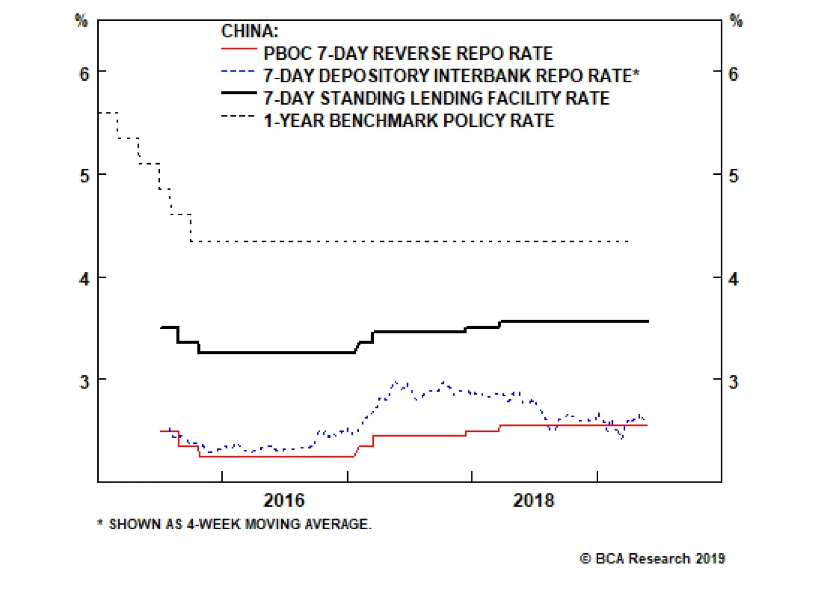
This implies that any agreement would require President Trump to capitulate and accept a temporary deal relating simply to the balance of trade between the two countries. It is possible that this occurs over the coming 6-12 months (in time for Trump to attempt a declaration of victory before the 2020 election), but it is not likely to occur before real economic (and thus financial market) pain arrives. This supports our view that a major financial market riot point is likely over the coming few months to force policymakers, including those in China, to address the economic weakness that a full-tariff scenario will entail (Chart 1). Given this, we would not recommend a long position in Chinese stocks, either in absolute terms or relative to the global benchmark, for investors with a time horizon of less than 3 months. However, over a strictly cyclical (i.e. 6-12 month) time horizon, we would recommend staying long/overweight Chinese stocks (in hedged currency terms) on the basis that policymakers will ultimately respond as needed, lest they face an unstable deceleration in economic activity that may become difficult to stop. In this week’s report we address the following three questions facing China-exposed investors over the coming year, before concluding with a brief note about the RMB: Can the PBOC provide more of a reflationary impulse if needed, and if so, how? How can investors tell whether policymakers are stimulating as required from the monthly credit data? What are the odds that China will stimulate aggressively and the economy does not meaningfully reaccelerate? How Can The PBOC Ease Further? We argued in our May 15 Weekly Report that a 2015/2016-magnitude policy response will again be required in order for policymakers to be confident that the upcoming trade shock will be overcome.2 In our view, this response, instead of aggressive and broad-based bank lending, will likely have to come in the form of quasi-fiscal spending, e.g. a significant increase in infrastructure-oriented local government bond issuance (which we include as “credit” in our adjusted total social financing calculation). However, we have received several questions from clients asking about the outlook for monetary policy in a full-tariff scenario, particularly the question of what the PBOC can do to provide even more of a reflationary response. Most investors would simply assume that the PBOC would cut interest rates even further, and this is certainly a possible outcome over the coming year. But even if the PBOC were to cut interest rates, it is not always clear to investors what rate should or will be cut. Confusion surrounding China’s monetary policy landscape has been high ever since the PBOC established an interest rate corridor system in 2015, and a review of what has occurred over the past 2½ years is warranted in order to better understand the implications of future policy decisions. A 2015/2016-magnitude policy response will again be required in order for policymakers to be confident that the upcoming trade shock will be overcome. Chart 2The Simple (But Incomplete) View Of China's New Monetary Regime
The Simple (But Incomplete) View Of China's New Monetary Regime
The Simple (But Incomplete) View Of China's New Monetary Regime
Chart 2 outlines how China’s new monetary regime is officially described by the PBOC. The benchmark lending rate, China’s “old” policy rate that established a base regulated rate for banks to price their loans, was replaced in 2015 with a corridor system. The target rate in this system is the 7-day interbank repo rate, which can be seen in Chart 2 is often at the low end of the corridor. However, we explained in a February 2018 Special Report why Chart 2 is only half of the story.3Charts 3 - 5 show the other half: Chart 3 shows that while the 7-day repo rate rose in late-2016 and 2017, the rise was fairly small (on the order of 60 basis points). By contrast, the 3-month repo rate surged, which appears to have been caused by macro-prudential policy changes aimed at severely curtailing the issuance of wealth management products by non-depository financial institutions. Chart 4 highlights that there is a strong (and leading) relationship between changes in China’s 3-month interbank repo rate and 1) changes in the percentage of loans issued above the benchmark rate and 2) changes in the gap between the weighted-average interest rate and the benchmark rate. Chart 5 shows that China’s weighted average interest rate can be successfully modelled by a regression on the benchmark lending rate and the 3-month interbank repo rate. Chart 3The 3-Month Repo Rate Has Been More Important Than The 7-Day
The 3-Month Repo Rate Has Been More Important Than The 7-Day
The 3-Month Repo Rate Has Been More Important Than The 7-Day
Chart 4A Strong Link Between 3-Month Repo Rates And Economy-Wide Rates
A Strong Link Between 3-Month Repo Rates And Economy-Wide Rates
A Strong Link Between 3-Month Repo Rates And Economy-Wide Rates
The relationships shown in Charts 3 - 5 are weaker if the 3-month repo rate is replaced with the 7-day rate, highlighting that while the latter is the new de jure policy rate in China, the former has been the de facto policy and market-driven lending rate among banks and non-financial institutions over the past 2½ years. Chart 5The Benchmark Lending And 3-Month Repo Rates Explain Effective Lending Rates
The Benchmark Lending And 3-Month Repo Rates Explain Effective Lending Rates
The Benchmark Lending And 3-Month Repo Rates Explain Effective Lending Rates
Our framework for examining China’s monetary policy environment leads us to conclude that there are three things the PBOC can do to meaningfully ease further, were they to decide to do so: The most impactful action that the PBOC could take is to cut the benchmark lending rate. While banks in China are no longer required to price loans in reference to the benchmark rate, in practice many still do. Roughly 2/3rds of loans in China have been priced at an interest rate above the benchmark over the past year, and Chart 5 noted that the weighted average interest rate is a direct function of the benchmark rate. As such, a cut to the benchmark rate is likely to feed directly into lower lending rates. Chart 3 showed that the substantial spread between the 3-month and 7-day repo rates that prevailed from late-2016 to mid-2018 has all but disappeared, implying that the PBOC cannot lower interest rates much further by dialing back on macro-prudential regulation. Instead, if it wants interbank rates to fall meaningfully, lowering the corridor around the 7-day rate by cutting the floor (the PBOC’s 7-day reverse repo rate) will likely be required. This would be carried out with further reductions to the reserve requirement ratio (RRR). Third, while Chart 5 showed that our model for the weighted average lending rate has done a very good job over the past few years, it is clear that a gap has opened up between the actual rate and that predicted by the model. The most likely explanation of this gap is that it is due to a risk premium applied by banks, possibly in response to the re-orientation of riskier funding demands that had previously been fulfilled by the shadow banking sector to on-balance sheet loans from depository institutions. It is not clear what policy tools are at the PBOC’s disposable to reduce the gap, but doing so has the potential to lower average interest rates by a non-trivial amount. The relative easiness of monetary conditions is the key difference between today and 2012. It is not clear yet which option the PBOC will pursue over the coming year or whether further monetary easing will occur, but an RRR cut coupled with a benchmark lending rate cut is now a real possibility. If it happens, it would be a clear signal for investors that the monetary policy dial has been turned to “maximum stimulus”. Inferring Reluctance Or Capitulation From Monthly Credit Growth The second issue that investors will be wrestling with over the coming few months relates to the question of whether the month-to-month pace of credit growth is consistent with the magnitude of the reflationary response that we believe will be required. To the extent that significantly more monetary easing occurs over the coming year, it is likely to have happened because policymakers were overly reluctant to green-light a renewed and substantial re-acceleration in credit growth and were then forced to fight a destabilizing slowdown in the economy. Chart 6A Strong Credit Response Will Be Required In Response To A Full Tariff Scenario
A Strong Credit Response Will Be Required In Response To A Full Tariff Scenario
A Strong Credit Response Will Be Required In Response To A Full Tariff Scenario
We have used the metric of new credit to GDP as the primary method to judge the relative size of previous credit booms, and have argued that a return to 30% on this measure will likely be required in response to a full 25% tariff scenario (Chart 6). Unfortunately, China’s unique seasonality patterns and the lack of official seasonally adjusted data make it difficult for investors to judge whether incoming credit data is consistent with the required policy response. Previously, we have shown seasonally adjusted measures of credit using a simple application of X12 ARIMA, the statistical seasonal adjustment program used by the U.S. Census Bureau. But Charts 7 and 8 present a different approach. The charts show the average cumulative amount of adjusted total social financing as the calendar year progresses, along with a ±0.5 standard deviation band, based on the 2010 to 2018 period. The thick black line in both charts shows the progress in new credit creation this year, assuming an 8% annual nominal GDP growth rate for the remainder of the year. Chart 7 shows the cumulative progress in credit assuming a 27% new credit to GDP ratio for the year (corresponding to a half-strength credit cycle relative to past episodes), whereas Chart 8 assumes 30%.
Chart 7
Chart 8
In our view, these charts are revelatory. First, Chart 7 provides evidence that policymakers have been reluctant to allow credit growth to surge. The chart shows that credit growth ran well above a half-strength credit cycle pace in the first quarter of the year; following this, through either administrative controls or jawboning, policymakers lowered the pace of credit growth in April such that it moved back within the range. By contrast, Chart 8 highlights that the pace of Q1 credit growth was exactly right in a 30% new credit to GDP scenario, and that April fell short. In order to be back within the range by June, Chart 8 suggests that monthly credit growth needs to be on the order of 2.8-3 trillion RMB per month in May and June, just a slightly slower pace than what investors observed in March. It is quite possible that May’s credit number will fall short of 2.8-3 trillion RMB, given that the increase in the second round tariffs only occurred on May 10 and that Chinese policymakers have so far seemed reluctant to pull the trigger. But this also heightens the risk of a serious near-term selloff in the domestic equity market, and would set up June as a make-it or break-it month for credit creation. Stimulus Without A Recovery? Revisiting The 2012 Scenario Chart 9The 2012 Scenario: Strong Credit, But A Modest Improvement In Activity
The 2012 Scenario: Strong Credit, But A Modest Improvement In Activity
The 2012 Scenario: Strong Credit, But A Modest Improvement In Activity
A final question facing investors this year is whether it is possible that the Chinese economy fails to respond to strong efforts by policymakers to stimulate the economy. Chart 9 shows that a similar situation occurred in 2012; while the surge in new credit to GDP did stabilize economic activity and caused a modest uptrend, the economic improvement was much smaller than what the relationship shown in the chart would imply. In our view, there are three reasons to believe that a 2012 scenario will not repeat itself: First, Chart 10 shows that the Q1 rebound in new credit to GDP appears to have halted the decline in investment-relevant Chinese economic activity. There is no basis to suggest that an uptrend in activity has begun, but the fact that the economy has even started to respond to the pickup in credit growth is a positive sign. Second, Chart 11 highlights one important difference between 2012 and today. The chart shows that our leading indicator for China’s economy did not rise as much as new credit to GDP, and that this occurred because monetary conditions remained relatively tight from the beginning of 2012 all the way through to early-2015. This relative tightness in monetary conditions occurred because of fairly elevated interest rates, and due to a persistent rise in the real effective exchange rate. However, the collapse in the weighted average lending rate following the 2015/2016 economic slowdown has eased monetary conditions in a lasting way, suggesting that a similar rise in new credit to GDP should have a strongly positive effect on Chinese economic growth. This also underscores our earlier point: monetary policy has already largely returned to 2015/2016 levels, meaning that it is fiscal/administrative action to boost credit growth that is missing. Third, Chart 12 highlights that the pace of inventory accumulation represents another key difference between the current economic environment and that of 2012. The chart shows that the change in China’s level of industrial inventories relative to exports (both measured in value terms) rose sharply in 2011 and 1H 2012, only to slow significantly over the following year (which may have weighed on the rebound in activity in 2012 and 2013). In contrast, the chart shows that inventories have recently been contracting at their fastest pace relative to exports since 2011, implying that the drag on production from potential destocking may be minimal. Chart 10A (Very) Tentative Sign Of Stabilization
A (Very) Tentative Sign Of Stabilization
A (Very) Tentative Sign Of Stabilization
Chart 11Monetary Conditions Are Considerably Easier Today
Monetary Conditions Are Considerably Easier Today
Monetary Conditions Are Considerably Easier Today
There are, however, two caveats to the above analysis. First, on the inventory front, Chart 12 shows that the level of industrial inventories to exports is fractionally higher than it was in 2012, even though it has declined significantly from its 2017 high. The level of inventories has been rising relative to exports for some time, and thus the “equilibrium” level is not clear. But to the extent that a prolonged trade war with the U.S. requires meaningfully lower inventory levels in China, then destocking may become more of a drag than we expect. Second, Chart 11 shows that while monetary conditions are much easier today than they were in 2012, money growth is much weaker. A weaker-than-expected recovery in Chinese economic activity is much more likely if money growth remains weak, although we cannot reasonably envision an outcome where credit growth surges and growth in the money supply does not. A Brief Note On The RMB We noted in our May 15 Weekly Report4 that a significant rise in new credit to GDP and a meaningful decline in the currency would be required to stabilize China’s economy if the U.S. proceeds with 25% tariffs on all imports from China. Consequently, we recommended that investors hedge the inherent RMB exposure from a long US$ cyclical position in Chinese stocks by opening a long USD-CNH trade, with the expectation that a break above 7 in the coming weeks was likely (Chart 13). Chart 12Inventories Have Been Meaningfully Reduced
Inventories Have Been Meaningfully Reduced
Inventories Have Been Meaningfully Reduced
Chart 13In A Full Tariff Scenario, A Defense Of 7 Is Only A Near-Term Event
In A Full Tariff Scenario, A Defense Of 7 Is Only A Near-Term Event
In A Full Tariff Scenario, A Defense Of 7 Is Only A Near-Term Event
Recently, Xiao Yuanqi, the spokesman for the China Banking and Insurance Regulatory Commission, was quoted as saying that “those who speculate and short the yuan will [surely] suffer heavy loss[es]”,5 which many investors took to mean that China will defend USD-CNY = 7 at all costs. In our view this may be true in the short-term, but is unlikely to occur over a 6-12 month time horizon in a full 25% tariff scenario. Policymakers have become much more attuned to sharp declines in the currency after the major episode of capital flight that occurred in 2015 and 2016, and are keen to ensure that any movements in the exchange rate are orderly. However, complete currency stability in the face of a major shock to the export sector means that the required rise in the “macro leverage ratio” to stabilize the economy will be even higher, highlighting that an orderly depreciation in the currency is the lesser of two evils. As such, we interpret these recent comments from policymakers as an attempt to prevent a breach in USD-CNY = 7 over the short-term, and an attempt to control the pace of decline over the longer term in a full-tariff scenario. The conclusion for investment strategy is that China-exposed investors should stay long USD-CNH over the cyclical horizon, but should limit the leverage of the position and should expect frequent short-term reversals. Jonathan LaBerge, CFA, Vice President Special Reports jonathanl@bcaresearch.com Footnotes 1 Please see Geopolitical Strategy Weekly Report, “Is Trump Ready For The New Long March?” dated May 24, 2019, available at gps.bcaresearch.com. 2 Please see China Investment Strategy Weekly Report, “Simple Arithmetic,” dated May 15, 2019, available at cis.bcaresearch.com. 3 Please see China Investment Strategy Special Report, “Seven Questions About Chinese Monetary Policy,” dated February 22, 2018, available at cis.bcaresearch.com. 4 Please see China Investment Strategy Weekly Report, “Simple Arithmetic,” dated May 15, 2019, available at cis.bcaresearch.com. 5 Reuters News, “China’s top banking regulator says yuan bears will suffer ‘heavy losses’,” dated May 25, 2019. Cyclical Investment Stance Equity Sector Recommendations
Highlights Corporate Bonds: Corporate bond spreads have been slow to price-in the escalation of the U.S./China trade dispute. Nimble investors should take steps to mitigate their near-term (0-3 month) exposure to credit spreads, but remain overweight corporate bonds (both investment grade and high-yield) on a 6-12 month investment horizon. Duration: With 50 bps of rate cuts already priced into the market for the next 12 months, there is very little money to be made from extending duration and potentially a lot of money to be made by keeping duration low. This is especially true given that the Fed has so far done nothing to suggest that rate cuts are on the table. TIPS: Long-maturity TIPS breakeven inflation rates look cheap on our model, and the core PCE deflator’s sharp drop probably overstates the deflationary pressures in the economy. Maintain an overweight allocation to TIPS versus nominal Treasuries in U.S. bond portfolios. Feature Concerns that the ongoing U.S./China trade war will exacerbate the decline in global growth flared again last week, and our geopolitical strategists see high odds of further near-term escalation.1 For starters, China has not yet retaliated to the U.S. Commerce Department’s blacklisting of Huawei and a handful of other Chinese tech firms. Meanwhile, the U.S. stands ready to extend tariffs across the full slate of imported Chinese goods. To cap it all off, there are currently no firm plans for the resumption of talks between the countries’ respective negotiating teams, and no assurance that Presidents Donald Trump and Xi Jinping will speak to each other at the G20 Summit in Japan on June 28-29. Credit Spreads Are Too Complacent Chart 1Corporate Bonds At Risk
Corporate Bonds At Risk
Corporate Bonds At Risk
While Treasury yields responded to the turmoil by dropping for the second consecutive week, the spillover to corporate bond markets has been less severe. Chart 1 on page 1 shows that corporate bond excess returns have de-coupled from the CRB Raw Industrials index during the past 12 months. The CRB Raw Industrials index tracks a broad basket of commodity prices, making it an excellent real-time indicator of the market’s assessment of global growth. Like Treasury yields, the CRB index has fallen sharply during the past two weeks. The wide gulf between corporate bond and commodity returns suggests that we will soon see either a sell-off in the corporate bond market or a positive re-rating of global growth that sends the CRB index higher. Recent history provides examples of both cases (Chart 2). The CRB index rose to meet corporate bond returns in 2012, but dragged corporate bond returns lower in 2014. Given the long list of potential negative trade catalysts, some near-term downside for corporate bond excess returns appears more likely. But it’s not just political headlines that make us cautious about the near-term outlook for credit spreads. The uncertainty created by the U.S./China trade dispute is now finding its way into the economic survey data. Flash Manufacturing PMIs for the U.S., Eurozone and Japan all fell in May, with respondents quick to blame the decline on global trade tensions. Much like the CRB index, PMI readings are sending a starkly different message than credit spreads. Either trade tensions will ease during the next couple of months, sending PMIs higher, or corporate bond spreads will widen. A model of U.S. capacity utilization based on lagged junk spreads predicts that capacity utilization will rise from its current 78% to 80% during the next six months (Chart 3). However, both the Markit and ISM Manufacturing PMIs suggest a further decline is more likely. Once again, either trade tensions will ease during the next couple of months, sending the PMIs higher, or corporate bond spreads will widen. Chart 2Position For Reconvergence
Position For Reconvergence
Position For Reconvergence
Chart 3Capacity Utilization & Junk Spreads
Capacity Utilization & Junk Spreads
Capacity Utilization & Junk Spreads
We recommend that investors take measures to limit their near-term (~3-month) exposure to corporate spread risk. Stay Positive On A Cyclical (6-12 Month) Horizon Chart 4Expect More Stimulus From China
Expect More Stimulus From China
Expect More Stimulus From China
While near-term caution is warranted, we would still position for positive corporate bond excess returns (both investment grade & high-yield) on a 6-12 month investment horizon. Ultimately, the U.S. and China will navigate toward some sort of truce, and the negative impact from tariffs is unlikely to derail the U.S. economic recovery.2 What’s more, Chinese policymakers will accelerate their stimulus efforts to mitigate the negative impact of higher tariffs. Our China Investment Strategy service tracks a composite of six money and credit growth indicators that lead Chinese economic activity. This leading indicator has already bottomed, and our strategists anticipate a return to stimulus levels reminiscent of mid-2016 (Chart 4).3 As long as a U.S. recession is avoided, corporate bond spreads will eventually settle near levels seen in the late stages of previous economic cycles (Chart 5A & Chart 5B).4 Chart 5AInvestment Grade Spread Targets
Investment Grade Spread Targets
Investment Grade Spread Targets
Chart 5BHigh-Yield Spread Targets
High-Yield Spread Targets
High-Yield Spread Targets
Bottom Line: Corporate bond spreads have been slow to price-in the escalation of the U.S./China trade dispute. Nimble investors should take steps to mitigate their near-term (0-3 month) exposure to credit spreads, but remain overweight corporate bonds (both investment grade and high-yield) on a 6-12 month investment horizon. Risk & Reward In The Treasury Market Unlike credit spreads, Treasury yields have responded aggressively to the negative news flow. The 10-year Treasury yield currently sits at 2.32%, 7 bps lower than at this time last week. Meanwhile, the overnight index swap curve is priced for two full 25 basis point rate cuts over the next 12 months. Interestingly, while market prices imply 50 bps of rate cuts during the next year, the New York Fed’s Survey of Market Participants shows that, as of the May FOMC meeting, investors didn’t actually expect rate cuts any time soon. The shaded region in Chart 6 shows the interquartile range of the surveyed investors’ fed funds rate forecasts, while the dashed black line shows the median forecast. The survey responses convey widespread consensus that the fed funds rate will remain flat until the end of the year – the 25th percentile, median and 75th percentile are all equal until the end of 2019. Then, heading into 2020, the 75th percentile of the distribution starts to forecast rate hikes. The 25th percentile doesn’t move in the direction of rate cuts until Q4 2020, and the median forecaster sees the fed funds rate staying put at least through the second half of 2021. Chart 6Market And Survey Expectations Differ
Market And Survey Expectations Differ
Market And Survey Expectations Differ
Why would market prices imply a much lower path for the fed funds rate than actual investor survey responses? The most likely reason relates to assessments about the balance of risks. When responding to surveys, investors will usually provide their modal (or most likely) outcome. However, investor bets in financial markets will reflect a dollar-weighted average of different possible scenarios. It’s possible that while investors think a flat fed funds rate is the most likely outcome, they also view rate cuts as a higher probability tail risk than rate hikes. They therefore invest some of their money to hedge that risk, even if it does not reflect their base case view.
Chart 7
The intuition that rate cuts remain a “tail risk” is confirmed by another question from the survey. This question asks investors to consider a time period between now and the end of the year, and then attach a probability to the Fed’s next move i.e. whether it will be hike, a cut, or whether there will be no change in the funds rate until the end of 2019 (Chart 7). As of the April/May survey, market participants thought the odds of a hike were 23%, odds of a cut were 17% and the odds of flat rates until the end of the year were 59%. Before the Fed meeting in March, investors saw 50% chance of a hike, 13% chance of a cut, and 37% chance of no change. The overall message is that investors continue to view a 2019 rate cut as a tail risk, but one that’s perceived probability is rising. In any event, for our purposes it doesn’t really matter how investors respond to surveys. According to our Golden Rule of Bond Investing, if the actual change in the fed funds rate over the next 12 months exceeds what is currently priced into the OIS curve for that period, then below-benchmark portfolio duration positions will pay off.5 In fact, the Golden Rule even gives us a framework for translating different rate hike/cut scenarios into expected 12-month Treasury returns (Table 1). Table 1The Golden Rule Of Bond Investing
Hedge Near-Term Credit Exposure
Hedge Near-Term Credit Exposure
Based on current prices, if the fed funds rate holds steady for the next 12 months – as the median market participant expects – we calculate that the Bloomberg Barclays Treasury Master Index will lose between 1.98% and 2.41% relative to cash. Even in the scenario where the Fed delivers two rate cuts during the next 12 months, we would still expect Treasury index returns to lag cash by 12-13 bps. Negative excess returns in the “two rate cut” scenario are due to the negative carry in the Treasury index. Capital gains/losses would be close to zero in that scenario, since the change in the fed funds rate is exactly equal to the market’s expectations. Investors continue to view a 2019 rate cut as a tail risk, but one that’s perceived probability is rising. What’s evident from those figures is that there is currently very little money to be made betting on rate cuts, and quite a bit to be made betting on rate hikes. The risk/reward balance in the Treasury market clearly favors keeping portfolio duration low. But What Will The Fed Actually Do? The minutes from the last FOMC meeting show broad consensus around the Fed’s current “on hold” policy stance, though it’s notable that “a few” participants thought rate hikes would be appropriate if the economy evolved in line with their expectations. The minutes contain no mention of a possible rate cut. Our sense is that it would require a further sharp tightening of financial conditions or significantly worse economic data before the Fed seriously considers cutting rates. Our Fed Monitor – an aggregate indicator that measures economic growth, inflation and financial conditions – is currently very close to the zero line, a level consistent with the Fed’s “on hold” stance (Chart 8). The ISM Manufacturing PMI is also firmly above the 50 boom/bust line. Historically, Fed rate cuts are usually preceded by a negative reading from our Fed Monitor and a sub-50 PMI. We would be looking for those two signals before expecting the Fed to cut rates. Chart 8Sub-50 ISM Required Before The Fed Cuts Rates
Sub-50 ISM Required Before The Fed Cuts Rates
Sub-50 ISM Required Before The Fed Cuts Rates
Bottom Line: With 50 bps of rate cuts already priced into the market for the next 12 months, there is very little money to be made from extending duration and potentially a lot of money to be made by keeping duration low. This is especially true given that the Fed has so far done nothing to suggest that rate cuts are on the table. Inflation & TIPS Chart 9Adaptive Expectations Model
Adaptive Expectations Model
Adaptive Expectations Model
It’s not just nominal Treasury yields that dropped during the past two weeks. Long-maturity TIPS breakeven inflation rates – the spread between nominal Treasury yields and TIPS yields – also fell precipitously. The 10-year TIPS breakeven inflation rate is currently 1.76% and the 5-year/5-year forward breakeven is only 1.9%. These figures suggest that the market does not trust the Fed to meet its inflation target in the long-run. Our main valuation tool for the 10-year TIPS breakeven rate is our Adaptive Expectations Model.6 It derives a fair value for the 10-year breakeven based on: The 10-year rate of change in the core consumer price index The 12-month rate of change in the headline consumer price index The New York Fed’s Underlying Inflation Gauge At present, the 10-year TIPS breakeven rate is 20 bps below the model’s fair value (Chart 9). It shouldn’t be too surprising that TIPS look cheap relative to nominals. Recent inflation data have been weak and the Fed has written off the weakness as “transitory”, leading to doubts about whether it will keep rates low enough to meet its target. For our part, we think investors should take advantage of low breakevens and overweight TIPS versus nominal Treasuries in U.S. bond portfolios. In fact, the Fed’s characterization of low inflation as “transitory” seems correct. Chart 10 shows both the core and trimmed mean PCE deflators. The dramatic fall in the core measure, which strips out food and energy prices from the headline number, is what has caught the market’s attention. But it’s important to note that trimmed mean PCE inflation has not confirmed the decline. In fact, it remains in a multi-year uptrend. Recent inflation data have been weak, but the Fed has written off the weakness as “transitory”. Chart 10Low Inflation Looks "Transitory"
Low Inflation Looks "Transitory"
Low Inflation Looks "Transitory"
This is the third time during this cycle that core PCE inflation has diverged negatively from the trimmed mean. Core eventually rebounded and re-converged with the trimmed mean in both of the prior two episodes. The Fed is banking on the third time playing out the same way, and we think it would be unwise to bet against them. Recently released research from the Federal Reserve Bank of Dallas shows that trimmed mean PCE inflation provides a less-biased real-time estimate of the headline figure than the traditional core measure. The latter tends to run too low. The trimmed mean is also more closely related to labor market slack.7 Bottom Line: Long-maturity TIPS breakeven inflation rates look cheap on our model, and the core PCE deflator’s sharp drop probably overstates the deflationary pressures in the economy. Maintain an overweight allocation to TIPS versus nominal Treasuries in U.S. bond portfolios. Ryan Swift U.S. Bond Strategist rswift@bcaresearch.com 1 Please see Geopolitical Strategy Weekly Report, “Is Trump Ready For The New Long March?” dated May 24, 2019, available at gps.bcaresearch.com 2 The potential economic impact from tariffs is discussed in Global Investment Strategy Weekly Report, “Tarrified,” dated May 16, 2019, available at gis.bcaresearch.com 3 Please see China Investment Strategy Weekly Report, “Simple Arithmetic,” dated May 15, 2019, available at cis.bcaresearch.com 4 For details on how we determine the spread targets shown in Charts 5A & 5B, please see U.S. Bond Strategy Weekly Report, “Paid To Wait”, dated February 26, 2019, available at usbs.bcaresearch.com 5 Please see U.S. Bond Strategy Special Report, “The Golden Rule Of Bond Investing”, dated July 24, 2018, available at usbs.bcaresearch.com 6 For details on the model’s construction please see U.S. Bond Strategy Weekly Report, “Adaptive Expectations In The TIPS Market,” dated November 20, 2018, available at usbs.bcaresearch.com 7 https://www.dallasfed.org/-/media/Documents/research/papers/2019/wp1903… Fixed Income Sector Performance Recommended Portfolio Specification
Highlights Falling Yields: There have been three main drivers of the latest decline in global bond yields: slower global growth, softer inflation expectations and increased safe-haven demand for bonds given the intensifying U.S.-China trade conflict. The first two are more than fully discounted in current yield levels, but the latter is likely to persist in the near-term with no resolution of the trade conflict in sight. Model Portfolio Adjustments: We are tactically reducing the sizes of the overall strategic tilts in our model bond portfolio – below-benchmark duration exposure and overweight global corporates vs. governments. There is a growing risk of deeper selloffs in global equity and credit markets if the June G-20 meeting produces no positive signals on ending the trade dispute. We do not yet see a case to position more defensively on a medium-term horizon, however, given the pickup in “early” global leading economic indicators. Feature Chart of the WeekYields Discount A Lot Of Bad News
Yields Discount A Lot Of Bad News
Yields Discount A Lot Of Bad News
The investment backdrop at the moment – slowing global growth momentum, softening inflation expectations, an increasingly prolonged U.S.-China trade dispute with no immediate sign of resolution, and a strengthening U.S. dollar– is fairly bond bullish. Unsurprisingly, government bond yields in the developed markets have fallen to levels more consistent with a less certain macro environment. At one point last week, the 10-year U.S. Treasury yield dipped as low as 2.30%, while the 10-year German Bund fell deeper into negative territory at -0.13%. There are now expectations of easier monetary policy discounted in yield curves of several countries, most notably the U.S. where markets are priced for 50bps of Fed rate cuts over the next year – despite no indication from the Fed that cuts are coming anytime soon. From a valuation perspective, bond yields are starting to look a bit stretched to the downside (Chart of the Week). The term premium component of yields has fallen to near post-crisis lows in the majority of countries, while the U.S. dollar has surged despite lower U.S. interest rate expectations – both indications of investors driving up the value of traditional safe-havens at a time of uncertainty. Looking purely at the growth side of the equation, the downward momentum in bond yields should start to fade with the global leading economic indicator now in the process of bottoming out. That does not mean, however, that yields could not fall further in the near-term if the trade headlines get worse and risk assets sell off more meaningfully – an outcome that grows increasingly likely as the two sides in the trade war seem to be digging in for a longer battle. The State Of The World Since The “TTT” Our colleagues at BCA Geopolitical Strategy now believe that there is only a 40% chance of a U.S.-China trade deal by the end of June. This could trigger a deeper selloff in global equity and credit markets if investors begin to price in a larger and more prolonged hit to economic growth and corporate profits from the U.S. tariffs. This would trigger even greater safe-haven flows into government bonds, pushing yields lower through a more negative term premium. The much lower level of U.S. Treasury yields has helped limit the hit to risk asset prices from the elevated uncertainty over global trade. Since the “Trump Tariff Tweet” (TTT) of May 5, when the new round of tariffs on U.S. imports from China was announced which sparked the new leg of the trade war, the fall in benchmark 10-year government bond yields across the developed world can be fully explained by the fall in the term premium (Table 1). For example, the 10-year U.S. Treasury yield has fallen -14bps since the TTT, while our estimate of the term premium on the 10-year Treasury as decreased by -20bps. Over the same time period, 10-year U.S. inflation expectations have also fallen -11bps, but the market has only priced in an additional -5bps of Fed rate cuts over the next year according to our Fed Discounter. Table 1Decomposing 10-Year Government Bond Yield Changes Since The "Trump Tariff Tweet"
The Message From Low Bond Yields
The Message From Low Bond Yields
The big difference between last December and today is the much lower level of U.S. Treasury yields. Lower yields have helped mute the hit to risk asset prices from the elevated uncertainty over global trade since the TTT (Chart 2). The Fed’s more dovish pivot in the early months of 2019 has helped push Treasury yields lower as investors have moved from pricing in rate hikes to discounting rate cuts. Even traditional “risk-off” measures like the VIX, U.S. TED spreads, the price of gold and the Japanese yen have only risen modestly since the TTT compared to the big moves seen back in December when investors feared that the Fed would tighten right into a U.S. recession (Chart 3). Chart 2Risk Assets Remain Relatively Calm
Risk Assets Remain Relatively Calm
Risk Assets Remain Relatively Calm
Chart 3Falling Bond Yields Helping Keep Vol Subdued
Falling Bond Yields Helping Keep Vol Subdued
Falling Bond Yields Helping Keep Vol Subdued
Easier monetary policy, if delivered, can help underwrite a rebound in equity and credit markets. When looking across the array of financial market returns since the TTT (Table 2), the only developed economies that have seen equities appreciate are Australia and New Zealand – countries where rate cuts are being signaled by policymakers (or already delivered, in the case of New Zealand). Table 2Asset Returns By Country Since The "Trump Tariff Tweet"
The Message From Low Bond Yields
The Message From Low Bond Yields
In the case of the U.S., however, numerous Fed officials have stated recently that no changes to U.S. monetary policy are likely without decisive evidence that the new round of China tariffs and trade uncertainty was having a major negative impact on U.S. growth. On that front, forward-looking measures of U.S. economic activity, like the Conference Board leading economic indicator or our models for U.S. employment and capital spending, are not pointing to an imminent sharp slowing of U.S. growth (Chart 4). At the same time, leading indicators like our global LEI diffusion index and the China credit impulse are both signaling that global growth momentum may soon start surprising to the upside (Chart 5). Chart 4No U.S. Recession Signal Yet From These Indicators
No U.S. Recession Signal Yet From These Indicators
No U.S. Recession Signal Yet From These Indicators
Chart 5Some Reasons For Optimism On Global Growth
Some Reasons For Optimism On Global Growth
Some Reasons For Optimism On Global Growth
If the Fed does not see a case to deliver the rate cuts that are now discounted, or even to just signal to the markets that easier policy is coming soon, then there is a greater chance of a deeper pullback in U.S. equity and credit markets from any new negative news on trade. This suggests that the risk-aversion bid for U.S. Treasuries will result in an even more deeply negative U.S. term premium and lower bond yields. Easier monetary policy, if delivered, can help underwrite a rebound in equity and credit markets. Already, we are seeing such increasingly negative correlations between returns on equities and government bonds across the major developed markets. In Charts 6 & 7, we show the rolling 52-week correlation between local government bond and equity returns for the U.S., euro area, Japan, U.K., Canada and Australia. For each country, we also plot that correlation versus our estimate of the term premium on 10-year government bond yields. Chart 6Safe Haven Demand For Bonds ...
Safe Haven Demand For Bonds...
Safe Haven Demand For Bonds...
Chart 7... Helping Drive Down Term Premia
...Helping Drive Down Term Premia
...Helping Drive Down Term Premia
It is clear that there is a significant “risk-aversion bid” for government bonds right now, given the increasingly negative stock/bond correlations and falling term premia. One possible interpretation is that falling bond yields are being driven more by fears of a risk-off selloff in global equity and credit markets rather than rational pricing of future monetary policy or inflation expectations because of slowing growth. Interestingly, Australia – where the central bank has been signaling that rate cuts are imminent – is the only exception in this list of countries where the stock/bond correlation is not negative. There, the deeply negative term premium is more about weakening growth and low inflation expectations, which is forcing a dovish response from the Reserve Bank of Australia, rather than a risk aversion bid for safe assets from investors. It is clear that there is a significant “risk-aversion bid” for government bonds right now, given the increasingly negative stock/bond correlations and falling term premia. Net-net, while bond yields discount a lot of bad news and now look too low compared to tentative signs of improving global growth, it is hard to build a case for an imminent rebound in global bond yields without signs that U.S. and China are getting closer to a trade deal. Bottom Line: There have been three main drivers of the latest decline in global bond yields: slower global growth, softer inflation expectations and increased safe-haven demand for bonds given the intensifying U.S.-China trade conflict. The first two are more than fully discounted in current yield levels, but the latter is likely to persist in the near-term with no resolution of the trade conflict in sight. Tactical Risk-Reduction Adjustments To Our Model Bond Portfolio Chart 8Easier Monetary Policy Required In Europe & Australia
Easier Monetary Policy Required In Europe & Australia
Easier Monetary Policy Required In Europe & Australia
Given the growing potential for a larger selloff in global risk assets if no U.S.-China trade deal comes out of next month’s G-20 meeting (where Presidents Trump and Xi will both be in attendance), we think it is prudent to make some tactical adjustments to the recommended weightings within our model bond portfolio. These moves will provide a partial hedge against any near-term widening of global credit spreads or further reduction in government bond yields in the event of a complete breakdown of the trade talks. Specifically, we are making the following changes: Duration Exposure: We are increasing the overall duration of the model bond portfolio by 0.5 years, which still leaves a duration position that is 0.5 years below the custom benchmark index of the portfolio. We are doing this by increasing allocations to the longer maturity buckets in the U.S., Japan and France. Credit Exposure: We are cutting the sizes of our recommended overweight tilts for U.S. corporates in half for both investment grade and high-yield. This is a combined reduction of nearly 4% of the portfolio that will be used to fund the increase in duration on the government bond side. We are making no other changes to our government bond country allocations, staying overweight in core Europe (Germany plus France), Japan and Australia where our Central Bank Monitors are calling for a need for easier monetary policy (Chart 8). We are also staying overweight U.K. Gilts, where yields continue to trade more off Brexit uncertainty than domestic economic growth or inflation pressures. We are not making any changes to the model bond portfolio exposure to euro area corporate debt or Italian governments, riskier spread products where we are already underweight. We are, however, maintaining our weightings for U.S. dollar denominated EM sovereign and corporate debt at neutral. EM debt has performed relatively well versus developed market equivalents since the May 5 “Trump Tariff Tweet” (TTT). We understand that not downgrading EM seems counterintuitive when we are trying to position more defensively in the model portfolio. We prefer to reduce exposure to U.S. credit, however, given that EM debt has performed relatively well versus developed market equivalents since the May 5 TTT (Table 3), and with EM spreads now at more attractive levels relative to U.S. investment grade (Chart 9). In addition, EM credit tends to perform better during periods when Chinese credit growth is accelerating, as is currently the case (bottom panel) – and which may continue if China’s policymakers eventually turn to more domestic stimulus measures to combat the effects of U.S. tariffs, as seems likely. Table 3Credit Market Performance Since The "Trump Tariff Tweet"
The Message From Low Bond Yields
The Message From Low Bond Yields
Chart 9EM Credit Offers Value Versus U.S. Corporates
EM Credit Offers Value Versus U.S. Corporates
EM Credit Offers Value Versus U.S. Corporates
Importantly, these are all only tactical changes to our model portfolio to partially protect against the risk of U.S. credit spread widening in the event of more negative news on the U.S.-China trade front. We still have not changed our strategic (6-12 month) views on global bond yields (higher) and global corporates (outperforming government bonds) given the tentative signs of improving global growth from the leading indicators. Bottom Line: We are tactically reducing the sizes of the overall strategic tilts in our model bond portfolio – below-benchmark duration exposure and overweight global corporates vs. governments. There is a growing risk of deeper selloffs in global equity and credit markets if the June G20 meeting produces no positive signals on ending the trade dispute. We do not yet see a case to position more defensively on a medium-term horizon, however, given the pickup in “early” global leading economic indicators. Robert Robis, CFA, Chief Fixed Income Strategist rrobis@bcaresearch.com Recommendations The GFIS Recommended Portfolio Vs. The Custom Benchmark Index
The Message From Low Bond Yields
The Message From Low Bond Yields
Duration Regional Allocation Spread Product Tactical Trades Yields & Returns Global Bond Yields Historical Returns
Highlights Treasury yields have tumbled despite a solid U.S. economy: The 10-year Treasury bond yielded just under 3% when we started beating the below-benchmark-duration drum last summer; now it’s hovering around 2.3%. The golden rule of bond investing argues against positioning for further declines, … : The returns to duration strategies hinge on the difference between actual and expected moves in the fed funds rate. With the money market looking for two cuts over the next twelve months, the fed funds rate is more likely to surprise to the upside than the downside. … but could a lack of borrowing keep yields low?: If debt-fueled spending has gone out of fashion in the U.S., global savings could overwhelm investment, and rates might have to fall further to bring them back into balance. Feature The ride has gotten bumpier as the trade tensions between the U.S. and China have heated up, but our recommendations have held up well since last summer. Equal-weighting equities, underweighting bonds and overweighting cash helped preserve capital during the fourth-quarter selloff, while our early and late January upgrades of equities (while downgrading cash) and spread product (while further downgrading Treasuries), respectively, have proven to be beneficial.1 On a total return basis, the S&P 500 is up over 12% since our upgrade, and the Barclays Bloomberg Corporate and High Yield Indexes have generated excess returns over Treasuries of around 175 and 75 basis points (“bps”), respectively, despite ceding much of their previous leads.2 Even the TIPS ETF (TIP) has held its own with the equivalent-duration nominal-Treasury ETF (IEF). The below-benchmark duration call has eroded some of the overall outperformance, however, and there has been some debate within BCA about whether or not we should change the view. We still do not believe the monetary policy outlook merits a duration-view change. We remain constructive on the outlook for global growth, despite the escalation in tensions between U.S. and Chinese trade negotiators, and therefore do not see a fundamental reason to expect lower real rates. The idea that soft credit growth could hold rates down is interesting, but one would have to believe the spendthrift U.S. leopard really has changed its spots to position a portfolio in line with it. Fed Policy Chart 1Caution: Falling Rate Expectations
Caution: Falling Rate Expectations
Caution: Falling Rate Expectations
As of Thursday’s close, the money market was pricing in a 100% chance of a 25-bps rate cut by Thanksgiving, a 100% chance of a 50-bps rate cut by this time next year, and a 45% chance of a third cut by Thanksgiving 2020 (Chart 1, bottom panel). The FOMC has paused its rate-hiking campaign, to be sure, but the idea that it will soon embark on a rate-cutting campaign seems like a stretch. The minutes from the FOMC’s April 30th-May 1st meeting, released last week, painted a picture of a fundamentally solid economy. The balance between hawks and doves remained roughly equal, with “a few participants” calling for a coming need to firm policy, given the swiftness with which inflation pressures can build in a tight labor market, while “a few other participants” noted that the unemployment rate is not the be-all and end-all measure of resource utilization. From an investment strategy perspective, we think our U.S. Bond Strategy service’s golden rule provides the best insight. Below-benchmark-duration positioning will outperform if the Fed cuts less (or hikes more) over the next twelve months than markets expect; above-benchmark-duration will win if the Fed cuts more (or hikes less) than markets expect. Some strategists within BCA have raised the possibility that market expectations could force the Fed’s hand. The reason that the Fed is especially loath to disappoint markets in what might be called the forward-guidance era of central banking, but we think there’s an important distinction between taking care not to surprise markets and surrendering one’s free will to them, as parents of young children can attest. Bottom Line: We think the money markets are significantly overestimating the possibility that the Fed will soon cut the fed funds rate, increasing the potential returns from below-benchmark-duration positioning. The Rates Checklist Table 1Rates View Checklist
Is America Not Borrowing Enough?
Is America Not Borrowing Enough?
We developed our rates checklist3 to provide a list of real-time measures that bear on our rates view. Of the eleven items on the list, only three have met our threshold for reassessing our bearish rates call at any point over the last eight months, so we have stayed the course (Table 1). The checked boxes indicate that the evidence has been moving against us, though we would argue that the stingy 10-year Treasury yield has gotten overly carried away with discounting that evidence (Chart 1, top panel). Policy Perceptions The spread between our monetary policy expectations and the markets’ remains wide, so the prospective returns from our Fed call remain ample, and the first box remains unchecked. Thanks to last week’s two-day, 11-bps decline in the 10-year Treasury yield, we have again checked the inverted yield curve box, which first inverted for five days near the end of March, and has inverted for four days so far in May. Our empirical study of the inverted curve’s recession-signaling properties used month-end closes for the 10-year Treasury yield and the 3-month Treasury Bill rate, and found that an inverted curve had called the seven recessions that have occurred over the last 50 years with just one false positive (Chart 2). Now that the curve has inverted over a couple of daily stretches, clients have asked us just what constitutes bona fide inversion. Chart 2Accurate Yield Curve Signals Tend To Last
Accurate Yield Curve Signals Tend To Last
Accurate Yield Curve Signals Tend To Last
Per the curve’s moves over the last 50 years, we would say inversion doesn’t issue an actionable signal until it persists for at least a few months (Table 2). 1998’s false alarm encompassed just seven days between late September and early October, and covered just one month end. The intuition behind the inverted yield curve’s predictive power is that the bond market sniffs out economic weakness before the Fed officially changes course. Recognizing that the Fed will have to begin cutting rates soon, bond investors buy longer-maturity instruments to reap the biggest rewards. Investors shouldn’t overreact to tentative inversions of the yield curve. Table 2Yield Curve Inversions
Is America Not Borrowing Enough?
Is America Not Borrowing Enough?
We have argued that the next recession will not occur until the Fed has hiked the fed funds rate to a level above the equilibrium fed funds rate. Since we cannot observe the equilibrium rate in real time, we have looked to interest-rate-sensitive segments of the economy to gauge if higher rates are beginning to bite. Housing is on the front line of interest-rate sensitivity, and it remains quite affordable relative to history, suggesting that monetary policy has not yet become restrictive. Every time the inverted curve preceded a recession, the affordability index was below its long-run mean or rapidly making its way there (mid-1973); when the yield curve briefly inverted in September 1998, homes remained more affordable than average (Chart 3). Chart 3If Higher Rates Aren't Squeezing The Economy, The Yield Curve May Be Crying Wolf
If Higher Rates Aren't Squeezing The Economy, The Yield Curve May Be Crying Wolf
If Higher Rates Aren't Squeezing The Economy, The Yield Curve May Be Crying Wolf
Inflation We concede that realized inflation measures (Chart 4), and inflation expectations as proxied by the difference in TIPS and nominal Treasury yields (Chart 5), have lost momentum since last summer. Washington’s unexpected grant of six-month waivers for importing Iranian oil caused crude prices to plunge, taking headline inflation measures and inflation expectations down with them (Chart 6). Given our Commodity And Energy Strategy team’s view that oil prices will extend their rebound across the rest of this year and into next, we expect that they will again move higher. Chart 4Consumer Price Indexes, ...
Consumer Price Indexes, ...
Consumer Price Indexes, ...
chart 5... And Inflation Breakevens, ...
... And Inflation Breakevens, ...
... And Inflation Breakevens, ...
Chart 6... Are Joined At The Hip With Oil Prices
... Are Joined At The Hip With Oil Prices
... Are Joined At The Hip With Oil Prices
The Labor Market And Imbalances At Home And Abroad The labor market remains tight, so none of the labor market indicators argue for easier monetary policy and lower rates across the term structure. As far as the instability indicators go, there is as yet no sign of unsustainable activity in the economy’s key cyclical sectors. The Fed has stopped emphasizing the idea that financial sector imbalances alone might justify tighter policy, but anecdotal reports about lending standards suggest that potential vulnerabilities remain. There has not yet been an outbreak of major international distress that could deter the Fed from tightening policy, but worsening trade tensions and continued dollar strength would seem to make it slightly more likely. Bottom Line: We have checked a few boxes on our rates checklist, but the available evidence does not support adopting a more constructive view on rates. Hey, Big Spender The American consumer has long been a punching bag for Austrian School adherents and other moralists. As much as they scorn American households for living beyond their means, U.S. consumption has long played a symbiotic role in the global economy. As the engine powering the world’s largest economy, it makes an essential contribution to global aggregate demand, and provides an outlet for export powerhouses like China and Germany. An economy can only run a current account surplus provided that there are other economies running current account deficits capable of offsetting it. Measured inflation and inflation expectations were beginning to get some traction before oil collapsed upon the issuance of Iranian import waivers. In a recent blog post, former BCA Editor-in-Chief Francis Scotland posited that interest rates may not go anywhere as long as American households embrace their nascent post-crisis frugality. Using U.S. household demand as a proxy for global aggregate demand, Francis argues that if households don’t borrow and spend the way they did throughout the pre-crisis postwar era, global aggregate demand will suffer unless another profligate spender emerges to pick up the slack. Add China to the mix, and global savings could swamp global investment. Against that backdrop, savings and investment would only realign if rates fell. Newly frugal U.S. households may be helping to cap interest rates, but it’s too early to declare the end of the Debt Supercycle. Broadening the scope to include all public- and private-sector U.S. borrowing, the nominal 10-year Treasury yield has taken some cues from growth in aggregate borrowing (Chart 7). The relationship with real yields is not as strong (Chart 8), but if borrowing has some relationship to inflation, as under the guns-and-butter fiscal policy of the late sixties, nominal yields might well be a better measure. We can easily go along with the supply-and-demand intuition behind the observed relationship: when there’s stronger demand for credit, rates have to rise to entice savings and discourage investment to bring them back into balance, and vice versa. Chart 7Nominal Treasury Yields Have Been Tightly Linked With The Pace Of Loan Growth, ...
Nominal Treasury Yields Have Been Tightly Linked With The Pace Of Loan Growth, ...
Nominal Treasury Yields Have Been Tightly Linked With The Pace Of Loan Growth, ...
Chart 8... And Real Yields Have Broadly Followed The Pattern As Well
... And Real Yields Have Broadly Followed The Pattern As Well
... And Real Yields Have Broadly Followed The Pattern As Well
Government borrowing filled the void left by retrenching households and corporations in the immediate aftermath of the crisis. Household and corporate loan demand has been choppy since, however, and growth in aggregate borrowing has bumped around its mid-1950s lows throughout the expansion. We are not ready to declare that Americans have turned over a new, parsimonious leaf. The federal budget deficit soared following the passage of the stimulus package, and the CBO projects that it will continue to widen. Household debt growth is at its pre-crisis lows, but it has been accelerating ever since 2010 (Chart 9), and with debt service as a share of disposable income at its lowest level in at least 40 years, households have plenty of capacity to borrow. Chart 9Don't Count Consumers Out Just Yet
Don't Count Consumers Out Just Yet
Don't Count Consumers Out Just Yet
Bottom Line: Interest rates have moved directionally with aggregate loan growth across the postwar era. Tepid loan demand growth may well keep a lid on rates, but we are not convinced that the Debt Supercycle has really breathed its last. Investment Implications Now that the 10-year Treasury yield has drifted back down to 2.3%, we believe the distribution of potential rate outcomes a year from now is skewed to the upside. We are thereby sticking with our recommendation that investors underweight Treasuries and maintain below-benchmark-duration positioning in all fixed-income portfolios. Even if there is not a clear catalyst on the immediate horizon for higher rates, we do not think that either the U.S. or the global economy is so fragile that investors should position for further rate declines. Doug Peta, CFA Chief U.S. Investment Strategist dougp@bcaresearch.com Footnotes 1 Please see the January 7 and January 28, 2019 U.S. Investment Strategy Weekly Reports, “What Now?” and “Double Breaker,” available at usis.bcaresearch.com. 2 All return data calculated as of the Thursday, May 23rd close. 3 Please see the September 17, 2018 U.S. Investment Strategy Weekly Report, “What Would It Take To Change Our Bearish Rates View?” available at usis.bcaresearch.com.
Highlights The view that the world will sink into a deflationary “ice age” hinges on the assumption that policymakers will make a colossal mistake by failing to do what is in their own best interest. Contrary to popular belief, governments always have a tool to increase inflation, even when an economy has fallen into a liquidity trap: It’s called sustained fiscal stimulus. Japan could have avoided its deflationary epoch if the authorities had eased fiscal policy more aggressively. Ironically, bigger budget deficits probably would have caused the government debt-to-GDP ratio to rise less than it did. The U.S. and China are unlikely to repeat Japan’s mistake. Actually, looking ahead, Japan may not repeat Japan’s mistake. The euro area is a tougher call given the region’s political and institutional constraints; but even there, a reflationary outcome is more likely than not. An intensification of the trade war will cause government bond yields to fall a bit further in the near term. However, yields are likely to be higher one year from now. Global equities will follow the same path as bond yields: Down in the near term, but up over a 12-month horizon. Feature I feel more confident than ever that the next phase of the Ice Age will soon be upon us. Much of the thesis has come from learning the hard deflationary lessons from Japan. Most commenters now accept the Japanification of mainland Europe has occurred, but they just cannot conceive that the same thing might happen with the US. My biggest conviction call is that US 10y bond yields will converge with Japanese and German yields in the next recession at around minus 1% (and US 30y yields will fall to zero or below) and that markets will panic as outright deflation takes an icy grip. - Albert Edwards, Société Générale (May 2019) Fire Or Ice? If you were to ask most central bankers today whether it is better to err on the side of too much or too little inflation, chances are they would say the former. Their rationale would surely be as follows: If inflation rises to uncomfortably high levels, they can simply raise interest rates in order to cool the economy. In contrast, if inflation gets too low, and interest rates are already close to zero, monetary policy loses potency. It is better to have more control over the economy than less. This reasoning is correct on its own terms, but if one stands back and thinks about it, it is rather perverse to argue that deflation, which generally stems from a lack of aggregate demand, should be more difficult to overcome than inflation, which is usually the result of too much demand. After all, people like to spend money. Getting someone to work and produce should, in principle, be more difficult than getting them to consume. Inflation should be a bigger problem than deflation. So why do so many economists think otherwise? The Paradox Of Thrift There actually is a very good reason for this bias, one which John Maynard Keynes articulated more than 80 years ago. Keynes observed that when unemployment is rising, people are likely to try to save more due to fear of losing their jobs. Since one person’s spending is another’s income, this could create a vicious cycle where falling spending leads to lower aggregate income, and so on. Unfortunately, it is hard to save if you do not have a job. Thus, the decision by all individuals to save more could result, ironically, in a decline in aggregate savings.1 Keynes called this the paradox of thrift. At the heart of the paradox of thrift lies a deep-seated coordination problem. During an economic downturn, everyone would be better off if everyone else spent more money. However, since the spending of any one person only has a negligible effect on aggregate demand, no one has an incentive to spend more than is absolutely necessary. Keynes’ seminal insight was that a government could overcome this coordination problem by acting as a spender of last resort. Keynes argued that if the private sector decides to save more, the public sector should save less by running a bigger budget deficit. The result would be the preservation of full employment. Debt And Deliverance A common objection to the idea that governments should run bigger budget deficits to compensate for inadequate private-sector demand is that this will cause public-sector debt levels to swell to the point that a fiscal crisis becomes inevitable. The solution to Japan’s problem is obvious: The government should just keep easing fiscal policy until long-term inflation expectations reach the BoJ’s target. For countries such as Italy, this is a legitimate concern. If a country does not have a central bank that can serve as a buyer of last resort of government debt, it can end up facing a pernicious feedback loop where rising bond yields increase the likelihood of default, leading to even higher bond yields. These countries can, and often do, face speculative attacks on their bond markets (Chart 1).
Chart 1
For countries that issue debt in their own currencies, this concern does not exist. This is because their governments can print money to pay for goods and services. Since the cost to the government of printing a $100 bill is negligible, the government can always conjure up demand out of thin air. Of course, there is a risk that the government will manufacture too much demand and inflation will rise. But if the goal is to prevent deflation, this is a feature not a bug. Once demand increases enough, the government can just pull the plug on further fiscal stimulus, and everyone can live happily ever after. Japan’s Experience Chart 2The 1990s Japanese Example
The 1990s Japanese Example
The 1990s Japanese Example
Didn’t Japan try this approach and fail? No. Japan suffered the mother of all financial shocks in the early 1990s when the real estate and stock market bubbles simultaneously burst. This happened just as the working-age population was peaking, which made businesses even less eager to expand domestic capacity. The result of all this was a massive increase in excess private-sector savings. The government did loosen fiscal policy, but not by enough. Consequently, deflation eventually set in. As inflation expectations fell, real rates rose (Chart 2). Rising real rates put upward pressure on the yen and increased the government’s real debt financing costs. To make matters worse, falling prices made it more difficult for private-sector borrowers to pay back their loans. This further depressed spending. Ironically, had the Japanese government eased fiscal policy more aggressively to begin with, it probably would have been able to trim deficits later on. Nominal GDP would have also increased more briskly. As a consequence, the government debt-to-GDP ratio would have ended up rising less than it did. Today, Japan remains mired in a deflationary mindset. Twenty-year CPI swaps, a proxy for long-term inflation expectations, are trading at 0.3%, nowhere close to the Bank of Japan’s 2% target. Interest rates are stuck near zero, reflecting the fact that the economy continues to suffer from excess savings. Japan Needs Fiscal Stimulus, Not Austerity The solution to Japan’s problem is obvious: The government should just keep easing fiscal policy until long-term inflation expectations reach the BoJ’s target. Given Japan’s pathetically low fertility rate, a sensible strategy would be to offer subsidized housing and baby bonuses to any couple that has three or more children. It is impossible to know how big a budget deficit will be required to reset inflation expectations to a higher level. If people believe that the government is serious about easing fiscal policy by enough to get inflation up to target, real rates will collapse, the yen will fall, and private demand will rise. In the end, the government may not need to raise the budget deficit that much. Even if the Japanese government did have to increase the budget deficit substantially, this would not endanger the economy. As long as the interest rate at which the government borrows is below the growth rate of the economy, any budget deficit, no matter how large, will produce a stable debt-to-GDP ratio in the long run (Chart 3).2 Since there would be no need to ease fiscal policy by so much that the Bank of Japan is forced to lift interest rates above the economy’s growth rate, there is little risk that the debt-to-GDP ratio will end up on an unsustainable trajectory.
Chart 3
Chart 4Japanese Excess Savings Are Starting To Recede
Japanese Excess Savings Are Starting To Recede
Japanese Excess Savings Are Starting To Recede
Will the Japanese government heed this advice? While Q1 GDP growth surprised on the upside, this was mainly because of a strong contribution from net exports and inventories. Final domestic demand remains underwhelming. Stronger global growth will help Japan later this year, but we think there is still a 50/50 chance the planned VAT hike will be postponed. Looking ahead, the exodus of Japanese workers from the labor market into retirement will reduce private-sector savings. The household savings rate has already fallen from nearly 20% in the early 1980s to around 4% in recent years. The ratio of job openings-to-applicants has risen to a 45-year high (Chart 4). Falling private-sector savings will raise the neutral rate of interest, thus giving the BoJ more traction over monetary policy. Japan’s deflationary ice age may be coming to an end. Stimulus With Chinese Characteristics Like Japan, China has struggled to consume enough of what it produces. In the days when China had a massive current account surplus, it could export that excess savings abroad. It cannot do that anymore, so the government has consciously chosen to spur fixed-investment spending in order to prop up employment. Since a lot of investment is financed through credit, debt levels have risen (Chart 5). Much of China’s debt-financed investment spending has been undertaken by local governments and state-owned enterprises. This has made credit and fiscal policy virtually indistinguishable. While the general government fiscal deficit stands at a moderate 4.1% of GDP, the augmented deficit, which includes a variety of off-balance sheet expenditures, has swollen to 10.7% of GDP, up more than six percentage points since 2010 (Chart 6). Chart 5China: From Exporting Savings To Investing Domestically And Building Up Debt
China: From Exporting Savings To Investing Domestically And Building Up Debt
China: From Exporting Savings To Investing Domestically And Building Up Debt
Chart 6
As we discussed a few weeks ago in a report entitled “Chinese Debt: A Contrarian View”, there is little preventing the Chinese government from further ramping up credit/fiscal stimulus.3 The fact that the trade negotiations are on the ropes only strengthens the case for additional easing. The government knows full well that it will gain negotiating leverage over the U.S. if the Chinese economy is humming along despite higher tariffs on Chinese imports. Regardless of whether it is right-wing populism or left-wing populism that triumphs in the end, the outcome is likely to be the same: higher inflation. Europe: Turning Japanese? Judging from the fact that German bund yields have fallen to Japanese levels, one might conclude that the Japanification of Europe is complete. There is, however, at least one key macro difference between the two regions: While long-term inflation expectations in the euro area have declined, they are still well above Japanese levels (Chart 7). As a result, real yields are quite a bit lower in core Europe, which gives countries such as Germany and France some cushion of support. Chart 7Despite Similar Nominal Bond Yields, Real Rates Are Still Much Lower In Germany Than Japan
Despite Similar Nominal Bond Yields, Real Rates Are Still Much Lower in Germany Than Japan
Despite Similar Nominal Bond Yields, Real Rates Are Still Much Lower in Germany Than Japan
Chart 8Italian Bond Yields Are Still Worryingly High
Italian Bond Yields Are Still Worryingly High
Italian Bond Yields Are Still Worryingly High
Bond yields remain elevated in Italy, though still below the levels seen last October, and far below their peak during the euro crisis in 2011 (Chart 8). Short of the creation of a pan-euro area fiscal union, Italy’s best hope is that Germany takes steps to reflate its own economy. The conventional wisdom is that the German psyche, ever focused on fiscal discipline, would never permit that to happen. This view, however, forgets that Germany had no trouble violating the Maastricht Treaty’s deficit cap of 3% of GDP in the early 2000s. Germany today sees little need to significantly loosen fiscal policy because years of wage repression, and more recently, a weak euro, have caused its current account surplus to swell to 9% of GDP. However, the country’s ability to push out its excess production to the rest of the world may become more limited in the future. The gap in unit labor costs between Germany and other euro area members has narrowed steadily in recent years. This development has coincided with a decline in Germany’s trade surplus with the rest of the euro area (Chart 9). If the common currency starts to appreciate and wage growth in Germany continues to outpace the rest of the region, the German government may have no choice but to loosen the fiscal screws. Chart 9Germany's Competitive Advantage Against The Rest Of The Euro Area Is Declining
Germany's Competitive Advantage Against The Rest Of The Euro Area Is Declining
Germany's Competitive Advantage Against The Rest Of The Euro Area Is Declining
Chart 10U.S.: Federal Discretionary Spending Has Been Gaining Steam
U.S.: Federal Discretionary Spending Has Been Gaining Steam
U.S.: Federal Discretionary Spending Has Been Gaining Steam
U.S.: Ice Age Vs. Green New Deal While Trump’s tax cuts have gotten a lot of attention, an equally important development in recent years has been the rapid acceleration in federal government spending. From a contraction of 7% in 2013, real discretionary outlays are set to grow by 3% in 2019 (Chart 10). There is little reason to think that the U.S. budget deficit will shrink anytime soon. Taxes may go back up if the Democrats take control of the White House and sweep Congress next year. However, even in that scenario, any increase in tax rates is likely to be neutralized by higher social welfare spending – yes, including partial implementation of the green new deal. Meanwhile, government outlays on Social Security and health care programs such as Medicaid are on track to rise by 5.4% of GDP over the next thirty years (Chart 11).
Chart 11
So far, an overstimulated U.S. economy has not produced much in the way of inflation. But with the unemployment rate down to a 49-year low, that could change over the next few years. Recent communications from FOMC members suggest a growing tolerance for a modest inflation overshoot of the 2% target. An outright increase in the Fed’s inflation target is unlikely in the near term, but could become a viable option if realized inflation moves above the Fed’s current comfort zone of 2%-to-2.5% for long enough. If that were to happen, raising the inflation target could turn out to be politically more expedient than engineering a deep recession in an effort to bring inflation back down. It will also help alleviate the rising real debt burden that will ensue from high deficits. We expect global bond yields to reach a series of “higher highs and higher lows” over the coming years. The Fed is already facing political pressure from the Trump administration to keep rates low. Politics in the U.S. and in many other countries is moving in a more populist direction. Regardless of whether it is right-wing populism or left-wing populism that triumphs in the end, the outcome is likely to be the same: higher inflation. Historically, there is a clear inverse correlation between central bank independence and inflation (Chart 12).
Chart 12
Investment Conclusions On the question of whether we are heading for a deflationary ice age or a period of inflationary global warming, we would put higher odds on the latter. Many of the structural factors that have produced lower inflation over the last few decades are in retreat. Globalization has stalled, and may even reverse course if the trade war intensifies (Chart 13). The ratio of workers-to-consumers globally is starting to shrink as the post-war generation leaves the labor force (Chart 14). Central bank autonomy is under attack, while fiscal policy is turning more expansionary. Chart 13The Age Of Globalization Is Over
The Age of Globalization Is Over
The Age of Globalization Is Over
Chart 14The Worker-To-Consumer Ratio Has Peaked Globally
The Worker-To-Consumer Ratio Has Peaked Globally
The Worker-To-Consumer Ratio Has Peaked Globally
To believe that politicians will not dial up fiscal stimulus in the face of a chronic shortfall of aggregate demand is to believe that they will act incompetently. Not incompetent in the low-IQ sort of way. Incompetent in the sense that they will act against their own self-interest. Voters want more employment. In the age of populism, it seems unlikely that politicians with ready access to the printing press will fail to deliver what the people want. We declared “The End Of The 35-Year Bond Bull Market” on July 5, 2016. As luck would have it, this was the very same day that the U.S. 10-year Treasury yield hit an all-time low of 1.37%. We expect global bond yields to reach a series of “higher highs and higher lows” over the coming years. Right now, we are witnessing a countertrend rally in bond prices. Yields could fall a bit further in the coming weeks if the trade war heats up. However, yields will be higher in 12 months’ time, provided that China and the U.S. begrudgingly reach a trade truce and global growth reaccelerates, as we expect. Global equities are likely to follow the same pattern as bond yields. Trade tensions could push stocks down about 5% from current levels (we are presently positioned for this by being tactically short the S&P 500 against an underlying structural overweight position). However, equities will move to fresh highs over a 12-month horizon as global growth picks up. The recent stock market correction caused our long European bank trade to be stopped out for a loss of 7%. We will re-enter the trade once we conclude that global equities have found a bottom. The dollar will probably strengthen a bit more in the near term, but as a countercyclical currency, the greenback will weaken in the second half of this year. This will provide a good opportunity to go overweight EM and European stocks in common-currency terms. Peter Berezin, Chief Global Strategist Global Investment Strategy peterb@bcaresearch.com Footnotes 1 Another way to see this point is to recall that business spending normally declines when the economy weakens. Investment spending tends to move in lockstep with national savings (indeed, at the global level, the two must be exactly equal to each other). Thus, if consumer spending falls in response to the decision by households to try to save more, and this leads to lower investment, it will also lead to lower aggregate savings. 2 Please see Global Investment Strategy Weekly Report, “Is There Really Too Much Government Debt In The World?” dated February 22, 2019. 3 Please see Global Investment Strategy Weekly Report, “Chinese Debt: A Contrarian View,” dated April 19, 2019. Strategy & Market Trends MacroQuant Model And Current Subjective Scores
Chart 15
Tactical Trades Strategic Recommendations Closed Trades
Highlights So What? Markets remain complacent about U.S.-China trade. Why? The U.S. has escalated the trade war by threatening sanctions on key Chinese tech firms. Chinese President Xi Jinping is preparing his domestic audience for protracted struggle. U.S. domestic politics do not prohibit, and likely encourage, a tough stance on China. Farmers are not a constraint on Trump — economic growth is. Go long spot gold and JPY-USD. Feature Markets remain complacent. Chart 1 suggests that while the combination of unilateral trade tariffs and spiking U.S. 10-year Treasury yields was enough to sink the S&P 500 in 2018, the former alone cannot do so today. Chart 1Tariffs Alone Not Enough To Sink Equities? Wrong.
Tariffs Alone Not Enough To Sink Equities? Wrong.
Tariffs Alone Not Enough To Sink Equities? Wrong.
Specifically, the increase in the Section 301 tariff rate from 10% to 25% on $200 billion worth of Chinese imports and the threat of a new 25% tariff on the remaining $300 billion worth of Chinese imports in just a month’s time has only led to a 3% pullback in equities since May 3. That was the last trading day prior to President Donald Trump’s infamous tweet about hiking the tariff. Unlike the trade war escalation in October through November of last year, the Federal Reserve is no longer hiking rates, China’s economic indicators have bottomed, and U.S. equity investors have now fully imbibed the “Art of the Deal.” The consensus holds that the escalation of trade tensions with China is contained within the context of Trump’s well-known routine of inflicting pain and then compromising. We would wager that the bond market is right and equities are wrong. Equities will converge to the downside, unless the market receives a concrete positive catalyst that improves the near-term outlook for U.S.-China relations and hence global trade. The problem is that for equities such a catalyst could happen at any time in the form of additional Chinese stimulus. Therefore, higher volatility is the only guaranteed outcome. The sudden onslaught of U.S. pressure makes it harder for Chinese President Xi Jinping to offer structural concessions to his American counterpart without looking weak. It was easier to do so when the threat of tariffs was under wraps, as was the case between December 1 and May 5. This new obstacle informed our decision to close out our long China equities and long copper trades and downgrade our end-June trade deal probability from 50% to 40%. But the escalation of tensions makes stimulus more likely to surprise to the upside, which will at least partially offset the negative hit to global sentiment and the trade outlook. Waiting For A Positive Political Intervention Three negative geopolitical catalysts loom in plain sight, while investors are still waiting on a positive catalyst. The negatives: China has not yet announced retaliation to the U.S. Commerce Department’s blacklisting of Huawei and a handful of other Chinese tech firms; the U.S. could implement the blacklist within three months, increasing the risk of a broader “tech blockade” against China; and the U.S. authorities are prepared to extend tariffs to all Chinese goods in one month. Meanwhile there are no high-level talks currently scheduled between the principal Chinese and American negotiators as we go to press. This could change quickly. But if negotiating teams do not hold substantive meetings with positive reports afterwards, then investors cannot be sure that Presidents Donald Trump and Xi Jinping will speak to each other, let alone finalize a substantive trade deal, at the G20 in Japan on June 28-29. The macro backdrop is hardly encouraging: global export volumes are contracting and the dollar’s fall may be arrested amid a huge spike in global policy uncertainty. Any rebound in the greenback will pile additional pressure onto trade flows, at least until the market sees a substantial increase in Chinese stimulus (Chart 2). Furthermore, it is concerning that President Trump, a businessman president and champion of American manufacturing, is raising tariffs at a time when lending and factory activity are already slowing in the politically vital Midwestern states (Chart 3). The implication is that he is unfazed by economic risks and therefore less predictable. He is pursuing long-term national foreign policy objectives at the expense of everything else. This may be patriotic but it will be painful for global equity investors. Chart 2Trump Unfazed By Deteriorating Global Economy
Trump Unfazed By Deteriorating Global Economy
Trump Unfazed By Deteriorating Global Economy
Chart 3Economic Activity Is Already Slowing
Economic Activity Is Already Slowing
Economic Activity Is Already Slowing
Chart 4Markets Blasé About Looming Risks
Markets Blasé About Looming Risks
Markets Blasé About Looming Risks
It is not only the S&P 500 that is failing to register the dangerous combination of weak global trade and escalating U.S.-China strategic conflict. Our colleague Anastasios Avgeriou of the BCA U.S. Equity Strategy points out that the “Ted spread,” the premium charged on interbank lending over the risk-free rate, is as docile as the safe-haven Japanese yen (Chart 4). President Xi Jinping, however, is not so blasé. He took a trip to Jiangxi province on May 20 to declare that China is embarking on a “new Long March.” This is a reference to the legendary strategic withdrawal executed by the early Chinese Communist Party in its civil war against the nationalists in 1934-35. It was an 8,000-mile slog across the rugged terrain of western and central China, peppered with battles against warlords and nationalists, in which nearly nine-tenths of the communist troops never made it. It is a historical event of immense propagandistic power used to celebrate the CPC’s resilience and ultimate triumph over corrupt and capitalist forces backed by imperialist Western powers. Most importantly, the Long March culminated in Mao Zedong’s consolidation of power over the party and ultimately the nation. In short, President Xi just told President Trump to “bring it on,” as he apparently believes that a conflict with the U.S. will strengthen his rule. The S&P 500 and the “Ted spread” are failing to register the dangerous combination of weak global trade and escalating U.S.-China strategic conflict. Trump, meanwhile, operates on a much shorter time horizon. He is coming closer to impeachment, as House Speaker Nancy Pelosi sharpens her rhetoric and negotiations over a bipartisan infrastructure bill collapse. Impeachment will fail and in the process will most likely help Trump’s reelection chances. But gridlock at home means that one of our top five “Black Swan” risks for 2019 is now being activated: Trump is at risk of becoming a lame duck and is therefore looking for conflicts abroad as a way of stirring up support at home. Bottom Line: The bad news in the trade war is all-too-apparent while good news is elusive. Yet key “risk off” indicators have hardly responded. We recommend going long JPY-USD on a cyclical basis on the expectation that the market will continue to have indigestion until a positive catalyst emerges in the trade talks. Trump’s Trade War Calculus
Chart 5
The trade war is focused on China more so than other states – and Trump likely has the public backing for such a conflict. President Trump delayed any Section 232 tariffs on auto and auto parts imports this month as the China trade war escalated (Chart 5). This confirms our reasoning that the nearly 50/50 risk of tariffs on car imports from Europe and Japan (recently upgraded from 35%) is contingent on first wrapping up a China deal. Another signal that Trump is conscientious not to saddle the equity market with too many trade wars is the decision finally to exempt Canada and Mexico from Section 232 aluminum and steel tariffs (Chart 6). It is now possible for Canada to ratify the deal before parliament dissolves in late June and for the U.S. and Mexico to follow. American ratification will involve twists and turns as the Democrats raise challenges but their obstructionism is ultimately fruitless as it will not hurt Trump’s approval ratings and labor unions largely support the new deal. Meanwhile a major hurdle relating to Mexican labor standards has already been met. These are positive developments for these markets and yet they call attention to a critical point about the Trump administration’s trade strategy: Trump has not shown much willingness to compromise his trade demands with allies in order to secure their cooperation in pressuring China. The threat of car tariffs is still looming over Europe (and even Japan and South Korea). In fact, a united front among these players would have made it much harder for China to resist structural changes (Chart 7). Chart 6Canada And Mexico Are Off The Hook
Canada And Mexico Are Off The Hook
Canada And Mexico Are Off The Hook
Chart 7A 'Coalition Of The Willing' Would Be More Effective
A 'Coalition Of The Willing' Would Be More Effective
A 'Coalition Of The Willing' Would Be More Effective
Nevertheless, we have long held that China, not NAFTA or Europe, would be the focus of Trump’s ire because there is much greater consensus within the U.S. political establishment on the need for a more muscular approach to China grievances, and hence fewer constraints on Trump. This view has now come full circle, at least for the time being. Bear in mind that while Republicans and even Democrats have a favorable view of international trade, in keeping with an improving economy (Chart 8), the U.S. as a whole is more skeptical of free trade than most other countries (Chart 9). The economy is insulated and globalization has operated unchecked for several decades, generating resentment.
Chart 8
Chart 9
Chart 10
This is especially relevant with China. Americans have an unfavorable view of China’s trade practices and China in general (Charts 10 and 11). This perception is getting worse as the great power competition heats up. Even a majority or near-majority of Democrats view China’s cyber-attacks, ownership of U.S. debt, environmental policies, and economic competition as causes of real concern (Chart 12). This means Trump is closer to the median voter when he is tough on China.
Chart 11
Chart 12
The result is a lower chance of a “weak deal,” i.e. a short-term deal to reduce the trade deficit primarily through Chinese purchases of commodities, since this will be a political liability for Trump. He may be forced into such a deal if the market revolts (say 35% odds). But otherwise he will hold out for something better, which Xi Jinping may be unwilling to give. China, not NAFTA or Europe, is the focus of Trump’s ire. This is why we rank “no deal” at 50%, more likely than any kind of deal (40%), though there is some chance of an extension of talks beyond the June G20 (10%). Bottom Line: The delay of auto tariffs and progress in replacing NAFTA suggest that the Trump administration is cognizant of the negative market impact of its trade wars and the need to focus on China. However, the risks to Europe and Japan are not yet removed. And any Chinese concessions will be weaker than might otherwise have been possible had Trump created a “coalition of the willing” to prosecute China’s violations of global trading norms. A weak deal makes it more likely that strategic conflict is the result. Trump Beats Bernie Beats Biden? Or Vice Versa? U.S. domestic politics are also pushing Trump in the direction of conflict with China. The American voter’s distrust of China explains why former Vice President Joe Biden, and leading contender for the Democratic Party nomination in 2020, recently caught flak from both sides of the aisle for being soft on China. At a campaign stop in Iowa on May 1, Biden said, “China is going to eat our lunch? Come on, man … They’re not competition for us.” He has made similarly dovish comments in the recent past. It makes sense, then, that Trump is trying to link “Sleepy Joe” (as he calls Biden) with weakness on China and trade. Biden, who is still enjoying a very sizable bump to his polling a month after formally announcing his candidacy (Chart 13), is a direct threat to Trump’s electoral strategy of maximizing white blue-collar turnout and support, particularly in the Midwestern swing states. Biden was on the ticket when President Barack Obama won these states in 2008 and 2012. He is a native son of Pennsylvania. And he appeals to the same voters as a plain-talking everyman.
Chart 13
Both Biden and Democratic Socialist Bernie Sanders of Vermont are beating Trump in the very early head-to-head polling for the 2020 presidential race. In fact, Sanders has a bigger lead over Trump than Biden in many of these polls (Chart 14).
Chart 14
Yet Sanders has a narrower path to victory in the general election – he is heavily dependent on the Rustbelt, where he could either win based on repeating the 2016 results in a new demographic context (the “Status Quo” scenario in Chart 15), or by winning back the blue-collar voters who abandoned the Democrats for Trump in 2016 (the “Blue Collar Democrats” scenario). Sanders performed well in these states in the Democratic primary in 2016, whereas he struggled in the South.
Chart 15
Chart 16Democrats Swung Too Far Left For Many Independents
Democrats Swung Too Far Left For Many Independents
Democrats Swung Too Far Left For Many Independents
Biden, on the other hand, is capable of winning not only in these two scenarios, but also by rebuilding the Obama coalition. He has a better bid to win over the black community due to his close association with Obama and his command of Democratic Party machinery, plus potentially his choice of running mate (the “Obama vs. Trump” scenario). By this means Biden, unlike Sanders, can compete against Trump in the Sun Belt and South in addition to the Midwest. Therefore, it is all the more imperative for Trump to try to corner Biden and frame the debate about Biden early. Trump may also be betting that despite the head-to-head polling, Sanders is too far left for the median voter. While the Democratic Party swings sharply to the left, the median voter remains more centrist, judging by the fact that independent voters (who make up half the electorate now) only slightly favor Democrats over Republicans, a trend that is only slightly rising (Chart 16). Biden’s polling is strong enough that he holds out the prospect of winning the Democratic nomination relatively smoothly, without deepening the ideological split in the party too much. Whereas Trump would benefit in the general election if Democrats suffered an internal split over a bloody primary season in which Bernie Sanders clawed his way to the nomination. The hit to American farmers is probably not a significant political constraint on President Trump waging his trade war. The upshot is that Trump is vulnerable in U.S. politics and will attempt to take action to strengthen his position. Meanwhile if Biden’s position on trade changes then we will know that he reads the Midwestern voter the same way Trump does – as a protectionist. Bottom Line: Trump’s eagerness to attack Biden reveals the specific threat that Biden poses to Trump’s electoral strategy as well as Trump’s calculus that a belligerent position on China is a vote-getter in the key Midwestern swing states. We expect Biden to become more hawkish on China, which will emphasize the long-term nature of the U.S.-China struggle and confirm the median voter’s appetite for hawkish policy. American Farmers Unlikely To Alter The 2020 Playing Field
Chart 17
Chart 18
Yet can Trump’s political base withstand the trade war? And can he possibly win the swing states if the trade war is escalating and damaging pocketbooks? There are many stories about farmers in the Midwest and other purple states who are deeply alarmed at Trump’s trade policies, prompting questions about whether he could be unseated there. American farmers have been among the hardest hit in the trade war. China was a major market for U.S. agricultural exports prior to the conflict (Chart 17). Since then U.S. agriculture has struggled, as exports to China have declined by more than 50% y/y in 2018 (Chart 18). Agricultural commodity prices are down ~10% since a year ago, with soybeans – the poster child of the conflict – trading at 10 year lows. Net farm incomes – a broad measure of profits – were on a downward trend prior to the trade war (Chart 19). While the USDA estimates that overall U.S. farm income will increase by 8.1% y/y this year, this follows a nearly 18% y/y decline in 2018 to reach the lowest level since 2002 (Chart 20). The recent escalation of the trade war will weigh on these incomes.
Chart 19
Chart 20
A common narrative in the financial media is that this hit to American farmers is a significant political constraint on President Trump in waging his trade war. He could be forced to accept a watered-down deal with China to preserve this voting bloc’s support ahead of November 2020, the thinking goes. Possibly, but probably not because of farmers abandoning the Republican Party en masse. First of all, rural counties and small towns continued supporting the Republican Party in the 2018 midterms, at a time when the initial negative impact of the trade war was front-page news (Chart 21). Second, some of the key farm states are unlikely to be key swing states in the election. Take soybeans, for example. Prior to the trade war, nearly 60% of U.S. soybean exports, and more than a third of U.S. soybeans, ended up in China. Illinois is the top producer, followed by Iowa and Minnesota. Last year soybean production in these three states accounted for 15%, 13%, and 8% of total U.S. production, respectively. As such, agriculture and livestock products exports to China in 1Q2019 are down 76% y/y in Illinois and 97% y/y in Minnesota. However, Trump won Iowa by nearly 150 thousand votes, a 9.4% margin, and there are not enough farmers in the state to overturn that margin. The negative impact on soybeans could prevent Trump from picking up Minnesota, where he lost by only 1.5% of the vote. But Minnesota is unlikely to cost him the White House in 2020. The picture is different in the key swing states of Michigan, Pennsylvania, and Wisconsin. Farming accounts for only ~1% of jobs in Michigan, Ohio, and Pennsylvania – and 2.3% of jobs in Wisconsin – and thus farmers represent a small share of the voting bloc in these states (Chart 22). But Trump won Michigan by a mere 0.23% of the vote, Pennsylvania by 0.72%, and Wisconsin by 0.77%. If one-fifth of farmers in these states switched their vote, Trump’s 2016 margin of victory would vanish.
Chart 21
Chart 22
Of course, manufacturers are a much larger voting bloc (Chart 23). And rural voters are unlikely to shift to the Democrats on such a large scale. Moreover, ag exports from these states have generally held up (Chart 24), the majority of their exports are destined for North America rather than China. The benefit from the recent thaw in North American trade relations will outweigh the loss of China as a market (Chart 25).
Chart 23
Chart 24
The Trump administration is also producing an aid package worth at least $15 billion to shield farmers at least partially from the trade war impact.1 This compares to an estimated $12 billion loss in net farm income in 2018.
Chart 25
Chart 26
Ultimately, Trump is much more threatened by other voting groups in these states. Young voters, women, minorities, suburbanites, and college-educated white voters all pose a threat to his thin margins if they turn out to vote and/or increase their support for the Democratic Party in 2020. A surge in Millennials, for instance, played the chief role in unseating Republican Governor Scott Walker in Wisconsin in 2018 (Chart 26). While midterm elections differ fundamentally from presidential elections, the Republicans lost 10 out of 12 significant elections in the Midwest during the midterms (Table 1). Table 1Republicans Lost Almost All Significant Midwest Elections In The Midterm
Is Trump Ready For The New Long March?
Is Trump Ready For The New Long March?
It is true that the winning Democratic candidates in the six major statewide races in Michigan, Pennsylvania, and Wisconsin all had voters who believed Trump’s trade policies were more likely to “hurt” the local economy than help it, according to exit polls (Chart 27). At the same time, a majority of voters believed that the trade policies either “helped” the local economy or “had no impact,” as opposed to hurting it. And Democrats are somewhat divided on this issue. Health care, not the economy, was the primary concern of voters. Moreover, health care, not the economy, was the primary concern of voters, especially Democratic voters (Chart 28). Republicans cared more about the economy and tended to support Trump’s trade policies.
Chart 27
Chart 28
In sum, unless the trade war causes a general economic slowdown that changes voter priorities, Trump’s chief threat in 2020 comes from urban and suburban voters angry over his attempt to dismantle the Affordable Care Act, rather than from farmers suffering from the trade war. The large bloc of manufacturing workers in the Midwestern battleground states helps to explain why Trump is willing to wage a trade war at such a critical time: loyal rural counties bear the brunt of the economic pain yet a tough-on-China policy could bring out swing voters from the manufacturing sector in suburbs and cities. Bottom Line: Trump could very well lose agriculture-heavy swing states in 2020, but it would not be because of losing his base among rural voters. Rather, it would be a result of a broader economic slowdown – or a superior showing of key demographic groups in favor of Democrats for other reasons like health care. The large bloc of manufacturing voters relative to Trump’s margins of victory helps to explain his aggressive posture on the trade war. Investment Conclusions Go long JPY-USD on a cyclical, 12-month horizon in the context of escalating trade war, complacent markets, and yet the prospect of additional Chinese stimulus improving global growth. This trade should be reinforced by the specific hurdles facing Japan over the next three to 18 months. While we would not be surprised if a trade agreement with the U.S. is concluded quickly, even ahead of any U.S.-China deal, nevertheless Japan faces upper house elections, a potential consumption tax hike, and preparations for a contentious constitutional revision and popular referendum on the cyclical horizon. On the expectation of greater Chinese stimulus, we are maintaining our long China Play Index call, which is up 2.2%. As a hedge against both geopolitical risk and the impact of Chinese stimulus over the cyclical horizon, go long spot gold. Matt Gertken, Vice President Geopolitical Strategy mattg@bcaresearch.com Roukaya Ibrahim, Editor/Strategist Geopolitical Strategy RoukayaI@bcaresearch.com Footnotes 1 While the plan is yet to be finalized, payments of ~$2/bushel to soybean farmers, $0.63/bushel to wheat farmers, and $0.04/bushel to corn farmers are under consideration. Unlike last year when the payments were distributed according to farmers’ current production, a potential modification to this year’s plan is that the payments will be distributed based on this years’ planted acreage and past yields.
Highlights Duration: We see current bond market behavior as very similar to mid-2016, when heightened political uncertainty obscured the economy’s true strength and kept bond yields lower for longer than was justified by the economic fundamentals. The correct strategy at that time was to sell into the bond market’s strength, and we advocate a similar strategy today. China: Any attempt by the Chinese government to retaliate in the trade war by selling U.S. Treasury securities would be either self-defeating or ineffective, depending on the exact strategy employed. In either case, U.S. Treasury yields will be unaffected. Fed: At least part of the Fed’s dovish turn might represent a desire to send the labor share of national income higher. We introduce a new data series for Fed Watchers to track. Feature The Trump Administration fired the latest salvo in the trade war two weeks ago, expanding tariffs to a broader swathe of Chinese imports. Then last week, the escalation of tensions spilled over to the bond market, sending global yields abruptly lower. Chart 1Flight To Safety
Flight To Safety
Flight To Safety
The 10-year U.S. Treasury yield bounced off 2.35% last Thursday and has since settled at 2.39% (Chart 1). Meanwhile, the overnight index swap curve is now priced for 44 bps of Fed rate cuts over the next 12 months (Chart 1, bottom panel). It is possible, and even likely, that geopolitical tensions will keep yields low during the next month or two. In fact, our Geopolitical Strategy service places the odds of a complete breakdown in trade negotiations by the end of June at 50%.1 But we would encourage investors to sell into rallies, positioning for higher yields on a 6-12 month horizon. To see why, we return to a Weekly Report from early April where we walked through different factors that would be useful in the creation of a macroeconomic model for the 10-year U.S. Treasury yield.2 We consider what has changed during the past six weeks and what those developments mean for bond yields going forward. Back In The Bond Kitchen In early April, we ran through four different factors that should be included in any bond model and suggested macroeconomic indicators that best capture the trends in each. The four factors are: Global Growth: Best proxied by the Global Manufacturing PMI and Bullish Dollar Sentiment Policy Uncertainty: Best proxied by the Global Economic Policy Uncertainty Index Output Gap: Best proxied by Average Hourly Earnings Sentiment: Best proxied by the U.S. Economic Surprise Index We consider each factor in turn. Global Growth Chart 2Monitoring Global Growth
Monitoring Global Growth
Monitoring Global Growth
The Global Manufacturing PMI, our preferred series for tracking global growth, ticked down during the past month, continuing the free-fall that has been in place since the end of 2017 (Chart 2). At 50.3, it is now only slightly above the 50 boom/bust line and is close to where it was in mid-2016, when the 10-year yield hit its cyclical low. But on a positive note, several leading indicators have hooked up in recent months, suggesting that the Global PMI could soon trough and move higher in the second half of the year. Specifically, the ZEW survey of global economic sentiment is off its lows, as is the BCA Global Leading Economic Indicator (LEI). Meanwhile, the Global LEI Diffusion Index has surged, indicating that 74% of the 23 countries in our sample are seeing improvement in their LEIs. Historically, the Global LEI Diffusion Index leads changes in both the Global LEI and the Global Manufacturing PMI (Chart 2, panel 3). Financial market prices that are highly geared to global growth had been singing a similar tune, but they rolled over as trade tensions flared during the past two weeks. For example, cyclical equity sectors recently started to underperform defensive sectors (Chart 2, bottom panel), and the important CRB Raw Industrials index took a nosedive. We place particular importance on the CRB Raw Industrials index as a timely indicator of global growth, because the ratio between the CRB index and gold correlates nicely with the 10-year Treasury yield (Chart 3).3 Unsurprisingly, the ratio’s recent dip coincides with last week’s drop in the 10-year. Several leading indicators have hooked up in recent months, suggesting that the Global PMI could soon trough and move higher in the second half of the year. In addition to the Global Manufacturing PMI, we recommend including a survey of bullish sentiment toward the U.S. dollar in any bond model. More bullish dollar sentiment coincides with lower Treasury yields, and vice-versa. Our preferred survey shows that dollar sentiment remains elevated, but hasn’t changed much since April (Chart 4). The dollar itself, however, has begun to appreciate during the past two weeks (Chart 4, bottom panel). Chart 3A Falling CRB/Gold Ratio...
A Falling CRB/Gold Ratio...
A Falling CRB/Gold Ratio...
Chart 4...And The Greenback Is On The Rise
...And The Greenback Is On The Rise
...And The Greenback Is On The Rise
Bottom Line: The coincident global growth indicators that correlate best with bond yields – the Global Manufacturing PMI and Dollar Bullish Sentiment – are sending a similar message as in April. Meanwhile, leading economic indicators continue to suggest that we should expect improvement in the second half of the year. The biggest change from April is that global growth indicators derived from financial market prices – cyclical versus defensive equities, the CRB Raw Industrials index and the trade-weighted dollar – have responded negatively to heightened political risk. If this weakness persists and eventually infects the economic data, then it could prevent a second-half rebound in global growth, keeping Treasury yields low for even longer. Policy Uncertainty Spikes in the monthly Global Economic Policy Uncertainty Index often cause capital to seek out the safety of U.S. Treasuries, and we recommend including this index in any macroeconomic bond model (Chart 5A). Spikes in the monthly Global Economic Policy Uncertainty Index often cause capital to seek out the safety of U.S. Treasuries. While there have been no updates to the monthly index since the trade war’s recent escalation, one of its components – a daily index that tracks the number of relevant news stories – has surged during the past two weeks (Chart 5B). This clearly illustrates that a sharp increase in political uncertainty has been the catalyst for the bond market rally. Investors are obviously concerned that an ongoing and intensifying trade war might derail the economic recovery, and they are seeking out Treasuries as a hedge. Chart 5AGlobal Uncertainty Set To Spike
Global Uncertainty Set To Spike
Global Uncertainty Set To Spike
Chart 5BMarkets Are Concerned
Markets Are Concerned
Markets Are Concerned
In such situations, the traditional playbook is to fade any purely uncertainty-driven rally, on the view that markets tend to overreact to headline risk. This strategy worked well following the mid-2016 Brexit vote. The uncertainty shock from the vote sent the 10-year quickly down to 1.37%, but it then increased in the second half of the year when it became apparent that the economic recovery would continue. While higher tariffs will certainly be a drag on growth going forward, accommodative Fed policy and a probable increase in Chinese economic stimulus will mitigate the impact, keeping the economic recovery intact.4 Output Gap Chart 6Wages Are Headed Higher
Wages Are Headed Higher
Wages Are Headed Higher
The output gap is a concept that represents where the economy is operating relative to its peak capacity, and its progress during the past three years is the main reason why bond yields will not re-test 2016 lows. We have found that wage growth is the most reliable way to measure the output gap: higher wage growth signals less spare capacity, and less spare capacity coincides with higher bond yields. We recommend Average Hourly Earnings as the best wage measure to include in any bond model. Since April, average hourly earnings growth has been roughly flat, but leading indicators suggest that further acceleration is highly likely in the coming months (Chart 6). While the Fed is keen to let wage growth accelerate, rising wage growth also makes a rate cut difficult to justify. The combination of rising wage growth and an on-hold Fed should put a rising floor under long-maturity bond yields. Sentiment The final factor that should be included in any bond model is sentiment. In April, we suggested that the U.S. Economic Surprise Index is the best measure of sentiment. When the surprise index has been deeply negative for a long time, it usually means that investors are downbeat on the economy and that the bar for a positive surprise is low. This has actually been the case in recent months, and our simple auto-regressive model suggests that the surprise index is biased higher (Chart 7). Positioning data confirm this message, and in fact show that investors are taking as much duration risk as they were when yields troughed in mid-2016 (Chart 8). Chart 7Low Bar For Positive Surprises
Low Bar For Positive Surprises
Low Bar For Positive Surprises
Chart 8Similar Positioning As In Mid-2016
Similar Positioning As In Mid-2016
Similar Positioning As In Mid-2016
The overall message is that bond investors have a very dim view of the economy, and it will not take much positive news to send yields higher. Investment Strategy We see current bond market behavior as very similar to mid-2016, when heightened political uncertainty obscured the economy’s true strength and kept bond yields lower for longer than was justified by the economic fundamentals. The correct strategy at that time was to sell into the bond market’s strength, and we advocate a similar strategy today. Timing when the next move higher in bond yields will occur is difficult, but we take some comfort in the fact that the flatness of the yield curve makes it less costly than usual to carry below-benchmark duration positions. In fact, the average yield on the Bloomberg Barclays Cash index is 7 bps higher than the average yield on the Bloomberg Barclays Treasury Master Index. Bond investors have a very dim view of the economy, and it will not take much positive news to send yields higher. To further mitigate the cost of keeping duration low, we advocate taking duration-neutral positions that are short the belly (5-year & 7-year) part of the yield curve and long the very long and very short ends of the curve. Such trades are also provide a positive yield pick-up, and will earn capital gains when Treasury yields move higher.5 A Quick Note On China’s Treasury Purchases Chart 9Do Not Expect Treasuries To Be Used As A Weapon In This War
Do Not Expect Treasuries To Be Used As A Weapon In This War
Do Not Expect Treasuries To Be Used As A Weapon In This War
The trade war’s recent escalation has led some to speculate that China could retaliate against higher tariffs by dumping U.S. Treasury securities onto the open market. The speculation only increased when the TIC data revealed that Chinese net Treasury purchases totaled -$24 billion in March, the most deeply negative figure since October 2016 (Chart 9). We see low odds that China will employ this tactic in the trade war, and no meaningful impact on Treasury yields in any case. To see why, let’s consider two possible scenarios. In the first scenario, China sells a large amount of U.S. Treasury securities and keeps the proceeds from the sales in its domestic currency. Assuming the amounts in question are sufficiently large, these transactions would cause the RMB to appreciate and lead to a tightening of Chinese monetary conditions. Tighter monetary conditions are exactly what the Chinese government does not want as it seeks to counteract the negative economic impact from tariffs. In fact, China is much more likely to engineer a further easing of monetary conditions, much like in 2015/16 (Chart 9, bottom panel). In the second scenario, China could sell U.S. Treasuries and purchase other foreign bonds (German bunds, for example). This would nullify any impact on Chinese monetary conditions, but it would not have much impact on U.S. Treasury yields. With Chinese money still flowing into global bond markets, the re-balancing would only push other investors out of non-U.S. bond markets and into U.S. Treasuries. Without changing the overall demand for global bonds, it is difficult to envision much of an impact on U.S. yields. Bottom Line: Any attempt by the Chinese government to retaliate in the trade war by selling U.S. Treasury securities would be either self-defeating or ineffective, depending on the exact strategy employed. In either case, U.S. Treasury yields will be unaffected. A New Data Series For Fed Watchers: Rich’s Ratio A number of recent Fed speeches have referred to the time series plotted in Chart 10: The share of national income going to labor, as opposed to corporate profits. Chart 10Introducing Rich's Ratio
Introducing Rich's Ratio
Introducing Rich's Ratio
Vice-Chair Richard Clarida brought this analysis to the Fed, and the data series was actually once dubbed “Rich’s Ratio” by Clarida’s old PIMCO colleague Paul McCulley. The idea behind Rich’s Ratio is that while some late-cycle wage gains are passed through to prices, a portion also eat into corporate profits. Notice in Chart 10 that Rich’s Ratio has a tendency to rise late in the economic recovery. Based on his past writings, we would not be surprised if at least part of the Fed’s recent dovish turn represents a desire to send Rich’s Ratio higher, even if that goal might entail a modest overshoot of the Fed's 2 percent inflation target. We will have more to say about Rich’s Ratio in the coming weeks. For now, we simply want to make Fed Watchers aware that they have a new series to track. Stay tuned. Ryan Swift, U.S. Bond Strategist rswift@bcaresearch.com Footnotes 1 Please see Geopolitical Strategy Weekly Report, “How Trump Became A War President”, dated May 17, 2019, available at gps.bcaresearch.com 2 Please see U.S. Bond Strategy Weekly Report, “Bond Kitchen”, dated April 9, 2019, available at usbs.bcaresearch.com 3 The rationale for why the CRB/Gold ratio tracks the 10-year Treasury yield is found in U.S. Bond Strategy Weekly Report, “The Search For Aaa Spread”, dated March 12, 2019, available at usbs.bcaresearch.com 4 Please see Global Investment Strategy Weekly Report, “Tarrified”, dated May 16, 2019, available at gis.bcaresearch.com 5 Please see U.S. Bond Strategy Weekly Report, “Paid To Wait”, dated February 26, 2019, available at usbs.bcaresearch.com Fixed Income Sector Performance Recommended Portfolio Specification