Policy

Feature In lieu of our regular Weekly Report this week, tomorrow we will be publishing a joint Special Report on the Chinese housing market with our Emerging Markets Strategy service, authored by my colleague Ellen JingYuan He. Ellen’s previous housing report was extremely well received,1 and clients should look forward to tomorrow’s update. Chart 1A Full Trade War: Clear Near-Term Risk, But An Uncertain Cyclical Outlook
A Full Trade War: Clear Near-Term Risk, But An Uncertain Cyclical Outlook
A Full Trade War: Clear Near-Term Risk, But An Uncertain Cyclical Outlook
Turning to the financial markets, investors have been squarely focused this week on the sudden escalation in tension between the U.S. and China, caused by President Trump’s renewed threat on May 5 to heighten tariffs on Chinese imports at the end of this week. Specifically, President Trump has claimed that he would increase the current 10% tariff rate on $200 billion worth of Chinese imports to 25%, a move that was originally due on March 1, but was delayed to extend the talks and seek a better agreement. Trump also threatened to raise tariffs on the remaining $325 billion of Chinese imports that are so far untouched. This is the most significant escalation in rhetoric since before the tariff truce agreed on December 1 between Trump and Chinese President Xi Jinping in Buenos Aires. The financial market reaction was swift: Chinese A shares fell nearly 6% on Monday, and USD-CNY surged nearly half a percent (Chart 1). Chinese stocks fared better on Tuesday, but may come under pressure again later in the week as China’s trade delegation returns to the U.S. for talks on Thursday & Friday. Despite this week’s volatility, we would not yet recommend any portfolio strategy changes to investors who are positioned in favor of Chinese stocks or China-related assets more generally. First, we still see the combined odds of a deal or a further extension in talks as being as high as 60%, and investors would view an agreement to extend the negotiations in a positive light after this week’s selloff. At a minimum, investors are likely to get a better chance to sell in such a scenario. Second, over that past year we have steadfastly maintained that China’s economy and its earnings cycle are driven by monetary conditions, money, and credit growth, and two of these three drivers are clearly now pointing to improving economic activity over the coming year. Certainly, the imposition of a 25% import tariff on all Chinese goods would represent a new, negative shock to the Chinese economy, but in this scenario Chinese policymakers would also substantially dial up their reflationary response. As such, while the near-term response in the equity market is likely to be very negative if President Trump follows through with his threat, the cyclical (i.e. 6-12 month outlook) for Chinese relative equity performance is not yet clear. This is only true in local currency (i.e. hedged) terms, however, as we agree that there is meaningful downside potential for the RMB in a full tariff scenario. So while we are likely to advise investors to wait and assess the likely reflationary response if a 25% “second round” tariff rate is imposed this week before changing their equity stance, we would recommend a long USD-CNY/CNH position in the interim as a hedge against a potentially substantial decline in the RMB. Stay tuned. Jonathan LaBerge, CFA, Vice President Special Reports jonathanl@bcaresearch.com Footnotes 1 Please see BCA Research’s China Investment Strategy Special Report, “China’s Property Market: Where Will It Go From Here?,” published September 13, 2018. Available at cis.bcaresearch.com. Cyclical Investment Stance Equity Sector Recommendations
If inflation runs persistently above or below 2 percent, then the Fed would be forced to adjust its policy stance to nudge it back towards target. If inflation’s deviation from target is only transitory, it means that it will return to target even if the…
Under the Fed’s existing framework, its “symmetric” inflation target is not supposed to be backward-looking. Symmetry simply means that the Fed targets 2% inflation every year, allowing for an equal probability of inflation ending up overshooting its mark as…
The rationale is straightforward: If the neutral rate turns out to be higher than expected and inflation starts to accelerate, central banks can always tighten monetary policy. In contrast, if the neutral rate is very low, the decision to raise rates could…
The Fed that has adopted an abruptly dovish stance and a recently inverted 10-year/fed funds rate yield curve indicates the market’s expectation that the next Fed move will be a cut, corroborated by elevated probabilities of a cut by December. This has driven a marked increase in client requests on positioning if rates are falling. Accordingly, we have updated our research to answer the question: what sectors perform best when the Fed eases? The results of our analysis of the seven Fed loosening cycles since 1965 are presented in the table below. The sector results are telling: defensives lead the pack in advance of a rate cut as market participants smell trouble and a defensive rotation occurs. The key source of funds in this defensive rotation in advance of a loosening cycle is S&P tech which underperforms early and continues to underperform dramatically through the initial stages of the loosening cycle. While we are not forecasting a cut and BCA’s view remains one of no recession for the coming 12 months, the production of this report may well be early. Nevertheless, its use as a sector positioning/return road map is evergreen; please see Monday’s Special Report for more details.
Chart 1
At first blush, the first quarter’s real 3.2% growth would seem to attack the notion that the Fed has already reined in the economy. However, there was much less to the GDP release than meets the eye, as it was propped up by a 100-basis-point (“bps”)…
Our sector strategists recently examined the question of sector performance in an environment where the Fed is cutting rates. A Fed rate cut is not our base case view: leading indicators of inflation remain biased to the upside, the S&P 500 is close to…
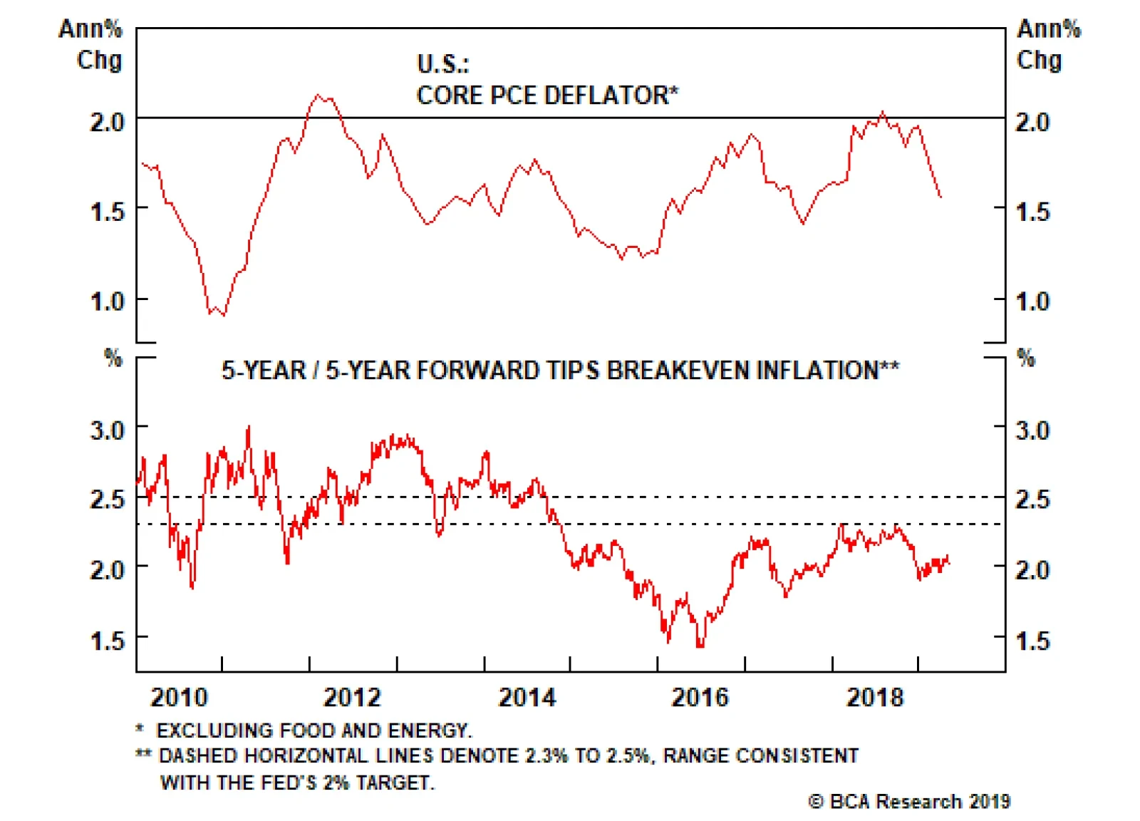
Highlights Chart 1Is Low Inflation Transitory?
Is Low Inflation Transitory?
Is Low Inflation Transitory?
Persistent /pə’sıst(ə)nt/ adj. If inflation runs persistently above or below 2 percent, then the Fed would be forced to adjust its policy stance to nudge it back towards target. Transitory /’trænsıtərı/ adj. If inflation’s deviation from target is only transitory, it means that it will return to target even if the Fed maintains its current policy stance. Symmetrical /sı‘metrık(ə)l/ adj. The Fed’s inflation target is symmetrical because the FOMC is as concerned with undershoots as it is with overshoots. More recently, some members are urging the Fed to demonstrate the target’s symmetry by explicitly pursuing an overshoot. Last week, Chair Powell described recent low inflation readings as transitory (Chart 1). In other words, the Fed believes that interest rates are already low enough to send inflation higher over time. Equally, with downbeat inflation expectations signaling doubts about the symmetry of the Fed’s target (bottom panel), the committee is in no rush to hike. The result is status quo monetary policy for the time being. With the market priced for 25 basis points of rate cuts over the next 12 months, investors should keep portfolio duration low. Feature Investment Grade: Overweight Chart 2Investment Grade Market Overview
Investment Grade Market Overview
Investment Grade Market Overview
Investment grade corporate bonds outperformed the duration-equivalent Treasury index by 95 basis points in April, bringing year-to-date excess returns up to +365 bps. The corporate bond sector’s strong outperformance has resulted in spread tightening across the credit spectrum. In fact, average index spreads for the Aaa, Aa and A credit tiers are now at or below our fair value targets.1 Only the Baa credit tier, which accounts for about 50% of index market cap, remains attractively valued, with an average spread 11 bps above target (Chart 2). We recommend that investors focus their investment grade credit exposure on Baa-rated bonds. The combination of above-trend economic growth and accommodative Fed policy creates a favorable environment for credit risk. Spreads should continue to tighten in the near-term. However, we will turn more cautious once Baa spreads reach our target. Gross corporate leverage ticked higher in Q4, breaking a year-long downtrend (panel 4). Meantime, while C&I lending standards eased slightly in Q1 after having tightened in Q4 (bottom panel), C&I loan demand contracted for the third consecutive quarter. Weaker loan demand in the Fed’s Senior Loan Officer Survey often precedes tighter lending standards, and tighter lending standards usually coincide with wider corporate bond spreads.
Chart
Chart
High-Yield: Overweight Chart 3High-Yield Market Overview
High-Yield Market Overview
High-Yield Market Overview
High-Yield outperformed the duration-equivalent Treasury index by 137 basis points in April, bringing year-to-date excess returns up to +710 bps. Junk spreads for all credit tiers remain above our spread targets (Chart 3).2 At present: The Ba-rated option-adjusted spread is 214 bps, 35 bps above target. The B-rated spread is 356 bps, 79 bps above target. The Caa-rated spread is 709 bps, 145 bps above target. An alternative valuation measure, the excess spread available in the junk index after accounting for expected default losses, is currently 267 bps, slightly above average historical levels (panel 4). However, this measure uses the Moody’s baseline default rate forecast of 1.7% for the next 12 months. For that forecast to be realized, it would require a substantial decline from the current default rate of 2.4%. In a previous Special Report, we flagged some reasons why the Moody’s forecast might be too optimistic.3 Among them is the increase in job cut announcements, which remains a concern despite last month’s drop (bottom panel). If we assume that the default rate holds at 2.4% for the next 12 months, the default-adjusted junk spread would fall to 237 bps. Still reasonably attractive by historical standards, and consistent with positive excess returns. MBS: Neutral Chart 4MBS Market Overview
MBS Market Overview
MBS Market Overview
Mortgage-Backed Securities underperformed the duration-equivalent Treasury index by 1 basis point in April, dragging year-to-date excess returns down to +27 bps. The conventional 30-year zero-volatility spread widened 1 bp on the month, as a 5 bps widening in the option-adjusted spread (OAS) was partially offset by a 4 bps drop in the compensation for prepayment risk (option cost). At 42 bps, the conventional 30-year OAS now looks elevated compared to recent years, though it remains below the pre-crisis mean (Chart 4). In fact, we would assign high odds to MBS outperformance during the next few months. Not only is the OAS attractive, but mortgage refinancings – which have recently caused the nominal MBS spread to widen – have probably peaked (panel 2). Following its sharp decline earlier in the year, the 30-year mortgage rate has now leveled-off. Another downleg is unlikely, given the recent improvements in housing data. New home sales and mortgage purchase applications have both surged in recent months, while homebuilder optimism remains close to one standard deviation above its long-run mean.4 Moreover, even at current mortgage rates we calculate that only about 17% of the conventional 30-year MBS index is refinanceable. All in all, given that corporate credit offers higher expected returns, we continue to recommend only a neutral allocation to MBS. However, MBS spreads are very likely to tighten during the next few months. Government-Related: Underweight Chart 5Government-Related Market Overview
Government-Related Market Overview
Government-Related Market Overview
The Government-Related index outperformed the duration-equivalent Treasury index by 37 basis points in April, bringing year-to-date excess returns up to +152 bps. Sovereign debt outperformed duration-equivalent Treasuries by 83 bps on the month, bringing year-to-date excess returns up to +420 bps. Local Authorities outperformed the Treasury benchmark by 67 bps and Foreign Agencies outperformed by 40 bps, bringing year-to-date excess returns up to +208 bps and +192 bps, respectively. Domestic Agencies outperformed by 10 bps in April, bringing year-to-date excess returns up to +29 bps. Supranationals outperformed by 7 bps on the month, bringing year-to-date excess returns up to +23 bps. The Fed’s on-hold policy stance and signs of improvement in leading global growth indicators could set the U.S. dollar up for a period of weakness. All else equal, a softer dollar makes USD-denominated sovereign debt easier to service, benefiting spreads. However, a period of dollar weakness driven by improving global growth would also benefit U.S. corporate bonds, and valuation is heavily tilted in favor of U.S. corporate debt relative to sovereigns (Chart 5). Given that the last period of significant sovereign outperformance versus corporates was preceded by much more attractive valuation (panels 2 & 3), we maintain an underweight allocation to sovereign debt for the time being. We make an exception for Mexican sovereign debt, where spreads are attractive compared to similarly rated U.S. corporates (bottom panel). Our Emerging Markets Strategy service also thinks that the market is taking too dim a view of Mexican government finances.5 Municipal Bonds: Overweight Chart 6Municipal Market Overview
Municipal Market Overview
Municipal Market Overview
Municipal bonds outperformed the duration-equivalent Treasury index by 52 basis points in April, bringing year-to-date excess returns up to +105 bps (before adjusting for the tax advantage). The average Aaa-rated Municipal / Treasury yield ratio fell 3% in April, and currently sits at 78% (Chart 6). This is more than one standard deviation below its post-crisis mean and slightly below the average of 81% that prevailed in the late stages of the previous cycle, between mid-2006 and mid-2007. Long-dated municipal bonds (10-year, 20-year and 30-year) outperformed short-dated munis (2-year and 5-year) dramatically last month, but yield ratios at the long end remain well above those at the short end of the curve (panel 2). In other words, the best value in the municipal bond space continues to be found at the long-end of the Aaa muni curve. We showed in a recent report that lower-rated and shorter-maturity munis are much less attractive.6 First quarter GDP data revealed that state & local government tax revenues snapped back sharply in Q1, following a contraction in 2018 Q4. Meanwhile, current expenditures actually ticked down. Incorporating an assumption for Q1 corporate tax revenues, we forecast that state & local government interest coverage jumped to 16% in Q1 from 4% in 2018 Q4.7 This is consistent with municipal ratings upgrades continuing to outpace downgrades for the time being (bottom panel). Treasury Curve: Adopt A Barbell Curve Positioning Chart 7Treasury Yield Curve Overview
Treasury Yield Curve Overview
Treasury Yield Curve Overview
The Treasury curve bear-steepened in April. The 2/10 Treasury slope steepened 10 bps on the month and currently sits at 21 bps (Chart 7). The 5/30 slope steepened 7 bps on the month and currently sits at 60 bps. In recent reports we have urged investors to adopt barbell positions along the yield curve. In particular, investors should avoid the 5-year and 7-year maturities and instead focus their allocations at the very short and long ends of the curve.8 There are three main reasons to prefer a barbell positioning. First, the 5-year and 7-year yields are most sensitive to changes in our 12-month discounter. In other words, those yields fall the most when the market prices in rate cuts and rise the most when it prices in rate hikes. With recession likely to be avoided this year, the market will eventually price rate hikes back into the curve. Second, barbells currently offer a yield pick-up relative to bullets. The duration-matched 2/10 barbell offers 8 bps more yield than the 5-year bullet (panel 4), and the duration-matched 2/30 barbell offers 5 bps more yield than the 7-year bullet. This means that investors will earn positive carry in barbell positions while they wait for rate hikes to get priced back in. Finally, almost all barbell combinations look cheap according to our yield curve fair value models (see Appendix B). TIPS: Overweight Chart 8TIPS Market Overview
Inflation Compensation
Inflation Compensation
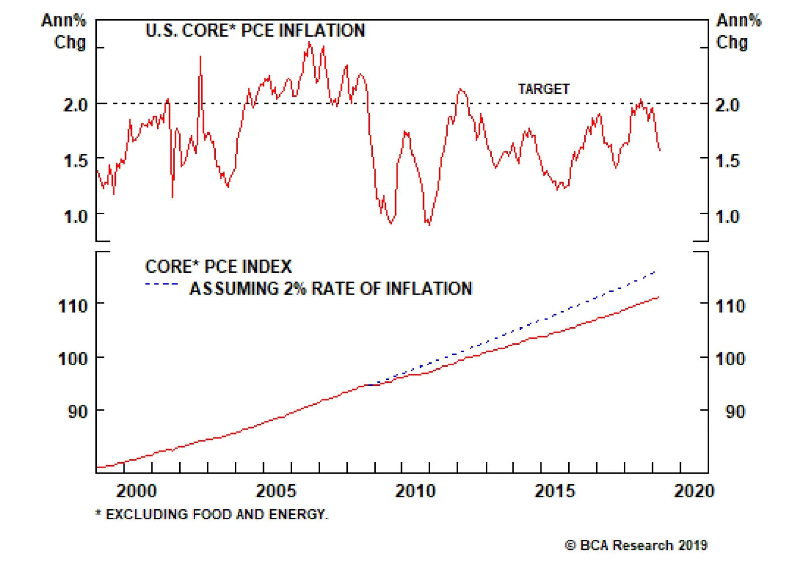
TIPS outperformed the duration-equivalent nominal Treasury index by 81 basis points in April, bringing year-to-date excess returns up to +157 bps. The 10-year TIPS breakeven inflation rate rose 13 bps on the month and currently sits at 1.91% (Chart 8). The 5-year/5-year forward TIPS breakeven inflation rate rose 12 bps on the month and currently sits at 2.02%. Both rates remain below the 2.3% - 2.5% range that has historically been consistent with inflation expectations that are well-anchored around the Fed’s target. As we noted in a recent report, the Fed has clearly pivoted to a more dovish stance in an effort to re-anchor inflation expectations at levels more consistent with its 2% target.9 This change should support wider TIPS breakevens, though investors will also need to see evidence of firming realized inflation before meaningful upside materializes. So far, such evidence is in short supply. Year-over-year core PCE inflation dipped to 1.55% in March. However, as Fed Chair Powell went out of his way to mention in last week’s press conference, core PCE was dragged down by one-off adjustments in the ‘Clothing & Footwear’ and ‘Financial Services’ components. In fact, 12-month trimmed mean PCE inflation actually moved up in March. It now sits at 1.96%, just below the Fed’s target (bottom panel). The combination of a dovish Fed and above-trend economic growth should push TIPS breakevens higher over time. Maintain an overweight allocation to TIPS versus nominal Treasuries. ABS: Underweight Chart 9ABS Market Overview
ABS Market Overview
ABS Market Overview
Asset-Backed Securities outperformed the duration-equivalent Treasury index by 9 basis points in April, bringing year-to-date excess returns up to +49 bps. The index option-adjusted spread for Aaa-rated ABS narrowed one basis point on the month and, at 32 bps, it remains close to its all-time low (Chart 9). In addition to poor valuation, the sector’s credit fundamentals are also shifting in a negative direction. Household interest payments continue to trend up, suggesting a higher delinquency rate going forward (panel 3). Meanwhile, the Fed’s Senior Loan Officer Survey revealed that average consumer lending standards tightened in Q1 for the second consecutive quarter. Tighter lending standards usually coincide with rising consumer delinquencies (bottom panel). Loan officers also reported slowing demand for credit cards for the fifth consecutive quarter, and slowing auto loan demand for the third consecutive quarter. The combination of poor value and deteriorating credit quality leads us to recommend an underweight allocation to consumer ABS. Non-Agency CMBS: Neutral Chart 10CMBS Market Overview
CMBS Market Overview
CMBS Market Overview
Non-Agency Commercial Mortgage-Backed Securities outperformed the duration-equivalent Treasury index by 40 basis points in April, bringing year-to-date excess returns up to +187 bps. The index option-adjusted spread for non-agency Aaa-rated CMBS tightened 6 bps on the month. It currently sits at 67 bps, below its average pre-crisis level but somewhat higher than levels seen last year (Chart 10). In a recent report, we noted that non-agency CMBS offer the best risk/reward trade-off of any Aaa-rated U.S. spread product.10 While we remain cautious on the macro outlook for commercial real estate, noting that prices are decelerating (panel 3) and banks are tightening lending standards (panel 4) amidst falling demand (bottom panel), we view elevated CMBS spreads as providing reasonable compensation for this risk for the time being. Agency CMBS: Overweight Agency CMBS outperformed the duration-equivalent Treasury index by 21 basis points in April, bringing year-to-date excess returns up to +95 bps. The index option-adjusted spread tightened 2 bps on the month and currently sits at 47 bps. The Excess Return Bond Map in Appendix C shows that Agency CMBS offer high potential return compared to other low-risk spread products. An overweight allocation to this defensive sector remains appropriate. Appendix A - The Golden Rule Of Bond Investing We follow a two-step process to formulate recommendations for bond portfolio duration. First, we determine the change in the federal funds rate that is priced into the yield curve for the next 12 months. Second, we decide – based on our assessments of the economy and Fed policy – whether the change in the fed funds rate will exceed or fall short of what is priced into the curve. Most of the time, a correct answer to this question leads to the appropriate duration call. We call this framework the Golden Rule Of Bond Investing, and we demonstrated its effectiveness in the U.S. Bond Strategy Special Report, “The Golden Rule Of Bond Investing”, dated July 24, 2018, available at usbs.bcaresearch.com. Chart 11 illustrates the Golden Rule’s track record by showing that the Bloomberg Barclays Treasury Master Index tends to outperform cash when rate hikes fall short of 12-month expectations, and vice-versa. At present, the market is priced for 25 basis points of cuts during the next 12 months. We do not anticipate any rate cuts during this timeframe, and therefore recommend that investors maintain below-benchmark portfolio duration. Chart 11The Golden Rule's Track Record
The Golden Rule's Track Record
The Golden Rule's Track Record
We can also use our Golden Rule framework to make 12-month total return and excess return forecasts for the Bloomberg Barclays Treasury index under different scenarios for the fed funds rate. Excess returns are relative to the Bloomberg Barclays Cash index. To forecast total returns we first calculate the 12-month fed funds rate surprise in each scenario by comparing the assumed change in the fed funds rate to the current value of our 12-month discounter. This rate hike surprise is then mapped to an expected change in the Treasury index yield using a regression based on the historical relationship between those two variables. Finally, we apply the expected change in index yield to the current characteristics (yield, duration and convexity) of the Treasury index to estimate total returns on a 12-month horizon. The below tables present those results, along with 95% confidence intervals. Excess returns are calculated by subtracting assumed cash returns in each scenario from our total return projections.
Image
Image
Appendix B - Butterfly Strategy Valuation The following tables present the current read-outs from our butterfly spread models. We use these models to identify opportunities to take duration-neutral positions across the Treasury curve. The following two Special Reports explain the models in more detail: U.S. Bond Strategy Special Report, “Bullets, Barbells And Butterflies”, dated July 25, 2017, available at usbs.bcaresearch.com U.S. Bond Strategy Special Report, “More Bullets, Barbells And Butterflies”, dated May 15, 2018, available at usbs.bcaresearch.com Table 4 shows the raw residuals from each model. A positive value indicates that the bullet is cheap relative to the duration-matched barbell. A negative value indicates that the barbell is cheap relative to the bullet. Table 4Butterfly Strategy Valuation: Raw Residuals In Basis Points (As of April 30, 2019)
The Fed's Inflation Dictionary
The Fed's Inflation Dictionary
Table 5 scales the raw residuals in Table 4 by their historical means and standard deviations. This facilitates comparison between the different butterfly spreads. Table 5Butterfly Strategy Valuation: Standardized Residuals (As of April 30, 2019)
The Fed's Inflation Dictionary
The Fed's Inflation Dictionary
Table 6 flips the models on their heads. It shows the change in the slope between the two barbell maturities that must be realized during the next six months to make returns between the bullet and barbell equal. For example, a reading of +56 bps in the 5 over 2/10 cell means that we would only expect the 5-year to outperform the 2/10 if the 2/10 slope steepens by more than 56 bps during the next six months. Otherwise, we would expect the 2/10 barbell to outperform the 5-year bullet. Table 6Discounted Slope Change During Next 6 Months (BPs)
The Fed's Inflation Dictionary
The Fed's Inflation Dictionary
Appendix C - Excess Return Bond Map The Excess Return Bond Map is used to assess the relative risk/reward trade-off between different sectors of the U.S. fixed income market. The Map employs volatility-adjusted breakeven spread analysis to show how likely it is that a given sector will earn/lose money during the subsequent 12 months. The Map does not incorporate any macroeconomic view. The horizontal axis of the Map shows the number of days of average spread widening required for each sector to lose 100 bps versus a position in duration-matched Treasuries. Sectors plotting further to the left require more days of average spread widening and are therefore less likely to see losses. The vertical axis shows the number of days of average spread tightening required for each sector to earn 100 bps in excess of duration-matched Treasuries. Sectors plotting further toward the top require fewer days of spread tightening and are therefore more likely to earn 100 bps of excess return.
Chart 12
Ryan Swift, U.S. Bond Strategist rswift@bcaresearch.com Jeremie Peloso, Research Analyst jeremiep@bcaresearch.com Footnotes 1 For further details on how we arrive at our spread targets please see U.S. Bond Strategy Weekly Report, “Paid To Wait”, dated February 26, 2019, available at usbs.bcaresearch.com 2 For further details on how we arrive at our spread targets please see U.S. Bond Strategy Weekly Report, “Paid To Wait”, dated February 26, 2019, available at usbs.bcaresearch.com 3 Please see U.S. Bond Strategy Special Report, “Assessing Corporate Default Risk”, dated March 19, 2019, available at usbs.bcaresearch.com 4 Please see U.S. Bond Strategy Weekly Report, “A High Bar For Rate Cuts”, dated April 30, 2019, available at usbs.bcaresearch.com 5 Please see Emerging Markets Strategy Special Report, “Mexico: The Best Value In EM Fixed Income”, dated April 23, 2019, available at ems.bcaresearch.com 6 Please see U.S. Bond Strategy Weekly Report, “Full Speed Ahead”, dated April 16, 2019, available at usbs.bcaresearch.com 7 Corporate tax revenue is not released until the second GDP estimate. We assume that the 2019 Q1 value equals the 2018 Q4 value. 8 Please see U.S. Bond Strategy Weekly Report, “Paid To Wait”, dated February 26, 2019, available at usbs.bcaresearch.com 9 Please see U.S. Bond Strategy Weekly Report, “The New Battleground For Monetary Policy”, dated March 26, 2019, available at usbs.bcaresearch.com 10 Please see U.S. Bond Strategy Weekly Report, “The Search For Aaa Spread”, dated March 12, 2019, available at usbs.bcaresearch.com Fixed Income Sector Performance Recommended Portfolio Specification Corporate Sector Relative Valuation And Recommended Allocation
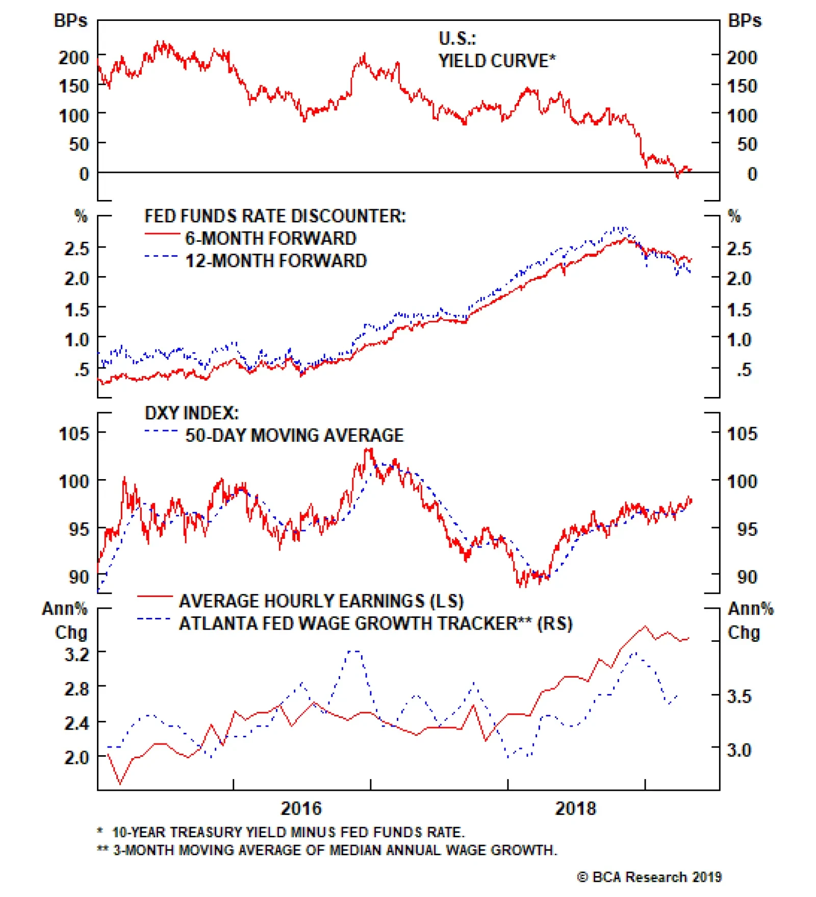
Feature Leading indicators of inflation, and hence a hawkish Fed, remain biased to the upside. The S&P 500 is close to all-time highs, the U.S. dollar has been strong this year, and wage growth has been resilient. Almost exactly eight years ago, we published a report examining historical sector performance across the various Fed tightening cycles.1 We now find ourselves on the other side with a Fed that has adopted an abruptly dovish stance and a recently inverted 10-year/fed funds rate yield curve indicating the market’s expectation that the next Fed move will be a cut. Accordingly, we have updated our research to analyze the opposite perspective when rates are falling and answer the question: what sectors perform best when the Fed eases? Such an exercise may seem ill-timed; leading indicators of inflation, and hence a hawkish Fed, remain biased to the upside. The S&P 500 is close to all-time highs, the U.S. dollar has been strong this year, and wage growth has been resilient (Chart 1). Nevertheless, we have been inundated by client requests on this topic and, while we may well be early in its production, its use as a sector positioning/return road map is evergreen and not necessarily to forecast that a Fed cut is nearing. Chart 1Inflation Indicators Still Don’t Point To A Cut
Inflation Indicators Still Don’t Point To A Cut
Inflation Indicators Still Don’t Point To A Cut
The results of our analysis of the seven Fed loosening cycles since 1965 are presented in Table 1. While we highlight the May 1980 iteration as an easing cycle, we have excluded it from our analysis owing to its returns overlap with the March 1981 iteration less than a year later, which offers a cleaner analysis. Table 1Sector Relative Performance And Seven Fed Easing Cycles
Sector Performance And Fed Loosening Cycles: A Historical Roadmap
Sector Performance And Fed Loosening Cycles: A Historical Roadmap
Still, the sector results are telling: defensives lead the pack in advance of a rate cut as market participants smell trouble and a defensive rotation occurs. Some of the results should be taken with a grain of salt. As shown in Table 1, the broad market delivers significant returns 24 months after an easing cycle begins. However, the last two easing cycles (January 2001 and September 2007) witnessed the S&P returning -37% and -31%, respectively, two years post rate cut. Thus, a rate cut does not signal with certainty a positive two year return. The key source of funds in this defensive rotation in advance of a loosening cycle is S&P tech which underperforms early and continues to underperform dramatically through the initial stages of the loosening cycle. Still, the sector results are telling: defensives lead the pack in advance of a rate cut as market participants smell trouble and a defensive rotation occurs (Chart 2). However, the results are not unambiguous as the rate-sensitive defensive S&P utilities and S&P telecoms indexes both underperform early while S&P consumer staples and S&P health care are the top performers of all sectors prior to, and both one and two years post rate cut (Charts 4 & 5).
Chart 2
Chart 3
The key source of funds in this defensive rotation in advance of a loosening cycle is S&P tech which underperforms early and continues to underperform dramatically through the initial stages of the loosening cycle (Chart 3). This is an excellent and consistent leading signal that we are monitoring closely. S&P tech’s deep cyclical peer S&P industrials surprisingly does not show advance warning of a loosening cycle, though persistently underperform once the cycle is underway. Also surprising is S&P energy’s outperformance in the early stages of a lower rate environment.
Chart 4
Chart 5
The current implied fed funds probabilities are roughly 50-50 for a rate cut at the Fed’s December 2019 meeting and move increasingly towards a rate cut thereafter. While we are not forecasting a cut and BCA’s view remains one of no recession for the coming 12 months, were a Fed cut to materialize, our barbell portfolio approach will likely be able to absorb the Fed shock. We highlight our overweight recommendation on S&P consumer staples and S&P energy along with our neutral recommendation on S&P health care as sector winners in an easing cycle and our underweight recommendation for S&P consumer discretionary as a sector laggard as rates fall. We further note our neutral recommendation on S&P tech. The reference charts below show individual sector relative performance charts along with the fed funds rate (shaded areas depict the initial Fed rate cut). Chris Bowes, Associate Editor U.S. Equity Strategy ChrisB@bcaresearch.com Anastasios Avgeriou, U.S. Equity Strategist anastasios@bcaresearch.com Chart 6
CHART 6
CHART 6
Chart 7
CHART 7
CHART 7
Chart 8
CHART 8
CHART 8
Chart 9
CHART 9
CHART 9
Chart 10
CHART 10
CHART 10
Chart 11
CHART 11
CHART 11
Chart 12
CHART 12
CHART 12
Chart 13
CHART 13
CHART 13
Chart 14
CHART 14
CHART 14
Chart 15
CHART 15
CHART 15
Footnotes 1 Please see BCA U.S. Equity Strategy Special Report, “Sector Performance And Fed Tightening Cycles: An Historical Roadmap” dated April 25, 2011, available at uses.bcaresearch.com.
Feature The U.S.-China trade talks have not yet collapsed but they appear to be reaching a “make it or break it” moment. President Donald Trump renewed his threat of heightening tariffs on Chinese imports on May 5, in the interim between two weeks of shuttle diplomacy in Beijing and next in Washington that have been billed as the final round of negotiations. Chinese officials responded to Trump’s new tariff remarks by threatening to pull out of the talks. The status of the Chinese delegation due in Washington this week is unclear as we go to press. Specifically, President Trump has claimed that he would increase the current 10% tariff rate on $200 billion worth of Chinese imports to 25%, a move that was originally due on March 1, but was delayed to extend the talks and seek a better agreement. Trump also threatened to raise tariffs on the remaining $325 billion of Chinese imports that are so far untouched. This is the most significant escalation in rhetoric since before the tariff truce agreed on December 1 between Trump and Chinese President Xi Jinping in Buenos Aires. True, the threat to increase the tariffs is a last-minute pressure tactic tied to the administration’s attempt to make this week “the final week” of the talks. American advisers have said that at the end of these two weeks they would make a recommendation to the president either to sign a deal or walk away. For this reason, it is not certain that Trump will follow through with the increase. However, we consider the threat credible. The costs of trade war are not prohibitive to the U.S. or China considering the strategic interests at stake in their great power competition (Chart 1). And since December 1, we have argued that a relapse into trade war and rising tariffs was a substantial risk at 30% odds; this threat increases those odds. Chart 1The Era Of U.S.-China Detente Is Over
The Era Of U.S.-China Detente Is Over
The Era Of U.S.-China Detente Is Over
Talks have been deteriorating for the past month at least. First, the trade grievances at the root of the trade war with China – namely corporate espionage, hacking, forced technology transfer, intellectual property theft, and the American-allied restrictions on Chinese telecoms firm Huawei – were always going to be extremely difficult to settle. These are apparently weighing on the ability of Washington and Beijing to close an agreement. Second, tensions have recently flared across the entire range of U.S.-China strategic disagreements, including most importantly North Korea and Iran. In late April, the U.S. demanded that China halt all imports of Iranian oil by the end of May in order to avoid secondary sanctions that, in theory, could affect China’s central bank and other banks. Meanwhile North Korea has conducted two minor but provocative weapon tests (including short-range missiles on May 4) since the failed summit between Trump and Kim Jong Un in Hanoi. Washington expects Beijing to keep North Korea in check and involved in diplomacy as part of the broader strategic negotiation. Taiwan and the South China Sea are also simmering due to U.S.-Taiwan diplomacy and arms sales, Chinese military drills, and the U.S. decision to treat China’s “maritime militia” like its navy. Trump’s latest threat reduces the chances of an extension of the talks beyond June to 10%, while raising the odds of a collapse in talks and escalation of trade war to 40%. As a result of these developments, and the dragging on of talks, we put the odds of a trade deal by the end of June at 50% in our April 10 report. Trump’s latest threat reduces the chances of an extension of the talks beyond June to 10%, while raising the odds of a collapse in talks and escalation of trade war to 40% (Table 1). Table 1Updated Trade War Probabilities (May 2019)
U.S. And China Get Cold Feet
U.S. And China Get Cold Feet
From the Chinese point of view, Trump’s threat makes it harder to clinch a deal. Trump’s use of sweeping, unilateral tariffs on national security grounds has forced China into an awkward position. It is politically and ideologically toxic for Beijing to appear to capitulate to coercion, i.e. nineteenth-century-style tactics of gunboat diplomacy and western imperialism. The tariff truce in Buenos Aires minimized the appearance that China is negotiating under duress, giving Xi Jinping the ability to negotiate and make concessions without losing face. While China is in the weaker position economically, and therefore would prefer a deal, it will batten down the hatches and fight a trade war if forced to do so. The risk of other executive decisions disruptive to markets is going up. The implication for investors is threefold. First, the USD and U.S. equities will continue to outperform global counterparts as trade policy uncertainty shoots back up (Chart 2). The American economy is more insulated from global trade and the dollar is counter-cyclical. But as U.S. equities have rallied and volatility will go up, U.S. equities may simply fall less rapidly than Chinese and others. Chart 2U.S. Will Outperform On Rising Trade Uncertainty
U.S. Will Outperform On Rising Trade Uncertainty
U.S. Will Outperform On Rising Trade Uncertainty
Second, our view that China’s economic stimulus will surprise to the upside is reinforced by this development, as Beijing cannot afford to withdraw or pause stimulus when it still faces such a severe external risk to its manufacturing sector and employment (Chart 3). This will counteract the negative impact to global sentiment and manufacturing expected from any additional tariffs, creating more volatility in commodity and emerging market assets. Third, as we recognized in the case of Trump’s renewed “maximum pressure” tactic on Iran, the president is apparently not concerned with minimizing risks to the economy ahead of the 2020 election. His risk appetite remains voracious. Therefore the risk of other executive decisions disruptive to markets is going up. For instance, our 35% chance that Trump will impose Section 232 tariffs on auto and auto part imports, particularly from Europe, is rising toward 50% (Chart 4). Chart 3China Cannot Afford to Withhold Stimulus
China Cannot Afford to Withhold Stimulus
China Cannot Afford to Withhold Stimulus
Chart 4
Bottom Line: The odds of a re-escalation of the trade war have risen to 40%. American equities should outperform global, while safe-haven assets, such as a portfolio hedge of Swiss bonds and gold, should catch a bid. We are closing out our long copper trade for a loss of 3.58% as well as our long Chinese equities ex-tech trade for a gain of 6.59%. Matt Gertken, Geopolitical Strategist mattg@bcaresearch.com