Policy

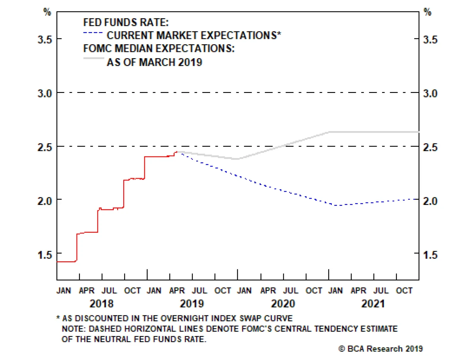
Feature The U.S.-China trade talks have not yet collapsed but they appear to be reaching a “make it or break it” moment. President Donald Trump renewed his threat of heightening tariffs on Chinese imports on May 5, in the interim between two weeks of shuttle diplomacy in Beijing and next in Washington that have been billed as the final round of negotiations. Chinese officials responded to Trump’s new tariff remarks by threatening to pull out of the talks. The status of the Chinese delegation due in Washington this week is unclear as we go to press. Specifically, President Trump has claimed that he would increase the current 10% tariff rate on $200 billion worth of Chinese imports to 25%, a move that was originally due on March 1, but was delayed to extend the talks and seek a better agreement. Trump also threatened to raise tariffs on the remaining $325 billion of Chinese imports that are so far untouched. This is the most significant escalation in rhetoric since before the tariff truce agreed on December 1 between Trump and Chinese President Xi Jinping in Buenos Aires. True, the threat to increase the tariffs is a last-minute pressure tactic tied to the administration’s attempt to make this week “the final week” of the talks. American advisers have said that at the end of these two weeks they would make a recommendation to the president either to sign a deal or walk away. For this reason, it is not certain that Trump will follow through with the increase. However, we consider the threat credible. The costs of trade war are not prohibitive to the U.S. or China considering the strategic interests at stake in their great power competition (Chart 1). And since December 1, we have argued that a relapse into trade war and rising tariffs was a substantial risk at 30% odds; this threat increases those odds. Chart 1The Era Of U.S.-China Detente Is Over
The Era Of U.S.-China Detente Is Over
The Era Of U.S.-China Detente Is Over
Talks have been deteriorating for the past month at least. First, the trade grievances at the root of the trade war with China – namely corporate espionage, hacking, forced technology transfer, intellectual property theft, and the American-allied restrictions on Chinese telecoms firm Huawei – were always going to be extremely difficult to settle. These are apparently weighing on the ability of Washington and Beijing to close an agreement. Second, tensions have recently flared across the entire range of U.S.-China strategic disagreements, including most importantly North Korea and Iran. In late April, the U.S. demanded that China halt all imports of Iranian oil by the end of May in order to avoid secondary sanctions that, in theory, could affect China’s central bank and other banks. Meanwhile North Korea has conducted two minor but provocative weapon tests (including short-range missiles on May 4) since the failed summit between Trump and Kim Jong Un in Hanoi. Washington expects Beijing to keep North Korea in check and involved in diplomacy as part of the broader strategic negotiation. Taiwan and the South China Sea are also simmering due to U.S.-Taiwan diplomacy and arms sales, Chinese military drills, and the U.S. decision to treat China’s “maritime militia” like its navy. Trump’s latest threat reduces the chances of an extension of the talks beyond June to 10%, while raising the odds of a collapse in talks and escalation of trade war to 40%. As a result of these developments, and the dragging on of talks, we put the odds of a trade deal by the end of June at 50% in our April 10 report. Trump’s latest threat reduces the chances of an extension of the talks beyond June to 10%, while raising the odds of a collapse in talks and escalation of trade war to 40% (Table 1). Table 1Updated Trade War Probabilities (May 2019)
U.S. And China Get Cold Feet
U.S. And China Get Cold Feet
From the Chinese point of view, Trump’s threat makes it harder to clinch a deal. Trump’s use of sweeping, unilateral tariffs on national security grounds has forced China into an awkward position. It is politically and ideologically toxic for Beijing to appear to capitulate to coercion, i.e. nineteenth-century-style tactics of gunboat diplomacy and western imperialism. The tariff truce in Buenos Aires minimized the appearance that China is negotiating under duress, giving Xi Jinping the ability to negotiate and make concessions without losing face. While China is in the weaker position economically, and therefore would prefer a deal, it will batten down the hatches and fight a trade war if forced to do so. The risk of other executive decisions disruptive to markets is going up. The implication for investors is threefold. First, the USD and U.S. equities will continue to outperform global counterparts as trade policy uncertainty shoots back up (Chart 2). The American economy is more insulated from global trade and the dollar is counter-cyclical. But as U.S. equities have rallied and volatility will go up, U.S. equities may simply fall less rapidly than Chinese and others. Chart 2U.S. Will Outperform On Rising Trade Uncertainty
U.S. Will Outperform On Rising Trade Uncertainty
U.S. Will Outperform On Rising Trade Uncertainty
Second, our view that China’s economic stimulus will surprise to the upside is reinforced by this development, as Beijing cannot afford to withdraw or pause stimulus when it still faces such a severe external risk to its manufacturing sector and employment (Chart 3). This will counteract the negative impact to global sentiment and manufacturing expected from any additional tariffs, creating more volatility in commodity and emerging market assets. Third, as we recognized in the case of Trump’s renewed “maximum pressure” tactic on Iran, the president is apparently not concerned with minimizing risks to the economy ahead of the 2020 election. His risk appetite remains voracious. Therefore the risk of other executive decisions disruptive to markets is going up. For instance, our 35% chance that Trump will impose Section 232 tariffs on auto and auto part imports, particularly from Europe, is rising toward 50% (Chart 4). Chart 3China Cannot Afford to Withhold Stimulus
China Cannot Afford to Withhold Stimulus
China Cannot Afford to Withhold Stimulus
Chart 4
Bottom Line: The odds of a re-escalation of the trade war have risen to 40%. American equities should outperform global, while safe-haven assets, such as a portfolio hedge of Swiss bonds and gold, should catch a bid. We are closing out our long copper trade for a loss of 3.58% as well as our long Chinese equities ex-tech trade for a gain of 6.59%. Matt Gertken, Geopolitical Strategist mattg@bcaresearch.com
Highlights The business cycle has been extended, … : The expansion is nearly a year older than it was last summer, but the next recession could well be further away now than we estimated it was back then. … thanks to the Fed’s pause, … : Recessions only occur when monetary conditions are tight. The longer the Fed pauses its rate-hiking campaign, the longer the expansion will persist. … and the upshot is that the shelf life of our recommendations has been extended: Corporate earnings don’t meaningfully contract outside of recessions, so equities don’t typically enter bear markets, and bond defaults don’t typically spike, while the economy is expanding. Stay the course until monetary policy is on the way to turning restrictive: The Fed’s pause is risk-asset-friendly, and investors should continue to prioritize the return on their capital. Focusing on return of capital can wait until monetary policy turns hawkish. Feature Late last July, we began outlining our positions on the key macro drivers of financial markets: rates, credit, the business cycle, and the state of monetary policy. Laying out our big-picture views, and the rationale underpinning them, provides us with a framework for evaluating incoming data and adjusting asset-allocation strategy as necessary. Nine months on, our macro views are very nearly unchanged, and we expect they will remain so for the rest of the year. That would have come as a surprise to us last summer, when we anticipated that 2019 might finally bring the macro inflection points that would dictate de-risking portfolios to preserve capital ahead of the next bear market. The Fed’s pause has been the key to extending the shelf life of our views. We continue to expect that the transition from accommodative to restrictive monetary policy will be the catalyst for the inflection points that investors most care about: the end of the expansion, the end of the equity bull market, and the point at which spread product ceases to generate positive excess returns over Treasuries. By abandoning the gradual normalization pace it maintained throughout 2017 and 2018, the Fed has postponed its crossing of the neutral-rate Rubicon. That postponement has indefinitely extended the expansion, and the credit and equity bull markets in turn. There is no free lunch, however. Unless low rates for even longer shift the economy’s potential long-run growth rate higher, they will only pull future investment gains forward into the present. In other words, we expect the Fed’s pause will allow risk assets to reach higher cyclical peaks than they otherwise would at the cost of suffering larger declines once restrictive monetary policy settings are ultimately imposed. Barring an exogenous shock that causes a recession or some sort of financial-market scare, we expect robust investment returns, possibly crowned by an incremental melt-up in equities. The longer the Fed delays removing monetary accommodation, the longer the expansion, and the equity bull market, will continue. Our base case, then, is to stay the course with risk-friendly positioning, maintaining at least an equal weight in equities and spread product. We are expending much of our research energy on weighing the challenges to our constructive view. We are particularly focused on signs that the nine rate hikes the Fed has already executed might be slowing the economy, that the economy is at risk of overheating, or that investor euphoria constrains future returns. This week’s report considers the current backdrop on all three counts. Has The Fed Already Squeezed The Economy? At first blush, the first quarter’s real 3.2% growth would seem to do in the notion that the Fed has already reined in the economy. Alas, there was much less to the GDP release than meets the eye, as it was goosed by a 100-basis-point (“bps”) contribution from net exports and a 65-bps contribution from inventory restocking (Chart 1). Real final domestic demand grew by only 1.5%. Measured against 2018’s 3% growth in real final domestic demand, and 2.5% and 2.4% in 2017 and 2016, respectively, the first quarter represented a noticeable slowdown. Given the 40-bps decline in fiscal thrust from 2018 to 2019 (Chart 2), some growth deceleration is inevitable this year. Thanks to a projected 40 bps of fiscal stimulus, we expect that growth will still exceed the economy’s long-run approximate 2% potential growth rate. We are undeterred by the first quarter’s underlying weakness, though, because the economy is not likely to face such daunting challenges again this year. The first quarter began on the heels of a sudden 19% peak-to-trough decline in the S&P 500 that shaved nearly $4 trillion from household wealth; a similar blowout in credit spreads spooked would-be home buyers and must have made some business borrowers table their investment plans. Chart 1Much Less Than Meets The Eye
Much Less Than Meets The Eye
Much Less Than Meets The Eye
Chart 2Fiscal Policy Is Still Easy
Fiscal Policy Is Still Easy
Fiscal Policy Is Still Easy
The quarter also began in the midst of the 35-day federal government shutdown that lasted nearly all of January. Furloughed government employees would eventually receive back pay for the days they were involuntarily idle, but many had no choice but to curtail spending until they did, causing ripple effects in communities with high concentrations of federal employees. The White House Council of Economic Advisers estimated that the shutdown trimmed 10 basis points a week from GDP. We presented the high-level outlook for GDP growth a month ago, with particular emphasis on the consumption outlook.1 Our constructive consumption view is a function of the surging labor market’s impact on household incomes and the post-crisis shoring up of household balance sheets. Consumer confidence has declined from its cyclical peak, but it remains elevated relative to history, and the expectations component has historically marched in lockstep with consumption (Chart 3). The two series have diverged over the last few years, perhaps because of a desire to shore up balance sheets, but consumer confidence remains elevated, and is positioned to support spending in much the same way as bulked-up household balance sheets (Chart 4). Chart 3Ample Confidence Leaves Plenty Of Room For More Spending
Ample Confidence Leaves Plenty Of Room For More Spending
Ample Confidence Leaves Plenty Of Room For More Spending
Solid consumption should bolster nonresidential investment, and survey data suggest that it is not about to roll over in any event (Chart 5). Residential investment has exerted a modest drag on GDP for seven of the last eight quarters, but homes remain quite affordable relative to history, and we still see the single-family housing market as undersupplied. Our GDP outlook showed that the state and local component of government spending should be well supported by growing household incomes, and ventured that it’s hard to see how federal spending will slip in a presidential election year. Last week’s preliminary bipartisan discussions about a $2 trillion infrastructure-spending plan would seem to ensure that it won’t. Chart 4Consumption Fundamentals Are Solid ...
Consumption Fundamentals Are Solid ...
Consumption Fundamentals Are Solid ...
Chart 5... Which Bodes Well For Capex
... Which Bodes Well For Capex
... Which Bodes Well For Capex
Are There Signs That The Economy Could Overheat? With its pause, the Fed has indicated that it sees little near-term risk of economic overheating. The available data support that conclusion. Even after a steady multi-year recovery, cyclical spending as a share of GDP is only around its long-run average level (Chart 6, top panel). The three components of cyclical spending that are prone to harmful inventory overhangs – consumer durables (Chart 6, second panel), commercial real estate (Chart 6, fourth panel), and residential real estate (Chart 6, bottom panel) – are all at fairly low levels relative to history. Only equipment and intellectual property is elevated (Chart 6, third panel), but the bulk of its growth is attributable to investment in software and R&D, neither of which carries the same fraught inventory implications as the tangible-good components. One silver lining of the tepid expansion is that it hasn’t ever revved up the engine enough to overheat. Chart 6Cyclical Spending Is Well Below Past Peaks
Cyclical Spending Is Well Below Past Peaks
Cyclical Spending Is Well Below Past Peaks
Chart 7Inventories Are Elevated ...
Inventories Are Elevated ...
Inventories Are Elevated ...
The wholesale inventory-to-sales ratio is elevated (Chart 7), and registers as a yellow light. The labor market is running hot, and we believe it will eventually force the Fed to resume tightening policy, but probably not in any meaningful way until 2020. Injecting a substantial amount of stimulus into an economy already operating at capacity is a textbook recipe for inflation, but inflation is a lagging indicator and the steep decline in oil prices has held back headline price measures. The bottom line is that the aggregate macro data do not suggest that the U.S. economy is in any immediate danger of overheating. Are Investors Too Optimistic? Investor sentiment is properly viewed as a contrarian indicator. When investors are depressed, equity multiples are low and forward earnings expectations are restrained. When they’re euphoric, equity multiples are high and forward earnings expectations are ambitious. The multiple/expectations interaction makes for juicy prospective returns when sentiment is washed out, and stingy prospective returns when sentiment is ebullient. Chart 8... But Sentiment Is Not
... But Sentiment Is Not
... But Sentiment Is Not
Barron’s semi-annual Big Money poll of money managers, published in its April 29th edition, suggests that sentiment is nowhere near either extreme, though its respondents are less constructive on equities and the economy than we are. Fewer than half of money managers are bullish on equities over the next twelve months for the first time since 2016, and more of their clients are bearish than bullish. The bullish managers’ expectations were modest; they saw the S&P 500 gaining just over 4% by year-end, and another 3% in the first half of 2020.2 The Barron’s data aligns with other sentiment surveys: individual investor bullishness is below its historical mean (Chart 8, second panel), while advisor optimism is about a standard deviation above its average (Chart 8, third panel), and trader sentiment is slightly bullish (Chart 8, bottom panel). Recession fears continue to dog the markets. Economic slowdown or recession was the most common concern (28%), followed by earnings disappointments (21%) and Fed missteps (13%), meaning that almost two-thirds of investors are concerned about the business cycle and the possibility that the Fed might short-circuit it. One-half of respondents expect a recession to arrive by the end of next year. Their sector calls didn’t reflect a strong cyclicals/defensives bias, though they are avoiding bond proxies like REITs and Utilities, and the majority of respondents expect the 10-year Treasury to yield 3% or more a year from now. Investment Implications The U.S. economy is faring well, but continued above-trend growth is not assured. First quarter GDP was inflated by a one-off boost from net exports and inventory restocking that is not likely to be repeated. A robust labor market should support consumption, but wholesale inventories are high, and retail sales have been making large swings from month to month. We believe that Chinese policymakers have tabled their deleveraging campaign, helping the Chinese economy to rebound and pull the rest of the world along with it, but it is too early to say for certain that ex-U.S. growth has turned around. The uncertain global growth outlook provides stocks with a wall of worry, and the Fed is poised to help them climb it. The upshot is that conditions remain somewhat uncertain. That augurs well for equities and other risk assets because it will allow them to climb a wall of worry. Meanwhile, our base case scenario is that the economy will move forward at a Goldilocks pace. The neither-too-hot-nor-too-cold economy will allow the Fed to continue to be patient and refrain from hiking rates for most, if not all, of the rest of the year. While the Fed stays on hold, risk assets should find the going pretty smooth. We expect that the pause will have the effect of extending the expansion, along with the bull markets in equity and credit. We continue to believe that the Fed’s patience now will beget more aggressive tightening later. Since that tightening will bite after stocks have run up to higher levels than they would otherwise have reached, and spreads are tighter than they would otherwise have gotten, the offsetting bear-market declines will be worse. The ensuing declines are concerns for late 2020 or early 2021, however, and it is too early for investors to prepare their portfolios for them. We continue to recommend that investors remain at least equal weight equities and spread product in balanced portfolios. Doug Peta, CFA Chief U.S. Investment Strategist dougp@bcaresearch.com Footnotes 1 Please see U.S. Investment Strategy Weekly Report, “If We Were Wrong,” published April 8, 2019. Available at usis.bcaresearch.com. 2 The survey was sent to respondents in late March. The S&P 500’s average close over the last two weeks of March was 2,823, and the survey’s bulls’ year-end and mid-2020 targets were 2,946 and 3,044, respectively.
Highlights Recent data suggest central bankers remain behind the curve in boosting inflation expectations. Ergo, expect a dovish bias to persist over the next few months. Our thesis remains that global growth is in a volatile bottoming process. However, market focus could temporarily flip towards short term data weakness, which warrants taking out some insurance. Meanwhile, in an environment where volatility is low and falling, it also pays to have insurance in place. Rising net short positioning in the yen and Swiss franc is making them attractive from a contrarian standpoint. Maintain a limit-buy on CHF/NZD at 1.45. The path of least resistance for the dollar remains down. This is confirmed by incoming data that suggests the euro area economies have bottomed, which should boost the EUR/USD. The rising dollar shortage remains a key risk to our sanguine view. But the forces driving dollar liquidity lower are largely behind us. Feature Investors looking for more clarity on the global growth picture from the April data print have been left in a quandary. In the U.S., the headline first-quarter real GDP growth number of 3.2% was well above consensus but was boosted by volatile components such as inventories and net exports. Real final sales to domestic purchasers, a cleaner print for final demand, came in at 1.5%, the lowest increase since 2015. Assuming trend growth in the U.S. is around 2%, a view shared by the Federal Open Market Committee (FOMC), then the increase in first-quarter final sales was a big miss. Most importantly, the U.S. ISM manufacturing index fell to 52.8 in April, a drop that was broad-based across seven of the 10 components. Chart I-1At The Cusp Of A V-Shaped Recovery?
At The Cusp Of A V-Shaped Recovery?
At The Cusp Of A V-Shaped Recovery?
Across the ocean, European growth was a tad stronger. Italy managed to nudge itself out of a technical recession, while Spanish year-on-year growth of 2.4% helped drive euro area GDP growth to the tune of 1.2%. The most volatile components of euro area growth tend to be investment and net exports. Should both pick up on the back of stronger external demand, then GDP could easily gravitate towards 1.5%-2%, pinning it well above potential. The German PMI is currently one of the weakest in the euro zone. But forward-looking indicators suggest we are at the cusp of a V-shaped bottom over the next month or so (Chart I-1). China remains the epicenter of any growth pickup and the headline PMI numbers were soft, with the official NBS manufacturing PMI falling to 50.1 from 50.5, and the private sector Caixin manufacturing PMI falling to 50.2 from 50.8. Still, the numbers remain above the critical 50 threshold level, and well beyond the 45-48 danger zone. Export growth numbers across southeast Asia remain weak, and after a brisk rise since the start of the year, many China plays including commodity prices, the yuan, emerging market stocks, and Asian currencies are all rolling over. The bearish view is that there are diminishing marginal returns to Chinese stimulus, and the authorities need to be more aggressive to turn the domestic economy around. The reality is that policy stimulus works with a lag, and we need about three to six months before we see the effects of the current policy shift. Southeast Asian exports track the Chinese credit impulse with a lag of six months, and there is little reason to believe this time should be different (Chart I-2). Chart I-2Global Trade Should Soon Bottom
Global Trade Should Soon Bottom
Global Trade Should Soon Bottom
The broad message is that global growth likely bottomed in the first quarter. However, before evidence of this fully unfolds, markets are likely to be swayed by the ebbs and flows of higher-frequency data, making for a volatile bottoming process. We recommend maintaining a pro-cyclical bias, but taking out some insurance against a potential spike in volatility. The Fed On Hold This week’s FOMC meeting focused on the lack of inflationary pressures in the U.S. but was largely a non-event for financial markets, aside from a spike in volatility. Nonetheless, there were three key takeaways. First, the dip in inflation appears to be “transitory,” driven by lower clothing prices and financial services fees. Second, Chair Powell made it clear that the Fed will only feel the need to ease policy if inflation runs “persistently” below target. Finally, the Fed’s interpretation of its “symmetric” inflation target is slowly shifting. Many FOMC members increasingly believe that the Fed should explicitly pursue an overshoot of its 2% inflation target to make up for past misses. Taken together, we expect the Fed to remain on hold for the time being, but to eventually start raising rates again as inflationary pressures pick up. Chart I-3Inflation Should Be Higher In The U.S. Versus The Euro Area
Inflation Should Be Higher In The U.S. Versus The Euro Area
Inflation Should Be Higher In The U.S. Versus The Euro Area
The bigger picture is that in a very globalized world with fully flexible exchange rates, it is becoming more and more difficult for any one central bank to independently achieve its inflation objective. This is because, should inflation be on the rise and moving higher in one country, expectations of higher interest rates should lift its currency, which eventually tempers inflationary pressures, and vice versa. This is obviously a very simplistic view of the world economy, since other factors such as demographics, productivity, labor mobility, openness of the economy, and policy divergences among others, play important roles. However, it is remarkable that almost every developed market central bank has continued to attempt to boost inflation to the 2% level since the Global Financial Crisis, but very few have been able to achieve this independently. In a very globalized world with fully flexible exchange rates, it is becoming more and more difficult for any one central bank to independently achieve its inflation objective. Take the case of Europe versus the U.S., two economies that could not be more different. Euro area imports constitute about 41% of GDP, while the number in the U.S. is only 15%, so tradeable prices matter a lot more for the former. Meanwhile, the demographic profile is worse in Europe, with the old-age dependency ratio at 32% in Europe versus 23% in the U.S. Finally, other measures of supply-side constraints such as labor market slack or capacity utilization suggest the euro area is well behind the U.S. on the path toward a closed output gap (Chart I-3). Despite this, since 2015, headline inflation in both the U.S. and euro area have moved tick-for-tick. Yes, policy divergences between the two countries have been very wide, either via the lens of quantitative easing or simply the differential in policy rates (Chart I-4). But the fact that the magnitude and direction of overall inflation has moved homogenously, begs the question of the ability of either central bank to influence overall prices. One explanation could be that variations in headline CPI are largely driven by volatile items that tend to be exogenous, while variations in core CPI tend to be mostly driven by endogenous factors. This is confirmed by most research that suggest there is a weak link between rising commodity prices and longer-term inflation.1 That said, over the shorter run, commodity price gyrations can dominate and be the main driver of inflation expectations (Chart I-5). Chart I-4U.S. And Euro Area Overall CPI Are Broadly Similar
U.S. And Euro Area Overall CPI Are Broadly Similar
U.S. And Euro Area Overall CPI Are Broadly Similar
Chart I-5In The Short Term, Commodity Prices Matter For Inflation Expectations
In The Short Term, Commodity Prices Matter For Inflation Expectations
In The Short Term, Commodity Prices Matter For Inflation Expectations
The bottom line is that muted inflationary pressures are a global phenomenon, and not centric to the U.S. This means that as a whole, global central banks are set to stay accommodative for the time being, which will be bullish for global growth (Chart I-6). This warrants maintaining a pro-cyclical stance but being extremely selective in what might be a volatile bottoming process. Chart I-6Global Monetary Policy Needs To Ease Further
bca.fes_wr_2019_05_03_s1_c6
bca.fes_wr_2019_05_03_s1_c6
Maintain A Pro-Cyclical Stance With the S&P 500 breaking to all-time highs, crude oil prices up around 40% from their lows, and U.S. 10-year Treasury yields rolling over relative to the rest of the world, this has historically been fertile ground for high-beta currency trades. That said, the lack of more pronounced strength in pro-cyclical currencies like the Australian, New Zealand, and Canadian dollars suggest that caution prevails. Our bias is that currency markets continue to fight a tug-of-war between strong dollar fundamentals and fading tailwinds. Our portfolio consists mostly of trades along the crosses, but we have been cautiously adding to U.S. dollar short positions over the past few weeks: Long AUD/USD: Our limit-buy on the Aussie was triggered at 0.70. Data out of Australia are showing tentative signs of a bottom. Last week’s important jobs report showed that the economy continues to offer more employment than the consensus expects. Meanwhile, the credit growth data out of Australia this week suggests that macro-prudential policies continue to drive a wedge between owner-occupied and investor housing (Chart I-7). House prices in Australia are already deflating to the tune of around 6%. Once the cleansing process is through, we expect house price growth to eventually converge toward levels of credit and/or natural income growth. Moreover, the Australian dollar remains a commodity currency, and will benefit from rising terms-of-trade. Iron ore prices remain firm on the back of supply-related issues. Meanwhile, a rising mix of liquefied natural gas in the export basket will provide tailwinds as China continues to steer its economy away from coal. Finally, Chinese credit growth has been a key determinant of the re-rating of Australian equities. Ergo, a rising Chinese credit impulse will ignite Australian share prices, and by extension the Australian dollar (Chart I-8). Chart I-7Australian Credit Growth Converging To Steady State
Australian Credit Growth Converging To Steady State
Australian Credit Growth Converging To Steady State
Chart I-8More Chinese Credit Will Help Australian Equities
More Chinese Credit Will Help Australian Equities
More Chinese Credit Will Help Australian Equities
Long GBP/USD: Our buy-limit order on the British pound was triggered at 1.30 on March 29th. As we argued back then, the pound is sitting exactly where it was after the 2016 referendum results, but the odds of a hard Brexit have significantly fallen since then. On the domestic front, economic surprises in the U.K. relative to both the U.S. and euro area continue to soar. The reality is that the pound and U.K. gilt yields should be much higher – solely on the basis of hard incoming data. Employment growth has been holding up very well, wages are inflecting higher, and the average U.K. consumer appears in decent shape. Full-time employees continue to creep higher as a percentage of overall employment (Chart I-9). This view was echoed in yesterday’s Bank Of England (BoE) policy meeting, where the central bank raised its growth forecast while striking a more hawkish tone. Chart I-9U.K.: What Brexit?
U.K.: What Brexit?
U.K.: What Brexit?
Chart I-10Sweden: Volatile Bottom
Sweden: Volatile Bottom
Sweden: Volatile Bottom
Long SEK/USD: The Swedish krona should be one of the first currencies to benefit from any bottoming in European growth (Chart I-10). The Swedish economy appears to have bottomed relative to that of the U.S., making the USD/SEK an attractive way to play USD downside. From a technical perspective, the cross is trading at its lowest level since the global financial crisis (Chart I-11). Economic surprises in the U.K. relative to both the U.S. and euro area continue to soar. The main appeal of the Swedish krona is that it is extremely cheap. Meanwhile, despite negative interest rates, Swedish household loan growth has been slowing as consumers are increasingly financing purchases through rising wages. This will alleviate the need for the Riksbank to maintain ultra-accommodative policy, despite its recent dovish shift. Buy Some Insurance Given current low levels of volatility and elevated equity market valuations, the dollar would have been a great insurance policy for any stock market correction. But with U.S. interest rates having risen significantly versus almost all G10 countries in recent years, the dollar has itself become the object of carry trades. This has also come with a good number of unhedged trades, as the rising exchange rate has lifted hedging costs. Chart I-11How Much Lower Could The Swedish Krona Go?
How Much Lower Could The Swedish Krona Go?
How Much Lower Could The Swedish Krona Go?
Chart I-12Buy Some##br## Insurance
Buy Some Insurance
Buy Some Insurance
It will be difficult for the dollar to act as both a safe-haven and carry currency, because the forces that drive both move in opposite directions. As markets become volatile and some carry trades are unwound, unhedged trades will become victim to short-covering flows. Currencies such as the Japanese yen and the Swiss franc that could have been used to fund carry trades are ripe for reversals. This suggests at a minimum building some portfolio hedges. One such hedge is going long the CHF/NZD. This trade has a high negative carry, so we do not intend to hold it for longer than three months. But it should pay off handsomely on any rise in volatility (Chart I-12). Maintain a limit-buy at 1.45. Chester Ntonifor, Foreign Exchange Strategist chestern@bcaresearch.com Footnotes 1 Stephen G Cecchetti and Richhild Moessner, “Commodity Prices And Inflation Dynamics,” Bank Of International Settlements, Quarterly Review, (December 2008). Currencies U.S. Dollar Chart II-1USD Technicals 1
USD Technicals 1
USD Technicals 1
Chart II-2USD Technicals 2
USD Technicals 2
USD Technicals 2
Recent data in the U.S. continue to moderate: Annualized Q1 GDP came in at 3.2% quarter-on-quarter, well above estimates. Personal income increased by 0.1% month-on-month in March, below the estimated 0.4%. On the other hand, personal spending increased by 0.9% month-on-month in March. PCE deflator and core PCE deflator fell to 1.5% and 1.6% year-on-year, respectively in March. Michigan consumer sentiment index slightly increased to 97.2 in April. Markit manufacturing PMI increased from 52.4 to 52.6 in April, while ISM manufacturing PMI fell to 52.8. Q1 nonfarm productivity increased by 3.6%, surprising to the upside. DXY index fell by 0.3% this week. On Wednesday, the Fed announced their decision to keep interest rates on hold at current levels, further suggesting that there is no strong case to move rates in either direction based on recent economic developments. Moreover, Fed chair Powell reiterated their strong commitment to the 2% inflation target. Report Links: Currency Complacency Amid A Global Dovish Shift - April 26, 2019 Beware Of Diminishing Marginal Returns- April 19, 2019 Not Out Of The Woods Yet - April 5, 2019 The Euro Chart II-3EUR Technicals 1
EUR Technicals 1
EUR Technicals 1
Chart II-4EUR Technicals 2
EUR Technicals 2
EUR Technicals 2
Recent data in the euro area are improving: Money supply (M3) in the euro area increased by 4.5% year-on-year in March. The sentiment in the euro area remains soft in April: economic sentiment indicator fell to 104; business climate fell to 0.42; industrial confidence fell to -4.1; consumer confidence was unchanged at -7.9. Q1 GDP came in at 1.2% year-on-year, surprising to the upside. Unemployment rate fell to 7.7% in March. Markit PMI increased to 47.9 in April. EUR/USD appreciated by 0.3% this week. European data keep grinding higher. Italian GDP moved back into positive territory in Q1. Spanish GDP also rebounded in Q1. Positive Chinese credit data suggests the euro will soon benefit from rising Chinese imports. Report Links: Reading The Tea Leaves From China - April 12, 2019 Into A Transition Phase - March 8, 2019 A Contrarian Bet On The Euro - March 1, 2019 Japanese Yen Chart II-5JPY Technicals 1
JPY Technicals 1
JPY Technicals 1
Chart II-6JPY Technicals 2
JPY Technicals 2
JPY Technicals 2
Recent data in Japan have been positive: The unemployment rate in March increased slightly to 2.5%; job-to-applicant ratio was unchanged at 1.63. Tokyo consumer price inflation increased to 1.4% year-on-year in March, the highest level since October 2018. Industrial production fell by 4.6% year-on-year in March. However, projections for April suggest a 2.7% month-on-month jump. Retail sales grew by 1% year-on-year in March, higher than expected. Housing starts grew by 10% year-on-year in March. This is the highest growth level since February 2017. USD/JPY fell by 0.2% this week. The Japanese government’s intention to raise sales tax this October could be a highly deflationary outcome. However, there is still an outside chance that the tax hike will be postponed. We continue to recommend yen as a safety hedge. Report Links: Beware Of Diminishing Marginal Returns - April 19, 2019 Tug OF War, With Gold As Umpire - March 29, 2019 A Trader’s Guide To The Yen - March 15, 2019 British Pound Chart II-7GBP Technicals 1
GBP Technicals 1
GBP Technicals 1
Chart II-8GBP Technicals 2
GBP Technicals 2
GBP Technicals 2
Recent data in the U.K. have been positive: U.K. mortgage loans in March increased to 40K. Nationwide housing prices increased by 0.9% on a year-on-year basis in April. Markit manufacturing PMI came in above expectations at 53.1 in April, even though it fell; Markit construction PMI however increased to 50.5. Money supply (M4) increased by 2.2% year-on-year in March. GBP/USD increased by 1% this week. The Bank of England kept rates on hold at 0.75% this week. In the May inflation report, the BoE mentioned that U.K.’s economic outlook will depend significantly on the nature and timing of EU withdrawal, and the new trading agreement with EU in particular. But governor Carney struck a slightly hawkish tone, revising up GDP estimates and guiding the next policy move as a rate hike. Report Links: Not Out Of The Woods Yet - April 5, 2019 A Trader’s Guide To The Yen - March 15, 2019 Balance Of Payments Across The G10 - February 15, 2019 Australian Dollar Chart II-9AUD Technicals 1
AUD Technicals 1
AUD Technicals 1
Chart II-10AUD Technicals 2
AUD Technicals 2
AUD Technicals 2
Recent data in Australia have shown tentative signs of recovery: Private sector credit growth fell to 3.9% year-on-year in March. However, this is heavily biased downwards by lending to home investors that has slowed to a crawl. The Australian Industry Group (AiG) manufacturing index increased to 54.8 in April. RBA commodity index increased by 14.4% year-on-year in April. AUD/USD fell by 0.4% this week. The data are starting to look brighter in Q2, suggesting that the economy might have bottomed in Q1. The Australian dollar is likely to grind higher, especially driven by rising terms of trade. Report Links: Beware Of Diminishing Marginal Returns- April 19, 2019 Not Out Of The Woods Yet - April 5, 2019 Into A Transition Phase - March 8, 2019 New Zealand Dollar Chart II-11NZD Technicals 1
NZD Technicals 1
NZD Technicals 1
Chart II-12NZD Technicals 2
NZD Technicals 2
NZD Technicals 2
Recent data in New Zealand are mixed: ANZ activity outlook increased by 7.1% in April. ANZ business confidence in April improved to -37.5. On the labor market front in Q1, the employment change fell to 1.5% year-on-year; unemployment rate was unchanged at 4.2%, but participation rate fell to 70.4%; labor cost index fell to 2% year-on-year. Building permits contracted by 6.9% month-on-month in March. NZD/USD depreciated by 0.4% this week. The data from New Zealand continue to underperform its antipodean neighbor. We anticipate this trend will persist. Stay long AUD/NZD, currently 0.5% in the money. Report Links: Not Out Of The Woods Yet - April 5, 2019 Balance Of Payments Across The G10 - February 15, 2019 A Simple Attractiveness Ranking For Currencies - February 8, 2019 Canadian Dollar Chart II-13CAD Technicals 1
CAD Technicals 1
CAD Technicals 1
Chart II-14CAD Technicals 2
CAD Technicals 2
CAD Technicals 2
Recent data in Canada continue to underperform: GDP in February contracted by 0.1% on a month-on-month basis. Markit manufacturing PMI fell below 50 to 49.7 in April. USD/CAD fell by 0.1% this week. During Tuesday’s speech, Governor Poloz acknowledged recent negative developments in the Canadian economy, and blamed it on the U.S.-led trade war, as well as the sharp decline in oil prices late last year. While a bottoming in the global growth could be a tailwind for the Canadian economy near-term, a Ricardian equivalence framework will suggest fiscal austerity over the next few years, will be a headwind for long-term CAD investors. Report Links: Currency Complacency Amid A Global Dovish Shift - April 26, 2019 A Shifting Landscape For Petrocurrencies - March 22, 2019 Into A Transition Phase - March 8, 2019 Swiss Franc Chart II-15CHF Technicals 1
CHF Technicals 1
CHF Technicals 1
Chart II-16CHF Technicals 2
CHF Technicals 2
CHF Technicals 2
Recent data in Switzerland have been negative: KOF leading indicator fell to 96.2 in April. Real retail sales contracted by 0.7% year-on-year in March. SVME PMI fell below 50 to 48.5 in April. USD/CHF fell by 0.1% this week. The reduced volatility worldwide could make the Swiss franc less attractive. Moreover, the relative outperformance of the euro area is a headwind for the franc. Our long EUR/CHF position is now 1% in the money. We intend to trade the franc purely as an insurance policy near-term. Report Links: Beware Of Diminishing Marginal Returns - April 19, 2019 Balance Of Payments Across The G10 - February 15, 2019 A Simple Attractiveness Ranking For Currencies - February 8, 2019 Norwegian Krone Chart II-17NOK Technicals 1
NOK Technicals 1
NOK Technicals 1
Chart II-18NOK Technicals 2
NOK Technicals 2
NOK Technicals 2
Recent data in Norway has been positive: Retail sales increased by 0.6% in March, in line with expectations. This was a marked improvement from the 1.2% drop in February. The unemployment rate held low at 3.8% USD/NOK increased by 1% this week. We expect the Norwegian krone to pick up based on the strong fundamentals and positive oil price outlook. Report Links: Currency Complacency Amid A Global Dovish Shift - April 26, 2019 A Shifting Landscape For Petrocurrencies - March 22, 2019 Balance Of Payments Across The G10 - February 15, 2019 Swedish Krona Chart II-19SEK Technicals 1
SEK Technicals 1
SEK Technicals 1
Chart II-20SEK Technicals 2
SEK Technicals 2
SEK Technicals 2
Recent data in Sweden have been mostly positive: Retail sales increased on a month-on-month basis by 0.5% in March, but fell to 1.9% on a yearly basis. Producer price index was unchanged at 6.3% year-on-year in March. Trade balance came in at a large surplus of 7 billion SEK in March. Manufacturing PMI fell to 50.9 in April, but notably, import orders and backlog orders rose. USD/SEK increased by 0.4% this week. Despite the RiksBank’s dovish shift last week, we continue to favor our long SEK position. Our conviction is rooted in the fact that the Swedish krona is undervalued, and relative PMI trends favor Sweden vis-à-vis the U.S. Report Links: Balance Of Payments Across The G10 - February 15, 2019 A Simple Attractiveness Ranking For Currencies - February 8, 2019 Global Liquidity Trends Support The Dollar, But... - January 25, 2019 Trades & Forecasts Forecast Summary Core Portfolio Tactical Trades Closed Trades
Highlights This week’s FOMC meeting confirmed that the Fed is on hold. We would downplay Powell’s reference to the decline in inflation as being “transitory”. Strictly speaking, he is correct. All of the decline in core inflation since last September has occurred in just two categories: financial services and clothing/footwear. The bigger point is that the Fed no longer sees fit to raise rates even though the unemployment rate is at a 50-year low and real rates are barely positive. Both the Fed and the markets have completely bought into two of Larry Summers’ core views, which are that the neutral rate of interest is much lower today than in the past, and that the Fed should wait to see the “whites of inflation’s eyes” before raising rates any further. We think the neutral rate will prove to be higher than widely believed and that the Fed will eventually find itself far behind the curve. Risk assets may see heightened volatility over the next few days as markets adjust to the fact that rate cuts are not forthcoming. Nevertheless, with rates still far below our estimate of neutral, the path of least resistance for global equities remains to the upside. The bull market in stocks will only end when inflation moves significantly higher, requiring the Fed to hike rates aggressively. That is unlikely to happen during the next 12 months. Feature Gentle Jay Ruffles The Markets … Transitorily This week’s FOMC statement confirmed that the Fed is on hold. In sharp contrast to his claim last October that rates were “a long way from neutral,” Chair Powell stressed during his press conference that there was no strong case for moving rates in “either direction.” Equities initially rose, while the dollar weakened, only to reverse direction following Powell’s subsequent comment that the recent decline in inflation was “transitory.” We would not make a big deal of Powell’s “transitory” remark. As a factual matter, he is correct. Table 1 shows that almost all of the decline in core PCE inflation from 2% in September 2018 to 1.6% in March 2019 can be explained by a drop in inflation in two categories: financial services and clothing/footwear. The former was weighed down by the steep decline in equity prices late last year (Chart 1). The latter was affected by a methodological change in how the Bureau of Labor Statistics calculates apparel prices.1 Table 1Weaker Core PCE Inflation Driven Mainly By Financial Services
Larry Summers: Shadow Fed Chair
Larry Summers: Shadow Fed Chair
Chart 1Stock Market Swings Feed Into Price Indices
Stock Market Swings Feed Into Price Indices
Stock Market Swings Feed Into Price Indices
The more important takeaway is that the Fed is now in a “wait and see” mode. Considering that the unemployment rate is at a 50-year low and real rates are barely positive, this is an extraordinary development. How to explain it? Two words: Larry Summers. Everyone Loves Larry Six years after President Obama dashed Larry Summers’ hopes of becoming the next Fed chair by anointing Janet Yellen instead, the former Treasury Secretary’s shadow hangs over the central bank like never before. Two of Summers’ key views – that the neutral rate of interest is much lower today than in the past, and that the Fed should wait to see the “whites of inflation’s eyes” before raising rates any further – have become accepted wisdom not just at the Fed, but on Wall Street as well. At the same time, another of Larry Summers’ core beliefs, that the Fed should aim for an inflation rate above the current target of 2%, is gaining traction. This raises an important question: What would it mean for investors if all these hypotheses turned out to be wrong? Let’s examine the arguments. How Low Is The Neutral Rate Of Interest? Conceptually, the interest rate on safe government securities should adjust to ensure that global savings equal investment. Interest rates will fall if either desired savings rise or desired investment declines (Chart 2). To the extent that some countries have more savings and/or fewer worthwhile domestic investment opportunities than others, they will run current account surpluses. Countries with less savings and better investment prospects will run current account deficits (Chart 3).
Chart 2
Chart 3
There is a strong case to be made that the neutral rate of interest has fallen over the past few decades. Potential GDP growth in developed economies has slowed. This has reduced the need for new capital investment. The advent of the digital age, or the “demassification” of the economy as Summers calls it, has also brought down the amount of physical capital firms need to function. Meanwhile, China’s entry into the global economy greatly expanded productive capacity without a concomitant increase in spending, thus creating the “savings glut” that Ben Bernanke first described in 2005. The question is how will these forces evolve over the coming years? According to the standard “accelerator” model, the optimal level of investment spending is determined by the growth rate of aggregate demand.2 As Chart 4 illustrates, most of the decline in trend real GDP growth in developed economies occurred between 1960 and 2000. Growth may decelerate further over the next decade, but not by much.
Chart 4
Chart 5Dependency Rates Are Rising Again In Developed Economies
Dependency Rates Are Rising Again In Developed Economies
Dependency Rates Are Rising Again In Developed Economies
Investment growth in China is likely to slow, but savings could also decline as a more robust consumer culture emerges and the government continues to take steps to strengthen the social safety net. Population aging in China and elsewhere could also erode savings. Falling fertility rates in most of the world starting in the early 1960s led to a decline in dependency rates in the 1980s and 1990s (Chart 5). However, now that baby boomers are starting to retire, dependency rates are rising. Once health care spending is included, consumption increases in old age, especially in the last few years of life (Chart 6). Globally, the ratio of workers-to-consumers peaked earlier this decade. The pace of the decline in this ratio is set to accelerate over the next few decades (Chart 7). More desired consumption relative to any given level of production implies less savings and a higher neutral rate of interest. Chart 6Savings Over The Life Cycle
Savings Over The Life Cycle
Savings Over The Life Cycle
Chart 7The Worker-To-Consumer Ratio Has Peaked Globally
The Worker-To-Consumer Ratio Has Peaked Globally
The Worker-To-Consumer Ratio Has Peaked Globally
Even in Japan, the neutral rate may be stealthily moving higher (Chart 8). Despite an influx of women into the labor market, the household savings rate has fallen from nearly 20% in the early 1980s to around 4% of late. The ratio of job openings-to-applicants has risen to a 45-year high. The trade balance has moved into deficit. Yet, 20-year inflation swaps are trading at 0.3%, implying that investors do not expect the Bank of Japan to achieve its 2% inflation target anytime soon. They may be in for a big surprise. Gauging The Cyclical Drivers Of The Neutral Rate At its core, the secular stagnation thesis is a theory about the long-term determinants of interest rates. It says little about the appropriate level of interest rates over cyclical horizons of a few years, even though that is the period over which monetary policy decisions tend to affect the economy. Today, aggregate demand in the United States is being buoyed by a number of cyclical forces. These include very loose fiscal policy, fairly strong credit growth (especially among corporates), high levels of asset prices, and faster wage growth at the bottom of the income distribution (Chart 9). All of these forces are helping to lift the neutral rate of interest. Chart 8Japan May Be Slowly Moving Towards Higher Inflation
Japan May Be Slowly Moving Towards Higher Inflation
Japan May Be Slowly Moving Towards Higher Inflation
Chart 9U.S.: Cyclical Forces Are Propping Up Demand
U.S.: Cyclical Forces Are Propping Up Demand
U.S.: Cyclical Forces Are Propping Up Demand
Consider the impact of looser fiscal policy. The IMF estimates that the U.S. structural budget deficit averaged 3.2% of GDP in 2015. In 2019, the IMF reckons it will average 5.2% of GDP. The budget deficit could rise further if Trump and Congress succeed in negotiating a new infrastructure package or if, as is likely, the Democrats insist on new spending measures as a condition for increasing the debt ceiling later this year. For the sake of argument, let us suppose that every $1 of additional fiscal stimulus adds $1 to aggregate demand. In this case, fiscal policy has added about 2% of GDP to annual aggregate demand over the past five years. Suppose that a one percentage-point increase in aggregate demand raises the appropriate level of interest rates by one percentage point, which is in line with the specification of the Taylor Rule that former Fed Chair Janet Yellen favored. This implies that fiscal policy alone has raised the neutral rate by over two percentage points over this time period. Laubach-Williams And The Fed Pause The discussion above suggests that the neutral rate of interest may be much higher than what the widely-used Laubach-Williams (LW) model implies. The LW model essentially calculates the trend growth rate of the economy in order to come up with its estimate for the neutral rate (Chart 10). It is an overly simplistic approach, as it ignores all the other factors influencing savings and investment decisions. Nevertheless, it seems to be driving the Fed’s thinking to a significant degree.
Chart 10
Chart 11Things That Make The Fed Go "Hmm"...
Things That Make The Fed Go "Hmm"...
Things That Make The Fed Go "Hmm"...
The real fed funds rate reached the LW estimate for the first time in 11 years last December (Chart 11). While we would not go as far as crediting the model for the Fed’s decision to go on hold – the sell-off in stocks and the flattening of the yield curve played a much larger role – the Fed’s reliance on the model does explain why it has maintained a dovish stance this year even as financial conditions have eased. Waiting For The Whites Of Inflation’s Eyes To his credit, John Williams, who helped develop the model more than 15 years ago, and now serves as the President of the New York Fed and the Vice Chair of the FOMC, has stressed that there is a wide band of uncertainty around any estimate of the neutral rate. Given this inherent uncertainty, a growing number of policymakers have shifted towards the Summers view that it is better to err on the side of caution and take a go-slow approach to raising rates. The rationale is straightforward: If the neutral rate turns out to be higher than expected and inflation starts to accelerate, central banks can always tighten monetary policy. In contrast, if the neutral rate is very low, the decision to raise rates could plunge the economy into a downward spiral. Historically, the Fed has cut rates by about six percentage points during recessions (Chart 12). At present rates of inflation, that would surely mean that the zero lower bound on interest rates would be reached, at which point monetary policy becomes increasingly impotent. Chart 12The Fed Is Worried About The Zero Bound
The Fed Is Worried About The Zero Bound
The Fed Is Worried About The Zero Bound
A major drawback to waiting too long to raise rates is that it can take up to 18 months for changes in monetary policy to affect the economy. Inflation is also a highly lagging indicator: It normally does not peak until after a recession has begun, and does not bottom until the recovery is well underway (Chart 13). By the time you realize that the economy is overheating, it may be too late to prevent inflation from rising.
Chart 13
Of course, in the minds of many influential economists, higher inflation would be a virtue rather than a vice. Summers has argued that the Fed should aim to bring inflation into a range of 3%-to-4% in order to ensure that real rates can fall far enough into negative territory during the next recession. Higher inflation could also alleviate the nominal wage rigidity problem, thus allowing real wages to adjust more readily in response to economic shocks. The risk of aiming for higher inflation is that you will get more of it than you bargained for. True, inflation was broadly stable in the mid-to-late 1980s at around 4%, but this followed a period of much higher inflation in the late 1970s/early 1980s (Chart 14). It may be more difficult to stabilize inflation after it has risen than after it has fallen. This is especially likely to be the case if the central bank has purposely taken steps to raise inflation. Chart 14Inflation Was Broadly Stable At Around 4% In The Mid-To-Late 1980s
Inflation Was Broadly Stable At Around 4% In The Mid-To-Late 1980s
Inflation Was Broadly Stable At Around 4% In The Mid-To-Late 1980s
Supersymmetry: Inflation Edition The Fed is not about to raise its inflation target anytime soon. It is, however, rethinking the manner in which it conducts monetary policy in a way that will probably lead to somewhat higher inflation. Under the Fed’s existing framework, its “symmetric” inflation target is not supposed to be backward-looking. Symmetry simply means that the Fed targets 2% inflation every year, allowing for an equal probability of inflation ending up overshooting its mark as undershooting it. If inflation has missed its target in the past, this does not give the Fed license to try to exceed it in the future. Bygones are bygones.
Chart 15
Chart 16Inflation Has Been Below The Fed's 2% Target For The Past 10 Years
Inflation Has Been Below The Fed's 2% Target For The Past 10 Years
Inflation Has Been Below The Fed's 2% Target For The Past 10 Years
This definition of symmetry is starting to shift to one that is both forward-looking and backward-looking. This effectively brings the Fed one step closer to adopting price-level targeting – an idea John Williams has spoken glowingly about. Under a price-level targeting regime, the Fed would try to keep the price level on a predetermined trend (Chart 15). Inflation undershoots would have to be rectified with overshoots, and vice versa. This is obviously relevant for the current environment. Chart 16 shows that the core PCE deflator is now 4.6% below where it would have been if it increased by 2% per year since the financial crisis. Even if the Fed did not change its inflation target, bringing the deflator back towards its pre-crisis trend would still require that inflation run above the Fed’s target over the next few years. As Neel Kashkari said earlier this year: “We officially have a symmetric target and actual inflation has averaged around 1.7%, below our 2% target, for the past several years. So if we were at 2.3% for several years that shouldn't be concerning.”3 Investment Conclusions Risk assets may see heightened volatility over the next few days as markets adjust to the fact that rate cuts are not forthcoming. Nevertheless, with rates still far below our estimate of neutral, the path of least resistance for global equities remains to the upside. Recessions typically do not occur when monetary policy is accommodative. The stock market, in turn, rarely falls in a sustained manner when the economy is expanding (Chart 17). This view prompted us to upgrade global equities in December. We remain cyclically bullish today. Chart 17Recessions And Bear Markets Usually Overlap
Recessions And Bear Markets Usually Overlap
Recessions And Bear Markets Usually Overlap
Regionally, we do not have any strong preferences at the moment, but expect to upgrade EM and Europe by this summer. Despite the occasional disappointment such as this month’s manufacturing ISM, a broad swath of the evidence suggests global growth is reaccelerating (Chart 18). EM and European stocks tend to outperform in that environment. The dollar tends to weaken when the global economy strengthens (Chart 19). Hence, the greenback should enter a soft patch over the coming months which could last until the second half of next year. Chart 18Global Growth Is Reaccelerating
Global Growth Is Reaccelerating
Global Growth Is Reaccelerating
Chart 19The Dollar Is A Countercyclical Currency
The Dollar Is A Countercyclical Currency
The Dollar Is A Countercyclical Currency
Global bond yields will drift higher over the coming months as global growth surprises on the upside. Investors should position for somewhat steeper yield curves globally. The U.S. yield curve will flatten again late next year as inflation starts to reach levels that even a dovish Fed is not comfortable with. This will likely set the stage for an inversion of the yield curve in early 2021 and a global recession later that same year. Peter Berezin, Chief Global Strategist Global Investment Strategy peterb@bcaresearch.com Footnotes 1 “Government Economists Turn to Big Data to Track the Economy,” The Wall Street Journal, April 30, 2019. 2 In most economic models, the capital-to-output ratio is assumed to converge towards a stable level over time. By definition, the capital stock in Year t is determined by the capital stock in Year t-1 plus whatever net investment (gross investment minus depreciation) takes place in Year t. In general, the optimal net investment-to-GDP ratio will equal the product of the capital-to-output ratio and the growth rate of GDP. For example, suppose that the capital-to-output ratio is three (meaning that the capital stock is three times as large as GDP). If output does not change from one year to the next, no additional net investment would be necessary to maintain a stable capital-to-output ratio. However, if output is growing at 2%, net investment of 3X2%=6% of GDP would be required. 3 “Fed's Kashkari says some overshoot on inflation would not be alarming,” Reuters, April 11, 2019. Strategy & Market Trends MacroQuant Model And Current Subjective Scores
Chart 20
Tactical Trades Strategic Recommendations Closed Trades
Yesterday, the Fed dashed the hopes of traders betting on an interest rate cut this year. The FOMC is on pause for now, and it will not respond to what it perceives as a transitory inflation slowdown. The Fed reaction function has also evolved. The Fed…
Highlights Open an equity market relative overweight to Europe versus China. Upgrade Denmark to neutral. Downgrade the Netherlands to underweight. Maintain Switzerland at overweight. With the Euro Stoxx 50 now up almost 20 percent from its January 3 low, the majority of this year’s absolute gains have already been made. Core euro area bond yields will edge modestly higher… …and EUR/USD will appreciate, as the backward-looking data on which the ECB depends catches up with the more perky real-time economic data. Feature Vertical charts scare us, as we contemplate falling over the edge. But they also excite us, as we contemplate a lucrative investment opportunity. Right now, the vertical chart that is causing us palpitations is technology versus healthcare (Chart of the Week). Chart of the WeekTechnology Versus Healthcare Has Gone Vertical!
Technology Versus Healthcare Has Gone Vertical!
Technology Versus Healthcare Has Gone Vertical!
The technology versus healthcare sector pair is critical, because it looms large in several stock markets’ ‘fingerprint’ sector skews. Meaning that the technology versus healthcare relative performance has unavoidable consequences for regional and country stock market allocation (Chart I-2 and Chart I-3). The technology versus healthcare sector pair is critical, because it looms large in several stock markets’ ‘fingerprint’ sector skews. Chart I-2When Technology Underperforms Healthcare, Netherlands Underperforms Switzerland
When Technology Underperforms Healthcare, Netherlands Underperforms Switzerland
When Technology Underperforms Healthcare, Netherlands Underperforms Switzerland
Chart I-3When Technology Underperforms Healthcare, China Underperforms Switzerland
When Technology Underperforms Healthcare, China Underperforms Switzerland
When Technology Underperforms Healthcare, China Underperforms Switzerland
Specifically, from a European stock market perspective, the Netherlands is overweight technology while Switzerland and Denmark are both overweight healthcare. Further afield, the U.S. is overweight technology while China is both overweight technology and underweight healthcare. Explaining Verticality And The Subsequent Fall What creates vertical charts? To answer the question, let’s turn it on its head: what prevents vertical charts? The answer is: the presence of value investors. In a healthy market, a cohort of value investors will sit on the side lines and only transact with the marginal seller when the price falls to a semblance of value. In other words, the value sensitive investors help to set the price, preventing verticality. But if the value sensitive cohort switches out of character to join a strong uptrend, the cohort will suddenly become value insensitive. In this case, the marginal seller will set the price higher and the formerly uninterested value sensitive buyer will now buy at the higher price. The market has morphed into a trend-following market. As more of the value cohort switch sides, the process adds rocket fuel to the rally. Driven by the ‘fear of missing out’ the marginal buyer will buy at larger and larger price increments, and the chart becomes vertical. What triggers the subsequent fall? When all of the value cohort have joined the uptrend, the fuel has run out: the marginal seller will no longer find a willing marginal buyer at the elevated price. At this critical point, one of two things will happen. Either: a completely new cohort of even deeper value investors will switch out of character and provide new fuel to the trend, allowing it to continue. Or: the deep value investors will stay true to character and will only deal with the marginal seller when the price falls, perhaps sharply, to a semblance of deep value. Technology versus healthcare is now at this critical technical point at which the probability of trend-reversal has significantly increased. Both the theoretical and empirical evidence suggests that at this critical point, the probability of trend-continuation decreases to about a third and the probability of a trend-reversal increases to about two-thirds. Technology versus healthcare is now at this critical technical point at which the probability of trend-reversal has significantly increased (Chart I-4). Chart I-4Technology Versus Healthcare: The Probability Of A Trend-Reversal Is High
Technology Versus Healthcare: The Probability Of A Trend-Reversal Is High
Technology Versus Healthcare: The Probability Of A Trend-Reversal Is High
Therefore, on a tactical horizon, it is now appropriate to underweight technology versus healthcare – which, to reiterate, carries unavoidable consequences for country and regional stock market allocation: Open an overweight to Europe versus China. Upgrade Denmark to neutral. Downgrade the Netherlands to underweight. Maintain Switzerland at overweight. Distinguishing Between Valuation And Growth Is Extremely Difficult There is another problem for value investors. Over short periods – meaning less than a year – it is very difficult, if not impossible, to decompose a price return into its two components: the component coming from the change in valuation and the component coming from the change in earnings growth expectations. A stock market’s actual earnings are highly sensitive to small changes in economic growth. This is universally the case but is especially true in Europe, because the European stock market’s skew towards growth-sensitive cyclicals gives it a very high operational leverage to GDP growth: a seemingly minor 0.5 percent change in economic growth translates into a major 25 percent change in stock market earnings growth (Chart I-5). The slightest improvement in economic growth expectations causes the market to upgrade its forecasts for earnings very sharply. Chart I-5A Minor Upgrade To Economic Growth = A Major Upgrade To Profits Growth
A Minor Upgrade To Economic Growth = A Major Upgrade To Profits Growth
A Minor Upgrade To Economic Growth = A Major Upgrade To Profits Growth
Given this very high operational leverage, the slightest improvement in economic growth expectations causes the market to upgrade its forecasts for earnings very sharply. Which of course lifts the market’s price, P, very sharply. In contrast, equity analysts’ forecasts for earnings, which drive the market’s ‘official’ forward earnings, E, adjust much more slowly. As my colleague, Chris Bowes explains: “analysts get married to a view and usually require overwhelming evidence to materially change it.” The upshot is that the P rises very sharply but the official forward E does not, meaning that the official forward P/E also rises very sharply. This gives the impression that the move is mostly valuation driven, but the truth is that the move is mostly earnings growth driven. In a similar vein, when central banks guide interest rates lower, how much of the equity market’s move is due to a higher valuation, and how much is due to improved prospects for economic growth resulting from the central bank policy change? Over relatively short periods of time, it is extremely difficult to tell. All of which provides an important lesson: over short periods, do not focus on separately forecasting the valuation change and earnings growth change of a stock market. Much better to forecast the stock market price directly, by focussing on the two main things which will drive it: changes to central bank policy, and changes to short-term real-time economic growth. Focus On Central Banks And Short-Term Economic Growth Central bank policy now ‘depends’ on relatively longer-term changes (say, year-on-year) in backward-looking data, most notably the consumer price index. Whereas the stock market’s earnings growth expectations take their cue from shorter-term changes in real-time economic indicators (Chart I-6). Chart I-6Quarter-On-Quarter Growth Is Rebounding
Quarter-On-Quarter Growth Is Rebounding
Quarter-On-Quarter Growth Is Rebounding
Hence, the ‘sweet spot’ for equity markets is when, in simple terms, year-on-year CPI inflation is decelerating, implying central banks will become more dovish, while quarter-on-quarter economic growth is accelerating, implying the market will upgrade earnings growth (Chart I-7). The stock market’s earnings growth expectations take their cue from shorter-term changes in real-time economic indicators. The ‘weak spot’ for equity markets is the exact opposite, when year-on-year CPI inflation is accelerating, implying central banks will become less dovish, while quarter-on-quarter economic growth is decelerating, implying the market will downgrade earnings growth. As 2019 progresses, our high-conviction prediction is that equity markets will move from a sweet spot to a weak spot. With the Euro Stoxx 50 now up almost 20 percent from its January 3 low, it implies that the majority of 2019’s gains have already been made in the first four months of the year – and the market is unlikely to be significantly higher at the end of the year. Compared to the equity market, the bond, interest rate, and currency markets are – almost by definition – much more dependent on central banks’ lagging reaction functions than on real-time growth. Which solves the mystery as to why bond yields are close to new lows while equity markets are close to new highs. It also solves the mystery as to why EUR/USD has lagged the very clear recovery in euro area real-time growth and in euro area stock markets (Chart I-8). Central banks are following lagging indicators. Chart I-7Stock Markets Take Their Cue from Real-Time Indicators
Stock Markets Take Their Cue from Real-Time Indicators
Stock Markets Take Their Cue from Real-Time Indicators
Chart I-8Central Banks Are Following Lagging Indicators, Stock Markets Are Following Real-Time Indicators
Central Banks Are Following Lagging Indicators, Stock Markets Are Following Real-Time Indicators
Central Banks Are Following Lagging Indicators, Stock Markets Are Following Real-Time Indicators
But as the backward-looking data, on which the ECB depends, catches up with the more perky real-time data, core euro area bond yields will edge modestly higher, and EUR/USD will gently appreciate. Next week, in lieu of the usual weekly report, I will be giving this quarter’s webcast titled ‘From Sweet Spot to Weak Spot?’ live on Wednesday May 8 at 10.00 AM EDT (3.00 PM BST, 4.00 PM CEST, 10.00 PM HKT). Through a series of key charts, the webcast will reveal the prospects and opportunities for all asset-classes through the remainder of 2019. At the end of the webcast, I will also unveil a brand new investment recommendation. So don’t miss it! Fractal Trading System* Supporting the arguments in the main body of this report, fractal analysis suggests that the recent rally in China’s stock market is at a technical point that has reliably signaled previous major reversals. Accordingly, this week’s recommended trade is a stock market pair trade, short China versus Japan. Set the profit target at 2.5 percent with a symmetrical stop-loss. We now have six open positions. For any investment, excessive trend following and groupthink can reach a natural point of instability, at which point the established trend is highly likely to break down with or without an external catalyst. An early warning sign is the investment’s fractal dimension approaching its natural lower bound. Encouragingly, this trigger has consistently identified countertrend moves of various magnitudes across all asset classes. Chart I-9Short China Vs. Japan
Short China VS. Japan
Short China VS. Japan
The post-June 9, 2016 fractal trading model rules are: When the fractal dimension approaches the lower limit after an investment has been in an established trend it is a potential trigger for a liquidity-triggered trend reversal. Therefore, open a countertrend position. The profit target is a one-third reversal of the preceding 13-week move. Apply a symmetrical stop-loss. Close the position at the profit target or stop-loss. Otherwise close the position after 13 weeks. Use the position size multiple to control risk. The position size will be smaller for more risky positions. * For more details please see the European Investment Strategy Special Report “Fractals, Liquidity & A Trading Model,” dated December 11, 2014, available at eis.bcaresearch.com. Dhaval Joshi, Chief European Investment Strategist dhaval@bcaresearch.com Recommendations Asset Allocation Equity Regional and Country Allocation Equity Sector Allocation Bond and Interest Rate Allocation Currency and Other Allocation Closed Fractal Trades Trades Closed Trades Asset Performance Currency & Bond Equity Sector Country Equity Indicators Bond Yields Chart II-1Indicators To Watch - Bond Yields
Indicators To Watch - Bond Yields
Indicators To Watch - Bond Yields
Chart II-2Indicators To Watch - Bond Yields
Indicators To Watch - Bond Yields
Indicators To Watch - Bond Yields
Chart II-3Indicators To Watch - Bond Yields
Indicators To Watch - Bond Yields
Indicators To Watch - Bond Yields
Chart II-4Indicators To Watch - Bond Yields
Indicators To Watch - Bond Yields
Indicators To Watch - Bond Yields
Interest Rate Chart II-5Indicators To Watch - Interest Rate Expectations
Indicators To Watch - Interest Rate Expectations
Indicators To Watch - Interest Rate Expectations
Chart II-6Indicators To Watch - Interest Rate Expectations
Indicators To Watch - Interest Rate Expectations
Indicators To Watch - Interest Rate Expectations
Chart II-7Indicators To Watch - Interest Rate Expectations
Indicators To Watch - Interest Rate Expectations
Indicators To Watch - Interest Rate Expectations
Chart II-8Indicators To Watch - Interest Rate Expectations
Indicators To Watch - Interest Rate Expectations
Indicators To Watch - Interest Rate Expectations
Highlights The March data brought the first signs of a stabilization in China’s “hard” economic data, albeit from a weak level. The April PMIs disappointed, but they remained in expansionary territory; this is in addition to a continued significant improvement in the trade-related subcomponents of the official survey. Chinese credit growth is unlikely to relapse over the coming year, despite recent investor concerns that Chinese policymakers may dial back their stimulus efforts. The pace of growth may moderate, but halting the uptrend in growth this year would constitute a major policy mistake that we do not expect. Chinese stocks may trend flat-to-down in the very near term as investors await a signed trade deal with the U.S. and further signs of a recovery in activity. Over the next 6-12 months, however, an overweight stance is warranted, barring a major relapse in our leading indicator. Feature Tables 1 and 2 on pages 2 and 3 highlight key developments in China’s economy and its financial markets over the past month. On the growth front, March’s data brought the very first (albeit modest) signs of stabilization in actual Chinese economic activity. While the April manufacturing PMIs released earlier this week disappointed, the trade related components of the official survey continued to improve meaningfully, which implies that an improvement in domestic demand is still early. This conclusion is not particularly surprising given that the first green shoots in the actual data are emerging from a depressed level of activity. Credit growth has only recently picked up, implying that actual activity will strengthen over the coming 6-12 months followed a signed trade deal and a continued (modest) uptrend in credit. Table 1China Macro Data Summary
China Macro And Market Review
China Macro And Market Review
Table 2China Financial Market Performance Summary
China Macro And Market Review
China Macro And Market Review
Within financial markets, the most significant recent development has been that Chinese stocks have sagged somewhat due to concerns that policymakers may meaningfully dial back their stimulus efforts over the coming year. In our view, recent statements from policymakers, as well as the fact that the recovery in activity is only now beginning, underscores that credit growth is unlikely to relapse over the coming year. It may not grow at the breakneck pace observed in the first quarter, but beyond the near-term jitters that this may introduce into the equity market, we do not see it as a threat to an overweight stance towards Chinese stocks over the coming 6-12 months. In reference to Tables 1 and 2, we provide below several detailed observations concerning developments in China’s macro and financial market data: Chart 1 highlights that March brought the first sign of a stabilization in actual Chinese economic activity. When measured on a smoothed basis, the Li Keqiang index itself weakened further in March, but total import growth moved sideways and nominal manufacturing output ticked higher. We noted in our last Macro & Market review that future changes in activity measures were now more likely to reflect actual changes in underlying economic circumstances given that the previously beneficial tariff front-running effect had probably washed out of the data. March’s data confirms this view, and underscores that activity will pickup in the second half of the year. Chart 1The First (Albeit Tentative) Sign Of Economic Stabilization
The First (Albeit Tentative) Sign Of Economic Stabilization
The First (Albeit Tentative) Sign Of Economic Stabilization
Chart 2 shows that the uptrend in our leading indicator for Chinese economic activity is so far modest, but also that it is now at a 2-year high relative to its 12-month moving average. The indicator is being weighed-down by weak money growth (M2 and our definition of M3), even though monetary conditions remain easy and our measures of credit growth picked up sharply in Q1. We doubt that the trend in Chinese money and credit growth can sustainably decouple in a scenario where the latter is sustainably improving, as it would imply that all of the credit improvement was originating from non-bank financial institutions. As such, we expect money growth to catch up to credit growth in the coming months. The annual change in the PBOC’s pledged supplementary lending injection remained in negative territory in March, and both floor space started and sold decelerated modestly further. Construction and sales activity continue to diverge, with the latter still pointing to a further slowdown in the former. We will be updating our Chinese housing outlook in a Special Report next week. April’s Caixin and official manufacturing PMI disappointed, but this overshadowed a continued significant improvement in the new export orders and import components of the official PMI (Chart 3). In our view, this is consistent with a stabilization in the export outlook, but implies that Chinese domestically-oriented manufacturing activity is not yet booming. Nonetheless, a signed trade deal, improving importer/exporter sentiment, and an uptrend in credit growth still implies that activity will pick up meaningfully later in the year. Chart 2Our Leading Indicator Is Now Modestly Trending Higher
Our Leading Indicator Is Now Modestly Trending Higher
Our Leading Indicator Is Now Modestly Trending Higher
Chart 3Trade-Related Components Of The Official PMI Continue To Rise
Trade-Related Components Of The Official PMI Continue To Rise
Trade-Related Components Of The Official PMI Continue To Rise
Over the past month, Taiwanese and domestic Chinese stocks have been the best performers within “Greater China”, relative to the MSCI Hong Kong index, the MSCI China index, and the Hang Seng China Enterprises index. The latter in particular has lagged other Chinese equity indexes since late-March (Chart 4), and may be due for a catch-up. Over the nearer-term, Chinese stocks, especially the domestic market, have sagged due to concerns that Chinese policymakers may meaningfully dial back their stimulus efforts over the coming year. We discussed this risk in our April 17thWeekly Report,1 and noted that while we expected credit growth to moderate somewhat, a more meaningful slowdown, particularly if coupled with signals from policymakers that a much slower pace of growth is desired, could pose a risk to our overweight equity stance. The April manufacturing PMIs disappointed, but the trade-related components of the official survey continued to improve meaningfully. In our view, recent statements from policymakers, particularly from PBOC Deputy Governor Liu Guoqiang,2 underscores that credit growth is unlikely to relapse over the coming year; it will simply not be growing at the breakneck pace observed in the first quarter. Beyond the near-term jitters that this may introduce into the equity market, we do not see it as a threat to an overweight stance towards Chinese stocks over the coming 6-12 months. Chart 5 highlights that Chinese consumer stocks have been the clear winners since the beginning of the year, particularly in the domestic market. Consumer stocks, including staples, sold off substantially in 2H2018 as investors responded to shockingly weak consumer spending data. Stimulus measures targeted to Chinese households, along with a meaningful improvement in some measures of consumer spending, has helped restore investor confidence in consumer stocks (which had previously been viewed as a bullish “no-brainer” structural trade). Chart 4Is An H-Share Catchup##br## Looming?
Is An H-Share Catchup Looming?
Is An H-Share Catchup Looming?
Chart 5Chinese Consumer Stocks Have Been On Fire
Chinese Consumer Stocks Have Been On Fire
Chinese Consumer Stocks Have Been On Fire
The sharp rise in the 7-day interbank repo rate in April fed concerns among equity investors that Chinese policymakers might be in the process of paring back their stimulus efforts. However, as Chart 6 shows, China’s 7-day repo rate is extraordinarily volatile, and is affected by a variety of seasonal and technical factors. The chart shows that a 1-month moving average of the 7-day repo rate is broadly in line with the level that has prevailed over the past 9 months. In addition, the 3-month repo rate (which we have argued has been a more informative predictor of China’s monetary policy stance) remains well on the low end of its range over the past year. In short, despite investor concerns, Chinese interbank repo rates are not signaling a change in China’s monetary policy stance. Tighter monetary policy is not in the cards for this year. After having risen noticeably in late-March, Chinese onshore corporate bond spreads have fallen back to the low end of their trading range over the past 8 months. We continue to recommend that domestic investors hold a diversified portfolio of SOE corporate bonds, on the basis that actual bond defaults over the coming 6-12 months are likely to be materially lower than what investors are pricing in even though they are indeed likely to rise. Chart 7 shows that USD-HKD has eased somewhat over the past month from the top end of the band, and now trades closed at 7.845. This modest appreciation in HKD appears to have been catalyzed by a further reduction in the supply of interbank liquidity by the HKMA. While the appreciation in HKD is some modest good news for Hong Kong’s monetary authority, it remains reluctant to reduce liquidity in the system given how extremely weak loan growth is in Hong Kong. This implies that, barring a meaningful upturn in credit, a significant appreciation in HKD is not likely in the cards. Chart 6Interbank Repo Rates Are Not Trending Higher
Interbank Repo Rates Are Not Trending Higher
Interbank Repo Rates Are Not Trending Higher
Chart 7A Modest Appreciation In HKD (Which Is Not Likely To Continue)
A Modest Appreciation In HKD (Which Is Not Likely To Continue)
A Modest Appreciation In HKD (Which Is Not Likely To Continue)
Jonathan LaBerge, CFA, Vice President Special Reports jonathanl@bcaresearch.com Footnotes 1 Please see China Investment Strategy Weekly Report “In The Wake Of An Upgrade: An Investment Strategy Post-Mortem,” dated April 17, 2019, available at cis.bcaresearch.com 2 During a PBOC briefing on April 25, Deputy Governor Guoqiang noted that “no one can bear it if policy swings back and forth between tightening and loosening many times a year”. Cyclical Investment Stance Equity Sector Recommendations
Highlights Fed: Fed policymakers are sending a unified message that they want to keep rates on hold until they see a significant increase in inflation. However, our reading of their recent remarks suggests that they will be reluctant to actually cut rates unless GDP growth falls to below its estimated potential. Economy: If we strip out the volatile net exports, government and inventory components of growth, we see that economic activity slowed to below potential in the first quarter. However, the timeliest data on consumer spending, nonresidential investment and residential investment all suggest that Q1 will be the trough for the year. All in all, economic growth should be comfortably above potential in 2019, keeping rate cuts at bay. Investment Strategy: Investors should keep portfolio duration low, avoiding the 5-year/7-year part of the Treasury curve. Investors should also overweight spread product versus Treasuries, with a focus on Baa and junk rated corporate bonds. Feature Since January, Federal Reserve policymakers have sent a strikingly unified message: Policy should remain “patient” in an effort to re-anchor inflation expectations and demonstrate the symmetry of the Fed’s 2 percent inflation target. Take for example, two excerpts from recent speeches by Boston Fed President Eric Rosengren and Chicago Fed President Charles Evans. Rosengren:1 My own preference is for the Federal Reserve to adopt an inflation range that explicitly recognizes the challenge of the effective lower bound. We might be forced to accept below-2-percent inflation during recessions, but we would commit to achieving above-2-percent inflation in good times, so as to provide more policy space to counteract the next recession. Evans:2 I think the Fed must be willing to embrace inflation modestly above 2 percent 50 percent of the time. Indeed, I would communicate comfort with core inflation rates of 2-1/2 percent, as long as there is no obvious upward momentum and the path back toward 2 percent can be well managed. The consensus appears to be not only that higher inflation is necessary before the Fed lifts rates again, but also that the Fed should explicitly target an overshoot of its 2 percent target. With trailing 12-month core PCE inflation running at only 1.55% as of March, it will undoubtedly take some time before these inflation goals are met. We think the Fed’s commitment to keeping rates steady could waver if financial conditions ease sufficiently.3 But for now, with the market priced for 36 basis points of rate cuts over the next 12 months, the more pertinent question is: What will it take for the Fed to lower rates from current levels? Expecting A Rate Cut? Don’t Hold Your Breath Our Fed Monitor has an excellent track record calling turning points in monetary policy, and at present it is very close to zero, consistent with the Fed’s “on hold” stance (Chart 1). The Monitor is comprised of 44 indicators of economic growth, inflation and financial conditions. In other words, for the Monitor to recommend rate cuts going forward we will need to see some further deterioration in either economic growth, inflation or financial markets (Chart 2). This is roughly consistent with how Chicago Fed President Evans described his reaction function in his speech from two weeks ago: Chart 1"On Hold" Stance Justified
"On Hold" Stance Justified
"On Hold" Stance Justified
Chart 2Fed Monitor Components
Fed Monitor Components
Fed Monitor Components
If growth runs close to or somewhat above its potential and inflation builds momentum, then some further rate increases may be appropriate over time… In contrast, if activity softens more than expected or if inflation and inflation expectations run too low, then policy may have to be left on hold – or perhaps even loosened – to provide the appropriate accommodation to obtain our objectives. Our interpretation of the Fed’s reaction function is that it wants to maintain an accommodative monetary policy to ensure that inflation and inflation expectations move higher over time. However, it will consider monetary policy to be accommodative as long as GDP growth stays close to, or above, estimates of its potential rate. In other words, while the Fed is in no rush to tighten, we probably need to see a significant period of below-potential GDP growth before rate cuts are on the table. In his speech, Evans indicates that his personal estimate of potential GDP growth is 1.75%. The March Summary of Economic Projections shows that the central tendency of FOMC participant estimates is 1.8% - 2%. Our view is that U.S. growth will easily surpass this threshold in 2019, keeping rate cuts at bay. Tracking U.S. Growth Markets were caught off guard last week when we learned that real GDP grew 3.17% in the first quarter, above consensus estimates and well above the 1.8% - 2% potential growth threshold. However, the headline Q1 figure was flattered by significant gains in a few volatile GDP components. Chart 3Underlying Growth Slowdown
Underlying Growth Slowdown
Underlying Growth Slowdown
Much like how core measures of inflation strip out volatile food and energy prices to give us a better sense of the underlying trend, we can also look at Real Final Sales To Domestic Purchasers (FSDP) to get a better sense of the underlying trend in economic growth. FSDP includes only consumer spending, nonresidential investment and residential investment. That is, it removes government spending, net exports and inventory investment from the overall number. Viewed this way, we see that the U.S. economy did experience a significant growth slowdown in the first quarter. Real FSDP grew only 1.45% in Q1, below the 1.8% - 2% potential growth threshold (Chart 3). Net Exports & Inventories Chart 4Net Exports & Inventories
Net Exports & Inventories
Net Exports & Inventories
First quarter GDP was boosted by a +1.03% contribution from net exports and a +0.65% contribution from inventory investment, neither of which is likely to be repeated in Q2 (Chart 4). The top panel of Chart 4 shows just how unusual it is to see such a large contribution from net exports, an event that becomes even less likely when you factor in the dollar’s recent appreciation (Chart 4, panel 2). Turning to inventories, a significant build was long overdue given the backlog of orders seen during the past two years. But the ISM Manufacturing Index’s backlog of orders component has now fallen back to a neutral level (Chart 4, bottom panel). This suggests that firms are comfortable with their current inventory stockpiles, and that no aggressive inventory increases are likely during the next few quarters. Interestingly, while net exports and inventories will almost certainly pressure GDP growth lower in Q2, back toward the growth rate in FSDP, the latter has probably already troughed for the year. Recent data on consumer spending, nonresidential investment and residential investment all appear to have turned a corner. Consumer Spending Consumer spending added a meager +0.8% to GDP in Q1, but core retail sales growth has recovered sharply after having plunged near the end of last year (Chart 5). What’s more, with consumer sentiment close to one standard deviation above its historical mean – whether we look at expectations or current conditions surveys – consumers don’t seem inclined to retrench in the months ahead (Chart 6). Chart 5Consumer Spending
Consumer Spending
Consumer Spending
Chart 6Buoyant Consumer Sentiment
Buoyant Consumer Sentiment
Buoyant Consumer Sentiment
Nonresidential Investment Chart 7Nonresidential Investment
Nonresidential Investment
Nonresidential Investment
We expected business investment to weaken in Q1, and its +0.4% growth contribution is low compared to recent readings. The decline was anticipated due to last year’s significant deterioration in global growth. Slower global growth necessarily causes firms to downgrade their profit expectations. Faced with lower expected profits, companies are much more inclined to curtail investment. However, considering the outlook heading into mid-year, we have already noticed signs of improvement in leading global growth indicators.4 More recently, we have even seen that improvement translate into stronger U.S. investment data. Core durable goods new orders grew +17% (annualized) in March, dragging the year-over-year rate up to +5.3% (Chart 7). Further, our BCA Composite New Orders Indicator – a weighted combination of ISM New Orders and NFIB Capital Spending Plans – has bounced during the past few months, returning close to its historical mean (Chart 7, panel 3). An average of Capital Spending Intentions from regional Fed surveys also remains close to one standard deviation above its historical average (Chart 7, bottom panel). Residential Investment Residential investment (aka Housing) has exerted a meaningful drag on GDP growth in each of the past five quarters, and it lowered GDP by -0.1% in Q1 (Chart 8). However, much like with consumer spending and nonresidential investment, the timely economic data suggest a turnaround is in the offing. Much like with consumer spending and nonresidential investment, the timely economic data suggest a turnaround is in the offing. Optimism has returned to housing since mortgage rates fell earlier this year. New home sales and mortgage purchase applications have jumped, and single-family housing starts are the only important housing-related data that haven’t yet rebounded. We expect that rebound to occur soon, as do homebuilders whose confidence has risen during the past few months. Homebuilder optimism surveys remain close to one standard deviation above their historical averages (Chart 9). Chart 8Residential Investment
Residential Investment
Residential Investment
Chart 9Buoyant Homebuilder Confidence
Buoyant Homebuilder Confidence
Buoyant Homebuilder Confidence
Bottom Line: Fed policymakers are sending a unified message that they want to keep rates on hold until they see a significant increase in inflation. However, our reading of their recent remarks suggests that they will be reluctant to actually cut rates unless GDP growth falls to below its estimated potential. Potential GDP growth is estimated to be in the 1.8% to 2% range. If we strip out the volatile net exports, government and inventory components of growth, we see that economic activity slowed to below potential in the first quarter. However, the timeliest data on consumer spending, nonresidential investment and residential investment all suggest that Q1 will be the trough for the year. All in all, economic growth should be comfortably above potential in 2019, keeping rate cuts at bay. Investment Implications To translate the above views on the economy and the Fed’s reaction function into a portfolio strategy, we first return to our Golden Rule of Bond Investing.5The Golden Rule states that if the Fed delivers more (fewer) rate hikes than are currently discounted in the market over the next 12 months, then the Treasury index will earn negative (positive) excess returns versus cash during that investment horizon (Chart 10). At present, this means that investors should only expect positive excess returns from taking duration risk in the event that the Fed cuts rates by more than 36 basis points during the next 12 months. Given our view that rate cuts are unlikely, investors should maintain below-benchmark portfolio duration. Chart 10The Golden Rule's Track Record
The Golden Rule's Track Record
The Golden Rule's Track Record
If we further assume that market expectations will shift to price-in fewer rate cuts, or even possibly some rate hikes, then we would expect 5-year and 7-year yields to rise the most (Chart 11). Investors should avoid those maturities and focus their Treasury exposure on the short and long ends of the curve. These barbell over bullet trades have the advantage of being positive carry, so they will earn money even if rate hike expectations are unchanged.6 Chart 11Avoid The 5- And 7-Year Maturities
Avoid The 5- And 7-Year Maturities
Avoid The 5- And 7-Year Maturities
Chart 12Investment Grade Spread Targets
Investment Grade Spread Targets
Investment Grade Spread Targets
Finally, the combination of above-potential GDP growth and a patient Fed is positive for spread product. Investors should remain overweight spread product versus Treasuries in bond portfolios, focusing on Baa and junk rated corporate bonds. Spreads for those credit tiers remain wide compared to historical median levels for this phase of the cycle (Charts 12 &13).7 Chart 13High-Yield Spread Targets
High-Yield Spread Targets
High-Yield Spread Targets
Ryan Swift, U.S. Bond Strategist rswift@bcaresearch.com Footnotes 1 https://www.bostonfed.org/news-and-events/speeches/2019/monetary-policymaking-in-todays-environment.aspx 2 https://www.chicagofed.org/publications/speeches/2019/risk-management-and-the-credibility-of-monetary-policy 3 Please see U.S. Bond Strategy Weekly Report, “The New Battleground For Monetary Policy”, dated March 26, 2019, available at usbs.bcaresearch.com 4 Please see U.S. Bond Strategy Weekly Report, “Bond Kitchen”, dated April 9, 2019, available at usbs.bcaresearch.com 5 Please see U.S. Bond Strategy Special Report, “The Golden Rule Of Bond Investing”, dated July 24, 2018, available at usbs.bcaresearch.com 6 Please see U.S. Bond Strategy Weekly Report, “Paid To Wait”, dated February 26, 2019, available at usbs.bcaresearch.com 7 For further details on how we calculate these spread targets please see U.S. Bond Strategy Weekly Report, “The Value In Corporate Bonds”, dated February 19, 2019, available at usbs.bcaresearch.com Fixed Income Sector Performance Recommended Portfolio Specification
Highlights Central bankers appear to be in a rush to boost inflation expectations before the next economic downturn. This in practice should be stimulative for the global economy. Historically, currencies of small, open economies are typically the first to benefit from rebounding global growth. Ditto for those whose output gaps have fully closed. However, there appears to be a shift in the behavior of certain currency pairs in the current cycle. For example, the U.S. dollar has tended to perform better in a low-volatility environment in recent years, a shift from the past. Correspondingly, its safe-haven status may have been marginally eroded. The U.S. decision not to extend waivers on Iranian oil exports beyond the May 2 deadline is bullish for petrocurrencies such as the RUB and NOK. The Bank of Canada kept rates on hold but will be hard pressed to meet its inflation mandate before the next downturn. This suggests standing aside on USD/CAD. Rising net short positioning on the yen and Swiss franc is making them attractive from a contrarian standpoint. Place a limit-buy on CHF/NZD at 1.45. Feature Chart I-1Volatility Is Due For A Bounce
Volatility Is Due For A Bounce
Volatility Is Due For A Bounce
The four most important financial variables that could give a near-complete snapshot of the world economy at any point in time are probably the level of the S&P 500, the U.S. 10-year Treasury yield, the trade-weighted dollar and a commodity bellwether, say, crude oil prices. Any permutation of these variables can identify what quadrant the world economy is operating in, with the two most important states being either boom or bust. Taking three of those variables today – the S&P 500 breaking to all-time highs, crude oil prices up 40% from their lows and U.S. 10-year Treasury yields off by almost 100 basis points from their October highs – it is hard to justify why the dollar has hardly budged, this week’s rally aside. Obviously, this is a very simplified view of an intricately complex world economy. But it highlights a point we have been making in recent bulletins: that extended periods of low currency volatility have been very unusual in the post-Bretton Woods world (Chart I-1). The typical narrative has been that as we enter a reflationary window, pro-cyclical currencies should outperform. The reason is simple enough: These economies are export-oriented and tied to the global cycle. So, a rising current account surplus as demand for their goods and services picks up provides underlying support for the currency. Should there be little slack in their domestic economies, this also raises the probability that the central bank tightens monetary policy to fend off future inflationary pressures. It does not hurt if these countries are also commodity producers, since rising terms of trade also provides an additional exchange-rate boost. The reality is that the world is not static, and some of these dynamics have been shifting. The evidence is in the counterfactual: At current levels, China’s credit injection should have lit a fire under pro-cyclical trades because they tend to work in real-time rather than with a lag. The foreign exchange market is one of the deepest and most liquid where new information tends to get digested and discounted instantaneously. As such, the lack of more pronounced strength in pro-cyclical currencies like the Australian, New Zealand and Canadian dollar exchange rates is genuine reason for concern and worth investigation. Why Is The Dollar Breaking Higher? Our Special Report1 on March 29th highlighted the fact that the dollar should be 5-10% higher simply based on measures of relative trends, and recent data corroborate this view. The growth differential between the U.S. and the rest of the world remains wide. Meanwhile, exports and industrial production from Southeast Asia continue to decelerate. Interbank rates in China are spiking higher, suggesting most of the monetary stimulus may have already been frontloaded. And on the earnings front, U.S. profit leadership also continues. It is unclear which of these catalysts was the actual trigger for dollar strength, since these have been in place for a while now, but confirmation from any and all of them was sufficient to reinvigorate the dollar bulls. That said, it is important to pay heed to shifting market forces, but it will be imprudent to change investment strategy on this week’s moves alone. Given these moves, a few observations are in order: Almost all currencies are already falling versus the U.S. dollar – a trend that has been in place for several months now (Chart I-2). This means most of the factors putting upward pressure on the dollar are well understood by the market. For example, global growth has been slowing for well over a year, based on the global PMI. Putting on fresh U.S. long positions is at risk of a washout from stale investors, just as it was back in 2015, a year after growth had peaked. Dollar technicals are also very unfavorable (Chart I-3). Speculators are holding near-record long positions, sentiment is stretched and our intermediate-term indicator is also flagging yellow. Over the past five years, confirmation from all three indicators has been followed by some period of U.S. dollar indigestion. This time should be no different. Chart I-2Is It Time To Initiate Fresh Dollar Longs?
Is It Time To Initiate Fresh Dollar Longs?
Is It Time To Initiate Fresh Dollar Longs?
Chart I-3Dollar Technicals Are Unfavourable
Dollar Technicals Are Unfavourable
Dollar Technicals Are Unfavourable
A breakout in the dollar along with rising equity markets suggests that the correlation is once again shifting. The dollar has tended to trade as a counter-cyclical currency for most of the time, with a negative correlation even to global equities (Chart I-4). Importantly, given current low levels of volatility and elevated equity market valuations, the dollar would have been a great insurance policy for any stock market correction. But with U.S. interest rates having risen significantly versus almost all G10 countries in recent years, the dollar has itself become the object of carry trades. This has also come with a good number of unhedged trades, as the rising exchange rate has lifted hedging costs (Table I-1). Chart I-4The Dollar Remains A 'Risk-Off' Currency
The Dollar Remains A 'Risk-Off' Currency
The Dollar Remains A 'Risk-Off' Currency
Chart I-
It will be difficult for the dollar to act as both a safe-haven and carry currency, because the forces that drive both move in opposite directions. For one, safe-haven assets tend to be lower-yielding but also during episodes of capital flight, investors choose to repatriate capital to pay down debt, with creditor nations having the upper hand. And given U.S. investors have already been repatriating close to $400 billion in assets over the past 12 months, it is unlikely this pace persists (Chart I-5). The bottom line is that investors who believe that the U.S. dollar has become a high-beta currency should be prepared to stampede out the door on any rise in volatility. Our bias remains that the U.S. dollar will ultimately weaken, given that the forces driving it higher are mostly behind us. Meanwhile, currencies such as the Japanese yen or even Swiss franc that have been used to fund carry trades are very ripe for short-covering flows. Putting everything together suggests at minimum building portfolio hedges. It will be difficult for the dollar to act as both a safe-haven and carry currency. One such hedge is going long CHF/NZD. This trade has a high negative carry, so we do not intend to hold it for longer than three months. But speculative positioning and relative economic trends also support this cross for the time being (Chart I-6). We are placing a limit-buy at 1.45. Chart I-5How Much More Will Repatriation Flows Help?
How Much More Will Repatriation Flows Help?
How Much More Will Repatriation Flows Help?
Chart I-6CHF/NZD Is An Attractive ##br##Hedge
CHF/NZD Is An Attractive Hedge
CHF/NZD Is An Attractive Hedge
A Shifting Landscape If the dollar eventually weakens, let’s consider the premise that the most export-dependent economies should benefit more from a rebound in global growth, and by extension, their currencies should appreciate the most. Within the G10 universe, this will be notably the European currencies led by the Swiss franc, the Swedish Krona, the euro and the pound (Chart I-7). However, from the trough in the global Purchasing Managers’ Index (PMI) in December 2008 until the peak in April 2010, it was the commodity currencies that outperformed. During that time frame, the Swiss franc actually fell. It is well known that Switzerland’s persistent trade surplus over the decades has been a key factor behind structural appreciation in the currency. However, at any point in time, other nuances such as whether the rebound is China or commodities driven, the starting point for valuations or even interest rate differentials take center stage in explaining currency moves. The lesson is that investors have to become nimble with currency investment strategy. The lesson is that investors have to become nimble with currency investment strategy. For pro-cyclical currencies, there have been dramatic shifts in the export share of GDP for various countries, according to World Bank data. Most euro area countries have massively expanded their export share of GDP as they have gained ground in value-added products and services. Meanwhile, the export share in Australian GDP has been stuck at 20% for many years, while that in Norway, New Zealand and Canada has seen a huge drop, even since 2009 (Chart I-8). At first blush, this suggests diminishing marginal returns to their currencies from global growth.
Chart I-7
Chart I-8A Shifting Export ##br##Landscape
A Shifting Export Landscape
A Shifting Export Landscape
Take the example of New Zealand, where commodities are over 75% of exports. Since the 2000s, the government has been actively trying to redistribute growth from net exports to domestic demand. This has been mainly via the skilled workers program. The result has been a collapse in the export share of GDP from 36% to about 26%. This means that the New Zealand dollar, which has typically been a higher-beta play on global growth, is giving way to other currencies such as the euro and the Swedish krone (Chart I-4). In addition to this, while global growth might eventually recover, part of the widespread deterioration since the global financial crisis may be structural. If the overarching theme over slowing global trade is a global economy that is trying to lift its precautionary savings and spend less, then the world may not see the high rates of trade growth registered in the 1990s anytime soon. This is because at a lower rate of potential GDP growth, trade elasticities also tend to fall.2 There are many reasons for this, including less willingness among creditor nations to finance current account deficits, the paradox of thrift or just outright saturation in the turnover of trade. All of this dampens marginal returns toward all pro-cyclical currency trades. Chart I-9Trade Volatility Has Fallen
Trade Volatility Has Fallen
Trade Volatility Has Fallen
The bottom line is that the overall magnitude and volatility of trade relative to GDP has fallen, at least until the recent China – U.S. trade spat (Chart I-9). This has had the effect of dampening the volatility of the corresponding mediums of trade exchanges. Part of this is clearly cyclical, but a part may be structural as well. If we embrace confirmation that the Chinese economy has bottomed, it will be important to monitor if this cycle plays out like those in the past. Notes On Petrocurrencies, And The BoC The U.S. has decided not to extend waivers on Iranian oil exports beyond the May 2 deadline. Supposedly, a coalition with both Saudi Arabia and the United Arab Emirates would ensure that oil markets remain adequately supplied, though Saudi Arabia has since signaled they are in no rush to raise production. Overall, this increases the bullish narrative for oil. First, the Iranian response to a shutoff in their exports could be unpredictable. The U.S. threat of driving Iranian oil exports to zero increases the geopolitical risk premium in prices, as full implementation pushes Iran to a wall, raising the odds of retaliation. Chart I-10Iran Is A Meaningful Oil Supplier
Iran Is A Meaningful Oil Supplier
Iran Is A Meaningful Oil Supplier
Second, oil production is being curtailed at a time when Venezuelan output is rapidly falling, conflict in Libya is reviving and OPEC spare capacity remains tight. This could nudge the oil market dangerously close to a negative supply shock (Chart I-10). Meanwhile, there is the non-negligible risk of unplanned outages which have been rising in 2019, which is another source of risk for oil supply Oil futures have responded positively to the news, with both Brent and WTI making fresh 2019 highs. However, while initially reacting favorably, petrocurrencies such as the Canadian dollar, Russian ruble and Norwegian krone are selling off amid dollar strength. We think Brent will continue to trade at a premium to WCS crude. This bodes well for currencies tied to North Sea production. Hold short CAD/NOK and long NOK/SEK positions, despite the selloff this week. As for Canada, we are neutral on the loonie both short and medium term. The dovish shift by the BoC and looser fiscal policy are likely to be growth tailwinds. So is the rise in oil prices. However, there appears to be a genuine slowdown in the Canadian economy that is not yet fully reflected in economic forecasts. The key drivers for the CAD/USD exchange rate are interest rate differentials with the U.S. (which we think will compress further) and energy prices (which we think Canada benefits less from due to the discount Canadian oil sells for, and persistent infrastructure problems). As such, we think domestic conditions will continue to knock down whatever benefit comes from rising oil prices (Chart I-11). Chart I-11CAD/USD Will Benefit From##br## Rising Terms Of Trade
CAD/USD Will Benefit From Rising Terms Of Trade
CAD/USD Will Benefit From Rising Terms Of Trade
Chart I-12Can The BoC Hike Given ##br##This Backdrop? (1)
Can The BoC Hike Given This Backdrop? (1)
Can The BoC Hike Given This Backdrop? (1)
On the consumer side, real retail sales are deflating at the worst pace since the financial crisis, and demand for housing loans is falling off (Chart I-12). This is unlikely to improve if house prices continue to roll over (Chart I-13). A study by the Reserve Bank of New Zealand shows that on average, the elasticity of consumption growth to house price changes is asymmetric with negative housing shocks, hurting consumption by more than the boost received from positive shocks. This asymmetry may be due to the fact that at very elevated debt levels, leveraged gains are used to pay down debt aggressively, whereas leveraged losses hit bottom lines directly. There appears to be a genuine slowdown in the Canadian economy that is not yet fully reflected in economic forecasts. On the corporate side of the equation, the latest Canadian Business Outlook Survey is very telling. Firms’ expectations for sales have softened significantly, as businesses in several sectors are less optimistic about demand. This is driven by uncertainty in the oil patch, weak housing and weak external conditions. This in turn, has led to a steep drop in plans to increase capex (Chart I-14). For external investors, the large stock of debt in the Canadian private sector and overvaluation in the housing market are likely to continue leading to equity outflows on a rate-of-change basis. Chart I-13Can The BoC Hike Given This Backdrop? (2)
Can The BoC Hike Given This Backdrop? (2)
Can The BoC Hike Given This Backdrop? (2)
Chart I-14Can The BoC Hike Given This Backdrop? (3)
Can The BoC Hike Given This Backdrop? (3)
Can The BoC Hike Given This Backdrop? (3)
Technically, USD/CAD failed to break below the upward sloping trendline drawn from its 2017 lows. The next resistance zone is the 1.36-1.38 level. Our bias is that this zone will prove to be formidable resistance. We continue to recommend investors short the CAD, mainly via the euro. Housekeeping Our limit-buy on AUD/USD was triggered at 0.70. Place tight stops at 0.68 until further evidence that global growth has bottomed. Our short USD/SEK position garnered losses this week. The RiksBank’s dovish shift surprised the market, and triggered panic selling as important technical levels were broken. With a manufacturing PMI at 52.8, inflation at 1.8% and wages growing near 3%, this is not exactly the symptoms of an economy that needs more stimulus. We recommend holding onto positions, but will respect our stop loss a few hundred pips away. Finally, the dovish shift by the Bank of Japan does not change our thinking on the yen. The resilience in the currency might indicate the pool of yen bears has been exhausted. Chester Ntonifor, Foreign Exchange Strategist chestern@bcaresearch.com Footnotes 1 Please see Foreign Exchange Strategy Special Report, titled “Tug Of War With Gold As Umpire,” dated March 29, 2019, available at fes.bcaresearch.com. 2 Cristina Constantinescu, Aaditya Mattoo, and Michele Ruta, “The Global Trade Slowdown: Cyclical Or Structural?” IMF working paper (2015). Currencies U.S. Dollar Chart II-1
USD Technicals 1
USD Technicals 1
Chart II-2
USD Technicals 2
USD Technicals 2
Recent data in the U.S. suggest a weaker housing market: In March, building permits contracted by 1.7% month-on-month, falling to 1.27 million; housing starts decreased by 0.3% month-on-month, coming in at 1.14 million. March new home sales grew by 4.5% month-on-month, coming in at 0.69 million. However, existing home sales contracted by 4.9% month-on-month, falling to 5.21 million. The house price index grew by 0.3% month-on-month in February, in line with expectations. MBA mortgage applications decreased by 7.3% in April. The Chicago Fed National Activity index fell to -0.15 in March, underperforming expectations. Durable goods orders increased by 2.7% in March, surprising to the upside. DXY index appreciated by 1% this week, hitting the highest level since June 2017. While a more accommodative monetary policy stance has been taken in China, global growth momentum remains weak, which is a cause for concern. Report Links: Beware Of Diminishing Marginal Returns - April 19, 2019 Not Out Of The Woods Yet - April 5, 2019 Tug OF War, With Gold As Umpire - March 29, 2019 The Euro Chart II-3
EUR Technicals 1
EUR Technicals 1
Chart II-4
EUR Technicals 2
EUR Technicals 2
Recent data in the euro area continue to soften: Italian business confidence and consumer confidence in March fell to 100.6 and 110.5, respectively. April preliminary consumer confidence in the euro area fell to -7.9, below expectations. German IFO business climate fell to 99.2 in April; expectations and current assessment fell to 95.2 and 103.3, respectively. French business confidence improved to 105, while business climate decreased to 101 in April. Italian trade balance came in at a larger surplus of 3.42 billion euro in April. EUR/USD depreciated by 1% this week. The incoming data from the euro area and globally have been weaker than expected. The recent ECB Economic Bulletin remains positive for the growth outlook going forward, stating that “the supportive financing conditions, favorable labor market dynamics and rising wage growth should continue to underpin the euro area expansion.” Report Links: Reading The Tea Leaves From China - April 12, 2019 Into A Transition Phase - March 8, 2019 A Contrarian Bet On The Euro - March 1, 2019 The Yen Chart II-5
JPY Technicals 1
JPY Technicals 1
Chart II-6
JPY Technicals 2
JPY Technicals 2
Recent data in Japan have been negative: Headline inflation and core inflation were unchanged at 0.5% and 0.4% year-on-year in March, respectively. Machine tool orders in March contracted by -28.5% year-on-year. All industry activity index fell by 0.2% month-on-month in February, in line with expectations. USD/JPY surged initially by 0.4% ahead of BoJ’s rate decision, then fell sharply, returning flat this week. The BoJ has decided to keep the interest rate on hold at -0.1%. The shift to a calendar-based form of forward guidance is unlikely to be a game-changer on its own. Moreover, the BoJ expects the Japanese economy to pick up through 2021 supported by highly accommodative financial conditions and government spending, despite the weakness of global growth and scheduled consumption tax hike. Report Links: Beware Of Diminishing Marginal Returns - April 19, 2019 Tug OF War, With Gold As Umpire - March 29, 2019 A Trader’s Guide To The Yen - March 15, 2019 British Pound Chart II-7
GBP Technicals 1
GBP Technicals 1
Chart II-8
GBP Technicals 2
GBP Technicals 2
Recent data in the U.K. have been positive: Public sector net borrowing increased to 0.84 billion pounds in March. In April, the CBI retailing reported sales increased to 13. The CBI business optimism came in at -16 in April, an improvement compared to the last reading of -23. GBP/USD fell by 1% this week, mostly affected by the U.S. dollar’s broad strength. The pound is likely to rebound once we see more signs confirming the strength in global growth, given Brexit has been kicked down the road. Report Links: Not Out Of The Woods Yet - April 5, 2019 A Trader’s Guide To The Yen - March 15, 2019 Balance Of Payments Across The G10 - February 15, 2019 Australian Dollar Chart II-9
AUD Technicals 1
AUD Technicals 1
Chart II-10
AUD Technicals 2
AUD Technicals 2
Recent data in Australia have been negative: Headline inflation fell to 1.3% year-on-year in Q1, missing expectations. Trimmed mean inflation in Q1 fell to 1.6% year-on-year. AUD/USD fell by 2.3% this week, which triggered our limit buy order at 0.7 on Wednesday. Inflation is a lagging indicator. While the Q1 inflation number missed expectations, the Australian dollar is likely to bottom as Chinese stimulus plays out and global growth starts to pick up. Report Links: Beware Of Diminishing Marginal Returns - April 19, 2019 Not Out Of The Woods Yet - April 5, 2019 Into A Transition Phase - March 8, 2019 New Zealand Dollar Chart II-11
NZD Technicals 1
NZD Technicals 1
Chart II-12
NZD Technicals 2
NZD Technicals 2
Recent data in New Zealand has been negative: Credit card spending contracted by 5.1% year-on-year in March, underperforming expectations. NZD/USD fell by 1.36% this week. We remain bearish on the New Zealand dollar due to the Achilles’ heel of an overvalued housing market. Moreover, the Kiwi is still expensive compared to its fair value. Report Links: Not Out Of The Woods Yet - April 5, 2019 Balance Of Payments Across The G10 - February 15, 2019 A Simple Attractiveness Ranking For Currencies - February 8, 2019 Canadian Dollar Chart II-13
CAD Technicals 1
CAD Technicals 1
Chart II-14
CAD Technicals 2
CAD Technicals 2
Recent data in Canada have been positive: Wholesale sales grew by 0.3% month-in-month in February, surprising to the upside. CFIB business barometer increased to 56.7 in April. USD/CAD surged by 0.95% this week. The Canadian dollar seems to be less responsive to the energy prices this week due to lots of concerns regarding the pipeline issue in Alberta. The Bank of Canada maintained its overnight interest rate target at 1.75% on Wednesday. In the April Monetary Policy Report, the BoC projects real GDP growth of 1.2% in 2019, and around 2% in 2020 and 2021. Given the current developments in household spending, energy investment, and trade conditions, a dovish stance by BoC is warranted. Report Links: A Shifting Landscape For Petrocurrencies - March 22, 2019 Into A Transition Phase - March 8, 2019 Balance Of Payments Across The G10 - February 15, 2019 Swiss Franc Chart II-15
CHF Technicals 1
CHF Technicals 1
Chart II-16
CHF Technicals 2
CHF Technicals 2
Recent data in Switzerland have been mostly positive: Money supply M3 grew by 3.5% year-on-year in March, same as last month. ZEW survey expectations increased to -7.7 from the previous reading of -26.9. USD/CHF increased by 0.66% this week. While global growth is set to rebound, the uncertainties regarding geopolitical risks, trade conditions, and oil prices will weigh on the growth pace. We remain neutral on the Swiss franc against U.S. dollar, but acknowledge that the large short positioning is attractive from a contrarian standpoint. Report Links: Beware Of Diminishing Marginal Returns - April 19, 2019 Balance Of Payments Across The G10 - February 15, 2019 A Simple Attractiveness Ranking For Currencies - February 8, 2019 Norwegian Krone Chart II-17
NOK Technicals 1
NOK Technicals 1
Chart II-18
NOK Technicals 2
NOK Technicals 2
There is no significant data from Norway this week. USD/NOK appreciated by 2.2% this week. We remain overweight the NOK based on our bullish outlook for oil. The Trump administration said they would not renew the waivers for Iranian oil exports, a move that roiled the energy market. The spike in oil prices will eventually benefit the Norwegian krone once global growth stabilizes. Report Links: A Shifting Landscape For Petrocurrencies - March 22, 2019 Balance Of Payments Across The G10 - February 15, 2019 A Simple Attractiveness Ranking For Currencies - February 8, 2019 Swedish Krona Chart II-19
SEK Technicals 1
SEK Technicals 1
Chart II-20
SEK Technicals 2
SEK Technicals 2
Recent data in Sweden suggest a more positive sentiment: Consumer confidence increased to 95.8 in April, surprising to the upside. Economic tendency survey increased to 102.7 in April. Moreover, the manufacturing confidence also improved to 108.4 in April. USD/SEK appreciated by 2.64% this week. The Riksbank has kept its interest rate unchanged at -0.25% this week, as widely expected. The dovish shift of central banks worldwide is likely to help the global economy, which will benefit the Swedish krona. Report Links: Balance Of Payments Across The G10 - February 15, 2019 A Simple Attractiveness Ranking For Currencies - February 8, 2019 Global Liquidity Trends Support The Dollar, But... - January 25, 2019 Trades & Forecasts Forecast Summary Core Portfolio Tactical Trades Closed Trades
Highlights The U.S. dollar will ultimately reach fresh cycle highs, but not before going through a weak phase starting this summer that could last 12 months. We closed our long DXY trade for a carry-adjusted return of 16.4% last week. We will go tactically short the index if it breaches 101 (about 3% above current levels). As a countercyclical currency, the dollar is likely to stumble in the second half of this year as global growth accelerates. Positioning and sentiment are currently very dollar bullish, which is likely to exacerbate any sell-off in the greenback. The dollar should begin to rally again late next year, as global growth decelerates while the Fed is forced to turn more hawkish in the face of rising inflation. Go long European banks as a tactical trade. Feature Moving To The Sidelines On The Dollar We closed our long DXY trade recommendation for a carry-adjusted gain of 16.4% at last Thursday’s close – too early it turns out, as the DXY has gained another 0.7% since then. The dollar is a high-momentum currency (Chart 1). The trend is the dollar’s friend at the moment, which makes betting against the greenback risky. Nevertheless, we would not chase the dollar higher at these levels. Long dollar positioning is highly stretched and sentiment is overly bullish (Chart 2). This makes a price reversal increasingly probable.
Chart 1
Perhaps more importantly, the macro fundamentals, which have worked in favor of the dollar since early 2018, will likely start working against it as the summer months approach. Chart 2There Are A Lot Of Dollar Bulls Out There
There Are A Lot Of Dollar Bulls Out There
There Are A Lot Of Dollar Bulls Out There
Stronger Global Growth Will Hurt The Greenback The dollar is a countercyclical currency, meaning that it tends to move in the opposite direction of global growth (Chart 3). Global growth has been decelerating since early 2018, and that has helped boost the dollar’s value. The dollar is a countercyclical currency, meaning that it tends to move in the opposite direction of global growth. Chart 3The Dollar Is A Countercyclical Currency
The Dollar Is A Countercyclical Currency
The Dollar Is A Countercyclical Currency
If anything, the growth divergence between the U.S. and the rest of the developed world has increased over the past few months. Goldman’s Current Activity Indicator (CAI) for the U.S. has been rising since January, while the European and Japanese CAIs have continued to fall (Chart 4). Looking out, the rest of the world is likely to catch up to the United States. The Chinese CAI has already moved sharply higher thanks in part to an acceleration in Chinese credit growth. Chart 4Growth Is Recovering In The U.S. And China
Growth Is Recovering In The U.S. And China
Growth Is Recovering In The U.S. And China
Chart 5China: Credit Is Growing At A Moderately Faster Pace Than GDP
China: Credit Is Growing At A Moderately Faster Pace Than GDP
China: Credit Is Growing At A Moderately Faster Pace Than GDP
We would downplay recent market speculation that the Chinese authorities are preparing to restart their deleveraging campaign. Credit growth is now running only modestly above nominal GDP growth (Chart 5). With the ratio of debt-to-GDP broadly stable, there is no need to further clamp down on credit formation. The Chinese government also wants to keep the economy buoyant in order to gain negotiating leverage in trade talks with the Trump administration. Better Chinese Data Will Benefit The Rest Of The World Fluctuations in Chinese growth usually affect Europe with a lag of around six months (Chart 6). This suggests that European exports should strengthen starting this summer. Meanwhile, European domestic demand should benefit from an easing of fiscal policy of around 0.5% of GDP. Chart 6Europe Will Benefit From Improving Chinese Growth
Europe Will Benefit From Improving Chinese Growth
Europe Will Benefit From Improving Chinese Growth
Chart 7Swings In Interest Rate Differentials Explain Some Currency Moves
Swings In Interest Rate Differentials Explain Some Currency Moves
Swings In Interest Rate Differentials Explain Some Currency Moves
Faster growth in the U.S. in relation to the euro area has caused the spread in expected interest rates to widen between the two regions. The spread in one-month, five-year forward OIS rates now stands at 202 bps, similar to the highs seen in late-2016 (Chart 7). If euro area growth recovers this summer, the market will price in a bit of tightening from the ECB starting late next year. This will cause the spread to narrow, leading to a stronger euro. A revival in Chinese growth should also help EM and commodity currencies. The market is currently pricing in 44 basis points of rate cuts in Australia, 33 bps of cuts in New Zealand, and 21 bps of cuts in Canada over the next 12 months. While domestic concerns around high household debt levels and overvalued real estate markets will keep central banks on guard in all three economies, a more robust global growth backdrop should allow some of the expected easing to be priced out. Japan remains a bit of a wildcard due to the government’s stated intention to raise the sales tax this October. We see little justification for increasing the sales tax given that inflation expectations are still nowhere close to the BOJ’s target. Japan needs easier, not tighter, fiscal policy. There is still an outside chance that the tax hike will be postponed, but even if it is, rising bond yields in the rest of the world will still hurt the yen. The BOJ has no intention of abandoning its yield curve targeting system anytime soon. In fact, it introduced new forward guidance at this week’s monetary policy meeting promising not to raise rates at least until the spring of 2020. Investors looking to trade the yen should consider going long EUR/JPY or AUD/JPY. We recommend going long European banks outright for a tactical trade. Bottom Line: If global growth accelerates later this year, the dollar will probably weaken. Accordingly, investors should use this week’s rally in the dollar to scale back exposure to the currency. We are also putting in a limit order to go short the DXY index if it reaches 101 (about 3% above its current level). Looking Further Out… Chart 8Low Odds Of An Imminent Major Inflationary Upswing In The U.S.
Low Odds Of An Imminent Major Inflationary Upswing In The U.S.
Low Odds Of An Imminent Major Inflationary Upswing In The U.S.
Mini-cycles within the broader global business cycle tend to last around 12-to-18 months. If this pattern continues to hold, global growth will probably falter again in the second half of next year. At that point, the dollar is likely to strengthen again. By how much can the dollar rise? That depends on what the Fed does. A stronger dollar would entail a tightening in financial conditions. Normally that would cause the Fed to turn more dovish, limiting the upside for the greenback. The risk is that rising inflation prevents the Fed from turning more accommodative. Inflation is not much of a concern now. Leading indicators of inflation such as core intermediate goods prices and the prices paid component of the ISM remain well contained (Chart 8). Wage growth has picked up, but productivity growth has risen even more. As a result, unit labor costs, which tend to lead core inflation, have been decelerating since the middle of last year. If the U.S. economy continues to grow above trend, however, inflation could begin to break out late next year. That would force the Fed to start raising rates more aggressively than it would like, even in the face of slower growth. Such a stagflationary outcome will be awful for equities and other risk assets. As U.S. financial conditions tighten, global growth will slow, giving the dollar a further boost. The upshot is that the dollar could see a meaningful rally starting late next year. Stay Bullish On Stocks For Now… Until that fateful day arrives, we are inclined to maintain our bullish equity bias. We upgraded global stocks to overweight in December after having moved to the sidelines in June. Despite the run-up in stock prices, the forward P/E ratio on the MSCI All-Country World Index is still 7% below where it was at the start of 2018 and 3% below its long-term (30-year) average (Chart 9). Earnings estimates are also finally starting to increase (Chart 10). Accelerating global economic growth will ensure that profits continue to rise into year-end. Chart 9Global Stocks Are Not That Expensive
Global Stocks Are Not That Expensive
Global Stocks Are Not That Expensive
Chart 10Earnings Estimates Have Turned The Corner
Earnings Estimates Have Turned The Corner
Earnings Estimates Have Turned The Corner
… And Buy Some European Banks For A Tactical Trade European banks are trading at distressed valuations (Chart 11). One can debate the long-term prospects for the European banking sector, but in the near term, one thing is clear: If European growth begins to surprise on the upside, bond yields in core European markets will rise, which should help European bank stock prices (Chart 12). Stronger economic growth will also translate into more credit demand and lower non-performing loans. This will boost bank earnings (Chart 13). With all this in mind, we recommend going long European banks outright for a tactical trade. Chart 11European Banks: A Good Value Play
European Banks: A Good Value Play
European Banks: A Good Value Play
Chart 12Euro Area: Higher Bond Yields Bode Well For Bank Stocks
Euro Area: Higher Bond Yields Bode Well For Bank Stocks
Euro Area: Higher Bond Yields Bode Well For Bank Stocks
Chart 13More Credit, Fatter Bank Earnings
More Credit, Fatter Bank Earnings
More Credit, Fatter Bank Earnings
Peter Berezin, Chief Global Strategist Global Investment Strategy peterb@bcaresearch.com Strategy & Market Trends MacroQuant Model And Current Subjective Scores
Chart 14
Tactical Trades Strategic Recommendations Closed Trades