Policy
From a data perspective, it seems the Fed is mostly holding off to see how the outlook for the rest of the world evolves. The minutes of the March meeting, released last week, suggested that there may be more nuance to the Fed’s embrace of patience than…

Highlights Monetary Policy: The Fed is in no rush to tighten, and will remain on hold until inflation expectations or financial conditions give them a reason to resume hikes. Investors should take advantage by overweighting spread product while keeping portfolio duration low. Municipal Bonds: The best value in municipal bonds is found at the long-end of the Aaa-rated municipal bond curve. Lower-rated and shorter maturity munis are much less appealing. Investors should focus their municipal bond exposure on Aaa-rated debt with 20-year and 30-year maturities. Fed Balance Sheet: The Fed has now announced almost all the details of its balance sheet normalization plan. The Fed’s asset holdings will stop falling at the end of September, and we project that it will start buying securities again in 2020. Feature The minutes from the March FOMC meeting, released last week, were about as bullish for risk assets as anyone could have hoped. Not only did we learn that the Fed’s consensus forecast calls for economic growth to trough in Q1: Underlying economic fundamentals continued to support sustained expansion, and most participants indicated that they did not expect the recent weakness in spending to persist beyond the first quarter.1 But we also learned that, despite its economic optimism, the FOMC sees no reason to telegraph another rate hike any time soon: Chart 1Stay Overweight Corporate Bonds
Stay Overweight Corporate Bonds
Stay Overweight Corporate Bonds
[A] majority of participants expected that the evolution of the economic outlook and risks to the outlook would likely warrant leaving the target range unchanged for the remainder of the year. The overall message couldn’t be clearer. The Fed is inclined to let the economy run for a while before it steps in to spoil the party. This supportive policy backdrop, coupled with our positive view of global growth,2 argues for investors to be overweight risk assets. Fortunately, even those who have so far been reluctant to add credit risk probably still have time to get in on the action. High-yield excess returns have only just made up the ground they lost near the end of last year, and investment grade corporates have another 46 bps to go (Chart 1). Further, only spreads from the highest rated credit tiers have tightened back to the target levels we set in February.3 Baa and junk-rated spreads still have ample room to tighten (Charts 2A & 2B). Specifically, The average Aaa-rated spread is currently 59 bps, 19 bps below our target. The average Aa-rated spread is currently 57 bps, exactly equal to our target. The average A-rated spread is currently 85 bps, 2 bps below our target. The average Baa-rated spread is currently 140 bps, 9 bps above our target. The average Ba-rated spread is currently 205 bps, 27 bps above our target. The average B-rated spread is currently 348 bps, 72 bps above our target. The average Caa-rated spread is currently 714 bps, 145 bps above our target. Chart 2AInvestment Grade Spread Targets
Investment Grade Spread Targets
Investment Grade Spread Targets
Chart 2BHigh-Yield Spread Targets
High-Yield Spread Targets
High-Yield Spread Targets
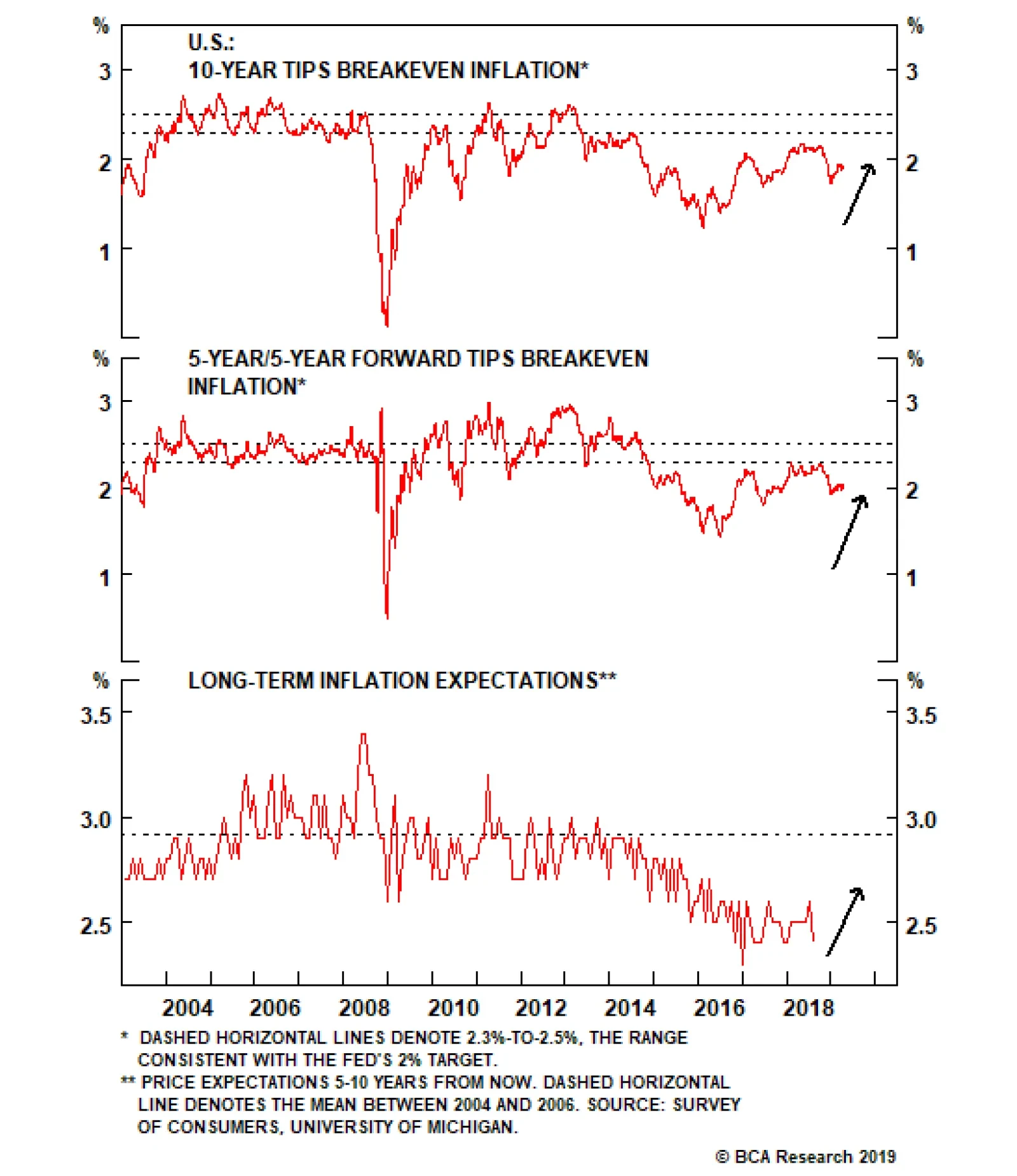
As a result, we recommend that investors avoid Aaa-, Aa- and A-rated credits, but overweight the remaining corporate credit tiers. Who’s Watching The Punch Bowl? Even though a hike is not imminent, at some point the Fed will lift rates again. For this reason, and because the market is currently priced for 20 bps of rate cuts over the next 12 months, we recommend that investors maintain below-benchmark portfolio duration. Investors should avoid Aaa-, Aa- and A-rated credits, but overweight the remaining corporate credit tiers. But how will the Fed decide when to take away the punch bowl? In a recent report we made the case that the two most important factors to monitor will be (i) inflation expectations and (ii) financial conditions.4 Last week’s FOMC minutes only strengthened our conviction in that view. The Fed On Inflation Expectations The March FOMC minutes showed that participants are concerned that inflation expectations have become un-anchored to the downside. In the Fed’s thinking, it must ensure that policy is accommodative enough to re-anchor inflation expectations. Otherwise, a Japanese-style scenario of permanent deflation could unfold. From the minutes: Several participants observed that limited inflationary pressures during a period of historically low unemployment could be a sign that low inflation expectations were exerting downward pressure on inflation relative to the Committee’s 2 percent inflation target; Consistent with these observations, several participants noted that various indicators of inflation expectations had remained at the lower end of their historical range… In light of these considerations, some participants noted that the appropriate response of the federal funds rate to signs of labor market tightening could be modest provided that signs of inflation pressures continued to be limited. These concerns about low inflation expectations are not unfounded. Long-maturity TIPS breakeven inflation rates are well below the 2.3% - 2.5% range that has historically been consistent with “well anchored” expectations (Chart 3). The University of Michigan Survey of household inflation expectations is also well below pre-crisis levels (Chart 3, bottom panel). We expect monthly core CPI will print above 1.8% more often than not going forward. Our sense is that expectations are depressed because many years of low inflation have convinced markets that the Fed cannot sustainably hit its 2% target. In fact, our Adaptive Expectations Model – a model driven purely by measures of actual inflation – does a good job explaining movements in the 10-year TIPS breakeven inflation rate (Chart 4).5 At present, our model shows that the 10-year breakeven is close to fair value. Although we expect the fair value reading from our model to creep slowly higher over time. Chart 3First Battleground: Inflation Expectations
First Battleground: Inflation Expectations
First Battleground: Inflation Expectations
Chart 4Adaptive Expectations Model
Adaptive Expectations Model
Adaptive Expectations Model
The most important independent variable in our model is trailing 10-year core CPI inflation, which is currently running at an annualized 1.8% clip. This means that as long as monthly core CPI prints above 1.8% (annualized), it will send our model’s fair value reading higher over time. While core CPI has printed below that threshold in each of the past two months, we expect it will more often than not exceed it going forward. Notice that while year-over-year core CPI has rolled over, trimmed mean CPI has increased and median CPI just made a new cycle high (Chart 5). Meanwhile, small businesses continue to report an elevated rate of price increases and ISM prices paid surveys recently ticked up, after having fallen sharply earlier this year (Chart 6). Chart 5Encouraging Inflation Readings...
Encouraging Inflation Readings...
Encouraging Inflation Readings...
Chart 6...Alongside Continued Price Pressures
...Alongside Continued Price Pressures
...Alongside Continued Price Pressures
The Fed On Financial Conditions The Fed didn’t have much to say about financial conditions at the March 2019 meeting. In fact, looking through the minutes we could only locate the following relevant passage: A few participants observed that the appropriate path for policy, insofar as it implied lower interest rates for longer periods of time, could lead to greater financial stability risks. The lack of references to financial conditions shouldn’t be too surprising. Financial conditions aren’t nearly as accommodative as they were last autumn, and hence are currently much less of a policy concern (Chart 7): Chart 7Second Battleground: Financial Conditions
Second Battleground: Financial Conditions
Second Battleground: Financial Conditions
The financial conditions component of our Fed Monitor is at 0.5. It was more than one standard deviation easier than average only a few months ago (Chart 7, top panel). The average junk index spread is still 46 bps above its 2018 low (Chart 7, panel 2). The GZ Excess Corporate Bond Risk Premium, an estimate of the excess spread in corporate bonds after accounting for expected default risk, still hasn’t recovered after widening sharply near the end of last year (Chart 7, panel 3).6 At 16.8, the S&P 500 Forward P/E ratio is almost back to its October level of 17 (Chart 7, bottom panel). Now consider that last year, when financial conditions were much more accommodative, the Fed was much more concerned. Fed Governor Lael Brainard and Chairman Jerome Powell both warned that signs of economic overheating could show up in financial markets before they show up in price inflation. Also, the minutes from the September 2018 FOMC meeting reveal that participants were willing to use the risk of “financial imbalances” as justification for tighter policy. A few participants expected that policy would need to become modestly restrictive for a time and a number judged that it would be necessary to temporarily raise the federal funds rate above their assessments of its longer-run level in order to reduce the risk of sustained overshooting of the Committee’s 2 percent inflation objective or the risk posed by significant financial imbalances.7 Bottom Line: The Fed is in no rush to tighten, and will remain on hold until inflation expectations or financial conditions give them a reason to resume hikes. Investors should take advantage by overweighting spread product while keeping portfolio duration low. Extend Maturity In Municipal Bonds Chart 8Municipal / Treasury Yield Ratios
Municipal / Treasury Yield Ratios
Municipal / Treasury Yield Ratios
We continue to recommend that investors hold an overweight allocation to tax-exempt municipal bonds. Not only does the sector tend to outperform during the mid-to-late innings of the cycle,8 but value also remains attractive, with one key caveat: The best value in the municipal bond space is found at the long-end of the Aaa curve. The Value In Aaa Munis Chart 8 shows yield ratios for different maturities of Aaa-rated municipal debt relative to Treasuries. Notice that the 2-year and 5-year yield ratios, at 65% and 70% respectively, are close to one standard deviation below average pre-crisis levels. In fact, the all-time low for the 2-year Muni / Treasury yield ratio is 61%, only 4% below the current level. The all-time low for the 5-year yield ratio is 66%, also only 4% below the current level. The 10-year yield ratio looks almost as expensive as the 2-year and 5-year. At 76%, it is also close to one standard deviation below its average pre-crisis level. It is also only 6% above its all-time low. The real value in Aaa municipal bonds is found at the very long-end of the curve, in the 20-year and 30-year maturities where yield ratios, at 92% and 94% respectively, remain well above average pre-crisis levels (Chart 8, bottom two panels). While yield ratios out to the 10-year maturity point likely don’t have much room to compress, they could still look enticing depending on an investor’s tax situation. For example, a 76% 10-year Muni / Treasury yield ratio means that an investor facing an effective tax rate above 24% would still earn a positive after-tax yield pick-up in the municipal bond relative to the 10-year Treasury. The Value In Lower-Rated Munis Table 1Municipal Revenue Bonds / U.S. Credit Index Yield Ratios
Full Speed Ahead
Full Speed Ahead
When we move outside the Aaa-rated municipal bond space we find that relative value starts to evaporate. Table 1 shows yield ratios between different municipal revenue bonds and the U.S. Credit index. We did our best to match the duration and credit rating of the different muni sectors as closely as possible. The table shows that the highest available Muni / Credit yield ratio is for 20-year A-rated munis, and even that yield ratio is only 73%. This means that an investor would need an effective tax rate above 27% to earn a positive after-tax yield pick-up relative to the U.S. Credit index. In other words, investors can add a fair amount of value by swapping Aaa-rated munis into their portfolios in place of Treasuries, especially at the long-end of the curve. There is much less incremental value to be gained from replacing corporate credit with lower-rated municipal debt. The Yield Ratio Curve Chart 9A Supportive Environment For Munis
A Supportive Environment For Munis
A Supportive Environment For Munis
Our research shows that the yield ratio advantage at the long-end of the Aaa-rated muni curve tends to be greatest when the fundamental credit back-drop is supportive and municipal ratings upgrades are far outpacing downgrades (Chart 9). Conversely, when downgrades increase, yield ratios usually widen at the short-end of the curve relative to the long-end. At present, the muni ratings back-drop looks fairly supportive. While state & local government interest coverage dipped in Q4 (Chart 9, panel 2), it remains positive and should rebound as tax receipts move back to levels that are more consistent with the trend in nominal income growth (Chart 9, bottom panel). Periods of negative interest coverage tend to precede downgrade spikes. Under normal circumstances, a positive ratings outlook would suggest that yield ratios should fall more at the short-end of the curve than at the long-end, but there is very little chance that short-maturity yield ratios can compress further from current levels. Instead, it makes sense for investors to camp out at the long-end of the Aaa muni curve. Not only is the yield pick-up greater, but long-maturity yield ratios should better weather the storm when the cycle eventually turns. Bottom Line: The best value in municipal bonds is found at the long-end of the Aaa-rated municipal bond curve. Lower-rated and shorter maturity munis are much less appealing. Investors should focus their municipal bond exposure on Aaa-rated debt with 20-year and 30-year maturities. Fed Balance Sheet Normalization Almost Complete The Fed also presented a much more detailed plan for balance sheet normalization at the March FOMC meeting. To summarize the details: The Fed will continue to allow assets to passively run off its balance sheet until the end of September. Beginning in May, the Fed will reduce the monthly cap on Treasury redemptions from $30 billion to $15 billion. This means that if $16 billion of the Fed’s Treasury holdings mature in May, $15 billion will be allowed to run off and $1 billion will be reinvested. The current monthly cap of $20 billion for MBS remains unchanged. After September, the Fed will keep its overall assets constant but will continue to allow its MBS holdings to run down. It will reinvest the proceeds from MBS run-off into Treasuries. After September, even though the Fed will keep the asset side of its balance sheet constant, the supply of bank reserves will continue to shrink because the Fed’s other non-reserve liabilities – mostly currency in circulation – will continue to grow. Eventually, reserves will shrink to a level that the Fed deems optimal for the future implementation of monetary policy. It will then start to increase its asset holdings by purchasing Treasury securities. To implement this policy the Fed will likely announce a “minimum operating level” of desired reserve supply and then buy enough Treasuries to ensure that reserves stay above that level. The Fed has not announced which maturities it will target when it re-starts Treasury purchases. In our view, there are only two remaining questions when it comes to the Fed’s balance sheet policy. What Treasury maturities will it purchase going forward? And, when will it start buying Treasuries again? The Treasury’s cash holdings will continue to decline until the fall, putting upward pressure on the supply of bank reserves. On the first question, we will have to wait for an official announcement. Though in our view the Fed will choose a policy that reduces the risk that it will be perceived to be easing or tightening monetary policy through its purchases. This could be achieved by either concentrating its purchases in T-bills, or by targeting maturities in proportion to the Treasury department’s issuance schedule. The second question comes down to estimating the minimum reserve supply that will ensure banks are fully satiated, so that they don’t start competing for scarce reserve balances, driving up overnight rates in the process. While that equilibrium reserve number is unknown, the New York Fed’s most recent Survey of Primary Dealers shows that the 25th and 75th percentile of dealer estimates range from $1.1 trillion to $1.3 trillion. With those figures in mind, we can turn to the simplified Fed balance sheet shown in Table 2. The current balance sheet is shown along with what the balance sheet will look like when run off stops at the end of September. Table 2Simplified Fed Balance Sheet Projections
Full Speed Ahead
Full Speed Ahead
To forecast the Fed’s balance sheet we assume that MBS runs off at a pace of $15 billion per month and that currency-in-circulation grows at an annual rate of 5%. We also estimate a range of possible values for the Treasury department’s General Account. This is the account where the Treasury keeps its cash holdings, which currently total $246 billion. Because the Treasury is currently engaged in extraordinary measures to prevent the U.S. from breaching the debt ceiling, this cash balance will almost certainly decline between now and when the debt ceiling is raised in the fall. After the debt ceiling is raised, the Treasury will probably start to re-build its cash balance. All else equal, a decline in the Treasury’s cash holdings puts upward pressure on the supply of bank reserves, while an increase in the Treasury’s cash holdings causes the supply of bank reserves to fall. According to Table 2, the supply of bank reserves will be between $1.42 trillion and $1.66 trillion by the end of September, still above most estimates of its equilibrium level. The table also shows that reserves will then shrink to between $1.35 trillion and $1.60 trillion by June 2020 and to between $1.31 trillion and $1.55 trillion by the end of 2020. Based on those figures and the dealer estimates, the Fed can probably keep its asset holdings constant through the end of 2020 without losing control of the policy rate or causing a disruption in money markets. However, we expect the Fed will err on the side of caution and start purchasing Treasuries again much earlier, possibly in the first half of 2020. The reason for the Fed to act quickly is that it faces asymmetric risks. The Fed risks losing control of the policy rate if it allows reserves to fall too far, but there is no real downside to keeping the balance sheet “too large”. In any event, the Fed has already demonstrated that it has the tools to conduct monetary policy with a large balance sheet. Bottom Line: The Fed has now announced almost all the details of its balance sheet normalization policy. The Fed’s asset holdings will stop falling at the end of September, and we project that it will start buying securities again in 2020. Ryan Swift, U.S. Bond Strategist rswift@bcaresearch.com Footnotes 1 https://www.federalreserve.gov/monetarypolicy/files/fomcminutes20190320.pdf 2 Please see U.S. Bond Strategy Weekly Report, “Bond Kitchen”, dated April 9, 2019, available at usbs.bcaresearch.com 3 We moved to overweight corporate bonds (both investment grade and high-yield) in in the U.S. Bond Strategy Weekly Report, “Buy Corporate Credit”, dated January 15, 2019, available at usbs.bcaresearch.com. The rationale for our spread targets is found in U.S. Bond Strategy Weekly Report, “The Value In Corporate Bonds”, dated February 19 , 2019, available at usbs.bcaresearch.com 4 Please see U.S. Bond Strategy Weekly Report, “The New Battleground For Monetary Policy”, dated March 26, 2019, available at usbs.bcaresearch.com 5 For further details on our Adaptive Expectations Model please see U.S. Bond Strategy Weekly Report, “Adaptive Expectations In The TIPS Market”, dated November 20, 2018, available at usbs.bcaresearch.com 6 The Gilchrist and Zakrajsek (GZ) Excess Bond Premium is a measure of the excess spread available in a sample of nonfinancial corporate bonds after removing a bottom-up estimate of expected default losses for each security. Default losses are estimated based on the Merton Default model using each firm’s market value of equity and face value of debt. https://www.federalreserve.gov/econresdata/notes/feds-notes/2016/files/…; 7 https://www.federalreserve.gov/monetarypolicy/files/fomcminutes20180926.pdf 8 Please see U.S. Bond Strategy Special Report, “2019 Key Views: Implications For U.S. Fixed Income”, dated December 11, 2018, available at usbs.bcaresearch.com Fixed Income Sector Performance Recommended Portfolio Specification
Highlights The first quarter is in the books, … : Risk may have been out in the fourth quarter, but it is squarely back in fashion so far this year, with equities and high yield posting gaudy first-quarter returns. … and events have compelled us to modify our high-conviction Fed call, … : There may yet be another four or more rate hikes, but they’re not going to occur this year. … but we’re still confident in our asset-allocation recommendations, … : The Fed may no longer be a menacing presence, but that doesn’t mean Treasuries and longer-maturity bonds are going to have it easy from here. … which should benefit from a more accommodative monetary policy outlook: Conditions remain favorable for equities and spread product, and unfavorable for Treasuries, even if the underlying drivers have shifted. Feature Table 1Whipsaw
Where We Stand Now
Where We Stand Now
Newton’s Third Law holds that for every action there is an equal and opposite reaction. Markets have been busy supporting the theorem, as the fourth quarter’s sharp selloff has been nearly erased by the potent first-quarter rally (Table 1). Risk assets have been on a rollercoaster ride, though our economic outlook has been more or less unchanged. We chalked up the fourth quarter’s selloff to fears that the Fed was threatening the expansion. Conversely, the first quarter’s snapback likely owed quite a bit to the Fed’s pivot. By shifting its emphasis from trying to prevent inflation from getting away on the upside to trying to keep inflation expectations from falling too far, the Fed has gone from removing the punch bowl to promising to keep it full. In financial markets, risk assets should be the biggest relative beneficiaries. The Fed’s turn thwarted our more-hikes-than-expected call, at least in the near term. That surprise has been compounded by the administration’s seeming intent to pack the board of governors with nominees chosen solely on the basis of their uber-dovishness, and has inspired us to reflect on our calls. We like to share our reflections, as well as the internal BCA discussions and the client questions that shed light on our views. This week’s report examines some of the most important issues on our minds, and the minds of our colleagues and clients. Q: What does the Fed do from here?
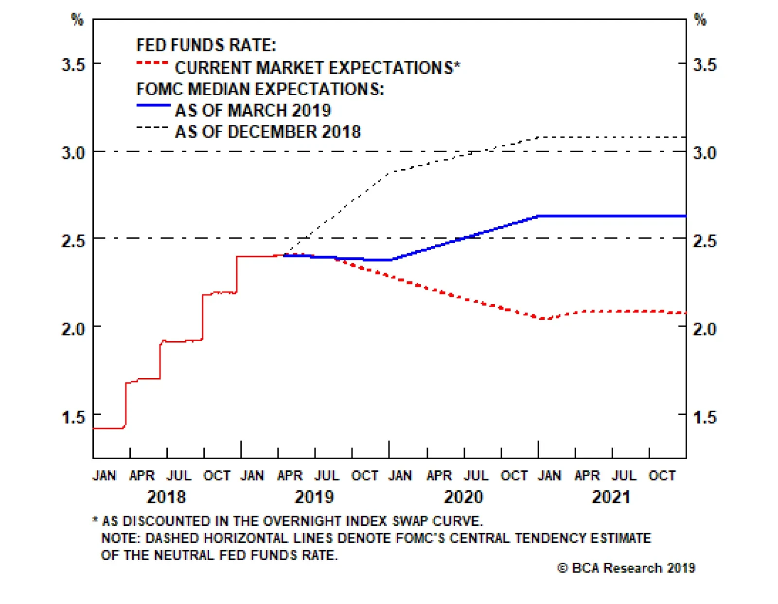
Chart 1
The quarterly summary of economic projections compiles FOMC meeting participants’ expectations for the likely path of key economic indicators (real GDP growth, unemployment and inflation) and monetary policy. The latest release revealed that Fed governors and regional presidents sharply dialed back their rate hike expectations between the December meeting and the March meeting (Chart 1). The median participant lopped 50 basis points (“bps”) off of his/her year-end 2019 and terminal fed funds rate projections, calling for no hikes in 2019 and just one more for the current cycle, in 2020. The rationale is a bit of a mystery, as the median participant’s estimates of GDP and inflation only came down modestly, and his/her unemployment rate estimates only rose modestly. It made sense for the Fed to turn away from the gradual pace of hikes it pursued in 2017 and 2018 in response to the sharp tightening in financial conditions brought on by the fourth-quarter selloff. The ensuing rallies in equities and high-yield bonds have undone much of that tightening, however. From a data perspective, it seems the Fed is mostly holding off to see how the outlook for the rest of the world evolves. The minutes of the March meeting, released last week, suggested that there may be more nuance to the Fed’s embrace of patience than markets initially perceived. The money markets had been calling for a 25-bps cut in the fed funds rate, to 2.25%, by the end of 2020; following the March meeting, they swiftly moved to price in a high likelihood of a second cut, to 2% (Chart 2). That outlook does not exactly accord with the committee’s more measured take: “Several participants observed that the [‘patient’] characterization … would need to be reviewed regularly[.] … A couple of participants noted that the ‘patient’ characterization should not be seen as limiting the Committee’s options[.] … Several participants noted that their views of the appropriate target range for the federal funds rate could shift in either direction[.] … Some participants indicated that if the economy evolved as they currently expected, … they would likely judge it appropriate to raise the target range … modestly later this year[.]” Chart 2... To Keeping It Full
... To Keeping It Full
... To Keeping It Full
We continue to believe that the Phillips Curve is alive and well inside the Fed’s policy framework. The inverse relationship between inflation and unemployment is embedded in its macroeconomic models, and will compel the Fed to tighten policy in response to an unemployment rate that is nosing around 50-year lows (Chart 3). With the committee seemingly willing to let inflation get a bit of a head start before it tightens policy, it may well have to hike faster, and establish a higher terminal rate, than it otherwise would have if it had continued to follow a steady course. We believe the tightening cycle has been postponed rather than truncated, contrary to the money market’s view. Chart 3Sixties Flashback
Sixties Flashback
Sixties Flashback
Bottom Line: The Fed is not going to take the fed funds rate to 3.25 - 3.5% by year end, as we expected late last year. We still believe the terminal rate is in that neighborhood, however, and the longer the Fed cools its heels, the greater the potential that it could exceed our estimate. Q: What is the outlook for the rest of the world? The March minutes revealed that conditions in the rest of the world continue to influence the Fed’s policy decisions. The slowdown in China, the uncertain outcomes of ongoing trade talks and Britain’s separation from the EU shadow the outlook in emerging economies and the major non-U.S. developed economies. The outlook for China, other emerging markets, and Europe have been a spirited subject of discussion within BCA. With a majority of the managing editors perceiving the signs of some green shoots, we upgraded Chinese equities to overweight from equal weight, and European and EM equities to equal weight from underweight, at our monthly View Meeting last week. An end to China’s deleveraging campaign may be all the rest of the world needs to show a little more life. Chart 4As China Goes
As China Goes
As China Goes
China is a critical influence on our global view. We expect that policymakers have already begun de-emphasizing their deleveraging campaign, as suggested by March’s credit data, released Friday, and will encourage lenders to lend. No one at BCA expects a stimulus campaign on the order of the massive 2008 and 2016 efforts, but the general view is that policymakers can take steps to end the deceleration in China’s growth, since it was rooted in their deleveraging drive. The deceleration weighed on trade and manufacturing activity around the world (Chart 4), and may have been the catalyst for the global mini-slowdown. The rest of the world should benefit from the easing in financial conditions driven by the global equity rally. The decline in bond yields has also helped ease financial conditions, and the nearly unanimous dovishness of major-economy central banks may provide investors and consumers with additional comfort. The key issue for the U.S. economy, and U.S.-oriented investors, is whether or not the other major economies will slow enough to cool off the U.S. at a time when its fiscal impulse is slowing. We have a sense that China and Europe are beginning to turn, and we do not expect spillovers to drag on U.S. growth, but continued rallies in U.S. risk assets probably require some sort of revival beyond its shores. Q: How do corporate profits look? Is the consensus overly optimistic? The corporate profit outlook is getting less ambitious by the day. Over the last three months, consensus expectations for first quarter S&P 500 share-weighted earnings have fallen by 6.5%, as analysts downwardly revised their year-over-year growth projections from +3.5% to -2.2%. Management teams seek to under-promise and over-deliver, and do their best to guide analyst expectations to a level their companies can exceed. Since 1994, according to Thomson Reuters, about two-thirds of companies have reported earnings that beat estimates. On average over that stretch, companies have beaten estimates by a margin of 3.2%. We are therefore inclined to take the projected earnings contraction with a grain of salt. Corporations seem to have lowered the bar to a level they should be able to clear without too much trouble. Chart 5Wages Aren't Yet Pressuring Margins ...
Wages Aren't Yet Pressuring Margins ...
Wages Aren't Yet Pressuring Margins ...
We are further inclined to question the projected 2.2% contraction in earnings, given that revenues are projected to grow by 5% in the quarter. The disparity implies margin contraction of close to 7%. Compensation is the largest component of corporate expenses, with the remainder roughly split between interest expense and other input costs. The other meaningful input is the dollar, which should most often exhibit an inverse relationship with margins. Real unit labor costs is the compensation series that most directly impacts profit margins, and it has been contracting on a year-over-year basis, augmenting margins (Chart 5). It will continue to do so as long as nominal wage growth lags inflation and productivity gains. BBB-rated corporate yields were materially higher in the first quarter than they were a year ago, and may have taken a modest bite out of margins, but they’re now back to where they were then and cannot explain the projected 7-ppt margin haircut by themselves (Chart 6). Producer prices grew just 2.2% on a year-over-year basis, slightly ahead of consumer prices (Chart 7), suggesting that margins only slightly narrowed from the disparity between input costs and selling costs. Chart 6... And Interest Rates Aren't Anymore
... And Interest Rates Aren't Anymore
... And Interest Rates Aren't Anymore
Chart 7Input Costs Are Manageable
Input Costs Are Manageable
Input Costs Are Manageable
The broad trade-weighted dollar gained 6% from 1Q18 to 1Q19. Assuming corporations lower prices to defend market share against foreign competitors, profit margins should fall when the dollar rises. Dollar appreciation likely exerted some incremental pressure on margins, but the internal model we’ve previously referenced pegs the EPS impact of a 10% rise in the dollar at 2.5%, far too small for a 6% rise in the dollar to drive a 7-ppt fall in margins. If the revenue estimates are accurate, it seems to us that management must be sandbagging its earnings guidance to some degree. The 10-year Treasury yield will have a harder time falling further now that the Fed is already awfully dovish. Q: Are you having any second thoughts about your duration recommendation? Our below-benchmark duration call was largely founded on our expectation that the Fed was going to surprise complacent markets by hiking more than they expected. It instead surprised dovishly, and the OIS curve responded by pricing in an additional rate cut by the end of next year. The 10-year Treasury yield melted, in accordance with our U.S. Bond Strategy service’s golden rule1 (Chart 8). Chart 8The Golden Rule
The Golden Rule
The Golden Rule
The surest way to mess up a Fed call is to allow what one thinks the Fed should do to intrude on one’s assessment of what the Fed will do. We did not fall into that trap: our view that the Phillips Curve exerts considerable influence over the Fed and other central banks is founded in the observation that virtually every mainstream macroeconomic model incorporates an inverse relationship between inflation and unemployment. As noted above, we see the Fed’s hiking campaign as extended rather than ended. We believe pausing the hiking campaign will extend the expansion and allow the economy to build up more momentum. More momentum would merit higher real rates, and we also expect it would promote inflation pressures given that the output gap is already closed. We were admittedly on the wrong side as the 10-year Treasury yield fell from 3.25% to 2.4%, but still lower yields would be incompatible with our constructive view of the U.S. economy. With much of the drag on Treasury yields seeming to have come from overseas, it’s also important to note that lower major-economy yields would be incompatible with our house view that the global economy is on the cusp of rebounding (Chart 9). Chart 9Yields Rise When Green Shoots Appear
Yields Rise When Green Shoots Appear
Yields Rise When Green Shoots Appear
Bottom Line: We missed the slide in the 10-year Treasury yield because we failed to foresee the Fed’s pivot, and because we may have focused too much on U.S., rather than global, conditions. We do not see yields falling much further, however, now that the Fed’s capacity for dovish surprises is spent, and green shoots are starting to appear in China and Europe. Q: How was the Final Four? Fantastic, and we recommend gathering some old college friends and making the trip to cheer on your alma mater should it qualify. Bring your kids if they’re old enough. If your school wins it all, you’ll share lifelong memories of the sort the Virginia alumni who attended the games will cherish. We’ll always have Minneapolis. Go ‘Hoos! Doug Peta, CFA Chief U.S. Investment Strategist dougp@bcaresearch.com Footnotes 1 Treasuries beat cash when the Fed hikes less than the money market expects, and lag cash when it hikes more than expected. Please see the U.S. Bond Strategy Special Report, “The Golden Rule Of Bond Investing,” published July 24, 2018. Available at usbs.bcaresearch.com.
Highlights Evidence continues to mount that the Chinese economy is in a bottoming process. This suggests the path of least resistance for the RMB is up. Meanwhile, as the U.S. and China move closer to a trade deal, any geopolitical risk premium in the RMB will slowly erode. The ultimate catalyst for CNY longs will be depreciation in the U.S. dollar, which we believe is slowly underway. The ECB is turning more dovish at a time when euro area growth is hitting a nadir. This will be bullish for the euro beyond the near term. Our limit buy on the pound was triggered at 1.30. Target 1.45 with stops at 1.25. With the Aussie dollar close to the epicenter of Chinese stimulus, data down under is increasingly stabilizing. We are closing our short AUD/NOK position for a small profit. Feature Chart I-1The Chinese Yuan Is Pro-cyclical
The Chinese Yuan Is Pro-cyclical
The Chinese Yuan Is Pro-cyclical
In addition to the dovish shift by global central banks, most investors are rightly fixated on China at this juncture in the economic cycle. For one, it has been mostly responsible for the mini cycles in the global economy since 2014. And with improvements in both Chinese credit and manufacturing data in recent months, the consensus is drawing closer to the fact that we may be entering a reflationary window. Looking at risk assets, MSCI China is up 25% from its lows, while the S&P 500 is up 20%. Commodity prices are also rising, with crude oil hitting a new calendar-year high this week. The corollary is that if the improvement in Chinese data proves sustainable, it will propel these asset markets to fresh highs. The evolution of the cycle has important implications for the yuan exchange rate, because the RMB has been trading like a pro-cyclical currency in recent years. The USD/CNY has been moving tick for tick with emerging market equities, Asian currencies, and even some commodity prices (Chart I-1). Ever since its liberalization over a decade ago, the RMB may finally be behaving like a free-floating exchange rate. Therefore, a simple evaluation of how relative prices between China and the rest of the world evolve will be valuable input for the fair value of the RMB exchange rate. Reading the tea leaves from Chinese credit data can be daunting, but we agree with the assessment of our China Investment Strategy team that while the credit impulse has clearly bottomed,1 the magnitude of the rise is unlikely to be what we saw in 2015-2016. That said, a higher credit-to-GDP ratio also requires a smaller increase in credit growth to have an outsized effect on GDP. As such, monitoring what is happening with hard data in the economy concurrently – in particular, green shoots – could add valuable evidence to the reflation theme. A Repeat Of 2016? Cycle bottoms can be protracted and volatile, but also V-shaped. So it is useful when economic data is at a nadir to pay attention to any green shoots emerging, because by the time the last piece of pertinent economic data has turned around, it may well be too late to call the cycle. Admittedly, most measures of Chinese (and global) growth remain weak. But there have been notable improvements in recent months that suggest economic velocity may be picking up: Production of electricity and steel, all inputs into the overall manufacturing value chain, are inflecting higher. Intuitively, these tend to lead overall industrial production. Overall industrial production remains weak, but the production of electricity and steel, all inputs into the overall manufacturing value chain, are inflecting higher. Intuitively, these tend to lead overall industrial production (Chart I-2). Electricity production for the month of February grew 5% after grinding to a halt in 2015-2016. Production of steel also rose by 7%. If these advance any further, they will begin to exceed Q4 GDP growth, indicating a renewed mini-cycle. Chart I-2A Revival In Industrial Activity
A Revival In Industrial Activity
A Revival In Industrial Activity
Chart I-3Metal Prices Are Sniffing A Rebound
Metal Prices Are Sniffing A Rebound
Metal Prices Are Sniffing A Rebound
In recent weeks, both steel and iron ore prices have been soaring. Many commentators have attributed these increases to supply bottlenecks and/or seasonal demand. However, it is evident from both the manufacturing data and the trend in prices that demand is also playing a role (Chart I-3). Overall residential property sales remain soft, but evidence from tier-1 and even tier-2 cities is signalling that this may be behind us, given robust sales. Over the longer term, the ebb and flow of property sales has tended to be in sync across city tiers. A revival in the property market will support construction activity and investment. House prices have been rising to the tune of 10% year-on-year, and real estate stocks in China may be sniffing an eventual pick-up in property volumes (Chart I-4). Over the last 20 years or so, Chinese credit growth has been a reliable indicator for car sales with a lead of about six months. Government expenditures were already inflecting higher ahead of last month’s China National People’s Congress (NPC). Again, this suggests stimulus this time around may be more fiscal than monetary (Chart I-5). In addition to the recent VAT cut for manufacturing firms from 16% to 13%, a string of policy easing measures will begin to accrue, including a cut to social security contributions effective May 1st, and perhaps a pickup in infrastructure spending. Already, real estate infrastructure spending growth is perking up, with that in the mining sector soaring to multi-year highs. Chart I-4Real Estate Volumes Could Pick Up
Real Estate Volumes Could Pick Up
Real Estate Volumes Could Pick Up
Chart I-5The Fiscal Spigots Are Opening
The Fiscal Spigots Are Opening
The Fiscal Spigots Are Opening
Finally, Chinese retail sales including those of durable goods remain very weak. Car sales are deflating at the fastest pace in over two decades. But the latest VAT cut by the government is being passed through to consumers, with an increasing number of car manufactures cutting retail prices. Chart I-6Car Sales Typically Have V-Shaped Recoveries
Car Sales Typically Have V-Shaped Recoveries
Car Sales Typically Have V-Shaped Recoveries
Over the last 20 years or so, Chinese credit growth has been a reliable indicator for car sales with a lead of about six months (Chart I-6). The indicator right now suggests we could witness a coiled-spring rebound in Chinese car sales over the next few months. Bottom Line: Both Chinese stocks and commodity prices have been suggesting a bottoming process in the domestic economy for a while now. Incoming data is beginning to corroborate this view. This has important implications for both the Chinese yuan and other global assets. Capital Flows Improving domestic and external conditions will likely offset any renewed pressure on the Chinese yuan from capital outflows. Our China Investment Strategy team reckons that even after adjusting for cross-border RMB settlements and illicit capital outflows, there is less evidence of capital flight today than there was in 2015-2016.2 Chart I-7Offshore Markets Don't See RMB Weakness
Offshore Markets Don't See RMB Weakness
Offshore Markets Don't See RMB Weakness
Typically, offshore markets have had a good track record of anticipating depreciation in the yuan. Back in 2014, offshore markets started pricing in a rising USD/CNY rate, and maintained that view all the way through to 2018, when the yuan eventually bottomed. Right now, no such depreciation is being priced in (Chart I-7). The reason offshore markets in Hong Kong and elsewhere can be prescient is because more often than not, they are the destination for illicit flows out of China. For example, one of the often-rumored ways Chinese money has left the country is through junkets, key operators in Macau casinos.3 These junkets bankroll their Chinese clients in Macau while collecting any debts in China allowing for illicit capital outflows. This was particularly rampant ahead of the Chinese 2015-2016 corruption clampdown, when Macau casino equities were surging while equity prices in China remained subdued. Historically, both equity markets tend to move together, since over 70% of visitors to Macau come from China (Chart I-8). Right now, both the Chinese MSCI index and Macau casino stocks are rising in tandem, suggesting gains are more related to fundamentals than hot money outflows. Chart I-8Macau Casinos: A Good Proxy For Chinese Spending
Macau Casinos: A Good Proxy For Chinese Spending
Macau Casinos: A Good Proxy For Chinese Spending
A surge in illicit capital outflows could also be part of the reason for an explosion in sight deposits in Hong Kong ahead of the 2015-2016 clampdown (Chart I-9). Admittedly, most of these deposits were and still are due to cross-border RMB settlements, but it is also possible that part of these constituted hot money outflows. With these sight deposits rising at a more reasonable pace, it suggests little evidence of capital flight. Chart I-9The Chinese Government Has Clamped Down On Illicit Flows
The Chinese Government Has Clamped Down On Illicit Flows
The Chinese Government Has Clamped Down On Illicit Flows
Trade Truce A trade truce between the U.S. and China will be the final catalyst for a stronger yuan. The news flow so far has been positive, with both U.S. President Donald Trump and Chinese President Xi Jinping publicly acknowledging they are closer to a deal. Even well-known China hawk Peter Navarro, head of the U.S. National Trade Council, has admitted that the two sides are in the final stages of talks. But with a still-ballooning U.S. trade deficit with China, Trump will want to take home a win (Chart I-10). Chart I-10Trump Needs To Take A Win Back To America
Trump Needs To Take A Win Back To America
Trump Needs To Take A Win Back To America
Concessions on the Chinese side so far seem reasonable, allowing us to speculate that there is a rising probability of a deal. They have agreed to increase agriculture and energy imports from the U.S. by about $1 trillion over the next six years, announced a cut on import tariffs, revised their Patent Law to improve protection of intellectual property, and provided a clear timeline for when foreign caps will be removed in sectors such as autos and financial services. These seem like very reasonable concessions that will allow Trump to go home and declare victory. Trade wars are usually synonymous with recessions. As such, there are acute political constraints inching both sides towards an agreement. For President Trump, a deteriorating U.S. manufacturing sector in the midwestern battleground states is a thorn in his side. For President Xi, rising unemployment is a key constraint. On the currency front, the details of any agreement are still unknown, but should Chinese economic fundamentals start to genuinely improve, it will put upward pressure under rates – and ergo the yuan (Chart I-11). A gradually rising yuan exchange rate will further assuage any doubts or concerns that Trump may have. Bottom Line: Our fundamental models show the yuan as undervalued by about 3%. This means China could allow its currency to gradually appreciate towards fair value, with little impact on the domestic economy or even exports. Given some green shoots in incoming economic data, little risk of capital flight, and the rising likelihood of a trade deal between the U.S. and China, our bias is that the path of least resistance for the Chinese RMB is up (Chart I-12). Chart I-11Rising Chinese Rates Will Favor The Yuan
Rising Chinese Rates Will Favor The Yuan
Rising Chinese Rates Will Favor The Yuan
Chart I-12The RMB Is Not Expensive
The RMB Is Not Expensive
The RMB Is Not Expensive
Another Dovish Shift By The ECB In another dovish twist, the European Central Bank kept monetary policy unchanged following this week’s meeting, while highlighting that it might be on hold for longer. Unsurprisingly, incoming data has been weak of late, which the ECB (like other central banks) blamed on the external environment. It did fall short of speculation that it will introduce a tiered system for its marginal deposit facility, which would have alleviated some cash flow pressures for euro area banks. Our bias is for the new Targeted Long Term Refinancing Operation (TLTRO III – in other words, cheap loans), to remain a better policy tool than a tiered central bank deposit system. In the case of a TLTRO, the ECB can effortlessly decentralize monetary policy, since liquidity gravitates towards the countries that need it the most. While a tiered system can allow a bank to offer higher rates and attract deposits, there is no guarantee that these deposits will find their way into new loans. It is also likely to benefit countries with the most excess liquidity. In the case of a TLTRO, the ECB can effortlessly decentralize monetary policy. Beyond any short-term volatility in the euro, we think the ECB’s dovish shift could be paradoxically bullish. If a central bank eases financing conditions at a time when growth is hitting a nadir, it is tough to argue that it is bearish for the currency. Meanwhile, fiscal policy is also set to be loosened. Swedish new orders-to-inventories lead euro area growth by about five months, and the recent bounce could be a harbinger of positive euro area data surprises ahead (Chart I-13). Chart I-13Euro Area Growth Will Recover
Euro Area Growth Will Recover
Euro Area Growth Will Recover
Bottom Line: European rates are further below equilibrium compared to the U.S., and the ECB’s dovish shift will help lift the euro area’s growth potential. Meanwhile, investors are currently too pessimistic on euro area growth prospects. Our bias is that the euro is close to a floor. House Keeping Our buy-stop on the British pound was triggered at 1.30. We recommend placing stops at 1.25, with an initial target of 1.45. As we argued last week,4 the odds of a hard Brexit continue to fall, with U.K. Prime Minister Theresa May explicitly saying this week that the path for the U.K. going forward is either a deal with the EU or with no Brexit at all. As we go to press, EU leaders have granted the U.K. an extension until the end of October, with a review in June. Chart I-14What Next For The Pound?
What Next For The Pound?
What Next For The Pound?
Back when the referendum was held in June 2016, even the pro-Brexit Tories, a minority in the party, promised continued access to the Common Market. Fast forward to today and there are simply not enough committed Brexiters in Westminster to deliver a hard exit. Given that the can has been kicked down the road, markets are likely to turn their focus on incoming economic data. On that front, economic surprises in the U.K. relative to both the U.S. and euro area are soaring (Chart I-14). Elsewhere, we are also taking profits on our short AUD/NOK position. Since 2015, the market has been significantly dovish on Australia, in part due to a more accelerated downturn in house prices and a marked slowdown in China. The reality is that the downturn in Australia has allowed some cleansing of sorts and has brought it far along the adjustment path relative to its potential. Any potential growth pickup in China will light a fire under the Aussie dollar, which is a risk to this position. Chester Ntonifor, Foreign Exchange Strategist chestern@bcaresearch.com Footnotes 1 Please see China Investment Strategy Special Report, titled “China: Stimulating Amid The Trade Talks,” dated February 20, 2019, available at fes.bcaresearch.com 2 Please see China Investment Strategy Special Report, titled “Monitoring Chinese Capital Outflows,” dated March 20, 2019, available at fes.bcaresearch.com 3 Farah Master, “Factbox: How Macau's casino junket system works,” Reuters, October 21, 2011. 4 Please see Foreign Exchange Strategy Weekly Report, titled “Not Out Of The Woods Yet,” dated April 5, 2019, available at bca.bcaresearch.com Currencies U.S. Dollar Chart II-1USD Technicals 1
USD Technicals 1
USD Technicals 1
Chart II-2USD Technicals 2
USD Technicals 2
USD Technicals 2
Recent data in the U.S. have been mostly positive: In March, 196K nonfarm jobs were created, surprising to the upside; unemployment rate stayed low at 3.8%, though average hourly earnings growth fell to 3.2% year-on-year. The factory orders in February contracted by 0.5% month-on-month. More importantly, headline consumer price inflation in March rose to 1.9% year-on-year, however this was mostly lifted by rising energy prices. Core inflation excluding food and energy dropped by 10 basis points to 2%. JOLTs job openings unexpectedly fell to 7.1 million in February, from 7.6 million. However, initial jobless claims fell to 196K. After a 3-month lull, producer prices are inflecting higher at a pace of 2.2% year-on-year for the month of March. DXY index fell by 0.44% this week. Global risk assets are on the rise this week. Meanwhile, the Fed minutes highlighted that members are in no rush to raise rates. Stalling interest rate differentials will be a headwind for the dollar. Report Links: Not Out Of The Woods Yet - April 5, 2019 Tug OF War, With Gold As Umpire - March 29, 2019 Into A Transition Phase - March 8, 2019 The Euro Chart II-3EUR Technicals 1
EUR Technicals 1
EUR Technicals 1
Chart II-4EUR Technicals 2
EUR Technicals 2
EUR Technicals 2
Recent data in the euro area have been positive: The Sentix Investor Confidence index continues to inflect higher, coming in at -0.3 from -2.2. German industrial production grew by 0.7% month-on-month in February. Trade balances improved across the euro area. In France, the trade deficit fell to €-4.0B in February. In Germany, the trade surplus increased to €18.7B. Italian retail sales increased by 0.9% year-on-year in February. On the inflation front, consumer price inflation in Germany and France both stayed at 1.3% year-on-year in March. EUR/USD rose by 0.57% this week. On Wednesday, the ECB has decided to leave policy unchanged as expected. Mario Draghi also highlighted more uncertainties and downside risks to the euro area amid the ongoing trade disputes. While the global trade war might add volatility to the pro-cyclical euro, easier financial conditions should eventually backstop growth. Report Links: Into A Transition Phase - March 8, 2019 A Contrarian Bet On The Euro - March 1, 2019 Balance Of Payments Across The G10 - February 15, 2019 The Yen Chart II-5JPY Technicals 1
JPY Technicals 1
JPY Technicals 1
Chart II-6JPY Technicals 2
JPY Technicals 2
JPY Technicals 2
Recent data in Japan have been negative: Preliminary cash earnings fell by 0.8% year-on-year in February, the only decline since mid-2017. Household confidence continues to tick lower, coming in at 40.5 in March. The trade balance in February came in at a surplus of ¥489.2B. Capex is rolling over. Machinery orders fell by 5.5% year-on-year in February. Machine tool orders remain extremely weak, at -28.5% year-on-year for the month of March. Lastly, the foreign investment in Japanese stocks increased to ¥1,463.7B. USD/JPY fell by 0.46% this week. In its April regional outlook, the BoJ downgraded most of the prefectures in Japan, with only Hokkaido that had an upgrade in the aftermath of the earthquake. As domestic deflationary pressures intensify, this will favor the yen. This also raises the probability the government defers the consumption tax hike. Report Links: Tug OF War, With Gold As Umpire - March 29, 2019 A Trader’s Guide To The Yen - March 15, 2019 Balance Of Payments Across The G10 - February 15, 2019 British Pound Chart II-7GBP Technicals 1
GBP Technicals 1
GBP Technicals 1
Chart II-8GBP Technicals 2
GBP Technicals 2
GBP Technicals 2
Recent data in the U.K. have been strong: In February, manufacturing production increased by 0.6% year-on-year; industrial production also increased by 0.1% year-on-year, both surprising to the upside. Both were deflating in January. The goods trade balance in February fell to £-14.1B, however the total trade balance came in at a smaller deficit of £4.86B. Monthly GDP also came in higher at 2% year-on-year in February. House prices gains have pared the increase of previous years, but the Halifax house price index still increased by 2.6% year-on-year for the month of March. GBP/USD rose by 0.41% this week. Theresa May got an extension for Brexit to October 31. Meanwhile, U.K. data have been stronger than consensus recently. We are long GBP/USD from 1.30, with a 0.6% profit. Report Links: Not Out Of The Woods Yet - April 5, 2019 A Trader’s Guide To The Yen - March 15, 2019 Balance Of Payments Across The G10 - February 15, 2019 Australian Dollar Chart II-9AUD Technicals 1
AUD Technicals 1
AUD Technicals 1
Chart II-10AUD Technicals 2
AUD Technicals 2
AUD Technicals 2
Recent data in Australia have continued to improve: Investment lending for homes in February grew by 2.6%. Home loans in February increased by 2% month-on-month, surprising to the upside. Westpac consumer confidence came in at 100.7 in April, increasing by 1.9%. AUD/USD surged by 0.64% this week. The RBA Deputy Governor Guy Debelle hinted that a wait-and-see approach for interest rates seemed like the appropriate path, signaling that policy will continue to be accommodative. Meanwhile, the Australian dollar is probably anticipating better upcoming data from China, as it is Australia’s largest trading partner. If the world’s second largest economy can turn around, the Aussie dollar is likely to grind higher. Report Links: Not Out Of The Woods Yet - April 5, 2019 Into A Transition Phase - March 8, 2019 Balance Of Payments Across The G10 - February 15, 2019 New Zealand Dollar Chart II-11NZD Technicals 1
NZD Technicals 1
NZD Technicals 1
Chart II-12NZD Technicals 2
NZD Technicals 2
NZD Technicals 2
There was little data out of New Zealand this week: The food price index came in at 0.5% month-on-month in March, shy of the estimate of 1.3%. NZD/USD plunged after rising by 0.5% initially this week, returning flat. Incoming data in New Zealand is likely to lag its commodity currency counterparts pushing the kiwi relatively lower. Our long AUD/NZD position is now 0.7% in the money since entry last Friday. Report Links: Not Out Of The Woods Yet - April 5, 2019 Balance Of Payments Across The G10 - February 15, 2019 A Simple Attractiveness Ranking For Currencies - February 8, 2019 Canadian Dollar Chart II-13CAD Technicals 1
CAD Technicals 1
CAD Technicals 1
Chart II-14CAD Technicals 2
CAD Technicals 2
CAD Technicals 2
Recent data in Canada have been negative: On the labor market front, the participation rate in March fell slightly to 65.7%; 7,200 jobs were lost, underperforming the estimated creation of 1,000 jobs; unemployment rate was unchanged at 5.8%. On the housing market front, starts in March increased by 192.5K year-on-year, underperforming the expected 196.5K; building permits dropped by 5.7% month-on-month in February. USD/CAD rebounded quickly after falling by 0.7% earlier this week, offsetting the loss. While the dovish shift by the BoC and looser fiscal policy, together with rising oil prices are likely to be growth tailwinds, the data disappointment coming from the housing market and overall economy limit upside in the CAD. Report Links: A Shifting Landscape For Petrocurrencies - March 22, 2019 Into A Transition Phase - March 8, 2019 Balance Of Payments Across The G10 - February 15, 2019 Swiss Franc Chart II-15CHF Technicals 1
CHF Technicals 1
CHF Technicals 1
Chart II-16CHF Technicals 2
CHF Technicals 2
CHF Technicals 2
There was scant data in Switzerland this week: The foreign currency reserves came in at 756B CHF in March. Unemployment rate in March was unchanged at 2.4%, in line with expectations. USD/CHF appreciated by 0.44% this week. With the euro area economy slowly recovering, the franc is likely to underperform as risk appetite rises. We are long EUR/CHF for a 0.1% profit. Report Links: Balance Of Payments Across The G10 - February 15, 2019 A Simple Attractiveness Ranking For Currencies - February 8, 2019 Waiting For A Real Deal - December 7, 2018 Norwegian Krone Chart II-17NOK Technicals 1
NOK Technicals 1
NOK Technicals 1
Chart II-18NOK Technicals 2
NOK Technicals 2
NOK Technicals 2
Recent data in Norway have been strong, with inflation grinding higher: Headline consumer price inflation increased to 2.9% year-on-year in March; core inflation also rose to 2.7% year-on-year, both surprising to the upside. Producer price index grew by 5.2% year-on-year in March, outperforming expectations. USD/NOK depreciated by 1.16% this week. The improving domestic economy, rising oil prices, and the tick up in inflation are all the reasons why we favor the Norwegian krone. We are playing the NOK via a few pairs, notably long NOK/SEK and short AUD/NOK, which are currently 3.11% and 0.75% in the money, respectively. Report Links: A Shifting Landscape For Petrocurrencies - March 22, 2019 Balance Of Payments Across The G10 - February 15, 2019 A Simple Attractiveness Ranking For Currencies - February 8, 2019 Swedish Krona Chart II-19SEK Technicals 1
SEK Technicals 1
SEK Technicals 1
Chart II-20SEK Technicals 2
SEK Technicals 2
SEK Technicals 2
Recent data in Sweden have been mixed: Industrial production fell to 0.7% year-on-year in February, lower than the previous reading of 3%. New manufacturing orders contracted by 2.8% year-on-year in February. However, the leading manufacturing new orders to inventory ratio is rising suggesting we might be near a bottom. Consumer price inflation came in higher at 1.9% year-on-year in March. USD/SEK fell by 0.21% this week. We remain bullish on the Swedish krona due to its cheap valuation and the imminent pickup in the euro area economy. Report Links: Balance Of Payments Across The G10 - February 15, 2019 A Simple Attractiveness Ranking For Currencies - February 8, 2019 Global Liquidity Trends Support The Dollar, But... - January 25, 2019 Trades & Forecasts Forecast Summary Core Portfolio Tactical Trades Closed Trades
While most FOMC participants do not expect growth weaknesses to last beyond the first quarter of 2019, a majority do not anticipate interest rates to rise in 2019. The key to this seeming paradox lies in the participants’ assessment of the inflation…
Feature For a decade, mainstream economics has prescribed remedies for sluggish growth in the euro area on the basis of three articles of blind faith. First, that the ailment arises from structural impediments to growth; second, that in response to an ailing economy, ultra-loose monetary policy is always and everywhere effective; and third, that ‘Keynesian’ government stimuluses are at best a necessary evil and at worst a recipe for disaster. As a result, European policymakers have expended much time and energy attempting structural reforms, experimenting with ultra-loose monetary policy, while shirking government borrowing and spending. But have policymakers misdiagnosed the ailment? Chart of the WeekItaly’s Private Sector Is Paying Back Debt
Italy's Private Sector Is Paying Back Debt
Italy's Private Sector Is Paying Back Debt
Why The Focus On Public Deficits And Debt Might Be Misplaced We frown upon government deficits. They are associated with crowding out and misallocation of resources. But when the private sector is running a financial surplus, the exact opposite is true. Government borrowing and spending causes no crowding out because the government is simply utilising the private sector’s surplus savings and debt repayments. And importantly, this deficit spending prevents a deflationary shrinkage of the broad money supply. Most people are aware of the size of government deficits. Few people are aware of the size of private sector surpluses; and the leakage from the national income stream that they create. By not making this connection, people might believe that government deficits are profligate. But if the private sector as a whole has a financial surplus, it makes sense for the government to borrow to support economic growth. In a similar vein, an economy’s debt sustainability depends on its total indebtedness, not on its public indebtedness or its private indebtedness in isolation. Debt becomes unsustainable when the marginal extra euro of debt results in misallocation of resources and mal-investment. At this point, the extra debt adds nothing to growth or, worse, it subtracts from growth. This is also the point at which lenders tend to be unwilling to provide the marginal loan. Therefore, debt reaches its sustainable limit when the economy has exhausted all productive uses for it. Deficit spending can prevent a deflationary shrinkage of the broad money supply. It does not matter whether these productive uses are funded with private debt or with public debt. For example, successful economies require investment in high-quality healthcare and education. Some economies fund this with private debt, while others fund it with public debt. This means that if productive private indebtedness is low, there is more scope for productive public indebtedness. Many people believe that Italy has one of the world’s most indebted economies. But this belief is wrong. Although Italy’s public indebtedness is high, Italy’s private indebtedness is one of the lowest in the world, making Italy’s total indebtedness less than that of France and the U.K., and broadly equal to that of the U.S. (Chart I-2-I-5). Crucially, Italy’s extremely low private indebtedness means that it could afford relatively high public indebtedness before reaching the limit of debt sustainability. Chart I-2Italy: Total Debt = 250% Of GDP
Italy: Total Debt = 250% Of GDP
Italy: Total Debt = 250% Of GDP
Chart I-3France: Total Debt = 315% Of GDP
France: Total Debt = 315% Of GDP
France: Total Debt = 315% Of GDP
Chart I-4U.K.: Total Debt = 280% Of GDP
U.K.: Total Debt = 280% Of GDP
U.K.: Total Debt = 280% Of GDP
Chart I-5U.S: Total Debt = 250% Of GDP
U.S: Total Debt = 250% Of GDP
U.S: Total Debt = 250% Of GDP
Italy And Japan: Compare And Contrast In a normal world, the task of ensuring that private sector savings are borrowed and spent falls on the banks, which take in the savings and debt repayments and lend them out to others in the private sector who can make the best use of the funds. But if a dysfunctional banking system fails this task, the savings generated by the private sector will find no borrowers. The unrecycled funds become a leakage from the national income stream generating a persistent deflationary headwind for the economy. Welcome to Italy! Since 2008, the stock of loans to Italian households and firms has been stagnant while in real terms it has fallen (Chart of the Week). The upshot is that the real money supply has shrunk despite low private sector indebtedness, low interest rates and massive injections of ECB liquidity into the banking system. Japan’s public sector levering has been counterbalancing its private sector de-levering. After the 2008 global financial crisis Italian banks’ balance sheets were left unrepaired and undercapitalized. For an individual bank whose solvency is impaired, the right thing to do is shrink its loan book relative to its equity capital. But when the entire banking system is doing this simultaneously, the economy falls into a massive fallacy of composition: what is right for an individual bank becomes very deflationary when all banks are doing it together. Under these circumstances, an agent outside the fallacy of composition – namely, the government – must counter this deflationary headwind by borrowing and spending the un-recycled private sector savings. Welcome to Japan! The Japanese government has been doing precisely this for the past 25 years. Many people fret about the Japanese government’s persistent deficits and its ballooning public debt. What these people do not realise is that these persistent deficits are simply counterbalancing private sector de-levering. Hence, Japan’s all-important total (public plus private) indebtedness as a share of GDP has not been rising (Chart I-6). In Italy, the banking system has been dysfunctional for over a decade, preventing the private sector from borrowing (Chart I-7). Under these circumstances, the Italian government could borrow the private sector’s excess savings and debt repayments and put them to highly productive use, just like in Japan. Chart I-6Japan’s Persistent Deficits Have Been Counterbalancing Private Sector De-levering
Japan's Persistent Deficits Have Been Counterbalancing Private Sector De-levering
Japan's Persistent Deficits Have Been Counterbalancing Private Sector De-levering
Chart I-7The Italian Banking System Has Been Dysfunctional
The Italian Banking System Has Been Dysfunctional
The Italian Banking System Has Been Dysfunctional
Japan and Italy have quite similar demographics, but there is also a big difference. Despite the Japanese government’s persistent deficit and ballooning debt, the 10-year Japanese government bond seems not the slightest bit concerned and is yielding zero. Whereas in Italy, where the government finances are close to structural balance, the merest hint of a Keynesian stimulus sent the 10-year BTP yield rocketing towards 4 percent. Why? The answer is that Italy does not have its own central bank. The Japanese government bond yield is a direct function of the BoJ’s expected monetary policy. But the Italian BTP yield has two components: the ECB’s expected monetary policy plus a risk-premium for currency redenomination in the event that Italy left the euro. Italy’s problem is that even if modest deficit spending was the right policy, it would take time to prove. Meanwhile, bond vigilantes shoot first and ask questions later. The euro debt crisis was essentially a fear of currency redenomination which resulted from bond vigilantes running amok. When bond markets refuse to lend to sovereigns at a rational interest rate, maturing debt has to be refinanced at a penalising interest rate, causing an undeserved deterioration in the government’s finances. Thereby, the fear of redenomination could become a self-fulfilling prophecy. In Italy, the banking system has been dysfunctional for over a decade. The bottom line is that every economy has its own ‘tipping-point’ interest rate, at which its debt financing can flip from stability to instability. But we believe this interest rate is low everywhere. Modern Monetary Theory Simplified Modern Monetary Theory (MMT) is a hot topic of the moment. Our view is that its breakthrough is to establish the ‘appropriate’ public sector deficits in the context of private sector surpluses, and it simplifies to this question: In highly indebted economies, what is the interest rate needed to keep total (public plus private) indebtedness as a share of GDP stable, and prevent a deflationary shrinkage of the broad money supply? The answer differs slightly from economy to economy because private sector indebtedness is modestly rising in some places, stable in a few, while declining in others (Chart I-8). But crucially, at a global level, total indebtedness is stabilising with the global bond yield within a historically depressed sideways channel (Chart I-9). Chart I-8Private Sector Indebtedness Is Not Rising As A Whole
Private Sector Indebtedness Is Not Rising As A Whole
Private Sector Indebtedness Is Not Rising As A Whole
Chart I-9The Global Long Bond Yield Has Been In A Sideways Channel
The Global Long Bond Yield Has Been In A Sideways Channel
The Global Long Bond Yield Has Been In A Sideways Channel
Admittedly, the global bond yield is now at the bottom of this channel. This means that from a tactical perspective, we can expect 10-year yields to go up about 50 bps before hitting the top of the channel. However, from a structural perspective, the interest rate needed to stabilise total indebtedness as a share of GDP now appears to be extremely low. And this means that structurally low bond yields are here to stay. Finally, I am excited to report that two of the main commentators on MMT – Richard Koo and Stephanie Kelton – are keynote speakers at our annual conference on September 26-27 in New York City. Suffice to say it will be an event not to be missed! Fractal Trading System* There are no new trades this week, leaving five open positions. For any investment, excessive trend following and groupthink can reach a natural point of instability, at which point the established trend is highly likely to break down with or without an external catalyst. An early warning sign is the investment’s fractal dimension approaching its natural lower bound. Encouragingly, this trigger has consistently identified countertrend moves of various magnitudes across all asset classes. Chart I-10
Short the 10-Year OAT
Short the 10-Year OAT
The post-June 9, 2016 fractal trading model rules are: When the fractal dimension approaches the lower limit after an investment has been in an established trend it is a potential trigger for a liquidity-triggered trend reversal. Therefore, open a countertrend position. The profit target is a one-third reversal of the preceding 13-week move. Apply a symmetrical stop-loss. Close the position at the profit target or stop-loss. Otherwise close the position after 13 weeks. Use the position size multiple to control risk. The position size will be smaller for more risky positions. * For more details please see the European Investment Strategy Special Report “Fractals, Liquidity & A Trading Model,” dated December 11, 2014, available at eis.bcaresearch.com Dhaval Joshi, Chief European Investment Strategist dhaval@bcaresearch.com Fractal Trading System Recommendations Asset Allocation Equity Regional and Country Allocation Equity Sector Allocation Bond and Interest Rate Allocation Currency and Other Allocation Closed Fractal Trades Trades Closed Trades Asset Performance Currency & Bond Equity Sector Country Equity Indicators Bond Yields Chart II-1Indicators To Watch - Bond Yields
Indicators To Watch - Bond Yields
Indicators To Watch - Bond Yields
Chart II-2Indicators To Watch - Bond Yields
Indicators To Watch - Bond Yields
Indicators To Watch - Bond Yields
Chart II-3Indicators To Watch - Bond Yields
Indicators To Watch - Bond Yields
Indicators To Watch - Bond Yields
Chart II-4Indicators To Watch - Bond Yields
Indicators To Watch - Bond Yields
Indicators To Watch - Bond Yields
Interest Rate Chart II-5Indicators To Watch - Interest Rate Expectations
Indicators To Watch - Interest Rate Expectations
Indicators To Watch - Interest Rate Expectations
Chart II-6Indicators To Watch - Interest Rate Expectations
Indicators To Watch - Interest Rate Expectations
Indicators To Watch - Interest Rate Expectations
Chart II-7Indicators To Watch - Interest Rate Expectations
Indicators To Watch - Interest Rate Expectations
Indicators To Watch - Interest Rate Expectations
Chart II-8Indicators To Watch - Interest Rate Expectations
Indicators To Watch - Interest Rate Expectations
Indicators To Watch - Interest Rate Expectations
Highlights So what? The U.S.-China deal is not shaping up as well as the consensus holds. Why? The odds of reaching a deal by June are rising, but no higher than 50%. Unemployment is a constraint on the Chinese side but stimulus reduces urgency. Structural concessions on currency and foreign investment are limited in scope. Strategic concessions are limited to North Korea; Taiwan risks are rising. Stay overweight U.S. and Chinese equities on a relative basis at least until the deal is signed. Feature Once again investors are faced with a stream of headlines suggesting that a U.S.-China trade deal is all but finished, only to find critical caveats buried on page six. For instance, President Donald Trump and President Xi Jinping have not yet scheduled a summit to sign a trade agreement, though Trump insists a summit is necessary. Chief U.S. negotiator Robert Lighthizer says that he is “hoping but not necessarily hopeful.”1 There is still room for U.S. and Chinese bourses to outperform on a relative basis while negotiations continue. Still, the news flow is encouraging. Trump has said “we’ve agreed to far more than we have left to agree to,” while Xi Jinping has called for an “early conclusion of negotiations.” The other negotiators are also making positive sounds, with Vice Premier Liu He saying that a “new consensus” has been reached on a text of the trade agreement. National Economic Council Director Larry Kudlow says that key structural issues are on the table and that negotiations are continuing by videoconference after two successful rounds of direct talks in Beijing and Washington. Even the notorious China hawk, Peter Navarro, Director of the U.S. National Trade Council, has begrudgingly admitted that the two sides are in the final stage of the talks, saying, “the last mile of the marathon is actually the longest and the hardest.”2 Readers know that we take a pessimistic view of U.S.-China relations over the long run. We were skeptical about the possibility of a tariff truce on December 1. However, the signs are stacking up in favor of a deal. While we would not be surprised if talks extended to the June 28-29 G20 summit in Osaka, Japan, President Trump has suggested that a summit could come as early as May 5-19. Chart 1Still Some Room To Run
Still Some Room To Run
Still Some Room To Run
Judging by the performance of U.S. and Chinese equities relative to the rest of the world since the first tariffs were imposed on June 14, 2018, there is still room for these two bourses to outperform on a relative basis while negotiations continue. Relative to global equities excluding China and U.S., Chinese stocks have retraced 78% of the ground they lost, while U.S. stocks have not surpassed the high points reached at the peak of the global economic divergence in 2018 (Chart 1). Once a deal is reached, will investors that bought equities on the rumor sell the news? We would buy, though equity leadership should rotate away from the U.S. and China depending on the timing and external conditions discussed below. As a House we are overweight global equities on a 12-month horizon. Xi Is Not Mao China’s economic stimulus is a key swing factor for global growth and the corporate earnings outlook this year. Our China Investment Strategy has highlighted that the BCA Activity Indicator has now fully registered the negative impact of trade tariffs as well as the broader slowdown (Chart 2). Chart 2Slowdown Fully Priced In
Slowdown Fully Priced In
Slowdown Fully Priced In
Previously it was more buoyant than our leading indicator suggested it should be, largely because companies placed orders throughout the second half of 2018 to front-run Trump’s tariffs and this artificially boosted China’s exports and manufacturing activity. Now that this front-running is over, any improvement or deterioration in underlying monetary conditions, money supply, and lending should be reflected in the BCA Activity Indicator itself. Hence a stout credit number for March will cause an uptick that will confirm that China’s economy is recovering. We expect this to occur because, to be blunt, President Xi Jinping is not truly a modern-day Chairman Mao Zedong. While he has revived aspects of Maoism, he has responded pragmatically, rather than ideologically, to the Communist Party’s Number one political constraint: the tradeoff between productivity and employment. When Xi consolidated power in 2017, he launched a deleveraging campaign and doubled down on various structural reforms in order to make progress in rebalancing China’s economy. The result was renewed weakness in the labor market as the stimulus measures of 2015-16 wore off (Chart 3). Labor “incidents,” or protests, particularly those sparked by the relocation of workers from closed factories, began to rise again (Chart 4). Significantly, the number of bankruptcies also increased, demonstrating that the government was willing to tolerate some economic pain in order to make the allocation of capital more efficient (Chart 5). Chart 3A Key Constraint On Xi Jinping
A Key Constraint On Xi Jinping
A Key Constraint On Xi Jinping
Chart 4Labor Incidents On The Rise
Labor Incidents On The Rise
Labor Incidents On The Rise
Chart 5
China’s policymakers pursued these reforms while believing that President Trump’s threat of a trade war was largely bluster. But when Trump proceeded to impose tariffs, confidence collapsed and China’s private sector found itself sandwiched between stricter government at home and an impending squeeze of demand abroad. The labor and business indicators in Charts 3-5 suffered further deterioration in 2018 as animal spirits evaporated across the economy. President Xi’s response could have been to close China’s doors to trade and to the West and undertake an even more aggressive purge of “capitalist roaders.” The possibility is inherent in his cult of personality, aggressive anti-corruption campaign, and cyber-security state apparatus. This would have meant a dramatic reckoning with the country's economic and financial imbalances, but it would have given the hardliners in the Communist Party an opportunity to establish absolute control and national “self-sufficiency.” Instead, Xi entered into talks with Trump and launched supply-side, tax-and-tape-cutting measures to stimulate private economic activity, and boosted fiscal spending. He chose reflation rather than revolution. Chinese stimulus does not make a trade deal more likely in itself, as it gives President Xi more leverage in negotiations. But without a trade deal, private sector sentiment and animal spirits will remain depressed and stimulus measures will eventually falter. So it makes sense that Xi wants a deal. China will be the center of two market-positive outcomes in the near term: more domestic reflation and less conflict with the United States. To put this into context: if China’s credit impulse turns positive it will push the overall fiscal-and-credit impulse higher than 2% of GDP (Chart 6), foreshadowing a rebound in Chinese imports and global growth and enabling China’s own corporate earnings to recover. Our China Investment Strategy estimates that if the past three months’ rate of credit growth continues, while manufacturing sentiment improves on a trade deal and the renminbi remains flat, then the probability of an earnings recession on the MSCI China Index falls from 92% to 21%, as shown in Chart 7. From a policy perspective this looks conservative, as the actual rate of credit growth will probably be faster than that of the past three months. Chart 6Credit Will Add To Fiscal Boost
Credit Will Add To Fiscal Boost
Credit Will Add To Fiscal Boost
Chart 7Earnings Unlikely To Contract
Earnings Unlikely To Contract
Earnings Unlikely To Contract
Of course, President Trump has even more acute political constraints than President Xi urging him toward a deal. A deterioration in the U.S. manufacturing sector is a serious liability, especially in the Midwestern battleground states (Chart 8), and Trump has apparently calculated that a tailored infusion of Chinese cash and promises is a better reelection strategy than a continuation of trade war amid a slowdown. Chart 8A Key Constraint On Donald Trump
A Key Constraint On Donald Trump
A Key Constraint On Donald Trump
The implication of all of the above is that China will be the center of two market-positive outcomes in the near term: more domestic reflation and less conflict with the United States. The former is not yet consensus, while the latter is lacking in specifics. Yet both are beneficial for Chinese equities on an absolute and relative basis. And once there is a concluded trade deal and clarity over stimulus, emerging markets can also outperform their developed market counterparts. Note that we do not expect China to launch a massive 2008-09-style stimulus unless the tariff war reignites. Such an outcome would only be bullish for some EMs, since beneath the initial surge in Chinese imports would lie the disruption of the global supply chain and broader de-globalization. Bottom Line: Unemployment is a key political constraint suggesting both that China’s stimulus will surprise to the upside and that a trade deal is forthcoming. We are reducing the odds of an extension of trade talks beyond June from 35% to 20%, leaving a 50% chance for some kind of trade deal to emerge by the end of that month (Table 1). Table 1Updated Trade War Probabilities (April 2019)
U.S.-China Conflict: The End Of The Beginning
U.S.-China Conflict: The End Of The Beginning
Trump Is Not Nixon If Xi is not Mao, then Trump is not Nixon. Despite a likely trade deal, we are not on the verge of a historic 1972-esque “grand compromise” that will usher in a new era of U.S.-China engagement. This should temper enthusiasm regarding the long-term durability of the trade truce, highlighting that China’s credit data is the more important factor for the 12-month horizon, though the trade issue is an impediment that needs to be removed for a sustainable rally. China may be increasingly willing to embrace structural concessions, but the depth of the structural change should be doubted until the details of the trade deal prove otherwise. For example, at the moment there is still no agreement on tariff levels. And there can be no “enforcement mechanism” to satisfy the U.S. side other than the perpetual threat of tariffs, which erodes trust and discourages Chinese implementation of structural changes. Two structural issues highlight the conundrum: currency and foreign investment. First, while the details of the currency agreement are unknown, the U.S. will definitely not get anything comparable to what it got from Japan after the Plaza Accord in 1985. The Japanese were a subordinate ally to the U.S. in the midst of the Cold War; they did not negotiate with the suspicion that the U.S. secretly wanted to destroy their economy. China has neither the security guarantee nor the economic trust. The implication is that the CNY-USD may rise by about 10% or so from current levels (Chart 9), as opposed to the 54% that the JPY-USD witnessed from 1985-88. The upside for the U.S. is that Trump may get some yuan appreciation, while the upside for China is that limited appreciation means no excessively deflationary impact. Chart 9Currency Agreement: Far From A Plaza Accord
Currency Agreement: Far From A Plaza Accord
Currency Agreement: Far From A Plaza Accord
Second, China’s new foreign investment law, which received a rubber stamp from the legislature in March, is not an unqualified success for American negotiators. We have illustrated this in Table 2 by denoting white flags for aspects of the law that are genuine concessions and red flags for aspects that will raise new suspicions about China’s foreign investment framework. It is a mixed bag. Moreover, the law itself has no power and will depend entirely on the central government’s dedication to imposing strict adherence down through the local layers of government, where forced technology transfer actually takes place. Table 2New Foreign Investment Law: A Mixed Bag
U.S.-China Conflict: The End Of The Beginning
U.S.-China Conflict: The End Of The Beginning
American negotiators will also want bilateral agreements on tech transfer and intellectual property protection since otherwise they will not receive any particular benefit from a law that applies equally to all foreign investors (e.g. Europeans). But it is not yet clear that they will get anything more concrete. The upside for the U.S. is that it will have some means of redress for forced tech transfer and intellectual property theft, while the upside for China is that foreign direct investment should improve. The strategic conflicts between the U.S. and China are even less likely to be dealt with than the economic issues. How can we be sure? Peer Competition: The U.S.-China détente under Nixon occurred at a time when a vast asymmetry between U.S. and Chinese national power existed, whereas today China’s power increasingly rivals that of the U.S., making it easier for China to write its own rules for global interactions and to resist U.S. pressure (Chart 10). Unilateralism: Trump did not leverage American alliances and partnerships across the world to create a “coalition of the willing” to confront China over its mercantilist trade and investment practices. There is some cooperation but it has been inconsistent and tentative, even on deep national security concerns like Huawei’s involvement in 5G networks and the Internet of Things. Had the U.S. created such a coalition and then set out to prosecute its claims, the threat to China’s economy would have been so immense that much greater structural changes could be expected than is the case today (Chart 11). Chart 10The Era Of U.S.-China Detente Is Over
The Era Of U.S.-China Detente Is Over
The Era Of U.S.-China Detente Is Over
Chart 11Trump Eschewed A Coalition Of The Willing
Trump Eschewed A Coalition Of The Willing
Trump Eschewed A Coalition Of The Willing
Core Interests: The trade talks only nominally address dangerous conflicts in China’s near abroad. China’s enforcement of sanctions on North Korea has produced limited results so far but we ultimately expect diplomacy to bear fruit (Chart 12). However, Taiwan is more rather than less likely to be the site of conflict. This is not because of pro-independence sentiment, which is actually on decline in public opinion relative to pro-unification sentiment (Chart 12, second panel). It is because the lame duck Tsai Ing-wen administration may attempt to secure last-minute benefits from the U.S., while an unexpected primary election challenge could lead to the nomination of Lai Ching-te (William Lai), a more outspoken pro-independence candidate, on April 24. Either could provoke Beijing. There is zero chance that any trade deal in the coming months will reduce the threat of reunification of Taiwan by force. Underlying distrust will remain. Chart 12Geopolitical Risk Down In Korea But Up In Taiwan
Geopolitical Risk Down In Korea But Up In Taiwan
Geopolitical Risk Down In Korea But Up In Taiwan
Furthermore, the South China Sea is not a “red herring” but a potential “black swan,” as it is connected to Taiwan’s security and more broadly to U.S. alliance security. After all, 96%-97% of Taiwan’s, South Korea’s, and Japan’s oil imports flow through these sea lanes. Critical supplies become vulnerable if China expands its military’s capabilities there (Diagram 1). The U.S. and China will likely be just as provocative as before in this area after they sign a deal. Technology: The tech conflict is more likely to limit the trade deal than vice versa. The sanctions and embargoes on Chinese companies like ZTE, Fujian Jinghua, and Huawei have operated on a separate track from the trade talks, and it is not at all clear that the U.S. will embrace Huawei as part of any final deal. The initial actions of the newly beefed-up Committee on Foreign Investment in the United States (CFIUS) send warning signals. CFIUS is largely a vehicle for U.S. oversight of China (Table 3) and, if anything, that country-specific focus is intensifying. For instance, the U.S. has deemed Chinese ownership of a gay and lesbian hook-up app, Grindr, to pose an excessive national security risk.3 This is not a high bar for intervention and it suggests that any trade deal will fail to improve China’s investment options in the U.S. tech sector. Diagram 1South China Sea As Traffic Roundabout
U.S.-China Conflict: The End Of The Beginning
U.S.-China Conflict: The End Of The Beginning
Table 3CFIUS Is Mostly About China
U.S.-China Conflict: The End Of The Beginning
U.S.-China Conflict: The End Of The Beginning
The takeaway is that while both sides want a deal over the short term, it will not mark the end of the trade war. It is more likely the end of the beginning of a cold war. As long as China’s economy and industrial capabilities continue to grow relative to the United States, its geographic periphery remains a cauldron of geopolitical risks, and its technological advancement remains rapid, the competition will continue. Bottom Line: There is no substantial evidence from the current trade talks that underlying strategic conflicts will be resolved. This implies that the U.S. and China will shift their focus to these conflicts in the weeks and months after any trade deal. That process will be a nuisance to global equity markets expecting a clean deal; Chinese and American tech stocks in particular will remain exposed to tail risks. The status of Chinese tech companies is a critical risk, as a deal for the U.S. to admit Huawei would be a game-changer. Investment Conclusions Ironically, an early resolution of the trade war – in April or May – offers less of a benefit for Chinese equities and other risk assets than a later resolution in June or thereafter. While we expect to have greater clarity on China’s stimulus magnitude from the March data, it is still possible that stimulus will remain mixed or disappointing. Stimulus measures may also be toned down after a deal is approved, which means that an earlier deal would reduce the total stimulus by the end of 2019. The Trump administration will use the new flexibility gained from a China deal to toughen its policies in other areas, potentially with negative market consequences. The decision to designate the Iranian Revolutionary Guard Corps (IRGC) as a foreign terrorist organization is an important example. This decision is squarely within the Trump administration’s policy of pressuring Iran, which is a high-risk policy with substantial market-relevance. Trump may have made the decision in order to save face while planning to renew waivers on Iranian oil sanctions on May 4 – we would be extremely surprised if he did not renew. Sanctioning the IRGC involves a string of consequences but it is not a direct attack on oil supply that could produce an oil shock dangerous to Trump’s re-election prospects in 2020 (Chart 13). Of course, Iran will retaliate to the IRGC blacklisting – and one way it could do so would be through oil production in various places, including Iraq. The result would be oil volatility and higher prices.
Chart 13
Further, an early deal could encourage Trump to instigate a trade war with Europe. Trump’s four-to-six week time frame for the conclusion of talks with China is conspicuously close to the tentative May 18 deadline by which he is required to determine whether to impose tariffs on foreign auto and auto part imports (Chart 14). Such tariffs would be pursuant to the Section 232 investigation that likely found such imports a threat to national security. We have argued that a U.S.-China deal raises the risk of tariffs on European cars to 35%, with Japanese and Korean cars less at risk, progressively. The EU is ready to retaliate so this would be a drawn-out trade conflict.
Chart 14
Chart 15
By contrast, we are less concerned about the market impact of Trump’s recent threats to close the border with Mexico or include Mexico in car tariffs (Chart 15). True, Trump could close the border and generate a temporary drag on trade and the border economy. However, the Republicans have limited patience for the economic blowback of an extended border closure, and Trump cannot afford to jeopardize passage of his USMCA trade deal as long as he has alternative ways of looking tough on the border. Geopolitical Strategy would view the U.S. and China as good overweights relative to global equities and within their respective developed and emerging market contexts. What about a later resolution of the trade deal, in June or later in the summer? This would remove some risks. By that time, the Iran decision and possibly the car tariff decision will be past and there will be greater clarity on the magnitude of China’s stimulus. More extensive negotiations could also suggest that the ensuing trade deal will resolve deeper disagreements – unless the talks drag on without consequence amid signs of declining trust. Given the risk of trade war with Europe, oil volatility, and uncertainties about China’s stimulus, Geopolitical Strategy would view the U.S. and China as good overweights relative to global equities and within their respective developed and emerging market contexts. When and if the above political hurdles are cleared, the emphasis can shift to other bourses. Geopolitical Strategy’s preferred emerging market plays are EM energy producers and EM Asian states like Thailand and Indonesia. Matt Gertken, Vice President Geopolitical Strategy mattg@bcaresearch.com Footnotes 1 See Ailsa Chang, “U.S. Trade Representative Robert Lighthizer Discusses Ongoing Trade Talks With China,” National Public Radio, March 25, 2019, www.npr.org. 2 For the above quotations see Andrew Mayeda, Xiaoqing Pi, and Margaret Talev, “Kudlow Sees No Letup in China Talks as Both Sides Cite Progress,” Bloomberg, April 4, 2019, www.bloomberg.com. 3 See David E. Sanger, “Grindr Is Owned by a Chinese Firm, and the U.S. Is Trying to Force It to Sell,” March 28, 2019, www.nytimes.com.
Highlights 10-Year Yield: In this week’s report we run through different macro factors that could be used to create a macroeconomic model of the 10-year Treasury yield, and describe the current outlook for each one. On balance, the indicators suggest that the 10-year Treasury yield is near its floor. Global Growth: Leading indicators have hooked up recently, suggesting that the Global Manufacturing PMI – a key driver of the 10-year Treasury yield – may rise in the coming months. Wages: Average hourly earnings softened in March, but survey measures suggest that wage growth remains in an uptrend. We show that rising wages have put considerable upward pressure on the 10-year yield in recent years, and should continue to do so going forward. Sentiment: The depressed Economic Surprise Index suggests that investor economic sentiment is downbeat. This means that the bar for positive data surprises (and higher bond yields) is relatively low. Feature Chart 1CRB/Gold Ratio On The Rise
CRB/Gold Ratio On The Rise
CRB/Gold Ratio On The Rise
Treasury yields stabilized during the past week, and investors are trying to figure out whether the next big move will be higher or lower. We’re on the record as predicting that yields will eventually head higher, and have flagged the CRB Raw Industrials / Gold ratio as an important indicator to watch to time the next big move.1 Encouragingly, this indicator has risen during the past few weeks (Chart 1). Though the message from the CRB/Gold index is promising, the outlook for the 10-year Treasury yield remains uncertain. To shed some light on this important investment question, in this week’s report we run through different macroeconomic indicators that could be used to create a model of the 10-year Treasury yield. By performing this exercise out in the open, our goal is to present readers with a good way to think about the linkages between the economy and the 10-year Treasury yield. Recipe For A 10-Year Treasury Yield Model Ingredient #1: Growth Factors The first logical factor to include in any model of the 10-year Treasury yield is some measure of economic growth. We have found that the Global Manufacturing PMI is often highly correlated with the 10-year yield (Chart 2). Interestingly, the manufacturing PMI correlates more strongly with the 10-year yield than do the services or composite (manufacturing + services) PMIs. The Global PMI also correlates more strongly with the U.S. 10-year yield than does the U.S. PMI. It only takes a quick glance at the Global Manufacturing PMI to see why the 10-year Treasury yield fell this year. The Global PMI has been in a sharp downtrend for some time, driven mostly by the Euro Area and China. U.S. PMIs have also weakened in recent months, though they remain above levels seen in Europe and China. Another global growth indicator that correlates tightly with the 10-year Treasury yield is investor sentiment toward the U.S. dollar (Chart 3). Since the dollar is a countercyclical currency that appreciates when global growth slows and depreciates when it quickens, we observe that the 10-year Treasury yield tends to be lower when investors are extremely bullish on the U.S. dollar and higher when they are more bearish on the dollar. Chart 2Growth Factor Ingredient 1: Global Manufacturing PMI
Growth Factor Ingredient 1: Global Manufacturing PMI
Growth Factor Ingredient 1: Global Manufacturing PMI
Chart 3Growth Factor Ingredient 2: Dollar Bullish Sentiment
Growth Factor Ingredient 2: Dollar Bullish Sentiment
Growth Factor Ingredient 2: Dollar Bullish Sentiment
Notice in Charts 2 and 3 that the Global Manufacturing PMI and dollar bullish sentiment are both close to levels seen near the 10-year yield’s mid-2016 trough. At 50.6, the PMI is only slightly above its 2016 low of 49.9. Meanwhile, dollar bullish sentiment is currently 79%. It maxed out at 82% in 2016. Interestingly, despite the fact that our economic growth indicators paint a similar growth back-drop as 2016, the 10-year yield remains well above its mid-2016 low of 1.37%. Logically, we must conclude that some other “non-growth” factor is propping yields up (more on this below). The 10-year Treasury yield tends to be lower when investors are extremely bullish on the U.S. dollar and higher when they are more bearish on the dollar. Looking ahead, we remain optimistic that the most important global growth indicators (Global Manufacturing PMI and dollar bullish sentiment) will soon reverse course, as some leading global growth indicators have recently turned a corner. We already saw that the CRB Raw Industrials index has broken out (Chart 1). Additionally: Chart 4The Worst Is Behind Us?
The Worst Is Behind Us?
The Worst Is Behind Us?
The Global ZEW Economic Sentiment index has risen in two consecutive months (Chart 4, top panel). Our Global LEI Diffusion Index shows that more than half of the countries in our sample now have improving leading economic indicators (Chart 4, panel 2). Our BCA Boom/Bust Indicator – an indicator based on the CRB index, Global Metals equities and U.S. unemployment claims – has also jumped (Chart 4, bottom panel). Ingredient #2: Output Gap As noted above, the 10-year Treasury yield looks too high relative to our preferred economic growth indicators. This could be because yields haven’t yet caught up to the deteriorating global economy, but more likely it is because our bond model is still missing some key ingredients. The next most obvious factor to incorporate into our model is some measure of the output gap. If an economy is operating at very close to its peak capacity, with a small output gap, then it doesn’t take much additional growth to spark inflation. Conversely, even rapid economic growth will not be inflationary if the output gap is large. As long as the central bank is expected to lean against rising inflation with higher interest rates, then some measure of the output gap should be included in our bond model. Unfortunately, appropriate output gap measures are difficult to find. We could rely on the CBO or IMF’s output gap estimates, but those are often subject to large ex-post revisions – not ideal if we want to create a bond model that is useful in real time. Since the Fed tends to lift rates when the output gap closes, another option would be to include the fed funds rate as an independent variable in our model. However, this is also not ideal since we would expect the macroeconomic data and the 10-year yield to lead changes in the policy rate. Some measure of inflation might be the best factor to include. However, we find that the correlation between different price inflation measures and the 10-year Treasury yield is incredibly unstable over time. This is likely because the Fed targets price inflation explicitly, making its correlation with bond yields less empirically apparent. Wage growth is the best “output gap” measure to include in a 10-year Treasury yield model. In fact, our analysis reveals that wage growth is the best “output gap” measure to include in a 10-year Treasury yield model. Specifically, average hourly earnings from the monthly employment report. Not only does the fed funds rate respond – with a lag – to changes in average hourly earnings, but average hourly earnings also line up reasonably well with the 10-year yield over time (Chart 5). Looking at Chart 5, we can now clearly see why the 10-year yield is above its mid-2016 low, despite the poor readings from our growth indicators. Wages have risen sharply since mid-2016, indicating that the output gap has closed, and the Fed has hiked rates 8 times as a result. The obvious conclusion is that in the present situation, with a much smaller output gap than in 2016, it would require a Global Manufacturing PMI well below 50 to produce a 10-year yield near 2% or below. Going forward, we see the uptrend in wage growth continuing for some time. The proportion of workers quitting their jobs each month, a signal of worker bargaining power, remains very high relative to history. Meanwhile, many more households continue to describe jobs as “plentiful” as opposed to “hard to get” (Chart 6). Chart 5Output Gap Ingredient: Average Hourly Earnings
Output Gap Ingredient: Average Hourly Earnings
Output Gap Ingredient: Average Hourly Earnings
Chart 6More Room For Wages To Grow
More Room For Wages To Grow
More Room For Wages To Grow
Ingredient #3: Policy Uncertainty The third ingredient we’ll add to our 10-year Treasury yield model is a measure of policy uncertainty. Specifically, the index of Global Economic Policy Uncertainty created by Baker, Bloom and Davis.2 Investors often flock to the safety of U.S. Treasuries in times of economic distress. But Treasuries can also benefit from flight-to-quality flows during periods of stable economic growth but heightened political turmoil. In other words, elevated political uncertainty can make investors fear a downturn in the future, and drive a flight into the safety of U.S. Treasuries. The Global Economic Policy Uncertainty index also shows a relatively strong correlation with the 10-year Treasury yield over time (Chart 7). Chart 7Policy Uncertainty Ingredient: Global Economic Policy Uncertainty Index
Policy Uncertainty Ingredient: Global Economic Policy Uncertainty Index
Policy Uncertainty Ingredient: Global Economic Policy Uncertainty Index
Looking more closely at Chart 7, we see that global policy uncertainty is currently as high as it was in mid-2016, when the 10-year Treasury yield hit its cycle low. This lines up pretty well with intuition, since investors are understandably quite nervous about the state of Brexit negotiations and U.S./China trade relations. In that context, it is reasonable to expect that some geopolitical risk premium is currently priced into the 10-year Treasury yield, though a smaller output gap than in 2016 is preventing the 10-year yield from reaching mid-2016 levels. Going forward, though political uncertainty will probably stay elevated compared to history. It seems increasingly likely that a “hard Brexit” will be avoided and that President Trump will seek some sort of agreement with China in advance of the 2020 U.S. election.3 The political risk premium in 10-year notes could unwind somewhat in the coming months. Ingredient #4: Sentiment The fourth and final ingredient we’ll add to our 10-year Treasury yield model is a component related to investor sentiment. Our favorite being the U.S. Economic Surprise Index. Chart 8Sentiment Ingredient: Economic Surprise Index
Sentiment Ingredient: Economic Surprise Index
Sentiment Ingredient: Economic Surprise Index
Investors don’t often think of the Surprise index as a sentiment indicator, but in fact that’s exactly what it is. It measures whether the economic data exceeded or fell short of expectations during the past 30 days, a measurement that is heavily influenced by whether investor expectations are optimistic or pessimistic. When economic expectations are extremely downbeat it doesn’t take much good news to generate a positive surprise, and vice-versa. Also, investor expectations are influenced in one direction or the other by whether the recent economic data are positive or negative. This behavioral dynamic causes the Economic Surprise Index to be a mean-reverting series, one that we can even describe with a simple auto-regressive model, as shown in Chart 8. More importantly, we have found that the Economic Surprise Index is tightly correlated with the change in the 10-year Treasury yield. A given month that ends with the Surprise index above zero is usually a month when the 10-year Treasury yield increased, and vice-versa (Chart 9). This correlation also holds relatively well over 3-month and 6-month horizons (Charts 10 & 11), but breaks down beyond that.4
Chart 9
Chart 10
Chart 11
The U.S. data surprise index is deeply negative at present, and has been for several weeks. But the longer the data continue to disappoint, the more downbeat investor expectations become and the more likely it is that the surprise index will rise in the future. Right now, our simple auto-regressive model projects that the surprise index will be slightly higher in one month’s time, though still deeply negative. Nevertheless, the Surprise index suggests we are approaching a turning point in investor sentiment. Mix Well, Cover, Stir Occasionally We’ve now presented what, in our view, is a fairly complete list of factors that should be included in a macroeconomic model of the 10-year Treasury yield. Importantly, each factor complements the other ones in the sense that they each capture a different element of the economic landscape. At this stage, it would be nice to weight all of the factors together and arrive at a fair value estimate for the 10-year yield. Unfortunately, we won’t be performing that exercise in this report (we may do so in the future). The key challenge in combining all of the indicators together is that the sensitivity of the 10-year yield to each of the above factors changes over time. For example, there are periods when policy uncertainty appears to be a very significant driver of the 10-year yield, and other times when it appears to not matter much at all. The macro indicators listed in this report generally signal that the 10-year yield is near its trough. While it is often useful to boil all of the important drivers down into a point estimate of the 10-year yield, such an exercise can also create problems if it causes us to zero-in on the model’s output and avoid thinking critically about what the different macro inputs are telling us. As of today, we think the macro indicators listed above generally signal that the 10-year yield is near its trough. Leading global growth indicators have hooked up, suggesting that the Global Manufacturing PMI will improve during the next few months and that bullish dollar sentiment could soften. Survey indicators suggest that the labor market remains tight, and that wage growth will stay in an uptrend. Policy uncertainty will probably continue to apply some downward pressure to yields, but a long Brexit extension and/or trade agreement between the U.S. and China could cause that impact to wane in the next few months. Economic sentiment is likely quite depressed, meaning that the bar for positive surprises is low. All in all, our investment strategy is unchanged. We recommend that investors maintain below-benchmark duration in U.S. bond portfolios, while focusing short positions on the 5-year and 7-year maturities. Ryan Swift, U.S. Bond Strategist rswift@bcaresearch.com Footnotes 1 The rationale for tracking the CRB/Gold ratio can be found in U.S. Bond Strategy Weekly Report, “The Search For Aaa Spread”, dated March 12, 2019, available at usbs.bcaresearch.com 2 www.policyuncertainty.com 3 Please see Global Investment Strategy Quarterly Outlook, “From Dead Zone To End Zone”, dated March 29, 2019, available at gis.bcaresearch.com 4 Please see U.S. Bond Strategy Weekly Report, “How Much Higher For Yields?”, dated October 31, 2017, available at usbs.bcaresearch.com Fixed Income Sector Performance Recommended Portfolio Specification

First, rebounding global growth is normally associated with a weakening dollar. This time will not be different, especially as U.S. equity valuations relative to global stocks suggest that investors are particularly pessimistic on non-U.S. growth. A weaker…
Highlights As long as Chinese policymakers remain committed to their anti-pollution campaign, we believe high-grade iron ore prices will remain supported by demand from newer steelmaking technologies. A continuation of the much-needed consolidation in steelmaking capacity in China – wherein larger, more efficient operators force their less competitive rivals from the market – will reinforce this trend (Chart of the Week). Chart of the WeekChina's Steel Sector Will Continue Consolidating
China's Steel Sector Will Continue Consolidating
China's Steel Sector Will Continue Consolidating
Over time, the iron ore market will resemble other developed markets – e.g., crude oil – where higher- and lower-grades of the commodity are regularly traded against each other (Chart 2). As this develops, hedgers and investors will be able to fine tune exposures with greater precision, and prices from these markets will better reflect supply-demand fundamentals. The central and local governments also will have a valuable window on how policy is affecting fundamentals as they pursue their “blue skies” policies. We are initiating tactical spread, getting long spot high-grade 65% Fe vs. short spot 62% Fe at today’s Custeel Seaborne Iron Ore Price Index levels, consistent with our view.1 Chart 2Iron Ore Spread Markets Will Continue To Develop
Iron Ore Spread Markets Will Continue To Develop
Iron Ore Spread Markets Will Continue To Develop
Highlights Energy: Overweight. The Trump administration is reviving the Monroe Doctrine with its demand Russia remove its troops and advisors from Venezuela immediately, based on comments by the U.S. National Security Advisor John Bolton. In addition, a “senior administration official” said waivers for eight of Iran’s largest crude oil importers could be allowed to expire May 4, and that the administration is considering additional sanctions against Iran.2 Brian Hook, the special U.S. envoy for Iran, this week said three of eight countries granted waivers to U.S. sanctions agreed to take oil imports to zero.3 In a related development, OPEC crude oil output fell to a four-year low of 30.4mm b/d in March, according to a Reuters’s survey, as Venezuelan output falls and Saudi Arabia continues to over-deliver on its production cuts. Base Metals: Neutral. Codelco’s mined copper ore output fell to 1.8mm MT last year, down 1.6% vs. 2017 levels. This took refined output down almost 3% to 1.7mm MT, according to Metal Bulletin. The Chilean state-owned company cited reduced ore content in its mined production as a reason for the decline. MB’s copper treatment and refining charges index for the Asia Pacific region is at its lowest level since March 26, 2018, reflecting the lower concentrate supplies. We remain long spot copper on the back of low inventories, and an expected recovery in demand. Precious Metals: Neutral. Strength in equities has taken some of the luster off gold’s rally in the near term as investors move to increase stock exposures, but we continue to favor gold as a portfolio hedge and remain long. Agriculture: Underweight. USDA’s corn planting intentions report released last week came in much stronger than earlier estimates. Corn and soybeans traded lower following the release of the report, but recovered some this week on the back of positive news from Sino - U.S. trade talks. The USDA estimated farmers intended to plant 92mm acres of corn, and 85mm acres of soybeans this year. Ahead of the report, a Farm Bureau survey estimated corn and soybean acreage would average 91.3mm acres of corn and 86.2mm acres of beans. Trade Recommendations: Our 1Q19 trade recommendations were up an average of 41% at end-March (Quarterly Performance Table below). Including recommendations that were open at the beginning of 1Q19, the average was 31%. Feature China’s push to reduce pollution in its steelmaking sector will continue to support demand for Brazil’s high-grade ores – i.e., ores with iron (Fe) content higher than 65%. Transitory Brazilian iron ore supply losses notwithstanding, China’s push to reduce pollution in its steelmaking sector will continue to support demand for Brazil’s high-grade ores – i.e., ores with iron (Fe) content higher than 65%. This will allow the continued development of an active spread market, not unlike spread markets in commodities like oil, which will expand hedging and trading opportunities for producers, consumers and investors (Chart 2). Older, more polluting steelmaking technology in China will continue to be replaced by plants that favor Brazil’s high-grade ores, then Australia’s benchmark-type grades (62% Fe), then, as a last resort, the lower quality domestic ores. In a steelmaking market still suffering significant overcapacity, we expect policymakers will, at some point, discover the benefit of letting markets forces do the work of forcing older technology offline, as happened with the country’s domestically produced lower-quality iron ore, which has lower iron content and higher impurities than Brazilian and Aussie imports.4 We believe growth in China’s steel and steel products demand – hence iron ore demand – likely has peaked and is in the process of flattening or declining slightly, which will alter the composition of iron ore imports and tilt them in favor of high-grade Fe imports from Brazil over the next 3 - 5 years (Chart 3). This leveling off in steel demand growth will put a premium on more efficient technology to meet future demand, particularly with the pollution constraints that will, we believe, be an enduring feature of this market.5 Chart 3China's Steel Demand Growth Likely Has Peaked
China's Steel Demand Growth Likely Has Peaked
China's Steel Demand Growth Likely Has Peaked
Impurities found in lower-grade iron ore raise steelmaking costs by increasing unwanted mineral build-ups in blast furnaces, increase pollution and lower mills’ efficiency. With inventories re-building following the winter steelmaking hiatus in China, imports will continue to grow market share at the expense of indigenous lower-quality ores (Chart 4). Imports from Australia, which mostly price to the 62% Fe benchmark, will continue to grow, but we strongly believe that in China’s post-anti-pollution-campaign market, Brazilian imports will see growth increasing (i.e., the 2nd derivative) at a higher rate (Chart 5). Chart 4Chinese Iron Ore Inventories Fall Relative To Steel Production
Chinese Iron Ore Inventories Fall Relative To Steel Production
Chinese Iron Ore Inventories Fall Relative To Steel Production
Chart 5China's Brazil, Australia Import Growth Will Recover
China's Brazil, Australia Import Growth Will Recover
China's Brazil, Australia Import Growth Will Recover
These imports are lower in cost, and higher in quality than the domestic iron ore. This is particularly important when it comes to keeping costs under control – impurities found in lower-grade iron ore raise steelmaking costs by increasing unwanted mineral build-ups in blast furnaces, increase pollution and lower mills’ efficiency. Extended Output Cuts Favor High-Grade Ores The biggest reason supporting our view high-grade iron ores will continue to grow market share at the expense of lower-quality domestic supply and benchmark 62% Fe material is the recent behavior of the central government and local governments vis-a-vis pollution. Both have shown they are not averse to extending operating restrictions on high-polluting industrial plants, even in provinces where steelmaking is a large employer. Last year, major steel producing regions– Hebei, Jiangsu, Shandong, Liaoning – increased production during the winter months, likely driven by higher margins at the steelmakers (Chart 6). This indicates compliance with anti-pollution regulations fell significantly (Chart 7). In turn, this led to higher pollution, according to the latest available data from China’s National Environmental Monitoring Centre, which shows concentrations of particulate matter 2.5 micrometers or less in diameter (i.e., PM2.5) rose again this year (Chart 8). Chart 6Higher Margins, Higher Output
Higher Margins, Higher Output
Higher Margins, Higher Output
Chart 7
Consequently, Chinese authorities decided to tighten anti-pollution measures by extending production cuts beyond the heating season into 3Q and 4Q19.6 Furthermore, the top producing city, Tangshan, in the province of Hebei extended its most elevated level of smog alert on March 1 and deepened production cuts to 70% from 40%, with reported cases of complete operations being halted. Chart 8China's Pollution Is Increasing; Steelmaking Curbs Will Persist
China's Pollution Is Increasing; Steelmaking Curbs Will Persist
China's Pollution Is Increasing; Steelmaking Curbs Will Persist
Last month, Chinese Communist Party (CCP) officials in Hebei announced plans to cut steel production by 14mm MT this year and next. Going forward, China’s environment ministry said winter restrictions will be extended for a third year during the 2019-2020 winter period. As we argued last year, winter curbs likely will become a permanent feature of China’s steelmaking landscape. Combined with China’s steel de-capacity reforms, iron ore and steel markets will continue to evolve to a less-polluting presence in the country.7 As a consequence, IO grade and form differentials are now crucial input in our analysis.8 We believe a wider than usual premium will remain until new high-grades and pellets supplies come on line in the next few years. Credit Stimulus Vs. Battle For Blue Skies The reversal in China’s credit cycle and in the Fed’s monetary policy stance will be supportive of steel and iron ore prices going forward. In fact, our credit cycle proxy suggests global industrial activity will increase in the next few months (Chart 9).9 Additionally, our geopolitical strategists’ base case suggests a resolution of the Sino-U.S. trade war likely will occur this year. This will support EM income growth, which will stimulate commodity demand generally at the margin. Chart 9Upturn in China's Credit Cycle Will Support Iron Ore Prices
Upturn in China's Credit Cycle Will Support Iron Ore Prices
Upturn in China's Credit Cycle Will Support Iron Ore Prices
We believe China’s credit cycle bottomed in 1Q19 and that Chinese authorities will modestly increase stimulus in 2H19.10 As discussed previously, we do not expect this new round of stimulus to be as large as previous rounds; China’s economy is in better shape now than it was at the start of previous expansionary credit cycles, hence the magnitude of the stimulus needed to revive the economy is lower. Nonetheless, this stimulus will be sufficient to strengthen China’s and EM’s steel-intensive activities in the coming months. As long as China maintains its anti-pollution drive, high-grade iron ore will continue to grow market share. Historically, these sectors correlated positively with the 62% Fe content benchmark (Chart 10). However, the expected stimulus works against Beijing’s critically important battle for blue skies. A revival of China’s industrial activity would increase PM2.5 concentrations above targets. Chart 10China's Stimulus Will Stoke Iron Ore Demand
China's Stimulus Will Stoke Iron Ore Demand
China's Stimulus Will Stoke Iron Ore Demand
These constraints, we believe, mean China’s policymakers will have to incentivize steelmakers to favor lower-polluting high-grade iron ore (Fe > 65%), in order to maximize steel output subject to their emissions target. This will widen the form and grade premiums ahead of next year’s winter period. Bottom Line: As long as China maintains its anti-pollution drive, high-grade iron ore will continue to grow market share, as steelmakers upgrade their technology and inefficient mills are shuttered. This will favor Brazilian exports going forward, and we expect the rate of growth in these imports to increase. In line with our view, we are opening a long 65% Fe spot vs. a short 62% Fe spot position at tonight’s close. This is a tactical position, but could easily become a strategic recommendation. Robert P. Ryan, Senior Vice President Commodity & Energy Strategy rryan@bcaresearch.com Hugo Bélanger, Senior Analyst Commodity & Energy Strategy HugoB@bcaresearch.com Footnotes 1 This index is published by Beijing Custeel E-Commerce Co., Ltd. 2 We flagged this risk in our February 21, 2019, report entitled “The New Political Economy of Oil.” We noted the odds of a U.S. – Russia military confrontation are low, and that “the U.S. would revive the Roosevelt Corollary to the Monroe Doctrine, and that Russia and China most likely would concede Venezuela is within the U.S.’s sphere of influence, as neither intends to project the force and maintain the supply lines … a confrontation would require.” That said, there is always the risk such a confrontation could go kinetic, or that either or both sides could lunch a cyberattack to disable its adversary. The Roosevelt Corollary refers to U.S. President Theodore Roosevelt’s extension of the Monroe Doctrine at the beginning of the 20th century, which has been used by the U.S. to justify the use of military power in the Western Hemisphere. Our February 21 report is available at ces.bcaresearch.com, as is a Special Report on Venezuela published November 22, 2018, entitled “Venezuela: What Cannot Go On Forever Will Stop,” which discusses Venezuela’s debts to China and Russia, et al. See also “Exclusive: Trump eyeing stepped-up Venezuela sanctions for foreign companies – Bolton” and “Oil hits 2019 high on OPEC cuts, concerns over demand ease,” published by reuters.com March 29 and April 2, 2019, respectively. 3 Please see “Three importers cut Iran oil shipments to zero - U.S. envoy” published April 2, 2019, by reuters.com. 4 According to Platts, “at least half of China’s previous 300 million mt plus iron ore mining capacity has left the market for good.” Please see “China’s quest for cleaner skies drives change in iron ore market,” published January 30, 2019, by S&P Global Platts. CRU estimates average iron content in China’s ores is 30%, which means they must undergo costly upgrading to be useful to steelmakers. 5 Australian miners are expected to bring on significant volumes of high-grade iron ore beginning in 2022 - 23, with Fe content as high as 70%, according to the Department of Industry, Innovation and Science’s March 2019 Resources and Energy Quarterly. 6 Please see “Tangshan mulls output curbs for 2nd, 3rd quarters of 2019” published January 22, 2019, by metal.com. 7 Please see China to extend winter anti-smog measures for another year published March 6, 2019, by reuters.com. 8 Grade premium: The chemistry of iron ore supply varies widely in terms of Fe content. Higher Fe content reduces production cost and pollution per unit of steel output. The higher the quality, the higher the volume of steel produced relative to energy consumed. The current global benchmark iron ore is 62% Fe, but China’s evolution to a less-polluting steelmaking sector will raise the importance of higher-grade markets. Form premium: A steelmaker’s blast furnace typically consumes iron ore in pellets, fines or lumps combined with coking coal. Fines are the most common form of iron ore, and account for ~ 75% of total seaborn IO market. This form cannot be directly fed in the blast furnace and requires an extra sintering step. Sintering is highly polluting and coal-intensive process that compresses fines into a more useable form. This process is usually conducted on-site at steel mills. On the other hand, lumps and pellets are direct feedstock and therefore completely avoid the highly polluting sintering step. Both types of premium are primarily affected by environmental policies in consuming countries, coke prices and steelmills’ profitability. 9 Modeling historical iron ore prices remains difficult because of the short sample available for spot iron prices – i.e., the benchmark 62% Fe. Before 2009, iron ore prices were determined using a producer pricing system. Once a year, prices were negotiated by miners and steelmakers and would be fixed for the remaining of the year. Given that iron ore supply was plentiful relative to demand, prices were fairly stable and this mechanism was used for over four decades. The rapid rise of emerging economies – mainly China – during the 2000s forced the pricing system to adjust toward a spot-market pricing system. The short spot-price time series available for analysis increases the distortion of policy-driven exogenous shocks like China’s de-capacity and winter restriction policies. This makes it difficult to identify the underlying relationships between its price and potential explanatory variables, and forces us to rely on theory and analogous experience in other markets like crude oil. 10 Please see BCA Commodity and Energy Strategy Weekly Report titled “Bottoming Of China’s Credit Cycle Bullish For Copper Over Near Term,” published March 14, 2019. It is available at ces.bcaresearch.com Investment Views and Themes Recommendations Strategic Recommendations Tactical Trades Trade Recommendation Performance In 2019 Q1
Image
Commodity Prices and Plays Reference Table Trades Closed in 2019 Summary of Closed Trades
Image