Sectors

Highlights Portfolio Strategy Speculative fervor dominates trading in the S&P auto & components group, but soaring long-term profit projections, lofty valuations, overbought technicals, and a looming German/Japanese/Chinese BEV competitive attack on TSLA’s BEV home turf, all but guarantee some cooling off in the recent exuberance in this GICS2 industry group, and compel us to downgrade exposure to underweight. This move also pushes the S&P consumer discretionary sector to a below benchmark allocation, today. A firming operating backdrop, a stealthy turn in select macro data, extreme sell-side pessimism, bombed out technicals and compelling valuations all signal that it no longer pays to be bearish the S&P utilities sector. Upgrade to neutral. Recent Changes Downgrade the S&P automobiles & components index to underweight, today. This move also pushes the S&P consumer discretionary sector to a below benchmark allocation, today. Upgrade the S&P utilities sector to neutral today, locking in gains of 14.8% since inception. Last Wednesday our rolling stop on the long “Back To Work”/short “COVID-19 Winners” pair trade got triggered and we booked gains of 21.5% since the September 8 inception. Table 1
Overdose?
Overdose?
Feature The SPX cheered Joe Biden’s inauguration and vaulted to fresh all-time highs last week. It is now at spitting distance from our 4,000 target, a mere 3.8% higher. While loose fiscal and easy monetary policies have staying power and will remain largely intact in 2021, their efficacy is dwindling. Crudely put, it would take additional extra-ordinary larger amounts of stimuli to move the needle, as all the good news and then some, is already reflected in fully valued stocks. Financial conditions are the easiest on record, as we highlighted recently, and investor complacency reigns supreme given the 0.34 print in the equity put/call ratio (Chart 1). Chart 1Complacency Reigns
Complacency Reigns
Complacency Reigns
In the near-term, something’s got to give. Importantly, a rising number of indicators we track are flashing red. Not only is there a plethora of anecdotes that the newly minted stock traders using Robinhood are chasing story stocks armed with freshly-written stimulus checks, but margin debt is also exploding (Chart 2). Granted, the latter is a coincident indicator, nevertheless the stampede into stocks via tapping margin accounts is near previous cyclical zeniths: the annualized 13-week rate of change of margin debt uptake surpassed 100%/annum, a move last seen in 2007/2008 and 1999/2000 (Chart 2). Correcting margin debt for GDP and total stock market capitalization for the size of the US economy (Buffett Indicator) is revealing. Both measures are at an extreme using data going back to the 1970s, making the equity market susceptible to disappointment (Chart 3). Buyer exhaustion will come sooner rather than later, and such a dearth of buyers will cause at least an air pocket in stocks. Chart 2Maxed Out On Debt?
Maxed Out On Debt?
Maxed Out On Debt?
Chart 3Off The Charts
Off The Charts
Off The Charts
Moreover, there is an element of pre-GFC-type excesses, but now investors are speculating with equities instead of housing. Back then, NINJA loans, ARM loans and subprime loans in general were sustaining the house of cards as long as the price of the underlying asset kept on rising. As soon as prices crested and moved sideways to lower, debt deflation hit real estate speculators hard, especially ones that owned multiple homes. Currently, anecdotes of homeowners speculating on the stock market via Mortgage Equity Withdrawals (Greenspan-Kennedy MEW)1 are also mushrooming. In other words, many retail investors are tapping into their home equity and money saved from ultra-cheap re-financings and redeploying it into stocks. As of Q3/2020 MEW is running at the highest level since the GFC at $300bn or roughly 2% of disposable income; keep in mind that the latter has also gotten a COVID-19 fiscal boost to the order of $1.2tn, which makes the galloping MEW even more remarkable (Chart 4). Chart 4Even MEW Is Spiking
Even MEW Is Spiking
Even MEW Is Spiking
While MEW is nowhere near its 2007/2008 peak, surely some of it is leaking into equities, beyond PCE, further fueling the recent stock market exuberance. Another indicator that has sprang to life of late is our Equity Capitulation Index. Back in March we used this indicator from a contrary perspective when we recommended investors go long equities on a cyclical basis (reason #16 to start buying equities). Subsequently we have remained cyclically exposed, but we cannot neglect the negative signal this indicator is now emitting: it has clawed back all the losses since March and is now at a level that has marked previous near-term tops, and at an eerily similar level as during the 2010 SPX peak (second panel, Chart 5). Further on the sentiment front, bulls are abundant, but bears have gone extinct: according to Investors Intelligence the bull/bear ratio is closing in on 4, an historically elevated ratio (Chart 6). Chart 5Contrary Alert: Bears Capitulated?
Contrary Alert: Bears Capitulated?
Contrary Alert: Bears Capitulated?
Chart 6Extreme Sentiment Reading
Extreme Sentiment Reading
Extreme Sentiment Reading
Netting it all out, speculative fervor has taken over the equity markets and at least a healthy near-term breather is warranted in order to consolidate recent impressive gains. We remain cautious on the short-term prospects of the broad equity market and continue to recommend investors go long a $390/$410 call spread on the SPY exchange traded fund financed by a short $340 put on the SPY for either March or June option expiries. This week, we downgrade a consumer goods index to underweight that is at the epicenter of the recent equity market bubble talk. This change also pushes the S&P consumer discretionary index to a below benchmark allocation. Further, we trigger our upgrade alert on a niche defensive sector monetizing sizable gains for the portfolio. Downgrade Autos & Components To Underweight We recommend investors shy away from the S&P automobiles & components GICS2 industry group, and today we downgrade it to an underweight stance. Before analyzing this group that has an 80%+ weight in TSLA in more detail, a couple of bubble-related observations are in order. The top panel of Chart 7 shows the google trends search term ‘stock market bubble’ as a time series, and it has hit all-time highs since the 2004 start in this data search query. Importantly, linking this to the SPX is instructive. Every time these search results pick up steam, so does S&P 500 momentum until it cracks. Assuming a sideways move from here onward on the S&P until the spring, it will boost year-over-year momentum to a peak over the 50%/annum mark (bottom panel, Chart 7). Using weekly data, the SPX has only managed such a feat three other times since WWlI, in 1983, in 1998 and in 2010 (as a reminder we drew SPX parallels to 1998 and 2010 earlier this month). True, this does not prove that the SPX is in a bubble per se, however it does highlight that it is overstretched and at risk of a snapback. While everyone was preoccupied with the effect TSLA’s SPX inclusion would have on the index’s 12-month forward P/E, the real change crept up in the long-term EPS growth expectations. This story stock caused the S&P 500’s five-year profit growth expectation to skyrocket from 12% to 21% overnight (top panel, Chart 8) and pushed down the S&P 500 forward P/E/G ratio to near par (not shown). Chart 7Bubble Talk Mushrooming
Bubble Talk Mushrooming
Bubble Talk Mushrooming
Chart 8"It's too good for true, honey, it's too good for true" (Adventures of Huckleberry Finn, 1884), Mark Twain.
"It's too good for true, honey, it's too good for true" (Adventures of Huckleberry Finn, 1884), Mark Twain.
"It's too good for true, honey, it's too good for true" (Adventures of Huckleberry Finn, 1884), Mark Twain.
Back in late-1999, YHOO’s SPX inclusion also caused a bump in this metric, but it paled in comparison to TSLA’s current dominance. In other words, nine percentage points of growth are attributed to a single stock or 43% of the SPX EPS growth is tied to the fortunes of TSLA. We highly doubt this will occur as analysts have been upgrading profit estimates and price targets for TSLA hand over fist over the past few months, with some using DCFs out to 2040 in order to back up their forecasts. Drilling deeper beneath the surface into the consumer discretionary sector is revealing. TSLA’s inclusion pushed the sector’s 5-year forward profit growth estimates to 83% (bottom panel, Chart 8). To put this in perspective it translates into consumer discretionary profits increasing 20 fold in the next 5 years; no, this is not a typo. Assuming that stock prices follow profits as it typically transpires, then prices will have to rise by a similar amount. Again, our sense is that this is highly unlikely. In comparison, AMZN’s graduation to the SPX in late-2005 barely budged this profit growth metric for the GICS1 sector as tech stocks were still licking their wounds from the dotcom bubble burst. One level lower into GICS2 territory and circling back to S&P auto & components, data series go fully parabolic, to a degree not seen even during the dotcom bubble era. The same aforementioned long-term growth rate zooms to over 300% for the S&P automobiles & components index compared with the broad market (Chart 9). Turning over to relative revenue expectations for the coming 12 months that data point surges close to 15% (middle panel, Chart 9). With regard to valuations, relative forward P/E, relative P/S and P/B are all in the stratosphere, warning that there is no valuation cushion to fall back on in case of an earnings mishap (Chart 10). Chart 9Dizzying…
Dizzying…
Dizzying…
Chart 10...Heights
...Heights
...Heights
Importantly, on the profit front, a wide gap has opened between relative share prices and relative forward EPS, which suggests that high-flying auto stocks will soon stop defying gravity (Chart 11). Technicals are also waving a red flag: the S&P autos & components relative annualized 13-week rate of change clocked in at over 250%/annum, steeply diverging from relative net EPS revisions (Chart 12). Chart 11Stocks Should Follow Profits
Stocks Should Follow Profits
Stocks Should Follow Profits
Chart 12Cult Stock…
Cult Stock…
Cult Stock…
Using the datastream index equivalent to the S&P automobiles & components (this data provider had included TSLA prior to the S&P’s inclusion in the S&P 500) reveals that this relative share price ratio is on a tear and warns investors that the S&P automobiles & components index is not as depressed as it first appears to the naked eye (Chart 13). Chart 13...Effect
...Effect
...Effect
Looking at the single stock level, TSLA exemplifies the mania of the 2020s (bottom panel, Chart 14). This story stock has been moving in lockstep with M1 money supply. Such a breakneck pace of appreciation is clearly unsustainable (Chart 15). Chart 14TSLA Is A Mania
TSLA Is A Mania
TSLA Is A Mania
Chart 15Spurious? Doubt It
Spurious? Doubt It
Spurious? Doubt It
Finally, comparing TSLA to its global peers is also mind boggling. TSLA is worth a couple hundred billion US dollars more than all of the other global auto stocks put together (top panel, Chart 14)! Auto manufacturing is a cutthroat business with razor thin margins. Thus, we doubt that the German and Japanese (and lately even Chinese BEV makers) auto makers are not going to make inroads into TSLA’s BEV home turf. In Norway, the most advanced BEV market in the world, VW Group outsold TSLA last year by a factor of over 3-to-1. In sum, speculative fervor dominates trading in the S&P auto & components group, but soaring long-term profit projections, lofty valuations, overbought technicals, and a looming German/Japanese/Chinese BEV competitive attack on TSLA’s BEV home turf all but guarantee some cooling off in the recent exuberance in this GICS2 industry group. Bottom Line: Trim the S&P automobiles & components index to underweight today. This move also pushes the S&P consumer discretionary sector to a below benchmark allocation. The ticker symbols for the stocks in this index are: BLBG: S5AUCO – TSLA, GM, F, APTV, BWA. Act On The Utilities Upgrade Alert, Lock In Gains And Lift Exposure To Neutral We have been on the right side of the underweight utilities position for the better part of the past two years, but now that the easy money has been made we are compelled to book handsome gains of 14.8% for the portfolio since inception and move to the sidelines. The bearish story is well known on utilities and avoiding them is now a consensus trade. Chart 16 shows that when the economy is in expansion mode, it pays to minimize utilities exposure. The pendulum always swings the opposite direction and when the cycle matures, investors seek the safe haven stable cash flow status of this niche defensive sector. Extreme euphoria has taken over in the overall equity space and while the vaccine rollout news is a big positive, we doubt the ISM manufacturing survey reading can rise significantly from the current historically stretched level (ISM survey shown inverted, top panel, Chart 16). Similarly, junk yields are at all-time lows confirming that investor complacency is sky-high, and the USD very oversold with positioning stretched to the short dollars side. Any hiccups would cause all three of these macro indicators to reverse course abruptly, which would boost relative utilities share prices (Chart 16). Already, the CITI economic surprise index is sinking like a stone, equity market vol refuses to fall below 20, and the gap between the 10-year US Treasury (UST) yield and relative share prices remains historically wide, leaving ample room for utilities to catch up to the year-over-year drubbing in yields (yields shown inverted, top panel, Chart 17). In fact, were the broad equity market to correct as we expect in the near-term, there are high odds that the 10-year UST yield would fall, further boosting the allure of high yielding utilities. Chart 16Bearish Story Is Well Known
Bearish Story Is Well Known
Bearish Story Is Well Known
Chart 17It No Longer Pays To Avoid Utilities
It No Longer Pays To Avoid Utilities
It No Longer Pays To Avoid Utilities
On the operating front, nat gas prices have stopped hemorrhaging and as this least dirty fossil fuel gains broader investor acceptance in the new EV/ESG and responsible investing world, there is scope for utilities to reassert some of their lost pricing power. As a reminder, natural gas prices are the marginal price setter for utilities and the recent jump in momentum in the former is encouraging for utilities selling prices (second panel, Chart 18). Chart 18Positive Operating…
Positive Operating…
Positive Operating…
Chart 19...Backdrop
...Backdrop
...Backdrop
Moreover, industry inventories are whittled down and utilities construction has been receding, throughout last year (inventories shown inverted, top panel, Chart 19). In fact, it is contracting at roughly a 10%/annum pace (construction shown inverted, bottom panel, Chart 19). Taken together, it no longer pays to be overly bearish this niche defensive sector. Unsurprisingly, sell-side analysts have thrown in the towel and relative 12-month profit forecasts have plummeted, probing all-time lows near the negative 20% mark (third panel, Chart 18). Analyst pessimism is even more pronounced on the five-year outlook, with relative profit growth collapsing again near the negative 17% mark (bottom panel, Chart 18)! Granted this is a single stock’s effect as we showed in the previous section, with late-December TSLA inclusion to the index pushing the SPX long-term profit growth estimate to nearly 21%. We would lean against such pessimism. Finally, relative technicals and valuations also warn against staying negative on the prospects of the S&P utilities sector (Chart 20). Importantly, our Technical Indicator has fallen to one standard deviation below the historical mean, a level that has marked six countertrend up-moves in the past 25 years (bottom panel, Chart 20). Adding it all up, a firming operating backdrop, a stealthy turn in select macro data, extreme sell-side pessimism, bombed out technicals and compelling valuations all signal that it no longer pays to be bearish the S&P utilities sector. Bottom Line: Execute the upgrade alert and augment the S&P utilities sector to neutral today locking in gains of 14.8% since inception. The ticker symbols for the stocks in this index are: BLBG: S5UTIL – NEE, D, DUK, SO, AEP, EXC, XEL, ES, SRE, WEC, AWK, PEG, ED, DTE, AEE, EIX, ETR, PPL, CMS, FE, AES, LNT, ATO, EVRG, CNP, NI, NRG, PNW. Chart 20Unloved And Undervalued
Unloved And Undervalued
Unloved And Undervalued
Anastasios Avgeriou US Equity Strategist anastasios@bcaresearch.com Footnotes 1 https://www.federalreserve.gov/pubs/feds/2007/200720/200720pap.pdf Current Recommendations Current Trades Strategic (10-Year) Trade Recommendations
Overdose?
Overdose?
Size And Style Views January 12, 2021 Stay neutral small over large caps October 26, 2020 Favor small over large caps July 27, 2020 Overweight cyclicals over defensives (Downgrade Alert) June 11, 2018 Long the BCA Millennial basket The ticker symbols are: (AAPL, AMZN, UBER, HD, LEN, MSFT, NFLX, SPOT, TSLA, V). January 22, 2018 Favor value over growth
Obey The Rolling Stop And Crystallize Gains In The “Back To Work” Trade
Obey The Rolling Stop And Crystallize Gains In The “Back To Work” Trade
In the September 8thStrategy Report we first created the “Back To Work” basket and recommended investors to gain exposure to the reopening trade by initiating a long “Back To Work”/short “COVID-19 Winners” pair trade. More recently, and in light of the handsome gains that this trade has produced, we instituted a 5% rolling stop in order to protect profits. Yesterday, our stop was triggered compelling us to crystallize 21.5% in gains since inception. Not only did this long/short trade serve its purpose by capturing the economic reopening and vaccine related rollout euphoria, but it also outperformed the market by 700bps as the SPX rose only by 14.5% since September 8th. Bottom Line: Lock in 21.5% gains in the long “Back-To Work”/short “COVID-19 Winners” pair trade since the early-September inception.
Melt Up Arithmetic
Melt Up Arithmetic
While everyone was preoccupied with the effect TSLA’s SPX inclusion would have on the index’s 12-month forward P/E, the real change crept up in the long-term EPS growth expectations. This story stock caused the S&P 500’s five-year profit growth expectation to skyrocket from 12% to 21% overnight (top panel) and push down the S&P 500 forward P/E/G to near par (not shown). Back in late-1999, YHOO’s SPX inclusion also caused a bump in this metric, but it paled in comparison to TSLA’s current dominance. In other words, nine percentage points of growth are attributed to a single stock or 43% of the SPX EPS growth is tied to the fortunes of TSLA. We highly doubt this will occur as analysts have been upgrading profit estimates and price targets for TSLA hand over fist, with some using DCFs out to 2040 in order to back up their forecasts. Drilling deeper beneath the surface into the consumer discretionary sector is revealing. TSLA’s inclusion pushed the sector’s 5-year forward profit growth estimates to 83% (bottom panel). To put this in perspective it translates into consumer discretionary profits increasing 20 fold in the next 5 years; no, this is not a typo. Assuming that stock prices follow profits as it typically transpires, then prices will have to rise by a similar amount. Again, our sense is that this is highly unlikely. In comparison, AMZN’s graduation to the SPX in late-2005 barely budged this profit growth metric for the GICS1 sector as tech stocks were still licking their wounds from the dotcom bubble burst. Bottom Line: Frothiness is prevalent in certain parts of the equity market and some near-term caution is warranted. We reiterate our recent recommendation that investors deploy fresh capital via going long the $390/$410 SPY call spread and financing it via a $340 put either for March or June expiries. For additional analysis please look forward to this coming Monday’s Strategy Report.
Buy The Breakout In Movies & Entertainment
Buy The Breakout In Movies & Entertainment
Overweight The S&P movies & entertainment index has been on a tear recently likely due to receding fiscal uncertainty and the normalization process in the economy (third panel). This niche communication services sub-industry is dominated by the two key players DIS and NFLX, and while they are fierce competitors, our view remains that there is plenty demand for the pair of them to remain successful. We first showed the relative P/E/G ratio for this index in mid-December, and highlighted how the ratio was below the historical mean and offered compelling value. True, today it has spiked, but it is nowhere near previous extreme readings (bottom panel). Keep in mind that analysts still remain relatively neutral to slightly pessimistic on the industry’s growth prospects and earnings power (second panel). The fact that relative net earnings revisions are negative, underscores that investors should buy the breakout in relative share prices. Bottom Line: We remain overweight the S&P movies & entertainment index. The ticker symbols for the stocks in this index are: BLBG: S5MOVI – DIS, NFLX, LYV.
2021 High-Conviction Underweight Calls: S&P Consumer Staples
2021 High-Conviction Underweight Calls: S&P Consumer Staples
Underweight Countercyclical consumer staples stocks served their purpose and supported our portfolio in the front half of 2020. Now that vaccines are here, we added the S&P consumer staples sector to the high-conviction underweight call list. The current macro backdrop underscores that the path of least resistance is lower for relative share prices. Not only is the ISM manufacturing survey on fire, but also, consumer confidence is forming a trough (ISM manufacturing shown inverted, second panel). One of the factors that will drive relative earnings lower is the weaker US dollar. As a reminder, the S&P consumer staples sector derives approximately 32% of its sales from abroad, which is 10 percentage points lower than the S&P 500. As a consequence, on a relative basis, staples stocks benefit much less than the rest of the market from a falling currency (third panel). Our relative macro earnings model does an excellent job in encapsulating all these moving parts and paints a dark profit picture for this GICS1 sector this year (fourth panel). Bottom Line: The S&P consumer staples sector is a high-conviction underweight.
There is little good news left that the market can discount to push the SPX higher through the multiple expansion pathway. This implies that earnings will have to do the heavy lifting and pull the SPX higher. The near all-time high 23x forward P/E multiple-implied SPX level will remain a bar hard to surpass and, similar to last summer when the market discounted the second wave of infections, it will face stiff resistance. We are already cautious on the near-term equity market prospects and would also recommend investors fade any overshoots above the 23 handle on the forward P/E level as the risk/reward ratio will be skewed to the downside (top & third panels). Tuesday’s Insight drew parallels with 2009-2010, and today we continue the analogy further and disaggregate the SPX return into its two components: forward P/E and “E”. Importantly the 2009-2010 episode is a close resemblance to today (third & bottom panels). The forward P/E similarity is especially striking. In fact, in order for the SPX to continue cyclically grinding higher to reach our end-2021 target of about 4,000, a repeat of 2010 is required when the forward multiple passed the baton to profits (see the second chart on the next page). Bottom Line: Lofty valuations add to our near-term cautious broad equity market view. Stay tuned.
Pushing On A String?
Pushing On A String?
Pushing On A String?
Pushing On A String?
Highlights Long-term investors should remain in the stock market – because central banks’ explicit commitment to financial stability will force them to crush bond yields in response to any major pullback in the $500 trillion worth of risk-assets. Given that stock market valuations are an inverse and exponential function of bond yields, crushing bond yields can give stock prices a massive boost. Hence, the structural bull market in stocks will end only when long-dated US bond yields approach zero. Nevertheless, expect a near-term exhaustion within the bull market, given stretched tech valuations and a fragile 65-day fractal structure of stocks versus bonds. Maintain a near-term tilt towards defensive sectors such as healthcare and utilities, and stock markets with a high exposure to these sectors, such as Switzerland and Portugal. Expect a countertrend rally in the dollar. Fractal trade: underweight Korea. Feature Chart I-1AStocks Became Unhinged From The Economy...
Stocks Became Unhinged From The Economy...
Stocks Became Unhinged From The Economy...
Chart I-1B...And Became Hinged To The Bond Yield, Inversely And Exponentially
...And Became Hinged To The Bond Yield, Inversely And Exponentially
...And Became Hinged To The Bond Yield, Inversely And Exponentially
Investment strategy is about a lot more than macroeconomics. As my colleague Garry Evans points out, the best investors seek wisdom from many other disciplines: statistics, psychology, organizational theory, geopolitics, history, climate science etc. In 2020 the list added three new subjects: virology, epidemiology, and immunology. The lesson is that investors need to be heterodox. To this end, Garry has published a list of non-finance books that are essential reading for all investors, available here https://www.bcaresearch.com/reports/view_report/31160/gaa. Yet despite the multi-disciplinarian inputs to an investment outcome, most investment strategy is not heterodox, it remains stubbornly orthodox – placing primacy on macroeconomics. The canonical form is, here is my outlook for economy X, so here is my outlook for stock market X. This primacy of macroeconomics is dangerous, because stock markets have become increasingly unhinged from the economy. How Stocks Became Unhinged From The Economy… Stock markets have become increasingly unhinged from the economy for three reasons. Stock markets have become increasingly unhinged from the economy. The first reason is that, to varying degrees, the composition of a stock market has become very different to the composition of the economy. Consider Denmark. Its stock market has a 41 percent weighting to healthcare and biotechnology, of which 21 percent is in the multinational pharmaceutical company, Novo Nordisk.1 Suffice to say, with such a heavy skew to global pharma and biotech, the Danish stock market has absolutely no connection with the Danish economy (Chart I-2). Chart I-2Denmark = Long Biotech
Denmark = Long Biotech
Denmark = Long Biotech
Now consider the much larger UK stock market. The oil sector contributes less than 1 percent to UK GDP, yet it contributes almost 20 percent to the sales of UK listed companies (because of the £0.5 trillion multinational sales of BP and Royal Dutch). Add in all the other multinational revenues and you will find little connection between UK listed companies’ sales and the UK economy (Chart I-3). Chart I-3Oil And Gas Is Overrepresented In The UK Stock Market Versus The UK Economy
Oil And Gas Is Overrepresented In The UK Stock Market Versus The UK Economy
Oil And Gas Is Overrepresented In The UK Stock Market Versus The UK Economy
A similar story holds true for the largest stock market of all, the US stock market. The tech sector contributes less than 5 percent to US GDP, yet it contributes 12 percent to the sales of the US listed companies. This significant overexposure to tech means that the aggregate sales of US listed companies are not representative of the US economy (Chart I-4). Chart I-4Tech Is Overrepresented In The US Stock Market Versus The US Economy
Tech Is Overrepresented In The US Stock Market Versus The US Economy
Tech Is Overrepresented In The US Stock Market Versus The US Economy
But what about the global stock market? The global stock market also has different sector skews compared with the global economy. This explains why, in 2015, the sales of global listed companies unhinged from a growing global economy, and suffered a severe and ‘hidden’ -11 percent recession, worse even than that suffered during the global financial crisis of 2008-09 (Chart I-5). Chart I-5Stock Market Revenues Suffered A Severe 'Hidden' Recession In 2015
Stock Market Revenues Suffered A Severe 'Hidden' Recession In 2015
Stock Market Revenues Suffered A Severe 'Hidden' Recession In 2015
The second reason that stocks are unhinged from the economy is the obvious point that the stock market is a discounting mechanism. Stocks are priced off the economy not as it is now, but as the market expects it at some future date. But what future date? The answer is: it varies. The market is composed of investors with many different time-horizons, ranging from day traders to multi-year horizon pension funds. In practice though, the long-term horizons tend to be fluid, sometimes compressing to focus on market momentum, sometimes re-expanding and reconnecting to a valuation anchor such as expected sales or profits. The shorter that the average time horizon of the stock market is, the more unhinged the market becomes from the valuation anchor. When the time horizon ultimately re-expands, the stock market reconnects with its valuation anchor, sometimes violently. Hence, it is crucial to monitor the average time horizon of the market using fractal analysis. And beware if the time horizon has compressed too far. The third reason that stocks can unhinge from the economy is that valuation extremes can dominate the price. To the extent that a weaker economy depresses the bond yield, and that valuation is an inverse exponential function of the bond yield, the paradox is that a much weaker economy can cause much higher stock prices. That was the story of 2020 (Chart of the Week). The corollary is that the perception of a stronger economy, by pushing up the bond yield, can depress stock and other risk-asset prices. This is a big worry because the total worth of global risk-assets, at $500 trillion, dwarfs the $90 trillion global economy by more than five to one.2 To their credit, central banks now understand this major risk, evidenced by the explicit addition of ‘financial stability’ to their mandates. Put simply, if stock and risk-asset prices fell far enough, central banks would be forced to crush bond yields. …And What To Do About It Having gone through the three reasons why stocks are unhinged from the economy, we can now advise on three ways that investors should respond. Avoid the canonical form, here is my outlook for economy X, so here is my outlook for stock market X. First, avoid the canonical form, here is my outlook for economy X, so here is my outlook for stock market X. In a few cases of X, such as Germany and Norway, there is a reasonable connection between the economy and stock market, but these are the exceptions. Mostly, the connection is either non-existent, as in Denmark and the UK, or tenuous, as in the US (Chart I-6 and Chart I-7). Chart I-6Little Connection Between GDP And Stock Market Revenues In The UK...
Little Connection Between GDP And Stock Market Revenues In The UK...
Little Connection Between GDP And Stock Market Revenues In The UK...
Chart I-7...And ##br##Europe
...And Europe
...And Europe
Instead, think in terms of the composition of the stock market. It is the sectors and stocks that dominate the stock market, rather than the local economy, that will drive its performance. Second, always monitor the average time horizon of the market (or any investment), and beware if it compresses too far. This is identified by the fractal structure breaking down, warning of a potential instability. For example, as we presaged last week in Stocks Are Vulnerable… And So Is Bitcoin, the reason that bitcoin has just suffered a 20 percent pullback was that the time horizons of its investors had compressed too far. Specifically, bitcoin’s 130-day fractal structure had collapsed, just as it had before previous pullbacks in late 2017 and mid-2019 (Chart I-8). Chart I-8Bitcoin's Investor Time Horizons Compressed Too Far
Bitcoin's Investor Time Horizons Compressed Too Far
Bitcoin's Investor Time Horizons Compressed Too Far
Third, swings in stock market valuations swamp the changes in the economic fundamentals. And the driver of these valuation swings is the bond yield, inversely and exponentially. Hence, if you get just one thing right, that one thing must be the bond yield. Some Investment Conclusions The most important conclusion is that investors who can ride out pullbacks should remain in the stock market. The simple reason is that central banks’ explicit commitment to financial stability will force them to crush bond yields in response to any major pullback in the $500 trillion worth of risk-assets. Given that stock market valuations are an inverse and exponential function of bond yields, crushing bond yields can give stock prices a massive boost – as we witnessed last year during the sharpest economic contraction in a century. One important takeaway is that the structural bull market in stocks will end only when bond yields can no longer be crushed. As bond yields in Europe and Japan are already close to their lower bound, this effectively means that bull market in stocks will end only when long-dated US bond yields approach zero. Long-term investors should stay in stocks until then. Nevertheless, as we detailed last week, we anticipate a near-term exhaustion within the bull market, for two reasons. First, the (earnings) yield premium on tech stocks versus the 10-year bond yield is at its 2.5 percent lower threshold that has presaged four previous market exhaustions. Second, the average time horizon of stocks versus bonds has compressed too far, evidenced by a fragile 65-day fractal structure (Chart I-9). Chart I-9Stock Versus Bond Investor Horizons Have Compressed Too Far
Stock Versus Bond Investor Horizons Have Compressed Too Far
Stock Versus Bond Investor Horizons Have Compressed Too Far
Hence, for the near-term, maintain a tilt towards defensive sectors such as healthcare and utilities, and stock markets with a high exposure to these sectors, such as Switzerland and Portugal. Expect a countertrend rally in the dollar. Finally, expect a countertrend rally in the dollar, given that in the short term the dollar is just the perfect mirror-image of the stock market (Chart I-10). Chart I-10The Dollar Has Been The Perfect Mirror-Image Of The Stock Market
The Dollar Has Been The Perfect Mirror-Image Of The Stock Market
The Dollar Has Been The Perfect Mirror-Image Of The Stock Market
Fractal Trading System* The near-vertical rally in the Korean stock market is vulnerable to a setback given that both the 130-day and 65-day fractal structures have collapsed. Accordingly, underweight MSCI Korea versus MSCI AC World, setting a profit target and symmetrical stop-loss at 10.6 percent. Chart I-11MSCI Korea Vs. MSCI All-Country World
MSCI Korea Vs. MSCI All-Country World
MSCI Korea Vs. MSCI All-Country World
In other trades, long XLU versus XLB was closed at its stop-loss. The rolling 12-month win ratio now stands at 60 percent. When the fractal dimension approaches the lower limit after an investment has been in an established trend it is a potential trigger for a liquidity-triggered trend reversal. Therefore, open a countertrend position. The profit target is a one-third reversal of the preceding 13-week move. Apply a symmetrical stop-loss. Close the position at the profit target or stop-loss. Otherwise close the position after 13 weeks. * For more details please see the European Investment Strategy Special Report “Fractals, Liquidity & A Trading Model,” dated December 11, 2014, available at eis.bcaresearch.com. Dhaval Joshi Chief European Investment Strategist dhaval@bcaresearch.com Footnotes 1 Based on Datastream indexes. 2 The $500 trillion comprises $300 trillion in real estate plus $200 trillion in other risk-assets such as equities, corporate bonds, and EM debt. Fractal Trading System Cyclical Recommendations Structural Recommendations Closed Fractal Trades Trades Closed Trades Asset Performance Currency & Bond Equity Sector Country Equity Indicators Bond Yields Chart II-2Indicators To Watch - Bond Yields
Indicators To Watch - Bond Yields
Indicators To Watch - Bond Yields
Chart II-2Indicators To Watch - Bond Yields
Indicators To Watch - Bond Yields
Indicators To Watch - Bond Yields
Chart II-3Indicators To Watch - Bond Yields
Indicators To Watch - Bond Yields
Indicators To Watch - Bond Yields
Chart II-4Indicators To Watch - Bond Yields
Indicators To Watch - Bond Yields
Indicators To Watch - Bond Yields
Interest Rate Chart II-5Indicators To Watch - Interest Rate Expectations
Indicators To Watch - Interest Rate Expectations
Indicators To Watch - Interest Rate Expectations
Chart II-6Indicators To Watch - Interest Rate Expectations
Indicators To Watch - Interest Rate Expectations
Indicators To Watch - Interest Rate Expectations
Chart II-7Indicators To Watch - Interest Rate Expectations
Indicators To Watch - Interest Rate Expectations
Indicators To Watch - Interest Rate Expectations
Chart II-8Indicators To Watch - Interest Rate Expectations
Indicators To Watch - Interest Rate Expectations
Indicators To Watch - Interest Rate Expectations
(Part I) Turn Cautious On The SPX
(Part I) Turn Cautious On The SPX
Last autumn during the 10% SPX correction, we started to reposition the portfolio to benefit from the reopening trade and initiated our long “Back-To-Work”/short “COVID-19 Winners” trade, implemented a small cap size bias, reiterated our cyclicals / defensives portfolio bent by downgrading the S&P pharma index to underweight (which pushed the S&P health care to neutral) and crystalized handsome gains in our VIX futures trade.
(Part I) Turn Cautious On The SPX
(Part I) Turn Cautious On The SPX
We were arguing that stocks would glide lower into the election and then take off as geopolitical in general and election in particular uncertainty would subside and also seasonality would switch from a headwind to a powerful tailwind for stocks. One week following the election we updated our three EPS scenarios for 2021 and also upped our calendar 2021 EPS estimate to $168, from $162 previously, and lifted our SPX target for end-2021 to 4,000. Since then, the SPX is up nearly 600 points and we are now compelled to turn wary. Keep in mind that the S&P 500 has fully discounted the 24% EPS growth for calendar 2021 and now that we are in early 2021 and the market will soon look into calendar 2022 EPS, we doubt that the sell side’s $196 EPS level which translates into 17% EPS growth rate is attainable, especially given the specter of rising corporate taxes. The higher the SPX will rise in the near-term the more it will eat into future returns and thus push down the expected return. Equity flows are very powerful both from sidelined cash coffers, which are getting replenished from fiscal easing packages and from investors fleeing bonds. The implication is that timing the exact turn is difficult. The chart (on the previous page) shows that 2009/10 is an interesting parallel to draw, which we used recently when we initiated a VIX futures hedge to our high-conviction calls for the June 2021 expiry, as a number of asset classes signal that it is prudent to be cautious especially on the prospects of the broad equity market. Applying the SPX return from the 2009 trough to the 2010 peak, implies that the SPX can rise to 4,010 if history at least rhymes. Given recent bubble talk in the media, using the October 1998 to March 2000 parallel and applying that SPX return would imply an SPX level of 3,687 (see table). Our sense is that the further we rise the bigger the snapback will be and a retest of the October 2020 lows is a high probability event. Thus, from a tactical perspective we are not willing to risk 100-200 points of upside for a potential 800-point drawdown. One enticing synthetic long trade recommendation we are initiating is to buy a $390/$410 call spread on the SPY ETF and sell a $340 put for March 19 expiry for a modest cost of $0.67 per contract. The June expiry is a good alternative for more conservative investors with an actual $2.85 per contract cash inflow. This is not a speculative trade; it is a way to deploy fresh capital (i.e. covered position) at a much lower S&P 500 level given our still sanguine broad equity market view on a cyclical 9-12 month time horizon. This way we can partially participate (as we cap our gains) in the unfolding mania, and if markets turn around, as we expect on a near-term tactical basis, this trade goes long the SPY at a much lower level. Bottom Line: The board equity market risk/reward tradeoff is to the downside for the next three months on a tactical basis (please see the next Insight).
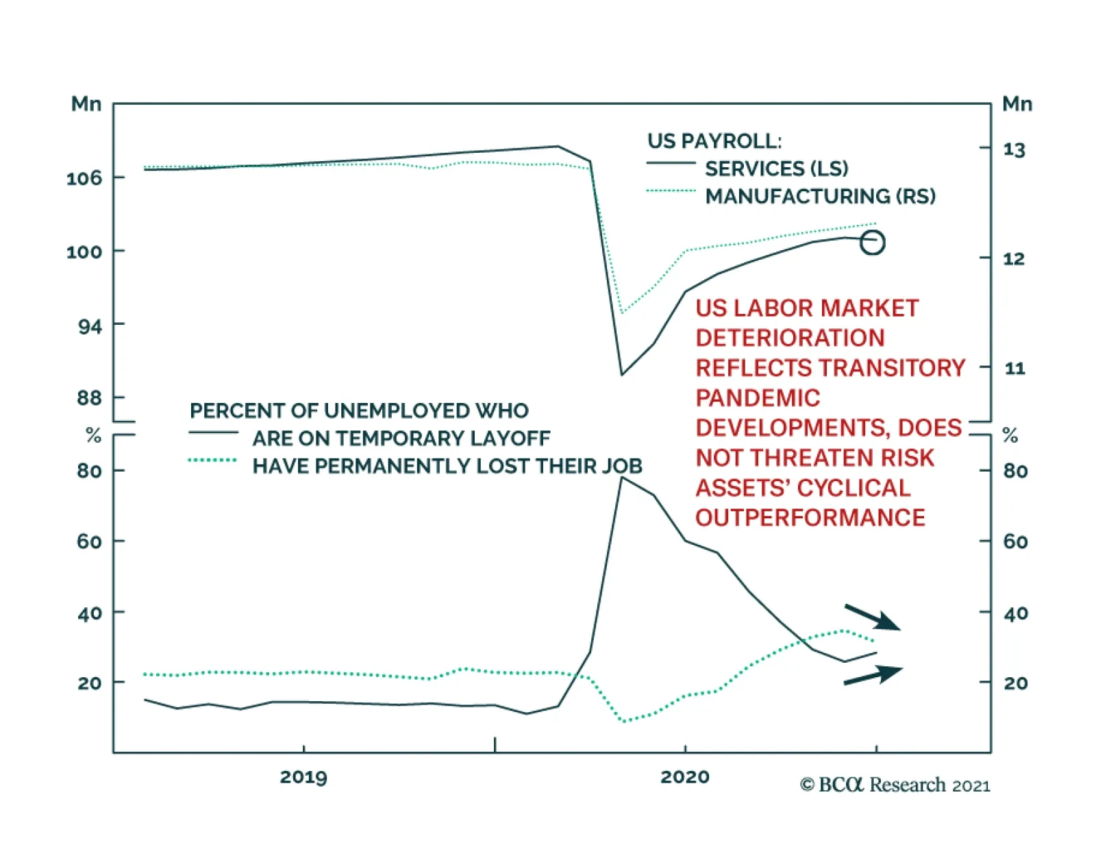
Total US nonfarm payrolls were a major disappointment, falling by 140 thousand in December, after rising in the previous 7 months. But the contents of the report are not nearly as negative for markets as the headline number suggests. Rather than implying…

After bottoming in Q4, the German DAX is rallying and outperforming the Euro Stoxx 50 in the process. While the near-term is muddled by the pandemic’s resurgence, the global manufacturing recovery this year will ultimately benefit the German economy and…