Sectors

Highlights The (earnings) yield premium on tech stocks versus the 10-year bond yield is at its 2.5 percent lower threshold that has signalled four previous market fragilities. Additionally, the 65-day fractal structure of stocks versus bonds has collapsed, signalling a high probability of an exhaustion or correction over the next 65 days. Likewise, the 130-day fractal structure of bitcoin has also collapsed, signalling a high probability of an exhaustion or correction over the next 130 days. Bond yields are unlikely to go much higher; they are likely to go lower. Prefer utilities within the value segment, and prefer healthcare within the growth segment. Offices and bricks-and-mortar retail will never fully reopen. This will devastate the jobs market once the protection from government-funded furlough schemes winds down in 2021. Feature The pandemic will ease in 2021, and with it many of the restrictions on our lives. Yet when it comes to the economy and investment, the great reopening narrative for 2021 is misleading because the world economy has already largely reopened. We quickly learned that, with some adaptations, like working from home, and doing our shopping online, almost all economic activity can resume during a raging global pandemic. As a result, global profits have already rebounded very strongly (Chart of the Week). Chart of the WeekGlobal Profits Have Already Rebounded Very Strongly
Global Profits Have Already Rebounded Very Strongly
Global Profits Have Already Rebounded Very Strongly
Manufacturing is fully open. Construction is fully open. Industrial production is fully open. Finance and most services are fully open. Looking at the world’s two largest economies, China is already beyond its pre-pandemic levels of output (Chart I-2), while the US is a mere 0.9 percent below (based on the Atlanta Fed Nowcast of 2.6 percent growth in the fourth quarter)1 (Chart I-3). Chart I-2The Chinese Economy Has Already Rebounded
The Chinese Economy Has Already Rebounded
The Chinese Economy Has Already Rebounded
Chart I-3The US Economy Has Already ##br##Rebounded
The US Economy Has Already Rebounded
The US Economy Has Already Rebounded
Offices And Bricks-And-Mortar Retail Will Never Fully Reopen In the great reopening narrative, the end of the pandemic will allow the full reopening of offices, shops, restaurants, bars, travel and leisure. But will former office workers flock back to their offices full-time, or even majority-time? Will consumers flock back to bricks-and-mortar retailers? Will firms flock back to the same extent of business travel? Our high conviction answers are no, no, and no. The reason we will not go back to the pre-pandemic way of doing things is because we have found a better way of doing things. Obviously, we will relish our re-found ability to go on holiday and to meet our fellow humans in the flesh. But do we really need to meet our co-workers every day, or even most days? Do we really need to do our shopping in person every time, or even most times? Do we really need to visit the overseas office every quarter? In 2021 and beyond, we will continue to work, shop, and interact more remotely, not because a pandemic forces us to, but because it improves the quality of our personal and working lives. It improves our standard of living. In 2021 and beyond, we will continue to work, shop, and interact more remotely. Unfortunately, there will be collateral damage. As working from home becomes mainstream, the ecosystem of city centre bars, restaurants, and shops that rely on office workers will wither. This ecosystem’s large footprint can be illustrated by a remarkable fact: the pre-pandemic populations of both Manhattan and central London were 2 million people greater during the weekday daytime than during the night-time. Likewise, as online shopping becomes the default, bricks-and-mortar retailing will go into terminal decline. This is significant because retail employs 10 percent of all workers in the US and the UK, the majority in bricks-and-mortar retail outlets. In the same way, more online meetings and fewer business trips means less employment in the travel and accommodation sectors. The common thread connecting retail and accommodation and food services is that they produce relatively little output, but account for a lot of jobs – in fact, just 8 percent of output but 20 percent of all jobs (Table I-1). Table I-1Retail Plus Accommodation And Food Services Account For 8 Percent Of Output But 20 Percent Of Jobs
Stocks Are Vulnerable… And So Is Bitcoin
Stocks Are Vulnerable… And So Is Bitcoin
Hence, as these sectors wither, the good news is that the impact on economic output will be modest. The bad news is that the ultimate impact on the jobs market will be devastating. Crucially, this ultimate impact on the jobs market will only be felt once the protection from government-funded furlough schemes winds down in 2021. In time, a dynamic economy will redeploy the army of shop assistants, city centre bar and restaurant staff, and cabin crew into fast growing sectors such as healthcare and education. But a process that requires retraining and reskilling will take years not months. During this long adjustment, there is likely to be huge slack in developed economy labour markets. Given that central banks are now explicitly targeting labour market slack, these central banks will be forced to keep nominal bond yields at ultra-low levels for a very long time. The Near-Term Constraint On Bond Yields In the near term, there is an even greater force holding bond yields in check, and that force is something that central banks also explicitly target – financial stability. Higher bond yields would imperil financial stability. The global stock market is at an all-time high because valuations stand 25 percent higher than a year ago (Chart I-4). Valuations have surged because bond yields have collapsed (Chart I-5), but even relative to these ultra-low bond yields, technology sector valuations are now stretched. Chart I-4The Global Stock Market Is At An All-Time High Because Valuations Are 25 Percent Higher
The Global Stock Market Is At An All-Time High Because Valuations Are 25 Percent Higher
The Global Stock Market Is At An All-Time High Because Valuations Are 25 Percent Higher
Chart I-5Valuations Are 25 Percent Higher Because Bond Yields Have Collapsed
Valuations Are 25 Percent Higher Because Bond Yields Have Collapsed
Valuations Are 25 Percent Higher Because Bond Yields Have Collapsed
The (earnings) yield premium on tech stocks versus the 10-year bond yield is at its 2.5 percent lower threshold that has signalled four previous market fragilities. These previous market fragilities resulted in an exhaustion, or worse, a correction in the stock market in February 2018, October 2018, April 2019, and January 2020. Just as important, these points of fragility signalled that bond yields were approaching a major or minor peak (Chart I-6). Chart I-6Tech Stock Valuations Are Fragile
Tech Stock Valuations Are Fragile
Tech Stock Valuations Are Fragile
Hence, in the early part of 2021 at least, steer towards investments that will benefit from a backing down of bond yields. This means avoiding value stocks as an aggregate, because value cannot outperform growth unless bond yields are rising (Chart I-7). However, it also means avoiding growth stocks in aggregate as the fragility lies in tech stock valuations. Chart I-7Value Cannot Outperform Growth Unless Bond Yields Are Rising
Value Cannot Outperform Growth Unless Bond Yields Are Rising
Value Cannot Outperform Growth Unless Bond Yields Are Rising
A good strategy is to prefer utilities within the value segment, given that utilities benefit from lower bond yields (Chart I-8). And prefer healthcare within the growth segment, given the sector’s more reasonable valuation. Chart I-8Banks Cannot Outperform Utilities Unless Bond Yields Are Rising
Banks Cannot Outperform Utilities Unless Bond Yields Are Rising
Banks Cannot Outperform Utilities Unless Bond Yields Are Rising
Stocks Are Vulnerable… And So Is Bitcoin Manias occur in markets when marginal buyers keep flooding in at a higher and higher price. (Likewise, panics occur when marginal sellers keep flooding in at a lower and lower price.) The supply of marginal buyers fuelling the strong uptrend tends to come from longer-term investors who are uncharacteristically behaving like short-term momentum traders for fear of missing out on the rally. For example, an investor with a 130-day investment horizon shouldn’t buy because of a one-day price increase. If he does, then his investment horizon has shrunk to 1-day. In this example, the strong uptrend will run out of fuel when the 130-day investors who are fuelling it are all in. This is defined by the 130-day fractal structure of the investment collapsing, meaning that its 130-day fractal dimension has reached its lower bound. If someone now puts on a sell order, there are no more 130-day horizon investors available to be the marginal buyer at the current price. Having sucked in all the 130-day investors, an investor with an even longer horizon, say 260 days, must step in as the marginal buyer. The likely outcome is a price correction because the longer-term investor is likely to buy only when a lower price satisfies his value compass. The other possibility is that the 260-day investor joins the uptrend, becoming a marginal buyer at the current price, adding more fuel to the mania. This is the less likely outcome because the longer that an investor’s horizon is, the more faithful he is likely to be to his valuation compass. Nevertheless, sometimes the valuation compass goes awry because of structural shifts or massive intervention by policymakers, allowing the trend to continue. The above describes the basis of our proprietary fractal trading system. In a nutshell, when the fractal structure of an investment collapses, the probability of a trend reversal increases sharply, and the probability of a trend continuation decreases sharply. Right now, the 65-day fractal structure of stocks versus bonds has collapsed, signalling a high probability of an exhaustion or correction over the next 65 days (see final section). Likewise, the 130-day fractal structure of bitcoin has also collapsed, signalling a high probability of an exhaustion or correction over the next 130 days (Chart I-9). Chart I-9The 130-Day Fractal Structure Of Bitcoin Has Collapsed
Bitcoin
Bitcoin
To be clear, these rallies can continue uninterrupted if longer-term investors join the bandwagon. But this would require them to discard their valuation compasses. Hence, on balance, we think that this is the lower probability outcome. Also, to be clear, the long-term direction of both stocks versus bonds and bitcoin is up. The vulnerability we refer to is of a tactical pullback within a structural uptrend. An Excellent Year For The Fractal Trading System Among our most recent trades, overweight Portugal versus Italy achieved its 7 percent profit target, and underweight Australian construction materials (James Hardie, Lendlease, and Boral) achieved its 6 percent profit target. This takes the 2020 win ratio to a very pleasing 63 percent, comprising 18.4 winning trades versus 11 losing trades. Using a position size that delivers 2 percent for a win (and -2 percent for a loss), this equates to a 2020 return of 15 percent with a worst drawdown of -6 percent. By comparison, the MSCI All Country World index delivered a similar return of 17 percent but with a much more severe worst drawdown of -34 percent. 63 percent is a great win ratio. 63 percent is a great win ratio, but our aim is to reach 70 percent. To this end we are preparing several enhancements to the system which we will unveil in the coming weeks. Stay tuned. Fractal Trading System* As already discussed, we are targeting a tactical pullback in the MSCI All Country World Index versus the 30-year T-bond. The profit-target and symmetrical stop-loss are set at 5.8 percent. Chart I-10
MSCI All-Country World Vs. 30-Year T-Bond
MSCI All-Country World Vs. 30-Year T-Bond
The rolling 12-month win ratio now stands at 63 percent. When the fractal dimension approaches the lower limit after an investment has been in an established trend it is a potential trigger for a liquidity-triggered trend reversal. Therefore, open a countertrend position. The profit target is a one-third reversal of the preceding 13-week move. Apply a symmetrical stop-loss. Close the position at the profit target or stop-loss. Otherwise close the position after 13 weeks. * For more details please see the European Investment Strategy Special Report “Fractals, Liquidity & A Trading Model,” dated December 11, 2014, available at eis.bcaresearch.com. Dhaval Joshi Chief European Investment Strategist dhaval@bcaresearch.com Footnotes 1 The GDP rebound creates a dissonance. If GDP is indicating a largely recovered economy, but our lives feel far from normal, is GDP really a good measure or objective for our wellbeing? We will leave a deeper discussion of this to a later date. Fractal Trading System Cyclical Recommendations Structural Recommendations Closed Fractal Trades Trades Closed Trades Asset Performance Currency & Bond Equity Sector Country Equity Indicators Bond Yields Chart II-1Indicators To Watch - Bond Yields
Indicators To Watch - Bond Yields
Indicators To Watch - Bond Yields
Chart II-2Indicators To Watch - Bond Yields
Indicators To Watch - Bond Yields
Indicators To Watch - Bond Yields
Chart II-3Indicators To Watch - Bond Yields
Indicators To Watch - Bond Yields
Indicators To Watch - Bond Yields
Chart II-4Indicators To Watch - Bond Yields
Indicators To Watch - Bond Yields
Indicators To Watch - Bond Yields
Interest Rate Chart II-5Indicators To Watch - Interest Rate Expectations
Indicators To Watch - Interest Rate Expectations
Indicators To Watch - Interest Rate Expectations
Chart II-6Indicators To Watch - Interest Rate Expectations
Indicators To Watch - Interest Rate Expectations
Indicators To Watch - Interest Rate Expectations
Chart II-7Indicators To Watch - Interest Rate Expectations
Indicators To Watch - Interest Rate Expectations
Indicators To Watch - Interest Rate Expectations
Chart II-8Indicators To Watch - Interest Rate Expectations
Indicators To Watch - Interest Rate Expectations
Indicators To Watch - Interest Rate Expectations
Dear Client, I am writing as the US Capitol goes under lockdown to tell you about a new development at BCA Research. Since you are a subscriber of Geopolitical Strategy, we wanted you to be the first to know. This month we are launching a new sister service, US Political Strategy, which will expand and deepen our coverage of investment-relevant US domestic political risks and opportunities. Over the past decade, we at Geopolitical Strategy have worked hard to craft an analytical framework that incorporates policy insights into the investment process in a systematic and data-dependent way. We have learned a lot from your input and have refined our method, while also building new quantitative models and indicators to supplement our qualitative, theme-based coverage. While our method served us well in 2020, the frantic US election cycle often caused clients to lament that US politics had begun to crowd out our traditional focus on truly global themes and trends. We concurred. Therefore we have decided to expand our team and deepen our coverage. With a series of new hires, we are now better positioned to provide greater depth on US markets in US Political Strategy while redoubling our traditional global sweep in the pages of Geopolitical Strategy. Going forward, US Political Strategy will cover executive orders, Capitol Hill, federal agencies, regulatory risk, the Supreme Court, emerging socioeconomic trends, and their impacts on key US sectors and assets. It will be BCA Research’s newest premium investment strategy service and will include the full gamut of weekly reports, special reports, webcasts, and client conferences. Meanwhile Geopolitical Strategy will return to its core competency of geopolitics writ large – including the US in its global impacts, but diving deeper into the politics and markets of China, Europe, India, Japan, Russia, the Middle East, and select emerging markets. Both strategies will utilize our proprietary analytical framework, which relies on data-driven assessments of the “checks and balances” that shape policy outcomes (i.e. comparing constraints versus preferences). As you know best, we are agnostic about political parties, transparent about conviction levels and scenario probabilities, and solely focused on getting the market calls right. To this end, we offer you a complimentary trial subscription of US Political Strategy. We aim to become an integral part of your work flow – separating the wheat from the chaff in the political and geopolitical sphere so that you can focus on honing your investment process. We know you will be pleased to see Geopolitical Strategy return to its roots – and we hope you will consider diving deeper with us into US politics and markets. We look forward to hearing from you. Happy New Year! All very best, Matt Gertken, Vice President BCA Research The outgoing Trump administration is powerless to stop the presidential transition and the US military and security forces will not participate in any “coup.” Investors should buy the dip if social instability affects the markets between now and President-elect Joe Biden’s Inauguration Day. Democrats have achieved a sweep of US government with two victories in Georgia’s Senate election. The Biden administration is no longer destined for paralysis. Investors no longer need fear a premature tightening of US fiscal policy. Fiscal thrust will expand by around 6.9% of GDP more than it otherwise would have in FY2021 and contract by 12.3% of GDP in FY2022. Democrats will partly repeal the Trump tax cuts to pay for new spending programs, including an expansion and entrenchment of Obamacare. Big Tech is the most exposed to the combination of higher corporate taxes and inflation expectations. Investors should go long risk assets and reflation plays on a 12-month basis. We recommend value over growth stocks, materials over tech, TIPS over nominal treasuries, infrastructure plays, and municipal bonds. The special US Senate elections in Georgia produced a two-seat victory for Democrats on January 5 and have thus given the Democratic Party de facto control of the Senate.Financial markets have awaited this election with bated breath. The “reflation trade” – bets on economic recovery on the back of ultra-dovish monetary and fiscal policy – had taken a pause for the election. There was a slight setback in treasury yields and the outperformance of cyclical, small cap, and value stocks, which rallied sharply after the November 3 general election (Chart 1). The Democratic victory ensures that US corporate and individual taxes will go up – triggering a one-off drop in earnings per share of about 11%, according to our US Equity Strategist Anastasios Avgeriou (Table 1). But it also brings more proactive fiscal policy. Since the Democrats project larger new spending programs financed by tax hikes, the big takeaway is that the US economic recovery will gain momentum and will not be undermined by premature fiscal tightening. Chart 1Markets Will Look Through Unrest To Reflation
Buy Reflation Plays On Georgia’s Blue Sweep
Buy Reflation Plays On Georgia’s Blue Sweep
Table 1What EPS Hit To Expect?
Buy Reflation Plays On Georgia’s Blue Sweep
Buy Reflation Plays On Georgia’s Blue Sweep
Chart 2Democrats Won Georgia Seats, US Senate
Buy Reflation Plays On Georgia’s Blue Sweep
Buy Reflation Plays On Georgia’s Blue Sweep
Republicans Snatch Defeat From Jaws Of Victory The results of the Georgia runoffs, at the latest count, are shown in Chart 2. Republican Senator David Perdue has not yet officially lost the race, as votes are still being tallied, but he trails his Democratic challenger Jon Ossoff by 16,370 votes. This is a gap that is unlikely to be changed by subsequent vote disputes or recounts (though it is possible and the results are not yet declared as we go to press). President-elect Joe Biden only lost 1,274 votes to President Trump when ballots were recounted by hand in November. The Democratic victory offers some slight consolation for opinion pollsters who underestimated Republicans in the general election in certain states. Opinion polls had shown a dead heat in both of Georgia’s races, with Republican Senators Perdue and Kelly Loeffler deviating by 1.4% and 0.4% respectively from their support rate in the average of polls in December. Democratic challengers Jon Ossoff and Raphael Warnock differed by 1.3% and 2.3% from their final polling (Charts 3A & 3B). Chart 3AOpinion Pollsters Did Better …
Buy Reflation Plays On Georgia’s Blue Sweep
Buy Reflation Plays On Georgia’s Blue Sweep
Chart 3B… In Georgia Runoffs
Buy Reflation Plays On Georgia’s Blue Sweep
Buy Reflation Plays On Georgia’s Blue Sweep
By comparison, in the November 3 general election, polls underestimated Perdue by 1.3% and overestimated Warnock by 5.3% (Chart 4). On the whole, the election shows that state-level opinion polling can improve to address new challenges. Our quantitative Senate election model had given Republicans a 78% chance of winning Georgia. This they did in the first round of the election, but conditions have changed since November 3, namely due to President Trump’s refusal to concede the election after the Electoral College voted on December 14.1 Our model is based on structural factors so it did not distinguish between the two Senate candidates in the same state. For the whole election, the model predicted that Democrats would win a net of three seats, resulting in a Republican majority of 51-49. Today we see that the model only missed two states: Maine and Georgia. But Georgia has made all the difference, with the result to be 50-50, for Vice President Kamala Harris to break the tie (Chart 5). Chart 4Ossoff In Line With Polls, Warnock Slightly Beat
Buy Reflation Plays On Georgia’s Blue Sweep
Buy Reflation Plays On Georgia’s Blue Sweep
Chart 5Our Quant Model Missed Maine And Georgia – And Georgia Carries Two Seats To Turn The Senate
Buy Reflation Plays On Georgia’s Blue Sweep
Buy Reflation Plays On Georgia’s Blue Sweep
COVID-19 likely took a further toll on Republican support in the interim between the two election rounds. The third wave of the COVID-19 pandemic has not peaked in the US or the Peach State. While the number of cases has spiked in Georgia as elsewhere, the number of deaths has not yet followed (Chart 6). Chart 6COVID-19 Surged Since November
Buy Reflation Plays On Georgia’s Blue Sweep
Buy Reflation Plays On Georgia’s Blue Sweep
Lame Duck Trump Risk Before proceeding to the policy impacts of the apparent Democratic sweep of both executive and legislative branches, a word must be said about the presidential transition and President Trump’s final 14 days in office. First, the Joint Session of Congress to count the Electoral College ballots to certify the election of the new US president has been interrupted as we go to press. There is zero chance that protesters storming the proceedings will change the outcome of the election. The counting of the electoral votes can be interrupted for debate; it will be reconvened. Disputes over the vote could theoretically become meaningful if Republicans controlled both the House and the Senate, as the combined voice of the legislature could challenge the legitimacy of a state’s electoral votes. But today the Republicans only control the Senate, and while some will press isolated challenges, based on legal disputes of variable merit, these challenges will not gain traction in the Senate let alone in the Democratic-controlled House. What did the US learn from this controversial election? US political polarization is reaching extreme peaks which are putting strain on the formal political system, but Trump lacks the strength in key government bodies to overturn the election. Second, there was no willingness of state legislatures to challenge their state executives on the vote results. This has to do with the evidence upon which challenges could be lodged, but there is also a built-in constraint. Any state legislature whose ruling party opposes the popular result will by definition put its own popular support in jeopardy in the next election. Third, the Supreme Court largely washed its hands of state-level disputes settled by state-level courts. Historically, the Supreme Court never played a role in presidential elections. The year 2000 was an exception, as the high court said at the time. The 2020 election has established a high bar for any future Supreme Court involvement, though someday it will likely be called on to weigh in. Hysteria regarding the conservative leaning on the court – which is now a three-seat gap – was misplaced. The three Supreme Court justices appointed by Trump took no partisan or interventionist role. Nevertheless, the court’s conservative leaning will be one of the Trump administration’s biggest legacies. The marginal judge in controversial cases is now more conservative and will take a larger role given that Democrats now have a greater ability to pass legislation by taking the Senate. President Trump is still in office for 14 days. There is zero chance of a successful military coup or anything of the sort in a republic in which institutions are strong and the military swears allegiance to the constitution. Attempts to oppose the Electoral College and Congress will be opposed – and ultimately they will be met with an overwhelming reassertion of the rule of law. All ten of the surviving secretaries of defense of the United States have signed an open letter saying that the election results should no longer be resisted and that any defense officials who try to involve the military in settling electoral disputes could be criminally liable.2 With Trump’s options for contesting the election foreclosed, he will turn to signing a flurry of executive orders to cement his legacy. His primary legacy is the US confrontation with China, so he will continue to impose sanctions on China on the way out, posing a tactical risk to equity prices. The business community will be slow to comply, however, so the next administration will set China policy. There is a small possibility that Trump will order economic or even military action against Iran or any other state that provokes the United States. But Trump is opposed to foreign wars and the bureaucracy would obstruct any major actions that do not conform with national interests. Basically, Trump’s final 14 days may pose a downside risk to equities that have rallied sharply since the November 9 vaccine announcement but we are long equities and reflation plays. Sweeps Just As Good For Stocks As Gridlock The balance of power in Congress is shown in Chart 7. The majorities are extremely thin, which means that although Democrats now have control, there will remain high uncertainty over the passage of legislation, at least until the 2022 midterm elections. Investors can now draw three solid conclusions about the makeup of US government from the 2020 election: The White House’s political capital has substantially improved – President-elect Joe Biden no longer faces a divided Congress. He won by a 4.5% popular margin (51.4% of the total), bringing the popular and electoral vote back into alignment. He will have a higher net approval rating than Trump in general, and household sentiment, business sentiment, and economic conditions will improve from depressed, pandemic-stricken levels over the course of his term. The Senate is evenly split but Democrats will pass some major legislation – Thin margins in the Senate make it hard to pass legislation in general. However, the budget reconciliation process enables laws to pass with a simple majority if they involve fiscal matters. Hence, Democrats will be able to legislate additional COVID relief and social support that they were not able to pass in the end-of-year budget bill. They can pass a reconciliation bill for fiscal 2022 as well. They will focus on economic recovery followed by expanding and entrenching the Affordable Care Act (Obamacare). We fully expect a partial repeal of Trump’s Tax Cut and Jobs Act, if not initially then later in the year. Democrats only have a five-seat majority in the House of Representatives – Democrats will vote with their party and thus 222 seats is enough to maintain a working majority. But the most radical parts of the agenda, such as the Green New Deal, will be hard to pass. Chart 7Democrats Control Both Houses
Buy Reflation Plays On Georgia’s Blue Sweep
Buy Reflation Plays On Georgia’s Blue Sweep
With the thinnest possible margin, the Senate has a highly unreliable balance of power. Table 2 shows top three Republicans and Democrats in terms of age, centrist ideology, and independent mentality. Four senators are above the age of 85 – they can vote freely and could also retire or pass away. Centrist and maverick senators will carry enormous weight as they will provide the decisive votes. The obvious example is Senator Joe Manchin of West Virginia, who has opposed the far-left wing of his party on critical issues such as the Green New Deal, defunding the police, and the filibuster. Table 2The Senate Will Hinge On These Senators
Buy Reflation Plays On Georgia’s Blue Sweep
Buy Reflation Plays On Georgia’s Blue Sweep
The Democrats could conceivably muster the 51 votes to eliminate the filibuster, which requires a 60-vote majority to pass most legislation, but it will be very difficult. Senators Dianne Feinstein (D, CA), Angus King (I, ME), Kyrsten Sinema (D, AZ), Jon Tester (D, MT), and Manchin are all skeptical of revoking this critical hurdle to Senate legislation.3 We would not rule it out, however. The US has reached a point of “peak polarization” in which surprises should be expected. By the same token, Republican Senators Lisa Murkowski and Susan Collins often vote against their party. Collins just won yet another tough race in Maine due to her ability to bridge the partisan gap. There are also mavericks like Rand Paul – and Ted Cruz will have to rethink his populist strategy given his thin margins of victory and the Trump-induced Republican defeat in the South. Not shown are other moderates who will be eager to cross the political aisle, such as Senator Mitt Romney of Utah. None of the above means Democrats will fail to raise taxes. All Democrats voted against Trump’s Tax Cut and Jobs Act, which did not end up being popular or politically beneficial for the Republicans. The Democratic base is fired up and mobilized by Trump to pursue its core agenda of increasing the government role in US society and the economy and redressing various imbalances and disparities. This requires revenue, especially if it is to be done with only 51 votes via the budget reconciliation process. The two Democratic senators from Arizona are vulnerable, but they will toe the party line because Trump and the GOP were out of step with the median voter. Moreover, Arizonians voted for higher taxes in a state ballot measure in November. Since 1980, gridlocked government has resulted in higher average annual returns on the S&P500. But since 1949, single-party sweeps have slightly edged out gridlocked governments in stock returns, though the results are about the same (Chart 8). The point is that gridlock makes it hard for government to get big things done. Sometimes that is positive for markets, sometimes not. The macro backdrop is what matters. The Federal Reserve is unlikely to start tightening until late 2022 at earliest and fiscal thrust in 2021-22 will be more expansionary now that the Democrats have control of the Senate. This policy backdrop is negative for the dollar and positive for risk assets, especially equity sectors that will suffer least from impending corporate tax hikes, such as energy, industrials, consumer staples, materials, and financials. Chart 8Sweeps Don’t Always Underperform Gridlock
Buy Reflation Plays On Georgia’s Blue Sweep
Buy Reflation Plays On Georgia’s Blue Sweep
Meanwhile, Biden will have far less trouble getting his cabinet and judicial appointments through the Senate (Appendix). His appointees so far reflect his desire to return the US to “rule by experts,” as opposed to Trump’s disruptive style of personal rule. Investors will cheer the return to technocrats and predictable policymaking even if they later relearn that experts make gigantic mistakes too. Fiscal Policy Outlook The critical feature of the Trump administration was the COVID-19 pandemic, which sent the US budget deficit soaring to World War II levels relative to GDP. In the coming years, the change in the budget deficit (fiscal thrust) will necessarily be negative, dragging on growth rates (Chart 9). Fiscal policy determines how heavy and abrupt that drag will be. Chart 9US Budget Deficit Surged – Pace Of Normalization Matters
Buy Reflation Plays On Georgia’s Blue Sweep
Buy Reflation Plays On Georgia’s Blue Sweep
Chart 10 presents four scenarios that we adjusted based on data from the Congressional Budget Office. The baseline would see an extraordinary 6.7% of GDP contraction in the budget deficit that would kill the recovery, which the Georgia outcome has now rendered irrelevant. The “Republican Status Quo” scenario is now the minimum. Chart 10Democratic Sweep Suggests Big Fiscal Thrust In FY2021 And Less Contraction FY2022
Buy Reflation Plays On Georgia’s Blue Sweep
Buy Reflation Plays On Georgia’s Blue Sweep
The “Democratic Status Quo” scenario assumes that the $600 per household rebate will be increased to $2,000 per family and that the remaining $2.5 trillion of the Democrats’ proposed HEROES Act will be enacted. The “Democratic High” scenario adds Biden’s $5.6 trillion policy agenda on top of the Democratic status quo, supercharging the economic recovery with a fiscal bonanza. Biden will not achieve all of this, so the reality will lie somewhere between the solid blue and dotted blue lines. This Democratic status quo implies a 6.9% of GDP expansion of the deficit in FY2021. It also implies that the deficit will contract by 12.3% of GDP in FY2022, instead of 13.5% in the Republican status quo scenario. The economic recovery will be better supported. So, too, will the Fed’s timeline for rate hikes – but the Fed’s new strategy of average inflation targeting shows that it is targeting an inflation overshoot. So the threat of Fed liftoff is not immediate. The longer the extraordinary fiscal largesse is maintained, the greater the impact on inflation expectations and the more upward pressure on bond yields (Chart 11). Big Tech will be the one to suffer while Big Banks, industrials, materials, and energy will benefit. Chart 11Bond Bearish Blue Sweep
Buy Reflation Plays On Georgia’s Blue Sweep
Buy Reflation Plays On Georgia’s Blue Sweep
Our US Political Risk Matrix There is no correlation between fiscal thrust and equity returns. This is true whether we consider the broad market, cyclicals/defensives, value/growth stocks, or small/large caps (Chart 12). Normally, fiscal thrust surges when recessions and bear markets occur, leading to volatility in asset prices. However, in the new monetary policy context, the risk is to the upside for the above-mentioned sectors, styles, and segments. Looking at sector performance before and after the November 3 election and November 9 vaccine announcement, there has been a clear shift from pandemic losers to pandemic winners. Big Tech and Consumer Discretionary (Amazon) thrived during the period before the vaccine, while value stocks (industrials, energy, financials) suffered the most from the lockdowns. These trends have reversed, with energy and financials outperforming the market since November (Chart 13). The Biden administration poses regulatory risks for Big Oil and arguably Big Banks, but these will come into play after the market has priced in economic normalization and the emerging consensus in favor of monetary-fiscal policy coordination, which is very positive for these sectors. Chart 12Fiscal Thrust Not Correlated With Stocks
Buy Reflation Plays On Georgia’s Blue Sweep
Buy Reflation Plays On Georgia’s Blue Sweep
Chart 13Energy And Financials Turned Around With Vaccine
Buy Reflation Plays On Georgia’s Blue Sweep
Buy Reflation Plays On Georgia’s Blue Sweep
In the case of energy, as stated above, the Biden administration will still struggle to get anything resembling the Green New Deal approved in Congress. Nevertheless, environmental regulation will expand and piecemeal measures to promote research and development, renewables, electric vehicles, and other green initiatives may pass. Large cap energy firms are capable of adjusting to this kind of transition. Coal companies are obviously losers. In the case of financials, Biden’s record is not unfriendly to the financial industry. His nominee for Treasury Secretary, former Fed Chair Janet Yellen, approved of the relaxation of some of its more stringent financial regulations under the Trump administration. Big Banks are no longer the target of popular animus like they were after the 2008 financial crisis – in that regard they have given way to Big Tech. Our US Investment Strategist Doug Peta argues that the Democratic sweep will smother any gathering momentum in personal loan defaults, which would help banks outperform the broad market. Biden’s regulatory approach to Big Tech will be measured, as the Obama administration’s alliance with Silicon Valley persists, but tech stands to suffer the most from higher taxes, especially a minimum corporate tax rate. With a unified Congress, it is also now possible that new legislation could expand tech regulation. There is a bipartisan consensus emerging on tech regulation so Republican votes can be garnered. Tech thrives on growth-scarce, disinflationary environments whereas the latest developments are positive for inflation expectations. In the recent lead-up to the Georgia vote, industrials, financials, and consumer discretionary stocks have not benefited much, even though they should (Chart 14). These are investment opportunities. Chart 14Upside For Energy And Financials Despite Regulatory Risk
Buy Reflation Plays On Georgia’s Blue Sweep
Buy Reflation Plays On Georgia’s Blue Sweep
In our Political Risk Matrix, we establish these views as our baseline political tilts, to be applied to the BCA Research House View of our US Equity Strategy. The results are shown in Table 3. When equity sectors become technically stretched, the political impacts will become more salient. Table 3US Political Risk Matrix
Buy Reflation Plays On Georgia’s Blue Sweep
Buy Reflation Plays On Georgia’s Blue Sweep
Investment Takeaways Over the past few years our sister Geopolitical Strategy has written extensively about “Civil War Lite,” “Peak Polarization,” and contested elections in the United States. We will dive deeper into these themes and issues in forthcoming reports, but for now suffice it to say that extremist events will galvanize the majority of the nation behind the new administration while also driving politicians of both stripes to use pork-barrel spending to try to stabilize the country. Congress will err on the side of providing too much fiscal stimulus just as surely as the Fed is bent on erring on the side of providing too much monetary stimulus. That means reflation, which will ultimately boost stocks in 2021. We also expect stocks to outperform government bonds, at least on a tactical 3-6 month timeframe. As the above makes clear, we prefer value stocks over growth stocks. Specifically we favor cyclical plays like materials over the big five of Google, Apple, Amazon, Microsoft, and Facebook. An infrastructure bill was one of the few legislative options for the Biden administration under gridlock, now it is even more likely. Infrastructure is popular and both presidential candidates competed to see who could offer the bigger plan. Moreover, what Biden cannot achieve under the rubric of climate policy he can try to achieve under the rubric of infrastructure. The BCA US Infrastructure Basket correlates with the US budget deficit as well as growth in China/EM and we recommend investors pursue similar plays. In the fixed income space, Treasury inflation protected securities (TIPS) are likely to continue outperforming nominal, duration-matched government bonds. Our US Bond Strategist Ryan Swift is on alert to downgrade this recommendation, but the change in US government configuration at least motivates a tactical overweight in TIPS. The chances of US state and local governments receiving fiscal support – previously denied by the GOP Senate – has increased so we will also go long municipal bonds relative to treasuries. Matt Gertken Vice President US Political Strategy mattg@bcaresearch.com Appendix Table A1Biden’s Cabinet Position Appointments
Buy Reflation Plays On Georgia’s Blue Sweep
Buy Reflation Plays On Georgia’s Blue Sweep
Footnotes 1 Perdue defeated Ossoff on November 3 but fell short of the 50% threshold to avoid a second round; meanwhile the cumulative Republican vote in the multi-candidate special election outnumbered the cumulative Democratic vote on November 3. 2 Ashton Carter, Dick Cheney, William Cohen, et al, “All 10 living former defense secretaries: Involving the military in election disputes would cross into dangerous territory,” Washington Post, January 3, 2021, washingtonpost.com. 3 Jordain Carney, “Filibuster fight looms if Democrats retake Senate,” The Hill, August 25, 2020, thehill.com.
According to BCA Research’s Global Asset Allocation Strategy service, a rapid rollout of vaccines means that the economy should be on track to return to near-normality by the second half of 2021. Therefore, the key thing for investors to think about is what…
In our "Millennials Are Not Coming Of Age; They Are Already Here” Special Report where we first created the BCA Millennial Basket we mentioned that “we would not hesitate to add other sharing economy stocks, including Airbnb and Uber, to this basket should they become investable.” We did eventually add UBER to the basket, which replaced FB on December 13, 2019. Today, in light of the recent Airbnb IPO, we are compelled to make another substitution. We are banking all the TSLA gains and removing it from our millennial basket as the S&P is adding it in the S&P 500. And, we are reinvesting the funds into ABNB and rebalance all the stocks in the millennial basket back to a 10% weight for each of the constituents. The main reason behind the substitution is because the easy money has already been made in TSLA, but not in ABNB (Chart 1). In other words, now that TSLA is worth as much as all the other car manufacturers in the world put together, it is difficult to continue rising at the same frenetic pace of the past few years. In contrast, were ABNB to follow a similar trajectory and rise to a similar stardom to TSLA, then there is a long runway ahead for this new IPO. Our Millennial Basket is currently up 137% in absolute terms, and 77% in relative to S&P 500 terms, since the June 11 2018 inception (Chart 2). Recently, we also instituted an 18% rolling stop that we plan to obey it. Chart 1
Replace TSLA with ABNB In The Millennial Equity Basket
Replace TSLA with ABNB In The Millennial Equity Basket
Chart 2
Replace TSLA with ABNB In The Millennial Equity Basket
Replace TSLA with ABNB In The Millennial Equity Basket
Bottom Line: ABNB takes TSLA’s seat in our Millennial Basket.
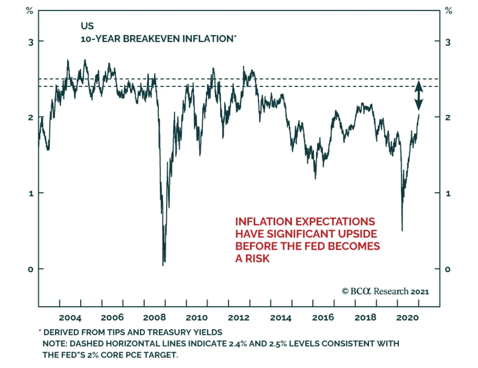
Many investors feel that the Phillips Curve has failed to predict weak inflation over the past decade. But this perception is due to a singular focus on the economic slack component of the modern-day version of the curve to the exclusion of inflation expectations, and a failure to fully consider the lasting impact of sustained periods of a negative output gap on those expectations. In addition, many investors tend to downplay the long-term balance sheet impact of two episodes of excesses and savings/capital misallocations on the relationship between the stance of monetary policy and the output gap, via a persistently negative shock to aggregate demand and a reduced sensitivity of economic activity to interest rates. The COVID-19 pandemic was certainly a major economic shock. But for now, it seems like this was a sharp income statement recession, not a balance-sheet recession. This fact, along with lower odds of negative supply-side shocks and several structural factors, suggest that inflation will be higher over the next ten years than it has over the past decade. Investors looking to protect against potentially higher inflation should look primarily to commodities, cyclical stocks, and US farmland. Gold is likely to remain well supported over the coming few years, but rich valuation suggests the long-term outlook for the yellow metal is poor. A hybrid TIPS/currency portfolio has historically been strongly correlated with the price of gold, and may provide investors with long-term protection against inflation – at a better price. Introduction Chart II-1A Surge In Long-Dated Inflation Expectations
A Surge In Long-Dated Inflation Expectations
A Surge In Long-Dated Inflation Expectations
The pandemic, and the corresponding fiscal and monetary response is challenging the low-inflation outlook of many market participants. Chart II-1 highlights that long-dated market-based inflation expectations have surged past their pre-COVID levels after collapsing to the lowest-ever level in March. The shift in thinking about inflation has partly been a response to an extraordinary rise in government spending in many countries. But Chart II-1 shows that long-dated expectations in the US were mostly trendless from April to June as Federal support was distributed, and instead rose sharply in July and August in the lead-up to the Fed’s official shift to an average inflation targeting regime. This new dawn for US monetary policy has been prompted not just by the pandemic, but also by the extended period of below-target inflation over the past decade. In this report, we review how the past ten-year episode of low inflation can be successfully explained through the lens of the expectations-augmented (i.e. “modern-day”) Phillips Curve. Many investors fail to fully appreciate the impact that inflation expectations have on driving actual inflation, as well as the cumulative impact of two major capital and savings misallocations over the past 25 years on the responsiveness of demand to interest rates and on the level of inflation expectations. Using the modern-day Phillips Curve as a guide, we present several reasons in favor of the view that inflation will be higher over the next decade than over the past ten years. Finally, we conclude with an assessment of several ways for investors to protect their portfolios from rising inflation. Revisiting The “Modern-Day” Phillips Curve The original Phillips Curve, as formulated by New Zealand economist William Phillips in the late 1950s, described a negative relationship between the unemployment rate and the pace of wage growth. Given the close correlation between wage and overall price growth at the time, the Phillips Curve was soon extended and generalized to describe an inverse relationship between labor market slack and overall price inflation. Chart II-2Rising Unemployment And Inflation Challenged The Original Phillips Curve
Rising Unemployment And Inflation Challenged The Original Phillips Curve
Rising Unemployment And Inflation Challenged The Original Phillips Curve
However, the experience of rising inflation alongside high unemployment from the late 1960s to the late 1970s underscored that prices are also importantly determined by inflation expectations and shocks to the supply-side of the economy (Chart II-2). In the 1980s and 1990s, the Federal Reserve’s success at reigning in inflation was achieved not only by raising interest rates to punishingly high levels, but also by sharply altering consumer, business, and investor expectations about future prices. The experience of the late 1960s and 1970s led to a revised form of the Phillips Curve, dubbed the “expectations-augmented” or “modern” version. As an equation, the modern Phillips Curve is described today by Fed officials, in terms of core inflation, as follows: πct = β1πet + β2πct-1 + β3πct-2 - β4SLACKt + β5IMPt + εt where: πct = Core inflation today πet = Expectations of inflation πct-n = Lagged core inflation SLACKt = Slack in the economy IMPt = Imported goods prices εt = Other shocks to prices Described verbally, this framework suggests that “economic slack, changes in imported goods prices, and idiosyncratic shocks all cause core inflation to deviate from its longer-term trend that is ultimately determined by long-run inflation expectations.1” This framework can easily be extended to headline inflation by adding changes in food and energy prices. In most formal models of the economy in use today, the modern Phillips Curve is combined with the New Keynesian demand function to describe business cycles: Yt = Y*t – β(r-r*) + εt where: Yt = Real GDP Y*t = Real potential GDP r = The real interest rate r* = The neutral rate of interest εt = Other shocks to output This equation posits that differences in the real interest rate from its neutral level, along with idiosyncratic shocks to demand, cause real GDP to deviate from potential output. Abstracting from import prices and idiosyncratic shocks, these two equations tell a simple and intuitive story of how the economy generally works: The stance of monetary policy determines the output gap and, The output gap, along with inflation expectations, determine inflation. The Modern-Day Phillips Curve: The Pre-2000 Experience This above view of inflation and demand was strongly accepted by investors before the 2008 global financial crisis, but the decade-long period of generally below-target inflation has caused a crisis of faith in the idea of the Phillips Curve. Charts II-3 and II-4 show the historical record of the New Keynesian demand function and the modern-day Phillips Curve, using five-year averages of the data in question to smooth out the impact of short-term and idiosyncratic effects. We use nominal GDP growth as our long-run proxy for the neutral rate of interest,2 the US Congressional Budget Office’s (CBO) estimate of potential GDP to determine the output gap, and a proprietary measure of inflation expectations based on an adaptive expectations framework3 (Chart II-5). Chart II-3With Just Two Exceptions, Monetary Policy Strongly Explained Demand Before 2000
With Just Two Exceptions, Monetary Policy Strongly Explained Demand Before 2000
With Just Two Exceptions, Monetary Policy Strongly Explained Demand Before 2000
Chart II-4Similarly, Pre-2000 The Output Gap Generally Explained Unexpected Inflation
Similarly, Pre-2000 The Output Gap Generally Explained Unexpected Inflation
Similarly, Pre-2000 The Output Gap Generally Explained Unexpected Inflation
Chart II-3 shows that until 1999, the stance of monetary policy was highly predictive of the output gap over a five-year period, with just two exceptions where major structural forces were at play: the late 1970s, and the second half of the 1990s. In the case of the former, the disruptive effect of persistently high inflation negatively impacted output growth despite easy monetary policy, and in the latter case, economic activity was modestly stronger than what interest rates would have implied due to the beneficial impact of the technologically-driven productivity boom of that decade. Similarly, Chart II-4 shows that until 1999 there was a good relationship between the output gap and the deviation in inflation from expectations, again with the late 1970s and late 1990s as exceptions. Along with the beneficial supply-side effects of the disinflationary tech boom, persistent import price weakness (via dollar strength) seems to have also played a role in suppressing inflation in the late 1990s (Chart II-6). Chart II-5The Expectations Component Of The Modern Phillips Curve, Visualized
The Expectations Component Of The Modern Phillips Curve, Visualized
The Expectations Component Of The Modern Phillips Curve, Visualized
Chart II-6A Strong Dollar Also Played A Role In Suppressing Inflation During The 1990s
A Strong Dollar Also Played A Role In Suppressing Inflation During The 1990s
A Strong Dollar Also Played A Role In Suppressing Inflation During The 1990s
The Modern-Day Phillips Curve Post-2000 Following 2000, deviations between the monetary policy stance, the output gap, and inflation become more prominent, particularly after 2008. As we will illustrate below, these deviations are more apparent on the demand side. In the case of inflation, the question should be why inflation was not even lower in the years immediately following the global financial crisis. On both the demand and inflation side, these deviations are explainable, and in a way that helps us determine future inflation. Charts II-7 and II-8 show the same series as in Charts II-3 and II-4, but focused on the post-2000 period. From 2000-2007, Chart II-8 shows that the relationship between the output gap and the deviation in inflation from expectations was not particularly anomalous. The output gap was negative from the end of the 2001 recession until the beginning of 2006, and inflation was correspondingly below expectations on average for the cycle. Chart II-7Post-2000, The Output Gap Decoupled From The Monetary Policy Stance
Post-2000, The Output Gap Decoupled From The Monetary Policy Stance
Post-2000, The Output Gap Decoupled From The Monetary Policy Stance
Chart II-8Since The GFC, The Real Mystery Is Why Inflation Has Been So Strong
Since The GFC, The Real Mystery Is Why Inflation Has Been So Strong
Since The GFC, The Real Mystery Is Why Inflation Has Been So Strong
Chart II-7 shows that the anomaly during that cycle was in the relationship between the output gap and the stance of monetary policy. Monetary policy was the easiest it had been in two decades, yet the output gap was negative for several years following the recession. Larry Summers pointedly cited this divergence in his revival of the secular stagnation theory in November 2013, arguing that it was strong evidence that excess savings were depressing aggregate demand via a lower neutral rate of interest and that this effect pre-dated the financial crisis. Why was demand so weak during that period? Chart II-9 compares the annualized per capita growth in the expenditure components of GDP during the 2001-2007 expansion to the 1991-2001 period. The chart shows that all components of GDP were lower than during the 1991-2001 period, with investment – the most interest rate sensitive component of GDP – showing up as particularly weak. On the surface, this supports the idea of structural factors weighing heavily on the neutral rate, rendering monetary policy less easy than investors would otherwise expect. But Chart II-9 treats the 2001-2007 years as one period, ignoring what happened over the course of the expansion. Chart II-10 repeats the exercise shown in Chart II-9 from Q1 2001 to Q3 2005, and highlights that the annualized growth in per capita residential investment was much stronger than it was during the 1991-2001 period – and nonresidential fixed investment was much weaker. Spending on goods was roughly the same, which is impressive considering that the late 1990s experienced a productivity boom and robust wage growth. All the negative contribution to growth from residential investment during the 2001-2007 expansion came after Q3 2005, as the housing market bubble burst in response to rising interest rates. In short, Chart II-10 highlights that there was a strong relationship between easy monetary policy and the demand for housing, but that this was not true for the corporate sector. Chart II-9Looking At The Whole 2001-2007 Period, Investment Was Extremely Weak
January 2021
January 2021
Chart II-10Housing Absolutely Responded To Easy Monetary Policy
January 2021
January 2021
Explaining Weak CAPEX Growth In The Early 2000s This leads us to ask why CAPEX was so weak during the 2001-2007 period. In addition to changes in interest rates, business investment is strongly influenced by expectations of consumer demand and corporate profitability. Chart II-11 shows that real nonresidential fixed investment and as-reported earnings moved in lockstep during the period, and that this delayed corporate-sector recovery also impacted the pace of hiring. Weak expectations for consumer spending do not appear to be the culprit. Chart II-12 highlights that while real personal consumption expenditure growth fell during the recession, spending did not contract (as it had done during the previous recession) and capital expenditures fell much more than what real PCE would have implied. Chart II-11Post-2001, Persistently Weak Profits Led To Weak Investment And Jobs Growth
Post-2001, Persistently Weak Profits Led To Weak Investment And Jobs Growth
Post-2001, Persistently Weak Profits Led To Weak Investment And Jobs Growth
Chart II-12CAPEX Was Much Weaker In 2002 Than Justified By Consumer Spending
CAPEX Was Much Weaker In 2002 Than Justified By Consumer Spending
CAPEX Was Much Weaker In 2002 Than Justified By Consumer Spending
Instead, persistently weak CAPEX in the early 2000s appears to be best explained by the damaging impact of corporate excesses that built up during the dot-com bubble. The Sarbanes-Oxley Act of 2002 was passed in response to a series of corporate accounting frauds that came to light in the wake of the bubble, but in many cases had been occurring for several years. Chart II-13 highlights that widespread write-offs badly impacted earnings quality and the growth in the asset value of equipment and intellectual property products (IPP), both of which only began to improve again in early 2003. This occurred alongside an outright contraction in real investment in IPP as investors lost faith in company financial statements and heavily scrutinized corporate spending. Chart II-14highlights that a contraction in IP spending was a huge change from the double-digit pace of growth that occurred in the late 1990s. Chart II-13The Damaging Impact Of Corporate Excesses
The Damaging Impact Of Corporate Excesses
The Damaging Impact Of Corporate Excesses
Chart II-14A Near-Unprecedented Collapse In IPP Investment Followed The Tech Bubble
A Near-Unprecedented Collapse In IPP Investment Followed The Tech Bubble
A Near-Unprecedented Collapse In IPP Investment Followed The Tech Bubble
In addition, corporate sector indebtedness also appears to have played a role in driving weak investment in the early 2000s. While the interest burden of nonfinancial corporate debt was not as high in 2000 as it was in the early 1990s, Chart II-15 highlights that debt to operating income surged in the late 1990s – which likely caused investors already skeptical about company financial statements to impose a period of elevated capital discipline on corporate managers following the recession. Chart II-16 shows that while the peak in the 12-month trailing corporate bond default rate in January 2002 was similar to that of the early 90s, it was meaningfully higher on average in the lead-up to and following the recession. Chart II-15The Late-1990s Saw A Major Increase In Corporate Debt
The Late-1990s Saw A Major Increase In Corporate Debt
The Late-1990s Saw A Major Increase In Corporate Debt
Chart II-16Above-Average Corporate Defaults Before And After The 2001 Recession
Above-Average Corporate Defaults Before And After The 2001 Recession
Above-Average Corporate Defaults Before And After The 2001 Recession
To summarize, Charts II-10-16 underscore that management excesses, governance failures, and elevated debt in the corporate sector in the 1990s were the root cause of the seeming divergence between monetary policy and the output gap from 2001 to 2007. This was, unfortunately, the first of two major savings/capital misallocations that have occurred in the US over the past 25 years. Explaining The Post-GFC Experience In the early 2000s, the Federal Reserve was faced with a decision between two monetary policy paths: one that was appropriate for the corporate sector, and one that was appropriate for the household sector. The Fed chose the former, and it inadvertently contributed to the second major savings/capital misallocation to occur over the past 25 years: the enormous debt-driven bubble in US housing that culminated into the global financial crisis (GFC) of 2007-2009. Chart II-17It Is No Mystery Why Demand And Inflation Were Weak Last Cycle
It Is No Mystery Why Demand And Inflation Were Weak Last Cycle
It Is No Mystery Why Demand And Inflation Were Weak Last Cycle
As a result, 2007 to 2013/2014 was a mirror image of the early 2000s. Unlike previous post-war downturns, the GFC precipitated a balance-sheet recession that deeply affected homeowners and the financial system. This lasting damage led to a multi-year household deleveraging process, which substantially lowered the responsiveness of the economy to stimulative monetary policy. On a year-over-year basis, Chart II-17 shows that total nominal household mortgage credit growth was continuously negative for six and a half years, from Q4 2008 until Q2 2015, underscoring that the large divergence during this period between the stance of monetary policy and the output gap should not, in any way, be surprising to investors. And this is even before accounting for the negative impact of the euro area sovereign debt crisis and double-dip recession, or the persistent fiscal drag in nearly every advanced economy last cycle. What is surprising about the post-GFC experience is that inflation was not substantially weaker than it was, which is ironic considering that the secular stagnation narrative was revived to help explain below-target inflation. Chart II-8 showed that actual inflation steadily improved versus expected inflation alongside the closing of the output gap and the decline in the unemployment rate, but that it was much stronger than the output gap would have implied – particularly during the early phase of the economic recovery. It is still an open question as to why this occurred. A weak dollar and a strong recovery in oil prices likely helped support consumer prices, but we doubt that these two factors alone explain the discrepancy. A more credible answer is that expectations stayed very well anchored due to the Fed’s strong record of maintaining low and stable inflation (thus preventing a disinflationary spiral). In addition, the fact that the Fed actively communicated to the public during the early recovery years that a large part of its objective was to prevent deflation may have helped support prices. For example, in a CBS interview following the Fed’s November 2010 decision to engage in a second round of quantitative easing (“QE2”), then-Chair Bernanke prominently tied the decision to the fact that “inflation is very, very low.” When asked whether additional rounds of easing might be required, Bernanke responded that it was “certainly possible” and again cited inflation as a core consideration. Chart II-18Rising US Oil Production Caused The Massive 2014 Oil Price Shock
Rising US Oil Production Caused The Massive 2014 Oil Price Shock
Rising US Oil Production Caused The Massive 2014 Oil Price Shock
While inflation did not ultimately fall relative to expectations post-GFC as much as the output gap would have implied, the long-lasting weakness in demand left expectations vulnerable to exogenous shocks. In 2014, such a shock occurred: oil prices collapsed almost exactly at the point that US tight oil production crossed the four-million-barrels-per-day mark (Chart II-18), a level of output that many experts had previously believed would not be attainable (or would roughly mark the peak in production). We view this event as a truly exogenous shock to prices, given that research & development of shale technology had been ongoing since the late 1970s and only happened to finally gain traction around 2010. Chart II-19 shows that the 2014 oil price collapse caused a clear break lower in our measure of inflation expectations, to the lowest value recorded since the 1940s. This break also occurred in market-based expectations of inflation, such as long-dated CPI swap rates and TIPS breakeven inflation rates, and surveys of consumer inflation expectations (Chart II-20). This decline in inflation expectations meant that the output gap needed to be above zero in order for the Fed to hit its 2% target (absent any upwards shock to prices), and that the meaningful acceleration of inflation from 2016 to 2018 should actually be viewed as inflation “outperformance” because its long-term trend had been lowered by the earlier downward shift in expectations. Chart II-19The 2014 Oil Price Shock Collapsed Inflation Expectations...
The 2014 Oil Price Shock Collapsed Inflation Expectations...
The 2014 Oil Price Shock Collapsed Inflation Expectations...
Chart II-20...No Matter What Inflation Expectations Measure Is Used
...No Matter What Inflation Expectations Measure Is Used
...No Matter What Inflation Expectations Measure Is Used
The Modern-Day Phillips Curve: Key Takeaways Based on the evidence presented above, we see the perceived “failure” of the Phillips Curve to predict weak inflation over the past decade as being due to: A singular focus on the output gap/slack component of the modern Phillips Curve, to the exclusion of expectations A failure to fully consider the lasting impact of sustained periods of a negative output gap on expectations Downplaying the long-term balance-sheet impact of two episodes of excesses and savings/capital misallocations on the relationship between the stance of monetary policy and the output gap, via a persistently negative shock to aggregate demand and a reduced sensitivity of economic activity to interest rates. One crucial takeaway from the modern-day Phillips Curve equation presented above is that if inflation expectations are largely formed based on the experience of past inflation, then inflation is ultimately determined by three dimensions of the output gap: whether it is rising or falling, whether it is above or below zero, and how long it has been above or below zero. The extended period of below-potential output over the past two decades, accelerated recently by a major negative shock to energy prices, has now lowered inflation expectations to a point that merely reaching the Fed’s target constitutes inflation “outperformance.” This realization, made even more urgent by the COVID-19 pandemic, has strongly motivated the Fed’s official shift to an average inflation targeting regime. That shift does not suggest that the Fed is moving away from the modern-day Phillips Curve framework; rather, the Fed’s new policy is aimed at closing the output gap as quickly as possible in order to prevent a renewed decline in inflation expectations (and thus inflation itself) from another long period of activity running below its potential. The Outlook For Inflation While the Fed has shifted its policy to prefer higher inflation, that does not necessarily mean it will get it. Why is it likely to happen this time, if the last economic cycle featured such a large divergence between monetary policy and the output gap? Chart II-21Above-Target Inflation Is Not Imminent
Above-Target Inflation Is Not Imminent
Above-Target Inflation Is Not Imminent
First, to clarify, we do not believe that above-target inflation is imminent. The COVID-19 pandemic was an extreme event, and even given the very substantial recovery in the labor market, the unemployment rate remains almost 2½ percentage points above the Congressional Budget long-run estimate of NAIRU (Chart II-21). But based on our analysis of the modern-day Phillips Curve presented above, there are at least four main reasons to expect that inflation may be higher on average over the next ten years than over the past decade. Reason #1: This Appears To Be A Sharp Income Statement Recession, Not A Balance-Sheet Recession We highlighted above the importance of savings/capital misallocations in driving a gap between monetary policy and the output gap over the past two decades, but this recession was obviously not sparked by such an event. The onset of the pandemic came following a long period of US household sector deleveraging which, while painful, helped restore consumer balance sheets. Chart II-22 highlights that household debt to disposable income had fallen back to 2001 levels at the onset of the pandemic, and the interest burden of debt servicing had fallen to a 40-year low. From a wealth perspective, Chart II-23 highlights that total household liabilities to net worth have fallen below where they were at the peak of the housing market boom in 2005 for almost all income groups, and that a decline in leverage has been particularly noteworthy for the lowest income group since mid-2016. Chart II-22Households Have Repaired Their Balance Sheets...
Households Have Repaired Their Balance Sheets...
Households Have Repaired Their Balance Sheets...
Chart II-23...Across Almost All Income Brackets
...Across Almost All Income Brackets
...Across Almost All Income Brackets
Total credit to the nonfinancial corporate sector rose significantly relative to GDP over the course of the last cycle, but subpar growth in real nonresidential fixed investment and a rise in share buybacks highlight that this debt went largely to fund changes in capital structure rather than increased productive capacity. Chart II-24 highlights that corporate sector interest payments as a percentage of operating income are low relative to history, and they do not seem to be necessarily dependent on extremely low government bond yields.4 Finally, the corporate bond default rate may have already peaked (Chart II-25) and the percentage of jobs permanently lost looks more like 2001 than 2007 (Chart II-26), signaling that a prolonged balance-sheet recession is unlikely. Chart II-24Corporate Sector Debt Is Currently High, But Affordable
Corporate Sector Debt Is Currently High, But Affordable
Corporate Sector Debt Is Currently High, But Affordable
Chart II-25Corporate Defaults Have Already Peaked
Corporate Defaults Have Already Peaked
Corporate Defaults Have Already Peaked
Chart II-26So Far, Permanent Job Losses Look Like The 2001 Recession, Not 2007/2008
So Far, Permanent Job Losses Look Like The 2001 Recession, Not 2007/2008
So Far, Permanent Job Losses Look Like The 2001 Recession, Not 2007/2008
The bottom line is that while the pandemic has not yet been resolved and that major and permanent economic damage cannot be ruled out, the absence of “balance-sheet dynamics” is likely to eventually lead to a stronger responsiveness of demand for goods and services to what is set to be an extraordinarily easy monetary policy stance for at least another two years. Reason #2: The Fed May Be Able To Jawbone Inflation Higher The Fed’s public commitment to set interest rates in a way that will generate moderately above-target inflation is highly reminiscent of its defense of quantitative easing in the early phase of the last economic expansion, and (in the opposite fashion) of Paul Volker’s campaign in the 1980s against the “self-fulfilling prophecy” of inflation. From 2008-2014, the Fed explicitly linked the odds of future bond buying to the pace of actual inflation in its public statements. On its own, this was not enough to cause inflation to rise, but we highlighted above that it may have contributed to the fact that inflation expectations did not collapse. Chart II-1 on page 12 showed that long-dated market-based expectations for inflation have already been impacted by the Fed’s regime shift, suggesting decent odds that Fed policy will contribute to self-fulfilling price increases if the US economy does indeed avoid “balance-sheet dynamics” as a result of the pandemic. Reason #3: The Odds Of Negative Supply Shocks Are Lower Than In The Past We noted above the impact that energy price shocks and large typically exchange-rate driven changes in import prices can have on inflation, with the 2014 oil price collapse serving as the most vivid recent example. On both fronts, a value perspective suggests that the odds of negative shocks to inflation over the coming few years from oil and the dollar are lower than they have been in the past. Chart II-27 shows that the cost of global energy consumption as a share of GDP has fallen below its median since 1970, and Chart II-28 highlights that the US dollar is comparatively expensive relative to other currencies – which raises the bar for further gains. Stable-to-higher oil prices alongside a flat-to-weak dollar implies reflationary rather than disinflationary pressure. Chart II-27Massive, Downward Shocks To Oil Prices Are Now Less Likely
Massive, Downward Shocks To Oil Prices Are Now Less Likely
Massive, Downward Shocks To Oil Prices Are Now Less Likely
Chart II-28Valuation Favors A Declining Dollar, Which Is Inflationary
January 2021
January 2021
Reason #4: Structural Factors In addition to the cyclical arguments noted above, my colleague Peter Berezin, BCA’s Chief Global Strategist, has also highlighted several structural arguments in favor of higher inflation. Chart II-29 highlights that the world support ratio, calculated as the number of workers relative to the number of consumers, peaked early last decade after rising for nearly 40 years. This suggests that output will fall relative to spending the coming several years, which should have the effect of boosting prices. Chart II-30 also highlights that globalization is on the back foot, with the ratio of trade-to-output having moved sideways for more than a decade. Since the early 1990s, rising global trade intensity has corresponded with very low goods prices in many countries, and the end of this trend reduces the impact of a factor that has been weighing on consumer prices globally over the past two decades. Chart II-29Less Production Relative To Consumption Is Inflationary
Less Production Relative To Consumption Is Inflationary
Less Production Relative To Consumption Is Inflationary
Chart II-30Trade Is Not Suppressing Prices As Much As It Used To
Trade Is Not Suppressing Prices As Much As It Used To
Trade Is Not Suppressing Prices As Much As It Used To
Positioning For Eventually Higher Inflation Below we present an assessment of several potential candidates across the major asset classes that investors can use to protect their portfolios from rising inflation once it emerges. We conclude with a new trade idea that may provide investors with inflation protection at a better valuation profile than more traditional inflation hedges. Fixed-Income Within fixed-income, inflation-linked bonds and derivatives (such as CPI swaps) are the obvious choice for investors seeking inflation protection. Inflation-linked bonds are much better played relative to nominal equivalents, as inflation expectations make up the difference between nominal and inflation-linked yields. But Table II-1 shows that 5-10 year TIPS are also likely to provide positive absolute returns over the coming year even in a scenario where 10-year Treasury yields are rising, so long as real yields do not account for the vast majority of the increase. Barring a major and positive change in the long-term economic outlook over the coming year, our sense is that the Fed would act to cap any outsized increase in real yields and that TIPS remain an attractive long-only option until the Fed becomes sufficiently comfortable with the inflation outlook. Table II-1TIPS Will Earn Positive Absolute Returns Next Year Barring A Surge In Real Yields
January 2021
January 2021
Commodities Commodities are arguably the most traditional inflation hedge, and are likely to provide investors with superior risk-adjusted returns in an environment where inflation expectations are rising. Our Commodity & Energy Strategy service is positive on gold, and recently argued that Brent crude prices are likely to average between $65-$70/barrel between 2021-2025.5 Chart II-31Gold Is Expensive And Long-Term Returns May Be Poor
Gold Is Expensive And Long-Term Returns May Be Poor
Gold Is Expensive And Long-Term Returns May Be Poor
One caveat about gold is that, unlike oil prices, it appears to be quite expensive relative to its history. Since gold does not provide investors with a cash flow, over time real (or inflation-adjusted) prices should ultimately be mean-reverting unless real production costs steadily trend higher. Chart II-31 highlights that the real price of gold is already sky-high and well above its historical average. Over a ten-year time horizon, gold prices fell meaningfully following the last two occasions where real gold prices reached current levels, suggesting that the long-term outlook for gold returns is poor. However, over the coming few years, gold prices are likely to remain well supported given our economic outlook, the Fed’s new monetary policy regime, and the consistently negative correlation between real yields and the US dollar and gold prices. As such, we would recommend gold as a hedge against the fear of inflation, which is likely to increase over the cyclical horizon. Equities We provide two perspectives on how equity investors may be able to protect themselves against rising inflation. The first is simply to favor cyclical versus defensive sectors. The former is likely to continue to benefit next year in response to a strengthening economy as COVID-19 vaccines are progressively distributed, and historically cyclical sectors have tended to outperform during periods of rising inflation. In addition, my colleague Anastasios Avgeriou, BCA’s Equity Strategist, presented Table II-2 in a June Special Report,6 and it highlights that cyclical sectors (plus health care) have enjoyed positive relative returns on average during periods of rising inflation. Table II-2S&P 500 Sector Performance During Inflationary Periods
January 2021
January 2021
The second strategy is to favor companies that are more likely to successfully pass on increasing prices to their customers (i.e., firms with “pricing power”). Pricing power is a difficult attribute to identify, but one possible approach is to select industries that have experienced above-average sales per share growth over the past decade. While it is true that the past ten years have seen low rather than high inflation, it has also seen firms in general struggle to achieve robust top-line growth. Industries that have succeeded in this environment may thus be able to pass on higher costs to their customers without disproportionately suffering from lower sales. Chart II-32Last Decade's Revenue Winners: Potential Pricing Power Candidates
Last Decade's Revenue Winners: Potential Pricing Power Candidates
Last Decade's Revenue Winners: Potential Pricing Power Candidates
Chart II-32 presents the historical relative performance of these industries in the US plus the materials and energy sector, equally-weighted and compared to an equally-weighted industry group portfolio (level 2 GICS). The chart shows that the portfolio has outperformed steadily over the past decade, although admittedly at a slower pace since 2018. An interesting feature of this approach is that, in addition to including industries within the industrials, consumer discretionary, and health care sectors (along with the food & staples retailing component of the consumer staples sector), tech stocks show up prominently due to their outstanding revenue performance over the past decade. Table II-2 above highlighted that tech stocks have historically performed poorly during periods of rising inflation, although it is unclear whether this is due to increasing prices or expectations of rising interest rates. Tech stocks are typically long-duration assets, meaning that they are very sensitive to the discount rate, but the Fed’s new monetary policy regime all but guarantees that investors will see a gap between inflation and rates for a time. It is thus an open question how tech stocks would perform in the future in response to rising inflation, and we plan to revisit this topic in a future report. Chart II-33Owners Of Existing Infrastructure Assets Are Primarily Utilities And Telecom Companies
Owners Of Existing Infrastructure Assets Are Primarily Utilities And Telecom Companies
Owners Of Existing Infrastructure Assets Are Primarily Utilities And Telecom Companies
As a final point within the stock market, we would caution against equity portfolios favoring companies that are owners or operators of infrastructure assets. While increased infrastructure spending may indeed occur in the US over the coming several years, indexes focused on companies with sizeable existing infrastructure assets tend to be highly concentrated in the utilities and telecommunications sectors. Chart II-33 shows that the relative performance of the MSCI ACWI Infrastructure Index is nearly identical to that of a 50/50 utilities/telecom services portfolio, two sectors that are defensive rather than pro-cyclical and that have historically performed poorly during periods of rising inflation. Direct Real Estate Alongside commodities, direct real estate investment is also typically viewed as a traditional inflation hedge. For now, however, the outlook for important segments of the commercial real estate market is sufficiently cloudy that it is difficult to form a high conviction view in favor of the asset class. CMBS delinquency rates on office properties have remained low during the pandemic, but those of retail and accommodation have soared and the long-term outlook for all three may have permanently shifted due to the impact of the pandemic. By contrast, industrial and medical properties are likely to do well, with the former likely to be increasingly negatively correlated with the performance of retail properties in the coming few years (i.e., “warehouses versus malls”). I noted my colleague Peter Berezin’s structural arguments for inflation above, and Peter has also highlighted farmland as a real asset that is likely to do well in an environment of rising inflation.7 Chart II-34 further supports the argument: the chart shows that despite a significant increase in real farm real estate values over the past 20 years, returns to operators as a % of farmland values are not unattractive. In addition, USDA forecasts for 2020 suggest that operator returns will be the highest in a decade relative to current 10-year Treasury yields, underscoring both the capital appreciation and relative yield potential of US farmland. A Hybrid TIPS/Currency Inflation-Hedged Portfolio Finally, as we highlighted in Section 1, in a world of extremely low government bond yields, global ex-US investors have the advantage of being able to hedge against deflationary risks in a long-only portfolio by employing the US dollar as a diversifying asset. The dollar is consistently negatively correlated with global stock prices, and this relationship tends to strengthen during crisis periods. The flip side is that US-based investors have the advantage of being able to hedge against inflationary risks in a long-only portfolio by buying global currencies. Chart II-35 presents a 50/50 portfolio of US TIPS and an equally-weighted basket of six major DM currencies against the US dollar. The chart highlights that the portfolio is strongly positively correlated with gold prices, but with a better valuation profile. We already showed in Chart II-28 on page 28 that global currencies are undervalued versus the US dollar. TIPS valuation is not as attractive given that real yields are at record low levels, but the 10-year TIPS breakeven inflation rate currently sits at its 40th percentile historically (and thus has room to move higher). Chart II-34Farmland: Protection Again Inflation, At A Decent Yield
Farmland: Protection Again Inflation, At A Decent Yield
Farmland: Protection Again Inflation, At A Decent Yield
Chart II-35A Hybrid TIPS/Currency Portfolio: Liquid, And Cheaper Than Gold
A Hybrid TIPS/Currency Portfolio: Liquid, And Cheaper Than Gold
A Hybrid TIPS/Currency Portfolio: Liquid, And Cheaper Than Gold
As such, while gold prices are likely to remain supported over the cyclical horizon, a hybrid TIPS/currency portfolio may also provide investors with long-term protection against inflation – at a better price. Jonathan LaBerge, CFA Vice President The Bank Credit Analyst Footnotes 1 “Inflation Dynamics and Monetary Policy,” Janet Yellen, Speech at the Philip Gamble Memorial Lecture, University of Massachusetts - Amherst, Amherst, Massachusetts, September 24, 2015. 2 The use of nominal GDP growth as our proxy for the neutral rate of interest is based on the idea that borrowing costs are stimulative if they are below that of income growth. 3 An adaptive expectations framework suggests that expectations for future inflation are largely determined by what has occurred in the past. Our proxy for inflation expectations is thus calculated using simple exponential smoothing of the actual PCE deflator, which provides us with a long and consistent time series for expectations. 4 The second debt service ratio shown in Chart II-24 would only rise to its 68th historical percentile if the 10-year Treasury yield were to rise to 3%, or the 75th with a 10-year yield at 4%. This would be elevated relative to history, but not extreme. 5 Please see Commodity & Energy Strategy Report “BCA’s 2021-25 Brent Forecast: $65-$70/bbl,” dated November 12, 2020, available at ces.bcaresearch.com 6 Please see US Equity Strategy Special Report “Revisiting Equity Sector Winners And Losers When Inflation Climbs,” dated June 1, 2020, available at uses.bcaresearch.com 7 Please see Global Investment Strategy Weekly Report “Will There Be A Fiscal Hangover?” dated May 29, 2020, available at gis.bcaresearch.com
This is our last report of this year. We will resume publications in January. The EM strategy team wishes you a happy holiday season and a prosperous new year. Chart Of The weekFiscal Thrust Is A Major Negative In 2021
Charts That Matter: Crosscurrents
Charts That Matter: Crosscurrents
Emerging market equities, currencies and credit markets are facing crosscurrents. On the positive side, their business cycle will continue to improve, albeit from very low levels, and there is too much money chasing fewer securities globally. On the other hand, several factors argue for a shakeout in EM financial markets: (1) peak investor sentiment and positioning, (2) peak stimulus and continued regulatory tightening in China and (3) the negative fiscal thrust in the US as well as in EM ex-China, Korea and Taiwan. Our Chart of the Week illustrates that the aggregate fiscal thrust in EM ex-China, Korea and Taiwan will be -2.7% of GDP in 2021. The charts on the following pages illustrate these positives and negatives. With such factors in mind, EM risk assets should price in those negatives and work out excesses before resuming their uptrend. Hence, our best hunch is that a potential shakeout is likely to occur before a breakout. Arthur Budaghyan Chief Emerging Markets Strategist arthurb@bcaresearch.com EM ex-China: Fiscal Thrust And New Covid Cases In many emerging economies, the good news about the vaccines could be offset by a negative fiscal thrust in 2021. Brazil, Peru, Poland and Hungary stand out as those economies facing the most negative fiscal thrust in 2021. Brazil is in an especially precarious position and is facing a dilemma: financial markets might sell off in the wake of fiscal stimulus or the economy will relapse again if fiscal policy is not eased substantially. Chart 1
Charts That Matter: Crosscurrents
Charts That Matter: Crosscurrents
Chart 2EM ex-China: Fiscal Thrust And New Covid Cases
Charts That Matter: Crosscurrents
Charts That Matter: Crosscurrents
Chart 3EM ex-China: Fiscal Thrust And New Covid Cases
Charts That Matter: Crosscurrents
Charts That Matter: Crosscurrents
Will EM Share Prices Break Out? EM equity prices have risen back to their highs of the last decade. Will they break out and enter a secular bull market? In our outlook report for 2021, for the first time in the past 10 years we suggested that odds of a breakout next year are more than 50%. Nevertheless, it could be preceded by a shakeout. The following pages contain many indicators and charts that highlight both upside and downside risks. Watching emerging Asian credit markets is essential: if the excess return on high-yield corporate bonds breaks out above investment grade bonds, odds of a breakout will rise. Chart 4Will EM Share Prices Break Out?
Charts That Matter: Crosscurrents
Charts That Matter: Crosscurrents
Chart 5Will EM Share Prices Break Out?
Charts That Matter: Crosscurrents
Charts That Matter: Crosscurrents
Chart 6Will EM Share Prices Break Out?
Charts That Matter: Crosscurrents
Charts That Matter: Crosscurrents
Outside The US, Global Equities Have Not Broken Out Yet Only US stocks have had a broad-based breakout – both large and small caps as well as the equal-weighted index. Global ex-US equity indexes have not yet broken out above their previous highs. Chart 7Outside The US, Global Equities Have Not Broken Out Yet
Charts That Matter: Crosscurrents
Charts That Matter: Crosscurrents
Chart 8Outside The US, Global Equities Have Not Broken Out Yet
Charts That Matter: Crosscurrents
Charts That Matter: Crosscurrents
Chart 9Outside The US, Global Equities Have Not Broken Out Yet
Charts That Matter: Crosscurrents
Charts That Matter: Crosscurrents
Chart 10Outside The US, Global Equities Have Not Broken Out Yet
Charts That Matter: Crosscurrents
Charts That Matter: Crosscurrents
Too Much Money Chasing Fewer Securities One major reason to expect breakouts in global ex-US share prices is too much money chasing fewer securities. The current round of QEs is producing ballooning broad money supply worldwide. Such a powerful boost to broad money supply is a major departure for QE programs from those of the last decade. We discussed those differences in the following special report: Dissecting The Impact Of QE Programs On Asset Prices And Inflation. Chart 11Too Much Money Chasing Fewer Securities
Charts That Matter: Crosscurrents
Charts That Matter: Crosscurrents
Chart 12Too Much Money Chasing Fewer Securities
Charts That Matter: Crosscurrents
Charts That Matter: Crosscurrents
Chart 13Too Much Money Chasing Fewer Securities
Charts That Matter: Crosscurrents
Charts That Matter: Crosscurrents
Chart 14Too Much Money Chasing Fewer Securities
Charts That Matter: Crosscurrents
Charts That Matter: Crosscurrents
EM/China EPS Recovery To Continue In H1 2021 As previous stimulus packages continue to work their way through the Chinese economy, its business cycle will remain robust in H1 2021. Reviving business and consumer confidence will reinforce it. EM corporate profits will continue recovering in H1 2021. Chart 15EM/China EPS Recovery To Continue In H1 2021
Charts That Matter: Crosscurrents
Charts That Matter: Crosscurrents
Chart 16EM/China EPS Recovery To Continue In H1 2021
Charts That Matter: Crosscurrents
Charts That Matter: Crosscurrents
Chart 17EM/China EPS Recovery To Continue In H1 2021
Charts That Matter: Crosscurrents
Charts That Matter: Crosscurrents
Chart 18EM/China EPS Recovery To Continue In H1 2021
Charts That Matter: Crosscurrents
Charts That Matter: Crosscurrents
Global Business Cycle And Investor Expectations Global trade and manufacturing have staged a strong comeback but investor/analyst expectations are already very elevated. Chart 19Global Business Cycle And Investor Expectations
Charts That Matter: Crosscurrents
Charts That Matter: Crosscurrents
Chart 20Global Business Cycle And Investor Expectations
Charts That Matter: Crosscurrents
Charts That Matter: Crosscurrents
Chart 21Global Business Cycle And Investor Expectations
Charts That Matter: Crosscurrents
Charts That Matter: Crosscurrents
Chart 22Global Business Cycle And Investor Expectations
Charts That Matter: Crosscurrents
Charts That Matter: Crosscurrents
Growth In EM ex-China, Korea And Taiwan In EM ex-China, Korea and Taiwan, the economic activity will continue to improve, albeit from very low levels. Chart 23Growth In EM ex-China, Korea And Taiwan
Charts That Matter: Crosscurrents
Charts That Matter: Crosscurrents
Chart 24Growth In EM ex-China, Korea And Taiwan
Charts That Matter: Crosscurrents
Charts That Matter: Crosscurrents
Chart 25Growth In EM ex-China, Korea And Taiwan
Charts That Matter: Crosscurrents
Charts That Matter: Crosscurrents
Chart 26Growth In EM ex-China, Korea And Taiwan
Charts That Matter: Crosscurrents
Charts That Matter: Crosscurrents
Investor Sentiment On Stocks The latest Bank of America Merrill Lynch survey noted that investor overweights in EM stocks and commodities are the highest since November 2010 and February 2011, respectively. Overall investor "risk on" optimism is the highest since early 2011. Our charts corroborate extremely bullish investor sentiment. Chart 27Investor Sentiment on Stocks
Charts That Matter: Crosscurrents
Charts That Matter: Crosscurrents
Chart 28Investor Sentiment on Stocks
Charts That Matter: Crosscurrents
Charts That Matter: Crosscurrents
Chart 29Investor Sentiment on Stocks
Charts That Matter: Crosscurrents
Charts That Matter: Crosscurrents
Red Flag For Chinese Equities Rising corporate bond yields in China’s onshore bond market are not an impediment to rising Chinese share prices as long as forward EPS net revisions are also rising. Recently, not only have onshore corporate bond yields risen but also forward EPS net revisions have rolled over. Such a combination does not bode well for Chinese equities. Chart 30Red Flag For Chinese Equities
Charts That Matter: Crosscurrents
Charts That Matter: Crosscurrents
China’s Monetary Conditions Have Tightened In China, monetary conditions have tightened as real (inflation-adjusted) interest rates have risen considerably and the RMB has appreciated. Such tightening has historically heralded a shakeout in the domestic A-share market and industrial metals prices. Chart 31China's Monetary Conditions Have Tightened
Charts That Matter: Crosscurrents
Charts That Matter: Crosscurrents
Chart 32China's Monetary Conditions Have Tightened
Charts That Matter: Crosscurrents
Charts That Matter: Crosscurrents
Message From Chinese Equities Chinese cyclical equity sectors and small cap stocks have paused or have had a small setback despite strong economic numbers. This could be a roadmap for DM and EM share prices in the coming months. Chart 33Message From Chinese Equities
Charts That Matter: Crosscurrents
Charts That Matter: Crosscurrents
Chart 34Message From Chinese Equities
Charts That Matter: Crosscurrents
Charts That Matter: Crosscurrents
Message From Chinese Equities China’s A-share index and relative performance of Chinese cyclical stocks versus defensive ones point to a halt in the EM and commodities rallies. Chart 35Message From Chinese Equities
Charts That Matter: Crosscurrents
Charts That Matter: Crosscurrents
Chart 36Message From Chinese Equities
Charts That Matter: Crosscurrents
Charts That Matter: Crosscurrents
China: Peak Stimulus The PBoC has been withdrawing liquidity from the banking system — the seasonally-adjusted excess reserves ratio has been trending lower. This points to a peak in the credit impulse. Reduced central and local government bonds issuance entails a crest in the fiscal stimulus. Chart 37China: Peak Stimulus
Charts That Matter: Crosscurrents
Charts That Matter: Crosscurrents
Chart 38China: Peak Stimulus
Charts That Matter: Crosscurrents
Charts That Matter: Crosscurrents
Chart 39China: Peak Stimulus
Charts That Matter: Crosscurrents
Charts That Matter: Crosscurrents
Chart 40China: Peak Stimulus
Charts That Matter: Crosscurrents
Charts That Matter: Crosscurrents
China Stimulus And EM Stocks And Commodities Cycles in the adjusted Total Social Financing (TSF) lead fluctuations in EM equity and industrial metals prices. Can EM and commodities break out despite the peak stimulus in China? They have not been able to do so in the past 10 years. Stay tuned. Chart 41China Stimulus and EM Stocks And Commodities
Charts That Matter: Crosscurrents
Charts That Matter: Crosscurrents
Chart 42China Stimulus and EM Stocks And Commodities
Charts That Matter: Crosscurrents
Charts That Matter: Crosscurrents
The US Dollar Is Very Oversold And Is Due For A Rebound Following the 2016 US elections, the US dollar rallied strongly for several weeks before selling off violently. It seems that the broad trade-weighted dollar is now following a reverse pattern. The US dollar in 2016 is shown inverted in this chart. The greenback was selling off before the 2020 US elections and has since continued to weaken. If this reverse pattern is to play out, the US dollar will near its bottom soon and then stage a playable rebound. Chart 43The US Dollar Is Very Oversold and Is Due For A Rebound
Charts That Matter: Crosscurrents
Charts That Matter: Crosscurrents
Chart 44The US Dollar Is Very Oversold and Is Due For A Rebound
Charts That Matter: Crosscurrents
Charts That Matter: Crosscurrents
Several Indicators Herald A US Dollar Rebound The relative outperformance of the US equal-weighted equity index against its global peers and the recent relapse in a cyclical European currency (the Swedish krona) versus a defensive currency (the Swiss franc) point to a potential rebound in the US dollar. Chart 45Several Indicators Herald A US Dollar Rebound
Charts That Matter: Crosscurrents
Charts That Matter: Crosscurrents
Chart 46Several Indicators Herald A US Dollar Rebound
Charts That Matter: Crosscurrents
Charts That Matter: Crosscurrents
Chart 47Several Indicators Herald A US Dollar Rebound
Charts That Matter: Crosscurrents
Charts That Matter: Crosscurrents
Commodities Prices Have Surged Recently Many commodities prices have recently spiked after the notable rally from their March/April lows. Is the latest spike the final climax phase of the cyclical rally? If yes, China-related plays might have approached a major peak. Chart 48Commodities Prices Have Surged Recently
Charts That Matter: Crosscurrents
Charts That Matter: Crosscurrents
Chart 49Commodities Prices Have Surged Recently
Charts That Matter: Crosscurrents
Charts That Matter: Crosscurrents
The Latest Rebound In Oil Prices Is Unsustainable The US and European mobility index points to lower gasoline consumption. Critically, the rise in US oil inventories (shown inverted) points to a drop in crude prices. Chart 50The Latest Rebound In Oil Prices Is Unsustainable
Charts That Matter: Crosscurrents
Charts That Matter: Crosscurrents
Chart 51The Latest Rebound In Oil Prices Is Unsustainable
Charts That Matter: Crosscurrents
Charts That Matter: Crosscurrents
Chart 52The Latest Rebound In Oil Prices Is Unsustainable
Charts That Matter: Crosscurrents
Charts That Matter: Crosscurrents
The Long-Term Oil Outlook Global oil demand will rise next year, as the deployment of the coronavirus vaccines revives mobility and travel. However, greater demand will be offset by higher crude production in 2021. The long-term oil outlook is dismal as the OPEC+ arrangement of suppressing crude output will likely prove unsustainable. In turn, oil consumption will be suppressed by green policies. Notably, long-term (three- and five-year) oil price forwards have failed to advance. Chart 53The Long-Term Oil Outlook Chinese Oil Imports Have Slowed
Charts That Matter: Crosscurrents
Charts That Matter: Crosscurrents
Chart 54The Long-Term Oil Outlook Oil Production Will Rise For Major Producers
Charts That Matter: Crosscurrents
Charts That Matter: Crosscurrents
Chart 55The Long-Term Oil Outlook Long-Term Oil Prices Remain Depressed
Charts That Matter: Crosscurrents
Charts That Matter: Crosscurrents
Chart 56The Long-Term Oil Outlook
Charts That Matter: Crosscurrents
Charts That Matter: Crosscurrents
EM Fixed-Income Markets EM sovereign and corporate credit spreads (shown inverted on the chart) move in tandem with commodities prices and EM exchange rates. We continue to recommend receiving 10-year swap rates in Mexico, Colombia, Russia, Malaysia, India and China. In the long run, EM currencies are attractive versus the US dollar. Investors should consider buying cash bonds on potential EM currency weakness. Chart 57EM Fixed-Income Markets
Charts That Matter: Crosscurrents
Charts That Matter: Crosscurrents
Chart 58EM Fixed-Income Markets
Charts That Matter: Crosscurrents
Charts That Matter: Crosscurrents
Chart 59EM Fixed-Income Markets
Charts That Matter: Crosscurrents
Charts That Matter: Crosscurrents
Chart 60EM Fixed-Income Markets EM Currencies Are Cheap
Charts That Matter: Crosscurrents
Charts That Matter: Crosscurrents
A Peak In Copper And Iron Ore Prices Copper and iron ore prices are vulnerable going into 2021 due to various factors elaborated in our two recent in-depth special reports. Chart 61A Peak In Copper And Iron Ore Prices
Charts That Matter: Crosscurrents
Charts That Matter: Crosscurrents
Chart 62A Peak In Copper And Iron Ore Prices
Charts That Matter: Crosscurrents
Charts That Matter: Crosscurrents
Chart 63A Peak In Copper And Iron Ore Prices
Charts That Matter: Crosscurrents
Charts That Matter: Crosscurrents
Five High-Conviction Strategies / Trades Long global value / short Chinese value stocks; Stay neutral on EM versus DM equities; Continue receiving select EM 10-year swap rates (please refer page 21); Stay short a basket of high-beta EM currencies versus an equal-weighted basket of the euro, CHF and JPY; Stay long EM consumer staples / short EM bank stocks. Chart 64Five High-Conviction Strategies/Trades
Charts That Matter: Crosscurrents
Charts That Matter: Crosscurrents
Chart 65Five High-Conviction Strategies/Trades
Charts That Matter: Crosscurrents
Charts That Matter: Crosscurrents
Chart 66Five High-Conviction Strategies/Trades
Charts That Matter: Crosscurrents
Charts That Matter: Crosscurrents
Chart 67Five High-Conviction Strategies/Trades
Charts That Matter: Crosscurrents
Charts That Matter: Crosscurrents
Footnotes Equities Recommendations Currencies, Credit And Fixed-Income Recommendations
2021 High-Conviction Underweight Calls: S&P Homebuilders
2021 High-Conviction Underweight Calls: S&P Homebuilders
Underweight We deem that most, if not all, of the good news (low mortgage rates, low inventories, high demand, work-from-home reality, all-time highs on the overall NAHB housing sentiment survey) is already priced in galloping homebuilders stock prices and exuberant expectations. If our economic reopening thesis proves accurate next year, then the COVID-19 winners – homebuilders included – will take the back seat. Historically, interest rates and relative share prices have been inversely correlated and a steep selloff in the bond market is bad news for homebuilding stocks (top panel). On the operating housing front, some cracks are forming. New home sales, while brisk in absolute terms, are losing out to existing housing sales and homebuilders have resorted to price concessions in order to drive volumes (second & third panels). Profit margins are at the highest level since the subprime crisis and are vulnerable to a squeeze courtesy of rising input costs. Framing lumber comprises roughly 15% of a new home’s commodity related costs and lumber prices have been expanding all year long (bottom panel). Bottom Line: Put the S&P homebuilding index to the high-conviction underweight call list. The ticker symbols for the stocks in this index are: BLBG: S5HOME – LEN, PHM, DHI, NVR.
Feature Feature ChartEconomies Have Already Snapped Back
Fragility In A New-Normal: 2021 Key Views
Fragility In A New-Normal: 2021 Key Views
In this final report of a tumultuous 2020, we present our key views for 2021 in the form of ten questions and answers during a recent conversation with a client. 1. Let’s begin with a blunt question. How can your views ever anticipate a shock such as this year’s once-in-a-century pandemic? Nobody can predict when, where, or how a shock will come. But what we can, and should, always do is gauge the fragility of the market to an incoming shock, whatever that unknown shock might be. Before the pandemic struck, both our 2020 key views and our first report of this year, Markets Are Fractally Fragile, pointed out that a fragile market was vulnerable to “the tiniest of straws that could break its back.” Right now, markets are close to a similar point of fragility. 2. What is the specific source of market fragility right now? The fragility is that tech stock valuations have become hyper-dependent on low bond yields in a so-called ‘rational bubble’. Specifically, the (earnings) yield premium on tech stocks versus the 10-year bond yield is at its 2.5 percent lower threshold that has signalled four previous fragilities in February 2018, October 2018, April 2019, and January 2020 (Chart I-2). Chart I-2Tech Stock Valuations Are Fragile
Fragility In A New-Normal: 2021 Key Views
Fragility In A New-Normal: 2021 Key Views
These previous fragilities resulted in an exhaustion, or worse, a correction, in tech stocks, and by extension in the overall market. The upshot is that a meaningful rise in bond yields could once again undermine the stock market. 3. But I thought that higher bond yields were good for stocks, if the higher bond yields imply that growth is accelerating? Not necessarily. Yes, a stock price is proportional to growth, but it is also inversely proportional to the discount rate, which is the required return that investors demand to hold it. If the discount rate increases by more than growth, then the stock price will fall, not rise. The discount rate equals the bond yield plus the equity risk premium. At ultra-low yields, the two components move together. This is because when the bond yield declines towards its lower bound, the bond price carries less upside versus downside and thereby more risk. Meaning that in relative terms, equities require a smaller risk premium. When bond yields increase, the opposite is true – both the bond yield and the equity risk premium rise together (Chart I-3). Chart I-3AUltra-Low Bond Yields Have Created The Greatest Asset-Price Inflation Of All Time
Fragility In A New-Normal: 2021 Key Views
Fragility In A New-Normal: 2021 Key Views
Chart I-3BUltra-Low Bond Yields Have Created The Greatest Asset-Price Inflation Of All Time
Fragility In A New-Normal: 2021 Key Views
Fragility In A New-Normal: 2021 Key Views
The result is that growth would have to increase very sharply to counter the large rise in the bond yield plus equity risk premium. 4. But 2021-22 are likely to be years of very strong growth just like the post-recession years 2009-10, right? Wrong. You see, after a slump the strongest growth occurs in the sharp snapback of lost output, and most of this sharp snapback has already happened. In 2008-09, the US and German economies shrank for four quarters. It then took five quarters of strong growth to recover two-thirds of this lost output. But in 2020, everything has happened at quintuple-speed. It has taken just one quarter to recover two-thirds of the lost output, and by the end of this year US GDP will be almost back to its pre-pandemic level (Feature Chart and Chart I-4). Chart I-4Economies Have Already Snapped Back
Fragility In A New-Normal: 2021 Key Views
Fragility In A New-Normal: 2021 Key Views
This is because we quickly realised that even in a full-scale pandemic, 90 percent of economic activity can continue with face masks and social distancing. The activities that are most disrupted – retail, hospitality, and transport – account for just 10 percent of output. Meanwhile, China, which on some measures is the world’s largest economy, is already ‘back to normal’ because its effective track-and-trace system has circumvented the need for face masks and social distancing. The upshot is that, as far as global economic output is concerned, most of the powerful snapback has already happened. 5. But if economic output has largely recovered, why does it not feel like it has? For three reasons. First, the most disrupted activities comprise so-called ‘social consumption’ such as going to bars and restaurants, having friends round for dinner, and going on holiday. In other words, all the fun things in life. Although these activities account for just 10 percent of economic output, they likely account for a much bigger proportion of our happiness. Second, we are producing and consuming the 90 percent of undisrupted output differently. For example, working from home, doing business meetings virtually, and doing our shopping on-line. Crucially, much of this ‘new-normal’ is here to stay even when the pandemic ends. Third, although the disrupted activities account for just 10 percent of output, they account for a very significant 25 percent of all jobs. Meaning that the jobs market has not snapped back to the same extent as output. Indeed, permanent unemployment continues to rise (Chart I-5). Chart I-5Permanent Unemployment Continues To Rise
Fragility In A New-Normal: 2021 Key Views
Fragility In A New-Normal: 2021 Key Views
Alas, the jobs market will take a long time to fully recover even when the pandemic ends. This is because the new-normal way of producing and consuming will permanently scar traditionally high-employment sectors such as retail and hospitality. Constituting a major economic fragility in the new-normal (Table I-1). Table I-1Retail And Hospitality Employ 25 Percent Of All Workers
Fragility In A New-Normal: 2021 Key Views
Fragility In A New-Normal: 2021 Key Views
6. All of which means inflation stays below the 2 percent target, right? Right. But your question should be framed differently. You see, inflation is a non-linear system with two states: price stability and price instability. You can shift an economy between these two states, but you cannot hit an arbitrary target like 2 percent, 3 percent, or 5 percent. So, your question should be, will developed economies stay in the state of price stability? And the answer is yes, because it is the much better state to be in, and it took decades of blood, sweat and tears to achieve. Nevertheless, any government can flip its economy into the state of price instability if it so desires. Just look at Turkey. A warning sign is that the central bank loses its independence, enabling it to monetise government debt. That’s the warning sign to look out for. 7. Talking of fragility in a new-normal, hasn’t the double whammy of Brexit and the pandemic weakened the EU? No, quite the contrary. As Jean Monnet, a founding father of the EU, said: “Europe will be forged in crises.” And he was right. Each of the last three crises has strengthened the EU’s architecture. The euro debt crisis added the missing ‘lender of last resort to sovereigns’ weapon into the ECB armoury – a weapon whose mere presence means it has never had to be used. Brexit removed the most troublesome member from the EU fold, as well as demonstrating how costly it is to exit. And the pandemic has allowed the EU to smash two major taboos: explicit fiscal transfers across countries, and the large-scale issuance of common EU bonds. All of which means that the yield spreads on euro area ‘periphery’ bonds over Germany and France will continue to tighten, and ultimately disappear altogether (Chart I-6). Chart I-6The Yield Spread On Euro Periphery Bonds Will Vanish
Fragility In A New-Normal: 2021 Key Views
Fragility In A New-Normal: 2021 Key Views
8. What about the prospects for the UK outside the EU? Like all divorces, Brexit is a gain of self-determination for a loss of wealth. Hence, since the Brexit vote in 2016, the UK economy has flipped from outperformer to underperformer (Chart I-7). Chart I-7The UK Economy Has Flipped From Outperformer To Underperformer
Fragility In A New-Normal: 2021 Key Views
Fragility In A New-Normal: 2021 Key Views
The UK economy will continue to underperform until it forges a fresh purpose and role as a newfound singleton on the world stage. 9. Turning to investments, will the 2020 losers become the 2021 winners, and vice-versa? No, that’s an over-simplification. For example, for bonds to lose their 2020 winnings, yields would have to back up a lot. But as we’ve already discussed, that would burst the ‘rational bubble’ in tech stocks, undermine the stock market, and put renewed downward pressure on bond yields. In which case, banks will struggle to sustain any outperformance (Chart I-8). Meaning that ‘value’ will struggle to sustain any outperformance. Hence, a much smarter strategy is to switch between winners and losers within ‘growth’ and within ‘value’. Specifically, overweight healthcare versus tech, and overweight utilities versus banks. Chart I-8Bank Relative Performance Tracks The Bond Yield
Fragility In A New-Normal: 2021 Key Views
Fragility In A New-Normal: 2021 Key Views
Of course, sector allocations always carry implications for regional and country equity allocation. The main implications are to overweight Europe versus Emerging Markets (Chart I-9), and to overweight Developed Markets versus Emerging Markets. Chart I-9Europe Vs. EM = Healthcare Vs. Tech
Fragility In A New-Normal: 2021 Key Views
Fragility In A New-Normal: 2021 Key Views
10. Finally, what about your long-term recommendations? This brings us full circle to the first question. While we could not predict the pandemic, all our four mega-themes for the 2020s proved to be successful, and in some cases very successful. A hypersensitivity to higher interest rates. Overweight equities versus bonds. Europe conquers its disintegration forces. Overweight European currencies. Non-China exposed investments outperform. Underweight materials and resources. The rise of blockchain and alternative energy. Overweight alternative energy, underweight oil and gas, and underweight financials. Given their long-term nature, these structural recommendations are as appropriate today as they were a year ago. And with that, it is time to sign off on a tumultuous 2020 and usher in 2021, a year which we define as Fragility In A New-Normal. We wish you and your families a safe and healthy holiday season, and a less tumultuous 2021. Fractal Trading System* This week’s recommended trade is to go long US utilities (XLU) versus US materials (XLB). Set the profit target and symmetrical stop-loss at 5.7 percent. In other trades, short European retail (EXH8) versus the market (STOXX) achieved its 4.2 percent profit target at which it was closed. The rolling 12-month win ratio now stands at 61 percent. Chart I-10
Fragility In A New-Normal: 2021 Key Views
Fragility In A New-Normal: 2021 Key Views
When the fractal dimension approaches the lower limit after an investment has been in an established trend it is a potential trigger for a liquidity-triggered trend reversal. Therefore, open a countertrend position. The profit target is a one-third reversal of the preceding 13-week move. Apply a symmetrical stop-loss. Close the position at the profit target or stop-loss. Otherwise close the position after 13 weeks. * For more details please see the European Investment Strategy Special Report “Fractals, Liquidity & A Trading Model,” dated December 11, 2014, available at eis.bcaresearch.com. Dhaval Joshi Chief European Investment Strategist dhaval@bcaresearch.com Fractal Trading System Cyclical Recommendations Structural Recommendations Closed Fractal Trades Trades Closed Trades Asset Performance Currency & Bond Equity Sector Country Equity Indicators Bond Yields Chart II-1Indicators To Watch - Bond Yields
Fragility In A New-Normal: 2021 Key Views
Fragility In A New-Normal: 2021 Key Views
Chart II-2Indicators To Watch - Bond Yields
Fragility In A New-Normal: 2021 Key Views
Fragility In A New-Normal: 2021 Key Views
Chart II-3Indicators To Watch - Bond Yields
Fragility In A New-Normal: 2021 Key Views
Fragility In A New-Normal: 2021 Key Views
Chart II-4Indicators To Watch - Bond Yields
Fragility In A New-Normal: 2021 Key Views
Fragility In A New-Normal: 2021 Key Views
Interest Rate Chart II-5Indicators To Watch - Interest Rate Expectations
Fragility In A New-Normal: 2021 Key Views
Fragility In A New-Normal: 2021 Key Views
Chart II-6Indicators To Watch - Interest Rate Expectations
Fragility In A New-Normal: 2021 Key Views
Fragility In A New-Normal: 2021 Key Views
Chart II-7Indicators To Watch - Interest Rate Expectations
Fragility In A New-Normal: 2021 Key Views
Fragility In A New-Normal: 2021 Key Views
Chart II-8Indicators To Watch - Interest Rate Expectations
Fragility In A New-Normal: 2021 Key Views
Fragility In A New-Normal: 2021 Key Views
DIS & NFLX Can Both Be Winners
DIS & NFLX Can Both Be Winners
Overweight The S&P movies & entertainment industry has sprung to life on the back of encouraging DIS news. In more detail, Disney’s price hike for the Disney+ service along with exponential subscription growth projections propelled this S&P consumer discretionary sub-group to fresh multi-year highs (top panel). Disney’s timing could not have been better, as both the ISM non-manufacturing PMI and NFIB surveys forecast improving consumer data (second & third panels). Tack on the secular rise in demand for at home entertainment that benefits both NFLX and DIS and the allure of the S&P movies & entertainment index increases further. Importantly, while on a relative forward price-to-earnings basis this index is expensive, correcting for growth reveals that it is actually very compellingly valued: using I/B/E/S data, the bottom panel of the chart shows that the relative P/E/G ratio has fallen both below the historical mean and below par. Bottom Line: We remain overweight the S&P movies & entertainment index. The ticker symbols for the stocks in this index are: BLBG: S5MOVI – DIS, NFLX, LYV.
2021 High-Conviction Overweight Calls: S&P Industrials
2021 High-Conviction Overweight Calls: S&P Industrials
Overweight Emerging markets (EM) and China represent the key source for the sector’s buoyancy. The EM manufacturing PMI clocking in at 53.9 hit an all-time high (top panel). China’s PMIs are also on a similar trajectory, and the Chinese Citi economic surprise index has swung a whopping 277 points from -239 to +38 over the past nine months (second panel). The upshot is that US industrials stocks should outperform when China and the EM are vibrant. Peering over to the currency market, the debasing of the US dollar should also underpin industrials stocks via the export relief valve. A depreciating greenback also lifts the commodity complex and hence industrials equities that are levered to the extraction of commodities and other derivative activities (middle panel). Capex intentions are firming and CEO confidence is upbeat for the coming six months. The ISM manufacturing new orders-to-inventories ratio is corroborating the budding recovery in the soft data. Green shoots are also evident in hard data releases. Durable goods orders are expanding anew (fourth panel). Bottom Line: The S&P industrials sector is a high-conviction overweight.