Sectors

Highlights Portfolio Strategy We are introducing a structurally constructive US equity market view with an SPX 7000 target for year 2028 on the back of peak cycle EPS of $310 and peak cycle P/E multiple of 23. The reopening of the global economy is enticing us to recommend a trade going long a basket of 14 laggard “back to work” stocks versus a basket of 14 high-flying “COVID-19 winners.” While we maintain a cyclical and secular bullish outlook on the broad market, a short-term correction due to technical and (geo) political reasons is likely in the cards. In the last segment of the Weekly Report we identify five technical reasons, in no particular order. A playable short-term pullback is in order. Recent Changes Go long a basket of 14 “back to work” stocks versus a basket of 14 COVID-19 proof stocks. Table 1
SPX 7000
SPX 7000
Feature Our structural target is neither a joke nor a marketing ploy. And yes, it really does read SPX 7000! This is our S&P 500 target for the year 2028. A new business cycle has commenced and with it a fresh bull market. Our secular US equity market view is bullish. Our readers can fault us for our optimistic view on the world. But we live by the Buffett maxim that “there are no short sellers in the Forbes Billionaires list.” What gives us confidence in this prima facie hyperbolic market view? The Fed’s explicit acceptance that it is ready to incur inflation risk, cementing the fed funds rate near the zero-lower bound for as long as the eye see. In the last cycle, it took the Fed seven years to lift the fed funds rate from zero, a move that ended being judged as premature and forced the Yellen-led Fed to pause for another year (bottom panel, Chart 1). Seven years. As such, there is a good chance the Fed will stay put until the year 2028, another election year. Even if it ultimately raises interest rates faster due to an overheated economy goosed up on the sweet nectar of fiscal largesse, it is highly likely to be behind the curve. Before we move on to justifying our target, some observations on ZIRP are in order. Chart 1Prolonged ZIRP Neither Eliminates Corrections…
Prolonged ZIRP Neither Eliminates Corrections…
Prolonged ZIRP Neither Eliminates Corrections…
First, the Fed’s unorthodox monetary policy (QE and ZIRP) in the last cycle did not prevent stock market corrections, including a near 20% fall in 2011 (top panel, Chart 1). In other words, we do not expect smooth sailing or a 45-degree angle line in the SPX heading to 2028. Rather, an era of volatility with a plethora of sizable corrections is upon us, but the path of least resistance will be higher. Make no mistake, we are in a “buy the dip” market now. Similar to 2008-2015, there will be a lot of fits and starts and a number of mini economic cycles will develop. Chart 2 highlights that the ISM oscillated violently during the ZIRP years and so did equity momentum and the 10-year Treasury yield. Granted, the Fed managed to suppress economic volatility as real GDP averaged ~2%/annum in the aftermath of the GFC, but mini economic cycles and profit growth scares did not disappear (top panel, Chart 3). Importantly, while the 10-year Treasury yield moved with the ebbs and flows of the ISM manufacturing survey’s readings, it remained in a downtrend and every bond market selloff proved a buying opportunity in the era of ZIRP (third panel, Chart 2). What the Fed failed to generate was inflation – of either the CPI or PCE deflator variety. In fact, the Fed has not seen core PCE price inflation overshoot 2.5% since the early 1990s (bottom panel, Chart 3). Chart 2...Nor Mini Economic Cycles
...Nor Mini Economic Cycles
...Nor Mini Economic Cycles
Chart 3“Lowflation”/Disinflation Has Been The Story Of The Past 30 years
“Lowflation”/Disinflation Has Been The Story Of The Past 30 years
“Lowflation”/Disinflation Has Been The Story Of The Past 30 years
Another feature of the ZIRP years in the last cycle was that early on easy monetary policy coincided with easy fiscal policy, as was warranted for the first few years post the GFC. Subsequently, fiscal thrust increased starting in 2016 counterbalancing the Fed’s interest rate hikes. Despite all that fiscal easing, real GDP growth peaked at 3% in 2018 before decelerating last year, raising a question mark about the long-term health of the US economy, a question to be answered in a future Special Report. Frequent readers of US Equity Strategy know our long-held view that the two primary equity market drivers have been easy fiscal and monetary policies since the March carnage. Looking ahead, the Fed has cemented the view that easy monetary policy will stay with us for quite some time. While the jury is still out on fiscal policy, it appears at the moment that profligacy has staying power as no party in Washington is campaigning on austerity or worrying about paying down the debt (save for the lone voice of the Kentucky Senator Rand Paul). The Buenos Aires Consensus is a paradigm shift, and the most important long-term consequence will be higher inflation. The US has abandoned the guardrails on populism established by the Washington Consensus – countercyclical fiscal policy, independent central banking, free trade, laissez-faire economic policy – and has adopted something… different. A new Consensus. These are extremely potent macro forces and given that there is a lag between the time both easy monetary and loose fiscal policies hit the economy, their effects will be long lasting. Especially given that they are now synchronized – unlike for large periods of the previous cycle – and undertaken at a much greater order of magnitude than after the GFC. With that macro backdrop in mind, let us circle back to our 7000 SPX target. A fresh bull market has commenced and we consider the breakout above the previous cycle’s highs as its starting point. In August, the SPX surpassed the February 19, 2020 highs, giving birth to the new bull market. Using empirical evidence since the late-1950s we conclude that, on average, the SPX doubles from its breakout point (Table 2). This gives us the SPX 7000 reading before the new bull is slayed in the plaza de toros of economic cycles. While this qualitative analysis is enticing, ultimately earnings have to deliver in order to justify the equity market’s appreciation. Put differently, easy fiscal and monetary policies the world over will deliver EPS inflation. Table 2
SPX 7000
SPX 7000
On the quantitative EPS front, we first turn to the reconstructed S&P 500 earnings back to the late-1920s. On average, EPS have grown by 7.5%/annum, effectively doubling every decade (Chart 4). Chart 4Average Annual EPS Growth Since 1920s = 7.5%
Average Annual EPS Growth Since 1920s = 7.5%
Average Annual EPS Growth Since 1920s = 7.5%
More recently, using I/B/E/S data, there have been four distinct EPS growth periods over the past four decades with different durations. From trough-to-peak, EPS have enjoyed an average CAGR of over 10% (top panel, Chart 5). Chart 5EPS Can Double In Next Eight Years
EPS Can Double In Next Eight Years
EPS Can Double In Next Eight Years
The current trough in forward EPS stands just shy of $140. Applying the average CAGR until 2028 results in a $310 EPS figure. This is our starting point of our EPS sensitivity analysis. Assigning the current forward multiple equates to an SPX terminal value of over 7000. Table 3 showcases different EPS and forward P/E multiple permutations with the grey shaded area representing our tight range of peak cycle multiples and peak EPS estimates. Table 3SPX EPS & Multiple Sensitivity
SPX 7000
SPX 7000
With regard to what is currently priced in by sell side analysts, the 5-year forward EPS growth rate – the longest duration estimate available – is near a trough reading of 10%. The historical mean is 12% since 1985, with a range of 19% near the dotcom bubble peak and a trough of 9% at the depths of the 2016 manufacturing recession (bottom panel, Chart 5). A few words on presidential cycles are relevant given our structural bullish equity market view. We first noticed Tables 4 & 5 in the WSJ in late-2016 and we have corrected some minor mistakes and updated them filling in the gaps. Drawdowns are frequent during term presidencies1 dating back to Hoover. Table 4Every Presidency Experiences Drawdowns
SPX 7000
SPX 7000
Table 5S&P 500 Returns During Presidential Terms
SPX 7000
SPX 7000
What is truly remarkable, however, is that since the late-1920s only three term presidencies ended up in the red. What the WSJ article did not mention was that in all three market declines GOP presidents were at the helm and had taken over at/or near all-time highs in the SPX! This represents a risk to our SPX 7000 view. If President Trump wins the upcoming election, given the recent modest recovery in the polling, he could meet the same fate as his Republican predecessors. Our sister Geopolitical Strategy service still assigns 35% probability for the incumbent to remain in office, a solid figure that suggests the race remains close. Importantly, while we believe a transition to a Democratic president will be tumultuous as we have been cautioning investors recently, a Biden presidency along with the possibility of a “Blue Wave” will bode well for the long-term prospects of the US equity market, if history at least rhymes. BCA’s Geopolitical strategist Matt Gertken assigns 65% odds to a Biden win and 55% to a Blue trifecta. Finally, on a technical note, the recent megaphone formation has stirred a lot of debate among technical analysts in the blogosphere and is eerily reminiscent of a similar formation that lasted from 1965 until 1975. Typically, these megaphone formations get resolved/completed by a diamond formation (Chart 6). Chart 6Of Megaphones And Diamonds
Of Megaphones And Diamonds
Of Megaphones And Diamonds
While this points to a selloff in the broad equity market in the near-term, which is in accordance with our tactically cautious view (please see the last section of this Weekly Report), it is very bullish for the long-term, as equities catapult higher from such a diamond base formation (Chart 7). In other words, odds are much higher that the SPX will hit 7000 first, before it ever revisits 2200. Adding it all up, we are introducing a structurally constructive US equity market view with an SPX 7000 target for year 2028 on the back of peak cycle EPS of $310 and peak cycle P/E multiple of 23. Chart 7Diamond Base Is Long Term Bullish
Diamond Base Is Long Term Bullish
Diamond Base Is Long Term Bullish
This week we recommend a basket of 14 stocks to play the “back to work” reopening of the global economy versus a basket of 14 "COVID-19 winners". We also reiterate our view not to chase the broad equity market higher in the short-term and back it up with five key technical reasons. “Back To Work” Versus “Stay At Home” Today we recommend buying a basket of 14 stocks levered to the economic reopening and the “back to work” theme, at the expense of a basket of 14 “COVID-19 winners” stocks. There is no question that we are in a V-shaped economic recovery, partly due to arithmetic, i.e. base effects. The severe blow to the economy that the pandemic-induced shutdowns inflicted is reversing violently. Easy monetary and loose fiscal policy have been a tonic and are allowing enough time for the economy to heal and stand on its own two feet. Chart 8 shows a number of economic variables that are in this V-shaped recovery. Our sense is that there will be a rotation out of mostly high-flying tech titans and select health care COVID-19 beneficiaries and into laggard stocks that would benefit from the reopening of the global economy. The transition to these stocks will be anything but smooth, however, it is a necessary precondition for the continuation of the rally late in the year post the election and into 2021. Clearly, the "COVID-19 winners" have stolen demand from the future. Now that the working-from-home setup is nearly complete for most workers, the pendulum is likely to swing in the opposite direction. In other words, at the margin, employees will slowly start to return to work and the economic reopening should serve as a catalyst for this rotation. Chart 8V-Shapes Galore
V-Shapes Galore
V-Shapes Galore
Chart 9Buy "Back To Work" Stocks
Buy “Back To Work” Stocks
Buy “Back To Work” Stocks
Importantly, a definitive vaccine breakthrough will assist some of the beaten down stocks and sectors that at some point were priced for bankruptcy. We remain hopeful that such positive news will soon hit the tape. As a result, this will unleash a stream of bargain hunters out of the woodwork in favor of “back to work” equities and send short sellers reeling. Ultimately, the violent recovery in relative earnings forecasted by the sling shot recovery in the ISM manufacturing survey and most of its subcomponents will boost the “back to work” basket at the expense of the “COVID-19 winners” (Chart 9). For the “back to work” basket we have selected two airlines, two hotels, two oil producers, two restaurant operators, two capital goods manufacturers, two credit card companies, an automobile manufacturer, and a steel producer. In contrast, the “COVID-19 winners” basket that we first created in mid-March currently includes: a bankruptcy consultant, a software company that enables remote access, three grocers, a tele-medicine company, two biotech giants, a Big Pharma company, the biggest online store in the US, an online streaming service company, a teleconferencing company, and finally two household/cleaning products leaders. Bottom Line: Go long a basket of 14 “back to work” stocks at the expense of 14 “COVID-19 winners” equities. The ticker symbols for the stocks in the US Equity Strategy “back to work” basket are: LUV, DAL, MAR, HLT, CVX, EOG, SBUX, MCD, CAT, HON, AXP, COF, NUE, GM. The ticker symbols for the US Equity Strategy “COVID-19 winner” basket are: TDOC, FCN, ZM, CTXS, JNJ, AMGN, REGN, CLX, RBGLY, WMT, COST, KR, NFLX, AMZN. Five Reasons Not To Chase Equities In the Near-Term Over the past weeks, we have been cautioning investors not to chase the equity market higher as the risk/reward trade-off at current levels is tilted to the downside. While we maintain a 9-12 month bullish view on the broad market, a short-term correction due to technical and/or (geo) political reasons is likely in the cards. Consequently, patient investors will be rewarded with a compelling entry point likely in the coming months. Below are five reasons, in no particular order, arguing that a playable short-term pullback is in order: Reason #1: The 200-day Moving Average Moving averages are a perfect tool to put the speed of any rally in perspective and to highlight extreme investor optimism. Chart 10 shows standardized SPX and Nasdaq 100 (NDX) price ratios with respect to their 200-day moving averages. If we look at the current cycle, whenever both the SPX and NDX crossed above the one standard deviation (std) line, a sizable pullback was quick to follow. While NDX has been well above its 1 std line for some time, last week’s price action finally pushed the SPX into the overstretched column. The implication is that a correction is looming. Chart 10Overstretched
Overstretched
Overstretched
Reason #2: Monthly Moving Averages For the second reason, we look at the concept of price deviations from the moving average through a different lens – Bollinger bands (BBs). A traditional (20,2) BB includes a 20-period moving average of the price, as well as 20-period 2-standard standard deviation lines. While it can be plotted on any time frame, we use monthly data as set ups in longer time frames (i.e. monthly) dictate the behavior of the shorter (i.e. daily) time frames. Chart 11 shows the S&P 500 together with its (20,2) BBs on a monthly time frame. Whenever the market spikes above the 2 std line, a sizable correction ensues. Currently, the market is squarely above the 2 std line, which has historically been a precursor to a 5-10% drawdown. Chart 11Too Far Too Fast
SPX 7000
SPX 7000
Reason #3: Growth/Value Staying on the topics of extreme rallies, Chart 12 shows the year-over-year growth rate in the S&P growth / S&P value share price ratio. In the entire history of the data, never has it printed a jaw-dropping 34% growth rate, not even after the depths of GFC or to the lead up to the dotcom March 2000 peak. Such a pace is clearly not sustainable and since growth stocks are dominated by FAANG-like companies that have done all of the heavy lifting year-to-date, a reset in the S&P growth / S&P value ratio will weigh on the overall market. A selloff in the bond market will likely serve as a catalyst to boost the allure of beaten down value stocks at the expense of overvalued tech titans. Chart 12In Need Of A Breather
In Need Of A Breather
In Need Of A Breather
Reason #4: Options/Volatility Markets Option and related volatility market movements reveal some vulnerabilities in the broad equity market. More specifically, the VIX and the VXN which by construction are inversely correlated with the S&P 500 and NASDAQ 100, respectively, serve as an excellent timing tool. We look at the 20-day moving correlation of those respective variables, and similarly to Reason #1, a reliable sell signal is given once both (VIX, SPX) and (VXN, NDX) 20-day moving correlations shoot into positive territory (Chart 13). While the (VXN, NDX) correlation has been going haywire over the past quarter as likely single stock call option buying has been heavily hedged by NDX put buying, the (VIX, SPX) moving correlation only slingshot higher at the end of last week - finally producing a decisive sell signal. Again, similarly to Reason #2, each sell signal resulted into a sizable correlation in the SPX, warning that a 5-10% pullback – the sixth since the March lows – is inevitable in the coming weeks. Chart 13Unsustainable Correlation
Unsustainable Correlation
Unsustainable Correlation
Reason #5: Bad Breadth Tech stocks have clearly been the work horse behind this rally pushing markets into uncharted territory in a very short period of time since the March lows. However, and as we highlighted in our previous research, it is only a handful of tech titans that propelled the markets to all-time highs. Overconcentration of returns in just a few tickers is not healthy, and a reset is only a question of time. Chart 14 highlights that today only 58% of NASDAQ Composite stocks are trading above their respective 50-day moving average, which stands in marked contrast to the all-time highs in the NASDAQ Composite. Such a divergence is unsustainable and typically gets resolved by a snap back in equity prices. While Chart 14 cannot be used as a precise timing tool, it has been consistently leading the NASDAQ Composite especially at peaks, cautioning that a healthy pullback is forthcoming. Chart 14Bad Breadth
Bad Breadth
Bad Breadth
Bottom Line: While we maintain a cyclical and structural stance in the broad equity market, the shorter-term risk/reward trade-off is tilted to the downside, and presents a playable opportunity. Anastasios Avgeriou US Equity Strategist anastasios@bcaresearch.com Footnotes 1 By term presidencies we are referring to the different duration of Presidents staying in office. Current Recommendations Current Trades Strategic (10-Year) Trade Recommendations
Drilling Deeper Into Earnings
Drilling Deeper Into Earnings
Size And Style Views July 27, 2020 Overweight cyclicals over defensives April 28, 2020 Stay neutral large over small caps June 11, 2018 Long the BCA Millennial basket The ticker symbols are: (AAPL, AMZN, UBER, HD, LEN, MSFT, NFLX, SPOT, TSLA, V). January 22, 2018 Favor value over growth
Highlights Chart 1Permanent Job Losses Still Rising
Permanent Job Losses Still Rising
Permanent Job Losses Still Rising
The biggest event in bond markets last month was the Fed’s shift toward a regime of average inflation targeting. Treasuries sold off in the days following the announcement and, overall, the Bloomberg Barclays Treasury index underperformed cash by 111 basis points in August (Chart 1). We view this market reaction as sensible, since it seems clear that the Fed’s new commitment to tolerate an overshoot of its 2% inflation target will be bearish for bonds in the long run. However, for this bond bear market to play out the US economy must first generate some inflation. This will take time. Despite the drop in the headline U3 unemployment rate, August’s employment report showed that permanent job losses continue to rise (bottom panel). This is a clear sign that the economic recovery is not yet on a solid footing. We advise bond investors to keep portfolio duration close to benchmark for the time being. We also recommend several yield curve trades across the nominal, real and inflation compensation curves (see pages 10 & 11). Feature Investment Grade: Overweight Chart 2Investment Grade Market Overview
Investment Grade Market Overview
Investment Grade Market Overview
Investment grade corporate bonds outperformed the duration-equivalent Treasury index by 5 basis points in August, bringing year-to-date excess returns up to -356 bps. Spreads on Baa-rated corporate bonds continued their tightening trend through August, even as spreads were roughly flat for bonds rated A and above. As a result, Baa-rated bonds outperformed duration-matched Treasuries by 30 bps on the month while higher-rated credits underperformed. Valuation remains more attractive for the Baa space than for higher-rated credits (Chart 2), but spreads for all credit tiers look cheaper than they did near the end of 2019. Given the Fed’s strong support for the market through both its emergency lending facilities, and now, its extraordinarily dovish forward rate guidance, we see further room for spread compression across all credit tiers. At the sector level, we continue to recommend a focus on high-quality Baa-rated issuers. That is, Baa-rated bonds that are unlikely to face a ratings downgrade during the next 12 months. Subordinate bank bonds are a prime example of debt that falls into this sweet spot.1 We also recommend overweight allocations to Healthcare and Energy bonds2 and underweight allocations to Technology3 and Pharmaceutical bonds.4 Table 3ACorporate Sector Relative Valuation And Recommended Allocation*
The Fed’s New Framework Is Bond Bearish … But Not Yet
The Fed’s New Framework Is Bond Bearish … But Not Yet
Table 3BCorporate Sector Risk Vs. Reward*
The Fed’s New Framework Is Bond Bearish … But Not Yet
The Fed’s New Framework Is Bond Bearish … But Not Yet
High-Yield: Neutral Chart 3High-Yield Market Overview
High-Yield Market Overview
High-Yield Market Overview
High-Yield outperformed the duration-equivalent Treasury index by 121 basis points in August, bringing year-to-date excess returns up to -351 bps. All junk credit tiers delivered strong returns in August, but the lowest-rated credits performed best. Caa-rated & below junk bonds outperformed Treasuries by 255 bps on the month compared to 98 bps of outperformance for Ba-rated bonds (Chart 3). The recent strong performance of low-rated junk bonds makes us question whether our focus on the Ba-rated credit tier is overly conservative. If the economy is indeed on a quick road to recovery, then we are leaving some return on the table by avoiding the B-rated and lower credit tiers. However, we aren’t yet confident enough in the economic recovery to move down in quality. Last week’s employment report showed that permanent job losses continue to rise and Congress has still not passed a much needed follow-up to the CARES act. What’s more, current junk spreads imply a very rapid decline in the corporate default rate during the next 12 months, from its current level of 8.4% all the way to 4.4% (panel 3).5 In this regard, August’s steep drop in layoff announcements is a positive development (bottom panel), though job cuts are still running well above pre-pandemic levels. At the sector level, we advise overweight allocations to high-yield Technology6 and Energy7 bonds. We are underweight the Healthcare and Pharmaceutical sectors.8 MBS: Underweight Chart 4MBS Market Overview
MBS Market Overview
MBS Market Overview
Mortgage-Backed Securities outperformed the duration-equivalent Treasury index by 9 basis points in August, bringing year-to-date excess returns up to -37 bps. The conventional 30-year MBS index option-adjusted spread (OAS) tightened 7 bps in August, but it still offers a small spread pick-up compared to other similarly risky sectors. The MBS OAS of 77 bps is greater than the 75 bps offered by Aa-rated corporate bonds, the 67 bps offered by Agency CMBS and the 35 bps offered by Aaa-rated consumer ABS. Despite the spread advantage, we are concerned that the elevated primary mortgage spread is a warning that refinancing risk could flare later this year (Chart 4). Even if Treasury yields are unchanged, a further 50 bps drop in the mortgage rate due to spread compression cannot be ruled out. Such a move would lead to a significant increase in prepayment losses. With that in mind, we are concerned about the low level of expected prepayment losses (option cost) priced into the MBS index (panel 3). A fourth quarter refi wave would undoubtedly send that option cost higher, eating into the returns implied by the OAS. The recent spike in the mortgage delinquency rate does not pose a near-term risk to spreads as it is being driven by households that have been granted forbearance from the federal government (panel 4). The risk for MBS holders only comes into play if many households are unable to resume their regular mortgage payments when the forbearance period expires early next year. But even in that case, further government action to either support household incomes or extend the forbearance period could mitigate the risk. Government-Related: Underweight Chart 5Government-Related Market Overview
Government-Related Market Overview
Government-Related Market Overview
The Government-Related index outperformed the duration-equivalent Treasury index by 31 basis points in August, bringing year-to-date excess returns up to -295 bps. Sovereign debt outperformed duration-equivalent Treasuries by 105 bps on the month, bringing year-to-date excess returns up to -468 bps. Foreign Agencies outperformed the Treasury benchmark by 13 bps in August, bringing year-to-date excess returns up to -694 bps. Local Authority debt outperformed Treasuries by 33 bps in August, bringing year-to-date excess returns up to -337 bps. Domestic Agency bonds outperformed by 8 bps, bringing year-to-date excess returns up to -54 bps. Supranationals outperformed by 5 bps, bringing year-to-date excess returns up to -9 bps. US dollar weakness is usually a boon for Sovereign and Foreign Agency returns. However, most of the dollar’s recent depreciation has occurred against other Developed Market currencies, not Emerging Markets (Chart 5). Added to that, dollar weakness against all trading partners helps US corporate sector profits, and Baa-rated corporate bonds continue to offer a spread pick-up versus EM sovereigns (panel 4). Within the Emerging Market Sovereign space: Turkey, South Africa, Mexico, Colombia and Russia all offer a spread pick-up relative to quality and duration-matched US corporate bonds. Of those attractively priced countries, Mexico stands out as particularly compelling on a risk/reward basis.9 Municipal Bonds: Overweight Chart 6Municipal Market Overview
Municipal Market Overview
Municipal Market Overview
Municipal bonds underperformed the duration-equivalent Treasury index by 19 basis points in August, dragging year-to-date excess returns down to -492 bps (before adjusting for the tax advantage). Municipal bond spreads versus Treasuries have widened during the past month, more so at the long-end than at the short-end, and the entire Aaa muni curve remains above the Treasury curve, despite municipal debt’s tax-exempt status (Chart 6). Municipal bonds also remain attractively priced relative to corporate bonds across the entire investment grade credit spectrum, as we demonstrated in a recent report.10 The Fed reduced the pricing on its Municipal Liquidity Facility (MLF) by 50 basis points last month. Most likely, it felt pressure to act as Congress has still not passed a state & local government aid package. However, the Fed’s move will not have much impact on municipal bond spreads. Even after the reduction, municipal yields continue to run well below the cost offered by the MLF (panel 3). Extremely attractive valuation causes us to stick with our municipal bond overweight, though spreads will widen in the near-term if much needed stimulus doesn’t arrive soon. In the long-run, we remain optimistic that elevated state rainy day funds will help cushion the fiscal blow and lessen the risk of ratings downgrades (bottom panel). Treasury Curve: Buy 5-Year Bullet Versus 2/10 Barbell Chart 7Treasury Yield Curve Overview
Treasury Yield Curve Overview
Treasury Yield Curve Overview
The Treasury curve bear-steepened in August. The 2/10 and 5/30 Treasury slopes steepened 14 bps and 22 bps, reaching 58 bps and 121 bps, respectively. One easy way to think about nominal Treasury yields is as the market’s expectation of future changes in the federal funds rate.11 With that in mind, the Fed’s recent shift toward a regime of average inflation targeting will likely lead to nominal yield curve steepening. That is, the Fed will keep a firm grip on the front-end of the curve, but long-maturity yields could rise as investors price-in the possibility that the Fed will have to eventually respond to high inflation by quickly tightening policy. For this reason, we retain a core position in nominal yield curve steepeners. Specifically, we recommend buying the 5-year bullet and shorting a duration-matched 2/10 barbell. This position is designed to profit from 2/10 Treasury curve steepening, which should play out over the next 6-12 months, assuming the economic recovery is sustained. Valuation is a concern with this recommended positioning. The 5-year yield is below the yield on the duration-matched 2/10 barbell (Chart 7), and the 5-year bullet looks expensive on our yield curve models (Appendix B). However, the 5-year bullet traded at much more expensive levels during the last zero-lower-bound period between 2010 and 2013 (bottom panel). With short rates once again pinned at zero, we expect the 5-year to once again hit extreme levels of overvaluation. TIPS: Overweight Chart 8TIPS Market Overview
TIPS Market Overview
TIPS Market Overview
TIPS outperformed the duration-equivalent nominal Treasury index by 240 basis points in August, bringing year-to-date excess returns up to -76 bps. The 10-year and 5-year/5-year forward TIPS breakeven inflation rates rose 25 bps and 22 bps on the month. They currently sit at 1.67% and 1.78%, respectively. TIPS breakeven inflation rates have moved up rapidly during the past couple months, a trend that was supercharged by the Fed’s Jackson Hole announcement. In fact, the 10-year TIPS breakeven inflation rate is now right around fair value according to our Adaptive Expectations Model (Chart 8).12 TIPS will soon turn expensive if current trends continue. That is, unless stronger CPI inflation sends our model’s fair value reading higher. We place strong odds on the latter occurring during the next few months, with trimmed mean inflation measures still running well above core (panel 3). However, we cautioned in a recent report that inflation is likely to moderate in 2021 after core inflation re-converges with the trimmed mean.13 In addition to our overweight stance on TIPS, we continue to recommend real yield curve steepeners and inflation curve flatteners. With the Fed now officially targeting an overshoot of its 2% inflation goal, we would expect the cost of 2-year inflation protection to rise above the cost of 10-year inflation protection (panel 4). With the Fed also keeping a firmer grip over short-dated nominal yields than over long-dated ones, this means that short-maturity real yields will come under downward pressure relative to the long end (bottom panel). ABS: Overweight Chart 9ABS Market Overview
ABS Market Overview
ABS Market Overview
Asset-Backed Securities outperformed the duration-equivalent Treasury index by 30 basis points in August, bringing year-to-date excess returns up to +53 bps. Aaa-rated ABS outperformed the Treasury benchmark by 24 bps on the month, bringing year-to-date excess returns up to +46 bps. Non-Aaa ABS outperformed by 73 bps, bringing year-to-date excess returns up to +95 bps. Aaa ABS are a high conviction overweight, given that spreads remain elevated compared to historical levels and that the sector benefits from Fed support through the Term Asset-Backed Loan Facility (TALF). However, spreads are even more attractive in non-Aaa ABS (Chart 9) and we recommend owning those securities as well. This is despite the fact that only Aaa-rated bonds are eligible for TALF. We explained our rationale for owning non-Aaa consumer ABS in a recent report.14 We noted that the stimulus received from the CARES act caused real disposable personal income to increase significantly between February and July and, faced with fewer spending opportunities, households used that windfall to pay down consumer debt (bottom panel). Granted, further income support from fiscal policymakers is needed now that the CARES act’s enhanced unemployment benefits have expired. But given the substantial boost to savings that has already occurred, we are confident that more stimulus will arrive in time to prevent a wave of consumer bankruptcies. Non-Agency CMBS: Neutral Chart 10CMBS Market Overview
CMBS Market Overview
CMBS Market Overview
Non-Agency Commercial Mortgage-Backed Securities outperformed the duration-equivalent Treasury index by 77 basis points in August, bringing year-to-date excess returns up to -320 bps. Aaa Non-Agency CMBS outperformed Treasuries by 57 bps on the month, bringing year-to-date excess returns up to -108 bps. Non-Aaa Non-Agency CMBS outperformed by 160 bps, bringing year-to-date excess returns up to -1008 bps (Chart 10). We continue to recommend an overweight allocation to Aaa non-agency CMBS and an underweight allocation to non-Aaa CMBS. Our reasoning is simple. Aaa CMBS are eligible for TALF, meaning that spreads can still tighten even as the hardship in commercial real estate continues. Without Fed support, non-Aaa CMBS will struggle to deal with a climbing delinquency rate (panel 3).15 Agency CMBS: Overweight Agency CMBS outperformed the duration-equivalent Treasury index by 38 basis points in August, bringing year-to-date excess returns up to -4 bps. The average index spread tightened 6 bps on the month to 66 bps, still well above typical historical levels (bottom panel). The Fed is supporting the Agency CMBS market by directly purchasing the securities as part of its Agency MBS purchase program. The combination of strong Fed support and elevated spreads makes the sector a high conviction overweight. Appendix A: Buy What The Fed Is Buying The Fed rolled out a number of aggressive lending facilities on March 23. These facilities focused on different specific sectors of the US bond market. The fact that the Fed has decided to support some parts of the market and not others has caused some traditional bond market correlations to break down. It has also led us to adopt of a strategy of “Buy What The Fed Is Buying”. That is, we favor those sectors that offer attractive spreads and that benefit from Fed support. The below Table tracks the performance of different bond sectors since the March 23 announcement. We will use this to monitor bond market correlations and evaluate our strategy’s success. TablePerformance Since March 23 Announcement Of Emergency Fed Facilities
The Fed’s New Framework Is Bond Bearish … But Not Yet
The Fed’s New Framework Is Bond Bearish … But Not Yet
Appendix B: Butterfly Strategy Valuations The following tables present the current read-outs from our butterfly spread models. We use these models to identify opportunities to take duration-neutral positions across the Treasury curve. The following two Special Reports explain the models in more detail: US Bond Strategy Special Report, “Bullets, Barbells And Butterflies”, dated July 25, 2017, available at usbs.bcaresearch.com US Bond Strategy Special Report, “More Bullets, Barbells And Butterflies”, dated May 15, 2018, available at usbs.bcaresearch.com Table 4 shows the raw residuals from each model. A positive value indicates that the bullet is cheap relative to the duration-matched barbell. A negative value indicates that the barbell is cheap relative to the bullet. Table 4Butterfly Strategy Valuation: Raw Residuals In Basis Points (As Of September 3, 2020)
The Fed’s New Framework Is Bond Bearish … But Not Yet
The Fed’s New Framework Is Bond Bearish … But Not Yet
Table 5 scales the raw residuals in Table 4 by their historical means and standard deviations. This facilitates comparison between the different butterfly spreads. Table 5Butterfly Strategy Valuation: Standardized Residuals (As Of September 3, 2020)
The Fed’s New Framework Is Bond Bearish … But Not Yet
The Fed’s New Framework Is Bond Bearish … But Not Yet
Table 6 flips the models on their heads. It shows the change in the slope between the two barbell maturities that must be realized during the next six months to make returns between the bullet and barbell equal. For example, a reading of 72 bps in the 5 over 2/10 cell means that we would only expect the 5-year to outperform the 2/10 if the 2/10 slope steepens by more than 72 bps during the next six months. Otherwise, we would expect the 2/10 barbell to outperform the 5-year bullet. Table 6Discounted Slope Change During Next 6 Months (BPs)
The Fed’s New Framework Is Bond Bearish … But Not Yet
The Fed’s New Framework Is Bond Bearish … But Not Yet
Appendix C: Excess Return Bond Map The Excess Return Bond Map is used to assess the relative risk/reward trade-off between different sectors of the US bond market. It is a purely computational exercise and does not impose any macroeconomic view. The Map’s vertical axis shows 12-month expected excess returns. These are proxied by each sector’s option-adjusted spread. Sectors plotting further toward the top of the Map have higher expected returns and vice-versa. Our novel risk measure called the “Risk Of Losing 100 bps” is shown on the Map’s horizontal axis. To calculate it, we first compute the spread widening required on a 12-month horizon for each sector to lose 100 bps or more relative to a duration-matched position in Treasury securities. Then, we divide that amount of spread widening by each sector’s historical spread volatility. The end result is the number of standard deviations of 12-month spread widening required for each sector to lose 100 bps or more versus a position in Treasuries. Lower risk sectors plot further to the right of the Map, and higher risk sectors plot further to the left. Chart 11Excess Return Bond Map (As Of September 3, 2020)
The Fed’s New Framework Is Bond Bearish … But Not Yet
The Fed’s New Framework Is Bond Bearish … But Not Yet
Ryan Swift US Bond Strategist rswift@bcaresearch.com Footnotes 1 Please see US Bond Strategy Weekly Report, “The Case Against The Money Supply”, dated June 30, 2020, available at usbs.bcaresearch.com 2 Please see US Bond Strategy Special Report, “The Outlook For Energy Bonds Part 1: A Model Of Energy Bond Excess Returns”, dated July 14, 2020 and US Bond Strategy Special Report, “The Outlook For Energy Bonds Part 2: Buy The Dip In High-Yield Energy”, dated July 21, 2020, available at usbs.bcaresearch.com 3 Please see US Bond Strategy Weekly Report, “Take A Look At High-Yield Technology Bonds”, dated June 23, 2020, available at usbs.bcaresearch.com 4 Please see US Bond Strategy Weekly Report, “Assessing Healthcare & Pharma Bonds In A Pandemic”, dated June 9, 2020, available at usbs.bcaresearch.com 5 We assume a 25% recovery rate and target a spread of 150 bps in excess of default losses. For more details on this calculation please see US Bond Strategy Weekly Report, “No Holding Back”, dated June 16, 2020, available at usbs.bcaresearch.com 6 Please see US Bond Strategy Weekly Report, “Take A Look At High-Yield Technology Bonds”, dated June 23, 2020, available at usbs.bcaresearch.com 7 Please see US Bond Strategy Special Report, “The Outlook For Energy Bonds Part 1: A Model Of Energy Bond Excess Returns”, dated July 14, 2020, and US Bond Strategy Special Report, “The Outlook For Energy Bonds Part 2: Buy The Dip In High-Yield Energy”, dated July 21, 2020, available at usbs.bcaresearch.com 8 Please see US Bond Strategy Weekly Report, “Assessing Healthcare & Pharma Bonds In A Pandemic”, dated June 9, 2020, available at usbs.bcaresearch.com 9 Please see US Bond Strategy Weekly Report, “The Treasury Market Amid Surging Supply”, dated May 12, 2020, available at usbs.bcaresearch.com 10 Please see US Bond Strategy Weekly Report, “Bonds Are Vulnerable As North America Re-Opens”, dated May 26, 2020, available at usbs.bcaresearch.com 11 For more details on this forecasting framework please see US Bond Strategy Weekly Report, “Positioning For Reflation And Avoiding Deflation”, dated August 11, 2020, available at usbs.bcaresearch.com 12 For more details on our model please see US Bond Strategy Weekly Report, “How Are Inflation Expectations Adapting?”, dated February 11, 2020, available at usbs.bcaresearch.com 13 Please see US Bond Strategy Weekly Report, “Positioning For Reflation And Avoiding Deflation”, dated August 11, 2020, available at usbs.bcaresearch.com 14 Please see US Bond Strategy Weekly Report, “No Holding Back”, dated June 16, 2020, available at usbs.bcaresearch.com 15 For a deeper dive into the outlook for US commercial real estate please see Global Investment Strategy Special Report, “Working From Home, Urban Flight, And Commercial Real Estate Loans: How Bad Can Things Get?”, dated August 28, 2020, available at gis.bcaresearch.com Fixed Income Sector Performance Recommended Portfolio Specification Corporate Sector Relative Valuation And Recommended Allocation
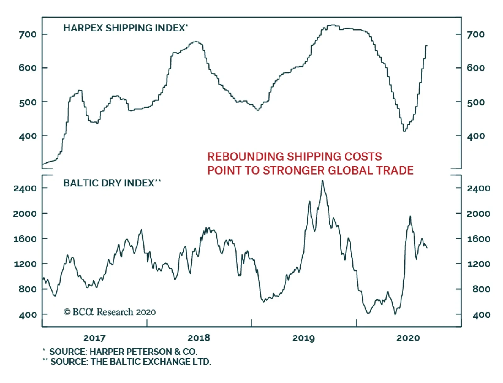
The sharp recovery in global shipping rates indicates that the recovery in the global trade cycle has legs. The Harpex Shipping Index, which measures the cost of chartering a container ship is now a stone-throw away from its pre-COVID-19 highs. This is a…
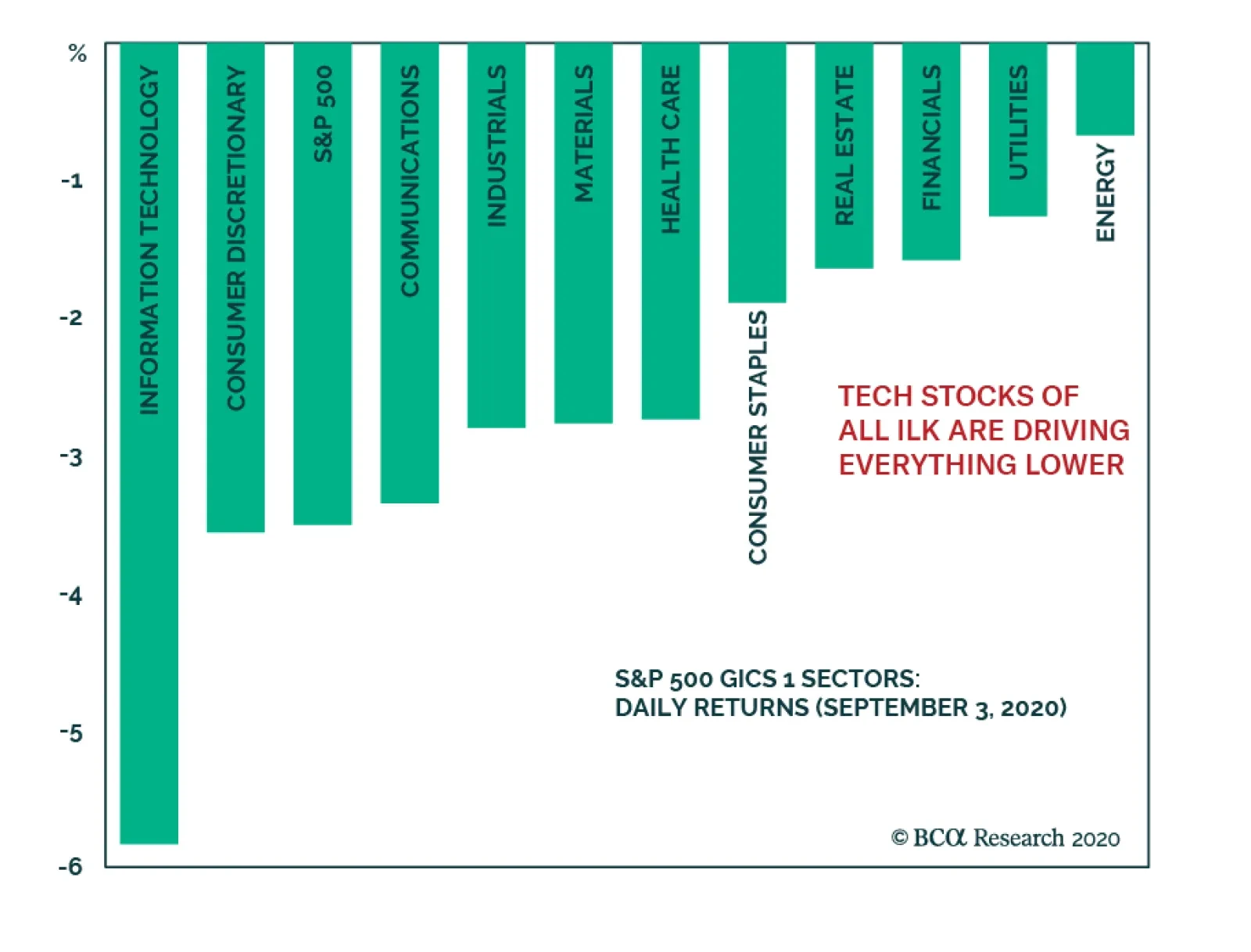
The overstretched tech stocks finally buckled after an exceptional run. The correction taking shape in those widely held stocks that have driven the entire S&P 500 higher has caused the whole market to fall as well. However, value stocks are…
Chart 1
Chart 1
Chart 1
Today, we continue cautioning investors about how overstretched the equity market is and highlight a few key reasons not to chase it higher; especially technology stocks. The top five stocks in the SPX (AAPL, MSFT, AMZN, GOOGL & FB) have added $5.8tn to the S&P 500 market cap since 2015, whereas the bottom 495 stocks have added $5.1tn. Crudely put, as a contribution the SPX’s return the former account for 53%, whereas the bottom 495 stocks account for the remaining 47% of the advance over the same time frame. In percent return terms, these five tech titans’ market capitalization has more than quadrupled or risen by 350% over the past 5 ½ years from $1.67tn to $7.5tn. In marked contrast, the S&P 495 market cap has gone nowhere rising a mere 31% (increasing from 16.57tn to $21.7tn) during the same time frame (Chart 1, top panel). If investors have not been in these tech titans, then they have not really participated in the SPX’s run up. The measly return since 2015 in the Value Arithmetic index and negative return in the Value Line Geometric index gauging the mean and median US stock, respectively, corroborate our analysis (not shown). Chart 2
Chart 2
Chart 2
Drilling deeper, the over concentration risks become even more apparent, even within the tech universe itself. Chart 2 shows that the S&P tech sector excluding AAPL & MSFT is just above the February highs, and nearly all the tech related return sits with the top five titans that are up almost 60% year-to-date (ytd). Worrisomely, the remaining S&P 426 stocks (which exclude all the tech names) are down 6% ytd. Once again, Chart 2 further reiterates the message that even the tech sector is a bifurcated market where only a handful of stocks have been generating all the alpha. Such extreme concentration, while not unprecedented, is a sign of an unhealthy overall market backdrop which makes it vulnerable to a significant shock. Chart 3
Chart 3
Chart 3
Naturally, the overconcentration in the SPX is even more acute in the NASDAQ. While the top five SPX stocks comprise over a quarter of the index, the same five tech titans carry a 50% weight in the NASDAQ 100. True, the collapse in interest rates has boosted the NASDAQ forward P/E to the stratosphere, but the longer these high-flying stocks defy gravity the more painful the eventual snap will be (Chart 3, bottom panel). Already there are signs of trouble brewing beneath the surface. NASDAQ breadth is sinking, and this has proven a reliable leading indicator in the recent past, warning that a pullback is looming (Chart 3, top panel). The hypersensitive chip stocks are also suffering from exhaustion, unable to outperform the tech titan led NASDAQ (Chart 3, middle panel). Any hiccups in the tech space will negatively reverberate in the SPX: currently the S&P tech sector plus the FANG (FB, AMZN, NFLX & GOOGL) comprise 41% of the S&P 500. Chart 4
Chart 4
Chart 4
Switching gears and drilling deeper into an S&P tech sub-group doesn’t brighten the short-term picture. The S&P technology hardware storage & peripherals (HS&P) index is in unchartered territory. The second panel of Chart 4 shows that the relative share price ratio is at the highest level as a percentage of its 200-day moving average since the late-1990s. Shown as a z-score, this technical indicator is stretched to the tune of almost four standard deviations above the historical mean (Chart 4, third panel). The last two times technical conditions were so overbought, it marked a multi-year peak in relative performance (Chart 4, top panel). Given that this sub-sector is home to AAPL, such extreme readings even on the index level confirm that the market is vulnerable to a snapback. Chart 5
Chart 5
Chart 5
Finally, going down to a stock level a couple of historical parallels are also in order. Specifically, Chart 5 compares the titans of the late 20th century with the current market leaders. The second and bottom panels of Chart 5 reveal that the market capitalization concentration of the top five stocks in the S&P 500 surpassed the late-1990s. However, there is an offsetting factor. In terms of valuation overshoot, the current 12-month forward P/E of these top five stocks near 45x is 3/4 that of late-1990s parabolic episode (Chart 5, top & third panels). Bottom Line: While we maintain a cyclical and structural (please see upcoming Weekly Report after Labor Day) bullish stance in the broad equity market, the shorter-term risk/reward trade-off is tilted to the downside, especially in the technology universe.
Highlights EM domestic fundamentals, global trade and commodities prices, as well as global financial market themes are the main drivers of EM financial assets and currencies. The positive effect of improving global growth and rising commodity prices on EM currencies (ex-China, Korea and Taiwan) has been offset by these countries’ inferior domestic fundamentals. The odds of a near-term US dollar rebound are rising. This will likely produce a setback in EM currencies, fixed-income markets and equities. However, such a setback will likely prove to be a buying opportunity. Increased central bank intervention in asset markets may diminish the importance of fundamentals in determining the asset prices. Feature Chart I-1Unusual Divergences
Unusual Divergences
Unusual Divergences
EM risk assets have done well in absolute terms but have underperformed their DM counterparts. This is unusual given the substantial weakness in the US dollar and the rally in commodities prices since April (Chart I-1). Until early this year, many commentators had argued that monetary policies of DM central banks were the principal drivers of EM financial markets. Given the zero interest rates and money printing that is prevalent in DM, the underperformance of EM equities and currencies is especially intriguing. Is this underperformance an aberration or is it fundamentally justified? What really drives EM performance? Back To Basics As we have argued over the years, EM risk assets and currencies are primarily driven by their domestic fundamentals, rather than by the actions and policies of the US Federal Reserve or the ECB. The critical determinant of EM stocks’ absolute as well as relative performance versus DM equities has been corporate profits. Chart I-2 illustrates that relative equity performance and relative EPS between EM and the US move in tandem, both in common and, critically, local currency terms. Similarly, the main reason why EM share prices in absolute terms have failed to deliver positive returns over the past 10 years is that their profits have been stagnant over the same period, even prior to the pandemic (Chart I-3). Interestingly, fluctuations in EM EPS resemble those of Korea’s exports. This reflects the importance of global growth in shaping EM profit trends. Chart I-2Corporate Profits Drive EM Absolute And Relative Performance
Corporate Profits Drive EM Absolute And Relative Performance
Corporate Profits Drive EM Absolute And Relative Performance
Chart I-3EM EPS Has Been Flat For 10 Years
EM EPS Has Been Flat For 10 Years
EM EPS Has Been Flat For 10 Years
The key drivers of EM risk assets and currencies have been and remain: 1. EM domestic fundamentals that can be encapsulated by a potential risk-adjusted return on capital. The latter is impacted by both cyclical and structural growth trajectories, as well as by the quality and composition of growth. Risks to growth can be gauged based on factors such as (but not limited to): productivity, wages, inflation, fiscal and balance of payment positions, the global economic and financial environment, and the health of the banking system. In EM (ex-China, Korea and Taiwan), the fundamentals remain challenging: The business cycle recovery is slower in these economies than it is in China and advanced economies. Fiscal stimulus has not been as large as in many advanced countries, while the pandemic situation has been worse. Their banking systems were already fragile before the pandemic, and have lately been hit by defaults stemming from the unprecedented recession. These governments have less room than in DM and China, to stimulate fiscally and bail out debtors and banks. Banks in EM (ex-China, Korea and Taiwan) will continue struggling for some time, and their ability to finance a new expansion cycle will, for now, remain constrained (Chart I-4). A restructuring of non-performing loans and a recapitalization of banks will be required to kick-start a new credit cycle in many of these economies. 2. Global growth, especially relating to China’s business cycle and commodities. The recovery in China since April, along with rising commodities prices have been positive for EM (ex-China, Korea and Taiwan). Given the substantial stimulus injected into the Chinese economy, its recovery will continue well into next year (Chart I-5). As a result, higher commodities prices will benefit resource producing economies by supporting their balance of payments and enhancing income growth. Chart I-4EM ex-China: Limited Bank Support For Growth
EM ex-China: Limited Bank Support For Growth
EM ex-China: Limited Bank Support For Growth
Chart I-5China's Stimulus Entails More Upside In Commodity Prices
China's Stimulus Entails More Upside In Commodity Prices
China's Stimulus Entails More Upside In Commodity Prices
3. Global financial market themes: a search for yield and leadership of new economy stocks. Global investment themes have an important bearing on EM financial markets. For example, in recent years, the increased market cap of new economy and semiconductor stocks – due to an exponential rise in their share prices – has amplified their importance for the aggregate EM equity index. The largest six mega cap stocks in the EM benchmark are new economy and semiconductor companies, and make up about 25% of the EM MSCI market cap. The six FAANGM stocks presently account for about 25% of the S&P 500. Hence, the concentration risk in EM is as high as it is in the US. Consequently, the trajectory of new economy and semiconductor stocks globally will be essential to the performance of the EM equity index. On August 20, we published an in-depth Special Report assessing near-term and structural outlooks for global semiconductor stocks. With new economy and semiconductor share prices going parabolic worldwide, we are witnessing a full-fledged mania, as we discussed in our July 16 report. The equal-weighted US FAANGM stock index has risen by 24-fold in nominal and 20-fold in real (inflation-adjusted) terms, since January 1, 2010 (Chart I-6). Chart I-6History Of Manias Of Past Decades
History Of Manias Of Past Decades
History Of Manias Of Past Decades
In brief, with respect to magnitude and duration, the bull market in FAANGM is on par with the bubbles of previous decades (Chart I-6). Those bubbles culminated in bear markets, where prices fell by at least 50% after topping out. Chart I-7EM ex-TMT Stocks: Absolute And Relative Performance
EM ex-TMT Stocks: Absolute And Relative Performance
EM ex-TMT Stocks: Absolute And Relative Performance
We do not know when the FAANGM rally will end. Timing a reversal in a powerful bull market is impossible. Also, we are not certain about the magnitude of such a potential drawdown. Nevertheless, our message is that the risk-reward tradeoff of chasing FAANGM at this stage is very unattractive. Excluding technology, media and telecommunication (TMT) – as most growth stocks are a part of TMT– EM equities remain in a bear market (Chart I-7, top panel). In relative terms, EM ex-TMT stocks have massively underperformed their global peers (Chart I-7, bottom panel). Even with a larger weighting of mega-cap growth TMT stocks than the overall DM equity index, the aggregate EM equity index has underperformed the overall DM index. Bottom Line: EM domestic fundamentals, global trade and commodities prices, and global financial market themes are the main drivers of EM financial assets and currencies. What About The Dollar? The high correlation of the trade-weighted US dollar and EM equities is due to the following: (1) the greenback has been a countercyclical currency; and (2) the US dollar’s exchange rate against EM currencies reflects relative fundamentals in the US versus EM economies. When a global business cycle accelerates, the broad trade-weighted US dollar weakens. If this growth acceleration is led by China and other emerging economies, the greenback depreciates considerably versus EM currencies. The opposite is also true. In other words, the US dollar exchange rate’s strong negative correlation to EM equities is primarily due to the fact that the greenback’s exchange rates against EM currencies reflect both the global business cycle as well as EM growth and fundamentals. Chart I-8Divergence Between DM And EM Currencies
Divergence Between DM And EM Currencies
Divergence Between DM And EM Currencies
In recent months, the greenback has: (1) depreciated due to the global economic recovery; (2) tumbled versus DM currencies due to the still raging pandemic and the socio-political instability in the US as well as the Fed’s commitment to staying behind the inflation curve in the years to come; and (3) not fallen much against EM (ex-China, Korea and Taiwan) currencies because their fundamentals have been poor, as discussed above. Bottom Line: Exchange rates in EM (ex-China, Korea and Taiwan) have failed to appreciate versus the dollar despite the latter’s plunge versus other DM currencies (Chart I-8). The positive effect of improving global growth and rising commodities prices on EM currencies (ex-China, Korea and Taiwan) has been offset by these countries’ inferior domestic fundamentals. Flows And Cash On The Sidelines Chart I-9Cash On The Sidelines Has Been Produced By The Fed's Debt Monetization
Cash On The Sidelines Has Been Produced By The Fed's Debt Monetization
Cash On The Sidelines Has Been Produced By The Fed's Debt Monetization
What about capital flows? Aren’t they essential in driving EM financial markets? Of course, they are important. However, we view flows as resulting from and determined by fundamentals. Over the medium and long term, we assume that capital flows to regions where the return on capital is high or rising. Thus, we see ourselves as responsible for directing investors to those areas that we have identified as providing a high or rising return on capital (and cautioning investors when the opposite is true). The presumption is that beyond short-term volatility, investment flows will gravitate to countries/sectors/asset classes with high or rising returns on capital, just as they will abandon areas of low or falling returns on capital. In brief, fundamentals drive flows and flows determine asset price performance. Isn’t sizable cash on the sidelines a reason to be bullish? Yes, there is substantial cash on the sidelines. Along with zero short-term rates, this has been the potent force leading investors to purchase equities, credit and other risk assets since late March. Below we examine the case of the US, but this has also been true in many markets around the world. The top panel of Chart I-9 demonstrates that US institutional and retail money market funds – a measure of cash on the sidelines - presently stand at $4.2 trillion, having increased by $900 billion since March. Yet, the Fed and US commercial banks have increased their debt securities holdings by $2.9 trillion since March. Furthermore, the Fed and US commercial banks hold $10.6 trillion of debt securities (Chart I-9, middle panel) – amounting to 18% of the aggregate equity and US dollar fixed-income market value (Chart I-9, bottom panel). These securities, held by the Fed and US commercial banks, are not available to non-bank investors. Chart I-10Investors' Cash Holdings Ratio Is Still Elevated
Investors' Cash Holdings Ratio Is Still Elevated
Investors' Cash Holdings Ratio Is Still Elevated
Excluding debt securities owned by the Fed and commercial banks, we reckon that cash on the sidelines is equal to 8.4% of the value of equities and US dollar debt securities available to non-bank investors (Chart I-10). This is a relatively high cash ratio. Unprecedented purchases by the Fed and US commercial banks have not only removed a considerable chuck of debt securities from the market; they have also created money “out of thin air”. When central or commercial banks acquire a security from, or lend to, a non-bank entity, they are creating new money “out of thin air”. No one needs to save for the central bank and commercial banks to lend to or purchase a security from a non-bank. In short, savings versus spending decisions by economic agents (non-banks) do not affect the stock of money supply. We have deliberated on these topics at length in past reports. In sum, the Fed’s large purchases of debt securities amount to a de facto monetization of public and private debt. These operations have both reduced the amount of securities available to investors and boosted the latter’s cash balances. Hence, the Fed has boosted asset prices not only indirectly, by lowering short-term interest rates, but also directly, by printing new money and shrinking the amount of securities available to investors. We have in recent months argued that global risk assets are overpriced relative to fundamentals. However, investors have continued to deploy cash in asset markets, pushing prices higher. Given the zero money market interest rates and the still elevated cash balances, one can envision a scenario in which cash continues to be deployed in asset markets, pushing valuations to bubble levels across all risk assets. Pressure on investors to deploy their cash amid rising asset prices implies that only a major negative shock might be able to reverse this rally. There have been plenty of reasons to be cautious, including escalating US-China geopolitical tensions, the increasing odds of a contested US presidential election and, hence, elevated political uncertainty, the possibility of a US fiscal cliff, and a potential second wave of the pandemic. However, investors have so far shrugged off all of these and continue to allocate capital to risk assets. Bottom Line: Increased central bank intervention in asset markets may diminish the importance of fundamentals in determining the price of risk assets. This would also mean that the role of momentum investing and psychology may increase. Investment Strategy Currencies: The US dollar has become oversold and could stage a rebound in the near term. The euro has risen to its technical resistance (Chart I-11). The EM currency index (ex-China, Korea and Taiwan) has failed to break above its 200-day moving average (Chart I-12, top panel). The emerging Asian trade-weighted currency index (ADXY) has rebounded to the upper boundary of its falling channel (Chart I-12, bottom panel). Chart I-11A Short-Term Resistance For Euro/USD
A Short-Term Resistance For Euro/USD
A Short-Term Resistance For Euro/USD
Chart I-12EM Currencies Have Not Entered A Bull Market
EM Currencies Have Not Entered A Bull Market
EM Currencies Have Not Entered A Bull Market
Such technical profiles suggest that EM currencies have not yet entered a bull market despite the greenback’s considerable depreciation against DM currencies. This is a reflection of the poor fundamentals of EM (ex-China, Korea and Taiwan). In short, the odds of a US dollar rebound are rising. This could dent commodities prices and weigh on EM currencies. We continue recommending shorting a basket of EM currencies versus the euro, CHF and JPY. The downside in these DM currencies versus the greenback is limited. The euro could drop to 1.15, but not much below that level. Our basket of EM currencies to short includes: BRL, CLP, ZAR, TRY, PHP, KRW and IDR. Chart I-13EM Local Currency Bonds: Looking For A Better Entry Point
EM Local Currency Bonds: Looking For A Better Entry Point
EM Local Currency Bonds: Looking For A Better Entry Point
Fixed-Income Markets: We have been neutral on EM local currency bonds and EM credit markets (USD bonds) since April 23 and June 4, respectively. The strategy is to wait for a correction in these markets before going long. The rebound in the US dollar and correction in commodities will provide a better entry point for these fixed-income markets (Chart I-13). Equities: On July 30, we recommended shifting the EM equity allocation within a global equity portfolio from underweight to neutral. In the near term, EM share prices will likely continue underperforming their DM counterparts. A bounce in the US dollar, rising geopolitical tensions between the US and China, as well as the continuation of a FAANGM-driven mania in US equities will result in EM equity underperformance versus DM. However, in the medium- to long-term, the balance of risks no longer justifies an underweight allocation. Arthur Budaghyan Chief Emerging Markets Strategist arthurb@bcaresearch.com Equities Recommendations Currencies, Credit And Fixed-Income Recommendations
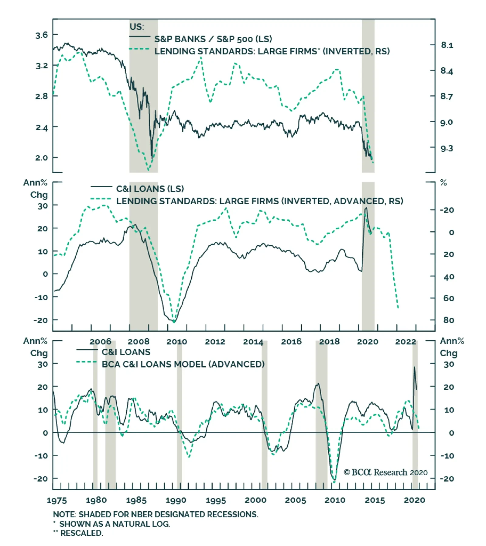
BCA Research’s US Equity Strategy service put the S&P banks index on downgrade alert. Following the recent Fed stress results and the resulting dividend cuts, banks have continued to trail both the broad equity market and their early cyclical peers:…
No Relief For Banks
No Relief For Banks
Neutral - Downgrade Alert Bank stocks fail to catch a break. Following the recent Fed stress results and the resulting dividend cuts, banks have continued to trail both the broad equity market and their early cyclical peers: consumer discretionary stocks. Worryingly, on all three income generation fronts, dark clouds are gathering for banks, the nervous system of the US economy. While the initial knee jerk reaction of corporates was to tap their existing credit lines in order to fight the pandemic that caused an exponential rise in C&I loan growth, going forward a steep reversal is looming (middle & bottom panels). Bankers are tightening lending standards at the fastest pace in a decade despite ZIRP, weighing heavily on relative share prices (top panel). On the price of credit front, the Fed’s recent perching of the fed funds rate on the zero line for as far as the eye can see all but guarantees a tough pricing power environment for banks. The latest FDIC Quarterly Banking Profile revealed that the banking industry broke the 3 handle on net interest margins coming in at 2.81%, the lowest level since the history of the data dating back to 1984. Finally, with regard to credit quality, a double digit unemployment rate, along with commercial real estate ails will propel non-performing loans, which are extremely lagging by nature. While credit quality deterioration is late to show up, it wreaks immediate havoc on bank income statements as loan loss provisions. Aggressive provisioning will likely continue at least until the end of the year. Bottom Line: Stay neutral the S&P banks index, but it is now on downgrade alert.
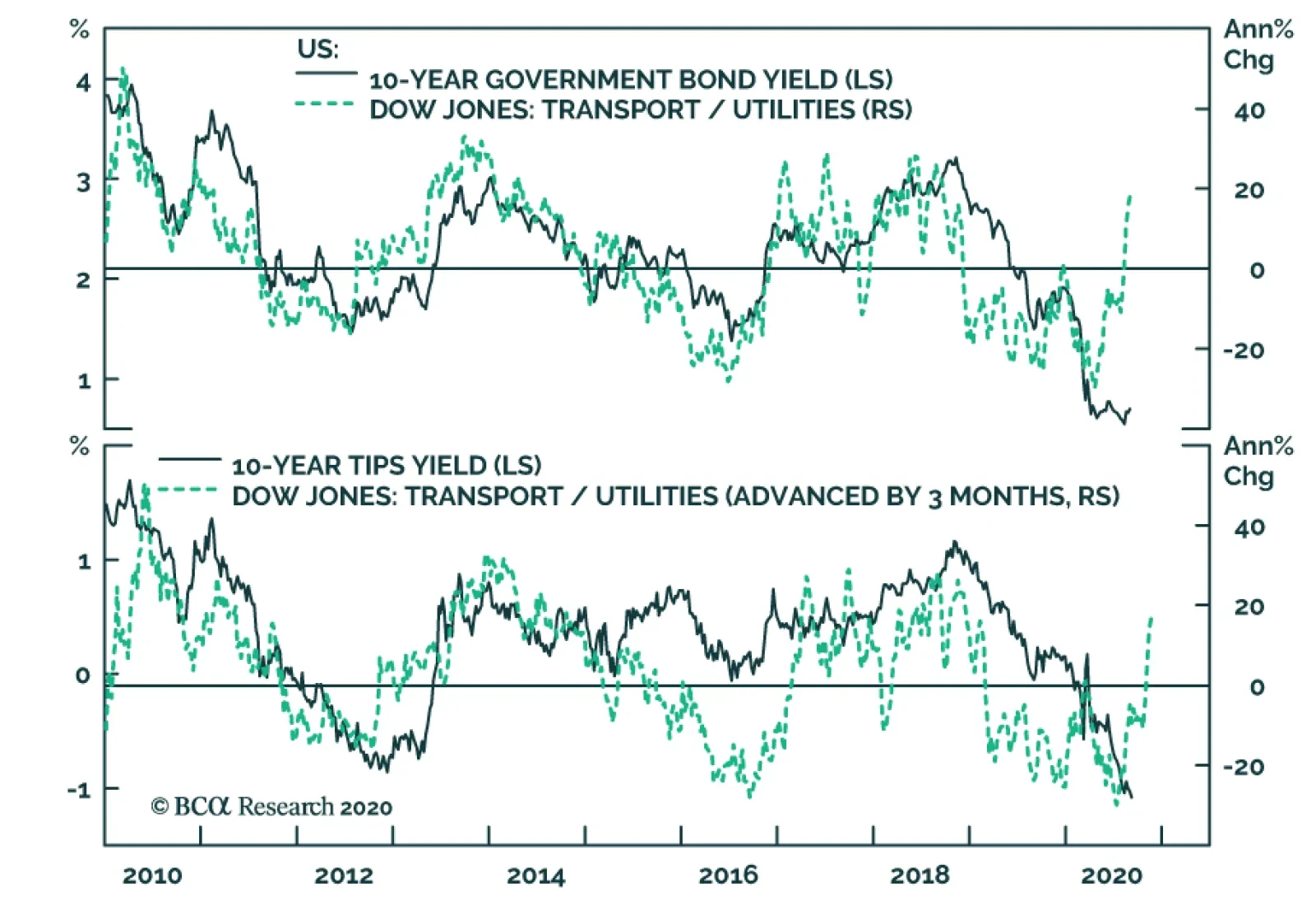
The outperformance of transportation stocks relative to utilities has gained pace in the month of August. This internal market dynamics is important because it confirms that the outlook for cyclical equities is improving relative to defensive ones. A…
GAA DM Equity Country Allocation Model Update The GAA DM Equity Country Allocation model is updated as of August 31, 2020. The country allocation model still favors the US as its largest overweight. Despite Japan’s outstanding performance in August, the model still maintains its large underweight in Japanese equities, as shown in Table 1. Table 1Model Allocation Vs. Benchmark Weights
GAA Quant Model Updates
GAA Quant Model Updates
As shown in Table 2 and Charts 1, 2 and 3, the overall model slightly underperformed the MSCI World benchmark by 7 bps in August. The Level 1 model outperformed by 19 bps because of the overweight in the US, while the Level 2 model underperformed its benchmark by 104 bps partly because of its large underweight in Japan. August was a very strange month in the sense that only the US and Japan outperformed while the rest underperformed the MSCI World benchmark. As such, except for the US and Japan bets, all other six underweight choices made positive contributions to the overall performance of the model, while all other four overweight bets made negative contributions. Since going live, the overall model has outperformed its MSCI World benchmark by 404 bps, with 604 bps of outperformance from the Level 2 model, and 111 bps of outperformance from the Level 1 model. Table 2Performance (Total Returns In USD %)
GAA Quant Model Updates
GAA Quant Model Updates
Chart 1GAA DM Model Vs. MSCI World
GAA DM Model Vs. MSCI World
GAA DM Model Vs. MSCI World
Chart 2GAA US Vs. Non US Model (Level 1)
GAA US Vs. Non US Model (Level 1)
GAA US Vs. Non US Model (Level 1)
Chart 3GAA Non US Model (Level 2)
GAA Non US Model (Level 2)
GAA Non US Model (Level 2)
For more on historical performance, please refer to our website https://www.bcaresearch.com/site/trades/allocation_performance/latest/G…. For more details on the models, please see Special Report, “Global Equity Allocation: Introducing The Developed Markets Country Allocation Model,” dated January 29, 2016, available at https://gaa.bcaresearch.com. Please note that the overall country and sector recommendations published in our Monthly Portfolio Update and Quarterly Portfolio Outlook use the results of these quantitative models as one input, but do not stick slavishly to them. We believe that models are a useful check, but structural changes and unquantifiable factors need to be considered as well when making overall recommendations. GAA Equity Sector Selection Model The GAA Equity Sector Model (Chart 4) is updated as of August 31, 2020. Chart 4Overall Model Performance
Overall Model Performance
Overall Model Performance
The model continues to maintain its pro-cyclical stance driven by an improvement in its global growth proxy, and remains exposed to cyclical sectors. Over the past month, the model outperformed its benchmark by 58 basis points. Year-to-date, the model has outperformed its benchmark by 212 basis points, and 227 basis points since going live. The model’s global growth proxy continues to signal a bullish stance – driven by its three components: Appreciating EM currencies, rising metal prices, and an improvement in broad business climate. The model therefore continues to remain positive on cyclical sectors. Global monetary easing for the coming years and low rates should keep the liquidity component favoring a mixed bag of cyclical and defensive sectors. The valuation component remains muted across all sectors except Energy. However, several sectors continue to be near the expensive and cheap zones – mainly Info Tech and Consumer Discretionary (expensive), and Real Estate and Consumer Staples (cheap). The model awaits confirming momentum signals to change recommendations for those sectors. The model upgraded Industrials this month based on an improvement in its momentum component. Table 3Overall Model Performance
GAA Quant Model Updates
GAA Quant Model Updates
Table 4Current Model Allocations
GAA Quant Model Updates
GAA Quant Model Updates
The model is now overweight five cyclical sectors in total. These are Information Technology, Consumer Discretionary, Communication Services, Materials, and Industrials. For more details on the model, please see the Special Report “Introducing the GAA Equity Sector Selection Model”, dated July 27, 2016, as well as the Sector Selection Model section in the Special Alert “GAA Quant Model Updates”, dated March 1, 2019 available at https://gaa.bcaresearch.com. Xiaoli Tang Associate Vice President xiaoliT@bcaresearch.com Amr Hanafy Senior Analyst amrh@bcaresearch.com