Sectors

Highlights Chart 1More Stimulus Required
More Stimulus Required
More Stimulus Required
The unemployment rate fell for the second consecutive month in June, down to 11.1% from a peak of 14.7%. Bond markets shrugged off the news, and rightly so, as this recent pace of improvement is unlikely to continue through July and August. The main reason for pessimism is that the number of new COVID cases started rising again in late June, consistent with a pause in high-frequency economic indicators (Chart 1). This second wave of infections will slow the pace at which furloughed employees are returning to work, a development that has been responsible for all of the unemployment rate’s recent improvement. Beneath the surface, the number of permanently unemployed continues to rise (Chart 1, bottom panel). The implication for policymakers is that it is too early to back away from fiscal stimulus. In particular, expanded unemployment benefits must be extended, in some form, beyond the July 31 expiry date. We are confident that Congress will eventually pass another round of stimulus, though it may not make the July 31 deadline. For investors, bond yields are still biased higher on a 6-12 month horizon, but their near-term outlook is now in the hands of Congress. We continue to recommend benchmark portfolio duration, along with several tactical overlay trades designed to profit from higher yields. Feature Investment Grade: Overweight Chart 2Investment Grade Market Overview
Investment Grade Market Overview
Investment Grade Market Overview
Investment grade corporate bonds outperformed the duration-equivalent Treasury index by 189 basis points in June, bringing year-to-date excess returns up to -529 bps. The average index spread tightened 24 bps on the month. We still view investment grade corporates as attractively valued, with the index’s 12-month breakeven spread only just below its historical median (Chart 2). With the Fed providing strong backing for the market, we are confident that investment grade corporate bond spreads will continue to tighten. As such, we want to focus on cyclical segments of the market that tend to outperform during periods of spread tightening (panel 2). One caveat is that the Fed’s lending facilities can’t prevent ratings downgrades (bottom panel). Therefore, we also want to avoid sectors and issuers that are mostly likely to be downgraded. High-quality Baa-rated issues are the sweet spot that we want to target. Those securities will tend to outperform the overall index as spreads tighten, but are not likely to be downgraded. Subordinate bank bonds are a prime example of securities that exist within that sweet spot.1 In recent weeks we published deep dives into several different industry groups within the corporate bond market. In addition to our overweight recommendation for subordinate bank bonds, we also recommend an overweight allocation to investment grade Healthcare bonds.2 We advise underweight allocations to investment grade Technology and Pharmaceutical bonds.3 Table 3ACorporate Sector Relative Valuation And Recommended Allocation*
Watch Out For July’s Fiscal Cliff
Watch Out For July’s Fiscal Cliff
Table 3BCorporate Sector Risk Vs. Reward*
Watch Out For July’s Fiscal Cliff
Watch Out For July’s Fiscal Cliff
High-Yield: Neutral High-Yield outperformed the duration-equivalent Treasury index by 90 basis points in June, bringing year-to-date excess returns up to -855 bps (Chart 3A). The average index spread tightened 11 bps on the month and has tightened 500 bps since the Fed unveiled its corporate bond purchase programs on March 23. We reiterated our call to overweight Ba-rated junk bonds and underweight bonds rated B and below in a recent report.4 In that report, we noted that high-yield spreads appear tight relative to fundamentals across the board, but that the Ba-rated credit tier will continue to perform well because most issuers are eligible for support through the Fed’s emergency lending facilities. Specifically, we showed that “moderate” and “severe” default scenarios for the next 12 months – defined as a 9% and 12% default rate, respectively, with a 25% recovery rate – would lead to a negative excess spread for B-rated bonds (Chart 3B). The same holds true for lower-rated credits. Chart 3AHigh-Yield Market Overview
High-Yield Market Overview
High-Yield Market Overview
Chart 3BB-Rated Excess Return Scenarios
Watch Out For July’s Fiscal Cliff
Watch Out For July’s Fiscal Cliff
We appear to be on track for that sort of outcome. Moody’s recorded 20 defaults in May, matching the worst month of the 2015/16 commodity bust and bringing the trailing 12-month default rate up to 6.4%. Meanwhile, the trailing 12-month recovery rate is a meagre 22%. At the industry level, in recent reports we recommended an overweight allocation to high-yield Technology bonds5 and underweight allocations to high-yield Healthcare and Pharmaceuticals.6 MBS: Underweight Chart 4MBS Market Overview
MBS Market Overview
MBS Market Overview
Mortgage-Backed Securities underperformed the duration-equivalent Treasury index by 13 basis points in June, dragging year-to-date excess returns down to -44 bps. The conventional 30-year MBS index option-adjusted spread (OAS) has tightened 5 bps since the end of May, but it still offers a pick-up relative to other comparable sectors. The MBS index OAS stands at 95 bps, greater than the 81 bps offered by Aa-rated corporate bonds (Chart 4), the 54 bps offered by Aaa-rated consumer ABS and the 76 bps offered by Agency CMBS. At some point this spread advantage will present a buying opportunity, but we think it is still too soon. As we wrote in a recent report, we are concerned that the elevated primary mortgage spread is a warning that refinancing risk could flare in the second half of this year (bottom panel).7 The primary mortgage rate did not match the decline in Treasury yields seen earlier this year. Essentially, this means that even if Treasury yields are unchanged in 2020 H2, a further 50 bps drop in the mortgage rate cannot be ruled out. Such a move would lead to a significant increase in prepayment losses, one that is not priced into current index spreads. While the index OAS has widened lately, expected prepayment losses (aka option cost) have dropped (panels 2 & 3). We are concerned this decline in expected prepayment losses has gone too far and that, as a result, the current index OAS is overstated. Government-Related: Underweight Chart 5Government-Related Market Overview
Government-Related Market Overview
Government-Related Market Overview
The Government-Related index outperformed the duration-equivalent Treasury index by 78 basis points in June, bringing year-to-date excess returns up to -399 bps. Sovereign debt outperformed duration-equivalent Treasuries by 112 bps on the month, bringing year-to-date excess returns up to -828 bps. Foreign Agencies outperformed the Treasury benchmark by 37 bps in June, bringing year-to-date excess returns up to -764 bps. Local Authority debt outperformed Treasuries by 268 bps in June, bringing year-to-date excess returns up to -439 bps. Domestic Agency bonds outperformed by 14 bps, bringing year-to-date excess returns up to -58 bps. Supranationals outperformed by 12 bps, bringing year-to-date excess returns up to -19 bps. We updated our outlook for USD-denominated Emerging Market (EM) Sovereign bonds in a recent report.8 In that report we posited that valuation and currency trends are the primary drivers of EM sovereign debt performance (Chart 5). On valuation, we noted that the USD sovereign bonds of: Mexico, Colombia, UAE, Saudi Arabia, Qatar, Indonesia, Malaysia and South Africa all offer a spread pick-up relative to US corporate bonds of the same credit rating and duration. However, of those countries that offer attractive spreads, most have currencies that look vulnerable based on the ratio of exports to foreign debt obligations. In general, we don’t see a compelling case for USD-denominated sovereigns based on value and currency outlook, although Mexican debt stands out as looking attractive on a risk/reward basis. Municipal Bonds: Overweight Chart 6Municipal Market Overview
Municipal Market Overview
Municipal Market Overview
Municipal bonds outperformed the duration-equivalent Treasury index by 68 basis points in June, bringing year-to-date excess returns up to -582 bps (before adjusting for the tax advantage). Municipal bond spreads versus Treasuries widened in June and continue to look attractive compared to typical historical levels. In fact, both the 2-year and 10-year Aaa Muni yields are higher than the same maturity Treasury yield, despite municipal debt’s tax exempt status (Chart 6). Municipal bonds are also attractively priced relative to corporate bonds across the entire investment grade credit spectrum, as we demonstrated in a recent report.9 In that report we also mentioned our concern about the less-than-generous pricing offered by the Fed’s Municipal Liquidity Facility (MLF). At present, MLF funds are only available at a cost that is well above current market prices (panel 3). This means that the MLF won’t help push muni yields lower from current levels. Despite the MLF’s shortcomings, we aren’t yet ready to downgrade our muni allocation. For one thing, federal assistance to state & local governments will probably be the centerpiece of the forthcoming stimulus bill. The Fed could also feel pressure to reduce MLF pricing if the stimulus is delayed. Further, while the budget pressure facing municipal governments is immense, states are also holding very high rainy day fund balances (bottom panel). This will help cushion the blow and lessen the risk of ratings downgrades. Treasury Curve: Buy 5-Year Bullet Versus 2/10 Barbell Chart 7Treasury Yield Curve Overview
Treasury Yield Curve Overview
Treasury Yield Curve Overview
The Treasury curve was mostly unchanged in June. Both the 2-year/10-year and 5-year/30-year slopes steepened 1 bp on the month, reaching 50 bps and 112 bps, respectively. With no expectation – from either the Fed or market participants – that the fed funds rate will be lifted before the end of 2022, short-maturity yield volatility will stay low and the Treasury slope will trade directionally with the level of yields for the foreseeable future. The yield curve will steepen when yields rise and flatten when they fall. With that in mind, we continue to recommend duration-neutral yield curve steepeners that will profit from moderately higher yields, but that won’t decrease the average duration of your portfolio. Specifically, we recommend going long the 5-year bullet and short a duration-matched 2/10 barbell.10 In a recent report we noted that valuation is a concern with this recommended position.11 The 5-year yield is below the yield on the duration-matched 2/10 barbell (Chart 7), and the 5-year bullet also looks expensive on our yield curve models (Appendix B). However, we also noted that the 5-year bullet traded at much more expensive levels during the last zero-lower-bound period between 2010 and 2013 (bottom panel). With short rates once again pinned at zero, we expect the 5-year bullet will once again hit levels of extreme over-valuation. TIPS: Overweight Chart 8TIPS Market Overview
TIPS Market Overview
TIPS Market Overview
TIPS outperformed the duration-equivalent nominal Treasury index by 99 basis points in June, bringing year-to-date excess returns up to -400 bps. The 10-year TIPS breakeven inflation rate rose 19 bps on the month and currently sits at 1.39%. The 5-year/5-year forward TIPS breakeven inflation rate rose 5 bps on the month and currently sits at 1.62%. TIPS breakevens have moved up rapidly during the past couple of months, but they remain low compared to average historical levels. Our own Adaptive Expectations Model suggests that the 10-year TIPS breakeven inflation rate should rise to 1.53% during the next 12 months (Chart 8).12 On inflation, it also looks like we are past the cyclical trough. The WTI oil price is back up to $41 per barrel after having briefly turned negative (panel 4), and trimmed mean inflation measures suggest that the massive drop in core is overdone (panel 3). If inflation has indeed troughed, then the real yield curve will continue to steepen as near-term inflation expectations move higher. We have been advocating real yield curve steepeners since the oil price turned negative in April.13 The curve has steepened considerably since then, but still has upside relative to levels seen during the past few years (bottom panel). ABS: Overweight Chart 9ABS Market Overview
ABS Market Overview
ABS Market Overview
Asset-Backed Securities outperformed the duration-equivalent Treasury index by 103 basis points in June, bringing year-to-date excess returns up to -2 bps. Aaa-rated ABS outperformed duration-equivalent Treasuries by 8 bps in June, bringing year-to-date excess returns up to +7 bps. Meanwhile, non-Aaa ABS outperformed by 233 bps in June, bringing year-to-date excess returns up to -88 bps (Chart 9). Aaa ABS are a high conviction overweight, given that spreads remain elevated compared to historical levels and that the sector benefits from Fed support through the Term Asset-Backed Securities Loan Facility (TALF). However, spreads are even more attractive in non-Aaa ABS and we recommend owning those securities as well. This is despite the fact that non-Aaa bonds are not eligible for TALF. We explained our rationale for owning non-Aaa consumer ABS in a recent report.14 We noted that the stimulus received from the CARES act caused real personal income to increase significantly during the past few months and, faced with fewer spending opportunities, households used that windfall to pay down consumer debt (bottom panel). Granted, further fiscal stimulus will be needed to sustain those recent income gains. But we are sufficiently confident that a follow-up stimulus bill will be passed that we advocate moving down in quality within consumer ABS. Non-Agency CMBS: Overweight Neutral Chart 10CMBS Market Overview
CMBS Market Overview
CMBS Market Overview
Non-Agency Commercial Mortgage-Backed Securities outperformed the duration-equivalent Treasury index by 211 basis points in June, bringing year-to-date excess returns up to -501 bps. Aaa CMBS outperformed Treasuries by 164 bps in June, bringing year-to-date excess returns up to -233 bps. Non-Aaa CMBS outperformed by 407 bps in June, bringing year-to-date excess returns up to -1451 bps (Chart 10). Our view of non-agency CMBS has not changed during the past month, but we realize that it is more accurately described as a “Neutral” allocation as opposed to “Overweight”. Our view is that we want an overweight allocation to Aaa-rated CMBS because that sector offers an attractive spread relative to history and benefits from Fed support through TALF. However, we advocate an underweight allocation to non-Aaa non-agency CMBS. Those securities are not eligible for TALF and, unlike consumer ABS, their fundamental credit outlook has deteriorated significantly as a result of the COVID recession.15 Agency CMBS: Overweight Agency CMBS outperformed the duration-equivalent Treasury index by 104 basis points in June, bringing year-to-date excess returns up to -58 bps. The average index spread tightened 19 bps on the month to 77 bps, still well above typical historical levels (bottom panel). The Fed is supporting the Agency CMBS market by directly purchasing the securities as part of its Agency MBS purchase program. The combination of strong Fed support and elevated spreads makes the sector a high conviction overweight. Ryan Swift US Bond Strategist rswift@bcaresearch.com Appendix A: Buy What The Fed Is Buying The Fed rolled out a number of aggressive lending facilities on March 23. These facilities focused on different specific sectors of the US bond market. The fact that the Fed has decided to support some parts of the market and not others has caused some traditional bond market correlations to break down. It has also led us to adopt of a strategy of “Buy What The Fed Is Buying”. That is, we favor those sectors that offer attractive spreads and that benefit from Fed support. The below Table tracks the performance of different bond sectors since the March 23 announcement. We will use this to monitor bond market correlations and evaluate our strategy’s success. Performance Since March 23 Announcement Of Emergency Fed Facilities
Watch Out For July’s Fiscal Cliff
Watch Out For July’s Fiscal Cliff
Appendix B: Butterfly Strategy Valuations The following tables present the current read-outs from our butterfly spread models. We use these models to identify opportunities to take duration-neutral positions across the Treasury curve. The following two Special Reports explain the models in more detail: US Bond Strategy Special Report, “Bullets, Barbells And Butterflies”, dated July 25, 2017, available at usbs.bcaresearch.com US Bond Strategy Special Report, “More Bullets, Barbells And Butterflies”, dated May 15, 2018, available at usbs.bcaresearch.com Table 4 shows the raw residuals from each model. A positive value indicates that the bullet is cheap relative to the duration-matched barbell. A negative value indicates that the barbell is cheap relative to the bullet. Table 4Butterfly Strategy Valuation: Raw Residuals In Basis Points (As Of July 3, 2020)
Watch Out For July’s Fiscal Cliff
Watch Out For July’s Fiscal Cliff
Table 5 scales the raw residuals in Table 4 by their historical means and standard deviations. This facilitates comparison between the different butterfly spreads. Table 5Butterfly Strategy Valuation: Standardized Residuals (As Of July 3, 2020)
Watch Out For July’s Fiscal Cliff
Watch Out For July’s Fiscal Cliff
Table 6 flips the models on their heads. It shows the change in the slope between the two barbell maturities that must be realized during the next six months to make returns between the bullet and barbell equal. For example, a reading of 57 bps in the 5 over 2/10 cell means that we would only expect the 5-year to outperform the 2/10 if the 2/10 slope steepens by more than 57 bps during the next six months. Otherwise, we would expect the 2/10 barbell to outperform the 5-year bullet. Table 6Discounted Slope Change During Next 6 Months (BPs)
Watch Out For July’s Fiscal Cliff
Watch Out For July’s Fiscal Cliff
Appendix C: Excess Return Bond Map The Excess Return Bond Map is used to assess the relative risk/reward trade-off between different sectors of the US bond market. It is a purely computational exercise and does not impose any macroeconomic view. The Map’s vertical axis shows 12-month expected excess returns. These are proxied by each sector’s option-adjusted spread. Sectors plotting further toward the top of the Map have higher expected returns and vice-versa. Our novel risk measure called the “Risk Of Losing 100 bps” is shown on the Map’s horizontal axis. To calculate it, we first compute the spread widening required on a 12-month horizon for each sector to lose 100 bps or more relative to a duration-matched position in Treasury securities. Then, we divide that amount of spread widening by each sector’s historical spread volatility. The end result is the number of standard deviations of 12-month spread widening required for each sector to lose 100 bps or more versus a position in Treasuries. Lower risk sectors plot further to the right of the Map, and higher risk sectors plot further to the left. Chart 11Excess Return Bond Map (As Of July 3, 2020)
Watch Out For July’s Fiscal Cliff
Watch Out For July’s Fiscal Cliff
Footnotes 1 Please see US Bond Strategy Weekly Report, “The Case Against The Money Supply”, dated June 30, 2020, available at usbs.bcaresearch.com 2 Please see US Bond Strategy Weekly Report, “Assessing Healthcare & Pharma Bonds In A Pandemic”, dated June 9, 2020, available at usbs.bcaresearch.com 3 Please see US Bond Strategy Weekly Report, “Take A Look At High-Yield Technology Bonds”, dated June 23, 2020, available at usbs.bcaresearch.com 4 Please see US Bond Strategy Weekly Report, “No Holding Back”, dated June 16, 2020, available at usbs.bcaresearch.com 5 Please see US Bond Strategy Weekly Report, “Take A Look At High-Yield Technology Bonds”, dated June 23, 2020, available at usbs.bcaresearch.com 6 Please see US Bond Strategy Weekly Report, “Assessing Healthcare & Pharma Bonds In A Pandemic”, dated June 9, 2020, available at usbs.bcaresearch.com 7 Please see US Bond Strategy Weekly Report, “No Holding Back”, dated June 16, 2020, available at usbs.bcaresearch.com 8 Please see US Bond Strategy Weekly Report, “The Treasury Market Amid Surging Supply”, dated May 12, 2020, available at usbs.bcaresearch.com 9 Please see US Bond Strategy Weekly Report, “Bonds Are Vulnerable As North America Re-Opens”, dated May 26, 2020, available at usbs.bcaresearch.com 10 The rationale for why this position will profit from curve steepening is found in US Bond Strategy Special Report, “Bullets, Barbells And Butterflies”, dated July 25, 2017, available at usbs.bcaresearch.com 11 Please see US Bond Strategy Weekly Report, “Take A Look At High-Yield Technology Bonds”, dated June 23, 2020, available at usbs.bcaresearch.com 12 Please see US Bond Strategy Weekly Report, “Take A Look At High-Yield Technology Bonds”, dated June 23, 2020, available at usbs.bcaresearch.com 13 Please see US Bond Strategy Weekly Report, “Negative Oil, The Zero Lower Bound And The Fisher Equation”, dated April 28, 2020, available at usbs.bcaresearch.com 14 Please see US Bond Strategy Weekly Report, “No Holding Back”, dated June 16, 2020, available at usbs.bcaresearch.com 15 We discussed our outlook for CMBS in more detail in US Bond Strategy Weekly Report, “No Holding Back”, dated June 16, 2020, available at usbs.bcaresearch.com Fixed Income Sector Performance Recommended Portfolio Specification Corporate Sector Relative Valuation And Recommended Allocation
The GAA DM Equity Country Allocation model is updated as of June 30, 2020. The model has added another 6 points to the US overweight at the expense of the euro area, mainly Germany, Netherlands, and Spain. The driving force for this change is from the relatively favorable momentum and liquidity indicators, despite an unfavorable valuation indicator. Now the top four overweight countries are the US, Spain, Australia, and Sweden, while the biggest four underweight countries remain Japan, the UK, France, and Switzerland, as shown in Table 1. Table 1Model Allocation Vs. Benchmark Weights
GAA Quant Model Updates
GAA Quant Model Updates
As shown in Table 2 and Charts 1, 2 and 3, the overall model outperformed the MSCI World benchmark in June by 49 bps. The Level 2 model outperformed its benchmark by 162 bps, thanks largely to the underweight in Japan and the UK, as well as the overweight in Australia and Spain. The Level 1 model underperformed slightly by 3 bps due to the slight overweight in the US. Since going live, the overall model has outperformed its MSCI World benchmark by 260 bps, with 463 bps of outperformance from the Level 2 model, and 29 bps of outperformance from the Level 1 model. Table 2Performance (Total Returns In USD %)
GAA Quant Model Updates
GAA Quant Model Updates
Chart 1GAA DM Model Vs. MSCI World
GAA DM Model Vs. MSCI World
GAA DM Model Vs. MSCI World
Chart 2GAA US Vs. Non US Model (Level 1)
GAA US Vs. Non US Model (Level 1)
GAA US Vs. Non US Model (Level 1)
Chart 3GAA Non US Model (Level 2)
GAA Non US Model (Level 2)
GAA Non US Model (Level 2)
For more on historical performance, please refer to our website https://www.bcaresearch.com/site/trades/allocation_performance/latest/G…. For more details on the models, please see Special Report, “Global Equity Allocation: Introducing The Developed Markets Country Allocation Model,” dated January 29, 2016, available at https://gaa.bcaresearch.com. Please note that the overall country and sector recommendations published in our Monthly Portfolio Update and Quarterly Portfolio Outlook use the results of these quantitative models as one input, but do not stick slavishly to them. We believe that models are a useful check, but structural changes and unquantifiable factors need to be considered as well when making overall recommendations. GAA Equity Sector Selection Model The GAA Equity Sector Model (Chart 4) is updated as of June 30, 2020. Chart 4Overall Model Performance
Overall Model Performance
Overall Model Performance
The model’s relative tilts between cyclicals and defensives have changed compared to last month. The model maintains its cyclical stance driven by an improvement in its global growth proxy. The model reversed its overweight position on the only defensive sector where it was previously overweight, Healthcare, given a deterioration in its momentum component. Over the past month, the model outperformed its benchmark by 42 basis points. Year-to-date, the model has outperformed its benchmark by 109 basis points, and 108 basis points since inception. Table 3Overall Model Performance
GAA Quant Model Updates
GAA Quant Model Updates
Table 4Current Model Allocations
GAA Quant Model Updates
GAA Quant Model Updates
The model’s global growth proxy improved – driven by EM currencies and rising metal prices, and therefore continues to remain positive on cyclical sectors. Global monetary easing and low rates should keep the liquidity component favoring a mixed bag of cyclical and defensive sectors. The valuation component remains muted across all sectors except Energy. However, multiple sectors continue to be near the expensive and cheap zones – mainly Info Tech and Consumer Discretionary (expensive), and Real Estate and Consumer Staples (cheap). The model awaits confirming momentum signals to change recommendations for those sectors. The model is now overweight four cyclical sectors in total. These are Information Technology, Consumer Discretionary, Communication Services, and Materials. For more details on the model, please see the Special Report “Introducing the GAA Equity Sector Selection Model”, dated July 27, 2016, as well as the Sector Selection Model section in the Special Alert “GAA Quant Model Updates,” dated March 1, 2019, available at https://gaa.bcaresearch.com. Xiaoli Tang Associate Vice President xiaoliT@bcaresearch.com Amr Hanafy Senior Analyst amrh@bcaresearch.com
Highlights The cost of housing is the one item that has held up US inflation vis a vis European inflation in recent years. But as the cost of housing flips from being a strong tailwind to a strong headwind, US inflation is about to converge down to European levels and stay there. This means that US and European bond yields will also converge. If the US 30-year yield converges down to the UK 30-year yield, it would equate to a price appreciation of 15 percent. Underweight the dollar versus the most defensive European currency, the Swiss franc. Continue to favour long-duration defensive equities, technology and healthcare, whose net present values are most leveraged to a decline in the US T-bond yield. Fractal trade: long GBP/RUB. Feature Chart I-1Housing Cost Inflation Has Been Subdued In The UK...
Housing Cost Inflation Has Been Subdued In The UK...
Housing Cost Inflation Has Been Subdued In The UK...
Chart I-2...But Running Hot In The US. What Happens Next?
...But Running Hot In The US. What Happens Next?
...But Running Hot In The US. What Happens Next?
One of the biggest ongoing costs that we face is the cost of housing. Yet economists remain perplexed on how to measure this cost in a consumer price index. For people who rent their homes, the issue is straightforward – the rent paid every month captures the cost of the housing services that are consumed. But for owner occupiers, the biggest ongoing cost tends to be the mortgage interest payment. Therein lies a problem. Measuring Housing Costs Is A Challenge A consumer price index aims to measure the costs of consumption. But a mortgage interest payment measures the cost of borrowing money, rather than a cost of consumption. Therefore, capturing owner occupiers’ housing costs poses a challenge, and economists have developed several theoretical approaches to measure them (Box I-1). Box I-1The Different Methods Of Measuring Owner Occupiers’ Housing Costs
Why Housing Costs Matter More Than Ever
Why Housing Costs Matter More Than Ever
This report focusses on the approach known as rental equivalence or ‘owners’ equivalent rent’. The reason is that rental equivalence is the approach used in the UK CPI including housing (CPIH) – though be aware that the Bank of England still targets inflation using the CPI excluding housing. Rental equivalence is also the approach used in the US CPI and PCE, and the Federal Reserve does target inflation including housing. The treatment of housing costs in inflation matters enormously. The UK versus US comparison reveals something odd. In the UK, owner occupiers’ housing inflation has been running well below overall inflation, whereas in the US it has been running hot (Chart I-1 and Chart I-2). In fact, remove the 25 percent weighting to owners’ equivalent rent from the US consumer price index – to make it comparable with Europe – and the US inflation rate would now be one of the lowest in the world at minus 1 percent! (Chart I-3). Hence, the treatment of housing costs in inflation matters enormously. Chart I-3Excluding Owners' Equivalent Rent, US Inflation Is Minus 1 Percent
Excluding Owners' Equivalent Rent, US Inflation Is Minus 1 Percent
Excluding Owners' Equivalent Rent, US Inflation Is Minus 1 Percent
What Is Driving Housing Costs? A UK Versus US Comparison Rental equivalence uses the rent paid for an equivalent house as a proxy for the costs faced by an owner occupier. The approach answers the question: “how much rent would I have to pay to live in a home like mine?” In other words, the housing services are valued by looking at the cost of the next best alternative to owning the home, namely renting an identical or near-identical property. As rental equivalence aims to measure the cost of housing services rather than the asset value of the house, it should not be expected to move in line with house prices in the short-term. Indeed, the rent for a property is likely to be lower in relation to the house price when the monthly mortgage payment is lower. This is because a lower monthly mortgage payment makes it more affordable to own a house, pushing down the prices of rents and rental equivalence. Economists remain perplexed on how to measure housing costs in a consumer price index. In the UK, mortgages tend to have a variable interest rate linked to the Bank of England policy rate. Hence, the change in short-term mortgage rates explains the profile of housing cost inflation. For the past few years, UK owner occupiers’ housing inflation has been subdued because short-term mortgage rates have been drifting down (Chart I-4). Chart I-4UK Owner Occupiers' Housing Cost Inflation Tracks Changes In The Mortgage Rate
UK Owner Occupiers' Housing Cost Inflation Tracks Changes In The Mortgage Rate
UK Owner Occupiers' Housing Cost Inflation Tracks Changes In The Mortgage Rate
But in the US, mortgages tend to have fixed rates resulting in a different explanation for the profile of housing cost inflation. US owners’ equivalent rent inflation moves in lockstep with actual rent inflation. In fact, the two series are almost indistinguishable (Chart I-5). Raising the question: what drives US rent inflation? Empirically, the most important driver is the (inverted) unemployment rate – which establishes the number of people who can rent a property. Chart I-5US Owners' Equivalent Rent Tracks Actual Rent Inflation
US Owners' Equivalent Rent Tracks Actual Rent Inflation
US Owners' Equivalent Rent Tracks Actual Rent Inflation
This leads to a crucial finding. The last three times that the US unemployment rate moved into the high single digits – in the recessions of the early 1980s, early 1990s, and 2008 – rent inflation plus owners’ equivalent rent inflation flipped from being a strong tailwind to core inflation into a very strong headwind. Given the consistent relationship in each of the last three recessions, and with US unemployment rate now running in double digits, only a brave man would bet on it being any different in the 2020 recession (Chart I-6). Chart I-6Whenever US Unemployment Surges, Shelter Inflation Flips From An Inflation Tailwind To An Inflation Headwind
Whenever US Unemployment Surges, Shelter Inflation Flips From An Inflation Tailwind To An Inflation Headwind
Whenever US Unemployment Surges, Shelter Inflation Flips From An Inflation Tailwind To An Inflation Headwind
The combination of rent plus owners’ equivalent rent – shelter – comprises 34 percent of the US consumer price index, 42 percent of the core CPI, as well as a hefty weighting in the core PCE. It is the one item that has held up US core inflation vis a vis European core inflation in recent years (Chart I-7). But as shelter inflation flips from being a strong tailwind to a strong headwind, US inflation is about to converge down to European levels and stay there. Chart I-7Shelter Has Propped Up US Core Inflation... But For How Much Longer?
Shelter Has Propped Up US Core Inflation... But For How Much Longer?
Shelter Has Propped Up US Core Inflation... But For How Much Longer?
The Implications Of Converging Inflation As US inflation converges down to European levels, the last few years of divergence in US bond yields from European yields will prove to be a brief aberration. Before 2016, US and European yields were joined at the hip. It is highly likely that they will soon re-join at the hip (Chart I-8 and Chart I-9). Chart I-8The Last Few Years Of Divergence Between US And European Bond Yields...
The Last Few Years Of Divergence Between US And European Bond Yields...
The Last Few Years Of Divergence Between US And European Bond Yields...
Chart I-9...Will Prove To Be A Brief ##br##Aberration
...Will Prove To Be A Brief Aberration
...Will Prove To Be A Brief Aberration
All of which reinforces three of our existing investment recommendations: Stay overweight US T-bonds versus high-quality European government bonds. In fact, if the US 30-year yield converges down to the UK 30-year yield, it would equate to a price appreciation of 15 percent. Meaning that an absolute overweight to the US long bond will also reap rewards. Turning to currencies, yield convergence should be bearish for the dollar versus European currencies. That said, the dollar has the merit of being well bid during periods of economic and financial stress which might prove to be regular occurrences in the coming year. On this basis, the best strategy is to underweight the dollar versus the most defensive European currency, the Swiss franc. If the US 30-year yield converges down to the UK 30-year yield, it would equate to a price appreciation of 15 percent. Finally, in the equity markets, continue to favour long-duration growth defensives – whose net present values are most leveraged to a decline in the US T-bond yield. This means technology and healthcare. Fractal Trading System* The rally in the Russian rouble is technically stretched and susceptible to a countertrend reversal. Accordingly, this week’s recommended trade is long GBP/RUB. Set the profit target and symmetrical stop-loss at 3 percent. Chart I-10GBP/RUB
GBP/RUB
GBP/RUB
In other trades, long Australia versus New Zealand closed at the end of its 65 day holding period flat. The rolling 1-year win ratio now stands at 59 percent. When the fractal dimension approaches the lower limit after an investment has been in an established trend it is a potential trigger for a liquidity-triggered trend reversal. Therefore, open a countertrend position. The profit target is a one-third reversal of the preceding 13-week move. Apply a symmetrical stop-loss. Close the position at the profit target or stop-loss. Otherwise close the position after 13 weeks. * For more details please see the European Investment Strategy Special Report “Fractals, Liquidity & A Trading Model,” dated December 11, 2014, available at eis.bcaresearch.com. Dhaval Joshi Chief European Investment Strategist dhaval@bcaresearch.com Fractal Trading System Cyclical Recommendations Structural Recommendations Closed Fractal Trades Trades Closed Trades Asset Performance Currency & Bond Equity Sector Country Equity Indicators Bond Yields Chart II-1Indicators To Watch - Bond Yields
Indicators To Watch - Bond Yields
Indicators To Watch - Bond Yields
Chart II-2Indicators To Watch - Bond Yields
Indicators To Watch - Bond Yields
Indicators To Watch - Bond Yields
Chart II-3Indicators To Watch - Bond Yields
Indicators To Watch - Bond Yields
Indicators To Watch - Bond Yields
Chart II-4Indicators To Watch - Bond Yields
Indicators To Watch - Bond Yields
Indicators To Watch - Bond Yields
Interest Rate Chart II-5Indicators To Watch - Interest Rate Expectations
Indicators To Watch - Interest Rate Expectations
Indicators To Watch - Interest Rate Expectations
Chart II-6Indicators To Watch - Interest Rate Expectations
Indicators To Watch - Interest Rate Expectations
Indicators To Watch - Interest Rate Expectations
Chart II-7Indicators To Watch - Interest Rate Expectations
Indicators To Watch - Interest Rate Expectations
Indicators To Watch - Interest Rate Expectations
Chart II-8Indicators To Watch - Interest Rate Expectations
Indicators To Watch - Interest Rate Expectations
Indicators To Watch - Interest Rate Expectations
Highlights We are moving our tactical call on Chinese stocks from neutral to overweight, bringing it inline with our cyclical stance on Chinese equities. Our cyclical overweight stance is supported by several factors: the rate of recovery in China’s economy and corporate profits should outpace the rest of the world in the next 9-12 months and valuations in Chinese stocks are relatively cheap. In the near term, compared with the tug-of-war in the US between resuming business activities and containing a second COVID-19 wave, China has a lower risk of a major second wave and re-lockdown of its economy. The recent request by China’s central government for banks to forgo a large portion of this year’s profits should have very limited effect on China’s overall stock performance. Feature Chinese stocks have fewer downside risks compared to their global counterparts, which were buffeted this past week by escalating COVID-19 case counts in the US and a slower global economy recovery according to IMF estimates. Chart 1Overweight Chinese Stocks
Overweight Chinese Stocks
Overweight Chinese Stocks
We have been tactically neutral on Chinese stocks since early April, due to heightened uncertainties about the path of the global pandemic and geopolitical tensions between the US and China.1 These uncertainties remain in place. Nevertheless, against the backdrop of a bleak outlook in normalizing global economic activity, the pandemic containment in China has been relatively successful and the nation’s economic outlook is slightly more positive. This argues for overweighting Chinese stocks in a global equity portfolio, on both tactical (0-3 months) and cyclical (6-12 months) time horizons (Chart 1). We are initiating two new trades: long Chinese stocks versus global benchmarks, in both onshore and offshore equity markets. At its June 17th State Council meeting, China’s central government asked that commercial banks give up 1.5 trillion yuan in profits and cap profit growth below 10% this year to support the real economy. While this rare government request may further depress the banking sector’s stock performance, we think its negative impact on China’s overall stock market will be minimal. Furthermore, the request should help to lower corporate financing costs - including the private sector and small businesses – and, therefore, help bolster corporate marginal propensity to invest. The net result will be positive on both China’s economic recovery and overall stock performance in the medium term. Better Than The Rest Compared to the rest of the world, Chinese stocks should be supported by a more positive economic outlook and relatively cheaper valuations in the next 9 to 12 months. Chart 2China May Return To Its Trend Growth In 2021
Upgrading Chinese Stocks To Overweight
Upgrading Chinese Stocks To Overweight
The IMF has downgraded its 2020 global economic growth projection to -4.9% from April’s -3%. According to the IMF’s baseline scenario, China is the only major economy that will still register positive growth this year, albeit very modest. This contrasts with an 8% growth contraction in developed nations and a 4.6% retrenchment in emerging economies excluding China. The IMF estimate also suggests that China’s level of economic output in 2021 will rise above its 2019 level, whereas the US and European GDP levels will remain below their pre-COVID 19 levels (Chart 2). If the global economy recovers at a slower-than-expected rate in the second half of this year, then there will be spillover effects on China through reduced demand for its goods. The IMF projected that global trade will shrink by nearly 12% this year (Chart 3). However, compared with Europe and a majority of EM economies, China’s economy is dominated by domestic rather than external demands (Chart 4). Moreover, a weaker external environment means that Chinese authorities will have to press on the stimulus pedal to avoid an outright growth contraction this year. Chart 3Global Trade Will Remain Depressed This Year...
Global Trade Will Remain Depressed This Year...
Global Trade Will Remain Depressed This Year...
Chart 4...But The Chinese Economy Has Become Less Reliant On External Demand
...But The Chinese Economy Has Become Less Reliant On External Demand
...But The Chinese Economy Has Become Less Reliant On External Demand
Industrial profit growth turned positive in May, the first year-over-year increase in 2020. On a year-to-date basis, industrial profits remain in deep contraction (Chart 5). As aggressive credit and fiscal stimulus works its way into the economy, however, we expect China’s industrial profits and GDP to turn modestly positive for the entire year of 2020. Positive annual expansion in China’s industrial profits, even if small, supports a recovery in corporate earnings and stock prices. Chart 5Industrial Profit Growth Should Pick Up Along With The Economy
Industrial Profit Growth Should Pick Up Along With The Economy
Industrial Profit Growth Should Pick Up Along With The Economy
Valuations in Chinese stocks have also become less expensive. Similar to the US and elsewhere, Chinese stock prices have trended upwards ahead of a corporate earnings recovery. Nevertheless, compared with other major economies, Chinese stocks have not diverged from its economic fundamentals as drastically as other major economies (Chart 6). Moreover, Chinese stocks are not traded at extreme multiples as experienced in previous cycles (Chart 7). Chart 6China's Stock Market Rally Less Decoupled From Economic Fundamentals
China's Stock Market Rally Less Decoupled From Economic Fundamentals
China's Stock Market Rally Less Decoupled From Economic Fundamentals
Chart 7Valuations in Chinese Stocks Are Not As Extended As In Previous Cycles
Valuations in Chinese Stocks Are Not As Extended As In Previous Cycles
Valuations in Chinese Stocks Are Not As Extended As In Previous Cycles
Bottom Line: China’s economic outlook for this year and next is better than the rest of the world, while its stocks are currently less overbought. This supports our positive view on Chinese stocks on a cyclical time frame. Lower Near-Term Risks China has been relatively successful in controlling its domestic infection rate compared with the uncertain path of virus containment in the US and most EM economies (Chart 8). China’s steady return to normalcy in business activities warrants a change in our tactical investment call on Chinese stocks from neutral to overweight. Chart 8Mind The Gap
Upgrading Chinese Stocks To Overweight
Upgrading Chinese Stocks To Overweight
China has seen a flare up in domestically transmitted cases since June 11, after successfully containing the virus and reporting only single-digit new cases for nearly two months. However, the new cases have not had any meaningful impact on China’s returning to normalcy in domestic business or consumer activities. This is in sharp contrast with the US where a resurgence in infection rates last week threatened a potential rollback in economic re-openings and the need to increase social distance measures (Chart 9). Indeed, several states in the US have responded to the second wave of virus spread by slowing or stalling reopening efforts. The ongoing tug-of-war between normalizing economic activities and containing the pandemic challenges the sustainability of the US stock rally that started in late March. China’s new COVID cases are concentrated in Beijing and the number of daily new infections has been limited to double digits (Chart 10). Instead of imposing a blanket lockdown as was done in late January and February, the Beijing government has only locked down a few high-risk districts. In the past two weeks the municipal government has also drastically expanded its testing to more than one-third of its 21 million residents, and promptly traced and isolated close contacts of infected people. Chart 9Running Ahead Of Itself?
Running Ahead Of Itself?
Running Ahead Of Itself?
Chart 10Beijing Quickly Brought New Case Numbers Down To Low Double-Digits
Upgrading Chinese Stocks To Overweight
Upgrading Chinese Stocks To Overweight
China’s authoritative style of containing the pandemic leaves little room for error. The chance is slim that the Chinese government will allow the number of infections, if any were to pop up, to manifest into a major second wave and derail its economic recovery. However, the US will undoubtedly experience some hiccups in the near term as it struggles to contain the virus and reopen its economy. Bottom Line: The near-term risk to China’s economic recovery due to a second wave of infections is lower relative to the rest of the world. A Few Words On Chinese Banks The central government’s request that commercial banks “sacrifice” 1.5 trillion yuan in profits this year will likely further depress the banking sector’s stock performance. However, it should have a limited negative impact on the performance of aggregate Chinese equities for the following reasons: The banking sector currently accounts for around 10% of market caps in both China's onshore and offshore equity markets, limiting the downside risks to the broad market from the sector’s price declines. The tech sector2 has been driving the overall stock performance in both China’s onshore and offshore equity markets (Chart 11). Chinese banks’ market capitalization as a share of the total broad market caps has declined in recent years, while the share of the tech sector has risen substantially (Chart 12). Chart 11The Tech Sector Has Been Driving Chinese Stock Performance Since 2016
The Tech Sector Has Been Driving Chinese Stock Performance Since 2016
The Tech Sector Has Been Driving Chinese Stock Performance Since 2016
Chart 12Banking Sector's Share Of Broad Market Has Been Declining
Banking Sector's Share Of Broad Market Has Been Declining
Banking Sector's Share Of Broad Market Has Been Declining
Unlikely its global peers, banking sector's relative performance in both China’s domestic and offshore equity markets are countercyclical; periods of outperformance in banking stocks have been negatively related to rising economic activity and broad market stock prices.3 In other words, China’s banking sector underperforms during an economic recovery. It has been underperforming the broad indexes in both the domestic and investable markets since mid-2018, regardless the sector’s profit growth (Chart 13A and 13B). Chart 13ARegardless Of Profit Growth...
Regardless Of Profit Growth...
Regardless Of Profit Growth...
Chart 13B...The Banking Sector Underperformed During Economic Recoveries
...The Banking Sector Underperformed During Economic Recoveries
...The Banking Sector Underperformed During Economic Recoveries
Banks will give up a large portion of this year's profits by offering lower lending rates, cutting fees, deferring loan repayments and granting more unsecured loans to small businesses. Based on our calculations, banks will achieve the 1.5 trillion yuan goal by either lowering their average lending rate by 20bps and/or by expanding loan growth by 15% in the 2nd half of 2020 from last year (Table 1). Both measures will benefit China’s real economy and corporate profits, as well as help to bolster corporate marginal propensity to invest. The net result will be positive on overall stock performance in the medium term. Table 1Scenarios On How Banks Will Make Up For The 1.5 Trillion Profit “Sacrifice”
Upgrading Chinese Stocks To Overweight
Upgrading Chinese Stocks To Overweight
Bottom Line: China’s banking sector will continue to underperform, but the impact from a profit reduction this year should have a limited negative impact on Chinese equities. The benefit of a “wealth transfer” from banks to the real economy, however, should more than offset the banking sector’s drag on Chinese stocks. Jing Sima China Strategist jings@bcaresearch.com Footnotes 1 Please see China Investment Strategy Weekly Report "Investing During A Global Pandemic," dated April 1, 2020, available at cis.bcaresearch.com 2 Please see the footnote in Chart 12 for the tech-related sectors included in China's offshore market and the TMT Index in the A-share market. 3 Please see China Investment Strategy Special Report "A Guide To Chinese Domestic Equity Sector Performance," dated November 27, 2019, available at cis.bcaresearch.com Cyclical Investment Stance Equity Sector Recommendations
Highlights Money Supply Drivers: About 70% of the unprecedented increase in broad money supply is the result of the Fed’s asset purchase activity. The remaining 30% is due to an uptick in C&I loan growth, almost all of which is from nonfinancial firms tapping existing credit lines, an activity that will taper off in the coming months. Money Supply Impact: We don’t find broad money supply measures (M1 and M2) to be useful indicators of economic growth, inflation or financial asset performance. Bank Bonds: After viewing the results of the Fed’s stress tests, we still think the odds of bank ratings downgrades this year are low. Investors should stay overweight subordinate bank bonds. Feature The COVID-19 recession and associated policy response have led to unprecedented moves in a number of economic indicators. In this week’s report we focus on one such move that is particularly difficult to square with the rest of the economic landscape, at least judging by the large volume of client questions we’ve received on the topic. The move in question: Broad money supply growth (M1 & M2) is faster today than at any time since the mid-1940s (Chart 1). This week, we look at what has driven money growth to such heights and consider what it might mean for bond investors. We also update our call to overweight subordinate bank bonds based on last week’s release of the Fed’s bank stress tests. Chart 1Massive Money Growth!
Massive Money Growth!
Massive Money Growth!
Money Supply Drivers The US economy’s broad money supply is more or less the sum total of all the money sitting in bank deposits at any point in time. More specifically, the M1 measure includes currency in circulation, demand deposits and traveler’s checks. The M2 measure includes all of M1 plus savings accounts, time deposits and retail money market funds. Fed asset purchases and bank lending are the two drivers of money supply growth. There are two ways for these broad money supply measures to grow. First, the Fed can purchase securities from the private market. Second, banks can lend money to the private sector. We consider both of these drivers in turn. The Federal Reserve’s Contribution To Money Growth The Fed influences the money supply by changing the amount of reserves in the banking system. To see how this works, Table 1 shows recent balance sheets for both the Fed and the aggregate US banking system. Table 1The Link Between The Fed’s Balance Sheet And The Aggregate US Banking System
The Case Against The Money Supply
The Case Against The Money Supply
The largest line items on the Fed’s balance sheet are the securities it owns (on the asset side) and the reserves it supplies to the banking system (on the liability side). The Treasury Department’s General Account has also become a sizeable liability for the Fed during the past couple of months (see Box). Box 1: The Large Treasury General Account Is Not Stimulus Waiting To Be Deployed The Treasury General Account (TGA), aka the Treasury Department’s cash account at the Fed, has skyrocketed during the past couple of months and now totals $1.6 trillion (Chart 3). This has prompted more than a few client questions, mostly asking whether this large amount of money represents fiscal stimulus that is waiting to be deployed. Chart 3Treasury Holds A Huge Cash Buffer
Treasury Holds A Huge Cash Buffer
Treasury Holds A Huge Cash Buffer
It does not. Any new fiscal stimulus must be authorized by Congress and with most of the funds from the CARES act having already been paid out, any further fiscal stimulus is contingent upon Congress passing a follow-up bill. So why is the TGA balance so large? The Treasury Department’s job is to finance the federal government’s deficit by issuing bonds. To do this, it must make estimates about what tax revenues and government spending will be in the future. To avoid a situation where it has not issued enough bonds to finance the deficit, it will typically err on the side of caution and issue some extra bonds, holding the proceeds in cash in its account at the Fed. Due to the heightened uncertainty of the current macro environment, it recently decided to target a larger-than-usual cash balance of $800 billion. It even overshot that target during the past couple of months, likely because tax revenues came in higher than expected. Going forward, heightened uncertainty about federal deficit projections will ensure that the Treasury continues to hold an elevated cash balance. However, it will probably try to bring the TGA balance down a bit in the second half of the year, closer to its stated $800 billion target. It will accomplish this by simply issuing fewer T-bills in the second half of the year. This will have the result of increasing the broad money supply through the same mechanism as Fed asset purchases. That is, any drawdown in the TGA increases the amount of reserves supplied on the liability side of the Fed’s balance sheet. When the Fed buys a Treasury security it removes that security from the private market and replaces it with cash in the form of a bank reserve. Those bank reserves are a liability for the Fed, but appear on the asset side of the banking sector’s aggregate balance sheet. Please note that the amount of reserves supplied on the Fed’s balance sheet in Table 1 doesn’t exactly match the amount of reserves shown on the banking sector’s balance sheet. This is only because the numbers were recorded on different days. Turning to the banking sector’s balance sheet, we see that when the amount of reserves increases there are only a few different things that can occur to keep the balance sheet in balance. Banks can accommodate the increase in reserves by reducing the amount of loans or securities they hold. Alternatively, banks can raise capital, borrow in private debt markets or show an increase in deposits. When banks accommodate the increase in reserves by raising deposits, the money supply rises. Charts 2A and 2B show the change in the main items on the aggregate banking system balance sheet since the end of February. First, we see that banks did not reduce their other asset holdings in response to the sharp increase in reserves. Neither did they raise capital or debt. Rather, deposit growth accommodated the entire increase in bank reserves. Chart 2AChange In Commercial Bank Assets: February 26 To June 17, 2020
The Case Against The Money Supply
The Case Against The Money Supply
Chart 2BChange In Commercial Bank Liabilities & Capital: February 26 To June 17, 2020
The Case Against The Money Supply
The Case Against The Money Supply
In fact, deposits have grown by about $2 trillion since February compared to reserve growth of $1.4 trillion. Roughly, we can say that Fed asset purchases are responsible for 70% of the growth in the money supply since then. The remaining 30% is attributable to the second driver of the money supply: bank lending. Bank Lending’s Contribution To Money Growth Looking again at Table 1, we see that an increase in bank loans must also lead to an increase in deposits, unless the bank raises debt and/or capital instead. Further, Chart 2A shows that increased bank lending since February accounts for about 30% of the growth in deposits. However, we expect bank loan growth to moderate in the coming months, easing some of the upward pressure on the money supply. This year's increase in bank loan growth has been driven entirely by C&I loans. A look at bank loan growth by category shows that this year’s increase has been driven entirely by Commercial & Industrial (C&I) loans (Chart 4). Growth in other major loan categories – commercial real estate, residential real estate and consumer – has flagged. Further, the increase in C&I lending has been mostly due to firms drawing on existing credit lines. Chart 4A Spike In C&I Lending
A Spike In C&I Lending
A Spike In C&I Lending
The Fed’s Senior Loan Officer Survey for the first quarter of 2020 showed a small increase in C&I loan demand. But the survey also asked about potential reasons for the demand uptick (Chart 5). When faced with that question, 95% of respondents reported that “precautionary demand for cash” was a “very important” reason for increased C&I loan demand in Q1. 71% of respondents also pointed to a lack of internally generated funds as a “very important” reason. Importantly, no respondents reported increased C&I loan demand due to investment needs or M&A activity. Chart 5Possible Reasons For Greater C&I Loan Demand In Q1 2020
The Case Against The Money Supply
The Case Against The Money Supply
The distinction is important. Greater investment needs and M&A activity would suggest an improving economic back-drop, and would imply a more sustainable increase in bank lending. In contrast, there is a limit to how much firms can tap existing credit lines for immediate cash needs, and this activity should taper off during the next few months. Bottom Line: About 70% of the unprecedented increase in broad money supply is the result of the Fed’s asset purchase activity. The remaining 30% is due to an uptick in C&I loan growth, almost all of which is from nonfinancial firms tapping existing credit lines, an activity that will taper off in the coming months. The Implications Of Rapid Money Growth According to some theory and popular thought, there are three possible channels through which rapid money growth could impact the economy and financial markets: Fast money growth could lead to stronger economic growth in the future. Fast money growth could lead to rising inflationary pressures. A larger money supply could suggest that there are more funds available to deploy in financial markets. As such, it could lead to price appreciation in risky financial assets. We are inclined to downplay the importance of M1 and M2 as indicators in all three of these areas, for reasons discussed below. The Money Supply’s Impact On Economic Growth In the past, measures of the broad money supply (M1 and M2) did a good job of forecasting economic growth and were tracked closely (and at times targeted) by the Federal Reserve. But as the banking and monetary systems evolved, M1 and M2 became less important. As Fed Chairman Alan Greenspan explained in 1996:1 At different times in our history a varying set of simple indicators seemed successfully to summarize the state of monetary policy and its relationship to the economy. Thus, during the decades of the 1970s and 1980s, trends in money supply, first M1, then M2, were useful guides. […] Unfortunately, money supply trends veered off path several years ago as a useful summary of the overall economy. Chairman Greenspan’s insight is backed up by the empirical data (Chart 6). Real M2 growth was an excellent leading indicator of economic growth until the early 1990s. The relationship has broken down since then, and in fact, the only reliable trend in Real M2 since the 1990s is that it tends to spike during recessions. Chart 6Broad Money Growth Has Been A Poor Indicator For Economic Activity Since The 1990s
Broad Money Growth Has Been A Poor Indicator For Economic Activity Since The 1990s
Broad Money Growth Has Been A Poor Indicator For Economic Activity Since The 1990s
The Conference Board also noticed this trend and removed Real M2 from its Leading Economic Indicator in 2012. According to the Conference Board, Real M2 ceased to function as a leading economic indicator because (i) the Fed began targeting interest rates instead of monetary aggregates and (ii) the creation of interest-bearing checking accounts and money market funds increased safe haven demand for M2. The latter helps explain why money growth has surged during the last three recessions. All in all, broad money growth is now a poor indicator for GDP. The Money Supply’s Impact On Inflation Another popular theory is that money growth is a leading indicator of inflation. This stems from the following identity, aka the Equation of Exchange: MV = PY Where: M = money supply, V = velocity of money, P = price level and Y = real output The identity holds, but is of little practical value, mainly because there is no good way to measure (or model) velocity (V) without relying on money growth and nominal GDP (P*Y). This means that an increase in the money supply doesn’t necessarily tell us anything about inflation, because we have no idea how velocity will respond. In fact, many commentators have observed that the stronger empirical correlation is actually between money velocity (PY/M) and core inflation (Chart 7). When nominal GDP growth exceeds money growth, core inflation tends to rise 18 months later. However, this relationship also holds if we remove money supply from the equation entirely (Chart 7, bottom panel). What we’re actually observing is that core inflation tends to lag economic growth by about 18 months. Chart 7Inflation Lags Economic Growth, Not Broad Money Growth
Inflation Lags Economic Growth, Not Broad Money Growth
Inflation Lags Economic Growth, Not Broad Money Growth
Since we’ve already seen that money supply does a poor job forecasting economic growth, it’s clear that indicators such as M1 and M2 don’t improve our ability to forecast inflation, and in fact probably only confuse the picture. The Money Supply’s Impact On Financial Markets BCA’s US Bond Strategy definitely subscribes to the notion that the stance of monetary policy is one of the most important drivers of financial market performance. If the Fed keeps interest rates low and signals to the market that rates will stay low for a long time, then we would expect investors to chase greater returns in riskier assets, driving up the prices of corporate bonds and equities. That being said, the appropriate way to measure the stance of monetary policy is with interest rates. Money supply measures like M1 and M2 are not helpful guides for risk asset performance. We have already seen that an increase in the money supply can only arise via (i) greater bank lending or (ii) the Fed’s purchase of securities and injection of reserves into the banking system. Both of these things are likely to occur when interest rates are low and monetary policy is accommodative. Low interest rates boost loan demand, and large-scale Fed asset purchases are more likely to occur when interest rates are already at the zero-lower-bound. We would argue that it is, in fact, low interest rates that influence both money growth and financial asset prices. The drivers of money supply growth – bank lending and Fed asset purchases – don’t offer any new information beyond what the interest rate already tells us. On loan growth, both loan demand and risk asset price appreciation are functions of low interest rates. In fact, financial markets will respond more quickly to changes in interest rates than will bank lending: Stock prices are included in the Conference Board’s Leading Economic Indicator, while C&I bank lending is included in the Lagging Economic Indicator.2 This means that, practically, any money supply growth that is driven by bank lending is not useful as an indicator for financial asset prices. What about money growth that is driven by Fed asset purchases? Here, we need to distinguish between the signaling impact of Fed asset purchases and any other potential impact that purchases might have on asset prices. In the first half of 2019, financial markets responded to the Fed's dovish interest rate policy, not to its shrinking balance sheet. Though the data are difficult to parse, our reading is that the only meaningful impact of Fed purchases on financial asset prices is through what the purchase announcements signal to markets about the future path of interest rates. To test this theory, we need to search for periods when the Fed’s signaling about its future interest rate policy diverges from its balance sheet policy. That is, we need to find periods when the balance sheet is shrinking and Fed rate guidance is becoming more dovish, or periods when the balance sheet is growing and rate policy is becoming more hawkish. Unfortunately, we can only identify one such period and that is the first half of 2019 when the Fed was simultaneously shrinking its balance sheet and signaling to markets that interest rate policy was becoming more dovish (Chart 8A). During that period, financial markets responded to the more dovish interest rate policy and not to the shrinking of the Fed’s balance sheet (Chart 8B). Bond yields fell, the dollar weakened and both corporate bonds and equities delivered strong returns. Chart 8ARates Policy Trumps Balance Sheet Part I
Rates Policy Trumps Balance Sheet Part I
Rates Policy Trumps Balance Sheet Part I
Chart 8BRates Policy Trumps Balance Sheet Part II
Rates Policy Trumps Balance Sheet Part II
Rates Policy Trumps Balance Sheet Part II
Bottom Line: We don’t find broad money supply measures (M1 and M2) to be useful indicators of economic growth, inflation or financial asset performance. Subordinate Bank Bonds: Still In The Sweet Spot Chart 9Still In The Sweet Spot
Still In The Sweet Spot
Still In The Sweet Spot
Two months ago we made the case for owning subordinate bank bonds.3 The premise for this call is that subordinate bank bonds are a high-quality cyclical sector, exactly the sweet spot of the investment grade corporate bond market that we want to own in the current environment. We expect that extraordinary Fed support for the market will cause investment grade corporate bond spreads to tighten during the next 6-12 months. In that environment we want to focus on cyclical (or “high beta”) bond sectors, ones that outperform the index during periods of spread tightening. However, we also recognize that the Fed’s emergency lending facilities will not prevent a surge in ratings downgrades. Therefore, the sweet spot we want to own is cyclical bonds that are unlikely to be downgraded. High-quality Baa-rated securities, like subordinate bank bonds, fit the bill nicely. Chart 9 shows that the subordinate bank bond index has a duration-times-spread ratio above 1.0.4 This confirms that the sector will trade cyclically relative to the corporate benchmark. We also see that subordinate bank bonds have outperformed both the overall corporate index and other Baa-rated bonds since the start of the year (Chart 9, panel 2). Further, subordinate bank bonds offer a spread pick-up versus the corporate index in both option-adjusted spread terms (Chart 9, panel 3) and 12-month breakeven spread terms (Chart 9, bottom panel). What Did We Learn From The Stress Tests? Last week the Fed released the results of its 2020 bank stress tests. Results for individual banks were released for a “severely adverse scenario”, the details of which had been publicly available since February. However, because of concern that the “severely adverse scenario” wasn’t dire enough to capture the potential fallout from the pandemic, the Fed also stress tested three COVID-specific scenarios and released results only for the banking system in aggregate. The three scenarios are: A ‘V’-shaped recovery, where economic growth recovers in Q3 and Q4 of this year after contracting significantly in the first half. A ‘U’-shaped recovery, where the growth pick-up in the second half of 2020 is much milder. A ‘W’-shaped recovery, where economic growth recovers in Q3 but then dips again near the end of the year. Table 2 shows a few key assumptions of the three scenarios along with how the actual economy is tracking. It seems that, absent the re-imposition of lock-down measures, the economy is tracking to be in a slightly better place than in any of the three scenarios. Note that the unemployment rate has already peaked below 15%, lower than assumed by any of the three scenarios. Table 2Three Stress Test Scenarios*
The Case Against The Money Supply
The Case Against The Money Supply
Chart 10Banks Have Huge Capital Buffers
Banks Have Huge Capital Buffers
Banks Have Huge Capital Buffers
Chart 10 shows the Common Equity Tier 1 Capital Ratio for the aggregate banking sector, and the dashed horizontal lines show how far it would fall in the three different COVID scenarios. The results show that the ‘V’-shaped scenario is manageable for the banking system, but a significant number of banks would run into trouble in the ‘U’ and ‘W’ shaped scenarios. The good news for bank credit quality is that, based on how the economy is tracking and the prospects for further fiscal stimulus, the worst ‘U’ and ‘W’ shaped scenarios will probably be avoided. Further, the Fed has already suspended share buybacks and capped dividend payouts. It will also re-run the stress tests later this year. Another round of stress tests this year is credit positive, as it will encourage banks to strengthen their capital buffers during the next few months. Bottom Line: After viewing the results of the Fed’s stress tests, we still think the odds of bank ratings downgrades this year are low. Investors should stay overweight subordinate bank bonds. Appendix A: Buy What The Fed Is Buying The Fed rolled out a number of aggressive lending facilities on March 23. These facilities focused on different specific sectors of the US bond market. The fact that the Fed has decided to support some parts of the market and not others has caused some traditional bond market correlations to break down. It has also led us to adopt of a strategy of “Buy What The Fed Is Buying”. That is, we favor those sectors that offer attractive spreads and that benefit from Fed support. The below Table tracks the performance of different bond sectors since the March 23 announcement. We will use this to monitor bond market correlations and evaluate our strategy’s success. Table 3Performance Since March 23 Announcement Of Emergency Fed Facilities
The Case Against The Money Supply
The Case Against The Money Supply
Footnotes 1 https://www.federalreserve.gov/BOARDDOCS/SPEECHES/19961205.htm 2 https://www.conference-board.org/data/bci/index.cfm?id=2160 3 Please see US Bond Strategy Weekly Report, “Negative Oil, The Zero Lower Bound And The Fisher Equation”, dated April 28, 2020, available at usbs.bcaresearch.com 4 Duration-Times-Spread (DTS) is a simple measure that is highly correlated with excess return volatility for corporate bonds. The DTS ratio is the ratio of a sector’s DTS to that of the benchmark index. It can be thought of like the beta of a stock. A DTS ratio above 1.0 signals that the sector is cyclical (or “high beta”), a DTS ratio below 1.0 signals that the sector is defensive or (“low beta”). For more details on the DTS measure please see: Arik Ben Dor, Lev Dynkin, Jay Hyman, Patrick Houweling, Erik van Leeuwen & Olaf Penninga, “DTS (Duration-Times-Spread)”, Journal of Portfolio Management 33(2), January 2007. Ryan Swift US Bond Strategist rswift@bcaresearch.com Fixed Income Sector Performance Recommended Portfolio Specification

Beauty is in the eye of the beholder, and the current pageant suggests the most attractive country in the world is Israel. The basis is valuation and the structural change we are witnessing in global economies. With the advent of COVID-19, “platform”…
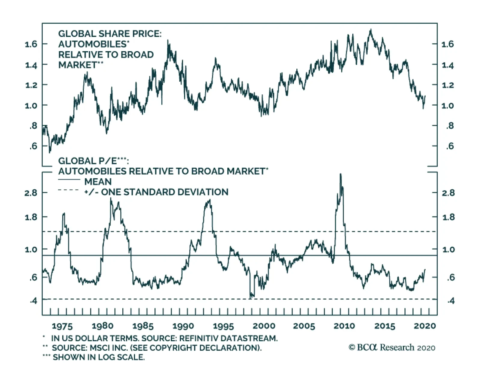
Global automotive stocks are sporting their worst performance in relative terms since March 2000. At the epicenter of the selloff have been two tectonic shifts. First, the COVID-19 crisis has led to widespread shutdowns and arrested travel. Second, and…
Dear Client, There will be no US Equity Insights from July 1-3 inclusive, as the US Equity team will be on vacation for the week. Our regular publication schedule will resume on Monday July 13, 2020 with our Weekly Report. Happy Independence Day. Kind Regards, Anastasios Highlights Portfolio Strategy Odds are high that stocks will move laterally in Q3, digesting the massive gains since the March 23 lows. Beyond that, on a cyclical 9-12 month time horizon we remain constructive on the return prospects of the broad market. On all three key profit fronts – price of credit, loan growth and credit quality – banks are starting to show signs of stress. Tack on the potential dividend cuts/suspensions and we were compelled to downgrade exposure to neutral. A dearth of M&A deals, a steep fall in margin debt and declining equity flows into mutual funds and exchange traded funds and potential dividend cuts/suspensions enticed us to trim exposure in the S&P investment banks & brokers index to neutral. Recent Changes Last Tuesday we downgraded the S&P banks and S&P investment banks & brokers indexes to neutral. These two moves also pushed the S&P financials sector weighting to neutral.1 Feature The SPX remains in churning mode, consolidating the massive gains since the March 23 lows. Easy fiscal and monetary policies are still the dominant macro themes underpinning markets, and thus any letdown in either loose policies poses a threat to the 1000 point three-month SPX run-up (bottom panel, Chart 1). Importantly, correlations have gone vertical of late with the CBOE’s implied correlation index – gauging the S&P 500 constituents’ pairwise correlations – surging to 70% (implied correlation index shown inverted, second panel, Chart 1). This is cause for concern as it has historically been a precursor to SPX pullbacks. Typically, stocks move in tandem, especially during risk off phases when everything becomes one big macro trade. Similarly, two Fridays ago we highlighted that the VIX and the S&P 500 were becoming positively correlated.2 The 20-day moving correlation between these two assets is shooting higher, approaching positive territory. Since late-2017 every time this correlation has hit the inflection point near the zero line, stocks has subsequently suffered a sizable setback (Chart 2). Chart 1Short-Term Downdraft Risks Are Rising
Short-Term Downdraft Risks Are Rising
Short-Term Downdraft Risks Are Rising
Chart 2Watch SPX/VIX Correlation
Watch SPX/VIX Correlation
Watch SPX/VIX Correlation
Tack on the public’s renewed interest in COVID-19 according to Google trends search results, and the odds are high that stocks will be range bound this summer (top panel, Chart 1). Beyond that, on a cyclical 9-12 month time horizon we remain constructive on the return prospects of the broad market. Turning over to profits on the eve of earnings season, our four-factor macro EPS growth model for the SPX has tentatively troughed at an extremely depressed level (Chart 3). Our SPX EPS estimate for next calendar year remains near $162/share which we consider trend EPS and was last hit both in 2018 and 2019.3 Chart 3Our EPS Growth Model Has Troughed
Our EPS Growth Model Has Troughed
Our EPS Growth Model Has Troughed
Moreover, drilling beneath the surface, this week Table 1 updates the sector and subgroup EPS growth expectations. First we rank the GICS1 sectors and then within each sector we rank the subsectors, both times by absolute 12-month forward EPS growth using I/B/E/S/ data (see second columns, Table 1). The third columns in Table 1 show the sector growth rate relative to the SPX. Table 1Identifying S&P 500 Sector EPS Growth Leaders And Laggards
Drilling Deeper Into Earnings
Drilling Deeper Into Earnings
The final columns highlight the trend in relative growth. In more detail, they compare the current relative growth rate to that of three months ago: a positive sign indicates an upgrade in analysts’ relative estimates and a negative sign a downgrade in analysts’ relative estimates. Tech, health care and communication services occupy the top ranks with positive EPS growth expectations, while financials, real estate and energy are forecast to contract in the coming 12 months and have fallen at the bottom of the table. Table 2Sector EPS And Market Cap Weights
Drilling Deeper Into Earnings
Drilling Deeper Into Earnings
Given that the tech sector has the highest profit weight in the SPX roughly 23% projected for next year (Table 2) it has really helped the broad market’s profit growth recovery (Chart 4). As a reminder, we continue to employ a barbell portfolio approach and prefer defensive (software and services) to aggressive tech (hardware and equipment). On the flip side, financials have the third largest profit weight roughly 16% in the S&P 500, trailing tech and health care, and pose a big threat to overall SPX profits next year, especially if there are any hiccups with the reopening of the economy (Table 2). Worrisomely, investors are not voting with their feet and are doubting that financials profits will deliver as the market cap weight relative to the profit weight stands at negative 540bps. Last Tuesday we downgraded the S&P financials sector to a benchmark allocation via trimming the S&P banks and S&P investment banks & brokers indexes to neutral and this week we delve into more details on these two early cyclical subgroups. Chart 4Earnings Finding Their Footing
Earnings Finding Their Footing
Earnings Finding Their Footing
Downgrade Banks To Neutral… We were compelled to downgrade the S&P banks index to neutral last Tuesday in advance of the Fed’s stress test results. There are high odds that a number of banks will cut/suspend dividend payments in coming quarters in line with the Fed’s guidance in the latest round of stress test, especially if profits take a big hit as we expect. As a reminder, dividends are paid out below-the-line. Beyond the Fed’s stress tests and rising political risks,4 yellow flags are waving on all three key bank profit drivers, namely the price of credit, loan growth and credit quality. First, it is disconcerting that bank relative performance has really not taken the yield curve’s steepening cue and has negatively diverged as we showed last week.5 The year-to-date plummeting 10-year yield is weighing heavily on relative share prices (top panel, Chart 5). The transmission mechanism to bank profits of this lower price of credit is via the net interest margin (NIM) avenue (third panel, Chart 5). NIMs will remain under downward pressure as long at the 10-year Treasury yield stays suppressed owing to the Fed’s immense b/s expansion. The rising likelihood of yield curve control could keep interest rates on the long end of the curve depressed for a number of years similar to what happened between 1942 and 1951. Second, on the credit growth front news is equally worrisome. The widening in the junk spread signals loan growth blues in the quarters ahead (second panel, Chart 6). Despite the initial knee jerk reaction, primarily by corporations, of tapping existing C&I credit lines and causing a surge in bank credit growth, bankers are not willing to extend credit according to the latest Fed Senior Loan Officer survey (third panel, Chart 6). The same survey revealed that banks are reporting lower demand for credit across the board, warning that future loan growth will be anemic at best, especially given the collapse in our economic impulse indicator (bottom panel, Chart 6). Chart 5Bank Yellow Flags Waving
Bank Yellow Flags Waving
Bank Yellow Flags Waving
Chart 6Loan Growth Will Suffer
Loan Growth Will Suffer
Loan Growth Will Suffer
Finally, with regard to credit quality, delinquency and charge-off rates are all but certain to spike in the coming months. The third panel of Chart 7 highlights that historically all these credit quality gauges are lagging. However, the near vertical climb in the unemployment rate recently and persistently high continuing unemployment benefit claims near 20mn signal that non-performing loans (NPLs) are slated to soar in the back half of 2020 (bottom panel, Chart 7). True, the recent $2tn+ fiscal package is acting as a Band-Aid solution by putting money in unemployed consumers’ pockets, but when the money runs out on July 31, the going will get tough especially if Congress does not pass a new fiscal package. In addition, there are “extend and pretend” clauses in the existing relief package especially on the residential mortgage front that aim to help homeowners make ends meet. But, the longer workers stay out of the labor force the higher the chances that their skills atrophy making it difficult for them to return to work. As a result, foreclosure risk is on the rise. While residential real estate loans are no longer the largest category in bank loan books they still comprise a respectable 21% of total loans or $2.3tn, a souring housing market could spell trouble for banks (Chart 8). Chart 7Deteriorating Credit Quality Will Sink Profits
Deteriorating Credit Quality Will Sink Profits
Deteriorating Credit Quality Will Sink Profits
Chart 8Housing Arrears Are A Risk
Housing Arrears Are A Risk
Housing Arrears Are A Risk
Already, residential mortgage delinquencies are rising and in May surged to the highest level since November 2011 according to Bloomberg. 4.3mn residential real estate borrowers are in arrears (this delinquency count includes borrowers with forbearance agreements who missed payments) and “more than 8% of all US mortgages were past due or in foreclosure” according to Black Night Inc., a property information service. Tack on the shattering consumer confidence and the consumer loan category (credit card, auto and student debt) is also under risk of severe credit quality deterioration (fourth panel, Chart 7). The commercial real estate (CRE) side of loan books is also likely to bleed. Anecdotes where landlords are demanding past due rent payment from tenants are mushrooming, at a time when the same landlords refuse to service their loan obligations. According to TREPP, CMBS delinquencies are skyrocketing across different REIT lines of business. Importantly, CRE loans add up to $2.4tn on commercial bank balance sheets or roughly 22% of total loans. Encouragingly, in Q1 banks started to aggressively provision for steep credit losses with commercial bank loan loss reserves now climbing just shy of $180bn according to the latest FDIC Quarterly Banking Profile (second panel, Chart 7). This figure is almost twice as high as noncurrent loans and represents a healthy reserve coverage ratio. However, our fear is that if history at least rhymes NPLs will sling shot higher (bottom panel, Chart 7) rendering loan loss reserves insufficient. Putting this provisioning number in context, according to the Fed’s most adverse stress test scenarios banks’ losses could spring to $700bn: “In aggregate, loan losses for the 34 banks ranged from $560bn to $700bn”.6 As a result, banks will have to further provision for futures losses and thus take an additional hit to profitability. Our bank earnings growth model does an excellent job in capturing all these moving parts and warns of a contraction in profit in the back half of the year (bottom panel, Chart 9). Nevertheless, before getting too bearish on banks, there two key offsetting factors. Relative valuations are bombed out, signaling that most of the bad news is likely reflected in prices (bottom panel, Chart 5). Finally, technicals are also extremely oversold. The second panel of Chart 5 shows that relative momentum is as bad as it gets. Netting it all out, on all three key profit fronts – price of credit, loan growth and credit quality – banks are starting to show signs of stress and compel us to downgrade exposure to neutral. Chart 9Dividend Cuts Are Looming
Dividend Cuts Are Looming
Dividend Cuts Are Looming
…And Move To The Sidelines On Investment Banks & Brokers The S&P investment banks & brokers (IBB) group has a similar investment profile to the S&P banks index. But, given its more cyclical nature it typically oscillates violently around banks’ relative performance. Thus last Tuesday, we were also compelled to move to the sidelines on this higher beta financials subgroup.7 The COVID-19 accelerated recession has not only mothballed potential M&A deals that were in the works, but also a number of previously announced deals have been canceled. In addition, the outlook for M&A is grim, at least until the dust really settles from the coronavirus pandemic (second panel, Chart 10), weighing heavily on the sector’s profit prospects. While “Robinhood” (retail investor) trading stories abound, margin debt remains moribund and continues to contract, despite the V-shaped recovery in all major US stock markets since the March 23 lows (third panel, Chart 10). This coincident indicator speaks volumes in the near term direction of the broad market and any sustained contraction in trading related debt uptake will likely dent IBB profitability. According to the American Association of Individual Investors bullish retail investors have been absent from this quarter’s massive stock market rally and equity mutual fund and exchange traded fund flows corroborate this message (fourth panel, Chart 10). With regard to cyclicality, IBB are extremely quick to prune labor in times of duress and aggressively add to headcount during expansions. Recent trimming of IBB input costs signal that this industry is retrenching as it is trying to adjust cost structures to lower revenue run rates (bottom panel, Chart 10). Chart 10Diminishing Activities Are Profit Sapping
Diminishing Activities Are Profit Sapping
Diminishing Activities Are Profit Sapping
Related to the cyclical nature of the IBB industry, an accelerating stock-to-bond ratio has been synonymous with relative share outperformance and vice versa. In early June we turned cautious on the broad market’s near-term return prospects primarily on the back of rising (geo)political risks. The implication is that a lateral move in the broad market would push down the S/B ratio and weigh on relative share prices (Chart 11). However, there are some offsets that prevent us from turning outright bearish on this niche early-cyclical group. First relative valuations are extremely alluring. On a price-to-book basis IBB traded recently at 0.8x in absolute terms and at a steep 68% discount to the broad market (bottom panel, Chart 12). Chart 11Move To The Sidelines On This Highly Cyclical Industry
Move To The Sidelines On This Highly Cyclical Industry
Move To The Sidelines On This Highly Cyclical Industry
Chart 12Some Positive Offsets
Some Positive Offsets
Some Positive Offsets
Second, volatility has gone haywire since late-February and it remains elevated with a VIX reading still north of 30. This is a fertile environment for IBB trading desks and should translate into higher profits (second panel, Chart 12). Third, equity trading volumes have exploded. True, volumes spike on downdrafts, but they have remained at an historically high level recently underscoring that IBB trading desk should be minting money (third panel, Chart 12). Adding it all up, a dearth of M&A deals, a steep fall in margin debt and declining equity flows into mutual funds and exchange traded funds and potential dividend cuts/suspensions compelled us to trim exposure in the S&P investment banks & brokers index to neutral. Bottom Line: Downgrade the S&P banks index to neutral for a loss of 32.4% since inception. Trim the S&P investment banks & brokers index to neutral for a loss of 24% since inception. These moves also push the S&P financials sector to a benchmark allocation. The ticker symbols for the stocks in these indexes are: BLBG S5BANKX – JPM, BAC, C, WFC, USB, TFC, PNC, FRC, FITB, MTB, KEY, SIVB, RF, CFG, HBAN, ZION, CMA, PBCT, and BLBG S5INBK – GS, MS, SCHW, ETFC, RJF, respectively. Anastasios Avgeriou US Equity Strategist anastasios@bcaresearch.com Footnotes 1 Please see BCA US Equity Strategy Insight Report, “Unresponsive” dated June 23, 2020, available at uses.bcaresearch.com. 2 Please see BCA US Equity Strategy Insight Report, “Tales Of The Tape” dated June 19, 2020, available at uses.bcaresearch.com. 3 Please see BCA US Equity Strategy Weekly Report, “Gauging Fair Value ” dated April 27, 2020, and BCA US Equity Strategy Special Report, “Debunking Earnings” dated May 19, 2020, both available at uses.bcaresearch.com. 4 Please see BCA US Equity Strategy Insight Report, “Unresponsive” dated June 23, 2020, available at uses.bcaresearch.com. 5 Ibid. 6 https://www.federalreserve.gov/newsevents/pressreleases/bcreg20200625c.htm 7 Please see BCA US Equity Strategy Insight Report, “Unresponsive” dated June 23, 2020, available at uses.bcaresearch.com. Current Recommendations Current Trades Strategic (10-Year) Trade Recommendations
Drilling Deeper Into Earnings
Drilling Deeper Into Earnings
Size And Style Views June 3, 2019 Stay neutral cyclicals over defensives (downgrade alert) January 22, 2018 Favor value over growth April 28, 2020 Stay neutral large over small caps June 11, 2018 Long the BCA Millennial basket The ticker symbols are: (AAPL, AMZN, UBER, HD, LEN, MSFT, NFLX, SPOT, TSLA, V).
Highlights The highly uncertain backdrop calls for taking less near-term risk: It may be boring, but it’s only prudent for asset allocators to limit risk exposures when the distribution of economic and public health outcomes is so unusually wide. The US reported record daily COVID-19 infections last Wednesday and Thursday: Several southern and western states that led the way in easing social distancing measures are now experiencing record-high infection rates. Some states are pausing their reopening plans, and the recovery may be more drawn out than expected. Bank stocks sold off after the stress tests, but we’re still a fan of the SIFIs: The year-over-year increases in projected losses weren’t that large, and we still think the SIFIs will suffer smaller credit losses than the market expects. Feature Neutral is dull, neither hot nor cold, neither here nor there, and recommending a benchmark equity weighting in a balanced portfolio makes us restless. We see an equity equal weight as no more than a temporary pause while we wait for the balance between risk and reward to shift enough to merit an underweight or an overweight. When conditions are unusually uncertain, however, we recognize that staying within sight of the shore is prudent. Investors should only take risks when they judge that they will be adequately compensated for doing so. The IMF titled last week’s update to its World Economic Outlook, in which it lowered its 2020 global GDP growth forecast to -4.9% from April’s -3%, “A Crisis Like No Other, An Uncertain Recovery.” As the 1918-19 influenza outbreak is the only global public health threat approaching COVID-19 in terms of its seriousness and its reach, investors have to proceed without a ready basis of comparison. Six months after its emergence, there is still a great deal that we don’t know about the virus. It remains uncertain if developed economies have the hospital capacity and resource stockpiles to combat it, though many emerging economies clearly do not. Modeling the economic impact is further complicated by human vagaries. Public officials can make careful plans for the phased relaxation of activity restrictions, but there is no guarantee that the populace will abide by them. Clusters of unmasked patrons enjoying takeout service on the sidewalk outside the lower Manhattan bars that are open suggest that even likely Democratic voters are as tired of social distancing as the attendees packing the seats at the president’s recent rallies. It turns out that there is something that both sides can agree on, after all. The unpredictability of how well citizens will take direction can go the other way, as well. Just as steadily declining infection rates emboldened people to emerge from their cocoons sooner than officials wished, they may be reluctant to quit them even after officials sound the all-clear signal. As our European Investment Strategy colleagues have noted, economic activity in Sweden, which imposed barely any virus restrictions, was just as weak as it was in neighboring countries that sharply limited movement. The takeaway is that government officials may not have all that much say over how citizens change their behavior amidst a pandemic. There is a possibility, then, that even if officials become comfortable with fully reopening the economy, participants may balk at returning to some corners of it. Officials might throw a party, only to find that very few people will come. The bottom line is that economic conditions are still extremely uncertain, and we will remain in our tactically neutral limbo until we get some clarity about the virus’ path or until equity prices move significantly. Ready Or Not, Here We Come US equities stumbled last week as new COVID-19 infections staged a comeback, with the 7-day moving average rising for 13 straight days and counting (Chart 1). Increases in infections are an inevitable consequence of the expiration of temporary stay-at-home orders that stymied transmission by keeping people apart. The locus has begun to shift from a still largely limited New York City to the southern and western states that were among the first to reopen their economies. As infection rates surged beyond Gotham, the US set consecutive daily infection records last Wednesday and Thursday. Chart 1US Daily New Infections
Limbo
Limbo
We reiterate that rising cases are no surprise. It is a certainty that more people will contract a communicable disease once large swaths of the population are released from quarantine. But the sharp increases in cases may inspire investors to ask some uncomfortable questions. The lockdowns were meant to buy time for officials to design a testing, tracing and isolation framework that other countries have successfully wielded to short-circuit the spread of the virus. Did the United States use that time to build a workable framework? If not, are conditions materially different than they were in March, when stay-at-home orders began to be issued? The testing process continues to be beset by snags. The US is now capable of administering half a million tests a day, according to health officials’ testimony before Congress last week, and they expect capacity to triple by the fall. That capacity is fragmented across several small labs and testing facilities, however, and it can take as much as a week to obtain results, hampering attempts to isolate those who test positive. The absence of a central authority to direct resources where they’re most needed as new nodes emerge undermines the aggregate national capabilities.1 Turnabout Is Fair Play New York City quickly became the global epicenter once the pandemic entered the United States on account of its density, its residents’ reliance on public transportation and its position as an international crossroads. Counties across the entire metropolitan area, stretching into New Jersey and Connecticut, suffered high per-capita infection rates. Nowhere else in the US needed lockdown measures more than New York City, and it only entered the second stage of a four-stage phased re-opening last week. Other states, observing how the virus besieged New York in March and April, imposed restrictions on New York residents traveling to their states, fearing that they could potentially spread the virus far and wide. The rise in infection rates isn't surprising, but its steepness might cause investors to revisit their virus assumptions. The shoe is now on the other foot. New York has steadily reduced its new infection rate for two months and its 7-day moving average of new infections is just one-fifteenth of its early April peak (Chart 2, top panel). It is now nervously eyeing states suffering new outbreaks, and it announced 14-day quarantine measures for visitors from nine states – Alabama, Arizona, Arkansas, Florida, North Carolina, South Carolina, Texas, Utah and Washington – last week. The visitor quarantines are a voluntary measure, and thus likely to have little practical effect, but they highlight the way that several states that have reopened are seeing sharply rising per-capita infection rates relative to the entire country. Alabama’s stay-at-home order ended on April 30th. Its relative per-capita infection rate began to rise immediately (Chart 3, bottom panel). Its 7-day moving average of new infections has since experienced three surges, with the last and most potent causing it to more than double across nine days from June 8th to June 16th (Chart 3, top panel). That span included four consecutive days of record infections. Chart 2New York Daily New Infections
Limbo
Limbo
Chart 3Alabama Daily New Infections
Limbo
Limbo
Arizona’s outbreak has been remarkably swift. Its stay-at-home order expired on May 15th, and both its 7-day moving average of new infections (Chart 4, top panel) and its relative per-capita infection rate (Chart 4, bottom panel) inflected sharply higher fourteen days later. The former series has risen sixfold since residents regained their ability to circulate freely outside of their homes. Arkansas did not have a statewide stay-at-home order, but several measures to slow the virus’ spread were imposed. Restaurants re-opened with capacity limits on May 11th, and by month’s end Arkansas’ 7-day moving average of new infections (Chart 5, top panel) and its relative per-capita infection rate (Chart 5, bottom panel) had begun to inflect sharply higher. Chart 4Arizona Daily New Infections
Limbo
Limbo
Chart 5Arkansas Daily New Infections
Limbo
Limbo
The story is similar across the rest of the states subject to New York’s quarantine. Stay-at-home orders end, stores, bars and restaurants reopen, and infection rates surge with a lag of about two weeks. Florida and Texas, the two most populous states on New York’s list, fit the general pattern, though the rate at which their infections has grown has been striking. Last Wednesday, Florida topped its previous single-day new infection record by 36%2 (Chart 6, top panel), while Texas surpassed its daily high by 30% (Chart 7, top panel). Chart 6Florida Daily New Infections
Limbo
Limbo
Chart 7Texas Daily New Infections
Limbo
Limbo
What’s That Have To Do With The Price Of Stocks In New York? Some of the increase in infection rates is surely a function of more widely available testing. An assessment of what increased state infection rates mean for the course of the virus in any individual state or the entire country is beyond the scope of this report, not to mention our qualifications. Our intention is simply to assess whether US equities are vulnerable to the rising state case counts. We think they could be. Combined daily new infections in Florida and Texas now exceed New York's worst levels in the first half of April. We have previously written that the political will for social distancing measures has dissipated. For many state and local leaders, a return to lockdowns is not an option, and both Missouri’s and Texas’ governors have said as much, in no uncertain terms. There must be an infection level, however, that would force their hands, no matter the depth of their personal opposition. On Thursday, Texas’ governor halted any further easing of restrictions and signed an order suspending elective procedures at hospitals in the counties encompassing Austin, Dallas, Houston and San Antonio, all the while reiterating that rolling back reopening measures was a last resort.3 A resurgence in infection rates isn’t an investment concern per se, but it could become one if it encourages state and/or municipal authorities to reinstitute strict social distancing measures or freeze steps toward reopening local economies. There is also a potential threat to consumer confidence, which could be much harder to combat. Reopening an economy too soon could produce a more persistent drag than locking it down for too long. Premature easing that leads to a widely observed surge in infections may make individuals wary of leaving their homes lest they encounter the virus. Hasty measures meant to unshackle economic activity could backfire by sapping confidence that takes a long time to restore. The bottom line is that the combination of virus risks and an elevated forward earnings multiple keeps us from changing our neutral tactical stance to overweight. We are not inclined to underweight stocks, however, unless the S&P 500 approaches its all-time high around 3,400, given the potential for a positive virus surprise and individual and institutional investors’ ample cash holdings. Over a one-year horizon, we remain overweight equities as we do not see the pandemic exerting a permanently negative impact on corporate earnings. SIFI Bank Update The Fed released the results of its annual Dodd-Frank Act Stress Tests (DFAST) after the close last Thursday. The verdict was decidedly mixed. Investors and the financial media were keenly focused on the fate of bank dividends, and while the Fed did not forbid dividend payments, it capped third-quarter distributions at the lesser of a bank’s second-quarter dividend payment or the average of its trailing four-quarter earnings. It also said it would not allow any share repurchases in the third quarter, extending the largest banks' voluntary buyback pause. Among the SIFIs, Wells Fargo (WFC) is most likely to be constrained by the dividend cap, but its stock, lagging the rest of its peers’, already discounted that possibility. Our thesis that the SIFI banks will not incur credit losses as large as the market expects is still intact, provided Congress doesn’t abandon pandemic-stricken businesses, state and local governments or the unemployed in its follow-up to the CARES Act. The Fed's stress tests highlighted the many risks the banking system still faces, but we stand behind our call to overweight the SIFIs. If Congress plays its part, reserve builds roughly equivalent to half of the credit losses projected under the severely adverse scenario should prove to be more than sufficient. Table 1 updates the table we created after first quarter earnings releases to assess the adequacy of each bank’s loan-loss reserves. It shows that the total projected stress-test losses for the SIFIs are just 8.6% larger than they were in 2019, with only JP Morgan (JPM) facing a material increase in its loan-loss rate. A modest increase in maximum projected losses suggests only a modest increase in future provisions, and we still believe that another two quarters of provisions equivalent to the first quarter’s will be enough for each bank ex-WFC, which continues to look under-provisioned alongside its peers. Table 1Loan-Loss Reserves Vs. Updated Stress Test Projections
Limbo
Limbo
Doug Peta, CFA Chief US Investment Strategist dougp@bcaresearch.com Footnotes 1 Kliff, Sarah, “Arizona ‘Overwhelmed’ With Demand for Tests as U.S. System Shows Strain,” New York Times, June 25, 2020. https://www.nytimes.com/2020/06/25/upshot/virus-testing-shortfall-arizona.html 2 As we went to press Friday afternoon, Florida announced over 8,900 new cases, 60% above Wednesday's high. 3 As we went to press Friday afternoon, the governor had just issued an order closing all Texas bars.
US Dollar Bear Market...
US Dollar Bear Market...
In this Monday’s Special Report, we examined which S&P 500 GICS1 sectors have historically benefited from a falling greenback. Currently, piling evidence suggests that the path of least resistance will be lower for the US dollar. Looking at structural (five years+) dynamics, swelling twin deficits emit a bearish USD signal. In more detail, prior to COVID-19 outbreak, the US twin deficits were estimated to gradually rise towards the 7.5% mark (top panel), but now the US Congressional Budget Office (CBO) estimates that the US fiscal deficit alone will be approximately 11% of nominal GDP for 2020 if not higher. In other words, the recent pandemic has exacerbated already structurally bearish dynamics for the US dollar. Switching gears from a structural to a medium term horizon (2-3 years), BCA’s four-factor macro model, is sending an unambiguous bearish message regarding the greenback’s fate (middle panel). Finally, on a short-term time horizon, the USD is lagging the money multiplier by approximately 3 months. The COVID-19 catalyzed recession and resulting money printing will likely exert extreme downward pressure on the US dollar (bottom panel).