Sectors

Highlights Social distancing must persist to prevent dangerous super-spreading of COVID-19. The jobs recovery will be much weaker than the output recovery, because the sectors most hurt by social distancing have a very high labour intensity. This will force a prolonged period of ultra-accommodative monetary policy… …structurally favour T-bonds and Bonos over Bunds and OATs… …growth defensives such as tech and healthcare… …and the S&P 500 over the Euro Stoxx 50. Stay overweight Animal Care (PAWZ). Working from home has generated a puppy boom. Fractal trade: short gold, long lead. Feature As economies reopen, economists and strategists are quibbling about the shape of the output recovery: U, V, W, square root, or even ‘swoosh’. But for the furloughed or displaced worker, the more urgent question is, what will be the shape of the jobs recovery? Unfortunately, the jobs recovery will be much weaker than the output recovery – because the sectors most hurt by social distancing have a very high labour intensity (Chart Of The Week). Chart Of The Week 1ALeisure And Hospitality Makes A Large Contribution To Jobs Relative To Output
A Jobless V-Shape Recovery, And A Puppy Boom
A Jobless V-Shape Recovery, And A Puppy Boom
Chart Of The Week 1BFinance Makes A Small Contribution To Jobs Relative To Output
A Jobless V-Shape Recovery, And A Puppy Boom
A Jobless V-Shape Recovery, And A Puppy Boom
Output Might Snap Back, But Jobs Will Not The sectors most hurt by social distancing make a huge contribution to employment but a much smaller contribution to economic output. This is true for Europe and all advanced economies, though the following uses US data given its superior granularity and timeliness. The leisure and hospitality sector generates 11 percent of jobs, but just 4 percent of output. Retail trade generates 10 percent of jobs, but just 5 percent of output. It follows that if both sectors are operating at half their pre-coronavirus capacity, output will be down by 4.5 percent, but employment will collapse by 10.5 percent. Conversely, sectors which are relatively unaffected by social distancing make a small contribution to employment but a much bigger contribution to economic output. Financial activities generate just 6 percent of jobs, but 19 percent of economic output. Information technology generates just 2 percent of jobs, but 5 percent of output (Table I-1). Table I-1Sectors Hurt By Social Distancing Have A Very High Labour Intensity
A Jobless V-Shape Recovery, And A Puppy Boom
A Jobless V-Shape Recovery, And A Puppy Boom
If economies are reopened but social distancing persists – either via government policy or personal choice – then output can rebound in a V-shape, but employment cannot (Chart I-2). Forcing a prolonged period of ultra-accommodative monetary policy, with all its ramifications for financial markets. Chart I-2UK Unemployment Is Set To Surge If The US Is Any Guide
UK Unemployment Is Set To Surge If The US Is Any Guide
UK Unemployment Is Set To Surge If The US Is Any Guide
This raises a key question. Must social distancing persist? To answer, we need to pull together our latest understanding of COVID-19. COVID-19: What We Know So Far Many people argue that coronavirus fears are disproportionate. The mortality rate seems comfortingly low, at well below 0.5 percent (Chart 3). Yet this argument misses the point. Chart I-3The COVID-19 Mortality Rate Is Not High
A Jobless V-Shape Recovery, And A Puppy Boom
A Jobless V-Shape Recovery, And A Puppy Boom
COVID-19 is dangerous not because it kills, but because it makes a lot of people seriously ill. It has a low mortality rate, but a high morbidity rate. According to the World Health Organisation, around one in six that gets infected “develops difficulty in breathing”. Moreover, The Lancet points out that many recovered COVID-19 patients suffer pulmonary fibrosis, a permanent scarring of the lungs that impairs their breathing for the rest of their lives. Hence, while COVID-19 is highly unlikely to kill you, it could damage your health forever1 (Figure I-1). Figure 1COVID-19 Is Unlikely To Kill You, But It Could Permanently Damage Your Lungs
A Jobless V-Shape Recovery, And A Puppy Boom
A Jobless V-Shape Recovery, And A Puppy Boom
The most famous COVID-19 victim to date is British Prime Minister Boris Johnson who spent several days recovering in intensive care. By his own admission, Johnson’s only pre-existing conditions are that he is overweight and “drinks an awful lot”. But those pre-existing conditions could apply to a large swathe of the population. COVID-19 is virulent. But we now know that most infections are the result of so-called ‘super-spreaders’ – a small minority of virus carriers who infect tens or hundreds of other people. We also know that talking loudly, singing, or chanting tends to eject higher doses of the virus, and in an aerosol form that can linger in enclosed spaces. This creates the perfect conditions for one infected person to infect scores of others very quickly. Based on this latest knowledge, the good news is that economies can reopen. The bad news is that, until an effective vaccine is developed, social distancing must persist. Specifically, people must avoid forming the crowds, congregations, and loud gatherings that can generate very dangerous super-spreading events. Hence, the sectors that are most hurt by social distancing – leisure and hospitality and retail trade – will continue to operate well below capacity for many months, at a minimum. And as these sectors have a very high labour intensity, there will be no V-shape recovery in jobs. Without Higher Bond Yields, European Equities Struggle To Outperform Social distancing is set to persist, which will create heaps of slack in advanced economy labour markets. This will force central banks to push the monetary easing ‘pedal to the metal’ – though in many cases, the pedal is already at the metal. In turn, this will force bond yields to stay ultra-low and, where they can, go even lower. One immediate takeaway is to stay overweight positively yielding US T-bonds and Spanish Bonos versus negatively yielding German Bunds and French OATs. Depressed bond yields must also compress the discount rate on competing long-duration investments that generate safely growing cashflows. Meaning, growth defensive equities such as technology and healthcare. Now comes the part that is conceptually difficult to grasp because it is novel to this unprecedented era of ultra-low bond yields. Take some time to absorb the following few paragraphs. For growth defensives, both components of the discount rate – the bond yield and the equity risk premium (ERP) – compress together. This is because the ERP is a tight function of the difference in equity and bond price ‘negative asymmetries’, defined as the potential price downside versus upside. When bond yields converge to their lower limit, bond prices converge to their upper limit, which increases the potential price downside versus upside. The result is that the difference in equity and bond negative asymmetries converges to zero, forcing the ERP to converge to zero. As the discount rate on growth defensives such as tech and healthcare collapses towards zero, the net present value must increase exponentially. This exponentially higher valuation of tech and healthcare is a mathematical consequence of the novel risk relationship between growth defensive equities and bonds at ultra-low bond yields. The unprecedented phenomenon has a major implication for European equity relative performance. The Euro Stoxx 50 is heavily underweight technology and healthcare, and this defining sector fingerprint is the key structural driver of European equity market relative performance (Chart I-4). Meanwhile, the relative performance of technology and healthcare is just an inverse exponential function of the bond yield (Chart I-5). The upshot is that European equities tend to outperform other regions only when bond yields are heading higher and the growth defensives are underperforming (Chart I-6). Chart I-4The Euro Stoxx 50's Underweight In Tech Drives Its Relative Performance
The Euro Stoxx 50's Underweight In Tech Drives Its Relative Performance
The Euro Stoxx 50's Underweight In Tech Drives Its Relative Performance
Chart I-5Tech Outperforms When The Bond Yield Declines...
Tech Outperforms When The Bond Yield Declines...
Tech Outperforms When The Bond Yield Declines...
Chart I-6...Hence, Without Higher Bond Yields The Euro Stoxx 50 Struggles To Outperform
...Hence, Without Higher Bond Yields The Euro Stoxx 50 Struggles To Outperform
...Hence, Without Higher Bond Yields The Euro Stoxx 50 Struggles To Outperform
Some commentators are calling the higher valuations in tech and healthcare a new bubble. But it is a bubble only to the extent that bond yields are in a ‘negative bubble’, meaning that ultra-low yields are unsustainable. However, with social distancing set to leave heaps of slack in the advanced economy labour markets, ultra-low bond yields are here to stay and could go even lower. Moreover, as shown earlier, tech and healthcare demand and output are immune to social distancing. They may even benefit from social distancing. Hence, on a one-year horizon and beyond, stay overweight the growth defensive tech and healthcare sectors. And stay overweight the tech and healthcare heavy S&P 500 versus Euro Stoxx 50. A Puppy Boom We finish on a very positive note for animal lovers. The shift to working from home has generated a puppy boom. The Association of German Dogs claims that “the demand for puppies is endless” and the UK Kennel Club says that “there is unprecedented demand.” In the era of social distancing, the waiting list for puppies has quadrupled, and prices of easy to look after crossbreeds such as cockapoos have more than doubled. The demand for pet food and equipment is also very strong. Dogs make excellent companions for the socially isolated, which describes how many people are now feeling. Furthermore, with millions of people now working from home or on extended furlough, a growing number of households can fulfil the dream of owning a dog. We have recommended a structural overweight to the Animal Care sector based on the ‘humanisation’ of pets and the structural uptrend in spend per pet, especially on veterinary costs (Chart I-7). Animal Care has outperformed by 50 percent in the past two and a half years, but the shift to working from home will add impetus to the structural uptrend (Chart I-8). Chart I-7Animal Care Prices Are Rising...
Animal Care Prices Are Rising...
Animal Care Prices Are Rising...
Chart I-8...And The Animal Care Sector Is Strongly Outperforming
...And The Animal Care Sector Is Strongly Outperforming
...And The Animal Care Sector Is Strongly Outperforming
Stay overweight Animal Care. The ETF ticker, appropriately enough, is called PAWZ. Fractal Trading System This week’s recommended trade is to short gold versus lead, given that the relative performance recently reached a fractal resistance point that has successfully identified four previous turning points. Set the profit target and symmetrical stop-loss at 13 percent. In our other open trades, five are in profit and one is in loss. The rolling 1-year win ratio now stands at 64 percent.
Gold Vs. Lead
Gold Vs. Lead
When the fractal dimension approaches the lower limit after an investment has been in an established trend it is a potential trigger for a liquidity-triggered trend reversal. Therefore, open a countertrend position. The profit target is a one-third reversal of the preceding 13-week move. Apply a symmetrical stop-loss. Close the position at the profit target or stop-loss. Otherwise close the position after 13 weeks. * For more details please see the European Investment Strategy Special Report “Fractals, Liquidity & A Trading Model,” dated December 11, 2014, available at eis.bcaresearch.com. Dhaval Joshi Chief European Investment Strategist dhaval@bcaresearch.com Footnotes 1 https://www.thelancet.com/journals/lanres/article/PIIS2213-2600(20)30222-8/fulltext Fractal Trading System Cyclical Recommendations Structural Recommendations Closed Fractal Trades Trades Closed Trades Asset Performance Currency & Bond Equity Sector Country Equity Indicators Bond Yields Chart II-1Indicators To Watch - Bond Yields
Indicators To Watch - Bond Yields
Indicators To Watch - Bond Yields
Chart II-2Indicators To Watch - Bond Yields
Indicators To Watch - Bond Yields
Indicators To Watch - Bond Yields
Chart II-3Indicators To Watch - Bond Yields
Indicators To Watch - Bond Yields
Indicators To Watch - Bond Yields
Chart II-4Indicators To Watch - Bond Yields
Indicators To Watch - Bond Yields
Indicators To Watch - Bond Yields
Interest Rate Chart II-5Indicators To Watch - Interest Rate Expectations
Indicators To Watch - Interest Rate Expectations
Indicators To Watch - Interest Rate Expectations
Chart II-6Indicators To Watch - Interest Rate Expectations
Indicators To Watch - Interest Rate Expectations
Indicators To Watch - Interest Rate Expectations
Chart II-7Indicators To Watch - Interest Rate Expectations
Indicators To Watch - Interest Rate Expectations
Indicators To Watch - Interest Rate Expectations
Chart II-8Indicators To Watch - Interest Rate Expectations
Indicators To Watch - Interest Rate Expectations
Indicators To Watch - Interest Rate Expectations
How Much Is Too Much Inflation?
How Much Is Too Much Inflation?
A profligate US government where $3 trillion + fiscal packages are passed with a strong bipartisan consensus, rising odds of increased defense and infrastructure spending, a renewed focus on protecting America’s industrial champions from competition (foreign or domestic), and a robust protectionist agenda (again, on both sides of the aisle), are all inherently inflationary and negative for bonds, ceteris paribus. A whiff of inflation would be a positive for the broad equity market, further fueling the “risk on”, liquidity-driven, melt-up phase. However, historically when inflation has entered the 3.7%-4% zone in the past, the broad equity market has stumbled (see chart). Despite these powerful longer-term inflationary forces, our working assumption is that, in the next 9-12 months, headline CPI inflation will only renormalize, rather than surge, as the coronavirus-induced deficient demand and excess supply dynamic will take time to reach a new equilibrium. Bottom Line: We remain constructive on the prospects of the broad equity market on a cyclical 9-12 month time horizon. For a detailed discussion on inflationary forces and their effects on the S&P 500 GICS1 sectors, please refer to this Monday’s Special Report.
Highlights The Chinese economy continues to recover, albeit less quickly than the first two months following a re-opening of the economy. The demand side of the Chinese economic recovery in May marginally outpaced the supply side, with a notable improvement concentrated in the construction sector. We are initiating two new trades: long material sector stocks versus the broad indices, in both onshore and offshore equity markets. Feature The recovery in China’s economy and asset prices has entered a “tapering phase”, in which the speed of the recovery is normalizing from a rapid rebound two months after the economy re-opened. The direction of the ultra-accommodative monetary and fiscal stance has not changed, but the aggressiveness in the stimulus impulse is abating as the recovery continues. As we highlighted in last week’s report, the announced stimulus at this year's NPC was less than meets the eye of investors.1 Chart 1A Quick Reversal In The Outperformance Of Chinese Stocks
A Quick Reversal In The Outperformance Of Chinese Stocks
A Quick Reversal In The Outperformance Of Chinese Stocks
Near-term downside risks in Chinese stocks were highlighted by last week’s quick reversal in the outperformance of Chinese equities relative to global benchmarks (Chart 1). As the US and European economies re-open and the stimulus impulse in major developed markets (DMs) is at peak intensity, Chinese stocks will underperform those in DMs, particularly US stocks. The re-escalation in Sino-US tensions will also add to the near-term volatility in Chinese equities. Therefore, we maintain our tactical (0-3 months) neutral view on aggregate Chinese equity indexes, in both domestic and offshore markets. Beyond Q2, however, our baseline view still supports an outperformance in Chinese stocks. The stepped-up stimulus measures since March should start to trickle down into the broader economy. Global business activities and demand will slowly normalize in the summer, helping to revive China’s exports. Moreover, an intensified pressure on employment, indicated in this month’s employment subcomponents in manufacturing and non-manufacturing PMIs, should prompt policymakers to roll out more growth-supporting measures in Q3. Tables 1 and 2 below highlight key developments in China’s economic and financial market performance in the past month. Table 1China Macro Data Summary
China Macro And Market Review
China Macro And Market Review
Table 2China Financial Market Performance Summary
China Macro And Market Review
China Macro And Market Review
Chart 2ASpeed Of Manufacturing Activity Recovery Has Moderated
Speed Of Manufacturing Activity Recovery Has Moderated
Speed Of Manufacturing Activity Recovery Has Moderated
China’s official manufacturing PMI slipped to 50.6 in May from 50.8 a month earlier (Chart 2A). While the reading suggests that manufacturing activities are still in an expansionary mode, the speed of the expansion has moderated compared with April and March. The supply side of manufacturing activities and employment were the biggest drags on May’s official PMI. The production subcomponent in the PMI decelerated whereas new orders increased from April (Chart 2A, bottom panel). The net result is an improved supply-demand balance in the manufacturing sector, however, the improvement is marginal. It also differs from the V-shaped recovery in 2008/09, when both new orders and production subcomponents grew simultaneously (Chart 2B). The demand side of the economy is still concentrated in the policy-driven construction sector. The rebound in construction PMI continues to significantly outpace that in manufacturing and non-manufacturing PMIs (Chart 2C, top panel). The construction employment sub-index ticked up by 1.7 percentage points in May, compared with a slowdown of 0.8 percentage points in manufacturing and 0.1 percentage points in non-manufacturing employment PMIs (Chart 2C, bottom panel). Chart 2BDemand Struggles To Outpace Supply
Demand Struggles To Outpace Supply
Demand Struggles To Outpace Supply
Chart 2CDemand Recovery Is Concentrated In Construction
Demand Recovery Is Concentrated In Construction
Demand Recovery Is Concentrated In Construction
While a buoyant construction sector should provide a strong tailwind to raw material prices and related machinery sales, a laggard recovery from other sectors means the upside potential in aggregate producer prices (PPI) will be limited in the current quarter. In May, there was a rebound in the PMI sub-indices measuring raw material purchase prices and ex-factory prices, which heralds easing in the contraction of PPI in Q2 (Chart 3). However, neither of the PMI price sub-indices has returned to levels reached in January, when PPI growth was last positive. Moreover, weaker readings in the purchases and raw material inventory subcomponents suggest that manufacturers may be reluctant to restock due to sluggish global trade and a lagging rebound in domestic demand (Chart 3, bottom panel). This month’s PMI shows that the employment subcomponents in both the manufacturing and non-manufacturing PMIs are contracting (Chart 4). Because demand for Chinese export goods remains sluggish, we expect unemployment in China’s labor-intensive export manufacturing sector to rise in Q2 and even into Q3. The intensified pressure on employment will likely prompt Chinese policymakers to roll out more demand-supporting measures. Chart 3PPI Contraction Will Ease But Upside Limited In Q2/Q3
PPI Contraction Will Ease But Upside Limited In Q2/Q3
PPI Contraction Will Ease But Upside Limited In Q2/Q3
Chart 4Employment In Trouble, A Catalyst For More Easing
Employment In Trouble, A Catalyst For More Easing
Employment In Trouble, A Catalyst For More Easing
The BCA Li Keqiang Leading Indicator rose moderately in April. A plunge in the Monetary Conditions Index (MCI) limited the magnitude of the indicator's increase, offsetting an uptick in money supply and credit growth (Chart 5). A rapid disinflation in headline consumer prices (CPI) since the beginning of this year has pushed up the real savings deposit rate, which contributed to the MCI’s nose-dive. In our view, the MCI’s sharp drop is idiosyncratic and does not signify a tightening in the PBoC’s monetary stance or overall monetary conditions. Huge fluctuations in food prices have been driving the headline CPI since March 2019, while the core CPI remains stable. While food prices historically have very little correlation with the PBoC's monetary policy actions, a disinflationary environment will provide the central bank more room for easing. Odds are high that the PBoC will cut the savings deposit rate for the first time since 2015. Chart 5Monetary Conditions Are Not As Tight As The Indicator Suggests
Monetary Conditions Are Not As Tight As The Indicator Suggests
Monetary Conditions Are Not As Tight As The Indicator Suggests
The yield curve in Chinese government bonds quickly flattened around the time of the National People’s Congress (NPC), with the short end of the curve rising faster than the long end (Chart 6). This is in keeping with our assessment that while the market is expecting the recovery to continue in China, it is unimpressed with the intensity of upcoming stimulus and monetary easing. Monetary easing seems to be taking a pause, but we do not think this indicates a change in the PBoC’s policy stance (Chart 7). Instead, weak global demand, slow recovery in the domestic economy and intensified pressure on domestic employment, all will incentivize policymakers to up their game by mid-year. As such, we expect the yield curve to steepen again in H2, with the short-end of the curve fluctuating at a low level and the 10-year government bond yield picking up when the economy gains traction. Chart 6The Bond Market May Be Incorrectly Pricing In A Monetary Tightening
The Bond Market May Be Incorrectly Pricing In A Monetary Tightening
The Bond Market May Be Incorrectly Pricing In A Monetary Tightening
Chart 7A Pause Before More Easing In June
A Pause Before More Easing In June
A Pause Before More Easing In June
The spread in Chinese corporate bond yields has dropped by more than 30bps from its peak in April. This is in line with that of major DM countries and a reflection of the easier liquidity conditions globally (Chart 8). We anticipate that the yield spreads in Chinese corporate bonds will continue to normalize. However, a flare in US-China tensions will put upward pressure on the financing costs of lower-rated corporations (Chart 8, bottom panel). The default rate among Chinese corporate bonds is unlikely to rise meaningfully this year, in light of ultra-accommodative monetary conditions and the Chinese government’s bailout programs to backstop corporate defaults. Chinese corporate bond defaults and non-performing loans historically have correlated with periods of financial sector de-leveraging and de-risking, other than during economic downturns. We continue to recommend investors hold China’s corporate bonds in the coming 6-12 months in a USD-CNH hedged term. Chart 8Financing Costs May Rise For Lower-Rated Corporations
Financing Costs May Rise For Lower-Rated Corporations
Financing Costs May Rise For Lower-Rated Corporations
Chart 9Cyclicals Are Struggling To Break Out
Cyclicals Are Struggling To Break Out
Cyclicals Are Struggling To Break Out
Among Chinese equities, cyclical sectors have struggled to outperform defensives in both onshore and offshore markets (Chart 9). This reflects investors’ concerns over the slow recovery in domestic demand and heightened geopolitical risk between the US and China. As such, we continue to favor domestic, demand-driven sectors among the cyclical stocks, such as consumer discretionary and construction-related materials. We upgraded consumer discretionary stocks from neutral to overweight on May 20, and we are now initiating two trades to long material sector stocks versus the broad markets in both the domestic and investable markets. The constituents of both China’s investable and domestic material sectors are highly concentrated in the metal and mining subsectors, which roughly account for half of the material sectors’ weight in the MSCI and MSCI A Onshore Indexes, respectively. Chart 10 highlights that the material sectors’ relative performance is highly correlated with CRB raw materials in both domestic and investable markets. Given that China’s credit cycles historically lead the CRB material index by about six months, China’s massive credit stimulus will boost CRB raw materials by end-Q2 and thus, the outperformance of the material sectors. The RMB has depreciated by almost 3% in the wake of a re-escalation in US-China frictions. The CNY/USD spot rate is approaching its weakest point reached in September 2019 (Chart 11). Furthermore, on May 29, the PBoC set the CNY/USD reference rate at its lowest level since 2008, a move that suggests defending the RMB is no longer in China’s interest. Downward pressure on the RMB will persist in the months leading up to the November US presidential election. The US economy is in a much more fragile state than in 2018/19, which may hinder President Trump’s willingness to resort to tariffs between now and November. However, we cannot completely roll out the probability that Trump will impose further tariffs on Chinese exports, if he is losing the election through weak public support and is removed from his financial and economic constraints. In any case, in the coming months CNY/USD exchange rate will likely continue to decouple from the economic fundamentals such as interest rate differentials (Chart 11, bottom panel). Instead, the exchange rate will be largely driven by market sentiment surrounding the US-China frictions. Volatility in CNY/USD will increase, but the overall trend in the CNY/USD will continue downwards as long as the escalation in US-China tensions persists. On a 6- to 12-month horizon, however, we expect that the depreciation trend in the RMB to moderately reverse as the Chinese economy continues to strengthen. Chart 10Material Sectors Should Benefit From The Stimulus And Construction Boom
Material Sectors Should Benefit From The Stimulus And Construction Boom
Material Sectors Should Benefit From The Stimulus And Construction Boom
Chart 11The CNY/USD Will Continue To Decouple From Interest Rate Differentials
The CNY/USD Will Continue To Decouple From Interest Rate Differentials
The CNY/USD Will Continue To Decouple From Interest Rate Differentials
Qingyun Xu, CFA Senior Analyst qingyunx@bcaresearch.com Jing Sima China Strategist jings@bcaresearch.com Footnotes 1 Please see China Investment Strategy Weekly Report "Taking The Pulse Of The People’s Congress," dated May 28, 2020, available at cis.bcaresearch.com Cyclical Investment Stance Equity Sector Recommendations
What Are Trucks Telling Us?
What Are Trucks Telling Us?
While the S&P transports index has neither made new all-time highs nor outperformed the SPX year-to-date, one economically hypersensitive sub-group, trucking, has been revving its engines and is sending a bullish signal for the broad market (top panel). The S&P 1500 trucking index has stealthily joined the “new all-time highs” club, similar to the biotech index that we mentioned two weeks ago. Likely, as large parts of the economy are on the verge of reopening, this index has priced in a full recovery and a return to normal in the back half of the year. True, the jury is still out on the economic recovery shape and the risk of a second wave is significant along with the recent spike in uncertainty regarding the US election. But stocks continue to climb the proverbial "wall of worry". Bottom Line: Historically, the highly fragmented trucking industry has an excellent track record in leading the SPX and the current message is that the path of least resistance remains higher for the SPX in the coming 9-12 months (bottom panel).
Highlights Chart 1More Stimulus Forthcoming?
More Stimulus Forthcoming?
More Stimulus Forthcoming?
Last week we posited that bond yields could move modestly higher during the next couple of months as the US economy re-opens and economic growth recovers. However, any economic recovery is contingent on the US consumer maintaining an adequate amount of income, whether that income comes from employment or government assistance. So far, real personal income is holding up nicely. It is actually up 9% since February as the CARES act’s one-time stimulus checks and enlarged unemployment insurance benefits have more than offset the 9% drop in income from non-government sources (Chart 1). Contrast this with 2008, when government assistance only tempered the peak-to-trough decline in income from 8% to 4%. However, the stimulus checks are not recurring and the extra unemployment benefits lapse at the end of July. Before then, either employment income will have to rise or the government will have to pass additional stimulus measures. Otherwise, real personal income will fall and any nascent economic recovery will be stopped in its tracks. Stay tuned. Feature Investment Grade: Overweight Chart 2Investment Grade Market Overview
Investment Grade Market Overview
Investment Grade Market Overview
Investment grade corporate bonds outperformed the duration-equivalent Treasury index by 181 basis points in May, bringing year-to-date excess returns up to -705 bps. The average index spread tightened 28 bps on the month and has tightened 199 bps since the Fed unveiled its corporate bond purchase programs on March 23. However, the index’s 12-month breakeven spread remains above its historical median (Chart 2). Spreads are high relative to history and the investment grade corporate bond market benefits strongly from Fed support.1 The sector therefore meets both our criteria for an overweight allocation. One caveat to our overweight stance is that while Fed lending can forestall bankruptcy, it can’t clean up highly-levered corporate balance sheets. With firms taking on more debt, either from the Fed or the public market, ratings downgrades remain a risk. Indeed, Moody’s already downgraded 18 investment grade issuers in March and another 7 in April, while recording no upgrades in either month (panel 4). With downgrade risk still in play, sector and firm selection is particularly important. Investors should seek out pockets of the market that are unlikely to be downgraded, subordinate bank bonds being one example (bottom panel).2 Table 3ACorporate Sector Relative Valuation And Recommended Allocation*
Filling The Income Gap
Filling The Income Gap
Table 3BCorporate Sector Risk Vs. Reward*
Filling The Income Gap
Filling The Income Gap
High-Yield: Neutral Chart 3AHigh-Yield Market Overview
High-Yield Market Overview
High-Yield Market Overview
High-Yield outperformed the duration-equivalent Treasury index by 427 basis points in May, bringing year-to-date excess returns up to -937 bps. The average index spread tightened 107 bps on the month and has tightened 463 bps since the Fed unveiled its corporate bond purchase programs on March 23. Encouragingly, lower-rated (B & below) credits performed well in May, but they still lag the Ba credit tier since the March 23 peak in spreads (Chart 3A). Appendix A on page 14 shows returns for all fixed income sectors since March 23. Chart 3BB-Rated Excess Return Scenarios
Filling The Income Gap
Filling The Income Gap
Better performance from the lower credit tiers that don’t benefit from the Fed’s emergency facilities signals that investors are becoming more optimistic about an economic turnaround. But for our part, we remain skeptical about valuations in the B-rated and lower space. Chart 3B shows that “moderate” and “severe” default scenarios for the next 12 months – defined as a 9% and 12% default rate, respectively, with a 25% recovery rate – would lead to a negative excess spread for B-rated bonds.3 The same holds true for lower-rated credits. We appear to be on track for that sort of outcome. Moody’s recorded 15 defaults in April, the highest monthly figure since the 2015/16 commodity bust, bringing the trailing 12-month default rate up to 5.4%. Meanwhile, the trailing 12-month recovery rate is a meagre 21%. MBS: Underweight Mortgage-Backed Securities outperformed the duration-equivalent Treasury index by 3 basis points in May, bringing year-to-date excess returns up to -31 bps. Chart 4MBS Market Overview
MBS Market Overview
MBS Market Overview
The average yield of the conventional 30-year MBS index rose from 1.18% to 1.74% on the month, and the index duration extended from 1.5 to 2.9. The result is that value – as measured by the index option-adjusted spread (OAS) – has improved considerably, especially relative to other spread products. The 30-year conventional MBS index OAS is now 100 bps. This is greater than the 91 bps and 93 bps offered by Aaa-rated consumer ABS and Agency CMBS, respectively. It’s also greater than the 91 bps offered by Aa-rated corporate bonds (Chart 4). There’s no doubt that MBS are starting to look more attractive, and if current trends continue, we will likely upgrade our recommendation in the coming months. However, we are reluctant to do so just yet because we worry that the prepayment assumptions embedded in the current index OAS will turn out to be too low. Our concern stems from the extremely high primary/secondary mortgage spread (bottom 2 panels). That wide spread shows that capacity constraints have so far prevented mortgage originators from competing on price and dropping rates, even as Treasury and MBS yields plummeted. The risk remains that bond yields will stay low and that primary mortgage rates will eventually play catch-up. That could lead to a surge of refinancing activity and wider MBS spreads. Government-Related: Underweight Chart 5Government-Related Market Overview
Government-Related Market Overview
Government-Related Market Overview
The Government-Related index outperformed the duration-equivalent Treasury index by 162 basis points in May, bringing year-to-date excess returns up to -474 bps. Sovereign debt outperformed duration-equivalent Treasuries by 589 bps on the month, bringing year-to-date excess returns up to -930 bps. Foreign Agencies outperformed the Treasury benchmark by 99 bps in May, bringing year-to-date excess returns up to -798 bps. Local Authority debt outperformed Treasuries by 187 bps in May, bringing year-to-date excess returns up to -688 bps. Domestic Agency bonds outperformed by 15 bps, bringing year-to-date excess returns up to -72 bps. Supranationals outperformed by 8 bps, bringing year-to-date excess returns up to -31 bps. We updated our outlook for USD-denominated Emerging Market (EM) Sovereign bonds in a recent report.4 In that report we posited that valuation and the performance of EM currencies are the primary drivers of sovereign debt performance (Chart 5). On valuation, we noted that the USD sovereign bonds of: Mexico, Saudi Arabia, UAE, Colombia, Qatar, South Africa and Malaysia all offer a spread pick-up relative to US corporate bonds of the same credit rating and duration. However, of those countries that offer attractive spreads, most have currencies that look vulnerable based on the ratio of exports to foreign debt obligations. In general, we don’t see a compelling case for USD-denominated sovereigns based on value and currency outlook, although Mexican debt stands out as looking attractive on a risk/reward basis. Municipal Bonds: Overweight Chart 6Municipal Market Overview
Municipal Market Overview
Municipal Market Overview
Municipal bonds outperformed the duration-equivalent Treasury index by 290 basis points in May, bringing year-to-date excess returns up to -646 bps (before adjusting for the tax advantage). Municipal bond spreads versus Treasuries tightened considerably in May, but valuations remain very attractive. The 2-year Aaa Muni / Treasury spread stands at -2 bps, implying a breakeven effective tax rate of 12%.5 Meanwhile, the 10-year Aaa Muni / Treasury spread is above zero (Chart 6). As we showed in last week’s report, municipal bonds are also attractively priced relative to corporates across the entire investment grade credit spectrum.6 In last week’s report we also flagged our concern about the less-than-generous pricing offered by the Fed’s Municipal Liquidity Facility (MLF). At present, MLF funds are only available at a cost that is well above current market prices (panel 3). This means that the MLF won’t help push muni yields lower from current levels. Despite the MLF’s shortcomings, we aren’t yet ready to downgrade our muni allocation. For one thing, federal assistance to state & local governments is likely on its way, and the Fed could feel pressure to lower MLF pricing if that stimulus is delayed. Further, while the budget pressure facing municipal governments is immense, states are also holding very high rainy day fund balances (bottom panel). This will help cushion the blow and lessen the risk of ratings downgrades. Treasury Curve: Buy 5-Year Bullet Versus 2/10 Barbell Chart 7Treasury Yield Curve Overview
Treasury Yield Curve Overview
Treasury Yield Curve Overview
The Treasury curve steepened in May, as long-maturity yields rose and short-dated yields declined slightly. The 2-year/10-year Treasury slope steepened 5 bps to end the month at 49 bps. The 5-year/30-year Treasury slope steepened 19 bps to end the month at 111 bps. One good thing about the fed funds rate being pinned at zero is that it greatly simplifies yield curve strategy. As we showed in a recent report, when the funds rate is at its lower bound the Treasury slope will trade directionally with yields.7 That is, the yield curve will steepen when yields rise and flatten when they fall. Therefore, if you want to put on a position that will profit from lower yields but that doesn’t increase the average duration of your portfolio, you can enter a duration-neutral flattener: long a 2/10 or 2/30 barbell and short the 5-year or 7-year bullet, in duration-matched terms. Or if, like us, you do not want to make a large duration bet but suspect that Treasury yields will move modestly higher as the US economy re-opens during the next couple of months, you can enter a duration-neutral steepener: long the 5-year bullet and short a duration-matched 2/10 barbell.8 In terms of value, the 5-year yield no longer trades deeply negative relative to the 2/10 and 2/30 barbells (Chart 7), though it remains somewhat expensive according to our models (see Appendix B). TIPS: Overweight Chart 8TIPS Market Overview
TIPS Market Overview
TIPS Market Overview
TIPS outperformed the duration-equivalent nominal Treasury index by 62 basis points in May, bringing year-to-date excess returns up to -494 bps. The 10-year TIPS breakeven inflation rate rose 8 bps to 1.16%. The 5-year/5-year forward TIPS breakeven inflation rate rose 5 bps to 1.48%. March’s market crash created an extraordinary amount of long-run value in TIPS. For example, headline CPI has to average below 1.16% for the next decade for a buy & hold investor to lose money long the 10-year TIPS and short the equivalent-maturity nominal Treasury. In last week’s report we argued that such a position should also work on a 12-month horizon.9 We calculate that headline CPI will have to be below -0.6% for the next 12 months for a long TIPS/short nominals position to lose money. With the recent drop in core inflation not mimicked by the trimmed mean and oil prices already on the mend (Chart 8), we’d bet against headline CPI getting that low. We also advise investors to enter real yield curve steepeners.10 In a repeat of the 2008/09 zero-lower-bound episode, front-end real yields jumped this year when oil prices collapsed (bottom 2 panels). In 2008/09, the real yield curve steepened sharply once oil prices troughed. We think now is a good time to position for a similar outcome. ABS: Overweight Chart 9ABS Market Overview
ABS Market Overview
ABS Market Overview
Asset-Backed Securities outperformed the duration-equivalent Treasury index by 101 basis points in May, bringing year-to-date excess returns up to -104 bps. The index option-adjusted spread for Aaa-rated ABS tightened 49 bps on the month to 91 bps. It remains 51 bps above where it was at the beginning of the year. Aaa-rated ABS meet both our criteria to own. Index spreads are elevated and the securities benefit from Fed support through the TALF program. Specifically, TALF allows eligible counterparties to borrow against Aaa ABS collateral at a rate of OIS + 125 bps (Chart 9). TALF benefits don’t extend to non-Aaa ABS and we recommend avoiding those securities even though valuation is more attractive. Since the March 23 peak in spreads, non-Aaa ABS have outperformed Aaa-rated ABS by 197 bps, but have only re-traced a fraction of their prior losses (panel 2). As with municipal bonds, Aaa ABS yields are now below the cost of TALF loans. This certainly makes the bullish case for ABS spreads less robust. However, unlike munis, yields are only slightly below the cost of Fed support (bottom panel). Also, as shown on page 1, government spending has so far prevented a collapse in personal income. As long as this continues, it should prevent a wave of consumer bankruptcies and ABS defaults. Non-Agency CMBS: Overweight Chart 10CMBS Market Overview
CMBS Market Overview
CMBS Market Overview
Non-Agency Commercial Mortgage-Backed Securities outperformed the duration-equivalent Treasury index by 99 basis points in May, bringing year-to-date excess returns up to -697 bps. The index option-adjusted spread for non-agency Aaa-rated CMBS tightened 22 bps on the month to 169 bps. As was the case in April, non-Aaa CMBS underperformed Aaa securities (Chart 10). This is not surprising given that only Aaa-rated CMBS benefit from the Fed’s TALF program and the underlying credit outlook for commercial real estate is very poor with most people now working from home. We continue to recommend avoiding non-Aaa CMBS, but think that Aaa spreads can tighten further. The cost of borrowing against Aaa CMBS through TALF remains well below the current Aaa non-agency CMBS yield (panel 3). Agency CMBS: Overweight Agency CMBS outperformed the duration-equivalent Treasury index by 62 basis points in May, bringing year-to-date excess returns up to -161 bps. The average index spread tightened 9 bps on the month to 93 bps, still well above typical historical levels (bottom panel). The Fed is supporting the Agency CMBS market by directly purchasing securities as part of its Agency MBS purchase program. The combination of strong Fed support and elevated spreads makes the sector a high conviction overweight. Appendix A: Buy What The Fed Is Buying The Fed rolled out a number of aggressive lending facilities on March 23. These facilities focused on different specific sectors of the US bond market. The fact that the Fed has decided to support some parts of the market and not others has caused some traditional bond market correlations to break down. It has also led us to adopt of a strategy of “Buy What The Fed Is Buying”. That is, we favor those sectors that offer attractive spreads and that benefit from Fed support. The below Table tracks the performance of different bond sectors since the March 23 announcement. We will use this to monitor bond market correlations and evaluate our strategy’s success. Performance Since March 23 Announcement Of Emergency Fed Facilities
Filling The Income Gap
Filling The Income Gap
Appendix B: Butterfly Strategy Valuations The following tables present the current read-outs from our butterfly spread models. We use these models to identify opportunities to take duration-neutral positions across the Treasury curve. The following two Special Reports explain the models in more detail: US Bond Strategy Special Report, “Bullets, Barbells And Butterflies”, dated July 25, 2017, available at usbs.bcaresearch.com US Bond Strategy Special Report, “More Bullets, Barbells And Butterflies”, dated May 15, 2018, available at usbs.bcaresearch.com Table 4 shows the raw residuals from each model. A positive value indicates that the bullet is cheap relative to the duration-matched barbell. A negative value indicates that the barbell is cheap relative to the bullet. Table 4Butterfly Strategy Valuation: Raw Residuals In Basis Points (As Of May 29, 2020)
Filling The Income Gap
Filling The Income Gap
Table 5 scales the raw residuals in Table 4 by their historical means and standard deviations. This facilitates comparison between the different butterfly spreads. Table 5Butterfly Strategy Valuation: Standardized Residuals (As Of May 29, 2020)
Filling The Income Gap
Filling The Income Gap
Table 6 flips the models on their heads. It shows the change in the slope between the two barbell maturities that must be realized during the next six months to make returns between the bullet and barbell equal. For example, a reading of 51 bps in the 5 over 2/10 cell means that we would only expect the 5-year to outperform the 2/10 if the 2/10 slope steepens by more than 51 bps during the next six months. Otherwise, we would expect the 2/10 barbell to outperform the 5-year bullet. Table 6Discounted Slope Change During Next 6 Months (BPs)
Filling The Income Gap
Filling The Income Gap
Appendix C: Excess Return Bond Map The Excess Return Bond Map is used to assess the relative risk/reward trade-off between different sectors of the US bond market. It is a purely computational exercise and does not impose any macroeconomic view. The Map’s vertical axis shows 12-month expected excess returns. These are proxied by each sector’s option-adjusted spread. Sectors plotting further toward the top of the Map have higher expected returns and vice-versa. Our novel risk measure called the “Risk Of Losing 100 bps” is shown on the Map’s horizontal axis. To calculate it, we first compute the spread widening required on a 12-month horizon for each sector to lose 100 bps or more relative to a duration-matched position in Treasury securities. Then, we divide that amount of spread widening by each sector’s historical spread volatility. The end result is the number of standard deviations of 12-month spread widening required for each sector to lose 100 bps or more versus a position in Treasuries. Lower risk sectors plot further to the right of the Map, and higher risk sectors plot further to the left. Chart 11Excess Return Bond Map (As Of May 29, 2020)
Filling The Income Gap
Filling The Income Gap
Footnotes 1 For a detailed description of the Fed’s different emergency facilities please see US Investment Strategy/US Bond Strategy Special Report, “Alphabet Soup: A Summary Of The Fed’s Anti-Virus Measures”, dated April 14, 2020, available at usbs.bcaresearch.com 2 For more details on our recommendation to favor subordinate bank bonds please see US Bond Strategy Weekly Report, “Negative Oil, The Zero Lower Bound And The Fisher Equation”, dated April 28, 2020, available at usbs.bcaresearch.com 3 For an explanation of how we calculate default-adjusted spreads by credit tier please see US Bond Strategy Weekly Report, “Is The Bottom Already In?”, dated April 21, 2020, available at usbs.bcaresearch.com 4 Please see US Bond Strategy Weekly Report, “The Treasury Market Amid Surging Supply”, dated May 12, 2020, available at usbs.bcaresearch.com 5 Investors will see a greater after-tax yield in the municipal bond compared to the Treasury bond if their effective tax rate is above the breakeven effective tax rate. 6 Please see US Bond Strategy Weekly Report, “Bonds Are Vulnerable As North America Re-Opens”, dated May 26, 2020, available at usbs.bcaresearch.com 7 Please see US Bond Strategy Weekly Report, “Life At The Zero Bound”, dated March 24, 2020, available at usbs.bcaresearch.com 8 The rationale for why barbell positions profit from curve flattening and bullet positions profit from curve steepening is found in US Bond Strategy Special Report, “Bullets, Barbells And Butterflies”, dated July 25, 2017, available at usbs.bcaresearch.com 9 Please see US Bond Strategy Weekly Report, “Bonds Vulnerable As North America Re-Opens”, dated May 26, 2020, available at usbs.bcaresearch.com 10 For more details on this recommendation please see US Bond Strategy Weekly Report, “Negative Oil, The Zero Lower Bound And The Fisher Equation”, dated April 28, 2020, available at usbs.bcaresearch.com Fixed Income Sector Performance Recommended Portfolio Specification Corporate Sector Relative Valuation And Recommended Allocation
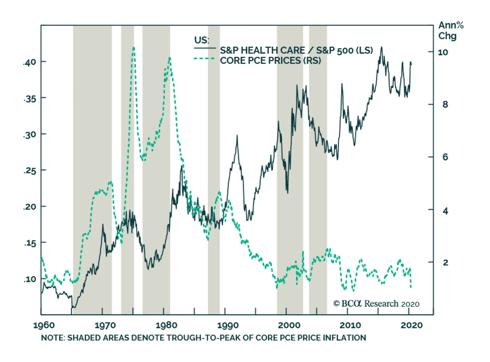
BCA Research's US Equity Strategy service concluded that health care stocks have consistently outperformed during the six inflationary periods they examined. Over the long haul, it has paid to overweight this sector given the structural uptrend in relative…
The COVID-19 induced recession has accelerated several paradigm shifts that were already afoot. Populism, anti-immigrant sentiment, deglobalization, and fiscal profligacy were replete – particularly in the US – even before the pandemic. For the first time since WWII, the US budget deficit significantly expanded for three years running at a time when the unemployment rate was declining, late in the cycle. We fear that the Washington Consensus – a catchall term for fiscal prudence, laissez-faire economics, free trade, and unfettered capital flows – is being replaced by economic populism, by a Buenos Aires Consensus, as our geopolitical strategists have posited in the past. Buenos Aires Consensus is our catchall term for everything that is opposite of the Washington Consensus: less globalization, fiscal stimulus as far as the eyes can see, erosion of central bank independence, and a dirigiste (as opposed to laissez-faire) approach to economics that seeks to protect “state champions,” stifles innovation, and ultimately curbs productivity growth. The most important long-term consequence of the Buenos Aires Consensus will be higher inflation. And we are not talking just the asset price kind – which investors have enjoyed over the past decade – but of the more traditional flavor: consumer price inflation (Chart 1). Chart 1Inflation Is Coming
Inflation Is Coming
Inflation Is Coming
A profligate US government where $3 trillion + fiscal packages are passed with a strong bipartisan consensus, rising odds of increased defense and infrastructure spending, a renewed focus on protecting America’s industrial champions from competition (foreign or domestic), and a robust protectionist agenda (again, on both sides of the aisle), are all inherently inflationary and negative for bonds, ceteris paribus. A whiff of inflation would be a positive for the broad equity market, further fueling the “risk on”, liquidity-driven, melt-up phase. However, historically when inflation has entered the 3.7%-4% zone in the past, the broad equity market has stumbled (Chart 2). Despite these powerful longer-term inflationary forces, our working assumption is that, in the next 9-12 months, headline CPI inflation will only renormalize, rather than surge, as the coronavirus-induced deficient demand and excess supply dynamic will take time to reach a new equilibrium (Chart 3). Chart 2Only A Whiff Of Inflation Is Good For Stocks
Only A Whiff Of Inflation Is Good For Stocks
Only A Whiff Of Inflation Is Good For Stocks
Importantly, the magnitude of the economic damage, the likelihood that a “second wave” requires renewed lockdowns, and a new steady state of the apparent “square root” type of recovery remain unknown. This means that “deflationistas” may continue to have an upper hand on the “inflationistas”, as witnessed by the subdued inflation expectations (Chart 3). Chart 3In The Near-Term Disinflation Looms
In The Near-Term Disinflation Looms
In The Near-Term Disinflation Looms
The Federal Reserve’s Function As The Lender Of Last Resort What is certain is the Fed’s resolve to keep things gelled together and allow businesses and the economy enough time to heal and overcome the coronavirus shock. Simply put, there are high odds that the Fed will remain accommodative and take inflation risk “sitting down” for quite some time, certainly for the next year, and likely longer (Chart 4). While early on, the Powell-led Fed had been ambivalent, the FOMC’s swift and immense response to the coronavirus calamity with unorthodox monetary policies has been appropriate and unprecedented (Chart 5). Clearly, the sloshing liquidity cannot cure the coronavirus, but providing the credit needed in parts of the financial markets and select business sectors that had completely dried up was the proper policy response. The Fed acted promptly as a lender of last resort. Unlike the difficulty in defeating deflation – look no further than Japan – ending inflation is easy. The great Paul Volcker has taught the Fed and the world how to break the back of inflation. The Fed, therefore, has the credible tools to deal with a possible inflationary impulse. Chart 4Do Not Fight The Mighty Fed
Do Not Fight The Mighty Fed
Do Not Fight The Mighty Fed
Chart 5Joined At The Hip
Joined At The Hip
Joined At The Hip
Until economic growth regains its footing and climbs to its post-GFC steady 2-2.5% real GDP growth profile, the probability is high that the Fed will take some inflation risk (Chart 6). Chart 6The Fed Can Afford To Take Inflation Risk
The Fed Can Afford To Take Inflation Risk
The Fed Can Afford To Take Inflation Risk
This is especially the case given that political risk in the US is tilted to the downside. With income inequality at nose bleeds levels, US policymakers (both fiscal and monetary authorities) will hesitate to act on the inflation mandate with gusto and objectivity (Chart 7). Chart 7The Apex Of Globalization And Income Inequality
The Apex Of Globalization And Income Inequality
The Apex Of Globalization And Income Inequality
The Fed will therefore not rush to abruptly tighten monetary policy, a view confirmed by the bond market: fed funds futures are penciling a negative fed funds rate in mid-2021 and ZIRP as far as the eye can see (Chart 8). A sustainable breakout in bond yields would require inflation (and to a lesser extent real GDP growth) to significantly surprise to the upside, which would compel the Fed to aggressively raise the fed funds rate. But that is not on the immediate horizon especially given the recent coronavirus-related blow to unit labor costs (please see Appendix below). Even if there were an inflationary backup in longer term Treasury yields, yield curve control is a tool the Fed is considering, something it first tried on the Treasury’s orders during and following WWII for a nine year period. Chart 8ZIRP As Far As The Eye Can See
ZIRP As Far As The Eye Can See
ZIRP As Far As The Eye Can See
Dollar And The Inflationary Valve Importantly, the US dollar’s direction will be critical in determining whether any lasting inflation acceleration occurs. The top panel of Chart 9 shows that inflation accelerates during U.S. dollar bear markets. A depreciating greenback greases the wheels of the global financial system and also serves as a global growth locomotive given that trade is largely conducted in US dollars (bottom panel, Chart 9). Thus, the Fed’s recent US dollar swap lines to other Central Banks, along with its FIMA facility, were instrumental in unclogging the global financial system. Sloshing US dollar liquidity restored a semblance of normality to asset prices (Chart 10). Chart 9Inversely Correlated
Inversely Correlated
Inversely Correlated
Chart 10Ample Liquidity To Debase The Greenback
Ample Liquidity To Debase The Greenback
Ample Liquidity To Debase The Greenback
As we highlighted in our December 16 Special Report titled “Top US Sector Investment Ideas For The Next Decade” ,1 there are rising odds that a US dollar bear market takes root this decade. Eventually, the steeper the greenback’s fall, the higher the chance of a longer lasting inflationary spurt as US import price inflation will rear its ugly head (Chart 11). Chart 11US Dollar Bear Markets Are Synonymous With Inflation
US Dollar Bear Markets Are Synonymous With Inflation
US Dollar Bear Markets Are Synonymous With Inflation
So What? While, in the near-term, accelerating inflation is a negligible risk owing to excess economic slack, in the intermediate-term, it is a rising probability outcome. BCA’s long-held de-globalization theme,2 the US/Sino trade war that is here to stay irrespective of the next electoral outcome and excessive US government fiscal largesse will likely, in the next two-to-three years, swing the global deflation/inflation pendulum toward sustained inflation (Chart 12). For investors that are worried about the prospect of higher inflation, the purpose of this Special Report is to serve as an equity sector positioning roadmap, especially if inflationary pressures become more acute sooner than we anticipate. Chart 12Deglobalization Will Result In Inflation
Deglobalization Will Result In Inflation
Deglobalization Will Result In Inflation
Historically, inflation has been synonymous with an aggressive Fed and hard asset outperformance, suggesting that deep cyclical sectors would be the primary beneficiaries. Table 1 shows that over the last six major inflationary cycles, energy, materials, real estate and health care have been consistent outperformers. On the flip side, utilities, tech and telecom have been clear underperformers. The remaining sectors have been a mixed bag. Table 1S&P 500 Sector Performance During Inflationary Periods
Revisiting Equity Sector Winners And Losers When Inflation Climbs
Revisiting Equity Sector Winners And Losers When Inflation Climbs
With the exception of real estate, our portfolio will benefit from an accelerating inflationary backdrop. However, our early- and late-cyclical preference to defensives is a consequence of the current stage of the cycle: when in recession it pays to have a cyclical portfolio bent (please see Charts 6 and 7 from our mid-April Weekly Report).3 Ultimately, we expect relative profit trends to dictate relative performance on a cyclical investment horizon, and are not rushing to further shift our portfolio in order to benefit from accelerating inflation. What follows is a one page per sector analysis of the impact of inflation on pricing power and performance. Sectors are ranked by their average returns (largest to smallest) in the six inflationary cycles we studied as shown on Table 1. Anastasios Avgeriou US Equity Strategist anastasios@bcaresearch.com Health Care Health care stocks have consistently outperformed during the six inflationary periods we examined. Over the long haul, it has paid to overweight this sector given the structural uptrend in relative share prices. Spending on health care services is non-cyclical and demand for such services is on a secular rise around the globe most recently further catalyzed by the COVID-19 pandemic: in the developed markets driven largely by the aging population and in the emerging markets by the accelerating adoption of health care safety nets and higher standards. Chart 13Health Care
Health Care
Health Care
Health care pricing power is expanding at a healthy clip, outshining overall CPI. Importantly, recent geopolitical uncertainty had cast a shadow on the sector’s pricing power prospects that suffered from a constant derating. Now that political uncertainty has lifted as Biden is a more moderate Democratic President candidate than either Sanders or Warren, a rerating looms. Finally, demand for health care goods and services will not only remain robust, but also get a boost from the recent coronavirus pandemic as governments around the globe beef up their health care response systems. Chart 14Health Care
Health Care
Health Care
Energy The energy sector comes out on top of the median relative return results in times of inflation, and second best in average terms (Table 1 above). Oil price surges are typically synonymous with other forms of inflation. During the six inflationary periods we analyzed, all but one period were associated with relative share outperformance. Oil producers in particular benefit from the increase in the underlying commodity almost immediately (assuming little to no hedging), which also serves as an excellent inflation hedge. Chart 15Energy
Energy
Energy
Relative energy pricing power collapsed during the COVID-19 accelerated recession plumbing multi-decade lows. Saudi Arabia’s decision in early-2020 to refrain from balancing the oil market triggered a plunge in WTI crude oil prices to negative $40/bbl. While global demand remains deficient, this breakdown in oil prices has brought some much needed supply discipline in global oil producers including US shale. As the reopening of economies takes hold oil demand will recover and absorb excess oil inventories. While base effects will push crude oil inflation to the stratosphere in Q1/2021, eventually a more balanced global oil market will pave the way to a sustainable rebound in oil prices. Chart 16Energy
Energy
Energy
Real Estate REITs have outperformed the overall market during the five inflationary periods we analyzed, exemplifying their hard asset profile. While the 1976-81 iteration skewed the mean results, REITs still come out with the third best showing among the top eleven sectors even on median return basis (Table 1 above). Real estate prices tend to appreciate when inflation is accelerating, because landlords have consistently raised rents at least on a par with inflation. Chart 17Real Estate
Real Estate
Real Estate
Following the GFC trough, REITs pricing power has outpaced the overall CPI. CRE selling prices had been on a tear since the GFC, but the ongoing recession has short-circuited this hard asset’s near uninterrupted price appreciation; according to Green Street Advisors, average CRE prices contracted by roughly 10% in April. Worrisomely the persistent multi-family construction boom and the “amazonification” of the economy will act as a restraint to the apartment REIT and shopping center REIT segments, respectively. Tack on the longer-term knock-on effects of the work-from-home wave that has staying power and even office REITs may suffer a demand-related deflationary shock. Chart 18Real Estate
Real Estate
Real Estate
Materials Materials equities have a tight positive correlation with accelerating inflation. Resource-related stocks are the closest representation of hard assets, given their ability to store value among the eleven GICS1 sectors. As inflation takes root and commodity prices rise, materials sales and EPS growth get a boost with relative share prices following right behind. Chart 19Materials
Materials
Materials
Our relative materials pricing power gauge is currently contracting, but encouragingly it is showing some signs of stabilization. The drubbing in Chinese GDP in Q1 has dealt a blow to commodities-related demand and thus prices as infrastructure projects ground to a halt. As the Chinese economy has restarted slightly ahead of developed markets a return to normalcy is a high probability outcome in the back half of the year. Keep in mind that the delayed effect of stimulus spending should also hit in Q3 and Q4 likely further tightening commodity markets. Chart 20Materials
Materials
Materials
Consumer Discretionary While the overall trend in consumer discretionary stocks has been higher since the mid-1970s, relative performance mostly declines during inflationary times. Consumer spending takes the backseat as a performance driver when interest rates rise on the back of higher inflation. In addition, previous inflationary periods have also coincided with surging energy prices, representing another source of diminishing consumer discretionary purchasing power. Chart 21Consumer Discretionary
Consumer Discretionary
Consumer Discretionary
Consumer discretionary selling prices are expanding relative to overall wholesale price inflation, and are on a trajectory to hit double digit growth. Deflating energy prices, ultra-loose monetary conditions and the $3tn fiscal stimulus have kept the US consumer afloat. As Washington and the Fed are providing a lifeline to the economy during the recession, the reopening of the economy has the potential to turbo-charge consumer discretionary spending as pent up demand will get unleashed. Chart 22Consumer Discretionary
Consumer Discretionary
Consumer Discretionary
Financials Financials relative returns are neither hot nor cold when inflation rears its ugly head. In fact they sit in the middle of the pack in terms of relative median and mean returns. This lack of consistency reflects different factors that exerted significant influence in some of these inflationary periods. Moreover, Chart 23 shows that relative share prices have been mean reverting since the 1960s, likely blurring the inflation influence. Ultimately, the yield curve, credit growth and credit quality determine the path of least resistance for the relative share price ratio of this early cyclical sector. Chart 23Financials
Financials
Financials
Financials sector pricing power has jumped by about 450bps since the 2019 trough and have exited deflation. Given the recent steepening of the yield curve that is typical at the depths of the recession, the odds are high that sector pricing power will remain firm via rising net interest margins. Any easing in the regulatory backdrop even temporary could also provide a fillip to margins and offset the large precautionary provisioning that banks are taking to combat the looming recession-related losses. Chart 24Financials
Financials
Financials
Industrials The industrials sector tends to outperform during inflationary periods. In fact, relative share prices have risen 50% of the time since the mid-1960s when inflation was accelerating. The two oil shocks in the 1970s raised the profile of all commodity-related sectors as investors were scrambling to find reliable inflation hedges. Chart 25Industrials
Industrials
Industrials
Following a three-year period in the deflation zone, industrials relative pricing power is steadily rising, likely as a consequence of decreasing supplies, CEO discipline and the ongoing US/Sino trade war. The previously expansionary mindset has given way to retrenchment, as the scars from the late-2015/early 2016 manufacturing recession remain fresh. However, infrastructure spending is slated to increase at some point in late-2020 as China revs its economic engine and bolster the demand prospects for this deep cyclical sector. Chart 26Industrials
Industrials
Industrials
Consumer Staples Similar to the health care sector, consumer staples stocks have been stellar outperformers over the past 55 years. The sector’s track record during the six inflationary periods we studied is split down the middle. Most consumer staples companies are global conglomerates and their efforts have been focused on building global consumer brands, allowing them to implement a stickier pricing strategy. As a result, overall inflation/deflation pressures are more benign. Chart 27Consumer Staples
Consumer Staples
Consumer Staples
Relative consumer staples pricing power has slingshot higher and is flirting with the upper bound of the past three decade range near the 10% mark. The current recession has augmented the status of consumer staples. While the lockdowns has dealt a blow to select discretionary purchases, demand for staples has actually increased according to recent retail sales and inflation data releases. Tack on falling commodity input costs and the implication is that consumer staples manufacturers will likely continue to enjoy widening profit margins. Chart 28Consumer Staples
Consumer Staples
Consumer Staples
Tech Technology stocks have underperformed every time inflation has accelerated with two exceptions, in the mid-to-late 1960s and mid-to-late 1970s. Creative destruction forces in the tech industry are inherently deflationary. As a result, tech business models have evolved to thrive during disinflationary periods. Moreover, tech stocks have become more mature than is typically perceived, generating enormous amounts of free cash flow. Cash flow growth is also steadier than in the past and has served as a catalyst to embark on shareholder friendly activities. Chart 29Tech
Tech
Tech
Tech companies are constantly mired in deflation. While relative pricing power has been in an uptrend since 2016, it has recently soared as tech companies preserved their pricing power, but overall wholesale inflation has suffered a sizable setback. Importantly, demand for tech goods and services has remained resilient during the current recession, further adding to the allure of the tech sector. Chart 30Tech
Tech
Tech
Utilities Utilities relative returns during inflationary bouts are the second worst among the top eleven sectors on an average basis and dead last on a median return basis (Table 1 above). In five out of the six inflationary phases we examined, utilities stocks suffered a setback. The industry’s lack of economic leverage and fixed income attributes anchor the relative share price ratio during inflationary times. Chart 31Utilities
Utilities
Utilities
Our utilities sector pricing power proxy has sprung to life recently moderately outpacing overall inflation. Natural gas prices, the industry’s marginal price setter, have risen 18% since the early-April trough, signaling that recent utility pricing power gains have more upside. Nevertheless, as the economy is gradually reopening, soft data will stage a V-shaped recovery bolstering the odds of a selloff in the bond market. Such a backdrop will dampen the demand for high-yielding defensive equities, including pricey utilities. Chart 32Utilities
Utilities
Utilities
Telecom Services Relative telecom services performance and inflation appear broadly inversely correlated since the early 1970s, underperforming 60% of the time when core PCE prices accelerate. Importantly, in two of the periods we studied (during the late-70s and the TMT bubble) the drawdowns were massive, skewing the mean results portrayed in Table 1 above. This fixed income proxy sector tends to suffer in times of inflation as competing assets dilute its yield appeal and vice versa. Chart 33Telecom Services
Telecom Services
Telecom Services
Telecom services pricing power has been on a recovery mode since February 2017 when Verizon surprised investors and embarked on a price war by reinstating its unlimited plans in order to defend its market share. Importantly, earlier in the year telecom carriers relative selling prices exited deflation coinciding with the completion of the T-Mobile/Sprint deal. Intra-industry M&A is over as now only three major wireless providers are left raising the threat of monopolistic power. Nevertheless, the ongoing 5G deployment is of the utmost importance for telecom carriers and a foray further into cable/media/content services is inevitable so that the telecom incumbents move beyond being “dumb pipelines”. Chart 34Telecom Services
Telecom Services
Telecom Services
Appendix Chart A1
CHART A1
CHART A1
Chart A2
CHART A2
CHART A2
Chart A3
CHART A3
CHART A3
Chart A4
CHART A4
CHART A4
Chart A5
CHART A5
CHART A5
Chart A6
CHART A6
CHART A6
Footnotes 1 Please see BCA US Equity Strategy Special Report, “Top US Sector Investment Ideas For The Next Decade” dated December 16, 2019, available at uses.bcaresearch.com 2 Please see BCA Geopolitical Strategy Special Report, “The Apex Of Globalization - All Downhill From Here” dated November 12, 2014, available at gps.bcaresearch.com 3 Please see BCA US Equity Strategy Weekly Report, “Fight Central Banks At Your Own Peril” dated April 14, 2020, available at uses.bcaresearch.com.
The GAA DM Equity Country Allocation model is updated as of May 29, 2020. The model has not made any significant change this month. It has kept the same order for the top four overweight countries (Spain, Australia, Sweden, and the US) as well as the four large underweight countries (Japan, the UK, France, and Switzerland), as shown in Table 1. Table 1Model Allocation Vs. Benchmark Weights
GAA Quant Model Updates
GAA Quant Model Updates
As shown in Table 2 and Charts 1, 2 and 3, the overall model outperformed the MSCI World benchmark in May by 29 bps. The Level 1 model outperformed 2 bps because of the overweight in the US. The Level 2 model outperformed by 85 bps thanks to the overweight of Sweden, Germany and the Netherlands, as well as the underweight in the UK and Switzerland. Since going live, the overall model has outperformed its MSCI World benchmark by 180 bps, with 246 bps of outperformance from the Level 2 model, and 33 bps of outperformance from the Level 1 model. Table 2Performance (Total Returns In USD %)
GAA Quant Model Updates
GAA Quant Model Updates
Chart 1GAA DM Model Vs. MSCI World
GAA DM Model Vs. MSCI World
GAA DM Model Vs. MSCI World
Chart 2GAA US Vs. Non US Model (Level 1)
GAA US Vs. Non US Model (Level 1)
GAA US Vs. Non US Model (Level 1)
Chart 3GAA Non US Model (Level 2)
GAA Non US Model (Level 2)
GAA Non US Model (Level 2)
For more on historical performance, please refer to our website https://www.bcaresearch.com/site/trades/allocation_performance/latest/G…. For more details on the models, please see Special Report, “Global Equity Allocation: Introducing The Developed Markets Country Allocation Model,” dated January 29, 2016, available at https://gaa.bcaresearch.com. Please note that the overall country and sector recommendations published in our Monthly Portfolio Update and Quarterly Portfolio Outlook use the results of these quantitative models as one input, but do not stick slavishly to them. We believe that models are a useful check, but structural changes and unquantifiable factors need to be considered as well when making overall recommendations. GAA Equity Sector Selection Model Chart 4Overall Model Performance
Overall Model Performance
Overall Model Performance
The GAA Equity Sector Model (Chart 4) is updated as of May 29, 2020. The model’s relative tilts between cyclicals and defensives have changed compared to last month. The model reversed its defensive stance implemented throughout March and April and is now tilted towards cyclical sectors. However, the semi-defensive tilt led the model to outperform its benchmark by 21 basis points during May. Year-to-date, the model has outperformed its benchmark by 88 basis points, and 86 basis points since inception. The model’s global growth proxy improved – mostly driven by EM currencies and commodity prices, and therefore turned positive on various cyclical sectors and reversed its defensive stance implemented in March. Global monetary easing and low rates should keep the liquidity component favouring a mixed bag of cyclical and defensive sectors. The valuation component remains muted across all sectors except Energy. However, multiple sectors are approaching expensive and cheap territories – mainly Info Tech (expensive), and Real Estate (cheap). The model awaits confirming momentum signals to change recommendations for that component. The model is now overweight five sectors in total, four cyclical sectors versus one defensive sectors. These are Information Technology, Consumer Discretionary, Communication Services, Materials and Health Care. Table 3Overall Model Performance
GAA Quant Model Updates
GAA Quant Model Updates
For more details on the model, please see the Special Report “Introducing the GAA Equity Sector Selection Model”, dated July 27, 2016, as well as the Sector Selection Model section in the Special Alert “GAA Quant Model Updates,” dated March 1, 2019 available at https://gaa.bcaresearch.com. Table 4Current Model Allocations
GAA Quant Model Updates
GAA Quant Model Updates
Xiaoli Tang Associate Vice President xiaoliT@bcaresearch.com Amr Hanafy Senior Analyst amrh@bcaresearch.com
Feature The key to how markets will move over the coming 12 months is whether the coronavirus pandemic turns out to be a short-term (albeit severe) disruption to the world economy, or something more fundamentally damaging. Markets currently – with global equities up by 34% since March 23 – are clearly pricing in the former. They seem to be saying that the sudden stop to the economy – with US employment, for example, rising to a post-war high in just two months (Chart 1) – is not a problem, since most of the unemployed are furloughed and will quickly return to work once businesses reopen. Enormous stimulus (direct fiscal spending in G20 countries of 4.6% of GDP, even if loans and guarantees are excluded – Chart 2) and aggressive monetary policy (major central banks’ balance sheets have ballooned by $4.7trn since March – Chart 3) will tide us over until normality returns, and then provide a big boost to risk assets. Unprecedented efforts by drugs companies will soon produce a vaccine against COVID-19. Recommended Allocation
Monthly Portfolio Update: Disruptive Or Damaging?
Monthly Portfolio Update: Disruptive Or Damaging?
Chart 1Can Unemployment Come Down As Quickly?
Can Unemployment Come Down As Quickly?
Can Unemployment Come Down As Quickly?
Chart 2Unprecedented Fiscal…
Monthly Portfolio Update: Disruptive Or Damaging?
Monthly Portfolio Update: Disruptive Or Damaging?
Chart 3...And Monetary Stimulus
...And Monetary Stimulus
...And Monetary Stimulus
All this is possible. Certainly, the amount of excess liquidity being pumped into the economy by central banks (Chart 4) could dramatically boost economic activity and asset prices once the world returns to normal. The newsflow over coming months may largely be positive, with a gradual easing of lockdowns, a rebound in economic data (it cannot mathematically get any worse), and an abatement of the pandemic during the northern hemisphere summer. Many investors remain pessimistic (Chart 5) and so may be pulled into markets if stocks continue to rise. In this environment – and with the alternatives so unattractive (10-year US Treasurys at 0.6% anyone?) – we wouldn’t want to take a bet against equities. Chart 4Liquidity Will Boost Assets - Eventually
Liquidity Will Boost Assets - Eventually
Liquidity Will Boost Assets - Eventually
But is the market ignoring the risks? Easing of lockdown could lead to a flare-up of new COVID-19 cases: China has already had to reintroduce some containment measures when this happened (Chart 6). Chart 5Retail Investors Remain Bearish
Retail Investors Remain Bearish
Retail Investors Remain Bearish
Chart 6What Happens When Lockdowns Are Eased?
Monthly Portfolio Update: Disruptive Or Damaging?
Monthly Portfolio Update: Disruptive Or Damaging?
While COVID-19 cases have peaked in Asia, Europe, and North America, there is a new wave in Emerging Markets, particularly those such as Brazil which were lax in implementing containment measures (Chart 7). Even where the pandemic has waned, consumers seem highly reluctant to go to restaurants (Chart 8) or fly on airplanes (Chart 9). Chart 7The Pandemic Is Shifting To Emerging Economies
The Pandemic Is Shifting To Emerging Economies
The Pandemic Is Shifting To Emerging Economies
Consumer-facing companies may no longer see revenues down by 70% or 80% over the next few months, but they could still be 10% or 20% below normal levels. How many business models are robust enough to survive that? As for a vaccine, it is worth remembering that no vaccine has ever been developed for a coronavirus in humans. We may have to learn to live with the disease. Chart 8Consumers Are Not Yet Going To Restaurants...
Consumers Are Not Yet Going To Restaurants...
Consumers Are Not Yet Going To Restaurants...
Chart 9…Or On Planes
Monthly Portfolio Update: Disruptive Or Damaging?
Monthly Portfolio Update: Disruptive Or Damaging?
The longer the pandemic lasts, the more damaging will be its second-round effects. Already banks are turning more cautious about lending (Chart 10), and rating agencies are rapidly downgrading companies (Chart 11). We are likely to see a wave of corporate defaults, Emerging Market borrowers struggling to service their foreign-currency debts, and banks getting into trouble as a result – though monetary and fiscal bridging programs may defer these problems for a while. Chart 10Banks Are Turning More Cautious...
Banks Are Turning More Cautious...
Banks Are Turning More Cautious...
Chart 11...And Companies Are Being Downgraded
...And Companies Are Being Downgraded
...And Companies Are Being Downgraded
The US/China relationship is also a concern in the run-up to November’s US presidential election. It will be tempting for President Trump to turn tough on China, a policy that could be popular with the US electorate, which has become more anti-China in recent months (Chart 12). Problems over Hong Kong, China failing to hit the import targets it promised in January’s trade agreement, and action against Huawei (whose license expires in mid-August) mean that the conflict could escalate quickly. China would also much prefer Joe Biden as US president, and will do nothing to help President Trump get reelected. Chart 12Being Tough On China Is Popular In The US
Monthly Portfolio Update: Disruptive Or Damaging?
Monthly Portfolio Update: Disruptive Or Damaging?
Chart 13The Dollar Has Not Reacted To The Risk-On Rally
The Dollar Has Not Reacted To The Risk-On Rally
The Dollar Has Not Reacted To The Risk-On Rally
In this environment of unusual uncertainty, we continue to leaven our benchmark-weight position in global equities with relatively cautious tilts: overweight the lower-beta US market and structural-growth sectors such as Healthcare and Tech. We maintain our large position in cash, and would continue to hold gold as a hedge against tail risks. The risk to this view is that over coming months – if the environment continues to stabilize – there is a vicious rotation into pure cyclical plays, perhaps driven by a fall in the US dollar (which has until recently been surprisingly stable during the past two months’ risk-on rally – Chart 13), a rise in commodity prices, and higher long-term interest rates. This scenario would trigger outperformance by Emerging Markets and eurozone stocks, and value-oriented sectors such as Materials and Financials. This might be possible for a short period but, given the risks highlighted above, we would not recommend long-term investors to shift their portfolios in this direction. Equities: Our “minimum volatility” approach has worked well: US equities and structural growth sectors such as Healthcare and Tech continued to outperform both during the sell-off in February and March and in the subsequent rebound (Chart 14). For now, we prefer to stick to this cautious stance on a 12-month investment horizon. It is possible, though, that there could be some short-term rotation into value and small cap stocks if the environment improves further over the next couple of months (Chart 15). We are partially hedged against this sort of upside surprise through our overweight in Industrials (which would benefit from a ramp-up in Chinese infrastructure spending, in particular) and neutral on Emerging Markets and Australia. Chart 14"Min Vol" Equities Have Outperformed
"Min Vol" Equities Have Outperformed
"Min Vol" Equities Have Outperformed
Chart 15Could There Be A Shift To Value And Small Caps?
Could There Be A Shift To Value And Small Caps?
Could There Be A Shift To Value And Small Caps?
Fixed Income: Government bond yields have not risen despite the risk-on rally, and we expect this to remain the case. Continuing uncertainty, central bank insistence that easy monetary policies will stay in place for a long time, and deflationary pressures over coming months warrant a neutral stance on duration – though returns from high-quality government bonds will be around zero. In the longer-run, however, the pandemic is likely to prove inflationary: like in a post-war environment, excess liquidity, supply constraints, and pent-up demand could push up consumer prices in 12 months’ time. Consumers are already noticing that the goods they are actually buying now (as opposed to the weightings in the consumption basket used to measure inflation) are rising in price (Chart 16). We recommend TIPS as a hedge, particularly given how cheap they are (with the 10-year breakeven at only 1.2%). Corporate credits that are supported by central bank buying remain attractive, although with spreads having already contracted the easy money has been made (Chart 17). BCA Research’s fixed-income strategists prefer US and UK investment-grade and BB-rated corporate bonds in the Media, Financials and Energy sectors.1 Chart 16Consumers Are Sniffing Out Inflation
Consumers Are Sniffing Out Inflation
Consumers Are Sniffing Out Inflation
Chart 17The Easy Money Has Been Made In Credit
The Easy Money Has Been Made In Credit
The Easy Money Has Been Made In Credit
Currencies: It will pay to watch the US dollar. It is overvalued and no longer supported by interest rate differentials, but as a safe haven currency has seen inflows given global economic uncertainty. For now, we remain neutral. Emerging Market currencies are likely to remain under pressure, particularly since EM central banks have followed the example of their Developed Market counterparts and for the first time embarked on QE to boost their economies (Chart 18). This could lead to rising inflation in some EMs, as central banks essentially monetize government debt. Chart 18EM Central Banks Are Starting QE Too
EM Central Banks Are Starting QE Too
EM Central Banks Are Starting QE Too
Commodities: China has quietly been ramping up its credit growth, and this will eventually have a positive impact on industrial metals prices, which have showed tentative signs of bottoming (Chart 19). The rebound in oil prices has further to run. OPEC oil production is likely to fall by around 4 million barrels/day from its Q4 2019 level, with further output drops from capital-constrained North American shale producers (Chart 20). Chart 19Industrial Commodities Bottoming?
Industrial Commodities Bottoming?
Industrial Commodities Bottoming?
Harder to predict is how quickly demand – currently down around 15% year-on-year – will recover. BCA Research’s oil strategists, based on an assumption of a strong demand revival in H2, forecast Brent crude to rise above $50 a barrel by end-2020. Chart 20Oil Supply Has Fallen Significantly
Oil Supply Has Fallen Significantly
Oil Supply Has Fallen Significantly
Garry Evans, Senior Vice President Global Asset Allocation garry@bcaresearch.com Footnotes 1 Please see Global Fixed Income Strategy, "Hunting For Alpha In The Global Corporate Bond Jungle," dated May 27, 2020, available at gfis.bcaresearch.com. Recommended Asset Allocation
Overweight (Downgrade Alert) We have been overweight the S&P biotech index and adding alpha to our portfolio in the double digits since February 2019. While a few technology sectors and subsectors have come close to vaulting to fresh all-time highs in absolute terms, none other than the S&P biotech index has managed such an impressive feat. The stealthy advance in biotech stocks has been earnings driven and is not only confined to the narrow based Big-Pharma lookalike S&P biotech index (see chart), but also to the more speculative NASDAQ biotech index that comprises 209 stocks. However, we do not want to overstate our welcome and are putting the index on downgrade alert and instituting a 5% rolling stop in order to protect profits. Bottom Line: Stay overweight the S&P biotech index, but put it on downgrade alert and set a 5% rolling stop in order to protect profits. Please refer to this Tuesday’s Weekly Report for more details. The ticker symbols for the stocks in this index are: BLBG: S5BIOT – ABBV, ALXN, AMGN, BIIB, GILD, INCY, REGN, VRTX.
Prepare To Crystalize Gains In Biotech
Prepare To Crystalize Gains In Biotech