Sectors

Highlights German bunds and Swiss bonds are no longer haven assets. The haven assets are the Swiss franc, Japanese yen, and US T-bonds. Gold is less effective as a haven asset. During this year’s coronavirus crash, the gold price fell by -7 percent. As such, our haven asset of choice for a further demand shock would be the 30-year T-bond, whose price rose by 10 percent during the crash. Technology and healthcare are the two sectors most likely to contain haven equities. Fractal trade: long Polish zloty versus euro. German Bunds And Swiss Bonds Are No Longer Haven Assets Chart of the WeekGold Is Tracking The US 30-Year T-Bond Price... But The T-Bond Is The Better Haven Asset
Gold Is Tracking The US 30-Year T-Bond Price... But The T-Bond Is The Better Haven Asset
Gold Is Tracking The US 30-Year T-Bond Price... But The T-Bond Is The Better Haven Asset
European investors have been left defenceless. German bunds and Swiss bonds used to be the safest of haven assets. You used to be able to bet your bottom dollar – or euro or Swiss franc for that matter – that the bond prices would rally during a demand shock. Not in 2020. When the global economy and stock markets collapsed from mid-February through mid-March, the DAX slumped by -39 percent. Yet the German 10-year bund price, rather than rallying, fell by -2 percent, while the Swiss 10-year bond price fell by -4 percent.1 The lower limit to bond yields is around -1 percent. The reason is that German and Swiss bond yields are close to the practical lower limit to yields, which we believe is around -1 percent (Chart I-2). This means that German and Swiss bond prices cannot rise much, though they can theoretically fall a lot. Chart I-2German And Swiss Bond Yields Are Near Their Practical Lower Bound
German And Swiss Bond Yields Are Near Their Practical Lower Bound
German And Swiss Bond Yields Are Near Their Practical Lower Bound
The behaviour of German bunds and Swiss bonds during the current crisis contrasts with previous episodes of market stress when their yields were unconstrained by the -1 percent lower limit. During the heat of the euro debt crisis in 2011, the 10-year bund price rallied by 12 percent. Likewise, during the frenzy of the global financial crisis in 2008, the 10-year bund price rallied by 7 percent (Chart I-3 - Chart I-5). Chart I-3German And Swiss Bonds Protected Investors During The 2008 Crash
German And Swiss Bonds Protected Investors During The 2008 Crash
German And Swiss Bonds Protected Investors During The 2008 Crash
Chart I-4German And Swiss Bonds Protected Investors During The 2011 Crash
German And Swiss Bonds Protected Investors During The 2011 Crash
German And Swiss Bonds Protected Investors During The 2011 Crash
Chart I-5German And Swiss Bonds Did Not Protect Investors During The 2020 Crash
German And Swiss Bonds Did Not Protect Investors During The 2020 Crash
German And Swiss Bonds Did Not Protect Investors During The 2020 Crash
The defencelessness of European investors can also be illustrated via a ‘balanced’ 25:75 portfolio containing the DAX and 10-year German bund. The balanced portfolio theory is that a large weighting to bonds should counterbalance a sharp sell-off in equities, thereby protecting the overall portfolio. The theory worked well… until now. In this year’s coronavirus crisis, the 25:75 DAX/bund portfolio suffered a loss of -13 percent. This is substantially worse than the loss of -2 percent during the euro debt crisis in 2011, and the loss of -7 percent during the global financial crisis in 2008 (Chart I-6 - Chart I-8). Chart I-6A 25:75 DAX:Bund Portfolio Lost 7 Percent During The 2008 Crash
A 25:75 DAX:Bund Portfolio Lost 7 Percent During The 2008 Crash
A 25:75 DAX:Bund Portfolio Lost 7 Percent During The 2008 Crash
Chart I-7A 25:75 DAX:Bund Portfolio Lost 2 Percent During The 2011 Crash
A 25:75 DAX:Bund Portfolio Lost 2 Percent During The 2011 Crash
A 25:75 DAX:Bund Portfolio Lost 2 Percent During The 2011 Crash
Chart I-8A 25:75 DAX:Bund Portfolio Lost 13 Percent During The 2020 Crash
A 25:75 DAX:Bund Portfolio Lost 13 Percent During The 2020 Crash
A 25:75 DAX:Bund Portfolio Lost 13 Percent During The 2020 Crash
What Are The Haven Assets? The lower limit to the policy interest rate – and therefore bond yields – is around -1 percent, because -1 percent counterbalances the storage costs of holding physical cash or other stores of value. If banks passed a deeply negative policy rate to their depositors, the depositors would flee into other stores of value. But if banks did not pass a deeply negative policy rate to their depositors, it would wipe out the banks’ net interest (profit) margin. Either way, a deeply negative policy rate would destroy the banking system. German and Swiss bond prices cannot rise much. German and Swiss bond yields are close to the -1 percent lower limit, meaning that the bond prices are close to their upper limit. Begging the question: what are the haven assets whose prices will rise and protect long-only investors when economic demand slumps? We can think of three. The Swiss franc. The Japanese yen (Chart I-9). US T-bonds. Chart I-9The Swiss Franc And Japanese Yen Are Haven Assets
The Swiss Franc And Japanese Yen Are Haven Assets
The Swiss Franc And Japanese Yen Are Haven Assets
During the coronavirus crash, the 10-year T-bond price rallied by 4 percent while the 30-year T-bond price rallied by 10 percent (Chart I-10). Compared with German bund and Swiss bond yields, US T-bond yields were – and still are – further from the -1 percent lower limit. The good news is that long-dated T-bonds can still protect investors during a demand shock, although be warned that the extent of protection diminishes as yields get closer to the lower limit. Chart I-10Long-Dated US T-Bonds Are Haven Assets
Long-Dated US T-Bonds Are Haven Assets
Long-Dated US T-Bonds Are Haven Assets
What about gold? As gold has a zero yield, it becomes relatively more attractive to own as the yield on other haven assets declines and turns negative. In fact, through the last three years, the gold price has been nothing more than a proxy for the US 30-year T-bond price (Chart of the Week). But gold is an inferior haven asset. During the coronavirus crash, the gold price fell by -7 percent, meaning it did not offer the protection that T-bonds offered. As such, our haven asset of choice for a further demand shock would not be gold. It would be the 30-year T-bond. What Are The Haven Equities? Many investors still use (root mean squared) volatility as a metric of investment risk. There’s a big problem with this. Volatility treats price upside the same as price downside. This is unrealistic. Nobody minds the price upside, they only care about the downside! Hence, a truer metric of risk is the potential for short-term losses versus gains. This truer measure of risk is known as negative asymmetry, or negative skew. In the twilight zone of ultra-low bond yields, bond prices take on this unattractive negative skew. As German bunds and Swiss bonds have taught us this year, bond prices can suffer losses, but they cannot offer gains. This means that bonds become riskier investments relative to other long-duration investments such as equities whose own negative skew remains relatively stable. The upshot is that the prospective return offered by equities must collapse. This is because both components of the equity return – the bond yield plus the equity risk premium – shrink simultaneously. Equity valuations rise as an exponential function of inverted bond yields. Given that valuation is just the inverse of prospective return, the effect is that equity valuations rise as an exponential function of inverted bond yields. Chart I-11 illustrates this exponentiality by showing that technology equity multiples have tightly tracked the inverted bond yield plotted on a logarithmic scale. Chart I-11Technology Valuations Are Exponentially Sensitive To The (Inverted) Bond Yield
Technology Valuations Are Exponentially Sensitive To The (Inverted) Bond Yield
Technology Valuations Are Exponentially Sensitive To The (Inverted) Bond Yield
Unfortunately, not all equities will benefit from this powerful dynamic. Equities must meet two crucial conditions to justify this exponential re-rating. One condition is that their sales and profits must be relatively resilient in the face of the current coronavirus induced demand shock. And they should not be at risk of a structural discontinuity, as is likely for say airlines, leisure and many other old-fashioned cyclicals. A second condition is that their cashflows must be weighted further into the future, so that their ‘net present values’ are much more geared to the decline in bond yields. Equities that meet these two conditions are likely to benefit the most from the ongoing era of ultra-low bond yields. And the two equity sectors that appear the biggest beneficiaries are technology and healthcare. In the coronavirus world, these two sectors will likely contain the haven equities. Stay structurally overweight technology and healthcare. Fractal Trading System* This week’s recommended trade is to go long the Polish zloty versus the euro. The profit-target and symmetrical stop-loss are set at 2 percent. Most of the other open trades are flat, though long Australian 30-year bonds versus US 30-year T-bonds and Euro area personal products versus healthcare are comfortably in profit. The rolling 1-year win ratio now stands at 61 percent. Chart I-12PLN/EUR
PLN/EUR
PLN/EUR
When the fractal dimension approaches the lower limit after an investment has been in an established trend it is a potential trigger for a liquidity-triggered trend reversal. Therefore, open a countertrend position. The profit target is a one-third reversal of the preceding 13-week move. Apply a symmetrical stop-loss. Close the position at the profit target or stop-loss. Otherwise close the position after 13 weeks. * For more details please see the European Investment Strategy Special Report “Fractals, Liquidity & A Trading Model,” dated December 11, 2014, available at eis.bcaresearch.com. Dhaval Joshi Chief European Investment Strategist dhaval@bcaresearch.com Footnotes 1 From February 19 through March 18, 2020. Fractal Trading System Cyclical Recommendations Structural Recommendations Closed Fractal Trades Trades Closed Trades Asset Performance Currency & Bond Equity Sector Country Equity Indicators Bond Yields Chart II-1Indicators To Watch - Bond Yields
Indicators To Watch - Bond Yields
Indicators To Watch - Bond Yields
Chart II-2Indicators To Watch - Bond Yields
Indicators To Watch - Bond Yields
Indicators To Watch - Bond Yields
Chart II-3Indicators To Watch - Bond Yields
Indicators To Watch - Bond Yields
Indicators To Watch - Bond Yields
Chart II-4Indicators To Watch - Bond Yields
Indicators To Watch - Bond Yields
Indicators To Watch - Bond Yields
Interest Rate Chart II-5Indicators To Watch - Interest Rate Expectations
Indicators To Watch - Interest Rate Expectations
Indicators To Watch - Interest Rate Expectations
Chart II-6Indicators To Watch - Interest Rate Expectations
Indicators To Watch - Interest Rate Expectations
Indicators To Watch - Interest Rate Expectations
Chart II-7Indicators To Watch - Interest Rate Expectations
Indicators To Watch - Interest Rate Expectations
Indicators To Watch - Interest Rate Expectations
Chart II-8Indicators To Watch - Interest Rate Expectations
Indicators To Watch - Interest Rate Expectations
Indicators To Watch - Interest Rate Expectations
Dear Client, Next week we will be sending you a Special Report providing our insights on the much-anticipated China National People’s Congress. We think the messages sent from the conference will be highly relevant to both the global economy and financial markets. Please note: instead of Wednesday, the Special Report will be published on Thursday the 28th of May. Best regards, Jing Sima China Strategist Highlights Insert HiEarly signs suggest a renewed appetite among Chinese consumers for real assets and durable goods. China’s discretionary consumption will likely benefit greatly from pro-growth measures, and recover much faster than the aggregate consumption. The unemployment rate has been rising and largely concentrated in lower-income workers. Elevated unemployment will be a drag on China’s overall consumption, but its impact on discretionary consumption is limited. We are initiating two trades: long investable consumer discretionary/short investable consumer staples and long domestic consumer discretionary/broad A-share market. Feature Chart 1Sectors Directly Benefiting From Stimulus Are Recovering Faster
Sectors Directly Benefiting From Stimulus Are Recovering Faster
Sectors Directly Benefiting From Stimulus Are Recovering Faster
Economic data released last week showed that China’s economy continued to recover, particularly the infrastructure, construction and high-tech sectors (Chart 1). On the other hand, household consumption, which accounts for nearly 40% of the country’s economy, remained in a deep contraction in April. While we think the annual growth in China’s aggregate household demand will remain muted this year, the breakdown in April’s retail sales data suggests that the speed in consumer discretionary spending is already accelerating (Chart 2). During economic recoveries, consumer discretionary spending usually rebounds ahead of a recovery in overall consumption. Even though the current economic downturn is extra-ordinary, we believe that China’s discretionary consumption growth will pick up faster and stronger than the aggregate household consumption. Consumer discretionary stocks, an early cyclical sector in China’s equity market, troughed about 3 months ahead of a bottoming in Chinese investable and domestic stock prices in previous cycles. In line with our constructive view on Chinese stocks in the next 6 to 12 months, we recommend investors overweight Chinese consumer discretionary stocks relative to the benchmarks. In addition, we are initiating a long position in investable consumer discretionary versus investable consumer staples, and a long position in domestic consumer discretionary versus A-share market. Chart 2Discretionary Consumption Is Rebounding Faster Than Staples
A Consumption Recovery On Two Tracks
A Consumption Recovery On Two Tracks
China’s Stimulus-Driven Consumption Cycles Chinese consumption cycles since 2008 have mostly reflected the effectiveness of China’s pro-consumption and stimulus policies. So far, the Chinese government’s stimulus measures have been concentrated in the corporate sector rather than households. Nevertheless, government pro-growth measures, flush liquidity in the market and global travel restrictions should provide a lift to domestic sales of durable and luxury goods. Chart 3 illustrates how, in contrast to the US, China’s retail sales have grown faster than nominal GDP during every economic downturn since 2008. A reason for this counter-cyclicality in China’s consumption is that the monthly retail sales data consists of household, government and business purchases. Since the Chinese government tends to increase its expenditures during economic downturns, the increases in government purchases help to offset the declines in household and business consumption. Chart 3Retail Sales In China Have Become 'Countercyclical' Since 2008
Retail Sales In China Have Become 'Countercyclical' Since 2008
Retail Sales In China Have Become 'Countercyclical' Since 2008
Chart 4China's Post-GFC Consumption Cycles Largely Driven By Stimulus
China's Post-GFC Consumption Cycles Largely Driven By Stimulus
China's Post-GFC Consumption Cycles Largely Driven By Stimulus
A more important contributor to the faster retail sales growth during economic down cycles is government stimulus. Direct pro-consumption policies, such as sales tax cuts and subsidies, helped to boost auto sales in every cycle since 2008, whereas stimulus measures to enhance home sales indirectly led to an upcycle in the sales of home appliances in 2015-2016 (Chart 4). April’s retail sales data showed a sharp rebound in Chinese household consumption in autos, appliances and furniture (Chart 5). The strong comeback in durable goods purchases in April was driven by a release of pent-up demand and government pro-consumption measures. Since March, local governments have handed out subsidies, vouchers and tax reductions on consumer durable goods purchases and discretionary spending, such as travel and restaurant dining. By end-April, an estimate of 40 billion yuan worth of consumption vouchers were issued by provincial and city-level governments, with more than 90 percent of them targeted at discretionary goods and services. We think the government will announce further policies to support consumption at the May 22-23 National People’s Congress. Chart 5A Strong Comeback In Durable Goods Sales
A Consumption Recovery On Two Tracks
A Consumption Recovery On Two Tracks
Chinese consumers took on more medium- and long-term loans in March and April, indicating a renewed appetite for purchasing real assets and durable goods (Chart 6). This is partially because consumers want to take advantage of lower interest rates and easier monetary conditions. Moreover, Chinese households may also be seeking real assets to hedge future inflation and financial market uncertainties. Housing in China in the past two decades has been perceived as countercyclical and a low-risk asset that holds value. Early signs indicate a renewed Chinese consumers’ appetite for real assets and durable goods. Both land sales and real estate investment growth returned to positive territory in April, while the contraction in floor space started, completed, and sold all narrowed. The upward cycle in the property market should continue to support a recovery in household appliances and furniture (Chart 7). Chart 6Appetite For Real Asset Purchases May Be Returning
Appetite For Real Asset Purchases May Be Returning
Appetite For Real Asset Purchases May Be Returning
Chart 7A Recovering Property Market Should Help Boost Home Appliance Sales
A Recovering Property Market Should Help Boost Home Appliance Sales
A Recovering Property Market Should Help Boost Home Appliance Sales
In addition, global travel restrictions will likely remain in place through this year. This may prompt Chinese consumers to allocate a larger portion of their discretionary spending budgets to domestic, high-end consumer goods and services. Bottom Line: Early signs indicate a renewed consumer appetite for real assets and durable goods. The government’s pro-consumption and pro-growth measures should further boost discretionary spending. The Wealth Effect The consumption behavior of Chinese households will likely be driven by both the change in the value of their assets, and their expectations of the immediate or perceived future loss of employment and income. Housing is the largest part of Chinese households’ net worth.1 At the same time, financial assets account for a much lower share of Chinese households’ net worth versus their American peers.2 Home prices are much less volatile than stock prices, and we expect home prices in China to grow faster this year than in 2019. Hence the wealth effect of housing on Chinese consumers should remain positive. The unemployment rate has been elevated, but job losses so far are concentrated in the labor-intensive, lower-skilled manufacturing and service sectors (Chart 8). While lower-income workers account for more than half of China’s total population, their share of the country’s total household wealth and income is dismal compared with households in the top 10 percentile earnings3 (Chart 9). In fact, households in the bottom 40 percentile essentially have no discretionary spending capacity.4 Households in the top 40 group (middle- and upper middle-class urbanites) are the main driver of China’s discretionary and luxury goods market.5 Chart 8Job Losses So Far Concentrated In Lower-Skilled, Lower-Wage Manufacturing & Service Sectors
A Consumption Recovery On Two Tracks
A Consumption Recovery On Two Tracks
Chart 9Higher-Income Chinese Households Will Drive Recovery In Discretionary Consumption
A Consumption Recovery On Two Tracks
A Consumption Recovery On Two Tracks
Because poorer households tend to have a higher marginal propensity to consume than the richer ones, China’s high income inequality may reduce the aggregate demand and has the potential to structurally stagnate its household consumption growth. This is a topic we hope to provide insights on in our future research. Cyclically, however, accommodative monetary conditions and outsized stimulus during economic downturns often help augment richer households’ net worth as well as increase their discretionary purchasing power. Our constructive view on China’s discretionary consumption could change if a second wave of Covid-19 infections is virulent enough to trigger another round of global lockdowns. In this case unemployment may expand from lower-income to middle-class Chinese consumers and extend from temporary to permanent job losses. Consumption will also be constrained by more widespread income declines and renewed physical lockdowns. Bottom Line: Job losses are concentrated in the lower-income household group so far. While developments in the pandemic remain fluid, our baseline view suggests that the wealth effect will have a limited impact on Chinese middle-class consumers. Investment Conclusions The recovery is still in its early stages, but government stimulus is bearing fruit in discretionary consumption. Furthermore, the elevated unemployment rate should prompt the government to roll out more consumption and growth-supporting measures at this week’s NPC conference, which will help further boost Chinese consumers’ appetite for discretionary spending. China’s investable consumer discretionary sector has consistently outperformed both the broad market and consumer staples during previous economic recoveries. China’s investable consumer discretionary sector has consistently outperformed both the broad market and consumer staples during previous economic recoveries (Chart 10). The overwhelming shares of China’s online tech titans in the investable market, such as Alibaba and JD, make a strong case to overweight the consumer discretionary sector given that both online platforms will continue to benefit from the Chinese government’s pro-consumption schemes. On the other hand, the behavior of consumer discretionary versus consumer staples in China’s A-share market has been atypical. Chart 11 shows domestic consumer discretionary stocks have consistently underperformed consumer staples since 2015, even during the 2016/2017 upcycle in broad market stock prices. We think a few underlying factors may be at play: Chart 10The CD Sector Has Consistently Outperformed CS In Offshore Market Upcycles...
The CD Sector Has Consistently Outperformed CS In Offshore Market Upcycles...
The CD Sector Has Consistently Outperformed CS In Offshore Market Upcycles...
Chart 11...It Is Not The Case In The Onshore Market
...It Is Not The Case In The Onshore Market
...It Is Not The Case In The Onshore Market
Food and beverage companies in mainland China have one of the highest ROAs and the lowest financial leverages, which is preferred by Chinese domestic investors; Chinese liquor brands such as Kweichow Moutai and Wuliangye, which are listed on the A-share market and within the consumer staples group, have become collectable luxury goods. They have helped driving up the prices of consumer staple equities (Chart 12); Soaring food prices since 2017 have helped to widen profit margins among food processing firms (Chart 13). Chart 12Some 'Consumer Staples' Have Become Luxury Goods
Some 'Consumer Staples' Have Become Luxury Goods
Some 'Consumer Staples' Have Become Luxury Goods
Chart 13Soaring Food Prices Also A Contributing Factor
Soaring Food Prices Also A Contributing Factor
Soaring Food Prices Also A Contributing Factor
For investors with a time horizon longer than a 12 months, consumer discretionary sector is a winner. However, for investors with a time horizon longer than 12 months, average returns in consumer discretionary stocks still beat staples in the past three market recoveries (Table 1). This is true for both onshore and offshore markets. As such, we recommend investors go long on consumer discretionary versus consumer staples in the investable market, and also go long on domestic consumer discretionary versus the broad domestic market. We are initiating these two trades today. Table 1CD Sector Still A Winner On A 12-18 Month Horizon
A Consumption Recovery On Two Tracks
A Consumption Recovery On Two Tracks
Jing Sima China Strategist jings@bcaresearch.com Footnotes 1 Housing accounts for 59.1% in Chinese households’ net worth, compared with 30% in the US. PBoC, “2019 Chinese Urban Households Assets And Liabilities Survey”. 220.4% of Chinese households’ total net worth is in financial assets. In the US, the share is 42.5%. PBoC, “2019 Chinese Urban Households Assets And Liabilities Survey”. 3China’s low-income households account for about 60% of China’s population as of 2015. “How well-off is China’s middle class?” Center For Strategy & International Studies. https://chinapower.csis.org/china-middle-class/ 4 “Can China Avoid the Middle Income Trap?” Damien Ma, Foreign Policy, March 2016 5China Consumer Report 2020, McKinsey & Company, December 2019 Cyclical Investment Stance Equity Sector Recommendations
The US dollar is a key macro variable that we are closely monitoring and as we highlighted last week,1 the Fed is indirectly aiming at jawboning the greenback to reflate global growth and SPX sales, of which roughly 40% come from international markets.US dollar-based liquidity is one of the most important determinants/drivers of global growth. The longer US dollar liquidity gets replenished, the more upward pressure it will put on SPX momentum and SPX EPS (see chart). Sloshing US dollar-based liquidity will serve as a much needed catalyst for a global growth recovery. Bottom Line: We remain constructive on the prospects of the broad equity market on a cyclical 9-12 months time horizon. Please refer to this Monday’s Weekly Report for more details.
Dollar Liquidity, Chart Of The Year Candidate
Dollar Liquidity, Chart Of The Year Candidate
1 Please see BCA US Equity Strategy Weekly Report, “The Bottomless Punchbowl” dated May 11, 2020, available at uses.bcaresearch.com.
Feature The SPX suffered its third 5.3-7.3% pullback since early April last week, which we deem a healthy development as markets cannot go up in a straight line. While there is a chance this latest pullback may morph into a correction, our sense is that equities will remain range bound in the near-term consolidating the vast gains made since the March 23 lows. Now that earnings season is practically over and macro data will remain backward looking, a large void signals that technicals will dominate trading. On that front, this looming lateral move will likely confine the SPX between the critical 50-day and 200-day moving averages – a roughly 10% range between 2,712 and 3,000 – until a catalyst breaks the stalemate (top panel, Chart 1A). With regard to the cyclical outlook, ultra-accommodative fiscal and monetary policies remain the dominant macro themes, and underpin our sanguine equity market view for the next year. Chart 1AConsolidating Gains
Consolidating Gains
Consolidating Gains
Dollar The Reflator Importantly, King Dollar is a key macro variable that we are closely monitoring and as we highlighted last week, the Fed is indirectly aiming at jawboning the greenback.1 US dollar based liquidity is one of the most important determinants/drivers of global growth. The longer US dollar liquidity gets replenished, the more upward pressure it will put on SPX momentum and SPX EPS (Chart 1B). Sloshing US dollar based liquidity will serve as a much needed catalyst for a global growth recovery. Chart 1BHeed The Message From US Dollar Liquidity: Chart Of The Year Candidate
Heed The Message From US Dollar Liquidity: Chart Of The Year Candidate
Heed The Message From US Dollar Liquidity: Chart Of The Year Candidate
The Yield Curve, Interests Rates And Profits Meanwhile, the yield curve, in fact a number of different yield curve slopes, troughed prior to the SPX in March, preserving its leading properties both near equity market tops and bottoms (middle & bottom panels, Chart 1A). The Fed orchestrated the steepening of the yield curve – which is typical during recessions – with the two preemptive cuts in March. Crucially, the yield curve is signaling that in the back half of the year SPX profits will also trough. True, a profit shortfall is upon us in Q2, and the steeper the fall, the higher the chance of a V-shaped recovery, owing to base effects (yield curve shown advanced, Chart 2). Chart 2Steep Yield Curve Slope Will Reflate Profits
Steep Yield Curve Slope Will Reflate Profits
Steep Yield Curve Slope Will Reflate Profits
Encouragingly, the Fed reiterated last week that it will remain ultra-accommodative. While it will refrain from delving into NIRP, QE5 can expand anew and sustain the perching of the 2-year and even the 5-year and 7-year Treasury yields near zero. In fact, the shadow fed funds rate is already below zero as we highlighted last week.2 This monetary backdrop coupled with rising fiscal deficits as far as the eye can see – which will put upward pressure on long-term Treasury yields – will ensure a steep yield curve, and thus engineer a profit recovery (Chart 2). With regard to the interplay of interest rates and profit growth, the two are tightly inversely correlated (Chart 3). Empirical evidence suggests that since the mid-1980s profit growth is the mirror image of the year-over-year change in 7-year Treasury yields, albeit with a significant lag. Chart 3Interest Rate Pummeling Is A Boon For EPS
Interest Rate Pummeling Is A Boon For EPS
Interest Rate Pummeling Is A Boon For EPS
What EPS Growth Is Discounted? Currently, if the relationship between profits and yields were to hold, then SPX EPS growth would stage a sizable come back in 2021. Chart 4 depicts the sell side’s quarterly EPS forecasts all the way to end 2021. Indeed, following a steep contraction, a brisk V-shaped profit recovery is looming in 2021 as we first argued three weeks ago that “historical precedents show an explosive year-over-year growth increase in EPS from recessionary troughs”.3 In more detail, Chart 5 breaks down 12-month forward EPS growth per sector. Tech comes out on top and by a wide margin with a near double-digit profit growth rate in absolute terms. This gulf is even more pronounced relative to the contracting SPX EPS growth rate. In fact, tech relative profit growth just reached the highest level since 2004 and explains the broad market’s tech dependence. As a reminder, tech market cap is back to the 2018 peak despite the fact the GOOGL and FB have now moved to the newly formed S&P communication services index. If one were to add the pair and AMZN back to the tech sector’s weight, it would comprise over 36% of the SPX, higher even than the dotcom bubble era (Chart 6)! Chart 4V-Shaped Profit Recovery
V-Shaped Profit Recovery
V-Shaped Profit Recovery
Chart 5Tech…
Tech…
Tech…
Chart 6…Reigns Supreme
…Reigns Supreme
…Reigns Supreme
Tech Titans Digression A brief digression is in order as it pertains to the tech titans. We have been inundated with requests recently on the subject of valuations and the concentration of returns in the top five SPX stocks. We first commented on this in January, and reiterate today that the current tech sector’s supposed overvaluation is nowhere near the dotcom excesses .4 Back then, the top five SPX stocks commanded a forward P/E over 60, but today’s valuation pales in comparison with the late-1990s, as the equivalent P/E is roughly half that multiple (please refer to Chart 2 of the January 27, 2020 Weekly Report). Why? Because at the turn of the millennium, tech stocks had very little earnings to show for, but now the tech sector has the largest profit weight among its GICS1 peers. Thus, tech stocks trade at a modest 9% premium to the broad market whereas in 1999 they were changing hands at more than twice the SPX multiple (Chart 7). Chart 8 attempts to shed more light on the subject. The top panel shows the overall SPX market cap and also excluding the top five stocks. Then we subtract the top five stocks’ forward P/E from the broad market and show where the S&P 500 ex-top five stocks P/E trades (second panel, Chart 8). Since the FB IPO, these stocks have indeed increased their influence on the broad market’s valuation (third panel, Chart 8). Chart 7What Relative Overvaluation?
What Relative Overvaluation?
What Relative Overvaluation?
Chart 8Top Five Are Pricey, But For Good Reason
Top Five Are Pricey, But For Good Reason
Top Five Are Pricey, But For Good Reason
Sectorial Profit Growth Breakdown Circling back to the breakdown of 12-month forward EPS growth per sector, traditional defensive sectors (utilities, staples and health care) all enjoy positive 12-month forward profit growth in absolute terms, and so do communication services that just kissed off the zero line. All other sectors are contracting at differing degrees (Chart 5). On a longer-term basis, as expected no GICS1 sector is slated to contract, but their five-year growth rates are widely dispersed. Consumer discretionary, real estate, materials and tech occupy the top ranks with double digit growth rates, while utilities, consumer staples, energy, industrials and financials are in mid-single digits and at the bottom of the pit. Communication services and health care hover in the middle, on a par with the broad market (Chart 9). Chart 9Long-Term Growth Has Reset Lower
Long-Term Growth Has Reset Lower
Long-Term Growth Has Reset Lower
Higher Profits Are Synonymous With Higher Returns Intuitively, the higher the forward profit growth rate, the higher each sector’s trailing return. Chart 10 depicts this positive correlation on the GICS1 sectors and corroborates that the laggard energy sector has the lowest year-to-date return, whereas tech stocks lead the pack. Importantly, SPX sector profit weights are extremely important. Chart 11 ranks the GICS1 sectors 12-month forward profit weights. Tech, health care and financials comprise roughly 60% of total S&P 500 earnings for the coming year. Whereas the drubbing in the energy sector (83% projected EPS contraction) has drifted into oblivion within the SPX context and has a mere 0.5% profit weight (Chart 11). Chart 10Higher Growth = Higher Returns
Debunking Earnings
Debunking Earnings
Chart 11Top three Comprise 60% Of Profit Weight
Debunking Earnings
Debunking Earnings
Bottom Line: While the top three sectors inherently carry the bulk of the risk on the SPX earnings front courtesy of the high concentration, our sense is that both tech (neutral) and health care (overweight) will deliver according to the messages from our macro EPS growth models (Chart 12). Financials (overweight) profits are a question mark, and therefore pose the greatest risk to our still constructive 9-12 month broad equity market view. Anastasios Avgeriou US Equity Strategist anastasios@bcaresearch.com Chart 12EPS Growth Models Emit Positive Signals
EPS Growth Models Emit Positive Signals
EPS Growth Models Emit Positive Signals
Footnotes 1 Please see BCA US Equity Strategy Weekly Report, “The Bottomless Punchbowl” dated May 11, 2020, available at uses.bcaresearch.com. 2 Ibid. 3 Please see BCA US Equity Strategy Weekly Report, “Gauging Fair Value” dated April 27, 2020, available at uses.bcaresearch.com. 4 Please see BCA US Equity Strategy Weekly Reports, “Three EPS Scenarios” dated January 13, 2020 and “When The Music Stops...” dated January 27, 2020, available at uses.bcaresearch.com.
Highlights The duration of this crisis and the details of the plan to reopen the economy will determine whether the initial uptick in median home prices will prove to be transitory. Phase I provides room for construction to resume at least partially, while demand for homes is likely to recover more gradually. This temporary supply/demand imbalance is unlikely to result in a meaningful price contraction as significant mitigating factors are at play. Government actions to support households and the availability of credit as well as low mortgage rates should prop up the homeownership rate. Housing’s wealth effect has decreased and is unlikely to drive consumption in a pandemic-related recession. Construction employment was highly affected though resuming work in this sector is more likely to boost steel demand than have a significant impact on the unemployment rate. Feature A recession typically occurs amidst imbalances in the economy and the 2008 sub-prime episode arguably embodied the epitome of housing excesses. Housing’s contribution to GDP has significantly decreased over the past seventy years, and today’s well-balanced housing market is unlikely to be the center of attention, but home prices are cyclical and large fluctuations can have repercussions in other areas of the economy. Social distancing is leading supply to contract first, altering the typical recessionary chain of events. We examine the COVID-induced shock to housing and its potential ramifications. Under the working assumption that a vaccine and/or effective treatment will allow economic activity to fully resume within the next twelve months, we conclude that home prices are unlikely to contract meaningfully. The homeownership rate should remain well supported and consumption is more likely to be impacted by unemployment than housing wealth effects. Meanwhile, a tightening in lending standards at the margin should not get in the way of credit availability. A Sellers’ Market Chart 1COVID-19 Is Destroying More Supply Than Demand
COVID-19 Is Destroying More Supply Than Demand
COVID-19 Is Destroying More Supply Than Demand
The latest housing data releases strikingly contrast with the employment data and GDP growth estimates. The median home price actually increased by 8% on a year-on-year basis while new home sales contracted by 10%, suggesting that supply has been decreasing at a faster pace than demand (Chart 1). In the typical recession sequence of events, home prices slip as falling employment dents demand which in turn leads homebuilders to defer new starts and reduce prices on the existing supply of new homes. This is not a typical recession, however, and the supply shock preceded the demand shock. Confinement measures prevented construction professionals from going to work, thereby immediately halting the production of new homes. Meanwhile, the fact that most job losses have been temporary thus far has led to a relatively slower pace of demand destruction. Moreover, real estate transactions take a couple of months to close and the latest data may simply reflect purchase decisions that were made before the US became an epicenter of the pandemic. Median home prices may also be holding firm because sellers are not compromising on their asking price when social distancing prevents in-person visits (Chart 2), or because sellers are waiting things out before re-listing their property for sale. The housing market is effectively in a time-out where a reduced number of transactions is preventing prices from adjusting in a timely fashion. Chart 2Prospective Buyers Taking Social Distancing To Heart
Prospective Buyers Taking Social Distancing To Heart
Prospective Buyers Taking Social Distancing To Heart
Prices Subject To Mitigating Forces Chart 3A Well-Balanced Housing Market
A Well-Balanced Housing Market
A Well-Balanced Housing Market
The duration of the COVID-19 crisis and the details of the phases of economic reopening will ultimately determine whether this initial uptick in median home prices proves to be transitory. The housing market can remain a sellers’ market for as long as the mortgage forbearance allowed under CARES Act protects mortgage owners from defaults. It currently allows applicants to postpone their mortgage payments for up to a year amid COVID-related economic hardships. These payments are then tacked on to the end of the forbearance period and paid back over time in a mortgage modification. The winds will change if a vaccine is not mass-produced by then and Congress does not provide new aid. A wave of defaults would lead to mass property listings by desperate sellers, exerting significant downward pressure on home prices. Local homebuilders’ associations are making their case to Washington to be considered essential. The current plans to reopen the economy would provide room for residential construction to resume at least partly under Phase I, as mandated social distancing measures can be implemented on an open-air construction site. The US Census Bureau estimates that the average length of time from start to completion ranges between 7 and 15 months depending on the type of construction. Even if no new project begins until the end of the recession, currently pending constructions will resume and add another 730,0001 new homes on the market by fall - a conservative estimate that excludes any potential existing homes that might go up for sale. Existing homes account for the lion’s share of total inventory. Meanwhile, it would take much longer for demand to recover even in the unlikely event that the virus miraculously disappeared and life returned to normal in a fortnight. It generally takes time for the unemployment rate to recover to pre-recession levels, as matching available workers with employers is time-consuming and feedback loops are at play whereby unemployment leads to less spending which in turn reduces the incentive for firms to hire. The temporary nature of the layoffs and the government financial support to households will be mitigating factors, but precautionary savings tend to rise after a recession and unemployed workers might have drawn down their bank accounts. All these factors should contribute to a slower pace of housing demand recovery. Even though demand might take longer to recover, a generally well-balanced market will support prices. This temporary supply/demand imbalance scenario is bearish for home prices. However, it is worth remembering2 that unlike the previous downturn, the housing market was well balanced before this crisis began, another important factor that should mitigate the magnitude of any potential price decline (Chart 3). Bottom Line: Under the working assumption that a vaccine will be available and mass-produced within twelve months, this atypical recession is unlikely to result in a severe home price contraction. Support For Credit Chart 4Loan Deferrals Exert Pressure On Banks...
Loan Deferrals Exert Pressure On Banks...
Loan Deferrals Exert Pressure On Banks...
An increasing share of banks have tightened residential mortgage lending standards at the margin (Chart 4), an unsurprising outcome given that a recession has arrived and payment deferrals reduce the net present value of any given mortgage. Securitization may also become more difficult or costly as mortgage servicers’ resources are strained by delayed reimbursement from Fannie Mae and Freddie Mac for the interest payments they have to advance to holders of agency mortgage-backed securities. Three-quarters of residential mortgages are backed by federal agencies, and banks presumably have little appetite to tie up limited capital with new loans at the onset of what might be a brutal recession. They will presumably be eager to get loans off their balance sheets by selling them into securitization pools, but if servicers are wary in an environment when 7.5% of all mortgages are already in forbearance, they would be well-advised to underwrite them as if they were going to have to hold them. However, banks have exerted significant restraint since their pre-Great Financial Crisis frenzy.3 Their loan books - across all core lending categories, but most prominently in the real estate segment - have grown at a markedly slower pace in the past decade than they did in any other postwar expansion4 (Chart 5). Banks are also better capitalized than they used to be, strengthening their ability to sustain losses (Chart 6). Chart 5...But Their Restrained Behavior In The Late Expansion...
...But Their Restrained Behavior In The Late Expansion...
...But Their Restrained Behavior In The Late Expansion...
Chart 6...And Increased Equity Capital Strengthen Their Ability To Sustain Losses
...And Increased Equity Capital Strengthen Their Ability To Sustain Losses
...And Increased Equity Capital Strengthen Their Ability To Sustain Losses
Bottom Line: Financing should remain available to prospective home buyers. There are no excesses in the overall banking system and regulators will not allow the mortgage securitization machinery to break down. Resilient Homeownership Rate Just as the pandemic is unlikely to result in a drastic decline in home prices, the homeownership rate is unlikely to deteriorate meaningfully. Chart 7Better Situated Households Taking Advantage Of Competitive Rates
Better Situated Households Taking Advantage Of Competitive Rates
Better Situated Households Taking Advantage Of Competitive Rates
COVID-19 may have claimed a staggering 33 million jobs and counting, but CARES Act forbearance will shield the most vulnerable households for the next twelve months, propping up their current rate of homeownership. Meanwhile, low mortgage rates create opportunities for better-situated households. Data from Corelogic suggest that millennials have driven the bulk of the uptick in mortgage applications (Chart 7). They are also the cohort most inclined to transition from renting to owning and their increasing access to homeownership these past few years suggests that their financial situation is not as dire as widely believed (Chart 8). Chart 8Millennials' Transition From Renting To Owning
Millennials' Transition From Renting To Owning
Millennials' Transition From Renting To Owning
Low mortgage rates have also increased homeownership’s competitiveness relative to renting (Chart 9). This trend is unlikely to reverse in the near term. Eviction protection programs and rent forbearance under the CARES Act will only temporarily cap rent growth. Meanwhile, mortgage rates are set to remain competitive beyond the timeframe of this recession. Chart 9Owning Is More Attractive Than Renting...
Owning Is More Attractive Than Renting...
Owning Is More Attractive Than Renting...
Low mortgage rates and relatively easy lending standards have prevailed since 2013 but home price appreciation has outpaced wage growth, denting housing affordability (Chart 10). While the tendency to build smaller housing units would contribute to decreasing median home prices at the margin (Chart 11), income growth will take a while to catch up. The labor market will have to tighten anew before income growth can revive. Chart 10...Even Though Homes Have Become Less Affordable
...Even Though Homes Have Become Less Affordable
...Even Though Homes Have Become Less Affordable
Chart 11Is Smaller Becoming Better?
Is Smaller Becoming Better?
Is Smaller Becoming Better?
Still, declining affordability has not prevented the homeownership rate from recovering to its long-run average. It may stand at a lower level today than it did in 2007 when it reached 69%, but it reflects sounder lending behaviors. Bottom Line: The COVID-19 crisis does not pose an immediate risk to the currently healthy level of homeownership. Better-situated households can take advantage of low mortgage rates but decreasing housing affordability will prevent homeownership from grinding meaningfully higher. Fading Wealth Effect Amid COVID-19 Consumers tend to spend more when the value or perceived value of their assets rises. Housing accounts for a sizable portion of homeowners’ equity, but the wealth effect of housing may have become less significant than most investors believe. The contribution to spending from housing wealth mirrors the decrease in housing as a share of households’ aggregate net worth (Chart 12). The latter now stands at 15%, way off its 1980s and 2006 peaks, while pension entitlements and equity and mutual fund holdings have filled the void, each accounting for a quarter of homeowners’ net worth. Chart 12The Wealth Effect Of Housing Is Decreasing...
The Wealth Effect Of Housing Is Decreasing...
The Wealth Effect Of Housing Is Decreasing...
The wealth effect of housing remains positive. However, fluctuations in home prices are not evident to consumers in real time (Chart 13) and COVID-19 has precipitated the swiftest recession on record. The immediate or perceived future loss of employment and income are much more likely to drive consumption than home prices. Chart 13...And Is Unlikely To Influence Spending In A Pandemic
...And Is Unlikely To Influence Spending In A Pandemic
...And Is Unlikely To Influence Spending In A Pandemic
Bottom Line: In a pandemic-induced downturn, home prices alone are unlikely to have a meaningful effect on consumption patterns. A Marginal Impact On Employment Overall housing-related sectors of the economy account for a marginal share of total employment. Construction activity makes up a mere 5% while related sectors including the sale and manufacturing of furniture, appliances and wood products, amongst others, chip in another 4.5% (Chart 14). On a rate of change basis, however, housing has been at the forefront. While the airline and leisure and hospitality sectors have been the center of attention in the past couple of months, construction has also suffered markedly. Total construction employment contracted by a third in April alone, behind only leisure and hospitality (Chart 15). Chart 14Housing's Marginal Impact On Overall Employment
Housing's Marginal Impact On Overall Employment
Housing's Marginal Impact On Overall Employment
Chart 15Construction Was Highly Affected By COVID-19
Housing In The Time Of COVID-19
Housing In The Time Of COVID-19
A Phase I economic reopening will make room for activity in housing and many other sectors to resume and restore at least a portion of the jobs temporarily destroyed. The leisure and hospitality sector, however, is most likely to be the real game changer. 40% of the job losses so far have been in this single sector. While restaurants will be able to resume partial activity under Phase I, traveling is unlikely to return to normal for some time, even after a vaccine is mass-produced. It took several years after 9/11 for individuals to feel safe traveling again and for air traffic to reach its pre-crisis levels. Bottom Line: Although housing employment has been highly affected by COVID-19, it accounts for a small share of nonfarm payrolls and a pickup in this sector is unlikely to have a meaningful impact on the overall unemployment rate. A Significant Source Of Global Steel Demand A revival in housing activity is more likely to significantly impact commodity prices than the overall unemployment rate. Homebuilders are a key driver of lumber demand and construction activity accounts for half of the demand for steel and copper (Chart 16). The US is the largest net importer, making it a heavy player in the steel market, but its influence on copper prices is dwarfed by the demand stemming from Asia. Chart 16A Revival In Construction Would Boost Demand For Commodities
Housing In The Time Of COVID-19
Housing In The Time Of COVID-19
Putting It All Together Over the past seventy years, housing has accounted for a steadily decreasing share of the economy and homeowners’ net wealth. In the absence of excessive lending and overbuilding, its ramifications for employment, consumption and the rest of the economy should remain muted in this crisis. BCA researchers tend to leave the thorough bottom-up analysis to professional stock pickers and instead focus their attention on the fundamental 30,000-feet top-down macroeconomic perspective. Although we do not expect overall home prices to contract drastically, “location, location, location” has always been real estate’s modus operandi. We would note that home prices in cities like Las Vegas or Orlando with economic activity tied to tourism, arts and entertainment, restaurants and recreation might be disproportionally affected by COVID-related externalities. It is too early to assess whether the widespread social distancing measures will result in lasting structural changes on society, housing preferences and the way we conduct business. There is sound basis, however, to hypothesize that cooped-up city dwellers might find suburbs and satellite cities to be more attractive going forward, and that lasting work-from-home arrangements will enable them to make that life-style change. Jennifer Lacombe Associate Editor jenniferl@bcaresearch.com Footnotes 1 The housing start data is seasonally adjusted. Starts averaged 1,466 million in 1Q20 and 1,443 million in 4Q19 meaning that a quarter of these projects actually started in 1Q20 and 4Q19 (367K and 361K starts, respectively). 2 Please see US Investment Strategy Special Report titled "Housing: Past, Present And (Near) Future", published November 19, 2018. Available at usis.bcaresearch.com. 3 Please see US Investment Strategy Special Report titled "How Vulnerable Are US Banks? Part 2: It’s Complicated", published April 6, 2020. Available at usis.bcaresearch.com. 4 Until the NBER makes the official designation, our working assumption is that the current recession began in March.
Dear Client, In lieu of our regular report next week, we will be sending you a Special Report on China from Matt Gertken, BCA Research’s Chief Geopolitical Strategist. Matt will discuss whether China’s President Xi Jinping is losing his political mandate. Best regards, Peter Berezin, Chief Global Strategist Highlights The pandemic is likely to have a more severe impact on Main Street than Wall Street, which helps explain why stocks have rallied off their lows even as bond yields have remained depressed. Equity investors are hoping that central banks will keep rates lower for longer, while fiscal easing will revive demand. The end result could be lower bond yields within the context of a full employment economy – a win-win for stocks. In the near term, these hopes could be dashed, given bleak economic data, falling earnings estimates, and rising worries about a second wave of the pandemic. Longer term, an elevated equity risk premium and the likelihood that the pandemic will not have a significantly negative effect on the supply side of the economy argue for overweighting stocks over bonds. Negative real rates will continue to support gold prices. A weaker dollar later this year will also help. Divergent Signals Chart 1Conflicting Signals
Conflicting Signals
Conflicting Signals
Global equities have rallied 24% off their March lows. The S&P 500 is down only 12% year-to-date and is trading close to where it was last August. In contrast, bond yields have barely risen since March. The US 10-year note currently yields 0.63%, down from 1.92% at the start of the year. The yield on the 30-year bond stands at a mere 1.3%. While crude oil and industrial metal prices have generally tracked bond yields, gold prices have rallied alongside equities (Chart 1). It would be easy to throw up one’s hands and exclaim that markets are behaving schizophrenically. Yet, we think it is possible to reconcile these seemingly divergent price patterns in a way that sheds light on where the major asset classes are likely to go in the months ahead. Two important points should be kept in mind: Bonds and industrial commodities tend to reflect the outlook for the real economy (i.e., Main Street) whereas stocks reflect the outlook for corporate earnings (i.e., Wall Street). The two often move together but can occasionally diverge in important ways. Stock prices and bond yields will tend to move in tandem when deflationary pressures are intensifying; however, the two often move in opposite directions when monetary policy is becoming more accommodative. The former prevailed in early March whereas the latter has been the dominant force since central banks have opened up the monetary spigots. The Real Economy Is Suffering The current economic downturn will go down as the deepest since the Great Depression. The IMF expects global GDP to contract by 3% this year, compared with a flat reading in 2009. GDP in advanced economies is projected to fall by 6%, twice as bad as in 2009 (Chart 2). Chart 2Severe Damage To The Global Economy This Year
Are Stocks And Bonds Sending Mixed Messages?
Are Stocks And Bonds Sending Mixed Messages?
Unemployment rates are also likely to reach the highest levels since the 1930s. The US unemployment rate spiked to 14.7% in April. Even that understates the true increase in joblessness. The labor force has shrunk by 8 million workers since February. If everyone who had left the labor force had been considered unemployed, the unemployment rate would have jumped to nearly 19% (Chart 3). Unemployment among less-skilled workers rose more than among the skilled. Joblessness also increased more among women than men (Chart 4). Chart 3Increase In Joblessness Is Understated
Increase In Joblessness Is Understated
Increase In Joblessness Is Understated
Chart 4Unemployment Has Risen More For Less Skilled Workers And Women
Are Stocks And Bonds Sending Mixed Messages?
Are Stocks And Bonds Sending Mixed Messages?
The one silver lining is that unlike in past recessions, temporary layoffs have accounted for the vast majority of job losses (Chart 5). This suggests that the links between firms and workers have yet to be severed. As businesses reopen, the hope is that most of these workers will be able to return to their jobs, fueling a rebound in spending. Chart 5Temporary Layoffs Account For Most Of The Recent Increase In Unemployment
Temporary Layoffs Account For Most Of The Recent Increase In Unemployment
Temporary Layoffs Account For Most Of The Recent Increase In Unemployment
Risks Of A Second Wave Will that hope be realized? As we discussed last week, the virus that causes COVID-19 is highly contagious – probably twice as contagious as the one that caused the Spanish flu.1 While some social distancing measures will persist even if governments relax lockdown orders, the risk is high that we will see a second wave of infections. Even if a second wave ensues, we do not expect stocks to take out their March lows. In many places, the second wave could come on top of a first wave that has barely abated. This is precisely what happened during the Spanish flu pandemic (Chart 6). Stock prices and credit spreads have closely tracked the number of Google queries about the coronavirus (Chart 7). If the number of new infections begins to trend higher, concern about the pandemic will deepen. This makes us somewhat wary about the near-term direction of risk assets. Chart 6The Lesson From The Spanish Flu: The Second Wave Could Be Worse Than The First
Are Stocks And Bonds Sending Mixed Messages?
Are Stocks And Bonds Sending Mixed Messages?
Chart 7Joined At The Hip
Joined At The Hip
Joined At The Hip
March Was The Bottom In Equities Nevertheless, even if a second wave ensues, we do not expect stocks to take out their March lows. This is partly because the cone of uncertainty around the virus has narrowed. We now know that the fatality rate from the virus is around 1%-to-1.5%, which makes COVID-19 ten times more deadly than the common flu, but still less lethal than SARS or MERS, let alone some avian flu strains which have mortality rates upwards of 50%. A few treatments for the virus are on the horizon. Gilead’s remdesivir appears to be effective in treating COVID-19. Blood plasma injections also look promising. A vaccine developed by researchers at the University of Oxford has been shown to be safe on humans and effective against COVID-19 on rhesus monkeys. Production of the vaccine has already begun, and if it works well on humans, the Oxford scientists expect it to be widely available by September.2 The Stock Market Is Not The Economy Then there is the issue of Main Street versus Wall Street. US equities account for over half of global stock market capitalization. Tech and health care are the two largest sectors in the S&P 500. The former has benefited from the shift towards digital commerce in the wake of the pandemic, while the latter is a highly defensive sector that has gained from the flurry of interest in new treatments for the disease (Chart 8). Chart 8AUS Equity Sectors: Winners And Losers From The Pandemic (I)
US Equity Sectors: Winners And Losers From The Pandemic
US Equity Sectors: Winners And Losers From The Pandemic
Chart 8BUS Equity Sectors: Winners And Losers From The Pandemic (II)
US Equity Sectors: Winners And Losers From The Pandemic
US Equity Sectors: Winners And Losers From The Pandemic
Even within individual sectors, the impact on Wall Street has been more muted than on Main Street. For example, spending on consumer discretionary goods and services has plummeted across the real economy over the past few months. Yet, this has not hurt equity investors as much as one might have expected. Amazon accounts for 55% of the retail sector’s market capitalization. Home Depot is in second place by market cap. Home Depot’s stock is trading near an all-time high, buoyed by increased spending on home improvement projects by people stuck at home. McDonald's, which is benefiting from the shift to take-out ordering, is the largest stock in the consumer services sector (followed by Starbucks). Contrary to the claim that the stock market is blissfully ignorant of the mounting economic damage, those sectors that one would expect to suffer from a pandemic-induced downturn have, in fact, suffered. Airline stocks, which account for less than 2% of the industrials sector, have plunged. The same is true for cruise ship stocks. Bank stocks have also been beaten down, reflecting fears of heightened loan losses. Likewise, lower oil prices have undercut the stocks of energy exploration and production companies (Chart 9). At the regional level, non-US stocks, with their heavy weighting in deep cyclicals and financials, have underperformed their US peers. Small caps have also lagged their large cap brethren, while value stocks have trailed growth stocks (Chart 10). Chart 9Sectors Expected To Suffer From A Pandemic-Induced Downturn Have, In Fact, Suffered
Sectors Expected To Suffer From A Pandemic-Induced Downturn Have, In Fact, Suffered
Sectors Expected To Suffer From A Pandemic-Induced Downturn Have, In Fact, Suffered
Chart 10Non-US Stocks, Small Caps, And Value Stocks Have Underperformed
Non-US Stocks, Small Caps, And Value Stocks Have Underperformed
Non-US Stocks, Small Caps, And Value Stocks Have Underperformed
Tech stocks are overrepresented in growth indices, which helps explain why growth has outperformed value. Tech companies also tend to carry little debt while sporting large cash holdings. Companies with strong balance sheets have greatly outperformed companies with weak ones since the start of the year (Chart 11). Chart 11Firms With Strong Balance Sheets Have Excelled Relative To Weak Ones
Firms With Strong Balance Sheets Have Excelled Relative To Weak Ones
Firms With Strong Balance Sheets Have Excelled Relative To Weak Ones
Chart 12Real Rates Have Come Down This Year
Real Rates Have Come Down This Year
Real Rates Have Come Down This Year
In addition, growth companies have disproportionately benefited from the dramatic decline in real interest rates (Chart 12). A drop in the discount rate raises the present value of a stream of cash flows more the further out in time those cash flows are expected to be realized. What Low Bond Yields Are Telling Us Doesn’t the decline in real long-term interest rates signal that future economic growth will be considerably weaker? If so, doesn’t this nullify the benefit to growth companies in particular, and the stock market in general, from a lower discount rate? Not necessarily! While lockdowns have led to a temporary drop in aggregate supply, they have not severely undermined the long-term productive capacity of the economy. Unlike during a war, no factories have been destroyed. And while heightened unemployment could lead to some atrophying of skills, the human capital base has remained largely intact. Chart 13 shows that output-per-worker eventually returned to its long-term trend following the Great Depression. Chart 13No Clear Evidence That The Great Depression Lowered Long-Term Trend Growth
No Clear Evidence That The Great Depression Lowered Long-Term Trend Growth
No Clear Evidence That The Great Depression Lowered Long-Term Trend Growth
What the pandemic has done is made some forms of capital obsolete. We probably will not need as many cruise ships or airplanes as we once thought. But these items are not a huge part of the capital stock. And while some brick and mortar stores will disappear, this was part of a long-term shift toward a digital economy – a shift that has been raising productivity levels, rather than lowering them. Demand Is The Bigger Issue So why have long-term real interest rates fallen so much? The answer has more to do with demand than supply. Investors are betting that the pandemic will force central banks to keep interest rates at ultra-low levels for a very long period of time. All things equal, such an extended period of low rates might be necessary if the pandemic causes households to increase precautionary savings and prompts businesses to cut back on investment spending for an extended period of time. All things are not equal, however. As discussed in greater detail in Box 1, if real interest rates fall by enough, aggregate demand could still return to levels consistent with full employment since lower interest rates would discourage savings while encouraging capital expenditures. What if interest rates cannot fall by enough because of the zero-lower bound? In that case, fiscal policy would have to pick up the slack. Either taxes would need to be cut so that the private sector becomes more eager to spend, or the government would need to undertake more spending directly on goods and services. When interest rates are close to zero, worries about debt sustainability diminish since debt can be rolled over at little cost. In the end, the economy could end up in a new post-pandemic equilibrium where real interest rates are lower and fiscal deficits are larger. Applying Theory To Practice Framed in this light, we can make sense of what has happened over the past few months. The drop in long-term bond yields in February and early March was driven by falling inflationary expectations and rising financial stress. Yields then briefly jumped in mid-March as panicky investors dumped bonds in a mad scramble to raise cash. Not surprisingly, stocks suffered during this period. The Federal Reserve reacted to this turmoil by cutting rates to zero. It also initiated large-scale asset purchases, which injected much needed cash into the markets. In addition, the Fed dusted off the alphabet soup of programs created during the financial crisis, while launching a few new ones in an effort to increase the availability of credit and reduce funding costs. Other central banks also eased aggressively. As Chart 14 illustrates with a set of simple examples, even a modest decline in long-term interest rates has the power to significantly raise the present value of future cash flows. To compliment the easing in monetary policy, governments loosened fiscal policy (Chart 15). The point of the stimulus was not to raise GDP. After all, governments wanted most non-essential workers to remain at home. What fiscal easing did do was allow many struggling households and businesses to meet their financial obligations, while hopefully having enough income left over to generate some pent-up demand for when businesses did reopen their doors. Chart 14What Happens To Earnings During A Recessionary Shock?
Are Stocks And Bonds Sending Mixed Messages?
Are Stocks And Bonds Sending Mixed Messages?
Chart 15Will It Be Enough?
Are Stocks And Bonds Sending Mixed Messages?
Are Stocks And Bonds Sending Mixed Messages?
Ultimately, equity investors are hoping for an outcome where fiscal policy is eased by enough to eventually restore full employment while interest rates stay low well beyond that point in order to induce the private sector to keep spending: A win-win combination for stocks. Chart 16Gold Prices Move In The Opposite Direction To Real Rates
Gold Prices Move In The Opposite Direction To Real Rates
Gold Prices Move In The Opposite Direction To Real Rates
The discussion above can also explain the divergent moves in commodity prices. Most industrial metals are consumed not long after they are produced. This makes industrial metal prices highly sensitive to the state of the global business cycle. In contrast, almost all of the gold that has ever been unearthed is still around. This makes gold an anticipatory asset whose price reflects expectations about future demand. Since owning gold does not generate any income, the opportunity cost of holding gold is simply the interest rate (Chart 16). When real interest rates rise, as they did briefly in early March when deflationary fears intensified, gold prices tend to fall. When real interest rates decline, as they did after central banks slashed rates and restarted large-scale QE programs, gold prices tend to rise. Investment Conclusions The current environment bears a passing resemblance to the one that prevailed in late 2008. Following the stock market crash in the wake of Lehman’s bankruptcy, the S&P 500 rallied by 24% between November 20, 2008 and January 6, 2009 to reach a level of 935. Had you bought stocks on that day in January, you still would have made good money over a 12-month horizon. However, you would have lost money over a 3-month horizon since the S&P 500 ultimately dropped to as low as 667 on March 6. During that painful first quarter of 2009, the economic surprise index remained firmly below zero, while earnings estimates continued to drift lower, just like today (Chart 17). As noted above, we do not expect stocks to take out their March 2020 lows, but a temporary sell-off would not surprise us, especially against a backdrop where a second wave of the pandemic looks increasingly likely. Chart 17Is Today A Replay Of Late 2008/Early 2009?
Is Today A Replay Of Late 2008/Early 2009?
Is Today A Replay Of Late 2008/Early 2009?
Chart 18Favor Equities Over Bonds Over A 12-Month Horizon
Favor Equities Over Bonds Over A 12-Month Horizon
Favor Equities Over Bonds Over A 12-Month Horizon
Despite our near-term concerns, we continue to think that stocks will outperform bonds over a 12-month horizon. The equity risk premium remains elevated, particularly outside the US (Chart 18). While non-US stocks do not have as much exposure to tech and health care, they do benefit from very cheap valuations. European banks are trading at washed out levels (Chart 19). The cyclically-adjusted PE ratio for EM stocks is near record lows (Chart 20). Investors should consider increasing exposure to non-US equities if global growth begins to reaccelerate this summer. Chart 19European Banks Are Trading At Washed Out Levels
European Banks Are Trading At Washed Out Levels
European Banks Are Trading At Washed Out Levels
Chart 20EM Stocks Are Very Cheap
Are Stocks And Bonds Sending Mixed Messages?
Are Stocks And Bonds Sending Mixed Messages?
Given our view that central banks want real rates to stay low and will refrain from tightening monetary policy even if inflation eventually begins to rise, investors should maintain above-average exposure to gold. A weaker US dollar later this year will also help bullion. Box 1The Role Of Monetary And Fiscal Policy Following Savings Shocks
Are Stocks And Bonds Sending Mixed Messages?
Are Stocks And Bonds Sending Mixed Messages?
Peter Berezin Chief Global Strategist peterb@bcaresearch.com Footnotes 1 Please see Global Investment Strategy Weekly Report, “Risks To The U,” dated May 7, 2020. 2 Charlie D’Agata, “Oxford scientists say a vaccine may be widely available by September,” cbsnews (April 30, 2020). Global Investment Strategy View Matrix
Are Stocks And Bonds Sending Mixed Messages?
Are Stocks And Bonds Sending Mixed Messages?
Current MacroQuant Model Scores
Are Stocks And Bonds Sending Mixed Messages?
Are Stocks And Bonds Sending Mixed Messages?
Going Neutral Restaurants
Going Neutral Restaurants
Neutral As reopening of the economy will, at the margin, bring back diners (take out mostly) to restaurants, the two heavyweights that comprise 80% of the market cap of the S&P restaurants group are anything but discretionary. In our view, MCD is defensive and SBUX has become a staple. Thus, as the economy slowly reopens and store traffic picks up, these bellwether stocks will lead this index higher. With regard to macro data, most of the restaurant-relevant releases are looking in the rear view mirror. In other words, the trouncing in restaurant retail sales and employment, food-away-from-home PCE and even the collapse in the Restaurant Performance Index were “known knowns”. Therefore, all of this grim news is already reflected in the 30% drubbing in relative performance from peak-to-trough (see chart). Bottom Line: Lift the S&P restaurants index to neutral from previously underweight, and please see this Monday’s report for additional details.
This week we upgraded the S&P railroads index to neutral locking in 6.4% in relative gains since inception. The defensive nature of rails is most evident in industry pricing power (third panel). Railroad selling prices are holding their own despite a sizable drop in volumes. Moreover, CEOs exercised caution and refrained from adding to headcount. Taken together, they are boosting our profit margin proxy, which can serve as a catalyst to lift relative share price momentum out of its recent funk (second panel). Similarly, our three factor S&P rail EPS growth model is heralding a pickup in profits in the back half of the year (bottom panel). Bottom Line: Lift the S&P railroads index to neutral. Please refer to the most recent Weekly Report for the headwinds that prevent us from going overweight rail stocks.
Light At The End Of The Tunnel
Light At The End Of The Tunnel
Highlights COVID-19 & The Economy: Australia is now in its first recession in 30 years, thanks to lockdown measures to contain the spread of COVID-19. Yet the nation’s rates of infection and death from the virus are relatively low, which should allow for a faster reopening of the domestic economy. Policy Responses: The RBA has taken extraordinary measures to cushion the blow from the lockdowns, like cutting policy rates to near-0% and capping shorter maturity bond yields through quantitative easing. The Australian government has also been aggressive in providing fiscal stimulus. These measures give the economy a better chance of seeing a “v”-shaped recovery as the lockdown restrictions are eased. Fixed Income Strategy: Downgrade Australian government bonds to neutral within global fixed income portfolios: the RBA has little room to cut rates, inflation expectations are too low and the structural convergence to global yields is largely complete. Favor inflation-linked bonds and investment grade corporate debt over government debt, as both now offer better value. Feature Chart 1The Australian Bond Yield Convergence Story Is Over
The Australian Bond Yield Convergence Story Is Over
The Australian Bond Yield Convergence Story Is Over
Australia has a well-deserved reputation as a wonderful place to live, regularly sitting near the top of annual “world’s most livable countries” lists. A big reason for that is the stability of the economy, which has famously not suffered a recession since 1991. The COVID-19 pandemic has changed that happy economic story, with Australia now in the midst of a deep recession. Yet even during this uncertain time, Australia is living up to its reputation as a livable country, with one of the lowest rates of COVID-19 infection among the major economies. This potentially sets up Australia as an economy that can recover from the pandemic – and the growth-crushing measures used to contain its spread - more quickly than harder-hit countries like the US and Italy. For global fixed income investors, Australia has also been a very pleasant place to spend some time. The local bond market has enjoyed a stellar bull run since the 2008 Global Financial Crisis, with policy rates and yields converging to much lower global levels (Chart 1). We have steadfastly maintained a structural overweight recommendation on Australian government bonds since December 2017. Over that time, the benchmark yield on the Bloomberg Barclays Australia government bond index declined -168bps, delivering a total return of +17.6% (in local currency terms). That soundly outperformed the global government benchmark index by 5.7 percentage points (in USD-hedged terms). However, just like the nation’s recession-free streak, Australia’s status as a secular bond outperformer is coming to an end. Just like the nation’s recession-free streak, Australia’s status as a secular bond outperformer is coming to an end. In this Special Report, we take a closer look at the Australian economy and fixed income landscape after the shock of the global pandemic. Our main conclusion is that most of the juice has been squeezed out of the Australian government bond yield global convergence trade. There are, however, some interesting opportunities still available in other parts of the Australian fixed income universe, like corporates and inflation-linked bonds. Yes, Recessions Can Actually Happen In Australia Chart 2A V-Shaped Recovery Is Widely Expected
A V-Shaped Recovery Is Widely Expected
A V-Shaped Recovery Is Widely Expected
During the record streak of recession-free growth in Australia, the annual growth of real GDP has never dipped below 1.1%. The fact that a recession was avoided in 2009, given the degree of the shock from the Global Financial Crisis, is a testament to the balance within the Australian economy; consumer spending is 55% of GDP, business investment is 12%, government spending is 24% and exports are 25%. This stands out in contrast to more imbalanced economies like the US (where consumer spending is 70% of GDP) and Germany (where exports are 47% of GDP). Yet the unique nature of the COVID-19 pandemic, which has forced shutdowns across the entire economy, has nullified that advantage for Australia. There is no part of the economy that can avoid a major slowdown to help prevent a full-blown recession in 2020. Yet while expectations have adjusted to this new short-term reality, there appears to be a broad consensus that this Australian recession will be a short-lived “V” rather than an extended “U”. That can be seen in the forecasts of the Bloomberg Consensus survey and the Reserve Bank of Australia (RBA), both of which are calling for a year-over-year decline in real GDP growth of at least -7% in Q2/2020. That will represent the low point of the recession, with growth expected to steadily recover over the subsequent year, with annual real GDP growth reaching +7% by the second quarter of 2021 (Chart 2). The Westpac-Melbourne Institute consumer sentiment index suffered the single greatest monthly decline in the 47-year history of the series in April. Yet there was only a modest decline in the longer-run expectations component of that survey, which remains above recent cyclical lows (bottom panel) This is a message consistent with the RBA and Bloomberg consensus forecasts, where economic resiliency is expected. One reason for that relative optimism among Australian consumers is that COVID-19 has not hit the country as hard as other nations. A recent survey of Australian consumers conducted by McKinsey in April showed that 65% of respondents named “the Australian economy” as their biggest COVID-19 related concern. At the same time, only 33% of those surveyed cited “not being able to make ends meet” as their main worry related to the virus (Chart 3). Other responses to the survey showed a similar divide, with greater concern shown for the state of the overall Australian nation compared to worries about one’s own economic or health outlook. Chart 3Australians Worrying More About The Nation Than Their Own Situation
Australia: All Good Streaks Must Come To An End
Australia: All Good Streaks Must Come To An End
For an economy that has not seen a recession in over a generation, a relative lack of concern over one’s own financial health – even in a global pandemic that has paralyzed the world economy – may not be that surprising. Another reason for that relative optimism is that Australia has, so far, escaped relatively unscathed from the spread of COVID-19 compared to other nations. Australia has, so far, escaped relatively unscathed from the spread of COVID-19 compared to other nations. The number of new daily COVID-19 cases is now only 1 per million people, according to the Johns Hopkins University data on the virus. This is down from the peak of 20 per million people reached on March 28, and substantially below the numbers seen in countries more severely struck by the virus like the US and Italy (Chart 4). Australia has also seen a relatively low fatality rate from the virus, with only 1.4% of confirmed cases resulting in deaths (Chart 5). Chart 4The COVID-19 Wave Has Crested Down Under
The COVID-19 Wave Has Crested Down Under
The COVID-19 Wave Has Crested Down Under
Chart 5Australia Has Weathered The Pandemic Much Better Than Others
Australia: All Good Streaks Must Come To An End
Australia: All Good Streaks Must Come To An End
Given these low rates of infection and death, it is likely that Australia will be able to reopen its economy faster than other nations. The Australian government has already announced an easing of the COVID-19 lockdown measures, which will include the opening of restaurants (with limited seating) and schools (on a staggered schedule). There is even talk of creating a “trans-Tasman travel bubble” with neighboring New Zealand, which has similarly low rates of COVID-19 infection. Yet even when Australians can begin resuming a more “normal” life, the backdrop for consumer spending will be constrained by relatively low income growth and high consumer debt levels (Chart 6). Real consumer spending has struggled to grow faster than 2-3% over the past decade and, with household debt now up to a staggering 190% of disposable income, a faster pace of spending is unlikely even as the economy reopens. Chart 6Weak Consumer Fundamentals
Weak Consumer Fundamentals
Weak Consumer Fundamentals
Chart 7Australian Businesses Are Retrenching
Australian Businesses Are Retrenching
Australian Businesses Are Retrenching
Among the other parts of the Australian economy, the near-term outlook is gloomy, but there are potential areas where the damage to growth could be more limited. Capital Spending Business fixed investment has been flat in real terms over the past year. With corporate profit growth already slowing rapidly and likely to contract because of the recession, firms will look to cut back on capital spending to preserve cash, leading to a bigger drag on overall growth from investment (Chart 7). According to the latest National Australia Bank business survey conducted in March, confidence has collapsed to lower levels than seen during the Global Financial Crisis, while capital spending and employment expectations have also declined sharply – trends that had already started before the COVID-19 breakout. Chart 8No Rebound In Housing
No Rebound In Housing
No Rebound In Housing
Housing The housing market has long been a source of both strength and vulnerability for the Australian economy. While the days of double-digit growth in house prices are in the past, thanks to greater restrictions on banks for mortgage lending and worsening affordability, Australian housing was showing signs of life before the COVID-19 outbreak. National house prices were up +2.8% on a year-over-year basis in Q4/2019, while building approvals were stabilizing (Chart 8). That nascent housing rebound was choked off by the virus, with the Westpac-Melbourne Institute “good time to buy a home” survey plunging 30 points in April to the lowest level since February 2008. While the RBA’s interest rate cuts over the past decade have helped lower borrowing costs in Australia, the gap between the RBA cash rate and variable mortgage rates has been steadily widening (bottom panel). This suggests a worsening transmission from monetary policy into the most interest-sensitive parts of the economy like housing. Australian banks have been more stringent on mortgage lending standards over the past couple of years, which likely explains some of the widening gap between the RBA cash rate and mortgage rates. However, Australian banks have also seen an increase in their funding costs over that same period, both for onshore measures like the Bank Bill Swap Rate and offshore indicators like cross-currency basis swaps (Chart 9). Those funding costs have plunged in recent weeks, in response to the RBA’s aggressive monetary policy easing measures to help mitigate the hit to growth from COVID-19. The US Federal Reserve’s decision to activate a $60 billion currency swap line with the RBA back in March also helped reduce offshore funding costs for Australian banks. It is possible that the easing of funding costs could make banks more willing to make consumer and mortgage loans in the coming months, at lower interest rates, as the lockdown restrictions ease. This could help improve the transmission from easy RBA monetary policy to economic activity. Exports Demand for Australian exports was already starting to soften in the first few months of 2020. The year-over-year growth in total exports fell to 9.7% in March from a peak of 18.7% in July 2019. Exports to China, Australia’s largest trade partner, have held up better than non-Chinese exports (Chart 10). This was largely due to increased Chinese demand for Australian iron ore earlier in the year. Chart 9Bank Funding Pressures Have Diminished
Bank Funding Pressures Have Diminished
Bank Funding Pressures Have Diminished
Iron ore prices have been declining more recently, but remain surprisingly elevated given the sharp contraction in global economic activity since March. This may be a sign that China’s reawakening from its own COVID-19 lockdowns, combined with more monetary and fiscal stimulus measures from Chinese policymakers, is putting a floor under the demand for Australian exports to China. Chart 10Australian Exports Will Not Rebound Anytime Soon
Australian Exports Will Not Rebound Anytime Soon
Australian Exports Will Not Rebound Anytime Soon
Summing it all up, a major near-term economic contraction in Australia is unavoidable, but a relatively quick rebound could happen as domestic quarantine measures are lifted – especially given the significant amount of monetary and fiscal stimulus put in place by the RBA and the Australian government. Bottom Line: Australia is now in its first recession in 30 years, thanks to lockdown measures to contain the spread of COVID-19. Yet the nation’s rates of infection and death from the virus are relatively low, which should allow for a faster reopening of the domestic economy. A Powerful Policy Response To The Recession Almost every government and central bank in the world has introduced fiscal stimulus or monetary easing measures in response to the COVID-19 economic downturn. Australia’s policymakers have been particularly aggressive, both on the monetary and (especially) fiscal side. Monetary Policy The RBA has announced a variety of measures since late March to ease financial conditions and provide more liquidity to the economy, including: cutting the cash rate by 50bps to 0.25% the introduction of quantitative easing for the first time, buying government bonds in enough quantity in secondary markets to keep the yield on 3-year Australian government debt around 0.25% introducing a Term Funding Facility for the banking system under which authorized deposit-taking institutions can get funding from the RBA for three years at a rate of 0.25%, with additional funding available to increase lending to small and medium-sized businesses an increase in the amount and maturity of daily reverse repurchase (repo) operations, to support liquidity in the financial system setting up the currency swap line with the US Fed, providing US dollar liquidity to market participants in Australia. The RBA’s decisions on cutting the cash rate the 0.25%, and capping 3-year bond yields at the same level, sent a strong message to the markets that monetary policy must be highly accommodative until the threat of COVID-19 has passed. Fixed income markets have taken notice, with the yield on the benchmark 10-year Australian government bond falling from 1.30% just before the RBA announced the easing measures on March 19th to a low of 0.68% on April 1st. The yield has since rebounded to 0.95%, but this remains well below the level prevailing before the RBA eased. Those low interest rates have also helped to keep monetary conditions easy by dampening the attractiveness, and value, of the Australian dollar. The currency has historically been driven by three factors – interest rate differentials, commodity prices and global investor risk-aversion. With the RBA’s relentless rate cuts over the past decade, capped off by the measures introduced two months ago, the dominant factor on the currency has become interest rate differentials between Australia and other countries (Chart 11). The Aussie dollar has enjoyed a bounce as global equity markets have rebounded since the collapse in March, but remains well below levels implied by the RBA Commodity Price Index. The implication is that the upside in the currency will be capped by the RBA’s interest rate stance, which has taken all the formerly attractive carry out of the Aussie dollar. The RBA will need to maintain an accommodative stance for some time, as inflation – and inflation expectations – are likely to remain well below the central bank’s 2-3% target range. The RBA will need to maintain an accommodative stance for some time, as inflation – and inflation expectations – are likely to remain well below the central bank’s 2-3% target range. The new baseline forecast by the RBA calls for the Australian unemployment rate to double from 5.2% in Q1/2020 to 10% in Q2/2020, before drifting back down to 8.5% by Q2/2021 (Chart 12). The central bank sees the jobless rate returning to 6.5% in Q2/2022, but that will still not be enough to push headline or core CPI inflation back above 2% (middle panel). Chart 11Interest Rates Are The Main Driver Of The AUD Now
Interest Rates Are The Main Driver Of The AUD Now
Interest Rates Are The Main Driver Of The AUD Now
Chart 12Inflation Is Dormant Down Under
Inflation Is Dormant Down Under
Inflation Is Dormant Down Under
Inflation expectations have discounted a similar outcome. The Union Officials’ and Market Economists’ surveys of 2-year-ahead inflation expectations are both now under 2%. Market-based measures like the 2-year CPI swap rate are even more pessimistic, priced at a mere 0.12%! The recent plunge in oil prices is clearly playing a role in that extreme CPI swap pricing, but until there is some recover in market-based inflation expectations, the RBA will be unable to move away from its current emergency policy easing measures. Fiscal Policy The Australian government has been very aggressive in its economic support measures, including1: a so-called “JobKeeper Payment” to allow businesses to cover employee wages direct income support payments to individuals and households allowing temporary withdrawals from superannuation (retirement savings) plans direct financial support to businesses to “boost cash flow” temporary changes to bankruptcy laws to make it more difficult for creditors to demand payment increased financial incentives for new investment providing loan guarantees to small and medium-sized businesses temporarily easily regulatory standards (like capital ratios) for Australian banks, to free up more funds for lending The size of these combined measures is estimated to be 12.5% of GDP, according to calculations from the IMF (Chart 13). This puts Australia in the upper tier of G20 countries in terms of the size of the total government support measures, according to an analysis of fiscal policy responses to COVID-19 from our colleagues at BCA Research Global Investment Strategy.2 When looking at purely the fiscal policy response through tax changes and direct spending, and removing liquidity support and loan guarantees that may not be fully utilized, the Australian government’s stimulus response is 10.6% of GDP - the largest in the G20 (Chart 14). Chart 13Australian Policymakers Have Responded Aggressively To COVID-19
Australia: All Good Streaks Must Come To An End
Australia: All Good Streaks Must Come To An End
Chart 14Australia’s Planned Deficit Increase Is The Largest In The G20
Australia: All Good Streaks Must Come To An End
Australia: All Good Streaks Must Come To An End
Chart 15Australia Has The Fiscal Space To Be Aggressive
Australia Has The Fiscal Space To Be Aggressive
Australia Has The Fiscal Space To Be Aggressive
The Australian government can deliver such a large response because it has the fiscal space to do it, with a debt/GDP ratio that was only 41.9% prior to the COVID-19 outbreak (Chart 15). This compares favorably to other countries that have delivered major stimulus packages but from a starting point of much higher levels of government debt. The Australian government can deliver such a large response because it has the fiscal space to do it. We do not see any downgrade risk for Australia’s sovereign AAA credit rating from the fiscal stimulus measures, despite the recent decision by S&P to put the nation on negative outlook. Australia will still have one of the lowest government debt/GDP ratios among the G20, even after adding in the expected increases in deficits for all the countries in 2020 (Chart 16). Chart 16Australia’s AAA Credit Rating Is Safe
Australia: All Good Streaks Must Come To An End
Australia: All Good Streaks Must Come To An End
Net-net, the monetary and fiscal stimulus measures undertaken by Australian policymakers appear large enough to offset the immediate hit to the economy from the COVID-19 recession. This has important investment implications for Australian bond markets. The monetary and fiscal stimulus measures undertaken by Australian policymakers appear large enough to offset the immediate hit to the economy from the COVID-19 recession. Bottom Line: The RBA has taken extraordinary measures to cushion the blow from the lockdowns, like cutting policy rates to near-0% and capping shorter maturity bond yields through quantitative easing. The Australian government has also been aggressive in providing fiscal stimulus. These measures give the economy a better chance of seeing a “v”-shaped recovery as the lockdown restrictions are eased. Investment Conclusions We started this report by discussing the consistent outperformance of Australian government bonds versus other developed market debt over the past decade. After going through a careful analysis of the economy, inflation, monetary policy and fiscal policy, we now view the period of Australian bond outperformance as essentially complete. This leads us to make the following investment conclusions on a strategic (6-12 months) investment horizon. Duration: We recommend only a neutral duration stance for dedicated Australian fixed income portfolios; the RBA has little room to cut policy rates further; inflation expectations are too low; the nation is poised to rapidly emerge from COVID-19 lockdowns; and fiscal stimulus will be more than enough to offset the hit to domestic incomes from the recession. Country Allocation: Within global bond portfolios, we recommend downgrading Australia to neutral from overweight. The multi-year interest rate convergence story is largely complete, both in terms of central bank policy rates and longer-term bond yields. Our most reliable indicator for the future relative performance of Australian government bonds versus the global benchmark – the ratio of the OECD’s leading economic indicator for Australia to the overall OECD leading indicator – is increasing because of a greater decline in the non-Australian measure (Chart 17, second panel). This fits with the idea of the relative economic growth story turning into a headwind for Australian bonds after being a tailwind for the past few years. Within global bond portfolios, we recommend downgrading Australia to neutral from overweight. Yield Curve: We recommend positioning for a steeper Australian government bond yield curve. The RBA is anchoring the short-end of the curve as part of its quantitative easing program, leaving the slope of the curve to be driven more by longer-term inflation expectations that are too depressed (third panel). Inflation-linked Bonds: We recommend overweighting Australian inflation-linked bonds versus nominal government debt. As we discussed in a recent report, breakevens on Australian inflation-linked bonds are far too low on our fair value models, which include the sharp decline in global oil prices (fourth panel).3 Chart 17Move To Neutral Duration Exposure In Australia, While Favoring Inflation-Linked Bonds
Move To Neutral Duration Exposure In Australia, While Favoring Inflation-Linked Bonds
Move To Neutral Duration Exposure In Australia, While Favoring Inflation-Linked Bonds
Chart 18Australian Corporate Bonds Look More Attractive Now
Australian Corporate Bonds Look More Attractive Now
Australian Corporate Bonds Look More Attractive Now
Corporate Credit: We recommend going overweight Australian investment grade corporate debt versus government bonds. The recent spread widening has restored some value - especially when compared to the more modest increase seen in credit default spreads - while Australian equity market volatility, which correlates with spreads, has peaked (Chart 18). Also, the RBA has just announced that they will now accept investment grade corporates as collateral for its domestic repo market operations, which should increase the demand for corporates on the margin.4 Robert Robis, CFA Chief Fixed Income Strategist rrobis@bcaresearch.com Footnotes 1 The full details of the Australian government economic response to COVID-19 can be found here: https://treasury.gov.au/sites/default/files/2020-03/Overview-Economic_Response_to_the_Coronavirus_2.pdf 2 Please see BCA Research Global Investment Strategy Special Report, “The Global COVID-19 Fiscal Response: Is It Enough?”, dated April 30, 2020, available at gis.bcaresearch.com. 3 Please see BCA Research Global Fixed Income Strategy Weekly Report, "Global Inflation Expectations Are Now Too Low", dated April 28, 2020, available at gfis.bcaresearch.com. 4https://www.rba.gov.au/mkt-operations/announcements/broadening-eligibility-of-corporate-debt-securities.html Recommendations The GFIS Recommended Portfolio Vs. The Custom Benchmark Index
Australia: All Good Streaks Must Come To An End
Australia: All Good Streaks Must Come To An End
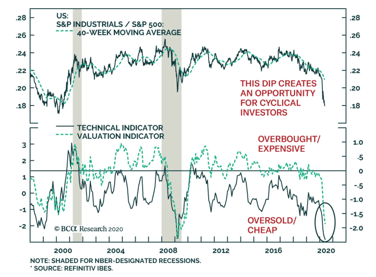
Industrials continue to lag behind the S&P 500, having underperformed by an additional 4% since the March 23rd market bottom. The sub-par performance of this sector makes sense: the global industrial production is in tatters and industrial prices are…