Sectors

The chart shows that the Fed is on track to balloon its balance sheet over $11tn in the coming year, i.e. almost trebling it, and soaring to over 50% of GDP. Beyond the Fed’s QE5 liquidity injection and skyrocketing bank credit, in response to firms tapping existing credit lines, money seems to be growing on trees. M2 money supply growth spiked to 14.8% of late, the highest rate since WWII! This breakneck pace of M2 growth translates into $2tn created versus last year. In the past two weeks alone, M2 grew by $805bn. Deposits and money market funds’ assets are surging, driving the money supply to unprecedented levels. While we have sympathy to some investors’ view that very little of this money and credit will flow to the real economy, such flush liquidity is likely to spillover from the banking system. Asset prices will be the primary beneficiaries of that flood. Bottom Line: We continue to recommend investors with a cyclical time horizon deploy capital into the market. Please refer to this Tuesday’s Weekly Report for more detail.
It Is Futile To Fight The Fed
It Is Futile To Fight The Fed
Yesterday, BCA Research's US Equity Strategy service upgraded the S&P consumer discretionary sector to overweight. The Fed really cares about household net worth (HNW) because it is a key pillar of consumer spending, which powers over 70% of the US…
Highlights Portfolio Strategy The Fed’s QE and ZIRP, the collapse in gasoline prices and extremely depressed breadth readings that are contrarily positive, all signal that it no longer pays to be bearish consumer discretionary stocks. A boost in demand for e-commerce, the high-growth profile of internet retailers along with neutral valuations and technicals, all compel us to trigger our upgrade alert and lift the S&P internet retail index to overweight. The rising gap between house price inflation and mortgage rates, the looming increase in residential investment’s contribution to GDP growth and firming industry operating metrics, all argue for an above benchmark allocation in the S&P home improvement retail index. Recent Changes Boost the S&P consumer discretionary sector to overweight today. Execute the upgrade alert and lift the S&P internet retail index to overweight today. Augment exposure to the S&P home improvement retail index to above benchmark today. Table 1
Fight Central Banks At Your Own Peril
Fight Central Banks At Your Own Peril
Feature The SPX oscillated violently last week, and a glimmer of good news on the coronavirus fight front, the Fed’s newly announced bazooka and a tick down in unemployment insurance claims all signaled that the bulls have the upper hand. We first showed the Google Trends’ worldwide searches for “coronavirus” series in our early-March Weekly Report,1 when stocks were unhinged and we were still bearish. Now, the most recent update of this indicator suggests that the recessionary lows are likely in for the SPX – this search term peaked a week prior to the overall stock market’s bottom (Google Trends shown inverted, Chart 1) – and we therefore reiterate our cyclically sanguine equity market view.2 Moreover, two weeks ago we highlighted that market internals were confirming the SPX recessionary lows.3 Not only did the SOX versus NDX and small caps versus large caps bottom in advance of the S&P 500, but also transports along with the Value Line Geometric and Arithmetic Indexes relative ratios all led the broad market’s trough.4 Chart 1Joined At The Hip
Joined At The Hip
Joined At The Hip
Chart 2Dr. Copper...
Fight Central Banks At Your Own Peril
Fight Central Banks At Your Own Peril
Importantly, Dr. Copper is also sending a bullish signal for the broad equity market. Economically sensitive copper tends to trough prior to the SPX especially in recessions. Copper collapsed below $2/lb recently leading the SPX by a few days (Chart 2). Similarly, in the recent late-2015/early-2016 manufacturing recession, the 2007/09 and 2001 recessions, copper sniffed out the bottom before the overall equity market troughed (Chart 3). Turning over to the macro backdrop, keep in mind that the Fed first cut rates this year on March 3, 2020, a mere nine trading days following the SPX peak when it fell just below the 10% correction mark. Then, on Sunday March 15, 2020 the Fed cut rates to zero, as the SPX had fallen another 10% into a bear market. Chart 3...Tends To Lead
...Tends To Lead
...Tends To Lead
Just to put these moves into perspective, the last time the SPX fell roughly 20% from its peak was on Christmas Eve 2018, and it took the Fed seven months to cut interest rates. While a retest of the 2174 ES futures lows is possible, we would rather not fight the Fed. Instead, we continue to recommend investors deploy cyclically oriented capital in the broad equity market with a 9-12 month time horizon. Chart 4 shows that the Fed is on track to balloon its balance sheet over $11tn in the coming year, i.e. almost trebling it, and soaring to over 50% of GDP. Chart 4Follow The…
Follow The…
Follow The…
Beyond the Fed’s QE5 liquidity injection and skyrocketing bank credit, in response to firms tapping existing credit lines, money seems to be growing on trees. M2 money supply growth spiked to 14.8% of late, the highest rate since WWII! This breakneck pace of M2 growth translates into $2tn created versus last year. In the past two weeks alone, M2 grew by $805bn. Deposits and money market funds’ assets are surging, driving the money supply to unprecedented levels. While we have sympathy to some investors’ view that very little of this money and credit will flow to the real economy, such flush liquidity is likely to spillover from the banking system. Asset prices will be the primary beneficiaries of that flood, albeit with a slight lag (Chart 5). Chart 5…Money Trail
…Money Trail
…Money Trail
Meanwhile, we have heeded our research of how to prepare a portfolio from the SPX peak to the recessionary trough highlighted in the Special Report penned in May 2018, and we have been overweight health care and consumer staples (please refer to Table 5 in that Special Report).5 We are now building on the research from that report. Table 2 shows the (unweighted) average relative sector performance six, twelve and eighteen months out from the SPX recessionary troughs, using market cycles since the 1960s. Table 2Sector Winners From Recessionary Recoveries
Fight Central Banks At Your Own Peril
Fight Central Banks At Your Own Peril
Early cyclicals financials and consumer discretionary along with tech are clear winners in all three periods we analyzed. This empirical evidence confirms the theoretical backdrop that early cyclicals are the first to sniff out a recovery during a recession. At the opposite end of the spectrum, defensive utilities, consumer staples and telecom services fare poorly in the three time frames we examined. Impressively, health care (we are overweight), which is the defensive sector with the largest market cap weight, manages to eke out modest relative gains. Charts 6 & 7 depict these time series profiles for the ten GICS1 sectors (we use telecom services instead of communication services due to lack of historical data). Chart 6Early Cyclicals Rise To The Occasion...
Early Cyclicals Rise To The Occasion...
Early Cyclicals Rise To The Occasion...
Chart 7...But Defensives Lag
...But Defensives Lag
...But Defensives Lag
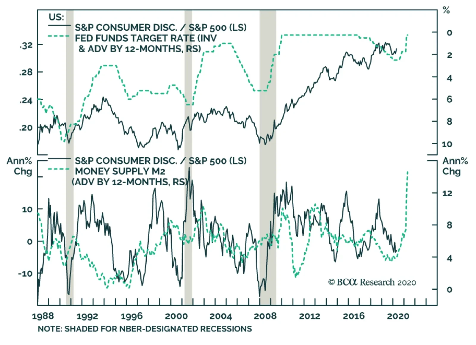
We are already overweight financials, hence, this week we heed this empirical evidence and are upgrading the S&P consumer discretionary sector to overweight via executing the upgrade alert on the S&P internet retail index and also via augmenting the S&P home improvement retail (HIR) index to an above benchmark allocation. Boost Consumer Discretionary To Overweight… While we may be a bit early, we recommend investors augment exposure to the S&P consumer discretionary index to overweight, today. The Fed really cares about household net worth (HNW). It is a key pillar of consumer spending, which powers over 70% of the US economy. Greenspan in the late 1990s eloquently described this relationship between HNW and the economy. In Q1/2020 HNW will take a beating, but the Fed is making sure it recovers in Q2, and is doing everything in its power to keep the stock and residential real estate markets afloat (roughly 50% of HNW). Granted employment and income are also currently of paramount importance, and the Main Street Fed programs along with the massive fiscal easing package should partially cushion the blow from the looming surge in the unemployment rate. We are therefore comfortable with lifting consumer discretionary to an above benchmark allocation. Chart 8 highlights the inverse correlation between consumer discretionary relative performance and the fed funds rate dating back to the 1980s. Now that the Fed has returned to ZIRP and is on track to expand its balance sheet to over $11tn, the risk/reward tradeoff favors consumer discretionary stocks. Keep in mind household balance sheets have been repaired since the Great Recession with both debt/income and debt/GDP ratios plumbing multi-year lows as the GFC hit the consumer (and financial sector) hardest (bottom panel, Chart 8). Chart 8Buy Consumer Discretionary Stocks
Buy Consumer Discretionary Stocks
Buy Consumer Discretionary Stocks
Our consumer drag indicator comprising interest rates and oil prices also signals that the path of least resistance for this early cyclical sector is higher (Chart 9). Not only will consumers eventually take advantage of ultra-low interest rates to buy big ticket items on credit, but also a wave of mortgage refinancing at lower rates translates into more cash in consumers’ wallets. Keep in mind that $20/bbl oil also saves US consumers money as retail gas at the pump has now plunged to $1.8/gallon from a recent high of $2.8/gallon. If we are correct and the US economy avoids a Great Depression/Recession, then the swift economic collapse will likely prove transitory as the authorities will have to slowly reopen the economy in early May, and the US consumer will come roaring back in the back half of the year. Finally, sentiment is bombed out toward consumer discretionary equities. Earnings breadth is as bad as it gets, technicals are washed out and a lot of damage has already been done to these interest rate-hypersensitive stocks (Chart 10). True, valuations are a bit extended, but were our thesis to pan out, these early cyclical stocks will grow into their expensive valuations. Chart 9Tailwinds
Tailwinds
Tailwinds
Netting it all out, the Fed’s QE and ZIRP, the collapse in gasoline prices and extremely depressed breadth readings that are contrarily positive, all signal that it no longer pays to be bearish consumer discretionary stocks. Chart 10As Bad As It Gets
As Bad As It Gets
As Bad As It Gets
Bottom Line: Boost the S&P consumer discretionary sector to overweight today from previously underweight, for a modest loss of 1.4% since inception. …Via Executing The Upgrade Alert On Internet Retail To Overweight… E-commerce has been garnering a rising market share of total retail sales uninterruptedly for over two decades. In fact, this juggernaut accelerates during recessions not only because overall retail sales level off, but also internet sales prove resilient during downturns. We are thus compelled to boost the bellwether S&P internet retail index to overweight by executing our upgrade alert to take advantage of the ongoing explosion of internet sales in the face of the coronavirus pandemic (Chart 11). AMZN dominates the internet retail space and by extension the broad consumer discretionary index, especially ever since the media complex migrated to the newly formed S&P communications services index in October 2018. Therefore, as AMZN goes so goes the rest of the consumer discretionary sector. Chart 11Market Share Gains As Far As The Eye Can See
Market Share Gains As Far As The Eye Can See
Market Share Gains As Far As The Eye Can See
AMZN is a retail category killer and the “amazonification” of the economy is not something new as evidenced by the shopping mall evisceration and the dampening of retail sales price inflation. Nearly every segment AMZN has entered it has dominated. The Whole Foods acquisition has also positioned this internet retail behemoth to benefit from an online push for groceries. All of these forces were ongoing prior to the current recession. Now we deem they will accelerate and disproportionately benefit internet retailers at the expense of bricks and mortar retailers: the howling out of the latter is best evidenced by the recent double demotion of Macy’s from the big leagues to the S&P 600 small cap index. Related to the inevitable rise in demand for e-commerce owing to social distancing, growth is a highly sought after attribute that this index enjoys. Time and again we have stressed that when growth is scarce investors flock to industries that exemplify growth (Chart 12). AMZN’s cloud business, AWS, represents another aspect of significant growth, that will remain on an exponential trajectory as more and more businesses move to the SaaS model catalyzed by the current recession. While at first sight this index appears expensive, versus its own history it has worked off previously extreme valuation readings. In more detail, our relative Valuation Indicator has fallen from three standard deviations above the mean back to the historical average. Similarly, despite the recent run-up in prices, relative technicals are only back up to the neutral zone (Chart 13). Chart 12Seek Out Growth…
Seek Out Growth…
Seek Out Growth…
Chart 13...At A Reasonable Price
...At A Reasonable Price
...At A Reasonable Price
Adding it all up, a boost in demand for e-commerce, the high-growth profile of internet retailers along with neutral valuations and technicals, all compel us to trigger our upgrade alert and lift the S&P internet retail index to overweight. Bottom Line: Execute the upgrade alert and boost the S&P internet retail index to overweight, today. The ticker symbols for the stocks in this index are: BLBG: S5INRE - AMZN, BKNG, EBAY, EXPE. …And Upgrading Home Improvement Retailers To Overweight Home improvement retailers (HIR) were the first consumer discretionary stocks to sniff out the end of the Great Recession, troughing even prior to the China-sensitive materials and industrials equities (Chart 14). As such we believe these economically hyper-sensitive stocks will once again showcase their early cyclical status, and we recommend augmenting exposure to above benchmark. ZIRP along with the rising gap between house price inflation and mortgage refinancing rates are a tonic for home improvement retailers (fed funds rate shown inverted, Chart 14). While the residential real estate market will remain in the doldrums for a few months (we recently monetized impressive gains in our underweight stance in the S&P homebuilding index and lifted to neutral), mortgage holders that retain their jobs will be quick to benefit from lower refinancing rates, and boost their savings. Some of these savings will likely flow into home improvement activities courtesy of the recent quarantine rules. One big assumption is that these retailers remain open during the coronavirus induced lockdown. Chart 14Overweight Home Improvement Retailers…
Overweight Home Improvement Retailers…
Overweight Home Improvement Retailers…
If our thesis pans out, then given the looming drubbing in Q2 GDP, residential investment/GDP should jump and provide a relative boost to the S&P HIR index (second panel, Chart 15). None of this positive news is priced in relative forward sales or profits that are flirting with the zero line (third panel, Chart 15). Importantly, relative valuations have dropped below par and are 30% below the historical mean, offering a compelling entry point for fresh capital with a 12-18 month time horizon (bottom panel, Chart 15). Turning over to industry operating metrics, there is a budding recovery in a number of the indicators we track. Chart 15...As A Play On A Relative Rise In Fixed Residential Investment
...As A Play On A Relative Rise In Fixed Residential Investment
...As A Play On A Relative Rise In Fixed Residential Investment
Chart 16Firming Operating Metrics
Firming Operating Metrics
Firming Operating Metrics
While it is not very visible in Chart 16, lumber prices have bounced from $275/tbf to over $338/tbf of late, signaling gains for industry relative profits. As a reminder, HIR make a set margin on lumber sales, thus earnings tend to move with the ebb and flow of lumber prices. Moreover, the Fed is resolute to keep the residential real estate market afloat, as we aforementioned, owing to the HNW effect and all these new and old Fed QE policies should underpin the US residential market and by extension lumber prices (Chart 16). Meanwhile, the HIR price deflator has made an effort to exit deflation recently and should also contribute to the sector’s profitability in the coming quarters (Chart 16). Tack on the V-shaped recovery in the HIR sales-to-inventories ratio, albeit from depressed levels, and factors are falling into place for an earnings-led rebound in relative share prices (Chart 16). In sum, the Fed’s ZIRP and QE5, the rising gap between house price inflation and mortgage rates, the looming increase in residential investment’s contribution to GDP growth and firming industry operating metrics, all argue for an above benchmark allocation in the S&P home improvement retail index. Bottom Line: Lift the S&P HIR index to overweight, today. The ticker symbols for the stocks in this index are: BLBG: S5HOMI – HD, LOW. Anastasios Avgeriou US Equity Strategist anastasios@bcaresearch.com Footnotes 1 Please see BCA US Equity Strategy Weekly Report, “From "Stairway To Heaven" To "Highway To Hell"?” dated March 2, 2020, available at uses.bcaresearch.com. 2 Please see BCA US Equity Strategy Weekly Report, ““The Darkest Hour Is Just Before The Dawn”” dated March 23, 2020, available at uses.bcaresearch.com. 3 Please see BCA US Equity Strategy Weekly Report, “What Is Priced In?” dated March 30, 2020, available at uses.bcaresearch.com. 4 Please see BCA US Equity Strategy Daily Report, “Watch The Value Line Geometric Index” dated April 1, 2020, available at uses.bcaresearch.com. 5 Please see BCA US Equity Strategy Special Report, “Portfolio Positioning For A Late Cycle Surge” dated May 22, 2018, available at uses.bcaresearch.com. Current Recommendations Current Trades Strategic (10-Year) Trade Recommendations
Fight Central Banks At Your Own Peril
Fight Central Banks At Your Own Peril
Size And Style Views June 3, 2019 Stay neutral cyclicals over defensives (downgrade alert) January 22, 2018 Favor value over growth May 10, 2018 Favor large over small caps (Stop 10%) June 11, 2018 Long the BCA Millennial basket The ticker symbols are: (AAPL, AMZN, UBER, HD, LEN, MSFT, NFLX, SPOT, TSLA, V).
Highlights The Fed has been awfully busy since the middle of March, … : Over the last 30 days, the Fed has unleashed a barrage of measures to support market liquidity and alleviate economic hardship. … unveiling a package of facilities to keep credit flowing to consumers, businesses and municipalities, … : The Fed is building a sizable firewall against market seizure, touching on commercial paper, money market funds, asset-backed securities, small business loans, municipal notes, investment-grade corporate bonds and ETFs and high-yield corporate ETFs. … and loosening regulatory strictures to encourage banks to put their capital buffers to work: The Fed and other major bank regulators have eased some of the post-2008 rules to encourage banks to ramp up market-making activity and increase lending to cushion the shock to the economy. Investors should buy what the Fed is buying: Fixed income investors should look to capture excess spreads in markets that have not yet priced in the full effect of the Fed’s indemnity. Banks and agency mortgage REITs offer a way to implement this theme in equities. Feature What A Difference A Pandemic Makes “Whatever it takes” is clearly the order of the day for Jay Powell and company, as well as Congress and the White House, to mitigate the potentially pernicious second-round economic damage from COVID-19. In this Special Report, we detail the Fed’s key initiatives. Central banks are neither omniscient nor omnipotent, and they cannot stave off all of the pressure from mass quarantines, but we do expect the Fed’s measures will cushion the economic blow, and reflate prices in targeted asset markets. The Fed began pulling out all the stops to fight the virus on Sunday, March 15th with what have now become stock emergency responses: zero rates and purchases of Treasuries and agency mortgage-backed securities (MBS). Although the MBS purchases began the week of March 23rd, and have continued at a steady clip despite appearing to have swiftly surpassed their $200 billion target, they have not yet achieved much traction in the mortgage market. The spread between the current coupon agency MBS and the 10-year Treasury yield has come down a bit, but the average 30-year fixed-rate home mortgage rate does not reflect the 150 basis points ("bps") of rate cuts since the beginning of March (Chart 1). The Fed’s measures are intended to help direct the flow of credit to adversely affected constituencies with a pressing need for it. Other measures to relieve liquidity pressures, like the Fed’s ongoing overnight repo operations, have achieved their aim. The signal indicator of liquidity strains, the effective fed funds rate, was bumping up against the top of the Fed’s target range for several days after the return to zero interest rate policy. Over the last week, however, it has settled around 5 bps, near the bottom of its range (Chart 2), suggesting that the formerly tight overnight funding market is now amply supplied. Chart 1MBS Purchases Haven't Helped Main Street Yet
MBS Purchases Haven't Helped Main Street Yet
MBS Purchases Haven't Helped Main Street Yet
Chart 2Overnight Funding Stresses ##br##Have Eased
Overnight Funding Stresses Have Eased
Overnight Funding Stresses Have Eased
The rest of the Fed’s measures (Table 1) have been more finely targeted, intended to help direct the flow of credit to adversely affected constituencies with a pressing need for it. We focus on the most important measures in the following section and summarize their common elements in Table 2. The following discussions of the individual programs highlight their intent, their chances of success, and yardsticks for tracking their progress. We conclude with the fixed income and equity niches that are most likely to benefit from the Fed’s efforts. Table 1A Frenzied Month Of Activity
Alphabet Soup: A Summary Of The Fed's Anti-Virus Measures
Alphabet Soup: A Summary Of The Fed's Anti-Virus Measures
Table 2The 2020 Federal Reserve Emergency Programs
Alphabet Soup: A Summary Of The Fed's Anti-Virus Measures
Alphabet Soup: A Summary Of The Fed's Anti-Virus Measures
A Field Guide To The Acronym Jungle Money Market Mutual Fund Liquidity Facility (MMLF) Under the MMLF, which started on March 23rd, US banks can borrow from the Fed to purchase eligible assets mainly from prime money market funds. These assets are in turn pledged to the Fed as collateral, effectively allowing the Fed to lend to prime money market funds via banks. Assets eligible for purchase from these funds include: US Treasuries & fully guaranteed agencies Securities issued by US GSEs Asset-backed commercial paper (ABCP) rated A1 or its equivalent, issued by a US issuer US municipal short-term debt (excluding variable rate demand notes) Backed by $10 billion of credit protection from the Treasury, the Fed will lend at the primary credit rate (the discount rate, currently 0.25%) for pledged asset purchases of US Treasuries, fully guaranteed agencies or securities issued by US GSEs. For any other assets pledged, the Fed will charge an additional 100 bps – with the exception of US municipal short-term debt to which the Fed only applies a 25-bps surcharge. Chart 3The MMLF Already Providing Some Relief
The MMLF Already Providing Some Relief
The MMLF Already Providing Some Relief
Loans made under the MMLF are fully non-recourse (the Fed can recover nothing more from the borrower than the pledged collateral). Banks borrowing from the Fed under the MMLF bear no credit risk and have therefore been exempted from risk-based capital and leverage requirements for any asset pledged to the MMLF, an important element that should promote MMLF participation. This facility is a direct descendant of the Asset-Backed Commercial Paper Money Market Mutual Fund Liquidity Facility (AMLF), which operated from September 2008 to February 2010 to prevent a run on prime money market funds after a prominent fund “broke the buck.” Its objective is to help prime money market funds meet redemption requests from investors and increase liquidity in the markets for the assets held by these funds – most notably commercial paper where prime money market funds represent 21% of the market. Those funds have experienced large outflows in the midst of the coronavirus pandemic and building economic crisis – erasing $140 billion, or 18%, of the fund segment’s total net assets in a matter of days (Chart 3, top panel). Since it started, the MMLF has extended $53 billion of credit to prime money funds, about a third of AMLF’s output in its first 10 days of operation. The financial sector is suffering a big shock, but it is not the source of the problem like it was in 2008, so the situation is not as dire as it was in late 2008, and we are already seeing a tentative stabilization of asset outflows from money market funds. Commercial paper spreads have also narrowed, implying that the combination of the MMLF and the CPFF (see below) is having the intended effect (Chart 3, bottom panel). Commercial Paper Funding Facility (CPFF) Starting today, April 14th, the Fed will revive 2008’s Commercial Paper Funding Facility (CPFF) with the aim of restoring liquidity to a market where investment grade corporate borrowers raise cash to finance payroll, inventories, accounts payable and other short-term liabilities. The 2020 iteration applies to municipalities as well, extending its reach across the real economy. Via a Special Purpose Vehicle (SPV) (see Box) funded with a $10 billion equity investment from the Treasury Department, the CPFF will purchase US dollar-denominated investment-grade (A1/P1/F1) three-month asset-backed, corporate and municipal commercial paper priced at the overnight index swap rate (OIS) plus 110 bps. Lower-rated issuers are not eligible, but investment-grade borrowers who were downgraded to A2/P2/F2 after March 17th, 2020 can be grandfathered into the program at a higher spread of OIS+200 bps. The pricing is tighter than it was in 2008, when unsecured investment grade and asset-backed issues were priced at OIS+100 bps and OIS+300 bps, respectively, and the Fed did not have the loss protection provided by an equity investment in the SPV. Box 1 - SPV Mechanics The Fed has set up Special Purpose Vehicles (SPV) in connection with most of the facilities we examine here. Each SPV has been seeded by the Treasury department to carry out the facility’s work. The Fed lends several multiples of the Treasury’s initial equity investment to each SPV to provide it with a total capacity of anywhere from eight to fourteen times its equity capital, based on the riskiness of the assets the SPV is purchasing or lending against. The result is that most of the cash used to operate the facilities will come from the Fed in the form of loans with full recourse to the SPVs’ assets, but the Treasury department will own the equity tranche. The Treasury therefore bears the first credit losses, should any occur. Issuers are only eligible if they have issued three-month commercial paper in the twelve months preceding the March 17th announcement of the program. The Federal Reserve did not set an explicit limit on the size of the program, but funding for any single issuer is limited to the amount of outstanding commercial paper it had during that twelve-month period. The 2020 CPFF could therefore max out above $750 billion, the peak size of the domestic commercial paper market over the past year (Chart 4). If the first CPFF’s experience is any guide, however, it’s unlikely that its full capacity will be needed. Its assets peaked at $350 billion in January 2009, around a quarter of 2008’s $1.5 trillion average outstanding balance. A similar proportion today would cap the fund at $175-200 billion. As in 2008 (Chart 5, bottom panel), the mere announcement of the program has driven commercial paper spreads significantly below their previously stressed levels (Chart 5, top panel). Chart 4Pressure On The Domestic Commercial Paper Market...
Pressure On The Domestic Commercial Paper Market...
Pressure On The Domestic Commercial Paper Market...
Chart 5...Is Being Relieved Ahead Of The CPFF Implementation
...Is Being Relieved Ahead Of The CPFF Implementation
...Is Being Relieved Ahead Of The CPFF Implementation
Term Asset-Backed Securities Loan Facility (TALF) The asset-backed securities (ABS) market funds a significant share of the credit extended to consumers and small businesses. The Fed’s TALF program that started on March 23rd aims to provide US companies holding AAA collateral with funding of up to $100 billion, in the form of 3-year non-recourse loans secured by AAA-rated ABS. It will be conducted via an SPV backed by a $10 billion equity investment from the US Treasury Department. Chart 6Narrower Spreads Promote Easier Financial Conditions At The Margin
Narrower Spreads Promote Easier Financial Conditions At The Margin
Narrower Spreads Promote Easier Financial Conditions At The Margin
Eligible collateral includes ABS with exposure to auto loans, student loans, credit card receivables, equipment loans, floorplan loans, insurance premium finance loans, SBA-guaranteed loans and leveraged loans issued after March 23rd, 2020. Last week, the Fed added agency CMBS issued before March 23rd, 2020 and left the door open to further expansion of the pool of eligible securities. The rate charged on the loans is based on the type of collateral and its weighted average life. Depending on the ABS, the spreads will range from 75 bps to 150 bps over one of four different benchmarks (LIBOR, SOFR, OIS or the upper 25-bps bound of the target fed funds range). The spreads are reasonable, and will not keep ABS holders away from the facility, but they’re not meant to be giveaways. The 2009 TALF program originally had a $200 billion capacity, which was later expanded to $1 trillion. Those numbers make the current iteration’s $100 billion limit look awfully modest, but only $71 billion worth of loans were eventually granted the first time around. ABS spreads have already narrowed significantly (Chart 6), suggesting the program is already making a difference. Although an incremental $100 billion of loans is not likely to move the needle much for the US economy, narrower spreads will promote easier financial conditions at the margin. Secondary Market Corporate Credit Facility (SMCCF) Though no firm start date has been given, the Fed will soon enter the secondary market and start purchasing corporate bonds. As with all of the other facilities discussed in this section except the MMLF, the SMCCF is set up as an SPV. It will have up to $250 billion of buying power, anchored by $25 billion of equity funding from the Treasury department. Once it’s up and running, the SMCCF will buy non-bank corporate bonds in the secondary market that meet the following criteria: Issuer rated at least BBB-/Baa3 (the lowest investment grade tier) as of March 22nd, 2020 A remaining maturity of 5 years or less Issuer is a US business with material operations, and a majority of its employees, in the US Issuer is not expected to receive direct financial assistance from the federal government The SMCCF can own a maximum of 10% of any single firm’s outstanding debt, and it may dip into the BB-rated market for securities that were downgraded from BBB after March 22nd. In addition to cash bonds, the SMCCF will also buy ETFs that track the broad corporate bond market. The Fed says that the “preponderance” of SMCCF ETF purchases will be of ETFs tracking investment grade corporate bond benchmarks (like LQD), but it will also buy some high-yield ETFs (like HYG). We expect that the SMCCF will be able to achieve its direct goal of driving down borrowing costs for otherwise healthy firms that may struggle to access credit markets in the current environment. One way to track the program’s success is to monitor investment grade corporate credit spreads (Chart 7). Spreads have been tightening aggressively since the Fed announced the program on March 23rd but are still elevated compared to average historical levels. The slope of the line of investment grade corporate bond spreads plotted by maturity will be another important metric (Chart 8). An inverted spread slope tends to coincide with a sharply rising default rate, since it signals that investors are worried about near-term default risk. By purchasing investment grade bonds with maturities of 5 years or less, the Fed hopes to maintain a positively sloped spread curve. Chart 7SMCCF Announcement Marked The Peak In Spreads
SMCCF Announcement Marked The Peak In Spreads
SMCCF Announcement Marked The Peak In Spreads
Chart 8Fed Wants A Positive ##br##Spread Slope
Fed Wants A Positive Spread Slope
Fed Wants A Positive Spread Slope
Primary Market Corporate Credit Facility (PMCCF) The PMCCF employs the same structure as the SMCCF, but it is twice as large. The Treasury’s initial equity investment will be $50 billion and Fed loans will scale its capacity up to $500 billion. As a complement to the SMCCF, the PMCCF will purchase newly issued non-bank corporate bonds. The eligibility criteria are the same as the SMCCF’s, but the PMCCF will only buy bonds with a maturity of 4 years or less. The new issuance purchased by the PMCCF can be new debt or it can be used to refinance existing debt. The only caveat is that the maximum amount of borrowing from the facility cannot exceed 130% of the issuer’s maximum debt outstanding on any day between March 22nd, 2019 and March 22nd, 2020. Essentially, eligible firms can use the facility to refinance their entire stock of debt and then top it up by another 30% if they so choose. The goals of the PMCCF are to keep the primary issuance markets open and to prevent bankruptcy for firms that were rated investment grade before the virus outbreak. Investment grade corporate bond issuance shut down completely for a stretch in early March, but then surged once the Fed announced the PMCCF and SMCCF on March 23rd. The PMCCF will have achieved lasting traction if gross corporate bond issuance holds up in the coming months (Chart 9). It should also meet its bankruptcy-prevention goal, since firms will be able to refinance their maturing obligations and tack on some new debt to get through the next few months. Given the large amount of outstanding BBB-rated debt, a lot of fallen angel supply is poised to hit the high-yield bond market. While we expect the PMCCF will succeed in achieving its primary aims, it is unlikely to prevent a large number of ratings downgrades. If a given firm only makes use of the facility to refinance its existing debt at a lower rate, then its ability to service its debt will improve at the margin and its rating should be safe. However, any firm that increases its debt load via this facility will end up with a riskier balance sheet. Ratings agencies will not look through an increased debt burden, and we expect a significant number of ratings downgrades in the coming months (Chart 10, top panel). Chart 9Primary Markets Have Re-Opened
Primary Markets Have Re-Opened
Primary Markets Have Re-Opened
Chart 10Fed Actions Won't Prevent Downgrades
Fed Actions Won't Prevent Downgrades
Fed Actions Won't Prevent Downgrades
Given the large amount of outstanding BBB-rated debt, a lot of fallen angel supply is poised to hit the high-yield bond market (Chart 10, middle and bottom panels). The Fed will try to contain the surge by allowing the SMCCF to purchase fallen angel debt, and by providing some support to the upper tiers of high-yield credits through its Main Street Lending Programs. Main Street New Loan Facility (MSNLF) and Main Street Expanded Loan Facility (MSELF) The goal of the MSNLF and MSELF is to provide relief to large firms that are not investment grade credits. Both facilities will draw from the same SPV, which will be funded by a $75 billion equity stake from the Treasury and will then be levered up to a total size of “up to $600 billion” by the Fed. The Main Street facilities are structured differently than the PMCCF and SMCCF in that the Fed will not transact directly with nonfinancial corporate issuers. Rather, the Fed will purchase 95% of the par value of eligible loans from banks (which will retain 5% of the credit risk of each loan), hoping to free up enough extra room on bank balance sheets to promote more lending. To be eligible for purchase by the Main Street New Loan Facility, loans must be issued after April 8th, 2020 and meet the following criteria: Borrowers have less than 10,000 employees or $2.5 billion of 2019 revenue Borrowers are US firms with significant operations, and a majority of employees, in the US Loans are unsecured and have a maturity of 4 years Loans are made at an adjustable rate of SOFR + 250-400 bps Principal and interest payments are deferred for one year Loan size of $1 million to the lesser of $25 million or the amount that keeps the borrower’s Debt-to-EBITDA ratio below 4.01 Loan proceeds cannot be used to refinance existing debt Borrowers must commit to “make reasonable efforts to maintain payroll and retain employees during the term of the loan” The Main Street Expanded Loan Facility applies similar criteria to existing loans that banks will upsize before transferring 95% of the incremental risk to the Fed. The MSELF allows for loans up to the lesser of $150 million, 30% of the borrower’s existing debt (including undrawn commitments) or the amount keeps the borrower’s Debt-to-EBITDA ratio below 6.0. Borrowers can participate in only one of the MSNLF, MSELF and PMCCF, though they can tap the PPP alongside one of the Main Street lending facilities. Chart 11Main Street Programs Will Spur Bank Lending
Main Street Programs Will Spur Bank Lending
Main Street Programs Will Spur Bank Lending
The Main Street facilities endeavor to have banks adopt an “originate to distribute” model. With the Fed assuming 95% of each loan’s credit risk, banks will have nearly unlimited balance sheet capacity to continue originating these sorts of loans. Retaining 5% of each loan ensures that the banks will have enough skin in the game to perform proper due diligence. We expect to see a significant increase in commercial bank C&I loan growth in the coming months once these facilities are up to speed (Chart 11). Crucially for high-yield investors, the debt-to-EBITDA constraints ensure that the Main Street facilities will aid BB- and some B-rated issuers but will not bail out high-default-risk issuers rated CCC and below. BB-rated firms typically have debt-to-EBITDA ratios between 3 and 4, while B-rated issuers typically fall in a range of 4 to 6. For the most part, BB-rated firms will be able to make use of either the MSNLF or MSELF, while B-rated firms will be limited to the MSELF. By leaving out issuers rated CCC & below, the Fed is acquiescing to a significant spike in corporate defaults over the next 12 months. The bulk of corporate defaults come from firms that were rated CCC or below 12 months prior (Chart 12). Chart 12A Significant Increase In Corporate Defaults Is Coming
A Significant Increase In Corporate Defaults Is Coming
A Significant Increase In Corporate Defaults Is Coming
As with the PMCCF, we note that the Main Street facilities offer loans, not grants. While they will address firms’ immediate liquidity issues, they will do so at the cost of more indebted balance sheets. Downgrade risk remains high for BB- and B-rated companies. Paycheck Protection Program Liquidity Facility (PPPLF) The Paycheck Protection Program (PPP) is a component of the CARES Act that was designed to forestall layoffs by small businesses. PPP loans are fully guaranteed by the Small Business Association (SBA), which will forgive them if the borrower maintains its employee headcount for eight weeks. The size of the PPPLF has yet to be announced, along with the details of its funding, but its intent is to get PPP loans off of issuers’ balance sheets so as to free up their capital and allow them to make more loans, expanding the PPP’s reach. The Fed will lend on a non-recourse basis at a rate of 0.35% to any depository institution making PPP loans,2 taking PPP loans as collateral at their full face value. PPP loans placed with the Fed are exempt from both risk-weighted and leverage-based capital adequacy measures (please see “Easing Up On The Regulatory Reins,” below). PPP is meant to be no less than a lifeline for households and small businesses, but the devil is in the details. Banks were reportedly overwhelmed with demand for PPP loans over the first five business days that they were available, suggesting that many small businesses still qualify, despite 17 million initial unemployment claims over the last three weeks. Media reports about the program highlighted that there are quite a few kinks yet to be worked out, and it has arrived too late to stave off the first waves of layoffs. Success may be most easily measured by the size of the PPPLF, which should eventually translate into fewer layoffs and bankruptcies than would otherwise have occurred. Municipal Liquidity Facility (MLF) Chart 13State & Local Governments Need Support
State & Local Governments Need Support
State & Local Governments Need Support
The Municipal Liquidity Facility is similar in structure to the PMCCF, only it is designed to support state and local governments. The MLF SPV will be funded by a $35 billion equity investment from the Treasury, and the Fed will lever it up to a maximum size of $500 billion to purchase newly issued securities directly from state and local governments that meet the following criteria: All states (including D.C.) are eligible, as are cities with populations above 1 million and counties with populations above 2 million. The newly issued notes will have a maximum maturity of 2 years. The MLF can buy new issuance from any one state, city or county up to an amount equal to 20% of that borrower’s fiscal year 2017 general revenue. States can request a higher limit to procure funds for political subdivisions or instrumentalities that aren’t eligible themselves for the MLF. The MLF’s goal is to keep state and local governments liquid as they deal with the COVID-19 pandemic. The large size of the facility – $500 billion is five times 2019’s aggregate muni issuance – should allow it to meet its goal. However, as with the Fed’s other facilities, the support comes in the form of loans, not grants. The lost tax revenue and increased pandemic expenditures cannot be recovered. State and local government balance sheets will emerge from the recession weaker. We can track the program’s success by looking at the spread between municipal bond yields and comparable US Treasury yields. These spreads widened to all-time highs in March, but have since come in significantly, even for longer maturities (Chart 13). If this tightening does not continue, the Fed may eventually enter the secondary market to purchase long-maturity municipal bonds. Supporting such a fragmented market will be tricky, and the Fed may be hoping that more aid will come from Capitol Hill. Central Bank Liquidity Swaps Chart 14US Dollar Debt Is A Global Problem
US Dollar Debt Is A Global Problem
US Dollar Debt Is A Global Problem
The global economy is loaded with USD-denominated debt issued by entities outside of the US. As of 3Q19, there was roughly $12 trillion of outstanding foreign-issued US dollar debt, exceeding the domestic nonfinancial corporate sector’s total issuance (Chart 14). As the sole provider of US dollars, the Fed has a role to play in supporting foreign dollar-debt issuers during this tumultuous period. Currency swap lines linking the Fed with other central banks can help alleviate the pressure on foreign borrowers to access the US dollars they need to service their debt. For example, once the Fed exchanges dollars for euros using its swap line with the European Central Bank (ECB), the ECB can then direct those US dollars toward USD-denominated borrowers within the Euro Area. Widening cross-currency basis swap spreads are a tried-and-true signal that US dollars are becoming too scarce. The Fed responded to widening basis swap spreads by instituting swap lines during the financial crisis and again during the Eurozone debt crisis of 2011. In both instances, the swap lines eventually calmed the market and basis swap spreads moved back toward zero (Chart 15). Chart 15The Cost Of US Dollars
The Cost Of US Dollars
The Cost Of US Dollars
Since 2013, the Fed has maintained unlimited swap lines with the central banks of the Euro Area, Canada, UK, Japan and Switzerland. On March 19th, it extended limited swap lines to the central banks of Australia, Brazil, Denmark, Korea, Mexico, Norway, New Zealand, Singapore and Sweden. These swap lines will help ease stresses for some foreign issuers of US dollar debt, but not all. One potential problem is that the foreign central banks that acquire dollars via the swap lines may be unwilling or unable to direct those dollars to debtors in their countries. Another problem is that several emerging markets (EM) countries do not have access to the Fed’s swap facility. EM issuers account for roughly one-third of foreign-issued dollar debt (Chart 14, bottom panel). For example, the governments of the Philippines, Colombia, Indonesia and Turkey all carry large US dollar debt balances, not to mention US dollar debt issued by the EM corporate sector in non-swap line countries. Currency swap lines linking the Fed with other central banks can help alleviate the pressure on foreign borrowers to access the US dollars they need to service their debt. The swap lines that are already in place have led to basis swap spread tightening in developed markets. If global growth eventually rebounds and the dollar weakens, EM dollar-debt burdens will become easier to service. However, until that happens, a default by some foreign issuer of US dollar debt remains a non-trivial tail risk. The Fed may need to extend swap lines to more countries to mitigate this risk in the months ahead. Easing Up On The Regulatory Reins As we’ve argued in US Investment Strategy Special Reports the last two weeks, the largest US banks are extremely well capitalized.3 The Fed agrees, and over the last 30 days, it has issued six separate statements encouraging the banks to lend or to work with struggling borrowers, all but one of them in concert with its fellow banking regulators. Although the largest banks have amassed sizable capital cushions that would support increased lending, post-GFC regulations often crimp incentives to deploy them. Over the last 30 days, the Fed and the other federal regulators have granted banks relief from the key binding constraints. Those constraints fall into two broad categories: risk-based requirements, which are based on risk weightings assigned to individual assets, and leverage requirements, which are based on total assets or total leverage exposure. All banks are required to maintain minimum ratios of equity capital to risk-weighted assets under the former and to total leverage, which includes some off-balance-sheet exposures, under the latter. The three federal banking regulators have amended rules to exclude MMLF and PPP exposures from the regulatory capital denominator used to calculate risk-weighted and leverage ratios. The Fed also made a similar move by excluding Treasury securities and deposits held at the Fed from the denominator of the supplementary leverage ratio large banks must maintain (3% for banks with greater than $250 billion in assets, 5% for SIFIs). Reducing the denominators increases the banks’ ratios and expands their lending capacity. Community banks’ capital adequacy is determined by their leverage ratio (equity to total assets), and regulators have temporarily cut it to 8% from 9%. We expect that easing capital constraints will spur the banks to lend more in the coming weeks and months, but it’s not a sure thing. A clear lesson from the Bernanke Fed’s three rounds of quantitative easing is that the Fed can lead banks to water, but it can’t make them drink. A considerable amount of the funds the Fed deployed to buy Treasury and agency securities was simply squirreled away by banks, and wound up being neither lent nor spent. Lending is not the Fed’s sole focus, though: it hopes that easing capital regulations will also encourage banks and broker-dealers to ramp up their market-making activity, improving capital market liquidity across a range of instruments. Investment Implications While all of the programs discussed above have expiration dates, they can be extended if necessary. Flexible end dates illustrate the open-ended nature of the Fed’s (and Congress’) support, and help underpin our contention that more aid will be forthcoming at the drop of a hat. Confronting the most severe recession in 90 years and an especially competitive election, policymakers can be counted upon to err to the side of providing too much stimulus. That is not to say, however, that the measures amount to a justification for loading up on all risk assets. Every space will not be helped equally. Spreads for all corporate credit tiers are cheap compared to history, but only BB-rated and higher benefit from the Fed’s programs. Within US fixed income, investors should look for opportunities in sectors that offer attractive spreads and directly benefit from Fed support. In the corporate bond market this means owning securities rated BB or higher and avoiding debt rated B and below. Spreads for all corporate credit tiers are cheap compared to history (Charts 16A & 16B), but only BB-rated and higher benefit from the Fed’s programs. Some B-rated issuers will be able to access the MSELF, but Fed support for the B-rated credit tier is limited. Fed support is non-existent for securities rated CCC or lower. Chart 16AInvestment Grade Valuation
Investment Grade Valuation
Investment Grade Valuation
Chart 16BHigh-Yield Valuation
High-Yield Valuation
High-Yield Valuation
Elsewhere, several traditionally low-risk spread sectors also meet our criteria of offering attractive spreads and benefitting from Fed support. AAA-rated Consumer ABS spreads are wide and will benefit from TALF. Agency CMBS spreads are also attractive and those securities are being directly purchased by the Fed (Chart 17). We also like the opportunity in Agency bonds (the debt of Fannie Mae and Freddie Mac) and Supranationals, where spreads are currently well above historical levels (Chart 17, third panel). Chart 17Opportunities In Low-Risk Spread Product
Opportunities In Low-Risk Spread Product
Opportunities In Low-Risk Spread Product
Chart 18Not Enough Value In Agency MBS
Not Enough Value In Agency MBS
Not Enough Value In Agency MBS
Agency MBS are less appealing. Spreads have already tightened back to pre-COVID levels and while continued Fed buying should keep them low, returns will be much better in the investment grade corporate space (Chart 18). Meanwhile, we would also advocate long positions in municipal bonds. Spreads are wide and the Fed is now providing support out to the 2-year maturity point (see Chart 13). We also see potential for the Fed to start purchasing longer-maturity municipal debt if spreads don’t tighten quickly enough. Chart 19Look For Attractive Spreads In Countries With Swap Lines
Look For Attractive Spreads In Countries With Swap Lines
Look For Attractive Spreads In Countries With Swap Lines
Finally, we would also consider the USD-denominated sovereign debt of countries to which the Fed has extended swap lines, with Mexico offering a prime example. Its USD-denominated debt offers an attractive spread and it has been extended a swap line (Chart 19). In equities, agency mortgage REITs – monoline lenders that manage MBS portfolios 8-10 times the size of their equity capital – are a levered play on buying what the Fed’s buying. They were beaten up quite badly throughout March, and have been de-rated enough to deliver double-digit total returns as long as the repo market doesn’t flare up again, and agency MBS spreads do not widen anew. We see large banks as a direct beneficiary of policymakers’ efforts to limit credit distress and expect that their loan losses could ultimately be less than markets fear. While lenders have an incentive to be the first to push secured borrowers into default in a normal recession to ensure they’re first in line to liquidate collateral, they now have an incentive to keep borrowers from defaulting lest they end up having to carry the millstone of seized collateral on their balance sheets for an indefinite period. Regulatory forbearance may end up being every bit as helpful for bank book values as the ability to move securities into the Fed’s non-recourse facilities. Footnotes 1 This calculation uses 2019 EBITDA and includes undrawn loan commitments in total debt. 2 The Fed plans to expand the program to include non-bank SBA-approved lenders in the near future. 3 Please see the US Investment Strategy Special Reports, “How Vulnerable Are US Banks? Part 1: A 50-Year Bottom-Up Case Study,” and “How Vulnerable Are US Banks? Part 2: It’s Complicated,” published March 30 and April 6, 2020, respectively, available at usis.bcaresearch.com. Doug Peta, CFA Chief US Investment Strategist dougp@bcaresearch.com Ryan Swift US Bond Strategist rswift@bcaresearch.com Jennifer Lacombe Associate Editor jenniferl@bcaresearch.com Jeremie Peloso Senior Analyst jeremiep@bcaresearch.com
Highlights US Corporates: The Fed continues to expand the reach of its extraordinary monetary policies designed to combat the COVID-19 recession, now giving itself the ability to hold BB-rated US high-yield bonds within its corporate bond buying programs. Raise allocations to US BB-rated corporates to overweight, within a neutral overall strategic (6-12 months) allocation to US high-yield. Euro Area Corporates: European investment grade corporate debt has seen significant spread widening over the past month, but spreads have stabilized with the ECB introducing a new asset purchase program with fewer restrictions. Upgrade euro area investment grade corporates to neutral from underweight on both a tactical (0-6 months) and strategic (6-12 months) basis. Favor debt from beaten-up sectors that are already priced for severe economic weakness like Energy, Transportation and non-bank Financials. Central Banks Are A Corporate Bond Investor’s Best Friend Right Now Chart of the WeekThe Fed & ECB Are Supporting Bond Markets
The Fed & ECB Are Supporting Bond Markets
The Fed & ECB Are Supporting Bond Markets
The actions of policymakers worldwide to help mitigate the severe economic shock from the COVID-19 recession have helped boost global risk assets over the past couple of weeks. This is particularly notable in US corporate bond markets, where credit spreads have tightened for both shorter-maturity investment grade bonds and Ba-rated high-yield (Chart of the Week). It is not a coincidence that those are the parts of the US corporate bond market that the Fed is now explicitly backstopping through its off-balance-sheet investment programs. Last week, the Fed unveiled yet another “bazooka” to help ease US financial conditions, broadening the scope of its previously investment grade-only corporate bond purchase programs to include Ba-rated high-yield corporate bonds and high-yield ETFs. In Europe, meanwhile, the European Central Bank (ECB) is also providing additional monetary support through increased asset purchases of both government and corporate debt. Those purchases are focused more on the weakest links in the euro area financial and economic chain like Italian sovereign bonds. This has helped to stabilize credit spreads for both Italian government bonds and euro area investment grade corporate debt. This support from policymakers is critical to prevent a further tightening of financial conditions during a severe global recession (Chart 2). The excess return (over government bonds) for the Bloomberg Barclays global high-yield bond index is now down 15% on a year-over-year basis. High-yield corporate bond spreads are well above the lows seen earlier this year on both sides of the Atlantic, across all credit quality tiers. In the US, spreads between credit quality tiers had widened to levels not seen in several years. Within the US investment grade universe, the gap between Baa-rated and Aa-rated spreads had widened from 20bps to 60bps (Chart 3), a level last seen in September 2011, but now sits at 39bps. Chart 2Junk Bonds Already Discount A Big Recession
Junk Bonds Already Discount A Big Recession
Junk Bonds Already Discount A Big Recession
Chart 3The Fed Wants These Spreads To Tighten
The Fed Wants These Spreads To Tighten
The Fed Wants These Spreads To Tighten
Looking in the other direction of the credit quality spectrum, the spread between Baa-rated and Ba-rated corporates – the line of demarcation between investment grade and high-yield bonds – had blown out from 132bps in February to 556bps, but is now at 360bps. This is the market pricing in the growing risk of fallen angels being downgraded from investment grade to junk. In our view, the Ba-Baa spread is the best indicator to follow to see if the Fed’s extension of its bond purchase program to high-yield is working to reduce borrowing costs for lower-rated US companies. Both in the US and Europe, we continue to recommend a credit investment strategy that favors the parts of the markets that the Fed and ECB are most directly involved in now. That means staying overweight US investment grade corporate bonds with maturities of less than five years (the Fed’s maturity limit for its bond buying program). It also means staying overweight Italian government debt versus core European equivalents. The Fed’s new extension into high-yield corporates within its buying programs means we need to upgrade our recommendation on US BB-rated high-yield to overweight within our recommended neutral strategic (6-12 months) allocation to US junk bonds. We are making that change on a tactical basis in our model bond portfolio, as well, as can be seen on pages 14-15. As the title of this Weekly Report suggests, buy what the central banks are buying. The Fed’s new extension into high-yield corporates within its buying programs means we need to upgrade our recommendation on US BB-rated high-yield to overweight within our recommended neutral strategic (6-12 months) allocation to US junk bonds. In Europe, there is now scope to also raise allocations to euro area corporate bonds, as well, as we discuss over the remainder of this report. Bottom Line: The Fed continues to expand the reach of its extraordinary monetary policies designed to combat the COVID-19 recession, now giving itself the ability to hold BB-rated US high-yield bonds within its corporate bond buying programs. Raise allocations to US BB-rated corporates to overweight within a neutral overall strategic (6-12 months) allocation to US high-yield. Looking For Value In Euro Area Investment Grade Bonds The outlook for euro area spread product does not have as clean-cut a story as is the case for US credit. The ECB is not explicitly supporting European corporate credit markets to the same degree as the Fed is with its open-ended off-balance sheet investment vehicles. While the ECB has introduced a new large €750bn asset purchase program, the Pandemic Emergency Purchase Program (PEPP), to help ease financial conditions in the euro area, no specific details have yet been provided specifying how much of the PEPP will go towards corporate debt versus sovereign bonds. The ECB has already loosened the country and issuer limit restrictions it has imposed on its existing Asset Purchase Program (APP), however, which means that the central bank will be very flexible with the PEPP purchases. That means helping reduce sovereign risk premiums in Peripheral Europe by buying greater amounts of Italian, Spanish and even Greek government debt. That also likely means buying more corporate debt in the most stressed sectors of the euro area economy, as needed. Greater ECB bond purchases would make euro area investment grade credit – which has seen some value restored after the recent bout of spread widening - more attractive over both tactical and strategic investment horizons. This is true even with much of the euro area now in a deep recession because of COVID-19 lockdowns, which has already been discounted in the poor investment performance of euro area corporates. Greater ECB bond purchases would make euro area investment grade credit – which has seen some value restored after the recent bout of spread widening - more attractive over both tactical and strategic investment horizons. Year-to-date, euro area corporate credit markets have been hit hard by the global credit selloff (Table 1). In total return terms denominated in euros, the Bloomberg Barclays euro area investment grade corporate bond index is down -5.0% so far in 2020. The numbers are slightly better relative to duration-matched euro area government bonds (the pure credit component), with the index excess return down -5.5% year-to-date. At the broad sector level, the laggards so far in 2020 have been the sectors most exposed to the sharp downturn in European (and global) economic growth. In excess return terms, the worst performing sectors year-to-date within the eleven major groupings shown in Table 1 have been Consumer Cyclicals (-8.5%), Transportation (-8.1%), Energy (-7.2%). The best performing sectors are those that would be categorized as less cyclical and more “defensive”, like Utilities (-4.3%), Technology (-4.3%) and Financials (-4.7%). In many ways, this is a mirror image of 2019, when Consumer Cyclicals and Transportation were among the top performers while Technology was the worst performer. Table 1Euro Area Investment Grade Corporate Bond Returns
Buy What The Central Banks Are Buying
Buy What The Central Banks Are Buying
Chart 4Euro Area Corporate Spreads Are Relatively Subdued Vs. Past Credit Cycles
Euro Area Corporate Spreads Are Relatively Subdued Vs. Past Credit Cycles
Euro Area Corporate Spreads Are Relatively Subdued Vs. Past Credit Cycles
When looking at the differences in spreads between credit tiers in the euro area, the gaps are not as wide as in the US (Chart 4). The index spread on Baa-rated euro area corporates is only 44bps above that of Aa-rated credit, far below the 100bps gap seen at the peak of the 2001 and 2011 spread widening episodes and well below the 200bps witnessed in 2008. Looking at the difference between Ba-rated and Baa-rated euro area spreads paints a similar picture, with the gap between the highest high-yield credit tier and lowest investment grade credit tier now sitting at 297bps after getting as wide as 431bps in late March – close to the 500bps peak seen in 2011 but far below the 1000bps levels seen in 2001 and 2007 The broad conclusion looking strictly at credit tiers is that euro area corporates have cheapened up a bit during the COVID-19 selloff, but on a more modest scale compared to previous euro area credit cycles. A similar conclusion is reached when looking at industry-level credit spreads. The broad conclusion looking strictly at credit tiers is that euro area corporates have cheapened up a bit during the COVID-19 selloff, but on a more modest scale compared to previous euro area credit cycles. A similar conclusion is reached when looking at industry-level credit spreads. In Charts 5 & 6, we show the history of option-adjusted spreads (OAS) for the major industrial sub-groupings of the Bloomberg Barclays euro area investment grade corporate indices. Unsurprisingly, spreads look relatively wide for the biggest underperforming sectors like Energy, Consumer Cyclicals and Transportation. The spread widening has been more contained in the better performing sectors like Technology. Chart 5A Mixed Performance For Euro Area Investment Grade Spreads By Industry …
A Mixed Performance For Euro Area Investment Grade Spreads By Industry ...
A Mixed Performance For Euro Area Investment Grade Spreads By Industry ...
Chart 6…. With Spreads Well Below 2001 And 2008 Credit Cycle Peaks
... With Spreads Well Below 2001 And 2008 Credit Cycle Peaks
... With Spreads Well Below 2001 And 2008 Credit Cycle Peaks
When looking at the individual country corporate bond indices within the euro area, the current levels of spreads do not look particularly wide in an historical context. In Chart 7, we show a bar chart of the range of index OAS for the six largest euro area countries (Germany, France, Italy, Spain, the Netherlands, Belgium and Austria). The current OAS is shown within that historical range. The chart shows that current spreads are in the middle of that range for most countries, suggesting some better value has been restored by the COVID-19 selloff but with spreads remaining relatively subdued compared to past euro area credit cycles.1 Chart 7Euro Area Investment Grade Corporate Spreads By Country
Buy What The Central Banks Are Buying
Buy What The Central Banks Are Buying
On a relative basis, investment grade spreads are tightest in France (203bps), the Netherlands (202bps) and Belgium (226bps), and widest in Germany (255bps), Italy (255bps), Austria (251bps) and Spain (234bps). With the ECB already promising greater flexibility in the country allocations of its sovereign bond purchases within the PEPP, Italian corporates may offer the best value within the major euro area countries. With the ECB already promising greater flexibility in the country allocations of its sovereign bond purchases within the PEPP, Italian corporates may offer the best value within the major euro area countries. We can get a better sense of relative corporate bond spread valuation at the country level by looking at the 12-month breakeven spread percentile rankings of those spreads. This is one of the tools we use to assess value in global credit spreads, as measured by historical “spread cushions”. Specifically, we calculate how much spread widening is required over a one-year horizon to eliminate the yield advantage of owning corporate bonds versus duration-matched government debt. We then show those breakeven spreads as a percentile ranking versus its own history, to allow comparisons over periods with differing underlying spread volatility. In Charts 8 & 9, we show the 12-month breakeven spread percentile rankings for Germany, France, Italy, Spain, Belgium and Austria. On this basis, the current level of spreads looks most historically attractive in Germany, Italy and France, with the breakeven spread in the upper quartile versus its history dating back to the year 2000. Spreads in Spain, Belgium and Austria also look relatively wide versus their own history, but to a lesser extent than in Germany, France and Italy. Chart 8German, Italian & French Investment Grade Corporates Offer Better Value On A Breakeven Spread Basis ….
German, Italian & French Investment Grade Corporates Offer Better Value On A Breakeven Spread Basis ...
German, Italian & French Investment Grade Corporates Offer Better Value On A Breakeven Spread Basis ...
Chart 9… Than Spanish, Belgian & Austrian Investment Grade Corporates
Buy What The Central Banks Are Buying
Buy What The Central Banks Are Buying
Chart 10Euro Area Investment Grade Corporate Spreads Are Relatively Wide Across All Credit Tiers
Euro Area Investment Grade Corporate Spreads Are Relatively Wide Across All Credit Tiers
Euro Area Investment Grade Corporate Spreads Are Relatively Wide Across All Credit Tiers
So while there are some modest differences in value to exploit within the euro area investment grade corporate bond universe at the country level, there is less to choose from across credit tiers. The 12-month breakeven spreads for Aaa-rated, Aa-rated, A-rated and Baa-rated euro area corporates are all within the upper quartiles of their own history (Chart 10). One other tool we can use to assess value across euro area investment grade corporates is our sector relative value framework. Borrowing from the methodology used by our colleagues at BCA Research US Bond Strategy to assess US investment grade corporates, the sector relative value framework determines “fair value” spreads for each of the major and minor industry level sub-indices of the overall euro area investment grade universe. The methodology takes each sector's individual OAS and regresses it in a cross-sectional regression with all other sectors. The independent variables in the model are each sector's duration, trailing 12-month spread volatility, and credit rating - the primary risk factors for any corporate bond. Using the common coefficients from that regression, a risk-adjusted "fair value" spread is calculated. The difference between the actual OAS and fair value OAS is our valuation metric used to inform our sector allocation ranking. The latest output from the euro area relative value spread model can be found in Table 2. We also show the duration-times-spread (DTS) for each sector in those tables, which we use as the primary way to measure the riskiness (volatility) of each sector. The scatterplot in Chart 11 shows the tradeoff between the valuation residual from our model and each sector's DTS. Table 2Euro Area Investment Grade Corporate Sector Valuation & Recommended Allocation
Buy What The Central Banks Are Buying
Buy What The Central Banks Are Buying
We can then apply individual sector weights based on the model output and our desired level of overall spread risk to come up with a recommended credit portfolio. The weights are determined at our discretion and are not the output from any quantitative portfolio optimization process. The only constraints are that all sector weights must add to 100% (i.e. the portfolio is fully invested with no use of leverage) and the overall level of spread risk (DTS) must equal our desired target. The strongest overweight candidates (a DTS score equal to or greater than that of the overall index with the highest positive valuation residual) are the following euro area investment grade sectors: Packaging, Tobacco, Other Industrials, Media Entertainment, Supermarkets, Integrated Energy, Consumer Cyclical Services and all non-bank Financials (Insurance, REITs, Brokerages and Finance Companies). Against the current backdrop of euro area corporate spreads offering relatively wide spreads on a breakeven spread basis, and with the ECB providing a highly accommodative monetary backdrop that includes more purchases of both government and corporate debt, we think targeting an overall portfolio DTS greater than that of the euro area investment grade corporate bond index is reasonable. On that basis, we are looking to go overweight sectors with relatively higher DTS and positive risk-adjusted spread residuals from our relative value model (and vice versa). Those overweight candidates would ideally be located in the upper right quadrant of Chart 11. Chart 11Euro Area Investment Grade Corporate Sectors: Valuation Versus Risk
Buy What The Central Banks Are Buying
Buy What The Central Banks Are Buying
Based on the latest output from the relative value model, the strongest overweight candidates (a DTS score equal to or greater than that of the overall index with the highest positive valuation residual) are the following euro area investment grade sectors: Packaging, Tobacco, Other Industrials, Media Entertainment, Supermarkets, Integrated Energy, Consumer Cyclical Services and all non-bank Financials (Insurance, REITs, Brokerages and Finance Companies). The least attractive sectors within this framework (negative risk-adjusted valuations) are: Senior Bank Debt, Natural Gas, Other Utilities, Metals and Mining, Chemicals, Construction Machinery, Lodging, Cable and Satellite, Restaurants, Food/Beverage, Health Care, Oil Field Services, Building Materials and Aerospace/Defense. Bottom Line: European investment grade corporate debt has seen significant spread widening over the past month, but spreads should stabilize with the ECB introducing a new asset purchase program with fewer restrictions. Upgrade euro area investment grade corporates to neutral from underweight on both a tactical (0-6 months) and strategic (6-12 months) basis. Favor debt from beaten-up sectors that are already priced for severe economic weakness like Energy, Transportation and non-bank Financials. Robert Robis, CFA Chief Fixed Income Strategist rrobis@bcaresearch.com Footnotes 1 For the Netherlands, there is a much shorter history of corporate bond index data available from Bloomberg Barclays than the other euro area countries shown in Chart 7. The OAS range only encompasses about seven years of data, while the other countries go back as far as the early 2000s. Recommendations The GFIS Recommended Portfolio Vs. The Custom Benchmark Index
Buy What The Central Banks Are Buying
Buy What The Central Banks Are Buying
Duration Regional Allocation Spread Product Tactical Trades Yields & Returns Global Bond Yields Historical Returns
Dear clients, Owing to the observance of Easter holidays our regular publication schedule resumes with our Weekly Report on Tuesday, April 14th, 2020. Kind Regards, Anastasios Avgeriou
More Bottoming Signs?
More Bottoming Signs?
While we have no real visibility on EPS, our sense is that we will not fall further than what has already been discounted in the broad equity market (please see the March 30, 2020 Weekly Report for more details). At the same time, analysts are scrambling to cut estimates the world over. Not only SPX net earnings revisions (NER) are at the lowest point since the GFC, but so is the emerging markets NER ratio. The Eurozone and Japan are following close behind and have recently plunged near the GFC lows (see chart). Once again the speed of this downward adjustment suggests that a lot of bad news is already priced in now depressed NER. Such pessimism in the sell-side community has historically flagged periods of climactic selling, and with NER being nearly on a par with GFC levels, it is likely that the market has already printed the lows for the current recession. Bottom Line: We continue to recommend investors with higher risk tolerance and a cyclical 9-12 month time horizon deploy capital in the broad equity market.
Dear Client, Next week, we will send you a special report published by our Geopolitical Strategy service, authored by my colleague Roukaya Ibrahim. Roukaya will provide her insights on the global shortages of medical equipment as well as the risk of food shortages. A significant portion of the special report focuses on China. We trust you will find her report very useful. Additionally, I will be having three webcasts next week, discussing the economic and financial implications of the COVID-19 pandemic on China. The webcasts will be in both English and Mandarin. Please check out the dates and time on our website. Best regards, Jing Sima China Strategist Highlights China’s official and Caixin manufacturing PMIs in March were weak at best. The indexes underscore that a quick recovery of Chinese and global economic growth is unlikely. A recent re-lockdown of a Chinese county, along with tightened containment measures in other key Asian economies, illustrates the risk of a second wave of infections and a precarious economic “return to normalcy”. Further policy supports announced in the past week suggest that Chinese authorities may be willing to match the size of stimulus from other major economies. In the next three months, risks to Chinese stock prices are still elevated barring a peak in the global pandemic. We maintain a neutral position in both Chinese investable and domestic stocks. Feature Global financial markets are unlikely to sustainably move higher in an environment where it is uncertain whether the COVID-19 virus is abating and business activities can start resuming (Chart 1). China’s economy and stock prices are not insulated from a deep global recession. Price volatility will remain high in Chinese stocks in the next three months and, therefore, we maintain a neutral position in Chinese investable and domestic stocks. Chart 1Close To A Peak In New Cases?
China Macro And Market Review
China Macro And Market Review
In financial markets, cyclical stocks have underperformed defensives since early March. In particular, information technology, materials, industrials and consumer discretionary, all have underperformed the broad market. This reflects a delayed recovery in China’s economic fundamentals. Tables 1 and 2 highlight key developments in China’s economic and financial market performance in the past month. On the growth front, both the official and Caixin PMIs rebounded to above the 50% boom-bust threshold from historic lows in February. However, the indexes suggest that headwinds to China’s economic recovery are not yet subsiding. Table 1China Macro Data Summary
China Macro And Market Review
China Macro And Market Review
Table 2China Financial Market Performance Summary
China Macro And Market Review
China Macro And Market Review
Chart 2Supply Shock Meets A Collapse In Demand
Supply Shock Meets A Collapse In Demand
Supply Shock Meets A Collapse In Demand
The methodology in calculating PMI indexes reflects the net reported improvement in activity relative to the previous month; a reading of 50 represents no month-over-month change. As such, a 52 reading in March’s official PMI suggests that manufacturing activity in China barely ticked up over February. This is concerning given the extremely depressed level of manufacturing activity in February (Chart 2). Furthermore, two important subcomponents of the PMI remained in contractionary territory even after February’s plunge. While the new orders subcomponent modestly improved in line with the overall index, new export orders and the imports index continued to contract (Chart 2, middle panel). The latter is particularly important for investors who focus on global growth because a modest improvement in Chinese domestic demand that does not translate into import growth is of limited benefit to China's trade partners and global economic activity. In our view, China's March PMI reflects a return to normalcy for the supply side, but it also indicates that domestic demand remains very weak (Chart 2, bottom panel). This is a discouraging result. While March’s economic data in the developed world will likely be uniformly negative, China’s weak PMI readings suggest that its economy may have been impacted by “second-round effects”. This aspect is an ominous sign for developed economies, particularly the US, where the number of new cases continues to escalate. A second wave of infections in China and other Asian nations also underlines the fragility of the rebound, both on the social and economic fronts. Although the pandemic in Asia was largely contained domestically by early March, there is now an increasing number of both imported and domestically transmitted cases. China recently locked down a county of about 600,000 residents and Singapore closed schools and workplaces last week due to a re-emergence of domestic cases.1 There are some encouraging signs in China’s housing market. The monthly real estate sector indicators in Table 1 show the severe impact of the pandemic on China’s property market in the first two months of the year. However, the seasonally adjusted daily data indicate that home sales in China’s 30 large- and medium-sized cities steadily picked up in March (Chart 3). By the end of March, the amount of floor space sold in those cities surpassed the same period of the previous year. A return to normal in housing demand and activity will be crucial for easing property developers’ cash constraints and a recovery in China’s construction sector. On the policy response front, monetary and fiscal stimulus measures continue to roll out. The PBoC chopped its 7-day reverse repo rate by 20bps on March 30, which was the third rate cut in 5 months. It helped to push the 3-month interbank repo rate back to its early-2010 low. We noted in a previous report2 that the 3-month repo rate is China's de facto short-term policy rate and that changes in the rate are strongly linked to average lending rates in the economy (Chart 4). A lowering in the repo rate will help to ease financial conditions and support an eventual rebound in China’s economic activity. Chart 3Signs Of A Gradual Revival In The Housing Market
China Macro And Market Review
China Macro And Market Review
Chart 4Lending Rates Bound To Drop Further
Lending Rates Bound To Drop Further
Lending Rates Bound To Drop Further
Further monetary and fiscal stimulus are also pending. The timing and magnitude of these measures suggest that Chinese policymakers may be willing to step up their efforts to match the size of stimulus from other major economies, such as the US.3 If so, it will support our cyclical (i.e. 6-12 months) overweight investment call on Chinese stocks relative to global benchmarks, even though we believe that the short-term risks to Chinese stock prices are still quite elevated. The PBoC adjusted down the interest rate on financial institutions’ central bank excess reserves from 0.72% to 0.35%, effective April 7. The move is significant: the last time that the PBoC reduced the excess reserve rate was in November 2008 during the global financial crisis. The excess reserve rate drop of 0.37% is also larger than the 0.27% dip in 2008. The cut in excess reserves will free up more liquidity for commercial banks and encourage them to lend to businesses. More importantly, the decrease will lower the floor of PBoC’s “interest rate corridor” and pave the way for further reduction in the MLF (the ceiling of the corridor), LPR, and even the benchmark deposit rate which has remained unchanged for the past five years (Chart 5). Last week’s Politburo meeting approved an increase in this year’s quota of local government special purpose bonds (SPBs) along with a bigger fiscal deficit, and the issuance of special treasury bonds (first time since 2007). We believe the fiscal support will help facilitate double-digit growth in infrastructure spending this year. The exact quantity of the SPB quota will be approved at the upcoming National People’s Congress (NPC), but we think the quota will be close to 4 trillion yuan. This amount, which is equivalent of 4% of China’s GDP, will almost double the 2.15 trillion yuan SPBs issued in 2019. Chart 5Lowering The Floor Opens The Door
Lowering The Floor Opens The Door
Lowering The Floor Opens The Door
Chinese stocks have lost more than 10% of their value year-to-date. In addition, cyclical stocks have underperformed defensives in the past month (Chart 6). We noted in our October 30 Special Report4 that historically these cyclical sectors have been positively correlated with pro-cyclical macroeconomic and equity market variables. Therefore, a return to outperformance in both the aggregate Chinese stocks and cyclical sectors will likely require strong evidence of an upturn in China’s business cycle. Chart 6Cyclicals Vs. Defensives Performance Has Reversed Course
Cyclicals Vs. Defensives Performance Has Reversed Course
Cyclicals Vs. Defensives Performance Has Reversed Course
Chart 7RMB Depreciated Due To A Dollar Rally...
RMB Depreciated Due To A Dollar Rally...
RMB Depreciated Due To A Dollar Rally...
The recent devaluation in the RMB against the USD is linked to the dollar’s strength. In the near term, the downward pressure on the RMB against the greenback will persist because the dollar will strengthen from signs that the global economy is entering a more protracted slowdown5 (Chart 7). We think it is unlikely that the PBoC will intervene in the exchange rate market to prop up the RMB; the weakness in the RMB has been benign and limited compared with a collapse in EM currencies (Chart 8). A strong RMB does not bode well either for China’s export price competitiveness or corporate profits (Chart 9). As such, we think that the PBoC will allow the RMB’s value to remain weak against the dollar. The ongoing race-to-the-bottom in interest rates and competitive currency devaluations have indeed provided a window for the PBoC to cut interest rates even more. Chart 8...But Appreciated Against EM Currencies
...But Appreciated Against EM Currencies
...But Appreciated Against EM Currencies
Chart 9A Strong RMB Is Not Desired In The Current Environment
A Strong RMB Is Not Desired In The Current Environment
A Strong RMB Is Not Desired In The Current Environment
Qingyun Xu, CFA Senior Analyst qingyunx@bcaresearch.com Jing Sima China Strategist jings@bcaresearch.com Footnotes 1 https://www.bloomberg.com/news/articles/2020-04-02/chinese-county-back-under-lockdown-after-infection-re-emerges?mc_cid=e33ef3872b&mc_eid=9da16a4859 https://www.scmp.com/week-asia/health-environment/article/3078297/singapore-close-schools-most-workplaces-next-week 2Please see China Investment Strategy Special Report "How To Analyze And Position Towards Chinese Government Bonds," dated January 29, 2020, available at cis.bcaresearch.com 3China has deployed bank re-lending programs and supplementary funds totaling about 1.5% of its 2019 GDP. A 4 trillion yuan local government SPBs will add more than 4% of GDP in fiscal spending. Fiscal deficit is likely to be augmented by 2% of GDP, and the issuance of special treasury bonds and local government general purpose bonds should amount to more than 2% of GDP. 4Please see China Investment Strategy Special Report "A Guide To Chinese Investable Equity Sector Performance," dated October 30, 2019, available at cis.bcaresearch.com 5Please see Foreign Exchange Strategy Weekly Report "Which Are The Most Attractive G10 Currencies?" dated March 27, 2020, available at fes.bcaresearch.com Cyclical Investment Stance Equity Sector Recommendations
Highlights Chart 1Will Fed Purchases Mark The Top?
Will Fed Purchases Mark The Top?
Will Fed Purchases Mark The Top?
Policymakers can’t do much to boost economic activity when the entire population is under quarantine, but they can take steps to contain the ongoing credit shock and mitigate the risk of widespread corporate bankruptcy. If most firms can stay afloat, then at least there will be jobs to return to when shelter in place restrictions are lifted. Are the steps taken so far by the Federal Reserve and Congress sufficient in this regard? We expect that the Fed’s announcement of investment grade corporate bond purchases will mark the peak in investment grade corporate bond spreads (Chart 1). However, the Fed is doing nothing for high-yield issuers and its purchases only lower borrowing costs for investment grade firms, they don’t clean up highly levered balance sheets. Similarly, much of Congress’ fiscal stimulus package comes in the form of loans instead of grants. As such, ratings downgrades will surge and high-yield spreads probably have more near-term upside. Investors should keep portfolio duration close to benchmark, overweight investment grade corporate bonds and remain cautious vis-à-vis high-yield. Investors should also take advantage of the attractive long-run value in TIPS. Investment Grade: Overweight Chart 2Investment Grade Market Overview
Investment Grade Market Overview
Investment Grade Market Overview
Investment grade corporate bonds underperformed the duration-equivalent Treasury index by 1040 basis points in March, dragging year-to-date excess returns down to -1268 bps. The average index spread widened 251 bps from the beginning of the month until the Fed announced its corporate bond purchase programs. It then tightened by 90 bps. It currently sits at 283 bps. Even after the recent tightening, investment grade spreads are extremely high relative to history. Our measure of the 12-month breakeven spread adjusted for changing index credit quality ranks at its 89th percentile since 1989 (Chart 2).1 This means that the sector has only been cheaper 11% of the time since 1989. As we wrote in last week’s Special Report, the Fed’s two new corporate bond purchase programs could be thought of as adding an agency guarantee to eligible securities (those with 5-years to maturity or less).2 We would also expect ineligible (longer maturity) securities to benefit from some knock-on effects, since many firms issue at both the short and long ends of the curve. As such, we recommend an overweight allocation to investment grade corporate bonds, with a preference for the short-end of the curve (5-years or less). The Fed’s purchases should lead to spread tightening, and a steepening of the spread curve (panel 4). Table 3ACorporate Sector Relative Valuation And Recommended Allocation*
Containing The Credit Shock
Containing The Credit Shock
Table 3BCorporate Sector Risk Vs. Reward*
Containing The Credit Shock
Containing The Credit Shock
High-Yield: Neutral Chart 3High-Yield Market Overview
High-Yield Market Overview
High-Yield Market Overview
High-Yield underperformed the duration-equivalent Treasury index by 1330 basis points in March, dragging year-to-date excess returns down to -1659 bps. The average index spread widened 600 bps from the beginning of the month until the Fed announced its corporate bond purchase programs. It then tightened by 158 bps. It currently sits at 942 bps. As we wrote in last week’s Special Report, the Fed’s corporate bond purchases will cause investment grade corporate spreads to tighten, but so far, high-yield has been left out in the cold.3 This means that we must view high-yield spreads in the context of what sort of default cycle we expect for the next 12 months. To do that, we use our Default-Adjusted Spread – the excess spread available in the index after accounting for default losses. At current spreads, our base case expectation of an 11%-13% default rate and 20%-25% recovery rate implies a Default-Adjusted Spread between -98 bps and +117bps (Chart 3). For a true buying opportunity, we would prefer a Default-Adjusted Spread above its historical average of 250 bps. This means that we would consider upgrading high-yield to overweight if the index spread widens to a range of 1075 bps – 1290 bps, in the near-term. Until then, junk investors should stay cautious. MBS: Underweight Chart 4MBS Market Overview
MBS Market Overview
MBS Market Overview
Mortgage-Backed Securities underperformed the duration-equivalent Treasury index by 22 basis points in March, dragging year-to-date excess returns down to -81 bps. The conventional 30-year zero-volatility spread widened 13 bps on the month, driven by a 16 bps widening of the option-adjusted spread that was offset by a 3 bps decline in expected prepayment losses (aka option cost). Like investment grade corporates, MBS spreads will benefit from aggressive Fed purchases for the foreseeable future. However, we prefer investment grade corporates over MBS because of much more attractive valuations. Notice that the option-adjusted spread offered by a Aa-rated corporate bond is 98 bps greater than that offered by a conventional 30-year MBS (Chart 4). Further, servicer back-log is currently keeping primary mortgage rates elevated compared to both Treasury and MBS yields (panels 4 & 5). This is preventing many homeowners from refinancing, despite the Fed’s dramatic rate cuts. However, we expect these homeowners will eventually get their chance. The Fed will be very cautious about raising rates in the future, and primary mortgage spreads will tighten as servicers add capacity. This means that there is a significant amount of refi risk that is not yet priced into MBS. Government-Related: Underweight Chart 5Government-Related Market Overview
Government-Related Market Overview
Government-Related Market Overview
The Government-Related Index underperformed the duration-equivalent Treasury index by 574 basis points in March, dragging year-to-date excess returns down to -667 bps. Sovereign debt underperformed duration-equivalent Treasuries by 1046 bps in March, dragging year-to-date excess returns down to -1375 bps. Foreign Agencies underperformed the Treasury benchmark by 850 bps on the month, dragging year-to-date excess returns down to -1023 bps. Local Authority debt underperformed Treasuries by 990 bps in March, dragging year-to-date excess returns down to -948 bps. Domestic Agency bonds underperformed by 96 bps in March, dragging year-to-date excess returns down to -103 bps. Supranationals underperformed by 70 bps on the month, dragging year-to-date excess returns down to -63 bps. USD-denominated Sovereigns handily outperformed Baa-rated corporate bonds during last month’s market riot (Chart 5). But going forward, we prefer to grab the extra spread available in Baa-rated corporates, with the added bonus that the corporate sector now benefits from direct Fed purchases. The Fed’s dollar swap lines should remove some of the liquidity premium priced into sovereign spreads, but these swap lines only extend to 14 countries (Euro Area, Canada, UK, Japan, Switzerland, Australia, Brazil, Denmark, Korea, Mexico, Norway, New Zealand, Singapore and Sweden) and further dollar appreciation is possible until global growth recovers. One silver lining of last month’s indiscriminate spread widening is that some value has been created in traditionally low-risk sectors. Specifically, the Domestic Agency and Supranational option-adjusted spreads are at 46 bps and 31 bps, respectively (bottom panel). Both look like attractive buying opportunities. Municipal Bonds: Overweight Chart 6Municipal Market Overview
Municipal Market Overview
Municipal Market Overview
Municipal bonds underperformed the duration-equivalent Treasury index by a whopping 649 basis points in March, dragging year-to-date excess returns down to -755 bps (before adjusting for the tax advantage). In fact, Aaa-rated Municipal / Treasury yield ratios have blown out across the entire curve and have made new all-time highs, above where they were during the 2008 financial crisis (Chart 6). While the spread levels are alarming, it’s not hard to understand why muni spread widening has been so dramatic. State and local governments are not only shouldering massive expenses fighting the COVID-19 crisis, but will also see tax revenues plunge as economic activity grinds to a halt. This opens up a massive whole in state & local government budgets and municipal bond prices are reacting in kind. Support in the form of Fed municipal bond purchases and direct cash injections from the federal government is required to right the ship. So far, the Fed is only supporting municipal debt with less than six months to maturity and federal government aid has come in the form of grants directed at specific spending areas. Ideally, the Fed will start purchasing long-dated municipal bonds (as it is doing with corporates) and the federal government will provide more direct aid to fill budget gaps. We expect both of those policies to be launched in the coming weeks, and thus think it is a good time to buy municipal bonds on the expectation that the “policy put” will drive spreads lower. Treasury Curve: Buy 5-Year Bullet Versus 2/10 Barbell Chart 7Treasury Yield Curve Overview
Treasury Yield Curve Overview
Treasury Yield Curve Overview
The Treasury curve underwent a massive bull-steepening in March, as the Fed cut rates by 100 bps, all the way back to the zero bound. The 2-year/10-year Treasury slope steepened 20 bps on the month. It currently sits at 39 bps. The 5-year/30-year Treasury slope steepened 22 bps on the month. It currently sits at 85 bps. One good thing about the fed funds rate being pinned at zero is that it greatly simplifies yield curve strategy. As we showed in a recent report, when the funds rate is at its lower bound the Treasury slope will trade directionally with yields.4 That is, the yield curve will steepen when yields rise and flatten when they fall. Therefore, if you want to put on a position that will profit from lower yields but that doesn’t increase the average duration of your portfolio, you can enter a duration-neutral flattener: long a 2/10 or 2/30 barbell and short the 5-year or 7-year bullet, in duration-matched terms. Or, if like us, you do not want to make a large duration bet but suspect that Treasury yields will be higher in 12 months, you can enter a duration-neutral steepener: long the 5-year bullet and short a duration-matched 2/10 barbell.5 In terms of value, the 5-year yield no longer trades deeply negative relative to the 2/10 and 2/30 barbells (Chart 7), though it remains somewhat expensive according to our models (see Appendix B). TIPS: Overweight Chart 8Inflation Compensation
Inflation Compensation
Inflation Compensation
TIPS underperformed the duration-equivalent nominal Treasury index by 515 basis points in March, dragging year-to-date excess returns down to -735 bps. The 10-year TIPS breakeven inflation rate fell 55 bps on the month. It currently sits at 1.09%. The 5-year/5-year forward TIPS breakeven inflation rate fell 24 bps on the month. It currently sits at 1.39%. As we noted in a recent report, the market crash has created an extraordinary amount of long-run value in TIPS.6 For example, the 10-year and 5-year TIPS breakeven inflation rates have fallen to 1.09% and 0.78%, respectively. This means that a buy & hold position long the TIPS and short the equivalent-maturity nominal Treasury will make money if average annual inflation is greater than 0.78% for the next five years, or greater than 1.09% for the next ten (Chart 8). This seems like a slam dunk. Even on a 1-year horizon, we would argue that TIPS trades make sense. We calculate that the TIPS note maturing in April 2021 will deliver greater returns than a 12-month T-bill as long as headline CPI inflation is above -1.25% during the next 12 months (panel 4). Granted, the oil price collapse is a significant drag on CPI (bottom panel). But, we would also note that the worst year-over-year CPI print during the 2008 financial crisis was -2.1% and this included deflation in the shelter component. Shelter accounts for 33% of the CPI, compared to only 7% for Energy. ABS: Underweight Overweight Chart 9ABS Market Overview
ABS Market Overview
ABS Market Overview
Asset-Backed Securities underperformed the duration-equivalent Treasury index by 342 basis points in March, dragging year-to-date excess returns down to -317 bps. The index option-adjusted spread for Aaa-rated ABS soared 158 bps on the month. It currently sits at 163 bps, well above average historical levels (Chart 9). Aaa-rated consumer ABS were not immune to the recent sell-off, but we think today’s elevated spreads signal an opportunity to increase exposure to the sector. In addition to the value argument, the Fed’s re-launched Term Asset-Backed Securities Loan Facility (TALF) should cause Aaa-rated ABS spreads to tighten in the coming months. Through TALF, eligible private investors can take out non-recourse loans from the Fed and use the proceeds to purchase Aaa-rated ABS. In our view, the combination of elevated spreads and direct Fed support for the sector suggests a buying opportunity in Aaa-rated consumer ABS. Non-Agency CMBS: Neutral Underweight Chart 10CMBS Market Overview
CMBS Market Overview
CMBS Market Overview
Non-agency Commercial Mortgage-Backed Securities underperformed the duration-equivalent Treasury index by 786 basis points in March, dragging year-to-date excess returns down to -785 bps. The index option-adjusted spread for non-agency Aaa-rated CMBS widened 133 bps on the month. It currently sits at 217 bps, well above typical historical levels (Chart 10). Despite wide spreads, we are hesitant about stepping into the sector. The Fed has so far not extended its asset purchases to non-agency CMBS. There are other sectors – such as consumer ABS, Agency CMBS, and investment grade corporate bonds – that also offer attractive spreads and are benefitting directly from Fed support. Agency CMBS: Overweight Agency CMBS underperformed the duration-equivalent Treasury index by 394 basis points in March, dragging year-to-date excess returns down to -361 bps. The average index spread for Agency CMBS widened 74 bps on the month. It currently sits at 121 bps, well above typical historical levels (panel 3). Unlike its non-agency counterpart, the Fed is buying Agency CMBS as part of its mortgage-backed securities purchase program. The combination of an elevated spread and direct Fed support makes the Agency CMBS sector a high conviction overweight. Appendix A: The Golden Rule Of Bond Investing With the federal funds rate pinned at its effective lower bound for the foreseeable future, yield volatility at the front-end of the curve will decline markedly. This means that the 12-month fed funds rate expectations embedded in the yield curve provide little useful information. As such, our Golden Rule of Bond Investing is not a useful framework for implementing duration trades when the fed funds rate is pinned at zero. We will therefore temporarily stop updating the Golden Rule tables that were previously shown in Appendix A of our monthly Portfolio Allocation Summary. The Golden Rule framework will return when the fed funds rate is close to lifting off from zero. Please feel free to contact us if you have any questions. Appendix B: Butterfly Strategy Valuations The following tables present the current read-outs from our butterfly spread models. We use these models to identify opportunities to take duration-neutral positions across the Treasury curve. The following two Special Reports explain the models in more detail: US Bond Strategy Special Report, “Bullets, Barbells And Butterflies”, dated July 25, 2017, available at usbs.bcaresearch.com US Bond Strategy Special Report, “More Bullets, Barbells And Butterflies”, dated May 15, 2018, available at usbs.bcaresearch.com Table 4 shows the raw residuals from each model. A positive value indicates that the bullet is cheap relative to the duration-matched barbell. A negative value indicates that the barbell is cheap relative to the bullet. Table 4Butterfly Strategy Valuation: Raw Residuals In Basis Points (As Of April 3, 2020)
Containing The Credit Shock
Containing The Credit Shock
Table 5 scales the raw residuals in Table 4 by their historical means and standard deviations. This facilitates comparison between the different butterfly spreads. Table 5Butterfly Strategy Valuation: Standardized Residuals (As Of April 3, 2020)
Containing The Credit Shock
Containing The Credit Shock
Table 6 flips the models on their heads. It shows the change in the slope between the two barbell maturities that must be realized during the next six months to make returns between the bullet and barbell equal. For example, a reading of 46 bps in the 5 over 2/10 cell means that we would only expect the 5-year to outperform the 2/10 if the 2/10 slope steepens by more than 46 bps during the next six months. Otherwise, we would expect the 2/10 barbell to outperform the 5-year bullet. Table 6Discounted Slope Change During Next 6 Months (BPs)
Containing The Credit Shock
Containing The Credit Shock
Appendix C: Excess Return Bond Map The Excess Return Bond Map is used to assess the relative risk/reward trade-off between different sectors of the US bond market. It is a purely computational exercise and does not impose any macroeconomic view. The Map’s vertical axis shows 12-month expected excess returns. These are proxied by each sector’s option-adjusted spread. Sectors plotting further toward the top of the Map have higher expected returns and vice-versa. Our novel risk measure called the “Risk Of Losing 100 bps” is shown on the Map’s horizontal axis. To calculate it, we first compute the spread widening required on a 12-month horizon for each sector to lose 100 bps or more relative to a duration-matched position in Treasury securities. Then, we divide that amount of spread widening by each sector’s historical spread volatility. The end result is the number of standard deviations of 12-month spread widening required for each sector to lose 100 bps or more versus a position in Treasuries. Lower risk sectors plot further to the right of the Map, and higher risk sectors plot further to the left. Chart 11Excess Return Bond Map (As Of April 3, 2020)
The Golden Rule's Track Record
The Golden Rule's Track Record
Ryan Swift US Bond Strategist rswift@bcaresearch.com Footnotes 1 The 12-month breakeven spread is the spread widening required to deliver negative excess returns versus duration-matched Treasuries on a 12-month horizon. 2 Please see US Bond Strategy/Global Fixed Income Strategy Special Report, “Trading The US Corporate Bond Market In A Time Of Crisis”, dated March 31, 2020, available at usbs.bcaresearch.com 3 Please see US Bond Strategy/Global Fixed Income Strategy Special Report, “Trading The US Corporate Bond Market In A Time Of Crisis”, dated March 31, 2020, available at usbs.bcaresearch.com 4 Please see US Bond Strategy Weekly Report, “Life At The Zero Bound”, dated March 24, 2020, available at usbs.bcaresearch.com 5 The rationale for why barbell positions profit from curve flattening and bullet positions profit from curve steepening is found in US Bond Strategy Special Report, “Bullets, Barbells And Butterflies”, dated July 25, 2017, available at usbs.bcaresearch.com Fixed Income Sector Performance Recommended Portfolio Specification Corporate Sector Relative Valuation And Recommended Allocation
Yesterday, BCA Research's US Investment Strategy service continued its series of reports on How Vulnerable Are US Banks? Unused loan commitments have provoked much agitation among investors in recent weeks. A floundering company, desperately trying to stay…
Highlights The potential range of book value outcomes for large banks is enormous, … : Total credit losses will be a function of the virus’ persistence, the intensity and duration of the social distancing actions taken to combat it, and the efficacy of monetary and fiscal policy measures meant to mitigate the economic pain. … making it almost impossible to assess their equity valuations: With the uncertainty around each of the three independent variables, estimating default rates and recovery rates is a guessing game. This is the most sudden recession on record, … : Nearly 10 million people have filed initial jobless claims in the last two weeks, more than the average over the first 26 weeks of the last seven recessions. … but the biggest banks have entered it on more stable footing than they typically would, and they have a few things going for them: The biggest banks are nowhere near as extended as they typically are after expansions, with unusually conservative asset portfolios and a large stockpile of equity capital. Feature “It depends” is always the answer to quite a few questions in economics, but right now, it’s the answer to just about all of them. Global economic activity is hostage to the COVID-19 outbreak, and the social distancing measures that have been implemented in an attempt to impede its progress. No one can say for sure how long those measures will have to remain in place, though their impact has been starkly apparent on the broad swath of businesses that they have rendered unviable. Non-essential retailers, pro sports leagues, movie theaters, concert venues, gyms, barbers, nail salons, bars and restaurants have had their revenue streams cut off entirely. Nearly all of them have some fixed costs: rent if they don’t own their space; maintenance, mortgage payments and property taxes if they do. Table 1A Half-Year Of Jobless Claims In Two Weeks
How Vulnerable Are US Banks? Part 2: It’s Complicated
How Vulnerable Are US Banks? Part 2: It’s Complicated
Monthly rent and mortgage obligations pose a thorny issue for the banking system, because they could lead to a surge of defaults among retailers and their landlords. The unprecedentedly rapid rise in unemployment (Table 1) could trigger a tsunami of home mortgage, credit card and auto loan delinquencies. Congress, the Fed, and various executive-branch departments and agencies are doing their best to protect the individuals and businesses sucked into the vortex, but the ultimate success of their efforts is uncertain. That uncertainty makes it impossible to project the SIFI banks’ credit losses within a reasonably useful confidence interval. To take an extreme example, what if the collateral securing auto loans were reduced to its scrap value because consumers developed an aversion to previously-owned vehicles? Getting less far-fetched, what if all used cars had to be marked down by 20 or 30% to entice drivers to swallow their discomfort, and the value of soon-to-be-vacant homes and apartments faced similar haircuts? Neither is our base-case scenario, but the fact that the markdown scenario is at least plausible illustrates the difficulty of estimating credit losses, and the challenge of coming up with decent estimates of SIFI banks’ earnings and capital adequacy. For the time being, we cannot say if the SIFI banks are better bought or sold at their current prices because we don’t know how 1Q loan-loss provisions will affect their March 31st book value, or what June 30th book might be. Our thinking has evolved in the week since we published Part 1 of this Special Report on the biggest US banks’ vulnerability. Initially, 50 years of Wells Fargo’s financials led us to believe that the SIFI bank de-rating over the last month and a half was excessive, and we concluded that buying SIFI banks at or below their December 31st tangible book value provided investors with a significant margin of safety. The chance to buy at or below tangible book would be a gift even in a bad recession, but the current episode threatens to go well beyond bad. Though we still lean to buying the SIFIs rather than selling them, we now recommend that investors watch and wait before committing, as they should with risk assets more generally. We hold to that bias because our review of system-wide data revealed ample instances of how the largest banks have entered this recession in better shape than normal. We also take heart from the idea that the Fed and elected officials will vigorously pursue policies that directly and indirectly benefit the banks. The banking system is considerably more solid than it was ahead of the 2007-8 crisis. It’s not immune to the shocks that are roiling the economy, but it will not be a driver of them. A Lack Of Banking Excesses Back in 2007, the last time that a recession/financial crisis was taking aim at the US, a bank-examiner-turned-analyst told us that, “Banks create value on the liability side of the balance sheet [via deposits], and destroy it on the asset side.” At the time, the destruction was centered on subprime mortgages and the securities they spawned, but the story plays itself out in every cycle. Bad loans are made in good times, as bankers let their guard down after an extended period of low defaults and market share takes precedence over lending standards. Banks exercised more restraint over the last 10-plus years than they have in any prior postwar expansion. 11 years of zero- and negative-interest-rate policy have promoted plenty of credit excesses, as many investors have gone far afield in search of yield. Bond covenants have been shredded, and corporate leverage has duly risen. Yet banks have largely stayed out of the fray. Bank lending grew at a markedly slower rate between July 2009 and February 2020 than it has in any other postwar expansion1 (Chart 1, top panel). Chart 1An Especially Restrained Expansion
An Especially Restrained Expansion
An Especially Restrained Expansion
Total loan growth slid all the way to 3.8% annualized versus 9.7% in prior postwar expansions. While real estate lending slowed the most, following the frenzy that precipitated the 2007-8 crisis (Chart 1, bottom panel), C&I (Chart 1, second panel) and consumer lending (Chart 1, third panel) also fell well short of their postwar expansion pace, and only consumer lending failed to set a new postwar expansion low (Table 2). From the examiner-analyst’s perspective, banks behaved less self-destructively in the last ten-plus years than they have in any other postwar expansion. Regulatory efforts to curb banking excesses really did get some traction. Table 2Core Bank Lending Growth During Expansions
How Vulnerable Are US Banks? Part 2: It’s Complicated
How Vulnerable Are US Banks? Part 2: It’s Complicated
Setting An Uncharacteristically Good Example Historically, the largest banks are at the center of the excesses that make the banking system vulnerable and help set the stage for crises. It wasn’t a community banker, after all, who smugly declared that countries don’t go bust after having plunged headfirst into lending to shaky Latin American governments. It has been the biggest players who have hatched dubious financial innovations and scaled them to the extremes that trigger systemic rumbles. Since the 2007-8 crisis, however, the biggest banks have demonstrated uncommon restraint. As we noted in Part 1, loan-to-deposit ratios around 100% and above are a sign of instability because they have to be funded with capital flows that are here today but gone tomorrow. Lower loan-to-deposit ratios hold down profits, but they buffer banks’ exposure to the business cycle, provided that deposit funding isn’t diverted to uses that are riskier than straightforward loans. The FDIC and the Fed maintain data series that offer insight into different-sized banks’ use of their lending capacity. The FDIC’s Quarterly Banking Profile, published since the mid-‘90s, breaks out total system loan-to-deposit ratios into categories based on the size of individual banks’ assets. Using its data, we were able to compare the largest banks’ activity with all other FDIC-insured banks’ activity since 1997. The comparison showed that the largest banks performed an about-face after the subprime crisis, going from operating with uniformly higher loan-to-deposit ratios than all other banks to operating with uniformly – and significantly – lower loan-to-deposit ratios (Chart 2). Chart 2The Biggest Banks Are Using Less Of Their Lending Capacity ...
The Biggest Banks Are Using Less Of Their Lending Capacity ...
The Biggest Banks Are Using Less Of Their Lending Capacity ...
The Fed’s commercial bank balance sheet data covering large and small banks extend back another decade. The data do not align perfectly with the FDIC’s, as the Fed’s large-bank subset (the top 25 banks by assets) has been broader than the FDIC’s since 2016 (top 9 or 10 banks) and was narrower in prior years (the FDIC’s top subset included 66 to 119 banks). The Fed’s data do not show large banks making fuller use of their deposit capacity in the ‘90s and most of last decade, but they echo the post-2007-8 drop-off in the FDIC data (Chart 3). The biggest banks have operated with less risk under the Basel 3/Dodd-Frank/Volcker Rule regime, allocating less of their capacity to loans, and considerably more to Treasuries, agencies and cash (Chart 4). Chart 3... No Matter How They're Defined ...
... No Matter How They're Defined ...
... No Matter How They're Defined ...
Chart 4... And They're Directing It To Safer, More Liquid Assets
... And They're Directing It To Safer, More Liquid Assets
... And They're Directing It To Safer, More Liquid Assets
Banks Are Better Capitalized Than They Used To Be The overall banking system is operating with considerably less leverage than it did in the ‘80s or ‘90s, as equity capital now accounts for 12% of total assets (Chart 5). Wells Fargo’s leverage history as shown in Part 1 suggests that banks were even more thinly capitalized in the ‘70s. An increased proportion of equity capital makes a bank more resilient to loan losses and other operational stumbles. Critically for the stability of the system, the SIFI banks are forced to maintain additional capital buffers. The combination of increased equity capital and increased holdings of liquid assets with little to no credit risk like Treasury and agency securities has made all of the largest banks safer. Chart 5Increased Equity Financing Has Made Banks More Resilient
Increased Equity Financing Has Made Banks More Resilient
Increased Equity Financing Has Made Banks More Resilient
Some Fears Seem Overblown We reiterate from Part 1 that larger banks do not borrow short to lend long, and have not for a long time. According to the latest Quarterly Banking Profile, barely a sixth of the 4,400 banks with assets of less than $1 billion report having any derivatives exposure. A considerable majority of community banks must therefore take their asset and liability maturity profiles as given, leaving them exposed to the vagaries of shifts in the yield curve. No management team at a decently-sized publicly traded bank would dare to run anything more than a very narrow mismatch in asset and liability duration, however, as evidenced by the gargantuan interest-rate swaps market. Bank stocks may trade with 10-year Treasury yields, but the slope of the curve has very little bearing on bank earnings.2 During recessions, banks usually encounter more customers trying to park money than businesses trying to borrow it. Unused loan commitments have provoked much agita among investors in recent weeks. A floundering company, desperately trying to stay afloat, may well draw down all of its available credit lines. Line drawdowns could force banks to make good on loan commitments made in better times that now have little prospect of repayment. While they do not appear to have been a significant issue in the ’90-’91 or 2001 recessions, lines were drawn down sharply in 2007-8 (Chart 6). Chart 6Much Ado About Nothing?
Much Ado About Nothing?
Much Ado About Nothing?
The positive news for banks is that their exposure to untapped commitments is considerably smaller than it was heading into the last recession. They may also be less likely to be drawn, thanks to multiple Fed initiatives aimed at ensuring the availability of credit, like its ambitious plan to backstop investment-grade corporate borrowers, and the CARES Act’s expansion of Small Business Administration funding and provision of loans and loan guarantees for ailing companies in industries related to national security. There are going to be considerably more strapped borrowers, but they will have more non-bank avenues to obtain funding than they have had in prior recessions. Banks know that line demand may spike soon after the business cycle peaks; they reserve for unused commitments and will not be caught entirely unawares. Finally, not all of the unused commitments are to suffering C&I borrowers that investors most fear; Wells Fargo’s commitment history suggests that the largest share of the outstanding commitments are to individual credit card borrowers. Despite rising distress, lending has increased at a fairly modest rate during recessions, as households and businesses broadly shrink from risk, while deposits have grown at a faster rate, as the safety of FDIC-insured accounts gains appeal (Table 3). We do not expect that increased consumption of credit line capacity will materially alter the banking system’s credit exposures. Table 3Core Bank Lending And Deposit Growth During Recessions
How Vulnerable Are US Banks? Part 2: It’s Complicated
How Vulnerable Are US Banks? Part 2: It’s Complicated
Investment Implications The banking system, anchored by the SIFI banks, is in considerably better shape now than it was in 2007, and does not pose an active threat to the financial system this time around. The banking system is not only better capitalized than it has been in the past, but large banks have invested far more conservatively. We cannot assess how expensive SIFI stocks are without having a better handle on potential loan losses, however, and we need to get a sense at how successful the Fed’s and Congress’ interventions to stem the building economic distress will be. We hope for the best, but the last-mile issues are complicated, and we expect that the mitigation efforts will have to work out some kinks before they begin to get traction. Don't worry about the banks, but give it some time before buying them. Congress and the Fed are trying to perform challenging new routines, and it's unlikely they'll stick the landing on their first try. Table 4Comfortably In The Money
How Vulnerable Are US Banks? Part 2: It’s Complicated
How Vulnerable Are US Banks? Part 2: It’s Complicated
Our no-rush-to-buy take on the broad market applies to the SIFI banks, as well. We have high conviction that Congress and the administration will do whatever it takes to shore up the most vulnerable parts of the economy as they reveal themselves, and the Fed has already moved to a war footing. Stocks can go lower as they climb the learning curve, and may have to do so to signal the need for further intervention. We would not be concerned in the slightest if the SIFI banks were to cut or suspend their dividends. Husbanding cash is a good idea in times of uncertainty, and a couple of quarters without dividends is far preferable to shareholders than a dilutive secondary equity offering or rights issue. To the extent that it may leave elected officials more favorably disposed to the banking sector, it would be a plus. One may as well stay on the good side of legislators doling out goodies. Finally, our newly increased sense of caution does not extend to the put-writing idea we detailed two weeks ago. If implied volatility in the SIFI banks’ stocks returns to the triple-digit level, investors selling put options would be generously compensated for assuming the inherent risks. Even though the SIFIs have stumbled over the last six sessions, time decay and the steep decline in the VIX have the contracts we highlighted well in the money (Table 4). Doug Peta, CFA Chief US Investment Strategist dougp@bcaresearch.com Footnotes 1 Until the NBER makes the official designation, our working assumption is that the recession began in March. 2 Please see the February 28, 2011 US Investment Strategy Special Report, "Banks And The Yield Curve," available at usis.bcaresearch.com.