Sectors

Highlights Malaysian businesses and households have been deleveraging and the economy risks entering a debt deflation spiral. This macro-backdrop is bond bullish. EM fixed income-dedicated investors should keep an overweight position in both local currency and US dollar government bonds. In Peru, the central bank does not want its currency to depreciate rapidly; it will therefore defend the sol at the cost of slower economic growth. The outperformance of the Peruvian sol heralds an overweight stance in domestic and US dollar government bonds versus EM peers. Malaysia: In Deleveraging Mode Malaysian businesses and households have been deleveraging. The top panel of Chart I-1 illustrates that commercial banks’ domestic claims on the private sector – both companies and households – relative to nominal GDP have been flat to down in recent years. This measure is produced by the central bank and includes both bank loans as well as securities held by banks (Chart I-1, bottom panel). It does not include borrowing from non-banks or external borrowing. Other measures of indebtedness from the Bank of International Settlements (BIS) – which includes non-bank credit as well as foreign currency borrowing – portend similar dynamics: Household and corporate debt seem to have topped out as a share of GDP (Chart I-2). Chart I-1Malaysian Banks' Claims On The Private Sector Have Rolled Over
Malaysian Banks' Claims On The Private Sector Have Rolled Over
Malaysian Banks' Claims On The Private Sector Have Rolled Over
Chart I-2Malaysia's Business And Household Total Leverage Has Peaked
Malaysia's Business And Household Total Leverage Has Peaked
Malaysia's Business And Household Total Leverage Has Peaked
Chart I-3Malaysia: The GDP Deflator Is About To Turn Negative
Malaysia: The GDP Deflator Is About To Turn Negative
Malaysia: The GDP Deflator Is About To Turn Negative
The message is that after years of an unrelenting credit boom, households’ and companies’ appetite for new borrowing has diminished, and at the same time, creditors have become less willing to finance them. At 136% of GDP, the combined total of household and company debt is non-trivial. If deleveraging among debtors intensifies, the economy risks entering a debt deflation spiral. To prevent such an ominous outcome, aggressive central bank rate cuts, sizable fiscal stimulus, some currency devaluation or a combination of all of the above is required. Not only is real growth very sluggish in Malaysia, but deflationary pressures are intensifying. Chart I-3 shows the GDP deflator is flirting with contraction. Moreover, headline and core consumer price inflation are both weak, while trimmed-mean inflation is at 1.1% (Chart I-4). Last year's spike in consumer inflation was due to low base effects from the abolishment of the country’s goods and services tax back in June 2018. Going forward, these base effects will dissipate, making deflation in consumer prices a likely threat. If prices or wages begin deflating, the highly-indebted Malaysian economy will fall into debt deflation. The latter is a phenomenon that occurs when falling level of prices and wages cause the real value of debt to rise. In such a case, demand for credit will plummet and banks could become unwilling to lend. A vicious cycle of further falling prices, income and credit retrenchment could grip the economy. Household and corporate debt seem to have topped out as a share of GDP. Nominal GDP growth has already dropped slightly below average lending rates (Chart I-5). When such a phenomenon occurs amid elevated debt levels, it can produce a lethal cocktail – namely, the debt-servicing ability of borrowers deteriorates, causing both demand for credit to evaporate and non-performing loans (NPLs) to rise. Chart I-4Malaysia: Consumer Price Inflation Is Very Low
Malaysia: Consumer Price Inflation Is Very Low
Malaysia: Consumer Price Inflation Is Very Low
Chart I-5Malaysia: Nominal GDP Growth Dipped Below Lending Rates
Malaysia: Nominal GDP Growth Dipped Below Lending Rates
Malaysia: Nominal GDP Growth Dipped Below Lending Rates
Critically, falling inflation has caused real borrowing costs to rise. Lending rates in real terms are elevated, from a historical perspective (Chart I-6, top panel).1 Not surprisingly, loan growth has been decelerating sharply, posting a 13-year low (Chart I-6, bottom panel). Even though government expenditure growth has been accelerating over the past year or so and the central bank has cut interest rates twice in the past 8 months, economic conditions remain extremely feeble: Consumer spending has been teetering. Chart I-7 shows that retail sales are dwindling in nominal terms and have plummeted in volume terms. Chart I-6Malaysia: Real Lending Rates Have Risen & Credit Has Slowed
Malaysia: Real Lending Rates Have Risen & Credit Has Slowed
Malaysia: Real Lending Rates Have Risen & Credit Has Slowed
Chart I-7Malaysia: Consumer Spending Is Teetering
Malaysia: Consumer Spending Is Teetering
Malaysia: Consumer Spending Is Teetering
Malaysian exports – which account for a 67% share of the economy – are still contracting 2.5% from a year ago, adding an additional unwelcome layer of deflation to the Malaysian economy. After years of travails, the property sector is not yet out of the woods. Residential property unit sales remain sluggish (Chart I-8, top panel). In turn, the number of unsold residential properties remains elevated and residential construction approvals are rolling over at lower levels (Chart I-8, second & third panels). As a result, residential property prices are beginning to deflate across various segments in nominal terms (Chart I-8, bottom panel). Listed companies’ earnings-per-share (EPS) in local currency terms are contracting (Chart I-9, top panel). Chart I-8Malaysia's Residential Property Market Is Struggling
Malaysia's Residential Property Market Is Struggling
Malaysia's Residential Property Market Is Struggling
Chart I-9Malaysia: Capital Spending Is Contracting
Malaysia: Capital Spending Is Contracting
Malaysia: Capital Spending Is Contracting
Chart I-10Malaysia: Weak Employment Outlook
Malaysia: Weak Employment Outlook
Malaysia: Weak Employment Outlook
All of these ominous trends have induced Malaysian businesses to cut capital spending. The bottom three panels of Chart I-9 illustrate that real gross capital goods formation, capital goods imports and commercial vehicles units sales are all contracting. Equally important, the business sector slowdown is weighing on the employment outlook (Chart I-10). This will trigger a negative feedback loop of falling household income and spending. Bottom Line: Only by bringing borrowing costs down considerably for households and businesses and introducing large fiscal stimulus measures, can the Malaysian authorities prevent the economy from slipping into a vicious debt deflation spiral. On the fiscal front, the Malaysian government is committed to reducing its overall fiscal deficit from 3.4% to 3.2% of GDP this year, further consolidating it to 2.8% of GDP by 2021. Importantly, the government is also adamant about lowering its total public debt-to-GDP ratio from 77% to below 50% in the medium term by ridding itself of the outstanding legacy liabilities and guarantees incurred by the previous government. This leaves monetary policy and some currency depreciation as the likely levers to reflate the economy. Investment Recommendations We continue to recommend EM fixed -income dedicated investors keep an overweight position in local currency bonds within an EM local currency bonds portfolio. Malaysia’s macro-backdrop is bond bullish, and the central bank will cut its policy rate further. Consumer spending has been teetering. Consistent with further rate cut expectations, we also recommend continuing to receive 2-year swap rates. We initiated this trade on October 31, 2019, and it has so far produced a profit of 29 basis points. Furthermore, fiscal discipline and the government’s resolve to reduce public debt and government liabilities as a share of GDP will help Malaysian sovereign credit – US dollar-denominated government bonds – outperform their EM peers. Chart I-11The Malaysian Ringgit Is Cheap
The Malaysian Ringgit Is Cheap
The Malaysian Ringgit Is Cheap
We recommend keeping a neutral allocation to Malaysian equities within an EM equity dedicated portfolio. In terms of the outlook for the currency, ongoing deflationary pressures are bearish for the MYR in the short-term. The basis is that the Malaysian economy needs a cheaper ringgit in order to help reflate the economy and boost exports. However, the Malaysian currency will sell off less than other EM currencies: First, foreign ownership of local bonds has declined from 36% in 2016-17 to 23% today. Likewise, foreign equity portfolios own about 31% of the stock market, which is less than in many other EMs. This has occurred because foreigners have been major net sellers of Malaysian equities. Overall, low foreign ownership of Malaysian financial assets reduces the risk of sudden portfolio outflows in case EM investors pull out en masse. Second, the current account balance is in surplus and will provide support for the Malaysian ringgit. Malaysia has become less reliant on commodities exports and more of a semiconductor exporter. We are less negative on the latter sector than on resources prices. Third, the currency is cheap, according to the real effective exchange rate, making further downside limited (Chart I-11). Finally, the ongoing purge in the Malaysian economy – deleveraging and deflation – is ultimately long-term bullish for the currency. Deflation brings down the cost structure of the economy and precludes the need for chronic currency depreciation in order to keep the economy competitive. All things considered, the risk-reward profile for shorting the MYR is no longer appealing. We are therefore closing this trade as of today. It has produced a 4% loss since its initiation on July 20, 2016. Ayman Kawtharani Editor/Strategist ayman@bcaresearch.com Peru: A Pending Policy Dilemma Investors in Peruvian financial markets are presently facing three challenging macro issues: Will the currency appreciate or depreciate? If it depreciates, will the central bank cut or hike interest rates? If policy rates drop or rise, will bank stocks rally or sell off? Chart II-1Peru: Slow Money Growth Heralds Lower Inflation
Peru: Slow Money Growth Heralds Lower Inflation
Peru: Slow Money Growth Heralds Lower Inflation
Looking forward, the central bank (also known as the BCRP) is facing a dilemma. On one hand, inflation is low and will likely drop toward the lower end of the central bank’s target band, as portrayed by narrow money (M1) growth (Chart II-1). Weak domestic demand and low and falling inflation – combined – justify additional rate cuts. On the other hand, the Peruvian currency – like most EM currencies – will likely depreciate versus the US dollar in the coming months, if our baseline view – that foreign capital will flow out of EM and industrial metals prices will drop further for a few months – transpires. In such a case, will the BCRP cut rates – i.e., will the monetary authorities choose to target the exchange rate, or inflation? If the Peruvian central bank follows its own historical footsteps, it will not cut rates, despite economic weakness and falling inflation. On the contrary, the BCRP will likely prioritize defending the nuevo sol by selling foreign currency reserves, as it has done in the past. This in turn will shrink banking system local currency liquidity and lift interbank rates (Chart II-2). Higher interbank rates will hurt the real economy as well as bank share prices. Chart II-2Peru: Selling BCRP FX Reserves Will Shrink Banking System Liquidity
Peruvian Local Rates Have Risen Peru: Selling BCRP FX Reserves Will Shrink Banking System Liquidity
Peruvian Local Rates Have Risen Peru: Selling BCRP FX Reserves Will Shrink Banking System Liquidity
Is Peru more leveraged to precious or industrial metals? Precious and industrial metals account for 17% and 40% of Peruvian exports, respectively. Hence, falling industrial metals prices will be sufficient to exert meaningful depreciation on the sol, despite high precious metals prices. Foreign investors own about 50% of both Peruvian stocks and local currency bonds. Even if a fraction of these foreign holdings flees, the exchange rate will come under significant downward pressure. Granted that Peru’s central bank does not want its currency to depreciate rapidly, it will defend the currency at the cost of the economy. All in all, the Impossible Trinity thesis is alive and well in Peru: In an economy with an open capital account, the central bank cannot target both interest rates and the exchange rate simultaneously. If the BCRP intends to achieve exchange rate stability, it needs to tolerate interest rate fluctuations. Specifically, interbank rates and other market-determined interest rates could diverge from policy rates. From a real economy perspective, it is optimal to target interest rates and allow the exchange rate to fluctuate. However, the Peruvian economy is still dollarized, albeit much less than before. Dollarization has been a motive to sustain exchange rate stability. If the Peruvian central bank follows its own historical footsteps, it will not cut rates, despite economic weakness and falling inflation. On the whole, Peru’s monetary authorities remain very mindful of exchange rate volatility. Odds are that they will sacrifice growth to avoid sharp currency fluctuations. This has ramifications for financial markets. The Peruvian sol will depreciate much less than other EM and Latin American currencies. This is why it is not in our basket of currency shorts. The central bank will not cut rates in the near term, even though the economy is weak and inflation is low. This is negative for the cyclical economic outlook. Growth will stumble further and non-performing loans (NPLs) in the banking system will rise. NPL growth (inverted) correlates with bank share prices (Chart II-3). Notably, the business cycle is already weak, as illustrated in Chart II-4. Higher interest rates and lower industrial metals prices will weigh further on the economy. Chart II-3Peru: Rising NPLs Will Depress Banks Share Prices
Peru: Rising NPLs Will Depress Banks Share Prices
Peru: Rising NPLs Will Depress Banks Share Prices
Chart II-4Peru: The Economy Is Weak
Peru: The Economy Is Weak
Peru: The Economy Is Weak
Remarkably, local currency private sector loan growth has moderated, despite the 140 basis points decline in interbank rates over the past 12 months (Chart II-5). This indicates that either interest rates are too high, or banks are reluctant to originate more loans – or a combination of both. Whatever the reason, bank loan growth will decelerate further if interest rates do not drop. Investment Recommendations The Peruvian stock market has underperformed the aggregate EM index over the past five months (Chart II-6, top panel). This underperformance has not only been due to this bourse’s large weight in mining stocks but also because of banks’ underperformance (Chart II-6, bottom panel). Chart II-5Peru: Higher Rates Will Hinder Credit Growth
Peru: Higher Rates Will Hinder Credit Growth
Peru: Higher Rates Will Hinder Credit Growth
Chart II-6Peruvian Equities Have Been Underperforming
Peruvian Equities Have Been Underperforming
Peruvian Equities Have Been Underperforming
Remarkably, bank shares have languished in absolute terms, even though their funding costs – interbank rates – have dropped significantly (Chart II-7). This is a definitive departure from their past relationship. Chart II-7Peruvian Bank Stocks Stagnated Despite Falling Interest Rates
Peruvian Bank Stocks Stagnated Despite Falling Interest Rates
Peruvian Bank Stocks Stagnated Despite Falling Interest Rates
As interbank rates rise marginally, bank share prices will be at risk of selling off. This in tandem with lower industrial metals prices warrants a cautious stance on this bourse’s absolute performance. Relative to the EM benchmark, we remain neutral on Peruvian equities. The Peruvian sol will depreciate less than many other EM currencies, which will help the stock market’s relative performance versus the EM benchmark. Currency outperformance heralds an overweight stance in domestic bonds within the EM local currency bond portfolio. Dedicated EM credit portfolios should overweight Peruvian sovereign and corporate credit as well. The key attraction is that Peru’s debt levels are low, which will make its credit market a low-beta defensive one in the event of a sell off. Arthur Budaghyan Chief Emerging Markets Strategist arthurb@bcaresearch.com Juan Egaña Research Associate juane@bcaresearch.com Footnotes 1 Deflated by the average of (1) the GDP deflator, (2) core consumer price inflation, and (3) 25% trimmed-mean consumer price inflation. Equities Recommendations Currencies, Credit And Fixed-Income Recommendations
Gone Ballistic
Gone Ballistic
While Tesla (TSLA) is not part of the SPX yet, it is one of the ten constituents comprising BCA’s Millennial Basket. When we initiated this trade on June 11, 2018 we recommended an equally-weighted basket of stocks. On our December 16, 2019 Special Report titled "Top US Sector Investment Ideas For The Next Decade" we also recommended BCA’s Millennial Basket on a secular ten year view basis, predicated upon the Millennials spending theme. In absolute terms this trade is up 48%, and 25% compared with the broad market, since inception. While earnings fundamentals have not changed over the past six weeks and we reiterate our structural and cyclical overweight view, the recent TSLA action compels us to rebalance this portfolio back to equal weight and protect profits. Bottom Line: Longer-term oriented investors should continue to overweight BCA’s Millennial Basket. The ticker symbols in this equity basket are: AAPL, AMZN, UBER, HD, LEN, MSFT, NFLX, SPOT, TSLA, and V.
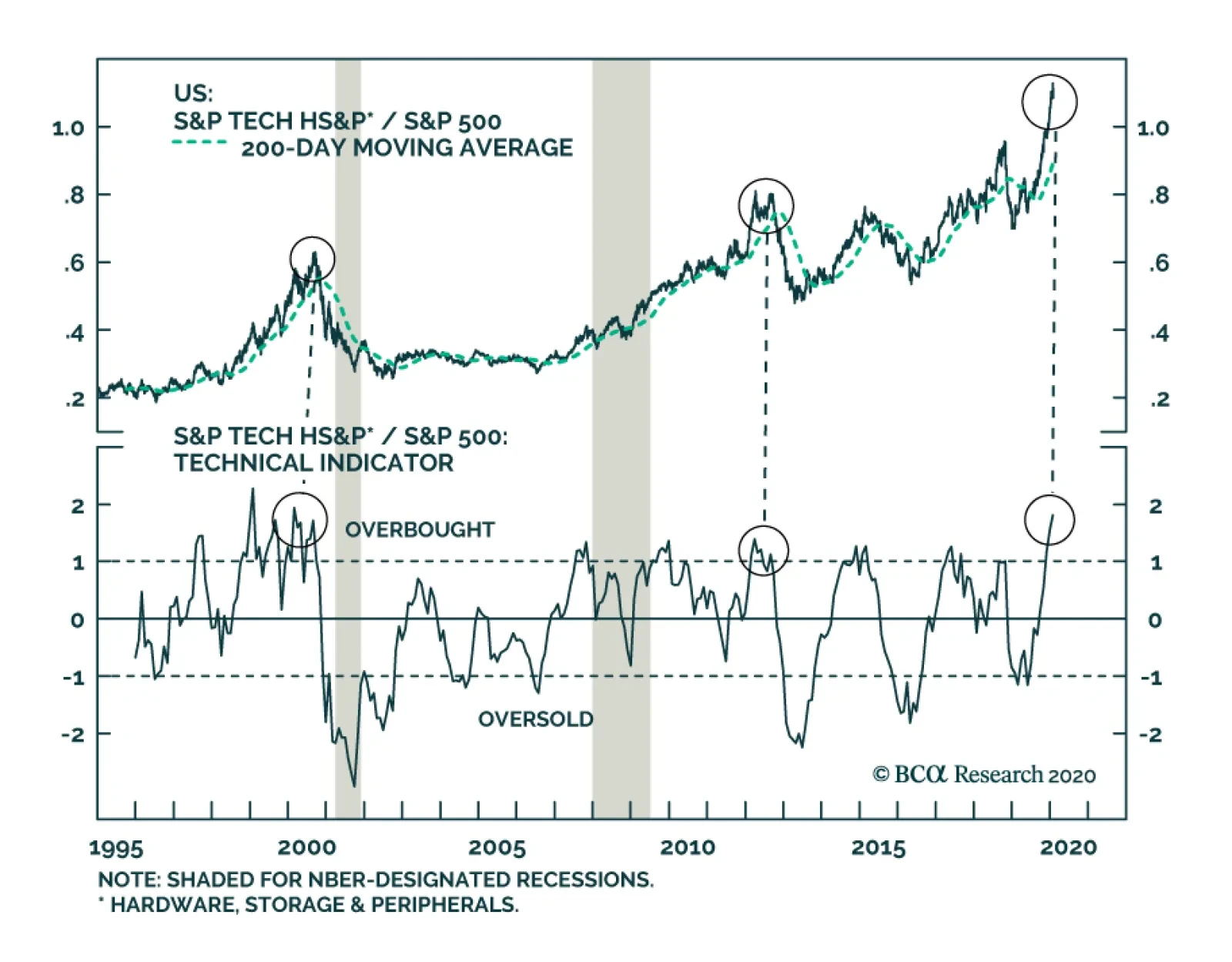
On Monday, BCA's US Equity Strategy service downgraded the S&P tech hardware, storage & peripherals index citing overbought technical conditions and weak operating metrics. Undoubtedly, relative share prices are extremely extended. The last three…
No Capitulation, Yet
No Capitulation, Yet
The S&P 500 has given back almost all of the year-to-date gains. While the coronavirus has served as an excuse to sell as we warned last week, we are nowhere near in unwinding the extreme overbought conditions in the broad equity market. While we are no epidemiology experts, what concerns us most is when the news will eventually hit that coronavirus deaths are sprucing up outside of China’s borders. This will likely catalyze more equity selling and a capitulation point will subsequently ensue. Importantly, beneath the surface macro divergences remain wide. The yield curve peaked at the turn of the year. Similarly, the real 10-year Treasury yield crested around the same time and so did the hyper growth sensitive AUD/CHF cross rate, all predating the coronavirus epidemic news (see chart). Our sense is that the bond market in particular is likely reflecting Bernie Sander’s rise in the polls along with persistently soft economic data. Bottom Line: There are high odds that the coronavirus epidemic may serve as a catalyst and short-circuit the already frail handoff from liquidity-to-growth, warning that equity market caution is warranted at this juncture.
Highlights Chart 1The 2003 SARS Roadmap
The 2003 SARS Roadmap
The 2003 SARS Roadmap
The bond market impact from the coronavirus has already been substantial. The 10-year Treasury yield has fallen back to 1.51%, below the fed funds rate. Meanwhile, the investment grade corporate bond index spread is back above 100 bps, from a January low of 93 bps. The 2003 SARS crisis is the best roadmap we can apply to the current situation. Back then, Treasury yields also fell sharply but then rebounded just as quickly when the number of SARS cases peaked (Chart 1). The impact on corporate bond excess returns was more short-lived (Chart 1, bottom panel). Like in 2003, we expect that bond yields will rise once the number of coronavirus cases peaks, but it is difficult to put a timeframe on how long that will take. The economic impact from the virus could also weigh on global PMI surveys during the next few months, delaying the move higher in Treasury yields we anticipated earlier this year. In short, we continue to expect higher bond yields and tighter credit spreads in 2020, but those moves will be delayed until markets are confident that the virus has stopped spreading. Feature Investment Grade: Neutral Chart 2Investment Grade Market Overview
Investment Grade Market Overview
Investment Grade Market Overview
Investment grade corporate bonds underperformed the duration-equivalent Treasury index by 80 basis points in January. The sector actually outpaced the Treasury benchmark by 7 bps until January 21 when the impact of the coronavirus started to push spreads wider. As stated on page 1, we expect the impact of the coronavirus on corporate spreads to be short lived. Beyond that, low inflation expectations will keep monetary conditions accommodative. This in turn will encourage banks to ease credit supply, keeping defaults at bay and providing a strong tailwind for corporate bond returns.1 Yesterday’s Fed Senior Loan Officer survey showed a slight easing of C&I lending standards in Q4 2019, reversing the tightening that occurred in the third quarter (Chart 2). We expect that accommodative Fed policy will lead to continued easing of C&I lending standards for the remainder of the year. Despite the positive tailwind from accommodative Fed policy and easing bank lending standards, investment grade corporate bond spreads are quite expensive. Spreads for all credit tiers are below our targets (panels 2 & 3).2 As a result, we advise only a neutral allocation to investment grade corporate bonds. We also recommend increasing exposure to Agency MBS in place of corporate bonds rated A or higher (see page 7). Table 3ACorporate Sector Relative Valuation And Recommended Allocation*
Contagion
Contagion
Table 3BCorporate Sector Risk Vs. Reward*
Contagion
Contagion
High-Yield Overweight Chart 3High-Yield Market Overview
High-Yield Market Overview
High-Yield Market Overview
High-Yield underperformed the duration-equivalent Treasury index by 111 basis points in January. Junk outperformed the Treasury benchmark by 30 bps until January 21 when the coronavirus outbreak sent spreads sharply wider. Once the negative impact of the coronavirus passes, junk spreads will have plenty of room to tighten in 2020. In fact, the junk index spread is now at 390 bps, 154 bps above our target (Chart 3).3 While spreads for all junk credit tiers are currently above our targets, Caa-rated bonds look particularly cheap. We analyzed the divergence between Caa and the rest of the junk index in a recent report and came to two conclusions.4 First, the historical data show that 12-month periods of overall junk bond outperformance are more likely to be followed by underperformance if Caa is the worst performing credit tier. Second, we can identify several reasons for 2019’s Caa spread widening that make us inclined to downplay any negative signal. Specifically, we note that the Caa credit tier’s exposure to the shale oil sector is responsible for the bulk of 2019’s underperformance (bottom panel). Absent significant further declines in the oil price, this sector now has room to recover. MBS: Overweight Chart 4MBS Market Overview
MBS Market Overview
MBS Market Overview
Mortgage-Backed Securities underperformed the duration-equivalent Treasury index by 53 basis points in January. The sector was only lagging the Treasury benchmark by 7 bps as of January 21, when the coronavirus outbreak sent spreads wider. The conventional 30-year zero-volatility spread widened 8 bps in January, driven by a 7 bps widening of the option-adjusted spread (OAS) and a 1 bp increase in expected prepayment losses (aka option cost). The fact that expected prepayment losses only rose by a single basis point even though the 30-year mortgage rate fell by 23 bps is notable. It speaks to the high level of refi burnout in the mortgage market, which is a key reason why we prefer mortgage-backed securities over investment grade corporate bonds in our portfolio. Essentially, most homeowners have already had at least one opportunity to refinance during the past few years, so prepayment risk is low even if rates fall further. Competitive expected compensation is another reason to move into Agency MBS. The conventional 30-year MBS OAS is 49 bps, only 7 bps below the spread offered by Aa-rated corporate bonds (Chart 4). Also, spreads for all investment grade corporate bond credit tiers are below our cyclical targets. Risk-adjusted compensation favors MBS even more strongly. The Excess Return Bond Map in Appendix C shows that Agency MBS plot well to the right of investment grade corporates. This means that the sector is less likely to see losses versus Treasuries on a 12-month horizon. Government-Related: Underweight Chart 5Government-Related Market Overview
Government-Related Market Overview
Government-Related Market Overview
The Government-Related index underperformed the duration-equivalent Treasury index by 14 basis points in January. The index was up 2 bps versus the Treasury benchmark until January 21, when the coronavirus outbreak hit. Sovereign debt underperformed duration-equivalent Treasuries by 99 bps on the month, and Foreign Agencies underperformed by 28 bps. Local Authorities, however, bested the Treasury benchmark by 60 bps. Domestic Agency bonds underperformed Treasuries by 2 bps in January, while Supranationals outperformed by 2 bps. We continue to recommend an underweight allocation to USD-denominated sovereign bonds, given that spreads remain expensive compared to US corporate credit (Chart 5). However, we noted in a recent report that Mexican and Saudi Arabian sovereigns look attractive on a risk/reward basis.5 This is also true for Local Authorities and Foreign Agencies, as shown in the Bond Map in Appendix C. Our Emerging Markets Strategy service also thinks that worries about Mexico’s fiscal position are overblown, and that bond yields embed too high of a risk premium (bottom panel).6 Municipal Bonds: Overweight Chart 6Municipal Market Overview
Municipal Market Overview
Municipal Market Overview
Municipal bonds underperformed the duration-equivalent Treasury index by 33 basis points in January (before adjusting for the tax advantage). They were up 39 bps versus the Treasury index before the coronavirus outbreak hit on January 21. The average Aaa-rated Municipal / Treasury (M/T) yield ratio swung around during the month, but settled close to where it began at 77% (Chart 6). We upgraded municipal bonds in early October, as yield ratios had become significantly more attractive, especially at the long-end of the Aaa curve (panel 2).7 Yield ratios have tightened a lot since then, but value remains at long maturities. Specifically, the 2-year, 5-year and 10-year M/T yield ratios are all below average pre-crisis levels at 62%, 65% and 78%, respectively. But 20-year and 30-year yield ratios stand at 89% and 93%, respectively, above average pre-crisis levels. Fundamentally, state and local balance sheets remain solid. Our Municipal Health Monitor is in “improving health” territory and state & local government interest coverage has improved considerably in recent quarters (bottom panel). Both of these trends are consistent with muni ratings upgrades continuing to outpace downgrades going forward. Treasury Curve: Maintain A Barbell Curve Positioning Chart 7Treasury Yield Curve Overview
Treasury Yield Curve Overview
Treasury Yield Curve Overview
The Treasury curve bull-flattened dramatically in January. Treasury yields declined across the curve, and the 2/10 slope flattened from 34 bps to 18 bps. The 5/30 slope flattened from 70 bps to 67 bps. Despite the significant flattening, the 2/10 slope remains near the middle of our target 0 – 50 bps range for 2020, and we anticipate some bear-steepening once the coronavirus is contained.8 The front-end of the curve also moved in January to price-in 57 bps of Fed rate cuts during the next 12 months (Chart 7). At the beginning of the year the curve was priced for only 14 bps of rate cuts. We expect that the Fed would respond with rate cuts if the coronavirus epidemic worsens, leading to inversion of the 2/10 yield curve. However, for the time being the safer bet is that the virus will be contained relatively quickly and the Fed will remain on hold for all of 2020. Based on this view, we continue to recommend holding a barbelled Treasury portfolio. Specifically, we favor holding a 2/30 barbell versus the 5-year bullet, in duration-matched terms. The position offers positive carry and looks attractive on our yield curve models (see Appendix B).9 TIPS: Overweight Chart 8Inflation Compensation
Inflation Compensation
Inflation Compensation
TIPS underperformed the duration-equivalent Treasury index by 75 basis points in January. The 10-year TIPS breakeven inflation rate fell 12 bps on the month and currently sits at 1.66%. The 5-year/5-year forward TIPS breakeven inflation rate fell 16 bps on the month and currently sits at 1.71%. Both rates remain well below the 2.3%-2.5% range consistent with the Fed’s target. The divergence between the actual inflation data and inflation expectations remains stark. Trimmed mean PCE inflation has been fluctuating around the Fed’s target since mid-2018 (Chart 8). However, long-maturity TIPS breakeven inflation rates remain stubbornly low. It takes time for expectations to adapt to a changing macro environment, but even accounting for those long lags, our Adaptive Expectations Model pegs the 10-year TIPS breakeven inflation rate as 31 bps too low (panel 4).10 It is highly likely that the Fed will have to tolerate some overshoot of its 2% inflation target in order to re-anchor long-term inflation expectations. As a result, the actual inflation data will lead expectations higher, causing the TIPS breakeven inflation curve to flatten.11 ABS: Underweight Chart 9ABS Market Overview
ABS Market Overview
ABS Market Overview
Asset-Backed Securities outperformed the duration-equivalent Treasury index by 32 basis points in January. The index option-adjusted spread for Aaa-rated ABS tightened 14 bps on the month. It currently sits at 26 bps, below its minimum pre-crisis level (Chart 9). Our Excess Return Bond Map (see Appendix C) shows that Aaa-rated consumer ABS ranks among the most defensive US spread products. This explains why the sector performed so well in January when other spread sectors struggled. ABS also offer higher expected returns than other low-risk sectors such as Domestic Agency bonds and Supranationals. However, we remain wary of allocating too much to consumer ABS because credit trends are slowly shifting in the wrong direction. The consumer credit delinquency rate remains low, but has put in a clear bottom. This is also true for the household interest expense ratio (panel 3). Senior Loan Officers also continue to tighten lending standards for both credit cards and auto loans. Tighter lending standards usually coincide with rising delinquencies (bottom panel). Non-Agency CMBS: Neutral Chart 10CMBS Market Overview
CMBS Market Overview
CMBS Market Overview
Non-Agency Commercial Mortgage-Backed Securities outperformed the duration-equivalent Treasury index by 43 basis points in January. The index option-adjusted spread for non-agency CMBS tightened 6 bps on the month. It currently sits at 67 bps, below its average pre-crisis level (Chart 10). In last week’s Special Report, we explored how low interest rates have boosted commercial real estate (CRE) prices this cycle, and concluded that a sharp drawdown in CRE prices is likely only when inflation starts to pick up steam.12 In that report we also mentioned that non-agency Aaa-rated CMBS spreads look attractive relative to US corporate bonds from a risk/reward perspective (see our Excess Return Bond Map in Appendix C), and that the macro environment is only slightly unfavorable for CMBS spreads. Specifically, CRE bank lending standards are just in “net tightening” territory. But both lending standards and loan demand are very close to neutral (bottom 2 panels). Agency CMBS: Overweight Agency CMBS outperformed the duration-equivalent Treasury index by 34 basis points in January. The index option-adjusted spread tightened 4 bps on the month to reach 54 bps. The Excess Return Bond Map in Appendix C shows that Agency CMBS offer a compelling risk/reward trade-off. An overweight allocation to this sector remains appropriate. Appendix A: The Golden Rule Of Bond Investing We follow a two-step process to formulate recommendations for bond portfolio duration. First, we determine the change in the federal funds rate that is priced into the yield curve for the next 12 months. Second, we decide – based on our assessments of the economy and Fed policy – whether the change in the fed funds rate will exceed or fall short of what is priced into the curve. Most of the time, a correct answer to this question leads to the appropriate duration call. We call this framework the Golden Rule Of Bond Investing, and we demonstrated its effectiveness in the US Bond Strategy Special Report, “The Golden Rule Of Bond Investing”, dated July 24, 2018, available at usbs.bcaresearch.com. Chart 11 illustrates the Golden Rule’s track record by showing that the Bloomberg Barclays Treasury Master Index tends to outperform cash when rate hikes fall short of 12-month expectations, and vice-versa. At present, the market is priced for 57 basis points of cuts during the next 12 months. We anticipate a flat fed funds rate over that time horizon, and therefore anticipate that below-benchmark portfolio duration positions will profit. Chart 11The Golden Rule's Track Record
The Golden Rule's Track Record
The Golden Rule's Track Record
We can also use our Golden Rule framework to make 12-month total return and excess return forecasts for the Bloomberg Barclays Treasury index under different scenarios for the fed funds rate. Excess returns are relative to the Bloomberg Barclays Cash index. To forecast total returns we first calculate the 12-month fed funds rate surprise in each scenario by comparing the assumed change in the fed funds rate to the current value of our 12-month discounter. This rate hike surprise is then mapped to an expected change in the Treasury index yield using a regression based on the historical relationship between those two variables. Finally, we apply the expected change in index yield to the current characteristics (yield, duration and convexity) of the Treasury index to estimate total returns on a 12-month horizon. The below tables present those results, along with 95% confidence intervals. Excess returns are calculated by subtracting assumed cash returns in each scenario from our total return projections.
Contagion
Contagion
Contagion
Contagion
Appendix B: Butterfly Strategy Valuations The following tables present the current read-outs from our butterfly spread models. We use these models to identify opportunities to take duration-neutral positions across the Treasury curve. The following two Special Reports explain the models in more detail: US Bond Strategy Special Report, “Bullets, Barbells And Butterflies”, dated July 25, 2017, available at usbs.bcaresearch.com US Bond Strategy Special Report, “More Bullets, Barbells And Butterflies”, dated May 15, 2018, available at usbs.bcaresearch.com Table 4 shows the raw residuals from each model. A positive value indicates that the bullet is cheap relative to the duration-matched barbell. A negative value indicates that the barbell is cheap relative to the bullet. Table 4Butterfly Strategy Valuation: Raw Residuals In Basis Points (As Of January 31, 2020)
Contagion
Contagion
Table 5 scales the raw residuals in Table 4 by their historical means and standard deviations. This facilitates comparison between the different butterfly spreads. Table 5Butterfly Strategy Valuation: Standardized Residuals (As Of January 31, 2020)
Contagion
Contagion
Table 6 flips the models on their heads. It shows the change in the slope between the two barbell maturities that must be realized during the next six months to make returns between the bullet and barbell equal. For example, a reading of 33 bps in the 5 over 2/10 cell means that we would only expect the 5-year to outperform the 2/10 if the 2/10 slope steepens by more than 33 bps during the next six months. Otherwise, we would expect the 2/10 barbell to outperform the 5-year bullet. Table 6Discounted Slope Change During Next 6 Months (BPs)
Contagion
Contagion
Appendix C: Excess Return Bond Map The Excess Return Bond Map is used to assess the relative risk/reward trade-off between different sectors of the US bond market. It is a purely computational exercise and does not impose any macroeconomic view. The Map’s vertical axis shows 12-month expected excess returns. These are proxied by each sector’s option-adjusted spread. Sectors plotting further toward the top of the Map have higher expected returns and vice-versa. Our novel risk measure called the “Risk Of Losing 100 bps” is shown on the Map’s horizontal axis. To calculate it, we first compute the spread widening required on a 12-month horizon for each sector to lose 100 bps or more relative to a duration-matched position in Treasury securities. Then, we divide that amount of spread widening by each sector’s historical spread volatility. The end result is the number of standard deviations of 12-month spread widening required for each sector to lose 100 bps or more versus a position in Treasuries. Lower risk sectors plot further to the right of the Map, and higher risk sectors plot further to the left. Excess Return Bond Map (As Of January 31, 2020)
Contagion
Contagion
Footnotes 1 Please see US Bond Strategy Special Report, “2020 Key Views: US Fixed Income”, dated December 10, 2019, available at usbs.bcaresearch.com 2 For details on how we calculate our spread targets please see US Bond Strategy Weekly Report, “The Value In Corporate Bonds”, dated February 19, 2019, available at usbs.bcaresearch.com 3 For details on how we calculate our spread targets please see US Bond Strategy Weekly Report, “The Value In Corporate Bonds”, dated February 19, 2019, available at usbs.bcaresearch.com 4 Please see US Bond Strategy Weekly Report, “Caa-Rated Bonds: Warning Sign Or Buying Opportunity?”, dated November 26, 2019, available at usbs.bcaresearch.com 5 Please see US Bond Strategy Weekly Report, “A Perspective On Risk And Reward”, dated October 15, 2019, available at usbs.bcaresearch.com 6 Please see Emerging Markets Strategy Weekly Report, “Country Insights: Malaysia, Mexico & Central Europe”, dated October 31, 2019, available at ems.bcaresearch.com 7 Please see US Bond Strategy Weekly Report, “Two Themes And Two Trades”, dated October 1, 2019, available at usbs.bcaresearch.com 8 Please see US Bond Strategy Special Report, “2020 Key Views: US Fixed Income”, dated December 10, 2019, available at usbs.bcaresearch.com 9 For further details on our recommended yield curve trade please see US Bond Strategy Weekly Report, “The Best Spot On The Yield Curve”, dated January 21, 2020, available at usbs.bcaresearch.com 10 For further details on our Adaptive Expectations Model please see US Bond Strategy Weekly Report, “Adaptive Expectations In The TIPS Market”, dated November 20, 2018, available at usbs.bcaresearch.com 11 Please see US Bond Strategy Special Report, “2020 Key Views: US Fixed Income”, dated December 10, 2019, available at usbs.bcaresearch.com 12 Please see US Investment Strategy / US Bond Strategy Special Report, “Commercial Real Estate And US Financial Stability”, dated January 27, 2020, available at usbs.bcaresearch.com Fixed Income Sector Performance Recommended Portfolio Specification Corporate Sector Relative Valuation And Recommended Allocation
Highlights Portfolio Strategy China’s monetary easing, the resilient US dollar, weak operating industry metrics and a looming margin squeeze all signal that an underweight stance is still warranted in the S&P chemicals index. Lofty valuations, overbought technicals, declining capex and weak operating metrics, are all warning that an earnings-led underperformance period is in store for the S&P tech hardware, storage & peripherals index. Recent Changes Trim the S&P tech hardware, storage & peripherals index to underweight, today. Table 1
Crosscurrents
Crosscurrents
Feature The S&P 500 fell for a second straight week and has now given back almost all of the year-to-date gains. While the coronavirus has served as an excuse to sell as we warned last week,1 we are nowhere near in unwinding the extreme overbought conditions in the broad equity market. We are no epidemiology experts, however, what concerns us most is when the news will eventually hit that coronavirus deaths are sprucing up outside of China’s borders. This will likely catalyze more equity selling and a capitulation point will subsequently ensue. Importantly, beneath the surface macro divergences remain wide. The yield curve peaked at the turn of the year. Similarly, the real 10-year Treasury yield crested around the same time and so did the hyper growth sensitive AUD/CHF cross rate all predating the coronavirus epidemic news (Chart 1). Our sense is that the bond market in particular is likely reflecting Bernie Sander’s rise in the polls along with persistently soft economic data. Other indicators we track confirm that the handoff from liquidity-to-growth we have all been waiting for remains on hold. The oil-to-gold and copper-to-gold ratios have no pulse, warning that growth remains elusive (third & bottom panels, Chart 2). Chart 1Souring Macro Predates Coronavirus
Souring Macro Predates Coronavirus
Souring Macro Predates Coronavirus
Chart 2Watch Gold Closely
Watch Gold Closely
Watch Gold Closely
Moreover, in our January 13 report we highlighted that gold was sniffing out two or three fed cuts in 2020, leading the fed funds futures market, as it did in the spring of 2019.2 Since our last update, the fed funds discounter in the coming 12 months has sunk from negative 20bps to negative 42bps (year-on-year change in the fed funds rate shown inverted, second panel, Chart 2). It is disconcerting that despite the sloshing liquidity and de-escalation in the US/China trade war, CEOs remain on the sidelines. The Q4 GDP release showed that non-residential investment is now contracting on a year-over-year (yoy) basis (bottom panel, Chart 3) and has been subtracting from real output growth for three consecutive quarters. Hard data continues to warn that the manufacturing recession is not over as the 15% yoy contraction in non-defense durable goods orders revealed last week (third panel, Chart 3). Equity market internals also warn that the SPX is skating on thin ice. Worrisomely, the Philly semiconductors index (SOX) peaked versus the NASDAQ 100 last year and has been losing steam of late. The equally- versus market cap-weighted S&P 500 and NASDAQ 100 ratios remain near multi-year lows, and small caps are still stalling versus large caps (Chart 4). The implication is that, at least, an indigestion period looms for the broad equity market. Chart 3Ongoing Manufacturing Recession
Ongoing Manufacturing Recession
Ongoing Manufacturing Recession
Chart 4Weak Market Internals
Weak Market Internals
Weak Market Internals
Netting it all out, there are high odds that the coronavirus epidemic may serve as a catalyst and short-circuit the already frail handoff from liquidity-to-growth, warning that equity market caution is warranted at this juncture. This week we are trimming a key tech subgroup to underweight, and updating a heavyweight basic materials sub-index. To Infinity And Beyond? While we have been neutral the S&P tech hardware, storage & peripherals index and thus participating in the monster rally over the past year, the time is ripe to downgrade exposure to below benchmark. Undoubtedly, relative share prices are extremely extended. The second panel of Chart 5 shows that the relative share price ratio is at the highest level as a percentage of its 200-day moving average since the late-1990s. Shown as a z-score, this technical indicator is stretched to the tune of two standard deviations above the historical mean (third panel, Chart 5). The last three times technical conditions were so overbought, it marked a multi-year peak in relative performance (top panel, Chart 5). Importantly, the forward multiple explains all of the return in this tech sub-group’s stellar relative performance since the 2018 Christmas Eve lows (Chart 6). In fact, stagnant-to-lower relative profit growth subtracted from relative returns over the same time period (bottom panel, Chart 6). Chart 5Up, Up And Away?
Up, Up And Away?
Up, Up And Away?
Moreover, the parabolic move in the forward P/E ratio that climbed from a 25% discount to the SPX to a 15% premium (i.e. a 53% multiple jump), was because the 10-year US Treasury yield plunged by 175 basis points from peak to trough (10-year US Treasury yield shown inverted, Chart 7). Chart 6EPS Have To Do The Heavy Lifting
EPS Have To Do The Heavy Lifting
EPS Have To Do The Heavy Lifting
Chart 7Multiple Expansion Phase Has Run Its Course
Multiple Expansion Phase Has Run Its Course
Multiple Expansion Phase Has Run Its Course
Such enormous easing in financial conditions is unlikely to repeat in the coming twelve months in order to push the forward multiple even higher and sustain the “goldilocks” conditions for the S&P tech hardware, storage & peripherals index. In contrast, BCA’s higher interest rate view is a harbinger of a multiple contraction phase and compels us to trim exposure on this high-flying tech sub group to underweight. Another market narrative substantiating the multiple expansion phase is that heavyweight AAPL is now a services oriented company and rightly so commands a sky-high multiple similar to the cloud and software stocks. While there is some truth to the push into services, the iphone and other hardware still dominates AAPL’s sales and will continue to do so for the foreseeable future especially on the eve of a 5G smartphone rollout. Turning over to the macro backdrop, this still mostly manufacturing-based industry moves with the ebbs and flows of the ISM manufacturing survey. Overall business investment is contracting and so is industry capex. Worrisomely, most of the ISM manufacturing subcomponents remain below the boom/bust line warning that investment will remain soft in the coming months, despite the Sino-American trade détente (middle panel, Chart 8). CEO confidence in capital spending remains downbeat and corroborates that at least a wait and see attitude toward greenfield expansion plans is a high probability outcome (bottom panel, Chart 8). Moreover, global export expectations continue to plumb cyclical lows. Similarly, the Emerging Asian (a key tech manufacturing hub) leading economic indicator broke below the GFC lows warning that industry exports are at risk of a further collapse (second & third panels, Chart 9). Chart 8Something’s Gotta Give
Something’s Gotta Give
Something’s Gotta Give
Chart 9Weak Operating Metrics
Weak Operating Metrics
Weak Operating Metrics
Chart 10Soft Pricing Power…
Soft Pricing Power…
Soft Pricing Power…
Chart 11…Will Continue To Weigh On Margins
…Will Continue To Weigh On Margins
…Will Continue To Weigh On Margins
Beyond soft exports, industry new orders are also contracting (bottom panel, Chart 9). This deficient demand backdrop will continue to weigh on industry sales, owing to the recent drubbing in pricing power (third panel, Chart 10).\ Deflating selling prices are also negative for profit margins. The wide gap between industry and SPX margins is clearly unsustainable (Chart 11). Already there is tentative evidence that S&P tech hardware, storage & peripherals margins have peaked and will remain under downward pressure, especially given our expectation of underwhelming profit growth in the coming months. In sum, lofty valuations, overbought technicals, declining capex and weak operating metrics are all warning that an earnings-led underperformance period is in store for the S&P tech hardware, storage & peripherals index. Nevertheless, there is one risk that is worth monitoring: the US consumer. A tight labor market should continue to bid up the price of labor and sustains wage gains which means more money in consumers’ wallets. As a result, brisk consumer outlays on computers & peripherals could reverse the ongoing industry sales deceleration (bottom panel, Chart 12). In sum, lofty valuations, overbought technicals, declining capex and weak operating metrics are all warning that an earnings-led underperformance period is in store for the S&P tech hardware, storage & peripherals index. Bottom Line: Downgrade the S&P tech hardware, storage & peripherals index. The ticker symbols for the stocks in this index are: BLBG S5CMPE – AAPL, HPQ, WDC, HPE, STX, NTAP, XRX. Chart 12Risk To Bearish View
Risk To Bearish View
Risk To Bearish View
Hazardous Chemicals The S&P chemicals bear market has entered its third year and we remain underweight this capital intensive basic materials subgroup. Relative share prices have broken below the GFC lows and it would not surprise us if they would retest the 2006 lows (Chart 13). Now that the chemicals M&A activity dust has settled for good, China dominates the direction of chemical equities. Chinese authorities are still easing monetary policy and are injecting liquidity in the banking system by slashing the reserve requirement ratio (RRR). The recent coronavirus epidemic almost guarantees further easing via the RRR channel. Such a monetary setting should eventually stabilize the economy. However, until a turnaround is evident, US chemical stocks will continue to follow down the path of the Chinese RRR (top panel, Chart 13). The Australian currency, which is hyper-sensitive to China’s growth, corroborates that Chinese economic activity remains soft (second panel, Chart 13). Broad-based US dollar strength also confirms that global growth has yet to stage a durable comeback. The implication is that US chemical exports will continue to lose market share, weighing on industry profits (third panel, Chart 13). Chart 13China Leads The Way
China Leads The Way
China Leads The Way
In fact, sell-side analysts are expecting a relative profit growth acceleration phase, but a decline in relative revenue prospects. This suggests that already uncharacteristically high chemical profit margins will continue to outpace the broad market (bottom panel, Chart 13). Our indicators suggest that it pays to lean against such relative EPS and profit margin euphoria. Importantly, our chemicals profit margin proxy is sinking, warning that a profit margin squeeze looms. Not only are selling prices deflating, but also the industry’s wage bill is gaining steam (bottom panel, Chart 14). Adding it up, China’s monetary easing, the resilient US dollar, weak operating industry metrics and a looming margin squeeze all signal that an underweight stance is still warranted in the S&P chemicals index. Moreover, chemical railcar loads are contracting at a time when the ISM manufacturing survey remains squarely below the boom/bust line (middle panel, Chart 14). This deficient chemical demand backdrop is deflationary (second panel, Chart 15) and will eat into industry profit margins. Chart 14Downbeat Demand Backdrop
Downbeat Demand Backdrop
Downbeat Demand Backdrop
Chart 15Deflation Getting Entrenched
Deflation Getting Entrenched
Deflation Getting Entrenched
On the operating front, our chemicals industry productivity proxy (industrial production/employment) is also in negative territory, underscoring that profits will likely surprise to the downside (third panel, Chart 15). Chemical industrial production is contracting at an accelerating pace and industry shipments are in retreat, warnings that the risk is high of an inventory liquidation phase (bottom panel, Chart 15). While we remain bearish on chemical stocks on a cyclical horizon, there are two key risks we are closely monitoring that would push our view offside. The global reflation handoff to actual growth is the key risk. If the global economy enters a V-shaped recovery, global bond yields will immediately reflect such a growth backdrop and push interest rates higher. This would put downward pressure on the greenback and significantly reflate chemical earnings (middle panel, Chart 16). Finally, chemical stocks are cheap and trade at a steep discount to the broad market. When our relative valuation indicator has plunged to such depressed levels in the past fifteen years, bottom-fishing buyers have come back in the market and added chemical stock exposure to their portfolios (bottom panel, Chart 16). Adding it up, China’s monetary easing, the resilient US dollar, weak operating industry metrics and a looming margin squeeze all signal that an underweight stance is still warranted in the S&P chemicals index. Bottom Line: Stay underweight the S&P chemicals index. The ticker symbols for the stocks in this index are: BLBG S5CHEM – LIN, APD, ECL, SHW, DD, DOW, PPG, CTVA, LYB, IFF, CE, FMC, EMN, CF, ALB, MOS. Chart 16Two Risks To Monitor
Two Risks To Monitor
Two Risks To Monitor
Anastasios Avgeriou US Equity Strategist anastasios@bcaresearch.com Footnotes 1 Please see BCA US Equity Strategy Weekly Report, “When The Music Stops...” dated January 27, 2020, available at uses.bcaresearch.com. 2 Please see BCA US Equity Strategy Weekly Report, “Three EPS Scenarios” dated January 13, 2020, available at uses.bcaresearch.com. Current Recommendations Current Trades Size And Style Views Stay neutral cyclicals over defensives (downgrade alert) Favor value over growth Favor large over small caps (Stop 10%)
GAA DM Equity Country Allocation Model Update The GAA DM Equity Country Allocation model is updated as of January 31, 2020. The model made a significant change in its allocation this month. The allocation to the US is now overweight from neutral previously. Japan, the UK and France remain the three largest underweight countries, as shown in Table 1. Table 1Model Allocation Vs. Benchmark Weights
GAA Quant Model Updates
GAA Quant Model Updates
As shown in Table 2 and Charts 1, 2 and 3, the overall model outperformed the MSCI World benchmark in January by 9 bps, driven by the outperformance from the Level 2 mode (21 bps). The Level 1 model also generated two basis points of outperformance. Since going live, the overall model has outperformed by 80 bps, with 297 bps of outperformance by Level 2 model, offset by 55 bps of underperformance from Level 1. Table 2Performance (Total Returns In USD %)
GAA Quant Model Updates
GAA Quant Model Updates
Chart 1GAA DM Model Vs. MSCI World
GAA DM Model Vs. MSCI World
GAA DM Model Vs. MSCI World
Chart 2GAA US Vs. Non US Model (Level 1)
GAA U.S. Vs. Non U.S. Model (Level 1)
GAA U.S. Vs. Non U.S. Model (Level 1)
Chart 3GAA Non US Model (Level 2)
GAA Non U.S. Model (Level 2)
GAA Non U.S. Model (Level 2)
For more on historical performance, please refer to our website http://gaa.bcaresearch.com/trades/allocation_performance. For more details on the models, please see Special Report, “Global Equity Allocation: Introducing The Developed Markets Country Allocation Model,” dated January 29, 2016, available at https://gaa.bcaresearch.com. Please note that the overall country and sector recommendations published in our Monthly Portfolio Update and Quarterly Portfolio Outlook use the results of these quantitative models as one input, but do not stick slavishly to them. We believe that models are a useful check, but structural changes and unquantifiable factors need to be considered as well when making overall recommendations. GAA Equity Sector Selection Model The GAA Equity Sector Model (Chart 4) is updated as of January 31, 2019. Chart 4Overall Model Performance
Overall Model Performance
Overall Model Performance
The model’s relative tilts between cyclicals and defensives have changed compared to last month. The global growth proxies used in our model continue providing positive signals. This in turn led the model to maintain its overweight on multiple cyclical sectors. The valuation component remains muted across all sectors except Energy. Global central bankers will continue to keep monetary policy accommodative, leading the model to favor a mixed bag of cyclical and defensive sectors. The model is now overweight four sectors in total, three cyclical sectors versus one defensive sector. These are Consumer Discretionary, Information Technology, Communication Services, and Health Care. For more details on the model, please see the Special Report “Introducing the GAA Equity Sector Selection Model”, dated July 27, 2016, as well as the Sector Selection Model section in the Special Alert “GAA Quant Model Updates”, dated March 1, 2019 available at https://gaa.bcaresearch.com. Table 3Overall Model Performance
GAA Quant Model Updates
GAA Quant Model Updates
Table 4Current Model Allocations
GAA Quant Model Updates
GAA Quant Model Updates
Xiaoli Tang Associate Vice President xiaoliT@bcaresearch.com Amr Hanafy Research Associate amrh@bcaresearch.com
Overweight The latest MSFT report was very robust and surprised to the upside on nearly every metric, and helped push the S&P software index to uncharted territory. Nevertheless, we do not want to overstay our welcome and a number of yellow flags compel us to further increase the trailing stop to the 37% relative return mark. As we went to press this position was generating alpha to the tune of 46%, since inception. First, software capex has been slowing over the course of 2019 both in absolute and relative terms (top & bottom panels). Second, M&A activity is running out of fuel, and is at the margin diluting a previously bullish backdrop (second panel). Third, despite the heavyweight status this tech subgroup enjoys, the Standard & Poor’s has recently added two newcomers to the software index, NOW and PAYC, further lifting the index’s market cap weight within the tech sector and the SPX. As we highlighted in an Insight two weeks ago, the S&P software index alone accounts for 18% of the entire SPX return since December 24, 2018. This concentration represents another yellow flag. Bottom Line: Remain overweight the S&P software index, but tighten the trailing stop to the 37% relative return mark. The ticker symbols for the stocks in this index are: BLBG – S5SOFT: MSFT, ADBE, CRM, ORCL, INTU, NOW, ADSK, ANSS, SNPS, CDNS, NLOK, FTNT, CTXS, PAYC.
Lift Off!
Lift Off!
Stick With Capital Markets
Stick With Capital Markets
Overweight Capital markets stocks have come out of hibernation recently and are on the cusp of breaking out – in a bullish fashion – of their 18-month trading range. Total mutual fund assets are expanding at a brisk rate and hitting fresh all-time highs, signaling an uptick in risk appetite (third panel). Rising investor confidence will facilitate both new and secondary share issuance, an important source of fee generation for capital markets firms. Meanwhile, the three Fed rate cuts last year should work through the economy and at least stem further losses in the ISM manufacturing survey. The US/China trade détente will also lead to a stabilization in global growth. In fact, the V-shaped recovery in the global ZEW survey suggests that capital markets profits will likely outpace the broad market this year (second & bottom panels). Bottom Line: Stay overweight the S&P capital markets index. For more details please refer to this Monday’s Weekly Report. The ticker symbols for the stocks in this index are: BLBG S5CAPM – GS, CME, SPGI, MS, BLK, SCHW, ICE, MCO, BK, TROW, STT, MSCI, NTRS, AMP, MKTX, CBOE, NDAQ, RJF, ETFC, BEN, IVZ.
Highlights The liquidity-driven rally will soon be followed by an acceleration in global growth. The economic recovery will bump up expectations of long-term profit growth. The dollar has downside, but the euro will not benefit much. Overweight stocks relative to bonds and bet on traditional cyclical sectors and commodities. The potential for outperformance of value relative to growth favors European equities. The probability of a tech mania is escalating: how should investors factor an expanding bubble into their portfolios? Feature Chart I-1A Bull Market In Stocks And Volatility?
A Bull Market In Stocks And Volatility?
A Bull Market In Stocks And Volatility?
Despite all odds, the nCoV-2019 outbreak is barely denting the S&P 500’s frenetic rally. Plentiful liquidity, thawing Sino-US trade relations and improving economic activity in Asia, all have created ideal conditions for risk assets to appreciate on a cyclical basis. Stocks may look increasingly expensive and are primed to correct, but the bubble will expand further. After lifting asset valuations, monetary policy easing will soon boost worldwide economic activity. Consequently, earnings in the US and Europe will improve. As long as central bankers remain unconcerned about inflation, investors will bid up stocks. Investors should remember we are in the final innings of a bull market. Stocks can deliver outsized returns during this period, but often at the cost of elevated volatility, and the options market is not pricing in this uncertainty (Chart I-1). Moreover, timing the ultimate end of the bubble is extremely difficult. Hence, we prefer to look for assets that can still benefit from easy monetary conditions and rebounding growth, but are not as expensive as equities. Industrial commodities fit that description, especially after their recent selloff. The dollar remains a crucial asset to gauge the path of least resistance for assets. If it refuses to swoon, then it will indicate that global growth is in a weaker state than we foresaw. The good news is that the broad trade-weighted dollar seems to have peaked. Accommodative Monetary Conditions Are Here To Stay Easy liquidity has been the lifeblood of the S&P 500’s rally. The surge in the index coincided with the lagged impact of the rise in our US Financial Liquidity Index (Chart I-2). Low rates have allowed stocks to climb higher, yet earnings expectations remain muted. For example, since November 26, 2018, the forward P/E ratio for the S&P 500 has increased from 15.2 to 18.7, while 10-year Treasury yields have collapsed from 3.1% to 1.6%. Meanwhile, expectations for long-term earnings annual growth extracted from equity multiples using a discounted cash flow model have dropped from 2.4% to 1.2%. Historically, easier monetary policy pushes asset prices higher before it lifts economic activity. Historically, easier monetary policy pushes asset prices higher before it lifts economic activity. Yet, stocks and risk assets normally continue to climb when the economy recovers. Even without any additional monetary easing, as long as policy remains accommodative, risk assets will generate positive returns. Expectations for stronger cash flow growth become the force driving asset prices higher. Policy will likely remain accommodative around the world. Within this framework, peak monetary easing is probably behind us, even though liquidity conditions remain extremely accommodative. Nominal interest rates remain very low, and real bond yields are still falling. Unlike in 2018 and 2019, dropping TIPs yields reflect rising inflation expectations (Chart I-3). Those factors together indicate that policy is reflationary, which is confirmed by the gold rally. Chart I-2A Liquidity Driven Rally
A Liquidity Driven Rally
A Liquidity Driven Rally
Chart I-3Today, Lower TIPS Yields Are Reflationary
Today, Lower TIPS Yields Are Reflationary
Today, Lower TIPS Yields Are Reflationary
Chart I-4Economic Activity To Respond To Liquidity
Economic Activity To Respond To Liquidity
Economic Activity To Respond To Liquidity
Based on the historical lags between monetary easing and manufacturing activity, the global industrial sector is set to mend (Chart I-4). Moreover, the liquidity-driven surge in stock prices, combined with low yields and compressed credit spreads, has eased financial conditions, which creates the catalyst for an industrial recovery. Where will the growth come from? First, worldwide inventory levels have collapsed after making negative contributions to growth since mid-2018 (Chart I-5). Thus, there is room for an inventory restocking. Secondly, auto sales in Europe and China have rebounded to 18.5% from -23% and to -0.1% from -16.4%, respectively. Thirdly, China’s credit and fiscal impulse has improved. The uptick in Chinese iron ore imports indicates that the pass-through from domestic reflation to global economic activity will materialize soon (Chart I-6). Finally, following the Phase One Sino-US trade deal, global business confidence is bottoming, as exemplified by Belgium’s business confidence, Switzerland KOF LEI, Korea's manufacturing business survey, or US CFO and CEO confidence measures. The increase in EM earnings revisions shows that US capex intentions should soon re-accelerate, which bodes well for investment both in the US and globally (Chart I-7). Chart I-5Room For Inventory Restocking
Room For Inventory Restocking
Room For Inventory Restocking
Chart I-6China Points To Stronger Global Growth
China Points To Stronger Global Growth
China Points To Stronger Global Growth
Construction activity, a gauge of the monetary stance, is looking up across the advanced economies. In the US, housing starts – a leading indicator of domestic demand – have hit a 13-year high. A pullback in this volatile data series is likely, but it should be limited. Vacancies remain at a paltry 1.4%, household formation is solid and affordability is not demanding (Chart I-8). In Europe, construction activity has been relatively stable through the economic slowdown. Even in Canada and Australia, housing transactions have gathered steam quickly following declines in mortgage rates (Chart I-9). Chart I-7Capex Is Set To Recover
Capex Is Set To Recover
Capex Is Set To Recover
Chart I-8US Housing Is Robust
US Housing Is Robust
US Housing Is Robust
Chart I-9Even The Canadian And Australian Housing Markets Are Stabilizing
Even The Canadian And Australian Housing Markets Are Stabilizing
Even The Canadian And Australian Housing Markets Are Stabilizing
Consumers will remain a source of strength for the global economy. The dichotomy between weak manufacturing PMIs and the stable service sector reflects a healthy consumer spending. December retail sales in Europe and the US corroborate this assessment. The stabilization in US business confidence suggests that household incomes are not in as much jeopardy as three months ago. As household net worth and credit growth improve further, a stable outlook for household income will underwrite greater gains in consumption. Policy will likely remain accommodative around the world. For the time being, US inflationary pressures are muted. The New York Fed’s Underlying Inflation Gauge has rolled over, hourly earnings growth has moved back below 3%, our pipeline inflation indicator derived from the ISM is weak, and core producer prices are flagging (Chart I-10). This trend is not US-specific. In the OECD, core consumer price inflation is set to decelerate due to the lagged impact of the manufacturing slowdown. Central banks are also constrained to remain dovish by their own rhetoric. The Fed's statement this week was a testament to this reality. Central banks are increasingly looking to set symmetrical inflation targets. After a decade of missing their targets, a symmetric target would imply keeping policy easier for longer, even if realized inflation moves back above 2%. A rebound in global growth and weak inflation should create a poisonous environment for the US dollar. Finally, fiscal policy will make a small positive contribution to growth in most major advanced economies in 2020, particularly in Germany and the UK (Table I-1). Chart I-10Limited Inflation Will Allow The Fed To Remain Easy
Limited Inflation Will Allow The Fed To Remain Easy
Limited Inflation Will Allow The Fed To Remain Easy
Table I-1Modest Fiscal Easing In 2020
February 2020
February 2020
The Dollar And The Sino-US Phase One Deal At first glance, a rebound in global growth and weak inflation should create a poisonous environment for the US dollar (Chart I-11). As we have often argued, the dollar’s defining characteristic is its pronounced counter-cyclicality. Chart I-11A Painful Backdrop For The Greenback
February 2020
February 2020
Deteriorating dollar fundamentals make this risk particularly relevant. US interest rates are well above those in the rest of the G10, but the gap in short rates has significantly narrowed. Historically, the direction of rates differentials and not their levels has determined the trend in the USD (Chart I-12). Moreover, real differentials at the long end of the curve support the notion that the maximum tailwinds for the dollar are behind us (Chart I-12, bottom panel). Furthermore, now that the US Treasury has replenished its accounts at the Federal Reserve, the Fed’s addition of excess reserves in the system will likely become increasingly negative for the dollar, especially against EM currencies. Likewise, relative money supply trends between the US, Europe, Japan and China already predict a decline in the dollar (Chart I-13). Chart I-12Interest Rate Differentials Do Not Favor The Dollar...
Interest Rate Differentials Do Not Favor The Dollar...
Interest Rate Differentials Do Not Favor The Dollar...
Chart I-13...Neither Do Money Supply Trends
...Neither Do Money Supply Trends
...Neither Do Money Supply Trends
Chart I-14The Phase One Deal Is Ambitious
February 2020
February 2020
The recent Sino-US trade agreement obscures what appears to be a straightforward picture. According to the Phase One deal signed mid-January, China will increase its US imports by $200 billion in the next two years vis-à-vis the high-water mark of $186 billion reached in 2017. This is an extremely ambitious goal (Chart I-14). Politically, it is positive that China has committed to buy manufactured goods and services in addition to commodities. However, the scale of the increase in imports of US manufactured goods is large, at $77 billion. China cannot fulfill this obligation if domestic growth merely stabilizes or picks up just a little, especially now that the domestic economy is in the midst of a spreading illness. It will have to substitute some of its European and Japanese imports with US goods. A consequence of this trade deal is that the euro’s gains will probably lag those recorded in normal business cycle upswings. Historically, European growth outperforms the US when China’s monetary conditions are easing and its marginal propensity to consume is rising (Chart I-15). However, given the potential for China to substitute European goods in favor of US ones, China’s economic reacceleration probably will not benefit Europe as much as it normally does. China may not ultimately follow through with as big of US purchases as it has promised, but it is likely, at least initially, to show good faith in the agreement. The euro’s gains will probably lag those recorded in normal business cycle upswings. While the trade agreement is a headwind for the euro, it is a positive for the Chinese yuan. The US output gap stands at 0.1% of potential GDP and the US labor market is near full employment. The US industrial sector does not possess the required spare capacity to fulfill additional Chinese demand. To equilibrate the market for US goods, prices will have to adjust to become more favorable for Chinese purchasers. The simplest mechanism to achieve this outcome is for the RMB to appreciate. Meanwhile, the euro is trading 16% below its equilibrium, which will allow European producers to fulfill US domestic demand. A widening US trade deficit with Europe would undo improvements in the trade balance with China. The probability that US equities correct further in the short-term is elevated. The implication for the dollar is that the broad trade-weighted USD will likely outperform the Dollar Index (DXY). The euro represents 18.9% of the broad trade-weighted dollar versus 57.6% of the DXY. Asian currencies, EM currencies at large, the AUD and the NZD, all should benefit from their close correlation with the RMB (Chart I-16). Chart I-15Europe Normally Wins When China Recovers
Europe Normally Wins When China Recovers
Europe Normally Wins When China Recovers
Chart I-16EM, Asian, And Antipodean Exchange Rates Love A Strong RMB
EM, Asian, And Antipodean Exchange Rates Love A Strong RMB
EM, Asian, And Antipodean Exchange Rates Love A Strong RMB
Obviously, before the RMB and the assets linked to it can appreciate further, the panic surrounding the coronavirus will have to dissipate. However, the economic damage created by SARS was short lived. This respiratory syndrome resulted in a 2.4% contraction Hong-Kong’s GDP in the second quarter of 2003. The economy of Hong Kong recovered that loss quickly afterward. Investment Forecasts BCA continues to forecast upside in safe-haven yields. Global interest rates remain well below equilibrium and a global economic recovery bodes poorly for bond prices (Chart I-17). However, inflation expectations and not real yields will drive nominal yield changes. The dovish slant of global central banks and the growing likelihood that symmetric inflation targets will become the norm is creating long-term upside risks for inflation. Moreover, if symmetric inflation targets imply lower real short rates in the future, then they also imply lower real long rates today. Investors should begin switching their risk assets into industrial commodity plays, especially after their recent selloff. Easy monetary conditions, decreased real rates and an improvement in economic activity are also consistent with an outperformance of assets with higher yields. High-yield bonds, which offer attractive breakeven spreads, will benefit from this backdrop (Chart I-18). Furthermore, carry trades will likely continue to perform well. In addition to low interest rates across most of the G10, the low currency volatility caused by an extended period of easy policy will continue to encourage carry-seeking strategies. Chart I-17Bonds Are Still Expensive
Bonds Are Still Expensive
Bonds Are Still Expensive
Chart I-18Where Is The Value In Credit?
Where Is The Value In Credit?
Where Is The Value In Credit?
An environment in which growth is accelerating and monetary policy is accommodative argues in favor of stocks. Our profit growth model for the S&P 500 has finally moved back into positive territory. As earnings improve, investors will likely re-rate depressed long-term growth expectations for cash flows (Chart I-19). The flip side is that equity risk premia are elevated, especially outside the US (Chart I-19). Hence, as long as accelerating growth (but not tighter policy) drives up yields, equities should withstand rising borrowing costs. The use of passive investing and the prevalence of “closet indexers” accentuates the risk that a tech mania could blossom. The 400 point surge in the S&P 500 since early October complicates the picture. The probability that US equities correct further in the short-term is elevated, based on their short-term momentum and sentiment measures, such as the put/call ratio (Chart I-20). Foreign equities will continue to correct along US ones, even if they are cheaper. Chart I-19Elevated Stock Multiples Reflect Low Yields, Not Growth Exuberance
Elevated Stock Multiples Reflect Low Yields, Not Growth Exuberance
Elevated Stock Multiples Reflect Low Yields, Not Growth Exuberance
Chart I-20Tactical Risks For Stocks
Tactical Risks For Stocks
Tactical Risks For Stocks
Chart I-21Buy Commodities/Sell Stocks?
Buy Commodities / Sell Stocks?
Buy Commodities / Sell Stocks?
The coronavirus panic seems to be the catalyst for such a correction. When a market is overextended, any shock can cause a pullback in prices. Moreover, as of writing, medical professionals still have to ascertain the virus’s severity and potential mutations. Therefore, risk assets must embed a significant risk premium for such uncertainty, even if ultimately the infection turns out to be mild. However, that risk premium will likely prove to be short lived. During the SARS crisis in 2003, stocks bottomed when the number of reported new cases peaked. The tech sector has plentiful downside if the correction gathers strength. As indicated in BCA’s US Equity Sector Strategy, Apple, Microsoft, Google, Amazon and Facebook account for 18% of the US market capitalization, which is the highest market concentration since the late 1990s tech bubble. Investors should begin switching their risk assets into industrial commodity plays, especially after their recent selloff. Commodity prices are trading at a large discount to US equities. Moreover, the momentum of natural resource prices relative to stocks has begun to form a positive divergence with the price ratio of these two assets (Chart I-21). Technical divergences such as the one visible in the ratio of commodities to equities are often positive signals. Low real rates, an ample liquidity backdrop, a global economic recovery, a weak broad trade-weighted dollar and a strong RMB, all benefit commodities over equities. Tech stocks underperform commodities when the dollar weakens and growth strengthens. Moreover, our positive stance on the RMB justifies stronger prices for copper, oil and EM equities (Chart I-22). Chart I-22The Winners From A CNY Rebound
February 2020
February 2020
Our US Equity Strategy Service has also reiterated its preference for industrials and energy stocks, and it recently upgraded materials stocks to neutral.1 All three sectors trade at significant valuation discounts to the broad market and to tech stocks in particular. They are also oversold in relative terms. Finally, their operating metrics are improving, a trend which will be magnified if global growth re-accelerates. Do not make these bets aggressively. A weakening broad trade-weighted dollar would allow for a rotation into foreign equities and an outperformance of value relative to growth stocks. The share of US equities in the MSCI All-Country World Index is a direct function of the broad trade-weighted dollar (Chart I-23). Moreover, since 1971, the dollar and the relative performance of growth stocks versus value stocks have exhibited a positive correlation (Chart I-24). Thus, the dollar’s recent strength has been a key component behind the run enjoyed by tech stocks. Chart I-23Global Stocks Love A Soft Dollar
Global Stocks Love A Soft Dollar
Global Stocks Love A Soft Dollar
Chart I-24Value Stocks Needs A Weaker Dollar To Outperform Growth Stocks
Value Stocks Needs A Weaker Dollar To Outperform Growth Stocks
Value Stocks Needs A Weaker Dollar To Outperform Growth Stocks
Despite the risks to the euro discussed in the previous section, European equities could still outperform US equities. Such a move would be consistent with value stocks beating growth equities (Chart I-24, bottom panel). This correlation exists because the euro area has a combined 17.7% weighting to tech and healthcare stocks compared with a 37.1% allocation in US benchmarks. Moreover, a cheap euro should allow European industrials and materials to outperform their US counterparts. Finally, the recent uptick in the European credit impulse indicates that an acceleration in European profit growth is imminent, a view that is in line with our preference for European financials (Chart I-25).2 Chart I-25Euro Area Profits Should Improve
Euro Area Profits Should Improve
Euro Area Profits Should Improve
Bottom Line: The current environment remains favorable for risk assets on a 12-month investment horizon. As such, we expect stocks and bond yields to continue to rise in 2020. Moreover, a pick-up in global growth, along with a fall in the broad trade-weighted dollar, should weigh on tech and growth stocks, and boost the attractiveness of commodity plays, industrial, energy and materials stocks, as well as European and EM equities. Forecast Meets Strategy Liquidity-driven rallies, such as the current one, can carry on regardless of the fundamentals. As Keynes noted 90 years ago: “Markets can remain irrational longer than you can stay solvent.” The gap between forecast and strategy can be great. The use of passive investing and the prevalence of “closet indexers” accentuates the risk that a tech mania could blossom. We assign a substantial 30% probability to the risk of another tech mania. Outflows from equity ETFs and mutual funds have been large. Investors will be tempted to move back into those vehicles if stocks continue to rally on the back of plentiful liquidity and improving global growth (Chart I-26). In the process, the new inflows will prop up the over-represented, over-valued, and over-extended tech behemoths. Chart I-26Depressed Equity Flows Should Pick Up
Depressed Equity Flows Should Pick Up
Depressed Equity Flows Should Pick Up
The current tech bubble can easily run a lot further. Based on current valuations, the NASDAQ trades at a P/E ratio of 31 compared with 68 in March 2000 (Chart I-27). Moreover, momentum is becoming increasingly favorable for the NASDAQ and other high-flying tech stocks. The NASDAQ is outperforming high-dividend stocks and after a period of consolidation, its relative performance is breaking out. Momentum often performs very well in liquidity-driven rallies. Chart I-27Where Is The Bubble?
Where Is The Bubble?
Where Is The Bubble?
Chart I-28Debt Loads Are Already High Everywhere
Debt Loads Are Already High Everywhere
Debt Loads Are Already High Everywhere
A full-fledged tech mania would make our overweight equities / underweight bonds a profitable call, but it would invalidate our sector and regional recommendations. Moreover, with a few exceptions in China and Taiwan, the major tech bellwethers are listed in the US. A tech bubble would most likely push our bearish dollar stance to the offside. Bubbles are dangerous: participating on the upside is easy, but cashing out is not. Moreover, financial bubbles tend to exacerbate the economic pain that follows the bust. During manic phases, capital is poorly invested and the economy becomes geared to the sectors that benefit from the financial excesses. These assets lose their value when the bubble deflates. Moreover, bubbles often result in growing private-sector indebtedness. Writing off or paying back this debt saps the economy’s vitality. Making matters worse, today overall indebtedness is unprecedented and central banks have little room to reflate the global economy once the bubble bursts (Chart I-28). Finally, US/Iran tensions will create additional risk in the years ahead. Matt Gertken, BCA’s Geopolitical Strategist, warns that the ratcheting down of tensions following Iran’s retaliation to General Soleimani’s assassination is temporary.3 As a result, the oil market remains a source of left-handed tail-risk. Section II discusses other potential black swans lurking in the geopolitical sphere. We continue to recommend that investors overweight industrials and energy, upgrade materials to neutral, Europe to overweight, and curtail their USD exposure as long as US inflation remains well behaved and the US inflation breakeven rate stays below the 2.3% to 2.5% range. However, do not make these bets aggressively. Moreover, some downside protection is merited. Due to our very negative view on bonds, we prefer garnering these hedges via a 15% allocation to gold and the yen. The yen is especially attractive because it is one of the few cheap, safe-haven plays (Chart I-29). Chart I-29The Yen Offers Cheap Portfolio Protection
The Yen Offers Cheap Portfolio Protection
The Yen Offers Cheap Portfolio Protection
Mathieu Savary Vice President The Bank Credit Analyst January 30, 2020 Next Report: February 27, 2020 II. Five Black Swans In 2020 Our top five geopolitical “Black Swans” are risks that the market is seriously underpricing. With the “phase one” trade deal signed, Chinese policy could become less accommodative, resulting in a negative economic surprise. The trade deal may fall victim to domestic politics, raising the risk of a US-China military skirmish. A Biden victory at the Democratic National Convention or a Democratic takeover of the White House could trigger social unrest and violence in the US. A pickup in the flow of migrants to Europe would fundamentally undermine political stability there. Russia’s weak economy will add fuel to domestic unrest, risking an escalation beyond the point of containment. Over the past four years, BCA’s Geopolitical Strategy service has started off each year with their top five geopolitical “Black Swans.” These are low-probability events whose market impact would be significant enough to matter for global investors. Unlike the great Byron Wien’s perennial list of market surprises, we do not assign these events a “better than 50% likelihood of happening.” We offer risks that the market is seriously underpricing by assigning them only single-digit probabilities when we think the reality is closer to 10%-15%, a level at which a risk premium ought to be assigned. Some of our risks below are so obscure that it is not clear how exactly to price them. We exclude issues that are fairly probable, such as flare-ups in Indo-Pakistani conflict. The two major risks of the year – discussed in our Geopolitical Strategy’s annual outlook – are that either US President Donald Trump or Chinese President Xi Jinping overreaches in a major way. But what would truly surprise the market would be a policy-induced relapse in Chinese growth or a direct military clash between the two great powers. That is how we begin. Other risks stem from domestic affairs in the US, Europe, and Russia. Black Swan 1: China’s Financial Crisis Begins Chart II-1A Crackdown On Financial Risk Could Cause China's Economy To Derail
A Crackdown On Financial Risk Could Cause China's Economy To Derail
A Crackdown On Financial Risk Could Cause China's Economy To Derail
The risk of Xi Jinping’s concentration of power in his own person is that individuals can easily make mistakes, especially if unchecked by advisors or institutions. Lower officials will fear correcting or admonishing an all-powerful leader. Inconvenient information may not be relayed up the hierarchy. Such behavior was rampant in Chairman Mao Zedong’s time, leading to famine among other ills. Insofar as President Xi’s cult of personality successfully imitates Mao’s, it will be subject to similar errors. If President Xi overreaches and makes a policy mistake this year, it could occur in economic policy or other policies. We begin with economic policy, as we have charted the risks of Xi’s crackdown on the financial system since early 2017 (Chart II-1). This year is supposed to be the third and final year of Xi Jinping’s “three battles” against systemic risk, pollution, and poverty. The first battle actually focuses on financial risk, i.e. China’s money and credit bubble. The regime has compromised on this goal since mid-2018, allowing monetary easing to stabilize the economy amid the trade war. But with a “phase one” trade deal having been signed, there is an underrated risk that economic policy will return to its prior setting, i.e. become less accommodative (Chart II-2). When Xi launched the “deleveraging campaign” in 2017, we posited that the authorities would be willing to tolerate an annual GDP growth rate below 6%. This would not only cull excesses in the economy but also demonstrate that the administration means business when it says that China must prioritize quality rather than quantity of growth. While Chinese authorities are most likely targeting “around 6%” in 2020, it is entirely possible that the authorities will allow an undershoot in the 5.5%-5.9% range. They will argue that the GDP target for 2020 has already been met on a compound growth rate basis (Chart II-3), as astute clients have pointed out. They may see less need for stimulus than the market expects. Chart II-2Easing Of Trade Tensions May Re-Incentivize Tighter Policy
Easing Of Trade Tensions May Re-Incentivize Tighter Policy
Easing Of Trade Tensions May Re-Incentivize Tighter Policy
Chart II-3Chinese Authorities Might Tolerate A Growth Undershoot In 2020
Chinese Authorities Might Tolerate A Growth Undershoot In 2020
Chinese Authorities Might Tolerate A Growth Undershoot In 2020
Similarly, while urban disposable income is ostensibly lagging its target of doubling 2010 levels by 2020, China’s 13th Five Year Plan, which concludes in 2020, conspicuously avoided treating urban and rural income targets separately. If the authorities focus only on general disposable income, then they are on track to meet their target (Chart II-4). This would reduce the impetus for greater economic support. The Xi administration may aim only for stability, not acceleration, in the economy. There are already tentative signs that Chinese authorities are “satisfied” with the amount of stimulus they have injected: some indicators of money and credit have already peaked (Chart II-5). The crackdown on shadow banking has eased, but informal lending is still contracting. The regime is still pushing reforms that shake up state-owned enterprises. Chart II-4Lower Impetus For Economic Support Due To Improvements In National Income?
Lower Impetus For Economic Support Due To Improvements In National Income?
Lower Impetus For Economic Support Due To Improvements In National Income?
Chart II-5Has China's Stimulus Peaked?
chart 5
Has China's Stimulus Peaked?
Has China's Stimulus Peaked?
An added headwind for the Chinese economy stems from the currency. The currency should track interest rate differentials. Beijing’s incremental monetary stimulus, in the form of cuts to bank reserve requirement ratios (RRRs), should also push the renminbi down over time (Chart II-6). However, an essential aspect of any trade deal with the Trump administration is the need to demonstrate that China is not competitively devaluing. Hence the CNY-USD could overshoot in the first half of the year. This is positive for global exports to China, but it tightens Chinese financial conditions at home. A stronger than otherwise justified renminbi would add to any negative economic surprises from less accommodative monetary and fiscal policy. Conventional wisdom says China will stimulate the economy ahead of two major political events: the centenary of the Communist Party in 2021 and the twentieth National Party Congress in 2022. The former is a highly symbolic anniversary, as Xi has reasserted the supremacy of the party in all things, while the latter is more significant for policy, as it is a leadership reshuffle that will usher in the sixth generation of China’s political elite. But conventional wisdom may be wrong – the Xi administration may aim only for stability, not acceleration, in the economy. It would make sense to save dry powder for the next US or global recession. The obvious implication is that China’s economic rebound may lose steam as early as H2 – but the black swan risk is that negative surprises could cause a vicious spiral inside of China. This is a country with massive financial and economic imbalances, a declining potential growth profile, and persistent political obstacles to growth both at home and abroad. Corporate defaults have spiked sharply. While the default rate is lower than elsewhere, the market may be sniffing out a bigger problem as it charges a much higher premium for onshore Chinese bonds (Chart II-7). Chart II-6CNY/USD Overshoot Would Tighten Chinese Financial Conditions
CNY-USD Overshoot Would Tighten Chinese Financial Conditions
CNY-USD Overshoot Would Tighten Chinese Financial Conditions
Chart II-7Is China's Bond Market Sniffing Out A Problem?
Is China's Bond Market Sniffing Out A Problem?
Is China's Bond Market Sniffing Out A Problem?
Bottom Line: Our view is that China’s authorities will remain accommodative in 2020 in order to ensure that growth bottoms and the labor market continues to improve. But Beijing has compromised its domestic economic discipline since 2018 in order to fight trade war. The risk now, with a “phase one” deal in hand, is that Xi Jinping returns to his three-year battle plan and underestimates the downward pressures on the economy. The result would be a huge negative surprise for the Chinese and global economy in 2020. Black Swan 2: The US And China Go To War In 2013, we predicted that US-China conflict was “more likely than you think.” This was not just an argument for trade conflict or general enmity that raises the temperature in the Asia-Pacific region – we included military conflict. At the time, the notion that a Sino-American armed conflict was the world’s greatest geopolitical threat seemed ludicrous to many of our clients. We published this analysis in October of that year, months after the Islamic State “Soldier’s Harvest” offensive into Iraq. Trying to direct investors to the budding rivalry between American and Chinese naval forces in the South China Sea amidst the Islamic State hysteria was challenging, to say the least. Chart II-8Americans’ Attitudes Toward China Plunged…
February 2020
February 2020
The suggestion that an accidental skirmish between the US and China could descend into a full-blown conflict involved a stretch of the imagination because China was not yet perceived by the American public as a major threat. In 2014, only 19%of the US public saw China as the “greatest threat to the US in the future.” This came between Russia, at 23%, and Iran, at 16%. Today, China and Russia share the top spot with 24%. Furthermore, the share of Americans with an unfavorable view of China has increased from 52% to 60% in the six intervening years (Chart II-8). The level of enmity expressed by the US public toward China is still lower than that toward the Soviet Union at the onset of the Cold War in the 1950s (Chart II-9). However, the trajectory of distrust is clearly mounting. We expect this trend to continue: anti-China sentiment is one of the few sources of bipartisan agreement remaining in Washington, DC (Chart II-10). Chinese sentiment toward the United States has also darkened dramatically. The geopolitical rivalry is deepening for structural reasons: as China advances in size and sophistication, it seeks to alter the regional status quo in its favor, while the US grows fearful and seeks to contain China. Chart II-9…But Not Yet To War-Inducing Levels
February 2020
February 2020
Chart II-10Distrust Of China Is Bipartisan
February 2020
February 2020
Chart II-11Newfound American Concern For China’s Repression
February 2020
February 2020
One example of rising enmity is the US public’s newfound concern for China’s domestic policies and human rights, specifically Beijing’s treatment of its Uyghur minority in Xinjiang. A Google Trends analysis of the term “Uyghur” or “Uyghur camps” shows a dramatic rise in mentions since Q2 of 2018, around the same time the trade war ramped up in a major way (Chart II-11). While startling revelations of re-education camps in Xinjiang emerged in recent years, the reality is that Beijing has used heavy-handed tactics against both militant groups and the wider Uyghur minority since at least 2008 – and much earlier than that. As such, the surge of interest by the general American public and legislators – culminating in the Uyghur Human Rights Policy Act of 2019 – is a product of the renewed strategic tension between the two countries. The same can be said for Hong Kong: the US did not pass a Hong Kong Human Rights and Democracy Act in 2014, during the first round of mass protests, which prompted Beijing to take heavy-handed legal, legislative, and censorship actions. It passed the bill in 2019, after the climate in Washington had changed. Why does this matter for investors? There are two general risks that come with a greater public engagement in foreign policy. First, the “phase one” trade deal between China and the US could fall victim to domestic politics. This deal envisions a large step up in Sino-American economic cooperation. But if China is to import around $200 billion of additional US goods and services over the next two years – an almost inconceivable figure – the US and China will have to tamp down on public vitriol. This is notably the case if the Democratic Party takes over the White House, given its likely greater focus on liberal concerns such as human rights. And yet the latest bills became law under President Trump and a Republican Senate, and we fully expect a second Trump term to involve a re-escalation of trade tensions to ensure compliance with phase one and to try to gain greater structural concessions in phase two. Second, mounting nationalist sentiment will make it more difficult for US and Chinese policymakers to reduce tensions following a potential future military skirmish, accidental or otherwise. While our scenario of a military conflict in 2013 was cogent, the public backlash in the United States was probably manageable.3 Today we can no longer guarantee that this is the case. The “phase one” trade deal risks falling victim to domestic politics due to greater public engagement in foreign policy. China has greater control over the domestic narrative and public discourse, but the rise of the middle class and the government’s efforts to rebuild support for the single-party regime have combined to create an increase in nationalism. Thus it is also more difficult for Chinese policymakers to contain the popular backlash if conflict erupts. In short, the probability of a quick tamping down of public enmity is actively being reduced as American public vilification of China is closing the gap with China’s burgeoning nationalism at an alarming pace. Another of our black swan risks – Taiwan island – is inextricably bound up in this dangerous US-China dynamic. To be clear, Washington will tread carefully, as a conflict over Taiwan could become a major war. Nevertheless Taiwan’s election, as we expected, has injected new vitality into this already underrated geopolitical risk. It is not only that a high-turnout election (Chart II-12) gave President Tsai Ing-wen a greater mandate (Chart II-13), or that her Democratic Progressive Party retained its legislative majority (Chart II-14). It is not only that the trigger for this resounding victory was the revolt in Hong Kong and the Taiwanese people’s rejection of the “one country, two systems” formula for Taiwan. It is also that Tsai followed up with a repudiation of the mainland by declaring, “We don’t have a need to declare ourselves an independent state. We are an independent country already and we call ourselves the Republic of China, Taiwan.” Chart II-12Tsai Ing-Wen Enjoys A Greater Mandate On Higher Turnout…
February 2020
February 2020
Chart II-13…Popular Support…
February 2020
February 2020
Chart II-14…And A Legislative Majority
February 2020
February 2020
This statement is not a minor rhetorical flourish but will be received as a major provocation in Beijing: the crystallization of a long-brewing clash between Beijing and Taipei. Additional punitive economic measures against Taiwan are now guaranteed. Saber-rattling could easily ignite in the coming year and beyond. Taiwan is the epicenter of the US-China strategic conflict. First, Beijing cannot compromise on its security or its political legitimacy and considers the “one China principle” to be inviolable. Second, the US maintains defense relations with Taiwan (and is in the process of delivering on a relatively large new package of arms). Third, the US’s true willingness to fight a war on Taiwan’s behalf is in doubt, which means that deterrence has eroded and there is greater room for miscalculation. Bottom Line: A US-China military skirmish has been our biggest black swan risk since we began writing the BCA Geopolitical Strategy. The difference between then and now, however, is that the American public is actually paying attention. Political ideology – the question of democracy and human rights – is clearly merging with trade, security, and other differences to provoke Americans of all stripes. This makes any skirmish more than just a temporary risk-off event, as it could lead to a string of incidents or even protracted military conflict. Black Swan 3: Social Unrest Erupts In America There are numerous lessons that one can learn from the ongoing unrest in Hong Kong, but perhaps the most cogent one is that Millennials and Generation Z are not as docile and feckless as their elders think. Images of university students and even teenagers throwing flying kicks and Molotov cocktails while clad in black body armor have shocked the world. Perhaps all those violent video games did have a lasting impact on the youth! What is surprising is that so few commentators have made the cognitive leap from the ultra-first world streets of Hong Kong to other developed economies. Perhaps what is clouding analysts’ minds is the idiosyncratic nature of the dispute in Hong Kong, the “one China” angle. However, Hong Kong youth are confronted with similar socio-economic challenges that their peers in other advanced economies face: overpriced real estate and a bifurcated service-sector labor market with few mid-tier jobs that pay a decent wage. There is a risk of rebellion from Trump’s most ardent supporters if he loses the White House. In the US, Millennials and Gen Z are also facing challenges unique to the US. First, their debt burden is much more toxic than that of the older cohorts, given that it is made up of student loans and credit card debt (Chart II-15). Second, they find themselves at odds – demographically and ideologically – with the older cohorts (Chart II-16). Chart II-15Younger American Cohorts Plagued By Toxic Debt
February 2020
February 2020
Chart II-16Younger And Older Cohorts At Odds Demographically
February 2020
February 2020
Chart II-17Massive Turnout To The 2016 Referendum On Trump
February 2020
February 2020
The adage that the youth are apolitical and do not turn out to vote may have ended thanks to President Trump. The 2018 midterm election, which the Democratic Party successfully turned into a referendum on the president, saw the youth (18-29) turnout nearly double from 20% to 36% (the 30-44 year-old cohort also saw a jump in turnout from 35.6% to 48.8%). The election saw one of the highest turnouts in recent memory, with a 53.4% figure, just two points off the 2016 general election figure (Chart II-17). Despite the high turnout in 2018, the-most-definitely-not-Millennial Vice President Joe Biden continues to lead the Democratic Party in the polls. His probability of winning the nomination is not overwhelming, but it is the highest of any contender. In recent polls, Biden comes third place in Millennial/Gen-Z vote preferences (Chart II-18). Yet he is hardly out of contention, especially for the 30-44 year-old cohort. The view that “Uncle Joe” does not fit the Democratic Party zeitgeist has become so entrenched in the Democratic Party narrative that it became conventional wisdom last year, pulling oddsmakers and betting markets away from the clear frontrunner (Chart II-19). Chart II-18Biden Unpopular Among Young American Voters
February 2020
February 2020
Chart II-19Bookies Pulled Down 'Uncle Joe’s' Odds, Capturing Democratic Party Zeitgeist
February 2020
February 2020
As such, a Biden victory at the Democratic National Convention in Milwaukee, Wisconsin on July 13-16 may come as an affront to the left-wing activists who will surely descend on the convention. This will particularly be the case if Biden wins despite the progressive candidates amassing a majority of overall delegates, which is possible judging by the combined progressive vote share in current polling (Chart II-20). He would arrive in Milwaukee without clearing the 1990 delegate count required to win on the first ballot. On the second ballot, his presidency would then receive a boost from “superdelegates” and those progressives who are unwilling to “rock the boat,” i.e. unify against an establishment candidate with the largest share of votes. This is also how Mayor Michael Bloomberg could pull off a surprise win. Chart II-20Progressives Come Closest To Victory
February 2020
February 2020
Such a “brokered” – or contested – convention has not occurred since 1952. However, several Democratic Party conventions came close, including 1968, 1972, and 1984. The 1968 one in Chicago was notable for considerable violence and unrest. Even if the Milwaukee Democratic Party convention does not produce unrest, it could sow the seeds for unrest later in the year. First, a breakout Biden performance in the primaries is unlikely. As such, he will likely need to pledge a shift to the left at the convention, including by accepting a progressive vice-presidential candidate. Second, an actual progressive may win the primary. Chart II-21Zealots In Both Parties Perceive Each Other As A National Threat
February 2020
February 2020
It is likely that either of the two options would be seen as an existential threat to many of Trump’s loyal supporters across the United States. President Trump’s rhetoric often paints the scenario of a Democratic takeover of the White House in apocalyptic terms. And data suggests that the zealots in both parties perceive each other as a “threat to the nation’s wellbeing” (Chart II-21). The American Civil War in the nineteenth century began with the election of a president. This is not just because Abraham Lincoln was a particularly reviled figure in the South, but because the states that ultimately formed the Confederacy saw in his election the demographic writing-on-the-wall. The election was an expression of a general will that, from that point onwards, was irreversible. Given demographic trends in the US today, it is possible that many would see in Trump’s loss a similar fait accompli. If one perceives progressive Democrats as an existential threat to the US constitution, rebellion is the obvious and rational response. Bottom Line: Year 2020 may be a particularly violent one for the US. First, left wing activists may be shocked and angered to learn that Joe Biden (or Bloomberg) is the nominee of the Democratic Party come July. With so much hype behind the progressive candidates throughout the campaign, Biden’s nomination could be seen as an affront to what was supposed to be “the big year” for left-wing candidates. Second, investors have to start thinking about what happens if Biden – or a progressive candidate – goes on to defeat President Trump in the general election. While liberal America took Trump’s election badly, it has demographics – and thus time – on its side. Trump’s most ardent supporters may conclude that his defeat means the end of America as they know it. Black Swan 4: Europe’s Migration Crisis Restarts It is a testament to Europe’s resilience that we do not have a Black Swan scenario based on an election or a political crisis set on the continent in 2020. Support for the common currency and the EU as a whole has rebounded to its highest since 2013. Even early elections in Germany and Italy are unlikely to produce geopolitical risk. The populists in the former are in no danger of outperforming whereas the populists in the latter barely deserve the designation. But what if one of the reasons for the surge in populism – unchecked illegal immigration – were to return in 2020? Chart II-22Decline In Illegal Immigration Dampened European Populism
February 2020
February 2020
The data suggests that the risk of migrant flows has massively subsided. From its peak of over a million arrivals in 2015, the data shows that only 125,472 migrants crossed into Europe via land and sea routes in the Mediterranean last year (Chart II-22). Why? There are five reasons that we believe have checked the flow of migrants: Supply: The civil wars in Syria, Iraq, and Libya have largely subsided. Heterogenous regions, cities, and neighborhoods have been ethnically cleansed and internal boundaries have largely ossified. It is unlikely that any future conflict will produce massive outflows of refugees as the displacement has already taken place. These countries are now largely divided into armed, ethnically homogenous, camps. Enforcement: The EU has stepped up border enforcement since 2015, pouring resources into the land border with Turkey and naval patrols across the Mediterranean. Individual member states – particularly Italy and Hungary – have also stepped up border enforcement policy. While most EU member states have publicly chided both for “draconian” policies, there is no impetus to force Rome and Budapest to change policy. Libyan Imbroglio: Conflict in Libya has flared up in 2019 with military warlord Khalifa Haftar looking to wrest control from the UN-backed Government of National Accord led by Fayez al-Serraj. The Islamic State has regrouped in the country as well. Ironically, the conflict is helping stem the flow of migrants as African migrants from sub-Saharan countries dare not cross into Libya as they did in 2015 when there was a brief lull in fighting. Turkish benevolence: Ankara is quick to point out that it is the only thing standing between Europe and a massive deluge of migrants. Turkey is said to host somewhere between two and four million refugees from various conflicts in the Middle East. Fear of the crossing: If crossing the Mediterranean was easy, Europe would have experienced a massive influx of migrants throughout the twentieth century. Not only is it not easy, it is costly and quite deadly, with thousands lost each year. Furthermore, most migrants are not welcomed when they arrive to Europe, many are held in terrible conditions in holding camps in Italy and Greece. Over time, migrants who made it into Europe have reported these dangers and conditions, reducing the overall demand for illegal migration. We do not foresee these five factors changing, at least not all at once. However, there are several reasons to worry about the flow of migrants in 2020. US-Iran tensions have sparked outright military action, while unrest is flaring up across Iran’s sphere of influence. Going forward, Iran could destabilize Iraq or fuel Shia unrest against US-backed regimes. Second, Afghanistan has been the source of most migrants to Europe via sea and land Mediterranean routes – 19.2%. The conflict in the country continues and may flare up with President Trump’s decision to formally withdraw most US troops from the country in 2020. Third, a break in fighting in Libya may encourage sub-Saharan migrants to revisit routes to Europe. Migrants from Guinea, Cote d’Ivoire, and the Democratic Republic of Congo make up over 10% of migrants to Europe. Finally, Turkish relationship with the West could break up further in 2020, causing Ankara to ship migrants northward. We highly doubt that President Erdogan will risk such a break, given that 50% of Turkish exports go to Europe. A European embargo on Turkish exports – which would be a highly likely response to such an act – would crush the already decimated Turkish economy. Bottom Line: While we do not see a return to the 2015 level of migration in 2020, we flag this risk because it would fundamentally undermine political stability in Europe. Black Swan 5: Russia Faces A “Peasant Revolt” Our fifth and final black swan risk for the year stems from Russia. This risk may seem obvious, since the US election creates a dynamic that revives the inherent conflict in US-Russian relations. Russia could seek to accomplish foreign policy objectives – interfering in US elections, punishing regional adversaries. The Trump administration may be friendly toward Russia but Trump is unlikely to veto any sanctions passed by the House and Senate in an election year, should an occasion for new sanctions arise. Conversely Russia could anticipate greater US pressure if the Democrats win in November. Yet it is Russia’s domestic affairs that represent the real underrated risk. Putin’s fourth term as president has been characterized by increased focus on domestic political control and stability as opposed to foreign adventurism. The creation of a special National Guard in 2016, reporting directly to Putin and responsible for quelling domestic unrest, symbolizes the shift in focus. So too does Russia’s adherence to the OPEC 2.0 regime of production control to keep oil prices above their budget breakeven level. Meanwhile Putin’s courting of Europe for the Nordstream II pipeline, and his slight peacemaking efforts with Ukraine, has suggested a slightly more restrained international posture. Strategically it makes little sense for Russia to court negative attention at a time when the US and Europe are at odds over trade and the Middle East, the US is preoccupied with China and Iran, and Russia itself faces mounting domestic problems. The domestic problems are long in coming. The central bank has maintained a stringent monetary policy for the better part of the decade. Despite cutting interest rates recently, monetary and credit conditions are still tight, hurting domestic demand. Moscow has also imposed fiscal austerity, namely by cutting back on state pensions and hiking the value added tax. Real wage growth is weak (Chart II-23), retail sales are falling, and domestic demand looks to weaken further, as Andrija Vesic of BCA Emerging Markets Strategy observes in a recent Special Report. The effect of Russia’s policy austerity has been a drop in public approval of the administration (Chart II-24). Protests erupted in 2019 but were largely drowned out by the larger and more globally significant protests in Hong Kong. These were met by police suppression that has not removed their underlying cause. Putin’s first major decision of the new year was to reshuffle the government, entailing Prime Minister Dmitri Medvedev’s transfer to a new post and the appointment of a new cabinet. This move reveals the need to show some accountability to reduce popular pressure. While Moscow now has room to cut interest rates and ease fiscal policy, it is behind the curve and the weak economy will add fuel to domestic unrest. Chart II-23Sluggish Wage Growth Threatens Russian Stability
Sluggish Wage Growth Threatens Russian Stability
Sluggish Wage Growth Threatens Russian Stability
Chart II-24Austerity Weighed On The Administration's Popularity In Russia
Austerity Weighed On The Administration's Popularity In Russia
Austerity Weighed On The Administration's Popularity In Russia
Meanwhile Putin’s efforts to alter the Russian constitution so he can stay in power beyond current term limits, effectively becoming emperor for life, like Xi Jinping, should not be dismissed merely because they are expected. They reflect a need to take advantage of Putin’s popular standing to consolidate domestic political power at a time when the ruling United Russia party and the federal government face discontent. They also ensure that strategic conflict with the United States will take on an ideological dimension. Russia's recent cabinet shakeup is positive from the point of view of economic reform. And the country's monetary and fiscal room provide a basis for remaining overweight equities within EM, as our Emerging Markets Strategy recommends. However, Russian equities have rallied hard and the political risk is understated. Chart II-25Russian Political Risk Is Unsustainably Low
Russian Political Risk Is Unsustainably Low
Russian Political Risk Is Unsustainably Low
Bottom Line: It is never easy predicting Putin’s next international move. Our market-based indicators of Russian political risk have hit multi-year lows, but both the domestic and international context suggest that these lows will not be sustained (Chart II-25). A new bout of risk can emanate from Putin, or from changes in Washington, or from the Russian people themselves. What would take the world by surprise would be domestic unrest on a larger scale than Russia can easily suppress through the police force. Housekeeping We are closing our long European Union / short Chinese equities strategic trade with a 1.61% loss since inception on May 10, 2019. Dhaval Joshi of BCA’s European Investment Strategy downgraded the Eurostoxx 50 to underweight versus the S&P 500 and the Nikkei 225 this week. He makes the point that the Euro Area bond yield 6-month impulse hit 100 bps – a critical technical level – and will be a strong headwind to growth. We will look to reopen this trade at a later date when the euphoria over the “phase one” trade deal subsides, as we still favor European equities and DM bourses over EM. We will reinstitute our long Brent crude H2 2020 versus H2 2021 tactical position, which was stopped out on January 9, 2020. We remain bullish on oil fundamentals and expect Middle East instability to add a political risk premium. China's stimulus and the oil view also give reason for us to reinitiate our long Malaysian equities relative to EM as a tactical position. The Malaysian ringgit will benefit as oil prices move higher, helping Malaysian companies make payments on their large pile of dollar-denominated debt and improving household purchasing power. Higher oil prices also correlate with higher equity prices, while China's stimulus and the US trade ceasefire will push the US dollar lower and help trade revive in the region. Marko Papic Chief Strategist, Clocktower Group Matt Gertken Geopolitical Strategist III. Indicators And Reference Charts The S&P 500 rally looks increasingly vulnerable from a tactical perspective. The US benchmark is overbought, and the percentage of NYSE stocks above their 30-week and 10-week moving averages is rolling over at elevated levels. Additionally, the number of NYSE new highs minus new lows has moved in a parabolic fashion and has hit levels that in previous years have warned of an imminent correction. The spread of nCoV-2019 is likely to be the catalyst to a pullback that could cause the S&P 500 to retest its October 2019 breakout. An improving outlook for global growth, limited inflationary pressures and global central banks who maintain an accommodative monetary stance bode well for stocks. Therefore, the anticipated equity correction will not morph into a bear market. For now, our Monetary Indicator remains at extremely elevated levels. Furthermore, our Composite Technical Indicator has strengthened. Additionally, our BCA Composite Valuation index suggests that stocks are expensive, but not so much as to cancel out the supportive monetary and technical backdrop. Finally, our Speculation Indicator is elevated, but is not so high as to warn of an imminent market top. This somewhat muted level of speculation is congruent with the expectation of low long-term growth rates for profits embedded in equity prices. In contrast to our Revealed Preference Indicator, our Willingness-to-Pay (WTP) is moving in accordance with our constructive cyclical stance for stocks. Indeed, the WTP for the US, Japan and Europe continues to improve. The WTP indicator tracks flows, and thus provides information on what investors are actually doing, as opposed to sentiment indexes that track how investors are feeling. This broad-based improvement therefore bodes well for equities. Meanwhile, net earnings revisions appear to be forming a trough. 10-year Treasury yields remain extremely expensive. Moreover, according to our Composite Technical Indicator, T-Note prices are losing momentum. The fear surrounding the spread of the new coronavirus has cause bonds to rally again, but this is likely to be the last hurrah for the Treasury markets before a major reversal takes hold. The rising risk premia linked to the coronavirus is also helping the dollar right now, but signs that global growth is bottoming, such as the stabilization in the global PMIs, the pick-up in the German ZEW and Belgium’s Business Confidence surveys, or the improvement in Asia’s export growth, point to a worsening outlook for the counter-cyclical US dollar. Moreover, the dollar trades at a large premium of 24.5% relative to its purchasing-power parity equilibrium. Additionally, the negative divergence between the dollar and our Composite Momentum Indicator suggests that the dollar is technically vulnerable. In fact, the very modest pick-up in the dollar in response to the severe fears created by the spreading illness in China argues that dollar buying might have become exhausted. Finally, commodity prices have corrected meaningfully in response to the stronger dollar and the growth fears created by the spread of the coronavirus. However, they have not pulled back below the levels where they traded when they broke out in late 2019. Moreover, the advance/decline line of the Continuous Commodity Index remains at an elevated level, indicating underlying strength in the commodity complex. Natural resources prices will likely become the key beneficiaries of both the eventual pullback in virus-related fears and the weaker dollar. EQUITIES: Chart III-1US Equity Indicators
US Equity Indicators
US Equity Indicators
Chart III-2Willingness To Pay For Risk
Willingness To Pay For Risk
Willingness To Pay For Risk
Chart III-3US Equity Sentiment Indicators
US Equity Sentiment Indicators
US Equity Sentiment Indicators
Chart III-4Revealed Preference Indicator
Revealed Preference Indicator
Revealed Preference Indicator
Chart III-5US Stock Market Valuation
US Stock Market Valuation
US Stock Market Valuation
Chart III-6US Earnings
US Earnings
US Earnings
Chart III-7Global Stock Market And Earnings: Relative Performance
Global Stock Market And Earnings: Relative Performance
Global Stock Market And Earnings: Relative Performance
Chart III-8Global Stock Market And Earnings: Relative Performance
Global Stock Market And Earnings: Relative Performance
Global Stock Market And Earnings: Relative Performance
FIXED INCOME: Chart III-9US Treasurys And Valuations
US Treasurys And Valuations
US Treasurys And Valuations
Chart III-10Yield Curve Slopes
Yield Curve Slopes
Yield Curve Slopes
Chart III-11Selected US Bond Yields
Selected US Bond Yields
Selected US Bond Yields
Chart III-1210-Year Treasury Yield Components
10-Year Treasury Yield Components
10-Year Treasury Yield Components
Chart III-13US Corporate Bonds And Health Monitor
US Corporate Bonds And Health Monitor
US Corporate Bonds And Health Monitor
Chart III-14Global Bonds: Developed Markets
Global Bonds: Developed Markets
Global Bonds: Developed Markets
Chart III-15Global Bonds: Emerging Markets
Global Bonds: Emerging Markets
Global Bonds: Emerging Markets
CURRENCIES: Chart III-16US Dollar And PPP
US Dollar And PPP
US Dollar And PPP
Chart III-17US Dollar And Indicator
US Dollar And Indicator
US Dollar And Indicator
Chart III-18US Dollar Fundamentals
US Dollar Fundamentals
US Dollar Fundamentals
Chart III-19Japanese Yen Technicals
Japanese Yen Technicals
Japanese Yen Technicals
Chart III-20Euro Technicals
Euro Technicals
Euro Technicals
Chart III-21Euro/Yen Technicals
Euro/Yen Technicals
Euro/Yen Technicals
Chart III-22Euro/Pound Technicals
Euro/Pound Technicals
Euro/Pound Technicals
COMMODITIES: Chart III-23Broad Commodity Indicators
Broad Commodity Indicators
Broad Commodity Indicators
Chart III-24Commodity Prices
Commodity Prices
Commodity Prices
Chart III-25Commodity Prices
Commodity Prices
Commodity Prices
Chart III-26Commodity Sentiment
Commodity Sentiment
Commodity Sentiment
Chart III-27Speculative Positioning
Speculative Positioning
Speculative Positioning
ECONOMY: Chart III-28US And Global Macro Backdrop
US And Global Macro Backdrop
US And Global Macro Backdrop
Chart III-29US Macro Snapshot
US Macro Snapshot
US Macro Snapshot
Chart III-30US Growth Outlook
US Growth Outlook
US Growth Outlook
Chart III-31US Cyclical Spending
US Cyclical Spending
US Cyclical Spending
Chart III-32US Labor Market
US Labor Market
US Labor Market
Chart III-33US Consumption
US Consumption
US Consumption
Chart III-34US Housing
US Housing
US Housing
Chart III-35US Debt And Deleveraging
US Debt And Deleveraging
US Debt And Deleveraging
Chart III-36US Financial Conditions
US Financial Conditions
US Financial Conditions
Chart III-37Global Economic Snapshot: Europe
Global Economic Snapshot: Europe
Global Economic Snapshot: Europe
Chart III-38Global Economic Snapshot: China
Global Economic Snapshot: China
Global Economic Snapshot: China
Mathieu Savary Vice President The Bank Credit Analyst Footnotes 1 Please see US Equity Strategy Weekly Report "Three EPS Scenarios," dated January 13, 2020, available at uses.bcaresearch.com; US Equity Strategy Insight Report "Bombed Out Energy," dated January 8, 2020, available at uses.bcaresearch.com; US Equity Strategy Special Report "Industrials: Start Your Engines," dated January 21, 2020, available at uses.bcaresearch.com 2 Please see The Bank Credit Analyst Monthly Report "January 2020," dated December 20, 2019 available at bca.bcaresearch.com; The Bank Credit Analyst Monthly Report "OUTLOOK 2020: Heading Into The End Game," dated November 22, 2019 available at bca.bcaresearch.com 3 Please see Geopolitical Strategy "A Reprieve Amid The Bull Market In Iran Tensions," dated January 8, 2020, available at gps.bcaresearch.com 4 Observe how little attention the public paid to US-China saber-rattling around China’s announcement of an Air Defense Identification Zone in the East China Sea that year.