Sectors
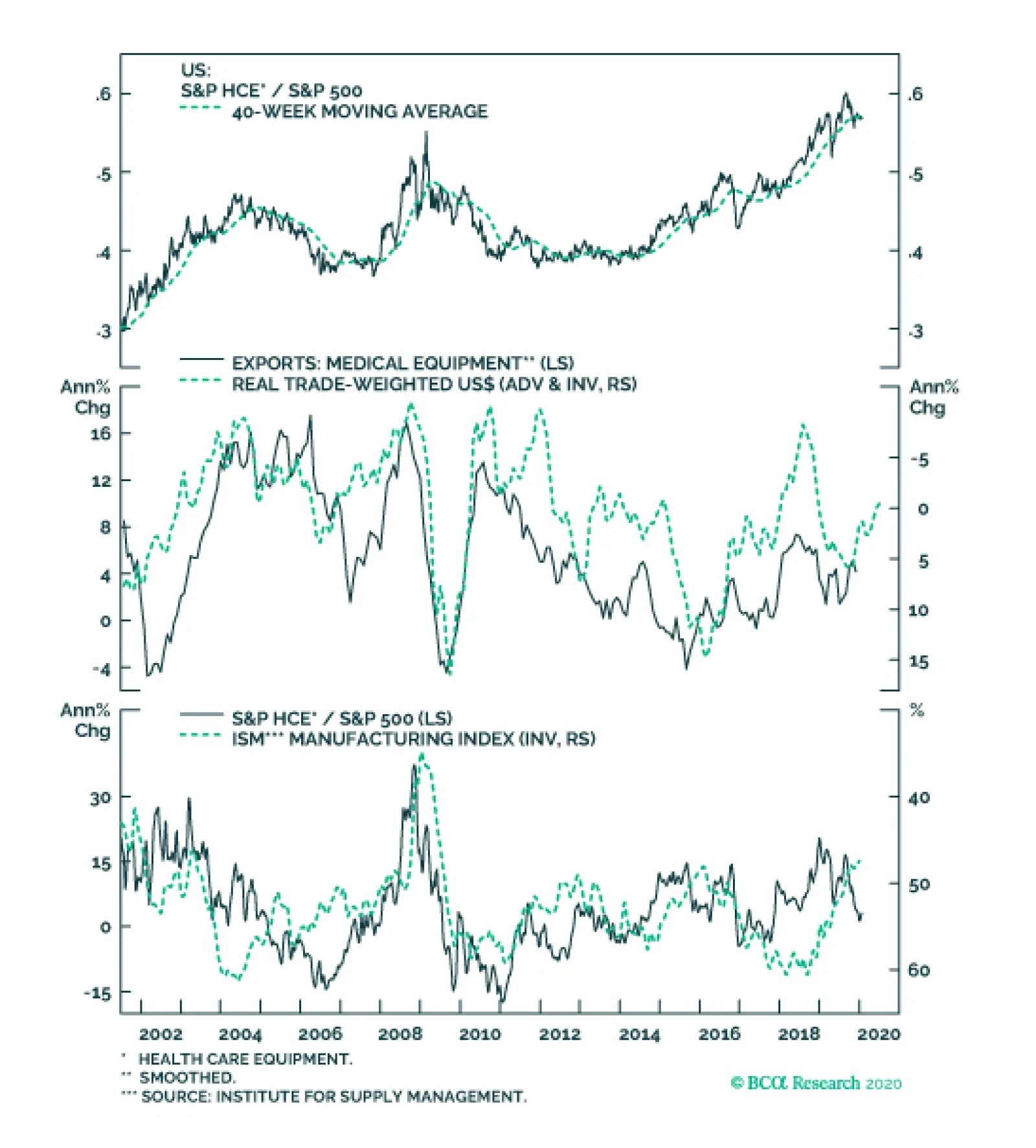
US medical equipment manufacturers are world leaders in supplying hospitals with quality equipment. Given that BCA’s house view for 2020 calls for a weaker dollar, HCE exporters have a bright future. Further, the industry also showcases some of its…

Overweight The S&P software index has gone parabolic. SPX returns are extremely concentrated as we showed on Monday’s Weekly Report, with the S&P software & services GICS2 sector being responsible for 18% of the broad market’s gains since late-2018 (see bar chart below). We are participating in this rally via sustaining an overweight stance in the S&P software index – a positon that is currently up nearly 40% since inception in relative terms. However, we are compelled to raise our trailing stop to 32% (from 27% previously) as this concentrated nature of returns is making us uneasy. Should it get triggered, it will have a domino effect on our portfolio. The move to a benchmark S&P software index allocation will push the broad S&P technology sector to underweight, and consequently tilt the portfolio to a modest defensive over cyclical bent. Bottom Line: Remain overweight the S&P software index, but tighten the trailing stop to the 32% relative return mark. The ticker symbols for the stocks in this index are: BLBG – S5SOFT: MSFT, ADBE, CRM, ORCL, INTU, NOW, ADSK, ANSS, SNPS, CDNS, NLOK, FTNT, CTXS.
Protecting Gains
Protecting Gains

Security holdings by US banks lead economic activity and thus, Treasury yields. By stockpiling liquid assets, commercial banks are accumulating the necessary liquidity that banks can then transform into loan and money growth once the nonfinancial private…
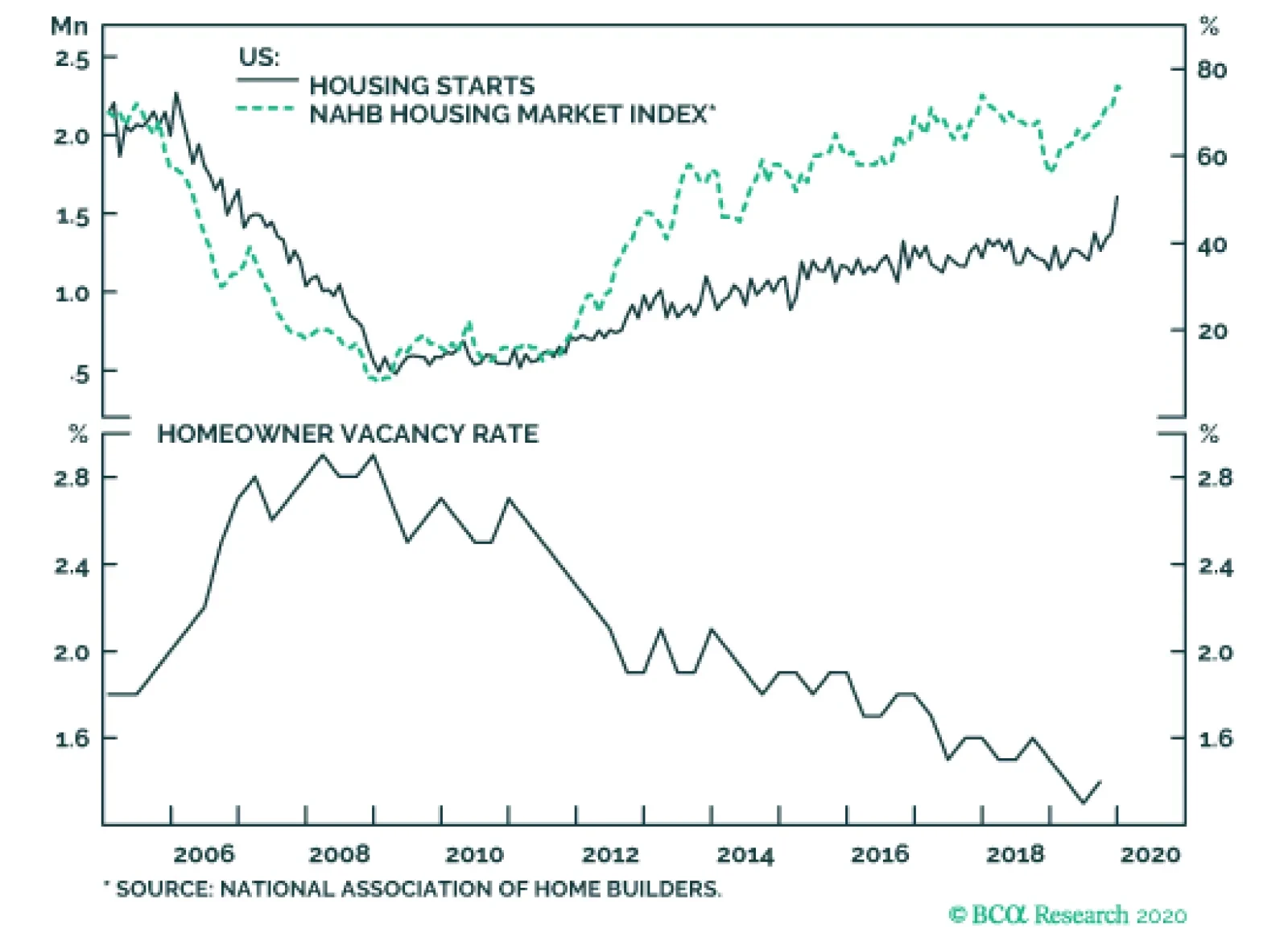
In December, US housing starts surged to their highest level in 13 years. Housing starts are a noisy series, but the 41% annual growth rate was undeniably phenomenal. Moreover, it was driven by both single family and multifamily units. Such a pace of…
Closing Materials Underweight
Closing Materials Underweight
Neutral Our recent gold miners overweight has pushed the broad materials sector from underweight to neutral. Simultaneously, macro data also suggests that it no longer pays to be bearish materials stocks. Our materials sector profit growth model has troughed and signals that a turnaround in EPS growth is underway and should gain steam this year (second panel). Keep in mind that this niche deep cyclical sector has borne the brunt of the Sino/American trade war and the recent de-escalation can serve as a catalyst for an earnings-led recovery. Moreover, this industry is not at a standstill. Contrary to the overall economy, materials executives are investing in new projects as financial market reported materials sector capex clearly shows (third panel). These investments should bear fruit in coming quarters and translate into higher top line growth, something that is not at all discounted in bombed out relative sales growth expectations (bottom panel). Bottom Line: Book relative gains of 5% since inception and lift the S&P materials sector to a benchmark allocation. Please refer to this Monday’s Weekly Report for more details.
Highlights The euro area bond yield 6-month impulse recently hit 100 bps, constituting the strongest headwind to growth for three years. Nine times out of ten, the strong headwind to nominal growth pushes the bond yield to a lower level six months later. Downgrade banks and materials to underweight. Downgrade the Eurostoxx 50 to underweight versus the S&P 500 and the Nikkei 225. Upgrade Switzerland to overweight, and upgrade Denmark to neutral. Downgrade Sweden to neutral, and downgrade Spain and Austria to underweight. Fractal trade: short NZD/JPY. Feature Chart of the WeekIf You Get The Bond Yield Right, You'll Get Banks Right Too
If You Get The Bond Yield Right, You'll Get Banks Right Too
If You Get The Bond Yield Right, You'll Get Banks Right Too
The analysis in this report differs from the BCA house view which is overweight European versus US equities and expects modestly higher bond yields in the next six months. The euro area 10-year bond yield stands at a miserly 50 bps, though admittedly this does mark a 60 bps increase from its record low of -10 bps last August (Chart I-2).1 However, if you look only at the level or the change in the bond yield you will miss the bigger story. As we explained in Four Impulses, Three Mistakes, the bond yield’s impact on growth accelerations and decelerations comes neither from its level nor from its change – instead, the impact comes from the change in its change, the bond yield impulse.2 Chart I-2The Recent Rise In Bond Yields Followed A Sharp Decline In The Preceding Six Months
The Recent Rise In Bond Yields Followed A Sharp Decline In The Preceding Six Months
The Recent Rise In Bond Yields Followed A Sharp Decline In The Preceding Six Months
The Strongest Headwind Impulse For Three Years The euro area bond yield 6-month impulse recently hit 100 bps, its highest mark, and therefore its strongest headwind to growth, for three years. The impulse hit such a high mark because the recent rise in yields followed a sharp decline in yields in the preceding six months. The euro area bond yield 6-month impulse recently hit 100 bps, its highest mark, and therefore its strongest headwind to growth, for three years. Since the turn of the century, the euro area bond yield 6-month impulse has reached the 100 bps strong headwind mark ten times. Nine times out of the ten, the strong headwind to nominal growth pushed the yield to a lower level six months later. That’s the bigger story. The one exception was in 2006 at the frothy end of the credit bubble which bears no resemblance to today. In any case, nine times out of ten are odds that we wouldn’t want to bet against right now (Chart I-3). Chart I-3Nine Times Out Of Ten, A Strong Headwind Bond Yield Impulse Pushes Yields To A Lower Level Six Months Later
Nine Times Out Of Ten, A Strong Headwind Bond Yield Impulse Pushes Yields To A Lower Level Six Months Later
Nine Times Out Of Ten, A Strong Headwind Bond Yield Impulse Pushes Yields To A Lower Level Six Months Later
Suffice to say, in the vast majority of these cases the lower bond yield also hurt bond yield proxies in the equity market such as banks and materials. The Bond Yield Drives Sector Strategy Investment is complex but it is not complicated. The words complex and complicated are often used interchangeably but they mean different things. Complex means something that is not fully predictable or analysable, whereas complicated means something that is made up of many parts. A car’s movement in traffic is complex, but it is not complicated. A car engine is complicated, but it is not complex. Unlike a car engine, investment is not complicated. This is because investment has just a few key parts that drive everything, albeit these parts are themselves highly complex. The objective of investment is to identify the few key parts that drive everything and to conquer their complexity. One key part is the bond yield. The Chart of the Week and Chart I-4 should leave you in no doubt that if you get the bond yield right, you will also get the relative performance of banks right, whether you are in Europe, Japan, or, for that matter, anywhere. Chart I-4If You Get The Bond Yield Right, You'll Get Banks Right Too
If You Get The Bond Yield Right, You'll Get Banks Right Too
If You Get The Bond Yield Right, You'll Get Banks Right Too
The connection between the bond yield and bank performance is twofold. First, to the extent that a higher bond yield reflects higher nominal economic growth, it also likely reflects higher growth in bank credit, which effectively constitutes bank ‘sales’. Second, a higher bond yield also typically signifies a steeper yield curve, which lifts bank net interest (profit) margins. And vice versa for a lower bond yield. Investment is complex but it is not complicated. Likewise, Chart I-5 should also leave you in no doubt that if you get the bond yield right you will also get commodity prices right. Again, this is not surprising. The higher nominal economic growth reflected in a higher bond yield could come from stronger real demand or from higher inflation, either of which would be bullish for commodity prices. And vice versa for a lower bond yield. Albeit the causality can sometimes go the other way, from a commodity price shock via inflation to the bond yield. Chart I-5If You Get The Bond Yield Right, You'll Get Commodity Prices Right Too
If You Get The Bond Yield Right, You'll Get Commodity Prices Right Too
If You Get The Bond Yield Right, You'll Get Commodity Prices Right Too
However, the bond yield’s movement itself is highly complex because it is subject to numerous feedback loops. One feedback loop is that the valuation of equities and other risk-assets depends inversely and exponentially on the bond yield level. A higher yield will ultimately undermine equity and other risk-asset prices and thereby unleash a deflationary impulse, and vice versa. A separate feedback loop comes via the direct impact on economic accelerations and decelerations which, as we have just seen, depends on the bond yield impulse – which is to say, its second derivative. Mathematicians will immediately recognise this setup as a second order differential equation with delayed negative feedback. They will tell you that it describes a complex adaptive system (CAS) which you cannot predict or analyse with any certainty. The best you can do is understand the probabilities that the system goes in one direction or the other. Based on the euro area bond yield impulse at a strong headwind mark, and the previous ten outcomes from this setup, there is a high probability that the post-August burst of outperformance from banks and materials is now over. Accordingly, we are now downgrading both banks and materials to underweight. Sector Strategy Drives Regional And Country Strategy To repeat, investment is highly complex but it is not highly complicated. If you get the bond yield right you will get your equity sector strategy right. And if you get your equity sector strategy right you will automatically get your regional and country allocation right too. This is because each major stock market has a distinguishing ‘long’ sector in which it contains up to a quarter of its total market capitalisation, as well as a distinguishing ‘short’ sector in which it has a significant under-representation. The combination of this long sector and short sector gives each equity index its distinguishing fingerprint which drives relative performance (Table I-1): Table 1The Sector Fingerprints Of Major Regional Stock Markets
Strong Headwind Warrants Caution In H1
Strong Headwind Warrants Caution In H1
FTSE 100 = long energy, short technology. Eurostoxx 50 = long banks, short technology. Nikkei 225 = long industrials, short banks and energy. S&P 500 = long technology, short materials. MSCI Emerging Markets = long technology, short healthcare. Specifically, the Eurostoxx 50 has an 11 percent overrepresentation to banks and materials versus both the S&P 500 and the Nikkei 225. Against the S&P 500 it is at the expense of technology and against the Nikkei 225 it is at the expense of industrials. It follows that if banks and materials underperform technology and industrials, the Eurostoxx 50 must underperform the S&P 500 and the Nikkei 225. Chart I-6 and Chart I-7 should convince you that there are no ifs, buts, or maybes. Chart I-6Euro Stoxx 50 Vs. S&P 500 = Global Banks In Euros Vs. Global Technology In Dollars
Euro Stoxx 50 Vs. S&P 500 = Global Banks In Euros Vs. Global Technology In Dollars
Euro Stoxx 50 Vs. S&P 500 = Global Banks In Euros Vs. Global Technology In Dollars
Chart I-7Euro Stoxx 50 Vs. Nikkei 225 = Global Banks In Euros Vs. Global Industrials In Dollars
Euro Stoxx 50 Vs. Nikkei 225 = Global Banks In Euros Vs. Global Industrials In Dollars
Euro Stoxx 50 Vs. Nikkei 225 = Global Banks In Euros Vs. Global Industrials In Dollars
Accordingly we are now downgrading the Eurostoxx 50 to underweight versus the S&P 500 and the Nikkei 225. Exactly the same principle applies to the stock markets within Europe. Relative performance comes from nothing more than the stock market’s long and short sector fingerprint combined with sector performance (Table I-2 and Table I-3). Table I-2The Sector Fingerprints Of Euro Area Stock Markets
Strong Headwind Warrants Caution In H1
Strong Headwind Warrants Caution In H1
Table I-3The Sector Fingerprints Of Non Euro Area European Stock Markets
Strong Headwind Warrants Caution In H1
Strong Headwind Warrants Caution In H1
Based on the expected underperformance of banks and materials, we are now upgrading Switzerland to overweight, and upgrading Denmark to neutral. Also, we are downgrading Sweden to neutral, and downgrading Spain and Austria to underweight (Chart I-8). Chart I-8Spain = Long Banks
Spain = Long Banks
Spain = Long Banks
Fractal Trading System* This week's recommended trade is short NZD/JPY. Set the profit target at 2.3 percent with a symmetrical stop-loss. The rolling 1-year win ratio now stands at 61 percent. Chart I-9NZD/JPY
NZD/JPY
NZD/JPY
When the fractal dimension approaches the lower limit after an investment has been in an established trend it is a potential trigger for a liquidity-triggered trend reversal. Therefore, open a countertrend position. The profit target is a one-third reversal of the preceding 13-week move. Apply a symmetrical stop-loss. Close the position at the profit target or stop-loss. Otherwise close the position after 13 weeks. * For more details please see the European Investment Strategy Special Report “Fractals, Liquidity & A Trading Model,” dated December 11, 2014, available at eis.bcaresearch.com. Dhaval Joshi Chief European Investment Strategist dhaval@bcaresearch.com Footnotes 1 This is the weighted average of 10-year government bond yields in the euro area, weighted by the stock of government issued debt. 2 Please see the European Investment Strategy Weekly Report “Four Impulses, Three Mistakes” October 31, 2019 available at eis.bcaresearch.com. Fractal Trading System
Strong Headwind Warrants Caution In H1
Strong Headwind Warrants Caution In H1
Strong Headwind Warrants Caution In H1
Strong Headwind Warrants Caution In H1
Cyclical Recommendations Structural Recommendations
Strong Headwind Warrants Caution In H1
Strong Headwind Warrants Caution In H1
Strong Headwind Warrants Caution In H1
Strong Headwind Warrants Caution In H1
Strong Headwind Warrants Caution In H1
Strong Headwind Warrants Caution In H1
Strong Headwind Warrants Caution In H1
Strong Headwind Warrants Caution In H1
Trades Closed Trades Asset Performance Currency & Bond Equity Sector Country Equity Indicators Bond Yields Chart II-1Indicators To Watch - Bond Yields
Indicators To Watch - Bond Yields
Indicators To Watch - Bond Yields
Chart II-2Indicators To Watch - Bond Yields
Indicators To Watch - Bond Yields
Indicators To Watch - Bond Yields
Chart II-3Indicators To Watch - Bond Yields
Indicators To Watch - Bond Yields
Indicators To Watch - Bond Yields
Chart II-4Indicators To Watch - Bond Yields
Indicators To Watch - Bond Yields
Indicators To Watch - Bond Yields
Interest Rate Chart II-5Indicators To Watch - Interest Rate Expectations
Indicators To Watch - Interest Rate Expectations
Indicators To Watch - Interest Rate Expectations
Chart II-6Indicators To Watch - Interest Rate Expectations
Indicators To Watch - Interest Rate Expectations
Indicators To Watch - Interest Rate Expectations
Chart II-7Indicators To Watch - Interest Rate Expectations
Indicators To Watch - Interest Rate Expectations
Indicators To Watch - Interest Rate Expectations
Chart II-8Indicators To Watch - Interest Rate Expectations
Indicators To Watch - Interest Rate Expectations
Indicators To Watch - Interest Rate Expectations
Three EPS Scenarios
Three EPS Scenarios
In this Monday’s Weekly Report we build on our four-factor S&P 500 EPS model by plugging in our base, worse, and best case estimates of the four variables and got as output the model’s EPS growth estimate for the calendar 2020. We then assigned probabilities to those three outcomes resulting in an EPS forecast of $169/share. Next, we introduced our base, worse and best case forward P/Es (with an equal probability of occurrence) and multiplied them with our $169/share weighted EPS forecast in order to arrive at the SPX 3,049 expected value for end-2020. The Chart on the right depicts results of our analysis, which also suggests that the SPX is currently 8% overvalued. Bottom Line: We remain cautious on the prospects of the broad equity market. For a more detailed discussion of our EPS analysis please refer to this Monday’s Weekly Report.
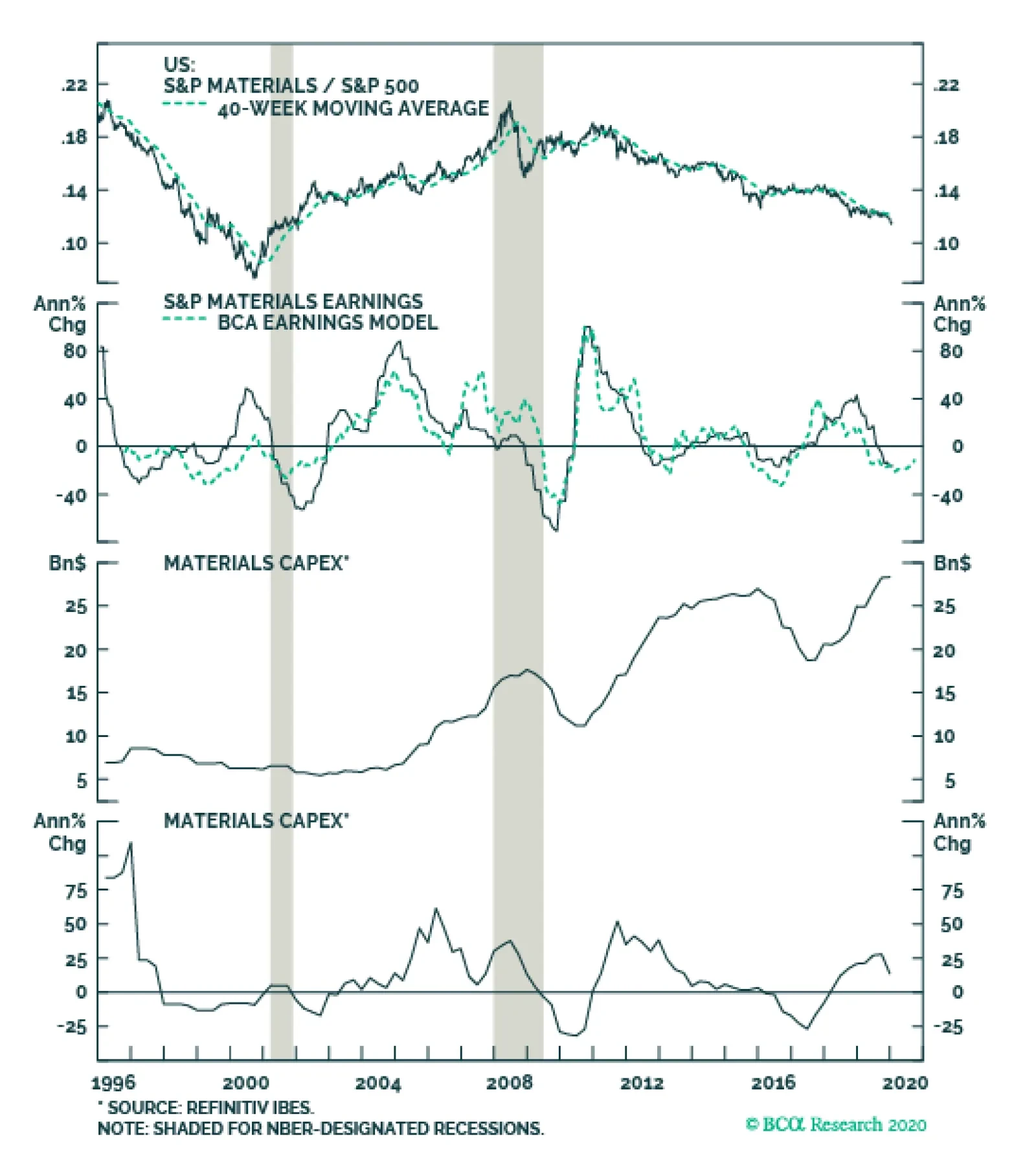
The sell-side has given up on this niche deep cyclical sector, but it no longer pays to be bearish materials stocks. Our materials sector profit growth model has troughed and signals that a turnaround in EPS growth should gain steam this year. Keep in mind…
Highlights Portfolio Strategy Gold bullion is on the move again, and falling real yields, a soft economic backdrop, a depreciating US dollar and resurgent geopolitical uncertainty, all argue for reintroducing a modest portfolio hedge by overweighting the global gold mining index. Washed out technicals, depressed valuations, the turn in our EPS growth model, rising industry capex and bottoming EM-related financial market data, all signal that it no longer pays to be bearish materials stocks. Augment exposure to neutral. Recent Changes Boost global gold miners to overweight via the long GDX/short ACWI exchange traded funds, today. Book gains and lift the S&P materials sector to neutral, today. Table 1Sector Performance Returns (%)
Three EPS Scenarios
Three EPS Scenarios
Feature “There is nothing so disturbing to one's well-being and judgment as to see a friend get rich.” - Charles P. Kindleberger “The bubble involves the purchase of an asset, usually real estate or a security, not because of the rate of return on the investment but in anticipation that the asset or security can be sold to someone else at an even higher price; the term the ‘greater fool’ has been used to suggest the last buyer was always counting on finding someone else to whom the stock or the condo apartment or the baseball cards could be sold.” - Charles P. Kindleberger Equities broke out to fresh all-time highs in the second week of the year, shrugging off the flare up in geopolitical risk. It seems that nothing can derail this juggernaut and the following narrative is now prevalent: Bad news is actually good for equities because the Fed will step in and do more QE and cut interest rates anew. Good news is great because the Fed will not hike interest rates as the economy is chugging along. No news is good news as money has to flow somewhere and equities are the default answer. Kindleberger’s quotes above are instructive. To put the recent advance in perspective, the SPX is up 425 points uninterruptedly since early October – when the Fed commenced ramping up its Treasury purchases – and it is, at a minimum, headed for a much needed breather. Contrary to popular belief, a handful of tech stocks explain this recent meteoric rise rather than a broad-based advance (Chart 1). Currently, the top five stocks in the S&P 500 (AAPL, MSFT, GOOGL, AMZN & FB) comprise over 18% of its market cap, even higher than the late-1999/early-2000 concentration (top panel, Chart 1). On January 9, 2020, AAPL’s $30bn one day market cap increase was larger than the bottom 300 stocks’ market cap in the S&P 500 and is another anecdote that drives this return concentration point home. Chart 1Teflon Tech Stocks
Teflon Tech Stocks
Teflon Tech Stocks
As a reminder, we are neutral the broad tech sector and overweight the largest subgroup, the S&P software index, thus participating in this euphoric rise in stocks that has been defying earnings fundamentals. Granted, such phenomena are prevalent late cycle. While this can go on for a bit longer, it is clearly unsustainable and represents a big risk especially given the proliferation of passive funds. Tack on rising geopolitical risks and the odds of a sharp drawdown increase significantly. Before we proceed to our SPX EPS analysis, however, it is worth noting some disappointing economic data. The decade low in the ISM manufacturing, the deceleration in non-farm payroll growth, the grinding higher in the 4-week average of unemployment insurance claims, the contraction in C&I loans, the sustained pessimism in CEO confidence and the down hook in average hourly earnings all warn that macro headwinds abound despite the looming signing of the “phase one” US/China trade deal (Chart 2). All of the rise in the SPX last year was due to multiple expansion. Now, in order for the SPX to continue rallying, profits will have to do the heavy lifting. However, our analysis shows that the market is fully priced and earnings will have to hit escape velocity in order for equities to grow into their pricey valuations (Chart 3). Chart 2Underwhelming
Underwhelming
Underwhelming
Chart 3Lofty Valuations
Lofty Valuations
Lofty Valuations
Currently, our SPX EPS growth model has no pulse. This four-factor macro model is regression based (out of sample since January 2014) and continues to forecast a contraction into mid-year (Chart 4). Chart 4No EPS Pulse
No EPS Pulse
No EPS Pulse
Table 2 summarizes three EPS scenarios analysis, along with a forward P/E multiple and SPX forecast. Table 2Three Scenarios
Three EPS Scenarios
Three EPS Scenarios
This week we are re-instituting a small portfolio hedge, which lifts a niche deep cyclical sector to neutral from previously underweight. Step 1: We plugged into the model our base, worse and best case estimates of these four variables into mid-year, and we got as output the model’s estimate of EPS growth for end-2020 with a range of -1% to 10% (one important assumption is that the historical correlation of the movement of these variables holds steady). Step 2: Then, we applied these growth rates to the IBES 2019 EPS forecast of $162/share and arrived at our end-2020 three scenarios EPS level estimates with a range of $160/share to $178/share. Step 3: We then assigned probabilities to those three outcomes resulting in an EPS forecast of $169/share. Step 4: In order to get an SPX expected value we needed to assign a forward P/E multiple to our EPS estimate. Thus, we introduced our base, worse and best case forward P/Es (with an equal probability of occurrence) and multiplied them with our $169/share weighted EPS forecast in order to arrive at the SPX 3,049 expected value for end-2020 (please refer to the Appendix below for additional details of our analysis and click here if you would like to request the excel file and insert your own estimates and probabilities). Chart 5 depicts the results of our analysis. Chart 5Projections
Projections
Projections
Currently, sell-side analysts expect 10% profit growth in calendar 2020, a tall order in our view, and the SPX appears 8% overvalued according to our analysis. However, a potential break in historical correlations where the ISM recovers, the bond market sells off fearing an inflationary spurt pushing interest rates higher yet P/E multiples continue to expand indiscriminately, could sustain the melt-up phase in stocks in general and mega cap tech stocks in particular. While the macro data cannot fall indefinitely and a natural trough will occur sometime in the first half of the year, we doubt that a V-shaped recovery is imminent. Our base case is a stabilization of macro data equating to roughly 5% EPS growth for this year as noted above, with risks clearly titled to the downside. Under such a backdrop, perceptive equities will have to, at least, mildly deflate to this EPS reality. This week we are re-instituting a small portfolio hedge, which lifts a niche deep cyclical sector to neutral from previously underweight. In Gold We Trust While the SPX has been on an impressive run, it has failed to outshine gold bullion that has been on a tear lately. The bottom panel of Chart 6 shows that gold could be sniffing out a couple of Fed interest rate cuts, warning that the economic backdrop remains frail. This gold move is compelling us to reintroduce a modest portfolio hedge and today we recommend augmenting exposure to global gold miners to overweight. Chart 6What Is Gold Sniffing Out?
What Is Gold Sniffing Out?
What Is Gold Sniffing Out?
Global gold miners have a lot going for them. Rising global policy uncertainty plays to their strength as investors seek the refuge of safe haven assets especially when geopolitical risks flare up (top panel, Chart 7). If our FX strategists hit the bull’s eye and the greenback loses steam this year,1 then gold related equities should outperform given the inverse correlation most commodities, including bullion, enjoy with the US dollar (bottom panel, Chart 7). Chart 7Solid Backdrop
Solid Backdrop
Solid Backdrop
Importantly, real US bond yields have taken a beating recently underpinning gold prices and gold mining equities. This is significant, as bullion yields nothing and gold miners next to nothing so from an opportunity cost perspective it pays to hold a zero yielding asset when competing yields fall and vice versa (second panel, Chart 7). Worrisomely, this fall in real US yields is de facto pushing global real yields lower, which might indicate that investors worry that the global economy has more downside. In fact, economists’ estimates for GDP growth (as compiled by Bloomberg, third panel, Chart 7) continue to decelerate globally, and they forecast below-trend real output growth in the US for 2020. Global manufacturing also reflects this soft economic backdrop. While the global manufacturing PMI is trying to trough – it ticked down last month and is just a hair above the boom/bust line – both its momentum and diffusion are weak, heralding a catch up phase in global gold miners (PMI momentum shown inverted, Chart 8). Chart 8Global Economy Not Out Of The Woods Yet
Global Economy Not Out Of The Woods Yet
Global Economy Not Out Of The Woods Yet
Boost global gold miners to an above benchmark allocation via the long GDX/short ACWI exchange traded funds. From a gold positioning perspective, on all three fronts we monitor (gold ETF holdings, gold net speculative positions and bullish consensus on gold) we see green lights (Chart 9). Even global gold miners’ extremely overbought positions have now been worked out according to our Technical Indicator (TI). Following the parabolic bull run from May to September last year, our TI is now drifting to the neutral zone. Relative valuations have also corrected offering investors a compelling entry point (Chart 10). Chart 9Enticing Sentiment
Enticing Sentiment
Enticing Sentiment
Chart 10Compelling Entry Levels
Compelling Entry Levels
Compelling Entry Levels
In sum, gold bullion is on the move again and falling real yields, a soft economic backdrop, a depreciating US dollar and resurgent geopolitical uncertainty, all argue for reintroducing a modest portfolio hedge by overweighting the global gold mining index. Bottom Line: Boost global gold miners to an above benchmark allocation via the long GDX/short ACWI exchange traded funds. Lift Materials To Neutral While materials stocks have broken down recently, our fresh gold miners overweight lifts the broad materials sector from previously underweight to currently neutral (Chart 11). Not only have relative share prices given way, but also breadth is weak as measured both by the percentage of groups with a positive year-over-year momentum and by the number of groups trading above their 40-week moving average (Chart 12). Moreover, relative valuations are downbeat (second panel, Chart 12), with relative P/S and P/B cratering. Chart 11Breakdown
Breakdown
Breakdown
On the profit front, earnings breadth fell below neutral recently and net earnings revisions have collapsed. Wall Street analysts are even forecasting a dire relative revenue backdrop for the coming twelve months (Chart 13). Chart 12Washout
Washout
Washout
Chart 13Extreme Pessimism Reigns
Extreme Pessimism Reigns
Extreme Pessimism Reigns
While the sell-side has all but given up on this niche deep cyclical sector, we are going against the grain and posit that it no longer pays to be bearish materials stocks. First, our materials sector profit growth model has troughed and signals that a turnaround in EPS growth is underway and should gain steam this year (second panel, Chart 14). Keep in mind that this niche deep cyclical sector has borne the brunt of the Sino/American trade war and the recent de-escalation can serve as a catalyst for an earnings-led recovery (trade policy uncertainty shown inverted, Chart 11). Book relative gains of 5% since inception and lift the S&P materials sector to a benchmark allocation. Second, this industry is not at a standstill. Contrary to the overall economy, materials executives are investing in new projects as financial market reported materials sector capex clearly shows (third & bottom panels, Chart 14). These investments should bear fruit in coming quarters and translate into higher top line growth, something that is not at all discounted in bombed out relative sales growth expectations (bottom panel, Chart 13). Finally, there is tentative evidence that the EMs in general and China in particular are at least stabilizing. Not only are their manufacturing PMIs above the boom/bust line (not shown), but also financial market data suggest that the selling in materials stocks is nearing exhaustion. JP Morgan’s EM currency index is ticking higher, the CRB metals index is showing some signs of life and EM equities have been outperforming their global peers (Chart 15). Chart 14EPS Model Trough, Rising Capex…
EPS Model Trough, Rising Capex…
EPS Model Trough, Rising Capex…
Chart 15…And Firming Financial Market Data Signal It No Longer Pays To Be Bearish
…And Firming Financial Market Data Signal It No Longer Pays To Be Bearish
…And Firming Financial Market Data Signal It No Longer Pays To Be Bearish
Netting it all out, washed out technicals, depressed valuations, the turn in our EPS growth model, rising industry capex and bottoming EM-related financial market data all signal that it no longer pays to be bearish materials stocks. Bottom Line: Book relative gains of 5% since inception and lift the S&P materials sector to a benchmark allocation. Anastasios Avgeriou US Equity Strategist anastasios@bcaresearch.com Appendix Appendix 1
Three EPS Scenarios
Three EPS Scenarios
Appendix 2
Three EPS Scenarios
Three EPS Scenarios
footnotes 1 Please see BCA Foreign Exchange Strategy Weekly Report, “On Oil, Growth And The Dollar” dated January 10, 2020, available at fes.bcaresearch.com. Current Recommendations Current Trades Size And Style Views Stay neutral cyclicals over defensives (downgrade alert) Favor value over growth Favor large over small caps (Stop 10%)
Fading Insurance
Fading Insurance
Underweight The S&P insurance index is our sole underweight within the financials universe. The broad macro picture remains unwelcoming and compels us to keep the index at a below benchmark allocation. Falling yields stimulate consumer demand for houses and auto vehicles, which in turn allows insurance companies to raise prices and increase product sales (bottom panel). Today, all the yield related benefits are nearly exhausted as yields are turning from a tailwind into a headwind. As a reminder, BCA’s interest rate view calls for a sell-off in the bond market near 2.25-2.5% for this year. On the operating front, our insurance profit margin proxy – consisting of wage bill and related CPI data – has taken a nosedive, signaling that insurance companies are failing to make the necessary cost adjustments to offset pricing pressures and falling demand. Bottom Line: We remain underweight the S&P insurance index. The position is up 16% since inception. The ticker symbols for the stocks in this index are: BLBG: S5INSU - AIG, CB, MET, MMC, PRU, TRV, AFL, AON, ALL, PGR, WLTW, HIG, PFG, L, CINF, LNC, AJG, UNM, AIZ, RE, GL, WRB.