Sectors

Highlights U.S. growth will soon rebound thanks to robust drivers of domestic activity, and strengthening money and credit trends. The U.S. Federal Reserve will maintain an easing bias and will expand its balance sheet again. A growing Fed balance sheet will catalyze an underlying improvement in global liquidity conditions and boost the global economy. Brexit, China and Iran are key risks. The dollar will depreciate, bond yields will rise further and silver will outperform gold. Equities will surpass bonds on both cyclical and structural investment horizons. Financials and energy are more attractive than tech and healthcare. Thus, Europe is becoming increasingly appealing relative to the U.S. Feature Global equities are only 5% below their January 2018 all-time highs and the S&P 500 is close to breaking out above its July 2019 record. Meanwhile, yields are rebounding and value stocks are crushing momentum plays. Are these trends durable? Global growth is the key. If economic activity around the world can stabilize and ultimately improve, then stocks will break out and bond prices will suffer in the coming year. Otherwise, these recent financial market developments will undo themselves. Even if current activity remains weak, the outlook for global growth is looking up, despite trade wars, Brexit, Middle East tensions and problems in the interbank market. Therefore, we continue to favor stocks over bonds, because the backup in yields has further to go. If the dollar weakens, our pro-risk stance will only strengthen. U.S. Growth Drivers Are Healthy Chart I-1Recession Indicators Are Flashing A Yellow Flag
Recession Indicators Are Flashing A Yellow Flag
Recession Indicators Are Flashing A Yellow Flag
The U.S. is near the end of a potent mid-cycle slowdown, but a recession will be avoided. Current conditions support an improvement in U.S. activity next year, even if key recessionary indicators, such as the yield curve and the annual rate of change of the Leading Economic Indicator, are still sending muddy signals (Chart I-1). U.S. growth will intensify because of five fundamental factors that will ultimately push the LEI higher and force the yield curve to re-steepen: A budding housing rebound, robust household spending, a stabilizing manufacturing sector, limited inflationary pressures, and a pick-up in money and credit trends. Housing The housing market has stabilized, buoyed by strong household formation, decent affordability, passing of the shock created by the cap in state and local tax deductions, and a 110-basis point collapse in mortgage yields since November 2018. Housing market indicators are finally catching up with leading variables, such as mortgage applications. In the past nine months, the NAHB housing market index has recovered nearly two-thirds of its decline since December 2018. Building permits and housing starts are at their highest levels since 2007, despite a significant fall last year. Even existing home sales have increased by 11% since December and are tracking the stimulation offered by lower borrowing costs (Chart I-2). Chart I-2The Housing Recovery Is Real
The Housing Recovery Is Real
The Housing Recovery Is Real
Residential investment should soon boost economic activity after curtailing the level of GDP by 1% over the past six quarters. Moreover, rebounding housing activity implies that policy is not constraining growth. The real estate sector is historically the most sensitive to monetary conditions. Households Are Still Doing Well Core U.S. real retail sales continue to grow at a more than 4% annual pace and the Atlanta Fed GDPNow model forecasts a healthy 3.1% annual rise in consumer spending in the third quarter. This resilience is particularly impressive in the face of economic uncertainty and an ISM Manufacturing index below the 50 boom-bust line. Strong balance sheets are crucial to households. After 12-years of deleveraging, household debt has contracted by 37 percentage points to 99% of disposable income. Consequently, debt-servicing costs only represent 10% of disposable income, the lowest level in more than 45 years. Moreover, the household savings rate is a healthy 7.9% of after-tax income, which is particularly high in the context of the highest net worth ever and the lowest debt-to-asset ratio since 1985. Household income creates an additional support to consumption. Real disposable income is expanding at a 3% annual rate, despite slowing job creation. A tight labor market explains this apparent paradox. The employment-to-population ratio for prime-age workers is our favorite measure of labor market slack, and it has escalated to 79.7%, a level consistent with the 2.9% pace of annual growth in wages and salary (Chart I-3). The UAW strike at GM, the quits-rate at an 18-year high, and the difficulties small firms face to find qualified workers, all suggest that wages (and thus, consumption) will remain well underpinned (Chart I-3, bottom panel). Improving Manufacturing Outlook Manufacturing activity is set to rebound, despite the weakness in the ISM Manufacturing index. Recent industrial production numbers have already improved. Monthly IP expanded at a 0.6% monthly pace in August, but as recently as April, it was shrinking at a -0.6% rate. U.S. monetary conditions will continue to support asset prices and worldwide economic activity for the coming 18 months or so. The car sector will soon bottom. Weak auto production has been a primary diver of the recent global manufacturing slowdown. The automotive component of GDP contracted at a stunning 29.1% annual rate in the second quarter. However, U.S. light-vehicle sales are essentially flat. This dichotomy implies that the automobile sector’s inventories are contracting briskly (Chart I-4). Chart I-3A Tight Labor Market Supports Consumption
October 2019
October 2019
Chart I-4Will Auto Production Rebound Soon?
Will Auto Production Rebound Soon?
Will Auto Production Rebound Soon?
Capex should also recover. Last quarter, investment in structures and equipment subtracted from GDP growth. Before this, capex intentions had fallen significantly, now, the Philly Fed’s capital expenditure component is trying to stabilize. Capex must stop falling if global manufacturing is to strengthen. Limited Inflationary Pressures Inflationary pressures remain muted in the U.S., which supports growth in two ways. First, muted inflation allows the Fed to maintain accommodative monetary conditions. In the absence of crippling debt-servicing costs, easy policy guarantees a continued expansion. Secondly, low inflation keeps real income growth higher and increases the welfare of households. At 2.4%, core CPI is perky, but will soon roll over. Core goods prices have been driving fluctuations in aggregate core prices in the past three years, while service sector inflation has been stable at 2.7% during this period. Goods inflation will soon weaken for the following reasons: Chart I-5The Trade War Is Masking The Economy's Deflationary Tendencies
The Trade War Is Masking The Economy's Deflationary Tendencies
The Trade War Is Masking The Economy's Deflationary Tendencies
Soft global economic activity will drive down global inflation. Inflation lags real activity and proxies for the global economy, such as Singapore’s GDP, point to weaker core CPI in the OECD (Chart I-5). This weakness will act as a drag on U.S. inflation because U.S. goods prices have a large international component. U.S. import prices peaked 15 months ago and they normally lead goods inflation by roughly a year and a half. The strength in the broad trade-weighted dollar, which has climbed by nearly 15% in the past 18 months to an all-time high, will hurt goods prices. U.S. capacity utilization declined through 2019 and remains well below the 80% level that historically causes core goods prices to overheat. The White House’s tariffs on China are boosting inflation but this effect will prove transitory. The tariffs are pushing up inflation for goods touched by the levies, while unaffected goods are experiencing deflation (Chart I-5, bottom panel). Given that tariffs have a one-off impact and that inflation expectations are hovering near record lows, inflation for tariffed-goods will converge toward the underlying trend in non-tariffed goods. Stronger Money And Credit Trends Money and credit trends indicate that the recent slump will not translate into a recession. Moreover, improving U.S. private-sector liquidity conditions argues that the mid-cycle slowdown is ending. Chart I-6Liquidity Indicators Point To A Growth Rebound
Liquidity Indicators Point To A Growth Rebound
Liquidity Indicators Point To A Growth Rebound
U.S. broad money is recovering. After falling to 0.9% last November, U.S. real M2 growth is expanding at a 3% annual rate, a pace in keeping with the end of mid-cycle slowdowns. Moreover, money is also accelerating relative to credit issuance, which historically has pointed to quicker industrial activity. Similarly, our U.S. financial liquidity index is rapidly escalating, a development that normally precedes turning points in the ISM manufacturing (Chart I-6) index. Credit activity is also picking up. Corporate bond issuance is firming and, according to the Fed’s Senior Loan Officer Survey, demand for loans is rebounding across the board. The yield collapse is boosting credit growth across the G-10. Gold is outperforming bonds, which confirms that a mid-cycle slowdown occurred. If inflation is not a problem, then the yellow metal always underperforms bonds ahead of recessions. However, before mid-cycle slumps, gold consistently outperforms bonds (Chart I-7). Chart I-7Bonds Outperform Gold Ahead Of Recession
Bonds Outperform Gold Ahead Of Recession
Bonds Outperform Gold Ahead Of Recession
More Fed Easing Imminent U.S. monetary conditions will continue to support asset prices and worldwide economic activity for the coming 18 months or so. The Fed will ease policy further and is a long way from tightening. Last week, the Federal Open Market Committee (FOMC) curtailed the fed funds target rate by 25 basis points to 2%. Additionally, while the median projection shows that Fed members expect no more rate cuts for at least the next 18 months, the reality is more subtle. Among 17 FOMC members, 7 expect to cut the fed funds rate by another 25 basis points by year end, and 8 foresee a lower policy rate in late 2020. The greenback is very expensive and will decline as global liquidity conditions improve. We are still on track for three 25-basis-point rate cuts this year. The Fed remains highly data dependent and is particularly sensitive to depressed inflation expectations. This means the Fed is acutely aware of the danger created by a sudden tightening in financial conditions. If by year-end the market has not moved away from discounting another cut in 2019, the FOMC will likely deliver this easing. Otherwise, financial conditions could suddenly tighten, which would hurt inflation expectations and the economic outlook. If global growth does not recover in early 2020, the Fed would probably cut rates an additional time in the first quarter, which would validate the current 12-month pricing in the OIS curve. Chart I-8Not Enough Excess Reserves
Not Enough Excess Reserves
Not Enough Excess Reserves
The Fed will again increase the size of its balance sheet. Interbank markets have boxed the FOMC into adding welcomed stimulus to the global economy. Allowing commercial bank excess reserves to grow anew will have a greater positive impact for global growth compared with rate cuts alone. Last month, we highlighted the risks to the repo market created by the combination of the dwindling of excess reserves, the bloated securities inventory of primary dealers financed via repo transactions, and the growth in the issuance of Treasurys.1 These risks materialized last week, when the Secured Overnight Financing Rate (SOFR) suddenly spiked above 5% (Chart I-8). To calm the market, the Fed injected $75 billion each day last week starting Tuesday to bring repo rates closer to the Interest Rate on Excess Reserves (IOER). But this is not a long-term solution. Chart I-9Higher Excess Reserves Will Hurt The Dollar And Boost Global Growth
Higher Excess Reserves Will Hurt The Dollar And Boost Global Growth
Higher Excess Reserves Will Hurt The Dollar And Boost Global Growth
Paradoxically, the crystallization of the repo market tensions is good news for the global economy because it will force the Fed to again expand its balance sheet as soon as next month. The supply of funds to the repo market needs to increase permanently, which means that banks’ excess reserves must re-expand. As we showed last month, higher excess reserves will hurt the U.S. dollar, lift EM exchange rates and boost global PMIs (Chart I-9). Higher excess reserves ease global liquidity conditions. The money injected will find its way to the rest of the world. The dollar trades 25% above its long-term, fair-value estimate of purchasing power parity. Therefore, a growing fiscal deficit indirectly financed by a larger Fed balance sheet will lead to a larger U.S. current account deficit, which in turn, will lift global FX reserves. As a result, the Fed’s custodial holdings of securities on behalf of other central banks will rise. Thus, global dollar-based liquidity will stop contracting relative to the stock of U.S. dollar-denominated foreign currency debt it supports (Chart I-10). Higher excess reserves will also ease global financial conditions. By boosting dollar-based liquidity, a larger Fed balance sheet will dampen offshore dollar interest rates. Moreover, rising excess reserves depreciate the greenback, which further cuts the cost of credit for foreign entities borrowing in U.S. dollars. This phenomenon is especially significant for EM. Therefore, we should see an easing of EM financial conditions, which are heavily dependent on EM exchange rates. Historically, looser EM financial conditions lead to stronger global growth (Chart I-11). Chart I-10High-Powered Liquidity Set To Improve
High-Powered Liquidity Set To Improve
High-Powered Liquidity Set To Improve
Chart I-11Easier EM FCI Should Lead To Faster Growth
Easier EM FCI Should Lead To Faster Growth
Easier EM FCI Should Lead To Faster Growth
Risks: The U.K., China And Iran While the outlook generally points to a rebound in global growth, which will create a positive environment for risk assets, the situations in the U.K., China, and Iran should be closely monitored. The U.K. Brexit remains a potential danger for the world even though our base case calls for a benign outcome. U.K. Prime Minister Boris Johnson’s gambit to push for a No-Deal Brexit to force the EU to make concessions could result in a miscalculation. Such a turn of events would plunge a European economy – already damaged by weak global trade – into recession. The dollar would strengthen and global financial conditions would tighten. Global growth would take another hit. Chart I-12U.K.: No Clear Winner Ahead Of A Potential Election
U.K.: No Clear Winner Ahead Of A Potential Election
U.K.: No Clear Winner Ahead Of A Potential Election
Following this week’s Supreme Court unanimous ruling against Johnson’s decision to prorogue Parliament, No-Deal carries a less than 10% probability. Johnson lacks a majority in a Parliament staunchly against a hard Brexit and he is unable to call an election prior to the October 31st deadline to leave the EU. Therefore, a delay is the most likely outcome, which will allow the EU and the U.K. to reach a deal on the Irish backstop that Parliament can then ratify. Ultimately, the U.K. needs another election to break the current logjam, which could materialize in November or December. However, the Remain vote is split between Labour, Lib Dems, and the SNP, but the Brexit vote is not nearly as divided. (Chart I-12). Hence, Brexit will remain a risk lurking in the background even if it does not morph into a full-blown assault on global growth. China Chart I-13Chinese Stimulus Remains Too Tepid To Move The Needle
Chinese Stimulus Remains Too Tepid To Move The Needle
Chinese Stimulus Remains Too Tepid To Move The Needle
China’s economic activity continues to soften. In August, industrial production and fixed-asset investment decelerated to 4.4% and 5.5%, respectively. Moreover, total social financing growth slowed on an annual basis and overall Chinese credit flows decreased as a share of GDP (Chart I-13). Chinese policy reflation remains too tepid to undo the drag created by trade uncertainty and the weakness in the marginal propensity to spend (Chart I-13, bottom panel). Sino-U.S. trade tensions have significantly decreased in recent months, but they will remain an important source of uncertainty for China and the world. China and the U.S. will again hold high-level talks next month, U.S. President Donald Trump has again postponed some of the tariff increases, and China is again buying mid-Western soybeans and pork. But last Friday’s cancelation of U.S. farm visits by Chinese officials reminds us that the situation is very fluid. Ultimately, China and the U.S. are long-term geopolitical rivals. Trump may be constrained by the 2020 election, but China could still drive a hard bargain. Hence, it is prudent to expect a stop-and-go pattern in the negotiations. Chart I-14Deflation Unleashes A Vicious Circle Of Higher Real Borrowing Costs
Deflation Unleashes A Vicious Circle Of Higher Real Borrowing Costs
Deflation Unleashes A Vicious Circle Of Higher Real Borrowing Costs
A weak China will sow the seeds of its own recovery. In addition to the negative effect on capex intentions and credit demand of trade uncertainty, Beijing faces deteriorating employment and producer price inflation of -0.8% (Chart I-14, top panel). As PPI inflation becomes more negative, heavily indebted corporate borrowers face rising real interest rates (Chart I-14, bottom panel). This higher cost of debt weakens an already vulnerable economy, unleashing a vicious circle. Chinese policymakers are unlikely to tolerate this situation for much longer. The cumulative 400-basis point cuts in the reserve requirement ratio since April 2018 are steps in the right direction, but are not yet enough. The dovish change to the Politburo’s and State Council’s language indicates that greater stimulus is forthcoming. Thus, credit expansion, local government special bonds issuance and fiscal stimulus will become even more prevalent in the final quarter of 2019. This policy should noticeably goose economic activity in 2020, which will help global growth accelerate. Iran Tensions are re-flaring and a spike in oil prices would threaten the fragile global economy. However, this remains a risk, not a central case. In the July issue of The Bank Credit Analyst, we warned that tensions with Iran were the greatest visible risk to global growth and risk assets.2 This danger came into focus last week with the drone attacks on the Khurais oil field and Abqaiq oil processing facility in Saudi Arabia, which curtailed global oil supply by an unprecedented 5.7 million bbl/day, or 5.5% of global demand. Unsurprisingly, Brent prices quickly surged by 12% to $68/bbl. Chart I-15Higher Energy Efficiency Makes The World More Robust
Higher Energy Efficiency Makes The World More Robust
Higher Energy Efficiency Makes The World More Robust
A durable spike in oil prices would push the global economy into a recession, especially while the global economy is already on weak footing. Chief U.S. Equity Strategist Anastasios Avgeriou reminded his clients3 that according to a seminal 2011 paper by Prof. James D. Hamilton, a doubling of oil prices preceded all but one of the post-war recessions.4 However, an oil-induced recession would likely be shallow because the oil intensity of the global economy has significantly declined in the past 30 years (Chart I-15). Moreover, global fiscal authorities would respond forcefully to an economic contraction, which would also limit the impact of the shock. There is a low likelihood that oil will double by year-end. It would require Brent prices to surge to $100/bbl. Saudi Arabia has already stated that production will return to pre-crisis levels in the coming days and not a single shipment will be missed. This promise implies further inventory drawdowns. Aramco also expects to achieve maximum output by late November. Moreover, higher oil prices will encourage further activity in the U.S. shale patch. Consequently, oil prices are unlikely to surge by another $35/bbl in the next three months. However, Brent prices could climb to $75/bbl next year, because while oil demand is set to recover, investors must also embed a greater risk premium against Saudi supply disruptions. A military conflict with Iran is a tail risk, but if it were to materialize, crude prices would surge by $35/bbl or more in an instant. According to Matt Gertken, BCA’s Chief Geopolitical strategist, the appetite for such a conflict is low in the U.S.5 President Trump has isolationist instincts and does not want to be mired in another conflict. Investment Implications The Dollar The dollar has significant downside. The greenback is very expensive and will decline as global liquidity conditions improve (Chart I-16). These dynamics reflect the countercyclical nature of the dollar and also lead to strong greenback momentum, both on the way up and down. The dollar would weaken in response to improving global growth and liquidity conditions, the lower dollar would ease global financial conditions, further stimulating the global economy. A virtuous circle could then emerge. Chart I-16Increasing Financial Liquidity Will Hurt The Greenback
Increasing Financial Liquidity Will Hurt The Greenback
Increasing Financial Liquidity Will Hurt The Greenback
Repatriation flows will also move from a tailwind to a headwind for the greenback. Prompted by both rising risk aversion and the Trump tax cuts, U.S. economic agents have repatriated $461 billion in the past 18 months. This has created powerful support for the USD (Chart I-17). The effect of the tax cut is vanishing and rising global growth will incentivize U.S. households and firms to buy foreign assets more levered to the global business cycle. In the process, they will sell the dollar. Chart I-17Repatriation Will Not Support The Dollar For Much Longer
Repatriation Will Not Support The Dollar For Much Longer
Repatriation Will Not Support The Dollar For Much Longer
The euro will continue to behave as the anti-dollar, a consequence of the pair’s plentiful market liquidity. Moreover, the euro trades at a 17% discount to its purchasing power parity equilibrium. After last week’s rate cut and QE announcement, the European Central Bank has no more room to ease. Instead, the recent fall in peripheral bond spreads is loosening European financial conditions, which is boosting European growth prospects. This makes the euro more attractive. Bonds And Precious Metals Safe-haven yields will have significant upside in the coming 12 to 18 months. As we highlighted last month, bonds are so expensive, overbought and over-owned that they suffer from an extremely elevated probability of negative cyclical returns (Chart I-18, left and right panels). Moreover, excess reserves will once again grow when the Fed re-starts to expand its balance sheet. Higher excess reserves lead to a steeper yield curve slope (Chart I-19). Short rates have limited downside, therefore, the curve can only steepen via higher 10-year yields. Chart I-18AValuation And Technicals Point Toward Higher Yields In 12 Months (I)
Valuation And Technicals Point Toward Higher Yields In 12 Months (I)
Valuation And Technicals Point Toward Higher Yields In 12 Months (I)
Chart I-18BValuation And Technicals Point Toward Higher Yields In 12 Months (II)
Valuation And Technicals Point Toward Higher Yields In 12 Months (II)
Valuation And Technicals Point Toward Higher Yields In 12 Months (II)
Chart I-19Fed Purchases Will Steepen The Curve
Fed Purchases Will Steepen The Curve
Fed Purchases Will Steepen The Curve
Short-term dynamics are more complex. Treasury yields have climbed by 21 basis points since their September 3rd low, mostly on the back of decreasing trade tensions. In previous mid-cycle slowdowns, bond price tops only emerged after the ISM bottomed. We are not there yet. We expect substantial short-term volatility in yields in view of the unpredictable Sino-U.S. negotiations and the current lack of pick-up in global growth. During this transition process, cyclical investors should use bond rallies such as the current one to build below-benchmark duration positions in their fixed-income portfolios. Within precious metals, we continue to prefer silver to gold. We have favored precious metals since late June,6 but higher bond yields are negative for gold. However, central banks are maintaining a dovish bias aimed at lifting inflation breakevens back to their historical norm of 2.3% to 2.5%. This process increases the chance that the economy will overheat late next year. For the next 12 months, rising inflation expectations, not higher real rates, will push up bond yields. Combined with a weaker dollar, this configuration is mildly bullish for gold. Silver has a higher beta and more industrial uses than gold, which will allow for a period of outperformance if global growth increases. In this context, the silver-to-gold ratio, which stands at its 6th percentile since 1970, is an attractive mean-reversion play (Chart I-20). Chart I-20The Silver-Gold Ratio Is A Bargain
The Silver-Gold Ratio Is A Bargain
The Silver-Gold Ratio Is A Bargain
Equities Investors should continue to favor stocks relative to bonds in the next year. Equities perform well up to six months before a recession starts (Table I-1). Moreover, our monetary and technical indicators are upbeat (see Section III). Additionally, sentiment surveys do not show rampant investor complacency (see Section III), which limits risks from a contrarian perspective. Meanwhile, yields have upside, which implies an outperformance of stocks versus bonds. Table I-1The S&P 500 Doesn’t Peak Until Six Months Before A Recession
October 2019
October 2019
The short-term picture is more complex. P/E ratio expansion powered 90% of the S&P 500’s gains since it bottomed in December 24, 2018, and according to our model, U.S. operating earnings will contract for at least eight more months (Chart I-21). Thus, if yields mount through the rest of the year, multiples will likely contract. The S&P 500 is set to continue to churn over that time frame. Chart I-21U.S. Profits Still Have Downside
U.S. Profits Still Have Downside
U.S. Profits Still Have Downside
In this context, strategy dictates investors focus on internal stock market dynamics. Namely, investors should favor financials and energy at the expense of tech and healthcare for the following reasons: Rising bond yields lift financials’ net interest margins. They also hurt multiples for tech stocks, which carry a large percentage of their intrinsic value in long-term cash flows and their terminal value. Thus, rising yields correlate with an outperformance of financials relative to tech (Chart I-22). Moreover, financials’ valuations and technicals are very depressed relative to tech, while comparative earnings estimates are equally morose (Chart I-23). Finally, our U.S. Equity Strategy team expects buybacks by financials to increase significantly.7 Chart I-22If Yields Rise, Financials Will Beat Tech
If Yields Rise, Financials Will Beat Tech
If Yields Rise, Financials Will Beat Tech
Chart I-23Valuations, Technicals And Sentiment Favor Financials Over Tech
Valuations, Technicals And Sentiment Favor Financials Over Tech
Valuations, Technicals And Sentiment Favor Financials Over Tech
Rising yields also hurts healthcare stocks. Additionally, the rising popularity of Democratic progressives like Senator Elizabeth Warren requires investors embed a risk premium in the price of healthcare stocks (Chart I-24). The progressives want to nationalize healthcare insurance and compress healthcare profit margins, from drugs to hospitals. Chart I-24The Rise Of The Progressives Requires A Risk Premium In Health Care Stocks
October 2019
October 2019
We have used energy stocks as a hedge against rising tensions in the Middle East. Now, our U.S. Equity Strategy colleagues have become more positive on this sector. Energy valuations and technicals are very attractive relative to the S&P 500 (Chart I-25).8 Energy stocks will outperform if global growth recovers and lifts global bond yields These sectoral recommendations argue investors should soon begin to favor European relative to U.S. stocks. Financials and energy are overrepresented in European equities while tech and healthcare are large overweight’s in the U.S. (Table I-2). Moreover, European activity is more sensitive to global economic momentum than the U.S. Thus, when global yields rally and the world economy stabilizes, European stocks will outperform their U.S. counterparts (Chart I-26). Additionally, European banks trade at 0.6-times book value which makes them the ultimate value play, one highly geared to easier European financial conditions and higher yields. Chart I-25Energy Is A Compelling Buy
Energy Is A Compelling Buy
Energy Is A Compelling Buy
Table I-2Overweighting Europe Is Consistent With Our Sectoral Recommendations
October 2019
October 2019
Chart I-26Europe Will Soon Outperform The U.S.
Europe Will Soon Outperform The U.S.
Europe Will Soon Outperform The U.S.
Chart I-27Long-Term Investors Should Favor Stocks Over Bonds
Long-Term Investors Should Favor Stocks Over Bonds
Long-Term Investors Should Favor Stocks Over Bonds
These sectoral biases are also consistent with value stocks outperforming growth equities. However, as Xiaoli Tang from BCA’s Global Asset Allocation service argues in Section II, the value-versus-growth question is a complex one that needs to be differentiated across geographies and equity size. Finally, long-term investors should also favor stocks over bonds. According to BCA Chief Global Strategist Peter Berezin, global stocks at their current valuations offer an expected 10-year real return of 4.2%. By historical standards, these are not elevated returns, but they are still much more generous than government bonds. Based on their dividend yields, U.S., Japanese and European equities need to fall by 18%, 28% and 40% before underperforming bonds on a 10-year basis, respectively.9 This is a large margin of safety (Chart I-27). We prefer foreign stocks with their more attractive valuations and local-currency expected returns. Additionally, the dollar is expensive and will weaken in a 5- to 10-year investment horizon. Mathieu Savary Vice President The Bank Credit Analyst September 26, 2019 Next Report: October 31, 2019 II. Value? Growth? It Really Depends! Investors should pay particular attention to definition and methodology when evaluating value versus growth strategies, both academically and in practice. Value investors should focus on non-U.S. markets, especially the emerging market small-cap universe. Growth investors should focus on large caps, especially the U.S. large-cap universe. Small-cap investors should focus on value. Large- and mid-cap investors should not be making bets between value and growth strategically. Tactical style rotation should be done only when valuation spreads reach extreme levels. GAA remains neutral on value versus growth, but prefers to use sector positioning (cyclicals versus defensives, financials versus tech and health care) and country positioning (euro area versus U.S.) to implement style tilts. Investing by way of style is as old as investing itself. Value versus growth has been one of the most frequently asked questions among our clients of late, particularly given the sharp style reversal in recent weeks. In this report, we attempt to answer some of the most often-asked questions on value versus growth. We have arranged these questions into five separate sections: First, we look at 93 years of history of the Fama-French value and growth portfolios to see how value, growth, and size have interacted over time, because academics have mostly used the Fama-French framework. Second, we look at how comparable U.S. style indices are, including the S&P, the Russell and the MSCI, since practitioners mostly use these commercial indices as their benchmarks. Third, we investigate if international markets share the same value-growth performance cycles as the U.S., using the MSCI suite of value-growth indices (since MSCI is the only index provider that produces value-growth indices for each market under its global coverage). Fourth, we investigate if pure exposure to value and growth can actually improve the value-growth performance spread by comparing the pure style indices from the S&P and the Russell to their standard counterparts. Finally, we present the GAA approach to style tilts in a section on our investment conclusions. 1. Is It True That Value Outperforms Growth In The Long Run? There has been overwhelming academic evidence supporting the existence of the value premium.10 Academically, the “value premium”, also known as the HML (high minus low) factor premium, or the value outperformance, is defined as the return differential between the cheapest stocks and the most expensive. Even though Fama and French used book-to-price as the sole valuation criterion,11 many researchers have combined book-to-price with other valuation measures such as earnings-to-price, sales-to-price, dividend yield,12 and so on. There is also academic evidence suggesting that “value outperformance is almost non-existent among large-cap stocks.”13 What is more, in 2014 Fama and French caused a huge stir by publishing “A Five-Factor Asset Pricing Model” working paper demonstrating that “HML is a redundant factor” because “the average HML return is captured by the exposure of the HML to other factors” (such as size, profitability, and investment pattern) based on U.S. data from 1963 to 2013.14 Asset owners and allocators should pay special attention when selecting benchmarks for value and growth. For non-quant practitioners, especially the long-only investors, value and growth are two separate investment styles, even though the style classification shares the same principle as the academic “value factor.” Their definitions vary, as evidenced by how S&P Dow Jones, FTSE Russell, and MSCI define their value and growth indexes (see next section on page 7). In general, value stocks are cheap, with lower-than-average earnings growth potential, while growth stocks have higher-than-average earnings growth potential but are very expensive. The indices published by commercial index providers do not have very long histories, however. Fortunately, Fama and French also provide value-growth-size portfolios on their publicly available website.15 Table II-1 shows that for 93 years, from July 1926 to June 2019, U.S. value portfolios in both large-cap and small-cap buckets based on the well-known Fama-French approach have returned more than their growth counterparts, no matter whether the portfolios are equal-weighted or market-cap-weighted. Most strikingly, equal-weighted small-cap value outperformed its growth counterpart by over 10% a year in absolute terms, and has more than doubled the risk-adjusted return compared to its growth counterpart. Table II-1Fama-French Value-Growth-Size Portfolio Performance*
October 2019
October 2019
Some media reports have claimed that value stocks are “less volatile” because they are on average “larger and better-established companies.”16 This may be true for some specific time periods. For the 93 years covered by Fama and French, however, this common belief is not supported. In fact, value portfolios in both the large- and small-cap universes have consistently had higher volatility than growth portfolios, no matter how the components are weighted. The excess returns, however, have more than offset the higher volatilities in three out of four pairs, with the exception being market cap-weighted large-cap growth, which has a slightly higher risk-adjusted return due to much lower volatility than its value counterpart. From a very long-term perspective, the value outperformance does come from taking higher risk. Further investigation shows that the superior long-run outperformance of value relative to growth came mostly in the first 80 years of Fama and French’s 93-year sample. In more recent years since 2007, however, value has underperformed growth significantly in three out of the four Fama-French value-growth pairs, with the equal-weighted small-cap value-growth pair being the sole exception, as shown in Table II-2. Even though the equal-weighted small-cap value has still outperformed its growth counterpart in the most recent period, the hit ratio drops to 54% compared to 76% in the first 80 years, while the magnitude of average calendar-year outperformance drops to a meager 1.3%, compared to 12.5% in the first 80 years. Table II-2The Fight Between Value And Growth*
October 2019
October 2019
Statistical analysis is sensitive to the time period chosen. How have value and growth been performing over time? Chart II-1 shows the long-term dynamics among value, growth, and size. The following conclusions are clear: Chart II-1Fama-French Value-Growth-Size Peformance Dynamics*
Fama-French Value-Growth-Size Peformance Dynamics*
Fama-French Value-Growth-Size Peformance Dynamics*
Value investors should favor small caps over large caps, while growth investors should do the opposite, favoring large caps over small caps, albeit with much less potential success (Chart II-1, panel 1). Small-cap investors should favor value stocks over growth stocks (panel 2). Value outperformance in the large-cap space (panel 3) is much weaker than in the small-cap space (panel 2). Fama and French define small and large caps based on the median market cap of all NYSE stocks on CRSP (Center for Research In Security Prices), then use the NYSE median size to split NYSE, AMEX and NASDAQ (after 1972) into a small-cap group and a large-cap group. The value and growth split is based on book-to-price, with stocks in the lowest 30% classified as growth, and the highest 30% as value. Interestingly, small-cap value and small-cap growth account for only a very small portion of the entire universe, as shown in Charts II-2A and II-2B. Value stocks’ average market cap is about half of that of growth stocks, in both the large- and small-cap universes (panel 3 in Charts II-2A and II-2B). Again, this does not support some media claims that value stocks are larger and better-established companies. However, it does add further support to the claim that all investors should favor small-cap value stocks. Unfortunately, “small-cap value” is a very small universe. As of June 2019, the CRSP total U.S. equity market cap was $26.2 trillion, with small-cap value accounting for only 1.5% (about $383 billion); even large-cap value comprises only a relatively small weight, 13% (US$3.5 trillion). Chart II-2ASmall-Cap Value-Growth Portfolios*
Small-Cap Value Growth Portfolios
Small-Cap Value Growth Portfolios
Chart II-2BLarge-Cap Value-Growth Portfolios*
Large-Cap Value Growth Portfolios
Large-Cap Value Growth Portfolios
The U.S. market is dominated by large-cap growth stocks with a heavy weight of 56% (US$14.7 trillion, as of June 2019). This is encouraging because academic research does show that the value premium among large caps is weak. But the large-cap value weakness mostly started from 2007, after 80 years of strength relative to large-cap growth (Chart II-1, panel 3). The Fama-French approach is widely used in academic research, partly due to its long history from 1926. For non-quant practitioners, especially long-only investors, however, commercial indexes from FTSE Russell, S&P Dow Jones, and MSCI are more often used as performance benchmarks. In this report, we study a series of commercial value-growth indexes in the U.S. and globally to shed light on value-growth dynamics, and how asset allocators can incorporate them into their decision-making processes. 2. Not All U.S. Style Indexes Are Created Equal Three major index providers have style indices. They are FTSE Russell (which launched the industry’s first set of value-growth indexes in 1987), S&P Dow Jones, and MSCI. MSCI is the only provider that has a full suite of value-growth indices for all individual markets under coverage. While all three provide “standard” style indices that include the full component of the parent index, the FTSE Russell and the S&P Dow Jones also provide “pure” style indices. There are two major differences between “standard” and “pure” style indices: 1) the standard indices are market-cap weighted, while the “pure” indices are weighted based on style score. 2) Standard value and standard growth have overlapping components, while pure value and pure growth do not share any common components. We prefer to use sector and country positioning to implement style tilts tactically. Other than book-to-price, the value variable used by the Fama-French approach, the three providers have added different variables in the determination of value and growth, as shown in Table II-3. This also reflects the evolution of the industry’s understanding on value and growth. For example, when MSCI first launched its style index in 1997, it used only book-to-price, but changed its approach in May 2003 to the current “multi-factor two-dimension” framework. Table II-3Value-Growth Index Criteria
October 2019
October 2019
Because of the differences in index construction methodology, value-growth indices for the U.S. have behaved differently. The S&P 500, the Russell 1000, and the MSCI standard (large and mid-cap) indices are widely followed institutional benchmarks, with back-tested history dating to the 1970s. Chart II-3 shows the relative value/growth performance dynamics from the three index providers, together with that from Fama and French (market value-weighted, to be consistent with the approach from the index providers). One can observe the following: Chart II-3Which Value/Growth?
Which Value/Growth?
Which Value/Growth?
None of the three pairs looks exactly like Fama-French’s market-cap value-weighted value/growth. This raises the question of how historical analysis based on the long history of Fama-French value/growth portfolios can be applied to the commercial indices. In the first cycle from 1975 to February 2000, all three index pairs made a round trip, with flat performance between value and growth. Also, even though the S&P 500 and Russell 1000 were more closely correlated with one another than with the MSCI, the three were quite similar. In the current cycle that began in February 2000, however, Russell value/growth has rebounded much more strongly than the other two. But in the down period that started in 2007, the three indices performed in line with each other, as shown in Table II-4. Table II-4U.S. Style Index Performance*
October 2019
October 2019
In addition, the difference between S&P and Russell does not just lie between the S&P 500 and the Russell 1000. It actually exists in every market-cap segment, as shown in Chart II-4. Unfortunately, MSCI does not provide history from 1975 for the detailed cap segments. In the current cycle since February 2000, S&P value rebounded the least between 2000 and 2006. Why? Chart II-4Know Your Benchmark
Know Your Benchmark
Know Your Benchmark
Further investigation reveals some interesting observations, as shown in Chart II-5. Chart II-5Value/Growth: Russell Vs. S&P
Value/Growth: Russell Vs. S&P
Value/Growth: Russell Vs. S&P
At the aggregate level, the S&P 1500, the Russell 3000 and their respective style indices have performed largely in line with one another in the most recent cycle starting from February 2000 (Chart II-5, panel 4), reflecting the industry trend of index convergence. In different market cap segments, however, the divergence is still prominent, especially in the small-cap space (panel 1). The S&P 600 has consistently outperformed the Russell 2000 in both the value and growth categories. In addition to different style factors, this consistency also reflects different universes, size distribution, and sector exposure, as explained in an earlier GAA Special Report on small caps.17 Managers with Russell 2000 as their performance benchmark could simply beat it by doing a total-return-performance swap between the Russell 2000 and the S&P 600. Bottom Line: Asset owners and allocators should pay special attention when selecting benchmarks for value and growth. 3. How Have Value And Growth Performed Globally? MSCI is the only index provider that also produces value-growth indices for each equity market under its global coverage, using the same methodology. Unfortunately, only the “standard” (i.e., large- and mid-cap) universe has a long history, dating from December 1974. Charts II-6A and II-6B show the value/growth dynamics in major DM and EM markets. The relative performance of MSCI DM value versus growth shares a similar pattern to that of the U.S. in the latest cycle since 2000, but looks very different in the period before 2000 (Chart II-6A). The ratio of EM large- and mid-cap value versus growth did not peak until February 2012, about five years after the peak of its DM peer (Chart II-6B, panel 1). On the other hand, EM small-cap value has resumed its outperformance versus growth since early 2016 after having peaked around the same time as its large-cap counterpart. Chart II-6AIs Value Dead In DM?
Is Value Dead In DM?
Is Value Dead In DM?
Chart II-6BIs Value Dead In EM?
Is Value Dead In EM?
Is Value Dead In EM?
The global value/growth dynamics also show that the “value outperforming growth” effect is more prominent in the small-cap space. But why has small value also underperformed small growth in most DM markets? Our explanation is that the EM universe is much less efficient than the DM universe because there are not many quant funds dedicated to the EM small-cap space – in addition to the fact that, in general, EM small caps are much smaller than those in DM markets. This is also in line with our finding that, in general, factor premia are more prominent in the EM universe.18 Bottom Line: Value premium is more prominent in non-U.S. markets, especially the EM small-cap universe. 4. Do Pure Style Indices Improve Performance? Both S&P Dow Jones and FTSE Russell provide pure-value and pure-growth indices. Unlike the standard value-growth indices, which target about 50% of the parent market cap, the pure-style indices include only stocks with the strongest value and growth characteristics. There is no overlap between the two. In theory, the pure-style indices should outperform the standard-style indices because of their concentrated exposure to style factors. How do they do in reality? Table II-5 shows that in terms of absolute return, this is indeed the case for 14 out of the 18 pairs of indices from S&P and Russell for the period between 1998 and 2019. However, the higher returns from greater exposure to style factors have largely come from much higher volatility in 17 out of the 18 pairs. Pure style has higher volatility than standard style in general, the only exception being the Russell mid-cap value space. As such, on a risk-adjusted basis, pure style is not necessarily better. Table II-5Purer Is Not Necessarily Better
October 2019
October 2019
Charts II-7A and II-7B show the different performance dynamics for the S&P and Russell families of style indices. For the S&P indices, pure growth has outperformed standard growth for the entire period in all three market-cap segments, but only the S&P 500 pure value outperformed its standard counterpart. Therefore, more concentrated exposure to style characteristics has improved the value-growth spread only in the large-cap space, but it has actually worsened the value-growth spread in the mid- and small-cap universes (Chart II-7A). Chart II-7AS&P Pure Styles*
S&P Pure Styles*
S&P Pure Styles*
Chart II-7BRussell Pure Styles*
Russell Pure Styles*
Russell Pure Styles*
For the Russell indices, it’s clear that there were a lot more tech stocks in its pure-growth indices leading up to the 2000 tech bubble, because pure growth shot up significantly more than the standard growth before the bubble burst, and also crashed more severely following it. Overall, only in the small-cap space did the value-growth spread improve by the more concentrated exposure to style factors. However, this improvement was not because of the outperformance of the pure-style relative to the standard indices. In fact, both pure value and pure growth in the small-cap universe underperformed their standard counterparts, but pure growth performed even worse (Chart II-7B and Table II-5). 5. Investment Conclusions Value and growth can mean very different things and behave very differently. Investors should pay special attention to the definitions and methodologies when evaluating style indices or strategies, both academically and in practice. Depending on an investor’s mandate, the following is recommended: Value investors should focus on non-U.S. markets, especially the emerging market small-cap universe. Growth investors should focus on large caps, especially the U.S. large-cap space. Small-cap investors should focus on value. Large-and mid-cap investors should not make bets between value and growth strategically. Tactical style rotation should be done only when valuation spreads reach extreme levels. Price-to-book is the only common variable used in the determination of value and growth by academics and practitioners. Its track record as a systematic return predictor has been poor, as shown in panel 2 of Charts II-8A and II-8B. Another factor we have a long history for is dividend yield. Its predictive power is even worse than that of price-to-book (panel 3). Chart II-8AValuation Is A Poor Timing Tool In The U.S.
Valuation Is A Poor Timing Tool In The U.S.
Valuation Is A Poor Timing Tool In The U.S.
Chart II-8BValuation Is A Poor Timing Tool Globally
Valuation Is A Poor Timing Tool
Valuation Is A Poor Timing Tool
Many factors have been used in conjunction with price-to-book by both academics and practitioners to time the rotation between value and growth. However, the results have been mixed. Regression models that correctly predicted in the past may not work in the future. For example, a regression model based on valuation spread and earnings-growth spread using data from January 1982 to October 1999 successfully predicted the rebound of value outperformance starting in early 2000,19 but the universal suffering of value funds over the past several years implies that this model may have given many false signals. Chart II-9 demonstrates how difficult it is to use regression models as a timing tool for value and growth rotation. A simple regression is conducted between value and growth return differentials (subsequent 60-month returns) and relative price-to-book. For data from December 1974 to July 2019, the r-squared for the MSCI world is 0.38 and for the U.S. it is 0.09. In hindsight, both models predicted the value outperformance starting in early 2000. However, the gaps between actual value and fitted value started to open, long before 2000. By late 1998, the gaps were already wider than the previous cycle lows, yet they continued to widen as value continued to underperform growth until February 2000. Chart II-9How Good Is The Fit?
How Good Is The Fit?
How Good Is The Fit?
What should investors currently do, based on these models? The gaps are large, but not as large as in early 2000. At which point should investors start to shift into value given its more than 12 years of underperformance? We have often written that we prefer to use sector and country positioning to implement style tilts.20, 21 This preference has not changed. Value and growth indices have sector tilts that change over time. Currently, the S&P Dow Jones large- and mid-cap value indices have a clear overweight in financials but an underweight in tech and health care compared to their growth counterparts (Table II-6). Table II-6Sector Bets In Value And Growth Indices*
October 2019
October 2019
Chart II-10Prefer Sector And Country Positioning To Style
Prefer Sector and Country Positioning To Style Tilts
Prefer Sector and Country Positioning To Style Tilts
We have been neutral on value and growth, but would likely change this view if we change our country equity allocation between the U.S. and the euro area, and our equity sector allocation between cyclicals and defensives as well as between financials and information technology (Chart II-10). Xiaoli Tang Associate Vice President Global Asset Allocation III. Indicators And Reference Charts The S&P 500 will continue to churn this year. U.S. stocks have rebounded sharply through the month of September, yet, sentiment is neutral. Nonetheless, for now, stocks are likely to find it hard to meaningfully break above their July highs. Short-term momentum oscillators are overbought and U.S. profits still have downside. Because this year’s equity rally has been nearly entirely driven by multiples, this leaves equities vulnerable to any back-up in yields. As yields have not priced in any pick-up in growth, potential positive economic surprises are more likely to lift yields than stock prices. However, if growth disappoints, weak rates will cushion to blow to expected earnings. In line with this picture, our Revealed Preference Indicator (RPI) continues to shun stocks. The RPI combines the idea of market momentum with valuation and policy measures. It provides a powerful bullish signal if positive market momentum lines up with constructive readings from the policy and valuation measures. Conversely, if strong market momentum is not supported by valuations and policy, investors should lean against the market trend. Global growth remains the biggest problem for stocks. Until the global economy finds a floor, the outlook for profits will be poor and our RPI will argue against buying equities. The outlook for next year remains constructive for stocks. Our Willingness-to-Pay (WTP) indicator for the U.S. and Japan is markedly improving. However, it continues to deteriorate in Europe. The WTP indicator tracks flows, and thus provides information on what investors are actually doing, as opposed to sentiment indexes that track how investors are feeling. Global yields remain very depressed at highly stimulatory levels. Moreover, money growth has picked up around the world, and global central banks are cutting rates and expanding their balance sheets again. As a result, our Monetary Indicator remains at its most accommodative level since early 2015. Furthermore, our Composite Technical Indicator might not be improving anymore but it is still very much in constructive territory. Therefore, unlike four years ago, equities are more likely to avoid the headwind created by their overvaluation, especially as our BCA Composite Valuation index continues to improve. 10-year Treasurys may have cheapened a bit since last month, but they remain very expensive. Moreover, when current overvaluation levels are met by our technical indicator being as massively overbought as it is today, safe-haven bonds experience significant price declines over the following 12 months. That being said, the timing of a backup in yields is uncertain. If previous mid-cycle slowdowns are any guide, yields might need to wait for a bottom in the global manufacturing PMIs before rising freely. Nonetheless, the current setup argues against adding to long-duration bets. On a PPP basis, the U.S. dollar is only growing more expensive and the U.S. current account is deteriorating anew. For now, weak global manufacturing activity has helped the dollar stay well bid. However, our Composite Technical Indicator has lost momentum and has formed a negative divergence with the Greenback’s level. This means that the dollar is highly vulnerable to any stabilization in growth. In fact, we would argue that the USD might prove to be the best variable to evaluate whether global growth is forming a durable bottom or not. EQUITIES: Chart III-1U.S. Equity Indicators
U.S. Equity Indicators
U.S. Equity Indicators
Chart III-2Willingness To Pay For Risk
Willingness To Pay For Risk
Willingness To Pay For Risk
Chart III-3U.S. Equity Sentiment Indicators
U.S. Equity Sentiment Indicators
U.S. Equity Sentiment Indicators
Chart III-4Revealed Preference Indicator
Revealed Preference Indicator
Revealed Preference Indicator
Chart III-5U.S. Stock Market Valuation
U.S. Stock Market Valuation
U.S. Stock Market Valuation
Chart III-6U.S. Earnings
U.S. Earnings
U.S. Earnings
Chart III-7Global Stock Market And Earnings: Relative Performance
Global Stock Market And Earnings: Relative Performance
Global Stock Market And Earnings: Relative Performance
Chart III-8Global Stock Market And Earnings: Relative Performance
Global Stock Market And Earnings: Relative Performance
Global Stock Market And Earnings: Relative Performance
FIXED INCOME: Chart III-9U.S. Treasurys And Valuations
U.S. Treasurys And Valuations
U.S. Treasurys And Valuations
Chart III-10Yield Curve Slopes
Yield Curve Slopes
Yield Curve Slopes
Chart III-11Selected U.S. Bond Yields
Selected U.S. Bond Yields
Selected U.S. Bond Yields
Chart III-1210-Year Treasury Yield Components
10-Year Treasury Yield Components
10-Year Treasury Yield Components
Chart III-13U.S. Corporate Bonds And Health Monitor
U.S. Corporate Bonds And Health Monitor
U.S. Corporate Bonds And Health Monitor
Chart III-14Global Bonds: Developed Markets
Global Bonds: Developed Markets
Global Bonds: Developed Markets
Chart III-15Global Bonds: Emerging Markets
Global Bonds: Emerging Markets
Global Bonds: Emerging Markets
CURRENCIES: Chart III-16U.S. Dollar And PPP
U.S. Dollar And PPP
U.S. Dollar And PPP
Chart III-17U.S. Dollar And Indicator
U.S. Dollar And Indicator
U.S. Dollar And Indicator
Chart III-18U.S. Dollar Fundamentals
U.S. Dollar Fundamentals
U.S. Dollar Fundamentals
Chart III-19Japanese Yen Technicals
Japanese Yen Technicals
Japanese Yen Technicals
Chart III-20Euro Technicals
Euro Technicals
Euro Technicals
Chart III-21Euro/Yen Technicals
Euro/Yen Technicals
Euro/Yen Technicals
Chart III-22Euro/Pound Technicals
Euro/Pound Technicals
Euro/Pound Technicals
COMMODITIES: Chart III-23Broad Commodity Indicators
Broad Commodity Indicators
Broad Commodity Indicators
Chart III-24Commodity Prices
Commodity Prices
Commodity Prices
Chart III-25Commodity Prices
Commodity Prices
Commodity Prices
Chart III-26Commodity Sentiment
Commodity Sentiment
Commodity Sentiment
Chart III-27Speculative Positioning
Speculative Positioning
Speculative Positioning
ECONOMY: Chart III-28U.S. And Global Macro Backdrop
U.S. And Global Macro Backdrop
U.S. And Global Macro Backdrop
Chart III-29U.S. Macro Snapshot
U.S. Macro Snapshot
U.S. Macro Snapshot
Chart III-30U.S. Growth Outlook
U.S. Growth Outlook
U.S. Growth Outlook
Chart III-31U.S. Cyclical Spending
U.S. Cyclical Spending
U.S. Cyclical Spending
Chart III-32U.S. Labor Market
U.S. Labor Market
U.S. Labor Market
Chart III-33U.S. Consumption
U.S. Consumption
U.S. Consumption
Chart III-34U.S. Housing
U.S. Housing
U.S. Housing
Chart III-35U.S. Debt And Deleveraging
U.S. Debt And Deleveraging
U.S. Debt And Deleveraging
Chart III-36U.S. Financial Conditions
U.S. Financial Conditions
U.S. Financial Conditions
Chart III-37Global Economic Snapshot: Europe
Global Economic Snapshot: Europe
Global Economic Snapshot: Europe
Chart III-38Global Economic Snapshot: China
Global Economic Snapshot: China
Global Economic Snapshot: China
Mathieu Savary Vice President The Bank Credit Analyst Footnotes 1 Please see The Bank Credit Analyst Section I, “September 2019,” dated August 29, 2019, available at bca.bcaresearch.com 2 Please see The Bank Credit Analyst Section I, “July 2019,” dated June 27, 2019, available at bca.bcaresearch.com 3 Please see U.S. Equity Strategy Weekly Report, “The Oil Factor,” dated September 23, 2019, available at uses.bcaresearch.com 4 J. D. Hamilton, "Historical Oil Shocks," NBER Working Paper No. 16790. 5 Please see Geopolitical Strategy Special Report "Policy Risk, Uncertainty Cloud Oil Price Forecast," dated September 19, 2019, available at gps.bcaresearch.com 6 Please see The Bank Credit Analyst Section I, “July 2019,” dated June 27, 2019, available at bca.bcaresearch.com 7 Please see U.S. Equity Strategy Weekly Report, “The Great Rotation,” dated September 16, 2019, available at uses.bcaresearch.com 8 Please see U.S. Equity Strategy Weekly Report, “The Oil Factor,” dated September 23, 2019, available at uses.bcaresearch.com 9 Please see Global Investment Strategy Special Report, “TINA To The Rescue?,” dated August 23, 2019, available at gis.bcaresearch.com 10 Antti Ilmanen, Ronen Israel, Tobias J. Moskowitz, Ashwin Thapar, Franklin Wang, “Factor Premia and Factor Timing: A Century of Evidence,” AQR Working Paper, July 2, 2019. 11 Eugene F. Fama and Kenneth R. French, “Common risk factors in the return on stocks and bonds,” Journal of Financial Economics, 33 (1993). 12 Clifford Asness, Andrea Frazzini, Ronen Israel and Tobias Moskowitz, “Fact, Fiction, and Value Investing,” The Journal of Portfolio Management, Vol. 42 No.1, Fall 2015. 13 Ronen Israel and Tobias J. Moskowitz, “The Role of Shorting, Firm Size and Time on Market Anomalies,” Journal of Financial Economics, Vol 108, Issue 2, May 2013 14 Eugene F. Fama and Kenneth R. French, “A Five-Factor Asset Pricing Model,” Working Paper, University of Chicago, September 2014. 15 Fama-French value-growth-size portfolios. 16 Mark P. Cussen, “Value or growth Stocks: Which are Better?” Investopedia, Jun 25, 2019. 17 Please see Global Asset Allocation Special Report titled “Small Cap Outperformance: Fact or Myth?” dated April 7, 2017, available at gaa.bcaresearch.com. 18 Please see Global Asset Allocation Special Report titled, “Is Smart Beta A Useful Tool In Global Asset Allocation?” dated July 8, 2016, available at gaa.bcaresearch.com. 19 Clifford S. Asness, Jacques A Friedman, Robert J. Krail and John M Liew, “Style Timing: Value versus Growth,” The Journal of Portfolio Management, Spring 2000. 20 Please see Global Asset Allocation Quarterly Portfolio Outlook, “Quarterly - March 2016,” dated March 31, 2016, and available at gaa. bcaresearch.com. 21 Please see Global Asset Allocation Quarterly Portfolio Outlook, “Quarterly - April 2019,” dated April 1, 2019 available at gaa.bcaresearch.com.
Economic surprise indexes have been at the forefront of investors’ minds recently, courtesy of the U.S. Citi economic surprise index’s (CESI) slingshot recovery into positive territory. The Bloomberg and GS ones are also on similar trajectories, but when normalized the magnitudes have not been as pronounced. Similarly, their negative oscillations have not been as prominent as in the CESI one. However, disentangling the surprise indexes in soft data versus hard data beats is revealing. Hard data positive surprises have been propelling the indexes since their March trough, while soft data surprises are in a bottoming process and remain in negative territory. Given the leading properties of soft survey data and the fact that they have remained disappointing is worrisome. The still wide gap between the soft versus hard data beats will likely continue to weigh on the broad equity market’s prospects (see chart). Bottom Line: Caution is still warranted in the overall U.S. equity market.
Deciphering Economic Surprise Indexes
Deciphering Economic Surprise Indexes
Highlights Portfolio Strategy Firming relative profit prospects, rising likelihood of an oil price spike and higher geopolitical risk premia, bombed out valuations and extremely oversold technicals all signal that an overweight stance is warranted in the S&P energy sector. Rising oil price and natural gas price inflation, declining industry high yield spreads, higher capital expenditure discipline and compelling relative value all suggest that it pays to be overweight the S&P E&P index. Recent Changes There are no changes to the portfolio this week. Table 1
The Oil Factor
The Oil Factor
Feature Equities were range bound last week, digesting the aftermath of the drone attacks on Saudi Arabia’s oil facilities and the kneejerk oil price spike, and the Fed’s at the margin hawkish interest rate cut (Chart 1). While the U.S./China trade war news headlines took the back seat, it is disquieting that the largest oil production disruption in recent memory came to the forefront. Crude oil prices spiked and oil volatility skyrocketed as market participants were not pricing in any geopolitical risk premium on crude prices (Chart 1). This is a wake-up call for market participants and there are longer-term ramifications if the previously dormant geopolitical risk premium returns with a vengeance in the oil markets as we expect. Chart 2 shows that historically, an oil price shock is coincident with a U.S. recession. Given that our Commodity & Energy Strategy (CES) service would not rule out another oil price surge in the coming months, a near doubling in oil inflation would likely be the straw that broke the camel’s back and check the final box for recession. Chart 1Mind The Oil Vol Spike
Mind The Oil Vol Spike
Mind The Oil Vol Spike
Chart 2Doubling In Oil Prices Are A Bad Omen For Stocks
Doubling In Oil Prices Are A Bad Omen For Stocks
Doubling In Oil Prices Are A Bad Omen For Stocks
To be precise, since the mid-1970s a 91% year-over-year oil price increase – using end of period monthly data – is synonymous with recession, with no false positives. In order for that prerequisite to be satisfied, WTI crude oil would have to surge to roughly $86/bbl by December (top panel, Chart 2). While this may seem as a tall order, our CES service has started assigning a rising probability to a sizable oil price jump in the coming months. With regard to equities, in all previous five oil price shocks the S&P 500 suffered significant losses, and if history at least rhymes, then the SPX would steeply contract anew (middle panel, Chart 2). While the U.S. economy is not currently in recession, it is fragile enough that an exogenous oil price shock would tilt it in recession. As a reminder, the U.S. benefits from the “good deflation” i.e. lower oil prices and suffers from oil spikes. Chart 3 depicts this inverse correlation. Importantly, re-reading James D. Hamilton’s “Historical Oil Shocks” NBER paper was insightful.1 In this piece Hamilton documents that “All but one of the 11 postwar recessions were associated with an increase in the price of oil, the single exception being the recession of 1960.” Hamilton then argues that “The correlation between oil shocks and economic recessions appears to be too strong to be just a coincidence…This is not to claim that the oil price increases themselves were the sole cause of most postwar recessions. Instead the indicated conclusion is that oil shocks were a contributing factor in at least some postwar recessions (emphasis ours)”. Chart 3GDP And Oil Are Inversely Correlated
GDP And Oil Are Inversely Correlated
GDP And Oil Are Inversely Correlated
This week, we update a deep cyclical sector and one of its key subcomponents. Table 2Real GDP Growth (Annual Rate) And Contribution Of Autos To The Overall GDP Growth Rate In Five Historical Episodes
The Oil Factor
The Oil Factor
While only the energy sector benefits from the oil price shock, the consumer, and most other sectors of the economy, have to contend with rising energy input costs. Hamilton finally makes a key point on auto production and a link to output: “one of the key responses seen following an increase in oil prices is a decline in automobile spending, particularly the larger vehicles manufactured in the United States”. He shows this relationship in Table 2 that we have replicated.2 Chart 4 also shows a number of different automobile-related economic series, and the current message is grim. It is clear that, were an oil price shock to hit, the motor vehicle-related production destruction would subtract from overall output and raise the probability of recession. Chart 4What’s Up With Autos?
What’s Up With Autos?
What’s Up With Autos?
In sum, geopolitical risk is getting priced into the crude oil markets and were an oil spike to take place near $86/bbl, then this external shock would most likely tilt the economy in recession as has happened in all previous such oil inflation surges since the 1970s. We would refuse the temptation to listen to pundits that, similar to the initial December 2018 yield curve inversion, would declare that “this time is different”. As a result of all this heightened uncertainty, we remain cautious on the prospects of the overall equity market. This week, we update a deep cyclical sector and one of its key subcomponents. Energy’s Time To Shine? The recent drone attacks in Saudi Arabia’s oil processing and production facilities have re-concentrated investors’ minds on reassessing geopolitical risk premia in the crude oil market (top panel, Chart 5). Given the heightened risk of a future oil price spike that BCA’s CES and Geopolitical Strategy services outlined recently, we remain overweight in the S&P energy sector and re-iterate our high-conviction overweight status. Rising oil prices will also filter through to rising inflation expectations and further boost the allure of the S&P energy sector (middle & bottom panels, Chart 5). This crude oil supply disruption comes at an inopportune time as U.S. crude oil inventories have been depleting recently; this represents another source of support for the relative share price ratio (crude oil supply shown inverted, second panel, Chart 6). Chart 5Energy Catch Up Phase Looms
Energy Catch Up Phase Looms
Energy Catch Up Phase Looms
Chart 6Energy Can Burst Higher
Energy Can Burst Higher
Energy Can Burst Higher
On the demand front, non-OECD demand remains on an upward trajectory since the start of its recovery path in the aftermath of the 2015/2016 manufacturing recession. Importantly, BCA’s Global Leading Economic Indicator diffusion index is accelerating driven by the emerging markets and signals that recent easing monetary policy measures in EM economies will put a lid under EM oil demand (Chart 6). As a result, still depressed relative S&P energy sales expectations should turnaround (third panel, Chart 6). Turning over to the financial statements of this now niche deep cyclical sector, there are no major red flags waving. Net debt-to-EBITDA is near 2x, on a par with the broad nonfinancial sector, and interest coverage is at a respectable 5x (Chart 7). The sector has been more stringent with shareholder friendly activities and the dividend payout ratio has fallen back to the historical mean (not shown). In more detail, the S&P energy sector sports the highest dividend yield compared with the rest of the GICS1 sectors, a full 185bps above the SPX, offering a relatively safe home for yield hungry investors in the era of depressed global interest rates (bottom panel, Chart 7). In fact, the S&P energy sector is so extremely undervalued that all of its 28 constituents combined are now worth as much as one stock, Microsoft. Indeed, our relative Valuation Indicator has plunged and is now roughly two standard deviations below the historical mean, a three decade low (second panel, Chart 8). Chart 7Repaired B/S With The Highest GICS1 Sector Dividend Yield
Repaired B/S With The Highest GICS1 Sector Dividend Yield
Repaired B/S With The Highest GICS1 Sector Dividend Yield
Chart 8Oversold And…
Oversold And…
Oversold And…
Energy sector technicals are also bombed out, with our relative Technical Indicator in deeply oversold territory. Such depressed levels have marked prior reversals and a violent snap back would not surprise us. Internal energy sector dynamics reveal a similarly extreme picture, with both the percentage of subgroups trading above the 40-week moving average and with a positive 52-week rate of change perched at the zero lower bound (fourth & fifth panels, Chart 8). Sell-side analysts are equally pessimistic, assigning a low probability in energy sector revenues and profits besting the overall market. This is not only a near-term phenomenon, but the sell side has also thrown in the towel on a 5-year time horizon (Chart 9). All of this extreme bearishness overshadowing the S&P energy sector is contrarily positive. One key risk to our overweight stance in the S&P energy sector is the U.S. dollar. Historically, the higher the greenback goes the lower oil prices and energy shares fall. This multi-decade inverse correlation remains intact and were the U.S. dollar to materially increase from current levels, it would heavily weigh on relative share prices (top panel, Chart 8). BCA’s U.S. Equity Strategy’s relative profit growth macro-models have an excellent track record in forecasting relative profit trends as they accurately capture most of the key profit drivers. Currently, the relative EPS models are in a slingshot recovery, which stands in marked contrast to the overly pessimistic sell side analyst community (second panel, Chart 9). Chart 9…Undervalued
…Undervalued
…Undervalued
Netting it all out, firming relative profit prospects, rising likelihood of an oil price spike and higher geopolitical risk premia, bombed out valuations and extremely oversold technicals all signal that an overweight stance is warranted in the S&P energy sector. Bottom Line: Stay overweight the S&P energy sector. This deep cyclical sector also remains on our high-conviction overweight list. Double Down On Exploration & Production Stocks S&P oil & gas exploration & production (E&P) stocks have closely tracked crude oil prices, but recently a wide gap has opened and we reckon that it will likely narrow via a catch up phase in the former (top panel, Chart 10). Even natural gas prices have come out of hibernation and caught a bid of late and similarly suggest that relative share prices are uncharacteristically depressed by steeply deviating from the underlying commodities (second panel, Chart 10). There is so much pessimism ingrained in the E&P space with net EPS revisions sinking to “as bad as it gets” warning that even a modest rise in oil prices can serve as a catalyst to raise the profile of this unloved corner of the deep cyclical universe (bottom panel, Chart 10). While the energy default rate has risen lately, the high yield E&P option adjusted spread is neither surging a la 2015/2016 nor sending a distress signal. If anything, given the recent jump in oil prices and prospects of an oil price surge, independent oil producers’ bond holders should further breathe a sigh of relief (junk spread shown inverted, middle & bottom panels, Chart 11). Chart 10Primed To Follow Oil Prices Higher
Primed To Follow Oil Prices Higher
Primed To Follow Oil Prices Higher
Adding it all up, rising oil price and natural gas price inflation, declining industry high yield spreads, higher capital expenditure discipline and compelling relative value all suggest that it pays to be overweight the S&P E&P index. With regard to operating metrics, free cash flow has more than doubled since the 2016 trough and has now stabilized (second panel, Chart 12). This highly capital intensive industry has gotten forced to live within its means and be more careful with expansion plans financed by rising indebtedness. Use of cash has also come under scrutiny. Capex as a percentage of overall cash flow rose from 35% to over 60% at the recent cyclical peak and has now corrected to 47%, just above the two decade average (Chart 12). Chart 11No Yellow Flags
No Yellow Flags
No Yellow Flags
Chart 12Cash Discipline Should Start To Pay Off
Cash Discipline Should Start To Pay Off
Cash Discipline Should Start To Pay Off
Similar to the broad energy space, E&P stocks are compellingly valued irrespective of the valuation metric chosen. To name a few, the dividend yield differential is at 150bps versus the broad market, relative price-to-sales has corrected from 3x to par, and on an EV/EBITDA basis E&P stocks trade at a 35% discount to the broad market (Chart 13). Nevertheless, there is a risk to our still constructive view of the E&P index. Oil prices have to stay above the $50-$55/bbl range in order for the shale oil space to breakeven and sustain crude oil production at recent all-time high levels. As a reminder, an industry capex collapse is synonymous with oil price plunges and major relative share price drawdowns (Chart 14). Chart 13Bombed Out Valuations
Bombed Out Valuations
Bombed Out Valuations
Chart 14Capex Collapse Is A Big Risk
Capex Collapse Is A Big Risk
Capex Collapse Is A Big Risk
Adding it all up, rising oil price and natural gas price inflation, declining industry high yield spreads, higher capital expenditure discipline and compelling relative value all suggest that it pays to be overweight the S&P E&P index. Bottom Line: Continue to overweight the S&P oil & gas exploration & production index. The ticker symbols for the stocks in this index are: S5OILP – COP, PXD, DVN, HES, APA, MRO, XEC, COG, CXO, EOG, FANG, NBL. Anastasios Avgeriou, U.S. Equity Strategist anastasios@bcaresearch.com footnotes 1 https://www.nber.org/papers/w16790 2 Ibid. Current Recommendations Current Trades Size And Style Views Stay neutral cyclicals over defensives (downgrade alert) Favor value over growth Favor large over small caps (Stop 10%)
Energy Stocks Are Heading North
Energy stocks are heading north
Energy stocks are heading north
Banks Clamoring For Higher Rates And A More Hawkish Fed
Banks clamoring for higher rates and a more hawkish Fed
Banks clamoring for higher rates and a more hawkish Fed
Homebuilding Stocks Are Catching Up To Housing Starts
Homebuilding stocks are catching up to housing starts.
Homebuilding stocks are catching up to housing starts.
Will Global Trade Get “Fed-Exed”?
Will Global Trade Get "Fed-Exed"?
Will Global Trade Get "Fed-Exed"?
Do Not Try To Bottom Fish…
... in cyclicals vs. defensives.
... in cyclicals vs. defensives.
... In Cyclicals Vs. Defensives
... in cyclicals vs. defensives.
... in cyclicals vs. defensives.
Staying Patient With Banks
Staying Patient With Banks
Overweight – Downgrade Alert Banks stocks troughed in mid-August, sniffing out a sell-off in the bond market, and we continue to recommend an above benchmark allocation in the S&P banks index. This is a global phenomenon as even the ultimate global value group, Eurozone bank equities, bottomed out on August 15 alongside their U.S. peers. The latest Fed Senior Loan Officer Survey painted a bright picture on both the demand and supply of credit. In more detail, bankers reported that a rising number of credit categories reversed course and demand for loans slingshot higher, likely as a delayed consequence of the dramatic fall in interest rates since last November (bottom panel). Encouragingly, bank officers also reported that they were willing extenders of credit. Our in-house calculated overall gauge of loan tightening standards fell compared with last quarter, signaling that at the margin it is easier to get a loan (middle panel). Bottom Line: Continue to overweight the S&P banks index, but keep it on the downgrade watch list, acknowledging the yield curve and manufacturing related risks. Please see the following Weekly Report for more details. The ticker symbols for the stocks in this index are: BLBG: S5BANKX – WFC, JPM, BAC, C, USB, PNC, BBT, STI, MTB, FITB, CFG, RF, KEY, HBAN, CMA, ZION, PBCT, SIVB, FRC.
Sticking With Financials
Sticking With Financials
Overweight The rise in the 10-year U.S. Treasury (UST) yield over the past two weeks has breathed life back into the S&P financials sector, and for the time being we are sticking with an overweight recommendation. While it remains to be seen if the rise in yields will be sustainable, BCA’s long-held view remains that the 10-year UST yield will sell off on a cyclical 9-12 month time horizon. If this is the case then financials stocks will lead the nascent sector rotation that commenced in late-August and outperform the SPX in the coming months (top panel). Foreign flows had put a solid bid under U.S. bonds and artificially suppressed yields and this is at the margin reversing. In addition, the market was hoping for a 50 bps rate cut from the Fed in the September meeting further weighing on the UST yield, but now the odds of that happening are nil. The Citi Economic Surprise Index (CESI) has also come out of hibernation and spiked in positive territory, evidence that economic data estimates had hit rock bottom. This slingshot recovery in the CESI is tonic for financials stocks (bottom panel). Bottom Line: We are sticking with the S&P financials index. Please refer to the following Weekly Report for more details.
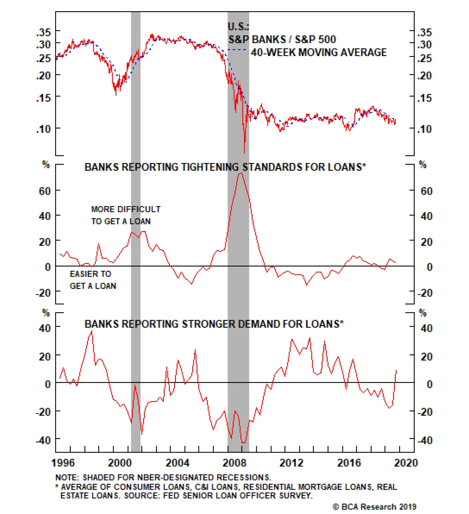
Banks stocks troughed in mid-August, sniffing out a sell-off in the bond market. While the broad financials index is levered to interest rate movements, banks are hyper-sensitive to changes in the risk-free asset. Thus, the recent jack-up in interest rates…
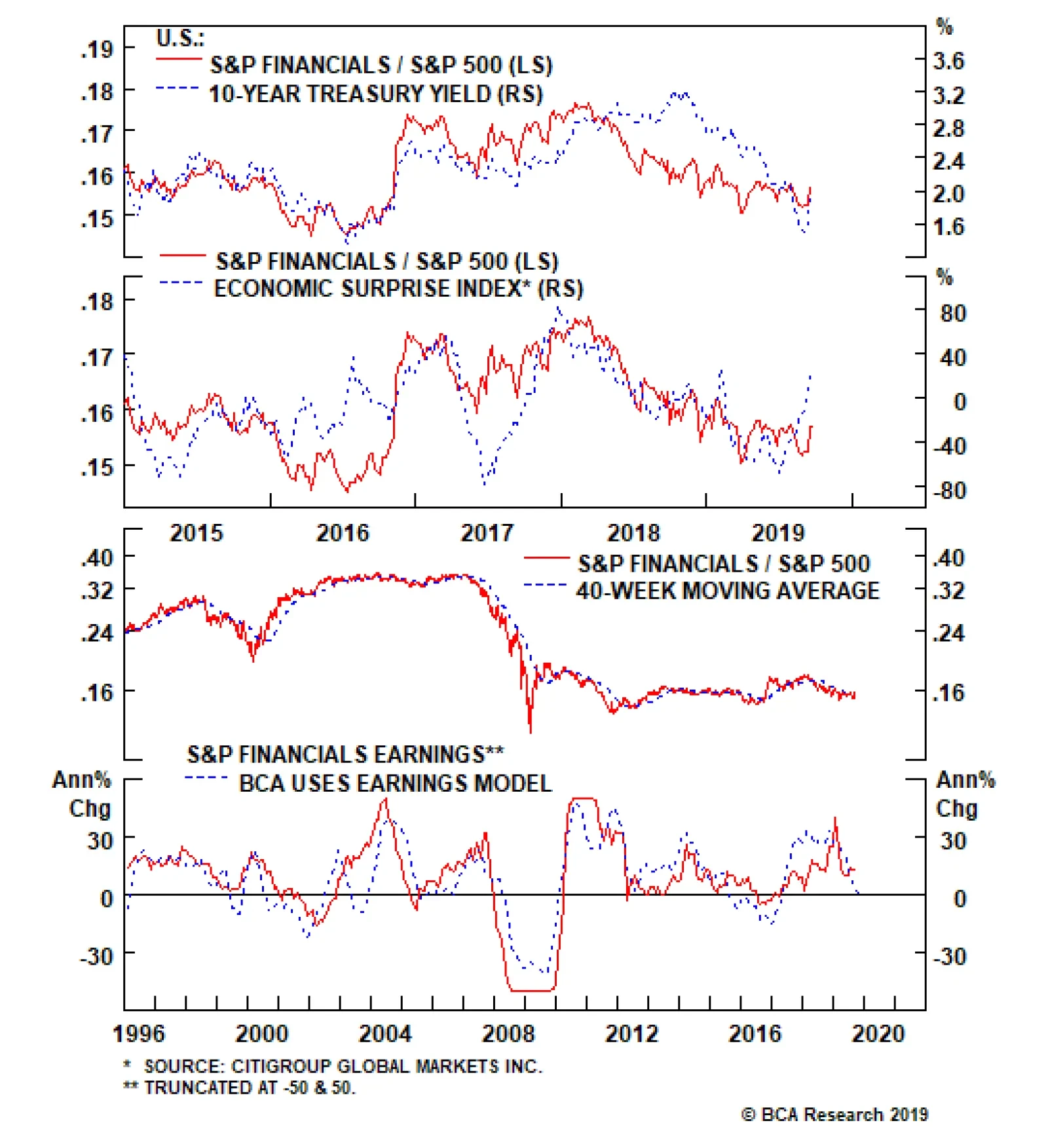
Foreign flows had put a solid bid under U.S. bonds and artificially suppressed yields and this is at the margin reversing. In addition, the market was hoping for a 50bps rate cut from the Fed in the September meeting further weighing on the UST yield, but now…
Highlights Portfolio Strategy Small cracks are forming in the labor market according to the ISM manufacturing, ISM services and NFIB surveys, and if the Fed goes ahead and cuts interest rates in half in the coming year as the bond market currently forecasts, then a recession would be a foregone conclusion. Stay cautious on the prospects of the broad equity market. The budding recovery in the 10-year UST yield, a rising Citi Economic Surprise Index (CESI) into positive territory, improving profit prospects and alluring valuations suggest that the recent financials sector outperformance has more legs. Healthy credit growth, still pristine credit quality and early signs of a recovery in the price of credit all signal that an overweight stance is warranted in the S&P banks index. Recent Changes Last Wednesday we removed the S&P software index from the high-conviction overweight list for a 10% gain. Last Wednesday we removed the large cap size bias from the high-conviction list for a 9% gain. Table 1
The Great Rotation
The Great Rotation
Feature The SPX built on recent gains last week, but failed to surpass the July highs. Beneath the surface, some big sector shifts are taking place, but it is still early to declare a definitive change in trend. Dormant value stocks have awaken and are riding a high at the expense of growth and momentum names, on the back of a selloff in the bond market (Chart 1). Similarly, small cap stocks have a pulse, and started to outshine large caps. Even in a red SPX day, small cap indexes managed to close in the black (Chart 1). As a reminder with regard to our portfolio, last Wednesday we obeyed our S&P software stop and removed it from the high-conviction call list for a 10% gain, and simultaneously booked gains in the tactical large cap bias and removed it from the high-conviction call list (Chart 1). In both cases our shorter-term confidence was taken down a notch, and we intend to obey our cyclical trailing stops in both positions in order to protect gains for our portfolio (for additional details please refer to the Daily Sector Insights available here and here). Following up from last week’s ISM-related analysis, we turn our attention to the labor market that is beginning to reveal some minor cracks. While the ISM debate has centered around the steep divergences between services and manufacturing on the headline number and the new orders subcomponents, the labor components have gone nearly unnoticed. Chart 1Healthy Rotation
Healthy Rotation
Healthy Rotation
Worrisomely on the employment front, the surveys are in agreement (second panel, Chart 2), warning that the labor market will have trouble standing on its own two feet. This is a bearish backdrop for the broad equity market (third panel, Chart 2). Tack on the latest NFIB survey, and the news gets grimmer. Chart 3 shows that an equally-weighted index of small business job openings and hiring plans is quickly losing momentum. Given that roughly 2/3 of job creation originates in small and medium businesses, non-farm payroll growth will likely continue to lose steam in the coming months (Chart 3). Chart 2Labor Market…
Labor Market…
Labor Market…
Chart 3…Yellow Flags
…Yellow Flags
…Yellow Flags
This week, we update an early cyclical sector and one of its key subcomponents. Finally, the still sinking stock-to-bond ratio corroborates the ISM and NFIB surveys’ messages. Crudely put, the longer that bonds outperform stocks, the higher the chances that employment will suffer a severe setback (Chart 4). Chart 4Last Man Standing
Last Man Standing
Last Man Standing
Granted, the labor market is a lagging indicator and typically one of the last, if not the last, shoes to drop on the eve of recession. With regard to recession, a simple thought experiment is in order. If we assume the bond market’s forecast for another 100bps of fed funds rate (FFR) cuts in the coming year as accurate, then the FFR will fall to 1.25%. This Fed policy easing will represent a 44% fall in the FFR on a year-over-year basis. Since the late 1960s recession there have not been any mid-cycle slowdowns that the Fed has engineered by clipping the FFR in half (Chart 5). Put differently, when the Fed is compelled to cut interest rates so deeply in every iteration we examined a recession followed suit. Chart 5When The Fed Funds Rate Gets Halved, Recession Is The Reason
When The Fed Funds Rate Gets Halved, Recession Is The Reason
When The Fed Funds Rate Gets Halved, Recession Is The Reason
In sum, small cracks are forming in the labor market according to the ISM manufacturing, ISM services and NFIB surveys and if the Fed goes ahead and cuts interest rates in half in the coming year, as the bond market currently forecasts, then a recession would be a foregone conclusion. Stay cautious on the prospects of the broad equity market. This week, we update an early cyclical sector and one of its key subcomponents. Stick With Financials… The 45bps rise in the 10-year U.S. Treasury (UST) yield over the past two weeks has breathed life back into the S&P financials sector, and for the time being we are sticking with an overweight recommendation. While it remains to be seen how sustainable the rise in yields will be, BCA's long-held view remains that the 10-year UST yield will sell off on a cyclical 9-12 time month horizon. If this is the case then financials stocks will lead the nascent sector rotation that commenced in late-August and outperform the SPX in the coming months (top panel, Chart 6). Foreign flows had put a solid bid under U.S. bonds and artificially suppressed yields and this is at the margin reversing. In addition, the market was hoping for a 50bps rate cut from the Fed in the September meeting further weighing on the UST yield, but now the odds of that happening are nil. Finally, the Citi Economic Surprise Index (CESI) has also come out of hibernation and spiked in positive territory, evidence that economic data estimates had hit rock bottom. This slingshot recovery in the CESI is tonic for financials stocks (bottom panel, Chart 6). On the earnings front, our profit growth model has kissed off the zero line. While financials sector EPS cannot grow indefinitely at a 30%/annum clip, the turn in our three-factor macro model is a positive development (second panel, Chart 7). Chart 6Moving In Lockstep With Rates
Moving In Lockstep With Rates
Moving In Lockstep With Rates
Chart 7Unwarranted Extreme Bearishness
Unwarranted Extreme Bearishness
Unwarranted Extreme Bearishness
Importantly, it stands in marked contrast to the sell side community. Analysts have been feverishly cutting EPS estimates for the sector, and now net earnings revisions have sunk to a level last hit during the great recession (middle panel, Chart 7). Similarly, relative 12-month and five-year forward profit growth forecasts are overly pessimistic. The upshot is that this lowered profit bar will be easy to surpass. With regard to shareholder friendly activities, while the overall share buyback frenzy has taken a breather, financials sector equity retirement is alive and kicking and on track to register the largest annual buyback since the short history of the data (second panel, Chart 8). If there is any sector with pent up buyback demand it is the financials sector that has been a net equity issuer until very recently still wrestling with equity dilution in the aftermath of the GFC. Adding it all up, the budding recovery in the 10-year UST yield, a rising CESI into positive territory, improving profit prospects and alluring valuations suggest that the recent financials sector outperformance has more legs. Dividend growth has been steady and in expansionary territory and the dividend payout ratio is far from waving any yellow flags. Moreover, financials yield 2.07% or 25bps higher than the 10-year UST yield and 17bps higher than the SPX, which is attractive for yield seeking investors (Chart 8). Moving on to relative valuations beyond the enticing relative dividend yield, relative price-to-book, relative forward P/E and our bombed out composite relative valuation indicator that collapsed to all-time lows suggest that financials are a screaming buy. Technicals remain oversold and also suggest that an overweight stance is warranted (Chart 9). Chart 8Pent-Up Demand For Shareholder Friendly Activities
Pent-Up Demand For Shareholder Friendly Activities
Pent-Up Demand For Shareholder Friendly Activities
Chart 9Undervalued And Unloved
Undervalued And Unloved
Undervalued And Unloved
Adding it all up, the budding recovery in the 10-year UST yield, a rising CESI into positive territory, improving profit prospects and alluring valuations suggest that the recent financials sector outperformance has more legs. Bottom Line: Stay overweight the S&P financials sector, that is compellingly valued, under-owned, and with promising profit prospects. … And Banks For A While Longer Banks stocks troughed in mid-August, sniffing out a sell-off in the bond market, and we continue to recommend an above benchmark allocation in the S&P banks index. This is a global phenomenon as even the ultimate global value group, Eurozone bank equities, bottomed out on August 15 alongside their U.S. peers. While the broad financials index is levered to interest rate movements, banks – that comprise roughly 42% of the S&P financials sector – are hyper-sensitive to changes in the risk-free asset. Thus, the recent jack up in interest rates represents a profit-augmenting opportunity for this early cyclical subgroup (Chart 10) Beyond the rising price of credit, credit growth is another key industry profit driver. Our bank loan models have crested, but are still expanding at a healthy clip (second and bottom panels, Chart 11). As long as they manage to remain above the zero line, they will prove a boon to bank earnings. Specifically on the consumer front, sky high consumer confidence coupled with rising wage inflation signal that consumer credit growth prospects remain upbeat (Chart 11). Chart 10Rising Rates=Buy Banks
Rising Rates=Buy Banks
Rising Rates=Buy Banks
Importantly, the latest Fed Senior Loan Officer Survey painted a bright picture on both the demand and supply of credit. In more detail, bankers reported that a rising number of credit categories reversed course and demand for loans slingshot higher, likely as a delayed consequence of the dramatic fall in interest rates since last November (bottom panel, Chart 12). Chart 11Loan Growth…
Loan Growth…
Loan Growth…
Chart 12…Prospects Are Firming
…Prospects Are Firming
…Prospects Are Firming
Encouragingly, bank officers also reported that they were willing extenders of credit. Our in-house calculated overall gauge of loan tightening standards fell compared with last quarter, signaling that at the margin it is easier to get a loan (middle panel, Chart 12). Netting it all out, early signs of a recovery in the price of credit, healthy credit growth and still pristine credit quality signal that an overweight stance is warranted in the S&P banks index. Finally, credit quality, the third key bank profit driver, is also emitting a positive signal. While a few loan categories have deteriorated recently in absolute terms, as percentage of loans outstanding, credit quality remains pristine (Chart 13). The upshot is that this credit quality backdrop combined with a jump in bank return-on-equity to low double digits, should serve as catalysts to unlock excellent value (third & bottom panel, Chart 13). Nevertheless, there are two risks worth close monitoring. First, parts of the yield curve inverted last December and more recently the 10/2 yield curve slope inverted warning that the path of least resistance is lower for bank net interest margins (NIMs, middle panel, Chart 14). Chart 13Pristine Credit Quality Is A Catalyst To Unlock Excellent Value
Pristine Credit Quality Is A Catalyst To Unlock Excellent Value
Pristine Credit Quality Is A Catalyst To Unlock Excellent Value
Chart 14Two Risks To monitor
Two Risks To monitor
Two Risks To monitor
Second, the ISM manufacturing survey fell below the boom/bust line in August for the first time since the late-2015/early-2016 manufacturing recession (bottom panel, Chart 14). Given that C&I loans are the largest loan category on the asset side of bank balance sheets, the current manufacturing recession may hurt bank profitability in two distinct ways. Not only C&I credit quality will worsen as the risk of defaults rises, but also C&I loan growth may take the back seat and weigh on bank profit growth prospects. Netting it all out, early signs of a recovery in the price of credit, healthy credit growth and still pristine credit quality signal that an overweight stance is warranted in the S&P banks index. Bottom Line: Continue to overweight the S&P banks index, but keep it on the downgrade watch list, acknowledging the yield curve-related potential decline in NIMs and manufacturing recession-related C&I loan growth risks. The ticker symbols for the stocks in this index are: BLBG: S5BANKX – WFC, JPM, BAC, C, USB, PNC, BBT, STI, MTB, FITB, CFG, RF, KEY, HBAN, CMA, ZION, PBCT, SIVB, FRC. Anastasios Avgeriou, U.S. Equity Strategist anastasios@bcaresearch.com Current Recommendations Current Trades Size And Style Views Stay neutral cyclicals over defensives (downgrade alert) Favor value over growth Favor large over small caps (Stop 10%)
Underweight Base metal prices are a real time indicator of the wellness of the S&P materials sector. Currently, base metals are deflating both on the back of a firming U.S. dollar and contracting global manufacturing. Such a commodity price backdrop is dampening prospects for a profit-led materials sector relative share price recovery (top & middle panels). The materials exports outlook is also darkening. The appreciating U.S. dollar renders materials related exports uncompetitive in international markets leading to market share losses. In addition, the latest ISM export order subcomponent plunged to multi-year lows reflecting trade war pessimism and falling global end-demand. The implication is that the export relief valve is closed for materials equities (bottom panel).
Immaterial Performance
Immaterial Performance
Bottom Line: We downgraded the S&P materials sector to underweight this past Monday via trimming the global gold miners index to neutral. Please refer to the most recent Weekly Report for more details.