Sectors
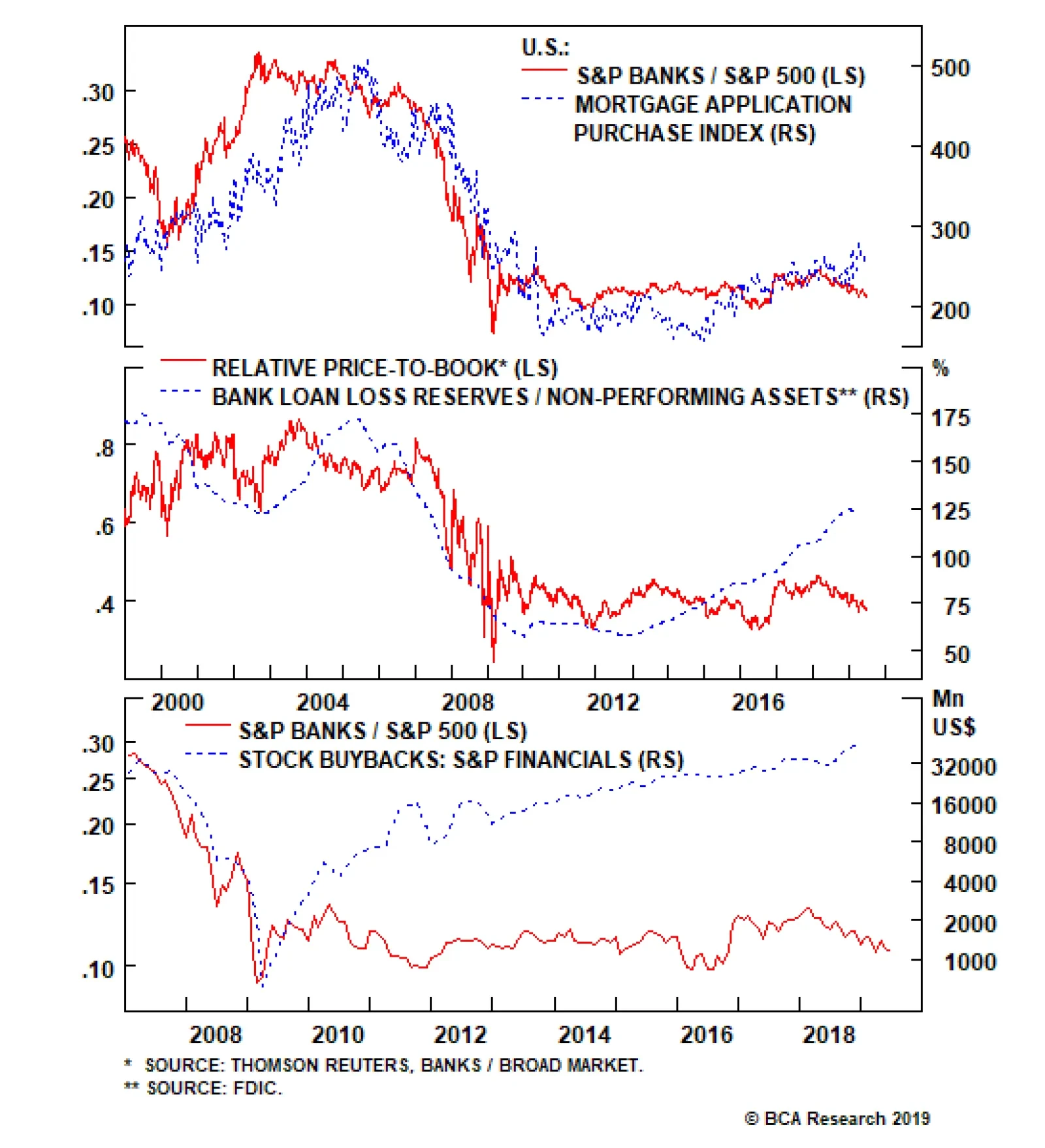
Our bank EPS growth model signals that bank EPS euphoria is misplaced. Nevertheless, four significant offsets prevent us from going for an outright downgrade. First, the 30-year fixed mortgage rate almost perfectly mimics the drubbing in 10-year yields.…
Last week, the yield curve steepened after the Fed signaled a rate cut is coming in July. While the yield curve has put in higher lows in the past seven months, relative bank performance has been facing stiff resistance and has failed to follow the yield…

Productivity growth is experiencing a cyclical rebound, but remains structurally weak. The end of the deepening of globalization, statistical hurdles, and the possibility that today’s technological advances may not be as revolutionary as past ones all hamper productivity. On the back of rising market power and concentration, companies are increasing markups instead of production. This is depressing productivity and lowering the neutral rate of interest. For now, investors can generate alpha by focusing on consolidating industries. Growing market power cannot last forever and will meet a political wall. Structurally, this will hurt asset prices. “We don’t have a free market; don’t kid yourself. (…) Businesspeople are enemies of free markets, not friends (…) businesspeople are all in favor of freedom for everybody else (…) but when it comes to their own business, they want to go to Washington to protect their businesses.” Milton Friedman, January 1991. Despite the explosion of applications of growing computing power, U.S. productivity growth has been lacking this cycle. This incapacity to do more with less has weighed on trend growth and on the neutral rate of interest, and has been a powerful force behind the low level of yields at home and abroad. In this report, we look at the different factors and theories advanced to explain the structural decline in productivity. Among them, a steady increase in corporate market power not only goes a long way in explaining the lack of productivity in the U.S., but also the high level of profit margins along with the depressed level of investment and real neutral rates. A Simple Cyclical Explanation The decline in productivity growth is both a structural and cyclical story. Historically, productivity growth has followed economic activity. When demand is strong, businesses can generate more revenue and therefore produce more. The historical correlation between U.S. nonfarm business productivity and the ISM manufacturing index illustrates this relationship (Chart II-1). Chart II-1The Cyclical Behavior Of Productivity
The Cyclical Behavior Of Productivity
The Cyclical Behavior Of Productivity
Chart II-2Deleveraging Hurts Productivity
Deleveraging Hurts Productivity
Deleveraging Hurts Productivity
Since 2008, as households worked off their previous over-indebtedness, the U.S. private sector has experienced its longest deleveraging period since the Great Depression. This frugality has depressed demand and contributed to lower growth this cycle. Since productivity is measured as output generated by unit of input, weak demand growth has depressed productivity statistics. On this dimension, the brief deleveraging experience of the early 1990s is instructive: productivity picked up only after 1993, once the private sector began to accumulate debt faster than the pace of GDP growth (Chart II-2). The recent pick-up in productivity reflects these debt dynamics. Since 2009, the U.S. non-financial private sector has stopped deleveraging, removing one anchor on demand, allowing productivity to blossom. Moreover, the pick-up in capex from 2017 to present is also helping productivity by raising the capital-to-workers ratio. While this is a positive development for the U.S. economy, the decline in productivity nonetheless seems structural, as the five-year moving average of labor productivity growth remains near its early 1980s nadir (Chart II-3). Something else is at play.
Chart II-3
The Usual Suspects Three major forces are often used to explain why observed productivity growth is currently in decline: A slowdown in global trade penetration, the fact that statisticians do not have a good grasp on productivity growth in a service-based economy, and innovation that simply isn’t what it used to be. Slowdown In Global Trade Penetration Two hundred years ago, David Ricardo argued that due to competitive advantages, countries should always engage in trade to increase their economic welfare. This insight has laid the foundation of the argument that exchanges between nations maximizes the utilization of resources domestically and around the world. The collapse in new business formation in the U.S. is another fascinating development. Rarely was this argument more relevant than over the past 40 years. On the heels of the supply-side revolution of the early 1980s and the fall of the Berlin Wall, globalization took off. The share of the world's population participating in the global capitalist system rose from 30% in 1985 to nearly 100% today. Generating elevated productivity gains is simpler when a country’s capital stock is underdeveloped: each unit of investment grows the capital-to-labor ratio by a greater proportion. As a result, productivity – which reflects the capital-to-worker ratio – can grow quickly. As more poor countries have joined the global economy and benefitted from FDI and other capital inflows, their productivity has flourished. Consequently, even if productivity growth has been poor in advanced economies over the past 10 years, global productivity has remained high and has tracked the share of exports in global GDP (Chart II-4). Chart II-4The Apex Of Globalization Represented The Summit Of Global Productivity Growth
The Apex Of Globalization Represented The Summit Of Global Productivity Growth
The Apex Of Globalization Represented The Summit Of Global Productivity Growth
This globalization tailwind to global productivity growth is dissipating. First, following an investment boom where poor decisions were made, EM productivity growth has been declining. Second, with nearly 100% of the world’s labor supply already participating in the global economy, it is increasingly difficult to expand the share of global trade in global GDP and increase the benefit of cross-border specialization. Finally, the popular backlash in advanced economies against globalization could force global trade into reverse. As economic nationalism takes hold, cross-border investments could decline, moving the world economy further away from an optimal allocation of capital. These forces may explain why global productivity peaked earlier this decade. Productivity Is Mismeasured Recently deceased luminary Martin Feldstein argued that the structural decline in productivity is an illusion. As the argument goes, productivity is not weak; it is only underestimated. A parallel with the introduction of electricity in the late 19th century often comes to mind. Back then, U.S. statistical agencies found it difficult to disentangle price changes from quantity changes in the quickly growing revenues of electrical utilities. As a result, the Bureau Of Labor Statistics overestimated price changes in the early 20th century, which depressed the estimated output growth of utilities by a similar factor. Since productivity is measured as output per unit of labor, this also understated actual productivity growth – not just for utilities but for the economy as a whole. Ultimately, overall productivity growth was revised upward. Chart II-5Plenty Of Room To Mismeasure Real Output Growth
Plenty Of Room To Mismeasure Real Output Growth
Plenty Of Room To Mismeasure Real Output Growth
In today’s economy, this could be a larger problem, as 70% of output is generated in the service sector. Estimating productivity growth is much harder in the service sector than in the manufacturing sector, as there is no actual countable output to measure. Thus, distinguishing price increases from quantity or quality improvements is challenging. Adding to this difficulty, the service sector is one of the main beneficiaries of the increase in computational power currently disrupting industries around the world. The growing share of components of the consumer price index subject to hedonic adjustments highlight this challenge (Chart II-5). Estimating quality changes is hard and may bias the increase in prices in the economy. If prices are unreliably measured, so will output and productivity. Pushing The Production Frontier Is Increasingly Hard Chart II-6A Multifaceted Decline In Productivity
A Multifaceted Decline In Productivity
A Multifaceted Decline In Productivity
Another school of thought simply accepts that productivity growth has declined in a structural fashion. It is far from clear that the current technological revolution is much more productivity-enhancing than the introduction of electricity 140 years ago, the development of the internal combustion engine in the late 19th century, the adoption of indoor plumbing, or the discovery of penicillin in 1928. It is easy to overestimate the economic impact of new technologies. At first, like their predecessors, the microprocessor and the internet created entirely new industries. But this is not the case anymore. For all its virtues, e-commerce is only a new method of selling goods and services. Cloud computing is mainly a way to outsource hardware spending. Social media’s main economic value has been to gather more information on consumers, allowing sellers to reach potential buyers in a more targeted way. Without creating entirely new industries, spending on new technologies often ends up cannibalizing spending on older technologies. For example, while Google captures 32.4% of global ad revenues, similar revenues for the print industry have fallen by 70% since their apex in 2000. If new technologies are not as accretive to production as the introduction of previous ones were, productivity growth remains constrained by the same old economic forces of capex, human capital growth and resource utilization. And as Chart II-6 shows, labor input, the utilization of capital and multifactor productivity have all weakened. Some key drivers help understand why productivity growth has downshifted structurally. Let’s look at human capital. It is much easier to grow human capital when very few people have a high-school diploma: just make a larger share of your population finish high school, or even better, complete a university degree. But once the share of university-educated citizens has risen, building human capital further becomes increasingly difficult. Chart II-7 illustrates this problem. Growth in educational achievement has been slowing since 1995 in both advanced and developing economies. This means that the growth of human capital is slowing. This is without even wading into whether or not the quality of education has remained constant. This is pure market power, and it helps explain the gap between wages and productivity. Human capital is also negatively impacted by demographic trends. Workers in their forties tend to be at the peak of their careers, with the highest accumulated job know-how. Problematically, these workers represent a shrinking share of the labor force, which is hurting productivity trends (Chart II-8).
Chart II-7
Chart II-8Demographics Are Hurting Productivity
Demographics Are Hurting Productivity
Demographics Are Hurting Productivity
The capital stock too is experiencing its own headwinds. While Moore’s Law seems more or less intact, the decline in the cost of storing information is clearly decelerating (Chart II-9). Today, quality adjusted IT prices are contracting at a pace of 2.3% per annum, compared to annual declines of 14% at the turn of the millennium. Thus, even if nominal spending in IT investment had remained constant, real investment growth would have sharply decelerated (Chart II-10). But since nominal spending has decelerated greatly from its late 1990s pace, real investment in IT has fallen substantially. The growth of the capital stock is therefore lagging its previous pace, which is hurting productivity growth.
Chart II-9
Chart II-10The Impact Of Slowing IT Deflation
The Impact Of Slowing IT Deflation
The Impact Of Slowing IT Deflation
Chart II-11A Dearth Of New Businesses
A Dearth Of New Businesses
A Dearth Of New Businesses
The collapse in new business formation in the U.S. is another fascinating development (Chart II-11). New businesses are a large source of productivity gains. Ultimately, 20% of productivity gains have come from small businesses becoming large ones. Think Apple in 1977 versus Apple today. A large decline in the pace of new business formation suggests that fewer seeds have been planted over the past 20 years to generate those enormous productivity explosions than was the case in the previous 50 years. The X Factor: Growing Market Concentration The three aforementioned explanations for the decline in productivity are all appealing, but they generally leave investors looking for more. Why are companies investing less, especially when profit margins are near record highs? Why is inflation low? Why has the pace of new business formation collapsed? These are all somewhat paradoxical. Chart II-12Wide Profit Margins: A Testament To The Weakness Of Labor
Wide Profit Margins: A Testament To The Weakness Of Labor
Wide Profit Margins: A Testament To The Weakness Of Labor
This is where a growing body of works comes in. Our economy is moving away from the Adam Smith idea of perfect competition. Industry concentration has progressively risen, and few companies dominate their line of business and control both their selling prices and input costs. They behave as monopolies and monopsonies, all at once.1 This helps explain why selling prices have been able to rise relative to unit labor costs, raising margins in the process (Chart II-12). Let’s start by looking at the concept of market concentration. According to Grullon, Larkin and Michaely, sales of the median publicly traded firms, expressed in constant dollars, have nearly tripled since the mid-1990s, while real GDP has only increased 70% (Chart II-13).2 The escalation in market concentration is also vividly demonstrated in Chart II-14. The top panel shows that since 1997, most U.S. industries have experienced sharp increases in their Herfindahl-Hirshman Index (HHI),3 a measure of concentration. In fact, more than half of U.S. industries have experienced concentration increases of more than 40%, and as a corollary, more than 75% of industries have seen the number of firms decline by more than 40%. The last panel of the chart also highlights that this increase in concentration has been top-heavy, with a third of industries seeing the market share of their four biggest players rise by more than 40%. Rising market concentration is therefore a broad phenomenon – not one unique to the tech sector.
Chart II-13
Chart II-14
This rising market concentration has also happened on the employment front. In 1995, less than 24% of U.S. private sector employees worked for firms with 10,000 or more employees, versus nearly 28% today. This does not seem particularly dramatic. However, at the local level, the number of regions where employment is concentrated with one or two large employers has risen. Azar, Marinescu and Steinbaum developed Map II-1, which shows that 75% of non-metropolitan areas now have high or extreme levels of employment concentration.4
Chart II-
Chart II-15The Owners Of Capital Are Keeping The Proceeds Of The Meagre Productivity Gains
The Owners Of Capital Are Keeping The Proceeds Of The Meagre Productivity Gains
The Owners Of Capital Are Keeping The Proceeds Of The Meagre Productivity Gains
This growing market power of companies on employment can have a large impact on wages. Chart II-15 shows that real wages have lagged productivity since the turn of the millennium. Meanwhile, Chart II-16 plots real wages on the y-axis versus the HHI of applications (top panel) and vacancies (bottom panel). This chart shows that for any given industry, if applicants in a geographical area do not have many options where to apply – i.e. a few dominant employers provide most of the jobs in the region – real wages lag the national average. The more concentrated vacancies as well as applications are with one employer, the greater the discount to national wages in that industry.5 This is pure market power, and it helps explain the gap between wages and productivity as well as the widening gap between metropolitan and non-metropolitan household incomes.
Chart II-16
Growing market power and concentration do not only compress labor costs, they also result in higher prices for consumers. This seems paradoxical in a world of low inflation. But inflation could have been even lower if market concentration had remained at pre-2000s levels. In 2009, Matthew Weinberg showed that over the previous 22 years, horizontal mergers within an industry resulted in higher prices.6 In a 2014 meta-study conducted by Weinberg along with Orley Ashenfelter and Daniel Hosken, the authors showed that across 49 studies ranging across 21 industries, 36 showed that horizontal mergers resulted in higher prices for consumers.7 While today’s technology may be enhancing the productive potential of our economies, this is not benefiting output and measured productivity. Instead, it is boosting profit margins. In a low-inflation environment, the only way for companies to garner pricing power is to decrease competition, and M&As are the quickest way to achieve this goal. After examining nearly 50 merger and antitrust studies spanning more than 3,000 merger cases, John Kwoka found that, following mergers that augmented an industry’s concentration, prices increased in 95% of cases, and on average by 4.5%.8 In no industry is this effect more vividly demonstrated than in the healthcare field, an industry that has undergone a massive wave of consolidation – from hospitals, to pharmacies to drug manufacturers. As Chart II-17 illustrates, between 1980 and 2016, healthcare costs have increased at a much faster pace in the U.S. than in the rest of the world. However, life expectancy increased much less than in other advanced economies.
Chart II-17
In this context of growing market concentration, it is easy to see why, as De Loecker and Eeckhout have argued, markups have been rising steadily since the 1980s (Chart II-18, top panel) and have tracked M&A activity (Chart II-18, bottom panel).9 In essence, mergers and acquisitions have been the main tool used by firms to increase their concentration. Another tool at their disposal has been the increase in patents. The top panel of Chart II-19 shows that the total number of patent applications in the U.S. has increased by 3.6-fold since the 1980s, but most interestingly, the share of patents coming from large, dominant players within each industry has risen by 10% over the same timeframe (Chart II-19, bottom panel). To use Warren Buffet’s terminology, M&A and patents have been how firms build large “moats” to limit competition and protect their businesses. Chart II-18Markups Rise Along With Growing M&A Activity
Markups Rise Along With Growing M&A Activity
Markups Rise Along With Growing M&A Activity
Chart II-19How To Build A Moat?
How To Build A Moat?
How To Build A Moat?
Why is this rise in market concentration affecting productivity? First, from an empirical perspective, rising markups and concentration tend to lead to lower levels of capex. A recent IMF study shows that the more concentrated industries become, the higher the corporate savings rate goes (Chart II-20, top panel).10 These elevated savings reflect wider markups, but also firms with markups in the top decile of the distribution display significantly lower investment rates (Chart II-20, bottom panel). If more of the U.S. output is generated by larger, more concentrated firms, this leads to a lower pace of increase in the capital stock, which hurts productivity. Second, downward pressure on real wages is also linked to a drag on productivity. Monopolies and oligopolies are not incentivized to maximize output. In fact, for any market, a monopoly should lead to lower production than perfect competition would. Diagram II-I from De Loecker and Eeckhout shows that moving from perfect competition to a monopoly results in a steeper labor demand curve as the monopolist produces less. As a result, real wages move downward and the labor participation force declines. Does this sound familiar?
Chart II-20
Chart II-
The rise of market power might mean that in some way Martin Feldstein was right about productivity being mismeasured – just not the way he anticipated. In a June 2017 Bank Credit Analyst Special Report, Peter Berezin showed that labor-saving technologies like AI and robotics, which are increasingly being deployed today, could lead to lower wages (Chart II-21).11 For a given level of technology in the economy, productivity is positively linked to real wages but inversely linked to markups – especially if the technology is of the labor-saving kind. So, if markups rise on the back of firms’ growing market power, the ensuing labor savings will not be used to increase actual input. Rather, corporate savings will rise. Thus, while today’s technology may be enhancing the productive potential of our economies, this is not benefiting output and measured productivity. Instead, it is boosting profit margins.12 Unsurprisingly, return on assets and market concentration are positively correlated (Chart II-22).
Chart II-21
Chart II-22
Finally, market power and concentration weighing on capex, wages and productivity are fully consistent with higher returns of cash to shareholders and lower interest rates. The higher profits and lower capex liberate cash flows available to be redistributed to shareholders. Moreover, lower capex also depresses demand for savings in the economy, while weak wages depress middle-class incomes, which hurts aggregate demand. Additionally, higher corporate savings increases the wealth of the richest households, who have a high marginal propensity to save. This results in higher savings for the economy. With a greater supply of savings and lower demand for those savings, the neutral rate of interest has been depressed. Investment Implications First, in an environment of low inflation, investors should continue to favor businesses that can generate higher markups via pricing power. Equity investors should therefore continue to prefer industries where horizontal mergers are still increasing market concentration. Second, so long as the status quo continues, wages will have a natural cap, and so will the neutral rate of interest. This does not mean that wage growth cannot increase further on a cyclical basis, but it means that wages are unlikely to blossom as they did in the late 1960s, even within a very tight labor market. Without too-severe an inflation push from wages, the business cycle could remain intact even longer, keeping a window open for risk assets to rise further on a cyclical basis. Third, long-term investors need to keep a keen eye on the political sphere. A much more laissez-faire approach to regulation, a push toward self-regulation, and a much laxer enforcement of antitrust laws and merger rules were behind the rise in market power and concentration.13 The particularly sharp ascent of populism in Anglo-Saxon economies, where market power increased by the greatest extent, is not surprising. So far, populists have not blamed the corporate sector, but if the recent antitrust noise toward the Silicon Valley behemoths is any indication, the clock is ticking. On a structural basis, this could be very negative for asset prices. An end to this rise in market power would force profit margins to mean-revert toward their long-term trend, which is 4.7 percentage-points below current levels. This will require discounting much lower cash flows in the future. Additionally, by raising wages and capex, more competition would increase aggregate demand and lift real interest rates. Higher wages and aggregate demand could also structurally lift inflation. Thus, not only will investors need to discount lower cash flows, they will have to do so at higher discount rates. As a result, this cycle will likely witness both a generational peak in equity valuations as well as structural lows in bond yields. As we mentioned, these changes are political in nature. We will look forward to studying the political angle of this thesis to get a better handle on when these turning points will likely emerge. Mathieu Savary Vice President The Bank Credit Analyst Footnotes 1 A monopsony is a firm that controls the price of its input because it is the dominant, if not unique, buyer of said input. 2 G. Grullon, Y. Larkin and R. Michaely, “Are Us Industries Becoming More Concentrated?,” April 2017. 3 The Herfindahl-Hirschman Index (HHI) is calculated by taking the market share of each firm in the industry, squaring them, and summing the result. Consider a hypothetical industry with four total firm where firm1, firm2, firm3 and firm4 has 40%, 30%, 15% and 15% of market share, respectively. Then HHI is 402+302+152+152 = 2,950. 4 J. Azar, I. Marinescu, M. Steinbaum, “Labor Market Concentration,” December 2017. 5 J. Azar, I. Marinescu, M. Steinbaum, “Labor Market Concentration,” December 2017. 6 M. Weinberg, “The Price Effects Of Horizontal Mergers”, Journal of Competition Law & Economics, Volume 4, Issue 2, June 2008, Pages 433–447. 7 O. Ashenfelter, D. Hosken, M. Weinberg, "Did Robert Bork Understate the Competitive Impact of Mergers? Evidence from Consummated Mergers," Journal of Law and Economics, University of Chicago Press, vol. 57(S3), pages S67 - S100. 8 J. Kwoka, “Mergers, Merger Control, and Remedies: A Retrospective Analysis of U.S. Policy,” MIT Press, 2015. 9 J. De Loecker, J. Eeckhout, G. Unger, "The Rise Of Market Power And The Macroeconomic Implications," Mimeo 2018. 10 “Chapter 2: The Rise of Corporate Market Power and Its Macroeconomic Effects,” World Economic Outlook, April 2019. 11 Please see The Bank Credit Analyst Special Report "Is Slow Productivity Growth Good Or Bad For Bonds?"dated May 31, 2017, available at bca.bcaresearch.com. 12 Productivity can be written as:
Image
13 J. Tepper, D. Hearn, “The Myth of Capitalism: Monopolies and the Death of Competition,” Wiley, November 2018.
Highlights We update our long-range forecasts of returns from a range of asset classes – equities, bonds, alternatives, and currencies – and make some refinements to the methodologies we used in our last report in November 2017. We add coverage of U.K., Australian, and Canadian assets, and include Emerging Markets debt, gold, and global Real Estate in our analysis for the first time. Generally, our forecasts are slightly higher than 18 months ago: we expect an annual return in nominal terms over the next 10-year years of 1.7% from global bonds, and 5.9% from global equities – up from 1.5% and 4.6% respectively in the last edition. Cheaper valuations in a number of equity markets, especially Japan, the euro zone, and Emerging Markets explain the higher return assumptions. Nonetheless, a balanced global portfolio is likely to return only 4.7% a year in the long run, compared to 6.3% over the past 20 years. That is lower than many investors are banking on. Feature Since we published our first attempt at projecting long-term returns for a range of asset classes in November 2017, clients have shown enormous interest in this work. They have also made numerous suggestions on how we could improve our methodologies and asked us to include additional asset classes. This Special Report updates the data, refines some of our assumptions, and adds coverage of U.K., Australian, and Canadian assets, as well as gold, global Real Estate, and global REITs. Our basic philosophy has not changed. Many of the methodologies are carried over from the November 2017 edition, and clients interested in more detailed explanations should also refer to that report.1 Our forecast time horizon is 10-15 years. We deliberately keep this vague, and avoid trying to forecast over a 3-7 year time horizon, as is common in many capital market assumptions reports. The reason is that we want to avoid predicting the timing and gravity of the next recession, but rather aim to forecast long-term trend growth irrespective of cycles. This type of analysis is, by nature, as much art as science. We start from the basis that historical returns, at least those from the past 10 or 20 years, are not very useful. Asset allocators should not use historical returns data in mean variance optimizers and other portfolio-construction models. For example, over the past 20 years global bonds have returned 5.3% a year. With many long-term government bonds currently yielding zero or less, it is mathematically almost impossible that returns will be this high over the coming decade or so. Our analysis points to a likely annual return from global bonds of only 1.7%. Our approach is based on building-blocks. There are some factors we know with a high degree of certainly: such as the return on U.S. 10-year Treasury yields over the next 10 years (to all intents and purposes, it is the current yield). Many fundamental drivers of return (credit spreads, the small-cap premium, the shape of the yield curve, profit margins, stock price multiples etc.) are either steady on average over the cycle, or mean revert. For less certain factors, such as economic growth, inflation, or equilibrium short-term interest rates, we can make sensible assumptions. Most of the analysis in this report is based on the 20-year history of these factors. We used 20 years because data is available for almost all the asset classes we cover for this length of time (there are some exceptions, for example corporate bond data for Australia and Emerging Markets go back only to 2004-5, and global REITs start only in 2008). The period from May 1999 to April 2019 is also reasonable since it covers two recessions and two expansions, and started at a point in the cycle that is arguably similar to where we are today. Some will argue that it includes the Technology bubble of 1999-2000, when stock valuations were high, and that we should use a longer period. But the lack of data for many assets classes before the 1990s (though admittedly not for equities) makes this problematic. Also, note that the historical returns data for the 20 years starting in May 1999 are quite low – 5.8% for U.S. equities, for example. This is because the starting-point was quite late in the cycle, as we probably also are now. We make the following additions and refinements to our analysis: Add coverage of the U.K., Australia, and Canada for both fixed income and equities. Add coverage of Emerging Markets debt: U.S. dollar and local-currency sovereign bonds, and dollar-denominated corporate credit. Among alternative assets, add coverage of gold, global Direct Real Estate, and global REITs. Improve the methodology for many alt asset classes, shifting from reliance on historical returns to an approach based on building blocks – for example, current yield plus an estimation of future capital appreciation – similar to our analysis of other asset classes. In our discussion of currencies, add for easy reference of readers a table of assumed returns for all the main asset classes expressed in USD, EUR, JPY, GBP, AUD, and CAD (using our forecasts of long-run movements in these currencies). Added Sharpe ratios to our main table of assumptions. The summary of our results is shown in Table 1. The results are all average annual nominal total returns, in local currency terms (except for global indexes, which are in U.S. dollars). Table 1BCA Assumed Returns
Return Assumptions – Refreshed And Refined
Return Assumptions – Refreshed And Refined
Unsurprisingly, given the long-term nature of this exercise, our return projections have in general not moved much compared to those in November 2017. Indeed, markets look rather similar today to 18 months ago: the U.S. 10-year Treasury yield was 2.4% at end-April (our data cut-off point), compared to 2.3%, and the trailing PE for U.S. stocks 21.0, compared to 21.6. If anything, the overall assumption for a balanced portfolio (of 50% equities, 30% bonds, and 20% equal-weighted alts) has risen slightly compared to the 2017 edition: to 4.7% from 4.1% for a global portfolio, and to 4.9% from 4.6% for a purely U.S. one. That is partly because we include specific forecasts for the U.K., Australia, and Canada, where returns are expected to be slightly higher than for the markets we limited our forecasts to previously, the U.S, euro zone, Japan, and Emerging Markets (EM). Equity returns are also forecast to be higher than 18 months ago, mainly because several markets now are cheaper: trailing PE for Japan has fallen to 13.1x from 17.6x, for the euro zone to 15.5x from 18.0x, and for Emerging Markets to 13.6x from 15.4x (and more sophisticated valuation measures show the same trend). The long-term picture for global growth remains poor, based on our analysis, but valuation at the starting-point, as we have often argued, is a powerful indicator of future returns. We include Sharpe ratios in Table 1 for the first time. We calculate them as expected return/expected volatility to allow for comparison between different asset classes, rather than as excess return over cash/volatility as is strictly correct, and as should be used in mean variance optimizers. Chart 1Volatility Is Easier To Forecast Than Returns
Volatility Is Easier To Forecast Than Returns
Volatility Is Easier To Forecast Than Returns
For volatility assumptions, we mostly use the 20-year average volatility of each asset class. As discussed above, historical returns should not be used to forecast future returns. But volatility does not trend much over the long-term (Chart 1). We looked carefully at volatility trends for all the asset classes we cover, but did not find a strong example of a trend decline or rise in any. We do, however, adjust the historic volatility of the illiquid, appraisal-based alternative assets, such as Private Equity, Real Estate, and Farmland. The reported volatility is too low, for example 2.6% in the case of U.S. Direct Real Estate. Even using statistical techniques to desmooth the return produces a volatility of only around 7%. We choose, therefore, to be conservative, and use the historic volatility on REITs (21%) and apply this to Direct Real Estate too. For Private Equity (historic volatility 5.9%), we use the volatility on U.S. listed small-cap stocks (18.6%). Looking at the forecast Sharpe ratios, the risk-adjusted return on global bonds (0.55) is somewhat higher than that of global equities (0.33). Credit continues to look better than equities: Sharpe ratio of 0.70 for U.S. investment grade debt and 0.62 for high-yield bonds. Nonetheless, our overall conclusion is that future returns are still likely to be below those of the past decade or two, and below many investors’ expectations. Over the past 20 years a global balanced portfolio (defined as above) returned 6.3% and a similar U.S. portfolio 7.0%. We expect 4.7% and 4.9% respectively in future. Investors working on the assumption of a 7-8% nominal return – as is typical among U.S. pension funds, for example – need to become realistic. Below follow detailed descriptions of how we came up with our assumptions for each asset class (fixed income, equities, and alternatives), followed by our forecasts of long-term currency movements, and a brief discussion of correlations. 1. Fixed Income We carry over from the previous edition our building-block approach to estimating returns from fixed income. One element we know with a relatively high degree of certainty is the return over the next 10 years from 10-year government bonds in developed economies: one can safely assume that it will be the same as the current 10-year yield. It is not mathematical identical, of course, since this calculation does not take into account reinvestment of coupons, or default risk, but it is a fair assumption. We can make some reasonable assumptions for returns from cash, based on likely inflation and the real equilibrium cash rate in different countries. After this, our methodology is to assume that other historic relationships (corporate bond spreads, default and recovery rates, the shape of the yield curve etc.) hold over the long run and that, therefore, the current level reverts to its historic mean. The results of our analysis, and the assumptions we use, are shown in Table 2. Full details of the methodology follow below. Table 2Fixed Income Return Calculations
Return Assumptions – Refreshed And Refined
Return Assumptions – Refreshed And Refined
Projected returns have not changed significantly from the 2017 edition of this report. In the U.S., for the current 10-year Treasury bond yield we used 2.4% (the three-month average to end-April), very similar to the 2.3% on which we based our analysis in 2017. In the euro zone and Japan, yields have fallen a little since then, with the 10-year German Bund now yielding roughly 0%, compared to 0.5% in 2017, and the Japanese Government Bond -0.1% compared to zero. Overall, we expect the Bloomberg Barclays Global Index to give an annual nominal return of 1.7% over the coming 10-15 years, slightly up from the assumption of 1.5% in the previous edition. This small rise is due to the slight increase in the U.S. long-term risk-free rate, and to the inclusion for the first time of specific estimates for returns in the U.K., Australia, and Canada. Fixed Income Methodologies Cash. We forecast the long-run rate on 3-month government bills by generating assumptions for inflation and the real equilibrium cash rate. For inflation, in most countries we use the 20-year average of CPI inflation, for example 2.2% in the U.S. and 1.7% in the euro zone. This suggests that both the Fed and the ECB will slightly miss their inflation targets on the downside over the coming decade (the Fed targets 2% PCE inflation, but the PCE measure is on average about 0.5% below CPI inflation). Of course, this assumes that the current inflation environment will continue. BCA’s view is that inflation risks are significantly higher than this, driven by structural factors such as demographics, populism, and the advent of ultra-unorthodox monetary policy.2 But we see this as an alternative scenario rather than one that we should use in our return assumptions for now. Japan’s inflation has averaged 0.1% over the past 20 years, but we used 1% on the grounds that the Bank of Japan (BoJ) should eventually see some success from its quantitative easing. For the equilibrium real rate we use the New York Fed’s calculation based on the Laubach-Williams model for the U.S., euro zone, U.K., and Canada. For Japan, we use the BoJ’s estimate, and for Australia (in the absence of an official forecast of the equilibrium rate) we take the average real cash rate over the past 20 years. Finally, we assume that the cash yield will move from its current level to the equilibrium over 10 years. Government Bonds. Using the 10-year bond yield as an anchor, we calculate the return for the government bond index by assuming that the spread between 7- and 10-year bonds, and between 3-month bills and 10-year bonds will average the same over the next 10 years as over the past 20. While the shape of the yield curve swings around significantly over the cycle, there is no sign that is has trended in either direction (Chart 2). The average maturity of government bonds included in the index varies between countries: we use the five-year historic average for each, for example, 5.8 years for the U.S., and 10.2 years for Japan. Spread Product. Like government bonds, spreads and default rates are highly cyclical, but fairly stable in the long run (Chart 3). We use the 20-year average of these to derive the returns for investment-grade bonds, high-yield (HY) bonds, government-related securities (e.g. bonds issued by state-owned entities, or provincial governments), and securitized bonds (e.g. asset-backed or mortgage-backed securities). For example, for U.S. high-yield we use the average spread of 550 basis points over Treasuries, default rate of 3.8%, and recovery rate of 45%. For many countries, default and recovery rates are not available and so we, for example, use the data from the U.S. (but local spreads) to calculate the return for high-yield bonds in the euro zone and the U.K. Inflation-Linked Bonds. We use the average yield over the past 10 years (not 20, since for many countries data does not go back that far and, moreover, TIPs and their equivalents have been widely used for only a relatively short period.) We calculate the return as the average real yield plus forecast inflation. Chart 2Yield Curves
Yield Curves
Yield Curves
Chart 3Credit Spreads & Default Rates
Credit Spreads & Defaykt Rates
Credit Spreads & Defaykt Rates
Bloomberg Barclays Aggregate Bond Indexes. We use the weights of each category and country (from among those we forecast) to derive the likely return from the index. The composition of each country’s index varies widely: for example, in the euro zone (27% of the global bond index), government bonds comprise 66% of the index, but in the U.S. only 37%. Only the U.S. and Canada have significant weightings in corporate bonds: 29% and 50% respectively. This can influence the overall return for each country’s index. Table 3Emerging Market Debt
Return Assumptions – Refreshed And Refined
Return Assumptions – Refreshed And Refined
Emerging Market Debt. We add coverage of EMD: sovereign bonds in both local currency and U.S. dollars, and USD-denominated EM corporate debt. Again, we take the 20-year average spread over 10-year U.S. Treasuries for each category. A detailed history of default and recovery is not available, so for EM corporate debt we assume similar rates to those for U.S. HY bonds. For sovereign bonds, we make a simple assumption of 0.5% of losses per year – although in practice this is likely to be very lumpy, with few defaults for years, followed by a rush during an EM crisis. For EM local currency debt, we assume that EM currencies will depreciate on average each year in line with the difference between U.S. inflation and EM inflation (using the IMF forecast for both – please see the Currency section below for further discussion on this). After these calculations, we conclude that EM USD sovereign bonds will produce an annual return of 4.7%, and EM USD corporate bonds 4.5% – in both cases a little below the 5.6% return assumption we have for U.S. high-yield debt (Table 3). 2. Equities Our equity methodologies are largely unchanged from the previous edition. We continue to use the return forecast from six different methodologies to produce an average assumed return. Table 4 shows the results and a summary of the calculation for each methodology. The explanation for the six methodologies follows below. Table 4Equity Return Calculations
Return Assumptions – Refreshed And Refined
Return Assumptions – Refreshed And Refined
The results suggest slightly higher returns than our projections in 2017. We forecast global equities to produce a nominal annual total return in USD of 5.9%, compared to 4.6% previously. The difference is partly due to the inclusion for the first time of specific forecasts for the U.K., Australia and Canada, which are projected to see 8.0%, 7.4% and 6.0% returns respectively. The projection for the U.S. is fairly similar to 2017, rising slightly to 5.6% from 5.0% (mainly due to a slightly higher assumption for productivity growth in future, which boosts the nominal GDP growth assumption). Japan, however, does come out looking significantly more attractive than previously, with an assumed return of 6.2%, compared to 3.5% previously. This is mostly due to cheaper valuations, since the growth outlook has not improved meaningfully. Japan now trades on a trailing PE of 13.1x, compared to 17.6x in 2017. This helps improve the return indicated by a number of the methodologies, including earnings yield and Shiller PE. The forecast for euro zone equities remains stable at 4.7%. EM assumptions range more widely, depending on the methodology used, than do those for DM. On valuation-based measures (Shiller PE, earnings yield etc.), EM generally shows strong return assumptions. However, on a growth-based model it looks less attractive. We continue to use two different assumptions for GDP growth in EM. Growth Model (1) is based on structural reform taking place in Emerging Markets, which would allow productivity growth to rebound from its current level of 3.2% to the 20-year average of 4.1%; Growth Model (2) assumes no reform and that productivity growth will continue to decline, converging with the DM average, 1.1%, over the next 10 years. In both cases, the return assumption is dragged down by net issuance, which we assume will continue at the 10-year average of 4.9% a year. Our composite projection for EM equity returns (in local currencies) comes out at 6.6%, a touch higher than 6.0% in 2017. Equity Methodologies Equity Risk Premium (ERP). This is the simplest methodology, based on the concept that equities in the long run outperform the long-term risk-free rate (we use the 10-year U.S. Treasury yield) by a margin that is fairly stable over time. We continue to use 3.5% as the ERP for the U.S., based on analysis by Dimson, Marsh and Staunton of the average ERP for developed markets since 1900. We have, however, tweaked the methodology this time to take into account the differing volatility of equity markets, which should translate into higher returns over time. Thus we use a beta of 1.2 for the euro zone, 0.8 for Japan, 0.9 for the U.K., 1.1 for both Australia and Canada, and 1.3 for Emerging Markets. The long-term picture for global growth remains poor, but valuation at the starting-point, as we have often argued, is a powerful indicator of future returns. Growth Model. This is based on a Gordon growth model framework that postulates that equity returns are a function of dividend yield at the starting point, plus the growth of earnings in future (we assume that the dividend payout ratio stays constant). We base earnings growth off assumptions of nominal GDP growth (see Box 1 for how we calculate these). But historically there is strong evidence that large listed company earnings underperform nominal GDP growth by around 1 percentage point a year (largely because small, unlisted companies tend to show stronger growth than the mature companies that dominate the index) and so we deduct this 1% to reach the earnings growth forecast. We also need to adjust dividend yield for share buybacks which in the U.S., for tax reasons, have added 0.5% to shareholder returns over the past 10 years (net of new share issuance). In other countries, however, equity issuance is significantly larger than buybacks; this directly impacts shareholders’ returns via dilution. For developed markets, the impact of net equity issuance deducts 0.7%-2.7% from shareholder returns annually. But the impact is much bigger in Emerging Markets, where dilution has reduced returns by an average of 4.9% over the past 10 years. Table 5 shows that China is by far the biggest culprit, especially Chinese banks. Table 5Dilution In Emerging Markets
Return Assumptions – Refreshed And Refined
Return Assumptions – Refreshed And Refined
BOX 1 Estimating GDP Growth We estimate nominal GDP growth for the countries and regions in our analysis as the sum of: annual growth in the working-age population, productivity growth, and inflation (we assume that capital deepening remains stable over the period). Results are shown in Table 6. Table 6Calculations Of Trend GDP Growth
Return Assumptions – Refreshed And Refined
Return Assumptions – Refreshed And Refined
For population growth, we use the United Nations’ median scenario for annual growth in the population aged 25-64 between 2015 and 2030. This shows that the euro zone and Japan will see significant declines in the working population. The U.S. and U.K. look slightly better, with the working population projected to grow by 0.3% and 0.1% respectively. There are some uncertainties in these estimates. Stricter immigration policies would reduce the growth. Conversely, greater female participation, a later retirement age, longer working hours, or a rise in the participation rate would increase it. For emerging markets we used the UN estimate for “less developed regions, excluding least developed countries”. These countries have, on average, better demographics. However, the average number hides the decline in the working-age population in a number of important EM countries, for example China (where the working-age population is set to shrink by 0.2% a year), Korea (-0.4%), and Russia (-1.1%). By contrast, working population will grow by 1.7% a year in Mexico and 1.6% in India. For productivity growth, we assume – perhaps somewhat optimistically – that the decline in productivity since the Global Financial Crisis will reverse and that each country will return to the average annual productivity growth of the past 20 years (Chart 4). Our argument is that the cyclical factors that depressed productivity since the GFC (for example, companies’ reluctance to spend on capex, and shareholders’ preference for companies to pay out profits rather than to invest) should eventually fade, and that structural and technical factors (tight labor markets, increasing automation, technological breakthroughs in fields such as artificial intelligence, big data, and robotics) should boost productivity. Based on this assumption, U.S. productivity growth would average 2.0% over the next 10-15 years, compared to 0.5% since 1999. Note that this is a little higher than the Congressional Budgetary Office’s assumption for labor productivity growth of 1.8% a year. Chart 4AProductivity Growth (I)
Productivity Growth (I)
Productivity Growth (I)
Chart 4BProductivity Growth (II)
Productivity Growth (II)
Productivity Growth (II)
Our assumptions for inflation are as described above in the section on Fixed Income. The overall results suggest that Japan will see the lowest nominal GDP growth, at 0.9% a year, with the U.S. growing at 4.4%. The U.K. and Australia come out only a little lower than the U.S. For emerging markets, as described in the main text, we use two scenarios: one where productivity grow continues to slow in the absence of reforms, especially in China, from the current 3.2% to converge with the average in DM (1.1%) over the next 10-15 years; and an alternative scenario where reforms boost productivity back to the 20-year average of 4.1%. Growth Plus Reversion To Mean For Margins And Profits. There is logic in arguing that profit margins and multiples tend to revert to the mean over the long term. If margins are particularly high currently, profit growth will be significantly lower than the above methodology would suggest; multiple contraction would also lower returns. Here we add to the Growth Model above an assumption that net profit margin and trailing PE will steadily revert to the 20-year average for each country over the 10-15 years. For most countries, margins are quite high currently compared to history: 9.2% in the U.S., for example, compared to a 20-year average of 7.7%. Multiples, however, are not especially high. Even in the U.S. the trailing PE of 21.0x, compares to a 20-year average of 20.8x (although that admittedly is skewed by the ultra-high valuations in 1999-2000, and coming out of the 2007-9 recession – we would get a rather lower number if we used the 40-year average). Indeed, in all the other countries and regions, the PE is currently lower than the 20-year average. Note that for Japan, we assumed that the PE would revert to the 20-year average of the U.S. and the euro zone (19.2), rather than that of Japan itself (distorted by long periods of negative earnings, and periods of PE above 50x in the 1990s and 2000s). Earnings Yield. This is intuitively a neat way of thinking about future returns. Investors are rewarded for owning equity, either by the company paying a dividend, or by reinvesting its earnings and paying a dividend in future. If one assumes that future return on capital will be similar to ROC today (admittedly a rash assumption in the case of fast-growing companies which might be tempted to invest too aggressively in the belief that they can continue to generate rapid growth) it should be immaterial to the investor which the company chooses. Historically, there has been a strong correlation between the earnings yield (the inverse of the trailing PE) and subsequent equity returns, although in the past two decades the return has been somewhat higher that the EY suggested, and so in future might be somewhat lower. This methodology produces an assumed return for U.S. equities of 4.8% a year. Shiller PE. BCA’s longstanding view is that valuation is not a good timing tool for equity investment, but that it is crucial to forecasting long-term returns. Chart 5 shows that there is a good correlation in most markets between the Shiller PE (current share price divided by 10-year average inflation-adjusted earnings) and subsequent 10-year equity returns. We use a regression of these two series to derive the assumptions. This points to returns ranging from 5.4% in the case of the U.S. to 12.5% for the U.K. Composite Valuation Indicator. There are some issues that make the Shiller PE problematical. It uses a fixed 10-year period, whereas cycles vary in length. It tends to make countries look cheap when they have experienced a trend decline in earnings (which may continue, and not mean revert) and vice versa. So we also use a proprietary valuation indicator comprising a range of standard parameters (including price/book, price/cash, market cap/GDP, Tobin’s Q etc.), and regress this against 10-year returns. The results are generally similar to those using the Shiller PE, except that Japan shows significantly higher assumed returns, and the U.K. and EM significantly lower ones (Chart 6). Chart 5Shiller PE Vs. 10-Year Return
Shiller PE Vs. 10-Year Return
Shiller PE Vs. 10-Year Return
Chart 6Composite Valuation Vs. 10-Year Return
Composite Valuation Vs. 10-Year Return
Composite Valuation Vs. 10-Year Return
3. Alternative Investments We continue to forecast each illiquid alternative investment separately, but we have made a number of changes to our methodologies. Mostly these involve moving away from using historical returns as a basis for our forecasts, and shifting to an approach based on current yield plus projected future capital appreciation. In direct real estate, for example, in 2017 we relied on a regression of historical returns against U.S. nominal GDP growth. We move in this edition to an approach based on the current cap rate, plus capital appreciation (based on forecasts of nominal GDP growth), and taking into account maintenance costs (details below). We also add coverage of some additional asset classes: global ex-U.S. direct real estate, global ex-U.S. REITs, and gold. Table 7 summarizes our assumptions, and provides details of historic returns and volatility. Table 7Alternatives Return Calculations
Return Assumptions – Refreshed And Refined
Return Assumptions – Refreshed And Refined
It is worth emphasizing here that manager selection is far more important for many alternative investment classes than it is for public securities (Chart 7). There is likely to be, therefore, much greater dispersion of returns around our assumptions than would be the case for, say, large-cap U.S. equities. Chart 7For Alts, Manager Selection Is Key
For Alts, Manager Selection Is Key
For Alts, Manager Selection Is Key
Hedge Funds Chart 8Hedge Fund Return Over Cash
Hedge Fund Return Over Cash
Hedge Fund Return Over Cash
Hedge fund returns have trended down over time (Chart 8). Long gone is the period when hedge funds returned over 20% per year (as they did in the early 1990s). Over the past 10 years, the Composite Hedge Fund Index has returned annually 3.3% more than 3-month U.S. Treasury bills. But that was entirely during an economic expansion and so we think it is prudent to cut last edition’s assumption of future returns of cash-plus-3.5%, to cash-plus-3% going forward. Direct Real Estate Our new methodology for real estate breaks down the return, in a similar way to equities, into the current cash yield (cap rate) plus an assumption of future capital growth. For the cap rate, we use the average, weighted by transaction volumes, of the cap rates for apartments, office buildings, retail, industrial real estate, and hotels in major cities (for example, Chicago, Los Angeles, Manhattan, and San Francisco for the U.S., or Osaka and Tokyo for Japan). We assume that capital values grow in line with each’s country’s nominal GDP growth (using the IMF’s five-year forecasts for this). We deduct a 0.5% annual charge for maintenance, in line with industry practice. Results are shown in Table 8. Our assumptions point to better returns from real estate in the U.S. than in the rest of the world. Not only is the cap rate in the U.S. higher, but nominal GDP growth is projected to be higher too. Table 8Direct Real Estate Return Calculations
Return Assumptions – Refreshed And Refined
Return Assumptions – Refreshed And Refined
REITs We switch to a similar approach for REITs. Previously we used a regression of REITs against U.S. equity returns (since REITs tend to be more closely correlated with equities than with direct real estate). This produced a rather high assumption for U.S. REITs of 10.1%. We now use the current dividend yield on REITs plus an assumption that capital values will grow in line with nominal GDP growth forecasts. REITs’ dividend yields range fairly narrowly from 2.9% in Japan to 4.7% in Canada. We do not exclude maintenance costs since these should already be subtracted from dividends. The result of using this methodology is that the assumed return for U.S. REITs falls to a more plausible 8.5%, and for global REITs is 6.2%. Private Equity & Venture Capital Chart 9Private Equity Premium Has Shrunk Around
Private Equity Premium Has Shrunk Around
Private Equity Premium Has Shrunk Around
It makes sense that Private Equity returns are correlated with returns from listed equities. Most academic studies have shown a premium over time for PE of 5-6 percentage points (due to leverage, a tilt towards small-cap stocks, management intervention, and other factors). However, this premium has swung around dramatically over time (Chart 9). Over the past 10 years, for example, annual returns from Private Equity and listed U.S. equities have been identical: 12%. However, there appears to be no constant downtrend and so we think it advisable to use the 30-year average premium: 3.4%. This produces a return assumption for U.S. Private Equity of 8.9% per year. Over the same period, Venture Capital has returned around 0.5% more than PE (albeit with much higher volatility) and we assume the same will happen going forward. Structured Products In the context of alternative asset classes, Structured Products refers to mortgage-backed and other asset-backed securities. We use the projected return on U.S. Treasuries plus the average 20-year spread of 60 basis points. Assumed return is 2.7%. Farmland & Timberland Chart 10Farm Prices Grow More Slowly Than GDP
Farm Prices Grow More Slowly Than GDP
Farm Prices Grow More Slowly Than GDP
As with Real Estate and REITs, we move to a methodology using current cash yield (after costs) plus an assumption for capital appreciation linked to nominal GDP forecasts. The yield on U.S. Farmland is currently 4.4% and on Timberland 3.2%. Both have seen long-run prices grow significantly more slowly than nominal GDP growth. Since 1980, for example, farm prices have risen at a compound rate of 3.9% per acre, compared to U.S. nominal GDP growth of 5.2% and global GDP growth of 5.5% (Chart 10). We assume that this trend will continue, and so project farm prices to grow 1.5 percentage points a year more slowly than global GDP (using global, not U.S., economic growth makes sense since demand for food is driven by global factors). This produces a total return assumption of 6%. For timberland, we did not find a consistent relationship with nominal GDP growth and so assumed that prices would continue to grow at their historic rate over the past 20 years (the longest period for which data is available). We project timberland to produce an annual return of 4.8%. Commodities & Gold For commodities we use a very different methodology (which we also used in the previous edition): the concept that commodities prices consistently over time have gone through supercycles, lasting around 10 years, followed by bear markets that have lasted an average of 17 years (Chart 11). The most recent super-cycle was 2002-2012. In the period since the supercycle ended, the CRB Index has fallen by 42%. Comparing that to the average drop in the past three bear markets, we conclude that there is about 8% left to fall over the next nine years, implying an annual decline of about 1%. Our overall conclusion is that future returns are still likely to be below those of the past decade or two, and below many investors’ expectations. We add gold to our assumptions, since it is an asset often held by investors. However, it is not easy to project long-term returns for the metal. Since the U.S. dollar was depegged from gold in 1968, gold too has gone through supercycles, in the 1970s and 2002-11 (Chart 12). We find that change in real long-term interest rates negatively affects gold (logically since higher rates increase the opportunity cost of owning a non-income-generating asset). We use, therefore, a regression incorporating global nominal GDP growth and a projection of the annual change in real 10-year U.S. Treasury yields (based on the equilibrium cash rate plus the average spread between 10-year yields and cash). This produces an assumption of an annual return from gold of 4.7% a year. We continue to see this asset class more as a hedge in a portfolio (it has historically had a correlation of only 0.1 with global equities and 0.24 with global bonds) rather than a source of return per se. Chart 11Commodities Still In A Bear Market
Commodities Still In A Bear Market
Commodities Still In A Bear Market
Chart 12Gold Also Has Supercycles
Gold Also Has Supercycles
Gold Also Has Supercycles
4. Currencies Chart 13Currencies Tend To Revert To PPP
Currencies Tend To Revert To PPP
Currencies Tend To Revert To PPP
All the return projections in this report are in local currency terms. That is a problem for investors who need an assumption for returns in their home currency. It is also close to impossible to hedge FX exposure over as long a period as 10-15 years. Even for investors capable of putting in place rolling currency hedges, GAA has shown previously that the optimal hedge ratio varies enormously depending on the home currency, and that dynamic hedges (i.e. using a simple currency forecasting model) produce better risk-adjust returns than a static hedge.3 Fortunately, there is an answer: it turns out that long-term currency forecasting is relatively easy due to the consistent tendency of currencies, in developed economies at least, to revert to Purchasing Power Parity (PPP) over the long-run, even though they can diverge from it for periods as long as five years or more (Chart 13). We calculate likely currency movements relative to the U.S. dollar based on: 1) the current divergence of the currency from PPP, using IMF estimates of the latter; 2) the likely change in PPP over the next 10 years, based on inflation differentials between the country and the U.S. going forward (using IMF estimates of average CPI inflation for 2019-2024 and assuming the same for the rest of the period). The results are shown in Table 9. All DM currencies, except the Australian dollar, look cheap relative to the U.S. dollar, and all of them, again excluding Australia, are forecast to run lower inflation that the U.S. implying that their PPPs will rise further. This means that both the euro and Japanese yen would be expected to appreciate by a little more than 1% a year against the U.S. dollar over the next 10 years or so. Table 9Currency Return Calculations
Return Assumptions – Refreshed And Refined
Return Assumptions – Refreshed And Refined
PPP does not work, however, for EM currencies. They are all very cheap relative to PPP, but show no clear trend of moving towards it. The example of Japan in the 1970s and 1980s suggests that reversion to PPP happens only when an economy becomes fully developed (and is pressured by trading partners to allow its currency to appreciate). One could imagine that happening to China over the next 10-20 years, but the RMB is currently 48% undervalued relative to PPP, not so different from its undervaluation 15 years ago. For EM currencies, therefore, we use a different methodology: a regression of inflation relative to the U.S. against historic currency movements. This implies that EM currencies are driven by the relative inflation, but that they do not trend towards PPP. Based on IMF inflation forecasts, many Emerging Markets are expected to experience higher inflation than the U.S. (Table 10). On this basis, the Turkish lira would be expected to decline by 7% a year against the U.S. dollar and the Brazilian real by 2% a year. However, the average for EM, which we calculated based on weights in the MSCI EM equity index, is pulled down by China (29% of that index), Korea (15%) and Taiwan (12%). China’s inflation is forecast to be barely above that in the U.S, and Korean and Taiwanese inflation significantly below it. MSCI-weighted EM currencies, consequently, are forecast to move roughly in line with the USD over the forecast horizon. One warning, though: the IMF’s inflation forecasts in some Emerging Markets look rather optimistic compared to history: will Mexico, for example, see only 3.2% inflation in future, compared to an average of 5.7% over the past 20 years? Higher inflation than the IMF forecasts would translate into weaker currency performance. Table 10EM Currencies
Return Assumptions – Refreshed And Refined
Return Assumptions – Refreshed And Refined
In Table 11, we have restated the main return assumptions from this report in USD, EUR, JPY, GBP, AUD, and CAD terms for the convenience of clients with different home currencies. As one would expect from covered interest-rate parity theory, the returns cluster more closely together when expressed in the individual currencies. For example, U.S. government bonds are expected to return only 0.8% a year in EUR terms (versus 2.1% in USD terms) bringing their return closer to that expected from euro zone government bonds, -0.4%. Convergence to PPP does not, however, explain all the difference between the yields in different countries. Table 11Returns In Different Base Currencies
Return Assumptions – Refreshed And Refined
Return Assumptions – Refreshed And Refined
5. Correlations Chart 14Correlations Are Hard To Forecast
Correlations Are Hard To Forecast
Correlations Are Hard To Forecast
We have not tried to forecast correlations in this Special Report. As discussed, historical returns from different asset classes are not a reliable guide to future returns, but it is possible to come up with sensible assumptions about the likely long-run returns going forward. Volatility does not trend much over the long term, so we think it is not unreasonable to use historic volatility data in an optimizer. But correlation is a different matter. As is well known, the correlation of equities and bonds has moved from positive to negative over the past 40 years (mainly driven by a shift in the inflation environment). But the correlation between major equity markets has also swung around (Chart 14). Asset allocators should preferably use rough, conservative assumptions for correlations – for example, 0.1 or 0.2 for the equity/bond correlation, rather than the average -0.1 of the past 20 years. We plan to do further work to forecast correlations in a future edition of this report. But for readers who would like to see – and perhaps use – historic correlation data, we publish below a simplified correlation matrix of the main asset classes that we cover in this report (Table 12). We would be happy to provide any client with the full spreadsheet of all asset classes . Table 12Correlation Matrix
Return Assumptions – Refreshed And Refined
Return Assumptions – Refreshed And Refined
Garry Evans Chief Global Asset Allocation Strategist garry@bcaresearch.com Footnotes 1 Please see Global Asset Allocation Special Report, “What Returns Can You Expect?”, dated 15 November 2017, available at gaa.bcaresearch.com 2 Please see Global Asset Allocation Special Report, “Investors’ Guide To Inflation Hedging: How To Invest When Inflation Rises,” dated 22 May 2019, available at gaa.bcaresearch.com 3 Please see GAA Special Report, “Currency Hedging: Dynamic Or Static? A Practical Guide For Global Equity Investors,” dated 29 September 2017, available at gaa.bcaresearch.com
Highlights Portfolio Strategy Melting inflation expectations, widening relative indebtedness, expensive adjusted relative valuations, high odds of a further drop in relative profit margins and the high-octane small cap status all signal that large caps continue to have the upper hand versus small caps. Modest deterioration in credit quality, weakening prospects for loan growth and falling inflation expectations, compel us to put the S&P bank index on downgrade alert. Recent Changes We got stopped out on the long S&P managed health care/short S&P semis trade on June 10 for a gain of 10% since inception. We got stopped out on the long S&P homebuilders/short S&P home improvement retailers trade on June 14 for a gain of 10% since inception. Table 1
Cracks Forming
Cracks Forming
Feature Equities surged to all-time highs last week, as investors cheered the Fed’s dovish stance and increasing likelihood of a late-July interest rate cut. The addiction to low interest rates and global dependence on QE are evident and simultaneously very worrisome signs. We are nervous that the U.S. economy is in a soft-patch, thus vulnerable to a shock (maybe sustained trade hawkishness is the negative catalyst) that can tilt the economy in recession. The risk/reward tradeoff on the overall equity market remains to the downside on a cyclical (3-12 month) time horizon as we first posited two weeks ago (this is U.S. Equity Strategy’s view and is going against BCA’s cyclically constructive equity market House View). In fact, using the NY Fed’s probability of a recession in the coming 12 months data series signals that there’s ample downside for stocks from current levels (recession probability shown inverted, Chart 1).1 We heed this message and reiterate our cautious equity market stance. Chart 1Watch Out Down Below
Watch Out Down Below
Watch Out Down Below
Importantly, drilling deeper with regard to the excesses we are witnessing this cycle, Chart 2 is instructive and an unintended consequence of QE and zero interest rate policy. In previous research we highlighted the cumulative equity buybacks corporations have completed this cycle near the $5tn mark. Chart 2Financial Engineering
Financial Engineering
Financial Engineering
What is worrying is that this “accomplishment” has come about at a great cost: a massive change in the capital structure of the firm. In other words, all of the buybacks are reflected in debt origination from the non-financial business sector (using the Fed’s flow of funds data), confirming our claim that the excesses this cycle are not in the financial or household sectors, but rather in the non-financial business sector (please refer to Chart 4A from the June 10 Weekly Report). One likely trigger of a jumpstart to a default cycle, other than a U.S./China trade dispute re-escalation, is dwindling demand. On that front, we are bemused on how much weight market participants place on the Fed’s shoulders bailing out the economy and the stock market. Chart 3 is a vivid reminder of this narrative. On the one side of the seesaw is the mighty Fed with its forecast interest rate cuts and on the other a slew of slipping indicators.
Chart 3
Our sense is that these eighteen indicators will more than offset the Fed’s about-to-commence easing cycle and eventually tilt the U.S. economy in recession, especially if the Sino-American trade talks falter. S&P 500 quarterly earnings are contracting on a year-over-year basis and the semi down-cycle points to additional profit pain for the rest of the year (top panel, Chart 4). On the trade front, exports are below the zero line and imports are flirting with the boom/bust line (second panel, Chart 4). Overall rail freight, including intermodal (retail segment) freight is plunging and so is the CASS freight shipments index at a time when the broad commodity complex is also deflating (third & bottom panels, Chart 4). The latest Q2 update of CEO confidence was disconcerting, weighing on the broad equity market’s prospects (top panel, Chart 5). Non-residential capital outlays have petered out and private construction is sinking like a stone. In fact, the latter have never contracted at such a steep rate during expansions over the past five decades (second panel, Chart 5). Real residential investment has clocked its fifth consecutive quarter of negative growth during an expansion, for the first time since the mid-1950s. Single family housing starts and permits are contracting (third panel, Chart 5). Chart 4Cracks…
Cracks…
Cracks…
Chart 5…Are…
…Are…
…Are…
Light vehicle sales are ailing (bottom panel, Chart 5) and the latest senior loan officer survey continued to show that there is feeble demand for credit across nearly all the categories the Fed tracks (bottom panel, Chart 6). Non-farm payrolls fell to 75K on a month-over-month basis last month and layoff announcements are gaining steam signaling that the labor market, a notoriously lagging indicator, is also showing some signs of strain (layoffs shown inverted, third panel, Chart 6). The latest update of the U.S. Equity Strategy’s corporate pricing power gauge is contracting (please look forward to reading a more in-depth analysis on our quarterly update on July 2) following down the path of the market’s dwindling inflation expectations. Finally, the yield curve remains inverted (top and second panels, Chart 6). Chart 6…Forming
…Forming
…Forming
Chart 7The “Hope" Rally
The “Hope" Rally
The “Hope" Rally
Adding it all up, we deem that the equity market remains divorced from the economic reality and too much faith is placed on the Fed’s shoulders to save the day. Thus, we refrain from positioning the portfolio on “three hopes”: first that the Fed will engineer a soft landing, second that the U.S./China trade tussle will get resolved swiftly, and finally that the Chinese authorities will inject massive amounts of liquidity and reflate their economy (Chart 7). This week we are putting a key financials sub-sector on downgrade alert and update our view on the size bias. Large Cap Refuge While small caps shielded investors from the U.S./China trade dispute that heated up in 2018 (owing to their domestic focus), this year small caps have failed to live up to their trade war-proof expectations and have lagged their large cap brethren by the widest of margins. In fact, the relative share price ratio sits at multi-year lows giving back all the gains since the Trump election, and then some (Chart 8). Chart 8Stick With A Large Cap Bias
Stick With A Large Cap Bias
Stick With A Large Cap Bias
As a reminder, our large cap preference has netted our portfolio 14% gains since the May 10 2018 cyclical inception and this size bias is also up 9% since our high-conviction call inclusion in early December 2018. Five key reasons underpin our large/mega cap preference in the size bias. Bearishness toward small vs. large caps has been pervasive raising the question: does it still pay to prefer large caps to small caps? The short answer is yes. Five key reasons underpin our large/mega cap preference in the size bias. First, melting inflation expectations have been positively correlated with the relative share price ratio, and the current message is to expect more downside (Chart 8). While the SPX has a higher energy weight than the S&P 600, financials and industrials dominate small cap indexes and likely explain the tight positive correlation with inflation expectations (Table 2). Table 2S&P 600/S&P 500 Sector Comparison Table
Cracks Forming
Cracks Forming
Second, relative indebtedness has been widening. Debt saddled small caps have been issuing debt at an accelerating pace at a time when cash flow growth has not been forthcoming. Small cap net debt-to-EBITDA is now almost three times as high as large cap net debt-to-EBITDA. Investors have finally realized that rising indebtedness is worrisome, especially at the late stages of the business cycle, and that is why small caps have failed to insulate investors from the re-escalating trade dispute (top & middle panels, Chart 9). Third, a large number of small cap companies (100 in the S&P 600 and 600 in the Russell 2000) have no forward EPS. Very few S&P 500 companies have negative projected profits. Thus, while, relative valuations have been receding, the relative forward P/E trading at par is masking the relative value proposition of the indexes. Were the S&P or Russell to adjust for this, small caps would trade at a significant forward P/E premium to large caps (bottom panel, Chart 9). Chart 9Mind The Debt Gap
Mind The Debt Gap
Mind The Debt Gap
Fourth, a small cap margin squeeze has been underway since the 2012 cyclical peak and the relative margin outlook is even grimmer. Simply put, small business labor costs are rising at a faster clip than overall wage inflation, warning that small cap profit margins have further to fall compared with large caps margins (Chart 10). Finally, small cap stocks are higher beta stocks and typically rise when volatility gets suppressed. As such, they also tend to outperform large caps when emerging markets outperform the SPX and vice versa. Tack on the recent yield curve inversion, and the odds are high that the size bias has entered a prolonged period of sustained small cap underperformance. Netting it all out, melting inflation expectations, widening relative indebtedness, expensive adjusted relative valuations, high odds of a further drop in relative profit margins and the high-octane small cap status all signal that large caps continue to have the upper hand versus small caps (Chart 11). Chart 10Relative Margin Trouble
Relative Margin Trouble
Relative Margin Trouble
Chart 11Shay Away From Small Caps
Shy Away From Small Caps
Shy Away From Small Caps
Bottom Line: Small cap underperformance has staying power. Continue to prefer large/mega caps to their small cap brethren. Put Banks On Downgrade Alert In the context of de-risking our portfolio we are taking the step and adding the S&P banks index on our downgrade watch list. The Fed’s signal of a cut in the upcoming July meeting steepened the yield curve last week. While the yield curve has put in higher lows in the past eight months, relative bank performance has been facing stiff resistance and has failed to follow the yield curve’s lead (Chart 12). One of the reasons for the Fed’s dovishness is melting inflation expectations. The latter are joined at the hip with relative bank performance and signal that downside risks are rising especially if the Fed fails to arrest the lower anchoring of inflation expectations (Chart 13). Chart 12Banks Are Not Participating
Banks Are Not Participating
Banks Are Not Participating
Chart 13Melting Inflation Expectations Are Anchoring Banks
Melting Inflation Expectations Are Anchoring Banks
Melting Inflation Expectations Are Anchoring Banks
With regard to credit demand, the latest Fed Senior Loan Officer survey remained subdued confirming the anemic reading from our Economic Impulse Indicator (a second derivative gauge of six parts of the U.S. economy, bottom panel, Chart 14). Lack of credit demand translates into lack of credit growth, despite the fact that bankers are, for the most part, willing extenders of credit. U.S. Equity Strategy’s overall loans & leases growth model has crested (second panel, Chart 15). Chart 14Anemic Loan Demand…
Anemic Loan Demand…
Anemic Loan Demand…
Chart 15…Will Weigh On Loan Origination
…Will Weigh On Loan Origination
…Will Weigh On Loan Origination
Similarly, the recent softness in a number of manufacturing surveys signal that C&I loan growth in particular – the largest credit category in bank loan books – is at risk of flirting with the contraction zone (third panel, Chart 15). Worrisomely, not only is the overall U.S. credit impulse contracting, but also U.S. Equity Strategy’s bank credit diffusion index is collapsing (second panel, Chart 16). Such broad breadth of loan growth deterioration warns that loan growth and thus bank earnings are at risk of underwhelming still optimistic sell-side analysts’ expectations (not shown). On the credit quality front there are now two loan categories that are starting to show some modest signs of stress. Credit card net chargeoffs and non-current loans are spiking and now C&I delinquent loans have ticked up for the first time since the manufacturing recession (third & bottom panel, Chart 16). Our bank EPS growth model does an excellent job in capturing all these forces and signals that bank EPS euphoria is misplaced (bottom panel, Chart 15). Nevertheless, despite these softening bank sector drivers there are four significant offsets. First the drubbing in the 10-year yield has been reflected nearly one-to-one on the 30-year fixed mortgage rate and the recent surge in mortgage applications signals that residential real estate loans (second largest bank loan category) may reaccelerate in the back half of the year (top panel, Chart 17). Chart 16Deteriorating Credit Quality
Deteriorating Credit Quality
Deteriorating Credit Quality
Chart 17Some Significant…
Some Significant…
Some Significant…
Second, while there have been credit card and C&I loan credit quality issues, as a percentage of total loans they just ticked higher and remain near cyclical lows, at a time when banks have been putting more money aside to cover for these potential loan losses (bottom panel, Chart 17). Third, bank source of funding remains very cheap as depositors have not been enjoying higher short term interest rates, at least not at the big money center banks. In other words, banks have not been passing higher interest rates to depositors sustaining relatively high NIMs (not shown). Finally, banks are one of the few sectors with pent up equity buyback demand. The upcoming release of the Fed’s stress test will likely continue to allow banks to pursue shareholder friendly activities, that they have been deprived from for so long, and raise dividend payments and increase share buybacks (Chart 18). Chart 18…Offsets
…Offsets
…Offsets
In sum, melting inflation expectations, modest deterioration in credit quality, and weakening prospects for loan growth compel us to put the S&P bank index on downgrade alert. Bottom Line: We remain overweight the S&P banks index, but have put it on downgrade alert and are looking for an opportunity to downgrade to neutral. The ticker symbols for the stocks in this index are: BLBG: S5BANKX – WFC, JPM, BaAC, C, USB, PNC, BBT, STI, MTB, FITB, CFG, RF, KEY, HBAN, CMA, ZION, PBCT, SIVB, FRC. Anastasios Avgeriou, U.S. Equity Strategist anastasios@bcaresearch.com Footnotes 1 https://www.newyorkfed.org/research/capital_markets/ycfaq.html Current Recommendations Current Trades Size And Style Views Favor value over growth Favor large over small caps
Stick With Resilient Software Stocks
Stick With Resilient Software Stocks
Overweight, High-Conviction On June 10th we tightened our stops on the overweight call in the S&P software index, as a risk management measure in the context of our cautious broad equity market stance. Our bullish software thesis has not changed, and we reiterate that the only way to monetize gains in these highflying stocks is via tightening stops. Yesterday’s ultra-dovish Fed meeting boosted the appeal of high growth stocks, including software, as the Fed is seriously considering a cut in the late-July meeting. Moreover, software investment is the last pillar keeping overall U.S. capital outlays in positive territory. Not only is software investment rising, but it is also garnering a larger slice of the overall capex pie (middle & bottom panels). Another source of support is that software is a service-based industry and, at the margin, mostly insulated from the U.S./China trade dispute, so investors have been finding refuge in these equities. Adobe’s and Oracle’s recent healthy earnings reports and upbeat guidance confirm that software profits will remain upbeat and will likely continue to outpace the broad market (bottom panel). Bottom Line: We remain cyclically overweight the S&P software index (it is also a high-conviction overweight), but we will obey our stops in case a riot point materializes in the broad equity market. The ticker symbols for the stocks in this index are: BLBG: S5SOFT – MSFT, ORCL, ADBE, CRM, INTU, ADSK, RHT, CDNS, SNPS, ANSS, SYMC, CTXS, FTNT.
(Part II) Global Semiconductors: The Key Driver
(Part II) Global Semiconductors: The Key Driver
Global smartphone sales, which drive 29% of global semiconductor revenues, are currently contracting. According to the International Data Corporation (IDC), in Q1/2019 global smartphone shipments declined 6.6% year-on-year (yoy) in volume terms. The slowdown is also picking up pace, as last year’s drop was 4.4% (see chart). We also expect smartphone shipments to continue contracting in the second half of this year. Major markets such as mainland China and advanced economies have entered the saturation phase of mobile-phone demand. For example, U.S. shipments were down 15% yoy in Q1 due to near-full market penetration. Investors are also mistakenly betting on 5G technology. Although Samsung, Huawei, OnePlus, Xiaomi, Motorola, LG, and ZTE have either released or will release their 5G phones this year, the sales growth from 5G phones will not be able to offset the loss in 2G, 3G and 4G phone sales, at least not in 2019. IDC estimated that 5G phones would only reach 0.5% of the global mobile-phone market share this year. 5G phones will likely only begin boosting overall semiconductor demand next year, when they will garner a larger slice of the global smartphone market. Bottom Line: Global semiconductor stocks are still facing considerable downside. Our Emerging Markets Strategy service remains negative on Asian semiconductor share prices in absolute terms. A continued contraction in global semiconductor sales will further squeeze their profits. For additional details, please see this past Monday’s Special Report authored by Ellen JingYuan He, Associate Vice President of Emerging Markets Strategy.
(Part I) Global Semiconductors: Demand
(Part I) Global Semiconductors: Demand
The odds of a cyclical upturn in global semiconductors over the next three-to-six months are low as global demand remains feeble and is contracting 15%/annum (top panel). Drilling deeper into global demand reveals that the slowdown is structural, affecting a number of geographical areas (bottom five panels). Chip company revenues have so far contracted by 24% since the October 2018 peak, which is disproportionally more than the decline in share prices. The global semiconductor equity index is only 14% below its March 2018 high. It appears as though the market is expecting a quick recovery in semi sales. However, as we highlighted in our most recent Special Report authored by Ellen JingYuan He, Associate Vice President of Emerging Markets Strategy, there are structural problems in each of the key segments that drive global semiconductor sales, warning that the odds of an upturn are low. Please see the next Insight where we discuss the major demand driver that accounts for 29% of the world’s total semiconductor sales.
Energy and consumer discretionary in both the domestic and investable markets, along with real estate and financials in the domestic market have had the strongest relationship across both dimensions (top-right quadrant). For energy and consumer discretionary,…
The first element of our framework for predicting Chinese investable earnings per share (EPS) growth is the strong leading relationship between the BCA China Activity Indicator and the year-over-year growth rate of investable EPS. This…