Sectors

Highlights The report reviews our framework for predicting broad market earnings in China based on the experience of the past decade, and documents the relationship between sector earnings and broad market earnings for both the investable and domestic market. We also review the cyclicality of earnings in each sector, and highlight the sectors where relative earnings have been successful at predicting relative performance. Energy and consumer discretionary in both markets, along with real estate and financials in the domestic market, have historically been the best candidates for a classic top-down fundamental “sector rotation” strategy. Compared with these sectors, investable telecom stocks have exhibited a weaker link between sector and index earnings, but this has occurred because of relatively steady, low volatility earnings growth. As such, telecom stocks are reliably defensive, but only in the investable market. We conclude by noting the extreme nature of long-term de/re-rating trends that have occurred for several of China’s equity sectors, and argue that the strength of the relationship between earnings and stock prices for these sectors is set to rise over a secular time horizon. Over the coming few years, investors should focus nearly exclusively on the earnings outlook for high flying and beaten down sectors, as further multiple expansion/contraction is unlikely to drive future returns (without an earnings catalyst). Feature Last week’s joint report with our Geopolitical Strategy service provided investors with an update on the trade war in the lead up to the G20 meeting in Osaka.1 While a new tariff ceasefire may emerge from the meeting, the report underscored why the odds are skewed against a positive outcome over the coming 18 months. Our bet is that investors are unlikely to assume that a deal will occur merely in response to a new timetable for talks, implying that any near-term boost to stock prices will be minimal until negotiators provide market participants with evidence (rather than hope) that a deal is achievable. This means that a financial market riot point remains likely over the coming few months, and that a cyclically bullish stance towards Chinese stocks rests on the likelihood of a major policy response in China to counter the likely shock to its export sector. During times of high policy uncertainty, we often take the opportunity to review and update our framework for key asset drivers. In today’s report we review our framework for predicting broad market earnings in China based on the experience of the past decade, and then document the relationship between sector earnings and broad market earnings for both the investable and domestic market. We review the cyclicality of earnings in each sector, and highlight the sectors where relative earnings have been successful at predicting relative performance. We conclude with a summary of what our results would imply over the tactical and cyclical investment horizons given our view of China’s likely growth trajectory, and highlight why several sectors may see a stronger relationship between their earnings and stock prices over the secular horizon. The report illustrates our key conclusions in the body of the text, but reference charts for each sector/industry group in both the investable and domestic market are provided as a convenience on pages 12 - 23. Predicting Chinese Equity Index Earnings Our framework for predicting index EPS is straightforward but reliable. Chart 1Stronger Economic Activity = Stronger Investable Earnings
Stronger Economic Activity = Stronger Investable Earnings
Stronger Economic Activity = Stronger Investable Earnings
Chart 1 presents the first element of our framework for predicting Chinese investable earnings per share (EPS) growth. The chart illustrates the strong leading relationship between our BCA China Activity Indicator and the year-over-year growth rate of investable EPS, which underscores that the fundamental performance of Chinese equities is still predominantly driven by China’s “old economy”. The leading nature of our activity index partly reflects the fact that earnings per share are measured on a trailing basis; the key point for investors is that indicators such as our Activity Index have been more successful at capturing the coincident trend in China’s economy than, for example, real GDP growth has over the past several years. Chart 2illustrates that the earnings cycle for the investable and domestic equity markets is the same, with the magnitude of a given cycle accounting for the difference between the two markets. This means that investors exposed to the Chinese equity market should be focused heavily on predicting the coincident trend in the economy, as doing so will lead investors to the same conclusion about the trend in H- and A-share EPS growth. Chart 2Same Earnings Cycle In The Investable And Domestic Markets
Same Earnings Cycle In The Investable And Domestic Markets
Same Earnings Cycle In The Investable And Domestic Markets
Chart 3Our Leading Indicator Reliably Predicts Economic Activity
Our Leading Indicator Reliably Predicts Economic Activity
Our Leading Indicator Reliably Predicts Economic Activity
In turn, Chart 3 presents our framework for predicting Chinese economic activity, which we originally laid out in our November 30, 2017 Special Report.2 The chart shows that our leading activity indicator has reliably predicted inflection points in actual activity over the past several years, including the slowdown of the past two years (the leading indicator peaked in Q1 2017). As detailed in the report, our indicator is based on monetary conditions and money & credit growth. Panel 2 of Chart 3 shows that monetary conditions are very easy and credit growth is picking up, though it needs to continue to improve alongside a forceful pickup in money growth in order for the economy to strengthen. The key takeaway for investors is that the overall earnings cycle in China is strongly linked to “old economy” economic activity, which in turn appears to reliably predicted by our indicator. This provides us with a stable platform from which we can examine (and ultimately predict) equity sector EPS. Sector Earnings: Predictability And Cyclicality Given the strong link between Chinese economic activity and equity market EPS that we noted above, the question for equity-oriented investors is then to identify the relationship between sector and overall index EPS. In other words, to what degree are sector EPS in China linked to the overall earnings trend (versus being driven by idiosyncratic factors), and is this relationship pro- or counter-cyclical in nature? Charts 4 and 5 present the answers to these questions, based on the 2011 – 2018 period.3 The charts present the highest R-squared value resulting from a regression of detrended sector EPS versus broad market EPS for both the investable and domestic markets, after accounting for any leading/lagging relationships. The color/shading of each bar denotes whether the beta of the relationship for each sector or industry group is above or below 1.
Chart 4
Chart 5
The charts present a mix of surprising and unsurprising results. Among the latter in the investable market, the cyclicality of typically high-beta sectors such as energy, materials, industrials, consumer discretionary, and technology would be readily accepted by most investors, as would the defensive characteristics of financials, telecom services, health care, utilities, and consumer staples. Investable consumer staples, health care, and utilities EPS are driven by either bottom-up/industry-specific factors or macro factors that are not fully captured by the trend in China’s business cycle. However, there were several less-intuitive results that emerged from our analysis, related to both the investable and domestic markets:
Chart 6
Within the investable market, the low predictability of health care, utilities, and consumer staples EPS is somewhat difficult to explain. A weak relationship would easily be explained if EPS growth for these sectors were somewhat constant in the face of fluctuations in overall index EPS, but Chart 6 shows that the volatility in EPS growth for these sectors are not bottom-ranked (see also pages 16, 17 and 22). In fact, utilities EPS growth vol has been relatively high, and it is higher for health care and consumer staples than it is for financials and banks, whose EPS growth are highly linked to the overall earnings cycle. This result suggests that the determinants of earnings for these sectors are driven by either bottom-up/industry-specific factors or macro factors that are not fully captured by the trend in China’s business cycle. The low predictability of consumer staples and utilities EPS observed in the investable market is also evident in the domestic market, suggesting that this finding is not the result of quirky data. We noted earlier that overall index earnings are highly correlated with our BCA China Activity Index, and we have noted in past reports that China’s business cycle continues to be subject to its “old” growth model centered on investment and exports rather than the services and consumer sectors.4 This may explain the relatively idiosyncratic EPS profile for consumer staples, although it still fails to explain the low predictability and relatively high volatility of utilities earnings. Telecom services and technology earnings also have a very low correlation with overall earnings in the domestic market, which is similar to the investable market but more extreme. On the tech front, this is explained by the fact that Alibaba and Tencent, China’s tech giants, are not listed in the domestic market, underscoring that investable tech and domestic tech should be considered by investors to be distinctly separate sectors. In the investable market the low predictability and defensive characteristic of telecom services EPS can be explained by stable, low-volatility growth, but this is not true in the domestic market. In fact, over the past several years the volatility of domestic telecom EPS growth has been among the highest of any of China’s domestic equity sectors, and it has been cyclical rather than defensive in nature. These findings are difficult to explain from a top-down perspective. Finally, while Charts 4 and 5 show a difference in the cyclicality of real estate earnings between the investable and domestic markets, the difference is not substantial: the beta of the former is 1.03 versus 0.94 for the latter. The truly surprising result from real estate stocks is that their EPS growth is not considerably high-beta, given the boom & bust nature of Chinese property prices and the enormous amount of activity that has occurred in Chinese real estate over the past decade. Given that beta is determined relative to the overall index, this is emblematic (and an important reminder) of the underlying cyclicality of China’s economy and its financial markets relative to its global counterparts. Sector Earnings: Relevance For Stock Prices Following our review of the predictability and cyclicality of Chinese sector EPS, Charts 7 and 8 illustrate the relationship between relative EPS and relative stock price performance for these sectors. The charts highlight several notable points:
Chart 7
Chart 8
In both the investable and domestic markets, the relative performance of energy and consumer discretionary stocks have been highly explained by the trend in relative EPS. Both of these sectors have also shown reasonably high EPS predictability (based on overall index EPS), suggesting that these two sectors have historically been the best candidates for a classic top-down fundamental “sector rotation” strategy. The relative re-rating of consumer staples and de-rating of banks reflects the existence of a long consumer economy / short industrial economy trade. Chart 9Multiples Have Been More Important In Driving The Returns Of These Sectors
Multiples Have Been More Important In Driving The Returns Of These Sectors
Multiples Have Been More Important In Driving The Returns Of These Sectors
Within the investable market, relative EPS has not been successful at predicting relative stock price performance for financials/banks, health care, consumer staples, and industrials. This means that multiple expansion/contraction has been a relatively more important factor in driving returns, which can clearly be seen in Chart 9. The chart shows that investable banks, health care, and industrials have been meaningfully de-rated over the past several years, whereas the relative P/E ratio for consumer staples stocks has risen (albeit in a choppy fashion). Domestic consumer staples have also benefited from re-rating, although it has occurred entirely within the past three years and has merely made up for the substantial de-rating that took place in 2012 (Chart 9, panel 2). Taken together, the relative re-rating of consumer staples and de-rating of banks and industrials reflects, at least in part, the existence of a long consumer economy / short industrial economy trade. The relative EPS trend of utilities in both markets and that of telecom services stocks in the investable market have done a decent-to-good job of predicting relative stock price performance. We noted earlier that investable telecom services earnings appear to have a weak relationship with overall index earnings because of their low variability, meaning that they have also been a good top-down rotation candidate on the defensive side of the spectrum. The high responsiveness of the relative equity performance of Chinese utilities to relative EPS raises the importance of predicting the latter, which is likely to be a topic of future reports for BCA’s China Investment Strategy service. Finally, Chart 7 shows that the most important sector trend in the investable market over the past several years, the outperformance of information technology, has been strongly explained by the trend in relative EPS. This is good news for investors, as it suggests that relative tech returns can be reasonably predicted by accurate earnings analysis. From a top-down perspective, we noted earlier that the relationship between tech and overall index EPS has not been extremely high, which raises the bar for investors to understand the idiosyncratic drivers of earnings for the BAT (Baidu, Alibaba, and Tencent) stocks. Chinese consumer spending remains the most important macro factor for these stocks, but our understanding of this relationship is not complete and is an area of ongoing research at BCA. Investment Conclusions Chart 10 summarizes the results of Charts 4-5 and 7-8, by grouping investable and domestic equity sectors into four quadrants based on top-down EPS predictability (x-axis) and the impact of the trend in relative EPS on relative stock price performance (y-axis):
Chart 10
Over a multi-year time horizon, the relationship between relative earnings and relative stock prices is likely to rise for several sectors. As we noted above, energy and consumer discretionary in both markets along with real estate and financials in the domestic market have had the strongest relationship across both dimensions (top-right quadrant). The EPS relationship is cyclical in both markets in the case of energy and consumer discretionary, whereas it is modestly cyclical for domestic real estate and defensive for domestic financials. Sectors in the top-left quadrant have shown a strong link between earnings and stock price performance, but a weaker link between sector and index earnings. This is the case for telecom services because of relatively steady, low volatility earnings growth, meaning that telecom stocks are reliably defensive. Fluctuations in the growth of index EPS do not explain the majority of changes in investable tech EPS, but it is an important driver in a cyclical relationship. Sectors in the bottom-right quadrant have a predominantly strong and defensive relationship with index earnings growth (with the exception of domestic industrials), but have experienced significant changes in multiples over the past several years that have materially impacted their relative stock price performance. We showed in Chart 9 that banks have been meaningfully de-rated over the past several years; this process appears to have halted at the end of 2017, suggesting that the relationship between relative earnings and relative stock prices may be stronger going forward. Chart 11Investable Real Estate And Materials Stocks Trade At A Huge Discount
Investable Real Estate And Materials Stocks Trade At A Huge Discount
Investable Real Estate And Materials Stocks Trade At A Huge Discount
Finally, sectors in the bottom left quadrant have had relatively idiosyncratic earnings trends, and relative EPS have not explained a majority of the trend in relative performance. We would draw a distinction between investable industrials, real estate, and materials and the rest of the sectors shown, as they are on the cusp of being in the top-right or bottom-right quadrants, and all three appear to have suffered from meaningful de-rating. Investable real estate and materials now trade at over a 40% discount to the overall index (Chart 11), raising a serious question as to whether relative P/Es can continue to compress and explain the majority of relative equity performance. However, investable consumer staples and health care, along with domestic technology and telecom services stocks, do appear to be legitimately idiosyncratic, suggesting that an equity beta approach (regressing sector returns against index returns) is the best top-down method available to investors when allocating to these sectors. For investable staples and health care their equity return betas are clearly defensive, whereas domestic tech and telecom services stocks are market neutral. What does this all mean for investors? Our findings above lead us to some specific conclusions over the tactical (0-3 months), cyclical (6-12 months), and secular (multi-year) horizons: Over the cyclical horizon, we expect Chinese co-incident economic activity to pick up and for overall index EPS to improve, suggesting that global investors have a fundamental basis to be overweight investable energy, consumer discretionary, materials, media & entertainment (within the new communication services sector) and industrial stocks, at the expense of telecom services and financials.5 Investable health care, consumer staples, and utilities stocks are also likely to underperform, although this view is based on a statistical/empirical relationship rather than a fundamental one. In the domestic market, our findings support substituting real estate for technology in comparison to the investable sectors we listed above, but we are concerned that policymakers may crack down more heavily on the property sector if they allow overall credit growth to rise meaningfully as part of a stimulative response. For now, we would not recommend aggressive bets in favor of the domestic real estate sector. Chart 12Flagging Earnings Growth Heightens Tactical Risks To Chinese Stocks
Flagging Earnings Growth Heightens Tactical Risks To Chinese Stocks
Flagging Earnings Growth Heightens Tactical Risks To Chinese Stocks
Over the tactical horizon, however, we would advise either the opposite stance, or a benchmark sector allocation. In addition to our view that a financial market riot point remains likely over the coming few months to force policymakers to address the economic weakness that an escalated tariff scenario would entail, broad-market Chinese EPS growth continues to decelerate (Chart 12). We see this continued slowdown as a lagged response to past economic weakness, which we expect will be reversed over the coming year due to stronger money & credit growth. However, sectors with pro-cyclical earnings growth may fare poorly in the near term until investors gain confidence that the (inevitable) policy response will stabilize the earnings outlook. Over the secular horizon, the most important conclusion is that there have been several long-term sectoral de/re-rating trends within China’s equity market. In the investable market, health care, consumer staples, and consumer discretionary (of which Alibaba is heavily represented) trade at 100-200% of a premium relative to the broad equity market on a trailing earnings basis, whereas financials, materials, and real estate stocks trade at a 40-60% discount. These divergences also exist in the domestic market, although the range is somewhat less extreme. A simple contrarian instinct might be to strategically overweight/underweight expensive/cheap sectors, but to us the simpler conclusion is that the extreme nature of these trends means that the strength of the relationship between EPS and stock prices for these sectors is set to rise. Over the coming few years, investors should focus nearly exclusively on the earnings outlook for high flying and beaten down sectors, a question that is very likely to be the topic of additional China Investment Strategy reports this year. Stay tuned! Jonathan LaBerge, CFA, Vice President Special Reports jonathanl@bcaresearch.com Reference Charts Energy Chart 13
Energy
Energy
Chart 14
Energy
Energy
Materials Chart 15
Materials
Materials
Chart 16
Materials
Materials
Industrials Chart 17
Industrials
Industrials
Chart 18
Industrials
Industrials
Consumer Discretionary Chart 19
Consumer Discretionary
Consumer Discretionary
Chart 20
Consumer Discretionary
Consumer Discretionary
Consumer Staples Chart 21
Consumer Staples
Consumer Staples
Chart 22
Consumer Staples
Consumer Staples
Health Care Chart 23
Health Care
Health Care
Chart 24
Health Care
Health Care
Financials Chart 25
Financials
Financials
Chart 26
Financials
Financials
Banking Chart 27
Banking
Banking
Chart 28
Banking
Banking
Information Technology Chart 29
Information Technology
Information Technology
Chart 30
Information Technology
Information Technology
Telecom Services Chart 31
Telecom Services
Telecom Services
Chart 32
Telecom Services
Telecom Services
Utilities Chart 33
Utilities
Utilities
Chart 34
Utilities
Utilities
Real Estate Chart 35
Real Estate
Real Estate
Chart 36
Real Estate
Real Estate
Footnotes 1 Please see Geopolitical Strategy and China Investment Strategy Special Report, “Another Phony G20? And A Word On Hong Kong”, dated June 14, 2019, available at cis.bcaresearch.com. 2 Please see China Investment Strategy Special Report, “The Data Lab: Testing The Predictability Of China’s Business Cycle”, dated November 30, 2017, available at cis.bcaresearch.com. 3 S&P Dow Jones and MSCI Inc. implemented major structural changes to the Global Industry Classification Standard (GICS) in Q4 2018 that substantially altered the sector composition of the MSCI China Investable index. The weight of the information technology sector in the investable index dropped dramatically after the GICS changes occurred. Investors should note that we used Q3 2018 as the end date of our analysis in order to remove any impact from the GICS sector change; the reference charts shown on pages 12 – 23 provide all data since 2011. 4 Please see China Investment Strategy Weekly Report, “The Three Pillars Of China’s Economy”, dated May 16, 2018, available at cis.bcaresearch.com. 5 Due to the changes to the GICS classification structure noted in footnote 3, the tech sector relationships that we highlighted above now apply to the consumer discretionary sector (level 1) and media & entertainment industry-group (level 2, within the new level 1 communication services sector. Cyclical Investment Stance Equity Sector Recommendations
Since early March, when we first turned tactically cautious on the prospects of the broad equity market, we started applying risk metrics to our portfolio in order to protect profits. In recent weeks as our cautiousness morphed from a tactical into a cyclical time horizon, we have both added more stops and also tightened existing trailing stops to our portfolio. As a result, our long S&P homebuilding/short S&P home improvement retail market- and sector-neutral trade got stopped out last week at the 10% return mark since the January 22nd, 2019 inception. Bottom Line: We have been increasingly using risk management metrics to protect gains in our U.S. equity portfolio and we are obeying the trailing stop on the long S&P homebuilders/short S&P home improvement retailers pair trade for a gain of 10% since inception.
Long Homebuilding/Short Home Improvement Retail Update: Move To The Sidelines
Long Homebuilding/Short Home Improvement Retail Update: Move To The Sidelines
Highlights The odds of a cyclical upturn in the global semiconductor sector over the next three to six months are low. Global semiconductor demand will continue to decline due to contracting demand for smartphones, automobiles, personal computers (PCs), and servers. Global semiconductor stocks are still facing considerable downside in absolute terms. We recommend going long Asian semiconductor stocks versus the U.S. S&P 500 semiconductor index. Dedicated EM equity portfolios should stay neutral on the Taiwanese bourse and Korean technology sector relative to the overall EM benchmark. Feature Chart 1 shows share prices of the global semiconductor sector and global semiconductor sales in the past two decades. Chart 1Global Semiconductor Market: Sales & Share Prices
Global Semiconductor Market: Sales & Share Prices
Global Semiconductor Market: Sales & Share Prices
Was last December’s trough in global semiconductor equity prices the ultimate bottom in this cycle? The odds are in favor of a continued contraction in global semiconductor sales and further downside in semiconductor share prices over the next three to six months. Cycle-On-Cycle Analysis Semiconductor sales experienced five recessions over the past 20 years. Table 1 illustrates the peak-to-bottom percentage decline in nominal global semiconductor sales and the magnitude of the drop in global semiconductor share prices in U.S. dollar terms during these five cyclical downturns in this industry. It also indicates the duration of each downturn and the number of months that semiconductor stocks led the bottom in global semiconductor sales. Table 1Key Statistics Of Five Cyclical Downturns In Global Semiconductor Market
The Global Semiconductor Sector: Is A Cyclical Upturn Imminent?
The Global Semiconductor Sector: Is A Cyclical Upturn Imminent?
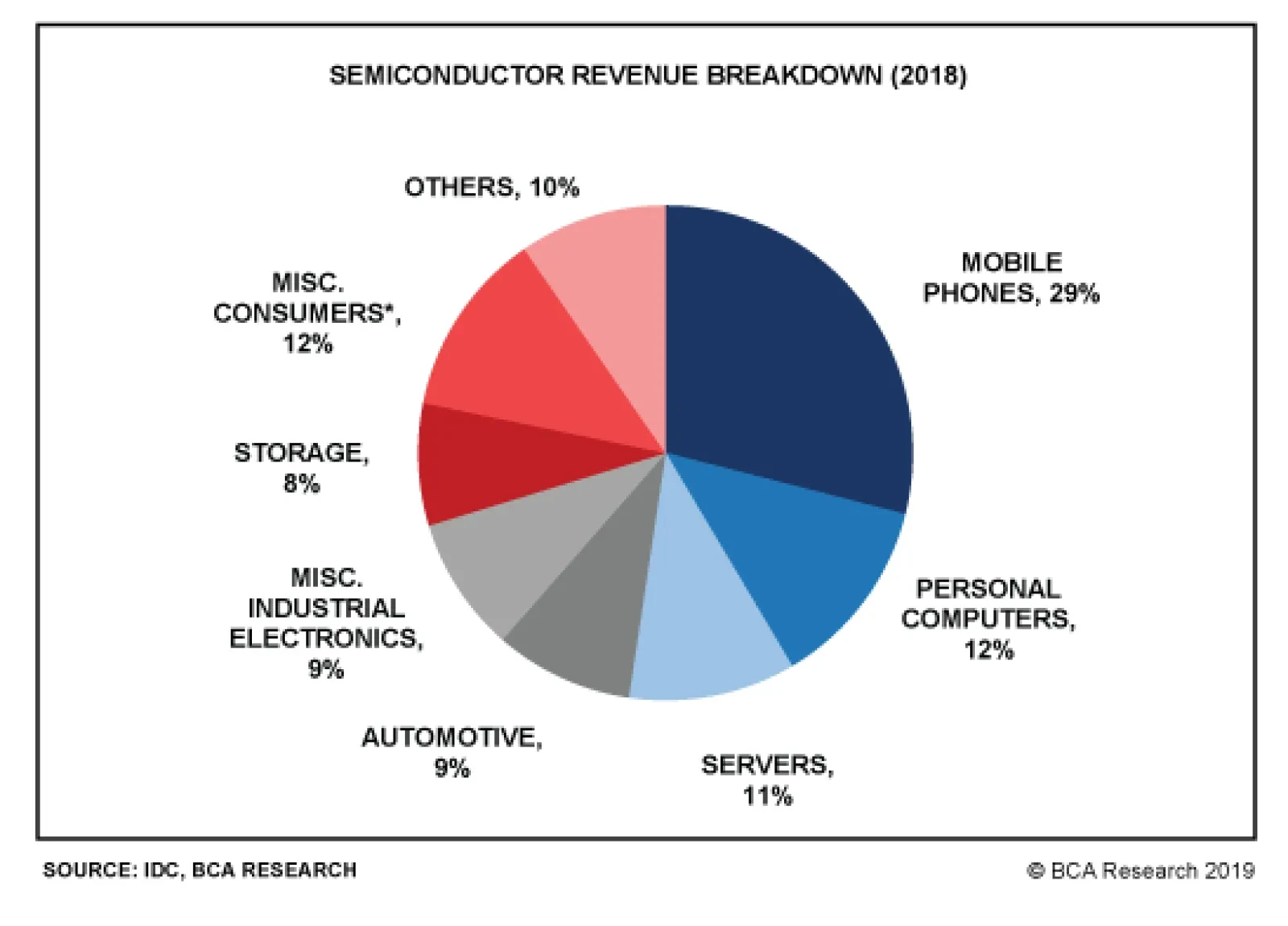
The current shrinkage of semiconductor sales is worse than the 2011-12 and 2015 downturns. Yet, it is still smaller than the magnitude during the 2008 Great Financial Crisis and the 2001 tech bubble bust. The revenue of semiconductor companies has so far contracted by 24%, which is disproportionally more than the decline in share prices of these companies. The global semiconductor equity index is only 14% below its March 2018 high. It appears as though the market is expecting a quick recovery in semiconductor sales. As per Table 1, in the downturns of 2008, 2011 and 2015, global semiconductor stocks all bottomed before the bottom of global semiconductor sales. Only in the 2001 episode, stock prices bottomed eight months after the bottom in sales. In the current cyclical downturn, global semiconductor sales have so far had only four months of growth contraction,1 far less than the 13-16 months experienced in all the past four cycles. All in all, we would lean against the market’s expectation of an imminent recovery in the semiconductor cycle. The demand downturn will last another three to six months and share prices are facing major headwinds. Global Semiconductor Demand Semiconductor sales are in contraction across countries and regions (Chart 2). In April – before President Trump’s tweet on imposing new import tariff on China, global semiconductor sales growth sank to a negative 15% year-on-year. The short-term (three-to-six month) outlook for global semiconductor demand remains dismal. Chart 3 shows global semiconductor revenue breakdown in terms of end usage. Mobile phones account for the largest share (29%) of the market, followed by PCs (12%), miscellaneous consumer products (12%), and servers (11%). All of these major demand sources are under downward pressure: Smartphone Sales Global smartphone sales are shrinking (Chart 4). According to the International Data Corporation (IDC), global smartphone shipments declined 6.6% year-on-year in volume terms in the first quarter of this year, worse than last year’s 4.4% drop. Chart 2Semiconductor Sales Are In Contraction Across Countries
Semiconductor Sales Are In Contraction Across Countries
Semiconductor Sales Are In Contraction Across Countries
In the current cyclical downturn, global semiconductor sales have so far had only four months of growth contraction, far less than the 13-16 months experienced in all the past four cycles.
Chart 3
Chart 4Global Smartphone Sales: Contracting
Global Smartphone Sales: Contracting
Global Smartphone Sales: Contracting
We expect smartphone shipments to continue contracting in the second half of this year. Major markets such as mainland China and advanced economies have entered the saturation phase of mobile-phone demand. For example, U.S. shipments were down 15% year-on-year in the first quarter due to near-full market penetration. In China, smartphone sales have shown signs of stabilization (Chart 5). However, this is probably temporary and has been driven by the boom in Huawei smartphone sales in China since early this year. The incredible 50% year-on-year growth of Huawei smartphone sales in the first quarter is not sustainable. While global sales of Huawei smartphones increased by 20 million units, total global smartphone sales of all brands fell by 22 million units (Chart 6). The U.S. punitive actions towards China and Huawei have also instigated nationalism in China. This has triggered a Chinese buying-spree of the Huawei smartphone. Chart 5Chinese Smartphone Sales: Temporary Stabilization
Chinese Smartphone Sales: Temporary Stabilization
Chinese Smartphone Sales: Temporary Stabilization
Chart 6
Yet, this has probably reduced the number of potential Chinese smartphones buyers in the near future. After all, many buyers likely made the purchase earlier than otherwise planned in the absence of a trade war. Although Samsung, Huawei, OnePlus, Xiaomi, Motorola, LG, and ZTE have either released or will release their 5G phones this year, the sales growth from 5G phones will not be able to offset the loss in 2G, 3G and 4G phone sales, at least not in 2019. The IDC estimated that 5G phones would only account for about 0.5% of the market share this year. 5G will likely only begin affecting overall semiconductor demand next year, when they account for a larger share of smartphone sales. Huawei is the market leader in 5G technology. The U.S. boycott of Huawei will likely continue. This will only slow the pace of 5G phone adoption and the development of 5G networks worldwide. On balance, global smartphone demand may only recover next year. Server Demand Global server shipments also experienced a 5% contraction in volume terms in the first quarter of this year, according to IDC (Chart 7). The outlook for the rest of 2019 does not look promising. Global server demand will likely remain in contraction in the second half of this year. Many hyperscale data centers have already purchased considerable amounts of servers in advance of the trade war to avoid tariffs.2 Meanwhile, the escalation in the U.S.-China confrontation has increased economic uncertainties. This may delay potential datacenter investments. Decelerating 5G network development worldwide due to the U.S. ban on Huawei will also tend to discourage new datacenter and cloud services projects. This is because the 5G technology enables datacenter and cloud services to experience a huge improvement in terms of data transfer speeds, latency, connectivity, capacity, reliability and mobility. Chart 7Global Server Shipment: Are In Contraction
Global Server Shipment: Are In Contraction
Global Server Shipment: Are In Contraction
Personal Computers (PC) PCs sales are also in contraction (Chart 8). PC demand has entered into the deep-maturation phase while facing strong competition from tablets and laptops. Auto Sales Global auto sales also sank by 5% in April from a year ago, registering the worst contraction since 2009 (Chart 9). Chart 8Global PCs Sales: Deeply Saturated
Global PCs Sales: Deeply Saturated
Global PCs Sales: Deeply Saturated
Chart 9Global Auto Sales Are In Contraction As Well
Global Auto Sales Are In Contraction As Well
Global Auto Sales Are In Contraction As Well
Regarding auto demand, the Chinese government may continue to implement more supportive policies to stimulate car sales in China. However, we believe the recovery will be delayed. The government has already implemented a number of policies to lift domestic car sales since late January, including providing subsidies to encourage new energy vehicle sales, to promote auto sales in rural areas, and to increase auto replacement. The central government recently loosened auto sales restrictions in the first tier cities of Guangzhou and Shenzhen that have restrictive auto sales policies. However, all of these policies have failed to lift Chinese domestic car sales out of deep contraction. The key reason has been a diminishing willingness to spend among Chinese consumers, as suggested by falling households’ marginal propensity to consume (Chart 10). Bottom Line: Global semiconductor demand growth will likely remain weak and will fail to recover in the second half of this year. The basis is that its major upstream markets (smartphone, servers, PCs and automobiles) are all facing cyclically declining demand. Chart 10Chinese Consumers: Diminishing Willingness To Consume
Chinese Consumers: Diminishing Willingness To Consume
Chinese Consumers: Diminishing Willingness To Consume
Inventories And Prices Chart 11 shows the semiconductor supply chain illustrating the process of manufacturing semiconductors starting with silicon wafers and up to final electronic products.
Chart 11
Box 1 explains the role of key segments and players along the supply chain. Box 1 A Brief Explanation Of The Key Segments/Players Of The Supply Chain Both integrated device manufacturers (IDM) and foundries are at the center of the supply chain, responsible for chip manufacturing. In terms of semiconductor sales revenue, Samsung, Intel and SK Hynix are the world’s top three IDM companies and TSMC, Global Foundries and United Microelectronics Corp (UMC) are the world’s top three foundries. While IDMs cover most of the process from IC design, chip fabrication, assembly, testing and packaging, IDM companies still have to purchase raw materials and equipment for the chip-making process. Foundry companies receive orders from IC designing companies like Qualcomm, Nvidia, and Huawei HiSilicon, then purchase needed raw materials and equipment to proceed in the chip-manufacturing process. Both IDMs and foundries can either outsource the tasks of semiconductor assembly and testing or perform them on their own. The final semiconductor products will be used in electronics products, such as smartphones, computers, home appliances, automobiles, etc. Global semiconductor demand growth will likely remain weak and will fail to recover in the second half of this year. The basis is that its major upstream markets (smartphone, servers, PCs and automobiles) are all facing cyclically declining demand. In a typical business cycle, a cyclical downturn begins with a slump in demand for final electronic products (upstream demand). This leads to falling semiconductor sales. As a result, inventory buildup will occur across most of the segments along the semiconductor supply chain. Chipmakers: Producers’ semiconductor inventory in both Taiwan and Korea have reached either a record high or a near-record high (Chart 12). The installed wafer capacities at these two countries are the world’s largest, together accounting for 43% of total global wafer capacity. In addition, the inventory of some major electronic parts and components have also increased considerably in Taiwan (Chart 13). This also implies weaker demand for semiconductor raw materials. Chart 12Chipmakers: A Rapid Buildup In Inventory
Chipmakers: A Rapid Buildup In Inventory
Chipmakers: A Rapid Buildup In Inventory
Chart 13Rising Inventory Of Some Major Electronic Parts And Components
Rising Inventory Of Some Major Electronic Parts And Components
Rising Inventory Of Some Major Electronic Parts And Components
Raw material suppliers: Silicon wafer is the indispensable raw material required in the chip manufacturing process. Japanese companies account for over half of global silicon wafer supply.Chart 14 shows that silicon wafer inventory in Japan has had a significant buildup in volume terms since late last year. Importantly, it is not declining yet. Chart 14Silicon Wafer Inventory: A Significant Buildup As Well
Silicon Wafer Inventory: A Significant Buildup As Well
Silicon Wafer Inventory: A Significant Buildup As Well
Outsourced semiconductor assembly and test (OSAT) providers: Both Singapore and Thailand are OSAT providers while they also manufacture, assemble and export electronic products. Both countries are closer to the downstream side of the semiconductor supply chain. Semiconductor inventory at these two countries has also jumped to a record high (Chart 15). Chart 15Singapore and Thailand: Record High Semiconductor inventory
Singapore and Thailand: Record High Semiconductor inventory
Singapore and Thailand: Record High Semiconductor inventory
Importantly, a marginal improvement in demand will tend to support spot prices. For example, in the memory chip market, falling prices denote weak demand relative to excess supply. When prices of DRAM and NAND start to form a bottom or decisively move up, this may indicate the arrival of a cyclical upturn. So far, both DRAM and NAND prices are continuing to fall (Chart 16). In addition, the prices of silicon wafer – the most important raw material used in the chip-making process – have declined in the first half of this year.3 Chart 16Still Falling Memory Chip Prices
Still Falling Memory Chip Prices
Still Falling Memory Chip Prices
Chart 17Deflating DRAM Prices Suggest Downside Risks To Korean Tech Stocks
Deflating DRAM Prices Suggest Downside Risks To Korean Tech Stocks
Deflating DRAM Prices Suggest Downside Risks To Korean Tech Stocks
In short, prices are the most important variable to monitor. Chart 17 exhibits the high correlation between DRAM prices and the Korean technology sector stock prices. Falling DRAM prices suggest downside risks to technology stocks in Korea. Samsung accounts for about 65% of Korea’s tech index and 27% of the overall Korean equity index. Memory chips accounted for 68% of Samsung’s operating profits in the first quarter of this year. Bottom Line: There has been involuntary inventory accumulation along the entire supply chain of semiconductors. This and ongoing price deflation among various types of semiconductors foreshadow a downbeat near-term outlook. The Interpretation Of Some Positive Developments There have been some positive developments in the past several months. Taiwanese PMI new orders diffusion index in the electronics sector jumped out of deep contraction to reach zero, and Chinese semiconductor imports halted their decline in both volume and value terms (Chart 18). The improvement in the aforementioned data was probably mainly due to large semiconductor purchases by China to hedge the rising risk of U.S. blocking China’s technological development (Chart 19). Chart 18Some Positive Development
Some Positive Development
Some Positive Development
Chart 19China: More Semiconductors Purchases Before The Tariff And U.S. Huawei Ban?
China: More Semiconductors Purchases Before The Tariff And U.S. Huawei Ban?
China: More Semiconductors Purchases Before The Tariff And U.S. Huawei Ban?
Besides, Huawei smartphone sales have been booming, which we deliberated on page 5, could have been responsible for the improvement in these data. This one-off surge will likely dwindle going forward. Investment Conclusions We remain negative on Asian semiconductor share prices in absolute terms. A continued contraction in global semiconductor sales will further squeeze their profits. In relative terms, we are neutral on the Asian semiconductor sector: we continue recommending market-weight allocation to Taiwan’s overall market and the Korean technology sector within the EM equity benchmark. As a new trade, we recommend going long Asian semiconductor stocks and short the S&P 500 semiconductor index over the next three to six months (Chart 20). The Bloomberg Asia Pacific semiconductor index has nine stocks. Samsung and TSMC account for 42% and 38% of the index, respectively. There has been involuntary inventory accumulation along the entire supply chain of semiconductors. This and ongoing price deflation among various types of semiconductors foreshadow the downbeat near-term outlook. Samsung will likely benefit from the U.S. ban on Huawei in the smartphone sector outside of China. In addition, Samsung will win some market share from Apple as the latter does not have a 5G phone to release this year. These positive factors may partially offset the negative impact from falling memory prices and demand on Samsung. The S&P 500 semiconductor index has 13 stocks. Intel, Broadcom, Texas Instruments and Qualcomm are the top five constituents, together accounting for nearly 70% of the index. Most of these companies are IC designing companies, which will likely suffer as Chinese demand for their products shrink due to the U.S. administration's ban on Huawei. This position will also benefit from U.S. dollar appreciation. A firm dollar will hurt profits of U.S. semiconductor stocks. In turn, currency depreciation in Korea and Taiwan will on the margin benefit Asian semiconductor stocks. Chart 20Recommend Long Asia Pacific Semiconductor Stock Vs. S&P 500 Semiconductor Index
Recommend Long Asia Pacific Semiconductor Stock Vs. S&P 500 Semiconductor Index
Recommend Long Asia Pacific Semiconductor Stock Vs. S&P 500 Semiconductor Index
Chart 21The 2015 Experience
The 2015 Experience
The 2015 Experience
Chart 21 shows that global foundry companies outperformed global IC designing companies during the final phase of the 2015 cyclical downturn. Odds are that these dynamics will play out in this downturn as well. Finally, the relative performance of Asian semiconductor stocks versus U.S. ones is oversold and might stage some sort of mean reversion (Chart 20). Ellen JingYuan He, Associate Vice President ellenj@bcaresearch.com Footnotes 1 Please note that here the calculation for “the number of months of the growth contraction” is different from the one for the “peak-to-bottom duration” in Table 1. “The number of months of the growth contraction” equals the number of months when semiconductor sales year-on-year growth is negative. 2 https://marketrealist.com/2019/05/nvidias-data-center-revenue-inference-rendering-and-edge/ 3 http://www.sohu.com/a/300386061_132567, http://news.moore.ren/industry/104958.htm
Highlights A resurfacing of trade tensions could weigh on risk sentiment in the near term. A somewhat less dovish tone from the FOMC this month could further rattle risk assets. While we would not exclude the possibility of an “insurance cut,” the Fed is probably uncomfortable with the amount of easing that markets now expect. That being said, a trade truce is still more likely than not, and while the Fed will resist cutting rates this year, it will not raise them either. The neutral rate of interest in the U.S. is higher than widely believed, which means that monetary policy will remain accommodative. That’s good news for global equities. Investors should maintain a somewhat cautious stance over the next month or so. However, they should overweight stocks, while underweighting bonds, over a 12-month horizon. The equity bull market will only end when U.S. inflation rises to a level that forces the Fed to pick up the pace of rate hikes. That is unlikely to occur until late-2020 at the earliest. Feature Stocks Bounce Back We turned positive on global equities in late December after a six-month period on the sidelines. While we have remained structurally bullish over the course of this year, we initiated a tactical hedge to short the S&P 500 on May 10th following what we regarded as an overly complacent reaction by investors to President Trump’s decision to increase tariffs on Chinese imports. Our reasoning at the time was that a period of market pressure would likely be necessary to forge an agreement between the two sides. Our thesis was looking prescient for a while. However, the rebound in stocks since last week has brought the S&P 500 close to the level where we initiated the trade. Is it time to drop the hedge? Not yet. First, market internals do not inspire much confidence. Even though the S&P 500 is just below its year-to-date (and all-time) high, the Russell 2000 is 5.1% below its May highs, and 11.8% below where it was last August (Chart 1). The S&P mid cap and small cap indexes are 6.8% and 16.2%, respectively, below their highs reached last August. Such weak breadth is disconcerting. Chart 1U.S. Stocks: Not As Strong As They Appear
U.S. Stocks: Not As Strong As They Appear
U.S. Stocks: Not As Strong As They Appear
Second, President Trump’s decision to suspend raising the tariffs on Mexican imports may have had less to do with his desire to seek a more conciliatory tone, and more to do with pressure from Congressional Republicans. Various news reports suggested that Mitch McConnell and other Republican leaders opposed the action, and threatened to revoke the President’s authority to unilaterally impose tariffs.1 In the end, the deal with Mexico contained many of the same measures that the Mexicans had already agreed to implement months earlier. Our geopolitical team remains skeptical of a grand bargain in trade talks with China.2 In the United States, protectionist sentiment is politically more popular towards China than it is towards other countries (Chart 2). A breakthrough is still probable, but again, it may take a stock market selloff to produce a trade truce.
Chart 2
Chart 2
Third, we have become increasingly concerned that the market has gotten ahead of itself in pricing in Fed easing. While we would not rule out the possibility that the Fed takes out an “insurance cut” to guard against downside risks to the economy, the 80 basis points of easing that the market has priced in over the next 12 months seems excessive to us. Chart 3Financial Conditions Have Not Tightened Much
Financial Conditions Have Not Tightened Much
Financial Conditions Have Not Tightened Much
Unlike late last year, U.S. financial conditions have tightened only modestly over the past nine weeks (Chart 3). The economy is also performing reasonably well. According to the Atlanta Fed GDPNow model, real final sales to domestic purchasers3 are set to grow by 2.5% in the second quarter, up from 1.5% in Q1 (Chart 4). Real personal consumption expenditures are on track to rise by 3.2%. Gasoline futures have tumbled, which will support discretionary spending over the next few quarters (Chart 5).
Chart 4
Chart 5Lower Gasoline Prices Should Bode Well For Discretionary Spending
Lower Gasoline Prices Should Bode Well For Discretionary Spending
Lower Gasoline Prices Should Bode Well For Discretionary Spending
Granted, the labor market has cooled down. Payrolls increased by only 75K in May. However, the Council of Economic Advisers estimated that flooding in the Midwest shaved 40K from payrolls. And even with this adverse impact, the three-month average for payroll growth still stands at 151K, well above the 90K-to-100K or so that is needed to keep up with labor force growth. Meanwhile, initial unemployment claims remain muted and the employment component of the nonmanufacturing ISM hit a seven-month high in May. Chart 6Trimmed Mean PCE Inflation Back To 2%
Trimmed Mean PCE Inflation Back To 2%
Trimmed Mean PCE Inflation Back To 2%
Inflation expectations are on the low side, but actual inflation is proving to be reasonably sturdy. The core PCE index rose by 0.25% month-over-month in April. Trimmed mean PCE inflation increased above 2% on a year-over-year basis for the first time in seven years (Chart 6). According to a recent Fed study, the trimmed mean calculation is superior to the core PCE index as a summary measure of underlying inflationary trends.4 Ultimately, the fact that the U.S. economy is holding up well is a positive sign for equity returns over the next 12 months. In the short term, however, it does create the risk that the Fed will sound less dovish than investors are anticipating, leading to a temporary selloff in stocks. Hence our view: near-term cautious, longer-term bullish. Who Determines Interest Rates? Central banks decide where rates will go in the short run, but it is the economy that determines where interest rates will go in the long run. The neutral rate of interest is the rate that corresponds to full employment and stable inflation. One can also think of it as the rate that aligns the level of aggregate demand with the maximum potential output the economy is capable of achieving without overheating. Both the Fed dots and the widely-used Laubach Williams model suggest that rates are close to neutral. But are they really? If a central bank keeps rates below their neutral level for too long, inflation will eventually break out, forcing the central bank to raise rates. Conversely, if a central bank raises rates above their neutral level, growth will slow, inflation will decline, and the central bank will be forced to cut rates. The problem is that changes in monetary policy typically affect the economy with a lag of 12-to-18 months. Inflation is also a highly lagging indicator. It usually peaks well after a recession has begun and troughs long after the recovery is under way (Chart 7). Thus, central banks have to make an educated guess as to where the neutral rate lies and try to steer the economy towards that rate in a way that achieves a soft landing. Needless to say, this is easier said than done.
Chart 7
Today, both the Fed dots and the widely-used Laubach Williams model suggest that rates are close to neutral (Chart 8). Chart 8The Fed Thinks Rates Are Close To Neutral
The Fed Thinks Rates Are Close To Neutral
The Fed Thinks Rates Are Close To Neutral
But are they really? That’s the million dollar question. Not only will the answer determine the medium-term path of interest rates, it will also determine how long the current U.S. economic expansion will last. Recessions rarely occur when monetary policy is accommodative, and equity bear markets almost never happen outside of recessionary periods (Chart 9). Thus, if rates are currently well below neutral, investors should maintain a bullish equity tilt. Chart 9Recessions And Bear Markets Usually Overlap
Recessions And Bear Markets Usually Overlap
Recessions And Bear Markets Usually Overlap
Chart 10U.S.: Federal Fiscal Policy Has Been Expansionary
U.S.: Federal Fiscal Policy Has Been Expansionary
U.S.: Federal Fiscal Policy Has Been Expansionary
Where Is Neutral? The neutral rate of interest is a function of many variables, most of which are not in the Laubach Williams model. Let us consider a few: Fiscal Policy A larger budget deficit boosts aggregate demand, while higher interest rates lower demand. Thus, once an economy has achieved full employment, an easing of fiscal policy must be counterbalanced by an increase in interest rates, which is another way of saying that looser fiscal policy raises the neutral rate of interest. The U.S. cyclically-adjusted budget deficit has risen by about 3% of GDP since 2015. Both tax cuts and increased federal discretionary spending have contributed to the deterioration in the fiscal balance (Chart 10). Standard “Taylor Rule” equations suggest that a 1% of GDP increase in aggregate demand will raise the appropriate level of the fed funds rate by 0.5-to-1 percentage points.5 This implies that easier fiscal policy has lifted the neutral rate of interest by 1.5-to-3 percentage points over the past five years. Labor Market Developments A tight labor market tends to increase the share of national income accruing to workers (Chart 11). Workers generally spend more of every dollar of income than businesses. Thus, a shift of income from businesses to workers raises the neutral rate of interest. The fact that a tight labor market usually generates the biggest gains for workers at the bottom of the income distribution – who have the highest marginal propensity to spend – further amplifies the positive effect on aggregate spending. Chart 11Workers Garner A Larger Piece Of The Income Pie When The Labor Market Is Tight
Workers Garner A Larger Piece Of The Income Pie When The Labor Market Is Tight
Workers Garner A Larger Piece Of The Income Pie When The Labor Market Is Tight
Chart 12
The labor share of income has rebounded since reaching a record low in 2014. The lowest-paid workers have also seen the largest wage increases during the past 12 months (Chart 12). Neither of these nascent developments have come close to unwinding the beating that labor has suffered in relation to capital over the past four decades, but if the unemployment rate keeps falling, workers are going to start gaining the upper hand. Thus, one would expect the neutral rate of interest to rise further as the labor market continues to tighten. Credit Growth The Great Recession ushered in a painful deleveraging cycle. Household debt fell from 86% of GDP in 2009 to 70% of GDP in 2012. The household debt-to-GDP ratio has edged slightly lower since then due to continued declines in mortgage debt and home equity lines of credit. A return to the rapid pace of credit growth seen before the financial crisis is unlikely. Nevertheless, a modest releveraging of household balance sheets would not be surprising. Some categories such as student and auto loans have seen fairly robust debt growth (Chart 13). Housing-related debt could also stage a modest comeback due to rising home prices and buoyant consumer confidence. Conceptually, the rate of credit growth determines the level of aggregate demand.6 Thus, if household credit growth picks up at the margin, this would push up the neutral rate of interest. Corporate debt levels also have scope to rise further. Net corporate debt is only modestly higher than it was in the late 1980s, a period when the fed funds rate averaged nearly 10% (Chart 14). Chart 13U.S. Housing Deleveraging Has Slowed
U.S. Housing Deleveraging Has Slowed
U.S. Housing Deleveraging Has Slowed
Chart 14U.S. Corporate Debt (I): No Cause For Alarm
U.S. Corporate Debt (I): No Cause For Alarm
U.S. Corporate Debt (I): No Cause For Alarm
Thanks to low interest rates and rapid asset accumulation, the economy-wide interest coverage ratio is above, while the ratio of debt-to-assets is below, their respective long-term averages (Chart 15). The corporate sector financial balance – the difference between what businesses earn and spend – is still in surplus. Almost every recession in the post-war era has begun when the corporate sector financial balance was in deficit (Chart 16). Chart 15U.S. Corporate Debt (II): No Cause For Alarm
U.S. Corporate Debt (II): No Cause For Alarm
U.S. Corporate Debt (II): No Cause For Alarm
Chart 16U.S. Corporate Debt (III): No Cause For Alarm
U.S. Corporate Debt (III): No Cause For Alarm
U.S. Corporate Debt (III): No Cause For Alarm
The Value Of The U.S. Dollar A stronger dollar reduces net exports. This drains demand from the economy, which lowers the neutral rate of interest. The real broad trade-weighted dollar index has risen 10% since 2014. According to the New York Fed’s econometric model, this would be expected to reduce the level of real GDP by 0.5% in the first year and by a further 0.2% in the second year, for a cumulative decline of 0.7%, equivalent to a decrease in the neutral rate of 0.35%-to-0.7%. The New York Fed model assumes an “all things equal” environment. All things have not been quite equal, however. The U.S. has benefited from a modest improvement in its terms of trade7 over the past five years (Chart 17). The shale boom has also significantly cut into oil imports. As a result, the trade deficit has fallen from 5.9% of GDP in 2005 to 2.9% of GDP at present. Chart 17The Dollar Has Appreciated Since 2014
The Dollar Has Appreciated Since 2014
The Dollar Has Appreciated Since 2014
Chart 18The Savings Rate Has (A Lot Of) Room To Drop, Judging From The Historical Relationship With Wealth
The Savings Rate Has (A Lot Of) Room To Drop, Judging From The Historical Relationship With Wealth
The Savings Rate Has (A Lot Of) Room To Drop, Judging From The Historical Relationship With Wealth
Asset Prices An increase in asset values – whether they be equities, bonds, or homes – makes people and businesses feel wealthier, which leads to more consumption and investment spending. As such, higher asset prices raise the neutral rate of interest. Today, U.S. household net worth stands near a record high as a percent of disposable income (Chart 18). The personal savings rate, in contrast, still stands at an elevated 6.4%. If the savings rate falls over the coming months, this would further boost aggregate demand. Demographics Slower labor force growth has led to a decline in trend GDP growth in the U.S. and most other economies. Slower economic growth tends to reduce the neutral rate of interest. The Bureau of Labor Statistics expects labor force growth to be broadly stable over the next 5-to-10 years, with immigration compensating for the withdrawal of baby boomers from employment (Chart 19).
Chart 19
Chart 20Savings Over The Life Cycle
Savings Over The Life Cycle
Savings Over The Life Cycle
In the current political climate, there is quite a bit of uncertainty over how many immigrants will settle in the United States. On the one hand, less immigration would reduce labor force growth, thus lowering the neutral rate. On the other hand, a decline in immigration would lead to an even tighter labor market, thus potentially raising the neutral rate. An additional question is how population aging, which will continue even if immigration remains elevated, will affect the neutral rate. Older people work less, but consume more than younger people, once health care spending is accounted for (Chart 20). If overall national output falls in relation to consumption, national savings will go down. This will raise the neutral rate of interest. The Shift To A Capital-Lite Economy Firms increasingly need less physical capital to carry out their activities. Larry Summers has labeled this the “demassification” of the economy. Lower investment spending would translate into a lower neutral rate. While plausible, it is not clear how important this phenomenon is. Companies may need less physical capital, but they need more human capital. Instead of more lending to businesses to finance purchases of machinery, we get additional lending to students. If our thesis that the neutral rate of interest is higher than widely believed turns out to be correct, this means that the Fed will eventually need to start hiking rates again. The question is when. The share of R&D and other intangibles in business investment has risen from around 14% in the 1960s to 33% today (Chart 21). Importantly, the depreciation rate for intangible investment is much higher than for other forms of capital spending. As intangible investment has increased, the overall depreciation rate for the economy has risen (Chart 22). Conceptually, an increase in the depreciation rate should lead to a higher neutral rate of interest.8 Chart 21A Larger Share Of Business Investment Is Intangible...
A Larger Share Of Business Investment Is Intangible...
A Larger Share Of Business Investment Is Intangible...
Chart 22...And That Puts Upward Pressure On The Depreciation Rate
...And That Puts Upward Pressure On The Depreciation Rate
...And That Puts Upward Pressure On The Depreciation Rate
Watch Housing And Business Capex The discussion above suggests that the neutral rate of interest is probably higher than widely believed. That said, there is significant uncertainty around any estimate of the neutral rate. As such, we recommend that investors track the more interest-rate sensitive sectors of the economy to gauge whether monetary policy is becoming restrictive. Housing, and to a lesser extent, business capital expenditures are the key indicators to watch. As a long-lived asset, housing is very sensitive to mortgage rates. Chart 23 shows that changes in mortgage rates tend to lead residential investment and home sales by about six months. Chart 23Housing Is Interest-Rate Sensitive
Housing Is Interest-Rate Sensitive
Housing Is Interest-Rate Sensitive
If the decline in mortgage rates since last fall fails to spur housing, this would support the claim that monetary policy turned restrictive last year. Fortunately, the jump in homebuilder confidence, the outperformance of homebuilder stocks, and the surge in mortgage applications for purchases all suggest that the housing sector remains on firm ground (Chart 24). Despite the broad-based weakness in the global manufacturing sector, U.S. capex intentions remain reasonably buoyant (Chart 25). This week’s release of the May NFIB small business survey, which showed that the share of firms citing “now is a good time to expand” jumped five points to a seven-month high, provides further evidence in support of this view. Chart 24Some Positives For U.S. Housing
Some Positives For U.S. Housing
Some Positives For U.S. Housing
Chart 25U.S. Capex Intentions Remain Solid
U.S. Capex Intentions Remain Solid
U.S. Capex Intentions Remain Solid
A Two-Stage Fed Cycle Chart 26Inflation Expectations Are Not Where The Fed Wants Them To Be
Inflation Expectations Are Not Where The Fed Wants Them To Be
Inflation Expectations Are Not Where The Fed Wants Them To Be
If our thesis that the neutral rate of interest is higher than widely believed turns out to be correct, this means that the Fed will eventually need to start hiking rates again. The question is when. Right now, the Fed has the luxury of time on its side. Even though some measures of core inflation such as the trimmed mean calculation discussed above have reached the Fed’s 2% target, this follows a prolonged period of below-target inflation. A few years of above-trend inflation would hardly be the worst thing in the world. The Fed’s failure to reach its inflation target has pushed long-term inflation expectations below the central bank’s comfort zone (Chart 26). Given the asymmetric risks created by the zero lower bound on interest rates - if inflation rises too fast, the Fed can always hike rates; but if inflation falls too much, it may be impossible to ease monetary policy by enough to avert a recession - the Fed can afford to remain patient. Thus, while the Fed is unlikely to cut rates as much as investors currently expect, it is also unlikely to raise them this year. Thanks to a cyclical revival in productivity growth, unit labor cost inflation has actually declined over the past 12 months (Chart 27). However, as we get into late next year and 2021, circumstances may change. If an increasingly tight jobs market continues to push up wage growth, unit labor costs will start to reaccelerate. Cost-push inflation will kick in. At that point, the Fed may have no choice but to pick up the pace of monetary tightening. All this suggests that Fed policy will evolve in two stages: an initial stage lasting for the next 12-to-18 months where the Fed is doing little-to-no tightening (and could even cut rates if the trade war heats up), followed by a second stage where the central bank is scrambling to raise rates to cool an overheated economy. U.S. Treasury yields are likely to rise modestly during the first stage in response to stronger-than-expected economic growth. We see the 10-year yield clawing its way back to the high-2% range by early next year. Yields could rise more precipitously, to around 4%, in the second stage once inflation begins to move decisively higher. The dollar is unlikely to strengthen during the first stage. Indeed, our baseline forecast calls for a period of modest dollar weakness stretching into late next year driven by a reacceleration in European and Chinese/EM growth. The sharp rebound in Chinese real estate equipment purchases from -18% on a six-month basis late last year to +30% in April suggests that the government’s stimulus efforts are working (Chart 28). Chart 27No Imminent Threat Of A Wage-Price Inflationary Spiral
No Imminent Threat Of A Wage-Price Inflationary Spiral
No Imminent Threat Of A Wage-Price Inflationary Spiral
Chart 28China: A Sign That Stimulus Is Finding Its Way Into The Economy
China: A Sign That Stimulus Is Finding Its Way Into The Economy
China: A Sign That Stimulus Is Finding Its Way Into The Economy
The greenback will likely appreciate, perhaps significantly so, once the Fed picks up the pace of rate hikes in late 2020. The accompanying tightening in global financial conditions is likely to sow the seeds for a worldwide downturn in 2021. The combination of faster global growth and a weaker dollar will support global equities over the next 12 months. European and EM bourses will benefit the most. Investors should begin derisking in the second half of next year. Peter Berezin, Chief Global Strategist Global Investment Strategy peterb@bcaresearch.com Footnotes 1 Patricia Zengerle, “U.S. Lawmakers Seek To Block Trump On Tariffs,” Reuters, June 5, 2019. 2 Please see Geopolitical Strategy Weekly Report, “Is Trump Ready For The New Long March?” dated May 24, 2019. 3 Final sales to domestic purchasers is equal to gross domestic product (GDP) excluding net exports of goods and services, less the change in private inventories. 4 Jim Dolmas and Evan F. Koenig, “Two Measures Of Core Inflation: A Comparison,” Federal Reserve Bank Of Dallas, Working Paper 1903, February 25, 2019. 5 Depending on which specification of the Taylor Rule one uses, a one percent of GDP increase in aggregate demand will increase the neutral rate of interest by half a point (John Taylor’s original specification) or by a full point (Janet Yellen’s preferred specification). John B. Taylor's 1993 specification is based on the following equation: rt = 2 + pt + 0.5(pt - 2) + 0.5yt. Janet Yellen's preferred specification is based on the following equation: rt = 2 + pt+ 0.5(pt - 2) + 1.0yt. Please note: For both specifications above, rt is the federal funds rate; pt is core PCE expressed as a year-over-year percent change; and yt is the output gap (as approximated using the unemployment gap and Okun's law). For further discussion, please see Janet L. Yellen, "The Economic Outlook And Monetary Policy," April 11, 2012. 6 Recall that GDP is a flow variable (how much production takes place every period), whereas credit is a stock variable (how much debt there is outstanding). By definition, a flow is a change in a stock. Thus, credit growth affects GDP and the change in credit growth affects GDP growth. 7 Ratio (multiplied by 100) of the price index for exports of goods and services to the price index for imports of goods and services. 8 The higher the depreciation rate, the more investment is necessary to maintain the existing capital stock. More investment demand for any given level of savings implies a higher interest rate. One can see this in the Solow growth model, which posits that the neutral rate of interest (r*) should be equal to:
Image
Where a is the output elasticity of capital, s is the savings rate, n is labor force growth, g is the growth in total factor productivity, and d is the depreciation rate. The equation implies that the neutral rate of interest will increase if capital intensity increases, the savings rate declines, the rate of labor force growth picks up, technological progress accelerates, or the depreciation rate increases. Strategy & Market Trends MacroQuant Model And Current Subjective Scores
Chart 29
Tactical Trades Strategic Recommendations Closed Trades
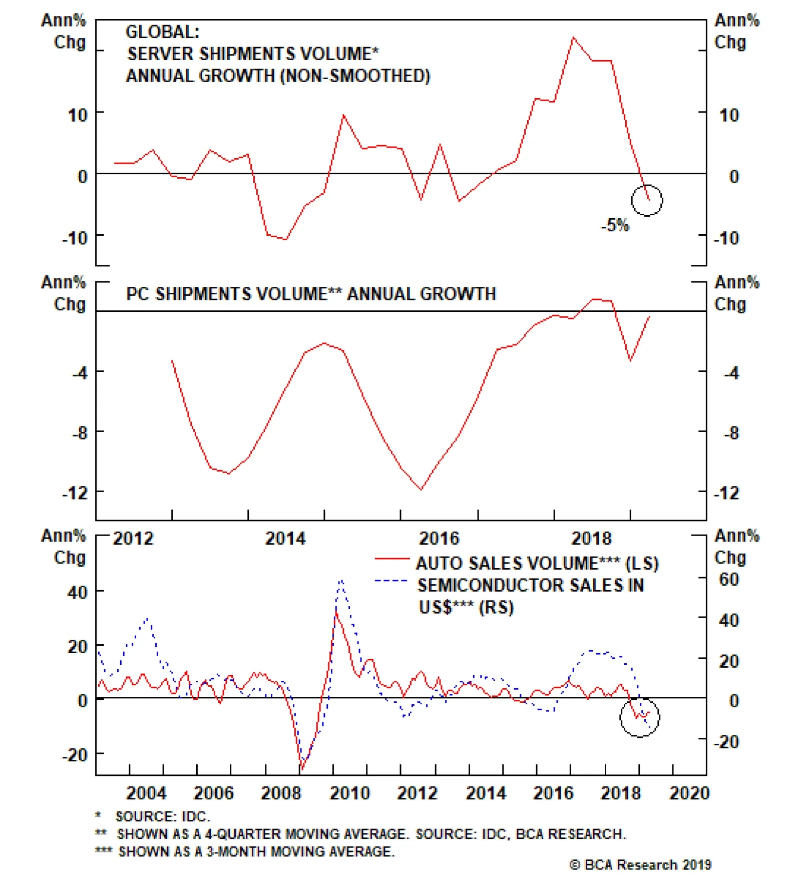
Continuing from the last Insight, these major demand sources are under downward pressure: Server Demand Global server shipments also experienced a 5% contraction in volume terms in the first quarter of this year, according to IDC. Global server…
Semiconductor sales are contracting across countries and regions. In April – before President Trump’s tweet on imposing new import tariffs on China – global semiconductor sales growth sank to a negative 15% year-on-year. The short-term…
Downgrade Tech Hardware Storage & Peripherals To Neutral
Downgrade Tech Hardware Storage & Peripherals To Neutral
Neutral In the context of further de-risking the portfolio, we downgraded the S&P tech hardware storage & peripherals index (THS&P) to neutral in our most recent Weekly Report. Four reasons underpin our downgrade of this index that comprises almost 1/5 of the S&P tech market cap. First, index heavyweight Apple has 20% foreign sales exposure to the Greater China region. While we doubt the Chinese will directly retaliate to the U.S. restriction on Huawei by directly targeting Apple, it is still a risk. Moreover, recent news of the FTC and the DOJ targeting GOOGL and FB pose a risk to Apple, especially given its App Store dominance. Any negative news on either front would take a bite out of the sector’s profits. Second, the S&P THS&P index’s internationally sourced revenues are near the 60% mark, and computer exports are also flirting with the zero line. Worryingly, deflating EM Asian currencies are sapping consumer purchasing power and are weighing on industry exports (bottom panel). For the other two reasons that compelled us to downgrade the S&P THS&P index, please refer to our most recent Weekly Report. Bottom Line: Downgrade the S&P THS&P index to neutral for a modest relative loss of 1.0% since inception. The ticker symbols for the stocks in this index are: BLBG: S5CMPE – AAPL, HPQ, HPE, NTAP, STX, WDC, XRX.
Highlights The odds of a cyclical upturn in the global semiconductor sector over the next three to six months are low. Global semiconductor demand will continue to decline due to contracting demand for smartphones, automobiles, personal computers (PCs), and servers. Global semiconductor stocks are still facing considerable downside in absolute terms. We recommend going long Asian semiconductor stocks versus the U.S. S&P 500 semiconductor index. Dedicated EM equity portfolios should stay neutral on the Taiwanese bourse and Korean technology sector relative to the overall EM benchmark. Feature Chart 1 shows share prices of the global semiconductor sector and global semiconductor sales in the past two decades. Chart 1Global Semiconductor Market: Sales & Share Prices
Global Semiconductor Market: Sales & Share Prices
Global Semiconductor Market: Sales & Share Prices
Was last December’s trough in global semiconductor equity prices the ultimate bottom in this cycle? The odds are in favor of a continued contraction in global semiconductor sales and further downside in semiconductor share prices over the next three to six months. Cycle-On-Cycle Analysis Semiconductor sales experienced five recessions over the past 20 years. Table 1 illustrates the peak-to-bottom percentage decline in nominal global semiconductor sales and the magnitude of the drop in global semiconductor share prices in U.S. dollar terms during these five cyclical downturns in this industry. It also indicates the duration of each downturn and the number of months that semiconductor stocks led the bottom in global semiconductor sales. Table 1Key Statistics Of Five Cyclical Downturns In Global Semiconductor Market
The Global Semiconductor Sector: Is A Cyclical Upturn Imminent?
The Global Semiconductor Sector: Is A Cyclical Upturn Imminent?
The current shrinkage of semiconductor sales is worse than the 2011-12 and 2015 downturns. Yet, it is still smaller than the magnitude during the 2008 Great Financial Crisis and the 2001 tech bubble bust. The revenue of semiconductor companies has so far contracted by 24%, which is disproportionally more than the decline in share prices of these companies. The global semiconductor equity index is only 14% below its March 2018 high. It appears as though the market is expecting a quick recovery in semiconductor sales. As per Table 1, in the downturns of 2008, 2011 and 2015, global semiconductor stocks all bottomed before the bottom of global semiconductor sales. Only in the 2001 episode, stock prices bottomed eight months after the bottom in sales. In the current cyclical downturn, global semiconductor sales have so far had only four months of growth contraction,1 far less than the 13-16 months experienced in all the past four cycles. All in all, we would lean against the market’s expectation of an imminent recovery in the semiconductor cycle. The demand downturn will last another three to six months and share prices are facing major headwinds. Global Semiconductor Demand Semiconductor sales are in contraction across countries and regions (Chart 2). In April – before President Trump’s tweet on imposing new import tariff on China, global semiconductor sales growth sank to a negative 15% year-on-year. The short-term (three-to-six month) outlook for global semiconductor demand remains dismal. Chart 3 shows global semiconductor revenue breakdown in terms of end usage. Mobile phones account for the largest share (29%) of the market, followed by PCs (12%), miscellaneous consumer products (12%), and servers (11%). All of these major demand sources are under downward pressure: Smartphone Sales Global smartphone sales are shrinking (Chart 4). According to the International Data Corporation (IDC), global smartphone shipments declined 6.6% year-on-year in volume terms in the first quarter of this year, worse than last year’s 4.4% drop. Chart 2Semiconductor Sales Are In Contraction Across Countries
Semiconductor Sales Are In Contraction Across Countries
Semiconductor Sales Are In Contraction Across Countries
In the current cyclical downturn, global semiconductor sales have so far had only four months of growth contraction, far less than the 13-16 months experienced in all the past four cycles.
Chart 3
Chart 4Global Smartphone Sales: Contracting
Global Smartphone Sales: Contracting
Global Smartphone Sales: Contracting
We expect smartphone shipments to continue contracting in the second half of this year. Major markets such as mainland China and advanced economies have entered the saturation phase of mobile-phone demand. For example, U.S. shipments were down 15% year-on-year in the first quarter due to near-full market penetration. In China, smartphone sales have shown signs of stabilization (Chart 5). However, this is probably temporary and has been driven by the boom in Huawei smartphone sales in China since early this year. The incredible 50% year-on-year growth of Huawei smartphone sales in the first quarter is not sustainable. While global sales of Huawei smartphones increased by 20 million units, total global smartphone sales of all brands fell by 22 million units (Chart 6). The U.S. punitive actions towards China and Huawei have also instigated nationalism in China. This has triggered a Chinese buying-spree of the Huawei smartphone. Chart 5Chinese Smartphone Sales: Temporary Stabilization
Chinese Smartphone Sales: Temporary Stabilization
Chinese Smartphone Sales: Temporary Stabilization
Chart 6
Yet, this has probably reduced the number of potential Chinese smartphones buyers in the near future. After all, many buyers likely made the purchase earlier than otherwise planned in the absence of a trade war. Although Samsung, Huawei, OnePlus, Xiaomi, Motorola, LG, and ZTE have either released or will release their 5G phones this year, the sales growth from 5G phones will not be able to offset the loss in 2G, 3G and 4G phone sales, at least not in 2019. The IDC estimated that 5G phones would only account for about 0.5% of the market share this year. 5G will likely only begin affecting overall semiconductor demand next year, when they account for a larger share of smartphone sales. Huawei is the market leader in 5G technology. The U.S. boycott of Huawei will likely continue. This will only slow the pace of 5G phone adoption and the development of 5G networks worldwide. On balance, global smartphone demand may only recover next year. Server Demand Global server shipments also experienced a 5% contraction in volume terms in the first quarter of this year, according to IDC (Chart 7). The outlook for the rest of 2019 does not look promising. Global server demand will likely remain in contraction in the second half of this year. Many hyperscale data centers have already purchased considerable amounts of severs in advance of the trade war to avoid tariffs.2 Meanwhile, the escalation in the U.S.-China confrontation has increased economic uncertainties. This may delay potential datacenter investments. Decelerating 5G network development worldwide due to the U.S. ban on Huawei will also tend to discourage new datacenter and cloud services projects. This is because the 5G technology enables datacenter and cloud services to experience a huge improvement in terms of data transfer speeds, latency, connectivity, capacity, reliability and mobility. Chart 7Global Server Shipment: Are In Contraction
Global Server Shipment: Are In Contraction
Global Server Shipment: Are In Contraction
Personal Computers (PC) PCs sales are also in contraction (Chart 8). PC demand has entered into the deep-maturation phase while facing strong competition from tablets and laptops. Auto Sales Global auto sales also sank by 5% in April from a year ago, registering the worst contraction since 2009 (Chart 9). Chart 8Global PCs Sales: Deeply Saturated
Global PCs Sales: Deeply Saturated
Global PCs Sales: Deeply Saturated
Chart 9Global Auto Sales Are In Contraction As Well
Global Auto Sales Are In Contraction As Well
Global Auto Sales Are In Contraction As Well
Regarding auto demand, the Chinese government may continue to implement more supportive policies to stimulate car sales in China. However, we believe the recovery will be delayed. The government has already implemented a number of policies to lift domestic car sales since late January, including providing subsidies to encourage new energy vehicle sales, to promote auto sales in rural areas, and to increase auto replacement. The central government recently loosened auto sales restrictions in the first tier cities of Guangzhou and Shenzhen that have restrictive auto sales policies. However, all of these policies have failed to lift Chinese domestic car sales out of deep contraction. The key reason has been a diminishing willingness to spend among Chinese consumers, as suggested by falling households’ marginal propensity to consume (Chart 10). Bottom Line: Global semiconductor demand growth will likely remain weak and will fail to recover in the second half of this year. The basis is that its major upstream markets (smartphone, servers, PCs and automobiles) are all facing cyclically declining demand. Chart 10Chinese Consumers: Diminishing Willingness To Consume
Chinese Consumers: Diminishing Willingness To Consume
Chinese Consumers: Diminishing Willingness To Consume
Inventories And Prices Chart 11 shows the semiconductor supply chain illustrating the process of manufacturing semiconductors starting with silicon wafers and up to final electronic products.
Chart 11
Box 1 explains the role of key segments and players along the supply chain. Box 1 A Brief Explanation Of The Key Segments/Players Of The Supply Chain Both integrated device manufacturers (IDM) and foundries are at the center of the supply chain, responsible for chip manufacturing. In terms of semiconductor sales revenue, Samsung, Intel and SK Hynix are the world’s top three IDM companies and TSMC, Global Foundries and United Microelectronics Corp (UMC) are the world’s top three foundries. While IDMs cover most of the process from IC design, chip fabrication, assembly, testing and packaging, IDM companies still have to purchase raw materials and equipment for the chip-making process. Foundry companies receive orders from IC designing companies like Qualcomm, Nvidia, and Huawei HiSilicon, then purchase needed raw materials and equipment to proceed in the chip-manufacturing process. Both IDMs and foundries can either outsource the tasks of semiconductor assembly and testing or perform them on their own. The final semiconductor products will be used in electronics products, such as smartphones, computers, home appliances, automobiles, etc. Global semiconductor demand growth will likely remain weak and will fail to recover in the second half of this year. The basis is that its major upstream markets (smartphone, servers, PCs and automobiles) are all facing cyclically declining demand. In a typical business cycle, a cyclical downturn begins with a slump in demand for final electronic products (upstream demand). This leads to falling semiconductor sales. As a result, inventory buildup will occur across most of the segments along the semiconductor supply chain. Chipmakers: Producers’ semiconductor inventory in both Taiwan and Korea have reached either a record high or a near-record high (Chart 12). The installed wafer capacities at these two countries are the world’s largest, together accounting for 43% of total global wafer capacity. In addition, the inventory of some major electronic parts and components have also increased considerably in Taiwan (Chart 13). This also implies weaker demand for semiconductor raw materials. Chart 12Chipmakers: A Rapid Buildup In Inventory
Chipmakers: A Rapid Buildup In Inventory
Chipmakers: A Rapid Buildup In Inventory
Chart 13Rising Inventory Of Some Major Electronic Parts And Components
Rising Inventory Of Some Major Electronic Parts And Components
Rising Inventory Of Some Major Electronic Parts And Components
Raw material suppliers: Silicon wafer is the indispensable raw material required in the chip manufacturing process. Japanese companies account for over half of global silicon wafer supply.Chart 14 shows that silicon wafer inventory in Japan has had a significant buildup in volume terms since late last year. Importantly, it is not declining yet. Chart 14Silicon Wafer Inventory: A Significant Buildup As Well
Silicon Wafer Inventory: A Significant Buildup As Well
Silicon Wafer Inventory: A Significant Buildup As Well
Outsourced semiconductor assembly and test (OSAT) providers: Both Singapore and Thailand are OSAT providers while they also manufacture, assemble and export electronic products. Both countries are closer to the downstream side of the semiconductor supply chain. Semiconductor inventory at these two countries has also jumped to a record high (Chart 15). Chart 15Singapore and Thailand: Record High Semiconductor inventory
Singapore and Thailand: Record High Semiconductor inventory
Singapore and Thailand: Record High Semiconductor inventory
Importantly, a marginal improvement in demand will tend to support spot prices. For example, in the memory chip market, falling prices denote weak demand relative to excess supply. When prices of DRAM and NAND start to form a bottom or decisively move up, this may indicate the arrival of a cyclical upturn. So far, both DRAM and NAND prices are continuing to fall (Chart 16). In addition, the prices of silicon wafer – the most important raw material used in the chip-making process – have declined in the first half of this year.3 Chart 16Still Falling Memory Chip Prices
Still Falling Memory Chip Prices
Still Falling Memory Chip Prices
Chart 17Deflating DRAM Prices Suggest Downside Risks To Korean Tech Stocks
Deflating DRAM Prices Suggest Downside Risks To Korean Tech Stocks
Deflating DRAM Prices Suggest Downside Risks To Korean Tech Stocks
In short, prices are the most important variable to monitor. Chart 17 exhibits the high correlation between DRAM prices and the Korean technology sector stock prices. Falling DRAM prices suggest downside risks to technology stocks in Korea. Samsung accounts for about 65% of Korea’s tech index and 27% of the overall Korean equity index. Memory chips accounted for 68% of Samsung’s operating profits in the first quarter of this year. Bottom Line: There has been involuntary inventory accumulation along the entire supply chain of semiconductors. This and ongoing price deflation among various types of semiconductors foreshadow a downbeat near-term outlook. The Interpretation Of Some Positive Developments There have been some positive developments in the past several months. Taiwanese PMI new orders diffusion index in the electronics sector jumped out of deep contraction to reach zero, and Chinese semiconductor imports halted their decline in both volume and value terms (Chart 18). The improvement in the aforementioned data was probably mainly due to large semiconductor purchases by China to hedge the rising risk of U.S. blocking China’s technological development (Chart 19). Chart 18Some Positive Development
Some Positive Development
Some Positive Development
Chart 19China: More Semiconductors Purchases Before The Tariff And U.S. Huawei Ban?
China: More Semiconductors Purchases Before The Tariff And U.S. Huawei Ban?
China: More Semiconductors Purchases Before The Tariff And U.S. Huawei Ban?
Besides, Huawei smartphone sales have been booming, which we deliberated on page 5, could have been responsible for the improvement in these data. This one-off surge will likely dwindle going forward. Investment Conclusions We remain negative on Asian semiconductor share prices in absolute terms. A continued contraction in global semiconductor sales will further squeeze their profits. In relative terms, we are neutral on the Asian semiconductor sector: we continue recommending market-weight allocation to Taiwan’s overall market and the Korean technology sector within the EM equity benchmark. As a new trade, we recommend going long Asian semiconductor stocks and short the S&P 500 semiconductor index over the next three to six months (Chart 20). The Bloomberg Asia Pacific semiconductor index has nine stocks. Samsung and TSMC account for 42% and 38% of the index, respectively. There has been involuntary inventory accumulation along the entire supply chain of semiconductors. This and ongoing price deflation among various types of semiconductors foreshadow the downbeat near-term outlook. Samsung will likely benefit from the U.S. ban on Huawei in the smartphone sector outside of China. In addition, Samsung will win some market share from Apple as the latter does not have a 5G phone to release this year. These positive factors may partially offset the negative impact from falling memory prices and demand on Samsung. The S&P 500 semiconductor index has 13 stocks. Intel, Broadcom, Texas Instruments and Qualcomm are the top five constituents, together accounting for nearly 70% of the index. Most of these companies are IC designing companies, which will likely suffer as Chinese demand for their products shrink due to the U.S. administration's ban on Huawei. This position will also benefit from U.S. dollar appreciation. A firm dollar will hurt profits of U.S. semiconductor stocks. In turn, currency depreciation in Korea and Taiwan will on the margin benefit Asian semiconductor stocks. Chart 20Recommend Long Asia Pacific Semiconductor Stock Vs. S&P 500 Semiconductor Index
Recommend Long Asia Pacific Semiconductor Stock Vs. S&P 500 Semiconductor Index
Recommend Long Asia Pacific Semiconductor Stock Vs. S&P 500 Semiconductor Index
Chart 21The 2015 Experience
The 2015 Experience
The 2015 Experience
Chart 21 shows that global foundry companies outperformed global IC designing companies during the final phase of the 2015 cyclical downturn. Odds are that these dynamics will play out in this downturn as well. Finally, the relative performance of Asian semiconductor stocks versus U.S. ones is oversold and might stage some sort of mean reversion (Chart 20). Ellen JingYuan He, Associate Vice President ellenj@bcaresearch.com Footnotes 1 Please note that here the calculation for “the number of months of the growth contraction” is different from the one for the “peak-to-bottom duration” in Table 1. “The number of months of the growth contraction” equals the number of months when semiconductor sales year-on-year growth is negative. 2 https://marketrealist.com/2019/05/nvidias-data-center-revenue-inference-rendering-and-edge/ 3 http://www.sohu.com/a/300386061_132567, http://news.moore.ren/industry/104958.htm Equity Recommendations Fixed-Income, Credit And Currency Recommendations
Put Tech on Downgrade Alert
Put Tech on Downgrade Alert
We are compelled to put the S&P tech sector on our downgrade watch list as President Trump’s hawkish trade talk and actions since May 5 warn that tech revenues (60% export exposure) and profits will likely remain under intense downward pressure. Our tech EPS model is also flashing red on the back of sinking capex and an appreciating U.S. dollar (bottom panel). We will be downgrading the tech sector to underweight via the S&P software index, the tech sector’s largest industry group on a market cap basis. A downgrade to neutral in the S&P software index would push our S&P tech sector weight to a below benchmark allocation. Thus, we are initiating a stop near the 10% relative return mark on the S&P software high-conviction overweight call since the December 3, 2018 inception. We also lift the stop to 27% from 17% relative return on the cyclical overweight we have on the S&P software index since the November 27, 2017 inception. Bottom Line: We are compelled to put the tech sector on our downgrade watch list. We will execute the S&P tech sector downgrade to underweight when the S&P software index’s stops are triggered. This would push the S&P software index to neutral from currently overweight.
Yesterday we were stopped out on our long S&P managed health care/short S&P semis market neutral pair trade initiated on May 13, 2019 for a gain of 10%. Our thesis remains intact that a lot of negative news has been priced into HMOs on the back of the threat of the “Medicare For All” bill passage, while a lot of euphoria has been baked in the cake for semis despite their current down cycle. However, portfolio risk management is forcing our hand and given our ongoing de-risking, we are obeying our trailing stop loss for a gain of 10% in a very short time span. Bottom Line: Book gains of 10% in the long S&P managed health care/short S&P semis pair trade since inception and move to the sidelines for now.
Obey The Stop In The Long Managed Health Care/Short Semis Pair Trade
Obey The Stop In The Long Managed Health Care/Short Semis Pair Trade