Sectors

Highlights Portfolio Strategy The risk/reward equity market tradeoff is to the downside and we remain tactically cautious. The trade war re-escalation risks pushing out the global growth recovery to early-2020 and has shaken our confidence in our cyclically constructive equity market view. An enticing safe-haven macro backdrop, firming industry operating metrics and rock-bottom profit expectations and valuations all signal that it no longer pays to be underweight the S&P telecom services index. Waning residential investment, the recent flare up in the U.S./China trade tussle, crumbling lumber prices and adverse supply/demand dynamics warn that the S&P home improvement retail (HIR) index has ample downside. Recent Changes Lift the S&P telecom services index to neutral for a gain of 6% since inception. Early last week we got stopped out of our S&P homebuilding overweight recommendation, which is now back to neutral, and booked profits of 10% since inception relative to the SPX. Table 1
De-Risk
De-Risk
Feature Equities continued to whipsaw last week and lacked clear direction as the dust from President Trump’s May 5 tariff tweet has still not settled. While the trade talks could go either way, we are reluctant to take a stance and would rather err on the side of caution. Clearly the SPX wants to spring higher and craves a U.S./China trade deal, but our geopolitical strategists believe the trade talks have taken a turn for the worse and the odds of a positive trade resolution are falling quickly. We remain cautious on the short-term equity market outlook and are now increasingly worried that our sanguine cyclical posture is in jeopardy. Worrisomely, the stock-to-bond (S/B) ratio is sounding the alarm and is now part of the slew of indicators we track that have rolled over decisively (Chart 1). The S/B ratio has formed a bearish head and shoulders trading pattern and suggests that the SPX is at risk of a further pullback. While up to very recently falling bond yields were an undoubtedly equity market recovery pillar, any further melting in the 10-year Treasury yield would exert downward pull on the equity market. There are other signs that the U.S. equity market may be hanging by a thread. The average stock has failed to make new all-time highs using the Value Line Arithmetic Index as a gauge. The median U.S. stock is also suffering the same fate, again according to the Value Line Geometric Index (middle & bottom panels, Chart 2). Chart 1Tread Carefully
Tread Carefully
Tread Carefully
Chart 2More Non-Confirming Indicators
More Non-Confirming Indicators
More Non-Confirming Indicators
The trade-weighted U.S. dollar is also sending a deflationary impulse signal and likely reflects a continued global growth deceleration (top panel, Chart 2). This is a net negative for EPS especially for internationally exposed SPX constituents. Thus, this week we are further de-risking our portfolio by crystalizing gains in a defensive high-yielding communications services sub-index and lifting exposure to neutral from underweight. In addition, we update our bearish view on an early-cyclical subgroup and continue to protect the portfolio by adding trailing stops. Meanwhile, taking the pulse of global bourses is disconcerting. With the exception of the S&P 500 and the NASDAQ, no other stock market (in USD terms) confirms the SPX’s breakout to all-time highs. Highs were either hit in 2006-2007 or in early 2018. Now a big gulf has opened up, reminiscent of last year’s late-summer dichotomies when the SPX vaulted to fresh highs, but none of the other major global bourses confirmed the September highs (Charts 3 & 4). There are rising odds that a repeat may be unfolding. Chart 3I Know What You Did Last Summer
I Know What You Did Last Summer
I Know What You Did Last Summer
Chart 4I Still Know What You Did Last Summer
I Still Know What You Did Last Summer
I Still Know What You Did Last Summer
In our view, what explains the reversal of fortunes that led to a U.S. market dominating outperformance since early 2017 has been the massive fiscal injection the Trump administration undertook (Chart 5), with rising fiscal deficits three years running (an unprecedented backdrop during expansions). Chart 6 puts this easing in fiscal policy in a global perspective and shows the average fiscal balance from 2017-2020 using the IMF’s WEO April 2019 dataset that includes projections. The delta in the U.S.’s fiscal largess is quite significant. Our worry is that this is unsustainable and, similar to last fall/winter, the rest of the world may pull down the U.S. stock market until at least there are clear signs of a positive resolution in the U.S./China trade dispute. Adding it all up, the equity market’s risk/reward tradeoff is poor and we remain tactically cautious. The trade war re-escalation risks pushing out the global growth recovery to early-2020 and has shaken our confidence in our cyclically constructive equity market view. Thus, this week we are further de-risking our portfolio by crystalizing gains in a defensive high-yielding communications services sub-index and lifting exposure to neutral from underweight. In addition, we update our bearish view on an early-cyclical subgroup and continue to protect the portfolio by adding trailing stops. Chart 5Explaining U.S. Outperformance
Explaining U.S. Outperformance
Explaining U.S. Outperformance
Chart 6
Dialing Up Profits In the context of a further de-risking of the portfolio, we are monetizing our gains of 6% since inception in our underweight recommendation in the S&P telecom services index and are upgrading this high yielding sector to neutral (bottom panel, Chart 7). Not only have bond yields plunged of late, raising the allure of fixed income equity proxies, but the recent escalation of the trade spat has caused U.S. manufacturers to pull in their horns. Markit’s flash manufacturing PMI survey that took place post the May 5 Trump tweet fell to 50.6 the lowest level since the history of the data. It is surprising that this latest reading near the 50 boom/bust line is below the late-2015/early 2016 level when global trade came to an abrupt halt. Historically, relative share price momentum has moved inversely with the annual change in this series and the current message is to expect a sustained rebound in the former (middle panel, Chart 7). Beyond this enticing macro backdrop for defensive equities, firming operating metrics also suggest that it no longer pays to be bearish telecom services stocks. Industry CEOs have shown labor restraint of late, at a time when selling prices are on the verge of expanding (middle & bottom panels, Chart 8). While the dust has yet to settle on the T-Mobile/Sprint saga, any reduction in supply should prove positive at the margin for industry selling prices. Chart 7Macro Headwinds Beneficiary
Macro Headwinds Beneficiary
Macro Headwinds Beneficiary
Chart 8Firming Operating Metrics
Firming Operating Metrics
Firming Operating Metrics
Tack on a tick up in consumer outlays on telecom services and this likely troughing in demand will also boost the sector’s revenue growth prospects (top panel, Chart 8). In sum, an enticing safe-haven macro backdrop, firming industry operating metrics and rock-bottom profits expectations and valuations all signal that it no longer pays to be underweight the S&P telecom services index. Meanwhile, bombed out profit expectations, suggest that the bar is set extremely low for incumbents and is likely a precursor of positive surprises. In fact, the five year out profit bearishness is unprecedented: telecom carriers are expected to trail the broad market by 13 percentage points (third panel, Chart 9). Despite this downbeat EPS message, relative share prices have fallen even faster, pushing the 12-month forward P/E multiple to multi-decade lows (bottom panel, Chart 9). Nevertheless, we refrain from bumping this niche safe haven index to overweight given some structural negative balance sheet issues. Chart 10 shows that telecom services debt burden is deteriorating. Net debt-to-EBITDA is pushing 3x versus below 2x for the broad market, and the interest coverage ratio is sinking steadily. Chart 9Bombed Out EPS Prospects And Valuations
Bombed Out EPS Prospects And Valuations
Bombed Out EPS Prospects And Valuations
Chart 10Balance Sheet Trouble
Balance Sheet Trouble
Balance Sheet Trouble
In sum, an enticing safe-haven macro backdrop, firming industry operating metrics and rock-bottom profits expectations and valuations all signal that it no longer pays to be underweight the S&P telecom services index. Bottom Line: Lift the S&P telecom services index to neutral and lock in gains of 6% since inception. The ticker symbols for the stocks in this index are: BLBG: S5TELSX – VZ, T, CTL. Home Improvement Retailers: Timber Alert While our high-conviction underweight call in the S&P home improvement retail index is slightly in the red, our confidence has increased that these hard line retailers are about to get chopped. Netting it all out, waning residential investment, the recent flare up in the U.S./China trade tussle, crumbling lumber prices and adverse supply/demand dynamics warn that the S&P home improvement retailing index has ample downside. First, the latest GDP release as it pertains to housing made for grim reading: residential fixed investment is in retreat. Big Box DIY retailers are highly levered to this type of housing activity and the prognosis is negative. Residential fixed investment has subtracted from real GDP growth for five consecutive quarters, which is unprecedented outside of a recession (top panel, Chart 11). Chart 11Time To Converge Lower...
Time To Converge Lower...
Time To Converge Lower...
Residential investment is on the verge of contracting in absolute terms, a feat already achieved compared to GDP growth (bottom panel, Chart 11). The direct link to HIR typically comes via existing home sales. In other words, when a home changes ownership, typically some renovation activity goes into that newly purchased home (second panel, Chart 12). Thus, any sustained softness in existing home sales especially given heightened competition from the newly built housing stock, will weigh on residential investment. Against such a backdrop, top line growth for building & supply stores will likely remain subdued (third panel, Chart 12). Second, the recently announced tariffs and the specter of additional tariffs on the remaining U.S./China trade balance will also weigh on home improvement retailers' margins and profits. While management teams have yet to pencil in the direct input cost increase hit to future profitability, as revealed in recent HD and LOW conference calls, if all of the cost is passed on to the consumer then sales will suffer the most. Put simply, at the margin, some remodeling projects would have to get trimmed or get postponed, warning that HIR same-store sales will remain under pressure (second panel, Chart 13). Chart 12...To Falling Residential Investment
...To Falling Residential Investment
...To Falling Residential Investment
Chart 13Lumber Price Blues
Lumber Price Blues
Lumber Price Blues
Third, lumber prices continue to crumble and, given that HIR makes a set margin on lumber sales, HIR profits will likely underwhelm (third panel, Chart 13). Finally, a buildup in industry inventories at a time when demand is easing has pummeled the sales-to-inventories ratio, warning that the path of least resistance for HIR profitability remains lower (bottom panel, Chart 13). Our HIR model does an excellent job in capturing most of these macro and operating headwinds, and suggests that a felling in the relative share price ratio looms (Chart 14). What is disquieting is that there is no real valuation cushion for these priced-to-perfection retailers to absorb any future profit hiccups that we anticipate in the coming quarters. Our sense is that the de-rating phase that commenced in early 2019 will gain steam in the back half of the year and a premium-to-discount valuation reversal would not surprise us at all (bottom panel, Chart 12). Netting it all out, waning residential investment, the recent flare up in the U.S./China trade tussle, crumbling lumber prices and adverse supply/demand dynamics warn that the S&P home improvement retailing index has ample downside. Bottom Line: We reiterate our high-conviction underweight status in the S&P HIR index. The ticker symbols for the stocks in this index are: BLBG: S5HOMI – HD, LOW. Anastasios Avgeriou, U.S. Equity Strategist anastasios@bcaresearch.com Chart 14Model Says Shy Away
Model Says Shy Away
Model Says Shy Away
Housekeeping Early last week we obeyed our stop and booked profits in the S&P homebuilding index of 10% versus the S&P 500 since inception; we also downgraded this niche consumer discretionary index from previously overweight to currently neutral. We are taking this opportunity of de-risking our portfolio to add another trailing stop at 10% to a related market-neutral trade: long S&P homebuilding/short S&P HIR that has recently cleared the 13% return mark since inception. Current Recommendations Current Trades Size And Style Views Favor value over growth Favor large over small caps
Highlights Currency markets continue to fight a tug of war between weak incoming data but easier financial conditions. Our thesis remains that the path of least resistance for the dollar is down, but the rising specter of global market volatility suggests it could catapult to new highs before ultimately reversing. Most of our pro-cyclical trades have been put offside in this environment of rising volatility. Maintain tight stops until more evidence emerges that global growth has bottomed. Large net short positioning in the Swiss franc and yen, together with cheap valuations, make them attractive from a contrarian standpoint. Hold on to CHF/NZD positions recommended on April 26. Feature Our thesis remains that global growth is in a volatile bottoming process. However, incoming data pretty much across the globe has been very weak, with the latest specter of a global trade war suggesting that economic softness could linger for longer than we originally anticipated. Given the shifting market dynamics, it is important to revisit our thesis on how to be positioned in currency markets. We do so this week via the lens of the Australian dollar, one of the market’s favorite short positions. Future reports will focus on additional global growth barometers, and when to time the shift towards a more pro-cyclical stance. Positive Divergences Chart I-1Global Growth Barometers Flashing Amber
Global Growth Barometers Flashing Amber
Global Growth Barometers Flashing Amber
On the surface, most data points appear negative for the Aussie dollar. Typical reflation indicators such as commodity prices, emerging market currencies, and industrial share prices are breaking down after a nascent upturn earlier this year. One of our favorite indicators on whether or not easing liquidity conditions will lead to higher growth are the CRB Raw Industrials index-to-gold, copper-to-gold, and oil-to-gold ratios. It is disconcerting that these indicators have moved decidedly lower together with U.S. bond yields, another global growth barometer (Chart I-1). On a similar note, currencies in emerging Asia that sit closer to the epicenter of Chinese stimulus are breaking down. This suggests that so far, policy stimulus in China has not been sufficient to lift global growth, and/or the transmission mechanism towards higher growth is not working. Not surprisingly, the Australian dollar has been breaking down at a rapid pace, putting our long AUD/USD position offside. We will respect our stop-loss at 0.68 if breached, but a few indicators suggest the bearish view on the Australian dollar is very late: Chart I-2Australian Stocks Hitting New Highs
Australian Stocks Hitting New Highs
Australian Stocks Hitting New Highs
Election Results: The recent general election outcome was a big surprise to the market, and has eased risks to both the country’s banks and housing market. The center-left Labour party, which moved further to the left in this electoral cycle, was defeated by a substantial margin. This has a few important implications. First, “negative gearing” – the practice of using investment properties that are generating losses to offset one’s income tax bill – will remain in place. This was a big overhang on the housing market, which likely exacerbated the downturn in Aussie house prices. Second, the capital gains tax exemption from selling properties will probably not be reduced from 50% to 25%, as previously pledged. Finally, the Liberal-National coalition government will maintain the policy of reimbursing investors for corporate taxes paid by the underlying company. This keeps the incentive for retirees to own high dividend-yielding equities such as those of Australian banks. Australian equities hit a new cyclical high following the election results. This suggests the return on capital for Aussie companies may have inched higher following the more pro-market leadership shift (Chart I-2). At low levels of interest rates, fiscal policy is much more potent than monetary policy. Interest Rates: The latest Reserve Bank Of Australia (RBA) minutes suggest that rate cuts are back on the agenda. But the question is, with the markets pricing in two rate cuts by the end of this year, does it still pay to be short the Aussie dollar on widening interest rate differentials? More importantly, fiscal policy is set to become decisively loose this year. The new government is slated to introduce income tax cuts as early as July. This is skewed towards lower-income households, meaning the fiscal multiplier may be larger than what the Australian economy is normally accustomed to. Meanwhile, infrastructure spending will remain high, which will be very stimulative for growth in the short term. At low levels of interest rates, fiscal policy is much more potent than monetary policy, and the RBA will be loath to cut rates more than is currently expected by the market, at a time when consumer indebtedness remains quite high, and policy rates are already close to rock-bottom levels. The key for the RBA will be the job market, which at the moment remains a pillar of support for the Aussie economy. Job growth is accelerating, and labor force participation is hitting fresh highs (Chart I-3). So long as these trends continue, the RBA can afford to remain on the sidelines for a while longer. Meanwhile, while Aussie rates continue to drift downward, it has not been particularly profitable to buy U.S. Treasurys on a hedged basis (Chart I-4). Chart I-3Australia Employment Remains Robust
Australia Employment Remains Robust
Australia Employment Remains Robust
Chart I-4It is Expensive To Short The Aussie
It is Expensive To Short The Aussie
It is Expensive To Short The Aussie
Housing Market: For more than two decades, the Australian dollar has tended to be mostly driven by external conditions, especially the commodity cycle. But for the first time in several years, domestic factors have joined in to exert powerful downward pressure on the currency. The Australian Prudential Regulation Authority (APRA) has been on a mission to surgically deflate the overvalued housing market, while engineering a soft landing in the economy. Initially, their macro-prudential measures worked like a charm, as owner-occupied housing activity remained resilient relative to “investment-style” housing. What has become apparent now is that the soft landing intended by the authorities has rapidly morphed into a housing crash (Chart I-5). This is negative for consumption, both via the wealth effect and as well as for the outlook for residential construction activity. Chart I-5Could Australian Housing Bottom Soon?
Could Australian Housing Bottom Soon?
Could Australian Housing Bottom Soon?
The good news is that policy is supposed to become supportive for Aussie homebuyers at the margin, with the government slated to introduce new initiatives to help first-time homebuyers. Should labor market improvements continue, it will also help household income levels. Over the past few decades, house prices in Australia have generally staged V-shaped recoveries when at this level of contraction. Betting on at least some stabilization going forward seems reasonable. Commodity Prices: One bright spot for the Aussie dollar has been rising terms of trade. Admittedly, most measures of Chinese (and global) growth remain weak. However, there have been notable improvements in recent months that suggest economic velocity may be picking up: Production of electricity and steel, all inputs into the overall manufacturing value chain, are inflecting higher. Intuitively, these tend to lead overall industrial production. If these advance any further, they will begin to exceed GDP growth, indicating a renewed mini-cycle (Chart I-6). Production of electricity and steel, all inputs into the overall manufacturing value chain, are inflecting higher. In recent months, both steel and iron ore prices have been soaring. Many commentators have attributed these increases to supply bottlenecks and/or seasonal demand. However, it is evident from both the manufacturing data and the trend in prices that demand is also playing a role. Meanwhile, Beijing’s clear environmental push has lifted the share of liquefied natural gas in Australia’s export mix (Chart I-7). Given that the reduction – if not the outright elimination – of pollution is a long-term strategic goal in China, this will be a multi-year tailwind. As the market becomes more liberalized and long-term contracts are revised to reflect higher spot prices, the Aussie dollar will get a boost. Chart I-6Some Green Shoots From China
Some Green Shoots From China
Some Green Shoots From China
Chart I-7Australian LNG Will Buffet Terms Of Trade
Australian LNG Will Buffet Terms Of Trade
Australian LNG Will Buffet Terms Of Trade
Valuation: In terms of currency performance, a lot of the bad news already appears priced in to the Australian dollar, which is down 15% from its 2018 peak, and 38% from its 2011 peak. Meanwhile, Australian dollar short positions appeared to have already hit a nadir. This suggests outright short AUD bets are at risk from either upside surprises in global growth or simply the forces of mean reversion (Chart I-8). One of our favorite metrics for the Australian dollar’s fair value is its real effective exchange rate relative to its terms of trade. On this basis, the Aussie dollar is cheap by about 10% (Chart I-9). Chart I-8Short AUD: ##br##A Consensus Trade
Short AUD: A Consensus Trade
Short AUD: A Consensus Trade
Chart I-9AUD Is Attractive From A Terms Of Trade Perspective
AUD Is Attractive From A Terms Of Trade Perspective
AUD Is Attractive From A Terms Of Trade Perspective
China Credit Cycle: We have discussed at length how a revival in the Chinese credit cycle will help global and Australian growth. On the real estate front, residential property sales remain soft, but evidence from tier-1 and even tier-2 cities is signaling that this may be behind us, given robust sales. Over the longer term, the ebb and flow of property sales have usually been in sync across city tiers. A revival in the property market will support construction activity and investment. Chart I-10How Long Will The Weakness In China Last?
How Long Will The Weakness In China Last?
How Long Will The Weakness In China Last?
House prices have been rising to the tune of 10%-15% year-on-year, and may be sniffing an eventual pick-up in property volumes. Finally, Chinese retail sales including those of durable goods remain very weak. Car sales are deflating at the fastest pace in over two decades. But the latest VAT cut by the government is being passed through to consumers, with an increasing number of car manufacturers cutting retail prices. This should help retail sales (Chart I-10). Other Global Growth Barometers Investors looking for more clarity on the global growth picture from the April and May data prints remain in a quandary. And the preliminary European PMI numbers this morning offered no glimmers of hope. That said, the most volatile components of euro area growth tend to be investment and net exports. Should they both pick up on the back of stronger external demand, GDP could easily gravitate towards 1.5%-2%, pinning it well above potential. The German PMI is currently among the weakest in the euro zone. But forward-looking indicators suggest we may be on the cusp of a V-shaped bottom over the next month or so (Chart I-11). Chart I-11German Manufacturing Might Be At The Cusp Of A V-Shaped Recovery
German Manufacturing Might Be At The Cusp Of A V-Shaped Recovery
German Manufacturing Might Be At The Cusp Of A V-Shaped Recovery
The broad message is that global growth is in the midst of volatile bottoming process. However, before evidence of this fully unfolds, markets are likely to be swayed by the ebbs and flows of higher-frequency data. We recommend maintaining a pro-cyclical bias at the margin, but having tight stop losses as well as positions in both the Swiss franc and yen as insurance. Housekeeping Our buy-limit order on the British pound was triggered at 1.30 on March 29th. As we argued at the time, the pound was sitting exactly where it was after the 2016 referendum results, but the odds of a hard Brexit had significantly fallen. Since then, policy-induced volatility has led to a significant depreciation in the pound, with our position at risk of being stopped out at our 1.25 stop-loss this week. Given the rising specter of political volatility, we will respect our stop-loss if breached at 1.25. On the domestic front, economic surprises in the U.K. relative to both the U.S. and euro area continue to soar. The reality is that the pound and U.K. gilt yields should be much higher – solely on the basis of hard incoming data. Employment growth has been holding up very well, wages are inflecting higher, and the average U.K. consumer appears in decent shape (Chart I-12). The CPI data this week confirm that the domestic environment is hardly deflationary. That said, given the rising specter of political volatility, we will respect our stop-loss if breached at 1.25. Chart I-12Hold GBP/USD, But Stand Aside At 1.25
Hold GBP/USD, But Stand Aside At 1.25
Hold GBP/USD, But Stand Aside At 1.25
Chester Ntonifor, Foreign Exchange Strategist chestern@bcaresearch.com Currencies U.S. Dollar Chart II-1USD Technicals 1
USD Technicals 1
USD Technicals 1
Chart II-2USD Technicals 2
USD Technicals 2
USD Technicals 2
Recent data in the U.S. have been soft: The Michigan consumer sentiment index jumped to 102.4 in May. However, the Chicago Fed national activity index fell to -0.45 in April. The Redbook index increased by 5.4% year-on-year in May. Existing home sales contracted by 0.4% month-on-month to 5.2 million in April. Moreover, new home sales fell by 6.9% month-on-month in April. The Markit composite index fell to 50.9 in April. The manufacturing and services PMI fell to 50.6 and 50.9 respectively. Importantly, this a just a nudge above the 50 boom/bust level. DXY index initially increased by 0.3%, then plunged on the weak PMI data, returning flat this week. The FOMC minutes released on Wednesday reiterated that the recent drop in core inflation is mostly transitory, and that no strong evidence exists for a rate change in either direction. With the forward market already pricing an 82% probability of a rate cut this year, any hawkish shift by the Fed will be a surprise. However, this will not necessarily be bullish for the dollar, if accompanied by a global growth bottom. We remain of the view that the path of least resistance for the dollar is down. Report Links: President Trump And The Dollar - May 9, 2019 Take Out Some Insurance - May 3, 2019 Currency Complacency Amid A Global Dovish Shift - April 26, 2019 The Euro Chart II-3EUR Technicals 1
EUR Technicals 1
EUR Technicals 1
Chart II-4EUR Technicals 2
EUR Technicals 2
EUR Technicals 2
Recent data in the euro area have been mixed: Headline consumer price inflation was unchanged at 1.7% year-on-year in April, while core inflation increased to 1.3%. The current account balance narrowed to a surplus of 24.7 billion euros in March. However, this was above expectations. German GDP was unchanged at 0.6% year-on-year in Q1. The euro area Markit composite PMI was flat at 51.6 compared to the last reading of 51.5. Below the surface, both the manufacturing and services PMIs fell to 47.7 and 52.5, respectively. German composite PMI was held up at 52.4 by the services component that came in at 55. However, the manufacturing component fell to 44.3. German IFO current assessment dropped to 100.6 in May, and the business climate dropped to 97.9. In France, the Markit composite PMI came in at 51.3. The manufacturing and services PMIs both increased, to 50.6 and 51.7 respectively. This was the one bright spot in euro area data. EUR/USD has been flat this week, with recent data being on the softer side. The PMI data remain subdued, in particular. Meanwhile, political uncertainties continue to weigh on investors’ sentiment. Report Links: Take Out Some Insurance - May 3, 2019 Reading The Tea Leaves From China - April 12, 2019 Into A Transition Phase - March 8, 2019 The Japanese Yen Chart II-5JPY Technicals 1
JPY Technicals 1
JPY Technicals 1
Chart II-6JPY Technicals 2
JPY Technicals 2
JPY Technicals 2
Recent data in Japan have been mixed: Q1 annualized GDP grew by 2.1% quarter-on-quarter, well above estimates. Industrial production fell by 4.3% year-on-year in March, but was higher than the previous reading of -4.6% in February. Capacity utilization fell by 0.4% month-on-month in March. Exports contracted by 2.4% year-on-year in April, while imports increased by 6.4% year-on-year. The total trade balance thus narrowed from ¥528 billion to ¥64 billion. Notably, the exports to China fell by 6.3%, while exports to the U.S. increased by 9.6%. Machinery orders fell by 0.7% year-on-year in March. Nikkei manufacturing PMI fell below 50, coming in at 49.6 in May. USD/JPY fell by 0.5% this week. Yutaka Harada, a dovish member of the BoJ, warned during a news conference that by hiking the consumption tax rate at this critical juncture, Japan could risk sliding into a recession. With core CPI far from its 2% target, more monetary easing is probably exactly what the doctor ordered. Report Links: Beware Of Diminishing Marginal Returns - April 19, 2019 Tug OF War, With Gold As Umpire - March 29, 2019 A Trader’s Guide To The Yen - March 15, 2019 British Pound Chart II-7GBP Technicals 1
GBP Technicals 1
GBP Technicals 1
Chart II-8GBP Technicals 2
GBP Technicals 2
GBP Technicals 2
Recent data in the U.K. have been firm: The Rightmove house price index increased by 0.1% year-on-year in May. The orders component of the CBI industrial trends survey decreased to -10 in May. Retail sales increased by 3% year-on-year in April. Producer prices and input prices increased by 2.1% and 3.8%, year-on-year respectively in April. Headline inflation and core inflation increased by 2.1% and 1.8% year-on-year in April, both below expectations. GBP/USD decreased by 0.6% this week. Teresa May offered MPs a vote on a second referendum on Brexit, which considers a tighter customs union with the EU. The ongoing Brexit chaos has increased volatility in the pound. Report Links: Take Out Some Insurance - May 3, 2019 Not Out Of The Woods Yet - April 5, 2019 A Trader’s Guide To The Yen - March 15, 2019 Australian Dollar Chart II-9AUD Technicals 1
AUD Technicals 1
AUD Technicals 1
Chart II-10AUD Technicals 2
AUD Technicals 2
AUD Technicals 2
Recent data in Australia have been mostly negative: ANZ Roy Morgan weekly consumer confidence index increased to 117.2 this week. Westpac leading index fell by 0.1% month-on-month in April. Completed construction work fell by 1.9% in Q1. AUD/USD fell by 0.3% this week. During this week’s federal election, the coalition government led by Prime Minister Scott Morrison won. Besides the political development, the RBA governor Philip Lowe gave a speech on Monday, highlighting external shocks to Australian economy. He also expressed the positive outlook for Australian economy in the second half of 2019 and 2020, supported by the ongoing capex in infrastructure and resources sectors, together with strong population growth. More importantly, he mentioned that the RBA would consider the case for lower interest rates, which is a dovish shift from previous speeches. We are long AUD/USD with a tight stop at 0.68. Report Links: Beware Of Diminishing Marginal Returns - April 19, 2019 Not Out Of The Woods Yet - April 5, 2019 Into A Transition Phase - March 8, 2019 New Zealand Dollar Chart II-11NZD Technicals 1
NZD Technicals 1
NZD Technicals 1
Chart II-12NZD Technicals 2
NZD Technicals 2
NZD Technicals 2
Recent data in New Zealand have been mixed: Credit card spending growth missed expectations, coming in at 4.5% year-on-year in April. Retail sales increased by 0.7% quarter-on-quarter in Q1. Retail sales excluding autos increased by 0.7% quarter-on-quarter in Q1. NZD/USD fell by 0.3% this week. NZD/USD is currently trading at a 7-month low around 0.65. A bleak external picture is worrisome for the kiwi. We continue to favor the AUD/NZD cross, from a strategic standpoint. Report Links: Not Out Of The Woods Yet - April 5, 2019 Balance Of Payments Across The G10 - February 15, 2019 A Simple Attractiveness Ranking For Currencies - February 8, 2019 Canadian Dollar Chart II-13CAD Technicals 1
CAD Technicals 1
CAD Technicals 1
Chart II-14CAD Technicals 2
CAD Technicals 2
CAD Technicals 2
Recent data in Canada have been solid: Retail sales increased by 1.1% month-on-month in March. In particular, retail sales excluding autos increased by 1.7% month-on-month, well above estimates. USD/CAD appreciated by 0.3% this week. The better-than-expected retail sales data in March sparked a small rally in the loonie. However, the rally proved to be short-lived following softer oil prices. Positive data surprises in Canada will have to be sustained for the loonie to find some measure of support. Report Links: Currency Complacency Amid A Global Dovish Shift - April 26, 2019 A Shifting Landscape For Petrocurrencies - March 22, 2019 Into A Transition Phase - March 8, 2019 Swiss Franc Chart II-15CHF Technicals 1
CHF Technicals 1
CHF Technicals 1
Chart II-16CHF Technicals 2
CHF Technicals 2
CHF Technicals 2
Recent data in the Switzerland have been positive: Money supply (M3) growth was unchanged at 3.5% year-on-year in April. Industrial production increased by 4.3% year-on-year in Q1, albeit lower than the last reading of 5.1%. USD/CHF fell by 0.8% this week. As we argued in last week’s research note, the increasing global market volatility has reignited interest in the Swiss franc. We continue to recommend the franc as an insurance policy amid rising geopolitical risk. Report Links: What To Do About The Swiss Franc? - May 17, 2019 Beware Of Diminishing Marginal Returns - April 19, 2019 Balance Of Payments Across The G10 - February 15, 2019 Norwegian Krone Chart II-17NOK Technicals 1
NOK Technicals 1
NOK Technicals 1
Chart II-18NOK Technicals 2
NOK Technicals 2
NOK Technicals 2
There was little data out of Norway this week: The unemployment rate came in at 3.5% in March, well below consensus of 3.7% and the previous reading of 3.8%. USD/NOK fell by 0.4% this week. Rising geopolitical risks will be supportive of the oil market and put a floor under the krone. Aside from the U.S.-Iran tensions, the world faces the prospect of the loss of Venezuelan production, and significant outages in Libya, which are all bullish. Meanwhile, Norway remains one of few G10 countries that can hike interest rates in the near term. Report Links: Currency Complacency Amid A Global Dovish Shift - April 26, 2019 A Shifting Landscape For Petrocurrencies - March 22, 2019 Balance Of Payments Across The G10 - February 15, 2019 Swedish Krona Chart II-19SEK Technicals 1
SEK Technicals 1
SEK Technicals 1
Chart II-20SEK Technicals 2
SEK Technicals 2
SEK Technicals 2
Recent data in Sweden have been positive: Capacity utilization increased by 0.5% in Q1. Moreover, the unemployment rate fell to 6.2% in April. This was well below expectations of 6.8% and the previous month’s reading of 7.1%. USD/SEK fell by 0.3% this week. While we favor both the NOK and SEK against the U.S. dollar, near-term factors are more bullish for the krone. Our long NOK/SEK position is currently 4.38% in the money. Stick with it. Report Links: Balance Of Payments Across The G10 - February 15, 2019 A Simple Attractiveness Ranking For Currencies - February 8, 2019 Global Liquidity Trends Support The Dollar, But... - January 25, 2019 Trades & Forecasts Forecast Summary Core Portfolio Tactical Trades Closed Trades
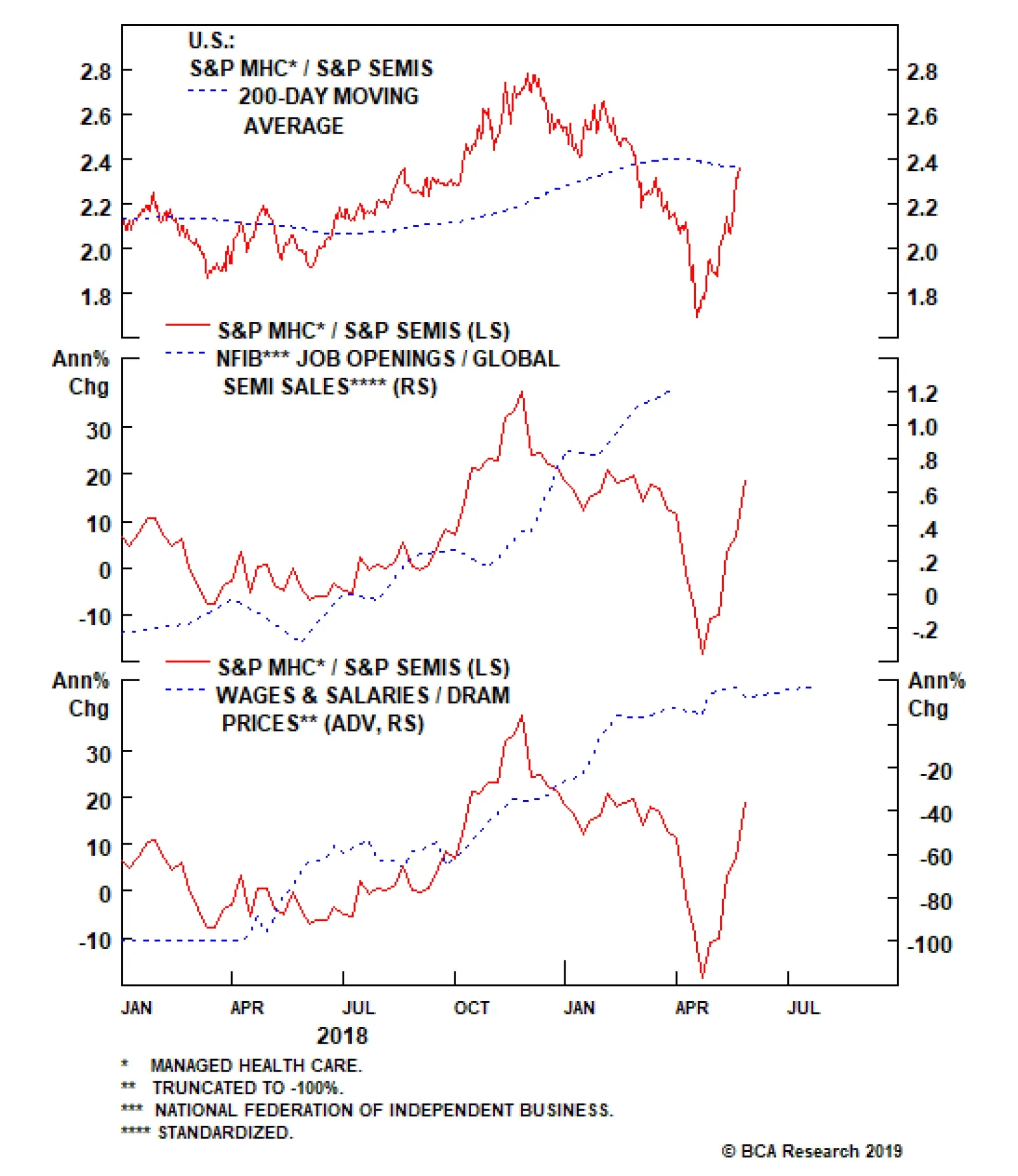
Given the trade’s extreme volatility, we initiated this trade with a stop loss at the -7% mark. However, this market-neutral trade has outperformed beyond our expectations and is currently up 14% since its inception at the beginning of last week. In order to…
Off To The Races
Off To The Races
In our recent Weekly Report, we initiated a pair trade, going long S&P managed health care/short S&P semiconductors. Given the trade’s extreme volatility, we initiated this trade with a stop loss at the -7% mark. However, this market-neutral trade has outperformed beyond our expectations, currently up 14% since its inception at the beginning of last week. Accordingly, and in order to protect these outsized gains, we are moving the goalposts and taking the stop to the 10% mark. From a macro perspective, nothing has changed to shake our conviction. Job openings, the ultimate driver of managed health care enrollments, are upbeat compared with declining global semi revenues (second panel). Further, on the relative pricing power gauge front, overall wage inflation is continuing to outpace DRAM prices (bottom panel). The combination implies more gains in store for the pair trade, despite our risk management change. Bottom Line: We reiterate our long S&P managed health care/short S&P semis pair trade and change our -7% stop loss recommendation to a 10% stop. The ticker symbols for the stocks in the S&P managed health care and S&P semi indexes are: BLBG: S5MANH – UNH, ANTM, HUM, CNC, WCG and BLBG: S5SECO – INTC, AVGO, TXN, NVDA, QCOM, MU, ADI, XLNX, AMD, MCHP, MXIM, SWKS, QRVO, respectively.
Global macro headwinds will continue to weigh on this deep cyclical index as the risk of a full-blown trade war will likely take a bite out of final demand. Chemical producers garner 60% of their revenues from abroad (a full 20 percentage points higher than…
HighlightsU.S. inflation is on a structural uptrend. Monetary and fiscal policy, populism, and demographics will tend to push inflation higher over the coming decade.How can investors protect portfolios against inflation risk? We look at periods of rising inflation to determine which assets were the best inflation hedge.We find that the level of inflation is very important in determining which assets work best.When inflation is rising and high, or very high, the best inflation hedges at the asset class level are commodities and U.S. TIPS.When inflation is very high, gold is the best commodity to hold and defensive sectors will minimize losses in an equity portfolio.However, hedges have a cost. Allocating a large percentage of a portfolio to inflation hedges will be a drag on returns. Investors should opt for a low allocation to hedges now, and increase to a medium level when inflation rises further.FeatureSome 38 years have passed since the last time the U.S. suffered from double-digit inflation. The Federal Reserve reform of 1979, championed by Paul Volcker, changed the way the Fed approached monetary policy by putting a focus on controlling money growth.1 The reform gave way to almost four decades of relatively controlled inflation, which persists today.But times are changing. While most of today’s investors have never experienced anything other than periods of tame inflation, BCA expects that rising inflation will be a major driving force of asset returns over the coming decade.2 The main reasons behind this view are the following:A rethink in the monetary policy framework: At its most recent meeting, the FOMC openly discussed the idea of a price-level target, implying that it would be open to the economy running hot to compensate for the past 10 years of below-target inflation (Chart I-1A, top panel).Procyclical fiscal policy: The U.S. is conducting expansionary fiscal policy while the economy is at near-full employment (Chart I-1A, middle panel). The last time this happened in the U.S., during the 1960s, high inflation followed, as the fiscal boost made the economy run substantially above capacity.Waning Fed independence: President Trump has openly questioned the hiking campaign undertaken by the Fed. Moreover, he has tried to nominate Fed governors with dovish tendencies. Historically around the world, a lack of central bank independence has often led to higher inflation rates (Chart I-1A, bottom panel).Peak in globalization: Globalization accelerated significantly in the 1990s and 2000s, flooding the global economy with cheap labor (Chart I-1B, top panel). However, we believe that globalization has peaked. Instead, populism and protectionism will be the dominant paradigms for years to come, reducing the cheap pool of workers and goods previously available.Demographics: The population in the U.S. is set to age in coming years (Chart I-1B, middle panel). As the percentage of U.S. retirees increases, the number of spenders relative to savers will begin to rise (Chart I-1B, bottom panel). Higher spending and lower savings in the economy should create upward pressure on inflation. Chart I-1AStructural Forces Point To Higher Inflation In The Coming Decade (I)
Structural Forces Point To Higher Inflation In The Coming Decade (I)
Structural Forces Point To Higher Inflation In The Coming Decade (I)
Chart I-1BStructural Forces Point To Higher Inflation In The Coming Decade (II)
Structural Forces Point To Higher Inflation In The Coming Decade (II)
Structural Forces Point To Higher Inflation In The Coming Decade (II)
If our view is correct, how should investors allocate their money?We attempt to answer this question by evaluating the performance of five major asset classes during periods when inflation was rising. Furthermore, we look into sub-asset class performance to determine how investors should position themselves within each asset class to take advantage of an inflationary environment.In our asset-class analysis, we use a data sample starting in 1973 and we limit ourselves to five publicly traded assets that have adequate history: global equities, U.S. Treasuries, U.S. real estate (REITs), U.S. inflation-linked bonds,3 and commodities. We compare asset classes according to their Sharpe ratios: average annualized excess returns divided by annualized volatilities.4 BCA expects that rising inflation will be a major driving force of asset returns over the coming decade.In our sub-asset class analysis, we analyze global equity sectors, international vs U.S. equities, and individual commodities. In some of the sections in our sub-asset class analysis, our sample is slightly reduced due to lack of historical data. Moreover, since in some instances all sectors have negative returns, we compare sub-asset classes according to their excess returns only.We base our analysis on the U.S. Consumer Price Index, given that most of the assets in our sample are U.S. based. We opt for this measure because it tends to track the living expenses for most U.S. citizens and it is the preferred measure to index defined-benefit payments.Finally, we decompose the periods of rising inflation into four quartiles in order to examine whether the level of inflation has any impact on the performance of each asset. Chart I-2 and Table I-1 show the different ranges we use for our analysis as well as a description of the typical economic and monetary policy environments in each of them.
Chart I-2
Chart I-
Summary Of ResultsTable I-2 shows the summary of our results. For a detailed explanation on how each asset class and sub-asset class behaves as inflation rises, please see the Asset Class section and the Sub-Asset Class section below.
Chart I-
Which assets perform best when inflation is rising?Rising inflation affects assets very differently, and is especially dependent on how high inflation is.Global equities performed positively when inflation was rising and low or mild, but they were one of the worst-performing assets when inflation was rising and high or very high. Importantly, equities underperformed U.S. Treasuries in periods of both high and very high inflation.Commodities and U.S. TIPS were the best performers when inflation was high or very high.U.S. REITs were not a good inflation hedge.Which global equity sectors perform best when inflation is rising?Energy and materials outperformed when inflation was high.Every single sector had negative excess returns when inflation was very high, but defensive sectors such as utilities, healthcare, and telecommunications5 minimized losses.Which commodities perform best when inflation is rising?With the exception of energy, most commodities had subpar excess returns when inflation was in the first two quartiles.Industrial metals outperformed when inflation was high.Gold and silver outperformed when inflation was very high. Additionally, gold had consistent returns and low volatility.What is the cost of inflation hedging?To answer this question, we construct four portfolios with different levels of inflation hedging:Benchmark (no inflation hedging): 60% equities / 40% bonds.Low Inflation Hedging: 50% equities / 40% bonds / 5% TIPS / 5% commoditiesMedium Inflation Hedging: 40% equities / 30% bonds / 15% TIPS / 15 % commoditiesPure Inflation Hedging: 50% TIPS / 50% commodities. At the asset-class level, investors should allocate to commodities and U.S. TIPS to hedge inflation. Chart I-3Inflation Hedging Comes At A Cost
Inflation Hedging Comes At A Cost
Inflation Hedging Comes At A Cost
While increased inflation hedging provides better performance when inflation is high and rising, these hedges are costly to hold when inflation is at lower ranges or when it is falling (Chart I-3, panels 1 & 2). However, adding moderate inflation hedging (low or medium) to a portfolio achieved the right balance between cost and protection, and ultimately improved risk-adjusted returns over the whole sample (Chart I-3, panel 3).What about absolute returns? The benchmark outperformed over the whole sample. However, the low and medium inflation hedging did not lag far behind, while avoiding the big drawdowns of high inflation periods (Chart I-3, panel 4).Investment ImplicationsHigh inflation may return to the U.S. over the next decade. Therefore, inflation hedging should be a key consideration when constructing a portfolio. Based on our results, our recommendations are the following:1. At the asset-class level, investors should allocate to commodities and U.S. TIPS to hedge inflation.2. However, these hedges are costly to hold as they will create a drag on returns in periods when inflation is not high or very high. Therefore, a low allocation to inflation hedges is warranted now.3. Inflation will probably start to pick up in the 2020s. A medium allocation to inflation hedges will then be appropriate.4. When inflation is high (3.3%-4.9%), investors should overweight energy and materials in their equity portfolios. Likewise, they should overweight industrial metals and energy within a commodity portfolio.5. When inflation is very high (4.9% or more), investors should overweight defensive sectors in their equity portfolio to minimize losses. Moreover, investors should overweight gold within a commodity portfolio.Asset ClassesGlobal EquitiesThe relationship between equity returns and rising inflation depends on how high inflation is, with outstanding performance when inflation is rising but low or mild, and poor performance as it gets higher (Chart II-1, top panel).
Chart II-1
This relationship can be explained by the interaction between interest rates, inflation, earnings, and valuations:Earnings growth was usually slightly negative when inflation was recovering from low levels. However, given that interest rates were very low in this environment and growth expectations were high, multiple expansion boosted equity returns (Chart II-1, bottom panel).When inflation was mild, the Fed typically started to raise rates, resulting in a declining multiple. However, equities had the best performance in this range thanks to very high earnings growth – a result of the economy growing strongly due to a healthy level of inflation.When inflation climbed into the high or very high range, earnings growth was usually positive but beginning to slow, as high inflation weighed on growth. Meanwhile the multiple started to decline rapidly due to rising interest rates and declining growth expectations.With the exception of the mild inflation range, the return profile of equities during inflationary periods was similar to its normal profile: negative skew and excess kurtosis (Table II-1). However, the consistency of returns decreased at higher levels of inflation, with only 45% of months with positive returns when inflation was rising and in its highest quartile.
Chart II-
U.S. Treasuries
Chart II-2
U.S. Treasuries reacted in a similar fashion to equities when inflation was rising (Chart II-2). However, while Treasuries underperformed equities when inflation was low or mild, they actually outperformed equities when inflation was high or very high. This was in part due to the fact that at higher inflation ranges, U.S. Treasuries offer a higher coupon return when rates are high, at least partially counteracting losses from falling prices.The steady stream of cash flows from the coupons helped Treasuries achieve positive returns roughly two-thirds of the time at the highest levels of inflation (Table II-2). However, this consistency in returns came at a cost: very high inflation resulted in negative skew and high excess kurtosis. Therefore, while Treasuries provided frequent positive returns when inflation was very high, they were prone to violent selloffs.
Chart II-
U.S. REITs
Chart II-3
While REITs had high risk-adjusted returns when inflation was rising but mild, much like equities they had subpar performance in every other quartile and particularly poor performance when inflation was high or very high (Chart II-3). These results confirm our previous research showing that REITs performance is very similar to that of equities.6The return consistency for REITs was generally poor in inflationary periods, with the second-lowest percentage of positive return of any asset class (Table II-3). Moreover, REIT returns had excess kurtosis and negative skew throughout all inflation quartiles.
Chart II-
Commodity Futures
Chart II-4
Commodities performed positively in every quartile, and did particularly well when inflation was mild (Chart II-4, top panel). However, total return and price return were very different due to the behavior of the roll and collateral return:Total risk-adjusted returns were lower than spot risk-adjusted returns when inflation was low and rising. This happened because during these periods, commodity supply was high relative to demand, as the economy was recovering from a deflationary shock. Thus, there was an incentive for producers to conserve inventories, making the futures curve upward-sloping (contango). Thus, roll return was negative (Chart II-4, bottom panel).When inflation was in the upper two quartiles, total risk-adjusted returns were much higher than risk-adjusted spot returns. This was because high inflation was the product of supply shocks. These supply shocks resulted in a downward-sloping futures curve (backwardation), which, in turn, resulted in a positive roll return. Additionally, high rates during these regimes contributed to a high collateral return.Commodities provided good return consistency during inflationary periods, with roughly 60% of positive return months in the upper two inflation quartiles (Table II-4). The skew of returns was neutral or positive in the top two quartiles. This means that although volatility was high for commodities, extreme return movements were normally positive.
Chart II-
U.S. Inflation-Protected Bonds
Chart II-5
While inflation-protected bonds provided meager returns when inflation was rising but in the mild range, they provided excellent performance at the highest levels of inflation (Chart II-5). Moreover, this high Sharpe ratio was not just simply the result of low volatility, since U.S. TIPS had excess returns of 4.6% when inflation was high and 5.7% when inflation was very high.7The return profile of inflation-protected bonds during inflationary periods was also attractive in our testing period. Average skew was positive, while kurtosis was relatively low (Table II-5). The percentage of positive months across all quartiles was also the highest of all asset classes, with a particularly high share of positive returns in the periods of highest inflation.
Chart II-
Sub-Asset ClassesGlobal Equity Sectors
Chart III-1
For the sector analysis, we looked at information technology, financials, energy, materials, utilities, healthcare, and telecommunications. We excluded industrials, consumer discretionary, and consumer staples given that they do not have adequate back data.Once again, we separate rising inflation periods into four quartiles, arriving at the following results:When inflation was low, information technology had the best excess returns while utilities had the worst (Chart III-1, panel 1). This matches our observations at the asset class level, as IT is highly responsive to changes in the valuation multiple.When inflation was mild, energy had the best performance, followed by information technology (Chart III-1, panel 2). Meanwhile, financials had the worst performance, as rates were normally rising in these periods.When inflation was high, sectors highly correlated with commodity prices such as energy and materials outperformed. Meanwhile, IT was the worst performer (Chart III-1, panel 3).When inflation was very high, every sector had negative excess returns. Overall, investing in energy minimized losses (Chart III-1, panel 4). However, this performance was in part attributable to the oil spikes of the 1970s. Alternatively, defensive sectors such as utilities, telecommunications, and healthcare also minimized losses. International vs U.S. Equities
Chart III-2
How do equities outside of the U.S. behave when inflation is rising? While the high share of U.S. equities in the global index causes U.S. equities to be the main driver of global stock prices, is it possible to improve returns in inflationary environments by overweighting international equities?The answer once again depends on the level of inflation. When inflation was rising but low, U.S. stocks outperformed global ex-U.S. equities in both common currency and local currency terms (Chart III-2, panel 1). This was in part due to the inherent tech bias in U.S. stocks. Additionally, the low level of inflation was often accompanied by slowing global growth in our sample, helping the U.S. dollar.When inflation was mild, U.S. stocks once again outperformed international stocks in both local and common currency terms, though to a lesser degree (Chart III-2, panel 2). The dollar was roughly flat in this environmentU.S. stocks started to have negative excess returns when inflation was high (Chart III-2, panel 3). On the other hand international equities had positive excess returns in dollar terms, partly because of their energy and material bias and partly because the dollar was generally weak in this period.U.S. equities outperformed global ex-U.S. equities by a small margin when inflation was very high, given that defensive sectors such as telecommunication were over-represented in the U.S. index (Chart III-2, panel 4). The dollar was roughly flat in this period. Individual Commodities
Chart III-3
Our analysis above confirmed that commodities were one of the best assets to hold when inflation was rising. However, which commodity performed best?8Total return for every commodity was lower than spot return when inflation was low (Chart III-3, panel 1). This was due to the upward-sloping term structure of the futures curve (contango), resulting in a negative roll yield. In this range, energy had the best performance, followed by industrial metals. Precious metals had negative excess returns.When inflation was mild, energy had the best performance of any commodity by far (Chart III-3, panel 2). Precious and industrial metals had low but positive excess returns in this period.When inflation was high, industrial metals had the highest excess returns, followed by energy (Chart III-3, panel 3).We omit energy for the last quartile since there is not enough data available. Overall, when inflation was very high, both gold and silver had the highest excess returns (Chart III-3, panel 4). However, gold’s return volatility was much lower, while it also had positive returns 64% of the time compared to 52% for silver.Other AssetsU.S. Direct Real Estate Chart IV-1Direct Real Estate Is A Good Inflation Hedge
Direct Real Estate Is A Good Inflation Hedge
Direct Real Estate Is A Good Inflation Hedge
Our asset-class analysis confirmed that public real estate (REITs) as an asset class offered poor risk-adjusted returns during inflationary periods. But how did direct real estate perform?We analyzed direct real estate separately from all other assets because of a couple of issues:Our return dataset is available only on a quarterly basis, versus a monthly basis for the rest of the assets in our sample. Even when annualized, volatility is not directly comparable when using data with different frequencies.The NCREIF Real Estate Index that we used is a broad aggregate, which is not investable. Individual property prices might differ from this aggregate.Finally, real estate returns are measured on an appraisal basis. Appraisal-based indices are not reflective of real transactions. Moreover, prices tend to be sticky. To attenuate this issue we unsmoothed the capital returns by removing return autocorrelation.Overall, the Sharpe ratio of direct real estate was solid throughout the first three quartiles of rising inflation (Chart IV-1, top panel). There is not enough data available for the fourth quartile. However, judging by the performance of U.S. housing in the 1970s from OECD, risk-adjusted returns when inflation was very high was likely positive (Chart IV-1, bottom panel). Cash Chart IV-2Very High Inflation Erodes The Value Of Cash
Very High Inflation Erodes The Value Of Cash
Very High Inflation Erodes The Value Of Cash
Cash (investing in a 3-month U.S. Treasury bill) outperformed inflation over our sample. (Chart IV-2, top panel). Moreover, cash provided positive real returns when inflation was mild, or high, or when it was decreasing (Chart IV-2, bottom panel). However, cash was not a good inflation hedge at the highest inflation quartile, with an average annualized real loss of almost 2%. Juan Manuel Correa OssaSenior Analystjuanc@bcaresearch.com Footnotes1 Please see Carl E. Walsh, “October 6, 1979,” FRSBF Economic Letter, 2004:35, (December 3, 2004).2 Please see Global Investment Strategy Special Report, “1970s-Style Inflation: Could it Happen Again? (Part 1), ” dated August 10, 2018, available at gis.bcaresearch.com and Global Investment Strategy Special Report, “1970s-Style Inflation: Could it Happen Again? (Part 2),” dated August 24, 2018, available at gis.bcaresearch.com.3 We use a synthetic TIPS series for data prior to 1997. For details on the methodology, please see: Kothari, S.P. and Shanken, Jay A., “Asset Allocation with Inflation-Protected Bonds,” Financial Analysts Journal, Vol. 60, No. 1, pp. 54-70, January/February 2004. Jay A., “Asset Allocation with Inflation-Protected Bonds,” Financial Analysts Journal, Vol. 60, No. 1, pp. 54-70, January/February 2004.4 Excess returns are defined as asset return relative to a 3-month Treasury bill.5 Sector classification does not take into account GICS changes prior to December 2018. 6 Please see Global Asset Allocation Strategy Special Report "REITS Vs Direct: How To Get Exposure To Real Estate," dated September 15, 2016, available at gaa.bcaresearch.com.7 It is important to note that the synthetic TIPS series does not completely match actual TIPS series for the periods where they overlap. Specifically, volatility is significantly higher in the synthetic series. Thus, results should be taken as approximations.8 We decompose the returns into the same 4 quartiles to answer this question. However, due to lower data availability, we start our sample in 1978 instead of 1973. Moreover, our sample for energy is smaller beginning in 1983. This mainly reduces the amount of data available at the upper quartile.
Locking In Homebuilder Gains
Locking In Homebuilder Gains
Neutral In a report late last month, we noted that our overweight recommendation on S&P homebuilders had generated alpha in excess of 10% for our portfolio, despite being offside early. However, we further noted a softening in some housing related data that gave us pause, particularly in the context of a trade that had provided outstanding gains, and we added a downgrade alert and set a stop sell order at the 10% relative return mark. That mark was breached on Monday; accordingly, and in a continuation of our progressive derisking of the portfolio, we have lowered our recommendation on the S&P homebuilders index to neutral. We continue to fear that if a generalized risk-off phase materializes, yields will fall but homebuilders will not participate in the bond rally. That is not to say we have grown negative on U.S. housing in general; on the contrary, we continue to explore a bullish housing view via our long S&P homebuilders/short S&P home improvement retailers pair trade. Clients should look forward to next week’s Weekly Report for an update on the latter of these sectors. Bottom Line: Downgrade S&P homebuilders to neutral, crystalizing gains of 10%. The ticker symbols for the stocks in this index are: BLBG: S5HOME – LEN, DHI, PHM.
BCA’s global synchronicity indicator, which gauges the number of countries with a PMI above versus below 50 is sinking like a stone. In fact, the overall global manufacturing PMI is just barely above the expansion/contraction line and global industrial…
More specifically on the domestic front, our Economic Impulse Indicator (EII) suggests that beneath the surface some cracks are appearing in the U.S. economy. The EII encapsulates six parts of the U.S. economy and on a second derivative basis, softness is…
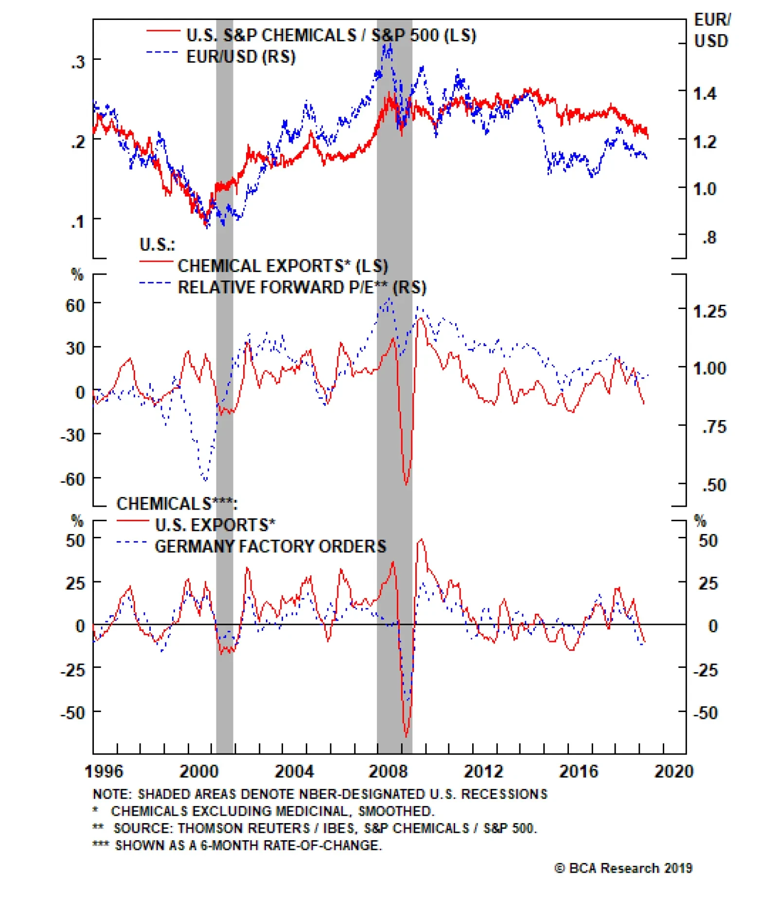
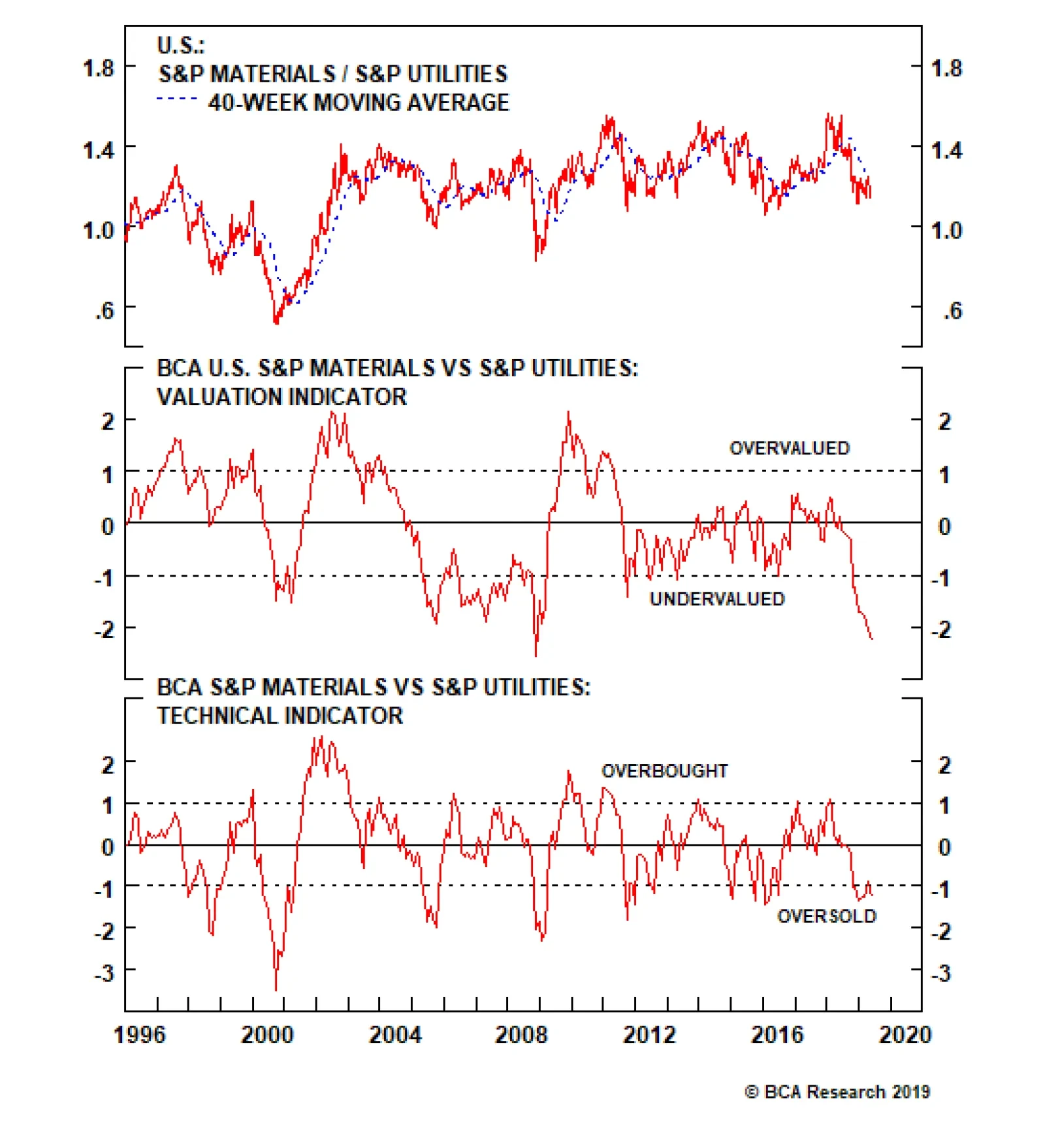
Highlights Portfolio Strategy Macro headwinds, deficient demand along with rising chemicals stockpiles that have dealt a blow to industry pricing power warn that chemicals stocks are on the verge of a breakdown. Downgrade to a below benchmark allocation. At the margin deteriorating domestic conditions, along with a sustained softness in global growth indicators that are prone to an additional setback given the rising trade policy uncertainty suggest that it is prudent to move to the sidelines on the long materials/short utilities pair trade. Recent Changes Downgrade the S&P chemicals index to underweight, today. This also pushes the S&P materials sector’s weight back down to neutral. Close the long S&P materials/short S&P utilities pair trade, today. Table 1
Consolidation
Consolidation
Feature The SPX suffered its first 5% pullback for the year early last week, and now that President Trump has opened Pandora’s Box, there are high odds that equities will continue to seesaw, at least, until the late-June G20 meeting when the heads of states meet again. Since early-March we have been, and remain, cautious on the short-term equity market outlook as a slew of our tactical indicators have soured. Chart 1 shows three additional non-confirming equity market breakout indicators that are exerting downward pull on the SPX. Stock correlations have increased (shown inverted, top panel, Chart 1), junk spreads have widened (shown inverted, middle panel, Chart 1) and the NYSE’s FANG+ Index has run out of steam (bottom panel, Chart 1). Now the risk is, as we first highlighted in the middle of last week, that the back half of the year global growth reacceleration phase goes on hiatus as this trade policy uncertainty further shatters CEO confidence and global exports remain downbeat (Chart 2). Chart 1Non-Confirming Indicators
Non-Confirming Indicators
Non-Confirming Indicators
Chart 2Stalled Export Engine
Stalled Export Engine
Stalled Export Engine
Worrisomely, a number of our cyclical indicators are also firing warning shots. Not only did the ISM’s manufacturing new orders-to-inventories ratio breach parity, but also BCA’s boom/bust indicator took a turn for the worse (Chart 3). Importantly, while a lot of ink is spent on how the U.S. economy is beyond full employment, labor markets are tight and the output gap has closed, resource utilization has petered out – interestingly at a lower high compared with the previous two peaks. This backdrop points to more stock market turmoil in the coming months, similar to the mid-2015 message (Chart 4). Chart 3Cyclical Trouble Brewing
Cyclical Trouble Brewing
Cyclical Trouble Brewing
Chart 4No Tightness Here
No Tightness Here
No Tightness Here
Tack on China’s cresting credit impulse and factors are falling into place for a tumultuous back half of the year (bottom panel, Chart 3). Keep in mind that the two ultimate “risk off” indicators we track remain tame and underscore that investor complacency remains elevated: the TED spread is at 16bps and the Japanese yen has barely budged of late. This is worrying and suggests that investors expect a positive U.S./China trade resolution (USD/JPY shown inverted, Chart 5). Chart 5No Real Risk Off Phase Yet
No Real Risk Off Phase Yet
No Real Risk Off Phase Yet
Were the equity markets to spin out of control however, the “Fed put” remains in place and would save the day. While the Fed has taken down the median dots and projects no hikes for the rest of the year and a single hike next year, the message from the bond market is diametrically opposite. Thus, we are de-risking our portfolio and this week we are downgrading a deep cyclical sector to neutral and also closing an explicit cyclical/defensive pair trade. Chart 6 shows that over 40bps of cuts are priced in by May 2020, according to the OIS curve. Historically, this has been an excellent leading indicator of the annual delta in the fed funds rate. Our takeaway is that the Fed remains the only game in town and were another mini-riot point to occur, then the Fed would not hesitate to step in and put a floor under the equity market. Chart 6The Bond Market Has The Stock Market’s Back
The Bond Market Has The Stock Market’s Back
The Bond Market Has The Stock Market’s Back
In sum, the risks are rising for a prolonged consolidation phase in equities on the back of a trade war escalation that pushes out the global growth recovery to early-2020. Thus, we are de-risking our portfolio and this week we are downgrading a deep cyclical sector to neutral and also closing an explicit cyclical/defensive pair trade. Chemical Reaction We have been on the sidelines on the heavyweight S&P chemicals index of late (it comprises 74% of the S&P materials sector), but factors have now fallen into place and warrant a below benchmark allocation. First, global macro headwinds will continue to weigh on this deep cyclical index as the risk of a full blown trade war will likely take a bite out of final demand. Chemical producers garner 60% of their revenues from abroad (a full 20 percentage points higher than the SPX) and thus are extremely sensitive to the ebbs and flows of emerging markets economic growth in general and China in particular. Adding it all up, macro headwinds, deficient demand along with rising chemicals stockpiles that have dealt a blow to industry pricing power warn that chemicals stocks are on the verge of a breakdown. Chart 7 shows that U.S. chemical products exports are contracting and if the greenback sustains its recent upward trajectory given heightened global trade policy uncertainty, further global market share losses are likely at a time when the overall chemicals market will be shrinking. With regard to China specifically, the recent drop in the credit impulse is far from reassuring (bottom panel, Chart 3) and, assuming that the Chinese authorities will await a riot point prior to really opening up the credit spigots, more pain lies ahead for U.S. chemical exports. Second, the picture is not brighter on the domestic front. Importantly, the American Chemical Council’s Chemical Activity Barometer is nil, warning that domestic end-demand is also ailing (Chart 8). Chart 7Hazard Warning
Hazard Warning
Hazard Warning
Chart 8Toxic Profit Prospects
Toxic Profit Prospects
Toxic Profit Prospects
Tack on a surprisingly persistent jump in industry headcount (bottom panel, Chart 9), and the implication is that waning productivity will slash chemicals profits (bottom panel, Chart 8). Finally, a number of other operating metrics are languishing. Chemicals railcar loads are outright contracting and the softening ISM manufacturing survey points to further downside in the coming months (middle panel, Chart 9). The chemicals shipments-to-inventories ratio is also in contraction territory as this downbeat demand has been met with a buildup in inventories both at the wholesale and manufacturing levels. As a result, a liquidation phase has ensued and chemicals selling prices have sunk into the deflation zone (middle & bottom panels, Chart 10). Chart 9Deficient Demand
Deficient Demand
Deficient Demand
Chart 10Liquidation Phase
Liquidation Phase
Liquidation Phase
Adding it all up, macro headwinds, deficient demand along with rising chemicals stockpiles that have dealt a blow to industry pricing power warn that chemicals stocks are on the verge of a breakdown. Bottom Line: Trim the S&P chemicals index to underweight. Given the 74% weight chemicals stock have in the S&P materials sector, this move also pushes the S&P materials sector’s (Chart 11) weight to neutral from overweight, and we crystalize modest losses of 5.2% in this niche deep cyclical sector. The ticker symbols for the stocks in the S&P chemicals index are: BLBG: S5CHEM – DWDP, ECL, SHW, PPG, IFF, CE, ALB, LIN, APD, DOW, LYB, FMC, CF, MOS, EMN. Chart 11Trim Materials Back Down To Neutral
Trim Materials Back Down To Neutral
Trim Materials Back Down To Neutral
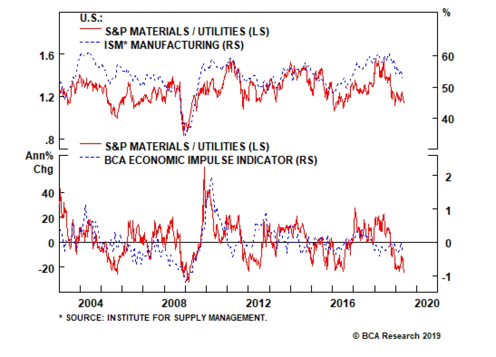
Materials/Utilities: Move To The Sidelines While we were early in identifying a reflationary impulse from the Chinese authorities and put on an explicit cyclicals/defensives pair trade to capitalize on this opportunity at the end of January, the long materials/short utilities pair trade has failed to live up to its expectations, and today we recommend moving to the sidelines. Such a move is part of our de-risking of the portfolio given the rising global macro headwinds on the horizon we identified earlier. More specifically on the domestic front, our Economic Impulse Indicator (EII) suggests that beneath the surface some cracks are appearing in the U.S. economy. The EII encapsulates six parts of the U.S. economy and on a second derivative basis, softness is apparent (top panel, Chart 12). The ISM manufacturing survey corroborates this message and is also flirting with the boom/bust 50 line, signaling that it is prudent to take some risk off the table (bottom panel, Chart 12). The bond market is sniffing out this deteriorating domestic backdrop and the recent 25bs drop in the 10-year Treasury yield has breathed life into utilities and sucked the oxygen out of materials. Fixed income proxies are also benefiting from the drubbing in Citi’s Economic Surprise Index to the detriment of growth-sensitive deep cyclicals. The melting stock-to-bond ratio reflects all these domestic forces and warns against preferring materials to utilities stocks (Chart 13). Chart 12Move To The Sidelines
Move To The Sidelines
Move To The Sidelines
Chart 13Mushrooming Domestic…
Mushrooming Domestic…
Mushrooming Domestic…
The specter of a re-escalation in the trade war will not only continue to weigh on some domestic indicators, but gauges monitoring the health of the global economy will also suffer a setback. Already, our Global Activity Indicator has lost its spark, underscoring that global export volumes will continue to contract. King Dollar is also flexing its muscles, especially versus vulnerable twin deficit emerging market countries which saps economic growth. Tack on the derivative deflationary effect the appreciating greenback has on the commodity complex and materials stocks are at a great disadvantage versus domestic focused utilities (Chart 14). A number of additional global growth indicators are waning and signal that relative profitability will move in favor of utilities and at the expense of materials in the coming months. BCA’s global synchronicity indicator, which gauges the number of countries with a PMI above versus below 50 is sinking like a stone. In fact, the overall global manufacturing PMI is just barely above the expansion/contraction line and global industrial production is decelerating. All of this is a net negative for the deep cyclical materials sector, but a net positive for defensive utilities stocks that sport nil foreign sales exposure (Chart 15). Chart 14…And Global Growth…
…And Global Growth…
…And Global Growth…
Chart 15…Worries
…Worries
…Worries
But before getting outright bearish on this pair, there is a powerful offset. Likely, most of the bad news is reflected in bombed out relative valuations and oversold technicals. This actually also prevents us from fully reversing the trade and buying utilities at the expense of materials. A move to the sidelines is more appropriate (Chart 16). At the margin deteriorating domestic conditions, along with a sustained softness in global growth indicators that are prone to an additional setback given the rising trade policy uncertainty suggest that it is prudent to move to the sidelines on the long materials/short utilities pair trade. Bottom Line: Book losses of 5.3% in the long S&P materials/short S&P utilities pair trade and move to the sidelines. Anastasios Avgeriou, U.S. Equity Strategist anastasios@bcaresearch.com Chart 16Saving Grace
Saving Grace
Saving Grace
Current Recommendations Current Trades Size And Style Views Favor value over growth Favor large over small caps