Highlights Portfolio Strategy Firming relative demand and input cost dynamics, the Medicare For All (MFA)-induced panic selling in HMOs coupled with 5G euphoria buying in semis have set the stage for an exploitable pair trade opportunity: long S&P managed health care/short S&P semiconductors. Relative supply/demand dynamics, crumbling lumber prices, lower interest rates and compelling valuations and technicals all suggest that the long homebuilding/short home improvement retail pair trade is in the early innings. Recent Changes Initiate a long S&P managed health care/short S&P semiconductors trade today, with a tight stop loss at -7%. Table 1
On Edge
On Edge
Feature Equities hit a speed bump last week, as President Trump’s trade related tweets instilled some fear back into the markets. Investor complacency reigned supreme and, given the liquidity crunch, risk premia exploded higher with the VIX more than doubling from the recent lows. Historically, a parabolic rise in policy uncertainty is synonymous with an equity market selloff and a widening in risk premia; last week was no different (economic policy uncertainty shown inverted, second panel, Chart 1). Adding insult to injury, given that the forward P/E multiple expansion explained all of the equity market’s advance year-to-date as we highlighted three weeks ago, the trade-related melt up in policy uncertainty caused a mini meltdown in the forward multiple as financial conditions tightened (financial conditions shown inverted, third panel, Chart 1). The implication is that short-term equity market caution is still warranted as we have been writing over the past few weeks, at least until the U.S./China trade dispute dust settles. Chart 1Caution Still Warranted
Caution Still Warranted
Caution Still Warranted
Chart 2Tenuous Trio
Tenuous Trio
Tenuous Trio
The recent simultaneous rise of three asset classes, that we call “the tenuous trio”, warned that something had to give: stocks, bond prices and the trade-weighted U.S. dollar cannot all go up in tandem for an extended period of time. When this happens it is typically a forewarning of an equity market snap (Chart 2). One simple explanation is that a rising greenback comes back and haunts equities via a negative P&L hit, albeit with a lagged effect. Irrespective of where the U.S. dollar will move in the coming months, it will continue to weigh on EPS as the surge in the greenback took root from April to November last year. Thus, with a six-to-nine month lag it will continue to infiltrate EPS and Q2 – which the sell-side already expects to barely breach year ago levels – will also feel the U.S. dollar’s wrath. Were the dollar to continue its ascent from current levels, it would put in jeopardy the back half of this year’s EPS growth numbers, especially Q4/2019 that sell-side analysts forecast to jump to 8%, according to I/B/E/S data. This week we recommend putting on a new pair trade involving an unloved health care subgroup and a mighty tech sector subindex but with a tight stop, and also update an intra-consumer discretionary market-neutral housing-levered pair trade. Importantly, the 12-month forward EPS number is artificially rising. Chart 3 shows that calendar 2019 and 2020 EPS estimates continue to build a base, but the 12-month forward number has been rising since early-February. What explains the increase in the 12-month forward estimate is arithmetic. In other words, despite a multi-month downgrading of calendar 2019 and 2020 EPS, the first two quarters of next year are forecast to come in significantly higher than 2019’s first six months. As the latter roll off and the former get added to the 12-month forward EPS number, a deceiving jump occurs. For next year, we continue to expect $181 EPS, and we would lean against the double-digit EPS growth in 2020 that the sell-side currently forecasts. Our top down macro S&P 500 EPS model softened anew recently, warning that mid-single digit growth, at best, is more likely than low double-digit growth (Chart 4). Chart 3Artificial EPS Rise
Artificial EPS Rise
Artificial EPS Rise
Chart 4SPX Macro EPS Model Forecasts Softness
SPX Macro EPS Model Forecasts Softness
SPX Macro EPS Model Forecasts Softness
Finally, one of the tech sector’s invincible subgroups is cracking with the S&P semis relative performance hitting a wall both versus the broad market ex-TMT and versus the NASDAQ 100. This is significant not only from a sentiment perspective, but also because semis have high international sales exposure in general and China in particular (Chart 5). Chart 5Vertigo Warning
Vertigo Warning
Vertigo Warning
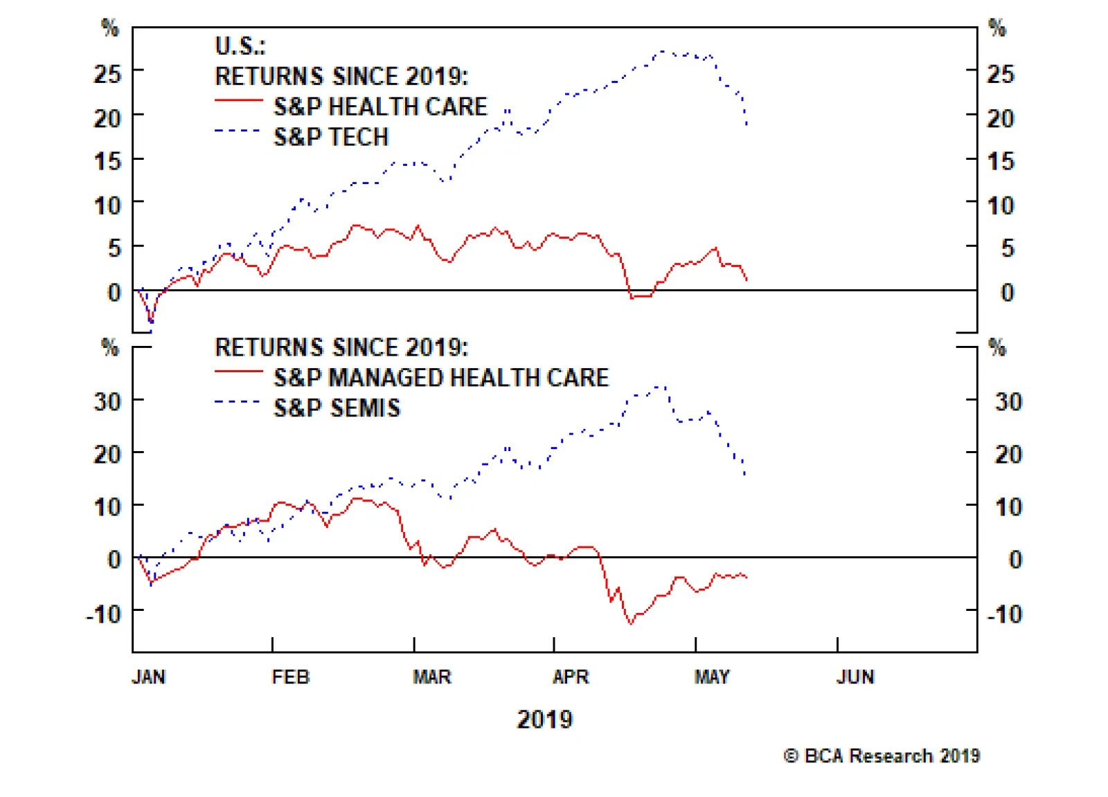
This week we recommend putting on a new pair trade involving an unloved health care subgroup and a mighty tech sector subindex but with a tight stop, and also update an intra-consumer discretionary market-neutral housing-levered pair trade. New High-Octane Pair Trade Idea While health care and tech stocks started the year on a similar footing, a wide gulf has opened that is likely to, at least partially, reverse in the back half of the year. This dichotomy is most evident at the subsector level where managed health care stocks are still down in absolute terms for the year, whereas chip stocks are up roughly 20% year-to-date (Chart 6). This is an exploitable gap and today we suggest a new pair trade: long S&P managed health care/short S&P semiconductors. Chart 6Exploitable Reversal Looms
Exploitable Reversal Looms
Exploitable Reversal Looms
Bernie Sanders’ revamped MFA bill sent the managed health care group to the ER. While there is heightened uncertainty surrounding MFA and we are working on a joint Special Report with our sister Geopolitical Strategy service due on June 3rd, this is likely a 2022 story. Not only will Sanders have to win the Democratic candidacy and subsequently the Presidential election, but also the GOP would have to lose the Senate. This is an extremely low probability event that has dealt a massive blow to HMO stocks. On the flip side, semis are priced for perfection. The recent catalyst for this group’s stratospheric rise was Apple’s patent settlement with Qualcomm that set in motion a 5G-related euphoria. Again 5G is a late-2021 story and a lot of good news is already priced in to semis stocks. Moreover, historically, semi cycles last four-to-five quarters and investors’ neglect of the semi downcycle is puzzling as we have recently concluded just two down quarters. Explicitly, what is truly baffling is that 12-month forward EPS are slated to contract in absolute terms and forward sales are hovering near the zero line, yet the Philly SOX index recently vaulted to all-time highs. Taken together, we would lean toward health care insurers at the expense of semiconductor stocks. Netting it all out, relative demand and input cost dynamics, the MFA-induced panic selling in HMOs coupled with 5G euphoria buying in semis have set the stage for an exploitable pair trade opportunity: long S&P managed health care/short S&P semiconductors. With regard to relative macro drivers, managed health care has the upper hand. Chart 7 shows that relative demand dynamics clearly favor HMOs and are working against chip stocks. Non-farm payroll growth is trouncing global semi billings. The message from the small business sector is similar with the labor market upbeat compared with declining global semi revenues. Finally, on the relative pricing power gauge front, overall wage inflation is outpacing DRAM prices. On all three fronts, the message is to expect a mean reversion higher in the relative share price ratio. Chart 7Buy Managed Health Care…
Buy Managed Health Care…
Buy Managed Health Care…
Chart 8…At The Expense…
…At The Expense…
…At The Expense…
Input cost/inventory dynamics suggest that HMOs also have the advantage. The health care insurance employment cost index is growing on a par with inflation, but semi industry employment is climbing at a rate over 5%/annum (bottom panel, Chart 8). Taking stock of medical cost inflation, costs are still melting, however global semi inventories are expanding. The upshot is that relative share prices have ample upside (middle panel, Chart 8). Finally, the previous relative valuation overshoot has returned to the neutral zone and, encouragingly, relative technicals are probing multi-year lows near one standard deviation below the historical mean. Importantly, over the past two decades every time our Technical Indicator has hit such a depressed level, a playable rebound in relative share prices has ensued (bottom panel, Chart 9). Chart 9…Of…
…Of…
…Of…
Chart 10…Semis
…Semis
…Semis
Nevertheless, this highly volatile market-neutral trade faces one big risk we previously alluded to: relative profit expectations are extended. In other words, the bombed out S&P semiconductor forward EPS and revenue projections are masking the relative profit and revenue backdrop (Chart 10). Netting it all out, relative demand and input cost dynamics, the MFA-induced panic selling in HMOs coupled with 5G euphoria buying in semis have set the stage for an exploitable pair trade opportunity: long S&P managed health care/short S&P semiconductors. Bottom Line: Initiate a long S&P managed health care/short S&P semis pair trade today with a stop loss at the -7% mark. The ticker symbols for the stocks in the S&P managed health care and S&P semi indexes are: BLBG: S5MANH – UNH, ANTM, HUM, CNC, WCG and BLBG: S5SECO – INTC, AVGO, TXN, NVDA, QCOM, MU, ADI, XLNX, AMD, MCHP, MXIM, SWKS, QRVO, respectively. Homebuilding/Home Improvement Retail Pair Trade Update In late-January we put on a market, sector and subindustry neutral trade preferring homebuilders to home improvement retailers (HIR) as a way to benefit from the increase in residential construction at the expense of residential investment. This trade moved in the black from the get-go and is now generating alpha to the tune of 7% since inception, but more gains are in store in the coming months. President Trump’s hawkish tariff rhetoric should keep interest rates at bay, at least for a short while, and bond market nervousness is more of a boon to homebuilders than to HIR (top panel, Chart 11). The drop in the price of mortgage credit along with minor price concessions from homebuilders are causing sales of new homes to take off versus existing home sales (middle panel, Chart 11). Granted, bankers remain willing extenders of residential loans and the latest Fed Senior Loan Officer Opinion Survey revealed that demand for residential credit is making a comeback following a near yearlong decline (not shown). As a result, relative loan growth metrics also underpin the relative share price ratio (bottom panel, Chart 11). Chart 11Still In Early Innings
Still In Early Innings
Still In Early Innings
In sum, relative supply/demand dynamics, crumbling lumber prices, lower interest rates and compelling valuations and technicals all suggest that the long homebuilding/short HIR pair trade is in its early innings. Importantly, the new/existing home sales–to-inventory ratio is an excellent leading indicator of relative share prices and is currently emitting an unambiguously bullish signal for homebuilders at the expense of HIR (Chart 12). Chart 12Supply/Demand Backdrop Says Stick With This Pair Trade
Supply/Demand Backdrop Says Stick With This Pair Trade
Supply/Demand Backdrop Says Stick With This Pair Trade
Chart 13Relative Sales ##br##Expectations…
Relative Sales Expectations…
Relative Sales Expectations…
Examining the relative demand backdrop reveals that homebuilders will continue to outshine HIR. Current readings in the NAHB home sales survey versus the remodeling survey and future expectations both point to more gains in the relative share price ratio (Chart 13). The felling in lumber prices also represents a benefit to homebuilders to the detriment of HIR. Lumber is a key building input cost in new home construction so any price liquidation is a boon for homebuilding margins. In contrast, HIR makes a set margin on lumber sales, therefore deflating lumber prices cut HIR profits (Chart 14). Chart 14…Felling Lumber Prices And …
…Felling Lumber Prices And …
…Felling Lumber Prices And …
Chart 15…Bombed Out Valuations Signal More Relative Share Price Gains
…Bombed Out Valuations Signal More Relative Share Price Gains
…Bombed Out Valuations Signal More Relative Share Price Gains
Finally, on the relative valuation and technical fronts, there is anything but froth. In fact, the relative price to book ratio is perched near an all-time low and relative momentum has only recently troughed and has yet to reach the neutral zone (Chart 15). In sum, relative supply/demand dynamics, crumbling lumber prices, lower interest rates and compelling valuations and technicals all suggest that the long homebuilding/short HIR pair trade is in its early innings. Bottom Line: Stick with a long S&P homebuilders/short S&P HIR pair trade. The ticker symbols for the stocks in the S&P homebuilding and S&P HIR indexes are: BLBG: S5HOME – PHM, DHI, LEN and BLBG: S5HOMI – HD, LOW, respectively. Anastasios Avgeriou, U.S. Equity Strategist anastasios@bcaresearch.com Current Recommendations Current Trades Size And Style Views Favor value over growth Favor large over small caps