Sectors

A Healthy Rebound For Apple
A Healthy Rebound For Apple
Overweight The S&P tech hardware, storage & peripherals (THSP) index was cheering yesterday as index heavyweight Apple reported results that, while not strong, were better than the market had feared after the terrible Q4 print. Importantly, management commented that the rate of decline in China had eased significantly over the course of the quarter while services revenues hit a new record. Perhaps more important to equity investors was the $27 billion the company returned to shareholders in Q1, the authorization of another $75 billion for share repurchases and a 5% increase in the dividend. In the context of the still-pristine sector balance sheets (bottom panel), further shareholder friendly actions seem likely. Nevertheless, while sector valuations have bounced off the recent relative lows, the S&P THSP index continues to trade at a wide (though shrinking) discount to the broad market (second panel). We continue to find this discount excessive in anticipation of a sector rerating. Bottom Line: Troughing results in China, progress in services and a surge in return of capital to shareholders all point to more gains for the S&P THSP index; stay overweight. The ticker symbols for the stocks in the S&P THSP index are: BLBG: S5CMPE - HPQ, WDC, STX, XRX, AAPL, HPE, NTAP.
Core to our thesis is that content is king and Disney is the reigning consolidator. Notably, the company’s Avengers property, acquired via the $4 billion acquisition of Marvel a decade ago, just set the record for box office openings this weekend with their…
Highlights Open an equity market relative overweight to Europe versus China. Upgrade Denmark to neutral. Downgrade the Netherlands to underweight. Maintain Switzerland at overweight. With the Euro Stoxx 50 now up almost 20 percent from its January 3 low, the majority of this year’s absolute gains have already been made. Core euro area bond yields will edge modestly higher… …and EUR/USD will appreciate, as the backward-looking data on which the ECB depends catches up with the more perky real-time economic data. Feature Vertical charts scare us, as we contemplate falling over the edge. But they also excite us, as we contemplate a lucrative investment opportunity. Right now, the vertical chart that is causing us palpitations is technology versus healthcare (Chart of the Week). Chart of the WeekTechnology Versus Healthcare Has Gone Vertical!
Technology Versus Healthcare Has Gone Vertical!
Technology Versus Healthcare Has Gone Vertical!
The technology versus healthcare sector pair is critical, because it looms large in several stock markets’ ‘fingerprint’ sector skews. Meaning that the technology versus healthcare relative performance has unavoidable consequences for regional and country stock market allocation (Chart I-2 and Chart I-3). The technology versus healthcare sector pair is critical, because it looms large in several stock markets’ ‘fingerprint’ sector skews. Chart I-2When Technology Underperforms Healthcare, Netherlands Underperforms Switzerland
When Technology Underperforms Healthcare, Netherlands Underperforms Switzerland
When Technology Underperforms Healthcare, Netherlands Underperforms Switzerland
Chart I-3When Technology Underperforms Healthcare, China Underperforms Switzerland
When Technology Underperforms Healthcare, China Underperforms Switzerland
When Technology Underperforms Healthcare, China Underperforms Switzerland
Specifically, from a European stock market perspective, the Netherlands is overweight technology while Switzerland and Denmark are both overweight healthcare. Further afield, the U.S. is overweight technology while China is both overweight technology and underweight healthcare. Explaining Verticality And The Subsequent Fall What creates vertical charts? To answer the question, let’s turn it on its head: what prevents vertical charts? The answer is: the presence of value investors. In a healthy market, a cohort of value investors will sit on the side lines and only transact with the marginal seller when the price falls to a semblance of value. In other words, the value sensitive investors help to set the price, preventing verticality. But if the value sensitive cohort switches out of character to join a strong uptrend, the cohort will suddenly become value insensitive. In this case, the marginal seller will set the price higher and the formerly uninterested value sensitive buyer will now buy at the higher price. The market has morphed into a trend-following market. As more of the value cohort switch sides, the process adds rocket fuel to the rally. Driven by the ‘fear of missing out’ the marginal buyer will buy at larger and larger price increments, and the chart becomes vertical. What triggers the subsequent fall? When all of the value cohort have joined the uptrend, the fuel has run out: the marginal seller will no longer find a willing marginal buyer at the elevated price. At this critical point, one of two things will happen. Either: a completely new cohort of even deeper value investors will switch out of character and provide new fuel to the trend, allowing it to continue. Or: the deep value investors will stay true to character and will only deal with the marginal seller when the price falls, perhaps sharply, to a semblance of deep value. Technology versus healthcare is now at this critical technical point at which the probability of trend-reversal has significantly increased. Both the theoretical and empirical evidence suggests that at this critical point, the probability of trend-continuation decreases to about a third and the probability of a trend-reversal increases to about two-thirds. Technology versus healthcare is now at this critical technical point at which the probability of trend-reversal has significantly increased (Chart I-4). Chart I-4Technology Versus Healthcare: The Probability Of A Trend-Reversal Is High
Technology Versus Healthcare: The Probability Of A Trend-Reversal Is High
Technology Versus Healthcare: The Probability Of A Trend-Reversal Is High
Therefore, on a tactical horizon, it is now appropriate to underweight technology versus healthcare – which, to reiterate, carries unavoidable consequences for country and regional stock market allocation: Open an overweight to Europe versus China. Upgrade Denmark to neutral. Downgrade the Netherlands to underweight. Maintain Switzerland at overweight. Distinguishing Between Valuation And Growth Is Extremely Difficult There is another problem for value investors. Over short periods – meaning less than a year – it is very difficult, if not impossible, to decompose a price return into its two components: the component coming from the change in valuation and the component coming from the change in earnings growth expectations. A stock market’s actual earnings are highly sensitive to small changes in economic growth. This is universally the case but is especially true in Europe, because the European stock market’s skew towards growth-sensitive cyclicals gives it a very high operational leverage to GDP growth: a seemingly minor 0.5 percent change in economic growth translates into a major 25 percent change in stock market earnings growth (Chart I-5). The slightest improvement in economic growth expectations causes the market to upgrade its forecasts for earnings very sharply. Chart I-5A Minor Upgrade To Economic Growth = A Major Upgrade To Profits Growth
A Minor Upgrade To Economic Growth = A Major Upgrade To Profits Growth
A Minor Upgrade To Economic Growth = A Major Upgrade To Profits Growth
Given this very high operational leverage, the slightest improvement in economic growth expectations causes the market to upgrade its forecasts for earnings very sharply. Which of course lifts the market’s price, P, very sharply. In contrast, equity analysts’ forecasts for earnings, which drive the market’s ‘official’ forward earnings, E, adjust much more slowly. As my colleague, Chris Bowes explains: “analysts get married to a view and usually require overwhelming evidence to materially change it.” The upshot is that the P rises very sharply but the official forward E does not, meaning that the official forward P/E also rises very sharply. This gives the impression that the move is mostly valuation driven, but the truth is that the move is mostly earnings growth driven. In a similar vein, when central banks guide interest rates lower, how much of the equity market’s move is due to a higher valuation, and how much is due to improved prospects for economic growth resulting from the central bank policy change? Over relatively short periods of time, it is extremely difficult to tell. All of which provides an important lesson: over short periods, do not focus on separately forecasting the valuation change and earnings growth change of a stock market. Much better to forecast the stock market price directly, by focussing on the two main things which will drive it: changes to central bank policy, and changes to short-term real-time economic growth. Focus On Central Banks And Short-Term Economic Growth Central bank policy now ‘depends’ on relatively longer-term changes (say, year-on-year) in backward-looking data, most notably the consumer price index. Whereas the stock market’s earnings growth expectations take their cue from shorter-term changes in real-time economic indicators (Chart I-6). Chart I-6Quarter-On-Quarter Growth Is Rebounding
Quarter-On-Quarter Growth Is Rebounding
Quarter-On-Quarter Growth Is Rebounding
Hence, the ‘sweet spot’ for equity markets is when, in simple terms, year-on-year CPI inflation is decelerating, implying central banks will become more dovish, while quarter-on-quarter economic growth is accelerating, implying the market will upgrade earnings growth (Chart I-7). The stock market’s earnings growth expectations take their cue from shorter-term changes in real-time economic indicators. The ‘weak spot’ for equity markets is the exact opposite, when year-on-year CPI inflation is accelerating, implying central banks will become less dovish, while quarter-on-quarter economic growth is decelerating, implying the market will downgrade earnings growth. As 2019 progresses, our high-conviction prediction is that equity markets will move from a sweet spot to a weak spot. With the Euro Stoxx 50 now up almost 20 percent from its January 3 low, it implies that the majority of 2019’s gains have already been made in the first four months of the year – and the market is unlikely to be significantly higher at the end of the year. Compared to the equity market, the bond, interest rate, and currency markets are – almost by definition – much more dependent on central banks’ lagging reaction functions than on real-time growth. Which solves the mystery as to why bond yields are close to new lows while equity markets are close to new highs. It also solves the mystery as to why EUR/USD has lagged the very clear recovery in euro area real-time growth and in euro area stock markets (Chart I-8). Central banks are following lagging indicators. Chart I-7Stock Markets Take Their Cue from Real-Time Indicators
Stock Markets Take Their Cue from Real-Time Indicators
Stock Markets Take Their Cue from Real-Time Indicators
Chart I-8Central Banks Are Following Lagging Indicators, Stock Markets Are Following Real-Time Indicators
Central Banks Are Following Lagging Indicators, Stock Markets Are Following Real-Time Indicators
Central Banks Are Following Lagging Indicators, Stock Markets Are Following Real-Time Indicators
But as the backward-looking data, on which the ECB depends, catches up with the more perky real-time data, core euro area bond yields will edge modestly higher, and EUR/USD will gently appreciate. Next week, in lieu of the usual weekly report, I will be giving this quarter’s webcast titled ‘From Sweet Spot to Weak Spot?’ live on Wednesday May 8 at 10.00 AM EDT (3.00 PM BST, 4.00 PM CEST, 10.00 PM HKT). Through a series of key charts, the webcast will reveal the prospects and opportunities for all asset-classes through the remainder of 2019. At the end of the webcast, I will also unveil a brand new investment recommendation. So don’t miss it! Fractal Trading System* Supporting the arguments in the main body of this report, fractal analysis suggests that the recent rally in China’s stock market is at a technical point that has reliably signaled previous major reversals. Accordingly, this week’s recommended trade is a stock market pair trade, short China versus Japan. Set the profit target at 2.5 percent with a symmetrical stop-loss. We now have six open positions. For any investment, excessive trend following and groupthink can reach a natural point of instability, at which point the established trend is highly likely to break down with or without an external catalyst. An early warning sign is the investment’s fractal dimension approaching its natural lower bound. Encouragingly, this trigger has consistently identified countertrend moves of various magnitudes across all asset classes. Chart I-9Short China Vs. Japan
Short China VS. Japan
Short China VS. Japan
The post-June 9, 2016 fractal trading model rules are: When the fractal dimension approaches the lower limit after an investment has been in an established trend it is a potential trigger for a liquidity-triggered trend reversal. Therefore, open a countertrend position. The profit target is a one-third reversal of the preceding 13-week move. Apply a symmetrical stop-loss. Close the position at the profit target or stop-loss. Otherwise close the position after 13 weeks. Use the position size multiple to control risk. The position size will be smaller for more risky positions. * For more details please see the European Investment Strategy Special Report “Fractals, Liquidity & A Trading Model,” dated December 11, 2014, available at eis.bcaresearch.com. Dhaval Joshi, Chief European Investment Strategist dhaval@bcaresearch.com Recommendations Asset Allocation Equity Regional and Country Allocation Equity Sector Allocation Bond and Interest Rate Allocation Currency and Other Allocation Closed Fractal Trades Trades Closed Trades Asset Performance Currency & Bond Equity Sector Country Equity Indicators Bond Yields Chart II-1Indicators To Watch - Bond Yields
Indicators To Watch - Bond Yields
Indicators To Watch - Bond Yields
Chart II-2Indicators To Watch - Bond Yields
Indicators To Watch - Bond Yields
Indicators To Watch - Bond Yields
Chart II-3Indicators To Watch - Bond Yields
Indicators To Watch - Bond Yields
Indicators To Watch - Bond Yields
Chart II-4Indicators To Watch - Bond Yields
Indicators To Watch - Bond Yields
Indicators To Watch - Bond Yields
Interest Rate Chart II-5Indicators To Watch - Interest Rate Expectations
Indicators To Watch - Interest Rate Expectations
Indicators To Watch - Interest Rate Expectations
Chart II-6Indicators To Watch - Interest Rate Expectations
Indicators To Watch - Interest Rate Expectations
Indicators To Watch - Interest Rate Expectations
Chart II-7Indicators To Watch - Interest Rate Expectations
Indicators To Watch - Interest Rate Expectations
Indicators To Watch - Interest Rate Expectations
Chart II-8Indicators To Watch - Interest Rate Expectations
Indicators To Watch - Interest Rate Expectations
Indicators To Watch - Interest Rate Expectations
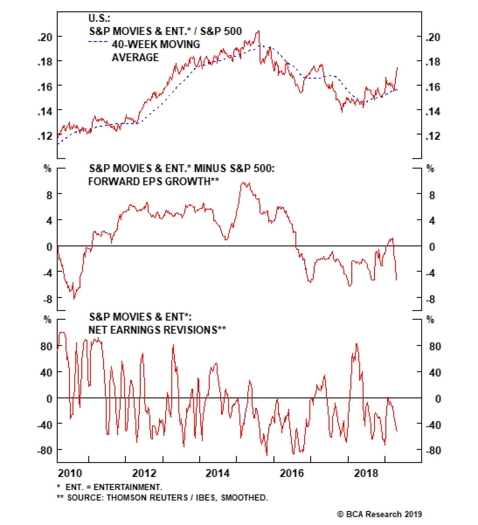
A Blockbuster Start To Summer
A Blockbuster Start To Summer
Overweight Last week we highlighted a number of reasons why the S&P movies & entertainment index had turned a corner, underscoring our upgrade to overweight.1 Core to our thesis is that content is king and Disney is the reigning consolidator. Notably, the company’s Avengers property, acquired via the $4 billion acquisition of Marvel a decade ago, just set the record for box office openings this weekend with their latest offering earning $1.2 billion. This bested their own record set last year with an offering from the same media property. Stocks in the S&P movies & entertainment index have been soaring to reflect the eager movie-going sentiment of consumers. Such exuberant consumption of entertainment, combined with Disney-specific optimism from their upcoming streaming service and majority stake of Hulu, an already formidable streaming competitor, should be met with analyst optimism. However, we have seen just the opposite as pessimism has dominated the sell-side and forward EPS are set to materially trail the broad market (second panel), while revisions are headed lower (bottom panel). We think this bearishness should prove fleeting and would lean against it. Bottom Line: Analyst pessimism appears offside in an exceptional box office environment. Stay overweight. The ticker symbols for the stocks in this index are: BLBG: S5MOVI – DIS, NFLX, VIAb. 1 Please see BCA U.S. Equity Strategy Weekly Report, “Mixed Signals” dated April 22, 2019, available at uses.bcaresearch.com.
Highlights Fed: Fed policymakers are sending a unified message that they want to keep rates on hold until they see a significant increase in inflation. However, our reading of their recent remarks suggests that they will be reluctant to actually cut rates unless GDP growth falls to below its estimated potential. Economy: If we strip out the volatile net exports, government and inventory components of growth, we see that economic activity slowed to below potential in the first quarter. However, the timeliest data on consumer spending, nonresidential investment and residential investment all suggest that Q1 will be the trough for the year. All in all, economic growth should be comfortably above potential in 2019, keeping rate cuts at bay. Investment Strategy: Investors should keep portfolio duration low, avoiding the 5-year/7-year part of the Treasury curve. Investors should also overweight spread product versus Treasuries, with a focus on Baa and junk rated corporate bonds. Feature Since January, Federal Reserve policymakers have sent a strikingly unified message: Policy should remain “patient” in an effort to re-anchor inflation expectations and demonstrate the symmetry of the Fed’s 2 percent inflation target. Take for example, two excerpts from recent speeches by Boston Fed President Eric Rosengren and Chicago Fed President Charles Evans. Rosengren:1 My own preference is for the Federal Reserve to adopt an inflation range that explicitly recognizes the challenge of the effective lower bound. We might be forced to accept below-2-percent inflation during recessions, but we would commit to achieving above-2-percent inflation in good times, so as to provide more policy space to counteract the next recession. Evans:2 I think the Fed must be willing to embrace inflation modestly above 2 percent 50 percent of the time. Indeed, I would communicate comfort with core inflation rates of 2-1/2 percent, as long as there is no obvious upward momentum and the path back toward 2 percent can be well managed. The consensus appears to be not only that higher inflation is necessary before the Fed lifts rates again, but also that the Fed should explicitly target an overshoot of its 2 percent target. With trailing 12-month core PCE inflation running at only 1.55% as of March, it will undoubtedly take some time before these inflation goals are met. We think the Fed’s commitment to keeping rates steady could waver if financial conditions ease sufficiently.3 But for now, with the market priced for 36 basis points of rate cuts over the next 12 months, the more pertinent question is: What will it take for the Fed to lower rates from current levels? Expecting A Rate Cut? Don’t Hold Your Breath Our Fed Monitor has an excellent track record calling turning points in monetary policy, and at present it is very close to zero, consistent with the Fed’s “on hold” stance (Chart 1). The Monitor is comprised of 44 indicators of economic growth, inflation and financial conditions. In other words, for the Monitor to recommend rate cuts going forward we will need to see some further deterioration in either economic growth, inflation or financial markets (Chart 2). This is roughly consistent with how Chicago Fed President Evans described his reaction function in his speech from two weeks ago: Chart 1"On Hold" Stance Justified
"On Hold" Stance Justified
"On Hold" Stance Justified
Chart 2Fed Monitor Components
Fed Monitor Components
Fed Monitor Components
If growth runs close to or somewhat above its potential and inflation builds momentum, then some further rate increases may be appropriate over time… In contrast, if activity softens more than expected or if inflation and inflation expectations run too low, then policy may have to be left on hold – or perhaps even loosened – to provide the appropriate accommodation to obtain our objectives. Our interpretation of the Fed’s reaction function is that it wants to maintain an accommodative monetary policy to ensure that inflation and inflation expectations move higher over time. However, it will consider monetary policy to be accommodative as long as GDP growth stays close to, or above, estimates of its potential rate. In other words, while the Fed is in no rush to tighten, we probably need to see a significant period of below-potential GDP growth before rate cuts are on the table. In his speech, Evans indicates that his personal estimate of potential GDP growth is 1.75%. The March Summary of Economic Projections shows that the central tendency of FOMC participant estimates is 1.8% - 2%. Our view is that U.S. growth will easily surpass this threshold in 2019, keeping rate cuts at bay. Tracking U.S. Growth Markets were caught off guard last week when we learned that real GDP grew 3.17% in the first quarter, above consensus estimates and well above the 1.8% - 2% potential growth threshold. However, the headline Q1 figure was flattered by significant gains in a few volatile GDP components. Chart 3Underlying Growth Slowdown
Underlying Growth Slowdown
Underlying Growth Slowdown
Much like how core measures of inflation strip out volatile food and energy prices to give us a better sense of the underlying trend, we can also look at Real Final Sales To Domestic Purchasers (FSDP) to get a better sense of the underlying trend in economic growth. FSDP includes only consumer spending, nonresidential investment and residential investment. That is, it removes government spending, net exports and inventory investment from the overall number. Viewed this way, we see that the U.S. economy did experience a significant growth slowdown in the first quarter. Real FSDP grew only 1.45% in Q1, below the 1.8% - 2% potential growth threshold (Chart 3). Net Exports & Inventories Chart 4Net Exports & Inventories
Net Exports & Inventories
Net Exports & Inventories
First quarter GDP was boosted by a +1.03% contribution from net exports and a +0.65% contribution from inventory investment, neither of which is likely to be repeated in Q2 (Chart 4). The top panel of Chart 4 shows just how unusual it is to see such a large contribution from net exports, an event that becomes even less likely when you factor in the dollar’s recent appreciation (Chart 4, panel 2). Turning to inventories, a significant build was long overdue given the backlog of orders seen during the past two years. But the ISM Manufacturing Index’s backlog of orders component has now fallen back to a neutral level (Chart 4, bottom panel). This suggests that firms are comfortable with their current inventory stockpiles, and that no aggressive inventory increases are likely during the next few quarters. Interestingly, while net exports and inventories will almost certainly pressure GDP growth lower in Q2, back toward the growth rate in FSDP, the latter has probably already troughed for the year. Recent data on consumer spending, nonresidential investment and residential investment all appear to have turned a corner. Consumer Spending Consumer spending added a meager +0.8% to GDP in Q1, but core retail sales growth has recovered sharply after having plunged near the end of last year (Chart 5). What’s more, with consumer sentiment close to one standard deviation above its historical mean – whether we look at expectations or current conditions surveys – consumers don’t seem inclined to retrench in the months ahead (Chart 6). Chart 5Consumer Spending
Consumer Spending
Consumer Spending
Chart 6Buoyant Consumer Sentiment
Buoyant Consumer Sentiment
Buoyant Consumer Sentiment
Nonresidential Investment Chart 7Nonresidential Investment
Nonresidential Investment
Nonresidential Investment
We expected business investment to weaken in Q1, and its +0.4% growth contribution is low compared to recent readings. The decline was anticipated due to last year’s significant deterioration in global growth. Slower global growth necessarily causes firms to downgrade their profit expectations. Faced with lower expected profits, companies are much more inclined to curtail investment. However, considering the outlook heading into mid-year, we have already noticed signs of improvement in leading global growth indicators.4 More recently, we have even seen that improvement translate into stronger U.S. investment data. Core durable goods new orders grew +17% (annualized) in March, dragging the year-over-year rate up to +5.3% (Chart 7). Further, our BCA Composite New Orders Indicator – a weighted combination of ISM New Orders and NFIB Capital Spending Plans – has bounced during the past few months, returning close to its historical mean (Chart 7, panel 3). An average of Capital Spending Intentions from regional Fed surveys also remains close to one standard deviation above its historical average (Chart 7, bottom panel). Residential Investment Residential investment (aka Housing) has exerted a meaningful drag on GDP growth in each of the past five quarters, and it lowered GDP by -0.1% in Q1 (Chart 8). However, much like with consumer spending and nonresidential investment, the timely economic data suggest a turnaround is in the offing. Much like with consumer spending and nonresidential investment, the timely economic data suggest a turnaround is in the offing. Optimism has returned to housing since mortgage rates fell earlier this year. New home sales and mortgage purchase applications have jumped, and single-family housing starts are the only important housing-related data that haven’t yet rebounded. We expect that rebound to occur soon, as do homebuilders whose confidence has risen during the past few months. Homebuilder optimism surveys remain close to one standard deviation above their historical averages (Chart 9). Chart 8Residential Investment
Residential Investment
Residential Investment
Chart 9Buoyant Homebuilder Confidence
Buoyant Homebuilder Confidence
Buoyant Homebuilder Confidence
Bottom Line: Fed policymakers are sending a unified message that they want to keep rates on hold until they see a significant increase in inflation. However, our reading of their recent remarks suggests that they will be reluctant to actually cut rates unless GDP growth falls to below its estimated potential. Potential GDP growth is estimated to be in the 1.8% to 2% range. If we strip out the volatile net exports, government and inventory components of growth, we see that economic activity slowed to below potential in the first quarter. However, the timeliest data on consumer spending, nonresidential investment and residential investment all suggest that Q1 will be the trough for the year. All in all, economic growth should be comfortably above potential in 2019, keeping rate cuts at bay. Investment Implications To translate the above views on the economy and the Fed’s reaction function into a portfolio strategy, we first return to our Golden Rule of Bond Investing.5The Golden Rule states that if the Fed delivers more (fewer) rate hikes than are currently discounted in the market over the next 12 months, then the Treasury index will earn negative (positive) excess returns versus cash during that investment horizon (Chart 10). At present, this means that investors should only expect positive excess returns from taking duration risk in the event that the Fed cuts rates by more than 36 basis points during the next 12 months. Given our view that rate cuts are unlikely, investors should maintain below-benchmark portfolio duration. Chart 10The Golden Rule's Track Record
The Golden Rule's Track Record
The Golden Rule's Track Record
If we further assume that market expectations will shift to price-in fewer rate cuts, or even possibly some rate hikes, then we would expect 5-year and 7-year yields to rise the most (Chart 11). Investors should avoid those maturities and focus their Treasury exposure on the short and long ends of the curve. These barbell over bullet trades have the advantage of being positive carry, so they will earn money even if rate hike expectations are unchanged.6 Chart 11Avoid The 5- And 7-Year Maturities
Avoid The 5- And 7-Year Maturities
Avoid The 5- And 7-Year Maturities
Chart 12Investment Grade Spread Targets
Investment Grade Spread Targets
Investment Grade Spread Targets
Finally, the combination of above-potential GDP growth and a patient Fed is positive for spread product. Investors should remain overweight spread product versus Treasuries in bond portfolios, focusing on Baa and junk rated corporate bonds. Spreads for those credit tiers remain wide compared to historical median levels for this phase of the cycle (Charts 12 &13).7 Chart 13High-Yield Spread Targets
High-Yield Spread Targets
High-Yield Spread Targets
Ryan Swift, U.S. Bond Strategist rswift@bcaresearch.com Footnotes 1 https://www.bostonfed.org/news-and-events/speeches/2019/monetary-policymaking-in-todays-environment.aspx 2 https://www.chicagofed.org/publications/speeches/2019/risk-management-and-the-credibility-of-monetary-policy 3 Please see U.S. Bond Strategy Weekly Report, “The New Battleground For Monetary Policy”, dated March 26, 2019, available at usbs.bcaresearch.com 4 Please see U.S. Bond Strategy Weekly Report, “Bond Kitchen”, dated April 9, 2019, available at usbs.bcaresearch.com 5 Please see U.S. Bond Strategy Special Report, “The Golden Rule Of Bond Investing”, dated July 24, 2018, available at usbs.bcaresearch.com 6 Please see U.S. Bond Strategy Weekly Report, “Paid To Wait”, dated February 26, 2019, available at usbs.bcaresearch.com 7 For further details on how we calculate these spread targets please see U.S. Bond Strategy Weekly Report, “The Value In Corporate Bonds”, dated February 19, 2019, available at usbs.bcaresearch.com Fixed Income Sector Performance Recommended Portfolio Specification
Highlights Portfolio Strategy China’s ongoing reflation trifecta, rising commodity prices, a back-half of the year global growth recovery, favorable balance sheet metrics and neutral valuations and technicals all signal that the cyclical vs. defensive outperformance phase has more running room. New home-related data releases have been a mixed bag lately and there are high odds that homebuilders have discounted all the good housing market news. Be prepared to book profits. Recent Changes There are no changes in our portfolio this week. Table 1
Updating Our SPX Target
Updating Our SPX Target
Feature The SPX hit fresh all-time closing highs last week, as declining profits were not as bad as previously feared. While economic and profit fundamentals remain soft at best, fear of missing out (FOMO) on the rally and proliferating talk of a melt up in stocks have provided the needed spark to fuel the recent equity breakout (Chart 1). Historically, both of these sentiment/anecdotal-type time series have led or coincided with temporary broad equity market peaks and we continue to believe that some short-term caution is still warranted. In other words, we would not chase this multiple expansion-driven market advance and specifically refrain from putting fresh capital to work (please refer to Charts 1 & 2 from last Monday’s Weekly Report)1. Moreover, the easy money on the “reflation trade” has already been made and now the risk/reward tradeoff is to the downside. Our Reflation Gauge (RG), comprising oil prices, the trade-weighted U.S. dollar and interest rates, is quickly losing steam and warns against extrapolating equity market euphoria far into the future (Chart 2). Chart 1Beware Melt Up And FOMO Narrative
Beware Melt Up And FOMO Narrative
Beware Melt Up And FOMO Narrative
Chart 2Reflation Stalling
Reflation Stalling
Reflation Stalling
As a reminder, crude oil prices are up over 50% from the nadir, the 10-year Treasury yield is up 25bps from the recent lows, and the greenback is on the cusp of a breakout in level terms. The implication from our decelerating RG is also consistent with a cautious equity market stance from a tactical perspective. But, on a cyclical 9-12 month time horizon we continue to have a sanguine equity market view as the U.S. will avoid recession and the Fed will likely stay on the sidelines. We recently updated the S&P 500 dividend payout for calendar 2018 and this week we are introducing our 3,150 SPX target for end-year 2020 derived via three methodologies: SPX dividend discount model (DDM), forward multiple/EPS sensitivity and forward equity risk premium (ERP) analysis. Table 2 summarizes our results. On a side note our end-year 2019 target remains unchanged since our mid-January update at 3,000.2 Table 2SPX Target Using Three Different Methods
Updating Our SPX Target
Updating Our SPX Target
In all three ways we get a value of roughly 3,150 on the SPX, which serves as our end-year 2020 SPX target. In our DDM, we moved the recession to 2021 from 2020 previously, added a year to our 5-year rolling estimates and continue to conservatively assume no buybacks. With regard to the sensitivity analysis, our 2021 EPS estimate is $191, a discount to the $205 currently penciled in by the sell-side, and our base case calls for a 16.5x forward multiple. Finally, the bottom part of Table 2 shows our forward ERP assumptions. We lifted the equilibrium ERP from 200bps to 250bps given the recent setback it suffered and our 10-year Treasury yield also moved down 50bps to 3.5%. Consistent with our sensitivity analysis base case, the starting point is $191 2021 EPS. In all three ways we get a value of roughly 3,150 on the SPX, which serves as our end-year 2020 SPX target. (If you would like to receive our excel spreadsheet in order to adjust our assumptions please email our client requests department here). This week we update our cyclicals/defensives portfolio bent view and a set a stop sell order to an overweight early-cyclical niche subsector. Stick With Cyclicals Over Defensives, For Now Chart 3China…
China…
China…
We were early and right in January when we posited that China’s slowdown was yesteryear’s story and more than discounted in the collapse of the U.S. cyclicals vs. defensives ratio (please refer to Chart 5 from the January 28 Weekly Report). Similarly, in early February when everyone was laser focused on the Fed’s January meeting, our report titled “Don’t Fight The PBoC” highlighted that the Chinese were serious about reflating their economy. The PBoC’s quasi-QE not only recapitalized the banks, but it also injected enormous liquidity into their financial system. The upshot was that U.S. cyclicals would reclaim the upper hand vs. defensives. Now as the story count for “China Slowdown” is coming down fast (story count shown inverted, bottom panel, Chart 3) the question is how much of the looming Chinese recovery is currently priced in the V-shaped cyclical/defensives rebound? Our sense is that while most of the good news is largely reflected in the slingshot recovery in the relative share price ratio, there is some room left for additional gains. Financial variables are upbeat and signal that more gains are in store for the cyclicals/defensives ratio. China’s A-shares year-to-date have trounced the S&P already by a factor greater than 2:1 (in local currency terms, not shown). The MSCI China index is also outperforming the MSCI All-Country World Index (top panel, Chart 4). Sell-side analysts are in synchrony with the markets and they have been upgrading EPS estimates for the MSCI China index (top panel, Chart 5). Chart 4…Signals…
…Signals…
…Signals…
Beyond the stock market, the FX market along with commodities are also underpinning relative share prices. The ADXY index (bottom panel, Chart 4) and the CRB metals index (bottom panel, Chart 5) are both moving in lockstep and suggest that commodity related profits will boost cyclicals at the expense of defensives. Chart 5…More Gains…
…More Gains…
…More Gains…
Similarly, the broad trade-weighted U.S. dollar is no longer appreciating at the late-2018 breakneck pace and, at the margin, suggests that cyclicals profits will get an added boost from positive FX translation gains as they garner a larger slice of their revenue from international markets compared with mostly domestically-exposed defensives (U.S. dollar shown inverted, bottom panel, Chart 6). Soft economic data have taken their cue from higher frequency financial market data and have also turned. China’s CAIXIN manufacturing PMI is above the 50 boom/bust line. The implication is that U.S. cyclicals’ profits will outshine U.S. defensives’ EPS (middle panel, Chart 6). Finally, monetary easing is ongoing on the Chinese front. The banks’ reserve-requirement-ratio is falling and so is the interbank lending rate as per SHIBOR (both shown inverted & advanced, top & middle panel, Chart 7). Given the trifecta of Chinese easing on the monetary, fiscal and credit front, it is inevitable that hard data will also soon turn. Chart 6…Are In Store For Cyclicals…
…Are In Store For Cyclicals…
…Are In Store For Cyclicals…
Chart 7…At The Expense Of Defensives
…At The Expense Of Defensives
…At The Expense Of Defensives
Chart 8Global LEI Diffusion Concurs
Global LEI Diffusion Concurs
Global LEI Diffusion Concurs
Nevertheless, it is not only China that is emitting an unambiguously positive signal for the U.S. cyclicals/defensive ratio. BCA’s global leading economic indicator diffusion index is pushing 65%, underscoring that the majority of the countries we track showcase an improving economic outlook. As a reminder, BCA’s view remains that in the back half of the year global growth will pick up steam. Thus, under such a backdrop, cyclicals will continue to outperform defensives (Chart 8). Stick with a cyclical over defensive portfolio bent, but stay tuned. On the relative operating front, cyclicals are also flexing their muscles and crushing defensives. Since 1980 (the beginning of our dataset), the cyclical/defensive portfolio bent has followed relative return-on-assets (ROA). While over the decades there have been some divergences, this correlation has become extremely tight since early-2000. Currently, following the late-2015/early 2016 manufacturing recession, the relative ROA has jumped 400bps and is signaling that relative share prices are on a solid footing (Chart 9). Chart 9Relative ROA And…
Relative ROA And…
Relative ROA And…
With regard to relative debt dynamics, cyclicals also have the upper hand. Net debt/EBITDA and EBIT/interest expense both show that the relative indebtedness favors cyclicals over defensives. While defensives are degrading their balance sheet, cyclicals are still repairing theirs in the aftermath of the recent manufacturing recession (Chart 10). Despite the year-to-date spike in relative share prices, relative valuations and technicals remain tame. Both our relative Valuation and Technical Indicators are timid, and remain below the respective historical averages (Chart 11). Chart 10…Indebtedness Suggests That Cyclicals Have the Upper Hand
…Indebtedness Suggests That Cyclicals Have the Upper Hand
…Indebtedness Suggests That Cyclicals Have the Upper Hand
In sum, China’s ongoing reflation, rising commodity prices, a back-half of the year global growth recovery, favorable balance sheet metrics and neutral valuations and technicals all signal that the cyclical vs. defensive outperformance phase has more running room. Chart 11No Red Flags
No Red Flags
No Red Flags
Bottom Line: Stick with a cyclical over defensive portfolio bent, but stay tuned. Is The Homebuilding Rally Sustainable? While we were slightly early in our upgrade of homebuilding stocks to overweight in late-September, this recommendation has generated alpha close to 10% for our portfolio. Nevertheless, some soft housing related data compel us to put this index on downgrade alert and, from a risk management perspective in order to protect gains, set a stop sell order near the 10% relative return mark. Just to be clear, this is not a negative call on residential real estate. Quite the opposite, housing market long-term drivers remain upbeat in the U.S. Chart 12 shows that household formation is still running higher than housing starts and building permits. This is a bullish industry supply/demand backdrop. Housing affordability, while not as sky-high as when house prices troughed in 2011/2012, remains above the historical mean and above previous peaks (second panel, Chart 12). Tack on still generationally low interest rates and there good odds that first-time home buyers will return to the residential real estate market. Finally, the labor market is as good as it gets with the unemployment rate plumbing multi-decade lows (unemployment rate shown inverted, bottom panel, Chart 12). Job certainty and rising salaries are a healthy combination for housing market prospects. Beyond the positive structural housing market forces, some recent homebuilder specific data have also been positive. New home sales have surged and are now in expansionary territory (top panel, Chart 13). Similarly, the latest inventory data on new homes showed that newly built house inventories are whittled down, with the months’ supply metric falling by over one month (new house supply shown inverted, second panel, Chart 13). Chart 12Bullish Structural Housing Fundamentals
Bullish Structural Housing Fundamentals
Bullish Structural Housing Fundamentals
Chart 13Select Positive…
Select Positive…
Select Positive…
The 70bps drop in the 30-year fixed mortgage rate since November has shown up in rising mortgage purchase applications that have vaulted to multi-year highs (middle panel, Chart 13). Lumber, a key input cost for new home construction has melted of late and this building material cost relief is a boon for homebuilding margins. True, new home prices are deflating and are an offset, but from an all-time high level and at a slower pace than lumber prices (fourth & bottom panels, Chart 13). One reason median new single family home prices are falling is that homebuilders are competing aggressively for market share with the existing stock of homes available for sale. Price concessions are paying dividends as relative volumes have spiked i.e. homebuilders are successfully grabbing market share (second & third panels, Chart 14). In absolute terms, S&P homebuilding sales are expanding at a healthy pace and the NAHB’s survey of future sales expectations point to a firming new home demand outlook (bottom panel, Chart 14). However, there are some macro headwinds that homebuilders will have to contend with in the back half of the year. While interest rates have fallen during the past six months, our fixed income strategists expect a selloff in the bond market, which, at the margin, will weigh on housing affordability (mortgage rate shown inverted, top panel,Chart 15). Chart 14…Homebuilding Data…
…Homebuilding Data…
…Homebuilding Data…
Chart 15…But Two Key Risks Remain
…But Two Key Risks Remain
…But Two Key Risks Remain
Netting it all out, housing related data have been a mixed bag of late and homebuilders have likely discounted most of the good housing market news. Thus, in order to protect profits we are setting a stop sell order near the 10% relative return mark. Already, bankers are making it slightly, but steadily, more difficult to get a mortgage loan (third panel, Chart 15). But, what worries us most is that according to the Fed Senior Loan Officer survey, demand for residential real estate loans has collapsed to a level last hit at the depths of the Great Recession. Historically, this bombed out demand indicator has been a precursor of a fall in relative share prices (second panel, Chart 15). Finally, actual mortgage loan origination is quickly decelerating (bottom panel, Chart 15) and short-term momentum is already contracting. Netting it all out, housing related data have been a mixed bag of late and homebuilders have likely discounted most of the good housing market news. Thus, in order to protect profits we are setting a stop sell order near the 10% relative return mark. Bottom Line: Stay overweight the S&P homebuilding index, but we are putting it on our downgrade watch list. Be prepared to monetize gains on a pullback in relative share prices near the 10% return mark since inception. The ticker symbols for the stocks in this index are: BLBG: S5HOME – PHM, DHI, LEN. Anastasios Avgeriou, U.S. Equity Strategist anastasios@bcaresearch.com Footnotes 1 Please see BCA U.S. Equity Strategy Weekly Report, “Mixed Signals” dated April 22, 2019, available at uses.bcaresearch.com. 2 Please see BCA U.S. Equity Strategy Weekly Report, “Catharsis” dated January 14, 2019, available at uses.bcaresearch.com. Current Recommendations Current Trades Size And Style Views Favor value over growth Favor large over small caps
Highlights The U.S. dollar will ultimately reach fresh cycle highs, but not before going through a weak phase starting this summer that could last 12 months. We closed our long DXY trade for a carry-adjusted return of 16.4% last week. We will go tactically short the index if it breaches 101 (about 3% above current levels). As a countercyclical currency, the dollar is likely to stumble in the second half of this year as global growth accelerates. Positioning and sentiment are currently very dollar bullish, which is likely to exacerbate any sell-off in the greenback. The dollar should begin to rally again late next year, as global growth decelerates while the Fed is forced to turn more hawkish in the face of rising inflation. Go long European banks as a tactical trade. Feature Moving To The Sidelines On The Dollar We closed our long DXY trade recommendation for a carry-adjusted gain of 16.4% at last Thursday’s close – too early it turns out, as the DXY has gained another 0.7% since then. The dollar is a high-momentum currency (Chart 1). The trend is the dollar’s friend at the moment, which makes betting against the greenback risky. Nevertheless, we would not chase the dollar higher at these levels. Long dollar positioning is highly stretched and sentiment is overly bullish (Chart 2). This makes a price reversal increasingly probable.
Chart 1
Perhaps more importantly, the macro fundamentals, which have worked in favor of the dollar since early 2018, will likely start working against it as the summer months approach. Chart 2There Are A Lot Of Dollar Bulls Out There
There Are A Lot Of Dollar Bulls Out There
There Are A Lot Of Dollar Bulls Out There
Stronger Global Growth Will Hurt The Greenback The dollar is a countercyclical currency, meaning that it tends to move in the opposite direction of global growth (Chart 3). Global growth has been decelerating since early 2018, and that has helped boost the dollar’s value. The dollar is a countercyclical currency, meaning that it tends to move in the opposite direction of global growth. Chart 3The Dollar Is A Countercyclical Currency
The Dollar Is A Countercyclical Currency
The Dollar Is A Countercyclical Currency
If anything, the growth divergence between the U.S. and the rest of the developed world has increased over the past few months. Goldman’s Current Activity Indicator (CAI) for the U.S. has been rising since January, while the European and Japanese CAIs have continued to fall (Chart 4). Looking out, the rest of the world is likely to catch up to the United States. The Chinese CAI has already moved sharply higher thanks in part to an acceleration in Chinese credit growth. Chart 4Growth Is Recovering In The U.S. And China
Growth Is Recovering In The U.S. And China
Growth Is Recovering In The U.S. And China
Chart 5China: Credit Is Growing At A Moderately Faster Pace Than GDP
China: Credit Is Growing At A Moderately Faster Pace Than GDP
China: Credit Is Growing At A Moderately Faster Pace Than GDP
We would downplay recent market speculation that the Chinese authorities are preparing to restart their deleveraging campaign. Credit growth is now running only modestly above nominal GDP growth (Chart 5). With the ratio of debt-to-GDP broadly stable, there is no need to further clamp down on credit formation. The Chinese government also wants to keep the economy buoyant in order to gain negotiating leverage in trade talks with the Trump administration. Better Chinese Data Will Benefit The Rest Of The World Fluctuations in Chinese growth usually affect Europe with a lag of around six months (Chart 6). This suggests that European exports should strengthen starting this summer. Meanwhile, European domestic demand should benefit from an easing of fiscal policy of around 0.5% of GDP. Chart 6Europe Will Benefit From Improving Chinese Growth
Europe Will Benefit From Improving Chinese Growth
Europe Will Benefit From Improving Chinese Growth
Chart 7Swings In Interest Rate Differentials Explain Some Currency Moves
Swings In Interest Rate Differentials Explain Some Currency Moves
Swings In Interest Rate Differentials Explain Some Currency Moves
Faster growth in the U.S. in relation to the euro area has caused the spread in expected interest rates to widen between the two regions. The spread in one-month, five-year forward OIS rates now stands at 202 bps, similar to the highs seen in late-2016 (Chart 7). If euro area growth recovers this summer, the market will price in a bit of tightening from the ECB starting late next year. This will cause the spread to narrow, leading to a stronger euro. A revival in Chinese growth should also help EM and commodity currencies. The market is currently pricing in 44 basis points of rate cuts in Australia, 33 bps of cuts in New Zealand, and 21 bps of cuts in Canada over the next 12 months. While domestic concerns around high household debt levels and overvalued real estate markets will keep central banks on guard in all three economies, a more robust global growth backdrop should allow some of the expected easing to be priced out. Japan remains a bit of a wildcard due to the government’s stated intention to raise the sales tax this October. We see little justification for increasing the sales tax given that inflation expectations are still nowhere close to the BOJ’s target. Japan needs easier, not tighter, fiscal policy. There is still an outside chance that the tax hike will be postponed, but even if it is, rising bond yields in the rest of the world will still hurt the yen. The BOJ has no intention of abandoning its yield curve targeting system anytime soon. In fact, it introduced new forward guidance at this week’s monetary policy meeting promising not to raise rates at least until the spring of 2020. Investors looking to trade the yen should consider going long EUR/JPY or AUD/JPY. We recommend going long European banks outright for a tactical trade. Bottom Line: If global growth accelerates later this year, the dollar will probably weaken. Accordingly, investors should use this week’s rally in the dollar to scale back exposure to the currency. We are also putting in a limit order to go short the DXY index if it reaches 101 (about 3% above its current level). Looking Further Out… Chart 8Low Odds Of An Imminent Major Inflationary Upswing In The U.S.
Low Odds Of An Imminent Major Inflationary Upswing In The U.S.
Low Odds Of An Imminent Major Inflationary Upswing In The U.S.
Mini-cycles within the broader global business cycle tend to last around 12-to-18 months. If this pattern continues to hold, global growth will probably falter again in the second half of next year. At that point, the dollar is likely to strengthen again. By how much can the dollar rise? That depends on what the Fed does. A stronger dollar would entail a tightening in financial conditions. Normally that would cause the Fed to turn more dovish, limiting the upside for the greenback. The risk is that rising inflation prevents the Fed from turning more accommodative. Inflation is not much of a concern now. Leading indicators of inflation such as core intermediate goods prices and the prices paid component of the ISM remain well contained (Chart 8). Wage growth has picked up, but productivity growth has risen even more. As a result, unit labor costs, which tend to lead core inflation, have been decelerating since the middle of last year. If the U.S. economy continues to grow above trend, however, inflation could begin to break out late next year. That would force the Fed to start raising rates more aggressively than it would like, even in the face of slower growth. Such a stagflationary outcome will be awful for equities and other risk assets. As U.S. financial conditions tighten, global growth will slow, giving the dollar a further boost. The upshot is that the dollar could see a meaningful rally starting late next year. Stay Bullish On Stocks For Now… Until that fateful day arrives, we are inclined to maintain our bullish equity bias. We upgraded global stocks to overweight in December after having moved to the sidelines in June. Despite the run-up in stock prices, the forward P/E ratio on the MSCI All-Country World Index is still 7% below where it was at the start of 2018 and 3% below its long-term (30-year) average (Chart 9). Earnings estimates are also finally starting to increase (Chart 10). Accelerating global economic growth will ensure that profits continue to rise into year-end. Chart 9Global Stocks Are Not That Expensive
Global Stocks Are Not That Expensive
Global Stocks Are Not That Expensive
Chart 10Earnings Estimates Have Turned The Corner
Earnings Estimates Have Turned The Corner
Earnings Estimates Have Turned The Corner
… And Buy Some European Banks For A Tactical Trade European banks are trading at distressed valuations (Chart 11). One can debate the long-term prospects for the European banking sector, but in the near term, one thing is clear: If European growth begins to surprise on the upside, bond yields in core European markets will rise, which should help European bank stock prices (Chart 12). Stronger economic growth will also translate into more credit demand and lower non-performing loans. This will boost bank earnings (Chart 13). With all this in mind, we recommend going long European banks outright for a tactical trade. Chart 11European Banks: A Good Value Play
European Banks: A Good Value Play
European Banks: A Good Value Play
Chart 12Euro Area: Higher Bond Yields Bode Well For Bank Stocks
Euro Area: Higher Bond Yields Bode Well For Bank Stocks
Euro Area: Higher Bond Yields Bode Well For Bank Stocks
Chart 13More Credit, Fatter Bank Earnings
More Credit, Fatter Bank Earnings
More Credit, Fatter Bank Earnings
Peter Berezin, Chief Global Strategist Global Investment Strategy peterb@bcaresearch.com Strategy & Market Trends MacroQuant Model And Current Subjective Scores
Chart 14
Tactical Trades Strategic Recommendations Closed Trades
Taking The Cloud To New Heights
Taking The Cloud To New Heights
Overweight (High-conviction) S&P software index heavyweight Microsoft reported results this week that reflect the themes underpinning our high-conviction overweight recommendation on the sector. Companies are actively deploying capex on software at an increasing rate (second panel) while the secular trends of cloud computing and SaaS are lifting software companies in general and, with its ubiquitous suite of products, Microsoft in particular. We expect today’s GDP release to confirm the trend of the past several quarters that investment in software is on a secular uptrend. The outsized growth in software is revealed in forward growth estimates versus the S&P 500; while the earnings of the broad market have been under pressure, software is soaring (third panel). Further, it is not just earnings growth that is driving the relative share price outperformance as inter- and intra-industry M&A has taken off (bottom panel), another secular theme that we expect to power the S&P software index to new relative highs. Bottom Line: We reiterate our high-conviction overweight recommendation on the S&P software index. The ticker symbols for the stocks in this index are: BLBG: S5SOFT – MSFT, ORCL, ADBE, CRM, INTU, ADSK, RHT, CDNS, SNPS, ANSS, SYMC, CTXS, FTNT.
Resource Demand Elevates CAT Results
Resource Demand Elevates CAT Results
Overweight Caterpillar, the global trade bellwether, reported results yesterday that beat expectations despite sell-side pessimism that global softness had not been priced in to the stock. Of particular note was the resilience in resource demand that was the source of both revenue and profit outperformance as volume and price gains outweighed tariff-driven input cost increases and FX headwinds. The stock’s reaction to the earnings beat was muted as investors focused on management commentary that aggressive competition would result in market share losses in China. Nevertheless, the credit easing-driven rebound in Chinese construction/infrastructure spending growth should more than offset this headwind. We remain focused on the sector’s core performance drivers. The CRB raw industrials index, which moves in lockstep with the S&P CMHT index, has been ticking up recently and continues to positively diverge from the CMHT’s relative performance (second panel). In particular, the recent spike in energy prices will likely provide a robust lever for relative share prices as energy development projects take off (third panel). Bottom Line: Solid end-demand should deliver outsized profit gains while the still-outstanding catalyst from a positive resolution of the China/U.S. trade tussle stands to lift S&P CMHT share prices. Stay overweight. The ticker symbols for the stocks in this index are: BLBG: S5CSTF - CAT, CMI, PCAR.
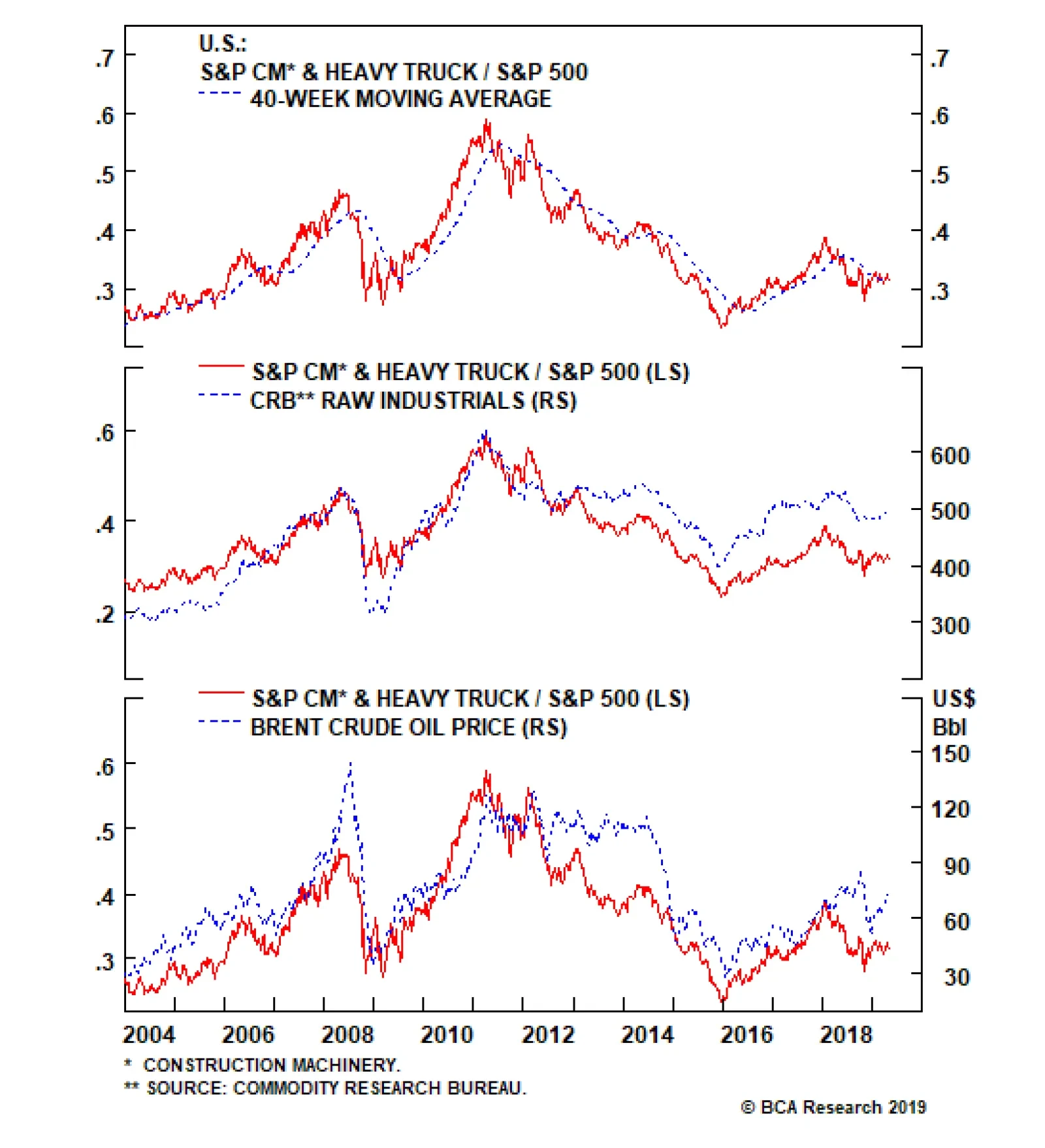
Of particular note was the resilience in resource demand that was the source of both revenue and profit outperformance, as volume and price gains outweighed tariff-driven input cost increases and FX headwinds. The stock’s reaction to the earnings beat was…