Sectors

Highlights An aging population, a banking sector in poor health, and a private sector focused on building up savings are the key factors undermining euro area growth on a structural basis. A large manufacturing sector makes the euro area vulnerable to EM competition. Unlike the U.S., the region’s tech sector is held back by regulatory burdens, taxes and heavy dependence on bank funding. The euro area growth faces decades of low growth and inflation. Euro area rates will stay depressed, but paradoxically, the euro can still experience structural appreciation. Euro area equities are cheap for a good reason, and banks will continue to weigh on performance. Feature Over the past 10 years, the euro area has gone through a sovereign debt crisis, a double-dip recession, persistent below-target inflation, and most recently, yet another major growth slowdown. Moreover, this economic malaise materialized despite highly stimulative monetary policy, including negative interest rates. The ongoing economic weakness has raised the specter that the euro area is the new Japan. Nearly three decades after the bursting of the Nikkei bubble, the Land of the Rising Sun remains mired in low growth and mild but persistent deflation. Consequently, charts showing that European policy rates or bond yields are tracking Japanese developments with a 17-year lag (Chart II-1) have not only become commonplace, they elicit fears that European growth, interest rates and asset valuations will lag the rest of the world for decades to come. Chart II-1Europe Is Following The Japanese Example
Europe Is Following The Japanese Example
Europe Is Following The Japanese Example
In this piece, we discuss the various forces that explain why the euro area economy has been so weak this decade, and why such low interest rates have had so little impact on growth. We also study what sets the U.S. and euro area apart, and whether or not Europe will follow the trail blazed by Japan nearly 30 years ago. The Three Headwinds Three ills have kept European growth particularly depressed this cycle and are likely to remain significant headwinds into the foreseeable future: demographics, the banking sector’s poor health, and nonfinancial private sector balance sheet cleansing. 1) Demographics This is the most well understood and acknowledged problem impacting Europe today. Since 2008, the European population has grown by 2%, or only 0.2% a year, with the working age population having peaked around that year. Going forward, the picture will only deteriorate: The UN expects Europe’s population to contract by 12% over the next 27 years, and the working age population to fall by 15%. This also means that the dependency ratio – the number of individuals aged less than 15 and above 65 per 100 working-age people – will approximately double over the coming 40 years. This is a clear parallel with Japan. As Chart II-2 illustrates, Europe’s population, the number of working-age individuals and the dependency ratio are all tracking Japan with a 17-year lag. Like Japan, Europe’s trend growth will thus only deteriorate further. Not only will Europe not be able to add as many workers as the U.S. to its total, but it will need to build even fewer schools, malls, office buildings or units of housing. Consequently, both the supply and demand sides of the economy will lag due to this factor alone. 2) Banking Sector Health The poor health of the euro area banking sector is well known. BCA’s Global Asset Allocation service published an in-depth analysis of the European banking sector last December.4 The piece demonstrated that European banks have been much slower to recognize non-performing loans, curtail credit and rebuild capital than their U.S. counterparts. U.S. bank loans to the private sector fell by 13% in the two years during the crisis, while in Europe, these same loans have only fallen by 2% since 2008. Euro area banks generally remain burdened with significant non-performing loans as a percentage of regulatory capital. Moreover, net interest margins are also dismal, implying that the income cushion against bad loans is thin. Consequently, outside of France, Finland and Germany, European banks have either not grown their loan books to the private sector or, as is the case with Spain, Portugal, and Ireland, these books are continuously shrinking (Chart II-3). Chart II-2Same Demography In Europe Now Than In Japan Then
Same Demography In Europe Now Than In Japan Then
Same Demography In Europe Now Than In Japan Then
Chart II-3Peripheral Banks Continue To Curtail Credit
Peripheral Banks Continue To Curtail Credit
Peripheral Banks Continue To Curtail Credit
The poor health of the European banking system is now constraining the supply of new credit to the rest of the economy. This is a much bigger problem than is the case in the U.S. given that in Europe, 72% of corporate funding comes from the banking system while 88% of household liabilities are also funded this way. In the U.S., the share of bank funding for these sectors is 32% and 29%, respectively (Chart II-4). A weak euro area banking system prevents the nonfinancial private sector from growing as robustly as it could.
Chart II-4
3) Nonfinancial Private Sector Balance Sheet Cleanse Another major drag on European growth has been the continued efforts of the European private sector to rebuild its balance sheet. To use the terminology developed by our upcoming conference speaker Richard Koo, the euro area has been in the thralls of a powerful balance sheet recession. Households in the euro area, Japan and the U.S. are all accumulating more financial assets than liabilities. However, only in the U.S. is the nonfinancial corporate sector building more liabilities than it is accumulating assets (Chart II-5). In Japan and Europe, the nonfinancial corporate sector is also a source of savings for the economy. Moreover, in Europe, the government runs a much smaller financial deficit. The current account balance tells this story vividly. A country’s current account is equal to the private sector’s savings minus investment and minus government deficits. As Italy, Spain, and other peripheral economies increased their aggregate savings after 2008, their large current account deficits vanished. Meanwhile, the governments of countries like Germany or the Netherlands, which sported healthy public finances, did not increase their spending in a commensurate way. This adjustment transformed an overall euro area current account deficit of 1.5% in 2008 into a surplus of 3.0% of GDP today, sending some of Europe’s excess savings abroad. This mimics the post-1990 Japanese experience. In the U.S., where the private sector savings did not rise as durably as in Europe, the current account stopped improving meaningfully in 2010 (Chart II-6). Chart II-5European Businesses Are Savers, Like In Japan
European Businesses Are Savers, Like In Japan
European Businesses Are Savers, Like In Japan
Chart II-6The Current Account Dynamics Epitomise The Savings Dynamics
The Current Account Dynamics Epitomise The Savings Dynamics
The Current Account Dynamics Epitomise The Savings Dynamics
A private sector squarely focused on rebuilding its balance sheet liquidity can lead to a liquidity trap. In this state, monetary policy can become ineffective as spending does not respond to lower interest rates. This is where Europe is currently stuck, explaining why the European Central Bank is finding that inflation and growth are not experiencing much lift, despite seemingly incredibly accommodative monetary conditions. Why Such An Urge To Save? The fact that the household sector is a net saver is not surprising, as this is a normal state of affairs across most economies. But why is the European nonfinancial corporate sector still trying to improve its balance sheet liquidity by accumulating more assets than liabilities? Like Japanese businesses 30 years ago, European firms have large debt loads. Another problem is the lack of capex opportunities in Europe. Why do we make this assertion? The return on assets in Europe has been at rock-bottom levels ever since the introduction of the euro (Chart II-7). In the decade from 1998 to 2008, this was a non-issue. Strong global growth flattered European sales, and easy access to credit meant that via rising leverage euro area-listed nonfinancial corporations were able to generate returns on equity comparable to U.S. firms (Chart II-8, top panel). Once European banks got cold feet and European nonfinancial businesses began focusing on deleveraging, the low level of return on assets became more apparent. Part of the problem is that European profit margins are much closer to Japanese than U.S. levels (Chart II-8, middle panel). Even more damning, asset turnover – how much sales are generated by a unit of assets – has been structurally lower in Europe than in both Japan and the U.S. for multiple decades (Chart II-8, bottom panel). Chart II-7Europe Suffers From A Lower RoA
Europe Suffers From A Lower RoA
Europe Suffers From A Lower RoA
Chart II-8DuPont's Decomposition Shows Why The Euro Area RoA Is Poor
DuPont's Decomposition Shows Why The Euro Area RoA Is Poor
DuPont's Decomposition Shows Why The Euro Area RoA Is Poor
The first factor weighing on the level of asset utilization and returns in Europe is the elevated level of capital stock. As Chart II-9 illustrates, the capital stock as a share of output in Italy, Spain and France dwarfs that of Japan, China or the U.S. Even Germany’s capital stock, which stands well below that of other large euro area economies, is nearly 100 percentage points of GDP larger than the U.S’s. Europe has too large a pool of assets to make any additional investments profitable, especially in light of its poor demographic profile.
Chart II-9
The second factor weighing on European asset utilization and returns is the poorer level of labor productivity. From the 1950s to the early 1980s, European GDP per worker rose relative to the U.S., albeit peaking at 92% of the levels across the Atlantic. Due to falling working hours in Europe relative to the U.S. since the 1980s, relative output per hour continued to rise until the mid-1990s, peaking at 105% of the U.S. level. However, since their respective zeniths, both relative productivity measures have collapsed (Chart II-10, top panel). Chart II-10Another Symptom Of Europe's Misallocation Of Capital In The 2000s
Another Symptom Of Europe's Misallocation Of Capital In The 2000s
Another Symptom Of Europe's Misallocation Of Capital In The 2000s
These collapses are in fact worse than Japan’s performance since its lost decades began. As the second panel of the chart shows, since the early 1990s, Japan’s relative output per hour and per worker have flattened – not declined – at around 65% and 72%, respectively, of U.S. levels. Instead, relative European productivity levels are currently converging toward Japanese levels (Chart II-10, third and fourth panels). The particularly poor level of European asset utilization and productivity principally reflects the duality between the peripheral as well as French economies on one side, and Germany as well as the Netherlands on the other side. The exceptionally large capital stock outside of Germany is a legacy of the years directly after the euro’s introduction. Back then, the ECB kept rates low to help Germany, the then-sick man of Europe. These rates were too low for the rest of Europe, encouraging large capital stock build-ups. Moreover, this capital was misallocated, as demonstrated by the tepid growth of output per hour and output per capita in Europe post 2000. Since funds were poorly allocated, the output-to-capital ratio in the periphery collapsed. In other words, the peripheral capital-stock-to-GDP ratios continued rising because the denominator, GDP, lagged. An additional problem for Europe’s asset utilization has been its large manufacturing sector. Even after declining, 20% of Europe’s GDP still comes from the secondary sector versus less than 12% in the U.S. (Chart II-11). This has two consequences for Europe’s asset utilization relative to the U.S. First, a large manufacturing sector requires a much larger asset base than a large service or tech sector. Second, the manufacturing sector is more exposed to competition from emerging markets than the tech sector, or than the domestically-focused service sector. Chart II-11Europe Is Left Exposed To EM Competition
Europe Is Left Exposed To EM Competition
Europe Is Left Exposed To EM Competition
In other words, not only has the U.S. experienced less capital misallocation than a large swath of the European economy, it has also re-aligned its economy to make it more robust in the face of competition from emerging economies, while Europe mostly has not. Consequently, hurt by foreign competition and unable or unwilling to re-invent itself, Europe has been left with dwindling relative productivity levels and poor degrees of asset utilization and returns. Why Did The U.S. Economy Transition Better than Europe To A Globalized World? There are many reasons why the U.S. has maintained higher RoAs and has been more successful at transitioning away from a manufacturing-led economy than the euro area. First, the level of product and service market regulation in Europe is highly punitive. As Chart II-12 illustrates, like Japan, most euro area countries fare poorly in the World Bank’s Ease of Doing Business survey. In fact, Italy scores even lower than China! Meanwhile, the U.S. ranks near the top, not far from Singapore. This means that starting new businesses, competing, and so on is easier in the U.S. than in Europe, helping foster a greater level of entrepreneurialism. Consequently, established businesses have been able to maintain the status quo longer in Europe than in the U.S., preventing creative destruction from purging the system of bad assets.
Chart II-12
Second, most large euro area economies are burdened by heavy taxes. As Chart II-13 shows, while the U.S. public sector extracts taxes equal to 27.1% of GDP, German, Italian and French taxes equal 37.5%, 42.4% and 46.2% of GDP, respectively, well above the OECD average of 34.2%. Such high levels of taxation disincentivize risk-taking. Lower levels of risk taking by individuals further prevented the degree of creative destruction necessary for Europe to better use its capital stock.
Chart II-13
Third, and linked to the previous point, government spending equals 34.9% of GDP in the U.S., compared to 48.2% and 56.0% in Italy or France, respectively. A large government has historically stifled innovation and favored the status quo. By no means does this implies that the U.S. system is free of imbalances, but it highlights that compared to two of the three largest European economies, the U.S. public sector has had a less deleterious impact on growth conditions and entrepreneurialism. Moreover, Italy and France have been in deep need of structural reforms that have been lacking. On this front, while the outlook is improving in France under Macron’s presidency, Italy remains mired in immobilism. Europe has too large a pool of assets to make any additional investments profitable, especially in light of its poor demographic profile. Fourth, the financing structure in the U.S. favors investing in new businesses and industries, especially when compared to the euro area. Equities represent 78% of the capital structure of nonfinancial corporations in the U.S. while they represent only 61% in the euro area. Moreover, within debt-financing, capital markets account for 68% of sourced funds in the U.S. compared to 28% in the euro area. In fact, junk bond market capitalization only accounts for 2.2% of GDP in Europe compared to 6.0% in the U.S. This suggests that financing risky ventures – and entrepreneurialism is inherently risky – is tougher in Europe than in the U.S. In fact, as a share of GDP, the European venture capital business is less than a sixth the size of the U.S.’s (Chart II-14), a gap that has existed for more than 30 years. Chart II-14U.S. Financing Allows For Greater Risk Taking
U.S. Financing Allows For Greater Risk Taking
U.S. Financing Allows For Greater Risk Taking
With all these hurdles, it is unsurprising that Europe has taken more time to make its economy more dynamic in the globalized economy of the 21st century. It also explains why Europe might be suffering more from EM competition than the U.S. Interestingly, this last point may be changing as U.S. voters seem to want to move back toward a larger manufacturing sector. This transition is unlikely to happen without more protectionism. This is a topic for another report. Is Europe Doomed To Japanification… Or Worse? It is easy to see why Europe cannot hope to grow as fast as the U.S., and therefore why the ECB will not be able to lift rates as high as the Fed and why bund yields are likely to lag Treasurys for years to come. Europe has a much more dire demographic profile than the U.S. It needs to purge its capital stock and invigorate its economy through reforms, a smaller public sector, and more diversified financing channels. But can the euro area fare better than Japan has over the past 30 years? On three fronts, the euro area looks better than Japan. First, as Chart II-15 shows, the overall European nonfinancial private sector entered its crisis in 2008 with lower leverage than Japan’s in the early 1990s. Additionally, European stocks were much cheaper in 2007 than the Nikkei was in 1989 (Chart II-16, top panel). Even Spanish real estate was more reasonably valued in 2007 than Japanese real estate in the early 1990s (Chart II-16, bottom panel). This combination means that now that the acute part of the crisis is over, the hole in the European private sector’s balance sheet is much smaller than the one Japan needed to plug 30 years ago. Thus, from a balance-sheet perspective, the need to rebuild savings is lower in Europe than Japan, and we could expect the current period of elevated savings to be shorter in the euro area than it has been in Japan.
Chart II-15
Chart II-16...And European Assets Were Not As Expensive As Japanese Ones At The Onset Of The Crisis
...And European Assets Were Not As Expensive As Japanese Ones At The Onset Of The Crisis
...And European Assets Were Not As Expensive As Japanese Ones At The Onset Of The Crisis
Second, despite former ECB President Jean-Claude Trichet’s policy mistake of raising interest rates in 2011, the ECB was much quicker to implement extreme easing policy measures than the Bank of Japan was in its day. It took 10 years for the BoJ to cut rates to zero after the Nikkei peaked in December 1989. It took one year for the ECB to do so after stock prices peaked in 2007. It took nine years for the BoJ to expand its balance sheet aggressively, but it took less than two years for the ECB to do so. One of the key benefits of this greater European proactivity has been to keep European inflation expectations much higher than in Japan, curtailing real interest rates in the process. Third, Europe purged economic excesses much more quickly than Japan. The Japanese unemployment rate increased from 2% to 6% between 1990 and 2010. In peripheral Europe, where the worst pre-crisis excesses existed, unemployment rose from 7.5% in 2008 to 18% in 2013 (Chart II-17, top panel). Meanwhile, real wages never adjusted in Japan, but fell 27.0% at their worst in Spain and 32.5% in Greece (Chart II-17, bottom panel). Moreover, the Rajoy reforms in Spain and the Macron reforms in France show that outside of Italy, European governments have been reforming their economies faster than Japan did after the bubble burst in 1990. Chart II-17Bigger Labor Market Purge In Europe Than Japan
Bigger Labor Market Purge In Europe Than Japan
Bigger Labor Market Purge In Europe Than Japan
However, on three fronts Europe is faring worse than Japan. First, up until the last 10 years, Japan benefited from a robust global economy where trade grew strongly. Europe is entering its second decade of low growth in an environment where global economic activity is much weaker, as potential U.S. GDP growth has slowed and China is not growing at a double-digit pace anymore. Moreover, budding protectionism in the U.S. is creating another hurdle for European economic output. Second, the excess capital stock in the European periphery is in fact greater than was the case in Japan in 1990. This suggests that the periphery needs to curtail investments by a greater margin than Japan did. Consequently, peripheral growth will continue to exert downward pressure on aggregate European activity for an extended period. Third, the European fiscal response will not match Japan’s. Investors often decry Japan’s large government debt of 238.2% of GDP as a sign of profligacy. It is not. It is mainly a mirror image of the private sector’s savings surplus. The Japanese government’s ability to run large deficits has prevented a larger fall in output – one that would have equaled the annual savings of the private sector. Without the government’s dissaving, the Japanese private sector would have found its debt load even more onerous to service, and the need to curtail spending would have been even greater as economy-wide cash flows would have been even smaller. Europe does not have a unified fiscal authority that can run such large-scale deficits. Instead, each nation’s government has a limited capacity to accumulate debt as investors worry that overly-indebted governments may very well redenominate what they have borrowed in much weaker currencies than the euro. This risk is made even greater by the fact that there is no euro-area wide deposit insurance scheme. Since Italian and Spanish banks hold large amounts of BTPs and Bonos, respectively, a so-called doom-loop exists that links the health of banks in those countries to the health of their governments, further limiting the public sector’s ability to act as a spender of last resort. This makes the efforts of the private sector in Italy, France, and Spain to increase its savings and bring down its excess capital stock more difficult, and thus, likely to last longer. Even if 10 years after the crisis first emerged, Europe has done more to purge its economy from its pre-crisis excesses than Japan had after its first lost decade, a lack of unified fiscal lever in Europe nullifies this positive. Thus, so long as the European integration efforts remain on the backburner, euro area growth, inflation, and interest rates will continue to look more like Japan’s have over the past 30 years than the U.S. This is likely to cause a big problem once the next recession emerges. Europe will enter that slowdown without any ammunition to reflate growth. Therefore, the next recession is likely to prove very deflationary and test the recent improvement in support for the euro seen across all euro area nations (Chart II-18). If the euro area survives this crisis, and we suspect it will, the probability of a fiscal union will only grow.2 After all, it has been through various crises that Europe has moved closer together, and the rise of a multipolar geopolitical environment dominated by large countries makes this imperative ever more vital. Chart II-18Support For The Euro Is Resilient
Support For The Euro Is Resilient
Support For The Euro Is Resilient
Bottom Line: We expect European growth and inflation to continue to lag well behind the U.S. for years to come if not a full decade. Ultimately, bringing down the expensive capital stock in the European periphery will be a slow process, especially if governments remain tight fisted. Investment Implications First, core euro area interest rates are likely to remain well below U.S. levels. As long as the European private sector pares back investments in order to normalize its capital stock-to-GDP ratio - a phenomenon that will be most pronounced in the periphery and France - European growth and inflation will lag behind the U.S. This also means that as long as European governments remain shy spenders and do not compensate for the lack of spending from the private sector, in the euro area periphery, European banks will suffer from depressed net interest margins and be structural underperformers. Second, the euro is likely to experience a structural upward drift. The euro is trading at a 10.5% discount to its purchasing power parity. Moreover, high private sector savings not only weigh on inflation, they will also push Europe’s net international investment position higher via an accumulated current account surplus. Both these factors are long-term bullish for the euro. Moreover, the fact that the euro area will soon become a net creditor nation, along with a lack of room to stimulate growth via monetary easing in times of recessions, means that the euro could increasingly become a counter-cyclical currency like the yen. So long as the European integration efforts remain on the backburner, euro area growth, inflation, and interest rates will continue to look more like Japan’s have over the past 30 years than the U.S. Third, European equities are trading at a discount to U.S. equities, but we do not think this guarantees long-term outperformance. European equities are cheap because European growth prospects are poor. If Japan is any guide, European stocks may be set to continue underperforming. This is especially true as financials are over-represented in European equity benchmarks, and banks stand at the epicenter of the European economic malaise. Fourth, European stocks will remain slaves to the global business cycle. Since the crisis, European growth has become hypersensitive to global growth, making European equities very responsive to the global business cycle. The same phenomenon happened in post-1990 Japan. In other words, the beta of European stocks is likely to continue to rise. This phenomenon could be exacerbated if the euro indeed does become a counter-cyclical currency, in which case the euro and European equities would become negatively correlated, like the yen and the Nikkei. Finally, the period from 1999 to 2005 showed how ECB policy targeted at supporting Germany resulted in imbalances that boosted real estate and equity returns in the periphery – in Spain and Ireland in particular. Today, the periphery is the worst offender when it comes to poor bank health and private sector balance sheet rebuilding. This means that the ECB is likely to keep monetary conditions too accommodative for Germany, where balance sheets are more robust and where the capital stock is not as excessive. As a result, financial market plays linked to German real estate are likely to continue outperforming other European domestic plays. They therefore warrant an overweight within European portfolios. Mathieu Savary Vice President The Bank Credit Analyst Footnotes 1 Please see Global Asset Allocation Special Report "Euro Area Banks: Value Play Or Value Trap?" dated December 14, 2018, available at gaa.bcaresearch.com 2 The European Commission Eurobarometer Surveys show that Europeans overwhelmingly see Europe as a peace project and as a way to maintain a voice in a world dominated by huge players like the U.S., China, or Russia, a world where France, Germany, or Italy individually are marginal players. In 2016, the U.K. population did not share this opinion. Moreover, even after what amounts to a depression, the support for the euro continues to rise in Greece, showing the growing commitment of Europeans to the euro, and the resilience of this commitment to economic shocks.
Highlights The recent dovish shift in tone from central banks around the world is here to stay this year, providing support for global growth. As a result, stock prices will benefit from a combination of easy policy and rebounding activity, while safe-haven yields will grind higher. The recent deterioration in profit margins is not due to rising costs but reflects weaknesses in pricing power. Pricing power is pro-cyclical: If global growth improves and the dollar weakens, margins should recover. Overweight financials and energy. We are upgrading European equities to neutral, and placing them on a further upgrade watch. Feature Easy Does It The global monetary environment has eased over the past four months. Some major central banks like the Federal Reserve and the Bank of Canada have backed away from tightening. Others, like the Bank of Japan, the Reserve Bank of Australia, the Reserve Bank of New Zealand and the Swedish Riksbank have provided very dovish forward guidance. And one major policy setting institution – the European Central Bank – has even eased policy outright by announcing a large-scale injection of liquidity in the banking sector through its TLTRO-III operation that will begin in September. This phenomenon is not limited to advanced economies. Important EM central banks are also targeting easier liquidity conditions. The Reserve Bank of India has cut interest rates by 50 basis points; the Monetary Authority of Singapore is now targeting a flat exchange rate; and the Bank of Korea has issued a somewhat dovish forward guidance. Most importantly, Chinese policymakers are once again forcing debt through the system, with total social financing flows amounting to RMB 2.9 trillion last quarter, more than the RMB 2.4 trillion pumped through the economy in the first quarter of 2016. These reflationary efforts will bear fruit. Policy easing, especially when it relies as largely on forward guidance as the current wave does, should result in lower forward interest rates. And as Chart I-1 illustrates, when a large proportion of global forward rates are falling, a rebound in global economic activity typically follows. This time will not be different. Chart I-1Monetary Guardians Are Coming To The Rescue
Monetary Guardians Are Coming To The Rescue
Monetary Guardians Are Coming To The Rescue
The S&P 500 and global equities have already rebounded by 18.9% and 17.2%, respectively since late December. Have markets already fully discounted the growth improvement that lies ahead, leaving them vulnerable to disappointments? Or do global stocks have more upside? While a rest may prove necessary, BCA anticipates that global equity prices have more upside over the coming 12 months. Are Central Banks About To Abandon Their Newfound Dovish Bias? We sincerely doubt it. Reversing the recent tone change soon would only hurt the battered credibility that central banks are fighting so hard to maintain. In the case of the U.S., the most recent FOMC minutes were clear: The Fed does not intend to tighten policy soon, even if growth remains decent. The minutes confirmed the idea we espoused last month, that FOMC members are focused on avoiding a Japan-like outcome for the U.S. where low expected inflation begets low realized inflation. Such an outcome would greatly increase the probability that an entrenched deflationary mindset develops in the U.S. in the next recession. As a result, we anticipate that the Fed will refrain from tightening policy until inflation expectations move back up toward their historical range (Chart I-2). Further justifying the Fed’s new stance, a small rebound in productivity is keeping unit labor costs at bay, despite a pick-up in wages. This is likely to put a lid on core inflation for now (Chart I-3). Chart I-2Inflation Expectations: Too Low For The FOMC's Comfort
Inflation Expectations: Too Low For The FOMC's Comfort
Inflation Expectations: Too Low For The FOMC's Comfort
Chart I-3A Whiff Of Disinflation
A Whiff Of Disinflation
A Whiff Of Disinflation
There is little reason for the ECB to adopt a more hawkish stance either. The euro area PMIs have stabilized but are still flirting with the boom/bust line. Realized core inflation is a paltry 0.8% and the ECB’s own forecast is inconsistent with its definition of price stability, which dictates that the inflation rate should be “below but close to 2% over the medium term.” Our ECB Monitor captures these dynamics, remaining in the neutral zone (Chart I-4). In China, the case for quickly removing credit accommodation is weak. Property developer stocks have rebounded 41% from their October lows, but sales of residential floor space remain soft, keeping real estate speculation in check. Meanwhile, our proxy for the marginal propensity to consume of Chinese households – based on the ratio of demand deposits to time deposits – continues to deteriorate (Chart I-5). The recent pick up in credit growth should put a floor under those trends, but it will take some time before these variables overheat enough to call for policy tightening. Chart I-4Our ECB Monitor Supports An ECB Standing Still
Our ECB Monitor Supports An ECB Standing Still
Our ECB Monitor Supports An ECB Standing Still
Chart I-5Key Domestic Variables Argue Against Tightening Policy In China
Key Domestic Variables Argue Against Tightening Policy In China
Key Domestic Variables Argue Against Tightening Policy In China
Bottom Line: The three most important policymakers in the world are not set to suddenly slam on the brake pedal. As a result, the global policy backdrop will remain accommodative for at least two to three quarters. The few economic green shoots observed around the world should therefore blossom into a full-fledge global growth pick-up. From Green Shoots To Green Gardens If central banks adopt an easier bias but global growth is slowing sharply without any end in sight, stock prices are unlikely to find a floor. After all, stock prices represent the discounted value of future cash flows. If those cash flows are expected to decline at a faster pace than the risk-free rate, then stock prices can fall – even if policy is becoming more accommodative. However, if economic activity is stabilizing, easier policy should generate substantial equity gains. Stimulative financial conditions will result in an improvement in global activity indicators, including emerging economies (Chart I-6, top panel). This is very important as emerging markets were at the epicenter of the slowdown in global trade, and because they historically lead global industrial activity (Chart I-6, bottom panel). The few economic green shoots observed around the world should therefore blossom into a full-fledge global growth pick-up. Policy easing in China is of particular significance. Our Chinese activity indicator is still slowing, but BCA’s Li-Keqiang Leading Indicator, which mostly tracks developments in the credit sector, has stabilized (Chart I-7, top panel). The rebound in the credit impulse also points to an acceleration in Chinese nominal manufacturing output (Chart I-7, bottom panel). This should lift Chinese imports, resulting in a positive growth impulse for the rest of the world. Chart I-6The Dance Of FCI And Activity
The Dance Of FCI And Activity
The Dance Of FCI And Activity
Chart I-7Chinese Industrial Activity Will Rebound Soon
Chinese Industrial Activity Will Rebound Soon
Chinese Industrial Activity Will Rebound Soon
At the moment, the euro area remains weak, but it will become a key beneficiary of improving growth. As the top panel of Chart I-8 illustrates, the Eurozone’s exports to China tend to follow the trend in the Chinese Adjusted Total Social Financing impulse. Moreover, European exports to the rest of the world are set to enjoy a recovery, as highlighted by the upturn in the diffusion index of our Global Leading Economic Indicator (Chart I-8, bottom panel). This external-sector improvement is happening as the euro area domestic credit impulse is rebounding, and as the region’s fiscal thrust increases from roughly zero to 0.4% of GDP. In the U.S., it is unlikely that 2019 growth will top that of 2018, but activity should nonetheless rebound from a lukewarm first quarter. Importantly, the fed funds rate is holding below its equilibrium (Chart I-9). Additionally, household fundamentals remain solid. A tight labor market means that wages have upside and household debt levels and debt servicing costs are all well behaved relative to disposable income (Chart I-10). Moreover, housing dynamics are generally stronger than reported by the press, as mortgage applications for purchases are making cyclical highs and the NAHB Homebuilder confidence index is rebounding (Chart I-11). Offsetting some of these positives, capex intentions – a robust forecaster of actual corporate investments – have rolled over from their heady mid-2018 levels. Even so, they remain consistent with positive capex growth. Also, U.S. fiscal policy is becoming increasingly less growth-friendly starting in mid-2019. Netting it all out, U.S. growth should remain above-trend, at about 2.5%. Chart I-8Europe Will Benefit From Stabilizing Growth Elsewhere
Europe Will Benefit From Stabilizing Growth Elsewhere
Europe Will Benefit From Stabilizing Growth Elsewhere
Chart I-9U.S. Policy Remains Accommodative
U.S. Policy Remains Accommodative
U.S. Policy Remains Accommodative
Chart I-10U.S. Households Are Doing Alright
U.S. Households Are Doing Alright
U.S. Households Are Doing Alright
Chart I-11Forward-Looking Housing Indicators Point To A Pick-Up
Forward-Looking Housing Indicators Point To A Pick-Up
Forward-Looking Housing Indicators Point To A Pick-Up
Bottom Line: While U.S. growth may be weaker than in 2018, it should not fall below trend. Meanwhile, Chinese credit trends suggest that growth there should clearly pick up in the coming months, which should also lead to stronger activity in Europe. In other words, exactly as central banks have removed policy constraints, global growth is set to re-accelerate. This is a positive backdrop for risk assets over the coming 12 months. What Does It Mean For Asset Prices? Simply put, a dovish shift in policy along with a tentative stabilization in growth should result in both higher stock prices and rising safe-haven bond yields. First, a rebound in global economic activity means that depressed profit growth expectations could easily be bested (Chart I-12, top panel). Bottom-up estimates point to EPS growth of 3.4% in the U.S. and 5.3% in the rest of the world in 2019, using MSCI data. However, profits are extremely pro-cyclical, and a combination of easy financial conditions and improving growth conditions in the second half of the year should result in better-than-expected earnings. Chart I-12Profit Expectations Are Low
Profit Expectations Are Low
Profit Expectations Are Low
Second, the Fed is extending its pause, as other global central banks are also adopting more accommodative policies. This implies that global real interest rates, both at the short- and long-end of the curve, will remain below equilibrium for longer than would have been the case if policy had remained on its previous path. Consequently, not only do lower real rates decrease the discount factor for stocks, they also imply a longer business cycle expansion. This should result in narrower risk premia for stocks and higher multiples. Since they offer cheaper valuations than those in the U.S., international equities may stand to benefit more from policy-led multiple expansion (Chart I-12, bottom panel). Third, the global duration indicator developed by BCA’s Global Fixed Income Strategy service is forming a bottom.1 This gauge – levered to global growth variables like the Global ZEW growth expectations survey, our Global Leading Economic Indicator and the Global LEI’s diffusion index – has perked up in response to green shoots around the globe. An upturn in global safe-haven yields is imminent (Chart I-13). Additionally, the global Policy Uncertainty Index is currently recording very high readings, congruent with depressed yields (Chart I-14). A benign resolution to the Sino-U.S. trade tensions along with the low likelihood of the implementation of a No-Deal Brexit should push this indicator down, lifting yields in the process. Chart I-13Global Dynamics Argue For Fading The Bond Rally
Global Dynamics Argue For Fading The Bond Rally
Global Dynamics Argue For Fading The Bond Rally
Chart I-14Policy Uncertanity Is At An Apex: Look The Other Way
Policy Uncertanity Is At An Apex: Look The Other Way
Policy Uncertanity Is At An Apex: Look The Other Way
Fourth, while we expect the Fed to stay on pause for the remainder of 2019 and probably through the lion’s share of 2020 as well, this is a more hawkish forecast than what the market is currently pricing in (Chart I-15). As we argued last month, a fed funds rate that turns out to be higher over the next year than what is currently discounted often results in the underperformance of Treasurys relative to cash. Finally, a rebound in global growth, even if the Fed proves more hawkish than the market anticipates, generally pushes the dollar lower (Chart I-16). Since speculators currently hold large net short bets on the euro, the AUD, the CAD, and so on, the probability is high that this historical pattern will assert itself. The recent period of dollar strength is unlikely to last more than a couple of weeks. A weak dollar, easy policy and rebounding growth should boost commodity prices, especially metals and oil. The latter should benefit most from this set up as the end of the waivers of U.S. sanctions on Iran will constrain the availability of crude in international markets.
Chart I-15
Chart I-16The Dollar Last Hurrah Will End Very Soon
The Dollar Last Hurrah Will End Very Soon
The Dollar Last Hurrah Will End Very Soon
Rebounding global growth should also allow equity prices to be resilient in the face of rising bond yields, up to a point. When yields and inflation expectations are low, multiples and equity prices tend to move in tandem. This is because in an environment where central banks are frightened by deflationary risks, monetary authorities do not lift rates as quickly as nominal activity would warrant. Thus, improving nominal growth lifts the growth component of equity multiples more than it raises yields. In other words, we expect yields and stocks to rise together because low but rising inflation expectations, but not surging real rates, will drive the upside in bond yields. Obviously, this cannot last forever. Once the Fed starts suggesting that rates will rise again, and the entire yield curve moves closer to neutral, higher yields will curtail equity advances. This is a constructive cyclical setup; but the tactical environment is murkier. The problem is that equity prices have already moved up significantly over the past four months. With volatility across asset classes having once again plunged toward historical lows, risk assets display a high degree of vulnerability to disappointing economic data. This means that unless growth rebounds strongly and quickly, stocks could experience a short-term correction in the coming months. While staying overweight equities, it is nonetheless prudent to buy some protection. Investors should also wait on the sidelines to deploy any excess cash. Rebounding global growth should also allow equity prices to be resilient in the face of rising bond yields, up to a point. Bottom Line: The current environment is favorable for risk assets on a cyclical basis. Low real rates will not only continue to nurture the nascent improvement in the global economy. They also imply lower discount rates. Meanwhile, improving economic activity and a decline in policy uncertainty will push safe-haven yields higher. Consequently, it remains sensible to be long stocks and underweight bonds for the remainder of the year, even if the risk of a short-term stock correction has risen. Within fixed-income portfolios, a below-benchmark duration makes sense, especially as oil prices are rising, Sino-U.S. trade negotiations should end in a benign outcome, and a No-Deal Brexit remains unlikely. Margins Are The Greatest Risk At the current juncture, the biggest risk for stocks is that profits fall short of depressed analysts’ estimates for 2019 – not because revenue growth disappoints, but because profit margins contract. Our U.S. Equity Sector Strategy service has recently highlighted that the S&P 500 operating earnings margin stands at 10.1% after having peaked at 12% in Q3 2018 (Chart I-17).2 Despite this decline, margins remain both elevated by historical standards and above their long-term upward-sloping trend. As Chart I-18 illustrates, the decline in margins is not an S&P 500-only phenomenon: It is an economy wide one as well, as the pattern is repeated using national accounts data. Chart I-17Will This Margin Deterioration Continue?
Will This Margin Deterioration Continue?
Will This Margin Deterioration Continue?
Chart I-18Margins: All About Labor Costs Versus Selling Prices
Margins: All About Labor Costs Versus Selling Prices
Margins: All About Labor Costs Versus Selling Prices
At first glance, the Fed’s current pause may undermine profit margins. As Chart I-19 shows, when the unemployment rate stands below NAIRU, on average, wages grow faster than when the labor market is not at full employment. Since the unemployment gap stands as -0.8% today, we are likely to see continued wage pressures in the U.S. economy. Chart I-19Wages Have Upside
Wages Have Upside
Wages Have Upside
The problem with this story is that productivity has been accelerating – from a -0.3% annual rate in the second quarter of 2016 to 1.8% in the fourth quarter of 2018. Because wage inflation did not experience as large a change, unit labor cost inflation is still growing at 1% annually, as they did in Q2 2016. In fact, real unit labor costs are currently contracting at a 0.4% pace. The pick-up in capex over the past three years suggests that productivity can continue to improve over the coming quarters. Consequently, as has been the case over the past two years, rising wages will only have a limited negative impact on margins. The key source of variance in profit margins has been, and will likely remain over the next year or so, corporate pricing power, which today stands at its lowest level since the deflationary episode of 2015-2016 (Chart I-20). As was the case back then, the slowdown in global growth has played a role, since it has resulted in falling global export prices. Not only do they affect foreign revenues for U.S. businesses, they also impact the price of goods sold at home, and thus have a broad impact on aggregate pricing power. Chart I-20Pricing Power Follows The Global Business Cycle
Pricing Power Follows The Global Business Cycle
Pricing Power Follows The Global Business Cycle
Last year’s dollar strength amplified those headwinds. A strengthening dollar affects profitability through four channels. First, it negatively impacts global growth by tightening financial conditions for foreign borrowers who fund themselves in USD. They are thus more financially constrained when the dollar appreciates. Second, a strong dollar hurts commodity prices and industrial goods prices. Third, a strong dollar negatively impacts the competitiveness of U.S. firms, forcing them to cut their prices to stay competitive. Finally, a strong dollar hurts the translation of overseas earnings back into USDs. As a result, a strong dollar weighs on earnings estimates (Chart I-21). Chart I-21The Dollar Amplified Margins Problems
The Dollar Amplified Margins Problems
The Dollar Amplified Margins Problems
Since we anticipate global growth to improve and the greenback to buckle, the current pricing power problem faced by corporate America should fade and profit margins should rebound in the second half of 2019. This suggests that for now, declining profit margins remain a risk that needs to be monitored – not a base case to embrace. Our U.S. Equity Sector Strategy service has highlighted that the tech sector has the poorest earnings outlook within the S&P 500. An economic upswing could counteract some of the recent declines in tech margins, but the much more pronounced rise in labor costs in Silicon Valley than in other sectors suggests that tech profits could lag behind other heavyweights like financials and energy. Consequently, BCA recommends a neutral allocation to tech stocks. We instead recommend overweighting financials and the energy sector. Financials will benefit from an easy monetary policy setting that should help credit growth. Moreover, net interest margins are at cycle highs of 3.5%, as banks have prevented interest costs on deposits from rising in line with short rates. Finally, buybacks by financial services firms are rising and will likely battle the tech sector’s buybacks for the pole position this year (Chart I-22).3 Chart I-22Why Are We Neutral On Tech?
Why Are We Neutral On Tech?
Why Are We Neutral On Tech?
Our positive stance on energy stems from undue pessimism surrounding the sector. Bottom-up analysts currently pencil in such a large contraction in earnings for this group that, according to their forecasts, energy will curtail 2019 S&P 500 earnings by 18%. With WTI prices back above $65/bbl, rising per-well productivity and easing financing costs, the hurdle to beat is already low. Moreover, the end of U.S. waivers on Iranian sanctions further supports oil prices. In this context, if global growth rebounds and the dollar depreciates, energy stocks could catch fire. Bottom Line: The biggest risk to our positive stance on equities is that earnings are dragged down by declining margins. While the recent softness in margins is concerning, it does not reflect an increase in labor costs. Instead, it is a consequence of eroding pricing power. Falling pricing power is itself a symptom of the slowdown in global growth and a stronger dollar. As both these ills pass, margins should recover in the second half of 2019. Within equities, we prefer financials and energy, as their earnings prospects outshine tech stocks. Upgrading European Equities To Neutral, And Looking For More For equity investors competing against a global benchmark, there is a simple way to express the view that global growth will rebound, safe-haven yields have upside, the dollar will weaken, and that profit margins are a risk to monitor. It is to abandon underweight allocations to European equities and overweight positions to U.S. stocks. This month, we are upgrading European equities to neutral and downgrading U.S. stocks to neutral. Even after this upgrade, we are putting European equities on a further upgrade watch. First, the euro area is much more sensitive than the U.S. to Chinese growth. This also has implication for equities. As Chart I-23 shows, when the ratio of M1 to M2 money supply in China perks up, as it is currently doing, European stocks end up outperforming their U.S. counterparts. This is because the M1-to-M2 ratio ultimately reflects the growth of demand deposits relative to savings deposits in the Chinese banking sector. It therefore informs how spending is likely to evolve. Currently, China’s reflationary efforts point toward a pickup in spending that should lift European exports, and European profits as well. Chart I-23Monetary Dynamics In China Favor Fading Euro Area Bearishness
Monetary Dynamics In China Favor Fading Euro Area Bearishness
Monetary Dynamics In China Favor Fading Euro Area Bearishness
Second, European exports have upside, and unsurprisingly, the bottoming in the BCA Boom/Bust indicator – which captures global growth dynamics beyond just China – is also flagging the end of European equity underperformance (Chart I-24, top panel). Moreover, if the global reflationary period is sustained, the decline in forward interest rates will reverse. This too is consistent with a period of outperformance for European equities (Chart I-24, bottom panel). Third, our overweight stance on financials relative to tech equates to European equities beating their U.S. counterparts. This simply reflects the fact that financials constitute 17.9% of the MSCI euro area index, while tech stocks account for 9.2%. The same sectors represent 12.9% and 26.8% of the U.S. market, respectively. Not only are European banks trading at 0.6-times book value compared to 1.2-times for U.S. lenders, but European banks stand to benefit more than U.S. banks from rising bond yields as they garner a larger share of their income from lending activity. Fourth, European profit margins are toward the bottom third of their distribution relative to U.S. profit margins. As Chart I-25 shows, European profit margins tend to rise when euro area unit labor costs lag U.S. ones. Since the euro area output gap is not as positive as that of the U.S., it is unlikely that European wages will outpace U.S. wages this year. Also, since European stocks are more heavily weighted toward industrials, materials and energy, the sectors that suffered the greatest loss of pricing power during the global economic slowdown, pricing power in Europe could rebound more strongly than in the U.S. This too should flatter European profit margins relative to the U.S. Chart I-24European Equities To Benefit From Rebounding Global Growth
European Equities To Benefit From Rebounding Global Growth
European Equities To Benefit From Rebounding Global Growth
Chart I-25European Profit Margins Can Experience A Further Cyclical Lift
European Profit Margins Can Experience A Further Cyclical Lift
European Profit Margins Can Experience A Further Cyclical Lift
Finally, even after adjusting for sectoral composition, European equities trade at a discount to U.S. stocks. On an equal-sector basis, the 12-month forward P/E ratio is 14.2, and the price-to-book ratio is 2.0. For the U.S., the same multiples stand at 20.7 and 4.0, respectively. This means that European stocks are not yet pricing in an improving outlook. Be warned: The positive outlook for European equities relative to the U.S. is a cyclical story. As Section II of this report argues, poor demographics and an excessively large capital stock suggest that European rates of return will continue to lag the U.S. As a result, the return from investing in European stocks is unlikely to beat that of the U.S. beyond 12 to 18 months. Bottom Line: Within a global equity portfolio, we are upgrading the euro area from underweight to neutral at the expense of the U.S., which moves to neutral. We are also putting European equities on a further upgrade watch. Mathieu Savary Vice President The Bank Credit Analyst April 25, 2019 Next Report: May 30, 2019 II. Europe: Here I Am, Stuck In A Liquidity Trap An aging population, a banking sector in poor health, and a private sector focused on building up savings are the key factors undermining euro area growth on a structural basis. A large manufacturing sector makes the euro area vulnerable to EM competition. Unlike the U.S., the region’s tech sector is held back by regulatory burdens, taxes and heavy dependence on bank funding. The euro area growth faces decades of low growth and inflation. Euro area rates will stay depressed, but paradoxically, the euro can still experience structural appreciation. Euro area equities are cheap for a good reason, and banks will continue to weigh on performance. Over the past 10 years, the euro area has gone through a sovereign debt crisis, a double-dip recession, persistent below-target inflation, and most recently, yet another major growth slowdown. Moreover, this economic malaise materialized despite highly stimulative monetary policy, including negative interest rates. The ongoing economic weakness has raised the specter that the euro area is the new Japan. Nearly three decades after the bursting of the Nikkei bubble, the Land of the Rising Sun remains mired in low growth and mild but persistent deflation. Consequently, charts showing that European policy rates or bond yields are tracking Japanese developments with a 17-year lag (Chart II-1) have not only become commonplace, they elicit fears that European growth, interest rates and asset valuations will lag the rest of the world for decades to come. Chart II-1Europe Is Following The Japanese Example
Europe Is Following The Japanese Example
Europe Is Following The Japanese Example
In this piece, we discuss the various forces that explain why the euro area economy has been so weak this decade, and why such low interest rates have had so little impact on growth. We also study what sets the U.S. and euro area apart, and whether or not Europe will follow the trail blazed by Japan nearly 30 years ago. The Three Headwinds Three ills have kept European growth particularly depressed this cycle and are likely to remain significant headwinds into the foreseeable future: demographics, the banking sector’s poor health, and nonfinancial private sector balance sheet cleansing. 1) Demographics This is the most well understood and acknowledged problem impacting Europe today. Since 2008, the European population has grown by 2%, or only 0.2% a year, with the working age population having peaked around that year. Going forward, the picture will only deteriorate: The UN expects Europe’s population to contract by 12% over the next 27 years, and the working age population to fall by 15%. This also means that the dependency ratio – the number of individuals aged less than 15 and above 65 per 100 working-age people – will approximately double over the coming 40 years. This is a clear parallel with Japan. As Chart II-2 illustrates, Europe’s population, the number of working-age individuals and the dependency ratio are all tracking Japan with a 17-year lag. Like Japan, Europe’s trend growth will thus only deteriorate further. Not only will Europe not be able to add as many workers as the U.S. to its total, but it will need to build even fewer schools, malls, office buildings or units of housing. Consequently, both the supply and demand sides of the economy will lag due to this factor alone. 2) Banking Sector Health The poor health of the euro area banking sector is well known. BCA’s Global Asset Allocation service published an in-depth analysis of the European banking sector last December.4 The piece demonstrated that European banks have been much slower to recognize non-performing loans, curtail credit and rebuild capital than their U.S. counterparts. U.S. bank loans to the private sector fell by 13% in the two years during the crisis, while in Europe, these same loans have only fallen by 2% since 2008. Euro area banks generally remain burdened with significant non-performing loans as a percentage of regulatory capital. Moreover, net interest margins are also dismal, implying that the income cushion against bad loans is thin. Consequently, outside of France, Finland and Germany, European banks have either not grown their loan books to the private sector or, as is the case with Spain, Portugal, and Ireland, these books are continuously shrinking (Chart II-3). Chart II-2Same Demography In Europe Now Than In Japan Then
Same Demography In Europe Now Than In Japan Then
Same Demography In Europe Now Than In Japan Then
Chart II-3Peripheral Banks Continue To Curtail Credit
Peripheral Banks Continue To Curtail Credit
Peripheral Banks Continue To Curtail Credit
The poor health of the European banking system is now constraining the supply of new credit to the rest of the economy. This is a much bigger problem than is the case in the U.S. given that in Europe, 72% of corporate funding comes from the banking system while 88% of household liabilities are also funded this way. In the U.S., the share of bank funding for these sectors is 32% and 29%, respectively (Chart II-4). A weak euro area banking system prevents the nonfinancial private sector from growing as robustly as it could.
Chart II-4
3) Nonfinancial Private Sector Balance Sheet Cleanse Another major drag on European growth has been the continued efforts of the European private sector to rebuild its balance sheet. To use the terminology developed by our upcoming conference speaker Richard Koo, the euro area has been in the thralls of a powerful balance sheet recession. Households in the euro area, Japan and the U.S. are all accumulating more financial assets than liabilities. However, only in the U.S. is the nonfinancial corporate sector building more liabilities than it is accumulating assets (Chart II-5). In Japan and Europe, the nonfinancial corporate sector is also a source of savings for the economy. Moreover, in Europe, the government runs a much smaller financial deficit. The current account balance tells this story vividly. A country’s current account is equal to the private sector’s savings minus investment and minus government deficits. As Italy, Spain, and other peripheral economies increased their aggregate savings after 2008, their large current account deficits vanished. Meanwhile, the governments of countries like Germany or the Netherlands, which sported healthy public finances, did not increase their spending in a commensurate way. This adjustment transformed an overall euro area current account deficit of 1.5% in 2008 into a surplus of 3.0% of GDP today, sending some of Europe’s excess savings abroad. This mimics the post-1990 Japanese experience. In the U.S., where the private sector savings did not rise as durably as in Europe, the current account stopped improving meaningfully in 2010 (Chart II-6). Chart II-5European Businesses Are Savers, Like In Japan
European Businesses Are Savers, Like In Japan
European Businesses Are Savers, Like In Japan
Chart II-6The Current Account Dynamics Epitomise The Savings Dynamics
The Current Account Dynamics Epitomise The Savings Dynamics
The Current Account Dynamics Epitomise The Savings Dynamics
A private sector squarely focused on rebuilding its balance sheet liquidity can lead to a liquidity trap. In this state, monetary policy can become ineffective as spending does not respond to lower interest rates. This is where Europe is currently stuck, explaining why the European Central Bank is finding that inflation and growth are not experiencing much lift, despite seemingly incredibly accommodative monetary conditions. Why Such An Urge To Save? The fact that the household sector is a net saver is not surprising, as this is a normal state of affairs across most economies. But why is the European nonfinancial corporate sector still trying to improve its balance sheet liquidity by accumulating more assets than liabilities? Like Japanese businesses 30 years ago, European firms have large debt loads. Another problem is the lack of capex opportunities in Europe. Why do we make this assertion? The return on assets in Europe has been at rock-bottom levels ever since the introduction of the euro (Chart II-7). In the decade from 1998 to 2008, this was a non-issue. Strong global growth flattered European sales, and easy access to credit meant that via rising leverage euro area-listed nonfinancial corporations were able to generate returns on equity comparable to U.S. firms (Chart II-8, top panel). Once European banks got cold feet and European nonfinancial businesses began focusing on deleveraging, the low level of return on assets became more apparent. Part of the problem is that European profit margins are much closer to Japanese than U.S. levels (Chart II-8, middle panel). Even more damning, asset turnover – how much sales are generated by a unit of assets – has been structurally lower in Europe than in both Japan and the U.S. for multiple decades (Chart II-8, bottom panel). Chart II-7Europe Suffers From A Lower RoA
Europe Suffers From A Lower RoA
Europe Suffers From A Lower RoA
Chart II-8DuPont's Decomposition Shows Why The Euro Area RoA Is Poor
DuPont's Decomposition Shows Why The Euro Area RoA Is Poor
DuPont's Decomposition Shows Why The Euro Area RoA Is Poor
The first factor weighing on the level of asset utilization and returns in Europe is the elevated level of capital stock. As Chart II-9 illustrates, the capital stock as a share of output in Italy, Spain and France dwarfs that of Japan, China or the U.S. Even Germany’s capital stock, which stands well below that of other large euro area economies, is nearly 100 percentage points of GDP larger than the U.S’s. Europe has too large a pool of assets to make any additional investments profitable, especially in light of its poor demographic profile.
Chart II-9
The second factor weighing on European asset utilization and returns is the poorer level of labor productivity. From the 1950s to the early 1980s, European GDP per worker rose relative to the U.S., albeit peaking at 92% of the levels across the Atlantic. Due to falling working hours in Europe relative to the U.S. since the 1980s, relative output per hour continued to rise until the mid-1990s, peaking at 105% of the U.S. level. However, since their respective zeniths, both relative productivity measures have collapsed (Chart II-10, top panel). Chart II-10Another Symptom Of Europe's Misallocation Of Capital In The 2000s
Another Symptom Of Europe's Misallocation Of Capital In The 2000s
Another Symptom Of Europe's Misallocation Of Capital In The 2000s
These collapses are in fact worse than Japan’s performance since its lost decades began. As the second panel of the chart shows, since the early 1990s, Japan’s relative output per hour and per worker have flattened – not declined – at around 65% and 72%, respectively, of U.S. levels. Instead, relative European productivity levels are currently converging toward Japanese levels (Chart II-10, third and fourth panels). The particularly poor level of European asset utilization and productivity principally reflects the duality between the peripheral as well as French economies on one side, and Germany as well as the Netherlands on the other side. The exceptionally large capital stock outside of Germany is a legacy of the years directly after the euro’s introduction. Back then, the ECB kept rates low to help Germany, the then-sick man of Europe. These rates were too low for the rest of Europe, encouraging large capital stock build-ups. Moreover, this capital was misallocated, as demonstrated by the tepid growth of output per hour and output per capita in Europe post 2000. Since funds were poorly allocated, the output-to-capital ratio in the periphery collapsed. In other words, the peripheral capital-stock-to-GDP ratios continued rising because the denominator, GDP, lagged. An additional problem for Europe’s asset utilization has been its large manufacturing sector. Even after declining, 20% of Europe’s GDP still comes from the secondary sector versus less than 12% in the U.S. (Chart II-11). This has two consequences for Europe’s asset utilization relative to the U.S. First, a large manufacturing sector requires a much larger asset base than a large service or tech sector. Second, the manufacturing sector is more exposed to competition from emerging markets than the tech sector, or than the domestically-focused service sector. Chart II-11Europe Is Left Exposed To EM Competition
Europe Is Left Exposed To EM Competition
Europe Is Left Exposed To EM Competition
In other words, not only has the U.S. experienced less capital misallocation than a large swath of the European economy, it has also re-aligned its economy to make it more robust in the face of competition from emerging economies, while Europe mostly has not. Consequently, hurt by foreign competition and unable or unwilling to re-invent itself, Europe has been left with dwindling relative productivity levels and poor degrees of asset utilization and returns. Why Did The U.S. Economy Transition Better than Europe To A Globalized World? There are many reasons why the U.S. has maintained higher RoAs and has been more successful at transitioning away from a manufacturing-led economy than the euro area. Europe has too large a pool of assets to make any additional investments profitable, especially in light of its poor demographic profile. First, the level of product and service market regulation in Europe is highly punitive. As Chart II-12 illustrates, like Japan, most euro area countries fare poorly in the World Bank’s Ease of Doing Business survey. In fact, Italy scores even lower than China! Meanwhile, the U.S. ranks near the top, not far from Singapore. This means that starting new businesses, competing, and so on is easier in the U.S. than in Europe, helping foster a greater level of entrepreneurialism. Consequently, established businesses have been able to maintain the status quo longer in Europe than in the U.S., preventing creative destruction from purging the system of bad assets.
Chart II-12
Second, most large euro area economies are burdened by heavy taxes. As Chart II-13 shows, while the U.S. public sector extracts taxes equal to 27.1% of GDP, German, Italian and French taxes equal 37.5%, 42.4% and 46.2% of GDP, respectively, well above the OECD average of 34.2%. Such high levels of taxation disincentivize risk-taking. Lower levels of risk taking by individuals further prevented the degree of creative destruction necessary for Europe to better use its capital stock.
Chart II-13
Third, and linked to the previous point, government spending equals 34.9% of GDP in the U.S., compared to 48.2% and 56.0% in Italy or France, respectively. A large government has historically stifled innovation and favored the status quo. By no means does this implies that the U.S. system is free of imbalances, but it highlights that compared to two of the three largest European economies, the U.S. public sector has had a less deleterious impact on growth conditions and entrepreneurialism. Moreover, Italy and France have been in deep need of structural reforms that have been lacking. On this front, while the outlook is improving in France under Macron’s presidency, Italy remains mired in immobilism. Fourth, the financing structure in the U.S. favors investing in new businesses and industries, especially when compared to the euro area. Equities represent 78% of the capital structure of nonfinancial corporations in the U.S. while they represent only 61% in the euro area. Moreover, within debt-financing, capital markets account for 68% of sourced funds in the U.S. compared to 28% in the euro area. In fact, junk bond market capitalization only accounts for 2.2% of GDP in Europe compared to 6.0% in the U.S. This suggests that financing risky ventures – and entrepreneurialism is inherently risky – is tougher in Europe than in the U.S. In fact, as a share of GDP, the European venture capital business is less than a sixth the size of the U.S.’s (Chart II-14), a gap that has existed for more than 30 years. Chart II-14U.S. Financing Allows For Greater Risk Taking
U.S. Financing Allows For Greater Risk Taking
U.S. Financing Allows For Greater Risk Taking
With all these hurdles, it is unsurprising that Europe has taken more time to make its economy more dynamic in the globalized economy of the 21st century. It also explains why Europe might be suffering more from EM competition than the U.S. Interestingly, this last point may be changing as U.S. voters seem to want to move back toward a larger manufacturing sector. This transition is unlikely to happen without more protectionism. This is a topic for another report. Is Europe Doomed To Japanification… Or Worse? It is easy to see why Europe cannot hope to grow as fast as the U.S., and therefore why the ECB will not be able to lift rates as high as the Fed and why bund yields are likely to lag Treasurys for years to come. Europe has a much more dire demographic profile than the U.S. It needs to purge its capital stock and invigorate its economy through reforms, a smaller public sector, and more diversified financing channels. But can the euro area fare better than Japan has over the past 30 years? On three fronts, the euro area looks better than Japan. First, as Chart II-15 shows, the overall European nonfinancial private sector entered its crisis in 2008 with lower leverage than Japan’s in the early 1990s. Additionally, European stocks were much cheaper in 2007 than the Nikkei was in 1989 (Chart II-16, top panel). Even Spanish real estate was more reasonably valued in 2007 than Japanese real estate in the early 1990s (Chart II-16, bottom panel). This combination means that now that the acute part of the crisis is over, the hole in the European private sector’s balance sheet is much smaller than the one Japan needed to plug 30 years ago. Thus, from a balance-sheet perspective, the need to rebuild savings is lower in Europe than Japan, and we could expect the current period of elevated savings to be shorter in the euro area than it has been in Japan.
Chart II-15
Chart II-16...And European Assets Were Not As Expensive As Japanese Ones At The Onset Of The Crisis
...And European Assets Were Not As Expensive As Japanese Ones At The Onset Of The Crisis
...And European Assets Were Not As Expensive As Japanese Ones At The Onset Of The Crisis
Second, despite former ECB President Jean-Claude Trichet’s policy mistake of raising interest rates in 2011, the ECB was much quicker to implement extreme easing policy measures than the Bank of Japan was in its day. It took 10 years for the BoJ to cut rates to zero after the Nikkei peaked in December 1989. It took one year for the ECB to do so after stock prices peaked in 2007. It took nine years for the BoJ to expand its balance sheet aggressively, but it took less than two years for the ECB to do so. One of the key benefits of this greater European proactivity has been to keep European inflation expectations much higher than in Japan, curtailing real interest rates in the process. Third, Europe purged economic excesses much more quickly than Japan. The Japanese unemployment rate increased from 2% to 6% between 1990 and 2010. In peripheral Europe, where the worst pre-crisis excesses existed, unemployment rose from 7.5% in 2008 to 18% in 2013 (Chart II-17, top panel). Meanwhile, real wages never adjusted in Japan, but fell 27.0% at their worst in Spain and 32.5% in Greece (Chart II-17, bottom panel). Moreover, the Rajoy reforms in Spain and the Macron reforms in France show that outside of Italy, European governments have been reforming their economies faster than Japan did after the bubble burst in 1990. Chart II-17Bigger Labor Market Purge In Europe Than Japan
Bigger Labor Market Purge In Europe Than Japan
Bigger Labor Market Purge In Europe Than Japan
However, on three fronts Europe is faring worse than Japan. First, up until the last 10 years, Japan benefited from a robust global economy where trade grew strongly. Europe is entering its second decade of low growth in an environment where global economic activity is much weaker, as potential U.S. GDP growth has slowed and China is not growing at a double-digit pace anymore. Moreover, budding protectionism in the U.S. is creating another hurdle for European economic output. Second, the excess capital stock in the European periphery is in fact greater than was the case in Japan in 1990. This suggests that the periphery needs to curtail investments by a greater margin than Japan did. Consequently, peripheral growth will continue to exert downward pressure on aggregate European activity for an extended period. Third, the European fiscal response will not match Japan’s. Investors often decry Japan’s large government debt of 238.2% of GDP as a sign of profligacy. It is not. It is mainly a mirror image of the private sector’s savings surplus. The Japanese government’s ability to run large deficits has prevented a larger fall in output – one that would have equaled the annual savings of the private sector. Without the government’s dissaving, the Japanese private sector would have found its debt load even more onerous to service, and the need to curtail spending would have been even greater as economy-wide cash flows would have been even smaller. Europe does not have a unified fiscal authority that can run such large-scale deficits. Instead, each nation’s government has a limited capacity to accumulate debt as investors worry that overly-indebted governments may very well redenominate what they have borrowed in much weaker currencies than the euro. This risk is made even greater by the fact that there is no euro-area wide deposit insurance scheme. Since Italian and Spanish banks hold large amounts of BTPs and Bonos, respectively, a so-called doom-loop exists that links the health of banks in those countries to the health of their governments, further limiting the public sector’s ability to act as a spender of last resort. This makes the efforts of the private sector in Italy, France, and Spain to increase its savings and bring down its excess capital stock more difficult, and thus, likely to last longer. Even if 10 years after the crisis first emerged, Europe has done more to purge its economy from its pre-crisis excesses than Japan had after its first lost decade, a lack of unified fiscal lever in Europe nullifies this positive. Thus, so long as the European integration efforts remain on the backburner, euro area growth, inflation, and interest rates will continue to look more like Japan’s have over the past 30 years than the U.S. This is likely to cause a big problem once the next recession emerges. Europe will enter that slowdown without any ammunition to reflate growth. Therefore, the next recession is likely to prove very deflationary and test the recent improvement in support for the euro seen across all euro area nations (Chart II-18). If the euro area survives this crisis, and we suspect it will, the probability of a fiscal union will only grow.2 After all, it has been through various crises that Europe has moved closer together, and the rise of a multipolar geopolitical environment dominated by large countries makes this imperative ever more vital. Chart II-18Support For The Euro Is Resilient
Support For The Euro Is Resilient
Support For The Euro Is Resilient
Bottom Line: We expect European growth and inflation to continue to lag well behind the U.S. for years to come if not a full decade. Ultimately, bringing down the expensive capital stock in the European periphery will be a slow process, especially if governments remain tight fisted. Investment Implications First, core euro area interest rates are likely to remain well below U.S. levels. As long as the European private sector pares back investments in order to normalize its capital stock-to-GDP ratio - a phenomenon that will be most pronounced in the periphery and France - European growth and inflation will lag behind the U.S. This also means that as long as European governments remain shy spenders and do not compensate for the lack of spending from the private sector, in the euro area periphery, European banks will suffer from depressed net interest margins and be structural underperformers. Second, the euro is likely to experience a structural upward drift. The euro is trading at a 10.5% discount to its purchasing power parity. Moreover, high private sector savings not only weigh on inflation, they will also push Europe’s net international investment position higher via an accumulated current account surplus. Both these factors are long-term bullish for the euro. Moreover, the fact that the euro area will soon become a net creditor nation, along with a lack of room to stimulate growth via monetary easing in times of recessions, means that the euro could increasingly become a counter-cyclical currency like the yen. So long as the European integration efforts remain on the backburner, euro area growth, inflation, and interest rates will continue to look more like Japan’s have over the past 30 years than the U.S. Third, European equities are trading at a discount to U.S. equities, but we do not think this guarantees long-term outperformance. European equities are cheap because European growth prospects are poor. If Japan is any guide, European stocks may be set to continue underperforming. This is especially true as financials are over-represented in European equity benchmarks, and banks stand at the epicenter of the European economic malaise. Fourth, European stocks will remain slaves to the global business cycle. Since the crisis, European growth has become hypersensitive to global growth, making European equities very responsive to the global business cycle. The same phenomenon happened in post-1990 Japan. In other words, the beta of European stocks is likely to continue to rise. This phenomenon could be exacerbated if the euro indeed does become a counter-cyclical currency, in which case the euro and European equities would become negatively correlated, like the yen and the Nikkei. Finally, the period from 1999 to 2005 showed how ECB policy targeted at supporting Germany resulted in imbalances that boosted real estate and equity returns in the periphery – in Spain and Ireland in particular. Today, the periphery is the worst offender when it comes to poor bank health and private sector balance sheet rebuilding. This means that the ECB is likely to keep monetary conditions too accommodative for Germany, where balance sheets are more robust and where the capital stock is not as excessive. As a result, financial market plays linked to German real estate are likely to continue outperforming other European domestic plays. They therefore warrant an overweight within European portfolios. Mathieu Savary Vice President The Bank Credit Analyst III. Indicators And Reference Charts The S&P 500 is retesting its all-time high made last fall. While our indicators suggest that U.S. equity have additional upside, the violence of the rally since December argues that a period of digestion may first be needed. Our Willingness-to-Pay (WTP) indicator for the U.S. and Japan continues to improve, while for the euro area, it is flat-lining after a tentative rebound. The WTP indicators track flows, and thus provide information on what investors are actually doing, as opposed to sentiment indexes that track how investors are feeling. The current readings in major advanced economies thus suggest that investors are still inclined to add to their stock holdings. Our Revealed Preference Indicator (RPI) is not echoing this message. The RPI combines the idea of market momentum with valuation and policy measures. It provides a powerful bullish signal if positive market momentum lines up with constructive signals from the policy and valuation measures. Conversely, if constructive market momentum is not supported by valuation and policy, investors should lean against the market trend. The pick-up in global growth remains too feeble for the RPI to validate the advance in stocks. This is why we worry that a correction is likely until economic activity around the globe confirms the rally in stocks. According to BCA’s composite valuation indicator, an amalgamation of 11 measures, the U.S. stock market remains slightly overvalued from a long-term perspective. Nonetheless, the S&P 500 is not at nosebleed valuation levels anymore. Hence, we are betting that once global growth picks up, stocks will be able to move even higher and any correction will prove temporary. Moreover, our Monetary Indicator remains into stimulative territory. The Fed has reiterated its dovish message and global central banks have all engaged in dovish talks, thus monetary conditions should stay supportive. As a result, our speculation indicator has also now fully moved out of the “speculative activity” zone. Our Composite Technical indicator for stocks had broken down in December, but it has now moved back above its 9-month moving average. This positive cyclical signal reinforces our confidence that any correction in stocks should prove tactical in nature, and that on a nine- to twelve-month basis equities have upside. According to our model, 10-year Treasurys are slightly expensive. However, we should not read too much into this. Essentially, yields are currently within their neutral range. Moreover, our technical indicator flags a similar picture. That being said, since BCA expects that over the next 24 months, the Fed will lift rates more than the OIS curve anticipates, and since the term premium is incredibly low, once green shoots for global growth fully bloom, bonds could suffer a violent selloff. Since our duration indicator has begun to deteriorate, it is probably a good time to begin moving out of safe-haven bonds. On a PPP basis, the U.S. dollar has only gotten more expensive. Additionally, our Composite Technical Indicator is becoming increasingly overbought. This combination suggests that the greenback could experience further downside this year. However, this downside will only materialize once global growth shows greater signs of strength. EQUITIES: Chart III-1U.S. Equity Indicators
U.S. Equity Indicators
U.S. Equity Indicators
Chart III-2Willingness To Pay For Risk
Willingness To Pay For Risk
Willingness To Pay For Risk
Chart III-3U.S. Equity Sentiment Indicators
U.S. Equity Sentiment Indicators
U.S. Equity Sentiment Indicators
Chart III-4Revealed Preference Indicator
Revealed Preference Indicator
Revealed Preference Indicator
Chart III-5U.S. Stock Market Valuation
U.S. Stock Market Valuation
U.S. Stock Market Valuation
Chart III-6U.S. Earnings
U.S. Earnings
U.S. Earnings
Chart III-7Global Stock Market And Earnings: Relative Performance
Global Stock Market And Earnings: Relative Performance
Global Stock Market And Earnings: Relative Performance
Chart III-8Global Stock Market And Earnings: Relative Performance
Global Stock Market And Earnings: Relative Performance
Global Stock Market And Earnings: Relative Performance
FIXED INCOME: Chart III-9U.S. Treasurys And Valuations
U.S. Treasurys And Valuations
U.S. Treasurys And Valuations
Chart III-10Yield Curve Slopes
Yield Curve Slopes
Yield Curve Slopes
Chart III-11Selected U.S. Bond Yields
Selected U.S. Bond Yields
Selected U.S. Bond Yields
Chart III-1210-Year Treasury Yield Components
10-Year Treasury Yield Components
10-Year Treasury Yield Components
Chart III-13U.S. Corporate Bonds And Health Monitor
U.S. Corporate Bonds And Health Monitor
U.S. Corporate Bonds And Health Monitor
Chart III-14Global Bonds: Developed Markets
Global Bonds: Developed Markets
Global Bonds: Developed Markets
Chart III-15Global Bonds: Emerging Markets
Global Bonds: Emerging Markets
Global Bonds: Emerging Markets
CURRENCIES: Chart III-16U.S. Dollar And PPP
U.S. Dollar And PPP
U.S. Dollar And PPP
Chart III-17U.S. Dollar And Indicator
U.S. Dollar And Indicator
U.S. Dollar And Indicator
Chart III-18U.S. Dollar Fundamentals
U.S. Dollar Fundamentals
U.S. Dollar Fundamentals
Chart III-19Japanese Yen Technicals
Japanese Yen Technicals
Japanese Yen Technicals
Chart III-20Euro Technicals
Euro Technicals
Euro Technicals
Chart III-21Euro/Yen Technicals
Euro/Yen Technicals
Euro/Yen Technicals
Chart III-22Euro/Pound Technicals
Euro/Pound Technicals
Euro/Pound Technicals
COMMODITIES: Chart III-23Broad Commodity Indicators
Broad Commodity Indicators
Broad Commodity Indicators
Chart III-24Commodity Prices
Commodity Prices
Commodity Prices
Chart III-25Commodity Prices
Commodity Prices
Commodity Prices
Chart III-26Commodity Sentiment
Commodity Sentiment
Commodity Sentiment
Chart III-27Speculative Positioning
Speculative Positioning
Speculative Positioning
ECONOMY: Chart III-28U.S. And Global Macro Backdrop
U.S. And Global Macro Backdrop
U.S. And Global Macro Backdrop
Chart III-29U.S. Macro Snapshot
U.S. Macro Snapshot
U.S. Macro Snapshot
Chart III-30U.S. Growth Outlook
U.S. Growth Outlook
U.S. Growth Outlook
Chart III-31U.S. Cyclical Spending
U.S. Cyclical Spending
U.S. Cyclical Spending
Chart III-32U.S. Labor Market
U.S. Labor Market
U.S. Labor Market
Chart III-33U.S. Consumption
U.S. Consumption
U.S. Consumption
Chart III-34U.S. Housing
U.S. Housing
U.S. Housing
Chart III-35U.S. Debt And Deleveraging
U.S. Debt And Deleveraging
U.S. Debt And Deleveraging
Chart III-36U.S. Financial Conditions
U.S. Financial Conditions
U.S. Financial Conditions
Chart III-37Global Economic Snapshot: Europe
Global Economic Snapshot: Europe
Global Economic Snapshot: Europe
Chart III-38Global Economic Snapshot: China
Global Economic Snapshot: China
Global Economic Snapshot: China
Mathieu Savary Vice President The Bank Credit Analyst Footnotes 1 Please see Global Fixed Income Strategy Weekly Report, “A Sustainable Bottom In Global Bond Yields,” dated April 9, 2019, available at gfis.bcaresearch.com 2 Please see U.S. Equity Strategy Weekly Report, “Have SPX Margins Peaked?” dated March 25, 2019, available at uses.bcaresearch.com 3 Please see U.S. Equity Strategy Weekly Report, “Mixed Signals,” dated April 22, 2019, available at uses.bcaresearch.com 4 Please see Global Asset Allocation Special Report "Euro Area Banks: Value Play Or Value Trap?" dated December 14, 2018, available at gaa.bcaresearch.com 5 The European Commission Eurobarometer Surveys show that Europeans overwhelmingly see Europe as a peace project and as a way to maintain a voice in a world dominated by huge players like the U.S., China, or Russia, a world where France, Germany, or Italy individually are marginal players. In 2016, the U.K. population did not share this opinion. Moreover, even after what amounts to a depression, the support for the euro continues to rise in Greece, showing the growing commitment of Europeans to the euro, and the resilience of this commitment to economic shocks. EQUITIES:FIXED INCOME:CURRENCIES:COMMODITIES:ECONOMY:
Highlights The short-term trade is to overweight the DAX or Euro Stoxx 50… …versus German bunds or the S&P 500. These trades have outperformed since late last year and can continue to do so for a while longer. But moving into the second half of the year, it will be time to take profits in these growth-sensitive trades. The long-term position is to own German real estate equities. The hedged position is long German real estate equities, short Swedish real estate equities. Feature Let’s begin with a trivia question. What do Germany, Finland, and Ireland have in common, that the other EU28 countries do not have? Chart of the WeekEuro Stoxx 50 Vs. S&P500 And EM Vs. DM Have Followed Near Carbon Copy Profiles
Euro Stoxx 50 Vs. S&P500 And EM Vs. DM Have Followed Near Carbon Copy Profiles
Euro Stoxx 50 Vs. S&P500 And EM Vs. DM Have Followed Near Carbon Copy Profiles
The answer: Germany, Finland, and Ireland are the only three European countries that have a trade surplus with China.1 Germany Catches A Cold When China Sneezes… Chart 2Slowdown In Germany And Finland, No Slowdown In France And Spain
U.S. GDP Growth Slowed By 1.5 Percent Slowdown In Germany And Finland, No Slowdown In France And Spain
U.S. GDP Growth Slowed By 1.5 Percent Slowdown In Germany And Finland, No Slowdown In France And Spain
Germany and Finland are the European economies most exposed to China, with 17 percent and 14 percent respectively of their extra-EU28 exports heading to the dominant emerging economy (for Ireland it is only 7 percent). This equates to almost 3 percent of GDP for Germany and around 1.5 percent for Finland. Hence, when China sneezes – as it did last year – Germany and Finland are the European economies most likely to catch a cold. It is not a coincidence that Germany and Finland suffered near identical short-term slowdowns in 2018 with the pain focussed in the third quarter. By contrast, the European economies with much less exposure to China – say, France and Spain – suffered no discernible slowdown (Chart I-2). In fact, Spain seemed completely unaffected, growing at a steady and robust 2 percent clip throughout 2018! The corollary is that when China rebounds – as it has recently – Germany and Finland are the European countries most likely to benefit. Since early January, Germany’s DAX has outperformed the 10-year German bund by 15 percent. For the past three months, the DAX has also outperformed the S&P 500, albeit modestly. The trends can continue for a while, but be warned: these short-term cyclical moves are likely to reverse later in the year, perhaps viciously. More about this later. …But Germany’s Structural Growth Model Has Changed Germany’s gross exports of €1.6 trillion equate to almost half of its €3.4 trillion economy. Inevitably, this makes the German economy highly vulnerable to down-oscillations in global growth as, for example, when China sneezes. But here’s the paradox: while the level of German exports is very high, it has been flat-lining at this elevated level since 2012 (Chart I-3). Hence, Germany is no longer deriving any structural growth from its export sector. All of Germany’s post-2012 structural growth has come from domestic demand. Germany’s structural growth model has changed. Through 1999-2007, Germany’s net export contribution accounted for the vast majority of its structural growth; and in 2008, net exports accounted for two-thirds of Germany’s severe economic contraction. But remarkably, since 2012, net exports have made no contribution to Germany’s structural growth (Chart I-4). Meaning that all of Germany’s post-2012 structural growth has come from domestic demand. Chart 3The Level Of German Exports Is High But Flat-Lining
The Level Of German Exports Is High But Flat-Lining
The Level Of German Exports Is High But Flat-Lining
Chart 4Since 2012, Net Exports Have Made No Contribution To Germany's Structural Growth
Since 2012, Net Exports Have Made No Contribution To Germanys Structural Growth
Since 2012, Net Exports Have Made No Contribution To Germanys Structural Growth
One manifestation of this is the post-2012 recovery in Germany’s real estate market. When Germany was deriving most of its growth from external demand, the domestic real estate market withered. In recent years, when growth has come from domestic demand, Germany’s real estate market has started to flourish (Chart I-5). Chart 5German Real Estate Prices Still Need To Catch Up
German Real Estate Prices Still Need To Catch Up
German Real Estate Prices Still Need To Catch Up
Chart 6German Real Estate Book Values Have Trebled
German Real Estate Book Values Have Trebled
German Real Estate Book Values Have Trebled
With Germany’s average house price, in real terms, at the same level as it was in 1995, there is still considerable upside outside the major cities such as Berlin, Frankfurt, and Munich. Especially so, because one of the main enemies of the real estate market – substantially higher bond yields – will be absent for some time.2 The strong performance of German real estate equities – a near trebling since 2012 – is just tracking the strong performance of their book values (Chart I-6), which itself is a leveraged function of real estate prices. On the basis that the real estate sector is benefiting from a structural tailwind, the sector is a long-term hold, but for those who want to hedge their exposure, the recommendation is: long German real estate equities, short Swedish real estate equities. What Is Driving Euro Stoxx Outperformance? In response to this week’s title question, some people will ask: has Euro Stoxx 50 outperformance even started? The answer is a clear yes. Relative to both global equities and the S&P 500, the Euro Stoxx 50 has been in a well-established – though modest – uptrend since last September. Interestingly, emerging markets (EM) versus developed markets (DM) has followed a near carbon copy profile, albeit the outperformance was front-end loaded (Chart of the Week and Chart I-7). Euro Stoxx 50 has been gently outperforming. Can this continue? Recent history is not very encouraging. Since the Global Financial Crisis, no bout of Euro Stoxx 50 outperformance has lasted more than a year (Chart I-8). If this pattern continues to hold, it implies that the current bout of Euro Stoxx 50 outperformance will be exhausted within another four months. Chart 7Euro Stoxx 50 Has Been Gently Outperforming
Euro Stoxx 50 Has Been Gently Outperforming
Euro Stoxx 50 Has Been Gently Outperforming
Chart 8Euro Stoxx 50 Vs. S&P500 ##br##Follows…
Euro Stoxx 50 Vs. S&P500 Follows
Euro Stoxx 50 Vs. S&P500 Follows
Chart 9…Euro Area Banks Vs. U.S. Tech
Euro Area Banks Vs. U.S. Tech
Euro Area Banks Vs. U.S. Tech
Could it be different this time? We think not. Euro Stoxx 50 performance relative to the S&P 500 lines up almost perfectly with the relative performance of euro area banks versus U.S. tech (Chart I-9). Given that this defines the sector skew ‘fingerprint’ of the relative position, this defining relationship is fundamental. Meaning that for the Euro Stoxx 50 to outperform the S&P 500 on a sustained basis, euro area banks have to outperform U.S. tech. Likewise, EM versus DM lines up almost perfectly with the relative performance of global resources versus global healthcare (Chart I-10 and Chart I-11). Again, this is not surprising as this just defines the sector skew fingerprint of EM versus DM. Admittedly, in this case the causality could sometimes run from the EM economy to the sector performance – given China’s role in driving resource demand – rather than from sector relative performance to EM versus DM. Nevertheless, for EM to outperform DM, resources have to outperform healthcare. EM versus DM lines up almost perfectly with the relative performance of global resources versus global healthcare. Since last autumn, Euro Stoxx 50 versus S&P 500 and EM versus DM have followed near carbon copy profiles because growth-sensitive financials and resources have outperformed less growth-sensitive technology and healthcare. Chart 10EM Vs. DM Follows…
10. EM Vs. DM Follows
10. EM Vs. DM Follows
Chart 11…Basic Resources Vs. Healthcare
Basic Resources Vs. Healthcare
Basic Resources Vs. Healthcare
From Sweet Spot To Weak Spot Nevertheless, there is a puzzle: why have growth-sensitive sectors, the DAX, Euro Stoxx 50, and EM outperformed since late last year when the high-profile hard economic data – such as GDP growth and CPI inflation – have been unambiguously weak? High-profile hard data are a record of what happened in the past. The simple answer is that these high-profile hard data are a record of what happened in the past, sometimes the distant past. Yet they matter because central banks’ increasingly ‘data dependent’ reaction functions have become slaves to this backward-looking data. Here’s the paradox: the ‘sweet spot’ for growth-sensitive sectors and markets is when the high-profile backward-looking data – GDP and inflation – are actually weak, while real-time measures of growth – such as short-term credit impulses – are strengthening. This creates a win-win for markets because the dovish pivot by data-dependent central banks lifts asset valuations and the acceleration in real-time growth lifts profit expectations. Sound familiar? It describes the situation since last autumn, and explains why the DAX, Euro Stoxx 50, and EM have outperformed. Now comes the unfortunate corollary: the ‘weak spot’ for growth-sensitive sectors and markets is when the high-profile backward-looking data are strong, while real-time measures of growth – such as short-term credit impulses – are weakening. This is a lose-lose for markets because the hawkish pivot by central banks weighs on asset valuations and the deceleration in real-time growth depresses profit expectations. Almost certainly, this will be the situation later in the year as the high-profile hard data starts to perk up – removing some of the central bank support for valuations – just as short-term credit impulses inevitably roll over – weighing on profit growth expectations. To sum up, growth-sensitive sectors, the DAX, and Euro Stoxx 50 have outperformed since late last year, especially versus bonds and cash – in line with our house view. These trends can continue for a while longer. But moving into the second half of the year, these growth-sensitive positions will transition from sweet spot to weak spot, and it will be time to take profits. As ever, we will tell you when. Stay tuned. Dhaval Joshi, Chief European Investment Strategist dhaval@bcaresearch.com Fractal Trading System* This week, we note that that the 65-day fractal dimension for technology versus healthcare is at an all-time low – implying that the recent strong outperformance is highly vulnerable to a technical reversal. Accordingly, this week’s recommended trade is short technology versus healthcare with a profit target of 6.5 percent and a symmetrical stop-loss. In other trades, we are pleased to report that long aluminium versus tin achieved its 6.5 percent profit target at which it was closed. This leaves five open positions. For any investment, excessive trend following and groupthink can reach a natural point of instability, at which point the established trend is highly likely to break down with or without an external catalyst. An early warning sign is the investment’s fractal dimension approaching its natural lower bound. Encouragingly, this trigger has consistently identified countertrend moves of various magnitudes across all asset classes. Chart I-10
Short Tech Versus Healthcare
Short Tech Versus Healthcare
The post-June 9, 2016 fractal trading model rules are: When the fractal dimension approaches the lower limit after an investment has been in an established trend it is a potential trigger for a liquidity-triggered trend reversal. Therefore, open a countertrend position. The profit target is a one-third reversal of the preceding 13-week move. Apply a symmetrical stop-loss. Close the position at the profit target or stop-loss. Otherwise close the position after 13 weeks. Use the position size multiple to control risk. The position size will be smaller for more risky positions. * For more details please see the European Investment Strategy Special Report “Fractals, Liquidity & A Trading Model,” dated December 11, 2014, available at eis.bcaresearch.com. Footnotes 1 Based on the EU28 net exports of goods to China in 2018 by Member State. 2 Please see the European Investment Strategy Weekly Report ‘Monetarists, Keynesians, And Modern Monetary Theory’ April 11 2019 available at eis.bcaresearch.com. Recommendations Asset Allocation Equity Regional and Country Allocation Equity Sector Allocation Bond and Interest Rate Allocation Currency and Other Allocation Closed Fractal Trades Trades Closed Trades Asset Performance Currency & Bond Equity Sector Country Equity Indicators Bond Yields Chart II-1Indicators To Watch - Bond Yields
Indicators To Watch - Bond Yields
Indicators To Watch - Bond Yields
Chart II-2Indicators To Watch - Bond Yields
Indicators To Watch - Bond Yields
Indicators To Watch - Bond Yields
Chart II-3Indicators To Watch - Bond Yields
Indicators To Watch - Bond Yields
Indicators To Watch - Bond Yields
Chart II-4Indicators To Watch - Bond Yields
Indicators To Watch - Bond Yields
Indicators To Watch - Bond Yields
Interest Rate Chart II-5Indicators To Watch - Interest Rate Expectations
Indicators To Watch - Interest Rate Expectations
Indicators To Watch - Interest Rate Expectations
Chart II-6Indicators To Watch - Interest Rate Expectations
Indicators To Watch - Interest Rate Expectations
Indicators To Watch - Interest Rate Expectations
Chart II-7Indicators To Watch - Interest Rate Expectations
Indicators To Watch - Interest Rate Expectations
Indicators To Watch - Interest Rate Expectations
Chart II-8Indicators To Watch - Interest Rate Expectations
Indicators To Watch - Interest Rate Expectations
Indicators To Watch - Interest Rate Expectations
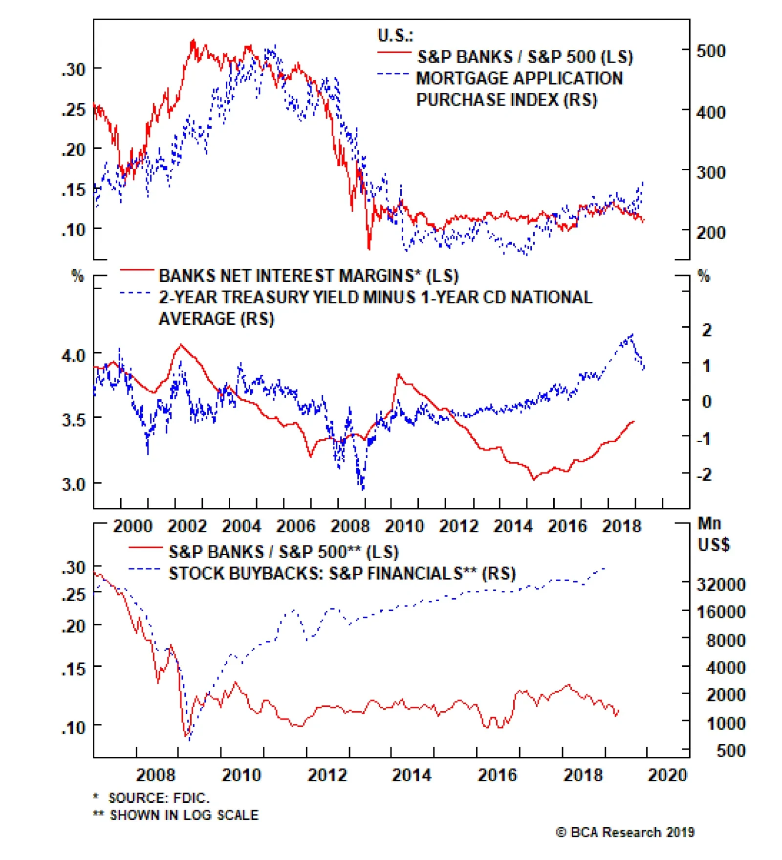
What partially explains the sector’s EPS resilience is net interest margins (NIMs) that just entered their fifth straight year of widening. While this may seem counterintuitive given the inverted/flattening yield curve, banks are repressing depositors by not…
Factors have fallen into place to boost the recently rejigged S&P movies & entertainment index to an above benchmark allocation today. While the index’s 12-month forward EPS took a hit with the NFLX addition in October, 2018 and the forward P/E…
A Kind Of Magic
A Kind Of Magic
Overweight A number of macro factors have fallen into place that have warmed us to the S&P movies & entertainment index. Consumer confidence remains glued to multi-decade highs and there are high odds that the big gulf that has opened up between confidence and relative share prices will narrow via a rise in the latter (top panel). Moreover, a vibrant labor market with payrolls expanding at a healthy clip (second panel), the unemployment rate and unemployment insurance claims at generational lows, all signal that consumers will keep their purse strings loose, especially given rising wages (third panel). More dollars spent on recreation is synonymous with a margin expansion in the S&P movies & entertainment index (bottom panel). This consumer spending backdrop is also conducive to a rise in relative profitability, the opposite of what the sell-side currently expects. Bottom Line: We lifted the S&P movies & entertainment index to overweight on Monday; please see our Weekly Report for more details. The ticker symbols for the stocks in this index are: BLBG: S5MOVI – DIS, NFLX, VIAb.
Highlights Portfolio Strategy Disney’s recent streaming pricing disclosure and a favorable macro backdrop for recreation PCE argue that more gains are in store for the S&P movies & entertainment index. The price of credit, credit quality and credit growth along with equity buybacks all suggest that bank profits will continue to overwhelm. Recent Changes Upgrade the S&P movies & entertainment index to overweight today. Table 1
Mixed Signals
Mixed Signals
Feature Equities continued to defy gravity last week as the earnings season warmed up and did not reveal any “skeletons in the closet”. Lower interest rates single-handedly explain the recent stock market exuberance (Treasury yield shown inverted, Chart 1). In more detail, the Fed’s complete pivot has suppressed the 10-year Treasury yield and last year’s forward multiple drubbing – to the tune of a 30% drawdown – has reversed. Chart 1Lower Yield = Higher Multiple
Lower Yield = Higher Multiple
Lower Yield = Higher Multiple
Chart 2 shows that, year-to-date, the forward multiple has done all the heavy lifting in the SPX and then some, as EPS have actually subtracted from the broad market’s return. In theory, a lower discount rate should boost the multiple and vice versa. Nevertheless, there are good odds that the 10-year Treasury yield has troughed, and BCA’s fixed income strategists continue to expect a selloff in the bond market for the rest of the year. The implication is that equities are becoming fully priced and if profits fail to pick up the baton from the multiple expansion phase, the risk/reward tradeoff is to the downside on a tactical horizon. Meanwhile, there are a number of indicators we track that are still firing warning shots for the overall equity market. Margin debt has stalled and remains 13% below the all-time peak hit last year. Historically, this has been a coincident equity market indicator and a lack of confirmation is troublesome for the overall equity market (bottom panel, Chart 3). Chart 2SPX Return Explained
SPX Return Explained
SPX Return Explained
Chart 3M&A Lull...
M&A Lull...
M&A Lull...
M&A activity has taken a step back, with the total number of deals down 25% from the 2018 zenith (top panel, Chart 3). Similar to margin debt uptake, this is a coincident indicator and the latest weak reading is cause for concern, as it signals that animal spirits are low. With regard to frail sentiment, CEO confidence has taken a beating of late on all fronts. The most recent Business Roundtable and Conference Board CEO surveys reveal that chief executives are a worried bunch. Their views on the overall economic outlook, all industries (including services manufacturing, durable and non-durable), capital outlays, employment, and revenues all remain downbeat, and likely explain the recent M&A lull (Chart 4). On the profit front, last year’s once in a lifetime equity retirement will not repeat this year, warning that artificial EPS growth will weigh on overall profit growth in 2019. Beyond this grim reading on “soft data”, select financial market leading indicators are also not corroborating the euphoric equity market. J.P. Morgan’s EM FX index has petered out recently and both EM and Chinese investable stocks (in U.S. dollar terms) remain well below their early-2018 peaks. Similarly, China-levered U.S. semi equipment stocks are a far cry from their cyclical highs set last year and suggest that some caution is still warranted in the broad equity market (Chart 5). Chart 4...Drop In CEO Confidence...
...Drop In CEO Confidence...
...Drop In CEO Confidence...
Chart 5...And Financial Indicators Still Flashing Red
...And Financial Indicators Still Flashing Red
...And Financial Indicators Still Flashing Red
Finally, on the profit front, last year’s once in a lifetime equity retirement will not repeat this year, warning that artificial EPS growth will weigh on overall profit growth in 2019. In addition, Charts 6A & 6B show that buybacks are already concentrated in a few sectors. Our sense is that this concentration theme will continue this year and likely center around financials as banks will flex their equity retirement muscle.
Chart 6
Chart 6
This week we delve deeper into banks and upgrade a communication services subsector. “A Kind Of Magic” Factors have fallen into place to boost the recently rejigged S&P movies & entertainment index to an above benchmark allocation today. DIS and NFLX dominate this index now comprising roughly 97% of the market cap weight and VIAb is merely the third wheel. The dust has settled from the global media industry M&A frenzy of the past two years, but the push to the cloud via online streaming services suggests that it is only a temporary break. We would not rule out another round of inter- and intra-industry M&A, as content is king once again (Chart 7). Chart 7Rejigged
Rejigged
Rejigged
Recent pricing news of Disney’s streaming service, expected later this year, sent reverberations across the media space as Disney priced it at such a low point in order to grab market share and likely pave the way for future price hikes. While streaming services have been mushrooming, there is space for a number of competitors, signaling that Netflix’s global streaming domination will not come crumbling down all of a sudden. While the index’s 12-month forward EPS took a hit with the NFLX addition in October, 2018 and the forward P/E jumped to the historical mean, this niche communication services subgroup is now clearly a growth index and will continue to command a premium valuation to the broad market (bottom panel, Chart 8). From a macro perspective there are also compelling reasons to warm up to the S&P movies & entertainment index. Consumer confidence remains glued to multi-decade highs and there are high odds that the big gulf that has opened up between confidence and relative share prices will narrow via a rise in the latter (top panel, Chart 8). Moreover, a vibrant labor market with payrolls expanding at a healthy clip (top panel, Chart 9), the unemployment rate and unemployment insurance claims at generational lows, all signal that consumers will keep their purse strings loose, especially given rising wages (third panel, Chart 9). Chart 8Positive Macro...
Positive Macro...
Positive Macro...
Chart 9...Drivers...
...Drivers...
...Drivers...
Tack on the confidence consumers have in residential real estate with house prices expanding both on a year-over-year and on a shorter-term basis (second panel, Chart 9), and the ingredients are in place for an increase in consumer recreation outlays. Disney’s streaming pricing disclosure, a favorable macro backdrop on recreation PCE and sell-side analyst extreme profit pessimism argue that more gains are in store for the S&P movies & entertainment index. Lift to overweight today. One final macro variable that is also on the side of the S&P movies & entertainment index is the ISM non-manufacturing index. Historically, real outlays on recreation activities has moved in lockstep with the ISM services survey and the current message is positive for PCE on recreation (bottom panel, Chart 9). More dollars spent on recreation is synonymous with a margin expansion in the S&P movies & entertainment index (third panel, Chart 8). This consumer spending backdrop is also conducive to a rise in relative profitability, the opposite of what the sell-side currently expects (middle panel, Chart 10). Chart 10...But Analysts Are Not Buying It
...But Analysts Are Not Buying It
...But Analysts Are Not Buying It
Not only are industry EPS slated to trail the SPX by 300bps in the coming year, but also analysts have been vigorously downgrading their EPS estimates weighing on the sector’s net earnings revisions ratio (bottom panel, Chart 10). This is contrarily positive and we would lean against such analyst pessimism. Netting it all out, Disney’s streaming pricing disclosure, a favorable macro backdrop for recreation PCE and sell-side analyst extreme profit pessimism argue that more gains are in store for the S&P movies & entertainment index. Bottom Line: Lift the S&P movies & entertainment index to overweight today. The ticker symbols for the stocks in this index are: BLBG: S5MOVI – DIS, NFLX, VIAb. Bank Update: Primed For A Re-rating By the end of last week most banks reported profits that exceeded expectations and investors breathed a sigh of relief, despite the early-December yield curve inversion and the more recent broadening of the inversion from the 5/3 all the way out to the 10/fed funds rate slope. What partially explains the sector’s EPS resilience is net interest margins (NIMs) that just entered their fifth straight year of widening. While this may seem counterintuitive given the inverted/flattening yield curve, banks are repressing depositors by not passing on higher interest rates on deposits, thus guaranteeing extremely cheap funding. The bottom panel of Chart 11 shows that the 2-year Treasury yield/1-year CD rate slope is steep and it has historically moved in lockstep with bank NIMs. As a reminder, BCA’s bond strategists expect a selloff in the bond market and remain short duration, signaling that bank NIMs will not suffer a setback for the remainder of the year. Beyond the prospects for a further increase in the price of credit, another key source of bank EPS support is equity retirement. Citi explicitly mentioned it this earnings season, and the S&P financials sector buybacks, largely driven by banks, corroborate this anecdote (Chart 12). Chart 11Deciphering Bank Profit Resilience
Deciphering Bank Profit Resilience
Deciphering Bank Profit Resilience
Chart 12New Buyback Kings
New Buyback Kings
New Buyback Kings
In fact, there is a wide gap between this artificial EPS lift and relative share prices that will likely narrow in the coming months via a catch up phase in the latter, particularly if banks pass the Fed’s stringent stress test anew as we expect later this summer. On the credit quality front, bank NPLs remain anchored near cycle lows and tight labor markets suggest that a flare up in delinquencies is a low probability event in the coming year, especially given BCA’s view of no recession (bottom panel, Chart 13). Chargeoffs and souring loans are almost non-existent in all the categories that the Federal Reserve tracks, with the slight exception of credit card loans that are ticking higher, but from an extremely low base (we provide more details below in the risk section, second & third panels, Chart 13). Finally, loan growth has held up very well despite the stock market collapse in Q4/2018 and the massive tightening in financial conditions. While our overall loans & leases and C&I loan models are decelerating, they remain squarely in expansion mode and should continue to underpin bank profitability (second and bottom panel, Chart 14). Chart 13Pristine Credit Quality
Pristine Credit Quality
Pristine Credit Quality
Chart 14Credit Growth Rests On A Solid Foundation
Credit Growth Rests On A Solid Foundation
Credit Growth Rests On A Solid Foundation
Consumer confidence remains sky-high and house prices are also rising at a healthy pace, signaling that mortgage (top panel, Chart 11) and consumer loan origination will remain upbeat (third panel, Chart 14). The price of credit, credit quality, credit growth along with buybacks all suggest that bank profits will continue to overwhelm. Stay overweight the S&P banks index. All of this positive news is already reflected in banks’ return on equity that vaulted higher recently signaling that a re-rating in still-extremely depressed valuations is looming in the coming quarters (Chart 15). Nevertheless, there are two risks to our sanguine S&P banks view that we are closely monitoring. First, our Economic Impulse Indicator remains near the zero line and, coupled with the still downbeat Citi Economic Surprise Index, warn that demand for loans may start softening at the margin (top panel, Chart 16). Chart 15Follow The ROE
Follow The ROE
Follow The ROE
Chart 16Two Risks To Monitor
Two Risks To Monitor
Two Risks To Monitor
Second, while the top 100 largest commercial banks are not showing a deterioration on the credit card delinquency front, the rest of the banks are waving a red flag as delinquencies are already at recessionary levels. This explains why the overall credit card delinquency rate is ticking higher (bottom panel, Chart 16). Netting it all out, the price of credit, credit quality, credit growth along with buybacks all suggest that bank profits will continue to overwhelm. Bottom Line: Stay overweight the S&P banks index. The ticker symbols for the stocks in this index are: BLBG: S5BANKX – JPM, BAC, WFC, C, USB, PNC, BBT, STI, MTB, FITB, FRC, KEY, CFG, RF, HBAN, SIVB, CMA, ZION, PBCT. Anastasios Avgeriou, U.S. Equity Strategist anastasios@bcaresearch.com Current Recommendations Current Trades Size And Style Views Favor value over growth Favor large over small caps
Highlights In China, “helicopter” money and the socialist put are positive for growth in the medium term but will prove harmful for the economy over the long run. In the socialist put scenario, a buy-and-hold strategy is inappropriate for Chinese stocks. The enormous amount of money supply in China is “the sword of Damocles” on the yuan’s exchange rate. A new equity trade: Short Chinese banks / long U.S. banks. Take profits on our short Chinese property developers / long U.S. homebuilders equity position. Feature Last week’s China credit and money data affirmed that Chinese banks have engaged in another round of massive credit and money injection into the economy. In the first quarter alone, aggregate credit rose by RMB 8.5 trillion (US$1.3 trillion). Aggregate credit growth accelerated to 11.6%, well above first-quarter nominal GDP growth of 8% (Chart I-1). This is in spite of numerous pledges by many of China’s top policymakers that they have no plans to resort to “floodgate irrigation” style stimulus, and that credit/money growth will be kept on par with nominal GDP growth. Our credit and fiscal spending impulse has spiked up, pointing to a potential improvement in economic data in the months ahead (Chart I-2). Chart I-1China: No Deleveraging At All
China: No Deleveraging At All
China: No Deleveraging At All
What’s more, there is anecdotal evidence of a revival of housing demand in March, and that property developers have once again commenced bidding up land prices in certain parts of the country. Chart I-2China: Leading Economic Indicators
China: Leading Economic Indicators
China: Leading Economic Indicators
Regarding investment strategy, two weeks ago we put a stop-buy limit on the MSCI EM stock index at 1125. If this index breaks above this level we will turn tactically positive on EM risk assets. There is anecdotal evidence of a revival of housing demand in March, and that property developers have once again commenced bidding up land prices in certain parts of the country. Below are the pros and cons of upgrading the EM outlook at the current juncture. Pros The credit impulse in China leads both the mainland’s business cycle and the global manufacturing cycle by an average of nine months. Given its bottom was in December 2018, the trough in the mainland business and global industrial cycles should have been around August 2019 (Chart I-3). Chart I-3Global Manufacturing PMI Has Not Led Global Stocks
Global Manufacturing PMI Has Not Led Global Stocks
Global Manufacturing PMI Has Not Led Global Stocks
Our assessment has been that the bottom in EM equities that occurred in late December 2018 was too early. Our basis has been that the Chinese and global manufacturing cycles were not likely to bottom before August 2019, according to their previous relationship with China’s credit and fiscal spending impulse. Consequently, we have been expecting China-related plays in financial markets to experience a setback before a more sustainable buying opportunity emerged. However, as China’s credit recovery is now gaining momentum and infrastructure spending financed by local government special bonds is accelerating, the window of downside risk for share prices is narrowing. There have been no recent major stimulus measures directed at China’s property market, but it appears banks have substantially boosted mortgage loan origination and their financing of property developers by loosening lending standards. Easy financing for both homebuyers and property developers makes a revival in real estate more likely. The property market and construction activity are critical to the mainland’s business cycle. If green shoots in the property market multiply, the odds of an overall growth recovery will rise substantially. Finally, if the EM equity index breaks above our stop-buy limit, it would clear an important technical resistance level, confirming the sustainability of this rally (Chart I-4). Cons EM corporate profit growth is contracting in U.S. dollar terms, and the pace of contraction will deepen into the end of this year. This assessment is based on the previous decline in China’s credit impulse. The latter suggests a bottom in EM EPS in December 2019 (Chart I-5). It is still unclear whether EM share prices can ignore this profit contraction and advance through the entire year without major bumps. Chart I-4EM Stocks Are Facing Technical Resistance
EM Stocks Are Facing Technical Resistance
EM Stocks Are Facing Technical Resistance
Chart I-5EM Profits Will Continue Contracting
EM Profits Will Continue Contracting
EM Profits Will Continue Contracting
As of March, Chinese domestic smartphone sales (Chart I-6), as well as Korean, Japanese, Singaporean and Taiwanese exports to the mainland, are all still shrinking at double-digit rates from a year ago (Chart I-7). Chart I-6China: Consumer Spending In March Was Still Weak
China: Consumer Spending In March Was Still Weak
China: Consumer Spending In March Was Still Weak
Chart I-7Exports To China Contracted At A Double-Digit Rate In March
Exports To China Contracted At A Double-Digit Rate In March
Exports To China Contracted At A Double-Digit Rate In March
Our indicators for marginal propensity to consume for Chinese households and companies remain in a downtrend as of March (Chart I-8). An upturn in these indicators is needed to validate that the fiscal and credit stimulus is accompanied by a greater multiplier effect. Chart I-8China: Marginal Propensity To Spend By Consumers And Enterprises
China: Marginal Propensity To Spend By Consumers And Enterprises
China: Marginal Propensity To Spend By Consumers And Enterprises
Chart I-9Low Vol Precedes A ##br##Regime Shift
Low Vol Precedes A Regime Shift
Low Vol Precedes A Regime Shift
Finally, financial markets’ aggregate volatility is extremely low (Chart I-9). This is especially true for the currency markets (Chart I-10, top panel). Typically, this is a sign of both complacency and a forthcoming major regime shift in financial markets. Chart I-10The Dollar Is Poised To Break Out Or Break Down
The Dollar Is Poised To Break Out Or Break Down
The Dollar Is Poised To Break Out Or Break Down
We would be much more comfortable upgrading the EM outlook if the broad trade-weighted U.S. dollar broke down, corroborating the improvement in global/EM growth. So far, the greenback has been moving sideways along its 200-day moving average (Chart I-10, bottom panel). If the dollar breaks out, it would confirm the negative outlook for EM. Investors should closely watch foreign exchange markets and adjust their investment strategy accordingly. “Helicopter” Money Forever = A Socialist Put China’s forthcoming recovery is good news for financial markets. Nonetheless, the long-term outlook for the Chinese economy is deteriorating because the credit and money, as well as property bubbles, will keep expanding. First, China holds the world record with respect to corporate sector leverage (Chart I-11). Second, households in China are more leveraged than those in the U.S. (Chart I-12). Given that borrowing costs for households are higher in China than in the U.S., interest payments take up a larger share of Chinese households’ disposable income. Chart I-11Corporate Sector Leverage: China Holds The World Record
Corporate Sector Leverage: China Holds The World Record
Corporate Sector Leverage: China Holds The World Record
Chart I-12Chinese Households Are More Leveraged Than Americans
Chinese Households Are More Leveraged Than Americans
Chinese Households Are More Leveraged Than Americans
Third, contrary to popular belief, banks do not channel savings/deposits into credit. They create deposits/money supply when they lend to or buy assets from non-banks. Money supply is the sum of deposits and cash in circulation. Financial markets’ aggregate volatility is extremely low. This is especially true for the currency markets. In a nutshell, credit and money excesses in China are not natural outcomes of the nation’s high savings rate but are the result of reckless credit origination by China’s commercial banks. We have elaborated on this point in a series of reports we have written on credit, money and savings.1 When commercial banks originate a loan, they create new money and new purchasing power “out of thin air.” Nobody needs to save for a bank to make a loan or buy assets. Consequently, new purchasing power for goods and services boosts demand in the real economy and inflates asset prices. Chinese banks have literally been dropping “helicopter” money over the past 10 years. Since January 2009 – the onset of the country’s massive credit binge – banks have created 165 trillion yuan ($25 trillion) of new broad money, based on our measure of M3 broad money. This is triple of the $8.3 trillion broad money supply created in the U.S., the euro area and Japan combined during the same period (Chart I-13, top panel). Chart I-13Helicopter Money In China
Helicopter Money In China
Helicopter Money In China
China’s broad (M3) money supply now stands at 220 trillion yuan, equivalent to $32.5 trillion. What’s astonishing is that Chinese broad money is larger than the sum of broad money in both the U.S. and the euro area (i.e. all outstanding U.S. dollars and euros in the world combined) (Chart I-13, bottom panel). Yet China’s nominal GDP is only 38% of U.S. and euro area’s GDP combined. Credit and money excesses in China are not natural outcomes of the nation’s high savings rate but are the result of reckless credit origination by China’s commercial banks. In a market-based economy, the constraints on banks doing “helicopter” money are bank shareholders, regulators and central banks. Bank shareholders are the primary and largest losers from credit booms because they are highly exposed to non-performing loans. That is why they should be the first to cut credit flows to the economy when they sense non-payments on loans could rise. In China, neither bank shareholders nor bank regulators or the People’s Bank of China have prevented banks from expanding credit/money. Moreover, the authorities have not forced banks to acknowledge non-performing loans. This scenario – whereby banks expand credit without taking responsibility for collecting the loans – only occurs in a socialist system. This is the ultimate socialist put. China’s Potential Growth Roadmaps We have been arguing for several years that China is facing a historic choice between: (1) Moving toward a more market-based economic system that entails making creditors and borrowers take responsibility for their lending/borrowing and investment decisions. If lenders and borrowers are made explicitly accountable for their business/financial decisions, then credit flows will decelerate considerably, bankruptcies will mushroom and a period of deleveraging will be inevitable. However, the quality of capital allocation will improve, enhancing the country’s productivity and potential growth in the long run (Chart I-14).
Chart I-14
This is a scenario of medium-term pain, long-term gain. The recent ramp-up in credit growth does not suggest the authorities are willing to embrace this option. Chart I-15China: Structural Growth Tailwinds Have Dissipated
China: Structural Growth Tailwinds Have Dissipated
China: Structural Growth Tailwinds Have Dissipated
(2) “Helicopter money” and a socialist put scenario entails lower potential GDP growth and rising inflation. If China continues opting to keep the socialist put in place, its potential growth rate – which is equivalent to the sum of growth rates in productivity and the labor force – will drop significantly. In the long run, this socialist put discourages innovation and breeds capital misallocation, reducing productivity growth. In fact, the industrialization ratio is 85% – not 60% as many contend(Chart I-15, top panel). Further, China’s labor force growth has stalled and will be mildly negative in the years to come (Chart I-15, bottom panel). Together, these circumstances point to a slower potential growth rate. Meanwhile, recurring stimulus via “helicopter” money will create mini-cycles around a falling potential growth rate (Chart I-16). Below we discuss the investment strategy this scenario entails.
Chart I-16
Implications Of The Socialist Put For The Currency… Slowing productivity and rampant money/purchasing power creation ultimately lead to rising inflation. Higher inflation and low interest rates - required to sustain an ever-rising debt burden - are a recipe for currency depreciation. Chinese households and businesses are eager to diversify their copious and mushrooming renminbi deposits into foreign currencies and assets. The PBoC’s foreign exchange reserves of $3 trillion are equal to only 10% of the amount of yuan deposits and cash in circulation. Foreign exchange reserves’ coverage of local currency money supply is much higher in many other EM countries, including Brazil and Russia (Chart I-17). Chart I-17China's FX Reserves Cover Less Local Currency Deposits Than Peers
China's FX Reserves Cover Less Local Currency Deposits Than Peers
China's FX Reserves Cover Less Local Currency Deposits Than Peers
The enormous amount of money supply/deposits in China is “the sword of Damocles” on the yuan’s exchange rate in the long run. It is therefore inconceivable that China can fully open its capital account in the foreseeable future. On the contrary, capital account restrictions will be further tightened. Plus, the current account will become much more regulated so that there is no leakage of capital via trade transactions – such as over-invoicing of imports or under-invoicing of exports. The inability to repatriate capital when needed and structural RMB depreciation are the key risks to long-term investors in China’s onshore capital markets. …And Chinese Stocks In the socialist put scenario, a buy-and-hold strategy is inappropriate for Chinese stocks: Investors should attempt to play the resultant mini-cycles (Chart I-16). In reality, however, economic and especially financial market mini-cycles are not symmetric, and investors can make money only if they time them properly. In fact, this decade Chinese share prices – both in absolute terms and relative to global stocks – have experience wild swings (Chart I-18). Chart I-18Chinese Stocks Are Following Mini-Cycles
Chinese Stocks Are Following Mini-Cycles
Chinese Stocks Are Following Mini-Cycles
Concerning the current outlook for Chinese investable stocks, our take is as follows: On absolute performance, we will turn positive on Chinese share prices if our stop-buy on EM equities is triggered, as per our discussion above. As for their relative performance within EM and global equity portfolios, simply because the stimulus originates in China does not warrant an overweight position in Chinese stocks. The primary losers from credit bubbles are banks and other financial companies. The basis is that they will carry the burden of potential rising non-performing loans unless the government bails them out by purchasing bad assets at par. The latter has not been the case so far this decade. Hence, an underweight position in Chinese banks/financials is currently warranted. Furthermore, the large debtors in the non-financial corporate sector should also be underweighted. When a company increases its debt but its new investments produce little net new cash flow, its equity value declines. It is difficult to find so many high-return investment projects, especially in a slowing economy. Therefore, another round of considerable capital misallocation is currently underway, and shareholders of the companies that are undertaking these investments will end up losing. In a socialist system, shareholders typically do not make money. They lose money. This is the rationale to underweight Chinese stocks within both EM and global equity portfolios. Yet, there is a caveat: This framework may not be pertinent to the two largest companies in the Chinese investable equity index Ali-Baba and Tencent - each of which accounts for 13% of the index. These two companies score well on the above issues but face different non-macro hazards including regulatory, business model and other risks. Weighing the pros and cons, we recommend maintaining a market weight allocation in Chinese equities within an EM equity portfolio. This is the view of BCA’s Emerging Markets Strategy team, which differs from the recommendations of other BCA services that are currently advocating an overweight position in Chinese stocks within a global equity portfolio. A New Trade: Short Chinese Bank / Long U.S. Bank Stocks Chinese banks’ equity value will erode as they once again expand their balance sheets aggressively, as per our discussion above. Chinese banks’ EPS have been and will continue to be diluted by the need to raise more capital. U.S. banks are better capitalized, and their asset quality is much better. Since the 2007-08 credit crisis, they have been much more prudent in expanding their balance sheets. U.S. bank stocks have underperformed the S&P 500 index since August 2018 because of falling U.S. interest rate expectations. The odds are high that U.S. bond yields are bottoming and will rise considerably – because the drag from China’s slowdown on the global economy is diminishing. This will help U.S. bank stocks. Although Chinese bank stocks optically appear undervalued, they are “cheap” for a reason. The fact that they have been “cheap” since 2011 and have failed to re-rate confirms that they suffer from chronic problems that have not been addressed yet (Chart I-19). Finally, their relative performance is facing a major resistance level, and will likely relapse (Chart I-20). Chart I-19Chinese Banks Are Cheap##br## For A Reason
Chinese Banks Are Cheap For A Reason
Chinese Banks Are Cheap For A Reason
Chart I-20A New Trade: Short Chinese Banks / Long U.S. Banks
A New Trade: Short Chinese Banks / Long U.S. Banks
A New Trade: Short Chinese Banks / Long U.S. Banks
Take Profits On Short Chinese Property Developers / Long U.S. Homebuilders Position “Helicopter” money might be temporary positive for mainland property developers. In the meantime, share prices of U.S. homebuilders will be hurt due to rising U.S. bond yields. We are closing this position to protect profits. This recommendation has produced a 90% gain since its initiation on March 6, 2012. Arthur Budaghyan Chief Emerging Markets Strategist arthurb@bcaresearch.com Footnotes 1 Please see Emerging Markets Strategy Special Report "Misconceptions About China's Credit Excesses," dated October 26, 2016 and Emerging Markets Strategy Special Report "The True Meaning Of China's Great 'Savings' Wall," dated December 20, 2017, available at ems.bcaresearch.com Equity Recommendations Fixed-Income, Credit And Currency Recommendations
Going long Treasurys/short bunds has been a “widow maker trade” for the past decade. Similarly trying to short the SPX has also proven impossible since March 2009 as stocks have been climbing the proverbial “wall of worry” and risen roughly 2,200 points or more than fourfold. While the correlation between the bond spread and the SPX may be spurious, it has been ongoing in both rising and falling markets for the better part of the past 25 years. The rationale would be that higher relative yields attract capital to U.S. shores and vice versa and some of that capital gets parked inevitably in U.S. stocks. Another reason behind the past decade’s widening of the bond spread is that U.S. return on capital (ROC) has been significantly higher than euro area ROC. Currently, there is tentative evidence that this bond spread has crested and at least from a tactical perspective some caution is warranted in the SPX.
Takeout Premiums Are Back In E&P
Takeout Premiums Are Back In E&P

The relative resilience of consumer discretionary stocks has been puzzling over the past two years. Typically, rising interest rates prelude a period of underperformance in these highly rate sensitive stocks (fed funds rate shown inverted, bottom panel) but…