Sectors

Overweight This week and last have witnessed the cavalcade of U.S. banks reporting earnings. A headwind in this earnings season has been the transitory impacts of volatility, which was suppressed in Q1, on fixed income and equity trading earnings that have torqued earnings up and down. While each firm has its own idiosyncrasies and exposure to trading gains or losses, a common theme has been the expansion of net interest margins (NIMs), the measure of profit from the core lending activity, despite the 10-year yield falling throughout the first quarter. In fact, this theme is not new as NIMs have been expanding since bottoming in early-2015, regardless of the ebbs and flows of rates. One key reason for wide NIMs is that banks have not been passing higher rates on to the consumer, despite the Fed’s tightening cycle, thus cementing cheap deposit funding. In the past, NIMs have been reliable indicators of banks’ relative performance but the GFC changed that. The radioactive nature of the sector post-GFC meant that banks did not respond to the recovery of NIMs to pre-crisis levels. However, times have changed; U.S. banks are exceptionally well capitalized and the current divergence between resilient and rising NIMs and flat bank relative performance has opened an exceptional buying opportunity. Bottom Line: Stay overweight banks (and remove the downgrade alert) and stay tuned for our April 22nd Weekly Report where we will be offering a more fulsome update on the sector.
Net Interest Margins Are Exceptionally Resilient
Net Interest Margins Are Exceptionally Resilient
Overweight
Buy Into Managed Health Care Weakness
Buy Into Managed Health Care Weakness
A little over a year ago we moved to the sidelines in the S&P managed health care index, crystalizing significant relative profits of 28% for our U.S. equity portfolio. Now the time has come anew to explore this niche health care index from the long side and yesterday we moved to an overweight position. Leading indicators of health care insurance profit margins are currently flashing green. Not only are medical costs melting including drug price inflation (second & bottom panels), but also industry cost structures are kept at bay with wages climbing below a 2%/annum rate growth and trailing overall wage inflation (third panel). On the demand front, as the economy is running at full employment, with unemployment insurance claims probing 60-year lows and with wages representing a headache for small and medium business owners, enrollment should stay healthy. Most importantly, the combination of decreasing medical cost inflation and a healthy overall labor market heralds a steep decline in the industry’s medical loss ratio. While risks of a potential “Medicare For All” plan remain nebulous and have clearly weighed on industry stock prices, melting medical cost inflation, BCA’s rising interest rate expectations along with an economy running at full steam, all suggest that managed health care margins and profits will overwhelm in the coming quarters. Bottom Line: We boosted the S&P managed health care index to overweight yesterday; please see Monday’s Weekly Report for more details. The ticker symbols for the stocks in this index are: BLBG: S5MANH - UNH, ANTH, HUM, CNC, WCG.
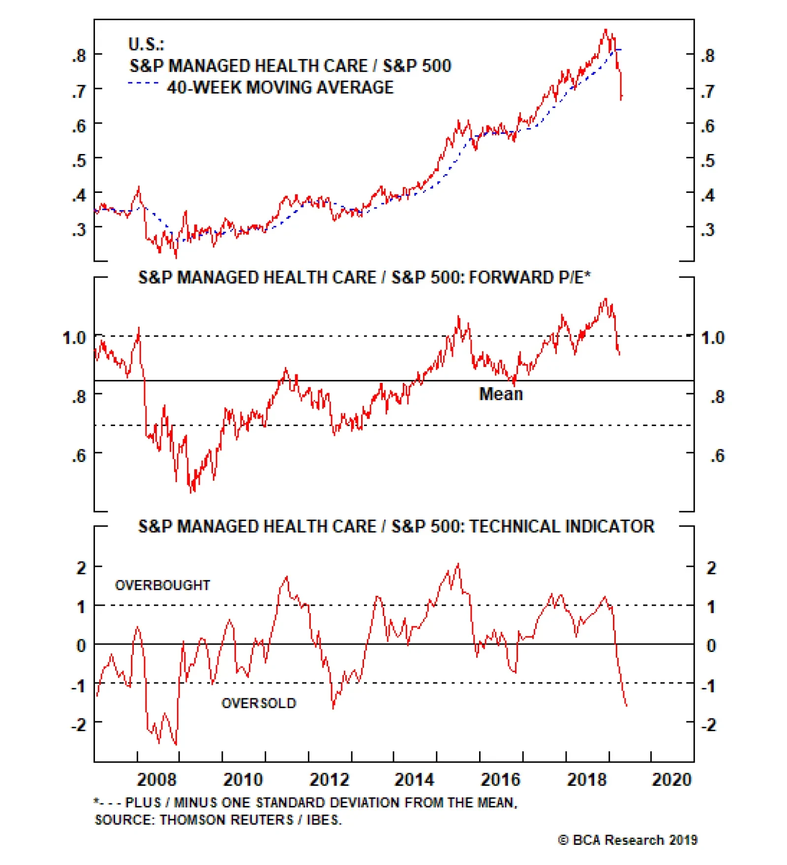
The inter- and intra-industry M&A fever has died down from mid-2018 and the rising momentum of a “Medicare For All” bill has weighed negatively on HMO sentiment. With regard to the latter, our geopolitical strategists believe that a passage is possible. …
Highlights Portfolio Strategy Yield curve dynamics, higher oil prices, recovering balance sheets, and compelling valuations and technicals all suggest that energy stocks will burst higher in the coming months. Melting medical cost inflation, BCA’s rising interest rate expectations along with an economy running at full steam, all suggest that managed health care margins and profits will overwhelm in the coming quarters. Recent Changes Upgrade the S&P managed health care index to overweight today. Add the S&P energy index to the high-conviction overweight list today. Table 1
Show Me The Profits
Show Me The Profits
Feature On the eve of earnings season, the SPX ended last week higher as bank profits delivered and allayed fears of recession. All-time absolute highs in the S&P tech sector and in the Philly SOX index suggest that global growth will likely reaccelerate in the back half of the year, vaulting the broad market to new highs. In addition, the suppressed Treasury term premium1 signals that the path of least resistance for equities is higher on a cyclical time horizon (term premium shown inverted, Chart 1). Chart 1All Clear...
All Clear...
All Clear...
Nevertheless, some caution is still warranted from a tactical perspective. Since March 4 when we first turned short-term cautious on the broad equity market,2 the SPX has moved roughly 100 points both ways. Internal market moves, financial conditions, fund flows, complacency and the current economic backdrop all signal that stocks are not out of the woods yet. Namely, the S&P high beta versus the S&P low volatility tilt has failed to confirm the slingshot in the SPX (Chart 2). Similar to the small cap underperformance, mega cap tech is trouncing small cap tech stocks (Chart 3). Not only do large cap technology stocks have pristine balance sheets, but they also have earnings. In contrast, from the 89 S&P 600 tech constituents 54 have no forward profits. The weak over strong balance sheet underperformance is emitting the same signal (top panel, Chart 3). Chart 2...But Some...
...But Some...
...But Some...
Chart 3...Caution...
...Caution...
...Caution...
The bond market is also sending a warning shot. High yield corporate bonds are underperforming long-dated Treasurys (middle panel, Chart 2). And, the junk bond option adjusted spread has not fallen to the 2018 lows, let alone all-time lows (not shown). While a lot has been said on easier financial conditions, they have yet to return to the early-2018 lows. In fact, similar to the non-confirmation of the all-time SPX highs in late-September, the GS financial conditions index (FCI) is tracing a higher low, warning that equities have room to fall (FCI shown inverted, bottom panel, Chart 2). Mutual fund flows on all equity related products are contracting on a net sales basis. Historically, fund flows and equity returns are joined at the hip and the current divergence suggests that equity prices will likely succumb to deficient demand (top panel, Chart 4). Chart 4...Is Warranted
...Is Warranted
...Is Warranted
On the economic front, last Wednesday we highlighted in an Insight Report, that lumber – a hyper sensitive economic indicator – failed to corroborate the recent equity market euphoria. The weak Citi Economic Surprise Index, also warns that the economic data has yet to turn the corner and should weigh on equities (bottom panel, Chart 4). What ties everything together is SPX profits. The news on this front is mixed, at least for the next little while: EPS will most likely contract in the first half of the year, but equity investors are looking through this earnings recession. Last year’s U.S. dollar appreciation will dent both revenues and EPS, and Q1/2019 is the first quarter where such greenback strength will subtract from corporate P&Ls (Chart 5). Chart 5Dollar Trouble?
Dollar Trouble?
Dollar Trouble?
What worries us most is the sectorial concentration of 2019 profit growth in one sector, financials. Another source of concern is the heavyweight tech sector’s negative profit path for calendar 2019. Such sudden internal profit moves both in magnitude and in a short time frame are far from reassuring, especially given that overall profit estimates are still trimmed. Chart 6A depicts the current sector profit contribution to 2019 growth, and compares it with the January 22nd iteration (Chart 6B). What a difference three months make.
Chart 6
Chart 6
In sum, internal equity and bond market dynamics, financial conditions, the economic soft-patch and the looming profit recession all signal that short-term equity market caution is still warranted. This week we upgrade a health care subsector and reiterate our bullish stance on a deep cyclical sector. Catch Up Phase Looms For Energy Stocks Last week we broadened out our research on the yield curve (YC) inversion beyond the S&P 500 to the GICS1 sectors.3 As a reminder, the SPX peaks following the yield curve inversion and on average the S&P energy sector performs the best from the time the YC inverts until the S&P 500 peters out (please refer to Table 3 from the April 8, Special Report). While every cycle is different, if history at least rhymes, deep cyclical energy stocks will likely outperform as the SPX eventually breaks out to fresh all-time highs. Already, year-to-date the S&P energy sector is the third best performing sector, besting the SPX by over 200bps. More gains are in store, especially given the big dichotomy between the oil price recovery and the relative share price ratio (Chart 7). What is perplexing is the ingrained sell-side analyst pessimism (Chart 6A) and lack of belief that oil prices will remain near current levels or even continue their ascent as our sister Commodity & Energy Strategy (CES) service publication predicts. Not only are EPS forecast to contract in every quarter this year, or 10% year-over-year according to IBES, but also revenues are slated to fall in every quarter in 2019. We would lean against this extreme analyst bearishness. While the $3.5/bbl backwardation in WTI oil futures prices one year out, and more than twice that 24-months out, underpins Wall Street’s gloomy energy sector outlook, U.S. oil extraction productivity reinforces sector profits. As U.S. crude oil production hits new all-time highs this is extracted by fewer oil rigs (bottom panel, Chart 7). If BCA’s CES constructive oil price expectation pans out, then energy stocks will easily surpass the profit and revenue bar that analysts have set extremely low for the sector. Delivering on the profit front will likely serve as a catalyst to rerate these deep cyclical stocks higher (Chart 8) and thus a catch up phase looms for energy stocks, at least up to the current level of WTI crude oil prices (top panel, Chart 7). Chart 7Catch Up
Catch Up
Catch Up
Chart 8Bombed Out Valuation
Bombed Out Valuation
Bombed Out Valuation
Granted, the U.S. dollar is a key determinant of oil prices and if BCA’s view proves accurate that global growth will return in the back half of the year (second panel, Chart 9), that is synonymous with a depreciating greenback, which in turn is bullish the broad commodity complex in general and oil prices (and thus energy stocks) in particular (middle panel, Chart 7). As a reminder, oil prices are an excellent global growth barometer, similar to their sibling Dr. Copper. Recovering global growth will boost energy stocks in an additional way: via a favorable supply/demand crude oil balance. Not only is OPEC rebalancing the global oil market through a reduction on the supply front, but a trio of potential supply shocks from Iranian sanctions, Venezuelan infrastructure and Libyan conflict are providing price support. Further, global growth has historically been tightly correlated with rising non-OECD oil demand (Chart 10). Chart 9Global Growth Beneficiary
Global Growth Beneficiary
Global Growth Beneficiary
Chart 10Favorable Supply/Demand Dynamics
Favorable Supply/Demand Dynamics
Favorable Supply/Demand Dynamics
Meanwhile, the broad energy sector is still licking its wounds from the late-2015/early-2016 manufacturing recession and is stabilizing debt and increasing EBITDA (fifth panel, Chart 11), thus the net debt/EBITDA ratio for the index has collapsed from over 11 to around 2, a level similar to the broad market (second panel, Chart 11). Interest coverage (EBIT/interest expense) is also renormalizing higher and is no longer sending a default warning for the energy space as a whole (third panel, Chart 11). The junk energy bond market corroborates/reflects this balance sheet improvement and is no longer flashing red (bottom panel, Chart 9). Finally, bombed out technical conditions are contrarily positive, and such extreme negative readings have marked the start of playable and sizable relative outperformance periods (Chart 12). Chart 11No Red Flags
No Red Flags
No Red Flags
Chart 12Contrary Alert: Depressed Technicals
Contrary Alert: Depressed Technicals
Contrary Alert: Depressed Technicals
Netting it all out, YC dynamics, higher oil prices on the back of rising global growth and a favorable supply/demand crude oil backdrop, recovering balance sheets, and compelling valuations and technicals suggest that energy stocks will burst higher in the coming months. Bottom Line: We reiterate our above benchmark recommendation in the S&P energy sector and today we are adding it to our high-conviction overweight list. Buy Into Managed Health Care Weakness A little over a year ago we moved to the sidelines in the S&P managed health care index, crystalizing significant relative profits of 28% for our U.S. equity portfolio.4 Now the time has come anew to explore this niche health care index from the long side. While we left some money on the table since our late-May 2018 move, relative share prices have come full circle, valuations have fallen roughly 18% from the late-2018 peak and analysts’ euphoria has been reined in (Chart 13). Chart 13Reset
Reset
Reset
The inter- and intra-industry M&A fever has died down from mid-2018 and the rising momentum of a “Medicare For All” bill has weighed negatively on HMO sentiment. With regard to the latter, our geopolitical strategists believe that passage is possible. If the Democrats can unseat an incumbent president in 2020, they will also likely take the Senate and keep the House. This means they will be in the position to pass a major piece of legislation. While Trump is favored to win, barring a recession, the risk of both a Democratic sweep and a push for “Medicare for All” could be as high as 27%, and this would have a dramatic impact on the health care sector.5 Tack on the near 90bps drop in the 10-year U.S. Treasury yield since the November 2018 peak, and factors have fallen into place for a bearish raid in this pure play health insurance index. Thin managed health care margins and profits move in close lockstep with interest rates as roughly 10% of the industry’s operating income is tied to “investment income”. In other words, as insurers receive the premia they typically invest it in Treasurys and that explains the high EPS and margin sensitivity on interest rate moves (Chart 14). While at first sight, the outlook for profits appears grim, BCA’s bond strategists expect a selloff in the bond market to materialize in the back half of the year simultaneously with a pick-up in global growth which will prove a tonic to both margins and EPS. In addition, leading indicators of heath care insurance profit margins are flashing green. Not only are medical costs melting including drug price inflation (second & bottom panels, Chart 15), but also industry cost structures are kept at bay with wages climbing below a 2%/annum rate growth and trailing overall wage inflation (third panel, Chart 15). Chart 14Overdone
Overdone
Overdone
Chart 15Melting Cost Inflation
Melting Cost Inflation
Melting Cost Inflation
On the demand front, as the economy is running at full employment, with unemployment insurance claims probing 60-year lows and with wages representing a headache for small and medium business owners, enrollment should stay healthy (Chart 16). Most importantly, the combination of decreasing medical cost inflation and a healthy overall labor market herald a steep decline in the industry’s medical loss ratio. All of this is unambiguously bullish for margins and profits. Finally, relative valuations and technicals have both corrected from previously stretched levels and offer a compelling entry point for fresh capital (Chart 17). Chart 16Full Employment Is Bullish
Full Employment Is Bullish
Full Employment Is Bullish
Chart 17Unloved And Under-Owned
Unloved And Under-Owned
Unloved And Under-Owned
Netting it all out, despite the risks that “Medicare For All” pose, melting medical cost inflation, BCA’s rising interest rate expectations along with an economy running at full steam, all suggest that managed health care margins and profits will overwhelm in the coming quarters. Bottom Line: Boost the S&P managed health care index to overweight today. The ticker symbols for the stocks in this index are: BLBG: S5MANH - UNH, ANTH, HUM, CNC, WCG. Anastasios Avgeriou, U.S. Equity Strategist anastasios@bcaresearch.com Footnotes 1 According to the NY Fed: “Treasury yields can be decomposed into two components: expectations of the future path of short-term Treasury yields and the Treasury term premium. The term premium is the compensation that investors require for bearing the risk that short-term Treasury yields do not evolve as they expected.” https://libertystreeteconomics.newyorkfed.org/2014/05/treasury-term-premia-1961-present.html 2 Please see BCA U.S. Equity Strategy Weekly Report, “The Good, The Bad And The Ugly” dated March 4, 2019, available at uses.bcaresearch.com. 3 Please see BCA U.S. Equity Strategy Special Report, “10 Most FAQs From The Road” dated April 8, 2019, available at uses.bcaresearch.com. 4 Please see BCA U.S. Equity Strategy Report, “Seeing The Light” dated May 29, 2018, available at uses.bcaresearch.com. 5 If there is a 60% chance the Democrats nominate a left-wing candidate, and a 45% chance they win the election, then there is a 27% chance that they are in a position to push for “Medicare for All” with fair odds of passage. Everything will depend on the specific outcomes of the Democratic primary, presidential campaign, general election, post-election government policy priorities, and congressional passage. Stay tuned as in the coming months we will be publishing a Special Report on “Medicare For All” and health care sector implications co-authored with our sister Geopolitical Strategy service. Current Recommendations Current Trades Size And Style Views Favor value over growth Favor large over small caps
Consumer Discretionary Stocks Are Too Expensive
Consumer Discretionary Stocks Are Too Expensive
Underweight The relative resilience of consumer discretionary stocks has been puzzling over the past two years. Typically, rising interest rates prelude a period of underperformance in these highly rate sensitive stocks (fed funds rate shown inverted, bottom panel) but the divergence has grown exceptionally wide. Regardless, we believe our negative thesis is sound. Consumer confidence is near record highs (though it has started to decline), which appears to be driving the relative share price gains but consumer credit has not followed suit (second panel), implying consumers are not backing up their positivity with their wallets. The sell-side too appears to discount soaring consumer confidence as earnings estimates have not kept pace with share prices, driving sector valuations to a 25% premium to the broad market and well above sustainable average levels (third panel). However, this is partially explained by Amazon, which carries roughly 30% weight in the S&P consumer discretionary index but only 12.5% of operating profit, and its exceptional outperformance since the beginning of 2018. Nonetheless, we expect retail sales to follow the opposite path of interest rates, as it always has in past cycles, and a derating to occur. Bottom Line: We reiterate our below-benchmark allocation rating on the S&P consumer discretionary index as valuations have grown excessive and BCA’s view remains that interest rates are near their trough.
Airline Demand Is Soaring
Airline Demand Is Soaring
Overweight With a pickup in oil prices in general and jet fuel prices in particular, a logical inference would be a decline in airlines’ earnings power (second panel). However, the revenue side of the equation has proven much more resilient than anticipated, a result of industry discipline reflected in constrained capacity growth combined with elevated consumer confidence. The upshot is that consumers have been willing to part with greater shares of their wallets in order to fly (third panel). Much of this is reflected in Delta’s results yesterday. The company lifted their full-year guidance on the back of outstanding customer demand driving unit revenues higher, combined with single-digit capacity growth. While it is worth cautioning that DAL does not face the same 737 MAX grounding issues as peers LUV, UAL and AAL, we believe the exceptional fare environment is a tide that lifts all boats. Accordingly, we expect earnings in the S&P airlines index to continue to significantly outpace the broad market (bottom panel), particularly once the transitory 737 MAX grounding issue is resolved. Stay overweight. The ticker symbols for the stocks in this index are: BLBG: S5AIRL - DAL, LUV, UAL, AAL and ALK.
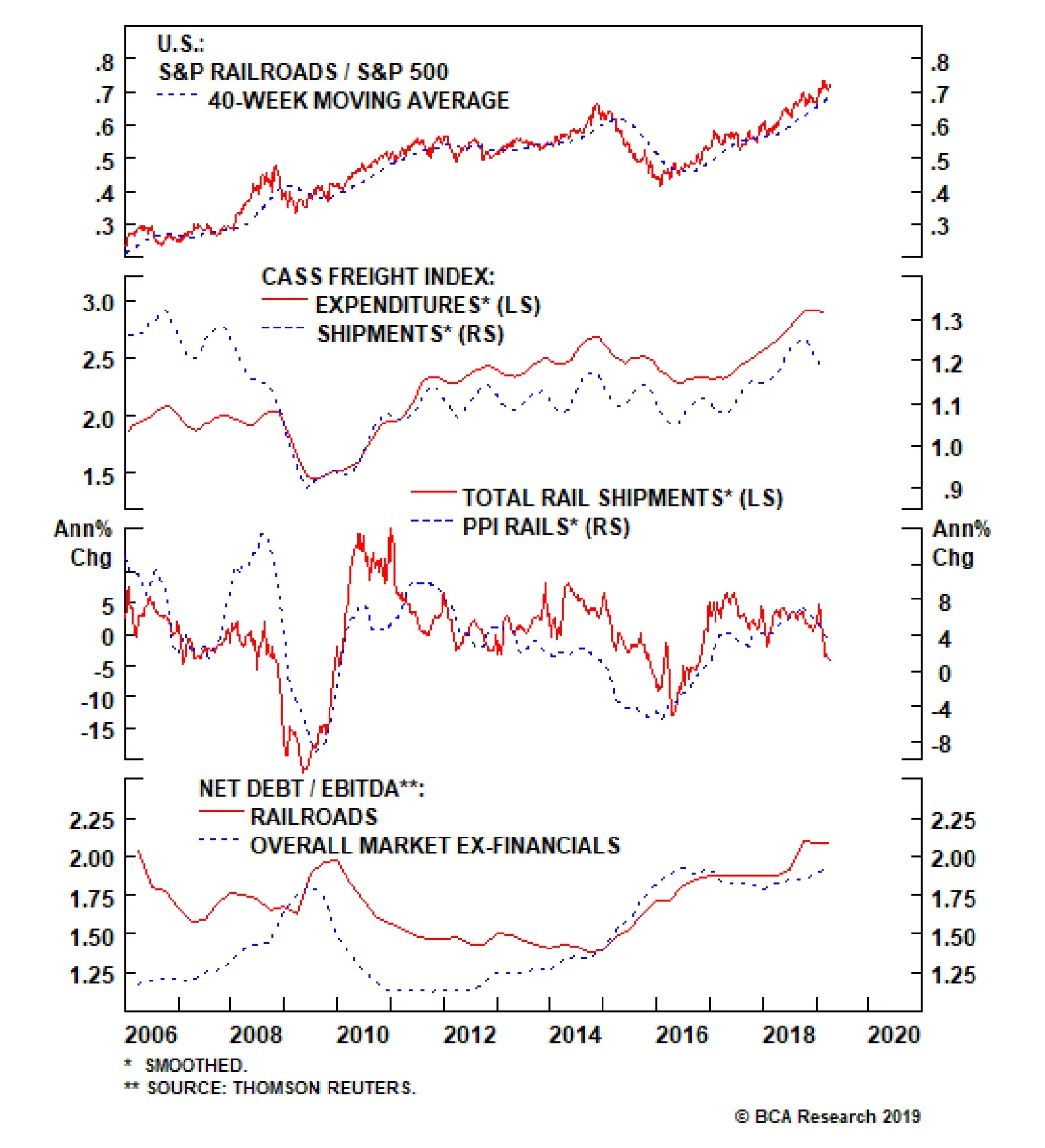
Last week’s release of traffic data showed further deterioration in freight volumes, the fundamental driver of pricing power, confirming our bearish thesis. Only four of the 20 commodity categories tracked by the Association of American Railroads (AAR) saw…
Rail Shipments Are Still Falling
Rail Shipments Are Still Falling
Underweight We downgraded the S&P railroads index to underweight last month based on falling rail traffic leading railroad pricing power down from its recent highs. Last week’s release of traffic data showed further deterioration in volumes, the fundamental driver of pricing power, confirming our bearish thesis. Only four of the 20 commodity categories tracked by the Association of American Railroads (AAR) saw volumes increase last month and virtually all of this was petroleum products which itself is likely only a temporary gain, owing to easing in pipeline bottlenecks later this year. Overall traffic fell a stunning 5.2% from the same period last year (third panel). The Cass Freight Shipments Index too has recently rolled over, a likely precursor to a fall in the Expenditures component of the index, and predicting that railroad pricing challenges are in the early stages (second panel). Meanwhile, sector leverage ratios are at their highest level in a decade as railroads have retooled their capital structure to increase buybacks at the expense of the balance sheet, adding a new level of risk to the industry (bottom panel). Bottom Line: Valuations in the S&P railroads index have overstated earnings power and understated equity risk premia; stay underweight. The ticker symbols for the stocks in this index are: BLBG: S5RAIL - UNP, CSX, NSC, KSU.
Lumber is a hyper-sensitive variable that has historically moved in lockstep with the SPX, its momentum (bottom panel) and of course EPS. Lumber’s leading properties are tied to the housing market link and the recent plunge in lumber futures is disconcerting. The top panel of the chart shows that lumber peaked in mid-May and then the SPX followed suit in late-September. Similarly, lumber troughed in late-October again leading the SPX trough. Currently this economically sensitive indicator is not confirming the bullish SPX run as it peaked in early February. We reiterate our view held since early-March that at least some short-term equity market caution is warranted, especially given the negative EPS backdrop on the eve of earnings season.
Lumber And The S&P 500
Lumber And The S&P 500
Feature This week, instead of our regular Weekly Report, we will answer clients’ most frequently asked questions (FAQs) from our recent marketing trip to the old continent. Table 1 lists these questions and below we will attempt to weave a cohesive piece and answer all of these interesting questions. Clients inquiring about “how is everyone else positioned” or the related “what is the general investor sentiment like” is by far the most FAQ we always get from the road and we purposefully omit it from Table 1. Table 1Most FAQs From The Road
10 Most FAQs From The Road
10 Most FAQs From The Road
During our last three developed markets (DM) trips, while we cannot comment on the positioning question, with regard to general investor sentiment, Australia and New Zealand are off the charts bullish. On the opposite end of the spectrum, Europe is extremely bearish, especially continental Europe. The U.S. is somewhere in the middle. Chart 1Fed’s Pivot On Display
Fed’s Pivot On Display
Fed’s Pivot On Display
With that out of the way, the recent broadening out of the U.S. yield curve inversion to the 10/fed funds rate took center stage in our client interactions, especially the implications of the inversion for sector positioning and the duration of the business cycle. To set the record straight, a yield curve inversion does not forecast recession. Instead, it explicitly signals that the market expects the Fed’s next move to be an interest rate cut (top panel, Chart 1). In that context, the yield curve has never had a false-positive reading. Even in May 1998, it accurately forecast that the Fed would decrease the fed funds rate as it actually did in the fallout of the LTCM meltdown later that year (bottom panel, Chart 1). As equity investors, what consumes us is the SPX’s performance following the yield curve inversion. On that front, mid-December last year we showed the results of our research and made a simple observation that the yield curve inversion almost always takes place prior to the S&P peak (Table 2, Charts 2 & 3). Table 2Yield Curve Inversions And S&P 500 Peaks
10 Most FAQs From The Road
10 Most FAQs From The Road
Chart 2
Chart 3…And Then The SPX Peaks
…And Then The SPX Peaks
…And Then The SPX Peaks
In addition, today we show the S&P 500’s return and the sector returns from the time the 10/2 yield curve slope inverts until the S&P peaks, and we summarize the results in Table 3. Table 3Sector Returns From Y/C Inversion To SPX Peak
10 Most FAQs From The Road
10 Most FAQs From The Road
While every cycle is different, clearly it pays to have energy exposure more often than not. In contrast, high-yielding defensive sectors like utilities and telecom services fare poorly in these late-cycle iterations. Meanwhile, Table 4 highlights sector performance from the SPX peak until the U.S. recession hits. We first showed these results on May 22, 2018, and we are on track to publish a Special Report on May 5 on how to position portfolios at the onset of a Fed easing cycle, so stay tuned. Table 4Defensive Stocks Beat Late
10 Most FAQs From The Road
10 Most FAQs From The Road
Investors remain infatuated with the recession signal that the yield curve inversion emits. Moreover, recent news of an onslaught of Unicorn IPOs that would bring stock supply to the equity market, near the $100bn mark on an annualized basis according to some estimates, have also brought forward recession fears, as smart money is cashing in on their investments. Chart 4 shows that $100bn per annum in IPOs has coincided with the SPX peak in the previous two cycles. Our long-held view remains that either a mega M&A deal in the tech or biotech space or Uber’s IPO at a stratospheric valuation could serve as the anecdote that confirms the current cycle’s peak. On the yield curve front specifically, the top panel of Chart 5 shows that the most important yield curve, the 10/2, has not yet inverted. Moreover, the 30/10 and the 30/5 slopes are steepening. True, we are late cycle, but we need all the slopes to invert to get a confirmation that the recession is a foregone conclusion. Chart 4Mind The Excess Supply
Mind The Excess Supply
Mind The Excess Supply
Chart 510/2 Y/C Has Yet To Invert
10/2 Y/C Has Yet To Invert
10/2 Y/C Has Yet To Invert
The Fed’s tightening cycle has not only inverted most parts of the yield curve starting early last December, but has inflicted some damage on profit margins. Following up from our recent profit margin work highlighting nil corporate pricing power at a time when wage costs are perking up, BCA’s Monetary Indicator signals more SPX margin pain in the coming months (Chart 6). In fact, sell-side estimates call for another three consecutive quarters of a year-over-year contraction in profit margins. Chart 6Margin Trouble
Margin Trouble
Margin Trouble
In more detail, the earnings deceleration that commenced in Q4 2018 and is gaining steam is disconcerting. As a reminder, Q4 included the lower corporate tax rate and the Q/Q deceleration is not solely due to the tech sector profit warnings. Eight out of the 11 GICS1 sectors sharply decelerated, two modestly accelerated and only industrials steeply accelerated to a cyclical EPS peak growth rate (Table 5). This EPS breadth deterioration is eerily reminiscent of early-2015 (Chart 7) and is disquieting. Short-term caution is also warranted given the increase in investor complacency. The one sided positioning in the VIX futures market is worrisome. As a reminder, net speculative positions are now at a lower low than the February 2018 level when the VIX snapped to over 50 and caused a massive tremor in the equity market (net speculative positions shown inverted, Chart 8). Table 5Historical/Current/Future Earnings Growth Rates
10 Most FAQs From The Road
10 Most FAQs From The Road
Chart 7Bad Breadth
Bad Breadth
Bad Breadth
Chart 8Too Complacent
Too Complacent
Too Complacent
But, before getting overly bearish there are some growth green shoots that suggest that Q2-to-Q3 will likely mark the trough in EPS/EBITDA growth and margins (Chart 9). Beyond these positive leading profit indicators, a resolution to the U.S./China trade tussle and China’s trifecta of policy easing measures will also aid in turning profit growth around and really power up U.S. cyclicals’ EPS growth rates. Following up from the January Fed meeting, on February 4 we penned a report titled “Don’t Fight The PBoC” and it is now clear with the recent manufacturing PMI release that China’s easing on all three fronts – credit (Chart 10), monetary (Chart 11) and fiscal (Chart 12) – is starting to pay some dividends. In that light, the U.S. cyclicals vs. U.S. defensives recent outperformance has more room to run. Chart 9Growth Green Shoots
Growth Green Shoots
Growth Green Shoots
Chart 10Chineasing…
Chineasing…
Chineasing…
Chart 11...On All…
...On All…
...On All…
Chart 12…Fronts
…Fronts
…Fronts
Deep cyclicals have another major advantage this cycle compared with defensives. While at this stage of the business cycle one would expect capital intensive businesses to become debt saddled, cyclicals are still de-levering from the depths of the late-2015/early-2016 manufacturing recession, i.e. paying down debt and increasing cash flow. Defensives, however, are doing the exact opposite with relative cash flow growth problems and piling on debt. Thus, on a relative basis Chart 13 shows that the indebtedness profile clearly favors deep cyclicals vs. defensives. From a bigger picture perspective, while the U.S. has not really purged any debt and it has just shifted it around from the financial and household sectors to the non-financial business and government sectors (Chart 14), the near all-time high in non-financial business sector credit as a share of GDP is disconcerting (top panel, Chart 14). Clearly the excesses are in this segment of U.S. debt and it is unsurprising that debt saddled stocks have been underperforming equities with pristine balance sheets since the 2016 presidential elections (top panel, Chart 15). Such outperformance has staying power, especially given that we are late in the cycle and the Fed has raised interest rates to the point where parts of the yield curve are inverted and a default cycle looms large (bottom panel, Chart 15). Chart 13Cyclicals Have The Upper Hand
Cyclicals Have The Upper Hand
Cyclicals Have The Upper Hand
Chart 14U.S. Debt Profile Breakdown
U.S. Debt Profile Breakdown
U.S. Debt Profile Breakdown
One sub-sector that epitomizes the current cycle’s excesses is commercial real estate (CRE). CRE prices have overshot the historical time trend by almost two standard deviations and it has already been three and a half years since they surpassed the previous all-time high (Chart 16). The recent pullback in the 10-year Treasury yield has pushed cap rates even lower and the bubble in CRE is further inflated. Looking back at the late-1980s pricking of that CRE bubble is instructive and when this cycle ends a big deflationary impulse will likely deal a blow to the CRE market. Chart 15Hide In Pristine Balance Sheets
Hide In Pristine Balance Sheets
Hide In Pristine Balance Sheets
Chart 16CRE Excesses Are A Yellow Flag
CRE Excesses Are A Yellow Flag
CRE Excesses Are A Yellow Flag
Speaking of bubbles, the biggest bubble we currently see is not in equities, but in bonds. Table 6 shows that red is taking over and is reminiscent of mid-year 2016 when the 10-year U.S. Treasury yield troughed a hair above 1.3%. Globally, negative yielding debt is near all-time highs (Chart 17) and the excesses are even larger in the EM sovereign space and in select DM corporates. Mexico raising century debt in U.S. dollars, in cable and in euros is perplexing, as Mexico was at the epicenter of the 1982 LatAm crisis and again in 1994 with the Tequila crisis. Argentina also raising century debt recently in hard currency speaks to the magnitude of the current bond bubble. On the corporate side, Sanofi and LVMH placing negative yielding debt is beyond our understanding, or Total issuing a perpetual bond with a 1.75% coupon. Table 6Red Takes Over
10 Most FAQs From The Road
10 Most FAQs From The Road
Chart 17Bonds Are In A Bubble
Bonds Are In A Bubble
Bonds Are In A Bubble
All of this is likely linked to the unintended consequences of global QE where fixed income investors are pushed out the risk spectrum and are forced into buying riskier credit. When this bond bubble gets pricked it will end in tears as it always does and the catalyst will likely be the next U.S. recession that will cause a global recession. While our cyclical 9-to-12 month equity market view is constructive and we believe the U.S. will avoid recession, our structural 1-to-3 year view is negative. Nevertheless, we constantly challenge our thesis and the biggest pushback to the negative structural view is the following: What if the Fed can engineer a soft landing in the U.S. as it did twice in the mid-1990s, and the business cycle runs hot for another 5 years (Chart 18)? What if the starting point of low interest rates with the real fed funds rates still close to zero is very stimulative for the U.S. economy as no recession has ever started with a fed funds rate perched near zero (Chart 19)? Finally, what if the late-2015/early-2016 manufacturing recession was actually an economic recession despite the fact that the NBER did not designate it as such and the business cycle got reignited, especially with President Trump’s election that lifted animal spirits? As a reminder, while S&P profits have contracted outside of an economic recession twice before, SPX sales had never achieved that feat, until late-2015/early-2016 (Chart 20). In other words, the revenue recession we had was unprecedented and felt like an economic recession. Chart 18The Fed Has Engineered A Soft Landing
The Fed Has Engineered A Soft Landing
The Fed Has Engineered A Soft Landing
Chart 19Stimulative Real Rates
Stimulative Real Rates
Stimulative Real Rates
Chart 20There Is Always A First Time
There Is Always A First Time
There Is Always A First Time
If that were the case and the cycle were to extend into the 2020s, then the risk is that SPX EPS vault to $200 and valuations overshoot, i.e. the forward P/E multiple spikes to a 20 handle and the SPX catapults to 4,000. In that case, we would leave 1,000 points on the table and our SPX 3,000 view would be way offside. While this is a risk to our negative structural view, there are two sectors we really like for the long-term as we deem them secular growth plays and should do exceptionally well on a 10-year horizon: software and defense stocks. Three key drivers underpin our bullish view on software: galloping higher private and public sector software outlays, a structurally enticing software demand backdrop and ongoing industry M&A (Chart 21). Most importantly, the move to cloud computing and SaaS, the proliferation of AI, machine learning and augmented reality are not fads but enjoy a secular growth profile, and signal that capital outlays on software are in a structural uptrend. With regard to defense stocks, the three key pillars we highlighted in our “Brothers In Arms” Special Report on October 31, 2016 remain intact: the global rearmament is still gaining steam, a space race with manned missions to the moon now includes the U.S., China and India, and cybersecurity is a real threat for governments around the world (Chart 22). On all three fronts, defense stocks stand to benefit as they have beefed up their offerings to provide governments with a one-stop shop solution covering most of these needs. Chart 21Buy The Software Breakout
Buy The Software Breakout
Buy The Software Breakout
Chart 22Defense Stocks Remain A Long-term Buy
Defense Stocks Remain A Long-term Buy
Defense Stocks Remain A Long-term Buy
Anastasios Avgeriou, U.S. Equity Strategist anastasios@bcaresearch.com