Sectors

Risk Reward Still Not There For Interactive Media & Services
Risk Reward Still Not There For Interactive Media & Services
Underweight (High-Conviction) The S&P interactive media & services index’s heavyweights Alphabet (the parent of Google) and Facebook have now reported their Q4 results and, while both beat estimates (particularly soundly in the case of Facebook), slowing profit growth remains the dominant theme. Both highlighted strong top line efforts for the year to come but equally, both reported costs growing faster than the top line. This is reflected in forward EPS growth estimates (second panel) which have now retreated to the same pace as the broad market. However, sector valuations responded by rising and the gap versus the broad market has started widening (bottom panel). While superior growth should be rewarded with rich valuations, this no longer seems appropriate for this sector. Tack on the ever-present risk of increasing regulation, which we think will be a key sector headwind this year, and a discount seems much more appropriate. Bottom Line: Heady valuations are prone to a downfall and the S&P interactive media & services index has more than its fair share of negative catalysts; stay underweight. The ticker symbols in the stocks in this index are: S5INMS – GOOGL, GOOG, FB, TWTR and TRIP.
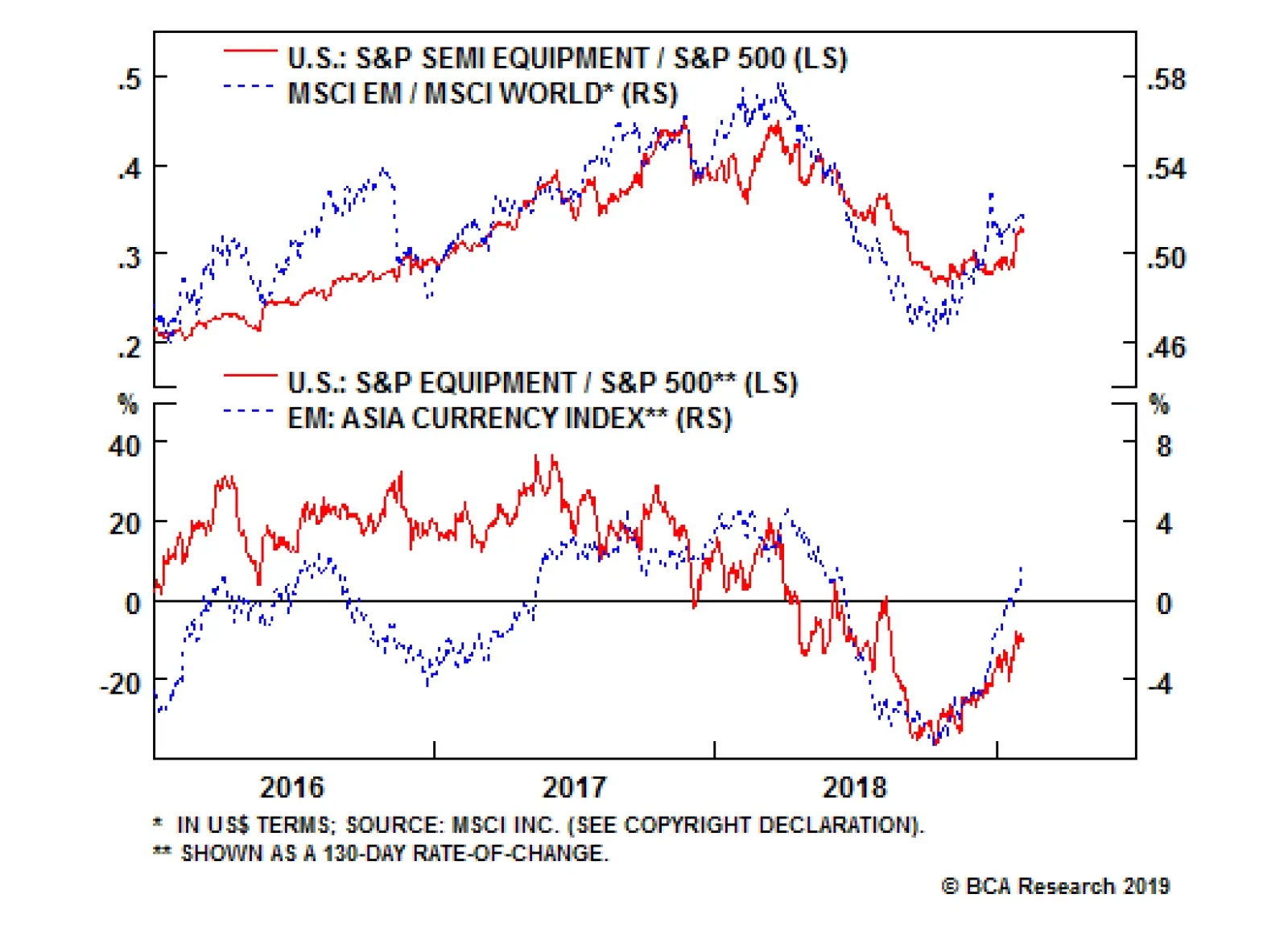
These high-octane, highly-cyclical tech stocks move in lockstep with other volatile assets. Rebounding emerging market (EM) stocks and FX not only confirm the S&P semi equipment breakout, they also signal additional gains in the coming months. Like these…
Highlights Chart 1Look For Rate Hikes In H2 2019
Look For Rate Hikes In H2 2019
Look For Rate Hikes In H2 2019
First things first: The Fed’s rate hike cycle is not over. Last week’s FOMC statement told us that the Fed will be “patient” and Chairman Powell cited slower global growth and tighter financial conditions as reasons to keep the funds rate steady. However, both of those reasons could soon evaporate. With the market now priced for 8 bps of rate cuts during the next 12 months and the dollar off its highs, there is scope for financial conditions to ease and global growth to improve in the first half of the year. According to our Fed Monitor, only tight financial conditions warrant a pause in rate hikes (Chart 1). The economic growth and inflation components of our Monitor (not shown) continue to recommend a tighter policy stance. The message is that if risk assets rally during the next six months causing financial conditions to ease, then all else equal, the Fed will have the green light to re-start rate hikes in the second half of the year. Investors should maintain below-benchmark duration in U.S. bond portfolios. Feature Investment Grade: Overweight Investment grade corporate bonds outperformed the duration-equivalent Treasury index by 183 basis points in January. The index option-adjusted spread tightened 25 bps on the month and currently sits at 127 bps. We upgraded our recommended allocation to corporate bonds three weeks ago because spreads had become too wide given the current phase of the credit cycle.1 Presently, we observe that the 12-month breakeven spread for Baa-rated corporate bonds has been tighter 43% of the time since 1989 (Chart 2). In the phase of the credit cycle when the 3/10 Treasury slope is between 0 bps and 50 bps, corporate breakeven spreads are typically in the lower third of their distributions.2 Chart 2Investment Grade Market Overview
Investment Grade Market Overview
Investment Grade Market Overview
Baa-rated bonds currently offer better value than higher-rated credits. The 12-month breakeven spread for A-rated debt has been tighter 29% of the time since 1989 (panel 2). Aa and Aaa-rated credits clock in at 25% and 4%, respectively. With the Fed in a holding pattern, we are comfortable taking credit risk for the next six months and recommend that investors move down in quality to capture the extra return. The Fed’s Q4 Senior Loan Officer Survey, released yesterday, showed that a net 3% of banks reported tightening lending standards on C&I loans. Tighter lending standards correlate with higher defaults and wider spreads, so this tentative development bears close monitoring going forward.
Chart
Chart
High-Yield: Overweight High-yield outperformed the duration-equivalent Treasury index by 408 basis points in January. The index option-adjusted spread tightened 103 bps, and currently sits at 416 bps. Our measure of the excess spread available in the High-Yield index after accounting for expected default losses is currently 224 bps, slightly below the historical average of 250 bps (Chart 3). In other words, if corporate defaults match the Moody’s baseline forecast for the next 12 months, high-yield bonds will return 224 bps in excess of duration-matched Treasuries, assuming no change in spreads. Chart 3High-Yield Market Overview
High-Yield Market Overview
High-Yield Market Overview
Moody’s revised its baseline 12-month default rate forecast higher last month, from 2.6% to 3.4%, and as was discussed in last week’s report, the revised forecast looks reasonable given our economic outlook.3 Specifically, our measure of nonfinancial corporate sector gross leverage – calculated as total debt over pre-tax profits – is roughly consistent with a 4% default rate. This leverage measure improved rapidly during the past year, but should start to stabilize during the next few quarters as profit growth decelerates. All in all, baseline default rate expectations have moved higher in recent months, but junk spreads still offer adequate compensation for that risk. In fact, if we assume excess compensation equal to the historical average, then junk spreads embed an expected default rate of 3% (panel 4), not far from the Moody’s base case. While junk spreads offer adequate compensation given our 12-month default outlook, the near-term outlook for excess returns is somewhat brighter as the Fed’s dovish turn should lead to spread compression during the next few months. MBS: Neutral Mortgage-Backed Securities outperformed the duration-equivalent Treasury index by 32 basis points in January. The conventional 30-year zero-volatility spread tightened 3 bps on the month, driven by a 3 bps decline in the option-adjusted spread (OAS). The compensation for prepayment risk (option cost) held flat. The drop in the 30-year mortgage rate to 4.46%, from 4.94% in November, led to a sharp spike in mortgage refinancings. However, refi activity remains very low relative to history (Chart 4). With the longer-run uptrend in mortgage rates still intact, the recent spike in refinancings is bound to reverse in the coming months. This will keep MBS spreads capped near historically low levels. Chart 4MBS Market Overview
MBS Market Overview
MBS Market Overview
Outside of refi activity, MBS spreads are also influenced by changes in mortgage lending standards. The Federal Reserve’s Senior Loan Officer Survey showed no change in residential mortgage lending standards in Q4 2018 (bottom panel), while reported mortgage demand took a significant dip. Periods of tightening lending standards tend to coincide with MBS spread widening, but faced with weaker demand banks are much more likely to ease standards going forward. This is particularly true because very little progress has been made easing lending standards since the financial crisis. The median FICO score for new mortgages peaked at 781 in Q1 2011, but had only fallen to 758 as of Q3 2018. With relatively little risk of spread widening we are comfortable with a neutral allocation to Agency MBS, though tight spreads make the sector less appealing than corporate bonds from a return perspective. Later in the cycle, when the risk of corporate spread widening is more pronounced, MBS will likely warrant an upgrade. Government-Related: Underweight The Government-Related index outperformed the duration-equivalent Treasury index by 53 basis points in January. Sovereign debt led the way, outperforming the Treasury benchmark by 221 bps. Foreign Agencies outperformed by 65 bps, Local Authorities outperformed by 32 bps, and Supranationals outperformed by 3 bps. Domestic Agency bonds were the sole laggard, underperforming Treasuries by 3 bps on the month. The Fed’s pause and the accompanying weakness in the dollar spurred last month’s outperformance of USD-denominated Sovereign debt. But given the current attractiveness of U.S. corporate credit, we are not eager to chase the outperformance in Sovereigns. The option-adjusted spread advantage in Baa-rated U.S. corporate credit relative to the Sovereign index is as wide as it was in mid-2016 (Chart 5), a period when corporate bonds outperformed Sovereigns by a significant margin. Chart 5Government-Related Market Overview
Government-Related Market Overview
Government-Related Market Overview
At the country level, our analysis of USD-denominated Emerging Market Sovereign spreads shows that only Argentina, Mexico, Saudi Arabia, Qatar, UAE and Poland offer excess spread compared to equivalently-rated U.S. corporates.4 We continue to view the Local Authority sector as very attractive. The sector offers similar value to Aa/A-rated corporate debt on a breakeven spread basis (bottom panel), and it is also dominated by taxable municipal securities that are insulated from weak foreign economic growth. Municipal Bonds: Overweight Municipal bonds outperformed the duration-equivalent Treasury index by 7 basis points in January (before adjusting for the tax advantage). The average Aaa-rated Municipal / Treasury yield ratio fell 2% in January, and currently sits at 84% (Chart 6). This is about one standard deviation below its post-crisis mean but above the average of 81% that prevailed in the late stages of the previous cycle, between mid-2006 and mid-2007. Chart 6Municipal Market Overview
Municipal Market Overview
Municipal Market Overview
In our research into the phases of the credit cycle, we often divide the cycle based on the slope of the yield curve. Since 1983, in the middle phase of the credit cycle when the 3/10 Treasury slope is between 0 bps and +50 bps (where it stands today), investment grade corporate bonds have delivered annualized excess returns of -14 bps. In contrast, municipal bonds have delivered annualized excess returns of +47 bps (before adjusting for the tax advantage).5 Given strong historical returns during the current phase of the cycle and the fact that our Municipal Health Monitor remains in “improving health” territory (bottom panel), we advocate an overweight allocation to municipal bonds. Long maturity municipal debt continues to offer a substantial yield advantage relative to the short-end of the curve. For example, a muni investor needs an effective tax rate of 35% to equalize the after-tax yields between a 5-year Aa-rated municipal bond and the equivalent-duration U.S. credit index. For a 20-year muni the same breakeven tax rate is between 10% and 17%. Treasury Curve: Favor 2/30 Barbell Over 7-Year Bullet Treasury yields declined in January, with the 5-year and 7-year maturities falling more than the short and long ends of the curve. The 2/10 slope flattened 3 bps on the month, from 21 bps to 18 bps. The 5/30 slope steepened 5 bps on the month, from 51 bps to 56 bps. In a recent report we looked at the correlations between different yield curve slopes and our 12-month Fed Funds Discounter.6 We found that the 5-year and 7-year maturities are most sensitive to changes in the discounter, while the short and long ends of the curve tend to be more stable. In other words, a decline in our 12-month discounter, like the one seen during the past two months (Chart 7), will tend to flatten the curve out to the 5-year/7-year maturity point and steepen the curve beyond that point. An increase in the discounter has the opposite effect. Chart 7Treasury Yield Curve Overview
Treasury Yield Curve Overview
Treasury Yield Curve Overview
We expect the market to price some Fed rate hikes back into the curve as financial conditions ease during the next few months. Based on that view, we recommend adopting a yield curve strategy that benefits from a rise in our 12-month discounter. A position short the 7-year bullet and long a duration-matched 2/30 barbell provides the appropriate exposure and is attractively valued by our yield curve models (panel 4).7 TIPS: Overweight TIPS outperformed the duration-equivalent nominal Treasury index by 84 basis points in January. The 10-year TIPS breakeven inflation rate rose 14 bps on the month, and currently sits at 1.88%. The 5-year/5-year forward TIPS breakeven inflation rate rose 9 bps, and currently sits at 2.04%. Both rates remain below the 2.3% - 2.5% range that has historically been consistent with inflation expectations that are well-anchored around the Fed’s target. The 10-year TIPS breakeven inflation rate also remains below the fair value reading from our Adaptive Expectations Model (Chart 8).8 This model is based on a combination of backward-looking and forward-looking inflation measures and is premised on the idea that investors’ expectations take time to adjust to changing macro environments. The current fair value reading from the model is 1.97%, but that fair value reading will trend steadily higher as long as core CPI inflation remains above 1.83%. The 1.83% threshold is the annualized trailing 10-year growth rate in core CPI, and it is the most important variable in our model. Chart 8Inflation Compensation
Inflation Compensation
Inflation Compensation
On that note, core CPI has increased at an annual rate of 2.48% during the past 3 months, well above the necessary threshold. And while some forward-looking inflation measures have moderated, notably the ISM Prices Paid index (panel 4), this is largely a reaction to the recent drop in energy prices. A drop that should reverse as global growth improves in the coming months. ABS: Neutral Asset-Backed Securities outperformed the duration-equivalent Treasury index by 16 basis points in January. The index option-adjusted spread for Aaa-rated ABS tightened 8 bps on the month, and currently sits at 40 bps, 6 bps above its pre-crisis low. The Excess Return Bond Map in Appendix C shows that consumer ABS offer greater expected return than Domestic Agencies and Supranationals, though with a commensurate increase in risk. The Map also shows that Agency CMBS offer very similar return potential with much less risk. The Fed's Senior Loan Officer Survey for Q4 2018 showed that banks tightened lending standards slightly for both credit cards and auto loans. This is consistent with a continued gradual uptrend in consumer credit delinquencies (Chart 9). Chart 9ABS Market Overview
ABS Market Overview
ABS Market Overview
Rising household interest expense further confirms that the consumer credit delinquency rate is biased higher, albeit from a low starting point (panel 4). All in all, ABS still offer a reasonable risk/reward trade-off but could warrant a downgrade in the coming quarters as credit quality worsens. Non-Agency CMBS: Underweight Non-Agency Commercial Mortgage-Backed Securities outperformed the duration-equivalent Treasury index by 67 basis points in January. The index option-adjusted spread for non-agency Aaa-rated CMBS tightened 11 bps on the month and currently sits at 105 bps. The Fed’s Senior Loan Officer Survey showed that banks tightened lending standards on commercial real estate (CRE) loans in Q4 and witnessed falling demand (Chart 10). This is a typical negative environment for CMBS spreads. Decelerating CRE prices are also a cause for concern (panel 3). Investors should maintain an underweight allocation to non-Agency CMBS. Agency CMBS: Overweight Agency CMBS outperformed the duration-equivalent Treasury index by 28 basis points in January. The index option-adjusted spread tightened 4 bps on the month and currently sits at 57 bps. The Excess Return Bond Map in Appendix C shows that Agency CMBS offer high potential return compared to other low-risk spread products. An overweight allocation to this defensive sector continues to make sense. Chart 10CMBS Market Overview
CMBS Market Overview
CMBS Market Overview
Appendix A - The Golden Rule Of Bond Investing We follow a two-step process to formulate recommendations for bond portfolio duration. First, we determine the change in the federal funds rate that is priced into the yield curve for the next 12 months. Second, we decide – based on our assessments of the economy and Fed policy – whether the change in the fed funds rate will exceed or fall short of what is priced into the curve. Most of the time, a correct answer to this question leads to the appropriate duration call. We call this framework the Golden Rule Of Bond Investing, and we demonstrated its effectiveness in the U.S. Bond Strategy Special Report, “The Golden Rule Of Bond Investing”, dated July 24, 2018, available at usbs.bcaresearch.com. Chart 11 illustrates the Golden Rule’s track record by showing that the Bloomberg Barclays Treasury Master Index tends to outperform cash when rate hikes fall short of 12-month expectations, and vice-versa. Chart 11The Golden Rule's Track Record
The Golden Rule's Track Record
The Golden Rule's Track Record
At present, the market is priced for 8 basis points of rate cuts during the next 12 months. Given that we expect the Fed to deliver rate hikes in the second half of this year, we recommend that investors maintain below-benchmark portfolio duration. Appendix B- Butterfly Strategy Valuation The following tables present the current read-outs from our butterfly spread models. We use these models to identify opportunities to take duration-neutral positions across the Treasury yield curve. The models are explained in detail in the following two Special Reports: U.S. Bond Strategy Special Report, “Bullets, Barbells And Butterflies”, dated July 25, 2017, available at usbs.bcaresearch.com U.S. Bond Strategy Special Report, “More Bullets, Barbells And Butterflies”, dated May 15, 2018, available at usbs.bcaresearch.com Table 4Butterfly Strategy Valuation: Raw Residuals In Basis Points (As of January 31, 2019)
On Pause But Not Forgotten
On Pause But Not Forgotten
Table 5Butterfly Strategy Valuation: Standardized Residuals (As of January 31, 2019)
On Pause But Not Forgotten
On Pause But Not Forgotten
Table 6Discounted Slope Change During Next 6 Months (BPs)
On Pause But Not Forgotten
On Pause But Not Forgotten
Appendix C - Excess Return Bond Map The Excess Return Bond Map is used to assess the relative risk/reward trade-off between different sectors of the U.S. fixed income market. The Map employs volatility-adjusted breakeven spread analysis to show how likely it is that a given sector will earn/lose money during the subsequent 12 months. The Map does not incorporate any macroeconomic view. The horizontal axis of the Map shows the number of days of average spread widening required for each sector to lose 100 bps versus a position in duration-matched Treasuries. Sectors plotting further to the left require more days of average spread widening and are therefore less likely to see losses. The vertical axis shows the number of days of average spread tightening required for each sector to earn 100 bps in excess of duration-matched Treasuries. Sectors plotting further toward the top require fewer days of spread tightening and are therefore more likely to earn 100 bps of excess return.
Chart 12
Ryan Swift, Vice President U.S. Bond Strategy rswift@bcaresearch.com Footnotes 1 Please see U.S. Bond Strategy Weekly Report, “Buy Corporate Credit”, dated January 15, 2019, available at usbs.bcaresearch.com 2 For further details on how we divide the credit cycle based on the slope of the yield curve please see U.S. Bond Strategy Special Report, “2019 Key Views: Implications For U.S. Fixed Income”, dated December 11, 2018, available at usbs.bcaresearch.com 3 Please see U.S. Bond Strategy Weekly Report, “Running Room”, dated January 29, 2019, available at usbs.bcaresearch.com 4 Please see U.S. Bond Strategy Weekly Report, “Oil Supply Shock Is A Risk For Junk”, dated October 9, 2018, available at usbs.bcaresearch.com 5 Please see U.S. Bond Strategy Special Report, “2019 Key Views: Implications For U.S. Fixed Income”, dated December 11, 2018, available at usbs.bcaresearh 6 Please see U.S. Bond Strategy Weekly Report, “Don’t Position For Curve Inversion”, dated January 22, 2019, available at usbs.bcaresearch.com 7 The output from all of our yield curve models is shown in Appendix B of this report. 8 Please see U.S. Bond Strategy Weekly Report, “Adaptive Expectations In The TIPS Market”, dated November 20, 2018, available at usbs.bcaresearch.com Fixed Income Sector Performance Recommended Portfolio Specification Corporate Sector Relative Valuation And Recommended Allocation
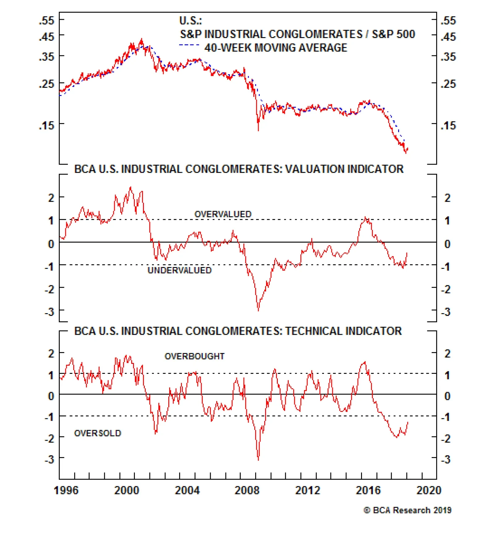
The S&P industrial conglomerates index has been surging on the back of Q4 results that, while not reflecting particular operating strength, are better than the beaten down sector valuations would indicate. Importantly, MMM mildly lowered their 2019…
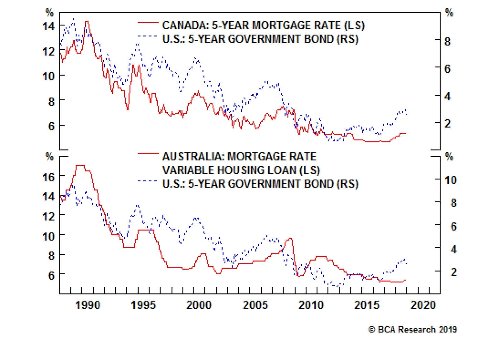
Until now, very low global interest rates have kept the Canadian and Australian housing bubbles afloat, but rising U.S. interest rates are now putting upward pressure on mortgage rates in both Canada and Australia. This simply reflects the fact that U.S.…
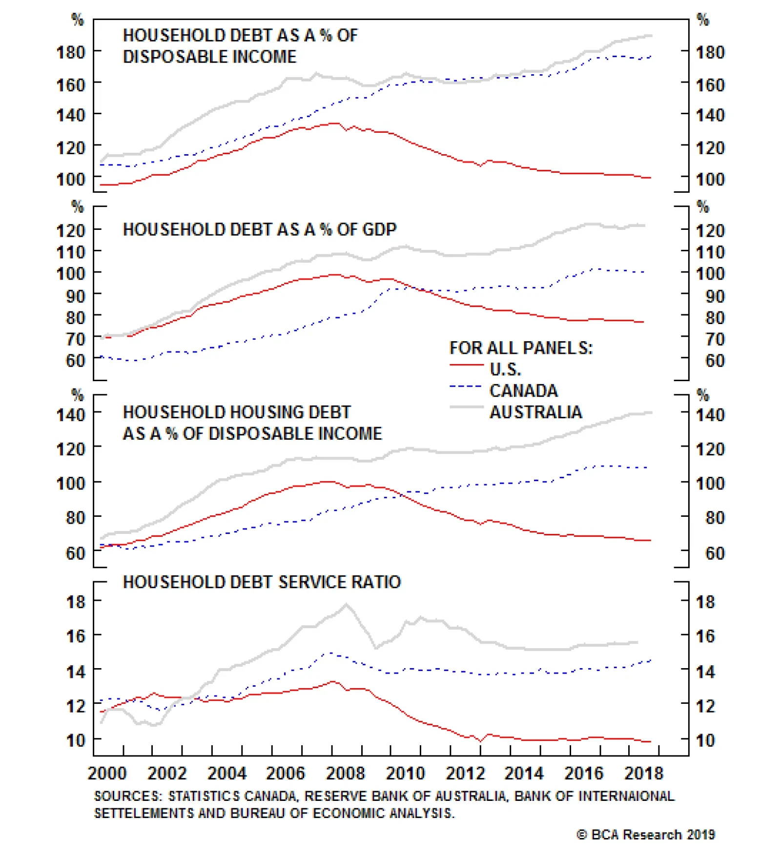
Few would care about the systemic risk created by elevated house prices if debt loads were small. However, in both countries, household indebtedness makes Americans circa 2007 look like a frugal bunch. In Canada, household debt has now reached 176% of…
Highlights Portfolio Strategy Chinese reflation, the ongoing global capex upcycle, and the Fed induced cap on the greenback with the knock-on effect of higher commodity prices, all signal that it still pays to overweight S&P cyclicals at the expense of S&P defensives. Sustained EM stock outperformance, a soft U.S. dollar, improving semi equipment operating metrics, along with compelling relative valuations and technicals, all suggest that there are high odds that the recent semi equipment run up has more upside. Recent Changes There are no changes in the portfolio this week. Feature The SPX consolidated the 350 point advance since the Christmas Eve trough last week, setting the stage for a durable advance in the coming months. The Fed stood pat last Wednesday, and signaled a much more dovish policy stance going forward. Chairman Powell was clearly humbled by last December’s convulsing equity market and abrupt tightening in financial conditions. On that front, in the latest FOMC statement the explicit mention of patience is significant: “the Committee will be patient as it determines what future adjustments to the target range for the federal funds rate may be appropriate”. A definitively more dovish Fed, which will help restrain the greenback, remains one of the three key catalysts for a durable equity market advance as we have highlighted in recent research.1 Encouragingly, our proprietary Equity Capitulation Indicator (ECI) has bottomed at two standard deviations below the historical mean (Chart 1). Over the past two decades, such a depressed level in our ECI has marked previous equity market troughs including the early-2016, 2011, 2002 and 1998 iterations. Only the GFC episode was lower, falling to three standard deviations below the mean. Clearly the late-December selling frenzy registers as another investor capitulation point and, if history at least rhymes, more gains are in store for the broad equity market. Chart 1Capitulation
Capitulation
Capitulation
Chart 2 shows some other measures of breadth that corroborate our ECI’s message: investors hit the panic button and exited equities in droves in Q4. The upshot is that with selling exhausted, stocks can now stage a durable recovery as long as profits continue to expand. As a reminder, the continuation of the earnings juggernaut is the second key catalyst we identified two weeks ago.2 Midway through earnings season, SPX EPS have held up well with growth approaching 16%. For calendar 2019 we expect mid-single digit EPS growth in line with the signal from our macro driven S&P 500 EPS growth model (please refer to Chart 4 from the mid-January Weekly Publication).3 Chart 2Selling Is Exhausted
Selling Is Exhausted
Selling Is Exhausted
A positive resolution to the U.S./China trade spat is the third catalyst we highlighted recently in order for equities to break out to fresh all-time highs.4 Related to this, China’s reflation efforts are equally important. On that front, news of quasi QE from the PBOC suggests that the Chinese authorities remain committed to injecting liquidity into their economy.5 Already, the PBOC balance sheet, with over $5.5tn in assets, is expanding anew. Empirical evidence suggests that SPX momentum and the ebb and flow of the PBOC balance sheet are joined at the hip, and the current message is positive (second panel, Chart 3). Chart 3Heed The PBoC Message
Heed The PBoC Message
Heed The PBoC Message
Beyond the PBOC balance sheet expansion, the Chinese six-month credit impulse is also in a sling shot recovery. This Chinese credit backdrop is enticing and moves more or less in tandem with the SPX six-month impulse (top panel, Chart 4). Chart 4Reflating Away
Reflating Away
Reflating Away
Two forces explain these relationships. First, China’s rise to become the second largest economy in the world along with its insatiable appetite for commodities and durable goods. Second, 40% of S&P 500 sales are international and an increasing share now originates in emerging markets in general and in China in particular. Keep in mind that the S&P cyclicals/defensives ratio is not only a high beta play on the SPX itself (top panel, Chart 3), but also an S&P global versus domestic gauge. Thus, both of these Chinese indicators also enjoy a positive correlation with the cyclicals vs. defensives tilt (bottom panels, Charts 3 & 4). With that in mind, this week we are drilling deeper into why we continue to prefer S&P cyclicals over S&P defensives and also highlight a highly cyclical index we went overweight in mid-December that has gone parabolic. Double Down On Cyclicals Vs. Defensives Early-October 2017 marks the initiation of our cyclical vs. defensive preference. Initially, this tilt jumped and peaked in mid-2018 returning 18% since inception. Since then, it has given up all of those gains and then some before troughing with the market on Christmas Eve, suffering a 6% drop since inception. Currently, the ratio has moved full circle and is back to where it was when we first recommended this portfolio bent (Chart 5). Chart 5Full Circle
Full Circle
Full Circle
Should investors commit capital to this tilt at this stage of the cycle and given the current global macro backdrop? The short answer is yes. Charts 3 & 4 show that China’s reflation efforts and the fate of the S&P cyclicals/defensives ratio are closely correlated. In addition to the PBOC’s expanding balance sheet and rising Chinese credit impulse, Chinese monetary easing also benefits S&P cyclicals at the expense of S&P defensives. The Chinese reserve requirement ratio (RRR) has plummeted to the lowest point since the GFC and Chinese interest rates are also plumbing multi-year lows (RRR shown inverted, top panel, Chart 6). Chart 6China Flashing Green
China Flashing Green
China Flashing Green
Tack on a resurgent currency with the CNY briefly breaking 6.70 with the U.S. dollar, and factors are falling into place for a playable rally in the cyclicals/defensive ratio. Likely, the Chinese are trying to appease President Trump by underpinning the yuan, but the Fed’s recent more dovish stance on interest rate hikes is also pushing the greenback lower. Taken together, this is a boon for the commodity exposed U.S. cyclicals that also garner a significant share of their sales from abroad (bottom panel, Chart 6). Commodity prices troughed last September, staying true to their leading properties and have been in recovery mode ever since (top panel, Chart 7). Now that the Fed has capped the U.S. dollar, more gains are in store for commodities and that is a boon for commodity producers’ top line growth prospects. Chart 7Capex Remains Healthy
Capex Remains Healthy
Capex Remains Healthy
The demand backdrop is also enticing at the current stage of the business cycle, not only domestically, but also in China. Capital outlays remain upbeat and despite some recent turbulence, U.S. capex intentions are near multi-year highs (third panel, Chart 7). In China, recent piece meal fiscal easing announcements are far from negligible; already infrastructure spending has jumped after contracting late last year (second panel, Chart 7). Were these announcements to get supplemented by a bigger and more comprehensive package, then commodity-levered equities will excel further. A look at the relative balance sheet health of cyclicals versus defensives is revealing. Cyclicals are paying down debt and their cash flow continues to improve, still recovering from the late-2015/early 2016 global manufacturing recession. On the flipside, defensives are piling on debt. All four safe haven sectors have been degrading their balance sheets (relative net debt-to-EBITDA shown inverted, middle panel, Chart 8). Interest coverage sends a similar message: cyclicals are in excellent health both in absolute terms and compared with defensives (top panel, Chart 8). Chart 8B/S Improvement Continues
B/S Improvement Continues
B/S Improvement Continues
Sell-side analysts have not yet taken notice of the macro tide that is turning in favor of cyclicals over defensives. Relative forward profit growth has collapsed to nil and net EPS revisions are at previous nadirs (fourth & fifth panels, Chart 9). Chart 9Oversold And Unloved
Oversold And Unloved
Oversold And Unloved
In sum, if our thesis pans out that China will continue to reflate, global capex will remain vibrant, the greenback will drift lower (U.S. dollar shown inverted, top panel, Chart 9) courtesy of a dovish Fed that will push the broad commodity complex higher, then a significant valuation rerating looms for the cyclicals/defensives tilt (second panel, Chart 9). Bottom Line: Continue to the prefer S&P cyclicals to S&P defensives. We also reiterate our recent long S&P materials/short S&P utilities pair trade.6 Semi Equipment: Buy Into Strength In mid-December we boosted the S&P semi equipment index to overweight from underweight and since then this niche chip subindex has outperformed the broad market by 17%.7 Semi equipment stocks are high beta (bottom panel, Chart 10) and, while we are recommending to buy into strength, from a portfolio risk management perspective, today we are also setting a trailing stop at the 10% return mark in order to protect profits in this tactical (three-to-six month time horizon) position. Chart 10Buy Into Strength...
Buy Into Strength...
Buy Into Strength...
These high-octane highly-cyclical tech stocks move in lockstep with other volatile asset classes. Rebounding emerging market (EM) stocks and FX confirm the S&P semi equipment breakout, and signal additional gains in the coming months (Chart 11). Not only do they share the high-beta status, but also semi equipment stocks garner 90% of their sales outside U.S. shores and 21% of total revenues come from China (please refer to Table 3 in our December 17, 2018 Weekly Report). Thus, the tight inverse correlation with the greenback and positive correlation with the outperforming EM stocks comes as no surprise (Chart 11). Chart 11...But Expect Heightened Vol
...But Expect Heightened Vol
...But Expect Heightened Vol
Importantly, Taiwan and Korea are chip manufacturing hubs and semi equipment stocks are levered plays on the macro backdrops of these two economies. Recent data suggests that a turn is in the making in two key indicators in these countries, respectively. Taiwanese tech capex has likely troughed at a depressed level (middle panel. Chart 12), and Korean electronic components manufacturing capacity is now contracting for the first time since late-1997 (bottom panel, Chart 12). The latter is significant as this abrupt and sizable reining in of productive capacity will soon help arrest the fall in chip prices, which serves as an excellent pricing power proxy for the semi equipment industry. Chart 12Green Shoots
Green Shoots
Green Shoots
Historically, relative forward profit growth and DRAM price momentum are joined at the hip. Therefore, were DRAM prices to exit deflation on the back of constrained Korean capacity, that would be a boon for relative profit prospects (second panel, Chart 13). Chart 13Analysts Have Thrown In The Towel
Analysts Have Thrown In The Towel
Analysts Have Thrown In The Towel
Despite these marginal positive developments, sell-side analysts’ pessimism reigns supreme. Industry revenue and profit growth expectations trail the broad market by a wide margin and net EPS revisions remain as bad as they get. The upshot is that these lowered profit and sales growth bars will be easy to surpass in 2019 (Chart 13). With regard to technicals and valuations, oversold conditions bounced, as we posited in mid-December using history as a guide, but still remain depressed (middle panel, Chart 14). Valuations are compelling with the S&P semi equipment forward P/E trading at a roughly 40% discount to the overall market (fourth panel, Chart 13). Chart 14Technicals Remain Depressed
Technicals Remain Depressed
Technicals Remain Depressed
Finally, earnings season has revealed that the bifurcated semiconductor market has staying power with semi equipment stocks (we are overweight) outperforming their ailing semi producer brethren (we remain underweight). Netting it out, sustained EM stock outperformance, a soft U.S. dollar, improving industry operating metrics, along with compelling relative valuations and technicals, all suggest that there are high odds that the recent semi equipment run up has more upside. Bottom Line: Maintain the overweight stance in the S&P semi equipment index for a while longer, but set a trailing stop at the 10% relative return mark in order to protect profits in this tactical (three-to-six month time horizon) position. The ticker symbols for the stocks in this index are: BLBG: S5SEEQ – AMAT, LRCX, KLAC. Anastasios Avgeriou, Vice President U.S. Equity Strategy anastasios@bcaresearch.com Footnotes 1 Please see BCA U.S. Equity Strategy Weekly Report, “Dissecting 2019 Earnings” dated January 22, 2019, available at uses.bcaresearch.com. 2 Ibid. 3 Please see BCA U.S. Equity Strategy Report, “Catharsis” dated January 14, 2019, available at uses.bcaresearch.com. 4 Please see BCA U.S. Equity Strategy Weekly Report, “Dissecting 2019 Earnings” dated January 22, 2019, available at uses.bcaresearch.com. 5 Please see Bloomberg Article, “PBOC Sets Up Swap Tool to Aid Bank Capital via Perpetual Bonds” dated January 24, 2019, available at www.bloomberg.com. 6 Please see BCA U.S. Equity Strategy Report, “Trader’s Paradise” dated January 28, 2019, available at uses.bcaresearch.com. 7 Please see BCA U.S. Equity Strategy Report, “Signal Vs. Noise” dated December 17, 2018, available at uses.bcaresearch.com. Current Recommendations Current Trades Size And Style Views Favor value over growth Favor large over small caps
Highlights After rising for thousands of years, human intelligence has begun to decline in developed economies. This can be seen in falling IQ scores and a decline in math and science test scores. Environmental factors appear to account for the bulk of this decline, but no one knows what these factors are. If left unchecked, falling intelligence will severely undermine productivity growth. This could lead to lower equity multiples, larger budget deficits, and ultimately, much higher government bond yields. Technological advances, particularly in the genetic realm, promise to radically raise IQs. In a complete abandonment of its one-child policy, China will combine these controversial technologies with pro-natal measures in order to boost sagging birth rates. The coming Eugenic Wars will be one of the most important economic and geopolitical developments of the 21st century. Feature Part 1: What The Tame Fox Says In 1959, a Soviet scientist named Dmitry Belyaev embarked on an ambitious experiment: to domesticate the silver fox. A geneticist by training, Belyaev wanted to replicate the process by which animals such as cats and dogs came to live side-by-side with humans. It was a risky endeavor. The Soviets had essentially banned the study of Mendelian genetics in favor of the blank slate ideology that is popular in progressive circles today. Belyaev persevered. Working under the guise of studying vulpine physiology, he selected foxes based on only one trait – tamability. Less than 10% of foxes made it to the subsequent generation, with the other 90% being sent off to fur farms. By the fourth generation, the changes were undeniable. Rather than fleeing humans, the foxes sought out their attention with no prompting whatsoever. They even wagged their tails and whined and whimpered like dogs do. The tame foxes also displayed physical changes. Their ears flopped over. Their snouts became shorter and their tails stood upright. “By intense selective breeding, we have compressed into a few decades an ancient process that originally unfolded over thousands of years,” wrote Lyudmila Trut, who began as Belyaev’s assistant and took over the project when her boss died in 1985. Genetically Capitalist? Evolution can broadly proceed in two ways. The first way is through random mutations. This form of evolution, which scientists sometimes refer to as genetic drift, can take thousands of years to yield any discernable changes. The second way is through natural selection, a process that exploits existing variations in genetic traits. As the Russian fox experiment illustrates, evolution driven by selective pressures (either natural or artificial) can occur fairly quickly. Did selective pressures manifest themselves in human evolution in the lead up to the Industrial Revolution? Did humans, in some sense, domesticate themselves? In his book, A Farewell To Alms, economic historian Gregory Clark argued in the affirmative. Clark documented that members of skilled professions in Medieval England had twice as many surviving children as unskilled workers (Chart 1). Indeed, the fledgling middle class of the time had even more surviving children than the aristocracy, who were often out fighting wars. As a result, the wages of craftsmen declined by a third relative to laborers between 1200 and 1800, implying that the supply of skilled labor was growing more quickly than the demand for skilled workers over this period.
Chart 1
In subsequent work, Clark and Cummins argued that the spread of bourgeois values across pre-industrial England was more consistent with a model of genetic transmission than a cultural one (see Box 1 for details). Similar developments occurred in other parts of the world. For example, in China, the gateway into the bureaucracy for a thousand years was the highly competitive imperial exam. Xi Song, Cameron Campbell, and James Lee showed that high-status men had more surviving children during the eighteenth- and nineteenth-centuries (Chart 2).1
Chart 2
The 10,000 Year Explosion Stephen Jay Gould famously said that “There’s been no biological change in humans in 40,000 or 50,000 years. Everything we call culture and civilization we’ve built with the same body and brain.” Gould was wrong. Data from the International HapMap Project show that human evolution accelerated by 100-fold starting around 10,000 years ago (Chart 3).
Chart 3
In their book The 10,000 Year Explosion: How Civilization Accelerated Human Evolution, Gregory Cochran and the late Henry Harpending explained why evolution sped up so rapidly.2 The advent of agriculture led to a surge in population levels. This, in turn, increased the absolute number of potentially beneficial genetic mutations that could be subject to selection effects. Farming and the rise of city states also completely reshaped the environment in which people lived. Basic biology teaches us that environmental dislocations of this kind tend to generate selective pressures that cause evolution to accelerate. John Hawks, professor of anthropology and genetics at the University of Wisconsin-Madison, put it best: “We are more different genetically from people living 5,000 years ago than they were different from Neanderthals.” Many of the changes to our genomes relate to diet and diseases. The various genetic resistances that people have built up to malaria are all less than 10,000 years old. Mutations to the LCT gene, which confers lactose tolerance into adulthood, occurred independently in three different geographical locations: one in East Asia, one in the Middle East, and one in Africa. The Middle Eastern variant was probably responsible for the rapid enlargement of the Indo-European language group, which now stretches from India to Ireland. The African variant likely facilitated the Bantu expansion, which started near the present-day border of Nigeria and Cameroon, and then spread out across almost all of sub-Saharan Africa. Evolution Of The Human Brain About half of the genes in the human genome regulate some aspect of brain function. Given the rapid acceleration in evolution, it would be rather surprising if our own brains had not been affected. And indeed, there is plenty of evidence that they were. The frontal lobe of the brain has increased in size over the past 10,000 years. This is the part of the brain that regulates such things as language, memory, and long-term planning. Testosterone levels have also declined. That may explain the steady reduction in violent crime rates (Chart 4).
Chart 4
We know that certain genes that are associated with higher intelligence have been under recent selective pressure. For example, the gene that leads to torsion dystonia – a debilitating movement disorder – appears to have increased in frequency. Why would a gene that causes a known disease become more widespread? The answer is that individuals who have this particular mutation tend to have IQs that are around 10-to 20-points above the population average. Why IQ Matters IQ has a long and contentious history. Yet, despite numerous efforts to jettison the concept, it has endured for one simple reason: It has more predictive power than virtually anything else in the psychological realm. A simple 30-minute IQ test can help predict future educational attainment, job performance, income, health, criminality, and fertility choices (Table 1 and Chart 5). IQ even predicts trader performance!3 Table 1What IQ Predicts (Results From Meta-Analyses)
The Most Important Trend In The World Has Reversed And Nobody Knows Why
The Most Important Trend In The World Has Reversed And Nobody Knows Why
Chart 5
Like most physiological traits, IQ is highly heritable.4 The genetic contribution to IQ increases from 20% in early childhood to as high as 80% by one’s late teens and remains at that level well into adulthood.5 This makes IQ almost as heritable as height (Chart 6).
Chart 6
Although there is a great deal of variation among individuals, on average, more intelligent people earn higher incomes (Chart 7). If the same relationship existed in the pre-industrial era, as seems likely, then human intelligence probably increased in a way that facilitated the economic explosion that we associate with the Industrial Revolution. The stunning implication is that the emergence of the modern era was a question of “when, not if.”
Chart 7
Part 2: The Flynn Effect By the late-19th century, it had become clear that the rich were no longer having as many children as the poor. This realization, together with the growing popularity of Darwin’s theories, helped galvanize the eugenics movement. Contrary to popular belief, this movement was not a product of the far-right. In fact, the most vocal proponents of eugenics were among the progressive left. John Maynard Keynes, for example, served as the Director of the British Eugenics Society between 1937 and 1944. Yet, a funny thing happened on the road to idiocracy: The concerns of eugenicists did not come to pass. Rather than becoming dimmer, people became smarter. This phenomenon is now known as the Flynn Effect, named after James Flynn, a psychologist who was among the first to document it. Chart 8 shows the evolution of IQ scores in a sample of countries between 1940 and 1990. The average country recorded IQ gains of three points per decade over this period, a remarkably large increase over such a relatively short period of time.
Chart 8
Explaining The Flynn Effect The Flynn Effect must have been entirely driven by environmental factors since genetic factors – namely the tendency of less-educated people to have more children, and to have them at an earlier age – would have reduced average IQs over the past two hundred years. But how could environmental factors have played the dominant role in light of the strong role of genes discussed above? The answer was proposed by geneticist Richard Lewontin in the 1970s. Lewontin suggested imagining a genetically-diverse sack of seed corn randomly distributed between two large identical fields. One field had fertilizer added to it while the other did not. Genetic variation would explain all of the differences in the height of corn stalks within each field, while environmental factors (the addition of fertilizer) would explain all of the difference in the average height of corn stalks between the two fields. This logic explains why genes can account for the bulk of the variation in IQs within any demographic group, while environmental effects may explain most of the variation across groups, as well as why average scores have changed over time. And what environmental effects are these? The truth is that no one really knows. Plenty of theories have been advanced, but so far there is still little consensus on the matter. Bigger, Healthier Brains It has long been known that learning increases the amount of grey matter in the brain. For example, a recent study showed that the hippocampi of London taxi drivers tend to be larger due to the need for drivers to memorize and navigate complex routes.6 The emergence of modern societies likely kicked off a virtuous circle where the need to solve increasingly complex tasks forced people to hone their learning skills, leading to higher IQs and further technological progress. The introduction of universal primary education amplified this virtuous circle. Better health undoubtedly helped as well. Early childhood diseases reduce IQ by diverting the body’s resources away from mental development towards fighting off infections. There is a strong correlation between measured IQ and disease burden across countries (Chart 9). A number of studies have documented a strong relationship between the timing of malaria eradication in the U.S. and other parts of the world and subsequent observed gains in childhood IQs.7
Chart 9
Brain size and IQ are positively correlated. Forensic evidence from the U.S. suggests that the average volume of adult human skulls has increased by 7% since the late 1800s, or roughly the size of a tennis ball.8 Part 3: The End Of A 10,000 Year Trend The problem with environmental effects is that they eventually run into diminishing returns. This appears to have happened with the Flynn Effect. In fact, not only does the recent evidence suggest that the Flynn Effect has ended, but the data suggest that IQs are starting to decline. Chart 10 shows that average math and science test scores fell in the OECD’s Program For International Scholastic Achievement (PISA) between 2009 and 2015, the latest year of the examination. The drop in math and science test scores has been mirrored in falling IQ scores. Flynn observed a decade ago that IQs of British teenagers were slipping.9 Similar results have been documented in France, the Netherlands, Germany, Denmark, and most recently, Norway.
Chart 10
The Norwegian results, published last year, are particularly noteworthy.10 Bernt Bratsberg and Ole Rogeberg examined three-decades worth of data on IQ tests of Norwegian military conscripts. Military duty has been mandatory for almost all men in Norway since 1814, which means that the study’s authors were able to collect comprehensive data on most Norwegian men and their fathers. Their paper clearly shows that IQ peaked with the generation born in the mid-1970s and declined by about five points, or one-third of a standard deviation, for the one born in 1990 (Chart 11). For the first time in recorded history, Norwegian kids today are not scoring as well as their parents.
Chart 11
A Mystery What caused the sudden reversal of the Flynn Effect in Norway and most other developed economies? Nobody knows. We can, however, offer three possible theories: New Technologies For much of human history, rising intelligence and technological innovation were complementary processes, meaning that the smartest people were the ones who could best exploit the new technologies that were coming their way. Moreover, as noted above, even those who were less gifted benefited from the mental stimulation that a technologically advanced society provided. It remains to be seen how future technological advances such as generalized AI will affect human intelligence, but recent technological advances seem to have had a dumbing down effect.11 For example, the GPS has obviated the need for people to navigate unfamiliar locations, thus blunting the development of their visuospatial skills. Modern word processors have made spelling skills less important. Having all the information in the world just a click away is a wonderful thing, but it has reduced the need for our brains to retain and codify what we learn. Meanwhile, the constant bombardment of information to which we are subject has made it difficult to concentrate on anything for long. How many youth today can read a report of this length without checking their Facebook feed multiple times? My guess is not many. Diminishing Returns To Education The ability to take young bright minds, who would have otherwise spent their lives doing menial labor, and provide them with an education was probably the greatest tailwind to growth that the 20th century enjoyed. There is undoubtedly still scope to continue this process, but the low-hanging fruit have been picked. Educational attainment has slowed dramatically in most of the world (Chart 12). Economist James Heckman estimates that U.S. high-school graduation rates, properly measured, peaked over 40 years ago.12
Chart 12
Despite billions of dollars spent, efforts to improve school performance have generally fallen flat. A recent high-level report by the U.S. Department of Education concluded that “The panel did not find any empirical studies that reached the rigor necessary to determine that specific turnaround practices produce significantly better academic outcomes.”13 This gets to a point that most parents already know, which is that when people talk about “bad schools,” they are really talking about “bad students.” Deteriorating Health Better health probably contributed to the Flynn Effect. But is it possible to have too much of a good thing? More calories are welcome when people are starving, but today’s calorie-rich, nutrient-poor diets have led to a surge in obesity rates. A clean environment reduces the spread of germs, but it also makes children hypersensitive to foreign substances. Following German reunification, researchers observed that allergies were much more common among West German children than their Eastern peers, presumably because of the West’s more salubrious environment.14 All sorts of weird and concerning physiological changes are occurring. Sperm counts have fallen by nearly 60% since the early 1970s.15 Testosterone levels in young men are dropping. Among girls, the age of first menarche has declined by two years over the past century.16 Are chemical agents in the environment responsible? If they are, what impact are they having on cognitive development? Nobody knows. Reported mental illness is also on the rise. The share of U.S. teenagers with a reported major depressive episode over the prior year surged by over 60% between 2010 and 2017 (Chart 13). The fraction of young adults that made suicide plans nearly doubled.17 More than 20% of U.S. women over the age of 40 are on antidepressants.18 Five percent of U.S. children are receiving ADHD medication.19
Chart 13
Implications For Economic Growth And Asset Markets So far, the reversal of the Flynn Effect has been largely confined to the developed economies. Test scores are still rising in the developing world, albeit from fairly low levels. For example, two recent studies have documented significant IQ gains in Kenya and Brazil.20 In the poorest countries, opportunities for improving health abound. Even small steps such as fortifying salt with iodine (which costs about five cents per person per year) have been shown to boost IQ by nearly one standard deviation.21 Measures to reduce inbreeding are also likely to boost IQ scores.22 Yet, we should not underestimate the importance of falling cognitive skills in developed economies. Chart 14 shows that there is a clear positive correlation between student score on math and science and per capita incomes.
Chart 14
Most technological innovation still takes place in developed economies. There is an extremely tight relationship between visuospatial IQ and the likelihood of becoming an inventor (Chart 15). Since IQ is distributed along a bell curve, a 0.1 standard deviation drop in IQs across the entire distribution will result in an 8% decline in the share of people with IQs over 100, a 14% decline in those with IQs over 115, and a 21% decline in those with an IQ over 130 (by convention, each standard deviation on an IQ test is worth 15 points).
Chart 15
Falling IQs could result in slower productivity growth, which could further strain fiscal balances. Lower IQs are also associated with decreased future orientation.23 People who live for the moment tend to save less. A decline in savings would push up real rates, leading to less capital accumulation. History suggests that a deceleration in productivity growth and higher real rates will put downward pressure on equity multiples (Chart 16). Chart 16Equity Multiples Tend To Fall When Real Rates Rise And Productivity Growth Declines
Equity Multiples Tend To Fall When Real Rates Rise And Productivity Growth Declines
Equity Multiples Tend To Fall When Real Rates Rise And Productivity Growth Declines
Part 4: Generation E For 200 years, the environmentally-driven Flynn Effect disguised the underlying genetically-driven decline in IQs that began not long after the dawn of the Industrial Revolution. Flynn has acknowledged this himself, noting at the 2017 International Society For Intelligence Research Conference that “I have no doubt that there has been some deterioration of genetic quality for intelligence since the late Victorian times.”24 Now that the Flynn Effect has reversed, both genes and the environment are working together to reduce cognitive abilities in developed economies. This means that the most important trend in the world – a trend that allowed the human population to increase during the Malthusian era and later allowed output-per-worker to soar following the Industrial Revolution – has broken down. Yet, there may be another twist in the story – one that began just a few months ago: the first members of Generation E were born. E Is For Edited ... Or Eugenics Lulu and Nana will be like most other children, but with one key difference: They will be the first humans ever to have their genomes edited through a procedure know as CRISPR-Cas9. Rogue Chinese scientist He Jiankui deactivated their CCR5 gene, which the HIV virus uses as a gateway into the body. His actions were rightfully condemned around the world for endangering the twins’ health by using a procedure that has not yet been fully vetted in animal studies, let alone in human trials (Lulu and Nana’s father is HIV+ but it is debatable whether the children were at an elevated risk of infection). He Jiankui remains under house arrest at the university where he worked. But whatever his fate, the dam has been broken. For better or for worse, the era of personal eugenics has arrived. The Return Of The Silver Fox It is easier to delete a gene than to add one. It is even more difficult to swap out a large number of genes in a way that achieves a predictable outcome. Thus, the successful manipulation of highly polygenic traits such as intelligence – traits that are linked to hundreds of different genes – may still be decades away.25 Predicting a trait is much simpler than modifying it, however. The cost of sequencing a human genome has fallen by more than 99% since 2001 (Chart 17). Start-up company Genomic Prediction has already developed a test for fertilized embryos for IVF users that predicts height within a few centimetres and IQ with a correlation of 0.3-to-0.4, roughly as accurate as standardized tests such as the SAT or ACT.26 Other companies are following suit.27
Chart 17
Some will recoil in horror at the prospect of selecting prospective children in this manner. They will argue that such technologies, beyond being simply immoral, will widen social inequality between those who can afford them and those who cannot. Others will counter that screening embryos for certain traits is not that dissimilar to what people already do with prospective romantic partners. They will also point out that mass usage of these technologies will drive down prices to the point that even poor people will be able to access them, thus giving low IQ parents the chance to have high IQ kids. They might also note that such technologies may be the only way to reverse the ongoing accumulation of deleterious mutations within the human germline that has been the unintended by-product of the proliferation of life-saving medicines.28 We will not wade into this thorny debate, other than to note that there will be huge incentives for people to avail themselves of these technologies. The Coming Eugenic Wars And not just individuals either – governments too. While the initial impact of eugenic technologies will be small, the effects will compound over time. Carl Shulman and Nick Bostrom estimate that genetic screening could boost average IQs by up to 65 points in five generations (Table 2). Table 2A Poisoned Chalice? Genetic Screening Can Raise IQ
The Most Important Trend In The World Has Reversed And Nobody Knows Why
The Most Important Trend In The World Has Reversed And Nobody Knows Why
China has been investing heavily in genetic technologies. As Geoffrey Miller has argued, China’s infatuation with eugenics spans into the modern day.29 Like most other countries, fertility in China is negatively correlated with IQ. Mingrui Wang, John Fuerst, and Jianjun Ren estimate that China is currently losing nearly one-third of a point in generalized intelligence per decade, with the loss having accelerated rapidly between the 1960s and mid-1980s.30 The decline in the genetic component of Chinese IQs is coming at a time when the population itself is about to shrink. According to the UN’s baseline forecast, China will lose 450 million working-age people by the end of the century (Chart 18). Meanwhile, the country is saddled with debt, the result of an economic model that has, for decades, recycled copious household savings into debt-financed fixed-investment spending in an effort to shore up domestic demand.
Chart 18
The authorities may be tempted to tackle all three problems simultaneously by adopting generous pro-natal measures – call it the “at least one-child policy”– which increasingly harnesses emerging eugenic technologies. The resulting baby boom would strengthen domestic demand, thus making the economy less dependent on exports, while ensuring China’s long-term geopolitical viability. The Eugenic Wars are coming, and they will be unlike anything the world has seen before. Peter Berezin, Chief Global Strategist Global Investment Strategy peterb@bcaresearch.com Box 1 The Diffusion Of Bourgeois Values: Culture Or Genes? Higher-income people had more surviving children in the centuries leading up to the Industrial Revolution. Real per capita income was broadly stable during this period. This implies that there must have been downward social mobility, with sons, on average, being less wealthy than their fathers. This downward mobility, in turn, spread the characteristics of higher-income people across the broad swathe of society. What were these characteristics? Cultural values that emphasized thrift, diligence, and literacy were undoubtedly part of what was passed on to future generations. But surprisingly, it also appears that genetic transmission played an important, and perhaps pivotal, role. Models of genetic transmission make very concrete predictions about the correlations in economic status that one would expect to see among relatives. Biological brothers share 50% of their genes, as do fathers and sons. Likewise, first cousins share 25% of their genes, the same as grandfathers and sons. These facts yield two testable predictions: The first is that the correlation coefficient on status measures such as wealth, occupation, and education should be the same for relatives that share the same fraction of genes such as sibling pairs and father-son pairs. Box Chart 1 shows that this is borne out by the data. The second prediction is that the correlation between status and genetic distance should follow a linear trend so that, for example, the correlation in wealth among brothers is twice that of first cousins and four times that of second cousins. Box Chart 2 shows that this is also borne out by the data. Other evidence supports the importance of genes in the transmission of status across generations. The correlation in measures such as wealth, education, and occupation is much higher among identical twins than fraternal twins. Adopted children turn out to be more similar to their biological parents on these measures when they reach adulthood than their adopted parents, even when the children have never met their biological parents. The parent-child correlation also remains the same regardless of family size, suggesting that spreading the same resources over more children may not harm life outcomes to any discernible degree, at least on the measures listed above.
Image
Image
Source: Gregory Clark and Neil Cummins, "Nature Versus Nurture in Social Outcomes. A Lineage Study of 263,000 English Individuals, 1750-2017," Luxembourg Institute of Socio-Economic Research. Footnotes 1 Xi Song, Cameron Campbell, and James Lee, "Descent Line Growth and Extinction From A Multigenerational Perspective, Extended Abstract," American Sociological Review 80:3, (April 21, 2015): 574-602. 2 Gregory Cochran and Henry Harpending, "The 10,000 Year Explosion: How Civilization Accelerated Human Evolution," Basic Books, (2009). 3 Mark Grinblatt, Matti Keloharju, and Juhani T. Linnainmaa, “IQ, Trading Behavior, and Performance,” Journal of Financial Economics, 104:2, (May 2012): 339-362. 4 Thomas Bouchard, “Genetic Influence On Human Psychological Traits - A Survey,” Current Directions in Psychological Science 13:4, (August 2004): 148-151. 5 The tendency for the genetic contribution to IQ to increase until early adulthood and then to remain at high levels until old age is known as the Wilson Effect. There is no consensus on what causes it, but it probably reflects a number of factors: 1) It may take some children longer than normal to reach full intellectual maturity. Testing their IQs at a young age will result in scores that are lower than those expected based on their parents’ IQs. The opposite is true for children whose IQs increase relatively quickly in young age, but possibly top out earlier; 2) Environmental effects are probably more important in young age when a child’s brain is still quite malleable; 3) Self-reinforcing gene-environment interactions tend to increase with age. Children do not have much control over their environment, but as they get older, they will seek out activities that are more in keeping with their genetic predispositions. For example, a studious child may pursue a career that reinforces their love of learning. 6 "Cache Cab: Taxi Drivers' Brains Grow to Navigate London's Streets," Scientific American, (December 2011). 7 Atheendar Venkataramani, “Early Life Exposure to Malaria and Cognition in Adulthood: Evidence from Mexico,” Journal of Health Economics 31:5, (July 2012): 767-780; Hoyt Bleakley, “Health, Human Capital and Development,” Annual Review of Economics 2, (March 2010): 283-310; Hoyt Bleakley, “Malaria Eradication in the Americas: A Retrospective Analysis of Childhood Exposure,” American Economic Journal: Applied Economics 2, (April 2010): 1-45. 8 “Anthropologists Find American Heads Are Getting Larger,” ScienceDaily, (May 2012). 9 “British Teenagers Have Lower IQs Than Their Counterparts Did 30 Years Ago,” The Telegraph, (February 2009). 10 Bernt Bratsberg and Ole Rogeberg, “Flynn Effect And Its Reversal Are Both Environmentally Caused,” Proceedings of the National Academy of Sciences 115:26, (June 2018): 6674-6678. 11 On the face of it, artificial intelligence would appear to be a substitute for human intelligence. Many applications of AI would undoubtedly have this feature, especially those that allow computers to perform complex mental tasks that humans now must do. However, there are several ways that AI may eventually come to complement human intelligence. First, and most obviously, AI could be used to augment human capabilities either directly by hardwiring it into our brains, or indirectly through the development of drugs or genetic techniques which improve cognition. Second, looking further out, the benefits of highly intelligent AI systems would be limited if humans did not possess the requisite intelligence to understand certain concepts that are currently beyond our mental reach. No matter how well intentioned, trying to explain string theory to a mouse is not going to succeed. There are probably a multitude of ideas that AI could reveal that we simply cannot comprehend at current levels of human intelligence. 12 James Heckman and Paul La Fontaine, “The American High School Graduation Rate: Trends and Levels,” The Review of Economics and Statistics 92:2, (May 2010): 244–262. 13 “Turning Around Chronically Low-Performing Schools,” The Institute of Education Sciences (IES), (May 2008). 14 E. von Mutius, F.D. Martinez, C. Fritzsch, T. Nicolai, G. Roell, and H. H. Thiemann, "Prevalence Of Asthma And Atopy In Two Areas Of West Germany And East Germany," American Journal of Respiratory and Critical Care Medicine 149:2, (February 1994): 358-64. 15 "Sperm Counts In The West Plunge By 60% In 40 Years As ‘Modern Life’ Damages Men’s Health," Independent, (July 2017). 16 Kaspar Sørensen, Annette Mouritsen, Lise Aksglaede, Casper P. Hagen, Signe Sloth Mogensen, and Anders Juul, "Recent Secular Trends in Pubertal Timing: Implications for Evaluation and Diagnosis of Precocious Puberty," Hormone Research in Paediatrics 77:3, (May 2012): 137-145. 17 “Results from the 2017 National Survey On Drug Use And Health: Detailed Tables,” Substance Abuse and Mental Health Services Administration, Center for Behavioral Health Statistics and Quality, Rockville (Maryland), (September, 2018). 18 Laura A. Pratt, Debra J. Brody, and Qiuping Gu, “Antidepressant Use Among Persons Aged 12 and Over: United States, 2011–2014,” NCHS Data Brief No. 283, Centers for Disease Control and Prevention, (August 2017). 19 Some, but not all, of the increase in reported rates of mental illness may be due to more aggressive diagnosis by health practitioners. For example, a recent study revealed that children born in August were 30% more likely to receive an ADHD diagnosis than those born in September, simply because they were less mature compared to other kids in the first few years of elementary school. See: Timothy J. Layton, Michael L. Barnett, Tanner R. Hicks, and Anupam B. Jena, “Attention Deficit-Hyperactivity Disorder and Month of School Enrollment,” New England Journal of Medicine 379:22, (November 2018): 2122-2130. 20 Tamara C. Daley, Shannon E. Whaley, Marian D. Sigman, Michael P. Espinosa, and Charlotte Neumann, “IQ On The Rise: The Flynn Effect In Rural Kenyan Children,” Psychological Science 14:3, (June 2003): 215-9; Jakob Pietschnig and Martin Voracek, “One Century of Global IQ Gains: A Formal Meta-Analysis of the Flynn Effect (1909-2013),” Perspectives on Psychological Science 10:3, (May 2015): 282-306. 21 N. Bleichrodt and M. P. Born, “Meta-Analysis of Research on Iodine and Its Relationship to Cognitive Development,” In: ed. J. B. Stanbury, “The Damaged Brain of Iodine Deficiency,” Cognizant Communication Corporation, New York, (1994): 195-200; “Iodine status worldwide: WHO Global Database on Iodine Deficiency,” World Health Organization, Geneva, (2004). 22 Mohd Fareed and Mohammad Afzal, “Estimating the Inbreeding Depression on Cognitive Behavior: A Population Based Study of Child Cohort,” PLOS ONE 9:12, (October 2015): e109585. 23 H. de Wit, J. D. Flory, A. Acheson, M. McCloskey, and S. B. Manuck, “IQ And Nonplanning Impulsivity Are Independently Associated With Delay Discounting In Middle-Aged Adults,” Personality and Individual Differences 42:1, (January 2007): 111-121; W. Mischel and R. Metzner, “Preference For Delayed Reward As A Function Of Age, Intelligence, And Length Of Delay Interval,” Journal of Abnormal and Social Psychology 64:6, (July 1962): 425-31. 24 James Flynn, “IQ decline and Piaget: Does the rot start at the top?” Lifetime Achievement Award Address, 18th Annual meeting of ISIR, (July 2017). 25 For a good discussion of these issues, please see Richard J. Haier, “The Neuroscience of Intelligence,” Cambridge Fundamentals of Neuroscience in Psychology, (December 2016). 26 “The Future of In-Vitro Fertilization and Gene Editing,” Psychology Today, (December 2018). 27 “DNA Tests For IQ Are Coming, But It Might Not Be Smart To Take One,” MIT Technology Review, (April 2018). 28 Michael Lynch, “Rate, Molecular Spectrum, And Consequences Of Human Mutation,” Proceedings of the National Academy of Sciences 107:3, (January 2010): 961-968. 29 Geoffrey Miller, “What *Should* We Be Worried About?” Edge, (2013). 30 Mingrui Wang, John Fuerst, and Jianjun Ren, “Evidence Of Dysgenic Fertility In China,” Intelligence 57, (April 2016): 15-24. Strategy & Market Trends MacroQuant Model And Current Subjective Scores
Image
Tactical Trades Strategic Recommendations Closed Trades
Highlights The CAD and AUD have tactical upside; however, this may well prove to be the last hurrah before some serious declines play out. This time domestic – not global – factors will drive the CAD and AUD lower. Canada and Australia are hitting the end game for their respective debt supercycles as rising U.S. rates will lift the global cost of capital. Canadian and Australian house prices and debt loads are too elevated; a reversal of these excesses is likely to push these two countries toward liquidity traps. These liquidity traps will cause the R-star in Canada and Australia to fall, lagging well behind the U.S. Canada and Australia are uncompetitive, suggesting external demand will not come to their respective rescue, at least not until after the CAD and AUD have fallen significantly. The CAD may fall first, but the AUD has more downside ultimately; not only is Australia even less competitive than Canada, but the Aussie is also more expensive than the Loonie. Feature The Canadian and Australian dollars are in the process of rebounding. This is not surprising. By the end of 2018, both these currencies were deeply oversold, and the recent easing in global financial conditions, helped by the Federal Reserve’s pause, is fueling their rebound (Chart 1). Moreover, pessimism toward China has hit an extreme, yet Sino-U.S. trade relations seem on the cusp of improving and Chinese policymakers are increasingly trying to manage the downside in the Chinese economy. This setup is normally supportive for the Canadian and Australian dollars (Chart 2). Chart 1Financial Conditions Point To A Tactical Rebound In The AUD And The CAD...
Financial Conditions Point To A Tactical Rebound In The AUD And The CAD...
Financial Conditions Point To A Tactical Rebound In The AUD And The CAD...
Chart 2...So Does Chinese Reflation
...So Does Chinese Reflation
...So Does Chinese Reflation
While we have been recommending that our more tactically minded clients play this rally,1 the longer-term outlook for the CAD and AUD remains poor. These countries are getting closer to the end of their respective debt supercycles. Consequently, the CAD and AUD need to trade at much larger discounts to fair value in order to be attractive. Way Too Much Debt Canada and Australia have become victims of their own success. Canada and Australia have seen real estate prices rise for more than two decades. At first, rising prices reflected solid valuations, growing populations and rising prosperity. However, things changed around the Great Financial Crisis. During this traumatic event, the Bank of Canada and the Reserve Bank of Australia both dropped interest rates by 4.25%. Since both countries’ banking sectors escaped the crisis unscathed, and households did not experience similar losses of wealth as those in the U.S., Ireland or Spain, credit growth remained strong. A real estate bubble became the natural consequence of this easy monetary policy. Banks pushed credit to households, and households – impressed by the solid performance of real estate prices, attracted by low interest rates, and enamored with the dream of easy riches – willingly took on mortgages and piled into the property market. A feedback loop ensued, whereby rising collateral values made credit even easier to access, fomenting further house price gains and even-easier credit conditions. Today, we stand at the end of this process. Vancouver and Toronto in Canada, and Sydney and Melbourne in Australia are some of the most expensive real estate markets in world in terms of price-to-income ratios, when one controls for population density (Chart 3). This has created major systemic risks for both countries.
Chart 3
Few would care about the systemic risk created by elevated house prices if debt loads were small. However, in both countries, household indebtedness makes Americans circa 2007 look like a frugal bunch. In Canada, household debt has now reached 176% of disposable income, or 100% of GDP, while in Australia, the same ratios are 189% and 121%, respectively. This is well above the levels that prevailed in the U.S. in 2007 (Chart 4). Mortgage debt alone represents 108% and 140% of disposable income in Canada and Australia, respectively. Moreover, Canadian and Australian households also spend 14.5% and 15.6% of their incomes servicing debt, which also compares unfavorably with the U.S. in 2007. Chart 4ACanadians And Australians Make Americans Look Frugal
Canadians And Australians Make Americans Look Frugal (1)
Canadians And Australians Make Americans Look Frugal (1)
Chart 4BCanadians And Australians Make Americans Look Frugal
Canadians And Australians Make Americans Look Frugal (2)
Canadians And Australians Make Americans Look Frugal (2)
Canadian and Australian households thus seem close to having reached their maximum debt loads. Moreover, measures taken in Canada and Australia to limit foreign money inflows and constrain bank lending are beginning to bite. In both countries, real estate transactions are slowing, with property sales declining by 20% and 8% in Canada and Australia, respectively. House prices too are being hit. House prices in Vancouver and Toronto peaked by 2018, and in Sydney and Melbourne in 2017. Residential construction is likely to be the first victim. Real estate inventories in both these countries have been rising, courtesy of the frenetic pace of housing starts going on for decades. Today, residential investment represents 7% of GDP in Canada and 5% of GDP in Australia (Chart 5). Thus, slowing real estate activity could curtail Canadian and Australian GDP by 2% if we move back to the real estate environment that prevailed in the mid-1990s. This would also imply large hits to employment as construction, real estate and finance have created 336-thousand and 250-thousand jobs in Canada and Australia since 2009, respectively. Chart 5AA Decline In Construction Activity Would Be A Vicious Hit To Canada And Australia (1)
A Decline In Construction Activity Would Be A Vicious Hit To Canada And Australia (1)
A Decline In Construction Activity Would Be A Vicious Hit To Canada And Australia (1)
Chart 5BA Decline In Construction Activity Would Be A Vicious Hit To Canada And Australia (2)
A Decline In Construction Activity Would Be A Vicious Hit To Canada And Australia (2)
A Decline In Construction Activity Would Be A Vicious Hit To Canada And Australia (2)
Consumption too is likely to suffer. Without a growing wealth effect and with declining equity in their houses, Canadian and Australian households are likely to curtail consumption – consumption that has contributed 60% and 30% of Canada’s and Australia’s cumulative GDP growth since 2009. Already, we are seeing slowing Canadian and Australian retail sales – right behind drops in housing activity. The biggest and most dangerous risk is that Canada and Australia teeter on the verge of falling into a liquidity trap, like the U.S. after 2007. As Chart 6 illustrates, propelled by households binging on cheap money in the form of mortgages, Canadian and Australian banks have managed to maintain higher levels of return on equity after the financial crisis. This robust profitability will decline if non-performing loans, which so far remain low, grow in response to weakening house prices and fragile household financial health (Chart 7). Chart 6Canadian And Australian Banks Remain Profitable...
Canadian And Australian Banks Remain Profitable...
Canadian And Australian Banks Remain Profitable...
Chart 7...As Long As NPLs Do Not Rise
...As Long As NPLs Do Not Rise
...As Long As NPLs Do Not Rise
Rising NPLs and declining RoEs tend to limit the willingness of banks to lend. Just as crucially, the poor health of households and falling real estate prices is likely to also limit demand for credit. This combination was behind the sharp decline in the U.S. money multiplier in 2008. No matter how much reserves the Federal Reserve would inject in commercial banks via QE programs, broader money would not respond. A similar fate is likely to ensue in Canada and Australia (Chart 8). The velocity of money is also likely to fall if households are not willing to take on debt anymore and instead focus on rebuilding their financial buffers. Chart 8Canada And Australia Have Avoided A Liquidity Trap... So Far
Canada And Australia Have Avoided A Liquidity Trap... So Far
Canada And Australia Have Avoided A Liquidity Trap... So Far
The consequence of this monetary constipation will be much lower interest rates. When an economy enters a liquidity trap, as was the case in the U.S. after 2007, in Japan since the 1990s, or in Europe after 2010, the neutral real rate of interest, the so-called R-star, falls to zero or even lower. Essentially, no matter how low interest rates fall, they cannot equilibrate the demand and supply for savings. Everyone wants to save, no one wants to borrow, and banks are unwilling to lend. This fate looks increasingly likely for both Canada and Australia over the coming two years. Bottom Line: The Canadian and Australian real estate markets have enjoyed incredible runs for more than two decades. Now, not only are real estate prices in these two nations very expensive, households have been left with prodigious debt loads. As real estate activity slows, residential construction will suffer, but most importantly, these two countries are likely to teeter toward becoming liquidity traps as banks curtail lending and households curtail borrowing. This will result in structurally lagging interest rates. Why Now? Betting on the end of the Canadian and Australian housing bubbles has so far been mugs games. Why is the situation different now? Because the U.S. economy is stronger. Until now, very low global interest rates have kept the Canadian and Australian housing bubbles afloat, but rising U.S. interest rates are now putting upward pressure on mortgage rates in both Canada and Australia (Chart 9). This simply reflects the fact that U.S. rates represent the ultimate opportunity cost of investing outside the international reserve currency, the U.S. dollar. After years of household deleveraging, the U.S. seems to be able to handle higher rates. However, because Canadian and Australian balance sheets are much weaker, their tolerance for higher rates is substantially lower. Chart 9Higher U.S. Rates Threaten Canadian And Australian Households
Higher U.S. Rates Threaten Canadian And Australian Households
Higher U.S. Rates Threaten Canadian And Australian Households
BCA sees further upside for U.S. rates and thus for the global cost of capital. In other words, we do not anticipate the Fed’s pause to last beyond June. The following reasons underpin this view: The U.S. labor market is increasingly inflationary. The employment-to-population ratio for prime-age workers continues to rise, which historically has boosted labor costs (Chart 10). The New York City Fed Underlying Inflation Gauge points toward higher core inflation (Chart 11). Moreover, Ryan Swift argues in BCA’s U.S. Bond Strategy that an unfavorable base effect will dissipate after February, further reinforcing the upside risk to inflation.2 Being the only component of our Fed Monitor moving toward “easy money required” territory, the tightening in U.S. financial conditions last year was the lynchpin behind the Fed’s pause. The other components of the Fed Monitor have not deteriorated significantly, and they still argue in favor of further rate hikes (Chart 12). Thus, if the recent easing in financial conditions can persist, the Fed will hike again this year.
Chart 10
Chart 11Budding U.S. Inflationary Pressures
Budding U.S. Inflationary Pressures
Budding U.S. Inflationary Pressures
Chart 12The Fed Is Pausing Because Of Tightening Financial Conditions, Not The Economy
The Fed Is Pausing Because Of Tightening Financial Conditions, Not The Economy
The Fed Is Pausing Because Of Tightening Financial Conditions, Not The Economy
Finally, U.S. productivity is set to pick up over the coming two years. Since a rising capital stock boosts productivity, the recent strength in capex augurs well (Chart 13). Moreover, the demand deficit created by the deleveraging of U.S. households has weighed on productivity. As U.S. credit growth picks up, so will productivity. This is important as rising productivity lifts the neutral rate, and thus creates more room for the Fed to lift interest rates. Chart 13Upside For U.S. Productivity Equals Upside For U.S. Rates
Upside For U.S. Productivity Equals Upside For U.S. Rates
Upside For U.S. Productivity Equals Upside For U.S. Rates
Ultimately, all these factors point to higher U.S. rates. As such, it suggests that Canadian mortgage rates, and to a lesser extent Australian ones as well, will experience upward pressure – exactly at the time when households in these two countries are most vulnerable to higher rates. Bottom Line: Higher U.S. rates are the main reason why we expect the Canadian and Australian housing markets and economies to buckle now, finally heeding the call of doomsayers. Higher U.S. rates lift the global cost of capital. While U.S. households are in robust shape and therefore better able to handle higher rates, the same cannot be said about Canadian and Australian households. Can the External Sector Come To The Rescue? This is unlikely. After years of commodity booms and strong domestic demand supported by rising household wealth, the Canadian and Australian manufacturing sectors have been greatly diminished. Much capacity has vanished, and it will be difficult to replace the lost output from falling domestic demand by exports of manufactured goods. The Australian and especially the Canadian corporate sectors are also already heavily indebted, and thus, it could take quite some time before capacity is expanded. Complicating the situation, Canada and Australia are not competitive exporters anymore. As the top panel of Chart 14 shows, since 1980, U.S. unit labor costs have risen by 156%, but they have risen by 183% in Canada and by a stunning 282% in Australia. Productivity trends paint a similar, albeit less dramatic picture. Since 1980, U.S. labor productivity has risen 22% versus its trading partners; in Canada it has declined by 20%, and in Australia, by 5%. Consequently, both Canadian and Australia labor will have to cheapen. Historically, the mechanism through which labor costs decline is higher unemployment, which forces a painful adjustment in wages. These adjustments are likely to force both interest rates and currencies lower. Chart 14Canada And Australia Are Uncompetitive
Canada And Australia Are Uncompetitive
Canada And Australia Are Uncompetitive
Could China come to the rescue? Via higher commodity prices, both Canada and Australia have been major beneficiaries of the Chinese economic boom. However, while China today is trying to contain its economic deceleration, Chinese policymakers remain fixated on controlling credit growth. This means that China is unlikely to go on another debt binge similar to what transpired in 2009 or in 2015-‘16. As a result, the recent uptick in commodity prices is unlikely to last long. More fundamentally, China is not only trying to move away from its debt-led growth model: It is also trying to move away from its investment-led growth model. This means that the commodity intensiveness of the Chinese economy is likely to decline. China’s emphasis on controlling air pollution will strengthen this trend. As Chart 15 illustrates, when the share of Capex as a percentage of Chinese GDP declines, so does the labor participation rate of Canada and Australia relative to the U.S. This decline in relative participation rates is associated with falling CAD and AUD values versus the U.S. dollar, a consequence of falling growth potential and interest rates. Chart 15AChanging Chinese Growth Model Points To Falling Canadian And Australian Participation Rates (1)
Changing Chinese Growth Model Points To Falling Canadian And Australian Participation Rates (1)
Changing Chinese Growth Model Points To Falling Canadian And Australian Participation Rates (1)
Chart 15BChanging Chinese Growth Model Points To Falling Canadian And Australian Participation Rates (2)
Changing Chinese Growth Model Points To Falling Canadian And Australian Participation Rates (2)
Changing Chinese Growth Model Points To Falling Canadian And Australian Participation Rates (2)
Bottom Line: Canada’s and Australia’s lack of manufacturing capacity, poor competitiveness, and China moving away from its investment-led growth model suggest that a deflationary environment will ultimately develop in these two nations, at least relative to the U.S. Moreover, the structurally negative outlook on consumption, debt growth and employment suggests that Canadian and Australian neutral rates are likely to fall relative to the U.S. These economic forces point to deeper lows this cycle in the CAD and AUD against the USD. Investment Implications Based on this economic backdrop, both the Canadian and Australian dollar could suffer significant downside in the coming years as their fair value is likely to fall, dragged by interest rates that will lag those in the U.S. However, if an asset is cheap enough, it may nonetheless be an attractive buy. The CAD and AUD do not fall into that camp. Today, the CAD trades in line with our long-term fair-value model, implying that if its fair value falls, the CAD provides zero insulation and will therefore also have to decline. The AUD is in an even worst spot as it currently trades above its fair value (Chart 16). Additionally, the Australian current account deficit is larger than Canada’s. Chart 16The CAD And AUD Are Not Cheap Enough To Compensate For Secular Risks
The CAD And AUD Are Not Cheap Enough To Compensate For Secular Risks
The CAD And AUD Are Not Cheap Enough To Compensate For Secular Risks
In terms of timing, the Loonie could start weakening before the Aussie. The Canadian housing bubble is likely to collapse first as Canadian mortgage rates are more tightly linked to U.S. ones than Australian rates are. Moreover, the Canadian economy seems even more levered to rising real estate prices than that of Australia. However, a collapse in Vancouver and Toronto housing prices will promptly catalyze similar weaknesses in Sydney and Melbourne. Thus, while the CAD may be the first to take the great plunge, the AUD will not be far behind. Ultimately, the AUD will suffer the greatest decline. Obviously, the more onerous pricing of the AUD contributes to this assessment, but so does the greater lack of competitiveness in Australia than in Canada. Australia is likely to endure deeper deflationary pressures as its labor costs need greater adjustments. Furthermore, Australia already suffers from a larger degree of underutilized labor than Canada. Since the currency – not wages – is likely to withstand the bulk of the competiveness adjustment, this implies that the AUD has more work to do than the CAD. The more expensive valuations of Australian assets also handicap the Aussie versus the Loonie. Australian real estate is pricier than Canadian property, and Australian stocks are more expensive (Chart 17). This means that Australians could end up with deeper holes in their balance sheets than Canadians, and that Australia has scope to witness greater outflows of capital than Canada. Chart 17Canadian Financial Assets Are Cheaper Than Australian Ones...
Canadian Financial Assets Are Cheaper Than Australian Ones...
Canadian Financial Assets Are Cheaper Than Australian Ones...
Where Australia shines relative to Canada is in terms of the ability of fiscal authorities to respond to an economic slowdown. Canadian public debt stands at 90% of GDP versus 41% of GDP in Australia. Canada’s cyclically-adjusted primary deficit is already deteriorating, while Australia’s is improving (Chart 18). This means that the Australian governments have deeper pockets and a greater capacity to support domestic demand than Canada’s. This could cushion the deflationary impact in Australia relative to Canada. That being said, the Japanese, Spanish or U.S. experiences argue that once a real estate bubble bursts, fiscal spending can cushion some of the pain, but it cannot eradicate the problem – at least not until banks are recapitalized and the private sector is once again ready to borrow, something that takes years of balance-sheet rebuilding. Chart 18...But Australia Has More Fiscal Space
...But Australia Has More Fiscal Space
...But Australia Has More Fiscal Space
Bottom Line: Both the CAD and AUD are likely to experience substantial downside over the coming years. The CAD and AUD are not cheap enough to compensate for a BoC and RBA that will greatly lag the Fed. While the CAD may weaken first, the AUD will suffer more long-term downside. The Aussie is more expensive, Australia is less competitive than Canada, and it could suffer greater outflows of capital. Continue to underweight Australian and Canadian assets in global portfolios as the AUD and CAD will drag their performance down. Remain short AUD/CAD on a structural basis. Mathieu Savary, Vice President Foreign Exchange Strategy mathieu@bcaresearch.com Footnotes 1 Please see Foreign Exchange Strategy Weekly Report, titled “Global Liquidity Trends Support The Dollar, But…”, dated January 25, 2019, 2018, available at fes.bcaresearch.com 2 Please see U.S. Bond Strategy Weekly Report, “Buy Corporate Credit”, dated January 15, 2019, available at usbs.bcaresearch.com Trades & Forecasts Forecast Summary Core Portfolio Tactical Trades Closed Trades
Overweight The S&P industrial conglomerates index has been surging on the back of Q4 results that, while not reflecting particular operating strength, are better than the beaten down sector valuations would indicate. Importantly, MMM only mildly lowering their 2019 guidance saw the stock rally while GE gave virtually no guidance with their Q4 earnings that missed estimates and the stock posted its best day in nine years. We view these as a powerful gauge that bearishness has gone too far for conglomerates, which was the fundamental reason behind our upgrade to overweight.1 While a clear recovery in valuation has started to take hold (second panel), still-washed out technicals (bottom panel) suggest that the subsiding pessimism has room to run. Further, these very international firms have particularly intense torque to the trade war with China; we think relief in the trade war could be a significant positive rerating catalyst. Bottom Line: Stay overweight the S&P industrial conglomerates index. The ticker symbols for the stocks in this index are: BLBG: S5INDCX - GE, MMM, HON, ROP. 1 Please see BCA U.S. Equity Strategy Insight Report, “A Rout For Conglomerates Opens A Buying Opportunity,” dated October 31, 2018, available at uses.bcaresearch.com.
Industrial Conglomerate Bears Are In Retreat
Industrial Conglomerate Bears Are In Retreat