Sectors

Underweight (High-Conviction) When we lowered our recommendation to underweight and added the S&P interactive media & services index to the high-conviction underweight list for 2019,1 we noted that one of our key themes for the year ahead would be increasing regulatory efforts on technology. This theme has accelerated in recent weeks as Facebook has faced a new government lawsuit and negative headlines with respect to sharing user data, while Alphabet (Google) has been called to testify before Congress. The much harsher environment has filtered through to forward earnings growth that has plummeted to roughly half the level of the broad market (second panel). Still, amidst the recent market turmoil, the S&P interactive media & services index has been an outperformer. This is somewhat surprising, considering the 40% valuation premium the index maintains relative to the broad market (bottom panel). We think it’s only a matter of time until the valuation catches up with earnings to the downside; stay underweight the S&P interactive media & services index. The ticker symbols in the stocks in this index are: S5INMS – GOOGL, GOOG, FB, TWTR and TRIP. 1 Please see BCA U.S. Equity Strategy Weekly Report, “2019 Key Views: High-Conviction Calls,” dated December 3, 2018, available at uses.bcaresearch.com.
Regulation Is Coming
Regulation Is Coming
Highlights The often-quoted 60% urbanization rate understates the extent of China’s industrialization. China is much more industrialized than generally perceived: the country’s industrialization rate is currently 82.5% – i.e., over 80% of jobs in China are already in non-agricultural sectors. This entails a slower rate of industrialization and urbanization going forward. Both rural-to-urban labor migration and expansion of existing cities will slow significantly over the next decade. Transforming rural areas into urban without migration will become the major form of urbanization over the next decade. Investment themes: Demand for urban property will slow considerably, while agricultural machinery sales may have sustainable growth ahead. Feature The scale of urbanization in China over the past two decades has been unprecedented in human history. China’s urban population has increased by 460 million from 1995 to 2017, outnumbering the total population of the U.S. and Japan combined. The extraordinary urbanization process, fundamentally driven by the country’s rapid and widespread industrialization process, had led to a massive migration of laborers from rural to urban areas, and in turn significant expansion of cities and a huge boom in the Chinese real estate market. Where is China now in terms of its industrialization and urbanization path? Will further urbanization be able to continue to support very high productivity growth as well as demand for its already bubbly property market? This report takes a closer look at the country’s progress of industrialization and urbanization. Industrialization Versus Urbanization Urbanization commonly refers to the increase in the proportion of people living in urban areas. For China, the National Bureau of Statistics (NBS) has two sets of data measuring the country’s urbanization rate – one uses the number of people who have resided in an urban area1 for at least six months within the period of one year, and the other uses the number of people who have only registered non-agricultural hukou.2 However, neither measure reflects the country’s industrialization level. Industrialization is defined as the transformation of an agrarian economy into an industrial one. One way to measure it is the share of employment in non-agricultural3 sectors of total employment. Based on this measure, China’s industrialization process is already reasonably advanced. Chart 1 shows that while only about 60% of the population lives in an urban area, as defined by the NBS (this is the often-cited measure by economists and strategists), World Bank data show that China’s industrialization rate is currently 82.5% – i.e., over 80% of jobs in China are already in non-agricultural sectors. This underscores that China’s development path is more advanced than is generally perceived by investors. Chart 1China: More Industrialized Than Perceived
China: More Industrialized Than Perceived
China: More Industrialized Than Perceived
China’s urbanization rate cannot capture the fact that there are many non-agricultural jobs held by people living and working in areas administratively classified as rural. Therefore, the 60% urbanization rate understates the extent of China’s industrialization, and overestimates potential upside in future growth. The nation is already reasonably advanced in terms of moving labor from agriculture to non-agriculture industries. This conclusion is reinforced by comparing China with developed economies (the U.S., Japan and South Korea) based on standard urbanization rates and based on our measure of industrialization: The latter points to a much smaller gap between China and advanced countries than the former (Charts 2 and 3). Chart 2China Vs. Advanced Economies: A Much Smaller Gap In Industrialization Measure...
China Vs. Advanced Economies: A Much Smaller Gap In Industrialization Measure...
China Vs. Advanced Economies: A Much Smaller Gap In Industrialization Measure...
Chart 3…Than In Standard Urbanization Measure
...Than In Standard Urbanization Measure
...Than In Standard Urbanization Measure
China’s industrialization rate at 82.5% is similar to South Korea in the early-1990s (Chart 4, top panel). If in next 10 years China’s industrialization progresses in line with the South Korean experience during 1991-2001, this will mean China’s industrialization pace – defined as an annual increase in the industrialization rate – will slow materially to 0.6 percentage points per year over the next decade, from 1.4 percentage points per year over the past decade (Chart 4, bottom panel). Chart 5 demonstrates the close correlation between the pace of industrialization and real per capita GDP growth in both China and South Korea. What is clear from the chart is that as the pace of industrialization decelerates, per capita real income growth will slow further. Chart 4Korean's Roadmap: Falling China's Industrialization Pace Ahead
Korean's Roadmap: Falling China's Industrialization Pace Ahead
Korean's Roadmap: Falling China's Industrialization Pace Ahead
Chart 5Industrialization Pace Vs. Real Per Capita GDP Growth: Closely Correlated
Industrialization Pace Vs. Real Per Capita GDP Growth: Closely Correlated
Industrialization Pace Vs. Real Per Capita GDP Growth: Closely Correlated
Indeed, industrialization has allowed massive rural-to-urban labor migration as well as enormous expansion of existing cities. Due to the high base, the pace of industrialization has already been slowing, and will continue to do so. Consequently, China’s industrialization-driven urbanization will also continue to lose steam, with ramifications for the economy and its various sectors. We discuss below each of the specific factors that are likely to contribute to China’s future urbanization path, and then conclude the report with the attendant implications for Chinese real estate and agricultural machinery sales. Falling Rural-To-Urban Migration Industrialization generally leads to urbanization by establishing manufacturing factories and generating job opportunities, which in turn induces the movement of agriculture labor to cities. Hence, rural-to-urban migration, triggered by industrialization, is typically the main driver of rising urbanization. Currently, rural-to-urban migration is falling, which is a negative signal for the pace of future urbanization. In China, the rural-to-urban migration process is indeed slowing – i.e., the number of new migrant workers moving from rural areas to cities has already decreased nearly by half, from an average of 9.3 million per year over 2009-2012 to 4.8 million per year over 2013-2017. If we exclude migrant workers aged 50 and above, the number of migrant workers (a stock variable) actually contracted last year (Chart 6). Chart 6The Number Of Young Migrant Workers: Actually Contracted In 2017
The Number Of Young Migrant Workers: Actually Contracted In 2017
The Number Of Young Migrant Workers: Actually Contracted In 2017
Several points suggest that the rural-to-urban migration process will likely progress at an even slower pace going forward: Declining industrial employment: Employment in industrial sectors has contracted across the board, implying less demand for migrant workers (Chart 7). Employment has contracted in all 30 industrial subsectors that the NBS monitors, and 29 of them currently have fewer employees than five years ago. Higher automation in factories, the government’s de-capacity reforms in some industries with excessive capacity (i.e., coal, steel, aluminum, cement and so on), and some labor-intensive industries (i.e. textiles) shifting to other low-labor-cost countries (i.e. Vietnam, Pakistan, Bangladesh, etc.) are all factors that have contributed to the reduction in industrial employment. Chart 7Declining Industrial Employment
Declining Industrial Employment
Declining Industrial Employment
Aging migrant workers: The average age of migrant workers has already risen from 34 in 2008 to 39.7 last year, with 21.3% of total migrant workers now aged 50 and above. As they continue to age over the next five to 10 years, our sense is that a considerable proportion of these older migrant workers will likely move back out of urban areas because of the existence of a family support network in their villages/rural townships. Shrinking youth population in rural areas: China’s rural population has declined by 33% from its peak of about 860 million in 1995 to 577 million in 2017 (Chart 8, top panel). All else equal, the lower rural population base alone will result in smaller rural-to-city migration compared to the previous two decades. More importantly, as substantial numbers of the working-age population left their rural homes for cities, the proportion of elders in the rural population has significantly increased, while the proportion of young people has drastically decreased. The current 19-and-under cohort will be the major source of future rural-to-urban migration over next five to 10 years. Based on the NBS data, in rural areas the share of the population aged 50 and over rose to 33% in 2017, much higher than the 25% of the population aged 19 and younger. This contrasts with 18% and 36%, respectively, back in 1997. The increasing proportion of elders and the declining proportion of the young population segment in rural areas implies smaller rural-to-city migration scale going forward. Chart 8Rural-To-Urban Migration Will Continue To Decline
Rural-To-Urban Migration Will Continue To Decline
Rural-To-Urban Migration Will Continue To Decline
Changing preferences of the rural population: In recent years, the agricultural hukou has become much more valuable than in the past. In China, the government always assigns a piece of land for farming to a person with an agricultural hukou when he or she is born. This does not apply to a person with a non-agricultural hukou. As the central government’s policy focuses more on rural development, more non-farming job opportunities will likely be created in the rural areas. Services that in the past could only be enjoyed in urban areas are now spreading into rural areas as well, suggesting farmers who have either kids or elder parents to take care of will be more willing to stay in rural areas. If we use the annual change in the rural population as an indicator to predict the scale of rural-to-urban migration, the migration started in 1996 and peaked in 2010, and will decline going forward (Chart 8, bottom panel). Bottom Line: The scale of rural-to-urban migration will likely continue to diminish in the next five to 10 years. Slower City Area Expansion China’s industrialization-driven urbanization is not only driven by rural-to-urban labor migration, but also by the process of expanding and developing existing urban areas. In Western parlance, this factor would be described as the intense development of the territories surrounding the core of a “metropolitan area.” By establishing manufacturing factories, developing public facilities (roads, highways, subways, schools, hospitals, recreation centers, etc.), and constructing residential/commercial buildings to accommodate massive influxes of migrant workers in the rural areas surrounding cities, these territories have quickly expanded and have been transformed into urban areas4 over the past two decades. Statistics show that the “city area” in China has expanded 150% since 2000, almost twice the 77% rate of growth in the urban population during the same period (Chart 9, top panel). Chart 9Overdevelopment Of City Area Expansion
Overdevelopment Of City Area Expansion
Overdevelopment Of City Area Expansion
In these now formerly rural areas, local governments often bought land from local farmers and then either sold the land to real estate developers to construct new residential properties or commercial buildings or used the land to develop public facilities. As a result, living conditions and economic development in these rural areas have become “urban-like.” Looking forward, over the next five to 10 years, we believe city area expansion will slow considerably (Chart 9, bottom panel). First, local governments have already taken on massive debt to fund city area expansion over the past two decades, as part of an attempt to demonstrate the success of their economic development plans to the central government (which is usually measured by GDP). However, circumstances have changed. China’s central government now expects local governments to generate “high-quality” and environmentally-sustainable economic growth – and they are unlikely to measure the performance of local government officials simply based on GDP. In addition, containing debt/leverage (including that of SOEs and local governments) is a priority for the central government, implying that debt-fueled city area expansion is unlikely to continue. Moreover, Beijing has already shifted its policy focus from city-area expansion to rural-in-situ urbanization (discussed below). Bottom Line: Past overdevelopment and constraints on local governments suggest that city-area expansion in China will slow considerably in the next five to 10 years, constraining the country’s urbanization pace. Rising Rural-In-Situ Urbanization Going forward, the major driver of urbanization in China will be greatly different from the previous 30 years. Over the next five to 10 years, China’s urban population growth will be driven more by the rural-in-situ urbanization (urbanization without people migration) by transforming rural areas into urban. This is in contrast to urbanization through rural-to-urban labor migration and city-area expansion. The rural-in-situ urbanization – transforming townships/villages directly into towns – has become a policy focus of the central government. The Chinese central government released its first national urbanization plan in March 2014 and announced the “Rural Revitalization Strategic Plan 2018-2022” in September. Both strategic blueprints emphasize the goal of “rural-in-situ urbanization” over the next five to 10 years, to be achieved by building up villages directly into towns. There are currently about 7,000 specialty towns planned or under construction, and it seems more are on the way. However, given already high local government debt and lack of funds for a sizeable proportion of Chinese local governments, we believe a considerable portion of the development of these specialty towns will miss their initial expectations. We expect the rural-in-situ urbanization to be the major force of further urbanization in China (Chart 10). As noted above, the shifting demographic structure of China’s rural areas and the changing preferences of the rural population will also facilitate the rural-in-situ urbanization. Meanwhile, with the government’s policy support, disposable income per capita in rural areas will likely continue to grow faster than in urban areas, which may also help induce rural farmers to remain in rural areas (Chart 11). Chart 10Rising Rural-In-Situ Urbanization
Rising Rural-In-Situ Urbanization
Rising Rural-In-Situ Urbanization
Chart 11Rural Vs. Urban: Higher Disposable Income Per Capita Growth
Rural Vs. Urban: Higher Disposable Income Per Capita Growth
Rural Vs. Urban: Higher Disposable Income Per Capita Growth
Bottom Line: Over the next decade, China’s urbanization will be driven more by the rural-in-situ urbanization (without people migration) by transforming rural areas into urban. Rising “Organic” Urban Population Growth As a final point, “organic” urban population growth (births minus deaths) will likely account for a larger share of China’s rising urban population in the future. A larger urban population base, improving birth rate due to the end of the one-child policy and longer life expectancy (76.3 in 2016 vs. 74 in 2005) will result in a rising urban population going forward (Chart 12). Chart 12Rising "Organic" Urban Population Growth
Rising "Organic" Urban Population Growth
Rising "Organic" Urban Population Growth
However, unaffordable housing and rising household debt levels (Chart 13) are generating pressure on new families, suggesting the demographic dividend of removing the one-child policy may be smaller than hoped. As a result, a rising urban-area population is unlikely to offset the slowing urbanization factors noted above. Chart 13Household Leverage: China And U.S. Structural Headwinds For Chinese Household Consumption Growth Growing Reluctance To Have More Kids
Household Leverage: China And U.S. Structural Headwinds For Chinese Household Consumption Growth Growing Reluctance To Have More Kids
Household Leverage: China And U.S. Structural Headwinds For Chinese Household Consumption Growth Growing Reluctance To Have More Kids
Bottom Line: We believe China’s urban population growth will drift below 2.5%, the lowest in the past 30 years (Chart 14). Chart 14China's Urban Population Growth Will Drift Lower
China's Urban Population Growth Will Drift Lower
China's Urban Population Growth Will Drift Lower
Investment Implications A declining pace of industrialization and changing forms of urbanization will have the following ramifications: Falling rural-to-urban labor migration points to diminishing property demand from migrant workers. This is structurally bearish for the Chinese residential real estate market, given that most residential construction has occurred in urban areas (Chart 15). Investors holding housing units in urban areas in expectations of rampant price appreciation due to continuous large-scale rural-to-urban migration will be disappointed in the long run. Chart 15Chinese Property Demand: Gloomy Outlook
Chinese Property Demand: Gloomy Outlook
Chinese Property Demand: Gloomy Outlook
An emphasis on rural-in-situ urbanization suggests the government is aiming to improve the living conditions of rural households to enable them to live more similar to urban households. For income per capita in rural areas to rise faster, their productivity growth should grow more rapidly. To raise productivity in the agricultural sector, the government is aiming to implement farmland reforms as proposed by the “Rural Revitalization Strategic Plan 2018-2022.” The objective is to enable either the private sector or public sector to collate many small pieces of farmland into large ones. Large tracts of farmland will in turn allow for an improvement in productivity by applying modern agricultural techniques and machinery. Hence, we believe agricultural machinery sales may have sustainable growth ahead. The aging population and rising number of newborns suggest growth in healthcare, childcare and eldercare will outperform the real estate and raw materials sectors over the long run. Ellen JingYuan He, Associate Vice President Emerging Markets Strategy EllenJ@bcaresearch.com Footnotes 1 The definition of urban area and rural area in China is based on the country’s administrative divisions defined by the government. In China, cities and towns are recognized as urban areas while townships and villages are considered to be rural areas. 2 The Hukou system is a governmental household registration process to define residence in mainland China. It determines a person’s access to housing, education, medical treatment, and social welfare in a city. 3 All sectors other than the agricultural sector (farming, fishery, forestry and animal husbandry). 4 There is no clear definition or standards for the transformation of rural areas to urban areas. In general, a rural area, where has become more developed in terms of economic development, more connected to the city or town in terms of transportation and public facility access, and the residents’ living condition is more like the urban residents, is more likely to be re-defined as urban area by the local government. CYCLICAL INVESTMENT STANCE
This is the second of a two-part Special Report on the structural changes that have occurred as a result of the Great Recession and financial crisis. We look at three issues: asset correlation, the safety of the financial system, and the level of global debt. First, correlations among financial assets shifted dramatically during the financial crisis and the after-effects lingered for years. Some believe that the underlying level of correlation among risk assets has shifted permanently higher for two main reasons: (1) trading factors such as the increased use of exchange-traded funds and algorithms; and (2) the risk-on/risk-off environment in which trading has become more binary in nature, due to the sharp rise in policy uncertainty, risk aversion and risk premiums in the aftermath of the Great Recession. We have sympathy for the second explanation. The equity risk premium (ERP) was forced higher on a sustained basis by the financial crisis, driven by fears that the advanced economies had entered a ‘secular stagnation’. Elevated correlation among risk assets was a result of a higher-than-normal ERP. The ERP should decline as fears of secular stagnation fade, leading to a lower average level of risk asset correlation than has been the case over the last decade. Second, regulators have been working hard to ensure that the financial crisis never happens again. But is the financial system really any safer today? Undoubtedly, banks have improved balance sheet and funding resilience, and have significantly reduced their involvement in complex financial activities. The propensity for contagion among banks has diminished and there has been a dramatic decline in the volume of complex structured credit securities. The bad news is that the level of global debt has increased at an alarming pace. The third part of this report highlights that elevated levels of debt could cause instability in the global financial system. Choking debt levels boost the vulnerability to negative shocks. The number and probability of potential shocks appear to have increased since 2007, including extreme weather events, sovereign debt crises, large-scale migration, populism, water crises and cyber & data attacks. The lack of a fiscal buffer in most countries means that it will be difficult or impossible to provide any fiscal relief in the event of a negative shock. Moreover, the end of the Debt Supercycle means that the monetary and fiscal authorities will find it difficult to encourage the private sector to spend more in most cases. For EM, deleveraging has not even started and more financial fireworks seem inevitable in the context of a strong dollar and rising global yields. China may avoid a crisis, but the adjustment to a less credit-driven economy is already proving to be a painful process. The Great Recession and Financial Crisis cast a long shadow that will affect economies, policy and financial markets for years to come. Rather than reviewing the roots of the crisis, the first of our two-part series examined the areas where we believe structural change has occurred related to the economy or financial markets. We covered the changing structure of the corporate bond market, the inflation outlook, central bank policymaking and equilibrium bond yields. We highlighted that the financial crisis transformed the corporate bond market in several ways that heighten the risk for quality spreads in the next downturn. We made the case that the prolonged inflation undershoot is sowing the seeds of an overshoot in the coming years, in part related to central bank policymakers that are doomed to fight the last war. Finally, we argued that the forces behind the structural and cyclical bull market in bonds reached an inflection point in 2016/2017. In Part II, we examine the theory that the financial crisis has permanently lifted market correlations among risk assets. Next, we look at whether regulatory changes implemented as a result of the financial crisis have made the global financial system safer. Finally, we highlight the implications of the continued rise in global leverage over the past decade in the context of BCA’s Debt Supercycle theme. The bottom line is that the global financial system still faces substantial risks, despite a more highly regulated banking system. (1) Are Risk Asset Correlations Permanently Higher? Correlations among financial assets shifted dramatically during the financial crisis and the after-effects lingered for years. For example, risk assets became more highly correlated, suggesting little differentiation within or across asset classes. Chart II-1 presents a proxy for U.S. equity market correlations, using a sample of current S&P 100 companies. The average correlation was depressed in the 1990s and 2000s relative to the 1980s. It spiked in 2007 and fluctuated at extremely high levels for several years, before moving erratically lower. It has jumped recently and is roughly in the middle of the post-1980s range. Chart II-1Two Factors Driving Correlation
bca.bca_mp_2019_01_01_s2_c1
bca.bca_mp_2019_01_01_s2_c1
Correlations will undoubtedly ebb and flow in the coming years and will spike again in the next recession. But a key question is whether correlations will oscillate around a higher average level than in the 1990s and 2000s. The consensus seems to believe that the underlying level of correlation among risk assets has indeed shifted higher on a structural basis for two main reasons: Market Structure Changes: Many investors point to trading factors such as the increased use of index products (exchange-traded funds for example), and high-frequency/algorithmic trading as likely culprits. Macro “theme” investing has reportedly become more popular and is often implemented through algorithms. The result is an increase in stock market volatility and a tendency for risk-asset prices to move up and down based on momentum because they are all being traded as a group. These factors would likely be evident today even if the financial crisis never happened, but the popularity of algorithm trading may have been encouraged by the fact that the macro backdrop was so uncertain for years after Lehman collapsed. Risk On/Off Trading Environment: Trading has become more binary in nature, due to the sharp rise in policy uncertainty, risk aversion and risk premiums in the aftermath of the Great Recession. Even after the recession ended, the headwinds to growth were formidable and many felt that the sustainability of the recovery hinged largely on the success or failure of unorthodox monetary policies. The general feeling was that either the policies would “work”, the output gap would gradually close and risk assets would perform well, or it would fail and risk assets would be dragged down by a return to recession. Thus, markets traded on an extreme “risk-on/risk-off” basis, as sentiment swung wildly with each new piece of economic and earnings data. While the market structure thesis has merit on the surface, the impact should only be short term in nature. It is difficult to see how a change in the intra-day microstructure of the market could have such a fundamental, wide-ranging and permanent impact on market prices. Previous research suggests that any impact on market correlation beyond the very short term is likely to be small. For the sake of brevity, we won’t present the evidence here, but instead refer readers to two BCA Special Reports.1 The risk on/off trading environment thesis is a more plausible explanation. However, we find it more useful to think about it in terms of the equity risk premium (ERP). A higher ERP causes investors to revalue cash flows from all firms, which, in turn, causes structural shifts in the correlation among stocks. A lower ERP results in less homogenization of the present value of future cash flows, and raises the effect of differentiation among business models. A rise in the ERP could occur for different reasons, but the most obvious are an increase in the perceived riskiness of firms, a shift in investor risk aversion, or both. Shifts in the ERP are sometimes structural in nature, but there is also a strong cyclical element in that persistent equity declines historically have had the effect of temporarily raising the ERP and correlations. A simple model based on the ERP and volatility explains a lot of the historical variation in equity correlation, including the elevated levels observed in the years after 2007 (Chart II-2).2 The shift lower in correlations after 2012 reflects both a lower equity risk premium and a dramatic decline in downside volatility. Chart II-2Simple Model Explains Correlation
Simple Model Explains Correlation
Simple Model Explains Correlation
It is tempting to believe that the lingering shell-shock related to the financial crisis means that the underlying equity risk premium has shifted permanently higher. The ERP is still elevated by historical standards, but this is more reflective of extraordinarily low bond yields than an elevated forward earnings yield. Investors evidently believe that the U.S. and other developed economies are stuck in a “secular stagnation”, which will require low interest rates for many years just to keep economic growth near its trend pace. In other words, the equilibrium interest rate, or R-star, is still very low. The ERP and correlations among risk assets will undoubtedly spike again in the next recession. Nonetheless, in the absence of recession, we expect fears regarding secular stagnation to fade further. If the advanced economies hold up as short-term interest rates and bond yields rise, then concerns that R-star is extremely low will dissipate and expectations regarding equilibrium bond yields will shift higher. The ERP will move lower as bond yields, rather than the earnings yield, do most of the adjustment. The underlying correlations among risk asset prices should correspondingly recede. This includes correlations among a wide variety of risk assets, such as corporate bonds and commodities. While this describes our base case outlook, there is a non-trivial risk that the next recession arrives soon and is deep. This would underscore the view that R-star is indeed very low and the economy needs constant monetary stimulus just to keep it out of recession (i.e. the secular stagnation thesis). The ERP and correlations would stay elevated on average in that scenario. What About The Stock/Bond Correlation? Chart II-3 shows the rolling correlation between monthly changes in the 10-year Treasury bond yield and the S&P 500. The correlation was generally negative between the late-1960s and the early-2000s. Bond yields tended to rise whenever the S&P 500 was falling. Over the past two decades, however, bond yields have generally declined when the stock market has swooned. Chart II-3Structural Shifts In The Stock/Bond Correlation
Structural Shifts In The Stock/Bond Correlation
Structural Shifts In The Stock/Bond Correlation
Inflation expectations can help explain the shift in stock/bond correlation. Expectations became unmoored after 1970, which meant that inflationary shocks became the primary driver of bond yields. Strong growth became associated with rising inflation and inflation expectations, and the view that central banks had fallen behind the curve. Bond yields surged as markets discounted aggressive tightening designed to choke off inflation. And, given that inflation lags the cycle and had a lot of persistence, central banks were not in a position to ease policy at the first hint of a growth slowdown. This was obviously a poor backdrop for stocks. When inflation expectations became well anchored again around the late 1990s, investors no longer feared that central banks would have to aggressively stomp on growth whenever actual inflation edged higher. Central banks also had more latitude to react quickly by cutting rates at the first sign of slower economic growth. Fluctuations in growth became the primary driver of bond yields, allowing stock prices to rise and fall along with yields. The correlation has therefore been positive most of the time since 2003. Bottom Line: A negative correlation between stocks and bond yields reared its ugly head in the last quarter of 2018. The equity correction reflected several factors, but the previous surge in bond yields and hawkish Fed comments appeared to spook markets. Investors became nervous that the fed funds rate had already entered restrictive territory, at a time when the global economy was cooling off. We expect more of these episodes as the Fed normalizes short-term interest rates over the next couple of years. Nonetheless, we see no evidence that inflation expectations have become unmoored. This implies that the stock-bond correlation will generally be positive most of the time over the medium term. In addition, the average level of correlation among risk assets has probably not been permanently raised, although spikes during recessions or growth scares will inevitably occur. (2) Is The Global Financial System Really Safer Today? The roots of the great financial crisis and recession involved a global banking and shadow banking system that encouraged leverage and risk-taking in ways that were hard for investors and regulators to assess. Complex and opaque financial instruments helped to hide risk, at a time when regulators were “asleep at the switch”. In many countries, credit grew at a much faster pace than GDP and capital buffers were dangerously low. Banking sector compensation skewed the system toward short-term gains over long-term sustainable returns. Lax lending standards and a heavy reliance on short-term wholesale markets to fund trading and lending activity contributed to cascading defaults and a complete seizure in parts of the money and fixed income markets. A vital question is whether the financial system is any less vulnerable today to contagion and seizure. The short answer is that the financial system is better prepared for a shock, but the problem is that the number of potential sources of instability have increased since 2007. Since the financial crisis, regulators have been working hard to ensure that the financial crisis never happens again. Reforms have come under four key headings: Capital: Regulators raised the minimum capital requirement for banks, added a buffer requirement, and implemented a surcharge on systemically important banks. Liquidity: Regulators implemented a Liquidity Coverage Ratio (LCR) and a Net Stable Funding Ratio (NSFR) in order to ensure that banks have sufficient short-term funds to avoid liquidity shortages and bank runs.3 Risk Management: Banks are being forced to develop systems to better monitor risk, and are subject to periodic stress tests. Resolution Planning: Banks have also been asked to detail options for resolution that, hopefully, should reduce systemic risk should a major financial institution become insolvent. Global systemically-important banks, in particular, will require sufficient loss-absorbing capacity. A major study by the Bank for International Settlements,4 along with other recent studies, found that systemic risk in the global financial system has diminished markedly as a result of the new regulations. On the whole, banks have improved balance sheet and funding resilience, and have significantly reduced their involvement in complex financial activities. Lending standards have tightened almost across the board relative to pre-crisis levels, particularly for residential mortgages. Additional capital and liquid assets provide a much wider buffer today against adverse shocks, allowing most banks to pass recent stress tests (Chart II-4). Financial institutions have generally re-positioned toward retail and commercial banking and wealth management, and away from more complex and capital-intensive activities (Chart II-5). The median share of trading assets in total assets for individual G-SIBs has declined from around 20% to 12% over 2009-16.
Chart II-4
Chart II-5
Moreover, the propensity for contagion among banks has diminished. The BIS notes that assessing all the complex interactions in the global financial system is extremely difficult. Nonetheless, a positive sign is that banks are focusing more on their home markets since the crisis, and that direct connections between banks through lending and derivatives exposures have declined. The BIS highlights that aggregate foreign bank claims have declined by 16% since the crisis, driven particularly by banks from the advanced economies most affected by the crisis, especially from some European countries (Chart II-6). It is also positive that European banks have made some headway in diminishing over-capacity, although problems still exist in Italy. Finally, and importantly, there has been a distinct shift toward more stable sources of funding, such as deposits, away from fickle wholesale markets (Charts II-7 and II-8). Chart II-6Less Cross Border Lending (Until Recently)
Less Cross Border Lending (Until Recently)
Less Cross Border Lending (Until Recently)
Chart II-7
Chart II-8
Outside of banking, many other regulatory changes have been implemented to make the system safer. One important example is that rules were adjusted to reduce the risk of runs on money market funds. What About Shadow Banking? Of course, more could be done to further indemnify the financial system. Concentration in the global banking system has not diminished, and it appears that the problem of “too big to fail” has not been solved. And then there is the shadow banking sector, which played a major role in the financial crisis by providing banks a way of moving risk to off-balance sheet entities and securities, and thereby hiding the inherent risks. Shadow banking is defined as credit provision that occurs outside of the banking system, but involves the key features of bank lending including leverage, and liquidity and maturity transformation. Complex structured credit securities, such as Collateralized Debt Obligations, allowed this type of transformation to mushroom in ways that were difficult for regulators and investors to understand. A recent study by the Group of Thirty5 concluded that securitization has dropped to a small fraction of its pre-crisis level, and that growing non-bank credit intermediation since the Great Recession has primarily been in forms that do not appear to raise financial stability concerns. Much of the credit creation has been in non-financial corporate bonds, which is a more stable and less risky form of credit extension than bank lending. Other types of lending have increased, such as corporate credit to pension funds and insurance companies, but this does not involve maturity transformation, according to the Group of Thirty. There has been a dramatic decline in the volume of complex structured credit securities such as collateralized debt obligations, asset-backed commercial paper, and structured investment vehicles since 2007 (Chart II-9). While the situation must be monitored, the Group of Thirty study concludes that the financial system in the advanced economies appears to be less vulnerable to bouts of self-reinforcing forced selling, such as occurred during the 2008 crisis. Chart II-9Less Private-Sector Securitization
Less Private-Sector Securitization
Less Private-Sector Securitization
One exception is the U.S. leveraged loan market, which has swelled to $1.13 trillion and about half has been pooled into Collateralized Loan Obligations. As with U.S. high-yield bonds, the situation is fine as long as profitability remains favorable. But in the next recession, lax lending standards today will contribute to painful losses in leveraged loans. The Bad News That’s the good news. The bad news is that, while the financial system might have become less complex and opaque, the level of debt has increased at an alarming rate in both the private and public sectors in many countries. Elevated levels of debt could cause instability in the global financial system, especially as global bond yields return to more normal levels by historical standards. We discuss other pressure points such as Emerging Markets and China in the next section, although the latter deserves a few comments before we leave the subject of shadow banking. The Group of Thirty notes that 30% of Chinese credit is provided by a broad array of poorly regulated shadow banking entities and activities, including trust funds, wealth management products, and “entrusted loans.” Links between these entities and banks are unclear, and sometimes involve informal commitments to provide credit or liquidity support. The study takes some comfort that most of Chinese debt takes place between Chinese domestic state-owned banks and state-owned companies or local government financing vehicles. Foreign investors have limited involvement, thus reducing potential direct contagion outside of China in the event of a financial event. Still, the potential for contagion internationally via global sentiment and/or the economic fallout is high. The other bad news is that, while regulators in the advanced economies have managed to improve the ability of financial institutions to weather shocks, potential risks to the financial system have increased in number and in probability of occurrence. The Global Risk Institute (GRI) recently published a detailed comparison of potential shocks today relative to 2007.7 The report sees twice the number of risks versus 2007 that are identified as “current” (i.e. could occur at any time) and of “high impact”. The most pressing risks today include extreme weather events, asset bubbles, sovereign debt crises, large-scale involuntary migration, water crises and cyber & data attacks. Any of these could trigger a broad financial crisis if the shock is sufficiently intense, despite improved regulation. The GRI study also eventuates how the risks will evolve over the next 11 years. Readers should see the study for details, but it is interesting that the experts foresee cyber dependency rising to the top of the risk pile by 2030. The increase is driven by the importance of data ownership, the increasing role of algorithms and control systems, and the $1.2 trillion projected cost of cyber, data and infrastructure attacks. Our computer systems are not prepared for the advances of technology, such as quantum computing. Climate change moves to the number two risk spot in its base-case outlook. Space limitations precluded a discussion of the rise of populism in this report, but the GRI sees the political tensions related to income inequality as the number three threat to the global financial system by 2030. Bottom Line: Regulators have managed to substantially reduce the amount of hidden risk and the potential for contagion between financial institutions and across countries since 2007. Banks have a larger buffer against stocks. Unfortunately, the number and probability of potential shocks to the financial system appear to have increased since 2007. (3) Implications Of The Global Debt Overhang The End of the Debt Supercycle is a key BCA theme influencing our macro view of the economic and market outlook for the coming years. For several decades, the willingness of both lenders and borrowers to embrace credit was a lubricant for economic growth and rising asset prices and, importantly, underpinned the effectiveness of monetary policy. During times of economic and/or financial stress, it was relatively easy for the Federal Reserve and other central banks to improve the situation by engineering a new credit up-cycle. However, since the 2007-09 meltdown, even zero (or negative) policy rates have been unable to trigger a strong revival in private credit growth in the major developed economies, except in a few cases. The end of the Debt Supercycle has severely impaired the key transmission channel between changes in monetary policy and economic activity. The combination of high debt burdens and economic uncertainty has curbed borrowers’ appetite for credit while increased regulatory pressures and those same uncertainties have made lenders less willing to extend loans. This has severely eroded the effectiveness of lower interest in boosting credit demand and supply, forcing central banks to rely increasingly on manipulating asset prices and exchange rates. On a positive note, the plunge in interest rates has lowered debt servicing costs to historically low levels. Yet, it is the level, rather than the cost, of debt that seems to have been an impediment to the credit cycle, contributing to a lethargic economic expansion. The Bank for International Settlements (BIS) publishes an excellent dataset of credit trends across a broad swath of developing and emerging economies. Some broad conclusions come from an examination of the data (Charts II-10 and II-11):7 Chart II-10Advanced Economies: Some Deleveraging
Advanced Economies: Some Deleveraging
Advanced Economies: Some Deleveraging
Chart II-11EM: Deleveraging Has Not Even Started
EM: Deleveraging Has Not Even Started
EM: Deleveraging Has Not Even Started
Private debt growth has only recently accelerated for the advanced economies as a whole. There are only a handful of developed economies where private debt-to-GDP ratios have moved up meaningfully in the past few years. These are countries that avoided a real estate/banking bust and where property prices have continued to rise (e.g. Canada and Australia). The high level of real estate prices and household debt currently is a major source of concern to the authorities in those few countries. Even where some significant consumer deleveraging has occurred (e.g. the U.S., Spain and Ireland), debt-to-income ratios remain very high by historical standards. In many cases, a stabilization or decline in private debt burdens has been offset by a continued rise in public debt, keeping overall leverage close to peak levels. This is a key legacy of the financial crisis; many governments were forced to offset the loss of demand from private sector deleveraging by running larger and persistent budget deficits. Weak private demand accounts for close to 50% of the rise in public debt on average according to the IMF. Global debt of all types (public and private) has soared from 207% of GDP in 2007 to 246% today. The Debt Supercycle did not end everywhere at the same time. It peaked in Japan more than 20 years ago and has not yet reached a decisive bottom. The 2007-09 meltdown marked the turning point for the U.S. and Europe, but it has not even started in the emerging world. The financial crisis accelerated the accumulation of debt in the latter as investors shifted capital away from the struggling advanced economies to (seemingly less risky) emerging markets. Both EM private- and public-sector debt ratios have continued to move up at an alarming pace. The lesson from Japan is that deleveraging cycles following the bursting of a major credit bubble can last a very long time indeed. One key area where there has been significant deleveraging is the U.S. household sector (Chart II-12). The ratio of household debt to income has fallen below its long-term trend, suggesting that the deleveraging process is well advanced. However, one could argue that the ratio will undershoot the trend for an extended period in a mirror image of the previous overshoot. Or, it may be that the trend has changed; it could now be flat or even down. Chart II-12U.S. Household Deleveraging...
U.S. Household Deleveraging...
U.S. Household Deleveraging...
What is clear is that U.S. attitudes toward saving and spending have changed dramatically since the Great Financial Crisis (GFC) (Chart II-13). Like the Great Depression of the 1930s that turned more than one generation off of debt, the 2008/09 crisis appears to have been a watershed event that marked a structural shift in U.S. consumer attitudes toward credit-financed spending. The Debt Supercycle is over for this sector. Chart II-13...As Attitudes To Debt Change
...As Attitudes To Debt Change
...As Attitudes To Debt Change
Developing Countries: Debt And Economic Fundamentals BCA’s long-held caution on emerging economies and markets is rooted in concern about deteriorating fundamentals. Trade wars and a tightening Fed are negative for EM assets, but the main headwinds facing this asset class are structural. Excessive debt is a ticking time bomb for many of these countries. EM dollar-denominated debt is now as high as it was in the late 1990s as a share of both GDP and exports (Chart II-14). Moreover, the declining long-term growth potential for emerging economies as a group makes it more difficult for them to service the debt. The structural downtrend in EM labor force and productivity growth underscores that trend GDP growth has collapsed over the past three decades (Chart II-14, bottom panel). Chart II-14EM: High Debt And Slow Growth...
EM: High Debt And Slow Growth...
EM: High Debt And Slow Growth...
The 2019 Key Views8 report from our Emerging Markets Strategy team highlights that excessive capital inflows over the past decade have contributed to over-investment and mal-investment. Much of the borrowing was used to fund unprofitable projects, as highlighted by the plunge in productivity growth, profit margins and return on assets in the EM space relative to pre-Lehman levels (Chart II-15) Decelerating global growth in 2018 has exposed these poor fundamentals. Chart II-15...Along With Deteriorating Profitability
...Along With Deteriorating Profitability
...Along With Deteriorating Profitability
As we highlighted in the BCA Outlook 2019, emerging financial markets may enjoy a rally in the second half of 2019 on the back of Chinese policy stimulus. However, this will only represent a ‘sugar high’. The debt overhang in emerging market economies is unlikely to end benignly because a painful period of corporate restructuring, bank recapitalization and structural reforms are required in order to boost productivity and thereby improve these countries’ ability to service their debt mountains. China’s Debt Problem Space limitations preclude a full discussion of the complex debt situation in China and the risks it poses for the global financial system. Waves of stimulus have caused total debt to soar from 140% of GDP in 2008 to 260% of GDP at present (Chart II-16). Since most of the new credit has been used to finance fixed-asset investment, China has ended up with a severe overcapacity problem. The rate of return on assets in the state-owned corporate sector has fallen below borrowing costs (Chart II-17). Chinese banks are currently being told that they must lend more money to support the economy, while ensuring that their loans do not sour. This has become an impossible feat. Chart II-16China's Overinvestment...
China's Overinvestment...
China's Overinvestment...
Chart II-17Has Undermined The Return On Assets
Has Undermined The Return On Assets
Has Undermined The Return On Assets
The previous section highlighted that much of the debt has been created in the opaque shadow banking system, where vast amounts of hidden risk have likely accumulated. Whether or not the central government is willing and/or able to cover a wave of defaults and recapitalize the banking system in the event of a negative shock is hotly debated, both within and outside of BCA. But even if a financial crisis can be avoided, bringing an end to the unsustainable credit boom will undoubtedly have significant consequences for the Chinese economy and the emerging economies that trade with it. Interest Costs To Rise Globally, many are concerned about rising interest costs as interest rates normalize over the coming years. In Appendix Charts II-19 to II-21, we provide interest-cost simulations for selected government, corporate and household sectors under three interest-rate scenarios. The good news is that the starting point for interest rates is still low, and that it takes years for the stock of outstanding debt to adjust to higher market rates. Even if rates rise by another 100 basis points, interest burdens will increase but will generally remain low by historical standards. It would take a surge of 300 basis points across the yield curve to really ‘move the needle’ in terms of interest expense. This does not imply that the global debt situation is sustainable or that a financial crisis can be easily avoided. The next economic downturn will probably not be the direct result of rising interest costs. Nonetheless, elevated government, household and/or corporate leverage has several important long-term negative implications: Limits To Counter-Cyclical Fiscal Policy: Government indebtedness will limit the use of counter-cyclical fiscal policy during the next economic downturn. Chart II-18 highlights that structural budget deficits and government debt levels are higher today compared to previous years that preceded recessions. The risk is especially high for emerging economies and some advanced economies (such as Italy) where investors will be unwilling to lend at a reasonable rate due to default fears. Even in countries where the market still appears willing to lend to the government at a low interest rate, political constraints may limit the room to maneuver as voters and fiscally-conservative politicians revolt against a surge in budget deficits. This will almost certainly be the case in the U.S., where the 2018 tax cuts mean that the federal budget deficit is likely to be around 6% of GDP in the coming years even in the absence of recession. A recession would push it close to a whopping 10%. Even in countries where fiscal stimulus is possible, the end of the Debt Supercycle means that the monetary and fiscal authorities will find it difficult to encourage the private sector to spend and take on more debt.
Chart II-18
Growth Headwinds: The debt situation condemns the global economy to a slower pace of trend growth in part because of weaker capital spending. From one perspective this is a good thing, because spending financed by the excessive use of credit is unsustainable. Still, deleveraging has much further to go at the global level, which means that spending will have to be constrained relative to income growth. The IMF estimates that deleveraging in the private sector for the advanced economies is only a third of historical precedents at this point in the cycle. The IMF also found that debt overhangs have historically been associated with lower GDP growth even in the absence of a financial crisis. Sooner or later, overleveraged sectors have to retrench. Vulnerability To Negative Shocks: If adjustment is postponed, debt reaches levels that make the economy highly vulnerable to negative shocks as defaults rise and lenders demand a higher return or withdraw funding altogether. IMF work shows that economic downturns are more costly in terms of lost GDP when it is driven or accompanied by a financial crisis. This is particularly the case for emerging markets. Bottom Line: Although credit growth has been subdued in most major advanced economies, there has been little deleveraging overall and debt-to-GDP is still rising at the global level. Elevated debt levels are far from benign, even if it appears to be easily financed at the moment. It acts as dead weight on economic activity and makes the world economy vulnerable to negative shocks. It steals growth from the future and, in the event of such a shock, the lack of a fiscal buffer in most countries means that it will be difficult or impossible to provide fiscal relief. The end of the Debt Supercycle means that the monetary and fiscal authorities will find it difficult to encourage the private sector to spend in most cases. For EM, deleveraging has not even started and more financial fireworks seem inevitable in the context of a strong dollar and rising global yields. China may avoid a crisis, but the adjustment to a less credit-driven economy is already proving to be a painful process. Mark McClellan Senior Vice President The Bank Credit Analyst APPENDIX Chart II-19Corporate Interest Cost Scenarios
Corporate Interest Interest Cost Scenarios
Corporate Interest Interest Cost Scenarios
Chart II-20Government Interest Cost Scenarios
Government Interest Cost Scenarios
Government Interest Cost Scenarios
Chart II-21U.S. Household Sector Interest Cost Scenarios
U.S. Household Sector Interest Cost Scenarios
U.S. Household Sector Interest Cost Scenarios
1 Please see BCA U.S. Investment Strategy Special Report "The Bane Of Investors’ Existence: Why Is Correlation High And When Will It Fall?" dated January 4, 2012, available at usis.bcaresearch.com. Also see BCA Global ETF Strategy Special Report "The Passive Menace," dated September 13, 2017, available at etf.bcaresearch.com 2 We use only below average returns in the calculation of volatility (downside volatility) because we are more concerned with the risk of equity market declines for the purposes of this model. 3 The LCR requires a large bank to hold enough high-quality liquid assets to cover the net cash outflows the bank would expect to occur over a 30-day stress scenario. The NSFR complements the LCR by requiring an amount of stable funding that is tailored to the liquidity risk of a bank’s assets and liabilities, based on a one-year time horizon. 4 Structural Changes in Banking After the Crisis. CGFS Papers No.60. Bank for International Settlements, January 2018. 5 Shadow Banking and Capital Markets Risks and Opportunities. Group of Thirty. Washington, D.C., November 2016. 6 Back to the Future: 2007 to 2030. Are New Financial Risks Foreshadowing a Systemic Risk Event? Global Risk Institute. 7 For more details on public and private debt trends, please see BCA Special Report "The End Of The Debt Supercycle: An Update," dated May 11, 2016, available at bca.bcaresearch.com 8 Please see BCA Emerging Markets Strategy Weekly Report "2019 Key Views: Will The EM Lost Decade End With A Bang Or A Whimper?" dated December 6, 2018, available at ems.bcaresearch.com
Overweight Though it may be hard to see in the top panel of our chart amidst a spectacular long-term fall from grace, the S&P industrial conglomerates index has been outperforming for the past week. At first glance, much of the credit for this bounce can be given to GE which has seen even the longest term sell-side bears throwing in the towel and turning positive. However, GE is no longer the dominant name in industrial conglomerates; at only 21.5% of the market cap weight of the S&P industrial conglomerates index, it ranks below both MMM and HON which together account for more than two-thirds. As such, any outperformance would have to be broad based, as it has been since the beginning of December. Considering how valuations have contracted, this is of little wonder. The S&P industrial conglomerates index is a full standard deviation below fair value according to our Valuation Indicator (second panel) while our Technical Indicator (bottom panel) shows the index to still be exceptionally oversold. Bottom Line: The pessimism baked in to the S&P industrial conglomerates index is out of proportion. We reiterate our valuation-driven overweight recommendation. The ticker symbols for the stocks in this index are: BLBG: S5INDCX - GE, MMM, HON, ROP.
Plumbing The Bottom
Plumbing The Bottom
Underweight The S&P soft drinks index popped in late October, driven by better than expected Q3 results, mostly at Coke. In truth, pricing power has been staging a fairly steady recovery since falling off a cliff in 2016, though it has recently rolled over (second panel). More important to the index is the structural underperformance in earnings growth (third panel). While pricing improvements seem to be helping close the gap, the industry has nearly a decade of uninterrupted earnings deficit relative to the broad market. As such, the recent recovery in the S&P soft drinks index without an accompanying EPS lift has driven sector valuations to a 40% premium to the S&P 500 (bottom panel). Considering the stalling pricing efforts, U.S. dollar strength and a generalized global trade slowdown, this seems overly optimistic. Stay underweight. The ticker symbols for the stocks in this index are: BLBG: S5SOFD - PEP, KO, MNST.
Soft Drink Valuations Look Fizzy
Soft Drink Valuations Look Fizzy

Household product stocks have typically performed well as retail gasoline prices have contracted; this iteration has proven no different. This boon to consumers has supported an uptick in spending on household products, which should translate into top line…
Overweight Household product stocks have typically performed well as retail gasoline prices have contracted; this iteration has proven no different (gasoline prices shown inverted, top panel). This boon to consumers has supported an uptick of the consumer’s wallet being deployed to household products which should translate into top line support for these equities (second panel). Curiously, the end of the bear market for this sector coincided with a moderating of S&P household products profit margins from their historically high level (third panel). The market is likely seeing ahead to a return to margin expansion. As noted above, the demand environment appears robust and, with commodity and labor costs well contained (bottom panel), things should continue looking up for the sector, especially given the recent success constituents have had in raising selling prices. Bottom Line: Earnings growth looks set to reaccelerate in the S&P household products index; we reiterate our overweight recommendation. The ticker symbols for the stocks in this index are: BLBG: S5HOPR – PG, CL, KMB, CLX and CHD.
Prices At The Pump Are Helping Households
Prices At The Pump Are Helping Households
Semi Equipment - Enough Is Enough
Semi Equipment - Enough Is Enough
Overweight In this week’s Weekly Report, we highlight three macro factors that, should they sustain their recent trajectories, would serve to catalyze the semi equipment group. First, trade policy uncertainty has dealt a blow to this tech subindex (trade policy uncertainty shown inverted, top panel). Not only are 90% of sales foreign sourced, but a large chunk is also China-related sales. Second, emerging market manufacturing PMIs are showing some signs of life, underscoring that semi equipment demand may turn out to be marginally less grim than currently anticipated (second panel). Third, while global semi sales will continue to decelerate for the next three-to-six months, the semi market is functioning as if the inventory liquidation cycle is in the later innings (third and bottom panel). Net, we think the drubbing in the S&P semi equipment index is overdone and even a modest improvement on either the trade policy, industry demand or currency fronts could result in a reflex rebound. Bottom Line: We lifted the S&P semi equipment index from underweight to overweight on Monday, as a tactical move for the next three-to-six months; please see Monday’s Weekly Report for more details. The ticker symbols for the stocks in this index are: BLBG: S5SEEQ – AMAT, LRCX and KLAC.
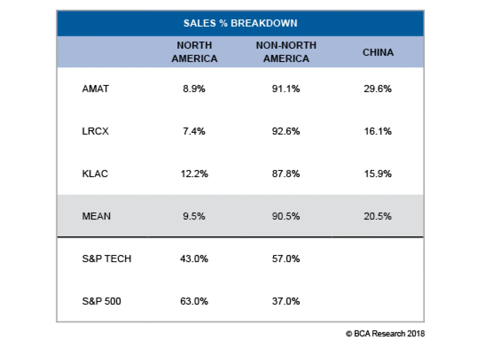
First, trade policy uncertainty has dealt a blow to this tech subindex. Not only are 90% of sales foreign sourced, but a large chunk is also China-related sales. The table highlights the excessive sensitivity these stocks have to the U.S. dollar. In fact, the…
Highlights Portfolio Strategy The drubbing in the S&P semi equipment index is overdone and even a modest improvement on either the trade policy, industry demand or currency fronts could result in a reflex rebound, warranting an above benchmark allocation. An oil price rebound on the back of a more balanced supply/demand backdrop, a continuation in the global capex energy upcycle and compelling relative valuations all suggest that the path of least resistance is higher for oil majors. Recent Changes Boost the S&P Semiconductor Equipment index to overweight today, on a tactical three-to-six month time horizon. Table 1
Signal Vs. Noise
Signal Vs. Noise
Feature Equities attempted to stage a recovery last week and are in a triple bottom technical formation, still consolidating the October tremor. The Fed meeting later this week will likely prove a catalyst on the monetary policy front, especially if the closely watched FOMC median dots decrease for 2019 as the bond market has been expecting. As we mentioned in our 2019 High-Conviction calls Report two weeks ago,1 the Fed will dominate markets next year and any dovish change in interest rate expectations will breathe a sigh of relief into the SPX. Given the heightened volatility and violent recent equity market oscillations, it is important to separate the noise from the actual signal. While distinguishing between the two is hard at times, we are relying on a few key indicators to aid us in this process. First, our S&P 500 EPS growth model is still expanding near the 10% mark for next year as clearly 25% EPS growth is not sustainable. While the risk is that this growth rate decelerates further, as long as EPS do not contract next year, stock prices should recover (Chart 1). From a macro perspective, at this stage of the cycle with nominal GDP growth between 4-5%, organic EPS growth should at least mimic nominal output growth. Tack on a 2% buyback yield or artificial EPS growth and attaining a 7% EPS growth rate is likely next year.
Chart 1
Second, while the 5/2 and 5/3 yield curve slopes have inverted and we heed these signals, the 10/2 and the Fed’s spread (2-year yield minus the fed funds rate) have yet to invert. Historically, the most significant yield curve signals for the equity market are when simultaneously all the different yield curve slopes are inverted. While everyone is infatuated with the yield curve inversion implications of recession, we are laser focused on the interplay between the yield curve and stock market peaks. Importantly, typically the 10/2 yield curve inversion occurs before stock market peaks. Going back to the mid-1960s there has been only one time when the stock market peaked prior to the yield curve inversion, in 1973: the SPX crested on January 11 and the yield curve inverted on January 16 (due to lack of data we use the effective fed funds rate instead of the 2-year yield prior to 1976). In all the other iterations, the yield curve inverts prior to the stock market top. Even in 1998 the yield curve inverted in late-May and the SPX peaked in mid-July before suffering a 20% drawdown. Similarly, on February 2, 2000 the yield curve inverted and on March 24, 2000 the SPX topped out for the cycle.
Chart 2
Chart 3… And Then The SPX Peaks
...And Then The SPX Peaks
...And Then The SPX Peaks
In other words, the yield curve inversion is a leading indicator and once the curve inverts, it signals that the stock market highpoint will follow soon thereafter (Charts 2 & 3). The broad market tops on average 248 days (median 77 days) following the yield curve inversion (Table 2), though the large variability in each iteration limits the usefulness of this average as an accurate predictor. Nevertheless, the implication remains that the SPX has yet to peak for the cycle. Table 2Yield Curve Inversions And S&P 500 Peaks
Signal Vs. Noise
Signal Vs. Noise
Third, a slew of economically sensitive indicators have troughed. Sweden’s PMI and Swedish stock market relative performance have been in a V-shaped recovery. As we highlighted earlier this week,2 Sweden is a small open economy and it is likely sniffing out an improvement in global export volume growth and a likely de-escalation in the U.S./China trade tussle. EM FX, the CRB raw industrials commodities index, the Baltic Dry Index and semi equipment stocks (see more details in the next section) all suggest that the worst is over, and global trade will likely resume its advance in the coming months (Chart 4). Chart 4Hyper-sensitive Indicators Sniffing Out A Trough?
Hyper-sensitive Indicators Sniffing Out A Trough?
Hyper-sensitive Indicators Sniffing Out A Trough?
Finally, inflation is coming off the boil and will likely decelerate in the months ahead courtesy of the fall in WTI crude oil prices. Were oil to move sideways from here, headline inflation would decelerate further, likely overwhelming core CPI (Chart 5). This is significant, as it could serve as a monetary policy catalyst. Put differently, decelerating inflation may cause the Fed to reconsider the pace of its interest rate hikes. A pause in the tightening cycle in March 2019 would be a welcome development for stocks, especially if the fed funds rate is nearing the terminal rate as we recently highlighted in our trough-to-peak fed funds rate tightening cycle analysis.3 Chart 5Inflation Will Decelerate
Inflation Will Decelerate
Inflation Will Decelerate
Adding it all up, our still expanding SPX EPS growth model, a lack of a 10/2 yield curve inversion, a trough in a number of economically sensitive indicators and the potential for a temporary Fed hike pause in March next year, all signal that the equity bull market is not over and fresh all-time highs are looming in 2019. This week we are upgrading, on a tactical basis, a bombed out tech subgroup, and updating our view on a deep cyclical index. Semi Equipment: Enough Is Enough We are lifting exposure in the niche S&P semi equipment index from underweight to a modest overweight. Putting this in perspective, this small index comprises only 1.5% of the tech universe and commands a mere 0.3% weight in the S&P 500. There are high odds that most of the carnage in semi equipment stocks is already reflected in the violent swing of the sell side community from extreme bullishness up until August of this year to the current extreme bearishness. As a reminder, the S&P semi equipment index was part of U.S. Equity Strategy’s high-conviction underweight call revealed in November 27, 2017 when the sell-side could not have enough of semi equipment stocks as analysts were also mesmerized last winter by the near $20,000/bitcoin related mania.4 This timing coincided with the peak in performance of this hypersensitive early-cyclical tech index (Chart 6). Chart 6Extreme Bearishness...
Extreme Bearishness...
Extreme Bearishness...
To get a sense of how far the pendulum has swung on the bearish camp, we note the following: The relative 12-month forward EPS growth has deflated from positive 60% to negative 20% (Chart 6). The index’s forward P/E is trading at a 40% discount to the SPX, relative 5-year EPS growth estimates are near previous troughs and even compared to the overall tech sector; semi equipment long-term EPS growth is now forecast to trail their tech brethren (Chart 7). Even forward sales growth has collapsed, falling to a multi-year low. Analysts now expect an outright contraction in revenues to the tune of 4% or 10 percentage points below the S&P 500 (Chart 6). Net EPS revisions have also been sinking like a stone, approaching the 2012 nadir (Chart 6). Technical conditions are oversold with cyclical momentum as bad as it gets (Chart 7). Chart 7...Reigns
...Reigns
...Reigns
Beyond this overly pessimistic backdrop, there are some macro indicators that, were they to sustain their recent budding recoveries, would serve to catalyze the chip equipment group. First, trade policy uncertainty has dealt a blow to this tech subindex (trade policy uncertainty shown inverted, top panel, Chart 8). Not only are 90% of sales foreign sourced, but a large chunk is also China-related sales. Table 3 highlights the excessive sensitivity these stocks have to the U.S. dollar. In fact, the correlation with J.P. Morgan’s EM FX index is an almost perfect one (Chart 8). If President Trump is serious about striking a deal with China, then this group would enjoy a relief rally. Chart 8Potential Positive Catalysts
Potential Positive Catalysts
Potential Positive Catalysts
Table 3U.S. Semi Equipment Geographical Sales Breakdown
Signal Vs. Noise
Signal Vs. Noise
Second, emerging market manufacturing PMIs are showing some signs of life, underscoring that semi equipment demand may turn out to be marginally less grim than currently anticipated (Chart 9). Chart 9EM Green Shoots?
EM Green Shoots?
EM Green Shoots?
Third, while global semi sales will continue to decelerate for the next three-to-six months, the semi market is functioning as if the inventory liquidation cycle is in the later innings, with our industry pricing power proxy plummeting 180 percentage points from peak-to-the-recent trough, just below the contraction zone (Chart 10). Chart 10Inventory Liquidation Is In Late Stages
Inventory Liquidation Is In Late Stages
Inventory Liquidation Is In Late Stages
Finally, any bounce in cryptocurrencies may also serve as a positive catalyst for additional demand for the semi equipment companies that enjoy monopolies in their respective manufacturing niches (Chart 10). In sum, the drubbing in the S&P semi equipment index is overdone and even a modest improvement on either the trade policy, industry demand or currency fronts could result in a reflex rebound. Bottom Line: Lift the S&P semi equipment index from underweight to overweight today, as a tactical move for the next three-to-six months. The ticker symbols for the stocks in this index are: BLBG: S5SEEQ – AMAT, LRCX and KLAC. Oil Majors Are Holding Firm In early-February we upgraded the heavyweight integrated oil & gas energy subindex to an above benchmark allocation. Our thesis centered on a capex upcycle recovery and firming oil price backdrop that would unlock excellent value in this key energy subgroup. Since then, the relative share price ratio has moved laterally. Interestingly, this defensive energy subindex neither kept up with the steep oil price advance until the end of September, nor with the recent drubbing in crude oil prices (Chart 11). Put differently, oil majors never discounted sustainably higher oil prices, and are also refraining from extrapolating recent oil prices weakness far into the future. Chart 11Defensive Oil Equities
Defensive Oil Equities
Defensive Oil Equities
While the Trump Administration’s flip-flop on the Iranian sanctions has injected extreme volatility into oil prices, some semblance of normality has returned to the crude oil markets as last week OPEC and Russia agreed to a production cut in order to help balance the market. Another key factor that has contributed to the recent fall in oil prices at the margin has been U.S. shale oil supplies. Roughly 30% per annum growth in U.S. crude oil production is unsustainable and, were production to remain near all-time highs and move sideways in 2019, then the growth rate would fall back to the zero line. Such a paring back in the growth rate, along with OPEC/Russia discipline, would likely balance the oil market and pave the way for an oil price recovery (oil production shown inverted, Chart 12). Chart 12U.S. Supply Response Is Looming
U.S. Supply Response Is Looming
U.S. Supply Response Is Looming
Given that BCA’s Commodity & Energy Strategy service continues to forecast higher oil prices into 2019, the S&P integrated oil & gas index should stage a sustainable rebound next year. While the recent swift drop in oil prices is jeopardizing the still recovering capital expenditure cycle, we doubt $50/bbl oil would make current projects uneconomical and result in mothballing or outright canceling of ongoing oil exploration projects (Chart 13). Granted, a big assumption is that oil prices at least hold near the current level and do not suffer a relapse to the early-2016 lows. Historically, rising oil exploration outlays and integrated oil & gas share prices move in lock step and the current message is to expect a rebound in the latter (Chart 14). Chart 13Low Odds Of A Total...
Low Odds Of A Total...
Low Odds Of A Total...
Chart 14...Capex Collapse
...Capex Collapse
...Capex Collapse
Finally, sell-side analysts are throwing in the towel. Net earnings revisions have taken a beating of late, which is positive from a contrary point of view (second panel, Chart 15). Relative valuations are extremely compelling on a number of metrics including relative price-to-book, price-to-sales and relative forward price-to-earnings (third panel, Chart 15). Tack on a near 200bps positive delta in the dividend yield versus the broad market and yield hungry investors will also seek the relative safety of this defensive energy subindex (bottom panel, Chart 15). Chart 15Integrated Stocks Are On Sale
Integrated Stocks Are On Sale
Integrated Stocks Are On Sale
Netting it all out, an oil price rebound on the back of a more balanced supply/demand backdrop, a continuation in the global capex energy upcycle and compelling relative valuations all suggest that the path of least resistance is higher for oil majors. Bottom Line: Stay overweight the heavyweight S&P integrated oil & gas energy subindex. The ticker symbols for the stocks in this index are: BLBG: S5IOIL – XOM, CVX and OXY. Anastasios Avgeriou, Vice President U.S. Equity Strategy anastasios@bcaresearch.com Footnotes 1 Please see BCA U.S. Equity Strategy Weekly Report, “2019 Key Views: High-Conviction Calls,” dated December 3, 2018, available at uses.bcaresearch.com. 2 Please see BCA U.S. Equity Strategy Sector Insights, “Can Sweden Lead The SPX?” dated December 12, 2018, available at uses.bcaresearch.com. 3 Please see BCA U.S. Equity Strategy Weekly Report, “2019 Key Views: High-Conviction Calls,” dated December 3, 2018, available at uses.bcaresearch.com. 4 Please see BCA U.S. Equity Strategy Weekly Report, “2018 High-Conviction Calls,” dated November 27, 2017, available at uses.bcaresearch.com. Current Recommendations Current Trades Size And Style Views Favor value over growth Favor large over small caps