Sectors

Highlights Chart 12015 Repeat?
2015 Repeat?
2015 Repeat?
Credit spreads widened as Treasury yields rose in October, bringing to mind the experience of 2015 when tight monetary policy and flagging global growth combined to cause a large drawdown in spread product excess returns. Chart 1 shows the familiar pattern. The market's rate hike expectations held constant throughout most of 2015. Meanwhile, falling commodity prices signaled weakness in global demand. Eventually, the combination of tight money and slowing growth was too much for the market to bear. Junk sold off in late-2015 and didn't recover until after the Fed scaled back its rate hike plans. It's hard to ignore today's similar set-up. Commodity prices are once again falling and the Fed appears committed to lifting rates. Unless global demand rebounds, we could be in for a repeat of late-2015's ugly price performance. The best way to position U.S. bond portfolios for this risk is to maintain below-benchmark portfolio duration, and to scale back exposure to credit risk. We advocate nothing more than a neutral allocation to spread product, with an up-in-quality bias. Feature Investment Grade: Neutral Investment grade corporate bonds underperformed the duration-equivalent Treasury index by 82 basis points in October, dragging year-to-date excess returns down to -98 bps. The index option-adjusted spread widened 12 bps on the month, and currently sits at 117 bps. Recent spread widening has returned some value to the corporate bond space. The 12-month breakeven spread for Baa-rated corporate bonds is back up to its 36th percentile relative to history, while the same spread for A-rated securities is at its 18th percentile (Chart 2). Chart 2Investment Grade Market Overview
Investment Grade Market Overview
Investment Grade Market Overview
Though spreads are somewhat more attractive, caution remains warranted in the corporate bond space. Corporate profit growth has only just managed to keep pace with debt growth during the past few quarters (bottom panel). In other words, even a mild deceleration in profits will be enough for leverage to resume its uptrend (panel 4). As we observed in last week's report, Q3's sharp decline in non-residential investment spending might signal that weak foreign growth is finally starting to weigh on profits.1 The possibility of rising leverage in the coming quarters leads us to recommend an up-in-quality bias within our neutral allocation to corporate bonds. To pick up extra spread we prefer a strategy of favoring long-maturity credits over short maturities. In last week's report we showed that the long-end of the credit curve outperforms (in excess return terms) when Treasury yields rise. High-Yield: Neutral High-Yield underperformed the duration-equivalent Treasury index by 159 basis points in October, dragging year-to-date excess returns down to +161 bps. The average index option-adjusted spread widened 55 bps on the month, and currently sits at 363 bps. Our measure of the excess spread available in the High-Yield index after accounting for default losses is currently 259 bps, above the long-run mean of 247 bps (Chart 3). This tells us that if default losses are in line with our expectations during the next 12 months and junk spreads remain constant, we should expect high-yield returns of 259 bps in excess of duration-matched Treasuries. If we assume that spreads tighten enough to bring our default-adjusted spread back to its long-run average, we would expect an excess return of 306 bps. Chart 3High-Yield Market Overview
High-Yield Market Overview
High-Yield Market Overview
The main reason for continued caution on junk bonds is that the default loss expectation embedded in our excess spread calculation is extremely low relative to history (panel 4). Our assumption, derived from the Moody's baseline default rate forecast and our own forecast of the recovery rate, calls for default losses of 1.04% during the next 12 months. Default losses have rarely come in below that level. Further, the recent trend in job cut announcements makes it even more likely that default losses surprise to the upside during the next 12 months. Job cut announcements are highly correlated with the default rate, and while they remain low relative to history, they have clearly formed a trough this year (bottom panel). Table 3ACorporate Sector Relative Valuation And Recommended Allocation*
Toxic Combination
Toxic Combination
Table 3BCorporate Sector Risk Vs. Reward*
Toxic Combination
Toxic Combination
MBS: Neutral Mortgage-Backed Securities underperformed the duration-equivalent Treasury index by 37 basis points in October, dragging year-to-date excess returns down to -44 bps. The conventional 30-year zero-volatility MBS spread increased 2 bps on the month. A 4 bps widening of the option-adjusted spread (OAS) was partially offset by a 2 bps decline in the compensation for prepayment risk (option cost). The OAS has widened in recent months, though it remains tight compared to its average pre-crisis level (Chart 4). The overall nominal MBS spread remains very low, but for good reason (panel 4). Chart 4MBS Market Overview
MBS Market Overview
MBS Market Overview
The two most important drivers of MBS excess returns are: (i) mortgage refinancing activity and (ii) bank lending standards. Refi activity is already depressed and will stay muted as interest rates rise. Bank lending standards eased in Q2 for the 17th consecutive quarter, but remain tight relative to history. In response to a special question from the Fed's July Senior Loan Officer Survey, respondents noted that mortgage lending standards are in the tighter end of the range since 2005. This suggests that further gradual easing is likely going forward. With lending standards easing and refi activity low, the macro environment is consistent with tight MBS spreads. We maintain only a neutral allocation to the sector for now, but will look to upgrade when it comes time to further pare exposure to corporate credit risk. Government-Related: Underweight The Government-Related index underperformed the duration-equivalent Treasury index by 55 basis points in October, dragging year-to-date excess returns down to -16 bps. Sovereign debt underperformed the Treasury benchmark by 184 bps, dragging year-to-date excess returns down to -118 bps. Foreign Agencies underperformed by 94 bps on the month, dragging year-to-date excess returns down to -60 bps. Local Authorities underperformed by 28 bps, dragging year-to-date excess returns down to +63 bps. Supranationals underperformed Treasuries by 3 bps, dragging year-to-date excess returns down to +13 bps. Domestic Agency bonds underperformed by 4 bps, dragging year-to-date excess returns down to +5 bps. Sovereign debt has underperformed this year, but spreads remain expensive compared to U.S. corporate credit. In a recent report we looked at USD-denominated Emerging Market Sovereign debt by country and found that only a few nations offer excess spread compared to equivalently-rated U.S. corporates.2 Those countries being Argentina, Turkey, Lebanon and Ukraine at the low-end of the credit spectrum and Saudi Arabia, Qatar and UAE at the upper-end. We continue to view the Local Authority sector as very attractive. Not only does the sector offer elevated spreads (Chart 5), but it is dominated by taxable municipal securities which are insulated from weak foreign growth and U.S. dollar strength. Chart 5Government-Related Market Overview
Government-Related Market Overview
Government-Related Market Overview
Municipal Bonds: Overweight Municipal bonds underperformed the duration-equivalent Treasury index by 47 basis points in October, dragging year-to-date excess returns down to +105 bps (before adjusting for the tax advantage). The average Aaa-rated Municipal / Treasury (M/T) yield ratio rose 1% in October, and currently sits at 87% (Chart 6). This is about one standard deviation below its post-crisis mean and only slightly above the average of 81% that was observed in the late stages of the previous cycle, between mid-2006 and mid-2007. Chart 6Municipal Market Overview
Municipal Market Overview
Municipal Market Overview
But despite the low yield ratio, we see tax-exempt municipal yields as quite attractive, especially at the long-end of the curve. For example, we observe that a 5-year Aa-rated municipal bond carries a yield of 2.55% versus a yield of 3.62% for a comparable corporate bond index. This implies that an investor with an effective tax rate of 30% should be indifferent between the two bonds. Moving further out the curve, the breakeven tax rate falls to 23% at the 10-year maturity point and is even lower at the 20-year maturity point. Further, unlike the corporate sector, state & local government balance sheets are relatively insulated from weakening foreign economic growth and a rising U.S. dollar. While our Municipal Health Monitor has bounced in recent quarters, it remains below zero, consistent with ratings upgrades outpacing downgrades (bottom panel). Treasury Curve: Favor The 7-Year Bullet Over The 1/20 Barbell The Treasury curve bear-steepened in October. The 2/10 slope steepened 4 bps and the 5/30 slope steepened 16 bps. As a result of the large curve steepening, our position long the 7-year bullet and short the 1/20 barbell returned +67 bps on the month, and is now up +107 bps since inception. However, the curve steepening also means that steepener trades focused on the belly (5-7 year) of the curve are no longer attractive according to our models (see Tables 4 & 5). The 7-year bullet is now fairly valued relative to the 1/20 barbell, meaning that the butterfly spread is priced for an unchanged 1/20 slope during the next six months (Chart 7). Our baseline macro assessment is that the yield curve slope will remain near current levels during that timeframe. As such, we close our position long the 7-year bullet and short the 1/20 barbell. Chart 7Treasury Yield Curve Overview
Treasury Yield Curve Overview
Treasury Yield Curve Overview
Absent attractive value, the only reason to focus curve exposure on the 5-7 year maturity point is as a hedge against an unexpected pause in Fed rate hikes. In prior research we showed that the belly of the curve performs best when the 12-month discounter falls.3 But with our discounter priced for only 61 bps of rate hikes for the next 12 months, this risk may not be worth hedging. Instead, we prefer to go long the 2-year bullet and short a duration-matched 1/5 barbell. This trade is attractively priced on our model (bottom panel) and should outperform in a rising yield environment. The 1/5 slope tends to steepen when our 12-month discounter rises, and vice-versa. TIPS: Overweight TIPS underperformed the duration-equivalent nominal Treasury index by 61 basis points in October, dragging year-to-date excess returns down to +76 bps. The 10-year TIPS breakeven inflation rate fell 9 bps on the month and currently sits at 2.06%. The 5-year/5-year forward TIPS breakeven inflation rate also fell 9 bps on the month and currently sits at 2.21%. Both the 10-year and the 5-year/5-year forward TIPS breakeven inflation rates remain below the 2.3% to 2.5% range that has historically been consistent with inflation expectations that are well-anchored around the Fed's 2% target. We think it is only a matter of time before inflation expectations adjust higher into that range, and we therefore maintain an overweight position in TIPS versus nominal Treasuries. The catalyst for wider TIPS breakevens will be persistent inflation readings near the Fed's 2% target. Trimmed mean inflation has only just returned to the Fed's 2% target (Chart 8), but will probably remain close to that level for the next six months. While base effects will pose a higher hurdle for year-over-year inflation during this time, pipeline inflation pressures are also building, as evidenced by the prices paid component of the ISM Manufacturing survey (panel 4).4 Chart 8Inflation Compensation
Inflation Compensation
Inflation Compensation
ABS: Neutral Asset-Backed Securities underperformed the duration-equivalent Treasury index by 6 basis points in October, dragging year-to-date excess returns down to +23 bps. The index option-adjusted spread for Aaa-rated ABS widened 5 bps on the month and now stands at 38 bps, 4 bps above its pre-crisis low. The excess return Bond Map on page 15 shows that consumer ABS offer attractive return potential compared to both Supranationals and Domestic Agencies, but carry a substantially higher risk of losses. Agency CMBS appear much more attractive than consumer ABS on a risk/reward basis, offering approximately the same expected return with less risk. From a credit quality perspective, the consumer credit delinquency rate remains low by historical standards but has clearly put in a bottom (Chart 9). The household interest coverage ratio has been rising for 10 consecutive quarters, suggesting that the delinquency rate will continue to increase. Chart 9ABS Market Overview
ABS Market Overview
ABS Market Overview
We remain neutral on consumer ABS for now, but prefer Local Authorities, Municipal Bonds and Agency-backed CMBS when it comes to high-quality spread product. If consumer credit delinquencies continue to rise without a commensurate increase in ABS spreads, then our next move will likely be a reduction to underweight. Non-Agency CMBS: Underweight Non-Agency Commercial Mortgage-Backed Securities underperformed the duration-equivalent Treasury index by 47 basis points in October, dragging year-to-date excess returns down to +120 bps. The index option-adjusted spread for non-agency Aaa-rated CMBS widened 10 bps on the month and currently sits at 94 bps (Chart 10). Chart 10CMBS Market Overview
CMBS Market Overview
CMBS Market Overview
A typical negative environment for CMBS is characterized by tightening bank lending standards on commercial real estate loans as well as falling demand. The Fed's Q2 Senior Loan Officer Survey showed that both lending standards and demand are close to unchanged. In other words, the macro picture for CMBS is decidedly mixed. Agency CMBS: Overweight Agency CMBS underperformed the duration-equivalent Treasury index by 31 basis points in October, dragging year-to-date excess returns down to +23 bps. The index option-adjusted spread widened 7 bps on the month and currently sits at 51 bps. The Bond Maps on page 15 show that Agency CMBS offer high potential return compared to other low risk spread products. An overweight allocation to this sector continues to make sense. The BCA Bond Maps The following page presents excess return and total return Bond Maps that we use to assess the relative risk/reward trade-off between different sectors of the U.S. fixed income market. The Maps employ volatility-adjusted breakeven spread/yield analysis to show how likely it is that a given sector will earn/lose money during the subsequent 12 months. The Maps do not impose any macroeconomic view. The Excess Return Bond Map The horizontal axis of the excess return Bond Map shows the number of days of average spread widening required for each sector to lose 100 bps versus a position in duration-matched Treasuries. Sectors plotting further to the left require more days of average spread widening and are therefore less likely to see losses. The vertical axis shows the number of days of average spread tightening required for each sector to earn 100 bps in excess of duration-matched Treasuries. Sectors plotting further toward the top require fewer days of spread tightening and are therefore more likely to earn 100 bps in excess of Treasuries. The Total Return Bond Map The horizontal axis of the total return Bond Map shows the number of days of average yield increase required for each sector to lose 5% in total return terms. Sectors plotting further to the left require more days of yield increases and are therefore less likely to lose 5%. The vertical axis shows the number of days of average yield decline required for each sector to earn 5% in total return terms. Sectors plotting further toward the top require fewer days of yield decline and are therefore more likely to earn 5%. Chart 11Excess Return Bond Map (As Of November 2, 2018)
Toxic Combination
Toxic Combination
Chart 12Total Return Bond Map (As Of November 2, 2018)
Toxic Combination
Toxic Combination
Table 4Butterfly Strategy Valuation (As Of September 28, 2018)
Toxic Combination
Toxic Combination
Table 5Discounted Slope Change During Next 6 Months (BPs)
Toxic Combination
Toxic Combination
Ryan Swift, Vice President U.S. Bond Strategy rswift@bcaresearch.com 1 Please see U.S. Bond Strategy Weekly Report, "What Kind Of Correction Is This?", dated October 30, 2018, available at usbs.bcaresearch.com 2 Please see U.S. Bond Strategy Weekly Report, "Oil Supply Shock Is A Risk For Junk", dated October 9, 2018, available at usbs.bcaresearch.com 3 Please see U.S. Bond Strategy Weekly Report, "More Than One Reason To Own Steepeners", dated September 25, 2018, available at usbs.bcaresearch.com 4 For details on our base effects indicator for PCE inflation, please see U.S. Bond Strategy Weekly Report, "The Powell Doctrine Emerges", dated September 4, 2018, available at usbs.bcaresearch.com Fixed Income Sector Performance Recommended Portfolio Specification Corporate Sector Relative Valuation And Recommended Allocation Total Return Comparison: 7-Year Bullet Versus 2-20 Barbell (6-Month Investment Horizon)
The dramatic decline in semi equipment stocks has not been arrested in the Q3 earnings season, despite relatively positive results. We think the overall negative sentiment around global tech stocks in general and valuation high-flyers in particular has been…
There is no denying that the U.S. housing market has softened this year. There is little mystery as to why the housing market has been on the back foot. The Trump tax bill capped the deduction on state and local property taxes, while reducing the amount of…
Highlights Portfolio Strategy Frenzied software M&A activity, the ongoing capex upcycle, firming industry operating metrics and pristine balance sheets suggest that software stocks are a must have for equity portfolios. Rising interest rates along with the Fed's quantitative tightening, the return of volatility, higher gasoline prices, stretched technicals and a lack of a valuation cushion all suggest that it pays to remain bearish consumer discretionary stocks. Recent Changes We lifted the S&P Industrial Conglomerates index to overweight in a Sector Insight on Wednesday last week.1 Table 1
Recuperating
Recuperating
Feature Chart 1Stocks Are...
Stocks Are…
Stocks Are…
The S&P 500 found its footing last week, but the volatility comeback assures more violent oscillations before equities resume their upward trajectory. Crash-prone October lived up to its reputation but it is now over, and once the midterm election uncertainty passes this week, investors will refocus their attention on the U.S./China trade war and U.S. economic growth. Trump's moderating approach on the former was welcome news last week, and any further de-escalation signs in the trade tussle will breathe a huge sigh of relief for equities. On the investment front, the 10% SPX drawdown triggered our "buy the dip" strategy on Friday October 26 (please see the "Time To Bargain Hunt" Sector Insight), when we put to work longer-term oriented capital. Our "buy the dip" view remains intact, as we still do not foresee a recession in the coming 9-12 months. On the volatility front, the CBOE SKEW index, a measure of tail risk,2 is sending a positive message as investors are no longer buying tail risk protection as they did in August. Interestingly, as the nominal level of the SPX has been increasing over the decades so has the price of tail risk protection (Chart 1). We view the recent collapse in the CBOE SKEW index as a positive indication that the worst may be behind the equity market. With regard to global flows to U.S. shores, the Treasury International Capital (TIC) System data revealed that global portfolio managers were not chasing U.S. equities this summer as they had been at the beginning of the year. The likely current trough in net foreign portfolio flows into U.S. equities should, at the margin, underpin U.S. stocks (Chart 2). Chart 2... Likely Out Of The Woods...
... likely out of the woods…
... likely out of the woods…
On the U.S. economic front, the latest GDP release revealed that housing is indeed softening. This is the first time since the GFC that residential investment's contribution to real GDP growth turned negative for three consecutive quarters. Tack on decelerating house prices and collapsing lumber prices (Chart 3) and residential real estate confirms the yellow flag from our recently introduced Economic Impulse Indicator.3 Chart 3...But Housing Poses A Risk
...but housing poses a risk
...but housing poses a risk
While house prices are decelerating, corporate pricing power remains upbeat. True, investors focused on anecdotes about input cost inflation this earnings season and all but ignored evidence that companies across different sectors have been able, and will continue, to raise selling prices by more than the rise in wage and commodity costs. Thus, corporate profit margin squeeze fears are overblown; they are likely a risk for the back half of 2019, especially if volume growth suffers a setback. This week we are updating our corporate pricing power gauge. While our overall proxy has ticked down, it is still clocking higher than wage inflation. In fact, our pricing power diffusion index shows excellent breadth (second panel, Chart 4). This firming corporate inflation backdrop suggests that businesses have been successful in passing on rising input costs down the supply chain or to the consumer, and thus suggests that investors are mistakenly fretting about a looming profit margin squeeze. Chart 4No Margin Pressures Yet
no margin pressures yet
no margin pressures yet
While labor cost inflation is trending higher, wage growth remains contained near 3% despite a multi-decade low in the unemployment rate. According to our wage growth diffusion index, just over half of the 44 industries we track have to contend with rising wages, a visible fall from earlier in the year (middle panel, Chart 4). In addition, the Atlanta Fed Wage Growth Tracker remains tame and the switcher/stayer index recently nosedived to multi-year lows. The switcher/stayer index provides a reliable leading indication for the trend in overall labor expenses (fourth panel, Chart 4). Put differently, corporate pricing power is rising on a broadening basis while leading indicators of wage inflation suggest an easing in wage pressures in the coming months. As a result, there are rising odds that expanding forward operating margin expectations are likely, extending the two year margin expansion phase (bottom panel, Chart 4). Digging deeper into our corporate pricing power update is revealing. Table 2 summarizes the results. As a reminder, we calculate industry group pricing power from the relevant CPI, PPI, PCE and commodity growth rates for each of the 60 industry groups we track. Table 2 also highlights shorter term pricing power trends and each industry's spread to overall inflation. Table 2Industry Group Pricing Power
Recuperating
Recuperating
73% of the industries we cover are lifting selling prices, while another ten industries are experiencing only mild price deflation (less than a 0.6% decline). If we include those ten industries then 90% of sectors are maintaining or raising selling prices. One third of the industries are lifting prices at a faster clip than overall inflation. This is lower than our early-July report. Outright deflating sectors increased by four to sixteen since our last update but only six are deflating at 1% or more. On a slightly negative note, fourteen industries are experiencing a downtrend in selling price inflation, twice as many since our most recent report (Table 2). Deep cyclicals/commodity-related industries continue to dominate the top ranks, occupying the top 7 slots (top panel, Chart 5). Despite the ongoing global export softness, intensifying trade tussle with China and 5% year-to-date appreciation in the trade-weighted U.S. dollar, the commodity complex's ability to increase prices is impressive especially given that the base effects from the late-2015/early-2016 manufacturing recession have filtered out. On the flip side, tech industries dominate the bottom ranks of Table 2. Chart 5Cyclicals Have The Upper Hand
cyclicals have the upper hand
cyclicals have the upper hand
In sum, accelerating business sector selling prices will continue to underpin top line growth into 2019. As long as wage inflation rises gradually and does not gallop higher and the corporate sector sustains its pricing power, then profit margins and earnings will remain upbeat. This week we update a high-conviction overweight tech subgroup and reiterate our below benchmark allocation to an early cyclical sector. Software Is In High Demand Despite recent tech stock ills, software stocks continue to defy gravity and remain in a multi-year uptrend, still above the dotcom bubble relative performance highs (top panel, Chart 6). We reiterate our high-conviction overweight status and within tech we continue to prefer the S&P software and S&P tech hardware, storage & peripherals indexes to the early-cyclical tech S&P semis and S&P semi equipment subgroups. Chart 6Software Fever
software fever
software fever
It did not take long for the large CA acquisition to get surpassed by RHT. Inter-industry M&A activity is reaching fever pitch and this frenzy is bidding up premia to stratospheric levels (fourth panel, Chart 6). The push to the cloud, SaaS and even AI has boosted the appeal of software stocks and brought them to the forefront of potential takeout candidates. These are secular trends and will likely continue to gain steam irrespective of the different stages in the business cycle. As a result, software stocks should remain core tech holdings in equity portfolios. Chart 7Capex Gains...
capex gains…
capex gains…
Beyond the positive M&A angle that we have been exploring for quite some time in our research, software stocks are particularly levered on capital spending. Chart 7 shows that relative capital outlays and the share price ratio are joined at the hip. Software upgrades offer the simplest, quickest and most effective capital deployment especially when productivity gains ground to a halt. Importantly, leading indicators of overall capex remain upbeat and should continue to underpin software profits (Chart 8). Chart 8...Say Stick With Software
...say stick with software
...say stick with software
Moreover, industry operating metrics are on fire. Top line growth is accelerating and running at a higher clip than the broad market. The recovery in the software price deflator (middle panel, Chart 9), a proxy for industry pricing power, corroborates this bright demand backdrop. Impressively, labor additions have been muted, implying that margins can expand further and possibly challenge cyclical highs (bottom panel, Chart 9). Chart 9Operating Metrics Are Firing On All Cylinders
operating metrics are firing on all cylinders
operating metrics are firing on all cylinders
With regard to financial statements, software stocks have pristine balance sheets with more cash on hand than debt, which sustains the net debt-to-EBITDA ratio in negative territory. Interest coverage is great at 10x and free cash flow generation is expanding smartly (Chart 10). Chart 10Pristine Balance Sheets
pristine balance sheets
pristine balance sheets
Nevertheless, all of these positives have pushed several valuation metrics to a premium to the broad market and leave little space for any mishaps. On a forward P/E, trailing P/S, and even EV/EBITDA basis, software equities are pricey, but we think for good reason (bottom panel, Chart 10). This rerating phase will likely continue until there is evidence of an end either to the M&A frenzy, or capex upcycle or business cycle. In sum, feverish software M&A activity, the ongoing capex upcycle, firming industry operating metrics and pristine balance sheets, suggest that software stocks are a must have for equity portfolios. Bottom Line: The S&P software index remains a high-conviction overweight. The ticker symbols for the stocks in this index are: BLBG: S5SOFT - MSFT, ORCL, ADBE, CRM, INTU, RHT, ADSK, CA, SNPS, CTXS, ANSS, CDNS, FTNT and SYMC. Consumer Discretionary Stocks Are Still A Sell While we remain constructive on financials that benefit from higher rates, we continue to recommend investors avoid the consumer discretionary sector - the other early cyclical - that suffers when interest rates rise. Chart 11 depicts this inverse correlation consumer discretionary equities have with interest rates, especially the fed funds rate. Most discretionary equites are levered off of floating rates and thus any increase in the fed funds rates gets reflected immediately in banks' prime lending rate. Also, most consumer debt is floating rate debt and thus tighter monetary conditions, at the margin, dampen consumer debt uptake and, as a knock-on effect, weigh on discretionary consumer outlays. Chart 11Rising Fed Funds Rates...
rising fed funds rates…
rising fed funds rates…
Last week we highlighted that, now that the Fed has been raising rates and allowing bonds to roll off its balance sheet, volatility is making a comeback. Unsurprisingly, the consumer discretionary share price ratio is inversely correlated with the VIX index, signaling that more pain lies ahead for this early cyclical index (VIX shown inverted, Chart 12). Chart 12...The Volatility Comeback...
...the volatility comeback…
...the volatility comeback…
Money aggregates also corroborate that the time to buy consumer discretionary equities is when the money supply is galloping higher and shed exposure when both M1 and M2 are decelerating as we have shown in previous research. Importantly, the velocity of M2 money stock is inversely correlated with relative share prices and the current message is negative for consumer discretionary stocks as GDP is finally growing faster than M2 money growth (velocity of M2 money stock shown inverted, Chart 13). Chart 13...And Money Velocity Point To More Losses In Consumer Discretionary
...and money velocity point to more losses in consumer discretionary
...and money velocity point to more losses in consumer discretionary
Not only are higher interest rates anchoring consumer discretionary stocks but rising energy prices are also dealing a blow to this sector. Chart 14 shows our Consumer Drag Indicator (CDI, comprising mortgage rates and energy prices). Historically, our CDI has been an excellent leading indicator of relative share price momentum. Currently, the message is clear: the sinking CDI signals that a bear market in consumer discretionary stocks has likely commenced. Chart 14Heed The Message From The Consumer Drag Indicator
heed the message from the consumer drag indicator
heed the message from the consumer drag indicator
Sentiment and technical indicators also point to more downside ahead for this interest-rate sensitive index. Our sector advance/decline line is waning and EPS breadth has plunged (Chart 15). Worrisomely, sell-side analysts are penciling in an extremely optimistic 5-year outlook with EPS growth north of 30%/annum or twice as high as the overall market. Clearly this is not realistic as it assumes a near quadrupling of EPS in the coming 5 years. Chart 15Bad Breadth...
Bad Breadth…
Bad Breadth…
In the near-term, analysts are more cautious (bottom panel, Chart 15). Relative EPS estimates have already given way as AMZN commands very little EPS weight, despite its massive market cap weight (30% of the S&P consumer discretionary sector), and suggests that relative share prices will converge lower (top panel, Chart 16). As a result, the 12-month forward P/E ratio is trading at a 27% premium to the broad market and significantly above the historical mean. Technicals are almost as extended as relative valuations and cyclical momentum has likely peaked, warning that a downdraft in relative share prices looms (Chart 16). Chart 16...With Poor Technicals And No Valuation Cushion
...with poor technicals and no valuation cushion
...with poor technicals and no valuation cushion
Adding it up, a rising interest rate backdrop along with the Fed's quantitative tightening, the return of volatility, higher gasoline prices, stretched technicals and a lack of a valuation cushion, all suggest that it pays to remain bearish consumer discretionary stocks. Bottom Line: The path of least resistance is lower for the S&P consumer discretionary index, stay underweight. Anastasios Avgeriou, Vice President U.S. Equity Strategy anastasios@bcaresearch.com 1 Please see BCA U.S. Equity Strategy Sector Insight, "A Rout For Conglomerates Opens A Buying Opportunity," dated October 31, 2018, available at uses.bcaresearch.com. 2 "The crash of October 1987 sensitized investors to the potential for stock market crashes and forever changed their view of S&P 500® returns. Investors now realize that S&P 500 tail risk - the risk of outlier returns two or more standard deviations below the mean - is significantly greater than under a lognormal distribution. The Cboe SKEW Index ("SKEW") is an index derived from the price of S&P 500 tail risk. Similar to VIX®, the price of S&P 500 tail risk is calculated from the prices of S&P 500 out-of-the-money options. SKEW typically ranges from 100 to 150. A SKEW value of 100 means that the perceived distribution of S&P 500 log-returns is normal, and the probability of outlier returns is therefore negligible. As SKEW rises above 100, the left tail of the S&P 500 distribution acquires more weight, and the probabilities of outlier returns become more significant. One can estimate these probabilities from the value of SKEW. Since an increase in perceived tail risk increases the relative demand for low strike puts, increases in SKEW also correspond to an overall steepening of the curve of implied volatilities, familiar to option traders as the "skew"." Source: CBOE, http://www.cboe.com/products/vix-index-volatility/volatility-indicators/skew 3 Please see BCA U.S. Equity Strategy Weekly Report, "Icarus Moment?" dated October 22, 2018, available at uses.bcaresearch.com. Current Recommendations Current Trades Size And Style Views Favor value over growth Favor large over small caps
Highlights Investors are worrying too much about the things that caused the global financial crisis, and not enough about those that could cause the next downturn. Despite the recent patch of soft data, the U.S. housing market is in good shape. Go long homebuilders relative to the S&P 500. Imbalances in the corporate debt market have increased, but are not severe enough to generate systemic economic distress. U.S. rates will need to rise quite a bit more than the market anticipates before the economy slows by enough to force the Fed to back off. The combination of a stronger dollar and inadequate Chinese stimulus will continue to pressure emerging markets. Even Brazil's pro-capitalist new president may not be able to reverse the country's bleak fiscal dynamics. Our MacroQuant model, which predicted the correction, points to further near-term downside risk for global equities. The cyclical (12-to-18 month) outlook looks much better, however. Feature The Market's Maginot Line One of the most reliable ways to make money as an investor is to figure out the market's collective biases and trade against them. Behavioral economists have long noted that people tend to assign too much weight to recent experience in taking decisions. As a result, in finance, as in military strategy, there is a constant temptation to fight the last war. The last war policymakers waged was against the scourge of deflation that followed the housing bust and financial crisis. For much of the past decade, investors have held a magnifying glass over anything that could possibly resemble the conditions that led up to the Global Financial Crisis. While such behavior is understandable, it is misplaced. History suggests that both lenders and borrowers tend to act prudently for years, if not decades, following major financial crises. Mistakes are still made, but they are different mistakes. People overcompensate. They obsess about the past rather than focusing on the future. U.S. Housing Is Okay There is no denying that the U.S. housing market has softened this year (Chart 1). Housing starts, building permits, and home sales have all fallen. Residential investment has subtracted from GDP growth over three consecutive quarters. Chart 1Housing Has Been A Drag On The U.S. Economy This Year
Housing Has Been A Drag On The U.S. Economy This Year
Housing Has Been A Drag On The U.S. Economy This Year
There is little mystery as to why the housing market has been on the back foot. The Trump tax bill capped the deduction on state and local property taxes, while reducing the amount of mortgage debt on which homeowners can deduct interest payments from $1 million to $750,000. This had a negative effect on housing activity, especially in high-tax Democrat-leaning states with elevated real estate prices. More importantly, mortgage rates have risen by over 100 basis points since last August. Chart 2 shows that home sales and construction almost always decline after mortgage rates rise. In this respect, the weakness in housing activity is reminiscent of the period following the taper tantrum, when housing activity also slowed sharply. Chart 2No Mystery Why U.S. Housing Has Been Weak...
No Mystery Why U.S. Housing Has Been Weak...
No Mystery Why U.S. Housing Has Been Weak...
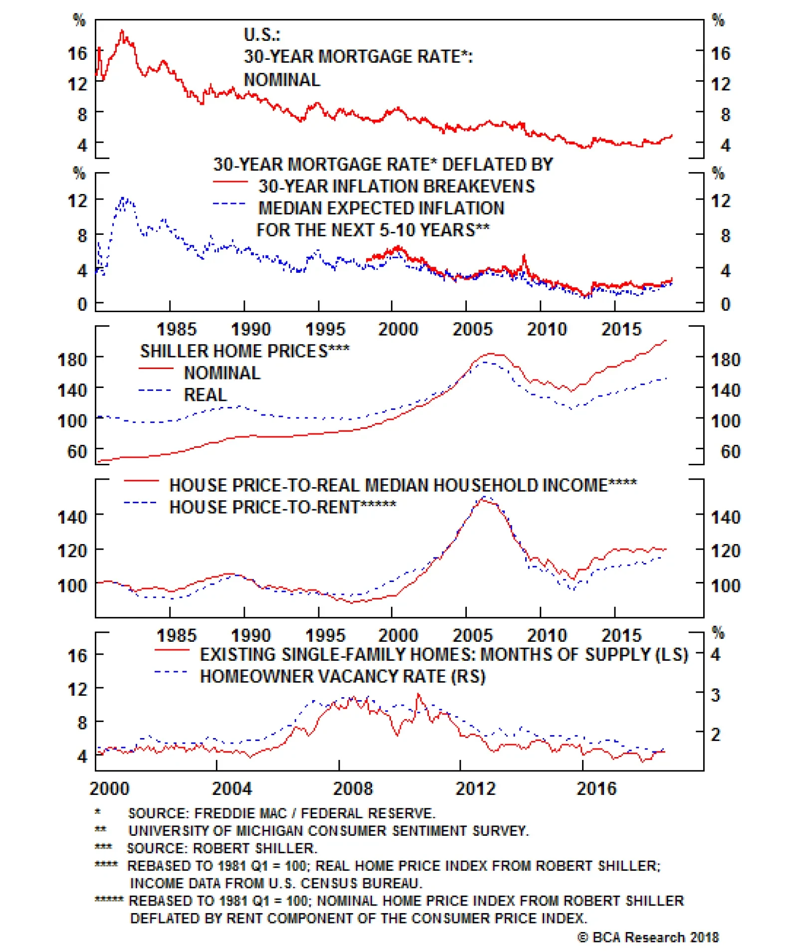
We do not expect mortgage rates to fall from current levels. But they are not going to rise at the same pace as they have over the past year. Thus, while the headwinds from higher financing costs will not disappear, they will abate to some extent. Fundamentally, the housing market is on solid ground (Chart 3). Mortgage rates are still well below their historic average. Home prices have risen considerably, but do not appear excessively stretched compared to rents or incomes. Unlike in 2006, the home vacancy rate is near its historic lows. Residential investment stands at only 3.9% of GDP, compared with a peak of 6.7% of GDP in the second half of 2005. The average age of the residential capital stock has risen by nearly five years since 2006, the largest increase since the Great Depression. With household formation rebounding briskly from its post-recession lows, homebuilders are still arguably not churning out enough new homes. Chart 3A...But Fundamentals Are Still In Good Shape (I)
...But Fundamentals Are Still In Good Shape (I)
...But Fundamentals Are Still In Good Shape (I)
Chart 3B...But Fundamentals Are Still In Good Shape (II)
...But Fundamentals Are Still In Good Shape (II)
...But Fundamentals Are Still In Good Shape (II)
Mortgage lenders have learned from past mistakes (Chart 4). While lending standards have eased modestly over the past 4 years, underwriting standards have remained high. The average FICO score for new borrowers is more than 40 points above pre-recession levels. The Urban Institute Housing Credit Availability index, which measures the percentage of home purchase loans that are likely to default over the next 90 days, is at reassuringly low levels. This is particularly the case for private-label mortgages, whose default risk has hovered at just over 2% during the past few years, down from a peak of 22% in 2006. Moreover, banks today hold much more high-quality capital than in the past, which gives them additional space to absorb losses (Chart 5). Chart 4Lending Standards Have Been Tight, But Are Starting To Loosen
Lending Standards Have Been Tight, But Are Starting To Loosen
Lending Standards Have Been Tight, But Are Starting To Loosen
Chart 5U.S. Banks Are Well Capitalized
U.S. Banks Are Well Capitalized
U.S. Banks Are Well Capitalized
With all this in mind, we are initiating a new strategic trade to go long U.S. homebuilders relative to the S&P 500.1 Corporate Debt: How Big Are The Risks? Unlike household debt, U.S. corporate debt has risen over the past decade and now stands at a record high level as a share of GDP. The quality of the lending has also been less than pristine, as evidenced by the proliferation of "covenant lite" loans. The interest coverage ratio for the economy as a whole - defined as the volume of profits corporations generate for every dollar of interest paid - is still above its historic average (Chart 6). However, this number is skewed by a few mega-cap tech companies that hold a lot of cash and have little debt. Chart 6Interest Coverage Looks Relatively High
Interest Coverage Looks Relatively High
Interest Coverage Looks Relatively High
My colleague Mark McClellan, who writes our monthly Bank Credit Analyst publication, has shown that the interest coverage ratio for companies comprising the Bloomberg Barclays index would drop close to the lows of the Great Recession if interest rates were to rise by a mere 100 basis points across the corporate curve. The damage would be far worse if profits also fell by 25% in this scenario.2 While the corporate debt market has become increasingly frothy, it does not pose an imminent danger to the economy. There are several reasons for this. First, while U.S. corporate debt is high in relation to the past, it is still quite low in comparison with many other economies (Chart 7). The ratio of corporate debt-to-GDP, for example, is 30 percentage points higher in the euro area. This suggests that U.S. businesses still have the "carrying capacity" to take on additional debt. Chart 7U.S. Corporate Debt Is Not That High By Global Standards
U.S. Corporate Debt Is Not That High By Global Standards
U.S. Corporate Debt Is Not That High By Global Standards
Second, the average maturity of U.S. corporate debt has risen over the past decade, with an increasing share of companies opting for fixed over floating-rate borrowings. This implies that it will take a while for the effect of higher rates to make their way through the system. Third, and perhaps most importantly, corporate bonds are generally held by non-leveraged investors such as pension funds, insurance companies, and ETFs. Bank loans account for only 18% of nonfinancial corporate-sector debt, down from 40% in 1980 (Chart 8). The share of leveraged loans held by banks has declined from about 25% a decade ago to less than 10% today. Chart 8Banks Have Reduced Their Exposure To The Corporate Sector
Banks Have Reduced Their Exposure To The Corporate Sector
Banks Have Reduced Their Exposure To The Corporate Sector
Tellingly, we already had a dress rehearsal for what a corporate debt scare might look like. Credit spreads spiked in 2015. Default rates rose, but the knock-on effects to the financial system were minimal (Chart 9). This suggests that corporate America could withstand quite a bit of monetary tightening without buckling under the pressure. Chart 9The 2015 Debt Scare Did Not Topple The Economy
The 2015 Debt Scare Did Not Topple The Economy
The 2015 Debt Scare Did Not Topple The Economy
Government Debt: No Worries... Yet If the risks posed by both the housing market and corporate debt market are contained, what about the risks posed by soaring government debt? The long-term fiscal outlook is certainly bleak, but the near-term risks are low.3 President Trump's tweets aside, the U.S. has an independent central bank which has been able to keep inflation expectations well anchored. The U.S. private sector is also running a financial surplus at the moment, meaning that it earns more than it spends (Chart 10). Not only does this make the economy more resilient, it also provides the government with additional savings with which to finance its fiscal deficit. Chart 10The U.S. Private Sector Is A Net Saver
The U.S. Private Sector Is A Net Saver
The U.S. Private Sector Is A Net Saver
The private sector's financial balance will deteriorate over the next two years as household savings decline and corporate investment rises. This will put upward pressure on Treasury yields. However, if rising yields are reflective of stronger aggregate demand, this is unlikely to derail the economy. When Things Break Recessions are usually caused when the Fed raises rates by enough to undermine spending on interest rate-sensitive purchases such as housing, or when higher rates prick an asset bubble just waiting to burst. Given the lack of clear imbalances either in the real economy or financial markets, the Fed may have to raise rates significantly more than the market is currently anticipating. In fact, far from having to press the pause button midway through next year, our baseline expectation is that the Fed will expedite the pace of rate hikes in late 2019 as inflation finally starts to accelerate. Aggressive Fed rate hikes combined with an incrementally less expansionary fiscal policy will sow the seeds of a recession in late 2020 or 2021. Before the next U.S. downturn arrives, the dollar will have strengthened further. A resurgent greenback will cast a long shadow over emerging markets and commodity producers. As we discussed last week, China is unlikely to save the day by launching a massive stimulus program of the sort that it orchestrated in both 2009 and 2015.4 True, not all emerging markets are equal. Emerging Asia is more resilient now than it was two decades ago. Thailand, for example, was patient zero for the Asian crisis in 1997. Today, it sports a current account surplus of over 10% of GDP and low levels of external debt. This resilience will not prevent Asian economies from experiencing slower growth on the back of weaker Chinese demand, but it will prevent a full-blown balance of payments crisis from spiraling out of control. In contrast to Emerging Asia, Latin America looks more vulnerable (Table 1). BCA's chief emerging market strategist, Arthur Budaghyan, wisely upgraded Brazilian assets on a tactical basis on October 9th ahead of the presidential elections. Nevertheless, Arthur still worries that Brazil's daunting fiscal challenges - the budget deficit currently stands at 7.8% of GDP and the IMF expects government debt to rise to nearly 100% of GDP over the next five years (Chart 11) - are so grave that even South America's answer to Donald Trump may not be able to save the Brazilian economy. Table 1Vulnerability Heat Map For Key EM Markets
Fighting The Last War
Fighting The Last War
Chart 11Brazil Is Fiscally Challenged
Brazil Is Fiscally Challenged
Brazil Is Fiscally Challenged
A Correction, Not A Bear Market The current market environment bears some similarities to the late 1990s. The Fed is tightening monetary policy in order to keep the domestic economy from overheating. The U.S. economy is responding to higher rates to some extent, but the main effects are being felt overseas. The Asian Crisis did not end the bull market in U.S. stocks, but it did generate a few nasty selloffs, the most notable being the 22% peak-to-trough decline in the S&P 500 between July 20 and October 8, 1998. We witnessed such a selloff this October. The bad news is that our MacroQuant model is pointing to additional equity weakness over the coming weeks (Chart 12). The model tends to downgrade stocks whenever growth is slipping, financial conditions are tightening, and sentiment is deteriorating from bullish levels. All three of these things are currently occurring. Chart 12MacroQuant* Model Suggests Caution Is Warranted
Fighting The Last War
Fighting The Last War
The good news is that none of our recession indicators are flashing red. Since recessions and bear markets typically overlap (Chart 13), the odds are high that the current stock market correction will be just that, a correction. Chart 13Recessions And Bear Markets Usually Overlap
Recessions And Bear Markets Usually Overlap
Recessions And Bear Markets Usually Overlap
Peter Berezin, Chief Global Strategist Global Investment Strategy peterb@bcaresearch.com 1 The corresponding ETFs are long ITB/short SPY. 2 Please see The Bank Credit Analyst Special Report, "The Long Shadow Of The Financial Crisis," dated October 25, 2018. 3 It is actually not even clear that a loss of confidence in America's fiscal management would cause a recession. The Fed largely determines borrowing costs at the short-to-medium end of the yield curve, which is where the government finances most of its debt. If people lose confidence in the dollar, they will either need to run down their cash balances by purchasing more goods and services or try to move their wealth abroad. The former will directly increase aggregate demand, while the latter will indirectly increase it through a weaker currency. To be clear, we are not suggesting that such an outcome would be beneficial to the economy; it would, among other things, greatly slow potential GDP growth by discouraging investment. But the near-term effect would likely be economic overheating and rising inflation rather than a recession. 4 Please see Global Investment Strategy Weekly Report, "Chinese Stimulus: Not So Stimulating," dated October 26, 2018. Strategy & Market Trends Tactical Trades Strategic Recommendations Closed Trades
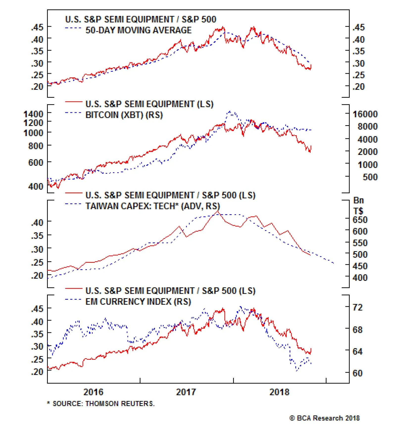
Underweight The dramatic decline in semi equipment stocks has not been arrested in the Q3 earnings season, despite relatively positive results. We think the overall negative sentiment around global tech stocks in general and valuation high flyers in particular has been weighing on the index. Still, much hinges on the results of sector heavyweight Applied Materials later this month, as their guidance update should offer some visibility into the sector operating environment; we continue to believe a bottom has yet to be found. Our bearish view is based on three factors that have not shown substantial improvement. Bitcoin has stabilized but we think the end of its meteoric increase (second panel) will continue to impair what had been a significant source of demand, driving pain in both volumes and pricing power for semi equipment which should take a toll on gross margins. Further, Taiwanese capex continues to slide, implying another source of demand has been faltering (third panel). Lastly, EM currencies, while stable at this new low level, will continue to sap consumer purchasing power (bottom panel). Bottom Line: A downbeat backdrop for semi equipment stocks tells us that things will get worse before they get better; stay underweight. The ticker symbols for the stocks in this index are: BLBG: S5SEEQ - AMAT, LRCX, KLAC.
A Dark Spot In An Otherwise Bright Earnings Season
A Dark Spot In An Otherwise Bright Earnings Season
GAA DM Equity Country Allocation Model Update The GAA DM Equity Country Allocation model is updated as of October 31, 2018. The quant model downgraded U.S. and Italy to underweight from overweight while upgrading Canada to a slight overweight from underweight, largely due to changes in technical and valuation conditions. Now the model is overweight 5 countries (Netherland, Germany, Spain, Switzerland and Canada) and underweight 7 countries (Japan, U.S., U.K., France, Australia, Sweden and Italy), as shown in Table 1. Table 1Model Allocation Vs. Benchmark Weights
GAA Quant Model Updates
GAA Quant Model Updates
As shown in Table 2 and Chart 1, Chart 2 and Chart 3, both Level 1 and Level 2 of the model system outperformed in October by 6bps and 57 bps, respectively, resulting in an outperformance of 24 bps from the overall model. Since going live, the overall model has outperformed its benchmarks by 44 bps, driven by Level 2 outperformance of 121 bps and Level 1 outperformance of 2bps. Table 2Performance (Total Returns In USD %)
GAA Quant Model Updates
GAA Quant Model Updates
Chart 1GAA DM Model Vs. MSCI World
GAA DM Model Vs. MSCI World
GAA DM Model Vs. MSCI World
Chart 2GAA U.S. Vs. Non U.S. Model (Level 1)
GAA U.S. Vs. Non U.S. Model (Level 1)
GAA U.S. Vs. Non U.S. Model (Level 1)
Chart 3GAA Non U.S. Model (Level 2)
GAA Non U.S. Model (Level 2)
GAA Non U.S. Model (Level 2)
Please see also the website http://gaa.bcaresearch.com/trades/allocation_performance. For more details on the models, please see Special Report, "Global Equity Allocation: Introducing The Developed Markets Country Allocation Model," dated January 29, 2016, available at https://gaa.bcaresearch.com. Please note that the overall country and sector recommendations published in our Monthly Portfolio Update and Quarterly Portfolio Outlook use the results of these quantitative models as one input, but do not stick slavishly to them. We believe that models are a useful check, but structural changes and unquantifiable factors need to be considered too in making overall recommendations. GAA Equity Sector Selection Model Dear Client, As advised last month, we have suspended the GAA Equity Sector Selection Model due to the significant changes in the GICS sector classifications, implemented at the end of September. We will rebuild the model using the newly constituted sectors once full back data is available from MSCI, which we understand will be in December. We thank you for your understanding.
Neutral The brand new S&P interactive media & services (IMS) index that we initiated coverage on last month1 has been experiencing extreme pain, being caught up in the global sell-off of former high-flying (and highly valued) tech stocks (top panel). As a reminder, the IMS index is dominated by Google & Facebook. The outlook appears to have brightened significantly, following Facebook's positive earnings results Tuesday which showed well-managed revenue deceleration and less margin contraction than had been feared following Q2's disastrous report; both FB and GOOG/GOOGL bounced following the report. Nevertheless, the three key risks that we highlighted in our initiation continue to keep us on the sidelines: a renewed regulatory focus, rapid unpredictable changes in tastes & technology and an appreciating U.S. dollar that threatens to sap growth in the key foreign segments. Further, while forward earnings multiples have declined significantly (second panel), the S&P IMS index remains richly valued relative to the market, which has also been going through a derating phase (bottom panel). Stay neutral. The ticker symbols for the stocks in this index are: BLBG: S5INMS - GOOG, GOOGL, FB, TWTR, TRIP. 1 Please see BCA U.S. Equity Strategy Special Report, "New Lines Of Communication," dated October 1, 2018, available at uses.bcaresearch.com.
The Social Network Shines
The Social Network Shines
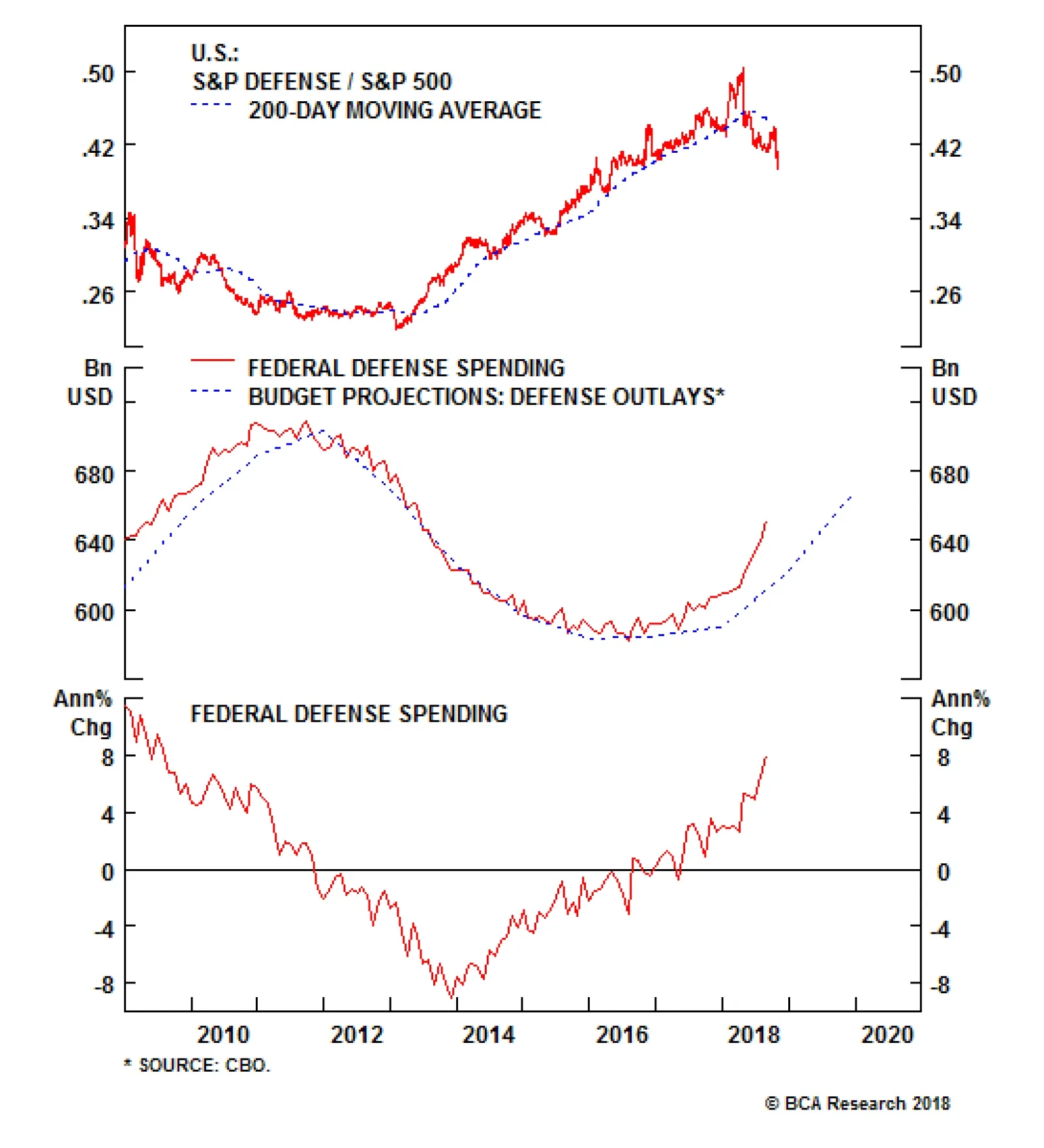
In the U.S., defense spending and investment have bottomed and will continue to accelerate. The Congressional Budget Office (CBO) continues to project that defense outlays will jump further next year. We expect that this breakneck pace is actually…
Highlights In the Philippines, inflation is breaking out while the central bank is well behind the curve. Financials markets remain at risk. As a play on surging interest rates: Go short Philippine property stocks. We appraise and modify our investment strategy across all central European markets in general and Hungary in particular - where a monetary policy shift is in the making. A new trade: We recommend paying 3-year swap rates in Hungary and receiving 3-year swap rates in the euro area. Feature The Philippines: Short Real Estate Stocks Philippine stocks are on the verge of a major breakdown (Chart I-1, top panel). Meanwhile, local currency bond yields are surging (Chart I-1, bottom panel). Chart I-1Philippine Stocks Are On The Edge Of A Breakdown
Philippine Stocks Are On The Edge Of A Breakdown
Philippine Stocks Are On The Edge Of A Breakdown
The Philippine economy continues to overheat, and the Bangko Sentral ng Pilipinas (BSP) has fallen well behind the curve. The top panel of Chart I-2 shows that both headline and core inflation measures are rising precipitously and have breached the central bank's upper target of 4% by a wide margin. Chart I-2The Central Bank Is Far Behind The Curve
The Central Bank Is Far Behind The Curve
The Central Bank Is Far Behind The Curve
Odds are that inflation will continue to climb higher. Overall domestic demand remains reasonably strong. Noticeably, both the current and fiscal accounts are in deficit and widening (Chart I-3). A current account deficit is a form of hidden inflation. The basis is that it gauges the degree of excess domestic demand relative to the productive capacity of the economy. Chart I-3The Philippines: A Large Twin Deficit
The Philippines: A Large Twin Deficit
The Philippines: A Large Twin Deficit
The roots of these macro problems stem from ultra-easy monetary and fiscal policies pursued by Filipino authorities. The BSP has kept borrowing costs low and for much longer than was warranted, and has been slow to hike rates. As a result, credit has been booming relentlessly (Chart I-4). Chart I-4Bank Loans Have Boomed...
Bank Loans Have Boomed...
Bank Loans Have Boomed...
The fiscal authorities, on the other hand, have vigorously pursued growth-at-all-costs programs. Government spending is now growing at an annual rate of 22% (Chart I-5). Chart I-5...So Have Government Expenditures
...So Have Government Expenditures
...So Have Government Expenditures
Consequently, these populist policies have created excessive domestic demand that has stoked an inflation breakout. Given Philippine President Rodrigo Duterte's reluctance to cut back on fiscal expenditures, it will be up to the monetary authorities to tighten sufficiently enough to curb inflation.1 The currency was depreciating against the U.S. dollar in 2017, even as its EM peers rallied. A falling currency amid strong economic growth is generally a symptom of an overheating economy; it signals that real interest rates are low and the central bank is behind the curve. Today, the monetary authorities need to hike borrowing rates aggressively, otherwise the currency will plunge much further. The country's financial markets are quickly approaching a riot point, and local currency bond yields are already selling off as creditors are rebelling (see bottom panel of Chart I-1 on page 1). Another option the BSP could take to defend the peso without hiking rates much is to sell foreign exchange reserves. Doing so, nevertheless, will still lead to higher domestic interest rates - especially at the short end of the curve. When a central bank sells its dollar reserves, it absorbs local currency liquidity - i.e. commercial banks' excess reserves at the central bank decline. Interbank rates then rise, which pushes up short-term rates and potentially long-term ones too. This is how financial markets naturally force macro adjustments on an overheating economy when policymakers are reluctant to act. As such, Filipino share prices are now facing a major risk. Higher domestic rates amid strong loan growth will cause the economy to decelerate significantly. Certain interest rate-sensitive sectors such as vehicle sales are already shrinking. The property sector - the segment of the economy that has benefited the most from the credit binge - will be the next shoe to drop: The supply of residential real estate buildings has been booming - floor space built has risen 2.4-fold since 2003. As interest rates continue to rise, real estate and construction loans - which are still growing at a 19% annual rate - will slump. Higher borrowing costs will hurt real estate prices. Meanwhile, rent growth will decline as the economy decelerates. The slowdown in the property sector will take a heavy toll on real estate development and management companies: First, these firms' revenues and income - property sales, rental and other types of income - will decelerate significantly (Chart I-6, top panel). Chart I-6Listed Real Estate Companies Will Face Major Headwinds
Listed Real Estate Companies Will Face Major Headwinds
Listed Real Estate Companies Will Face Major Headwinds
Second, higher interest rates will raise their interest expenses (Chart I-6, bottom panel). Remarkably, Philippine real estate stocks have remained quite resilient, despite the broad selloff in financial markets. While the former are down by 18% in dollar terms from their early 2018 peak, Chart I-7 suggests rising interest rates herald a much more pronounced drop in their prices. Chart I-7Filipino Property Stocks Are On A Cliff
Filipino Real Estate Stocks Have Been Quite Resilient
Filipino Real Estate Stocks Have Been Quite Resilient
Besides, these property companies are also still expensive. Their price-to-book value (PBV) currently stands at 2.9. Between the years 2000 and 2005, their PBV averaged 1.6. We are therefore initiating a new trade: Short Philippine real estate stocks in absolute U.S. dollar terms. Crucially, the real estate sector makes up 27% of the Philippines MSCI index, and will therefore have a significant impact on the Philippine stock market. As to bank stocks - the other large segment of the equity market - a couple of points are in order. Commercial banks in the Philippines are exposed to the real estate sector. Hence, a slowdown in the property sector will culminate in the form of higher NPLs and provisions for bad loans on banks' balance sheets. Real estate and construction loans account for 25% of total bank loans. Crucially, NPLs and provision levels - at 1.3% and 1.9%, respectively - are very low, and have so far not risen. This is unsustainable given the magnitude of the ongoing credit boom and rising interest rates. Higher provisions will cause banks' profits and share prices to suffer materially. This will come on top of plunging net interest margins (Chart I-8). Chart I-8Philippines Commercial Bank Profits Are Getting Squeezed
Philippines Commercial Bank Profits Are Getting Squeezed
Philippines Commercial Bank Profits Are Getting Squeezed
As to equity valuations, this bourse is not cheap, neither in absolute terms nor relative to the EM equity benchmark - both valuation measures are neutral (Chart I-9). Chart I-9Equity Valuations Are Not Attractive
Equity Valuations Are Not Attractive
Equity Valuations Are Not Attractive
Overall, the outlook for Philippine equities as a whole remains unattractive both in absolute terms, as well as relative to the EM benchmark. Bottom Line: EM equity portfolios should continue underweighting this bourse. We are also initiating a new trade: Going short Philippine real estate stocks in absolute U.S. dollar terms. Ayman Kawtharani, Associate Editor ayman@bcaresearch.com Strategy For Central European Markets Our presiding macroeconomic theme for central Europe - which we first elaborated on in a Special Report titled, Central Europe: Beware Of An Inflation Outbreak2 - has been as follows: An accommodative policy stance in the context of strong growth and tight labor markets warrants higher inflation. Our proxy for labor shortages - calculated as the number of job vacancies divided by the number of unemployed looking for a job - is continuing to surge across all central European countries as well as in Germany. This foreshadows higher wage growth ahead (Chart II-1). Chart II-1Tight Labor Markets Means Higher Wage Growth
Tight Labor Markets Means Higher Wage Growth
Tight Labor Markets Means Higher Wage Growth
Furthermore, monetary policy in central European countries remains accommodative - policy rates are negative in real (inflation-adjusted) terms. Consistently, private credit (bank loan) growth and domestic demand remain robust. Today, we appraise and modify our investment strategy across all central European markets in general and Hungary in particular, where a policy shift is in the making. Hungary: Moving Away From Ultra-Accommodative Monetary Policy? Last month, the NBH (National Bank of Hungary) modified its monetary policy statement to include a new paragraph explaining that the council is prepared for the gradual normalization of monetary policy, depending on the outlook for inflation.3 Given our view that inflation in Hungary will continue to rise, the NBH is likely to move away from ultra-accommodative monetary policy sooner rather than later. Besides mounting inflationary pressures, several factors lead us to believe that the NBH is more comfortable normalizing policy today than in the past: First, after seven years of deleveraging, private credit is finally on the rise, and money supply growth is booming (Chart II-2, top and middle panel). Chart II-2Hungary: Easy Monetary Conditions Will Lift Inflation
Hungary: Easy Monetary Conditions Will Lift Inflation
Hungary: Easy Monetary Conditions Will Lift Inflation
Second, capital expenditures are recovering and business confidence is making new highs (Chart II-3, top and middle panel). Furthermore, construction is firing on all cylinders (Chart II-3, bottom panel). Chart II-3Hungary: Capex Is Robust
Hungary: Capex Is Robust
Hungary: Capex Is Robust
Lastly, core consumer inflation is rising and the real deposit rates is at -2%, the lowest in 20 years (Chart II-2, bottom panel). Given the genuine need for rate normalization in Hungary and the central bank's readiness to do so, we are adjusting our strategy: We are taking profits of 72 basis points on our Hungarian yield curve steepening trade that we initiated on June 21, 2017. Hungary's yield curve is already the steepest yield curve in Europe. The slope of the 10/1-year yield curve is 320 basis points in Hungary, versus 200 in Poland, 100 in the Czech Republic and 105 in Germany. We are closing our long PLN / short HUF trade with a 7.7% gain since its initiation on September 28, 2016 (Chart II-4). The cross rate is close to an all-time high and will likely reverse. Chart II-4Book Profits On Long PLN / Short HUF
Book Profits On Long PLN / Short HUF
Book Profits On Long PLN / Short HUF
A new trade: We recommend paying 3-year swap rates in Hungary and receiving 3-year swap rates in the euro area (Chart II-5). Chart II-5A New Trade: Pay Hungarian / Receive Euro Area 3-year Swap Rates
A New Trade: Pay Hungarian / Receive Euro Area 3-year Swap Rates
A New Trade: Pay Hungarian / Receive Euro Area 3-year Swap Rates
First, not only is final domestic demand in Hungary much more robust than in the euro area, but Hungary's output gap is positive while the euro area's is still negative (Chart II-6,top and middle panel). This foreshadows a widening gap in inflation between Hungary and the euro area (Chart II-6, bottom panel). As this transpires, policy rate expectations will rise faster and by more in Hungary than in the euro area. Chart II-6Hungarian Economy Will Overheat Faster Than Euro Area's
Hungarian Economy Will Overheat Faster Than Euro Area's
Hungarian Economy Will Overheat Faster Than Euro Area's
Second, ultra-accommodative monetary policy in Hungary has served its purpose and has generated an overflow of liquidity. In effect, with broad money supply in Hungary now growing considerably faster than in the euro area, the NBH will likely tighten its policy at a faster pace and by more than the ECB (Chart II-7). This warrants a widening 3-year swap rate differential between Hungary and the euro area. Chart II-7Hungary Vs. Euro Area: Money Growth And Swap Rates
Hungary Vs. Euro Area: Money Growth And Swap Rates
Hungary Vs. Euro Area: Money Growth And Swap Rates
Third, as global trade continues to slump, affecting German manufacturing, the European Central Bank will be fast to reiterate its readiness to keep policy accommodative longer than expected. This could push back expectations of the first ECB rate hike. Finally, Italy remains a risk and European banks are exposed to weakening developing countries. With euro area bank share prices plunging close to their 2008 and 2012 lows, the ECB will be both slow and cautious in signaling rate normalization in the immediate future. While Hungary is a very open economy and will feel the pinch from a slowdown in European manufacturing, its currency may depreciate further against the euro as it typically does amid global risk-off periods. A cheap currency will reduce the NBH's worries about the pass-through of a global slowdown and disinflation into its domestic economy. In short, given that both economies have different inflationary backdrops, Hungarian interest rate expectations will increasingly diverge from those of the euro area. As such, fixed-income investors should bet on a rising 3-year swap rate differential between Hungary and the euro area. Our Other Positions In Central European Markets Within the fixed income and currency space: Stay overweight CE3 within EM dedicated fixed-income portfolios. Predicated on our view that the epicenter of the ongoing global growth slowdown is China, emerging Asian and commodity leveraged markets are at much bigger risk than their Central European counterparts. Consistent with this theme, stay short IDR versus PLN. Book profits of 109 basis points on the following trade initiated on July 26, 2017: Pay Czech / receive Polish 10-year swap rates (Chart II-8). In line with our expectations,4 the Czech National Bank has been responding to rising domestic inflationary pressures and has been tightening monetary policy faster than the National Bank of Poland. There now remains little upside in Czech rates relative to Polish ones, so we are booking profits. Chart II-8Book Profits On Pay Czech / Receive Polish 10-year Swap Rates
Book Profits On Pay Czech / Receive Polish 10-year Swap Rates
Book Profits On Pay Czech / Receive Polish 10-year Swap Rates
Stay long CZK against the EUR. Widening growth and inflation gaps between the Czech Republic and the euro area justify higher rates and a stronger currency in the former relative to the latter. Regarding the equity space: Stay long CE3 banks / short euro area banks. CE3 banks are less leveraged and have a higher return on assets than euro area banks. Continue overweighting CE3 within EM dedicated equity portfolios. CE3 stocks have staged a double bottom relative to their emerging market peers, both in common and local currency terms (Chart II-9). Given emerging markets are saddled with credit excesses, unresolved economic imbalances and looming currency weakness, central Europe is likely to continue outperforming. Chart II-9CE3 Equities Will Outperform EM
CE3 Equities Will Outperform EM
CE3 Equities Will Outperform EM
A summary of all our trades and asset allocations can be found on page 14 and 15. Stephan Gabillard, Senior Analyst stephang@bcaresearch.com 1 Please see Emerging Markets Strategy/Geopolitical Strategy Special Report, "The Philippines: Duterte's Money Illusion," dated April 25, 2018, available at ems.bcaresearch.com 2 Please see Emerging Markets Strategy Special Report "Central Europe: Beware Of An Inflation Outbreak," dated June 21, 2017, available at ems.bcaresearch.com. 3 http://www.mnb.hu/en/monetary-policy/the-monetary-council/press-releases/2018/press-release-on-the-monetary-council-meeting-of-18-september-2018 4 Please see Emerging Markets Strategy Weekly Report "Follow The Money, Not The Crowd," dated July 26, 2017, available at ems.bcaresearch.com Equity Recommendations Fixed-Income, Credit And Currency Recommendations