Sectors

Highlights Macro outlook: Global growth will continue to decelerate into early next year on the back of brewing EM stresses and an underwhelming policy response from China. Equities: Stay neutral for now, while underweighting EM relative to DM stocks. Within DM, overweight the U.S. in dollar terms. Bonds: Global bond yields may dip in the near term, but the longer-term path is firmly higher. Currencies: The dollar is working off overbought conditions, but will rebound into year-end. EM currencies will suffer the most. Commodities: Favor oil over industrial metals. Precious metals will also remain under pressure until the dollar peaks next year, before beginning a major bull run as inflation accelerates. Feature I. Economic Outlook The Fed Can Hike A Lot More If 2017 was the year of a synchronized global growth recovery, 2018 is turning out to be a year where desynchronization is once again the name of the game. The U.S. economy continues to fire on all cylinders, while much of the rest of the world is struggling to stay afloat. The divergence in economic outcomes has been mirrored in central bank policy. The Fed is now hiking rates once per quarter whereas most other major central banks are still sitting on their hands. How high can U.S. rates go? The answer is a lot higher than investors anticipate. Market participants currently expect the Fed funds rate to rise to 2.37% by the end of this year and 2.84% by the end of 2019. No rate hikes are priced in for 2020 and beyond. The Fed dots are somewhat higher than market expectations (Chart I-1). The median dot rises to about 3.4% in 2020-21, but then falls back to 3% over the Fed's longer-run horizon. Both investors and the Fed have apparently bought into Larry Summers' secular stagnation thesis. They seem convinced that rates will not be able to rise above 3% without triggering a recession. While we have a lot of sympathy for Summers' thesis, it must be acknowledged that it is a theory about the long-term determinants of the neutral rate of interest. Over a shorter-term cyclical horizon, many factors can influence the neutral rate. Critically, most of these factors are pushing it higher: Fiscal policy is extremely stimulative. The IMF estimates that the U.S. cyclically-adjusted budget deficit will reach 6.8% of GDP in 2019. In contrast, the euro area is projected to run a deficit of only 0.8% of GDP (Chart I-2). The relatively more expansionary nature of U.S. fiscal policy is one key reason why the Fed can raise rates while the ECB cannot. Chart I-1Markets Expect No Fed Hikes Beyond Next Year
October 2018
October 2018
Chart I-2Fiscal Policy Is More Expansionary In ##br##The U.S. Than In The Euro Area
Fiscal Policy Is More Expansionary In The U.S. Than In The Euro Area
Fiscal Policy Is More Expansionary In The U.S. Than In The Euro Area
Credit growth has picked up. After a prolonged deleveraging cycle, private-sector nonfinancial debt is increasing faster than GDP (Chart I-3). The recent easing in The Conference Board's Leading Credit Index suggests that this trend will continue (Chart I-4). Chart I-3U.S. Private-Sector Nonfinancial Debt Is ##br##Rising At Close To Its Historic Trend
U.S. Private-Sector Nonfinancial Debt Is Rising At Close To Its Historic Trend
U.S. Private-Sector Nonfinancial Debt Is Rising At Close To Its Historic Trend
Chart I-4U.S. Credit Growth Will Remain Strong
U.S. Credit Growth Will Remain Strong
U.S. Credit Growth Will Remain Strong
Wage growth is accelerating. Average hourly earnings surprised on the upside in August, with the year-over-year change rising to a cycle high of 2.9%. This followed a stronger reading in the Employment Cost Index in the second quarter. A simple correlation with the quits rate suggests that there is plenty of upside for wage growth (Chart I-5). Faster wage growth will put more money into workers' pockets who will then spend it. The savings rate has scope to fall. The personal savings rate currently stands at 6.7%, more than two percentage points higher than what one would expect based on the current level of household net worth (Chart I-6). If the savings rate were to fall by two points over the next two years, it would add 1.5% of GDP to aggregate demand. Chart I-5The Quits Rate Is Signaling Upside For Wage Growth
The Quits Rate Is Signaling Upside For Wage Growth
The Quits Rate Is Signaling Upside For Wage Growth
Chart I-6The Personal Savings Rate Has Room To Fall
October 2018
October 2018
A back-of-the-envelope calculation suggests that these cyclical factors will permit the Fed to raise rates to 5% by 2020, almost double what the market is discounting.1 An Absence Of Major Financial Imbalances Will Allow The Fed To Keep Raising Rates The past three recessions were all caused by financial market overheating rather than economic overheating. The 1991 recession was mainly the consequence of the Savings and Loan crisis, compounded by the spike in oil prices leading up to the Gulf War. The 2001 recession stemmed from the dotcom bust. The Great Recession was triggered by the housing bust. Today, it is difficult to point to any clear imbalances in the economy. True, housing activity has been weak for much of the year. However, unlike in 2006, the home vacancy rate stands near record-low levels (Chart I-7). Tight supply will limit downside risks to both construction and home prices. On the demand side, low unemployment, high consumer confidence, and a rebound in the rate of new household formation should help the sector. Despite elevated home prices in some markets, the average monthly payment that homeowners must make to service their mortgage is quite low by historic standards (Chart I-8). The quality of mortgage lending has also been very high over the past decade, which reduces the risk of a sudden credit crunch (Chart I-9). Chart I-7Low Housing Inventories Will Support ##br##Home Prices And Construction
Low Housing Inventories Will Support Home Prices And Construction
Low Housing Inventories Will Support Home Prices And Construction
Chart I-8Housing Affordabiity Is Not Yet Stretched
Housing Affordabiity Is Not Yet Stretched
Housing Affordabiity Is Not Yet Stretched
Chart I-9Mortgage Lenders Are Being Prudent
Mortgage Lenders Are Being Prudent
Mortgage Lenders Are Being Prudent
Unlike housing debt, there are more reasons to be concerned about corporate debt. The ratio of corporate debt-to-GDP has risen to record-high levels. So-called "covenant-lite" loans now make up the bulk of corporate leveraged loan issuance. While there is no doubt that the corporate debt market is the weakest link in the U.S. financial sector, some perspective is in order. U.S. corporate debt levels are quite low by global standards. Corporate debt in the euro area is more than 30 points higher as a percent of GDP than in the United States (Chart I-10). Moreover, the interest coverage ratio - EBIT divided by interest expense - for U.S. corporates is still above its historic average (Chart I-11). While this ratio will fall as interest rates rise, this will not happen very quickly. Most U.S. corporate debt is at fixed rates and average maturities have been rising. This reduces both rollover risk and the sensitivity of debt-servicing costs to higher short-term rates. Chart I-10U.S. Corporate Debt Not That High By Global Standards
U.S. Corporate Debt Not That High By Global Standards
U.S. Corporate Debt Not That High By Global Standards
Chart I-11Interest Coverage Ratio Is Above Its Historic Average
Interest Coverage Ratio Is Above Its Historic Average
Interest Coverage Ratio Is Above Its Historic Average
An increasing share of U.S. corporate debt is held by non-leveraged investors. Bank loans account for only 18% of nonfinancial corporate sector debt, down from 40% in 1980 (Chart I-12). This is important, because what makes a spike in corporate defaults so damaging is not the direct impact this has on the economy, but the second-round effects rising defaults have on financial sector stability. In any case, we already had a dress rehearsal for what a corporate debt scare might look like. Credit spreads spiked in 2015. Default rates rose, but the knock-on effects to the financial system were minimal. This suggests that corporate America could handle a fair bit of monetary tightening without buckling under the pressure. The Fed And The Dollar If the Fed is able to raise rates substantially more than the market is discounting while most central banks cannot, the short-term interest rate spread between the U.S. and its trading partners is likely to widen. History suggests that this will produce a stronger dollar (Chart I-13). Chart I-12Banks Have Been Reducing Their ##br##Exposure To The Corporate Sector
Banks Have Been Reducing Their Exposure To The Corporate Sector
Banks Have Been Reducing Their Exposure To The Corporate Sector
Chart I-13Historically, The Dollar Has Moved ##br##In Line With Interest Rate Differentials
Historically, The Dollar Has Moved In Line With Interest Rate Differentials
Historically, The Dollar Has Moved In Line With Interest Rate Differentials
Some have speculated that the Trump administration will intervene in the foreign-exchange market in order to drive down the value of the greenback. We doubt this will happen, but even if such interventions were to occur, they would not be successful. Presumably, currency interventions would take the form of purchases of foreign exchange, financed through the issuance of Treasurys. The purchase of foreign currency would release U.S. dollars into the financial system, but the sale of Treasury securities would suck those dollars back out of the system. The net result would be no change in the volume of U.S. dollars in circulation - what economists call a "sterilized" intervention. Both economic theory and years of history show that sterilized interventions do not have lasting effects on currency values. The Fed could, of course, provide funding for the Treasury's purchases of foreign exchange, leading to an increase in the monetary base. This would be tantamount to an unsterilized intervention. However, such a deliberate attempt to weaken the dollar by expanding the money supply would fly in the face of the Fed's efforts to cool growth by tightening financial conditions. We highly doubt the Fed's current leadership would go along with this. Emerging Markets In The Crosshairs The combination of rising U.S. rates and a stronger dollar is bad news for emerging markets. Eighty percent of EM foreign-currency debt is denominated in dollars. Outside of China, EM dollar debt is now back to late-1990s levels, both as a share of GDP and exports (Chart I-14). The wave of EM local-currency debt issued in recent years only complicates matters. If EM central banks raise rates to defend their currencies, this could imperil economic growth and make it difficult for local-currency borrowers to pay back their loans. Rather than hiking rates, some EM central banks may simply choose to inflate away debt. Consider the case of Brazil. The fiscal deficit stands at nearly 8% of GDP and government debt has soared from 60% of GDP in 2013 to 84% of GDP at present (Chart I-15). Ninety percent of Brazilian sovereign debt is denominated in reais. The Brazilian government won't default on its debt per se. However, if push comes to shove, Brazil's central bank can always step in to buy government bonds, effectively monetizing the fiscal deficit. This could cause the real to weaken much more than it already has. Chart I-14EM Dollar Debt Is High
EM Dollar Debt Is High
EM Dollar Debt Is High
Chart I-15Brazil's Perilous Fiscal Position
Brazil's Perilous Fiscal Position
Brazil's Perilous Fiscal Position
Chinese Stimulus To The Rescue? When emerging markets last succumbed to pressure in 2015, China saved the day by stepping in with massive stimulus. Fiscal spending and credit growth accelerated to over 15% year-over-year. The government's actions boosted demand for all sorts of industrial commodities. The stimulus measures in 2015 followed an even greater wave of stimulus in 2009. While these stimulus measures invigorated China's economy and helped put a floor under global growth, they came at a price: China's debt-to-GDP ratio has swollen from 140% in 2008 to over 250% at present, which has endangered financial stability (Chart I-16). Excess capacity has also increased. This can be seen in the dramatic rise in the capital-to-output ratio. It can also be seen in the fact that the rate of return on assets within the Chinese state-owned enterprise sector, which has been the main source of rising corporate leverage, has fallen below borrowing costs (Chart I-17). Chart I-16China: Debt And Capital ##br##Accumulation Went Hand In Hand
China: Debt And Capital Accumulation Went Hand In Hand
China: Debt And Capital Accumulation Went Hand In Hand
Chart I-17China: Rate Of Return On Assets ##br##Below Borrowing Costs For SOEs
China: Rate Of Return On Assets Below Borrowing Costs For SOEs
China: Rate Of Return On Assets Below Borrowing Costs For SOEs
Chinese banks are being told that they must lend more money to support the economy, while ensuring that their loans do not turn sour. Unfortunately, that is becoming an impossible feat. Chart I-18China Saves A Lot
China Saves A Lot
China Saves A Lot
The Chinese economy produces too much and spends too little. The result is excess savings, epitomized most clearly in a national savings rate of 46% (Chart I-18). As a matter of arithmetic, national savings must be transformed either into domestic investment or exported abroad via a current account surplus. Now that the former strategy has run into diminishing returns, the Chinese authorities will need to concentrate on the latter. This will require a larger current account surplus which, in turn, will necessitate a relatively cheap currency. Above-average productivity growth has pushed up the fair value of China's real exchange rate over time. However, the currency still looks expensive relative to its long-term trend line (Chart I-19). Pushing down the value of the yuan against the dollar will not be that difficult. Chart I-20 shows that USD/CNY has moved broadly in line with the one-year swap spread between the U.S. and China. The spread was about 3% earlier this year. Today, it stands at only 0.6%. As the Fed continues to raise rates, the spread will narrow further, taking the yuan down with it. Chart I-19The RMB Is Still Quite Strong
The RMB Is Still Quite Strong
The RMB Is Still Quite Strong
Chart I-20USD/CNY Has Tracked China-U.S. Interest Rate Differentials
USD/CNY Has Tracked China-U.S. Interest Rate Differentials
USD/CNY Has Tracked China-U.S. Interest Rate Differentials
Unlike standard Chinese fiscal/credit easing, a stimulus strategy focused on weakening the yuan would hurt other emerging markets by undermining their competitiveness in relation to China. A weaker yuan would also make it more expensive for Chinese companies to import natural resources, thus putting downward pressure on commodity prices. The Euro Area: Back In The Slow Lane After putting in a strong performance in 2017, the economy in the euro area has struggled to maintain momentum this year. Growth is still above trend, but the overall tone of the data has been lackluster at best, with the risks to growth increasingly tilted to the downside. Weaker growth in China and other emerging markets certainly has not helped. However, much of the problem lies closer to home. Bank credit remains the lifeblood of the euro area economy. The 12-month credit impulse - defined as the change in credit growth from one 12-month period to the next - tends to track GDP growth (Chart I-21).2 Euro area credit growth accelerated over the course of 2017, but has been broadly stable this year. As a result, the credit impulse has fallen, taking GDP growth down with it. It will be difficult for euro area GDP growth to increase unless credit growth starts rising again. So far, there is little sign that this is about to happen. According to the latest euro area bank lending survey, while banks continue to ease standards for business loans, they are doing so at a slower pace than in the past. A net 3% of banks eased lending standards in the second quarter, compared to 8% in the first quarter. Loan demand growth has been fairly stable. This suggests that loan growth will remain positive, but is unlikely to increase much from current levels. Worries about the health of European banks will further constrain credit growth. European banks in general, and Spanish banks in particular, have significant exposure to the most vulnerable emerging markets (Chart I-22). Chart I-21Euro Area Credit Growth Has Flatlined
Euro Area Credit Growth Has Flatlined
Euro Area Credit Growth Has Flatlined
Chart I-22Spain Most Exposed To Vulnerable EMs
October 2018
October 2018
Concerns about the ability of the Italian government to service its debt obligations will also restrain bank lending. Investors breathed a sigh of relief last month when the Italian government signaled a greater willingness to pare back next year's proposed budget deficit, in accordance with the dictates of the European Commission. Tensions remain, however, as evidenced by the fact that the ten-year spread between BTPs and German bunds is still 120 basis points higher than in April (Chart I-23). The European political establishment is terrified of the rise in populism across the region and would love nothing more than to see Italy's populist parties implode. This means that any help from the ECB and the European Commission will only arrive once a full-fledged crisis is underway. Anyway, it is far from clear that a smaller budget deficit would actually translate into a lower government debt-to-GDP ratio. Like China, Italy also has a private sector that saves too much and spends too little. A shrinking population has reduced the need for firms to invest in new capacity. The prior government's pension cuts have also incentivized people to save more for their retirement. The result is a private sector savings-investment surplus that stood at 5% of GDP in 2017 compared to close to breakeven a decade ago (Chart I-24). Chart I-23Italian/Bund Spreads Signal Lingering Fiscal Strain
Italian/Bund Spreads Signal Lingering Fiscal Strain
Italian/Bund Spreads Signal Lingering Fiscal Strain
Chart I-24Italy: Private Sector Saves Too Much And Spends Too Little
Italy: Private Sector Saves Too Much And Spends Too Little
Italy: Private Sector Saves Too Much And Spends Too Little
Unlike Germany, Italy cannot export its excess production because it does not have a hypercompetitive economy. Nor does it have the ability to devalue its currency to gain a quick competitiveness boost. This means that the Italian government has to absorb excess private-sector savings with its own dissavings - a fancy way of saying that it has to run a large budget deficit. This has effectively been Japan's strategy for over two decades. However, unlike Japan, Italy does not have a lender of last resort that can unconditionally buy government debt. This raises the risk that Italy's debt woes will resurface, either because the government abandons austerity measures, or because the lack of fiscal support causes nominal GDP to stagnate, making it all but impossible for the country to outgrow its debt burden. Receding Policy Puts The discussion above suggests that many of the "policy puts" that investors have relied on are in the process of having their strike price marked down to deeper out-of-the-money levels. Yes, the Fed will ease off on rate hikes if U.S. growth is at risk of stalling out completely. However, now that the labor market has reached full employment, the Fed will welcome modestly slower growth. Remember that there has never been a case in the post-war era where the three-month average of the unemployment rate has risen by more than a third of a percentage point without a recession taking place (Chart I-25). The further the unemployment rate falls below NAIRU, the more difficult it will be for the Fed to achieve the proverbial soft landing. Chart I-25Even A Small Uptick In The Unemployment Rate Is Bad News For The Business Cycle
Even A Small Uptick In The Unemployment Rate Is Bad News For The Business Cycle
Even A Small Uptick In The Unemployment Rate Is Bad News For The Business Cycle
Likewise, the "China stimulus put" - the presumption that most investors have that the Chinese authorities will launch a barrage of fiscal and credit easing at the first sign of slower growth - has become less reliable in light of the government's competing objectives namely reducing debt growth and excess capacity. The same goes for the "ECB put." Yes, the ECB will bail out Italy if the entire European project appears at risk. But spreads may need to blow out before the cavalry arrives. Meanwhile, just as the aforementioned policy puts are receding, new policy risks are rising to the fore, chief among them protectionism. We expect the trade war to heat up, with the Trump administration increasingly directing its ire at China. Trump's macroeconomic policies are completely at odds with his trade agenda. Fiscal stimulus will boost aggregate demand, which will suck in more imports. An overheated economy will prompt the Fed to raise rates more aggressively than it otherwise would, leading to a stronger dollar. All this will result in a wider trade deficit. What will Trump tell voters two years from now when he is campaigning in Michigan and Ohio about why the trade deficit has widened rather than narrowed under his watch? Will he blame himself or Beijing? No trophy for getting that answer right. II. Financial Markets Global Equities The combination of slower global growth, rising economic vulnerabilities outside the U.S., and a more challenging policy environment caused us to downgrade our view on global equities from overweight to neutral in June,3 while reiterating our preference for developed market equities relative to EM stocks. For now, we are comfortable with our bearish view towards emerging market stocks. While EM equities have cheapened, they are not yet at washed out levels (Chart I-26). Bottom fishers still abound, as evidenced by the fact that the number of shares outstanding in the MSCI iShares Turkish ETF has almost tripled since early April (Chart I-27). Chart I-26EM Assets: Valuations Not Yet At Washed Out Levels
EM Assets: Valuations Not Yet At Washed Out Levels
EM Assets: Valuations Not Yet At Washed Out Levels
Chart I-27EM Bottom Fishers Still Abound
EM Bottom Fishers Still Abound
EM Bottom Fishers Still Abound
At some point - probably in the first half of next year - investors will liquidate their remaining bullish EM bets. At that point, EM stocks will rebound. European and Japanese equities should also start to outperform the U.S., given their more cyclical nature. As far as the absolute direction of the S&P 500 is concerned, the next few months could be challenging. U.S. stocks have been able to decouple from those in the rest of the world, but this state of affairs may not last. Recall that the S&P 500 fell by 22% peak-to-trough between July 20 and October 8, 1998, in what otherwise was a massive bull market. We do not know if there is another Long-Term Capital Management lurking around the corner, but if there is, a temporary selloff in U.S. stocks may be hard to avoid. Such a selloff would present a buying opportunity over a horizon of 12-to-18 months. If we are correct that cyclical forces have lifted the neutral rate of interest, it will take a while for monetary policy to reach restrictive territory. This means that both fiscal and monetary policy will stay accommodative at least for the next 18 months. As such, the S&P 500 may not peak until 2020. Appendix A - Chart I presents a stylized diagram of where we think global equities are going. It incapsulates three phases: 1) a challenging period over the next six months, driven by EM weakness; 2) a blow-off rally in equities starting in the middle of next year; 3) and finally, a recession-induced bear market beginning in late-2020. Appendix B also presents our valuation charts, which highlight that long-term return prospects are better outside the United States. Fixed Income After advocating for a long duration strategy for much of the post-crisis recovery, BCA declared "The End Of The 35-Year Bond Bull Market" on July 5, 2016, the very same day that the 10-year U.S. Treasury yield hit a record closing low of 1.37%. Cyclically and structurally, we continue to expect U.S. bond yields to rise more than the market is discounting. As noted above, the Fed is underestimating how high rates will need to go before they reach restrictive territory. This means that the Fed will end up behind the curve in normalizing monetary policy, causing the economy to overheat and inflation to rise above the Fed's comfort zone. Granted, the Fed is willing to tolerate a modest inflation overshoot. However, a core PCE reading above 2.3%, which is at the top end of the range of the Fed's own forecast, would prompt the Fed to expedite the pace of rate hikes. A bear flattening of the yield curve - a situation where long-term yields rise, but short-term rates go up even more - would be highly likely in that environment. Over a shorter-term horizon spanning the next six months, the outlook for yields is more benign. The combination of a stronger dollar, slower global growth, and flight-to-quality flows into the Treasury market from vulnerable emerging markets can cap yields. Add to this the fact that sentiment towards bonds is currently extremely bearish (Chart I-28), and a temporary countertrend decline in yields becomes quite probable. Chart I-28Bond Sentiment Is Extremely Bearish
Bond Sentiment Is Extremely Bearish
Bond Sentiment Is Extremely Bearish
Developed market bond yields in general are likely to follow the direction of U.S. yields, both on the upside and the downside, but in a more muted manner. Outside the periphery, euro area yields have less scope to fall in the near term given that they are already so low. European yields also have less room to rise once global growth bottoms next year because the neutral rate of interest is much lower in the euro area than in the United States. Ironically, a more dovish ECB would help reduce Italian bond yields, as higher inflation is critical for increasing Italian nominal GDP. Since labor market slack is still elevated in Italy, continued monetary stimulus would also lift wages in core Europe more than in Italy, helping to boost Italy's competitiveness relative to the rest of the euro area. Japanese yields have plenty of scope to rise over the long haul. An aging population is pushing more people into retirement, which will cause the national savings rate to fall further. A decline in the savings pool will increase the neutral rate of interest in Japan. Instead of raising the policy rate, the Japanese authorities will let the economy overheat, generating inflation in the process. This will cause the yield curve to steepen, particularly at the very long end (e.g., beyond 10 years) which is the part of the yield curve that is the least susceptible to the BoJ's yield curve control regime. Appendix A - Chart II shows our expectations for the major government bond markets over the coming years. Turning to credit markets, high-yield credit typically underperforms in the latter innings of business-cycle expansions, a period when the Fed is raising rates. Thus, while we do not think that U.S. corporate debt levels will be a major source of systemic financial risk for the broader economy, this is hardly a reason to be overweight spread-product. A more cautious stance towards credit outside the U.S. is also warranted. Currencies And Commodities The dollar is working off overbought conditions, but will rebound into year-end, as EM tensions intensify and hopes of a massive credit/fiscal-fueled Chinese stimulus package fizzle. EM currencies will weaken the most against the dollar over the next three-to-six months, but the euro and, to a lesser extent, the yen, will also come under pressure. Granted, the dollar is no longer a cheap currency, but if long-term interest rate differentials stay anywhere close to current levels, the greenback will remain well supported. Consider the dollar's value against the euro. Thirty-year U.S. Treasurys currently yield 3.20% while 30-year German bunds yield 1.12%, a difference of 208 basis points. Even if one allows for the fact that investors expect euro area inflation to be lower than in the U.S. over the next 30 years, EUR/USD would need to trade at a measly 82 cents today in order to compensate German bund holders for the inferior yield they will receive.4 We do not expect EUR/USD to get down to that level, but a descent into the $1.10-to-$1.12 range over the next six months is probable. Sterling will remain hostage to Brexit negotiations. It is impossible to know how talks will evolve, but our bias is to take a somewhat pound-positive view. The main reason is that support for Brexit has faded (Chart I-29). Opinion polls suggest that if a referendum were held again, the "bremain" side would almost certainly prevail. Lacking public support for leaving the EU, it is unlikely that British negotiators could simply walk away from the table. This reduces the odds of a "hard Brexit" outcome. Indeed, a second referendum that leads to a "no-Brexit" verdict remains a distinct possibility. The combination of slower global growth and a resurgent dollar is likely to hurt commodity prices. Industrial metals are more vulnerable than oil. China consumes around half of all the copper, nickel, aluminum, zinc, and iron ore produced around the world (Chart I-30). In contrast, China represents less than 15% of global oil demand. Chart I-29When Bremorse Sets In
When Bremorse Sets In
When Bremorse Sets In
Chart I-30China Is A More Dominant Consumer Of Metals Than Oil
China Is A More Dominant Consumer Of Metals Than Oil
China Is A More Dominant Consumer Of Metals Than Oil
The supply backdrop for oil is also more favorable than for metals. Not only are Saudi Arabia and Russia maintaining production discipline, but U.S. sanctions against Iran threaten to weigh on global crude supply. Further reduction in Venezuela's oil output, as well as potential disruptions to Libyan or Iraqi exports, could also boost oil prices. The superior outlook for oil over metals means we prefer the Canadian dollar relative to the Aussie dollar. While AUD/CAD has weakened in recent months, the Aussie dollar is still somewhat expensive against the loonie based on our long-term valuation model (Chart I-31). We also see an increasing chance that Canada will negotiate a revamped trade deal with the U.S., as Trump focuses his attention more on China. Should this happen, it will remove the NAFTA break-up risk discount embedded in the Canadian dollar. Finally, a few words on precious metals. Precious metals typically struggle during periods when the dollar is appreciating (Chart I-32). Consequently, we would not be eager buyers of gold or other precious metals until the dollar peaks, most likely around the middle of next year. As inflation starts to accelerate in late-2019 and in 2020, gold will finally move decisively higher. Chart I-31Canadian Dollar Still Somewhat ##br##Cheap Versus The Aussie Dollar
Canadian Dollar Still Somewhat Cheap Versus The Aussie Dollar
Canadian Dollar Still Somewhat Cheap Versus The Aussie Dollar
Chart I-32Gold Won't Shine Until The Dollar Peaks
Gold Won't Shine Until The Dollar Peaks
Gold Won't Shine Until The Dollar Peaks
Appendix A - Chart III and Chart IV present an illustration of where the major currencies and commodities are heading. Peter Berezin Chief Global Strategist Global Investment Strategy September 28, 2018 Next Report: October 25, 2018 1 Depending on which specification of the Taylor rule one uses, a one percent of GDP increase in aggregate demand will increase the neutral rate of interest by half a point (John Taylor's original specification) or by a full point (Janet Yellen's preferred specification). Fiscal policy is currently about 3% of GDP too stimulative compared to a baseline where government debt-to-GDP is stable over time. Assuming a fiscal multiplier of 0.5, fiscal policy is thus boosting aggregate demand by 1.5% of GDP. Nonfinancial private credit has increased by an average of 1.5 percentage points of GDP per year since 2016. Assuming that every additional one dollar of credit increases aggregate demand by 50 cents, the revival in credit growth is raising aggregate demand by 0.75% of GDP, compared to a baseline where credit-to-GDP is flat. The labor share of income has increased by 1.25% of GDP from its lows in 2015. Assuming that every one dollar shift in income from capital to labor boosts overall spending on net by 20 cents, this would have raised aggregate demand by 0.25% of GDP. Lastly, if the personal savings rate falls by two points over the next two years, this would raise aggregate demand by 1.5% of GDP. Taken together, these factors are boosting the neutral rate by anywhere from 2% (Taylor's specification) to 4% (Yellen's specification). This is obviously a lot, and easily overwhelms other factors such as a stronger dollar that may be weighing on the neutral rate. 2 Recall that GDP is a flow variable (how much production takes place every period), whereas credit is a stock variable (how much debt there is outstanding). By definition, a flow is a change in a stock. Thus, credit growth affects GDP and the change in credit growth affects GDP growth. Euro area private-sector credit growth accelerated from -2.6% in May 2014 to 3.1% in March 2017, but has been broadly flat ever since. Hence, the credit impulse has dropped. 3 Please see Global Investment Strategy Special Report, "Three Policy Puts Go Kaput: Downgrade Global Equities To Neutral," dated June 20, 2018. 4 For this calculation, we assume that the fair value for EUR/USD is 1.32, which is close to the IMF's Purchasing Power Parity (PPP) estimate. The annual inflation differential of 0.47% is based on 30-year CPI swaps. This implies that the fair value for EUR/USD will rise to 1.52 after 30 years. If one assumes that the euro reaches that level by then, the common currency would need to trade at 1.52/(1.0208)^30=0.82 today. APPENDIX A APPENDIX A CHART IMarket Outlook: Equities
October 2018
October 2018
APPENDIX A CHART IIMarket Outlook: Bonds
October 2018
October 2018
APPENDIX A CHART IIIMarket Outlook: Currencies
October 2018
October 2018
APPENDIX A CHART IVMarket Outlook: Commodities
October 2018
October 2018
APPENDIX B Long-Term Return Prospects Are Slightly Better Outside The U.S.
October 2018
October 2018
Long-Term Return Prospects Are Slightly Better Outside The U.S.
October 2018
October 2018
Long-Term Return Prospects Are Slightly Better Outside The U.S.
October 2018
October 2018
Long-Term Return Prospects Are Slightly Better Outside The U.S.
October 2018
October 2018
II. Is It Time To Buy Value Stocks? Per the most commonly referenced growth and value indexes, growth has been outperforming value for over 11 years, the longest stretch in the history of the series. Growth's extended winning streak has split investors into two camps: those who believe that value is finished because of overexposure and shortened investor timeframes, and those who are trying to identify the point at which reversion to the mean will ensue. In this Special Report, we argue that the traditional off-the-shelf indexes are poor proxies for true value. Their methodology strays quite far from the principles enumerated by Benjamin Graham, the father of value investing, and Fama and French, the researchers who demonstrated that lower-priced stocks have outperformed over time. The headline S&P 500 indexes currently differentiate between growth and value stocks using simplistic metrics that introduce considerable sector bias, reducing the difference between growth and value to a binary choice between Tech and Financials. Using tools developed by BCA's Equity Trading Strategy service, we create sector-neutral U.S. value and growth indexes that correct for the off-the-shelf indexes' flaws, and broaden the range of metrics Fama and French employed to make style distinctions. The ETS-derived indexes appear to better distinguish between value and growth stocks. The ETS value-versus-growth portfolio beat its Fama and French counterpart by four percentage points annually over its 22-year life. We join our custom value and growth indexes to Fama and French's to study the impact of macro variables on relative style performance over time for the purpose of gaining insight into the most opportune points to shift between styles. Relative style performance has not corresponded consistently or robustly enough with the business cycle, inflation, interest rates, or broad market direction to support reliable style-decision rules. We find that monetary policy settings, as defined by our stylized fed funds rate cycle, are a consistently reliable predictor of relative style performance. Per the fed funds rate cycle, tight policy is most conducive to value outperformance. From this perspective, value's decade-long slump is not a surprise, given that the ultra-accommodative tide has been lifting all boats. There is no rush to increase value exposure while policy remains easy, but investors should look to load up on value once policy becomes tight, using the metrics in our ETS model to identify true value stocks. We expect that the policy inflection will occur sometime in the second half of 2019, or the first half of 2020. Growth stocks have been on a tear for the longest stretch in the history of the series, based on the most commonly referenced growth and value indexes, even if their gains haven't yet matched the magnitude of the 1990s (Chart II-1). It is no surprise, then, that growth stocks are as expensive as they have ever been, outside of the tech-bubble era in the late 1990s. Many investors are thus wondering if the next "big trade" is to bet on an extended reversion to the mean during which value regains the ground it has given up. Chart II-1A Lost Decade For Value Stocks
A Lost Decade For Value Stocks
A Lost Decade For Value Stocks
In this Special Report, we argue that the traditional off-the-shelf indexes are not very good at differentiating growth from value stocks. Trends in relative performance have much more to do with sector performance than intrinsic value, making the indexes a poor proxy for investors who are truly interested in selecting stocks based on their value and growth profiles. We create U.S. value and growth indexes that are unaffected by sector performance, using stock selection software provided by BCA's Equity Trading Strategy service. The results will surprise readers who are used to dealing with canned measures of value and growth. What Is Value Investing? Value investing principles have been around at least since the days when Benjamin Graham was a money manager himself. Style investing has been a part of the asset-management lexicon for four decades. Yet there is no universally agreed-upon definition of a value stock versus a growth stock. Based on our reading of Graham's Intelligent Investor, we submit that an essential element of value investing is the identification of stocks that are temporarily trading below their intrinsic value. The temporary drag may persist for a while - stock markets can remain oblivious to fundamentals for extended stretches - but it is ultimately expected to dissipate. Value investing is a play on negative overreaction or neglect, and dedicated value investors have to be contrarians, not to mention contrarians with strong stomachs. The temporary nature of undervaluation is a recurring theme in Graham's book. The stock market's ever-present proclivity toward overreaction ensures a steady supply of value opportunities: "The market is always making mountains out of molehills and exaggerating ordinary vicissitudes into major setbacks.1" "[W]hen an individual company ... begins to lose ground in the economy, Wall Street is quick to assume that its future is entirely hopeless and it should be avoided at any price.2" "[T]he outstanding characteristic of the stock market is its tendency to react excessively to favorable and unfavorable influences.3" Graham viewed security analysis as the comparison of an issue's market price to its intrinsic value. He advised buying stocks only when they trade at a discount to intrinsic value, offering an investor a "margin of safety" that should guard against significant declines. His favorite measure for assessing intrinsic value was a sober, objective estimate of average future earnings, grossed-up by an appropriate multiple. A low price-to-average-earnings ratio was the linchpin of his margin-of-safety mantra. Decades after Graham's heyday, University of Chicago professors Eugene Fama and Kenneth French bestowed the academy's seal of approval on value investing. Their landmark 1992 paper found that low price-to-book ("P/B") stocks consistently and convincingly outperformed high P/B stocks.4 Several "growth" and "value" indexes have been developed over the years, but they bear no more than a passing resemblance to Graham's, and Fama and French's, work. It is important to realize that the off-the-shelf indexes are far from an ideal proxy for the value factor that Fama & French tried to isolate. Traditional Growth And Value Indexes Are Wanting The off-the-shelf growth and value indexes shown in Chart II-1 all share similar cyclical profiles, with only small differences in long-term returns. Given the similarity of the indexes, we will focus on Standard & Poor's/Citigroup methodology for the purposes of this report.5 The headline S&P 500 indexes currently differentiate between growth and value stocks using the following metrics: 3-year growth rates in EPS, 3-year growth rates in sales-per-share, and 12-month price momentum; along with valuation yardsticks including price-to-book, price-to-earnings, and price-to-sales. Companies with higher growth rates in earnings and sales, and better price momentum, are classified as growth stocks, while those with lower valuation multiples are considered value stocks. Several stocks are cross-listed in both indexes, which is baffling and counterproductive for an investor seeking to implement a rigorous style tilt.6 Table II-1 contains a summary of the current sector breakdowns for the S&P 500 Growth and Value indexes. Table II-2 sheds light on each index's aggregate geographical and U.S. business cycle exposure, the former of which is based on our U.S. Equity Strategy service's judgment. Table II-1Current S&P 500 Style Index Exposures
October 2018
October 2018
Table II-2The Value Index Has Less Global ##br##And Late Cyclical Exposure
October 2018
October 2018
Growth is currently heavily weighted in Health Care, Technology and Consumer Discretionary sectors, while value has a high concentration of Financials, Energy and Consumer Staples (Table II-1). Table II-2 shows that the growth index has a clear current bias toward sectors with global economic exposure that typically outperform the broad equity market late in the business cycle. The value benchmark flips growth's global/domestic exposure, and has slightly more exposure to defensive sectors, while splitting its cyclical exposure evenly between early and late cyclicals. Sector Dominance Unfortunately, the reigning methodology creates a major problem - shifts in the relative performance of growth and value indexes are dominated by sector performance. Financials' higher debt loads, and banks' low-margin operations, depress their multiples relative to nonfinancial firms. Thus, Financials hold permanent residency in the off-the-shelf value indexes. Conversely, Tech stocks perennially account for an outsized proportion of most growth indexes' market cap. Value-versus-growth boils down to a binary choice between Financials and Tech.7 The growth/value price ratio has closely tracked the Technology/Financials price ratio since the late 1990s (Chart II-2, top panel). The correlation was much less evident before 1995, when Tech stocks accounted for a much smaller share of market capitalization. Chart II-3 demonstrates that the positive correlation between growth/value and Tech has steadily climbed over the decades to almost 1, while the correlation with Financials has become increasingly negative (currently at -0.75). Chart II-2The S&P 500 Style Indexes Merely Mimic Relative Sector Performance
The S&P 500 Style Indexes Merely Mimic Relative Sector Performance
The S&P 500 Style Indexes Merely Mimic Relative Sector Performance
Chart II-3Style Capture
Style Capture
Style Capture
In contrast, the Fama/French approach, which focuses exclusively on price-to-book while ensuring equal representation for large- and small-market-cap stocks, appears much less affected by sector skews; the growth/value index created from their data has not tracked the Tech/Financials ratio, even after 1995 (Chart II-2, second panel). Moreover, note that the extended downward trend in the Fama/French growth/value ratio is consistent with other academic research that shows that value stocks outperform growth over the long-term. The off-the-shelf indexes show the opposite, but that is because they are merely tracking the long-term outperformance of Tech relative to Financials. The bottom line is that the standard indexes incorporate flawed measures of growth and value that limit their usefulness for true style investing. Conventional Wisdom With respect to style investing and the economic cycle, the prevailing conventional wisdom holds that: Inflation - Growth stocks perform best during times of disinflation and persistently low inflation, whereas value stocks perform best during periods of accelerating inflation; Interest Rates - Periods of high and rising interest rates favor value stocks at the expense of growth; and Business Cycle - It is believed that growth stocks outperform value during recessions, because the latter tend to be more highly leveraged to the economic cycle than their growth counterparts. According to the conventional view, value stocks shine in the early and middle phases of a business cycle expansion. Growth stocks return to favor again in the late states of an expansion, when investors begin to worry about the pending end to the business cycle and are looking for reliable and consistent earnings growth. Do the traditional measures of growth and value corroborate this conventional wisdom? Chart II-4 shows that the S&P value/growth index and headline CPI inflation have both trended lower since the early 1980s, but there has been no tendency for value to outperform when inflation rises. Value has shown some tendency to outperform during rising-rate phases since the mid-1980s, but the relationship with the level of the fed funds rate is stronger than its direction, as we discuss below. The growth-over-value relationship with the business cycle is complicated by the tech bubble in the late 1990s, which heavily distorted relative sector performance. The Citigroup measure of growth began to outperform very late in the cycle and through the subsequent recession in some business cycles (1979-1981, 1989-1991, and 2007-2009; Chart II-5). The early and middle parts of the cycles, however, were a mixed bag. Chart II-4Spiting The Conventional Wisdom
Spiting The Conventional Wisdom
Spiting The Conventional Wisdom
Chart II-5No Consistent Relationship With The Business Cycle
No Consistent Relationship With The Business Cycle
No Consistent Relationship With The Business Cycle
The bottom line is that there appears to be some rough correspondence between the Citigroup index and the interest rate and growth cycles, but it is too variable to point to reliable rules for shifting between styles. Ultimately, determining the direction of the growth and value indexes is more about forecasting relative Tech and Financials performance than it is about identifying cheap stocks. A Better Value Approach We identify four broad shortcomings of off-the-shelf value indexes: They exclusively use trailing multiples, a rear-view mirror metric. They rely on simple price-to-book multiples, which flatter serial acquirers. They rely entirely on reported earnings, which are an imperfect proxy for cash flow. A share of stock ultimately represents a claim on its issuer's future cash flows. They make no attempt to place relative metrics into historical context. Without a mechanism to compare a particular segment's valuation relative to its history, structurally low-multiple stocks will be over-represented and structurally high-multiple stocks will be under-represented. BCA's Equity Trading Strategy (ETS) platform provides a way of differentiating value from growth stocks that avoids these problems. The web-based platform uses 24 quantitative factors to rank approximately 10,000 individual stocks in 23 countries. Users can rank and score individual equities to support a broad set of investment strategies and apply macro and sector views to single-name investments. The ETS approach has an impressive track record. Historically, the top decile of stocks ranked using the "BCA Score" methodology has outperformed stocks in the bottom decile by over 25% a year. The overall BCA Score includes all 24 factors when ranking stocks, but to develop our custom value index, we use only the five valuation measures in the ETS database: trailing P/E, forward P/E, price-to-tangible-book, price-to-sales and price-to-cash flow. Every quarter we rank the stocks within each of the 11 sectors based on an equally-weighted composite of the five valuation measures. Note that we are using the data to rank stocks only against other stocks in the same sector. We calculate the total return from owning the top 30% of stocks by value in each sector. We do the same with the bottom 30% and refer to this as our "growth" index.8 We then compute an equally-weighted average of the total returns for the growth indexes across the 11 sectors. We do the same for the value indexes. By comparing stock valuation only to other stocks in the same sector, this approach avoids the sector composition problem suffered by the off-the-shelf measures. Chart II-6 compares the ETS value/growth total return index to the Fama/French value/growth index. Data limitations preclude comparing the two measures before 1996, but the ETS index confirms the Fama/French result that value trumps growth over the long term. The ETS index follows a similar cyclical profile to the Fama/French index from 1997 to 2009, rising and falling in tandem. The two series subsequently diverge: per the criteria ETS uses to identify value and construct an index, lower-priced stocks have outperformed higher-priced ones for most of this expansion, while the Fama/French methodology suggests the reverse. Chart II-6The ETS Model Builds On Fama And French's Work
The ETS Model Builds On Fama And French's Work
The ETS Model Builds On Fama And French's Work
By avoiding sector composition problems and using a wider variety of value measures, the ETS approach appears to be a superior measure of value. An investor that consistently over-weighted value stocks according to the ETS approach would have outperformed someone who did the same using the Fama methodology by an annual average of four percentage points from 1996 to 2018. The history of our ETS index only covers two recessions, limiting our ability to gauge its performance vis-Ã -vis a variety of macro factors, so we extend the ETS index back to 1926 using the Fama/French index. While joining two indexes with different methodologies is less than ideal, we feel the drawbacks are outweighed by the benefit of observing growth and value relative performance across more business cycles. The top panel of Chart II-7 shows U.S. real GDP growth, shaded for recessions. The bottom panel presents our extended ETS value/growth index, shaded for declines of more than 10%. The shaded periods overlap in many, but not all, cycles (indicated by circles in the chart). That is, growth stocks have tended to outperform during economic downturns, although this is not a hard-and-fast rule. Chart II-7No Hard-And-Fast Relationship With The Business Cycle...
No Hard-And-Fast Relationship With The Business Cycle...
No Hard-And-Fast Relationship With The Business Cycle...
Value-over-growth relative returns exhibit some directionality with the overall equity market when looking at corrections (peak-to-trough declines of at least 10%, as shaded in the top panel of Chart II-8), though it should be noted that it is nearly impossible to flag a correction in advance. The relationship weakens when considering bear markets, i.e. peak-to-trough declines of at least 20%, which can be forecast with at least some reliability.9 The bottom panel is the same as in Chart II-7; the extended ETS index, shaded for periods of significant value stock underperformance. The correspondence between the shaded periods is hardly perfect, and there does not appear to be a practical style exposure message, even if an investor could call corrections in advance. Chart II-8...And Market Directionality Has Been An Imperfect Guide Over The Last 50 Years
...And Market Directionality Has Been An Imperfect Guide Over The Last 50 Years
...And Market Directionality Has Been An Imperfect Guide Over The Last 50 Years
Valuation Relative valuation also provides some useful information on positioning, though it is not always timely. Chart II-9 presents an aggregate valuation measure for the stocks in our value index relative to that of the stocks in our growth index. Value stocks are expensive relative to growth when the valuation indicator is above +1 standard deviation, and value is cheap when the indicator is less than -1 standard deviation. Historically, investors would have profited if they had over-weighted value stocks when the valuation indicator reached the threshold of undervaluation, although subsequent outperformance was delayed by as much as a year in two episodes. In contrast, the valuation indicator is not useful as a 'sell' signal for value stocks because they can remain overvalued for long periods. Value was overvalued relative to growth for much of the time between 2009 and 2016. Value stocks have cheapened since then, although they have yet to reach the undervaluation threshold. The Fed Funds Rate Cycle While relative style performance may generally lean in one direction or another in conjunction with the business cycle, inflation, interest rates, or broad equity-market performance, there are no hard-and-fast rules. It is difficult to formulate any sort of rotation view between styles, and history does not inspire confidence that any such rule would generate material outperformance. The monetary policy backdrop offers a path forward. We have found the fed funds rate cycle offers a consistent guide to equity and bond returns in other contexts, and our Global ETF Strategy service has found a robust link between the policy cycle and equity factor performance.10 We segment the fed funds rate cycle into four phases, based on whether or not the Fed is hiking or cutting rates, and whether policy is accommodative or restrictive (Chart II-10). Our judgment of the state of policy is derived from comparing the fed funds rate to our estimate of the equilibrium fed funds rate, the policy rate that neither encourages nor discourages economic activity. Chart II-9Sizeable Undervaluation Flags Turning ##br##Points, But You May Have To Wait A While
Sizeable Undervaluation Flags Turning Points, But You May Have To Wait A While
Sizeable Undervaluation Flags Turning Points, But You May Have To Wait A While
Chart II-10The Fed Funds Rate Cycle
October 2018
October 2018
As defined by Fama and French, value stocks outperform growth stocks by a considerable margin when monetary policy is restrictive (Table II-3 and Chart II-11, top panel). Considering value and growth stocks separately, both perform extremely well when policy is easy (Chart II-11, second panel), but growth stocks barely advance when policy is tight, falling far behind their value counterparts. A strategy for generalist investors may be to seek out value exposure when policy is tight, while investing without regard to styles when it is easy. Table II-3The State Of Monetary Policy Is The ##br##Best Guide To Style Performance
October 2018
October 2018
Chart II-11The State Of Monetary Policy Drives Style Performance
The State Of Monetary Policy Drives Style Performance
The State Of Monetary Policy Drives Style Performance
Investment Conclusions: U.S. equity sectors that have traditionally been considered "growth" have outperformed value sectors for an extended period. The long slump has led some investors to argue that value investing is finished, killed by a combination of overexposure and short-term performance imperatives. Other investors see value's long drought as an anomaly, and are looking for the opportune time to bet on a reversal. We are in the latter camp. The difficulty lies in finding an indicator that reliably leads value stocks' outperformance. Most macro measures are unhelpful, though broad market direction offers some insight, as stocks with low price-to-book multiples have outperformed their high-priced peers by a wide margin during bear markets. Bear markets aren't the most useful timing guide, however, because one only knows in retrospect when they begin and end. The monetary policy backdrop holds the most promise as a practical guide. Although our determination of easy or tight policy turns on the modeled estimate of a concept and should not be looked to for absolute precision, it has provided a timely, reliable guide to value outperformance. We expect the relationship will persist because of the cushion provided by less demanding multiples. Earnings and multiples surge when policy is easy, lifting all boats. It is only when policy is tight, and the tide is going out, that the margin of safety offered by lower-priced stocks yields the greatest benefit. Per our estimate of the equilibrium fed funds rate, we are still firmly ensconced within Phase I of the policy rate cycle, and expect that we will remain there until sometime in the second half of 2019. We therefore expect that value, in Fama and French terms, will continue to underperform growth for another year. The clock is ticking for growth, though, as the expansion is in its latter stages and building inflation pressures will likely force the Fed to take a fairly hard line in this rate-hiking cycle. Once monetary policy turns restrictive, investors should hunt for value candidates using a range of valuation metrics, and combine them in a sector-neutral way, as we have via our Equity Trading Strategy service's model. Mark McClellan Senior Vice President The Bank Credit Analyst Doug Peta Senior Vice President U.S. Investment Strategy 1 Graham, Benjamin, The Intelligent Investor, Harper Collins: New York, 2005, p. 97. 2 Ibid, p. 15. 3 Ibid, p. 189. 4 Fama, Eugene F. and French, Kenneth R., "The Cross-Section of Expected Stock Market Returns," The Journal of Finance, Volume 47, Issue 2 (June 1992), pp. 427-465. 5 S&P currently brands its Growth and Value Indexes as S&P 500 Dow Jones Indexes, but Citigroup has the longest history of compiling S&P 500 Growth and Value Indexes, beginning in 1975, so we join the Citigroup S&P 500 style indexes to the Standard & Poor's series to obtain the maximum style-index history. We use the terms Citigroup and S&P interchangeably. 6 The Pure Value and Pure Growth indexes include only the top quartile of value and growth stocks, respectively, with no overlap between indexes, and are therefore better gauges of true style investing. 7 The Tech-versus-Financials cast of the indexes endures because all of the other sectors, ex-regulated Telecoms and Utilities, which account for too little market cap to make a difference, regularly move between the indexes as their fundamental fortunes, and investor appetites, wax and wane. The current Early Cyclical/Late Cyclical/Defensive profiles are not etched in stone and should be expected to shift, perhaps considerably, over time. 8 We created a second growth index by taking the top 30% of stocks ranked by earnings momentum. However, it made little difference to the results, so we will use the bottom 30% of stocks by value as our measure of "growth" for the purposes of this report, consistent with Fama/French methodology. 9 Please see The Bank Credit Analyst. September 2017, available on bca.bcaresearch.com 10 Please see the May 17, 2017 Global ETF Strategy Special Report, "Equity Factors And The Fed Funds Rate Cycle," available at getf.bcaresearch.com. III. Indicators And Reference Charts Our equity indicators continue to signal that caution is warranted, but U.S. profits remain potent enough to drown out scattered negative messages. Our Monetary Indicator remains at the low end of a multi-year range, suggesting that liquidity conditions have tightened. Our Composite Technical Indicator is in no-man's land, not far above the zero line that marks a sell signal, but coming close to issuing a buy signal by crossing above its 9-month moving average. Our Composite Sentiment Indicator is in a healthy position that suggests that the current level of investor optimism is sustainable. On the other hand, not one of our Willingness-to-Pay (WTP) Indicators is moving in the right direction. The U.S. version is still weak and slowly getting weaker; the European one has flat-lined; and our Japanese WTP extended its decline, albeit from a high level. Our Revealed Preference Indicator (RPI) for stocks continues to issue a sell signal. The RPI combines the idea of market momentum with valuation and policy measures. It provides a powerful bullish signal if positive market momentum lines up with constructive signals from the policy and valuation measures. Conversely, if constructive market momentum is not supported by valuation and policy, investors should lean against the market trend. Momentum remains out of sync with valuation and policy, underlining the idea that caution is warranted. On balance, our indicators continue to suggest that the underlying supports of the U.S. equity bull market are eroding. Surging U.S. profits are papering over the cracks, and may still have some legs. Earnings surprises are at an all-time high, and the net revisions ratio remains elevated. The 10-year Treasury yield's march higher is due to run out of steam. Valuation (slightly cheap) and technicals (oversold by almost 2 standard deviations) imply that a countertrend pullback is not too far around the corner. Beyond a near-term correction, though, complacency about inflation and the Fed's ability to hike rates to at least the level of the FOMC voters' median projection points to looming capital losses. The dollar is quite expensive on a purchasing power parity basis, and its long-term outlook is not constructive, but policy and growth divergences with other major economies will likely keep the wind at its back in the near term. EQUITIES: Chart III-1U.S. Equity Indicators
U.S. Equity Indicators
U.S. Equity Indicators
Chart III-2Willingness To Pay For Risk
Willingness To Pay For Risk
Willingness To Pay For Risk
Chart III-3U.S. Equity Sentiment Indicators
U.S. Equity Sentiment Indicators
U.S. Equity Sentiment Indicators
Chart III-4Revealed Preference Indicator
Revealed Preference Indicator
Revealed Preference Indicator
Chart III-5U.S. Stock Market Valuation
U.S. Stock Market Valuation
U.S. Stock Market Valuation
Chart III-6U.S. Earnings
U.S. Earnings
U.S. Earnings
Chart III-7Global Stock Market And Earnings: ##br##Relative Performance
Global Stock Market And Earnings: Relative Performance
Global Stock Market And Earnings: Relative Performance
Chart III-8Global Stock Market And Earnings: ##br##Relative Performance
Global Stock Market And Earnings: Relative Performance
Global Stock Market And Earnings: Relative Performance
FIXED INCOME: Chart III-9U.S. Treasurys And Valuations
U.S. Treasurys And Valuations
U.S. Treasurys And Valuations
Chart III-10Yield Curve Slopes
Yield Curve Slopes
Yield Curve Slopes
Chart III-11Selected U.S. Bond Yields
Selected U.S. Bond Yields
Selected U.S. Bond Yields
Chart III-1210-Year Treasury Yield Components
10-Year Treasury Yield Components
10-Year Treasury Yield Components
Chart III-13U.S. Corporate Bonds And Health Monitor
U.S. Corporate Bonds And Health Monitor
U.S. Corporate Bonds And Health Monitor
Chart III-14Global Bonds: Developed Markets
Global Bonds: Developed Markets
Global Bonds: Developed Markets
Chart III-15Global Bonds: Emerging Markets
Global Bonds: Emerging Markets
Global Bonds: Emerging Markets
CURRENCIES: Chart III-16U.S. Dollar And PPP
U.S. Dollar And PPP
U.S. Dollar And PPP
Chart III-17U.S. Dollar And Indicator
U.S. Dollar And Indicator
U.S. Dollar And Indicator
Chart III-18U.S. Dollar Fundamentals
U.S. Dollar Fundamentals
U.S. Dollar Fundamentals
Chart III-19Japanese Yen Technicals
Japanese Yen Technicals
Japanese Yen Technicals
Chart III-20Euro Technicals
Euro Technicals
Euro Technicals
Chart III-21Euro/Yen Technicals
Euro/Yen Technicals
Euro/Yen Technicals
Chart III-22Euro/Pound Technicals
Euro/Pound Technicals
Euro/Pound Technicals
COMMODITIES: Chart III-23Broad Commodity Indicators
Broad Commodity Indicators
Broad Commodity Indicators
Chart III-24Commodity Prices
Commodity Prices
Commodity Prices
Chart III-25Commodity Prices
Commodity Prices
Commodity Prices
Chart III-26Commodity Sentiment
Commodity Sentiment
Commodity Sentiment
Chart III-27Speculative Positioning
Speculative Positioning
Speculative Positioning
ECONOMY: Chart III-28U.S. And Global Macro Backdrop
U.S. And Global Macro Backdrop
U.S. And Global Macro Backdrop
Chart III-29U.S. Macro Snapshot
U.S. Macro Snapshot
U.S. Macro Snapshot
Chart III-30U.S. Growth Outlook
U.S. Growth Outlook
U.S. Growth Outlook
Chart III-31U.S. Cyclical Spending
U.S. Cyclical Spending
U.S. Cyclical Spending
Chart III-32U.S. Labor Market
U.S. Labor Market
U.S. Labor Market
Chart III-33U.S. Consumption
U.S. Consumption
U.S. Consumption
Chart III-34U.S. Housing
U.S. Housing
U.S. Housing
Chart III-35U.S. Debt And Deleveraging
U.S. Debt And Deleveraging
U.S. Debt And Deleveraging
Chart III-36U.S. Financial Conditions
U.S. Financial Conditions
U.S. Financial Conditions
Chart III-37Global Economic Snapshot: Europe
Global Economic Snapshot: Europe
Global Economic Snapshot: Europe
Chart III-38Global Economic Snapshot: China
Global Economic Snapshot: China
Global Economic Snapshot: China
Doug Peta Senior Vice President U.S. Investment Strategy
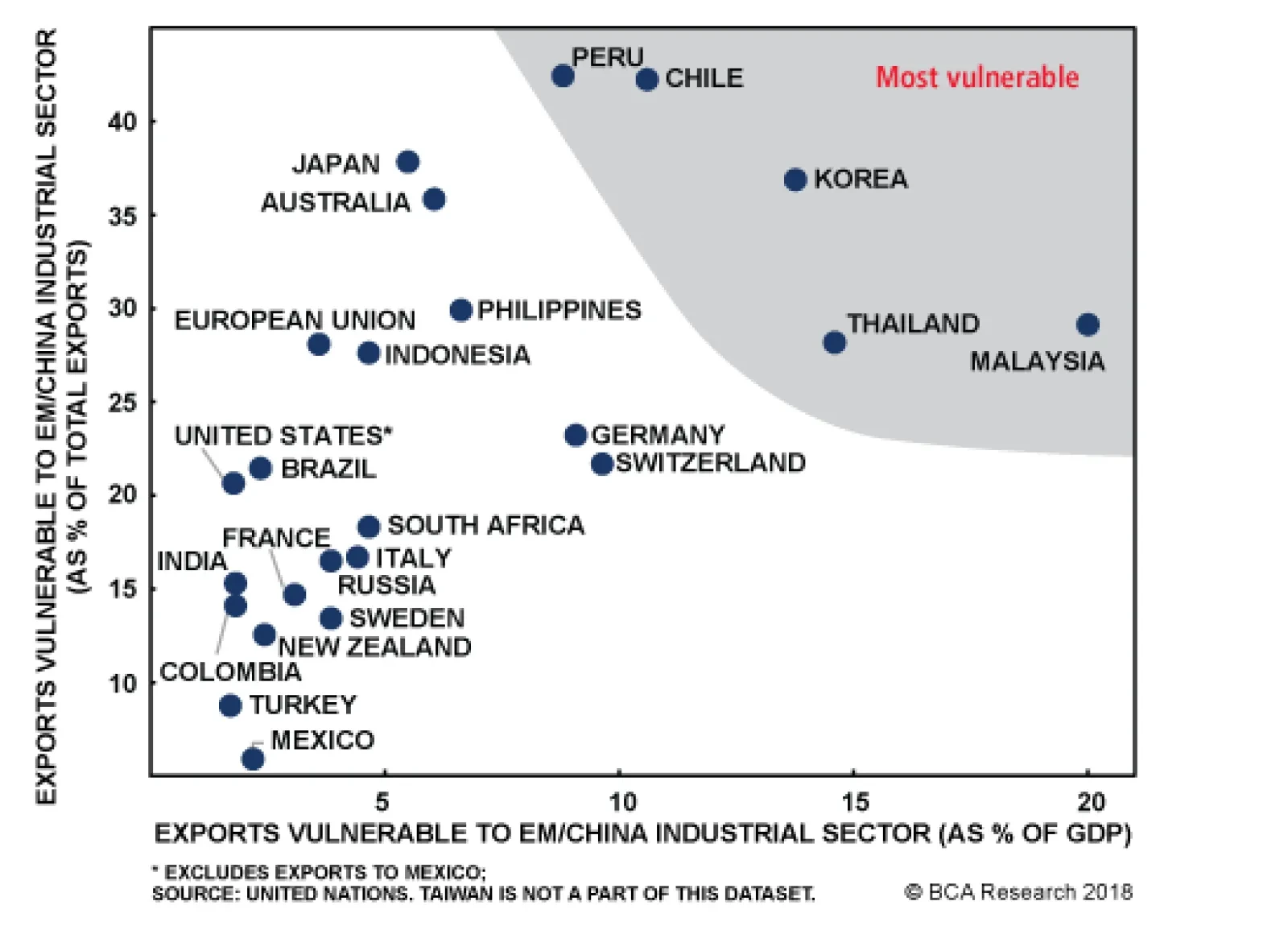
Their analysis takes into account not only the destinations of shipments but also the types of goods with the focus on identifying the size of the exports that are susceptible to an EM/China industrial slowdown. The chart above presents the vulnerability…
Neutral The S&P chemicals index appears to have found a bottom over the past couple of months, arresting the slide that began at the end of 2016. There is good reason too; producer prices have sustained their momentum (second panel) and capacity additions have not been egregious, resulting in a firming of productivity. The sell-side has rewarded the sector with much improved earnings forecasts (third panel). Still, chemical production has clearly rolled over (bottom panel) which could lead to a quick reversal of the gains in our productivity proxy. This may offset the otherwise good news in the sector and drive earnings estimates back down into deflation. While the recent wave of intra-industry mergers may prevent the too-large capacity increases of the past, we remain cautious, especially given the cresting in the industry’s activity barometer (according to the American Chemistry Council, not shown). Bottom Line: We reiterate our neutral recommendation for the sector. The ticker symbols for the stocks in this index are: BLBG: S5CHEM – DWDP, PX, ECL, SHW, APD, LYB, PPG, EMN, CF, FMC, MOS, ALB, IFF.
Chemicals Are Treading Water
Chemicals Are Treading Water
Neutral The battle of the titans of the U.S. media sector for control of Sky PLC was resolved over the weekend, with Comcast emerging victorious, besting 21st Century Fox's bid for the pay-TV firm. While increasing global diversification and a larger distribution channel are good things, we are somewhat skeptical of the victory for two reasons. First, the battle was settled in a blind auction and Comcast's £17.28 offer beat Fox's £15.67 effort by 10% and their own previous £12.50, made in February, by 38%. This could imply some vastly greater synergies identified over the past 7 months and more than Fox, which already owned 39% of Sky. However, it more likely is an extremely expensive tactic to block Disney, who has already pledged to buy Fox's existing stake, which doesn't bode well for the durability of the goodwill acquired. Our second hesitation with this deal is related to its composition, namely all-cash. We estimate an incremental U.S. $47 billion of net debt added to Comcast's balance sheet but analysts estimate Sky will generate only U.S. $3.8 billion of EBITDA next year, suggesting the index's deleveraging is reversing course. This increased risk has clearly been reflected by Comcast investors, who have wiped 6.5% off the stock's market cap. Bottom Line: We think this deal may be the strategic best case for Comcast but is tremendously expensive. Given that it has already been reflected in the stocks, our neutral recommendation remains unchanged.
Sky-High Deals In Cable
Sky-High Deals In Cable
Neutral As we highlighted in yesterday’s Daily Insight, we are firmly housing market bulls. However, we are concerned that too much euphoria is priced into home improvement retail (HIR) equities. Three reasons underlie our softening EPS stance for home improvement retailers. First, our HIR model has plunged on the back of the wholesale liquidation in lumber prices and rising interest rates (second panel). Second, household appliance and furniture & durable selling prices have tentatively crested, and represent another source of profit headaches for HIR (third panel). Finally, select industry operating metrics suggest that the easy profits are behind HIR. An inventory surge has sunk the HIR sales-to-inventories ratio into the contraction zone and is already having an impact on earnings estimates. (bottom panel). Netting it out, is it prudent to lock in gains in the S&P HIR index as profit drivers have downshifted at the margin; please see our Weekly Report for more details. Bottom Line: We downgraded exposure to neutral on Monday and crystalized gains of 13.3% in the S&P HIR index since inception. The ticker symbols for the stocks in this index are: BLBG: S5HOMI - HD, LOW.
Do Not Over Stay Your Welcome In Home Improvement Retailers
Do Not Over Stay Your Welcome In Home Improvement Retailers
Highlights Investors have piled into private equity (PE) in recent years, pushing assets under management (AUM) up to an all-time high of $3 trillion. However, there are increasing concerns about the outlook for the asset class over the next few years. In this report, we look at the fundraising and deal environment for PE, analyze historical risk-adjusted returns in comparison to traditional assets, and suggest how investors can optimize their PE allocation. Private equity and its two major sub-categories, buyouts and growth capital, have generated annualized returns of 13.4%, 13.7%, and 15.0% respectively over the past 32 years, significantly beating the returns from global equities and small-cap stocks of 8.4% and 9.1%. But the current environment is tougher. Dry powder (funds raised but not yet invested) exceeds $1 trillion. PE managers face increased competition from other investors and from companies with large cash balances looking to make acquisitions. Funds raised at the peak of bull markets have a higher probability of underperforming. The next two vintage years (2018 and 2019) face headwinds to making good returns, because of high entry valuations and a rising cost of borrowing. Manager selection is critical for a successful private-equity program. Top-quartile PE funds have outperformed second-quartile funds by as much as 8% a year over the past two decades. Feature Introduction The private equity (PE) market has grown more than five-fold since 2000, lifting assets under management from $577 billion to $2.97 trillion. However, its share of the private investment market has declined from 82% to 58% (Chart 1). Private equity and venture capital investing is said to date back to 1901 when J.P. Morgan purchased Carnegie Steel Co from Andrew Carnegie and Henry Philips for $480 million. The industry has evolved significantly over the years, and now encompasses a wide range of sub-strategies, offering investors a spectrum of exposures with very different risk/return profiles. Chart 1Private Equity Is A $3 Trillion Market
Private Equity: Have We Reached The Top?
Private Equity: Have We Reached The Top?
Compared to public equity, private equity investing is harder because of: 1) long-term illiquidity, whereas public equities can be bought and sold quickly, 2) limited information on target companies, 3) the lack of a clear price discovery function, meaning that pricing in private markets depends heavily on negotiations, 4) less separation between ownership and control - finance providers in PE tend to be managers too. The PE space has matured over the years, and this is clearly seen in the compression of returns. However, many investors remain bullish on this asset class because of its historically attractive risk-adjusted return, and ability to diversify traditional portfolios. As of mid-2017, the median net return of the PE holdings of public pensions globally over the previous 10 years was 8.5% compared to 4.2% for public equities, 4.5% for real estate, and 5.2% for fixed income.1 In this report, we analyze in detail the PE market, with an overview of the fundraising cycle, deal environment, and exit channels. We include in-depth analysis of historical returns from the private equity market in aggregate, and from its two largest sub-categories, buyouts and growth capital. We end by listing the key risks for limited partners (LPs - the investors in PE funds), and include a brief note on private-equity secondary investing. Our key conclusions are: Private equity, including buyouts and growth capital, has had exceptionally good returns over the past three decades, but has been on a structural downtrend as competition has increased. Buyout funds generate a negative skew and moderate kurtosis, whereas growth capital tends to have a larger kurtosis and positive skew. Funds raised at the peak of bull markets have a greater probability of underperforming given their higher entry valuations. This is likely to be the case for funds raised over the next 18 months. The current economic cycle has produced fewer home-run deals - in 2002-2005, 35% of deals produced returns of 3x invested capital, but this fell to 20% in the 2010-2013 period. Megacap buyout funds produce the best returns, but this comes with significantly higher volatility pushing down the risk-adjusted return. These larger funds experience larger negative skew and kurtosis driven by greater use of leverage. Entry valuations of investments made by PE funds have been steadily rising, and so has leverage: the median debt/EBITDA has reached 5.5x. As multiples keep rising, general partners (GPs - the fund managers) have to make up the difference with equity infusion. Top-quartile managers have significantly outperformed. Third-quartile managers struggled even to outperform global equities, and fourth quartile managers failed to preserve their initial capital. The secondary PE market is growing. It provides access to mature portfolio assets deeper into their distributions phase, which reduces the duration of the LP's investment. Fundraising, Deals, And Exits Private equity investing consists of many different sub-categories (Chart 2) that differ in value creation techniques and the maturity of target companies. Buyouts and growth capital are over 90% of the total. Buyouts2 invest in established companies, usually with the intention of improving operations and financials. There is usually substantial use of leverage. Growth capital3 takes significant minority positions in profitable yet still maturing companies mostly without the use of leverage. Secondary funds acquire stakes in PE funds from other LPs. Co-investment funds make minority investments alongside a buyout, recapitalization, or any other non-controlling investment. Turnaround funds aim to revitalize companies that face operational difficulties. Chart 2Buyouts & Growth Capital Are 90% Of PE
Private Equity: Have We Reached The Top?
Private Equity: Have We Reached The Top?
Private-equity firms raised $701 billion in 2017, making the past five years the strongest period for fundraising in history, with a total of $3.2 trillion (Chart 3). Additionally, more than two-thirds of the funds which closed in 2017 met or exceeded their target amounts, and 39% took less than a year to close. The last time fundraising peaked was in 2008, right in the middle of the last recession. However, since 2009, fundraising for buyouts has dropped from 85% to 70% of the aggregate for private equity, with growth capital picking up the slack, rising from 8% to 21%. As fundraising has gotten stronger, PE firms have been raising larger funds.4 These megafunds (with AUM greater than $5 billion) raised $174 billion in 2017, or 58% of that year's total buyout volume, a steep increase from $90 billion in 2016. For investment institutions with large amounts of capital to deploy, megafunds are an attractive and efficient outlet. Another reason for the very strong fundraising environment has been quick follow-up funds, where GPs race to launch new funds before predecessor funds have matured. Historically GPs have waited an average of 62 months between closing one fund and starting the next, but this has come down to 40 months in the past five years. With fundraising so strong, GPs are under pressure to deploy this capital wisely. Global PE deal volume increased by 14% in 2017, surpassing $1.2 trillion (Chart 4). But global deal count has been on the decline since 2015. Along with larger funds being raised, the average deal size in the private market has been rising steadily since the Global Financial Crisis (GFC). Despite increasing deal activity, the sheer volume of fundraising in recent years has led to massive accumulation of dry powder,5 which currently stands at $1.03 trillion. After 2008, dry powder as a percentage of AUM (Chart 5) was on a downward trend because of increased acquisition activity due to attractive valuations following the GFC. But this bottomed in 2012 at 29% and had risen to 35% at the end of 2017. If this level of dry powder accumulation continues, GPs will be forced to reduce hurdle rates and deploy capital into less attractive deals. Chart 3$3.2 Trillion Raised in 5 Years
$3.2 Trillion Raised In 5 Years
$3.2 Trillion Raised In 5 Years
Chart 4Rising Deal Size
Rising Deal Size
Rising Deal Size
Chart 5Harder To Find Attractive Deals
Harder To Find Attractive Deals
Harder To Find Attractive Deals
Another reason for dry powder accumulation is increasing competition for deals both within the private equity market, and from external sources. The number of private equity funds is at an all-time high of 7,775.6 The external competition comes largely from corporate buyers with large cash balances looking for inorganic growth. Corporations have two advantages over PE firms: 1) potential built-in synergies when it comes to integrating the target, giving them the ability to pay a higher price, and 2) a lower cost of capital. An increasing number of corporations have been setting up corporate venture-capital units (Chart 6) to focus on acquisition-led growth. In 2017, there were 38,479 companies bought and sold globally for a total value of $3.3 trillion. But, private equity's share of this market was just 13% by deal value and 8% by deal count (Chart 7). Looking forward, PE funds are likely to act more aggressively and take a larger share of the market, as they did in 2006-2007. In order to increase their share of global deal activity, private-equity funds need to look at more strategic ways to pick up assets: Chart 6Corporations Setting Up VCs
Corporations Setting Up VCs
Corporations Setting Up VCs
Chart 7Buyouts Only A Tiny Player In Global M&A
Private Equity: Have We Reached The Top?
Private Equity: Have We Reached The Top?
Zombie Assets: Assets (portfolio companies) belonging to funds that last raised initial capital between 2003 and 2008 but have not executed a deal since 2015. Currently there are over 100 such companies that are possible targets for takeover in 2018-2019. Carve-Outs: Over the past few years, one in five deals in the U.S. has come from corporations disposing of non-core assets.7 This provides a steady deal flow for buyout and turnaround funds. Public To Private: As multiples in private markets converge with those in public markets, more and more publicly listed companies are being taken private, and this market has doubled since 2016 (Chart 8). Additionally, lenders have become more comfortable about financing these high-value transactions. Buy & Build/Add-Ons: Purchasing cheaper small assets and adding them to existing large established platform companies. This in turn transforms a group of smaller companies at lesser multiples into a larger corporation with a premium valuation. Add-ons made up one-third of deals a decade ago, but that has now reached 50%. But, since such deals are smaller in terms of dollar value, they make up less than 25% of the total deal volume. Finally, PE firms have also been increasing the holding period of the assets in their portfolio. The median holding period before the GFC was four years, and this has now increased to over five years (Chart 9). Additionally, private equity firms exited 40% of all deals in fewer than three years, but now these quick-flips have fallen to only 20%. This is partly a response to increased competition: GPs are skeptical about finding new attractive deals, and this forces them to hold onto assets for as long as possible. Additionally, the new U.S. tax code has increased from one to three years the threshold period for carry to be treated as capital gain with a lower tax rate, rather than taxed as ordinary income. With fundraising on fire but deal activity struggling to keep pace, the final pillar for a successful private equity program is the exit environment. Global PE-backed exits have been flat for the past two years at around $500 billion, with the deal count between 2,500 and 3,000 (Chart 10). The rise in exit activity in 2015 was fuelled by PE firms looking to exit portfolio companies acquired before the financial crisis. By 2017, the dynamic had changed since more than 80% of exits that year were companies acquired in 2009 or later. Finally, dividend recapitalizations8 reached $42 billion in 2017, but these are heavily dependent on an accommodative debt market and positive environment for high-yield bonds. With rising rates, dividend recapitalization, and other forms of special dividends or distributions that require borrowing, become harder to execute. Chart 8Public-To-Private Activity
Public-To-Private Activity
Public-To-Private Activity
Chart 9Longer Holding Periods
Longer Holding Periods
Longer Holding Periods
Chart 10Global PE Exits Are Healthy
Global PE Exits Are Healthy
Global PE Exits Are Healthy
Historical Returns Before we look at the past risk-return profile of investing in this asset class, a note on the data used in this report. All return data are based on the Cambridge Associates Private Investment Benchmarks.9 We are satisfied with the methodology used and the format in which the returns are presented. The provider has taken sufficient steps to minimize survivorship bias. For more details on the data methodology, please see the Appendix. What can investors expect in terms of risk-return exposure from this asset class? Looking at Table 1, private equity and its sub-strategies have comfortably outperformed global equities, with lower volatility, over the past 32 years. Even after statistically adjusting returns for stale pricing,10 volatility for aggregate private equity and buyouts remains lower than for global equities and small-cap stocks. On the other hand, growth capital has had realized volatility greater than that of global equities, but with a significantly higher return; it is still the more attractive investment on a risk-adjusted basis. However, the significantly lower realized volatility of PE in aggregate, and buyout funds in particular, compared to growth capital makes them more attractive investments. Additionally, venture capital experienced volatility of close to 42%, more than double that of small-cap stocks, making it very unattractive from a risk-adjusted perspective. Table 1Risk-Return Spectrum
Private Equity: Have We Reached The Top?
Private Equity: Have We Reached The Top?
However, comparing the performance of PE with that of publicly traded assets could be misleading given the uncertain timing of cash inflows and outflows from private equity programs. Therefore, we also show the Public Market Equivalent11 (PME) to adjust public-market indices for uncertain cash flow streams. Looking at Tables 2-4, we can see that private equity still outperforms equity indices on a PME basis over different time frames. Table 2Private Equity PME Analysis
Private Equity: Have We Reached The Top?
Private Equity: Have We Reached The Top?
Table 3Buyout PME Analysis
Private Equity: Have We Reached The Top?
Private Equity: Have We Reached The Top?
Table 4Growth Capital PME Analysis
Private Equity: Have We Reached The Top?
Private Equity: Have We Reached The Top?
Another unique characteristic of private-market returns is the J-curve effect where investments in private markets take time to bear fruit, and fees are initially based on committed capital rather than invested capital. In addition, the biggest cash flows will be received towards the end, so the returns for the first few years can be misleading. IRR will remain negative until the point when distributions at least match contributions (the payback point). Given the non-linear return distribution of alternative assets such as PE and venture capital, risk analysis is not complete without skewness and kurtosis. Investing in buyout funds generates a negative skew and a moderate level of kurtosis, which means that investors can expect more stable, predictable returns, closer to a normal distribution. However, growth capital tends to have larger kurtosis and positive skew, thereby a higher probability of large upside gains. Since buyout capital structures tend to be more heavily geared, there is a higher skew towards negative returns driven by the leverage effect. Venture capital exhibits a return distribution similar to growth capital, where a few portfolio companies produce large positive returns given the start-up nature of its targets. PE returns remain attractive but, as with other alternative asset classes, performance has been on a downward trend (Chart 11) driven by increased competition. In the 1980s and 1990s, buyout firms exploited the poor performance of large U.S. conglomerates by acquiring underperforming divisions and using leverage. In the early 2000s, funds took advantage of the stock market rise, fuelled by low rates and levered returns. Within the structural downtrend in returns, PE has had a cyclical profile just like public equities. During bull markets there are more exits at higher valuations, and larger distributions to LPs. However, funds raised in bull markets have a higher probability of underperforming given their higher entry valuations. Looking forward, funds from recent vintages that are halfway through their life are likely to be able to take advantage of current tailwinds to build value and exit at the top. However, funds raised in the next two years will have to deal with high entry valuations and a possible increase in the cost of borrowing. There have been fewer write-offs and deals with capital impairments in the post-2009 period than in the years after the 2001 recession. However, the current economic cycle has produced fewer of the home-run deals that really drive PE performance. For example, in 2002-2005, 35% of deals produced returns of 3x invested capital or better, and more than 50% generated multiples of 2x or better. For the period 2010-2013, the equivalent percentages were 20% and 42% respectively. Looking at Chart 12, we can see that PE, buyout, and growth capital funds outperformed global equities and small-cap equities during recessions and equity bear markets. Chart 11Private Vs. Public Equity
Private Vs. Public Equity
Private Vs. Public Equity
Chart 12Recession & Bear Markets
Private Equity: Have We Reached The Top?
Private Equity: Have We Reached The Top?
Return persistence is the ability of top-performing manager to repeat the strong performance in their follow-up funds. In the PE industry, some large firms have proved able to repeat top-ranked performance time after time across multiple funds. We believe this is likely a function of their network of contacts that gives them access to proprietary deal flows. However, there are three factors that may be creating a spurious correlation here: 1) GPs tend to raise new funds 2-5 years into the life of an existing fund, thus creating overlapping structures of successive funds that are exposed to similar market environments, 2) investments in some portfolio companies are split between successive funds which induces a spurious patterns of performance persistence, 3) much of the top-quartile performance persistence came during periods of low competition. There is also a relationship between holding period and performance, whereby funds that hold onto portfolio companies for longer have lower performance, while quick-flips perform better. Funds have an incentive to exit successful investments earlier to show a good track record, and to extend the holding period of unsuccessful ones hoping for a better outcome. There is an intrinsic cyclicality in this relationship: in bear markets when valuations are low, funds will hold off from selling their assets in the hope of a better time to sell. Table 5 show the average returns LPs can expect from investing in companies with a specific sector focus. But, this comes with a large amount of idiosyncratic firm- and sector-specific risk; this tends to have a larger impact on buyouts than on venture capital which is already very industry focused. Geographic diversification gives investors access to different economic cycles and levels of market maturity across the globe. In the last recession, PE performance was very poor in some regions, while not that bad in others. There has been a clear cyclical pattern for U.S. versus ex-U.S. performance over the past 30 years, closely linked to the relative growth rates in the underlying economies (Chart 13). Table 5Returns By Sector Exposure
Private Equity: Have We Reached The Top?
Private Equity: Have We Reached The Top?
Chart 14 shows that from Q3 1998 to Q4 2000 relative performance between buyout and growth capital funds tended to move along with the interest-rate trajectory - the former benefits from falling rates which lower the cost of borrowing. Additionally, looking at median net IRR for funds by vintage year, we see that buyouts outperformed growth capital in 17 out of the 21 years (Chart 15). This was driven by stronger distributions to buyout fund LPs. Additionally; it was achieved with a fairly similar standard deviation of fund performance across vintage years. Within the buyout space, the median U.S.-focused buyout fund outperformed its ex-U.S. counterpart only in 2004-2012. Chart 13U.S. Vs. Rest Of The World
U.S. Vs. Rest Of The World
U.S. Vs. Rest Of The World
Chart 14Impact Of Rising Rates
Impact Of Rising Rates
Impact Of Rising Rates
Chart 15Buyouts Vs Growth Capital
Private Equity: Have We Reached The Top?
Private Equity: Have We Reached The Top?
Finally, when allocating to private-equity and especially buyout funds, investors have a choice between different deal sizes (small to megacap). Looking at Table 6, it is clear that megacap buyout funds have been able to produce the best returns, but this came with significantly higher volatility, pushing down risk-adjusted returns. Additionally, these megacap deals have a larger negative skew and kurtosis - investors should expect a higher probability of large negative returns. Looking at performance in recessions, one can find a relationship between the nature of the downturn and the performance of different buyout deal sizes. For example, during the 2001 recession, the smallest deal sizes produced the worst performance because smaller-cap tech stocks suffered in the aftermath of the dotcom bust. During the 2007-2009 recession, the worst hit were larger buyout deals because of the damage done to the credit market. An analysis of PE would not be complete without a discussion of valuations. The average deal size has risen by 25% since 2009: two-thirds of this increase is due to rising multiples, and the remaining one-third is organic (Chart 16). Median EV/EBITDA has risen from 5.6x in 2009 to 10.7x in 2017. Leverage levels have been rising alongside multiples, and so lenders will be more hesitant to offer debt financing for deals. GPs will have to to make up the funding shortage with equity infusion, and this leads to a decrease in IRR. Additionally, covenant-lite loans have been increasing since 2012 and are now 75% of overall loan volume in the U.S. The percentage of listed companies globally valued at more than 11x EV/EBITDA rose from 20% in 2012 to 54% in 2016. Table 6Size Matters
Private Equity: Have We Reached The Top?
Private Equity: Have We Reached The Top?
Chart 16Private Equity Is Expensive
Private Equity: Have We Reached The Top?
Private Equity: Have We Reached The Top?
Lastly, return dispersion is much larger for private-market investments compared to public markets, because of the more active nature of the investment process. If an LP had consistently picked only top-quartile managers from 2000, they would have outperformed second-quartile managers by an impressive 7.7% (Chart 17) a year. Top-quartile managers generated these higher returns with only a trivial increase in volatility, thereby producing far superior risk-adjusted returns. Additionally, skewness and kurtosis measures show no significant deterioration (Table 7). Third-quartile managers struggled even to outperform global equities, and fourth-quartile managers failed even to preserve initial capital. Therefore, manager selection is critical to building a successful private-equity program. Over the past decade, there has been clear compression in fees charged by private equity firms (Chart 18). Management fees tend to differ significantly between the smallest and largest funds; but they are fairly consistent at about 1.975% for funds with AUM between $100 million and $1.9 billion. Chart 17Manager Selection Is Critical
Manager Selection Is Critical
Manager Selection Is Critical
Table 7Large Dispersion
Private Equity: Have We Reached The Top?
Private Equity: Have We Reached The Top?
Chart 18Fee Compression?
Private Equity: Have We Reached The Top?
Private Equity: Have We Reached The Top?
Risks In Private Equity Chart 19Strong Distributions
Strong Distributions
Strong Distributions
The long-term investment horizon, illiquid nature, and unique structure of PE bring logistical challenges and unique risks. Given the erratic nature of capital draw-downs by GPs, some LPs might be unable to service capital calls which leads to their defaulting on their obligations. In this case, investors are exposed to funding risk and could lose their entire investment in the fund and all the capital already paid in. LPs tend to use distributions from a mature fund to finance capital calls of younger funds. But this may not be feasible in a slowdown when exits dry up and distributions slow, forcing LPs to raise additional capital from external sources12 for commitments. Many investors run an over-commitment strategy to avoid being under-exposed to their strategic allocation. The strong equity bull market has increased overall portfolio values, meaning that LPs have received large distributions, which have been double contributions since 2013 (Chart 19). Therefore, the net asset value (NAV) of PE holdings has not grown, and allocations even contracted in 2017, forcing LPs to keep plowing gains back into their programs to maintain the target allocation. Investors also face significant liquidity risk. GPs could be forced to sell portfolio companies in the secondary market at a discount to NAV, given the illiquid nature of the market. The secondary market tends to be very cyclical and is likely to experience a deal drought, as seen during the last financial crisis. Market risk is the impact of volatile markets on the quarterly changes in NAV of the portfolio. Capital risk relates to the realization value of the private-equity investments. There is a risk of a private-equity investment going bust and losing all its value. Holding a portfolio of funds exposed to many different companies can reduce this risk and generate a statistical distribution skewed towards positive returns. Additionally, diversification over multiple vintage years should create a right-skewed distribution that minimizes long-term capital risk. A Note On Private Equity Secondaries Chart 20Secondaries: Faster Return But Smaller Upside
Private Equity: Have We Reached The Top?
Private Equity: Have We Reached The Top?
The secondary market for LPs' private-equity investments is growing. Direct secondaries are the sale of an interest in a direct PE investment or portfolio of direct PE investments to a new third-party investor. A secondaries fund is a PE fund raised by a fund-of-funds manager to acquire limited partnership interests in private equity from the original LPs. Secondary investing is no longer looked at as a source of liquidity for distressed investors, but as a differentiated investment strategy and a regular portfolio management tool to rebalance fund exposures and lock in realized gains. The secondary penetration rate (the percentage of total NAV across all PE strategies that trades in the secondary market) is still less than 2%13 but, as the secondary market continues to expand, investors may see a broader spectrum of assets on sale. Many investors look at the secondary market solely for opportunistic investments, making commitments only during or immediately following periods of market distress. Intuitively this makes sense, as secondary buyers should be able to negotiate steeper discounts during periods of elevated uncertainty and tight liquidity. However, there are many reasons to have a dedicated allocation: It Mitigates The J-Curve: Mature secondary investments cut off several years from the typical term of a PE fund because a good portion of the investment period is already completed. This generates immediate returns from the mature private-equity program. Many fund-of-funds managers will combine secondary interests with their primary portfolios to mitigate the J-curve. Less Blind Pool Risk: In private equity, LPs commit capital to a portfolio that is yet to be built. Secondary investing significantly reduces this risk because portfolios acquired are generally more than 50% invested and have less unfunded commitments. This provides investors with an actual portfolio of companies to evaluate. It Diversifies A Private-Equity Program: An allocation to secondaries can provide instant exposure to a highly diversified portfolio of mature private-equity interests. Lower Probability Of Poor Performance: The potential upside for secondary funds is not as high as that of primary funds, but the former produce poor returns much less frequently (Chart 20). Aditya Kurian, Senior Analyst Global Asset Allocation adityak@bcaresearch.com 1 Source: Bain Global Private Equity Report 2018. 2 Buyouts refers to deals in which a PE fund borrows a significant amount to acquire a target company or companies, which tend to be larger-cap private or publicly listed corporations. 3 Investments in mature companies with proven business models that are looking for capital to expand or restructure operations, enter new markets, or finance a major acquisition. 4 Apollo Investment Fund IX with an AUM of $24.7 billion raised in 2016-2017 is the largest buyout fund raised in history. 5 The amount of capital that has been committed to a private equity fund, but not yet deployed. 6 Source: Pitchbook. 7 The largest global buyout was the $17.9 billion carve-out of Toshiba Memory Corp in 2018. 8 Whereby a company owned by a private-equity fund issues debt in order to pay a dividend to the fund. 9https://www.cambridgeassociates.com/private-investment-benchmarks/ 10 To de-smooth returns, we used a first-order autoregressive model as shown by Rt = A0 + At Rt-1 + e, where At is the auto-regressive coefficient, and A0 is the intercept term. However, statistical methods do not always satisfactorily solve the problem of underestimated volatility for appraised asset values. 11 PME replicates the timing and size of private equity cash flows (purchases and sales) as if they had been invested in public equities. It is the dollar-weighted return that could have been achieved if funds had been invested in the index whenever a capital contribution was made and divested when the GP paid out a distribution. 12 In the Global Financial Crisis, Harvard Management Co issued a bond of more than $1 billion and considered selling a private equity stake of $1.5 billion at a 40%-50% discount to fund its capital calls. 13 Source: Preqin Ltd. Appendix: A Note On Data Sources And Definitions The performance indices all use quarterly unaudited, and annual audited fund financial statements produced by the GPs for their LPs. Partnership financial statements and narratives are the primary source of information concerning cash flows and ending residual/net asset values for both partnerships and portfolio company investments. The data providers' goal is to have a complete record of the quarterly cash flows and NAVs for all funds in the benchmark. All performance is calculated net of fees, expenses, and carried interest. Cambridge Associates (CA) uses two types of return calculation in its indices: Since Inception IRR: This calculates a discount rate which makes the NPV of an investment equal to zero. It is based on cash-on-cash returns over equal periods modified for the residual value of the partnership's equity or portfolio company's NAV. The residual value attributed to each respective group being measured is incorporated as its ending value. Transactions are accounted for on a quarterly basis, and annualized values are used for reporting purposes. End-To-End/Horizon IRR: A money-weighted return similar to the Since Inception IRR, except that it measures performance between two points in time. The calculation incorporates the beginning NAV, interim cash flows, and the ending NAV. All interim cash flows are recorded on the mid-period date of the quarter. With regards to avoiding survivorship bias, CA requires the complete set of financial statements from the fund's inception to the most current reporting date. When an active fund stops providing financial statements, CA reaches out to the manager to encourage them to continue to submit data. CA may, during this communication period, roll forward the fund's last reported quarter's NAV for several quarters. When CA is convinced that the manager will not resume reporting, the fund's entire performance history is removed from the database. Survivorship bias can affect all investment manager databases, including those of public asset managers. But the illiquid nature of private investments can actually help limit this impact, since the private investment partnerships owning illiquid assets will continue to exist and be legally required to report to the LPs even after the original manager ceases to exit. Over the past nine years the number of fund managers that stopped reporting to the database before liquidation averaged per year 0.7% of the total number of funds, and 0.6% of total NAV in the database. During that period the overall number of funds in the database increased by an average of 8% per year. Public Market Equivalent (PME): A private-to-public comparison that seeks to replicate private-investment performance under public-market conditions. The public index is recalculated as if shares were purchased and sold according to the private fund's cash flow schedule, with distributions calculated in the same proportion as the private fund. The PME NAV is a function of PME cash flows and public index returns. The PME attempts to evaluate the return that would have been earned had the dollars been deployed in the public markets instead of in private investments.
With the labor market at full employment and unemployment insurance claims on the verge of breaking below the 200,000 level, housing starts should regain their footing and propel homebuilding profits. In addition, the latest Fed Senior Loan Officer survey…
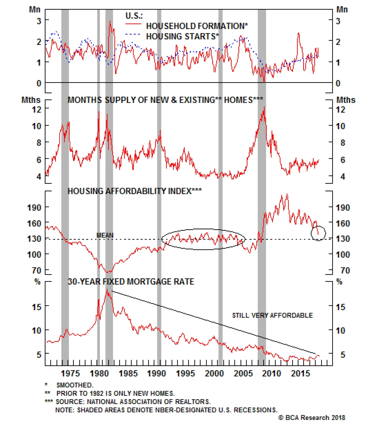
On the demand side, first-time home buyers still make only a third of total home sales and the homeownership rate is near generational lows, underscoring that pent up housing demand exists. In fact, the percentage of 18-34 year-olds that live with their…
Overweight While housing-related data releases have been slightly weaker than anticipated lately, we deem that this softness is transitory as housing market fundamentals rest on solid foundations. True, affordability has taken a hit both as a result of rising home price inflation and mortgage rates but as long as job certainty remains intact and wage growth picks up steam as we expect, we doubt that the U.S. housing market will suffer a relapse. In that light, we recommend augmenting exposure to overweight in the S&P homebuilding index. While galloping lumber prices were previously a key reason for putting the S&P homebuilding index on our high-conviction underweight list, the recent liquidation, down $300/thousand board feet since the mid-May peak, in lumber prices represents a massive input cost relief for homebuilders (second panel). In addition, the latest Fed Senior Loan Officer survey showed that demand for residential real estate loans ticked higher, while simultaneously bankers remain willing extenders of mortgage credit. The implication is that new home sales will likely reaccelerate in the coming months (third & bottom panels). Bottom Line: A playable opportunity has surfaced to ride the S&P homebuilding index higher. Lift exposure to overweight and see Monday's Weekly Report for more details. The ticker symbols for the stocks in this index are: BLBG: S5HOME - DHI, LEN, PHM.
Look Through The Housing Soft Patch
Look Through The Housing Soft Patch
Highlights Duration: The housing market is the key channel through which monetary policy impacts the economy. As such, it is unlikely that Treasury yields will peak until housing shows meaningful weakness. While residential investment has decelerated in recent quarters, we expect this weakness will prove temporary and that Treasury yields have further cyclical upside. Maintain below-benchmark portfolio duration. Yield Curve: The Fed will maintain its 25 bps per quarter rate hike pace for the time being, but could be forced to pause next year if weak foreign growth migrates to the U.S. via a stronger dollar. We recommend hedging this risk via a long position in the 7-year bullet versus a short position in the 1/20 barbell. Corporate Health: Strong profit growth - both organic and as a result of corporate tax cuts - has led to a significant improvement in corporate balance sheet health during the past few quarters. This improvement will not persist for much longer. We recommend only a neutral allocation to corporate bonds, both investment grade and junk. Feature This time last week the 10-year Treasury yield was bumping up against 3% and money markets were on the cusp of discounting an extra rate hike between now and the end of 2019. Both resistance levels broke during the past seven days. The 10-year yield is now 3.07% and the January 2020 fed funds futures contract is fully priced for four rate hikes (Chart 1). Chart 1Past Resistance Levels
Past Resistance Levels
Past Resistance Levels
With the 10-year yield back above 3%, many investors are once again speculating about where it will ultimately peak for the cycle. Any answer to this question relies on an assumption about the neutral fed funds rate, the level of interest rates above which monetary policy turns restrictive and acts to slow economic growth and inflation. In past reports we have suggested several measures investors can track to help decide whether interest rates are close to breaking above neutral.1 In this week's report we focus on one particularly important indicator - the housing market. In his essential 2007 paper "Housing Is The Business Cycle", Edward Leamer notes that of the ten post-WWII U.S. recessions, eight were preceded by a significant slowdown in residential investment.2 Given that recessions are also typically preceded by tightening monetary policy, it is not a stretch to connect the two. In fact, there is good reason to believe that housing is the main channel through which monetary policy impacts the economy. Since leverage is employed in the acquisition of new homes, interest rates impact the cost of homeownership more directly than other assets. A similar claim could be made about leveraged investment from the corporate sector, but business investment is also beholden to swings in expected future demand. Households can easily postpone the acquisition of a new home if the interest rate environment makes it uneconomical, businesses need to act when the market demands it. But most importantly, Leamer's paper demonstrates that, unlike residential investment, weaker business investment does not consistently provide advance warning of recession. The State Of U.S. Housing Turning to the data, we see that Leamer's claim is validated by the top panel of Chart 2. Residential investment tends to decline in the year preceding a U.S. recession. Housing starts and new home sales display a similar pattern (Chart 2, panels 2 & 3). Chart 2The Housing Market Predicts Recessions
The Housing Market Predicts Recessions
The Housing Market Predicts Recessions
What's worrying is that residential investment has barely grown at all during the past year (Chart 2, bottom panel). If this weakness continues it would signal that interest rates are too high for the housing market, and that we are likely very close to the cyclical peak in bond yields. However, we doubt the current weakness will persist. For one, the recent decline in construction activity has been concentrated in the multi-family sector while single-family construction continues to expand at a steady rate (Chart 3). This could simply reflect a shift in demand away from multi-family toward single-family, reversing the trend witnessed between 2010 and 2012. It's possible that some households who were forced into the rental market in the aftermath of the Great Recession now find themselves able to switch back. But even if we focus on the multi-family sector exclusively, there is little reason to believe that construction will see significantly more downside. The rental vacancy rate remains very low, and the National Multi Housing Council's Survey of Apartment Market Conditions suggests that there is no strong upward or downward pressure on the vacancy rate at the moment (Chart 3, bottom 2 panels). The fact that single-family housing starts have not declined casts some doubt on the notion that higher mortgage rates are to blame for the deceleration in residential investment. This is further borne out by the fact that, while higher mortgage rates have certainly increased the cost of homeownership, mortgage payments as a percent of median income are not stretched compared to history (Chart 4). The demand back-drop for housing also remains robust, with household formation in a clear uptrend (Chart 4, panel 2) and homebuilders as optimistic as ever about future sales activity (Chart 4, bottom panel). Chart 3A Temporary Weakness In Residential Investment
A Temporary Weakness In Residential Investment
A Temporary Weakness In Residential Investment
Chart 4Higher Mortgage Rates Are Not The Culprit
Higher Mortgage Rates Are Not The Culprit
Higher Mortgage Rates Are Not The Culprit
We conclude that interest rates are still too low to meaningfully impact the housing market. Residential investment will re-accelerate in the coming quarters and Treasury yields have plenty of room to rise before reaching their cyclical peak. Bottom Line: The housing market is the key channel through which monetary policy impacts the economy. As such, it is unlikely that Treasury yields will peak until housing shows meaningful weakness. While residential investment has decelerated in recent quarters, we expect this weakness will prove temporary and that Treasury yields have further cyclical upside. Maintain below-benchmark portfolio duration. Hedging Weak Foreign Growth With Steepeners The resilience of the U.S. housing market makes it likely that interest rates will continue to rise for quite some time. However, this does not preclude weak foreign growth - and the resultant dollar strength - from forcing the Fed to slow its 25 basis point per quarter rate hike pace at some point during the next 6-12 months. In fact, we have flagged in recent reports that, since 1993, every time the Global (ex. U.S.) Leading Economic Indicator (LEI) has fallen below zero, the U.S. LEI has eventually followed (Chart 5).3 Unless foreign growth suddenly recovers, it is quite likely that dollar strength will drag the U.S. LEI lower in the first half of next year. At that point, the Fed may be forced to pause its rate hike cycle in order to take some shine off the dollar, allowing the recovery to continue. Chart 5Weak Global Growth Could Bring Down The U.S.
Weak Global Growth Could Bring Down The U.S.
Weak Global Growth Could Bring Down The U.S.
Drops in the U.S. LEI to below zero almost always coincide with a recommendation for easier monetary policy from our Fed Monitor (Chart 5, bottom panel). Although one notable exception did occur in 2005. An examination of the three components of our Fed Monitor reveals that a falling LEI caused the economic growth component of our monitor to decline in 2005 (Chart 6). However, this was offset by an elevated inflation component and extremely easy financial conditions (Chart 6, bottom 2 panels). Chart 6The Three Components Of Our Fed Monitor
The Three Components Of Our Fed Monitor
The Three Components Of Our Fed Monitor
As in 2005, inflation pressures are once again elevated and financial conditions remain accommodative. It follows that it could take a significant deterioration in economic growth before the Fed is forced to pause its 25 bps per quarter rate hike cycle, one that is not yet evident in the data. Nevertheless, we cannot ignore the risk that weak foreign growth will infiltrate the U.S. via a stronger dollar, forcing the Fed to pause. With only two 25 basis point rate hikes currently discounted for 2019, some pause is already in the price. This makes us reluctant to advocate shifting away from below-benchmark portfolio duration. We think a better way to hedge the risk of a Fed pause is through yield curve steepeners. Since short-dated yields are more heavily influenced by the expected near-term pace of rate hikes than long-dated yields, any Fed pause will cause the yield curve to steepen. Steepeners are also very attractively priced at the moment, meaning that they should even perform well in a mild curve flattening environment.4 Our preferred method for implementing a curve steepener is to go long a bullet maturity near the middle of the curve and short a duration-matched barbell consisting of the very short and very long ends of the curve.5 With that in mind, we can determine the best yield curve trade to implement by answering the following two questions: Which bullet over barbell combination offers the most attractive value? Which bullet over barbell combination is most likely to outperform in the "Fed pause" scenario we are trying to hedge? In response to the first question, we consider the 2-year, 3-year, 5-year and 7-year bullet maturities all relative to a duration-matched 1/20 barbell. All of those butterfly spreads offer approximately the same yield pick-up (Chart 7). They also all offer approximately the same yield pick-up relative to our fair value models, which are based on regressions of the butterfly spread versus the 1/20 slope of the curve (Chart 8).6 To answer the second question, we try to identify which of the 2-year, 3-year, 5-year or 7-year yields is likely to decline the most in response to the market pricing-in a pause in Fed rate hikes. To do this we look at the historical correlations between different yield curve slopes and our 12-month Fed Funds Discounter - the change in the fed funds rate that is priced into the market for the next 12 months. The correlations are displayed in Chart 9, and they show that monthly changes in the 7/10 slope are almost always negatively correlated with monthly changes in the 12-month discounter. In other words, when the discounter falls, the 7-year yield falls by more than the 10-year yield. Chart 7Different Bullets, Similar Yield Pick-Up I
Different Bullets, Similar Yield Pick-Up I
Different Bullets, Similar Yield Pick-Up I
Chart 8Different Bullets, Similar Yield Pick-Up II
Different Bullets, Similar Yield Pick-Up II
Different Bullets, Similar Yield Pick-Up II
Chart 9Hedging The "Fed Pause" Scenario
Hedging The "Fed Pause" Scenario
Hedging The "Fed Pause" Scenario
Monthly changes in the 5/7 slope are also usually negatively correlated with changes in the discounter, though the correlation has been closer to zero in recent years. This makes it difficult to say with certainty whether the 5-year or 7-year yield would fall by more in response to a decline in the discounter. Chart 9 also shows that changes in both the 2/3 and 3/5 slopes are positively correlated with changes in the 12-month discounter. This means that when the discounter falls, the 3-year yield falls by more than the 2-year yield and the 5-year yield falls by more than the 3-year yield. In general, we can safely conclude that the 5-year and 7-year bullets are better hedges against a Fed pause than the 2-year or 3-year bullets. The 7-year in particular appears to be a safe bet. Given that the differences in valuation between the different options are miniscule, we are inclined to maintain our current yield curve position: long the 7-year bullet and short the 1/20 barbell. This week we also close our recommendation to favor the 5/30 barbell over the 10-year bullet for a small loss of 2 bps. This trade was designed to hedge the risk of Fed overtightening leading to an inverted yield curve. This trade would underperform in the event of a Fed pause, which we now view as the greater risk. Bottom Line: The Fed will maintain its 25 bps per quarter rate hike pace for the time being, but could be forced to pause next year if weak foreign growth migrates to the U.S. via a stronger dollar. We recommend hedging this risk via a long position in the 7-year bullet versus a short position in the 1/20 barbell. Corporate Balance Sheet Reprieve Last week's release of the second quarter U.S. Financial Accounts (formerly Flow of Funds) allows us to update our indicators of nonfinancial corporate balance sheet health. Overall, there has been a significant improvement in our Corporate Health Monitor (CHM) since the end of 2016. It has fallen from deep in "deteriorating health" territory to close to the "improving health" zone (Chart 10). By far, the biggest driver of the CHM's improvement has been the sharp increase in after-tax cash flows (Chart 10, panel 2). This is partly due to the recent corporate tax cuts, but also reflects a significant rebound in pre-tax cash flows (Chart 10, bottom panel). Despite the rebound in profits, we remain cautious on the outlook for corporate balance sheets going forward. First, our bottom-up samples of firms included in the investment grade and high-yield Bloomberg Barclays bond indexes both show that the median firm's net debt-to-EBITDA has improved in recent quarters, but remains elevated compared to history (Chart 11). Chart 10After-Tax Cash Flows Drive CHM Improvement
After-Tax Cash Flows Drive CHM Improvement
After-Tax Cash Flows Drive CHM Improvement
Chart 11Debt Levels Still High
Debt Levels Still High
Debt Levels Still High
Second, we see increasing headwinds to profit growth going forward. The positive impact from tax cuts is set to wane, while the stronger dollar and faster wage growth will both weigh on pre-tax profits during the next year.7 It is important to note that it will not take much deceleration in pre-tax profits for corporate balance sheets to worsen. Our measure of gross leverage - total debt over pre-tax profits - has only managed to flatten-off during the past few quarters, even as profit growth has surged. This means that the rapid gains in profits have only managed to keep pace with the rate of debt growth. Even a small deceleration in profits will cause leverage to rise, and rising leverage tends to occur alongside an increasing default rate (Chart 12). Chart 12Gross Leverage And Corporate Defaults
Gross Leverage And Corporate Defaults
Gross Leverage And Corporate Defaults
Bottom Line: Strong profit growth - both organic and as a result of corporate tax cuts - has led to a significant improvement in corporate balance sheet health during the past few quarters. This improvement will not persist for much longer. We recommend only a neutral allocation to corporate bonds, both investment grade and junk. Ryan Swift, Vice President U.S. Bond Strategy rswift@bcaresearch.com 1 Please see U.S. Bond Strategy Weekly Report, "Tracking The Two-Stage Treasury Bear", dated August 14, 2018, available at usbs.bcaresearch.com 2http://www.nber.org/papers/w13428 3 Please see U.S. Bond Strategy Weekly Report, "An Oasis Of Prosperity?", dated August 21, 2018, available at usbs.bcaresearch.com 4 Please see U.S. Bond Strategy Portfolio Allocation Summary, "Playing Catch-Up", dated September 11, 2018, available at usbs.bcaresesarch.com 5 For further details on why we prefer this trade construction, please see U.S. Bond Strategy Special Report, "Bullets, Barbells And Butterflies", dated July 25, 2017, available at usbs.bcaresearch.com 6 We calculate the butterfly spread as: the bullet yield minus the yield of the duration-matched barbell. 7 Please see U.S. Bond Strategy Special Report, "Go To Neutral On Spread Product", dated June 26, 2018, available at usbs.bcaresearch.com Fixed Income Sector Performance Recommended Portfolio Specification