Technology

The COVID-19 induced recession has accelerated several paradigm shifts that were already afoot. Populism, anti-immigrant sentiment, deglobalization, and fiscal profligacy were replete – particularly in the US – even before the pandemic. For the first time since WWII, the US budget deficit significantly expanded for three years running at a time when the unemployment rate was declining, late in the cycle. We fear that the Washington Consensus – a catchall term for fiscal prudence, laissez-faire economics, free trade, and unfettered capital flows – is being replaced by economic populism, by a Buenos Aires Consensus, as our geopolitical strategists have posited in the past. Buenos Aires Consensus is our catchall term for everything that is opposite of the Washington Consensus: less globalization, fiscal stimulus as far as the eyes can see, erosion of central bank independence, and a dirigiste (as opposed to laissez-faire) approach to economics that seeks to protect “state champions,” stifles innovation, and ultimately curbs productivity growth. The most important long-term consequence of the Buenos Aires Consensus will be higher inflation. And we are not talking just the asset price kind – which investors have enjoyed over the past decade – but of the more traditional flavor: consumer price inflation (Chart 1). Chart 1Inflation Is Coming
Inflation Is Coming
Inflation Is Coming
A profligate US government where $3 trillion + fiscal packages are passed with a strong bipartisan consensus, rising odds of increased defense and infrastructure spending, a renewed focus on protecting America’s industrial champions from competition (foreign or domestic), and a robust protectionist agenda (again, on both sides of the aisle), are all inherently inflationary and negative for bonds, ceteris paribus. A whiff of inflation would be a positive for the broad equity market, further fueling the “risk on”, liquidity-driven, melt-up phase. However, historically when inflation has entered the 3.7%-4% zone in the past, the broad equity market has stumbled (Chart 2). Despite these powerful longer-term inflationary forces, our working assumption is that, in the next 9-12 months, headline CPI inflation will only renormalize, rather than surge, as the coronavirus-induced deficient demand and excess supply dynamic will take time to reach a new equilibrium (Chart 3). Chart 2Only A Whiff Of Inflation Is Good For Stocks
Only A Whiff Of Inflation Is Good For Stocks
Only A Whiff Of Inflation Is Good For Stocks
Importantly, the magnitude of the economic damage, the likelihood that a “second wave” requires renewed lockdowns, and a new steady state of the apparent “square root” type of recovery remain unknown. This means that “deflationistas” may continue to have an upper hand on the “inflationistas”, as witnessed by the subdued inflation expectations (Chart 3). Chart 3In The Near-Term Disinflation Looms
In The Near-Term Disinflation Looms
In The Near-Term Disinflation Looms
The Federal Reserve’s Function As The Lender Of Last Resort What is certain is the Fed’s resolve to keep things gelled together and allow businesses and the economy enough time to heal and overcome the coronavirus shock. Simply put, there are high odds that the Fed will remain accommodative and take inflation risk “sitting down” for quite some time, certainly for the next year, and likely longer (Chart 4). While early on, the Powell-led Fed had been ambivalent, the FOMC’s swift and immense response to the coronavirus calamity with unorthodox monetary policies has been appropriate and unprecedented (Chart 5). Clearly, the sloshing liquidity cannot cure the coronavirus, but providing the credit needed in parts of the financial markets and select business sectors that had completely dried up was the proper policy response. The Fed acted promptly as a lender of last resort. Unlike the difficulty in defeating deflation – look no further than Japan – ending inflation is easy. The great Paul Volcker has taught the Fed and the world how to break the back of inflation. The Fed, therefore, has the credible tools to deal with a possible inflationary impulse. Chart 4Do Not Fight The Mighty Fed
Do Not Fight The Mighty Fed
Do Not Fight The Mighty Fed
Chart 5Joined At The Hip
Joined At The Hip
Joined At The Hip
Until economic growth regains its footing and climbs to its post-GFC steady 2-2.5% real GDP growth profile, the probability is high that the Fed will take some inflation risk (Chart 6). Chart 6The Fed Can Afford To Take Inflation Risk
The Fed Can Afford To Take Inflation Risk
The Fed Can Afford To Take Inflation Risk
This is especially the case given that political risk in the US is tilted to the downside. With income inequality at nose bleeds levels, US policymakers (both fiscal and monetary authorities) will hesitate to act on the inflation mandate with gusto and objectivity (Chart 7). Chart 7The Apex Of Globalization And Income Inequality
The Apex Of Globalization And Income Inequality
The Apex Of Globalization And Income Inequality
The Fed will therefore not rush to abruptly tighten monetary policy, a view confirmed by the bond market: fed funds futures are penciling a negative fed funds rate in mid-2021 and ZIRP as far as the eye can see (Chart 8). A sustainable breakout in bond yields would require inflation (and to a lesser extent real GDP growth) to significantly surprise to the upside, which would compel the Fed to aggressively raise the fed funds rate. But that is not on the immediate horizon especially given the recent coronavirus-related blow to unit labor costs (please see Appendix below). Even if there were an inflationary backup in longer term Treasury yields, yield curve control is a tool the Fed is considering, something it first tried on the Treasury’s orders during and following WWII for a nine year period. Chart 8ZIRP As Far As The Eye Can See
ZIRP As Far As The Eye Can See
ZIRP As Far As The Eye Can See
Dollar And The Inflationary Valve Importantly, the US dollar’s direction will be critical in determining whether any lasting inflation acceleration occurs. The top panel of Chart 9 shows that inflation accelerates during U.S. dollar bear markets. A depreciating greenback greases the wheels of the global financial system and also serves as a global growth locomotive given that trade is largely conducted in US dollars (bottom panel, Chart 9). Thus, the Fed’s recent US dollar swap lines to other Central Banks, along with its FIMA facility, were instrumental in unclogging the global financial system. Sloshing US dollar liquidity restored a semblance of normality to asset prices (Chart 10). Chart 9Inversely Correlated
Inversely Correlated
Inversely Correlated
Chart 10Ample Liquidity To Debase The Greenback
Ample Liquidity To Debase The Greenback
Ample Liquidity To Debase The Greenback
As we highlighted in our December 16 Special Report titled “Top US Sector Investment Ideas For The Next Decade” ,1 there are rising odds that a US dollar bear market takes root this decade. Eventually, the steeper the greenback’s fall, the higher the chance of a longer lasting inflationary spurt as US import price inflation will rear its ugly head (Chart 11). Chart 11US Dollar Bear Markets Are Synonymous With Inflation
US Dollar Bear Markets Are Synonymous With Inflation
US Dollar Bear Markets Are Synonymous With Inflation
So What? While, in the near-term, accelerating inflation is a negligible risk owing to excess economic slack, in the intermediate-term, it is a rising probability outcome. BCA’s long-held de-globalization theme,2 the US/Sino trade war that is here to stay irrespective of the next electoral outcome and excessive US government fiscal largesse will likely, in the next two-to-three years, swing the global deflation/inflation pendulum toward sustained inflation (Chart 12). For investors that are worried about the prospect of higher inflation, the purpose of this Special Report is to serve as an equity sector positioning roadmap, especially if inflationary pressures become more acute sooner than we anticipate. Chart 12Deglobalization Will Result In Inflation
Deglobalization Will Result In Inflation
Deglobalization Will Result In Inflation
Historically, inflation has been synonymous with an aggressive Fed and hard asset outperformance, suggesting that deep cyclical sectors would be the primary beneficiaries. Table 1 shows that over the last six major inflationary cycles, energy, materials, real estate and health care have been consistent outperformers. On the flip side, utilities, tech and telecom have been clear underperformers. The remaining sectors have been a mixed bag. Table 1S&P 500 Sector Performance During Inflationary Periods
Revisiting Equity Sector Winners And Losers When Inflation Climbs
Revisiting Equity Sector Winners And Losers When Inflation Climbs
With the exception of real estate, our portfolio will benefit from an accelerating inflationary backdrop. However, our early- and late-cyclical preference to defensives is a consequence of the current stage of the cycle: when in recession it pays to have a cyclical portfolio bent (please see Charts 6 and 7 from our mid-April Weekly Report).3 Ultimately, we expect relative profit trends to dictate relative performance on a cyclical investment horizon, and are not rushing to further shift our portfolio in order to benefit from accelerating inflation. What follows is a one page per sector analysis of the impact of inflation on pricing power and performance. Sectors are ranked by their average returns (largest to smallest) in the six inflationary cycles we studied as shown on Table 1. Anastasios Avgeriou US Equity Strategist anastasios@bcaresearch.com Health Care Health care stocks have consistently outperformed during the six inflationary periods we examined. Over the long haul, it has paid to overweight this sector given the structural uptrend in relative share prices. Spending on health care services is non-cyclical and demand for such services is on a secular rise around the globe most recently further catalyzed by the COVID-19 pandemic: in the developed markets driven largely by the aging population and in the emerging markets by the accelerating adoption of health care safety nets and higher standards. Chart 13Health Care
Health Care
Health Care
Health care pricing power is expanding at a healthy clip, outshining overall CPI. Importantly, recent geopolitical uncertainty had cast a shadow on the sector’s pricing power prospects that suffered from a constant derating. Now that political uncertainty has lifted as Biden is a more moderate Democratic President candidate than either Sanders or Warren, a rerating looms. Finally, demand for health care goods and services will not only remain robust, but also get a boost from the recent coronavirus pandemic as governments around the globe beef up their health care response systems. Chart 14Health Care
Health Care
Health Care
Energy The energy sector comes out on top of the median relative return results in times of inflation, and second best in average terms (Table 1 above). Oil price surges are typically synonymous with other forms of inflation. During the six inflationary periods we analyzed, all but one period were associated with relative share outperformance. Oil producers in particular benefit from the increase in the underlying commodity almost immediately (assuming little to no hedging), which also serves as an excellent inflation hedge. Chart 15Energy
Energy
Energy
Relative energy pricing power collapsed during the COVID-19 accelerated recession plumbing multi-decade lows. Saudi Arabia’s decision in early-2020 to refrain from balancing the oil market triggered a plunge in WTI crude oil prices to negative $40/bbl. While global demand remains deficient, this breakdown in oil prices has brought some much needed supply discipline in global oil producers including US shale. As the reopening of economies takes hold oil demand will recover and absorb excess oil inventories. While base effects will push crude oil inflation to the stratosphere in Q1/2021, eventually a more balanced global oil market will pave the way to a sustainable rebound in oil prices. Chart 16Energy
Energy
Energy
Real Estate REITs have outperformed the overall market during the five inflationary periods we analyzed, exemplifying their hard asset profile. While the 1976-81 iteration skewed the mean results, REITs still come out with the third best showing among the top eleven sectors even on median return basis (Table 1 above). Real estate prices tend to appreciate when inflation is accelerating, because landlords have consistently raised rents at least on a par with inflation. Chart 17Real Estate
Real Estate
Real Estate
Following the GFC trough, REITs pricing power has outpaced the overall CPI. CRE selling prices had been on a tear since the GFC, but the ongoing recession has short-circuited this hard asset’s near uninterrupted price appreciation; according to Green Street Advisors, average CRE prices contracted by roughly 10% in April. Worrisomely the persistent multi-family construction boom and the “amazonification” of the economy will act as a restraint to the apartment REIT and shopping center REIT segments, respectively. Tack on the longer-term knock-on effects of the work-from-home wave that has staying power and even office REITs may suffer a demand-related deflationary shock. Chart 18Real Estate
Real Estate
Real Estate
Materials Materials equities have a tight positive correlation with accelerating inflation. Resource-related stocks are the closest representation of hard assets, given their ability to store value among the eleven GICS1 sectors. As inflation takes root and commodity prices rise, materials sales and EPS growth get a boost with relative share prices following right behind. Chart 19Materials
Materials
Materials
Our relative materials pricing power gauge is currently contracting, but encouragingly it is showing some signs of stabilization. The drubbing in Chinese GDP in Q1 has dealt a blow to commodities-related demand and thus prices as infrastructure projects ground to a halt. As the Chinese economy has restarted slightly ahead of developed markets a return to normalcy is a high probability outcome in the back half of the year. Keep in mind that the delayed effect of stimulus spending should also hit in Q3 and Q4 likely further tightening commodity markets. Chart 20Materials
Materials
Materials
Consumer Discretionary While the overall trend in consumer discretionary stocks has been higher since the mid-1970s, relative performance mostly declines during inflationary times. Consumer spending takes the backseat as a performance driver when interest rates rise on the back of higher inflation. In addition, previous inflationary periods have also coincided with surging energy prices, representing another source of diminishing consumer discretionary purchasing power. Chart 21Consumer Discretionary
Consumer Discretionary
Consumer Discretionary
Consumer discretionary selling prices are expanding relative to overall wholesale price inflation, and are on a trajectory to hit double digit growth. Deflating energy prices, ultra-loose monetary conditions and the $3tn fiscal stimulus have kept the US consumer afloat. As Washington and the Fed are providing a lifeline to the economy during the recession, the reopening of the economy has the potential to turbo-charge consumer discretionary spending as pent up demand will get unleashed. Chart 22Consumer Discretionary
Consumer Discretionary
Consumer Discretionary
Financials Financials relative returns are neither hot nor cold when inflation rears its ugly head. In fact they sit in the middle of the pack in terms of relative median and mean returns. This lack of consistency reflects different factors that exerted significant influence in some of these inflationary periods. Moreover, Chart 23 shows that relative share prices have been mean reverting since the 1960s, likely blurring the inflation influence. Ultimately, the yield curve, credit growth and credit quality determine the path of least resistance for the relative share price ratio of this early cyclical sector. Chart 23Financials
Financials
Financials
Financials sector pricing power has jumped by about 450bps since the 2019 trough and have exited deflation. Given the recent steepening of the yield curve that is typical at the depths of the recession, the odds are high that sector pricing power will remain firm via rising net interest margins. Any easing in the regulatory backdrop even temporary could also provide a fillip to margins and offset the large precautionary provisioning that banks are taking to combat the looming recession-related losses. Chart 24Financials
Financials
Financials
Industrials The industrials sector tends to outperform during inflationary periods. In fact, relative share prices have risen 50% of the time since the mid-1960s when inflation was accelerating. The two oil shocks in the 1970s raised the profile of all commodity-related sectors as investors were scrambling to find reliable inflation hedges. Chart 25Industrials
Industrials
Industrials
Following a three-year period in the deflation zone, industrials relative pricing power is steadily rising, likely as a consequence of decreasing supplies, CEO discipline and the ongoing US/Sino trade war. The previously expansionary mindset has given way to retrenchment, as the scars from the late-2015/early 2016 manufacturing recession remain fresh. However, infrastructure spending is slated to increase at some point in late-2020 as China revs its economic engine and bolster the demand prospects for this deep cyclical sector. Chart 26Industrials
Industrials
Industrials
Consumer Staples Similar to the health care sector, consumer staples stocks have been stellar outperformers over the past 55 years. The sector’s track record during the six inflationary periods we studied is split down the middle. Most consumer staples companies are global conglomerates and their efforts have been focused on building global consumer brands, allowing them to implement a stickier pricing strategy. As a result, overall inflation/deflation pressures are more benign. Chart 27Consumer Staples
Consumer Staples
Consumer Staples
Relative consumer staples pricing power has slingshot higher and is flirting with the upper bound of the past three decade range near the 10% mark. The current recession has augmented the status of consumer staples. While the lockdowns has dealt a blow to select discretionary purchases, demand for staples has actually increased according to recent retail sales and inflation data releases. Tack on falling commodity input costs and the implication is that consumer staples manufacturers will likely continue to enjoy widening profit margins. Chart 28Consumer Staples
Consumer Staples
Consumer Staples
Tech Technology stocks have underperformed every time inflation has accelerated with two exceptions, in the mid-to-late 1960s and mid-to-late 1970s. Creative destruction forces in the tech industry are inherently deflationary. As a result, tech business models have evolved to thrive during disinflationary periods. Moreover, tech stocks have become more mature than is typically perceived, generating enormous amounts of free cash flow. Cash flow growth is also steadier than in the past and has served as a catalyst to embark on shareholder friendly activities. Chart 29Tech
Tech
Tech
Tech companies are constantly mired in deflation. While relative pricing power has been in an uptrend since 2016, it has recently soared as tech companies preserved their pricing power, but overall wholesale inflation has suffered a sizable setback. Importantly, demand for tech goods and services has remained resilient during the current recession, further adding to the allure of the tech sector. Chart 30Tech
Tech
Tech
Utilities Utilities relative returns during inflationary bouts are the second worst among the top eleven sectors on an average basis and dead last on a median return basis (Table 1 above). In five out of the six inflationary phases we examined, utilities stocks suffered a setback. The industry’s lack of economic leverage and fixed income attributes anchor the relative share price ratio during inflationary times. Chart 31Utilities
Utilities
Utilities
Our utilities sector pricing power proxy has sprung to life recently moderately outpacing overall inflation. Natural gas prices, the industry’s marginal price setter, have risen 18% since the early-April trough, signaling that recent utility pricing power gains have more upside. Nevertheless, as the economy is gradually reopening, soft data will stage a V-shaped recovery bolstering the odds of a selloff in the bond market. Such a backdrop will dampen the demand for high-yielding defensive equities, including pricey utilities. Chart 32Utilities
Utilities
Utilities
Telecom Services Relative telecom services performance and inflation appear broadly inversely correlated since the early 1970s, underperforming 60% of the time when core PCE prices accelerate. Importantly, in two of the periods we studied (during the late-70s and the TMT bubble) the drawdowns were massive, skewing the mean results portrayed in Table 1 above. This fixed income proxy sector tends to suffer in times of inflation as competing assets dilute its yield appeal and vice versa. Chart 33Telecom Services
Telecom Services
Telecom Services
Telecom services pricing power has been on a recovery mode since February 2017 when Verizon surprised investors and embarked on a price war by reinstating its unlimited plans in order to defend its market share. Importantly, earlier in the year telecom carriers relative selling prices exited deflation coinciding with the completion of the T-Mobile/Sprint deal. Intra-industry M&A is over as now only three major wireless providers are left raising the threat of monopolistic power. Nevertheless, the ongoing 5G deployment is of the utmost importance for telecom carriers and a foray further into cable/media/content services is inevitable so that the telecom incumbents move beyond being “dumb pipelines”. Chart 34Telecom Services
Telecom Services
Telecom Services
Appendix Chart A1
CHART A1
CHART A1
Chart A2
CHART A2
CHART A2
Chart A3
CHART A3
CHART A3
Chart A4
CHART A4
CHART A4
Chart A5
CHART A5
CHART A5
Chart A6
CHART A6
CHART A6
Footnotes 1 Please see BCA US Equity Strategy Special Report, “Top US Sector Investment Ideas For The Next Decade” dated December 16, 2019, available at uses.bcaresearch.com 2 Please see BCA Geopolitical Strategy Special Report, “The Apex Of Globalization - All Downhill From Here” dated November 12, 2014, available at gps.bcaresearch.com 3 Please see BCA US Equity Strategy Weekly Report, “Fight Central Banks At Your Own Peril” dated April 14, 2020, available at uses.bcaresearch.com.
An analysis on Turkey is available below. Highlights Due to the sizable stimulus announced by the NPC, we are upgrading our outlook for Chinese growth for this year. Nevertheless, in terms of investment strategy, we are reluctant to chase China-related plays higher at the moment. Rising geopolitical tensions between the US and China will likely produce a pullback in China-related risk assets, providing a better entry point in the months ahead. The RMB is set to depreciate dragging down emerging Asian currencies. There is evidence that the equity rally from late-March lows has been driven or supercharged by retail investors worldwide. Such retail-driven manias never end well, though they can last for a while. Feature Emerging market equities are facing a critical technical resistance. Chart I-1 shows that over the past decade, EM share prices often found support at the horizontal line during selloffs. The latter could now become a resistance point. In turn, the Australian dollar and the S&P 500 have climbed to their 200-day moving averages (Chart I-2). Chart I-1EM Stocks Are Facing A Technical Resistance
EM Stocks Are Facing A Technical Resistance
EM Stocks Are Facing A Technical Resistance
Chart I-2S&P 500 And AUD Are At Critical Technical Juncture
S&P 500 And AUD Are At Critical Technical Juncture
S&P 500 And AUD Are At Critical Technical Juncture
Having rallied strongly in the past two months, it is reasonable to expect that global risk assets will take a breather as investors assess the economic and geopolitical outlooks. China: Aggressive Stimulus… China has embarked on another round of aggressive stimulus. The government program approved by the National People’s Congress (NPC) last week laid out the following macro policy objectives: Stabilize employment. The NPC has pledged to create more than 9 million new jobs in urban areas. Although this is lower than last year’s target of more than 11 million new jobs, it is very ambitious given the number of layoffs that have occurred year-to-date. Chart I-3China: Money/Credit Is Set To Re-Accelerate
China: Money/Credit Is Set To Re-Accelerate
China: Money/Credit Is Set To Re-Accelerate
Significantly accelerate the growth rate of broad money supply and total social financing relative to last year. Indeed, broad money growth accelerated in April and will continue to move higher (Chart I-3). Lending to enterprises and households as well as overall bank asset growth have all accelerated (Chart I-3, bottom two panels). Boost aggregate government spending (budgetary and quasi-fiscal) growth to 13.2% in 2020 versus 9.5% last year. Local government’s special bond quotas have been set at RMB 3.75 trillion yuan, compared with RMB 2.15 trillion last year. The central government will issue special bonds in the order of 1 trillion yuan. The proceeds will be transferred to local governments to support tax and fee reductions, as well as to boost consumption and investment. Support SMEs. The government will extend its beneficial loan-repayment policy for SMEs until March 2021. It will extend exemptions for SMEs on social security contributions, VAT and other fees and taxes through to the end of this year. The government estimates a total of RMB 2.5 trillion in tax and fee reductions for companies in 2020. Table I-1 details potential scenarios for the credit and fiscal spending impulse (CFI). In our baseline scenario, the CFI will rise to 15.5% of GDP by year-end (Chart I-4). In short, in 2020 the CFI will likely be larger than it was in 2015-’16 and closer to its 2012 level. However, it will still fall short of the 2009-2010 surge. Table I-1Simulation On Credit And Fiscal Spending Impulse For 2020
EM Stocks Are At A Critical Resistance Level
EM Stocks Are At A Critical Resistance Level
Chart I-4Our Projections For The Credit And Fiscal Spending Impulse
Our Projections For The Credit And Fiscal Spending Impulse
Our Projections For The Credit And Fiscal Spending Impulse
In summary, it is fair to say that for now, the authorities have abandoned their deleveraging objective and are encouraging a substantial acceleration of both debt and credit. However, it will take time before the stimulus filters through the economy and boosts growth. This will be the case because of the following persistent headwinds: First, the reduced willingness of households and enterprises to spend. The top panel of Chart I-5 reveals that consumers’ marginal propensity to spend is falling. Enterprises’ willingness to invest continues to trend lower. Historically, companies’ willingness to invest has been a good indicator for industrial metals prices. So far it has not validated the advance in base metals (Chart I-5, bottom panel). The rationale for this correlation is that Chinese companies account for 50-55% of global industrial metals demand. Second, the COVID-19 economic downturn in China was much worse than previous downturns, and the financial health of companies and households is considerably poorer than before. This is why it will take very large amounts of stimulus to produce even a moderate recovery. In particular, a portion of the credit expansion will go toward plugging operating cash flow deficits at companies rather than to augment investment. For example, in the US, commercial and industrial loan growth surged in 2007/08 and this year (Chart I-6). In all of those cases, the underlying cause for credit acceleration was companies drawing on their credit lines to close their negative operating cashflow gaps. Chart I-5China: Households And Enterprises Are Less Willing To Spend
China: Households And Enterprises Are Less Willing To Spend
China: Households And Enterprises Are Less Willing To Spend
Chart I-6US Loan Growth Spikes In Recessions
US Loan Growth Spikes In Recessions
US Loan Growth Spikes In Recessions
The same phenomenon is presently occurring in China. This entails more credit origination will be required in China in this cycle before we witness a revival in capital spending. Third, geopolitical tensions between the US and China will escalate further in the months ahead. We elaborate on this in more detail below. As far as China’s growth outlook is concerned, rising geopolitical tensions with the US will weigh on both consumer and business confidence. On the whole, due to the sizable stimulus announced by the NPC, we are upgrading our outlook for Chinese growth for this year. Nevertheless, in terms of investment strategy, we are reluctant to chase China-related plays higher at the moment. Rising geopolitical tensions will likely produce a pullback in China-related risk assets, providing a better entry point in the months ahead. Chart I-7Chinese Economy: Still Very Weak
Chinese Economy: Still Very Weak
Chinese Economy: Still Very Weak
In addition, the mainland economy is still undergoing post-lockdown normalization – not recovery. Both capital spending and household consumption are still in recession (Chart I-7). Bottom Line: China is yet again resorting to aggressive fiscal and credit stimulus. Mainland growth is bound to improve over the remainder of the year. However, financial markets have run a bit ahead of themselves, and we will wait for a pullback before recommending China-related plays. …But Geopolitics Is A Major Risk Despite an improving growth outlook, Asian and China-related risk assets could struggle in the months ahead due to escalating geopolitical tensions between the US and China. On the surface, the COVID-19 crisis seems to be the culprit behind rising tensions between the two nations. However, the pandemic has only accelerated an otherwise unavoidable confrontation between the existing superpower and the rising one. BCA’s Geopolitical Strategy team has been writing about cumulating tensions and the potential for them to boil over in the months before the US election. The contours of the rise in geopolitical tensions will be as follows: President Trump’s chances of re-election have declined, with the recession gripping the US economy and unemployment surging. There is little doubt that he will use external foes to rally the nation behind the flag. Blaming China for the pandemic and acting tough is probably the only way for Trump to switch his campaign’s nucleus from the economy to foreign policy, which will raise the odds of his election victory. The US administration will not resort to import tariffs this time around. Going forward, the administration’s goal will be cutting China’s access to foreign technology. Technology in general and semiconductors in particular will be the key battleground in this new cold war. The US will also step up its pressure on multinationals to move production out of China. The broader idea is to impede China’s technological advance. Even though the US rhetoric on China’s policies toward Hong Kong will be tough, there is little the US can do or will do regarding Hong Kong. Rather, the more important battleground will be Taiwan and its semiconductor industry. Finally, China’s political leadership cannot tolerate being perceived as weak domestically in the face of US pressures. They will retaliate against the US. One form of retaliation against Trump could be pushing North Korea to test its strategic military weapons that could undermine Trump’s foreign policy credibility in the US. Another form of retaliation could be tolerating moderate currency depreciation. The latter will challenge Trump’s claims that he has been victorious in dealing with China. The latest decision to ban US and foreign companies from accepting orders from Huawei and the slide in the value of the RMB are consistent with these narratives. To our surprise, however, financial markets in general and Asian markets in particular have not sold off meaningfully in response to the US ban on Huawei and renewed RMB depreciation. Critically, China is the world’s largest consumer of semiconductors, accounting for 35% of global semiconductor demand. Restricting Chinese purchases would be negative for global semiconductor producers. China has been aware of the risk of US restrictions on its imports of semiconductors and has been ramping up its semi imports since 2018. Semi imports have been booming even though smartphone sales had been shrinking (Chart I-8). This is a sign of large semiconductor restocking in China which has helped global semi sales in general and TSMC sales in particular in the past 18 months. In brief, major semi restocking by China in the past 18 months along with the ban on sales to Huawei all but ensure that global semiconductor sales will be weak this year. It does not seem that global semi stocks in general and Asian ones in particular are pricing in this outcome. Global semiconductor stocks are a hair below their all-time highs, and their trailing P/E ratio is at 21. Specifically, given Huawei is the second-largest customer of TSMC, the latter’s sales will be negatively affected (Chart I-9). Chart I-8Has China Been Stockpiling Semiconductors?
Has China Been Stockpiling Semiconductors?
Has China Been Stockpiling Semiconductors?
Chart I-9TSMC Has Benefited From China Stockpiling Semiconductors
TSMC Has Benefited From China Stockpiling Semiconductors
TSMC Has Benefited From China Stockpiling Semiconductors
Finally, both DRAM and NAND prices are falling anew (Chart I-10). Further, DRAM revenue proxy correlates with Korean tech stocks and points to lower share prices (Chart I-11). Chart I-10Semiconductor Prices Have Begun Falling
Semiconductor Prices Have Begun Falling
Semiconductor Prices Have Begun Falling
Chart I-11Semiconductor Prices Are Still Deflating DRAM Revenue Proxy And Korean Tech Stocks
Semiconductor Prices Are Still Deflating DRAM Revenue Proxy And Korean Tech Stocks
Semiconductor Prices Are Still Deflating DRAM Revenue Proxy And Korean Tech Stocks
Crucially, Chinese, Korean and Taiwanese stocks account for 60% of the MSCI EM equity market cap. Hence, a selloff in these bourses will weigh on the EM equity index. Chart I-12 shows that the latest drawdown in these North Asian equity markets was relatively small compared to the drop in the rest of the EM equity universe. Hence, Chinese, Korean and Taiwanese share prices are not discounting a lot of bad news making them vulnerable to the geopolitical risks that lie ahead. Financial markets in Asia are very complacent to mounting geopolitical risks stemming from the US-China confrontation. The RMB is set to depreciate dragging down emerging Asian currencies. Chart I-12North Asian Stocks Versus The Rest Of EM
North Asian Stocks Versus The Rest Of EM
North Asian Stocks Versus The Rest Of EM
Bottom Line: Financial markets in Asia are very complacent to mounting geopolitical risks stemming from the US-China confrontation. The RMB is set to depreciate dragging down emerging Asian currencies. The large share of Chinese, Korean and Taiwanese stocks in the MSCI EM equity index implies significant downside risks to the EM equity benchmark. The Global Economic Outlook As economies around the world open, the level of economic activity will certainly begin to rise. The opening of shops, offices and various other facilities will result in a partial normalization and an increase in economic activities. However, we cannot call this a recovery. Rather it is just a snapback from the lockdowns which both equity and credit markets have already fully priced in. The outlook for global share prices and credit markets depends on what happens to the global economy following this post-lockdown snapback. Will the snapback be followed by an actual recovery or will the level of activity stagnate at low levels? For now, our sense is that following the initial snapback a U-shaped recovery is the most likely global scenario. This does not exclude the possibility that activity in some sectors/countries will follow a square root trajectory. From a global macro perspective, we have the following observations to share: Certain industries will likely experience stagflation. Due to social distancing measures, they will be forced to limit their output/capacity and compensate for their increased costs by charging higher prices. In this group, we would include airlines, restaurants, and other service sector businesses. The short-term outlook for consumer spending is contingent on fiscal stimulus. A material reduction in fiscal support for households will weigh on their spending capacity. Capital spending will remain subdued outside China’s stimulus-driven local government and SOE investment outlays, and outside the technology sector, generally. Critically, economic activity in many countries and industries will remain below pre-pandemic levels until late this year. This implies that despite the snapback, some businesses will still be operating below or close to their breakeven points. This will have ramifications on their ability to service debt and on their willingness to invest and hire. Any rise in government bond yields worldwide will be limited as central banks in both DM and EM will cap yields by augmenting their purchase of government and in some cases corporate bonds. We discussed EM QE programs in detail in last week’s report. Bottom Line: It is tempting to interpret the post-lockdown snapback in economic activity as a recovery. However, the nature and depth of this recession is unique. Investors should consider both the direction of economic indicators and the level of economic activity in relation to a company’s breakeven point. This is an extremely difficult task. And that is in addition to gauging the odds of a second wave of COVID-19 infections later this year. In the context of such complexities facing investors, there is astonishing evidence that the recent equity rally has been driven by unsophisticated retail investors. A Retail-Driven Equity Rally There is growing evidence that the equity rally from late-March lows has been driven or supercharged by retail investors, worldwide. There is growing evidence that the equity rally from late-March lows has been driven or supercharged by retail investors, worldwide. Such retail-driven manias never end well, though they can last for a while. The following articles corroborate the worldwide phenomenon that retail investors have been opening broker accounts en masse and investing in stocks: Bored Day Traders Locked at Home Are Now Obsessed With Options Frustrated sports punters turn to US stock market Coronavirus spawns new generation of Japanese stock pickers Stuck at Home, More Filipinos Try Luck at Stock Investing It is fair to assume that retail investors do very little fundamental analysis. Not surprisingly, since March global share prices have decoupled from profit expectations. Although some professional investors have no doubt also played the rally, surveys of asset managers and traders suggest that generally they have stayed lukewarm on stocks. Specifically, the net long position of asset managers and leveraged funds in various US equity index futures remains very low (Chart I-13). Chart I-14 shows that US traders’ and professional individual investors’ sentiment on US stocks are at multi-year lows. Only US investment advisors have become fairly bullish again (Chart I-14, bottom panel). Chart I-13Fund Managers Have Stayed Lukewarm On Stocks
Fund Managers Have Stayed Lukewarm On Stocks
Fund Managers Have Stayed Lukewarm On Stocks
Chart I-14Professional Investors’ Sentiment On Stocks Have Been Subdued
Professional Investors Sentiment On Stocks Have Been Subdued
Professional Investors Sentiment On Stocks Have Been Subdued
Who will capitulate first: retail or professional investors? It is hard to predict the behavior of investors but, if we had to guess, our take could be summed up as follows: If geopolitical tensions escalate much more or the number of COVID-19 inflections in some large countries rises anew, retail investors will likely sell before professional investors step in. In this scenario, share prices will drop considerably. In the case of an absence of geopolitical tensions or a new wave of infections, it is hard to see how economic data that is improving could lead to a substantial drawdown in equities even if the level of activity remains very depressed. In this case, corrections will be small and short-lived. Investment Strategy Chart I-15Beware Of Breakdowns
Beware Of Breakdowns
Beware Of Breakdowns
For global equity portfolios, we continue recommending underweighting EM stocks. Regardless of the direction of global share prices, EM will continue underperforming DM (Chart I-15, top panel). The basis for this is rising geopolitical tensions in China and weakness in the RMB will spill over into other emerging Asian currencies (Chart I-15, bottom panel). We continue recommending short positions in the RMB and KRW versus the US dollar. In terms of the absolute performance of EM equities and credit markets, as well as EM currencies versus the greenback, we recommend being patient. Global and EM financial markets are presently at a critical juncture, as illustrated in Charts 1 and 2 on pages 1 and 2. If these and some other markets meaningfully break above current levels of resistance, we will upgrade our stance on EM stocks and credit markets and close our short positions in EM currencies versus the US dollar. If they fail to do so, a considerable selloff is likely to follow. As to EM local currency bonds, we are long duration but cautious on EM currencies. For the full list of our recommendations for EM equity, credit, local fixed-income and currency markets, please refer to pages 18 and 19. Arthur Budaghyan Chief Emerging Markets Strategist arthurb@bcaresearch.com Lin Xiang, CFA Research Analyst linx@bcaresearch.com Turkish Lira: Facing A Litmus Test The Turkish lira has rolled over at its resistance level on a total return (including carry) basis (Chart II-1). The spot rate versus the US dollar is at its 2018 low. In short, the exchange rate is facing a litmus test. The culprit of a potential downleg in the lira is an enormous monetary deluge. Chart II-2 reveals that broad money supply growth has accelerated to 35% from a year ago. Local currency money supply is skyrocketing because the central bank and commercial banks are engaged in rampant money creation and public debt monetization. Chart II-1Turkish Lira (Including Carry): A Good Point To Short
Turkish Lira (Including Carry): A Good Point To Short
Turkish Lira (Including Carry): A Good Point To Short
Chart II-2Turkey’s Broad Money: The Sky Is The Limit
Turkey's Broad Money: The Sky Is The Limit
Turkey's Broad Money: The Sky Is The Limit
While such macro policies could benefit economic growth in the short term, they also herald growing inflationary pressures and currency devaluation. First, Turkish commercial banks have been on a government bonds buying binge since 2018 (Chart II-3, top panel). They presently own 62% of total local currency government bonds, up from 45% in early 2018. In addition, the central bank is de-facto engaging in government debt monetization. The Central Bank of Turkey (CBT) has bought TRY 40 billion of government bonds in the secondary market since March (Chart II-3, bottom panel). When a central bank or commercial bank buys a local currency asset from a non-bank, a new local currency deposit is created in the banking system and the money supply expands. Chart II-3Turkey: Public Debt Monetization In Full Force
Turkey: Public Debt Monetization In Full Force
Turkey: Public Debt Monetization In Full Force
Chart II-4Turkey: Loan Growth Exceeds 30%
Turkey: Loan Growth Exceeds 30%
Turkey: Loan Growth Exceeds 30%
Second, the commercial banks’ local currency loan growth has surged to 32% (Chart II-4). Government lending schemes and newly introduced regulations are incentivizing commercial banks to continue lending in order to boost domestic demand. In particular, state owned banks are providing loans at interest rates well below both the policy and inflation rates. The most likely outcome from such policies is rampant capital misallocation and an increase in non-performing loans. The former will weigh on productivity in the long turn. Third, the central bank has been providing enormous amounts of liquidity to commercial banks (Chart II-5, top panel). The latter’s local currency excess reserves – which are exclusively created out of thin air by the central bank - have surged (Chart II-5, bottom panel). In fact, the effective policy rate has been hovering below the actual policy rate, suggesting that there is an excess liquidity overflow in the banking system. In a nutshell, the central bank has been providing fuel to commercial banks to expand money supply via the purchases of local currency government bonds and loan origination. Fourth, an overly loose monetary stance will lead to higher inflation and currency devaluation. Moreover, wages continue to expand at an annual rate of 15-20%, confirming the fact that inflationary pressures are genuine and broad within this economy (Chart II-6). Higher inflation, and the consequent loss of purchasing power, is leading residents to switch their holdings of liras to foreign currencies. Chart II-5Central Banks' Liquidity Provision To Banks
Central Banks' Liquidity Provision To Banks
Central Banks' Liquidity Provision To Banks
Chart II-6Turkey: A Sign Of Genuine Inflation
Turkey: A Sign Of Genuine Inflation
Turkey: A Sign Of Genuine Inflation
Higher inflation, and the consequent loss of purchasing power, is leading residents to switch their holdings of liras to foreign currencies. Finally, Turkey’s current account deficit is set to widen, and the central bank’s net foreign currency reserves are non-existent at best. Booming credit growth will keep domestic demand and imports stronger than they otherwise would be. In the meantime, the complete collapse in tourism revenues and Turkey’s large foreign debt obligations, estimated at $160 billion over the next six months, entail negative balance of payment dynamics. Barring capital controls, Turkey will not be able to preclude further currency depreciation. Investment Implications Short the Turkish lira versus the US dollar. We recommend dedicated equity investors underweight Turkish equities and credit relative to their respective EM benchmarks. Also, we are reiterating our short Turkish banks / long Russian banks position. Local currency yields will offer little protection against currency depreciation. As such, investors should underweight domestic bonds. Andrija Vesic Associate Editor andrijav@bcaresearch.com Footnotes Equities Recommendations Currencies, Credit And Fixed-Income Recommendations
Highlights Risk assets continue to ignore the dire state of the economy. “Don’t fight the Fed” will dictate investment policy for the coming months. Populism and supply-chain diversification will shape the world after COVID-19. Global stimulus will result in higher long-term inflation when the labor market returns to full employment. Asset prices are not ready for higher inflation rates. Precious metals, especially silver, will offer inflation protection. Stocks should structurally outperform bonds, even if they generate lower returns than in the past. Tech will continue to rise for now, but this sector will suffer when inflation turns higher. Feature Despite the continued collapse in economic activity, the S&P 500 remains resilient, bolstered by the largesse of the Federal Reserve and US government, and generous stimulus packages in other major economies. Stocks will likely climb even higher with this backdrop, but a violent second wave of COVID-19 infections may derail the scenario in the near term. The biggest risk, which is long-term in nature, is rising inflation. Public debt ratios will skyrocket in the G-10 and many emerging markets. Private debt loads, which are elevated in most countries, will also increase. Add rising populism and ageing populations into this mix and the incentive to push prices higher and reduce real debt loads becomes too enticing. Long-term investors must be wary. For the time being, overweight equities relative to bonds, but the specter of rising inflation suggests that growth stocks (e.g. tech) will not offer attractive long-term returns. Investors with an eye on multi-year returns should use the ongoing surge in growth stocks to strategically switch their portfolios toward small-cap equities, traditional cyclicals and precious metals. Economic Freefall Continues Most economic indicators paint a dismal picture for the US. Industrial activity is suffering tremendously. In April, industrial production collapsed by 15%, a pace matching the depth of the Great Financial Crisis (GFC). The ISM New Orders-to-Inventories ratio remains extremely weak with no glimmer of a rebound in IP in May. The numbers for trucking activity and railway freight are equally poor. Chart I-1A Worried Consumer Saves
A Worried Consumer Saves
A Worried Consumer Saves
The US labor market has not been this ill since the 1930s. 20.5 million jobs vanished in April and the unemployment rate soared to 14.7%, despite a 2.5 percentage point decline in the participation rate. The number of employees involuntarily working in part-time positions has surged by 5.9 million, which has hiked up the broader U-6 unemployment rate to 22.8%. Wage growth has rebounded smartly to 7.7%, but this is an illusion. Average hourly earnings rose only because low-wage workers in the leisure and hospitality fields bore the brunt of the pain, accounting for 37% of layoffs. The worst news is that the Bureau of Labor Statistics (BLS) classifies any worker explicitly fired due to COVID-19 as temporarily laid off, but without a vaccine it is highly unlikely that employment in the leisure, hospitality or airline sectors will normalize anytime soon. Unsurprisingly, lockdowns have limited the ability of households to spend. Americans have boosted their savings rate to 13.1%, the highest level in 39 years, as they worry about catching a potentially deadly illness, losing their jobs, watching their incomes fall, or all of the above (Chart I-1). This double hit to both employment and consumer confidence sparked a 22% collapse in retail sales on an annual basis in April, the worst reading on record. Putting it all together, real GDP contracted at a 4.8% quarterly annualized rate in Q1 2020 and the Congressional Budget Office expects second-quarter annual growth to plummet to -37.7%. The New York Fed’s Weekly Economic Index suggests a more muted contraction of 11.1% (Chart I-2), which would still represent a post-war record. Investors must look beyond the gloom. The economic weakness is not limited to the US. In Europe and in emerging markets, retail sales and auto sales are disappearing at an unparalleled pace. Industrial production readings in those economies have been catastrophic and manufacturing PMIs are still in deeply contractionary territory. As a result, our Global Economic A/D line and our Global Synchronicity indicator continues to flash intense weakness (Chart I-3). Chart I-2The Worst Is Still To Come
The Worst Is Still To Come
The Worst Is Still To Come
Chart I-3Dismal Growth, Everywhere
Dismal Growth, Everywhere
Dismal Growth, Everywhere
Chart I-4China Leads The Way
China Leads The Way
China Leads The Way
Investors must look beyond the gloom. China’s experience with COVID-19 is instructive despite questions regarding the number of cases reported. China was the first country to witness the painful impact of COVID-19 and the quarantines needed to fight the disease. It was also the first country to control the virus’s spread and, most importantly, to escape the lockdown, along with being the first to enact economic stimulatory measures. The results are clear: industrial production, domestic new orders, and to a lesser extent, retail sales, are all experiencing V-shaped recoveries (Chart I-4). Even Chinese yields are rising, despite interest rate cuts by the People’s Bank of China. Accommodative Policy Matters Most The global policy “put option” is still in full force, which is boosting asset prices. A 41% rally in the median US stock reflects both a massive amount of funds inundating the financial system and a recovery that will take hold in the coming 12 months in response to this stimulus and the end of lockdowns. Global monetary policies have been even more aggressive than after the GFC. Interest rates have fallen as quickly and as broadly as they did around the Lehman bankruptcy. Moreover, unorthodox policy measures have become the norm (Chart I-5). Chart I-5Easy Policy, Everywhere
Easy Policy, Everywhere
Easy Policy, Everywhere
In China, credit generation is quickly accelerating and has reached 28% of GDP, the highest in 2 years. Moreover, policymakers are emphasizing the need to create 9 million jobs in cities and keep the unemployment rate at 6%. Consequently, the recent rebound in construction activity will continue because it is a perfect medium to absorb excess workers. The ever-expanding quotas for local government special bonds to CNY3.75 trillion will also ensure that infrastructure spending energizes any recovery. Therefore, we expect Chinese imports of raw materials and machinery to accelerate into the second half of the year. The country’s orders of machine tools from Japan have already bottomed, which bodes well for overall Japanese orders (Chart I-6). Europe has also moved in the right direction. Government support continues to expand and combined public deficits will reach EUR 0.9 trillion, or 8.5% of GDP. Governmental guarantees have reached at least EUR1.4 trillion. Meanwhile, the European Central Bank’s balance sheet is swelling more quickly than during either the GFC or the euro area crisis (Chart I-7). Unsurprisingly, European shadow rates have collapsed to -7.6% and European financial conditions are the easiest they have been in 8 years. Chart I-6Will China's Rebound Matter?
Will China's Rebound Matter?
Will China's Rebound Matter?
Chart I-7The ECB Is Aggressive
The ECB Is Aggressive
The ECB Is Aggressive
More importantly, COVID-19 has broken the taboo of common bond issuance in Europe. Last week, Chancellor Merkel, President Macron and EC President von der Leyen hatched a plan to issue common bonds that will finance a EUR 750 billion recovery fund as part of the European Commission Multiannual Financial Framework. The EC will then allocate EUR 500 billion of grants (not loans) to EU nations as long as they adhere to European principles. The unified front by the three most senior European politicians reflects elevated support for the EU among all European nations and an understanding that economic ruin in the smaller nations could capsize the core nations (Chart I-8). Hence, fiscal risk-sharing will increasingly become the norm in Europe. Unsurprisingly, Italian, Spanish, Portuguese and Greek bond spreads all narrowed significantly following the announcement. Chart I-8The Forces That Bind
The Forces That Bind
The Forces That Bind
Chart I-9Negative Rates Are Here, Sort Of
Negative Rates Are Here, Sort Of
Negative Rates Are Here, Sort Of
US policymakers have abandoned any semblance of orthodoxy. The Fed’s programs announced so far have lifted its balance sheet by $2.9 trillion and could generate an expansion to $11 trillion by year-end. Moreover, Fed Chair Jerome Powell has highlighted that there is “no limit” to what the Fed can do with its unconventional policy apparatus. The nature of the US funding market makes negative rates very dangerous and, therefore, highly doubtful in that country. Nonetheless, the Fed is willing to buy more paper from the public and private sectors to push the shadow rate and real interest rates further into negative territory (Chart I-9). Moreover, the Federal government has already bumped up the deficit by $3 trillion and the House has passed another $3 trillion in spending. Senate Republicans will pass some of this program to protect themselves in November. According to BCA Research’s Geopolitical Strategy service, a total escalation in the federal deficit of $5 trillion (or 23% of 2020 GDP) is extremely likely this year. Chart I-10The Fed Is Monetizing The Deficit
The Fed Is Monetizing The Deficit
The Fed Is Monetizing The Deficit
Combined fiscal and monetary policy in the US will have a more invigorating impact on the recovery than the measures passed in 2008-09. They represent a larger share of output than during the GFC (10.5% versus 6% of GDP for the government spending and 15.2% versus 8.3% for the Fed’s balance sheet expansion). Moreover, the Fed is buying a much greater percentage of the Treasury’s issuance than during the GFC (Chart I-10). Therefore, the Fed is much closer to monetizing government debt than it was 11 years ago. The combined monetary and fiscal easing should result in a larger fiscal multiplier because the private sector is not financing as much of the government’s largesse. Thus, the increase in the private sector’s savings rate should be short-lived and the current account deficit will widen to reflect the greater fiscal outlays. Low real rates and a larger balance-of-payments disequilibrium should weaken the dollar which will ease US financial conditions further. A Trough In Inflation Maintaining incredibly easy monetary and fiscal conditions as the economy reopens will lead to higher inflation when the labor market reaches full employment. Core CPI has collapsed to 1.4% on an annual basis and to -2.4% on a three-month annualized basis, the lowest reading on record. The breakdown of the CPI report is equally dreadful (Chart I-11). However, CPI understates inflation because the basket measured by the BLS includes many areas of commerce currently not frequented by consumers. Items actually purchased by households, such as food, have experienced accelerating inflation in recent months. Fiscal risk-sharing will increasingly become the norm in Europe. Beyond this technicality, the most important factor behind the anticipated structural uptick in inflation is a large debt load burdening the global economy. Total nonfinancial debt in the US stands at 254% of GDP, 262% in the euro area, 380% in Japan, 301% in Canada, 233% in Australia, 293% in Sweden and 194% in emerging markets (Chart I-12). Historically, the easiest method for policymakers to decrease the burden of liabilities is inflation; the current political climate increases the odds of that outcome. Chart I-11Weak Core
Weak Core
Weak Core
Chart I-12Record Debt, Everywhere
Record Debt, Everywhere
Record Debt, Everywhere
Households in the G-10 and emerging markets are angry. Growing inequalities, coupled with income immobility, have created dissatisfaction with the economic system (Chart I-13). Before the GFC, US households could gorge on debt to support their spending patterns, and inequalities went unnoticed. After the crisis revealed weakness in the household sector, banks tightened their credit standards and consumption slowed, constrained by a paltry expansion of the median household income. As a consequence, the American public increasingly supports left-wing economic policies (Chart I-14). Chart I-13Inequalities + Immobility = Anger
June 2020
June 2020
Chart I-14The US Population's Shift To The Left
June 2020
June 2020
COVID-19 is exacerbating the population’s discontent and highlighting economic disparities. The recession is hitting poor households in the US harder than the general population or highly skilled white-collar employees who can easily telecommute. Millennials, the largest demographic group in the US, are also irate. Their lifetime earnings were already lagging that of their parents because most millennials entered the job market in the aftermath of the GFC.1 Their income and balance sheet prospects were beginning to improve just as the pandemic shock struck. Finally, in response to the lockdowns and school closures caused by COVID-19, young families with children have to juggle permanent childcare and daily work demands from employers, resulting in a lack of separation between home and office.2 Economic populism will generate a negative supply shock, which will push up prices (Diagram I-1). BCA has espoused the theme of de-globalization since 20143 and COVID-19 will accelerate this trend. Firms do not want fragile supply chains that fall victim to random shocks; instead, they are looking to diversify their sources (Chart I-15). Additionally, workers and households want protection from foreign competition and perceived unfair trade practices. This sentiment is evident in a lack of trust toward China (Chart I-16). China-bashing will become a mainstay of American politics and rising tariffs will continue to increase the cost of doing business (Chart I-17). Last year’s Sino-US trade war was a precursor of events to come. Diagram I-1The Inflationary Impact Of A Stifled Supply Side
June 2020
June 2020
Chart I-15COVID-19 Accelerates The Desire To Repatriate Production
June 2020
June 2020
Chart I-16China As A Political Piñata
June 2020
June 2020
Chart I-17The Cost Of Doing International Business Will Rise
The Cost Of Doing International Business Will Rise
The Cost Of Doing International Business Will Rise
Chart I-18A Problem For Productivity
A Problem For Productivity
A Problem For Productivity
The rate of capital stock accumulation does not bode well for the supply side of the economy. Productivity trails the path of capex, with a long time lag. The 10-year moving average of non-residential investment in the US bottomed three years ago. Its subsequent uptick should enhance average productivity. However, the growth of the real net capital stock per employee remains weak and will not strengthen because companies are curtailing spending in the recession. Moreover, the efficiency of the capital stock is well below its long-term average and probably will not mend if supply chains are made less efficient. These factors are negative for productivity and thus, the capacity to expand the supply side of the economy (Chart I-18). Finally, a significant share of capital stock is stranded and uneconomical. The airline industry is a good example. Going forward, regulations will keep the middle row seats empty. Fewer filled seats imply that the capital stock has lost significant value, which creates a negative supply shock for the industry. To break even, airlines will have to raise the price of fares. IATA estimates that fares will increase by 43%, 49% and 54% on North American, European and Asian routes, respectively (Table I-1). The same analysis can be applied to restaurants, hotels, cinemas, etc. – industries that will have to curtail their supplies and change their practices in response to COVID-19. Table I-1The Inflationary Impact Of Supply Cuts
June 2020
June 2020
Chat I-19Pandemics Boost Wages
June 2020
June 2020
While rising populism will hurt the supply side of the economy, it will also hike demand. Redistribution is an outcome of populism. Corporate tax hikes hurt rich households that receive more than 50% of their income from profits. High marginal tax rates on high earners will also curtail their disposable income. Shifting a bigger share of national income to the middle class will depress the savings rate and boost demand. It is estimated that the middle class’s marginal propensity to spend is 90% compared with 60% for richer households. In fact, in the past 40 years, the shift in income distribution has curtailed demand by 3% of GDP. Pandemics also increase real wages. Òscar Jordà, Sanjay Singh, and Alan Taylor demonstrated that European real wages accelerated following pandemics (Chart I-19). Fewer willing workers contributed to the climb in real wages by decreasing the supply of labor. Higher real wages are positive for consumption. China-bashing will become a mainstay of American politics and rising tariffs will continue to increase the cost of doing business. Populism will also put upward pressure on public spending. Governments globally and in the US are bailing out the private sector to an even larger extent than they did after the GFC. Discontent with expanding inequalities and the perceived lack of accountability of the corporate sector4 will push the government to be more involved in economic management than it was after 2008. Moreover, the post-2008 environment showed that austerity was negative for private sector income growth and the economic welfare of the middle class (Chart I-20). Thus, government spending and deficits as a share of GDP will be structurally higher for the coming decade. Higher deficits mechanically boost aggregate demand which is inflationary if the advance of aggregate supply is sluggish. Chat I-20Austerity Hurts
June 2020
June 2020
Central banks will likely enable these inflationary dynamics. The Fed knows that it has missed its objective by a cumulative 4% since former Chairman Ben Bernanke set an official inflation target of 2% in 2012. Thus, it has lost credibility in its ability to generate 2% inflation, which is why the 10-year breakeven rate stands at 1.1% and not within the 2.3%-2.5% range that is consistent with its mandate. Moreover, the Fed is worried that the immediate deflationary impact of COVID-19 will further depress inflation expectations and reinforce low realized inflation. This logic partly explains why the Fed currently recommends more stimulus and the Federal Open Market Committee will be reluctant to remove accommodation anytime soon. Inflation will likely move toward 4-5% after the US economy regains full employment. Central banks may fall victim to growing populism. Both the Democrats and Republicans want control over the US Fed. If Congress changes the Fed’s mandate, there would be great consequences for inflation. Prior to the Federal Reserve Reform Act of 1977, the Fed’s mandate was to foster full employment conditions without any explicit mention of inflation. Therefore, the Fed kept the unemployment rate well below NAIRU for most of the post-war period. This tight labor market was a key ingredient behind the inflationary outbreak of the 1970s. After the reform act explicitly imposed a price stability directive on top of the Fed’s employment mandate, the unemployment rate spent a much larger share of time above NAIRU, which contributed to the structural decline in inflation after 1982 (Chart I-21). Chat I-21The Fed's Mandate Matters
The Fed's Mandate Matters
The Fed's Mandate Matters
Finally, demographics will also feed inflationary pressures. The global support ratio peaked in 2014 as the number of workers per dependent decreased due to ageing of the population in the West and China (Chart I-22). A declining support ratio depresses the growth of the supply side of the economy because the dependents continue to consume. In today’s world, dependents are retirees, who have higher healthcare spending needs. This healthcare spending will accrue additional government spending. Moreover, it will continue to push up healthcare inflation, which will contribute to higher overall inflation (Chart I-23). Chat I-22Demographics: From Deflation To Inflation
Demographics: From Deflation To Inflation
Demographics: From Deflation To Inflation
Chat I-23Aging Will Feed Healthcare Inflation
Aging Will Feed Healthcare Inflation
Aging Will Feed Healthcare Inflation
Bottom Line: COVID-19 has highlighted inequalities in the population and will accelerate a move toward populism that started four years ago. Consequently, the supply side of the economy will grow more slowly than it did in prior decades, while greater government interventions and redistributionist policies will boost aggregate demand. Additionally, monetary policy will probably stay easy for too long and demographic factors will compound the supply/demand mismatch. Inflation will likely move toward 4-5% after the US economy regains full employment, but will not surge to 1970s levels. Investment Implications Chat I-24Breakevens Will Listen To Commodities
Breakevens Will Listen To Commodities
Breakevens Will Listen To Commodities
Extremely accommodative economic policy and a shift to higher inflation will dominate asset markets for the next five years or more. Breakevens in the G-10 are pricing in permanently subdued inflation for the coming decade, which creates a large re-pricing opportunity if inflation troughs when the labor market reaches full employment. Investors cannot wait for inflation to turn the corner to bet on higher breakevens. After the GFC, core CPI bottomed in October 2010, but US breakevens hit their floor at 0.15% in December 2008. Instead, a rebound in commodity prices and a turnaround in the global economic outlook may signal when investors should buy breakevens (Chart I-24). Chat I-25Deleterious US Balance Of Payments Dynamics
Deleterious US Balance Of Payments Dynamics
Deleterious US Balance Of Payments Dynamics
A repricing of inflation expectations will depress real rates. Central banks want to see inflation expectations normalize towards 2.3%-2.5% before signaling an end to accommodation. Moreover, political pressures and high debt loads will likely loosen their reaction functions to higher breakeven. As a result, real interest rates will decline because nominal ones will not rise by as much as inflation expectations. This is exactly what central banks want to achieve because it will foster a stronger recovery. Our US fixed-income strategists favor TIPS over nominal Treasurys. The dollar will probably depreciate in the post-COVID-19 environment. As we wrote last month, the US is the most aggressive reflator among major economies. The twin deficit will expand while US real rates will remain depressed. This is very negative for the USD, especially in an environment where the US money supply is outpacing global money supply (Chart I-25).5 Additionally, Chinese reflation will stimulate global industrial production, which normally hurts the dollar. EM currencies are cheap enough that long-term investors should begin to bet on them (Chart I-26), especially if global inflation structurally shifts higher. Precious metals win from the combination of higher inflation, lower real rates and a weaker dollar. However, silver is more attractive than gold. Unlike the yellow metal, it trades at a discount to the long-term inflation trend (Chart I-27). Moreover, silver has more industrial uses, especially in the solar panel and computing areas. Thus, the post-COVID-19 recovery and the need to double up supply chains will boost industrial demand for silver and lift its price relative to gold. Our FX strategists recommend selling the gold-to-silver ratio.6 Chat I-26Cheap EM FX
Cheap EM FX
Cheap EM FX
Chat I-27Silver Is The Superior Inflation Hedge
Silver Is The Superior Inflation Hedge
Silver Is The Superior Inflation Hedge
Chat I-28Still Time To Favor Stocks Over Bonds
Still Time To Favor Stocks Over Bonds
Still Time To Favor Stocks Over Bonds
Investors should favor stocks over bonds. This statement is more an indictment of the poor value of bonds and their lack of defense against rising inflation than a structural endorsement of stocks. The equity risk premium is elevated. To make this call, we need to account for the lack of stationarity of this variable and adjust for the expected growth rate of earnings. Nonetheless, once those factors are accounted for, our ERP indicator continues to flash a buy signal in favor of equities at the expense of bonds (Chart I-28). Moreover, bonds tend to underperform stocks when inflation trends up for a long time (Table I-2). Table I-2Rising Inflation Flatters Stocks Over Bonds
June 2020
June 2020
Chart I-29Bonds Are Prohibitively Expensive
Bonds Are Prohibitively Expensive
Bonds Are Prohibitively Expensive
In absolute terms, G-7 government bonds are also vulnerable, both tactically and structurally. They are overbought and currently trade at their greatest premium to fair value since Q4 2009 and Q1 1986, two periods followed by sharp rebounds in yields (Chart I-29). Moreover, the previous experience with QE programs shows that even if real rates diminish, the reflationary impact of aggressive monetary policy on breakeven rates is enough to increase nominal interest rates (Chart I-30). Additionally, as our European Investment Strategy team indicates, bond yields are close to their practical lower bound, which creates a negative skew to their return profile.7 This asymmetric return distribution destroys their ability to hedge equity risk going forward, making this asset class less appealing to investors. This problem is particularly salient in Europe and Japan. A lower dollar, which is highly reflationary for global growth, will likely catalyze the rise in yields. Chart I-30QE Will Lift Breakevens And Yields
QE Will Lift Breakevens And Yields
QE Will Lift Breakevens And Yields
As long as real rates remain under downward pressure, the window to own stocks remains open, even if stocks continue to churn. Equities are expensive, but when yields are taken into consideration, their adjusted P/E is in line with the historical average (Chart I-31). Moreover, periods of weak growth associated with lower real interest rates can foster a large expansion in multiples (Chart I-32). Chart I-31Low Bond Yields Allow High Stock Multiples
Low Bond Yields Allow High Stock Multiples
Low Bond Yields Allow High Stock Multiples
Chart I-32Multiples Will Rise Further As The Fed Floods The World With Low Rates
Multiples Will Rise Further As The Fed Floods The World With Low Rates
Multiples Will Rise Further As The Fed Floods The World With Low Rates
Whether to have faith in stocks in absolute terms on a long-term basis is complicated by our view on inflation and populism. Strong inflation will increase nominal rates. Moreover, low productivity coupled with higher real wages, less-efficient supply chains and higher taxes will accentuate the margin compression that higher inflation typically creates. Thus, equities are expected to generate poor real returns over the long term, even if they beat bonds. Chart I-33Tech EPS Leadership
Tech EPS Leadership
Tech EPS Leadership
Tech stocks are another structural problem for equities. Including Amazon, Google and Facebook, tech stocks account for 41% of the S&P 500’s market cap. As our US Equity Strategy service explains, wherever tech goes, so does the US market.8 Tech stocks are the current market darling. Today, the tech sector is the closest thing to a safe-haven in the mind of market participants, because a post-COVID-19 environment will favor tech spending (telecommuting, e-commerce, cloud computing, etc.). The problem for long-term investors is that this view is the most consensus view. Already, investors expect the tech sector to generate the highest EPS outperformance relative to the rest of the S&P 500 in more than 15 years (Chart I-33). Moreover, in a low-yield environment, investors are particularly willing to bid up the multiples of growth stocks such as tech equities because low interest rates result in muted discount factors for long-term cash flows. When should investors begin betting against the tech sector? Backed by a powerful narrative, tech stocks are evolving into a mania. Yet, contrarian investors understand, being too early to sell a mania can be deadly. Bond yields should not be relied on to signal an end to the bubble. During most of the 1990s, tech would outperform the market when Treasury yields declined. However, when the tech outperformance became manic, yields became irrelevant. From the fall of 1998 to the beginning of 2000, 10-year yields rose from 4.2% to 6.8%, yet the tech sector outperformed the S&P 500 by 127%. More recently, yields rose from 1.33% in the summer of 2016 to 3.25% in November 2018, but tech outperformed the broader market by 39%. Investors should favor stocks over bonds. Instead, higher inflation will be the key factor to end the tech sector’s infallibility. Since the 1990s, higher core inflation has led periods of tech underperformance by roughly six months. This relationship also held at the apex of the tech bubble in the second half of the 1990s (Chart I-34). Relative tech forward EPS suffers when core inflation rises, as the rest of the S&P 500 is more geared to higher nominal GDP growth. In essence, if nominal growth is less scarce, then the need to bid up growth stocks diminishes. Moreover, the dollar will likely be the first early signal because it leads nominal GDP. As a result, a weak dollar leads to a contraction in tech relative multiples by approximately 9 months (Chart I-35). Chart I-34Tech Hates Inflation...
Tech Hates Inflation...
Tech Hates Inflation...
Chart I-35...And A Soft Dollar
...And A Soft Dollar
...And A Soft Dollar
We recommend long-term investors shift their portfolios toward industrial equities when inflation turns the corner. As a corollary, the low exposure of European and Japanese stocks to the tech sector suggests these cheap bourses will finally reverse their more-than-a-decade-long underperformance at the same time. This strategy means that even if the S&P 500 generates negative real returns during the coming decade, investors could still eke out positive returns from their stock holdings. Higher inflation will be the key factor to end the tech sector’s infallibility. Chart I-36The Time For Commodities Is Coming Back
The Time For Commodities Is Coming Back
The Time For Commodities Is Coming Back
Finally, commodities plays are also set to shine in the coming decade. Commodities are very cheap and oversold relative to stocks (Chart I-36). Commodities outperform equities in an environment where inflation rises, real rates decline and the dollar depreciates. Consequently, materials and energy stocks may be winners. As a corollary, Latin American and Australian equities should also reverse their decade-long underperformance when inflation and the dollar turn the corner. This month's Section II Special Report is an in depth study of the Spanish Flu pandemic, written by our colleague Amr Hanafy and also published in BCA Research’s Global Asset Allocation service. Amr thoroughly analyses the evolution of the 100-year old pandemic and which measures mattered most to contain the virus and allow a return to economic normality. Mathieu Savary Vice President The Bank Credit Analyst May 28, 2020 Next Report: June 25, 2020 II. Lessons From The Spanish Flu What Can 1918/1919 Teach Us About COVID-19? “Those who cannot remember the past are condemned to repeat it” George Santayana – 1905 Chart II-1Coronavirus: As Contagious But Not As Deadly As Spanish Flu
June 2020
June 2020
Today’s economy is very different to that of 100 years ago. Many countries then were in the middle of World War I (which ended in November 1918). The characteristics of the Spanish Flu which struck the world in 1918 and 1919 were also different to this year’s pandemic. COVID-19 is almost as contagious as the Spanish Flu, but it is much less deadly (Chart II-1). Healthcare systems and treatments today are far more advanced than those of a century ago: many people who caught Spanish flu died of complications caused by bacterial pneumonia, given the absence of antibiotics. Influenza viruses tend to mutate rapidly: the influenza virus in 1918 first mutated to become far more virulent in its second wave, and then to become much milder. Coronaviruses have a “proofreading” capacity and mutate less easily.9 Nevertheless, an analysis of the pandemic of 100 years ago provides a number of insights into the current crisis, particularly now that policymakers are easing social-distancing rules to help the economy, even at the risk of more cases and deaths. Among the lessons of 1918-1919: Non-pharmaceutical interventions (NPIs) do lower mortality rates. The speed at which NPIs are implemented and the period of implementation are as important as the number of measures taken. Removing or relaxing measures too early can lead to a renewed rise in mortality rates. It is hard to compare current fiscal and monetary policies to those taken during the 1918 pandemic, since policy in both areas was already easy before the pandemic as a result of the world war. However, a severe pandemic would certainly call for a wartime-like fiscal and monetary response. The economy was negatively impacted by the pandemic in 1918-19 but, despite the shock to industrial activity and employment, the economy subsequently rebounded quickly, in a V-shaped recovery. Introduction Predicting how the economy will react to the COVID-19 pandemic is hard. Governments and policymakers face multiple uncertainties: How effective are different containment measures? Will cases and deaths rebound quickly if lockdown measures are eased? When will the coronavirus disappear? When will a vaccine be ready? With an event unprecedented in the experience of anyone alive today, perhaps there are some lessons to be learned from history. For this Special Report, we attempt to draw some parallels between the current situation and the 1918-19 Spanish flu. We focus on the different containment efforts implemented, the role that fiscal and monetary policies played, the impact on markets and the economy, and whether history can throw any light on how the COVID-19 crisis might pan out. The 1918 Spanish Flu Chart II-2The Spanish Flu Hit The World In Three Waves
The Spanish Flu Hit The World In Three Waves
The Spanish Flu Hit The World In Three Waves
The 1918 influenza pandemic was the most lethal in modern history. Soldiers returning from World War I helped spread the pandemic across the globe. The first recorded case is believed to have been in an army camp in Kansas. While there is no official count, researchers estimate that about 500 million people contracted the virus globally, with a mortality rate of between 5% and 10%. The pandemic occurred over three waves in 1918 and 1919 – the first in the spring of 1918, the second (and most deadly) in the fall of 1918, and the third in spring 1919 (Chart II-2). In the US alone, official data estimate that around 500,000 deaths (or over 25% of all deaths) in 1918 and 1919 were caused by pneumonia and influenza.10 The pandemic moved swiftly to Europe and reached Asia by mid-1918, but became more lethal only towards the end of the year (Map II-1).11 Map II-1The Spread Of Influenza Through Europe
June 2020
June 2020
Initially, scientists were puzzled by the origin of the influenza and its biology. It was not until a decade later, in the early 1930s, that Richard Shope isolated the particular influenza virus from infected pigs, confirming that a virus caused the Spanish Flu, not a bacterium as most had thought. Many of those who caught this strain of influenza died as a result of their lungs filling with fluid in a severe form of pneumonia. In reporting death rates, then, it is considered best practice to include deaths from both influenza and pneumonia. The first wave had almost all the hallmarks of a seasonal flu, albeit of a highly contagious strain. Symptoms were similar and mortality rates were only slightly higher than a normal influenza. The first wave went largely unnoticed given that deaths from pneumonia were common then. US public health reports show that the disease received little attention until it reappeared in a more severe form in Boston in September 1918.12 Most countries did not begin investigating and reporting cases until the second wave was underway (Chart II-3). Chart II-3Most Countries Began Reporting Only When The Second Wave Hit
June 2020
June 2020
This second wave – which was more lethal because the virus had mutated – had a unique characteristic. Unlike the typical influenza mortality curve – which is usually “U” shaped, affecting mainly the very young and elderly – the 1918 influenza strain had a “W”-shaped mortality curve – impacting young adults as well as old people (Chart II-4). This pattern was evident in all three waves, but most pronounced during the second wave. The reason for this was that the infection caused by the influenza became hyperactive, producing a “cytokine storm” – when mediators secreted from the immune system result in severe inflammation.13 Simply put, as the virus became virulent, the body’s immune system overworked to fight it. Younger people, with strong immune systems, suffered most from this phenomenon. Chart II-4A Unique Characteristic: Impacting Younger Adults
June 2020
June 2020
By the summer of 1919, the pandemic was over, since those who had been infected had either died or recovered, therefore developing immunity. The lack of records makes it difficult to assess if “herd immunity” was achieved. However, some historical accounts and research – particularly for army groups in the US and the UK – suggest that those exposed to the disease in the first mild wave were not affected during the second more severe wave.14 The failure to define the causative pathogen at the time made development of a vaccine impossible. Nevertheless, some treatments and remedies showed modest success. These varied from using a serum – obtained from people who had recovered, who therefore had antibodies against the disease – to simple symptomatic drugs and various oils and herbs. The Effectiveness Of Non-Pharmaceutical Interventions (NPIs) Chart II-5Travel Slowed...Just Not Enough
Travel Slowed...Just Not Enough
Travel Slowed...Just Not Enough
What we today call “social distancing” showed positive effects during the 1918-19 pandemic. These included measures very similar to those applied today: school closures, isolation and quarantines, bans on some sorts of public gatherings, and more. However, there were few travel bans. The number of passengers carried during the months of the pandemic did noticeably decline though (Chart II-5). Table II-1, based on research by Hatchett, Mecher and Lipsitch, breaks down NPIs by type for 17 major US cities. Most cities implemented a wide range of interventions. But it was not only the type of NPIs implemented that made a difference, but also the speed and length of implementation. Further research by Markel, Lipman and Navarro based on 43 US cities shows that the median number of days between the first reported influenza case and the first NPI implementation was over two weeks. The median period during which various NPIs were implemented was about six weeks (Table II-2). Table II-1Measures Applied Then Are Very Similar To Those Applied Today
June 2020
June 2020
Table II-2NPIs Were Implemented Only For Short Periods
June 2020
June 2020
Markel, Lipman and Navarro's findings show that a rapid public-health response was an important factor in reducing the mortality rate by slowing the rate of infection, what we now refer to as “flattening the curve.” There were major differences in cities’ policies: both the speed at which they implement NPIs, and the length of the implementation period. Chart II-6 shows that: Cities that acted quickly to implement NPIs slowed the rate of infections and deaths (Chart II-6, panel 1) Cities that acted quickly had lower mortality rates from influenza and pneumonia (Chart II-6, panel 2) Cities that implemented NPIs for longer periods had fewer deaths (Chart II-6, panel 3) Chart II-7 quantifies the number of NPIs taken, the time it took to implement the measures, and the length of NPIs to gauge policy strictness. Cities with stricter enforcement had lower death rates than those with laxer measures. Chart II-6Fast Response And Longer Implementation Led To Fewer Deaths...
June 2020
June 2020
Chart II-7...So Did Policy Strictness
June 2020
June 2020
For example, Kansas City, less than a week after its first reported case, had implemented quarantine and isolation measures. By the second week, schools, churches, and other entertainment facilities closed. Schools reopened a month later (in early November) but quickly shut again until early January 1919. While we do not have definitive dates on when each NPI was lifted, some sort of protective measures in Kansas City were in place for almost 170 days. By contrast, Philadelphia, one of the cities hardest hit by Spanish Flu, took more than a month to implement any measures. Its tardiness meant that it reached a peak mortality rate much more quickly: in 13 days compared to 31 days for Kansas City. Even after the first reported case, the Liberty Loans Parade was still held on September 28, 1918 – with the knowledge that hundreds of thousands of spectators might be vulnerable to infection.15,16 It was not until a few days later that institutions were closed and a ban on public gatherings was imposed. Many other cities also held a Liberty Loans Parade, including Pittsburgh and Washington DC, but Philadelphia’s was the deadliest. Studies also show that relaxing interventions too early could be as damaging as implementing them too late. St. Louis, for example, was quick to lift restrictions and suffered particularly badly in the second wave as a result. It later reinstated NPIs up until end of February 1919. Other cities that eased restrictions too early (San Francisco and Minneapolis, for example) also suffered from a second swift, albeit milder, increase in weekly excess death rates from pneumonia and influenza (Chart II-8). Chart II-8Relaxing Lockdown Measures Too Early Can Lead To A Second Rise In Deaths...
June 2020
June 2020
Chart II-9...And So Can Highly Effective Measures
June 2020
June 2020
Of course, NPIs cannot be implemented indefinitely. A recent research paper by Bootsma and Ferguson raises the point that suppressing a pandemic may not be the best strategy because it just leaves some people susceptible to infection later. They argue that highly effective social distancing measures, which allow a susceptible pool of people to reintegrate into society when the measures are lifted, are likely to lead to a resurgence in infections and fatalities in a second peak (Chart II-9).17 They suggest an optimal level of control measures to reduce R (the infection rate) to a value that makes a significant portion of the population immune once measures are lifted. The Impact Of The Spanish Flu On The Economy And Markets How did the Spanish Flu pandemic affect the economy? Many pandemic researchers ignore the official recession identified by the NBER during the months of the pandemic (between August 1918 and March 1919).18 The reason is that most of the evidence indicates that the economic effects of the 1918-19 pandemic were short-term and relatively mild.19 Disentangling drivers of the economy is, indeed, tricky given that WW1 ended in November 1918. However, it is easy to underestimate the negative impact of the pandemic since the war had such a big impact on the economy, as well as investor and public sentiment. Various research papers support the fact that, while the pandemic did indeed have an adverse effect on the economy, NPIs did not just depress mortality rates, but also sped the post-pandemic economic recovery.20 Research by Correia, Sergio, and Luck showed that the areas most severely affected by the pandemic saw a sharp and persistent decline in real economic activity, whereas cities that intervened earlier and more aggressively, experienced a relative increase in economic activity post the pandemic.21 Their findings are based on the increase in manufacturing employment after the pandemic compared to before it (1919 versus 1914). However, note that the rise of manufacturing payrolls in 1919 was high everywhere given the return of soldiers post-WWI. The researchers also note that those cities hardest hit by the pandemic also saw a negative impact on manufacturing activity, the stock of durable goods, and bank assets. Chart II-10Short-Term Price Impact Was Disinflationary
Short-Term Price Impact Was Disinflationary
Short-Term Price Impact Was Disinflationary
Because Spanish flu disproportionately killed younger adults, many families lost their breadwinner. In economic terms, this implies both a negative supply shock and negative demand shock. If fewer employees are available to produce a certain good, supply will fall. The same reduction in employment also implies reduced income and therefore lower purchasing power. Both cases will result in a decrease in output. However, the change in prices depends on the decline of supply relative to demand. In 1918-19, the impact was disinflationary: demand declined by more than supply, and both spending and consumer prices fell during the pandemic (Chart II-10). US factory employment fell by over 8% between March 1918 and March 1919 – the period from the beginning of the first wave until the end of the second wave. It is important to note, however, that few businesses went bankrupt during the pandemic years (Chart II-11). Additionally, the November 1918 Federal Reserve Bulletin highlighted that many cities, including New York, Kansas City, and Richmond, experienced a shortage of labor due to the influenza.22 Factory employment in New York fell by over 10% during this period. The link between the labor shortages and the decline in industrial production is unclear. Industrial activity in the US peaked just before the second wave, contracting by over 20% during the second wave (Chart II-12). Various industries reported disruptions: automobile production fell by 67%, anthracite coal production and shipments fell by around 45%, and railroad freight revenues declined by over seven billion ton-miles (Chart II-12, panels 2, 3 & 4). However, some of this decline is attributed to falling defense production after the war. Chart II-11Loss Of Middle-Aged Adults = Loss Of Breadwinners
Loss Of Middle-Aged Adults = Loss Of Breadwinners
Loss Of Middle-Aged Adults = Loss Of Breadwinners
Chart II-12Activity Slowed, But Rebounded Quickly
Activity Slowed, But Rebounded Quickly
Activity Slowed, But Rebounded Quickly
Chart II-13The War Had A Bigger Impact On The Stock Market Than The Pandemic
The War Had A Bigger Impact On The Stock Market Than The Pandemic
The War Had A Bigger Impact On The Stock Market Than The Pandemic
Chart II-14Monetary Policy Was Easy...Even Before The Pandemic Started
Monetary Policy Was Easy...Even Before The Pandemic Started
Monetary Policy Was Easy...Even Before The Pandemic Started
The equity market moved in a broad range in 1915-1919 and fell sharply only ahead of the 1920 recession (Chart II-13). Seemingly, stock market participants were more focused on the war than the pandemic. The lack of reporting of the pandemic could have contributed to this: newspapers were encouraged to avoid carrying bad news for reasons of patriotism and did not widely cover the pandemic until late 1918.23 The Federal Reserve played an active role in funding the government’s spending on the war, and so monetary policy was very easy during the pandemic – but for other reasons. The Fed used its position as a lender to the banking system to facilitate war bond sales.16 Interest rates were cut in 1914 and 1915 even before the US entered the war. The US economy had been in recession between January 1913 and December 1914. Policy rates remained low throughout 1916 and 1917 and slightly rose in 1918 and 1919. It was not until 1920 that Federal Reserve Bank System tightened policy rapidly to choke off inflation, which accelerated to over 20% in mid-1920 – rising inflation being a common post-war phenomenon (Chart II-14). The Lessons Of 1918-19 For The Coronavirus Pandemic Non-pharmaceutical interventions should continue to be implemented until a vaccine, effective therapeutic drugs, or mass testing is available. Relaxing measures prematurely is as damaging as a tardy reaction to the pandemic. Reacting quickly and imposing multiple measures for longer periods not only reduces mortality rates, but also improves economic outcomes post-crisis. The economy suffers in the short-term: supply and demand shocks lead to lower output. The demand shock however is larger leading to lower prices and disinflationary pressures, at least during and immediately after the pandemic. Amr Hanafy Senior Analyst Global Asset Allocation III. Indicators And Reference Charts Last month, we maintained a positive disposition toward stocks, especially at the expense of government bonds. The global economy may be in the midst of its most severe contraction since the Great Depression, but betting against stocks is too dangerous when fiscal and monetary policy are both as easy as they are today. In essence, don’t fight the Fed. This view remains in place, even if the short-term risk/reward ratio for holding stocks is deteriorating. On a cyclical basis, the same factors that made us willing buyers of stocks remain broadly in place. Stocks are not as cheap as they were in late March, but monetary conditions have only eased further as real interest rates weakened. Additionally, our Speculation Indicator has eased, which indicates that contrary to many commentators’ perceptions, speculation is not rampant. Confirming this intuition, the equity risk premium remains elevated (even when one takes into account its lack of stationarity) and expected growth rates of earnings are still very low. Finally, our Revealed Preference Indicator is finally flashing a strong buy signal. Tactically, equities are still overbought. We have had four 5% or more corrections since March 23. More of them are in the cards. However, the most likely outcome for the S&P 500 this summer is a churning pattern, not a major downward move below 2700. The median stock is still 26% below its August 2018 low and only a fraction of equities on the NYSE trade above their 30-week moving average. These indicators do not scream that a major correction is on the horizon, especially when policy is as accommodative as it is today. We continue to recommend investors take advantage of the supportive backdrop for stocks by buying equities relative to bonds. In contrast to global bourses, government bonds are still massively overbought on a cyclical basis and trading at their largest premium to fair value since Q4 2008 and late 1985. Additionally, the vast sums of both monetary and fiscal stimulus injected in the economy should lift inflation expectations and thus, bond yields. The yield curve is therefore slated to steepen further. Since we last published, the dollar has not meaningfully depreciated, but the DXY is trying to breakdown while our composite technical indicator is making lower highs. It is too early to gauge whether the recent rebound in the IDR, the MXN, or the ZAR is anything more than an oversold bounce, but if it were to continue, it would indicate that the expensive greenback is starting to buckle under the weight of the quickly expanding twin deficit. The widening in the current account deficit that will result from extraordinarily loose fiscal policy means that the large increase in money supply by the Fed will leak out of the US economy. This process is highly bearish for the dollar. Ultimately, the timing of the dollar’s weakness will all boil down to global growth. As signs are building up that global growth is bottoming, odds are rising that the dollar will finally breakdown. Get ready for a meaningful downward move over the coming months. Finally, commodities seem to be gaining traction. The Continuous Commodity Index’s A/D line is quickly moving up and our Composite Technical Indicator is quickly rising from extremely oversold levels. Oil will hold the key for the broad complex. Oil supply has started to adjust lower and oil demand is set to improve starting June/July as the global economy re-opens, fueled with massive amounts of stimulus. As a result, inventories should start to meaningfully decline this summer, which will support the recent recovery in oil prices. If oil can rebound further, industrial commodities will follow. Finally, gold is a mixed bag in the near term. The dollar is set to weaken significantly and inflation breakevens to move higher, which will mitigate the negative impact of declining risk aversion. Silver is a superior play to gold as it will benefit from a recovery in global growth. EQUITIES: Chart III-1US Equity Indicators
US Equity Indicators
US Equity Indicators
Chart III-2Willingness To Pay For Risk
Willingness To Pay For Risk
Willingness To Pay For Risk
Chart III-3US Equity Sentiment Indicators
US Equity Sentiment Indicators
US Equity Sentiment Indicators
Chart III-4Revealed Preference Indicator
Revealed Preference Indicator
Revealed Preference Indicator
Chart III-5US Stock Market Valuation
US Stock Market Valuation
US Stock Market Valuation
Chart III-6US Earnings
US Earnings
US Earnings
Chart III-7Global Stock Market And Earnings: Relative Performance
Global Stock Market And Earnings: Relative Performance
Global Stock Market And Earnings: Relative Performance
Chart III-8Global Stock Market And Earnings: Relative Performance
Global Stock Market And Earnings: Relative Performance
Global Stock Market And Earnings: Relative Performance
FIXED INCOME: Chart III-9US Treasurys And Valuations
US Treasurys And Valuations
US Treasurys And Valuations
Chart III-10Yield Curve Slopes
Yield Curve Slopes
Yield Curve Slopes
Chart III-11Selected US Bond Yields
Selected US Bond Yields
Selected US Bond Yields
Chart III-1210-Year Treasury Yield Components
10-Year Treasury Yield Components
10-Year Treasury Yield Components
Chart III-13US Corporate Bonds And Health Monitor
US Corporate Bonds And Health Monitor
US Corporate Bonds And Health Monitor
Chart III-14Global Bonds: Developed Markets
Global Bonds: Developed Markets
Global Bonds: Developed Markets
Chart III-15Global Bonds: Emerging Markets
Global Bonds: Emerging Markets
Global Bonds: Emerging Markets
CURRENCIES: Chart III-16US Dollar And PPP
US Dollar And PPP
US Dollar And PPP
Chart III-17US Dollar And Indicator
US Dollar And Indicator
US Dollar And Indicator
Chart III-18US Dollar Fundamentals
US Dollar Fundamentals
US Dollar Fundamentals
Chart III-19Japanese Yen Technicals
Japanese Yen Technicals
Japanese Yen Technicals
Chart III-20Euro Technicals
Euro Technicals
Euro Technicals
Chart III-21Euro/Yen Technicals
Euro/Yen Technicals
Euro/Yen Technicals
Chart III-22Euro/Pound Technicals
Euro/Pound Technicals
Euro/Pound Technicals
COMMODITIES: Chart III-23Broad Commodity Indicators
Broad Commodity Indicators
Broad Commodity Indicators
Chart III-24Commodity Prices
Commodity Prices
Commodity Prices
Chart III-25Commodity Prices
Commodity Prices
Commodity Prices
Chart III-26Commodity Sentiment
Commodity Sentiment
Commodity Sentiment
Chart III-27Speculative Positioning
Speculative Positioning
Speculative Positioning
ECONOMY: Chart III-28US And Global Macro Backdrop
US And Global Macro Backdrop
US And Global Macro Backdrop
Chart III-29US Macro Snapshot
US Macro Snapshot
US Macro Snapshot
Chart III-30US Growth Outlook
US Growth Outlook
US Growth Outlook
Chart III-31US Cyclical Spending
US Cyclical Spending
US Cyclical Spending
Chart III-32US Labor Market
US Labor Market
US Labor Market
Chart III-33US Consumption
US Consumption
US Consumption
Chart III-34US Housing
US Housing
US Housing
Chart III-35US Debt And Deleveraging
US Debt And Deleveraging
US Debt And Deleveraging
Chart III-36US Financial Conditions
US Financial Conditions
US Financial Conditions
Chart III-37Global Economic Snapshot: Europe
Global Economic Snapshot: Europe
Global Economic Snapshot: Europe
Chart III-38Global Economic Snapshot: China
Global Economic Snapshot: China
Global Economic Snapshot: China
Mathieu Savary Vice President The Bank Credit Analyst Footnotes 1 Reid Cramer et al., The Emerging Millennial Wealth Gap, Divergent Trajectories, Weak Balance Sheets, and Implications for Social Policy, New America, Oct 2019. 2 https://www.wsj.com/articles/new-normal-amid-coronavirus-working-from-home-while-schooling-the-kids-11584437400 3 Please see Geopolitical Strategy Special Report "The Apex Of Globalization - All Downhill From Here," dated November 12, 2014, available at gps.bcaresearch.com 4 Please see The Bank Credit Analyst Special Report "The Productivity Puzzle: Competition Is The Missing Ingredient," dated June 27, 2019, available at bca.bcaresearch.com 5 Please see The Bank Credit Analyst Monthly Report "May 2020," dated April 30, 2020, available at bca.bcaresearch.com 6 Please see Foreign Exchange Strategy Weekly Report "A Few Trades Amidst A Pandemic," dated May 22, 2020, available at fes.bcaresearch.com 7 Please see European Investment Strategy Weekly Report "European Investors Left Defenceless," dated May 21, 2020, available at eis.bcaresearch.com 8 Please see US Equity Strategy Special Report "Debunking Earnings," dated May 19, 2020, available at uses.bcaresearch.com 9 Please see the Q&A with immunologist and Nobel laureate Professor Peter Doherty, published by BCA Research April 1st 2020: BCA Research Special Report, “Questions On The Coronavirus: An Expert Answers,” available at bcaresearch.com 10 Please see “Leading Cause of Death, 1990-1998,” CDC Centers for Disease Control and Prevention. 11 Please see Ansart S, Pelat C, Boelle PY, Carrat F, Flahault A, Valleron AJ, “Mortality burden of the 1918-1919 influenza pandemic in Europe,” NCBI. 12 Please see Public Health Report, vol. 34, No. 38, Sept. 19, 1919. 13 Please see Qiang Liu, Yuan-hong Zhou, Zhan-qiu Yang Cell Mol Immunol. 2016 Jan; 13(1): 3–10. 14 Please see Shope, R. (1958) Public Health Rep. 73, 165–178. 15 The Liberty Loans Parade was intended to promote the sale of government bonds to pay for World War One. 16 Please see Hatchett RJ, Mecher CE, Lipsitch M (2007) "Public health interventions and epidemic intensity during the 1918 influenza pandemic,"PNAS 104: 7582–7587. 17 Please see Bootsma M, Ferguson N, “The Effect Of Public Health Measures On The 1918 Influenza Pandemic In U.S. Cities,” PNAS (2007). 18 Please see https://www.nber.org/cycles.html 19 Please see https://www.stlouisfed.org/~/media/files/pdfs/community-development/res…12 Please see https://libertystreeteconomics.newyorkfed.org/2020/03/fight-the-pandemic-save-the-economy-lessons-from-the-1918-flu.html. 20 Please see Correia, Sergio and Luck, Stephan and Verner, Emil, Pandemics Depress the Economy, Public Health Interventions Do Not: Evidence from the 1918 Flu (March 30, 2020). Available at SSRN: https://ssrn.com/abstract=3561560 or http://dx.doi.org/10.2139/ssrn.3561560. 21 Please see Board of Governors of the Federal Reserve System (U.S.), 1935- and Federal Reserve Board, 1914-1935. "November 1918," Federal Reserve Bulletin (November 1918). 22 Please see https://newrepublic.com/article/157094/americas-newspapers-covered-pandemic. 23 Please see https://www.federalreservehistory.org/essays/feds_role_during_wwi.
Highlights Investment Grade Sector Valuation: Our investment grade corporate bond sector valuation models for the US, euro area, UK, Canada and Australia show some common messages, as markets have adjusted to a virus-stricken world. The most attractive valuations can be found within Energy and Financials, with defensive sectors like Utilities and Consumer Non-Cyclicals looking expensive everywhere. Global Corporate Bond Strategy: Investors should focus global investment grade corporate bond allocations along country lines, while keeping overall spread risk close to benchmark levels, over the next 6-12 months. Specifically, we favor overweighting the US (especially at maturities of five years or less where the Fed is buying) and the UK, while keeping a neutral allocation to euro area corporates. We also like Australian and Canadian corporate debt versus sovereigns in both countries. Feature Chart 1A Swift Policy Response Has Brought Spreads Under Control
A Swift Policy Response Has Brought Spreads Under Control
A Swift Policy Response Has Brought Spreads Under Control
Global policymakers have responded swiftly and aggressively to the COVID-19 outbreak and associated deep worldwide recession. This includes not only fiscal stimulus and monetary easing, but central banks buying corporate debt outright and providing other liquidity backstops. Coming at a time of collapsing economic growth and deteriorating corporate credit quality, these combined policy initiatives have reduced the negative tail risk for growth-sensitive assets like corporate debt. The result: a sharp tightening of corporate bond spreads across the developed markets (Chart 1). After such a large and broad-based rally, the easiest gains from the “beta” of owning corporate credit have been exhausted. Additional spread tightening is still expected in the coming months as governments begin to restart their economies after the COVID-19 quarantines start to loosen and global growth slowly begins to improve. Spreads are unlikely to return all the way to the pre-virus tights, however, as the recovery will be uneven and there is still the threat of a second wave of coronavirus infections later this year. To that end, it makes sense for investors to begin seeking out the “alpha” in corporate debt markets by looking at relative valuations across sectors to find opportunities. It makes sense for investors to begin seeking out the “alpha” in corporate debt markets by looking at relative valuations across sectors to find opportunities. In this report, we will conduct a review of our entire suite of global investment grade corporate sector relative value models. We will cover the US, provide fresh updates of our recently published look at the euro area1 and the UK,2 while also revisiting our relative value framework for Canada first introduced last year.3 We will also apply the same corporate bond sector value methodology to a new country: Australia. In addition, we will examine value across credit tiers using breakeven spread analysis for each of these regions. A Brief Note On Our Corporate Bond Relative Value Tools Before delving into the results from our models, we take this opportunity to refresh readers on the methodology underpinning these analyses. Our sector relative value framework determines “fair value” spreads for each of the major and minor industry level sub-indices of the overall investment grade universe of individual developed market economies (using Bloomberg Barclays bond indices). The methodology takes each sector’s individual option-adjusted spread (OAS) and regresses it with all other sectors in a cross-sectional model. The models vary slightly across countries/regions, as the independent variables in the regression are selected based on parameter significance and predictive power for local sector spreads. Using the common coefficients from that regression, a risk-adjusted "fair value" spread is calculated. The difference between the actual OAS and fair value OAS – a.k.a. the residual from the regression - is our valuation metric used to inform our sector allocation ranking. We then look at the relationship between these residuals and duration-times-spread (DTS), our primary measure of sector riskiness, to give a reading on the risk/reward trade-off for each sector. We then apply individual sector weights based on the model output and our desired level of overall spread risk to come up with a recommended credit portfolio. The weights are determined at our discretion and are not the output from any quantitative portfolio optimization process. The only constraints are that all sector weights must add to 100% (i.e. the portfolio is fully invested with no use of leverage) and the overall level of spread risk (DTS) must equal our desired target. To examine value across credit tiers, we use a different metric - 12-month breakeven spread percentile rankings. Specifically, we calculate how much spread widening is required over a one-year horizon to eliminate the yield advantage of owning corporate bonds versus duration-matched government debt. We then show those breakeven spreads as a percentile ranking versus its own history, to allow comparisons over periods with differing underlying spread volatility. With the key details of our models squared away, we will now present the results of our models for each country/region, along with our recommended allocation across sectors. We also discuss our recommended level of overall spread risk for each country/region, which helps inform our specific sector weightings. A Country-By-Country Assessment Of Investment Grade Corporates US In Table 1, we present the latest output from our US investment grade sector valuation model. In keeping with the framework used by BCA Research US Bond Strategy, we use the average credit rating, duration, and duration-squared (convexity) of each sector as the model inputs. To determine our US sector recommendations, we not only need to look at the spread valuations from the relative value model, but we must also consider what level of overall US spread risk (DTS) to target. Table 1US Investment Grade Corporate Sector Valuation & Recommended Allocation
Hunting For Alpha In The Global Corporate Bond Jungle
Hunting For Alpha In The Global Corporate Bond Jungle
With the Fed now purchasing investment grade corporates with maturities of up to five years in the primary and secondary markets, it makes sense to take advantage of that explicit support by focusing exposures on shorter-maturity bonds. Thus, we recommend targeting a relatively moderate level of spread risk (within an overweight allocation to US investment grade corporates) by favoring sectors with a DTS less than or equal to that of the overall US investment grade index. The sweet spot, therefore, is the upper-left quadrant in Chart 2 - sectors with positive risk-adjusted spread residuals from the relative value model and a relatively lower DTS. Chart 2US Investment Grade Corporate Sectors: Risk Vs. Reward
Hunting For Alpha In The Global Corporate Bond Jungle
Hunting For Alpha In The Global Corporate Bond Jungle
Chart 3US IG: More Value In The Lower Tiers
US IG: More Value In The Lower Tiers
US IG: More Value In The Lower Tiers
On that basis, some of the most attractive overweight candidates are Cable Satellite, Media Entertainment, Integrated Energy, Diversified Manufacturing, Brokerage/Asset Managers, and Other Financials. Meanwhile, the least attractive sectors within this framework are Railroads, Communications, Wirelines, Wireless, Other Industrials and Utilities (including Electric, Natural Gas, and Other Utilities). While we have chosen to underweight much of the Energy space (with the exception of Integrated Energy) because of generally high DTS numbers, investors who are comfortable with taking on a higher level of spread risk can find some of the most attractive risk-adjusted valuations within oil related sectors. Our colleagues at BCA Research Commodity & Energy Strategy expect oil prices to continue to steadily rise in the months ahead, with Brent oil trading, on average, at $40/bbl this year and $68/bbl in 2021.4 We recommend targeting a relatively moderate level of spread risk (within an overweight allocation to US investment grade corporates). Across credit tiers, the higher-quality portion of the US investment grade corporate bond market appears unattractive, with spreads ranking below the historical median for Aaa- and Aa-rated debt (Chart 3). Conversely, Baa-rated debt appears most attractive, with spreads almost in the historical upper quartile. Euro Area In Table 2, we present the results of our euro area investment grade sector valuation model. The independent variables in this model are each sector’s duration, trailing 12-month spread volatility, and credit rating. Note that we will be using the same independent variables in our UK model. Table 2Euro Area Investment Grade Corporate Sector Valuation & Recommended Allocation
Hunting For Alpha In The Global Corporate Bond Jungle
Hunting For Alpha In The Global Corporate Bond Jungle
Spreads have already tightened significantly since our last discussion of euro area corporates in mid-April, with credit markets more fully pricing in greater monetary stimulus from the European Central Bank (ECB) – including increased government and corporate bond purchases. Thus, we believe it is reasonable to target a neutral level of overall portfolio DTS close to that of the benchmark index (within a neutral allocation to euro area investment grade). This means that, visually, we can think about our overweight candidates as sectors that are in the top half of Chart 4 - with positive residuals from our relative value model - but close to the dashed vertical line denoting the euro area benchmark index DTS. Target a neutral level of overall portfolio DTS close to that of the benchmark index (within a neutral allocation to euro area investment grade). Chart 4Euro Area Investment Grade Corporate Sectors: Risk Vs. Reward
Hunting For Alpha In The Global Corporate Bond Jungle
Hunting For Alpha In The Global Corporate Bond Jungle
Chart 5Euro Area IG: All Credit Buckets Are Attractive
Euro Area IG: All Credit Buckets Are Attractive
Euro Area IG: All Credit Buckets Are Attractive
Within this framework, the most attractive sectors are Diversified Manufacturing, Packaging, Media Entertainment, Wireless, Wirelines, Automotive, Retailers, Services, Integrated Energy, Refining, Other Industrials, Bank Subordinated Debt and Brokerage/Asset Managers. The most unattractive sectors are Chemicals, Metals & Mining, Lodging, Restaurants, Consumer Products, Pharmaceuticals, Independent Energy, Midstream Energy, Airlines, Electric Utilities, and Senior Bank Debt. On a breakeven spread basis, all euro area investment grade credit tiers look attractive and rank well above their historical medians (Chart 5). The greatest value is in the upper rungs, with Aa-rated spreads ranking in the historical upper quartile; Aaa-rated and A-rated spreads almost meet that qualification as well, with Baa-rated spreads lagging a bit further behind (but still well above median). UK In Table 3, we present the latest output from our UK relative value spread model. With the Bank of England’s record expansion of corporate bond holdings still underway, we see good reason to maintain our overweight allocation to UK investment grade corporates on a tactical (0-6 months) and strategic basis (6-12 months). We are also targeting an overall portfolio DTS higher than that of the benchmark index—which we accomplish by overweighting sectors in the upper right quadrant of Chart 6. Table 3UK Investment Grade Corporate Sector Valuation & Recommended Allocation
Hunting For Alpha In The Global Corporate Bond Jungle
Hunting For Alpha In The Global Corporate Bond Jungle
Chart 6UK Investment Grade Corporate Sectors: Risk Vs. Reward
Hunting For Alpha In The Global Corporate Bond Jungle
Hunting For Alpha In The Global Corporate Bond Jungle
Chart 7UK IG: Value In All Tiers Except Aaa
UK IG: Value In All Tiers Except Aaa
UK IG: Value In All Tiers Except Aaa
Based on this framework, some of the most attractive overweight candidates are Diversified Manufacturing, Cable Satellite, Media Entertainment, Railroads, Financial Institutions, Life Insurance, Healthcare and Other Financials. Meanwhile, the most unattractive sectors are Basic Industry, Chemicals, Metals and Mining, Building Materials, Lodging, Consumer Products, Food & Beverage, Pharmaceuticals, Energy, and Technology. On a breakeven spread basis, Aa-rated spreads appear most attractive while A-rated and Baa-rated spreads also rank above their historical medians (Chart 7). Canada Table 4 shows the output from our Canadian relative value spread model. The independent variables in this model are: sector duration, one-year ahead default probability (as calculated by Bloomberg) and credit rating. Table 4Canada Investment Grade Corporate Sector Valuation & Recommended Allocation
Hunting For Alpha In The Global Corporate Bond Jungle
Hunting For Alpha In The Global Corporate Bond Jungle
This week, the Bank of Canada (BoC) will join peer central banks in purchasing investment grade debt via its Corporate Bond Purchase Program (CBPP). First announced in April, the program has a maximum size of C$10 billion, equal to only 2% of the Bloomberg Barclays Canadian investment grade index. Nonetheless, the BoC’s actions have already helped rein in corporate spreads. Yet given this unprecedented support from the central bank, with room to add more if necessary to stabilize Canadian financial conditions, we feel comfortable recommending an overweight allocation to Canadian investment grade corporates vs. Canadian sovereign debt, but with spread risk close to the overall index. Consequently, we are targeting sectors in the upper half of Chart 8 with a DTS close to the corporate average denoted by the dashed line. Chart 8Canada Investment Grade Corporate Sectors: Risk Vs. Reward
Hunting For Alpha In The Global Corporate Bond Jungle
Hunting For Alpha In The Global Corporate Bond Jungle
Chart 9Canada IG: Great Value Across Tiers
Canada IG: Great Value Across Tiers
Canada IG: Great Value Across Tiers
Our top overweight candidates are concentrated within the Financials category: Life Insurance, Healthcare REITs and Other Financials. Meanwhile, we recommend underweighting Construction Machinery, Environmental, Retailers, Supermarkets, Wirelines, Transportation Services, Cable Satellite, and Media Entertainment. On a breakeven spread basis, there is value in all credit tiers in the Canadian investment grade space, with Aaa-rated, Aa-rated, and Baa-rated spreads all in the uppermost historical quartile (Chart 9). Australia Table 5 shows the output from our new Australia relative value spread model. The independent variables in this model are sector credit rating, one-year ahead default probability (as calculated by Bloomberg), and yield-to-maturity. Due to the relatively small size of the Australian corporate bond market, we are focusing our analysis on Level 3 sectors within the Bloomberg Barclays Classification System (BCLASS) rather than the more granular Level 4 analysis we have employed for other markets. Table 5Australia Investment Grade Corporate Sector Valuation & Recommended Allocation
Hunting For Alpha In The Global Corporate Bond Jungle
Hunting For Alpha In The Global Corporate Bond Jungle
We recently recommended going overweight Australian investment grade corporate debt vs. government bonds.5 We feel comfortable reiterating that overweight stance while maintaining a neutral level of overall spread risk. As with Canada, we are looking for sectors in Chart 10 that show positive risk-adjusted valuations and have a DTS close to the Australian corporate benchmark. Chart 10Australia Investment Grade Corporate Sectors: Risk Vs. Reward
Hunting For Alpha In The Global Corporate Bond Jungle
Hunting For Alpha In The Global Corporate Bond Jungle
Chart 11Australia IG: Favor A-Rated and Baa-Rated Credit
Australia IG: Favor A-Rated and Baa-Rated Credit
Australia IG: Favor A-Rated and Baa-Rated Credit
Based on that, our top overweight candidates are Capital Goods, Consumer Cyclicals, Energy, Other Utility, Insurance, Finance Companies, and Other Financials. Meanwhile, we are avoiding sectors such as Technology, Transportation, Electric and Natural Gas. On a breakeven spread basis, Baa-rated spreads look incredibly attractive, ranking at the 99.9th percentile; A-rated spreads are also above their historical median (Chart 11). Meanwhile, the higher quality Aaa and Aa tiers are relatively unattractive. As the relevant data by credit tier are not available in the Bloomberg Barclays Indices, we have instead used the Bloomberg AusBond Indices for this particular case, which unfortunately limits the history of our analysis to mid-2014. Bottom Line: Investors should focus global investment grade corporate bond allocations along country lines, while keeping overall spread risk close to benchmark levels, over the next 6-12 months. Specifically, we favor overweighting the US (especially at maturities of five years or less where the Fed is buying) and the UK, while keeping a neutral allocation to euro area corporates. We also like Australian and Canadian corporate debt versus sovereigns in both countries. Comparing Sector Valuations Across Markets The above analyses have allowed us to paint a picture of sector valuation within regions. However, there is added benefit in looking at risk-adjusted valuations across the three major corporate bond markets—the US, euro area and UK—with the intent of spotting broader sector level trends in the global investment grade universe that are not limited to just one market. Looking at Table 6, we can see some clear patterns: Table 6Valuations Across Major Corporate Bond Markets
Hunting For Alpha In The Global Corporate Bond Jungle
Hunting For Alpha In The Global Corporate Bond Jungle
Chart 12Canada, Euro Area, and UK Win Out On A Breakeven Spread Basis
Canada, Euro Area, and UK Win Out On A Breakeven Spread Basis
Canada, Euro Area, and UK Win Out On A Breakeven Spread Basis
The most attractive sectors across the board are concentrated in the Financials space. Brokerage/Asset Managers, Insurance—especially Life Insurance - REITs and Other Financials all look well positioned. Valuations for Oil Field Services and Refining within the Energy space are also creating an attractive entry point ahead of the steady rebound in oil prices. Conversely, the most expensive sectors are the traditionally “defensive” ones, such as Utilities, Consumer Non-Cyclicals, and even Technology, which is now debatably a defensive sector. Most interesting are the idiosyncratic stories. These are sectors which have benefited or lost in outsized ways due to the unique impacts of COVID-19 on the economy, but which also have relatively wide or tight risk-adjusted spreads across all three countries. For example, Packaging and Paper, which should benefit from the increased demand for online shopping, and Media Entertainment, which benefits from a captive audience boosting streams and ratings, both have attractive spreads. On the other hand, we have Restaurants, with unattractive spread valuations at a time where more people will choose to stay home rather than take the health and safety risks associated with eating out. The most expensive sectors are the traditionally “defensive” ones, such as Utilities, Consumer Non-Cyclicals, and even Technology, which is now debatably a defensive sector. Finally, we can also employ our breakeven spread analysis to assess value across investment grade corporate bond markets and the country level (Chart 12). Within this framework, all the regions we have covered in this report appear attractive – especially Canada, the euro area and the UK – with Australia only appearing fairly valued. Bottom Line: Our investment grade corporate bond sector valuation models for the US, euro area, UK, Canada and Australia show some common messages, as markets have adjusted to a virus-stricken world. The most attractive valuations can be found within Energy and Financials, with defensive sectors like Utilities and Consumer Non-Cyclicals looking expensive everywhere. Shakti Sharma Research Associate ShaktiS@bcaresearch.com Robert Robis, CFA Chief Fixed Income Strategist rrobis@bcaresearch.com Footnotes 1 Please see BCA Research Global Fixed Income Strategy Weekly Report, "Buy What The Central Banks Are Buying", dated April 14, 2020, available at gfis.bcaresearch.com. 2 Please see BCA Research Global Fixed Income Strategy Weekly Report, "Global Inflation Expectations Are Now Too Low", dated April 28, 2020, available at gfis.bcaresearch.com. 3 Please see BCA Research Global Fixed Income Strategy Weekly Report, "The Great White North: A Framework For Analyzing Canadian Corporate Bonds", dated August 28, 2019, available at gfis.bcaresearch.com. 4 Please see BCA Research Commodity & Energy Strategy Weekly Report, "US Politics Will Drive 2H20 Oil Prices", dated May 21, 2020, available at ces.bcaresearch.com. 5 Please see BCA Research Global Fixed Income Strategy Special Report, "Australia: All Good Streaks Must Come To An End", dated May 13, 2020, available at gfis.bcaresearch.com. Recommendations The GFIS Recommended Portfolio Vs. The Custom Benchmark Index
Hunting For Alpha In The Global Corporate Bond Jungle
Hunting For Alpha In The Global Corporate Bond Jungle
Duration Regional Allocation Spread Product Tactical Trades Yields & Returns Global Bond Yields Historical Returns
Disconnected
Disconnected
Underweight The S&P communications equipment index has given up its gains over the course of 2020. We remain bearish as the macro outlook still spells trouble and this positioning is in line with our newly formed view of preferring defensive tech (software & services) and avoiding aggressive tech (hardware & equipment). On the international front, “king dollar” has yet to fully filter through the system as foreign executives are reluctant to spend on big ticket items (CNY/USD shown advanced, top panel). On the domestic front, the industry has been aggressively ramping up headcount to the point that its wage bill is now expanding at the fastest pace this cycle. This rising labor cost backdrop will likely cap the share price ratio (wage bill shown inverted & advanced, middle panel) At the same time, CEOs are not ready to take the capex route as highlighted by the most recent CEO confidence survey (bottom panel). Importantly, the downtick in capex intentions came amidst a healthy rebound in almost every other “future conditions” sub-component of the survey. Bottom Line: Stay underweight the S&P communications equipment index. The ticker symbols for the stocks in this index are: BLBG – S5COMM – CSCO, JNPR, MSI, ANET, FFIV.
Highlights German bunds and Swiss bonds are no longer haven assets. The haven assets are the Swiss franc, Japanese yen, and US T-bonds. Gold is less effective as a haven asset. During this year’s coronavirus crash, the gold price fell by -7 percent. As such, our haven asset of choice for a further demand shock would be the 30-year T-bond, whose price rose by 10 percent during the crash. Technology and healthcare are the two sectors most likely to contain haven equities. Fractal trade: long Polish zloty versus euro. German Bunds And Swiss Bonds Are No Longer Haven Assets Chart of the WeekGold Is Tracking The US 30-Year T-Bond Price... But The T-Bond Is The Better Haven Asset
Gold Is Tracking The US 30-Year T-Bond Price... But The T-Bond Is The Better Haven Asset
Gold Is Tracking The US 30-Year T-Bond Price... But The T-Bond Is The Better Haven Asset
European investors have been left defenceless. German bunds and Swiss bonds used to be the safest of haven assets. You used to be able to bet your bottom dollar – or euro or Swiss franc for that matter – that the bond prices would rally during a demand shock. Not in 2020. When the global economy and stock markets collapsed from mid-February through mid-March, the DAX slumped by -39 percent. Yet the German 10-year bund price, rather than rallying, fell by -2 percent, while the Swiss 10-year bond price fell by -4 percent.1 The lower limit to bond yields is around -1 percent. The reason is that German and Swiss bond yields are close to the practical lower limit to yields, which we believe is around -1 percent (Chart I-2). This means that German and Swiss bond prices cannot rise much, though they can theoretically fall a lot. Chart I-2German And Swiss Bond Yields Are Near Their Practical Lower Bound
German And Swiss Bond Yields Are Near Their Practical Lower Bound
German And Swiss Bond Yields Are Near Their Practical Lower Bound
The behaviour of German bunds and Swiss bonds during the current crisis contrasts with previous episodes of market stress when their yields were unconstrained by the -1 percent lower limit. During the heat of the euro debt crisis in 2011, the 10-year bund price rallied by 12 percent. Likewise, during the frenzy of the global financial crisis in 2008, the 10-year bund price rallied by 7 percent (Chart I-3 - Chart I-5). Chart I-3German And Swiss Bonds Protected Investors During The 2008 Crash
German And Swiss Bonds Protected Investors During The 2008 Crash
German And Swiss Bonds Protected Investors During The 2008 Crash
Chart I-4German And Swiss Bonds Protected Investors During The 2011 Crash
German And Swiss Bonds Protected Investors During The 2011 Crash
German And Swiss Bonds Protected Investors During The 2011 Crash
Chart I-5German And Swiss Bonds Did Not Protect Investors During The 2020 Crash
German And Swiss Bonds Did Not Protect Investors During The 2020 Crash
German And Swiss Bonds Did Not Protect Investors During The 2020 Crash
The defencelessness of European investors can also be illustrated via a ‘balanced’ 25:75 portfolio containing the DAX and 10-year German bund. The balanced portfolio theory is that a large weighting to bonds should counterbalance a sharp sell-off in equities, thereby protecting the overall portfolio. The theory worked well… until now. In this year’s coronavirus crisis, the 25:75 DAX/bund portfolio suffered a loss of -13 percent. This is substantially worse than the loss of -2 percent during the euro debt crisis in 2011, and the loss of -7 percent during the global financial crisis in 2008 (Chart I-6 - Chart I-8). Chart I-6A 25:75 DAX:Bund Portfolio Lost 7 Percent During The 2008 Crash
A 25:75 DAX:Bund Portfolio Lost 7 Percent During The 2008 Crash
A 25:75 DAX:Bund Portfolio Lost 7 Percent During The 2008 Crash
Chart I-7A 25:75 DAX:Bund Portfolio Lost 2 Percent During The 2011 Crash
A 25:75 DAX:Bund Portfolio Lost 2 Percent During The 2011 Crash
A 25:75 DAX:Bund Portfolio Lost 2 Percent During The 2011 Crash
Chart I-8A 25:75 DAX:Bund Portfolio Lost 13 Percent During The 2020 Crash
A 25:75 DAX:Bund Portfolio Lost 13 Percent During The 2020 Crash
A 25:75 DAX:Bund Portfolio Lost 13 Percent During The 2020 Crash
What Are The Haven Assets? The lower limit to the policy interest rate – and therefore bond yields – is around -1 percent, because -1 percent counterbalances the storage costs of holding physical cash or other stores of value. If banks passed a deeply negative policy rate to their depositors, the depositors would flee into other stores of value. But if banks did not pass a deeply negative policy rate to their depositors, it would wipe out the banks’ net interest (profit) margin. Either way, a deeply negative policy rate would destroy the banking system. German and Swiss bond prices cannot rise much. German and Swiss bond yields are close to the -1 percent lower limit, meaning that the bond prices are close to their upper limit. Begging the question: what are the haven assets whose prices will rise and protect long-only investors when economic demand slumps? We can think of three. The Swiss franc. The Japanese yen (Chart I-9). US T-bonds. Chart I-9The Swiss Franc And Japanese Yen Are Haven Assets
The Swiss Franc And Japanese Yen Are Haven Assets
The Swiss Franc And Japanese Yen Are Haven Assets
During the coronavirus crash, the 10-year T-bond price rallied by 4 percent while the 30-year T-bond price rallied by 10 percent (Chart I-10). Compared with German bund and Swiss bond yields, US T-bond yields were – and still are – further from the -1 percent lower limit. The good news is that long-dated T-bonds can still protect investors during a demand shock, although be warned that the extent of protection diminishes as yields get closer to the lower limit. Chart I-10Long-Dated US T-Bonds Are Haven Assets
Long-Dated US T-Bonds Are Haven Assets
Long-Dated US T-Bonds Are Haven Assets
What about gold? As gold has a zero yield, it becomes relatively more attractive to own as the yield on other haven assets declines and turns negative. In fact, through the last three years, the gold price has been nothing more than a proxy for the US 30-year T-bond price (Chart of the Week). But gold is an inferior haven asset. During the coronavirus crash, the gold price fell by -7 percent, meaning it did not offer the protection that T-bonds offered. As such, our haven asset of choice for a further demand shock would not be gold. It would be the 30-year T-bond. What Are The Haven Equities? Many investors still use (root mean squared) volatility as a metric of investment risk. There’s a big problem with this. Volatility treats price upside the same as price downside. This is unrealistic. Nobody minds the price upside, they only care about the downside! Hence, a truer metric of risk is the potential for short-term losses versus gains. This truer measure of risk is known as negative asymmetry, or negative skew. In the twilight zone of ultra-low bond yields, bond prices take on this unattractive negative skew. As German bunds and Swiss bonds have taught us this year, bond prices can suffer losses, but they cannot offer gains. This means that bonds become riskier investments relative to other long-duration investments such as equities whose own negative skew remains relatively stable. The upshot is that the prospective return offered by equities must collapse. This is because both components of the equity return – the bond yield plus the equity risk premium – shrink simultaneously. Equity valuations rise as an exponential function of inverted bond yields. Given that valuation is just the inverse of prospective return, the effect is that equity valuations rise as an exponential function of inverted bond yields. Chart I-11 illustrates this exponentiality by showing that technology equity multiples have tightly tracked the inverted bond yield plotted on a logarithmic scale. Chart I-11Technology Valuations Are Exponentially Sensitive To The (Inverted) Bond Yield
Technology Valuations Are Exponentially Sensitive To The (Inverted) Bond Yield
Technology Valuations Are Exponentially Sensitive To The (Inverted) Bond Yield
Unfortunately, not all equities will benefit from this powerful dynamic. Equities must meet two crucial conditions to justify this exponential re-rating. One condition is that their sales and profits must be relatively resilient in the face of the current coronavirus induced demand shock. And they should not be at risk of a structural discontinuity, as is likely for say airlines, leisure and many other old-fashioned cyclicals. A second condition is that their cashflows must be weighted further into the future, so that their ‘net present values’ are much more geared to the decline in bond yields. Equities that meet these two conditions are likely to benefit the most from the ongoing era of ultra-low bond yields. And the two equity sectors that appear the biggest beneficiaries are technology and healthcare. In the coronavirus world, these two sectors will likely contain the haven equities. Stay structurally overweight technology and healthcare. Fractal Trading System* This week’s recommended trade is to go long the Polish zloty versus the euro. The profit-target and symmetrical stop-loss are set at 2 percent. Most of the other open trades are flat, though long Australian 30-year bonds versus US 30-year T-bonds and Euro area personal products versus healthcare are comfortably in profit. The rolling 1-year win ratio now stands at 61 percent. Chart I-12PLN/EUR
PLN/EUR
PLN/EUR
When the fractal dimension approaches the lower limit after an investment has been in an established trend it is a potential trigger for a liquidity-triggered trend reversal. Therefore, open a countertrend position. The profit target is a one-third reversal of the preceding 13-week move. Apply a symmetrical stop-loss. Close the position at the profit target or stop-loss. Otherwise close the position after 13 weeks. * For more details please see the European Investment Strategy Special Report “Fractals, Liquidity & A Trading Model,” dated December 11, 2014, available at eis.bcaresearch.com. Dhaval Joshi Chief European Investment Strategist dhaval@bcaresearch.com Footnotes 1 From February 19 through March 18, 2020. Fractal Trading System Cyclical Recommendations Structural Recommendations Closed Fractal Trades Trades Closed Trades Asset Performance Currency & Bond Equity Sector Country Equity Indicators Bond Yields Chart II-1Indicators To Watch - Bond Yields
Indicators To Watch - Bond Yields
Indicators To Watch - Bond Yields
Chart II-2Indicators To Watch - Bond Yields
Indicators To Watch - Bond Yields
Indicators To Watch - Bond Yields
Chart II-3Indicators To Watch - Bond Yields
Indicators To Watch - Bond Yields
Indicators To Watch - Bond Yields
Chart II-4Indicators To Watch - Bond Yields
Indicators To Watch - Bond Yields
Indicators To Watch - Bond Yields
Interest Rate Chart II-5Indicators To Watch - Interest Rate Expectations
Indicators To Watch - Interest Rate Expectations
Indicators To Watch - Interest Rate Expectations
Chart II-6Indicators To Watch - Interest Rate Expectations
Indicators To Watch - Interest Rate Expectations
Indicators To Watch - Interest Rate Expectations
Chart II-7Indicators To Watch - Interest Rate Expectations
Indicators To Watch - Interest Rate Expectations
Indicators To Watch - Interest Rate Expectations
Chart II-8Indicators To Watch - Interest Rate Expectations
Indicators To Watch - Interest Rate Expectations
Indicators To Watch - Interest Rate Expectations
Feature The SPX suffered its third 5.3-7.3% pullback since early April last week, which we deem a healthy development as markets cannot go up in a straight line. While there is a chance this latest pullback may morph into a correction, our sense is that equities will remain range bound in the near-term consolidating the vast gains made since the March 23 lows. Now that earnings season is practically over and macro data will remain backward looking, a large void signals that technicals will dominate trading. On that front, this looming lateral move will likely confine the SPX between the critical 50-day and 200-day moving averages – a roughly 10% range between 2,712 and 3,000 – until a catalyst breaks the stalemate (top panel, Chart 1A). With regard to the cyclical outlook, ultra-accommodative fiscal and monetary policies remain the dominant macro themes, and underpin our sanguine equity market view for the next year. Chart 1AConsolidating Gains
Consolidating Gains
Consolidating Gains
Dollar The Reflator Importantly, King Dollar is a key macro variable that we are closely monitoring and as we highlighted last week, the Fed is indirectly aiming at jawboning the greenback.1 US dollar based liquidity is one of the most important determinants/drivers of global growth. The longer US dollar liquidity gets replenished, the more upward pressure it will put on SPX momentum and SPX EPS (Chart 1B). Sloshing US dollar based liquidity will serve as a much needed catalyst for a global growth recovery. Chart 1BHeed The Message From US Dollar Liquidity: Chart Of The Year Candidate
Heed The Message From US Dollar Liquidity: Chart Of The Year Candidate
Heed The Message From US Dollar Liquidity: Chart Of The Year Candidate
The Yield Curve, Interests Rates And Profits Meanwhile, the yield curve, in fact a number of different yield curve slopes, troughed prior to the SPX in March, preserving its leading properties both near equity market tops and bottoms (middle & bottom panels, Chart 1A). The Fed orchestrated the steepening of the yield curve – which is typical during recessions – with the two preemptive cuts in March. Crucially, the yield curve is signaling that in the back half of the year SPX profits will also trough. True, a profit shortfall is upon us in Q2, and the steeper the fall, the higher the chance of a V-shaped recovery, owing to base effects (yield curve shown advanced, Chart 2). Chart 2Steep Yield Curve Slope Will Reflate Profits
Steep Yield Curve Slope Will Reflate Profits
Steep Yield Curve Slope Will Reflate Profits
Encouragingly, the Fed reiterated last week that it will remain ultra-accommodative. While it will refrain from delving into NIRP, QE5 can expand anew and sustain the perching of the 2-year and even the 5-year and 7-year Treasury yields near zero. In fact, the shadow fed funds rate is already below zero as we highlighted last week.2 This monetary backdrop coupled with rising fiscal deficits as far as the eye can see – which will put upward pressure on long-term Treasury yields – will ensure a steep yield curve, and thus engineer a profit recovery (Chart 2). With regard to the interplay of interest rates and profit growth, the two are tightly inversely correlated (Chart 3). Empirical evidence suggests that since the mid-1980s profit growth is the mirror image of the year-over-year change in 7-year Treasury yields, albeit with a significant lag. Chart 3Interest Rate Pummeling Is A Boon For EPS
Interest Rate Pummeling Is A Boon For EPS
Interest Rate Pummeling Is A Boon For EPS
What EPS Growth Is Discounted? Currently, if the relationship between profits and yields were to hold, then SPX EPS growth would stage a sizable come back in 2021. Chart 4 depicts the sell side’s quarterly EPS forecasts all the way to end 2021. Indeed, following a steep contraction, a brisk V-shaped profit recovery is looming in 2021 as we first argued three weeks ago that “historical precedents show an explosive year-over-year growth increase in EPS from recessionary troughs”.3 In more detail, Chart 5 breaks down 12-month forward EPS growth per sector. Tech comes out on top and by a wide margin with a near double-digit profit growth rate in absolute terms. This gulf is even more pronounced relative to the contracting SPX EPS growth rate. In fact, tech relative profit growth just reached the highest level since 2004 and explains the broad market’s tech dependence. As a reminder, tech market cap is back to the 2018 peak despite the fact the GOOGL and FB have now moved to the newly formed S&P communication services index. If one were to add the pair and AMZN back to the tech sector’s weight, it would comprise over 36% of the SPX, higher even than the dotcom bubble era (Chart 6)! Chart 4V-Shaped Profit Recovery
V-Shaped Profit Recovery
V-Shaped Profit Recovery
Chart 5Tech…
Tech…
Tech…
Chart 6…Reigns Supreme
…Reigns Supreme
…Reigns Supreme
Tech Titans Digression A brief digression is in order as it pertains to the tech titans. We have been inundated with requests recently on the subject of valuations and the concentration of returns in the top five SPX stocks. We first commented on this in January, and reiterate today that the current tech sector’s supposed overvaluation is nowhere near the dotcom excesses .4 Back then, the top five SPX stocks commanded a forward P/E over 60, but today’s valuation pales in comparison with the late-1990s, as the equivalent P/E is roughly half that multiple (please refer to Chart 2 of the January 27, 2020 Weekly Report). Why? Because at the turn of the millennium, tech stocks had very little earnings to show for, but now the tech sector has the largest profit weight among its GICS1 peers. Thus, tech stocks trade at a modest 9% premium to the broad market whereas in 1999 they were changing hands at more than twice the SPX multiple (Chart 7). Chart 8 attempts to shed more light on the subject. The top panel shows the overall SPX market cap and also excluding the top five stocks. Then we subtract the top five stocks’ forward P/E from the broad market and show where the S&P 500 ex-top five stocks P/E trades (second panel, Chart 8). Since the FB IPO, these stocks have indeed increased their influence on the broad market’s valuation (third panel, Chart 8). Chart 7What Relative Overvaluation?
What Relative Overvaluation?
What Relative Overvaluation?
Chart 8Top Five Are Pricey, But For Good Reason
Top Five Are Pricey, But For Good Reason
Top Five Are Pricey, But For Good Reason
Sectorial Profit Growth Breakdown Circling back to the breakdown of 12-month forward EPS growth per sector, traditional defensive sectors (utilities, staples and health care) all enjoy positive 12-month forward profit growth in absolute terms, and so do communication services that just kissed off the zero line. All other sectors are contracting at differing degrees (Chart 5). On a longer-term basis, as expected no GICS1 sector is slated to contract, but their five-year growth rates are widely dispersed. Consumer discretionary, real estate, materials and tech occupy the top ranks with double digit growth rates, while utilities, consumer staples, energy, industrials and financials are in mid-single digits and at the bottom of the pit. Communication services and health care hover in the middle, on a par with the broad market (Chart 9). Chart 9Long-Term Growth Has Reset Lower
Long-Term Growth Has Reset Lower
Long-Term Growth Has Reset Lower
Higher Profits Are Synonymous With Higher Returns Intuitively, the higher the forward profit growth rate, the higher each sector’s trailing return. Chart 10 depicts this positive correlation on the GICS1 sectors and corroborates that the laggard energy sector has the lowest year-to-date return, whereas tech stocks lead the pack. Importantly, SPX sector profit weights are extremely important. Chart 11 ranks the GICS1 sectors 12-month forward profit weights. Tech, health care and financials comprise roughly 60% of total S&P 500 earnings for the coming year. Whereas the drubbing in the energy sector (83% projected EPS contraction) has drifted into oblivion within the SPX context and has a mere 0.5% profit weight (Chart 11). Chart 10Higher Growth = Higher Returns
Debunking Earnings
Debunking Earnings
Chart 11Top three Comprise 60% Of Profit Weight
Debunking Earnings
Debunking Earnings
Bottom Line: While the top three sectors inherently carry the bulk of the risk on the SPX earnings front courtesy of the high concentration, our sense is that both tech (neutral) and health care (overweight) will deliver according to the messages from our macro EPS growth models (Chart 12). Financials (overweight) profits are a question mark, and therefore pose the greatest risk to our still constructive 9-12 month broad equity market view. Anastasios Avgeriou US Equity Strategist anastasios@bcaresearch.com Chart 12EPS Growth Models Emit Positive Signals
EPS Growth Models Emit Positive Signals
EPS Growth Models Emit Positive Signals
Footnotes 1 Please see BCA US Equity Strategy Weekly Report, “The Bottomless Punchbowl” dated May 11, 2020, available at uses.bcaresearch.com. 2 Ibid. 3 Please see BCA US Equity Strategy Weekly Report, “Gauging Fair Value” dated April 27, 2020, available at uses.bcaresearch.com. 4 Please see BCA US Equity Strategy Weekly Reports, “Three EPS Scenarios” dated January 13, 2020 and “When The Music Stops...” dated January 27, 2020, available at uses.bcaresearch.com.
Dear Client, In lieu of our regular report next week, we will be sending you a Special Report on China from Matt Gertken, BCA Research’s Chief Geopolitical Strategist. Matt will discuss whether China’s President Xi Jinping is losing his political mandate. Best regards, Peter Berezin, Chief Global Strategist Highlights The pandemic is likely to have a more severe impact on Main Street than Wall Street, which helps explain why stocks have rallied off their lows even as bond yields have remained depressed. Equity investors are hoping that central banks will keep rates lower for longer, while fiscal easing will revive demand. The end result could be lower bond yields within the context of a full employment economy – a win-win for stocks. In the near term, these hopes could be dashed, given bleak economic data, falling earnings estimates, and rising worries about a second wave of the pandemic. Longer term, an elevated equity risk premium and the likelihood that the pandemic will not have a significantly negative effect on the supply side of the economy argue for overweighting stocks over bonds. Negative real rates will continue to support gold prices. A weaker dollar later this year will also help. Divergent Signals Chart 1Conflicting Signals
Conflicting Signals
Conflicting Signals
Global equities have rallied 24% off their March lows. The S&P 500 is down only 12% year-to-date and is trading close to where it was last August. In contrast, bond yields have barely risen since March. The US 10-year note currently yields 0.63%, down from 1.92% at the start of the year. The yield on the 30-year bond stands at a mere 1.3%. While crude oil and industrial metal prices have generally tracked bond yields, gold prices have rallied alongside equities (Chart 1). It would be easy to throw up one’s hands and exclaim that markets are behaving schizophrenically. Yet, we think it is possible to reconcile these seemingly divergent price patterns in a way that sheds light on where the major asset classes are likely to go in the months ahead. Two important points should be kept in mind: Bonds and industrial commodities tend to reflect the outlook for the real economy (i.e., Main Street) whereas stocks reflect the outlook for corporate earnings (i.e., Wall Street). The two often move together but can occasionally diverge in important ways. Stock prices and bond yields will tend to move in tandem when deflationary pressures are intensifying; however, the two often move in opposite directions when monetary policy is becoming more accommodative. The former prevailed in early March whereas the latter has been the dominant force since central banks have opened up the monetary spigots. The Real Economy Is Suffering The current economic downturn will go down as the deepest since the Great Depression. The IMF expects global GDP to contract by 3% this year, compared with a flat reading in 2009. GDP in advanced economies is projected to fall by 6%, twice as bad as in 2009 (Chart 2). Chart 2Severe Damage To The Global Economy This Year
Are Stocks And Bonds Sending Mixed Messages?
Are Stocks And Bonds Sending Mixed Messages?
Unemployment rates are also likely to reach the highest levels since the 1930s. The US unemployment rate spiked to 14.7% in April. Even that understates the true increase in joblessness. The labor force has shrunk by 8 million workers since February. If everyone who had left the labor force had been considered unemployed, the unemployment rate would have jumped to nearly 19% (Chart 3). Unemployment among less-skilled workers rose more than among the skilled. Joblessness also increased more among women than men (Chart 4). Chart 3Increase In Joblessness Is Understated
Increase In Joblessness Is Understated
Increase In Joblessness Is Understated
Chart 4Unemployment Has Risen More For Less Skilled Workers And Women
Are Stocks And Bonds Sending Mixed Messages?
Are Stocks And Bonds Sending Mixed Messages?
The one silver lining is that unlike in past recessions, temporary layoffs have accounted for the vast majority of job losses (Chart 5). This suggests that the links between firms and workers have yet to be severed. As businesses reopen, the hope is that most of these workers will be able to return to their jobs, fueling a rebound in spending. Chart 5Temporary Layoffs Account For Most Of The Recent Increase In Unemployment
Temporary Layoffs Account For Most Of The Recent Increase In Unemployment
Temporary Layoffs Account For Most Of The Recent Increase In Unemployment
Risks Of A Second Wave Will that hope be realized? As we discussed last week, the virus that causes COVID-19 is highly contagious – probably twice as contagious as the one that caused the Spanish flu.1 While some social distancing measures will persist even if governments relax lockdown orders, the risk is high that we will see a second wave of infections. Even if a second wave ensues, we do not expect stocks to take out their March lows. In many places, the second wave could come on top of a first wave that has barely abated. This is precisely what happened during the Spanish flu pandemic (Chart 6). Stock prices and credit spreads have closely tracked the number of Google queries about the coronavirus (Chart 7). If the number of new infections begins to trend higher, concern about the pandemic will deepen. This makes us somewhat wary about the near-term direction of risk assets. Chart 6The Lesson From The Spanish Flu: The Second Wave Could Be Worse Than The First
Are Stocks And Bonds Sending Mixed Messages?
Are Stocks And Bonds Sending Mixed Messages?
Chart 7Joined At The Hip
Joined At The Hip
Joined At The Hip
March Was The Bottom In Equities Nevertheless, even if a second wave ensues, we do not expect stocks to take out their March lows. This is partly because the cone of uncertainty around the virus has narrowed. We now know that the fatality rate from the virus is around 1%-to-1.5%, which makes COVID-19 ten times more deadly than the common flu, but still less lethal than SARS or MERS, let alone some avian flu strains which have mortality rates upwards of 50%. A few treatments for the virus are on the horizon. Gilead’s remdesivir appears to be effective in treating COVID-19. Blood plasma injections also look promising. A vaccine developed by researchers at the University of Oxford has been shown to be safe on humans and effective against COVID-19 on rhesus monkeys. Production of the vaccine has already begun, and if it works well on humans, the Oxford scientists expect it to be widely available by September.2 The Stock Market Is Not The Economy Then there is the issue of Main Street versus Wall Street. US equities account for over half of global stock market capitalization. Tech and health care are the two largest sectors in the S&P 500. The former has benefited from the shift towards digital commerce in the wake of the pandemic, while the latter is a highly defensive sector that has gained from the flurry of interest in new treatments for the disease (Chart 8). Chart 8AUS Equity Sectors: Winners And Losers From The Pandemic (I)
US Equity Sectors: Winners And Losers From The Pandemic
US Equity Sectors: Winners And Losers From The Pandemic
Chart 8BUS Equity Sectors: Winners And Losers From The Pandemic (II)
US Equity Sectors: Winners And Losers From The Pandemic
US Equity Sectors: Winners And Losers From The Pandemic
Even within individual sectors, the impact on Wall Street has been more muted than on Main Street. For example, spending on consumer discretionary goods and services has plummeted across the real economy over the past few months. Yet, this has not hurt equity investors as much as one might have expected. Amazon accounts for 55% of the retail sector’s market capitalization. Home Depot is in second place by market cap. Home Depot’s stock is trading near an all-time high, buoyed by increased spending on home improvement projects by people stuck at home. McDonald's, which is benefiting from the shift to take-out ordering, is the largest stock in the consumer services sector (followed by Starbucks). Contrary to the claim that the stock market is blissfully ignorant of the mounting economic damage, those sectors that one would expect to suffer from a pandemic-induced downturn have, in fact, suffered. Airline stocks, which account for less than 2% of the industrials sector, have plunged. The same is true for cruise ship stocks. Bank stocks have also been beaten down, reflecting fears of heightened loan losses. Likewise, lower oil prices have undercut the stocks of energy exploration and production companies (Chart 9). At the regional level, non-US stocks, with their heavy weighting in deep cyclicals and financials, have underperformed their US peers. Small caps have also lagged their large cap brethren, while value stocks have trailed growth stocks (Chart 10). Chart 9Sectors Expected To Suffer From A Pandemic-Induced Downturn Have, In Fact, Suffered
Sectors Expected To Suffer From A Pandemic-Induced Downturn Have, In Fact, Suffered
Sectors Expected To Suffer From A Pandemic-Induced Downturn Have, In Fact, Suffered
Chart 10Non-US Stocks, Small Caps, And Value Stocks Have Underperformed
Non-US Stocks, Small Caps, And Value Stocks Have Underperformed
Non-US Stocks, Small Caps, And Value Stocks Have Underperformed
Tech stocks are overrepresented in growth indices, which helps explain why growth has outperformed value. Tech companies also tend to carry little debt while sporting large cash holdings. Companies with strong balance sheets have greatly outperformed companies with weak ones since the start of the year (Chart 11). Chart 11Firms With Strong Balance Sheets Have Excelled Relative To Weak Ones
Firms With Strong Balance Sheets Have Excelled Relative To Weak Ones
Firms With Strong Balance Sheets Have Excelled Relative To Weak Ones
Chart 12Real Rates Have Come Down This Year
Real Rates Have Come Down This Year
Real Rates Have Come Down This Year
In addition, growth companies have disproportionately benefited from the dramatic decline in real interest rates (Chart 12). A drop in the discount rate raises the present value of a stream of cash flows more the further out in time those cash flows are expected to be realized. What Low Bond Yields Are Telling Us Doesn’t the decline in real long-term interest rates signal that future economic growth will be considerably weaker? If so, doesn’t this nullify the benefit to growth companies in particular, and the stock market in general, from a lower discount rate? Not necessarily! While lockdowns have led to a temporary drop in aggregate supply, they have not severely undermined the long-term productive capacity of the economy. Unlike during a war, no factories have been destroyed. And while heightened unemployment could lead to some atrophying of skills, the human capital base has remained largely intact. Chart 13 shows that output-per-worker eventually returned to its long-term trend following the Great Depression. Chart 13No Clear Evidence That The Great Depression Lowered Long-Term Trend Growth
No Clear Evidence That The Great Depression Lowered Long-Term Trend Growth
No Clear Evidence That The Great Depression Lowered Long-Term Trend Growth
What the pandemic has done is made some forms of capital obsolete. We probably will not need as many cruise ships or airplanes as we once thought. But these items are not a huge part of the capital stock. And while some brick and mortar stores will disappear, this was part of a long-term shift toward a digital economy – a shift that has been raising productivity levels, rather than lowering them. Demand Is The Bigger Issue So why have long-term real interest rates fallen so much? The answer has more to do with demand than supply. Investors are betting that the pandemic will force central banks to keep interest rates at ultra-low levels for a very long period of time. All things equal, such an extended period of low rates might be necessary if the pandemic causes households to increase precautionary savings and prompts businesses to cut back on investment spending for an extended period of time. All things are not equal, however. As discussed in greater detail in Box 1, if real interest rates fall by enough, aggregate demand could still return to levels consistent with full employment since lower interest rates would discourage savings while encouraging capital expenditures. What if interest rates cannot fall by enough because of the zero-lower bound? In that case, fiscal policy would have to pick up the slack. Either taxes would need to be cut so that the private sector becomes more eager to spend, or the government would need to undertake more spending directly on goods and services. When interest rates are close to zero, worries about debt sustainability diminish since debt can be rolled over at little cost. In the end, the economy could end up in a new post-pandemic equilibrium where real interest rates are lower and fiscal deficits are larger. Applying Theory To Practice Framed in this light, we can make sense of what has happened over the past few months. The drop in long-term bond yields in February and early March was driven by falling inflationary expectations and rising financial stress. Yields then briefly jumped in mid-March as panicky investors dumped bonds in a mad scramble to raise cash. Not surprisingly, stocks suffered during this period. The Federal Reserve reacted to this turmoil by cutting rates to zero. It also initiated large-scale asset purchases, which injected much needed cash into the markets. In addition, the Fed dusted off the alphabet soup of programs created during the financial crisis, while launching a few new ones in an effort to increase the availability of credit and reduce funding costs. Other central banks also eased aggressively. As Chart 14 illustrates with a set of simple examples, even a modest decline in long-term interest rates has the power to significantly raise the present value of future cash flows. To compliment the easing in monetary policy, governments loosened fiscal policy (Chart 15). The point of the stimulus was not to raise GDP. After all, governments wanted most non-essential workers to remain at home. What fiscal easing did do was allow many struggling households and businesses to meet their financial obligations, while hopefully having enough income left over to generate some pent-up demand for when businesses did reopen their doors. Chart 14What Happens To Earnings During A Recessionary Shock?
Are Stocks And Bonds Sending Mixed Messages?
Are Stocks And Bonds Sending Mixed Messages?
Chart 15Will It Be Enough?
Are Stocks And Bonds Sending Mixed Messages?
Are Stocks And Bonds Sending Mixed Messages?
Ultimately, equity investors are hoping for an outcome where fiscal policy is eased by enough to eventually restore full employment while interest rates stay low well beyond that point in order to induce the private sector to keep spending: A win-win combination for stocks. Chart 16Gold Prices Move In The Opposite Direction To Real Rates
Gold Prices Move In The Opposite Direction To Real Rates
Gold Prices Move In The Opposite Direction To Real Rates
The discussion above can also explain the divergent moves in commodity prices. Most industrial metals are consumed not long after they are produced. This makes industrial metal prices highly sensitive to the state of the global business cycle. In contrast, almost all of the gold that has ever been unearthed is still around. This makes gold an anticipatory asset whose price reflects expectations about future demand. Since owning gold does not generate any income, the opportunity cost of holding gold is simply the interest rate (Chart 16). When real interest rates rise, as they did briefly in early March when deflationary fears intensified, gold prices tend to fall. When real interest rates decline, as they did after central banks slashed rates and restarted large-scale QE programs, gold prices tend to rise. Investment Conclusions The current environment bears a passing resemblance to the one that prevailed in late 2008. Following the stock market crash in the wake of Lehman’s bankruptcy, the S&P 500 rallied by 24% between November 20, 2008 and January 6, 2009 to reach a level of 935. Had you bought stocks on that day in January, you still would have made good money over a 12-month horizon. However, you would have lost money over a 3-month horizon since the S&P 500 ultimately dropped to as low as 667 on March 6. During that painful first quarter of 2009, the economic surprise index remained firmly below zero, while earnings estimates continued to drift lower, just like today (Chart 17). As noted above, we do not expect stocks to take out their March 2020 lows, but a temporary sell-off would not surprise us, especially against a backdrop where a second wave of the pandemic looks increasingly likely. Chart 17Is Today A Replay Of Late 2008/Early 2009?
Is Today A Replay Of Late 2008/Early 2009?
Is Today A Replay Of Late 2008/Early 2009?
Chart 18Favor Equities Over Bonds Over A 12-Month Horizon
Favor Equities Over Bonds Over A 12-Month Horizon
Favor Equities Over Bonds Over A 12-Month Horizon
Despite our near-term concerns, we continue to think that stocks will outperform bonds over a 12-month horizon. The equity risk premium remains elevated, particularly outside the US (Chart 18). While non-US stocks do not have as much exposure to tech and health care, they do benefit from very cheap valuations. European banks are trading at washed out levels (Chart 19). The cyclically-adjusted PE ratio for EM stocks is near record lows (Chart 20). Investors should consider increasing exposure to non-US equities if global growth begins to reaccelerate this summer. Chart 19European Banks Are Trading At Washed Out Levels
European Banks Are Trading At Washed Out Levels
European Banks Are Trading At Washed Out Levels
Chart 20EM Stocks Are Very Cheap
Are Stocks And Bonds Sending Mixed Messages?
Are Stocks And Bonds Sending Mixed Messages?
Given our view that central banks want real rates to stay low and will refrain from tightening monetary policy even if inflation eventually begins to rise, investors should maintain above-average exposure to gold. A weaker US dollar later this year will also help bullion. Box 1The Role Of Monetary And Fiscal Policy Following Savings Shocks
Are Stocks And Bonds Sending Mixed Messages?
Are Stocks And Bonds Sending Mixed Messages?
Peter Berezin Chief Global Strategist peterb@bcaresearch.com Footnotes 1 Please see Global Investment Strategy Weekly Report, “Risks To The U,” dated May 7, 2020. 2 Charlie D’Agata, “Oxford scientists say a vaccine may be widely available by September,” cbsnews (April 30, 2020). Global Investment Strategy View Matrix
Are Stocks And Bonds Sending Mixed Messages?
Are Stocks And Bonds Sending Mixed Messages?
Current MacroQuant Model Scores
Are Stocks And Bonds Sending Mixed Messages?
Are Stocks And Bonds Sending Mixed Messages?
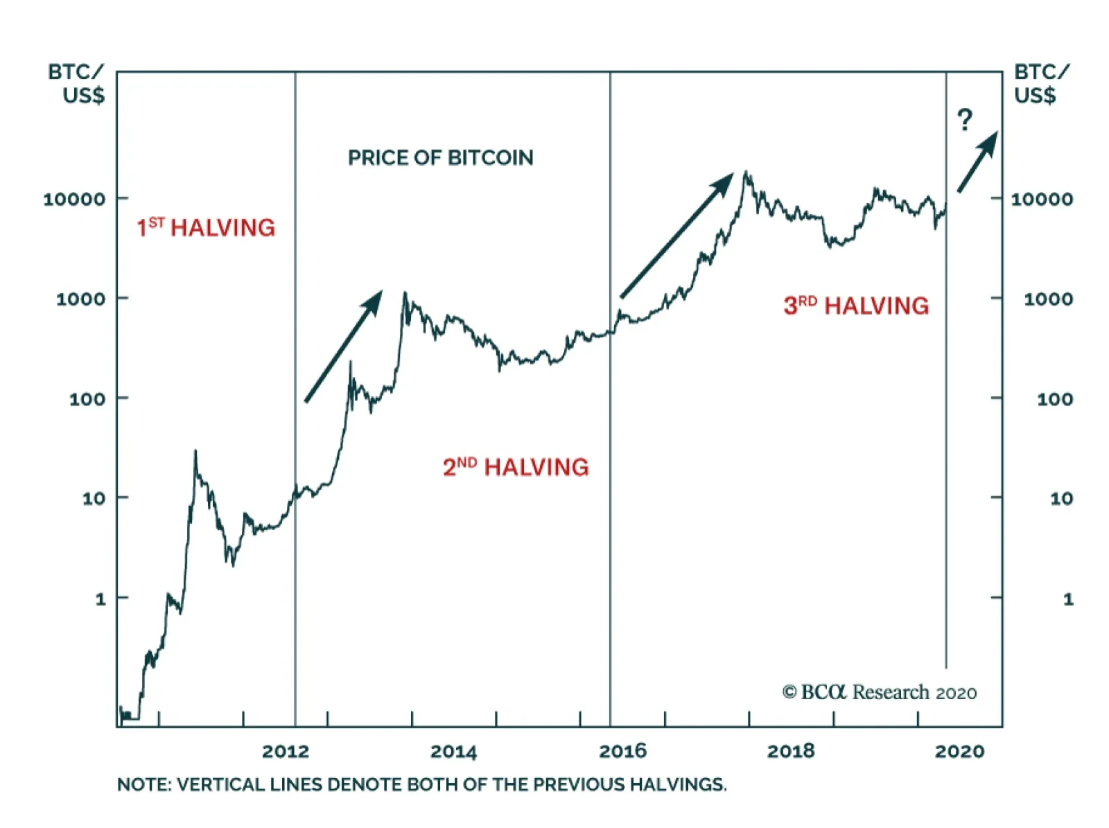
Inherent to the Bitcoin DNA is a limit to its supply. Beyond the maximum number of 21 million BTC to mine, for every 210,000 blocks mined, the reward for miners is cut in half in an event called "The Halving". The previous two halvings ushered in bull runs,…
Upgrade Software To Overweight
Upgrade Software To Overweight
Overweight We recently monetized over 50% relative gains in our overweight S&P software portfolio position by temporary going to neutral, but we are compelled to lift this heavyweight tech sub-index back to an overweight stance. One key reason for our renewed bullishness is that for the second time in the past 15 months, software stocks managed to eke out relative gains when the broad market fell peak-to-trough 20% and 35% in late-2018 and in Q1/2020, respectively (see chart). This resilience on the way down confirms both the defensive stature of this services tech subgroup and simultaneously our long held belief that when growth is scarce investors will flock to secular growth stocks. Last week we also showed that the tech sector (along with financials and consumer discretionary) best the broad market from the recessionary troughs onward, signaling that the key software sub group will likely lead the recovery. Bottom Line: Boost the S&P software index to overweight. This upgrade also lifts the S&P tech sector to neutral. The ticker symbols for the stocks in this index are: BLBG: S5SOFT – MSFT, ADBE, CRM, ORCL, INTU, NOW, ADSK, ANSS, SNPS, CDNS, FTNT, PAYC, CTXS, NLOK. For additional details please refer to our most recent Weekly Report.