Technology

Highlights The odds of a cyclical upturn in the global semiconductor sector over the next three to six months are low. Global semiconductor demand will continue to decline due to contracting demand for smartphones, automobiles, personal computers (PCs), and servers. Global semiconductor stocks are still facing considerable downside in absolute terms. We recommend going long Asian semiconductor stocks versus the U.S. S&P 500 semiconductor index. Dedicated EM equity portfolios should stay neutral on the Taiwanese bourse and Korean technology sector relative to the overall EM benchmark. Feature Chart 1 shows share prices of the global semiconductor sector and global semiconductor sales in the past two decades. Chart 1Global Semiconductor Market: Sales & Share Prices
Global Semiconductor Market: Sales & Share Prices
Global Semiconductor Market: Sales & Share Prices
Was last December’s trough in global semiconductor equity prices the ultimate bottom in this cycle? The odds are in favor of a continued contraction in global semiconductor sales and further downside in semiconductor share prices over the next three to six months. Cycle-On-Cycle Analysis Semiconductor sales experienced five recessions over the past 20 years. Table 1 illustrates the peak-to-bottom percentage decline in nominal global semiconductor sales and the magnitude of the drop in global semiconductor share prices in U.S. dollar terms during these five cyclical downturns in this industry. It also indicates the duration of each downturn and the number of months that semiconductor stocks led the bottom in global semiconductor sales. Table 1Key Statistics Of Five Cyclical Downturns In Global Semiconductor Market
The Global Semiconductor Sector: Is A Cyclical Upturn Imminent?
The Global Semiconductor Sector: Is A Cyclical Upturn Imminent?
The current shrinkage of semiconductor sales is worse than the 2011-12 and 2015 downturns. Yet, it is still smaller than the magnitude during the 2008 Great Financial Crisis and the 2001 tech bubble bust. The revenue of semiconductor companies has so far contracted by 24%, which is disproportionally more than the decline in share prices of these companies. The global semiconductor equity index is only 14% below its March 2018 high. It appears as though the market is expecting a quick recovery in semiconductor sales. As per Table 1, in the downturns of 2008, 2011 and 2015, global semiconductor stocks all bottomed before the bottom of global semiconductor sales. Only in the 2001 episode, stock prices bottomed eight months after the bottom in sales. In the current cyclical downturn, global semiconductor sales have so far had only four months of growth contraction,1 far less than the 13-16 months experienced in all the past four cycles. All in all, we would lean against the market’s expectation of an imminent recovery in the semiconductor cycle. The demand downturn will last another three to six months and share prices are facing major headwinds. Global Semiconductor Demand Semiconductor sales are in contraction across countries and regions (Chart 2). In April – before President Trump’s tweet on imposing new import tariff on China, global semiconductor sales growth sank to a negative 15% year-on-year. The short-term (three-to-six month) outlook for global semiconductor demand remains dismal. Chart 3 shows global semiconductor revenue breakdown in terms of end usage. Mobile phones account for the largest share (29%) of the market, followed by PCs (12%), miscellaneous consumer products (12%), and servers (11%). All of these major demand sources are under downward pressure: Smartphone Sales Global smartphone sales are shrinking (Chart 4). According to the International Data Corporation (IDC), global smartphone shipments declined 6.6% year-on-year in volume terms in the first quarter of this year, worse than last year’s 4.4% drop. Chart 2Semiconductor Sales Are In Contraction Across Countries
Semiconductor Sales Are In Contraction Across Countries
Semiconductor Sales Are In Contraction Across Countries
In the current cyclical downturn, global semiconductor sales have so far had only four months of growth contraction, far less than the 13-16 months experienced in all the past four cycles.
Chart 3
Chart 4Global Smartphone Sales: Contracting
Global Smartphone Sales: Contracting
Global Smartphone Sales: Contracting
We expect smartphone shipments to continue contracting in the second half of this year. Major markets such as mainland China and advanced economies have entered the saturation phase of mobile-phone demand. For example, U.S. shipments were down 15% year-on-year in the first quarter due to near-full market penetration. In China, smartphone sales have shown signs of stabilization (Chart 5). However, this is probably temporary and has been driven by the boom in Huawei smartphone sales in China since early this year. The incredible 50% year-on-year growth of Huawei smartphone sales in the first quarter is not sustainable. While global sales of Huawei smartphones increased by 20 million units, total global smartphone sales of all brands fell by 22 million units (Chart 6). The U.S. punitive actions towards China and Huawei have also instigated nationalism in China. This has triggered a Chinese buying-spree of the Huawei smartphone. Chart 5Chinese Smartphone Sales: Temporary Stabilization
Chinese Smartphone Sales: Temporary Stabilization
Chinese Smartphone Sales: Temporary Stabilization
Chart 6
Yet, this has probably reduced the number of potential Chinese smartphones buyers in the near future. After all, many buyers likely made the purchase earlier than otherwise planned in the absence of a trade war. Although Samsung, Huawei, OnePlus, Xiaomi, Motorola, LG, and ZTE have either released or will release their 5G phones this year, the sales growth from 5G phones will not be able to offset the loss in 2G, 3G and 4G phone sales, at least not in 2019. The IDC estimated that 5G phones would only account for about 0.5% of the market share this year. 5G will likely only begin affecting overall semiconductor demand next year, when they account for a larger share of smartphone sales. Huawei is the market leader in 5G technology. The U.S. boycott of Huawei will likely continue. This will only slow the pace of 5G phone adoption and the development of 5G networks worldwide. On balance, global smartphone demand may only recover next year. Server Demand Global server shipments also experienced a 5% contraction in volume terms in the first quarter of this year, according to IDC (Chart 7). The outlook for the rest of 2019 does not look promising. Global server demand will likely remain in contraction in the second half of this year. Many hyperscale data centers have already purchased considerable amounts of severs in advance of the trade war to avoid tariffs.2 Meanwhile, the escalation in the U.S.-China confrontation has increased economic uncertainties. This may delay potential datacenter investments. Decelerating 5G network development worldwide due to the U.S. ban on Huawei will also tend to discourage new datacenter and cloud services projects. This is because the 5G technology enables datacenter and cloud services to experience a huge improvement in terms of data transfer speeds, latency, connectivity, capacity, reliability and mobility. Chart 7Global Server Shipment: Are In Contraction
Global Server Shipment: Are In Contraction
Global Server Shipment: Are In Contraction
Personal Computers (PC) PCs sales are also in contraction (Chart 8). PC demand has entered into the deep-maturation phase while facing strong competition from tablets and laptops. Auto Sales Global auto sales also sank by 5% in April from a year ago, registering the worst contraction since 2009 (Chart 9). Chart 8Global PCs Sales: Deeply Saturated
Global PCs Sales: Deeply Saturated
Global PCs Sales: Deeply Saturated
Chart 9Global Auto Sales Are In Contraction As Well
Global Auto Sales Are In Contraction As Well
Global Auto Sales Are In Contraction As Well
Regarding auto demand, the Chinese government may continue to implement more supportive policies to stimulate car sales in China. However, we believe the recovery will be delayed. The government has already implemented a number of policies to lift domestic car sales since late January, including providing subsidies to encourage new energy vehicle sales, to promote auto sales in rural areas, and to increase auto replacement. The central government recently loosened auto sales restrictions in the first tier cities of Guangzhou and Shenzhen that have restrictive auto sales policies. However, all of these policies have failed to lift Chinese domestic car sales out of deep contraction. The key reason has been a diminishing willingness to spend among Chinese consumers, as suggested by falling households’ marginal propensity to consume (Chart 10). Bottom Line: Global semiconductor demand growth will likely remain weak and will fail to recover in the second half of this year. The basis is that its major upstream markets (smartphone, servers, PCs and automobiles) are all facing cyclically declining demand. Chart 10Chinese Consumers: Diminishing Willingness To Consume
Chinese Consumers: Diminishing Willingness To Consume
Chinese Consumers: Diminishing Willingness To Consume
Inventories And Prices Chart 11 shows the semiconductor supply chain illustrating the process of manufacturing semiconductors starting with silicon wafers and up to final electronic products.
Chart 11
Box 1 explains the role of key segments and players along the supply chain. Box 1 A Brief Explanation Of The Key Segments/Players Of The Supply Chain Both integrated device manufacturers (IDM) and foundries are at the center of the supply chain, responsible for chip manufacturing. In terms of semiconductor sales revenue, Samsung, Intel and SK Hynix are the world’s top three IDM companies and TSMC, Global Foundries and United Microelectronics Corp (UMC) are the world’s top three foundries. While IDMs cover most of the process from IC design, chip fabrication, assembly, testing and packaging, IDM companies still have to purchase raw materials and equipment for the chip-making process. Foundry companies receive orders from IC designing companies like Qualcomm, Nvidia, and Huawei HiSilicon, then purchase needed raw materials and equipment to proceed in the chip-manufacturing process. Both IDMs and foundries can either outsource the tasks of semiconductor assembly and testing or perform them on their own. The final semiconductor products will be used in electronics products, such as smartphones, computers, home appliances, automobiles, etc. Global semiconductor demand growth will likely remain weak and will fail to recover in the second half of this year. The basis is that its major upstream markets (smartphone, servers, PCs and automobiles) are all facing cyclically declining demand. In a typical business cycle, a cyclical downturn begins with a slump in demand for final electronic products (upstream demand). This leads to falling semiconductor sales. As a result, inventory buildup will occur across most of the segments along the semiconductor supply chain. Chipmakers: Producers’ semiconductor inventory in both Taiwan and Korea have reached either a record high or a near-record high (Chart 12). The installed wafer capacities at these two countries are the world’s largest, together accounting for 43% of total global wafer capacity. In addition, the inventory of some major electronic parts and components have also increased considerably in Taiwan (Chart 13). This also implies weaker demand for semiconductor raw materials. Chart 12Chipmakers: A Rapid Buildup In Inventory
Chipmakers: A Rapid Buildup In Inventory
Chipmakers: A Rapid Buildup In Inventory
Chart 13Rising Inventory Of Some Major Electronic Parts And Components
Rising Inventory Of Some Major Electronic Parts And Components
Rising Inventory Of Some Major Electronic Parts And Components
Raw material suppliers: Silicon wafer is the indispensable raw material required in the chip manufacturing process. Japanese companies account for over half of global silicon wafer supply.Chart 14 shows that silicon wafer inventory in Japan has had a significant buildup in volume terms since late last year. Importantly, it is not declining yet. Chart 14Silicon Wafer Inventory: A Significant Buildup As Well
Silicon Wafer Inventory: A Significant Buildup As Well
Silicon Wafer Inventory: A Significant Buildup As Well
Outsourced semiconductor assembly and test (OSAT) providers: Both Singapore and Thailand are OSAT providers while they also manufacture, assemble and export electronic products. Both countries are closer to the downstream side of the semiconductor supply chain. Semiconductor inventory at these two countries has also jumped to a record high (Chart 15). Chart 15Singapore and Thailand: Record High Semiconductor inventory
Singapore and Thailand: Record High Semiconductor inventory
Singapore and Thailand: Record High Semiconductor inventory
Importantly, a marginal improvement in demand will tend to support spot prices. For example, in the memory chip market, falling prices denote weak demand relative to excess supply. When prices of DRAM and NAND start to form a bottom or decisively move up, this may indicate the arrival of a cyclical upturn. So far, both DRAM and NAND prices are continuing to fall (Chart 16). In addition, the prices of silicon wafer – the most important raw material used in the chip-making process – have declined in the first half of this year.3 Chart 16Still Falling Memory Chip Prices
Still Falling Memory Chip Prices
Still Falling Memory Chip Prices
Chart 17Deflating DRAM Prices Suggest Downside Risks To Korean Tech Stocks
Deflating DRAM Prices Suggest Downside Risks To Korean Tech Stocks
Deflating DRAM Prices Suggest Downside Risks To Korean Tech Stocks
In short, prices are the most important variable to monitor. Chart 17 exhibits the high correlation between DRAM prices and the Korean technology sector stock prices. Falling DRAM prices suggest downside risks to technology stocks in Korea. Samsung accounts for about 65% of Korea’s tech index and 27% of the overall Korean equity index. Memory chips accounted for 68% of Samsung’s operating profits in the first quarter of this year. Bottom Line: There has been involuntary inventory accumulation along the entire supply chain of semiconductors. This and ongoing price deflation among various types of semiconductors foreshadow a downbeat near-term outlook. The Interpretation Of Some Positive Developments There have been some positive developments in the past several months. Taiwanese PMI new orders diffusion index in the electronics sector jumped out of deep contraction to reach zero, and Chinese semiconductor imports halted their decline in both volume and value terms (Chart 18). The improvement in the aforementioned data was probably mainly due to large semiconductor purchases by China to hedge the rising risk of U.S. blocking China’s technological development (Chart 19). Chart 18Some Positive Development
Some Positive Development
Some Positive Development
Chart 19China: More Semiconductors Purchases Before The Tariff And U.S. Huawei Ban?
China: More Semiconductors Purchases Before The Tariff And U.S. Huawei Ban?
China: More Semiconductors Purchases Before The Tariff And U.S. Huawei Ban?
Besides, Huawei smartphone sales have been booming, which we deliberated on page 5, could have been responsible for the improvement in these data. This one-off surge will likely dwindle going forward. Investment Conclusions We remain negative on Asian semiconductor share prices in absolute terms. A continued contraction in global semiconductor sales will further squeeze their profits. In relative terms, we are neutral on the Asian semiconductor sector: we continue recommending market-weight allocation to Taiwan’s overall market and the Korean technology sector within the EM equity benchmark. As a new trade, we recommend going long Asian semiconductor stocks and short the S&P 500 semiconductor index over the next three to six months (Chart 20). The Bloomberg Asia Pacific semiconductor index has nine stocks. Samsung and TSMC account for 42% and 38% of the index, respectively. There has been involuntary inventory accumulation along the entire supply chain of semiconductors. This and ongoing price deflation among various types of semiconductors foreshadow the downbeat near-term outlook. Samsung will likely benefit from the U.S. ban on Huawei in the smartphone sector outside of China. In addition, Samsung will win some market share from Apple as the latter does not have a 5G phone to release this year. These positive factors may partially offset the negative impact from falling memory prices and demand on Samsung. The S&P 500 semiconductor index has 13 stocks. Intel, Broadcom, Texas Instruments and Qualcomm are the top five constituents, together accounting for nearly 70% of the index. Most of these companies are IC designing companies, which will likely suffer as Chinese demand for their products shrink due to the U.S. administration's ban on Huawei. This position will also benefit from U.S. dollar appreciation. A firm dollar will hurt profits of U.S. semiconductor stocks. In turn, currency depreciation in Korea and Taiwan will on the margin benefit Asian semiconductor stocks. Chart 20Recommend Long Asia Pacific Semiconductor Stock Vs. S&P 500 Semiconductor Index
Recommend Long Asia Pacific Semiconductor Stock Vs. S&P 500 Semiconductor Index
Recommend Long Asia Pacific Semiconductor Stock Vs. S&P 500 Semiconductor Index
Chart 21The 2015 Experience
The 2015 Experience
The 2015 Experience
Chart 21 shows that global foundry companies outperformed global IC designing companies during the final phase of the 2015 cyclical downturn. Odds are that these dynamics will play out in this downturn as well. Finally, the relative performance of Asian semiconductor stocks versus U.S. ones is oversold and might stage some sort of mean reversion (Chart 20). Ellen JingYuan He, Associate Vice President ellenj@bcaresearch.com Footnotes 1 Please note that here the calculation for “the number of months of the growth contraction” is different from the one for the “peak-to-bottom duration” in Table 1. “The number of months of the growth contraction” equals the number of months when semiconductor sales year-on-year growth is negative. 2 https://marketrealist.com/2019/05/nvidias-data-center-revenue-inference-rendering-and-edge/ 3 http://www.sohu.com/a/300386061_132567, http://news.moore.ren/industry/104958.htm Equity Recommendations Fixed-Income, Credit And Currency Recommendations
Put Tech on Downgrade Alert
Put Tech on Downgrade Alert
We are compelled to put the S&P tech sector on our downgrade watch list as President Trump’s hawkish trade talk and actions since May 5 warn that tech revenues (60% export exposure) and profits will likely remain under intense downward pressure. Our tech EPS model is also flashing red on the back of sinking capex and an appreciating U.S. dollar (bottom panel). We will be downgrading the tech sector to underweight via the S&P software index, the tech sector’s largest industry group on a market cap basis. A downgrade to neutral in the S&P software index would push our S&P tech sector weight to a below benchmark allocation. Thus, we are initiating a stop near the 10% relative return mark on the S&P software high-conviction overweight call since the December 3, 2018 inception. We also lift the stop to 27% from 17% relative return on the cyclical overweight we have on the S&P software index since the November 27, 2017 inception. Bottom Line: We are compelled to put the tech sector on our downgrade watch list. We will execute the S&P tech sector downgrade to underweight when the S&P software index’s stops are triggered. This would push the S&P software index to neutral from currently overweight.
Yesterday we were stopped out on our long S&P managed health care/short S&P semis market neutral pair trade initiated on May 13, 2019 for a gain of 10%. Our thesis remains intact that a lot of negative news has been priced into HMOs on the back of the threat of the “Medicare For All” bill passage, while a lot of euphoria has been baked in the cake for semis despite their current down cycle. However, portfolio risk management is forcing our hand and given our ongoing de-risking, we are obeying our trailing stop loss for a gain of 10% in a very short time span. Bottom Line: Book gains of 10% in the long S&P managed health care/short S&P semis pair trade since inception and move to the sidelines for now.
Obey The Stop In The Long Managed Health Care/Short Semis Pair Trade
Obey The Stop In The Long Managed Health Care/Short Semis Pair Trade
Delving deeper into operating metrics, we encounter some profit margin trouble for tech stocks. Not only do industry selling prices continue to deflate, but also our tech sector wage bill gauge is picking up steam. Taken together, all-time high profit margins…
The reason for this is that President Trump’s hawkish trade talk and actions since May 5 warn that tech revenues (60% export exposure) and profits will likely remain under intense downward pressure. The way we will execute this tech sector downgrade to…
Highlights Portfolio Strategy The risk/reward tradeoff remains squarely to the downside and we are turning cyclically (3-12 month horizon) cautious on the prospects of the broad equity market. The Presidential cycle, UBER’s IPO, the SPX hitting all-time highs following the initial December 2018 yield curve inversion, and two additional yield curve inversions signal that this time is no different and a recession is likely upon us in the coming 18 months. The re-escalation of the U.S./China trade tussle along with the risk of an antitrust investigation into Apple, waning capital outlays, softening exports and deteriorating operating conditions warn that it does not pay to be overweight the S&P tech hardware storage & peripherals (THS&P) index. Our tech EPS model is flashing red on the back of sinking capex and an appreciating U.S. dollar, deteriorating operating metrics signal that tech margins are under attack and exports are also in a freefall, suggesting that the time is ripe to put the tech sector on downgrade alert. Recent Changes Downgrade the S&P THS&P index to neutral, today. Put the S&P tech sector on downgrade alert. Table 1
A Recession Thought Experiment
A Recession Thought Experiment
Feature The SPX appeared to crack early in the week, but dovish Fed President statements saved the day and stocks recovered smartly to end the week on a high note. Our tactically (0-3 month) cautious equity market stance has served us well and has run its course. We are currently leaning toward a cyclically (3-12 month) cautious stance as a slew of our cyclical indicators have rolled over decisively. At the current juncture the big call to make is on the longevity of the business cycle. Crudely put, can the Fed engineer a soft landing or is the looming easing cycle a precursor of recession (Chart 1)? We side with the latter. Chart 1What’s The Opposite Of Bond Vigilantes?
What’s The Opposite Of Bond Vigilantes?
What’s The Opposite Of Bond Vigilantes?
This is U.S. Equity Strategy service’s view. BCA’s house view remains constructive on a cyclical 3-12 month time horizon. As a reminder, the ongoing expansion is officially the longest on record and BCA’s house view also calls for recession in late-2020/early-2021. Stan Druckenmiller once famously said “…you have to visualize the situation 18 months from now, and whatever that is, that's where the price will be, not where it is today." Thus, if BCA’s recession view is accurate then we need to start preparing the portfolio for a recessionary outcome. This week we conduct a simple thought experiment on where and why the SPX will be headed as the economy flirts with recession. But first, we rely on the message from our indicators to guide us in determining if the cycle is nearing an end. Last December parts of the yield curve slope inverted (Chart 2) and our simple insight was that the market almost always peaks following the yield curve inversion and we remained bullish on the prospects of the broad equity market and called for fresh all-time highs based on the results of our research.1 On May 1, 2019 we got confirmation as the SPX vaulted to new all-time highs, so that box is now checked. Chart 2The Yield Curve...
The Yield Curve...
The Yield Curve...
Beyond the traditional yield curve inversion that forecasts that the Fed’s next move will be a cut and eventually the cycle ends, other yield curve type indicators have inverted and also foreshadow the end of the business cycle. Charts 3A & 3B show that the unemployment gap and another labor market yield curve type indicator have both inverted signaling that the business cycle is long in the tooth. Chart 3A...Is Always Right...
...Is Always Right...
...Is Always Right...
Chart 3B...In Predicting Fed Cuts
...In Predicting Fed Cuts
...In Predicting Fed Cuts
This time is no different and the business cycle will end. Why? Because the Fed has likely raised interest rates (as we first posited on November 19, 2018 and again on December 3, 2018) by enough to trigger a default cycle in the most indebted segment of the U.S. economy where the excesses are most prominent in the current expansion: the non-financial business sector (Chart 4A). Chart 4AMind The Corporate Debt Excesses
Mind The Corporate Debt Excesses
Mind The Corporate Debt Excesses
Chart 4BDefault Cycle Looming
Default Cycle Looming
Default Cycle Looming
Already, junk bond market spreads are widening and the yield curve is predicting that a default cycle is around the corner (yield curve shown on inverted scale, bottom panel, Chart 4B). Another interesting indicator is the Presidential cycle. Chart 5 updates our work from last year showing years 2 & 3 of 17 Presidential cycles dating back to 1950. In the summer of year 3 the SPX typically peaks. Finally, the anecdote of the biggest unicorn, UBER, ipoing on May 10, 2019 also likely marks the ending of the cycle. Therefore if recession looms in the coming 18 months what is the typical magnitude of the SPX EPS drawdown and what multiple do investors pay for trough earnings? Chart 5Presidential Cycle Says Sell
Presidential Cycle Says Sell
Presidential Cycle Says Sell
While the two most recent recessionary earnings contractions have been severe, we are conservative in estimating a garden variety recession causing a 20% EPS fall. S&P 500 2018 EPS ended near $162/share. This year $167/share is likely and we are now revising down our forecast for next year to $175/share from $181/share previously. A conservative 20% drawdown sets us back to $140/share in 2021. Dating back to the late 1970s when our IBES dataset on the forward P/E multiple commences, the trough forward P/E multiple during recessions averages out to 10x (Chart 6). Remaining on a conservative path we will use 13.5x, or the recent December 2018 trough multiple as our worst case multiple and a sideways move to 16.5x as the most optimistic case. This implies an SPX ending value of between 1890 and 2310 will be reached some time in 2020, with the former resetting the equity market back near the 2016 BREXIT lows. Chart 6Trough Recession Multiple Averages 10x
Trough Recession Multiple Averages 10x
Trough Recession Multiple Averages 10x
As a result, we are not willing to play a 100-200 point advance for a potential 1000 point drawdown, the risk/reward tradeoff is to the downside. Can and has the Fed previously engineered soft landings that have caused big relief rallies in the equity market? Six times since the 1960s: once in each of the mid-1960s, early-1970s, mid-1970s, mid-1980s and mid-1990s and once in 1998 (top panel, Chart 7). Chart 7Six Mid-cycle Easing Attempts
Six Mid-cycle Easing Attempts
Six Mid-cycle Easing Attempts
Three easing cycles were not forecast by a yield curve inversion, but the mid-1960s, the mid-1990s and in 1998 the yield curve cautioned investors that an easing cycle was looming (bottom panel, Chart 7). Specifically in 1998 the Fed only acted after the equity market fell by 20%. Another interesting observation is that ex-post five of these six iterations were truly mid cycle, one was very late cycle, but none took place in year 11 of an expansion as is currently the case. We are in uncharted territory. Chart 8 shows the mean profile of the S&P 500 six months prior to and one year post the initial Fed cut. Our assumption is that a cut in July may materialize, thus the vertical line in Chart 8 denotes t=0, which is in sync with the bond market that is pricing a greater than 75% chance of this occurrence. The subsequent market rallies were significant. Our insight from this research is that we already had the explosive rally as Chart 8 depicts, owing to the Fed’s completed pivot, with the stock market rallying from the 2018 Christmas Eve lows to the May 1, 2019 all-time highs by 26%. But, the jury is still out. The biggest risk to our call is indeed a continued rally in the S&P 500 on easy money. A way to mitigate this risk of missing out on a rally is by going long SPX LEAPS Calls once a greater than 10% correction takes root. Chart 8Is The Rally Already Behind Us?
Is The Rally Already Behind Us?
Is The Rally Already Behind Us?
Keep in mind, that for the Fed to act and cut rates, stocks will likely have to breach the 2650 level, a point where a reflexive fall will further shake investor’s confidence in profit growth. In other words, the bond market is screaming that Fed cuts are looming, but it also means that stocks have ample room to fall before the Fed cuts rates, i.e. a riot point will force the Fed’s hand. Another big risk to this call is a swift positive resolution on the U.S./China trade dispute, and/or an unprecedented easing from the Chinese authorities which will put us offside as a euphoric rise will definitely ensue. Again SPX LEAPS Calls are an excellent way to position for such an outcome. Netting it all out, the risk/reward tradeoff remains squarely to the downside and we are turning cyclically (3-12 month horizon) cautious on the prospects of the broad equity market. The Presidential cycle, UBER’s IPO, the SPX hitting all-time highs following the initial December 2018 yield curve inversion, and two additional yield curve inversions signal that this time is no different and a recession is likely upon us in the coming 18 months. Thus, this week we are further de-risking the portfolio by downgrading a tech subindex to neutral, setting a tighter stop on a different long term tech subsector holding that has been the cornerstone of the equity bull market, and putting the overall tech sector on downgrade watch. Downgrade Tech Hardware Storage & Peripherals To Neutral In the context of further de-risking the portfolio we are downgrading the S&P tech hardware storage & peripherals index to a benchmark allocation and booking a small loss of 1.0% in relative terms since inception. Four reasons underpin our downgrade of this index that comprises almost 1/5 of the S&P tech market cap. First, index heavyweight Apple has 20% foreign sales exposure to the Greater China region. While we doubt the Chinese will directly retaliate to the U.S. restriction on Huawei by directly targeting Apple, it is still a risk. Moreover, recent news of the FTC and the DOJ targeting GOOGL and FB pose a risk to Apple, especially given its App Store dominance. Any negative news on either front would take a bite out of the sector’s profits. Second, capex has taken a bit hit. Chart 9 shows industry investment is almost nil and capex intentions from regional Fed surveys and from CEO confidence surveys signal more pain down the line. Third, the S&P THS&P index’s internationally sourced revenues are near the 60% mark, and computer exports are also flirting with the zero line. Worryingly, deflating EM Asian currencies are sapping consumer purchasing power and are weighing on industry exports (third panel, Chart 10). Chart 9Capex Blues
Capex Blues
Capex Blues
Chart 10Exports...
Exports...
Exports...
Similarly, global trade volumes have sunk into contractionary territory and to a level last seen during the Great Recession (not shown). With regard to export expectations the recently updated IFO World Economic Survey still points toward sustained global export ails (second panel, Chart 10). More specifically, tech laden Korean and Taiwanese exports are outright contracting at an accelerating pace and so are Chinese exports. Tack on the negative signal from the respective EM Asian stock market indices and the implication is that more profit pain looms for the S&P THS&P index (Chart 11). Finally, on the domestic front, new orders-to-inventories (NOI) have not only ground to a halt from the overall manufacturing sector, but also computer and electronic product NOI are not contracting on a short-term rate of change basis (bottom panel, Chart 10). Tracking domestic consumer outlays on computer and peripheral equipment reveals that they too have steeply decelerated from the cyclical peak reached in early 2018, painting a softening picture for industry sales growth prospects (Chart 12). Chart 11...Under Pressure
...Under Pressure
...Under Pressure
Chart 12Soft Sales Backdrop
Soft Sales Backdrop
Soft Sales Backdrop
The re-escalation of the U.S./China trade tussle along with the risk of an antitrust investigation into Apple, waning capital outlays, softening exports and deteriorating operating conditions warn that it does not pay to be overweight the S&P THS&P index. Nevertheless, before getting too bearish there is a silver lining. This index has a net debt/EBITDA of 0.5x versus the non-financial broad market of 2x. On the valuation front this tech subindex trades at 28% discount to the non-financial broad market on an EV/EBITDA basis suggesting that most of bad news is already reflected in bombed out valuations (Chart 13). The re-escalation of the U.S./China trade tussle along with the risk of an antitrust investigation into Apple, waning capital outlays, softening exports and deteriorating operating conditions warn that it does not pay to be overweight the S&P THS&P index. Bottom Line: Downgrade the S&P THS&P index to neutral for a modest relative loss of 1.0% since inception. The ticker symbols for the stocks in this index are: BLBG: S5CMPE – AAPL, HPQ, HPE, NTAP, STX, WDC, XRX. Chart 13But B/S Remains Pristine
But B/S Remains Pristine
But B/S Remains Pristine
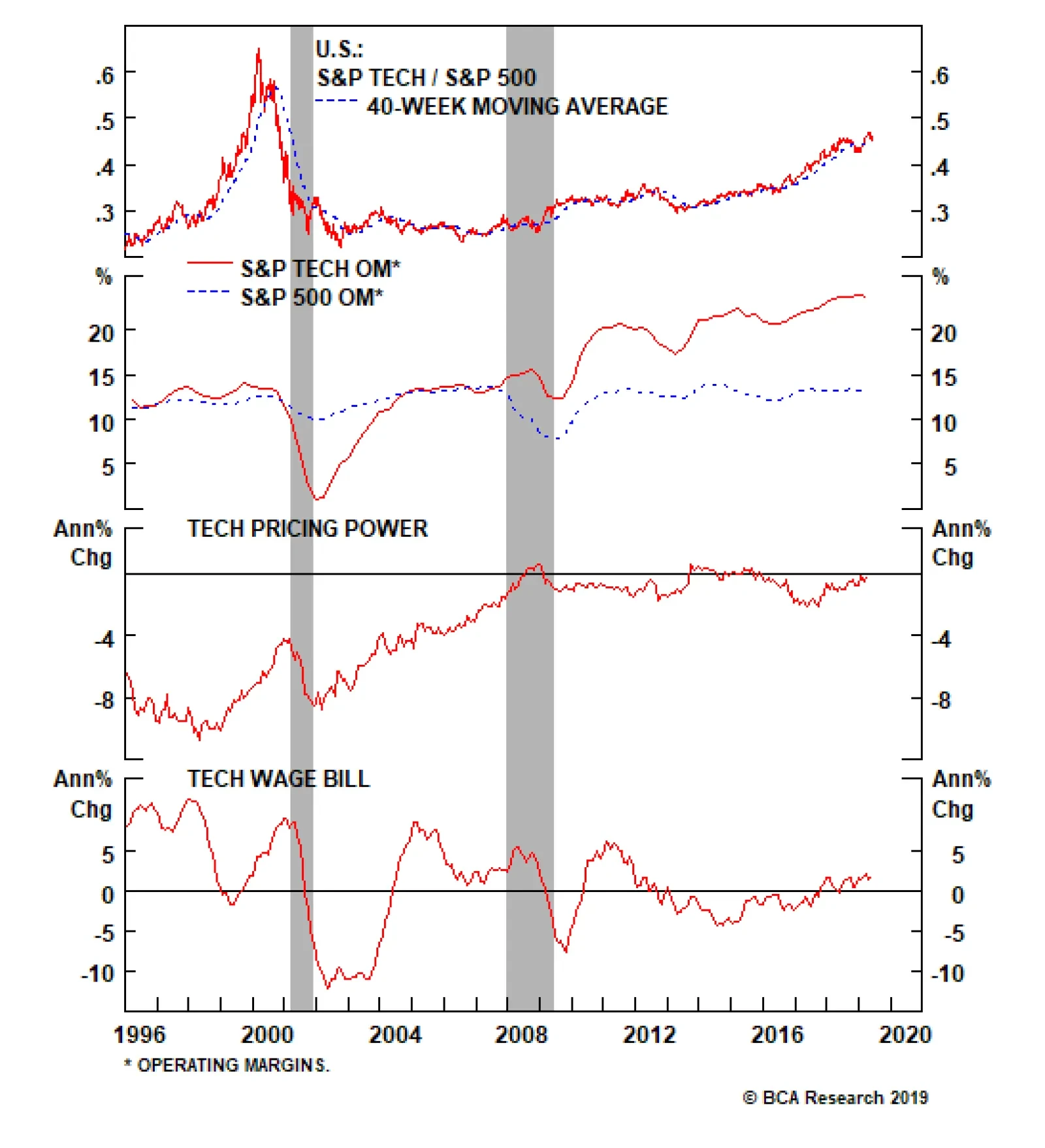
Put Tech On Downgrade Alert We are compelled to put the S&P tech sector on our downgrade watch list as President Trump’s hawkish trade talk and actions since May 5 warn that tech revenues (60% export exposure) and profits will likely remain under intense downward pressure. The way we will execute this tech sector downgrade to underweight will be via the S&P software index, the sector’s largest market cap weight. A downgrade to neutral in the S&P software index would push our S&P tech sector weight to a below benchmark allocation. Thus, we are initiating a stop near the 10% relative return mark on the S&P software high-conviction overweight call since the December 3, 2018 inception and also lift the stop to 27% from 17% relative return on the cyclical overweight we have on the S&P software index since the November 27, 2017 inception. Any near term stock market pullback will likely trigger these stops and push the tech sector to an underweight position. Stay tuned. With regard to the overall tech sector, our EPS model is on the verge of contraction on the back of sinking capex and a firming U.S. dollar (middle panel, Chart 14). In more detail, tech capex has recaptured market share swinging from below 6% to above 13% in the past decade and now has likely hit a wall similar to the late 1990s peak (second panel, Chart 15). On a rate of change basis tech capital outlays have all peaked and national data corroborate the message from stock market reported data (bottom panel, Chart 15). Chart 14Grim EPS Model Signal
Grim EPS Model Signal
Grim EPS Model Signal
Chart 15Exhausted Capex?
Exhausted Capex?
Exhausted Capex?
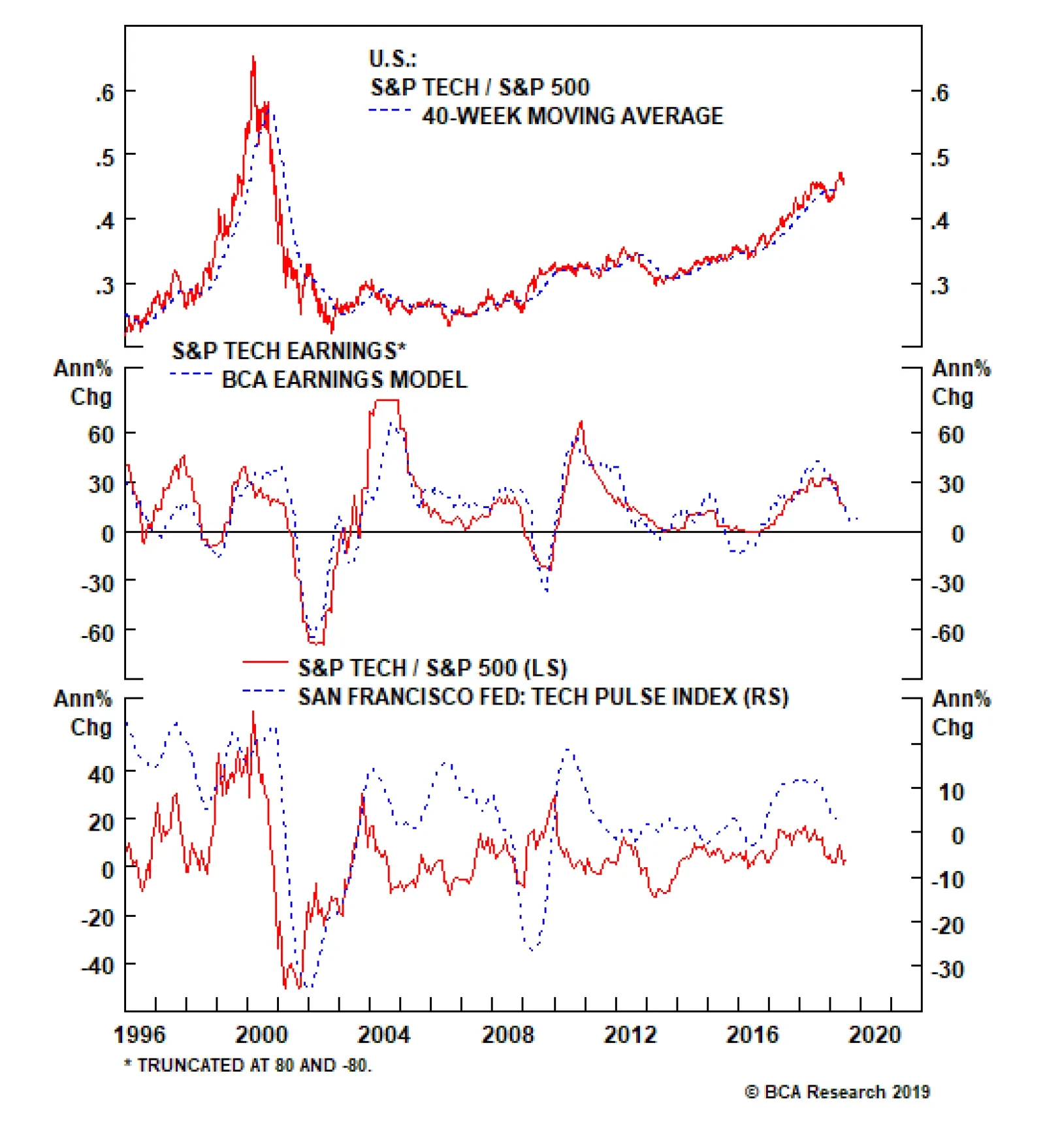
The San Francisco Fed’s Tech Pulse Index (comprising coincident indicators of activity in the U.S. information technology sector) is also closing in on the expansion/contraction line warning that tech stocks are in for a rough ride (bottom panel, Chart 14). Delving deeper into operating metrics, we encounter some profit margin trouble for tech stocks. Not only do industry selling prices continue to deflate, but also our tech sector wage bill gauge is picking up steam. Taken together, all-time high profit margins – double the broad market – appear unsustainable and something has to give (Chart 16). On the export relief valve front, the sector faces twin headwinds. First the trade war re-escalation suggests that an interruption/disruption of tech supply chains is a rising risk, and the firming greenback will continue to weigh on P&Ls as negative translation effects will hit Q2, Q3 and likely Q4 profits (Chart 17). Chart 16Margin Trouble
Margin Trouble
Margin Trouble
Chart 17Rising Dollar Will Weigh On Revenues & Profits
Rising Dollar Will Weigh On Revenues & Profits
Rising Dollar Will Weigh On Revenues & Profits
Netting it all out, our tech EPS model is flashing red on the back of sinking capex and an appreciating U.S. dollar, deteriorating operating metrics signal that tech margins are under attack and exports are also in a freefall, suggesting that the time is ripe to put the tech sector on downgrade alert. Nevertheless, there are two sizable offsets contrasting all the grim news. Tech stocks are effectively debt free with the net debt/EBITDA sitting on the zero line and valuations a far cry from the tech bubble era. Finally, the drop in interest rates via the 10-year yield and looming Fed cuts will underpin these growth stocks that thrive in a disinflationary backdrop (Chart 18). Netting it all out, our tech EPS model is flashing red on the back of sinking capex and an appreciating U.S. dollar, deteriorating operating metrics signal that tech margins are under attack and exports are also in a freefall, suggesting that the time is ripe to put the tech sector on downgrade alert. Bottom Line: We are compelled to put the tech sector on our downgrade watch list. We will execute the S&P tech sector downgrade to underweight when the S&P software index’s stops are triggered. This would push the S&P software index to neutral from currently overweight. Stay tuned. Chart 18But There Is An Offset: Melting Yields Help Growth Stocks
But There Is An Offset: Melting Yields Help Growth Stocks
But There Is An Offset: Melting Yields Help Growth Stocks
Anastasios Avgeriou, U.S. Equity Strategist anastasios@bcaresearch.com Footnotes 1 Please see BCA U.S. Equity Strategy Weekly Report, “Signal Vs. Noise” dated December 17, 2018, available at uses.bcaresearch.com. Current Recommendations Current Trades Size And Style Views Favor value over growth Favor large over small caps
Underweight High-Conviction
Shy Away From Near-Monopolies
Shy Away From Near-Monopolies
Late Friday night news broke that the DOJ was working on an antitrust investigation into Alphabet Inc., parent of GOOGL/GOOG, and on Monday, according to the Wall Street Journal, the “FTC got jurisdiction for a possible Facebook Inc. antitrust investigation”. We first co-authored a Special Report with our sister Geopolitical Strategy Service last August titled “Is The Stock Rally Long In The FAANG?” and warned investors that it was a matter of when, not if, that the U.S. government would clamp down on these monopolies that enjoy record profits and never seen before profit margins (panels 3 and 5). Then in early December, we cautioned investors to specifically avoid the S&P interactive media & services index (dominated by GOOGL & FB) as our conclusion was that both antitrust (particularly in the case of Alphabet Inc.) and privacy regulation (particularly in the case of Facebook Inc.) added significant risk to these near monopolies at a time when calls for legislating both had dramatically amplified. Bottom Line: Looming privacy regulation and news of an antitrust investigation into Alphabet Inc. underscore that more pain lies ahead for the S&P interactive media & services index. We reiterate our high-conviction underweight. The ticker symbols of the stocks in this index are: S5INMS – GOOGL, GOOG, FB, TWTR and TRIP.
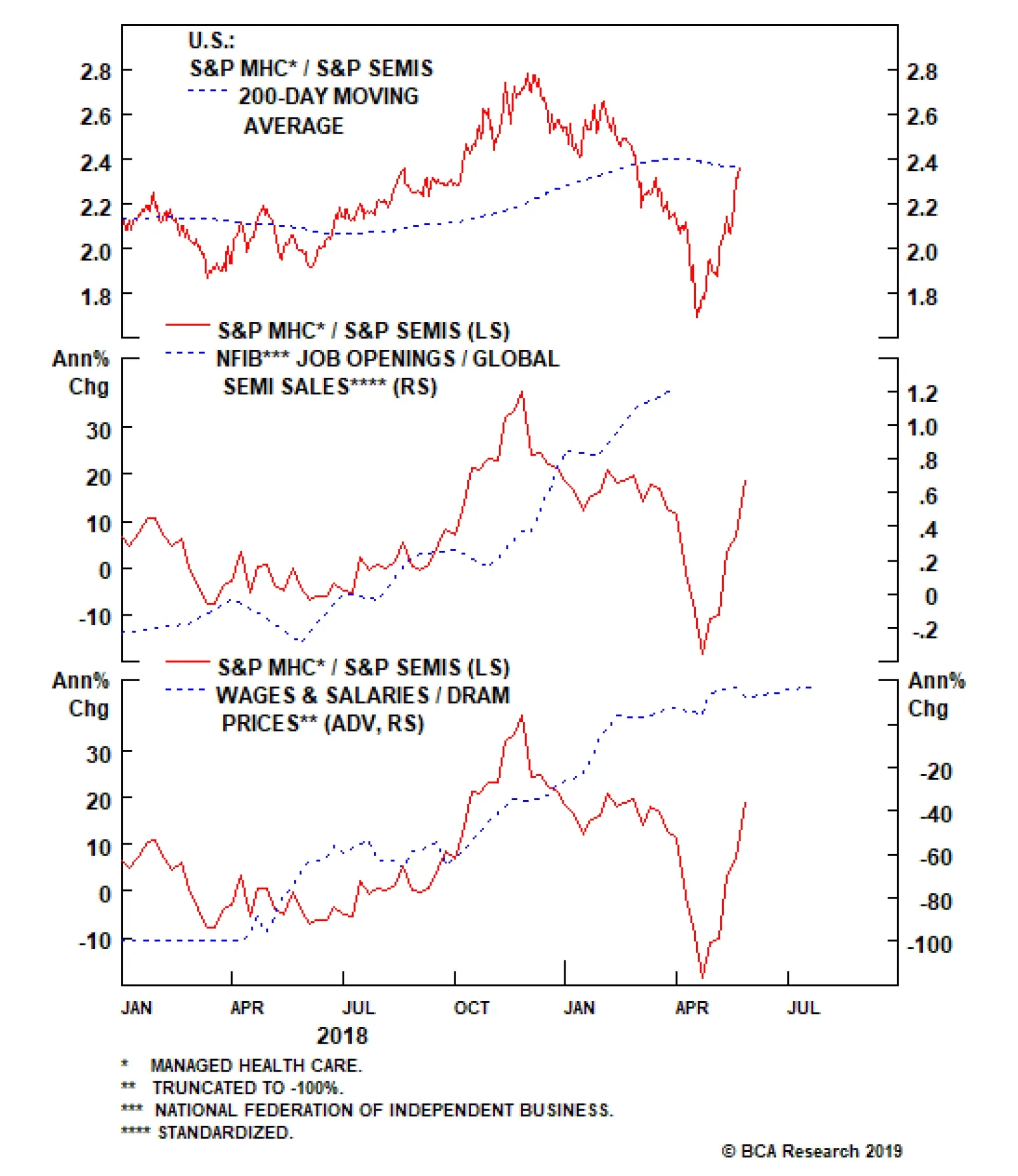
Given the trade’s extreme volatility, we initiated this trade with a stop loss at the -7% mark. However, this market-neutral trade has outperformed beyond our expectations and is currently up 14% since its inception at the beginning of last week. In order to…
Off To The Races
Off To The Races
In our recent Weekly Report, we initiated a pair trade, going long S&P managed health care/short S&P semiconductors. Given the trade’s extreme volatility, we initiated this trade with a stop loss at the -7% mark. However, this market-neutral trade has outperformed beyond our expectations, currently up 14% since its inception at the beginning of last week. Accordingly, and in order to protect these outsized gains, we are moving the goalposts and taking the stop to the 10% mark. From a macro perspective, nothing has changed to shake our conviction. Job openings, the ultimate driver of managed health care enrollments, are upbeat compared with declining global semi revenues (second panel). Further, on the relative pricing power gauge front, overall wage inflation is continuing to outpace DRAM prices (bottom panel). The combination implies more gains in store for the pair trade, despite our risk management change. Bottom Line: We reiterate our long S&P managed health care/short S&P semis pair trade and change our -7% stop loss recommendation to a 10% stop. The ticker symbols for the stocks in the S&P managed health care and S&P semi indexes are: BLBG: S5MANH – UNH, ANTM, HUM, CNC, WCG and BLBG: S5SECO – INTC, AVGO, TXN, NVDA, QCOM, MU, ADI, XLNX, AMD, MCHP, MXIM, SWKS, QRVO, respectively.
A High-Octane Pair Trade Idea
A High-Octane Pair Trade Idea
While health care and tech stocks started the year on a similar footing, a wide gulf has opened that is likely to, at least partially, reverse in the back half of the year. This dichotomy is most evident at the subsector level where managed health care stocks are still down in absolute terms for the year, whereas chip stocks are up roughly 20% year-to-date. This is an exploitable gap and on Monday, we suggested a new pair trade: long S&P managed health care/short S&P semiconductors. With regard to relative macro drivers, managed health care has the upper hand. The chart at the side shows that relative demand dynamics clearly favor HMOs and are working against chip stocks. Non-farm payroll growth is trouncing global semi billings (second panel). The message from the small business sector is similar with the labor market upbeat compared with declining global semi revenues (third panel). Finally, on the relative pricing power gauge front, overall wage inflation is outpacing DRAM prices (bottom panel). Bottom Line: We initiated a long S&P managed health care/short S&P semis pair trade on Monday with a stop loss at the -7% mark; please see Monday’s Weekly Report for more details. The ticker symbols for the stocks in the S&P managed health care and S&P semi indexes are: BLBG: S5MANH – UNH, ANTM, HUM, CNC, WCG and BLBG: S5SECO – INTC, AVGO, TXN, NVDA, QCOM, MU, ADI, XLNX, AMD, MCHP, MXIM, SWKS, QRVO, respectively.