Technology

With regard to relative macro drivers, managed health care has the upper hand. Relative demand dynamics clearly favor HMOs and are working against chip stocks. Non-farm payroll growth, which drives HMOs revenues, is trouncing global semi billings. Small…
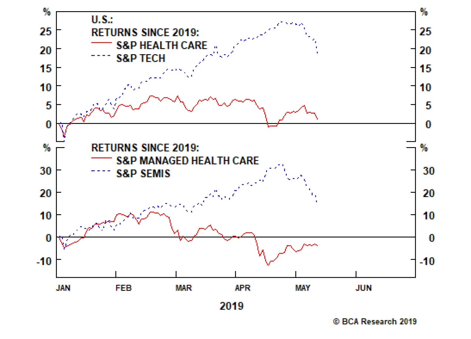
While health care and tech stocks started the year on a similar footing, a wide gulf has opened that is likely to reverse in the back half of the year. This dichotomy is most evident at the subsector level where managed health care stocks are still down in…

Highlights Portfolio Strategy Firming relative demand and input cost dynamics, the Medicare For All (MFA)-induced panic selling in HMOs coupled with 5G euphoria buying in semis have set the stage for an exploitable pair trade opportunity: long S&P managed health care/short S&P semiconductors. Relative supply/demand dynamics, crumbling lumber prices, lower interest rates and compelling valuations and technicals all suggest that the long homebuilding/short home improvement retail pair trade is in the early innings. Recent Changes Initiate a long S&P managed health care/short S&P semiconductors trade today, with a tight stop loss at -7%. Table 1
On Edge
On Edge
Feature Equities hit a speed bump last week, as President Trump’s trade related tweets instilled some fear back into the markets. Investor complacency reigned supreme and, given the liquidity crunch, risk premia exploded higher with the VIX more than doubling from the recent lows. Historically, a parabolic rise in policy uncertainty is synonymous with an equity market selloff and a widening in risk premia; last week was no different (economic policy uncertainty shown inverted, second panel, Chart 1). Adding insult to injury, given that the forward P/E multiple expansion explained all of the equity market’s advance year-to-date as we highlighted three weeks ago, the trade-related melt up in policy uncertainty caused a mini meltdown in the forward multiple as financial conditions tightened (financial conditions shown inverted, third panel, Chart 1). The implication is that short-term equity market caution is still warranted as we have been writing over the past few weeks, at least until the U.S./China trade dispute dust settles. Chart 1Caution Still Warranted
Caution Still Warranted
Caution Still Warranted
Chart 2Tenuous Trio
Tenuous Trio
Tenuous Trio
The recent simultaneous rise of three asset classes, that we call “the tenuous trio”, warned that something had to give: stocks, bond prices and the trade-weighted U.S. dollar cannot all go up in tandem for an extended period of time. When this happens it is typically a forewarning of an equity market snap (Chart 2). One simple explanation is that a rising greenback comes back and haunts equities via a negative P&L hit, albeit with a lagged effect. Irrespective of where the U.S. dollar will move in the coming months, it will continue to weigh on EPS as the surge in the greenback took root from April to November last year. Thus, with a six-to-nine month lag it will continue to infiltrate EPS and Q2 – which the sell-side already expects to barely breach year ago levels – will also feel the U.S. dollar’s wrath. Were the dollar to continue its ascent from current levels, it would put in jeopardy the back half of this year’s EPS growth numbers, especially Q4/2019 that sell-side analysts forecast to jump to 8%, according to I/B/E/S data. This week we recommend putting on a new pair trade involving an unloved health care subgroup and a mighty tech sector subindex but with a tight stop, and also update an intra-consumer discretionary market-neutral housing-levered pair trade. Importantly, the 12-month forward EPS number is artificially rising. Chart 3 shows that calendar 2019 and 2020 EPS estimates continue to build a base, but the 12-month forward number has been rising since early-February. What explains the increase in the 12-month forward estimate is arithmetic. In other words, despite a multi-month downgrading of calendar 2019 and 2020 EPS, the first two quarters of next year are forecast to come in significantly higher than 2019’s first six months. As the latter roll off and the former get added to the 12-month forward EPS number, a deceiving jump occurs. For next year, we continue to expect $181 EPS, and we would lean against the double-digit EPS growth in 2020 that the sell-side currently forecasts. Our top down macro S&P 500 EPS model softened anew recently, warning that mid-single digit growth, at best, is more likely than low double-digit growth (Chart 4). Chart 3Artificial EPS Rise
Artificial EPS Rise
Artificial EPS Rise
Chart 4SPX Macro EPS Model Forecasts Softness
SPX Macro EPS Model Forecasts Softness
SPX Macro EPS Model Forecasts Softness
Finally, one of the tech sector’s invincible subgroups is cracking with the S&P semis relative performance hitting a wall both versus the broad market ex-TMT and versus the NASDAQ 100. This is significant not only from a sentiment perspective, but also because semis have high international sales exposure in general and China in particular (Chart 5). Chart 5Vertigo Warning
Vertigo Warning
Vertigo Warning
This week we recommend putting on a new pair trade involving an unloved health care subgroup and a mighty tech sector subindex but with a tight stop, and also update an intra-consumer discretionary market-neutral housing-levered pair trade. New High-Octane Pair Trade Idea While health care and tech stocks started the year on a similar footing, a wide gulf has opened that is likely to, at least partially, reverse in the back half of the year. This dichotomy is most evident at the subsector level where managed health care stocks are still down in absolute terms for the year, whereas chip stocks are up roughly 20% year-to-date (Chart 6). This is an exploitable gap and today we suggest a new pair trade: long S&P managed health care/short S&P semiconductors. Chart 6Exploitable Reversal Looms
Exploitable Reversal Looms
Exploitable Reversal Looms
Bernie Sanders’ revamped MFA bill sent the managed health care group to the ER. While there is heightened uncertainty surrounding MFA and we are working on a joint Special Report with our sister Geopolitical Strategy service due on June 3rd, this is likely a 2022 story. Not only will Sanders have to win the Democratic candidacy and subsequently the Presidential election, but also the GOP would have to lose the Senate. This is an extremely low probability event that has dealt a massive blow to HMO stocks. On the flip side, semis are priced for perfection. The recent catalyst for this group’s stratospheric rise was Apple’s patent settlement with Qualcomm that set in motion a 5G-related euphoria. Again 5G is a late-2021 story and a lot of good news is already priced in to semis stocks. Moreover, historically, semi cycles last four-to-five quarters and investors’ neglect of the semi downcycle is puzzling as we have recently concluded just two down quarters. Explicitly, what is truly baffling is that 12-month forward EPS are slated to contract in absolute terms and forward sales are hovering near the zero line, yet the Philly SOX index recently vaulted to all-time highs. Taken together, we would lean toward health care insurers at the expense of semiconductor stocks. Netting it all out, relative demand and input cost dynamics, the MFA-induced panic selling in HMOs coupled with 5G euphoria buying in semis have set the stage for an exploitable pair trade opportunity: long S&P managed health care/short S&P semiconductors. With regard to relative macro drivers, managed health care has the upper hand. Chart 7 shows that relative demand dynamics clearly favor HMOs and are working against chip stocks. Non-farm payroll growth is trouncing global semi billings. The message from the small business sector is similar with the labor market upbeat compared with declining global semi revenues. Finally, on the relative pricing power gauge front, overall wage inflation is outpacing DRAM prices. On all three fronts, the message is to expect a mean reversion higher in the relative share price ratio. Chart 7Buy Managed Health Care…
Buy Managed Health Care…
Buy Managed Health Care…
Chart 8…At The Expense…
…At The Expense…
…At The Expense…
Input cost/inventory dynamics suggest that HMOs also have the advantage. The health care insurance employment cost index is growing on a par with inflation, but semi industry employment is climbing at a rate over 5%/annum (bottom panel, Chart 8). Taking stock of medical cost inflation, costs are still melting, however global semi inventories are expanding. The upshot is that relative share prices have ample upside (middle panel, Chart 8). Finally, the previous relative valuation overshoot has returned to the neutral zone and, encouragingly, relative technicals are probing multi-year lows near one standard deviation below the historical mean. Importantly, over the past two decades every time our Technical Indicator has hit such a depressed level, a playable rebound in relative share prices has ensued (bottom panel, Chart 9). Chart 9…Of…
…Of…
…Of…
Chart 10…Semis
…Semis
…Semis
Nevertheless, this highly volatile market-neutral trade faces one big risk we previously alluded to: relative profit expectations are extended. In other words, the bombed out S&P semiconductor forward EPS and revenue projections are masking the relative profit and revenue backdrop (Chart 10). Netting it all out, relative demand and input cost dynamics, the MFA-induced panic selling in HMOs coupled with 5G euphoria buying in semis have set the stage for an exploitable pair trade opportunity: long S&P managed health care/short S&P semiconductors. Bottom Line: Initiate a long S&P managed health care/short S&P semis pair trade today with a stop loss at the -7% mark. The ticker symbols for the stocks in the S&P managed health care and S&P semi indexes are: BLBG: S5MANH – UNH, ANTM, HUM, CNC, WCG and BLBG: S5SECO – INTC, AVGO, TXN, NVDA, QCOM, MU, ADI, XLNX, AMD, MCHP, MXIM, SWKS, QRVO, respectively. Homebuilding/Home Improvement Retail Pair Trade Update In late-January we put on a market, sector and subindustry neutral trade preferring homebuilders to home improvement retailers (HIR) as a way to benefit from the increase in residential construction at the expense of residential investment. This trade moved in the black from the get-go and is now generating alpha to the tune of 7% since inception, but more gains are in store in the coming months. President Trump’s hawkish tariff rhetoric should keep interest rates at bay, at least for a short while, and bond market nervousness is more of a boon to homebuilders than to HIR (top panel, Chart 11). The drop in the price of mortgage credit along with minor price concessions from homebuilders are causing sales of new homes to take off versus existing home sales (middle panel, Chart 11). Granted, bankers remain willing extenders of residential loans and the latest Fed Senior Loan Officer Opinion Survey revealed that demand for residential credit is making a comeback following a near yearlong decline (not shown). As a result, relative loan growth metrics also underpin the relative share price ratio (bottom panel, Chart 11). Chart 11Still In Early Innings
Still In Early Innings
Still In Early Innings
In sum, relative supply/demand dynamics, crumbling lumber prices, lower interest rates and compelling valuations and technicals all suggest that the long homebuilding/short HIR pair trade is in its early innings. Importantly, the new/existing home sales–to-inventory ratio is an excellent leading indicator of relative share prices and is currently emitting an unambiguously bullish signal for homebuilders at the expense of HIR (Chart 12). Chart 12Supply/Demand Backdrop Says Stick With This Pair Trade
Supply/Demand Backdrop Says Stick With This Pair Trade
Supply/Demand Backdrop Says Stick With This Pair Trade
Chart 13Relative Sales ##br##Expectations…
Relative Sales Expectations…
Relative Sales Expectations…
Examining the relative demand backdrop reveals that homebuilders will continue to outshine HIR. Current readings in the NAHB home sales survey versus the remodeling survey and future expectations both point to more gains in the relative share price ratio (Chart 13). The felling in lumber prices also represents a benefit to homebuilders to the detriment of HIR. Lumber is a key building input cost in new home construction so any price liquidation is a boon for homebuilding margins. In contrast, HIR makes a set margin on lumber sales, therefore deflating lumber prices cut HIR profits (Chart 14). Chart 14…Felling Lumber Prices And …
…Felling Lumber Prices And …
…Felling Lumber Prices And …
Chart 15…Bombed Out Valuations Signal More Relative Share Price Gains
…Bombed Out Valuations Signal More Relative Share Price Gains
…Bombed Out Valuations Signal More Relative Share Price Gains
Finally, on the relative valuation and technical fronts, there is anything but froth. In fact, the relative price to book ratio is perched near an all-time low and relative momentum has only recently troughed and has yet to reach the neutral zone (Chart 15). In sum, relative supply/demand dynamics, crumbling lumber prices, lower interest rates and compelling valuations and technicals all suggest that the long homebuilding/short HIR pair trade is in its early innings. Bottom Line: Stick with a long S&P homebuilders/short S&P HIR pair trade. The ticker symbols for the stocks in the S&P homebuilding and S&P HIR indexes are: BLBG: S5HOME – PHM, DHI, LEN and BLBG: S5HOMI – HD, LOW, respectively. Anastasios Avgeriou, U.S. Equity Strategist anastasios@bcaresearch.com Current Recommendations Current Trades Size And Style Views Favor value over growth Favor large over small caps
Protect Gains In Software
Protect Gains In Software
Overweight (High conviction) We have had a high conviction overweight recommendation on the S&P software index since the end of 2017 and the position has made handsome returns in excess of 27% since its inception. The macro view continues to support our bullish stance on the index as capital outlays on software have sustained their double-digit increases in 2019 (middle panel). Considering the tight correlation between capital outlays on software and industry profitability (bottom panel), the inference is that profit growth is set to reaccelerate. Nonetheless, as highlighted in yesterday’s Insight report, rising policy uncertainty and investor complacency sustained our cause for concern for the broad market, on a tactical perspective. Accordingly, this morning we suggest that clients institute a stop in this high-conviction call at the 17% relative return mark. We believe this is an appropriate risk management policy in our cyclically positive view on the S&P software index as rising odds of a material SPX drawdown could have outsized impacts on this relative high-flyer. Bottom Line: We reiterate our high-conviction overweight recommendation on the S&P software index, but recommend a 17% stop. The ticker symbols for the stocks in this index are: BLBG: S5SOFT – MSFT, ORCL, ADBE, CRM, INTU, ADSK, RHT, CDNS, SNPS, ANSS, SYMC, CTXS, FTNT.
Apple released its Q1 results last week. While not strong, they were better than the market had feared after the terrible Q4 print. Importantly, management commented that the rate of decline in China had eased significantly over the course of the…
A Healthy Rebound For Apple
A Healthy Rebound For Apple
Overweight The S&P tech hardware, storage & peripherals (THSP) index was cheering yesterday as index heavyweight Apple reported results that, while not strong, were better than the market had feared after the terrible Q4 print. Importantly, management commented that the rate of decline in China had eased significantly over the course of the quarter while services revenues hit a new record. Perhaps more important to equity investors was the $27 billion the company returned to shareholders in Q1, the authorization of another $75 billion for share repurchases and a 5% increase in the dividend. In the context of the still-pristine sector balance sheets (bottom panel), further shareholder friendly actions seem likely. Nevertheless, while sector valuations have bounced off the recent relative lows, the S&P THSP index continues to trade at a wide (though shrinking) discount to the broad market (second panel). We continue to find this discount excessive in anticipation of a sector rerating. Bottom Line: Troughing results in China, progress in services and a surge in return of capital to shareholders all point to more gains for the S&P THSP index; stay overweight. The ticker symbols for the stocks in the S&P THSP index are: BLBG: S5CMPE - HPQ, WDC, STX, XRX, AAPL, HPE, NTAP.
Highlights Open an equity market relative overweight to Europe versus China. Upgrade Denmark to neutral. Downgrade the Netherlands to underweight. Maintain Switzerland at overweight. With the Euro Stoxx 50 now up almost 20 percent from its January 3 low, the majority of this year’s absolute gains have already been made. Core euro area bond yields will edge modestly higher… …and EUR/USD will appreciate, as the backward-looking data on which the ECB depends catches up with the more perky real-time economic data. Feature Vertical charts scare us, as we contemplate falling over the edge. But they also excite us, as we contemplate a lucrative investment opportunity. Right now, the vertical chart that is causing us palpitations is technology versus healthcare (Chart of the Week). Chart of the WeekTechnology Versus Healthcare Has Gone Vertical!
Technology Versus Healthcare Has Gone Vertical!
Technology Versus Healthcare Has Gone Vertical!
The technology versus healthcare sector pair is critical, because it looms large in several stock markets’ ‘fingerprint’ sector skews. Meaning that the technology versus healthcare relative performance has unavoidable consequences for regional and country stock market allocation (Chart I-2 and Chart I-3). The technology versus healthcare sector pair is critical, because it looms large in several stock markets’ ‘fingerprint’ sector skews. Chart I-2When Technology Underperforms Healthcare, Netherlands Underperforms Switzerland
When Technology Underperforms Healthcare, Netherlands Underperforms Switzerland
When Technology Underperforms Healthcare, Netherlands Underperforms Switzerland
Chart I-3When Technology Underperforms Healthcare, China Underperforms Switzerland
When Technology Underperforms Healthcare, China Underperforms Switzerland
When Technology Underperforms Healthcare, China Underperforms Switzerland
Specifically, from a European stock market perspective, the Netherlands is overweight technology while Switzerland and Denmark are both overweight healthcare. Further afield, the U.S. is overweight technology while China is both overweight technology and underweight healthcare. Explaining Verticality And The Subsequent Fall What creates vertical charts? To answer the question, let’s turn it on its head: what prevents vertical charts? The answer is: the presence of value investors. In a healthy market, a cohort of value investors will sit on the side lines and only transact with the marginal seller when the price falls to a semblance of value. In other words, the value sensitive investors help to set the price, preventing verticality. But if the value sensitive cohort switches out of character to join a strong uptrend, the cohort will suddenly become value insensitive. In this case, the marginal seller will set the price higher and the formerly uninterested value sensitive buyer will now buy at the higher price. The market has morphed into a trend-following market. As more of the value cohort switch sides, the process adds rocket fuel to the rally. Driven by the ‘fear of missing out’ the marginal buyer will buy at larger and larger price increments, and the chart becomes vertical. What triggers the subsequent fall? When all of the value cohort have joined the uptrend, the fuel has run out: the marginal seller will no longer find a willing marginal buyer at the elevated price. At this critical point, one of two things will happen. Either: a completely new cohort of even deeper value investors will switch out of character and provide new fuel to the trend, allowing it to continue. Or: the deep value investors will stay true to character and will only deal with the marginal seller when the price falls, perhaps sharply, to a semblance of deep value. Technology versus healthcare is now at this critical technical point at which the probability of trend-reversal has significantly increased. Both the theoretical and empirical evidence suggests that at this critical point, the probability of trend-continuation decreases to about a third and the probability of a trend-reversal increases to about two-thirds. Technology versus healthcare is now at this critical technical point at which the probability of trend-reversal has significantly increased (Chart I-4). Chart I-4Technology Versus Healthcare: The Probability Of A Trend-Reversal Is High
Technology Versus Healthcare: The Probability Of A Trend-Reversal Is High
Technology Versus Healthcare: The Probability Of A Trend-Reversal Is High
Therefore, on a tactical horizon, it is now appropriate to underweight technology versus healthcare – which, to reiterate, carries unavoidable consequences for country and regional stock market allocation: Open an overweight to Europe versus China. Upgrade Denmark to neutral. Downgrade the Netherlands to underweight. Maintain Switzerland at overweight. Distinguishing Between Valuation And Growth Is Extremely Difficult There is another problem for value investors. Over short periods – meaning less than a year – it is very difficult, if not impossible, to decompose a price return into its two components: the component coming from the change in valuation and the component coming from the change in earnings growth expectations. A stock market’s actual earnings are highly sensitive to small changes in economic growth. This is universally the case but is especially true in Europe, because the European stock market’s skew towards growth-sensitive cyclicals gives it a very high operational leverage to GDP growth: a seemingly minor 0.5 percent change in economic growth translates into a major 25 percent change in stock market earnings growth (Chart I-5). The slightest improvement in economic growth expectations causes the market to upgrade its forecasts for earnings very sharply. Chart I-5A Minor Upgrade To Economic Growth = A Major Upgrade To Profits Growth
A Minor Upgrade To Economic Growth = A Major Upgrade To Profits Growth
A Minor Upgrade To Economic Growth = A Major Upgrade To Profits Growth
Given this very high operational leverage, the slightest improvement in economic growth expectations causes the market to upgrade its forecasts for earnings very sharply. Which of course lifts the market’s price, P, very sharply. In contrast, equity analysts’ forecasts for earnings, which drive the market’s ‘official’ forward earnings, E, adjust much more slowly. As my colleague, Chris Bowes explains: “analysts get married to a view and usually require overwhelming evidence to materially change it.” The upshot is that the P rises very sharply but the official forward E does not, meaning that the official forward P/E also rises very sharply. This gives the impression that the move is mostly valuation driven, but the truth is that the move is mostly earnings growth driven. In a similar vein, when central banks guide interest rates lower, how much of the equity market’s move is due to a higher valuation, and how much is due to improved prospects for economic growth resulting from the central bank policy change? Over relatively short periods of time, it is extremely difficult to tell. All of which provides an important lesson: over short periods, do not focus on separately forecasting the valuation change and earnings growth change of a stock market. Much better to forecast the stock market price directly, by focussing on the two main things which will drive it: changes to central bank policy, and changes to short-term real-time economic growth. Focus On Central Banks And Short-Term Economic Growth Central bank policy now ‘depends’ on relatively longer-term changes (say, year-on-year) in backward-looking data, most notably the consumer price index. Whereas the stock market’s earnings growth expectations take their cue from shorter-term changes in real-time economic indicators (Chart I-6). Chart I-6Quarter-On-Quarter Growth Is Rebounding
Quarter-On-Quarter Growth Is Rebounding
Quarter-On-Quarter Growth Is Rebounding
Hence, the ‘sweet spot’ for equity markets is when, in simple terms, year-on-year CPI inflation is decelerating, implying central banks will become more dovish, while quarter-on-quarter economic growth is accelerating, implying the market will upgrade earnings growth (Chart I-7). The stock market’s earnings growth expectations take their cue from shorter-term changes in real-time economic indicators. The ‘weak spot’ for equity markets is the exact opposite, when year-on-year CPI inflation is accelerating, implying central banks will become less dovish, while quarter-on-quarter economic growth is decelerating, implying the market will downgrade earnings growth. As 2019 progresses, our high-conviction prediction is that equity markets will move from a sweet spot to a weak spot. With the Euro Stoxx 50 now up almost 20 percent from its January 3 low, it implies that the majority of 2019’s gains have already been made in the first four months of the year – and the market is unlikely to be significantly higher at the end of the year. Compared to the equity market, the bond, interest rate, and currency markets are – almost by definition – much more dependent on central banks’ lagging reaction functions than on real-time growth. Which solves the mystery as to why bond yields are close to new lows while equity markets are close to new highs. It also solves the mystery as to why EUR/USD has lagged the very clear recovery in euro area real-time growth and in euro area stock markets (Chart I-8). Central banks are following lagging indicators. Chart I-7Stock Markets Take Their Cue from Real-Time Indicators
Stock Markets Take Their Cue from Real-Time Indicators
Stock Markets Take Their Cue from Real-Time Indicators
Chart I-8Central Banks Are Following Lagging Indicators, Stock Markets Are Following Real-Time Indicators
Central Banks Are Following Lagging Indicators, Stock Markets Are Following Real-Time Indicators
Central Banks Are Following Lagging Indicators, Stock Markets Are Following Real-Time Indicators
But as the backward-looking data, on which the ECB depends, catches up with the more perky real-time data, core euro area bond yields will edge modestly higher, and EUR/USD will gently appreciate. Next week, in lieu of the usual weekly report, I will be giving this quarter’s webcast titled ‘From Sweet Spot to Weak Spot?’ live on Wednesday May 8 at 10.00 AM EDT (3.00 PM BST, 4.00 PM CEST, 10.00 PM HKT). Through a series of key charts, the webcast will reveal the prospects and opportunities for all asset-classes through the remainder of 2019. At the end of the webcast, I will also unveil a brand new investment recommendation. So don’t miss it! Fractal Trading System* Supporting the arguments in the main body of this report, fractal analysis suggests that the recent rally in China’s stock market is at a technical point that has reliably signaled previous major reversals. Accordingly, this week’s recommended trade is a stock market pair trade, short China versus Japan. Set the profit target at 2.5 percent with a symmetrical stop-loss. We now have six open positions. For any investment, excessive trend following and groupthink can reach a natural point of instability, at which point the established trend is highly likely to break down with or without an external catalyst. An early warning sign is the investment’s fractal dimension approaching its natural lower bound. Encouragingly, this trigger has consistently identified countertrend moves of various magnitudes across all asset classes. Chart I-9Short China Vs. Japan
Short China VS. Japan
Short China VS. Japan
The post-June 9, 2016 fractal trading model rules are: When the fractal dimension approaches the lower limit after an investment has been in an established trend it is a potential trigger for a liquidity-triggered trend reversal. Therefore, open a countertrend position. The profit target is a one-third reversal of the preceding 13-week move. Apply a symmetrical stop-loss. Close the position at the profit target or stop-loss. Otherwise close the position after 13 weeks. Use the position size multiple to control risk. The position size will be smaller for more risky positions. * For more details please see the European Investment Strategy Special Report “Fractals, Liquidity & A Trading Model,” dated December 11, 2014, available at eis.bcaresearch.com. Dhaval Joshi, Chief European Investment Strategist dhaval@bcaresearch.com Recommendations Asset Allocation Equity Regional and Country Allocation Equity Sector Allocation Bond and Interest Rate Allocation Currency and Other Allocation Closed Fractal Trades Trades Closed Trades Asset Performance Currency & Bond Equity Sector Country Equity Indicators Bond Yields Chart II-1Indicators To Watch - Bond Yields
Indicators To Watch - Bond Yields
Indicators To Watch - Bond Yields
Chart II-2Indicators To Watch - Bond Yields
Indicators To Watch - Bond Yields
Indicators To Watch - Bond Yields
Chart II-3Indicators To Watch - Bond Yields
Indicators To Watch - Bond Yields
Indicators To Watch - Bond Yields
Chart II-4Indicators To Watch - Bond Yields
Indicators To Watch - Bond Yields
Indicators To Watch - Bond Yields
Interest Rate Chart II-5Indicators To Watch - Interest Rate Expectations
Indicators To Watch - Interest Rate Expectations
Indicators To Watch - Interest Rate Expectations
Chart II-6Indicators To Watch - Interest Rate Expectations
Indicators To Watch - Interest Rate Expectations
Indicators To Watch - Interest Rate Expectations
Chart II-7Indicators To Watch - Interest Rate Expectations
Indicators To Watch - Interest Rate Expectations
Indicators To Watch - Interest Rate Expectations
Chart II-8Indicators To Watch - Interest Rate Expectations
Indicators To Watch - Interest Rate Expectations
Indicators To Watch - Interest Rate Expectations
Taking The Cloud To New Heights
Taking The Cloud To New Heights
Overweight (High-conviction) S&P software index heavyweight Microsoft reported results this week that reflect the themes underpinning our high-conviction overweight recommendation on the sector. Companies are actively deploying capex on software at an increasing rate (second panel) while the secular trends of cloud computing and SaaS are lifting software companies in general and, with its ubiquitous suite of products, Microsoft in particular. We expect today’s GDP release to confirm the trend of the past several quarters that investment in software is on a secular uptrend. The outsized growth in software is revealed in forward growth estimates versus the S&P 500; while the earnings of the broad market have been under pressure, software is soaring (third panel). Further, it is not just earnings growth that is driving the relative share price outperformance as inter- and intra-industry M&A has taken off (bottom panel), another secular theme that we expect to power the S&P software index to new relative highs. Bottom Line: We reiterate our high-conviction overweight recommendation on the S&P software index. The ticker symbols for the stocks in this index are: BLBG: S5SOFT – MSFT, ORCL, ADBE, CRM, INTU, ADSK, RHT, CDNS, SNPS, ANSS, SYMC, CTXS, FTNT.
Feature This week, instead of our regular Weekly Report, we will answer clients’ most frequently asked questions (FAQs) from our recent marketing trip to the old continent. Table 1 lists these questions and below we will attempt to weave a cohesive piece and answer all of these interesting questions. Clients inquiring about “how is everyone else positioned” or the related “what is the general investor sentiment like” is by far the most FAQ we always get from the road and we purposefully omit it from Table 1. Table 1Most FAQs From The Road
10 Most FAQs From The Road
10 Most FAQs From The Road
During our last three developed markets (DM) trips, while we cannot comment on the positioning question, with regard to general investor sentiment, Australia and New Zealand are off the charts bullish. On the opposite end of the spectrum, Europe is extremely bearish, especially continental Europe. The U.S. is somewhere in the middle. Chart 1Fed’s Pivot On Display
Fed’s Pivot On Display
Fed’s Pivot On Display
With that out of the way, the recent broadening out of the U.S. yield curve inversion to the 10/fed funds rate took center stage in our client interactions, especially the implications of the inversion for sector positioning and the duration of the business cycle. To set the record straight, a yield curve inversion does not forecast recession. Instead, it explicitly signals that the market expects the Fed’s next move to be an interest rate cut (top panel, Chart 1). In that context, the yield curve has never had a false-positive reading. Even in May 1998, it accurately forecast that the Fed would decrease the fed funds rate as it actually did in the fallout of the LTCM meltdown later that year (bottom panel, Chart 1). As equity investors, what consumes us is the SPX’s performance following the yield curve inversion. On that front, mid-December last year we showed the results of our research and made a simple observation that the yield curve inversion almost always takes place prior to the S&P peak (Table 2, Charts 2 & 3). Table 2Yield Curve Inversions And S&P 500 Peaks
10 Most FAQs From The Road
10 Most FAQs From The Road
Chart 2
Chart 3…And Then The SPX Peaks
…And Then The SPX Peaks
…And Then The SPX Peaks
In addition, today we show the S&P 500’s return and the sector returns from the time the 10/2 yield curve slope inverts until the S&P peaks, and we summarize the results in Table 3. Table 3Sector Returns From Y/C Inversion To SPX Peak
10 Most FAQs From The Road
10 Most FAQs From The Road
While every cycle is different, clearly it pays to have energy exposure more often than not. In contrast, high-yielding defensive sectors like utilities and telecom services fare poorly in these late-cycle iterations. Meanwhile, Table 4 highlights sector performance from the SPX peak until the U.S. recession hits. We first showed these results on May 22, 2018, and we are on track to publish a Special Report on May 5 on how to position portfolios at the onset of a Fed easing cycle, so stay tuned. Table 4Defensive Stocks Beat Late
10 Most FAQs From The Road
10 Most FAQs From The Road
Investors remain infatuated with the recession signal that the yield curve inversion emits. Moreover, recent news of an onslaught of Unicorn IPOs that would bring stock supply to the equity market, near the $100bn mark on an annualized basis according to some estimates, have also brought forward recession fears, as smart money is cashing in on their investments. Chart 4 shows that $100bn per annum in IPOs has coincided with the SPX peak in the previous two cycles. Our long-held view remains that either a mega M&A deal in the tech or biotech space or Uber’s IPO at a stratospheric valuation could serve as the anecdote that confirms the current cycle’s peak. On the yield curve front specifically, the top panel of Chart 5 shows that the most important yield curve, the 10/2, has not yet inverted. Moreover, the 30/10 and the 30/5 slopes are steepening. True, we are late cycle, but we need all the slopes to invert to get a confirmation that the recession is a foregone conclusion. Chart 4Mind The Excess Supply
Mind The Excess Supply
Mind The Excess Supply
Chart 510/2 Y/C Has Yet To Invert
10/2 Y/C Has Yet To Invert
10/2 Y/C Has Yet To Invert
The Fed’s tightening cycle has not only inverted most parts of the yield curve starting early last December, but has inflicted some damage on profit margins. Following up from our recent profit margin work highlighting nil corporate pricing power at a time when wage costs are perking up, BCA’s Monetary Indicator signals more SPX margin pain in the coming months (Chart 6). In fact, sell-side estimates call for another three consecutive quarters of a year-over-year contraction in profit margins. Chart 6Margin Trouble
Margin Trouble
Margin Trouble
In more detail, the earnings deceleration that commenced in Q4 2018 and is gaining steam is disconcerting. As a reminder, Q4 included the lower corporate tax rate and the Q/Q deceleration is not solely due to the tech sector profit warnings. Eight out of the 11 GICS1 sectors sharply decelerated, two modestly accelerated and only industrials steeply accelerated to a cyclical EPS peak growth rate (Table 5). This EPS breadth deterioration is eerily reminiscent of early-2015 (Chart 7) and is disquieting. Short-term caution is also warranted given the increase in investor complacency. The one sided positioning in the VIX futures market is worrisome. As a reminder, net speculative positions are now at a lower low than the February 2018 level when the VIX snapped to over 50 and caused a massive tremor in the equity market (net speculative positions shown inverted, Chart 8). Table 5Historical/Current/Future Earnings Growth Rates
10 Most FAQs From The Road
10 Most FAQs From The Road
Chart 7Bad Breadth
Bad Breadth
Bad Breadth
Chart 8Too Complacent
Too Complacent
Too Complacent
But, before getting overly bearish there are some growth green shoots that suggest that Q2-to-Q3 will likely mark the trough in EPS/EBITDA growth and margins (Chart 9). Beyond these positive leading profit indicators, a resolution to the U.S./China trade tussle and China’s trifecta of policy easing measures will also aid in turning profit growth around and really power up U.S. cyclicals’ EPS growth rates. Following up from the January Fed meeting, on February 4 we penned a report titled “Don’t Fight The PBoC” and it is now clear with the recent manufacturing PMI release that China’s easing on all three fronts – credit (Chart 10), monetary (Chart 11) and fiscal (Chart 12) – is starting to pay some dividends. In that light, the U.S. cyclicals vs. U.S. defensives recent outperformance has more room to run. Chart 9Growth Green Shoots
Growth Green Shoots
Growth Green Shoots
Chart 10Chineasing…
Chineasing…
Chineasing…
Chart 11...On All…
...On All…
...On All…
Chart 12…Fronts
…Fronts
…Fronts
Deep cyclicals have another major advantage this cycle compared with defensives. While at this stage of the business cycle one would expect capital intensive businesses to become debt saddled, cyclicals are still de-levering from the depths of the late-2015/early-2016 manufacturing recession, i.e. paying down debt and increasing cash flow. Defensives, however, are doing the exact opposite with relative cash flow growth problems and piling on debt. Thus, on a relative basis Chart 13 shows that the indebtedness profile clearly favors deep cyclicals vs. defensives. From a bigger picture perspective, while the U.S. has not really purged any debt and it has just shifted it around from the financial and household sectors to the non-financial business and government sectors (Chart 14), the near all-time high in non-financial business sector credit as a share of GDP is disconcerting (top panel, Chart 14). Clearly the excesses are in this segment of U.S. debt and it is unsurprising that debt saddled stocks have been underperforming equities with pristine balance sheets since the 2016 presidential elections (top panel, Chart 15). Such outperformance has staying power, especially given that we are late in the cycle and the Fed has raised interest rates to the point where parts of the yield curve are inverted and a default cycle looms large (bottom panel, Chart 15). Chart 13Cyclicals Have The Upper Hand
Cyclicals Have The Upper Hand
Cyclicals Have The Upper Hand
Chart 14U.S. Debt Profile Breakdown
U.S. Debt Profile Breakdown
U.S. Debt Profile Breakdown
One sub-sector that epitomizes the current cycle’s excesses is commercial real estate (CRE). CRE prices have overshot the historical time trend by almost two standard deviations and it has already been three and a half years since they surpassed the previous all-time high (Chart 16). The recent pullback in the 10-year Treasury yield has pushed cap rates even lower and the bubble in CRE is further inflated. Looking back at the late-1980s pricking of that CRE bubble is instructive and when this cycle ends a big deflationary impulse will likely deal a blow to the CRE market. Chart 15Hide In Pristine Balance Sheets
Hide In Pristine Balance Sheets
Hide In Pristine Balance Sheets
Chart 16CRE Excesses Are A Yellow Flag
CRE Excesses Are A Yellow Flag
CRE Excesses Are A Yellow Flag
Speaking of bubbles, the biggest bubble we currently see is not in equities, but in bonds. Table 6 shows that red is taking over and is reminiscent of mid-year 2016 when the 10-year U.S. Treasury yield troughed a hair above 1.3%. Globally, negative yielding debt is near all-time highs (Chart 17) and the excesses are even larger in the EM sovereign space and in select DM corporates. Mexico raising century debt in U.S. dollars, in cable and in euros is perplexing, as Mexico was at the epicenter of the 1982 LatAm crisis and again in 1994 with the Tequila crisis. Argentina also raising century debt recently in hard currency speaks to the magnitude of the current bond bubble. On the corporate side, Sanofi and LVMH placing negative yielding debt is beyond our understanding, or Total issuing a perpetual bond with a 1.75% coupon. Table 6Red Takes Over
10 Most FAQs From The Road
10 Most FAQs From The Road
Chart 17Bonds Are In A Bubble
Bonds Are In A Bubble
Bonds Are In A Bubble
All of this is likely linked to the unintended consequences of global QE where fixed income investors are pushed out the risk spectrum and are forced into buying riskier credit. When this bond bubble gets pricked it will end in tears as it always does and the catalyst will likely be the next U.S. recession that will cause a global recession. While our cyclical 9-to-12 month equity market view is constructive and we believe the U.S. will avoid recession, our structural 1-to-3 year view is negative. Nevertheless, we constantly challenge our thesis and the biggest pushback to the negative structural view is the following: What if the Fed can engineer a soft landing in the U.S. as it did twice in the mid-1990s, and the business cycle runs hot for another 5 years (Chart 18)? What if the starting point of low interest rates with the real fed funds rates still close to zero is very stimulative for the U.S. economy as no recession has ever started with a fed funds rate perched near zero (Chart 19)? Finally, what if the late-2015/early-2016 manufacturing recession was actually an economic recession despite the fact that the NBER did not designate it as such and the business cycle got reignited, especially with President Trump’s election that lifted animal spirits? As a reminder, while S&P profits have contracted outside of an economic recession twice before, SPX sales had never achieved that feat, until late-2015/early-2016 (Chart 20). In other words, the revenue recession we had was unprecedented and felt like an economic recession. Chart 18The Fed Has Engineered A Soft Landing
The Fed Has Engineered A Soft Landing
The Fed Has Engineered A Soft Landing
Chart 19Stimulative Real Rates
Stimulative Real Rates
Stimulative Real Rates
Chart 20There Is Always A First Time
There Is Always A First Time
There Is Always A First Time
If that were the case and the cycle were to extend into the 2020s, then the risk is that SPX EPS vault to $200 and valuations overshoot, i.e. the forward P/E multiple spikes to a 20 handle and the SPX catapults to 4,000. In that case, we would leave 1,000 points on the table and our SPX 3,000 view would be way offside. While this is a risk to our negative structural view, there are two sectors we really like for the long-term as we deem them secular growth plays and should do exceptionally well on a 10-year horizon: software and defense stocks. Three key drivers underpin our bullish view on software: galloping higher private and public sector software outlays, a structurally enticing software demand backdrop and ongoing industry M&A (Chart 21). Most importantly, the move to cloud computing and SaaS, the proliferation of AI, machine learning and augmented reality are not fads but enjoy a secular growth profile, and signal that capital outlays on software are in a structural uptrend. With regard to defense stocks, the three key pillars we highlighted in our “Brothers In Arms” Special Report on October 31, 2016 remain intact: the global rearmament is still gaining steam, a space race with manned missions to the moon now includes the U.S., China and India, and cybersecurity is a real threat for governments around the world (Chart 22). On all three fronts, defense stocks stand to benefit as they have beefed up their offerings to provide governments with a one-stop shop solution covering most of these needs. Chart 21Buy The Software Breakout
Buy The Software Breakout
Buy The Software Breakout
Chart 22Defense Stocks Remain A Long-term Buy
Defense Stocks Remain A Long-term Buy
Defense Stocks Remain A Long-term Buy
Anastasios Avgeriou, U.S. Equity Strategist anastasios@bcaresearch.com
Highlights For the Eurostoxx50 to outperform the S&P500, the big euro area banks have to outperform the big U.S. tech stocks. Tactically overweight Eurostoxx50 versus S&P500 as well as other pro-cyclical positions such as overweight EM versus DM… …but prepare to take profits in the summer months. In the medium term, the euro area versus U.S. long-bond yield spread has plenty of scope to compress from its current -180 bps… …and EUR/USD has the scope to head higher. Feature Without a shadow of a doubt, the chart that causes the greatest stir among our clients is the Chart of the Week. It shows that one of the biggest investment decisions, the choice between the euro area and U.S. equity markets, reduces to the choice between the three large euro area banks – Santander, BNP Paribas, and ING – and the three U.S. tech behemoths – Apple, Microsoft, and Google. Chart of the WeekEurostoxx50 Vs. S&P500 Is Just 3 Banks Vs. 3 Tech Stocks!
Eurostoxx50 Vs. S&P500 Is Just 3 Banks Vs. 3 Tech Stocks!
Eurostoxx50 Vs. S&P500 Is Just 3 Banks Vs. 3 Tech Stocks!
Clients are simultaneously amazed and unsettled by this manifestation of the Pareto Principle, which states that the vast majority of an effect is explained by a tiny minority of causes. Financials feature large in the Eurostoxx50 while tech giants dominate the S&P500. But the amazing thing is that almost all of the relative performance can be explained by just three stocks in each market. The vast majority of an effect is explained by a tiny minority of causes. The chart creates a cognitive dissonance. What about the things that are supposed to matter for stock market selection: relative economic growth, profits growth, margins, valuations and geopolitics? The answer is that all of these are interesting areas of study, but they are mere details in the big picture. For the Eurostoxx50 to outperform the S&P500, the big euro area banks have to outperform the big U.S. tech stocks (Chart I-2). Period. Chart 2For The Eurostoxx50 To Outperform The S&P500, Euro Area Banks Have To Outperform U.S. Tech
For The Eurostoxx50 To Outperform The S&P500, Euro Area Banks Have To Outperform U.S. Tech
For The Eurostoxx50 To Outperform The S&P500, Euro Area Banks Have To Outperform U.S. Tech
Our view is that in the immediate future this is certainly possible, but that over the long haul it will prove to be a very tall order. When The Mean Is Meaningless The structural performances of vastly different equity sectors can diverge for a very long time. How long? Japanese banks have underperformed U.S. tech for thirty years and counting! In this situation, mean-reversion and ‘standard deviations’ from the mean become meaningless concepts (Chart I-3). Chart I-3Japanese Banks Have Underperformed U.S. Tech For Thirty Years And Counting!
Japanese Banks Have Underperformed U.S. Tech For Thirty Years And Counting!
Japanese Banks Have Underperformed U.S. Tech For Thirty Years And Counting!
The statistical concept of a standard deviation is only meaningful if the underlying data is stationary, which is to say mean-reverting. If it isn’t, then it is impossible to say that a sector price or valuation is stretched either versus another sector, or versus its own history. One problem is that sector performances and valuations undergo phase-shifts when they enter a different economic climate. The structural outlook for bank profits experiences a phase-shift when a debt super-cycle ends. Therefore, comparing a bank valuation after a debt super-cycle with the valuation during a debt super-cycle is as meaningless as comparing your height as an adult to your height when you were a child! Sector performances and valuations undergo phase-shifts when they enter a different economic climate. To which, a frequent riposte is: within the same sector, euro area companies appear cheaper than their counterparts elsewhere in the world. But again, this apparent value is deceptive because it is simply an adjustment for the so-called ‘currency translation effect’ and the anticipated long-term moves in exchange rates. If investors anticipate the euro ultimately to strengthen – because they see that it is trading well below purchasing power parity – then a multinational company listed on a euro area bourse will suffer a future headwind to its mixed-currency denominated profits when they are translated back to a stronger euro. To discount this anticipated headwind, the euro area multinational must trade cheaper compared with a peer in, say, the U.S. But the cheapness is a false impression. Pulling together these complexities of sector effects, phase-shifts in sector valuations and currency effects, making the big call between Europe and America on the basis of performance or valuation mean-reversion is dangerous. Instead, we come back to the basic question: should you tilt towards euro area financials or towards U.S. tech? Own Banks For The Short Term Only Japanese financial sector profits peaked in 1990 and stand at less than half that level today. Euro area financial sector profits peaked in 2007, and are tracking the Japanese experience with a 17-year lag. If euro area financial profits continue to follow in Japan’s footsteps, expect no sustained growth through the next 17 years (Chart I-4). Chart I-4Euro Area Financial Profits Are Following Japanese Footsteps
Euro Area Financial Profits Are Following Japanese Footsteps
Euro Area Financial Profits Are Following Japanese Footsteps
In a post credit boom era, banks lose the lifeblood of their business: credit creation. This loss becomes a multi-decade headwind to financial sector profit growth and share price performance. Bank profits are dependent on two other drivers. One is operational leverage – the amount of equity held against the balance sheet. More stringent European regulation is making this a headwind too. Banks have to hold more equity capital against assets, diluting their profitability. The other driver is the net interest margin – the difference between rates received on loans and rates paid on deposits. In this regard, both fintech and the blockchain are likely to create a further headwind to bank profitability. Japan’s experience suggests that euro area financials will struggle to outperform structurally. Admittedly, U.S. tech may also face its own headwinds or phase-shift, most obviously antitrust lawsuits to counter its near-monopoly status. But even allowing for this, Japan’s experience suggests that euro area financials will struggle to outperform structurally. Rather, financials is a sector to play for outperformance phases lasting no more than a few quarters. Last autumn, we noted that short-term credit impulses in the major economies were flipping from a sharp down-oscillation into an up-oscillation phase (Chart I-5). On that basis, we recommended a tactical overweight to Eurostoxx50 versus S&P500 as well as other pro-cyclical positions such as overweight EM versus DM. Those pro-cyclical sector positions have broadly succeeded, but they are still appropriate given that up-oscillation phases very reliably last around nine months. Chart I-5Short-Term Credit Impulses Have Flipped To Up-Oscillations
Short-Term Credit Impulses Have Flipped To Up-Oscillations
Short-Term Credit Impulses Have Flipped To Up-Oscillations
The caveat is: prepare to take profits in the summer months. The Fed Is Now At ‘Neutral’, But Where Is The ECB? Last week, the Federal Reserve confirmed that “the Federal funds rate (at 2.5 percent) is now in the broad range of estimates of neutral – the rate that tends neither to stimulate nor to restrain the economy.” This begs the question: where is the ECB policy rate (now at 0 percent) relative to its neutral? Our very high conviction view is that the ECB policy rate is well below neutral. Financials is a sector to play for outperformance phases lasting no more than a few quarters. The twenty year life of the euro captures multiple manias and crises, some centred in Europe, some in the U.S. Through these twenty years, the euro area versus U.S. long bond yield spread has averaged -50 bps1 (Chart I-6). Over this same period, the euro area versus U.S. annual inflation differential has also averaged -50 bps (Chart I-7). Ergo, the real interest rate differential has averaged zero. Meaning, the ex-post neutral real interest rates in the euro area and the U.S. have been exactly the same. Chart I-6The Euro Area Vs. U.S. Yield Spread Has Averaged -50 Bps...
The Euro Area Vs. U.S. Yield Spread Has Averaged -50 Bps...
The Euro Area Vs. U.S. Yield Spread Has Averaged -50 Bps...
Chart I-7...The Euro Area Vs. U.S. Inflation Spread Has Also Averaged -50 Bps
...The Euro Area Vs. U.S. Inflation Spread Has Also Averaged -50 Bps
...The Euro Area Vs. U.S. Inflation Spread Has Also Averaged -50 Bps
With little difference in the neutral real rates over the past two decades, is there a valid reason to expect a difference in the future? An obvious response is the fragility of the euro area’s banking system will require the ECB to persist with its zero interest rate policy for years. In Germany and France, bank lending is healthy, and could easily weather modestly tighter monetary policy. In fact, the evidence suggests that this fear is exaggerated. In Germany and France, bank lending is healthy, and could easily weather modestly tighter monetary policy (Chart I-8). The problem has been localised in Italy, where bank lending relapsed once again in 2018. Chart I-8Bank Lending Is Healthy In Germany And France
Bank Lending Is Healthy In Germany And France
Bank Lending Is Healthy In Germany And France
However, on closer examination this was a direct result of political tensions. Recently, Italian bank lending has been a very tight (inverse) function of the Italian bond yield. The BTP yield spiked last year when Rome escalated its budget spat with Brussels, and bank lending took a hard hit. But now that the Italian bond yield has retraced, lending should recover (Chart I-9). Chart I-9Italian Bank Lending Should Recover Now That The Bond Yield Has Come Down
Italian Bank Lending Should Recover Now That The Bond Yield Has Come Down
Italian Bank Lending Should Recover Now That The Bond Yield Has Come Down
The central issue is can the U.S. policy rate – which is at neutral – and the ECB policy – which is below neutral – diverge much from here? Our high conviction answer is no. Therefore, in the medium term, the euro area versus U.S. long-bond yield spread has plenty of scope to compress from its current -180 bps, one way or the other (Chart I-10). Chart I-10Can Interest Rate Expectations Diverge Much From Here?
Can Interest Rate Expectations Diverge Much From Here?
Can Interest Rate Expectations Diverge Much From Here?
It also implies that after remaining range-bound in the immediate future, EUR/USD has the scope to head higher. Dhaval Joshi, Chief European Investment Strategist dhaval@bcaresearch.com Fractal Trading System This week’s recommended trade is to go long SEK/NOK, as it is close to the limit of tight liquidity that has signaled many previous technical reversals in this currency cross. Set a profit target of 1.5 percent with a symmetrical stop-loss. In other trades, the on-going rally in government bonds caused the short position in 30-year T-bonds to hit its stop-loss. This leaves us with five open positions. Long SEK/NOK. For any investment, excessive trend following and groupthink can reach a natural point of instability, at which point the established trend is highly likely to break down with or without an external catalyst. An early warning sign is the investment’s fractal dimension approaching its natural lower bound. Encouragingly, this trigger has consistently identified countertrend moves of various magnitudes across all asset classes. Chart I-11
Long SEK/NOK
Long SEK/NOK
The post-June 9, 2016 fractal trading model rules are: When the fractal dimension approaches the lower limit after an investment has been in an established trend it is a potential trigger for a liquidity-triggered trend reversal. Therefore, open a countertrend position. The profit target is a one-third reversal of the preceding 13-week move. Apply a symmetrical stop-loss. Close the position at the profit target or stop-loss. Otherwise close the position after 13 weeks. Use the position size multiple to control risk. The position size will be smaller for more risky positions. * For more details please see the European Investment Strategy Special Report “Fractals, Liquidity & A Trading Model,” dated December 11, 2014, available at eis.bcaresearch.com Footnotes 1 Calculated from the over 10-year government bond yield: euro area average, weighted by sovereign issue size, less U.S. Fractal Trading System Recommendations Asset Allocation Equity Regional and Country Allocation Equity Sector Allocation Bond and Interest Rate Allocation Currency and Other Allocation Closed Fractal Trades Trades Closed Trades Asset Performance Currency & Bond Equity Sector Country Equity Indicators Bond Yields Chart II-1Indicators To Watch - Bond Yields
Indicators To Watch - Bond Yields
Indicators To Watch - Bond Yields
Chart II-2Indicators To Watch - Bond Yields
Indicators To Watch - Bond Yields
Indicators To Watch - Bond Yields
Chart II-3Indicators To Watch - Bond Yields
Indicators To Watch - Bond Yields
Indicators To Watch - Bond Yields
Chart II-4Indicators To Watch - Bond Yields
Indicators To Watch - Bond Yields
Indicators To Watch - Bond Yields
Interest Rate Chart II-5Indicators To Watch - Interest Rate Expectations
Indicators To Watch - Interest Rate Expectations
Indicators To Watch - Interest Rate Expectations
Chart II-6Indicators To Watch - Interest Rate Expectations
Indicators To Watch - Interest Rate Expectations
Indicators To Watch - Interest Rate Expectations
Chart II-7Indicators To Watch - Interest Rate Expectations
Indicators To Watch - Interest Rate Expectations
Indicators To Watch - Interest Rate Expectations
Chart II-8Indicators To Watch - Interest Rate Expectations
Indicators To Watch - Interest Rate Expectations
Indicators To Watch - Interest Rate Expectations