United States
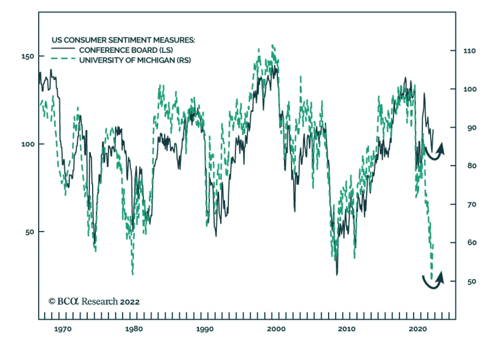
The US Conference Board’s Consumer Confidence index firmed in September, corroborating the signal from the University of Michigan measure that household sentiment is improving. The headline index climbed from 103.6 to 108 – the highest level since April – and…
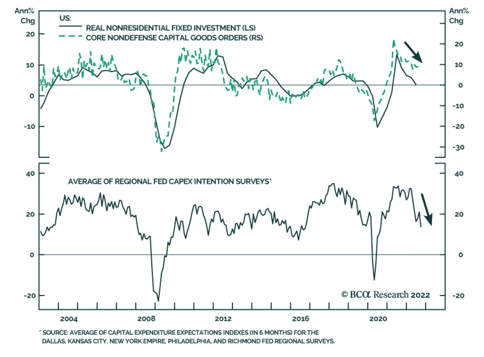
The Commerce Department reported that US orders for durable goods fell 0.2% in August, slightly better than the consensus expectation of a 0.3% drop. An 18.5% decline in nondefense aircraft and parts orders led the decline. Meanwhile, core capital goods…
BCA Research’s US Bond Strategy service expects one more move higher in US Treasury yields before the end of the cyclical bear market. The Fed will continue to lift rates for the next few months, before pausing in Q1 or Q2 of next year. After that, our…

Executive Summary Upward Repricing Of Bond Yields Continues
Upward Repricing Of Bond Yields Continues
Upward Repricing Of Bond Yields Continues
In this report, we discuss our move last week to shift to a below-benchmark overall global duration stance in more detail. Our strongest conviction view on developed market government bonds is underweighting US Treasuries. The outcome of last week’s FOMC meeting, where the Fed committed to a rapid shift to restrictive US monetary policy, supports that position. Our strongest conviction overweight is on Japan, with the Bank of Japan both willing and able to maintain its cap on longer-term JGB yields. We are also overweight countries where it will be difficult for central banks to lift rates as much as markets expect – core Europe, Australia and Canada. The explosion in UK bond yields, and collapse of the British pound, seen after last week’s UK “mini-budget” shows that investors have not lost the power to punish fiscal and monetary policies that are non-credible - like a massive debt-financed tax cut at a time of high inflation. As a result, the Bank of England will now be forced to raise rates much more than we had been expecting, and Gilts will remain extremely volatile in the near-term. Bottom Line: Maintain a below-benchmark overall duration stance in global bond portfolios. Stay underweight US Treasuries. Upgrade exposure to government bonds in Japan and Canada to overweight, but tactically downgrade UK Gilts to underweight until a more market-friendly policy mix leads to greater stability of the British pound. Feature We shifted our recommended stance on overall global portfolio duration to below-benchmark in a Special Alert published last week. In this report, we go into the rationale for that move in more detail, and present specific details of that shift in terms of allocations by country across the various yield curves. Related Report Global Fixed Income StrategyReduce Global Portfolio Duration To Below-Benchmark The global inflation and monetary policy backdrops remain toxic for bond markets. Last week saw interest rate increases from multiple developed economy central banks, including the Fed and Bank of England (BoE). The magnitudes of the rate hikes unnerved bond investors, with even the likes of perennial low yielders like the Swiss National Bank and Riksbank lifting rates by 75bps and 100bps, respectively. The Fed followed up its own 75bp hike by digging in its heels on the need for additional policy tightening after the 300bps of hikes already delivered this year (Chart 1). Fed Chair Jerome Powell strongly hinted that a policy-induced US recession is likely the only way to return overshooting US inflation back to the Fed’s 2% target. This triggered a breakout of the benchmark US 10-year Treasury yield above 3.5%. But the real fireworks in global bond markets occurred after the UK government announced its “mini-budget” last Friday that included massive tax cuts to be funded by debt issuance, triggering a sharp decline in the British Pound and spike in UK Gilt yields – a move that spilled over into other bond markets, pushing government bond yields to cyclical highs in the US and euro area. Chart 1Central Banks Keep Trying To “Out-Hawk” Each Other
The Global Bond Bear Market Continues
The Global Bond Bear Market Continues
Chart 2Yields Are Now Driven By Rate Hike Expectations, Not Inflation
Yields Are Now Driven By Rate Hike Expectations, Not Inflation
Yields Are Now Driven By Rate Hike Expectations, Not Inflation
We had been anticipating another move upward in global bond yields for this cycle, and we shifted to a below-benchmark overall global duration stance in advance of the Fed and BoE meetings last week. We see this next move higher in yields as being driven not by rising inflation expectations but by an upward repricing of interest rate expectations, leading to additional increases in real bond yields (Chart 2). Trying to pick a top in bond yields has now become a game of forecasting the level to which policy rates must rise in the current global monetary tightening cycle. On that front, there is still scope for rate expectations, and bond yields, to move higher in most developed market countries, justifying our downgrade of our recommended overall duration exposure to below-benchmark. Shifting rate expectations also lead to the changes in country bond allocations we announced last week. Rate Expectations And Country Bond Allocations Our proxy for medium-term nominal terminal rate expectations in developed market countries, the 5-year/5-year forward overnight index swap (OIS) rate, has been tracking 10-year bond yields very closely in the US and UK and, to a lesser extent, Europe (Chart 3). In those regions, the OIS curves are pricing in an increasing medium-term level of policy rates, leading to markets repricing government bond yields higher. In the US, the OIS curve is pricing in a 2023 peak for the fed funds rate of 4.67%, but with only a modest path of rate cuts in 2024 and 2025, leading to a 5-year/5-year OIS projection of 3.36% as of Monday’s market close. After the Gilt market rout, the UK OIS curve is now pricing in a 2023 peak Bank Rate over 6%, with our medium-term nominal rate proxy settling at 3.69%. In the euro area, the OIS curve is discounting a 2023 peak in the ECB policy rate of 3.22%, with a 5-year/5-year forward OIS rate of 2.7%. For all three of those regions, the market is now pricing in the highest peak in rates for the current tightening cycle. That is not the case in Canada or Australia, where rate expectations and longer-term bond yields are still below cyclical peaks (Chart 4). Japan remains the outlier, with the Bank of Japan’s yield curve control keeping 10-year JGB yields capped at 0.25%, even with the Japan OIS curve pricing in a medium-term terminal rate of 0.75%. Chart 3Rising Yields Reflect Higher Terminal Rate Expectations
Rising Yields Reflect Higher Terminal Rate Expectations
Rising Yields Reflect Higher Terminal Rate Expectations
Chart 4Our High-Conviction Government Bond Overweights
Our High-Conviction Government Bond Overweights
Our High-Conviction Government Bond Overweights
After looking at all the repricing of interest rate expectations and bond yields, we can determine our preferred government bond allocations within our strategic model bond portfolio framework. The US Remains Our Favorite Government Bond Underweight The new set of interest rate forecasts (“the dots”) presented at last week’s Fed meeting showed that the median FOMC member was forecasting the fed funds rate to rise to 4.4% by the end of 2022 and 4.6% by the end of 2023, before falling to 3.9% and 2.9% and the end of 2024 and 2025, respectively. Those are all significant increases from the June dots, where the expectations called for the funds rate to hit 3.4% by end-2022 and 3.8% by end-2023. The median Fed forecasts are now broadly in line with the pricing in the US OIS curve for 2022-2024, although the market expects higher rates than the FOMC in 2025 (Chart 5). Chart 5USTs Still Vulnerable To Additional Fed Hawkish Surprises
The Global Bond Bear Market Continues
The Global Bond Bear Market Continues
There has been a lot of back and forth between the Fed and the markets this year, but the market has generally lagged the Fed interest rate projections for 2023 and 2024 before last week. Market pricing is now in line with the Fed dots, as investors have adjusted to the increasingly hawkish message from Fed officials that are focused solely on slowing growth, and tightening financial conditions, in an effort to bring US inflation down. We see the US Treasury curve as still vulnerable to additional hawkish messaging from the Fed, and a potentially higher-than-anticipated peak in the funds rate versus the FOMC dots. The US consumer is facing a lot of headwinds from higher interest rates and rising food and gasoline prices. However, the latter has fallen 26% from the June 13/2022 peak and is acting as a “tax cut” that also helps reduce US inflation expectations (Chart 6). Consumer confidence measures like the University of Michigan expectations survey have already shown improvement alongside the fall in gas prices, which has boosted real income expectations according to the New York Fed’s Consumer Survey (bottom panel). Even a subtle improvement in consumer confidence due to some easing of inflation expectations can help support a somewhat faster pace of consumer spending at a time of robust labor demand and accelerating wage growth. The Atlanta Fed Wage Tracker is now growing at a year-over-year pace of 5.7%, while the ratio of US job openings to unemployed workers remains near a record high (Chart 7). Fed Chair Powell has noted that the Fed must see significant weakening of the US jobs market for the Fed to consider pausing on its current rate hike path. So far, there is little evidence pointing to a loosening of US labor market conditions that would ease domestically-generated inflation pressures. Chart 6Lower Gas Prices Can Provide A Lift To US Consumer Spending
Lower Gas Prices Can Provide A Lift To US Consumer Spending
Lower Gas Prices Can Provide A Lift To US Consumer Spending
Chart 7A Tight US Labor Market Will Keep The Fed Hawkish
A Tight US Labor Market Will Keep The Fed Hawkish
A Tight US Labor Market Will Keep The Fed Hawkish
Chart 8Stay Underweight US Treasuries
Stay Underweight US Treasuries
Stay Underweight US Treasuries
We expect overall US inflation to decelerate next year on the back of additional slowing of goods inflation, but will likely settle in the 3-4% range in 2023 given stubbornly sticky services inflation and wage growth. The Fed should follow through on its current interest rate projections, with a good chance that rates will need to be pushed up even higher in response to resilient labor market conditions in the first half of 2023. The risk/reward still favors higher US Treasury yields over at least the next 3-6 months, particularly with an improving flow of US data surprises and with bond investor duration positioning now much closer to neutral according to the JPMorgan client survey (Chart 8). Bottom Line: The US remains our highest conviction strategic government bond underweight in the developed markets. Recommended Allocations In Other Countries The path for monetary policy rates outside the US shows a similar profile as in the US, with a “front loading” of rate hikes to mid-2023 followed by modest rate cuts over the subsequent two years (Chart 9). The OIS-implied path for the level of rates is nearly identical in the US, Australia and Canada. On the other hand, markets are discounting much lower of levels of policy rates in Europe and Japan compared to the US, and a considerably higher path for rates in the UK (more on that in the next section). Chart 9Markets Priced For Global 'Front-Loaded' Rate Hikes
Markets Priced For Global 'Front-Loaded' Rate Hikes
Markets Priced For Global 'Front-Loaded' Rate Hikes
We would lean against the US-like pricing of interest rates in Australia and Canada. Based on work we published in a recent Special Report along with our colleagues at BCA Research European Investment Strategy, the neutral real interest rate (“r-star”) is estimated to be deeply negative in Australia and Canada after adjusting for the high level of non-financial debt in those countries (Table 1). That financial fragility makes it much less likely that the Bank of Canada and Reserve Bank of Australia can raise rates as much as the Fed. Table 1Some Big Swings In Our R* Estimates When Including Debt
The Global Bond Bear Market Continues
The Global Bond Bear Market Continues
US-like interest rates would almost certainly trigger a major downturn in house prices and household wealth given the inflated housing values in those two countries – the growth of which is already slowing rapidly in response to rate hikes delivered in 2022. We are maintaining our overweight recommendation on Australian government bonds, while we upgraded Canada to overweight from neutral after last week’s duration downgrade. Chart 10Move To Overweight Japan
Move To Overweight Japan
Move To Overweight Japan
We are also staying overweight on German and French government bonds, as the ECB is unlikely to deliver the full extent of rate increases discounted in the European OIS curve. Our estimated debt-adjusted r-star is also quite negative in the euro area, suggesting that financial fragility issues (due to high government debt in Italy and high corporate debt in France) will likely limit the ECB’s ability to continue with recent chunky rate increases for much longer. In Japan, we continue to view JGBs as an “anti-duration” instrument, given the Bank of Japan’s persistence in maintaining negative interest rates and yield curve control. That makes JGBs a good overweight when global bond yields are rising and a good underweight when global bond yields are falling (Chart 10). Given our decision to reduce our recommended duration exposure to below-benchmark, the logical follow through decision is to upgrade JGBs to overweight. The only remaining country to consider is our view on UK Gilts, which has now become more complicated. Anarchy In The UK The selloff in the UK Gilt market has been stunning in its ferocity. Dating back to last Thursday’s 50bp rate hike by the BoE, the 10-year UK Gilt yield has jumped 120bps and now sits at 4.52%. The increase in yields was identical at the front-end of the Gilt curve, with the 2-year yield jumping 120bps to 4.68%. The surge in longer-term Gilt yields stands out to the rise in bond yields seen outside the UK, as it also incorporates an increase in our estimate of the UK term premium – a move that was not matched in other countries (Chart 11). The rise in Gilt yields was also much more concentrated in real yields compared to inflation expectations (Chart 12), as markets aggressively repriced the path for UK policy rates after the UK government’s announced debt-financed fiscal package, including £45bn of tax cuts. Chart 11Upward Repricing Of Bond Yields Continues
Upward Repricing Of Bond Yields Continues
Upward Repricing Of Bond Yields Continues
Chart 12The Gilt Market Becomes Unhinged
The Gilt Market Becomes Unhinged
The Gilt Market Becomes Unhinged
The UK’s National Institute for Economic And Social Research (NIESR) estimates that the combined impact of the tax cuts and additional spending measures would increase the UK government deficit by a whopping £150bn, or 5% of GDP. The NIESR also estimated that the fiscal measures, including the previously-announced plan for the UK government to cap energy price increases, would result in positive UK GDP growth in the 4th quarter and also lift annual real GDP growth to 2% over 2023-24. The UK government now faces a major credibility issue with markets on its announced fiscal plans. The sheer size of the package, coming at a time when the US economy was already operating at full employment with high inflation, invites a greater than expected monetary policy tightening response from the BoE. The UK OIS curve now forecasts a peak in rates of 6.3% in October 2023, up from the current 2.25%. That would be a massive move in rates in just one year from a central bank that has been relatively gun shy in lifting rates since the 2008 financial crisis, even during the current inflation overshoot. New UK Prime Minister Liz Truss, and her new Chancellor of the Exchequer Kwasi Kwarteng, have both noted they would prefer a mix of looser fiscal policy (aimed at boosting the supply side of the economy to lift potential growth) with tighter monetary policy that would prevent asset bubbles and inflation overshoots. While there is certainly merit in any plan designed to boost medium-term growth by lifting anemic UK productivity through supply-side reforms, the timing of the announcement could not have been worse. Just one day earlier, the BoE announced a plan to go forward with the sale of Gilts from its balance sheet accumulated during quantitative easing. The Truss government needs to find buyers for all the Gilts that must be issued to pay for the tax cuts and stimulus, but the BoE will not be one of them. In the end, however, the BoE’s expected path for interest rates matters more than the increase in Gilt supply in determining the level of Gilt yields and the slope of the Gilt curve. The NIESR estimates that the UK public debt/GDP ratio will rise to 92% by 2024-25, versus its pre-budget forecast of 88%. While that is a meaningful increase, the correlation between the debt/GDP ratio and the slope of the Gilt curve has been negative for the past few years (Chart 13, top panel). The stronger relationship is between the slope of the curve and the level of the BoE base rate (bottom panel), which is pointing to an inversion of the 2-year/30-year curve if the BoE follows market pricing and lifts rates to 6%. Our view dating back to the early summer was that a low neutral interest rate would prevent the BoE from lifting rates as much as markets were discounting without causing a deep recession, lower inflation and, eventually, a quick reversal of rate hikes. The huge UK fiscal stimulus package changes that calculus, as the nominal neutral rate that will be needed to bring UK inflation back to target is likely now much higher. We have always believed that when a thesis underlying an investment recommendation is challenged by new information, it is best to adjust the recommendation to reflect the new facts. Thus, this week, we are tactically downgrading UK Gilts to underweight in our model bond portfolio framework. We still see a significant medium-term opportunity to go overweight Gilts, as UK policy rates pushing into the 4-6% range are not sustainable. However, the BoE will likely have no choice to begin lifting rates at a much more aggressive pace to restore UK policy credibility, especially with the British pound under immense selling pressure (Chart 14). Despite rumors of an inter-meeting rate hike by the BoE this week to try and support the pound, that is likely too risky a step for the BoE to take as it would invite a battle with investors and currency speculators. Such a battle would be difficult to win without a more credible and market-friendly medium-term fiscal policy from the Truss government. Chart 13The BoE Matters More Than Debt Levels For Gilts
The BoE Matters More Than Debt Levels For Gilts
The BoE Matters More Than Debt Levels For Gilts
Chart 14Tactically Move To Underweight UK Gilts
Tactically Move To Underweight UK Gilts
Tactically Move To Underweight UK Gilts
Bottom Line: We will review our UK Gilt stance once there are more clear signals of stability in the pound, but for now, we will step aside and limit our recommended exposure to Gilts – even after the huge selloff seen to date, which likely has more to go. Summarizing All The Changes In Our Model Bond Portfolio All the changes to our recommended duration exposure and country allocations after the past week, including the new weightings in our model bond portfolio, are shown in the tables on pages 14-16. To summarize: We moved the overall recommended global duration exposure to below-benchmark, and shifted the model bond portfolio duration to 0.9 years below that of the custom benchmark index. We increased the size of the US Treasury underweight, and moved Canada and Japan to overweight. We moved the UK to underweight, on top of the reduction in UK duration exposure that was part of last week’s move to reduce overall portfolio duration. We are also cutting exposure to UK investment grade corporates to underweight, as part of an overall move to reduce UK risk in the portfolio. We slightly increased the overweight in Germany. In next week’s report, we will present the quarterly performance review of our model bond portfolio and, more importantly, we will present out scenario-based return expectations after all the changes made this week. Robert Robis, CFA Chief Fixed Income Strategist rrobis@bcaresearch.com GFIS Model Bond Portfolio Recommended Positioning Active Duration Contribution: GFIS Recommended Portfolio Vs. Custom Performance Benchmark
The Global Bond Bear Market Continues
The Global Bond Bear Market Continues
The GFIS Recommended Portfolio Vs. The Custom Benchmark Index Global Fixed Income - Strategic Recommendations* Cyclical Recommendations (6-18 Months)
The Global Bond Bear Market Continues
The Global Bond Bear Market Continues
Executive Summary We hold to our view that households are in better shape than widely perceived, nourished by a robust labor market and a formidable supply of pandemic savings. We do not believe that the equity bear market will derail our base-case scenario that consumption will keep the economy afloat over the next several quarters. Empirically, changes in equity wealth have exerted little to no impact on consumption. Housing does have a discernible wealth effect, and consumption may be more sensitive to falling home prices than rising ones. The sharp decline in home prices feared by many investors could prompt homeowners to retrench, realizing the number-one risk to our constructive view. Although home price appreciation is in the process of decelerating, housing remains undersupplied and home prices will not fall precipitously. Housing bubble chatter is unfounded. Consumption Declines Are Few And Far Between
Consumption Declines Are Few And Far Between
Consumption Declines Are Few And Far Between
Bottom Line: Neither the equity bear market nor a softening housing market will stifle consumption. The Fed’s anti-inflation campaign will eventually induce a recession, but wealth effect concerns are overblown. Feature Flush consumers drawing down the mountain of excess savings they accumulated across 2020 and 2021 provide the foundation for our constructive near-term view on risk assets and the economy. Consumer retrenchment is one of the two principal risks to our stance1 and we would abandon it if a meaningful share of households began to cut back. We do not know that households will dip into their savings to keep consuming at something close to their trend pace – the scale of the fiscal transfers that fattened their bank accounts was unprecedented – but we view the low and declining savings rate as providing ongoing validation for our thesis. Households can sustainably dis-save relative to their post-crisis trend (Chart 1), as a 5% savings rate whittles down their remaining $2.1 trillion stash by just $150 billion per quarter. Chart 1An Extended Period Of Dis-saving Is Sustainable
An Extended Period Of Dis-saving Is Sustainable
An Extended Period Of Dis-saving Is Sustainable
The wealth effect is real – household spending fluctuates with wealth – and one may question whether consumers will continue to spend amidst an equity bear market while the 3-percentage-point surge in mortgage rates pressures home values. As counterintuitive as it may seem, however, changes in equity wealth have had a modest and inconsistent effect on consumption. Changes in housing wealth have exerted greater influence, and one study by prominent researchers suggests that the effect is stronger when home prices decline. We consider the empirical evidence regarding equity and housing wealth effects, along with the prospects for a sharp decline in home prices, in this report. What Drives Spending? For all the talk of the wealth effect, consumer spending is predominantly a function of income. Every multi-factor regression we performed (Box 1) indicated that changes in nominal income account for the lion’s share of changes in nominal consumption, with estimates ranging up to 75%. When we regressed real consumption with real income and real measures of equity and housing wealth, the estimates of income’s effect were sharply lower – typically between 10 and 25% – but the modeled results were dramatically less robust. We accordingly focus on the nominal relationships in the rest of this report, though we note that the real regressions reinforced the nominal regressions’ pointed implication that changes in equity wealth are largely irrelevant for explaining changes in consumption. Box 1: A Regression Refresher Multi-factor linear regression is a statistical method for determining which independent variables influence the movements of a dependent variable. Regression analysis reveals the statistical significance of independent variables based on their empirical relationship with the dependent variable. If the relationship is robust enough that it is unlikely to have occurred randomly, the independent variable is deemed to be significant. The regression equation describes a best-fit line that minimizes the individual observations’ aggregate deviation from the line. It includes a constant term, b, marking the point where the best-fit line intersects the y-axis, and an x term that denotes each of the independent variables, paired with a coefficient, a. Each coefficient describes the sensitivity of the dependent variable to changes in the value of each independent variable. For dependent variable y, and independent variables x1, x2, …, xn, the equation is written as: y = a1x1 + a2x2 + … + anxn + b. The robustness of the regression is indicated by its r-squared value, ranging from 0 to 1, which quantifies the share of the dependent variable's movement that is explained by movement in the independent variables. In our research, we used Personal Consumption Expenditures and Personal Income from the National Income Accounts as our measures of consumption and income, respectively. We used the measure of corporate equities held by households and nonprofit organizations from the Fed’s quarterly Financial Accounts of the United States (report Z.1) to measure equity wealth and followed the methodology of Case, Quigley and Shiller (2005 and 2013)2 to calculate housing wealth.3 We also followed Case, Quigley and Shiller’s methodology in regressing the year-over-year percentage change in the natural log of the variables’ values. Homes Trump Stocks Simple regressions, measuring the empirical impact of a single independent variable upon a dependent variable, indicate that changes in equity wealth exert considerably less influence over changes in consumption than changes in housing wealth. With a two-quarter lag, year-over-year consumption has changed by nearly three cents for every dollar move in equity wealth (Chart 2). Three cents are in line with rule-of-thumb estimates, but we note that the regression’s r-squared is less than 3%. An unlagged year-over-year regression posits a 0.6-cent consumption change for every dollar move in equity wealth with a microscopic r-squared of 0.1%. Chart 2Equities' Relationship With Consumption Is Weak And Unreliable, ...
The Wealth Of Households
The Wealth Of Households
The housing wealth regression indicates that every dollar of changes in housing wealth leads to a 38-cent change in consumption. With a 38% r-squared, the housing wealth regression generates a visibly tighter fit (Chart 3), inspiring more confidence in the posited relationship, though it is incomplete without considering any other variables’ role in influencing consumption. The housing wealth relationship is also considerably stronger on an unlagged basis (Table 1). Chart 3... Contrasting With Housing's Stronger, More Consistent Pull
The Wealth Of Households
The Wealth Of Households
Table 1Simple Regression Output
The Wealth Of Households
The Wealth Of Households
Chart 4Equities Are Owned By Low MPC Households
The Wealth Of Households
The Wealth Of Households
It may seem surprising that relatively opaque changes in housing wealth exert a much stronger influence over consumption than immediately observable changes in equity wealth. We think the result is a function of the greater breadth of home ownership; nearly two-thirds of households own their home, and it is far and away the largest asset for all but the wealthiest of families. Stock ownership, on the other hand, is highly concentrated, with the top 1% of households by wealth owning over 50% of equities, and the top 10% owning nearly 90% of them (Chart 4). Fluctuations in the stock market mostly impact households with a low marginal propensity to consume but changes in home prices effect a much fuller sweep of Americans. The simple regressions set the stage for what we discovered when we performed multi-factor regressions, confirming previous researchers’ findings. Income is the primary driver of consumption, with a one-dollar change in nominal income provoking a 65-to-72-cent change in nominal spending, and its statistical significance in the models is beyond question (Table 2). Table 2Multiple Regression Output
The Wealth Of Households
The Wealth Of Households
Equities’ wealth effect is not statistically significant in the unlagged model at a 5% significance level (it’s not even statistically significant at the more forgiving 10% significance level) and it is modest (about 1.5 cents on the dollar) in any event. The model would be better off without including equity wealth as an independent variable. In the model lagging consumption by two quarters, which produces a slightly better fit and accords more easily with our own intuition that wealth effects are not felt instantaneously, consumption moves inversely with equity wealth, falling 3 cents for every one-dollar increase in equity wealth and rising 3 cents for every one-dollar decrease. That result is statistically significant, albeit hard to wrap one’s head around. The housing wealth variable is comfortably significant even at a 1% significance level and its impact is quite large in both the unlagged (14.5 cents on the dollar) and the two-quarter-lagged (11.75 cents on the dollar) specifications. Both model specifications generate high r-squareds, explaining 58% and 60% of the variability in consumption, respectively, and the modeled values fit the actual values extremely well before the pandemic scrambled the relationship between consumption and its drivers (Chart 5). Chart 5A Tight Fit Before The Pandemic
A Tight Fit Before The Pandemic
A Tight Fit Before The Pandemic
We also ran a version of the model that substituted Disposable Income for Personal Income, but it slightly weakened its explanatory power and we judge that the broader Personal Income series is a better input. We also ran a version of the model that used household real estate holdings and mortgage balances from the Fed’s quarterly Z.1 report to calculate a factor that translates gross housing wealth to net housing wealth to reflect that all households do not own their homes free and clear.4 Substituting net housing wealth reduced the model’s explanatory power by about two percentage points but left the individual variables’ significance largely intact while cutting housing’s unlagged and two-quarter lagged wealth effect to 7 and 5 cents, respectively (Table 3). Net housing wealth is more intellectually satisfying than gross housing wealth and the smaller wealth effect estimates are more in line with the peer-reviewed literature. Table 3Multiple Regression Output With Net Housing Wealth
The Wealth Of Households
The Wealth Of Households
Whither Home Prices? Investors appear to be braced for a sizable decline in home prices even though nominal price declines are unusual in the five-decade history of the leading repeat sales price indexes. The Case-Shiller National Index has declined just 19% of the time on a sequential basis and 14% of the time on a year-over-year basis (Chart 6). Excepting the 21 consecutive quarters of year-over-year declines from 1Q07 through 1Q12, the Case-Shiller National Index has declined in just five quarters over 41 years, all during the 1990-91 recession that featured tax law changes sharply curtailing individuals’ ability to benefit from losses on real estate investments. The FHFA (née OFHEO) House Price Index has declined on a year-over-year basis just 11% of the time, with only one decline occurring outside of 2007 to 2012 (Chart 7). Chart 6Ex-The Crisis, Declines Are Rare, ...
Ex-The Crisis, Declines Are Rare, ...
Ex-The Crisis, Declines Are Rare, ...
Chart 7... In Both Major Series
... In Both Major Series
... In Both Major Series
Investors expecting a decline therefore appear to be anchoring to an extreme outlier. We cringe whenever we hear the term “housing bubble” used to liken today’s backdrop to the one that preceded the financial crisis. Make no mistake: it is not 2007 in the housing finance market in any way, shape or form. Residential mortgage originations have been made to vastly better borrowers than they were in the run-up to the crisis (Chart 8) and they’ve been made on far more solid terms, as the loan-to-value ratio for residential mortgages has shrunk by 25 percentage points in the immediate aftermath of the bust to its easily sustainable levels of the early ‘80s (Chart 9). Chart 8Mortgages Have Been Extended To Better Borrowers ...
The Wealth Of Households
The Wealth Of Households
Chart 9... On Better Terms Than Before The Crisis
... On Better Terms Than Before The Crisis
... On Better Terms Than Before The Crisis
Chart 10Housing Supply Is Tight
Housing Supply Is Tight
Housing Supply Is Tight
Housing is broadly undersupplied, as evidenced by the record-low home vacancy rate (Chart 10). Higher mortgage rates have surely put monthly payments out of the reach of some aspiring buyers, sending them to the sidelines, but supply remains constrained and home prices fall slowly. Kahneman and Tversky demonstrated that people are quick to take gains by selling appreciated assets but slow to part with assets that are under water. Even if we are underestimating the eventual magnitude of a decline in home prices, we are confident that the decline will not be sudden. Homeowners with discretion over when they sell will wait to exercise it; turnover will slow as pricing softens and the reduced supply will help to mitigate the declines. Investment Implications We were inspired to explore the housing wealth effect by a striking assertion featured in a leading market periodical two weeks ago. An independent strategist stated that the wealth effect from a one dollar decline in home prices was a whopping 40 cents, while the effect of a like decline in equity prices was 10 cents. The assertion was passed on without comment or criticism by the publication, which has long touted its skepticism and unwillingness to accept bullish statements at face value. Alas for its readers, the standard apparently does not apply to bearish claims, no matter how far off the beam they may be. (Based on our results, we suspect these wealth effect estimates are based on simple regressions.) Divergent views are what make a market, but nothing in the body of peer-reviewed research supports the idea that the $6.5 trillion decline in directly owned equities and a hypothetical 10% decline in home equity from its nearly $30 trillion June 30th level will extinguish $650 billion and $1.2 trillion of consumption, respectively. That nearly $2 trillion hit would be punishing, given consumption's current $17 trillion annualized pace. It would also be unprecedented: since the Personal Consumption Expenditures series began in 1950, nominal consumption has only ever declined by a margin that can be seen by the naked eye during the Great Recession and the COVID pandemic (Chart 11). Those historic declines amounted to 3.5% from the 3Q08 peak to the 2Q09 trough and 11.4% from the 4Q20 peak to the lockdown 2Q21 trough. Chart 11Visible Declines In Nominal Spending Are Rare
Visible Declines In Nominal Spending Are Rare
Visible Declines In Nominal Spending Are Rare
We are only too happy to take the other side of the view that another 11% decline could be in store, assuming the absence of nuclear war or another pandemic. We think the 3.5% Great Recession decline will likely remain out of reach, as well, given that the financial crisis emerged from a concatenation of events that cannot repeat now that regulators have so thoroughly clipped the banking system’s wings. Not every investor subscribes to Chicken Little warnings about the housing market, but the promiscuity with which the term bubble is thrown around strongly suggests to us that the consensus view overestimates the probability of a dire economic outcome. When subsequent events reveal that the shock probability has been overstated, the consensus economic and S&P 500 earnings views will have to be revised upward and we believe the eventual revisions will provide risk assets with a path to recover some of the ground they’ve lost this year. We continue to believe that it would be premature to implement full-on defensive asset allocation measures before they do. Doug Peta, CFA Chief US Investment Strategist dougp@bcaresearch.com Footnotes 1 A breakout in long-run inflation expectations is the other. 2 Case, Karl E., John M. Quigley, and Robert J. Shiller, “Comparing Wealth Effects: the Stock Market versus the Housing Market,” Advances in Microeconomics, 5(1),2005: 1-32. Case, Karl E., John M. Quigley, and Robert J. Shiller, “Wealth Effects Revisited: 1975-2012,” NBER Working Paper 18667, January 2013. 3 Case, Quigley and Shiller calculate housing wealth in time t, HWt, as the product of the number of US households, Nt, the homeownership rate, ORt, the average price of a single-family home in the base period (1Q75 in our study), AVGBASE, and a weighted repeat sales price index relative to its base period value, (PIt/PIBASE). We used the National Association of Realtors’ average existing home price series and the Case-Shiller National Index for variables AVG and PI, respectively, as per the following equation: HWt = Nt × ORt × AVG1Q75 × (PIt/PI1Q75) 4 HWt, described in the second footnote, is a gross measure of housing wealth. We divided outstanding mortgage debt by the value of households’ real estate holdings to calculate the aggregate residential mortgage loan-to-value ratio, LTV. We subtracted LTV from 1 to calculate the share of housing value that represented households’ aggregate home equity and multiplied it by HWt to produce an estimate of net housing wealth, NHW: NHWt = HWt × (1 – LTVt)
Executive Summary The USD has appreciated by over 25% since the beginning of 2021. This is a negative for US corporate sales and profits and is a drag on US equity performance. According to BCA FX strategists, the USD is likely to roll over as it appears overbought and overvalued. However, even if the USD has peaked, the effects of its appreciation will be imprinted in the earnings of US corporates for months. Our earnings model signals an earnings recession, with earnings expected to contract to the tune of 20% into the year-end. Technology and Materials are most exposed to the dollar, while Utilities, Financials, and Real Estate are the most domestic sectors. Growth is a more international style than Value, while midcaps offer the best protection from a stronger greenback. USES Model Breakdown
Should US Equity Investors Worry About The Dollar?
Should US Equity Investors Worry About The Dollar?
Bottom Line: While a strong dollar is certainly a headwind for US earnings growth and for the performance of US equities, its adverse effects are minor compared to the effects of tighter monetary policy, slowing growth at home and abroad, rising costs, falling productivity, and fading pricing power. An earnings recession is inevitable. Dollar depreciation will be a welcome development, yet the dollar should be the least of investors’ worries. Feature The USD has appreciated by over 25% since the beginning of 2021 (Chart 1), a concerning development for US equity investors. The S&P 500 companies derive roughly 40% of sales from abroad and the strong dollar is a headwind: Not only does an appreciating domestic currency diminish foreign earnings through a currency translation effect, but it also makes US goods and services more expensive and less competitive in a global marketplace. Related Report US Equity StrategyUS Dollar Bear Market: What To Buy & What To Sell Over the past few months, a number of US multinationals have complained about the adverse effect of the strong greenback on their sales and earnings. The list is both long and diverse and includes technology giants like Microsoft, Dell, and Netflix as well as the likes of Philip Morris, Johnson and Johnson, TJX, and Costco. Investors paid attention: Since the beginning of 2021, US companies with a high share of international sales underperformed their more domestically oriented counterparts by about 20% (Chart 2). However, partially this divergence in performance may be explained by the international index heavily overrepresenting Tech, which has headwinds of its own. Chart 1The USD Has Appreciated By Over 25%
The USD Has Appreciated By Over 25%
The USD Has Appreciated By Over 25%
Chart 2US Multinationals Have Underperformed
US Multinationals Have Underperformed
US Multinationals Have Underperformed
In this week’s report, we will analyze the effects of the stronger dollar on US corporate earnings, zooming in on its implications for the S&P 500 sectors and styles. Sneak Preview: A strong dollar is a definite negative for US corporate sales and profits and is a drag on US equity performance. However, when compared in magnitude to the effects of tighter monetary policy, slowing growth, and rising costs – the dollar should take a backseat to the other investor worries. USD: The Best House On The Worst Street The reasons for the rapid rise of the USD are manifold. The following are just a few: The Dollar smile: The USD outperforms when global growth is strong and investors are optimistic, as well as when growth slows and investors are fearful, benefiting from its status as a reserve currency. Over the past two years, both scenarios have played out. In 2021, investor flows pushed the dollar higher as the US was ahead of the rest of the world in terms of post-pandemic recovery. This year, the USD became a safe haven for jittery investors and became one of the rare assets delivering positive returns in the “sea of misery.” Chart 3Rate Differentials Favored The US
Rate Differentials Favored The US
Rate Differentials Favored The US
The US looks good compared to other regions: Despite its own economic maladies, such as high inflation and slowing growth, the US has been in an advantageous position compared to the rest of the world. The US appears well insulated from global shudders compared to Europe, which is in the midst of a recession and an energy crisis, China roiling from the zero-COVID policy and property market fallout, and EM countries on the verge of food and energy shortages. Interest rate differentials: The Fed is being viewed as the most credible central bank to curb inflation. As a result, US rates have risen more than in other markets (Chart 3). The USD has been strengthening as the US has been enjoying relative stability and better growth compared to the other regions. The Fed is also ahead of the curve. Will The USD Appreciation Continue? BCA FX Strategist Chester Ntonifor does not expect the dollar to continue to appreciate for the following reasons: While the Fed is ahead of the curve, other central banks are also becoming more hawkish. As such, interest rate differentials will not materially move further in favor of the dollar. Inflation is a global problem as opposed to US-centric. Thanks to the Fed’s aggressive policy stance compared to the other central banks, the inflation impulse is slowing in the US, relative to a basket of G10 countries (Chart 4). In addition, the dollar is expensive, overbought, and is a crowded consensus trade (Chart 5). Chart 4The US Inflation Impulse Has Turned
The US Inflation Impulse Has Turned
The US Inflation Impulse Has Turned
Chart 5The Dollar Is Overvalued On A PPP Basis
The Dollar Is Overvalued On A PPP Basis
The Dollar Is Overvalued On A PPP Basis
We concur. While we will not outright bet against the dollar, to our mind, risks are skewed to the downside. The dollar must be close to its peak, and we are neutral on a tactical basis. Effects Of USD Moves On S&P 500 Sales And Earnings Growth It Takes Time While US dollar appreciation may have come to an end, its toll will be imprinted on US earnings growth for a while. There is a lag between currency appreciation and its effects on company sales and earnings: It takes companies three to six months to change contracts, adjust prices and record revenue (Table 1). Stronger Dollar: Lower Sales And Lower Costs It is foreign sales that are most affected by the variation in the purchasing power of foreign currencies relative to the dollar (Chart 6). And while US multinationals hate the strengthening dollar, they also get a hand from it on the cost side of the equation, especially if they outsource a sizeable part of production abroad. Thus, the net effect on profits depends on the cost structure and the type of business. That explains why changes in the dollar are never one-to-one to changes in earnings growth. Table 1Sensitivity Of EPS YoY% To USD YoY% Over Time
Should US Equity Investors Worry About The Dollar?
Should US Equity Investors Worry About The Dollar?
Modeling Effects Of A Stronger Dollar In the “Is An Earnings Recession In The Cards?” report published this past June, we introduced our EPS Growth Forecast Model (Table 2). The model has five intuitive factors: Chart 6The USD Primarily Affects Sales
The USD Primarily Affects Sales
The USD Primarily Affects Sales
Table 2EPS Growth Forecast Model
Should US Equity Investors Worry About The Dollar?
Should US Equity Investors Worry About The Dollar?
ISM PMI is a gauge of US economic growth and a proxy for top-line growth. PPI stands for the change in costs. Pricing Power is a BCA proprietary indicator and captures companies’ ability to pass costs onto their customers. HY Spreads indicate costs of borrowing and also the state of the economy (spreads tend to shoot up in a slowing economy). USD represents the ability of US multinationals to sell goods abroad. These five factors explain 65% of the variation in earnings growth,1 and all factors are statistically significant. Earnings Recession Is Still In The Cards Back in June, we predicted an earnings recession later this year. After all, economic growth is slowing at home and abroad, and demand is rolling over while costs are rising, especially wages. Making things worse, productivity is falling, and Unit Labor Costs (ULC) hit nearly 10% in August. At the same time, consumers are reeling from rising prices, while companies are coming to realize that their ability to pass on costs to customers is pushing the limit. We have updated the model with three more months of data and expect earnings to start contracting in the third quarter, falling as much as 20% in the fourth quarter (Chart 7). None of this is surprising. S&P 500 margins have fallen by 2% in the second quarter, and earnings growth ex Energy came in at -2% on a nominal basis. Analysts expect six out of 11 S&P 500 sectors to deliver negative EPS Growth in Q3-2022. And while a 20% earnings drawdown sounds terrible, it is fairly mild compared to recent recessions – at the worst point in 2008, nominal earnings went to 0, printing a -100% contraction (Table 3). Chart 7The BCA Earnings Model Predicts A Earnings Recession Later This Year
The BCA Earnings Model Predicts A Earnings Recession Later This Year
The BCA Earnings Model Predicts A Earnings Recession Later This Year
Table 3The S&P 500 Earnings Drawdowns
Should US Equity Investors Worry About The Dollar?
Should US Equity Investors Worry About The Dollar?
Here, we would like to emphasize that financial econometrics is not an exact science, and earnings growth point estimates are rarely precise. However, it is abundantly clear that earnings growth will trend well past the zero mark. Costs And Pricing Power Are Key Drivers Of S&P 500 Earnings In 2022 Breaking down the negative earnings growth forecast into contributions from different factors (Chart 8), we observe that the outcome is mostly driven by the interplay between PPI and Pricing Power – costs are rising and companies’ ability to pass them on further defines their profitability. And while commodity prices have fallen, these changes will take a while to flow into earnings. In addition, tighter monetary policy and slowing growth are the new speed bumps (HY Spreads and ISM PMI). Chart 8Interplay Of PPI And Pricing Power Drives The Direction Of Earnings
Should US Equity Investors Worry About The Dollar?
Should US Equity Investors Worry About The Dollar?
Chart 9The USD Contribution Is Negative…
The USD Contribution Is Negative…
The USD Contribution Is Negative…
USD Is Less Important So what about the dollar? According to our model, 1% of dollar appreciation is shaving off roughly 50bps from earnings growth. However, we need to keep this number in context. While the dollar has appreciated more than 25% since the beginning of 2021, only the last three to six months matter on a rolling basis. And over the past three months, USD has appreciated by about 8%, which will detract 4% from earnings in Q4-2022 (Chart 9). The importance of the USD for earnings growth is fairly minor compared to the other factors, such as pricing power, PPI, HY spreads, and ISM PMI (Chart 10). Chart 10... But Is Minor Compared To The Other Factors
Should US Equity Investors Worry About The Dollar?
Should US Equity Investors Worry About The Dollar?
Bottom Line: A strong dollar is a headwind for earnings growth. However, its effects are dwarfed by other factors. Sectors Most Affected By The Strong Currency And Weakening Global Growth Table 4The S&P 500: % Of Foreign Sales By Sector
Should US Equity Investors Worry About The Dollar?
Should US Equity Investors Worry About The Dollar?
While the overall negative effect of a strong dollar on the S&P 500 earnings is relatively minor, some sectors in the index are more exposed than others (Table 4). While the S&P 500 derives about 40% of sales from abroad, the Technology and Materials sectors have about 60% of foreign sales, and for the companies in these sectors, a strong currency is a serious concern. Utilities, Financials, and Real Estate are the most domestic in the index. It is important to note, that, at present, US multinationals are dealing not only with the effects of a stronger currency but also with global growth slowdown. Effects Of Strong Dollar On US Equity Performance While over the long term, a link between earnings growth and equities performance is irrefutable, in the short run, there may be significant variations. In this section, we will look at the relationship between equity returns and the USD. We will also isolate sectors and styles that are best positioned to withstand the current environment. And when the dollar swoons, we will also know which parts of the equity market are most likely to bounce back. USD Dollar Regimes To better understand the relationship between equity returns and the USD, we demarcate two distinct USD regimes, defined rather simplistically as “USD Rising” and “USD Falling” (Chart 11). Then we compile median monthly returns in each regime and keep track of how many months the S&P 500 was positive in each. Chart 11The USD Regimes
Should US Equity Investors Worry About The Dollar?
Should US Equity Investors Worry About The Dollar?
Chart 12The USD Is A Headwind For The Performance Of Equities
Should US Equity Investors Worry About The Dollar?
Should US Equity Investors Worry About The Dollar?
We found that when the USD is appreciating, median monthly returns are only 0.5% and are positive only 37% of the time. However, when the dollar is depreciating, median monthly returns are 1.4% and are positive 63% of the time (Chart 12). This relationship is significant at a 10% confidence level. Sector Performance Under Different USD Regimes When the USD rises, more defensive sectors, such as Utilities, Healthcare, and Consumer Staples tend to outperform. Energy has made the list thanks to the recent rally – normally Energy does not benefit from dollar strength (Chart 13). Chart 13Materials And Comm Services Will Outperform If The USD Turns
Should US Equity Investors Worry About The Dollar?
Should US Equity Investors Worry About The Dollar?
The weakening dollar supports Materials as it stimulates demand, as well as the Communications sector, as it is home to multinational media and entertainment companies like Netflix, Facebook, and Google. Style Performance Under Different USD Regimes Growth Vs Value: Growth is more exposed to the USD than Value thanks to the index composition (Chart 14). Growth is home to Tech as well as Media & Entertainment, and “growthy” Consumer Discretionary, all of which have a higher share of earnings from abroad than the index. Value is dominated by Financials, Industrials, and Utilities, which are fairly domestic. Thus, while over time, exposure to the dollar fluctuates, over the long term, Growth is clearly more sensitive than Value (Chart 15). Chart 14Growth Is Dominated By Multinationals
Should US Equity Investors Worry About The Dollar?
Should US Equity Investors Worry About The Dollar?
Chart 15Growth Is More Exposed To The USD Than Value
Growth Is More Exposed To The USD Than Value
Growth Is More Exposed To The USD Than Value
Chart 16Mid Is A More Domestic Asset Class Than Small
Mid Is A More Domestic Asset Class Than Small
Mid Is A More Domestic Asset Class Than Small
Small Vs Mid: According to a popular belief, small caps are insulated from currency moves as they don’t have reach and scale and earn very little outside of the US. However, small caps are often part of the ecosystem and supply chain of multinationals, and when the profitability of those is under pressure, they also start to feel the heat. Small caps have little leverage with their large clients and their profitability changes with the ebbs and flows of their larger brethren. Hence, they are quite sensitive to currency moves. Arguably, it is midcaps that are the most domestic asset class, as their exposure to the USD is less and more stable compared to the S&P 500 and small caps (Chart 16). Midcaps are usually not big enough to have much international reach but are big enough to have bargaining power with their multinational customers to guard their profitability. Investment Implications The S&P 500 derives roughly 40% of sales from abroad, which makes its earnings quite sensitive to dollar moves and global growth. The recent dollar bull market and slowing growth abroad have challenged US corporates and have detracted from their profit growth. However, slower growth, rising costs, and diminished pricing power by far dwarf the effects of the dollar. Overall, challenges at home and abroad are likely to trigger an earnings recession, which in all likelihood, has already started this summer, and is about to get worse. The dollar may be close to its peak, and our colleagues from the FX team expect dollar devaluation over the long term. A turn in the dollar will offer some respite for the performance of US equities despite the domestic backdrop of slowing growth and rising rates. It will also trigger a change in leadership, with sectors such as Materials and Communications rebounding from their lows. In terms of styles, a strong dollar lends support to Value, thanks to its sector composition. Once the dollar starts to depreciate, Growth will get another tailwind towards recovery. And lastly, midcap is one area in the US equity market somewhat more insulated from currency moves. Bottom Line While a strong dollar is certainly a headwind for US earnings growth and for the performance of US equities, its adverse effects are minor compared to the effects of tighter monetary policy, slowing growth at home and abroad, rising costs, falling productivity, and companies, diminished ability to pass on costs to customers—who are already strapped by rising prices. In short, dollar depreciation will be a welcome development, yet the dollar is the least of investors’ worries. Irene Tunkel Chief Strategist, US Equity Strategy irene.tunkel@bcaresearch.com Footnotes 1 The model’s adjusted R-squared is 0.65. Recommended Allocation
The S&P 500 forward equity risk premium – measured as the difference between the S&P 500 12-month forward earnings yield (the inverse of the forward multiple) and the 10-year TIPS yield – reached its peak in March and has since rolled over. …
Listen to a short summary of this report Executive Summary Sales & Profit Margins: The Two Propellers That Powered The Post-GFC US Rally
What Has Driven US Outperformance Post-GFC And Can This Persist?
What Has Driven US Outperformance Post-GFC And Can This Persist?
US equity markets underperformed the global benchmark by 10% over 2000-08. Since then, the US has outperformed the global benchmark by about 170%. So, what has driven the US’ chartbusting performance in the post-GFC period? If we break down the US’ price performance into three parts – namely price-to-earnings ratio, net profit margins, and sales – then it becomes clear that growth in the latter two elements played a key role in driving US outperformance in the post-GFC era. Can the US’ outperformance relative to global markets persist going forward? It appears unlikely that the US’ high profit margins can sustain these levels of growth going forward. Distinct from the mean reversion argument, the US’ high profit margins are unusually concentrated amongst a fistful of firms. US firms may also find it challenging to maintain high sales growth as US GDP growth slows and given that America’s antitrust philosophy may soon undergo a once-in-a-generation change. Finally, it is worth noting that ‘sector composition’ effects played a significant role in driving US outperformance over 2008-22. Given that we expect outperforming sectors like Tech to become underperformers, this effect could become weaker going forward, thereby subverting another source of the US’ outperformance. Bottom Line: Forecasting is a tenuous science but given that the two prime propellers of the US’ performance engine are likely to confront headwinds going forward, investors should consider reducing allocations to US equities over a longer term, strategic horizon. Dear Client, I am meeting clients in Asia this week while also working on our Fourth Quarter Strategy Outlook, which will be published next week, followed by my webcast the week after. In lieu of our regular report this week, you are receiving a Special Report from my colleague, Ritika Mankar, discussing the sources of US equity outperformance over the past 14 years and the likely path ahead. Best Regards, Peter Berezin, Chief Global Strategist US Stock Market Dominance – It Wasn’t Always This Way Let us assume that you could travel back in time, and today was December 31, 2008. On this day you know that US and Japanese equity markets have underperformed the global benchmark (Chart 1). You also know that Europe (i.e., EU-27) has done marginally better than the US, while Emerging Markets (EM) have been the star outperformer. Let us further assume that by close of play today you have to deploy US$10bn across these four equity markets (across the US, Europe, Japan, and EM). As if the task of taking this decision on the last day of this historic year was not enough, let us assume that the funds you invest must be locked in until the fall of 2022. Finally, let us add one more condition to this task – let us suppose that you have no idea how markets would perform over the 2008-22 period, but you have perfect foresight about how the nominal GDP of these four regions would look like in 2022. Specifically, you know that EM GDP will have a terrific run between 2008 to 2022, US GDP will increase but by a far less impressive degree, European GDP will grow only slightly, and Japan’s GDP would be lesser in 2022 than it was in 2008 (Chart 2). Chart 1US Equities Underperformed The Global Benchmark By 10% Over 2000-08
US Equities Underperformed The Global Benchmark By 10% Over 2000-08
US Equities Underperformed The Global Benchmark By 10% Over 2000-08
Chart 2EM GDP Has More Than Doubled Since The GFC
What Has Driven US Outperformance Post-GFC And Can This Persist?
What Has Driven US Outperformance Post-GFC And Can This Persist?
Chart 3US Equities Outperformed The Global Benchmark By About 170% Over 2008-22YTD
US Equities Outperformed The Global Benchmark By About 170% Over 2008-22YTD
US Equities Outperformed The Global Benchmark By About 170% Over 2008-22YTD
If you were to take an investment decision based only this information, what is certain is that the fund you manage would underperform by a painful degree. This is because we now know that even though US markets had poor momentum in 2008, and the US’ GDP expansion paled relative to EM, US equity markets outperformed global markets by a wide margin since 2008 (Chart 3). On the other hand, despite positive momentum and high GDP growth, EM emerged as a distant second-best performer. Japan miraculously made it to third place despite a contraction in nominal GDP, and finally Europe ended up being the worst performer. If market momentum and GDP growth cannot explain these market movements, then what drove the US' outstanding performance in the post-GFC period? In this Special Report, we delve into answering this question in detail. The purpose of peeling the onion of the US' performance is simple – we hope to extract the insights that investors need to construct alpha-generating portfolios, in a world where forward time travel is not a possibility (yet). The US’ Performance Has Been Powered More By Earnings, Less By Valuations The two basic building blocks of any equity index are its earnings and its price-to-earnings ratio. The former captures the fundamentals backing an index, while the latter quantifies the valuation element. Breaking down the US’ performance into these two parts shows that earnings have been the prime factor that have propelled the rise of US equity markets in the post-GFC era (Chart 4). That earnings have been an important driver of the US’ outperformance becomes even more apparent when US earnings are compared to that of other major markets. For instance, the steep expansion in US earnings contrasts with the situation across the Atlantic. In Europe, earnings have trended lower relative to the global benchmark since 2008 and an increase in relative valuations has helped lend a floor to the index (Chart 5). The earnings report card for Japan and EM, on the other hand, have been surprisingly similar as earnings failed to rise meaningfully in both these geographies in the post-GFC period (Chart 6 and 7). Chart 4Earnings Have Played A Key Role In Propelling The Post-GFC US Rally
What Has Driven US Outperformance Post-GFC And Can This Persist?
What Has Driven US Outperformance Post-GFC And Can This Persist?
Chart 5European Equities Supported More By Valuation Multiples
What Has Driven US Outperformance Post-GFC And Can This Persist?
What Has Driven US Outperformance Post-GFC And Can This Persist?
Chart 6Earnings Growth Has Been Unimpressive In Japan Too
What Has Driven US Outperformance Post-GFC And Can This Persist?
What Has Driven US Outperformance Post-GFC And Can This Persist?
Chart 7Earnings Have Trended Lower In EM Since 2008
What Has Driven US Outperformance Post-GFC And Can This Persist?
What Has Driven US Outperformance Post-GFC And Can This Persist?
In summary, the US' price-to-earnings ratio has had a meaningful role in driving US outperformance in the post-GFC period (Chart 8), but earnings expansion has played an outsized role (Chart 9). Chart 8Relative Valuation Multiples Have Played A Key Role In Supporting European Markets
What Has Driven US Outperformance Post-GFC And Can This Persist?
What Has Driven US Outperformance Post-GFC And Can This Persist?
Chart 9Earnings Expansion In The US Has Been Phenomenal
What Has Driven US Outperformance Post-GFC And Can This Persist?
What Has Driven US Outperformance Post-GFC And Can This Persist?
In fact, the growth in earnings in the US in the post-GFC era has been so noteworthy that if US equity market prices were to be broken down into its two building blocks i.e., earnings and price-to-earnings ratio, then the lion’s share of US equity market prices today would be attributed to its earnings (Chart 10). Expectedly, this contrasts with the situation in Europe where equity market prices have managed to stay afloat owing to a re-rating in its price-to-earnings ratio (Chart 11). These attribution analysis numbers are not meant to be taken literally, but rather, reflect the relative role played by earnings and price-to-earnings ratios in supporting the prices of regional indices. Chart 10US Equities: Supported More By Earnings
What Has Driven US Outperformance Post-GFC And Can This Persist?
What Has Driven US Outperformance Post-GFC And Can This Persist?
Chart 11EU Equities: More Reliant On Multiples
What Has Driven US Outperformance Post-GFC And Can This Persist?
What Has Driven US Outperformance Post-GFC And Can This Persist?
The Unsung Hero Behind The US’ Outperformance - Record Sales Expansion The index of a region can also be envisaged as the product of three elements, namely: (1) its price-to-earnings ratio; (2) its net profit margins; and (3) its sales. In other words: Price = (Price / Earnings) x (Earnings / Sales) x (Sales) While the US' healthy earnings tend to attract disproportionate investor attention, this formulation shows how a surge in US sales was the bigger driver of US outperformance (Chart 12). US profit margins experienced a sharp surge relative to global profit margins over the 2008-12 period, but then this parameter flatlined. US sales, on the other hand, have managed to register a steady march upwards over the entirety of the post-GFC period. The growth in sales of listed American corporations has in fact been so remarkable that a grand total of ten American firms now have annual sales of over $200 billion – which marks an all-time high for the US (Chart 13). Chart 12Post-GFC US Rally Powered By Record Sales Expansion
What Has Driven US Outperformance Post-GFC And Can This Persist?
What Has Driven US Outperformance Post-GFC And Can This Persist?
Chart 13The US Is Home To Ten Firms With Revenues Of +$200bn
What Has Driven US Outperformance Post-GFC And Can This Persist?
What Has Driven US Outperformance Post-GFC And Can This Persist?
Furthermore, the US’ lead on sales today is meaningful not only by its own historical standards, but by cross-country standards too. The rise in US sales has meant that the US is now home to half of the twenty largest listed corporations globally (Table 1). Conversely, Europe and Japan, despite being the third and fourth largest economies of the world, respectively, together account for only three names on this list. Notably however, Emerging Markets have managed to punch above their weight and are home to six of the top twenty firms by sales globally. Table 1The US Today Dominates The Global List Of Top 20 Firms By Revenue
What Has Driven US Outperformance Post-GFC And Can This Persist?
What Has Driven US Outperformance Post-GFC And Can This Persist?
The steep rise in America’s sales in the post-GFC world is also unique because no other major market has experienced such a clear upward move in sales as the US has. Europe and Japan in fact saw their sales-per-share trend downwards in the post-GFC period (Chart 14 and Chart 15). Emerging markets were the only other major global market where sales-per-share managed to stay steady relative to the global benchmark (Chart 16). Chart 14Europe’s Sales Have Trended Lower Post-GFC
What Has Driven US Outperformance Post-GFC And Can This Persist?
What Has Driven US Outperformance Post-GFC And Can This Persist?
Chart 15Japan’s Sales Also Trended Lower Post-GFC
What Has Driven US Outperformance Post-GFC And Can This Persist?
What Has Driven US Outperformance Post-GFC And Can This Persist?
Finally, thanks to the high growth in US sales, the contribution of sales to US equity prices is far higher than the contribution of its net profit margins or its price-to-earnings ratio (Chart 17). This once again is in sharp contrast to a market like Europe, where only a smidgeon of the European equity prices pie can be attributed to its sales. Chart 16EM Sales Have Expanded Marginally Post-2008
What Has Driven US Outperformance Post-GFC And Can This Persist?
What Has Driven US Outperformance Post-GFC And Can This Persist?
Chart 17The Main Engine That Powers US Markets Is ‘Sales’
What Has Driven US Outperformance Post-GFC And Can This Persist?
What Has Driven US Outperformance Post-GFC And Can This Persist?
Chart 18US Profit Margins Have Also Been Expanding Steadily Post-GFC
What Has Driven US Outperformance Post-GFC And Can This Persist?
What Has Driven US Outperformance Post-GFC And Can This Persist?
Distinct from the role played by growing sales, the US’ stellar post-GFC performance has also been powered by growing profit margins. It is notable that the US has experienced an unusually strong upward movement in its profit margins in the post-GFC period (Chart 18). Japan is the only other region which has seen its profit margins expand post-GFC, with both Europe and EM having experienced a fall in profit margins from the levels seen in 2008. A Quick Note On Dividends: The US Lags On Dividend Yields But Leads On Buybacks Thus far we have focused on the returns generated by the US market relative to the world and the factors that drove US outperformance since the GFC. If one were to focus on the dividend yield component, then it is notable that the US lags its peers on this front. Post-GFC, the first major cresting of dividend yields globally took place in 2009-10. Then the next major move down in yields took place in 2020 (Chart 19). While globally, yields have now recovered from this last dip, the US finds itself lagging on this metric which matters for pension funds that rely on annuities (Chart 20). Not only have dividend yields in the US almost halved since the GFC, but the gap between dividend yields offered by the US and other markets has widened over the last few years. Europe however has managed to stay the undisputed leader when it comes to dividend yields through most of the 21st century. Chart 19Global Dividend Yields Have Recovered From The Post-2020 Fall
What Has Driven US Outperformance Post-GFC And Can This Persist?
What Has Driven US Outperformance Post-GFC And Can This Persist?
Chart 20US Lags Global Markets On Dividend Yields
What Has Driven US Outperformance Post-GFC And Can This Persist?
What Has Driven US Outperformance Post-GFC And Can This Persist?
Chart 21Pace Of Buybacks In The US Has Been Meaningful
Pace Of Buybacks In The US Has Been Meaningful
Pace Of Buybacks In The US Has Been Meaningful
Notably, however, while the US lags its peers on dividend yields, it leads when it comes to buybacks. The latter is evident from the fact that proxy measures of shares outstanding have trended lower in the US in the post-GFC period, as compared to the rest of the world (Chart 21). Finally, it is important to note that both the growth in dividends-per-share as well as the absolute level of dividends in the US has been high. This parameter has increased by 2.4 times since 2008 and US dividends in absolute terms are nearly 5 times that of Europe’s dividends today. The only reason why dividend yields have stayed low despite this is because US equity prices have had a stellar run in the post-GFC period. Can This Extent Of US Outperformance Persist? Having delved into the drivers of the US’ performance, we now know that a record expansion in sales and net profit margins have driven its outstanding performance in the post-GFC era. This in turn means that the probability of the US continuing to outperform over the next few years will be closely linked to its ability to maintain a lead on these two parameters. So how is the US positioned with respect to both these factors? The US’ High Profit Margins Appear Unsustainable, For A Wide Range Of Reasons We have established the fact that expanding profit margins have been a supporting driver of the US’ outperformance in the post-GFC period. Now, the consensus view is that US profit margins are extraordinarily high and that they will eventually come down to earth. The logic for this argument is often grounded in mean reversion. We have also previously highlighted that most of the increase in US profit margins has occurred due to rising margins within the tech sector and the accompanying increase in the market cap weight of tech within benchmark indices. Chart 22US High Profit Margins Are Concentrated Amongst Top Firms
What Has Driven US Outperformance Post-GFC And Can This Persist?
What Has Driven US Outperformance Post-GFC And Can This Persist?
Aside from these reasons, two more factors could lead to the compression of US profit margins over the next few years. Firstly, it is worth noting that the US' high profit margins are unusually concentrated amongst a handful of firms. While the US as a market is characterized by high margins at the headline level, profit margins of companies below the top tier are notably lower than that of the top tier (Chart 22). If profit margins were uniformly high across the US listed space and the divergence was low, then the probability of sustaining elevated margins would have been higher. But given that the US uniquely suffers from a high profit margin concentration problem, the probability of the sustainability of US high profit margins appears lower. Secondly, history suggests that in the globalized world that we live in, any region’s profit margins fail to persist above the global average beyond a maximum of 15 years (Table 2). This makes sense and is in line with economic theory which suggests that when profitability in a particular market is excessive, then new firms will enter this space, increase competition, and thereby exert downward pressure on the incumbents’ profit margins. Table 2Regional Profit Margins Seldom Persist Above The Global Average Beyond 15 Years
What Has Driven US Outperformance Post-GFC And Can This Persist?
What Has Driven US Outperformance Post-GFC And Can This Persist?
Given that US profit margins have now persisted above global levels for almost 13 years, if history were to repeat itself, then it appears highly likely that US profit margins would trend towards the global average over the next 2 years. US Sales Growth: A Peak Appears Nigh We now know that the rapid sales expansion experienced by US firms has been the prime driver of the US stock market outperformance since the GFC. However, the prognosis for this variable also appears shaky for the US. Chart 23US GDP And Sales Tend To Move In Lockstep
What Has Driven US Outperformance Post-GFC And Can This Persist?
What Has Driven US Outperformance Post-GFC And Can This Persist?
The key macro variable which has the tightest theoretical link to the sales generated by the companies in a country is the country’s nominal GDP. Even as companies headquartered in the US end up selling to the global economy, history suggests that the link between the US’ nominal GDP and the sales generated by listed American firms are closely linked (Chart 23). Given that the pace of US nominal GDP growth is set to slow over the next few years (relative to both its past and relative to other major economies), US companies’ sales growth could end up slowing too (Chart 24). Also, given that the US revenue-to-nominal GDP ratio is already elevated, it is likely that even as the US’ nominal GDP keeps growing, the pace of conversion of this GDP into revenues will stay the same or may even diminish over the coming decade. Chart 24US GDP Growth Is Set To Slow
What Has Driven US Outperformance Post-GFC And Can This Persist?
What Has Driven US Outperformance Post-GFC And Can This Persist?
Then from a bottom-up perspective, we are also of the view that the US economy’s ability to spawn mega-sized companies (by sales) may become increasingly compromised over the next decade. This is because a peculiar stagnation is in the works in the middle tier of American firms, which tend to become the mega-sized corporations of tomorrow. Finally, the US' antitrust philosophy is likely to undergo a once-in-a-generation change under the Biden administration. This could mean that America’s mega-scaled firms (which have had a free run up until now) could end-up baiting regulatory attention, restricting their ability to grow sales. US Price Performance: Strong Sector Effects Are Unlikely To Persist Chart 25Sector Composition Effect: Strongest For The US
What Has Driven US Outperformance Post-GFC And Can This Persist?
What Has Driven US Outperformance Post-GFC And Can This Persist?
Lastly, it is worth noting that the price performance of the broad US equity index subverts the role played by “sector composition” in driving the US' outperformance. The fact that returns generated by the US benchmark are higher than the returns generated by a hypothetical US index which weights all sectors equally suggests that “sector composition” effects had a meaningful role in driving US outperformance. In fact, as compared to other major markets, the sector composition effect is the most prominent for the US (Chart 25). Another way of quantifying the role of sector effects is to compare the US’ market cap expansion relative to a global benchmark after removing the market cap of top-performing sectors. Expectedly, US outperformance relative to the global benchmark over the post-GFC period gets substantially reduced if the market cap of the three top-performing sectors (namely Information Technology, Consumer Discretionary, and Health Care) is adjusted for (Chart 26). To complicate matters, the sector composition effect in the US has been unwinding but remains high (Chart 27). Given that we expect outperforming sectors like Tech to turn into underperformers, the sector constitution effect in the US could weaken going forward, thereby subverting another source of US outperformance. Chart 26Extent Of US Outperformance Weakens Sans Tech, Consumer Discretionary, And Health Care
What Has Driven US Outperformance Post-GFC And Can This Persist?
What Has Driven US Outperformance Post-GFC And Can This Persist?
Chart 27Sector Composition Effect In The US Remains High
What Has Driven US Outperformance Post-GFC And Can This Persist?
What Has Driven US Outperformance Post-GFC And Can This Persist?
Investment Conclusions The prime drivers of US outperformance relative to the global benchmark in the post-GFC period have been ascendant sales and rising net profit margins. Forecasting is a tenuous science but given that both these propellers of the US equity market engine are set to face headwinds, investors should consider reducing allocations to US equities over a longer term, strategic horizon. Ritika Mankar, CFA Editor/Strategist Ritika.Mankar@bcaresearch.com
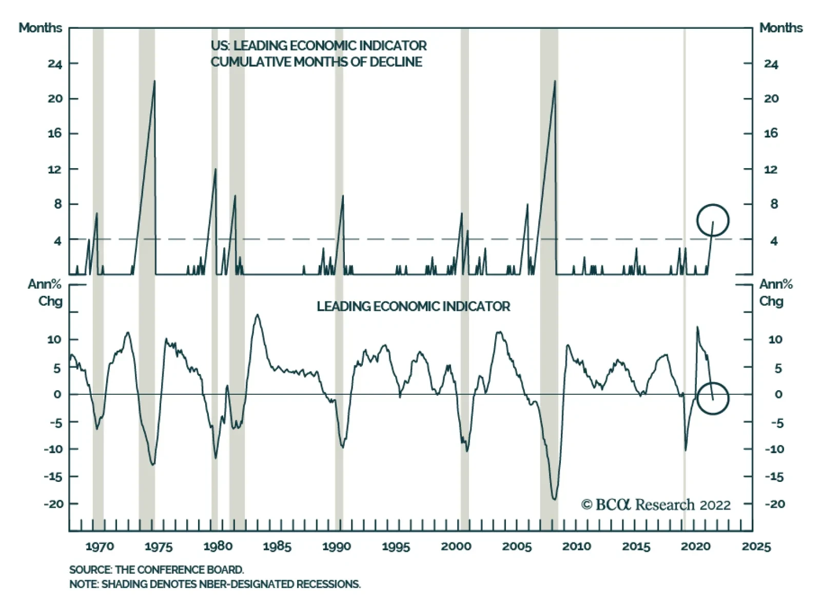
The Conference Board’s Leading Economic Index for the US declined 0.3% in August, falling below expectations of -0.1%. In addition, the July figure was revised down from -0.4% to -0.5%. Only two of the index’s ten components have been positive contributors…
Executive Summary Higher Brent Prices, Stronger Upside Bias
Higher Brent Prices, Stronger Upside Bias
Higher Brent Prices, Stronger Upside Bias
The Fed is pacing a globally synchronized monetary-policy tightening cycle as the war in Ukraine escalates, following Russia’s mobilization of 300k reserve forces. Despite central-bank tightening, the intensification of the war increases the odds of higher inflation. This will keep the USD well bid. Russia’s threat to cut oil supplies to states observing the G7 price cap will test US and EU resolve as winter sets in. Retaliatory output cuts by Russia could send Brent crude oil prices above $200/bbl. The Biden administration remains fearful its G7 price cap and EU sanctions on Russian oil exports will spike prices. The US will make 10mm barrels of crude from its SPR available in November as a palliative. Our base case Brent forecast is slightly lower, averaging $105/bbl this year from $110/bbl, due to weaker realized prices. On the back of this, we expect 4Q22 Brent to average $106/bbl, and for 2023 to average $118/bbl, up slightly vs. last month. WTI will trade $3-$5/bbl lower. Bottom Line: The economic war pitting the EU and its allies against Russia could escalate and widen as more Russian troops pour into Ukraine. This raises the odds of expanded conflict outside Ukraine, and higher war-driven inflation. Our baseline forecast for 2023 remains intact, with a strong bias to the upside. We remain long the COMT and XOP ETFs to retain exposure to commodities. Feature The Fed is pacing a globally synchronized monetary-policy tightening cycle at a time when the war in Ukraine is escalating. Russia’s mobilization of a reported 300k reserve forces raises the spectre of an expansion of the Ukraine war – perhaps crossing into a NATO state’s border – if tactical nuclear, biological, or chemical weapons are used. This is a low-probability outcome, but it would increase the odds of significantly higher inflation should it come to pass.1 The US central bank lifted its Fed funds rate 75 bps Wednesday to a range of 3% - 3.25% – and strongly indicated further rate hikes will follow. The Fed is one of numerous banks increasing policy rates. This synchronous monetary-policy tightening has not been observed for 50 years, and raises the odds of a global economic recession, according to the World Bank.2 The World Bank notes that since 1970, recessions have been “preceded by a significant weakening of global growth in the previous year, as has happened recently,” and, importantly, “all previous global recessions coincided with sharp slowdowns or outright recessions in several major economies.” The withdrawal of monetary and fiscal support “are necessary to contain inflationary pressures, but their mutually compounding effects could produce larger impacts than intended, both in tightening financial conditions and in steepening the growth slowdown.” Markets are acting in a manner consistent with this assessment, but, in our view, need to expand the risk set to include a higher likelihood of a war widening beyond Ukraine. While this is not our base case, it is worthwhile recalling the link between war and inflation. Prior to and during the 20th century’s two world wars, then the Korean and Vietnam wars, US CPI inflation rose sharply (Chart 1).3 Price controls and tighter monetary policy were needed to address these inflationary episodes. Chart 1A Wider Ukraine War Would Stoke Inflation
Oil Markets Anxiously Enter 4Q22
Oil Markets Anxiously Enter 4Q22
Stronger USD Remains Oil-Demand Headwind Fed policy will continue to push US interest rates higher, which will push the USD higher on the back of continued global demand for dollar-denominated assets. This will keep the cost of most commodities ex-US higher in local currency terms, which, all else equal, will weaken commodity demand in general, and oil demand in particular. This will be compounded if tighter monetary policy at systemically important central banks (led by the Fed) results in a global recession in 2023. This is especially true for EM oil demand: The income elasticity of EM oil consumption is 0.61, which means a 1% decrease (increase) in real EM GDP translates into a 0.61% decrease (increase) in oil demand, all else equal. In our base case, we expect global oil demand to grow 2.2mm b/d this year and 1.91mm b/d next year, roughly in line with the US EIA’s and IEA’s estimates (Chart 2). We expect EM demand will increase 1.25mm b/d this year, and 1.90mm b/d next year, accounting for almost all of global growth. As before, we expect China’s oil demand growth to be de minimus this year, on the back of its zero-tolerance COVID-19 policy. EM remains the key driver of our global oil demand assumptions, which, in our modeling, are a function of real income (GDP). Offsetting the stronger USD effects on demand is gas-to-oil switching demand, resulting from record-high LNG prices this year. This will add 800k b/d to demand globally this winter (November – March). Chart 2Global Oil Demand Holding Up
Global Oil Demand Holding Up
Global Oil Demand Holding Up
Oil Supply Getting Tighter Oil supply will remain challenged this year and next, as core OPEC 2.0 – the Kingdom of Saudi Arabia (KSA) and the United Arab Emirates (UAE) – approaches the limit of what it can supply to the market and still retain sufficient spare capacity to meet unexpected supply shocks (Chart 3). Among the anticipated shocks we believe core OPEC 2.0 is aware of is the loss of 2mm b/d of Russian crude oil output over the next year, due to the imposition of EU embargoes on seaborne crude oil and refined products, which will go into effect 5 December 2022 and 5 February 2023, respectively. The continued inability of non-core OPEC 2.0 states to maintain higher production – “The Other Guys” in our nomenclature – is another foreseeable shock (Chart 4). This is becoming acute for OPEC 2.0, given The Other Guys account for most of the 3.6mm b/d of below-quota output currently registered by the producer coalition.4 This is a record gap between expected production and actual production from OPEC 2.0, which was registered in August. Chart 3Core OPEC 2.0 Conserves Supplies
Oil Markets Anxiously Enter 4Q22
Oil Markets Anxiously Enter 4Q22
Chart 4'Other Guys' Production Keeps Falling
Oil Markets Anxiously Enter 4Q22
Oil Markets Anxiously Enter 4Q22
Net, demand will continue to outpace supply in our base case (Chart 5, Table 1). This will require continued inventory draws for the next year or so, as core OPEC 2.0 continues to conserve supplies (Chart 6). Chart 5Demand Continues To Outpace Supply
Demand Continues To Outpace Supply
Demand Continues To Outpace Supply
Chart 6Inventory Will Continue Drawing
Inventory Will Continue Drawing
Inventory Will Continue Drawing
Table 1BCA Global Oil Supply - Demand Balances (MMb/d, Base Case Balances) To Dec23
Oil Markets Anxiously Enter 4Q22
Oil Markets Anxiously Enter 4Q22
Russian Wild Card Battlefield losses in Ukraine are forcing Russia’s military to activate some 300k reserve troops. These losses again are prompting veiled threats to deploy nuclear and perhaps chemical weapons, which drew a sharp warning from US President Biden.5 Further economic losses will begin mounting in a little more than two months, as the first of two major EU oil-import embargoes and a ban on insuring/re-insuring vessels carrying Russian crude and products takes hold. In addition, a US-led G7 price cap on Russian oil purchases will go into effect with the December embargo on seaborne crude imports into the EU.6 We continue to expect Russia will be forced to shut in ~ 2mm b/d of crude oil production by the end of next year – taking output from a little more than 10mm b/d to ~ 8mm b/d.7 Russian’s President Putin already has threatened to cut off oil supplies to anyone abiding by the G7 price cap.8 In our modeling, a unilateral 2mm b/d cut in Russian output – in addition to the lost sales from the EU embargoes and insurance/reinsurance bans – would take Brent prices above $200/bbl (Chart 7). On the downside, a severe global recession that removes 2mm b/d of demand next year could send prices below $60/bbl. Equally plausible cases for either outcome can be made, given current supply-demand fundamentals and the geopolitical backdrop discussed above. This can be seen in the lack of skew in the options markets, which is measured by the difference in out-of-the-money call and put implied volatilities (Chart 8). The skew sits close to zero at present – meaning options buyers are not giving higher odds to a sharp upside or downside move at present.9 Chart 7Higher Brent Prices, Stronger Upside Bias
Higher Brent Prices, Stronger Upside Bias
Higher Brent Prices, Stronger Upside Bias
Chart 8Option Skew Shows Up Or Down Moves Equally Likely
Option Skew Shows Up Or Down Moves Equally Likely
Option Skew Shows Up Or Down Moves Equally Likely
In our modeling and analysis, we continue to believe the balance of risk is to the upside. As can be seen in Chart 6, inventories are below the 2010-14 five-year average – OPEC 2.0’s original target when it was formed – which means KSA and the UAE will be able to respond to any demand shocks that cause unintended inventory accumulation (e.g., the sort that occurred during the COVID-19 pandemic or the OPEC market-share war of 2015-16). Managing the upside risk is more difficult: KSA and the UAE are close to the limits of what they can supply and still carry sufficient spare capacity to meet unexpected production losses. KSA’s crude oil output is just over 11mm b/d, and the UAE’s is at 3.2mm b/d, according to OPEC’s Monthly Oil Market Report. This puts both within 1mm b/d of their max production capacity of 12mm and 4mm b/d. Both got close to producing at these max levels in early 2020, when Russia provoked a market share war; this was quickly reversed as a magnitude of the COVID-19 demand destruction became apparent. The only other large producer outside the OPEC 2.0 coalition capable of increasing and sustaining higher output is the US shales, which are producing at 7.8mm b/d and have pushed total US crude oil output to 12.2mm b/d (Chart 9). Leading producers in the shales have foreclosed any sharp increase in output this year, given tight labor markets and services and equipment markets in the US. Chart 9US Shales Close To Max Output
US Shales Close To Max Output
US Shales Close To Max Output
Investment Implications Global crude oil markets remain tight, with demand continuing to exceed supply. The risk that the economic war pitting the EU and its allies against Russia could expand to a more kinetic confrontation involving additional states is higher, as more Russian troops are called up to serve in Ukraine. If the additional troops do not reverse Russia’s battlefield losses – or if Ukraine looks like it will win this war – Putin likely will feel cornered, and get more desperate.10 We believe Putin will first attempt to impose as much economic pain on the West as possible by cutting off all natural gas and oil flows to the EU and states and firms observing the G7 price cap. However, if that does not force the West to relent on its economic war with Russia, a war with NATO could evolve in which tactical nukes or other weapons of mass destruction are employed. At that point, Putin would have concluded there would be nothing he could do to restore Russia’s standing as a world power. Any plume – nuclear, biological or chemical (NBC) – that crosses a NATO border likely would be treated as an act of war. NATO would have to act at that point. This is not our expectation, nor is it any part of our base case. But it is a higher non-trivial risk than it was last month or last week. This raises the odds of higher war-driven inflation, as well, which will further complicate central-bank monetary policy at a time of war. Our baseline forecast remains intact, with a strong bias to the upside. We remain long the COMT and XOP ETFs to retain exposure to commodities. Robert P. Ryan Chief Commodity & Energy Strategist rryan@bcaresearch.com Ashwin Shyam Research Analyst Commodity & Energy Strategy ashwin.shyam@bcaresearch.com Paula Struk Research Associate Commodity & Energy Strategy paula.struk@bcaresearch.com Commodities Round-Up Energy: Bullish In its September update, the US EIA reported natural gas consumption will hit record levels in 2022, increasing by 3.6 Bcf/d to just under 87 Bcf/d on average, led by increases in the electric power residential and commercial sectors (Chart 10). US natural gas consumption in the electric power sector will increase in 2022 due to limitations at coal-fired power plants and weather-driven demand. It is expected to decrease in 4Q22 and in 2023, due to more renewable electricity generation capacity. Natural gas consumption in the residential and commercial sectors for 2023 is expected to be similar as 2022 levels. Base Metals: Bullish According to Eurometaux, a consortium of European metal producers, approximately 50% of the EU’s zinc and aluminum production capacity is offline due to high power prices. More operations are expected to shut as European power prices remain elevated and metal prices drop on recessionary fears (Chart 11). The decision to reopen a smelter following a shutdown is expensive and can result in long wait times. This will make the bloc’s manufacturers heavily reliant on metal imports from other states, which likely will lead to higher pollution from these plants. Aluminum supply is particularly vulnerable to this power crisis since one ton needs an eye-watering 15 megawatt-hours of electricity – enough to power five homes in Germany for a year. Precious Metals: Neutral The Fed’s additional 75-bps rate hike will strengthen the USD and weaken gold prices. Geopolitical risk has been a tailwind for the greenback thus far, as investors rush to the USD instead of the yellow metal for safe-haven investments. If this trend continues, along with further Fed rate increases, the additional risk arising from Putin’s reserve force mobilization and possible expansion of the Ukraine war will boost the USD and leave gold in the doldrums. Chart 10
Oil Markets Anxiously Enter 4Q22
Oil Markets Anxiously Enter 4Q22
Chart 11
Oil Markets Anxiously Enter 4Q22
Oil Markets Anxiously Enter 4Q22
Footnotes 1 Please see Vladimir Putin mobilises army reserves to support Ukraine invasion, published by ft.com on September 21, 2022. 2 Please see Is a Global Recession Imminent?, published by the World Bank on September 15, 2022. The report notes, “Policymakers need to stand ready to manage the potential spillovers from globally synchronous withdrawal of policies supporting growth. On the supply-side, they need to put in place measures to ease the constraints that confront labor markets, energy markets, and trade networks.” 3 Please see One hundred years of price change: the Consumer Price Index and the American inflation experience, published by the US Bureau of Labor Statistics in April 2014. 4 Please see OPEC+ supply shortfall now stands at 3.5% of global oil demand, published 20 September 2022 by reuters.com. 5 Please see Biden warns Putin over nuclear, chemical weapons, published by politico.eu on September 17, 2022. 6 Please see EU Russian Oil Embargoes, Higher Prices, which we published on August 18, 2022, for discussion. 7 We include Russia among “The Other Guys” in our balances estimates. 8 Please see Explainer: The G7's price cap on Russian oil begins to take shape, published by reuters.com on September 19, 2022. 9 We use the standard measure of skew – i.e., the difference between 25-delta calls and puts – to determine whether option market participants are discounting a higher likelihood of an up or down move, respectively. 10 Please see CIA director warns Putin's 'desperation' over Russia's failures in Ukraine could lead him to use nukes, published by businessinsider.com on April 15, 2022. Investment Views and Themes Strategic Recommendations Trades Closed in 2022