United States
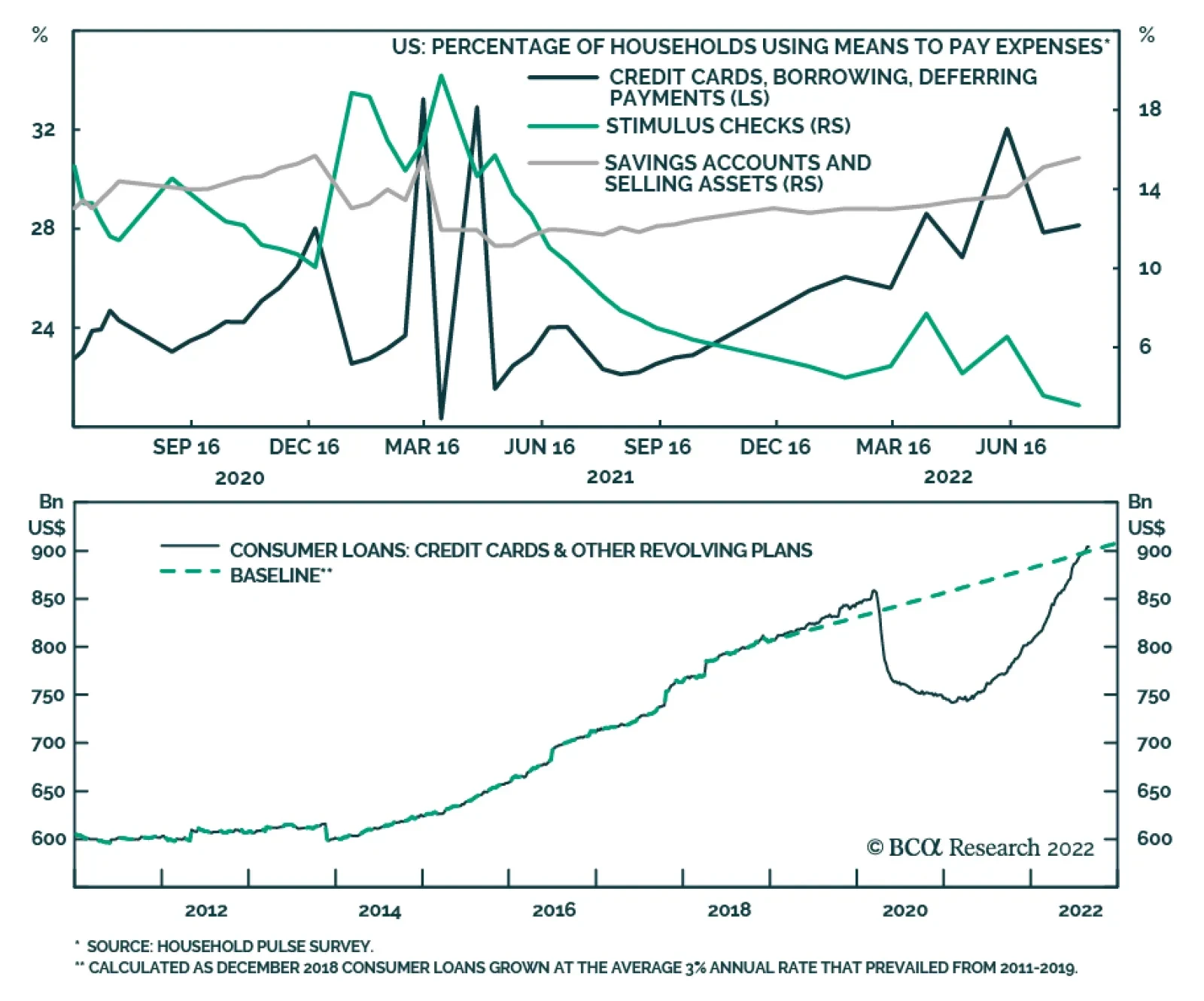
Data from the Census Bureau’s Household Pulse Survey highlight that the share of households using credit cards, borrowings and other forms of deferring payments has steadily increased since mid-2021. This data corroborates soaring credit card balances over…
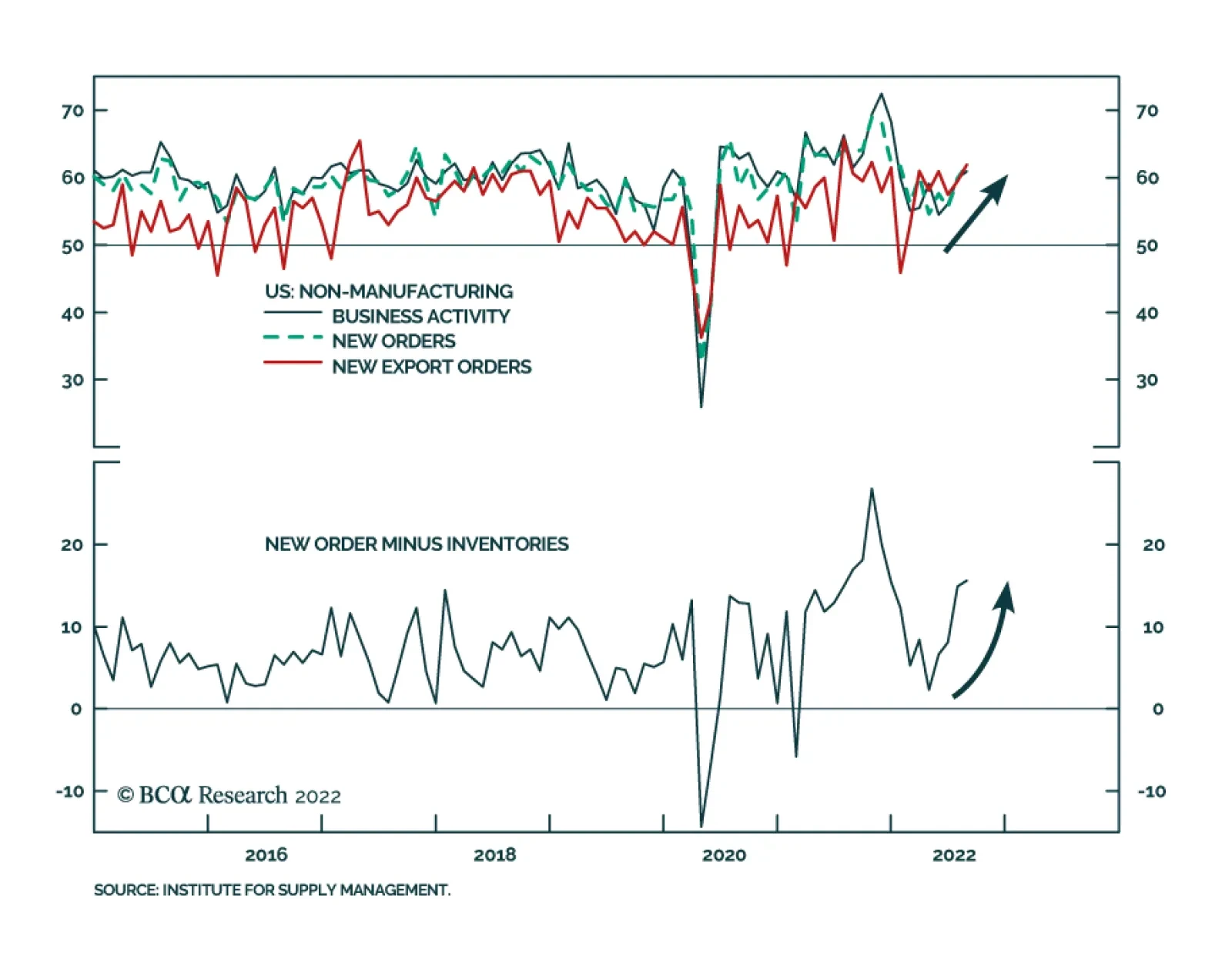
The ISM Services index rose to 56.9 in August from 56.7 and against expectations it would decelerate. The details of the release are even more encouraging. The Business Activity index firmed 1.0 ppt to 60.9, New Orders and New Export Orders increased by 1.9…

Highlights Chart 1A Hot Labor Market
A Hot Labor Market
A Hot Labor Market
The balance of data that’s come out during the past month points to a labor market that is not cooling very quickly. In fact, it is cooling much more slowly than we anticipated. First, nonfarm payroll growth of +315k in August is well above the +79k that is needed to maintain the unemployment and participation rates at current levels (Chart 1). Second, what had initially looked like a significant drop in job openings was revised away with the July JOLTS report. While the ratio of job openings to unemployed has leveled-off just below 2.0, it is no longer showing any signs of falling (bottom panel). Finally, the employment component of August’s ISM Manufacturing PMI jumped back above 50 and even initial unemployment claims have reversed their nascent uptrend. The conclusion we draw from this spate of strong employment data is that the Fed’s tightening cycle is not close to over. This means that the average fed funds rate that is priced into markets for 2023 is almost certainly too low. Feature Table 1 Recommended Portfolio Specification Table 2Fixed Income Sector Performance
Still Too Hot
Still Too Hot
Table 3A Corporate Sector Relative Valuation And Recommended Allocation* Table 3BCorporate Sector Risk Vs. Reward*
Still Too Hot
Still Too Hot
Investment Grade: Underweight Chart 2Investment Grade Market Overview
Investment Grade Market Overview
Investment Grade Market Overview
Investment grade corporate bonds outperformed the duration-equivalent Treasury index by 8 basis points in August, bringing year-to-date excess returns up to -267 bps. The average index option-adjusted spread tightened 4 bps on the month, and it currently sits at 145 bps. Our quality-adjusted 12-month breakeven spread ticked up to its 56th percentile since 1995 (Chart 2). A report from a few months ago made the case for why investors should underweight investment grade corporate bonds on a 6-12 month investment horizon.1 The main rationale for this recommendation is that the slope of the Treasury curve suggests that the credit cycle is in its late stages. Corporate bond performance tends to be weak during periods when the yield curve is very flat or inverted. Despite our underweight 6-12 month investment stance, we wouldn’t be surprised to see some modest spread narrowing during the next couple of months as inflation heads lower. That said, spread compression will be limited by the inverted yield curve and the persistent removal of monetary accommodation. A recent report dug deeper into the corporate bond space and concluded that investment grade-rated Energy bonds offer exceptional value on a 6-12 month horizon.2 That report also concluded that long maturity investment grade corporates are attractively priced relative to short maturity bonds. High-Yield: Neutral Chart 3High-Yield Market Overview
High-Yield Market Overview
High-Yield Market Overview
High-Yield underperformed the duration-equivalent Treasury index by 28 basis points in August, dragging year-to-date excess returns down to -519 bps. The average index option-adjusted spread tightened 15 bps on the month and it currently sits at 494 bps, 125 bps above the 2017-19 average and 43 bps below the 2018 peak. The 12-month spread-implied default rate – the default rate that is priced into the junk index assuming a 40% recovery rate on defaulted debt and an excess spread of 100 bps – increased modestly in August. It currently sits at 6.6% (Chart 3). As is the case with investment grade, high-yield spreads could stage a relief rally during the next few months as inflation falls and recession fears abate. However, the inverted yield curve will likely prevent spreads from moving much below the average level seen during the last tightening cycle (2017-19). All that said, even a move back to average 2017-19 levels would equate to a roughly 7% excess return for the junk index if it is realized over a six month period. This return potential is the main reason to prefer high-yield over investment grade in a US bond portfolio. While we maintain a neutral (3 out of 5) allocation to high-yield for now, we will downgrade the sector if spreads tighten to the 2017-19 average or if core inflation falls back to our 4% estimate of its underlying trend.3 MBS: Underweight Chart 4MBS Market Overview
MBS Market Overview
MBS Market Overview
Mortgage-Backed Securities underperformed the duration-equivalent Treasury index by 100 basis points in August, dragging year-to-date excess returns down to -144 bps. We discussed the outlook for Agency MBS in a recent report.4 We noted that MBS’ poor performance in 2021 and early-2022 was driven by duration extension. Fewer homeowners refinanced their loans as mortgage rates rose, and the MBS index’s average duration increased (Chart 4). But now, the index’s duration extension is over. The average convexity of the MBS index is close to zero (panel 3), meaning that duration is now insensitive to changes in rates. This is because hardly any homeowners have an incentive to refinance at current mortgage rates. With the duration extension trade over, the only thing preventing us from increasing exposure to the Agency MBS space is that spreads still aren’t sufficiently attractive. The average index spread versus duration-matched Treasuries is roughly midway between its post-2014 minimum and post-2014 mean (panel 4). Meanwhile, the option-adjusted spread has moved above its post-2014 mean (bottom panel), but at just 42 bps, it still offers less compensation than a Aa-rated corporate bond or a Aaa-rated consumer ABS. At the coupon level, we moved to a neutral allocation across the coupon stack last month, but this month we initiate a recommendation to favor high-coupon (3%-4.5%) securities over low coupon (1.5%-2.5%) ones. Given the lower duration of high coupon MBS, this position will profit from rising bond yields on a 6-12 month investment horizon. Emerging Market Bonds (USD): Underweight Chart 5Emerging Markets Overview
Emerging Markets Overview
Emerging Markets Overview
Emerging Market bonds outperformed the duration-equivalent Treasury index by 156 basis points in August, bringing year-to-date excess returns up to -563 bps. EM Sovereigns outperformed the Treasury benchmark by 117 bps on the month, bringing year-to-date excess returns up to -677 bps. The EM Corporate & Quasi-Sovereign Index outperformed by 180 bps, bringing year-to-date excess returns up to -491 bps. The EM Sovereign index outperformed the duration-equivalent US corporate bond index by 111 bps in August. Meanwhile, the yield differential between EM sovereigns and US corporates moved deeper into negative territory (Chart 5). As such, we continue to recommend a maximum underweight (1 out of 5) allocation to EM sovereigns. The EM Corporate & Quasi-Sovereign Index outperformed duration-matched US corporates by 168 bps in August. The index continues to offer a significant yield advantage versus duration-matched US corporates (panel 4). As such, we continue to recommend a neutral (3 out of 5) allocation to the sector. China is the most important trading partner for most EM countries and thus represents a major source of economic growth. Consequently, Chinese import volumes are a useful gauge for the outlook of EM economies. The persistent contraction of Chinese import volumes (bottom panel) therefore sends a negative signal for EM bond performance. Municipal Bonds: Overweight Chart 6Municipal Market Overview
Municipal Market Overview
Municipal Market Overview
Municipal bonds outperformed the duration-equivalent Treasury index by 126 basis points in August, bringing year-to-date excess returns up to -44 bps (before adjusting for the tax advantage). We view the municipal bond sector as better placed than most to cope with the recent bout of spread volatility. As we noted in a recent report, state & local government revenue growth has been strong, but governments have been slow to hire (Chart 6).5 The result is that net state & local government savings are incredibly high (bottom panel) and it will take some time to deplete those coffers. On the valuation front, munis have cheapened up relative to both Treasuries and corporates since last year. The 10-year Aaa Muni / Treasury yield ratio is currently 82%, up from its 2021 trough of 55%. The yield ratio between 12-17 year munis and duration-matched corporate bonds is also up significantly off its lows (panel 2). We reiterate our overweight allocation to municipal bonds within US fixed income portfolios, and we continue to have a strong preference for long-maturity munis. The yield ratio between 17-year+ General Obligation municipal bonds and duration-matched US corporates is 80%. The same measure for Revenue bonds is 94%, just below parity even without considering municipal debt’s tax advantage. Treasury Curve: Buy 5/30 Barbell Versus 10-Year Bullet Chart 7Treasury Yield Curve Overview
Treasury Yield Curve Overview
Treasury Yield Curve Overview
The Treasury curve bear-flattened in August as investors significantly marked up their 12-month rate expectations. Our 12-month Fed Funds Discounter – the market’s expected 12-month change in the funds rate – rose from 78 bps to 175 bps during the month and this caused the 2-year/10-year Treasury slope to flatten by 8 bps and the 5-year/30-year Treasury slope to flatten by 33 bps (Chart 7). We initiated a position in 5/30 flatteners (short 10-year bullet versus duration-matched 5/30 barbell) in our August 9th report.6 The main reason for this recommendation is our view that the Fed tightening cycle is not close to over. Therefore, it is too soon to position for a steepening of the 5-year/30-year Treasury slope. An analysis of past Fed tightening cycles shows that the 5-year/30-year Treasury slope tends to trough earlier than other segments of the yield curve. However, that trough has always occurred within a window spanning five months before the last Fed rate hike and three months after.7 On average, the 5-year/30-year slope troughs 1-2 months before the last Fed rate hike. Given our view that the Fed tightening cycle still has a lot of room to run, we think it makes sense to bet on a further flattening of the 5-year/30-year slope. This trade looks particularly attractive when you consider that a position short the 10-year bullet and long a duration-matched 5/30 barbell provides a yield pick-up of 12 bps (bottom panel). TIPS: Neutral Chart 8TIPS Market Overview
TIPS Market Overview
TIPS Market Overview
TIPS outperformed the duration-equivalent nominal Treasury index by 8 basis points in August, bringing year-to-date excess returns up to +264 bps. The 10-year TIPS breakeven inflation rate fell 5 bps on the month, moving back into the Fed’s 2.3% - 2.5% comfort zone (Chart 8). Meanwhile, our TIPS Breakeven Valuation Indicator shows that 10-year TIPS are close to fairly valued versus nominals. In a recent report we unveiled our Golden Rule of TIPS Investing.8 In that report we showed that TIPS of all maturities tend to outperform equivalent-maturity nominal bonds whenever headline CPI inflation exceeds the 1-year CPI swap rate during a 12-month period. The 1-year CPI swap rate is currently 2.77%, and we think this will turn out to be too low based on our modeling of headline CPI. While we see value in TIPS relative to nominals, especially at the front-end of the curve, we also suspect that more value will be created during the next few months as CPI prints come in soft. Therefore, we are reluctant to immediately upgrade TIPS to overweight. Instead, we recommend that investors initiate a 2-year/10-year TIPS breakeven inflation curve flattener. The 2/10 TIPS breakeven inflation curve has recently jumped into positive territory (bottom panel), but an inverted inflation curve is much more consistent with the current macro environment where the Fed is battling above-target inflation. ABS: Overweight Chart 9ABS Market Overview
ABS Market Overview
ABS Market Overview
Asset-Backed Securities outperformed the duration-equivalent Treasury index by 27 basis points in August, bringing year-to-date excess returns up to -25 bps. Aaa-rated ABS outperformed by 19 bps on the month, bringing year-to-date excess returns up to -24 bps. Non-Aaa ABS outperformed by 76 bps on the month, bringing year-to-date excess returns up to -28 bps. Substantial federal government support caused US households to build up an extremely large buffer of excess savings during the past two years. This year, consumers are starting to draw down that savings and are even starting to take on more debt. The amount of outstanding credit card debt is still low relative to household income, but it is rising quickly in absolute terms (Chart 9). Elsewhere, consumers are still paying down their credit card balances at high rates (panel 4), but banks are no longer easing lending standards on auto loans or credit cards (panel 3). To us, the prevailing evidence suggests that it will be a long time before delinquencies are a serious problem for consumer ABS. This justifies our overweight recommendation. That said, given that the trend toward consumer re-leveraging is in full swing, it makes sense to turn more cautious at the margin. We therefore close our prior recommendation to favor non-Aaa over Aaa-rated consumer ABS and move to a neutral allocation across the consumer ABS credit curve. Non-Agency CMBS: Overweight Neutral Chart 10CMBS Market Overview
CMBS Market Overview
CMBS Market Overview
Non-Agency Commercial Mortgage-Backed Securities outperformed the duration-equivalent Treasury index by 26 basis points in August, bringing year-to-date excess returns up to -150 bps. Aaa Non-Agency CMBS outperformed Treasuries by 20 bps on the month, bringing year-to-date excess returns up to -103 bps. Non-Aaa Non-Agency CMBS outperformed by 41 bps on the month, bringing year-to-date excess returns up to -280 bps. CMBS spreads remain wide compared to other similarly risky spread products and are currently close to their historic averages. However, the most recent Senior Loan Officer Survey showed tightening lending standards and weaker demand for commercial real estate (CRE) loans (Chart 10). This suggests a more negative back-drop for CRE prices and CMBS spreads and causes us to reduce our recommended allocation from overweight (4 out of 5) to neutral (3 out of 5). Agency CMBS: Overweight Agency CMBS underperformed the duration-equivalent Treasury index by 29 basis points in August, dragging year-to-date excess returns down to -44 bps. The average index option-adjusted spread held flat on the month, close to its long-term average (bottom panel). At 55 bps, the average Agency CMBS spread continues to look attractive compared to other similarly risky spread products. Stay overweight. Appendix A: The Golden Rule Of Bond Investing We follow a two-step process to formulate recommendations for bond portfolio duration. First, we determine the change in the federal funds rate that is priced into the yield curve for the next 12 months. Second, we decide – based on our assessments of the economy and Fed policy – whether the change in the fed funds rate will exceed or fall short of what is priced into the curve. Most of the time, a correct answer to this question leads to the appropriate duration call. We call this framework the Golden Rule Of Bond Investing, and we demonstrated its effectiveness in the US Bond Strategy Special Report, “The Golden Rule Of Bond Investing”, dated July 24, 2018. Chart 11 illustrates the Golden Rule’s track record by showing that the Bloomberg Barclays Treasury Master Index tends to outperform cash when rate hikes fall short of 12-month expectations, and vice-versa. At present, the market is priced for 175 basis points of rate hikes during the next 12 months. Chart 11The Golden Rule's Track Record
The Golden Rule's Track Record
The Golden Rule's Track Record
We can also use our Golden Rule framework to make 12-month total return and excess return forecasts for the Bloomberg Barclays Treasury index under different scenarios for the fed funds rate. Excess returns are relative to the Bloomberg Barclays Cash index. To forecast total returns we first calculate the 12-month fed funds rate surprise in each scenario by comparing the assumed change in the fed funds rate to the current value of our 12-month discounter. This rate hike surprise is then mapped to an expected change in the Treasury index yield using a regression based on the historical relationship between those two variables. Finally, we apply the expected change in index yield to the current characteristics (yield, duration and convexity) of the Treasury index to estimate total returns on a 12-month horizon. The below tables present those results, along with excess returns for a front-loaded and a back-loaded rate hike scenario. Excess returns are calculated by subtracting assumed cash returns in each scenario from our total return projections.
Still Too Hot
Still Too Hot
Appendix B: Butterfly Strategy Valuations The following tables present the current read-outs from our butterfly spread models. We use these models to identify opportunities to take duration-neutral positions across the Treasury curve. The following two Special Reports explain the models in more detail: US Bond Strategy Special Report, “Bullets, Barbells And Butterflies”, dated July 25, 2017, available at usbs.bcaresearch.com US Bond Strategy Special Report, “More Bullets, Barbells And Butterflies”, dated May 15, 2018, available at usbs.bcaresearch.com Table 4 shows the raw residuals from each model. A positive value indicates that the bullet is cheap relative to the duration-matched barbell. A negative value indicates that the barbell is cheap relative to the bullet. Table 4Butterfly Strategy Valuation: Raw Residuals In Basis Points (As Of September 1, 2022)
Still Too Hot
Still Too Hot
Table 5 scales the raw residuals in Table 4 by their historical means and standard deviations. This facilitates comparison between the different butterfly spreads. Table 5Butterfly Strategy Valuation: Standardized Residuals (As Of September 1, 2022)
Still Too Hot
Still Too Hot
Table 6 flips the models on their heads. It shows the change in the slope between the two barbell maturities that must be realized during the next six months to make returns between the bullet and barbell equal. For example, a reading of -7 bps in the 5 over 2/10 cell means that we would expect the 5-year to outperform the 2/10 if the 2/10 slope flattens by less than 7 bps during the next six months. Otherwise, we would expect the 2/10 barbell to outperform the 5-year bullet. Table 6Discounted Slope Change During Next 6 Months (BPs)
Still Too Hot
Still Too Hot
Appendix C: Excess Return Bond Map The Excess Return Bond Map is used to assess the relative risk/reward trade-off between different sectors of the US bond market. It is a purely computational exercise and does not impose any macroeconomic view. The Map’s vertical axis shows 12-month expected excess returns. These are proxied by each sector’s option-adjusted spread. Sectors plotting further toward the top of the Map have higher expected returns and vice-versa. Our novel risk measure called the “Risk Of Losing 100 bps” is shown on the Map’s horizontal axis. To calculate it, we first compute the spread widening required on a 12-month horizon for each sector to lose 100 bps or more relative to a duration-matched position in Treasury securities. Then, we divide that amount of spread widening by each sector’s historical spread volatility. The end result is the number of standard deviations of 12-month spread widening required for each sector to lose 100 bps or more versus a position in Treasuries. Lower risk sectors plot further to the right of the Map, and higher risk sectors plot further to the left. Chart 12Excess Return Bond Map (As Of September 1, 2022)
Still Too Hot
Still Too Hot
Ryan Swift US Bond Strategist rswift@bcaresearch.com Robert Timper Research Analyst robert.timper@bcaresearch.com Footnotes 1 Please see US Bond Strategy / Global Fixed Income Strategy Special Report, “Turning Defensive On US Corporate Bonds”, dated April 12, 2022. 2 Please see US Bond Strategy / Global Fixed Income Strategy Special Report, “Looking For Opportunities In US & European Corporates After The Recent Selloff”, dated May 31, 2022. 3 For more details on this call please see US Bond Strategy Weekly Report, “When The Dual Mandates Clash”, dated June 28, 2022. 4 Please see US Bond Strategy Weekly Report, “The Bond Market Implications Of A 5% Mortgage Rate”, dated April 26, 2022. 5 Please see US Bond Strategy Weekly Report, “Echoes Of 2018”, dated May 24, 2022. 6 Please see US Bond Strategy Weekly Report, “The Great Soft Landing Debate”, dated August 9, 2022. 7 In our analysis we examined seven Fed tightening cycles. The five most recent cycles and the two cycles that occurred during the inflation spike of the early 1980s. 8 Please see US Bond Strategy Special Report, “The Golden Rule Of TIPS Investing”, dated August 23, 2022. Recommended Portfolio Specification Other Recommendations Treasury Index Returns Spread Product Returns
Dear client, We will not be publishing the US Equity Strategy next week, as I will be participating in BCA Investment Conference. We will return to our regular publishing schedule on September 19, 2022. Kind Regards, Irene Tunkel Executive Summary Most Thematic ETFs Are Far Off Their Pandemic Peaks
Recap Of Long-term Investment Themes
Recap Of Long-term Investment Themes
In today’s sector Chart I-pack report we recap our structural investment themes. EV Revolution: The EV cohort benefits from a structural transformation of the automobile industry that is further supported by favorable legislative tailwinds, and shifting consumer preferences. Generation Z: Generation Zers are coming of age and wield an increasing influence over consumer trends. Cybersecurity: The pandemic-driven shift to remote work, broad-based migration to cloud computing and increasing geopolitical tensions, are all structural forces that will ensure a healthy demand pipeline for cybersecurity companies. Green And Clean: Green energy is becoming cheaper to produce, which supports a wider adaptation of green technologies. Green tech also enjoys favorable legislative tailwinds that are coming on the back of rising geopolitical tensions, the ongoing energy crisis, and climate change action. Renewables help to diversify energy sources and offer a path towards energy security. Bottom Line: Thematic investments that capture the latest technological breakthroughs present unprecedented long-term investment opportunities for investors who can stomach short-term volatility. Feature This week we are sending you a Sector Chart I-Pack, which offers macro, fundamentals, valuations, technicals, and uses of cash charts for each sector. In the front section of this publication, we will overview recent equity performance and provide a recap of the US Equity Strategy structural investment themes. August – When The Rally Came To A Stall As we predicted in the “What Will Bring This Rally To A Halt?” report, the “inflation is turning, and the Fed will be dovish” rally has come to a screeching halt. The S&P 500 was down 8% in August as investors finally believe that Jay Powell’s Fed is hell-bound on extinguishing inflation even if it means squelching economic growth (Chart I-1). The message from Jackson Hole was very much Mario Draghi-like: “whatever it takes.” The market reaction was swift and brutal. The rally winners were in the epicenter of the sell-off that ensued on the back of Powell’s comments. Invesco QQQ Trust is already down nearly 9% off its August 16 peak, while Ark Innovation (ARKK) is down 13% (Chart I-2). We expect that equities will continue to revert to their pre-summer lows. Chart I-1Summer Rally Winners Are At The Epicenter Of The Sell-off
Recap Of Long-term Investment Themes
Recap Of Long-term Investment Themes
Chart I-2Most Thematic ETFs Are Far Off Their Pandemic Peaks
Recap Of Long-term Investment Themes
Recap Of Long-term Investment Themes
With rates on the rise again, last week we shifted our overweight of Growth and underweight of Value to a neutral allocation. The last few months have been a rollercoaster. However, long-term investors may successfully survive the grind by resolutely sticking to some of the winning structural investment themes and ignoring short-term volatility. The fact that many themes are now more than 50% off their pandemic highs may indicate an opportune entry point. EV Revolution We initiated the EV Revolution theme in June 2021. Since then, the theme has outperformed the S&P 500 by 19%. The Auto and Components industry group is in the middle of a momentous transition to electric and autonomous vehicle manufacturing, thanks to technological advances in battery storage, AI, and radars. These technological breakthroughs help overcome most of the obstacles to the wide adoption of EVs. Multiple new entrants develop charging networks. Driving ranges are also rapidly increasing – Lucid promises a 500-mile range compared to Tesla’s 350. Couple that with the rising price of gas, the aging vehicle fleet, and the expectation that EVs will approach sticker parity with gas-powered cars as soon as 2023 (Chart I-3) and there is no turning back to gas-guzzling vehicles. LMC Automotive forecasts that by 2031, EVs will reach 17 million units. Chart I-3EVs Will Reach Price Parity With ICEs In 2023
Recap Of Long-term Investment Themes
Recap Of Long-term Investment Themes
The entire EV cohort also benefits from favorable legislative tailwinds, thanks to this administration’s support of decarbonization. The Inflation Reduction Act (IRA) includes approximately $370 billion in clean energy spending, as well as EV tax credits for both new and used cars. In addition, executive action by President Biden has tightened fuel economy standards. California has mandated a complete switch to EV vehicles by 2035. The surge in EV Capex and R&D spending will boost the entire supply chain, which consists of chip manufacturers, battery and lidar R&D, part manufacturers, and charging networks. Many of these companies are still small. An ETF may be the best way to capture the theme (Table I-1). Table I-1EV/AV ETFs
Recap Of Long-term Investment Themes
Recap Of Long-term Investment Themes
Generation Z: The Digital Natives The GenZ theme, which we identified exactly a year ago, has collapsed since the beginning of the market downturn and is down 47%. Its success was at the root of its demise – it captured overcrowded names most popular among GenZers, who are avid investors (Chart I-4). However, the theme is not “dead,” as a new cohort of Americans is coming of age, and they are not shy about it. Generation Z in the US includes 62 million people born between 1997 and 2012 (Chart I-5). With $143B in buying power in the US alone making up nearly 40% of all consumer sales, Gen Z wields increasing influence over consumer trends. This is the first generation of digital natives—they simply can’t remember the world without the internet. They are the early adopters of the new digital ways to bank, get medical treatments, and learn. Gen Z is joining the workforce and replacing retiring baby boomers. Chart I-4Gen Zers Are Avid Investors...
Recap Of Long-term Investment Themes
Recap Of Long-term Investment Themes
Chart I-5Gen Zers Are Taking Over
Recap Of Long-term Investment Themes
Recap Of Long-term Investment Themes
Gen Z is an umbrella theme that captures many other prominent themes, such as Fintech (Paypal & Social Finance), Crypto (COIN), Meme-investing (HOOD), Gaming and Alternative Reality (GAMR & ESPO), and Online Dating. But GenZers have a few behavioral quirks that make them different even from Millennials: Quality-Over-Price Shoppers: Gen Z was found to be less price sensitive when buying products, choosing quality over price. Lululemon (LULU) and Goose (GOOS) are among Gen Z’s favorites. Healthy Lifestyle: Gen Z is a “green” generation that deeply cares about the planet, loves the outdoors and traveling, and is crazy about pets. This is also a generation that prizes a healthy lifestyle and working out: Beyond Meat (BYND), Planet Fitness (PLNT), and Yeti (YETI). Generation Sober Chooses Cannabis: GenZers perceive hard liquor and tobacco as bad for their health. Curiously, marijuana is considered “healthy.” MSOS, CNBS, YOLO, and THCX are the biggest ETFs in this space. How To Invest In Gen Z? Gen Z is a nascent investment theme, so there are no ETFs available in the market yet. We propose that investors follow our Gen Z investment themes or replicate fully or partially our Gen Z basket. Cybersecurity: A Must-Have For Survival Despite its celebrity status, this is an industry that is still in the early innings of a growth cycle. The pandemic-driven shift to remote work, broad-based migration to cloud computing, development of the internet-of-things, and increasing geopolitical tensions create new targets for hackers who are after valuable data or just want to achieve maximum damage to the networks. Ubiquitous digitization requires increasingly more complex cyber defenses. With cybercrime costing the world nearly $600 billion each year and cyberattacks increasing in number and sophistication, the global cybersecurity market is expected to grow from $125 billion in 2020 to $175 billion by 2024. Both large and small businesses are yet to fully implement cybersecurity defenses. According to a survey by Forbes magazine, 55% of business executives plan to increase their budgets for cybersecurity in 2021 aiming to prevent malicious attacks. In response to the numerous breaches, the current US administration is placing a high priority on defensive cyber programs. Since 2017, US government departments have seen the cybersecurity share of their basic discretionary funding rise steadily from 1.38% to 1.73%. These developments are a boon for cybersecurity stocks (Chart I-6 & Chart I-7 ), the sales of which are soaring (Chart I-8). Chart I-6Cybercrime Losses Spur Demand for Cybersecurity
Cybercrime Losses Spur Demand for Cybersecurity
Cybercrime Losses Spur Demand for Cybersecurity
Chart I-7Stepped Up Government Spending Will Lift Cybersecurity Stocks
Stepped Up Government Spending Will Lift Cybersecurity Stocks
Stepped Up Government Spending Will Lift Cybersecurity Stocks
Chart I-8Cybersecurity Sales Are Soaring
Cybersecurity Sales Are Soaring
Cybersecurity Sales Are Soaring
We introduced cybersecurity as a structural investment theme back in October 2021. So far, the CIBR ETF, which we use as a proxy for the performance of the theme, has underperformed the S&P 500 by 11%. Monetary tightening has weighed on the performance of these companies as they tend to be younger, smaller, and less profitable than their S&P 500 counterparts, i.e., CIBR has a strong small-cap growth bias. However, with cybersecurity stocks down 26% off their November-2021 peak and valuation premium back to earth, now may be an opportune moment to add to the theme. After all, these stocks have tremendous growth potential, warranting a long-term position in most equity portfolios. There are several highly liquid ETFs powered by the cybersecurity theme, such as CIBR, BUG, and HACK, which can be excellent investment vehicles (Table I-2). Table I-2Cybersecurity ETFs
Recap Of Long-term Investment Themes
Recap Of Long-term Investment Themes
Green And Clean We introduced the “Green and Clean” theme back in March. Since then, it has outperformed the S&P 500 by 22%, benefiting from this administration’s focus on the mitigation of climate change. Putin’s energy stand-off with Europe has also put the industry into the global spotlight. The development of renewables will help diversify energy sources and offer a path toward energy security. Thus, renewable energy and cleantech companies are at the core of the global push to increase energy security and contain climate change. The International Renewable Energy Agency (IRENA) expects renewables to scale up from 14% of total energy today to around 40% in 2030. Global annual additions of renewable power would triple by 2030 as recommended by the Intergovernmental Panel on Climate Change (IPCC). Solar and wind power will attract the lion’s share of investments. Over the past 20 years, this country has made significant strides in shifting its energy generation toward renewable sources away from fossil fuels, increasing the share of clean energy from 3.7% in 2000 to 10% in 2020 (Chart I-9). Chart I-9A Structural Trend
A Structural Trend
A Structural Trend
The key reason for the proliferation of green energy generation is that renewable electricity is becoming cheaper than electricity produced by fossil fuels – according to IRENA, 62% of the added renewable power generation capacity had lower electricity costs than the cheapest source of new fossil fuel-fired capacity. Costs for renewable technologies continued to fall significantly over the past year (Chart I-10). Renewables are similar to traditional utility companies: They require a massive upfront investment, but also enjoy substantial operating leverage. As production capacity increases, the cost of energy generation falls. Solar power generation is a case in point (Chart I-11). Hence, we have a positive reinforcement loop: more usage begets even more usage, bolstering the economic case for transitioning to cleaner energy resources. Chart I-10R&D Is Paying Off
Recap Of Long-term Investment Themes
Recap Of Long-term Investment Themes
Chart I-11Capacity Is Inversely Correlated To Prices
Recap Of Long-term Investment Themes
Recap Of Long-term Investment Themes
Increased renewables adaptation is possible thanks to several technological advancements including improved battery storage, implementation of smart grid networks, and an increase in carbon capture activities. There is a host of ETFs that offer investors a wide range of choices for access to renewable energy and cleantech themes (Table I-3). These ETFs differ in geographic span, industry focus, liquidity, and cost, but all are viable investment options. Table I-3Clean Tech ETFs
Recap Of Long-term Investment Themes
Recap Of Long-term Investment Themes
Bottom Line Thematic investments that capture the latest technological breakthroughs present unprecedented long-term investment opportunities. However, these investments come with a warning: Technological innovation themes are intrinsically risky as they are rarely immediately profitable and require both continuous investment and technological breakthroughs to succeed. Also, most technological innovation themes carry high exposure to the small-cap growth style and are sensitive to rising rates and slowing growth. As such, they are fickle over the short term but pay off over a longer investment horizon. Irene Tunkel Chief Strategist, US Equity Strategy irene.tunkel@bcaresearch.com S&P 500 Chart II-1Macroeconomic Backdrop
Macroeconomic Backdrop
Macroeconomic Backdrop
Chart II-2Profitability
Profitability
Profitability
Chart II-3Valuations And Technicals
Valuations And Technicals
Valuations And Technicals
Chart II-4Uses Of Cash
Uses Of Cash
Uses Of Cash
Communication Services Chart II-5Macroeconomic Backdrop
Macroeconomic Backdrop
Macroeconomic Backdrop
Chart II-6Profitability
Profitability
Profitability
Chart II-7Valuations And Technicals
Valuations And Technicals
Valuations And Technicals
Chart II-8Uses Of Cash
Uses Of Cash
Uses Of Cash
Consumer Discretionary Chart II-9C Macroeconomic Backdrop
C Macroeconomic Backdrop
C Macroeconomic Backdrop
Chart II-10Profitability
Profitability
Profitability
Chart II-11Valuations And Technicals
Valuations And Technicals
Valuations And Technicals
Chart II-12Uses Of Cash
Uses Of Cash
Uses Of Cash
Consumer Staples Chart II-13Macroeconomic Backdrop
Macroeconomic Backdrop
Macroeconomic Backdrop
Chart II-14Profitability
Profitability
Profitability
Chart II-15Valuations And Technicals
Valuations And Technicals
Valuations And Technicals
Chart II-16Uses Of Cash
Uses Of Cash
Uses Of Cash
Energy Chart II-17Macroeconomic Backdrop
Macroeconomic Backdrop
Macroeconomic Backdrop
Chart II-18Profitability
Profitability
Profitability
Chart II-19Valuations And Technicals
Valuations And Technicals
Valuations And Technicals
Chart II-20Uses Of Cash
Uses Of Cash
Uses Of Cash
Financials Chart II-21Macroeconomic Backdrop
Macroeconomic Backdrop
Macroeconomic Backdrop
Chart II-22Profitability
Profitability
Profitability
Chart II-23Valuations And Technicals
Valuations And Technicals
Valuations And Technicals
Chart II-24Uses Of Cash
Uses Of Cash
Uses Of Cash
Health Care Chart II-25Sector vs Industry Groups
Sector vs Industry Groups
Sector vs Industry Groups
Chart II-26Profitability
Profitability
Profitability
Chart II-27Valuations And Technicals
Valuations And Technicals
Valuations And Technicals
Chart II-28Uses Of Cash
Uses Of Cash
Uses Of Cash
Industrials Chart II-29Macroeconomic Backdrop
Macroeconomic Backdrop
Macroeconomic Backdrop
Chart II-30Profitability
Profitability
Profitability
Chart II-31Valuations And Technicals
Valuations And Technicals
Valuations And Technicals
Chart II-32Uses Of Cash
Uses Of Cash
Uses Of Cash
Information Technology Chart II-33Macroeconomic Backdrop
Macroeconomic Backdrop
Macroeconomic Backdrop
Chart II-34Profitability
Profitability
Profitability
Chart II-35Valuations And Technicals
Valuations And Technicals
Valuations And Technicals
Chart II-36Uses Of Cash
Uses Of Cash
Uses Of Cash
Materials Chart II-37Macroeconomic Backdrop
Macroeconomic Backdrop
Macroeconomic Backdrop
Chart II-38Profitability
Profitability
Profitability
Chart II-39Valuations And Technicals
Valuations And Technicals
Valuations And Technicals
Chart II-40Uses Of Cash
Uses Of Cash
Uses Of Cash
Real Estate Chart II-41Macroeconomic Backdrop
Macroeconomic Backdrop
Macroeconomic Backdrop
Chart II-42Profitability
Profitability
Profitability
Chart II-43Valuations And Technicals
Valuations And Technicals
Valuations And Technicals
Chart II-44Uses Of Cash
Uses Of Cash
Uses Of Cash
Utilities Chart II-45Macroeconomic Backdrop
Macroeconomic Backdrop
Macroeconomic Backdrop
Chart II-46Profitability
Profitability
Profitability
Chart II-47Valuations And Technicals
Valuations And Technicals
Valuations And Technicals
Chart II-48Uses Of Cash
Uses Of Cash
Uses Of Cash
Recommended Allocation Recommended Allocation: Addendum
What Our Clients Are Asking: The Bear Market 2.0 Webcast Follow Up
What Our Clients Are Asking: The Bear Market 2.0 Webcast Follow Up
Executive Summary Chair Powell’s Jackson Hole speech did not change our fundamental take on the economy; we still think the expansion will survive through the first half of 2023 at a minimum. Financial markets’ reaction to Powell’s remarks highlighted that volatility will likely remain elevated but we continue to expect that equities will generate meaningful excess returns over Treasuries and cash over the rest of the year. The flow of data continues to send mixed signals about the outlook for financial markets and the economy, but the biggest risks to our view are no closer to occurring today than they were when we laid them out last month. An Eventful Intermeeting Period
An Eventful Intermeeting Period
An Eventful Intermeeting Period
Bottom Line: We remain more optimistic than the consensus and continue to recommend a risk-friendly tilt in multi-asset portfolios over the next six months. We are still on high alert, however, and remain open to changing our views if incoming data begin to hint at an approaching inflection. Feature At the outset of a Zoom call last week, a US-based client asked if Chair Powell’s Jackson Hole speech had changed our view. The short answer is no, though it certainly roiled financial markets, providing the latest reminder that investors’ conviction levels should be lower than normal. This week’s report offers a longer answer, analyzing Powell’s comments while revisiting the risks to our view that we laid out in August. The principal risks have not gotten any closer to fruition and we therefore stand by our glass-half-full view, though we reiterate that it is contingent on incoming data flows – if they point to a worse outcome than our current base case, we may yet join the bearish chorus. The Fed Bigwigs Went To Grand Teton National Park … Chair Powell opened his speech by promising brevity, focus and directness and he delivered on all three counts. He used less than a third of his allotted 30 minutes to hammer home the Fed’s commitment to bringing inflation back to its 2% target and he didn’t mince words. The speech was short enough to allow the following close reading of it in which we excerpt a key line from nearly every paragraph, followed by our italicized takeaways. Powell: “Restoring price stability will take some time and requires using our tools forcefully to bring demand and supply into better balance.” US Investment Strategy: We are prepared to accept a lengthy stretch of subpar growth as the cost of getting inflation under control. Until further notice, fighting inflation takes precedence over encouraging growth. “The labor market … is clearly out of balance, with demand … substantially exceeding … supply[.]” The rip-roaring labor market is so strong that we have no choice but to lean against it given the inflation backdrop. “In current circumstances, … [the dots’] estimates of [the] longer-run neutral [fed funds rate] are not a place to stop or pause.” It will take a good bit more monetary tightening to get inflation back to the 2% target. “I said [in July] that another unusually large increase could be appropriate at our next meeting.” Another 75-basis point hike is on the table in September. The pace of increases will eventually slow, but we don’t yet know when. “Restoring price stability will likely require maintaining a restrictive policy stance for some time.” Don’t count on rate cuts any time soon. “[C]entral banks can and should take responsibility for delivering low and stable inflation.” The Fed is obligated to combat high inflation, even if some of its causes are beyond our control. Though we can’t relieve supply constraints, we can bring demand into better balance with supply. Related Report US Investment StrategyRisks To Our View (Again) “If the public expects that inflation will remain low and stable over time, absent major shocks, it likely will. Unfortunately, the same is true of expectations of high and volatile inflation.” High inflation expectations can be self-fulfilling and we cannot allow them to become entrenched à la the 1970s. “The longer the current bout of high inflation continues, the greater the chance that expectations of higher inflation will become entrenched.” We cannot take it for granted that inflation expectations will remain well anchored despite high inflation prints. The public’s focus on inflation threatens future price stability and future growth and we would be playing with fire if we didn’t address it now. “[W]e must keep at it until the job is done.” If we do not act forcefully now, the cost of getting inflation back to the 2% target will be much greater. “We will keep at it until we are confident the job is done.” In case you missed my first reference to Paul Volcker’s memoir, Keeping At It, a moment ago, or the two times I spoke his name, understand that we’re willing to do whatever it takes to getting the inflation genie back in the bottle. … And All Investors Got Was A Lousy Selloff Our italicized translations should have sent a chill down the spines of equity investors and the S&P 500 duly plunged 3.4% after Powell’s speech, then followed up by sliding as much as another 3.8% in last week's sessions. BCA has always viewed 2023 rate cuts as something of a pipe dream, and we have been relieved to see the money market raise its terminal fed funds rate estimate while pushing out the date it will be reached. As Chart 1 shows, the expected terminal rate has risen by about 75 basis points and rate cuts have been pushed back since the July FOMC meeting, but even Jackson Hole didn’t get investors to give up on them entirely. Our best guess is that they still question the Fed’s commitment in the face of a slowdown. Chart 1A Lot Can Change In Five Weeks
A Lot Can Change In Five Weeks
A Lot Can Change In Five Weeks
That interpretation offers a ready answer for why the glass-half-full view has taken a beating over the last six sessions but suggests that the glass-half-empty view could be at risk before too long. A higher terminal fed funds rate implies lower near-term earnings as well as a reduced willingness to pay for those earnings, so stocks have suffered as investors revised their expectations to better align with the Fed’s guidance. But the need to hike more and faster than investors expected underscores aggregate demand’s surprising resilience. If the labor market, consumption and corporate earnings all continue to hold up better than expected, equities have a path to move higher once the terminal rate outlook fully discounts the Jackson Hole rhetoric. Risks To Our View: Unanchored Inflation Expectations If it takes longer than markets expect for rate hikes to bite, and corporate earnings and economic growth surprise to the upside while inflation intrinsically recedes along with COVID's threat, underweight investors are likely to find themselves pulled back into equities. That scenario remains our base case, but it would become highly improbable if inflation expectations were to become unmoored, forcing the Fed to race to get the fed funds rate above 4% and keep it there. We therefore deem a breakout in inflation expectations to be an existential threat to our view. One month’s flat headline CPI reading certainly does not meet the Fed’s “clear and consistent” standard for falling inflation but various indications that consumer prices have peaked have begun to provide some near-term expectations relief. Two-year TIPS breakevens fell 35 basis points in two weeks, to 2.3%, their lowest level since January 2021 (Chart 2, top panel). Two-year CPI swap rates dipped 15 basis points in that stretch and are at their lowest level since last October (Chart 3, top panel). Intermediate- (Charts 2 and 3, middle panel) and long-term (Charts 2 and 3, bottom panel) expectations have ticked slightly higher in the last two weeks but reduced near-term expectations will take some of the pressure off them. Consumers see it the same way, with one-year inflation coming down sharply in the University of Michigan’s August survey (Chart 4, top panel) while long-term inflation expectations held steady at the bottom of the 2.9-3.1% range that has been in place for a year (Chart 4, bottom panel). Chart 2Way Lower Near-Term And ...
Way Lower Near-Term And ...
Way Lower Near-Term And ...
Chart 3... Range-Bound Longer-Term Expectations
... Range-Bound Longer-Term Expectations
... Range-Bound Longer-Term Expectations
Chart 4No Vicious Inflation Expectations Cycle Yet
No Vicious Inflation Expectations Cycle Yet
No Vicious Inflation Expectations Cycle Yet
Risks To Our View: Consumer Retrenchment Our sanguine take on economic growth and corporate earnings will be in trouble if consumers begin to hoard their excess savings. The Personal Income report released the morning of Powell’s Jackson Hole speech indicated that the aggregate household savings rate was just 5% in July, matching June’s downwardly revised number. We view the steadily declining trend (Chart 5) as ongoing validation of our thesis that consumers will deploy their excess savings to keep consumption and the US economy growing at trend, despite uncomfortably high inflation. Chart 5Staying Out Of The Paradox-Of-Thrift Trap
Staying Out Of The Paradox-Of-Thrift Trap
Staying Out Of The Paradox-Of-Thrift Trap
Risks To Our View: A Softening Labor Market The major labor market datapoints that have arrived over the last two weeks have been consistently robust. Job openings, which had appeared to have entered a steady decline, turned out to be in a holding pattern following a significant July beat and an upward revision to June’s reading. Before the release, job openings were projected to be 12.5% below their March peak; instead, they’ve only shrunk by 5%, or about 100,000 more than July’s net payroll additions (Chart 6, top panel). Meanwhile, job quits data softened a little more, falling for the fourth straight month (Chart 7, top panel) and pushing the quits rate to its lowest level since May 2021 (Chart 7, bottom panel). Taken together, the openings and quits data hint that a Goldilocks outcome – labor demand remains strong but not so strong that employees are able to command higher wages simply by walking to the competitor across the street – is not impossible. Chart 6Job Openings Have Gotten A Second Wind ...
Job Openings Have Gotten A Second Wind ...
Job Openings Have Gotten A Second Wind ...
Chart 7... While Quits Are Slowing
... While Quits Are Slowing
... While Quits Are Slowing
The four-week moving average of initial unemployment claims extended its modest decline after a smaller-than-expected number last week and a downward revision in the previous week’s estimate (Chart 8). Markets let out a sigh of relief after the August employment situation report managed to thread the needle,1 showing that net payrolls robust growth is gently moderating (Chart 9). The numbers below the headline were also encouraging; average hourly earnings increased just 0.3% from July and the labor force participation rate rose by 30 basis points to match the post-COVID high set in March (Chart 10). The part rate remains a full percentage point below its pre-COVID level, amounting to 2.75 million missing workers – if they were to return, payrolls would have room to expand even as the unemployment rate ticks higher. Chart 8Jobless Claims Have Been Falling Since Mid-July
Jobless Claims Have Been Falling Since Mid-July
Jobless Claims Have Been Falling Since Mid-July
Chart 9Payrolls Are Still Growing At A Healthy Clip
Payrolls Are Still Growing At A Healthy Clip
Payrolls Are Still Growing At A Healthy Clip
Chart 10Yet Another Supply Constraint
Yet Another Supply Constraint
Yet Another Supply Constraint
Investment Implications The data received over the last two weeks suggest that the economy retains considerable momentum. Solid nonfarm payrolls gains, the month-and-a-half interruption in initial unemployment claims’ uptrend and the job openings and job quits data paint a picture of a labor market that is still humming even as upward pressure on wages may be moderating. We continue to be heartened by the low and slightly declining savings rate, which lends support to our thesis that excess pandemic savings will provide households with a cushion to keep spending despite painful increases in the price of necessities. Finally, despite eye-popping inflation readings, household, business and investor inflation expectations have remained well anchored. Though the fundamentals have been good since we elaborated on the key risks to our view two weeks ago, the technical picture turned against us with a vengeance. The S&P 500 support at 4,175 folded like a cheap lawn chair after Chair Powell took to the podium at Jackson Hole. We are CFAs, not CMTs, though we posit that technical analysis has a place in fundamental practitioners’ processes as a means of identifying advantageous entry and exit points. Going forward, however, we will not float ideas about technical levels without explicitly defining stops to exit a position if the technical level fails to hold. The stock swoon that ensued after Jackson Hole underlines how much investors are hanging on the Fed. Any perceived change of emphasis or direction has the potential to scramble financial markets and we continue to advise that investors carefully manage their holding periods and benchmark deviations. Although we think the Fed will eventually force a sober reckoning for risk assets, we believe equities can outperform over the next three to six months and therefore recommend overweighting equities in multi-asset portfolios through the end of the year. If inflation decelerates over the rest of the year as we expect, the Fed’s rhetoric should become less frightening and risk assets should see renewed inflows as the gloomy scenarios take longer to arrive than the consensus currently expects. Doug Peta, CFA Chief US Investment Strategist dougp@bcaresearch.com Footnotes 1 As we went to press, however, equities were selling off sharply, apparently on reports of an extended Gazprom pipeline shutdown.
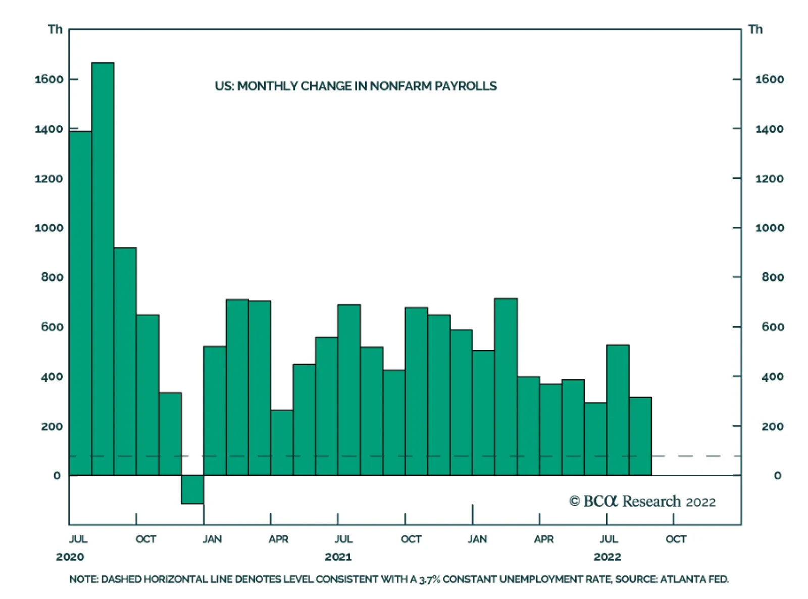
US nonfarm payrolls grew by a stronger-than-expected 315 thousand in August, down from 526 thousand in July. Professional and business services, health care, and retail trade drove the bulk of the job gains. Meanwhile, the unemployment rate ticked up from…
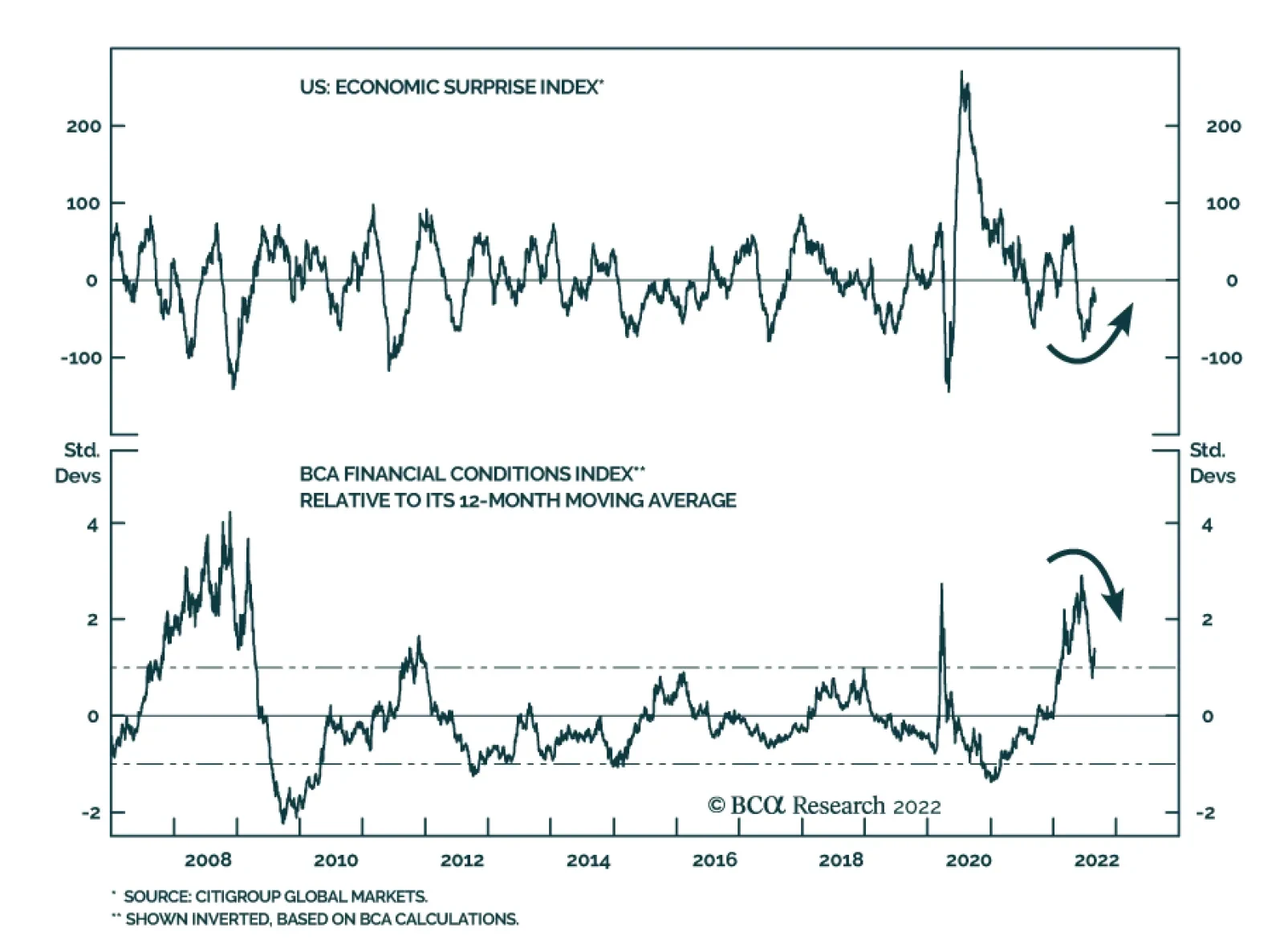
After collapsing earlier this year, the US economic surprise index is now becoming less negative and is likely to continue recovering over the coming months. First, economic surprises are a function of both the actual economic data as well as investors’…
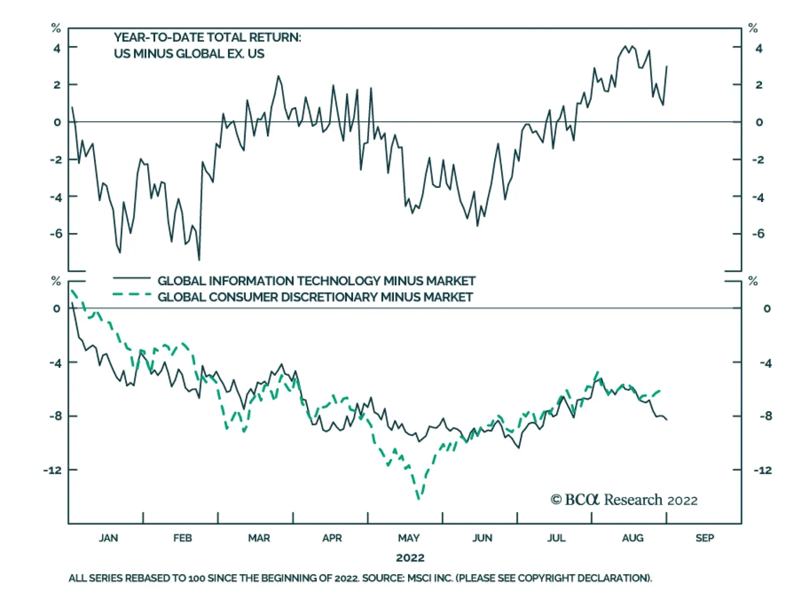
US stocks have outperformed their global counterparts by almost 3% year-to-date. On the surface this might be surprising: Sectors like Information Technology and Consumer Discretionary, which are overrepresented in the US stock market, have underperformed the…
Listen to a short summary of this report Executive Summary On the eve of the pandemic, most developed economies were operating at close to full capacity – the aggregate supply curve, in other words, had become very steep (or inelastic). Not surprisingly, in such an environment, pandemic-related stimulus, rather than boosting output, simply stoked inflation. Looking out, the inverse may turn out to be true: Just as an increase in aggregate demand did more to lift prices than output during the pandemic, a decrease in aggregate demand may allow inflation to fall without much loss in production or employment. Skeptics will argue that such benign disinflations rarely occur, pointing to the 1982 recession. But long-term inflation expectations were close to 10% back then. Today, they are broadly in line with the Fed’s target. Equities will recover from their recent correction as headline inflation continues to fall and the risks of a US recession diminish. Go long EUR/USD on any break below 0.99. Contrary to the prevailing pessimistic view, Europe is heading for a V-shaped recovery. The Aggregate Supply Curve Becomes Very Steep When Spare Capacity Is Exhausted
Inelastic Supply: The Secret To A Soft Landing?
Inelastic Supply: The Secret To A Soft Landing?
Bottom Line: The US economy is entering a temporary Goldilocks period of falling inflation and stronger growth. The latest correction in stocks will end soon. Investors should overweight global equities over the next six months but look to turn more defensive thereafter. Dear Client, I will be attending BCA’s annual conference in New York City next week. Instead of our regular report, we will be sending you a Special Report written by Mathieu Savary, BCA’s Chief European Strategist, and Robert Robis, BCA’s Chief Fixed Income Strategist, on Monday, September 12. Their report will discuss estimates of global neutral interest rates. We will resume our regular publication schedule on September 16. Best Regards, Peter Berezin, Chief Global Strategist The Hawks Descend On Jackson Hole Chart 1Markets Still Think The Fed Will Start Cutting Rates Next Year
Markets Still Think The Fed Will Start Cutting Rates Next Year
Markets Still Think The Fed Will Start Cutting Rates Next Year
Jay Powell’s Jackson Hole address jolted the stock market last week. Citing the historical danger of allowing inflation to remain above target for too long, the Fed chair stressed the need for “maintaining a restrictive policy stance for some time.” Powell’s comments were consistent with the Fed’s dot plot, which expects rates to remain above 3% right through to the end of 2024. However, with the markets pricing in rate cuts starting in mid 2023, his remarks came across as decidedly hawkish (Chart 1). While Fedspeak can clearly influence markets in the near term, our view is that the economy calls the shots over the medium-to-long term. The Fed sees the same data as everyone else. If inflation comes down rapidly over the coming months, the FOMC will ratchet down its hawkish rhetoric, opting instead for a wait-and-see approach. The Slope of Hope Could inflation fall quickly in the absence of a deep recession? The answer depends on a seemingly esoteric concept: the slope of the aggregate supply curve. Economists tend to depict the aggregate supply curve as being convex in nature – fairly flat (or “elastic”) when there is significant spare capacity and becoming increasingly steep (or “inelastic”) as spare capacity is exhausted (Chart 2). The basic idea is that firms do not require substantially higher prices to produce more output when they have a lot of spare capacity, but do require increasingly high prices to produce more output when spare capacity is low. Chart 2The Aggregate Supply Curve Becomes Very Steep When Spare Capacity Is Exhausted
Inelastic Supply: The Secret To A Soft Landing?
Inelastic Supply: The Secret To A Soft Landing?
When the aggregate supply curve is very elastic, an increase in aggregate demand will mainly lead to higher output rather than higher prices. In contrast, when the aggregate supply curve is inelastic, rising demand will primarily translate into higher prices rather than increased output. In early 2020, most of the developed world found itself on the steep side of the aggregate supply curve. The unemployment rate in the OECD stood at 5.3%, the lowest in 40 years (Chart 3). In the US, the unemployment rate had reached a 50-year low of 3.5%. Thus, not surprisingly, as fiscal and monetary policy turned simulative, inflation moved materially higher. Goods inflation, in particular, accelerated during the pandemic (Chart 4). Perhaps most notably, the exodus of people to the suburbs, combined with the reluctance to use mass transit, led to a surge in both new and used car prices (Chart 5). The upward pressure on auto prices was exacerbated by a shortage of semiconductors, itself a consequence of the spike in the demand for electronic goods. Chart 3The Pandemic Began When The Unemployment Rate In The OECD Was At A Multi-Decade Low
The Pandemic Began When The Unemployment Rate In The OECD Was At A Multi-Decade Low
The Pandemic Began When The Unemployment Rate In The OECD Was At A Multi-Decade Low
Chart 4With Supply Unable To Meet Demand, Goods Prices Surged During The Pandemic
With Supply Unable To Meet Demand, Goods Prices Surged During The Pandemic
With Supply Unable To Meet Demand, Goods Prices Surged During The Pandemic
The supply curve for labor also became increasingly inelastic over the course of the pandemic. Once the US unemployment rate fell back below 4%, wages began to accelerate sharply. The kink in the Phillips curve had been reached (Chart 6). Chart 5Car Prices Went On Quite A Ride During The Pandemic
Car Prices Went On Quite A Ride During The Pandemic
Car Prices Went On Quite A Ride During The Pandemic
Chart 6Wage Growth Soared When The Economy Moved Beyond Full Employment
Inelastic Supply: The Secret To A Soft Landing?
Inelastic Supply: The Secret To A Soft Landing?
Chart 7Job Switchers Usually See Faster Wage Growth
Job Switchers Usually See Faster Wage Growth
Job Switchers Usually See Faster Wage Growth
Faster labor market churn further turbocharged wage growth. Both the quits rate and the hiring rate rose during the pandemic. Typically, workers who switch jobs experience faster wage growth than those who do not (Chart 7). This wage premium for job switching increased during the pandemic, helping to lift overall wage growth. A Symmetric Relationship? All this raises a critical question: If an increase in aggregate demand along the inelastic side of the aggregate supply curve mainly leads to higher prices rather than increased output and employment, is the inverse also true – that is, would a comparable decrease in aggregate demand simply lead to much lower inflation without much of a loss in output or employment? If so, this would greatly increase the odds of a soft landing. Skeptics would argue that disinflations are rarely painless. They would point to the 1982 recession which, until the housing bubble burst, was the deepest recession in the post-war era. The problem with that comparison is that long-term inflation expectations were extremely high in the early 1980s. Both consumers and professional forecasters expected inflation to average nearly 10% over the remainder of the decade (Chart 8). To bring down long-term inflation expectations, Paul Volcker had to engineer a deep recession. Chart 8Long-Term Inflation Expectations Are Much Better Anchored Now Than In The Early 1980s
Inelastic Supply: The Secret To A Soft Landing?
Inelastic Supply: The Secret To A Soft Landing?
Chart 9Real Long Terms Bond Yields Are Currently A Fraction Of What They Were Four Decades Ago
Real Long Terms Bond Yields Are Currently A Fraction Of What They Were Four Decades Ago
Real Long Terms Bond Yields Are Currently A Fraction Of What They Were Four Decades Ago
Jay Powell does not face such a problem. Both survey-based and market-based long-term inflation expectations are well anchored. Whereas real long-term bond yields reached 8% in 1982, the 30-year TIPS yield today is still less than 1% (Chart 9). The Impact of Lower Home Prices Chart 10Supply-Side Constraints Limited Home Building During The Pandemic, Helping To Push Up Home Prices
Supply-Side Constraints Limited Home Building During The Pandemic, Helping To Push Up Home Prices
Supply-Side Constraints Limited Home Building During The Pandemic, Helping To Push Up Home Prices
While falling consumer prices would boost real incomes, helping to keep the economy out of recession, a drop in home prices would have the opposite effect on consumer spending. As occurred with other durable goods, a shortage of building materials and qualified workers prevented US homebuilders from constructing as many new homes as they would have liked during the pandemic. The producer price index for construction materials soared by over 50% between May 2020 and May 2022 (Chart 10). As a result, rising demand for homes largely translated into higher home prices rather than increased homebuilding. Real home prices, as measured by the Case-Shiller index, have increased by 25% since February 2020, rising above their housing bubble peak. As we discussed last week, US home prices will almost certainly fall in real terms and probably in nominal terms as well over the coming years. Chart 11Despite Higher Home Prices, Households Have Not Been Using Their Homes As ATMs
Despite Higher Home Prices, Households Have Not Been Using Their Homes As ATMs
Despite Higher Home Prices, Households Have Not Been Using Their Homes As ATMs
How much of a toll will falling home prices have on the economy? It took six years for home prices to bottom following the bursting of the housing bubble. It will probably take even longer this time around, given that the homeowner vacancy rate is at a record low and reasonably prudent mortgage lending standards will limit foreclosure sales. Thus, while there will be a negative wealth effect from falling home prices, it probably will not become pronounced until 2024 or so. Moreover, unlike during the housing boom, US households have not been tapping the equity in their homes to finance consumption (Chart 11). This also suggests that the impact of falling home prices on consumption will be far smaller than during the Great Recession. Inelastic Commodity Supply While inelastic supply curves had the redeeming feature of preventing a glut of, say, new autos or homes from emerging, they also limited the output of many commodities that face structural shortages. Compounding this problem is the fact that the demand for many commodities is very inelastic in the short run. When you combine a very steep supply curve with a very steep demand curve, small shifts in either curve can produce wild swings in prices. Nowhere is this problem more evident than in Europe, where a rapid reduction in oil and gas flows has caused energy prices to soar, forcing policymakers to scramble to find new sources of supply. Europe’s Energy Squeeze At this point, it looks like both the UK and the euro area will enter a recession. In continental Europe, the near-term outlook is grimmer in Germany and Italy than it is in France or Spain. The latter two countries are less vulnerable to an energy crunch (Spain imports a lot of LNG while France has access to nuclear energy). Both countries also have fairly resilient service sectors (Spain, in particular, is benefiting from a boom in tourism). The good news is that even in the most troubled European economies, the bottom for growth is probably closer at hand than widely feared. Despite the fact that imports of Russian gas have fallen by more than 60%, Europe has been able to rebuild gas inventories to about 80% of capacity, roughly in line with prior years (Chart 12). It has been able to achieve this feat by aggressively buying gas on the open market, no matter the price. While this has caused gas prices to soar, it sets the stage for a possible retreat in prices in 2023, something that the futures market is already discounting (Chart 13). Chart 12Europe: Squirrelling Away Gas For The Winter
Europe: Squirrelling Away Gas For The Winter
Europe: Squirrelling Away Gas For The Winter
Chart 13Natural Gas Prices In Europe Will Come Back Down To Earth
Natural Gas Prices In Europe Will Come Back Down To Earth
Natural Gas Prices In Europe Will Come Back Down To Earth
Europe is also moving with uncharacteristic haste to secure new sources of energy supply. In less than one year, Europe has become America’s biggest overseas market for LNG. A new gas pipeline linking Spain with the rest of Europe should be operational by next spring. In the meantime, Germany is building two “floating” LNG terminals. Germany has also postponed plans to mothball its nuclear power plants and has approved increased use of coal-fired electricity generators. Chart 14The Euro Is Undervalued
The Euro Is Undervalued
The Euro Is Undervalued
France is seeking to boost nuclear capacity. As of August 29, 57% of nuclear generation capacity was offline. Electricité de France expects daily production to rise to around 50 gigawatts (GW) by December from around 27 GW at present. For its part, the Dutch government is likely to raise output from the massive Groningen natural gas field. All this suggests that contrary to the prevailing pessimistic view, Europe is heading for a V-shaped recovery. The euro, which is 30% undervalued against the US dollar on a purchasing power parity basis, will rally (Chart 14). Go long EUR/USD on any break below 0.99. Investment Conclusions Chart 15Falling Inflation Should Boost Real Wages And Buoy Consumer Confidence
Falling Inflation Should Boost Real Wages And Buoy Consumer Confidence
Falling Inflation Should Boost Real Wages And Buoy Consumer Confidence
On the eve of the pandemic, most developed economies were operating at close to full capacity – the aggregate supply curve, in other words, had become very steep (or inelastic). Not surprisingly, in such an environment, pandemic-related stimulus, rather than boosting output, simply stoked inflation. Looking out, the inverse may turn out to be true: Just as an increase in aggregate demand did more to lift prices than output during the pandemic, a decrease in aggregate demand may allow inflation to fall with little loss in production or employment. Will this be the end of the story? Probably not. As inflation falls, US real wage growth, which is currently negative, will turn positive. Consumer confidence will improve, boosting consumer spending in the process (Chart 15). The aggregate demand curve will shift outwards again, triggering a “second wave” of inflation in the back half of 2023. Rather than cutting rates next year, as the market still expects, the Fed will raise rates to 5%. This will set the stage for a recession in 2024. Investors should overweight global equities over the next six months but look to turn more defensive thereafter. Peter Berezin Chief Global Strategist peterb@bcaresearch.com Follow me on LinkedIn & Twitter Global Investment Strategy View Matrix
Inelastic Supply: The Secret To A Soft Landing?
Inelastic Supply: The Secret To A Soft Landing?
Special Trade Recommendations Current MacroQuant Model Scores
Inelastic Supply: The Secret To A Soft Landing?
Inelastic Supply: The Secret To A Soft Landing?
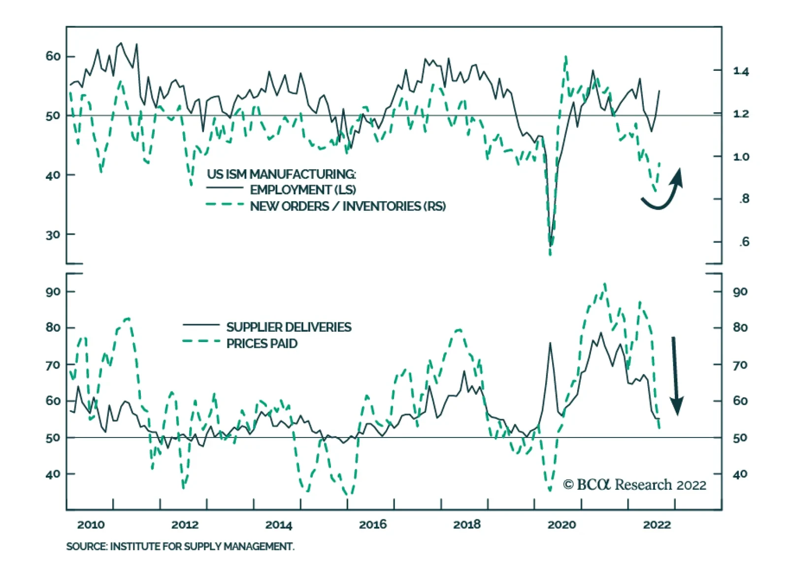
Although the headline index of the US ISM Manufacturing PMI was unchanged at 52.8 in August – indicating that manufacturing activity grew at a steady pace last month – the details of the release sent an optimistic signal about the US economy. Notably,…